Best Builder.io Websites of 2026 (20 Real-World Examples)
Twenty storefronts, marketing sites and public entrances with qualified Builder.io evidence, from J.Crew and Everlane to specialized retail and service brands.
The interesting question is not how many blocks an editor can move. It is how a team can change its website without losing the structure that makes the website useful.
A seasonal campaign, a product category and a service landing page have different jobs. They may still share a header, a set of reusable sections and the same rules for images, labels and actions. These examples show that relationship in several forms: a retailer can put a large campaign inside a dependable shopping frame, while a software business can reuse a quieter structure across distinct audiences. The visible result matters, but so does deciding which parts of that result the content team should be able to change.
The Builder.io relationships in this collection come from official customer cases and explicitly identified website showcase entries. Some concern a broad public content system; others document only landing pages, campaign sections or product widgets. A screenshot illustrates the public page that was actually reviewed. It does not independently prove the entire current runtime, commerce backend or login system. The reviews retain those boundaries, preserve older capture dates where verified originals are reused and separate present source reads from historical implementation accounts.
Before the examples
What makes good Builder.io website development in 2026?
Give reusable components a clear editorial contract
Builder's documentation explains how a registered custom component becomes available in the Visual Editor and how its inputs define editable properties. Use that boundary deliberately. A campaign card might allow an image, a short title and one destination while its spacing and interaction behavior remain in the code. Decide which variations are useful to an editor and which would create inconsistent pages. The implementation brief should explain the reason for each constraint, so future changes do not turn a focused component into a collection of unrelated switches.
Match the content model to the part of the site being changed
Builder distinguishes Page, Section and Data models. A Page represents a URL-based page, a Section can cover an editable portion of a page, and a Data model supplies structured information. That distinction helps keep a small content task from becoming a whole-page rebuild. A promotional strip may only need a section; a new campaign destination may need a page. Before implementing either, identify the persistent navigation and product information around it. The model should reflect the actual editorial responsibility rather than the largest surface the tool can control.
Builder's scheduling documentation describes start and end times, timezones and fallback entries. Those details are part of the website experience. A seasonal offer should not leave an empty space or an expired promise when its schedule ends. Write down the ordinary content that returns, the destination that remains valid and the owner who checks the change. Keep campaign copy separate from stable product facts. The design should accommodate the normal state as carefully as the launch state, especially when multiple regions or promotions share a single route.
The first five websites provide recognizable reference points. The remaining examples show different content responsibilities and visual approaches. Read each screenshot alongside its evidence scope: an explicitly documented landing-page program is not a claim that the entire present-day website uses the same architecture.
We start with five recognizable brands or organizations: J.Crew, Everlane, Zapier, Turtle Beach, LegalZoom. Each attribution applies to the named website property, not every product or website belonging to its organization. This is a curated reading sequence, not a measured ranking.
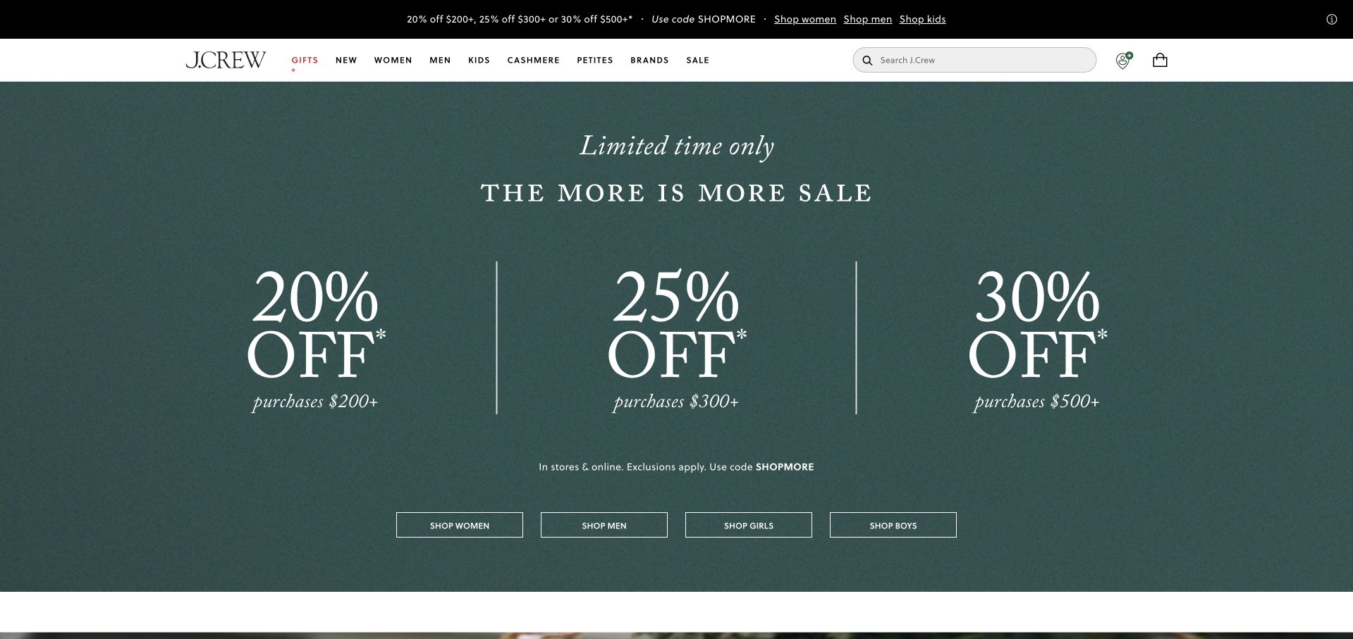
J.Crew makes the campaign itself the opening interface. The retained capture uses a textured teal field and three oversized percentage columns, with spending thresholds underneath and audience shopping links along the bottom. A compact navigation row still exposes gifts, new arrivals and clothing departments, so the promotion does not replace the store's basic structure. The interesting contrast is between expressive seasonal typography and a conventional, easily recognized retail header. This particular screen is an earlier captured offer, not a promise that the same prices remain available today.
What you can learn
Builder's official case identifies the J.Crew website's content system, including homepage and navigation work outside product and checkout responsibilities. Borrow the separation: define a dependable shopping shell, then give campaigns enough controlled space to feel distinctive without obscuring the routes customers already understand.
Pros
Three aligned offer columns make the campaign hierarchy immediately scannable across the wide composition.
Department links and search remain visible despite the unusually dominant promotional typography.
Cons & considerations
The opening communicates discounts more directly than garment construction or individual product details.
Several thresholds require visitors to read conditions before deciding which offer actually applies.
Platform source: Official Builder customer implementation case. Primary source reviewed 2026-11-11. Official customer case identifies jcrew.com and Builder content work including homepage, navigation and campaigns outside product and checkout responsibilities. This is a documented website relationship, not a complete current runtime inventory. Platform evidence is separate from the direct website screenshot and is not a complete current infrastructure audit.
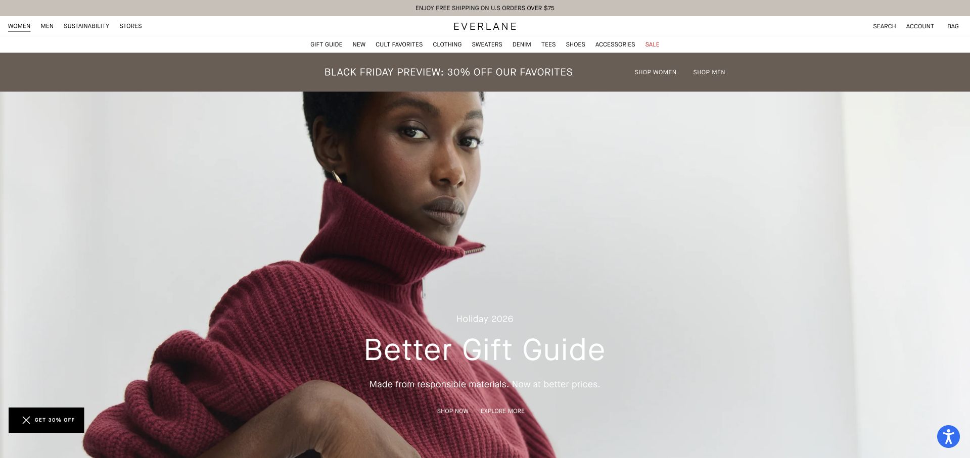
Everlane lets one photograph carry most of the opening impression. A model in a burgundy sweater fills the frame beneath a restrained white header, while the seasonal gift-guide title sits over the image. The centered wordmark, understated category navigation and slim announcement strip form a quiet frame around the richer fabric and color. The retained composition feels editorial rather than like a dense product grid. It is still a shopping entrance: the navigation offers clear audience and category routes before the visitor commits to the seasonal story.
What you can learn
The official Builder case describes homepage variations and merchandising experiences. The useful design lesson is to preserve consistent spacing, typography and navigation while changing the campaign's image and message. A visual editing system needs those constraints if frequent seasonal work is to remain recognizably part of one brand.
Pros
The large photograph gives material, silhouette and color more room than a crowded promotional layout.
The stable white header separates shopping navigation from the seasonal art direction below.
Cons & considerations
White overlay copy depends on the chosen photograph retaining sufficient contrast behind it.
A visitor seeking a specific product must move beyond the broad gift-guide introduction.
Platform source: Official Builder customer implementation case. Primary source reviewed 2026-11-11. Official customer case identifies homepage variations, merchandising and content experiences using Builder. The case is documentary implementation evidence; the retained capture is a specific earlier public state. Platform evidence is separate from the direct website screenshot and is not a complete current infrastructure audit.
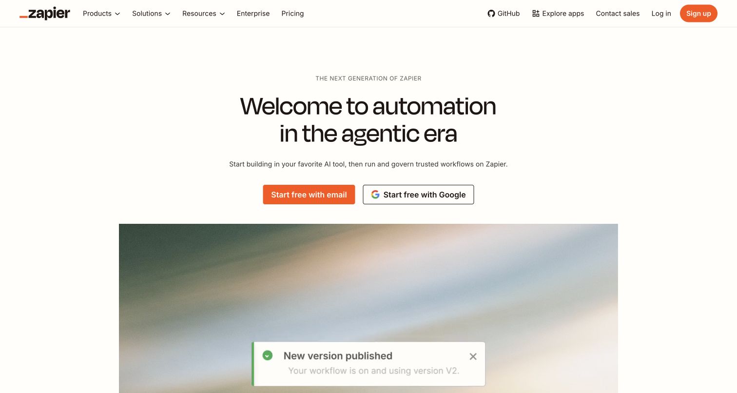
Zapier's retained opening is spacious for such a broad product. The cream background, centered headline and orange primary action create one obvious reading sequence. Email signup sits beside a Google route; the header separately exposes products, solutions, resources and enterprise information. A partial product illustration below the fold starts to explain the service without crowding the first decision. The screenshot records an earlier public marketing presentation; its demonstration notification is interface imagery, not evidence of a real workflow executed during this review.
What you can learn
Builder's customer case concerns Zapier's marketing website and public landing-page experimentation, not the automation engine itself. Study how a shared content system can keep the opening simple while allowing deeper audience-specific pages. The common visual language matters more than adding every product capability to one hero.
Pros
Whitespace and a strong accent color establish a clear primary action without a heavy visual frame.
Enterprise and resource routes remain available for visitors who need evaluation before signup.
Cons & considerations
The broad positioning needs supporting examples before a newcomer can understand a concrete use case.
Two signup methods add an account decision before the visitor has explored the product in depth.
Platform source: Official Builder customer implementation case. Primary source reviewed 2026-11-11. Official customer case identifies the public marketing website, landing pages and experimentation workflows. This does not identify the automation product engine or the entire current website runtime. Platform evidence is separate from the direct website screenshot and is not a complete current infrastructure audit.
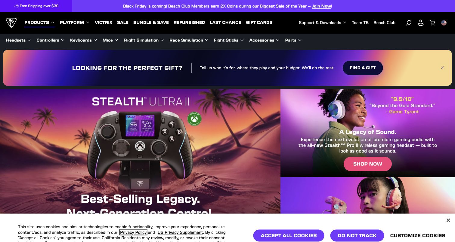
Turtle Beach combines a dense equipment navigation with vivid campaign imagery. The opening places a gift-finder strip above large promotional panels, with controllers and headsets presented through saturated purple, pink and warm outdoor colors. Product and platform categories occupy a separate dark header, giving knowledgeable shoppers a direct route around the campaign. The page serves gift browsing and equipment searches for a particular setup. The visible cookie bar consumes some of the opening viewport, and no consent choice or shopping action was made for the capture.
What you can learn
The official case documents a storefront using Shopify Hydrogen and Builder, with its launch described in April 2024. Treat that as implementation history. For a similar design, agree which category and product data stay controlled by commerce systems and which campaign modules editors can change independently.
Pros
Large product imagery makes the campaign recognizable before shoppers read detailed specifications.
Platform and equipment navigation supports visitors who already know the kind of accessory they need.
Cons & considerations
Several stacked promotional and navigation rows leave less space for the opening product story.
The strong campaign palette can compete with the dense set of shopping categories above it.
Platform source: Official Builder customer implementation case. Primary source reviewed 2026-11-11. Official customer case identifies the gaming-accessory storefront and content workflow with Builder and Shopify Hydrogen, describing a launch in April 2024. That implementation period is historical and does not establish every current component. Platform evidence is separate from the direct website screenshot and is not a complete current infrastructure audit.
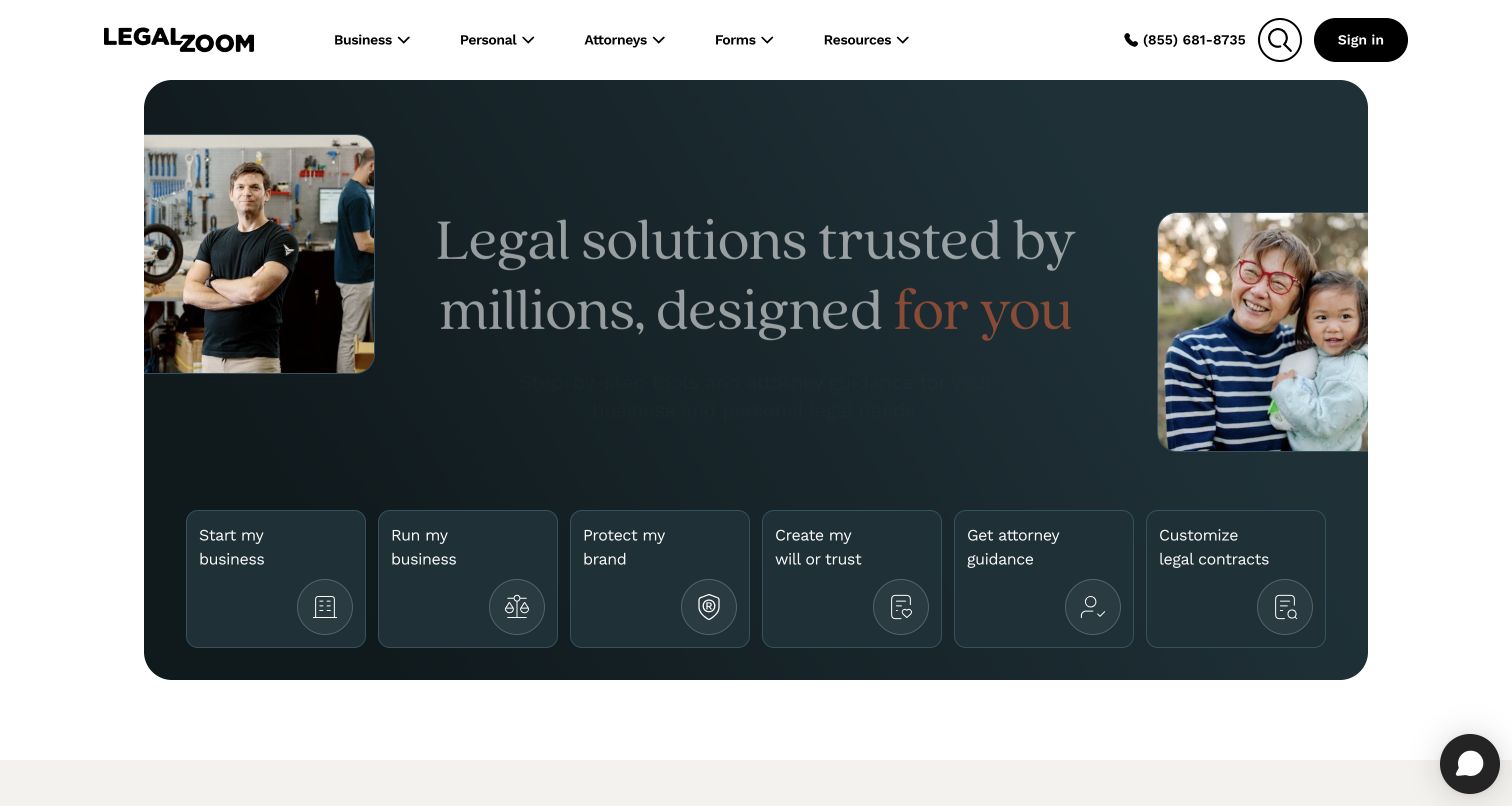
LegalZoom organizes its opening around tasks rather than a single product. A rounded teal hero frames a large serif headline and human photographs, followed by six distinct routes for starting or running a business, protecting a brand, planning an estate and finding other help. The white header keeps search, account access and a telephone route separate from those choices. The broad service platform reduces an unfamiliar subject into recognizable first steps. It does not establish the quality or suitability of any legal service.
What you can learn
Builder's case explicitly identifies legalzoom.com and its public landing and content pages. The design lesson is to model a reusable task card with a concise label and clear destination. Keep service boundaries and explanatory content available after the initial choice rather than forcing the hero to explain every possible situation.
Pros
Six task-oriented cards make a broad platform easier to scan than an undifferentiated service list.
Rounded framing and restrained color give the opening a clear, approachable visual hierarchy.
Cons & considerations
The number of task choices still assumes visitors can recognize which legal category fits them.
Large photography and headline space push detailed explanations below the initial decision area.
Platform source: Official Builder customer implementation case. Primary source reviewed 2026-11-11. Official customer case explicitly names legalzoom.com and public landing/content pages, with a homepage redesign. This is a website content relationship, not a finding about legal services, account systems or all current runtime components. Platform evidence is separate from the direct website screenshot and is not a complete current infrastructure audit.
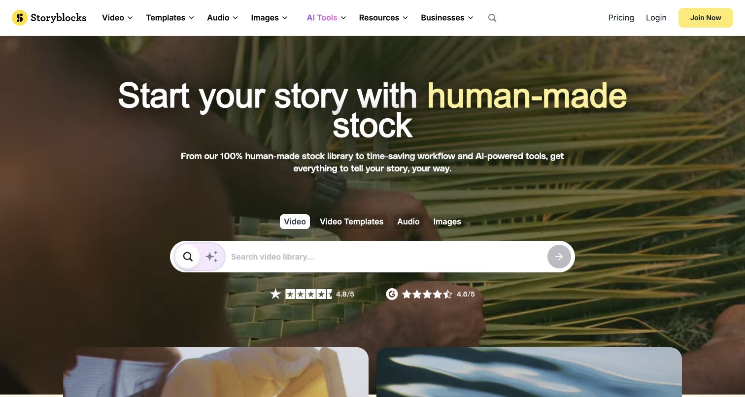
Storyblocks places the search task inside its visual proposition. A full-width moving-image background sits behind a large headline about human-made stock, while media-type chips and a prominent search field offer a next step. Yellow accents distinguish important controls against the darker imagery and the otherwise simple white navigation. The opening combines a mood demonstration and catalog entrance. Its claims about how the stock is made belong to the provider; this review evaluates the visible organization and does not independently certify the licensing or origin of every asset.
What you can learn
The Builder case describes homepage, localized landing-page and experimentation work. A useful content model would keep search behavior dependable while allowing the surrounding campaign and media categories to change. Editors should not need to rebuild the core retrieval interface every time the marketing story changes.
Pros
Search and media categories are presented where the visitor is already evaluating the visual material.
A small number of high-contrast yellow accents distinguishes actions from the background footage.
Cons & considerations
Moving imagery can compete with headline reading and requires careful motion and contrast handling.
A broad search entrance provides little immediate guidance about the limits of individual license options.
Platform source: Official Builder customer implementation case. Primary source reviewed 2026-11-11. Official customer case describes the public homepage, localized landing pages and experiments using Builder. It does not establish the content-licensing backend or every current rendering component. Platform evidence is separate from the direct website screenshot and is not a complete current infrastructure audit.
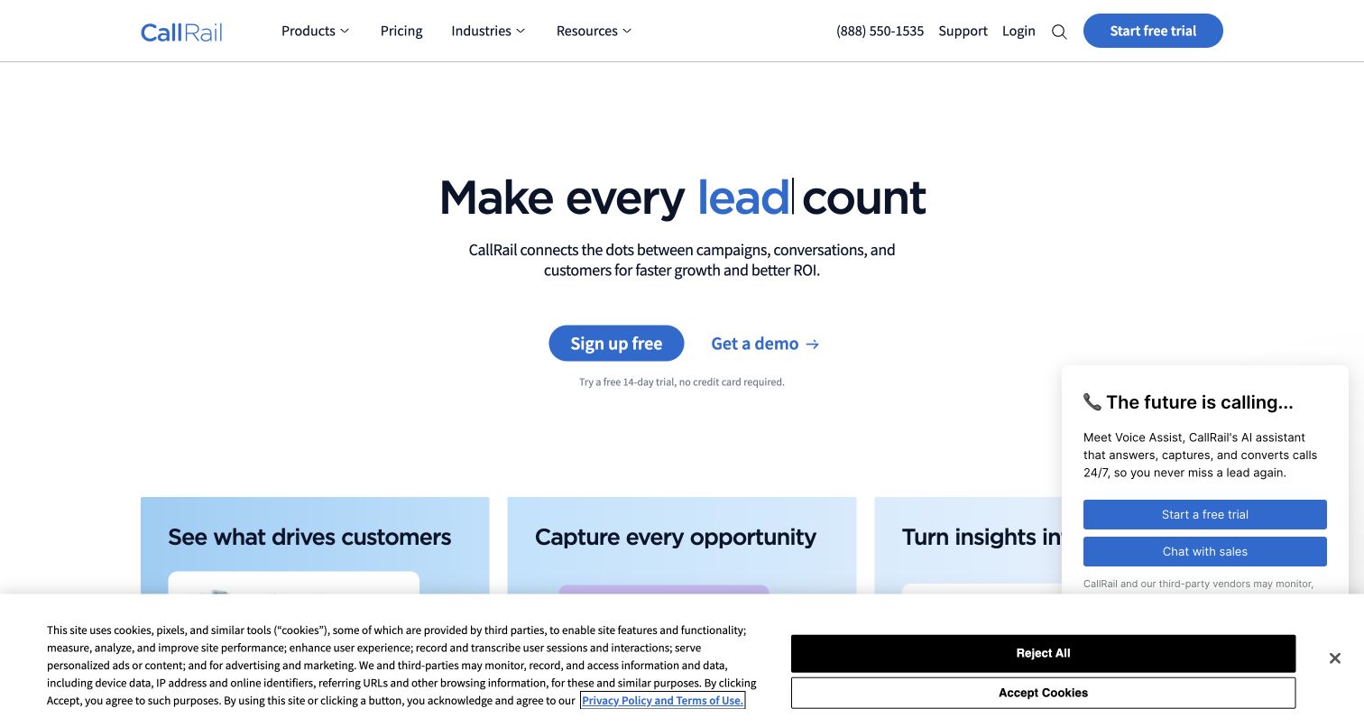
CallRail uses a restrained white opening to connect marketing activity with customer conversations. The central headline combines dark text with a blue emphasized term, followed by a short explanation and separate free-start and demonstration actions. Three pale blue cards begin breaking the broad promise into more specific benefits below. The captured page also shows a chat panel and cookie notice, making the real opening less empty than the main composition suggests. Those overlays are worth considering when evaluating usable space; the review did not send a chat, start an account or submit a lead.
What you can learn
Builder's primary case concerns CallRail's marketing website team, templates and content updates. The transferable pattern is a controlled family of headline, explanation and benefit-card modules. Reusing that structure can help different product pages remain coherent while their copy, imagery and audience emphasis change.
Pros
The centered headline and limited palette make the first reading path easy to identify.
Free exploration and a sales demonstration are given separate, plainly labeled actions.
Cons & considerations
Chat and consent overlays compete with the otherwise calm first-screen arrangement.
The high-level promise needs the following benefit cards to explain what the software actually does.
Platform source: Official Builder customer implementation case. Primary source reviewed 2026-11-11. Official customer case concerns the marketing website team, public page templates and content/design updates. It is not a claim about the underlying call-processing or analytics product architecture. Platform evidence is separate from the direct website screenshot and is not a complete current infrastructure audit.
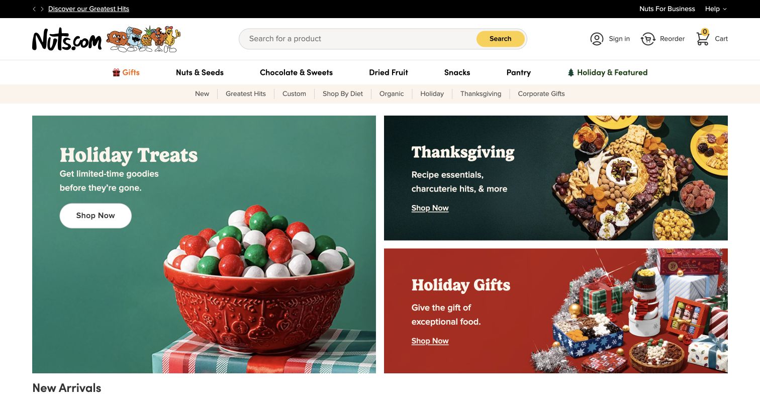
Nuts.com gives its food photography a playful but orderly frame. A cartoon wordmark and search field sit above shopping categories, while the opening campaign is divided into one large holiday panel and two smaller food and gifting panels. Rounded display type and colorful backgrounds make the promotions feel related without making them identical. Reordering, dietary categories and corporate gifting remain visible in the navigation, acknowledging that repeat buyers and gift shoppers arrive with different tasks. Seasonal images communicate abundance alongside practical catalog routes.
What you can learn
The Builder case specifically describes homepage personalization, banners, navigation and merchandising components. Borrow the modular relationship between one lead story and supporting cards. Give editors clear rules for image crops, copy length and destinations so that frequent campaign changes do not gradually turn the opening into unrelated advertisements.
Pros
Different panel sizes establish a primary seasonal story while preserving room for secondary shopping needs.
Search, reorder and dietary navigation address useful tasks beyond browsing a holiday promotion.
Cons & considerations
Many simultaneous category and campaign routes create a busy first decision for a new visitor.
The photographed assortments require a further step before a shopper can compare specific quantities or prices.
Visible tech stack
Earlier / documented evidence
Builder.io
Platform source: Official Builder customer implementation case. Primary source reviewed 2026-11-11. Official customer case identifies seasonal campaign pages, homepage personalization, banners, navigation and merchandising components. The documented content responsibilities are separate from a complete current commerce-backend inventory. Platform evidence is separate from the direct website screenshot and is not a complete current infrastructure audit.
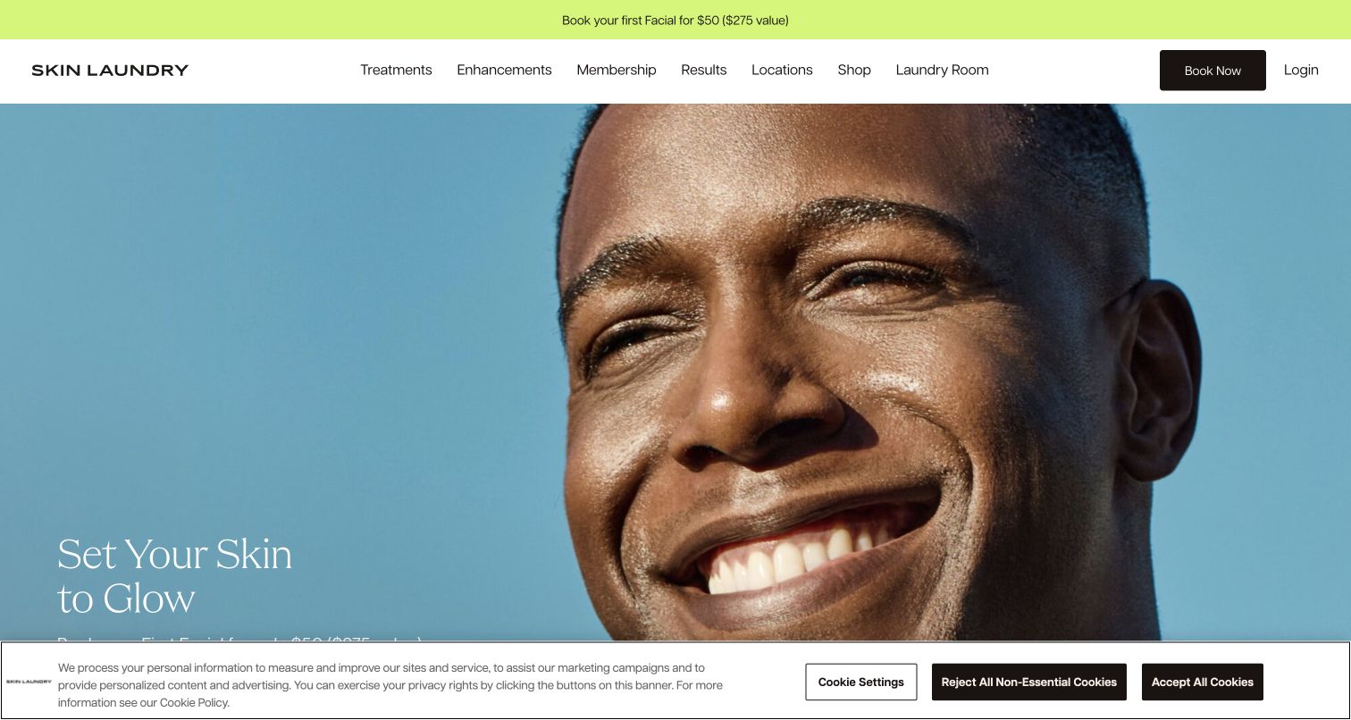
Skin Laundry's opening is built around a close facial photograph, a short aspirational headline and a clear booking route in the header. The cool blue image contrasts with a bright introductory-offer strip, while treatment, membership, results and location links provide several paths into evaluation. The face immediately establishes the subject. A cookie notice covers part of the lower opening in the actual capture. This is a study of presentation and navigation, not an assessment of treatment effectiveness, suitability or the medical claims made elsewhere on the site.
What you can learn
The official Builder case describes rebuilding the public website's content system and creating reusable custom components. For a comparable service site, let marketing modules change within a stable framework that keeps treatment explanations, locations and booking expectations easy to reach. Promotional content should not displace the information needed for a decision.
Pros
The close photograph and brief headline make the page's subject clear without a long introduction.
Treatment, membership and location routes separate several common reasons for visiting.
Cons & considerations
The dominant image leaves detailed service explanations outside the first screen.
A consent overlay partly obscures the lower hero and reduces room for its supporting action.
Platform source: Official Builder customer implementation case. Primary source reviewed 2026-11-11. Official customer case documents rebuilding the public website CMS/frontend and reusing custom Builder components. It does not establish clinical effectiveness or the architecture of private appointment or patient systems. Platform evidence is separate from the direct website screenshot and is not a complete current infrastructure audit.
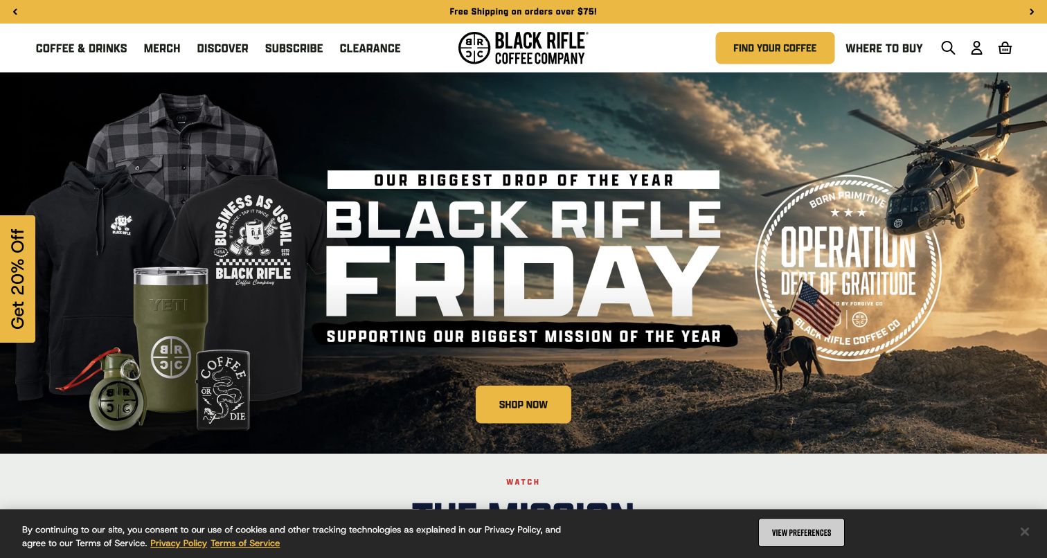
Black Rifle Coffee's captured campaign uses forceful contrast and product variety. A black-and-yellow header sits above a split composition that combines branded merchandise with an outdoor helicopter scene. Oversized seasonal lettering unifies the panels, while a yellow shopping action remains conspicuous. Coffee, merchandise, subscription and discovery routes stay available above the campaign, so the page presents both a retail catalog and a broader brand world. The optional newsletter dialog was closed without providing information; the remaining cookie bar is part of the recorded view. No purchase was initiated.
What you can learn
The primary Builder case documents storefront content, React components and campaign work, including a historical commerce-platform transition. It does not prove that every current layer remains identical. The useful pattern is to separate reusable navigation and product connections from highly changeable campaign art, while keeping the campaign's destination unmistakable.
Pros
Strong color contrast gives the shopping action a clear position within an energetic composition.
The imagery connects physical products with a consistent, recognizable brand setting.
Cons & considerations
Large promotional lettering can overpower more specific information about the featured products.
Coffee and merchandise share the opening, requiring shoppers to choose a category before comparing details.
Visible tech stack
Earlier / documented evidence
Builder.io
Platform source: Official Builder customer implementation case. Primary source reviewed 2026-11-11. Official customer case names Black Rifle Coffee storefront content, reusable React components and campaign/product-page workflows, including a historical transition to Salesforce Commerce Cloud. The case is not a blanket current-stack claim or evidence about subsidiary sites not reviewed here. Platform evidence is separate from the direct website screenshot and is not a complete current infrastructure audit.
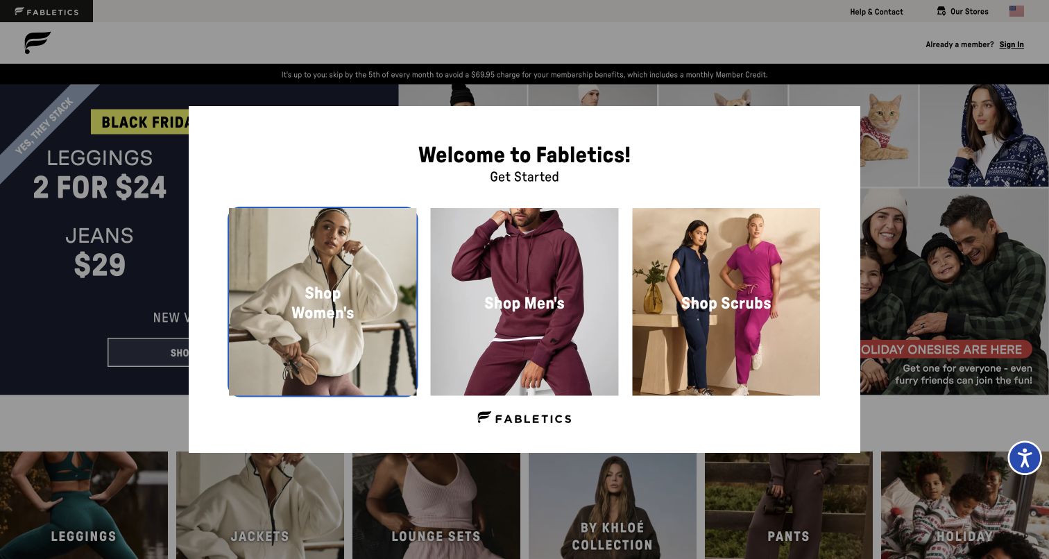
Fabletics presents a category choice before ordinary browsing. The captured public opening contains a welcome panel with three large photographic routes for women, men and scrubs, while a seasonal promotion remains visible behind it. Existing members receive a separate sign-in route in the header. The audience segmentation is explicit: the photographs do much of the labeling work, and the first decision is narrow enough to understand quickly. It also means the opening cannot be evaluated as an unobstructed catalog. No category selection, membership enrollment or subscription action was completed.
What you can learn
Builder's TechStyle case explicitly names Fabletics.com and describes category and product pages within a multi-brand architecture. The captured chooser illustrates the public entrance, not proof of every current component. Plan how audience selection passes context to reusable content without hiding the terms or shopping information needed for an informed visit.
Pros
Three substantial image choices make audience segmentation visually clear at the start.
An existing-member sign-in route distinguishes returning customers from the introductory flow.
Cons & considerations
The chooser obscures the underlying page and delays direct inspection of products.
Membership and promotional conditions need careful attention beyond the simple first category decision.
Visible tech stack
Earlier / documented evidence
Builder.io
Platform source: Official Builder customer implementation case. Primary source reviewed 2026-11-11. Official TechStyle customer case expressly names Fabletics.com category and product pages within a Builder/Next.js multi-brand implementation. The screenshot shows the public opening category chooser, not an authenticated membership or subscription flow. Platform evidence is separate from the direct website screenshot and is not a complete current infrastructure audit.
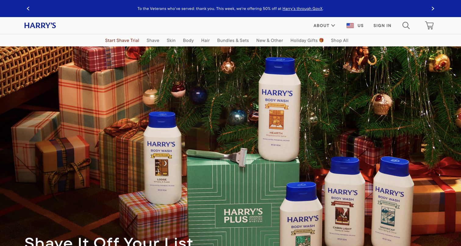
Harry's opens with a coordinated seasonal still life rather than a single isolated razor. Blue packaging, wrapped gifts and patterned surfaces establish a gifting theme beneath a tidy two-level shopping header. The campaign headline sits low in the large photograph, with product-category navigation and account controls remaining above it. The root address redirected to the English-language page during capture. An optional email promotion was dismissed without submitting information. The view shows seasonal changes within a recognizable personal-care shopping framework.
What you can learn
The official Builder case names Harry's as part of a shared landing-page system across distinct brands. That is narrower than proof that this entire current homepage uses Builder. Borrow the approach of reusable content structures with brand-specific typography, imagery and navigation, and document where those structures connect to the separate commerce system.
Pros
A unified palette and carefully arranged products make the campaign feel like one coherent story.
Product categories remain visible above the large seasonal image for shoppers with a specific need.
Cons & considerations
The image occupies much of the opening before individual product comparisons become available.
The low headline placement makes the message sensitive to viewport height and image cropping.
Visible tech stack
Earlier / documented evidence
Builder.io
Platform source: Official Builder customer implementation case. Primary source reviewed 2026-11-11. Official customer case explicitly names Harry’s in a five-brand Builder landing-page system. Scope is the documented landing-page workflow, not proof that this complete current English-language homepage or checkout uses Builder. Platform evidence is separate from the direct website screenshot and is not a complete current infrastructure audit.
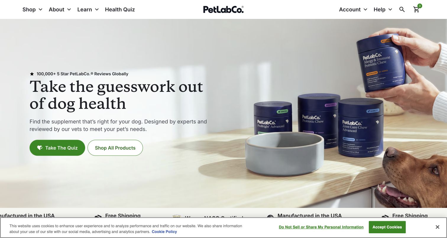
PetLab Co. frames its opening as a choice between guidance and direct shopping. A headline and quiz action occupy the left, while product containers, a dog and a feeding scene establish the subject on the right. An outlined shop action gives visitors another route without asking them to answer questions. Neutral imagery and an orderly header feel approachable. The public root redirected to a particular path, which is retained in the evidence. No quiz, account, purchase or pet-health information was submitted during this review.
What you can learn
Builder's case documents public content and experimentation workflows for PetLab. The design lesson is to keep the basic promise and alternative shopping route stable while testing campaign details. A variation is one observed state, not proof that everyone sees it or that animal-health claims have been independently verified.
Pros
Guided discovery and ordinary shopping are presented as distinct routes in the same opening.
Product and pet imagery clarify the category without relying on a long explanatory paragraph.
Cons & considerations
The prominent quiz asks visitors to choose a guided path before seeing detailed product comparisons.
Experiment-specific content may differ across visits, so the captured screen is not a universal presentation.
Platform source: Official Builder customer implementation case. Primary source reviewed 2026-11-11. Official customer case documents public content and website experiments using Builder visual headless CMS. The public root redirected to the recorded experiment path; one observed variation does not establish every visitor’s experience or the full current backend. Platform evidence is separate from the direct website screenshot and is not a complete current infrastructure audit.
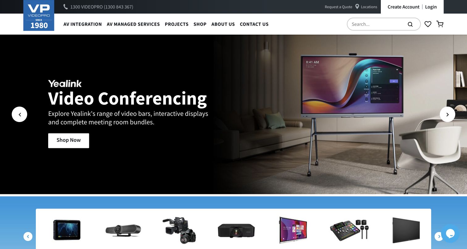
Videopro brings retail and professional installation under one dense but clearly divided header. Shopping, audiovisual integration, managed services and projects have separate navigation labels, alongside search, locations and quotation routes. The captured hero promotes conferencing equipment through a meeting-room photograph and a contrasting dark text panel. A strip of illustrated product categories begins immediately below. This combination gives the page two roles: finding a product and understanding a larger service capability. New visitors face more navigation than on a single-purpose store.
What you can learn
The official Matter Design case specifically identifies Videopro's homepage, landing pages and product widgets connected through Builder. It explains a content layer working with commerce data, rather than replacing that data. For a similar site, define reusable product modules whose information remains linked to its source while editors control the surrounding story and placement.
Pros
Retail shopping and project-oriented services are given separate, visible navigation routes.
The meeting-room photograph shows the equipment in a plausible setting instead of only isolated packaging.
Cons & considerations
The number of header utilities and service categories makes the opening visually dense.
A campaign carousel presents one message at a time, leaving other offerings less immediately visible.
Visible tech stack
Earlier / documented evidence
Builder.io
Platform source: Official Builder customer implementation case. Primary source reviewed 2026-11-11. Official Matter Design case specifically names Videopro homepage, landing pages and product widgets connected through Builder and the agency’s framework. The reviewed property is Videopro, not the agency website; the case does not make Builder the commerce data owner. Platform evidence is separate from the direct website screenshot and is not a complete current infrastructure audit.
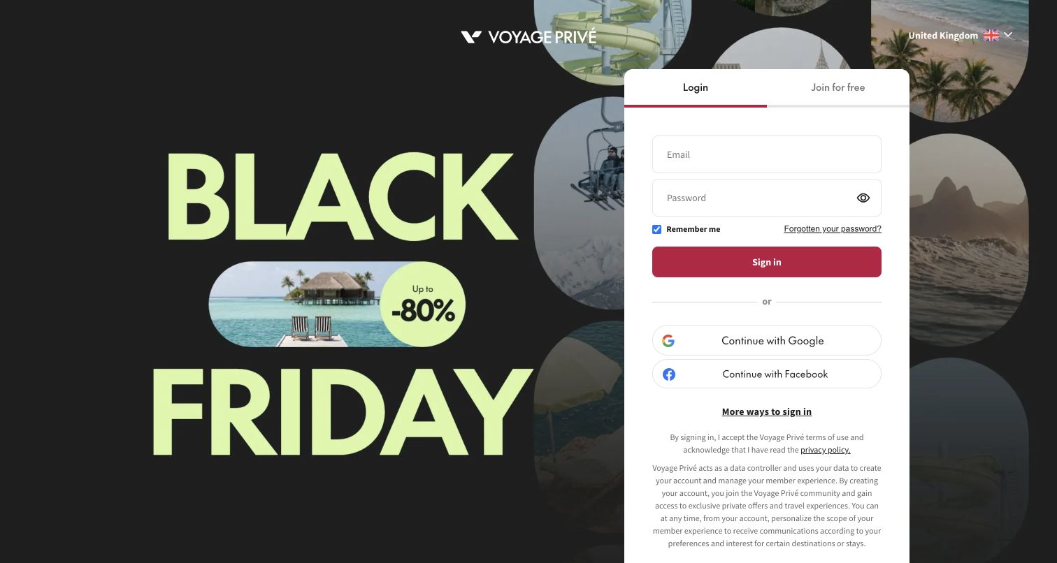
Voyage Privé's UK entrance leads to a signed-out membership gateway. A travel campaign fills the background, while a white panel contains login and joining tabs, empty account fields and social sign-in choices. Circular destination photographs supply the travel context around that panel. This is the actual public state reached from the root address, not a private booking screen or a review of available member offers. No login, membership registration or booking was attempted. The layout makes access requirements unmistakable while limiting what visitors can inspect beforehand.
What you can learn
Builder's case identifies localized partner landing pages across markets, including the UK. It does not establish that this login interface is implemented in Builder. The useful comparison is between a campaign's promise and the next access step: preserve context and explain membership before the journey asks for personal information.
Pros
The white account panel is easy to locate against the dark campaign background.
Login and joining routes distinguish returning members from visitors encountering the service for the first time.
Cons & considerations
The gateway prevents direct evaluation of the member-only travel inventory in the captured state.
Promotional imagery receives substantial space while membership details require more careful reading.
Platform source: Official Builder customer implementation case. Primary source reviewed 2026-11-11. Official customer case describes localized public partner landing pages in nine markets and explicitly includes the UK. It discusses platform evaluation in spring 2026. The actual UK root leads to the pictured signed-out membership gateway; this is not evidence that the login interface or private travel inventory runs on Builder. Platform evidence is separate from the direct website screenshot and is not a complete current infrastructure audit.
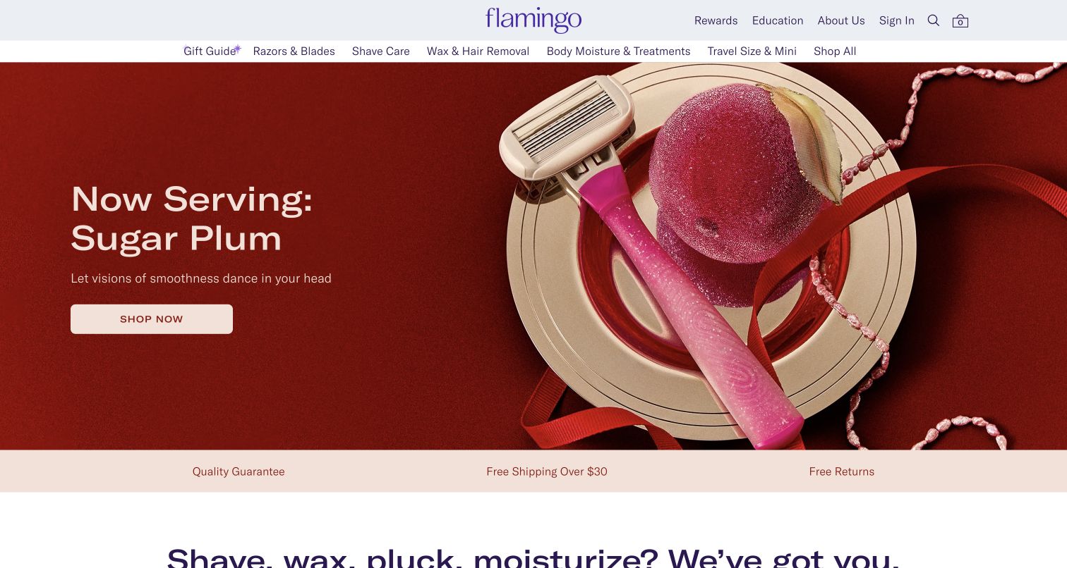
Flamingo uses a tightly coordinated seasonal palette to turn a small product range into a strong opening composition. A deep red hero pairs brief white copy with a razor and body-care packaging arranged on a pink, dessert-like surface. The pale header and purple wordmark keep the navigation legible without competing with that scene. Shopping categories, education and account routes remain recognizable above the campaign. A narrow reassurance strip follows beneath it. The specific art direction leaves detailed product differences for later exploration.
What you can learn
Builder's Harry's-family case explicitly names Flamingo in its landing-page program. The relationship is documented at that scope, not as a blanket claim about every current homepage component. Study how a common content structure can take on a distinct identity through art direction, color and type rather than duplicating another brand's visual treatment.
Pros
Consistent red, pink and purple tones make the product arrangement feel deliberate and memorable.
A short message and single shopping action keep the campaign's immediate decision simple.
Cons & considerations
Seasonal styling communicates mood more strongly than the practical distinctions among products.
White text requires careful placement against any future image variation to remain equally readable.
Platform source: Official Builder customer implementation case. Primary source reviewed 2026-11-11. Official Harry’s-family customer case explicitly names Flamingo as an onboarded brand in the shared Builder landing-page system. This is exact named-property documentary evidence, not inheritance from a parent-company logo or proof of the entire current homepage runtime. Platform evidence is separate from the direct website screenshot and is not a complete current infrastructure audit.
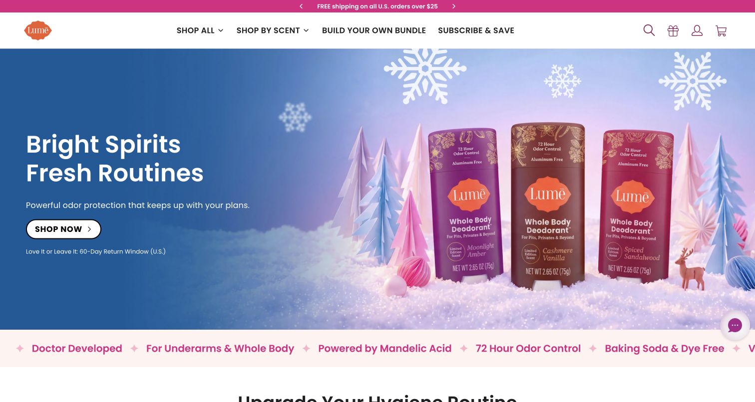
Lume's captured opening turns a seasonal product launch into a small illustrated landscape. Deodorant packages stand among pale paper-like trees against a blue and lilac background, with a white headline and outlined shopping action on the left. A bright announcement strip and simple shopping navigation frame the scene. The page then moves into a benefit strip and product-type choices. Different package shapes are visible before the conventional grid. Claims about product performance remain the brand's claims; this review examines the presentation rather than testing effectiveness or medical suitability.
What you can learn
The official Harry's-family case specifically includes Lume in a shared landing-page workflow. It does not prove the complete current homepage runtime. The design opportunity is a reusable campaign structure that supports distinct product arrangements while maintaining predictable navigation, concise labels and a clear next step into the catalog.
Pros
The restrained scenic backdrop gives the product packages enough contrast to remain the focal point.
Simple shopping routes keep the seasonal campaign connected to ordinary catalog exploration.
Cons & considerations
Light overlay text and outlines depend on carefully controlled background tones.
The opening emphasizes a launch story before explaining differences among individual formulations or formats.
Platform source: Official Builder customer implementation case. Primary source reviewed 2026-11-11. Official Harry’s-family customer case explicitly names Lume as an onboarded brand in the shared Builder landing-page system. The scope does not establish every current homepage component, checkout implementation or product-performance claim. Platform evidence is separate from the direct website screenshot and is not a complete current infrastructure audit.
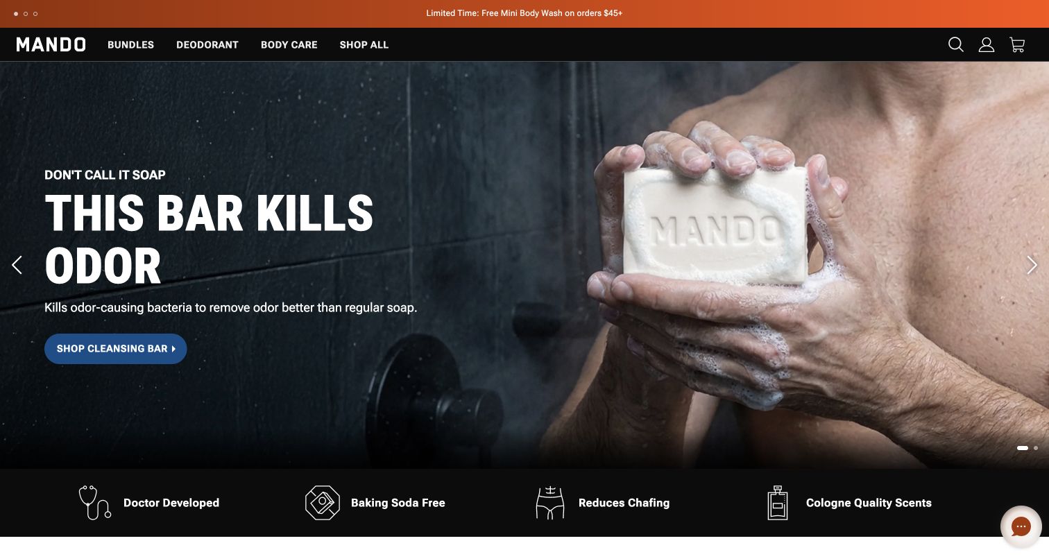
Mando's opening uses a deliberately different tone from the other personal-care brands in this collection. An orange announcement strip leads into a black header and a dark shower setting, with a large cleansing-bar headline, blue action and close product-use photograph. The first screen is direct and high contrast. A benefit strip and product-selection sections follow the campaign. The navigation keeps bundles, body products and shopping routes compact. The photograph demonstrates the category, but neither it nor the accompanying promotional claims establishes measured product performance.
What you can learn
Builder's primary Harry's-family case names Mando as a participant in its landing-page system. That supports a qualified content-workflow association, not a claim about every element of this current homepage. Shared technical components need not produce identical brands when visual rules and editorial choices are deliberately separated.
Pros
The dark setting and bright blue action create an unmistakable focal point for the opening campaign.
Compact navigation leaves more room for the product and message than a broad multi-category header would.
Cons & considerations
The dramatic single-product campaign postpones comparison with the rest of the range.
Large promotional copy offers less immediate detail about product options, ingredients or purchase conditions.
Platform source: Official Builder customer implementation case. Primary source reviewed 2026-11-11. Official Harry’s-family customer case explicitly names Mando as an onboarded brand in the shared Builder landing-page system. This is a scoped documentary relationship, not proof that all current brand pages or commerce systems use Builder. Platform evidence is separate from the direct website screenshot and is not a complete current infrastructure audit.
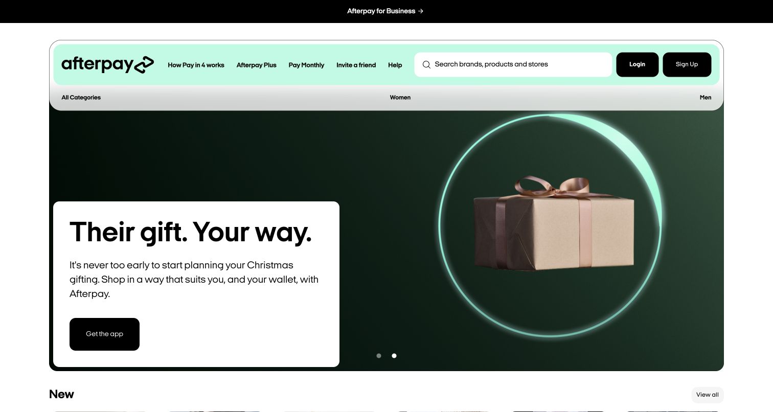
Afterpay's Australian homepage combines a shopping directory with a consumer campaign. A mint-colored header contains product navigation, search, login and signup, while the captured carousel shows a wrapped gift against a dark green background. A white copy panel and black app button provide a clear reading area beside the image. Store cards below the campaign connect the opening to discovery. This is the Australian public presentation, not an account or payment flow. No financial action was taken, and the design review does not assess credit suitability or endorse borrowing.
What you can learn
Builder's official showcase identifies and links Afterpay as a homepage example. That documentary association does not establish its private payment systems or complete current runtime. Borrow the separation between a changing campaign, persistent service navigation and store discovery, while keeping product explanations and conditions available to visitors.
Pros
The white message panel gives the campaign text dependable contrast against the darker imagery.
Search and recognizable store cards connect the broad promotion with more specific browsing tasks.
Cons & considerations
The opening emphasizes seasonal shopping before detailed product terms or eligibility information.
Several payment products in the header require further explanation before their differences are clear.
Platform source: Official Builder website showcase. Primary source reviewed 2026-11-11. The official Builder customer showcase has a separate Afterpay homepage card with its exact website link. The public destination resolves to the Australian /en-AU property. This is documentary homepage evidence, not a claim about private payment, credit or account systems; Builder CDN media alone would establish only delivery. Platform evidence is separate from the direct website screenshot and is not a complete current infrastructure audit.
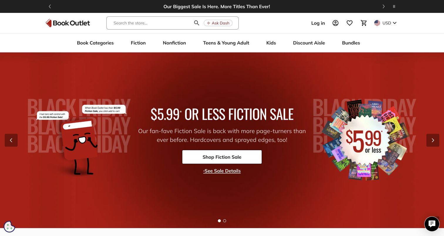
Book Outlet puts the bargain message at the center of its opening. A red campaign panel surrounds a white headline with a cartoon book character and a ring of cover images. The shopping action and sale-details link are kept together beneath the explanation. Above that campaign, a wide search field and familiar genre navigation give readers a direct route to the catalog. Carousel arrows and a pause control are provided. Captured prices record the promotion without guaranteeing its continuing availability.
What you can learn
Builder's official showcase explicitly links Book Outlet as a homepage example. Current Shopify media is also visible in the public evidence, so the relationship should not be expanded into a claim that Builder is the commerce backend or sole renderer. Study how promotional modules sit beneath a stable search and category structure.
Pros
Genre navigation and prominent search support readers who arrive with a specific book in mind.
The primary shopping action sits close to a separate link explaining the offer conditions.
Cons & considerations
The large sale panel delays individual title comparisons until the visitor continues into the catalog.
Multiple rotating promotional elements can compete for attention even when pause controls are available.
Platform source: Official Builder website showcase. Primary source reviewed 2026-11-11. The official Builder customer showcase has a separate Book Outlet homepage card linking exact bookoutlet.com. Current public Shopify media is also present. Preserve the documentary Builder homepage association without claiming Builder is its commerce backend or sole current renderer. Platform evidence is separate from the direct website screenshot and is not a complete current infrastructure audit.
Kegan has 15+ years of experience working with small businesses, Fortune 500 companies, and everything in between. No development job is too big or too small: he brings the same hands-on attention to a focused improvement, a complete website, or a custom application.
For Builder.io projects, he can help with responsive interfaces, reusable components, custom functionality, API connections, and performance-minded implementation. He works directly with clients on scope, design, implementation, testing, and handover, with an emphasis on clear communication and a system that remains practical to maintain after launch.
Show 3 other Builder.io developersHide other Builder.io developers
Choose a set of pages that genuinely share a structure, such as seasonal collections or product-launch destinations. Inventory the variations that editors already need and make those variations explicit. Harry's and its separately named brands provide a documented example of a landing-page system that can support different visual identities. The goal is not to make every brand look alike. It is to make the common work reliable while leaving room for the typography, image treatment and message that distinguish each one.
Improve a specific area inside an existing storefront
A homepage banner, editorial product module or category introduction may be a more useful starting point than replacing a complete store. Videopro's documented widgets and Nuts.com's merchandising examples illustrate this narrower scope. Identify where product names, availability and purchase destinations come from, then decide how editors may arrange them. Keep ownership of that information clear. A visually editable section still needs accurate connections to the surrounding store and a predictable result when an item is removed or unavailable.
Build a shared structure for a growing marketing website
When several teams create public pages, consistency becomes an operational question as well as a visual one. Zapier and CallRail offer documented marketing-site examples with different presentation styles. Start with the visitor's task and a small set of useful section types. Give each page a deliberate opening, a clear explanation and an appropriate next action. Shared components should reduce repeated decisions, while the content remains specific enough to explain the audience, product or use case of that particular page.
From references to requirements
Write the content responsibilities before arranging the editor
Inventory page types, owners and source systems
List the routes and sections in scope, who changes them and where their facts originate. Distinguish editorial copy from product records, account behavior and transactional systems. Record the pieces that must stay stable during a campaign. Then choose a representative page that includes ordinary content and a realistic exception. This reveals whether the proposed component family handles the work the team actually does, rather than just the cleanest example in a presentation.
Define variation without losing the reading order
For each reusable section, specify its job, required content, useful optional fields and intended destination. Consider a short title, a long translation, a missing image and an unavailable product. Decide how campaign art behaves when it shares space with notices or navigation. Several captures here show that overlays are part of the real reading environment. The component should remain understandable when the page contains more than the idealized hero alone.
Make the handover practical for the people maintaining it
A useful handover includes a content map, component examples, ownership of external data and the steps for ending or replacing a campaign. Explain how the team recognizes a draft, a scheduled variation and the currently served version. Keep instructions tied to the actual project rather than a generic tour of every platform feature. The owner should know which changes fit the agreed system and when a new requirement needs development work instead of another improvised override.
A useful handover demonstration
Ask the actual team to carry out its routine job: publish a realistic update, correct a mistake, preview a narrow screen, and identify who owns an integration failure. For a library or frontend framework, also ask who maintains the content source and deployment. A polished screenshot does not answer those operational questions.
Beyond the screenshot
Builder.io website planning checklist
Name the exact public pages or sections included in the implementation.
Separate content responsibilities from commerce, authentication and transactional systems.
Document the current source of product and service information.
Choose Page, Section or Data models according to the editorial task.
Define useful custom-component inputs and keep their purpose understandable.
Preserve a dependable navigation and reading structure around changing campaigns.
Set expectations for image crops, copy length and meaningful link labels.
Include realistic long content, translations and missing-data states.
Plan the default content that returns when a seasonal variation ends.
Keep regional routes and destinations explicit rather than assuming one universal page.
Assign owners for content accuracy, component maintenance and connected systems.
Record implementation scope and dates so future claims remain properly qualified.
Test with real content, a keyboard, a small screen, slow or failed requests, and the people who will maintain the system. These are planning checks, not an accessibility, security, performance, or search-ranking certification.
Sources & editorial method
How this Builder.io collection was reviewed
We reviewed 20 distinct public properties with official Builder.io website or landing-page evidence. Seventeen captures were taken directly on November 11, 2026; verified original J.Crew and Everlane captures retain November 9 dates, and Zapier retains its November 4 capture date. The first five brands are explicitly selected and supported by primary implementation cases. Reviews describe observed presentation and tradeoffs, not measured conversion improvements or a ranking of businesses. Documentary scope remains separate from the screenshot: the Harry's-family examples concern named landing-page systems, and Voyage Privé's case concerns localized partner pages while its capture shows a signed-out public membership entrance. Known implementation periods remain historical; undated cases receive no invented publication date. Every actual source page has a broad public stack-audit attempt or retained exact-page record with its original date. No accounts, forms, purchases or restricted content were accessed. Industry links use published collection membership or reviewed exact-page evidence, and unsupported associations remain omitted.
Every image is an unmodified capture from the actual website, with its source and capture date. Some captures are reused from our shared catalog; their dates remain the original capture dates. None comes from a vendor gallery or a generated reconstruction. Moving imagery and live content can change.
Technology attribution uses public page assets or metadata, official platform documentation, or a cited first-party project case study. Documentary and framework-relationship evidence is identified where used; it is not a complete current backend inventory. A CMS image CDN alone does not establish a full CMS deployment. A library’s presence does not prove which individual controls use it, and a platform label does not establish AI authorship.
The composition notes, lessons, pros and tradeoffs are original editorial observations. We have not measured conversion, traffic, security, performance or accessibility conformance. Website owners retain their brands and imagery; these examples are not our client portfolio. Written, Edited and Curated are independent records, not dates advanced by a build. See our editorial standards or suggest a correction.
Questions worth asking
Builder.io website development FAQs
Does every pictured homepage run entirely on Builder.io?
That is not the claim. The evidence identifies different responsibilities, including public content systems, campaign pages, sections and product widgets. Some examples document a landing-page program while the screenshot shows the property's public entrance. Each relationship is qualified so that a vendor case is not mistaken for a complete current runtime inventory.
How is a visual content system different from the commerce backend?
The content system controls the material and structures assigned to it. Product records, stock, prices, checkout and accounts may belong to other systems. The implementation needs to define those responsibilities explicitly. A documented Builder.io storefront relationship does not, by itself, identify the platform responsible for every transaction or every piece of product data.
Can different brands share components without looking identical?
Yes, when the shared structure and brand presentation are deliberately separated. The Harry's-family case documents a landing-page approach across separately named brands. In planning a similar system, decide which behaviors and content fields are common and which type, color, imagery and navigation rules belong to each brand. Shared structure is not a reason to reuse another brand's identity.
Why do three screenshots have earlier dates?
Those are verified original captures of the exact reviewed public properties, reused with their real capture dates and new collection-specific analysis. A later source read does not make an older screenshot newly captured. Keeping those dates distinct makes it possible to understand which visual state was reviewed and when the documentary evidence was checked.
Do the screenshots establish conversion improvements?
No. A screenshot can show hierarchy, imagery, navigation and the state reached during a visit. It cannot establish how a design affects sales, signups or retention. Some primary customer cases report their own outcomes, but these reviews do not turn those claims into independently measured results or attribute every change to one tool.
What should a team borrow from this collection?
Look for the relationship between stable structure and changing content. Notice how stores frame campaigns, how marketing pages explain a product and how public entrances lead toward the next task. Then define a content system around your own responsibilities, source data and maintenance needs. Copying a hero image arrangement is less useful than understanding why the surrounding structure makes it work.
Start with a clearly bounded content problem. Give the team enough freedom to solve it well, keep the supporting structure dependable and document the responsibilities that remain outside the visual editor.