Best Typesense Websites of 2026 (20 Real-World Examples)
Twenty real public properties with documented Typesense search associations, genuine dated screenshots and original reviews of discovery, navigation and catalog presentation.
A useful search experience begins before someone types. The field needs to be easy to find, the catalog needs understandable structure, and the results need enough context to support a decision. These twenty public properties show different ways to frame that work. Their Typesense associations come from scoped primary documentation; the design reviews do not claim that the search engine determines the entire website or that every current runtime has been verified.
Codecademy, Logitech, Lonely Planet, Font Awesome and Kick open this collection as recognizable brands, supported by separate official sources for their public identity. The remaining examples include specialist shops, public databases, book discovery and media libraries. Each is a distinct public property with a genuine capture. Vendor demonstrations, repeated framework demos and private application claims transferred to unrelated marketing sites are excluded.
The versioned Typesense showcase is the main documentary source. Font Awesome has a specific account of its icon-search migration, and Changelog currently credits Typesense for search in its public footer. Regional landing paths are recorded explicitly. A historical or undated association remains qualified even when a screenshot is new, and broad public technology audits retain their independent observation dates and access limitations.
Before the examples
What makes good Typesense website development in 2026?
Start with the visitor’s vocabulary
Collect the names, phrases and incomplete descriptions people use to find an item. A reader might remember an author, a shopper a model number, and a restaurant guest an area rather than a venue. Write representative queries before choosing a visual treatment. The result interface should help someone recognize the intended match, not merely display a list of records whose words happen to overlap.
Model the information needed to recognize a result
Typesense organizes documents into collections with fields. Decide which fields belong to the searchable object and which are useful for filtering or presentation. Keep distinct content types understandable: a product and a help article may both answer a query but need different context. Include realistic long names, missing images and similar records when designing the result card.
Typesense exposes text relevance and other ranking controls, including field weighting. Use those controls against concrete examples rather than assuming a single configuration will suit every catalog. Agree which result should appear for an exact title, a broad category and an ambiguous phrase. Record the expected behavior so a later change can be judged against the same questions.
Compare where each property places discovery controls, how it describes the catalog and which information it gives visitors before they continue. Four earlier screenshots retain their original dates; sixteen direct captures were made on November 12, 2026. Documentary association, visible design and current public-source observations remain separate forms of evidence.
We start with five recognizable brands or organizations: Codecademy, Logitech, Lonely Planet, Font Awesome icon search, Kick. Each attribution applies to the named website property, not every product or website belonging to its organization. This is a curated reading sequence, not a measured ranking.
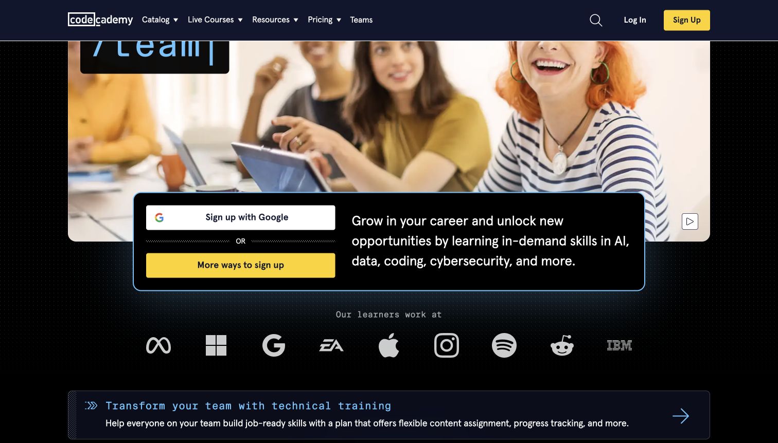
Codecademy's retained capture pairs a broad learning proposition with a direct registration panel. A large photograph gives the page a human scale, while the dark header keeps Catalog, Live Courses, Resources and search within the same navigation band. The lower hero explains the career purpose of learning before a row of employer logos introduces another kind of reassurance. A separate team-training strip makes the organizational offer visible without replacing the individual learner's entry point. For a searchable learning catalog, this is a useful reference for keeping motivation and navigation together, although the pictured view does not demonstrate result quality or course matching.
What you can learn
Separate the reason to learn from the task of finding a suitable lesson. Keep a persistent route to the catalog, then make subject, experience level and learning format clear in the destination interface. A registration prompt should not carry that information alone.
Pros
The header groups learning routes under familiar, distinct labels.
Individual and organizational offers have visibly separate entry points.
Cons & considerations
The registration panel occupies substantial space before course detail.
Employer logos cannot explain which learning path suits a visitor.
Visible tech stack
Earlier / documented evidence
Typesense
Platform source: Primary scoped Typesense search association. The versioned Typesense showcase lists Codecademy as a public website use case. Documentary association with the named public website and its search use case. The versioned showcase is not a current runtime scan or a dated implementation record. No claim is made about the entire frontend, private systems, backend architecture, or a Typesense version on the captured page. Platform evidence is separate from the direct website screenshot and is not a complete current infrastructure audit.
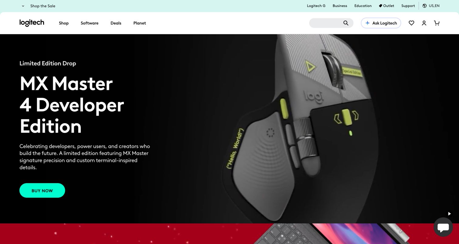
Logitech's public United States storefront uses a black campaign field to isolate the featured mouse and its oversized white headline. The turquoise purchase button is easy to locate because the surrounding image and typography have a restrained palette. Above that campaign, the lighter shopping header maintains a practical search field and account or basket controls. This gives returning visitors a route past the launch message while allowing the brand to feature one product prominently. The retained screenshot is particularly useful for studying the relationship between a focused advertisement and a much broader merchandise catalog. It does not reveal the behavior of search suggestions or product compatibility filters.
What you can learn
Give repeat shoppers a stable discovery route even when the main campaign changes. Product names, model numbers and everyday category language should remain useful entry points. Keep the global search visually distinct from a promotion's single purchase action.
Pros
The contrasting header separates navigation from campaign imagery.
A single bright action makes the featured offer easy to identify.
Cons & considerations
The hero explains one product rather than the wider range.
Large campaign typography leaves limited room for practical specifications.
Platform source: Primary scoped Typesense search association. The versioned Typesense showcase lists Logitech as a public website use case. Documentary association with the named public website and its search use case. The versioned showcase is not a current runtime scan or a dated implementation record. No claim is made about the entire frontend, private systems, backend architecture, or a Typesense version on the captured page. Platform evidence is separate from the direct website screenshot and is not a complete current infrastructure audit.
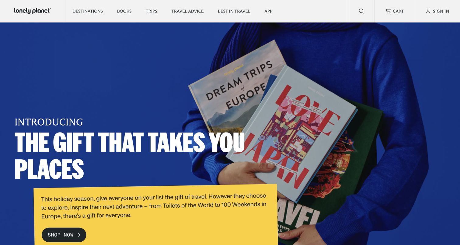
Lonely Planet's captured homepage leads with a vivid blue gift-guide campaign rather than a destination search result. Large white lettering, a photograph of someone holding books and a small yellow copy panel establish an unmistakable publishing offer. The white header above it preserves the broader travel navigation, so the campaign remains part of a recognizable guide platform. The design shows how a content-rich travel brand can temporarily emphasize a seasonal retail task without discarding its editorial identity. That distinction matters when studying a documented search association: the visible promotion describes the homepage's priorities, not the capabilities or performance of the search service behind the property.
What you can learn
Keep evergreen destination discovery stable when seasonal merchandising takes the hero position. A visitor planning a trip and a visitor buying a gift arrive with different questions. Clear navigation should let each continue without first interpreting the other audience's campaign.
Pros
Strong color blocking makes the seasonal message immediately recognizable.
The header preserves a separate route into travel content.
Cons & considerations
The large gift promotion delays destination-specific information.
Several contrasting text treatments compete within the same campaign.
Visible tech stack
Earlier / documented evidence
Typesense
Platform source: Primary scoped Typesense search association. The versioned Typesense showcase lists Lonely Planet as a public website use case. Documentary association with the named public website and its search use case. The versioned showcase is not a current runtime scan or a dated implementation record. No claim is made about the entire frontend, private systems, backend architecture, or a Typesense version on the captured page. Platform evidence is separate from the direct website screenshot and is not a complete current infrastructure audit.
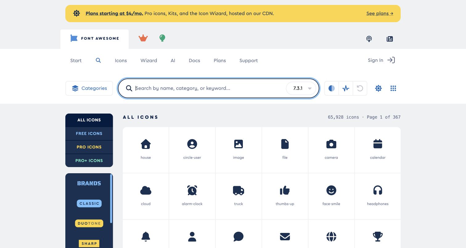
Font Awesome's icon-search page puts the working interface ahead of a general product introduction. A broad search field sits above a grid of named icons, while the dark filter column separates access levels and style choices from the results themselves. Each small preview has room to be recognized as a shape before its label is read. The pale main canvas keeps the dense catalog from feeling like a solid wall of symbols. A promotional strip and navigation still occupy the top edge, but the purpose of the page remains clear. This is the precise public icon-search property described in the vendor's migration account, rather than a related company blog.
What you can learn
For visual search, support recognition and vocabulary at the same time. Show a consistent preview size, keep meaningful labels close, and make the active constraints understandable. Filters should explain why an otherwise plausible asset may be outside the current result set.
Pros
Consistent icon previews make neighboring results easy to compare.
The sidebar gives access and style constraints a dedicated location.
Cons & considerations
Numerous style choices require some familiarity with the product taxonomy.
Promotional messaging adds another layer above an already dense interface.
Platform source: Primary scoped Typesense search association. Typesense reports the migration of fontawesome.com icon search from Algolia to a self-hosted Typesense service and links the public search interface. Documentary association with the named public website and its search use case. The versioned showcase is not a current runtime scan or a dated implementation record. No claim is made about the entire frontend, private systems, backend architecture, or a Typesense version on the captured page. Platform evidence is separate from the direct website screenshot and is not a complete current infrastructure audit.
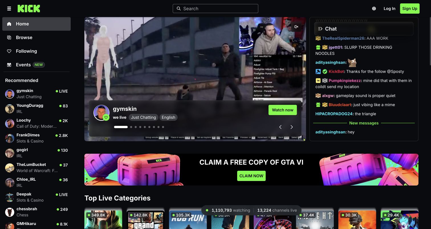
Kick's public homepage uses a dark interface and bright green branding to frame a live-content experience. A central search box anchors the header, recommended channels form a left rail, and the featured stream takes most of the main canvas. The adjacent conversation panel belongs to that featured experience, while category choices begin below it. This composition makes the platform feel active before the visitor has chosen a creator. It also demonstrates the pressure on discovery controls when video, recommendations and conversation all compete for attention. The captured page was publicly accessible; the review does not assess account features, stream moderation or the quality of personalized recommendations.
What you can learn
Give visitors who know a creator's name a direct route that remains distinct from editorial recommendations. For exploratory browsing, use legible categories and recognizable channel information. A live feature should invite attention without making the rest of the catalog difficult to locate.
Pros
The centered search field is separate from individual stream controls.
Channel recommendations provide alternatives alongside the featured content.
Cons & considerations
Video and conversation create several simultaneous centers of attention.
The dark, dense opening leaves little space for explanatory onboarding.
Visible tech stack
Earlier / documented evidence
Typesense
Platform source: Primary scoped Typesense search association. The versioned Typesense showcase lists Kick as a public website use case. Documentary association with the named public website and its search use case. The versioned showcase is not a current runtime scan or a dated implementation record. No claim is made about the entire frontend, private systems, backend architecture, or a Typesense version on the captured page. Platform evidence is separate from the direct website screenshot and is not a complete current infrastructure audit.
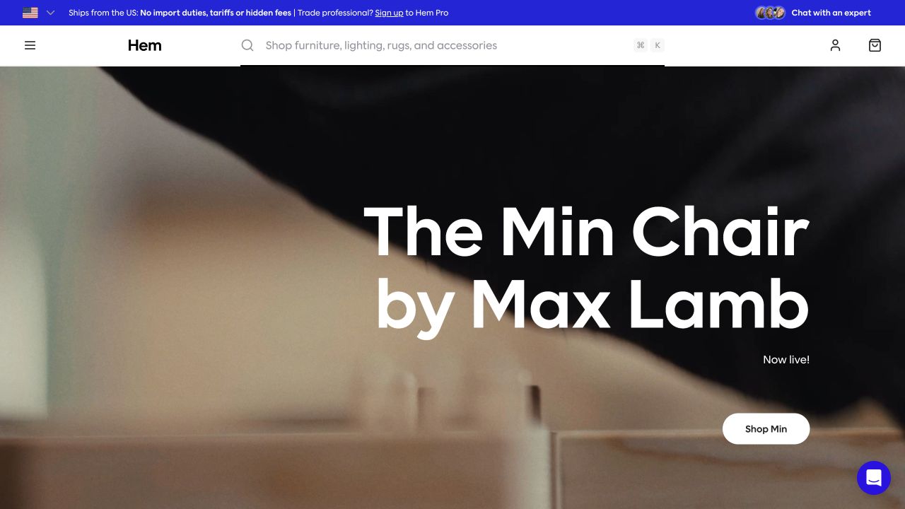
Hem's retained regional storefront capture is dominated by a close view of a chair. The image becomes the background for a large white product title, with a compact shopping action kept nearby. Above it, a broad search field explicitly names furniture, lighting, rugs and accessories, doing useful explanatory work that the abstract product photograph cannot. A thin blue notice strip introduces trade and delivery context without becoming another large campaign block. The result is an unusually economical combination of expressive photography and functional catalog language. It is a design reference for furniture discovery, while the separately dated evidence records the limits of the documented Typesense association.
What you can learn
A minimal storefront still needs concrete vocabulary. Let campaign photography communicate material and character, but use navigation and search labels to tell visitors what the catalog contains. Keep delivery or professional purchasing information available without allowing it to obscure the product story.
Pros
The descriptive search placeholder makes the merchandise range understandable.
A single product title preserves a strong visual hierarchy.
Cons & considerations
The close crop provides limited context for scale or dimensions.
White text over photography depends on careful image selection and cropping.
Platform source: Primary scoped Typesense search association. The versioned Typesense showcase lists Hem as a public website use case. Documentary association with the named public website and its search use case. The versioned showcase is not a current runtime scan or a dated implementation record. No claim is made about the entire frontend, private systems, backend architecture, or a Typesense version on the captured page. Platform evidence is separate from the direct website screenshot and is not a complete current infrastructure audit.
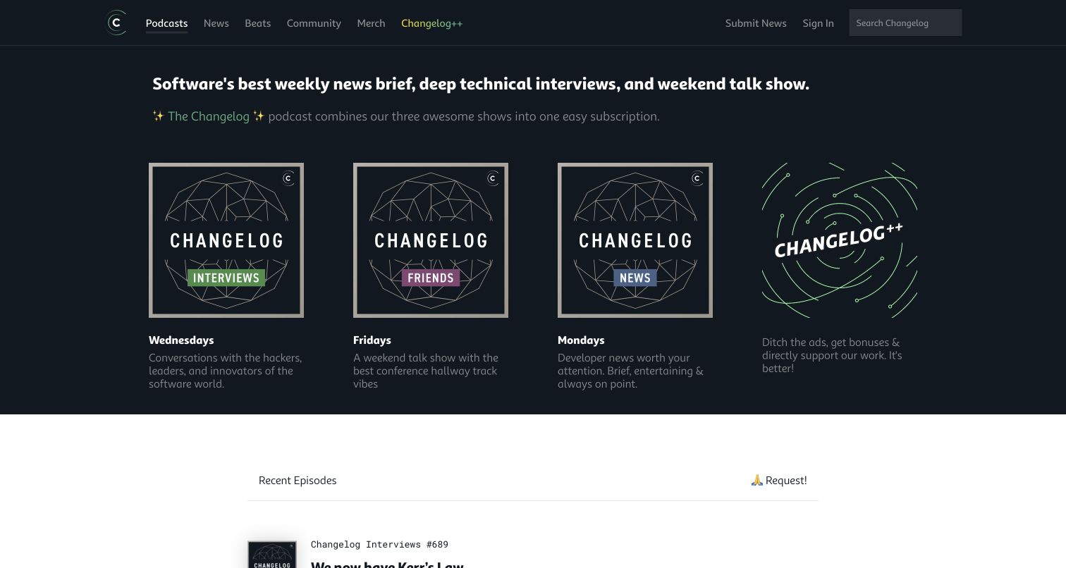
Changelog's retained homepage capture gives each podcast a recognizable visual identity inside a consistent four-card arrangement. The dark opening area presents the publication's developer focus, while show artwork and schedule information help readers distinguish recurring series. A lighter recent-episodes section begins below, creating a clear transition from choosing a show to finding an individual installment. Search remains available in the header rather than competing with every card. The current public footer separately credits Typesense for search, providing a more specific association than a generic customer logo. The screenshot is older than that source observation, and neither establishes how every archive query is ranked.
What you can learn
Use series identity and individual content metadata for different discovery tasks. Someone may remember a show, a guest or a topic; navigation should accommodate those entry points without repeating the same information everywhere. Preserve a dependable search route as the archive grows.
Pros
Distinct artwork makes recurring shows easier to recognize.
The tonal section change clarifies the move from shows to episodes.
Cons & considerations
Multiple branded shows require visitors to learn their editorial differences.
The opening cards leave limited space for detailed episode descriptions.
Platform source: Primary scoped Typesense search association. The current public Changelog footer links its Search credit directly to typesense.org; the same public property also appears in the versioned vendor showcase. Current public footer attribution for search, not a network trace, complete backend inventory or proof about every interface feature. The older screenshot and broad-audit dates are preserved separately. Platform evidence is separate from the direct website screenshot and is not a complete current infrastructure audit.
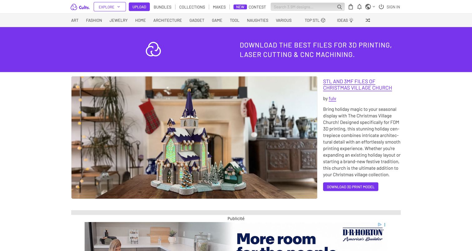
Cults 3D's English public page pairs a large featured model image with a concise descriptive panel. The purple identity strip and broad category navigation keep the marketplace recognizable above the feature, and search sits in the upper shopping and discovery area. The captured Christmas church model gives a visitor something concrete to inspect before moving into a wider library. This is useful for studying a marketplace where visual appeal and practical file selection must coexist. The page also contains commercial placements below the main feature, so the visual hierarchy has to distinguish editorial emphasis from other material. No download, purchase or printability assessment was performed.
What you can learn
Make a visual model easy to discover, then provide the practical information needed to judge suitability. Category vocabulary and search should complement attractive previews. A striking render can invite inspection, but it cannot replace clear file, licensing and production details on the destination page.
Pros
The large model preview provides an immediate visual reference.
Category navigation offers an alternative to knowing a precise model name.
Cons & considerations
The featured seasonal design represents only a small catalog segment.
Commercial placements add competing material around the discovery experience.
Visible tech stack
Earlier / documented evidence
Typesense
Platform source: Primary scoped Typesense search association. The versioned Typesense showcase includes Cults 3D and its search migration account; the reviewed public English site is /en. Documentary association with the named public website and its search use case. The versioned showcase is not a current runtime scan or a dated implementation record. No claim is made about the entire frontend, private systems, backend architecture, or a Typesense version on the captured page. Platform evidence is separate from the direct website screenshot and is not a complete current infrastructure audit.
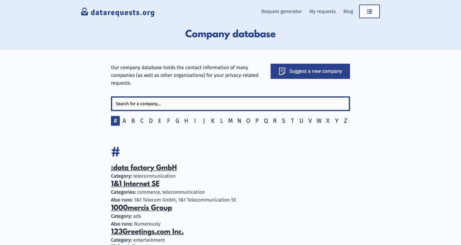
The datarequests.org company database places the purpose of the directory before decoration. A pale blue header and dark heading introduce text, a broad search field and an alphabetical index. Company rows expose names, aliases and category context in a format that can be scanned without opening a series of image cards. A separate suggestion action invites maintenance of the database while leaving the primary finding task intact. The official Typesense showcase identifies this exact company-database path as the search use case. The capture concerns public discovery only; it does not demonstrate submitting a privacy request or verify the accuracy of every listed contact.
What you can learn
For a reference database, prioritize identifying information and predictable scanning. Provide an alternative browsing route for people uncertain about spelling, and distinguish maintaining the directory from using it. Search is most useful when each result contains enough context to recognize the intended organization.
Pros
The large field makes the primary finding task unambiguous.
Alphabetical browsing offers a simple alternative to typing a query.
Cons & considerations
Long text lists demand careful reading when company names resemble each other.
The spare presentation provides little visual help for unfamiliar organizations.
Platform source: Primary scoped Typesense search association. The versioned Typesense showcase explicitly identifies the public company-database search at datarequests.org/company/. Documentary association with the named public website and its search use case. The versioned showcase is not a current runtime scan or a dated implementation record. No claim is made about the entire frontend, private systems, backend architecture, or a Typesense version on the captured page. Platform evidence is separate from the direct website screenshot and is not a complete current infrastructure audit.
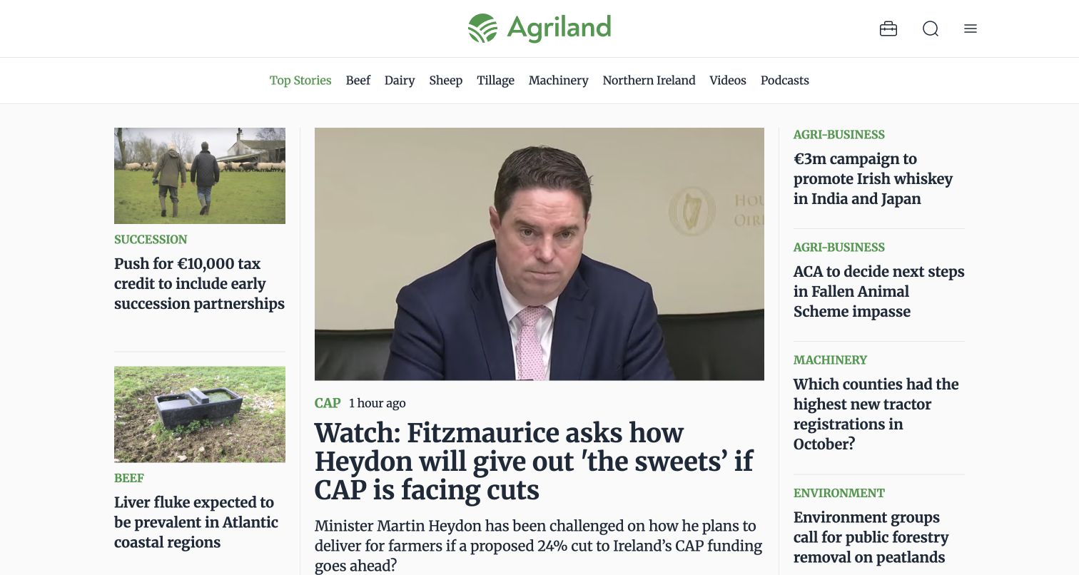
Agriland's public homepage uses a familiar news hierarchy: a compact masthead, a horizontal band of agricultural topics and a central lead story flanked by smaller reports. Green category labels repeat across the page, linking the brand color to useful editorial context. The lead image distinguishes the main story without overwhelming surrounding headlines. This arrangement supports a specialist publication whose returning readers may scan for a sector as often as a particular story. The screenshot records an opening news view, while the Typesense showcase documents the website association separately. It does not establish archive completeness, ranking behavior or the freshness of every article.
What you can learn
Give a specialist news archive stable topic language that also appears in current coverage. Readers should recognize the same subjects in navigation, story labels and discovery tools. Reserve the strongest visual treatment for a deliberate lead rather than giving every headline equal emphasis.
Pros
Repeated green category labels add useful context to compact stories.
The central lead and side columns create a clear editorial order.
Cons & considerations
Several adjacent headlines make the opening view relatively dense.
Small story summaries offer limited context before a reader opens an article.
Visible tech stack
Earlier / documented evidence
Typesense
Platform source: Primary scoped Typesense search association. The versioned Typesense showcase lists Agriland as a public website use case. Documentary association with the named public website and its search use case. The versioned showcase is not a current runtime scan or a dated implementation record. No claim is made about the entire frontend, private systems, backend architecture, or a Typesense version on the captured page. Platform evidence is separate from the direct website screenshot and is not a complete current infrastructure audit.
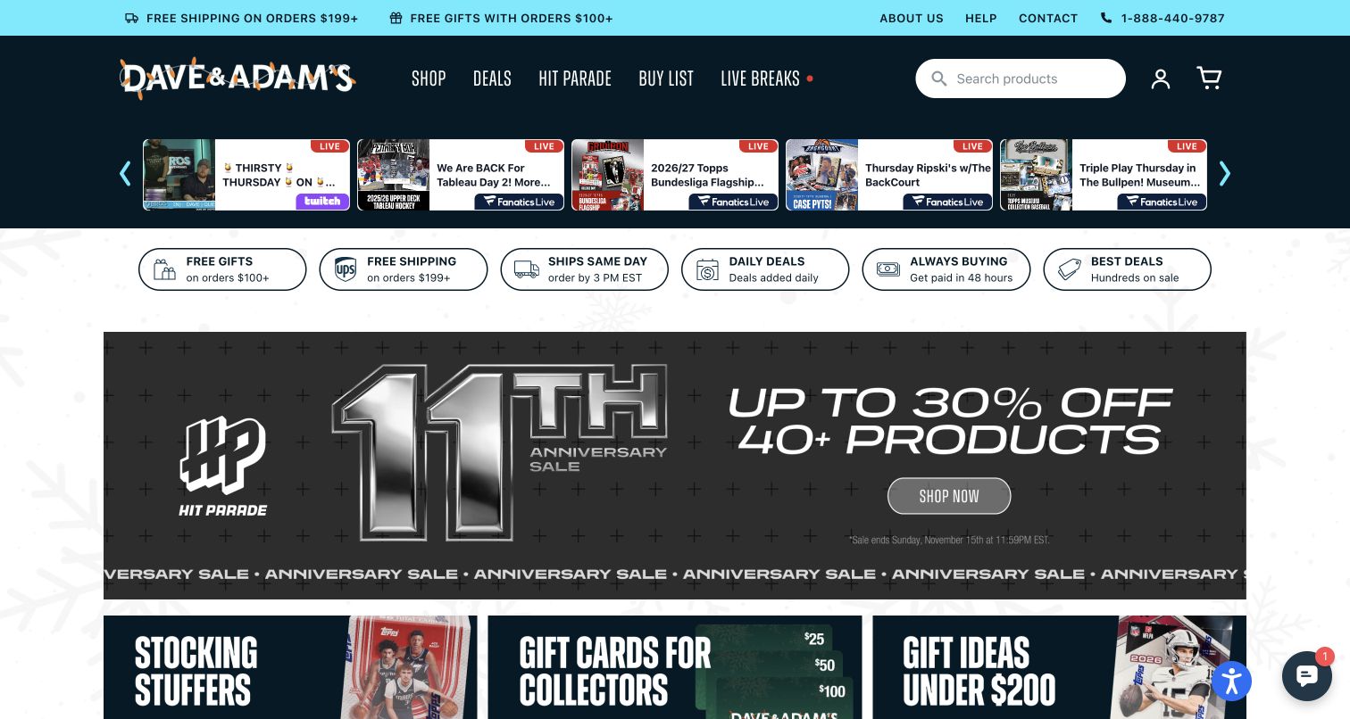
Dave and Adams Card World's storefront places a product-search field within a dark branded navigation band, with a cyan utility strip above it. A row of livestream tiles introduces another shopping format before the main promotional area, and compact service badges provide shipping or trust context. The large Hit Parade campaign then takes over the central canvas. This layered arrangement reflects a catalog where familiar buyers may arrive for a specific release while others respond to events or gifts. The screenshot was captured after ordinary promotional and chat notices were dismissed. It shows the storefront's discovery hierarchy, not the availability of products, payment behavior or authenticity verification.
What you can learn
Keep precise product finding accessible even when promotions multiply. Collectibles often have similar names across years, editions and formats, so the destination results need distinguishing metadata. Give live events their own visual treatment without allowing them to hide the core merchandise search.
Pros
The search field remains visible above the main campaign area.
Livestream tiles are grouped separately from the larger merchandising feature.
Cons & considerations
Several promotional layers compete before individual product details appear.
Compact service badges cannot explain all purchasing conditions at a glance.
Visible tech stack
Earlier / documented evidence
Typesense
Platform source: Primary scoped Typesense search association. The versioned Typesense showcase lists Dave and Adams Card World as a public website use case. Documentary association with the named public website and its search use case. The versioned showcase is not a current runtime scan or a dated implementation record. No claim is made about the entire frontend, private systems, backend architecture, or a Typesense version on the captured page. Platform evidence is separate from the direct website screenshot and is not a complete current infrastructure audit.
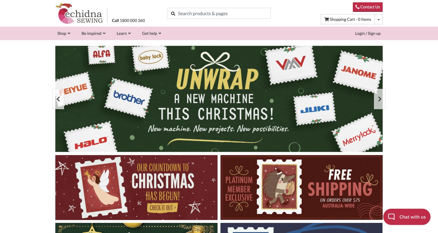
Echidna Sewing's homepage centers a generous product-search field in a practical white header. Contact and basket controls sit nearby, while a pale pink navigation band separates shopping from inspiration, learning and help. Below that structure, a large seasonal machine promotion uses a green field and product imagery to draw attention, followed by smaller campaign tiles. The useful distinction is between the stable specialist navigation and the changing merchandising message. A visitor who knows a machine name has a direct starting point, while someone seeking guidance has a visible alternative. The capture does not assess compatibility advice, stock status or any transaction, and the vendor association remains separately scoped.
What you can learn
Specialist retailers should make product lookup and product education equally understandable. Use a descriptive search entry for known items, then label learning and help routes plainly. Do not expect a promotional photograph to answer the technical questions that influence an equipment purchase.
Pros
A wide search field gives precise product lookup a strong position.
Learning and support have explicit navigation labels beside shopping.
Cons & considerations
The seasonal campaign delays detailed comparisons between machines.
Several promotional tiles can fragment attention below the main feature.
Visible tech stack
Earlier / documented evidence
Typesense
Platform source: Primary scoped Typesense search association. The versioned Typesense showcase lists Echidna Sewing as a public website use case. Documentary association with the named public website and its search use case. The versioned showcase is not a current runtime scan or a dated implementation record. No claim is made about the entire frontend, private systems, backend architecture, or a Typesense version on the captured page. Platform evidence is separate from the direct website screenshot and is not a complete current infrastructure audit.
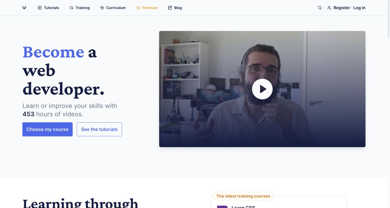
Grafikart's public homepage combines a large developer-learning headline with a video-style instructor preview. The restrained white and lavender palette surrounds distinct routes into tutorials, training, curriculum, premium access and the blog. Search is available in the same header. The captured browser displayed translated English text, so the review focuses on layout and hierarchy rather than treating that wording as the site's original French copy. A visible teaching-hours figure acts as an invitation to explore, but it is not an independent quality measure. The page is useful as a reference for making a technical catalog feel personal without hiding its subject structure.
What you can learn
Let learners choose between following a structured path and locating one specific explanation. An instructor image can establish a human presence, but navigation needs to explain the available formats. Keep promotional membership options distinguishable from the basic route into useful learning material.
Pros
The instructor preview gives the technical offer a recognizable human presence.
Separate tutorial and curriculum routes support different learning intentions.
Cons & considerations
Several learning labels require visitors to understand the format differences.
The hero offers little detail about an individual lesson before navigation.
Platform source: Primary scoped Typesense search association. The versioned Typesense showcase lists Grafikart as a public website use case. Documentary association with the named public website and its search use case. The versioned showcase is not a current runtime scan or a dated implementation record. No claim is made about the entire frontend, private systems, backend architecture, or a Typesense version on the captured page. Platform evidence is separate from the direct website screenshot and is not a complete current infrastructure audit.
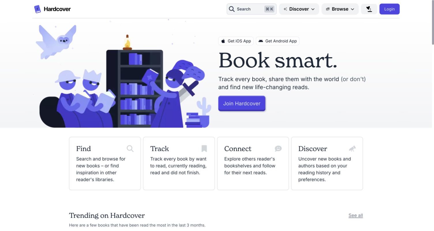
Hardcover's homepage places a purple illustration of readers opposite a large Booksmart headline and a clear account invitation. Four compact feature cards below separate finding, tracking, connecting and discovering books, turning a broad reading product into recognizable tasks. Search, discovery and browsing remain available in the public navigation. Opening Search during review produced a public panel with book, author and other catalog categories without requiring login, which helps distinguish this example from a private application-only association. The screenshot itself shows the introductory page. It does not test personal tracking, social features or the quality of recommendations, and no account was created during the review.
What you can learn
Explain personal benefits without hiding public discovery behind the registration message. A reading service can make its catalog useful before asking someone to maintain a profile. Give each major task a plain label, and keep search categories understandable as the collection expands.
Pros
The four task cards break a broad product promise into concrete activities.
Public search is reachable independently of the main account invitation.
Cons & considerations
The large introductory artwork pushes detailed book information lower.
Several overlapping discovery labels may need explanation for first-time visitors.
Visible tech stack
Earlier / documented evidence
Typesense
Platform source: Primary scoped Typesense search association. The versioned Typesense showcase lists Hardcover as a public website use case. Documentary association with the named public website and its search use case. The versioned showcase is not a current runtime scan or a dated implementation record. No claim is made about the entire frontend, private systems, backend architecture, or a Typesense version on the captured page. Platform evidence is separate from the direct website screenshot and is not a complete current infrastructure audit.
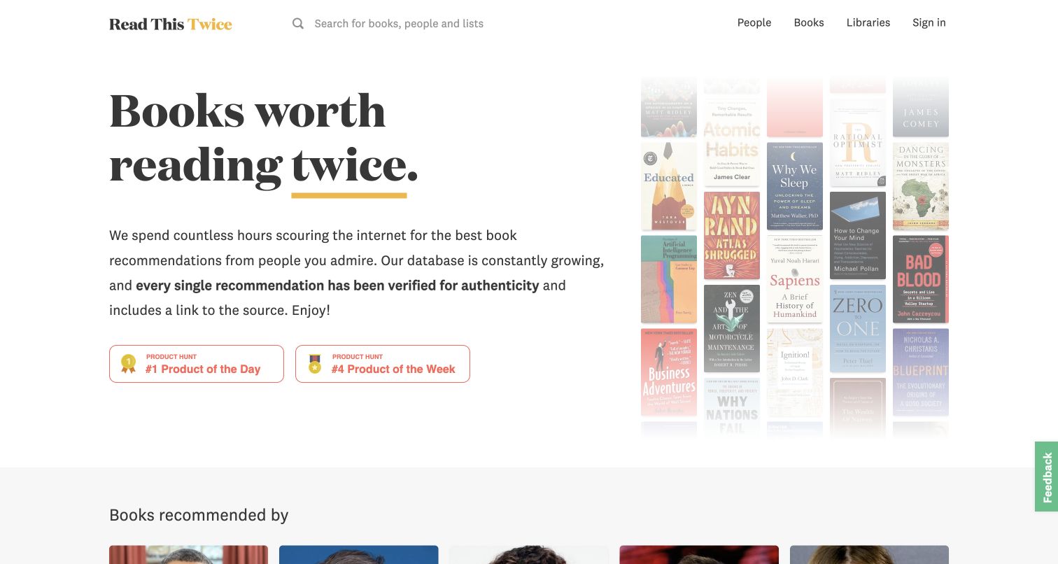
Read This Twice presents a large black serif heading on a spacious white background, with a yellow underline adding emphasis and a collage of book covers providing immediate subject recognition. The nearby explanation describes the site's approach to recommendations, while the header separates people, books and libraries and retains search. Featured people begin below, making the relationship between a recommender and a book part of the discovery model. Product badges supplement the editorial explanation. The official showcase specifically associates Typesense with book and people search. This review considers the visible organization; it does not independently verify every recommendation or endorsement in the database.
What you can learn
When recommendations depend on who suggested an item, make that relationship legible. Let people explore both the object and its source, with clear routes between them. A memorable editorial promise should lead to transparent context rather than asking visitors to trust a cover collage alone.
Pros
Book covers communicate the subject immediately without long introductory copy.
People and books have distinct navigation routes for different discovery habits.
Cons & considerations
Recommendation credibility requires more detail than the opening claim provides.
Decorative cover placement reveals little about individual books before exploration.
Platform source: Primary scoped Typesense search association. The versioned Typesense showcase specifically identifies book and people search on Read This Twice. Documentary association with the named public website and its search use case. The versioned showcase is not a current runtime scan or a dated implementation record. No claim is made about the entire frontend, private systems, backend architecture, or a Typesense version on the captured page. Platform evidence is separate from the direct website screenshot and is not a complete current infrastructure audit.
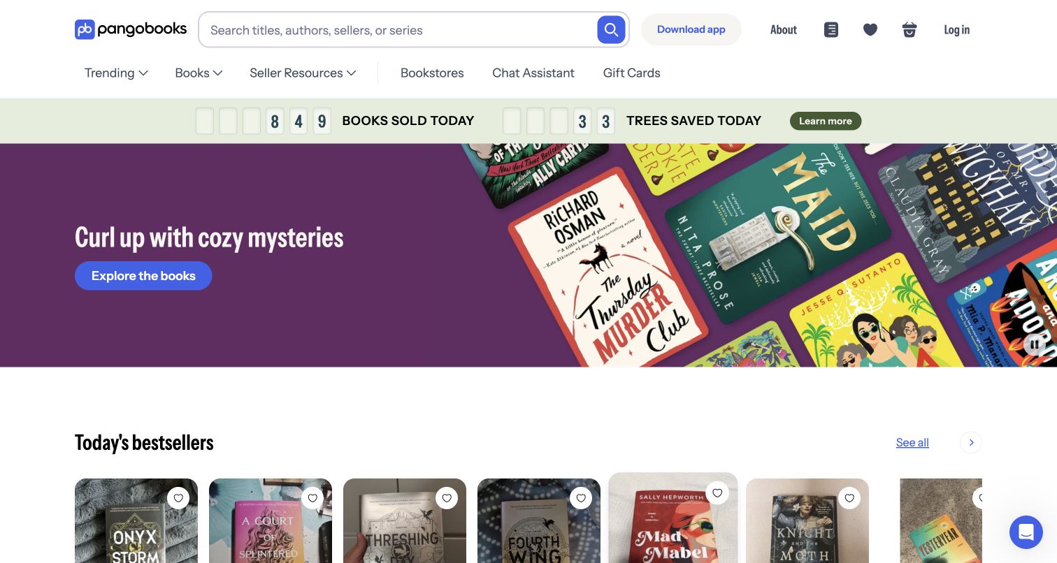
PangoBooks puts a broad search field inside a spacious header, with book-related navigation immediately below. A pale green activity strip introduces marketplace context, while a large purple cozy-mystery campaign gives the main area a clear browsing theme. Bestseller covers begin beneath that feature, bridging the campaign and individual listings. The combination serves visitors with a title in mind and readers open to recommendations. Optional cookies were declined before the capture. The displayed activity messaging is the site's own presentation, not an independently verified transaction metric, and the review does not assess sellers, listing condition or checkout behavior.
What you can learn
Keep title and author lookup available alongside genre-led discovery. A marketplace also needs listing details that distinguish different copies of the same book. Treat the campaign as an invitation to browse, then make condition, edition and seller context clear at the point of comparison.
Pros
The large search field supports a direct route to a known book.
Themed merchandising and visible covers offer an accessible browsing alternative.
Cons & considerations
Marketplace activity messaging competes with the main discovery hierarchy.
The opening campaign cannot explain differences between individual sellers or copies.
Platform source: Primary scoped Typesense search association. The versioned Typesense showcase lists PangoBooks as a public website use case. Documentary association with the named public website and its search use case. The versioned showcase is not a current runtime scan or a dated implementation record. No claim is made about the entire frontend, private systems, backend architecture, or a Typesense version on the captured page. Platform evidence is separate from the direct website screenshot and is not a complete current infrastructure audit.
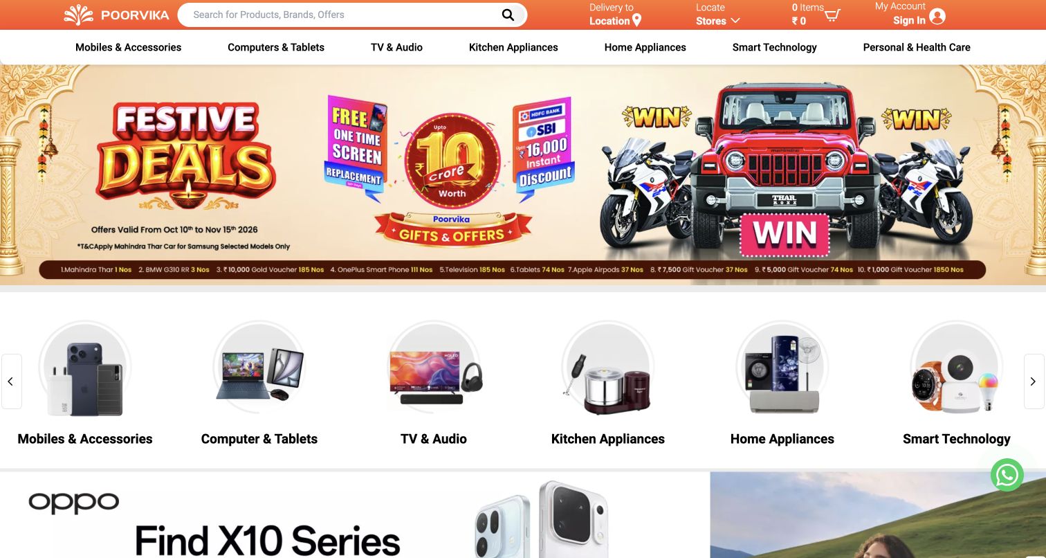
Poorvika's public storefront uses an orange header to anchor its search field, delivery context, store access and basket controls. Product categories sit directly below, followed by a large festive promotion and a row of illustrated category shortcuts. Another mobile promotion begins farther down the captured view. Shoppers have several catalog entry points, with search the most stable utility among changing offers. Its density is also the main design tradeoff: multiple colors, product images and purchase cues ask for attention together. No location permission, account access or purchase was used to produce the screenshot, and the review does not verify promotional availability.
What you can learn
When electronics campaigns change frequently, keep category vocabulary and product lookup predictable. Search results need to distinguish model, capacity and other meaningful variants. Let promotions introduce an offer while preserving a clear route to the practical specifications needed to compare similar devices.
Pros
Search receives a large, consistently placed area in the header.
Illustrated category shortcuts provide a quick alternative to typing model names.
Cons & considerations
Stacked promotional modules make the opening view visually crowded.
Campaign emphasis leaves limited space for detailed technical comparison.
Platform source: Primary scoped Typesense search association. The versioned Typesense showcase lists Poorvika as a public website use case. Documentary association with the named public website and its search use case. The versioned showcase is not a current runtime scan or a dated implementation record. No claim is made about the entire frontend, private systems, backend architecture, or a Typesense version on the captured page. Platform evidence is separate from the direct website screenshot and is not a complete current infrastructure audit.
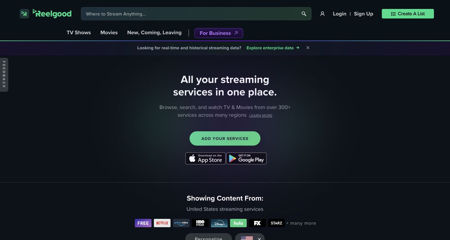
Reelgood's public United States page places a broad streaming search in a dark teal header, with separate navigation for television, films and availability-oriented collections. The hero explains the aggregation idea in large type, followed by an invitation to add services and badges for its mobile apps. Provider icons begin below the introduction, making the participating-service concept visible. The regional context is explicit, which matters for a discovery tool where availability can differ by market. The screenshot shows the public opening after the root redirected to the United States path. It does not verify any title's current availability or test personal tracking and provider-account connections.
What you can learn
Explain the scope of a discovery tool before asking visitors to rely on its results. Keep region and service context understandable, and separate title lookup from setting personal preferences. Availability labels should communicate meaningful differences without suggesting that every listed title is included in every subscription.
Pros
The broad header search gives known-title discovery a clear starting point.
Region and provider context help explain the boundaries of the catalog.
Cons & considerations
The introductory hero delays specific titles and availability details.
App and service-setup invitations compete with immediate browsing actions.
Visible tech stack
Earlier / documented evidence
Typesense
Platform source: Primary scoped Typesense search association. The versioned Typesense showcase links Reelgood; its public root redirected to the reviewed United States discovery page /us. Documentary association with the named public website and its search use case. The versioned showcase is not a current runtime scan or a dated implementation record. No claim is made about the entire frontend, private systems, backend architecture, or a Typesense version on the captured page. Platform evidence is separate from the direct website screenshot and is not a complete current infrastructure audit.
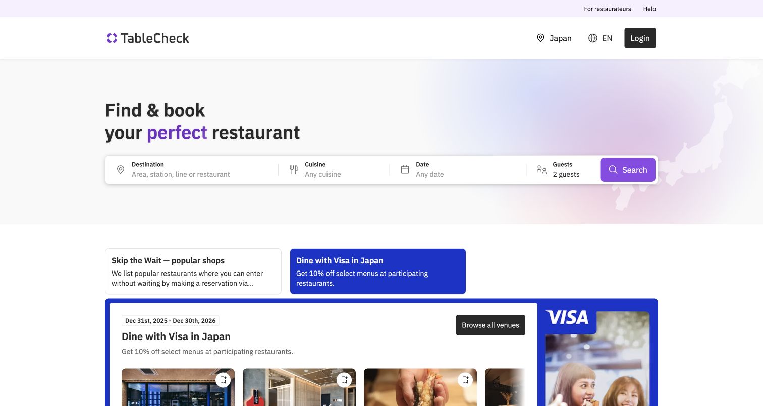
TableCheck's Japan discovery page places the primary task inside a single wide search panel. Destination, cuisine, date and guest count each have a clear label, and the purple Search button closes the sequence. The light background and subtle regional map keep the interface focused without relying on a large restaurant photograph. Promotional sections below introduce offers and venue cards, but they follow the search rather than displacing it. Region, language and login controls remain separate in the header. This search needs more than a keyword to become meaningful. No reservation was made, and the capture does not establish live table availability or booking conditions.
What you can learn
Ask for constraints in an order that matches the visitor's planning process. Give each field an understandable default and keep the submission action visually connected to the group. Promotional content can support discovery after the essential location, timing and party-size questions are clear.
Pros
Separate labels make the search constraints easy to distinguish.
The primary search precedes promotional venue collections in the reading order.
Cons & considerations
The broad control group needs careful adaptation on narrow screens.
Offer-led sections may draw attention away from neutral restaurant comparison.
Platform source: Primary scoped Typesense search association. The versioned Typesense showcase identifies TableCheck restaurant discovery, search and booking; the reviewed public regional directory is /en/japan. Documentary association with the named public website and its search use case. The versioned showcase is not a current runtime scan or a dated implementation record. No claim is made about the entire frontend, private systems, backend architecture, or a Typesense version on the captured page. Platform evidence is separate from the direct website screenshot and is not a complete current infrastructure audit.
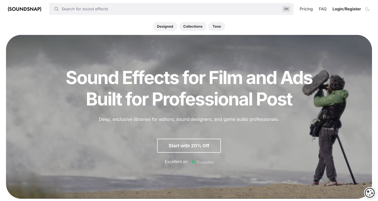
Soundsnap's homepage devotes most of its header width to a descriptive sound-effects search field. Small collection controls sit below, followed by a rounded photographic hero showing a production sound recordist outdoors. Large white text states the professional audience, while a restrained outlined offer button supplies the main campaign action. Pricing, help and account routes remain compact at the top right. The composition establishes the asset type and working context before browsing. Optional cookies were declined for an unobstructed capture. The review considers the public discovery interface, without testing downloads, license terms, audio quality or the availability of particular recordings.
What you can learn
Make asset search specific enough to suggest useful query language. Sound libraries also benefit from browsable categories for people describing a mood or production need rather than an exact filename. Keep subscription offers distinct from the practical task of locating and evaluating suitable material.
Pros
The unusually wide search field makes the library task immediately apparent.
Production imagery gives the professional positioning a concrete visual context.
Cons & considerations
The large hero delays actual sound previews in the opening view.
An offer-led call to action does not explain individual asset suitability.
Platform source: Primary scoped Typesense search association. The versioned Typesense showcase lists Soundsnap as a public website use case. Documentary association with the named public website and its search use case. The versioned showcase is not a current runtime scan or a dated implementation record. No claim is made about the entire frontend, private systems, backend architecture, or a Typesense version on the captured page. Platform evidence is separate from the direct website screenshot and is not a complete current infrastructure audit.
Kegan has 15+ years of experience working with small businesses, Fortune 500 companies, and everything in between. No development job is too big or too small: he brings the same hands-on attention to a focused improvement, a complete website, or a custom application.
For Typesense projects, he can help with responsive interfaces, reusable components, custom functionality, API connections, and performance-minded implementation. He works directly with clients on scope, design, implementation, testing, and handover, with an emphasis on clear communication and a system that remains practical to maintain after launch.
Show 3 other Typesense developersHide other Typesense developers
Choose a Typesense interface around the finding task
Use a focused search for a focused catalog
A compact collection may need one field, a readable result list and a small set of meaningful filters. Define what makes two records different before adding more controls. If visitors can usually identify the right item from a title and one supporting fact, a large interface may introduce unnecessary work. Make empty and unavailable states as understandable as successful results.
Use established widgets where their behavior fits
The Typesense InstantSearch adapter connects established InstantSearch interface widgets to Typesense queries. Review the actual widgets against your project’s labels, keyboard behavior and responsive layout before adopting them. A reusable component can provide useful structure, but it still needs content and interaction decisions that match the catalog. Do not assume that another site’s appearance reveals which frontend library it uses.
Create a custom interface for a specific discovery need
Visual assets, restaurants and technical equipment require different identifying details. A custom result layout can make those details clearer when a generic card is insufficient. Explain the reason for each control and keep the query, active constraints and next action visible. Prototype with realistic records and ask whether someone can recover from an unsuccessful search without starting the whole journey again.
From references to requirements
Plan the data flow and the interface together
Define how the index stays current
Typesense documents several ways to synchronize a primary data source with its search index. Choose an approach that matches how often records change, then include updates and deletions in the plan. A search result leading to an obsolete page or an unavailable item is an interface problem as well as a data problem. Assign someone to investigate delays and failed updates.
Typesense API keys can restrict actions and access to collections or records. Plan those boundaries before connecting a public interface. Administrative credentials belong outside browser code, and private content needs enforceable access rules rather than a hidden link. Keep the public search experience useful without giving it permissions that belong to publishing, indexing or operational tools.
Build a small evaluation set containing exact names, misspellings, broad concepts and queries that should return nothing. Check the information shown in each result, the effect of combined filters and the route back to a broader set. Include loading delays and service failures. The objective is a visitor who can understand what happened and choose a sensible next step, rather than a page that only looks convincing in its default state.
A useful handover demonstration
Ask the actual team to carry out its routine job: publish a realistic update, correct a mistake, preview a narrow screen, and identify who owns an integration failure. For a library or frontend framework, also ask who maintains the content source and deployment. A polished screenshot does not answer those operational questions.
Beyond the screenshot
A practical Typesense website planning checklist
List the main finding tasks and the words visitors use for them.
Define the searchable object and the context needed to recognize each result.
Keep the search entry visible around campaigns and other changing content.
Choose filters that represent meaningful decisions rather than every stored field.
Test exact names, ambiguous phrases, spelling variations and empty results.
Make active constraints clear and provide a simple way to broaden the search.
Keep result links, labels and identifying information understandable on small screens.
Plan source-data updates, deletions and recovery from failed synchronization.
Restrict public search credentials and keep administrative access server-side.
Assign responsibility for relevance decisions, service maintenance and content accuracy.
Test with real content, a keyboard, a small screen, slow or failed requests, and the people who will maintain the system. These are planning checks, not an accessibility, security, performance, or search-ranking certification.
Sources & editorial method
How this Typesense collection was reviewed
Research and editorial review were completed on November 12, 2026. Twenty distinct public website properties have primary documentary Typesense associations. Nineteen appear in the versioned official showcase; Font Awesome’s icon search has a specific vendor migration account, while Changelog additionally credits Typesense in its current public footer. The guide does not assert a current Typesense runtime or complete architecture for every captured page. Four genuine existing captures were visually reviewed and retained with their original dates and source records. Sixteen new desktop screenshots show the actual public pages; normal site controls dismissed promotional or consent overlays and rejected optional cookies where available. No page content was altered. The four prior broad audits retain their dates. Sixteen exact source pages received bounded new audit attempts, including recorded final paths for Cults 3D and Reelgood; the earlier root-path attempts remain in private history. Across the twenty examples, eight audits are checked, two partial, nine unavailable and one robots-excluded. No access controls were bypassed. Reviews describe visible design choices, not measured search performance, transaction behavior or service quality. Accounts, purchases, bookings and private application features were not tested.
Every image is an unmodified capture from the actual website, with its source and capture date. Some captures are reused from our shared catalog; their dates remain the original capture dates. None comes from a vendor gallery or a generated reconstruction. Moving imagery and live content can change.
Technology attribution uses public page assets or metadata, official platform documentation, or a cited first-party project case study. Documentary and framework-relationship evidence is identified where used; it is not a complete current backend inventory. A CMS image CDN alone does not establish a full CMS deployment. A library’s presence does not prove which individual controls use it, and a platform label does not establish AI authorship.
The composition notes, lessons, pros and tradeoffs are original editorial observations. We have not measured conversion, traffic, security, performance or accessibility conformance. Website owners retain their brands and imagery; these examples are not our client portfolio. Written, Edited and Curated are independent records, not dates advanced by a build. See our editorial standards or suggest a correction.
Questions worth asking
Typesense website development FAQs
Does a Typesense website have a particular visual style?
No. Typesense is associated here with search and discovery, while each website makes its own choices about layout, imagery, navigation and presentation. The examples are useful references for those visible choices without attributing every interface element to the search engine.
Are all twenty current Typesense runtimes independently detected?
No. The collection is supported by scoped primary documentary associations, with separate public-source audit attempts. A versioned showcase or migration account does not prove continuous deployment on a later capture date. Each source record preserves that limitation.
Why is Font Awesome represented by its icon-search page?
The primary migration account explicitly concerns icon search on fontawesome.com and links that public interface. A screenshot of the company’s blog would describe a different property, so the collection uses the directly relevant search page.
Can Typesense supply the whole website?
The documented role in this collection is search. Publishing, accounts, commerce and other application responsibilities need their own implementation decisions and evidence. A search association does not identify those systems.
Why do some examples have older screenshot dates?
Four previously captured public pages were inspected and reused. Their original dates state when those images were actually made. New editorial work does not refresh a capture or an earlier public technology observation.
What happens when a public technology audit is blocked?
The failed or excluded attempt remains recorded, and any separately cited documentary evidence keeps its original scope. The guide does not bypass access controls, invent stack entries or treat an unavailable scan as proof that a technology is absent.
Borrow the clear finding tasks, useful catalog language and recognizable result context in these examples. Plan Typesense around your own content and operating needs, and keep documentary associations separate from claims about a website’s current implementation.