Best Joomla Websites of 2026 (20 Real-World Examples)
Twenty public website properties with direct screenshots, original design reviews and individually qualified Joomla project evidence, including historical implementations.
Good Joomla website design turns a large collection of pages into a clear set of visitor journeys. The strongest lessons in these examples concern navigation, editorial structure and useful next steps, whether the documented Joomla implementation is recent or historical.
Joomla combines content publishing with menus, modules and configurable user access. That makes the planning questions concrete: what information belongs together, how should people reach it, and who keeps it accurate? A school, technical supplier, association and visitor business may share a CMS while needing very different page structures. Start with those responsibilities before choosing a visual treatment.
This collection opens with Nintendo’s Swedish regional website, Harvard Griffin GSAS, Notre Dame’s Alliance for Catholic Education, Linux.com and the Guggenheim. These are specific public properties with documented Joomla associations, not claims about every website operated by their parent organizations. Several have changed platforms since their cited case studies. Their current screenshots remain useful design references, while the evidence records keep that history explicit.
Before the examples
What makes good Joomla website development in 2026?
Separate the information hierarchy from the navigation
Articles and categories organize published material, while menus determine how visitors encounter it. A category tree that suits an editorial team may not be a useful main menu. Group related records consistently, then choose navigation labels that answer practical questions. A visitor looking for a course, a research report or a product should not need to understand the organization’s internal departments first.
A menu module places navigation into the page, while its menu items lead to specific destinations. Apply the same discipline to other recurring page elements: each should help someone understand where they are or what to do next. Avoid duplicating a long navigation list in every available position. Repetition is useful when it reinforces orientation; it becomes noise when several controls compete to perform the same task.
Design the publishing responsibilities as well as the page
Joomla’s user system distinguishes groups, access levels and permitted actions. Translate that capability into understandable responsibilities for the people maintaining the site. A contributor may prepare material while another person reviews publication. Public visibility and editing permission are separate decisions. Write down who owns each content area, and make everyday maintenance possible without handing every editor unrestricted administrative access.
The examples span education, public information, specialist services, retail, manufacturing and membership organizations. Each review discusses the actual captured page. Documentary Joomla associations are dated or qualified separately from current public technology observations.
We start with five recognizable brands or organizations: Nintendo Sweden, Harvard Griffin GSAS, Notre Dame Alliance for Catholic Education, Linux.com, Solomon R. Guggenheim Museum. Each attribution applies to the named website property, not every product or website belonging to its organization. This is a curated reading sequence, not a measured ranking.
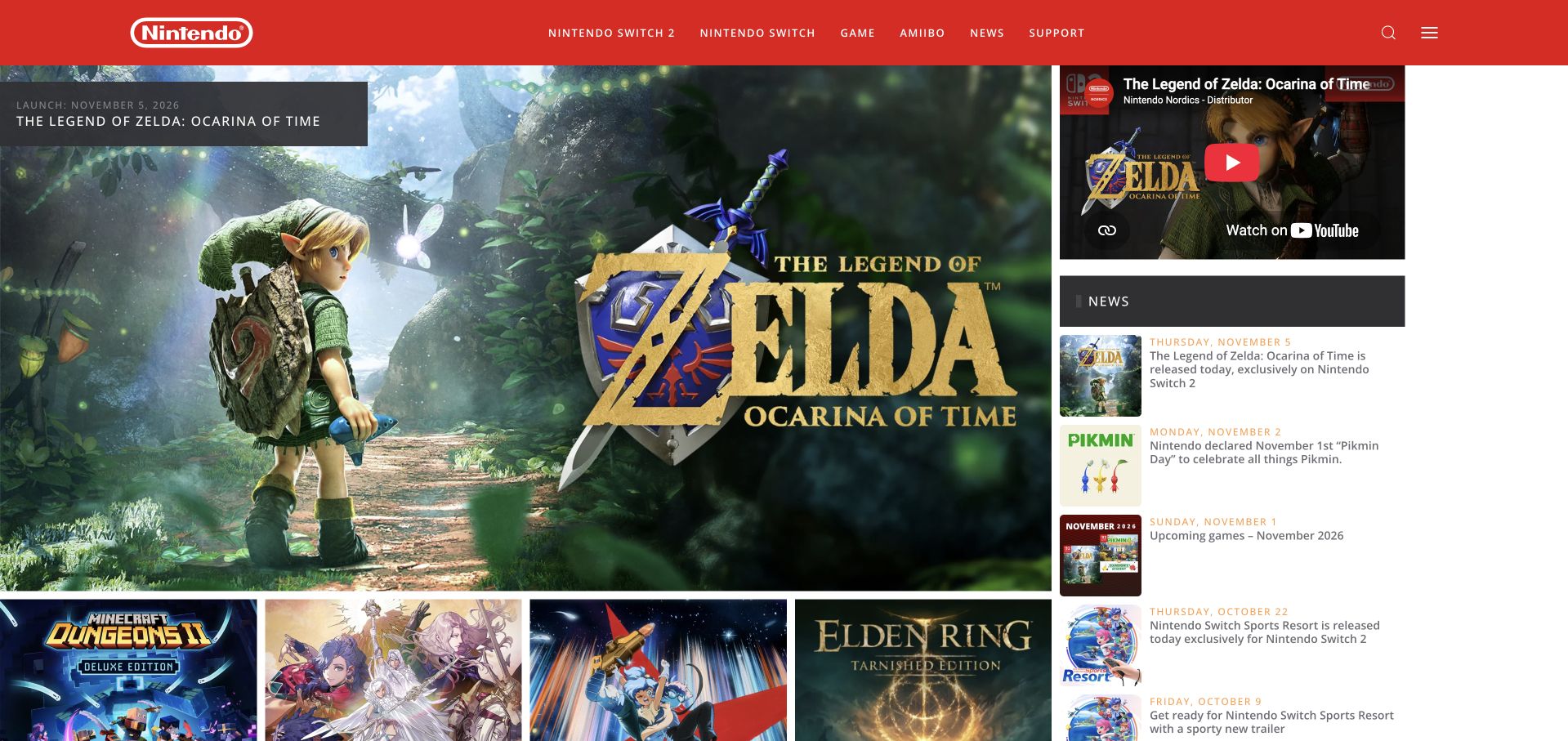
Nintendo Sweden combines its unmistakable red header with a large game feature and an adjacent news column. Smaller game tiles continue the browsing sequence below the opening image, while hardware, games, support and company information have distinct routes. Release labels connect the imagery with a practical publishing schedule. This is Bergsala’s Swedish regional property, documented in Joomla’s 2016 Nordic showcase. The earlier account does not establish the current technology of global Nintendo, consoles, accounts or commerce. The capture reflects the browser’s English translation of the Swedish site.
What you can learn
For a regional brand portal, keep the enduring catalog structure separate from the campaign that changes most often. Visitors should recognize support and product routes immediately, while individual launches can use stronger imagery and a more expressive visual treatment.
Pros
The red navigation band creates continuity across very different game imagery.
An adjacent news column gives returning readers another route beyond the main feature.
Cons & considerations
A large rotating game image can dominate the opening screen at the expense of supporting detail.
Several different release promotions need consistent date and platform labeling to prevent confusion.
Platform source: Official Joomla showcase — creator-submitted project account. Swedish regional property operated by Bergsala, not global Nintendo. 2016 official showcase case. The official Joomla showcase hosts a creator-submitted account for this exact public property. This is documentary implementation evidence, not an inspection of the current hidden backend or an assertion about a current version. No current hidden CMS or private application is inferred from the showcase. Source read November 10, 2026. Platform evidence is separate from the direct website screenshot and is not a complete current infrastructure audit.
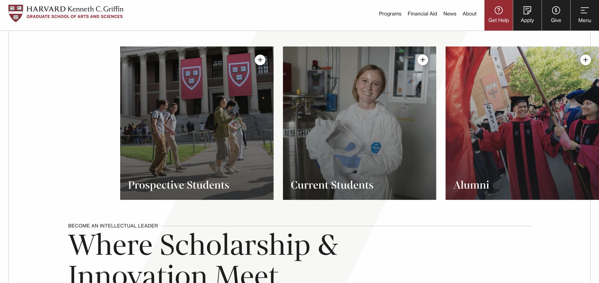
Harvard Griffin GSAS opens with three photographic audience cards beneath a restrained institutional header. Prospective students, current students and alumni each receive an explicit entry point before the large statement about scholarship and innovation. Programs and financial aid remain visible alongside help, application and giving actions. Joomla’s own July 2012 magazine identifies this exact GSAS property as an earlier Joomla example. The current bounded public-source audit identifies Drupal, so the historical association is not presented as today’s implementation or a claim about the whole university.
What you can learn
A university school can reduce navigational friction by letting people identify their relationship to the institution before asking them to understand internal departments. Keep practical tasks in the header and use the body to explain the academic offer after that audience decision.
Pros
Three similarly sized cards make the audience split clear without implying a ranking.
Help, applications and giving have distinct visual treatments within the header.
Cons & considerations
The large audience imagery pushes the main explanatory statement toward the lower edge of the opening view.
An unusually wide composition needs careful adaptation so each audience remains discoverable on smaller screens.
Platform source: Joomla magazine — July 2012 historical property account. 2012 historical GSAS property association, not all Harvard or current CMS. Joomla’s July 2012 magazine is historical documentary evidence for this exact named public property, not a present backend inspection. The November 10, 2026 public-source audit identifies Drupal; Joomla is historical here. Source read November 10, 2026. Platform evidence is separate from the direct website screenshot and is not a complete current infrastructure audit.
Notre Dame’s Alliance for Catholic Education places its program identity beside the university mark, followed by a simple navigation strip. A large graduation image carries the current recruitment message, while initiatives and audience routes appear below. Teachers, school leaders and advocates have separate destinations rather than one undifferentiated application path. The official Joomla magazine documented ACE’s public property in 2012. The current bounded audit identifies Drupal. That distinction is retained, and neither the university’s wider estate nor private teaching and applicant systems are assigned the historical platform.
What you can learn
A university initiative needs enough institutional identity to establish context, but its own programs must remain easy to understand. Pair the shared brand with explicit audience and initiative labels, then let individual campaign images support a specific next step.
Pros
The university and initiative identities are both visible without sharing the same visual weight.
Program, resource, news and jobs routes expose practical reasons to return.
Cons & considerations
The tall identity area and large carousel postpone the audience-specific choices.
Changing promotional slides need clear controls and durable links to the same program information.
Platform source: Joomla magazine — July 2012 historical property account. 2012 historical ACE public property association, not all Notre Dame. Joomla’s July 2012 magazine is historical documentary evidence for this exact named public property, not a present backend inspection. The November 10, 2026 public-source audit identifies Drupal; Joomla is historical here. Source read November 10, 2026. Platform evidence is separate from the direct website screenshot and is not a complete current infrastructure audit.
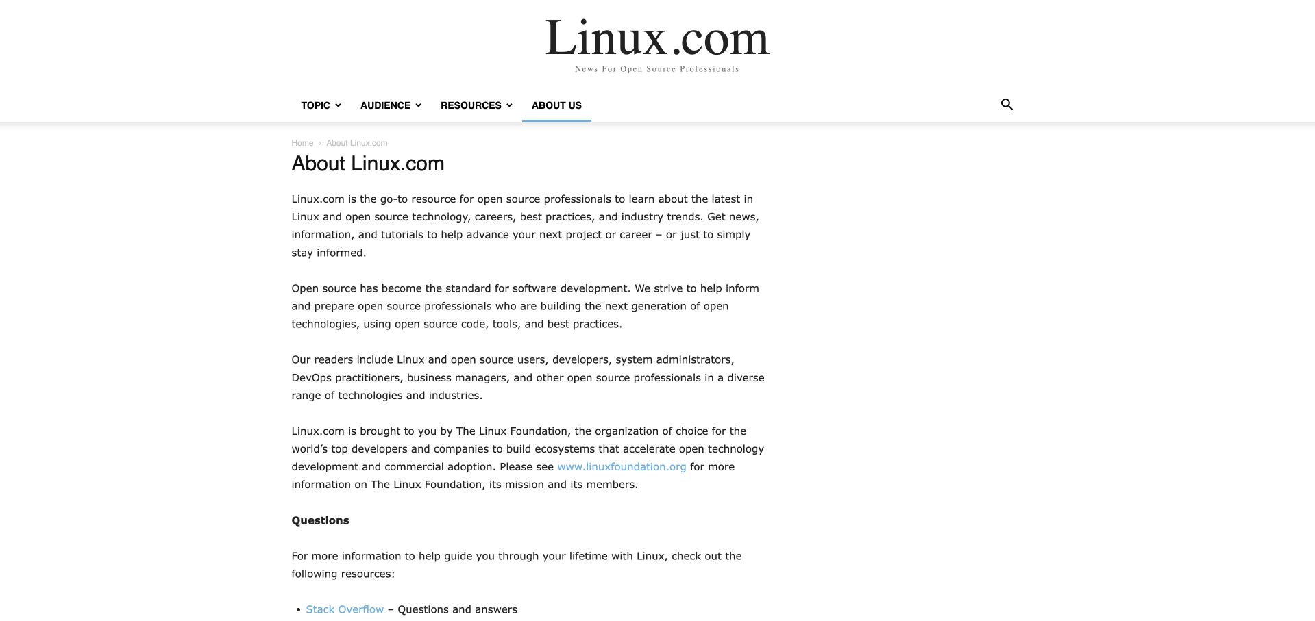
Linux.com’s About page uses a large serif masthead, a compact category bar and a straightforward reading column. Short paragraphs explain its intended readers and identify The Linux Foundation, followed by links to external learning resources. The readable About page is the selected capture because the current homepage exposes unresolved publishing shortcodes. Joomla’s July 2012 magazine documents an earlier Linux.com association; the current public audit and footer identify WordPress. This review concerns the public information page and its limitations, not the operating system or the foundation’s entire web estate.
What you can learn
An About page should tell readers what the publication covers, whom it serves and who stands behind it without requiring a long brand narrative. Keep the text readable, provide useful destinations and treat broken publishing output elsewhere as a maintenance problem to resolve.
Pros
The masthead and short introductory paragraphs establish the publication’s audience clearly.
Resource links offer specific next steps after the explanation of purpose.
Cons & considerations
The main homepage currently exposes shortcodes, weakening the overall editorial presentation.
A long plain-text column could use more section labels to help readers scan its different functions.
Platform source: Joomla magazine — July 2012 historical property account. 2012 historical Linux.com association. Capture readable About page; current homepage exposes shortcodes and current footer credits WordPress. No current Joomla inference. Joomla’s July 2012 magazine is historical documentary evidence for this exact named public property, not a present backend inspection. The November 10, 2026 audit of the actual About page identifies WordPress. Joomla is the earlier 2012 domain-level association; the current homepage exposes unresolved shortcodes and was not selected. Source read November 10, 2026. Platform evidence is separate from the direct website screenshot and is not a complete current infrastructure audit.
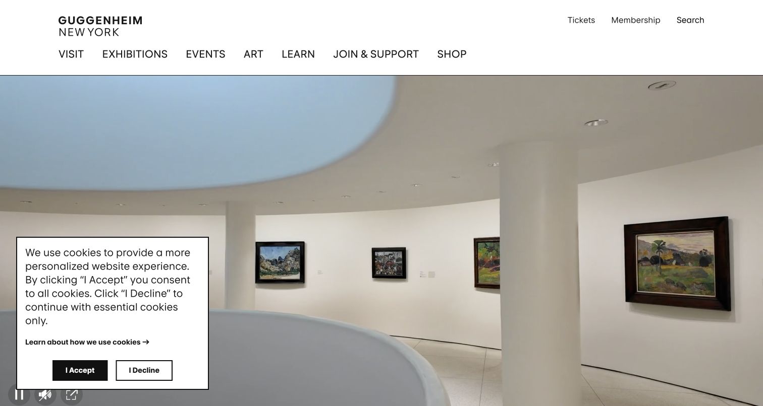
The preserved Guggenheim capture shows the museum’s curved galleries beneath a clean two-level header. Visit, exhibitions, events, art and learning form the principal navigation, while tickets, membership and search occupy a quieter utility row. The architectural imagery establishes a sense of place without placing a large marketing paragraph over the artworks. A cookie panel remains visible in the original November 3 screenshot. Joomla’s July 2012 magazine named this exact property, which is retained as historical documentary evidence rather than a claim about the present museum backend.
What you can learn
A cultural institution can let its spaces and collections establish character while reserving a clear navigation layer for practical tasks. The strongest atmospheric opening still needs visible routes to visiting information, exhibitions and learning resources, with consent choices that do not obscure the whole page.
Pros
The visitor and collection labels are direct and easy to distinguish.
Generous white space separates the institutional identity from the immersive gallery image.
Cons & considerations
The visible privacy panel covers a substantial part of the original opening scene.
A moving architectural background needs accessible controls and a useful static alternative.
Platform source: Joomla magazine — July 2012 historical property account. 2012 historical exact domain association. Reuse actual Nov3 screenshot and retained audit; no new capture date. Joomla’s July 2012 magazine is historical documentary evidence for this exact named public property, not a present backend inspection. The retained November 3, 2026 broad audit identifies WordPress. Its original date and separate webpack dependency evidence are preserved. Joomla is a historical 2012 association. Source read November 10, 2026. Platform evidence is separate from the direct website screenshot and is not a complete current infrastructure audit.
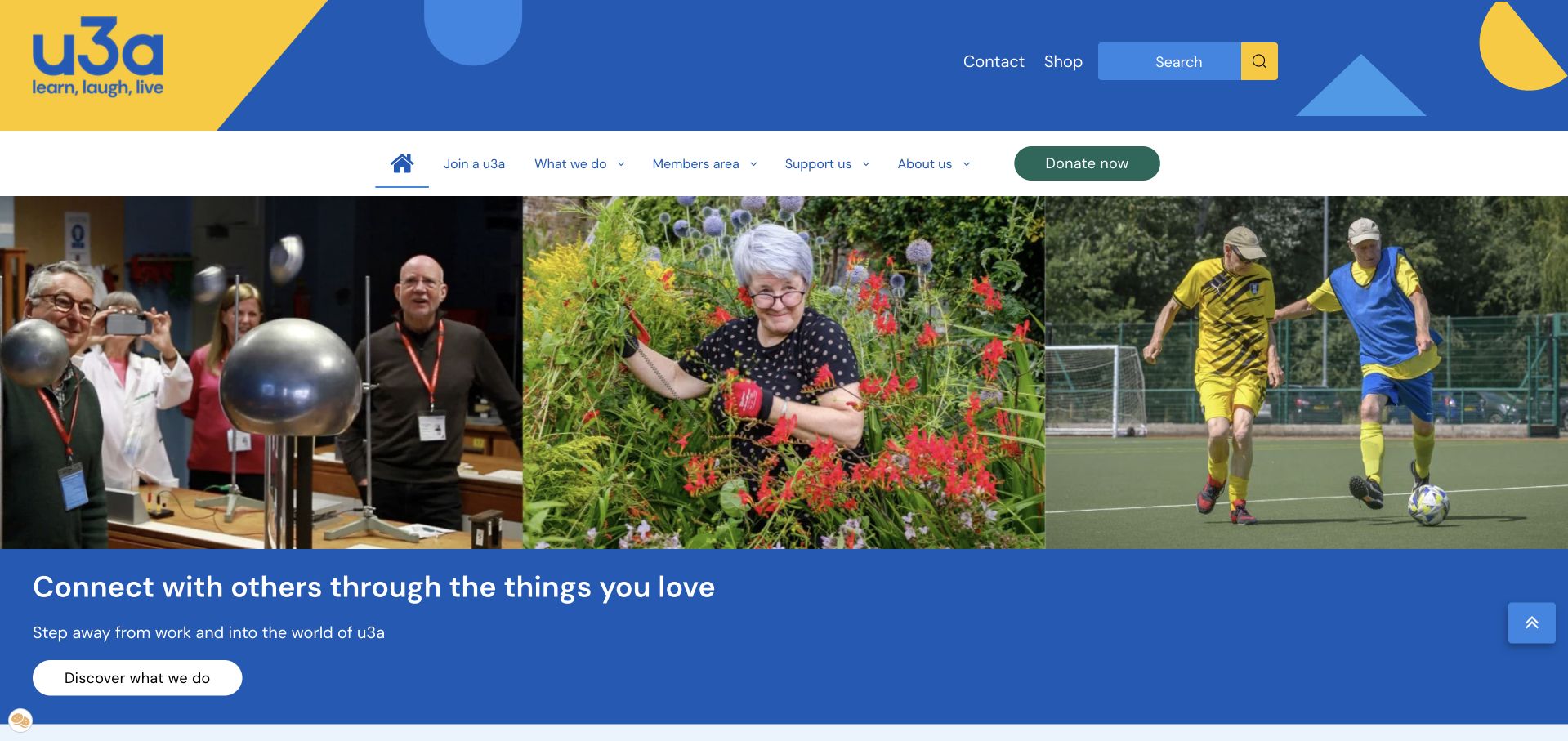
u3a uses a bright blue-and-yellow identity above a three-part image strip showing varied member activities. The opening message emphasizes connection and interests, with one discovery action beneath it. Join, activities, member information and support routes remain clearly separated in the navigation. Lower sections explain local groups, online learning and ways to participate. Its creator-submitted January 2024 Joomla showcase documents this public national website. The account is documentary evidence; it does not establish the technology of every local group, shop or separately linked member service.
What you can learn
A membership organization can explain its value through concrete activities before presenting its administrative structure. Give prospective members a welcoming introduction and an obvious joining route, while preserving a separate path for existing members who already know what they need.
Pros
The activity photographs show several forms of participation within one consistent visual frame.
The navigation distinguishes joining from member resources and organizational information.
Cons & considerations
The large branded header occupies considerable space before the opening message.
Many useful programs appear farther down the page and depend on clear menu grouping to remain findable.
Platform source: Official Joomla showcase — creator-submitted project account. 2024 creator-submitted official showcase account; public national property only. The official Joomla showcase hosts a creator-submitted account for this exact public property. This is documentary implementation evidence, not an inspection of the current hidden backend or an assertion about a current version. No current hidden CMS or private application is inferred from the showcase. Source read November 10, 2026. Platform evidence is separate from the direct website screenshot and is not a complete current infrastructure audit.
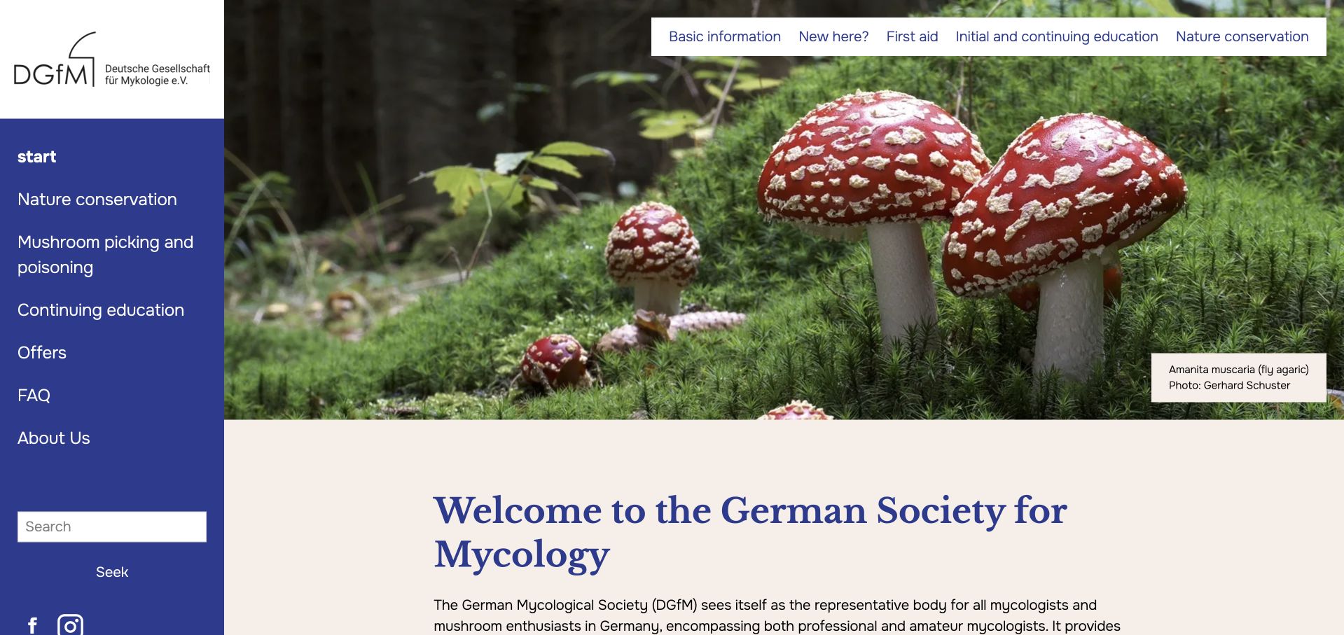
The German Mycological Society combines a persistent left navigation area with a large mushroom photograph and an introductory statement. Topic labels distinguish conservation, mushroom gathering, training and organizational information, while a separate row offers shortcuts into the page’s major sections. The image attribution remains visible. The current page redirects to the German-language /de/ route and is captured in the browser’s English translation. Joomla’s November 2020 showcase documents an earlier implementation of this exact society property; the review does not infer a current hidden CMS or validate mushroom-identification advice.
What you can learn
A specialist society should separate general learning, professional development and urgent public information. A recognizable topic structure helps different readers find the appropriate level of material, while visible authorship and attribution make the educational presentation more accountable and easier to maintain.
Pros
The sidebar keeps the main subject areas visible beside a long page.
Image attribution and section shortcuts provide useful context without dominating the content.
Cons & considerations
A wide sidebar reduces the horizontal space available for reading at intermediate screen sizes.
Large photography and introductory text delay the detailed resources below the opening view.
Visible tech stack
Earlier / documented evidence
Joomla
Platform source: Official Joomla showcase — creator-submitted project account. 2020 creator-submitted official showcase case; public property only. The official Joomla showcase hosts a creator-submitted account for this exact public property. This is documentary implementation evidence, not an inspection of the current hidden backend or an assertion about a current version. No current hidden CMS or private application is inferred from the showcase. Source read November 10, 2026. Platform evidence is separate from the direct website screenshot and is not a complete current infrastructure audit.
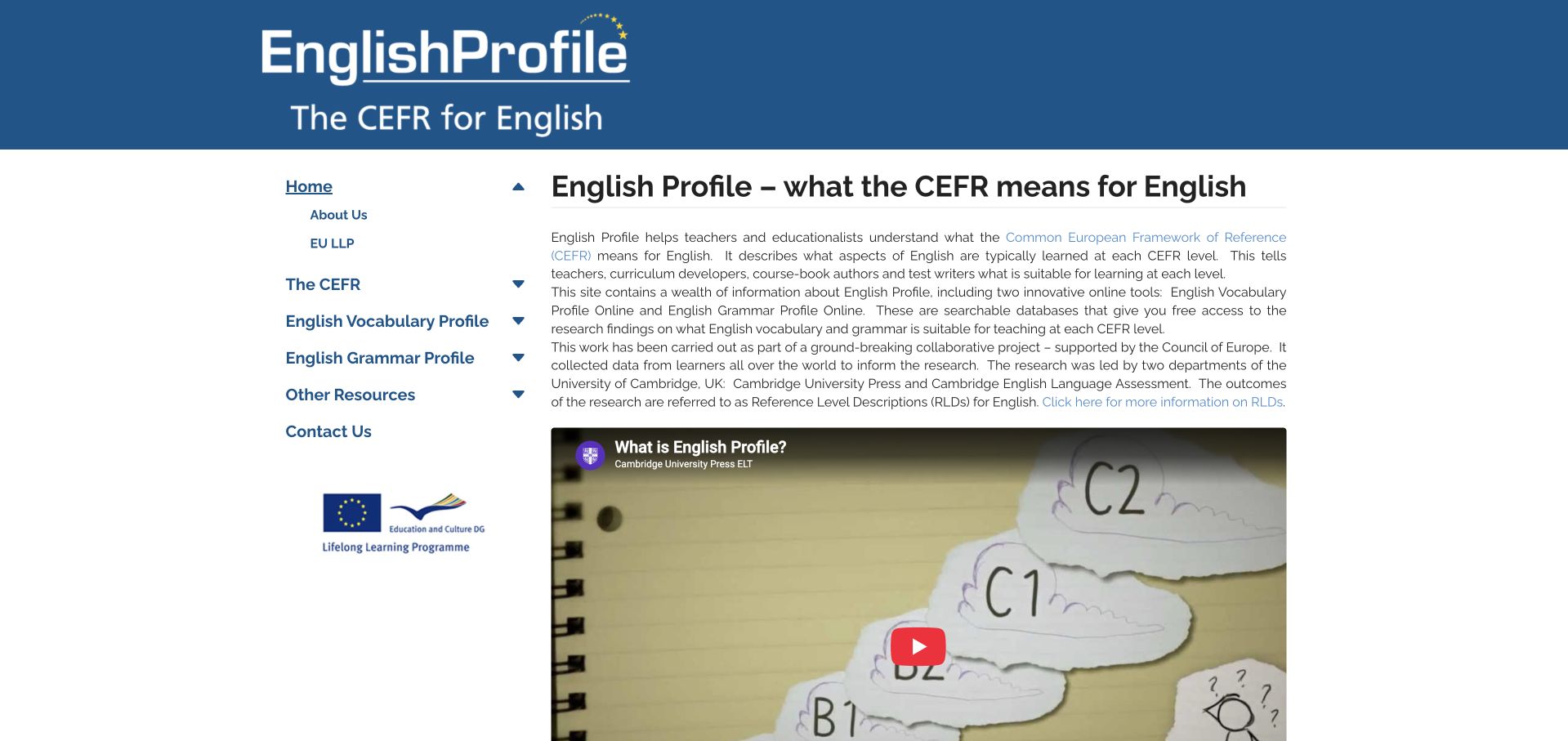
English Profile presents a blue institutional banner above a left-hand navigation tree and a plain explanatory reading area. Vocabulary and grammar resources are separate, while the opening text explains the relationship between the project and the CEFR. An embedded introductory video follows the written explanation. The page identifies Cambridge University Press and Assessment, but this example is limited to the English Profile property. Joomla’s 2016 showcase documents an earlier implementation; it does not establish the current technology of Cambridge’s wider publishing estate or the internals of the linked research tools.
What you can learn
A research resource benefits from a stable navigation tree and a short explanation of its terminology before presenting search tools. Keep the written introduction useful on its own so visitors can understand the purpose even if they do not play an embedded video.
Pros
The sidebar distinguishes vocabulary and grammar tools with direct labels.
The introduction explains the project’s scope before presenting the supporting video.
Cons & considerations
Dense introductory paragraphs would be easier to scan with additional subheadings.
Several navigation labels depend on specialist terminology that new readers may need help interpreting.
Platform source: Official Joomla showcase — creator-submitted project account. 2016 showcase association for this specific research property, not Cambridge entire estate. The official Joomla showcase hosts a creator-submitted account for this exact public property. This is documentary implementation evidence, not an inspection of the current hidden backend or an assertion about a current version. The bounded November 10, 2026 public-source audit is partial and is preserved without a repeated scan or guessed CMS claim. Source read November 10, 2026. Platform evidence is separate from the direct website screenshot and is not a complete current infrastructure audit.
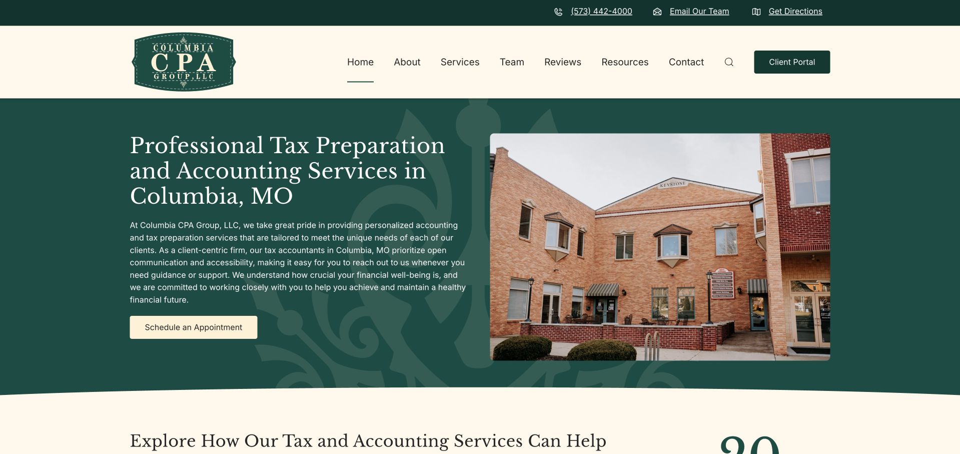
Columbia CPA Group pairs a dark green service panel with a photograph of its office building. The headline names both the accounting offer and Columbia, Missouri, while the pale header separates services, team, resources and contact routes. A dedicated client-portal button remains visually distinct from the public navigation. The next section organizes service information into tabs and introduces the team. Its creator-submitted September 2026 Joomla showcase concerns this public marketing website. No private client portal, tax records, appointments or service outcomes were tested as part of the design review.
What you can learn
A local professional-services homepage should make the service and place explicit before relying on broad claims about expertise. A real office image adds orientation, while separate public information and client-access routes prevent existing customers from having to navigate through a sales explanation.
Pros
The service-and-location headline quickly establishes the intended audience.
The office photograph and team routes give the business a concrete local presence.
Cons & considerations
The opening paragraph is long enough to compete with the primary appointment action.
Tabbed services should retain clear labels and keyboard access as the layout changes.
Platform source: Official Joomla showcase — creator-submitted project account. 2026 creator-submitted official showcase account; public marketing site only. The official Joomla showcase hosts a creator-submitted account for this exact public property. This is documentary implementation evidence, not an inspection of the current hidden backend or an assertion about a current version. No current hidden CMS or private application is inferred from the showcase. Source read November 10, 2026. Platform evidence is separate from the direct website screenshot and is not a complete current infrastructure audit.
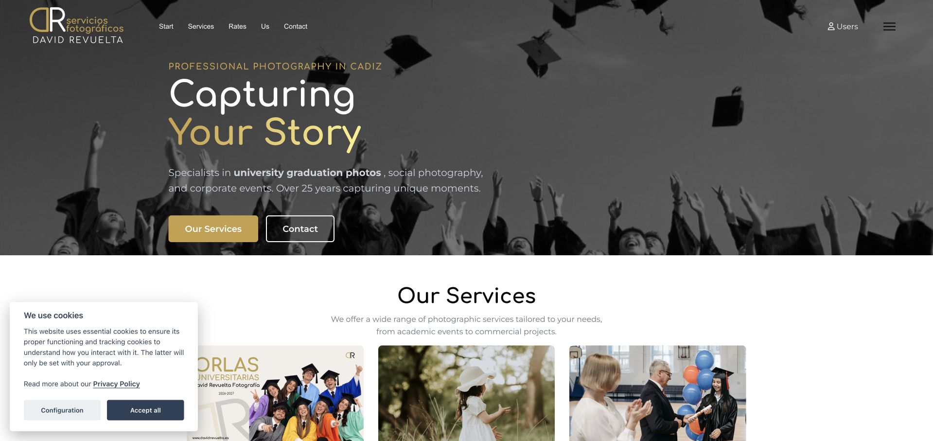
David Revuelta’s homepage uses a dark graduation photograph behind a concise studio introduction, with gold accents connecting the identity, headline and primary action. Services and contact form separate next steps. The following cards distinguish graduation portraits, communions and ceremonies, helping visitors recognize their occasion before browsing deeper. A public cookie notice remains in the capture. The August 2026 creator-submitted Joomla showcase documents this exact photography website. Private client galleries, appointment services and the separate user area were not opened or assigned the public site’s implementation.
What you can learn
A photographic business can use a strong opening image to establish tone, then quickly organize the portfolio around the situations customers recognize. Distinguish browsing from contacting and keep client access separate so the homepage serves both new inquiries and returning customers.
Pros
The limited gold, black and white palette supports the photographic presentation.
Occasion-based cards make the range of services easier to understand than an unlabeled gallery.
Cons & considerations
A dark image overlay conceals some photographic detail in the opening view.
The visible cookie notice covers part of the next section and interrupts the transition into service cards.
Platform source: Official Joomla showcase — creator-submitted project account. 2026 creator-submitted showcase case; photographer public portfolio only. The official Joomla showcase hosts a creator-submitted account for this exact public property. This is documentary implementation evidence, not an inspection of the current hidden backend or an assertion about a current version. No current hidden CMS or private application is inferred from the showcase. Source read November 10, 2026. Platform evidence is separate from the direct website screenshot and is not a complete current infrastructure audit.
Berner Engineering opens with a full-width conceptual portrait and a large statement, while a compact navigation distinguishes services, industries, company information and careers. Orange details connect the wordmark with the engineering imagery. Lower sections add customer references, a managing-partner quotation and more specific service explanations. The screenshot reflects the browser’s English translation of the German page. An April 2026 creator-submitted Joomla showcase documents the public website’s implementation. That account does not verify current software versions, customer relationships independently or the technology used in engineering projects.
What you can learn
A technical consultancy can use one strong visual concept to establish character, but practical service and industry routes should remain immediately available. Follow the brand statement with specific information and attributed evidence so visitors can judge relevance without decoding an abstract campaign.
Pros
Four primary navigation categories keep the opening structure compact.
A restrained orange accent connects the identity with the technical visual motif.
Cons & considerations
The large conceptual image postpones concrete examples of the work.
Browser translation changes some labels awkwardly, reinforcing the value of reviewed multilingual copy.
Platform source: Official Joomla showcase — creator-submitted project account. 2026 creator-submitted showcase case; no current version inference. The official Joomla showcase hosts a creator-submitted account for this exact public property. This is documentary implementation evidence, not an inspection of the current hidden backend or an assertion about a current version. No current hidden CMS or private application is inferred from the showcase. Source read November 10, 2026. Platform evidence is separate from the direct website screenshot and is not a complete current infrastructure audit.
Tenzo Industrial uses a blue industrial scene, an orange accent and a direct statement about safety instrumentation. The opening names rupture discs and safety valves before the page introduces the company’s approach and product families. A compact header keeps products, contact and language selection visible. Joomla’s February 2026 showcase documents this property, and the current bounded source audit also identifies Joomla. The showcase’s body and metadata disagree about the software version, so no version is asserted. The design review does not validate product performance or industrial safety claims.
What you can learn
For a technical product category, precise naming is more useful than an abstract slogan alone. Let the first screen establish the application, then organize product families and supporting specifications into distinct routes that a knowledgeable buyer can evaluate without submitting an inquiry.
Pros
The opening names the product application in concrete technical terms.
A simple blue-and-orange palette gives the main statement a clear visual hierarchy.
Cons & considerations
Large promotional photography delays the individual product comparisons.
Long explanatory paragraphs need clearly labeled specifications and context farther into the product pages.
Platform source: Official Joomla showcase — creator-submitted project account. 2026 showcase body and metadata disagree about Joomla version; association only, no version claim. The official Joomla showcase hosts a creator-submitted account for this exact public property. This is documentary implementation evidence, not an inspection of the current hidden backend or an assertion about a current version. The November 10, 2026 public-source audit independently identifies Joomla. The showcase body and version metadata disagree, so no version is claimed. Source read November 10, 2026. Platform evidence is separate from the direct website screenshot and is not a complete current infrastructure audit.
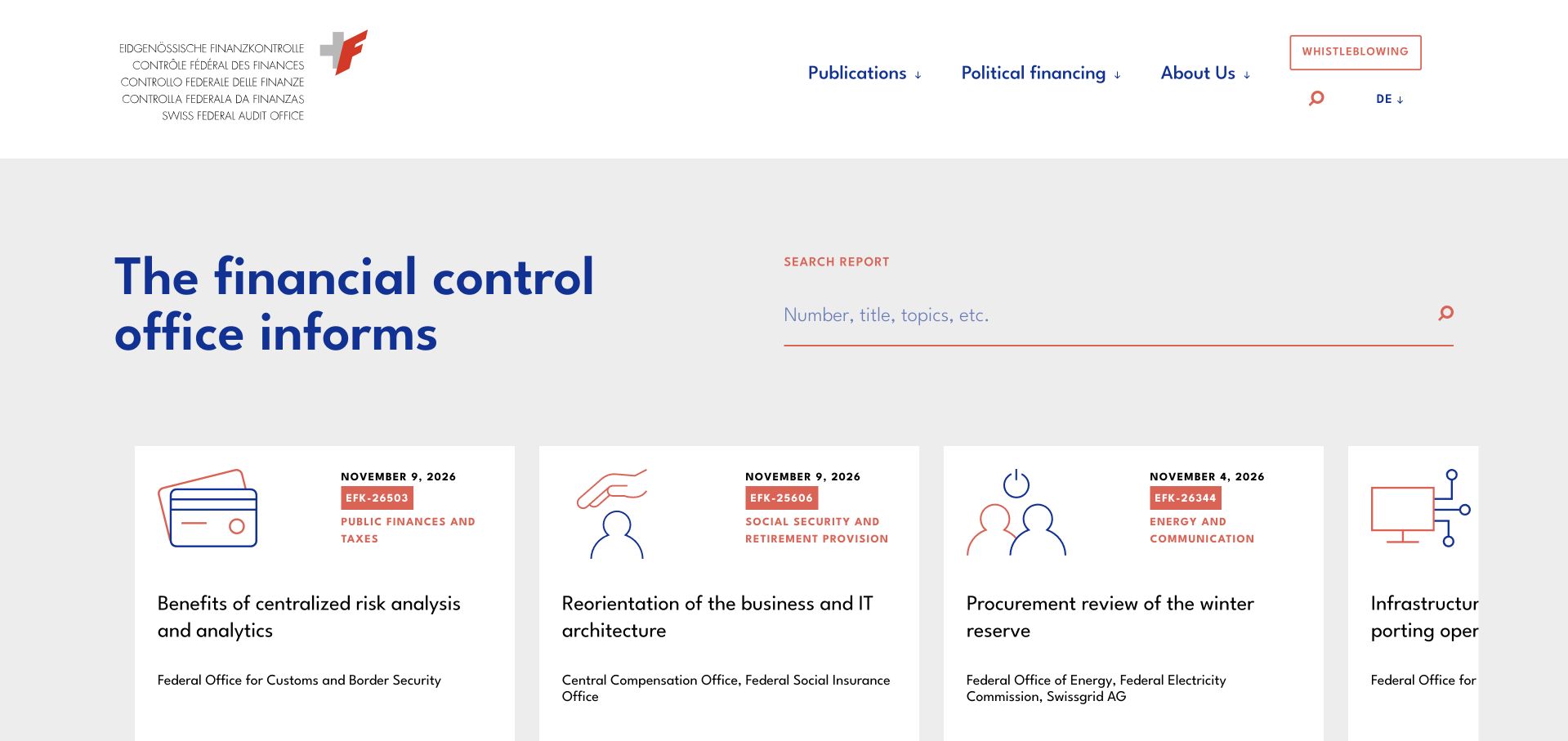
The Swiss Federal Audit Office places its multilingual institutional identity above an opening search field and a row of report cards. Each card displays a date, report number, topic and title, making a large publication collection easier to approach. Additional sections distinguish future publications, political-finance information and public reporting routes. The screenshot reflects the browser’s English translation. An earlier Joomla showcase documents this exact public institution property; the current bounded audit identifies WordPress and WPML. Neither source establishes the technology of confidential reporting systems, which were not accessed.
What you can learn
A public document library should expose the identifiers and categories that readers use to find a report. Combine direct search with consistent metadata on cards, and separate sensitive reporting routes from ordinary publication browsing so their purposes remain unambiguous.
Pros
Report numbers, dates and topics create a repeatable scanning structure.
The prominent search field supports visitors who arrive with a specific document in mind.
Cons & considerations
The horizontally arranged cards reveal only part of the publication set at once.
Several institutional topics need clear explanatory labels for readers unfamiliar with the organization.
Platform source: Official Joomla showcase — creator-submitted project account. Earlier official showcase association for this exact public institution property, not present hidden backend. The official Joomla showcase hosts a creator-submitted account for this exact public property. This is documentary implementation evidence, not an inspection of the current hidden backend or an assertion about a current version. The November 10, 2026 public-source audit identifies WordPress and WPML; Joomla is the earlier documented association. Source read November 10, 2026. Platform evidence is separate from the direct website screenshot and is not a complete current infrastructure audit.
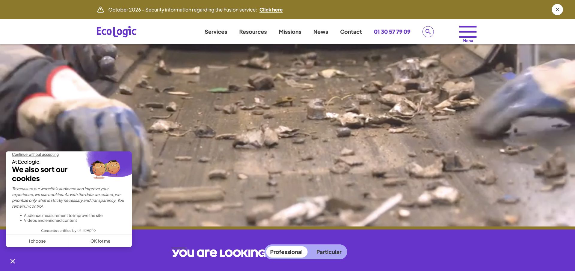
Ecologic’s public homepage combines a purple identity, a process video and a compact service navigation. A prominent audience selector introduces practical routes for professionals and individuals, while the body separates repair, reuse and recycling. Campaigns, figures and current notices appear in their own sections. A privacy panel and a security-information banner remain visible in the capture. The earlier Joomla showcase is a documentary association for this exact public property, not evidence about its present backend or separately linked operational extranets. The review does not assess incident response or environmental performance.
What you can learn
An organization serving several audiences should make the practical task routes as prominent as its mission. Keep operational notices distinct from campaigns, and place explanatory context beside reported figures so visitors understand what an action or statistic actually represents.
Pros
The audience selector connects a broad organizational mission with concrete service needs.
Distinct campaign and news sections keep continuing information separate from promotional material.
Cons & considerations
The privacy panel and notice banner compete with the opening visual.
A process video offers atmosphere but needs a useful static fallback and concise accompanying explanation.
Platform source: Official Joomla showcase — creator-submitted project account. Earlier creator showcase association, public organization site only. The official Joomla showcase hosts a creator-submitted account for this exact public property. This is documentary implementation evidence, not an inspection of the current hidden backend or an assertion about a current version. No current hidden CMS or private application is inferred from the showcase. Source read November 10, 2026. Platform evidence is separate from the direct website screenshot and is not a complete current infrastructure audit.
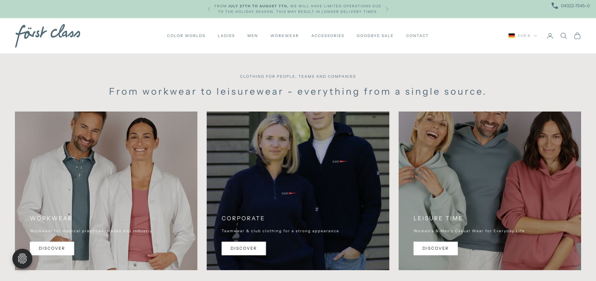
Först Class presents workwear, corporate clothing and leisurewear as three parallel photographic routes beneath a quiet header. A muted mint announcement strip and generous spacing keep the opening calm, while catalog navigation also supports audience, color and accessory browsing. The selected image follows a necessary privacy choice and retains the browser’s English translation. The earlier Joomla showcase documents this exact property, but the current public audit and footer identify Shopify. The historical association is kept separate from the current store; checkout and account functions were not tested.
What you can learn
A broad apparel catalog can reduce the first decision to a few recognizable use cases before exposing detailed filters. Keep those entry points visually consistent, then support alternative browsing paths for customers who already know a product attribute or category.
Pros
Three large cards create a clear initial choice without a rotating hero.
The restrained palette keeps product photographs and category labels in focus.
Cons & considerations
Subtle type and pale overlays require careful contrast across different photographs.
Multiple parallel catalog routes need consistent naming to prevent overlapping categories from becoming confusing.
Platform source: Official Joomla showcase — creator-submitted project account. Earlier showcase Joomla association; current public source exposes Shopify CDN. Preserve current audit separately. The official Joomla showcase hosts a creator-submitted account for this exact public property. This is documentary implementation evidence, not an inspection of the current hidden backend or an assertion about a current version. The November 10, 2026 public-source audit identifies Shopify; Joomla is the earlier documented association. Source read November 10, 2026. Platform evidence is separate from the direct website screenshot and is not a complete current infrastructure audit.
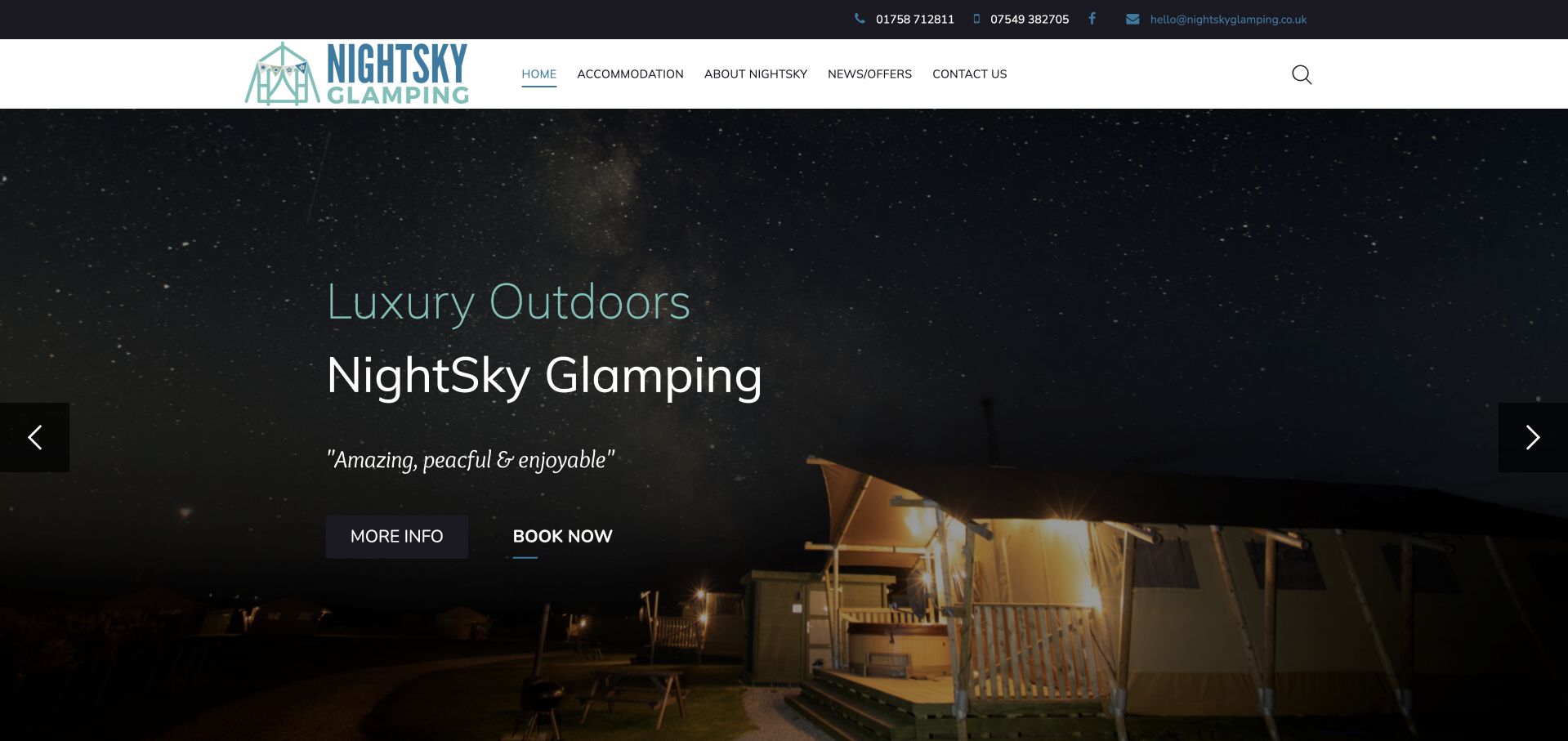
NightSky Glamping uses a star-filled evening photograph to establish the experience associated with its name. The compact header exposes accommodation, background information, offers and contact routes, while the hero provides separate information and booking links. Below, descriptive copy explains the facilities and introduces accommodation types. Joomla’s earlier showcase documents this exact public website. That account does not establish the technology of a booking system or the current availability of any stay. This review considers presentation only, and no reservations, contact forms or purchases were submitted.
What you can learn
A small hospitality business can use atmosphere to attract attention, but the next step should connect that mood with practical accommodation information. Keep the location, facilities and contact routes easy to find so visitors can evaluate a stay without relying solely on imagery.
Pros
The night photograph and restrained colors reinforce a distinctive destination identity.
Information and booking actions have separate roles within the main feature.
Cons & considerations
The large rotating image postpones specific facility details until below the opening view.
Generic action labels need clear destination pages so visitors understand whether they are browsing or beginning an inquiry.
Platform source: Official Joomla showcase — creator-submitted project account. Earlier creator showcase account; public hospitality property, no booking system inference. The official Joomla showcase hosts a creator-submitted account for this exact public property. This is documentary implementation evidence, not an inspection of the current hidden backend or an assertion about a current version. No current hidden CMS or private application is inferred from the showcase. Source read November 10, 2026. Platform evidence is separate from the direct website screenshot and is not a complete current infrastructure audit.
Etter and Partner uses a pale blue portrait-led opening with a compact service navigation and a distinct candidate button. A large statement introduces the leadership focus, followed by a concise explanation of the consultancy and its offices. The screenshot reflects the browser’s English translation. The April 2026 creator-submitted Joomla showcase documents this exact public property, although its body and version metadata disagree. The guide therefore retains the platform association without asserting a version. Candidate records, applications and private recruitment workflows were not accessed or assessed.
What you can learn
A recruiting website should distinguish the organization seeking help from the individual considering an opportunity. Give each audience a clear route, then use the public introduction to explain the service’s focus without implying that a brand statement proves hiring outcomes or suitability.
Pros
The separate candidate control clarifies a second audience without expanding the main menu.
A restrained color palette and portrait create a coherent opening composition.
Cons & considerations
The broad introductory statement leaves detailed process information to later pages.
A large image-led feature can reduce the amount of practical explanation visible at first glance.
Platform source: Official Joomla showcase — creator-submitted project account. April 2026 creator-submitted Joomla showcase; body mentions version6 while metadata says5. Association only, no version assertion. Public recruiting marketing site, no candidate/account data. The official Joomla showcase hosts a creator-submitted account for this exact public property. This is documentary implementation evidence, not an inspection of the current hidden backend or an assertion about a current version. The showcase body and version metadata disagree, so no version is claimed. Source read November 10, 2026. Platform evidence is separate from the direct website screenshot and is not a complete current infrastructure audit.
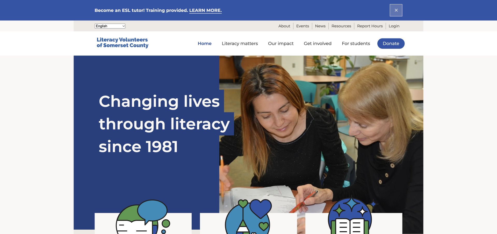
Literacy Volunteers of Somerset County combines a direct literacy message with a photograph of people learning together. A recruitment notice occupies a separate band above the header, while the main navigation distinguishes impact, involvement and student information. Language selection is visible, and the next section offers explicit routes for becoming a student or making a contribution. The April 2021 creator-submitted Joomla showcase documents this public website. Learner accounts, tutor reporting, donations and private records were not accessed; the review does not evaluate educational results or identify individuals in the images.
What you can learn
A community nonprofit can make its mission tangible by showing participation and naming the different roles visitors can take. Keep learner information distinct from volunteering and donations, and make language access part of the regular navigation rather than a hidden support feature.
Pros
The hero connects the organization’s purpose with a clear human context.
Student, volunteer and impact routes acknowledge different reasons for visiting.
Cons & considerations
The announcement, language control and two menu levels create a tall header.
Several similarly prominent participation routes need careful hierarchy on compact screens.
Platform source: Official Joomla showcase — creator-submitted project account. 2021 creator showcase account; public site only, no learner/donor/private portal access. The official Joomla showcase hosts a creator-submitted account for this exact public property. This is documentary implementation evidence, not an inspection of the current hidden backend or an assertion about a current version. No current hidden CMS or private application is inferred from the showcase. Source read November 10, 2026. Platform evidence is separate from the direct website screenshot and is not a complete current infrastructure audit.
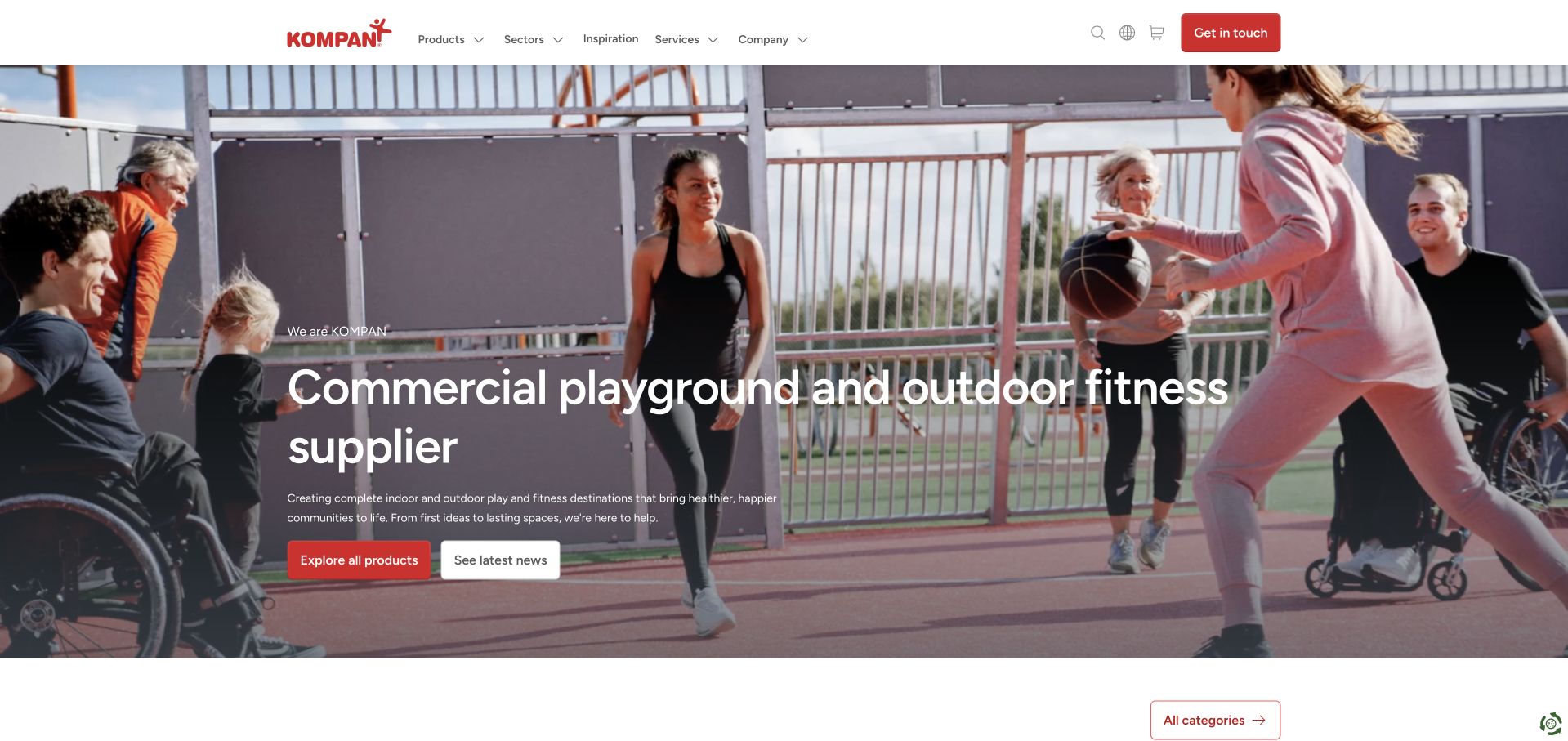
KOMPAN’s international homepage pairs a full-width recreation scene with a direct statement about playground and outdoor fitness equipment. Products, sectors, inspiration and services organize the main navigation, while a clear catalog action leads into category cards. The selected capture follows necessary-only cookies and dismissal of a location suggestion, without changing market settings. An earlier Joomla showcase documents KOMPAN’s public property. The current bounded audit identifies Next.js and Contentful asset delivery; those observations remain separate and do not prove a complete CMS or backend inventory.
What you can learn
A large equipment business can introduce its offer through the activity customers want to create, then move quickly into product and sector routes. Keep planning help distinct from the catalog so visitors can browse specifications or understand a larger project without taking the same path.
Pros
The opening statement explains the product category in plain language.
Products, sectors and planning services support different stages of a buyer’s research.
Cons & considerations
Initial location and privacy panels can obscure the main introduction until dismissed.
An extensive catalog needs reliable category labels and deeper filtering beyond the homepage’s broad entry points.
Platform source: Official Joomla showcase — creator-submitted project account. Earlier exact-property showcase association; no present CMS or global estate inference. The official Joomla showcase hosts a creator-submitted account for this exact public property. This is documentary implementation evidence, not an inspection of the current hidden backend or an assertion about a current version. The November 10, 2026 public-source audit identifies Next.js and Contentful asset delivery. Asset delivery does not establish a complete CMS or backend; Joomla remains the earlier documented association. Source read November 10, 2026. Platform evidence is separate from the direct website screenshot and is not a complete current infrastructure audit.
Aisha Umm Al-Mumineen School combines a blue navigation bar with a large school photograph and an introductory statement. Admissions, background information and media have separate destinations, while the Arabic-language route is visible beside the main menu. The body explains the school’s values and gives practical public admissions information. The August 2026 creator-submitted Joomla showcase documents this exact website. The selected capture follows a privacy choice. No student records, applications, school apps or private education services were opened, and the design review does not assess teaching quality or individual students.
What you can learn
A school homepage should make its identity, language options and public admissions routes understandable without exposing private learning systems. Use photographs to establish context, then support them with specific program and process information that families can read before making contact.
Pros
Language selection remains visible within the primary navigation area.
Separate admissions and organizational routes distinguish practical inquiries from broader school information.
Cons & considerations
The large opening photograph postpones much of the explanatory detail.
Generic media and service menu labels benefit from clear subcategories and descriptions on their destination pages.
Platform source: Official Joomla showcase — creator-submitted project account. August 2026 creator-submitted official showcase; public school website only, not student records/mobile apps/private education services. The official Joomla showcase hosts a creator-submitted account for this exact public property. This is documentary implementation evidence, not an inspection of the current hidden backend or an assertion about a current version. No current hidden CMS or private application is inferred from the showcase. Source read November 10, 2026. Platform evidence is separate from the direct website screenshot and is not a complete current infrastructure audit.
Kegan has 15+ years of experience working with small businesses, Fortune 500 companies, and everything in between. No development job is too big or too small: he brings the same hands-on attention to a focused improvement, a complete website, or a custom application.
For Joomla projects, he can help with responsive interfaces, reusable components, custom functionality, API connections, and performance-minded implementation. He works directly with clients on scope, design, implementation, testing, and handover, with an emphasis on clear communication and a system that remains practical to maintain after launch.
Show 3 other Joomla developersHide other Joomla developers
Use a consistent article structure for recurring announcements, resources and institutional information. The editing interface supports article creation and revision; your project must still establish useful titles, summaries, image descriptions and ownership. Separate time-sensitive news from practical information that should remain easy to find. A dependable reading layout is more valuable than a different composition for every ordinary update.
Language selection needs more than a translated navigation label. Joomla’s multilingual associations connect corresponding articles, categories and menu items. Plan the full set of equivalents, identify who maintains each language and make incomplete coverage understandable. Localized content may need different practical details, not merely the same sentences translated. Browser-rendered translation in a reference screenshot should not be mistaken for proof that the source website publishes that language itself.
Joomla supports template overrides and child templates for adjusting presentation. Use that flexibility to express a distinct identity while keeping the responsibilities of shared layouts clear. A product detail, an institutional report and a news article can need different treatments. Record where each variation lives and why it exists, so later maintenance does not require rediscovering a collection of unexplained exceptions.
Map content, menus and the most useful destinations
Start with a list of the information visitors need, then group it by purpose. A school might separate admissions, current-family resources and public news. A manufacturer might distinguish product specifications, applications and support. Write down the facts each page must contain before deciding how its cards or banners should look. Categories should make recurring material manageable without forcing visitors to navigate the same internal structure. Joomla allows the menu hierarchy to be organized separately from the content hierarchy. Use that distinction deliberately: give important destinations clear routes, and avoid a menu that simply repeats every category. Review a few realistic journeys from an internal page as well as the homepage. Someone arriving through search needs a useful title, context and a next step even if they never see the opening screen. List existing URLs before changing the structure, and map intentional changes to appropriate destinations. Keep external booking, account and payment services clearly identified. Finally, establish how the team handles expired announcements and archived resources. Old content may remain useful, but it should not compete with current practical instructions or send someone toward an obsolete action. Record those decisions alongside the sitemap so future editors can extend the structure consistently.
Make language coverage and editorial ownership explicit
Choose the languages and audiences the site can support reliably. For each important destination, identify the person responsible for preparing the original information and the person who checks each translated version. A language selector creates an expectation of equivalent useful content, so define what happens when an article, policy or service is available in only one language. Joomla’s multilingual associations can connect corresponding content and menu items. They do not supply an editorial decision about which details need translation, local adaptation or a separate explanation. Build a small representative set before expanding the whole site: a long article, a short announcement, an image-heavy page and a destination with an external action. Check their labels, relationships and reading order in each planned language. Document whether dates, contact details and regional services differ. Keep source-language records so a later update can be traced to the appropriate equivalents. Give editors an understandable review routine rather than relying on memory to keep translations aligned. Distinguish public language coverage from a visitor’s browser translation. The latter can change how a captured page reads without demonstrating that the organization authored that language. Treat the language plan as an ongoing publishing commitment with named responsibility and realistic coverage.
Plan maintenance, extensions and a recoverable migration
Inventory the installed CMS, template, extensions and external services before planning a redesign or update. Identify who maintains each component and which parts of the website depend on it. A familiar brand name or an old showcase entry does not establish the current implementation, so verify the actual project rather than copying assumptions from a reference site. Joomla’s migration guidance emphasizes backing up before updates and testing that the backup works. Put that advice into a concrete recovery process with an owner, a stored procedure and a way to check the restored result. Review extension compatibility and custom template changes before committing to an upgrade path. Preserve useful content, image attribution and established destinations, and keep a mapping for deliberate URL changes. Separate the public website from private account, enrollment, payment or operational systems that may have different maintainers. After release, inspect the live pages and links and confirm the expected content is available. Keep a record of what changed and when its claims were checked. A successful redesign does not renew historical technology evidence or remove the need for regular maintenance. Assign ongoing responsibility for updates, expired information and broken destinations as part of the project handover, not as an informal afterthought.
Ask the actual team to carry out its routine job: publish a realistic update, correct a mistake, preview a narrow screen, and identify who owns an integration failure. For a library or frontend framework, also ask who maintains the content source and deployment. A polished screenshot does not answer those operational questions.
Beyond the screenshot
Joomla website planning checklist
Define the exact public property behind each technology claim.
Keep historical project accounts separate from current observations.
Organize article categories around meaningful content relationships.
Choose menu labels around visitor tasks and understandable destinations.
Give each repeated module a clear purpose.
Assign responsibility for drafting, reviewing and maintaining information.
Distinguish editing permissions from public viewing access.
Plan equivalent content and practical details for each supported language.
Label external accounts, bookings and transaction destinations clearly.
Document template overrides, extensions and their maintainers.
Keep image rights, source links and original observation dates.
Map deliberate URL changes and preserve useful existing destinations.
Test backup recovery before an update or migration.
Verify the actual public pages and links after release.
Test with real content, a keyboard, a small screen, slow or failed requests, and the people who will maintain the system. These are planning checks, not an accessibility, security, performance, or search-ranking certification.
Sources & editorial method
How this Joomla collection was reviewed
This collection contains twenty distinct public website properties with original design reviews and direct browser screenshots. Nineteen captures were made on November 10, 2026; the Guggenheim image retains its original November 3, 2026 capture date and stable source identity. Each image records its actual source URL, dimensions and attribution. Several captures reflect the browser’s existing English translation, explicitly labeled in their capture records; this is not evidence of a source-authored English version. Joomla associations come from exact-property official showcase cases or the July 2012 Joomla magazine account. Earlier accounts remain historical and do not establish a current CMS or version. Current Drupal, WordPress and Shopify observations are retained separately, while Tenzo’s checked public source independently identifies Joomla. The Tenzo and Etter showcase bodies and version fields disagree, so no exact version is claimed. Every page has a broad public technology-audit attempt, with English Profile’s partial result preserved without another scan or unsupported additions. Public design observations do not establish private systems, service quality, conversion performance or accessibility conformance. Consent notices visible in selected captures remain part of the recorded page state.
Every image is an unmodified capture from the actual website, with its source and capture date. Some captures are reused from our shared catalog; their dates remain the original capture dates. None comes from a vendor gallery or a generated reconstruction. Moving imagery and live content can change.
Technology attribution uses public page assets or metadata, official platform documentation, or a cited first-party project case study. Documentary and framework-relationship evidence is identified where used; it is not a complete current backend inventory. A CMS image CDN alone does not establish a full CMS deployment. A library’s presence does not prove which individual controls use it, and a platform label does not establish AI authorship.
The composition notes, lessons, pros and tradeoffs are original editorial observations. We have not measured conversion, traffic, security, performance or accessibility conformance. Website owners retain their brands and imagery; these examples are not our client portfolio. Written, Edited and Curated are independent records, not dates advanced by a build. See our editorial standards or suggest a correction.
Questions worth asking
Joomla website development FAQs
Are all twenty websites currently running Joomla?
No. The collection includes qualified historical implementations documented by Joomla’s own magazine and showcase. Current public audits identify different platforms on several properties, including Drupal on Harvard GSAS and Notre Dame ACE, WordPress on Linux.com and the Swiss Federal Audit Office, and Shopify on Foerst Class. Their earlier Joomla associations and current observations are recorded separately.
What does the Nintendo example establish?
The official showcase case concerns Nintendo’s Swedish regional website operated by Bergsala. It does not establish the technology used by Nintendo’s global websites, online services or other regional properties. The review concerns the actual captured Swedish public homepage.
How should Joomla categories and menus work together?
Categories organize content, while menus provide routes to visitor-facing destinations. Their structures can differ. Plan categories that help editors maintain related material, then choose menu labels and paths that make sense to someone looking for a service, resource or answer.
Does adding a language pack translate all site content?
No. Human-authored articles, menu titles and other content still need appropriate translations or localized equivalents. Joomla’s multilingual associations help connect related items across languages, but the organization must decide what to translate and keep those versions accurate.
What should a Joomla redesign preserve?
Preserve useful content, established destinations, image rights and the evidence behind public claims. Inventory extensions and template changes, assign maintenance responsibility and verify that backups can be restored. After release, check the actual live pages and links rather than assuming that a completed build proves every visitor journey works.
Borrow the decisions that help people find and understand information: clear routes, consistent content, sensible language coverage and a visible next step. Adapt them to the material your team can maintain, and keep every technology claim tied to its exact source and date.