Best Language School Websites of 2026 (21 Real-World Examples)
Explore 21 language-school websites for clear course choices, practical destination information and useful routes from interest to registration.
Strong language-school website design connects an appealing learning story to the facts a visitor needs: language, level, format, location, schedule and the conditions of the next step.
Language study can mean an evening class near home, live online teaching, an intensive course abroad or a programme inside a cultural institution. Those are different decisions, even when the websites use similar travel photographs. Start by making the offer understandable. A visitor should not have to guess whether the page sells self-study software, a physical course, a cultural event or a combination of services.
The 21 examples here include independent schools, international providers and focused language pages inside broader institutions. Their layouts solve different information problems, so treat the collection as a source of design patterns rather than a ranking of teaching quality. Course, accreditation and outcome claims remain the publishers’ own statements. A compelling campaign photograph cannot establish the availability or suitability of an individual programme.
Before the examples
What makes good language school website design in 2026?
Make the course model explicit
State the language, audience and delivery format before adding an expansive promise about travel or confidence. Separate private lessons, group courses, online study and children’s programmes where those distinctions matter. SpeakItaly’s public course navigation is useful as an example of separating learner groups and services; the design lesson is the organisation of choices, not a recommendation of a particular course.
Carry the selected context forward
If someone chooses a city, language or age group, keep that choice visible on the next page. A course finder is frustrating when every route ends at the same general enquiry. Name the selected school, programme and format before registration, and make regional websites or currency changes clear. Old brand redirects also need a current explanation rather than silently implying unchanged terms.
Keep cultural and transactional content distinct
A festival or language-club story can make the site interesting, but a visitor comparing classes still needs an unambiguous course route. Keep events, examination preparation and language study clearly labelled. Where other services are offered, describe their boundaries rather than letting a shared menu imply that registering for a course includes unrelated professional or travel arrangements.
The collection · 21 examples
21 language school websites worth studying
The examples below show catalogue-first language grids, destination-led campaigns, local class directories and institutional service pages. Compare the first meaningful choice each one asks the visitor to make, then decide whether that choice matches your own courses.
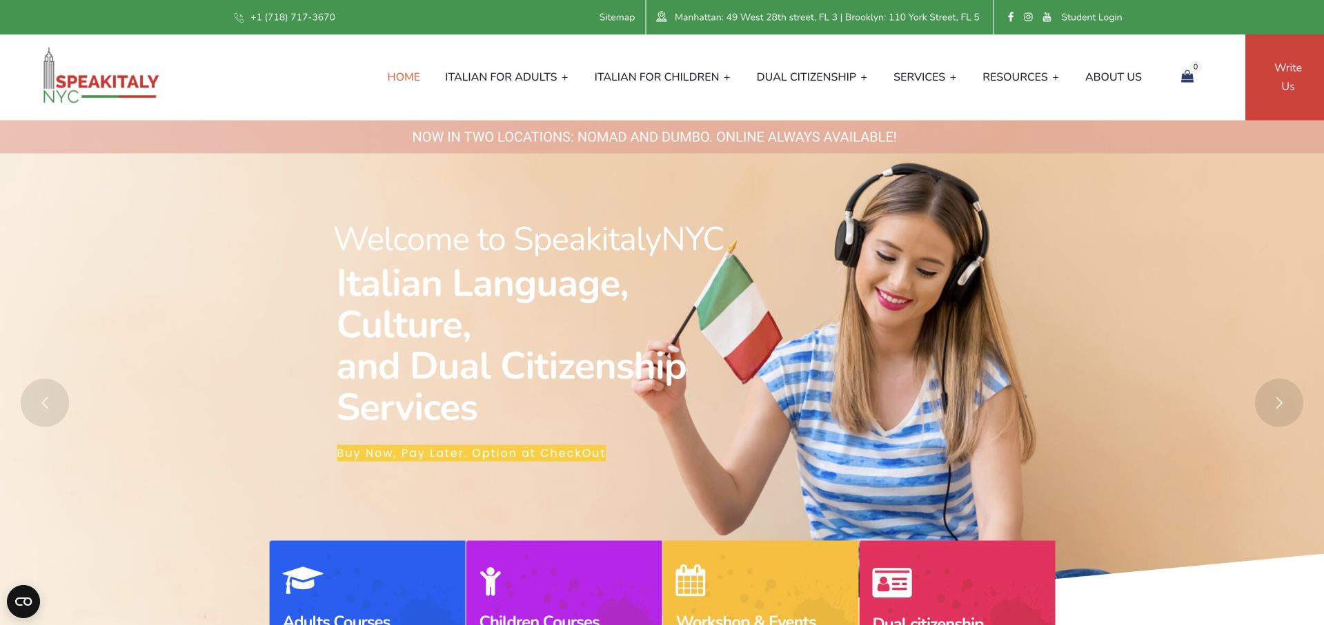
SpeakItaly NYC combines green and coral branding with a warm photographic introduction. Adult courses, children’s courses and workshops begin as distinct coloured cards below the hero. Manhattan, Brooklyn and online options are named in public text rather than left to the imagery. The school also offers adjacent services, which makes careful navigation especially important. Our specialist editorial choice recognises the coherent colour system and explicit course groupings, not teaching quality, exam outcomes or advice about citizenship matters.
What you can learn
Borrow the separation of learner groups and delivery formats. Keep language courses distinct from cultural events and other services, then let each course page explain level, schedule, location and the actual registration process.
Pros
Coloured course cards give the broad offer a recognisable structure.
Locations and online availability answer practical questions before an enquiry.
Cons & considerations
Adjacent services need clear boundaries from the language-course selection journey.
Delayed promotional overlays interrupted the otherwise clear introductory page view.
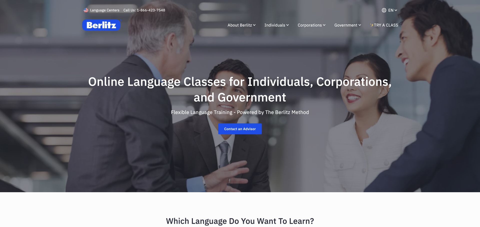
Berlitz places a white headline over a darkened photograph of people in conversation. The statement names individual, corporate and government audiences, while a blue starting action sits centrally beneath it. The dark header and compact programme navigation allow the photograph to occupy most of the opening. A language-selection section begins below. The page is useful for studying a broad provider’s audience framing, although the introductory image cannot establish which teaching format or course is appropriate for a particular visitor.
What you can learn
Name distinct audiences before routing them into different offers. A corporate training buyer needs different information from an individual beginner, so keep language, level and delivery-format choices visible after the broad introductory message.
Pros
Audience naming makes the broad service scope immediately understandable overall.
A single blue action anchors the restrained, photograph-led opening composition.
Cons & considerations
A shared introduction does not explain individual and organisational differences.
White text needs consistent contrast across changing photographic mobile crops.
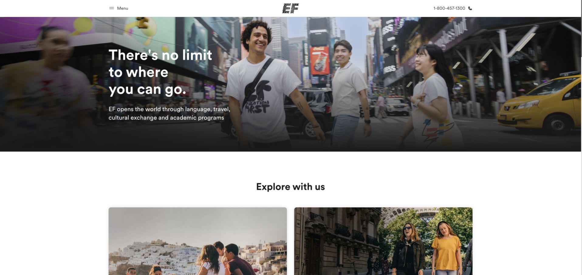
EF uses a bright travel-oriented scene beneath a compact white header and black wordmark. A short statement about where visitors can go sits over the image, while programme exploration begins soon below. The observed official root redirected to the US-facing education site, so this is a regional public view rather than a universal global homepage. Its strength is the quick connection between study and place, with enough room left for a practical programme catalogue beyond the opening image.
What you can learn
If a site changes by region, keep the selected market apparent and avoid mixing offers from several countries. Travel imagery should lead into real programme, age-range and destination information rather than implying that every photographed experience belongs to every course.
Pros
A white header frames the colourful study-and-travel imagery consistently overall.
Programme exploration begins without requiring an extended introductory video first.
Cons & considerations
Travel imagery can delay the practical course-format and schedule explanation.
Regional redirects need consistent market-specific programme and pricing information throughout.
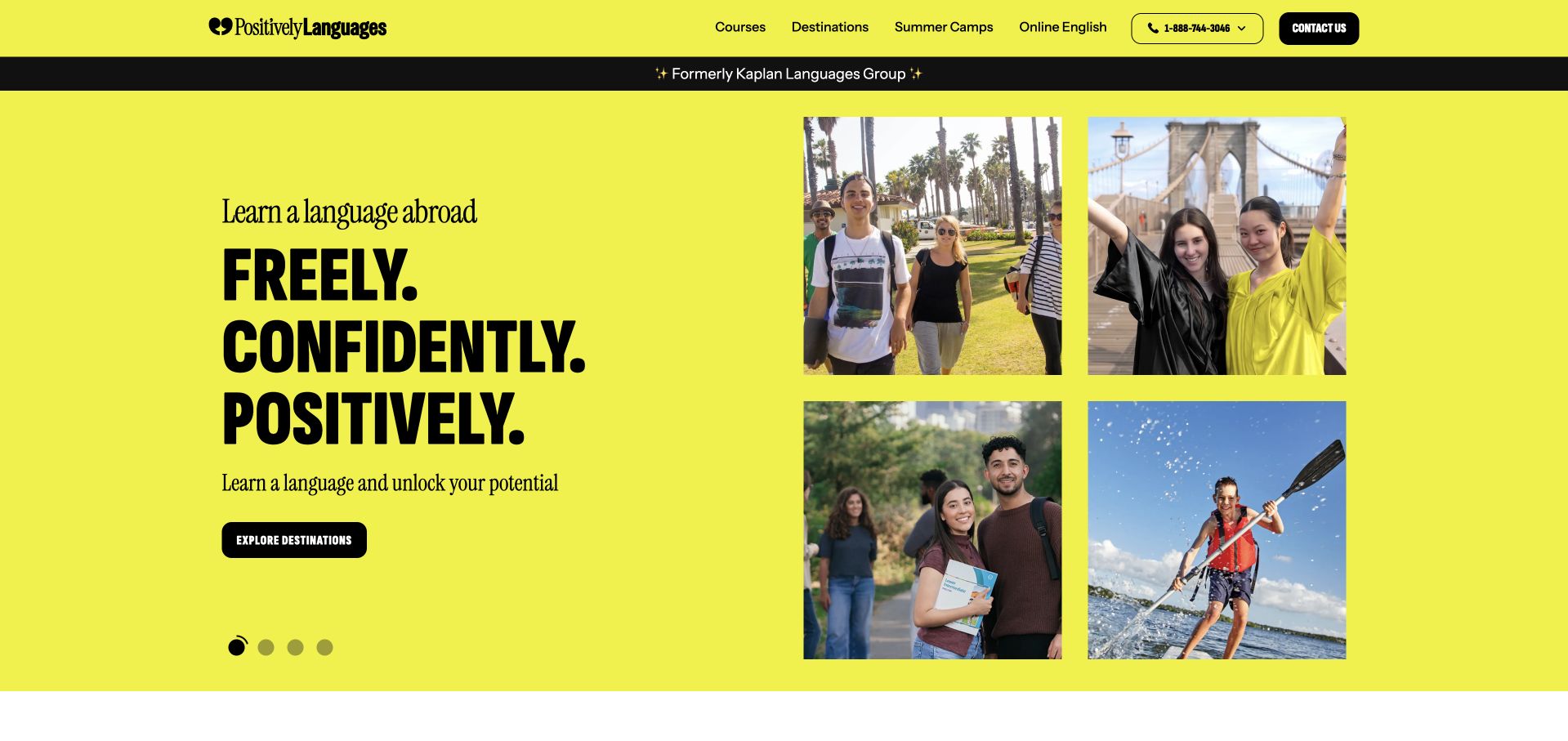
The former Kaplan International source now resolves to Positively Languages. The current page uses a vivid yellow-green background, a black wordmark and a four-part photographic arrangement beside a stacked headline. A small former-brand reference helps explain the transition. Course, destination and contact routes remain conventional above the expressive campaign. This is a reference for rebranding a familiar education service, not evidence that historic Kaplan programmes or conditions remain identical under the current name. The captured URL and review use the current public destination.
What you can learn
A rebrand should explain continuity without assuming it. Keep current course facts authoritative, retain a clear predecessor reference where useful and ensure old links resolve to relevant information rather than simply dropping every visitor at a new campaign.
Pros
A predecessor reference explains the redirected brand name for visitors.
Limited colours connect the photographic grid and stacked campaign headline.
Cons & considerations
The expressive campaign supplies less detail than a course selector.
Historic information needs review rather than being assumed currently applicable.
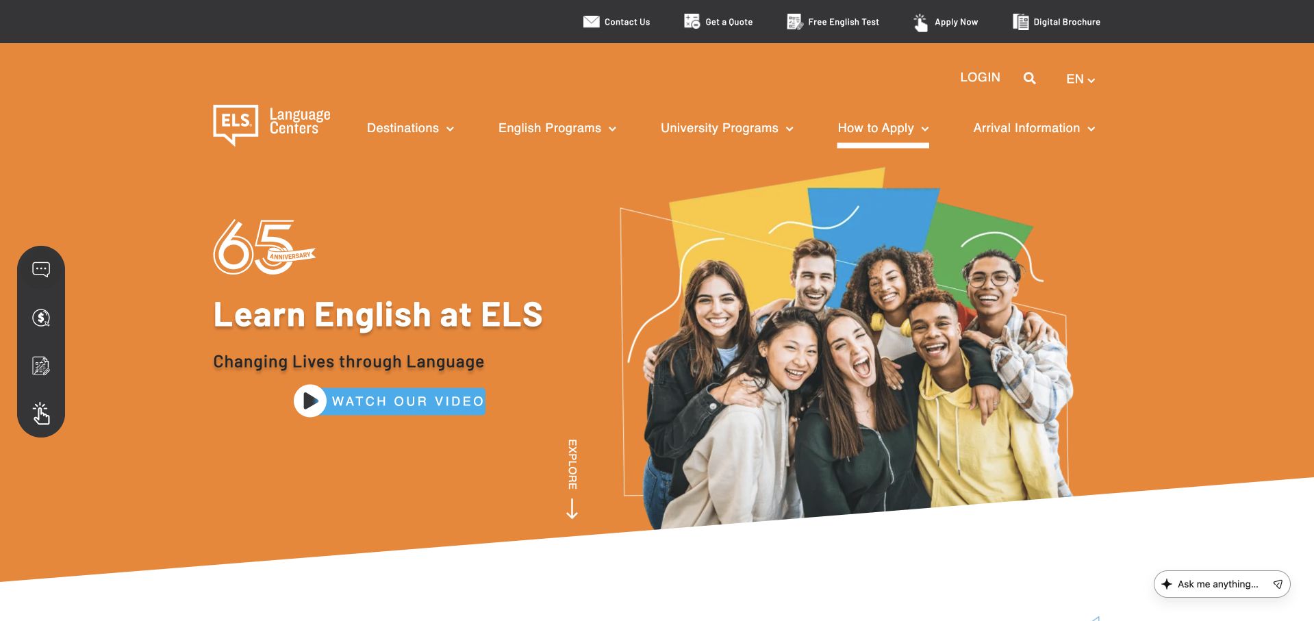
ELS combines a large orange field, a white wordmark and a cut-out group photograph. The main Learn English message remains short, while a visible Watch Our Video control offers an optional explanation. Programme and location routes sit above the hero, and an anniversary mark adds institutional context without taking over the page. The arrangement is simple and strongly branded. It introduces the provider clearly, but practical course and location information still needs to be learned from the linked public programme pages.
What you can learn
Use a short video as an alternative explanation rather than the only introduction. Keep the language taught, centre locations and next steps available in text, then ensure the video has captions and does not obscure ordinary browsing controls.
Pros
Orange branding gives the short English-learning introduction a distinctive identity.
An explicit video label separates optional media from programme navigation.
Cons & considerations
The broad opening does not state specific course timetables immediately.
An anniversary mark cannot establish an individual learner’s likely progress.
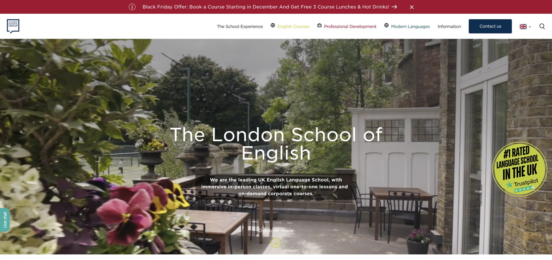
The London School of English uses a large photographic opening beneath a practical header with course and school information. The settled page connects its London identity to explicit English-language study rather than relying on a generic travel slogan alone. The broad image gives the institution a sense of place, while the surrounding navigation provides routes for visitors comparing programmes. This makes it useful as a reference for an established city-based school whose audience may include both local residents and visitors planning a course from abroad.
What you can learn
Combine the city story with course facts that remain understandable at a distance. Visitors planning travel need dates, lesson format and location information before they enquire, while local learners should not have to navigate through accommodation material to find a suitable class.
Pros
The school identity remains clear within conventional course-navigation patterns overall.
A city-setting photograph supports the local positioning without decorative clutter.
Cons & considerations
Programme pages still need dates and formats for useful comparison.
International audiences need clear time-zone and regional terminology throughout booking.
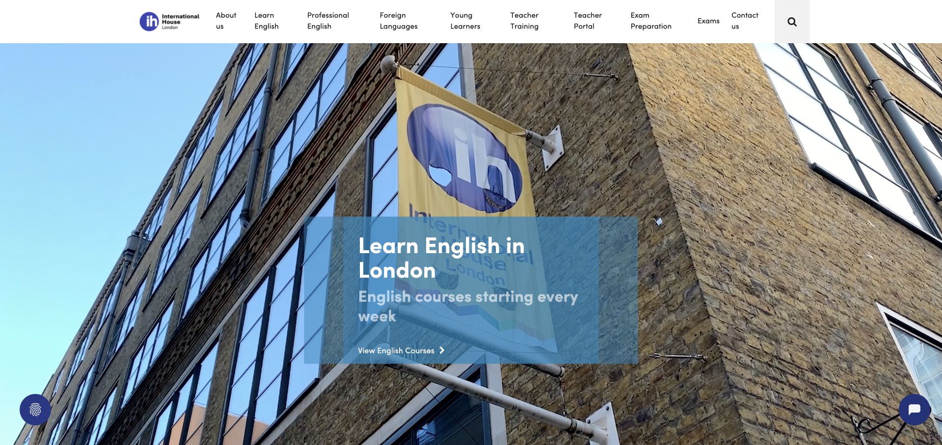
International House London opens with a wide photograph of its building, overlaid by a blue translucent panel introducing English study in London. A white header separates course, examination, teacher-training and experience routes. The photograph establishes a concrete institution in a real city setting instead of suggesting that the offer exists only online. The blue panel gives the message a stable reading surface. This is a useful example of physical-location storytelling, though the building image does not establish classroom facilities or accessibility arrangements in detail.
What you can learn
Use the building to establish place, then provide practical arrival and course information nearby. Different audiences—language learners, exam candidates and teachers—need distinct routes, even when they study in the same physical institution.
Pros
A blue panel protects text while preserving the building photograph.
Separate learner and teacher-training routes clarify different educational offers effectively.
Cons & considerations
An exterior photograph cannot explain classroom facilities or access arrangements.
Specialist categories need plain-language explanations and thoughtful mobile menu grouping.
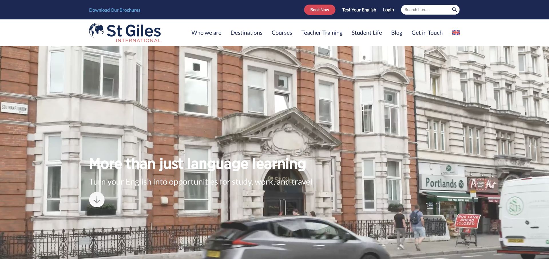
St Giles shows a street-level view of a school building below a white main header and dark blue utility strip. The opening headline is overlaid on the photograph, while a red Book Now action stands apart in the upper navigation. The design presents the institution as a physical place without obscuring the course and destination routes. A downward cue encourages further exploration. It is useful for studying how a familiar urban exterior can support a language-school introduction without requiring a separate cinematic production.
What you can learn
A physical school photograph should be paired with an accurate location page. Keep booking separate from general enquiries and explain course dates, requirements and what the booking action commits the visitor to before they enter personal or payment information.
Pros
A building exterior gives the offer a concrete physical setting.
A red booking action stands apart from informational navigation categories.
Cons & considerations
White text over pale architecture needs careful photographic contrast testing.
Booking prominence must not bypass current course dates and conditions.
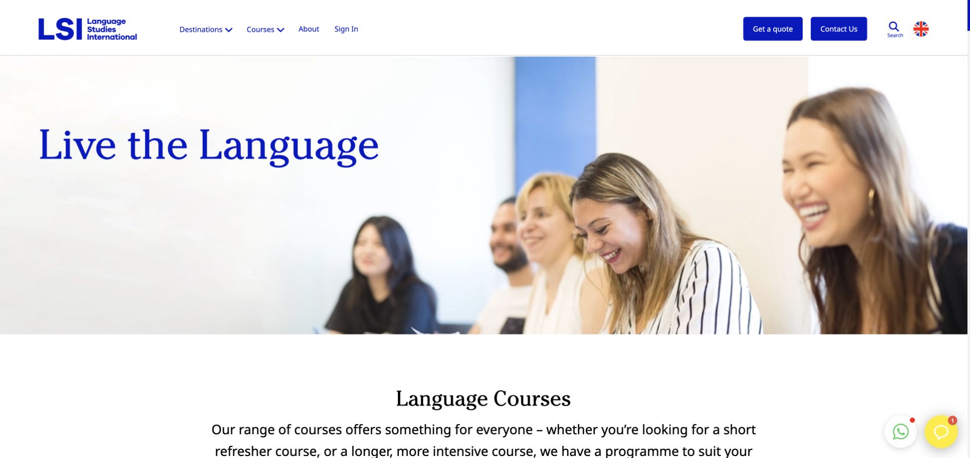
Language Studies International uses a white header, blue typography and a large conversational photograph beside the Live the Language message. The programme introduction is followed by a language-course section, making the transition from broad identity to practical browsing straightforward. Course, school and destination information appears through conventional navigation rather than an experimental interface. The design’s usefulness lies in that familiar structure. The broad immersion message should still be distinguished from the actual delivery format, level and location of each course listed on the site.
What you can learn
Keep a broad language-learning promise connected to a course catalogue that answers concrete questions. Let visitors compare language, location, level and format before requesting a quote, and make optional analytics preferences easy to decline without blocking the content.
Pros
A conventional header provides a predictable route into course browsing.
A limited blue palette connects photography and institutional navigation consistently.
Cons & considerations
The broad hero does not immediately explain levels or formats.
The cookie settings initially obscured the underlying course introduction content.
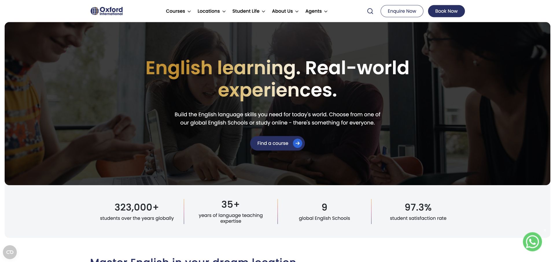
Oxford International uses a darkened conversational scene with a large English-learning headline and a smaller Find a Course action. The white header separates courses, locations, student life and agents, while Enquire Now and Book Now remain different actions. The supporting text explicitly mentions global schools and online study. This creates a clear distinction between browsing, asking questions and booking. The design is a useful example of a broad provider keeping practical choices available without placing a long form inside the opening hero.
What you can learn
Preserve the difference between enquiry and booking. Visitors still comparing levels or locations should not be funnelled into a purchase-oriented process. A course finder should explain format, dates and requirements before it asks for personal details or a commitment.
Pros
Separate enquiry and booking actions recognise different research stages clearly.
Physical and online options are named rather than only illustrated.
Cons & considerations
The photograph needs dependable contrast beneath supporting text on mobile.
Agent routes must stay distinct from the student’s booking journey.
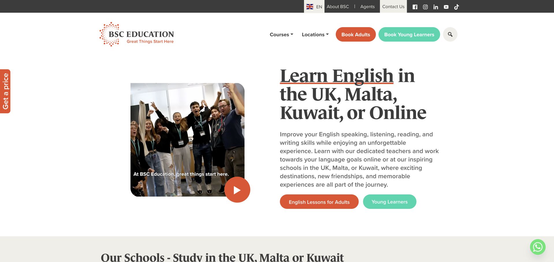
BSC uses a spacious white opening with a framed video image on the left and a large serif headline on the right. The introduction names several study locations and online delivery, with separate coloured actions for adult language study and young learners. Course and school navigation remains conventional at the top. The layout feels more editorial than a full-screen travel campaign, and the framing keeps the photograph from overwhelming the message. It is useful for studying how several delivery settings can be explained within a concise first view.
What you can learn
Use explicit audience actions when programme requirements differ. Keep the location list readable, but connect every route to its own current course facts. An attractive city list should not imply that every age group or programme is offered in every destination.
Pros
A split layout gives course text a stable reading surface.
Audience-specific actions make the broad school portfolio easier to approach.
Cons & considerations
Location lists need clear connections to the relevant programme types.
The opening still needs schedule and level details for comparison.
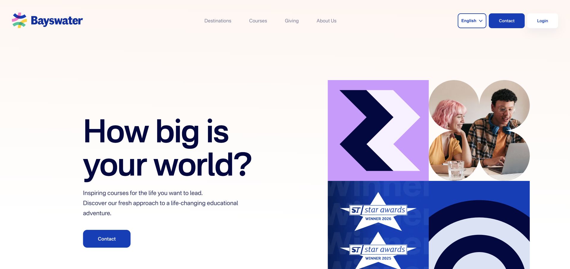
Bayswater places a large navy question on a pale background beside a geometric collage of photographs and brand shapes. A small blue contact action provides the main continuation route. The restrained header keeps destinations, courses and company information separate, while the collage adds visual energy without becoming a full-screen slideshow. The result is a distinctive institutional introduction with a predictable reading order. Its broad world-expanding message remains a brand proposition; the actual course catalogue must explain which language or professional-study options a visitor can choose.
What you can learn
A graphic identity can make a broad education offer memorable, but the next page must narrow the choice. Keep language courses and other professional programmes clearly distinguished, and use the collage as atmosphere rather than evidence of a specific course experience.
Pros
A stable text column stays readable beside the geometric collage.
A small contact action supports exploration without dominating the opening.
Cons & considerations
A broad question provides little immediate level or timetable information.
Collage shapes need simplification so practical mobile navigation remains visible.
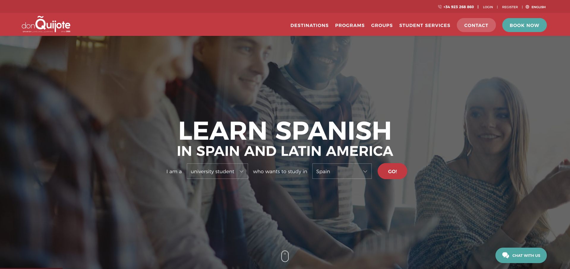
don Quijote uses a red header above a darkened conversational image and a large Learn Spanish message. A compact destination choice and red Go action sit directly inside the hero, giving the broad promise an immediate practical filter. The navigation separates destinations, programmes, groups and student services. This is a useful way to connect a specific language offer to several physical places without making the first page a long city directory. The photograph supports the introduction but does not verify the format or experience of any particular destination programme.
What you can learn
When location is the first meaningful choice, make it a genuine filter rather than a decorative list. Carry the selected destination into relevant course information and explain dates, level and delivery details before asking a visitor to begin a booking.
Pros
A destination selector gives the introductory hero a practical task.
Red accents connect the institutional header and main starting action.
Cons & considerations
Country-level messaging still needs specific city and course information nearby.
Overlaid controls require strong contrast and generous mobile interaction targets.
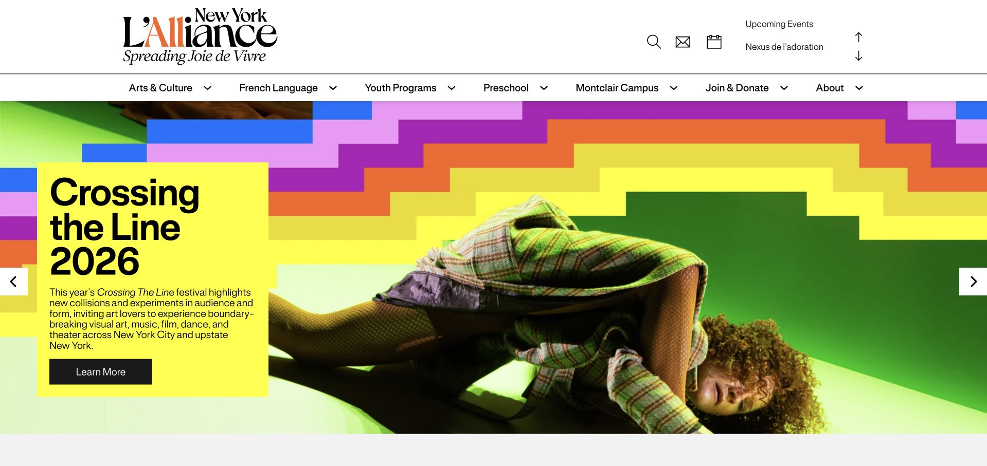
L’Alliance New York uses an intensely coloured festival campaign beneath a white institutional header. Large graphic blocks and a performance photograph make the opening feel like a cultural publication rather than a narrow course landing page. French Language remains a named navigation route beside arts, youth and preschool programmes. This example belongs in a language-school collection because the public institution offers language study, but the captured homepage is broader than that service. The design lesson is audience navigation across a mixed cultural and educational organisation.
What you can learn
A cultural homepage can promote a changing event while preserving a stable language-study route. Keep course pages easy to reach without requiring the visitor to understand the event programme, and avoid treating the current campaign as the institution’s entire offer.
Pros
A temporary event identity coexists with stable institutional navigation routes.
French Language provides an explicit route past broader cultural programming.
Cons & considerations
The dominant festival campaign delays the practical language-course information initially.
Saturated graphics still need dependable text contrast and responsive testing.
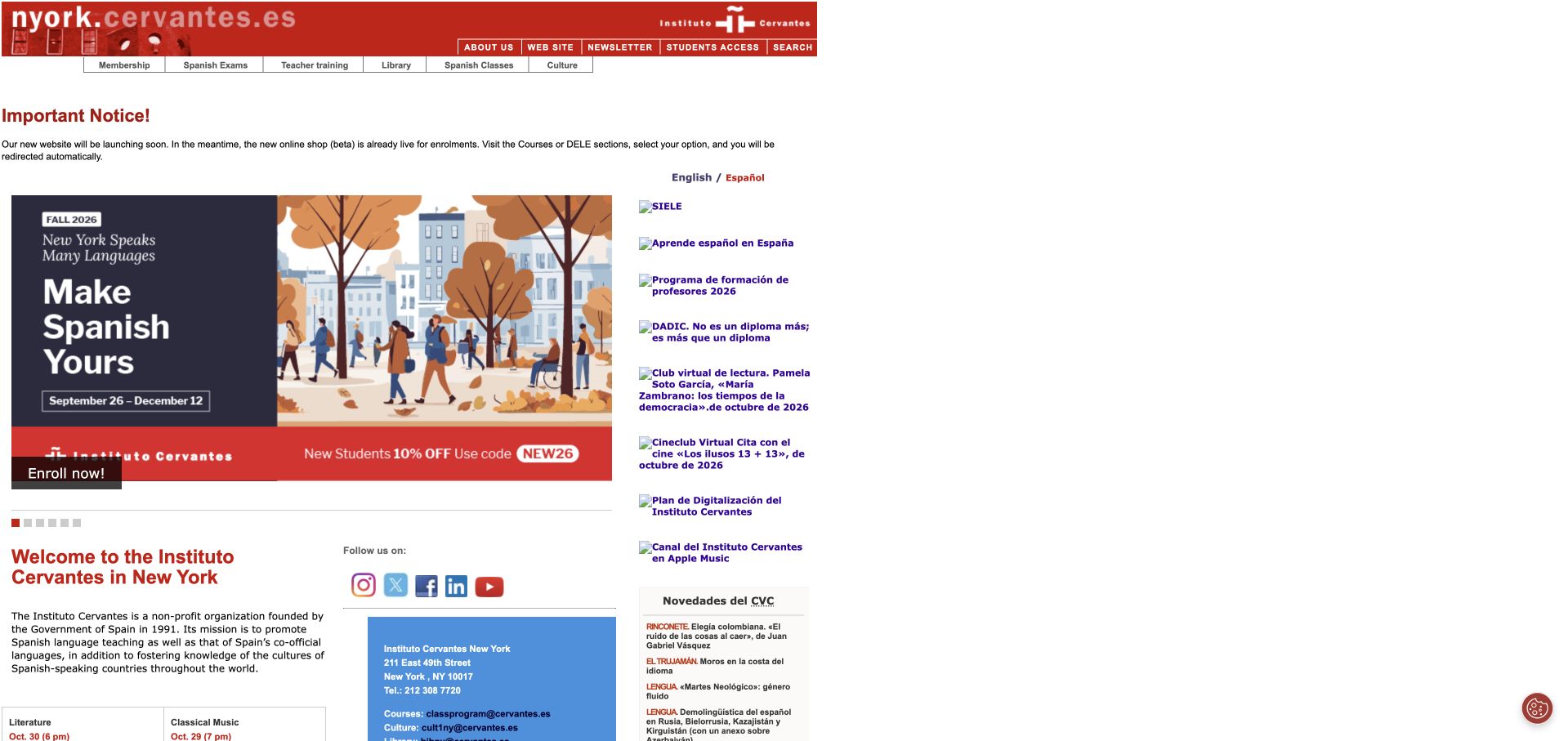
Instituto Cervantes New York uses a compact red masthead above a dense, left-aligned information layout. A large Spanish-course promotional panel occupies the central area, while notices, news and cultural links sit around it. The design is much more directory-like than the spacious commercial schools in this collection. That difference is useful: it shows a public institution prioritising a large volume of practical content. The page is an official language-and-culture source, but its traditional layout requires more deliberate scanning than a modern single-message landing page.
What you can learn
For a content-heavy institution, prioritisation matters more than adding visual effects. Group language courses, cultural events and notices clearly, maintain readable type sizes and give current course information a dependable route that does not depend on a rotating promotional graphic.
Pros
The course promotion supplies a clear starting point within dense content.
Consistent red branding gives institutional notices and course material recognition.
Cons & considerations
Small text and competing links increase first-time visitors’ scanning effort.
Narrow institutional columns need a deliberate responsive mobile arrangement throughout.
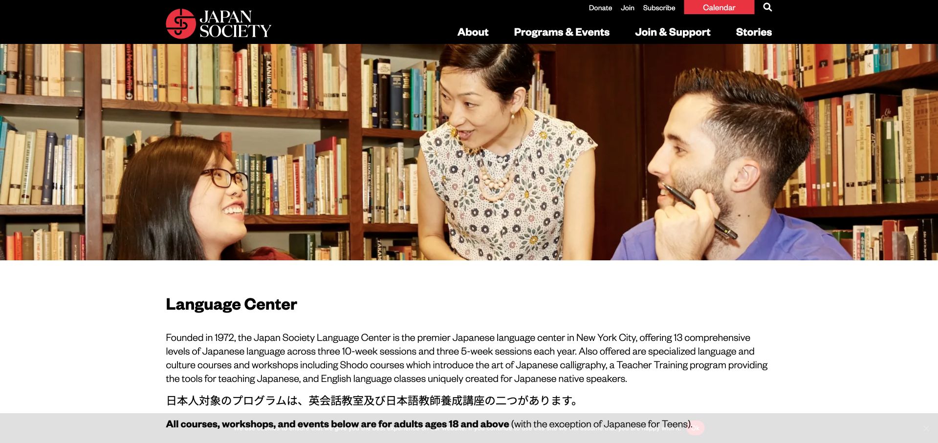
Japan Society’s Language Center page opens with a wide classroom photograph beneath the institution’s black header. The service title and explanatory paragraph follow immediately on white, making the page’s purpose clear without a separate promotional campaign. The visible content explains the language-centre offer within the larger cultural organisation. This is a public service page, not the organisation’s homepage, and that distinction matters when studying the layout. Its strength is the direct relationship between the page title, relevant photograph and concise introductory text.
What you can learn
A dedicated course-service page can be more useful than forcing every visitor through a broad institutional homepage. Keep the title literal, explain languages and formats promptly and link to current registration information without making the photographic scene carry essential facts.
Pros
A literal heading makes this dedicated service page immediately understandable.
Institutional navigation remains available without displacing the focused language-centre introduction.
Cons & considerations
Broader cultural routes still compete with the course-selection task itself.
A classroom photograph cannot establish a specific timetable or class format.
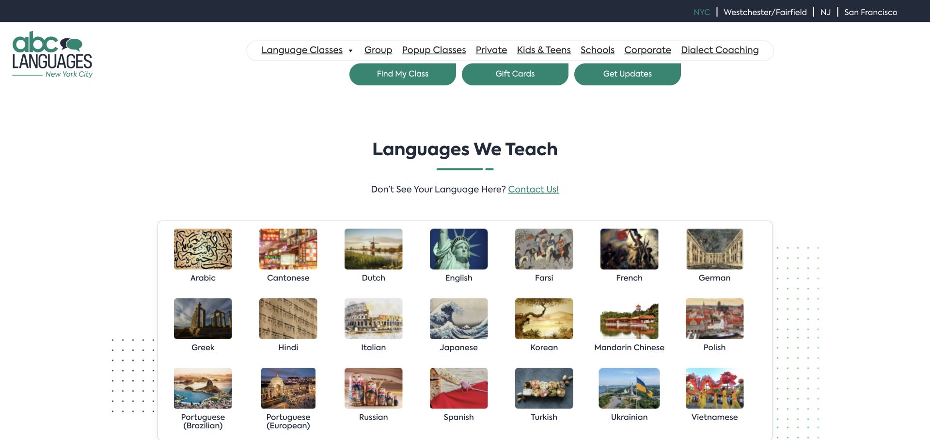
ABC Languages uses a white background, a green wordmark and a grid of photographic language tiles. The heading Languages We Teach makes the purpose explicit, while top navigation distinguishes group classes, private lessons, public classes and different audiences. Rather than asking visitors to read a broad motivational statement, the opening lets them identify a language immediately. This is a practical catalogue-first approach. The photographs add visual variety, but the language labels and linked course information do the important navigational work for visitors comparing actual classes.
What you can learn
If the language is the first decision, make it easy to browse before asking about a schedule. Keep language names as readable text and ensure each destination explains available levels, formats and dates rather than relying on a recognisable cultural photograph alone.
Pros
A language grid gives visitors an immediate course-catalogue starting point.
Group and private labels make a useful delivery distinction explicit.
Cons & considerations
Cultural photographs require text labels to identify languages accurately overall.
A catalogue-first page still needs clear school and location context.
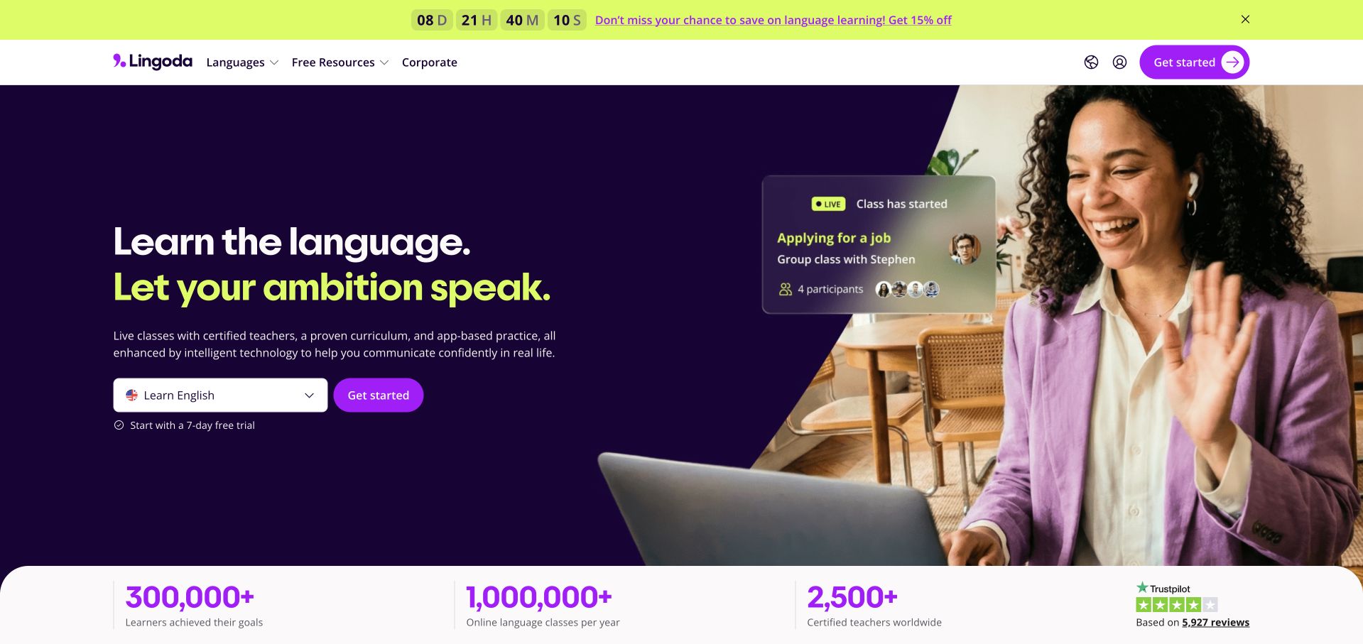
Lingoda uses a white header and deep-purple hero with a prominent online-language-learning introduction, clear actions and human-focused imagery. A promotional strip sits above the main header, while language and course information remain available through conventional navigation. The page’s visual language resembles a digital subscription product more than a physical school brochure. That can make an online offer easier to understand, provided the actual teaching format is stated clearly. Promotional savings and trial claims remain subject to the publisher’s current conditions, not an assurance from this review.
What you can learn
Distinguish live teaching from self-study before presenting subscription choices. Explain the class format, language levels and how booking works, then keep trial conditions accessible. A product-like interface should simplify the course decision rather than hide important scheduling or cancellation information behind account creation.
Pros
A product hierarchy suits a clearly explained online teaching offer.
Conventional language routes support visitors who bypass the promotional action.
Cons & considerations
Discounts and trials need clear conditions and active editorial maintenance.
Subscription-style presentation must not hide class scheduling behind account creation.
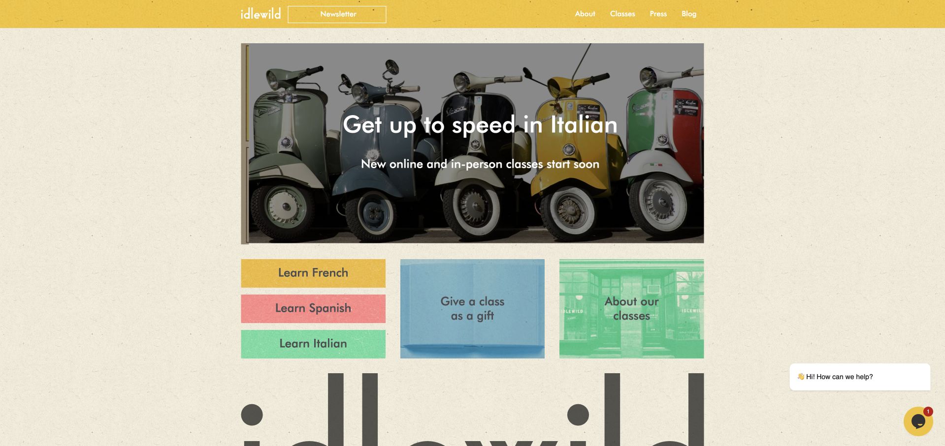
Idlewild uses a warm cream background, yellow header and a compact class promotion above coloured language buttons. A large wordmark begins further down, connecting the course offer to the shop’s broader identity. The opening is notably different from a corporate language-school template: it feels like a local cultural destination with classes rather than a global travel programme. French, Spanish and Italian routes are immediately visible, alongside gift-card and about options. The design is useful for its clear prioritisation and recognisable, limited colour system.
What you can learn
A small provider can use a distinctive local identity without sacrificing class navigation. Name the languages first, then explain location, online options and dates on the destination pages. Keep gift cards and editorial material secondary to the practical task of finding a class.
Pros
Coloured language buttons provide direct routes without an institutional slogan.
Warm colours give a small course catalogue a distinctive identity.
Cons & considerations
Small header labels need adequate mobile text size and spacing.
A chat prompt should never cover the class-selection action controls.
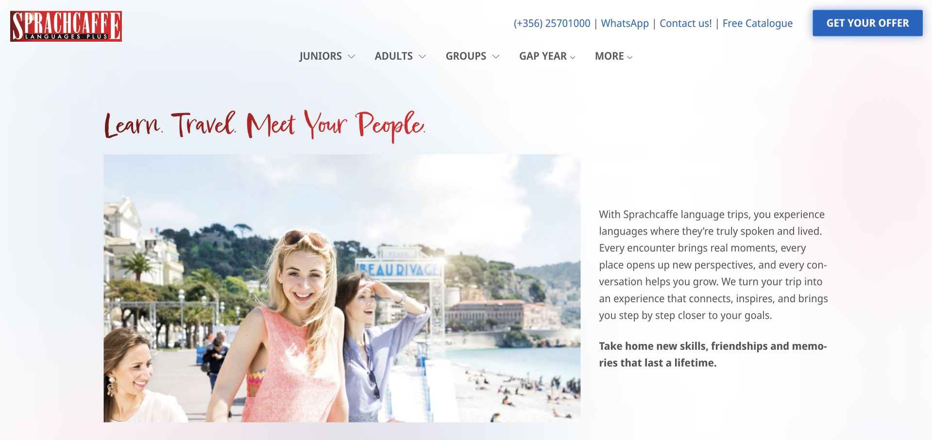
Sprachcaffe uses a white page, a compact red wordmark and a two-column introduction pairing travel imagery with explanatory text. The short red script headline names language, travel and people as the central themes. Navigation separates juniors, adults, groups and gap-year offers, making audience differences visible above the main content. This is a quieter and more text-led approach than a full-screen video. It can help explain a broad travel-study offer, although each programme still needs its own clear course facts and participation conditions.
What you can learn
Keep travel aspirations connected to practical programme information. Age group, destination, language and course format should be easy to identify before someone enquires. A two-column introduction works best when the text adds useful context rather than simply repeating what the holiday-style image already suggests.
Pros
Audience labels separate adult study from junior and group programmes.
Bounded imagery creates a predictable two-column reading order for visitors.
Cons & considerations
Travel imagery must not obscure the actual teaching format offered.
Experience-led introductions still need current destination and age-range programme details.
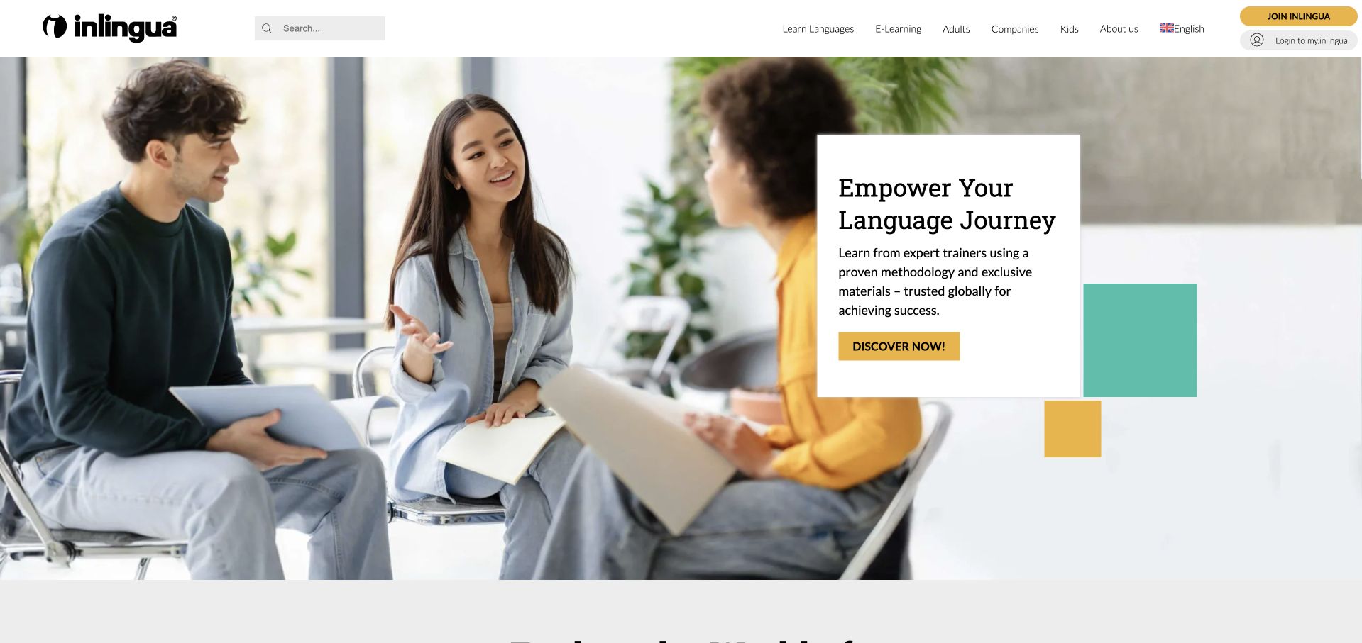
inlingua uses a wide conversation photograph beneath a white header and black wordmark. A small white text card sits within the scene, with yellow and turquoise accents providing emphasis. The introduction names the language-learning journey while keeping location and programme navigation available above it. The image-led opening is restrained enough to support a broader school network without turning the homepage into a directory. The design offers an accessible starting impression, but the details of courses, schedules and availability depend on the relevant local centre.
What you can learn
For a network, keep brand-level promises separate from centre-level facts. Let the main page introduce the approach, then make the location handoff explicit so visitors can verify the language, delivery format and timetable that are actually available to them.
Pros
A white text card protects the headline’s reading surface consistently.
Colour accents add hierarchy without obscuring conventional programme navigation above.
Cons & considerations
Global branding cannot establish every local centre’s available course formats.
Photographic context cannot replace current course and location information itself.
Kegan is a freelance web designer and developer with 15+ years of experience helping businesses turn complicated website requirements into clear, maintainable digital experiences. He works directly with clients from planning and design through development, launch, and ongoing support.
For language school website design, his development approach focuses on languages and proficiency levels, course formats, schedules, location information, and enrollment-system handoffs. The scope can be a targeted improvement or a complete custom build, with responsive layouts, thoughtful content structure, and integrations chosen around the people using and maintaining the site.
Show 3 other language school website designersHide other language school website designers
Plan a course catalogue that stays understandable as it grows
Define the course record before designing cards
List the facts every course page needs: language, level description, audience, format, location or time zone, dates, duration and registration route. Add only distinctions the school can maintain accurately. If a level framework is used, explain its practical meaning for the course rather than displaying an unexplained code. Keep current dates in structured content so the same schedule is not manually rewritten across promotional images and downloadable brochures.
Separate browsing from placement and registration
Let visitors investigate an offer before taking a placement test or creating an account. Explain why a test is needed and what its result does, without collecting unnecessary personal details. Make the handoff to a booking or learning platform visible. Before a registration action, provide current conditions and contact routes for questions; a promotional countdown should not displace the information required to understand the course itself.
Plan for local and international visitors
Use literal place names, clear time-zone information and accurate format labels. A local learner may need a transport page, while an international visitor may need information about the school’s location and what the course does not include. Keep professional, immigration and travel questions directed to appropriate authoritative sources rather than turning a design guide into legal advice. Review translated content and regional redirects with the same care as the main English pages.
The editing job behind the design
Choose technology around courses, dates and handoffs
[object Object]
[object Object]
[object Object]
Our WordPress website examples offer a separate look at publishing approaches. A visible platform label is evidence for that named page, not a guarantee that the same system will suit your requirements.
Before the public launch
Language-school website launch checklist
State the language, audience and delivery format before the main registration action.
Keep group, private, online and children’s programmes clearly distinguished where applicable.
Give each course current dates, duration, location or time-zone information and registration context.
Preserve city, language and audience selections when visitors move through course browsing.
Explain placement tests without requiring an account merely to read basic course facts.
Separate cultural events and adjacent services from ordinary language-course registration routes.
Check regional redirects, currencies and translated labels against the intended market.
Maintain one authoritative schedule source rather than conflicting dates in several formats.
Label booking fields and provide understandable errors, confirmations and external-provider handoffs.
Keep important level and course information readable without video or decorative graphics.
Remove expired offers and provide useful states for courses without current scheduled dates.
Assign editorial owners for locations, course descriptions, translations and practical visitor information.
These checks are a project checklist, not a performance, legal, security, or accessibility certification. Test real journeys with the people responsible for the website before making claims about the result.
Sources & editorial method
How this collection was selected and reviewed
We inspected public pages and actual browser captures, including service pages where the language offer sits inside a broader institution. Reviews are original observations about design and information structure, not measured teaching rankings. Redirects and capture dates are recorded honestly. Public technology notes are intentionally limited to source-qualified observations.
Each example links to its actual source page. Screenshots are direct browser captures with their own capture dates; moving imagery, announcements and live designs can change. The notes describe observable design choices and conditional tradeoffs, not measured traffic, conversion results, service quality, or accessibility conformance.
Technology labels use public page metadata, asset evidence, or explicitly cited platform documentation. Platform documentation is not a complete current deployment audit. A component reference may be legacy or unused; it is not a complete backend inventory. Unknown stacks are omitted. These sites are editorial examples, not our client portfolio.
Written, Edited and Curated are separate editorial records, not timestamps advanced by a rebuild. Website designs and imagery belong to their owners. See our editorial standards or suggest a correction.
Questions worth asking
Language School website design questions
Should a language school lead with destinations or languages?
Lead with the choice that matters first to your visitors and your actual offer. A local multilingual school may begin with languages, while an international single-language provider may begin with destinations. Carry that selection into real course information rather than routing every option to one generic form.
How much information belongs on a course card?
Enough to distinguish the offer without reproducing the entire page: language, audience, level or format and a useful date or location cue. Keep the detailed conditions on a dedicated course page. Do not display a schedule unless someone is responsible for maintaining it.
Can we use travel photographs for language courses?
Yes, if they are permissioned and accurately contextualised, but they do not explain teaching format or course inclusions. Pair them with plain text about the actual offer. Avoid implying that every pictured activity, accommodation or destination experience is included in every programme.
Does the site need an online placement test?
Only if it serves a defined process the school can support. Explain its purpose and the next step, minimise information collection and keep basic course descriptions public. A test is not a substitute for clear level descriptions or a route to ask a qualified member of staff.
How should a school handle a rebrand?
Use current names and programme information, provide useful predecessor context and review old redirects. Do not assume that historic terms, dates or accreditation claims remain unchanged simply because the former domain now points to a new homepage. Keep regional destinations consistent with their actual market.
Use the visual examples to make course choices easier, not merely more aspirational. The best brief connects the school’s identity to a course catalogue and registration process that staff can keep accurate throughout changing terms and destinations.