Best Campground Websites of 2026 (16 Real-World Examples)
Campground websites that explain pitch fit, utilities and the real price
These 16 campground and holiday-park websites compare the details behind a site booking: pitch dimensions, vehicle limits, power and sewer, occupancy, pet rules and seasonal rates. The strongest pages help visitors choose a compatible site before entering dates.
A campsite is not a standard hotel room. Two pitches with the same powered label may differ in surface, dimensions, vehicle access and whether tents are permitted. Put those physical facts in the product description rather than relying on a broad accommodation category.
Pricing also needs context. A nightly headline may cover one person, a family or a particular vehicle, with extra charges for utilities or longer stays. A clear website explains the base booking and its important conditions without making guests assemble the answer from several policies.
Before the examples
What makes good campground website design in 2026?
Put pitch restrictions beside booking
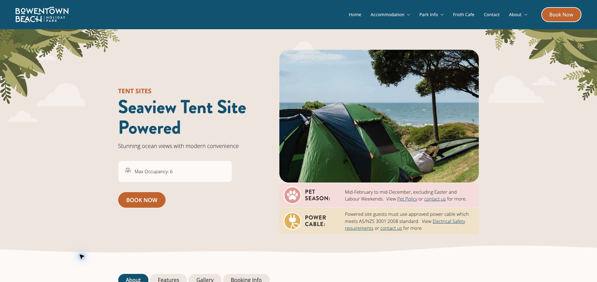
Bowentown’s seaview tent-site page gives capacity and important pet and equipment conditions a prominent place. Its specific product presentation is more useful than assuming a general park policy explains every pitch type.
Describe the physical fit
Sundale differentiates vehicle length and surface, including powered categories that do not accept tents. Te Puru supplies actual dimensions. These are practical selection facts, not optional details to reveal after purchase.
Explain what the base rate covers
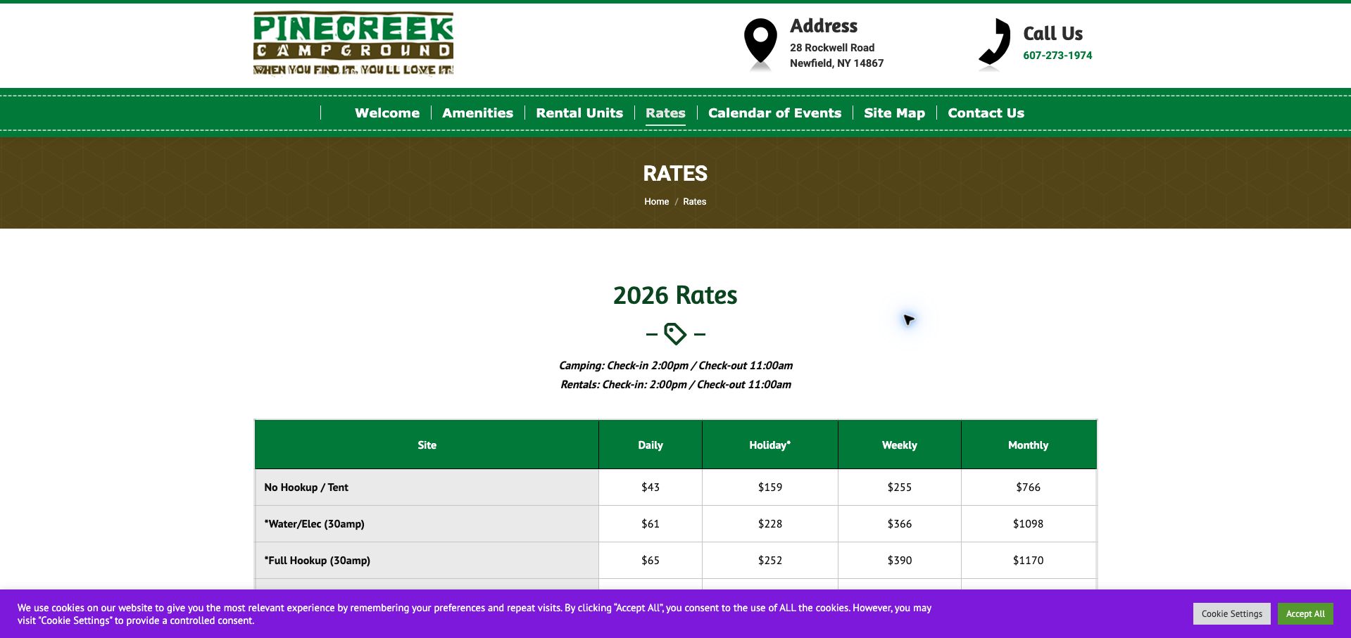
Separate people, vehicles, utilities and taxes. Pinecreek’s longer-stay electricity qualification illustrates why exclusions should sit beside the affected weekly or monthly price instead of only below the table.
Keep seasonal information aligned
A rate year, opening season and pet policy may each have different dates. Review them together so an advertised future booking season does not inherit an expired price or restriction without explanation.
The collection · 16 examples
16 campground websites worth studying
The collection includes basic tent sites, RV parks and mixed holiday accommodation. Compare the specificity of each pitch description and booking condition rather than treating a long amenity list as evidence that every site suits every visitor.
Bowentown earns our Editors Choice for making a specific camping product understandable in the opening view. The powered seaview tent site has its own photograph, descriptive title, six-person occupancy limit and booking action. Two colored information bands immediately qualify the offer: one describes the pet season and holiday exclusions, while the other explains that an approved camping power lead is required. Those details are easy to miss when buried in general park policies. Illustrated foliage, warm cream backgrounds, teal headings and an orange action create a friendly identity without crowding the practical information. Tabs organize further details, and related cards show that other tent-site categories have different capacities. The opening still lacks a price indication and physical pitch dimensions, so fit and cost require another step. The selection recognizes the clarity of the website's pitch presentation rather than endorsing the accommodation itself.
What you can learn
Give each pitch type its own capacity, photograph and restrictions, and place the most consequential pet and equipment conditions beside the booking action.
Pros
Occupancy and two important restrictions are visible in the first screen.
Related pitch cards retain their own capacity rather than implying uniform sites.
Cons & considerations
The opening product summary does not show a rate indication.
Physical pitch dimensions are not supplied beside the capacity limit.
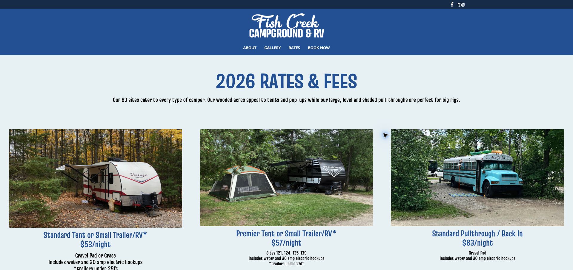
Fish Creek uses photographic rate cards to distinguish standard and premier tent or small-trailer sites from pull-through and back-in options. Each card couples a price with surface, electrical supply and, where relevant, a trailer-length limit. The page explicitly states that sewer is not included, avoiding the common ambiguity of a generic hookups label. Cabin details also distinguish pet eligibility by unit and tell guests to bring linens. Blue headings and real campsite photographs make the comparisons approachable, while the compact navigation keeps booking easy to find. The condensed type can feel heavy across longer passages, and additional fees and cancellation details sit further down or behind controls. A 2027 operating season appears beneath a 2026 rate heading, so the two periods should be reconciled before a traveler assumes the displayed prices apply to next year's booking. The underlying card structure is nevertheless highly reusable.
What you can learn
Compare the physical site, vehicle limit and exact utility provision together, and keep the rate year aligned with the season currently being sold.
Pros
Site photographs are paired with electrical supply and vehicle-size limits.
The absence of sewer and cabin-specific pet rules are clearly stated.
Cons & considerations
Condensed typography is tiring in the longer fee explanations.
The rate year and advertised next operating season need clearer alignment.
Pinecreek presents a substantial rate matrix with daily, holiday, weekly and monthly columns. Rows distinguish tent sites, water and electric, full hookups, amperage and pull-through options, while a second table covers rental accommodation. Arrival and departure times appear before the comparison, giving the page a practical opening. The important qualification comes below: electricity is additional for several extended-stay categories and is metered around the visit. Security deposits, occupancy, visitor fees and holiday minimums are also documented. Green table headers and a highlighted site-name column support scanning, but the matrix becomes dense and the electrical exception is easy to overlook after the headline numbers. A bright cookie bar further competes with the lower rows in the initial view. This example shows how useful a comprehensive table can be, and why recurring exclusions should be attached directly to the affected columns.
What you can learn
Mark utility exclusions in the relevant weekly and monthly table headings, rather than relying solely on a footnote after the accommodation comparisons.
Pros
Rate columns distinguish ordinary, holiday and longer stays.
Check-in times, occupancy and metered-electricity conditions are documented.
Cons & considerations
The broad matrix is dense and requires careful reading.
The extra-electricity condition is separated from the prices it qualifies.
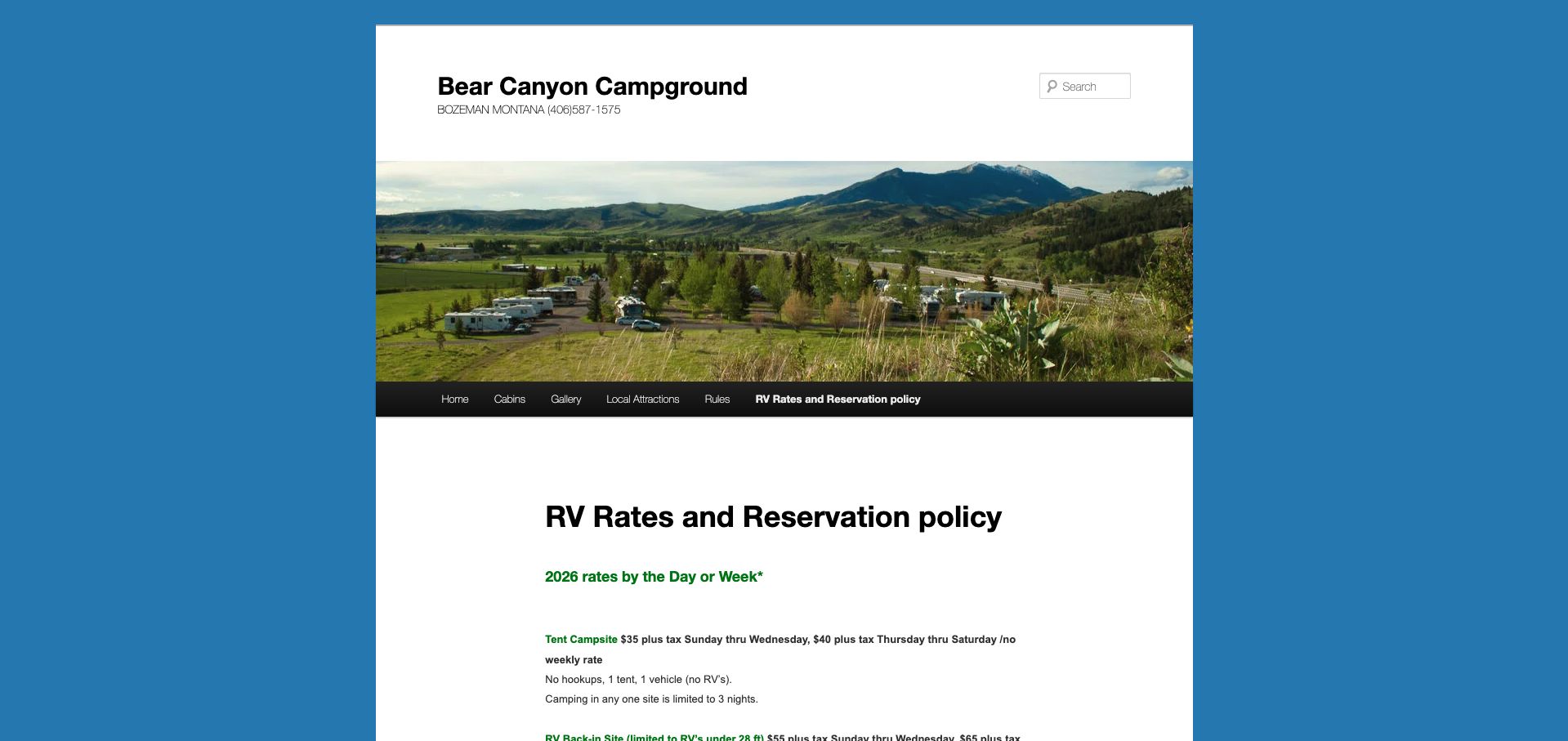
Bear Canyon explains its site inventory through concrete limits. Tent pitches exclude RVs and have a short maximum stay; back-in RV sites specify a vehicle-length ceiling and water and electric supply; pull-through sites add sewer. The reservation policy then distinguishes a requested site number from the guaranteed hookup and RV-length category. That is a particularly useful clarification for guests who might otherwise interpret a booking as a promise of one exact location. Daily, weekly and monthly arrangements have separate inclusions and extra-person, vehicle and dog charges. The narrow white page, blue surround and scenic banner create a simple, older-style presentation. Repeated spacing and paragraph-based pricing make comparison slower than a structured table, and the monthly section refers to a season already ended at review. The content's strength is precision about fit and allocation, even when the layout does not fully support it.
What you can learn
State whether guests reserve an exact pitch or a compatible category, then list vehicle length and utilities as explicit parts of that guarantee.
Pros
Tent, back-in and pull-through categories have concrete suitability limits.
The site-request policy separates preference from guaranteed features.
Cons & considerations
Long, spaced paragraphs make the rate categories harder to compare.
The monthly offer needs clearer handling after its seasonal end date.
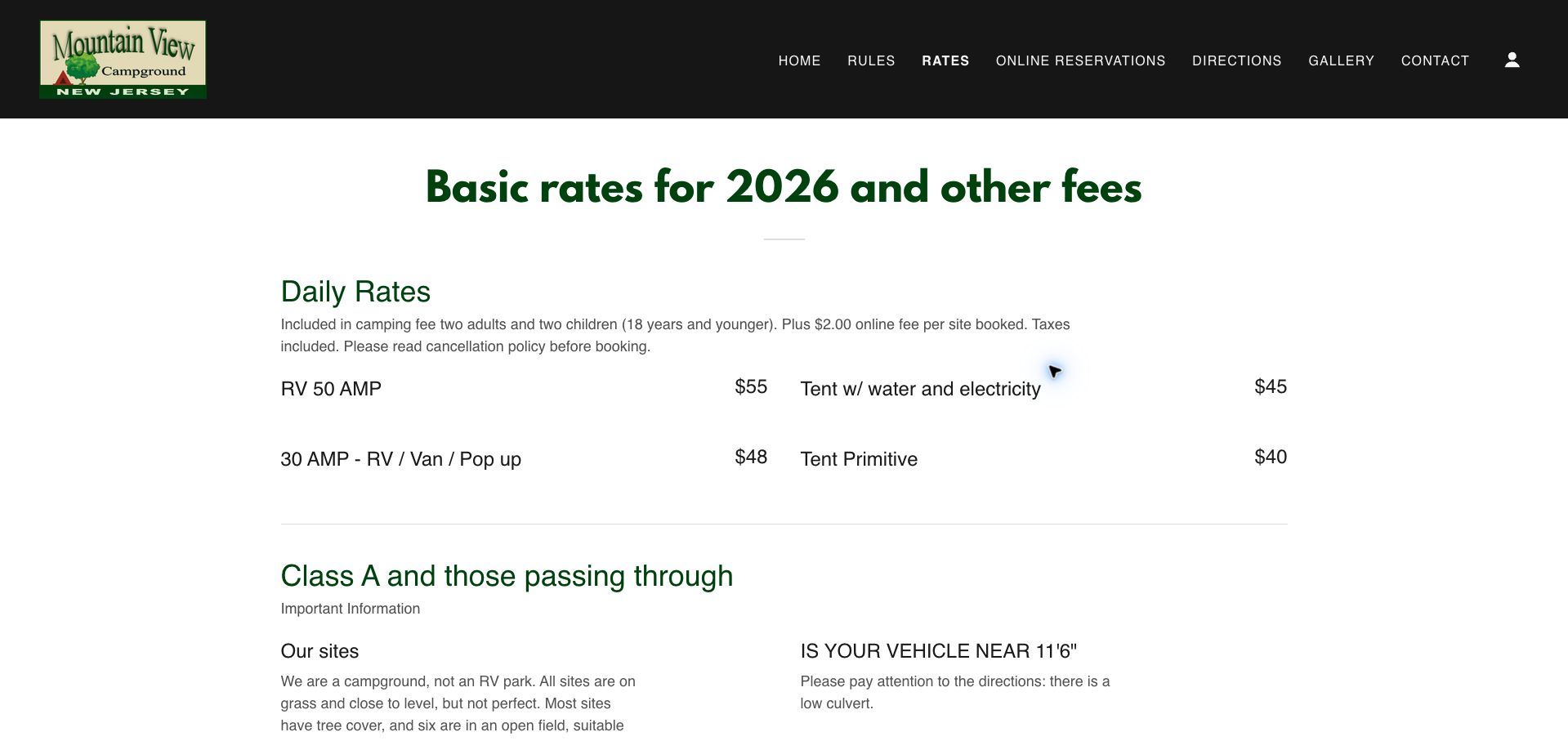
Mountain View's rate page places practical constraints close to the price. The first section states who is included in the daily fee, identifies an online charge and says tax is included. A following vehicle-focused section explains that pitches are grass and not perfectly level, that sewer hookups are absent, and that a low culvert makes the directions important for taller vehicles. This is more useful than allowing a generic RV photograph to imply unrestricted access. Check-in hours, visitor charges, firewood rules and dump-service fees continue the operational detail. Large green headings and a two-column layout keep the opening reasonably clear. Some later instructions become lengthy and forceful, however, and the reservation wording requires readers to reconcile recommended booking with walk-in availability. The strongest lesson is the willingness to publish constraints that materially affect whether the campground is suitable.
What you can learn
Put access height, terrain and missing utilities before the reservation action, with a direct route to the correct approach instructions.
Pros
Vehicle approach and uneven grass conditions are disclosed near the rates.
Tax inclusion, online fees and base occupancy are explicitly separated.
Cons & considerations
Long enforcement-oriented passages weaken the welcoming tone.
Reservation and walk-in guidance could be summarized more clearly.
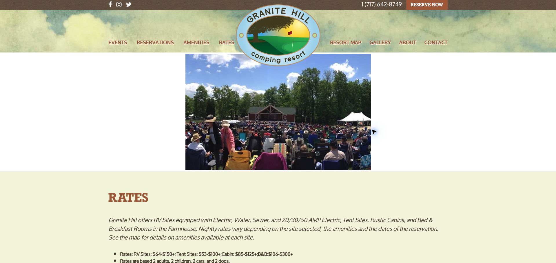
Granite Hill gives ranges for RV sites, tent sites, cabins and farmhouse rooms, explaining that the actual amount depends on the selected site, amenities and dates. The base occupancy includes people, vehicles and dogs, while maximum occupancy and permitted camping-unit combinations are separately stated. Taxes, additional guests, early arrival, storage and other services receive their own sections. The page also explains that discounts cannot be combined and that some dates or rate types are excluded. Brown and pale green branding and a festival photograph connect the information to a broader resort experience. The drawback is a long, densely qualified fee document, with a 2025 scout rate still appearing alongside newer reservation information. The headline ranges also need a clear quote path to become actionable. This is a useful example of transparent surcharge disclosure that would benefit from stronger date control and task-based grouping.
What you can learn
Show the base occupancy and unavoidable charges beside the range, then separate optional services and outdated special-group offers from the main reservation summary.
Pros
People, vehicles, pets and permitted unit combinations are defined.
Taxes, extra services and discount exclusions are openly listed.
Cons & considerations
The long fee document makes the likely total difficult to estimate quickly.
A prior-year scout offer weakens confidence in date maintenance.
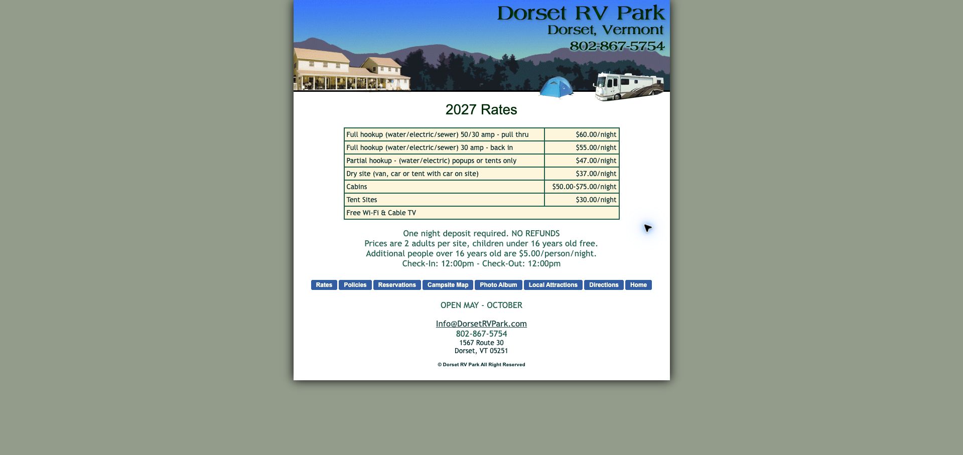
Dorset RV Park compresses its main rate information into a compact page. The 2027 table distinguishes full and partial hookups, electrical capacity, pull-through and back-in arrangements, dry sites, tents and cabins. Directly below, it states the included adults, child-age threshold, additional-person charge, deposit condition and arrival and departure times. The May-to-October operating season and contact details are also visible without a long scroll. That density makes the page efficient for a returning visitor who already understands the site. The narrow fixed-width presentation, small buttons and illustrated header feel dated, however, and the distinction between a dry site with a vehicle and an ordinary tent site needs more explanation. The child pricing also leaves the exact boundary age less clear than it could be. The lesson is that compactness is valuable when it preserves the definitions needed to interpret each row.
What you can learn
Keep a short fee brief together, but define adjacent site categories and age boundaries precisely enough that visitors can choose without guessing.
Pros
Rates, base occupancy, deposit and operating season fit in a compact view.
Electrical capacity and entry style distinguish the RV categories.
Cons & considerations
Small fixed-width text and buttons limit the visual hierarchy.
Dry-site and child-age distinctions require clearer definitions.
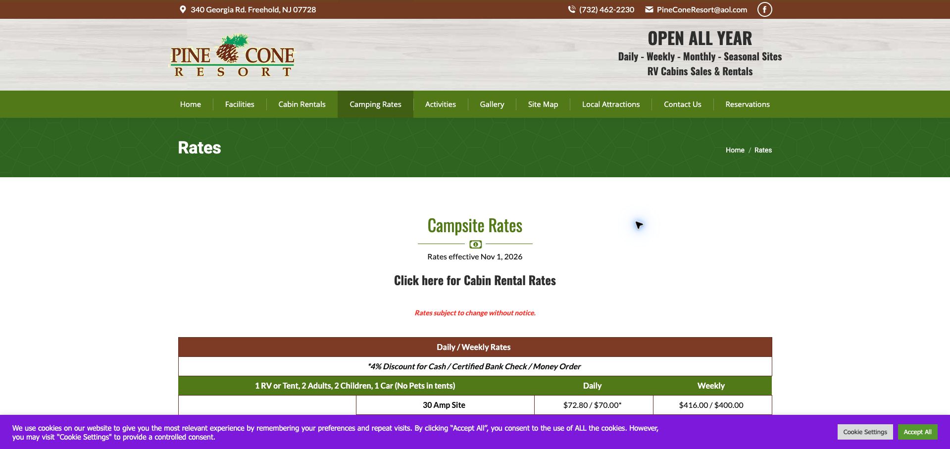
Pine Cone's rate page clearly announces a November 2026 effective date and separates daily or weekly camping from winter and later summer monthly arrangements. The comparison distinguishes electrical amperage, sewer provision and pull-through access. It also explains that the monthly unit means four weeks or twenty-eight days, an important distinction for anyone comparing it with a calendar month. Base occupancy, holiday additions and payment-method discounts are documented, while restrictions on pets in tents and certain electrical uses qualify the offer. The green and brown design gives the extensive tables a consistent framework. Slash-separated standard and discounted amounts, numerous asterisks and repeated prohibitions nevertheless make the page demanding to read. The strongest pattern is explicit dating and billing-period definition; the weakest is trying to carry too many qualifications inside each table cell and footnote.
What you can learn
State the exact billing period and effective season, then use separate labeled columns for ordinary and payment-method prices instead of slash-separated pairs.
Pros
Winter and summer monthly periods are explicitly dated.
The twenty-eight-day billing unit and utility categories are defined.
Cons & considerations
Paired prices and inconsistent asterisk use make comparison laborious.
Dense restrictions compete with the core cost and occupancy information.
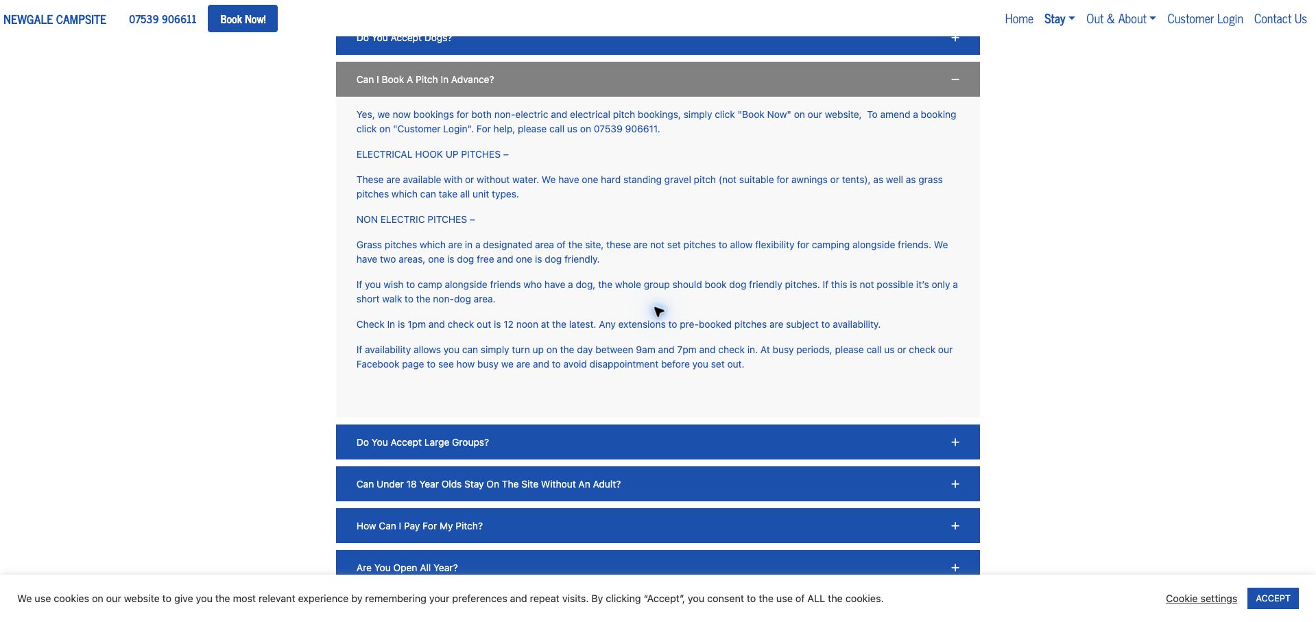
Newgale's FAQ gives practical meaning to its pitch choices. The booking answer distinguishes electric pitches with or without water, a hardstanding unsuitable for tents or awnings, and flexible non-electric grass areas. It explains that friends camping together with a dog should select the dog-friendly zone, which turns a general pet policy into a useful group-booking instruction. Check-in, departure and availability-dependent walk-ins are also described. A prominent seasonal notice states that the campsite is closed until March 2027 while future bookings remain possible. Blue and gray accordion rows make the question list easy to scan, but the answers form long blocks and essential choices remain hidden until opened. The initial page also has excessive empty space above the FAQ. The content is strongest where it connects a booking choice to the physical arrangement guests will encounter on arrival.
What you can learn
Translate park zones into booking instructions for real parties, especially groups with pets, and keep the current closure or opening status outside hidden FAQ panels.
Pros
Dog-area guidance explains how friends should coordinate their bookings.
The current closure and future reopening are clearly announced.
Cons & considerations
Important pitch distinctions are hidden in a long accordion answer.
Large empty space above the questions weakens the initial presentation.
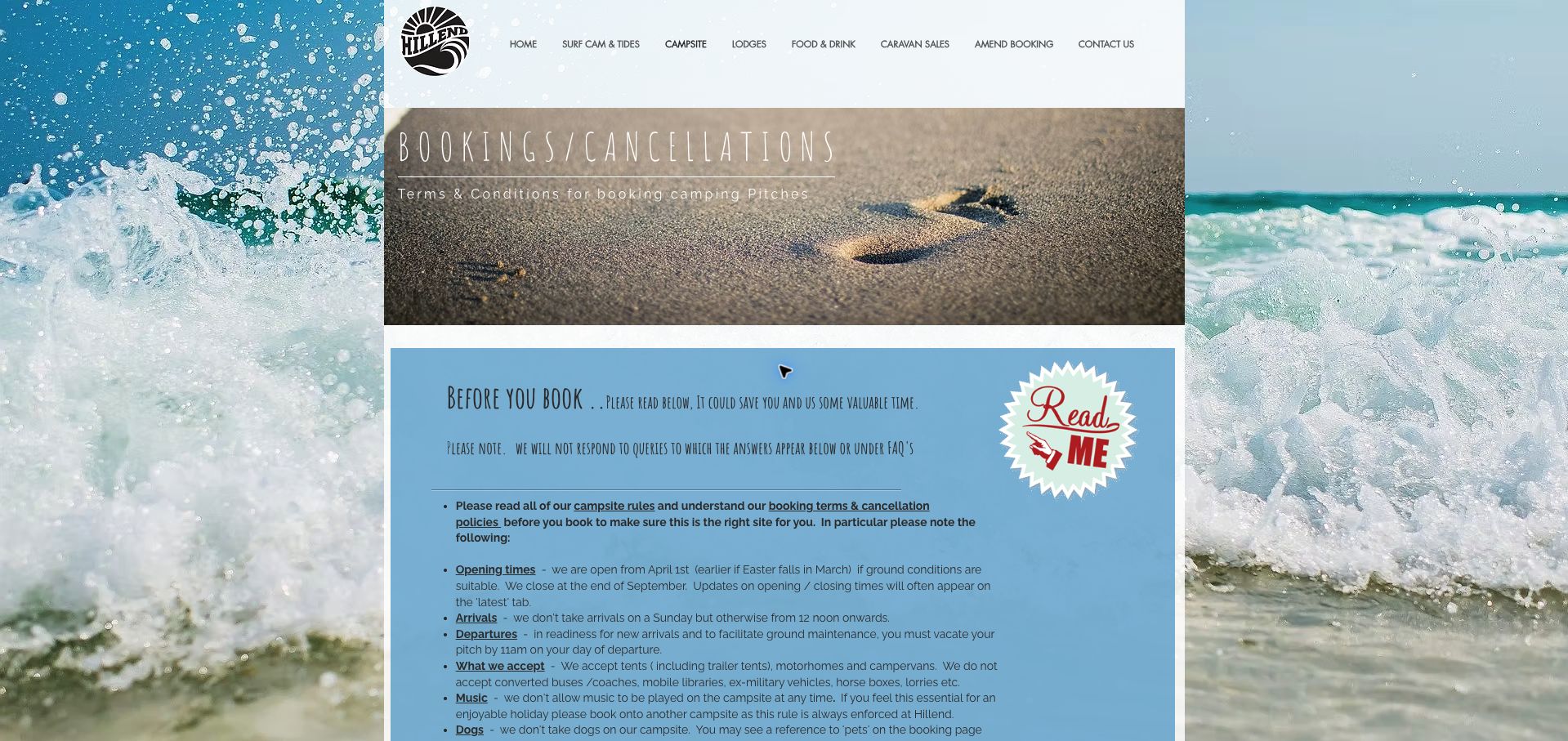
Hillend's booking page is unusually direct about who and what the campsite can accommodate. It identifies accepted camping units, excludes touring caravans and dogs, and explains that a pets reference in the booking interface should not be read as dog permission. It also states that Sunday arrivals are unavailable and that same-day online booking is not the ordinary process. Later guidance distinguishes a booking reference from a pitch number and explains allocation on arrival. These clarifications address misunderstandings that a standard reservation form may create. Surf photography and a blue content panel establish the coastal setting, but narrow type, a busy background and a long list of restrictions make the page harder to read. The warning-led tone is also severe. Its useful lesson is to expose consequential limitations early while presenting them in a clearer, more welcoming suitability checklist.
What you can learn
Summarize accepted units, pets, arrival days and pitch-allocation rules before the booking link, especially where the reservation system uses potentially misleading generic labels.
Pros
Vehicle, dog and Sunday-arrival restrictions are explicit.
The page clarifies that a booking reference is not a reserved pitch number.
Cons & considerations
Narrow type and a busy photographic surround reduce reading comfort.
The warning-heavy tone makes a long policy page feel unwelcoming.
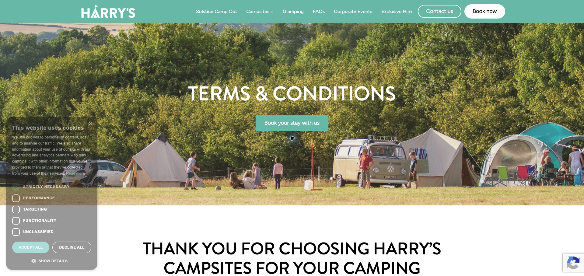
Harry's combines a friendly mint-colored identity and real camping photography with a detailed terms page. The 2026 conditions distinguish arrival and departure times for ordinary campers and bell-tent guests, describe the need to book extras before arrival, and explain the different security deposits that may apply. The page also addresses mixed parties: guests using grass pitches and bell tents are told where they may gather. That specificity helps prevent a broad glamping promise from concealing the operating rules. Contact and booking actions remain prominent in the header and hero. The practical information is nevertheless buried beneath a large image and an extended introduction, then presented as long paragraphs with limited visual grouping. A cookie panel adds another interruption. This is a useful reference for communicating two accommodation models, but a concise comparison above the full terms would make the differences much easier to understand.
What you can learn
Compare camping and furnished accommodation in a short arrival, departure, extras and deposit panel, then retain the complete terms as supporting detail.
Pros
Camping and bell-tent timing differences are explicitly documented.
Extras and mixed-group arrangements are addressed before arrival.
Cons & considerations
A large hero and introduction delay the substantive conditions.
Long paragraphs make accommodation-specific rules difficult to compare.
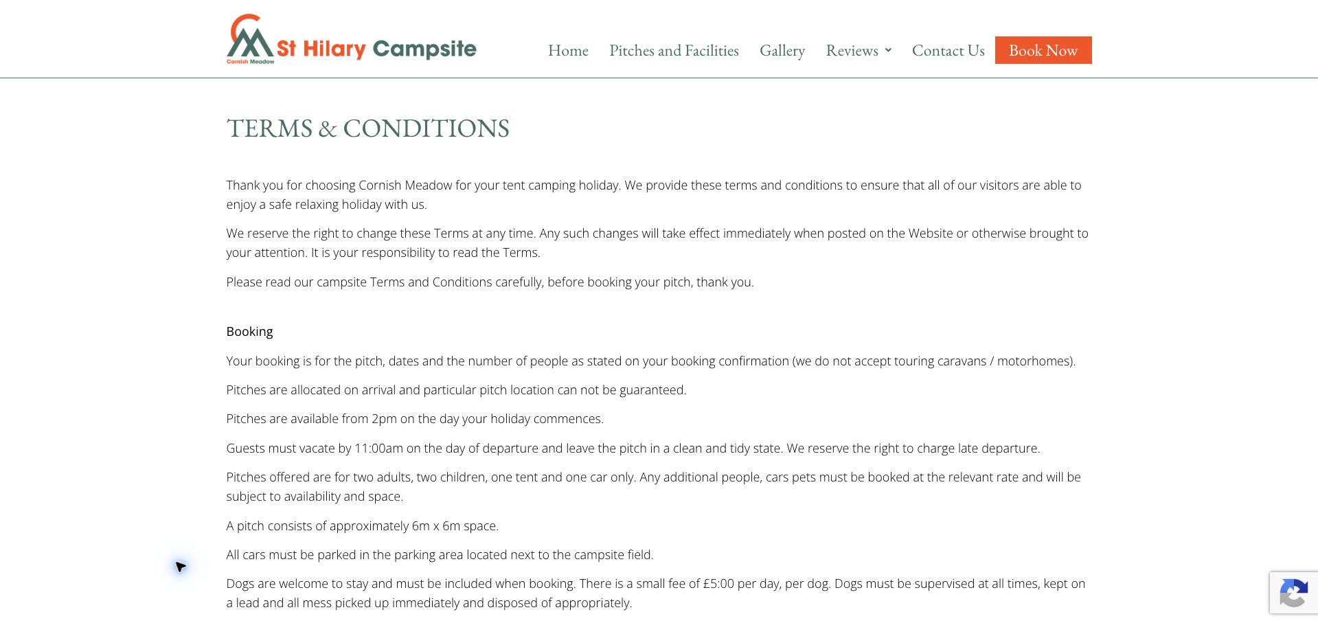
St Hilary's terms page gives a concrete definition of a camping pitch. It identifies the included adults, children, tent and car, describes the approximate six-by-six-metre space, and explains that cars use a neighboring parking area. Touring caravans and motorhomes are excluded, while grass pitches are stated to have no electric hookup. The page also explains allocation on arrival and a dog charge, making the booking more specific than a generic per-night offer. The white layout, green serif heading and orange booking action create a calm frame for the information. The main limitations are presentation and consistency: long paragraphs carry details that would work better as a compact specification, and both Cornish Meadow and St Hilary names appear without an immediate explanation of their relationship. The page's useful contribution is physical and occupancy precision, not an especially efficient reading experience.
What you can learn
Publish a pitch specification with dimensions, occupancy, unit restrictions, parking and power, and use one clearly explained business identity throughout the booking journey.
Pros
Pitch dimensions, included party and separate parking are described.
Tent-only use and the absence of electric hookups are explicit.
Cons & considerations
Important specifications are dispersed through lengthy terms.
Two business names appear without an immediate relationship explanation.
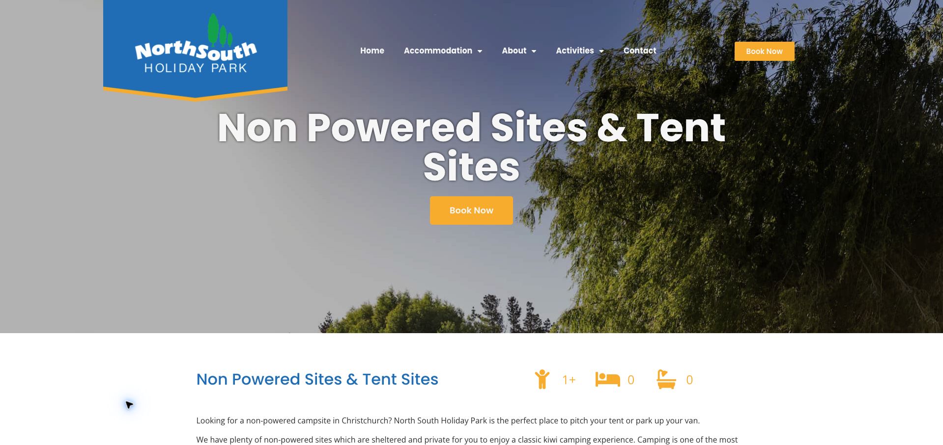
North South gives non-powered sites their own accommodation page rather than treating them as an afterthought to cabins. The copy explains access to communal kitchens, hot showers, laundry, barbecue areas, a playground, a pool and Wi-Fi, helping a budget traveler understand what remains available without an electrical hookup. A short information list defines the child-age category, maximum party size and arrival and departure times. The airport location and shuttle offer add a specific travel use case. Blue branding and yellow booking buttons provide a clear visual direction. The oversized hero title consumes much of the opening screen, however, and generic accommodation icons showing zero beds and bathrooms are a poor fit for a campsite with shared facilities. Rates also require a booking-system visit. The most transferable idea is to distinguish what a pitch lacks from the communal amenities its guests can still use.
What you can learn
Use campsite-specific icons and explicitly list shared facilities, with capacity and arrival details beside the booking action rather than relying on hotel-style bed and bathroom counts.
Pros
Shared facilities are described in practical detail.
Child ages, party capacity and arrival times are clearly listed.
Cons & considerations
Hotel-style zero-bed and zero-bathroom icons can misrepresent the camping offer.
The large title and hero delay the detailed site information.
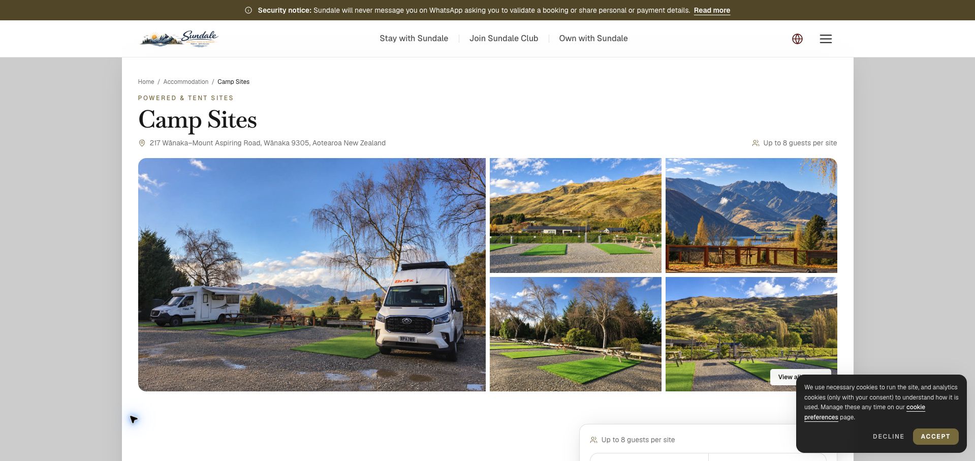
Sundale's camp-site page pairs a photographic gallery with detailed category descriptions. Non-powered grass sites are distinguished by length, while economy and standard powered options specify smaller vehicle limits and different capacities. Crucially, the powered-site descriptions explain that their artificial-turf surface is unsuitable for pitching tents. That prevents a camper from interpreting powered as a universally better version of an ordinary pitch. The page also describes permitted vehicle and tent combinations and directs guests to match the category in the booking engine. Serif headings, generous white space and a restrained olive accent produce a polished accommodation presentation. The broad opening claim of up to eight guests still needs the category-level qualification, and repeated prose makes the many size distinctions slower to compare. A structured suitability matrix would strengthen an already useful description of physical fit.
What you can learn
Compare surface, maximum vehicle length, tent compatibility and party capacity in one matrix before asking guests to select the corresponding booking category.
Pros
Vehicle-length limits and tent incompatibility are explicitly stated.
Photography shows the actual combination of paved areas and artificial turf.
Cons & considerations
The general eight-person headline requires qualification by site category.
Long descriptions make closely related size options harder to compare.
Bledisloe introduces an estuary-side camping experience through an oversized illustrated badge, conversational copy and practical accommodation categories. Powered and non-powered sites, individual cabins and cabin groups receive separate descriptions and booking links. The cabin explanation is especially useful because it distinguishes supplied sheets from blankets and pillows guests must bring. A campsite map and FAQ route offer further preparation, while the owner-operator introduction gives the business a personal presence. The visual identity is memorable, with warm cream, sea green and a bold black wordmark. Its scale is also the main drawback: the first screen is dominated by the badge, leaving the actual location, pitch choice and booking information further down. Capacity and rates are not consistently summarized across the site categories. The page is a strong reference for local character, provided the identity is balanced with an earlier practical stay summary.
What you can learn
Keep the owner's voice and distinctive illustration, but introduce location, accommodation choices and the main booking action before a full-screen brand treatment.
Pros
Accommodation categories have distinct descriptions and booking routes.
Cabin bedding inclusions are explained in concrete terms.
Cons & considerations
The oversized badge delays the useful stay-planning content.
Pitch categories lack a consistent capacity and price summary.
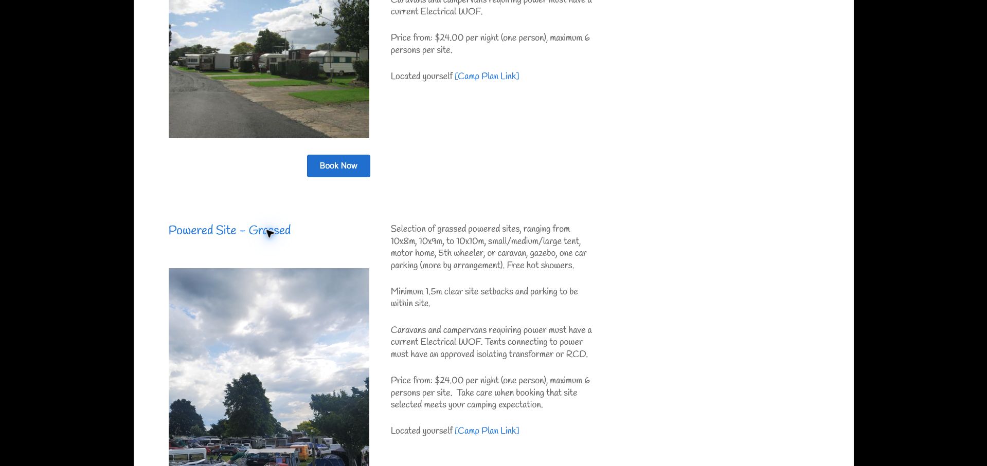
Te Puru's long accommodation list includes unusually specific campsite descriptions. Powered hardstanding, powered grass and non-powered grass options have their own dimensions or depth, vehicle suitability, occupancy and starting-price basis. The text clarifies that campsite prices start with one person, while accommodation units use a different base occupancy. It also explains parking within the pitch and electrical equipment requirements. Those details help visitors judge fit before choosing a reservation category. Photographs and blue booking buttons accompany the descriptions, although the handwritten-style body type and long list of unrelated units make comparison slow. The Sites category link led to a page-not-found result during review, so the working full list remained the way to reach campsite details. This example demonstrates valuable specification writing alongside a navigation defect that undermines access to that information.
What you can learn
Provide dimensions, surface, occupancy and the per-person price basis for each pitch, and verify that category shortcuts actually reach the corresponding content.
Pros
Site descriptions include dimensions, parking and electrical qualifications.
The starting-price basis distinguishes one-person camping from rental units.
Cons & considerations
The campsite category shortcut failed during review.
Handwritten-style text and a long mixed inventory slow comparison.
Kegan is a freelance web designer and developer with 15+ years of experience helping businesses turn complicated website requirements into clear, maintainable digital experiences. He works directly with clients from planning and design through development, launch, and ongoing support.
For campground website design, his development approach focuses on pitch and vehicle-fit specifications, utility and occupancy details, seasonal pricing, park policies, and reservation-platform connections. The scope can be a targeted improvement or a complete custom build, with responsive layouts, thoughtful content structure, and integrations chosen around the people using and maintaining the site.
Show 3 other campground website designersHide other campground website designers
Plan the content around the decisions visitors need to make
Create a pitch specification
Record surface, dimensions, maximum vehicle size, occupancy and utilities for each category. Distinguish actual site limits from general park capacity and use category names that match the booking engine.
Document approach and parking
Explain relevant access constraints, the correct entrance and where vehicles park. Use the park’s maintained guidance for height or route restrictions rather than letting a map service imply that every approach is suitable.
Make rates comparable
State the base occupancy, charging unit, taxes, additional people and metered or optional utilities. Separate holiday minimums and extended-stay arrangements. Show which conditions apply to each rate column.
Qualify pet and equipment rules
Publish the relevant seasonal pet conditions, excluded accommodation types and equipment requirements approved by the operator. Link to fuller policies while keeping decisive restrictions beside the pitch choice.
Explain reservation allocation
Say whether a guest reserves a specific numbered site or a compatible category. Describe arrival, departure and late-arrival processes, and clarify what a special request does and does not guarantee.
Test the category-to-booking journey
Check that shortcuts work and that the chosen site type remains identifiable in the booking system. Test tables, galleries and policy sections on phones without completing a reservation or payment.
The editing job behind the design
Choose a maintainable publishing and booking system
A structured accommodation catalogue should distinguish campsite-specific attributes from cabin or hotel fields. Generic zero-bed and zero-bathroom icons can mislead when guests have access to shared facilities.
Keep pitch definitions, rates and policies aligned with the reservation system. Publish useful specifications in ordinary text, with photographs and maps supporting the explanation. A third-party widget should not be the only place to discover a basic site restriction.
Our WordPress website examples offer a separate look at publishing approaches. A visible platform label is evidence for that named page, not a guarantee that the same system will suit your requirements.
Before the public launch
Practical website planning checklist
Show pitch surface and dimensions.
State maximum vehicle size.
Identify tent-compatible categories.
List exact utilities.
Give the base occupancy.
Explain additional-person charges.
State taxes and extra utility costs.
Date holiday and seasonal conditions.
Publish pet restrictions.
Describe approach and parking.
Explain site-number requests.
Verify category links and booking names.
These checks are a project checklist, not a performance, legal, security, or accessibility certification. Test real journeys with the people responsible for the website before making claims about the result.
Sources & editorial method
How this collection was selected and reviewed
The 16 examples match the original saved collection target. Each official public page was opened, inspected and directly captured in an ordinary browser; source URLs and capture dates identify the reviewed state. Reviews describe observed design, information and navigation, with distinct practical lessons and limitations. A bounded public technology-audit attempt accompanies every source, preserving unknown and inaccessible results without inventing a hidden stack. Editors Choice is an explicit editorial selection favoring a smaller specialist or local organization, not a service-quality, safety or outcome endorsement. No booking, application, payment or private form was submitted. Website imagery and trademarks belong to their owners.
Each example links to its actual source page. Screenshots are direct browser captures with their own capture dates; moving imagery, announcements and live designs can change. The notes describe observable design choices and conditional tradeoffs, not measured traffic, conversion results, service quality, or accessibility conformance.
Technology labels use public page metadata, asset evidence, or explicitly cited platform documentation. Platform documentation is not a complete current deployment audit. A component reference may be legacy or unused; it is not a complete backend inventory. Unknown stacks are omitted. These sites are editorial examples, not our client portfolio.
Written, Edited and Curated are separate editorial records, not timestamps advanced by a rebuild. Website designs and imagery belong to their owners. See our editorial standards or suggest a correction.
Questions worth asking
Campground website design questions
What should a campsite page include?
Surface, dimensions or vehicle limits, occupancy, utilities, shared facilities, the price basis and important restrictions. Use real site photographs and keep the category name consistent with reservation software.
Does powered mean suitable for tents?
No. The website should state the permitted unit types for each surface and category. The reviewed Sundale page, for example, explicitly excludes tents from certain powered artificial-turf sites.
How should extended-stay prices be shown?
Keep weekly or monthly charges separate from daily rates and state utilities, deposits and occupancy conditions beside them. Do not assume the inclusions remain identical as the stay gets longer.
Should guests be promised a numbered pitch?
Only if that is the operator’s actual booking model. Otherwise explain that a category is reserved and a specific site request remains a preference.
Why avoid hotel-style accommodation icons?
They can make a campsite with shared amenities look like it has no usable facilities. Use pitch-specific facts and a separate explanation of communal kitchens, showers and other services.
A useful campground website helps guests book a site that physically fits their party and equipment. Make dimensions, utilities and the price basis as visible as the scenery.