Best Yoga Studio Websites of 2026 (15 Real-World Examples)
Yoga studio website examples that turn a welcoming introduction into a clear class journey
A yoga studio website needs to make a first visit feel understandable and a repeat booking feel quick. These fifteen examples show how local studios, regional operators and larger networks present their practice, explain attendance and connect people with the right class.
Start with what someone needs before stepping into the room: where the studio is, what a class involves, how to choose one and what the first visit requires. Photography and thoughtful language can create a welcoming impression, but they cannot replace a maintained timetable, clear prices or practical arrival information.
This collection studies public website design and content, not teaching quality, practitioner credentials or health outcomes. A photograph of an advanced posture is not a requirement for attendance, and a wellness statement is not evidence of medical benefit. Confirm current class details, fees and studio policies on the operator's own pages.
Before the examples
What makes good yoga studio website design in 2026?
Give first-timers and regulars different routes
A newcomer may need class descriptions, heat information, equipment guidance and an explanation of booking. A regular usually wants the timetable or their account. Keep the schedule direct while giving the first visit a visible, reassuring starting page.
Describe classes in practical language
Branded formats can be memorable, but they need explanations of pace, duration, heat and activity. Separate physical intensity from room temperature. Avoid assuming visitors know a lineage name or that a phrase such as all levels answers every suitability question.
Connect the class to the actual place
For multiple studios, make location part of the class and workshop content model. Publish full addresses, entrance instructions, transport guidance and relevant accessibility information. A photograph of a beautiful room should lead to facts about arriving there.
Keep promotions subordinate to attendance
Introductory passes, retreats and teacher training have different commitments. Use clear labels and maintained conditions. Test the combined state when a sale banner, cookie choice and newsletter modal appear together, especially for someone trying to find a class on a phone.
The collection · 15 examples
15 yoga studio websites worth studying
Compare how each example helps a person move from interest to a practical decision. Some make the actual room their hero; others emphasize a local community, class formats or a location grid. The transferable idea is the relationship between identity and the next useful task, not a particular pose, color palette or promotional claim.
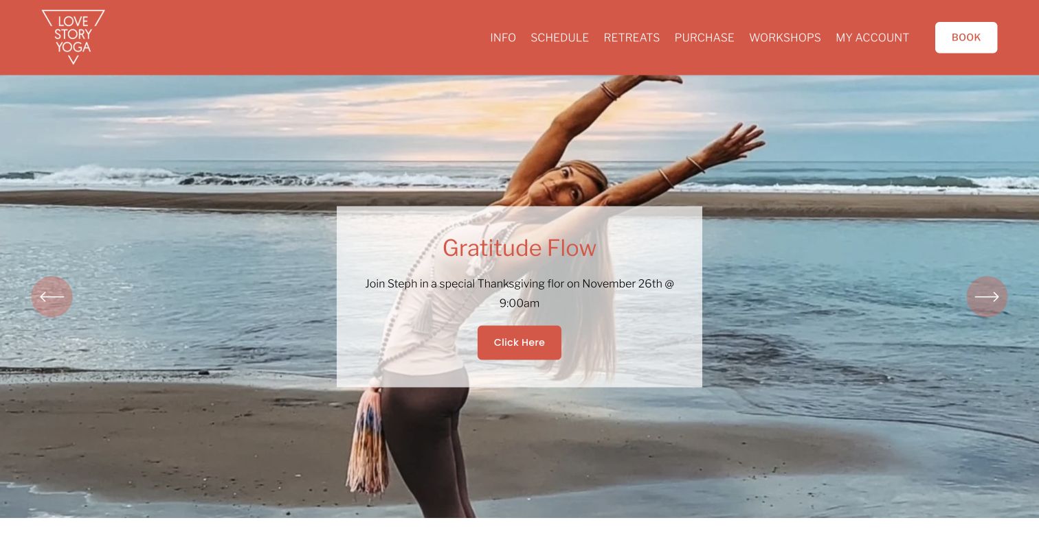
Love Story Yoga pairs a coral header with generous practice photography and a framed seasonal announcement. Schedule, purchases, workshops and Book stay above the campaign. Further down, Valencia and Larkspur receive separate descriptions, and upcoming workshops have dated cards with named locations. A visitor can investigate a special event without losing the everyday timetable. The founders' story appears later, making it available without requiring every returning student to read a biography first.
What you can learn
Give ordinary booking a permanent place in the frame, then use flexible homepage space for timely programs. Identify the actual studio where a class or workshop is introduced, not only in the footer.
Pros
The coral header supplies continuity across changing campaign images.
Dated event cards connect the program to a specific studio.
Cons & considerations
If essential information rotates in the hero, provide a stable event listing and usable pause controls.
If a new-student modal opens immediately, check that returning members can dismiss it and reach their schedule.
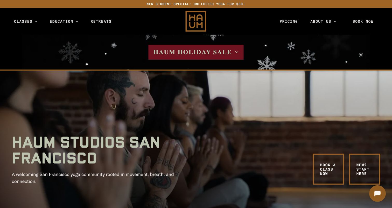
HAUM's black-and-gold frame, San Francisco heading and shared-practice photograph establish a particular community rather than an anonymous wellness service. Book a Class Now and New? Start Here recognize different visitor needs. Pricing and education remain visible in the header, while the location section introduces Mission District and Haight-Ashbury with interiors and addresses. Seasonal offer bands also show how quickly useful promotions can compete with the main introduction.
What you can learn
Give newcomers a route that explains attendance without slowing down regulars. Welcoming language becomes more useful when followed by specific class, pricing and location information; brand values alone do not tell someone which door to enter.
Pros
Two distinct hero actions acknowledge different levels of visitor knowledge.
Studio interiors and neighborhood names make the physical experience tangible.
Cons & considerations
If several sale bands run together, test how much useful content remains visible on smaller screens.
If similar location cards are reused, verify their destinations individually to prevent wrong-studio links.
Yogamaya turns navigation into the whole composition. Huge serif labels for Classes, Rates, Teacher Training, YMTV, Events, Studio and Blog surround an illustrated figure. Contact details and the street address sit along the bottom. The pale canvas and dark ink resemble a printed poster, giving the studio a recognizable identity without a stock wellness photograph. The visitor chooses a task immediately rather than scrolling through a long introductory story. This expressive approach places more responsibility on legible labels and well-explained destination pages.
What you can learn
A distinctive entrance can still function as a directory. Keep ordinary task language inside the artwork, and preserve an accessible navigation structure so the visual idea does not become a puzzle when using a keyboard or enlarged text.
Pros
Classes and rates are prominent destinations rather than secondary utility links.
Illustration and typography create identity without depending on a large photo production.
Cons & considerations
If decorative imagery overlaps oversized labels on narrow screens, ensure every link remains readable and operable.
If abbreviations such as YMTV are unfamiliar to newcomers, explain them in destination and accessible-link context.
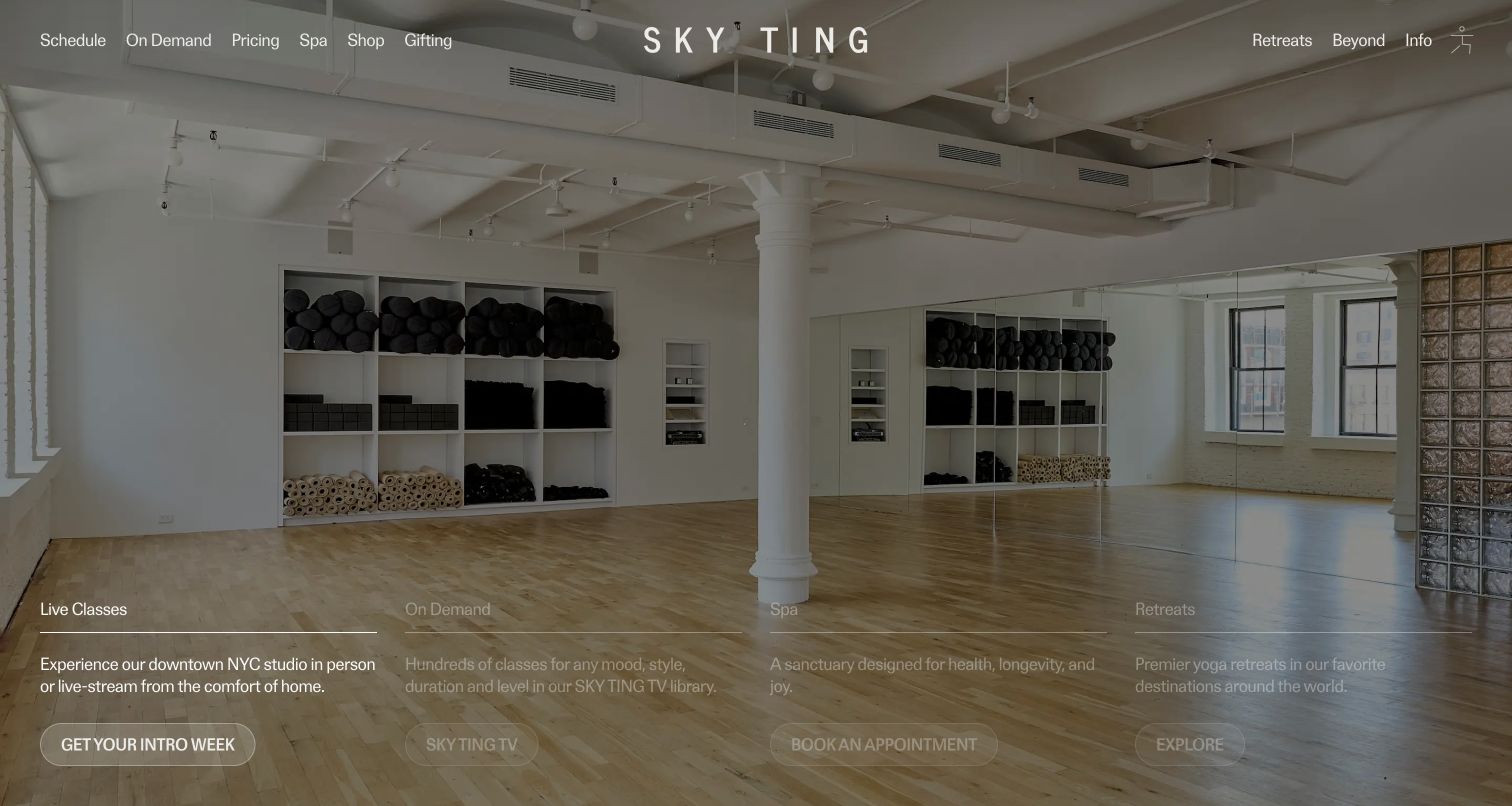
SKY TING places a studio photograph beneath a restrained light header. Four hero columns distinguish live classes, on-demand practice, spa appointments and retreats, each with a separate action. A daily schedule below identifies teachers, duration and attendance format, while curated video collections support visitors outside New York. Remote practice therefore receives a real product journey rather than a small footer link. The calm visual presentation is useful, but pale text over photography and the number of parallel offers need deliberate testing.
What you can learn
Separate attendance from remote viewing before asking someone to choose a pass. When one class appears in both formats, make the delivery method and time zone explicit instead of assuming a shared class title explains the difference.
Pros
The hero introduces several ways to participate before the long content sections.
Schedule entries associate a class with its teacher, duration and delivery format.
Cons & considerations
If light navigation overlays changing photographs, test contrast across every image state.
If a newsletter overlay appears before schedule discovery, keep dismissal obvious and preserve the visitor's place.
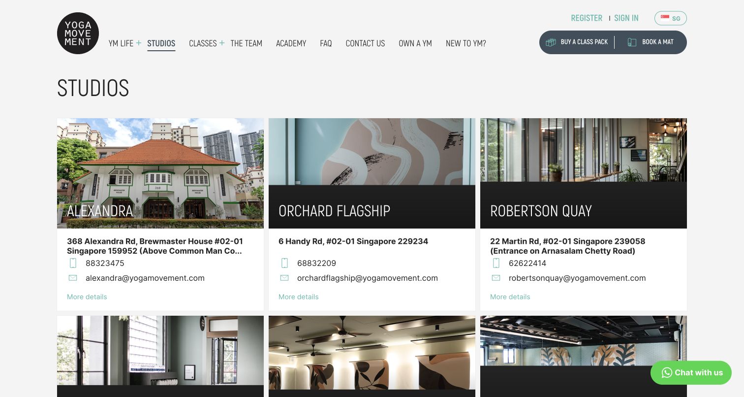
Yoga Movement's Studios page presents a three-column grid with neighborhood names, real photographs, addresses, telephone details and email contacts. Alexandra, Orchard Flagship and Robertson Quay use the same information structure, with further locations below. Buy a Class Pack and Book a Mat remain paired in the header, separating purchase from selecting a session. This is a useful alternative to atmosphere-only homepages: people can compare actual places without opening a different format for every branch. Long entrance instructions also expose the need for careful card-content limits.
What you can learn
Use consistent fields across locations so visitors can compare what matters. Treat entrance notes as structured information, with a full detail-page version, instead of allowing essential directions to disappear when an address exceeds the card height.
Pros
Repeated card fields make neighborhood and contact information easy to scan.
Purchase and booking stay available while visitors explore locations.
Cons & considerations
If an address is truncated, provide its full entrance instructions clearly on the detail page.
If a photograph is also a link, give it a meaningful accessible name rather than relying on nearby visual text.
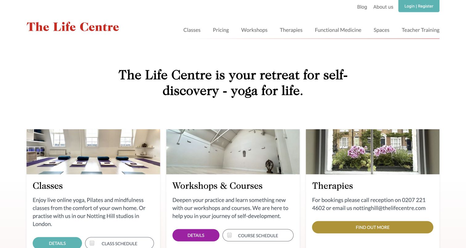
The Life Centre begins with a short self-discovery statement and then three service cards for classes, workshops and courses, and therapies. Each combines a setting photograph with explanatory text. The classes card offers both Details and Class Schedule. White space, a red wordmark and limited accents keep several types of service readable. Pricing, spaces and teacher training remain ordinary header links. Instead of presenting every offer as an identical join action, the page makes room for different next steps and levels of commitment.
What you can learn
A broader wellness program needs clear service boundaries. Put the timetable beside the class explanation and distinguish learning about a therapy from making an appointment, so the visitor understands what happens after each click.
Pros
The initial grid translates an abstract mission into concrete service choices.
Separate details and schedule links serve newcomers and returning students.
Cons & considerations
If therapies appear alongside yoga, review claims carefully; adjacent placement does not establish medical benefit.
If accent colors distinguish service categories, retain text labels so color is not the only cue.
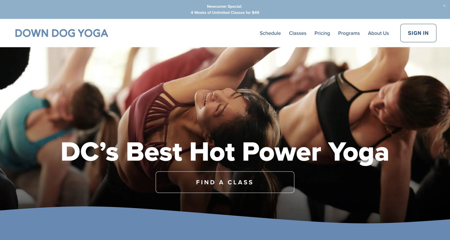
Down Dog Yoga uses a class-in-progress photograph, a large hot power yoga heading and one Find a Class button. Schedule appears before the other menu groups, while sign-in is separated on the right. Short sections below explain the practice, workshops and class styles before contact details and policies. The site commits to a particular practice identity instead of placing every possible wellness service in the hero. A narrow newcomer-offer banner promotes attendance without replacing the primary class route.
What you can learn
Be specific about the practice and make the timetable the natural next step. Heat, intensity and what to bring belong close to this journey, especially when an assertive headline or demanding pose could otherwise intimidate someone trying yoga for the first time.
Pros
The class-finding action is visually distinct from member sign-in.
The narrow offer banner leaves room for the practice introduction.
Cons & considerations
If the headline claims to be the best, treat that as the studio's own marketing rather than an independently established ranking.
If imagery emphasizes difficult poses, keep beginner guidance prominent so the photograph does not imply an entry requirement.
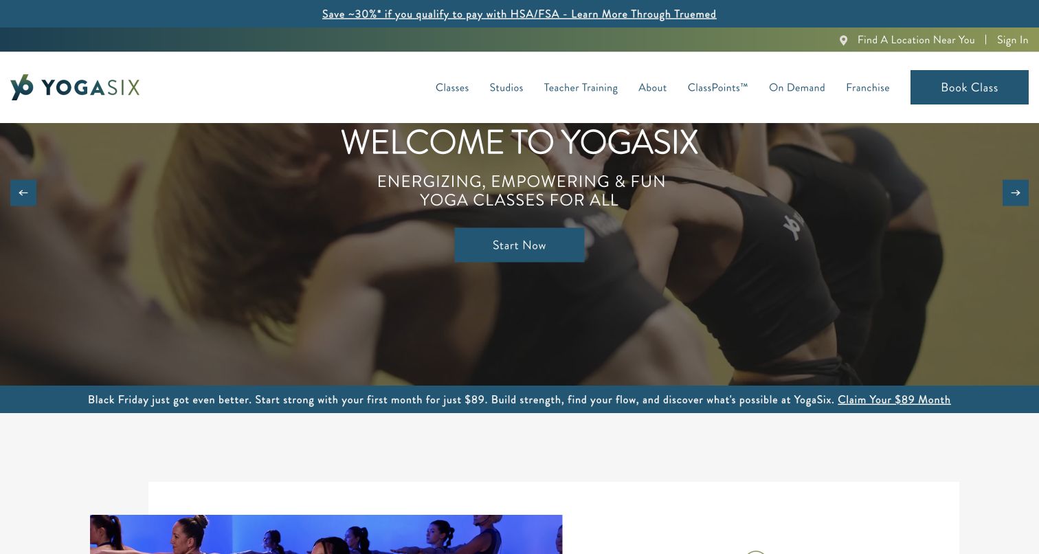
YogaSix frames its welcome around an energizing experience, with Book Class separated in the header. A studio-finder route acknowledges that attendance is local, while named formats including Slow Flow, Sculpt, Restore and Core receive ordinary-language descriptions below. Visitors can therefore compare the type of session before entering the booking journey. App downloads, loyalty information, seasonal offers and franchise links also demonstrate the complexity of a larger brand. A small studio can borrow the clarity of the class descriptions without adopting the entire navigation footprint.
What you can learn
Explain branded class names using practical descriptions of pace, heat and format. The final booking journey must identify the actual studio; a national promotional message cannot replace maintained local schedule information.
Pros
Short explanations make proprietary class names easier to understand.
The studio-finder route recognizes location as a necessary attendance decision.
Cons & considerations
If several promotions share the top of the page, retain current conditions and local availability beside each.
If franchise and student journeys share navigation, ensure business-development links do not distract from finding a nearby class.
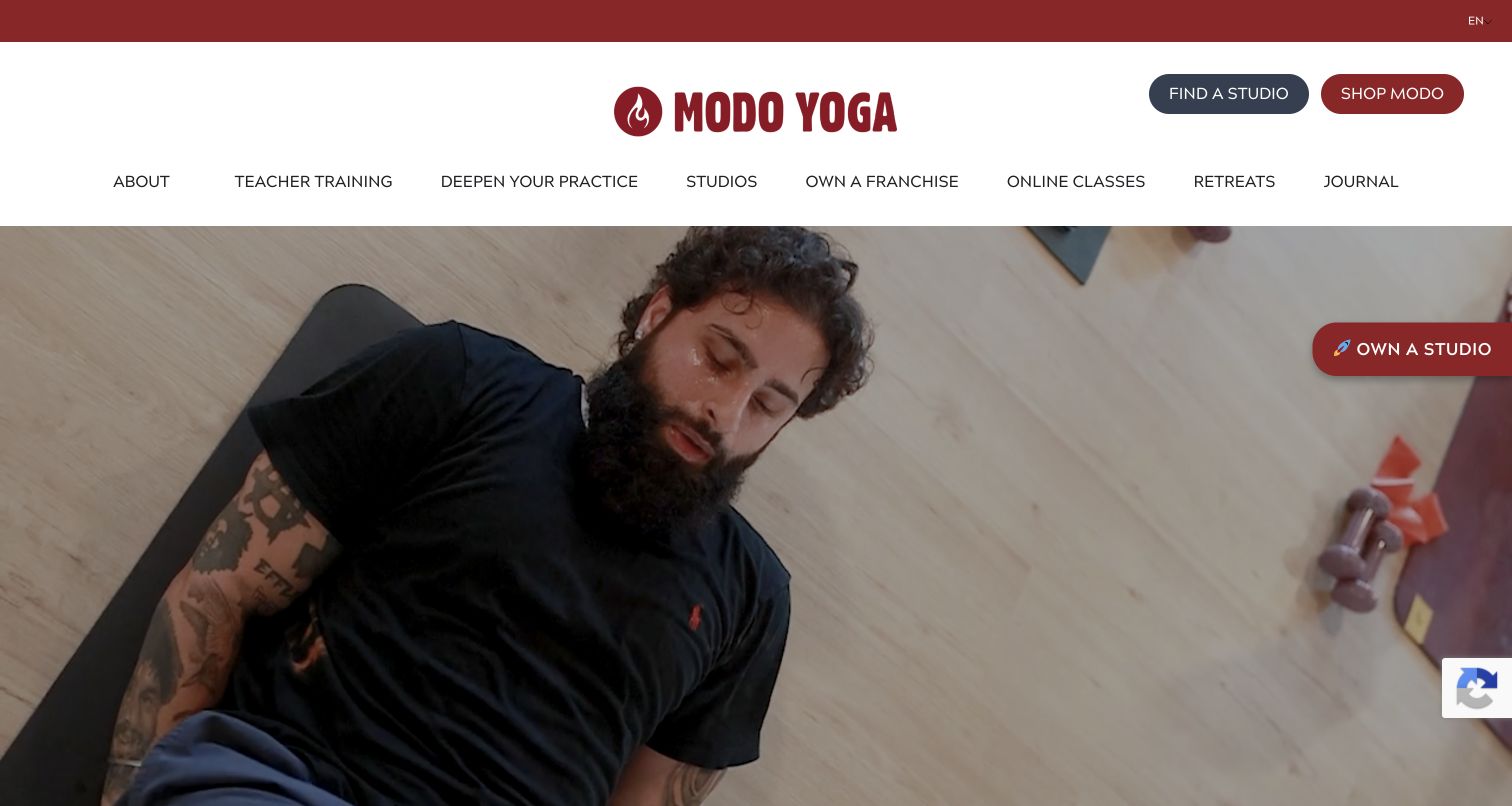
Modo Yoga combines a deep-red identity and large practice photograph with separate routes for studios, teacher training, online classes and retreats. The body expands its community mission into a set of pillars, while Find a Studio remains a prominent utility action. The page is useful for studying how an umbrella brand connects local experiences without pretending its central homepage is a neighborhood timetable. Testimonials and environmental language remain part of the organization's own presentation, not independent evidence of every studio's outcomes.
What you can learn
Explain the shared approach at network level, then send visitors clearly to the right local operation. Connect mission language to maintained policies where possible, and prevent a long philosophy section from becoming an obstacle to finding the nearest class.
Pros
Studio discovery is conspicuous near the brand mark.
Training, retreats and online practice have distinct navigation routes.
Cons & considerations
If multiple carousels are used, provide usable controls and reduced-motion behavior throughout.
If environmental and accessibility values are central, link to specific practices rather than relying on slogans as substantiation.
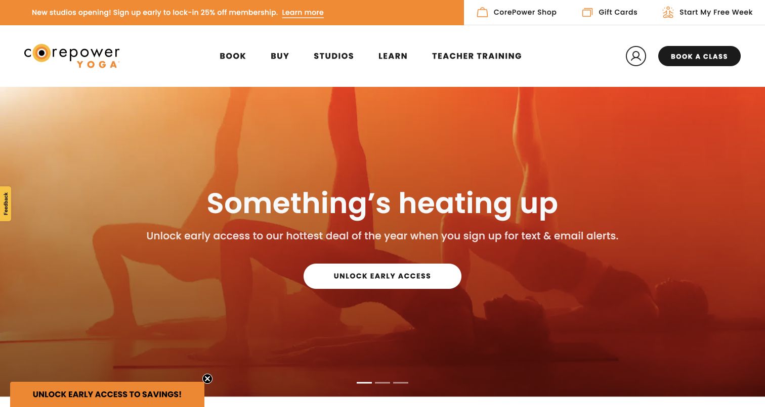
CorePower Yoga pairs an orange seasonal campaign with a functional Book, Buy and Studios header. Below, class cards distinguish physical intensity from heat intensity. Membership content then separates unlimited access, flexible packs and introductory choices. This is useful because visitors are deciding more than which teacher to try: studio, livestream and on-demand attendance are different products. The captured hero emphasizes promotion and lead generation, showing how a campaign can become the dominant first impression even when practical routes are present.
What you can learn
Expose the dimensions of the decision separately. Heat, physical intensity, attendance format and purchase model are different questions; presenting them as named fields is clearer than expecting someone to infer all four from a branded class name.
Pros
Class cards distinguish heat from physical intensity.
Booking, purchase and studio discovery are named as separate tasks.
Cons & considerations
If the hero promotes alerts or a sweepstakes, keep ordinary booking discoverable and avoid implying participation is required.
If memberships are compared, keep exclusions and location surcharges attached to the relevant offer.
Black Swan Yoga's captured homepage adopts a newspaper-like November campaign with oversized lettering. Book a Class stays prominent in the navigation. The underlying content explains donation-based heated yoga, gives a compact What to Expect sequence and separates memberships from teacher training. A highly expressive promotional surface is therefore supported by practical attendance information. The tension is instructive: newcomers need to understand the usual model, while the seasonal sale and gift-card overlay can dominate their first view.
What you can learn
Explain unusual pricing and attendance in ordinary words before expecting a visitor to interpret a purchase action. Seasonal creative may change, but drop-in expectations, heat information and the everyday booking route should remain dependable across campaigns.
Pros
The page dedicates a short section to donation-based attendance and practical expectations.
Memberships, training and ordinary classes have distinct routes.
Cons & considerations
If a seasonal campaign fills the hero, retain a quick explanation of normal drop-in attendance.
If a gift-card modal overlays a separate sale, test the combined state for dismissal, focus order and small-screen usability.
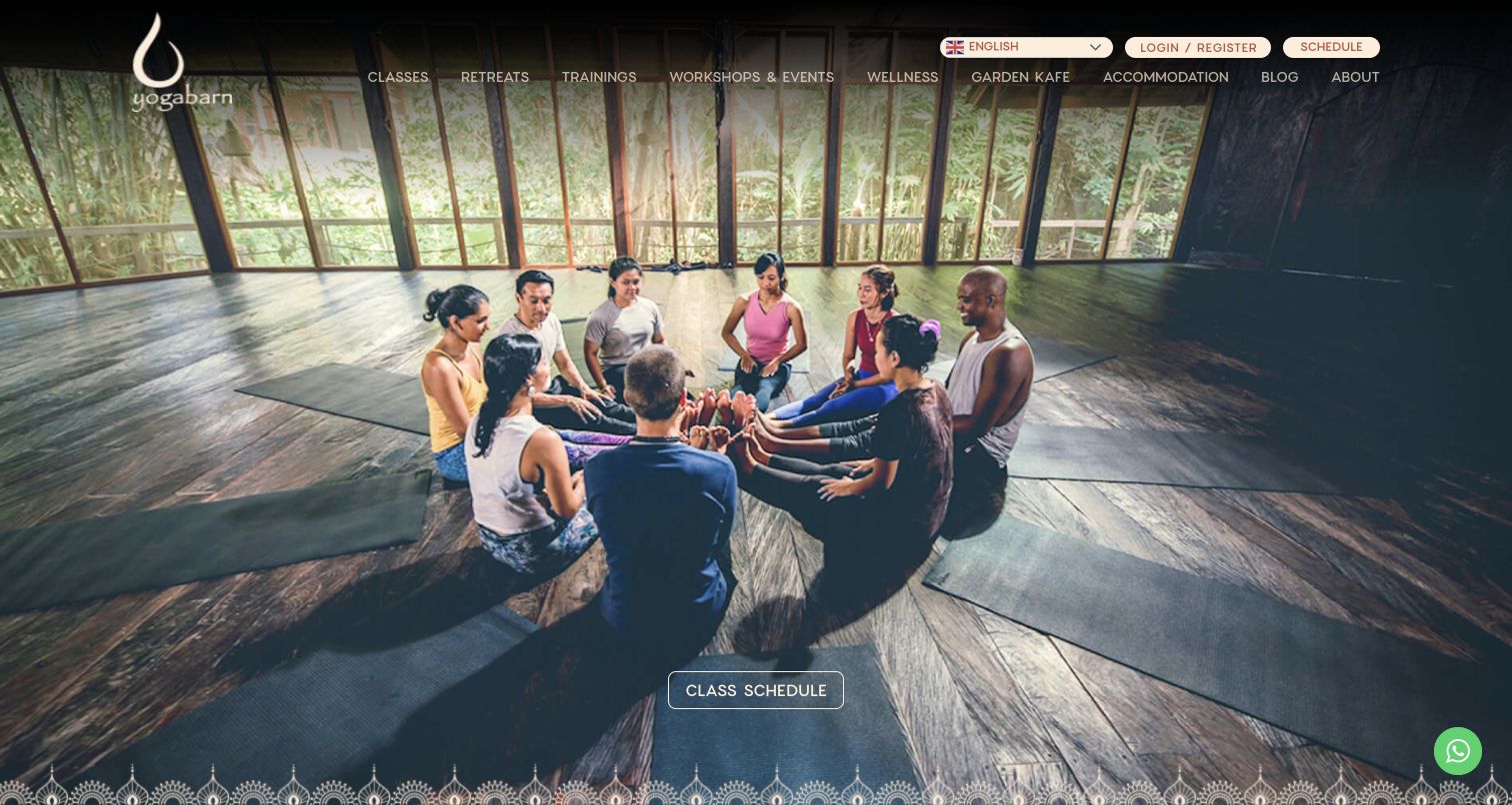
The Yoga Barn uses a real group-practice scene behind its entrance and retains Class Schedule as a distinct action over the photograph. Its header covers classes, retreats, training, workshops, wellness, food and accommodation. The page then organizes those activities into more detailed sections and presents upcoming events separately. A local drop-in visitor and someone planning an extended stay can enter different journeys. The setting imagery communicates atmosphere, but the breadth of the program makes navigation, dates and concrete program detail essential.
What you can learn
Distinguish today's class from a longer program or residential stay. Photograph the actual environment, then connect that atmosphere to practical schedules, accommodation details and event information rather than expecting the image to answer planning questions.
Pros
The schedule action stays visible within expansive destination imagery.
Dedicated sections organize activities beyond the everyday class timetable.
Cons & considerations
If numerous program categories share a header, test their grouping and legibility on smaller screens.
If event cards include training dates or stays, maintain their detail pages and remove expired offers from prominent positions.
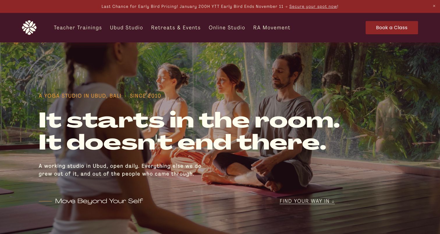
Radiantly Alive explicitly introduces a working Ubud studio before expanding into training, retreats and its wider community. The photograph-led hero makes a short statement about what starts in the room. The following Ways In section distinguishes classes, healing sessions, workshops, retreats and training with different time commitments. This hierarchy keeps longer programs from overwhelming the ordinary class offering. Current events and education choices sit further down, with Book a Class retained in the header. Its personal voice is supported by practical categories rather than replacing them.
What you can learn
Describe the everyday studio first, then show how participation can deepen. Time commitment is a useful organizing field: one class, an appointment, a workshop and a multiweek training require different preparation and should not share one ambiguous action.
Pros
The introduction establishes a physical studio before discussing the broader program.
Ways In separates activity types and commitments.
Cons & considerations
If ratings or graduate counts are published, maintain their source and date instead of treating them as timeless decoration.
If complementary healing services appear, keep their descriptions and evidence standards distinct from class marketing.
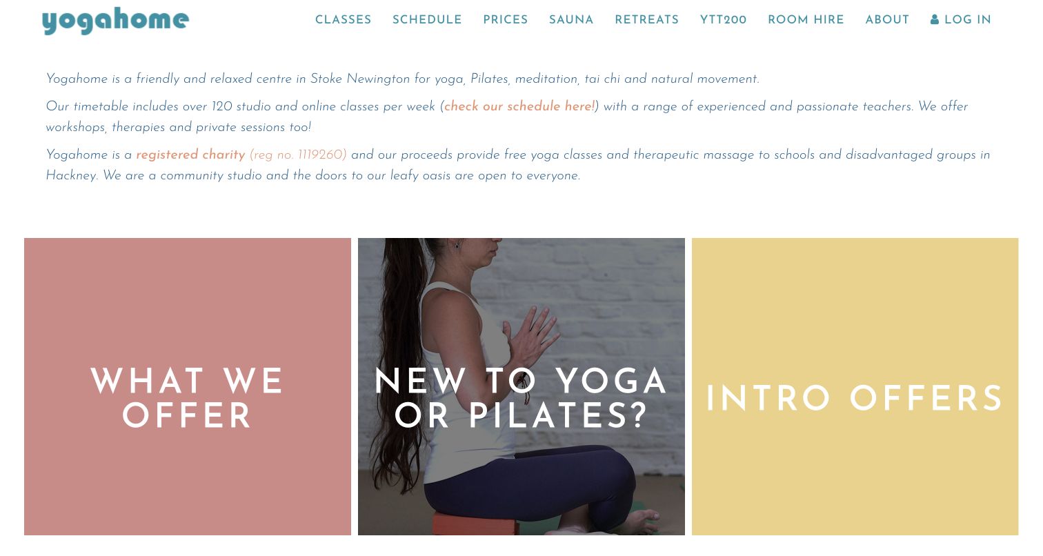
Yogahome begins with a concise explanation of its Stoke Newington setting and movement-class range. Three large cards then lead to the offering, beginner guidance and introductory offers. White space, a teal wordmark and pastel panels replace the conventional full-screen lifestyle photograph. The community and charity explanation appears in readable introductory copy, while Schedule and Prices remain in the main navigation. This makes a useful study in expressing an institution's purpose through specific content rather than an abstract wellness slogan.
What you can learn
Warmth can come from neighborhood and community information rather than elaborate visual effects. Give beginners a recognizable starting route, while keeping prices and the timetable near the top so returning practitioners can move directly to their task.
Pros
Beginner guidance is named on the homepage rather than hidden inside a generic FAQ.
Introductory text explains the local setting and community purpose.
Cons & considerations
If pale accents contain links or small text, check their contrast at ordinary viewing sizes.
If broad header labels open menus, verify that schedule access remains direct with touch and keyboard navigation.
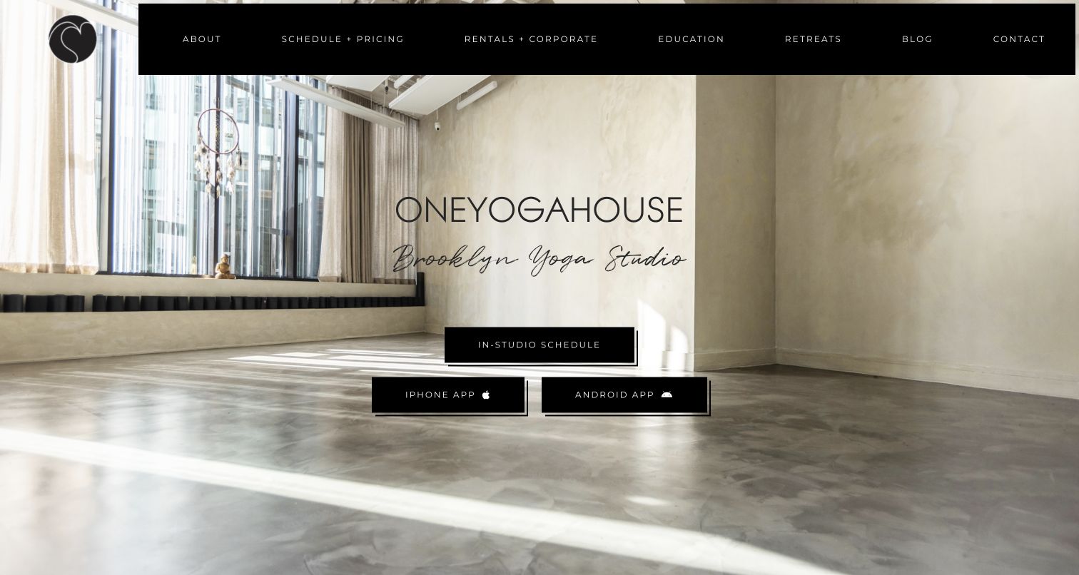
ONEYOGAHOUSE lets its bright Brooklyn interior do much of the introductory work. The brand name, Brooklyn Yoga Studio label and In-Studio Schedule button sit over a generous photograph, with app downloads secondary below. The longer page adds an address and opening hours before distinguishing events, retreats, corporate sessions, private classes and on-demand practice. People can understand the place before exploring its other services. The hierarchy between a website schedule and two app links is useful: installation supports participation but is not required for ordinary discovery.
What you can learn
Use the real room to communicate atmosphere, but retain a normal web route to the schedule. A first-time visitor still needs location, arrival information and class descriptions beyond an appealing interior photograph.
Pros
The interior photograph makes the actual setting tangible.
The primary in-studio schedule action is distinguished from app downloads.
Cons & considerations
If navigation overlays a bright photograph, use a reliably contrasting background.
If the page expands into many services, keep address and class access reachable without traversing the entire story.
Kegan is a freelance web designer and developer with 15+ years of experience helping businesses turn complicated website requirements into clear, maintainable digital experiences. He works directly with clients from planning and design through development, launch, and ongoing support.
For yoga studio website design, his development approach focuses on readable class schedules, teacher information, first-visit guidance, membership choices, and dependable booking-platform connections. The scope can be a targeted improvement or a complete custom build, with responsive layouts, thoughtful content structure, and integrations chosen around the people using and maintaining the site.
Show 3 other yoga studio website designersHide other yoga studio website designers
Plan a yoga studio site around the first class and the next class
Write down the first-visit questions
Gather the questions staff hear about experience, clothing, mats, heat, arrival time and changing facilities. Decide where each answer belongs and how the timetable links to it. Keep any health-related suitability questions within the studio's qualified guidance rather than improvising medical advice.
Model classes separately from sessions
A class format has a description; a scheduled session has a date, time, teacher, location, capacity and attendance mode. Keep those records connected but distinct. This prevents the marketing page from becoming an unreliable duplicate of the booking system.
Choose one source of truth for the timetable
Document who updates cancellations, substitute teachers, holidays and waitlists. Test how a schedule embed behaves when the provider is unavailable. Provide a useful fallback contact and avoid publishing an independently maintained list that can conflict with the actual timetable.
Explain pricing before checkout
Separate drop-ins, class packs, subscriptions, intro offers and special events. State the conditions that affect the decision, including validity periods and cancellation rules. A website redesign should not require a real purchase or waiver acceptance as part of routine testing.
Design each location as a usable destination
Use consistent fields for addresses, entrance notes, facilities and contact details. Add real photographs of each room instead of using one attractive image for every studio. Verify that each location card leads to the matching detail page and schedule filter.
Test the complete arrival journey
Ask testers to choose a suitable class, identify the studio, understand the price and find arrival instructions without submitting a booking. Test keyboard navigation, zoom, screen-reader labels, time zones and small screens. Include the state with all ordinary notices visible.
The editing job behind the design
Choose technology around reliable schedules and clear publishing
A studio often needs two connected systems: editorial pages that explain its practice and a booking provider that manages sessions, attendance and payments. Decide which system owns each fact. Schedule updates should not require editing a marketing banner, and private student data should not be copied into public page content or analytics.
Evaluate the actual booking embed with keyboard navigation, mobile browsers, time zones and failure states before choosing a visual theme. Offer normal web discovery even when an app is available. Public stack observations describe visible evidence only; they do not establish the security, accessibility or completeness of the private member platform.
Our WordPress website examples offer a separate look at publishing approaches. A visible platform label is evidence for that named page, not a guarantee that the same system will suit your requirements.
Before the public launch
Yoga studio website planning checklist
Put the current timetable within a direct navigation route.
Give first-time visitors a clearly named starting page.
Explain class duration, pace, heat and format in ordinary language.
Identify the location and time zone for each scheduled session.
Publish full addresses and practical entrance instructions.
Distinguish drop-ins, passes, memberships and special events.
Keep introductory-offer conditions current and easy to find.
Separate informational pages from booking, payment and waiver actions.
Make real studio photographs meaningful rather than decorative substitutes for facts.
Test schedule embeds and provide a useful failure-state contact.
Check keyboard access, zoom, focus and reduced-motion behavior.
Keep private student and payment information out of public analytics and QA records.
These checks are a project checklist, not a performance, legal, security, or accessibility certification. Test real journeys with the people responsible for the website before making claims about the result.
Sources & editorial method
How this collection was selected and reviewed
The fifteen examples meet the collection's saved target. Each selected official page was inspected in an ordinary browser and directly captured for this collection, with original commentary on the visible design and its tradeoffs. Yoga Movement is represented by its studio directory rather than its homepage. Editors Choice is an explicit design selection within this set, not a teaching-quality endorsement, health recommendation or result of visitor votes. No bookings, purchases, waivers or accounts were submitted.
Each example links to its actual source page. Screenshots are direct browser captures with their own capture dates; moving imagery, announcements and live designs can change. The notes describe observable design choices and conditional tradeoffs, not measured traffic, conversion results, service quality, or accessibility conformance.
Technology labels use public page metadata, asset evidence, or explicitly cited platform documentation. Platform documentation is not a complete current deployment audit. A component reference may be legacy or unused; it is not a complete backend inventory. Unknown stacks are omitted. These sites are editorial examples, not our client portfolio.
Written, Edited and Curated are separate editorial records, not timestamps advanced by a rebuild. Website designs and imagery belong to their owners. See our editorial standards or suggest a correction.
Questions worth asking
Yoga Studio website design questions
What should a yoga studio homepage prioritize?
Give people a dependable route to the timetable, then explain the practice and first visit. A newcomer needs more context than a regular member. Separate those routes instead of making everyone pass through the same promotional introduction.
Should a yoga studio require an app to see classes?
Basic discovery should work on the website. Apps can be convenient for frequent students, but an installation request adds friction for someone evaluating the studio. Provide class descriptions, location information and a usable schedule before asking for that commitment.
How should a studio explain its different class types?
Combine the class name with practical information about pace, duration, heat, format and what to expect. Avoid treating a branded name or a single intensity label as a complete explanation. Where personal suitability is uncertain, direct visitors to qualified studio guidance.
Is an online booking embed enough for the whole website?
It can own the timetable and transactions, but it usually does not explain the studio, arrival details, teachers or first-visit expectations by itself. Keep the surrounding content connected to the booking journey, and test the embed's accessibility and failure states.
How can a small studio make its website distinctive?
Use its actual rooms, neighborhood, community and teaching approach as source material. Yogamaya shows an illustrated typographic entrance, while Yogahome uses specific community information and simple starting cards. Distinctiveness does not require hiding familiar tasks or adding complex effects.
A useful yoga studio website makes the practical step feel as welcoming as the visual introduction. Keep the timetable dependable, explain the first visit clearly and let the studio's real people and place give the design its character.