Best Dance Studio Websites of 2026 (15 Real-World Examples)
Dance studio websites that connect classes, ages and registration
The best dance-class page helps a parent or adult learner identify a suitable class before asking them to register. These 15 examples examine age and level guidance, schedules, tuition, teacher introductions and the transition into enrollment.
A studio may teach preschool movement, recreational adults and advanced performers under one roof. Those audiences need different explanations, but they should not have to decode an internal course system to begin. Connect the class name to the age, level, location and term that make it relevant.
Visual energy is part of the appeal of dance. Use it through real studio and performance imagery while preserving a quiet, readable place for schedules and policies. A moving hero is not a substitute for a clear answer about when a class meets.
Before the examples
What makes good dance studio website design in 2026?
Compare actual class choices
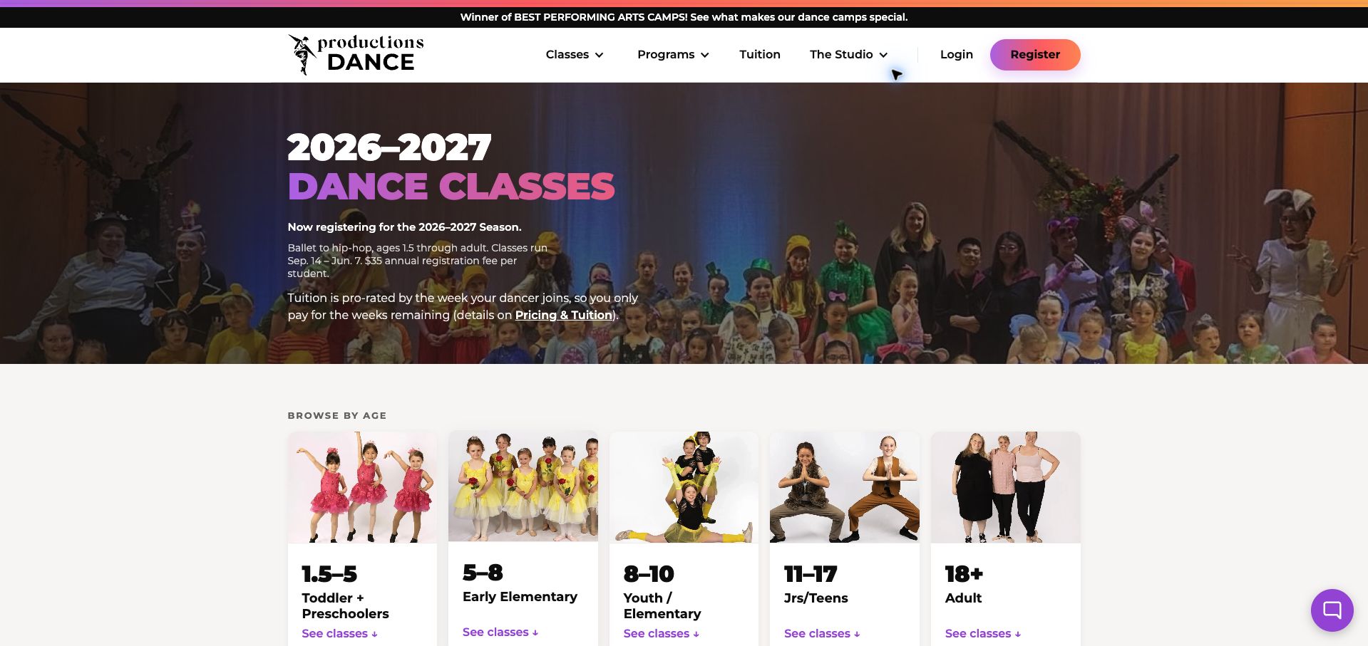
Productions Dance makes age and genre visible alongside its class listings and supports them with tuition information. Treat the schedule as a decision tool: visitors should understand which rows suit them before reaching the enrollment system.
Define level without gatekeeping
Terms such as beginner, intermediate and company mean different things across studios. Explain prerequisites, assessment or teacher-contact steps in plain language, especially when a returning dancer is unsure where to start.
Make the financial commitment visible
Distinguish tuition per term, month or class, registration charges, trial options and performance-related costs where applicable. Place important refund and withdrawal rules near the decision rather than only in a long handbook.
Connect studio identity to practical details
Actual teachers, rehearsal rooms and performances make the school distinctive. Pair that identity with addresses, transport, changing arrangements and an obvious contact route for questions the timetable cannot resolve.
The collection · 15 examples
15 dance studio websites worth studying
The examples span adult training, children’s classes and mixed studios. Study their audience routing and practical class explanations as well as their photography; the appropriate structure depends on how the studio actually teaches.
Productions Dance makes a large class catalog approachable by offering two starting points: age and dance genre. Photo cards lead to age groups, while the genre summaries explain what each discipline offers and which ages it serves. The opening identifies the current season, registration fee and prorated tuition policy before the visitor enters a class flow. Below, consistent rows pair age, level, duration and schedule with registration and detail links. Those practical decisions support the lively gradient accents and real group photography, earning the site our Editors Choice for website design in this collection. The catalog is still long, and overlapping age bands require clear class-level eligibility. The main strength is turning a broad program into a sequence of manageable choices.
What you can learn
Let families begin with the information they know—age or preferred style—then present eligibility, schedule and cost context before registration.
Pros
Age and genre provide complementary browsing routes.
Season dates and registration charges are disclosed early.
Cons & considerations
The full catalog requires substantial scrolling.
Overlapping age bands need precise eligibility on individual classes.
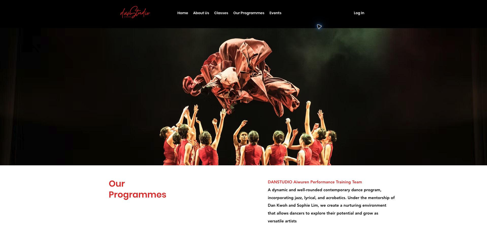
DANSTUDIO opens its programmes page with a dramatic stage photograph, a black header and restrained red accents. The image establishes a performance identity, but the written program descriptions are what make the offer understandable: training teams, a collective, beginner term classes and private coaching are distinguished. Specific day-and-time entries follow the overview, each with an inquiry route. This helps a prospective dancer see that not every path is competitive or advanced. The long page could make those program categories easier to compare with a short introductory table, and an older achievement paragraph uses relative time language that will age poorly. The design's strongest feature is its connection between a distinctive visual discipline and clearly different levels of participation.
What you can learn
Use performance photography to establish the artistic identity, then explain the commitment, level and schedule of each training route separately.
Pros
Recreational and performance pathways are distinguished.
Program entries include concrete days and times.
Cons & considerations
The long overview lacks a quick comparison of commitments.
Relative dates in achievement copy need regular maintenance.
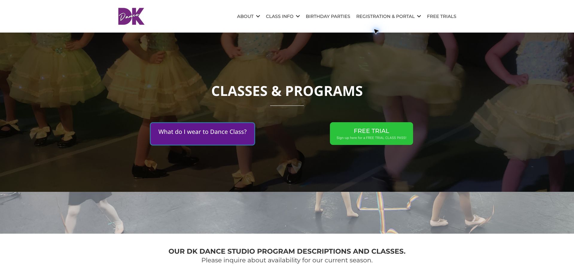
DK Dance places two practical choices directly in its class-page hero: what to wear and how to try a class. That pairing recognizes that a parent may need reassurance and preparation information before registration. The purple identity sits against a photograph of young dancers, while the class descriptions divide very young children into specific age ranges and explain caregiver participation. Schedule details and signup links connect those descriptions to action. The main limitation is length: the early-childhood explanations spend many paragraphs on general benefits, making the exact age and session information harder to retrieve. The bright green trial action also competes with a differently styled clothing button. A compact class summary would make the useful preparation content more effective.
What you can learn
Place first-class preparation beside the trial invitation, and summarize age, caregiver role and schedule before expanding into educational philosophy.
Pros
Clothing guidance is visible at the decision point.
Young-child programs identify specific age ranges.
Cons & considerations
Long benefit descriptions slow practical class comparison.
Competing button styles weaken the action hierarchy.
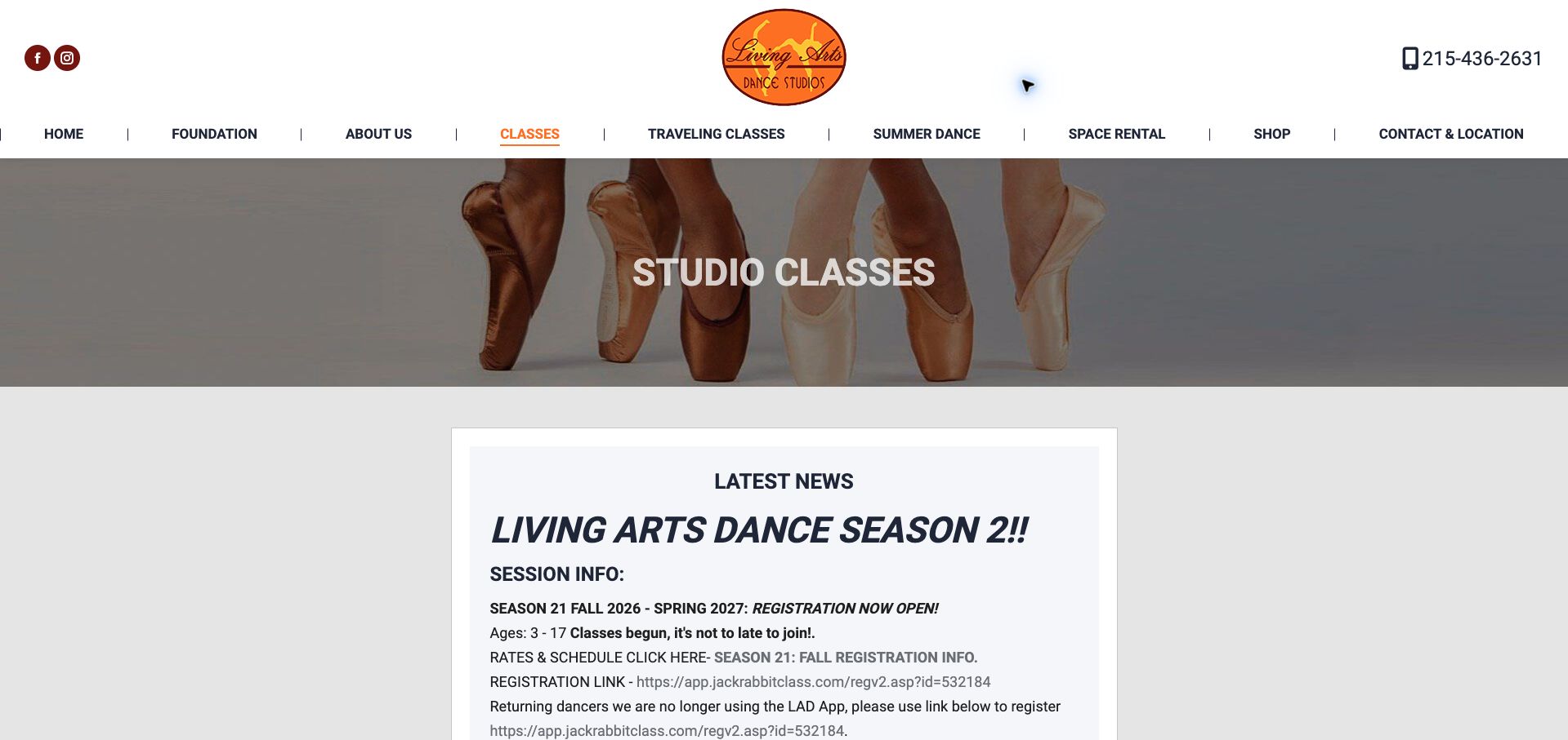
Living Arts uses an orange identity, a dance photograph and a prominent news panel to organize its studio-class page. The current season, age range and registration status appear before the longer program descriptions. Particularly useful is the notice telling returning families that the previous app is no longer the registration route; the page names the new registration and parent-portal links separately. That is important operational communication during a system change. The panel is visually dense, however, with raw URLs, capitalized headings and several repeated schedule prompts. Older mini-session dates remain beside current-season information, so readers must distinguish what is still open. The page has the right facts, but a clearer separation of current actions and historical notices would improve usability.
What you can learn
When a registration system changes, tell returning families directly and separate new enrollment from the existing-family portal.
Pros
The season is identified with full years.
Returning families receive explicit guidance about the changed system.
Cons & considerations
Raw URLs and repeated prompts create a dense noticeboard.
Different session periods need clearer current-versus-ended labeling.
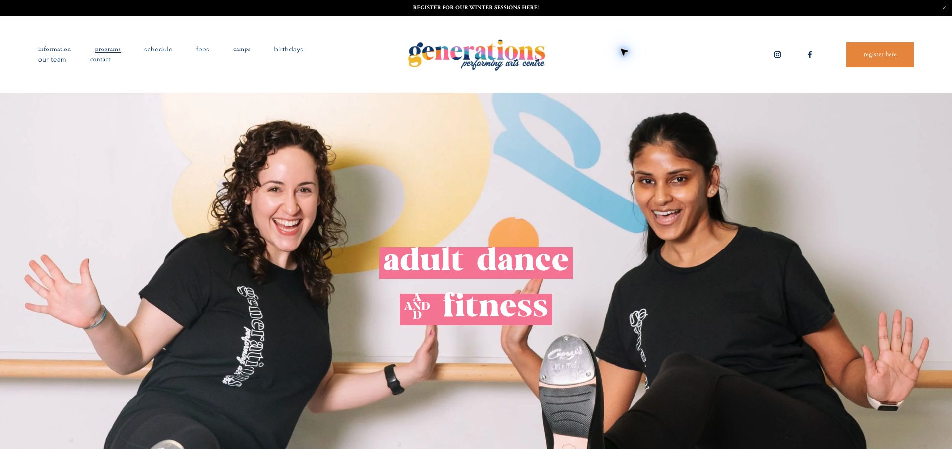
Generations gives adult students a dedicated page with an energetic photograph, multicolored identity and pink headline blocks. The introduction speaks directly to people returning after a break, then lists classes with days, levels and session dates. Descriptions distinguish absolute beginners from dancers with more experience, while tuition-proration and discount information explain how joining mid-session works. This is useful context before a student reaches registration. The page combines dance and fitness in one long sequence, and the navigation's small type makes the many site destinations harder to scan. Date-and-weekday combinations also deserve careful checking as sessions change. The transferable pattern is a welcoming tone supported by specific entry-level information, rather than reassurance without practical guidance.
What you can learn
For adult returners, explain the actual starting level and mid-session enrollment rules as clearly as the atmosphere of the class.
Pros
Class descriptions distinguish different experience levels.
Proration information supports people joining an existing session.
Cons & considerations
Dance and fitness share a long scrolling page.
Small navigation text makes the many destinations harder to scan.
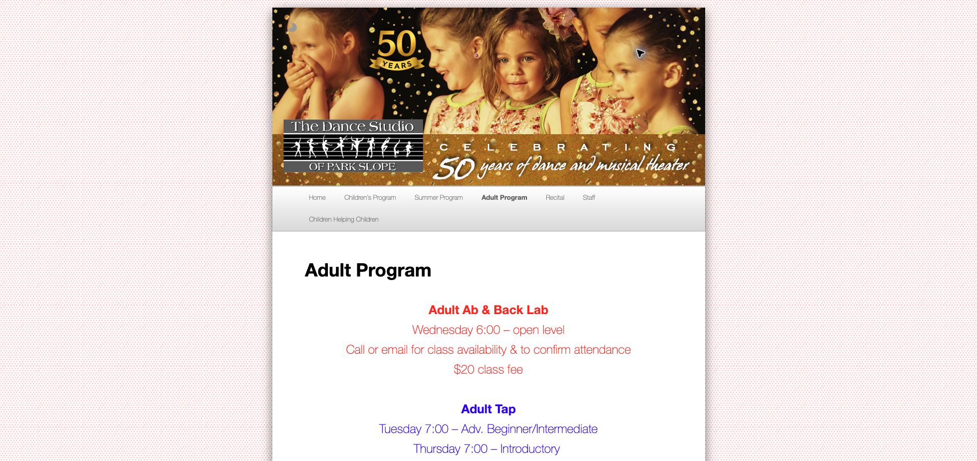
The Dance Studio of Park Slope presents adult classes in a narrow, centered page with a celebratory studio banner and color-coded text blocks. Each offering states the day, level and fee, then explains whether visitors should call, email or register in advance. The master-class listing distinguishes an open-level class from an introductory one, a useful clarification for new dancers. Performance photographs farther down show the adult program rather than relying solely on children's imagery. The older layout has limitations: a social-feed shortcode appears as literal text, and a future-dates placeholder leaves one offer unresolved. The example is valuable for its concise class facts, with a clear need to maintain peripheral widgets and remove incomplete announcements.
What you can learn
Even a simple class page should state level, time, fee and confirmation method together, while keeping unfinished dates out of the active offer.
Pros
Class fees and confirmation methods appear with the schedule.
The master class explicitly excludes introductory-level participation.
Cons & considerations
A visible social-feed shortcode signals a maintenance problem.
An unresolved date placeholder leaves one class difficult to plan.
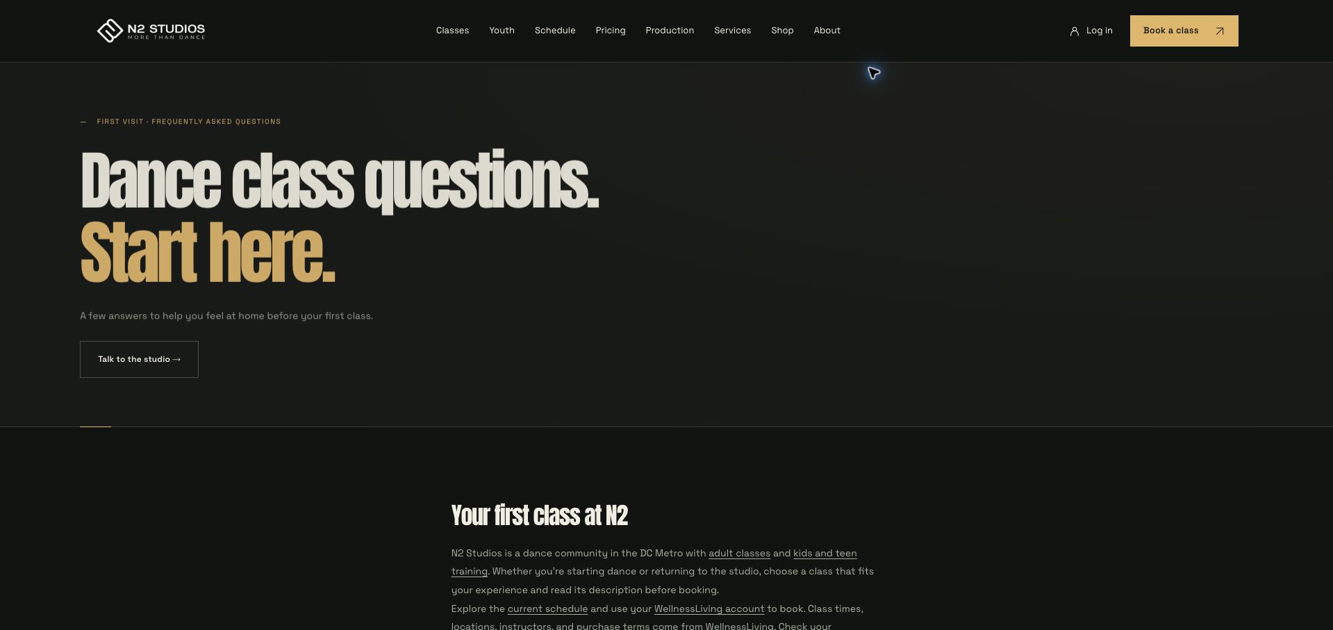
N2 turns its FAQ into a deliberate first-visit page, using large condensed headings, a near-black background and gold accents. The opening tells visitors to choose a class appropriate to their experience and explains that schedule, location and purchase terms come from WellnessLiving. That attribution is useful when the marketing site and operational system have different responsibilities. The question list covers clothing, youth programs, pricing, cancellations and private sessions, while a studio-contact route remains available. The tall introduction postpones the questions, and important answers are not exposed in the initial collapsed view. A shorter opening and a few visible essentials could reduce the number of interactions needed. The strongest pattern is setting expectations for the external booking handoff.
What you can learn
Explain which system controls current class details and provide first-visit guidance before sending a new dancer into an unfamiliar account flow.
Pros
The source of schedule and purchase information is named.
The FAQ covers practical newcomer concerns beyond class style.
Cons & considerations
The large introductory block delays the actual questions.
Collapsed answers add steps to finding essential first-visit information.
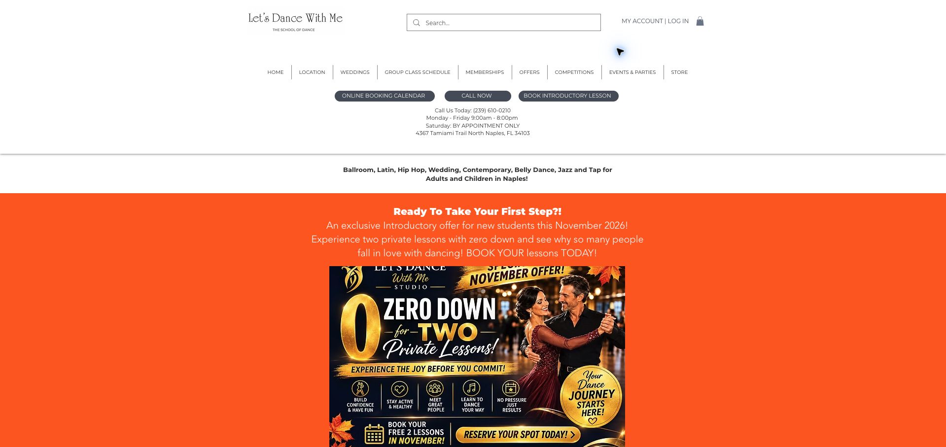
Let's Dance With Me combines a detailed navigation with three immediate routes: the calendar, a telephone call and an introductory lesson. The Naples address and opening hours appear in the same opening area. Below, an orange promotional section highlights the current introductory offer before the page explains group classes, wedding preparation and competitions. The explicit statement that a partner is not required addresses a common barrier for social-dance newcomers. However, the many header links and large promotional artwork compete with the class-selection task. Adjacent monthly references also require consistent updating. The useful pattern is distinguishing a low-commitment private introduction from the ongoing group schedule, while keeping practical location information close to both.
What you can learn
For social dance, answer the partner question and distinguish introductory private instruction from ongoing group classes before promoting packages.
Pros
Address and opening hours appear near the booking actions.
The page explicitly addresses attending without a partner.
Cons & considerations
Large promotional artwork dominates the opening content.
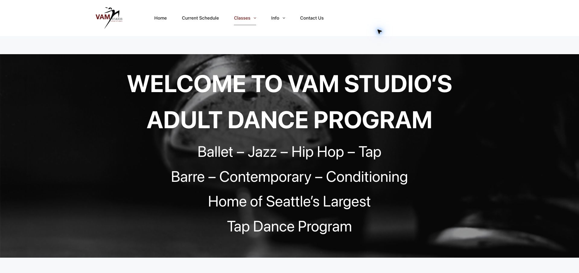
VAM's adult page begins with a bold black-and-white dance image and a direct list of disciplines. The text explains its flexible drop-in model, then gives beginner ballet and tap courses their own sections with duration, fee, dates and registration links. That distinction matters because an absolute beginner may benefit from a course sequence rather than entering an ongoing class without context. A current-schedule link and class-card action support returning students. The page is long, with large headings and repeated registration choices, and some date formatting is inconsistent. A comparison between courses and drop-ins near the top would make the structure easier to understand. The practical course details are the most useful element to borrow.
What you can learn
Explain whether a class is an ongoing drop-in or a fixed course, then put its duration, level and registration terms in one compact block.
Pros
Beginner courses include duration and fee information.
The drop-in model is explained before the detailed listings.
Cons & considerations
Large repeated headings create a lengthy page.
Inconsistent date formatting makes session boundaries harder to scan.
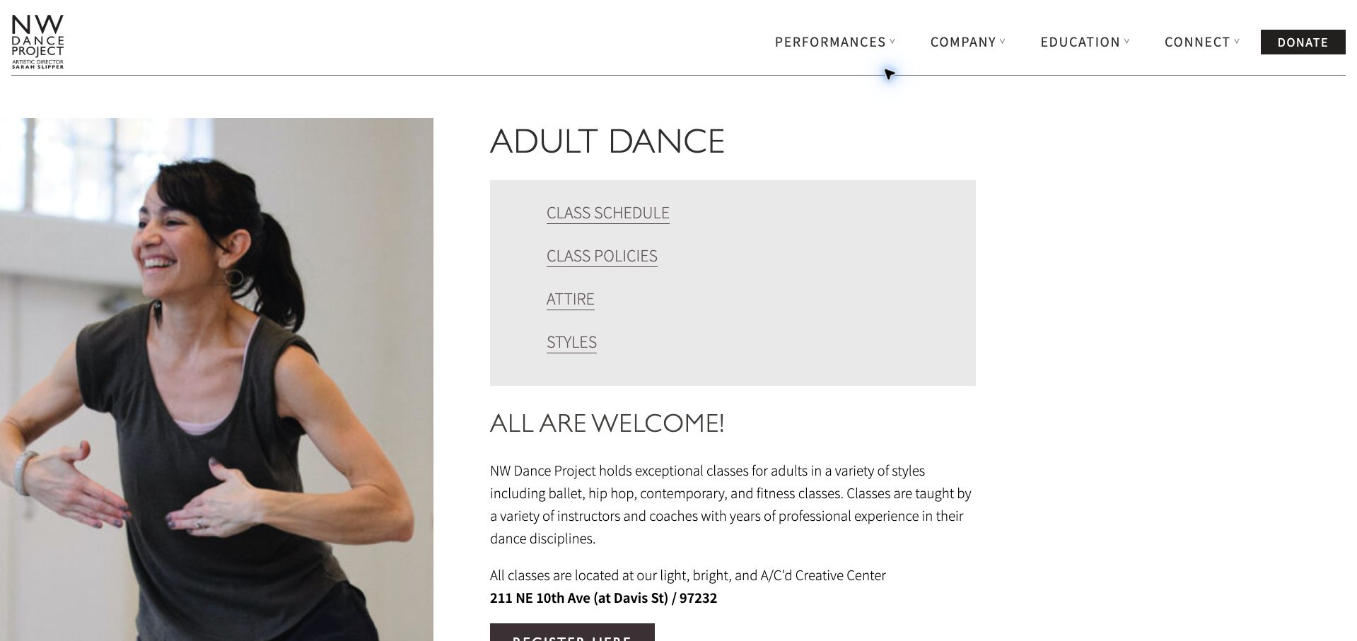
NW Dance Project places an adult-class photograph beside a simple content index linking to schedule, policies, attire and styles. That index makes a long page more usable for visitors who already know which question they need answered. The schedule distinguishes absolute beginner, beginner and more advanced ballet with short descriptions of expected experience, while the location is written prominently near the introduction. Holiday closures and a seasonal intensive are also visible before the regular timetable. The monochrome presentation is restrained, although several seasonal notices interrupt the main weekly flow. The broader organization header includes performance and donation routes that are less relevant to class selection. The strongest pattern is direct navigation to the practical parts of an adult program.
What you can learn
Give a long class page a short task-based index, and define experience levels in words rather than relying on labels alone.
Pros
The content index offers direct access to practical topics.
Ballet levels include concise experience expectations.
Cons & considerations
Seasonal notices interrupt the regular schedule sequence.
Organization-wide actions compete with the class-registration task.
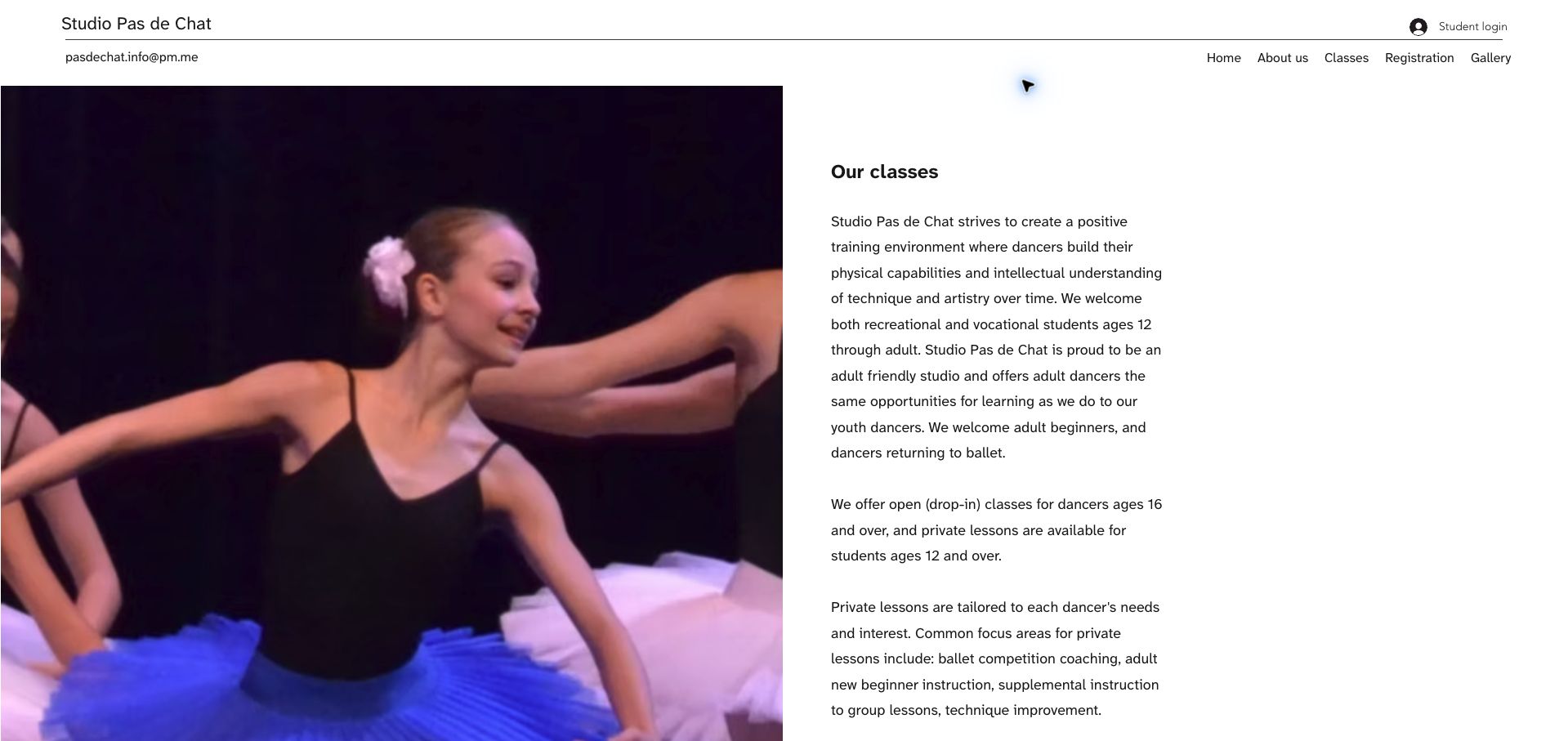
Studio Pas de Chat pairs a large performance photograph with a narrow column of class information. The simple header keeps student login separate from the public navigation, and an email address is visible without searching the footer. The copy distinguishes open classes for older dancers from private lessons available to younger students, then explains the purposes of individual coaching and workshops. This makes the specialist offer more concrete than a generic all-levels statement. The page still requires another navigation step to reach registration, and the long paragraphs do not present the class types as a quick comparison. Its useful lesson is that a small studio can explain eligibility precisely within a restrained design, without a large or elaborate website.
What you can learn
State the age and participation rules for each lesson format clearly, and place a relevant registration action beside that explanation.
Pros
Open and private lessons have distinct age requirements.
Direct email contact is visible in the header.
Cons & considerations
The class explanation lacks a nearby registration action.
Long paragraphs slow comparison of lesson formats.
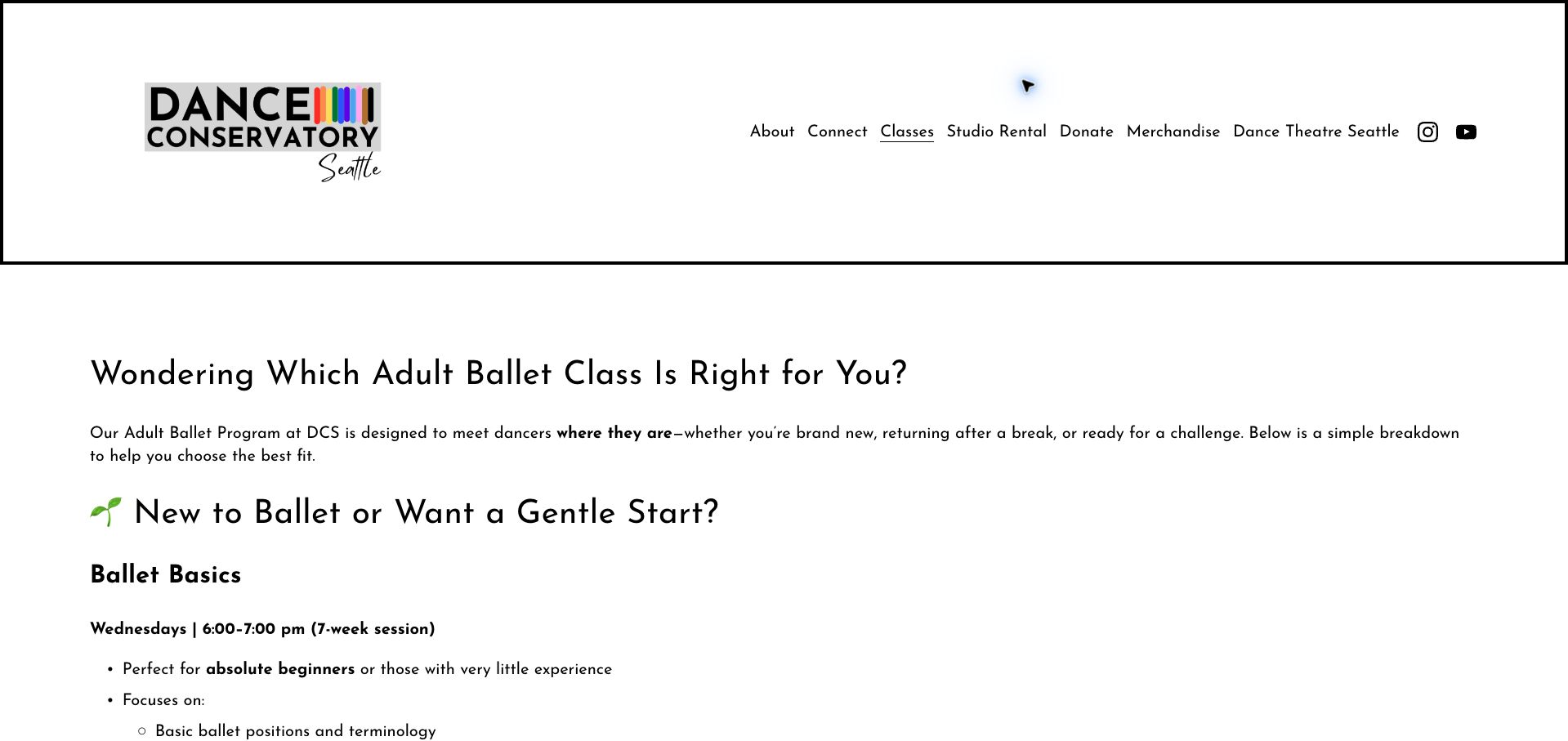
Dance Conservatory Seattle approaches its adult page as a decision guide. It asks which class fits, then describes basics, beginning, moderate, open and pointe options through pace, activities and prior experience. That is more useful than expecting visitors to understand the school's internal naming convention. A simple black-and-white layout, rainbow logo accent and large headings keep the guide readable, with schedules attached to the descriptions. The page is text-heavy, and some names combine beginning with intermediate or advanced qualifiers, so the explanation is doing work the labels could handle more clearly. A comparison table and stronger registration prompts would help readers act on the guidance. The core pattern—explain level through actual class expectations—is highly transferable.
What you can learn
Describe what happens in each class and what experience it assumes, so new students can choose a level without interpreting internal terminology.
Pros
Experience expectations accompany each class description.
The guide distinguishes a gentle start from faster-paced training.
Cons & considerations
Some class names combine potentially confusing level labels.
The long text guide needs stronger action points and comparison aids.
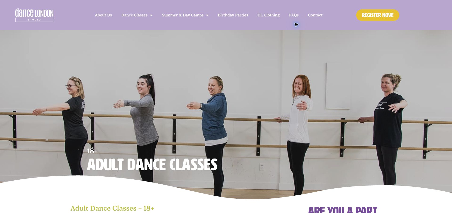
Dance London uses a lavender header, yellow registration action and a photograph of adults at the barre to make its audience immediately clear. The page follows a brief welcome with clothing and footwear guidance, then a table containing the class, experience requirements, day, time, start and end dates, session and tuition. Register and waitlist states appear in the same structure. This lets prospective students compare practical commitments before entering enrollment. The introductory claim that classes suit all levels needs to be read alongside individual rows that require prior experience. The wide table also creates a demanding layout on smaller screens. The most useful pattern is making term length, eligibility and cost comparable in one place.
What you can learn
Show session dates, required experience, tuition and availability together, and make sure broad introductory language agrees with the individual class requirements.
Pros
Tuition and session dates appear in the same comparison.
Waitlist states are distinguished from open registration.
Cons & considerations
Broad all-levels language needs qualification for advanced rows.
A wide information table requires careful small-screen treatment.
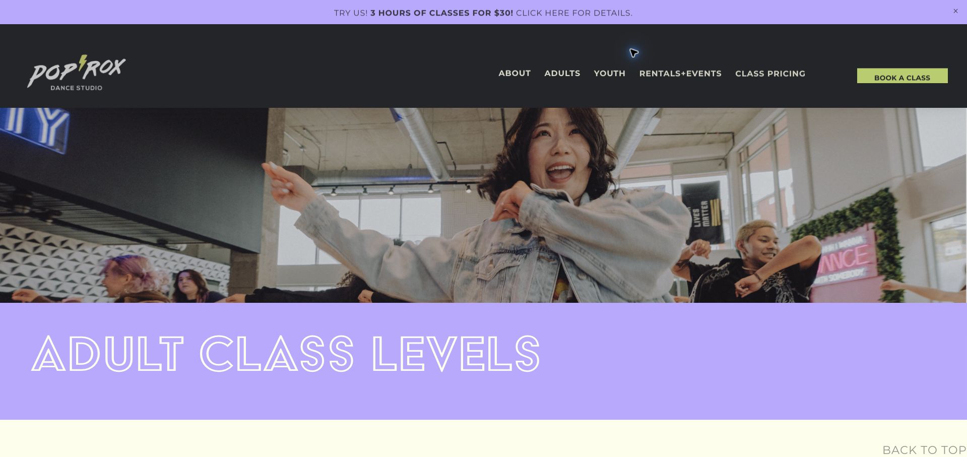
PopRox uses lavender, charcoal and lime accents around an energetic class photograph, then gives its adult levels plain-language definitions. Introductory classes are separated from beginner classes, with intermediate and advanced expectations described in terms of pace, repetition and choreography. A short explainer video offers another way to understand the levels. The subsequent listings identify the studio location and time before linking to details and booking, which matters for a two-neighborhood program. The page grows very long, and repeated graphic class cards can make comparison harder than the initial definitions suggest. The outlined headline is also less legible than the solid body headings. Its strongest idea is treating level choice as a real onboarding task rather than a label on a calendar.
What you can learn
Explain the difference between first-ever, beginner and more experienced classes, then carry those definitions consistently into location-specific booking listings.
Pros
Introductory and beginner levels are meaningfully distinguished.
Location information accompanies the class listings.
Cons & considerations
The extensive card sequence requires substantial scrolling.
Outlined headline lettering is less legible than solid text.
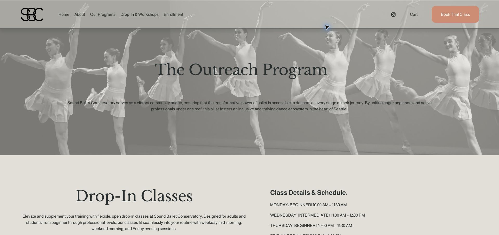
Sound Ballet Conservatory uses a monochrome ensemble photograph and a soft peach trial button to introduce its drop-in offering. The main content places the program explanation beside a short weekly timetable, followed by class pricing and booking policies. The page states the booking cutoff, maximum class size, refund timing and minimum enrollment needed for a session to run. Those details set useful expectations before payment, especially for a small class whose availability may change. The opening 'Outreach Program' title is less direct than the drop-in task visitors came to complete, and dark text over the photographic banner has uneven separation. The operational information is the strongest element, and it would benefit from a more task-specific introduction.
What you can learn
For limited-capacity classes, explain booking cutoffs, cancellation terms and minimum enrollment alongside the schedule rather than after checkout.
Pros
Capacity and minimum-enrollment rules are explicit.
Refund timing appears with the booking information.
Cons & considerations
The opening title is less specific than the visitor's drop-in task.
Text over the photograph needs stronger separation from the background.
Kegan is a freelance web designer and developer with 15+ years of experience helping businesses turn complicated website requirements into clear, maintainable digital experiences. He works directly with clients from planning and design through development, launch, and ongoing support.
For dance studio website design, his development approach focuses on class and level comparisons, readable term schedules, teacher profiles, tuition information, and enrollment-platform connections. The scope can be a targeted improvement or a complete custom build, with responsive layouts, thoughtful content structure, and integrations chosen around the people using and maintaining the site.
Show 3 other dance studio website designersHide other dance studio website designers
Plan the content around the decisions visitors need to make
Define audience groups first
Separate children, teens, adults and specialist programmes where those differences change the decision. Avoid duplicating the entire site for each audience when shared teacher and location information can remain connected.
Build a consistent class record
Store the discipline, age range, level, teacher, venue, day, time and term together. Clearly distinguish a published timetable from live place availability. Give staff a straightforward process for changing cancelled or relocated classes.
Explain trials and placement
State who can try a class, whether booking is necessary, what it costs and what happens afterward. For assessed programmes, describe the request and review process without implying that a submitted form guarantees admission.
Document the whole tuition model
List the unit of payment, registration fees, costume or performance charges and cancellation conditions approved by the studio. Link discounts to their eligibility and current dates so an attractive headline does not hide the actual commitment.
Prepare first-time visitors
Explain arrival time, clothing, footwear, changing space and observation arrangements using the studio’s current policies. Give families a direct way to ask about access or individual participation needs before registration.
Test term changes and full classes
Check that an old timetable cannot look current, that waiting lists have clear labels and that the correct class survives a booking handoff. Test on phones and with keyboard navigation without creating real student records.
The editing job behind the design
Choose a maintainable publishing and booking system
Use a structured class catalogue connected to a dependable enrollment service. The public site should explain classes clearly even when the booking widget is unavailable or a visitor has not yet created an account.
Keep season dates, availability and fee data under explicit ownership. Embeds can reduce duplicate entry, but check their narrow-screen layout, keyboard behavior and loading failures before making them the only way to discover a class.
Our WordPress website examples offer a separate look at publishing approaches. A visible platform label is evidence for that named page, not a guarantee that the same system will suit your requirements.
Before the public launch
Practical website planning checklist
Name the current term.
Show age and level for each class.
Explain prerequisites.
Identify the teacher and venue.
Publish readable days and times.
Distinguish availability from timetable data.
Explain trial eligibility.
State the tuition charging unit.
Include important extra costs.
Provide clothing and arrival guidance.
Label waiting lists clearly.
Test the external enrollment destination.
These checks are a project checklist, not a performance, legal, security, or accessibility certification. Test real journeys with the people responsible for the website before making claims about the result.
Sources & editorial method
How this collection was selected and reviewed
The 15 examples match the original saved collection target. Each official public page was opened, inspected and directly captured in an ordinary browser; source URLs and capture dates identify the reviewed state. Reviews describe observed design, information and navigation, with distinct practical lessons and limitations. A bounded public technology-audit attempt accompanies every source, preserving unknown and inaccessible results without inventing a hidden stack. Editors Choice is an explicit editorial selection favoring a smaller specialist or local organization, not a service-quality, safety or outcome endorsement. No booking, application, payment or private form was submitted. Website imagery and trademarks belong to their owners.
Each example links to its actual source page. Screenshots are direct browser captures with their own capture dates; moving imagery, announcements and live designs can change. The notes describe observable design choices and conditional tradeoffs, not measured traffic, conversion results, service quality, or accessibility conformance.
Technology labels use public page metadata, asset evidence, or explicitly cited platform documentation. Platform documentation is not a complete current deployment audit. A component reference may be legacy or unused; it is not a complete backend inventory. Unknown stacks are omitted. These sites are editorial examples, not our client portfolio.
Written, Edited and Curated are separate editorial records, not timestamps advanced by a rebuild. Website designs and imagery belong to their owners. See our editorial standards or suggest a correction.
Questions worth asking
Dance Studio website design questions
What should a dance class listing include?
At minimum, discipline, intended age or audience, level, location, day, time and current term. Add a clear route to tuition and enrollment, with availability labeled according to how it is maintained.
Should the timetable be embedded?
An embed can be useful if it remains readable and accessible. Retain an ordinary explanation of class types and provide a fallback when the external system does not load.
How should beginner classes be described?
Explain who the class is intended for and whether prior experience is expected. Give uncertain students a contact or placement route rather than relying on the word beginner alone.
Where should tuition information appear?
Near the class-selection journey, with the payment unit and important additional costs. A separate tuition page works well when the class list links to it clearly.
How should a studio handle expired terms?
Archive or label the old schedule and publish the next confirmed dates. Do not leave an old register action looking like a current place offer.
A strong dance website turns interest into an informed class choice. Give the timetable the same editorial care as the studio’s photographs, and keep the enrollment handoff tied to the class the visitor selected.