Best Optometry Websites of 2026 (30 Real-World Examples)
Optometry website examples that make the next visit easier to understand
Explore 30 optometry website examples, from neighborhood eye-care practices to optical boutiques, with practical lessons for appointments, location information, patient preparation and visual identity.
An optometry website needs to serve several intentions without confusing them. A new patient may be comparing an eye examination, a parent may be looking for a child's appointment, and an existing patient may only need contact-lens ordering or a payment link. An optical boutique also has a retail story to tell. The most useful design makes these routes recognizable while explaining who provides care, where the practice is and what happens next.
These examples include independent practices, regional offices and optometrists working inside larger retail locations. They are design references, not recommendations of clinicians or treatments. The reviews examine visible layout, navigation, imagery and information. Published prices, availability and clinical statements are the practices' own material and should be checked directly before relying on them.
Before the examples
What makes good optometry website design in 2026?
Separate booking from patient utilities
Give the first appointment a clear primary action. Keep contact-lens orders, portals and payments available for returning patients, but do not give every system identical visual weight. Label an appointment request differently from a confirmed booking.
Explain the exact place and provider
Identify the neighborhood, office and independent practice where relevant. An optometrist inside a retail store should explain which organization handles the exam and which handles optical purchases. Include practical arrival details rather than relying only on a map.
Prepare patients before they click
Provide visit types, accepted-plan guidance, price qualifications and current availability in ordinary language. Explain what a patient should bring and which questions require a call. Keep temporary notices dated and assign someone to remove them when no longer relevant.
Design for readable information
Large photographs and fashion imagery can be useful, but patient information needs predictable contrast, readable type and visible focus states. Test enlarged text, small screens and reduced motion. An accessibility widget is not a substitute for reviewing the actual interface.
The collection · 30 examples
30 optometry websites worth studying
Compare the appointment-led, team-led, fashion-led and location-led approaches below. Each example includes a direct public-page capture, a concrete design lesson and visible tradeoffs. Editors Choice recognizes the usefulness of one website's design, not the quality of its medical services.
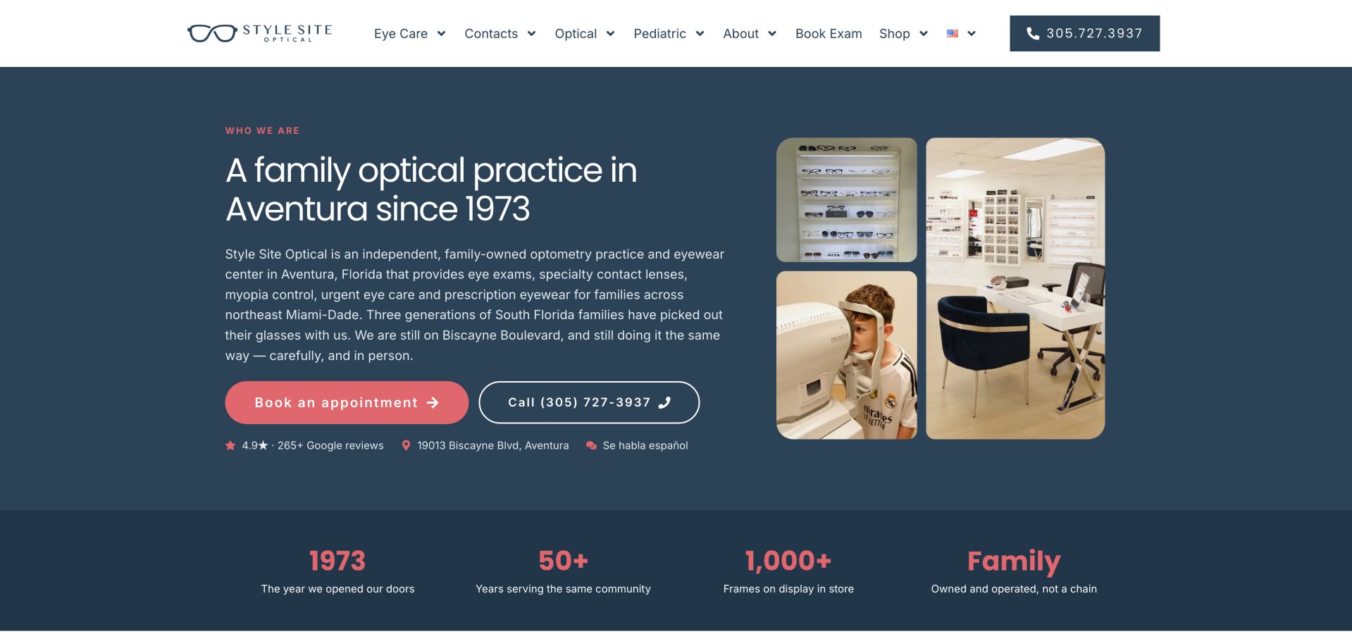
Style Site Optical's Aventura introduction combines practice and examination imagery with a navy-and-coral hierarchy. Calling and booking are easy to distinguish, while provider information, service pathways and price context make the page useful beyond its appearance. Its family-owned positioning is supported by the practice's own description, not an external quality assessment. A compact strip beneath the paired actions brings address and Spanish-language availability into the opening. The photographs use a small collage rather than one oversized image, leaving room for the practice explanation. Coral highlights connect the booking action with the figures below, but those displayed statistics should remain clearly attributed to the practice instead of becoming independent editorial proof.
What you can learn
Build a boutique identity around useful local information as well as photography. Bring provider names, visit options and price qualifications into the same journey rather than leaving them scattered across unrelated pages.
Pros
Real practice imagery and clear paired actions
Useful provider, service and pricing context
Cons & considerations
Long introductory material could be tighter
Self-reported figures still require independent verification
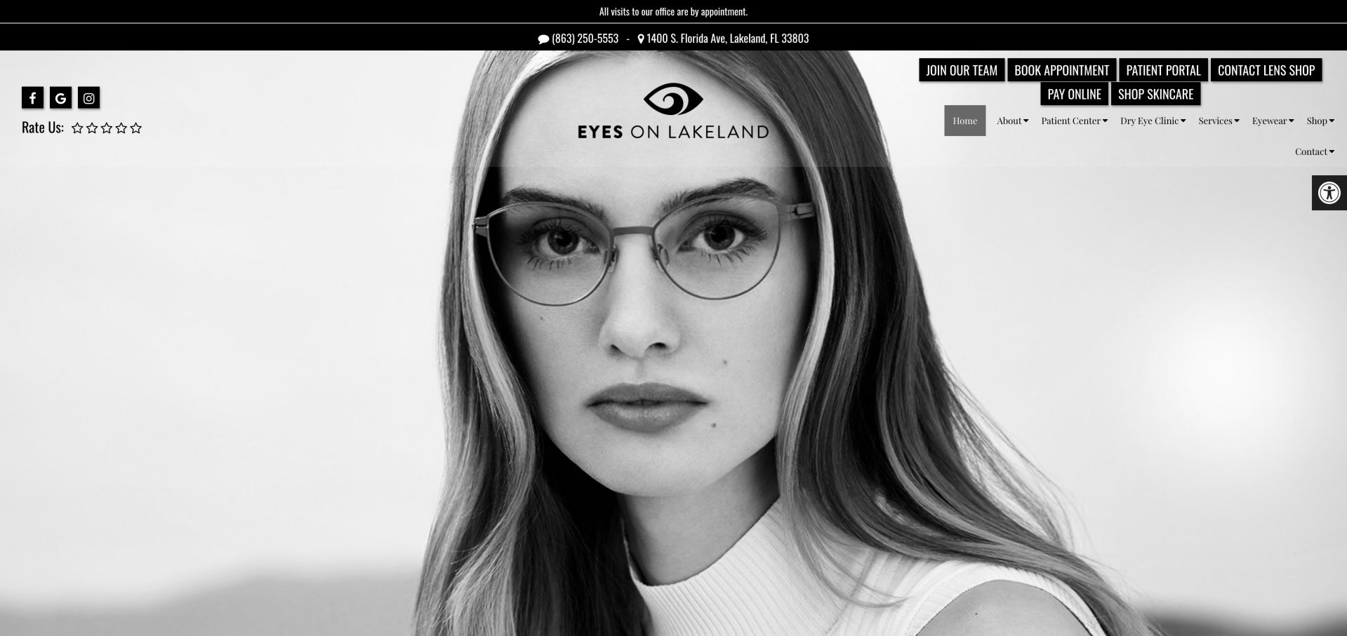
Eyes on Lakeland leads with a monochrome fashion portrait and a translucent masthead, giving the optical offer a distinctive editorial tone. Booking, the patient portal, payments and shopping are immediately available, but compete for attention before a newcomer learns what care is offered. The narrow location strip provides a useful practical counterpoint to the portrait, and its appointment-only notice belongs close to the booking choice. Because most supporting links sit in a small cluster above the image, the hierarchy favors visitors who already know which patient system they need. A newcomer has more work to do before choosing confidently.
What you can learn
Separate the first-time patient's exam decision from the returning patient's utilities. Keep the fashion identity, but add a brief care proposition beside the primary appointment action.
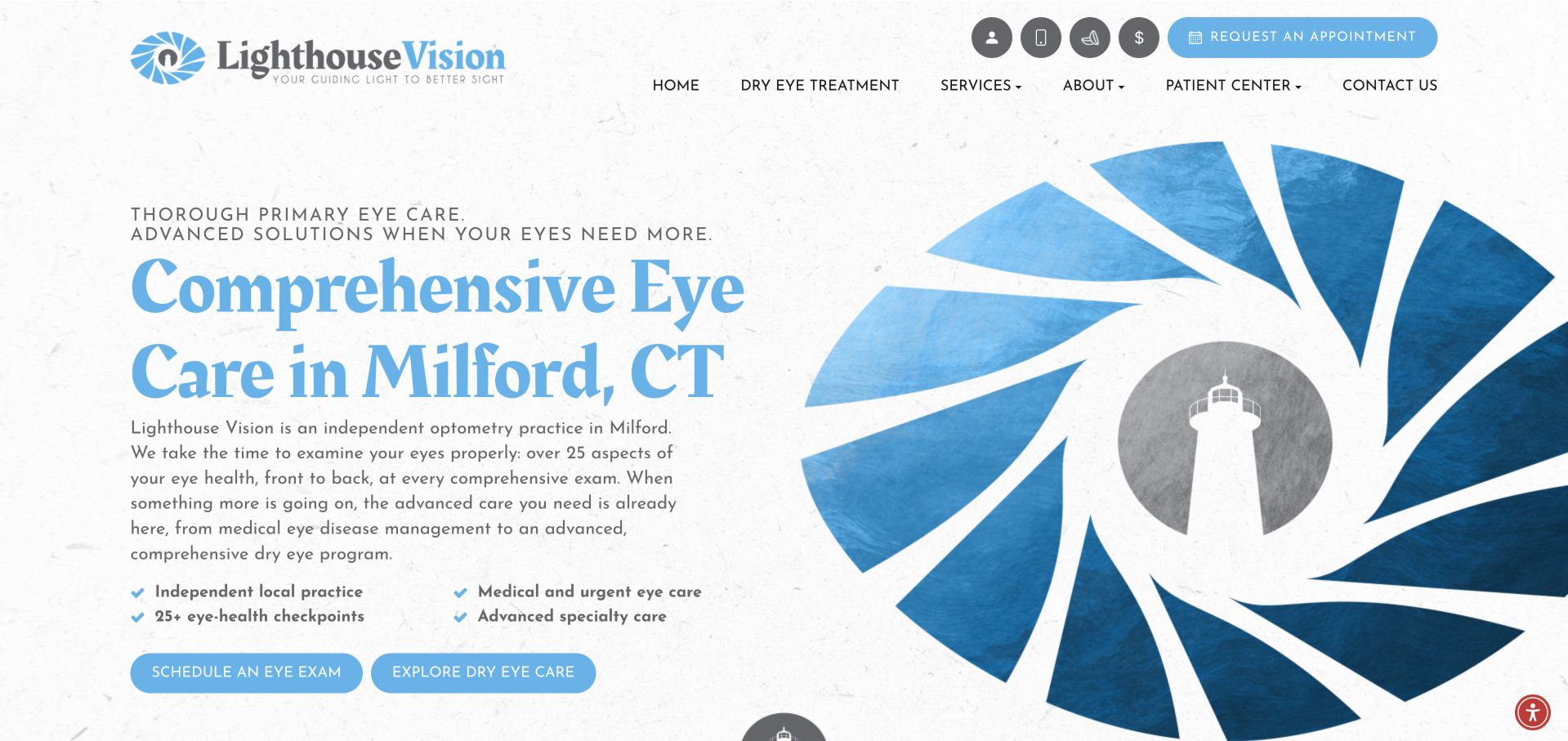
Lighthouse Vision uses navy type, pale blue panels and an oversized eye illustration to make its specialist positioning explicit. Exam and dry-eye actions appear together with concise reassurance points. The inspected exam link pointed to the dry-eye page, a reminder that a good visual hierarchy still depends on accurate destinations. The split composition gives the short local introduction its own white space instead of placing it over photography. Four compact service points help organize the message beneath the large serif heading. The oversized illustration makes the brand memorable, although its scale leaves less room for an expanded explanation of the two appointment paths.
What you can learn
Give routine exams and specialist consultations their own correctly labeled destinations, then test each link as a new visitor rather than assuming the button text proves the journey.
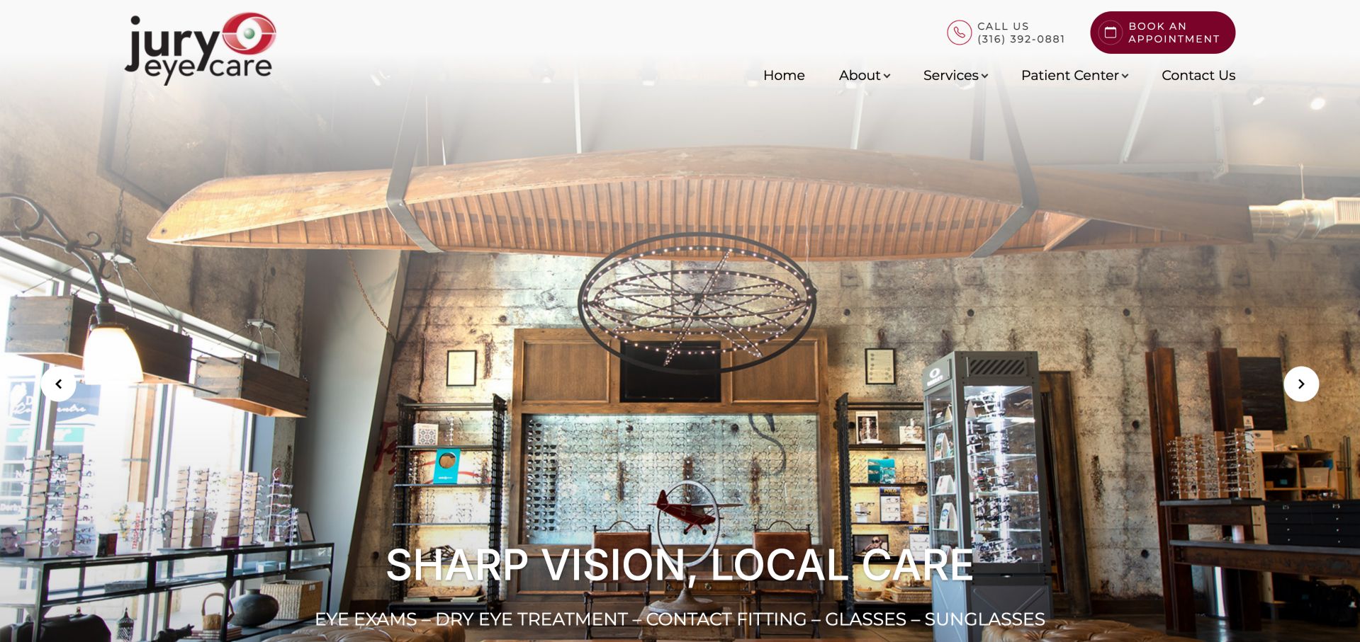
Jury Eye Care fills its opening with a warmly lit optical interior and places a burgundy appointment button beside a separate telephone option. A short navigation supports quick exploration. The large photograph establishes a sense of place, although Wichita and Derby details require further reading. The optical interior also communicates the retail side of the practice through visible display cases and shelving. Below that opening, the saved inspection found service cards, clinician profiles and location-specific hours, so there is useful information to support the visual introduction. Bringing a small amount of that office context into the hero would make the next step more predictable.
What you can learn
Use an actual practice photograph to reduce unfamiliarity, then make location selection as direct as booking so a patient does not have to infer which office the image represents.
Best In Sight pairs a mountain landscape with restrained centered typography and a quiet invitation to explore. It feels markedly less transactional than a typical appointment-first clinic. That calm comes with a tradeoff: the first screen does not provide the same immediate telephone or booking route as more task-led examples. Its centered headline spans the landscape, with a much smaller explanation and outline exploration link underneath. The later section navigation covers eyewear, the doctor, services and appointments. This makes the page behave more like a guided introduction than a utility dashboard, a useful distinction when evaluating whether its quiet opening suits the practice's most common visitor needs.
What you can learn
A relaxed identity can work without hiding practical help. Pair the atmospheric image with an explicit exam action and concise location information rather than relying on a generic exploration prompt.
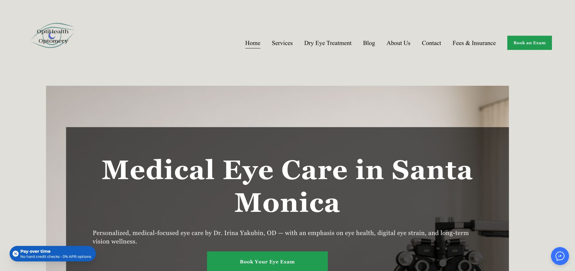
OptiHealth uses a warm neutral palette, large serif type and examination-room imagery to position its Santa Monica practice. Fees and insurance have a visible navigation route, which is valuable before an appointment. A lower notice about new-patient availability complicates the more general booking invitation. The solid dark panel behind the headline provides a more stable reading surface than placing white text directly across the examination-room image. Green booking controls are the strongest accents in an otherwise muted page. That restrained palette makes the competing financing and chat widgets especially noticeable, even though they occupy only small areas near the screen edges.
What you can learn
Treat availability notices as part of the appointment journey, not secondary copy. A new patient should understand eligibility before opening a scheduler or interpreting a prominent booking button.
Pros
Location and medical framing are prominent
Fees and insurance have a dedicated route
Cons & considerations
Availability notice and booking message need alignment
Several financing or chat utilities add visual competition
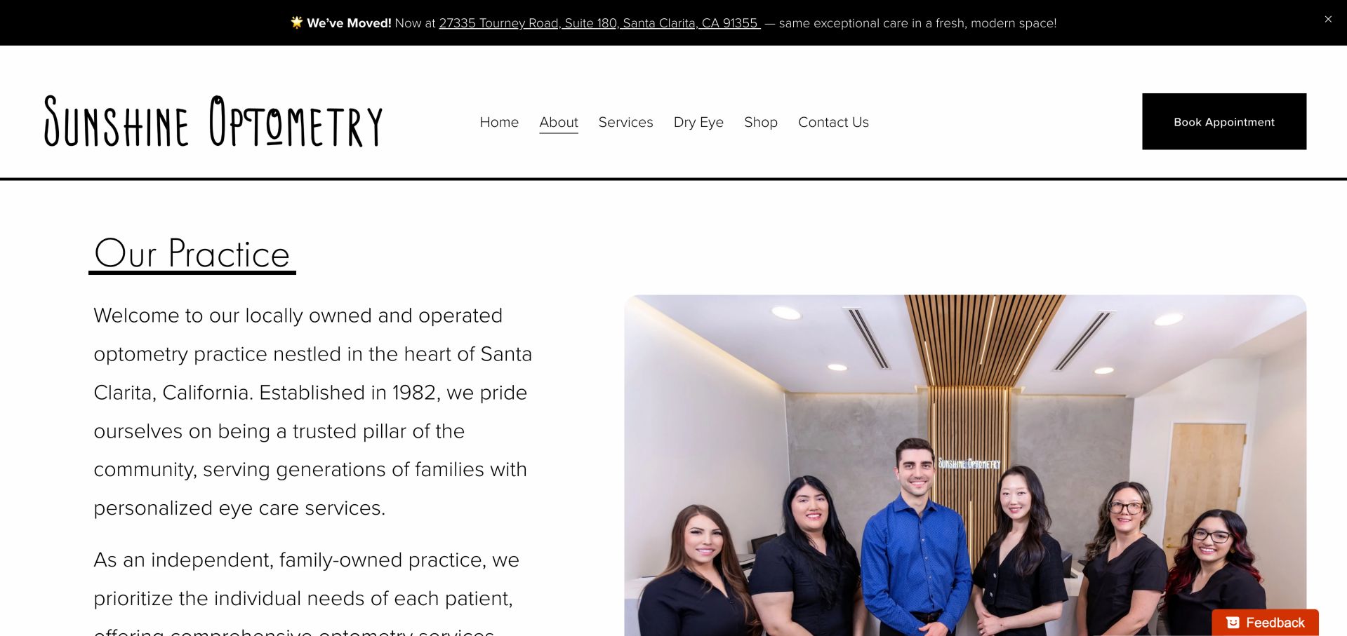
Sunshine Optometry's practice page puts a large team photograph and a straightforward heading ahead of individual biographies. The black-and-white structure keeps the people central, while a relocation notice supplies an operational update. Long biographies and generous spacing make the page more useful for deliberate reading than fast comparison. The introduction and group photograph sit side by side, allowing visitors to connect the written practice story with the people shown. A simple divider and underlined section title establish the page hierarchy without decorative cards. The upper booking button remains distinct from that reading experience, while the relocation strip needs to stay accurate as the move becomes less recent.
What you can learn
Introduce the real team collectively, then summarize each clinician's role before the longer biography. Keep relocation details connected to the current address and appointment route.
Pros
Actual team imagery supports a personal introduction
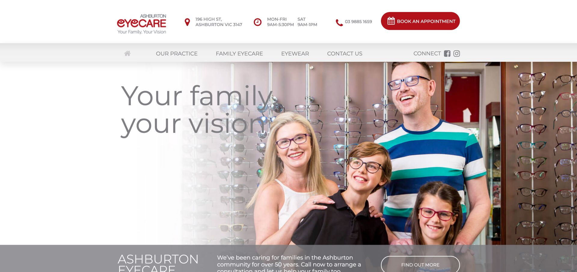
Ashburton Eyecare combines a family photograph with a red masthead that exposes address, hours, phone and booking. This makes the office's practical details easier to find than on image-only openings. The large gray headline overlaps a busy photograph, so the attractive family framing also creates a readability consideration. The header separates the practical utility row from a short set of practice, family-care, eyewear and contact categories. That organization supports two different tasks: arranging a visit and learning what the office offers. The photograph reinforces the family theme immediately, but the large text crossing it should be checked at each crop used for smaller screens.
What you can learn
Keep the family's emotional introduction, but give essential text a predictable contrast surface. An address-and-hours strip should remain legible and useful at small sizes rather than becoming decorative chrome.
Pros
Office details and booking are together
Family focus is visually clear
Cons & considerations
Text overlays need contrast review
Specific service distinctions sit below the opening
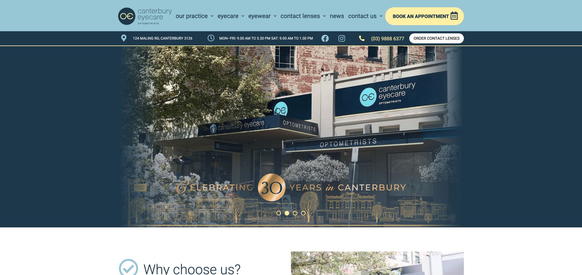
Canterbury Eyecare uses aqua and navy, a conspicuous yellow booking action and an anniversary storefront image. Its utility information covers address, hours, calls and ordering, making it useful for existing patients. Some of the opening message is carried by the photograph rather than ordinary page text. The yellow appointment button has a different treatment from the contact-lens ordering utility, helping distinguish a new visit from a repeat purchase. The storefront also makes the physical business recognizable. A carousel carries the anniversary message, so essential information should remain available outside the rotating artwork and retain its meaning when images are cropped or unavailable.
What you can learn
Use the storefront to establish recognition while repeating essential location and anniversary context as real text. Do not make a photographed sign the only way a visitor can understand the message.
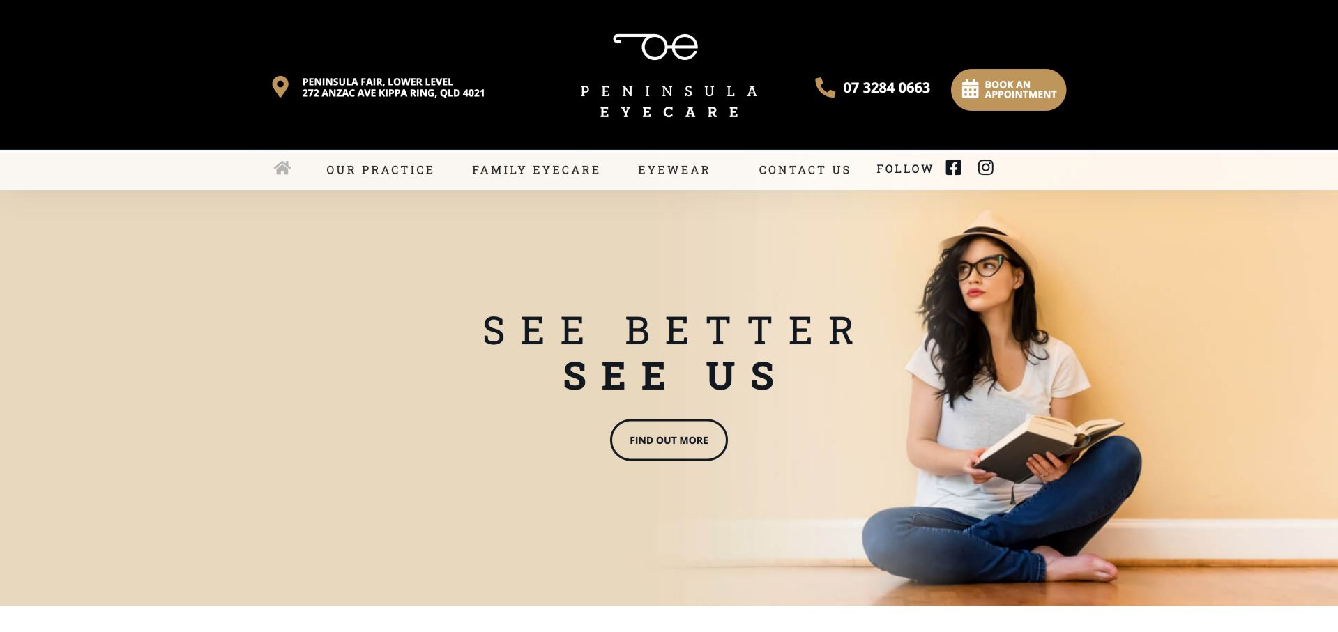
Peninsula Eyecare adopts a black-and-gold masthead and a spacious fashion photograph, with address, telephone and booking available above. The restrained menu leaves room for the imagery. Its generic discovery prompt and limited first-screen care explanation make the visual brand stronger than the immediate service proposition. The exact shopping-centre address in the upper band gives the otherwise aspirational image a concrete local anchor. Gold icons and the rounded appointment action connect that utility layer to the brand palette. The large empty areas around the fashion portrait preserve a calm composition, but could also accommodate a short sentence explaining the purpose of the next click.
What you can learn
Keep the fashion-led restraint but replace vague discovery language with the actual destination, such as eye examinations or frame selection. Visitors should not have to guess what the next click explains.
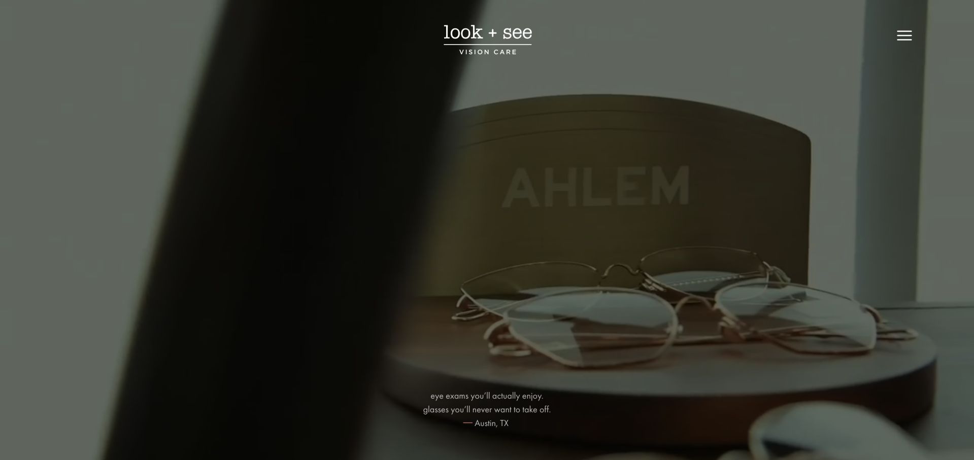
Look + See opens with a dark cinematic treatment and a small central wordmark, giving its Austin practice a distinctive independent-retail character. Its later copy separates exams from frame styling and uses a conversational voice. The opening prioritizes mood over an immediately obvious appointment path. The opening contains very few elements: the central wordmark, a menu icon and a small local tagline over moving product imagery. That restraint makes the eyewear feel editorial rather than catalog-like. It also transfers substantial responsibility to the menu and subsequent sections, which must explain the independent practice and distinguish an examination from a styling visit.
What you can learn
A strong brand voice can coexist with a permanent exam action. Reserve the immersive treatment for atmosphere while keeping booking, location and ordinary navigation discoverable without waiting for the page to unfold.
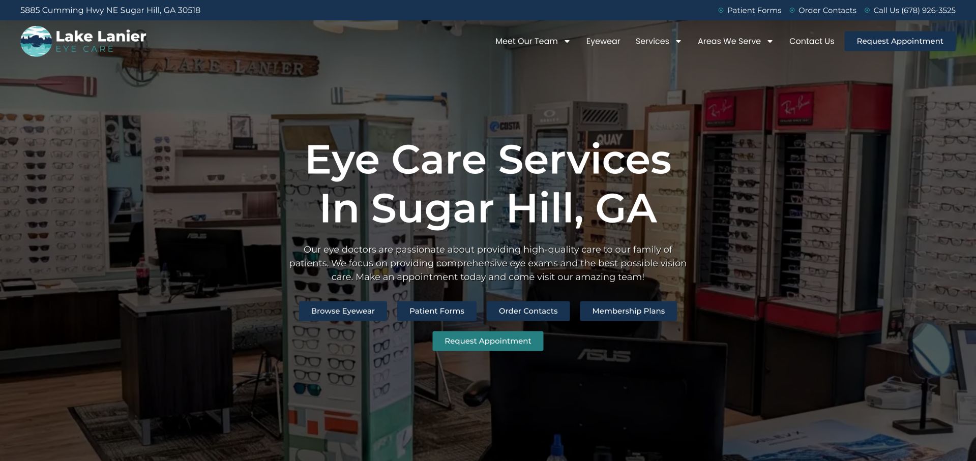
Lake Lanier Eye Care pairs a photograph of its optical interior with a large local headline and a teal appointment request. Forms, ordering, membership and frame selection are also presented as shortcuts. The practical breadth is helpful, but several actions compete before the visitor has chosen between a new exam and a returning-patient task. The image shows frame displays and the optical interior, making the retail setting part of the local introduction. A narrow utility bar carries the street address and contact routes above the larger headline. The teal appointment request is distinguishable from the darker shortcuts, although the cluster still asks visitors to compare several tasks at the same point in their visit.
What you can learn
Rank shortcuts by visitor intent rather than giving every operational system equal prominence. A new patient needs an exam and location decision before membership or product ordering becomes useful.
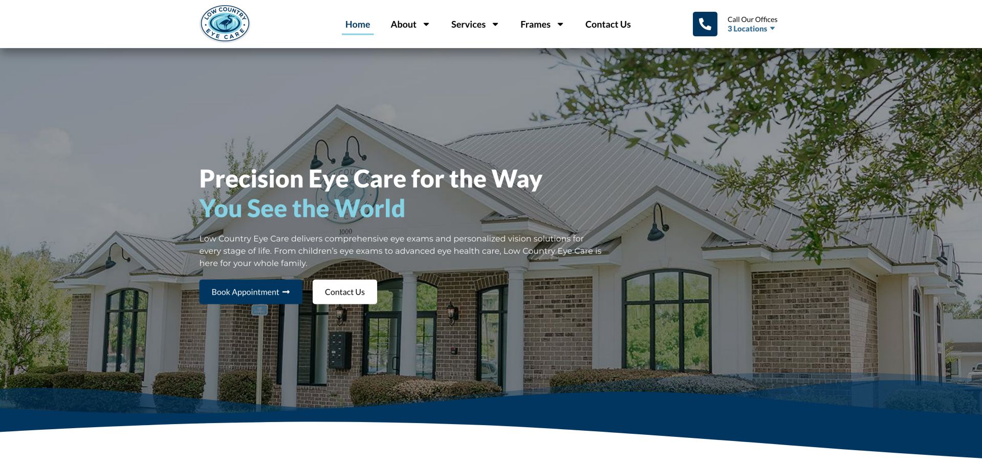
Low Country Eye Care uses a building photograph, navy wave shape and paired booking and contact actions to introduce its Georgia offices. Separate telephone routes acknowledge multiple locations. Some lower service and insurance links used placeholder destinations in the inspected page, which weakens an otherwise practical structure. The office-call control identifies a three-location group rather than presenting one unexplained telephone number. In the hero, a dark overlay keeps the heading readable while allowing the building's entrance and roofline to remain recognizable. The wave creates a clear boundary before later content, but that visual polish cannot resolve incomplete links to information patients may need before contacting an office.
What you can learn
Treat location routing and link completeness as part of the design. Each office and service label should lead somewhere meaningful before adding more promotional content to the homepage.
Pros
Regional office contact routes are recognized
Clear primary and secondary hero actions
Cons & considerations
Hero does not immediately resolve office selection
Some inspected links used placeholder destinations
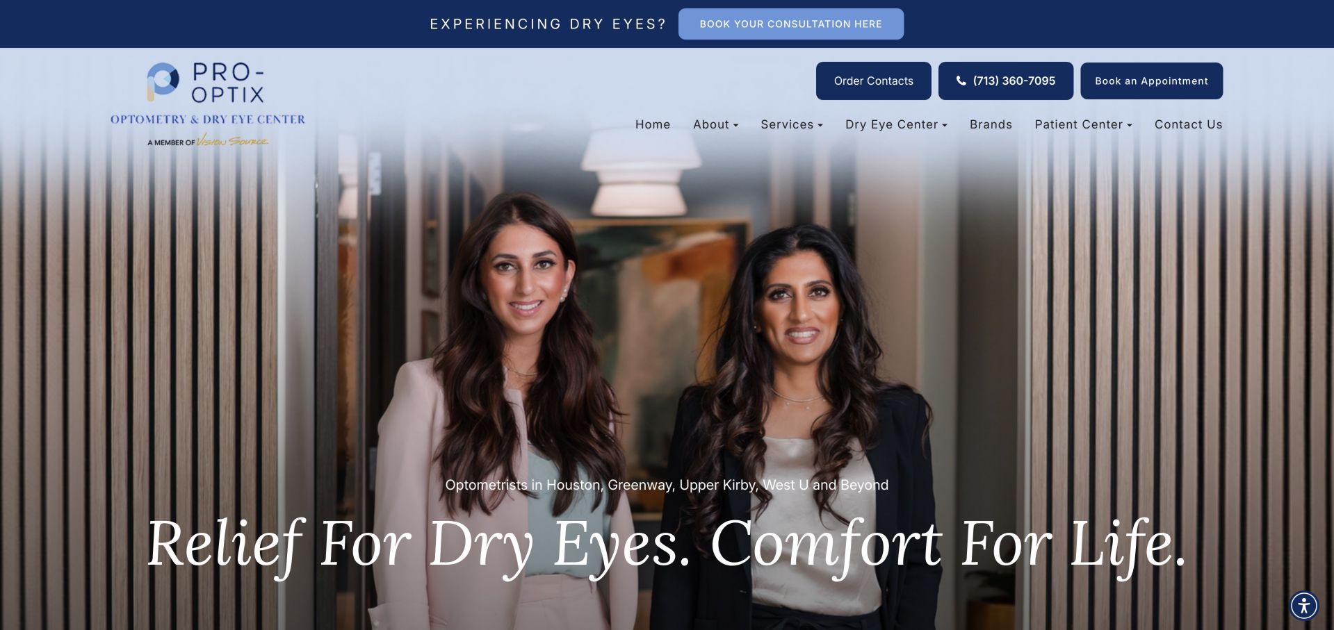
Pro-Optix presents doctor imagery, a large blue masthead and an italic serif specialty headline, positioning dry-eye care alongside broader optometry. Consultation, booking, contact and shopping routes are all visible. The tall header and repeated actions consume substantial space before the visitor reaches a plain-language explanation. A dedicated consultation banner sits above the main navigation, while the hero introduces two clinicians through a large portrait. This repeats the specialty emphasis in several places and makes it difficult to miss. The supporting service pages therefore have an important explanatory role: they should clarify the consultation rather than relying on a repeated headline or equipment name.
What you can learn
Let the clinician portrait establish familiarity, then explain the consultation in ordinary terms. Reduce repeated booking treatments so specialty equipment and retail utilities do not obscure the patient's next step.
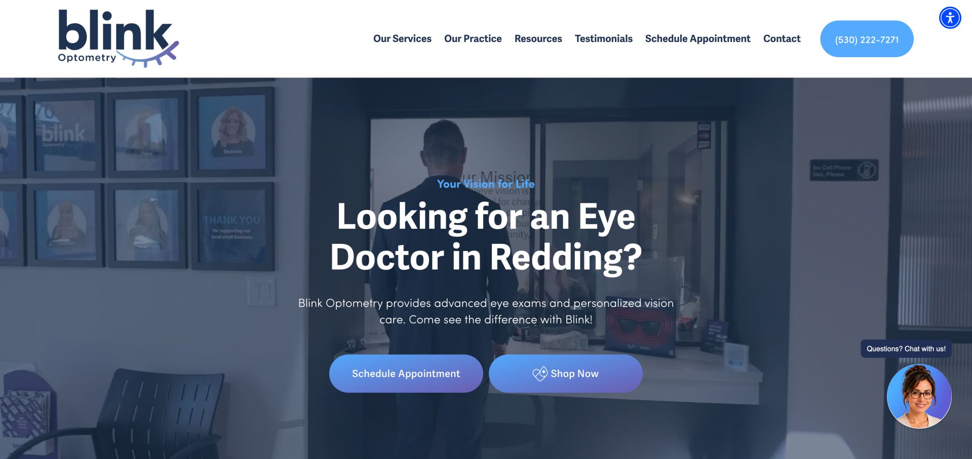
Blink Optometry uses a blue-purple gradient, rounded buttons and local phrasing alongside office video. Contact, hours and location information have supporting cards, and named doctors anchor the practice identity. Shopping, chat and motion add competing priorities to an otherwise approachable appointment journey. The local question in the headline gives the page an immediate geographic purpose, and the office footage adds context beyond a generic fashion image. The two rounded hero actions share nearly the same gradient treatment, however, so their visual similarity suggests equal importance. A quieter retail treatment would help the appointment route remain the default reading of the page.
What you can learn
Make the exam action the clearest choice, and label retail destinations specifically. A friendly visual system is more useful when its motion and widgets do not compete with a patient's basic navigation.
Pros
Approachable color and button system
Local practice and doctor identity are visible
Cons & considerations
Shop label does not explain the external destination
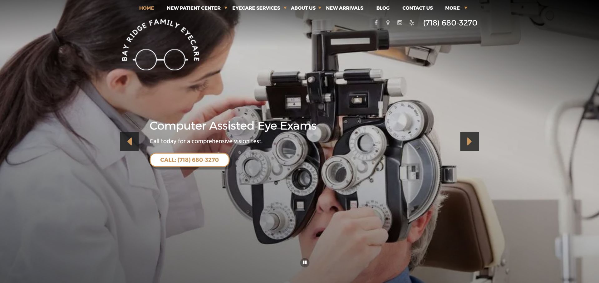
Bay Ridge Family Eye Care leads with examination imagery and a white-and-gold telephone invitation. New-patient information is represented in the navigation, and the carousel includes a pause control. Dense uppercase navigation and changing image contrast make the useful practical structure harder to scan. The examination photograph explains the service category without requiring a long introduction, and the call button supplies a direct next step for someone ready to speak with the office. New arrivals and blog links share the upper navigation with patient and service information. That breadth is useful, but requires a clear priority order when the menu becomes compact.
What you can learn
Support callers with a prominent phone action, but keep the address and new-patient route equally understandable. Test every slide's text contrast rather than checking only the most attractive frame.
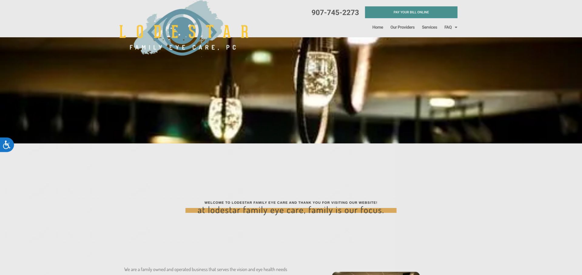
Lodestar's clinic page uses a turquoise-and-gold identity, a narrow photographic strip and a simple navigation before its family-practice story. Named clinicians help make the introduction concrete. Large unused areas and small body text reduce the impact of that personal content, while bill payment has a prominent utility role. The oversized logo and decorative photographic strip occupy much of the opening before the introductory text begins. A narrow yellow highlight emphasizes the family message, but its small scale makes it less effective than the available space suggests. This is a useful case for improving information density through larger text and clearer section spacing rather than adding more content.
What you can learn
Give the practice story a readable measure and useful heading structure. Returning-patient payment should remain available without becoming more visually important than learning who provides care.
Pros
Named clinicians support a real introduction
Small navigation keeps choices manageable
Cons & considerations
Small text and large gaps weaken readability
Payment utility competes with prospective-patient needs
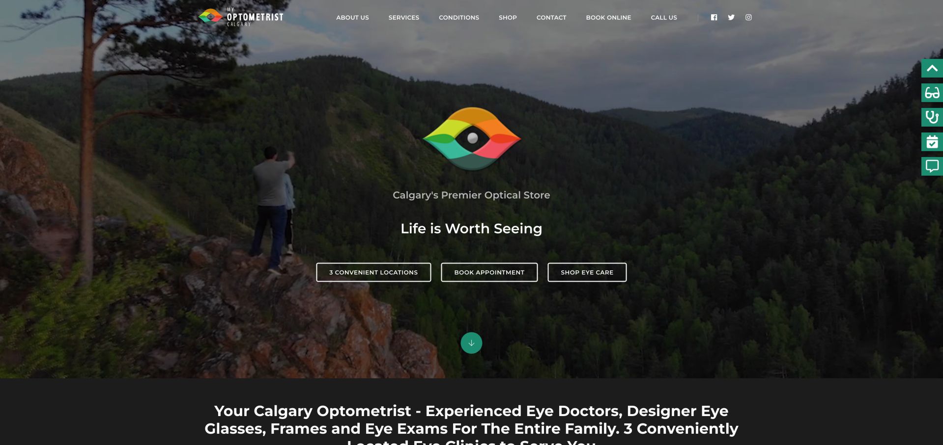
My Optometrist Calgary combines nature imagery and a colorful eye mark with outlined actions for location, booking and shopping. Both calling and booking lead into the location decision, a sensible dependency for a regional practice. The key service explanation and keyword-heavy heading appear later in the page. The nature scene and central eye mark establish a broad brand impression before the visitor reaches detailed service material. Three outlined hero actions create a consistent row, but locations, appointments and shopping represent different levels of commitment. A clearer location-first label could explain the regional structure while allowing the other actions to keep their own recognizable purposes.
What you can learn
Make the location dependency explicit in the button wording so visitors know why booking opens a location list. Keep the first care explanation concise rather than relying on search-oriented phrasing.
Pros
Location routing reflects multi-office needs
Consistent outlined action system
Cons & considerations
Booking label does not explain its intermediate step
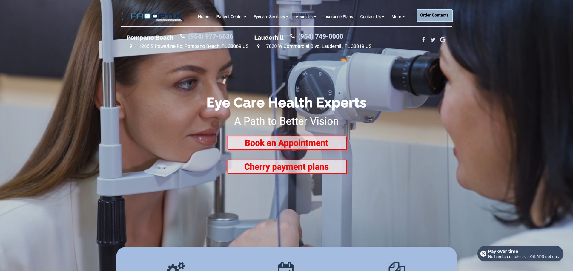
Pro Optix Vision places two Florida office contacts prominently above a clinical hero and red appointment action. Insurance and new-patient routes are visible, helping visitors prepare. The competing red and blue treatments and a financing action create more visual urgency than the underlying task requires. Each office has an address and telephone treatment in the upper area, which is more specific than a single regional contact button. The central appointment and payment-plan controls sit directly over the examination photograph. Keeping those choices visually distinct would help a visitor interpret financing as supporting information rather than an equivalent first step in arranging care.
What you can learn
For two-office practices, prioritize selecting the correct office and booking the correct visit. Financing information can remain accessible without sharing the visual weight of the main appointment action.
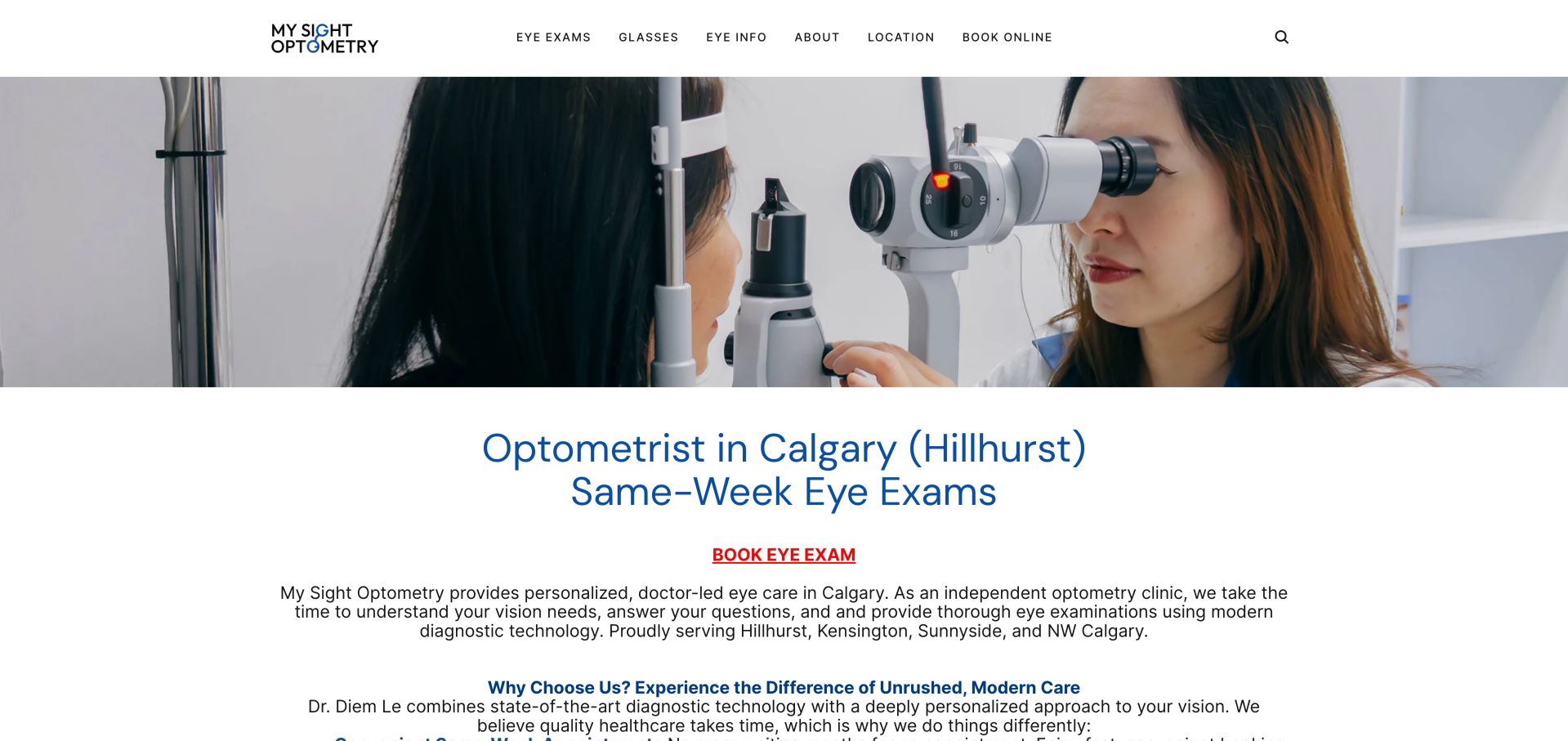
My Sight Optometry uses a slim white navigation, a wide examination photograph and a solid-background local introduction. The red underlined appointment link is easy to recognize, and the Hillhurst context gives the practice a specific place. Broad centered paragraphs make longer reading less comfortable than the short opening. The main photograph ends before the local heading begins, giving the practice description a predictable white reading surface. The header offers short, recognizable categories for exams, glasses, information and location. This quiet structure is a useful reference for avoiding oversized promotional cards, but the text should still be broken into concise sections as the explanation becomes longer.
What you can learn
Keep the local specificity and clean separation of image from text. For longer explanations, switch to a narrower reading measure and qualify availability statements rather than letting them sound guaranteed.
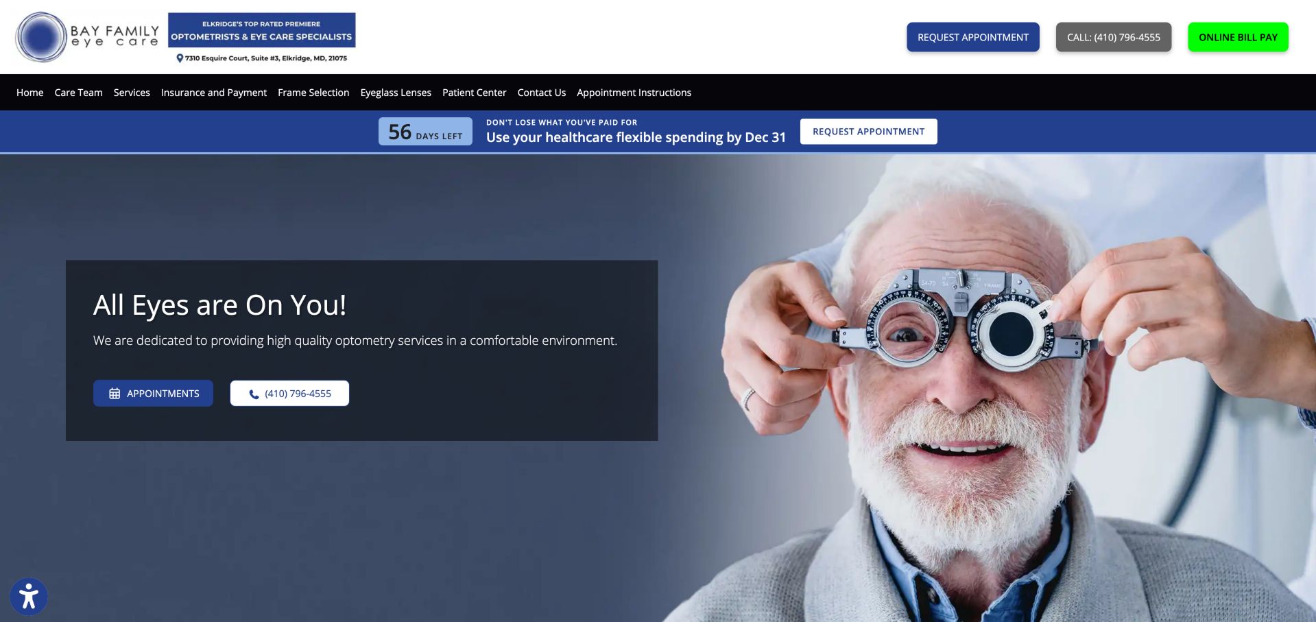
Bay Family Eye Care combines a blue promotional panel, patient imagery and paired calling and booking routes. Insurance and preparation information are findable, while an office notice communicates a temporary change. A bright bill-payment control and seasonal countdown compete with the core appointment hierarchy. The appointment instructions route is particularly useful because it can explain what patients should expect before they leave the public website. In the captured opening, the utility row, dark navigation, countdown strip and hero all compete for vertical space. A smaller number of active notices would leave more room for the appointment and telephone choices to guide the page.
What you can learn
Reserve interruption and accent treatments for information that affects a visit. Date temporary notices clearly and keep payment or seasonal promotions visually secondary to booking and patient preparation.
Eye Level uses oversized stacked typography and a full-screen fashion portrait to express its Boston boutique personality. An orange booking button contrasts with a quieter contact-lens ordering route. Clinical service and location information appear later, and the inspected footer address link led to an unrelated destination. The stacked headline occupies one side of the portrait and functions almost like a magazine cover. The small top-right controls preserve that composition, with an outlined ordering action secondary to the orange booking button. This gives the site a coherent visual voice, but the minimal navigation must still provide a dependable route to practical office and examination information.
What you can learn
Keep the distinctive editorial treatment while making location and care context easy to reach. Verify utility links carefully, because a polished visual identity does not compensate for a misleading address destination.
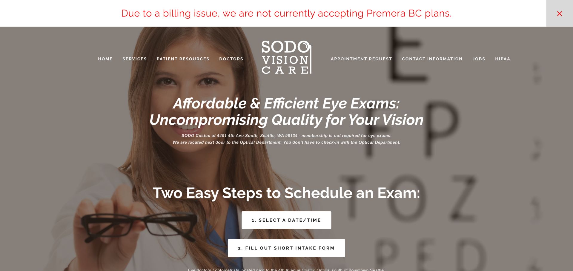
SODO Vision Care states that its Seattle exams do not require a Costco membership and explains scheduling as two numbered steps. Price scope and insurance conditions are unusually explicit below. The photo overlay and italic text make the opening busier, but the operational distinctions are useful. The numbered controls make the sequence visible before anyone enters an appointment system, reducing uncertainty about why an intake step follows time selection. A separate insurance-change banner sits above the navigation. Its prominence is appropriate to an operational change, but the message needs an owner and current scope so it does not outlast the situation it describes.
What you can learn
Explain the relationship between an independent exam practice and its retail location before booking. Put price inclusions and insurance qualifications near the relevant service, using readable text rather than dense disclaimers.
Pros
Membership and location relationship are explicit
Scheduling steps and price scope are explained
Cons & considerations
Small italic text over imagery reduces readability
Long policy sections need stronger scanning structure
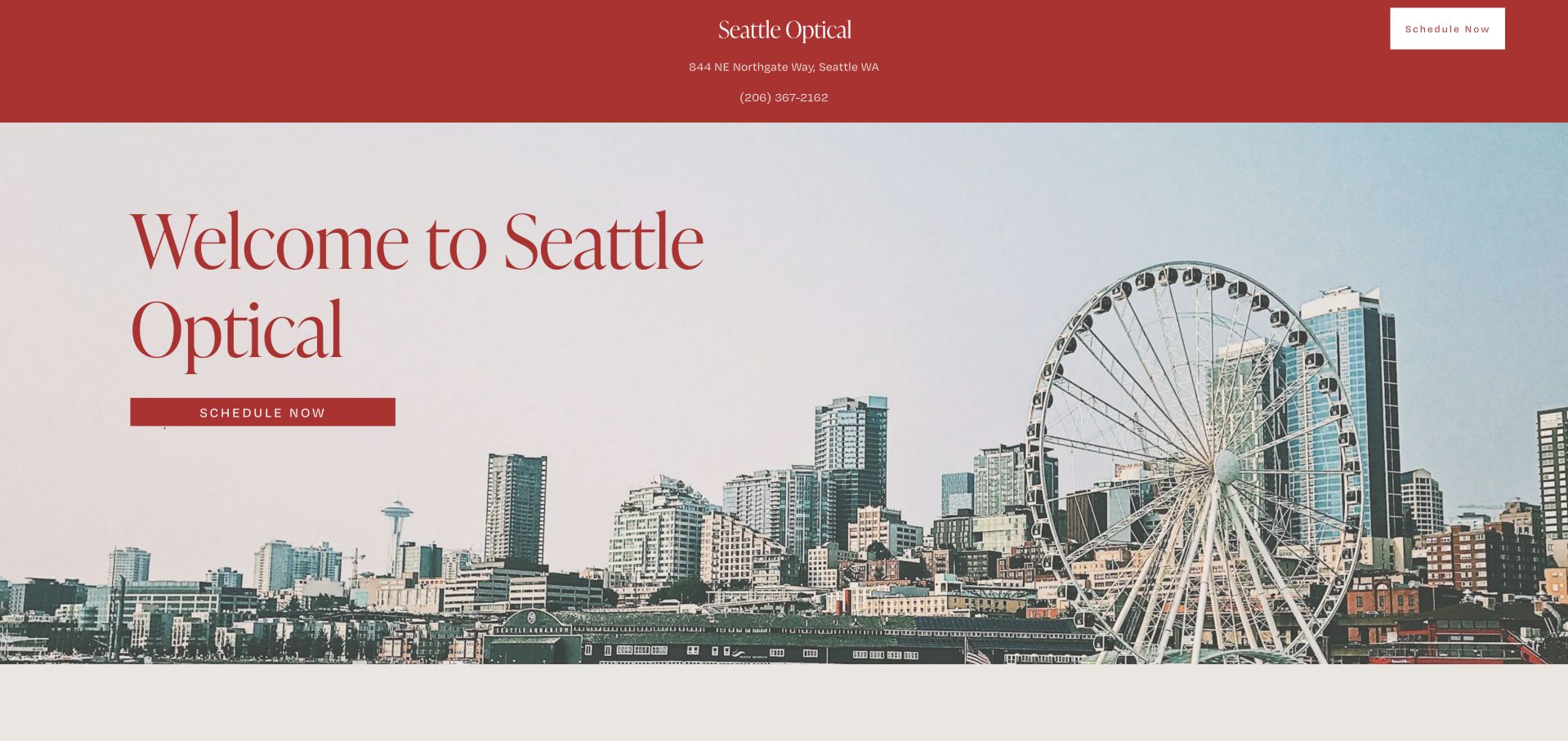
Seattle Optical uses a terracotta palette, serif typography and a waterfront image, with address and phone displayed above a single scheduling destination. Three service explanations cover exams, eyewear and the on-site lab. The simple structure is approachable, though the scenic hero provides little evidence of the practice itself. The same restrained scheduling treatment appears in the top band and the hero, giving visitors a consistent action without introducing several competing options. The large serif heading is visually separate from the small contact details. That contrast creates a clear opening, but section links would help people move directly to the later exam, eyewear or laboratory explanation.
What you can learn
A minimal homepage can still show the people and place behind the service. Keep the direct scheduling path, then replace generic local scenery with useful practice context when suitable original photography is available.
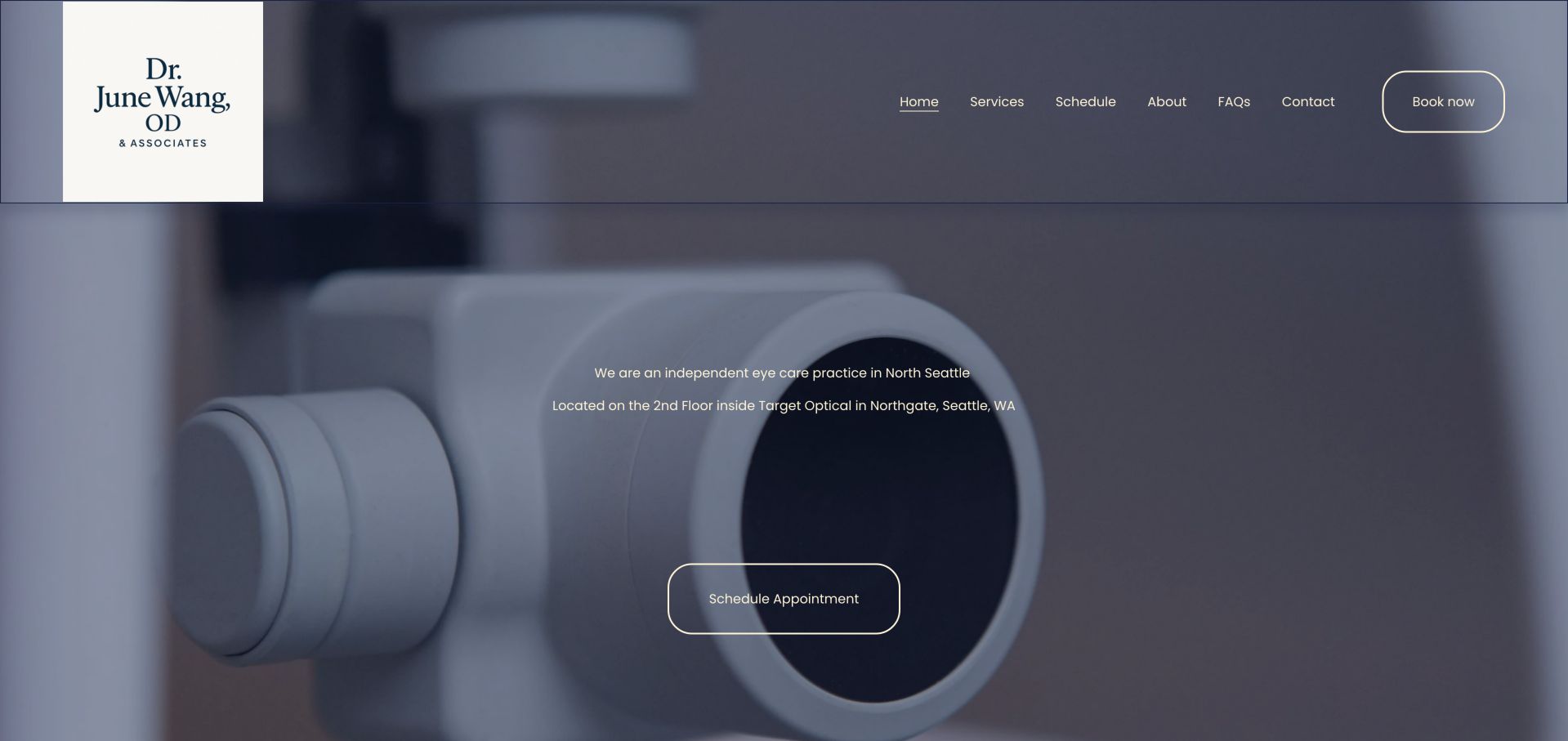
Dr. June Wang & Associates explicitly identifies its second-floor Northgate Target Optical location in the opening and uses one consistent appointment destination. Accordion services explain visit expectations and lead into doctor information. A very large equipment image and small centered introduction underuse the available space. The independent-practice wording is valuable because the retail location alone does not explain who provides the examination. The compact six-part navigation covers services, scheduling, the practice and common questions. Against the large darkened equipment image, a stronger introduction could make that distinction easier to absorb without requiring visitors to read very small centered lines.
What you can learn
Clarify the independent practice and exact in-store location before patients arrive. Use the hero's space for readable service context rather than expanding an equipment photograph around a small paragraph.
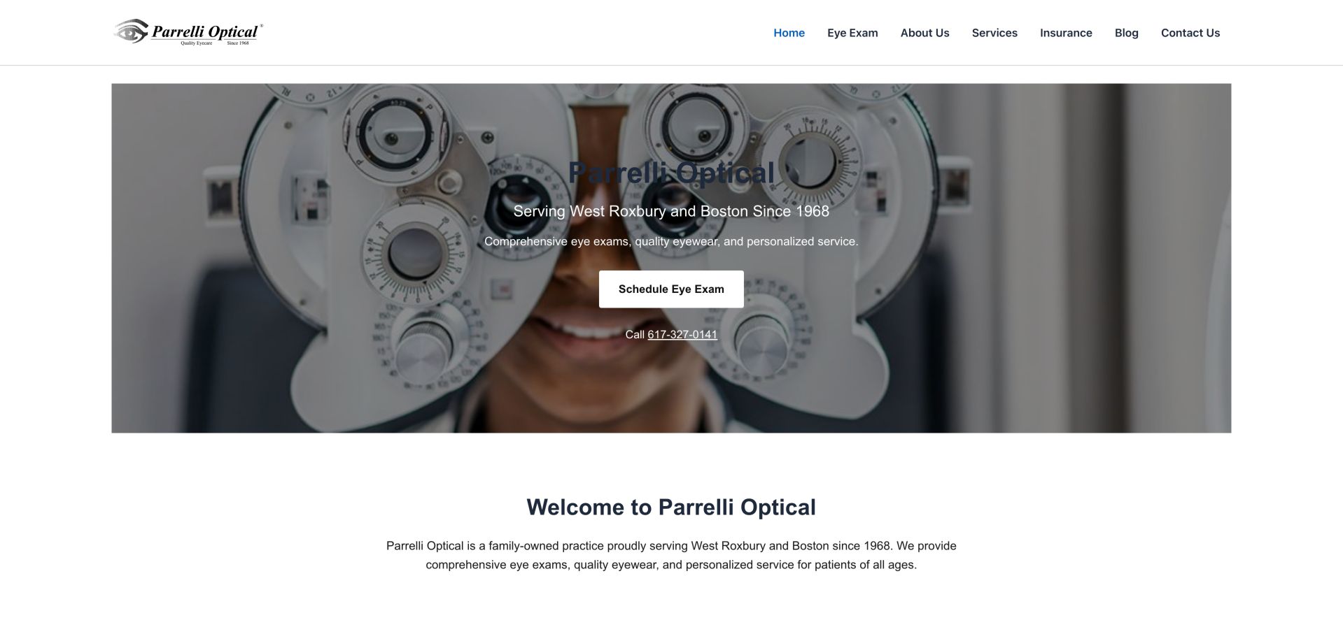
Parrelli Optical introduces its West Roxbury location, history and exam route in a contained clinical hero, followed by three straightforward service categories. It also publishes a starting eyewear price and identifies the independent optometrist. A dark headline over the darkened photograph is harder to read than the surrounding white text. The contained image leaves a white margin around the hero, distinguishing it from the full-screen treatments elsewhere in the collection. The next welcome section restates much of the local introduction instead of advancing the visitor's decision. That space could work harder by pointing immediately to the service categories, provider information or qualifications attached to the starting price.
What you can learn
Pair practical service and pricing detail with a carefully tested hero treatment. Historical identity is useful context, but the appointment action and headline must remain readable across the full image.
Pros
Clear exam and phone actions
Service and starting-price context support comparison
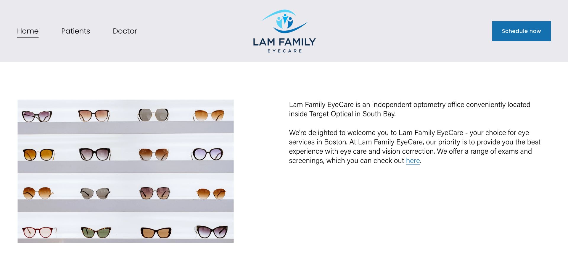
Lam Family EyeCare places an eyewear-shelf photograph beside a plain introduction that identifies its independent South Bay location. Three navigation labels and a solid blue scheduling action keep the page simple. The absence of a strong descriptive heading and a vague inline link make the otherwise legible content less scannable. The photograph and copy are placed on equal white surfaces, so the reader does not have to interpret text over changing imagery. The blue scheduling button is the only strong accent in the masthead. This is a useful foundation for a small practice because improvements can focus on headings, useful link wording and arrival details rather than a larger promotional layer.
What you can learn
Use this clean split layout with an informative heading and descriptive link labels. Bring limited opening hours and the exact location closer to scheduling so convenience can be assessed before clicking.
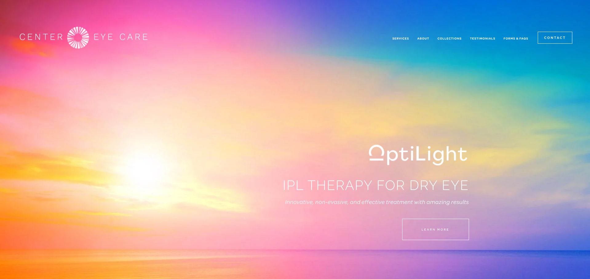
Center Eye Care uses a full-viewport carousel to introduce children, services, frames and dry-eye material. The inspected pastel promotion is visually distinctive, but its thin white lettering and tiny navigation have limited contrast. Forms and FAQs are available, while the actual appointment process is explained farther down. The captured slide uses a colorful sky as the background for a specific treatment promotion, with a light outline action beneath it. That image establishes mood but provides little contrast variation the designer can control. A solid text panel or darker treatment could preserve the campaign while making the service name and next action less dependent on the photograph.
What you can learn
Do not let a specialty promotion replace basic appointment guidance. Give every slide a robust text treatment and describe whether the contact action books an appointment or requests a callback.
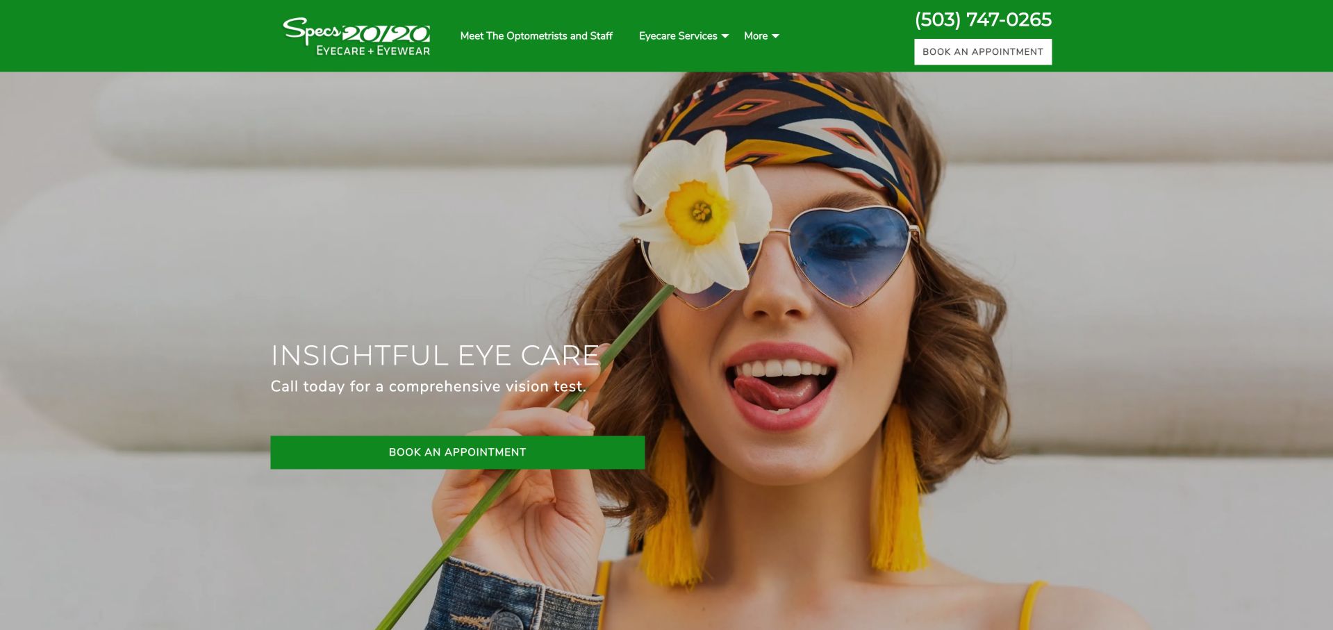
Specs 20/20 uses a vivid green masthead, a conspicuous telephone number and repeated booking actions over playful eyewear imagery. Named service routes support exploration. Insurance is less visible under a broader menu, and an inspected comprehensive-exam shortcut pointed to testimonials rather than exam information. The phone number and booking treatment in the green header remain distinct from the larger hero action, giving visitors two recognizable entry points. The sunglass portrait emphasizes the optical offer, while the service menu supplies the care categories. The relationship between those layers works best when every shortcut reaches the explanation promised by its visible label.
What you can learn
Keep the strong booking hierarchy while making supporting destinations equally dependable. Service labels should explain their own subject, and insurance should not be hidden behind an ambiguous catch-all menu.
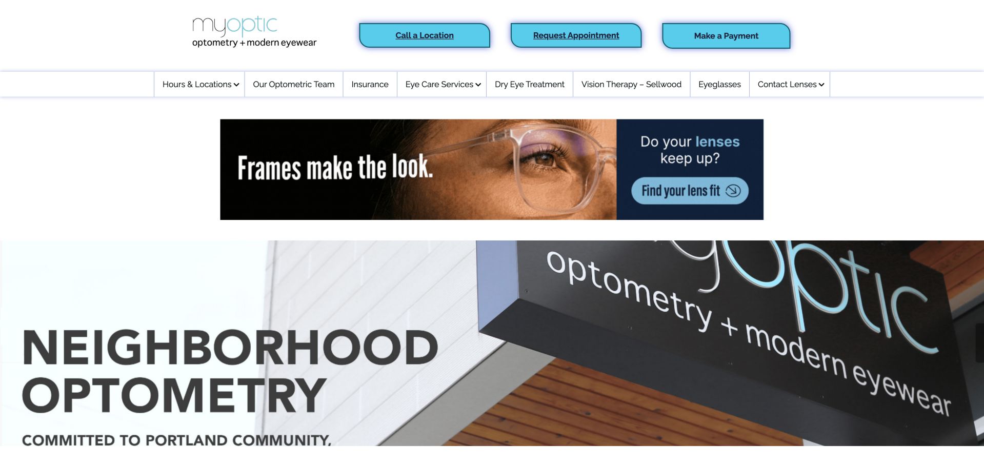
Myoptic presents call, appointment and payment utilities above a detailed service navigation, then combines a supplier promotion with its own Portland neighborhood imagery. Named doctors and insurance information are easy to discover. The supplier banner delays the practice's own opening message and gives retail promotion substantial weight. The three cyan utility buttons form an orderly row, but their equal styling treats calling, requesting an appointment and payment as parallel priorities. The detailed menu beneath them offers a more useful distinction between insurance, the team and specific services. Keeping the practice's neighborhood introduction ahead of supplier artwork would make that information architecture feel more connected to the local business.
What you can learn
Let the practice's local identity and appointment journey lead, with supplier campaigns as supporting content. Distinguish payment from booking visually so returning-patient utilities do not dominate new-patient orientation.
Pros
Named doctors and insurance are discoverable
Location calling and appointment requests are explicit
Kegan is a freelance web designer and developer with 15+ years of experience helping businesses turn complicated website requirements into clear, maintainable digital experiences. He works directly with clients from planning and design through development, launch, and ongoing support.
For optometry website design, his development approach focuses on eye-care service information, practitioner introductions, location details, eyewear browsing, and careful appointment-system handoffs. The scope can be a targeted improvement or a complete custom build, with responsive layouts, thoughtful content structure, and integrations chosen around the people using and maintaining the site.
Show 3 other optometry website designersHide other optometry website designers
Plan an optometry website around the patient's next decision
Map the main visit types
List routine exams, contact-lens evaluations, children's visits and any specialist consultations the practice actually offers. Agree on patient-facing labels with the clinical team. Decide which routes can be booked online and which need staff guidance before presenting a button.
Create a location and doctor model
Store each office's address, hours, telephone, appointment destination and doctors consistently. Include exceptions such as a practice inside another retailer. A regional site should preserve the selected office when the visitor moves from services to scheduling.
Define the scheduling handoff
Document whether the website opens an external scheduler, sends a request or asks the visitor to call. Explain the expected next step and any response timing the practice can actually support. Do not imply confirmed availability from a general invitation to book.
Organize cost and preparation information
Distinguish an exam's stated fee from optional services and optical purchases. Insurance explanations should say what needs verification rather than guarantee coverage. Put preparation guidance close to the relevant visit, and route sensitive details through the practice's appropriate controlled system.
Commission useful original imagery
Prioritize the real team, entrance, reception and optical area when permissions allow. Fashion images can establish an eyewear identity, but they should not stand in for proof of the actual premises. Write descriptive alternatives for informative images and keep essential words out of photographs.
Test tasks before adding promotion
Ask someone unfamiliar with the office to find a location, identify a doctor, understand a visit and begin the correct booking route. Test keyboard use, zoom, mobile menus and appointment links without submitting real requests. Resolve misleading destinations before adding another carousel or campaign.
The editing job behind the design
Choose tools that support dependable patient journeys
The public website and the practice's appointment, patient-record and payment systems may be separate services. Select a content platform that makes hours, provider profiles, service descriptions and notices easy to maintain. Plan how the site behaves when an external scheduler is unavailable and how staff will update its links.
Public technology observations identify only evidence exposed on the reviewed pages. They do not establish the security, privacy or clinical suitability of a practice's internal systems. Evaluate the actual integrations, data handling and legal requirements with appropriate specialists; do not infer them from a website's appearance.
Our WordPress website examples offer a separate look at publishing approaches. A visible platform label is evidence for that named page, not a guarantee that the same system will suit your requirements.
Before the public launch
Optometry website planning checklist
The practice name and exact location are clear before booking.
Independent in-store practices explain their relationship to the retailer.
New appointments are visually distinct from payments, portals and ordering.
Every service button leads to the service its label describes.
Appointment requests are not presented as confirmed bookings.
Doctor names and relevant practice roles are easy to find.
Insurance guidance explains what patients must verify.
Published prices describe their scope and relevant exclusions.
Hours and temporary notices have an owner and current dates.
Important information remains readable without image overlays or animation.
Mobile, keyboard, zoom and reduced-motion journeys have been reviewed.
Sensitive patient information uses an appropriate controlled collection route.
These checks are a project checklist, not a performance, legal, security, or accessibility certification. Test real journeys with the people responsible for the website before making claims about the result.
Sources & editorial method
How this collection was selected and reviewed
We inspected 30 distinct public practice pages and saved direct browser screenshots with source URLs, actual capture timestamps and dimensions. Reviews compare visible design and information architecture, including practical tradeoffs. We did not submit appointment forms, access patient portals, verify clinical or commercial claims, measure conversion performance or conduct a complete accessibility audit. Editors Choice is an editorial design selection, not a medical recommendation or service-quality endorsement. The saved evening collection target remains 30. Screenshots were captured on November 6, 2026 UTC, during the November 5 Pacific work date; their original timestamps are retained. The commentary is based on these dated observations and captures.
Each example links to its actual source page. Screenshots are direct browser captures with their own capture dates; moving imagery, announcements and live designs can change. The notes describe observable design choices and conditional tradeoffs, not measured traffic, conversion results, service quality, or accessibility conformance.
Technology labels use public page metadata, asset evidence, or explicitly cited platform documentation. Platform documentation is not a complete current deployment audit. A component reference may be legacy or unused; it is not a complete backend inventory. Unknown stacks are omitted. These sites are editorial examples, not our client portfolio.
Written, Edited and Curated are separate editorial records, not timestamps advanced by a rebuild. Website designs and imagery belong to their owners. See our editorial standards or suggest a correction.
Questions worth asking
Optometry website design questions
Should an optometry homepage lead with eye care or eyewear?
Lead with the main reason new visitors choose the practice, but make the alternative easy to find. A fashion-led boutique still needs a clear examination route, while a clinical opening can link to frames and styling without giving every retail utility equal prominence.
What should an appointment button say?
Use language that matches the actual outcome. Book an exam can lead to a live scheduler; request an appointment should explain that staff must respond. If visitors first need to choose an office, say so rather than surprising them with an unexplained intermediate page.
Should the site publish exam prices?
Clear price context can help patients compare, if the practice can maintain it accurately. State the scope, relevant extras and insurance qualifications. The examples show different approaches, but their listed amounts are not independent quotes or guarantees of current charges.
How should an optometrist inside a retailer explain the location?
Identify the independent practice, the store and any floor or entrance details. Explain which appointment system handles the exam and whether retail membership or purchasing rules differ. Patients should not have to infer these relationships from a logo.
Do these reviews verify medical quality or accessibility?
No. They are editorial observations of public website design. A readable screenshot does not establish accessibility conformance, and a polished site does not prove treatment outcomes, clinical credentials, privacy controls or quality of care.
Use these optometry website examples to make a real patient's next step easier: understand the practice, find the right office, prepare for the visit and reach the correct appointment route. Borrow the hierarchy and clarity rather than copying a photograph or an unsupported claim.