Best Fastly Websites of 2026 (20 Real-World Examples)
Twenty real public properties, with direct screenshots, scoped implementation sources and practical lessons for maintaining useful interfaces through changing content and traffic.
A website's edge layer is largely invisible until something changes or fails. These examples connect recognizable public experiences with specific published Fastly implementation records, without pretending that a screenshot can reveal every backend.
The collection begins with Le Monde, JetBlue, Dunelm, GIPHY and Khan Academy, followed by publishing, research, mapping, retail and travel properties. Their visitor tasks are very different: read a story, start a booking, search a catalog, find a paper or explore a map. That variety is the reason to compare them. An edge-delivery brief should be organized around what must stay correct for those visitors, not around a vendor logo.
Fastly's customer stories are primary documentary evidence, not independent performance benchmarks or complete current infrastructure inventories. WIRED and The Guardian include explicitly historical implementation records. The screenshots show the named public properties on their recorded capture dates; reused JetBlue and Khan Academy images retain their original dates. No authenticated account, purchase, reservation or private deployment was inspected.
Before the examples
What makes good Fastly website development in 2026?
Decide what may be shared before deciding what to cache
Separate public articles and product introductions from personal account information, entitlement checks, carts and booking state. Fastly's HTTP caching documentation explains the role of response directives, but a correct policy still depends on your application. Review the effective behavior of the actual service configuration rather than assuming a cookie or a single header makes every response safe.
A changed product, corrected article or expired offer may appear in several places. Model those relationships so the publishing workflow can invalidate the right group rather than relying on people to remember every URL. Fastly documents surrogate keys as a way to associate related objects for purging. The content model must supply the relationships; the delivery platform cannot infer your editorial intent.
Define a stale-content policy for each visitor task
An older decorative image, an old headline, an outdated price and another person's account information are not equivalent failures. Decide when an older public response is acceptable and how users learn that live information is unavailable. Fastly's purge documentation distinguishes soft purging from immediate invalidation. That mechanism is useful only when the business has decided what may safely remain visible.
Read the reviews as interface and operating questions, not a ranking of vendors or customer outcomes. Notice the difference between static public discovery, frequently changing public information and private application state. A published Fastly relationship does not mean the same products, configuration or performance apply to every example.
We start with five recognizable brands or organizations: Le Monde in English, JetBlue, Dunelm, GIPHY, Khan Academy. Each attribution applies to the named website property, not every product or website belonging to its organization. This is a curated reading sequence, not a measured ranking.
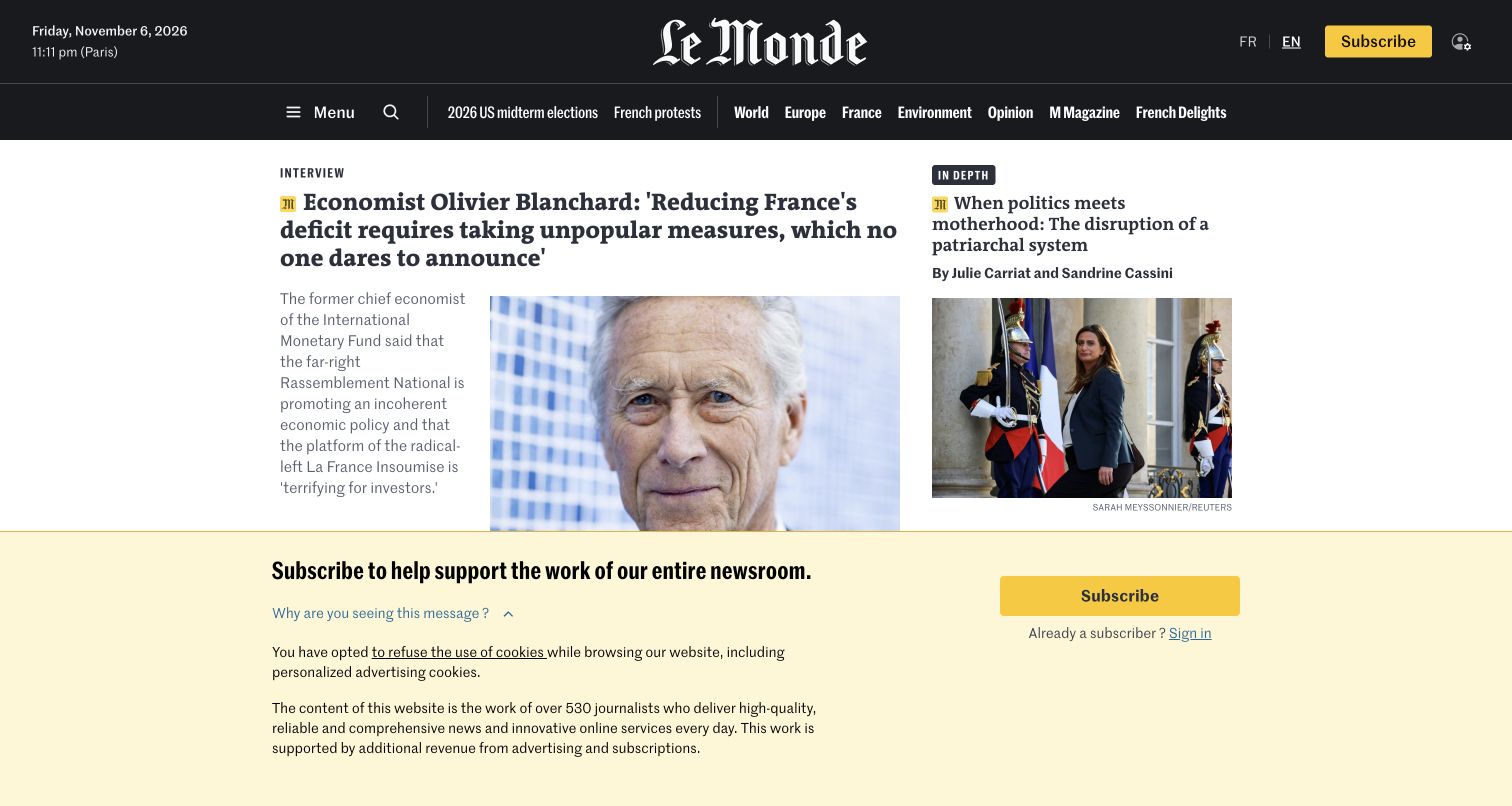
Le Monde gives its English edition a strong black masthead, restrained section navigation and an unmistakable hierarchy between the lead interview and the secondary column. Photography supports the stories rather than replacing their headlines. Subscriber markers appear beside the relevant items, making the distinction visible before a reader opens an article. In the captured state, declining optional cookies introduces a large subscription-support panel across the lower screen. That is an important part of the actual experience, not an element to crop away when evaluating the design.
What you can learn
Separate publication identity, story priority and subscription state in the content model. Fastly's case documents cached templates and subscriber personalization at the edge; the practical design question is which fragments may change without leaking private or entitled content between readers. Review both signed-out and subscriber states in an authorized test environment.
Pros
The masthead and category strip remain recognizable across changing lead stories.
Subscriber labels explain a content boundary before an article is opened.
Cons & considerations
The post-consent support panel occupies a substantial portion of the first screen.
Dense headline groups require careful spacing and focus treatment on smaller displays.
Visible tech stack
Earlier / documented evidence
Fastly
Platform source: Fastly customer implementation record. Fastly CDN, Compute and security for the publisher; its customer case specifically discusses the English edition and subscriber page fragments. Platform evidence is separate from the direct website screenshot and is not a complete current infrastructure audit.
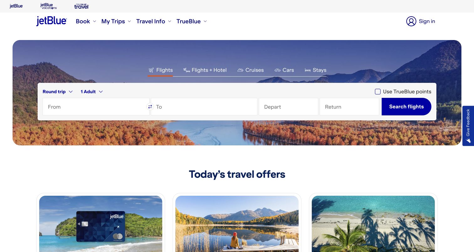
JetBlue places the flight form in a white panel over a broad destination photograph. Round-trip, passenger, origin, destination and date controls share one clear booking area, while the upper navigation keeps existing-trip information separate. The selected Flights tab uses a small accent rather than asking every product category to compete with the primary button. Travel offers begin below the hero, so promotional cards do not replace the starting task. The picture provides atmosphere without carrying the essential instructions or field labels.
What you can learn
Treat a booking form as application state, not another piece of campaign artwork. Fastly's JetBlue case identifies website delivery and protection responsibilities, but those services do not make every field cacheable. Preserve entered choices across failures, distinguish unavailable results from a security check, and test recovery without creating real reservations or exposing passenger information in logs.
Pros
Booking and trip-management routes serve different visitor intentions without hiding either.
The white form panel keeps inputs legible against a detailed landscape photograph.
Cons & considerations
Several related travel products still compete for attention inside the hero.
Large seasonal images need an appropriate loading budget on ordinary mobile connections.
Platform source: Fastly customer implementation record. CDN, Next-Gen WAF and bot management for jetblue.com, explicitly described in the customer implementation story. Platform evidence is separate from the direct website screenshot and is not a complete current infrastructure audit.
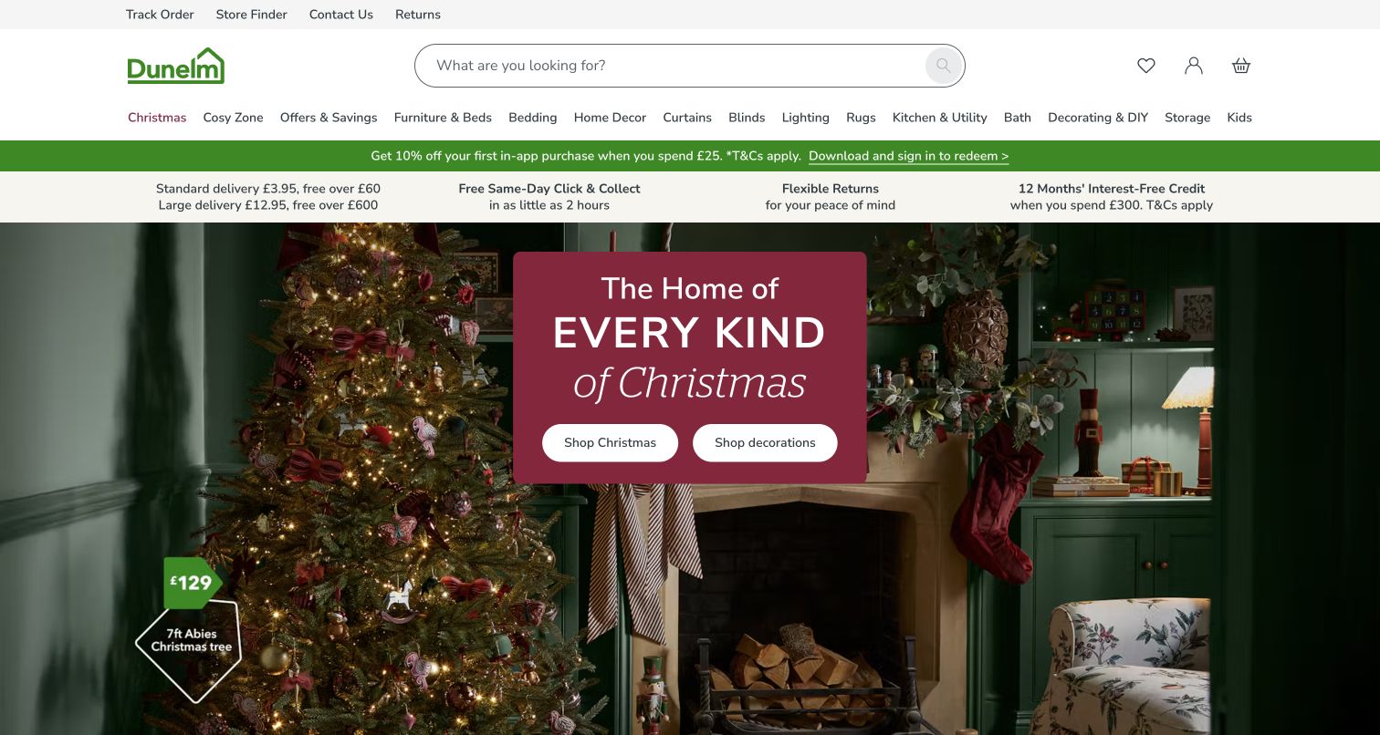
Dunelm surrounds its seasonal Christmas campaign with a practical retail header. Search occupies a prominent central position, followed by a familiar product-category strip and a separate area for order tracking, stores, contact and returns. The room photograph carries the campaign mood, while the campaign panel offers a compact route into the range. This is useful because a returning shopper can ignore the theme and continue toward a known product or service task. The first-screen design feels seasonal without making the entire navigation seasonal.
What you can learn
Define which parts of the storefront change with a campaign and which must remain dependable throughout the year. Fastly's published Dunelm case connects delivery, image handling and release configuration; use it as an operational reference rather than a promise of the same speed improvement. Include stale campaign links, updated prices and cache invalidation in the release brief.
Pros
Search has a clear position within a utility-rich but structured header.
Campaign imagery sits within a persistent product and service navigation system.
Cons & considerations
Multiple utility and category rows consume meaningful space before the campaign begins.
Promotional copy over a detailed room image needs contrast checks for every replacement.
Platform source: Fastly customer implementation record. Fastly delivery, image optimization and security for Dunelm’s web and mobile storefronts, documented by its engineering team. Platform evidence is separate from the direct website screenshot and is not a complete current infrastructure audit.
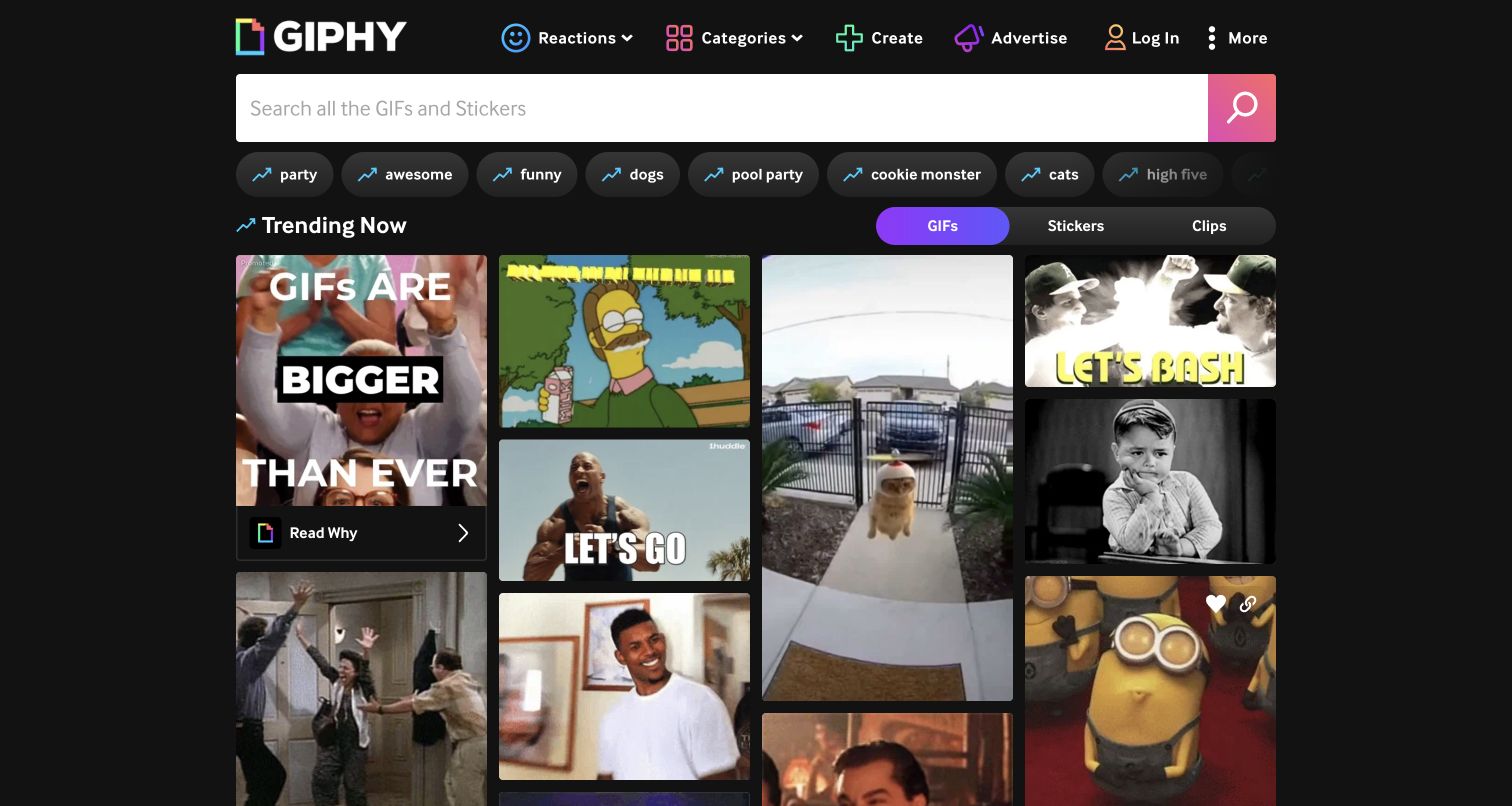
GIPHY uses a dark interface, a wide search field and a dense sequence of moving-image tiles. The navigation is deliberately compact compared with the media area. Filters for GIFs, Stickers and Clips give the library some structure without turning the page into a conventional product catalog. Unlike a quiet editorial homepage, this screen makes abundance part of its identity. The selected tiles are a moment in an animated feed, not permanent campaign art, so the capture should be understood as one observed state rather than a fixed composition.
What you can learn
Make the search and content-type controls more stable than the media around them. Fastly documents GIPHY's content-delivery responsibilities, which makes the example useful for discussing thumbnail variants, cache keys and optional animation. Provide understandable reduced-motion behavior and a useful interface while media is unavailable; a large delivery network is not a substitute for those design decisions.
Pros
A broad search field gives the varied library one obvious starting point.
The dark shell allows colorful media to provide the visual identity.
Cons & considerations
Simultaneous motion can compete with navigation and overwhelm some visitors.
A dense feed needs progressive loading and clear handling of failed media requests.
Platform source: Fastly customer implementation record. Fastly content delivery for GIPHY’s public media platform and distribution services; not a claim that every frontend component is served by the same product. Platform evidence is separate from the direct website screenshot and is not a complete current infrastructure audit.
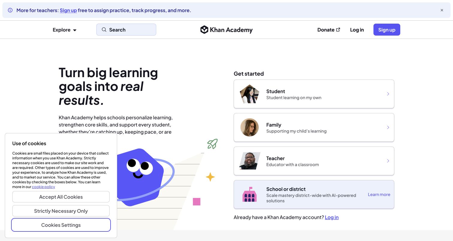
Khan Academy pairs a short learning proposition with four audience cards: student, family, teacher and school or district. The options explain the visitor's context rather than exposing internal product names. A small illustration provides warmth, while the more consequential choice remains a readable stack of labeled cards. Search and Explore also remain available for someone who does not need onboarding. The retained capture includes the real cookie panel, which overlaps part of the illustration and introductory copy without hiding the audience choices.
What you can learn
Identify audience boundaries before designing a personalized learning entrance. Fastly's case discusses delivery to a globally distributed learning audience, but an introductory screenshot cannot establish the behavior or accessibility of the authenticated classroom. Keep public discovery useful, explain the next step for each audience, and test slow or interrupted connections in a controlled environment.
Pros
Audience labels help visitors choose without first learning a product taxonomy.
Search and ordinary exploration remain alternatives to the onboarding cards.
Cons & considerations
The consent panel reduces the available space for the introductory explanation.
Audience branches need clear return routes when someone chooses the wrong context.
Platform source: Fastly customer implementation record. Fastly edge-delivery services for Khan Academy’s learning platform, documented in the official customer story. Platform evidence is separate from the direct website screenshot and is not a complete current infrastructure audit.
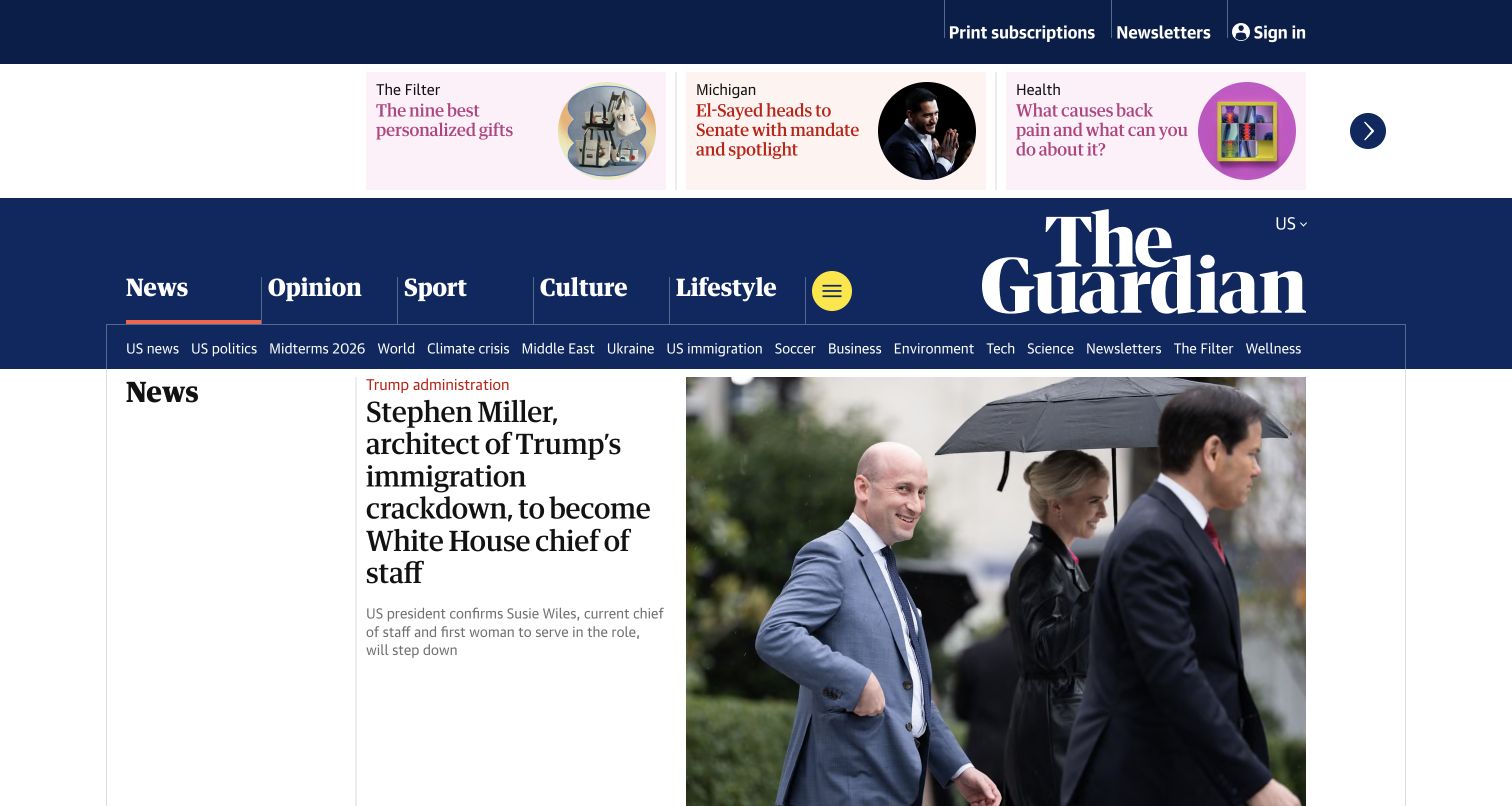
The Guardian's US edition combines a deep-blue masthead with large category labels, a thinner topic row and a three-card highlights strip. Its main news area then shifts to a compact headline column beside a dominant photograph. The typography, rules and color organize a large amount of content without treating every story as a separate floating card. This is an effective reference for a publication that needs several entry points, although the substantial header means the first news image begins well below the top edge.
What you can learn
Map the dependencies between navigation, edition selection and frequently changing story fragments. Fastly's published Guardian case describes an earlier domain migration, caching and release workflow, not an independent audit of today's entire stack. Preserve that historical scope while borrowing the operational question: can editors change urgent material without waiting for an unrelated full-site release?
Pros
Section names, topic links and story content use visibly different levels of hierarchy.
The publication's color and type system provide continuity across changing photographs.
Cons & considerations
The multi-level header leaves less initial space for the lead news item.
Edition and topic density require deliberate mobile simplification rather than simple shrinking.
Platform source: Fastly customer implementation record. Historical Fastly customer implementation record describing theguardian.com, domain migration, dynamic content caching and release automation; not an independently confirmed complete current deployment. Platform evidence is separate from the direct website screenshot and is not a complete current infrastructure audit.
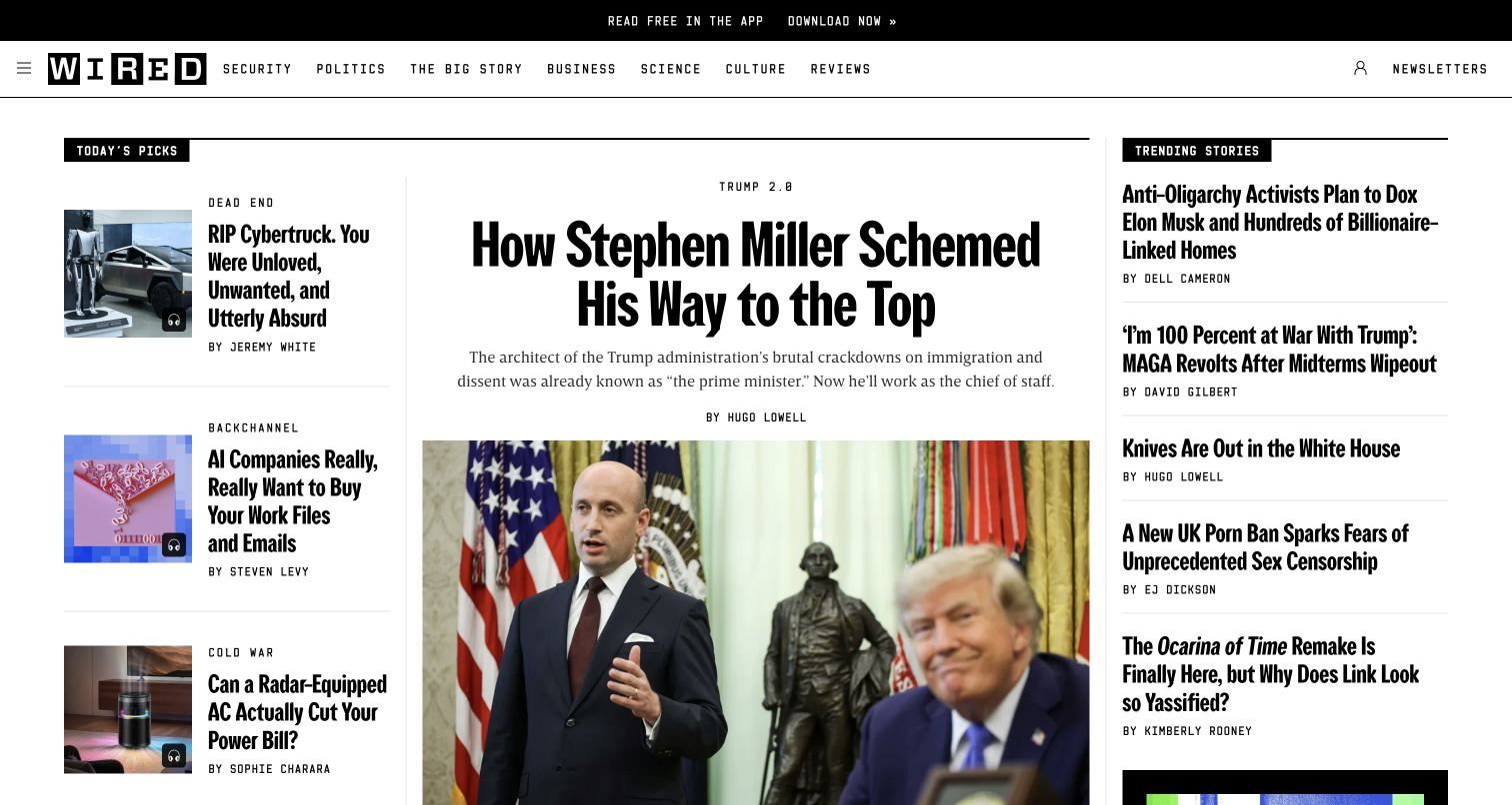
WIRED's first screen uses a narrow black utility strip, a compact category bar and a high-contrast editorial grid. A very large condensed headline anchors the middle, while Today's Picks and Trending Stories create smaller parallel reading routes. Thin rules make the columns understandable without large colored containers. The author line remains attached to the lead story rather than disappearing into the picture caption. This layout gives the central feature clear priority while allowing several other topics to remain discoverable before scrolling.
What you can learn
Design reusable story treatments rather than one unusually attractive homepage arrangement. Fastly's WIRED case specifically discusses the publisher's 2015 redesign and delivery work; it is historical implementation evidence, not proof of every current component. Define headline limits, image ratios, update ownership and empty-column behavior before discussing edge caching or live-blog traffic.
Pros
Distinct type scales make the lead feature and secondary story lists easy to separate.
Rules and alignment give the busy page structure without heavy card decoration.
Cons & considerations
Very large headlines can produce difficult wraps when an editor changes the story.
Three simultaneous editorial columns require a deliberate reading order on smaller screens.
Visible tech stack
Earlier / documented evidence
Fastly
Platform source: Fastly customer implementation record. Historical Fastly case describes the wired.com 2015 redesign and delivery configuration. The current screenshot is a design reference, not proof that all historical configuration remains in place. Platform evidence is separate from the direct website screenshot and is not a complete current infrastructure audit.
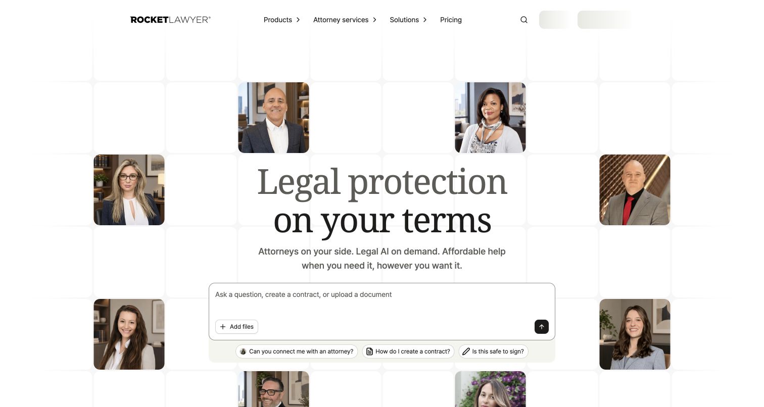
Rocket Lawyer frames its central proposition with attorney portraits rather than opening with a stock office scene. The main text, supporting line and broad question field form a calm central column. Products, attorney services and solutions remain separate navigation groups, while pricing and sign-in have direct routes. The design makes the people behind the service visible without turning the first screen into a wall of individual biographies. The portraits and question prompt work together as an introduction, not proof that a particular professional will handle every request.
What you can learn
Keep informational guidance, account state and consequential legal workflows distinct. Fastly's case describes routing and protection during platform changes; use that as a prompt to plan stable public URLs and clear failure states. Do not infer the quality of legal advice from interface polish, or submit a genuine legal matter as routine design QA.
Pros
Professional portraits give the otherwise restrained page a human focal point.
Pricing and account access remain direct links alongside the broader product menus.
Cons & considerations
A broad question prompt needs a clear explanation of what happens after submission.
Portrait motion or changing placements should not distract from the main service choice.
Platform source: Fastly customer implementation record. Published Fastly implementation record for Rocket Lawyer’s online legal platform, including routing, cached delivery and security during backend and CMS changes. Platform evidence is separate from the direct website screenshot and is not a complete current infrastructure audit.
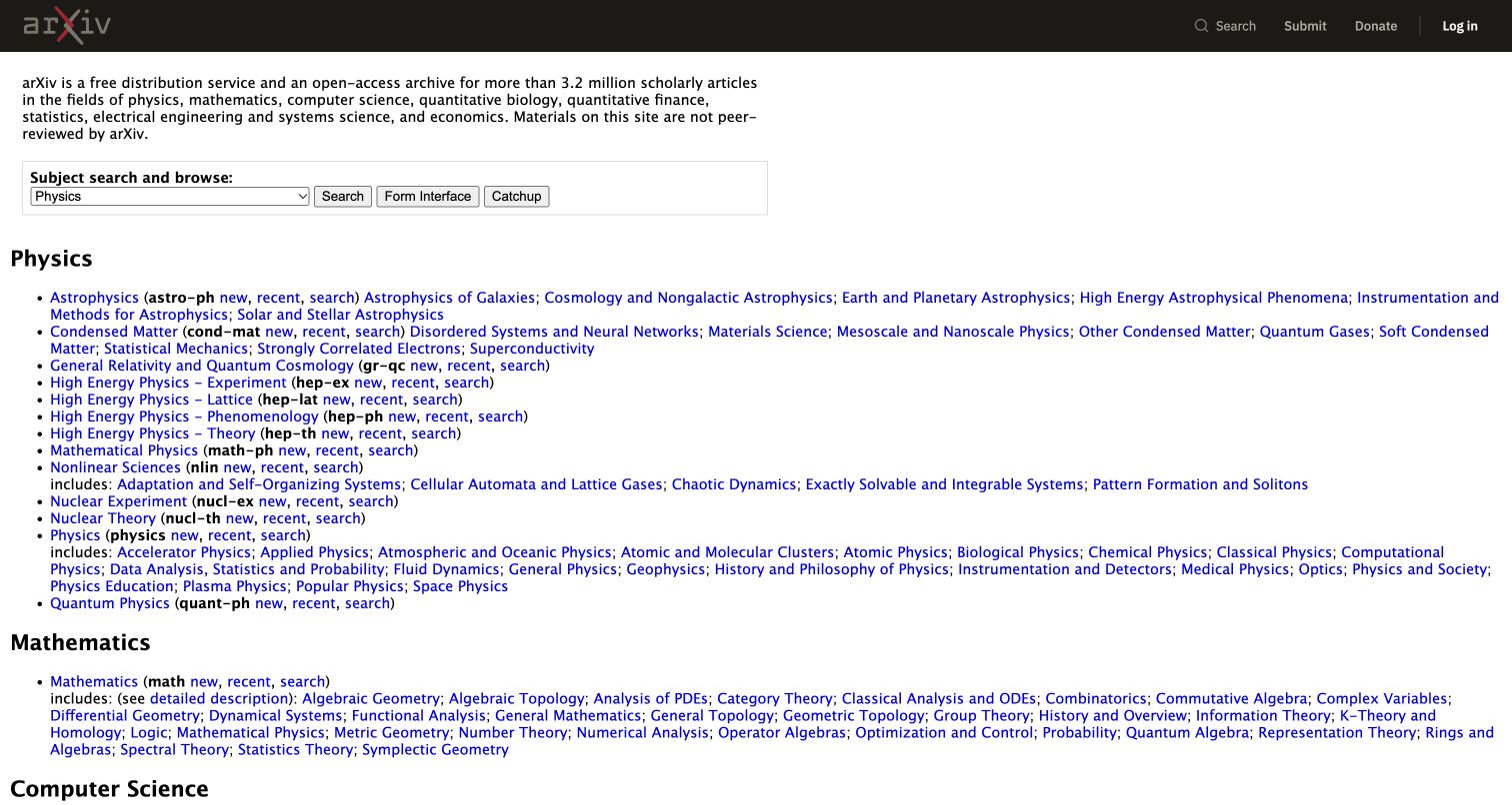
arXiv places a short explanation of the archive above a plainly organized subject index. Physics, Mathematics and Computer Science use recognizable headings and dense sets of specific links. Search, Submit, Donate and Log in stay in a compact dark header. The page is not trying to resemble a lifestyle magazine; its strength is that the subject taxonomy remains visible and directly navigable. That clarity is particularly useful for readers who already know their field, while a first-time visitor may need help understanding the abbreviations and overlapping categories.
What you can learn
Protect ordinary links and a dependable subject structure before adding richer discovery features. Fastly documents delivery and security work for arXiv, but the visible index supplies a different lesson: heavily used archives need graceful reading and navigation even when optional features fail. Plan cache freshness, document changes and download boundaries around the archive's actual publishing workflow.
Pros
The subject index exposes substantial archive depth without requiring a search first.
Publishing and account actions occupy a consistent, compact header area.
Cons & considerations
Dense abbreviations can be difficult for readers entering an unfamiliar discipline.
Long text-link lists need generous focus treatment and careful touch-target testing.
Visible tech stack
Earlier / documented evidence
Fastly
Platform source: Fastly customer implementation record. Fastly CDN and security for the arxiv.org research archive, as described in the named official implementation record. Platform evidence is separate from the direct website screenshot and is not a complete current infrastructure audit.
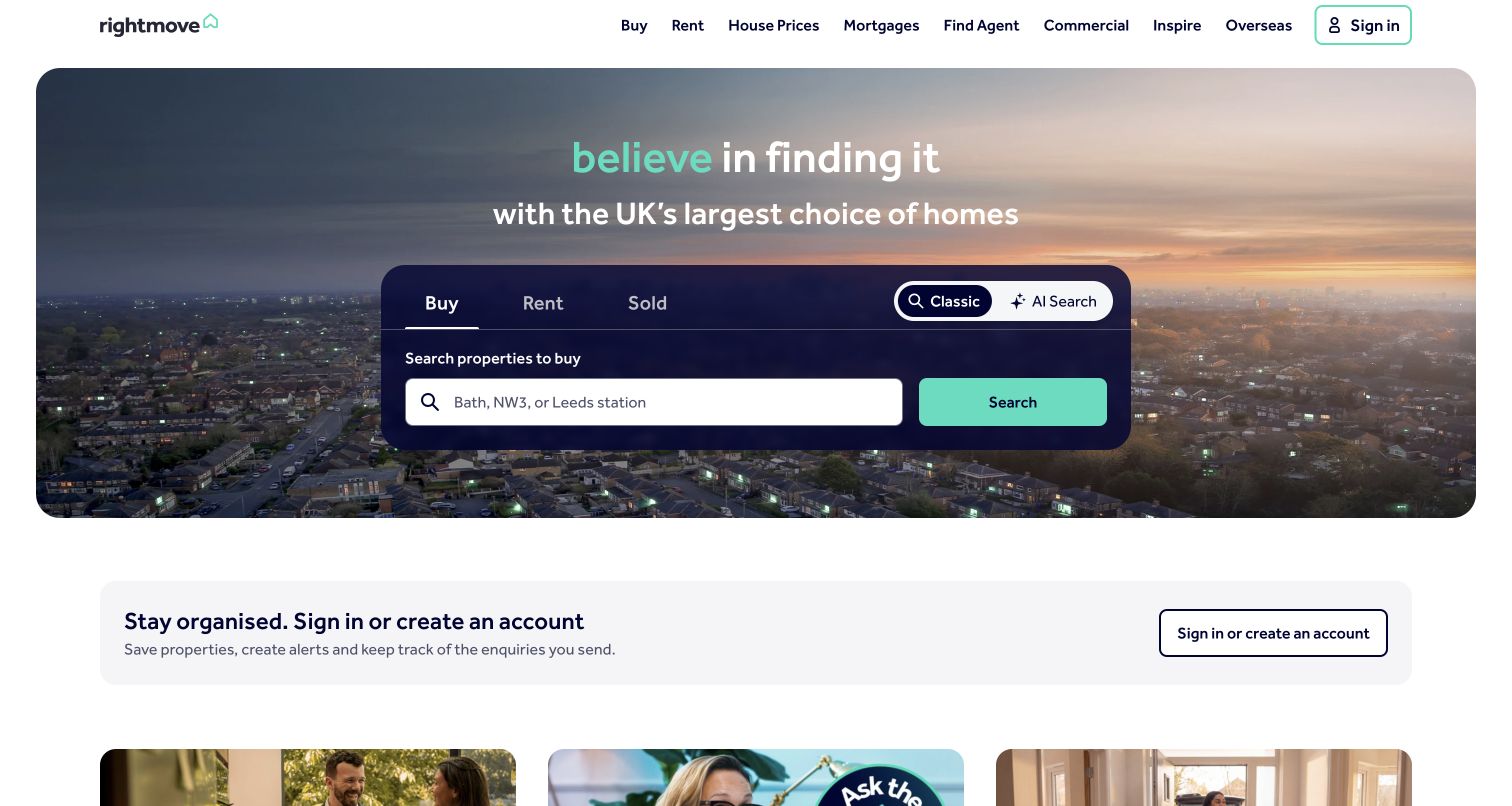
Rightmove centers a dark search panel over an atmospheric neighborhood photograph. Buy, Rent, Sold prices and Commercial are presented as task modes, followed by one location field and two distinct property-search actions. The surrounding navigation still exposes agents, mortgages and inspiration, but those routes do not displace the central search. A quieter account invitation begins below the hero, letting a visitor investigate the market before being asked to organize saved activity. The colored search actions remain legible against the subdued background.
What you can learn
Separate a public search entrance from personal saved searches and account information. Fastly's Rightmove case concerns the delivery and protection of a large property service, not a claim that every result is publicly cacheable. Specify location-state persistence, empty results, unavailable filters and expired property details before optimizing the visual search panel for a campaign.
Pros
The main search explains its available property modes in one compact area.
Account creation is secondary to a useful public discovery task.
Cons & considerations
Several purchase and research intentions still share one crowded navigation bar.
Search-state changes need clear feedback that remains understandable without the hero image.
Platform source: Fastly customer implementation record. Published Fastly security and delivery association for Rightmove’s property-search service, not an audit of every personalized search or account response. Platform evidence is separate from the direct website screenshot and is not a complete current infrastructure audit.
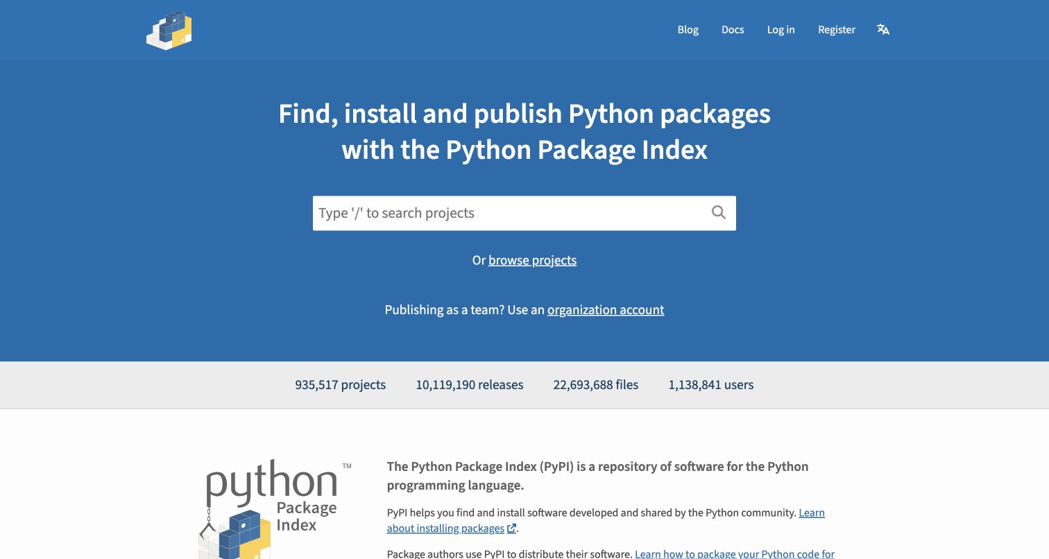
PyPI gives package search a large blue stage while keeping publishing documentation, login and registration in the header. The introductory sentence describes finding, installing and publishing packages in ordinary language. A statistics strip establishes the scale of the registry before the page moves into explanation and community support. The geometric blue background is distinctive without interfering with the central input. This is a focused technical homepage: it does not require a newcomer to understand the organization chart before attempting a package lookup.
What you can learn
Treat registry browsing and authenticated publishing as separate responsibilities. Fastly's Python Software Foundation case specifically discusses PyPI and its delivery and security needs, a more precise association than assigning every Python-related website the same stack. Keep package pages, release changes and account actions governed separately; a public design review is not an endorsement of individual packages.
Pros
Search receives the most obvious visual priority without hiding contributor documentation.
The short proposition identifies registry tasks without relying on specialist acronyms.
Cons & considerations
Registry-scale statistics can distract if they become more prominent than finding a package.
A simple homepage cannot communicate every trust or maintenance question about search results.
Visible tech stack
Earlier / documented evidence
Fastly
Platform source: Fastly customer implementation record. The Python Software Foundation case specifically describes PyPI’s package distribution, delivery and security relationship with Fastly. This is not a blanket attribution for all Python websites. Platform evidence is separate from the direct website screenshot and is not a complete current infrastructure audit.
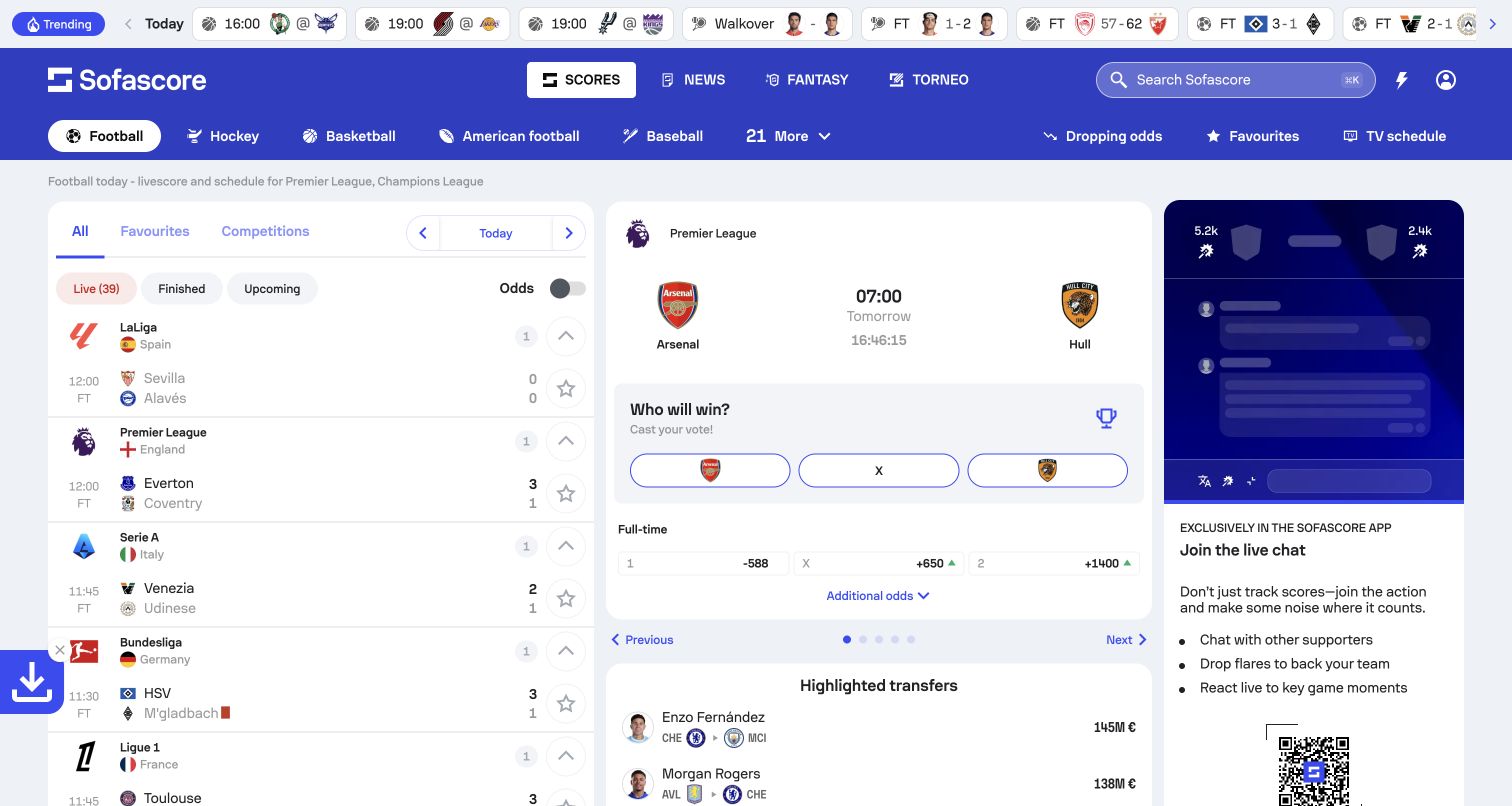
Sofascore combines a sports strip, a date control, featured matches, live scores and a competition sidebar. Small flags, crests and sport icons help distinguish rows without asking every fixture to carry a large photograph. The selected competition occupies a visible detail area beside the list, allowing browsing and interpretation to happen in the same screen. This is much denser than a conventional marketing homepage, but the repeated row structure makes the density understandable to a visitor following several events.
What you can learn
Document which updates belong to the selected date, competition and match before choosing an update mechanism. Fastly's case concerns the service's real-time data delivery; it does not establish a freshness guarantee for this capture. Label delayed or unavailable data, preserve the visitor's selection and provide a readable state when an optional live connection fails.
Pros
Repeated fixture rows support scanning more efficiently than unrelated promotional cards.
Date and competition controls give the changing data a recognizable frame.
Cons & considerations
The simultaneous controls can be difficult for a newcomer to prioritize.
Live updates require careful focus and announcement behavior so reading is not interrupted.
Visible tech stack
Earlier / documented evidence
Fastly
Platform source: Fastly customer implementation record. Official Fastly customer case documents the Sofascore platform’s live-data delivery and security; no claim that a particular score in the screenshot is current. Platform evidence is separate from the direct website screenshot and is not a complete current infrastructure audit.
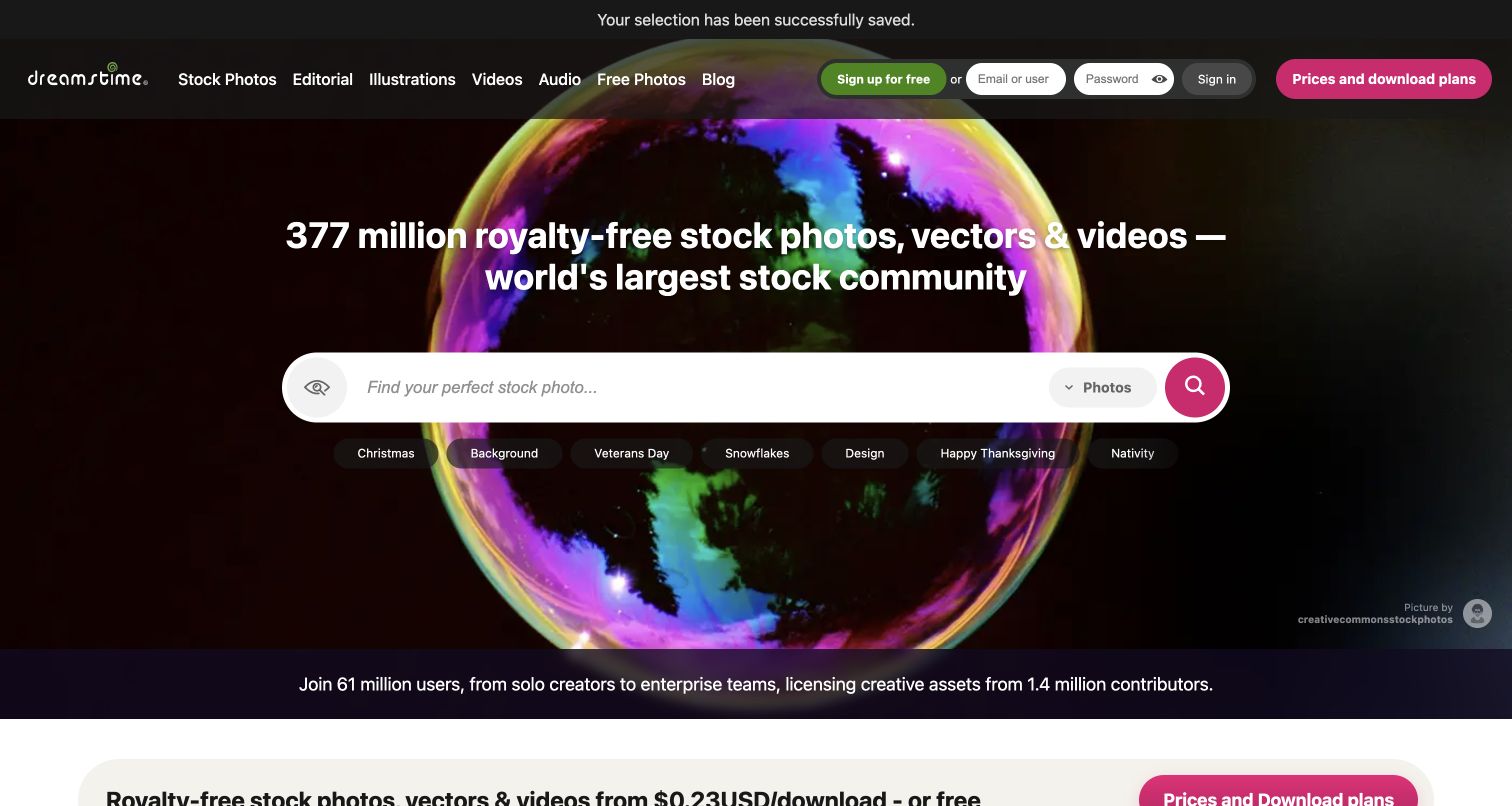
Dreamstime centers a wide search input over a dark, colorful globe illustration. Media-type choices sit directly beneath the field, while the header separates stock photography, editorial images, vectors, video and audio. This makes the first action more specific than a generic invitation to explore. Account and pricing routes stay visible for returning or purchase-ready visitors. The retained screen also shows a small confirmation after optional cookies were declined, illustrating that privacy feedback can remain present without hiding the primary search area.
What you can learn
Plan image previews, licensed downloads and account-dependent actions as different delivery paths. Fastly's Dreamstime case discusses a large media library, but its commercial figures are not transferable promises. Specify thumbnail sizes, understandable license context and reliable search feedback before adding media formats; test browsing without making purchases or downloading material outside the review's permitted scope.
Pros
The central search and nearby media choices create a clear library entry.
A dark hero provides input contrast without labels over busy photography.
Cons & considerations
Catalog-size claims need maintenance when they appear in prominent hero copy.
Multiple content types require explicit search-state feedback rather than unexplained results changes.
Platform source: Fastly customer implementation record. Official implementation story documents delivery of Dreamstime’s public image and media library through Fastly services. Platform evidence is separate from the direct website screenshot and is not a complete current infrastructure audit.
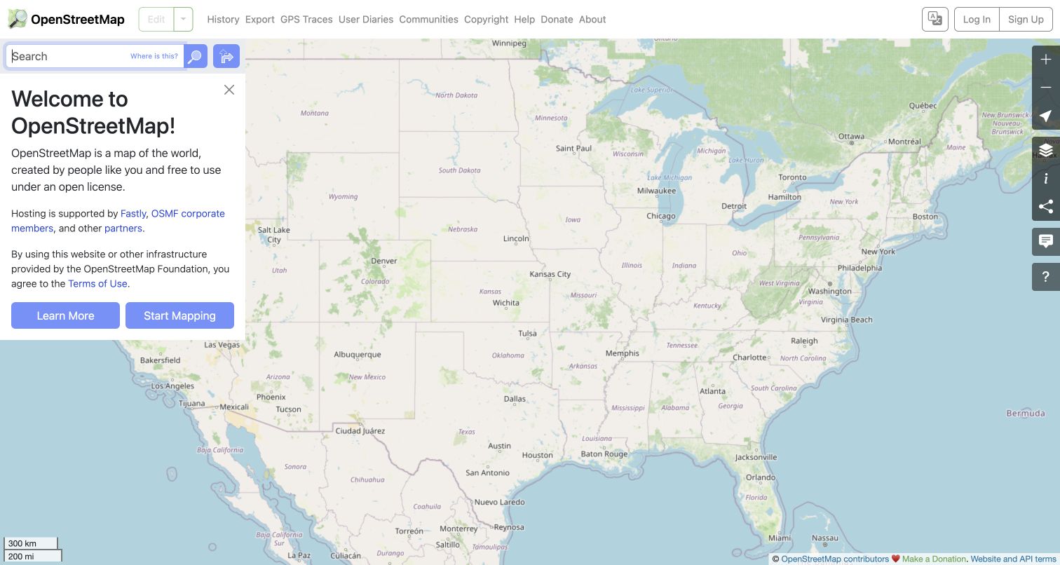
OpenStreetMap opens with an actual map rather than a photograph of someone using a map. Search and the welcome panel occupy the left side, while zoom and other map controls sit at the right edge. The header exposes history, export, GPS traces, community information and copyright as ordinary destinations. The result is a working canvas with a concise explanation, not a separate marketing page that delays access to the tool. The observed map extent is a viewing state, not a claim about a visitor's precise location.
What you can learn
Make the map useful before asking visitors to contribute or create an account. Fastly documents OpenStreetMap's delivery work, while map attribution and data licensing remain separate obligations. Define how tile errors, slow connections and unavailable search are explained. Provide ordinary information routes outside the interactive canvas so the map is not the only way to understand the project.
Pros
The main tool is immediately available without a promotional click-through.
Contribution and data-information links remain separate from the map's local controls.
Cons & considerations
A full-screen map needs deliberate keyboard, zoom and non-map alternatives.
Compact utility controls require accessible labels and understandable help.
Platform source: Fastly customer implementation record. Official Fastly case documents OpenStreetMap’s map and data delivery. This does not assign Fastly to every independently operated service using OpenStreetMap data. Platform evidence is separate from the direct website screenshot and is not a complete current infrastructure audit.
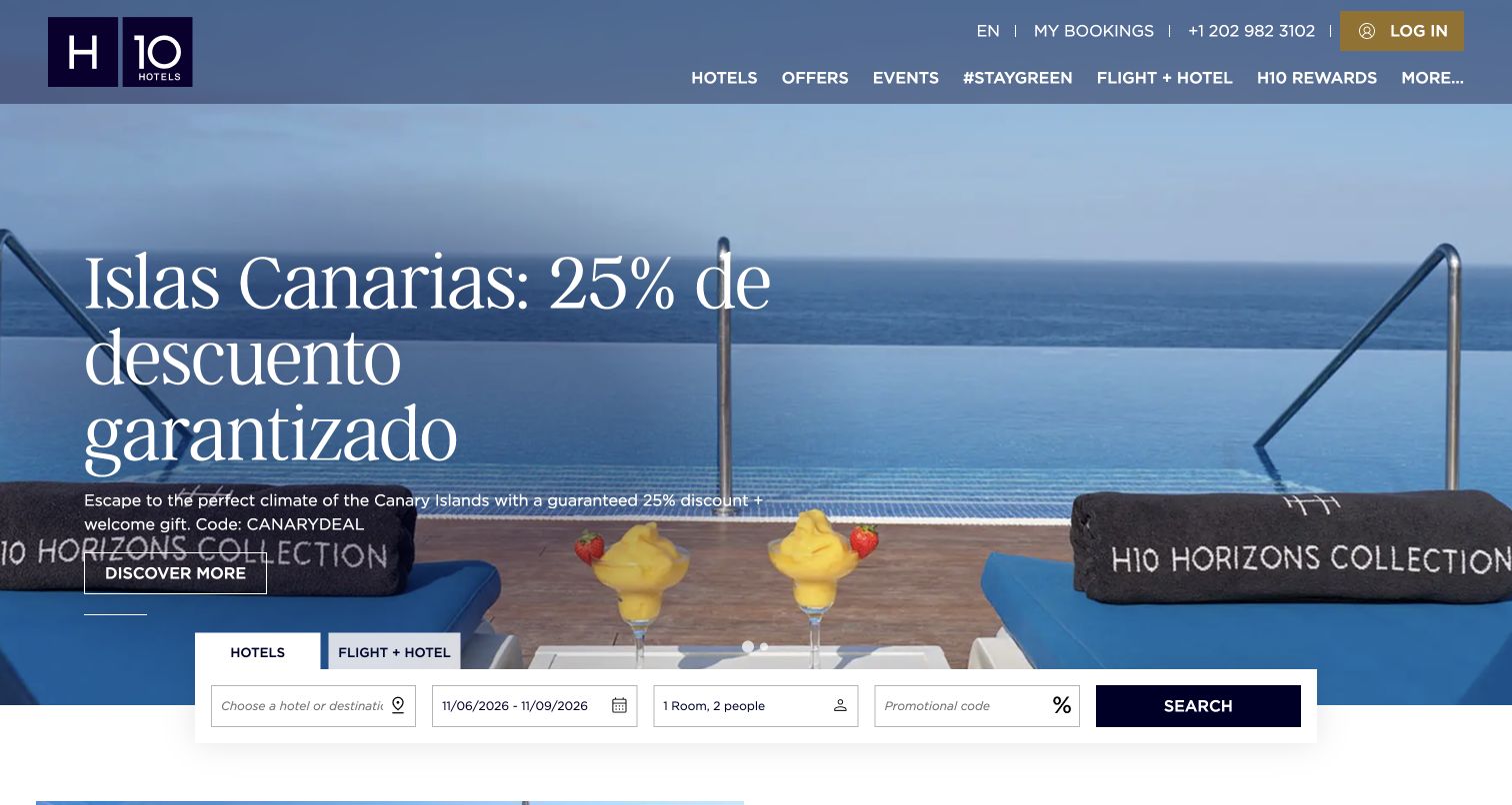
H10 Hotels uses a broad coastal photograph, a large seasonal heading and a reservation bar along the bottom of the hero. The navigation distinguishes hotel discovery, offers, events and sustainability from account and booking utilities. The landscape establishes the type of stay before a visitor selects dates or a destination. In the inspected public state, the cookie panel initially competes with the reservation area; the final retained image follows normal rejection of optional cookies rather than removing the panel through other means.
What you can learn
Separate public destination content from availability and personal booking data. Fastly's H10 case identifies the named hotel's ecommerce site, making it useful for discussing origin protection and seasonal traffic. Define unavailable inventory, invalid dates, accessible date selection and the booking-provider transition, without claiming a screenshot proves reservation reliability. Test each of those boundaries without creating real bookings.
Pros
A wide destination image establishes context before detailed choices begin.
The reservation bar has a consistent position apart from the main navigation.
Cons & considerations
Large campaign text can compete with booking controls on short displays.
Consent and promotional panels must be tested together with the reservation interface.
Platform source: Fastly customer implementation record. Official implementation case explicitly identifies h10hotels.com and Fastly delivery and security supporting its hotel ecommerce experience. Platform evidence is separate from the direct website screenshot and is not a complete current infrastructure audit.
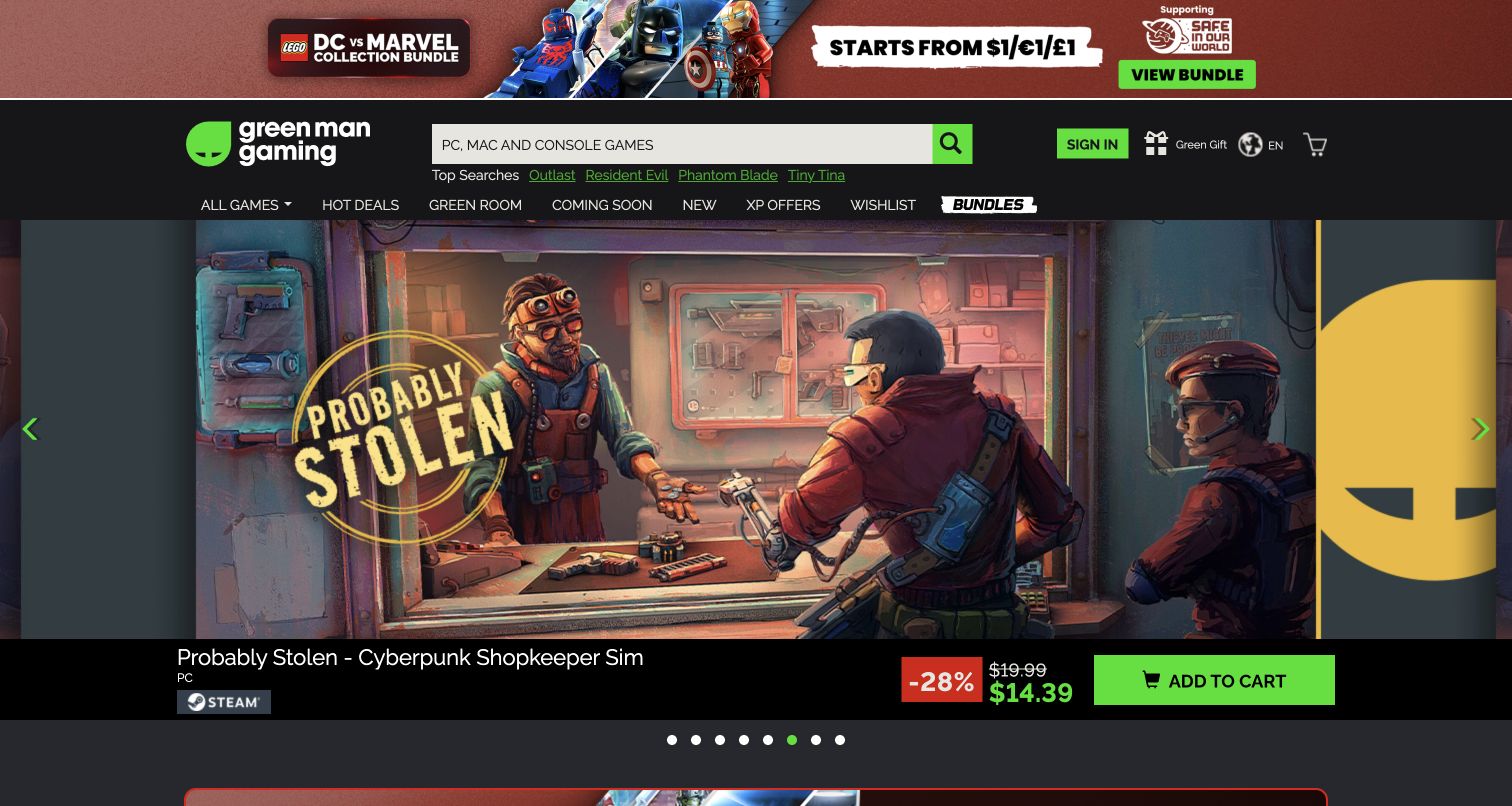
Green Man Gaming combines a dark header, a prominent search field and a large illustrated campaign carousel. The featured game keeps its platform marker, discount and price close to the artwork rather than scattering those details across unrelated blocks. Category navigation and sale routes remain above the campaign, while carousel indicators reveal that the image is only one promotion. It is a useful example of a visually intense store that still needs dependable product discovery for visitors uninterested in the current feature.
What you can learn
Keep product identity, price conditions and campaign artwork connected through a governed content model. Fastly's case documents a delivery-provider migration for this retailer; that is not evidence that a pictured discount remains available. Include expired offers, regional restrictions and missing artwork in release testing, and make the non-carousel route to products equally clear.
Pros
Price and platform context remain attached to the promoted game artwork.
Search offers a direct alternative to browsing the current campaign carousel.
Cons & considerations
Several promotional strips compete for space before the main feature begins.
Rotating campaign imagery needs pause, focus and reduced-motion behavior beyond a static capture.
Platform source: Fastly customer implementation record. The retailer’s official Fastly case documents the CDN and WAF migration for its digital-game ecommerce service. Platform evidence is separate from the direct website screenshot and is not a complete current infrastructure audit.
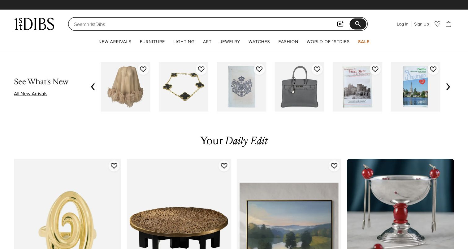
1stDibs uses a pale header, a long search field and a restrained category row to frame furniture, art and decorative objects. A small new-arrivals strip leads into larger product images rather than a single full-width campaign photograph. White space lets objects with different colors and proportions share one page. The tone is editorial, but favorites, account and cart utilities make the shopping context clear. The layout depends on consistent image treatment more than large promotional typography or a large block of introductory sales copy.
What you can learn
Make image variants and object metadata part of the same publishing workflow. Fastly's marketplace case discusses the need to update cached content promptly, which matters when an individual item changes availability. A similar design should explain sold items, inconsistent image ratios and delayed inventory updates without implying that elegant spacing or a named CDN guarantees accurate stock.
Pros
A quiet header and neutral canvas allow different objects to coexist visually.
Search and ordinary category links support focused shopping alongside editorial discovery.
Cons & considerations
Subtle typography needs contrast checks rather than relying on a luxury aesthetic.
Unique-item availability can change faster than an editorial collection is updated.
Platform source: Fastly customer implementation record. Official implementation record documents Fastly delivery and cache-purge requirements for the 1stdibs.com marketplace. Platform evidence is separate from the direct website screenshot and is not a complete current infrastructure audit.
Mindvalley places a large seasonal membership offer over a full-width video-style hero. A purple action button connects the campaign to a specific next step, while navigation separates membership, academy, coaching and events. The retained frame shows the actual campaign message, which can differ from the page's search title or later animation frames. This distinction matters when reviewing a moving hero: the screenshot is one visible moment in an active promotion, not a permanent summary of the entire product range.
What you can learn
Give time-sensitive offers explicit dates, ownership and fallbacks rather than treating the hero as an independent design file. Fastly's case discusses the platform's delivery and image responsibilities. Use the example to plan public discovery and separate member-only experiences, while evaluating motion, offer clarity and cancellation information independently of the infrastructure provider. Review seasonal and non-campaign variants together.
Pros
A contrasting action button establishes a clear next step within the image.
Major product families remain visible rather than becoming hidden offer details.
Cons & considerations
Video and campaign overlays require testing across frames and reduced-motion settings.
Temporary offers can obscure the longer-term membership proposition for new visitors.
Platform source: Fastly customer implementation record. Official Fastly case documents performance, security and image-delivery services for Mindvalley’s global learning platform. The marketing capture does not disclose its private classroom architecture. Platform evidence is separate from the direct website screenshot and is not a complete current infrastructure audit.
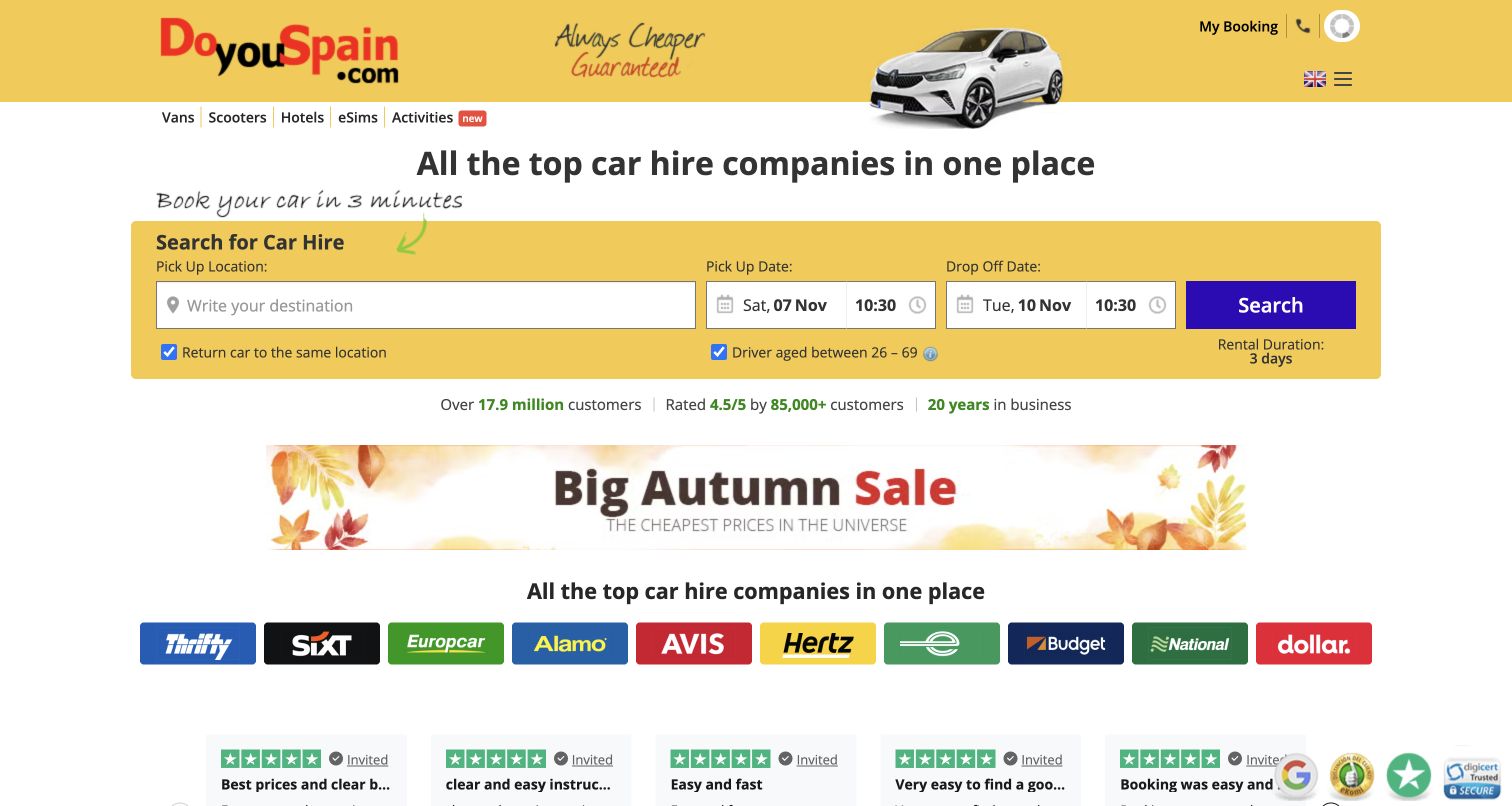
DoYouSpain places a yellow car-rental search panel near the top of a largely white page. Pickup location, dates and times share one horizontal task area, followed by a seasonal promotion and recognizable supplier marks. This makes the comparison role visible without asking a visitor to read a long company introduction. The compact presentation can be useful for experienced travelers, although its small fields and surrounding promotional messages require simplification on a phone. The supplier strip is separate from the inputs rather than replacing their labels.
What you can learn
Keep the comparison entrance, quoted results and final supplier transaction distinct. Fastly's case concerns this public booking platform's protection and availability, not a guarantee about a rental offer. Preserve field values after errors, label date and time relationships clearly, and test embedded or external booking components in a controlled environment without creating real reservations.
Pros
The primary rental-search fields appear before the longer promotional content.
Supplier context helps explain that the service compares multiple rental providers.
Cons & considerations
Dense small controls can be difficult to manipulate on narrow screens.
Seasonal banners and pricing claims require current conditions and clear onward explanations.
Platform source: Fastly customer implementation record. Official case identifies the DoYouSpain public comparison and booking platform and its Fastly security and availability work. Platform evidence is separate from the direct website screenshot and is not a complete current infrastructure audit.
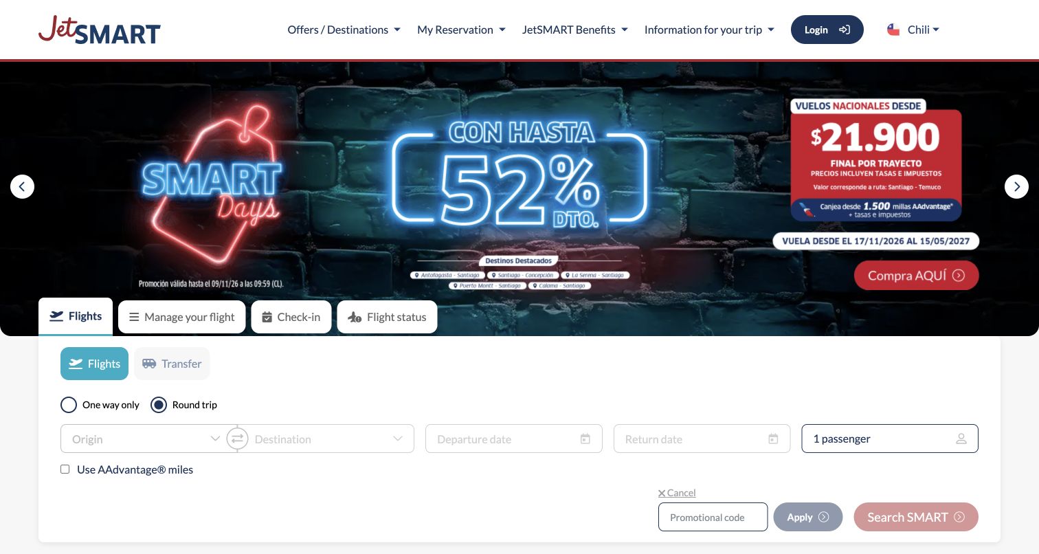
JetSMART's Chile property uses a high-contrast promotional image followed by tabs for flights, managing a trip, check-in and flight status. A white search panel separates flight controls from the artwork. The captured state mixes English interface labels with a Spanish campaign image, a reminder that translating navigation alone does not create a consistent localized experience. The campaign and reservation controls are clearly different regions, although the promotion occupies much of the first screen before a visitor reaches the form.
What you can learn
Treat locale, campaign content and booking state as related but separately governed information. Fastly's customer record identifies delivery and protection products for JetSMART; it does not prove a particular fare, language combination or booking result. Review mixed-language states, expired image-based offers and direct-entry regional URLs, and retain useful trip-management routes when the campaign changes.
Pros
Booking, check-in and existing-trip tasks have visible separate tabs.
A white form surface preserves input contrast against a visually intense promotion.
Cons & considerations
Image-based promotional text may not match the surrounding interface language.
A large fare campaign can delay access to practical reservation controls.
Platform source: Fastly customer implementation record. Official Fastly customer record identifies JetSMART and lists CDN, Compute and protection products. The pictured Chile regional entry is not a complete inventory of every JetSMART regional deployment. Platform evidence is separate from the direct website screenshot and is not a complete current infrastructure audit.
Kegan has 15+ years of experience working with small businesses, Fortune 500 companies, and everything in between. No development job is too big or too small: he brings the same hands-on attention to a focused improvement, a complete website, or a custom application.
For Fastly projects, he can help with responsive interfaces, reusable components, custom functionality, API connections, and performance-minded implementation. He works directly with clients on scope, design, implementation, testing, and handover, with an emphasis on clear communication and a system that remains practical to maintain after launch.
Show 3 other Fastly developersHide other Fastly developers
Three responsibilities to separate in a Fastly project
Public content delivery
Article introductions, product images, navigation and other public resources need clear update ownership and a useful fallback. Design the content and its delivery together so a campaign change does not leave broken assets or contradictory messages.
Application and account boundaries
Booking, publishing, saved items and subscriber experiences require deliberate state and authorization rules. Keep their responsibilities explicit even when public and private experiences share a visual header or an edge service.
Operational control
Release approval, purging, incident observation and rollback need named owners. A technically powerful control is not a complete workflow if an editor cannot tell whether a change reached the public page or who should investigate a failure.
From references to requirements
Write the visitor-state matrix before the edge configuration
Inventory the actual response types
List public pages, media variants, search results, private account routes, callbacks and APIs. Record which team owns each and whether it may contain personal or entitled information. Do not classify a whole domain as one homogeneous cacheable website.
Map the changes that matter
Use a product update, article correction, temporary closure or expired offer as a concrete example. Identify every page and asset affected. Connect the CMS or product-data event to an explicit invalidation plan, including what happens when that event fails.
Specify useful failure states
Give a visitor an understandable route when an optional photograph, live score or search service is unavailable. Separate a temporary security verification from an account error. Avoid an endless spinner that erases the distinction between loading, rejection and failure.
Test the exact release boundary
Check a new visit, an already-open tab, an old direct link and a returning visitor after a release. Preserve required asset versions long enough for existing pages to work. Test only in authorized environments and use synthetic data for private flows.
Review origin and edge responsibilities together
A routing change can affect canonical URLs, redirects, security checks and analytics as well as delivery. Keep the application and operations owners in the same review. Document what may change independently and what needs a coordinated release or rollback.
Measure before claiming an improvement
Define representative pages, devices, connection conditions and success criteria before implementation. Report your own observed results with their scope. A customer case study's percentage improvement is not a forecast for a different site, traffic pattern or starting architecture.
A useful handover demonstration
Ask the actual team to carry out its routine job: publish a realistic update, correct a mistake, preview a narrow screen, and identify who owns an integration failure. For a library or frontend framework, also ask who maintains the content source and deployment. A polished screenshot does not answer those operational questions.
Beyond the screenshot
Fastly development planning checklist
List public, private, personalized and transaction-bearing responses separately.
Document the exact service and product responsibilities being proposed.
Keep entitlement and account checks outside assumptions about public page caching.
Connect content changes to the affected URLs, fragments and media variants.
Choose a deliberate policy for stale public content by task and risk.
Test cache keys and variations without using real personal information.
Keep old asset references working across a controlled release boundary.
Explain unavailable search, live data and optional media to visitors.
Check localized routes, canonical links and existing redirects.
Assign owners for configuration changes, purging and rollback.
Use authorized staging environments for security and account-flow tests.
Distinguish published customer evidence from a complete current stack audit.
Test with real content, a keyboard, a small screen, slow or failed requests, and the people who will maintain the system. These are planning checks, not an accessibility, security, performance, or search-ranking certification.
Sources & editorial method
How this Fastly collection was reviewed
Twenty distinct public properties were selected using exact Fastly customer implementation records and direct browser captures of the actual destinations. First-screen layouts were visually reviewed for original summaries, lessons and tradeoffs. Two existing genuine captures are reused with original provenance, not relabeled as fresh images. The RealReal's mandatory account entrance and the uncompleted Die Zeit consent state were not included. New source pages receive the same bounded public HTML and linked-asset audit attempt as other Website Unpacked examples. Public findings supplement, rather than silently upgrade, the documentary product associations. No private account or transactional flow was submitted.
Every image is an unmodified capture from the actual website, with its source and capture date. Some captures are reused from our shared catalog; their dates remain the original capture dates. None comes from a vendor gallery or a generated reconstruction. Moving imagery and live content can change.
Technology attribution uses public page assets or metadata, official platform documentation, or a cited first-party project case study. Documentary and framework-relationship evidence is identified where used; it is not a complete current backend inventory. A CMS image CDN alone does not establish a full CMS deployment. A library’s presence does not prove which individual controls use it, and a platform label does not establish AI authorship.
The composition notes, lessons, pros and tradeoffs are original editorial observations. We have not measured conversion, traffic, security, performance or accessibility conformance. Website owners retain their brands and imagery; these examples are not our client portfolio. Written, Edited and Curated are independent records, not dates advanced by a build. See our editorial standards or suggest a correction.
Questions worth asking
Fastly website development FAQs
Does the list prove every example currently uses the same Fastly products?
No. Each source record identifies the documented scope, and public-source observations retain their own dates. CDN, security, compute and image-delivery relationships are different. The historical WIRED and Guardian sources are not presented as current complete configuration audits.
Can I identify a Fastly deployment from its visual design?
No. A masthead, booking form or product grid does not reveal the delivery provider. Use exact technical or primary documentary evidence, and keep the resulting claim limited to what that evidence actually establishes.
Does an edge cache replace the need to optimize the website?
No. Images, scripts, layout stability, accessibility, content organization and application behavior still need their own work. The examples are useful interface references, not proof that choosing a delivery provider resolves every performance or usability issue.
Should private responses be treated like ordinary public pages?
No. Plan the authorization, personalization and caching boundaries explicitly. Review the effective origin and edge configuration with the responsible engineers, and test using synthetic data rather than real customer accounts.
Why retain older genuine screenshots in a new collection?
A useful reference can be reviewed for a new editorial question without pretending the image was captured again. Capture dates, source observations and collection publication dates describe different events and remain separate.
Start with the states your visitors need to trust, then choose the delivery, update and recovery mechanisms that preserve them. The useful thing to borrow is the operating question, not another site's unverified configuration.