Best htmx Websites of 2026 (20 Real-World Examples)
Twenty public websites with observed htmx references or explicitly documented associations, genuine screenshots and original design reviews.
A responsive interface starts with a clear task. These examples show useful navigation, content and service patterns on websites associated with htmx, while keeping the technology evidence separate from the visible design.
htmx supports HTML-driven requests and partial page updates. Its documentation describes controls for request triggers, update targets, history and request indicators. Those features can support a focused interaction without determining the site's visual style. The collection ranges from retail and institutional pages to travel, professional services and developer resources because a library reference does not prescribe one kind of website.
Most examples have a dated script reference from the exact reviewed public page. Others have a documented association in the official htmx webring. These are different kinds of evidence. A script reference does not prove which visible feature uses the library, and a documentary listing does not establish every current implementation detail. The reviews evaluate what the real captures show and explain the narrower evidence alongside it.
Before the examples
What makes good htmx website development in 2026?
Start with a complete, understandable task
Write down what the visitor needs to accomplish before choosing which area of a page should update. A product comparison, a programme date and a service location need different context. Keep the initial page useful, label the next action clearly and avoid requiring an interaction simply to reveal basic information.
Treat the updated region as part of the whole page
A new result still needs a heading, context and a relationship to the control that requested it. Plan loading, empty, error and success states together. Preserve the visitor's position and attention where possible, and ensure changes can be understood without relying on motion or color alone.
Keep navigation predictable
The official documentation covers history and ordinary-link enhancement. Decide which changes deserve a distinct address and verify that direct entry, reload and back navigation produce a coherent page. Do not let a useful filtered view become an unshareable state that only works after a particular sequence of clicks.
A convenient interface must not decide what a user is authorized to see or change. Validate requests, protect state-changing actions and handle returned content appropriately. The official security guidance discusses untrusted content and request restrictions; use that guidance alongside the requirements of the actual application.
Compare the information hierarchy and practical task routes in these twenty distinct public properties. Similar service templates remain separate branded sites, and each retains its own original capture and dated source evidence.
We start with five recognizable brands or organizations: Nike Vision, Polartec, Phillips Academy, Great Journeys New Zealand, Wallenius Wilhelmsen. Each attribution applies to the named website property, not every product or website belonging to its organization. This is a curated reading sequence, not a measured ranking.
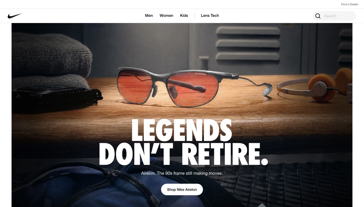
Nike Vision uses a tightly edited white navigation bar above a large campaign image, giving the eyewear photography room to establish the brand. Men, women, kids and lens technology remain explicit destinations, while search and the dealer locator sit within the same practical frame. Farther down, product cards introduce individual frames, prices and colour choices without abandoning the clean presentation. The useful contrast is between an expressive campaign and ordinary catalogue information. The observed page references htmx, but that does not identify which individual controls use it or establish the checkout architecture.
What you can learn
Let a campaign create interest while keeping product categories and availability routes independently understandable. If partial updates support filtering or product options, preserve meaningful URLs, clear loading feedback and the information required when an update fails.
Pros
A short category row makes the commercial structure easy to scan.
Product imagery and generous space give individual frames a clear identity.
Cons & considerations
The opening campaign delays detailed product comparison.
Dealer discovery and online product browsing require distinct expectations.
Platform source: Scoped htmx evidence for this public website. The official htmx webring lists this exact public website as created with htmx. This is a documented website association, not proof that every current control uses the library. Platform evidence is separate from the direct website screenshot and is not a complete current infrastructure audit.
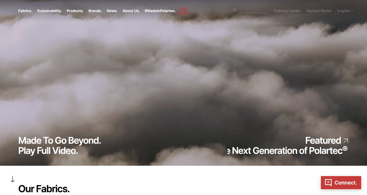
Polartec places a full-width atmospheric film behind a compact navigation covering fabrics, sustainability, products and brands. The large opening statement and video action emphasize the material's identity before the next white section introduces the fabric range. Training and partner routes remain available in the upper bar, acknowledging specialist visitors alongside general readers. The captured moving scene also illustrates a tradeoff: featured text at the right edge is partly cropped, and its position competes with the main statement. Retained source evidence records an htmx script reference on this exact public page; it does not attribute the film or navigation behavior to that library.
What you can learn
Keep the technical information architecture visible even when the first screen is cinematic. Design every overlaid label for the actual crop and provide a straightforward route into specifications, with a useful page still available when media or incremental updates are unavailable.
Pros
The navigation distinguishes fabric research from broader brand material.
A sharp transition to the fabric section gives the visual introduction a destination.
Cons & considerations
Cropped featured copy weakens the captured opening hierarchy.
The large film postpones concrete product information.
Platform source: Scoped htmx evidence for this public website. The retained public source audit dated 2026-11-03 observed Linked script matches HTMX. This is a bounded page/library reference, not a complete application architecture or current performance assessment. Platform evidence is separate from the direct website screenshot and is not a complete current infrastructure audit.
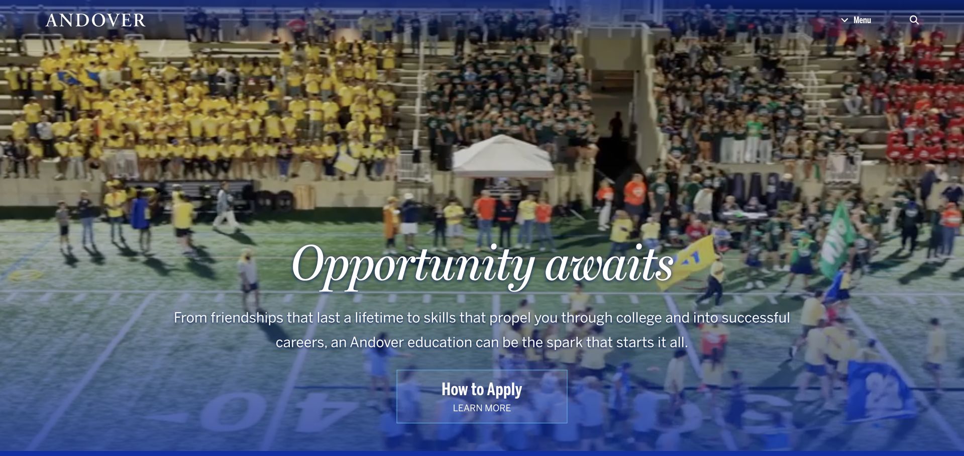
Phillips Academy's Andover homepage uses a school gathering as the background for a concise admissions message. A large italic headline and a short supporting statement sit above a clearly framed application link, while the name, menu and search remain at the top. The blue treatment ties the scene to the institution and keeps the central message readable. This is an example of simplifying the first decision without presenting the entire school structure immediately. It also leaves other visitor groups dependent on the menu. The retained htmx evidence concerns a linked script on this public homepage, rather than the school's private admissions or learning systems.
What you can learn
Choose a clear primary audience for the opening view, then give other audiences reliable navigation. For an institutional site using partial page updates, preserve accessible section titles, history navigation and a direct link to every substantive admissions page.
Pros
The authentic community scene gives the institution a specific atmosphere.
One prominent application route makes the next step easy to identify.
Cons & considerations
Most practical school information remains behind navigation.
The large background scene needs careful contrast across changing frames.
Platform source: Scoped htmx evidence for this public website. The retained public source audit dated 2026-11-09 observed Linked script matches HTMX. This is a bounded page/library reference, not a complete application architecture or current performance assessment. Platform evidence is separate from the direct website screenshot and is not a complete current infrastructure audit.
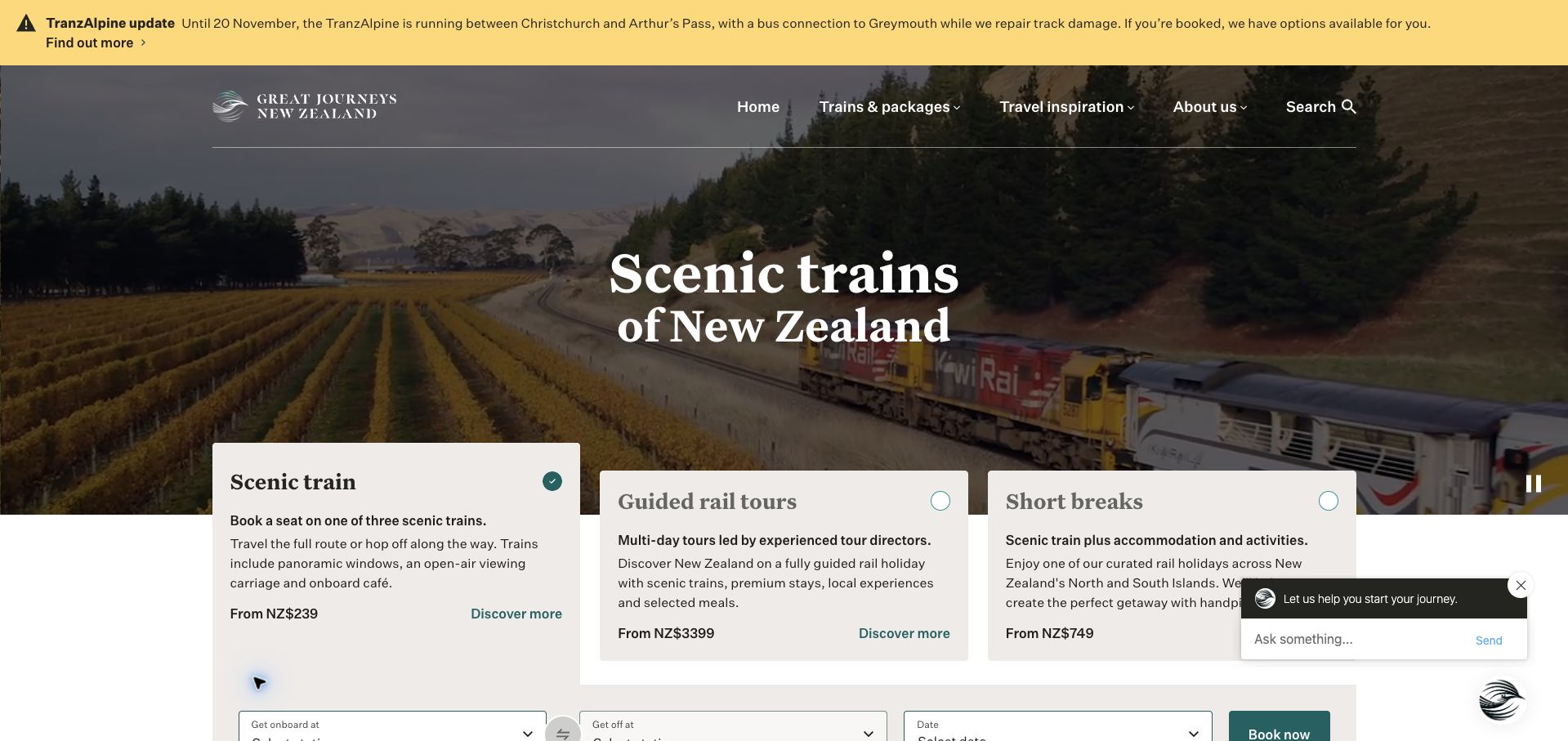
Great Journeys New Zealand combines a scenic railway image with three contrasting options: an individual train journey, a guided rail tour and a short break. Each card explains the format and shows a starting price, so the opening view begins to answer practical questions instead of relying on landscape alone. A service-disruption notice sits above the navigation, appropriately preceding the promotional content. The booking fields begin beneath the selected option, although a floating chat panel competes with the right-hand card. An existing exact-page audit observed htmx; this is a page-library reference, not verification of the complete booking or payment service.
What you can learn
Separate the trip-format decision from detailed availability. When selections refresh part of a booking interface, make the selected state explicit and keep warnings, dates and price qualifications attached to the relevant choice rather than replacing them silently.
Pros
Journey cards explain meaningful differences before asking for travel details.
Operational disruption information receives prominent placement.
Cons & considerations
The chat overlay obscures part of the initial comparison.
Starting prices require further context before a traveller can compare complete costs.
Platform source: Scoped htmx evidence for this public website. The retained public source audit dated 2026-11-08 observed Linked script matches HTMX. This is a bounded page/library reference, not a complete application architecture or current performance assessment. Platform evidence is separate from the direct website screenshot and is not a complete current infrastructure audit.
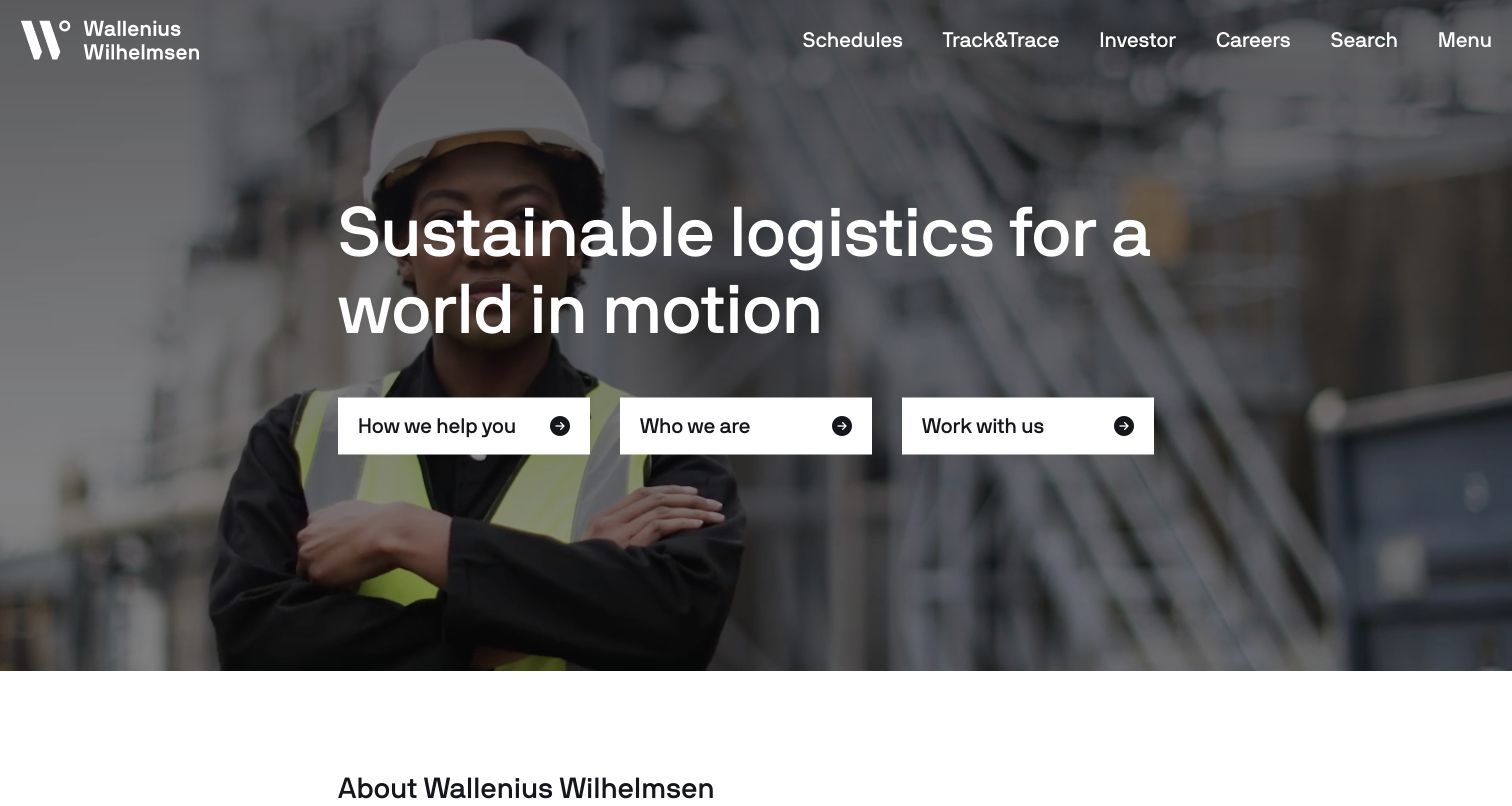
Wallenius Wilhelmsen places schedules and tracking alongside investor, careers and search links, making recurring operational tasks visible before its corporate story. The hero combines a worker photograph with a large logistics statement and three clearly separated routes for services, company information and employment. The image gives the introduction a human focus without replacing the practical navigation. The wide headline remains more general than the task labels, so visitors with a specific shipment question will likely benefit most from the top bar. Retained public evidence identifies an htmx script reference on this exact homepage, not the architecture of private tracking or logistics systems.
What you can learn
Give frequent tasks their own stable entry points instead of forcing every audience through a corporate narrative. If an operational result updates within a page, retain clear context, error messages and a shareable destination for the information users need to revisit.
Pros
Schedules and tracking are visible in the first navigation row.
Three prominent routes distinguish different visitor intentions.
Cons & considerations
The broad hero statement provides limited service detail.
Several audiences compete for attention within a single opening screen.
Platform source: Scoped htmx evidence for this public website. The retained public source audit dated 2026-11-05 observed Linked script matches HTMX. This is a bounded page/library reference, not a complete application architecture or current performance assessment. Platform evidence is separate from the direct website screenshot and is not a complete current infrastructure audit.
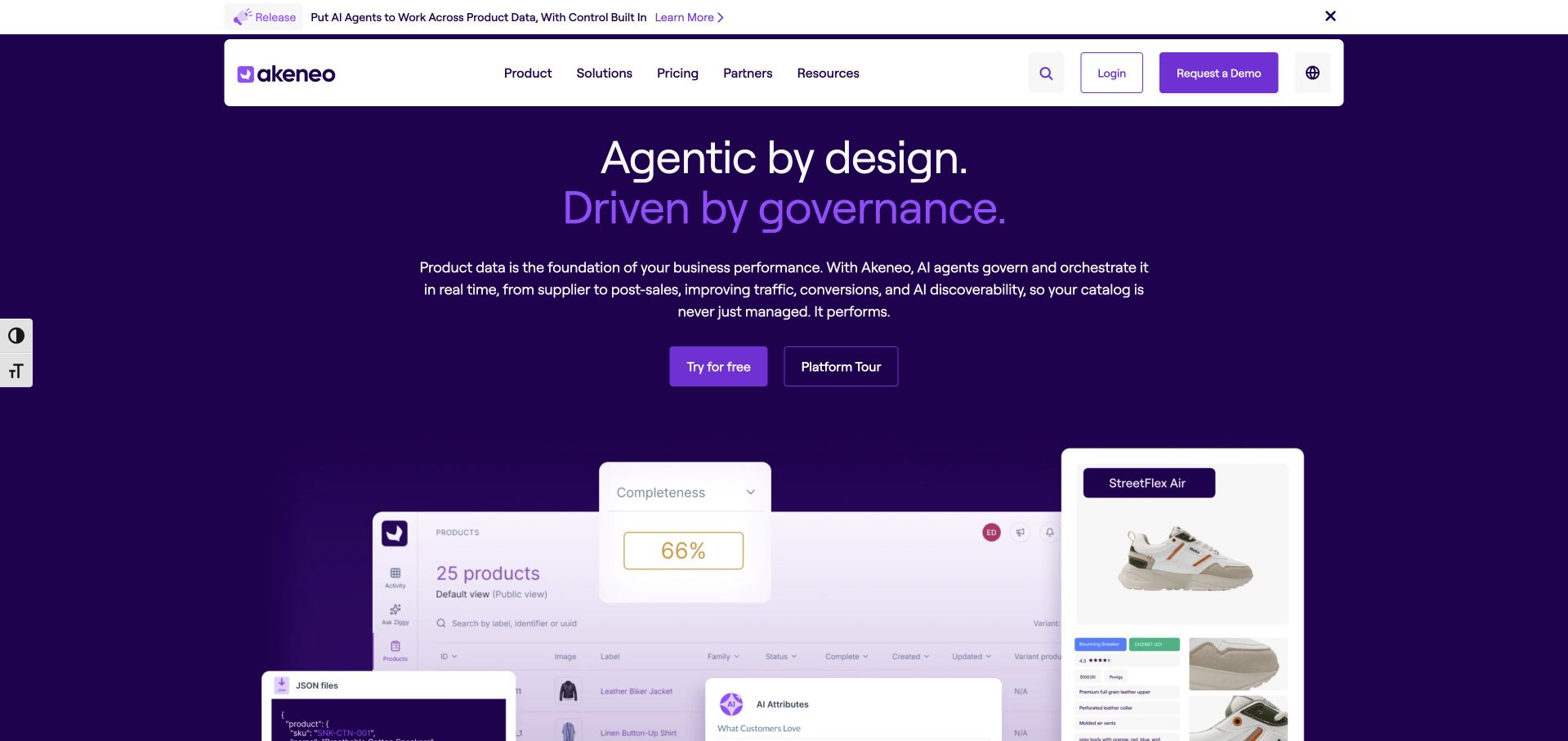
Akeneo uses a dark purple field and a short two-line headline to introduce its product-data proposition. The supporting paragraph explains the category, while trial and platform-tour actions provide different levels of commitment. Below, a layered product interface includes a completeness indicator and product cards, translating the abstract message into recognizable work. The white navigation panel creates a strong boundary between site structure and the campaign. There is substantial terminology to absorb before the first action, and the overlapping interface fragments show only part of the workflow. The retained htmx reference belongs to this marketing page; it does not establish the implementation of Akeneo's private product application.
What you can learn
Use a small, meaningful product example to support a broad software claim. Keep demonstration and purchase paths distinct, and make any progressively loaded interface illustration understandable without implying it is a fully interactive or independently tested product.
Pros
The trial and tour routes serve different levels of readiness.
Visible product-data fragments give the proposition concrete context.
Cons & considerations
Dense terminology raises the effort needed to understand the opening.
Decorative interface layers provide only a partial view of actual work.
Platform source: Scoped htmx evidence for this public website. The retained public source audit dated 2026-11-09 observed Linked script matches HTMX. This is a bounded page/library reference, not a complete application architecture or current performance assessment. Platform evidence is separate from the direct website screenshot and is not a complete current infrastructure audit.
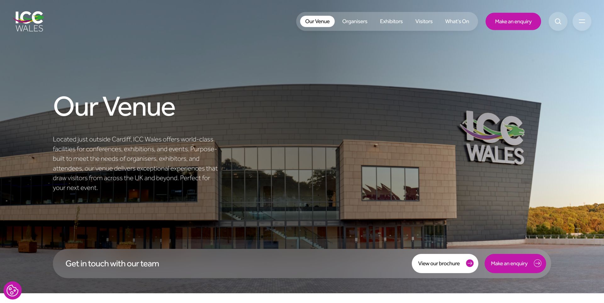
ICC Wales uses a large exterior photograph to establish the scale and setting of its venue. A translucent navigation capsule separates organizers, exhibitors and visitors, while the active venue label makes the current section clear. The introductory copy stays on the left, and a broad lower action strip offers a brochure and an enquiry route. This keeps orientation and next steps within the same view. The image remains visually dominant, however, and the opening does not yet provide the capacities or room details an organizer needs. An earlier exact-page source audit observed htmx; it does not verify the venue's private event-management or enquiry systems.
What you can learn
Separate audience needs before introducing detailed venue content. If room specifications or brochure panels load incrementally, keep headings, download destinations and the selected space clear, and ensure essential facts remain reachable through ordinary links.
Pros
Audience labels make the navigation more useful than a generic services menu.
Brochure and enquiry actions remain close to the venue introduction.
Cons & considerations
The large image delays specific capacity and layout information.
Text over photography requires care as the image crop changes.
Platform source: Scoped htmx evidence for this public website. The retained public source audit dated 2026-11-06 observed Linked script matches HTMX. This is a bounded page/library reference, not a complete application architecture or current performance assessment. Platform evidence is separate from the direct website screenshot and is not a complete current infrastructure audit.
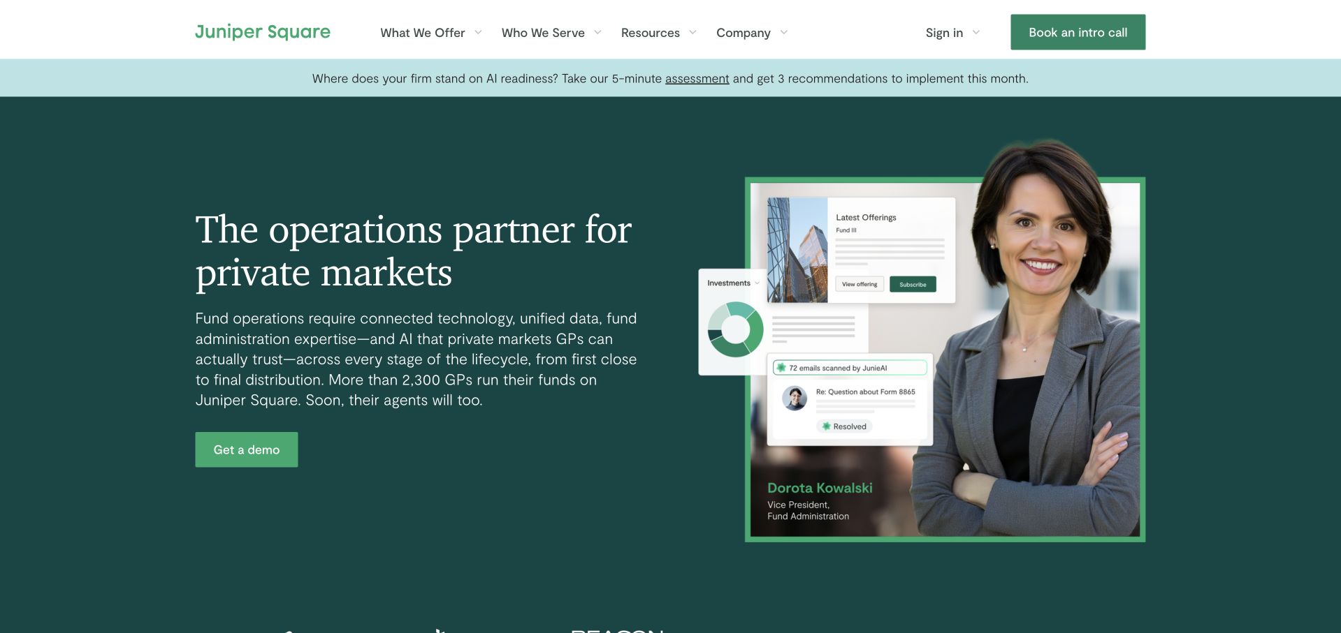
Juniper Square pairs a clearly stated private-markets proposition with a named team member and small interface examples. The dark green field, restrained typography and simple demonstration button establish a calm hierarchy, while the header separates what the company offers from the audiences it serves. The image suggests both operational expertise and software, rather than showing an anonymous dashboard alone. A separate assessment strip competes with the main demonstration route, and the long introductory paragraph asks for substantial reading. Public htmx evidence is scoped to the captured marketing homepage; it does not verify fund administration, investor accounts or any private financial workflow.
What you can learn
Make the relationship between people, service and software explicit. Where assessment or demonstration content is progressively revealed, maintain clear expectations about what is public, what requires contact and what information a visitor is being asked to provide.
Pros
The named-person image gives the service proposition a human reference.
Offer and audience navigation support different routes into the same business.
Cons & considerations
The assessment banner introduces a competing opening action.
A long paragraph slows understanding before the demonstration link.
Platform source: Scoped htmx evidence for this public website. The retained public source audit dated 2026-11-09 observed Linked script matches HTMX. This is a bounded page/library reference, not a complete application architecture or current performance assessment. Platform evidence is separate from the direct website screenshot and is not a complete current infrastructure audit.
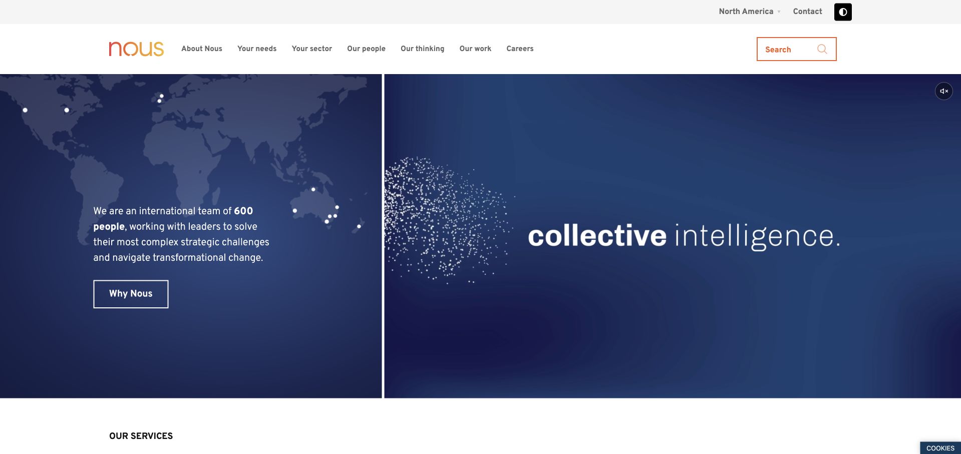
Nous uses a split introduction: a world map and short organizational description on the left, with a large statement on a deep blue moving field to the right. The white navigation above provides direct routes to needs, sectors, people, thinking and work. A regional selector remains separate from those content choices, helping explain the version of the site being viewed. The design gives the consultancy both a geographic frame and a recognizable visual idea. Its large panels nevertheless postpone concrete project examples, and the introductory statement is broader than a specific client problem. Retained htmx evidence identifies a reference on this public page only.
What you can learn
Separate organizational context from the visitor's practical route. When a region or sector changes displayed content, make that state visible and retain a stable URL so readers can share the exact version rather than an ambiguous default homepage.
Pros
Needs, sectors and work provide useful alternatives to company-centric navigation.
The regional indicator makes the site's geographic context explicit.
Cons & considerations
The opening requires scrolling before detailed project evidence appears.
The broad visual statement needs more specific supporting content below.
Platform source: Scoped htmx evidence for this public website. The retained public source audit dated 2026-11-09 observed Linked script matches HTMX. This is a bounded page/library reference, not a complete application architecture or current performance assessment. Platform evidence is separate from the direct website screenshot and is not a complete current infrastructure audit.
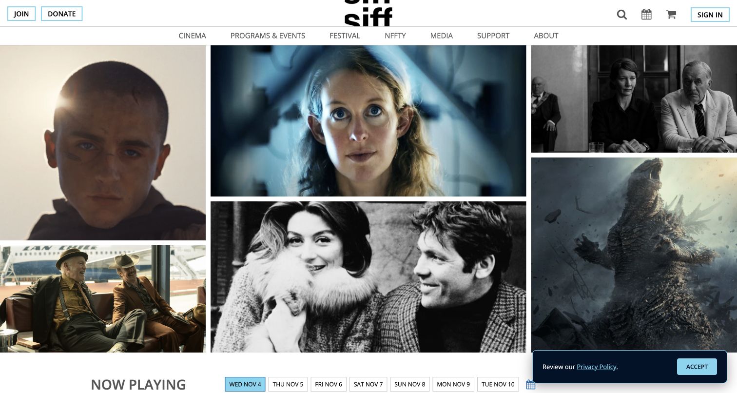
SIFF opens with a varied grid of film stills rather than one dominant campaign image. The compact navigation separates cinema, programmes, festival and support, while membership and donation actions stay at the edges of the header. At the bottom of the captured view, a now-playing heading and dated tabs begin the practical schedule. This connects the breadth of the film programme to a specific next decision: when to attend. The visual grid provides little textual context on its own, and a privacy notice overlaps part of the schedule area. A retained audit observed an htmx reference on this public property without establishing the ticketing system behind it.
What you can learn
Connect rich cultural imagery to a clear, maintained schedule. If date tabs refresh listings, preserve the selected date in navigation, announce changed results accessibly and keep film titles and performance details available through direct links.
Pros
Distinct film images convey variety without relying on a long introduction.
The date row provides a concrete route into current programming.
Platform source: Scoped htmx evidence for this public website. The retained public source audit dated 2026-11-04 observed Linked script matches HTMX. This is a bounded page/library reference, not a complete application architecture or current performance assessment. Platform evidence is separate from the direct website screenshot and is not a complete current infrastructure audit.
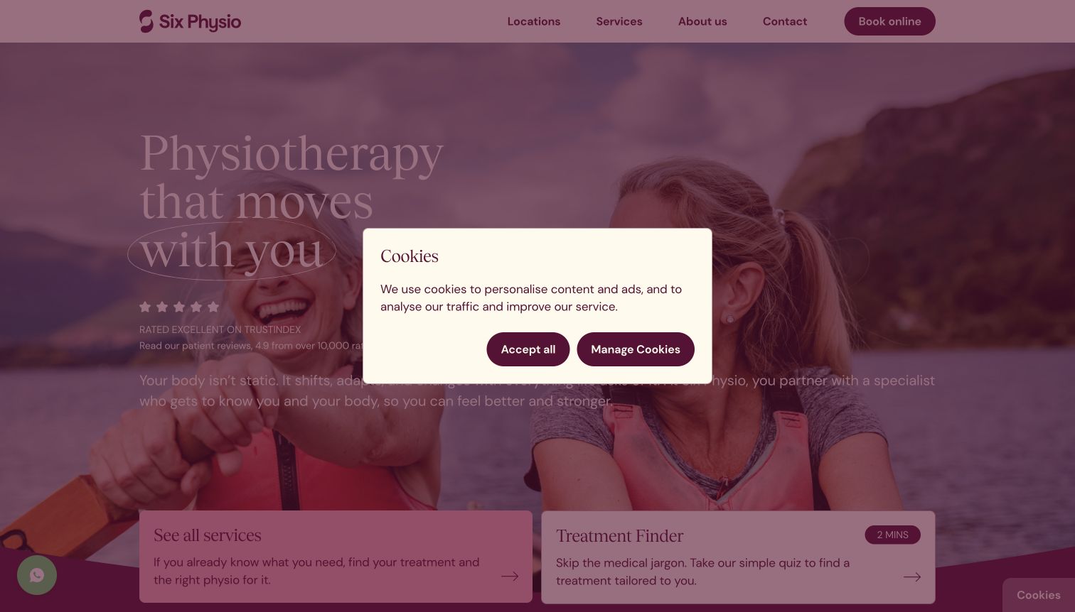
Six Physio uses a warm photographic introduction and a restrained burgundy palette, with locations, services and online booking visible in the top navigation. Two lower panels distinguish visitors who already know the service they want from those who need a treatment finder. That is a useful information-design distinction, independent of whether someone ultimately books. The retained capture also records a central cookie dialog that interrupts the introductory copy; the visible controls offer acceptance or further management. This review concerns the site's presentation, not medical suitability or treatment outcomes. The htmx evidence is a dated reference from the public page, not verification of clinical or booking systems.
What you can learn
Offer plain-language orientation without making a guided questionnaire the only route to service information. Any progressively updated finder should explain its limits, preserve a direct service index and avoid collecting unnecessary sensitive information before the visitor understands the process.
Pros
Known-service and exploratory visitors receive different entry points.
Location and booking routes remain clearly named in the header.
Cons & considerations
The captured consent dialog obscures much of the first impression.
A treatment finder needs clear limits alongside its inviting presentation.
Platform source: Scoped htmx evidence for this public website. The retained public source audit dated 2026-11-06 observed Linked script matches HTMX. This is a bounded page/library reference, not a complete application architecture or current performance assessment. Platform evidence is separate from the direct website screenshot and is not a complete current infrastructure audit.
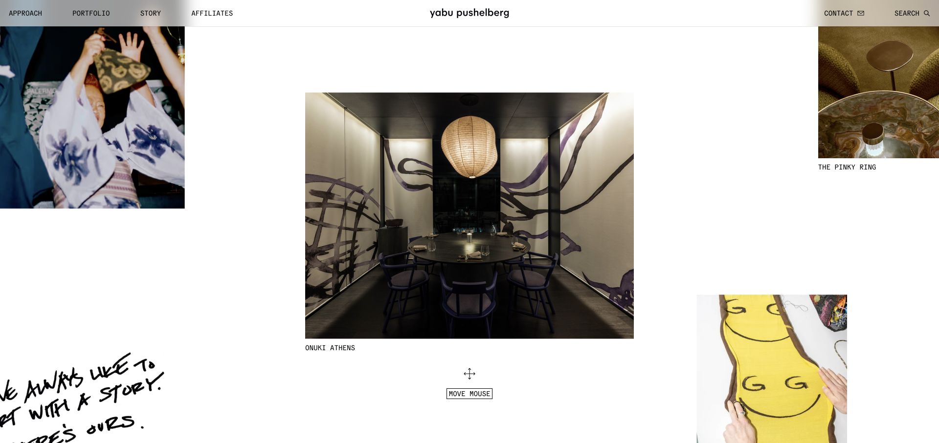
Yabu Pushelberg arranges project images across a large white canvas, with one interior photograph centered and other work partly visible at the edges. Small project labels and a move-mouse prompt invite exploration rather than a conventional vertical card list. The thin header provides stable approach, portfolio, story, contact and search routes, preserving a recognizable structure around the experimental presentation. The ample white space gives each image room, but the cropped peripheral content and interaction prompt may make orientation less immediate for some visitors. Retained source evidence identifies htmx on the public page; it does not attribute this canvas interaction to htmx.
What you can learn
Keep an experimental visual experience connected to an ordinary, accessible project index. If project details load into a partial view, give each one a direct URL and preserve keyboard navigation, focus context and a predictable way back to the collection.
Pros
Generous space makes the central project image feel deliberate.
A conventional top navigation provides a fallback to exploratory browsing.
Cons & considerations
Partly cropped projects make the collection boundaries unclear.
A mouse-oriented prompt needs equivalent non-pointer interaction routes.
Platform source: Scoped htmx evidence for this public website. The retained public source audit dated 2026-11-03 observed Linked script matches HTMX. This is a bounded page/library reference, not a complete application architecture or current performance assessment. Platform evidence is separate from the direct website screenshot and is not a complete current infrastructure audit.
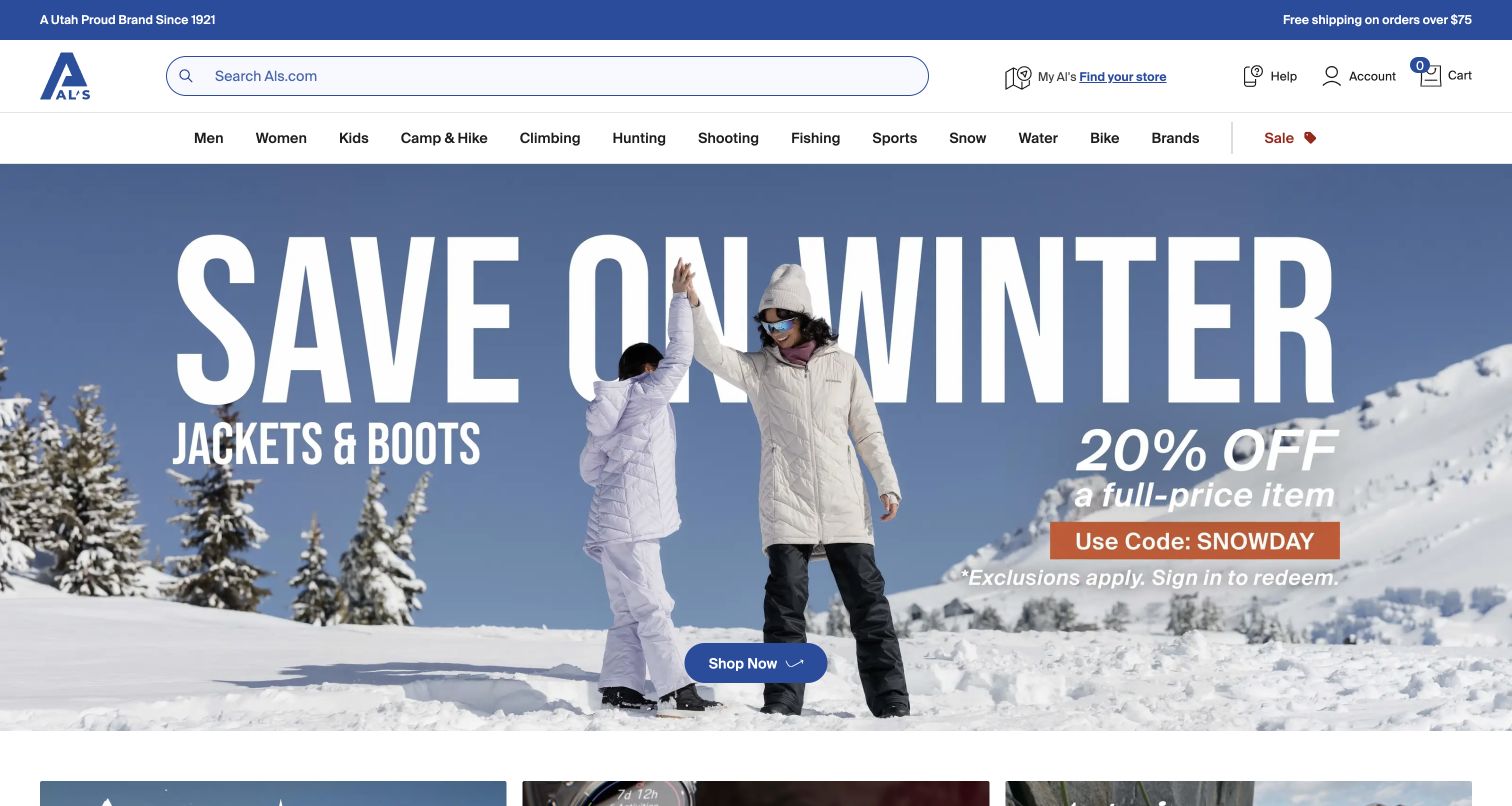
Al's places a large winter campaign beneath a substantial search field and a full department row. Store discovery, help, account and cart controls remain distinct from categories such as camping, climbing and snow. The campaign includes a clear shopping action and visible qualification that sign-in is required for the pictured offer. This structure gives shoppers several ways to proceed without making the promotion the sole entrance. The number of departments creates a dense header, while the large campaign delays individual product comparison. The retained exact-page htmx reference is supporting-library evidence and does not establish that the whole storefront or checkout is built around it.
What you can learn
Preserve search and category access across changing promotions. If product lists refresh after a filter choice, retain the selected options and result context, and make account requirements explicit before a shopper invests effort in a promotional journey.
Pros
Search and store discovery are prominent alongside the campaign.
The offer qualification appears within the promotional artwork.
Cons & considerations
The long department row demands careful scanning.
A large seasonal image pushes product-level information below the opening view.
Platform source: Scoped htmx evidence for this public website. The retained public source audit dated 2026-11-10 observed Linked script matches HTMX. This is a bounded page/library reference, not a complete application architecture or current performance assessment. Platform evidence is separate from the direct website screenshot and is not a complete current infrastructure audit.
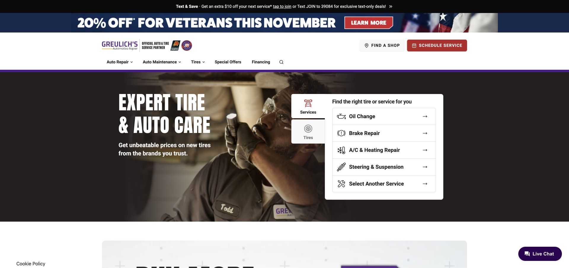
Greulich's combines workshop photography with a white service chooser, allowing visitors to identify common tasks without first opening the main navigation. Oil changes, brake repair and heating or cooling service appear as named rows, while tires occupy a separate tab. Shop discovery and scheduling are prominent in the header. The purple brand accent distinguishes the otherwise familiar automotive layout. Several promotional bands above it consume vertical space, and the opening claim remains broader than the practical choices alongside it. A retained exact-page audit recorded htmx, but this observation does not verify scheduling behavior, appointment availability or any private workshop system.
What you can learn
Bring common tasks into the introduction using clear, specific labels. When tabs or service lists update in place, preserve the selected category, keep each destination accessible as a link and distinguish browsing a service from actually booking an appointment.
Pros
Common maintenance needs are visible without opening a menu.
Shop location and scheduling are separated from informational navigation.
Cons & considerations
Multiple promotional strips make the header unusually tall.
The general hero promise offers less detail than the task panel beside it.
Platform source: Scoped htmx evidence for this public website. The retained public source audit dated 2026-11-03 observed Linked script matches HTMX. This is a bounded page/library reference, not a complete application architecture or current performance assessment. Platform evidence is separate from the direct website screenshot and is not a complete current infrastructure audit.
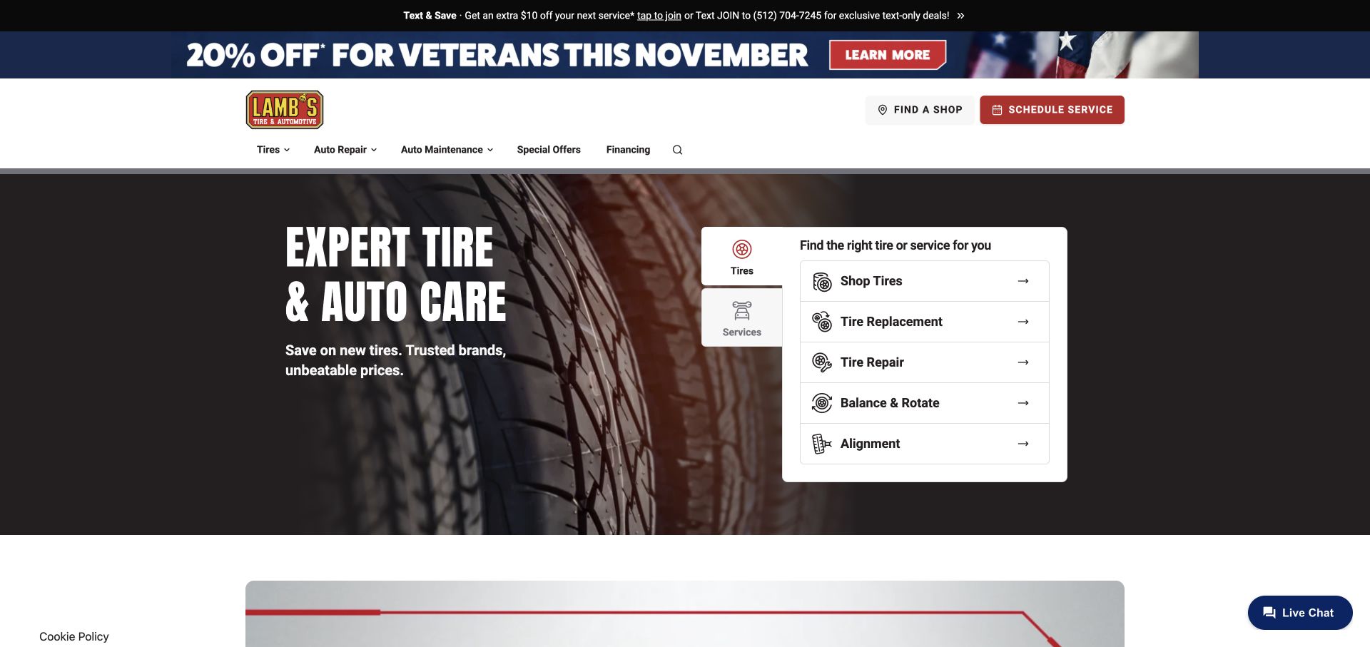
Lamb's places tire shopping, replacement, repair, balancing and alignment together in a white panel over a close-up tire image. A vertical tab distinguishes those tasks from broader services. The main navigation follows the same emphasis by leading with tires, while shop discovery and scheduling remain persistent actions. This repetition makes the site's primary purpose easy to understand. The page also demonstrates the cost of repeated promotion: a text-offer strip and a large veterans campaign precede the useful navigation and task panel. Existing public evidence records an htmx script on this exact page, without proving which selector or scheduling component depends on it.
What you can learn
Let the main navigation and the introductory task panel reinforce the same priorities. If a tire selector progressively requests vehicle details, keep the steps understandable, preserve previous choices and provide a clear recovery path when a result cannot be loaded.
Pros
Tire-related tasks are grouped using ordinary service names.
Persistent location and appointment actions support a practical next step.
Cons & considerations
Stacked promotions reduce the space available for the main task.
Several adjacent tire choices need clear destination copy to avoid overlap.
Platform source: Scoped htmx evidence for this public website. The retained public source audit dated 2026-11-03 observed Linked script matches HTMX. This is a bounded page/library reference, not a complete application architecture or current performance assessment. Platform evidence is separate from the direct website screenshot and is not a complete current infrastructure audit.
Sun Auto uses a workshop scene and a large full-service statement, then narrows that broad proposition with a visible list of maintenance actions. The white panel separates services from tires and names familiar needs such as oil changes and brake repair. A red accent connects the scheduling button, hero boundary and chat control. This gives the page a consistent identity while retaining a task-oriented structure. The promotional strips above the header compete for space, and the service list does not itself explain local availability or appointment conditions. The retained htmx evidence applies to the public page rather than a complete operational or booking stack.
What you can learn
Use broad positioning to establish scope, then immediately offer specific tasks. In a partially updated service journey, keep the chosen location attached to subsequent results and explain when the visitor is only viewing information versus requesting a real appointment.
Pros
Named maintenance tasks make the broad offer actionable.
A consistent accent color identifies prominent navigation and contact controls.
Cons & considerations
Promotional content delays the primary navigation and service choices.
Local availability remains a separate question beyond the opening panel.
Platform source: Scoped htmx evidence for this public website. The retained public source audit dated 2026-11-03 observed Linked script matches HTMX. This is a bounded page/library reference, not a complete application architecture or current performance assessment. Platform evidence is separate from the direct website screenshot and is not a complete current infrastructure audit.
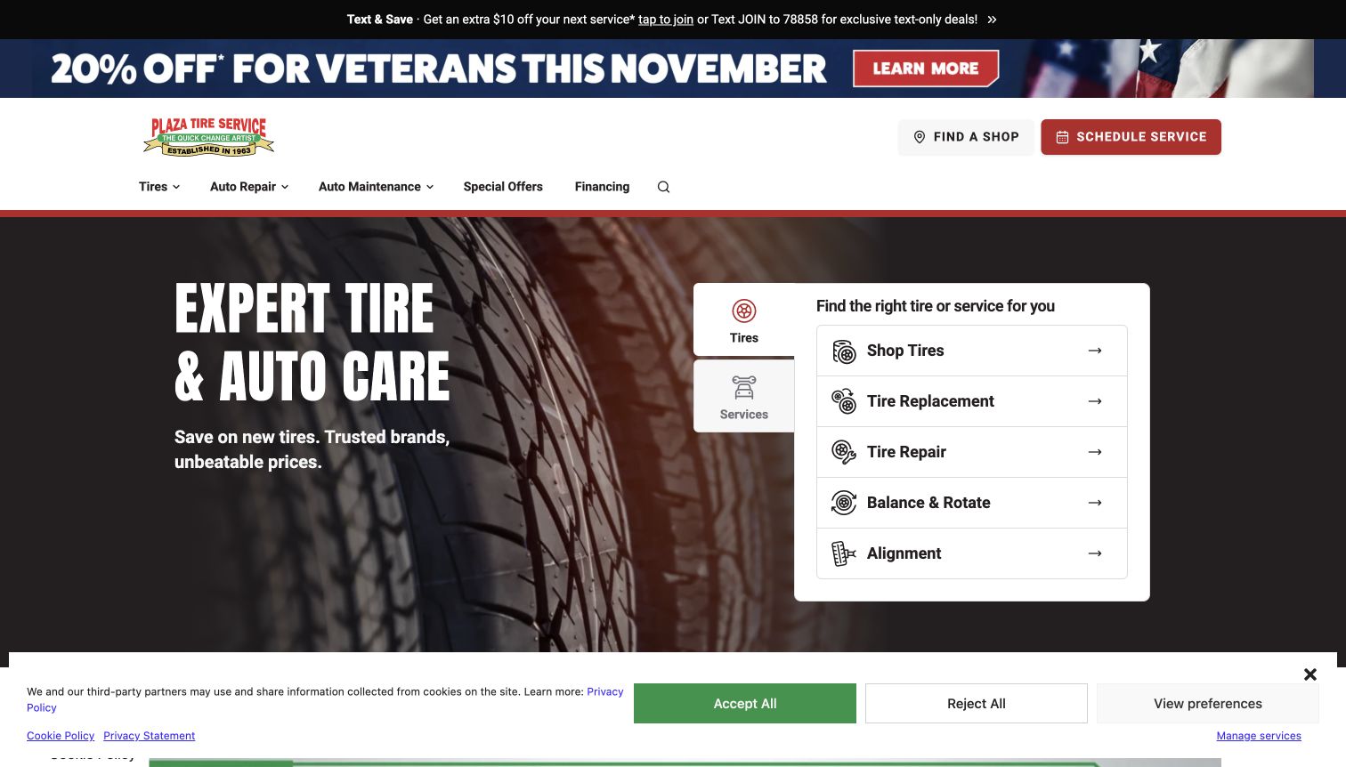
Plaza Tire Service presents a tire-focused hero with a white chooser for shopping, replacement, repair, balancing and alignment. Its compact logo and red accents distinguish the brand within a familiar automotive structure. Find-a-shop and scheduling buttons remain above the hero, so visitors can move from a general service need toward a local destination. The retained capture also includes a broad cookie notice with acceptance, rejection and preference controls; it is explicit but covers the lower portion of the page. The dated htmx reference is scoped to this public source, not evidence of appointment completion, inventory accuracy or the private systems behind the service.
What you can learn
Keep service discovery and location selection connected while preserving clear privacy choices. If a panel changes in response to a selected task, retain meaningful headings and links so visitors can understand the result without depending solely on a visual transition.
Pros
The task panel uses recognizable tire-service terminology.
The privacy notice presents an immediately visible rejection choice.
Cons & considerations
The consent panel reduces the usable opening content area.
Stacked promotional messages compete with the more useful service hierarchy.
Platform source: Scoped htmx evidence for this public website. The retained public source audit dated 2026-11-10 observed Linked script matches HTMX. This is a bounded page/library reference, not a complete application architecture or current performance assessment. Platform evidence is separate from the direct website screenshot and is not a complete current infrastructure audit.
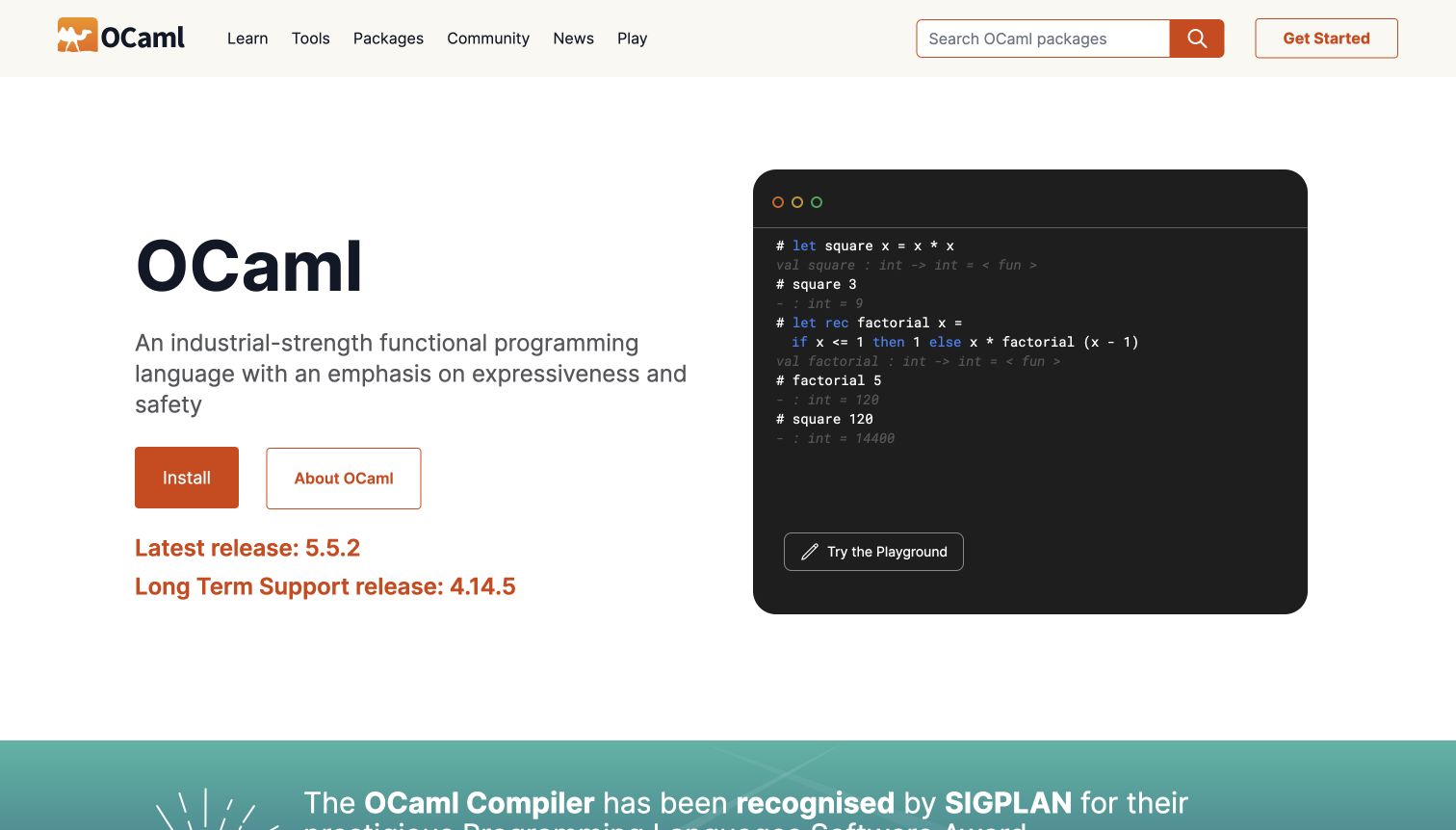
OCaml's public site combines an orange-accented introduction with a readable code example, giving visitors both a plain-language proposition and a concrete taste of the language. Installation and explanatory routes sit near the opening, while the navigation separates learning, documentation, packages and community material. Release information and package discovery add practical value for people who already know the project. The density of possible routes can still demand orientation from a newcomer. Both the official htmx webring and the reviewed source support an htmx association for this site; that evidence does not establish the implementation of every example or search control.
What you can learn
Give first-time visitors a short path from explanation to a working starting point, while keeping reference material directly accessible. When documentation search or package results update within the page, preserve useful URLs, keyboard access and an understandable no-results state.
Pros
A visible code example makes the language introduction concrete.
Learning and reference destinations serve different levels of experience.
Cons & considerations
Several parallel resource paths can overwhelm a first-time reader.
Release and package information require ongoing maintenance to remain useful.
Platform source: Scoped htmx evidence for this public website. The official htmx webring lists this exact public website as created with htmx. This is a documented website association, not proof that every current control uses the library. Platform evidence is separate from the direct website screenshot and is not a complete current infrastructure audit.
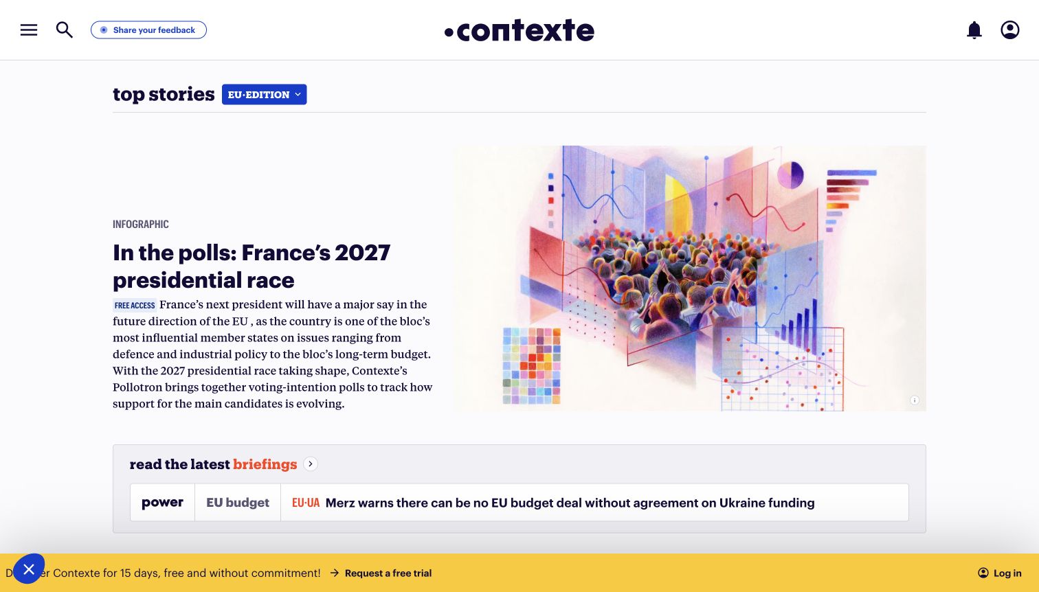
Contexte's public European edition gives its leading story a strong headline and illustration, then separates shorter recurring briefings into a more compact strip. The restrained editorial styling keeps the story structure prominent, while a floating trial invitation makes the commercial route visible. The reviewed page was the public edition reached from the site's root, without opening subscriber material or signing in. This makes it useful for studying the boundary between a readable public front page and a subscription proposition. The official htmx webring documents the site association; the bounded scan did not independently identify htmx on this edition, so the evidence remains documentary.
What you can learn
Keep the public editorial hierarchy useful before introducing a subscription decision. If briefings or sections refresh incrementally, retain stable article destinations and clear access labels, and avoid replacing a reader's current position with an unexpected promotional panel.
Pros
Different story scales distinguish the lead from recurring coverage.
The public front page communicates the publication's specialist focus.
Cons & considerations
A floating trial invitation competes with the reading space.
Documented site technology does not prove every edition uses the same current implementation.
Platform source: Scoped htmx evidence for this public website. The official htmx webring lists Contexte’s root website. The reviewed root navigation led to this public European edition. This is a documented site association; the bounded edition audit did not independently identify htmx or establish every current page implementation. Platform evidence is separate from the direct website screenshot and is not a complete current infrastructure audit.
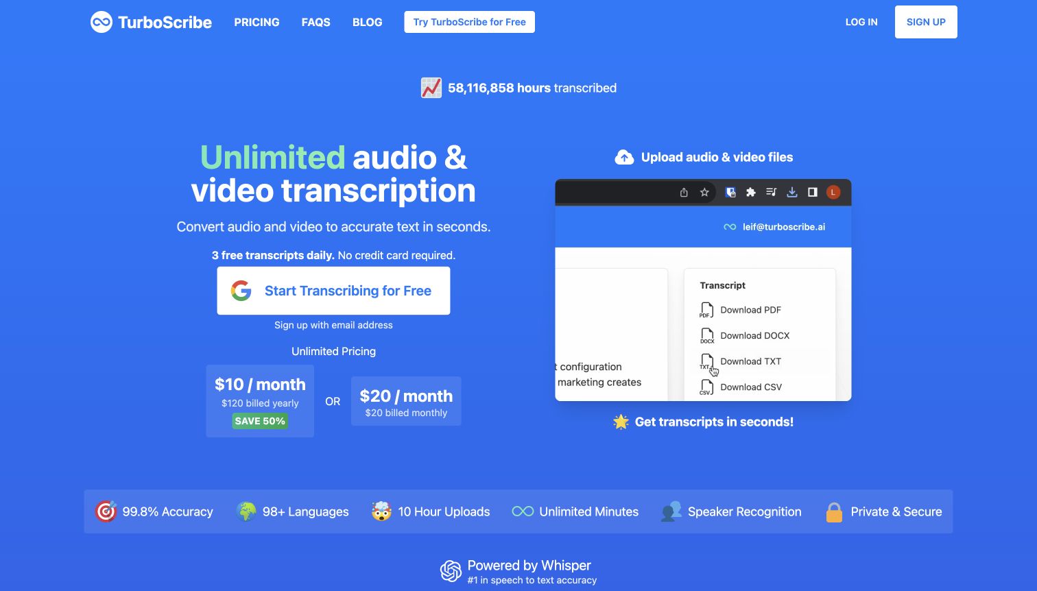
TurboScribe explains its audio-and-video transcription purpose immediately, using a blue introduction, clear account-entry routes and a public product demonstration. Pricing cards and frequently asked questions appear farther down, giving visitors ways to evaluate the proposition before uploading anything. The page makes the service category easier to understand than a screen of unexplained application controls would. Its prominent sign-in options still place an account decision early in the journey. The official htmx webring documents this exact public website; the bounded source audit returned an access refusal, which remains recorded rather than replaced with a guessed current stack.
What you can learn
Explain the task and its limits before asking for an account or a file. For a progressively updated upload interface, communicate progress, supported inputs and recoverable errors clearly, while keeping sensitive content out of unnecessary public or diagnostic displays.
Pros
The introduction states the product's purpose in ordinary language.
Public pricing and demonstration material support evaluation before an upload.
Cons & considerations
Account entry remains prominent before a visitor has tried the main workflow.
A public demonstration cannot establish real transcription quality or private processing behavior.
Visible tech stack
Earlier / documented evidence
htmx
Platform source: Scoped htmx evidence for this public website. The official htmx webring lists this exact public website as created with htmx. This is a documented website association, not proof that every current control uses the library. The new bounded source audit returned HTTP 403; no current runtime was inferred from that unavailable response. Platform evidence is separate from the direct website screenshot and is not a complete current infrastructure audit.
Kegan has 15+ years of experience working with small businesses, Fortune 500 companies, and everything in between. No development job is too big or too small: he brings the same hands-on attention to a focused improvement, a complete website, or a custom application.
For htmx projects, he can help with responsive interfaces, reusable components, custom functionality, API connections, and performance-minded implementation. He works directly with clients on scope, design, implementation, testing, and handover, with an emphasis on clear communication and a system that remains practical to maintain after launch.
Show 3 other htmx developersHide other htmx developers
A product list or article collection can benefit from a small, well-defined update. Keep the search phrase, filters, result count and empty state together. Explain when an option changes availability rather than merely changing presentation. A direct result URL and a useful ordinary page remain valuable even when incremental updates are fast.
Guided service choices
A visitor choosing a location, programme or service may need one decision at a time. Show why a question matters and preserve the answer when moving forward or backward. Avoid making a request for information look like a confirmed booking. Keep local conditions, eligibility and the eventual commitment clear throughout the journey.
Documentation and editorial navigation
For reference material, the reader's position and a reliable link to the exact content matter more than a decorative transition. Maintain headings, article titles and document context as sections change. Make it easy to reach a full page, copy a useful URL and return to a previous section without losing orientation.
From references to requirements
Plan the states before the transitions
Describe the information contract
For each interaction, identify its inputs, the content it changes and the information that must remain in place. Include unexpected values and empty results. A booking date, selected branch or product variation should not disappear because another section refreshed. Record which details are authoritative and how the interface presents stale or unavailable information.
Review ordinary and interrupted journeys
Check direct links, keyboard use, a slow response and an interrupted request as deliberate scenarios. Consider a visitor opening a result in a new tab or returning through browser history. Keep recovery specific: explain what did not finish and what the person can safely do next without silently repeating a consequential action.
Separate presentation from claims
A polished demo is evidence of presentation, not proof of speed, conversion or accessibility. Measure the behavior that matters in your own application. Keep implementation notes precise enough that a future maintainer can distinguish a library dependency, a particular interactive component and a separate transactional service.
Assign ongoing content ownership
Interactive filters and selectors rely on maintained content. Give someone responsibility for categories, prices, schedules, error wording and retired destinations. Use representative long labels and realistic empty states during implementation. A small interaction can become confusing when the content it depends on drifts from the original assumptions.
A useful handover demonstration
Ask the actual team to carry out its routine job: publish a realistic update, correct a mistake, preview a narrow screen, and identify who owns an integration failure. For a library or frontend framework, also ask who maintains the content source and deployment. A polished screenshot does not answer those operational questions.
Beyond the screenshot
A practical htmx website brief
Name the visitor's task and the exact region that changes.
Keep essential information available before interaction.
Define loading, empty, failure and success states.
Retain selected filters, dates or locations when related content updates.
Give meaningful result states useful direct URLs.
Check reload, browser history and direct entry.
Make changed content understandable to keyboard and assistive-technology users.
Distinguish an information request from a real booking or submission.
Validate permissions and state-changing requests on the server.
Keep untrusted content and sensitive information out of inappropriate responses.
Plan safe recovery from interrupted or repeated requests.
Document the library's actual scope rather than assuming the whole site depends on it.
Test with real content, a keyboard, a small screen, slow or failed requests, and the people who will maintain the system. These are planning checks, not an accessibility, security, performance, or search-ranking certification.
Sources & editorial method
How this htmx collection was reviewed
The collection combines four public pages directly captured on November 11, 2026 with sixteen previously verified original captures, whose actual dates remain unchanged. We reviewed all twenty images for this collection's distinct design analysis. Earlier exact-page audits retain their original observation dates; new source pages received bounded broad audit attempts. The official htmx webring provides documentary associations for Nike Vision, OCaml, Contexte and TurboScribe, with direct script evidence additionally observed for Nike Vision and OCaml. Contexte shows the public European edition reached from its root. TurboScribe's source scan returned HTTP 403 and was not bypassed. A library reference or documentary association does not establish a complete current stack or attribute every pictured interaction to htmx. No account access, booking, purchase, form submission or file upload was used to evaluate the examples.
Every image is an unmodified capture from the actual website, with its source and capture date. Some captures are reused from our shared catalog; their dates remain the original capture dates. None comes from a vendor gallery or a generated reconstruction. Moving imagery and live content can change.
Technology attribution uses public page assets or metadata, official platform documentation, or a cited first-party project case study. Documentary and framework-relationship evidence is identified where used; it is not a complete current backend inventory. A CMS image CDN alone does not establish a full CMS deployment. A library’s presence does not prove which individual controls use it, and a platform label does not establish AI authorship.
The composition notes, lessons, pros and tradeoffs are original editorial observations. We have not measured conversion, traffic, security, performance or accessibility conformance. Website owners retain their brands and imagery; these examples are not our client portfolio. Written, Edited and Curated are independent records, not dates advanced by a build. See our editorial standards or suggest a correction.
Questions worth asking
htmx website development FAQs
Does every pictured feature use htmx?
No. A source reference establishes that the reviewed page included the library at the recorded observation time. It does not identify the implementation of every visible control. Documentary examples have an explicitly qualified site association rather than an independently confirmed current runtime.
What should I borrow from these examples?
Study a clear task, a useful information hierarchy or an understandable recovery path. Those choices are visible in the page design. Decide separately whether htmx suits the interaction and server architecture you actually need.
Why do some screenshots have earlier dates?
They are genuine earlier captures of the exact public properties, reused with new collection-specific analysis. Keeping the original dates preserves what the evidence actually records. A later guide publication does not make an older capture or audit newly observed.
Do a script reference and a webring entry mean the same thing?
No. A script reference is a dated observation on a particular public page. The official webring documents a site's association with htmx. Neither is a complete architecture audit, and documentary association alone does not verify every current page or component.
Can partial updates replace ordinary navigation planning?
No. Readers still need to understand where they are, what changed and how to return. Useful URLs, direct entry, clear headings and appropriate browser-history behavior should be part of the interaction design.
What happens when a public source check is blocked?
The limitation remains recorded. Existing documentary evidence may support a narrower association, but an inaccessible response is not replaced with guessed technology facts. Failed checks do not refresh the guide's successful validation date.
Borrow the clarity of a well-chosen task and a readable result. Use incremental updates where they help that task, and keep the underlying page, evidence and navigation understandable.