Best Medical Device Websites of 2026 (13 Real-World Examples)
Medical device website examples that connect people with the right information
A medical device website serves patients, clinicians, purchasing teams and existing customers at the same time. These twelve examples show how manufacturers separate those audiences while keeping products, education and support findable.
Start a medical device website with the questions people bring to it. A patient may want a plain-language explanation or a support contact. A clinician may need product documentation or training. A procurement team may compare a portfolio and service options. Those tasks overlap, but they do not belong in an undifferentiated menu. The strongest information architecture makes each route explicit without requiring the visitor to understand the manufacturer's internal divisions.
This collection reviews public corporate and regional pages from twelve distinct manufacturers. It compares visible navigation, search, product presentation and editorial structure. It does not evaluate devices, recommend treatment, verify clinical claims or certify a website's accessibility. Product availability and permitted information differ across regions, so the examples should inform interface decisions rather than substitute for a company's own review process.
Before the examples
What makes good medical device website design in 2026?
Separate audiences without isolating them
Give patients and caregivers, professionals and existing customers recognizable entrances. Provide contextual cross-links when a person needs to change route. Avoid forcing visitors to declare professional status merely to read general corporate information.
Make support a permanent route
Keep documentation, product support and relevant contacts available independently of homepage campaigns. Returning customers often know exactly what they need and should not have to browse a corporate story before finding it.
Keep geography and product scope explicit
Identify the selected region and preserve it through product navigation. Put relevant availability qualifications near the content they describe. A language choice and a market choice may serve different purposes and should not be silently conflated.
Connect products with education
A product card is only one step in a longer information journey. Link specifications, compatible accessories, training and support where appropriate, using terminology maintained by the responsible content teams.
The collection · 13 examples
13 medical device websites worth studying
The twelve examples below compare patient-led stories, product campaigns, editorial grids and search-led openings. Each review identifies a visible design pattern and the tradeoff a team should test before adopting it.
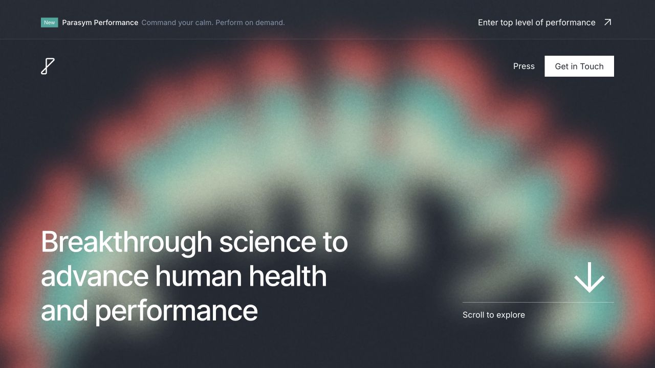
Parasym uses a dark, abstract visual opening, a concise statement of purpose and a limited navigation. Research and institutional context appear further into the page, creating a deliberately different presentation from a broad medical-device catalogue with many unrelated product divisions.
What you can learn
A focused scientific business can use restraint to establish a coherent identity. Abstract imagery must still lead to understandable product, evidence and regulatory information rather than standing in for it. A restrained medical-product layout is worth studying as information architecture, not as validation of the product; separate purchasing, evidence and support routes visibly.
Pros
A limited visual system creates a recognizable specialist identity.
The page gives scientific context a visible role beyond a product sales grid.
Cons & considerations
Abstract motion can make the actual product harder to understand.
Clinical, safety and regulatory claims require specialist verification; this is a design selection, not a medical endorsement.
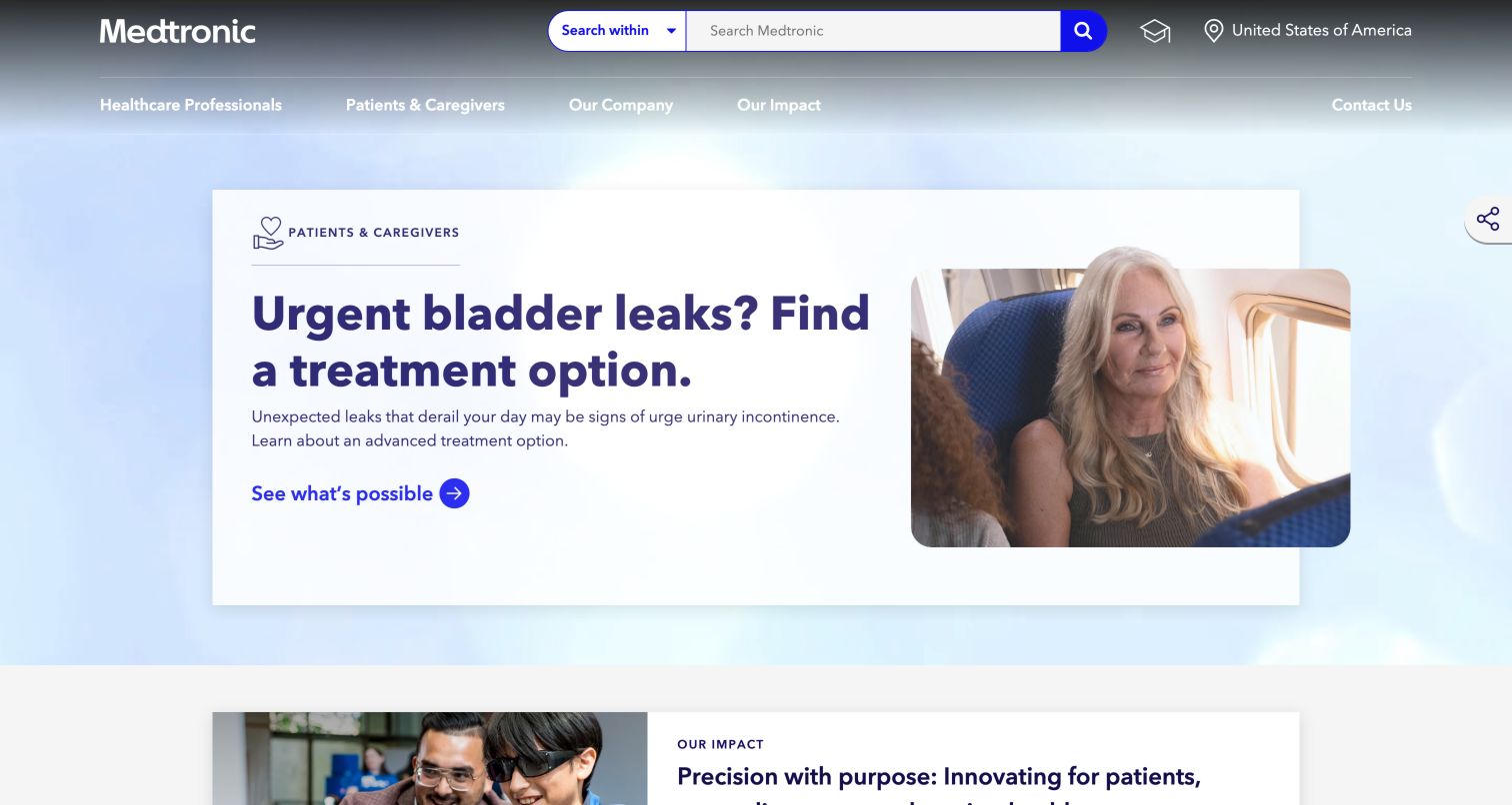
Medtronic places an audience selector directly beside its search field, so a visitor can frame a query before entering it. The main navigation separately names healthcare professionals and patients and caregivers. In the observed opening, a patient campaign uses an everyday travel photograph and a large white text panel instead of a technical product diagram. That makes the subject approachable while keeping the next action distinct. Further down, corporate impact, innovation news, careers and investor material receive their own sections. The result is a corporate gateway that acknowledges several audiences without requiring everyone to start with a product taxonomy.
What you can learn
Let visitors express who they are before asking them to navigate a complex device portfolio. Keep the selected audience visible in search results and provide an easy route back to general information.
Pros
Search offers an explicit audience scope.
Patient and professional routes use recognizable language.
Cons & considerations
Campaign content can push product support farther down the page.
White navigation over moving imagery needs contrast testing across every frame.
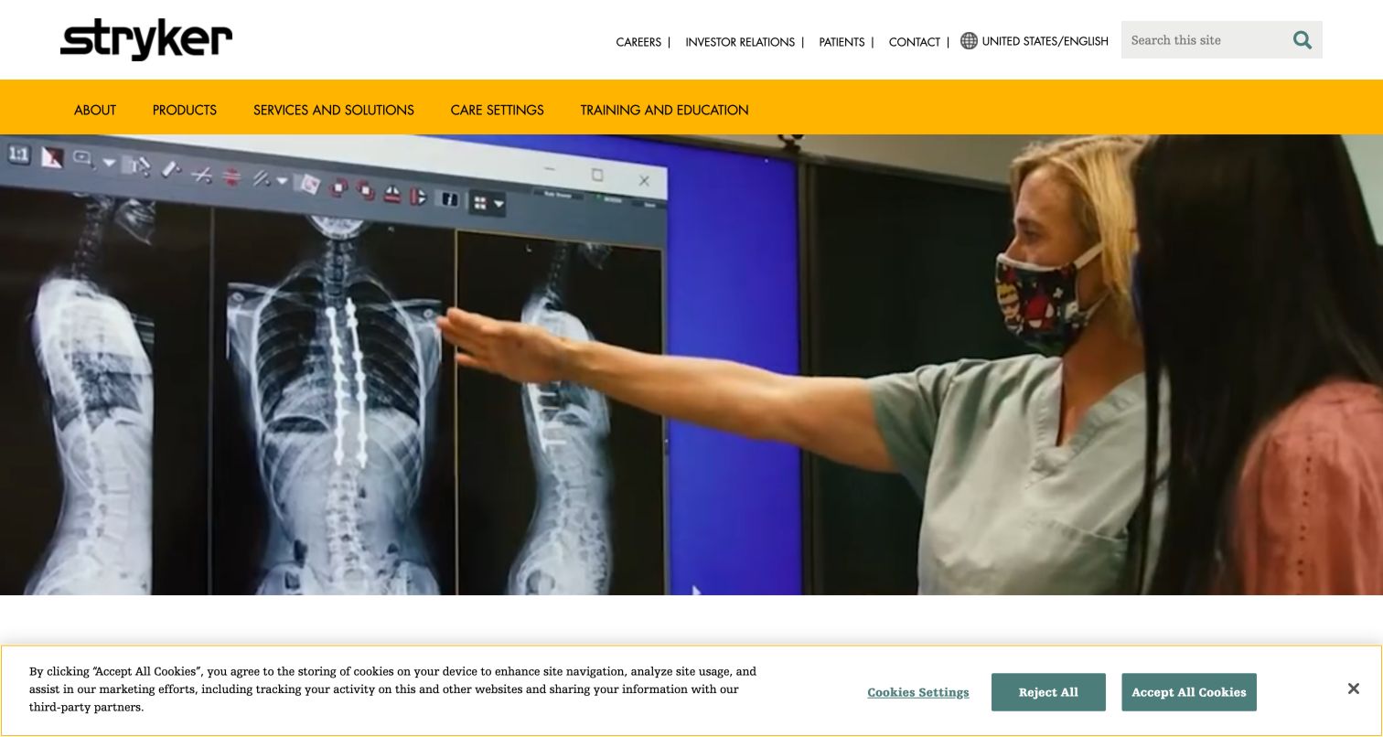
Stryker uses a vivid yellow navigation band to keep products, services, care settings and training distinct from the large clinical photograph below. Its utility links give patients, investors and job seekers separate entrances. The care-setting label is particularly useful because a buyer may know the environment they are outfitting before they know a product family. Below the opening, the page explains the company and organizes its focus into medical and surgical equipment, orthopaedics, neurotechnology and services. News remains a separate editorial layer. This structure offers several legitimate ways into the same portfolio instead of forcing every visitor through one organizational chart.
What you can learn
Offer a setting-based route alongside the product catalog when procurement begins with a clinical environment. Align the labels and cross-links so visitors can move between a setting, relevant equipment and ongoing support.
Pros
The yellow band makes the primary navigation easy to locate.
Training and care settings appear beside products rather than only in the footer.
Cons & considerations
A large visual opening offers little immediate product detail.
The extensive portfolio needs consistent terminology across several entry paths.
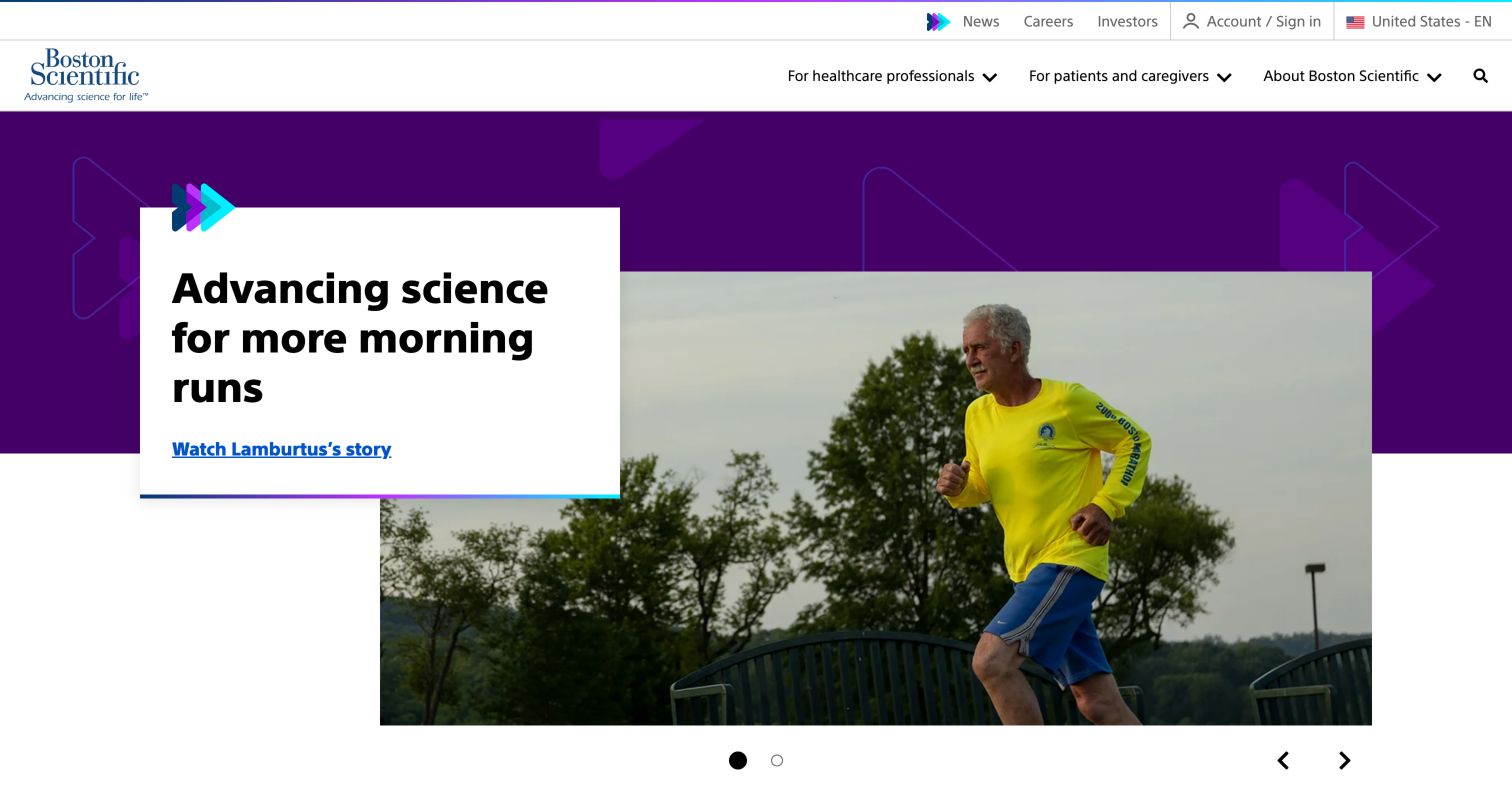
Boston Scientific opens with a patient story presented as an overlapping white card and large photograph on a purple field. The headline describes a return to an ordinary activity rather than leading with a device name. Above it, two clearly labeled menus distinguish healthcare professionals from patients and caregivers. Featured stories then separate company news, responsibility, culture and innovation through small category labels. Careers and investor information have their own later cards. The homepage therefore carries a human narrative while leaving the professional route available in the header. Its design lesson is the relationship between an approachable entry story and a more structured resource system.
What you can learn
Use personal stories to introduce the purpose of a device business, then keep audience routes visible around them. Make the destination of each story clear and distinguish individual experiences from general product information.
Pros
The overlapping card gives the headline a stable reading surface.
Audience menus are immediately visible above the story.
Cons & considerations
The carousel asks visitors to notice controls to see alternative content.
Story-led openings need nearby paths for urgent support or product searches.
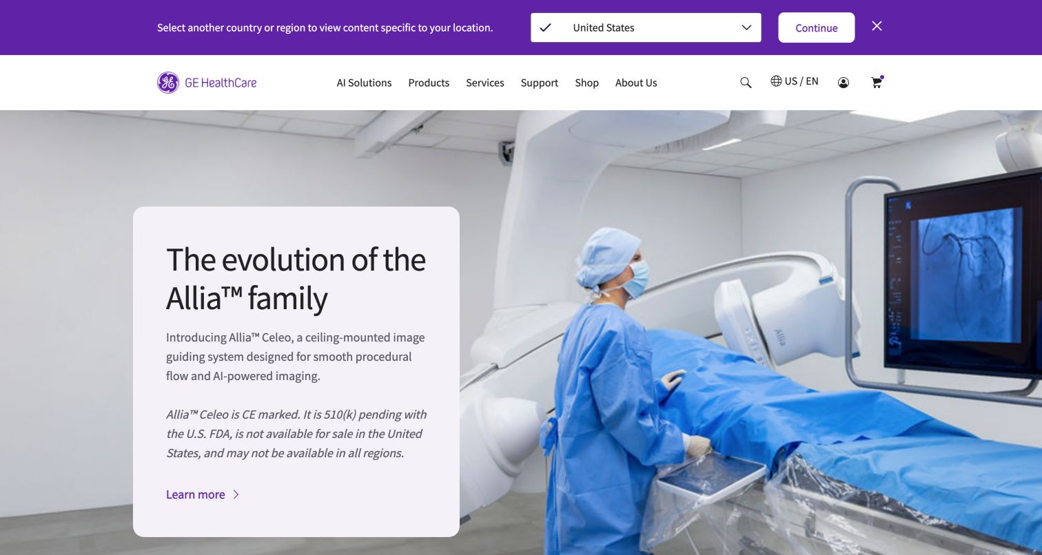
GE HealthCare combines a large image of equipment in use with a pale text card that names the featured system, explains its intended role and includes a visible regional availability qualification. The qualification sits in the same card as the promotional description, so it is part of the reading sequence rather than a distant footnote. A country prompt and US/EN marker reinforce the geographic context. Product categories below the hero include imaging, ultrasound, monitoring and clinical accessories. The top navigation also makes service and support distinct destinations. This is a useful example of keeping a launch visually prominent while acknowledging that the same equipment information may not apply everywhere.
What you can learn
Treat market availability and product scope as structured content near the announcement. Carry the chosen region into product details, support resources and contact routes, rather than relying on a global footer disclaimer alone.
Pros
Availability qualification is placed beside the featured product description.
Service and support have direct navigation labels.
Cons & considerations
A tall hero postpones access to the category overview.
Icon-only utility controls require accurate accessible names and predictable focus behavior.
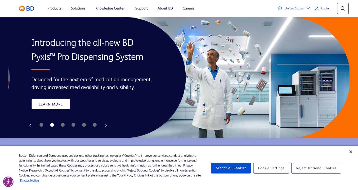
BD places a compact product, solutions, knowledge and support navigation above a broad promotional carousel. The captured slide pairs a dark blue text area with a product illustration and an orange accent, keeping the headline and action on a solid background. Visible dots and arrow controls identify the changing panel. The wider page rotates between product introductions, analytics, connected care and corporate reporting. This communicates breadth, but it also makes the first message dependent on which slide happens to be showing. The permanent navigation is consequently important: someone looking for documentation can choose Knowledge Center or Support without waiting for a matching campaign.
What you can learn
Use a campaign carousel only when essential tasks remain available outside it. Give product documentation and support permanent routes, and test pause, keyboard and reduced-motion behavior before adopting this visual pattern.
Pros
Solid color behind the headline protects its readability.
Knowledge Center and Support remain independent of the campaign slides.
Cons & considerations
Several slides compete for a visitor's limited attention.
Automatic changes can interrupt reading unless timing and pause behavior are carefully designed.
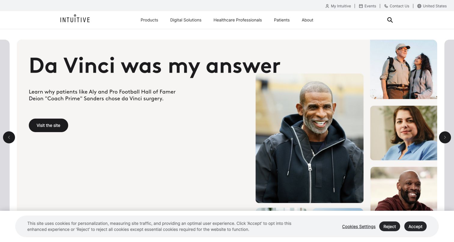
Intuitive places product, digital solution, healthcare professional and patient routes in a restrained header. The observed hero uses a large patient-story headline, a rounded black action and a collage of portraits. Other carousel panels introduce named robotic systems, while the next row links to an app, a simulation tool and instruments. This juxtaposition makes the website broader than a single equipment showcase: it presents the surrounding digital and educational ecosystem. News and explanatory articles continue below, with labels such as feature and problem solver. The interface is most useful as an example of connecting hardware, training and patient-oriented communication without giving every subject the same visual treatment.
What you can learn
Map the full ecosystem around a specialist device before designing the homepage. Separate patient explanations, professional tools and product specifications, then add deliberate links where those audiences legitimately need to cross over.
Pros
Product and audience navigation appear together in a short header.
The following cards make digital tools and instruments visible.
Cons & considerations
The large carousel requires visitors to discover content beyond its current panel.
Repeated generic actions such as Learn more need strong surrounding headings and accessible context.
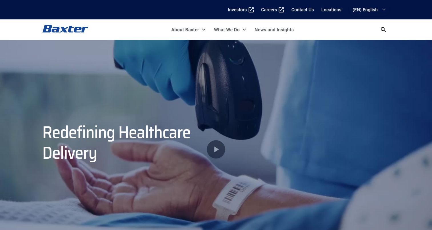
Baxter uses a restrained three-part primary navigation: About Baxter, What We Do, and News and Insights. Its large clinical video opening carries a short statement, while a separate utility bar handles investors, careers, contacts and locations. Below, the page explains the business before introducing connected-care reports and articles. A tabbed section then offers Products, Connected Care, Care Settings and Support as alternative ways into the portfolio. This sequence progressively increases detail instead of placing every product division in the first screen. It is a useful pattern when a company must describe a broad offering to unfamiliar visitors without hiding practical categories completely.
What you can learn
Keep the first navigation layer concise, but reveal concrete product and support routes soon afterward. Test whether returning customers can reach a known item directly rather than rereading the corporate introduction.
Pros
The short primary menu reduces initial scanning effort.
The portfolio section offers multiple meaningful browsing frames.
Cons & considerations
A video-led hero consumes substantial space before specific categories appear.
Broad labels such as What We Do need clear submenu and search support.
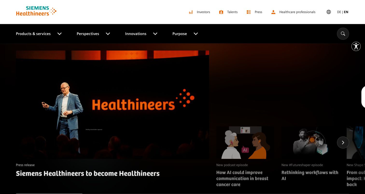
Siemens Healthineers presents its homepage as an editorial grid rather than a single product promotion. A large announcement image sits alongside smaller story cards, with category labels distinguishing a press release, podcast and other features. The dark canvas and orange brand accents tie these different formats together. Above, products and services remain accessible beside perspectives, innovations and purpose; utility links identify investors, talents, press and healthcare professionals. This makes the homepage useful for visitors following the company as well as those seeking equipment. Its main design tension is the balance between a lively publishing surface and the direct tasks that customers bring to a manufacturer website.
What you can learn
Use a story grid when the organization can sustain a clear publishing cadence. Keep product and professional-resource routes stable, and assign content labels that tell readers what format and destination they will encounter.
Pros
Different editorial formats receive visible category labels.
Product access remains in the permanent main navigation.
Cons & considerations
A dense story surface can compete with practical customer tasks.
Horizontal story layouts require discoverable controls and a readable small-screen sequence.
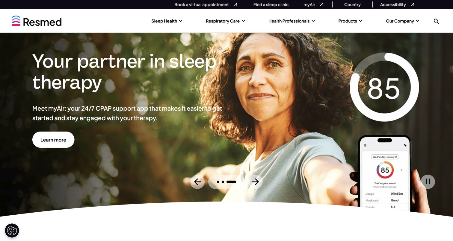
ResMed organizes the page around sleep health, respiratory care, professionals, products and the company. The captured hero promotes the myAir support app with a human photograph and a phone interface, connecting a device journey to continuing use. Other slides introduce a mask and a sleep assessment. Below, the page groups actions into understanding sleep health, exploring care options and learning about therapy. Utility links provide a clinic finder, virtual appointment route and myAir access. This is an example of treating the website as a continuing service relationship instead of ending the information architecture at a product purchase.
What you can learn
Plan the stages before and after someone begins using a home device. Separate educational tools, care-provider routes and existing-user support, and make any transition into an assessment or external service explicit.
Pros
The page provides both discovery and existing-user support entrances.
Journey cards translate broad information into recognizable visitor situations.
Cons & considerations
A rotating hero can change the apparent primary task.
Assessment and appointment actions need clear expectations before a visitor shares personal information.
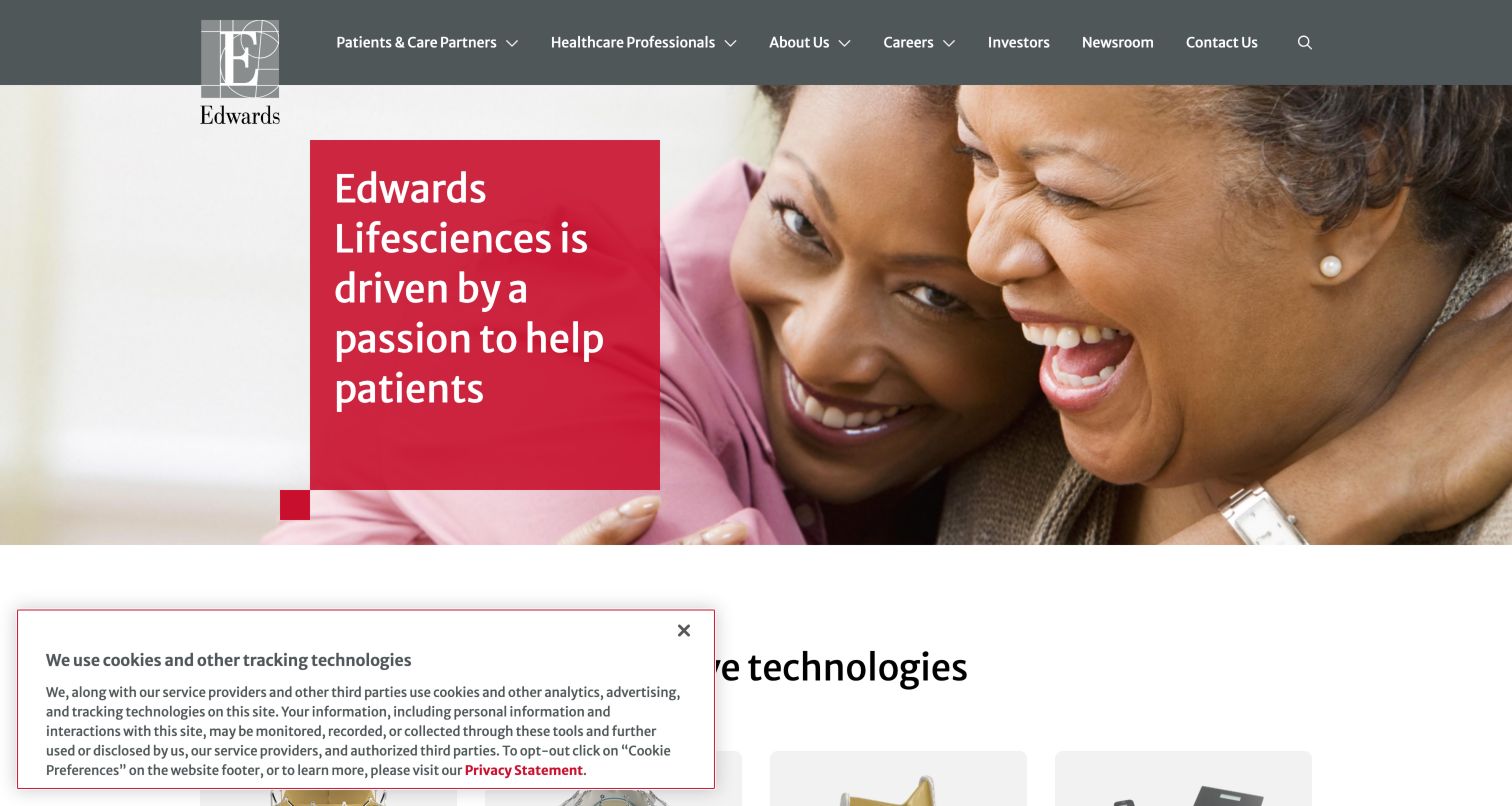
Edwards Lifesciences pairs a patient-focused photograph with a compact red statement card. The header clearly separates patients and care partners from healthcare professionals, then places company, career and investor routes beside them. Immediately below, product-family cards use recognizable device imagery and descriptive labels, including transcatheter and surgical valve technologies. A visible business-transition notice identifies where a former critical-care offering now belongs. Later content returns to research and patient resources. The combination is valuable because it puts a human introduction, a concrete portfolio overview and an important organizational clarification in a coherent sequence rather than hiding the latter in corporate news.
What you can learn
Show a specialized portfolio in a small set of explicit families, and place transition notices where returning customers will look. Ensure old product routes lead to an explanation and an appropriate next destination.
Pros
Product families appear soon after the introductory hero.
The critical-care transition notice helps returning visitors orient themselves.
Cons & considerations
Technical family names may need plain-language explanations for patients.
A long utility menu can become crowded when translated or viewed at narrow widths.
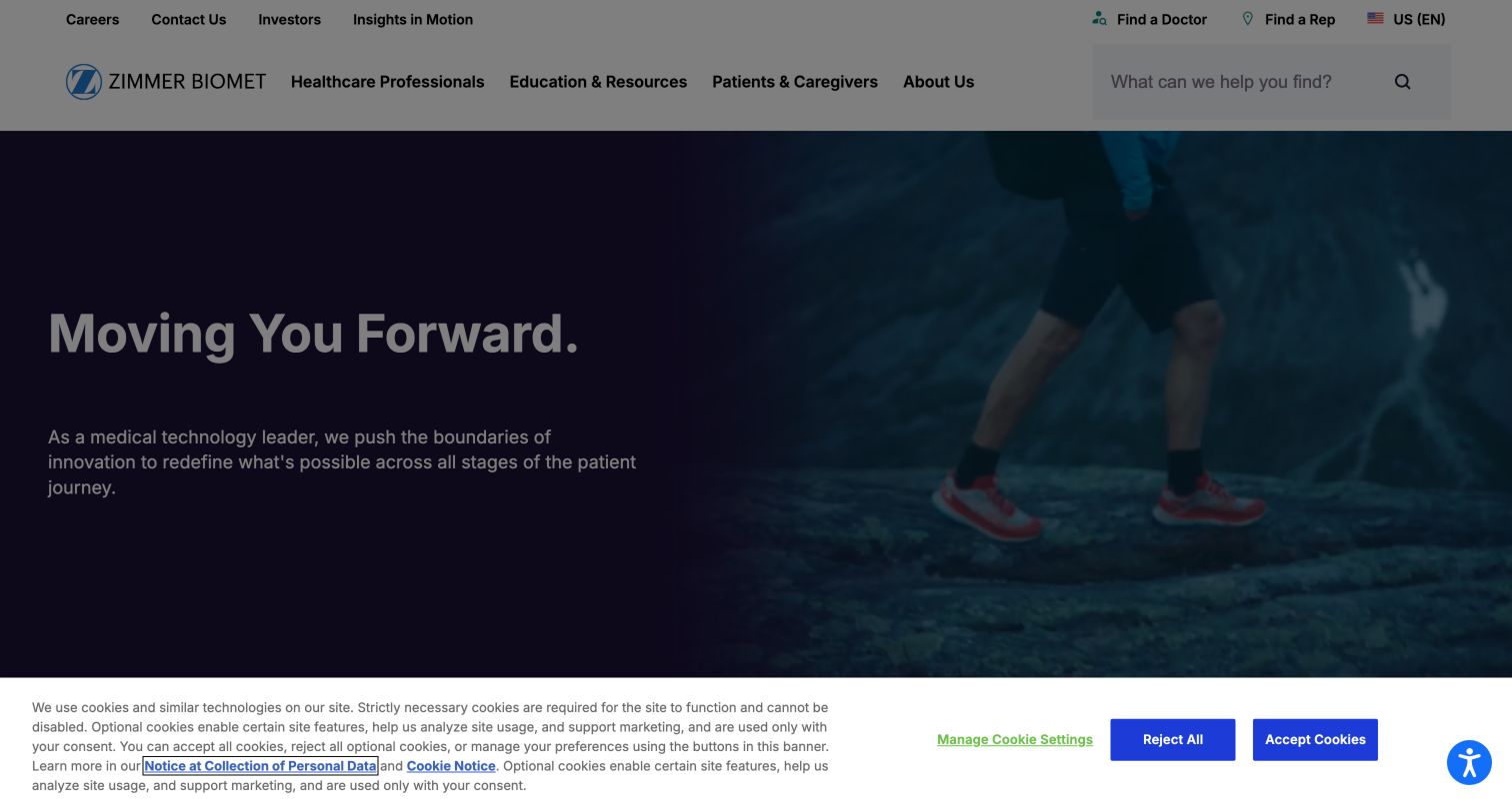
Zimmer Biomet puts a prominent search field in its header and includes Find a Doctor and Find a Rep as distinct utility actions. The broad moving-forward message overlays active lifestyle imagery, followed by separate entrances for healthcare professionals, patients and caregivers, and investors. Featured products appear after this audience gateway. The structure acknowledges that a visitor may need a person or local service rather than a product description. It also keeps professional education visible in the main navigation. As a design reference, the page is useful for showing how audience segmentation and practical locator tasks can coexist within a corporate brand presentation.
What you can learn
Identify which visitors need a local contact before they need a catalog. Give different locator tasks explicit names, and retain a clear distinction between finding a clinician and reaching a manufacturer's representative.
Pros
Doctor and representative locators are separately named.
Search is large enough to read as a primary alternative to menus.
Cons & considerations
A broad brand statement delays concrete product information.
Several navigation layers need careful ordering and focus management on mobile.
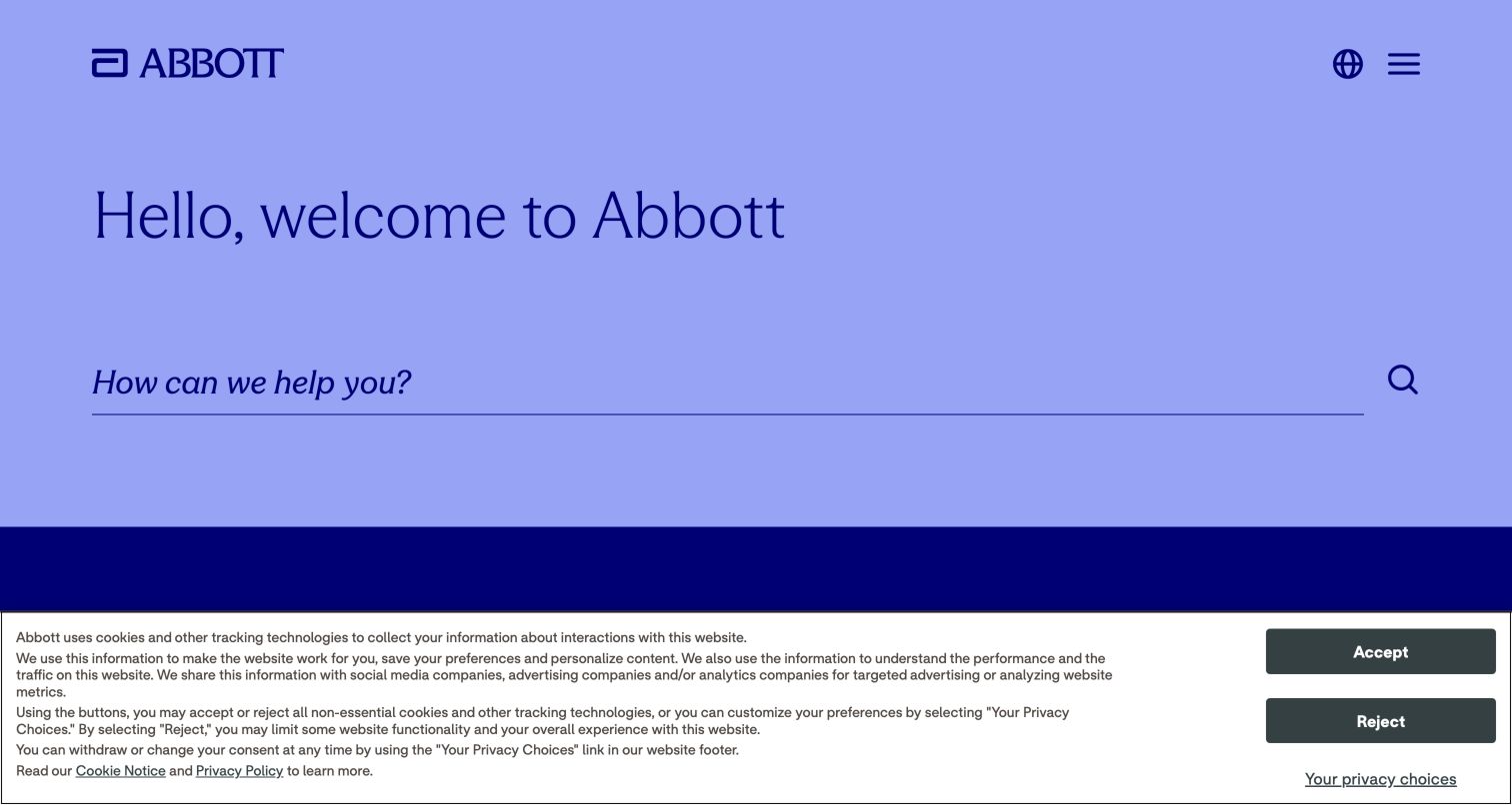
Abbott uses an unusually sparse opening: a welcome heading and a large underlined search field on a lavender background. A globe and menu icon sit at the upper right, leaving the question of what the visitor needs as the dominant interaction. The observed page offers trending prompts for contacting the company, working there and finding products. This is a different approach from a conventional device carousel. It can reduce the burden of choosing among many business units, but it places considerable responsibility on search quality and the visibility of alternative navigation. The page should be studied as a question-led gateway, not evidence that a minimal interface automatically answers complex support needs.
What you can learn
A search-first homepage needs an equally deliberate search service: useful suggestions, clear result categories, error recovery and visible non-search routes. Validate those tasks with both visitors who know a product name and those who only know their question.
Pros
The large search field communicates a clear starting point.
Trending prompts expose common corporate tasks without a dense menu.
Cons & considerations
Hidden navigation adds a step for visitors who prefer browsing.
A sparse opening depends heavily on search relevance and understandable empty states.
Kegan is a freelance web designer and developer with 15+ years of experience helping businesses turn complicated website requirements into clear, maintainable digital experiences. He works directly with clients from planning and design through development, launch, and ongoing support.
For medical device website design, his development approach focuses on product specifications, professional resources, distributor information, and controlled content workflows. The scope can be a targeted improvement or a complete custom build, with responsive layouts, thoughtful content structure, and integrations chosen around the people using and maintaining the site.
Show 3 other medical device website designersHide other medical device website designers
Plan a device website around information responsibilities
Map audiences and urgent tasks
List the reasons people arrive, including support, manuals, product identification, education, company research and careers. Identify which tasks are urgent and which require a specific country or professional context. Use this map to decide the first navigation layer.
Create a product content model
Define consistent fields for product family, intended audience, region, associated resources, owner and review status. Plan redirects for renamed, transferred or retired products. A corporate reorganization should not leave existing customers without a useful explanation.
Design the support handoff
Document which questions the public website can answer and which belong to a service team, distributor or care provider. Explain those boundaries with clear labels. Do not collect sensitive information through a general inquiry field when another controlled route is required.
Prototype search with real queries
Use product names, abbreviations, support questions and unfamiliar visitor language. Test no-result and ambiguous-result states as well as exact matches. Search categories should help a patient distinguish general education from technical material.
Establish publishing ownership
Assign owners to regional qualifications, product documents, training links and customer notices. Decide how changes are reviewed and how outdated files are withdrawn. Keep the visible experience coherent when several teams publish into the same system.
Review the complete interaction
Test menus, search, document links, video controls and any region selector with keyboard navigation and small screens. Review enlarged text and reduced motion. Include appropriate accessibility and content specialists for the actual project rather than inferring compliance from these examples.
The editing job behind the design
Choose technology for reliable, maintainable information
A content platform should support structured product records, regional variants, review workflows and durable document links. Search and asset management need clear ownership. Decide how the site will handle a renamed product, moved support portal or unavailable integration before choosing decorative homepage components.
Public stack observations can identify exposed libraries, delivery services or content-system references. They do not reveal the manufacturer's clinical systems, complete security controls or internal approval process. Use the evidence as a starting point for technical questions while retaining its actual source and observation date.
Our WordPress website examples offer a separate look at publishing approaches. A visible platform label is evidence for that named page, not a guarantee that the same system will suit your requirements.
Before the public launch
Medical device website planning checklist
Patient and professional routes use clear, consistent labels.
Support and product documentation remain reachable outside campaign slides.
The current country or market is visible where it affects content.
Product qualifications stay near the statements they qualify.
Search handles exact product names, general questions and no-result states.
Document titles identify product, purpose and relevant version or date.
Retired or transferred product routes explain the next step.
Videos and carousels offer understandable controls and a reduced-motion experience.
Contact routes explain who will handle the request.
Sensitive information is collected only through an appropriate controlled workflow.
Navigation and forms have been reviewed on mobile and with a keyboard.
Content owners can find and correct outdated product and support information.
These checks are a project checklist, not a performance, legal, security, or accessibility certification. Test real journeys with the people responsible for the website before making claims about the result.
Sources & editorial method
How this collection was selected and reviewed
Original selection: We inspected twelve distinct public manufacturer pages and saved direct browser screenshots with the actual source URL, capture date and dimensions. The pre-research random target was twelve. One additional candidate whose captured carousel was unsettled was excluded. Reviews concern visible design and information architecture; we did not submit forms, enter professional-only areas, test products, verify clinical claims or perform a complete accessibility audit. Technology arrays stay empty until the publisher's broad public stack audit supplies qualified evidence. On November 5, 2026, Parasym was reviewed and added as Editors Choice in the first slot, bringing this collection to 13 examples. All earlier reviews and their original capture dates are retained. The badge is an editorial design selection, not a user-vote award or an endorsement of the organization’s services.
Each example links to its actual source page. Screenshots are direct browser captures with their own capture dates; moving imagery, announcements and live designs can change. The notes describe observable design choices and conditional tradeoffs, not measured traffic, conversion results, service quality, or accessibility conformance.
Technology labels use public page metadata, asset evidence, or explicitly cited platform documentation. Platform documentation is not a complete current deployment audit. A component reference may be legacy or unused; it is not a complete backend inventory. Unknown stacks are omitted. These sites are editorial examples, not our client portfolio.
Written, Edited and Curated are separate editorial records, not timestamps advanced by a rebuild. Website designs and imagery belong to their owners. See our editorial standards or suggest a correction.
Questions worth asking
Medical Device website design questions
Should a medical device homepage begin with products or patients?
That depends on the site's principal tasks. A human story can explain purpose, while a product overview can help repeat professional visitors. Keep the alternative route prominent, and use task research to establish which information deserves the first screen.
How should professional and patient content be separated?
Use explicit audience labels and explain any transition into specialized material. General corporate information should remain easy to find. Plan the actual access and content requirements with the responsible company teams; a menu label alone is not an access control.
Is a search-first design suitable for a large portfolio?
It can be, if search understands the vocabulary visitors use and provides clear categories, suggestions and recovery paths. Retain a browsing route for people who do not know the product name or cannot formulate a useful query.
What belongs near a product announcement?
Its audience, a clear description, a meaningful next action and any relevant regional or availability qualification. The content team must determine the exact wording. Keeping that context nearby helps visitors understand the scope of the announcement.
Do these examples establish clinical quality or compliance?
No. These are editorial observations of public websites. They do not establish device effectiveness, regulatory status, information accuracy, security, conversion performance or accessibility conformance.
Use these medical device website examples to make the correct next step easier to identify. Clear audience language, visible support and well-maintained product context are more useful than copying a campaign's appearance alone.