Best Physical Therapy Websites of 2026 (15 Real-World Examples)
Physical therapy website examples that explain care, people and practical next steps
A physical therapy website needs to help someone choose a location, understand a first visit and find a relevant clinician without asking them to diagnose themselves. These fifteen examples range from local running specialists to national networks, showing different ways to connect a clear service model with useful patient information.
Start with the visitor's uncertainty. They may arrive with a referral, a familiar therapist's name or only a question about whether the practice offers a relevant service. Give each situation a dependable route. A provider directory, plain-language service pages, location details and a first-visit explanation often do more practical work than an elaborate movement animation.
This collection studies public website design and information presentation. It does not recommend treatment, establish the quality of care or verify every clinical and insurance claim. Screenshots record a particular moment, not current appointment availability. Follow the practice's maintained information and appropriate professional advice for personal care decisions.
Before the examples
What makes good physical therapy website design in 2026?
Distinguish discovery from appointment requests
A person who knows their clinic can move quickly to scheduling. Someone comparing services needs an ordinary browsing route and a clear way to ask questions. Spear, Therapydia and Select show versions of this two-path structure. Label an appointment request as a request when it is not an instant confirmation.
Make cost and first-visit information findable
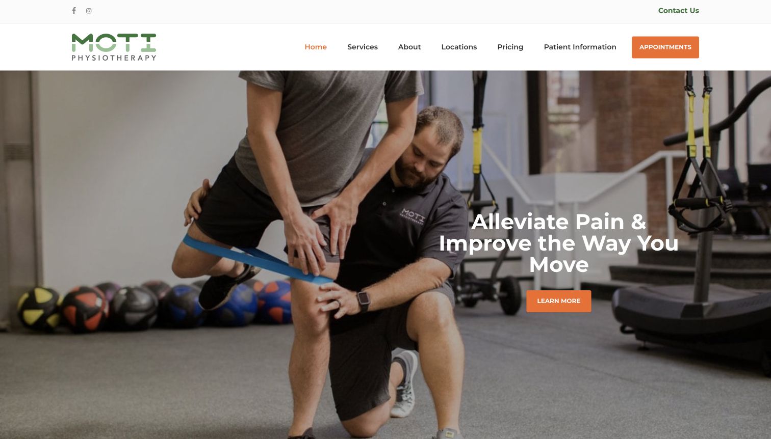
Give pricing, insurance processes, referral questions and preparation a maintained home. MOTI places pricing and patient information in its main menu. Avoid repeating broad coverage or access statements without linking to the details relevant to the location and individual plan.
Show the actual service environment
Treatment photographs and facility views can explain what a visit looks like. Use genuine, permissioned imagery and accurate captions without implying that a model is a patient or that every branch has identical equipment. Preserve useful text when footage is paused or unavailable.
Explain specialties without turning navigation into diagnosis
A service list, life-stage category or body-area index can help someone orient themselves. A quiz should not appear to determine a diagnosis or prescribe care. Make clinician profiles and an appropriate enquiry route available alongside any guided finder.
The collection · 15 examples
15 physical therapy websites worth studying
Study these examples by the job they prioritize: neighborhood clinic selection, therapist discovery, specialist orientation, returning-patient service or a defined sports community. Compare the practical routes as closely as the visual style. A local practice does not need a national network's menu to communicate a specific service well.
MOTI places a hands-on treatment photograph beneath a white header with a green identity and orange appointment action. Pricing and Patient Information receive the same navigation level as services and locations, so practical questions are not hidden behind the about page. The inspected homepage continues with short service summaries and a broad Who We Serve list, including dancers, active adults, seniors and several sports. Its opening carousel can change the highlighted subject, but the header preserves a stable route to appointments. The captured image makes the working setting visible rather than presenting only aspirational athletic scenery.
What you can learn
Give practical questions a permanent home beside the brand story. A smaller clinic group can distinguish itself through genuine environments, named therapists and carefully maintained service pages without needing a complicated interface. Keep audience-specific pages meaningfully different and have clinical staff review them. When a carousel changes the main topic, retain ordinary text links to locations, costs and first-visit expectations, then verify paused motion and readable contrast over every slide.
Pros
Pricing and patient information are primary navigation items
The photograph demonstrates a treatment setting
Cons & considerations
A long audience list requires ongoing editorial care
The carousel can make the first message vary between visits
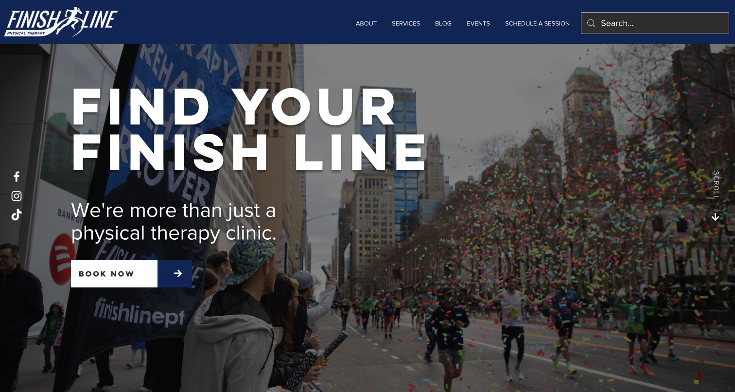
Finish Line uses a crowded race celebration as its opening image, connecting the clinic name with an actual running-community setting. Large white lettering and a dark overlay make the brand message readable; a single Book Now action sits beneath it. The restrained header exposes about, services, blog, events and scheduling, with search on the right. The inspected page continues into service content and an appointment enquiry area that directs insured patients to a separate intake route. The visual positioning is specific even though the large introductory sentence itself provides limited clinical detail.
What you can learn
Express a specialty through recognizable community activity, then make the service and administrative details concrete. A runner should still find information about clinicians, first appointments and insurance without decoding an event photograph. Keep event links current and distinguish community participation from a clinical endorsement. Review the amount of hero space required on smaller screens, and ensure a service enquiry clearly explains what happens after submission rather than resembling instant confirmed booking.
Pros
The race setting gives the brand a specific community context
Scheduling remains explicit in the header and hero
Cons & considerations
The broad introductory sentence leaves detailed services for later
An expansive hero can delay insurance and first-visit information
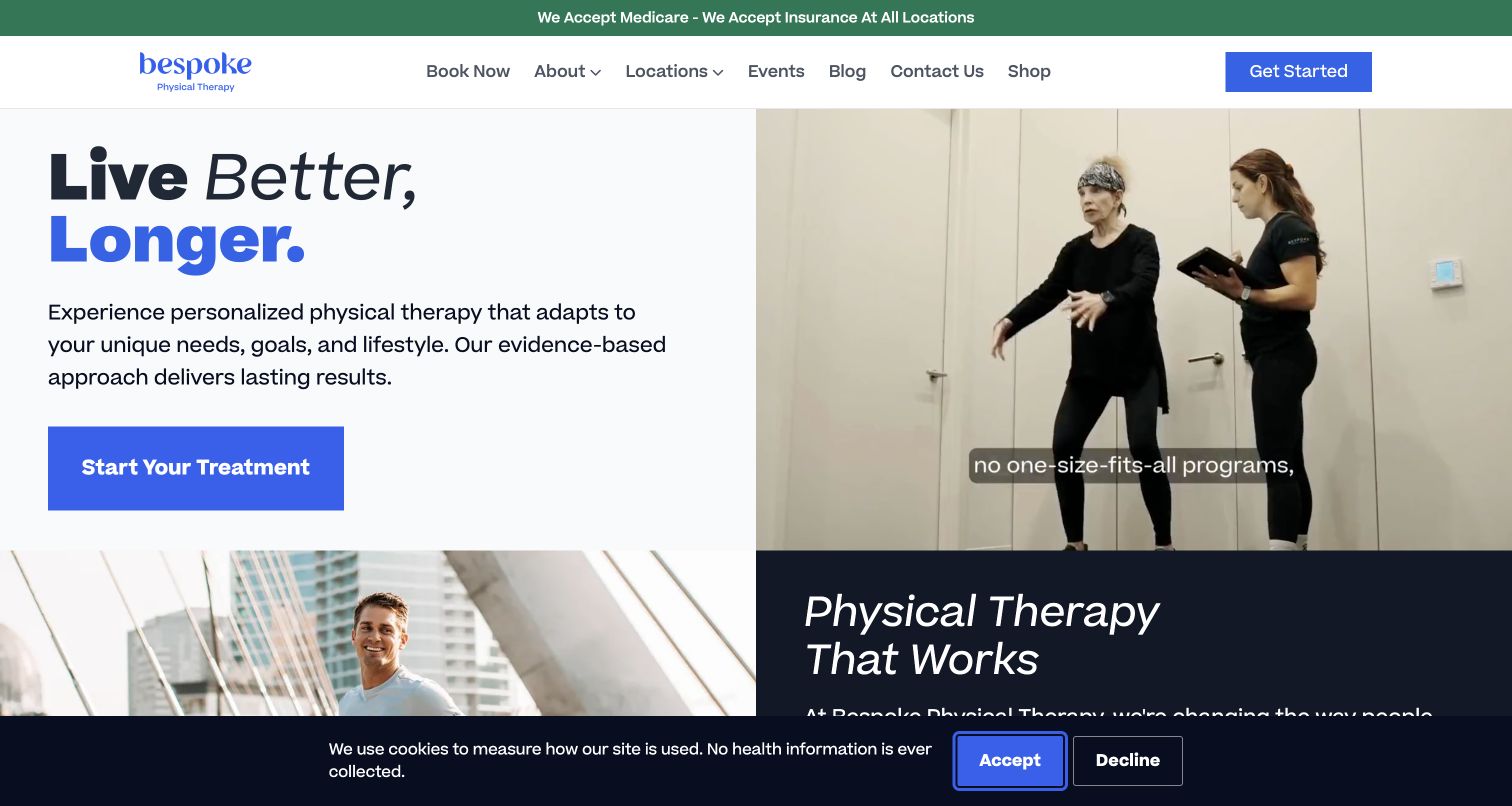
Bespoke uses a pale text panel and bright blue action beside footage of a therapist working with a patient. The written introduction explains a personalized physical-therapy proposition, while a separate green strip addresses insurance before the main navigation. Services continue below in consistently structured cards, followed by location records and provider-related content. The saved capture includes a dark consent bar at the bottom, but the principal action remains above it. Several later numerical claims are presented by the publisher; they are not independently established by this design review.
What you can learn
Demonstrate the service model with specific process imagery and explain it in ordinary text, so understanding does not depend on video. Keep insurance summaries linked to current verification rather than promising coverage to every visitor. Any published performance metric needs a clearly maintained source, scope and date. Service cards should support comparison, while location pages carry branch-specific details. Test footage, captions and consent together instead of approving only the static split-screen design.
Pros
Treatment context is shown beside the explanatory copy
Insurance information appears before the main decision
Cons & considerations
Repeated general outcome claims need maintained supporting context
The bottom consent bar reduces the space available for the following section
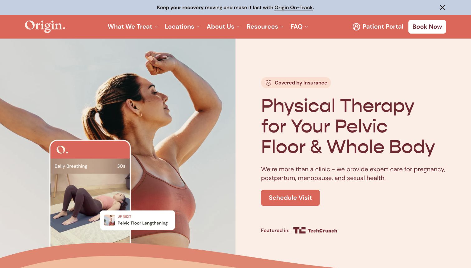
Origin names pelvic-floor and whole-body physical therapy in the main headline rather than assuming visitors recognize the brand. Coral and cream give the screen a warm identity, while a photograph and exercise-app graphic connect clinic and ongoing support. The header separates patient portal access from booking, and the inspected page organizes treatment information around recognizable life stages and concerns. Insurance has a visible introductory cue and a more detailed state-based route below. The combination makes a specialist service legible without requiring an anatomical selector or an immediate personal symptom entry.
What you can learn
Name a specialty plainly and explain the available visit formats before introducing optional quizzes or membership features. Sensitive subjects need clear, respectful wording and a low-pressure question route. Keep public education separate from personal intake and explain where an external portal begins. Coverage language needs current plan-specific verification, not a blanket assurance from a homepage badge. Review the exercise-app illustration as a description of support, not a claim that public browsing supplies a personalized exercise program.
Pros
The specialty and relevant life stages are plainly stated
Patient portal and new booking have different controls
Cons & considerations
Insurance shorthand needs a clear route to individual verification
Large imagery and support-product graphics can delay practical visit details
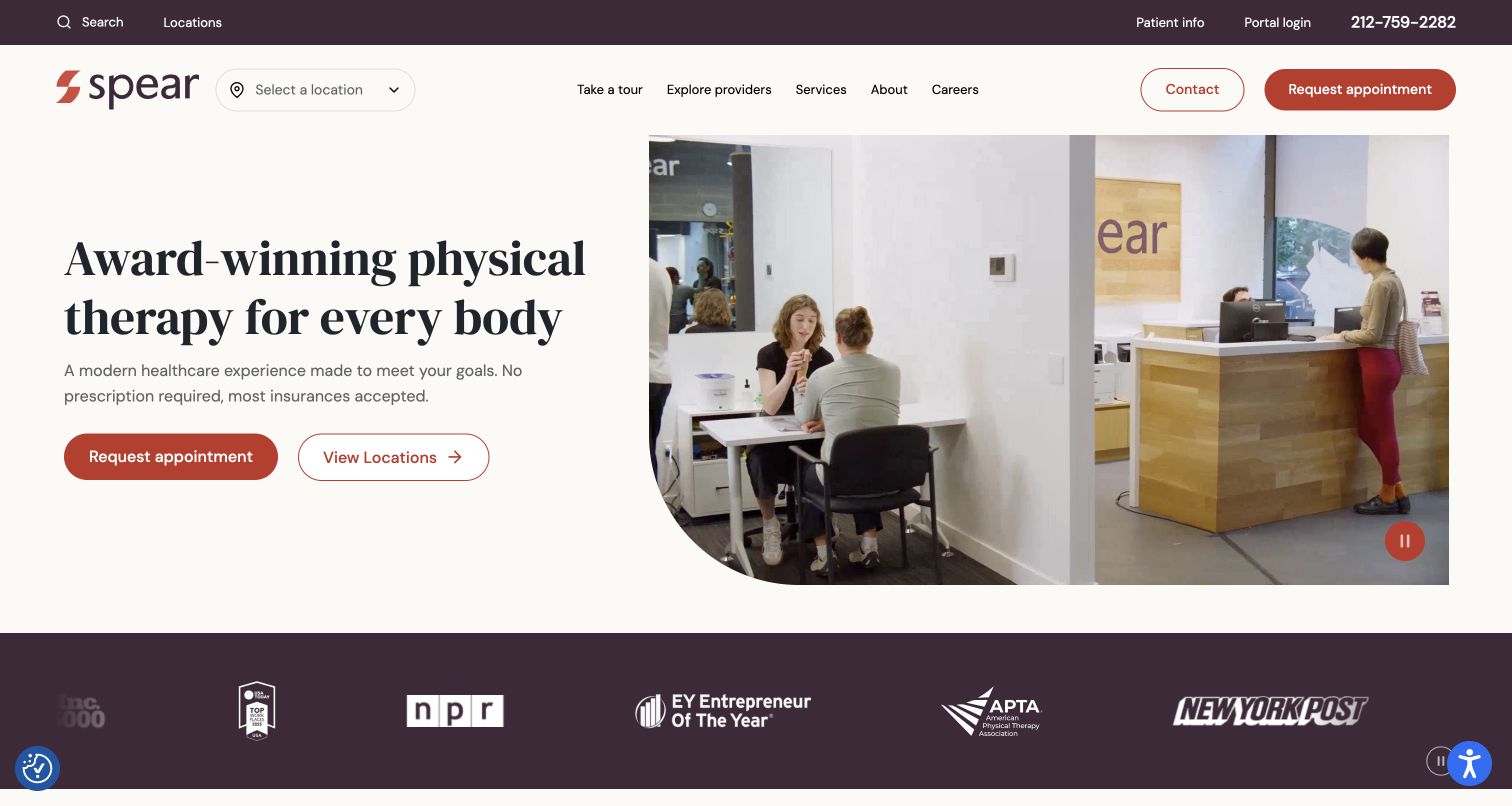
Spear pairs a spacious cream text panel with footage of reception and treatment activity. Appointment request and location browsing have different hero buttons, while a location selector sits directly beside the logo. The utility row preserves patient information, portal login and phone access; the main menu exposes facilities, providers and services. Inspected content continues into service cards and therapist spotlights filtered by region. A visible pause control accompanies the media in the capture, a more concrete interaction cue than an unlabeled decorative moving background.
What you can learn
Treat provider and location discovery as related but distinct jobs. A branch selector should not remove the ability to compare specialties or understand the first visit. Keep the portal and routine contact routes stable as the marketing content changes. Where referral or insurance statements appear, maintain jurisdiction and plan-specific explanations on the relevant pages. Pause controls are useful starting points, but keyboard, reduced-motion and caption behavior still need direct testing beyond this screenshot.
Pros
Provider and location routes are visible without opening a menu
The footage includes a visible pause control
Cons & considerations
The award-led headline gives less immediate service specificity
Several access and discovery controls need careful priority on intermediate widths
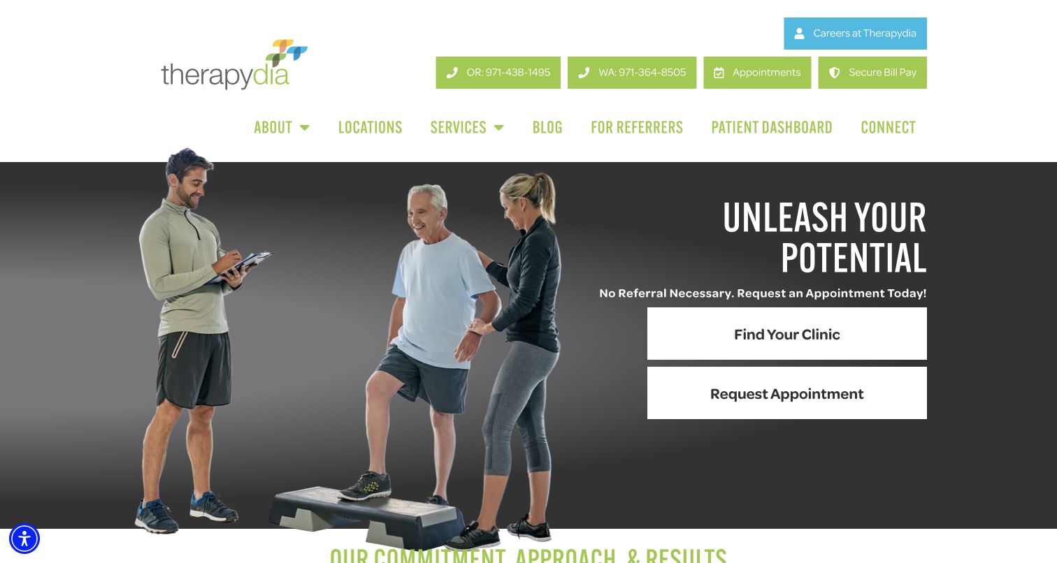
Therapydia uses a cutout treatment scene against a dark backdrop, pairing its introduction with two large stacked actions: Find Your Clinic and Request Appointment. Green utility controls expose separate Oregon and Washington phone numbers, appointments and bill pay. The broader menu adds patient dashboard and referrer information to services and locations. Below the hero, three short sections explain the publisher's approach before a substantial testimonial area. This layout is less minimal than some specialist examples, but its operational routes are unusually explicit in the first view.
What you can learn
Put the most common logistical tasks where visitors can recognize them immediately. Regional contact numbers are useful when their service area is labeled, and bill pay should remain distinct from scheduling. Keep the long testimonial area subordinate to clinic and service explanations; patient stories are not substitutes for a clear process description. When adopting similarly large action blocks, test their stacking and focus order on mobile so the two routes remain differentiated rather than becoming repetitive buttons.
Pros
Clinic selection and appointment request are unmistakable
Regional phone numbers and bill pay have explicit labels
Cons & considerations
The tall utility and navigation area consumes first-screen space
A large testimonial section may delay more practical patient information
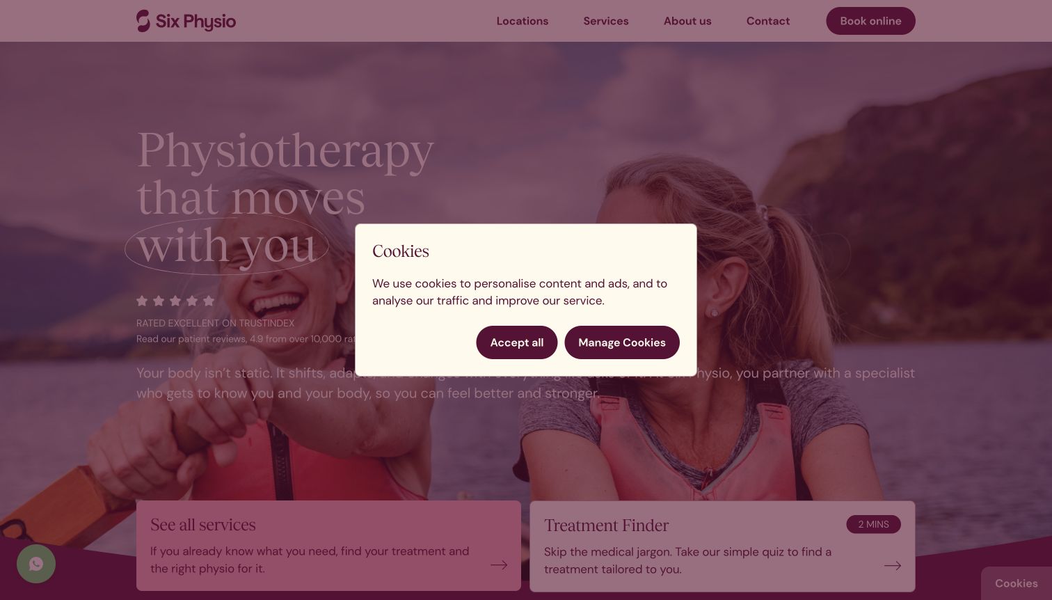
Six Physio uses a full-width outdoor image and a pink-and-burgundy identity, followed by two large discovery cards: ordinary service browsing and a treatment finder. The inspected page then provides a postcode-based clinic search with an optional service choice and explicit address cards. The navigation stays compact despite a substantial range of services. In the actual capture, a central cookie dialog dims and covers much of the opening text. The useful structural distinction remains apparent at the bottom: visitors who know their service and those still orienting themselves are offered different starting routes.
What you can learn
Give uncertain visitors a guided route without making everyone complete a quiz. Retain a complete service list and a usable clinic directory with ordinary addresses and contact links. Treat quiz outputs as orientation, not a diagnosis. Design consent as part of the first-screen composition and check it against both primary discovery choices. If live open/closed labels are used in location cards, ensure their time-zone and holiday handling is maintained rather than letting a decorative status become misleading.
Pros
Known-service and guided-discovery paths are separated
Clinic cards provide explicit addresses and contact details
Cons & considerations
The captured consent dialog obscures the main introduction
The broad service selector can be dense without clear plain-language labels
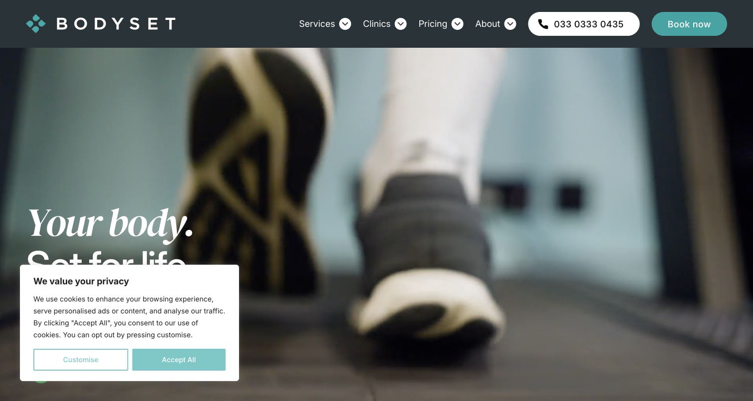
Bodyset opens with movement footage and an oversized serif statement, backed by dark teal navigation and turquoise accents. Clinics and Pricing are primary items rather than utility-page afterthoughts, while phone and booking are prominent pill-shaped controls. The inspected page expands into service cards, a national clinic introduction and case-study content. Its first view also contains a consent panel covering the lower-left headline and clinic action. The contrast between a simple global menu and the wider service range is useful, but the captured state demonstrates why overlay review matters for a video-led hero.
What you can learn
Keep location and cost questions visible even when the brand emphasizes an active lifestyle. Distinguish physiotherapy, performance assessment and other services in the content model so a visitor understands what they are comparing. A film can show the environment, but the written proposition and clinic route need to survive a static fallback. Evaluate consent panels against actual text placement, and maintain separate current information for self-pay prices, insurance processes and location-specific availability.
Pros
Pricing and clinics have primary navigation positions
Phone and booking are strongly differentiated controls
Cons & considerations
The observed consent panel covers part of the headline and action
Motion-led atmosphere can delay a concrete explanation of the first appointment
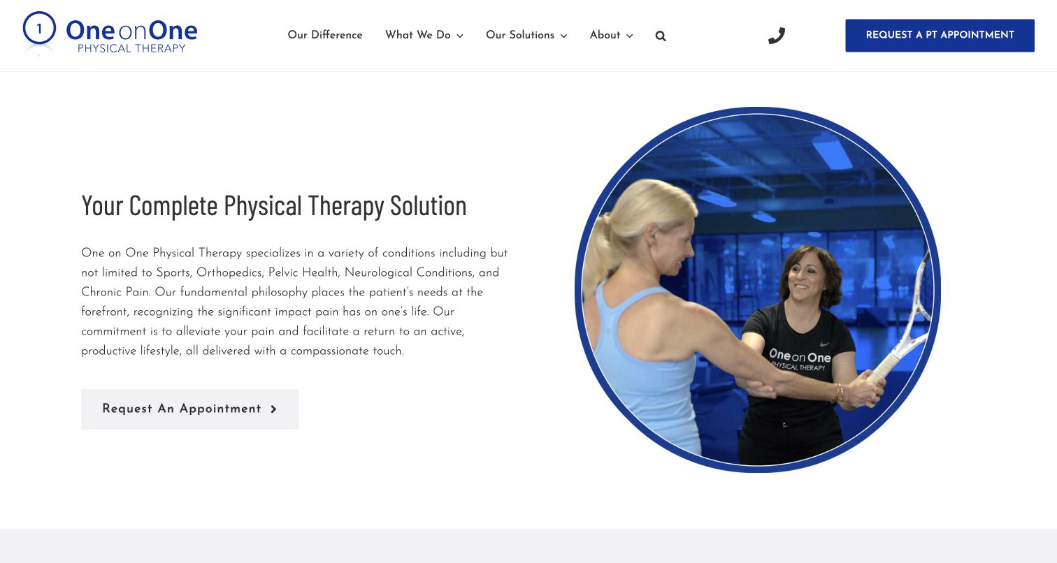
One on One introduces its Atlanta practice with a conventional split composition: explanatory text and appointment action on the left, a circular treatment photograph on the right. Blue framing and a small logo repeat the one-to-one identity. The inspected homepage adds goal-based tabs for relief, prevention and performance, followed by a practice-difference explanation and named team profiles. The global menu uses both What We Do and Our Solutions, suggesting two discovery models. Unlike a page made mostly of slogans, the first paragraph names several service areas and the location context.
What you can learn
Explain a care model through observable process details, then provide the people and practical information behind it. If using both service and solution menus, keep their purpose distinct and avoid duplicating the same list under different labels. Goal-based tabs should retain useful default content and accessible keyboard operation. Maintain practitioner profiles and clarify enquiry response expectations. A clinical team should review statements about treatment and outcomes, rather than using persuasive homepage wording as a universal promise.
Pros
The first paragraph identifies specialties and local context
Named team profiles follow the practice explanation
Cons & considerations
Similar menu concepts may need clearer differentiation
The decorative body typeface warrants legibility checks at small sizes
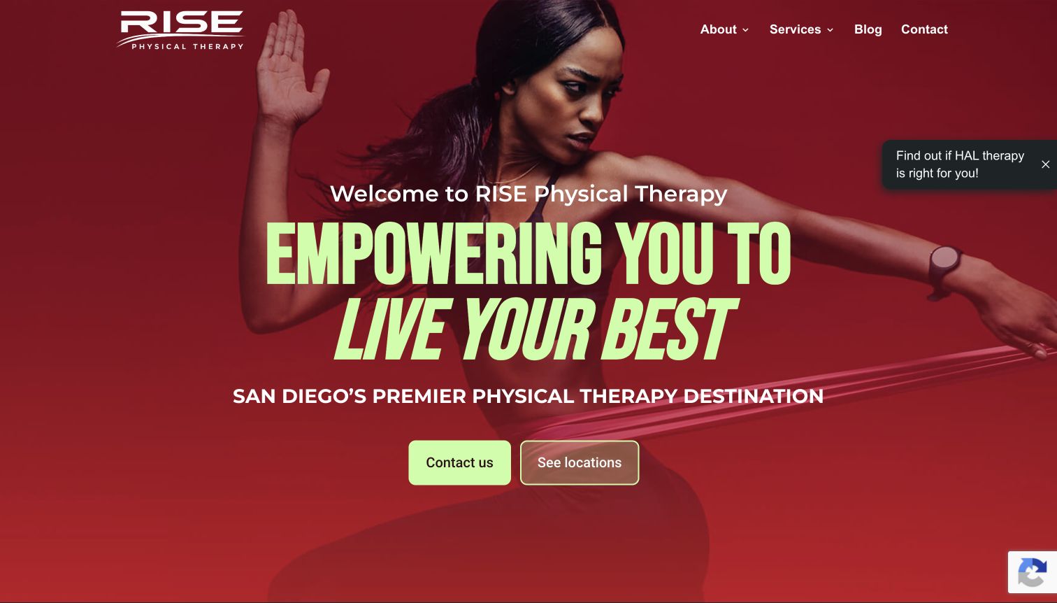
RISE uses a red athletic portrait, lime headline and two centered actions to introduce its San Diego service area. Contact and locations are the main hero choices; the header stays limited to about, services, blog and contact. Below, the inspected page explains its session model and presents short cards for services ranging from injury rehabilitation and balance to pediatric and hand therapy. A floating promotion for another therapy appears near the upper-right image in the capture. Its strong sports presentation is visually distinctive, while the wider catalog serves audiences beyond athletes.
What you can learn
Match energetic imagery with clear evidence of the audiences actually served. A broad practice should not make older adults or pediatric families infer that care is only for competitive athletes. Keep service descriptions specific and clinically reviewed, and connect every card to relevant staff and branch availability. Contact and location actions can stay simple if their destinations explain scheduling clearly. Consider whether a floating specialist promotion distracts from that initial orientation on narrow screens.
Pros
The region and two primary next steps are clear
Short service cards expose a broad range below the hero
Cons & considerations
Athletic imagery may feel narrower than the actual audience range
The floating therapy promotion adds competition near the main message
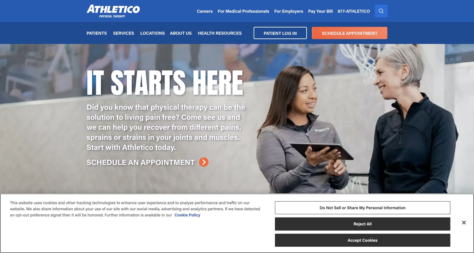
Athletico pairs a therapist-and-patient image with a large introductory statement and appointment link. The blue header separates medical-professional, employer and bill-pay utilities from patient, service and location navigation. Patient login and scheduling are deliberately different buttons. The inspected page places location search and insurance explanation immediately after the hero, then links to assessment, what-to-expect and service families. The actual screenshot includes a wide bottom consent panel that consumes much of the lower viewport, making the location-finder section less visible in the starting state.
What you can learn
Separate institutional audiences from patient tasks without giving them equal visual priority everywhere. For a large network, reliable branch search and a plain first-visit explanation are essential companions to the appointment action. Insurance and referral messages need maintained local and plan-specific detail; do not turn a general campaign into a universal eligibility statement. Test the combined consent state and retain keyboard access to routine controls when a wide notice occupies the bottom of the screen.
Pros
Login and new scheduling are visually distinct
Patient, professional and employer routes occupy different navigation layers
Cons & considerations
The wide consent panel reduces first-view space for location discovery
Broad introductory copy needs more specific follow-through on service pages
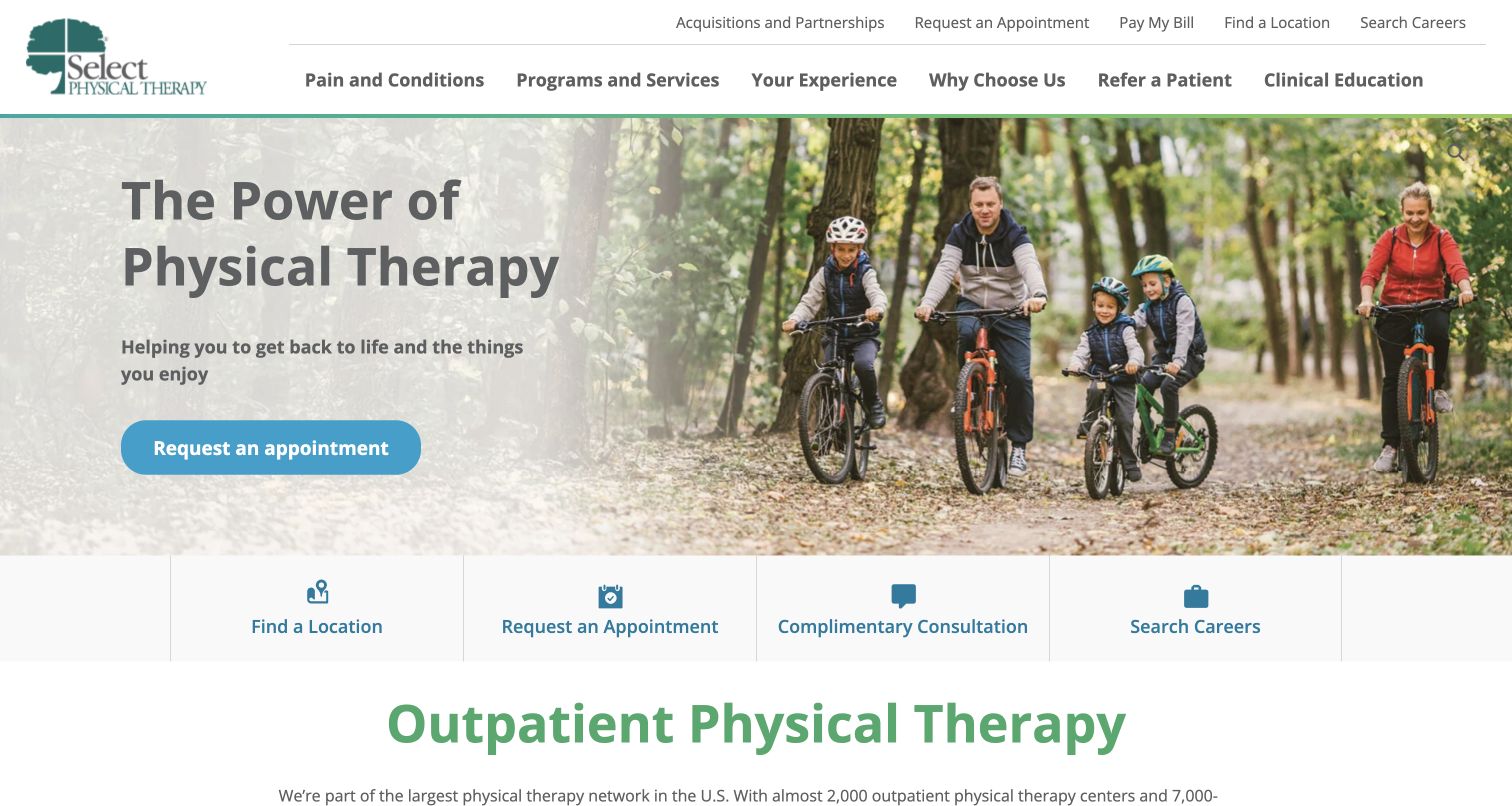
Select Physical Therapy places a family cycling scene beside a simple service introduction and appointment action. Directly below, a persistent-looking four-card row offers location finding, appointment request, consultation and careers. The broader menu separates pain/conditions from programs/services and includes referrer and education routes. Inspected content also offers a body-area list as another way into information. The saved capture shows the hero and task row clearly after optional cookies were declined. Its practical strength is that important routes do not depend on a visitor understanding the large condition catalog first.
What you can learn
Keep core tasks outside promotional imagery and any specialized content selector. A body-area index can help browsing, but ordinary service and location links should remain available. Consider whether careers belongs at the same level as patient actions for the audience of a particular page. Give condition information qualified clinical review and make clear that selecting an area is not an assessment. Repeated appointment routes should lead consistently, with the next step explained before personal information is requested.
Pros
The task row makes location and consultation paths explicit
Conditions and service programs have separate navigation concepts
Cons & considerations
Careers competes with patient tasks in the prominent four-card row
The large global menu needs careful mobile prioritization
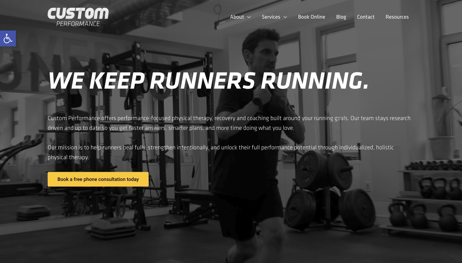
Custom Performance puts its running specialty in the first large line, over monochrome footage of a clinician exercising in the studio. A yellow free-phone-consult action is the only strongly colored item in the hero. The inspected page explains its combination of physical therapy, coaching and recovery services, followed by distinct program cards and practical office details. A training-plan signup modal was observed and dismissed for the retained capture. The saved screen shows substantial written orientation over the media, making the niche understandable even when the visitor does not recognize the equipment or person shown.
What you can learn
State a specialty plainly and connect it to the specific services offered. Keep coaching, rehabilitation and recovery products distinct so visitors understand the engagement they are choosing. A short phone consultation can be an orientation route when its scope is clear; it should not be presented as a complete assessment. Check text contrast over every media frame and avoid making newsletter acquisition a prerequisite for learning about care. Maintain ordinary contact details and cost explanations outside a booking portal.
Pros
The specialty is immediately explicit
One high-contrast action gives the introduction a clear next step
Cons & considerations
The long overlaid paragraph requires careful readability testing
An early newsletter modal can interrupt treatment discovery
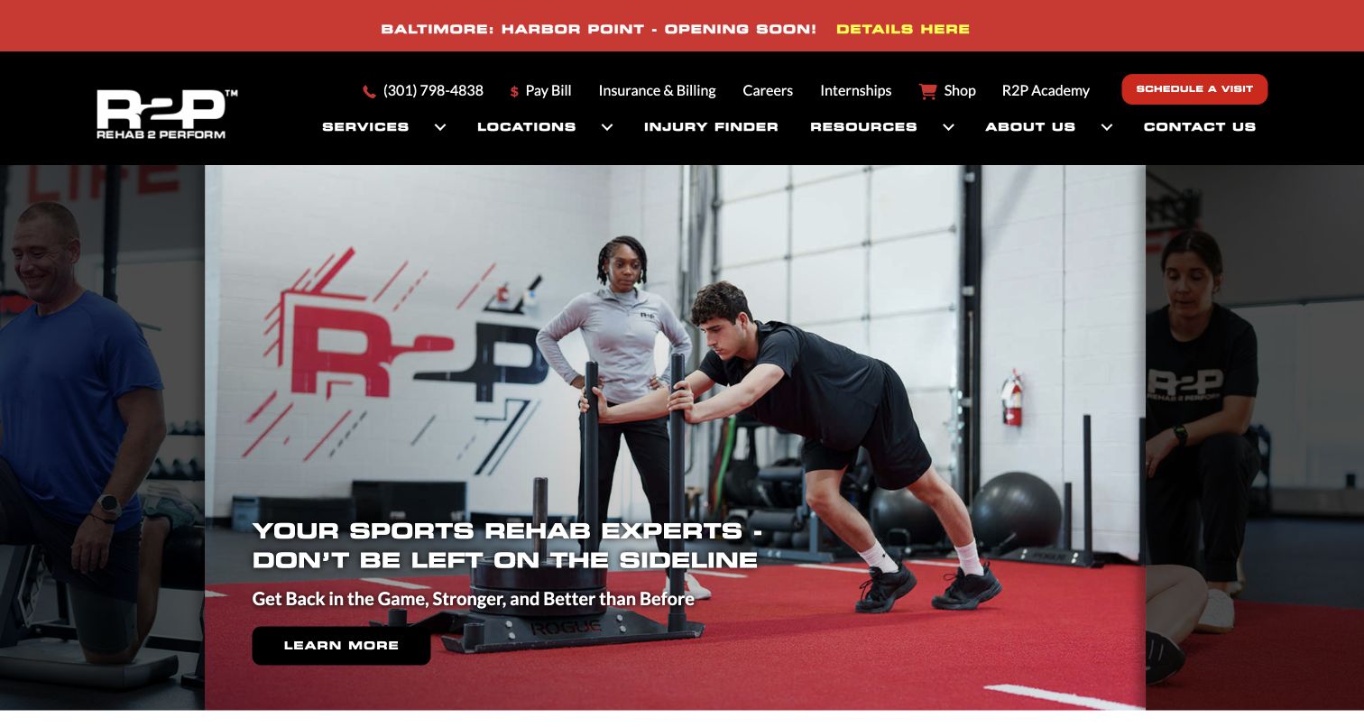
Rehab 2 Perform uses black, red and white with clinic-based exercise imagery to frame its performance identity. The captured carousel shows a supervised sled exercise and a sports-rehabilitation message, while scheduling remains in the header. The inspected page keeps a separate row for locations, visits, payment and contact, then introduces rehabilitation, physical therapy and pelvic-health services. Insurance and billing also have a direct utility link. A new-location popup was dismissed before the retained capture; its related opening notice remains at the top, so the announcement is still available without covering the main page.
What you can learn
Let regional growth announcements exist without replacing the service introduction. Keep payment and existing-patient tasks outside rotating campaigns, and explain that a fitness-forward environment serves more than competitive athletes if that is the actual scope. The scheduling source provides separate routes for specific requests and communication accommodations, a useful distinction to preserve. Review motion, banner expiry and service terminology together so an energetic brand remains understandable for someone attending therapy for the first time.
Pros
Routine payment and scheduling tasks have stable links
The retained growth notice does not obscure the main content
Cons & considerations
The sports-led first slide may feel narrower than the complete audience
Dense utility navigation adds several competing links above the service message
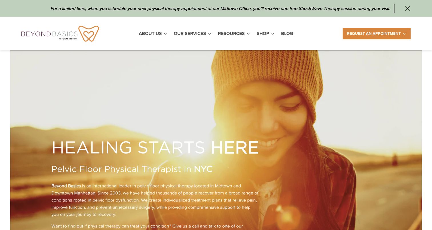
Beyond Basics names pelvic-floor physical therapy and New York in its hero, then adds a substantial paragraph explaining its practice and a short phone-discussion option. The warm outdoor portrait and orange accents soften an otherwise information-dense entrance. The inspected page separates Midtown and Downtown contact routes, offers condition-based browsing and explains out-of-network billing support later on. An introductory consultation-and-newsletter panel was dismissed before the retained screenshot. A limited-time treatment banner remains above the header, creating an additional message that must coexist with the sensitive subject and first-visit explanation.
What you can learn
For a specialty that visitors may not understand, explain the scope in respectful plain language and keep a question route visible. Separate location-specific contact options from clinical intake. Billing support and network status need current, precise explanation rather than a generic insurance badge. Keep promotions from overshadowing educational orientation, and avoid presenting a short introductory call as diagnosis. Long hero paragraphs should be tested with zoom and smaller screens so the important first-step information is not buried.
Pros
The specialty and city are explicit in the main heading
Location-specific contact and billing support are explained
Cons & considerations
The introductory paragraph is dense for a first screen
A limited-time treatment banner competes with the broader orientation
Kegan is a freelance web designer and developer with 15+ years of experience helping businesses turn complicated website requirements into clear, maintainable digital experiences. He works directly with clients from planning and design through development, launch, and ongoing support.
For physical therapy website design, his development approach focuses on treatment and program navigation, therapist introductions, clinic details, referral information, and careful appointment or patient-portal handoffs. The scope can be a targeted improvement or a complete custom build, with responsive layouts, thoughtful content structure, and integrations chosen around the people using and maintaining the site.
Show 3 other physical therapy website designersHide other physical therapy website designers
Plan a physical therapy website around real patient questions
Map patient and professional audiences
Separate new enquiries, returning patients, referrers, employers and job applicants. Decide which need persistent utility links and which belong deeper in the site. Keep payment and patient portal access recognizable without giving every institutional audience equal weight in the main hero.
Write a useful first-visit page
Document the actual scheduling process, what information is needed, what to bring and who can answer administrative questions. Let clinical staff review clinical expectations. Explain external booking transitions and do not use real patient submissions or confirmed appointments as website QA.
Model services, providers and branches together
Connect specialties to relevant clinicians and locations rather than maintaining three unrelated lists. Store hours, addresses, access arrangements and contact routes once. Assign an owner for staff changes and temporary closures so the directory remains useful after launch.
Keep financial explanations precise
Give current self-pay pricing and insurance processes their own reviewed content. Distinguish a practice participating with a plan from the visitor's individual coverage and expected cost. Website designers should create the structure and update workflow, not invent policy or reimbursement rules.
Plan privacy before adding intake and analytics
Inventory forms, portal links, chat, videos, quizzes and measurement tools. Keep public service browsing separate from clinical records and detailed health intake. Have the appropriate specialists review sensitive-data handling and third-party tools; a good-looking public page is not evidence that every integration meets its responsibilities.
Test common tasks with realistic interface states
Ask testers to find a clinician, compare branches, locate first-visit information and identify the correct booking route. Test keyboard use, zoom, narrow screens, reduced motion and static video fallbacks. Include consent dialogs and campaign notices together instead of testing only an unobscured layout.
The editing job behind the design
Choose technology that maintains the care directory accurately
A useful content system connects provider profiles, specialties, branch information, administrative guidance and temporary notices. Keep public publishing separate from clinical records. Scheduling, payment and patient portals may be separate systems; label those transitions and maintain consistent contact information across them.
Evaluate search, location filtering, editing permissions, accessibility and rollback before choosing decorative features. Quizzes and symptom-related pages deserve particular care around scope and data collection. The technology lists in this collection describe supported public evidence, not a complete clinical architecture, security review or hidden patient-record system.
Our WordPress website examples offer a separate look at publishing approaches. A visible platform label is evidence for that named page, not a guarantee that the same system will suit your requirements.
Before the public launch
Physical therapy website planning checklist
State the practice's service scope and geographic area plainly.
Separate clinic discovery from appointment requests.
Keep patient portal and bill-pay routes recognizable.
Explain the first-visit process on a maintained page.
Give pricing and insurance questions a clear destination.
Connect services to relevant providers and branches.
Maintain current hours, addresses and access information.
Use genuine treatment and facility imagery with appropriate permission.
Keep guided finders separate from diagnosis or prescribed care.
Test static alternatives and paused media.
Review consent, promotion and chat states together.
Keep patient details out of public analytics and routine QA records.
These checks are a project checklist, not a performance, legal, security, or accessibility certification. Test real journeys with the people responsible for the website before making claims about the result.
Sources & editorial method
How this collection was selected and reviewed
The fifteen examples match the collection's saved random target. Official public websites were independently opened, inspected and directly captured in an ordinary browser. Original commentary records visible design choices, practical lessons and conditional considerations; it does not test clinical services or submit patient forms. Editors Choice favors a researched specialist or regional operator and is not a clinical award, conversion ranking or result of visitor voting. Media and website trademarks remain the property of their owners.
Each example links to its actual source page. Screenshots are direct browser captures with their own capture dates; moving imagery, announcements and live designs can change. The notes describe observable design choices and conditional tradeoffs, not measured traffic, conversion results, service quality, or accessibility conformance.
Technology labels use public page metadata, asset evidence, or explicitly cited platform documentation. Platform documentation is not a complete current deployment audit. A component reference may be legacy or unused; it is not a complete backend inventory. Unknown stacks are omitted. These sites are editorial examples, not our client portfolio.
Written, Edited and Curated are separate editorial records, not timestamps advanced by a rebuild. Website designs and imagery belong to their owners. See our editorial standards or suggest a correction.
Questions worth asking
Physical Therapy website design questions
What should a physical therapy homepage include?
Begin with a plain service explanation, location discovery, clinician information and a clear next step. First-visit, cost and insurance questions need easy-to-find supporting pages. Returning patients should recognize portal, payment and contact routes without navigating marketing campaigns.
Should a practice lead with sports imagery?
It can work when it accurately represents the intended audience, as with a running specialist. A broader practice should make other groups and services visible too. The design should not make older adults, families or people attending rehabilitation infer that the clinic is only for competitive athletes.
Is a body-area selector necessary?
No. It can be an additional browsing route, but should not replace ordinary service, provider and location links. Keep its language understandable and avoid presenting the interaction as a clinical assessment. A useful default page should remain available without using the selector.
How should insurance information be presented?
Explain the practice's current process and provide a contact for individual questions. Link general statements to maintained details and distinguish participation from a person's actual benefits and expected cost. This design guide does not interpret insurance coverage or establish referral requirements.
How can a smaller practice stand out?
Use a specific service model, recognizable local context, genuine treatment imagery and helpful administrative information. MOTI's visible pricing and patient-information routes illustrate practical specificity; Custom Performance's running focus shows another approach. Distinctiveness does not require copying a large network's entire feature set.
A useful physical therapy website helps someone understand the practice before asking for personal information. Make services, people, locations and first-visit details clear, then use the visual identity to make those practical routes feel coherent.