Best Summer Camp Websites of 2026 (21 Real-World Examples)
Summer camp websites that explain eligibility, sessions and enrollment
Parents need more than an inspiring activity photograph to choose a summer camp. These 21 examples compare age and grade eligibility, session dates, costs, daily logistics and the difference between expressing interest, applying and securing a place.
Day camps, residential weeks and academic programmes have different planning demands. A useful page states the format and audience early, then explains the relevant timetable, accommodation or transport. Keep practical information connected to the programme rather than distributing it across unrelated promotional pages.
This collection reviews public website design and communication, not the quality or safety of a camp. Staff, supervision and accreditation statements remain operator claims unless independently established for a specific purpose. Parents should use current operator information for individual participation questions.
Before the examples
What makes good summer camp website design in 2026?
Start with a practical programme summary
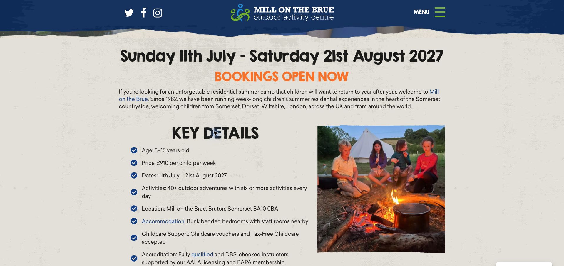
Mill on the Brue places age, weekly price, season, location and accommodation in one compact list. That helps parents understand a focused residential offer before reading the longer activity story or opening a booking system.
Define age and grade precisely
Rockbrook explains that its grades refer to the year just completed, while Living History Farms uses the grade a child will enter. Neither convention is universal. State the reference point and use an example when it prevents mistakes.
Explain the enrollment state
A free application, a waitlist place and a confirmed booking are different outcomes. Rockbrook explains its follow-up, while Camp Chief Ouray discloses that public availability is manually maintained. Match action labels to what actually happens.
Publish the total planning picture
Transport, meals, before-care, laundry, deposits and between-session stays can change the cost and schedule. Show important inclusions and exceptions near the programme price, and keep the season and discount dates consistent.
The collection · 21 examples
21 summer camp websites worth studying
The examples cover independent outdoor camps, community day programmes and school-based residential courses. Compare how each explains its own model; a complex international programme needs different detail from a local day camp.
Mill on the Brue earns our Editors Choice for the way its residential camp page turns a lively outdoor identity into practical information. Beneath the canoeing photograph and angled orange title, a compact list supplies the age range, weekly price, 2027 season, Somerset address, accommodation and childcare-payment options. Parents can understand the basic fit before reading the longer account of activities and group life. The textured background, informal display lettering and actual activity photography feel particular to this centre. The page also offers a day-camp route for children who are not ready for a residential week, a thoughtful alternative to pushing every visitor toward the same booking. There are still weaknesses: the long page repeats benefits, and the brochure link points to a file labeled 2026 beside the 2027 offer. This is recognition of the website's presentation, not an assessment of supervision or camp quality.
What you can learn
Pair an expressive outdoor identity with a short, current list of age, location, duration, cost and sleeping arrangements, then offer a lower-commitment option for uncertain families.
Pros
The practical summary groups eligibility, price and accommodation together.
A day-camp alternative addresses hesitation about a full residential week.
Cons & considerations
The linked brochure filename still identifies the preceding summer.
Repeated benefits and testimonials make the full page longer than necessary.
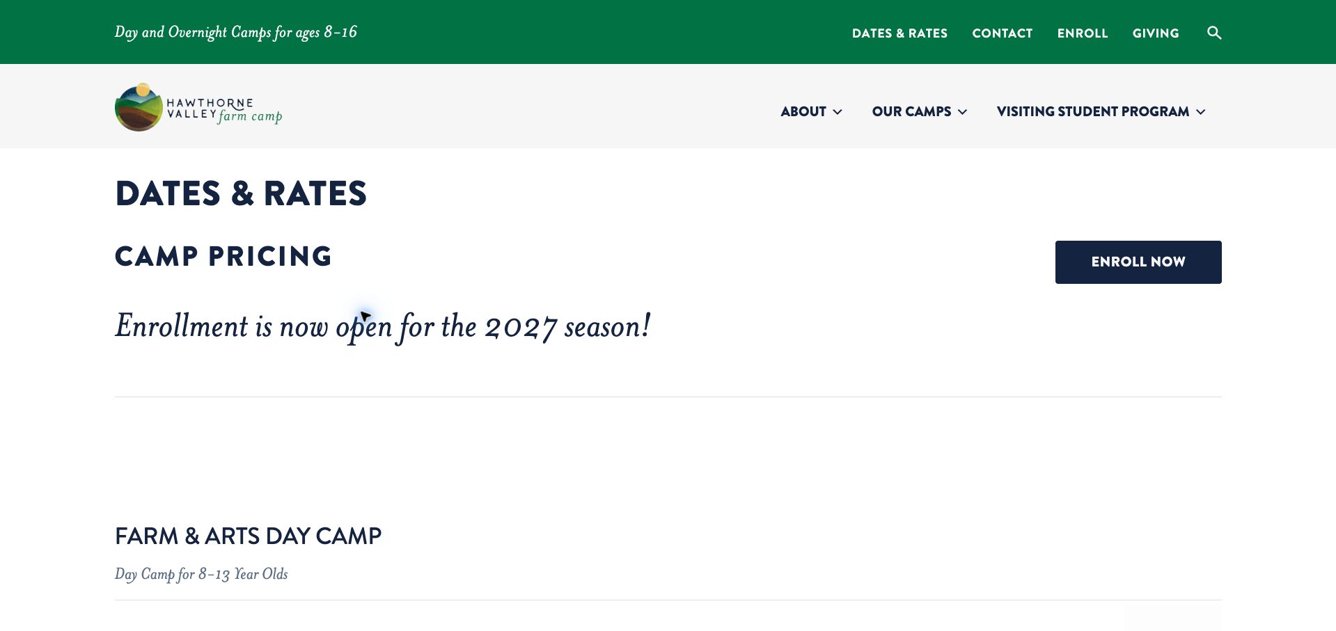
Hawthorne Valley distinguishes a farm-and-arts day programme from overnight farm exploration and an older Earth Stewards programme. The dated tables connect each session to its duration, age range and fee, avoiding an undifferentiated register button for several very different experiences. Sliding-scale day-camp pricing and a separate financial-assistance explanation make cost part of the main decision. The white layout, green accents and large italic enrollment notice give the page a straightforward school-community character. The information architecture is strongest when the reader reaches the tables; generous spacing and the oversized notice delay them. A more significant maintenance issue appears in the FAQ, where an early-booking deadline still names December 2025 beneath a 2027 enrollment offer. That mismatch needs correction before families can rely on the discount. The page remains a useful example of separating programmes by the child's stage rather than presenting dates alone.
What you can learn
Make age, overnight duration and fee explicit in each session row, and update every discount condition whenever a new season's enrollment opens.
Pros
Day and residential programmes have distinct age and duration information.
Financial assistance and sliding-scale fees receive visible explanation.
Cons & considerations
The enrollment announcement pushes detailed comparisons down the page.
An old discount deadline conflicts with the newly advertised season.
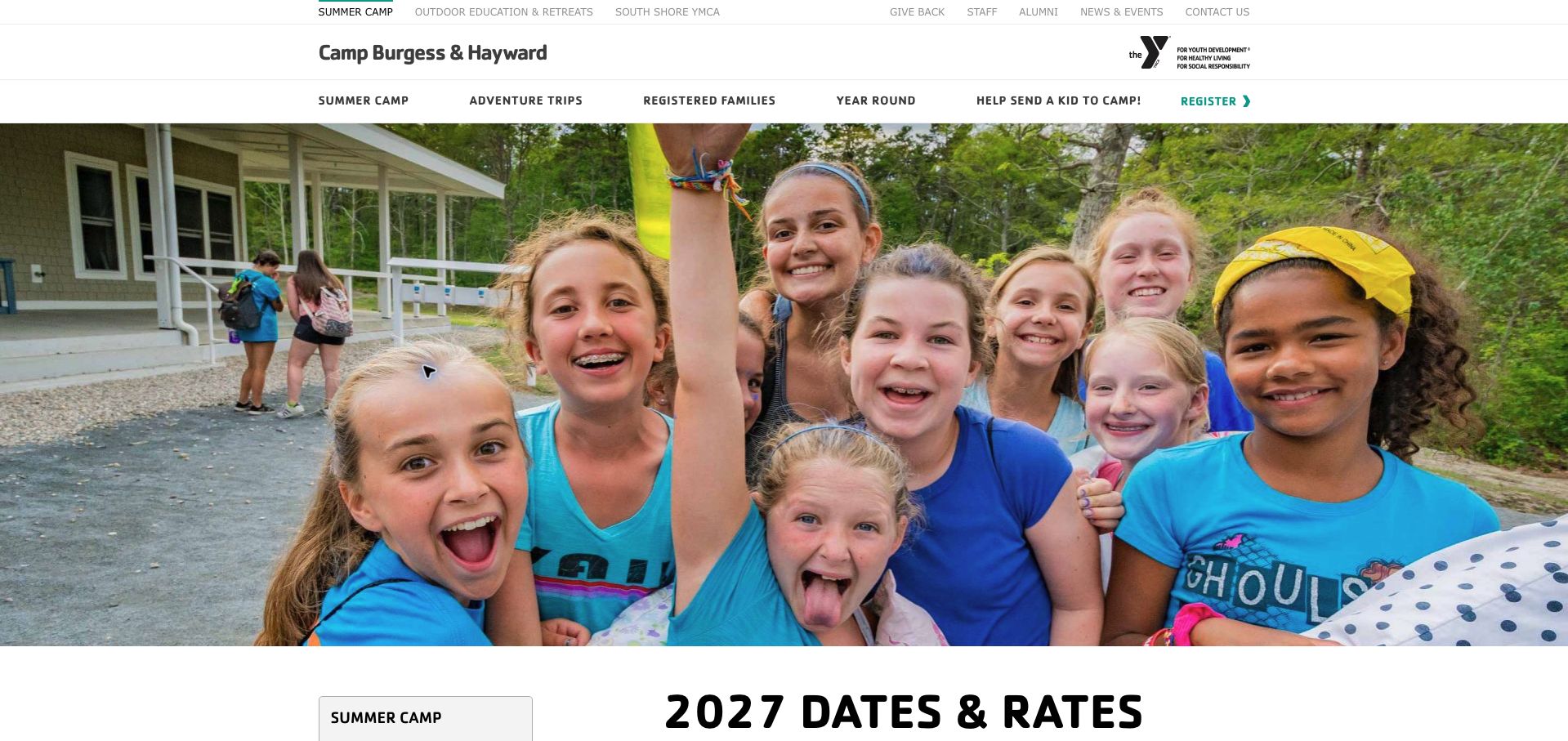
Camp Burgess and Hayward gives registration timing its own explanation before the session tables. Returning families, families previously waitlisted and new applicants have different opening dates, with email access identified for the earlier groups. This is valuable context when a parent sees a session listed but cannot yet book it. Tables then compare conventional sessions, leadership programmes and adventure trips, retaining their differing durations and age expectations. The YMCA identity, teal accents and large camper photograph provide a familiar setting, while a summer-camp sidebar offers related preparation pages. The extensive catalogue is less easy to scan as one long document, and availability labels such as open or limited need to be read alongside the registration calendar. A dated availability legend close to every table would reduce that ambiguity. The design lesson is the separation of eligibility to register from the existence of a place.
What you can learn
Explain who may register when, then label the freshness and meaning of availability in the session comparison itself.
Pros
Different registration windows are stated before the programme tables.
Specialist trips and leadership options retain their own session information.
Cons & considerations
The long catalogue makes comparison across programme types laborious.
Availability labels can be misread without the separate opening-date explanation.
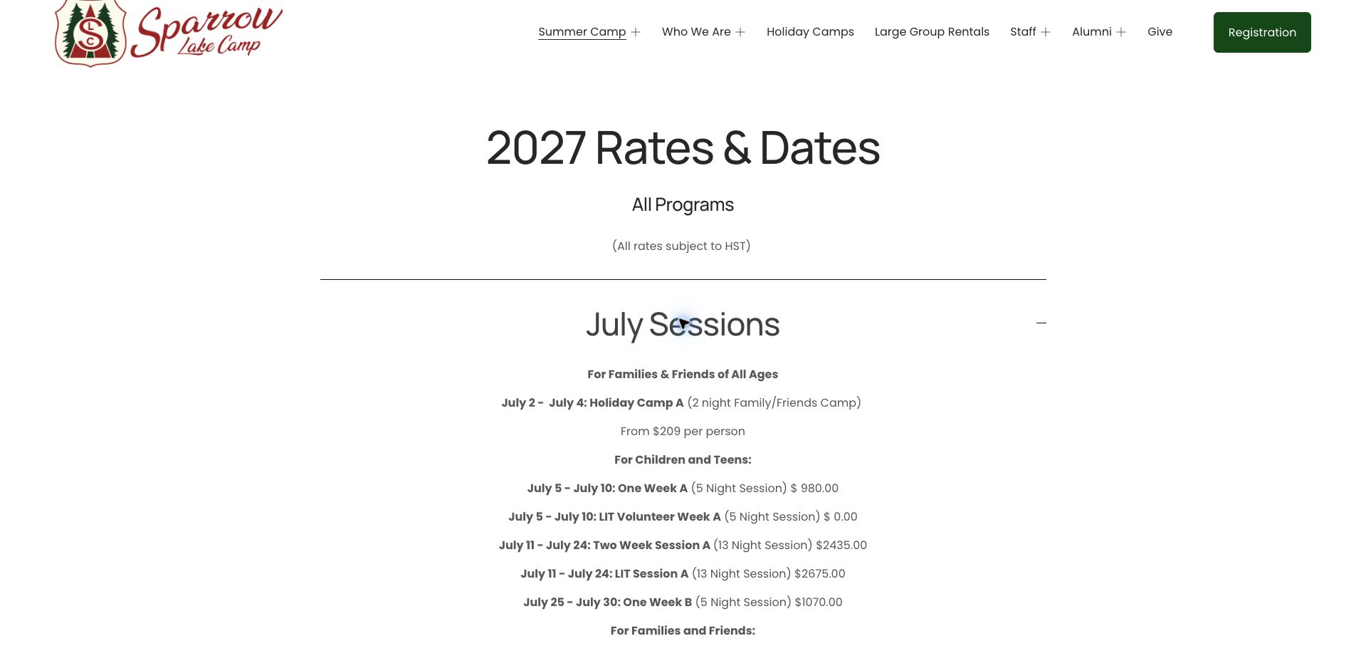
Sparrow Lake uses a notably restrained rates page: a large season heading, a tax qualification and two month accordions. Opening July reveals family weekends, one-week youth sessions, a longer session and leadership options, with night counts supplied alongside the informal week labels. The distinction matters because a one-week camp is shown as five nights. Financial assistance has a clear application route through the payment section, and families seeking accommodations are given a named director to contact rather than a vague promise. The forest-green header and script camp logo lend identity without requiring a photographic hero. Centered paragraphs, however, are slower to compare than aligned table columns, and the July list does not attach specific child-age eligibility to every programme. Cancellation and change conditions sit in a second set of accordions. This is a useful compact framework that would benefit from more consistent row-level detail.
What you can learn
Use month accordions to contain a large season, but keep dates, nights, age eligibility, tax treatment and price aligned within each programme row.
Pros
Night counts clarify what the one- and two-week labels mean.
Financial assistance has a concrete route within registration.
Cons & considerations
Centered text makes prices and dates harder to compare across sessions.
Programme-specific age eligibility is not repeated in the expanded July list.
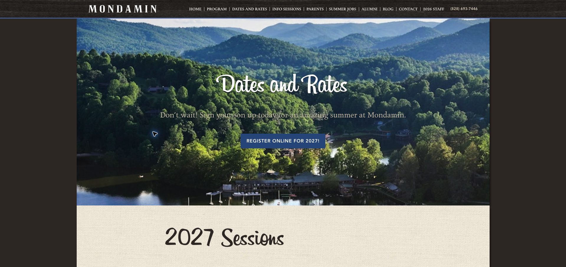
Mondamin follows its mountain photograph and wood-toned navigation with a season-specific list of sessions. Each option supplies dates, duration, grade range and cost, and the grade wording refers to the school year before camp. The more distinctive section explains how to choose: shorter introductory stays and longer sessions are discussed in terms of familiarity, pace and the experiences available. That gives parents a reason to prefer one duration rather than treating the cheapest or earliest slot as automatically suitable. Returning-family priority and the later opening for new families also explain the registration sequence. The visual treatment feels traditional and location-specific. The tradeoff is a dense collection of slash-separated facts followed by long explanatory prose; it is hard to compare all sessions at once. Refund and insurance material is also distant from the initial prices. A small comparison table would preserve the thoughtful guidance while shortening the first decision.
What you can learn
Combine a session table with a short explanation of who each duration suits, keeping grade definitions and financial conditions close to the relevant option.
Pros
Session advice explains the practical difference between short and long stays.
The grade reference point and registration priority are explicitly described.
Cons & considerations
Inline strings of dates, grades and prices make comparison unnecessarily slow.
Financial conditions are separated from the initial session selection.
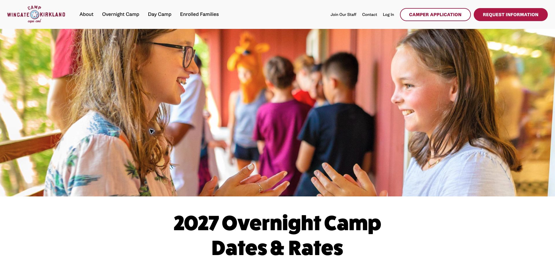
Camp Wingate Kirkland presents its 2027 overnight offer in a simple four-column table: session, duration, dates and rate. Immediately below, the mini-camp note restricts those sessions to first-time campers completing specified grades and recommends an initial-session route for newcomers. That placement is effective because the exception qualifies the exact options a parent has just compared. A concise statement also explains that trips and transportation are included, followed by refund and shorter-session change fees. The magenta header actions and rounded heavy headline create a cheerful, recognizable identity. A large photograph and testimonial precede the table, however, making a practical rates visit slower than necessary. Application, reenrollment and information-request actions also need a little interpretation from a first-time family. The strongest aspect is not the promotional introduction but the compact grouping of eligibility, inclusions and fee conditions around the comparison.
What you can learn
Attach first-time and grade restrictions directly to the relevant session table, and summarize inclusions and change costs before the application handoff.
Pros
Mini-session eligibility is placed immediately beneath the comparison.
Transport inclusion and refund or change charges are clearly stated.
Cons & considerations
A large hero and testimonial delay the dates-and-rates task.
Several differently labeled actions compete around the enrollment journey.
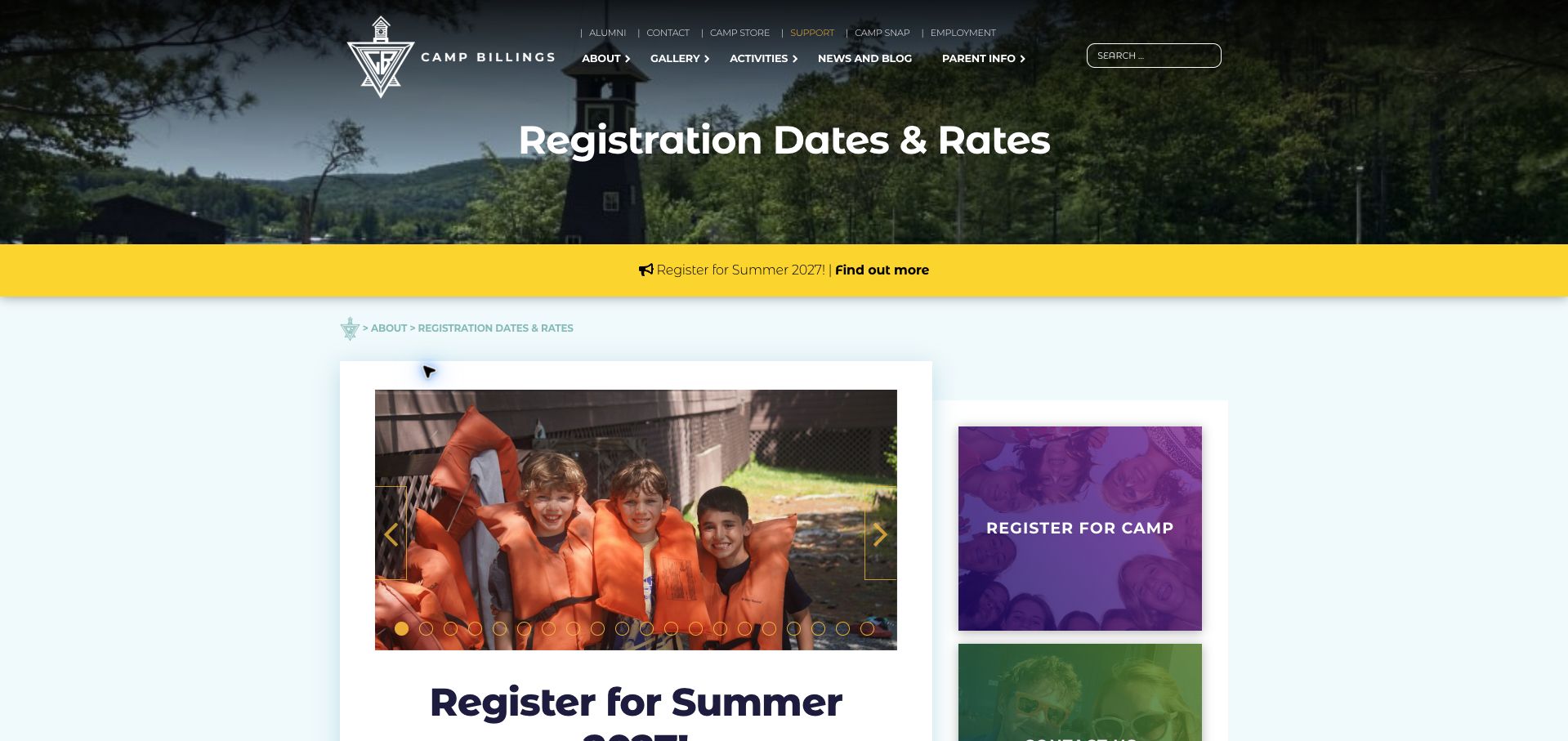
Camp Billings opens the substantive content with four two-week sessions for ages eight to fifteen, listing the dates and identifying a lower-priced first session. It then gives families information-session dates, a direct alternative for an individual conversation and a tuition-assistance explanation with geographic and timing priorities. These details make the offer more actionable than a general affordability claim. A registration-process section also explains how to prepare an account and which channel accepts applications. The lake photograph, yellow season notice and pale-blue content area establish a clear seasonal identity. The opening carousel occupies substantial space, and the sidebar's competing promotional cards distract from the rate comparison. Earlier information-session dates remain mixed with upcoming ones, requiring parents to sort the calendar themselves. The page is strongest as a guided sequence from basic eligibility to assistance and application preparation, rather than as a quick visual price comparison.
What you can learn
Follow a compact session list with assistance criteria and account-preparation steps, and automatically separate past information events from the next available dates.
Pros
The reduced first-session fee is visible beside the other session prices.
Assistance priorities and a direct registration process are explained.
Cons & considerations
The carousel and sidebar distract from the main enrollment information.
Past and future information-session dates are mixed in one list.
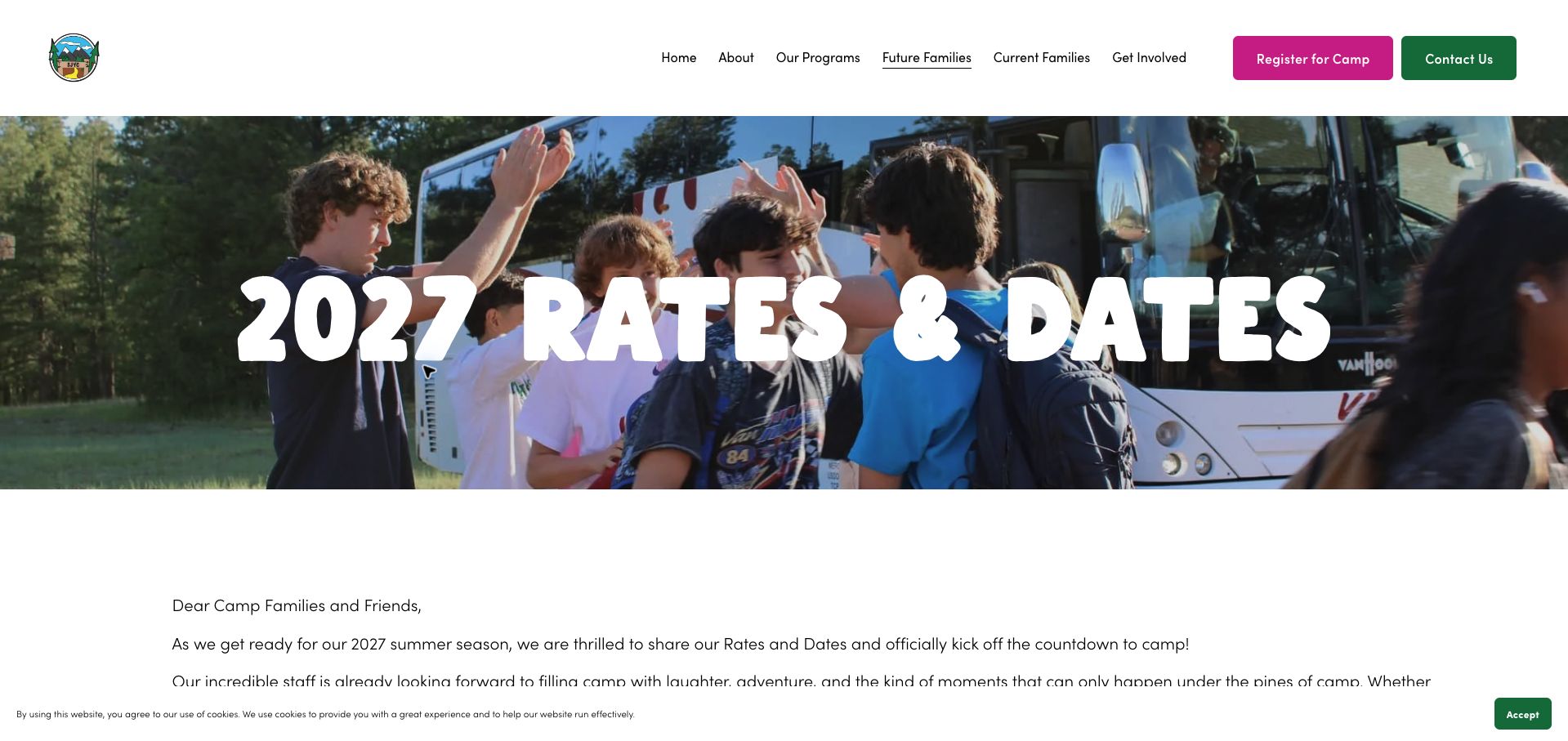
St. Joseph's Youth Camp separates overnight and day options while keeping session name, dates, age and rate together. The overnight table adds a deposit column, making the initial payment distinguishable from the full price. Its discount explanations are unusually explicit about which programme and age group qualifies, whether offers stack and when each window applies. The bright magenta registration button and forest-green contact action sit above a large arrival photograph, creating a warm but practical camp identity. The page could reach its useful comparison sooner: an introductory letter and a lengthy discount section come before the main table. Expired launch-day promotions also remain prominent within the current season's offer. A compact current-offers summary would preserve the transparency without making families calculate which paragraph still applies. The most useful pattern is the separation of programme eligibility, headline cost and deposit rather than presenting one ambiguous starting rate.
What you can learn
Compare the full fee and initial deposit separately, and show only currently applicable promotions before retaining historical terms in a clearly dated supporting section.
Pros
Overnight rows align age eligibility with dates, fee and deposit.
Discount eligibility and whether offers combine are explicitly described.
Cons & considerations
The welcome letter and promotions delay the session comparison.
Expired launch offers remain prominent beside active discounts.
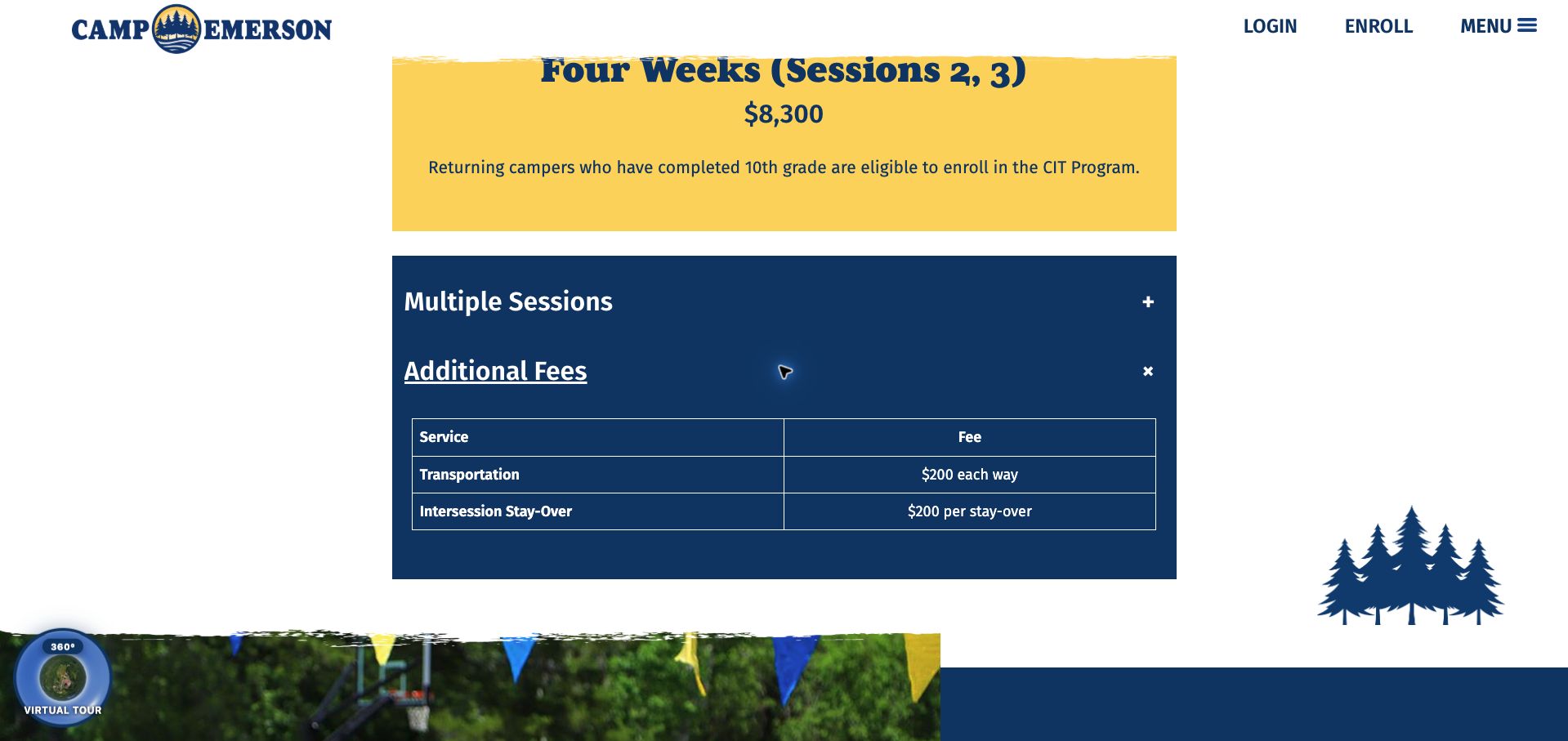
Camp Emerson uses large colored blocks to distinguish two-week, one-week and counselor-in-training options. Each block pairs its duration and price with dates, while the leadership option states the returning-camper and completed-grade requirements. An expandable additional-fees section gives concrete transport and between-session stay charges; opening it reveals a small, easily scanned service-and-fee table. The FAQ then explains practical matters such as age range, bunk assignment, activity choice, laundry and contact with home. Navy and yellow branding, rough-edged photography and tree illustrations provide an outdoors character without overwhelming the fee content. The very large opening photograph postpones the comparison, and optional costs remain concealed until a visitor opens their accordion. This is a useful model for combining a simple tuition overview with operational detail, provided that a short visible notice alerts families to those extra charges before they choose a session.
What you can learn
Use clear duration-based tuition blocks, but surface the existence of optional transport and stay-over charges before the expandable fee table.
Pros
The expanded extra-fees table supplies exact service and charging units.
The leadership programme includes a specific eligibility qualification.
Cons & considerations
The oversized photographic opening delays the practical rates content.
Additional charges are hidden behind a collapsed section by default.
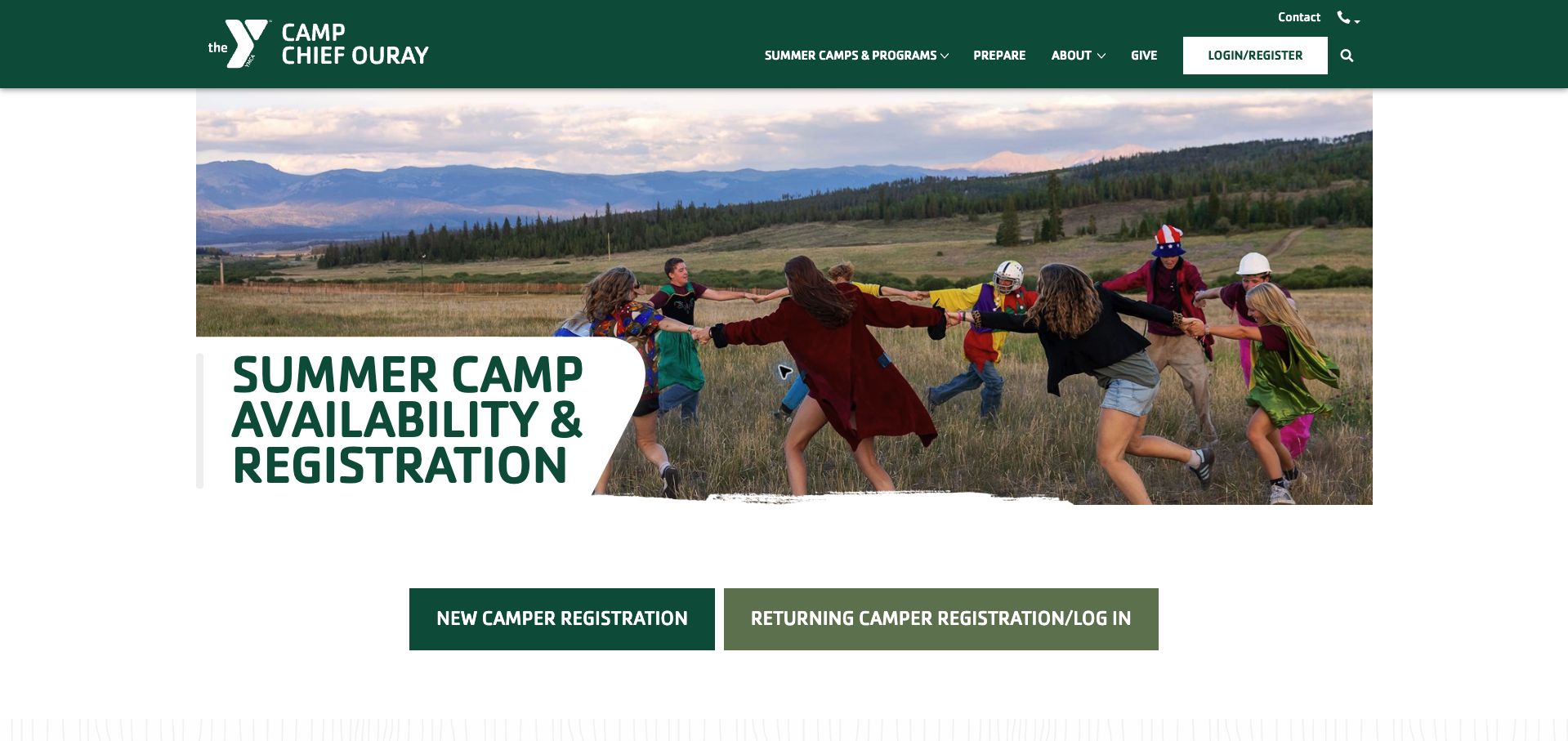
Camp Chief Ouray makes an important distinction explicit: its public availability is updated manually and is not directly connected to the registration platform. The accompanying explanation warns that displayed space may already be taken and points families toward a no-charge waitlist. Separate sections identify returning and new-family opening dates for overnight and day programmes, along with their different deposits. Leadership applications receive their own steps, including camper contributions and a later interview. The green YMCA header, mountain photograph and paired new/returning registration buttons give the page a clear hierarchy. The long set of programme tables is harder to navigate, and a generic closed status needs the nearby opening-date context to avoid sounding like sold out. More precise statuses and update timestamps would strengthen the honest explanation already present. The page's main lesson is to describe the limits of availability data rather than implying a live connection that does not exist.
What you can learn
Label manual availability, show its latest update and distinguish not-yet-open, sold-out and waitlisted states before sending families into registration.
Pros
The page clearly discloses that availability is maintained manually.
New and returning families have distinct registration timing guidance.
Cons & considerations
Closed labels require context to distinguish future opening from full sessions.
The extensive programme tables would benefit from stronger in-page navigation.
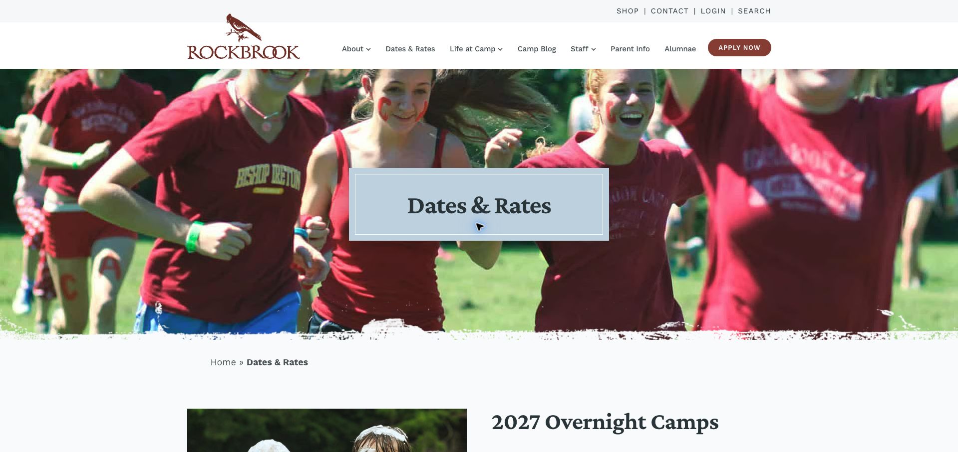
Rockbrook explains its grade convention with a concrete example: the relevant grade is the one just completed, not the one a child will enter next. Session cards then pair dates, prices and grade ranges, grouped into early, middle and late summer. The introductory copy states that the listed dollar amounts include activities such as off-site trips and riding, and explains that capacity is limited within each grade. At the end, the application section says that applying is free and carries no obligation, with a follow-up usually expected within a day or two. That is a useful correction to the assumption that an application button immediately confirms a place. The muted blue panel, maroon accents and lively camper photograph create a coherent identity. Prices and grade ranges still require scrolling between groups, and no grade-level availability is shown in the overview. The communication around application status is the strongest feature.
What you can learn
Define the school-grade reference point with an example and explain the next step after application, including whether any place or payment is yet committed.
Pros
A concrete example removes ambiguity from the grade eligibility rule.
The application explanation states both its nonbinding nature and follow-up timing.
Cons & considerations
Session groups require scrolling to compare the complete season.
The overview does not display current capacity for each eligible grade.
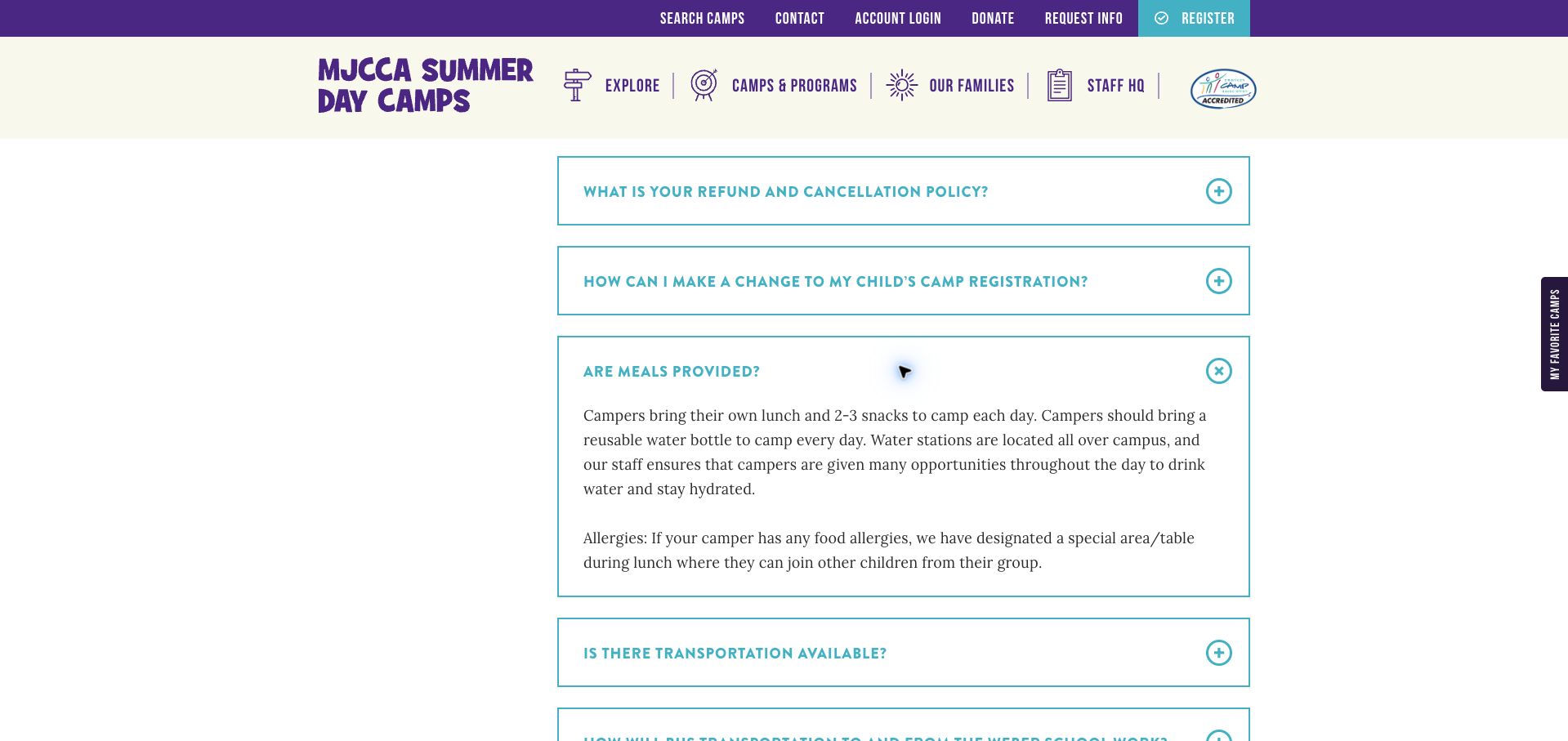
MJCCA's FAQ is organized around practical parent questions rather than broad marketing themes. Opening the hours answer distinguishes the camp day, carpool windows and before- or after-care times. The meals answer specifies that families supply lunch, several snacks and a reusable bottle. Other headings cover early pickup, transportation changes, registration changes and financial assistance, reflecting the ongoing logistics of a working family's summer. Purple and turquoise accents, substantial outlined accordion rows and a persistent exploration sidebar make the page recognizable within the larger camp catalogue. The list is long and mostly collapsed, so locating a related set of answers requires repeated opening and scrolling. An early-pickup question also appears twice, and the sidebar still points to 2026 rates at the time of review. Grouping these questions into daily routine, booking and support would make an already useful information resource easier to maintain and use.
What you can learn
Separate camp hours from arrival, collection and extended care, then group related logistics answers so parents can plan a whole day without searching several accordions.
Pros
The hours answer distinguishes programme, carpool and care windows.
The meal answer states concrete items families must supply.
Cons & considerations
A long undivided accordion list makes related answers harder to find.
A repeated pickup question and prior-season rate label need editorial upkeep.
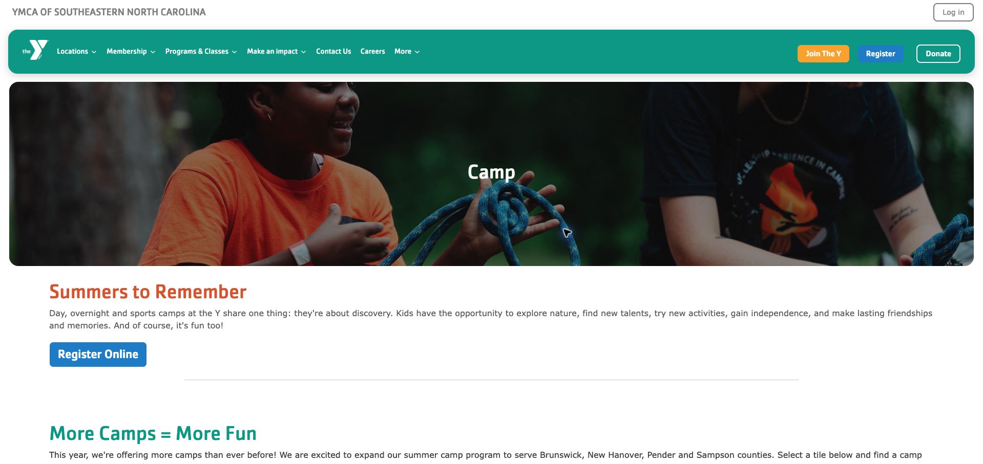
The YMCA of Southeastern North Carolina's former summer-camp link now leads to a broader camp hub. Its first useful choice is geographic: county tiles and Camp Kirkwood help visitors narrow the region before reading about traditional, specialty, sports and overnight programmes. The explanatory sections distinguish youth day camp from teen leadership options and identify which specialist activities are offered in New Hanover County. Rounded panels, a teal navigation bar and orange headings give this regional directory a friendly, consistent appearance. The main limitation is that the opening registration button precedes the location and programme selection, which may send an undecided parent into a broad system too soon. The hub also describes the season as this year without an obvious year beside the introductory copy. This example is useful for location-based routing, but its supporting dates, ages and fees belong on clearly connected programme pages rather than being inferred from the general overview.
What you can learn
Let families choose location and programme type before registration, and attach an explicit season year to regional camp information that is updated annually.
Pros
County routes help families narrow a geographically broad offer.
Youth, teen leadership and specialist formats are explained separately.
Cons & considerations
The first registration action appears before programme qualification.
The general season wording lacks a prominent explicit year.
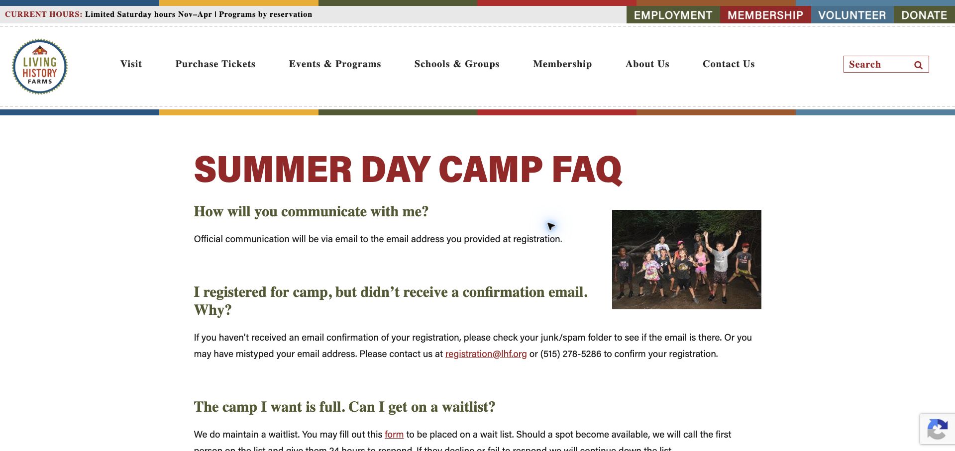
Living History Farms uses a straightforward, open FAQ rather than hiding every answer behind a control. It addresses missing confirmation emails, waitlist offers, the grade a child will enter in autumn and the practical details of food and collection. The waitlist explanation includes a response window, making clear that a potential opening still requires action. Pickup guidance describes the assigned flag and counselor information sent before camp, then states that an authorized adult needs identification each day. These concrete instructions make the historic-site setting more understandable to a first-time parent. Burgundy and olive headings and a small programme photograph provide enough character without a full-screen promotional hero. The long page would benefit from a contents list, and broad institutional navigation competes with the camp-specific task. Its value lies in answering likely points of failure in everyday language rather than repeating promises about an enjoyable summer.
What you can learn
Write practical answers for missing confirmations, waitlist offers and daily collection, with explicit next actions and timing rather than generic reassurance.
Pros
The waitlist process includes a defined response window.
Arrival, food and authorized-pickup instructions are specific and readable.
Cons & considerations
The long open FAQ lacks a compact in-page contents navigation.
Institution-wide navigation competes with the focused camp-planning task.
Rolling Hills places the 2027 full-season and half-season dates before a categorized FAQ. The answers explain that older children attend five days per week while younger campers have more flexible attendance, then distinguish the core camp day from bus pickup and extended-care windows. Included before- and after-care is particularly useful information for parents assessing the total daily coverage. Transport, group structure, swimming and meals receive separate answers, helping families understand the service behind the season price. The royal-blue header and playful yellow-red logo establish a strong identity. A full-height camper photograph delays the actual dates, however, and the page's inclusion explanations do not sit beside a visible tuition comparison. Some answers are also much longer and more promotional than necessary. The transferable idea is to describe the complete day from pickup to return, while keeping claims about staff or instruction clearly attributable to the operator.
What you can learn
Present programme hours, transport and extended care as one day-planning summary, then link that coverage to the applicable tuition and attendance option.
Pros
Core hours and included extended care are clearly distinguished.
Attendance flexibility is qualified by the child’s school stage.
Cons & considerations
A full-height opening photograph postpones the calendar and answers.
The service inclusions are separated from a visible tuition comparison.
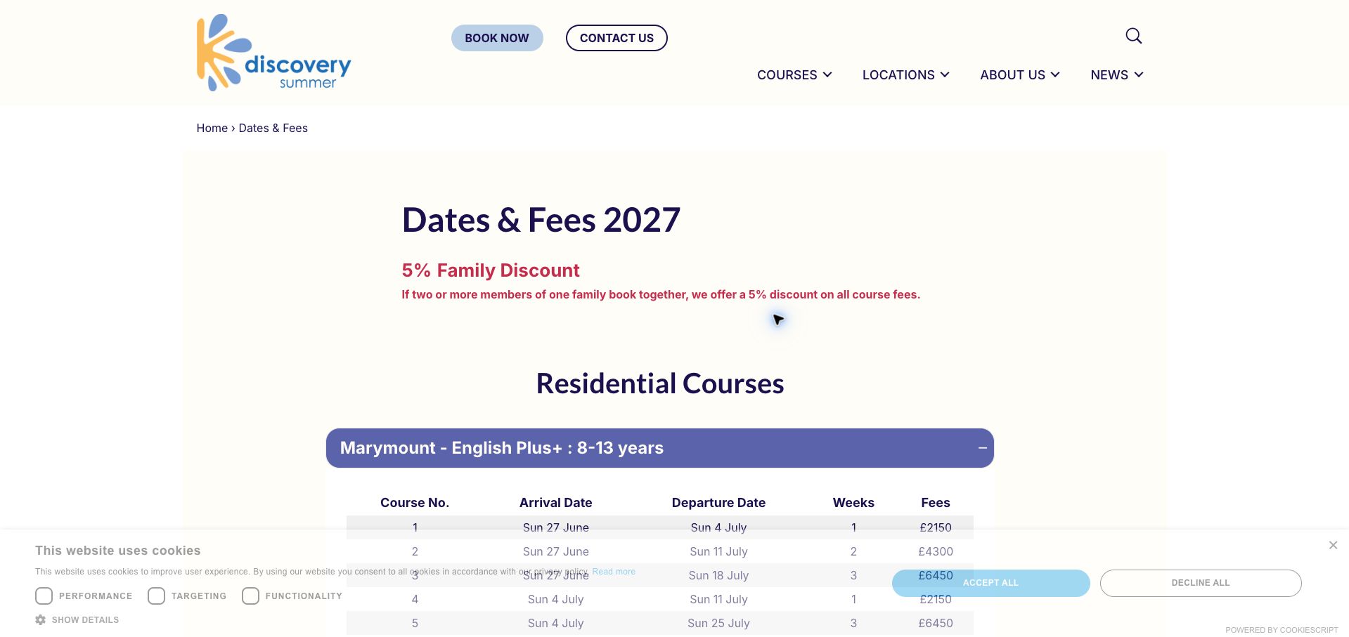
Discovery Summer groups its 2027 courses into residential and non-residential sections. The first expanded residential table aligns arrival, departure, weeks and fees, followed by room size, tuition hours and class-size information. Age ranges are visible in the section labels, so a parent can eliminate unsuitable options before opening every table. The day-course comparison adds hours and different age groups, while the travel section qualifies included airport transfers by both time window and stated arrival or departure date. A pale cream background, indigo headings and rounded purple controls create a calm administrative page. The number of exceptions and footnotes makes cross-course comparison demanding, and most campus alternatives require opening additional sections. The page is a strong reference for publishing the conditions behind an inclusive package, particularly because a free-transfer claim becomes misleading without its timing boundaries. A compact cross-campus summary would improve orientation before the detailed tables.
What you can learn
Compare age, dates, tuition hours and accommodation together, and state the time and date restrictions beside any included-transfer claim.
Pros
Course labels show age eligibility before expansion.
Airport-transfer inclusion is explicitly limited by dates and flight times.
Cons & considerations
Many footnotes make comparisons across course types demanding.
Collapsed campus sections obscure the overall set of alternatives.
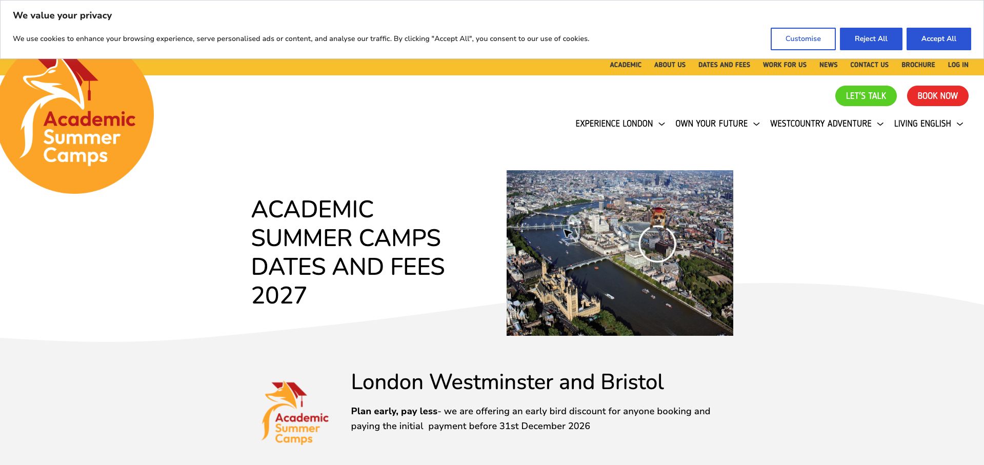
Academic Summer Camps separates London experiences, subject-focused programmes and a Westcountry adventure offer, attaching an age range, date span and charging unit to each. Day and residential prices are paired where both exist, with the day schedule and meal provision stated separately from accommodation, transfers and other residential inclusions. This is useful because per-week and two-week course fees appear on the same page and must not be compared as equivalent amounts. Orange branding and large programme headings create clear divisions. The opening countdown and several navigation layers compete for attention, and the long page repeats similar inclusion lists rather than presenting one concise comparison. An early-booking notice also needs readers to inspect the associated payment condition rather than treating a reservation alone as sufficient. The best lesson is to make the unit of sale and the service package explicit for every programme, even when that produces more detailed copy.
What you can learn
Keep price duration and day-versus-residential inclusions inseparable, and summarize the payment condition whenever an early-booking offer is advertised.
Pros
Each programme identifies whether the fee covers a week or a longer course.
Day schedules and meal inclusions are separated from residential services.
Cons & considerations
The countdown and layered navigation distract from fee comparison.
Repeated inclusion prose makes the full programme list laborious to scan.
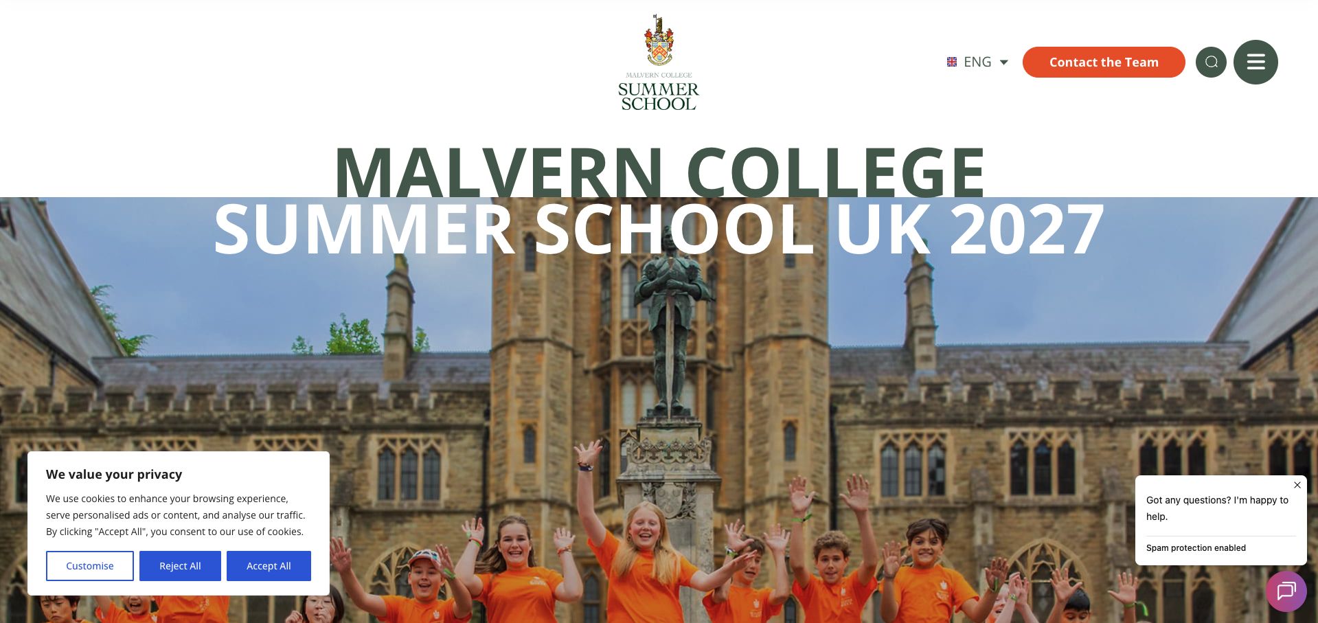
Malvern's summer-school page has already moved to a 2027 offer, with a clear seasonal date range and a register-interest action. It explains the programme through six module choices and a simple weekly structure: one selection in the morning and one in the afternoon. This gives the customizable offer a practical shape instead of leaving personalization as a slogan. Separate routes to pastoral care, FAQs and the team support parents who need more detail. The green-and-orange identity, oversized typography and campus photography make the school setting unmistakable. The large opening treatment is visually dominant, however, and the page mixes interest registration with a book-now navigation label without immediately explaining the distinction. Fees are also not part of the opening practical summary. The useful pattern is the clear module-selection explanation; the next improvement would be to pair it with age, price and the exact status of enrollment.
What you can learn
Explain customization as a concrete choice process, then align every call to action with whether the family is expressing interest, applying or confirming a booking.
Pros
The morning-and-afternoon module structure makes customization understandable.
Parent-support and programme-detail routes are clearly named.
Cons & considerations
The oversized opening delays practical eligibility and price information.
Interest-registration and booking labels do not immediately explain their relationship.
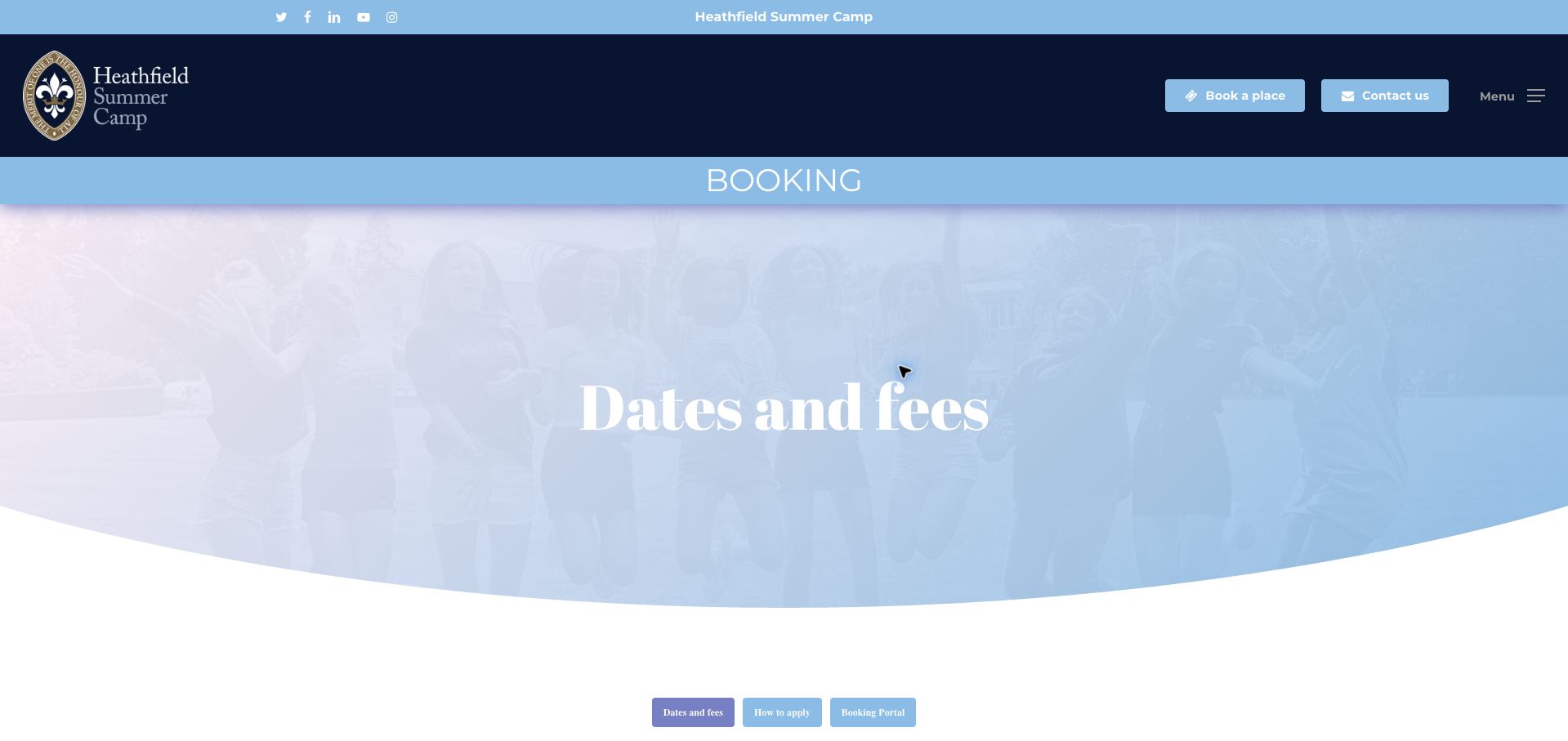
Heathfield divides dates and fees into day and boarding sections, then distinguishes standard and early-booking prices for one to four weeks. Individual-day attendance and cooked lunch are separately described, while breakfast and late-stay options have daily and weekly charges. The explanation that these extras require an email and revised invoice is useful because it tells families how the advertised option becomes part of their booking. Pale-blue panels, navy branding and serif headings produce a calm school-style presentation. The page reviewed still covers summer 2026 and includes discount deadlines that had already passed, so it should not be treated as a current 2027 price offer. Repeated price blocks also make the full page lengthy. The structure is worth studying for its distinction between attendance formats and extras, but its dated promotions illustrate why seasonal pricing needs an explicit archive or forthcoming-season state.
What you can learn
Keep day, boarding and optional-care prices distinct, and replace expired promotional calls with a clear archive label or next-season information.
Pros
Breakfast and late-stay charges identify both daily and weekly units.
The process for adding extras and receiving a revised invoice is explained.
Cons & considerations
The displayed season and promotional deadlines had already passed at review.
Repeated weekly price blocks lengthen an otherwise simple comparison.
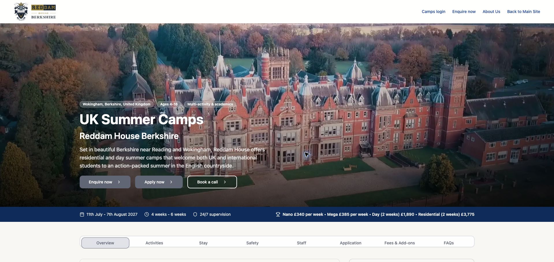
Reddam House places age, location, season dates and several starting prices around its main camp introduction, then provides a horizontal navigation for activities, accommodation, staff, application, fees and FAQs. The overview distinguishes the main eight-to-sixteen programme from younger Nano and Mega options, while detailed rows separate weekly and two-week prices. This creates a useful route through a complicated offer without forcing every parent to follow the same long narrative. Navy branding, campus photography and compact fact labels feel orderly. Some headline information still needs reconciliation: the opening duration label says four to six weeks while the main sessions are two weeks within a four-week date range. The price strip also mixes age groups and charging periods, so it demands careful reading. The design's strength is its section architecture; the content needs equally consistent labels to keep that architecture from giving conflicting facts an appearance of certainty.
What you can learn
Use persistent section links for complex camp offers, but standardize age groups, session duration and price units across the hero, fact strip and detailed tables.
Pros
Section navigation separates activities, stay, application and financial details.
Detailed information distinguishes main-camp and younger-child options.
Cons & considerations
The headline duration conflicts with the two-week session structure.
The opening price strip mixes age groups and charging periods.
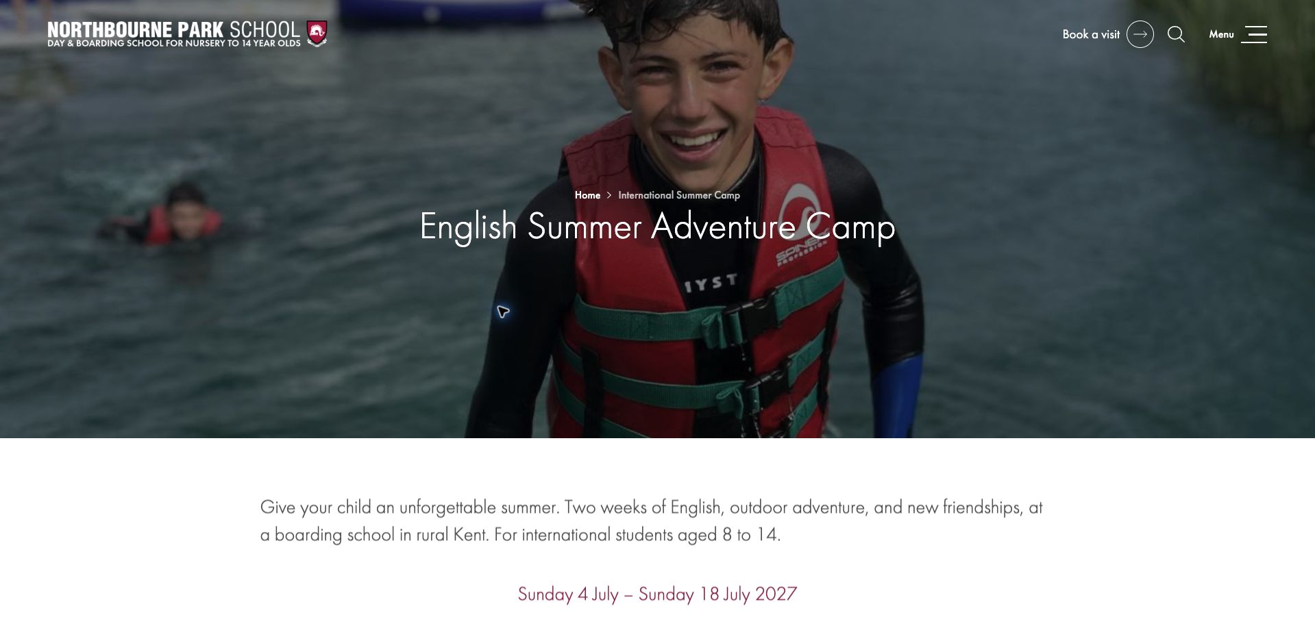
Northbourne Park starts with a specific two-week 2027 session for international students aged eight to fourteen. A short set of headline facts then gives weekly English tuition, the age range and the all-inclusive fee before inviting an enquiry. Later content explains the balance of classroom work, outdoor activities and contact with English-speaking peers, giving the course a concrete daily shape. The restrained maroon accents, clean type and water-activity photograph make the page feel consistent with the school. The principal drawback is the position and scope of the enquiry form: it appears before much of the supporting explanation and asks for extensive child details at an early interest stage. Families must scroll through it to reach more context. The page is a good model for a focused offer with a single date range, but a shorter initial enquiry and a clear explanation of the subsequent application steps would reduce friction.
What you can learn
Show the fixed dates, age range, teaching commitment and fee first, then collect only the details needed for an initial enquiry before requesting fuller enrollment information.
Pros
The opening offer combines a specific session with age and price facts.
The daily balance of language learning and activities is explained.
Cons & considerations
A substantial enquiry form interrupts the supporting programme information.
Extensive child details are requested at the initial interest stage.
Kegan is a freelance web designer and developer with 15+ years of experience helping businesses turn complicated website requirements into clear, maintainable digital experiences. He works directly with clients from planning and design through development, launch, and ongoing support.
For summer camp website design, his development approach focuses on age and session comparisons, fee and transport information, parent resources, clear application stages, and careful registration-system handoffs. The scope can be a targeted improvement or a complete custom build, with responsive layouts, thoughtful content structure, and integrations chosen around the people using and maintaining the site.
Show 3 other summer camp website designersHide other summer camp website designers
Plan the content around the decisions visitors need to make
Define programme eligibility
Record age or grade, the date used to assess it, required experience and any programme-specific application steps. Separate junior, teen and leadership options instead of letting a broad homepage age range imply universal access.
Build a consistent session table
Show the year, arrival and departure dates, nights or daily hours, fee and charging unit. Distinguish one-week labels from actual night counts and indicate whether availability is live, manual or not yet open.
Explain inclusions and extras
List meals, transport, extended care, materials and accommodation only where they are part of the actual offer. Attach transfer time windows, location restrictions and additional fees directly to the claim they qualify.
Describe the application sequence
Explain account creation, application, review, deposit and confirmation in the order families encounter them. Keep waitlists and information requests distinct from enrollment, and state the expected follow-up where the operator can support it.
Minimize early data collection
Let families understand the programme before presenting a long form. Ask only for information needed at the current stage, and move detailed participant records into an appropriate enrollment process with clear handling and access controls.
Plan annual rollover and testing
Update dates, prices, discounts, brochures and registration windows together. Test choosing a session and understanding the next step on a phone without submitting child details, applications or payments to real systems.
The editing job behind the design
Choose a maintainable publishing and booking system
Use structured programme and session records to keep dates, age rules and fees consistent across landing pages, FAQs and enrollment links. Include explicit expired, forthcoming, waitlisted and available states rather than leaving an old season looking bookable.
The public site should explain the offer while an appropriate registration system handles detailed participant information. Check the clarity of the handoff, the meaning of availability and the behavior of tables and accordions on small screens. Public technology signals do not establish the safety or quality of camp operations.
Our WordPress website examples offer a separate look at publishing approaches. A visible platform label is evidence for that named page, not a guarantee that the same system will suit your requirements.
Before the public launch
Practical website planning checklist
Show the current season year.
Define age or grade reference points.
Distinguish day and residential formats.
List exact session dates.
Show nights or daily hours.
State the fee charging unit.
Identify deposits and extras.
Qualify transport inclusions.
Explain application versus confirmation.
Label manual availability.
Limit initial inquiry fields.
Update brochures and expired discounts.
These checks are a project checklist, not a performance, legal, security, or accessibility certification. Test real journeys with the people responsible for the website before making claims about the result.
Sources & editorial method
How this collection was selected and reviewed
The 21 examples match the original saved collection target. Each official public page was opened, inspected and directly captured in an ordinary browser; source URLs and capture dates identify the reviewed state. Reviews describe observed design, information and navigation, with distinct practical lessons and limitations. A bounded public technology-audit attempt accompanies every source, preserving unknown and inaccessible results without inventing a hidden stack. Editors Choice is an explicit editorial selection favoring a smaller specialist or local organization, not a service-quality, safety or outcome endorsement. No booking, application, payment or private form was submitted. Website imagery and trademarks belong to their owners.
Each example links to its actual source page. Screenshots are direct browser captures with their own capture dates; moving imagery, announcements and live designs can change. The notes describe observable design choices and conditional tradeoffs, not measured traffic, conversion results, service quality, or accessibility conformance.
Technology labels use public page metadata, asset evidence, or explicitly cited platform documentation. Platform documentation is not a complete current deployment audit. A component reference may be legacy or unused; it is not a complete backend inventory. Unknown stacks are omitted. These sites are editorial examples, not our client portfolio.
Written, Edited and Curated are separate editorial records, not timestamps advanced by a rebuild. Website designs and imagery belong to their owners. See our editorial standards or suggest a correction.
Questions worth asking
Summer Camp website design questions
What belongs in a summer camp’s first summary?
Programme format, age or grade eligibility, session dates, location, duration and price basis. Residential offers should add accommodation context; day camps should clarify hours and any extended care.
How should grade eligibility be described?
State whether it means the grade just completed or the one the child will enter, and give an example when helpful. Different camps use different conventions, so a bare grade number can mislead.
Is an application the same as a booking?
Not necessarily. The site should explain what is submitted, who reviews it, when payment is due and what confirms a place. Interest forms and waitlists need equally explicit labels.
How should camp availability be displayed?
Identify whether the data is live or manually maintained and give its update time where useful. Distinguish registration not yet open from sold out, waitlisted or available.
What should happen to last summer’s prices?
Archive or label them clearly and publish the next confirmed season. Update linked brochures and discount deadlines together so old conditions do not appear to qualify a new offer.
Give families a clear account of eligibility, cost, daily life and enrollment. The strongest camp website makes the next step understandable without asking a parent to infer what a button promises.