Best Deck Builder Websites of 2026 (30 Real-World Examples)
Deck, porch and outdoor-living websites that connect inspiration with practical project decisions
A deck builder’s website should help someone imagine the space and understand the work behind it. These examples show how projects, materials, local coverage, planning tools and consultation routes can work together without hiding the important decisions beneath a large photograph.
An attractive outdoor room can start a conversation, but it cannot describe a construction scope on its own. A visitor may be planning a new deck, replacing an existing one, considering a covered structure or trying to understand what a realistic first consultation involves. Those are related interests, not identical projects. A useful website explains the company’s design-and-build role, territory and material scope, then connects the visual inspiration to a clear next step.
The collection includes small family practices, regional outdoor-living specialists, mixed supply-and-installation businesses and a larger builder network. Their services and operating models differ. Study how each page makes the project understandable and how it supports someone not yet ready to request a quotation. Photographs demonstrate presentation, not independently established construction quality, compliance, durability or customer outcomes. A strong brief uses the examples to improve communication without copying another company’s claims or project imagery.
Before the examples
What makes good deck builder website design in 2026?
Make the building role and service boundary clear
Explain whether the business designs and constructs new work, replaces decks, resurfaces suitable structures, supplies products or handles a broader outdoor project. Do not present those as interchangeable. A region or coverage page helps establish fit, while a national network needs an explicit local-provider handoff. If an existing structure must be assessed before scope can be confirmed, say so rather than allowing an online image or questionnaire to imply that every resurfacing request is suitable.
Turn the project library into useful evidence
Give projects context: the broad location, original brief, type of space, relevant materials and the company’s role. Show the relationship to the house, garden and access routes as well as close details. Captions help a visitor distinguish a roof cover from an open pergola or a material change from a complete rebuild. Identify illustrative renderings separately from built work. A portfolio and a case study can have different jobs—quick visual browsing and a fuller explanation of decisions.
Offer different levels of commitment
Someone researching materials may want a guide or project example, while a homeowner with a defined scope may be ready for a consultation. Keep those choices visible. If a calculator, configurator or rendering tool is offered, explain what it produces and what still needs assessment. A short initial enquiry can collect routing information without asking the visitor to design the entire project or select technical construction details on their own.
The collection · 30 examples
30 deck builder websites worth studying
Compare how a completed space is connected to useful facts. Notice the material and location captions, the difference between galleries and project stories, and whether the quotation journey explains what happens next.
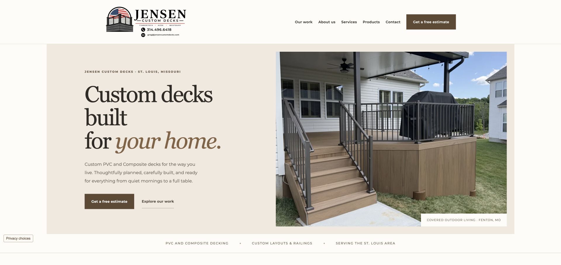
Jensen Custom Decks pairs a cream information panel with a photograph of a covered deck, stairs and railing at a named broad location. Serif typography gives the headline character, while the smaller copy identifies PVC and composite work rather than leaving the service to the image alone. Estimate and portfolio actions are distinct, and a compact strip names materials, custom layouts and the St. Louis service area. The restrained palette keeps attention on the relationship between the house, deck and proposed next step. This is a particularly useful small-business reference because the page does not need a full-screen form, giant review claim or discount banner to establish what the company does and where it works.
What you can learn
Give a real project a short factual caption and place the service explanation on a stable readable surface. A small crew can communicate a clear scope and working identity without copying the promotional density of a national home-improvement brand.
Pros
The project photograph has useful location and application context.
Material scope, service region and two different first actions are clear.
Cons & considerations
The fine supporting text requires careful sizing on small screens.
The broad lifestyle headline relies on the material-specific paragraph for practical detail.
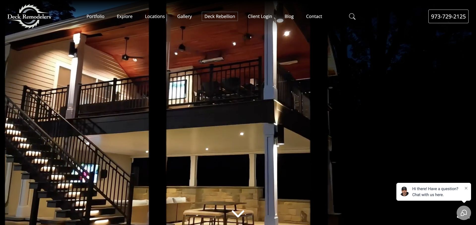
Deck Remodelers gives almost the entire opening to an evening outdoor-room photograph. A staircase, illuminated structure and living space show the scale and atmosphere of a completed setting rather than an isolated deck-board sample. The dark overlay header exposes a portfolio, gallery, locations and existing-client login, with telephone contact at the right. This is a deliberately visual introduction, not a text-led quotation funnel. The photograph has impact, but the captured first view offers little prominent service or geographic explanation. A prospective client needs the navigation and later content to connect the image with the company’s actual design-build role. A floating chat prompt adds another small layer over the project.
What you can learn
An immersive project image works best when the service and territory are still stated in text nearby. Preserve a useful portfolio and existing-client route, and do not make a large photograph carry facts that it cannot communicate on its own.
Pros
The completed space shows stairs, lighting and multiple outdoor uses together.
Portfolio and existing-client access have separate navigation roles.
Cons & considerations
The opening contains little prominent practical service explanation.
The floating chat prompt interrupts the project image.
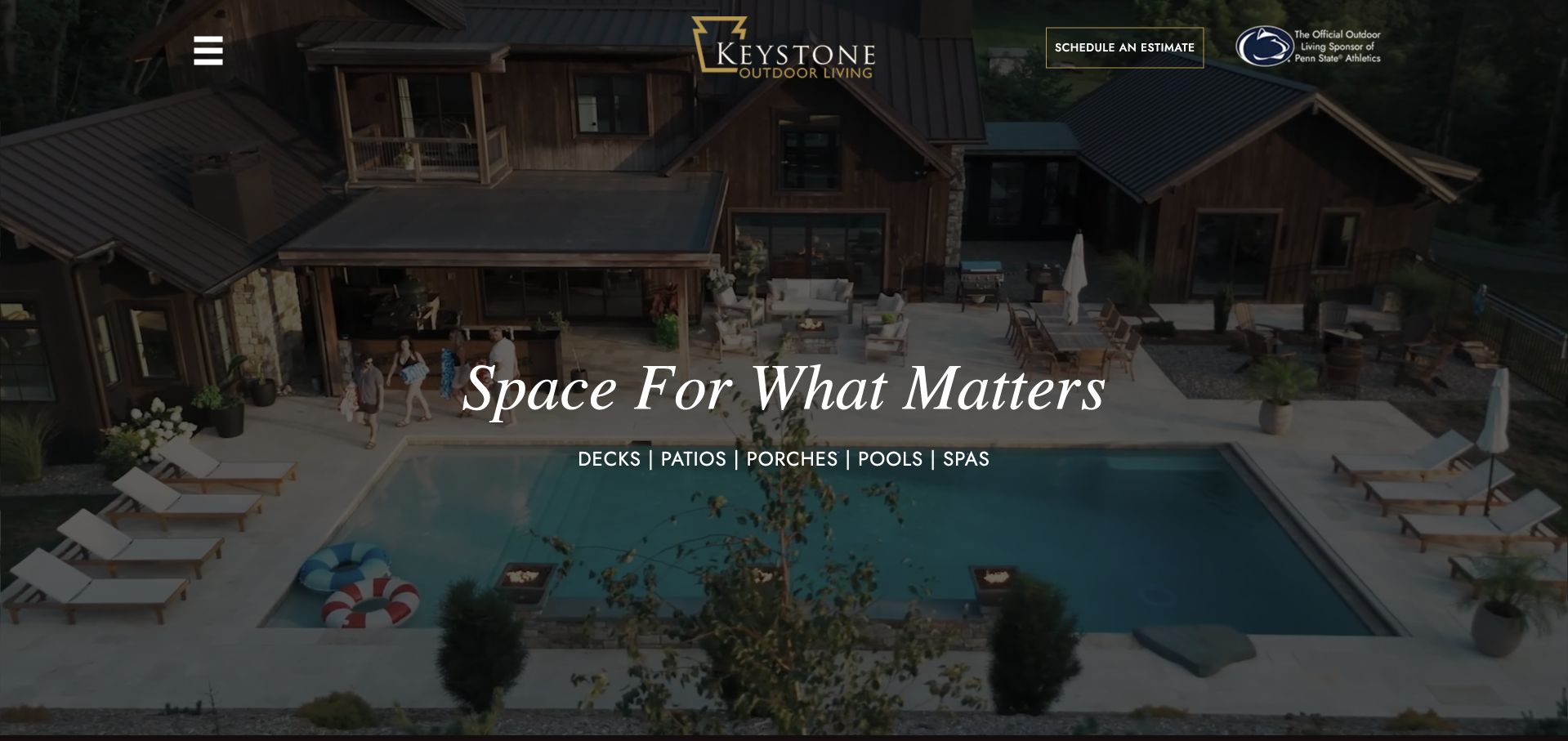
Keystone’s current site is branded Keystone Outdoor Living. Its opening photograph shows a complete pool-and-covered-living setting, paired with a short serif statement and a line naming decks, patios, porches, pools and spas. A centred mark, small estimate action and collapsed menu allow the project image to dominate. The broader brand is appropriate to the wider range, and the service list prevents the visual from being mistaken for a deck-only offer. The tradeoff is discoverability: most detailed navigation is hidden behind the menu, and a visitor must look further to establish local coverage, process and the particular project shown. The current branding should not be described as an archived earlier site.
What you can learn
When a company expands from decks into complete outdoor projects, explain that scope plainly and maintain a coherent product-and-service structure. Let the project image inspire, but do not hide all practical research routes inside an unlabelled menu.
Pros
The supporting line names the wider outdoor-living scope.
The complete setting shows how several project elements work together.
Cons & considerations
The collapsed desktop menu hides most research destinations initially.
The hero has little immediate location or project-specific context.
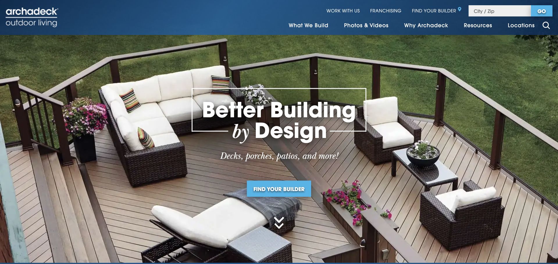
Archadeck uses an overhead deck photograph with furniture and railing to establish the product in ordinary use. A blue header separates what the network builds, photographs and videos, resources and locations. The central action is finding a builder, and a city-or-postcode finder repeats that practical task in the utility row. Recruitment and franchising sit apart from the customer’s project journey. This is a useful network pattern because it recognises that the national homepage is only the start of a local service relationship. The broad design slogan contributes less detail than the smaller deck-and-porch line, and local team, coverage and availability still need to be established after the handoff.
What you can learn
A national brand should make the local provider relationship explicit. Carry the selected location into the project enquiry, and give people useful range and project information before asking them to commit to a consultation.
Pros
Finding a local builder is the clearly prioritised task.
Project media and service research remain separate navigation routes.
Cons & considerations
The broad design slogan needs supporting copy to explain the service.
Practical local delivery information requires another step.
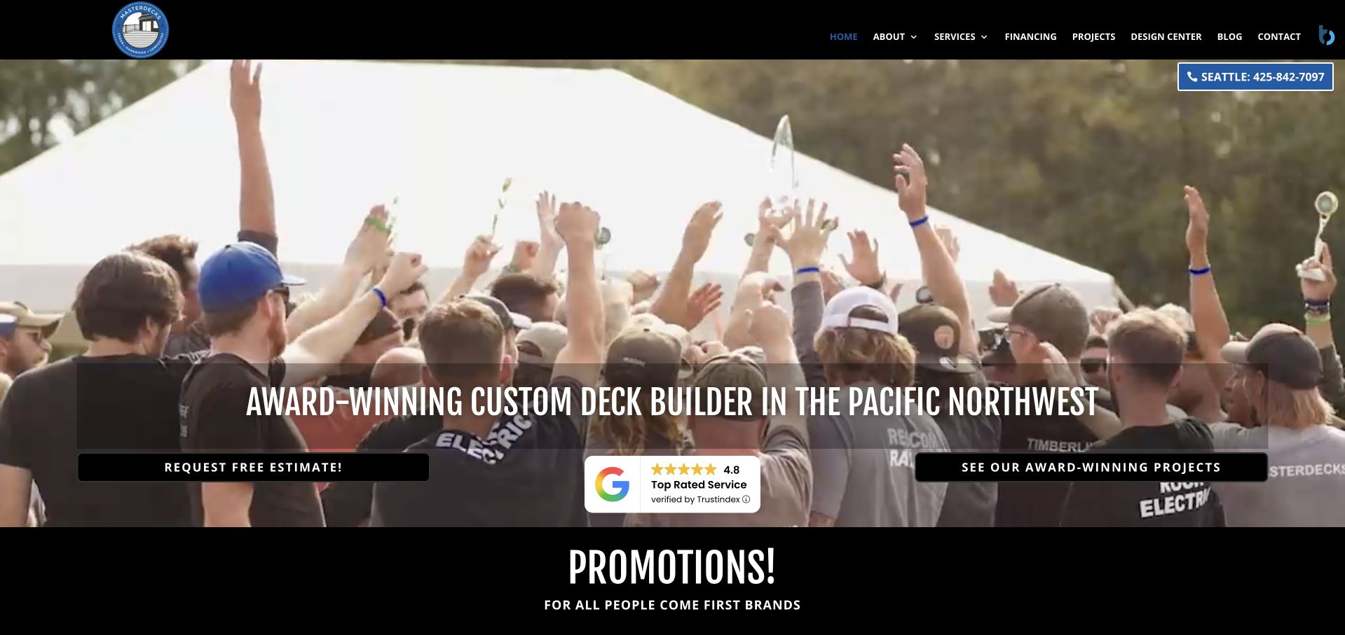
MasterDecks uses a lively group photograph beneath a restrained black header, followed by a large Pacific Northwest deck-builder statement. An estimate action and a project-viewing action occupy different sides of the information strip, giving both a direct enquiry and evidence-led next step. Services, financing, projects and a design centre are visible menu destinations, while a Seattle telephone label provides regional context. This is more people-led than the predominantly architectural collection. The choice can humanise a building business, but the group event itself says little about a particular deck design. The prominent award and rating language is company-presented reassurance, not independently measured by this collection.
What you can learn
Show the team where it helps explain the business relationship, but keep finished projects and the actual service scope close at hand. Distinguish an estimate request from browsing evidence rather than making every first action open a form.
Pros
Estimate and project exploration are separate actions.
The design centre has its own research destination.
Cons & considerations
The event photograph gives limited context about the actual built work.
Award and rating language takes space from practical process information.
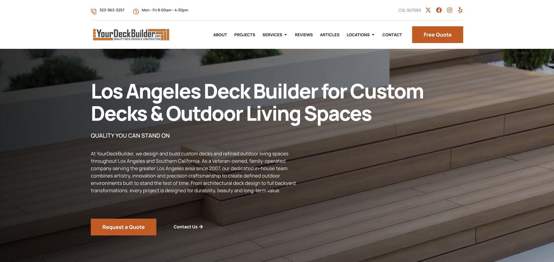
YourDeckBuilder places a plain Los Angeles service headline over a close view of deck boards and railing. The smaller introduction explains custom design, construction and a family-operated business, while quotation and general contact are separate actions. A compact white header carries hours, a telephone number, projects, services, reviews and location information. The practical scope is unusually explicit for an image-led trades page. The tradeoff is reading density: the first paragraph is quite long and small relative to the large headline, and the close-up photograph provides less complete project context than a view of the deck in relation to the house. The useful idea is specificity rather than decoration.
What you can learn
State the service and region plainly, then edit the supporting paragraph around what a first-time visitor needs to know. Pair material details with wider project views so the visitor can connect a finish with the complete outdoor space.
Pros
The headline identifies both locality and design-build scope.
Hours, projects and coverage are readily available.
Cons & considerations
The supporting paragraph is long and comparatively small.
The material close-up gives limited whole-project context.
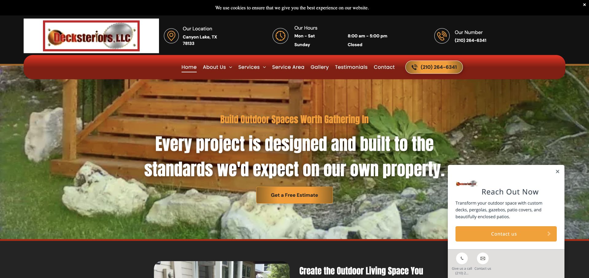
Decksteriors combines a dark utility area for location, hours and telephone contact with a red main menu over a timber outdoor structure. The central statement focuses on the company’s approach to project standards, with an estimate action below. Services, service area, a gallery and testimonials are clearly named, so the page supports research as well as immediate contact. Warm timber imagery connects the visual identity to the work. In the captured view, an expanded contact widget occupies the lower-right area, and a cookie strip adds another line at the top. These supporting tools compete with a hero that already has several layers of navigation and messaging.
What you can learn
Practical hours and coverage deserve readable placement, but combine them into a calm hierarchy. Test the expanded state of contact tools and distinguish a service explanation from a general promise about standards.
Pros
Location, hours and telephone information are explicitly available.
Gallery and service-area routes support further research.
Cons & considerations
The expanded contact widget obscures part of the opening.
The main standards statement gives less scope detail than the navigation.
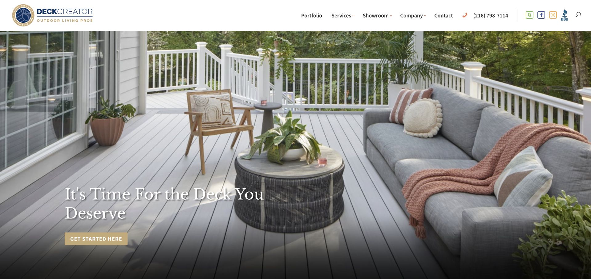
DeckCreator uses a bright furnished deck photograph, quiet serif headline and small warm-coloured action to introduce its work. The white header remains restrained, with portfolio, services, showroom and company information individually named. This gives a visitor a physical research option as well as online project browsing. The photograph shows the deck as a place to sit beside the house, rather than an abstract expanse of boards. The headline is aspirational and says little about location or project process, so the practical explanation depends on supporting content. The small opening action could also describe its destination more concretely than a generic invitation to get started.
What you can learn
Use a finished space to illustrate how a deck is used, then make the service and location explicit. A showroom can be a useful first-class route when visit arrangements, what is on display and the next step are clearly explained.
Pros
Portfolio and showroom visits have separate navigation destinations.
The photograph shows the deck in a recognisable domestic context.
Cons & considerations
The broad headline gives limited practical scope information.
The small generic hero action provides little expectation of the next step.
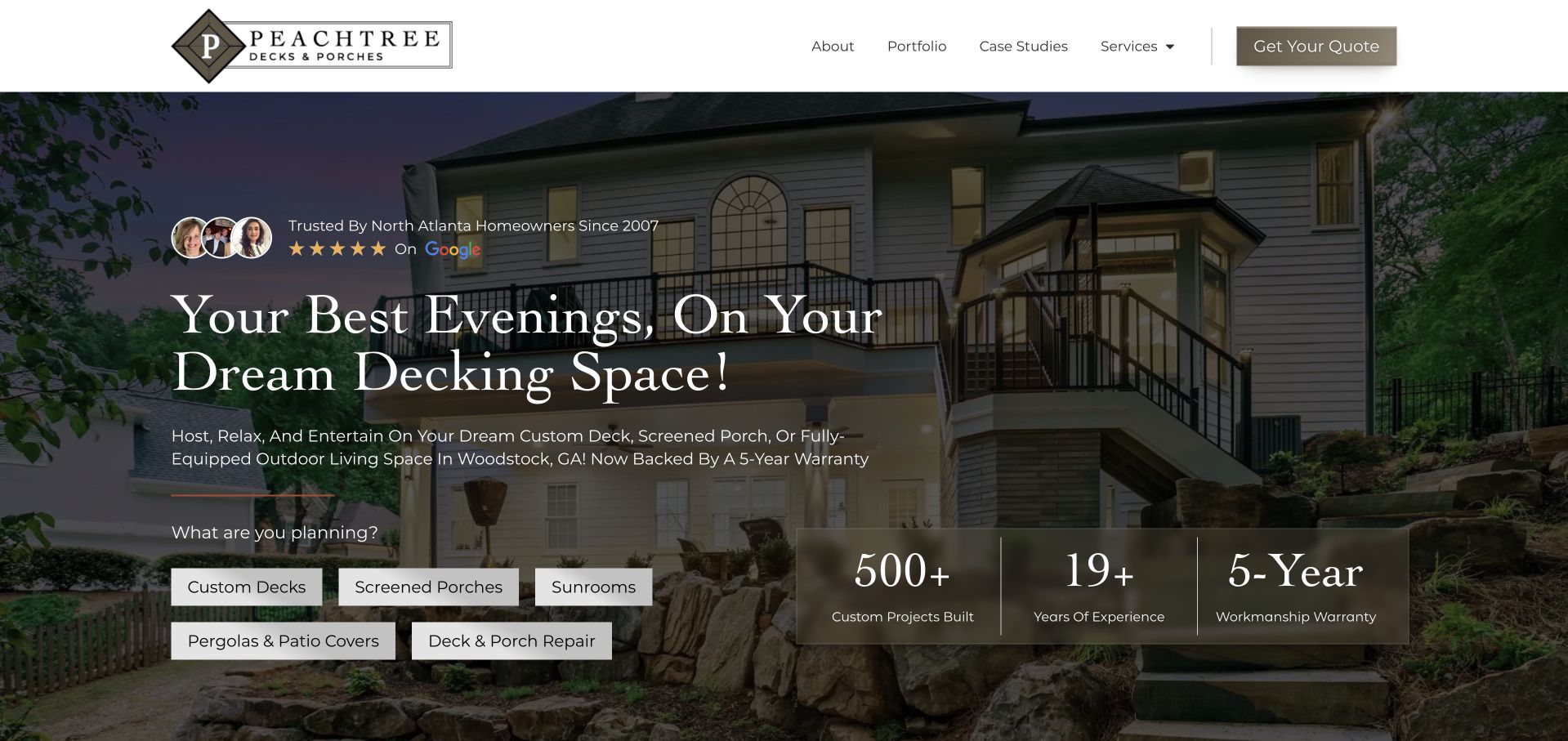
Peachtree places a furnished covered-deck photograph behind a large serif introduction and a row of project-type choices. Decks, screened porches, sunrooms, pergolas and repair are not collapsed into one undifferentiated enquiry. The header also distinguishes a portfolio from case studies, offering both image browsing and a more explanatory form of evidence. A broad North Atlanta context and a more specific location reference sit within the opening copy. Several company-presented review and project-count claims share the hero, which creates a denser introduction than the restrained header suggests. The useful pattern is the task-based project choice, not the amount of numerical reassurance.
What you can learn
Let visitors recognise their intended project before asking technical questions. Give a case study a different role from a gallery, and avoid allowing counters and review claims to crowd out service coverage and assessment expectations.
Pros
Distinct project types are visible before the enquiry.
Portfolio and case-study routes support different levels of research.
Cons & considerations
Several numerical and review claims compete in the same hero.
The large aspirational headline carries less practical information than its supporting text.
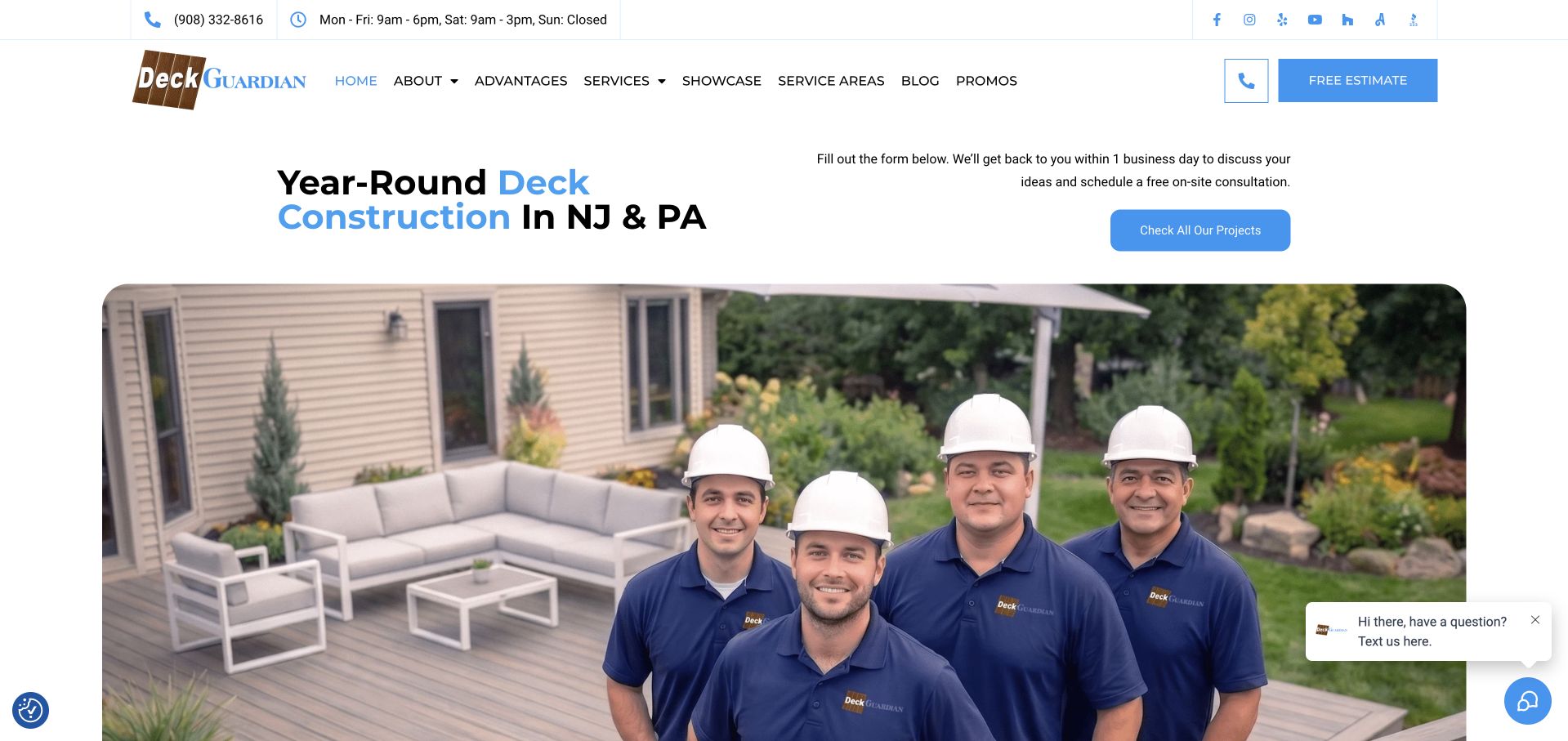
Deck Guardian uses a spacious white introduction naming deck construction in New Jersey and Pennsylvania, then places its team in front of a completed outdoor space. Blue actions and small utility icons connect the estimate and project routes without turning the first view into a full questionnaire. Service areas, services and a showcase are separately labelled in the header. The team photograph sits in its own broad rounded frame, keeping the service introduction readable above it. The practical copy also describes a consultation response process, although the visible invitation refers to a form further down rather than showing the full handoff immediately. The image’s strong human subject is the main distinction.
What you can learn
A real team photograph can make a regional business recognisable when the service and territory are stated plainly. Keep the form’s location and next step unambiguous, and do not make a response expectation sound like a confirmed construction slot.
Pros
The main service region is clear in the opening statement.
The team and completed setting give the business a human identity.
Cons & considerations
The form invitation requires further navigation to the actual fields.
Small utility and contact controls need careful mobile sizing.
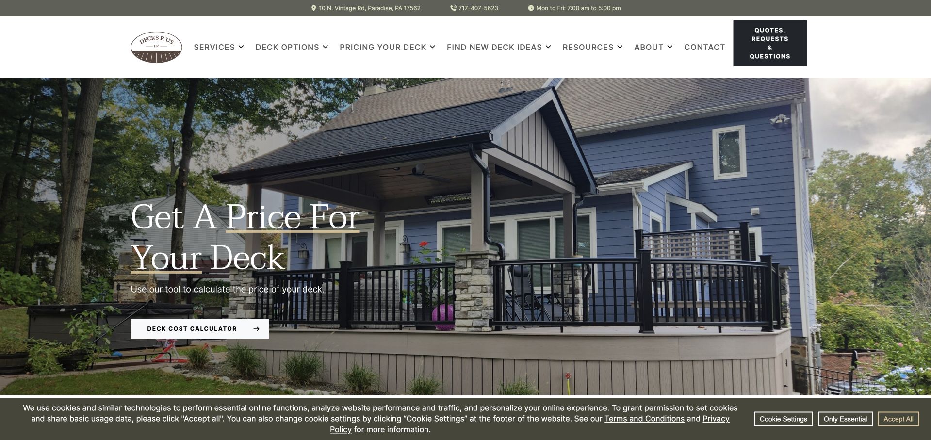
Decks R Us places a direct pricing invitation over a complete house-and-deck photograph. The warm serif headline is supported by a deck-cost-calculator action, while services, deck options, pricing, ideas and resources each have a place in the header. A separate dark quotation-and-questions control recognises that not every visitor wants to use the same tool. The composition is useful for an audience trying to understand the shape of a possible budget before committing to a consultation. The photograph offers a real architectural setting, but the calculator needs clear assumptions and scope so its result is not mistaken for a final site-specific quotation. A privacy strip remains visible at the lower edge.
What you can learn
Budget tools should explain what they can estimate and what still requires assessment. Keep project ideas and direct questions available alongside the calculator, and distinguish an indicative calculation from a written construction proposal.
Pros
Pricing research and direct questions have separate routes.
Deck options and ideas are explicitly available in the navigation.
Cons & considerations
The calculator action needs clear assumptions beyond the short label.
The opening photograph has little captioned project context.
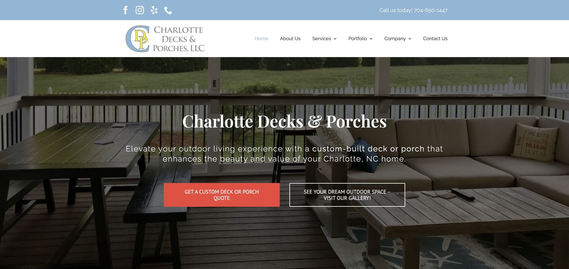
Charlotte Decks and Porches places its name and a short local-service explanation over a furnished covered-deck photograph. A coral quotation action contrasts with an outlined gallery invitation, giving a visitor both immediate contact and a lower-commitment evidence route. The pale blue utility strip, restrained mark and white navigation create a relatively calm frame around the image. Services and a portfolio remain available above the hero. The image is useful because it shows the space in everyday use, although the central text still lacks specific information about materials, project scope or the design-and-build process. Those facts need to follow promptly for someone comparing providers.
What you can learn
A local builder can give inspiration browsing and quotation different visual weight without hiding either. Follow a lifestyle image with specific services, materials and process information so the visitor can connect the attractive space with practical project fit.
Pros
Quote and gallery actions offer different levels of commitment.
The photograph shows the space in use beside the home.
Cons & considerations
The opening has limited material or process detail.
Some fine header text is delicate against the pale brand colours.
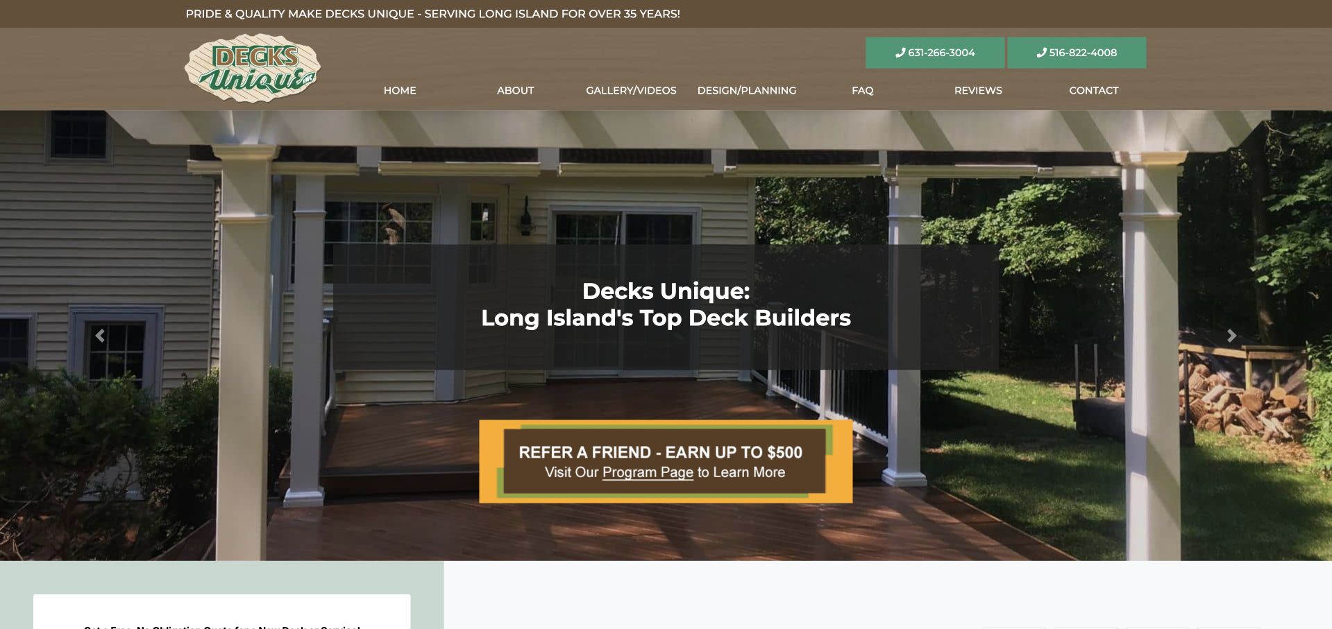
Decks Unique uses an installed covered-deck photograph beneath a warm brown header. The main introduction names Long Island, while gallery and video, design and planning, FAQs and reviews are explicit menu choices. Two telephone controls sit in the header, giving contact considerable prominence without a first-screen form. A large referral-offer panel sits directly beneath the headline, adding a separate campaign intended for existing or recommending customers. The project image and research navigation are useful, but the referral message can distract a new prospect from understanding the service. Its maintenance also needs to be separate from permanent project and company content.
What you can learn
Keep referral campaigns available without making them the clearest next step for a new project visitor. Use design-planning information and a useful gallery to explain the service, and label multiple contact numbers by purpose where possible.
Pros
Design and planning has a dedicated research route.
The local service identity is explicit.
Cons & considerations
The referral campaign competes with the main project enquiry.
Two telephone controls need clear task or location context.
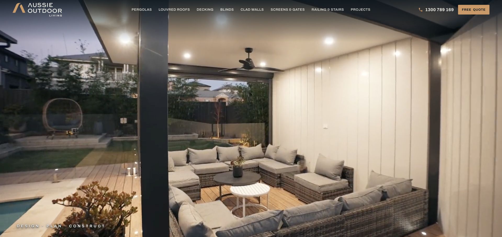
Aussie Outdoor Living gives a completed covered seating area almost the whole first view. The photograph shows ceiling lighting, furniture, decking and the relationship to the garden, making the intended use of the space immediately understandable. A dark overlay header names pergolas, louvred roofs, decking, blinds, screens, railing and projects, with a small quotation action at the right. The service categories are more informative than a generic aspirational slogan would be. The tradeoff is that the image-led opening contains little prominent location or process information. Visitors must use the menu or move down the page to connect the complete setting with the company’s specific regional services.
What you can learn
An immersive finished-space image can explain the relationship among several outdoor features. Keep service categories concrete, but state geography and the design-build process in text nearby so the photograph does not become the entire introduction.
Pros
The photograph shows several outdoor elements as one usable space.
Decking and related structures have explicit menu labels.
Cons & considerations
The opening has little prominent service-area information.
The small quotation action competes with a long product menu.
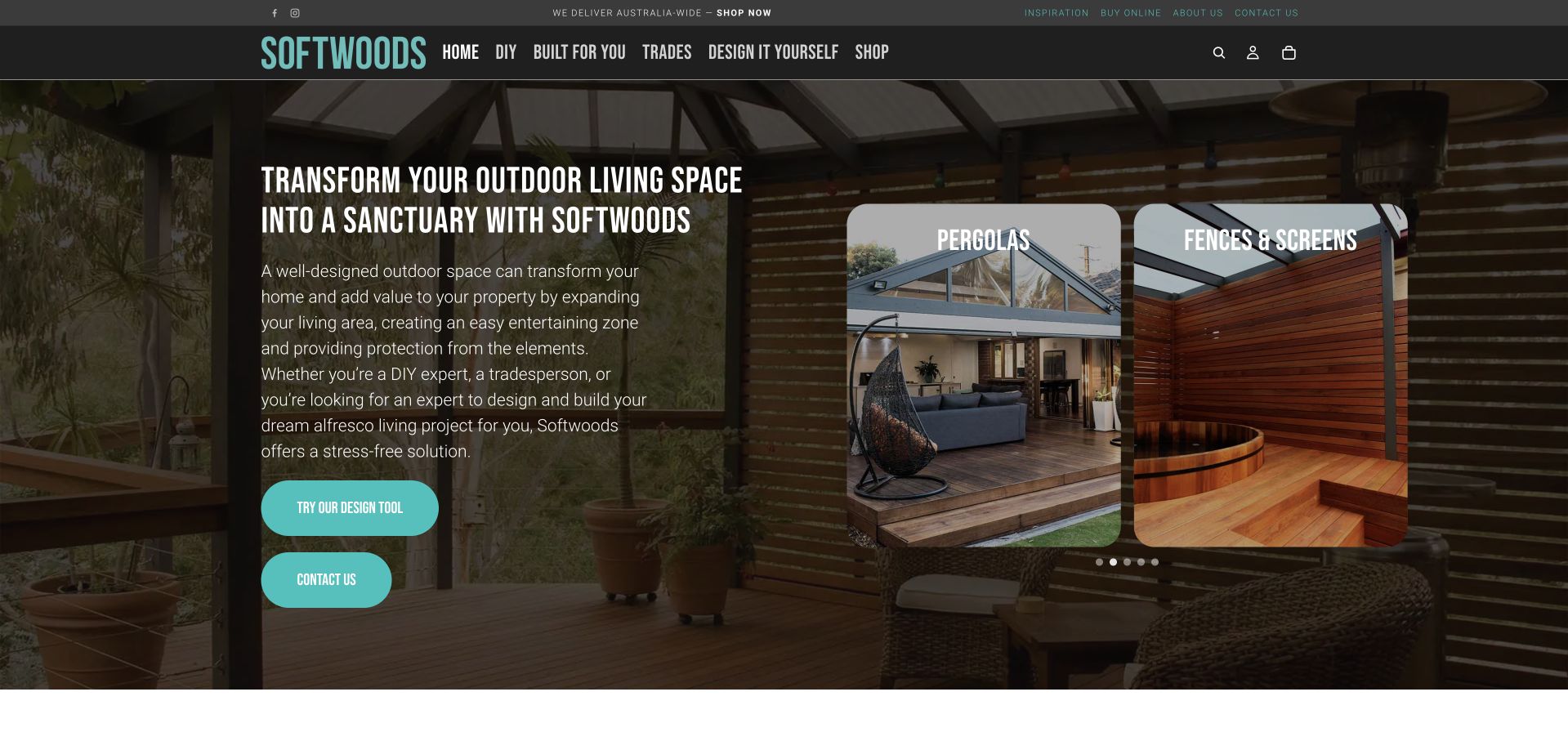
Softwoods uses a dark covered-space photograph behind a substantial plain-language introduction and a pair of product image cards. The header explicitly separates DIY, built-for-you, trades and self-design, recognising different customer relationships rather than one universal enquiry. A design tool and contact action sit below the explanation, while the photographic cards introduce product types. This is useful for a company that supplies materials or kits as well as handling finished projects. Its long opening paragraph and several overlapping discovery choices make the first scan demanding, however. A visitor needs to understand the difference between a design-tool result, a product purchase and a company-built installation before committing to the next step.
What you can learn
If DIY and installed work share a site, explain the delivery model early and carry that choice through the journey. A design tool should clarify its output and limitations rather than making a product configuration look like a complete construction agreement.
Pros
DIY, trade and company-built interests are explicitly separated.
The design tool is distinct from ordinary contact.
Cons & considerations
The opening paragraph is long for an initial scan.
Several product and task routes compete within the same image.
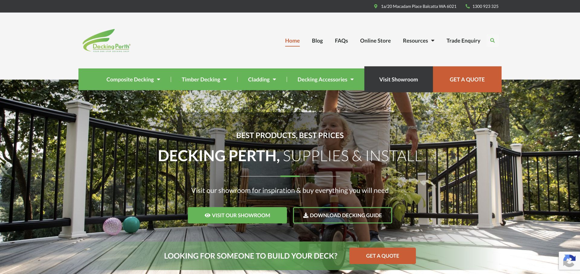
Decking Perth uses a complete deck-and-railing photograph beneath a spacious white header and green product navigation. The opening explicitly says supplies and installation, while two actions offer a showroom visit or a decking guide. A separate lower strip addresses people looking for someone to build their deck, making the installed-project route distinct from product research. Composite, timber, cladding, accessories and an online store all have visible destinations. This is useful for a mixed business model, but the number of routes can become crowded: a material shopper, trade buyer and homeowner arranging construction need clear expectations after their first click. The product and project scope should not be inferred from the photograph alone.
What you can learn
Give supply and installation different journeys when they are different transactions. A showroom and guide can help comparison-stage visitors, but explain what each route offers and carry the selected material or project context into the next step.
Pros
The supply-and-install role is explicitly stated.
Showroom, guide and builder enquiries have different purposes.
Cons & considerations
Several research and transaction routes compete within the opening.
The broad header gives little initial guidance on which route suits each audience.
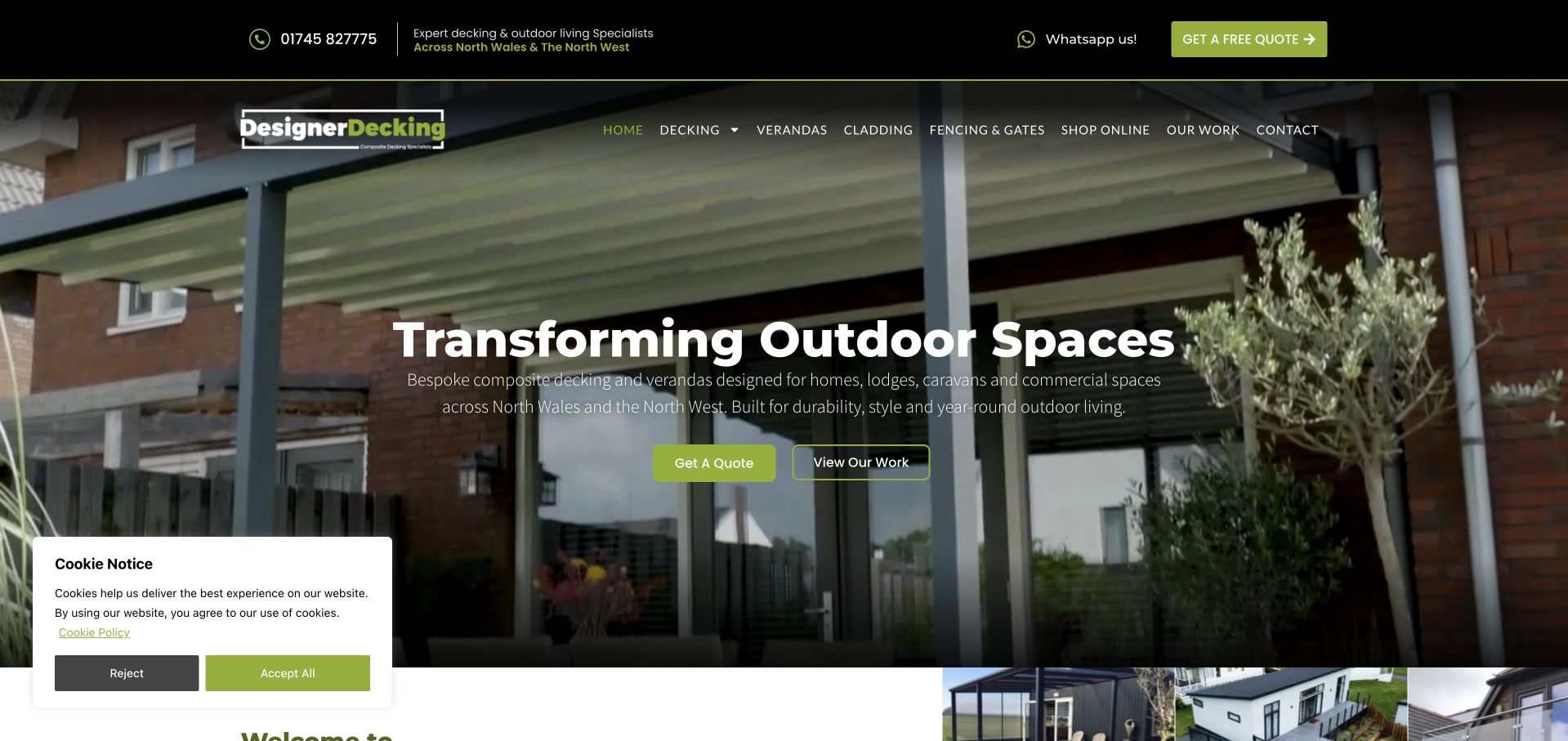
Designer Decking places a light outdoor-structure photograph behind a large service statement, with a compact black-and-lime header. The smaller copy names North Wales and the North West and includes homes, lodges, caravans and commercial contexts, giving the broader range practical boundaries. Decking, verandas, cladding, fencing and work examples have separate menu destinations. Quote and project-viewing actions sit together beneath the paragraph. The approach balances inspiration and service information, though the supporting text is comparatively small and the privacy card occupies part of the lower-left view. The broad headline also needs the regional paragraph to explain what the company actually does.
What you can learn
State the customer and property contexts rather than assuming all outdoor work is the same. Keep project evidence close to quotations, and test small supporting text over the actual photograph with the real privacy interface open.
Pros
The supporting copy gives a clear region and property context.
Work examples are an alternative to requesting a quotation.
Cons & considerations
The small supporting paragraph is less prominent than the general headline.
The privacy card competes with the lower part of the introduction.
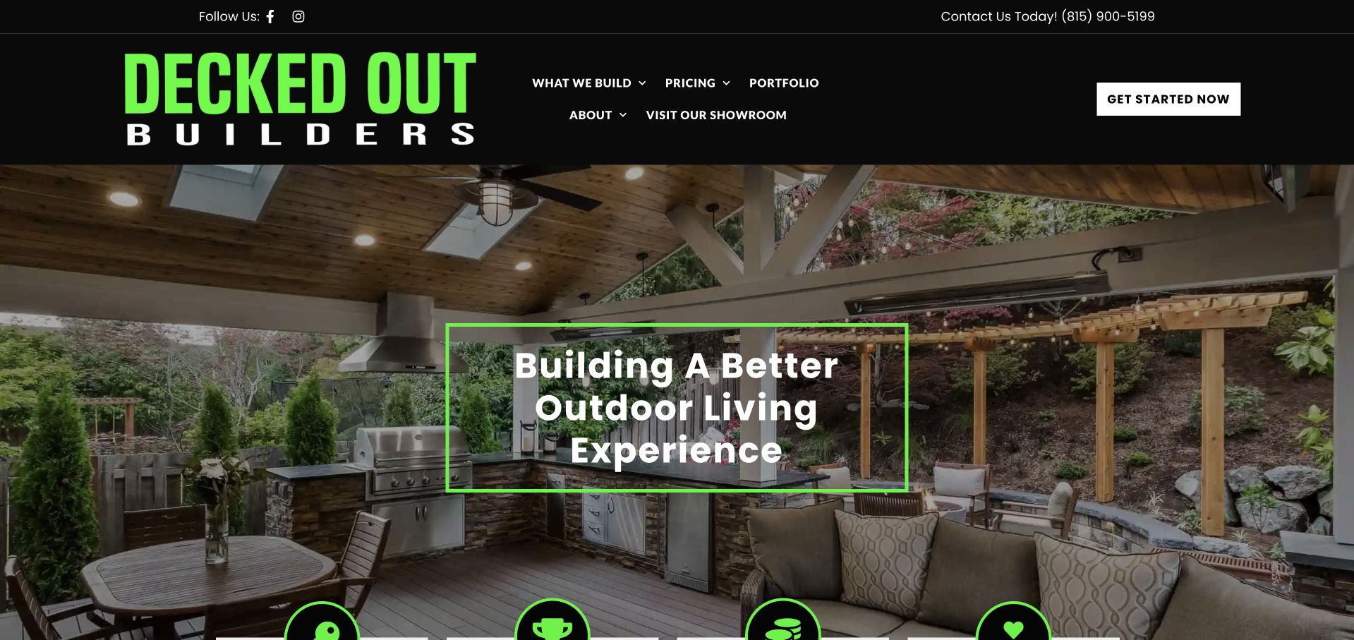
Decked Out Builders uses oversized lime lettering in a black header, then frames its central white message with a matching green outline over a furnished outdoor room. What the company builds, pricing, a portfolio and a showroom are separately labelled above the image. This creates a distinctive identity using typography and a consistent accent rather than a complex animation. The photograph shows a covered space with seating, lighting and an outdoor kitchen, supporting a broader living-space offer. The main headline remains general, however, and the large logo and menu consume a significant share of the opening. Locality and the design-build process need supporting text beyond the first view.
What you can learn
A strong typographic identity can be memorable when the navigation stays useful. Make pricing, a portfolio and showroom information genuinely distinct, and follow broad lifestyle language with a clear location and service explanation.
Pros
Pricing and showroom visits have explicit research routes.
The project image connects several outdoor uses within one setting.
Cons & considerations
The very large wordmark reduces space for practical introductory copy.
The opening gives limited immediate geographic context.
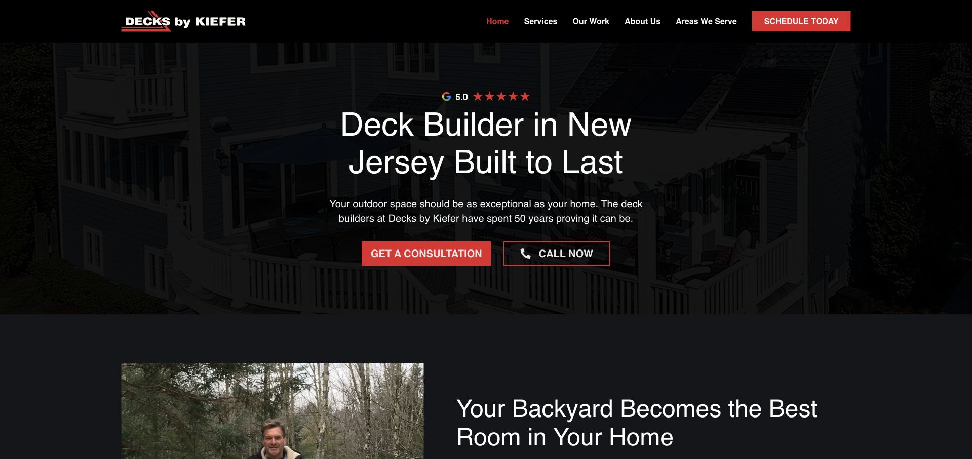
Decks by Kiefer uses a dark project photograph behind a large New Jersey deck-builder headline. A red consultation action and outlined telephone action provide two recognisable contact choices. The black header stays compact, with services, completed work, company background and service areas individually labelled. The first following section introduces the backyard as usable living space beside a human photograph, beginning a more explanatory story within the same view. The design is direct and relatively quiet, although the very dark background makes the project difficult to inspect. A visible rating line is supporting company-presented evidence, not an independently assessed comparison.
What you can learn
Keep the region and actual building service explicit, then let work examples demonstrate the range. A dark hero needs enough image detail to remain useful, and consultation versus calling should have clear expectations rather than merely different button colours.
Pros
The service and region are explicit in the headline.
Completed work and coverage have separate navigation routes.
Cons & considerations
The heavily darkened image makes project details hard to study.
The broad durability message needs factual supporting project information.
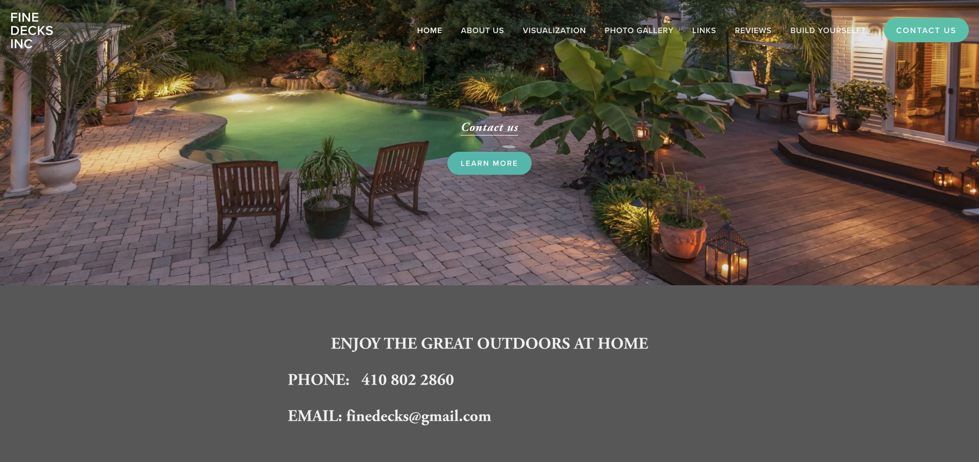
Fine Decks uses a large evening landscape photograph with a small central contact invitation and turquoise action. The white wordmark sits directly over the image, while navigation distinguishes visualisation, a photo gallery, reviews and a build-yourself route. A dark information panel immediately below displays telephone and email contact, making the next practical step straightforward. The composition is deliberately simple, but the featured scene foregrounds a patio and pool setting more than a deck-specific service. The main action is also generically labelled, so a visitor relies on the menu and following text to understand the company’s actual building scope. The image is inspiration, not a substitute for that explanation.
What you can learn
A small gallery-led website can remain useful when contact is easy and the scope is stated plainly. Choose a hero that represents the core service, and describe where a visualisation or DIY route leads rather than leaving those terms unexplained.
Pros
Telephone and email are visible immediately below the opening image.
Gallery and visualisation have distinct menu destinations.
Cons & considerations
The hero does not clearly explain the deck-building service.
The featured patio scene gives limited context about the core deck range.
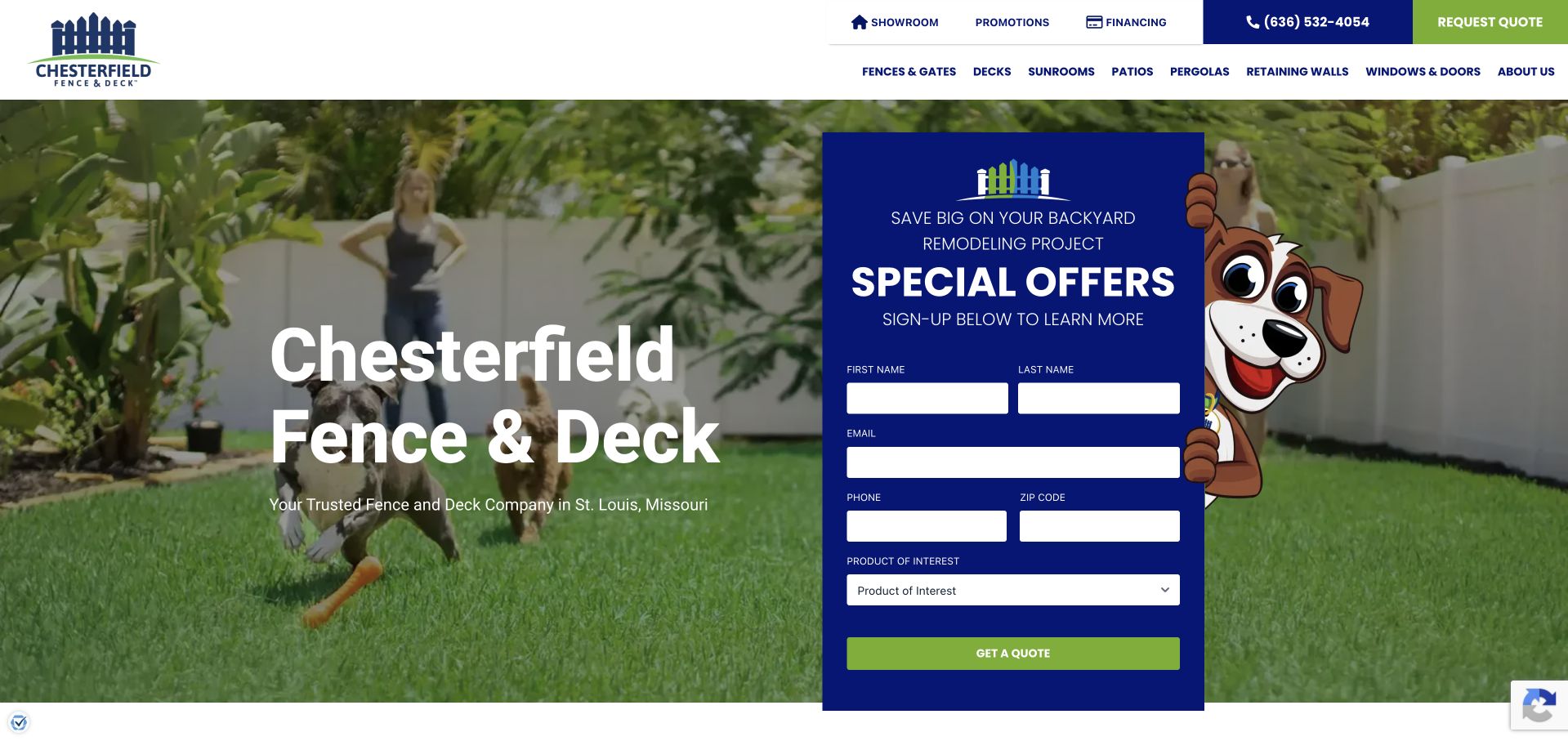
Chesterfield Fence & Deck places a blue promotional form over a domestic garden photograph. Its name and St. Louis context are clear on the left, while the form asks for contact information, postcode and product interest. The white header exposes fences, decks, sunrooms, patios, pergolas and other exterior categories, with a showroom destination in the utility row. This is useful for studying how a broader home-improvement company can route product interest from the start. The visual hierarchy is strongly campaign-led, however: special offers and an illustrated character occupy more space than the deck-building process. The form’s purpose needs to be clear so an offer signup is not confused with a full quotation.
What you can learn
When several exterior services share a homepage, ask about the relevant product without treating every enquiry as identical. Separate promotional subscriptions from actual project requests, and give decks their own process and evidence beyond a general garden image.
Pros
The service range is explicitly divided into product categories.
The form includes product-interest routing.
Cons & considerations
Offer language dominates the practical project explanation.
The signup-versus-quotation purpose is not immediately obvious from the combined presentation.
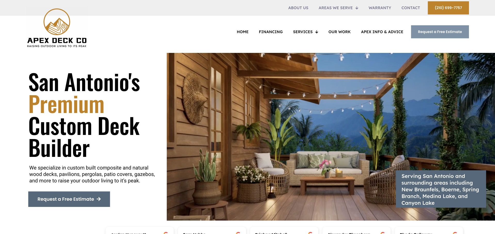
Apex Deck Company uses a white split composition with large black-and-gold lettering beside a timber outdoor room photograph. The headline names San Antonio and custom deck building, while the smaller paragraph identifies composite, natural wood and related outdoor structures. A service-area card sits on the photograph, adding practical regional context without replacing the main explanation. The header separates services, work examples, advice, warranty and coverage. This is a useful reference for explaining a broad outdoor range within a focused local identity. Its very large headline can push supporting information lower, and the photograph illustrates a complete seating structure more than the full range of deck configurations.
What you can learn
Name materials and related structures in plain language, but keep the core service and region clear. A service-area card should lead to accurate coverage information rather than a list of place names with no practical follow-through.
Pros
The installation focus, materials and locality are explicit.
Work examples and advice have different research roles.
Cons & considerations
The oversized headline reduces the space available for supporting detail.
The featured room represents only one part of the broader deck range.
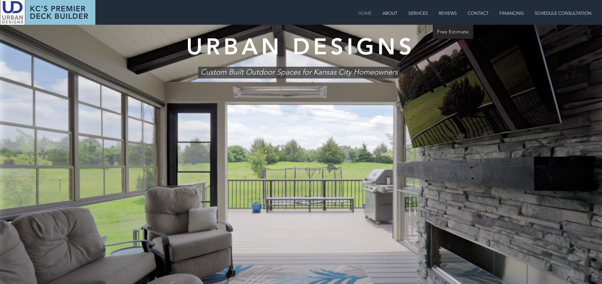
Urban Designs uses a bright screened outdoor room photograph, a large spaced wordmark and a short Kansas City homeowner description. The dark blue header keeps services, reviews, contact, financing and consultation separately labelled. The image shows furniture, glazing and the transition to an outside deck, making the usable space understandable without an elaborate explanation. This is a restrained project-led presentation. Its limitation is the amount of practical meaning carried by one small supporting line: a first-time visitor needs to continue into services to learn whether the company designs, builds, repairs or handles a wider outdoor scope. A small estimate label near the menu also needs a clear task relationship to consultation.
What you can learn
Use a complete project image to communicate how the space works, then state the building service and coverage in ordinary text. Keep consultation and estimate labels consistent so two adjacent actions do not seem like different processes when they are not.
Pros
The finished room makes the intended use of the space clear.
The local homeowner context is stated directly.
Cons & considerations
The first view gives limited explicit detail about the building scope.
Estimate and consultation wording need a clear distinction or consistent destination.
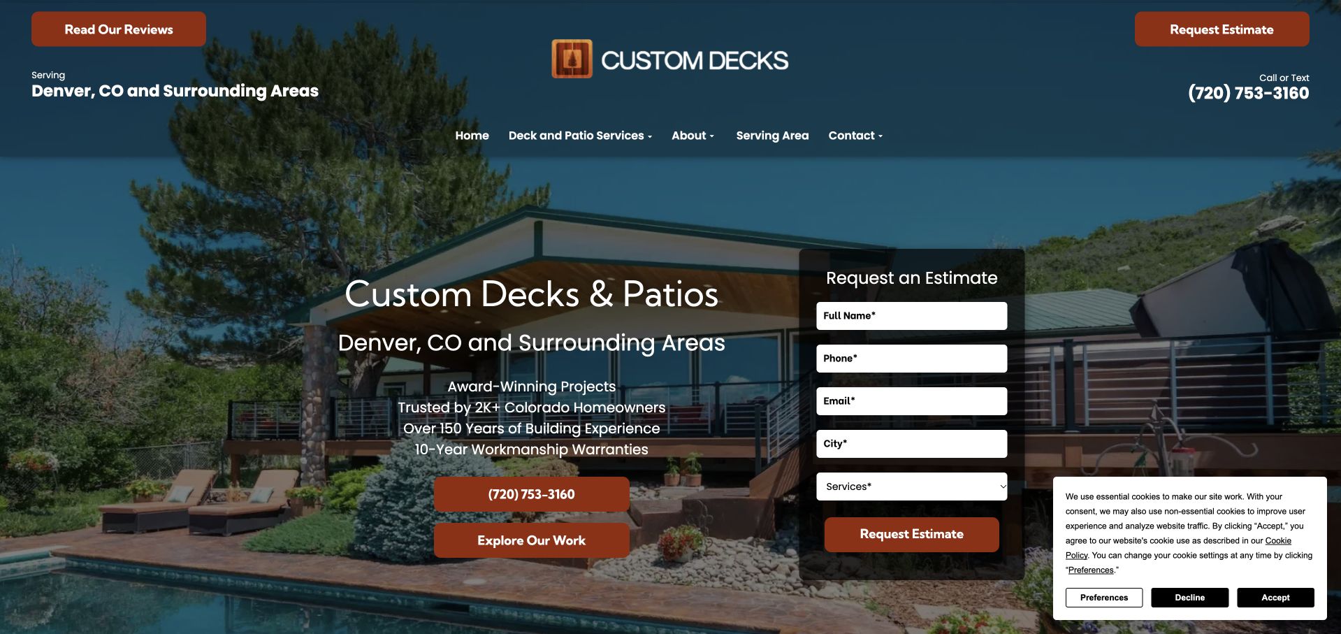
Custom Decks uses a large complete outdoor-project photograph behind a direct deck-and-patio headline and Denver service-area text. A short estimate card asks for contact details, city and service interest rather than immediately requesting a full construction brief. Telephone contact and work examples are separate actions on the left. The header repeats the locality and keeps services, company information and coverage available. This makes the service easier to identify than an image-only opening. The tradeoff is the number of reassurance claims beside the form: experience, warranties and awards share space with practical next steps, while a privacy panel adds another layer at the lower right.
What you can learn
An initial estimate form can stay focused on routing, with detailed scope discussed later. Keep company claims specific and maintainable, and do not allow a promise list or privacy panel to hide the work examples and contact alternatives.
Pros
The headline and supporting line identify the locality and service.
The short form asks for service interest without a full technical brief.
Cons & considerations
Several reassurance claims compete with practical next steps.
The privacy panel takes space beside the enquiry card.
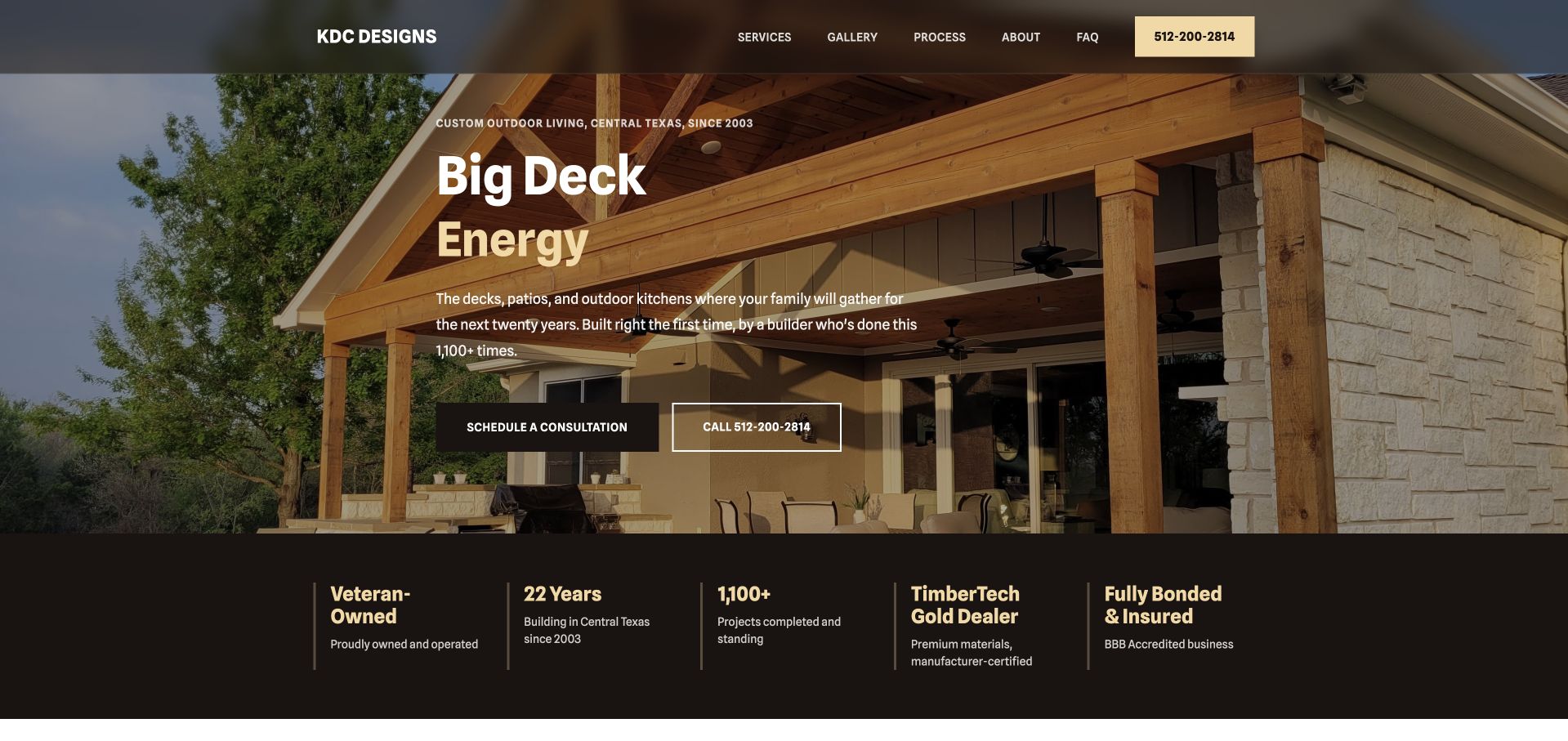
KDC Designs uses a warm timber-covered-space photograph and an unusually playful short headline. The smaller text gives the more useful service context: outdoor living in Central Texas, including decks, patios and outdoor kitchens. Consultation and telephone actions are separate, while services, gallery, process, company information and FAQs form a compact main menu. A dark assurance strip beneath the image names several business claims, including ownership and materials relationships. The design is distinctive because of its voice and restrained warm palette, not because it hides the service. The humour may not fit every audience, and the large claim strip needs current evidence and clear scope behind it.
What you can learn
A distinctive voice works when a plain service explanation remains close by. Give process and FAQs real content, and choose a tone appropriate to the customers instead of copying a memorable headline that may not fit another brand.
Pros
The small supporting line gives practical regional and service context.
Process and FAQs are explicit research destinations.
Cons & considerations
The playful headline may not suit every visitor or commissioning context.
Several assurance claims occupy a large strip below the image.
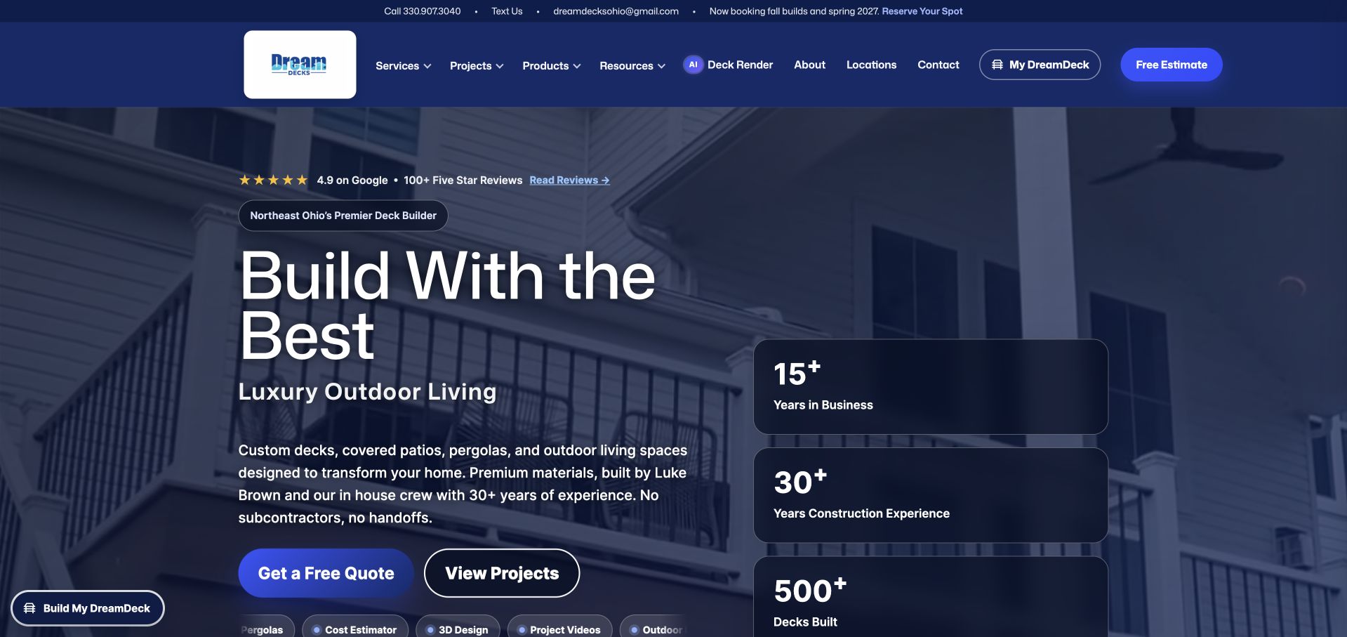
DreamDecks combines a dark blue project photograph, a large headline and a plainly described Northeast Ohio outdoor-living range. Its navigation separates services, project stories, products, resources, an AI rendering tool and a saved project-building journey. The main actions distinguish a quotation from viewing projects, while additional category shortcuts begin below. An automatic quotation panel can interrupt the first visit, so the underlying project-and-tool hierarchy needs to remain usable after it is dismissed. The breadth is useful when each tool has real supporting content, but the page also carries numerous review and experience claims and many competing pathways. A smaller builder would not benefit from imitating the tool count without the maintenance capacity.
What you can learn
Planning tools should have clearly different outputs and limitations. Keep a useful project library central, and explain that a rendering or saved concept is not a site assessment or confirmed construction specification.
Pros
Project stories and planning resources are separately accessible.
Quote and project browsing are different first actions.
Cons & considerations
The number of tools and shortcuts creates a demanding hierarchy.
An automatic quotation popup can interrupt research before the visitor is ready.
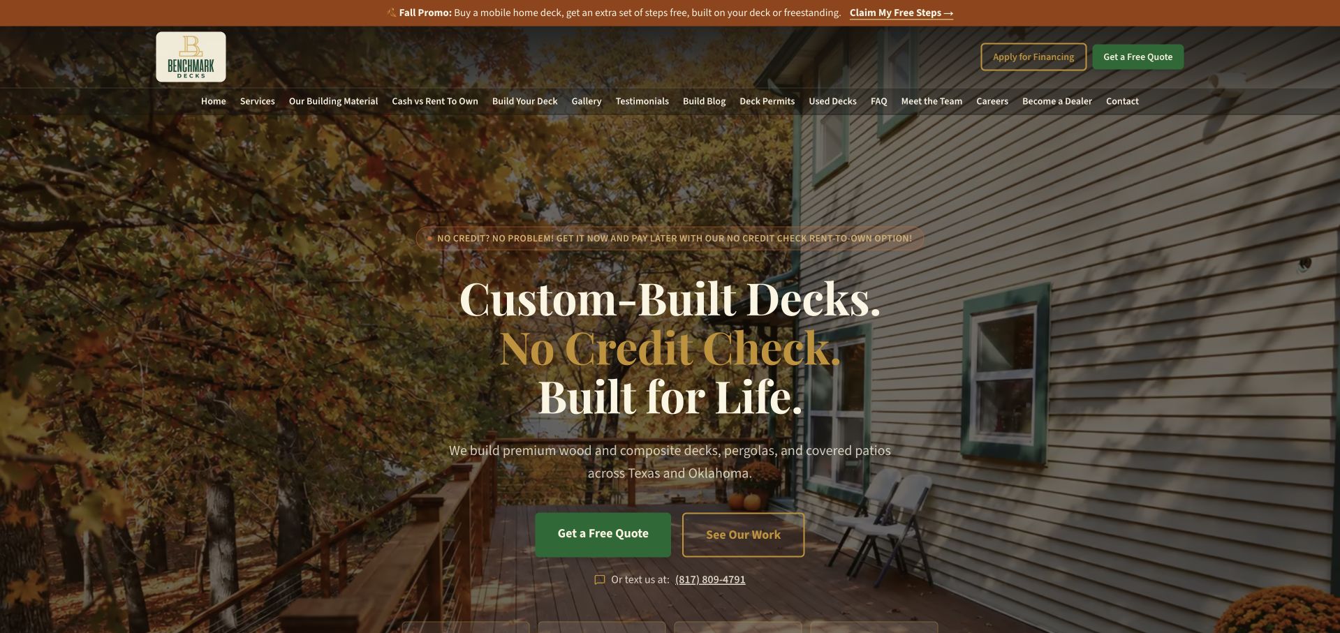
BenchMark Decks uses a domestic deck photograph, traditional serif headline and dark green actions within a warm brown identity. The supporting copy names wood and composite work in Texas and Oklahoma, while quotations and completed-work browsing are separate actions. The header is extensive, including materials, rent-to-own information, a build-your-deck tool, permits, team information and a gallery. Financing and a seasonal promotion are prominent in the opening, making the commercial model part of the first impression. That can be relevant, but the payment message should not replace a clear explanation of the actual building scope, costs and contract terms. The company’s finance claims are not evaluated here.
What you can learn
If financing is part of the offer, present its actual terms and role separately from project suitability. Preserve a useful material and portfolio journey for customers who are not seeking that payment model.
Pros
The regional service and broad material choices are stated.
Quotations and project evidence have different hero actions.
Cons & considerations
The financing message dominates the building-service introduction.
The long navigation combines many research and transactional tasks.
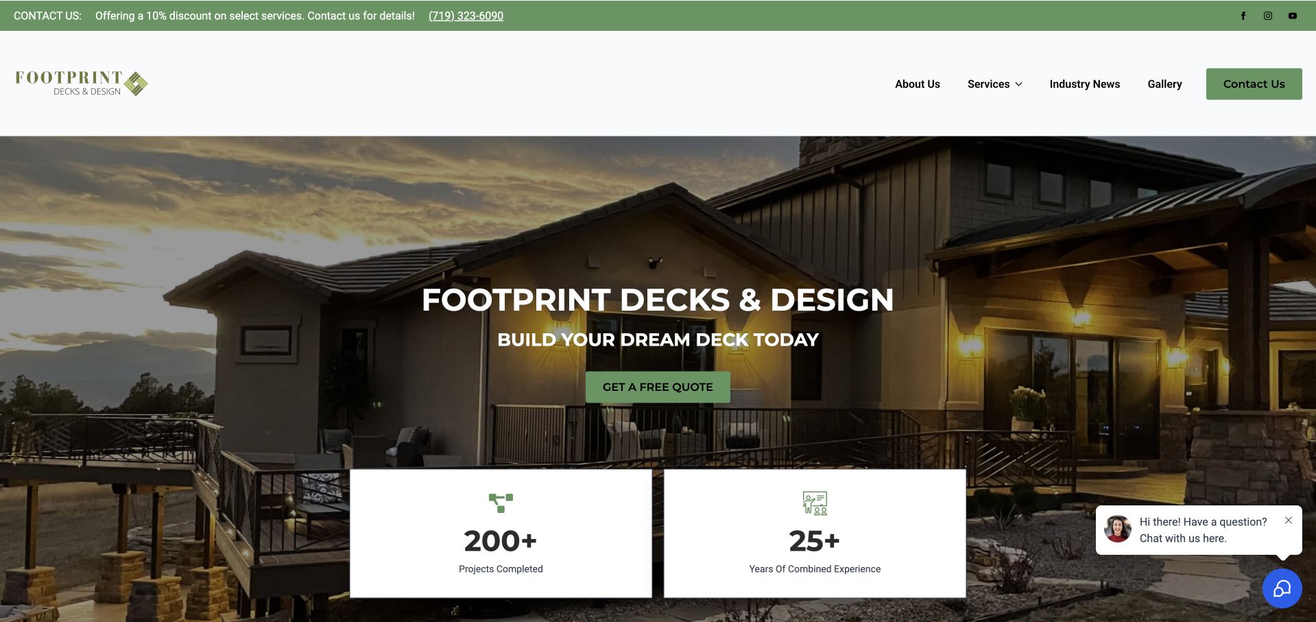
Footprint Decks & Design uses a dusk photograph of a complete property and deck behind a short builder introduction. Green contact controls connect the white header with the quotation action, and services, a gallery, company information and news are separately labelled. Two large numerical panels begin below the main message, giving company-presented project and experience claims substantial visual weight. The image provides useful architectural context, but the first-screen headline mostly repeats the company name rather than explaining coverage or a specific service distinction. A floating chat prompt also occupies the lower-right edge. This is most useful as an image-and-hierarchy reference, not as a model for unsupported numerical reassurance.
What you can learn
Let a complete project photograph establish context, then use the headline to explain the service rather than only repeat the name. Keep numerical claims current and qualified, and ensure a chat prompt does not cover the project details being used as evidence.
Pros
The photograph shows the deck’s relationship to the whole property.
Gallery and service information have separate menu routes.
Cons & considerations
The main headline gives little practical coverage or scope information.
Large claim panels compete with the project and contact hierarchy.
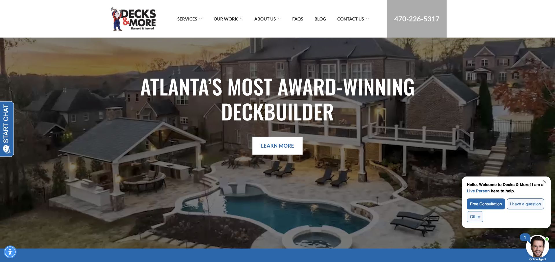
Decks & More places an aerial view of a complete pool-and-covered-outdoor setting behind a large Atlanta deck-builder headline. The white header stays compact, with services, work examples, company information, FAQs and contact individually named. A large telephone block makes calling prominent without a first-screen estimate form. The project image communicates scale and relationships among structures, though the headline is dominated by an award-related superlative rather than practical scope. The captured page also contains two separate chat interfaces, one as a side tab and another expanded near the lower-right corner. Those additions demonstrate how assistance tools can compete with a strong underlying project composition.
What you can learn
A complete aerial can explain how several outdoor spaces connect, but pair it with precise service and regional information. Consolidate assistance tools so visitors are not asked to choose between multiple overlapping chat systems.
Pros
The aerial shows the project as a connected whole.
Work examples and FAQs have explicit navigation destinations.
Cons & considerations
The award-related headline gives limited process detail.
Two chat interfaces compete with the main project view.
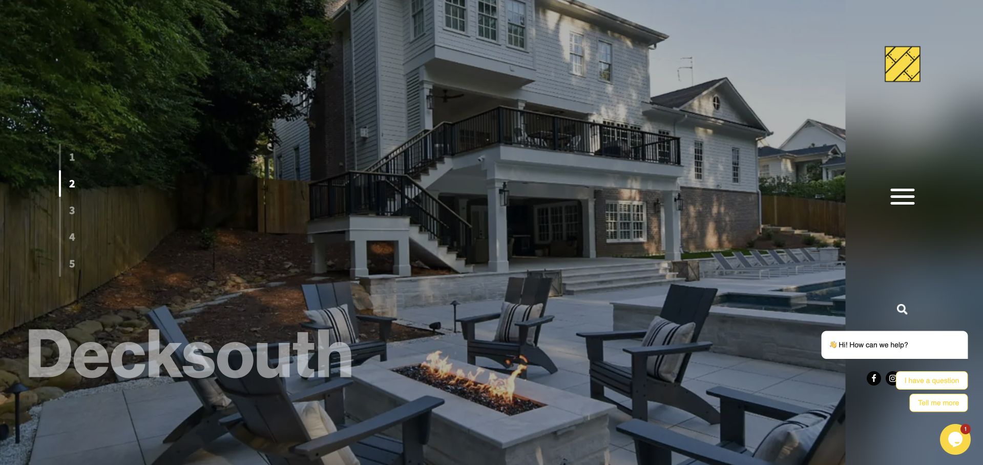
Decksouth uses a large finished outdoor-project photograph with an oversized quiet wordmark near the lower left. A numbered slide rail sits on one edge, while a vertical right-hand strip contains the menu, search and social controls. This is the most portfolio-like opening in the collection: the photograph of the house, deck, stairs and terrace does most of the initial communication. The approach is visually distinctive, but it postpones an ordinary explanation of services and geography and hides familiar navigation behind a small menu icon. A chat prompt expands over the side controls, adding another competing interaction. It is useful for studying both the impact and discoverability cost of an immersive layout.
What you can learn
An unconventional portfolio opening still needs discoverable service, location and contact information. Use expressive navigation only when it remains understandable on phones and keyboards, and test assistance widgets against the actual menu position.
Pros
The photograph shows several connected levels of the finished outdoor space.
The distinctive composition gives the project unusually strong visual emphasis.
Cons & considerations
The service and geographic scope are not prominent in the opening.
The side menu and chat controls compete for the same narrow area.
Kegan is a freelance web designer and developer with 15+ years of experience helping businesses turn complicated website requirements into clear, maintainable digital experiences. He works directly with clients from planning and design through development, launch, and ongoing support.
For deck builder website design, his development approach focuses on genuine completed-deck galleries, material and design comparisons, build-process expectations, service-area content, and qualified project inquiries. The scope can be a targeted improvement or a complete custom build, with responsive layouts, thoughtful content structure, and integrations chosen around the people using and maintaining the site.
Show 3 other deck builder website designersHide other deck builder website designers
Plan a deck builder website around the decisions before construction
Write the first consultation journey before the form
Define what the team needs to begin a useful conversation: broad location, contact preference, intended use, whether work is new or replacement, and an initial idea of timing. A budget range can help when the business can discuss it responsibly, but include an option for someone still exploring. Explain whether the form requests a callback, an on-site assessment or a confirmed appointment. Do not imply that a preferred date reserves construction capacity. Tell people what optional plans or photos would help and how those files are handled.
Explain material and scope choices without pretending to engineer online
Provide readable descriptions of the materials and project types the team actually supports, linked to current manufacturer documentation where needed. Distinguish the surface, railing, framing, cover and other components rather than presenting a finish name as the whole build. Explain the company’s role in design, assessment, permissions and installation, with responsibilities established in the actual project process. Website content should help a visitor ask better questions; it should not diagnose an existing structure’s suitability from a photograph or offer universal construction instructions.
Maintain project, availability and aftercare content
Assign owners for project captions, service coverage, enquiry expectations and any current promotion. A financing campaign, referral offer or seasonal booking message needs clear scope and a removal plan. Existing clients may need care documentation, support or project access after the sale, so keep those routes distinct from a new estimate form. Where a business changes its name or joins another group, explain the relationship at arrival rather than sending returning customers to an unfamiliar identity without context.
The editing job behind the design
Choose technology for an accurate project library and a reliable consultation handoff
A useful content model often includes services, material families, projects, service areas, team profiles and resources. Projects should link to the relevant service and material without duplicating long specifications. Give editors structured fields for captions and broad locations, and distinguish renderings from completed work. Test whether staff can update a service boundary, add a new project, remove an expired offer and replace a care document without changing the layout.
Large aerials, videos, virtual designs and third-party chat can be expensive in both performance and maintenance. Use appropriately sized photographs, meaningful alternative text and useful video fallbacks. Test the combined default state of privacy, chat, booking and promotional widgets; several individually small tools can obscure the entire first view. Forms need clear labels, errors and submission expectations. Visible stack notes identify supported public signals, not private estimating, project-management or construction-documentation systems.
Our WordPress website examples offer a separate look at publishing approaches. A visible platform label is evidence for that named page, not a guarantee that the same system will suit your requirements.
Before the public launch
Deck builder website brief checklist
State the real design, build, replacement, repair or supply roles; do not merge materially different services.
Make the coverage area and local-provider relationship clear.
Create project records with broad locations, actual scope, material context and permission to publish.
Distinguish built-project photographs, supplier imagery and illustrative renderings.
Keep a gallery and explanatory case studies separate when both have useful content.
Explain what a consultation, estimate request, calculator or rendering tool does and does not confirm.
Collect only the initial information needed to route the conversation, with a useful option for uncertain visitors.
Keep material documentation, permissions-process wording and client responsibilities reviewed by the appropriate team.
Provide aftercare or existing-client contact without routing every visitor into a new sales enquiry.
Maintain current campaigns, claimed figures, service availability and contact details with a named content owner.
Test mobile performance, keyboard access, forms, photo uploads and the combined effect of third-party overlays.
These checks are a project checklist, not a performance, legal, security, or accessibility certification. Test real journeys with the people responsible for the website before making claims about the result.
Sources & editorial method
How this collection was selected and reviewed
We directly inspected official public company pages and captured the visible designs in the browser. Reviews assess website communication, project presentation and practical tradeoffs, not construction quality, structural suitability, warranty coverage, regulatory compliance or a measured service ranking. The collection identifies supply-and-installation or network roles where relevant instead of treating every example as the same local practice. Company-provided metrics and awards are not independently certified here. Technology notes are limited to supported public evidence rather than a complete inventory of private systems.
Each example links to its actual source page. Screenshots are direct browser captures with their own capture dates; moving imagery, announcements and live designs can change. The notes describe observable design choices and conditional tradeoffs, not measured traffic, conversion results, service quality, or accessibility conformance.
Technology labels use public page metadata, asset evidence, or explicitly cited platform documentation. Platform documentation is not a complete current deployment audit. A component reference may be legacy or unused; it is not a complete backend inventory. Unknown stacks are omitted. These sites are editorial examples, not our client portfolio.
Written, Edited and Curated are separate editorial records, not timestamps advanced by a rebuild. Website designs and imagery belong to their owners. See our editorial standards or suggest a correction.
Questions worth asking
Deck Builder website design questions
What should a deck builder put in the homepage hero?
A clear building-service and geographic statement, a relevant real-project image and an understandable next step. A second route to projects or materials can help visitors still researching. A large slogan, discount or collection of counters is not a substitute for explaining what the company actually does and where it works.
How is a case study different from a gallery?
A gallery helps people scan appearance and project types. A case study explains the brief, context, material choices, company role and relevant decisions. Both can be useful, but a long page of photographs is not automatically a case study. Use accurate captions and publish only details the team can substantiate and the client permits.
Should the website publish a deck cost calculator?
Only when its assumptions, scope and maintenance are clear. It may help an early conversation, but it should not imply a final site-specific construction price. Explain what the result represents and what must be assessed next. A straightforward guide and consultation route may serve a small practice better than an opaque estimator.
Can a rendering tool replace project photographs?
No. A rendering can explore an idea, while a completed-project photograph documents something built. Label each honestly and explain that a concept still requires assessment, specification and agreement. Keeping them distinct helps visitors understand both the inspiration and the evidence of the company’s past work.
Should repair and resurfacing have their own pages?
Yes when the business genuinely provides those services and can explain the assessment process. Do not imply that every existing structure can be resurfaced or judged from a website form. Distinguish the initial enquiry from the professional assessment that establishes what work is appropriate.
How many local pages does a regional builder need?
Only as many as can provide useful, accurate information. Real coverage, relevant projects and local visit arrangements can justify a page; repeating the same paragraphs with a different town name cannot. A concise coverage page and a well-organised project library are often more useful than a large set of empty local landing pages.
Build the brief around a believable project journey: understand the space, see relevant work, clarify materials and scope, then start the right conversation. A clear regional identity and accurate project library are stronger foundations than another layer of generic promises.