Best Ice Cream Shop Websites of 2026 (22 Real-World Examples)
Ice cream websites that connect flavors with the right ordering route
These 22 examples compare seasonal flavors, ingredient stories, scoop-shop locations, shipped gifts, local pickup, and catering.
A local scoop, a shipped pint collection, and a catered event are different products. Make those choices explicit before presenting a large seasonal photograph or loyalty offer.
Bi-Rite Creamery is the editorial choice because its ingredient story is supported by daily hours and a clear explanation of products available to order ahead.
Before the examples
What makes good ice cream shop website design in 2026?
Explain the flavor in ingredients
Unfamiliar names become easier to choose when a short description explains the components. Keep dietary and allergen information product-specific and maintained by the business.
Separate fulfillment methods
Label local pickup, local delivery, nationwide shipping, and shop visits independently. State relevant coverage and ordering conditions beside each route.
Connect campaigns to practical details
Give holiday collections prices, contents, and order cutoffs. Place shop hours and addresses close to flavor discovery so an appealing image can lead to a realistic visit.
The collection · 22 examples
22 ice cream shop websites worth studying
Compare the examples by the visitor decisions they support. Each review identifies a specific pattern, practical lesson, strengths, and limitations in the directly inspected page.
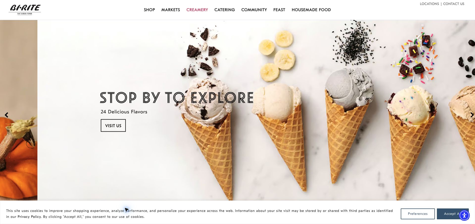
Bi-Rite’s creamery page makes a product-led introduction with a row of cones photographed against a bright background. The carousel distinguishes visiting, exploring flavors, and ordering ahead. Below it, the copy gives daily opening hours and explains which packaged products can be ordered in advance. Named suppliers receive specific explanations of their contribution, from coffee to dairy and chocolate. This is our editorial choice because the ingredient story supports a practical local visit instead of replacing it. The wider market navigation still competes with the creamery journey, and the lengthy supplier section could be easier to scan. A cookie strip remains in the retained view.
What you can learn
Connect provenance to the product customers can actually order. Keep hours, the flavor menu, and pickup eligibility near the top, then use concise supplier stories to explain distinctive ingredients rather than postponing the visitor’s basic planning questions.
Pros
Daily hours and order-ahead product types are stated.
Named suppliers make ingredient storytelling concrete.
Cons & considerations
The parent market navigation adds competing destinations.
Long supplier descriptions slow a quick visit-planning scan.
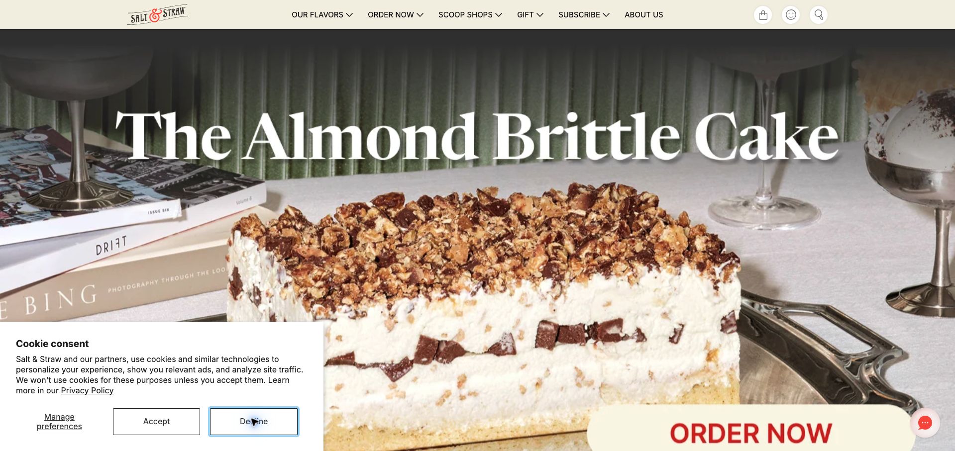
Salt & Straw gives a large almond-brittle cake photograph nearly the entire opening viewport, with an oversized serif headline and a prominent order action. Its navigation distinguishes local delivery and pickup from nationwide shipping, while regional shop links provide a separate route for in-person visits. Further down, themed bundles pair prices with one-time and subscription options. Detailed ingredient descriptions explain why a flavor is unusual, and an allergen guide is linked from the menu and footer. The cake crop pushes its action toward the bottom edge, and repeated promotional bands and press praise lengthen the route to practical details. The retained capture still shows a privacy panel after the initial decline action.
What you can learn
Give each fulfillment method an explicit label before presenting products. Keep seasonal storytelling and subscription savings, but place the purchase type and its conditions beside the price so a gift buyer can distinguish a single shipment from an ongoing plan.
Pros
Local ordering and nationwide shipping have separate routes.
Bundles display one-time and subscription prices.
Cons & considerations
The large hero leaves its action near the viewport edge.
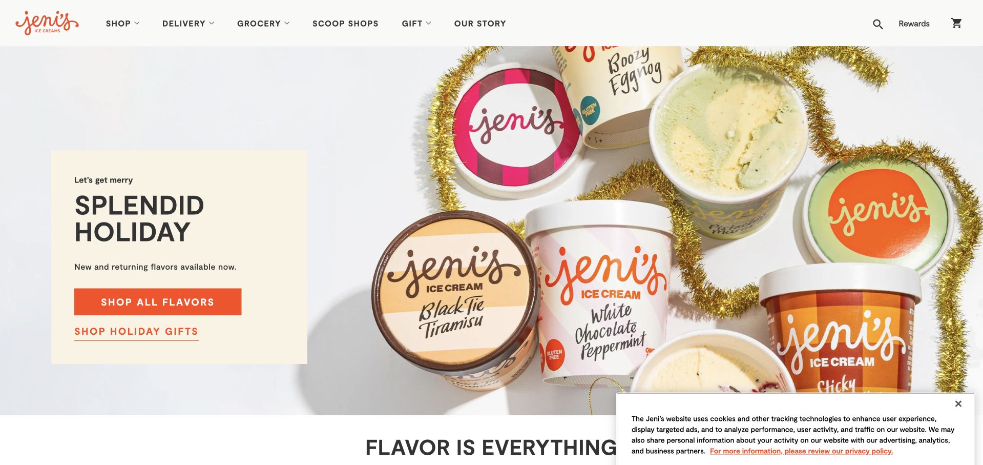
Jeni’s presents holiday pints in an airy product photograph beside a compact cream-colored text panel. Two differently styled actions distinguish browsing flavors from shopping holiday gifts. The menu expands that thinking into birthdays, new-parent gifts, corporate orders, dairy-free choices, and local versus nationwide delivery. Collection cards include prices, while a later explanation describes insulated packaging, dry ice, and the advertised shipping coverage. These details make an unusual perishable gift easier to understand. The homepage is long, with merchandise, rewards, subscriptions, and individual flavors competing for attention. Delivery reassurance arrives well after the first buying opportunities, and a cookie notice covers the lower corner of the captured opening.
What you can learn
Organize gifts around the recipient’s occasion, then answer delivery concerns beside the first collection cards. A short explanation of packaging, service area, and shipping terms can support the purchase before visitors reach subscription or loyalty promotions.
Pros
Occasion and dietary categories help narrow gift choices.
Packaging and shipping coverage receive concrete explanations.
Cons & considerations
Delivery reassurance appears late in a long homepage.
Numerous promotional programs compete with selecting a gift.
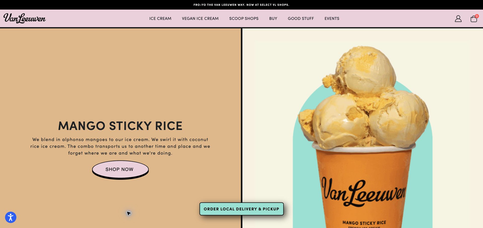
Van Leeuwen divides the opening into two strong halves: a short mango-sticky-rice description on a warm tan panel and a large branded cup against cream. The copy explains the mango and coconut-rice combination rather than relying on the flavor name alone. A pink shop button and a persistent local-delivery-and-pickup action create distinct routes. Vegan ice cream receives a first-level navigation item, and regional scoop-shop links sit alongside a grocery locator farther down. The unusually tall hero consumes the first screen, however, and the sticky ordering button overlaps the division between image and text. Generic labels such as Good Stuff are less informative than the otherwise direct product navigation.
What you can learn
Describe a distinctive flavor in familiar ingredient terms and pair that description with a close product image. Preserve explicit local ordering and dietary routes, while keeping decorative scale modest enough that visitors can see the next useful section.
Pros
Ingredient copy clarifies the featured flavor combination.
Vegan products and local ordering have visible routes.
Cons & considerations
The tall hero delays other choices.
Some navigation labels give little clue about their contents.
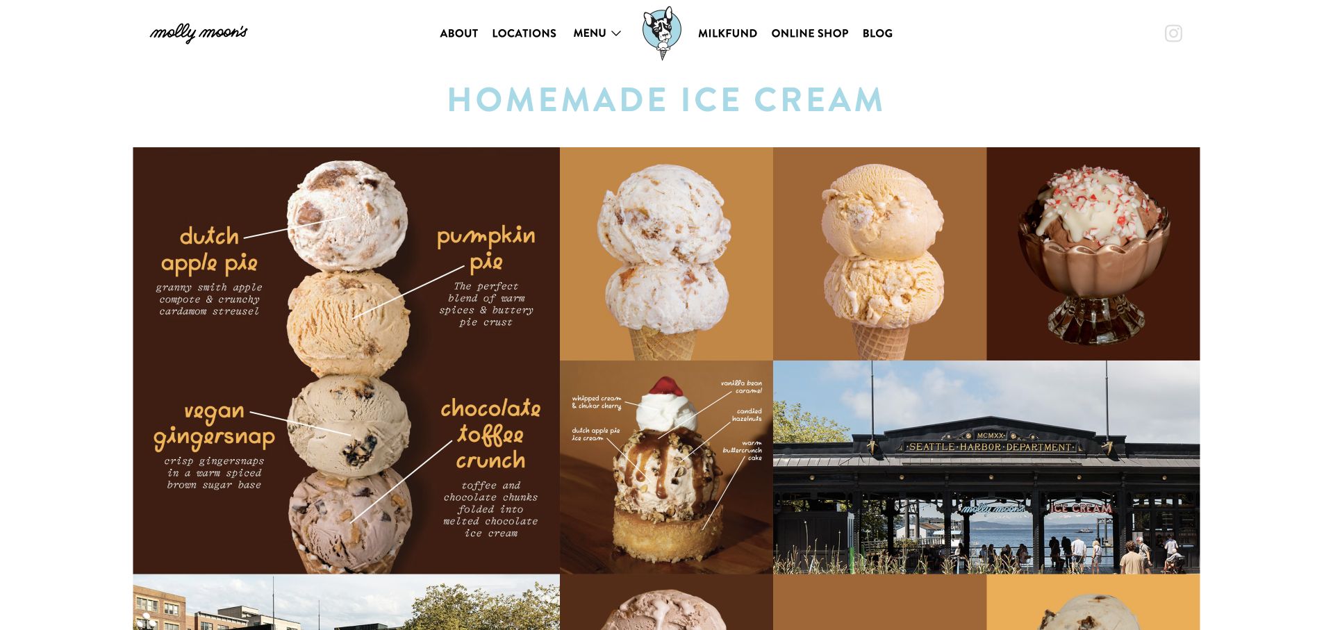
Molly Moon’s combines a restrained white header with a collage of cones, a sundae, and neighborhood imagery. Handwritten annotations describe seasonal flavors directly on the photographs, giving the page a handmade character. The accompanying page content lists named Seattle-area shops with weekday and weekend hours, followed by current seasonal flavors and an always-available menu route. That pairing supports the two obvious questions: what is being served and where to go. The opening collage is very tall, so the useful hours are initially out of view. Much of the flavor explanation is embedded within images, and the pale blue introductory heading has limited contrast against the white background.
What you can learn
Pair seasonal flavor excitement with a plain-text shop directory. Repeat image-based ingredient labels in readable text, and position neighborhood hours close enough to the opening that visitors can plan a trip without navigating through a large visual collage.
Pros
Named shops include weekday and weekend hours.
Seasonal and regular flavors have separate cues.
Cons & considerations
The oversized collage postpones the location information.
Image-based descriptions and a pale heading reduce readability.
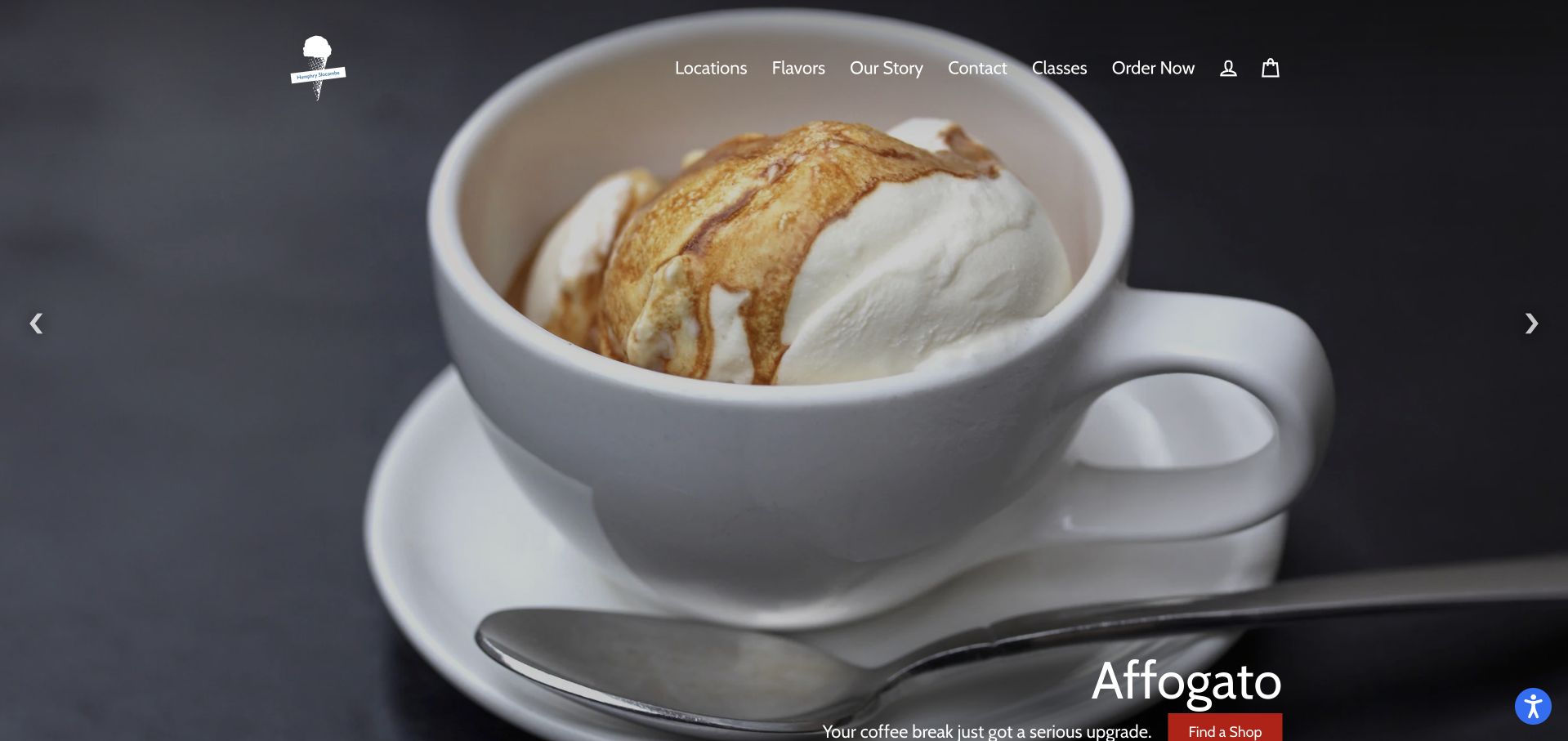
Humphry Slocombe opens with full-screen dessert photography and a rotating set of promotions for sundaes, affogato, events, and shipping. The simpler section beneath is more useful: nationwide orders, Bay Area local delivery, catering, and shop-redeemable gift certificates each receive their own explanation and action. Those labels clarify that the destinations serve different purposes, including external ordering providers. A visible slideshow pause control is welcome. The hero’s caption sits close to the bottom of the viewport, and pale navigation over changing photographs is not consistently easy to read. Several playful action labels also require the surrounding copy to explain what happens next.
What you can learn
Separate fulfillment and event services into plainly labeled blocks before handing visitors to another platform. Keep personality in supporting copy, but ensure the button itself identifies shipping, local delivery, catering, or gift certificates without relying on a carousel caption.
Pros
Shipping, local delivery, catering, and gift certificates are distinguished.
The carousel exposes a pause control.
Cons & considerations
Hero captions sit near the lower viewport edge.
Changing photos and playful labels weaken immediate navigation clarity.
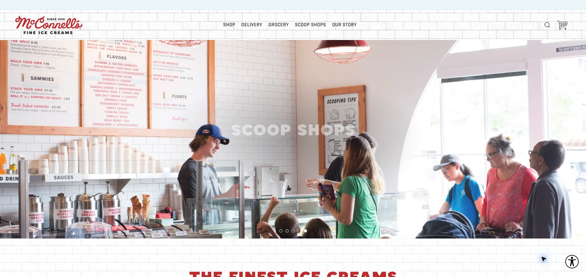
McConnell’s uses a tiled background, red script branding, and large rotating photographs to echo a traditional scoop shop. A top announcement gives an explicit Thanksgiving ordering deadline, while the navigation separates delivery, groceries, and scoop shops. The long flavor catalog is followed by sections about the dairy, gift subscriptions, and store discovery. Limited and seasonal products have a separate footer route, which is useful for returning shoppers. The opening carousel uses pale lettering over bright photographs, making some messages difficult to read. Many product tiles expose an add action without a nearby price in the captured page text, so the customer cannot compare costs as readily as names.
What you can learn
Put time-sensitive shipping cutoffs where gift buyers see them immediately, and carry that clarity into product cards with price and pack size. Test every carousel caption against its own photograph rather than assuming one text treatment works across all slides.
Pros
A specific holiday ordering deadline is prominent.
Delivery, grocery availability, and scoop shops are separated.
Cons & considerations
Pale carousel text competes with bright photography.
The flavor listing does not consistently surface prices beside actions.
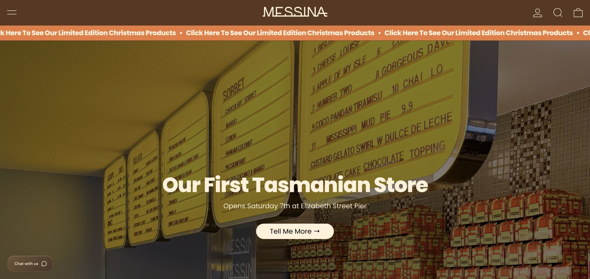
Messina’s brown-and-cream header and large shop photograph frame an announcement for its first Tasmanian store. The body mixes merchandise with limited gelato releases, student offers, tours, and app rewards. A Christmas product promotion states its December collection window, while the November special explains the actual flavor components. News summaries add useful opening details and local context. The repeated Christmas announcement strip is visually busy, and a desktop hamburger hides the main navigation despite ample horizontal space. The page also retains an October special alongside November content, making it harder to distinguish current availability from an older announcement without opening the detail page.
What you can learn
Treat limited releases as dated offers with an explicit collection window and availability status. Keep store-launch storytelling, but separate current products from older news and expose the core flavor and location destinations without requiring visitors to decode a moving announcement strip.
Pros
Seasonal products include concrete collection dates.
Store news supplies local opening context.
Cons & considerations
Repeated announcements and a hidden menu add navigation effort.
Older and current specials appear together without equally clear status.
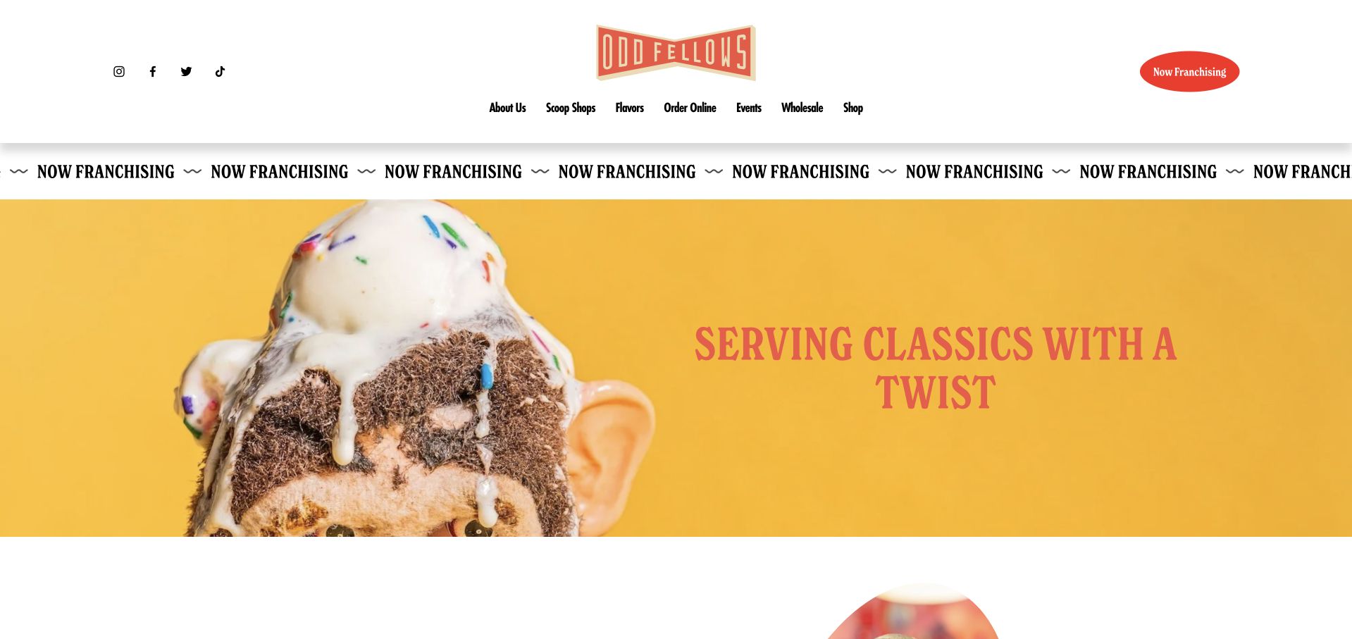
OddFellows uses a mustard-yellow hero, condensed lettering, and an intentionally odd photograph of ice cream atop a head. The result establishes a memorable tone before the page explains its small-batch flavor experimentation. Shop cards identify locations such as Tampa, DUMBO, and Chelsea, and flavor descriptions make the creative promise more concrete. Ordering, events, wholesale, and merchandise remain separate navigation destinations. Franchise recruitment nevertheless occupies both a header button and a repeating band above the customer-facing hero. The large header and recruitment strip consume substantial space, while the orange hero lettering has weaker contrast against yellow than the black navigation does against white.
What you can learn
Give a playful brand one strong visual idea, then quickly connect it to flavors and nearby shops. Place franchise recruitment in a clear secondary route so business-development goals do not displace the customer’s menu, location, and ordering decisions.
Pros
Distinctive art direction makes the brand easy to recognize.
Locations and flavor descriptions support the creative positioning.
Cons & considerations
Repeated franchise promotion competes with customer tasks.
Orange lettering on yellow weakens hero readability.
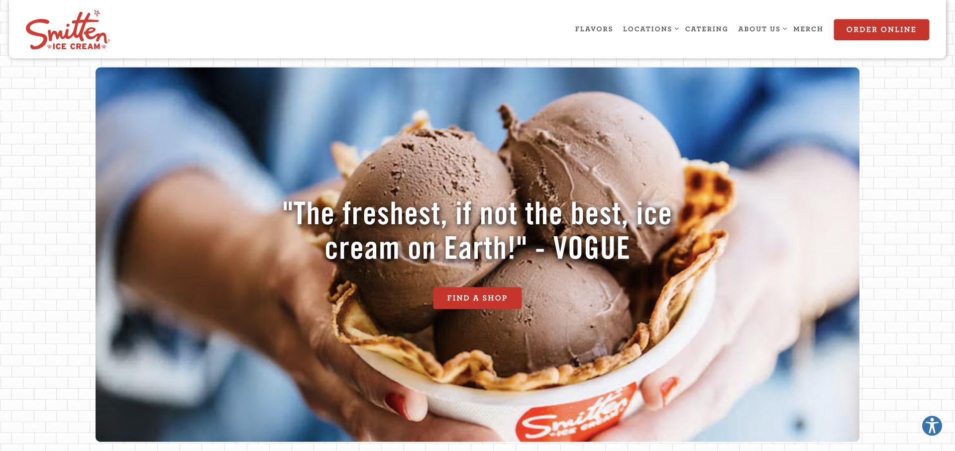
Smitten places a large close-up of ice cream beneath a floating white header, using a red shop-finder button as the main action. The rest of the homepage is unusually concise: flavors, catering, gift cards, and an explanation of its Brrr machine each receive a separate section. That structure lets the product-making process become a supporting story without overwhelming the immediate visit route. The cookie notice was declined before the retained capture. The opening headline relies on a press endorsement rather than explaining the preparation method itself, and the homepage supplies neither specific opening hours nor a nearby address. Visitors must follow another route to finish planning a visit.
What you can learn
Use a compact set of task sections to connect discovery, visiting, and catering. Explain the distinctive preparation method in a short factual sentence near the main action, and pair the shop finder with enough local information to make the next step obvious.
Pros
A clear shop-finder action anchors the opening.
Flavors, catering, gifts, and preparation receive distinct sections.
Cons & considerations
The hero depends on an endorsement instead of a product explanation.
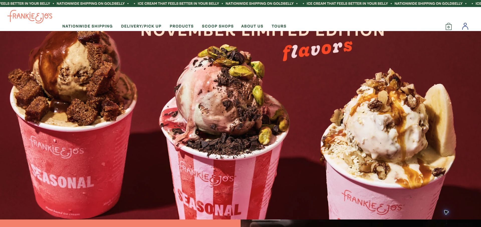
Frankie & Jo’s opens with richly colored photographs of three November specials and a navigation bar that explicitly separates nationwide shipping from delivery and pickup. The body explains the seasonal flavor combinations, introduces kitchen tours, and lists three named scoop-shop neighborhoods. A dedicated tours section describes what visitors can expect to see, giving a second reason to visit beyond purchasing a pint. The large hero crop cuts into the seasonal heading at the top of the image in the captured viewport. A repeated shipping announcement strip adds motion and repetition, while the practical location section names neighborhoods without immediately supplying their opening hours.
What you can learn
Give monthly releases a short ingredient explanation alongside their photograph, and keep shipping and local pickup labels distinct. Check the hero crop at the actual viewport size, then connect seasonal interest to shop hours or a clearly described tour rather than relying on imagery alone.
Pros
Nationwide and local fulfillment routes are explicit.
Kitchen tours explain the experience visitors can expect.
Cons & considerations
The hero crop cuts into its seasonal heading.
Repeated announcements and limited nearby location details slow planning.
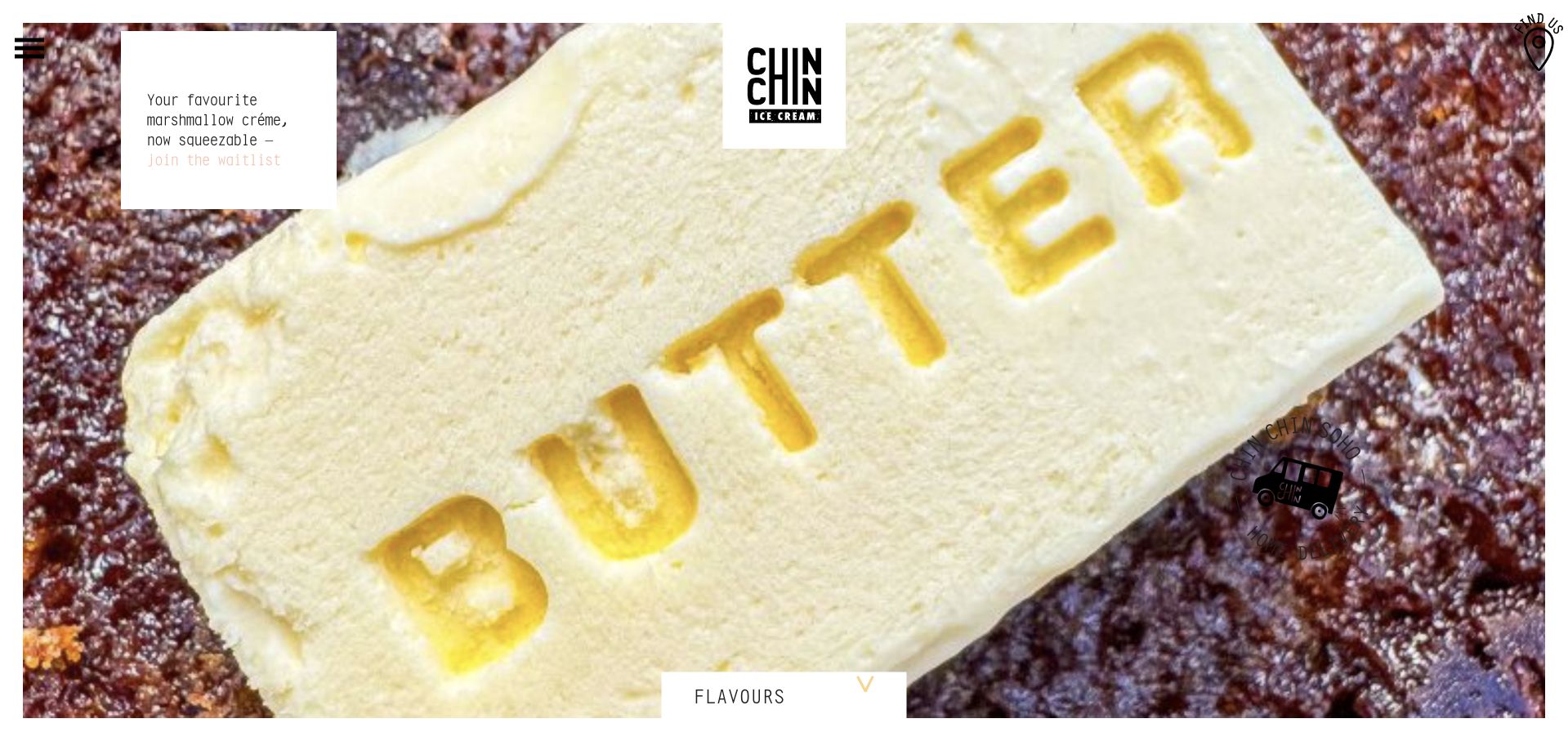
Chin Chin uses a very close food photograph, a centered block logo, and small graphic navigation cues to create an editorial rather than catalog-like opening. A modest Flavours control sits along the bottom edge, while the header menu exposes cakes, locations, events, and the online store. A small white announcement promotes a marshmallow-crème waitlist. The composition is distinctive, but the photographed butter and dessert fill almost the entire screen without explaining the ice cream offer. The pale waitlist text is difficult to read, and shop names appear without the opening hours or addresses needed to plan a visit. The image carries more of the page’s meaning than the sparse text does.
What you can learn
Let expressive food imagery establish a mood, but accompany it with one plain statement about the product and a readable menu action. Keep location essentials and launch announcements in text with strong contrast so visitors need not interpret decorative imagery to proceed.
Pros
The photographic style gives the brand a distinct identity.
Menu destinations distinguish cakes, shops, and events.
Cons & considerations
The opening offers little practical explanation of the product.
Pale announcement text and sparse visit details limit usefulness.
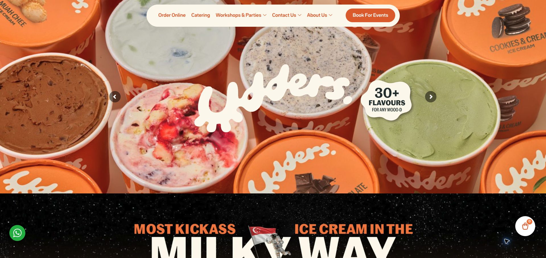
Udders uses orange packaging, cream lettering, and a floating pill-shaped navigation bar to create a lively first impression. Below the hero, cakes, pints, and bundles form one product group, while live scooping, pre-packed cups, workshops, and parties form another. Those distinctions make the catering offer more concrete than a generic events link. Location cards name individual outlets and their countries, reflecting the regional business. The first viewport nevertheless emphasizes branding and event booking without a clear flavor-menu label in the main navigation. Repeated carousel items lengthen the page, and the location overview postpones practical details such as addresses and hours to a separate destination.
What you can learn
Group event services by what the host actually receives: a staffed station, packaged cups, a workshop, or a party. Keep that useful distinction while preserving an obvious flavor menu and local shop details for visitors whose goal is simply to buy a scoop.
Pros
Product and event formats are divided into understandable groups.
Outlet cards identify locations across different countries.
Cons & considerations
The main navigation lacks an equally obvious flavor-menu label.
Repeated carousels and deferred shop details add browsing effort.
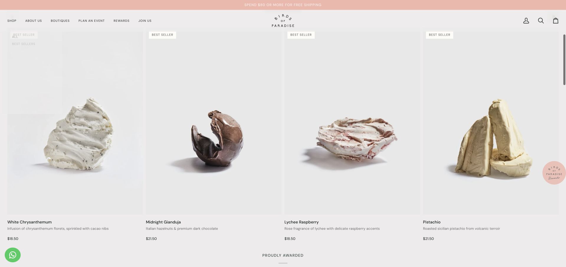
Birds of Paradise presents its best sellers as isolated sculptural scoops against pale backgrounds. In the retained scrolled view, each product has a flavor name, a short ingredient description, and a price, so chrysanthemum, lychee, or gianduja can be understood without opening every card. The wider page separates boutiques, events, subscriptions, and party cups, and states a free-shipping threshold in the top strip. Its restrained typography and spacious cards support the botanical positioning. The small text can feel delicate at desktop scale, however, and the first-view carousel mixes anniversary, subscription, and rewards promotions. Shipping eligibility is less explicit beside the threshold than the price itself.
What you can learn
Pair an unfamiliar flavor name with a familiar ingredient description and a visible price. Preserve room around the product image, but use readable type sizes and state the delivery territory beside a shipping threshold rather than leaving customers to infer eligibility.
Pros
Flavor cards combine ingredient explanations and prices.
Boutiques, party products, and subscriptions have distinct routes.
Cons & considerations
Small text reduces the ease of scanning at desktop size.
Shipping territory is not explained beside the prominent threshold.
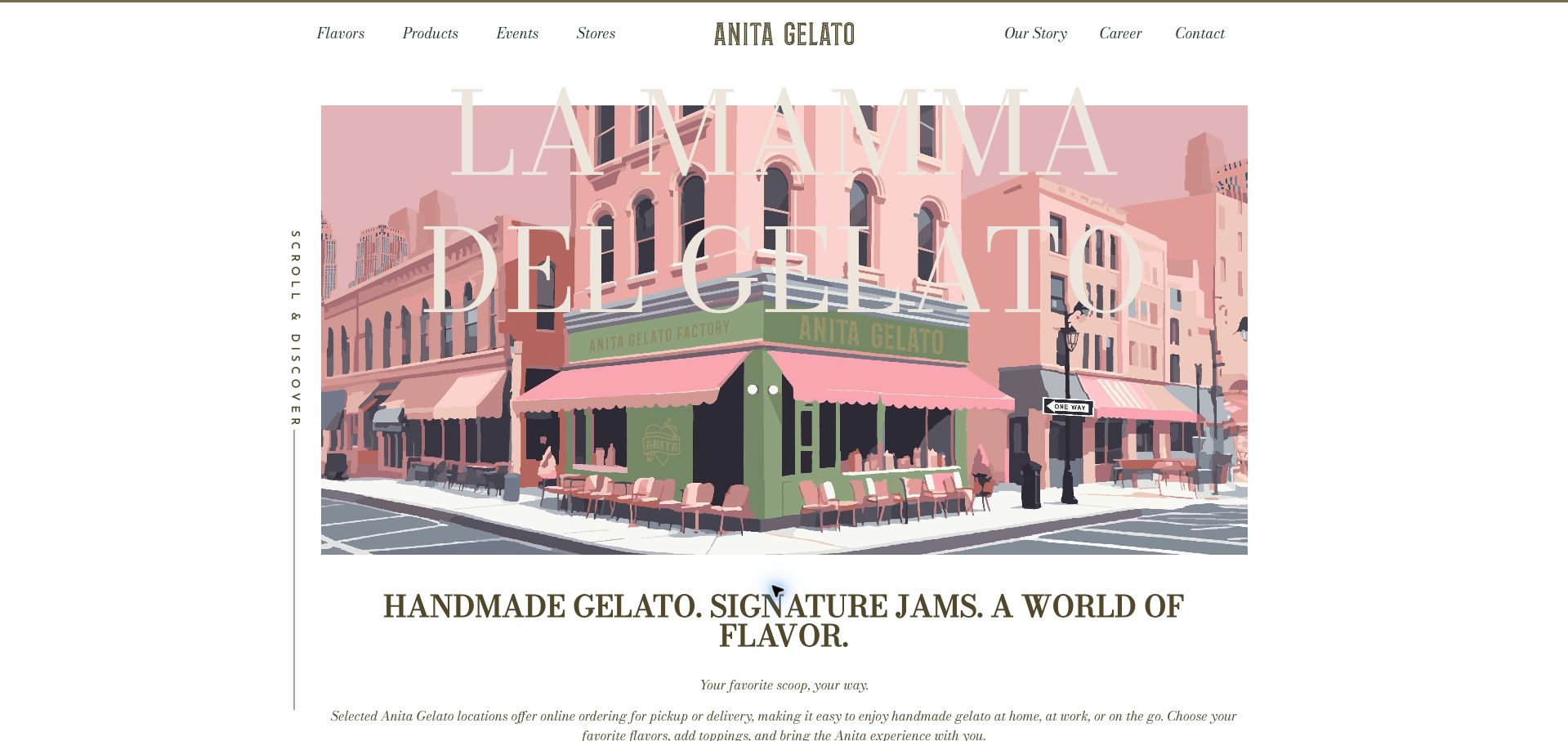
Anita introduces the brand with a pastel illustration of a corner shop, oversized serif lettering, and a slim symmetrical navigation bar. Beneath it, the copy explicitly says that online ordering is offered by selected locations, a useful qualification for a multi-market business. Best-selling flavors receive short ingredient descriptions, including the components behind names such as Cookieman. The visual identity feels cohesive across illustration, type, and muted colors. The opening headline has low contrast over parts of the illustration, and the order and store actions sit below a substantial introductory area. A broad contact form near the end asks for more information than a simple shop lookup needs.
What you can learn
Use a distinctive storefront illustration to build recognition, then explain local ordering availability before presenting an order action. Keep flavor names paired with ingredients, and make store discovery a shorter route than a general multi-field contact form.
Pros
Online-order availability is qualified by participating location.
Flavor descriptions explain unfamiliar names.
Cons & considerations
Oversized pale lettering loses contrast over the illustration.
Introductory space delays the practical ordering and shop actions.
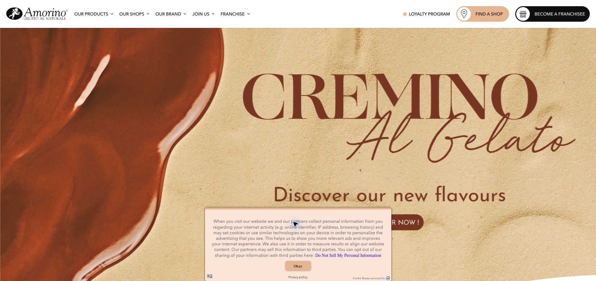
Amorino’s US page gives a shop-finder button strong placement in the header and pairs it with seasonal product imagery. The main navigation separates products, shops, the brand story, and recruitment. Lower sections describe individual gelato creations, while the footer exposes country switching and nutritional information. That provides useful infrastructure for a brand serving several markets. The campaign photograph occupies most of the first viewport, with a cookie notice covering part of its action. Product copy is not fully consistent: a section titled Inverno describes an Estate log. Franchise recruitment also receives a high-contrast header button that competes with the visitor’s immediate shop-finding task.
What you can learn
Localize more than the country selector: check product names, seasonal descriptions, and terminology together. Keep the shop finder prominent and separate recruitment from customer actions so a global campaign still leads to a clear, market-specific visit or product decision.
Pros
The shop finder has a prominent persistent position.
Country and nutrition routes support international browsing.
Cons & considerations
One product heading conflicts with its description.
Franchise promotion and the privacy notice compete with customer actions.
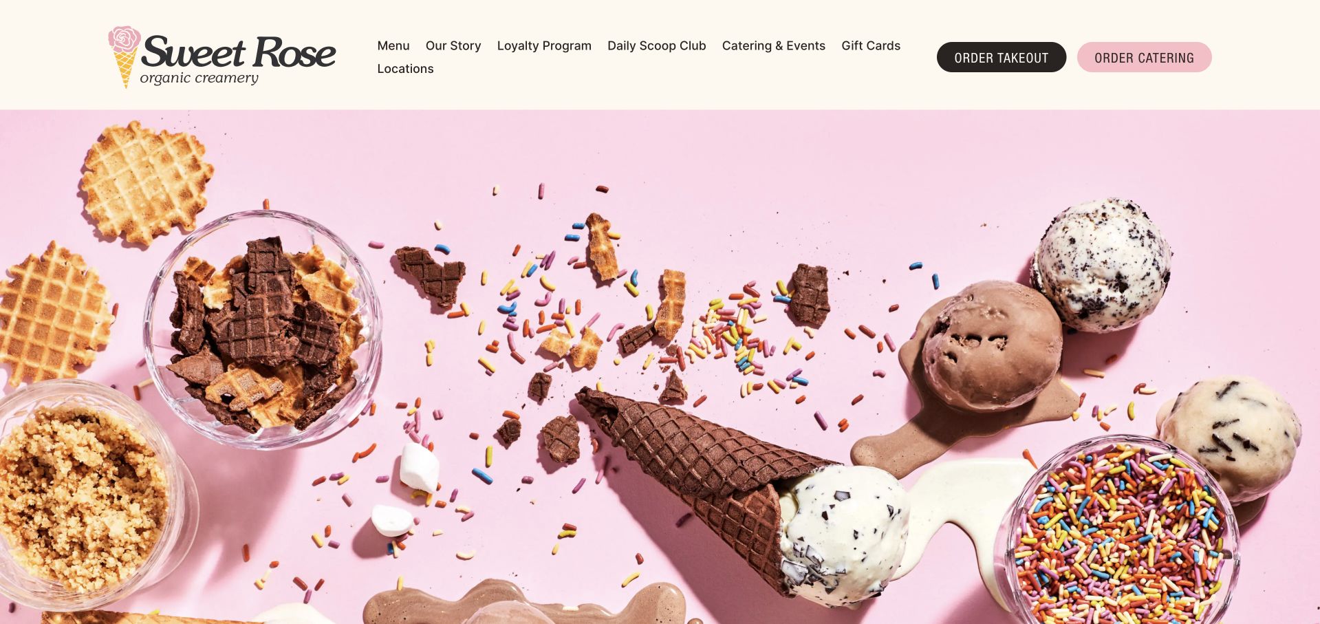
Sweet Rose uses a pink overhead photograph of scoops, cones, and toppings beneath a cream-colored header. The two main actions clearly distinguish takeout from catering, using different fills while retaining comparable size. The remaining homepage is short: a brief brand introduction leads into a named location with address, phone number, weekday and weekend hours, and a route to all locations. That economy is useful for a neighborhood business. The first screen is almost entirely photographic, however, leaving the practical details below it. The navigation wraps Locations onto a second line at the captured desktop width, and no current flavor preview accompanies the otherwise inviting image.
What you can learn
A small shop can keep its homepage short if it preserves the essential tasks: menu, hours, directions, takeout, and catering. Use two clearly labeled order actions, but size the hero and navigation so those practical details remain easy to find without a long scroll.
Pros
Takeout and catering actions are clearly distinguished.
The footer provides an address, phone number, and opening hours.
Cons & considerations
The large image postpones essential visit information.
Wrapped navigation and no flavor preview weaken the opening.
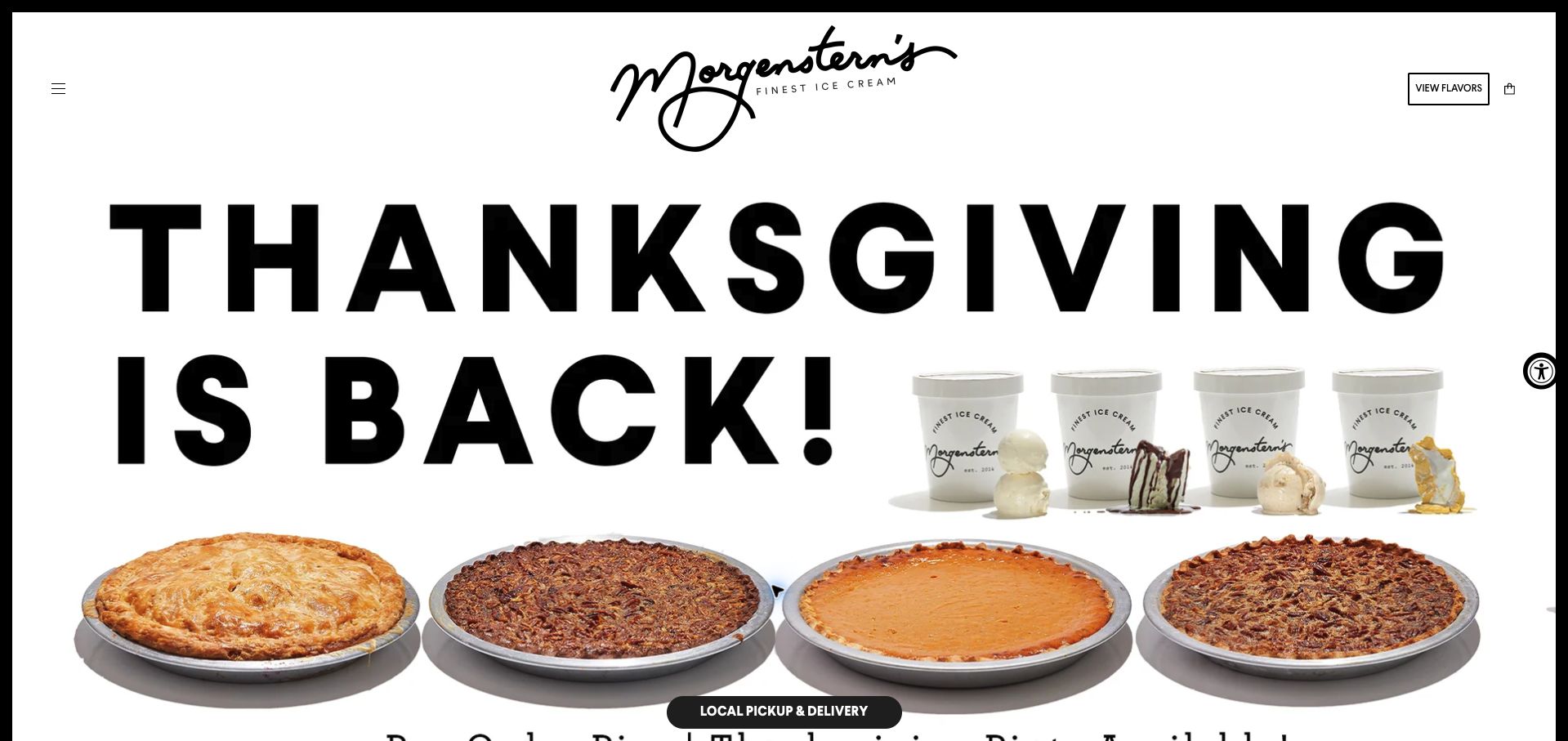
Morgenstern’s surrounds its white page with a black frame and puts an oversized handwritten logo above a stark Thanksgiving campaign. Large black lettering, pies, and pint photography create immediate seasonal recognition. A View Flavors control remains in the header, and a floating local-pickup-and-delivery action offers a practical route without waiting for the campaign to finish. The tradeoff is a very sparse text introduction: much of the seasonal message lives in the image, with little nearby explanation of prices, deadlines, or product availability. Other navigation is hidden behind a small menu icon, so visitors seeking a store address or hours have little guidance in the opening viewport.
What you can learn
Keep a persistent local-order route alongside a highly graphic seasonal campaign. Repeat its essential details in accessible text, including availability and ordering dates, and provide a visibly labeled location route so the campaign can support both new and returning visitors.
Pros
A persistent action identifies local pickup and delivery.
The seasonal campaign has a clear and memorable visual hierarchy.
Cons & considerations
Important campaign information is largely image-based.
Small hidden navigation delays location and practical order details.
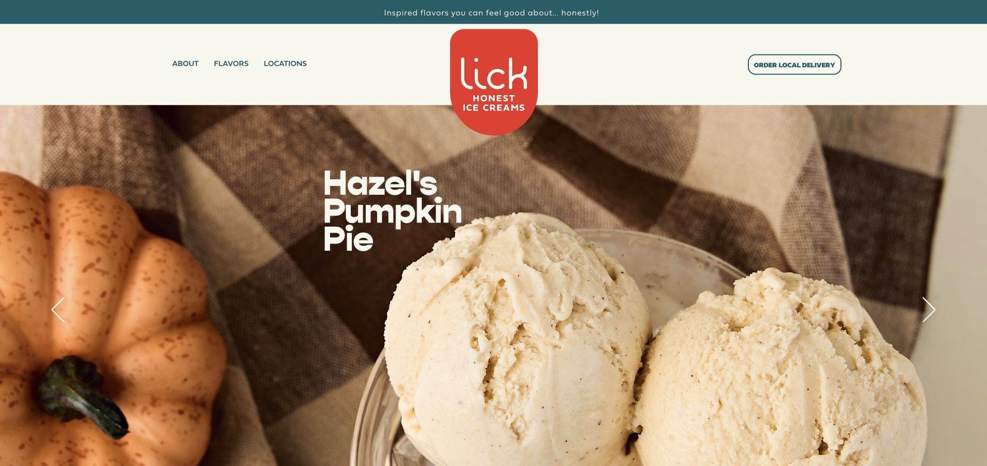
Lick uses a cream-and-teal header with just three primary navigation destinations and a separate local-delivery button. A large seasonal photograph names Hazel’s Pumpkin Pie, while the body explains the brand’s sourcing position and directs visitors toward Texas scoop shops. The short menu is easy to understand, and repeating the flavor and location routes below helps visitors who scroll through the story. The hero lacks a direct flavor-detail action, however, and the long sourcing message sits ahead of the practical store section. Statements about ingredients are presented as brand claims; the homepage does not turn them into an item-level allergen or dietary guide for each flavor.
What you can learn
Use a short navigation menu when the customer’s main decisions are flavor, location, and delivery. Support sourcing claims with product-specific ingredient information, and connect a seasonal hero directly to its flavor detail instead of requiring a separate menu search.
Pros
The compact navigation makes the main customer tasks clear.
Local delivery is visibly separated from general browsing.
Cons & considerations
The seasonal hero lacks a direct detail action.
General sourcing claims do not replace product-level ingredient guidance.
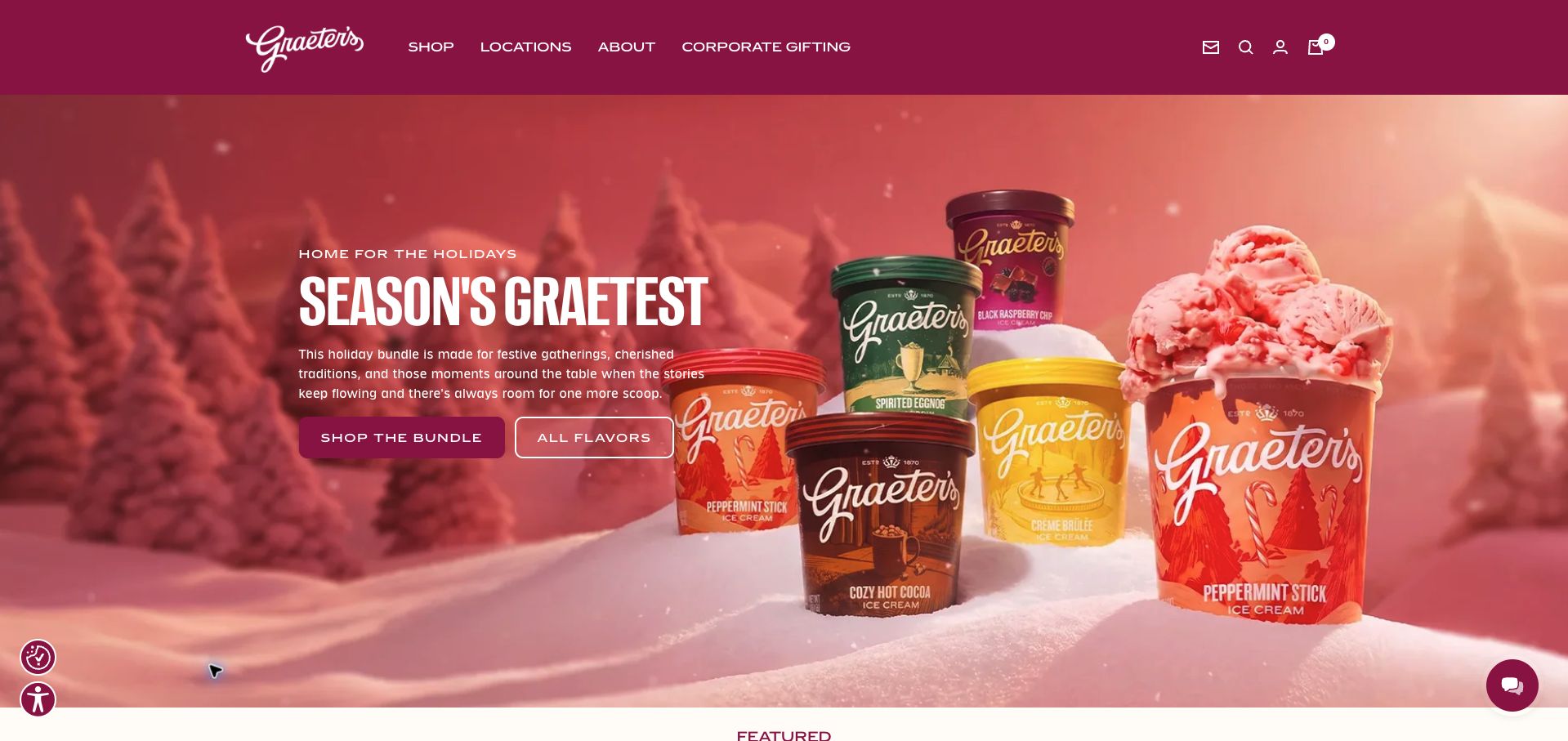
Graeter’s pairs a burgundy header with a holiday bundle photograph and two actions: the featured bundle or all flavors. The following collection cards describe their contents and give prices, including the number of each flavor in the seasonal pack. Farther down, a separate scoop-shop section introduces a sundae, local catering, and Cincinnati bakery offerings. This helps distinguish a shipped purchase from something available on a local visit. The long page repeats process and heritage messages across several sections, and local information is well below the initial shopping content. The hero also delays the bundle price until the next section rather than placing it beside the main action.
What you can learn
List the contents and quantities of a curated bundle before asking customers to buy it. Keep local-only products and catering clearly separated from shippable collections, and bring the price and relevant delivery terms close to the first promotional action.
Pros
Collection cards explain pack contents and prices.
A distinct section introduces local-shop products and catering.
Cons & considerations
Repeated heritage content lengthens the shopping journey.
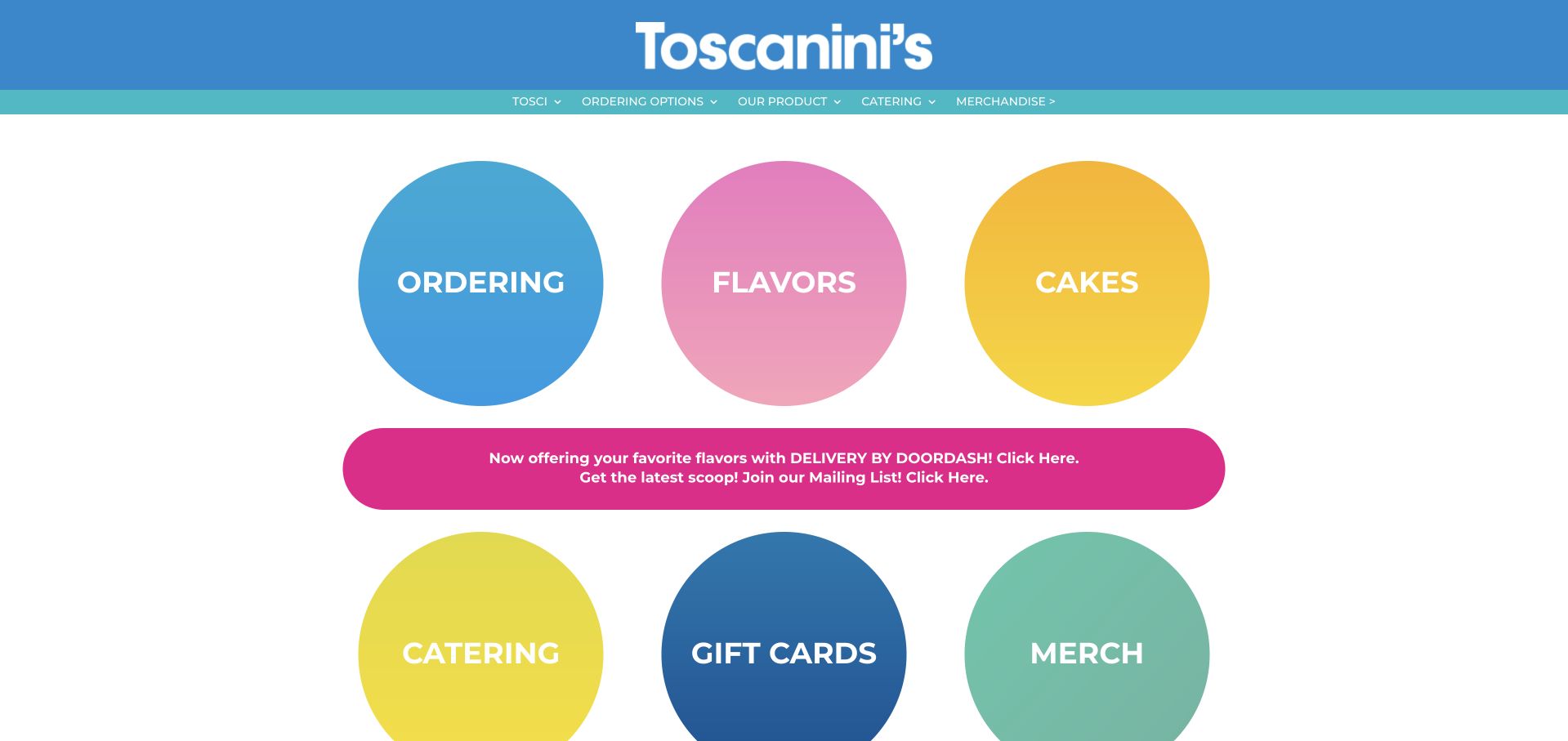
Toscanini’s leads with six large colored circles for ordering, flavors, cakes, catering, gift cards, and merchandise. This unusually direct opening gives each common task a large visual target rather than asking visitors to interpret a lifestyle photograph. A bright announcement names DoorDash, and the footer separately labels delivery and Square pickup. Two Cambridge street addresses provide basic local context. The circles occupy considerable space, and white labels over the yellow and pink gradients have weaker contrast than the darker buttons. The homepage also omits opening hours beside the addresses and uses generic Click Here wording in the announcement instead of a descriptive action label.
What you can learn
For a compact local business, a task directory can be more useful than a large campaign image. Keep the labels descriptive, check text contrast on every colored button, and pair addresses with hours so visitors can finish basic planning on the same page.
Pros
Large labeled targets expose the main customer tasks immediately.
Delivery and pickup providers are identified separately.
Cons & considerations
Some gradient buttons have weak text contrast.
Addresses lack adjacent hours and announcements use vague link text.
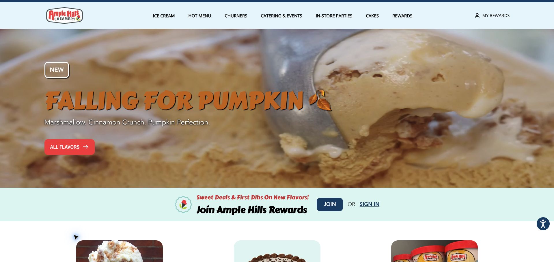
Ample Hills presents a pumpkin flavor promotion above a pale-blue rewards strip, then introduces ice cream, cakes, pints, flights, and other serving formats through individual cards. This gives customers more context than an undifferentiated flavor list. A later ordering section names New York shops and provides their street addresses, creating a concrete local handoff. Catering and in-store parties also have separate navigation labels. The first screen promotes joining the rewards program before a new visitor has seen the menu formats or locations. Terms such as Churners and Little Dipper receive little explanation in the homepage cards, and the warm-colored hero lettering is less readable over the busy ice cream photograph.
What you can learn
Explain serving formats with short descriptions before promoting account membership. Connect each format to a local ordering route and readable shop details, using the loyalty program as a supporting option after the visitor understands what and where they can buy.
Pros
Serving formats and event services have separate routes.
Local ordering sections name shops and give street addresses.
Cons & considerations
Rewards signup competes early with menu discovery.
Unexplained product terms and busy hero contrast reduce clarity.
Kegan is a freelance web designer and developer with 15+ years of experience helping businesses turn complicated website requirements into clear, maintainable digital experiences. He works directly with clients from planning and design through development, launch, and ongoing support.
For ice cream shop website design, his development approach focuses on flavor and dietary information, shop locations, seasonal announcements, catering inquiries, and ordering handoffs. The scope can be a targeted improvement or a complete custom build, with responsive layouts, thoughtful content structure, and integrations chosen around the people using and maintaining the site.
Show 3 other ice cream shop website designersHide other ice cream shop website designers
Store the name, description, ingredient information, format, availability, and relevant shop or shipment together. Distinguish seasonal availability from permanent menu content.
Plan gifts and catering separately
Explain pack quantities, shipping territory, lead times, and event-service formats. A staffed scooping station is different from prepacked cups and should have its own description.
Review image and campaign behavior
Check that text remains readable over every photograph and that crops preserve the message. Remove expired holiday offers and ensure rewards signup does not block the menu.
The editing job behind the design
Choose systems the team can keep accurate
Use structured flavor and location records, with commerce handling shippable products and the local ordering provider handling its own territory. Keep the handoff labels explicit.
Product photography should support readable prices, ingredients, and availability. Do not embed the only useful description inside an image.
Our WordPress website examples offer a separate look at publishing approaches. A visible platform label is evidence for that named page, not a guarantee that the same system will suit your requirements.
Before the public launch
Website planning checklist
Describe flavor ingredients.
Maintain allergen information.
Separate local and shipped orders.
Show shop hours.
Publish accurate addresses.
List bundle quantities.
State shipping territory.
Date holiday cutoffs.
Explain catering formats.
Check every hero crop.
These checks are a project checklist, not a performance, legal, security, or accessibility certification. Test real journeys with the people responsible for the website before making claims about the result.
Sources & editorial method
How this collection was selected and reviewed
These 22 examples match the collection target saved before research. Public pages were directly opened and visually inspected; the pictured source and capture date identify the reviewed state. Reused captures retain their earlier dates. Each source also has a bounded public stack-audit attempt, with inaccessible and unknown results kept explicit. Editors Choice recognizes website design and information, not service quality or promised outcomes. No purchases, bookings, applications, or private forms were submitted. Images and trademarks belong to their owners.
Each example links to its actual source page. Screenshots are direct browser captures with their own capture dates; moving imagery, announcements and live designs can change. The notes describe observable design choices and conditional tradeoffs, not measured traffic, conversion results, service quality, or accessibility conformance.
Technology labels use public page metadata, asset evidence, or explicitly cited platform documentation. Platform documentation is not a complete current deployment audit. A component reference may be legacy or unused; it is not a complete backend inventory. Unknown stacks are omitted. These sites are editorial examples, not our client portfolio.
Written, Edited and Curated are separate editorial records, not timestamps advanced by a rebuild. Website designs and imagery belong to their owners. See our editorial standards or suggest a correction.
Questions worth asking
Ice Cream Shop website design questions
Should the homepage lead with flavors or locations?
Both should be easy to find. The main emphasis can follow the business model, but a local visitor should not be forced through a nationwide shipping campaign.
What makes an unusual flavor name useful?
A brief ingredient explanation in readable text, with a route to the business’s current dietary and allergen details.
How should subscriptions differ from gifts?
State whether the purchase is one shipment or recurring, with the price interval and important terms beside the action.
Can a shop locator replace opening hours?
It can organize locations, but each destination still needs maintained hours and practical visit information.