Best Urgent Care Websites of 2026 (21 Real-World Examples)
Local clinic information, understandable visit choices and a practical next step when visitors are short on time.
An urgent-care website has a demanding first job: explain how someone can find a clinic without making them interpret a large healthcare organisation. A person may know a neighbourhood, a service or an existing clinic name. The website should accept those different starting points and make the next step understandable. It should not pretend that a marketing page can assess a person’s condition.
This collection compares regional specialists and larger networks, with different approaches to location search, walk-in messaging, online queues, virtual visits and visit preparation. The useful question is not which hero has the friendliest portrait. It is whether the page connects the service proposition to maintained local information. A clear search and an accurate clinic page can be more useful than several animated promises of speed.
These are design observations, not clinical recommendations or a ranking of care quality. Published hours, prices, accepted plans and availability remain each organisation’s information and can change. A design review of a public homepage does not verify them. When planning a site, have the responsible operational and clinical teams approve service descriptions, appropriate urgent-contact notices and the boundaries of any educational material.
Before the examples
What makes good urgent care website design in 2026?
Make the local clinic the useful destination
Give each clinic a maintained record containing its public address, telephone route, opening hours, access information and services actually offered there. Let visitors search by familiar geography or clinic name. A network-level page can introduce the brand, but it should not be the final source for every local fact. Preserve the selected clinic as someone moves into preparation or scheduling information.
Explain what each access action means
Walking in, choosing an appointment, saving a place in a queue and preregistering are not self-explanatory equivalents. Use the terminology the organisation can operationally support and explain it before the handoff. Show what a confirmation does and does not establish. Give an alternative public contact route when the online component fails, without implying that a form submission itself guarantees a visit.
Put preparation beside persuasion
Insurance questions, self-pay information, documents to bring and physical arrival details deserve clear public routes. Keep these separate from broad statements about convenience or affordability. Give practical content an owner and review date internally, with a way for clinic staff to report a change. A seasonal campaign should link into this stable information rather than become the only explanation of a service.
The collection · 21 examples
21 urgent care websites worth studying
Compare the access structure before borrowing the visual style. The first selection highlights a regional New York City provider; the remaining examples offer contrasting search, campaign and multi-brand patterns. Screenshots show specific public states, not independently tested wait times, booking outcomes or care results.
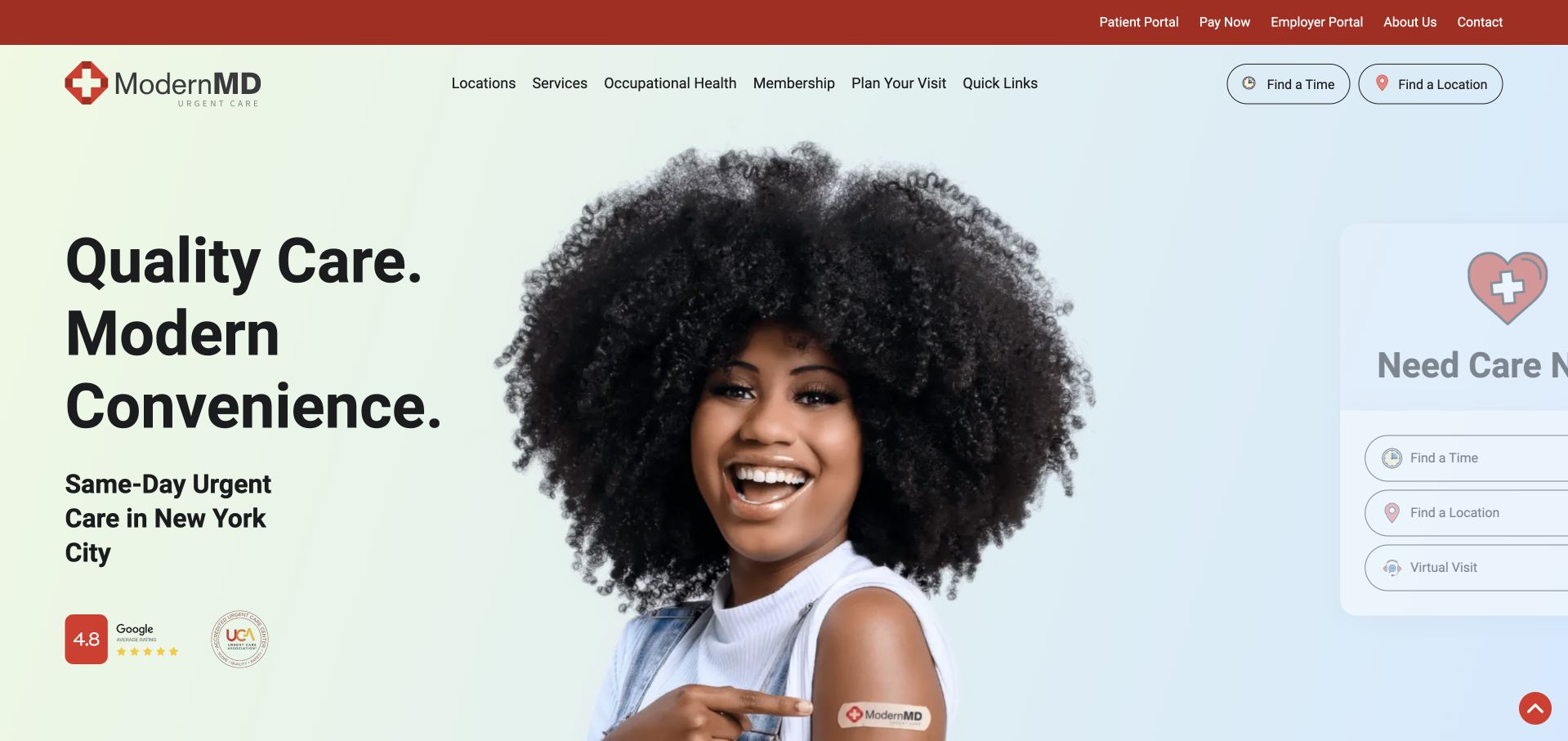
ModernMD makes the urgent-care task feel local rather than institutional. Its opening pairs a large, approachable photograph with a distinct care-now panel, while the navigation separates locations, services and preparation for a visit. The regional New York City focus is supported by its own story page, rather than inferred from a skyline photograph. Practical routes to insurance, self-pay information and what to bring sit within the same public information structure. The design succeeds by putting a decision beside the brand introduction instead of asking visitors to scroll through a company biography. It still depends on accurate clinic information and a clear explanation of what selecting a time actually reserves.
What you can learn
Let a regional care brand lead with a specific place and an actionable location route. Keep preparation and payment questions close to that route, and distinguish the website’s access promises from any claim about clinical outcomes.
Pros
A dedicated care-now panel gives the first view a practical purpose beyond reassurance and photography.
Separate preparation, payment and service routes reflect questions a visitor may have before choosing a clinic.
Cons & considerations
Multiple patient and employer destinations need clear labels so existing users do not enter the wrong portal.
Any availability or timing promise needs ongoing operational ownership rather than remaining static marketing copy.
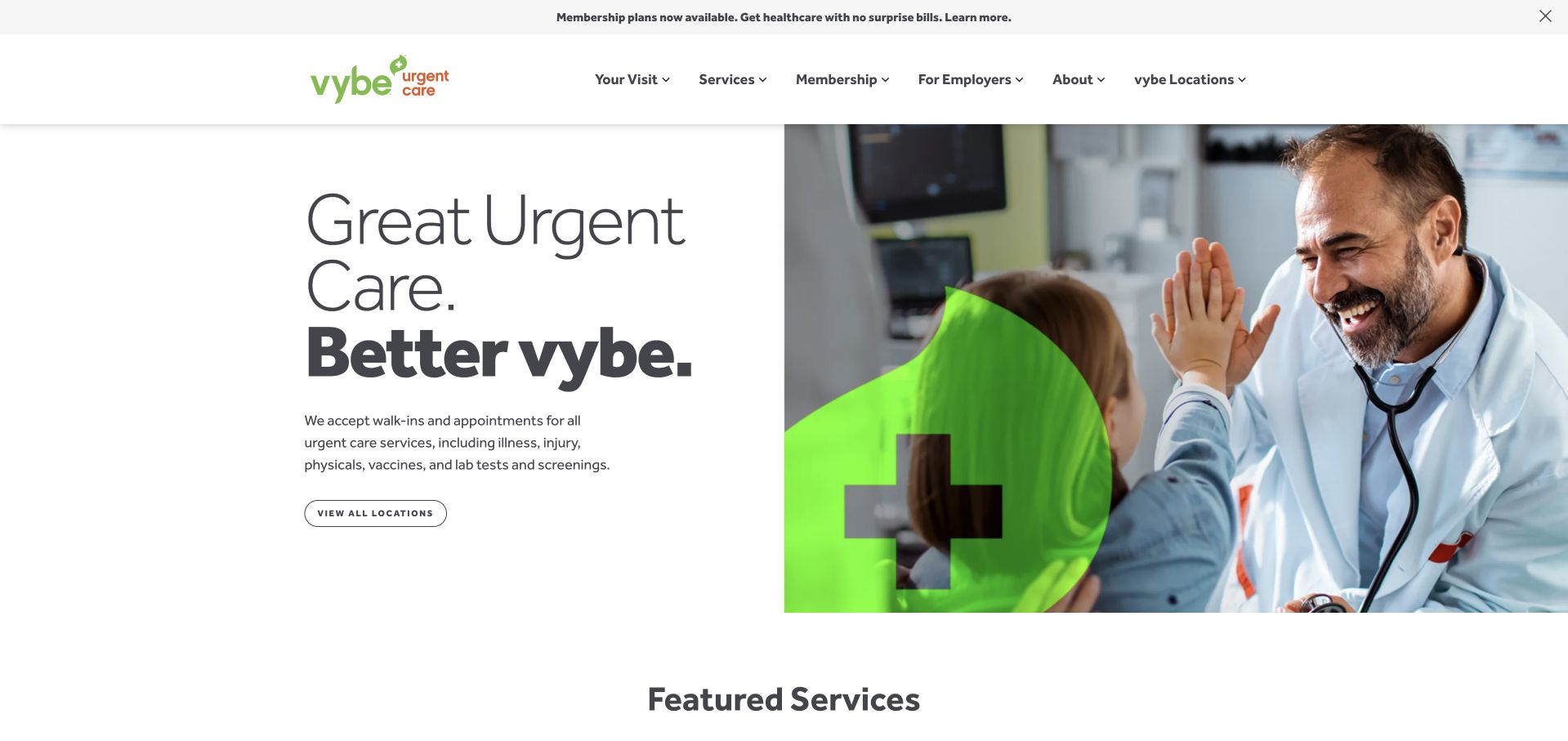
vybe uses an informal name and conversational headings to soften the standard urgent-care introduction. The current destination is vybe.care, and the public navigation divides the experience into a visit, services, membership, employers and locations. That is useful segmentation: someone checking how a visit works has different needs from a business arranging occupational services. The homepage follows its broad opening with featured services and an explanation of urgent care, rather than relying entirely on a slogan. The visual friendliness should not obscure the practical distinctions between walking in, arranging an appointment and paying for a membership. Those are separate commitments even when they appear within one welcoming brand.
What you can learn
A conversational voice works best when the underlying labels remain literal. Use friendliness to reduce distance, then explain location, appointment status and payment choices without making the visitor decode the brand’s personality.
Pros
Visit and employer information are separated rather than squeezed into one undifferentiated service menu.
The explanation of urgent care gives new visitors context before they encounter the deeper service catalogue.
Cons & considerations
A playful brand can make precise visit conditions feel secondary unless practical copy is equally prominent.
Membership and ordinary visit actions need distinct explanations so a visitor understands which route is being selected.
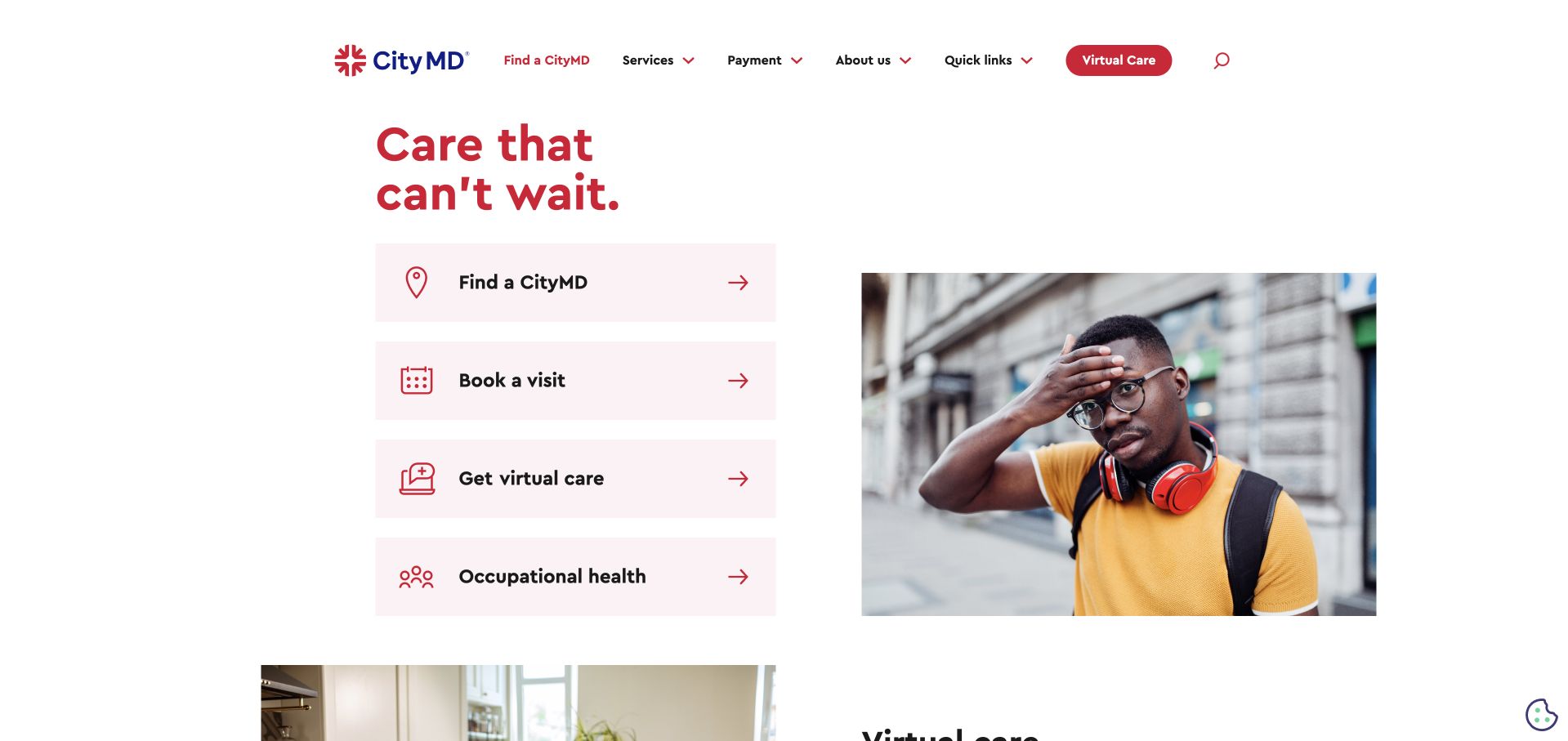
CityMD introduces the service with a short headline rather than a dense explanation of the organisation. The public page then develops several useful layers: virtual care, what the clinics treat, insurance and workplace services. That sequence lets someone start with a broad need and narrow it without having to understand the business structure first. The restrained header and strong brand colour keep the interface recognisable even where several destinations compete for attention. The concise opening is a useful contrast to healthcare homepages that attempt to list every service immediately. Its limitation is that the brand-level page cannot answer whether a particular clinic offers the same service, schedule or access arrangements.
What you can learn
Use a brief opening to establish the category, then progressively answer scope and access questions. Make clinic-specific details the next step rather than allowing a national or regional headline to stand in for local confirmation.
Pros
Virtual, in-person and workplace care are given distinct explanatory sections instead of one oversized promotional panel.
The short opening leaves room for a clear visual hierarchy and recognisable navigation.
Cons & considerations
A minimal headline needs a nearby location route to become useful to someone unfamiliar with the brand.
Insurance and treatment summaries require local detail and limitations before a visitor can rely on them.
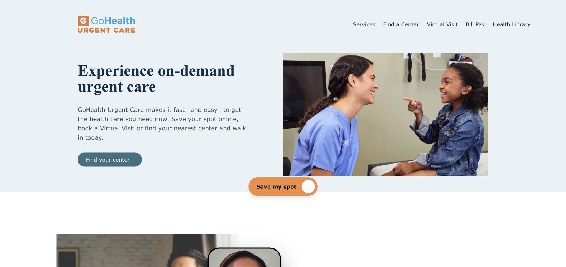
GoHealth centres the opening around on-demand urgent care and a prominent save-a-spot action. Its navigation explicitly distinguishes services, resources, partners and company information, which helps prevent the partnership story from overwhelming the patient task. Lower sections explain virtual visits and connected care, giving the brand more context than a locator alone would provide. The useful design tension is between speed and explanation: a visitor can recognise the immediate action, while a more cautious reader can inspect how the service fits into a wider network. That connection should remain a sourced organisational description, not an assumption that every record, insurer or follow-up process is automatically integrated.
What you can learn
Give urgent visitors a short route to local access, but preserve a separate explanatory path for people comparing services. Describe partner relationships precisely and explain reservation terminology before handing someone to another scheduling environment.
Pros
The primary save-a-spot action is easy to identify within a broader organisational homepage.
Separate partner and patient-resource sections make the connected-care story easier to examine without blocking access.
Cons & considerations
Saving a spot can be misunderstood as a guaranteed appointment unless the subsequent flow explains the distinction.
A network-wide proposition needs local service and handoff details rather than relying on partner names alone.
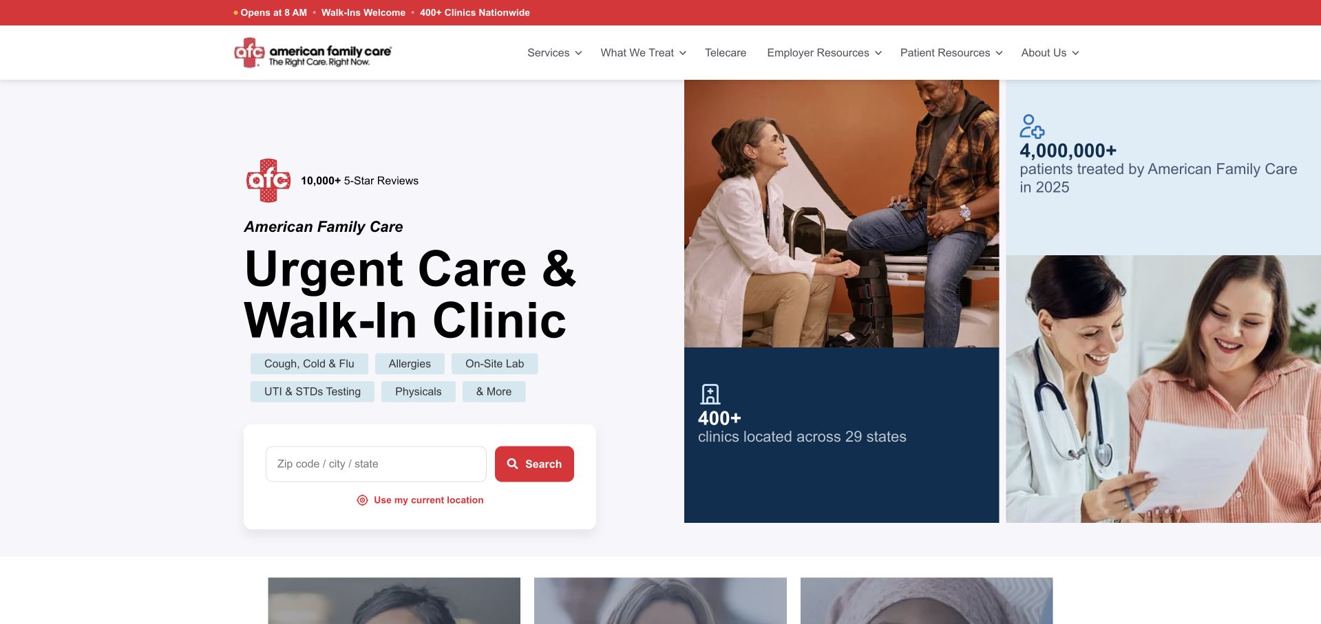
American Family Care states the category directly: urgent care and walk-in clinics. An address, city or ZIP search appears as a central task, while the supporting page groups familiar services such as physicals, testing and family care. The structure is useful for a brand whose visitors may arrive from different markets and know the service they need better than the local clinic name. Its accessible, affordable and convenient themes provide an understandable marketing framework, but those words are not a substitute for actual pricing, hours or accommodation details. The strongest lesson is the literal search-first opening, not the broad claims that surround the service catalogue.
What you can learn
Start a multi-market clinic homepage with the words a visitor already understands and a search that accepts ordinary location information. Follow with service-specific local pages, not a long national list that appears to promise identical provision everywhere.
Pros
The location field accepts several familiar ways of identifying an area rather than requiring a clinic name.
Service headings translate the broad urgent-care category into recognisable reasons for visiting.
Cons & considerations
A large service catalogue can imply uniform availability unless individual clinic pages clearly qualify it.
General affordability language needs current, concrete payment information to support an informed visit decision.
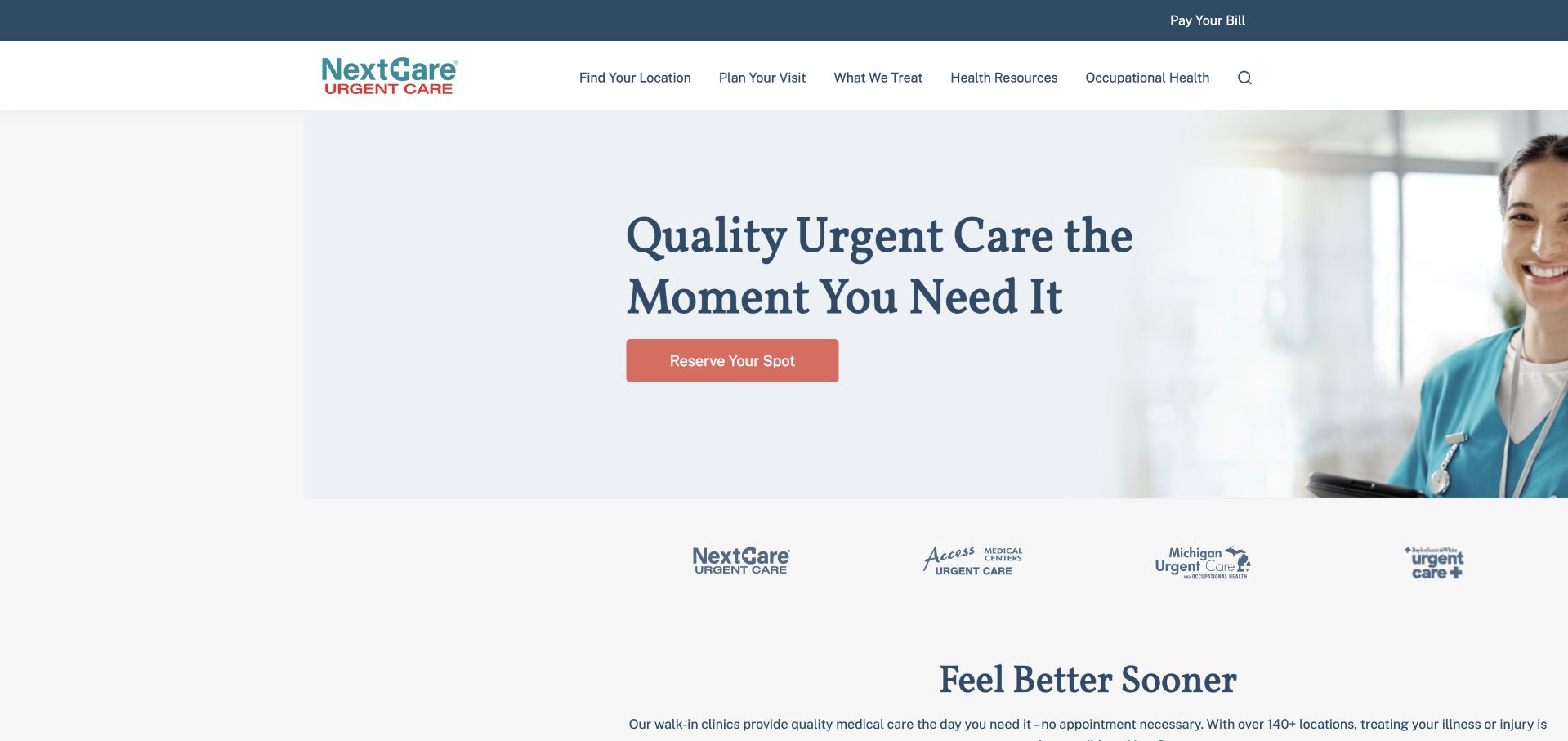
NextCare uses a straightforward care proposition and a familiar sequence of service, reassurance and resource sections. The opening does not ask visitors to interpret an abstract campaign before understanding the type of organisation. X-ray information and other service modules sit alongside the larger urgent-care explanation, followed by patient feedback and seasonal resources. That modular approach is adaptable when a clinic group needs to update one topic without redesigning the whole page. It also creates an editorial responsibility: testimonials, service availability and seasonal information age at different rates. A tidy layout alone cannot show whether each claim still applies at the visitor’s nearest clinic.
What you can learn
Build reusable clinic modules around specific visitor questions, with an owner for each type of content. Keep the access route visually stronger than testimonial controls and make local exceptions visible before a visitor commits to a journey.
Pros
Specific service modules add substance to the broader urgent-care introduction and provide natural onward routes.
The conventional section order makes the page easy to scan without learning an unusual interface.
Cons & considerations
Testimonials can occupy valuable attention if the location and visit-preparation path is not kept dominant.
Seasonal resources and local service descriptions require different review schedules to avoid stale practical information.
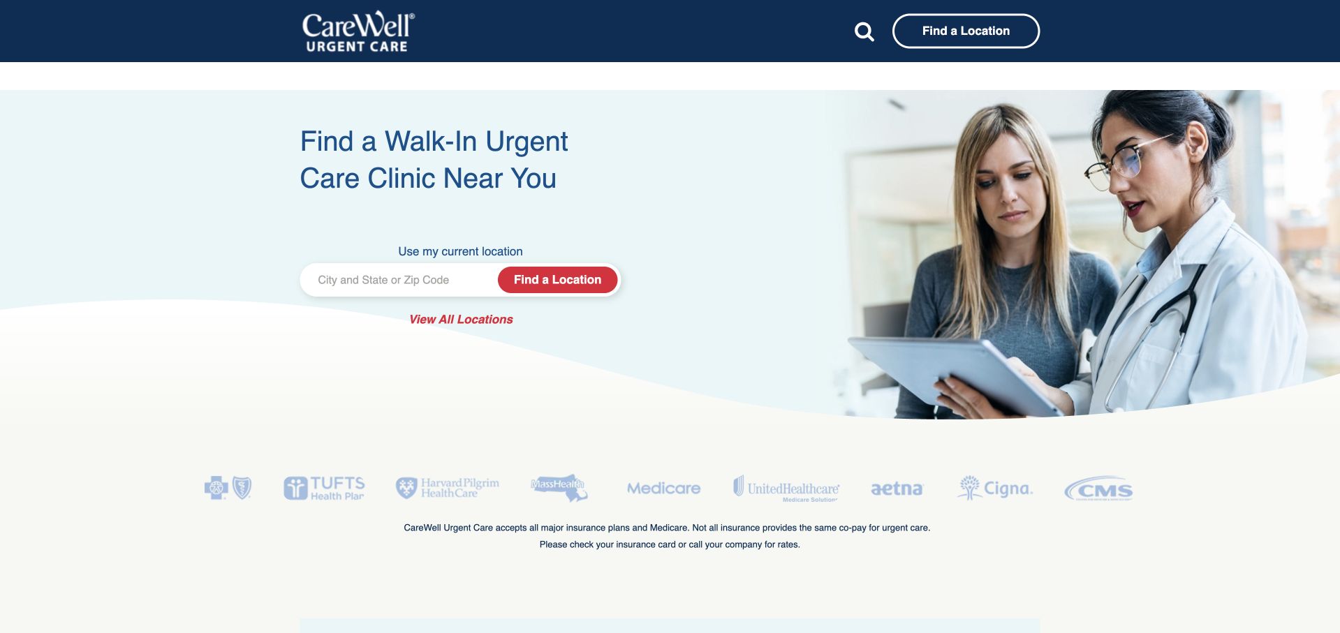
CareWell opens with the literal task of finding a walk-in clinic and places a city, state or ZIP field nearby. The page then breaks down its service range into labelled topics rather than leaving visitors with a generic promise of comprehensive care. Pediatric visits, physicals, laboratory services and other categories can be scanned independently. A section about joining with ClearChoiceMD adds organisational context, but the location task remains the more important patient-facing element. This is a useful example of making a broad clinic offering navigable without turning the opening into a symptom questionnaire. The supporting content still needs to distinguish general educational descriptions from services confirmed at a selected location.
What you can learn
Use a location search to narrow the operational question before presenting a large service range. If an organisation is changing ownership or brands, explain the transition without making patients reconstruct which location or portal they should use.
Pros
The opening search directly supports walk-in intent and accepts familiar geographic information.
Separate service headings make a broad offering easier to scan than a single long descriptive paragraph.
Cons & considerations
A corporate transition introduces extra names that can confuse returning patients if access destinations are inconsistent.
Service breadth needs clinic-level confirmation rather than an assumption that every listed option exists everywhere.
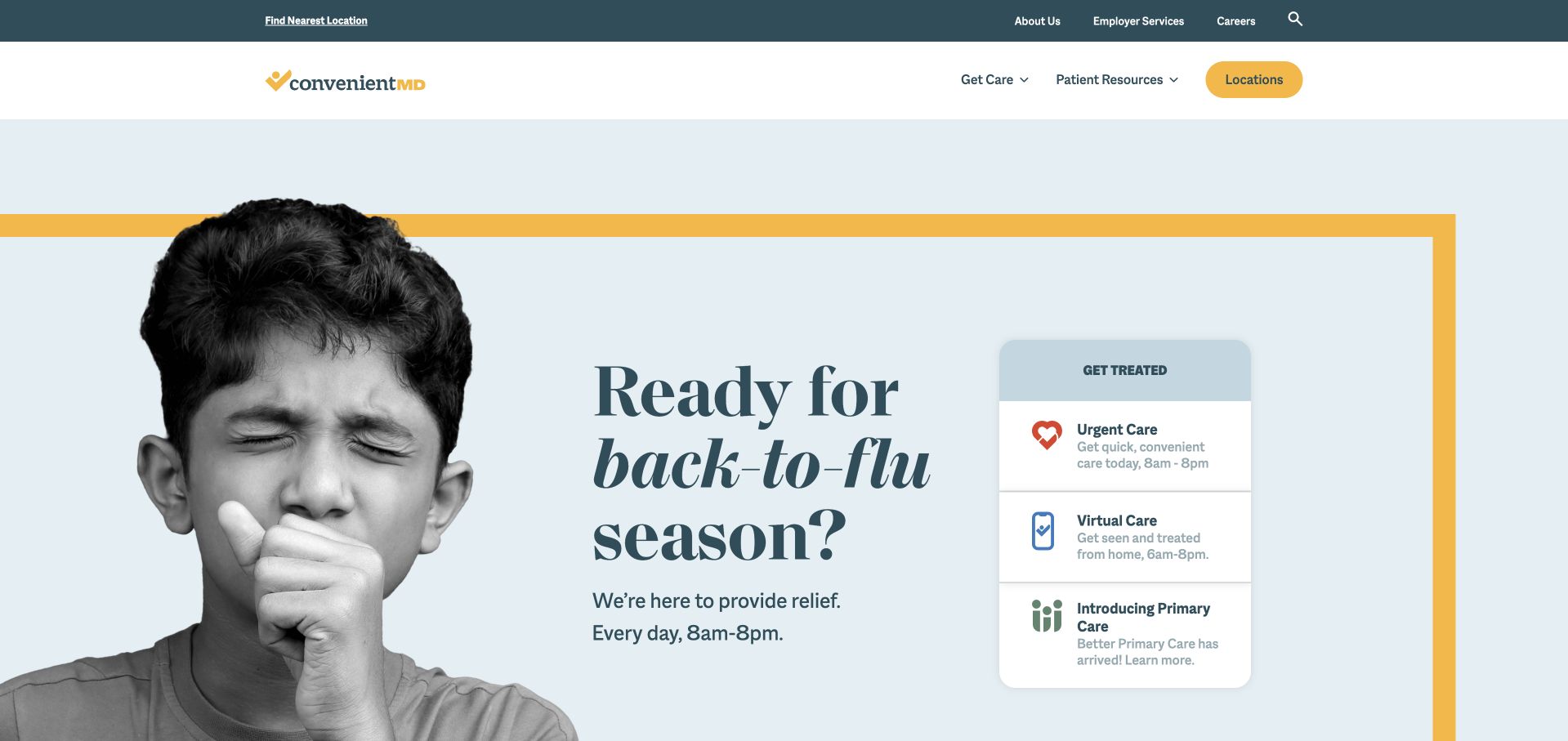
ConvenientMD combines a pale blue field, a yellow frame and a large monochrome photograph in its seasonal opening. A stacked care card sits beside the campaign rather than underneath it, distinguishing urgent, virtual and primary care. That is the important functional move: the seasonal message can change while the main routes remain understandable. The serif headline gives the page a different rhythm from the usual all-caps medical advertising, and the restrained colour system ties the navigation to the hero. A campaign-led first view does create a risk of overemphasising one seasonal need, particularly for someone arriving for an unrelated service or looking for a specific clinic.
What you can learn
Give a seasonal campaign a stable access component that survives every creative change. Keep care categories literal, preserve location navigation and ensure the text remains useful when the photograph or campaign film has not loaded.
Pros
Urgent, virtual and primary-care options are clearly separated in a compact card beside the campaign.
The blue-and-yellow system creates a coherent identity without requiring a dense collection of promotional badges.
Cons & considerations
A seasonal headline can overshadow unrelated visit needs unless the permanent care routes remain equally visible.
Large campaign imagery needs responsive crops that preserve both the subject and the adjacent action card.
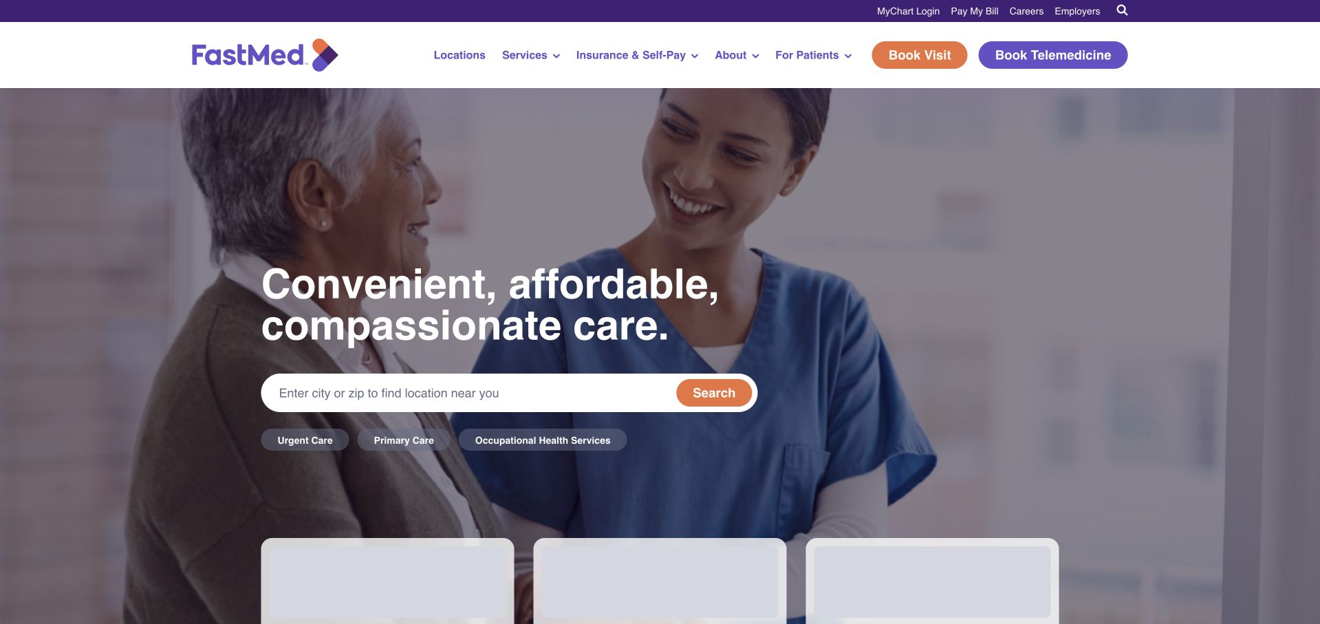
FastMed combines a simple reassurance-led headline with a city or ZIP search and a section for nearby centres. It then gives urgent care, primary care and occupational health their own service entries. Those categories matter because they describe different relationships, not interchangeable buttons for the same visit. The navigation also preserves useful existing-patient tasks such as billing and the patient portal. The page is less visually experimental than some newer healthcare brands, but its familiar arrangement can support a visitor who is trying to complete a practical task quickly. The main design challenge is preventing location results, service cards and health articles from all looking like equally urgent next steps.
What you can learn
Prioritise the nearby-centre task, then clearly separate ongoing primary care from a one-off urgent visit or employer service. Design loading and empty states so unfinished location content does not resemble broken or unavailable clinics.
Pros
City and ZIP search match common visitor intent without assuming prior knowledge of individual centre names.
Existing-patient tasks remain available while the public service categories provide a separate discovery path.
Cons & considerations
Several service models need explicit explanations so visitors do not assume that every appointment works the same way.
Health-resource cards should remain secondary to current clinic details, access instructions and local availability.
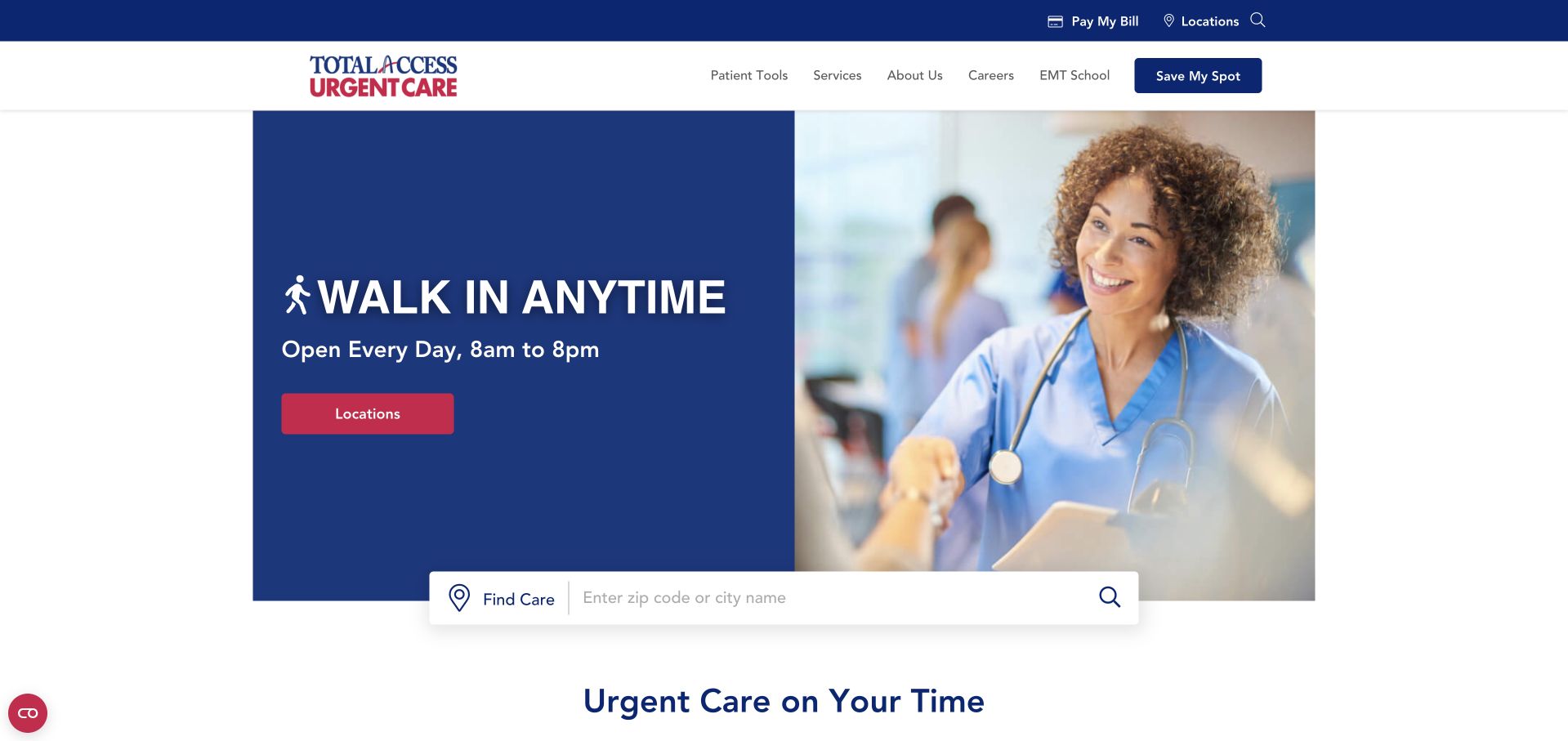
Total Access makes walk-in access the main visual statement and pairs it with published opening hours. A location search and separate save-my-spot route follow the campaign area, giving visitors more than one way to begin. The page repeats its access themes in supporting modules, which can reinforce the message for people who scan rather than read linearly. It also demonstrates a tradeoff: repeated slogans use space that might instead clarify the difference between arriving without a reservation and joining an online queue. The seasonal campaign provides timely context, while the permanent location route is what makes the homepage useful outside that particular campaign.
What you can learn
Make access instructions explicit, then explain the operational meaning of each alternative. Published hours should have a maintained local source, and a reservation-style action should not leave visitors guessing whether walk-ins remain a separate route.
Pros
The walk-in proposition is expressed in ordinary language and placed prominently in the opening hierarchy.
A city or ZIP search provides a concrete next step beneath the promotional messaging.
Cons & considerations
Repeated access slogans can crowd out practical distinctions between walk-in and online queue processes.
Network-wide hours and service statements need location-specific exceptions and a clear update process.
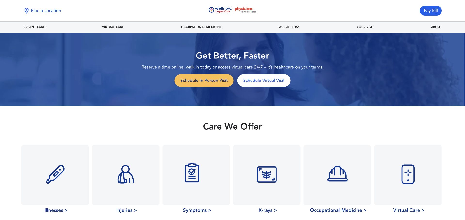
WellNow opens with a short recovery-oriented message, then makes its care categories visible through separate tiles. Illnesses, injuries, symptoms, X-rays, occupational medicine and virtual care are distinct routes rather than hidden within one general menu. Insurance information is organised by state lower on the page, acknowledging that a large network is not one uniform local offering. The structure offers useful scanning, although a symptoms category must be presented as navigation rather than an automated clinical assessment. A separate promotional programme also shares the page, making hierarchy important: someone seeking a same-day clinic should not have to distinguish that immediate task from a longer-term programme by colour alone.
What you can learn
Use distinct service tiles to support quick browsing, but label programme, visit and information destinations according to what actually happens next. Localise payment and availability details before the visitor reaches a scheduling commitment.
Pros
The tile system exposes the service range without requiring users to open a large multi-level menu.
State-based insurance sections acknowledge meaningful differences across the organisation’s service area.
Cons & considerations
A prominent additional programme can compete with the immediate clinic-finding task unless the hierarchy is deliberate.
Symptom-oriented navigation needs careful wording so it is not mistaken for personalised clinical guidance.
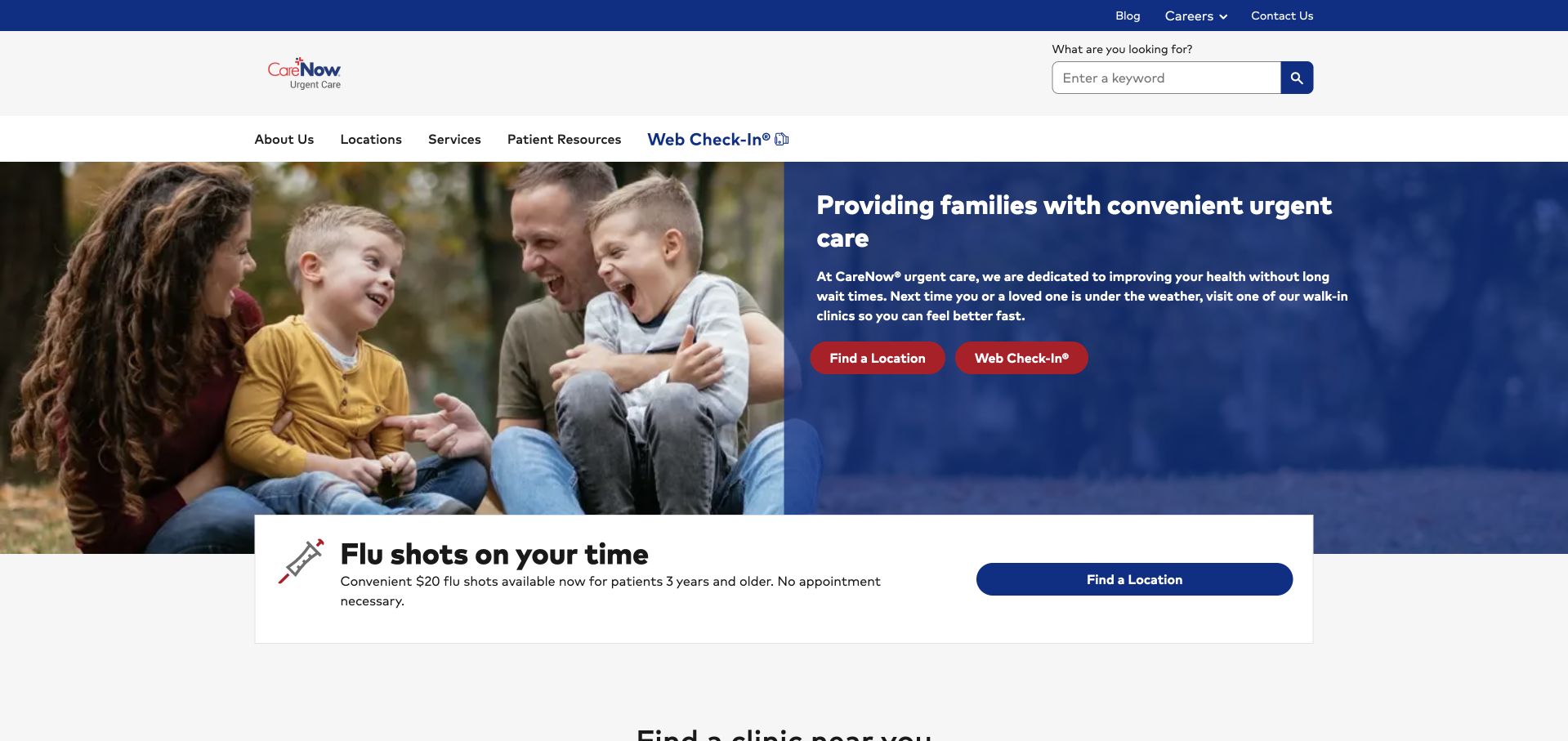
CareNow combines a family-oriented introduction with a conspicuous clinic-finding section and separate virtual-visit information. The public navigation groups locations, services and patient resources, a useful distinction for a visitor who already knows where they want to go versus one still comparing options. Seasonal flu messaging sits within the wider page rather than becoming the only explanation of the service. The network story provides additional context, but it should not replace local instructions. A visitor ultimately needs to know which site to attend, what the online action does and where existing-patient records or billing are handled. The homepage establishes those categories more effectively than it can answer every local variation.
What you can learn
Keep the patient’s local task separate from the parent network’s explanation. Use a consistent clinic template to carry current hours, service details and appointment terminology through the transition from brand homepage to local destination.
Pros
Locations, services and patient resources are separated into understandable top-level navigation categories.
Virtual visits receive their own explanatory space rather than being treated as identical to an in-person clinic visit.
Cons & considerations
A network-level introduction needs local detail before broad convenience claims become actionable for an individual visitor.
Seasonal promotions and clinic search must not compete equally for the same primary visual position.
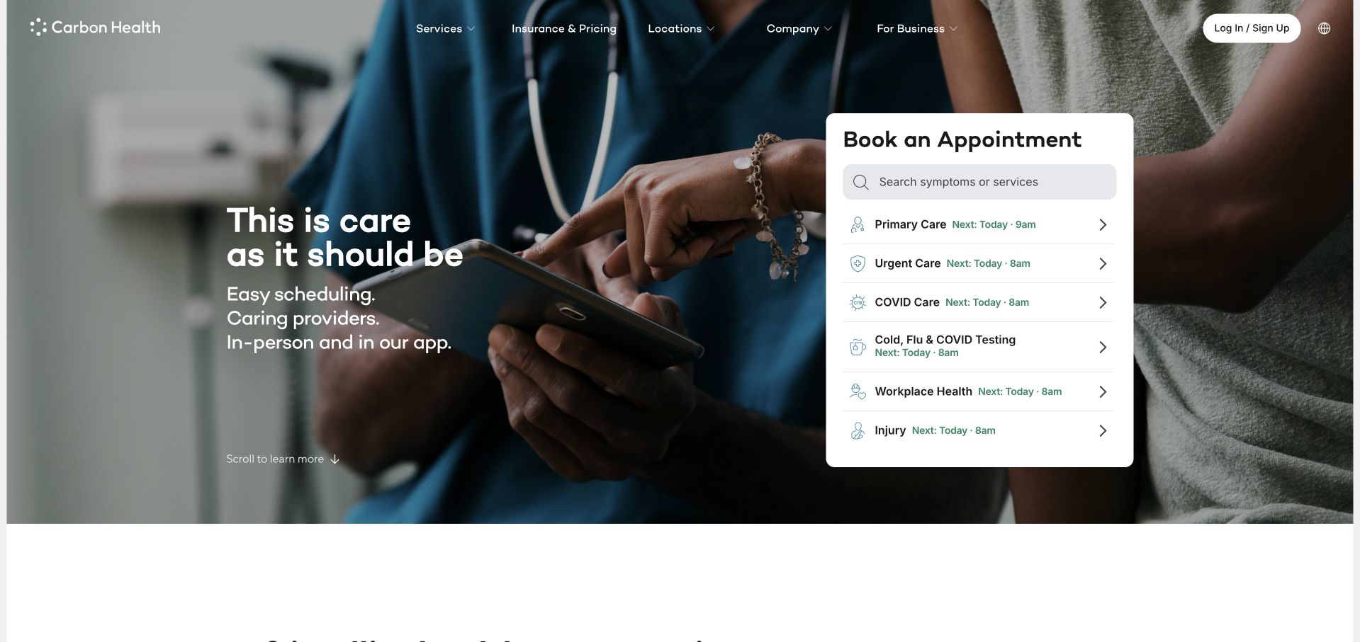
Carbon Health places a booking panel next to a short brand statement, making the first view closer to a service interface than a conventional brochure. Symptoms or services can be searched, while the navigation keeps insurance and pricing visible as a separate concern. Supporting sections describe appointments, messaging, prescriptions and the app as distinct parts of the experience. The design is worth studying for how much functional content it puts near the top without turning the entire page into a form. That density also raises the bar for reliable loading states: a partially loaded appointment panel can look like missing availability rather than a temporary interface state.
What you can learn
Bring useful scheduling context into the hero only when the component can clearly communicate loading, empty results and service limitations. Preserve a public pricing and location route for visitors who are not ready to enter the booking flow.
Pros
The appointment panel gives the opening view an immediate practical function rather than relying only on a call-to-action button.
Insurance and pricing remain visible public information routes alongside the digital service proposition.
Cons & considerations
A dynamic booking component creates more failure and loading states than a simple locator link.
App-related benefits need to remain distinct from what is available through a normal public website visit.
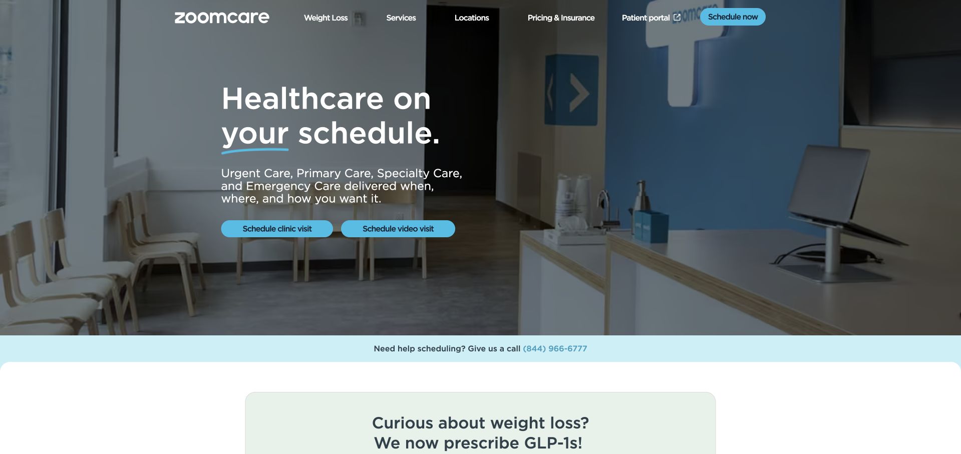
ZoomCare builds its introduction around the visitor’s schedule, then follows with concise modules for visits, hours, laboratory access and digital tools. The typography and direct scheduling actions give the page an energetic retail-service rhythm. Pricing and insurance have a dedicated section, which is important when convenience is the headline promise. The page also presents everyday and specialty care, so the design has to avoid suggesting that every service follows the same same-day process. A distinct promotional programme shares the opening hierarchy. The useful inspiration is the clear relationship between an access proposition and supporting practical topics, not an assumption that all advertised time or service claims apply universally.
What you can learn
Translate convenience into specific information about scheduling, payment and available service types. Keep specialist programmes separate from ordinary visits so users can understand the commitment and local availability behind each prominent action.
Pros
A schedule-focused opening is reinforced by relevant practical topics instead of an unrelated corporate story.
Dedicated pricing and insurance information gives cautious visitors a route beyond the main booking action.
Cons & considerations
Everyday care, specialty visits and promotional programmes can blur together without explicit process distinctions.
Short benefit statements need local detail and qualification before they can support a reliable visit plan.
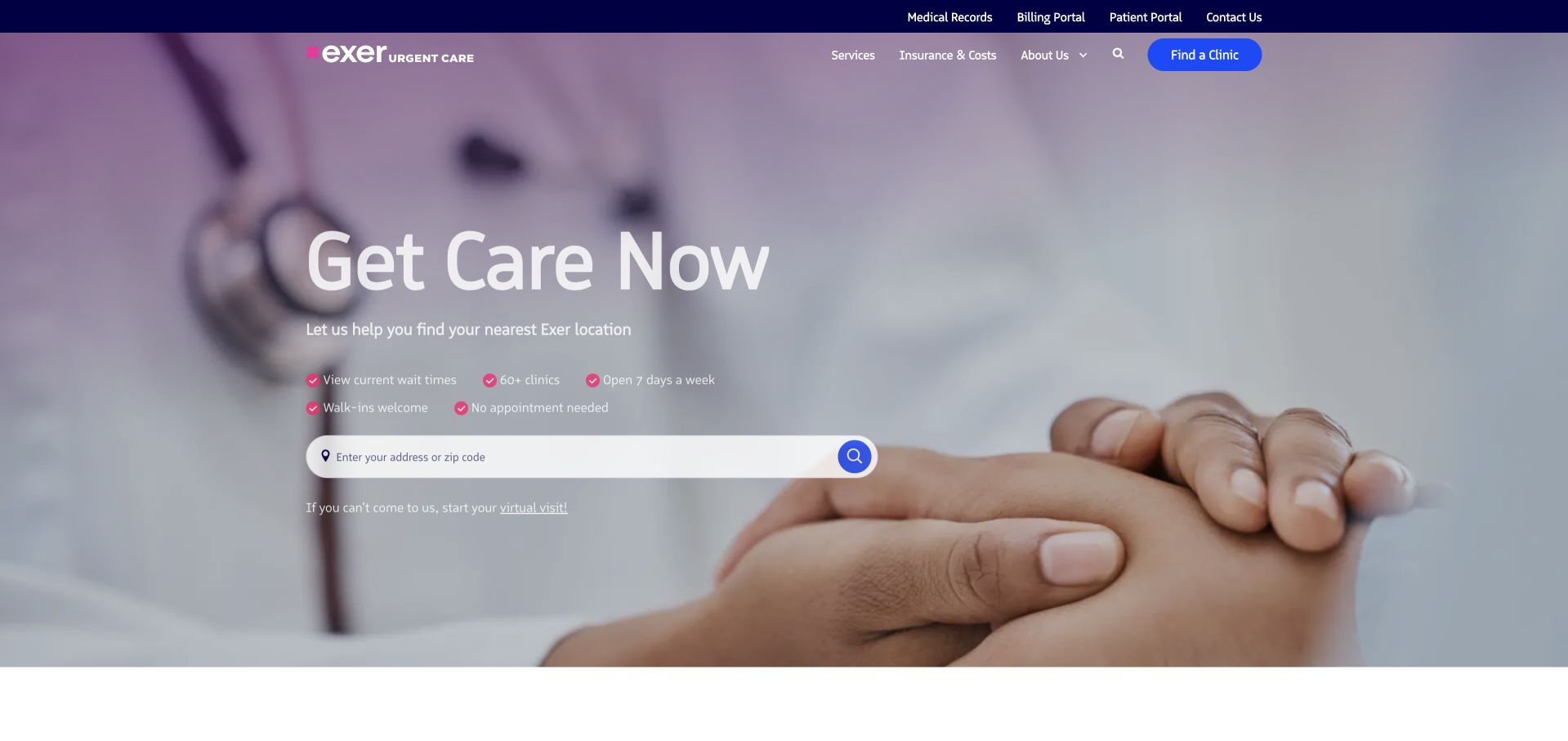
Exer leads with a direct care action and an address or ZIP search rather than an abstract wellness statement. The page then exposes familiar service categories, walk-in information and payment options. It is a useful model for visitors arriving with a concrete need and little interest in a lengthy brand introduction. The supporting promotional module can change without removing the permanent local-search task. Repeated walk-in messaging reinforces the access model, although the page would be stronger when every repetition adds a different practical detail. A large published location count communicates reach, but the visitor still needs confirmation about the service and hours at the particular clinic they select.
What you can learn
Let an address search do the work of narrowing a broad regional service. Use supporting modules to answer preparation and payment questions, and make each repeated access message add useful information rather than simply restating the promise.
Pros
The address or ZIP field provides a familiar, low-friction entry point for an unfamiliar visitor.
Insurance, self-pay and service information are visible components of the public page rather than exclusively booking-stage details.
Cons & considerations
Repeated walk-in language can consume space without clarifying local hours or the online reservation process.
A network-wide location count does not establish that a particular clinic provides every listed service.
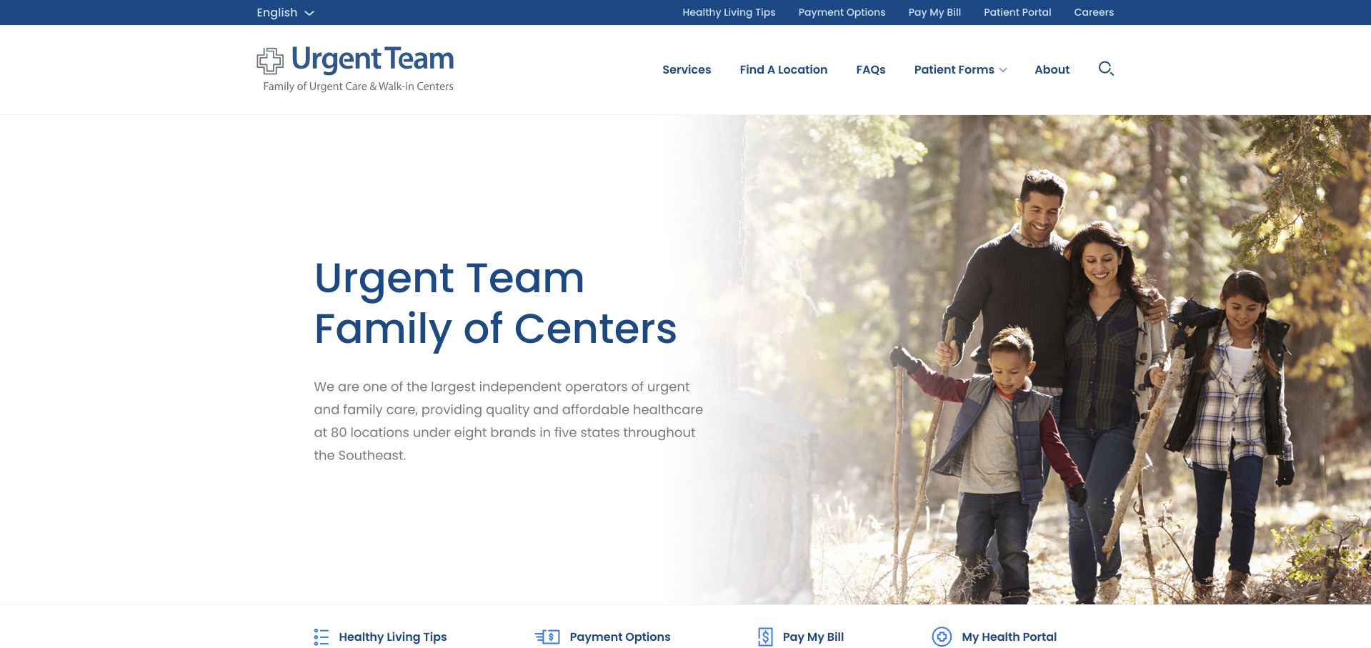
Urgent Team explicitly introduces itself as a family of centres. That is a different navigation problem from promoting a single clinic identity: the visitor may recognise a local brand without knowing the parent organisation. The homepage provides a family-of-centres section, services and a location finder, with an English language control visible in the interface. Organisational values and health articles add context below the immediate access content. The design is useful for studying how a parent site can acknowledge multiple identities rather than forcing every visitor through unfamiliar corporate language. The remaining challenge is preserving a clear handoff from the parent page to the correct local brand and its current visit information.
What you can learn
Explain the relationship between parent and local clinic brands in plain language. Carry the selected brand, location and patient task through subsequent pages so the user does not have to restart their search after crossing an organisational boundary.
Pros
The family-of-centres framing openly addresses a real multi-brand navigation problem instead of hiding it.
A location finder and service section provide practical routes beyond organisational values and corporate information.
Cons & considerations
The parent identity can feel remote to visitors who only recognise the name of their nearby clinic.
General health articles should not displace the local access and service information needed to complete a visit decision.
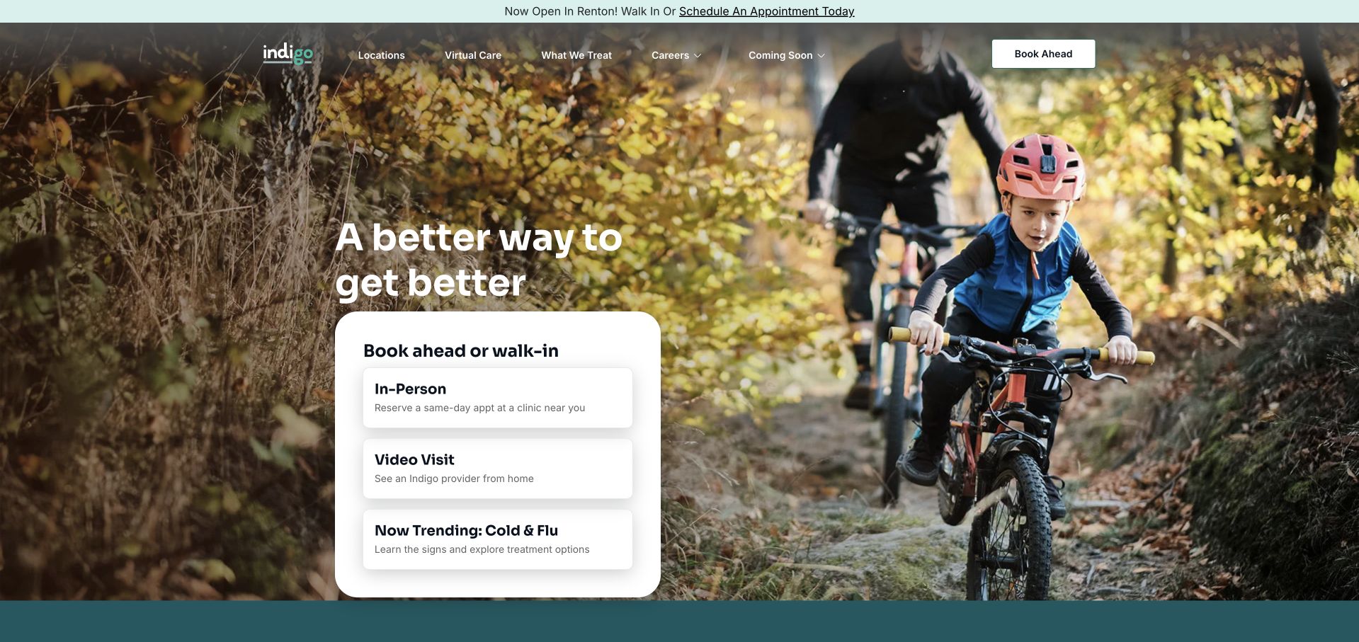
Indigo’s current site resolves to indigohealth.com and uses an outdoor activity photograph to frame a compact care-choice panel. In-person access, video visits and a seasonal topic are separate entries, making the functional hierarchy more specific than a single get-started button. The light navigation and large photographic field give the brand a lifestyle character, while the card keeps the opening tied to an actual service task. Supporting sections explain testing, prescriptions and virtual care. The contrast is useful inspiration, but lifestyle imagery is not evidence of treatment results or the identity of people using the service. Practical qualifications need to remain readable beside the aspirational presentation.
What you can learn
Pair an aspirational image with concrete, plainly labelled access choices. Keep the virtual and physical visit routes separate, and make location, eligibility and current availability visible before the visitor leaves the public information page.
Pros
The compact panel distinguishes in-person and video routes without requiring a long introductory form.
The photographic treatment gives the brand character while the card preserves a useful service-oriented opening.
Cons & considerations
Large lifestyle imagery needs dependable responsive crops and a meaningful fallback when media loads slowly.
A seasonal card can compete with permanent visit choices unless its secondary role is visually clear.
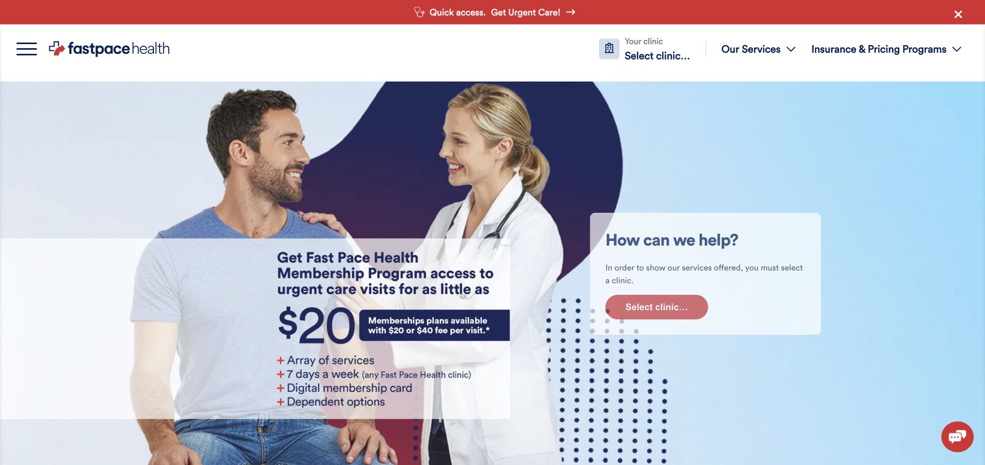
Fast Pace Health combines a prominent programme promotion with a nearby prompt to select a clinic. The header also identifies the current location and clinic context, which is important for a network covering many communities. Its visual language uses blue fields, a clinician-and-visitor image and a contrasting top access strip. The result clearly presents the organisation as a service network, but the opening asks visitors to distinguish two decisions: exploring a membership proposition and finding immediate local care. That distinction deserves explicit copy, especially when a price appears inside the hero. A marketing price should not look like the complete cost of every visit or service.
What you can learn
Separate programme evaluation from the immediate clinic task, even when both are commercially important. Make the selected location persistent and explain the scope of any headline price before handing visitors into booking or enrolment.
Pros
The header preserves location context instead of treating a multi-community network as one undifferentiated clinic.
A nearby clinic-selection prompt offers a practical route alongside the larger programme campaign.
Cons & considerations
Membership promotion and ordinary urgent-care access can compete for attention in the same first view.
A prominent price needs clear scope and conditions rather than an implied all-services or all-visits promise.
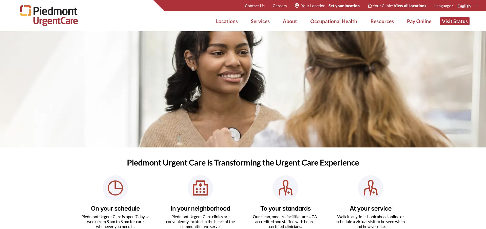
Piedmont Urgent Care opens with a large care-interaction photograph and follows it with four compact themes about schedule, neighbourhood, standards and service. Location and clinic controls are visible in the utility navigation, with a separate visit-status action for users already in the process. That separation recognises that returning visitors are not necessarily browsing for a new service. The simple icon-supported modules are easy to scan, although they are still marketing themes rather than operational detail. Their value depends on the local pages that follow. The homepage is most useful as a gateway to those details, not as a complete account of availability, insurance or what a particular visit involves.
What you can learn
Keep returning-visitor tasks such as visit status distinct from discovery and location selection. Use short promise modules as signposts to concrete information rather than allowing attractive icons to substitute for hours, access rules or service scope.
Pros
Location, clinic and visit-status controls acknowledge different stages of a visitor’s relationship with the service.
The four supporting themes create a readable transition from the large photograph into practical topics.
Cons & considerations
High-level service promises need specific supporting pages before they become useful for planning a visit.
A large image-led opening can delay concrete access information if the utility controls are overlooked.
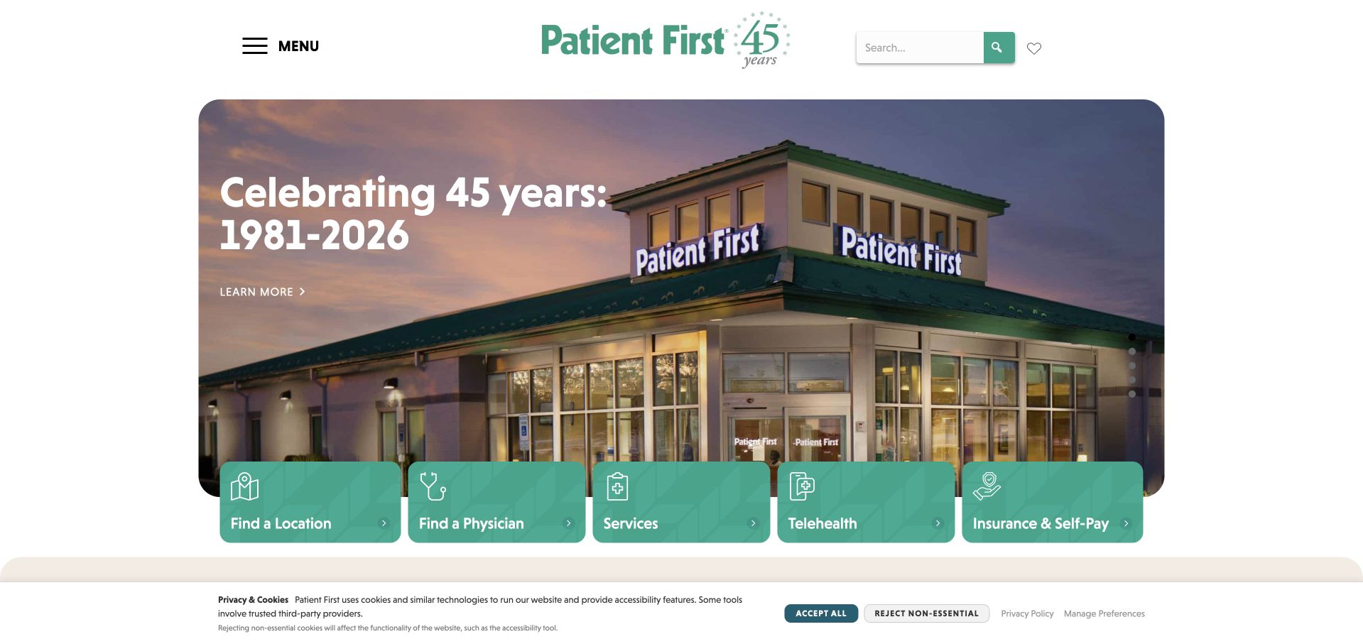
Patient First uses a clinic exterior and an anniversary campaign to create a recognisable physical reference. Across the base of the hero, a green utility strip exposes locations, physicians, services, telehealth and payment information. Those task labels are more useful than the anniversary itself for someone arriving with an immediate question. The opening also includes visible carousel controls, acknowledging that the promotional area changes. A long-established brand can use history to provide context, but the practical navigation is what prevents the page from becoming a commemorative advertisement. The collection illustrates the difference between a campaign slide and the stable service structure that should remain usable regardless of which slide is shown.
What you can learn
Let history or campaign imagery support recognition while keeping common patient tasks permanently visible. A carousel should never be the sole place where opening hours, service limitations or essential access instructions can be found.
Pros
The persistent utility strip exposes several useful patient tasks without requiring a full menu interaction.
A physical clinic image connects the digital introduction to a place a visitor might actually attend.
Cons & considerations
An anniversary-led first view is less directly useful than current clinic access and preparation information.
Changing campaign slides need stable controls and must not conceal essential details on a transient frame.
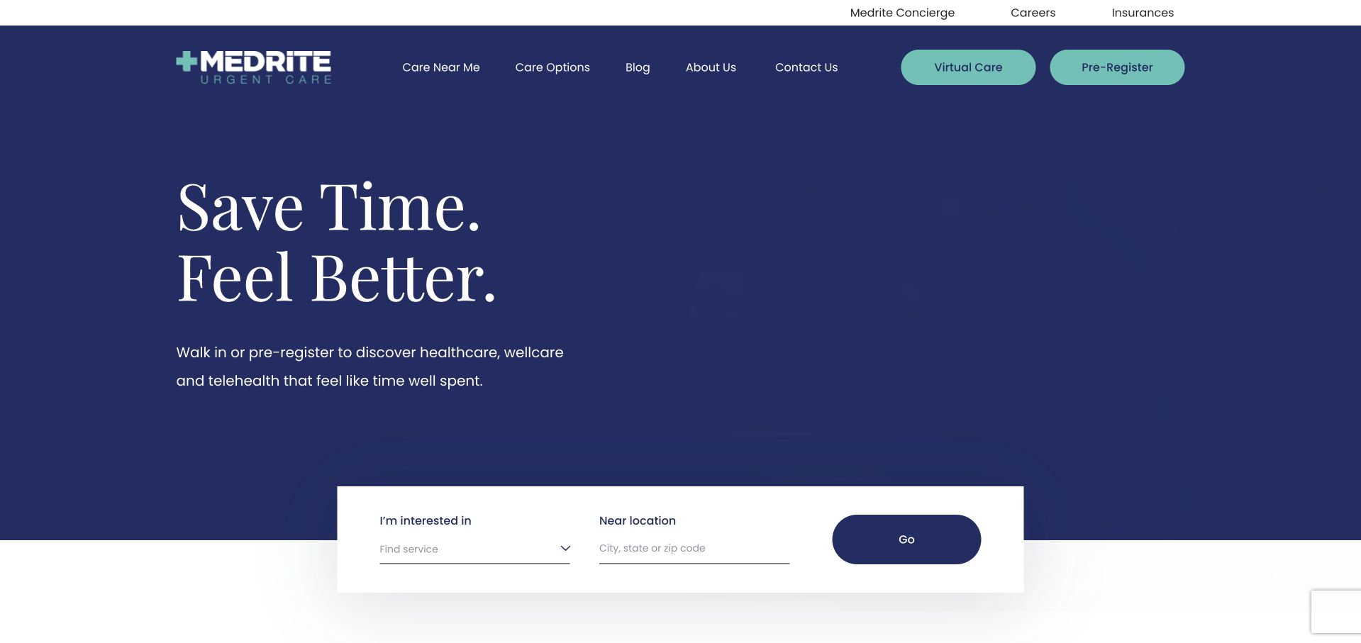
MEDRITE uses a deep navy opening with a restrained serif headline and a wide white search component. The search separates an area of interest from a nearby location, which is a helpful distinction when a visitor knows the service rather than the clinic. The header preserves virtual-care and preregistration routes, while lower sections develop services, payment questions and locations. The design avoids filling the first view with many competing photographs, giving the functional component a strong place in the hierarchy. The short headline is intentionally broad, however. Visitors still need clear service labels and an explanation of what preregistration does before they can understand the practical commitment behind each route.
What you can learn
A minimal visual opening can work when the search component supplies the missing specificity. Keep service interest and geography distinct, and explain preregistration, virtual care and walk-in access as separate processes rather than interchangeable actions.
Pros
The white search area stands out clearly against the dark hero without relying on multiple promotional graphics.
Service and location are separate inputs, reflecting two different questions involved in finding an appropriate clinic.
Cons & considerations
A broad two-line promise does not explain service scope without the supporting search labels and navigation.
Preregistration and virtual-care actions need plain-language explanations of what happens next and which locations participate.
Kegan is a freelance web designer and developer with 15+ years of experience helping businesses turn complicated website requirements into clear, maintainable digital experiences. He works directly with clients from planning and design through development, launch, and ongoing support.
For urgent care website design, his development approach focuses on location discovery, clear appointment-system handoffs, service information, and accessible patient resources. The scope can be a targeted improvement or a complete custom build, with responsive layouts, thoughtful content structure, and integrations chosen around the people using and maintaining the site.
Show 3 other urgent care website designersHide other urgent care website designers
Write separate scenarios for someone finding a clinic, an existing patient looking for records or billing, and an employer arranging a service. Give each a distinct destination and response owner. Do not make the new visitor open a patient portal merely to read hours. Keep employer information separate from the patient visit route, even if the same team ultimately responds behind the scenes.
Design the unpleasant interface states
Test a location search with no results, a scheduler that cannot load, a closed clinic and a service unavailable at the chosen location. Write useful public explanations for each. Never display an empty skeleton indefinitely or treat a technical error as proof that no care is available. Keep important location information readable without interactive maps, geolocation permission or optional marketing scripts.
Give time-sensitive content an operating process
Holiday hours, seasonal services, campaign slides and booking destinations change at different rates. Assign owners, review intervals and an urgent correction route. Keep a single structured source for recurring clinic facts so a footer, search card and detail page do not contradict one another. Before publishing a promotion, check that its end date and any conditions are represented in the maintained page rather than only inside a graphic.
The editing job behind the design
Build reliable public information before adding dynamic booking
Use structured clinic, service and preparation records in a maintainable CMS. A booking integration should sit beside, not replace, public location information. Treat external patient accounts as separate environments with obvious labels. Keep any sensitive intake data out of ordinary marketing forms, analytics events and public asset folders; have the organisation’s responsible privacy and technical reviewers approve the actual data flow.
A useful accessibility brief includes keyboard navigation, labelled fields, readable errors, text resizing and a meaningful alternative to map-only information. The W3C forms tutorial provides implementation context for labels and feedback. Source-visible technology labels in this collection are evidence-limited; a booking button does not reveal the organisation’s full patient-record system or private infrastructure.
Our WordPress website examples offer a separate look at publishing approaches. A visible platform label is evidence for that named page, not a guarantee that the same system will suit your requirements.
Before the public launch
Urgent-care website planning checklist
Maintain one current source for each clinic’s address, telephone number and hours.
Accept ordinary geographic search terms as well as known clinic names.
Confirm the services actually offered at each individual location.
Explain walk-in, appointment, queue and preregistration terminology separately.
Keep existing-patient records and billing distinct from new-visit information.
Provide public preparation, insurance and self-pay information with clear limits.
Have responsible clinical reviewers approve service and urgent-contact wording.
Design useful closed-clinic, empty-result and booking-error states.
Provide text-based location details without requiring map interaction or geolocation.
Give seasonal campaigns an end date and a maintained service destination.
Test keyboard use, field labels, error recovery and enlarged text.
Assign operational ownership for local facts and broken scheduling destinations.
These checks are a project checklist, not a performance, legal, security, or accessibility certification. Test real journeys with the people responsible for the website before making claims about the result.
Sources & editorial method
How this collection was selected and reviewed
We inspected public pages and direct browser captures. Reviews concern design, information hierarchy and access communication, not clinical quality, eligibility or measured visit outcomes. The first selection is an editorial design choice, and all operational claims remain attributed to the publishing organisation.
Each example links to its actual source page. Screenshots are direct browser captures with their own capture dates; moving imagery, announcements and live designs can change. The notes describe observable design choices and conditional tradeoffs, not measured traffic, conversion results, service quality, or accessibility conformance.
Technology labels use public page metadata, asset evidence, or explicitly cited platform documentation. Platform documentation is not a complete current deployment audit. A component reference may be legacy or unused; it is not a complete backend inventory. Unknown stacks are omitted. These sites are editorial examples, not our client portfolio.
Written, Edited and Curated are separate editorial records, not timestamps advanced by a rebuild. Website designs and imagery belong to their owners. See our editorial standards or suggest a correction.
Questions worth asking
Urgent Care website design questions
Should urgent-care websites lead with a search or a campaign?
Usually the clinic task needs to remain visible regardless of the campaign. A regional brand can use a photograph or seasonal message, but a visitor should still be able to reach local information immediately. Choose the layout around actual visitor tasks, not simply the most dramatic creative treatment.
Can a homepage show estimated wait times?
Only when the organisation has a reliable source, a clear definition and an explanation of the estimate’s limits. Design the unavailable and stale-data states too. A static marketing number should not look like a live operational promise.
Is saving a spot the same as making an appointment?
The organisation must explain its own process. The website should not leave users to infer the meaning. Describe what selecting a time does, what confirmation means and where any relevant local instructions can be found.
Should a form ask about symptoms immediately?
Do not add sensitive questions merely because a marketing template supports them. Establish the purpose, appropriate environment and responsible review first. Public browsing and clinic discovery can often work without collecting personal health details.
What should a clinic homepage measure?
Start with whether visitors can find the correct local page, preparation information and relevant contact or booking route. Do not treat clicks as proof of completed visits or better care. Keep reporting proportionate and have the actual data collection reviewed.
Borrow the strongest access patterns: local facts, explicit visit terminology and a clear handoff. The aim is a website that is useful before, during and after a campaign, without oversimplifying the clinical or operational questions behind the service.