Best Jekyll Websites of 2026 (20 Real-World Examples)
Twenty public website examples with genuine screenshots, original reviews, and a clear distinction between observed Jekyll signals and historical showcase associations.
Jekyll turns authored content and templates into static pages. The useful design question is how that publishing model supports a clear, maintainable website. These examples range from developer portals and public-service introductions to reference libraries and product sites, with each technology association kept within the evidence actually available.
A successful Jekyll project starts with understandable content rather than a theme selection. Identify the recurring page types, the people who maintain them and the routes readers need. Static output can suit a substantial editorial library, but it does not automatically create good navigation, accessible interactions or a reliable update process. Those responsibilities remain with the team that designs and maintains the site.
The opening references are Spotify for Developers, Twitch Developers, Mozilla Release Management, the United Nations World Statistics Day property and Login.gov. Jekyll’s official showcase lists these exact properties. Some associations may be historical: the current Spotify source audit observes Next.js, for example. Other examples have positive Jekyll generator signals from current or retained audits. The collection preserves those differences instead of describing every pictured page as a freshly verified Jekyll implementation.
Before the examples
What makes good Jekyll website development in 2026?
Make the content model understandable
Choose page types that reflect the material readers need: reference entries, articles, people, projects or service explanations. Jekyll collections group related documents, while front matter carries their metadata. Establish required fields and realistic examples before expanding the library. Consistent structure helps editors work confidently, but leave room for meaningful differences rather than forcing every subject into an identical page simply because a shared template is convenient.
A repository folder structure is not automatically a useful menu. Give new visitors a clear introduction and experienced visitors direct routes to reference material. Use descriptive headings, predictable content groupings and stable links. The strongest examples let learning and quick lookup coexist. Search can help, but the core information architecture should remain understandable without requiring a visitor to know an exact technical term or depend on a third-party search service.
Keep dates and evidence meaningful
Treat publication dates, substantive edits, source observations and image captures as separate facts. A rebuild should not make old articles appear new. Likewise, a historic showcase listing establishes an association rather than proving a present-day generator. Define how the site communicates archives and changing product details. This gives readers a way to judge relevance and gives maintainers a clear record of what actually changed.
The collection · 20 examples
20 Jekyll website examples worth studying
The twenty reviews assess actual saved public-page captures. Fourteen screenshots were taken directly for this collection, and six retain their earlier verified capture dates. Every source has a bounded broad technology-audit record. Where no Jekyll signal was observed, the association remains explicitly documentary or historical rather than inferred from appearance.
We start with five recognizable brands or organizations: Spotify for Developers, Twitch Developers, Mozilla Release Management, United Nations World Statistics Day, Login.gov — U.S. General Services Administration. Each attribution applies to the named website property, not every product or website belonging to its organization. This is a curated reading sequence, not a measured ranking.
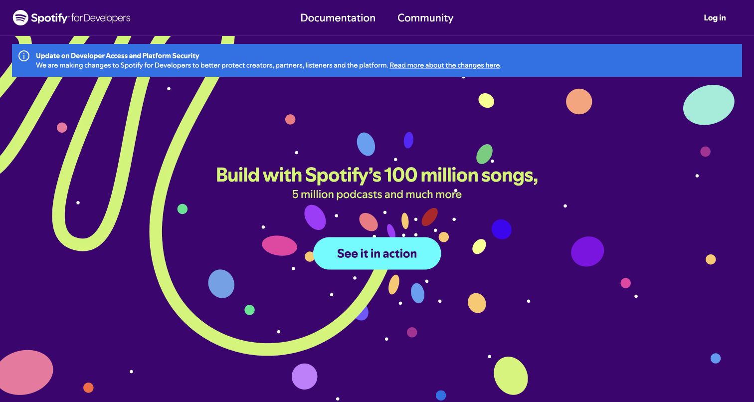
Spotify for Developers turns a technical landing page into a recognizable extension of the music brand. A deep purple field, loose lime curves and scattered colored shapes surround one centered action. The short header offers documentation and community instead of an extensive product menu. A prominent blue platform notice sits above the invitation, making operational context difficult to miss. The official Jekyll showcase records this property’s earlier association; the new public audit observes Next.js, so the current design must not be presented as proof of a current Jekyll build.
What you can learn
Borrow the separation between durable orientation and changing announcements. A static documentation project can keep its main introduction stable while maintaining notices as structured content with explicit owners, dates and destinations. Give the important update a predictable place instead of burying it among promotional sections.
Pros
One dominant action keeps a visually energetic hero understandable.
Documentation and community remain obvious routes for returning developers.
Cons & considerations
The large illustrated hero delays the actual technical example.
Bright notices and decorative motion can compete for attention.
Platform source: Official Jekyll showcase: potentially historical association. Jekyll’s official showcase lists Spotify for Developers at this public website property. The listing is undated and may describe an earlier implementation; no current Jekyll generator was independently observed in the bounded source audit. The new source audit observes Next.js, so the Jekyll association is historical rather than a current generator attribution. Platform evidence is separate from the direct website screenshot and is not a complete current infrastructure audit.
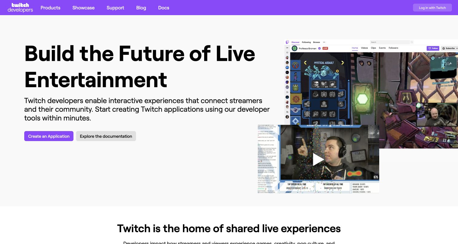
Twitch Developers leads with the outcome of building for its community. A wide headline and substantial explanatory sentence occupy the left side, while a collage of streaming interfaces supplies context on the right. Two differently weighted actions distinguish creating an application from reading documentation. The purple navigation carries the brand without placing every product in the opening view. The current bounded source audit records a Jekyll signal on this developer property; that observation does not extend to Twitch’s streaming application or every service behind its APIs.
What you can learn
Use the homepage to explain the audience and the first meaningful step, then let documentation handle implementation detail. For a Jekyll project, maintain onboarding paths and reference pages as related content with stable URLs. A visitor should understand which route teaches and which route begins account-dependent work.
Pros
Paired actions distinguish learning from application setup.
Interface imagery connects abstract integration tools with recognizable usage.
Cons & considerations
The broad image collage offers limited detail at smaller sizes.
Several competing developer products require further reading below the hero.
Platform source: Public source: dated Jekyll generator signal. Generator metadata identifies Jekyll on this exact public source page in the bounded audit dated 2026-11-10. This identifies the public publishing layer only, not the associated product, backend or every organizational property. Platform evidence is separate from the direct website screenshot and is not a complete current infrastructure audit.
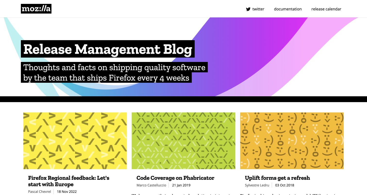
Mozilla’s Release Management Blog combines a strong institutional header with an immediately legible editorial grid. Black panels behind the title and description retain contrast over a bright geometric background. Below, three illustrated article cards expose their titles, author names and dates together. The visible entries span different years, making this a useful archive example rather than evidence of a frequently updated news feed. Jekyll’s official showcase identifies the exact blog property; the fresh broad audit does not independently confirm its current generator.
What you can learn
Preserve original publication dates and make older material easy to recognize. A Jekyll archive benefits from consistent front matter for authors, topics and dates, with templates that show those distinctions before a reader opens an article. Update navigation separately from historical content instead of making a rebuild look like new reporting.
Pros
Strong typography keeps the title clear over colorful artwork.
Visible author and date fields help readers assess archived material.
Cons & considerations
Repeated cover patterns contribute less context than article-specific imagery.
Older entries need clear maintenance expectations for present-day readers.
Platform source: Official Jekyll showcase: potentially historical association. Jekyll’s official showcase lists Mozilla Release Management at this public website property. The listing is undated and may describe an earlier implementation; no current Jekyll generator was independently observed in the bounded source audit. Platform evidence is separate from the direct website screenshot and is not a complete current infrastructure audit.
The United Nations World Statistics Day property uses a restrained institutional header to establish ownership before presenting the event identity. A large dated campaign graphic is followed by two parallel message panels, giving senior statements an organized place without making them compete with the main navigation. Language links and resource sections support an international audience. The capture visibly retains the 2025 event context. Its inclusion in Jekyll’s official showcase supports a documented association, while the current source sample does not independently establish the generator.
What you can learn
Build campaign dates, language variants and resource destinations into the content model. A static event site should remain useful after its live date, with archival labels and downloadable material kept distinct from current announcements. Reusable layouts can provide consistency without implying that every campaign has the same schedule or audience.
Pros
Agency identity is visible before the campaign content.
Parallel message panels create an orderly introduction to supporting material.
Cons & considerations
Several dense institutional labels occupy valuable header space.
Past-event material needs explicit context when readers arrive years later.
Platform source: Official Jekyll showcase: potentially historical association. Jekyll’s official showcase lists United Nations World Statistics Day at this public website property. The listing is undated and may describe an earlier implementation; no current Jekyll generator was independently observed in the bounded source audit. Platform evidence is separate from the direct website screenshot and is not a complete current infrastructure audit.
Login.gov separates its informational website from the account journey. An official government banner and agency identity establish context, while the dark blue hero explains the service in a short headline and supporting sentence. Three columns then distinguish individuals, agency partners and agency developers. The sign-in action is visible above the main navigation without taking over every section. Jekyll’s official showcase names this public property; that association does not describe the secure authentication application, its identity checks or its security architecture.
What you can learn
Keep explanatory content and sensitive transactions clearly separated. A Jekyll site can provide public help, eligibility information and developer guidance while pointing to a separately operated account service. Label those destinations accurately, maintain their links, and avoid implying that the static publishing tool supplies the transaction system itself.
Pros
Audience-specific columns make different next steps easy to compare.
Official ownership cues are visible without hiding the plain-language explanation.
Cons & considerations
Several header rows make the initial navigation relatively tall.
The public page cannot demonstrate the separate sign-in experience.
Platform source: Official Jekyll showcase: potentially historical association. Jekyll’s official showcase lists Login.gov — U.S. General Services Administration at this public website property. The listing is undated and may describe an earlier implementation; no current Jekyll generator was independently observed in the bounded source audit. Platform evidence is separate from the direct website screenshot and is not a complete current infrastructure audit.
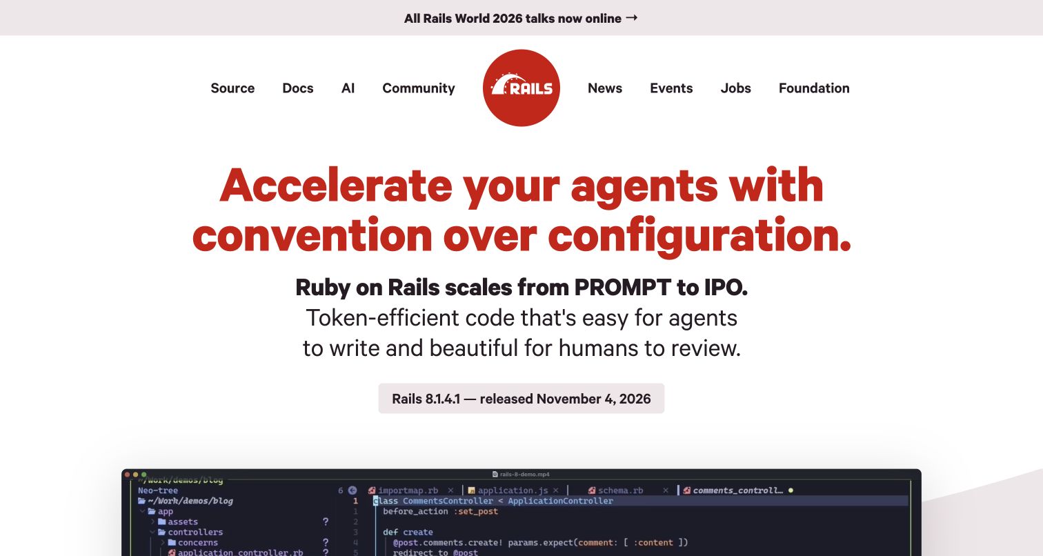
The Ruby on Rails homepage makes its argument through a large red headline and a compact supporting statement before introducing technical detail. The familiar logo anchors a balanced navigation row, and a release link gives returning visitors a concrete update. A code demonstration begins immediately below the opening pitch. The rest of the page connects framework concepts to code and learning resources. Jekyll’s showcase lists this public website; that documentary association must remain separate from Rails itself, which is the application framework being promoted.
What you can learn
Give a technical project one clear thesis and then support it with useful evidence. In a Jekyll implementation, release announcements, documentation routes and example snippets can share reusable templates while retaining different purposes. Keep changing release information in structured content so prominent links do not silently become stale.
Pros
A distinctive visual hierarchy makes the project’s position memorable.
Release information and documentation have visible, separate entry points.
Cons & considerations
Opinionated terminology can assume substantial prior developer knowledge.
A large opening claim delays concrete examples until the next section.
Platform source: Official Jekyll showcase: potentially historical association. Jekyll’s official showcase lists Ruby on Rails at this public website property. The listing is undated and may describe an earlier implementation; no current Jekyll generator was independently observed in the bounded source audit. Platform evidence is separate from the direct website screenshot and is not a complete current infrastructure audit.
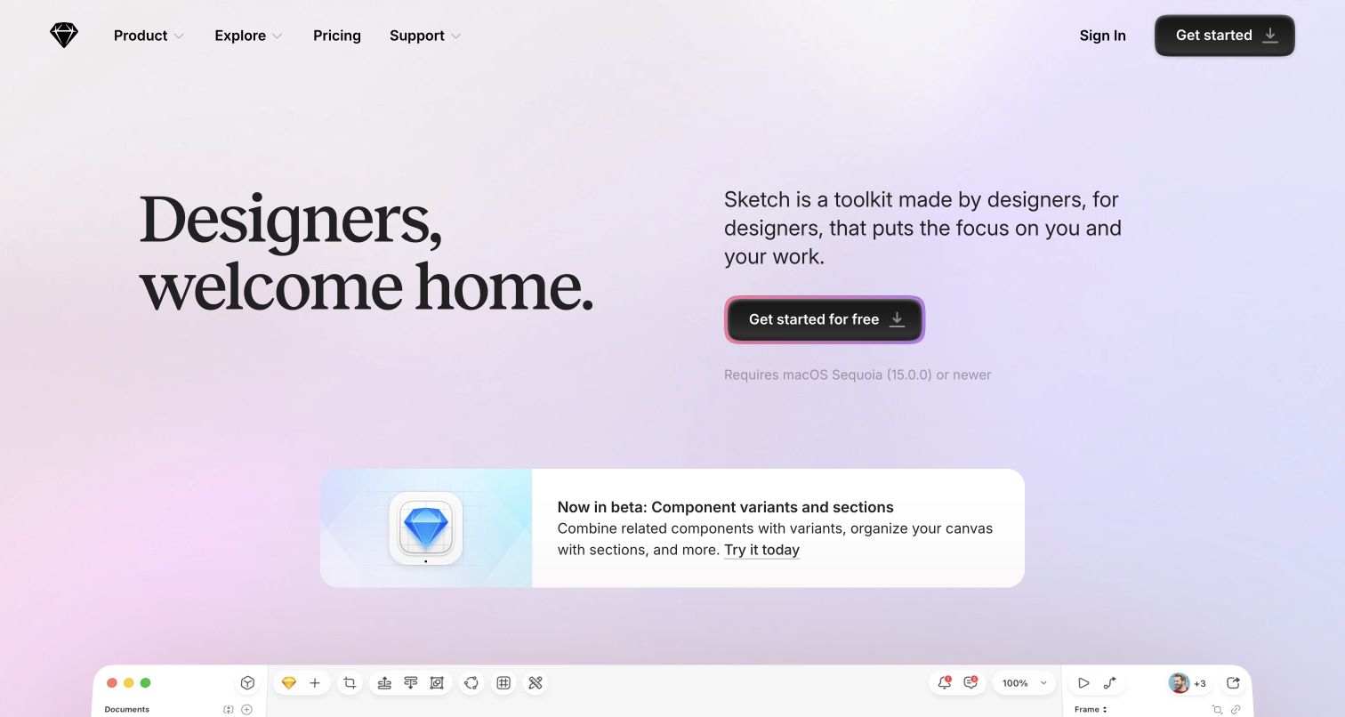
Sketch gives its opening statement room to breathe. Large serif typography on the left is paired with a practical product explanation and download action on the right. Soft gradients provide atmosphere without replacing the text, while a compact beta announcement introduces a specific update beneath the main pitch. A glimpse of the application appears at the bottom of the capture. The property is listed in Jekyll’s official showcase, but that potentially historical association is not a fresh attribution of the current homepage’s generator.
What you can learn
Let different content types have visibly different roles. A static product site can separate the enduring introduction, temporary release announcements and actual interface demonstrations rather than placing them in one undifferentiated carousel. Keep platform requirements close to download actions so visitors can judge relevance before leaving the page.
Pros
Contrasting type styles establish a clear editorial personality.
The download action includes nearby operating-system context.
Cons & considerations
The actual editor receives limited space in the first viewport.
Subtle background treatments need careful contrast across responsive layouts.
Platform source: Official Jekyll showcase: potentially historical association. Jekyll’s official showcase lists Sketch at this public website property. The listing is undated and may describe an earlier implementation; no current Jekyll generator was independently observed in the bounded source audit. Platform evidence is separate from the direct website screenshot and is not a complete current infrastructure audit.
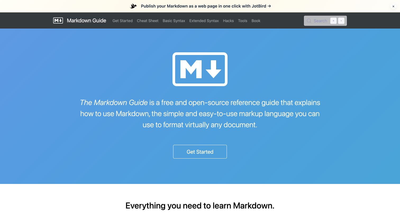
Markdown Guide gives the format’s symbol a large, central role above a concise explanation and a single starting action. The darker navigation bar offers direct routes to syntax references, a cheat sheet and advanced topics, so experienced visitors need not follow the introductory path. A separate announcement strip sits above the documentation identity. This public property appears in Jekyll’s official showcase. Its current broad audit records supporting technologies, but the showcase association remains the specific documentary basis for including it here.
What you can learn
Design the entry page around both learning and lookup. A Jekyll documentation collection can offer a guided introduction while generating consistent reference pages from structured source content. Keep basic and extended concepts distinct, and ensure navigation labels explain the information readers will find rather than the organization of repository folders.
Pros
Direct syntax links support quick repeat visits.
The central introduction explains the reference’s purpose without a lengthy pitch.
Cons & considerations
The promotional strip competes with the main documentation header.
A generic starting action provides less detail than a task-specific label.
Platform source: Official Jekyll showcase: potentially historical association. Jekyll’s official showcase lists Markdown Guide at this public website property. The listing is undated and may describe an earlier implementation; no current Jekyll generator was independently observed in the bounded source audit. Platform evidence is separate from the direct website screenshot and is not a complete current infrastructure audit.
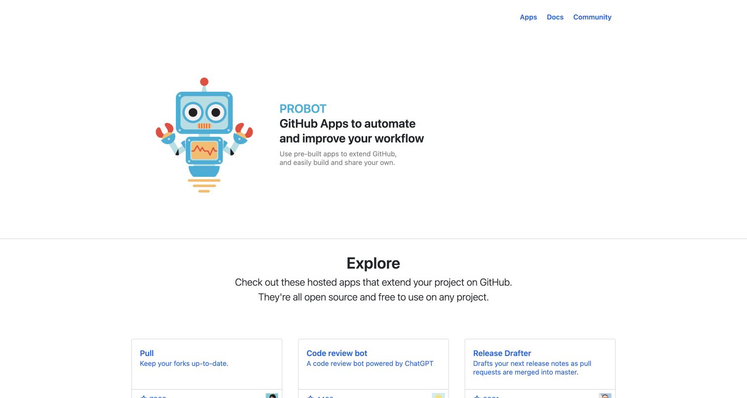
Probot pairs a friendly robot illustration with a compact explanation of its GitHub automation purpose. The three-item navigation is intentionally modest, while the next section turns quickly into a catalogue of actual apps. Each visible card combines a tool name, a short description and repository context, making the ecosystem tangible before a visitor reads implementation instructions. Jekyll’s official showcase lists the Probot website. The new audit observes GitHub Pages delivery, which by itself does not establish Jekyll as the current generator.
What you can learn
Use a small content schema to make a useful directory instead of an ornamental logo wall. Jekyll collections can give each entry a stable page, summary and destination, while shared templates keep the index consistent. Keep repository popularity or freshness values honest and dated rather than presenting them as permanent quality scores.
Pros
Actual app descriptions make the project’s purpose concrete.
Simple navigation separates discovery, documentation and community.
Cons & considerations
Large introductory whitespace pushes catalogue details lower in the view.
Repository counts can become misleading if copied without maintenance.
Platform source: Official Jekyll showcase: potentially historical association. Jekyll’s official showcase lists Probot at this public website property. The listing is undated and may describe an earlier implementation; no current Jekyll generator was independently observed in the bounded source audit. Platform evidence is separate from the direct website screenshot and is not a complete current infrastructure audit.
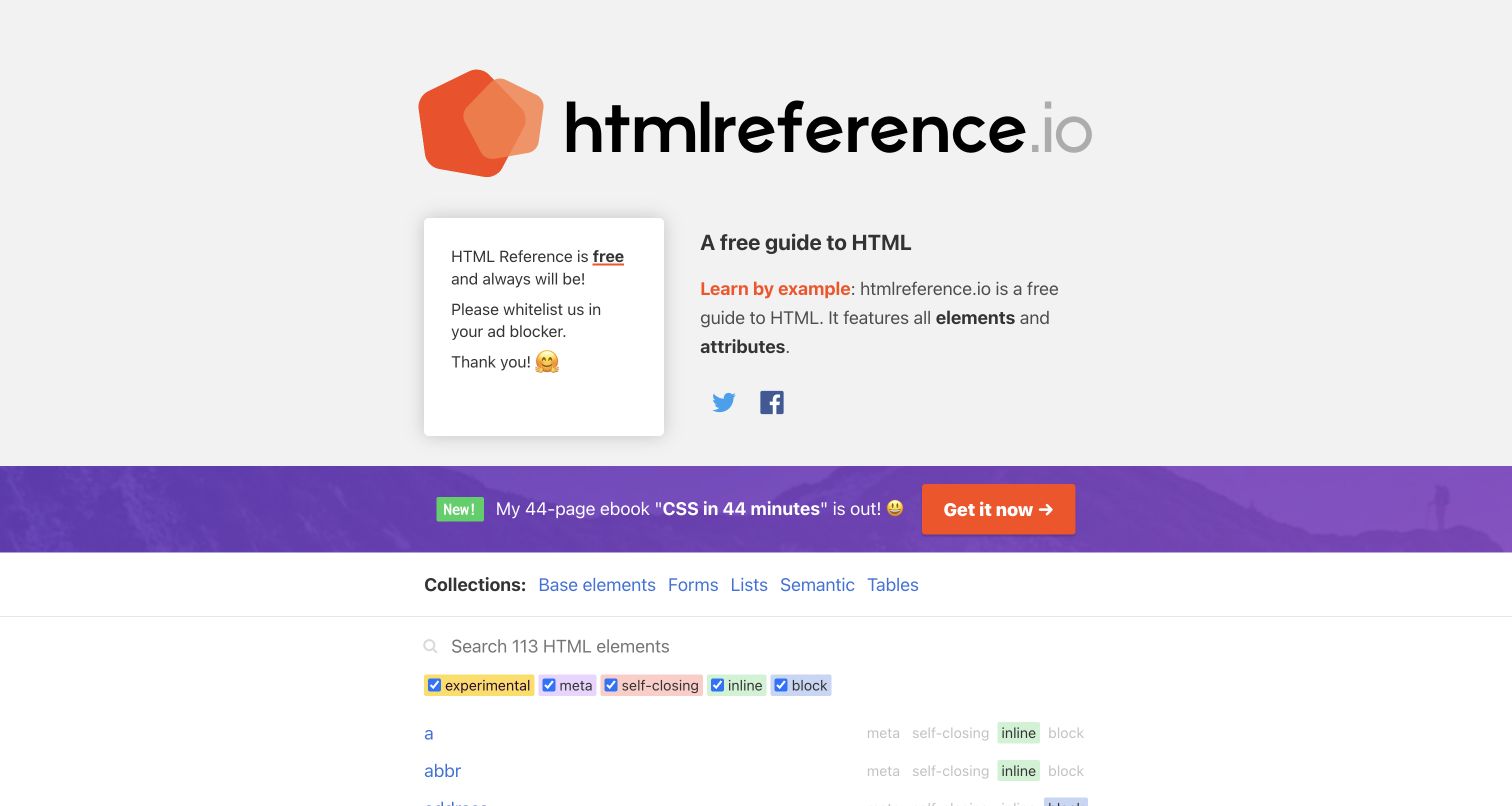
HTML Reference foregrounds its subject with a large identity mark and a short description before exposing collections, search and element filters. The first alphabetical entries are already visible near the bottom of the capture, helping the page behave like a reference rather than a conventional marketing landing page. The prominent ebook strip and support panel also reveal the tradeoff between funding and concentration. Jekyll’s official showcase provides the website association; the current source sample does not independently verify a generator signal.
What you can learn
Make the content model visible to readers. A Jekyll reference library can use consistent metadata for categories, examples and feature labels, then generate predictable detail pages and an index. Search should complement that structure rather than become the only way to find information, especially when scripts or external services are unavailable.
Pros
Alphabetical entries and category links support different lookup habits.
The explanation clearly identifies the reference’s scope.
Cons & considerations
Promotional content occupies substantial space before the first entries.
Several technical filter labels may be unclear to new learners.
Platform source: Official Jekyll showcase: potentially historical association. Jekyll’s official showcase lists HTML Reference at this public website property. The listing is undated and may describe an earlier implementation; no current Jekyll generator was independently observed in the bounded source audit. Platform evidence is separate from the direct website screenshot and is not a complete current infrastructure audit.
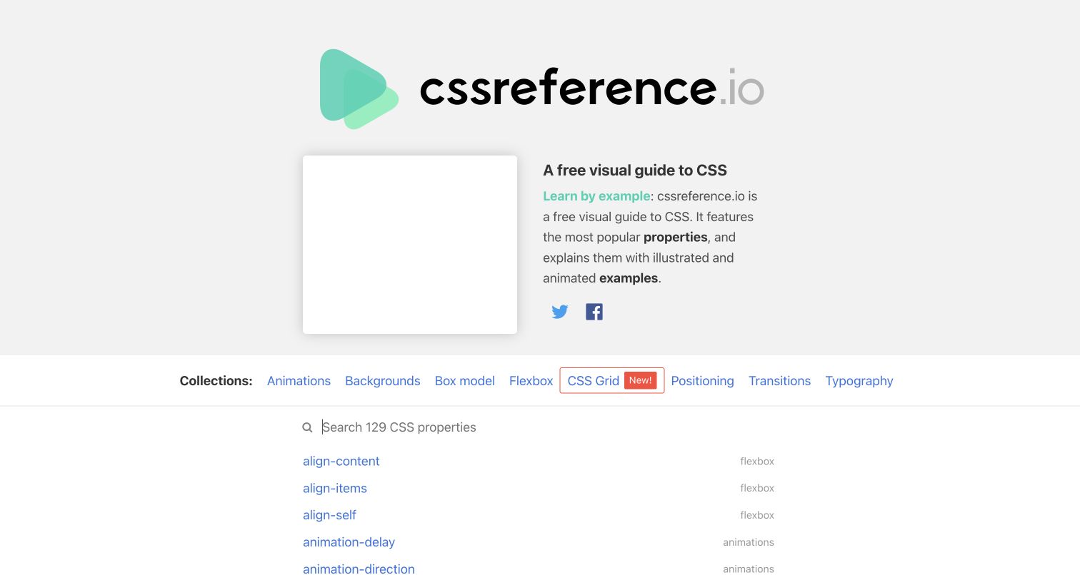
CSS Reference uses a familiar reference-site structure while making the subject distinct through green accents and a large wordmark. Topic links cover concepts such as layout, animation and typography, followed by a prominent search field and an alphabetical property list. The page explains that examples are central to its teaching approach, giving visitors a reason to open individual entries. Its Jekyll association comes from the official showcase; the fresh broad audit supplies supporting source observations without establishing the current generator.
What you can learn
Organize reference content around the questions a reader actually asks. In a Jekyll collection, a property page can carry topic metadata, examples and related entries without duplicating whole layouts. Keep topic navigation useful even when a visitor does not know the exact property name, and maintain visible examples alongside concise explanations.
Pros
Topic groupings provide a path beyond exact-name search.
The first reference entries appear within the opening screen.
Cons & considerations
A support panel competes with the explanatory introduction.
Small category labels require careful spacing on narrower screens.
Platform source: Official Jekyll showcase: potentially historical association. Jekyll’s official showcase lists CSS Reference at this public website property. The listing is undated and may describe an earlier implementation; no current Jekyll generator was independently observed in the bounded source audit. Platform evidence is separate from the direct website screenshot and is not a complete current infrastructure audit.
Bitcoin.org uses a restrained white layout with orange actions and a short central explanation. The opening gives several distinct routes, including learning and wallet selection, while a video entry offers another format. A support banner and a cookie notice are visible in the saved capture, showing how secondary interfaces can affect an otherwise simple composition. The official Jekyll showcase names Bitcoin.org. This documented website association is separate from the Bitcoin network, wallet software and any current financial decision a visitor might make.
What you can learn
For a static educational site, distinguish explanation from external actions with different consequences. Give newcomers a clear learning route and keep resource descriptions specific. Jekyll templates can maintain that structure across many topics, but editorial review must still keep links accurate and avoid turning a design pattern into an implied endorsement.
Pros
A short introduction leaves space for clear navigation choices.
Distinct routes support visitors with different levels of familiarity.
Cons & considerations
Several equally prominent actions weaken the initial priority.
The visible cookie notice overlays part of the introductory artwork.
Platform source: Official Jekyll showcase: potentially historical association. Jekyll’s official showcase lists Bitcoin.org at this public website property. The listing is undated and may describe an earlier implementation; no current Jekyll generator was independently observed in the bounded source audit. Platform evidence is separate from the direct website screenshot and is not a complete current infrastructure audit.
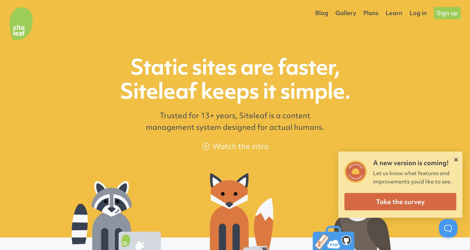
Siteleaf opens with a bright yellow field, friendly illustrations and a concise promise about static publishing. The header keeps plans, learning resources and account routes visible, while the body explains both local development and editorial collaboration. Its own page explicitly describes Jekyll compatibility, and the new source audit also records a Jekyll signal. Those findings support the public website and product association without proving how every customer project is configured. A survey panel and chat control remain visible in the capture.
What you can learn
Explain the workflow in the language of each participant. A Jekyll project with an editing layer should show who changes content, who maintains templates and how publication happens. Separate those responsibilities in onboarding material, and make the everyday editorial task understandable without pretending that build configuration or hosting maintenance disappears.
Pros
Friendly visual language softens a technical publishing subject.
Developer and editorial responsibilities receive distinct explanations.
Cons & considerations
Survey and chat overlays compete with the opening illustration.
Broad simplicity claims need concrete workflow detail before adoption.
Platform source: Public source: dated Jekyll generator signal. Generator metadata identifies Jekyll on this exact public source page in the bounded audit dated 2026-11-10. This identifies the public publishing layer only, not the associated product, backend or every organizational property. Platform evidence is separate from the direct website screenshot and is not a complete current infrastructure audit.
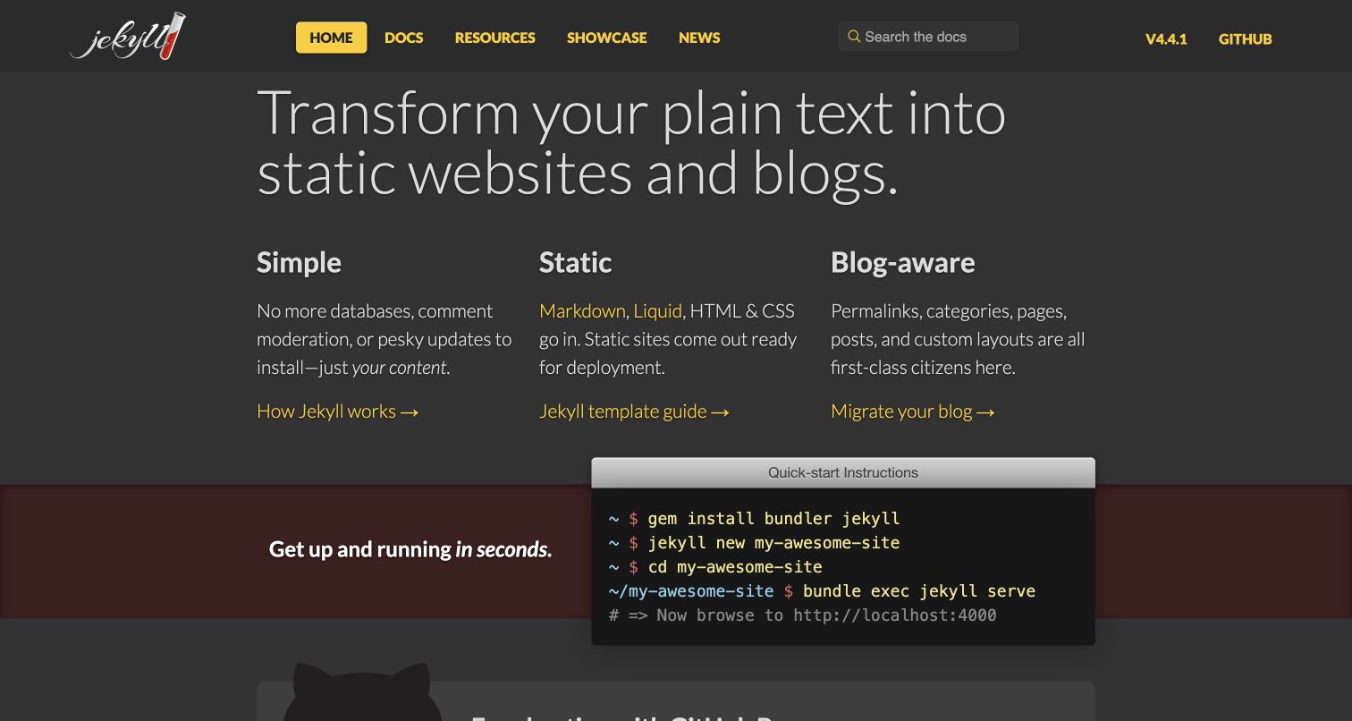
Jekyll’s own homepage presents three clear concepts across a dark, restrained layout before showing a compact command sequence. The yellow navigation and links provide consistent accents, while the logo gives the project a recognizable identity without taking over the page. Documentation, templates and migration are offered as different next steps. The current public audit records a Jekyll generator signal on this exact source. The screenshot is a website design reference, not evidence that the displayed quick-start steps have been executed in every visitor environment.
What you can learn
Use your introduction to explain both the output and the working model. For Jekyll, that means clarifying the relationship between authored content, templates and generated pages. Keep installation instructions linked to maintained documentation so the homepage can stay concise while platform requirements and troubleshooting details remain accurate elsewhere.
Pros
Three conceptual columns make the product model easy to scan.
A concrete command example connects the explanation to a starting task.
Cons & considerations
The dark technical presentation assumes some comfort with command-line tools.
A short quick start cannot cover every installation or hosting condition.
Platform source: Public source: dated Jekyll generator signal. Generator metadata identifies Jekyll on this exact public source page in the bounded audit dated 2026-11-10. This identifies the public publishing layer only, not the associated product, backend or every organizational property. Platform evidence is separate from the direct website screenshot and is not a complete current infrastructure audit.
Kruze Consulting places its audience directly in the headline: accounting for venture-funded startups. A restrained blue palette and centered explanation support that positioning, while the header keeps services, pricing, resources and contact routes visible. A consultation action follows several paragraphs, and a proof-oriented section begins below. The retained broad audit records a Jekyll source signal for this public page. That observation concerns its publishing technology, not the firm’s internal financial systems or the truth of every marketing claim shown in the capture.
What you can learn
Use structured static content to explain a specialist offer with consistent terminology. A Jekyll services site can share layouts across service pages while keeping audience, scope and next steps specific. Put evidence near consequential claims, and give factual assertions editorial ownership instead of assuming a reusable template makes them reliable.
Pros
The intended customer is explicit in the opening headline.
Navigation offers both research and direct-contact routes.
Cons & considerations
Several centered paragraphs slow scanning before the main action.
Large comparative claims require supporting context beyond the visual hierarchy.
Platform source: Public source: dated Jekyll generator signal. Generator metadata identifies Jekyll on this exact public source page in the bounded audit dated 2026-11-09. This identifies the public publishing layer only, not the associated product, backend or every organizational property. Platform evidence is separate from the direct website screenshot and is not a complete current infrastructure audit.
Plausible combines a centered product explanation with a dashboard preview that begins within the first screen. Purple highlights identify the main action and selected wording without creating a crowded color system. A secondary live-demo route offers a lower-commitment way to investigate the product, while pricing remains visible in the header. The earlier source audit records a Jekyll signal for this marketing page. That finding does not describe the analytics application backend or independently verify the privacy statements contained in its promotional copy.
What you can learn
Connect an abstract product promise to a concrete interface. A Jekyll marketing site can keep explanations and screenshots easy to maintain while sending interactive demonstrations to an appropriate separate destination. Treat screenshots as dated illustrations, and review policy claims independently rather than letting attractive presentation substitute for accurate product documentation.
Pros
The dashboard preview makes the product category immediately concrete.
Trial and demonstration routes support different levels of commitment.
Cons & considerations
The centered opening gives detailed comparison information limited room.
Privacy-related promotional claims need context beyond this design review.
Platform source: Public source: dated Jekyll generator signal. Generator metadata identifies Jekyll on this exact public source page in the bounded audit dated 2026-11-05. This identifies the public publishing layer only, not the associated product, backend or every organizational property. Platform evidence is separate from the direct website screenshot and is not a complete current infrastructure audit.
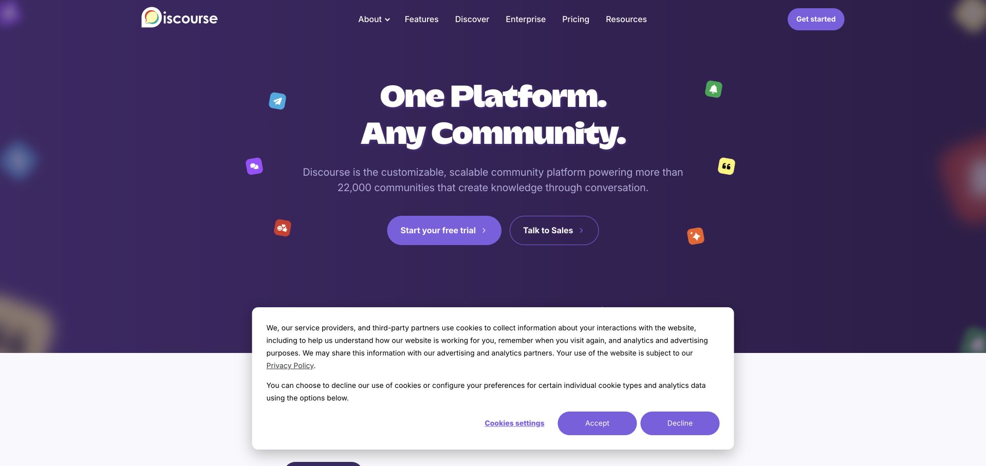
Discourse presents a short two-line headline against a deep purple background, with small conversation-related symbols reinforcing its subject. The main navigation offers product, enterprise, pricing and resource routes, while the hero separates a trial from a sales conversation. The retained screenshot also shows a substantial cookie panel, making the interaction cost of auxiliary interfaces clear. An earlier broad audit records Jekyll on the public marketing source. This is not an attribution of the Discourse discussion application, its database or every hosted community.
What you can learn
Keep the marketing site’s publishing layer distinct from the product it explains. Jekyll can maintain public feature pages and resources while the actual community application operates elsewhere. Make that boundary clear in technical documentation, and ensure overlays do not prevent visitors from understanding the first page or reaching their intended route.
Pros
Short headline lines create a strong initial hierarchy.
Trial and sales routes acknowledge different evaluation needs.
Cons & considerations
The visible cookie panel covers a large part of the lower hero.
Abstract floating symbols explain less than an actual conversation example.
Platform source: Public source: dated Jekyll generator signal. Generator metadata identifies Jekyll on this exact public source page in the bounded audit dated 2026-11-09. This identifies the public publishing layer only, not the associated product, backend or every organizational property. Platform evidence is separate from the direct website screenshot and is not a complete current infrastructure audit.
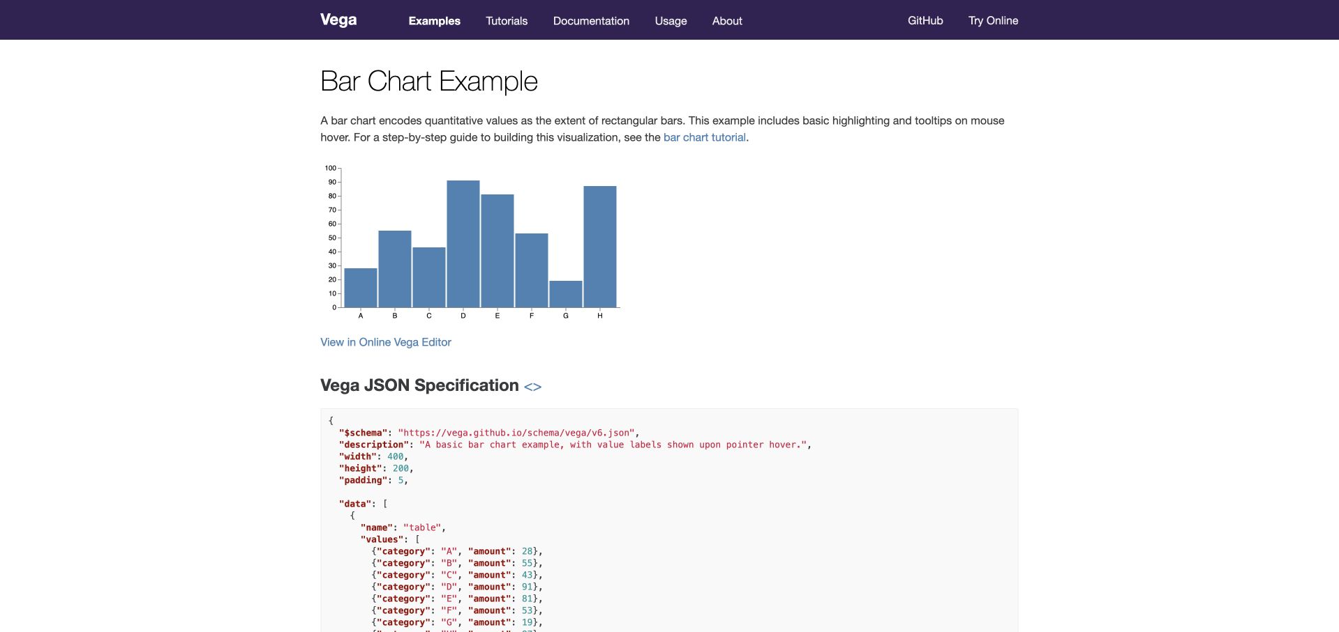
Vega’s bar-chart example wastes little space on promotion. A descriptive heading introduces the chart, a brief paragraph explains what it demonstrates, and the visualization sits immediately above a link to an online editor. The specification begins in a clearly separated code area beneath it. The retained source audit identifies a Jekyll signal for this documentation page. That publishing observation is distinct from Vega’s JavaScript visualization runtime, and the saved screenshot itself does not demonstrate keyboard access or every interactive state.
What you can learn
Pair explanatory output with the source a reader can actually inspect. A Jekyll documentation layout can consistently place examples, descriptions, editable destinations and code blocks in a predictable order. Keep runnable demonstrations scoped and optional, so the surrounding reference remains useful when execution is unavailable or when someone only needs to read.
Pros
The chart and its specification appear in one coherent sequence.
A descriptive page title makes the example easy to identify.
Cons & considerations
The long code section needs careful handling on small screens.
A static capture cannot establish the accessibility of chart interactions.
Platform source: Public source: dated Jekyll generator signal. Generator metadata identifies Jekyll on this exact public source page in the bounded audit dated 2026-11-09. This identifies the public publishing layer only, not the associated product, backend or every organizational property. Platform evidence is separate from the direct website screenshot and is not a complete current infrastructure audit.
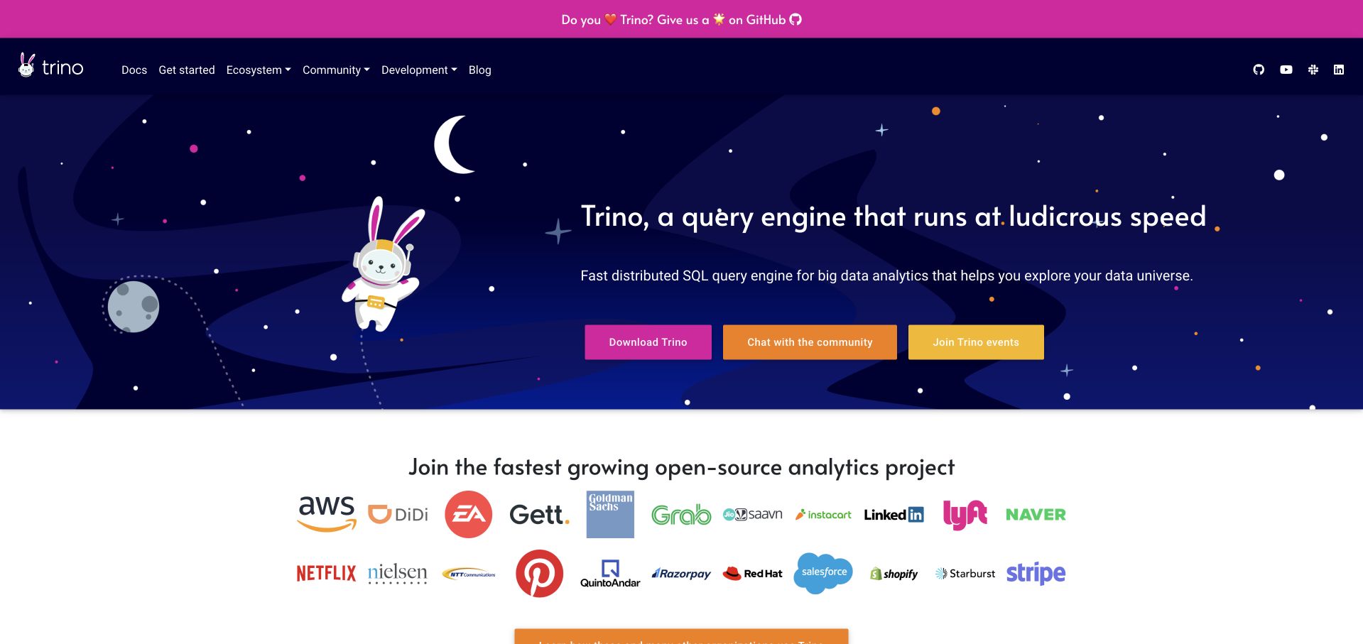
Trino uses a space-themed illustration and a recognizable mascot to give a technical query engine a memorable public identity. The dark hero pairs its explanation with three actions for downloading, community discussion and events. A logo section below introduces ecosystem context, while documentation and development remain in the main navigation. The retained audit records Jekyll on this website source. That does not mean the query engine itself runs on Jekyll or that displayed company logos establish any particular current deployment or endorsement.
What you can learn
Give an open-source project more than one useful path without losing the main task. Jekyll content can organize downloads, learning material, community participation and events as separate maintained sections. Keep ecosystem claims qualified and update time-sensitive destinations deliberately, particularly when prominent logos or event links may outlive the relationships they originally described.
Pros
The illustration gives a technical project a distinct visual identity.
Download and participation routes are visible together.
Cons & considerations
Three strong action colors compete for initial attention.
Large ecosystem logo sections need carefully maintained supporting context.
Platform source: Public source: dated Jekyll generator signal. Generator metadata identifies Jekyll on this exact public source page in the bounded audit dated 2026-11-09. This identifies the public publishing layer only, not the associated product, backend or every organizational property. Platform evidence is separate from the direct website screenshot and is not a complete current infrastructure audit.
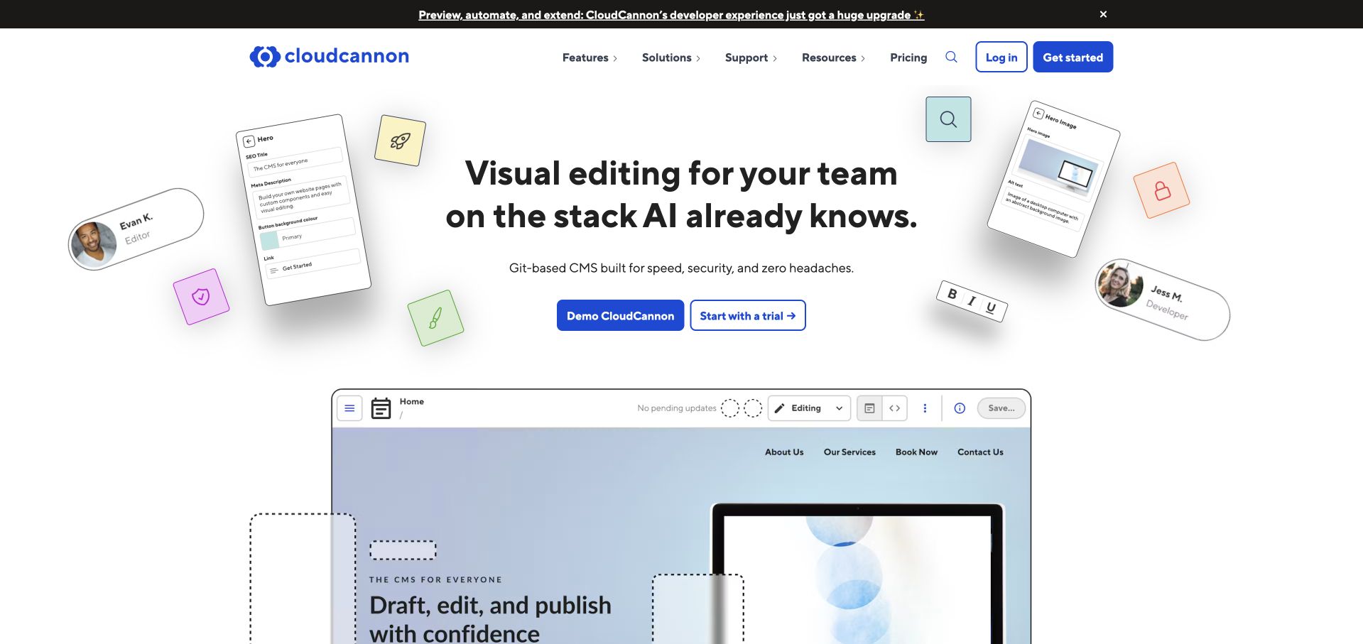
CloudCannon surrounds its central introduction with small interface fragments that suggest editing, permissions and collaboration. A substantial editor screenshot begins below two differently weighted actions, giving the page a visible product object rather than relying entirely on a slogan. Navigation keeps features, solutions and pricing available. Jekyll’s official showcase lists CloudCannon, but its retained public audit does not establish a current Jekyll generator. The inclusion is therefore a documented association and a design reference, not a claim about the implementation of every supported project.
What you can learn
Explain how people work with content as well as how developers build it. A Jekyll site that uses an editing service should make common tasks, content fields and approval responsibilities concrete. Show representative interfaces while retaining a clear distinction between a supported generator, the editor product and the public marketing website.
Pros
Interface fragments connect collaboration language to recognizable editing tasks.
The product screenshot provides a concrete next layer of explanation.
Cons & considerations
Floating decorative controls can compete with the central message.
Broad compatibility language needs precise supporting documentation during evaluation.
Platform source: Official Jekyll showcase: potentially historical association. Jekyll’s official showcase lists CloudCannon at this public website property. The listing is undated and may describe an earlier implementation; no current Jekyll generator was independently observed in the bounded source audit. Platform evidence is separate from the direct website screenshot and is not a complete current infrastructure audit.
Kegan has 15+ years of experience working with small businesses, Fortune 500 companies, and everything in between. No development job is too big or too small: he brings the same hands-on attention to a focused improvement, a complete website, or a custom application.
For Jekyll projects, he can help with responsive interfaces, reusable components, custom functionality, API connections, and performance-minded implementation. He works directly with clients on scope, design, implementation, testing, and handover, with an emphasis on clear communication and a system that remains practical to maintain after launch.
Show 3 other Jekyll developersHide other Jekyll developers
Choose a Jekyll publishing approach that fits the team
Maintain a focused documentation or editorial site
Use a small number of layouts for the recurring material and keep article content easy to review. Front matter can hold titles, authors, categories and other fields that the templates need. Establish a clear process for drafting, checking and publishing changes. This approach works best when maintainers understand the content structure and can keep links and dependencies current. Avoid treating the initial template as a complete operating plan for a growing knowledge base.
Define collections for related records and data files for information shared across several pages. A reference entry might need a description, examples, topic tags and related links; a directory might need a name, location and verified destination. Decide which fields belong to each record and which belong to the shared site. Generate indexes from those sources so an entry is not maintained separately in several lists. Keep the visible organization tied to the reader’s task.
Add an editing layer without hiding responsibility
If contributors need a browser-based editor, evaluate how it works with the existing content and build process. Check which fields it exposes, how drafts are reviewed and how changes are published. The editor service, generator and hosting environment have different responsibilities. A friendly editing screen does not eliminate template maintenance or release checks. Use representative tasks to assess the workflow, including correcting an image, changing a link and recovering an unsuccessful publication.
From references to requirements
Plan content, routes and ownership before implementation
Create a representative content inventory
List the pages and recurring records the website actually needs. Include long titles, missing optional images, multi-language resources, archived announcements and unusual but valid entries. Define who can correct each kind of content and which fields are essential. Test the model with a small set of realistic material before adding a large catalogue. This reveals whether the proposed layout and metadata serve the site or merely reflect the first easy example.
Set stable URL and redirect expectations
Choose readable output paths deliberately and preserve existing public links during migration. Jekyll permalinks can separate source organization from output URLs, so moving a file need not become a visitor-facing route change. Document which redirects are handled by the hosting environment and how they are checked. Include internal anchors, canonical metadata and sitemap entries in the same plan. A successful HTML build alone does not prove that old links still reach the intended destination.
Record how dependencies are installed, content is checked, pages are generated and the exact output reaches hosting. Assign responsibility for failed builds, broken links and dependency updates. Jekyll’s static output allows several deployment approaches, but the selected route still needs a repeatable verification process. Keep drafts, private research and credentials out of the published directory. Make the handover practical enough that another maintainer can publish a correction without relying on undocumented habits.
Ask the actual team to carry out its routine job: publish a realistic update, correct a mistake, preview a narrow screen, and identify who owns an integration failure. For a library or frontend framework, also ask who maintains the content source and deployment. A polished screenshot does not answer those operational questions.
Beyond the screenshot
Jekyll website planning checklist
Name the website’s main audiences and their most important reading or lookup tasks.
Define recurring page types, required fields and realistic edge cases.
Give each content area an owner and a clear correction process.
Choose stable public paths and preserve redirects from existing URLs.
Keep publication, edit, observation and capture dates distinct.
Make navigation useful without relying entirely on search or scripts.
Document which functions belong to separate applications or services.
Check templates, links, images and generated metadata automatically.
Keep private files, credentials and draft material out of public output.
Verify the deployed pages and maintain a recoverable release process.
Test with real content, a keyboard, a small screen, slow or failed requests, and the people who will maintain the system. These are planning checks, not an accessibility, security, performance, or search-ranking certification.
Sources & editorial method
How this Jekyll collection was reviewed
This guide contains twenty distinct public properties with genuine browser screenshots, source URLs, dimensions and attribution. Fourteen captures were taken directly during the November 9, 2026 Pacific research session, and six verified captures retain their earlier dates and original provenance. All images were inspected for new collection-specific reviews. Jekyll’s official showcase supplies explicitly qualified documentary associations; current positive generator signals are recorded for Twitch, Siteleaf and Jekyll itself, with five earlier positive source observations retained separately. Spotify’s fresh sample observes Next.js, so its Jekyll association is described as historical. Every source has a broad audit attempt, with fourteen new bounded checks and six retained records. These samples cover one public source page and limited same-origin assets, not complete backend inventories. No forms, account actions, private application workflows or performance measurements were used. The reviews discuss visible design and planning rather than conversion results, service quality or accessibility certification.
Every image is an unmodified capture from the actual website, with its source and capture date. Some captures are reused from our shared catalog; their dates remain the original capture dates. None comes from a vendor gallery or a generated reconstruction. Moving imagery and live content can change.
Technology attribution uses public page assets or metadata, official platform documentation, or a cited first-party project case study. Documentary and framework-relationship evidence is identified where used; it is not a complete current backend inventory. A CMS image CDN alone does not establish a full CMS deployment. A library’s presence does not prove which individual controls use it, and a platform label does not establish AI authorship.
The composition notes, lessons, pros and tradeoffs are original editorial observations. We have not measured conversion, traffic, security, performance or accessibility conformance. Website owners retain their brands and imagery; these examples are not our client portfolio. Written, Edited and Curated are independent records, not dates advanced by a build. See our editorial standards or suggest a correction.
Questions worth asking
Jekyll website development FAQs
Is every pictured website currently verified as using Jekyll?
No. The collection separates observed Jekyll source signals from official showcase associations that may be historical. Spotify’s current public source sample observes Next.js. A showcase listing does not establish that a site still uses the same generator, and each example retains its supported scope.
What does Jekyll actually do?
Jekyll transforms authored content and layouts into static website output. It provides conventions for pages, posts, collections and templates. It does not determine the design or automatically supply a private application backend, secure account service or transactional workflow.
Can Jekyll support more than a personal blog?
Yes. Its collections and data-file features can organize related content such as reference entries, team records or project libraries. The appropriate structure depends on the content and maintenance workflow. The generator alone does not decide whether a large library will be easy to navigate or keep current.
Does GitHub Pages hosting prove a website uses Jekyll?
No. A hosting or delivery signal is not the same as a generator signal. Treat it as evidence of the observed delivery service only. Use a direct source marker, official project configuration or an accurately qualified primary documentary source for a Jekyll association.
Can nontechnical contributors edit a Jekyll website?
They can participate through a suitable editing workflow, including an optional content editor that works with the project. Evaluate the actual fields, draft review and publication process. Template maintenance, dependency updates and deployment verification still need clear ownership.
Why keep older screenshots and observations?
A genuine earlier screenshot can support a new design review while retaining its actual date. An earlier source observation remains evidence of what was seen at that time. Neither should be relabeled as newly captured or freshly verified simply because a guide is written or rebuilt.
Borrow the clear content structure and useful navigation in these examples. Choose Jekyll when its publishing model fits the team, and keep the evidence, dates and operating responsibilities clear.