A pest-control website should help someone identify the right kind of help without making them understand the company's entire service catalog first.
Some visitors have an active problem; others are comparing ongoing plans, checking a service area, or managing an existing account. Those needs deserve different routes. A useful introduction states what the company does, where it works, and whether the next action requests an inspection, starts a conversation, or purchases a defined service.
These examples include national networks, regional providers, and companies with related home services. Study their pest categories, branch finders, service explanations, and customer-support routes. The reviews assess public website design; they do not verify treatment effectiveness, company guarantees, or suitability for a particular property.
Before the examples
What makes good pest control website design in 2026?
Connect the pest problem to a real service
Use familiar pest names and explain which services address them. Separate a one-time visit, an inspection, and an ongoing plan when the company offers different arrangements. Keep treatment and safety statements tied to current, approved service information rather than assuming a photograph of a technician explains the process.
Establish service coverage early
Show the actual service region or a simple branch finder before asking for a detailed lead form. Let visitors change an automatically suggested location. A person may be researching a rental property, workplace, or family member's home from another area.
Give new and existing customers different paths
A new inquiry needs scope, expectations, and a clear contact action. An existing customer may need scheduling, account access, payment, or support. Keep those routes recognizable so repeat visitors do not have to pass through a promotion or quote form every time.
The collection · 12 examples
12 pest control websites worth studying
Compare how these 12 sites balance local routing, pest-based navigation, service plans, and promotional offers. Their scale varies, so borrow the decision structure that fits the business rather than the number of menus or campaigns.
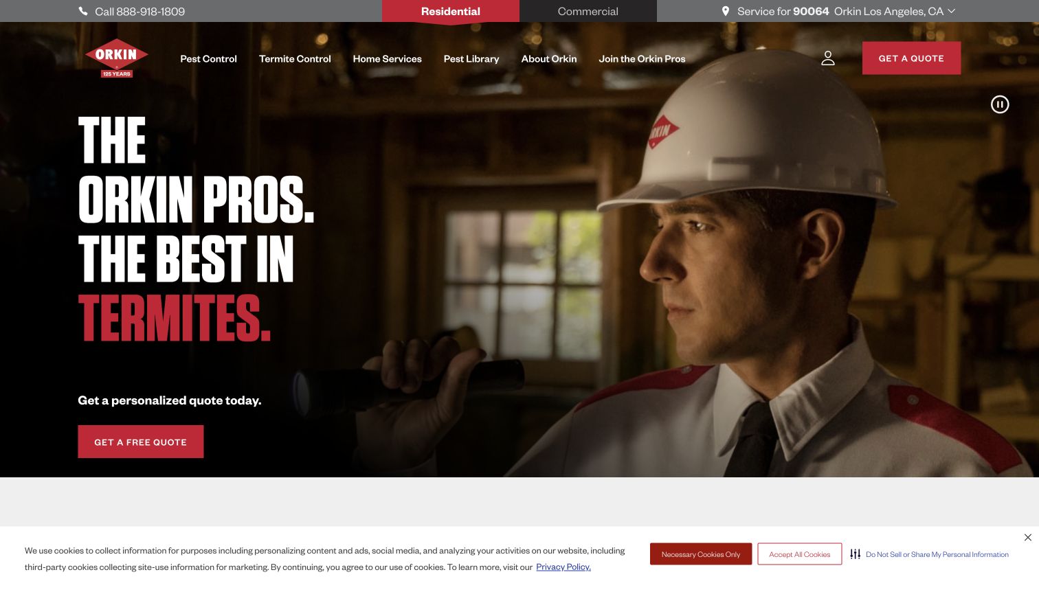
Orkin puts the working technician at the center of its opening image, with oversized condensed lettering and a red quote action layered over a darkened photograph. The navigation separates residential and commercial visitors before asking them to choose a pest or service. A local-branch route and an account area acknowledge that finding a provider and managing existing service are different jobs. The result feels operational as well as promotional: visitors can see a human delivering the service and find a practical next step. The broad navigation and campaign content still require careful editing so the immediate pest problem remains easy to find.
What you can learn
Use a real service photograph to establish context, then keep location, new inquiries, and existing-customer tasks distinct. A small operator can borrow that hierarchy without recreating the full national service menu or relying on a large campaign headline to explain every offering.
Pros
Strong contrast gives the main quote action a clear position.
Residential, commercial, and account tasks have recognizable routes.
Cons & considerations
The expansive service navigation can demand several choices.
Campaign-led headlines need supporting detail for specific pest problems.
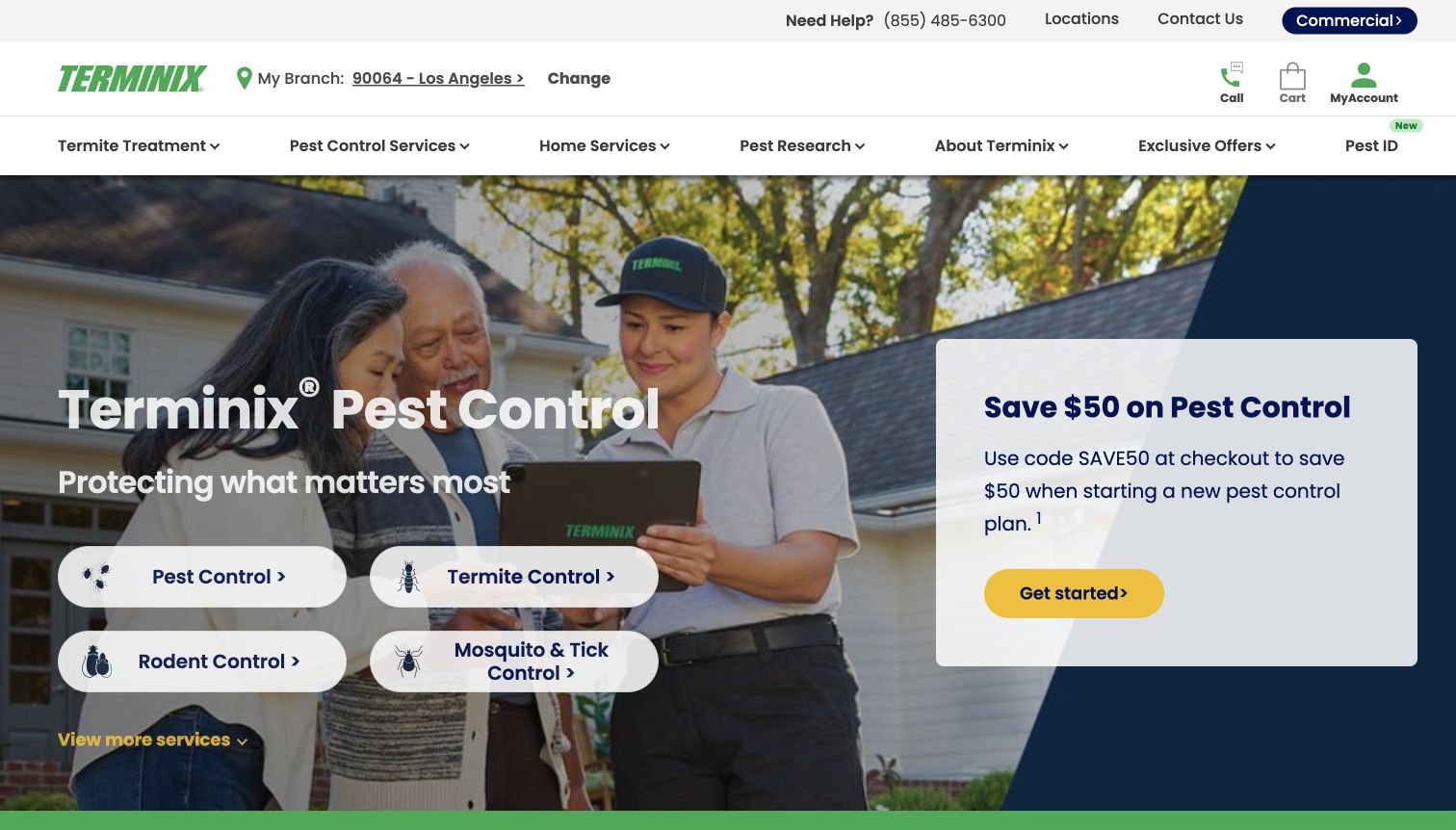
Terminix divides the opening area into a technician-and-customer photograph, a row of rounded service choices, and an offer panel. Pest, termite, rodent, and mosquito-related routes let visitors begin with the problem they recognize. The header also makes room for local-branch information and customer assistance. Green branding ties those separate elements together, while the yellow promotional action stands apart from the service buttons. This is a useful example of organizing a broad service business around concrete categories. It also shows how quickly a homepage can accumulate competing entry points when the offer, phone number, service cards, and navigation all ask for attention.
What you can learn
Decide whether the visitor should identify a service or request help first. Give the primary task a dominant position, then use a concise category chooser for people who already know their problem. Keep temporary offers visually subordinate to the permanent service structure.
Pros
Problem-based service labels reduce reliance on industry terminology.
Branch and customer-help routes support practical follow-up tasks.
Cons & considerations
The tall multirow header uses substantial space before the main content.
Offer and service actions compete in the opening view.
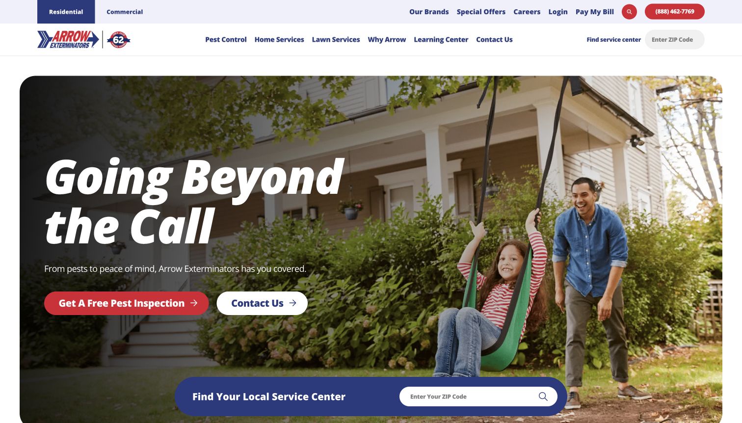
Arrow Exterminators frames its hero as a rounded photograph of family life, with inspection and contact actions placed over the image. The blue ZIP-code locator overlaps the bottom edge, making coverage a visible part of the introduction rather than an item buried in the footer. Red buttons and an italic display headline create a more energetic tone than the surrounding white navigation. Residential, commercial, payment, and customer-login links acknowledge different types of visitors. The page works as a reference for combining emotional reassurance with a concrete service-area question, although the number of header utilities can make the first view feel busy.
What you can learn
Connect household imagery to a useful local action. A visitor should be able to check whether service is available without sending a detailed inquiry. Give inspection and general-contact actions labels that explain their different purposes instead of presenting two interchangeable buttons.
Pros
The overlapping ZIP finder makes geographic relevance visible.
Separate inspection and contact routes explain possible next steps.
Cons & considerations
Several utility links compete with the core navigation.
Lifestyle photography offers less detail about the actual treatment process.
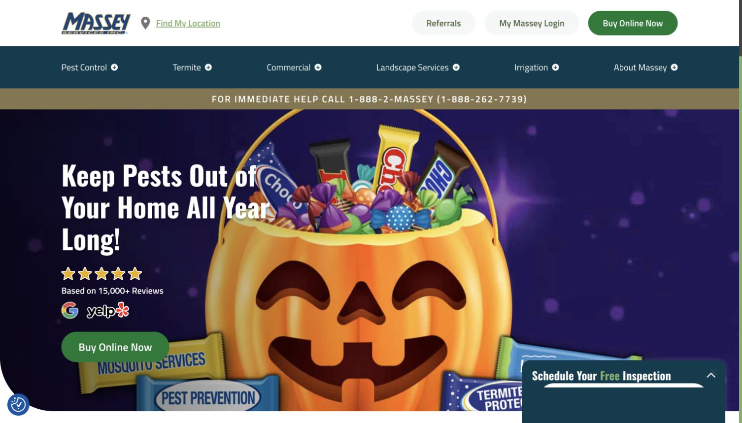
Massey Services uses a teal-and-gold identity across a broad navigation that includes pest control, termite protection, landscape care, irrigation, and commercial services. The captured homepage leads with seasonal imagery and a purchase action, while an inspection request remains available as a separate control. This is a useful reference for a company whose work extends beyond a single pest category: the service labels give the reader a map of that range. The seasonal creative makes the page feel actively maintained, but it also places extra responsibility on the editor to retire outdated offers and keep the underlying service proposition clear throughout the year.
What you can learn
Model each genuine service family explicitly before adding seasonal campaigns. A promotion should sit inside a stable structure with a clear owner and review date. Preserve an inspection or conversation route for visitors whose situation cannot be reduced to buying a standard service online.
Pros
Distinct service families make the breadth of the business understandable.
Purchase and inspection paths accommodate different levels of readiness.
Cons & considerations
Seasonal creative needs frequent maintenance to remain relevant.
Multiple promotions and service families can dilute the main pest-control task.
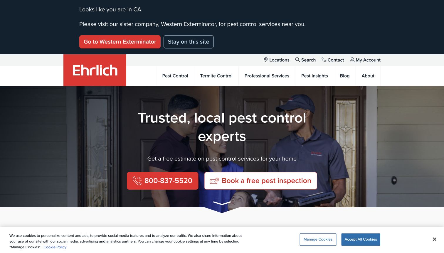
Ehrlich combines a red brand block, a large service photograph, and paired phone and inspection actions. The main message emphasizes local expertise, and the page provides routes to find an appropriate branch. In the captured visit, a regional notice suggested another provider for the detected area while still allowing the visitor to stay on the site. That detail is valuable: a national-looking website can still acknowledge practical service boundaries. The routing notice and cookie strip take up additional screen space, however, so a visitor sees several layers of interface before reaching deeper information about pests, inspections, or the service process.
What you can learn
Make regional coverage explicit and allow visitors to correct an automatic location assumption. A branch finder should help them reach a relevant team, while the homepage should still explain the service for people researching another property or browsing from a different region.
Pros
Phone and inspection actions are easy to distinguish.
Regional routing addresses a real service-availability constraint.
Cons & considerations
Location notices add another layer to an already busy first view.
Automatic regional assumptions may not match the property being researched.
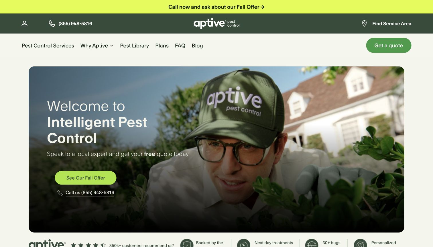
Aptive pairs a cream-and-green palette with rounded photography and a prominent seasonal offer. Its navigation includes plans, common questions, and a pest library, so visitors have both a buying route and a research route. Lower-page sections describe an inspection, customization, and communication sequence, which gives substance to the introductory claim of an intelligent approach. The design feels approachable without relying only on a list of pests. The main tradeoff is the emphasis on the promotion: it can attract attention before the visitor has understood the plan, coverage, or what ongoing service involves.
What you can learn
Explain the sequence of the service in ordinary language and link it to the plan being offered. Use a promotion as an optional entry point, then keep the permanent plan details, supported pests, and communication expectations easy to reach when the campaign changes.
Pros
A named process helps make an otherwise invisible service understandable.
Plans and pest-library routes support different research needs.
Cons & considerations
The opening offer can overshadow the service explanation.
Text over photography needs careful contrast across different images.
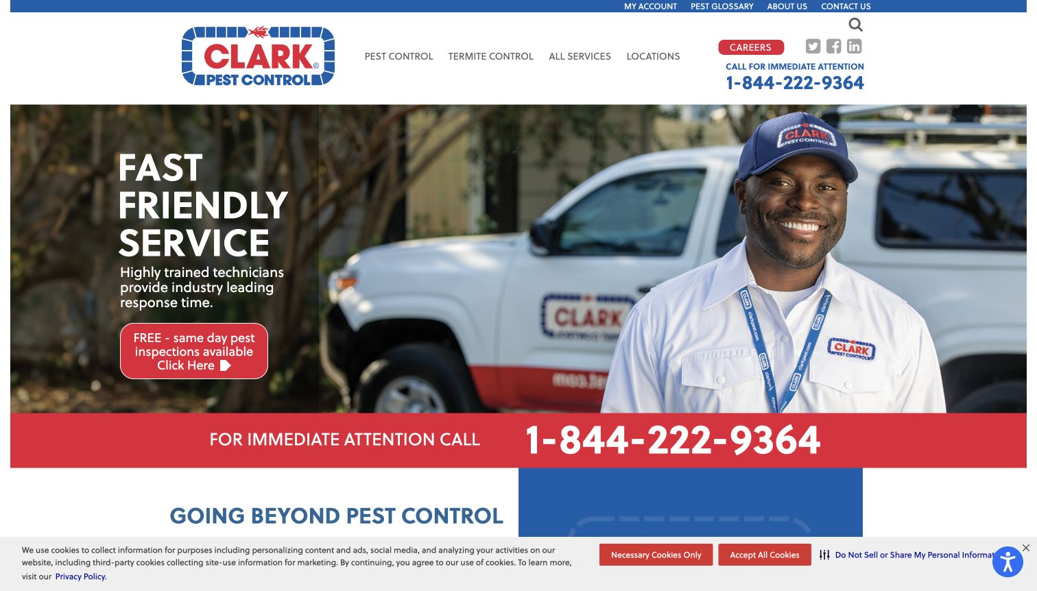
Clark Pest Control gives its telephone route unusually strong emphasis, including a prominent immediate-attention message above the main hero. Blue and red branding, technician imagery, and a service vehicle reinforce a practical regional identity. The navigation offers services and locations, while the opening call to action asks for contact instead of presenting a complicated plan selector. This is an instructive design for an office that expects to clarify the problem in conversation. The page is less restrained in its utility areas: career links, social icons, and additional notices occupy the same upper region as the most urgent customer task.
What you can learn
If phone calls are the real intake workflow, make that route unmistakable and keep the service region nearby. Use a short explanation of what the office can help with. Review the header as a whole so secondary company links do not weaken the primary call action.
Pros
The phone route is immediately visible.
Technician and vehicle imagery establish concrete service context.
Cons & considerations
Utility items make the top of the page visually dense.
A broad contact action provides less self-service guidance for plan comparison.
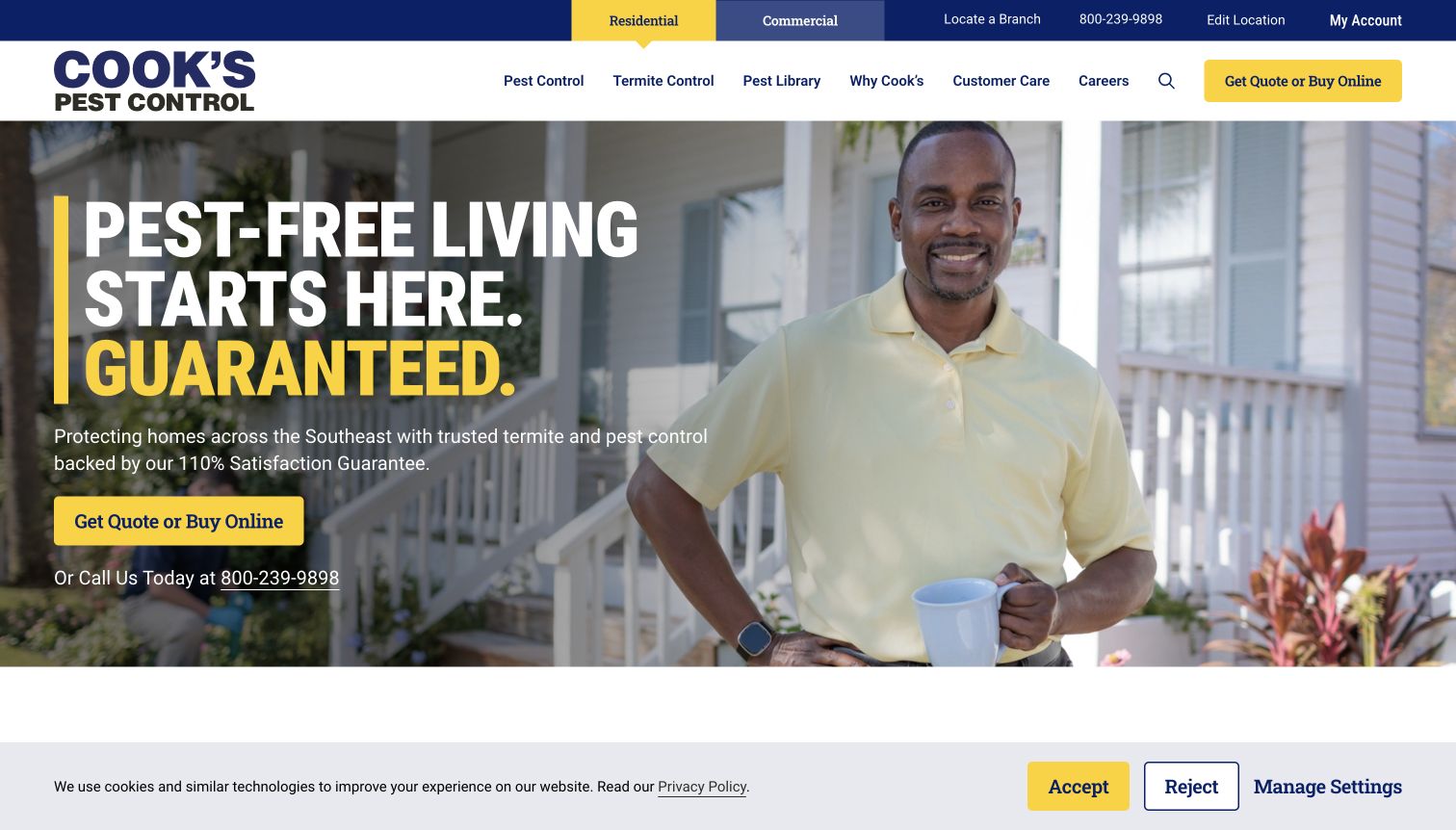
Cook's Pest Control uses navy and yellow to distinguish its key actions from a large technician photograph. Residential and commercial routes are visible in the upper navigation, and the hero supports both a quote request and an online-purchase path. Below the introduction, an 'I need help with' section turns pest categories into a familiar customer question. That progression moves from broad reassurance to a specific problem without forcing every visitor into the same level of detail. The guarantee-led hero and multiple action types still need supporting explanations, especially when an online purchase and a custom quote represent different expectations.
What you can learn
Write navigation in the language people use when they call the office. Follow the introduction with a problem chooser, then explain which situations can be purchased directly and which need a conversation. Keep guarantee wording connected to accessible, current terms.
Pros
The problem-oriented section gives visitors a natural starting point.
Residential and commercial journeys are visibly separated.
Cons & considerations
Quote, purchase, and phone actions can split attention.
A guarantee headline alone does not explain the limits of the offering.
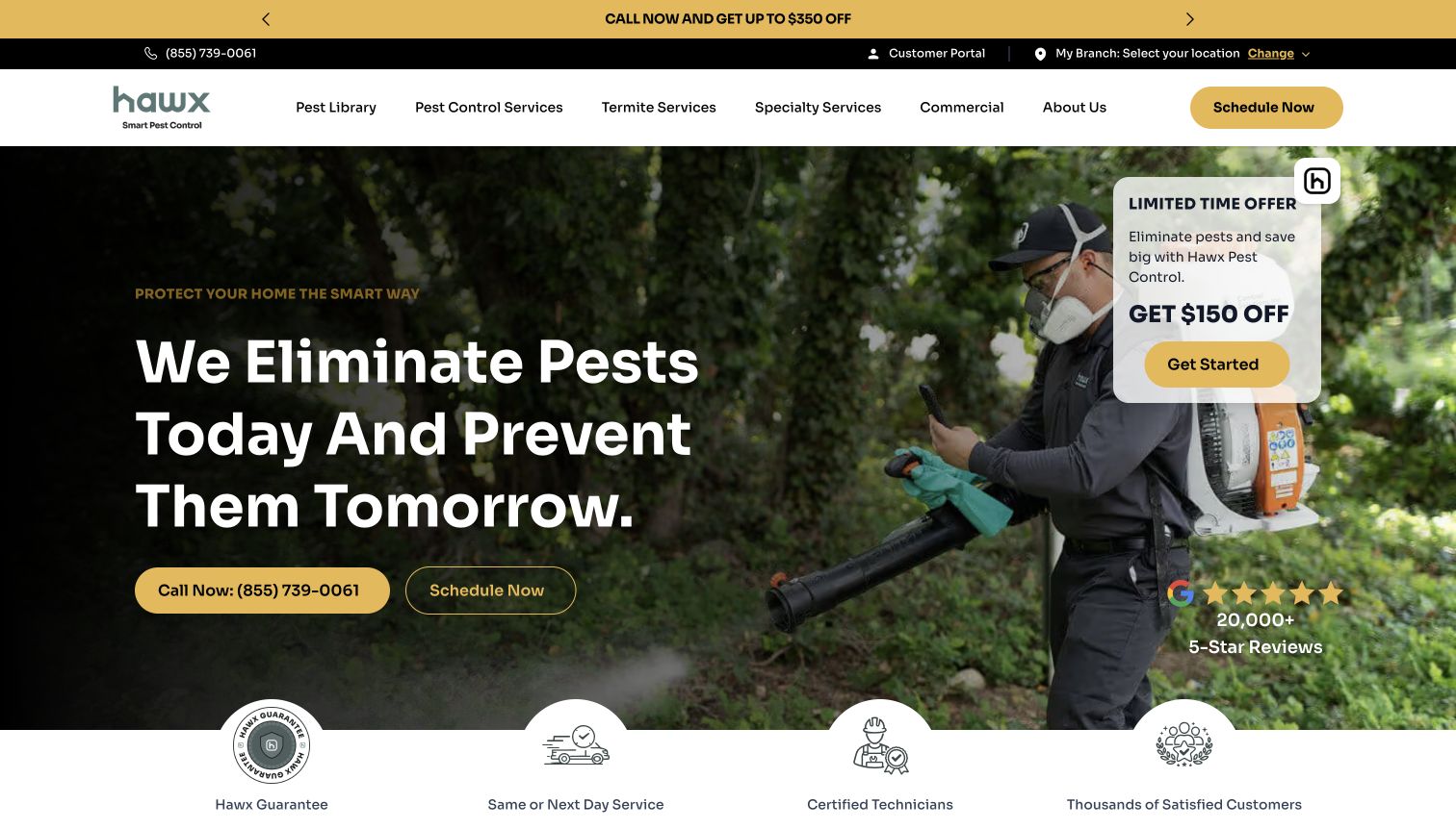
Hawx presents pest control as an ongoing prevention service, using a large treatment photograph behind a bold headline. Black and yellow styling carries from the promotional strip into the main actions, and visitors can choose between calling and scheduling. Pest categories and process information provide additional routes below the opening pitch. The page is useful for studying how a recurring-service proposition differs from a one-time removal message. Its floating discount card, top offer, and hero actions also demonstrate the cost of stacking promotional surfaces: the visitor must decide which of several equally energetic elements matters most.
What you can learn
State the difference between ongoing prevention and a single visit in the service copy, then show the actual sequence and scope. Reserve one prominent place for an offer. Keep booking and telephone alternatives visible without surrounding them with competing promotional panels.
Pros
The prevention message gives the service a clear positioning angle.
Phone and scheduling options support different contact preferences.
Cons & considerations
Several promotional elements compete in the first screen.
A treatment photograph needs explanatory copy to communicate service scope.
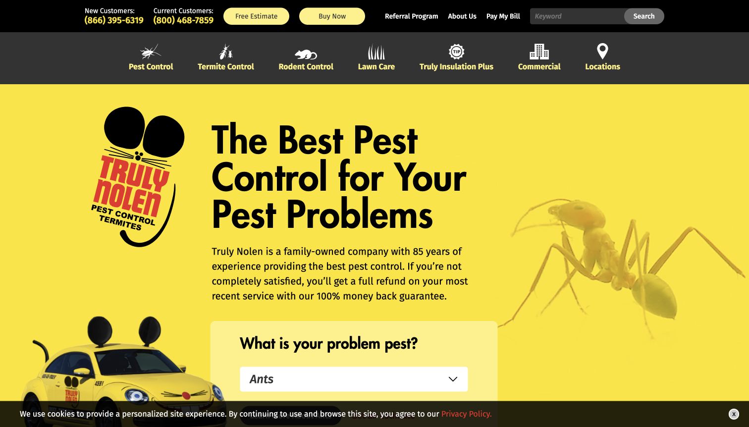
Truly Nolen makes its yellow-and-black identity impossible to miss, including the recognizable mouse-shaped service vehicle. A large pest-control headline is paired with a problem selector and illustrated pest categories, bringing a more playful tone to a task that can otherwise feel unpleasant. Separate new- and existing-customer phone routes are a particularly useful operational detail. The design demonstrates how distinctive brand assets can coexist with direct service navigation. It also has a dense upper area, where utility links, phone information, and multiple navigation rows compete with the visual character of the hero.
What you can learn
Use recognizable brand imagery to establish recall, then make the next practical task explicit. A pest selector should lead to useful information rather than decorative categories. Separate customer-support calls from new inquiries when the office actually handles those queues differently.
Pros
Illustrated pest choices create an approachable service entry point.
New and existing customer routes reflect different support needs.
Cons & considerations
The multirow header can feel crowded.
Playful branding requires clear process information to support the service decision.
Visible tech stack
Referenced on the public page
HubSpot
Google Fonts
reCAPTCHA
ASP.NETReported response header
Microsoft IISReported response header
Public source checked November 3, 2026. References may be embedded or legacy—not a complete backend inventory.
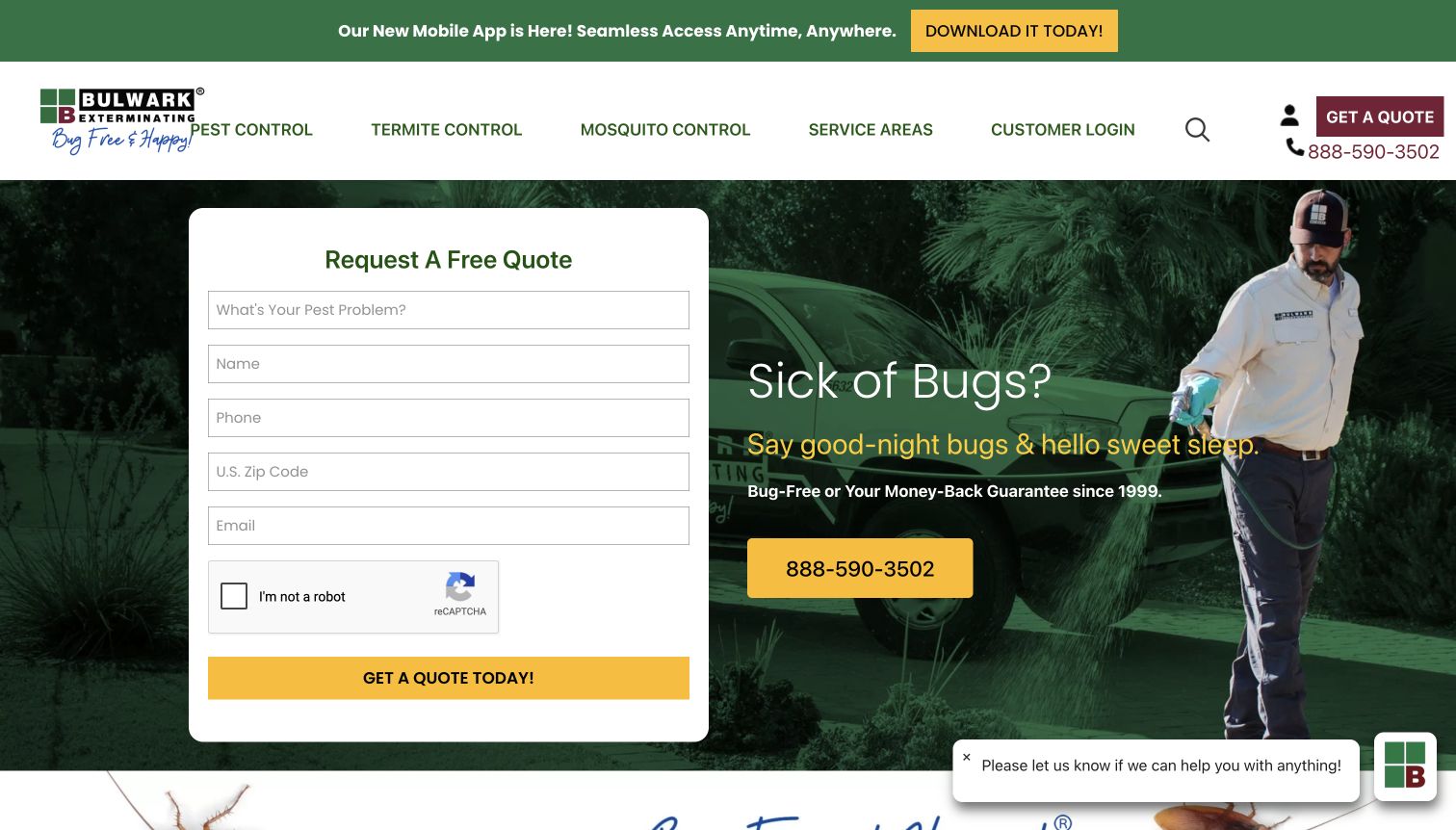
Bulwark puts a quote form beside its main headline, giving the visitor an immediate way to request help. Name, telephone, ZIP code, email, and pest information appear before any long service explanation, while a large phone number remains available as an alternative. Green and yellow styling connects the form to the technician photograph behind the introduction. This is a useful conversion pattern to examine because it makes the requested information concrete. Its weakness is equally visible: the page asks for several personal details before someone has necessarily evaluated coverage, service scope, or how the inquiry will be handled.
What you can learn
Place an early form only when each field earns its place. Explain what happens after submission and offer a phone alternative. Consider whether a location and service choice can precede contact details, especially when the visitor is still deciding whether the provider fits their situation.
Pros
The inquiry fields make the next step tangible.
A prominent telephone option offers an alternative to the form.
Cons & considerations
Several personal details are requested before much explanation.
Chat and app promotion add distractions around the primary intake area.
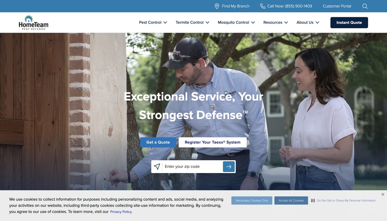
HomeTeam Pest Defense pairs a technician-and-customer photograph with a quote action and a separate route to register a Taexx system. The distinction matters: someone moving into a home with an installed system has a different task from someone seeking a new pest-control provider. A ZIP finder, branch information, and customer portal reinforce that operational structure. Below the hero, the page explains the system alongside more conventional treatment and builder-related information. The design is a useful example of acknowledging a product-specific customer journey, though unfamiliar system terminology needs a plain explanation before it can carry much persuasive weight.
What you can learn
Separate activation or registration from new-service inquiries when the business has an installed product. Introduce proprietary names with a short explanation of their purpose. Keep location and customer-support routes accessible so returning customers do not have to pass through a sales flow.
Pros
The installed-system registration task has its own action.
Location and customer-portal routes support ongoing service.
Cons & considerations
Proprietary terminology requires explanation for new visitors.
Builder, system, and conventional-service content can broaden the homepage considerably.
Plan the site around the office's real service workflow
Map the first conversation
Ask the team which details it needs to establish coverage and route a request. Start with the property area, broad problem, and preferred contact method. Explain what happens after an inquiry without promising an unstaffed response time or presenting a request as a confirmed appointment.
Create reusable service and branch records
Give each service a consistent description, relevant pest categories, limitations, and next step. Give branches accurate contact and coverage information. Connect those records rather than maintaining many nearly identical city pages whose claims drift apart.
Assign ownership for offers and claims
Record who approves guarantees, credentials, pricing language, and seasonal promotions. Set a review date for each campaign. Keep a stable service explanation available when an offer ends so the homepage does not depend on an expired discount to make sense.
The editing job behind the design
Choose tools that support service information and reliable intake
A maintainable CMS should let the team update services, branch details, pest-library articles, and offers independently. Structured fields are useful for service regions and review dates. The visual appearance of the examples does not establish their technology stack; this collection leaves unverified platform labels empty.
Connect inquiries to the workflow the office actually monitors, and provide a plain telephone alternative. If offering online purchases or account management, clearly identify the transition and explain the scope of the action. Check confirmation, error, and unavailable-service states as carefully as the default form.
Our WordPress website examples offer a separate look at publishing approaches. A visible platform label is evidence for that named page, not a guarantee that the same system will suit your requirements.
Before the public launch
Pest-control website launch checklist
Confirm every service area, branch telephone number, and customer-support route.
Have the responsible team review treatment, guarantee, credential, and pricing statements.
Distinguish inspection requests, quotes, purchases, and confirmed appointments in the labels.
Test intake using approved test data and verify the staff handoff and error messages.
Check mobile calling, form labels, keyboard navigation, and text over technician imagery.
Set owners and review dates for seasonal offers, pest articles, and branch information.
These checks are a project checklist, not a performance, legal, security, or accessibility certification. Test real journeys with the people responsible for the website before making claims about the result.
Sources & editorial method
How this collection was selected and reviewed
We reviewed 12 distinct official pest-control websites and captured their public desktop pages directly in a browser on November 3, 2026 UTC. The number was selected before research. The examples compare information hierarchy and inquiry patterns; marketing claims remain the companies' statements. Screenshots show observed page states, including some notices, and are attributed to their source websites. No customer forms were submitted.
Each example links to its actual source page. Screenshots are direct browser captures with their own capture dates; moving imagery, announcements and live designs can change. The notes describe observable design choices and conditional tradeoffs, not measured traffic, conversion results, service quality, or accessibility conformance.
Technology labels use public page metadata, asset evidence, or explicitly cited platform documentation. Platform documentation is not a complete current deployment audit. A component reference may be legacy or unused; it is not a complete backend inventory. Unknown stacks are omitted. These sites are editorial examples, not our client portfolio.
Written, Edited and Curated are separate editorial records, not timestamps advanced by a rebuild. Website designs and imagery belong to their owners. See our editorial standards or suggest a correction.
Questions worth asking
Pest Control website design questions
Should the homepage start with a quote form?
It can, when the business has a short, well-understood intake process. Explain coverage and what happens next, keep the requested details proportionate, and provide an alternative contact route for visitors who need to ask questions first.
Does every pest need its own page?
Only when the business can provide useful, accurate information about that problem and the service it offers. A smaller set of clear pages is more useful than many interchangeable articles that repeat a quote button.
How should a site handle recurring plans?
Explain what the plan includes, how visits are arranged, and where the current terms can be read. Make the difference between an inquiry and a purchase clear. Avoid letting a temporary offer substitute for the permanent plan description.
Is a branch finder necessary for a small provider?
A clear service-area statement may be sufficient for one office. Use a finder when it helps visitors reach the right team or confirm coverage, and allow manual selection when an automatic location suggestion is wrong.
Build around the service the team can actually deliver. Clear coverage, useful pest information, and an understandable contact process will outlast any seasonal offer.