Best Window Installer Websites of 2026 (27 Real-World Examples)
Replacement, restoration and architectural glazing sites worth studying
A window installation website has to connect a photograph of a better home with several practical decisions: can the company work here, does it handle this type of window, and what happens after an enquiry? These examples show different ways to make that connection.
Window shopping is not one task. An owner restoring original timber sashes needs different information from someone comparing replacement units, while an architect specifying a large glazed opening has another set of questions. A useful website names those differences before asking everyone to complete the same consultation form. It should say whether the business manufactures, supplies, fits, repairs or coordinates a combination of those services, and whether its project photographs show the kind of work the visitor needs.
This collection includes regional specialists, restoration businesses and larger installation networks. Their sites are not directly comparable as service providers: locations, products and commercial models differ. Instead, study the information design. Notice which pages explain location, which make product research possible without an enquiry, and which distinguish a new estimate from help with an existing installation. Photographs provide inspiration, not proof of workmanship or a complete account of the current technology behind a site.
Before the examples
What makes good window installer website design in 2026?
Make repair, replacement and supply-only unmistakable
A homeowner may not know whether a frame needs a repair or complete replacement. Explain the work you actually assess and perform in ordinary language, with distinct routes for restoration, new windows and trade supply where applicable. Do not imply that all three are available simply because they share a product photograph. A project page should identify what was retained, what changed and which part the company supplied or installed.
Bring the service area forward
A national product brand is not the same thing as a local installation team. Place a concise coverage statement near the opening and offer a useful location finder or service-area page. If a postcode check is required, explain its purpose and provide a clear response when an address falls outside the area. Showroom locations should include opening arrangements and appointment expectations rather than a map alone.
Help people research before they enquire
Style, opening method, material, glazing and installation scope are related but different questions. Organise the catalogue around customer choices, with readable specifications and real projects supporting the options. An estimate button is important, but so are product comparisons, warranty explanations and a clear outline of the survey process. Avoid making an email address the price of learning basic service facts.
The collection · 27 examples
27 window installer websites worth studying
Compare the opening hierarchy first, then follow the product, location and project routes. The strongest ideas here are transferable structures—not a reason to copy another installer’s claims, photographs or offer.
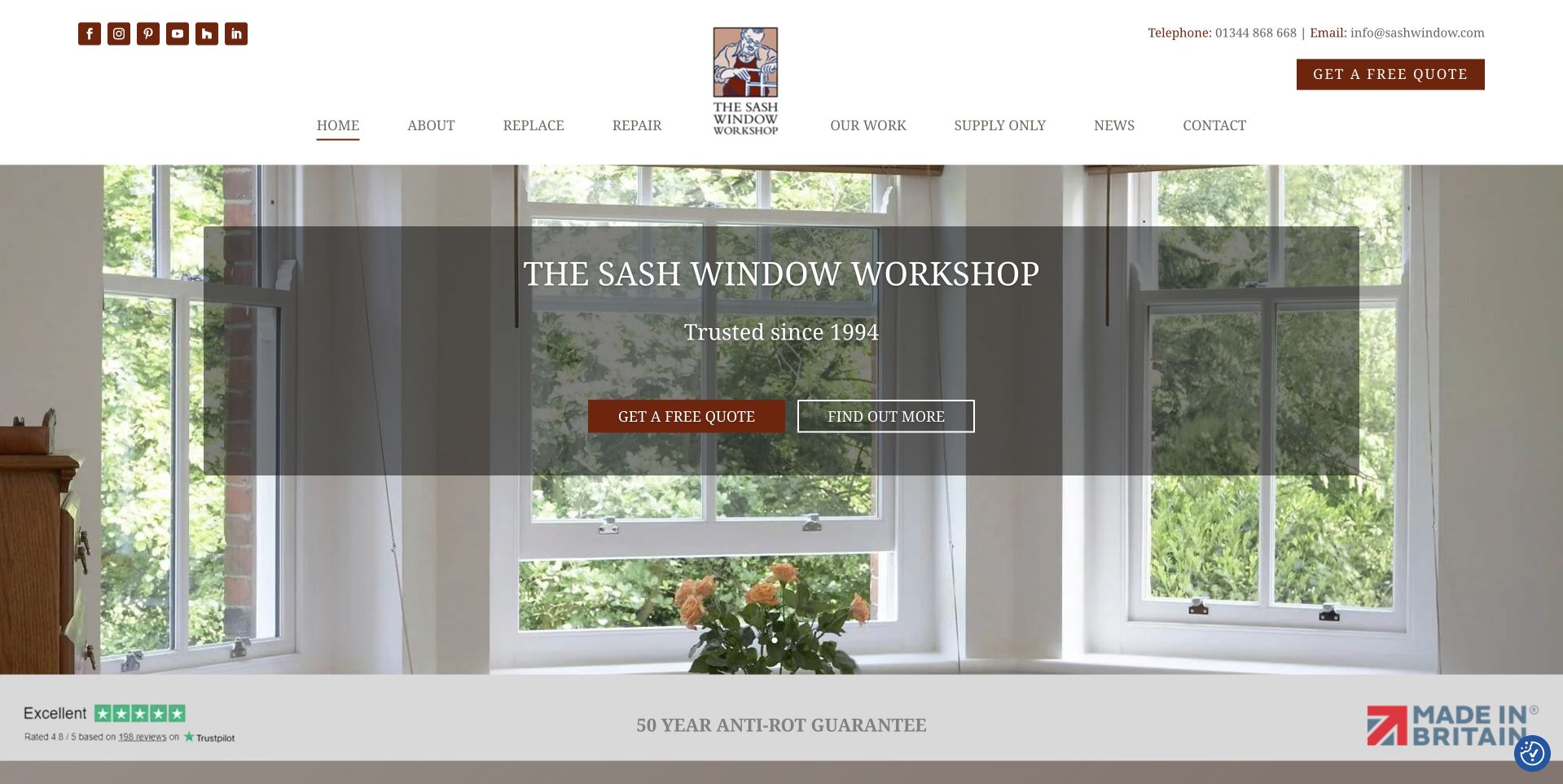
The Sash Window Workshop gives its illustrated craftsman mark and traditional serif lettering a generous white header, then lets an open timber sash window establish the product. The photograph shows the frame as part of a lived-in room rather than an isolated catalogue object. A dark translucent panel keeps the company name, history line and two actions readable. Most useful is the navigation’s distinction between replacing, repairing and buying supply-only joinery: these are different customer intentions, not merely different product styles. The presentation feels specific to a regional timber-window business without needing an elaborate interactive introduction.
What you can learn
Lead with a recognisable product context, but make the first navigation choices describe the work a visitor needs. Restoration and replacement should not be folded into one ambiguous window enquiry.
Pros
Repair, replacement and supply-only routes are visibly separate.
The workshop identity and timber-window imagery reinforce one another.
Cons & considerations
The hero repeats the company name more prominently than its service area.
Numerous small social links make the upper utility row comparatively busy.
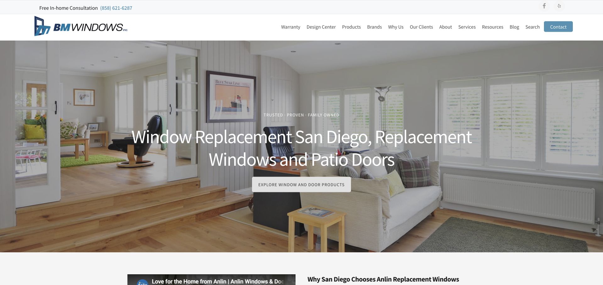
BM Windows uses a bright interior photograph to make replacement windows feel connected to the comfort of a home. Its large white headline names both San Diego and the actual product categories, which is more useful than a location-free slogan. The blue logo and restrained contact button maintain a quiet visual identity while the header exposes warranties, the design centre, brands and service information. A product-exploration action sits in the hero; the consultation invitation is available in the utility strip above it. The result supports someone still comparing windows, not only a visitor ready to give contact details.
What you can learn
Name the service and locality in ordinary language, then offer useful research routes alongside the sales action. A homeowner comparing brands or warranty scope should not need to complete a lead form first.
Pros
The headline identifies the location and replacement-window focus immediately.
Warranty and design resources have explicit navigation labels.
Cons & considerations
The long horizontal navigation asks visitors to scan many equal-weight choices.
The hero’s product action is more prominent than the consultation route.
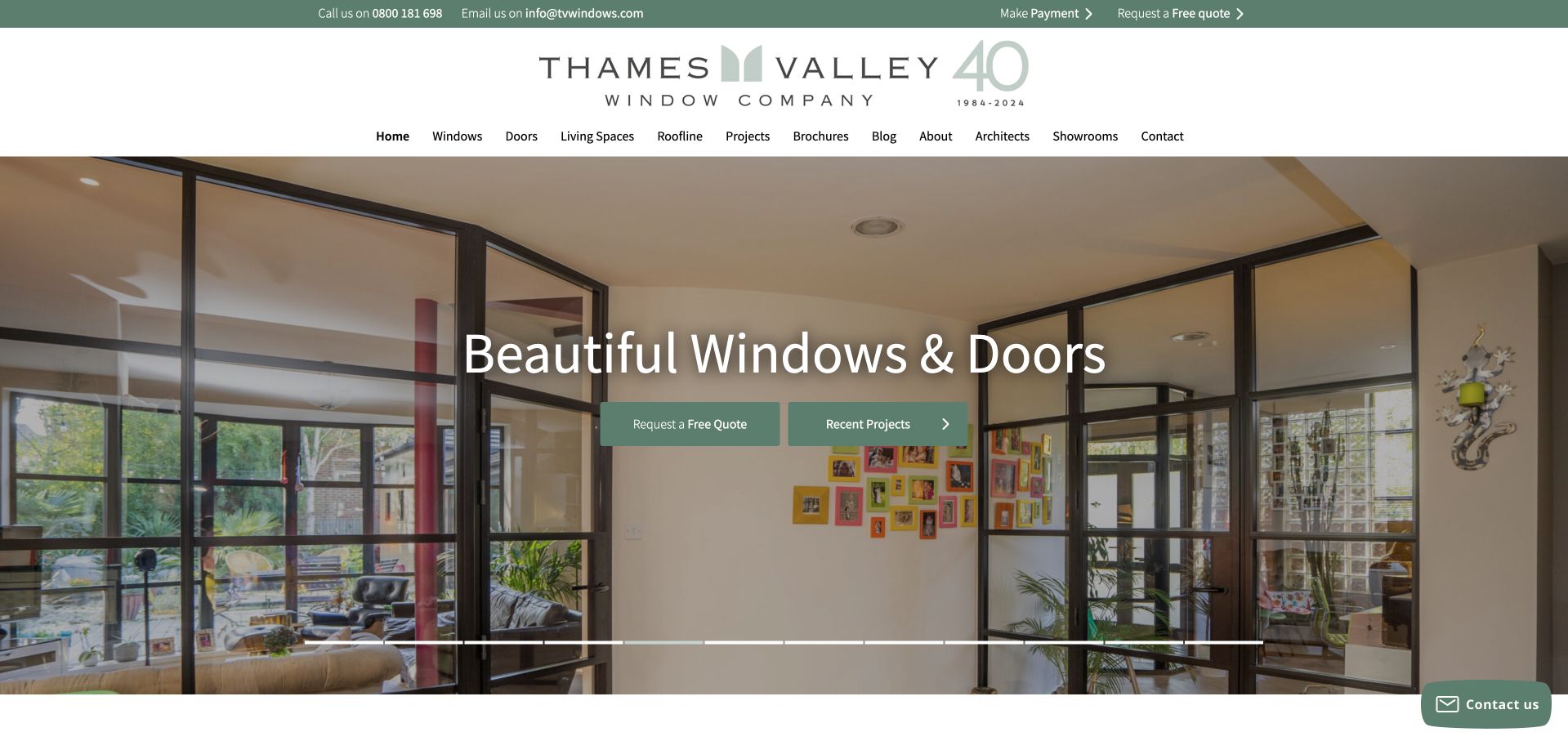
Thames Valley Window Company gives a large glazed opening almost the entire first screen, framing a room and garden as one architectural composition. Soft green buttons and an expansive logo create a calmer impression than the offer-heavy layouts elsewhere in this collection. The hero pairs a quote request with recent projects, allowing both an immediate enquiry and a less committed investigation. The navigation also distinguishes living spaces, roofline work, architect information and showrooms. This breadth is useful, although the general “Beautiful Windows & Doors” headline leaves geography and practical service distinctions to surrounding content.
What you can learn
Use a project image to explain the effect of glazing, then provide a route to the evidence behind it. A project library can help a cautious homeowner progress without making an immediate appointment.
Pros
Recent projects and a quote request are equally clear initial options.
Architect and showroom information has its own route.
Cons & considerations
The opening headline says little about the specific installation service.
The large slideshow occupies space that could introduce the project’s context.
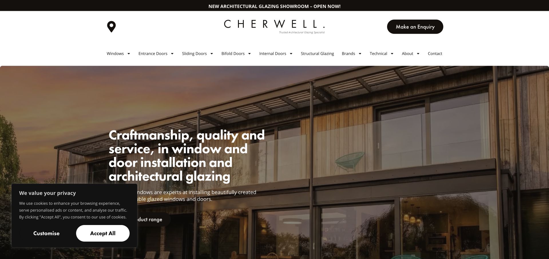
Cherwell’s homepage uses a broad architectural photograph and compact black-and-white identity to position glazing as part of a building design. The headline explicitly mentions window and door installation and architectural glazing, so the image is supported by a recognisable service description. Product navigation is detailed: windows, entrance doors, sliding doors, bifolds and structural glazing are not treated as interchangeable. A showroom announcement and enquiry button provide practical destinations above the hero. In the captured state, a sizeable cookie panel covers part of the lower-left introduction, illustrating how consent interfaces can compete with otherwise carefully composed promotional content.
What you can learn
For a specialist product range, balance the architectural image with precise category names. Keep showroom and enquiry routes easy to find, and test the opening with the actual privacy panel visible.
Pros
The headline identifies both installation and specialist glazing work.
Distinct product categories help visitors recognise their type of project.
Cons & considerations
The cookie panel obscures part of the captured hero copy and action.
A wide product menu demands careful adaptation for smaller screens.
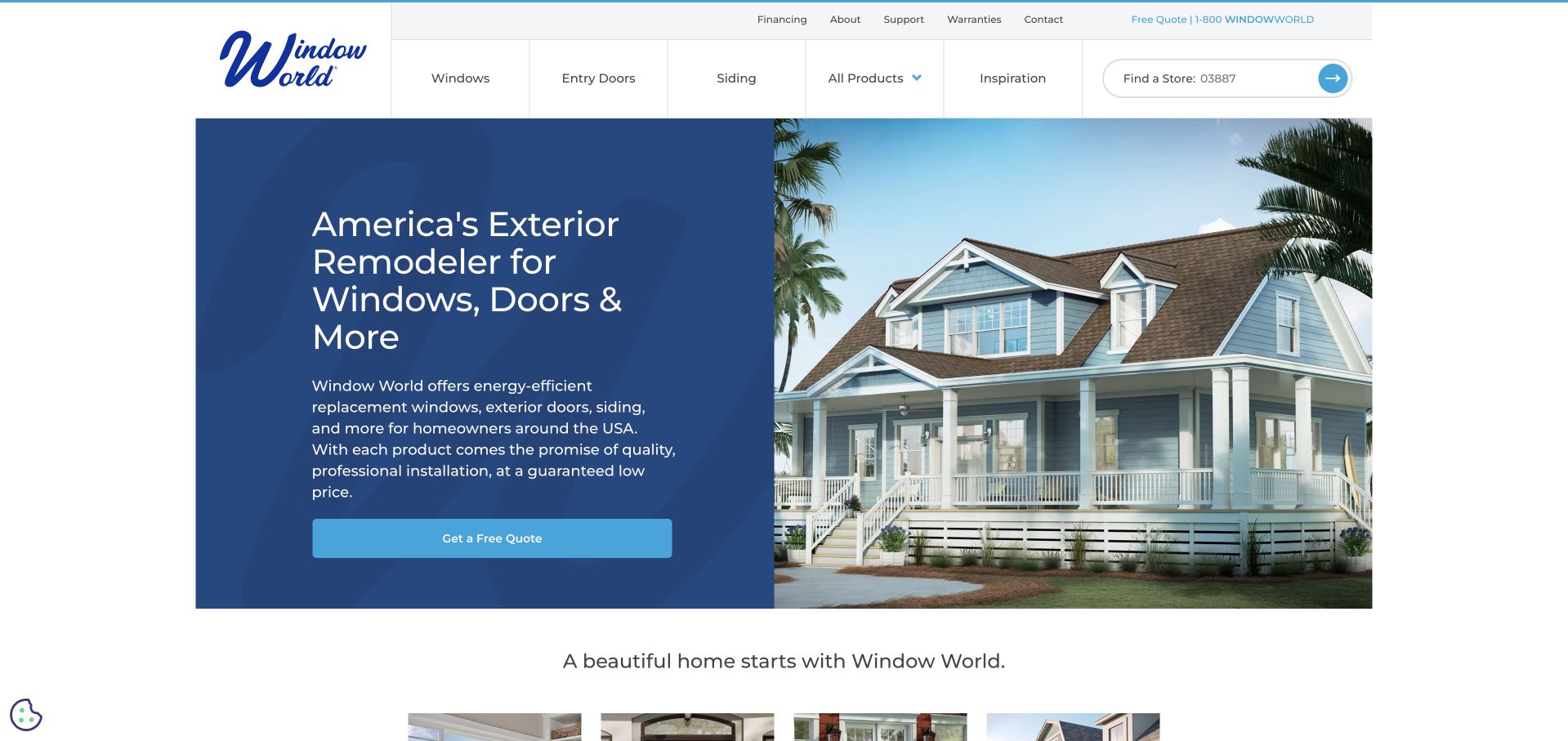
Window World splits the hero into a dark blue information panel and a photograph of a complete house. The text names windows, doors, siding and the broader exterior-remodelling offer instead of making the image carry that explanation alone. A full-width quote button is easy to distinguish from product navigation, while a store finder sits directly in the header. This creates a useful separation between researching the catalogue and locating a local provider. The surrounding layout is relatively conventional, but the stable text surface is more predictable than placing several paragraphs over a changing photograph.
What you can learn
When an exterior company offers several services, give the introduction its own readable surface. Treat location finding as a separate task from starting an estimate, especially when the national site hands work to local offices.
Pros
The split composition keeps the main service explanation consistently readable.
The header makes finding a local store an explicit task.
Cons & considerations
Several product links compete with the broader all-products destination.
General national copy needs local detail before a visitor can assess practical fit.
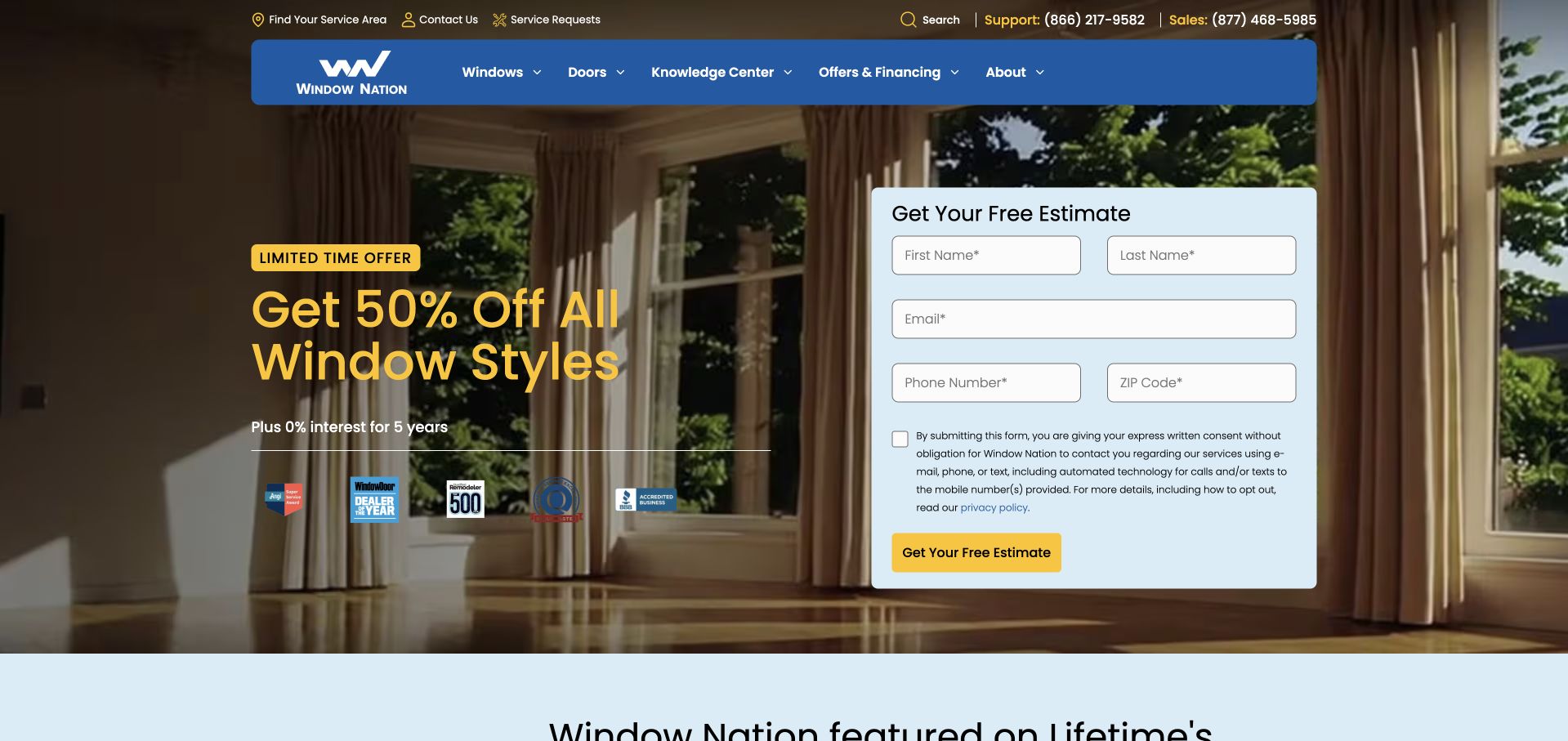
Window Nation places a pale blue estimate form on the right side of its full-width interior photograph. Yellow offer text, matching action buttons and a saturated blue menu make the conversion route highly visible. The form exposes its requested information rather than hiding the amount of effort behind a generic button; its contact-consent explanation is also visible before submission. The hierarchy is decisive but sales-led. Product research, service-area checks and existing-customer support live in the navigation and utility bar, while the introductory screen asks a new visitor to assess a substantial promotion and a form at once.
What you can learn
Showing the first form step can clarify what an enquiry involves, but it should not replace product and location information. Make contact permissions readable and give research-stage visitors an obvious alternative route.
Pros
The form’s fields and contact-consent explanation are visible before submission.
Sales and support telephone numbers are distinguished in the utility row.
Cons & considerations
The promotion dominates information about window styles or project suitability.
A large first-screen form can feel premature for comparison-stage visitors.
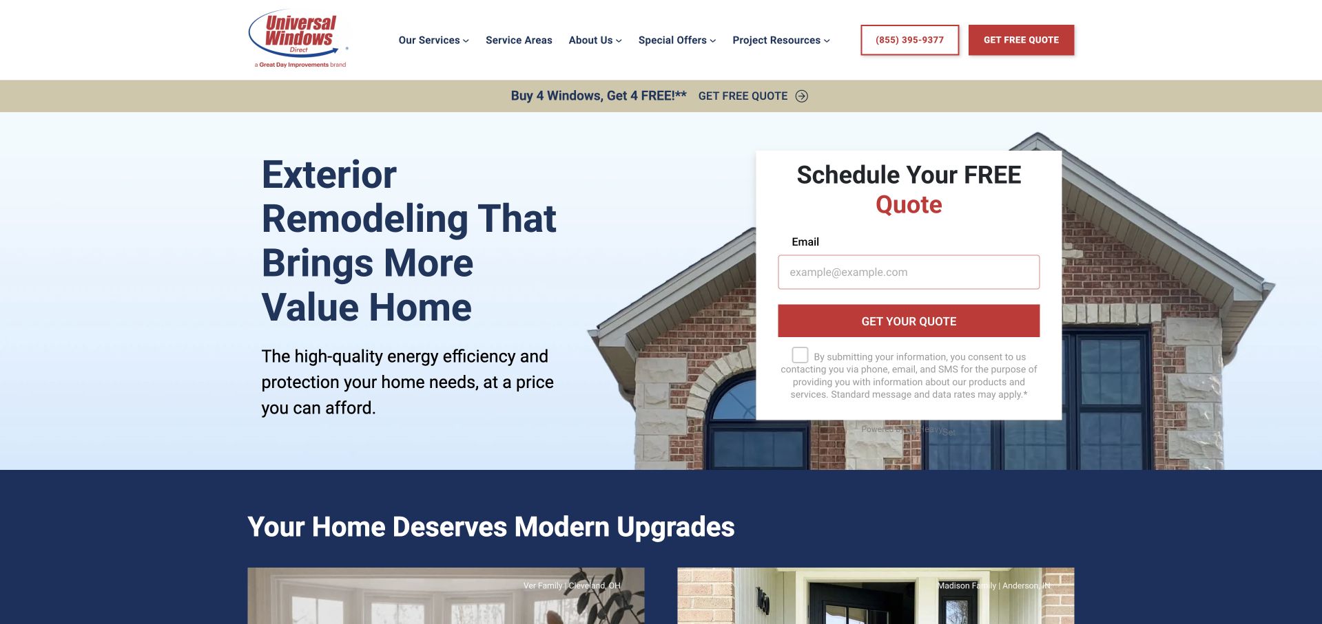
Universal Windows Direct uses a pale blue introduction, a cropped house photograph and a small white quotation card. The form initially asks for an email address, making the first step look lighter than a full consultation questionnaire. A red action button connects that card visually to the header’s quote control, while darker blue content below introduces the wider upgrade range. The primary navigation keeps service areas and project resources alongside services, so the site is not entirely dependent on the form. The practical tradeoff is expectation-setting: visitors need to understand what the apparently short first step will lead to.
What you can learn
A small initial form should explain the next stage, not merely reduce the apparent effort. Preserve service-area and project-information routes so people can establish fit before exchanging personal details.
Pros
The initial form is visually distinct from the surrounding photograph.
Project resources and service areas have visible top-level destinations.
Cons & considerations
The email-first card does not itself show the complete consultation journey.
Several promotional quotation controls repeat within the same opening view.
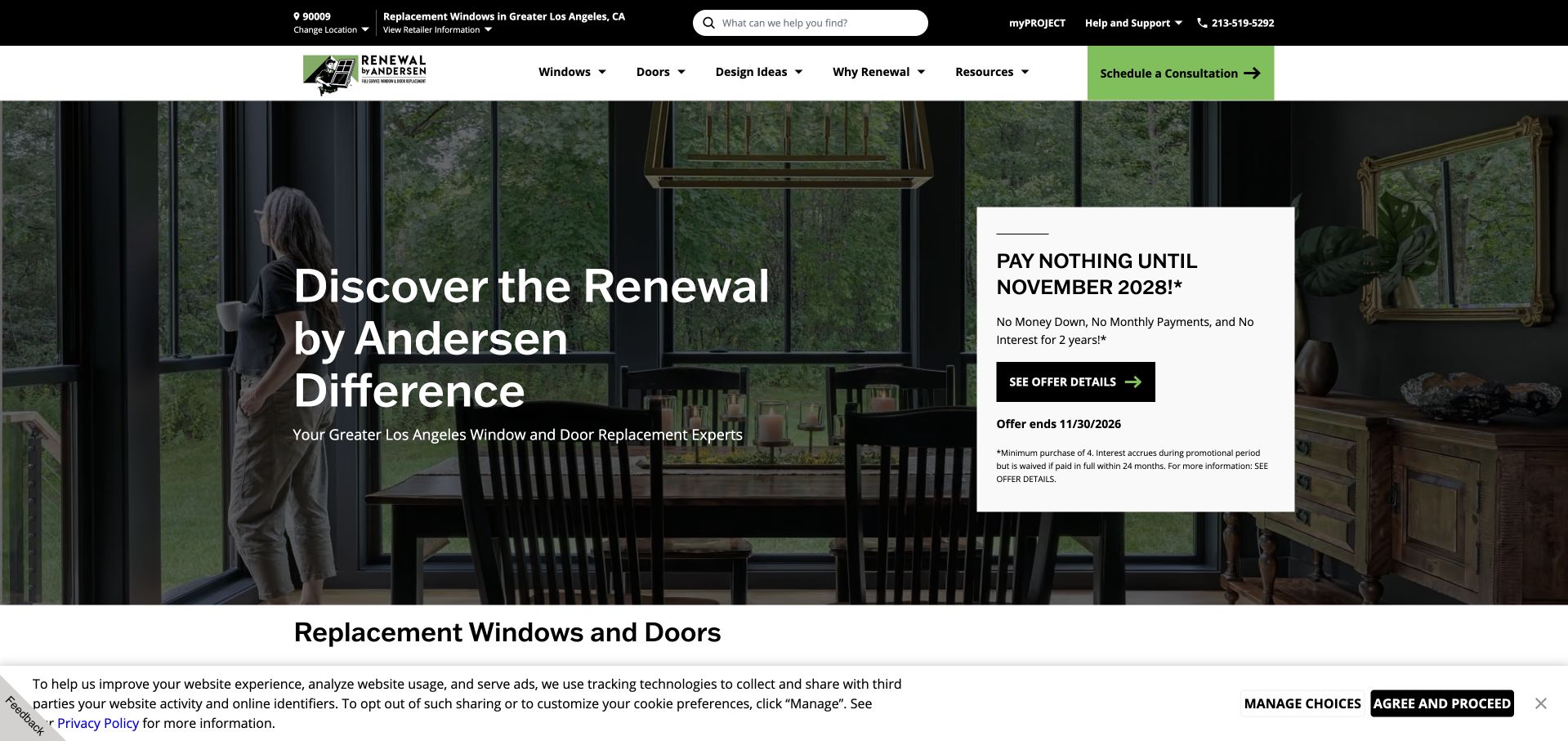
Renewal by Andersen puts the selected service region in a dark utility strip and repeats that context beneath the hero headline. Product navigation, design ideas and the consultation button sit on a separate white header, creating a useful hierarchy between local context and product discovery. An existing-customer portal is also distinguished from new-business enquiries. The captured hero combines an aspirational interior with a separate promotional panel, rather than putting every message into the main headline. This is a useful reference for a networked business, although a visitor still needs to check that an automatically selected region is correct.
What you can learn
Carry a chosen location through a multi-location service journey and keep the correction control visible. Existing project access should remain distinct from a new consultation so returning customers do not enter a sales funnel accidentally.
Pros
The selected service region is visible before the main navigation.
The project portal has a different role from the consultation action.
Cons & considerations
Automatic location selection may need correction by the visitor.
The promotional panel and hero message divide attention within the photograph.
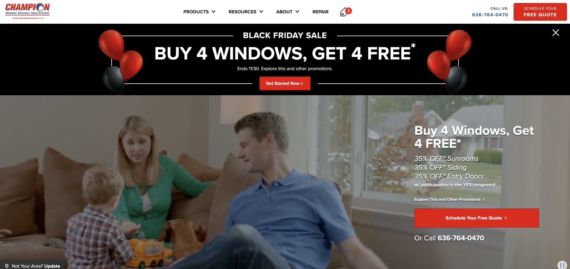
Champion’s homepage gives its current promotion a separate black banner and repeats the campaign beside the main domestic photograph. Red actions connect the offer, quote scheduling and header, producing a strong visual path for a visitor who already wants an estimate. Product navigation includes windows, sunrooms, siding and doors, with resources and company information separated above the hero. The campaign presentation is memorable but occupies a large share of the introduction. A smaller installer can learn from the consistent action treatment without copying the amount of promotional repetition or assuming that a discount should be the primary explanation of the service.
What you can learn
Treat an offer as a maintained campaign component with a clear expiry and conditions. Do not let repeating the campaign push product scope, service area or ordinary research routes out of the opening hierarchy.
Pros
The quotation controls use a consistent, recognisable red treatment.
The navigation exposes the broader exterior product range.
Cons & considerations
The same promotion appears in several places within the first screen.
Campaign terms introduce reading work before the core service is explained.
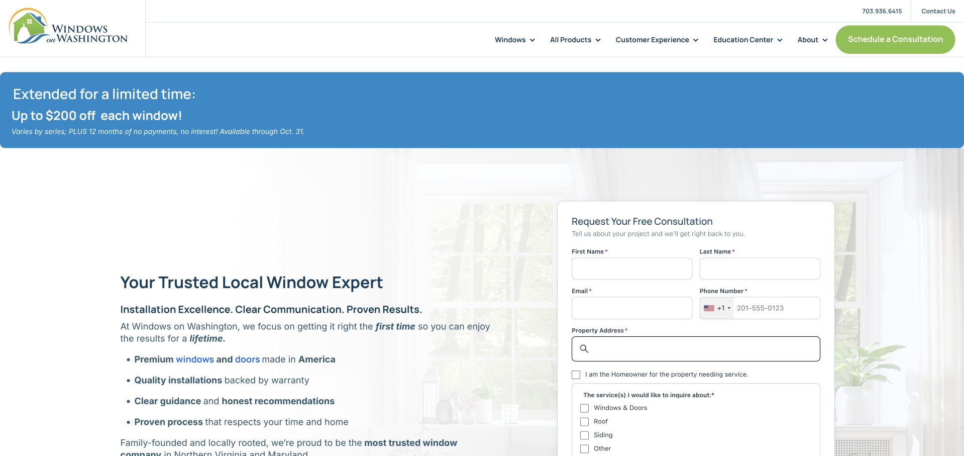
Windows on Washington combines a restrained house illustration, green consultation controls and a pale background that keeps the service copy separate from the form. Its opening text describes installation, communication and project handling rather than relying only on a product photograph. The form is substantial, requesting contact and property information together with the relevant service category. Navigation separates windows, the wider product range, customer experience and an education centre. A promotional strip remains prominent above this otherwise measured introduction, creating some tension between the calm service explanation and the immediate incentive.
What you can learn
Explain the working relationship in concrete terms before asking for detailed project information. Keep educational content close to service choices, and make sure a promotional strip does not become the clearest statement of the business.
Pros
Customer-experience and educational information have explicit navigation routes.
The enquiry form asks which service the visitor actually needs.
Cons & considerations
The long consultation form demands commitment early in the journey.
The large promotion strip competes with the quieter service-led introduction.
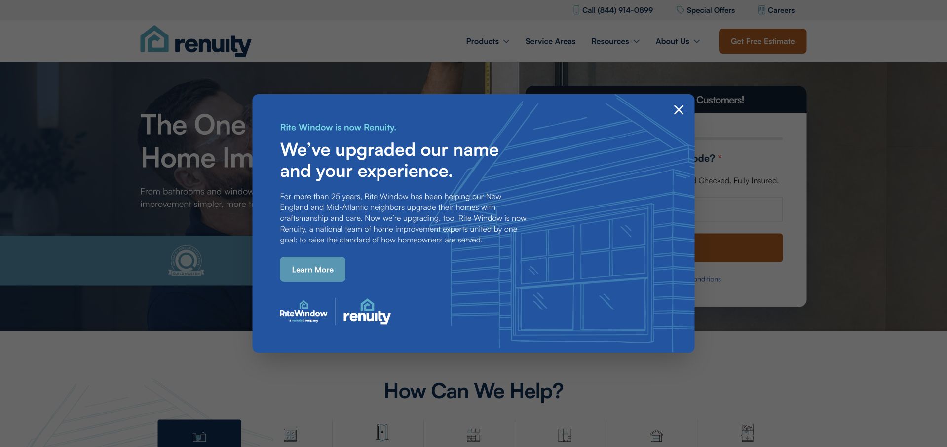
The former Rite Window homepage now redirects to Renuity, and the captured page explains that transition in an illustrated blue modal. The message pairs the old and new marks, so someone arriving through an older bookmark is not left to wonder whether the link was wrong. Behind it, the page has a broad home-improvement introduction and estimate form. This is a particularly useful transition pattern rather than a clean product-comparison example: the reassurance is relevant, but the overlay temporarily obscures much of the underlying service information. The review therefore concerns the current Renuity presentation, not an archived Rite Window design.
What you can learn
When a brand or domain changes, explain the relationship at the point of arrival. Reassure existing customers without making a large overlay the only way to understand the new company and its contact routes.
Pros
The old and new identities are presented together in the transition message.
The copy explains why a visitor has arrived at a differently named business.
Cons & considerations
The modal covers much of the underlying service and enquiry content.
A redirected old-brand visit needs additional context beyond a generic national homepage.
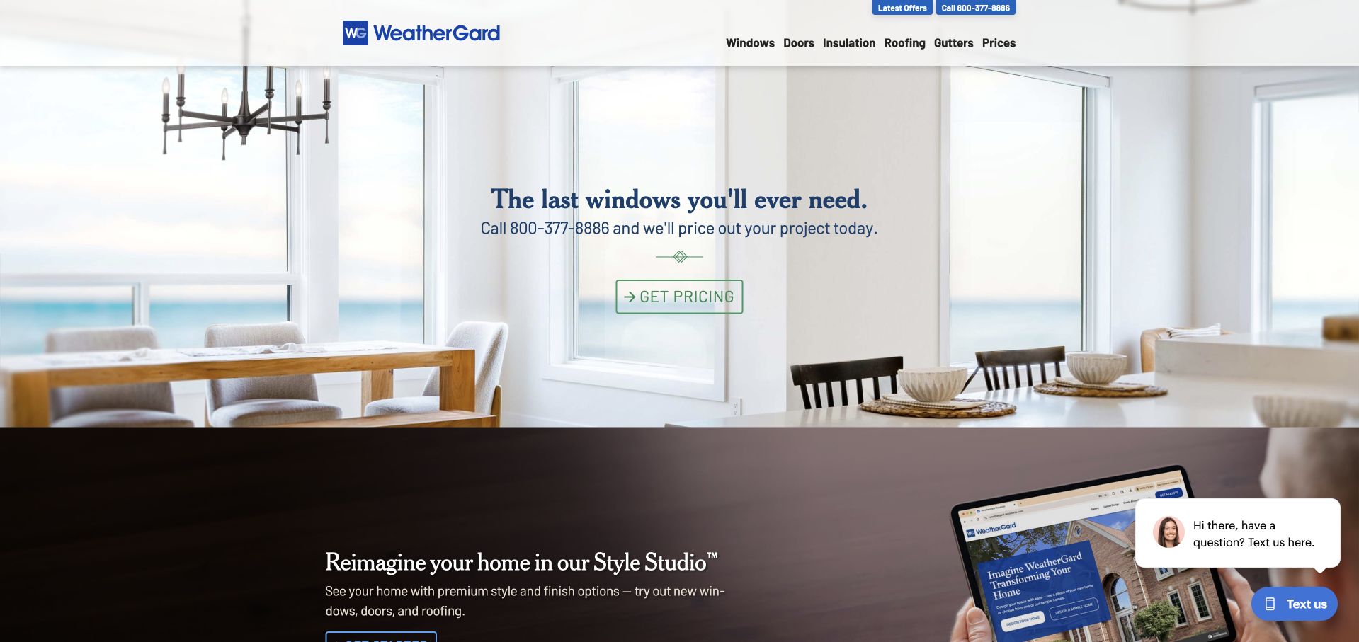
WeatherGard uses a bright dining-room image, a compact serif headline and a small outlined pricing action. The restrained opening gives the actual windows and room more visual space than the form-heavy examples in this collection. A narrow header makes product categories easy to see, while the beginning of a Style Studio section introduces a second way to explore possible changes. The presentation is approachable, although its broad “last windows” message needs more factual product context further down the page. A floating chat prompt and other service controls also need to be considered alongside the otherwise sparse design.
What you can learn
A pricing invitation does not need to dominate the whole hero. Pair it with an honest exploration tool or product explanation, and test floating assistance controls against the available space on a phone.
Pros
The uncluttered composition gives the product photograph room to communicate.
The Style Studio offers an alternative to immediate personal contact.
Cons & considerations
The short opening message does not explain the differences between window products.
Floating chat elements can interrupt an otherwise restrained first impression.
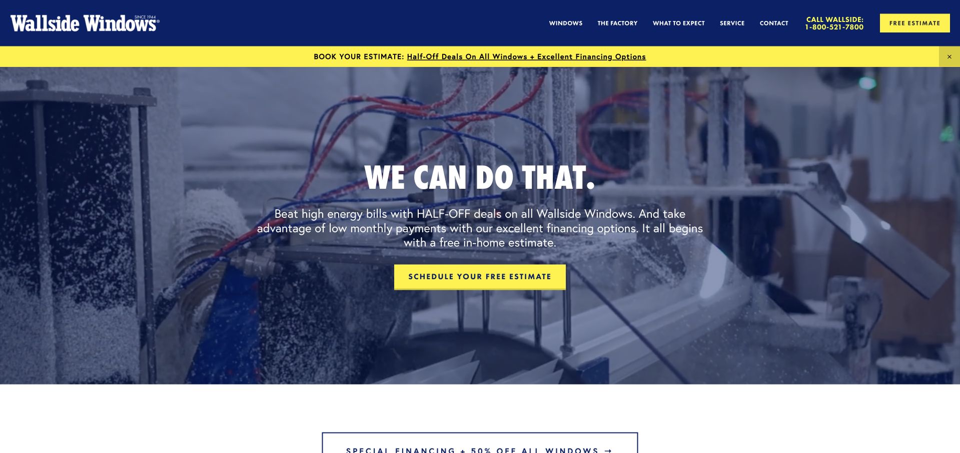
Wallside Windows places factory footage behind a short central headline and a bright yellow estimate button. The blue-and-yellow identity is easy to recognise, and the navigation distinguishes window products, the factory, customer expectations and service. Showing production is a useful departure from the polished-room images used by many installers: it gives the visitor another way to understand the business. The captured screen is still strongly offer-led, with a promotion strip above the moving image and campaign language inside it. The specific production details therefore depend on the separate factory and expectation-setting pages.
What you can learn
Use process imagery to introduce a real operational difference, then connect it to factual supporting content. Keep the product, installation and aftercare story available even when a promotional campaign is prominent.
Pros
Factory imagery gives the business a different visual subject from a showroom room.
The navigation distinguishes installation expectations from later service needs.
Cons & considerations
Promotional language appears both above and inside the hero.
Moving production footage needs an equally useful still-image and text alternative.
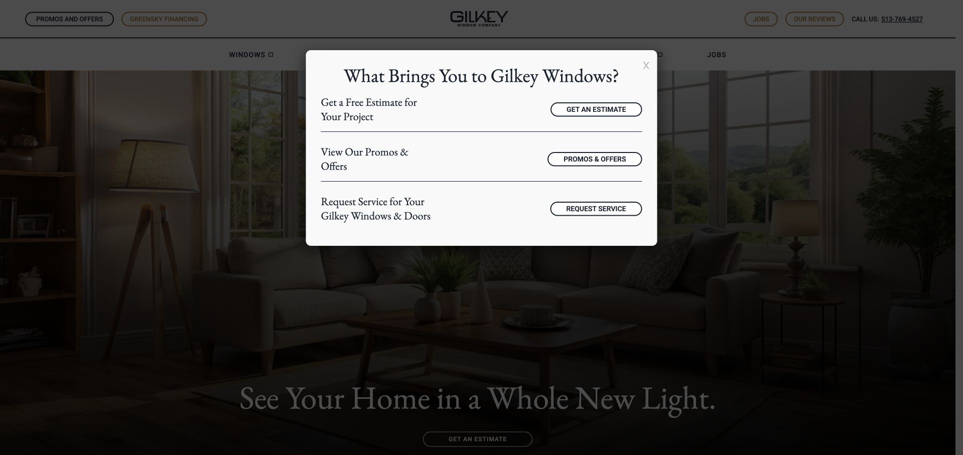
Gilkey opens with a centred panel asking what brings the visitor to the site. It offers three distinct routes: a project estimate, current promotions and service for existing windows or doors. This is a meaningful distinction for an installer whose website serves both prospects and previous customers. The underlying page uses a warm interior photograph and quiet serif typography, but the initial overlay makes the decision panel the dominant experience. The approach is worth studying as audience routing rather than simply as an attractive hero. Its success depends on allowing visitors to dismiss it and browse normally when none of the three choices fits.
What you can learn
Separate existing-customer help from new-project sales early, but keep intent selection optional. A well-labelled choice can save effort; an unavoidable modal can add a step without making the underlying navigation clearer.
Pros
Existing-customer service is not mixed into a new estimate journey.
The three choices use plain descriptions of what the visitor wants to do.
Cons & considerations
The initial panel obscures much of the photograph and underlying introduction.
A visitor seeking product details must dismiss or work around the selector.
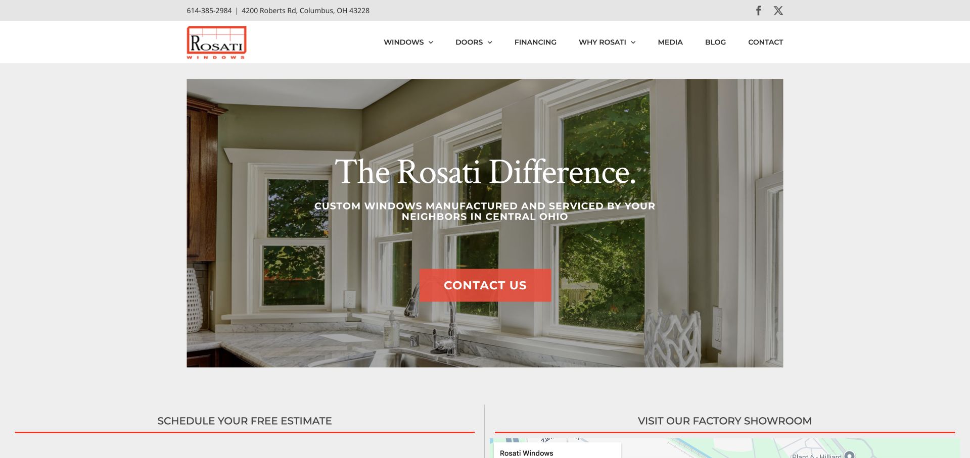
Rosati keeps its main image within a generous white frame rather than stretching it to the edges of the screen. A traditional serif headline and compact red contact button give the bright bay-window photograph a more editorial feel. The supporting line names custom manufacturing and local service, while the navigation keeps financing, company information and product categories available. Immediately below the hero, separate estimate and factory-showroom sections begin to turn that positioning into practical actions. The general “difference” headline still relies on the smaller copy for meaning, but the overall composition is calmer than a first-screen offer wall.
What you can learn
A framed hero can make a familiar product photograph feel deliberate without requiring animation. Support the brand statement with a concrete explanation of local work and clear routes to an estimate or showroom.
Pros
The contained photograph leaves the navigation and surrounding content easy to distinguish.
Estimate and factory-showroom routes have separate roles below the opening.
Cons & considerations
The main headline is broad until the smaller supporting line is read.
The low-contrast utility row is less prominent than the principal navigation.
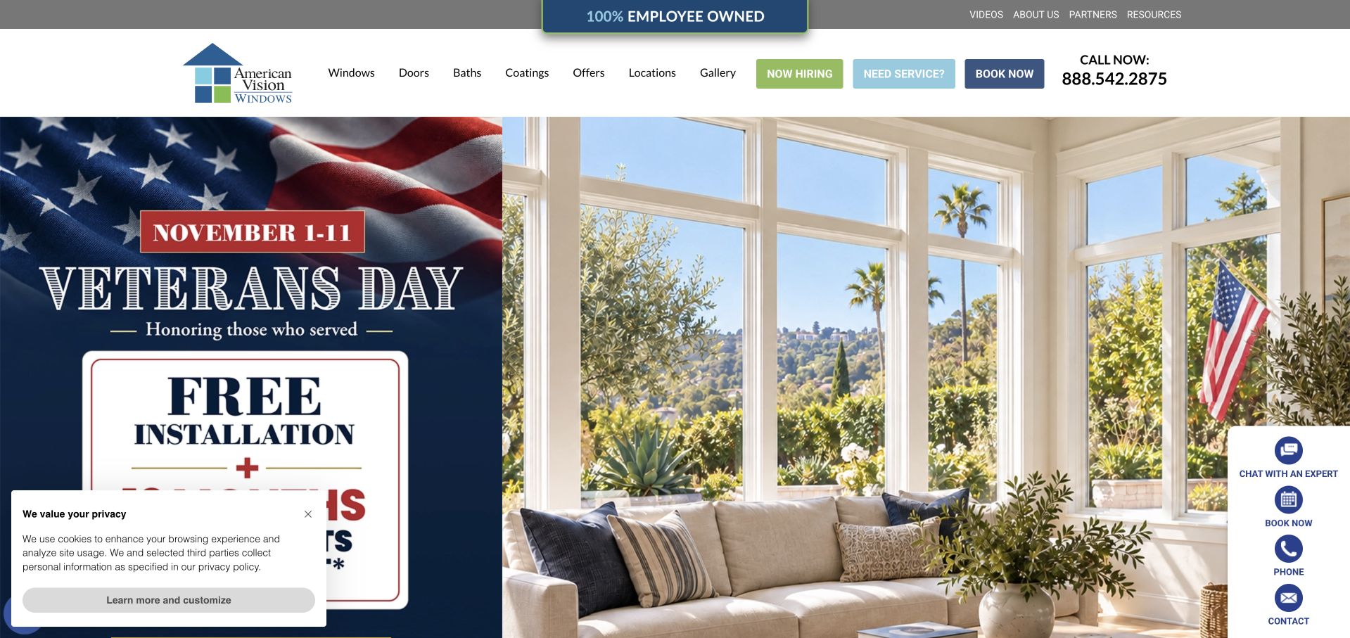
American Vision Windows divides its opening between a seasonal campaign panel and a bright interior photograph, making the offer and the resulting living space separate visual subjects. The navigation names windows, doors, baths and coatings, while locations, a gallery and existing-customer service remain accessible in the same header. The employee-ownership badge adds another layer of positioning above those practical choices. This is a dense introduction rather than a minimalist one: campaign graphics, several action buttons, chat controls and a privacy notice all share the opening. Its strongest lesson is therefore the need to manage competing commercial and service priorities deliberately.
What you can learn
A campaign should have a clear owner, date range and removal plan. Keep existing-customer help and the ordinary product catalogue usable when several promotional or assistance elements are active at once.
Pros
The campaign and the finished-room photograph occupy distinct parts of the composition.
Existing-customer service and location information are explicitly labelled.
Cons & considerations
The header gives many utility and sales controls similar visual weight.
Floating assistance and privacy controls reduce the uncluttered viewing area.
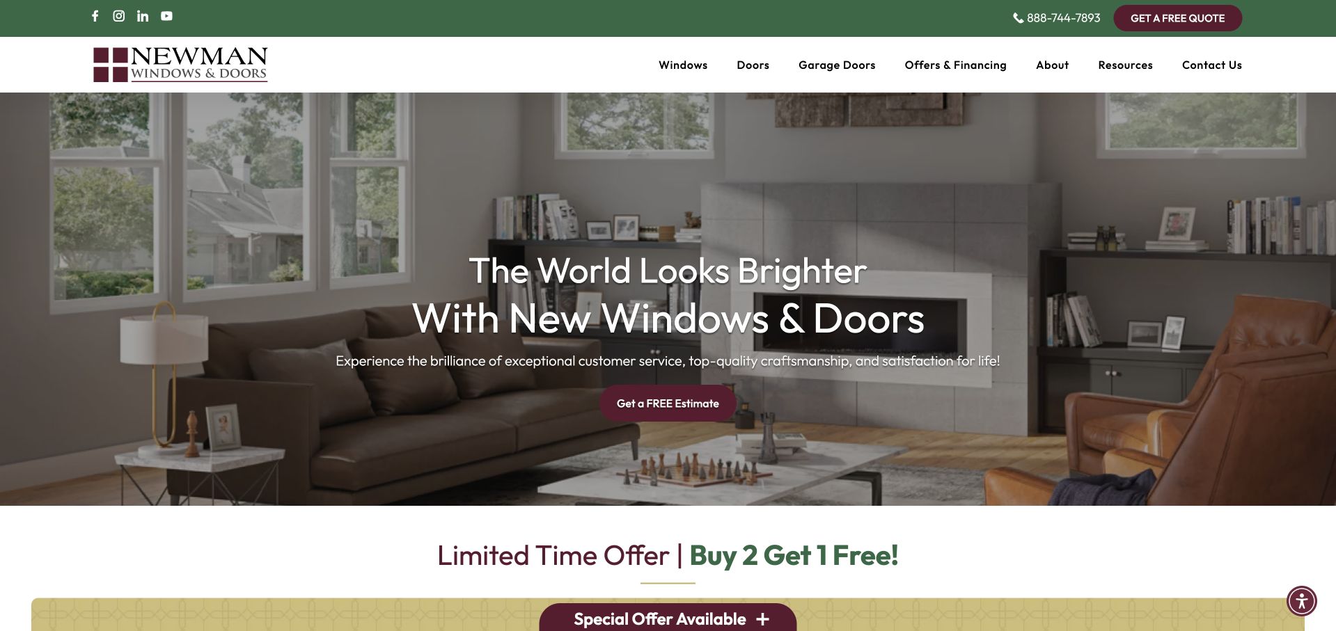
Newman Windows and Doors uses green utility framing, a white product menu and small burgundy actions around a large interior photograph. The hero’s furniture and planted views show the windows as part of a recognisable home, while the main estimate control remains modest in scale. The navigation includes both windows and garage doors, along with offers, resources and contact information, making the broader range visible without a large first-screen questionnaire. A promotional band begins beneath the photograph. The attractive opening is easy to recognise, although the broad “world looks brighter” headline depends on supporting copy and navigation to establish the practical service.
What you can learn
A restrained action can still be clear when its colour is consistent. Pair lifestyle language with an explicit service range, and keep a campaign band from becoming the only concrete reason to continue.
Pros
The estimate button has a consistent colour distinct from ordinary navigation.
Product categories and useful resources remain visible above the photograph.
Cons & considerations
The main headline says little about service coverage or installation process.
The offer band adds a second message immediately after the broad hero statement.
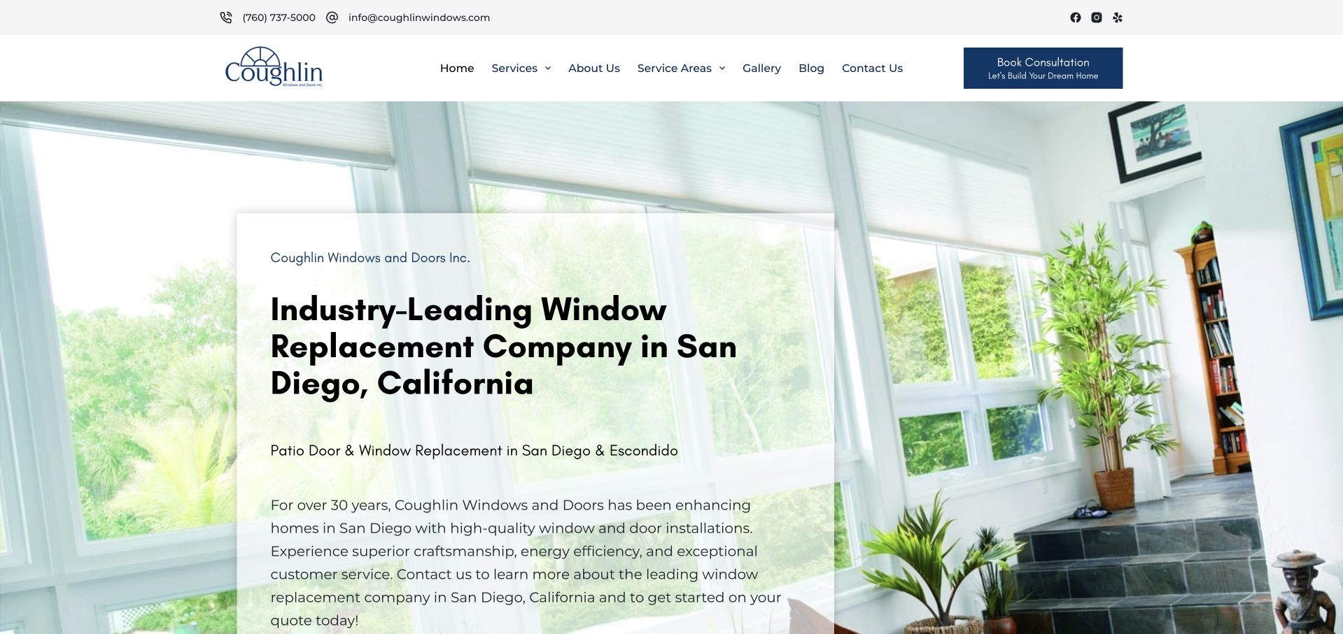
Coughlin places its San Diego replacement-window explanation on a pale panel over a bright room photograph. The card gives ordinary service and location information enough contrast to be read independently of the image. A dark blue consultation control sits in the white navigation above it, while service areas, a gallery and company information provide supporting routes. Compared with a one-line aspirational hero, this version makes a more substantial case in the introduction. The tradeoff is density: several paragraphs and location references ask for sustained reading before the visitor reaches the rest of the page.
What you can learn
A translucent information card can preserve the room image while making service copy readable. Edit the opening around one clear explanation, then move supporting detail into a useful next section rather than repeating local keywords.
Pros
The service and geographic focus are explicit in the opening text.
The light text panel remains distinct from the underlying window photograph.
Cons & considerations
The first-screen explanation is relatively long for a quick comparison visit.
Several different location references need a simple service-area summary.
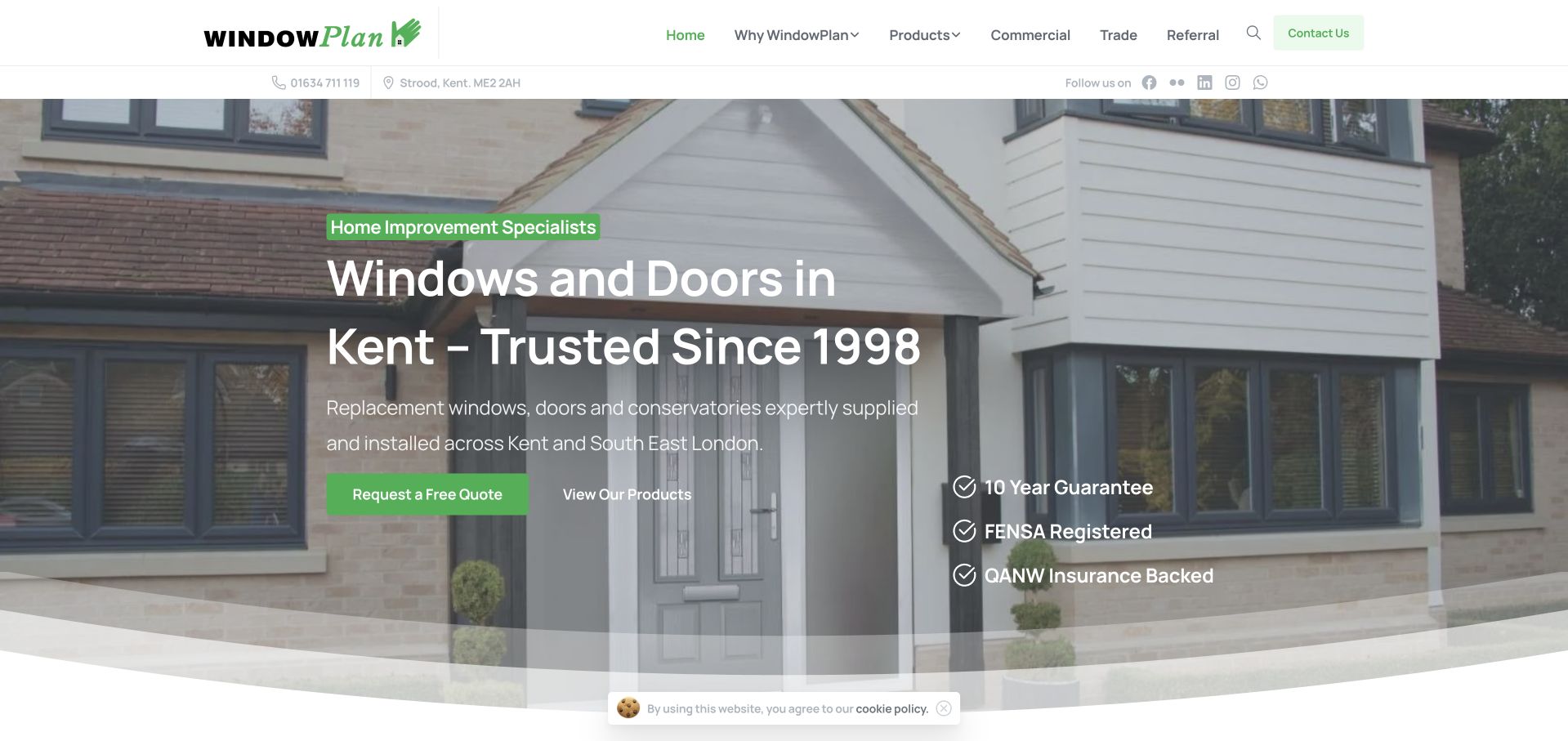
WindowPlan places a location-specific headline over a photograph of a complete house, rather than presenting the window as an isolated technical component. Green labels and buttons echo the small leaf detail in the wordmark, giving the page a consistent but light brand treatment. A quotation request and product-browsing route appear side by side, with a compact assurance list offset to the right. The top-level menu also separates commercial and trade audiences from the homeowner introduction. This provides useful structure for a smaller business, although the pale lettering and several overlaid elements depend on the chosen photograph remaining sufficiently quiet.
What you can learn
State the locality and the customer type before introducing technical product categories. If domestic, commercial and trade work share one site, give those audiences distinct destinations instead of one universal enquiry path.
Pros
The headline names Kent and the actual windows-and-doors service.
Commercial and trade audiences have visible navigation routes.
Cons & considerations
Text contrast varies across the light parts of the house photograph.
Several assurance statements and actions share the same hero image.
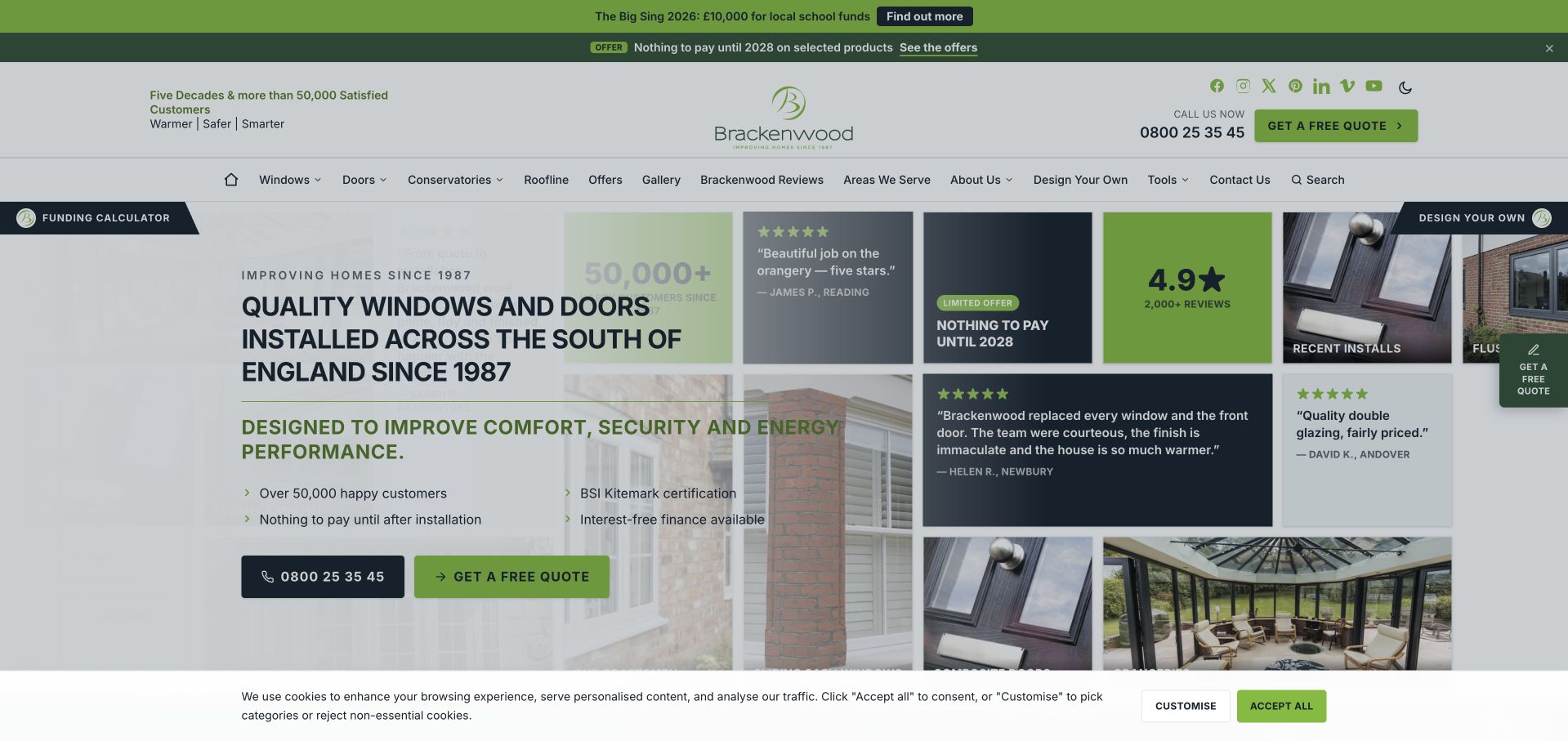
Brackenwood uses a compact collage rather than a single uninterrupted hero image. Project photographs, customer quotations, a rating panel and a finance-related tile sit alongside a direct explanation of installed windows and doors in southern England. Lime green and dark blue create a recognisable rhythm across the blocks and the header’s quotation action. The design can communicate several types of reassurance quickly, but it is also busy: event and offer strips, dense navigation, floating controls and a cookie panel all add to the opening. The example is most useful for studying how modular evidence can be organised without letting every module demand equal attention.
What you can learn
A collage works best when each tile answers a different customer question. Give project evidence, reviews and offers clear roles, and reduce peripheral controls before adding still more information to the same first screen.
Pros
The collage combines actual project imagery with separately identifiable evidence types.
The service explanation includes the installation role and broad region.
Cons & considerations
Multiple promotional strips compete with the main evidence grid.
The privacy overlay and floating controls make the captured opening visually dense.
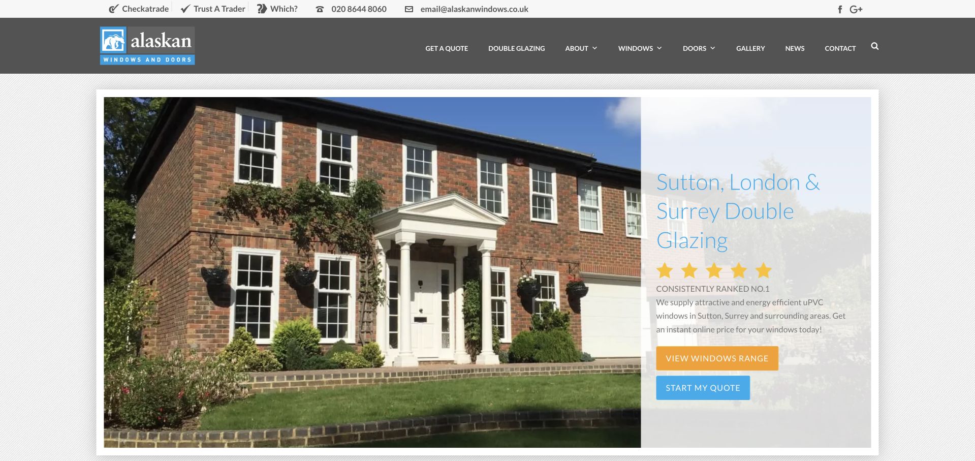
Alaskan Windows uses a contained exterior photograph with a pale information panel on its right edge. The headline names Sutton, London and Surrey, while the warm yellow product button and blue quotation button distinguish two useful next steps. Third-party review and trade-directory links sit in a utility row rather than being mixed into the main product navigation. The composition gives the house itself a prominent role and remains recognisably regional. Some of the light blue hero lettering is comparatively delicate against the pale background, illustrating why a calm visual identity still needs careful contrast and text-size decisions.
What you can learn
Differentiate browsing a range from starting an enquiry, and make the locality explicit. Test pale brand colours on the actual background image rather than assuming that a spacious layout automatically produces readable text.
Pros
The opening names a specific service region rather than a generic national claim.
Product browsing and quotation use different, recognisable button treatments.
Cons & considerations
The pale hero lettering is less prominent than the action buttons.
The photograph explains the house type more clearly than the window-product differences.
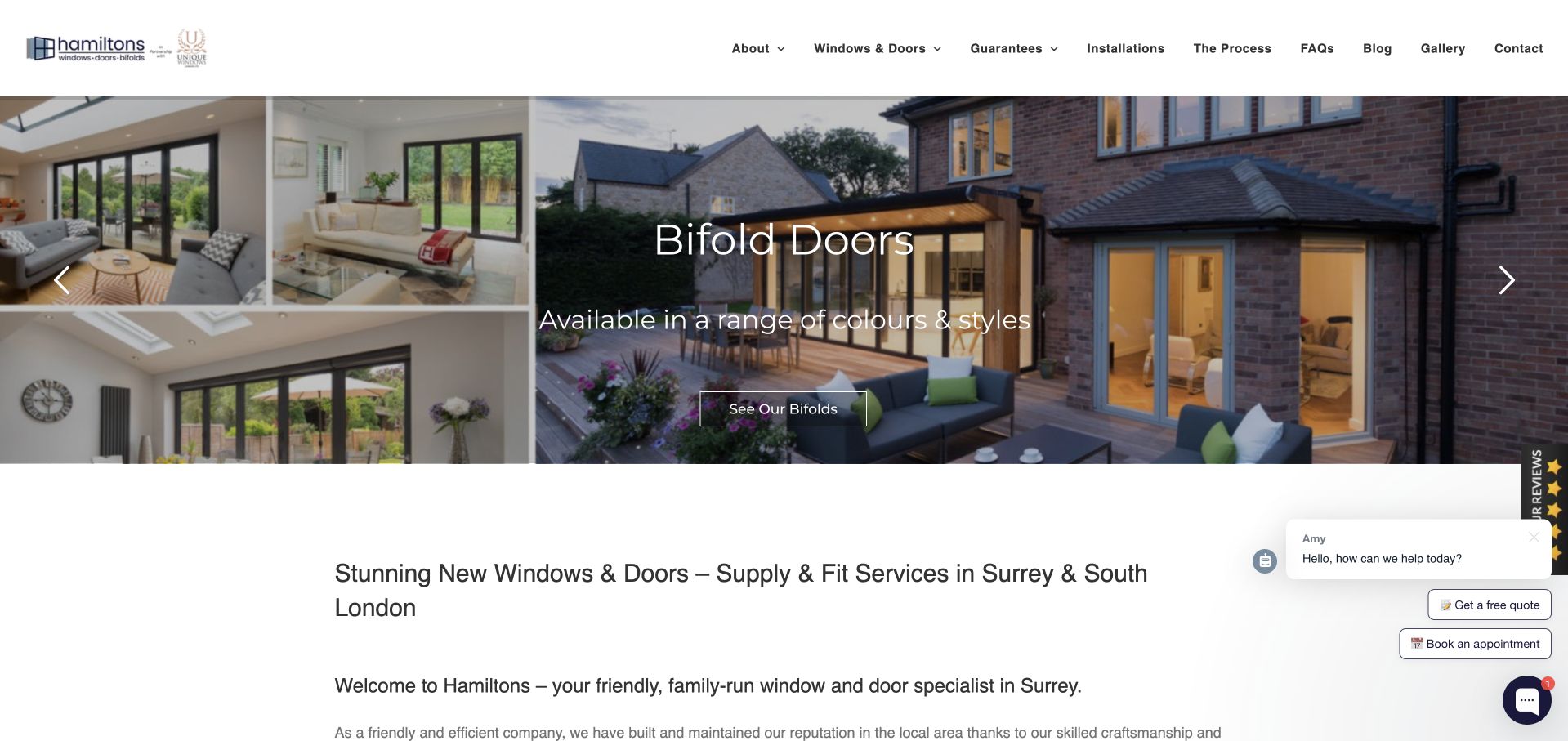
Hamiltons combines several small interior views with a larger bifold-door project image. The hero names the featured product and gives it a product-specific action, while the first paragraph below explains the wider supply-and-fit service in Surrey and south London. Its restrained white header exposes guarantees, installations, process, FAQs and a gallery, offering sensible support for a considered purchase. This is more useful than a purely decorative collage because the images lead to a named product family. The service region and broader window range, however, become clearer below the hero than within it, and the floating chat controls add another competing layer.
What you can learn
Give a product collage a clear purpose and a destination specific to the featured range. Follow it promptly with the installation scope and service area so the visitor can connect inspiration with practical eligibility.
Pros
The hero connects its imagery to a named product category.
Process, guarantees and installation examples have explicit navigation labels.
Cons & considerations
The first screen foregrounds bifold doors more than the broader window service.
Floating chat and appointment controls can compete with the project imagery.
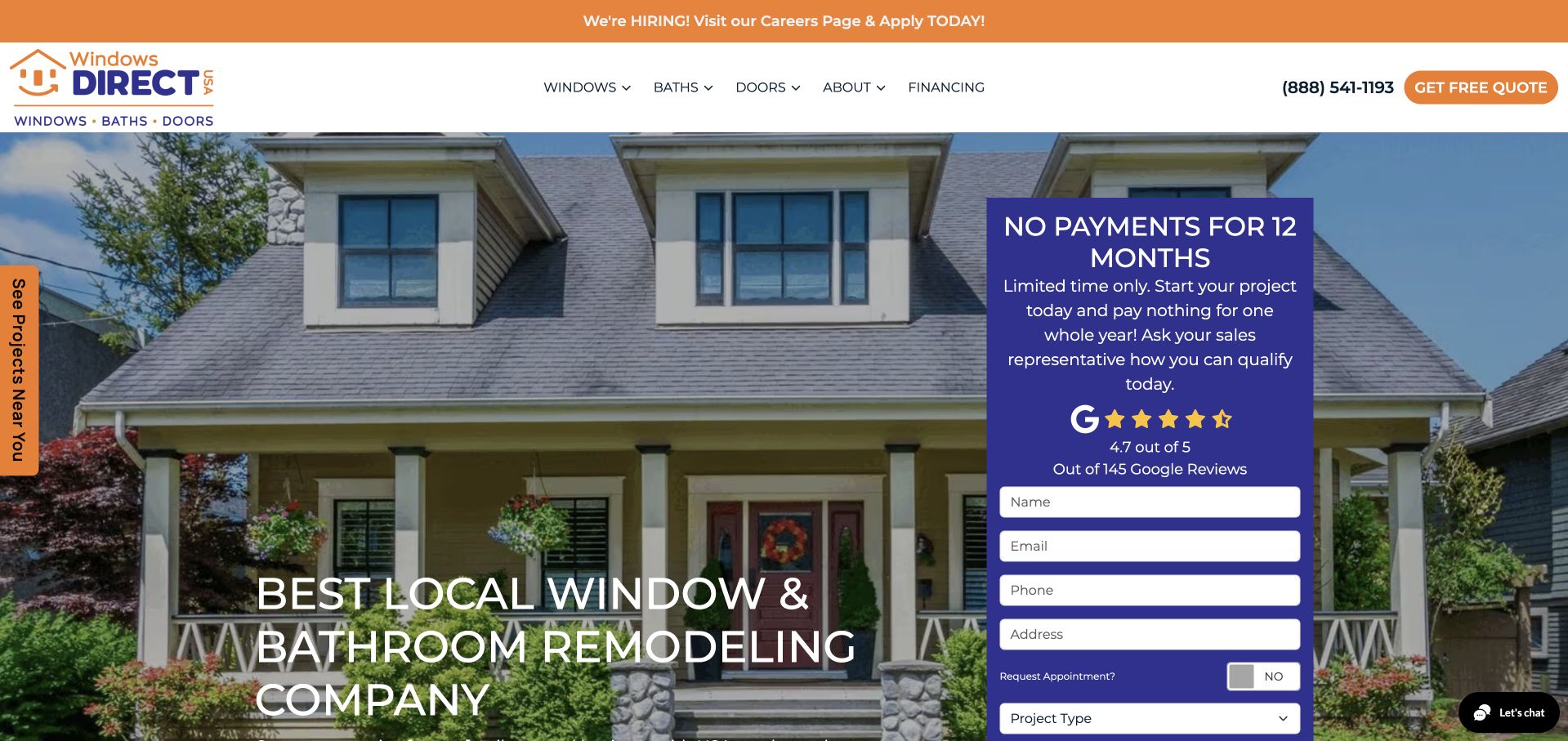
Windows Direct USA puts its window-and-bathroom proposition over a complete house photograph and gives a tall purple enquiry card the right side of the hero. The form exposes multiple project and contact fields, while a rating display and campaign explanation provide supporting persuasion. Orange quotation controls and a hiring strip add strong contrast to the white navigation. The composition makes the desired commercial action unmistakable, but the two remodelling categories need careful explanation: a visitor researching windows should not have to interpret bathroom-related choices before knowing whether the company covers their project.
What you can learn
If a business combines several services, use clear project-type routing before a long qualification form. Campaign language and ratings can support the action, but they should not obscure what information the business is requesting.
Pros
The form visibly distinguishes project types instead of assuming every enquiry is identical.
The broad service categories remain available in the primary navigation.
Cons & considerations
The tall form and promotion dominate the opening photograph.
Several different campaign and utility colours compete for attention.
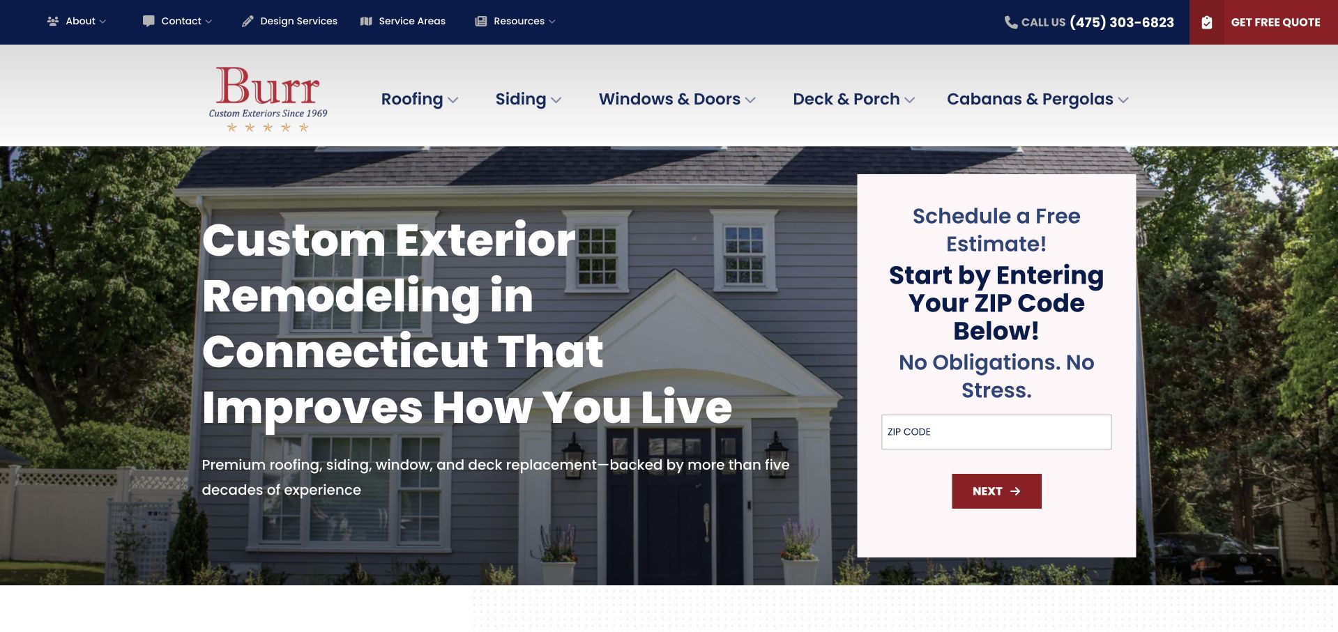
Burr Custom Exteriors places a compact postcode step beside a bold Connecticut remodelling headline. This makes the initial qualification visibly smaller than a full project questionnaire and connects it to the company’s stated coverage. The header separates roofing, siding, windows and doors, decks and porches, and outdoor structures, while design services and resources sit in a utility row. The photograph of a complete house supports that broader exterior offer. This is a useful progressive-form example, although visitors should be told what comes after the postcode step and whether their information is sent before the complete enquiry is finished.
What you can learn
Check service-area fit early when it materially affects whether a project can proceed. Explain the rest of the form journey and the handling of partial entries, rather than making a short first step appear to be the entire request.
Pros
The headline establishes the Connecticut service context immediately.
The initial form focuses on geographic eligibility rather than many personal fields.
Cons & considerations
The postcode card does not reveal the full later enquiry sequence.
A broad exterior service range needs carefully maintained category-specific information.
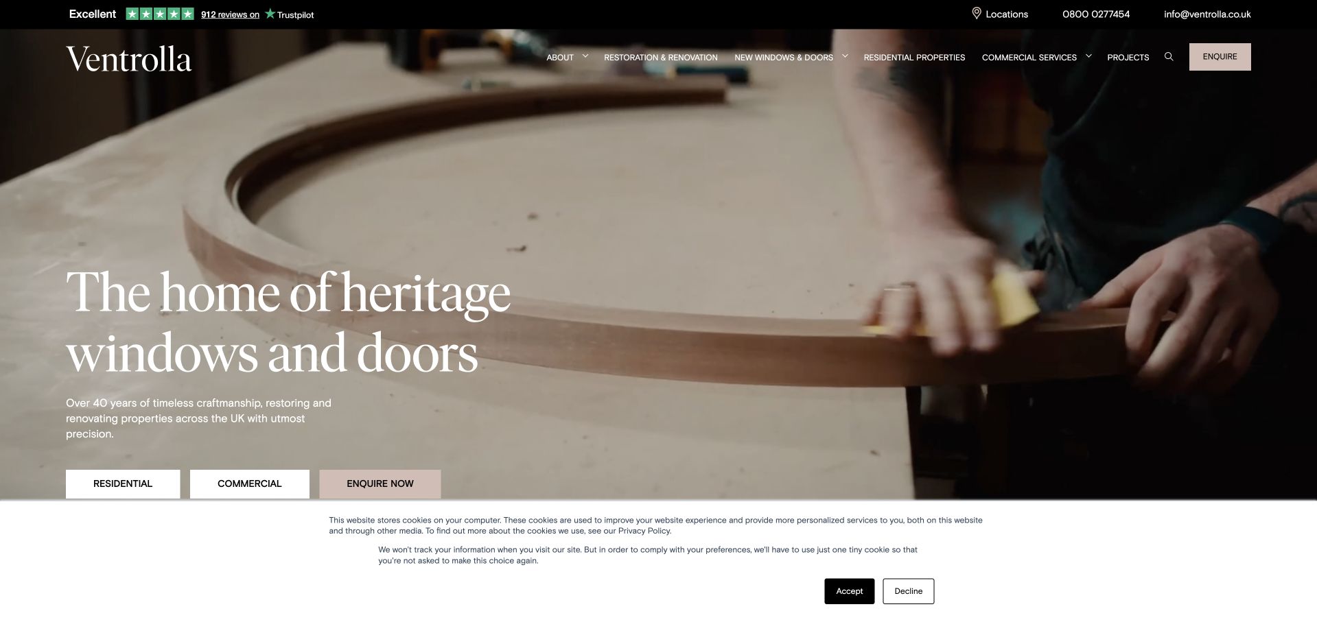
Ventrolla opens with close-up woodworking imagery rather than a finished-house sales scene. A restrained serif headline names heritage windows and doors, and three small actions distinguish residential work, commercial work and an immediate enquiry. The dark, transparent navigation keeps restoration and renovation separate from new products, making the service distinction visible before the visitor enters a catalogue. The result feels connected to craftsmanship and building context. It also places light text over moving or photographic material, so the legibility depends on the chosen frame; the cookie banner occupies additional space at the bottom of the captured view.
What you can learn
Use process imagery when it explains a genuine specialist capability, then label the customer and work types clearly. Restoration should be discoverable as a real option rather than merely a footnote under replacement products.
Pros
The opening separates residential and commercial customer journeys.
Restoration and renovation have a visible place beside new-window products.
Cons & considerations
Light navigation text depends on the background remaining sufficiently dark.
The first-screen cookie banner reduces the area available for the craft imagery.
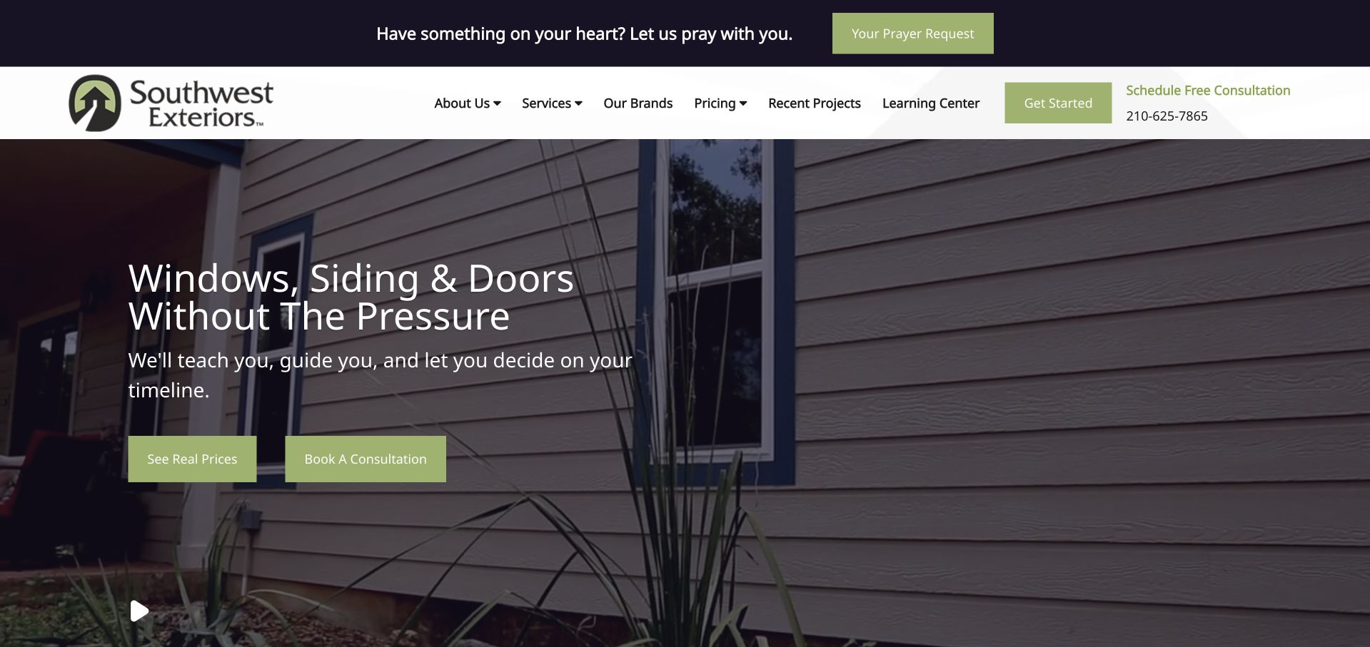
Southwest Exteriors makes “without the pressure” the central idea of its window, siding and door introduction. Two green actions let the visitor either inspect pricing information or book a consultation, which gives the claim a practical information-design counterpart. A darkened project photograph keeps the text legible, while recent projects and a learning centre sit in the main navigation. A prayer-request utility strip expresses another part of the organisation’s identity but also adds height and a separate intention above the commercial task. The example is strongest where it gives a cautious visitor something useful to read before speaking to a salesperson.
What you can learn
If a company promises a less pressured enquiry process, support that promise with genuinely useful self-service information. Give pricing and educational resources a clear route, while separating unrelated community or organisational activities from project enquiries.
Pros
Pricing information is offered alongside, not behind, a consultation action.
Recent projects and a learning centre support independent research.
Cons & considerations
The extra utility strip introduces a different task before the service navigation.
A darkened photograph communicates less product detail than the text-led proposition.
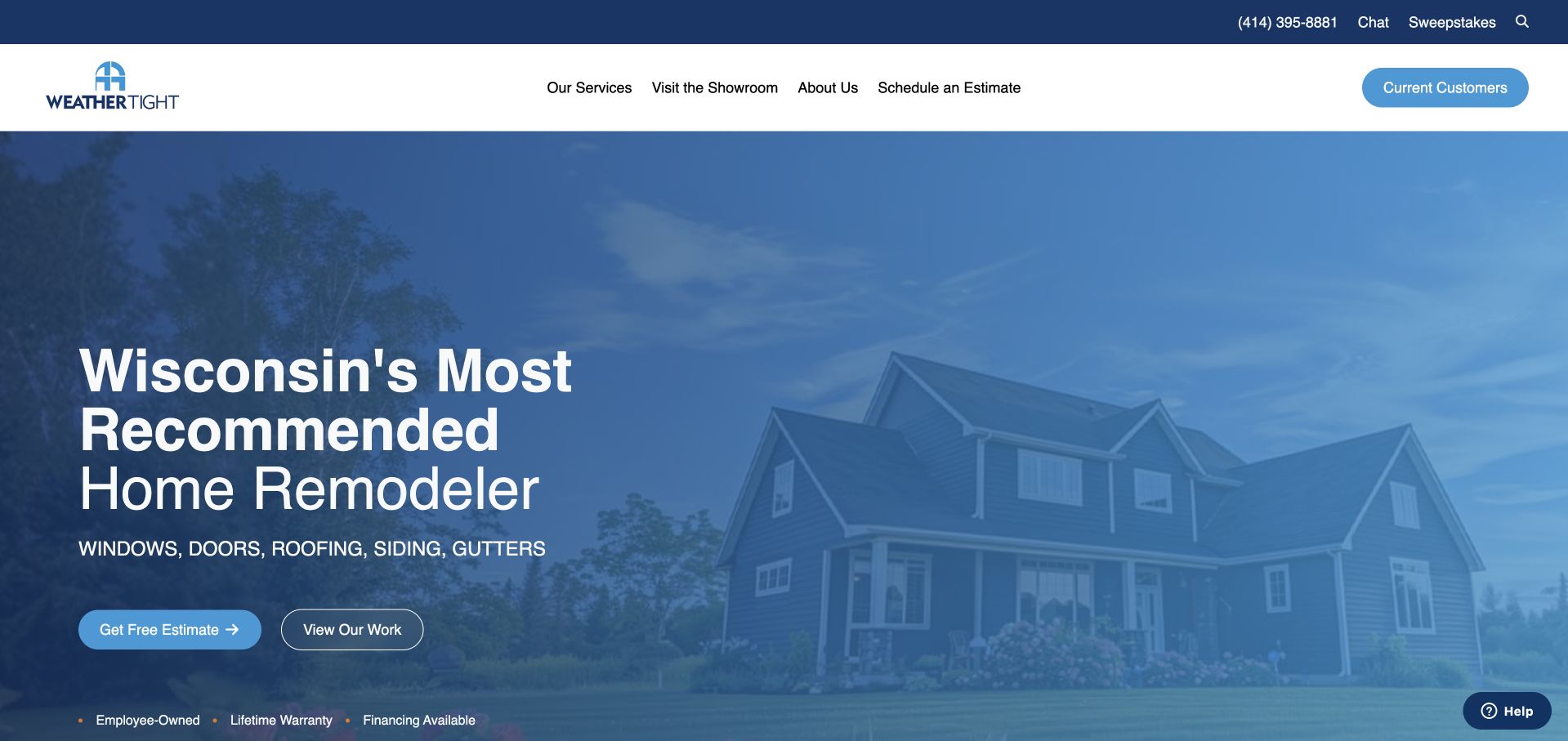
Weather Tight uses a blue-toned photograph, a large Wisconsin-focused headline and a short list of exterior services to establish the company’s region and range. The hero presents two different levels of commitment: request an estimate or view completed work. A separate current-customers control in the white header helps prevent service needs from being mistaken for new sales enquiries. The site’s strong recommendation claim is a piece of the company’s own positioning, not something this design review independently verifies. Its useful structural lesson lies in the distinction between evidence, new-project contact and ongoing support.
What you can learn
Keep a project-viewing route beside the estimate button, and give previous customers an identifiable support destination. Strong reputation statements should have clear evidence and ownership rather than substituting for practical service information.
Pros
Viewing completed work is a clear alternative to requesting an estimate.
The header explicitly distinguishes current customers from new prospects.
Cons & considerations
The large reputation headline gives limited detail about individual services.
The blue image treatment reduces the visible material and colour detail of the house.
Kegan is a freelance web designer and developer with 15+ years of experience helping businesses turn complicated website requirements into clear, maintainable digital experiences. He works directly with clients from planning and design through development, launch, and ongoing support.
For window installer website design, his development approach focuses on window-type and material comparisons, genuine installation examples, coverage information, survey expectations, and clear estimate inquiries. The scope can be a targeted improvement or a complete custom build, with responsive layouts, thoughtful content structure, and integrations chosen around the people using and maintaining the site.
Show 3 other window installer website designersHide other window installer website designers
Plan a window installer website around the whole project journey
Define the enquiry before designing its form
Write down what the team needs to route an initial enquiry: project location, the type of work, approximate number of openings, property context and a contact preference. Distinguish information required for routing from information that can wait for a survey. If uploads are offered, explain what photos help and avoid suggesting that an online estimate replaces an inspection. State who will respond and what the next step involves; do not promise a response time the team cannot maintain.
Turn completed work into useful project records
A gallery of attractive rooms can be hard to compare. Give each project an informative title, a broad location, product or material context and a short explanation of the client’s starting point. Include exterior and interior views where permissions allow, and explain whether the work involved restoration, replacement or a new opening. Caption images accurately. Do not present a supplier’s stock image as a completed installation or reveal a client’s exact address without permission.
Separate reassurance from promotion
Reviews, guarantees, product documentation, professional memberships and finance offers answer different questions. Label each accurately and link to the source or applicable terms where appropriate. Keep current promotions in a maintainable component with an owner and end date, rather than baking them into several unrelated banners. Existing-customer service should remain easy to find when a campaign is running, and contact forms should make the handling of personal details clear.
The editing job behind the design
Choose technology for a maintainable product and project library
A useful content model usually includes product families, materials, opening styles, locations, projects, showroom information and support topics. Give editors structured fields for those facts rather than asking them to rebuild a page layout each time. Allow products and projects to relate to one another without forcing duplicate copy. Before selecting a platform, test whether staff can retire an offer, correct a location and add a properly captioned project without development help.
Treat large photographs, videos, configurators and third-party lead widgets as performance and accessibility decisions, not just visual features. Provide a meaningful still image when video does not play, keep labels attached to form controls and test the real privacy notice alongside chat or booking tools. A visible stack label in this collection records supported public evidence; it does not identify a company’s complete infrastructure or prove how a private quotation system works.
Our WordPress website examples offer a separate look at publishing approaches. A visible platform label is evidence for that named page, not a guarantee that the same system will suit your requirements.
Before the public launch
Window installation website brief checklist
State whether the business repairs, restores, manufactures, supplies, installs or offers a documented combination of those services.
Name the installation coverage area and distinguish it from any wider supply-only delivery area.
Separate homeowner, architect, commercial and trade routes only where the business genuinely supports them.
Give product families readable descriptions, relevant specifications and accurately captioned project examples.
Explain the initial consultation, survey and quotation journey without implying an online form guarantees a price.
Keep showroom addresses, access arrangements, opening times and appointment instructions current.
Provide a clearly labelled existing-customer service route distinct from a new sales enquiry.
Review contrast over project photographs, keyboard access, form errors and mobile navigation using the actual content.
Assign responsibility for offer expiry dates, finance disclosures, warranty text and external review links.
Record image permissions, meaningful alternative text and an ongoing process for updating project information.
These checks are a project checklist, not a performance, legal, security, or accessibility certification. Test real journeys with the people responsible for the website before making claims about the result.
Sources & editorial method
How this collection was selected and reviewed
We reviewed the publicly accessible company pages and captured the visible page presentation directly. Selection considers how clearly a site communicates its service, location and project evidence, not an independent measurement of installation quality, customer outcomes or commercial performance. Official pages establish each company’s stated scope; the visual observations concern the captured page. Technology notes are limited to supported public signals and may omit private systems.
Each example links to its actual source page. Screenshots are direct browser captures with their own capture dates; moving imagery, announcements and live designs can change. The notes describe observable design choices and conditional tradeoffs, not measured traffic, conversion results, service quality, or accessibility conformance.
Technology labels use public page metadata, asset evidence, or explicitly cited platform documentation. Platform documentation is not a complete current deployment audit. A component reference may be legacy or unused; it is not a complete backend inventory. Unknown stacks are omitted. These sites are editorial examples, not our client portfolio.
Written, Edited and Curated are separate editorial records, not timestamps advanced by a rebuild. Website designs and imagery belong to their owners. See our editorial standards or suggest a correction.
Questions worth asking
Window Installer website design questions
Should a window installer put a quotation form in the hero?
It can work for visitors who have already decided to enquire, but it should not crowd out basic eligibility information. State the service and region first, label the requested details and explain the next step. A parallel product or project route gives someone still researching a useful action without demanding personal information immediately.
How should restoration and replacement be organised?
Use distinct service pages and explain the circumstances each team can assess. Avoid promising that every window can be repaired or that replacement is always necessary. Show relevant projects and describe what the work involved. A visitor uncertain which service applies should have a clearly described assessment route rather than needing to make a technical diagnosis themselves.
What makes a project gallery genuinely useful?
Context makes the difference: the broad location, property type, materials, product family and nature of the installation. Before-and-after photographs can help when their perspective and captions are honest. A short account of the original problem and the installed solution is often more informative than a long row of unlabelled room photographs.
Should a regional installer use separate location pages?
Only where each page can provide useful, accurate local information. Coverage, relevant projects, showroom access and service arrangements may justify a local page. Do not manufacture a separate office or repeat the same paragraphs with different place names. A clear coverage page is preferable to many empty local landing pages.
Does an impressive example prove which platform to choose?
No. A screenshot shows the public presentation, not the editorial workload, lead routing or private business systems. Choose a platform against your own content model, maintenance capacity, accessibility needs and integrations. Use the examples to clarify the required experience before comparing implementation options.
Start with the questions the sales and installation teams answer every week. A focused service structure, honest project library and well-explained enquiry journey make a stronger brief than collecting decorative window photographs alone.