Best Barber Websites of 2026 (21 Real-World Examples)
Barbershop websites that connect a distinctive local identity with a straightforward appointment
These 21 barbershop websites explore service menus, barber introductions, location clarity and the practical difference between walking in and reserving a chair.
A barbershop website has to work for a regular customer choosing a familiar barber and a newcomer who does not yet know what to book. Both need clear services, price context, opening hours and the right shop location. Photography and typography can communicate character, but they cannot explain whether a beard trim is included in a haircut or whether a walk-in will be seen at a particular time.
Original Barbershop is our Editors Choice for combining a recognizable East Village identity with concrete service information. Its inspected page puts prices and durations beside named services, introduces the barbers, and distinguishes walking in from booking ahead. The actual shop imagery establishes a place; the service-specific booking links make that place easier to approach. This recognizes the website’s information design, not a claim about haircut quality.
Before the examples
What makes good barber website design in 2026?
Describe the appointment before the booking link
Give each service an ordinary name, a short scope description, a duration and an accurate price or starting-price explanation. Identify combinations such as a haircut with beard work. A new visitor should not have to open a scheduling system to discover what the shop means by its own service names.
Keep people and places attached to availability
Introduce barbers with real photographs and useful professional context, then carry the selected person and location into booking. In a multi-shop business, do not assume that a customer knows which address belongs to a favorite barber or that every shop offers the same services.
Publish the actual walk-in policy
Explain whether walk-ins are accepted, whether booking is recommended and what happens when all chairs are occupied. Keep opening hours, phone and address easy to find. Avoid wording that turns a general welcome into a promise of immediate availability.
The collection · 21 examples
21 barber websites worth studying
The collection includes neighborhood shops, larger groups and deliberately experimental brand pages. Compare the practical route to a chair as closely as the visual identity: service, barber, location and appointment type should remain understandable throughout.
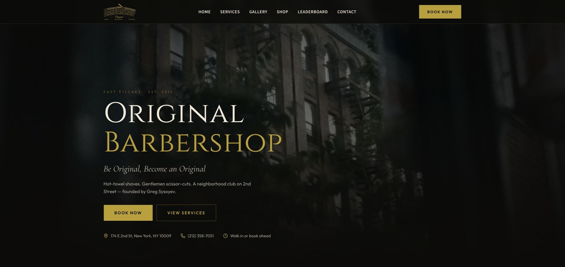
Original Barbershop puts its East Village identity beside the first booking action, rather than leaving the visitor to decode a lifestyle slogan. The dark shop photograph, cream serif lettering and restrained gold buttons feel connected to a physical place. Book Now and View Services offer two useful levels of commitment. Lower down, individual barber introductions make the people behind the chairs visible, while service cards pair prices with appointment lengths. The long repeating brand text is less useful than that concrete information, but the overall hierarchy gives a small shop a confident identity without hiding how to visit.
What you can learn
Build the first screen around the decisions a new customer can actually make: identify the shop, compare a service, then select a time. Keep the price and duration together when the booking system uses both.
Pros
The opening includes neighborhood, street address and distinct booking and service actions.
Named barber profiles and timed, priced services explain the actual appointment choices.
Cons & considerations
The repeating brand ticker adds movement without answering another customer question.
The heavily darkened hero makes some of the shop photography harder to appreciate.
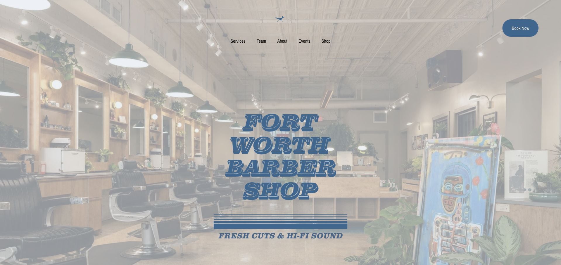
Fort Worth Barber Shop opens with a photograph of its working interior and a blue outlined wordmark. The music-led personality continues through records, vintage equipment and event navigation, giving the site more specificity than a stock portrait of a haircut. Services and Team remain available beside that atmosphere, with a separate booking button. Practical visit information includes a Jennings Avenue address, opening hours and parking guidance. The tradeoff is that the story and retail interests require more attention before a visitor reaches comparable service information.
What you can learn
Use the actual room to establish the experience, then provide an equally concrete route to the staff, service list and visit logistics. A parking note can be more useful than another broad quality claim.
Pros
Interior photography makes the physical setting recognizable.
The footer provides specific address, hours and parking information.
Cons & considerations
The music and brand story can delay a quick service-price comparison.
The blue wordmark has uneven contrast against details in the bright photograph.
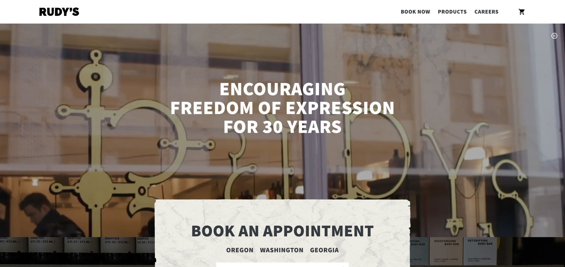
Rudy’s places a rough-edged appointment panel over its colorful visual opening. State choices give booking a geographic starting point, while the main navigation separates appointments from products. Large black typography and paper-like surfaces keep the identity recognizable across these different tasks. The inspected page also provides a video description and pause control, a useful detail when motion carries the mood. Haircuts, color and extras are described separately, including the need for a color consultation. Seasonal retail promotion creates another maintenance obligation beyond keeping appointment links working.
What you can learn
Ask the minimum geographic question before opening a branch-specific appointment journey. If the homepage uses video, supply a readable alternative and a visible way to stop it rather than making motion the only explanation.
Pros
The appointment panel begins with a clear location choice.
Video description and pause controls supplement the moving imagery.
Cons & considerations
Retail promotions compete with visitors who only want a haircut.
Service prices still depend on reaching the relevant local context.
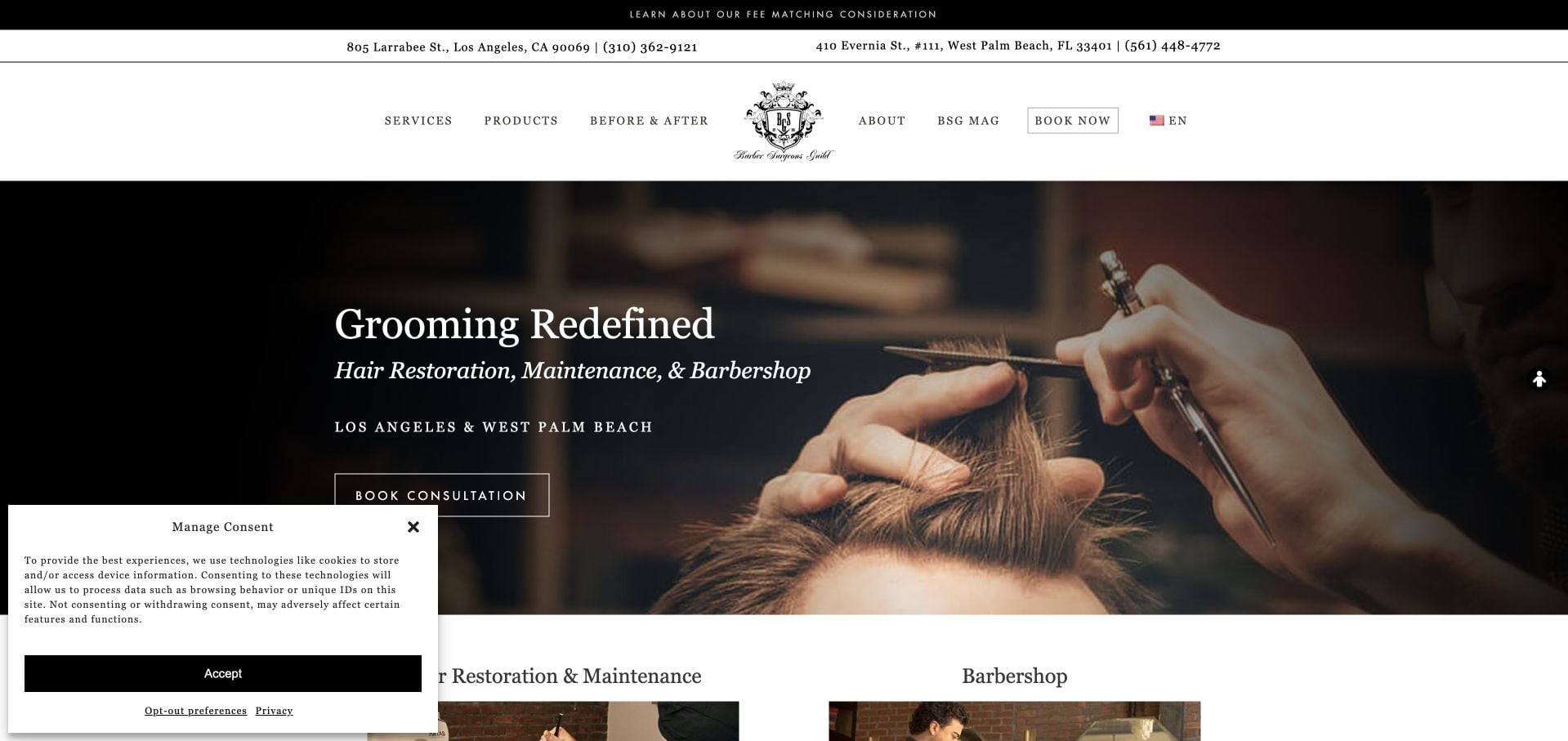
Barber Surgeons Guild uses a restrained black-and-white presentation with a close treatment photograph and elegant serif headlines. A narrow location strip introduces Los Angeles and West Palm Beach before the main content. The site separates barbershop appointments from hair-restoration consultations, an important distinction because those are not interchangeable services. Product shopping and editorial material extend the brand, but the consultation-led hero can make a routine haircut visitor work harder to identify their route. This review concerns that information architecture, not the effectiveness of any medical or grooming treatment.
What you can learn
Separate fundamentally different appointment types in plain language before presenting a single universal booking button. A shared visual identity should not conceal differences in provider, preparation or the purpose of a visit.
Pros
The location strip orients visitors before they choose an appointment.
Barbershop booking and restoration consultation are distinguishable routes.
Cons & considerations
The consultation emphasis can overshadow ordinary grooming services.
The consent panel occupies a noticeable portion of the opening view.
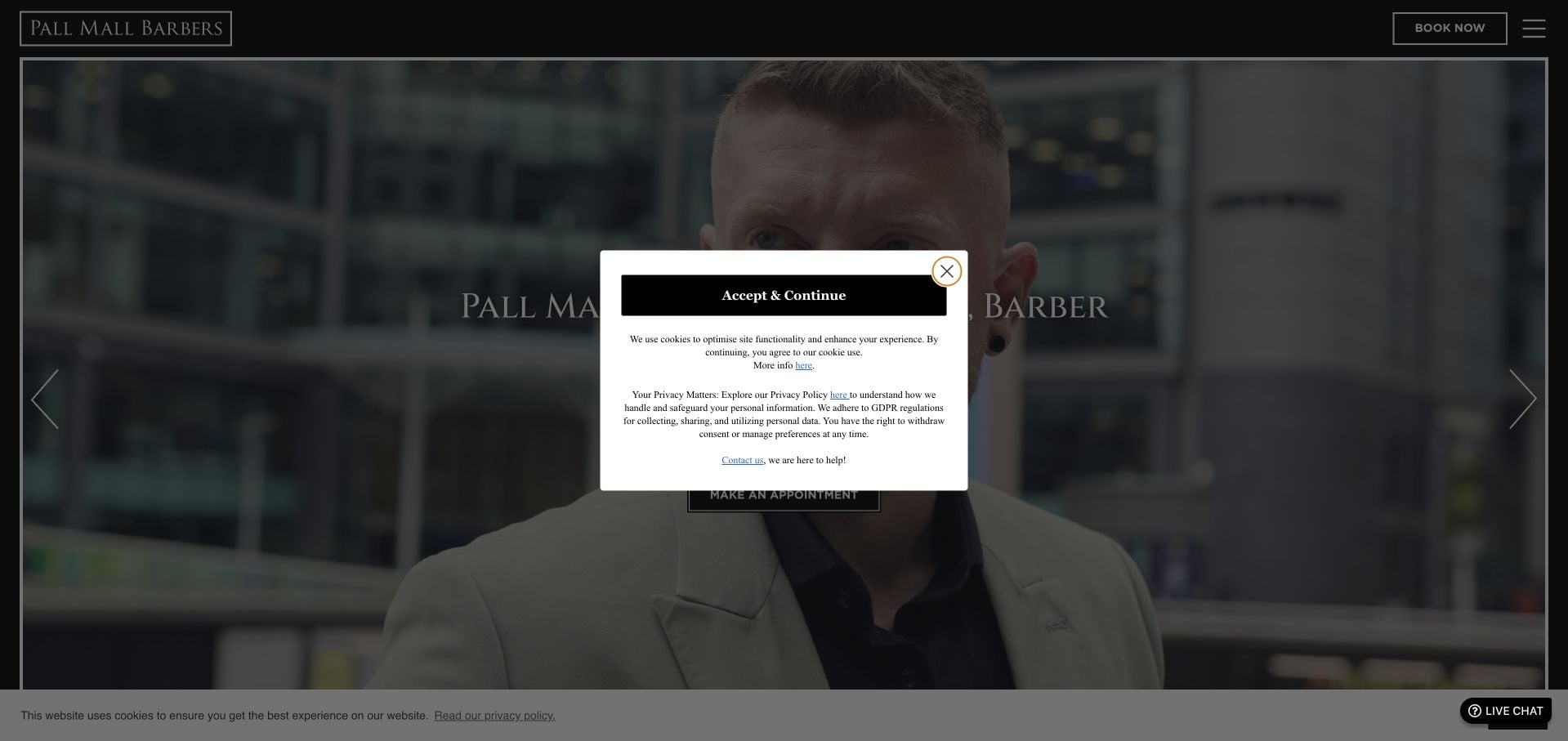
Pall Mall Barbers’ New York site uses a thin rectangular frame around a black hero, with small centered location copy and a direct appointment action. The composition is notably quieter than the dense history and search-oriented prose farther down the page. Services and Prices are available as a separate route, while the Rockefeller Center context supplies the useful local detail. The inspected hero background was sparse, so much of the visual weight falls on the frame and typography. The contrast between minimal opening and expansive body copy is the main lesson here.
What you can learn
Let local visit information lead an established brand story. A concise hero only helps if the service menu, exact branch and booking route remain easy to locate when visitors continue past it.
Pros
The appointment action is isolated from competing hero elements.
A dedicated Services and Prices route supports practical comparison.
Cons & considerations
Long history and keyword-heavy prose make the later page less scannable.
The sparse hero and compact text supply limited visual context for the shop.
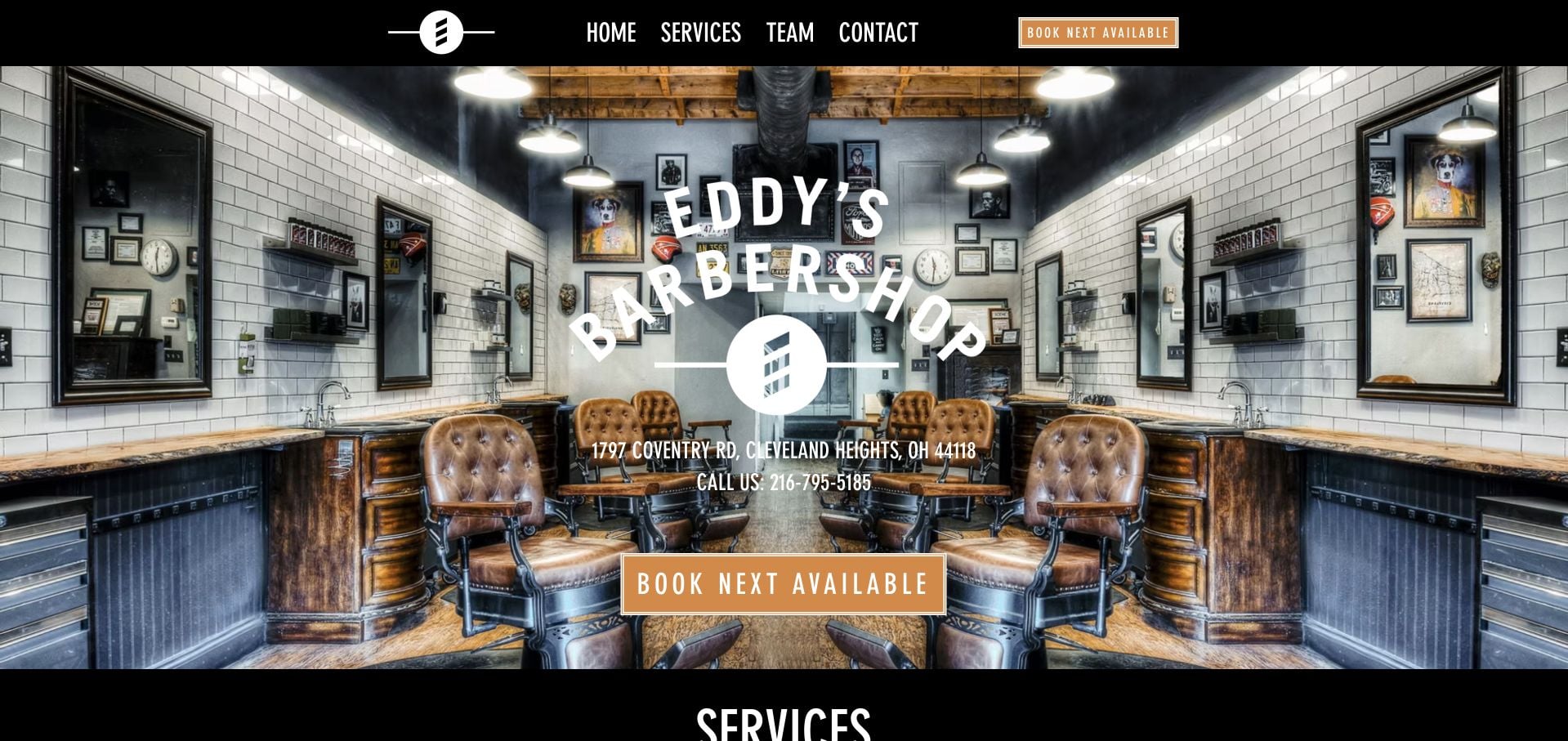
Eddy’s Barber Shop identifies its Coventry Road location and phone number directly over the opening shop photograph. The orange next-available booking action is more specific than a generic Learn More button. The inspected page continues with a detailed service table, combining prices and durations, and staff-specific appointment choices. Its cancellation terms are also available rather than being left entirely to the scheduling provider. The image treatment is soft and the browser title was generic, reminders that an effective booking hierarchy still benefits from careful photography and page metadata.
What you can learn
When the common task is finding a chair soon, say so in the action label and connect it to the real scheduling flow. Support that shortcut with enough service and policy information to make an informed choice.
Pros
The opening exposes location, phone and a next-available action.
Service prices, appointment lengths and individual staff choices are explicit.
Cons & considerations
The opening photograph appears noticeably soft.
The generic document title does not reinforce the shop’s distinctive identity.
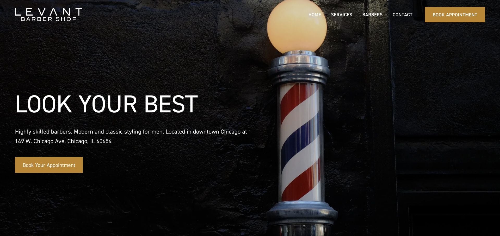
Levant’s Chicago homepage pairs a close barber-pole photograph with black brick, white condensed type and gold actions. The street address appears in the introduction, giving the scene a useful geographic anchor. Separate service and barber routes keep the compact header understandable. Lower down, named team biographies and even the shop dog add personality without replacing the business details. Hours and a clearly written cancellation policy explain the visit, although the first screen does not provide the same level of price comparison as some other examples.
What you can learn
Pair an atmospheric brand object with concrete location information. Team personality is most useful after visitors can establish where the shop is, what it offers and how appointments work.
Pros
The hero names the address beside the appointment route.
Individual staff biographies make the small team tangible.
Cons & considerations
The opening does not show comparable service prices.
Rotating testimonials require additional interaction to explore fully.
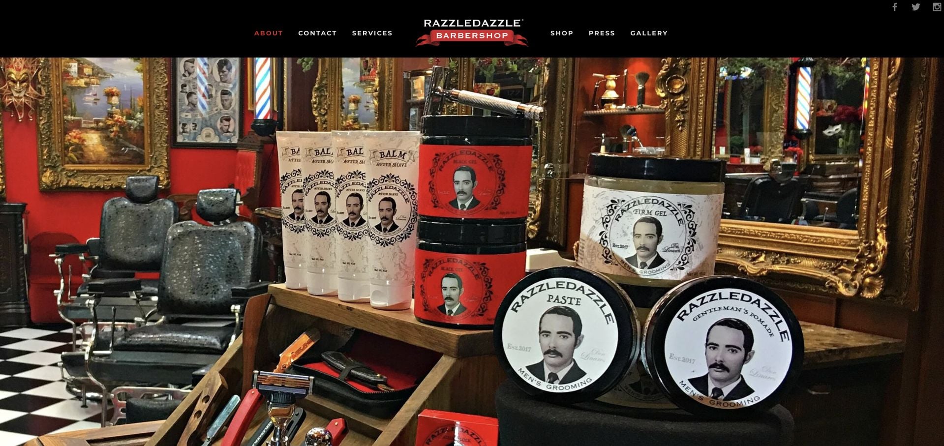
RazzleDazzle opens with an elaborate red, black and gold interior rather than a conventional service headline over stock imagery. The visual immediately communicates a particular atmosphere. Navigation distinguishes services and locations, while separate routes introduce memberships, parties and other uses of the space. This is a useful example of a brand choosing specificity over broad neutrality. It is also a reminder that an image-led opening can postpone essential appointment information: the practical booking route and service context require more exploration than the room photograph itself.
What you can learn
A distinctive physical environment can carry the identity, but it should not be the only first-screen content. Keep a readable service description and an obvious appointment action available alongside the photograph.
Pros
The real interior establishes a recognizable, highly specific identity.
Service, location and event interests have separate navigation routes.
Cons & considerations
The opening image delays a written explanation of the appointment offer.
The strongly themed presentation may not fit a broad, neutral service brief.
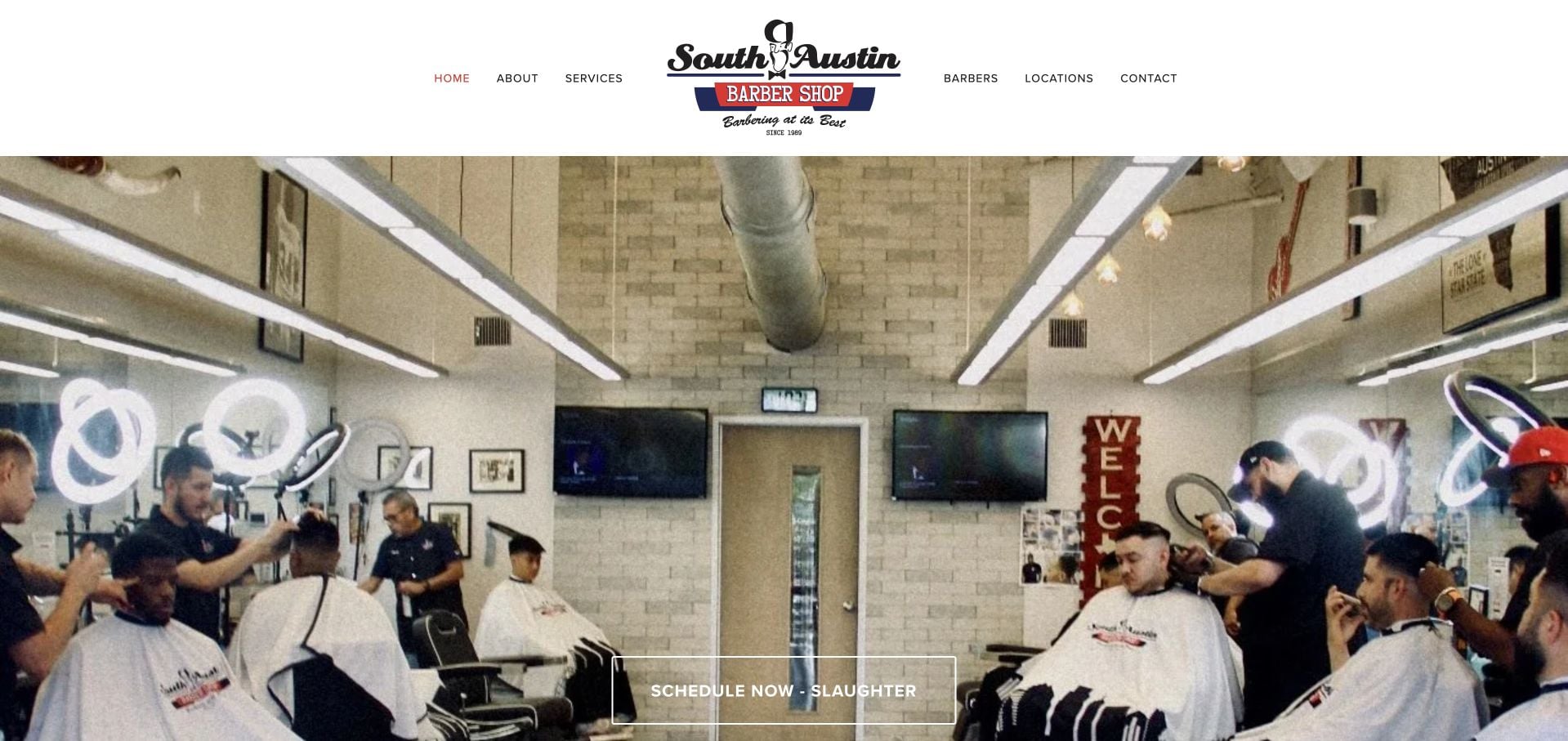
South Austin Barber Shop uses a centered logo and restrained white header above a busy photograph of the actual shop. The important booking distinction is geographic: Slaughter and Stassney have their own scheduling routes. The inspected content also explains walk-ins versus appointments and provides a priced service menu. Those specifics make the site useful beyond its visual introduction. A substantial review feed adds social context but lengthens the trip to other practical details, and the first-screen photograph does not itself make the exact branch address clear.
What you can learn
When a business has two nearby locations, put that choice before the scheduling handoff. Explain walk-in availability separately so the website does not imply that every visit follows the same process.
Pros
Separate branch scheduling avoids a single ambiguous appointment link.
Prices and the walk-in versus appointment distinction are explained.
Cons & considerations
The long review feed can push other visit details farther down.
The opening photo does not identify the exact branch address.
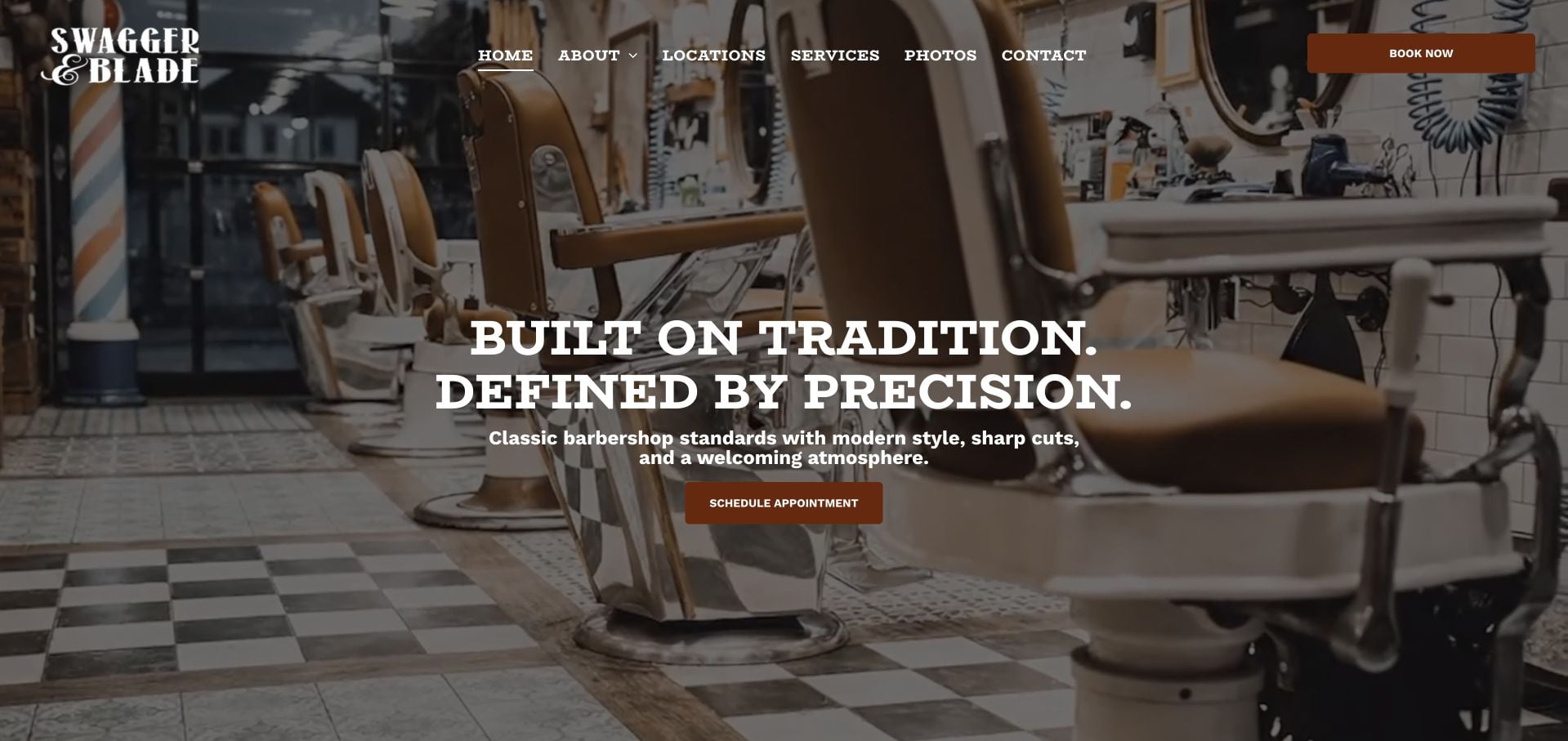
Swagger & Blade combines a real interior photograph with blocky white type, dark surfaces and rust-colored actions. The opening emphasizes tradition and precision, while the later page introduces the founder and individual New Jersey shops. Branch cards pair addresses and phone numbers with directions and scheduling, turning a brand story into a practical local journey. Service tiers are described, but pricing is less immediate than the location information. The dark, dramatic image treatment is cohesive, although a visitor scanning for the nearest chair still needs to reach those branch cards.
What you can learn
Give every branch a self-contained visit card rather than scattering its phone, directions and booking link across separate sections. A founder narrative can then support the journey without becoming its only organizing device.
Pros
Branch cards group directions, contact details and scheduling.
The visual treatment remains consistent across story and practical content.
Cons & considerations
Service-price comparison is not the opening priority.
Visitors must move beyond the general brand hero to choose a shop.
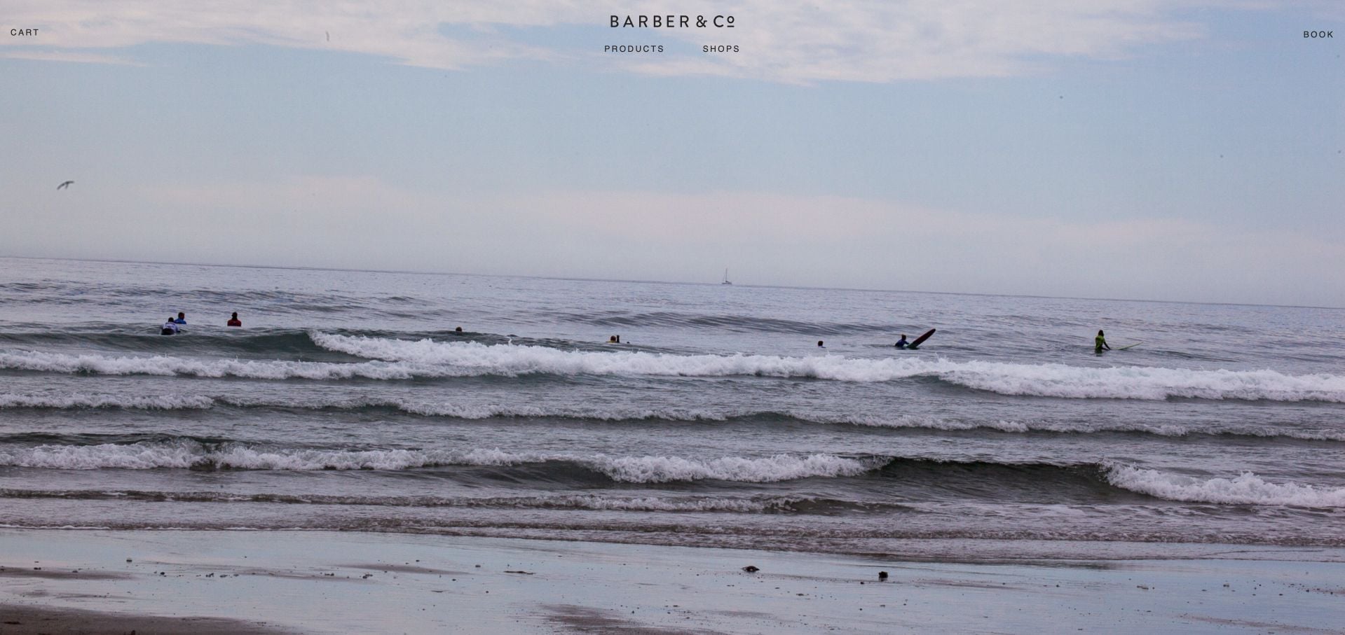
Barber & Co uses an unusually quiet opening: a broad photograph, compact navigation and very little written explanation. Products and Shops separate the two principal interests, while the booking route leads toward Yaletown and Main Street. The restraint allows the image and brand to carry the mood, rather than filling every available area with promotions. It also creates an information cost. Someone unfamiliar with the business receives little first-screen help comparing a haircut, identifying a street address or understanding what distinguishes the appointments.
What you can learn
Minimal navigation works best when the labels describe genuinely different visitor tasks. Keep the two-way service and product split, but supply enough local and service detail for people who have never encountered the brand.
Pros
Shops and Products create a simple initial choice.
The pared-back composition avoids a crowded promotional header.
Cons & considerations
The scenic opening gives limited context about the actual barber service.
Prices and exact visit details require the branch journey.
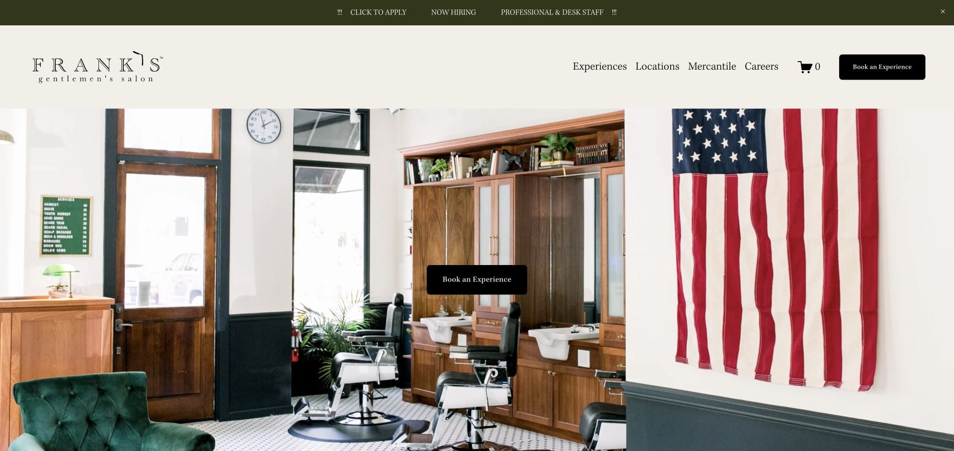
Frank’s Salon frames its interior photograph with cream surfaces, a fine serif wordmark and a dark appointment action. The page introduces locations in Greenville, Charleston and Denver, alongside a founder story and client quotations. Experiences, Locations and Mercantile separate the main service, place and retail interests. That vocabulary creates a coherent upscale identity, but it is less literal than Services and Prices. The hiring notice and shop content add competing tasks, so the strongest borrowing opportunity is the consistent visual system rather than every element of the page’s sequence.
What you can learn
Use photography of the actual room to make a premium positioning concrete. If the navigation uses branded terms such as Experiences, make the destination explain services and appointment choices immediately.
Pros
The interior photograph and restrained palette form a cohesive introduction.
Locations and retail have distinct navigation routes.
Cons & considerations
Experience-led wording is less immediately informative than a plain service label.
Hiring, shopping and testimonial content compete with a quick appointment journey.
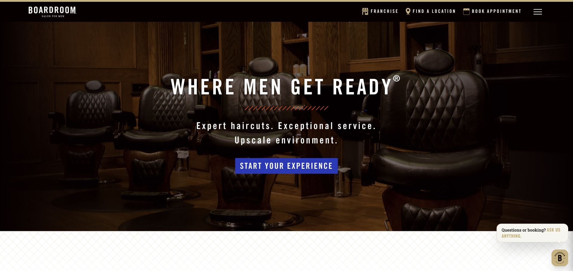
Boardroom presents a dark leather-chair scene, strong condensed lettering and a conspicuous first action. Beyond the atmosphere, the page distinguishes its Benchmark experience from the shorter Express Cut, making the offer more understandable than a list of proprietary service names alone. Reservations, locations and memberships have visible routes. A promotional lead-capture form adds another conversion goal and includes its own consent language. The result illustrates both the usefulness of a service comparison and the clutter that appears when appointment booking and offer signup receive similar emphasis.
What you can learn
Translate named packages into actual differences in what the visitor receives and how much time to allow. Keep promotional signup secondary to the appointment route rather than making every section ask for a different commitment.
Pros
The Benchmark and Express Cut explanation helps distinguish service formats.
Location and reservation routes remain available in the header.
Cons & considerations
The initial experience action is less literal than a booking label.
Promotional lead capture competes with choosing a service.
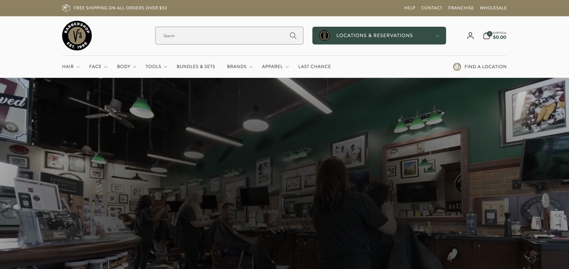
V’s Barbershop gives products substantial navigation space, including search, cart and grooming categories. A prominent green Locations and Reservations button prevents that shop infrastructure from completely swallowing the service journey. The opening also offers a choice between booking and shopping, with an interior photograph supplying the barber context. Lower content extends into product education. This is a useful mixed-business example, but a simple independent shop should not assume that the same volume of merchandise navigation will help customers find an appointment.
What you can learn
When commerce must share the header with a local service, give appointments a visually distinct, clearly named route. Audit the navigation from the perspective of someone who wants a haircut rather than a product.
Pros
Locations and Reservations has a conspicuous, specific label.
The opening distinguishes booking from shopping.
Cons & considerations
Retail categories and account tools make the header busy.
Local service details depend on choosing an individual shop.
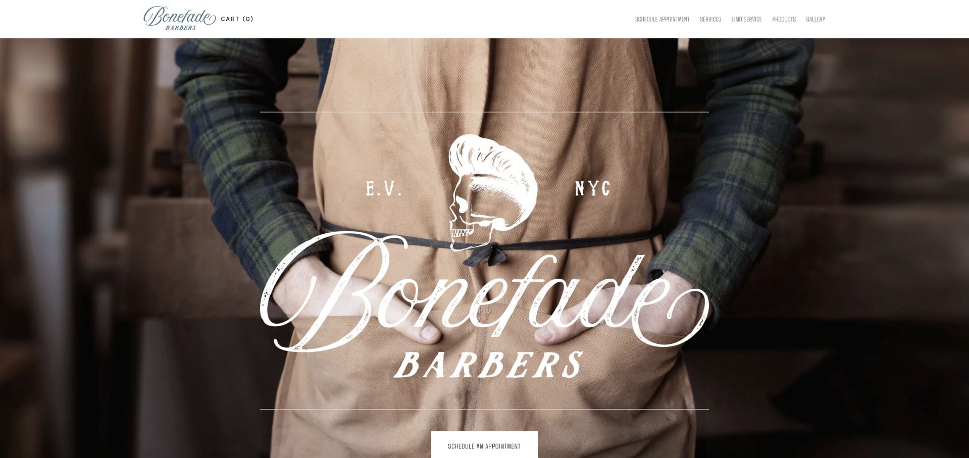
Bonefade Barbers uses an oversized script wordmark over a close photograph of a barber at work. The compact header and centered appointment action keep the initial composition simple. The inspected page provides Avenue A contact details, opening hours, a service route and an introduction to owner Avi. The photograph is more about craft than a polished model portrait, giving the brand a recognizable point of view. The tradeoff is that the large visual treatment leaves service costs and practical comparison below or beyond the opening screen.
What you can learn
One real working photograph can communicate more about a small shop than several unrelated lifestyle images. Pair it with a clear appointment label, then make the service and visit information easy to reach without deciphering the visual brand.
Pros
The working photograph gives the opening a specific barber context.
Named ownership, address and hours support the local introduction.
Cons & considerations
The oversized wordmark occupies much of the first view.
Service pricing is not immediately available in the hero.
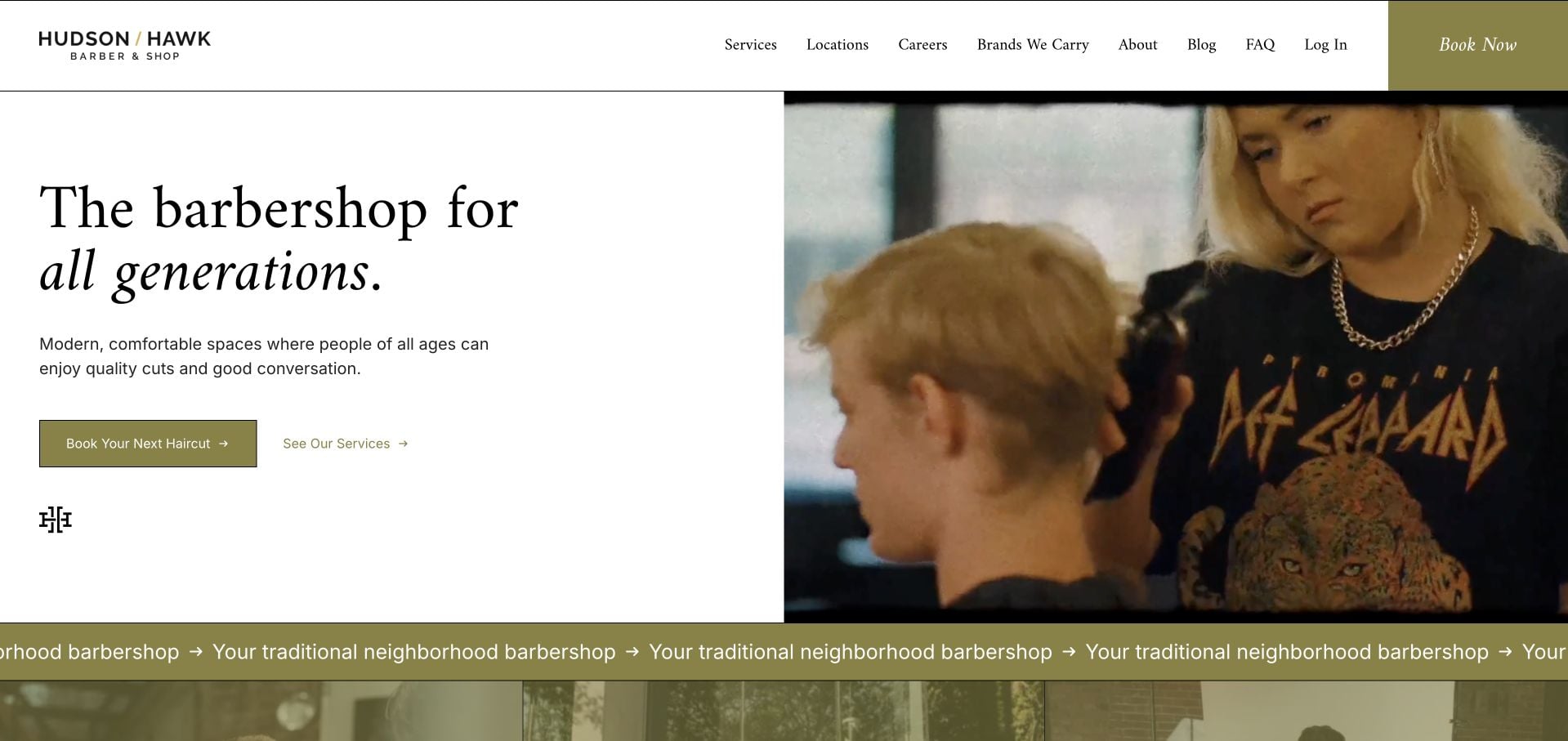
Hudson/Hawk places a concise serif introduction beside a close haircut photograph. A muted olive accent connects the primary appointment button to the rest of the page, while a secondary service action supports visitors who are not ready to book. The inspected site distinguishes location discovery, careers and the wider brand story, avoiding one oversized menu of equally weighted links. Repeating neighborhood-barber text adds movement beneath the hero. The simple first screen is worth studying, but branch-specific logistics and the detailed service comparison still require another step.
What you can learn
Offer one direct appointment path and one lower-commitment service path in the same visual group. That small distinction serves both returning customers and first-time visitors without requiring two competing homepage sections.
Pros
The split layout keeps the introductory text readable beside the photograph.
Booking and service discovery are separate, adjacent actions.
Cons & considerations
The repeating brand strip adds visual noise beneath a restrained hero.
Exact location and pricing context is still a later decision.
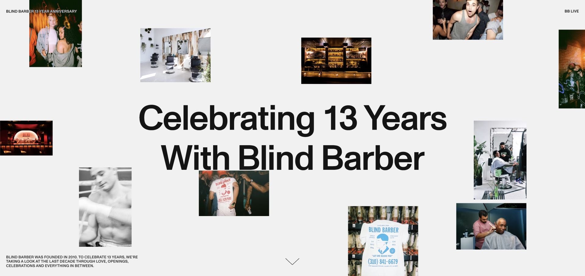
Blind Barber’s anniversary site is an explicitly historical microsite, not its routine booking homepage. Large black typography and a collage of small photographs introduce a timeline spanning the brand’s earlier years. Year navigation, archived imagery and video make the people and events part of the story. This is useful inspiration for a retrospective or community feature, rather than a complete model for a new local shop. The extended, motion-oriented presentation would be a poor substitute for current hours, services and an ordinary appointment route.
What you can learn
Give a campaign or archive its own purpose and label it accordingly. Borrow the timeline and editorial pacing for a brand-history feature, while keeping the main service website responsible for current visit information.
Pros
Year-based navigation provides structure to a large visual archive.
The collage introduces community history rather than generic grooming imagery.
Cons & considerations
This historical microsite is not a practical appointment-homepage template.
The long, motion-led experience demands more attention than a quick service visit.
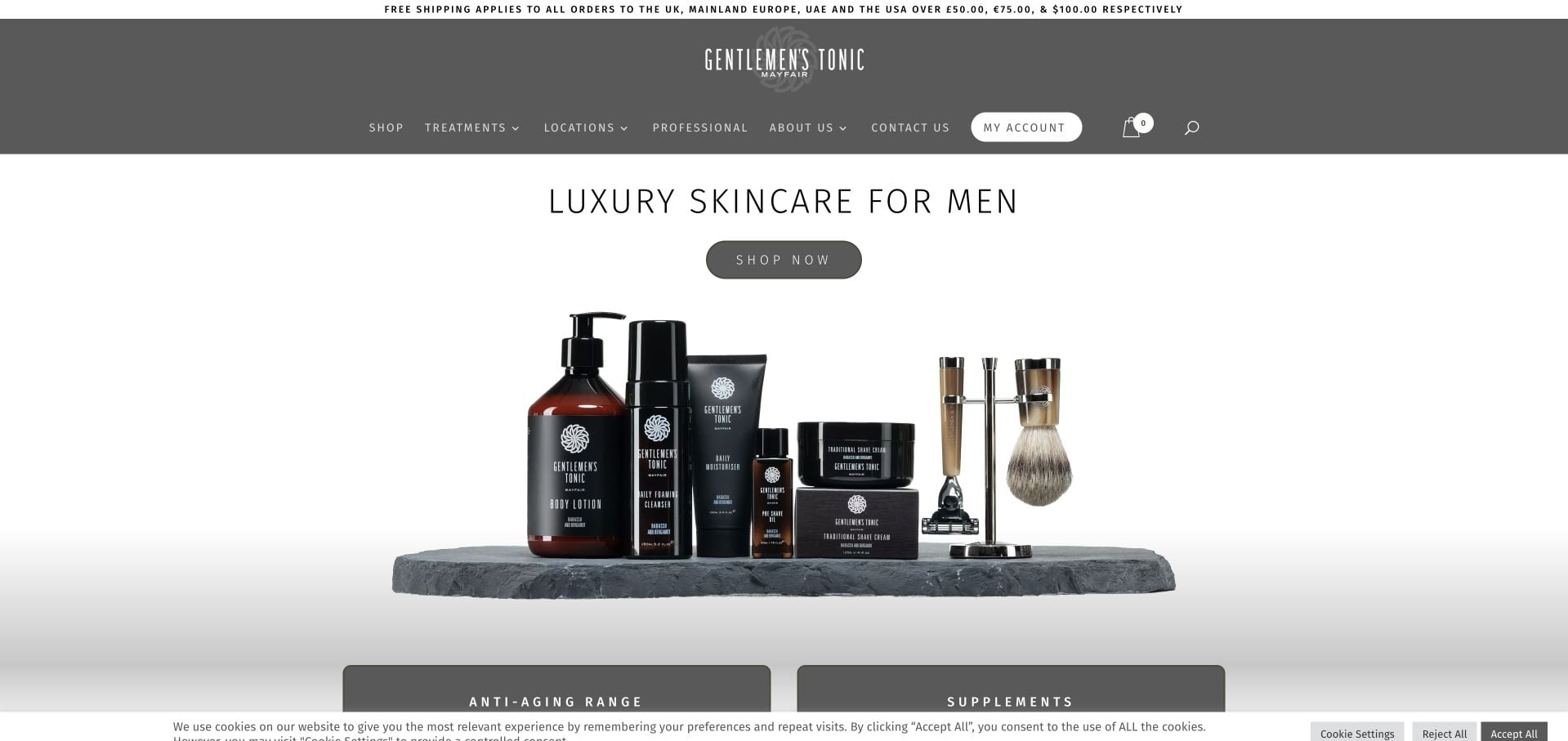
Gentlemen’s Tonic uses a restrained monochrome identity around a luxury-skincare product opening. Shopping, treatments and locations have separate routes, reflecting a business that is broader than haircut appointments alone. Product categories, gift vouchers and professional stockist information extend the retail journey. The clean arrangement is useful for organizing those different audiences, but the hero mainly explains merchandise. A barber borrowing this structure would need to strengthen the local service introduction rather than assuming visitors will find appointments through the commerce experience.
What you can learn
Separate consumer shopping, physical treatments and professional purchasing when each has a different decision process. Keep a local grooming service identifiable in its own language instead of relying on product photography to explain it.
Pros
Treatment and location links remain distinct from the shopping route.
The restrained visual system accommodates a substantial product range.
Cons & considerations
The opening prioritizes skincare merchandise rather than a haircut visit.
Professional and retail interests add navigation that a smaller shop may not need.
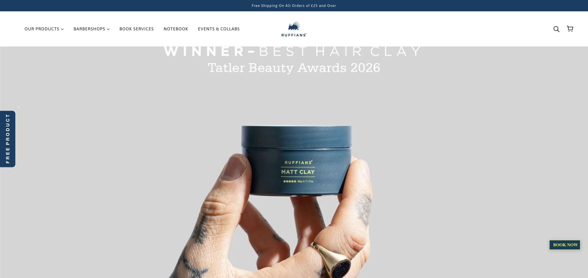
Ruffians combines a blue-and-white identity with a current grooming-product campaign. Ecommerce controls and the featured clay take much of the opening, while Book Services and later branch buttons preserve a way into appointments. The inspected content identifies separate shops rather than presenting a location-free booking promise. A newsletter incentive appeared over the page during review, illustrating how a promotion can interrupt an otherwise disciplined brand presentation. This is most useful as a mixed retail and service example, not a reason to put every marketing offer ahead of practical barber information.
What you can learn
Treat newsletter offers as a secondary layer, particularly when the same visitor might already be trying to book. Keep branch booking accessible even when a seasonal product campaign occupies the homepage.
Pros
A consistent blue-and-white identity connects products and services.
The service journey includes distinct branch choices.
Cons & considerations
The newsletter overlay interrupts the initial browsing view.
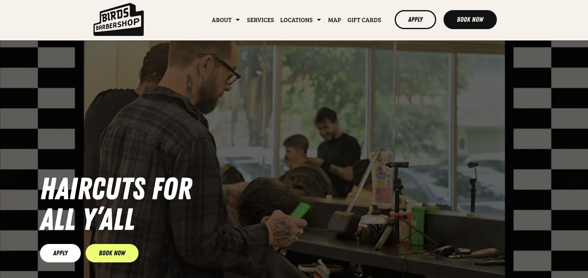
Birds Barbershop surrounds a real haircut scene with cream surfaces, checkerboard graphics and a bright yellow booking button. The chunky italic headline gives the brand personality while the navigation keeps familiar terms such as Services, Locations and Map. The inspected menu distinguishes different haircut categories instead of assuming every customer wants the same appointment. Careers and music-related material support the culture, but an Apply action near Book and repeated moving text introduce extra demands on attention. The useful lesson is the combination of expressive graphics and plain operational labels.
What you can learn
Let personality live in type, illustration and photography while action labels remain literal. Visually distinguish recruiting from appointments so a playful first screen does not ask two audiences to decode the same buttons.
Pros
The yellow booking action is easy to distinguish from the surrounding design.
Plain service and location labels balance the expressive visual identity.
Cons & considerations
Recruiting and booking actions sit close together.
Repeated moving text can distract from the practical service information.
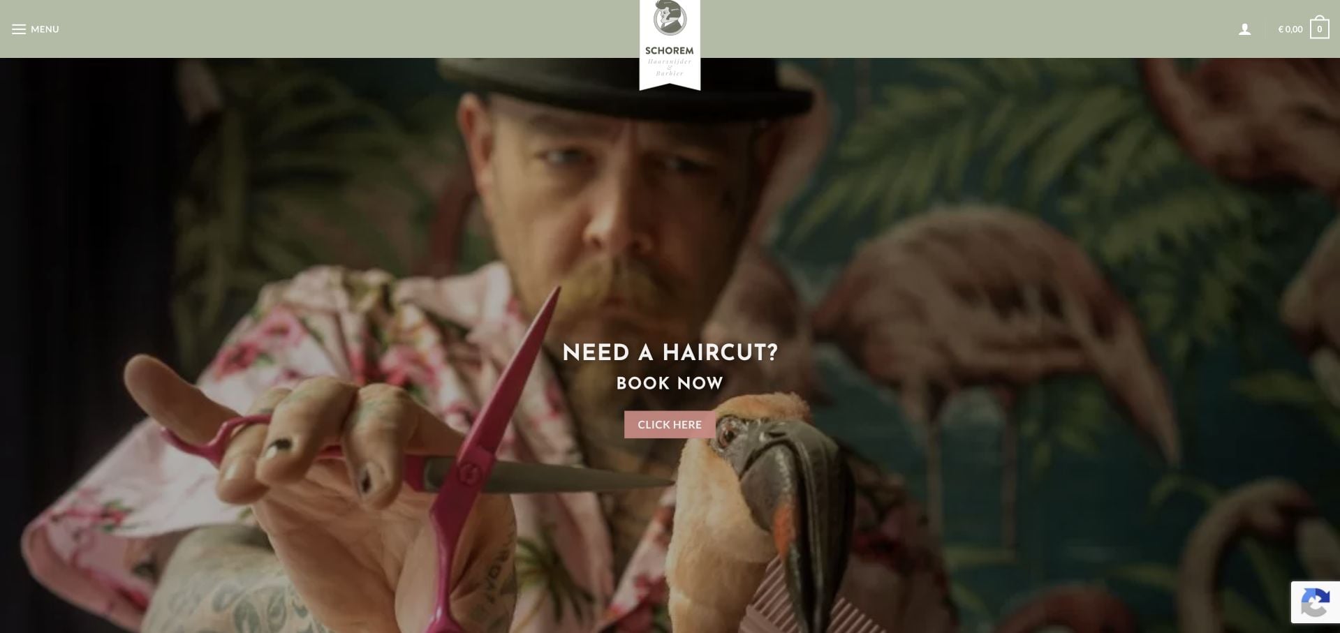
Schorem uses a sage-colored header and a close working image to frame a direct appointment invitation. The inspected page lists a compact set of core service prices rather than hiding the entire menu behind an external scheduler. Its academy and merchandise have their own roles in a broader craft-focused brand. The visual style is unmistakable, but some navigation remains behind the menu and the retail and education interests can pull attention away from an ordinary visit. The useful contrast is between a theatrical identity and a comparatively simple service offer.
What you can learn
A highly distinctive brand does not require a complicated appointment menu. Keep the core service comparison short, then send education, merchandise and other specialist audiences to clearly separated destinations.
Pros
Core service prices appear in the inspected page content.
The actual working imagery reinforces the specialist identity.
Cons & considerations
Some useful routes are concealed behind the menu.
Education and merchandise add competing interests to the appointment journey.
Kegan is a freelance web designer and developer with 15+ years of experience helping businesses turn complicated website requirements into clear, maintainable digital experiences. He works directly with clients from planning and design through development, launch, and ongoing support.
For barber website design, his development approach focuses on clear service and appointment-length comparisons, barber introductions, local shop information, and straightforward booking handoffs. The scope can be a targeted improvement or a complete custom build, with responsive layouts, thoughtful content structure, and integrations chosen around the people using and maintaining the site.
Show 3 other barber website designersHide other barber website designers
Agree the service names, combinations, durations and price rules with the people who manage appointments. Reuse that structure on the website and in booking. When a price varies by barber, length or another factor, explain the variation rather than repeating a misleading universal figure.
Separate other parts of the business
Retail, training, events or an evening venue can strengthen a shop’s identity, but each needs its own action. Original Barbershop’s distinction between haircut appointments and comedy tickets illustrates why two activities in one room should not share an ambiguous booking button.
Rehearse an unfamiliar customer’s visit
Test a phone-sized journey from search to the correct service, barber and address. Check the cancellation information, accessibility or arrival questions, and a direct contact alternative. Verify the visible appointment context before handing the visitor to another service.
The editing job behind the design
Make the booking handoff explicit
A maintainable service list, team directory and location template are usually more valuable than a complicated introductory animation. Keep hours and prices editable by the team responsible for them. Compress actual shop and haircut photographs, provide descriptive text, and avoid making an image-only price card the sole service menu.
A scheduling provider can handle appointments while the public website explains the choices. Preserve location and service context where supported, label external destinations and keep a phone alternative. Do not duplicate apparent live availability on an independently updated marketing page. A visible booking-provider link does not establish the rest of the website’s technical stack.
Our WordPress website examples offer a separate look at publishing approaches. A visible platform label is evidence for that named page, not a guarantee that the same system will suit your requirements.
Before the public launch
Barbershop website planning checklist
Publish the full shop address.
Keep opening hours current.
Explain walk-ins versus appointments.
Describe what each service includes.
Show durations and pricing context.
Introduce the actual barber team.
Attach barbers to their working locations.
Provide actual shop and work imagery.
Separate retail and event transactions.
Keep cancellation and contact information findable.
These checks are a project checklist, not a performance, legal, security, or accessibility certification. Test real journeys with the people responsible for the website before making claims about the result.
Sources & editorial method
How this collection was selected and reviewed
These 21 examples match the collection count saved before research. The editorial team directly inspected the public company pages and recorded source URLs, visible text and screenshot provenance in the supporting capture manifest. Direct browser captures are individually dated; the collection may also reuse an existing direct capture of the same primary property without changing its original capture date. The guide-level narrative was prepared from that inspected evidence. Reviews describe website design, service information and navigation, not professional competence, safety, treatment effectiveness, availability or promised outcomes. Business claims, testimonials and badges are not independent verification. Public technology labels require source evidence; unknown stacks remain unlisted. No appointments, purchases, inquiries or private intake forms were completed for this review. Parked, blocked, empty and unrelated pages were excluded. Website imagery and trademarks belong to their respective owners.
Each example links to its actual source page. Screenshots are direct browser captures with their own capture dates; moving imagery, announcements and live designs can change. The notes describe observable design choices and conditional tradeoffs, not measured traffic, conversion results, service quality, or accessibility conformance.
Technology labels use public page metadata, asset evidence, or explicitly cited platform documentation. Platform documentation is not a complete current deployment audit. A component reference may be legacy or unused; it is not a complete backend inventory. Unknown stacks are omitted. These sites are editorial examples, not our client portfolio.
Written, Edited and Curated are separate editorial records, not timestamps advanced by a rebuild. Website designs and imagery belong to their owners. See our editorial standards or suggest a correction.
Questions worth asking
Barber website design questions
Should a barbershop show prices before booking?
Yes, where the operation permits accurate public pricing. Give a fixed price, a starting price or a clear explanation of what changes it. Pair the figure with the service scope so visitors can compare the right appointment rather than a name alone.
Does every barber need a profile?
A concise profile is useful when customers choose a person. A photograph, working location and relevant service context are often enough. Avoid a long biography that hides the booking route or unsupported statements about being the best.
Can a walk-in shop skip online booking?
Yes. A clear walk-in policy, hours, address and contact information can serve the business well. Explain any queue or appointment exceptions instead of adding a booking system that does not reflect how chairs are allocated.
How should a multi-location shop handle booking?
Make the location choice explicit and retain it through the service and barber selection. Keep the selected address visible near the handoff, and explain any differences in menus, prices or opening hours.