Definitive guide · commercetools website development
Best commercetools Websites of 2026 (20 Real-World Examples)
Twenty public stores with documented commercetools projects, real screenshots and practical lessons for catalog, campaign and checkout planning.
A flexible commerce backend is useful when the public shop remains understandable. These examples show how different retailers balance product discovery, seasonal stories and practical buying information while keeping their individual brands recognizable.
Begin with the shopping decisions your store must support. Someone replacing a familiar item needs a different entrance from a gift buyer, a specialist looking for compatible parts or a visitor comparing an expensive appliance. A convincing homepage gives those people useful routes without asking them to understand the system behind the catalog.
The opening examples are L.L.Bean, Bang & Olufsen, Breville, Chemist Warehouse and Kmart Australia. Their identities are supported separately from their platform associations. Each selection has an official commercetools customer story tied to the named public store or its documented commerce project; regional properties, older migrations and current source observations remain explicitly distinguished.
Before the examples
What makes good commercetools website development in 2026?
Protect shopping tasks from changing campaigns
Give seasonal content a defined place without allowing it to replace search, departments, service information or returning-customer tasks. A retail campaign may change frequently; the routes that help people understand the assortment should remain recognizable. Use realistic promotions, long product names and imperfect imagery when deciding whether the page structure can cope with ordinary editorial work.
Model products before designing every variation
The commercetools Products API separates products from variants and supports attributes, assets and images. Use those distinctions to agree which differences belong to a shared product and which need a separately selectable variation. The interface should make the buyer’s meaningful choices clear rather than simply exposing every internal field maintained by the business.
A region, currency, customer group or fulfillment location can change what a shopper sees. Product APIs expose contextual price-selection parameters; the public experience needs a deliberate way to communicate the relevant context. Avoid presenting a promotional amount as universally applicable when the eventual choice depends on location, eligibility or another condition the visitor has not selected.
These twenty reviews assess actual public storefront captures. Official customer stories supply property-specific documentary associations, not automatic proof of a current backend. Broad source audits are recorded separately, including unavailable results. The sequence is editorial and does not rank sales, traffic, service quality or platform performance.
We start with five recognizable brands or organizations: L.L.Bean, Bang & Olufsen US, Breville US, Chemist Warehouse Australia, Kmart Australia. Each attribution applies to the named website property, not every product or website belonging to its organization. This is a curated reading sequence, not a measured ranking.
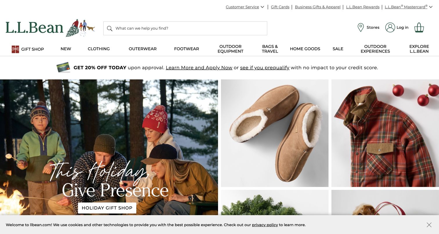
L.L.Bean gives its seasonal campaign room to feel like an outdoor story while keeping the catalog immediately accessible. The opening balances a large lifestyle photograph with smaller product tiles, so visitors can follow the mood or choose something concrete. Search and a broad department navigation remain above that composition. The official commercetools case specifically describes LLBean.com’s catalog, browse, cart and checkout migration in 2024; that is documentary commerce evidence, not a fresh identification of every current page component. The captured holiday presentation is useful because its campaign does not replace the underlying shopping structure.
What you can learn
Give campaign editors a distinct area to change while protecting persistent product discovery. A repeat shopper should still recognize the search field and departments when the seasonal photography, message and featured products are replaced.
Pros
Lifestyle imagery establishes an occasion without removing direct routes into merchandise.
Search, departments and product tiles support several different levels of purchase intent.
Cons & considerations
The competing promotional messages can make the first screen feel commercially crowded.
A homepage capture cannot establish inventory accuracy or checkout usability further along.
Platform source: Official commercetools case study for this public commerce property. Official case documents the LLBean.com storefront, cart, checkout, catalog and browse migration completed in May/June 2024. Documentary association for the described commerce project; not a fresh backend observation or proof of every current company system. Platform evidence is separate from the direct website screenshot and is not a complete current infrastructure audit.
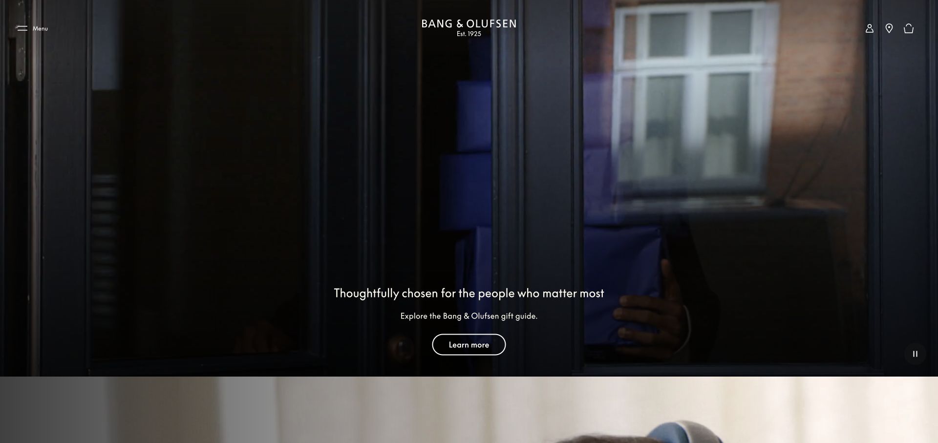
Bang & Olufsen’s US opening uses a dark, cinematic gift scene with a compact central wordmark and a small number of controls. Its gift message and outlined action sit within the image instead of competing with a dense grid of products. That restraint makes the brand atmosphere unusually coherent, although shoppers seeking a particular model must use the navigation or move beyond the opening. The official case documents a unified product website and global flagship shop launched in 2019. The earlier US capture is retained as an actual dated design observation, without converting that historical account into a new runtime finding.
What you can learn
Decide what the first screen should accomplish before adding catalog detail. An atmospheric introduction can work when the next product route is obvious, the image remains readable, and practical navigation is available independently of the campaign.
Pros
A limited visual vocabulary keeps the product brand recognizable across the opening.
The campaign action is distinguishable without adding several competing colored buttons.
Cons & considerations
Product specifications and comparison options are not visible in the first viewport.
Image-dependent messaging needs careful contrast and meaningful alternatives for nonvisual visitors.
Platform source: Official commercetools case study for this public commerce property. Official case documents the unified product website and global flagship shop launched in February 2019; this is the exact US public storefront route. Documentary association for the described commerce project; not a fresh backend observation or proof of every current company system. Platform evidence is separate from the direct website screenshot and is not a complete current infrastructure audit.
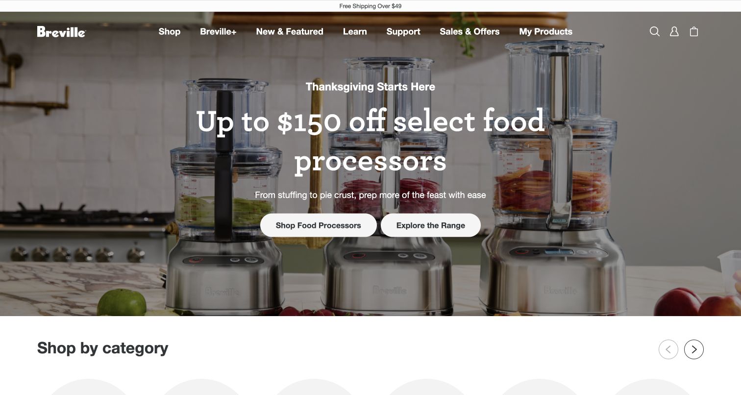
Breville’s US homepage places its food processors in a kitchen scene, then connects the seasonal message to two clear shopping actions. The products occupy much of the photograph rather than appearing as small decorative objects. Its navigation separates shopping, learning, support and ownership tasks, making the site useful beyond a single purchase. The commercetools case explicitly identifies the US store among the localized direct-to-consumer launches. That supports this property’s documented commerce association; it does not prove that the visible campaign, support system and learning content share one current implementation.
What you can learn
Connect promotional language to a recognizable task and visible product family. Keep education and post-purchase support available in the main structure, so the homepage can serve owners and researchers as well as shoppers following the current offer.
Pros
Product photography explains the category before a visitor reads detailed promotional copy.
Separate shop and range actions provide understandable choices within the same campaign.
Cons & considerations
White navigation over a photograph depends on a carefully controlled background treatment.
The large seasonal feature pushes detailed model differences below the initial view.
Platform source: Official commercetools case study for this public commerce property. Official case explicitly names Breville US among the initial localized direct-to-consumer stores launched on the shared commerce platform. Documentary association for the described commerce project; not a fresh backend observation or proof of every current company system. Platform evidence is separate from the direct website screenshot and is not a complete current infrastructure audit.
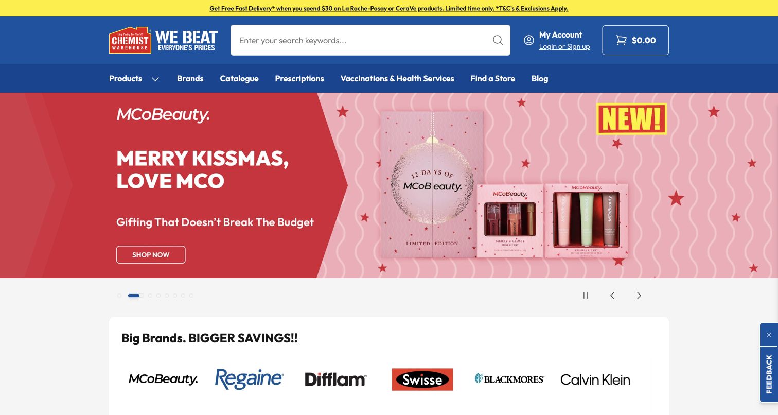
Chemist Warehouse Australia makes its retail identity unmistakable through blue navigation, yellow promotion space and a large search field. The opening campaign is followed by a recognizable brand strip, providing another way into a broad catalog. Services and store discovery sit beside product routes instead of being hidden in a distant footer. The official case describes the Australian and New Zealand online commerce experience; this review covers only the pictured Australian property. Its dense presentation is an editorial observation about information hierarchy, not a medical recommendation or an assessment of the claims made in individual product promotions.
What you can learn
For a broad retail catalog, provide several distinct discovery routes without making them interchangeable. Search, product categories, brands and service links should each answer a recognizable visitor need, with the largest campaign remaining a temporary layer above that structure.
Pros
A conspicuous search field suits visitors who already know the item they need.
The brand strip offers a compact alternative to browsing the full department tree.
Cons & considerations
Promotional colors and several attention-seeking areas create a busy opening screen.
Clinical suitability and product claims cannot be established through a design review.
Visible tech stack
Earlier / documented evidence
commercetools
Platform source: Official commercetools case study for this public commerce property. Official case describes the public pharmacy retailer's online storefront, catalog and checkout across Australia and New Zealand; this example is the Australian property. Documentary association for the described commerce project; not a fresh backend observation or proof of every current company system. Platform evidence is separate from the direct website screenshot and is not a complete current infrastructure audit.
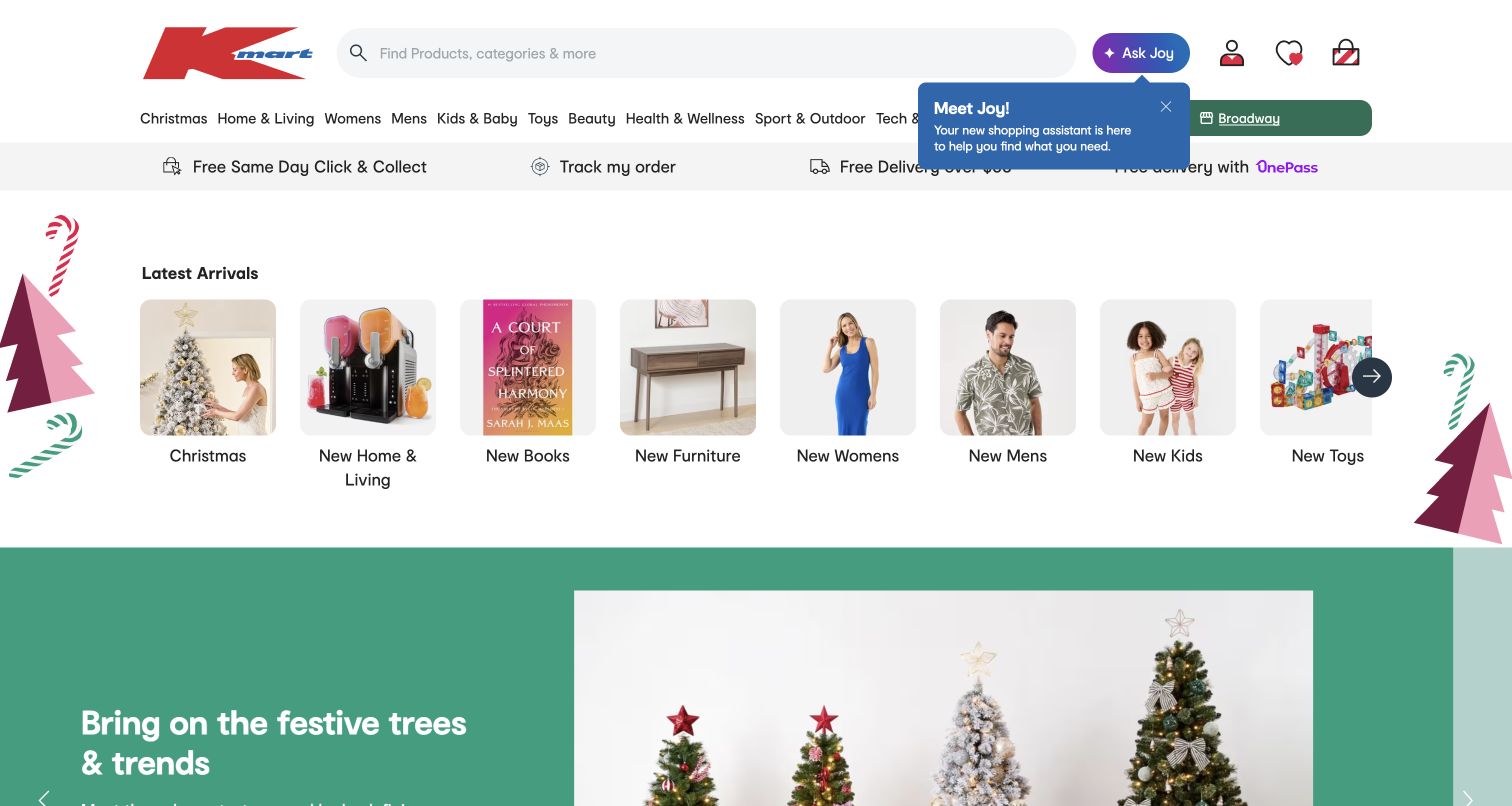
Kmart Australia opens with search, a substantial navigation system and a row of visual category shortcuts before the seasonal campaign. Those small pictures make broad departments easier to scan than a long list of text alone. The green holiday feature then supplies a timely destination without becoming the only route into the shop. The official commercetools story concerns Kmart’s Australian and New Zealand commerce migration and marketplace expansion. This is the Australian property, not the separate US retailer, and the case does not establish that every related service uses the same platform.
What you can learn
Keep high-frequency shopping categories visible outside the campaign area. A general merchandise homepage needs to accommodate both the shopper who knows a department and the visitor who arrives without a particular product in mind; a visual shortcut row can bridge those intentions.
Pros
Category images reduce the effort of scanning a large general merchandise catalog.
Search remains visually prominent even when the seasonal campaign changes below it.
Cons & considerations
Several navigation layers consume substantial vertical space before the featured content begins.
Helpful prompts and promotional elements can compete with the main browsing task.
Platform source: Official commercetools case study for this public commerce property. Official case documents Kmart Australia/New Zealand's web commerce migration and subsequent marketplace expansion; this example is the Australian public store, not the separate US retailer. Documentary association for the described commerce project; not a fresh backend observation or proof of every current company system. Platform evidence is separate from the direct website screenshot and is not a complete current infrastructure audit.
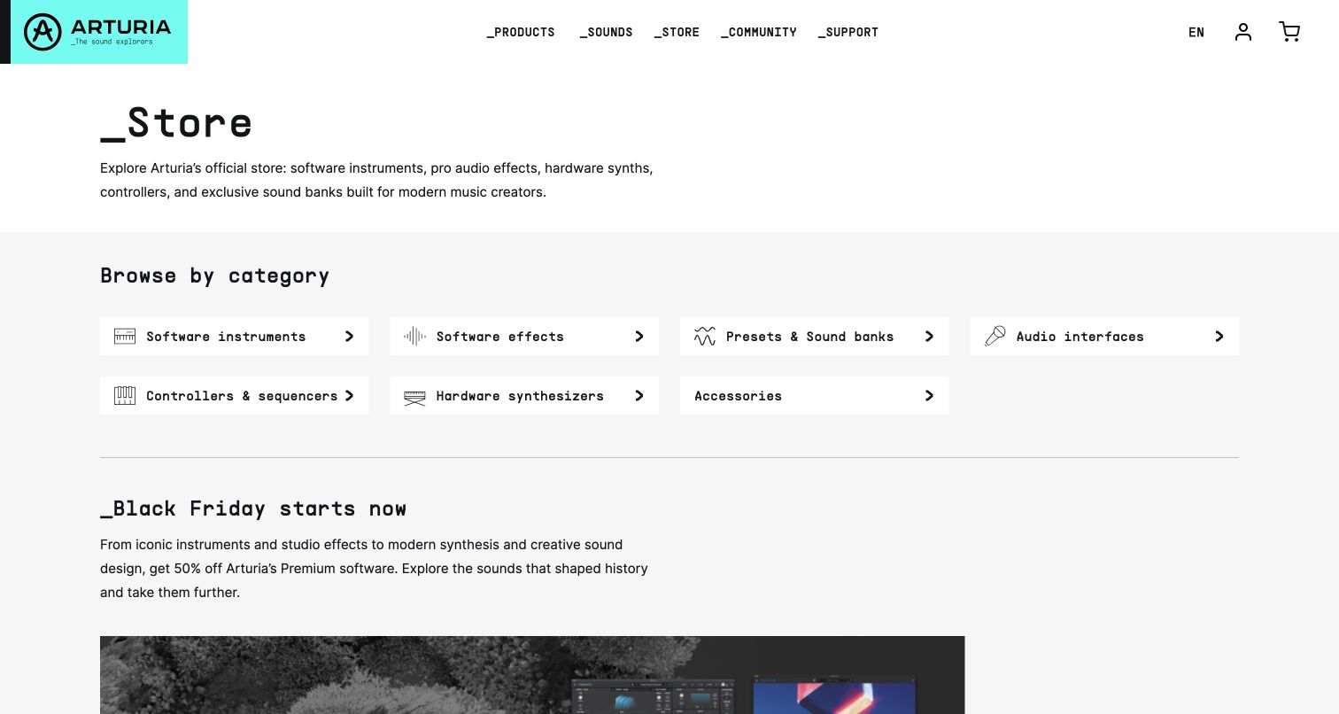
Arturia’s store begins with a plain statement of what it sells, followed by a tidy grid of categories for instruments, effects, sound banks, interfaces and hardware. The underscore typography and mint brand panel give the otherwise restrained layout a distinctive technical character. A seasonal offer follows the category gateway instead of displacing it. The official case describes the software and hardware webstore’s commerce migration, so this example uses the actual store route rather than assuming the corporate homepage proves the same implementation. The captured screen makes the distinction between product families particularly easy to study.
What you can learn
When a business sells both downloads and physical equipment, establish those shopping paths before presenting offers. Category names should describe what a buyer will receive, while the visual language can provide personality without making the basic product structure harder to understand.
Pros
A compact grid exposes the main product families without opening a menu.
The store introduction explains the breadth of the catalog in ordinary language.
Cons & considerations
The first viewport contains limited product imagery before the promotional section begins.
Digital licensing and physical delivery differences require explanation deeper in the journey.
Platform source: Official commercetools case study for this public commerce property. Official case documents Arturia's software and hardware webstore commerce migration, including catalog, promotions and order processing; capture the public store rather than infer unrelated corporate systems. Documentary association for the described commerce project; not a fresh backend observation or proof of every current company system. Platform evidence is separate from the direct website screenshot and is not a complete current infrastructure audit.
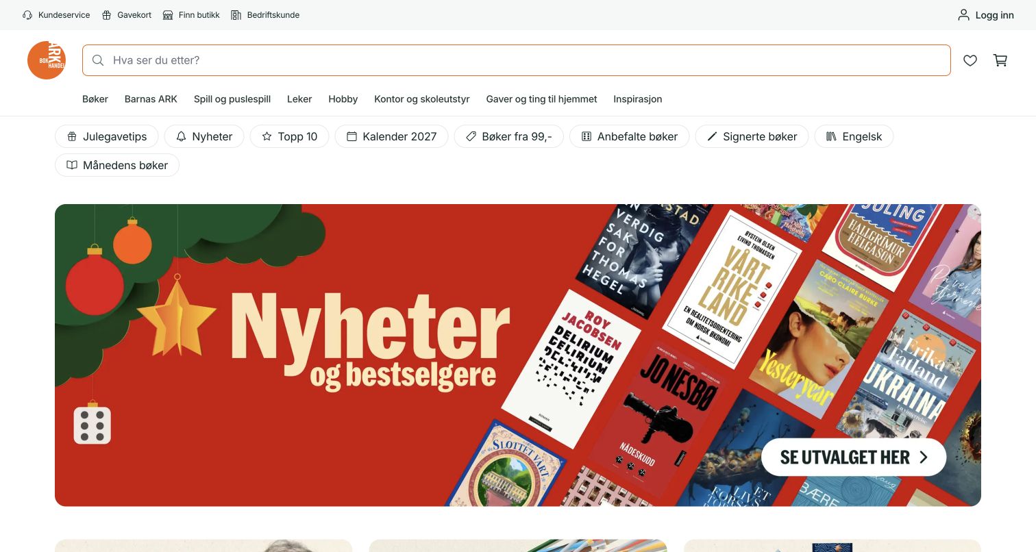
ARK Bokhandel combines an expansive search field with several compact navigation rows and a vivid seasonal book display. Tilted covers make the campaign recognizable as a reading selection rather than a generic lifestyle advertisement. Category shortcuts above it help visitors who want a genre or gift route instead of the featured assortment. The official case documents the Norwegian bookshop’s online-store migration, including browsing, pricing and checkout. Its current screenshot shows the public presentation; neither the imagery nor that case proves the implementation of every feature in the present store.
What you can learn
Treat book covers as informative content rather than interchangeable decoration. A themed selection can create an inviting entrance, but the permanent search and category system should remain easy to find for readers arriving with an author, title or genre already in mind.
Pros
The featured covers communicate the campaign’s product category immediately and visually.
Prominent search provides a practical counterweight to the more expressive seasonal presentation.
Cons & considerations
Several stacked navigation rows make the top of the page comparatively dense.
Angled small covers still need readable title information after a visitor enters a selection.
Visible tech stack
Earlier / documented evidence
commercetools
Platform source: Official commercetools case study for this public commerce property. Official case describes the Norwegian bookshop's public online-store migration, browsing, pricing and checkout. Documentary association for the described commerce project; not a fresh backend observation or proof of every current company system. Platform evidence is separate from the direct website screenshot and is not a complete current infrastructure audit.
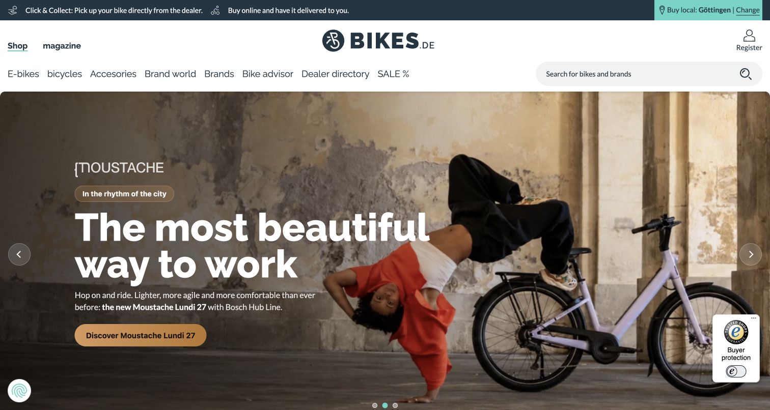
Bikes.de places collection and delivery information in a narrow utility strip above its brand, category navigation and search. The main feature uses a striking bicycle scene with a focused action, while a dealer directory remains available in the navigation. This creates a useful relationship between an aspirational product story and a practical local buying route. The official case specifically covers the public multi-dealer marketplace, including reservation, collection and shipping choices. The screenshot records the browser’s existing automatic translation; no regional preference or location was entered during research.
What you can learn
A marketplace should explain how fulfillment relates to its sellers before asking people to commit to a product. Keep the dealer route and delivery choices visible alongside campaigns, and distinguish a shared browsing experience from the responsibilities of individual participating retailers.
Pros
The utility strip makes collection and delivery visible before shoppers enter a listing.
The hero gives one product story clear priority within a broad bicycle catalog.
Cons & considerations
The large photographic campaign postpones specifications and comparison information until later.
Local availability and fulfillment terms need separate confirmation for the chosen dealer.
Platform source: Official commercetools case study for this public commerce property. Official case explicitly identifies the Bikes.de public multi-dealer bicycle marketplace, including reservation, collection and shipping choices. Documentary association for the described commerce project; not a fresh backend observation or proof of every current company system. Platform evidence is separate from the direct website screenshot and is not a complete current infrastructure audit.
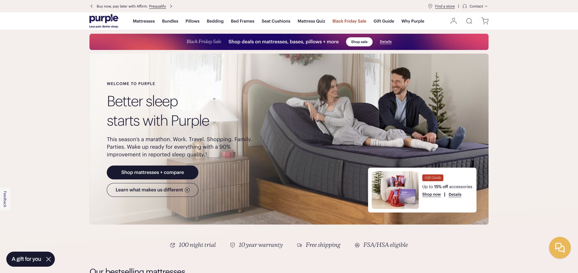
Purple’s captured homepage pairs a lifestyle mattress scene with a prominent comparison action and a secondary explanation of its product difference. A service strip introduces trial, warranty and delivery themes, while seasonal promotions remain visible around the central story. The layout gives research-oriented visitors a route beyond an immediate purchase button. The official commercetools case documents a public checkout migration in October 2019 and later product-page work. This is a historical commerce association, kept separate from the unchanged earlier capture and unavailable broad audit. The pictured sleep and comfort statements remain the retailer’s claims.
What you can learn
For an expensive product, make evaluation a first-class journey. A comparison route, a clear explanation of differences and accessible service terms can support deliberation, but each needs specific, verifiable detail beyond the reassuring wording on the homepage.
Pros
A comparison action acknowledges that shoppers may be deciding among several models.
Service themes are presented near the main product story instead of being concealed.
Cons & considerations
Seasonal banners and supplementary cards add competing messages around the core offer.
The capture does not substantiate health benefits or the practical terms of guarantees.
Platform source: Official commercetools case study for this public commerce property. Official case documents the mattress retailer’s public checkout migration in October 2019 and subsequent product-page work. Historical commerce association, not a fresh backend observation. Documentary association for the described commerce project; not a fresh backend observation or proof of every current company system. Platform evidence is separate from the direct website screenshot and is not a complete current infrastructure audit.
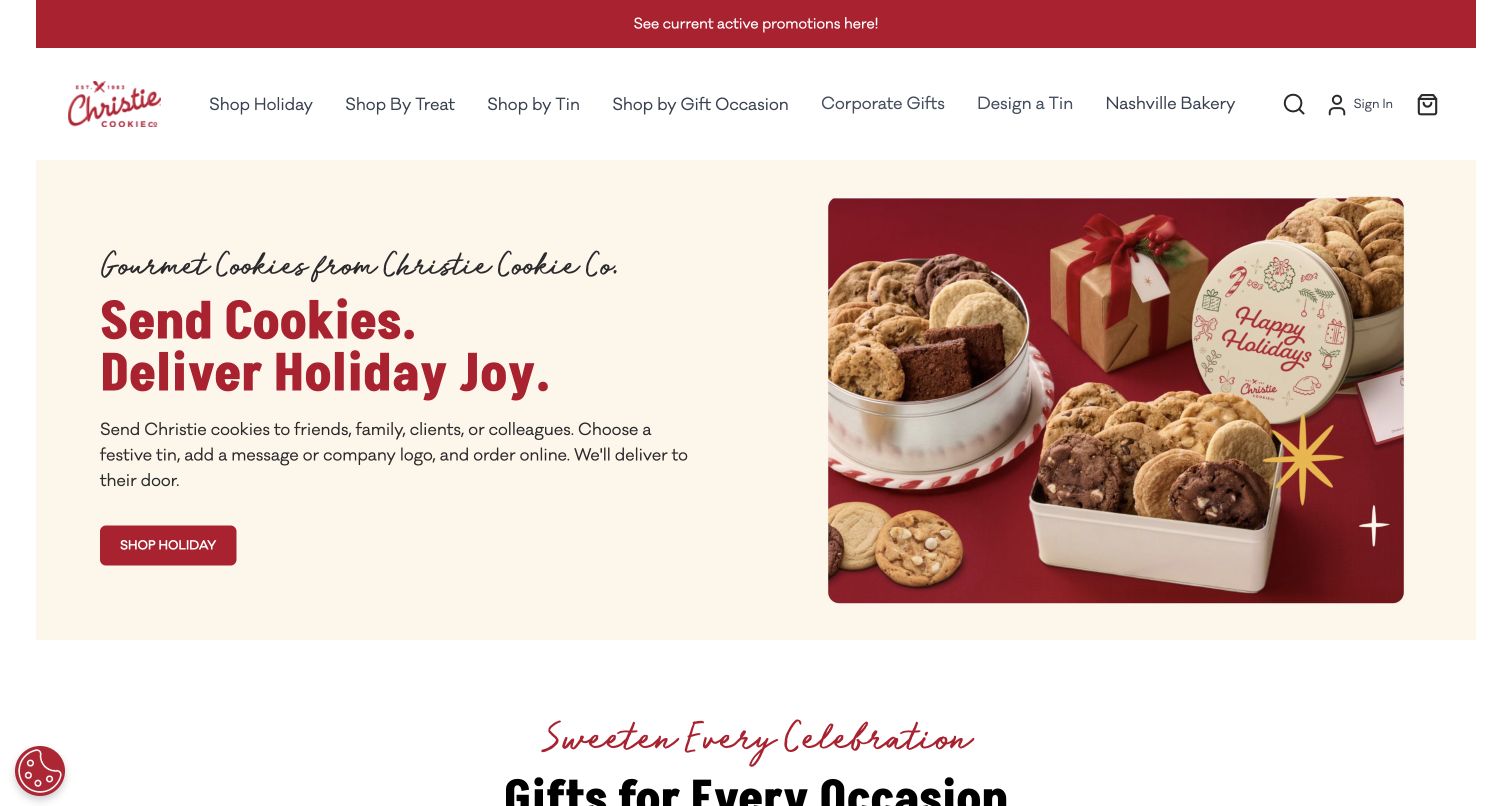
Christie Cookie uses a warm cream-and-red presentation to connect seasonal gift language with a photograph of packaged cookies. The split composition leaves room for a readable message while showing what the gift looks like. Navigation offers product, occasion and tin-related routes, with customization treated as a distinct possibility. The official case identifies the public storefront’s use of Composable Commerce and commercetools Frontend. That documentary relationship concerns the gift-shopping experience, rather than establishing every current operational system or proving the quality of the food itself.
What you can learn
A gift homepage should help visitors picture the object, recipient and occasion together. Show the packaging clearly, explain the next selection step, and make customization discoverable without forcing every shopper through a more complicated personalized-order process.
Pros
The product photograph makes the gift format tangible beside the promotional message.
Occasion and packaging routes give shoppers several understandable ways to narrow the assortment.
Cons & considerations
Seasonal styling can overshadow evergreen products when the campaign occupies most of the opening.
Shipping deadlines and customization constraints require clear detail beyond the first screen.
Platform source: Official commercetools case study for this public commerce property. Official case documents the public cookie storefront using Composable Commerce and commercetools Frontend, including gifting and customization. Documentary association for the described commerce project; not a fresh backend observation or proof of every current company system. Platform evidence is separate from the direct website screenshot and is not a complete current infrastructure audit.
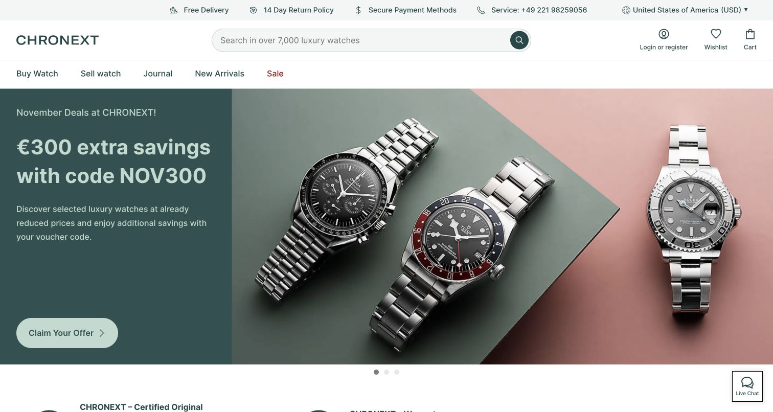
CHRONEXT balances a luxury-watch photograph with a concise promotional message and a substantial search field. The restrained gray-green frame avoids competing with the product, while navigation distinguishes buying, selling and editorial reading. Practical reassurance appears near the header, making the marketplace context visible before a visitor explores individual watches. The official case documents the public marketplace and its redesigned storefront using Composable Commerce and Frontend. This review concerns that visible shopping presentation; it does not independently verify authenticity, valuation, service promises or the current implementation of every linked workflow.
What you can learn
When a marketplace serves two sides of a transaction, make their starting points unmistakable. Separate buying from selling in the navigation, and attach concrete explanations to trust messages so that reassurance can be examined rather than simply accepted as decorative copy.
Pros
Buy and sell destinations acknowledge two distinct visitor intentions from the outset.
Large product photography and restrained colors keep attention on the watch itself.
Cons & considerations
Promotional messaging shares attention with the more durable marketplace trust questions.
Product condition and seller-service details cannot be judged from a homepage screenshot.
Visible tech stack
Earlier / documented evidence
commercetools
Platform source: Official commercetools case study for this public commerce property. Official case describes the public luxury-watch marketplace and redesigned storefront using Composable Commerce and Frontend. Documentary association for the described commerce project; not a fresh backend observation or proof of every current company system. Platform evidence is separate from the direct website screenshot and is not a complete current infrastructure audit.
Interflora Australia places a florist working on a bouquet beside a dark delivery-focused message panel. Its navigation offers occasions, flower types, colors, locations and price routes, reflecting the several ways someone may approach a gift purchase. The human working scene gives the network a more tangible identity than a grid of finished arrangements alone. The official case concerns the Australian storefront and its regional delivery and pricing workflow. The relationship is not extended to other Interflora territories, and no delivery details or recipient information were entered during this review.
What you can learn
Gift discovery should support both emotional and practical starting points. An occasion, preferred color and budget are useful routes, but they must eventually meet clear location and timing information; a compelling photograph cannot substitute for those fulfillment details.
Pros
The florist image makes the work behind the offered product visible and concrete.
Multiple browsing routes accommodate visitors who have different amounts of gift knowledge.
Cons & considerations
The extensive category menu requires careful organization to remain easy to scan.
Actual availability and delivery timing depend on information beyond the opening page.
Platform source: Official commercetools case study for this public commerce property. Official case covers the Australian flower-delivery storefront and regional delivery/pricing workflow; no claim is made for other Interflora territories. Documentary association for the described commerce project; not a fresh backend observation or proof of every current company system. Platform evidence is separate from the direct website screenshot and is not a complete current infrastructure audit.
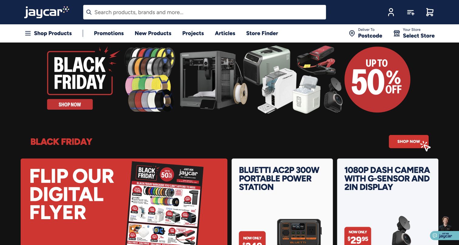
Jaycar’s Australian homepage combines a highly visible search field with product, project, article and store-finder routes. Its promotional area is deliberately energetic, using strong red-and-black treatment and a collage of merchandise. That emphasis suits a large retail offer, while the project and advice destinations give the store a role beyond listing parts. The official case connects its public online catalog and cart to a broader in-store commerce implementation. This review stays with the pictured Australian shop, without treating that account as evidence for every related internal retail system.
What you can learn
Technical stores should support both the exact item and the larger task it belongs to. Keep project advice and store assistance adjacent to product discovery, while ensuring promotions do not obscure specifications, compatibility information or the search tools experienced shoppers depend on.
Pros
Search is positioned as a primary task rather than a small secondary utility.
Project and article links offer a useful path for visitors who need context.
Cons & considerations
Dense promotional graphics compete with navigation for attention in the initial screen.
Compatibility and safety information still require careful product-level explanation and review.
Visible tech stack
Earlier / documented evidence
commercetools
Platform source: Official commercetools case study for this public commerce property. Official case connects the public online cart and catalog with the retailer's in-store commerce implementation; this review concerns the Australian public shop. Documentary association for the described commerce project; not a fresh backend observation or proof of every current company system. Platform evidence is separate from the direct website screenshot and is not a complete current infrastructure audit.
Leebmann24 uses a restrained black-and-white header to organize a specialist automotive catalog around recognizable vehicle divisions. Search and utility links remain close to that navigation, while a large care-product photograph supplies a more accessible promotional entrance. A visible service notice also shows how operational information competes with campaign space. The official commercetools case describes the public parts store’s catalog and commerce migration. The captured English route belongs to that same property; it is not a claim that a vehicle manufacturer’s own website or unrelated dealer systems use the platform.
What you can learn
A specialist catalog needs a clear distinction between inspiration and exact fit. Use campaigns to introduce products, but protect the search and compatibility routes that help knowledgeable visitors avoid selecting an unsuitable part; operational notices also need an intentional place in the layout.
Pros
Vehicle-oriented divisions give experienced buyers a recognizable starting point in a complex catalog.
The simple header treatment leaves the promotional product photograph visually distinct.
Cons & considerations
A broad campaign cannot explain the compatibility details required for individual parts.
Service notices add another important message to an already substantial navigation area.
Visible tech stack
Earlier / documented evidence
commercetools
Platform source: Official commercetools case study for this public commerce property. Official case describes the public automotive-parts catalog and webstore migration, including parts discovery and inventory integration. Documentary association for the described commerce project; not a fresh backend observation or proof of every current company system. Platform evidence is separate from the direct website screenshot and is not a complete current infrastructure audit.
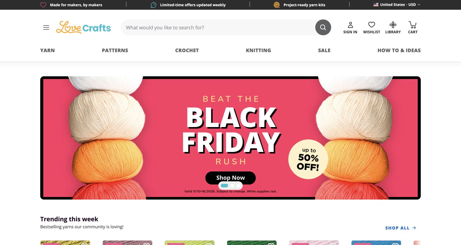
LoveCrafts combines a wide search field with separate routes for yarn, patterns, crochet, knitting and ideas. Its seasonal hero uses brightly colored yarn to keep the promotion closely tied to the materials people came to find. A trending-products section begins immediately below, moving the page from campaign to catalog. The official case describes an earlier incremental migration from Magento 1 to commercetools. That historical project is the reason for inclusion: the pictured 2026 storefront is a design reference, and its current platform continuity is not established by the older story.
What you can learn
Creative retail works best when materials and instructions are easy to connect. Keep the pathways to patterns, supplies and advice distinct enough to understand, but close enough that a visitor can move from inspiration toward a realistic project without starting the search again.
Pros
The category vocabulary reflects actual making activities rather than internal business departments.
The transition from campaign to trending items keeps the opening connected to merchandise.
Cons & considerations
Promotional intensity can distract from practical material specifications and project requirements.
Historical platform evidence must not be presented as a fresh current-backend observation.
Platform source: Official commercetools case study for this public commerce property. The official case documents LoveCrafts’ earlier incremental migration from Magento 1 to commercetools. The 2026 public storefront is shown for design comparison only; current platform continuity is not established and current source signals must remain separately qualified. Documentary association for the described commerce project; not a fresh backend observation or proof of every current company system. Platform evidence is separate from the direct website screenshot and is not a complete current infrastructure audit.
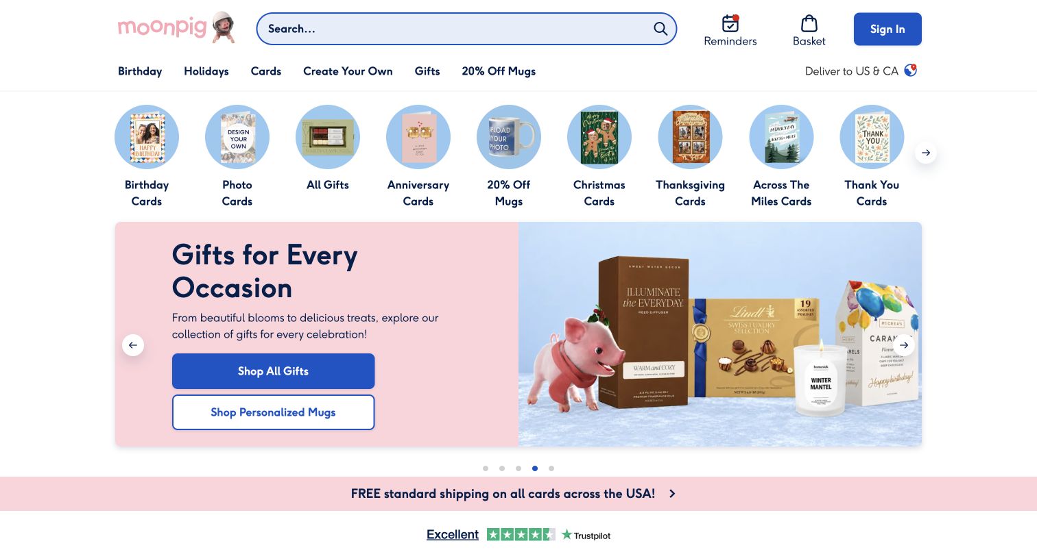
Moonpig’s US storefront uses rounded category imagery, generous spacing and a pastel palette to make a large gift assortment approachable. Its main campaign and prominent blue actions sit beneath routes that acknowledge different card and gift intentions. Reminders and regional context are visible parts of the experience, but neither was configured during this review. The official case describes the personalized card-and-gift commerce platform across several locales. The US property is the specific example here; a public homepage capture does not verify the behavior of its personalization, reminder or checkout systems.
What you can learn
Make the first selection feel manageable before introducing personalization. A gift store can organize browsing around familiar occasions and recipients, then explain the editable choices and delivery implications once a visitor has selected a suitable product rather than presenting every option immediately.
Pros
Rounded category images create a welcoming and easily scanned set of starting points.
Consistent blue actions stand out clearly from the softer surrounding campaign colors.
Cons & considerations
The cheerful opening does not reveal the complexity of personalization and delivery choices.
Reminder and account features need clear expectations before visitors provide personal information.
Platform source: Official commercetools case study for this public commerce property. Official case describes the personalized card-and-gift commerce platform across five locales; this review is the public US storefront only. Documentary association for the described commerce project; not a fresh backend observation or proof of every current company system. Platform evidence is separate from the direct website screenshot and is not a complete current infrastructure audit.
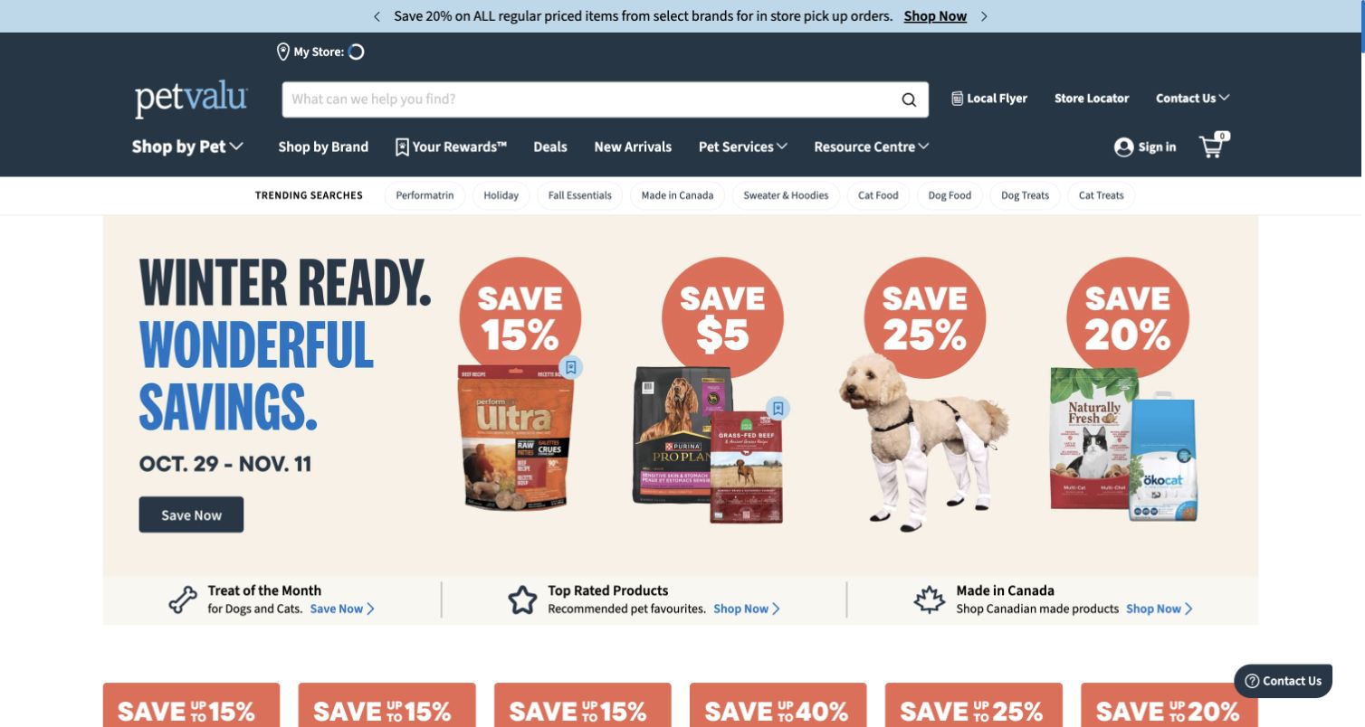
Pet Valu’s Canadian homepage places a broad search field within a dark-blue header, then offers pet, brand and trending routes before the seasonal promotion. The combination recognizes that shoppers may start with an animal, a familiar manufacturer or a specific replenishment need. Service content provides another reason to return beyond the current offer. The official case explicitly covers the Canadian storefront’s catalog, homepage and product-page migration. That supports a documented public commerce relationship, without establishing every current application or turning the site’s product messaging into independent veterinary advice.
What you can learn
Build the navigation around the recurring decisions customers actually make. A pet retailer needs to help people find a familiar item efficiently while also making species, life-stage and service information understandable; promotional content should not replace those stable routes.
Pros
Pet and brand pathways accommodate different levels of shopper familiarity with the catalog.
Search remains prominent above seasonal campaigns and supplementary retail service content.
Cons & considerations
Trending shortcuts and promotional cards add density to the first browsing decision.
Suitability for an individual animal requires information beyond the homepage and this design review.
Visible tech stack
Earlier / documented evidence
commercetools
Platform source: Official commercetools case study for this public commerce property. Official case documents the Canadian public storefront's catalog, promotions, homepage and product-page migration. Documentary association for the described commerce project; not a fresh backend observation or proof of every current company system. Platform evidence is separate from the direct website screenshot and is not a complete current infrastructure audit.
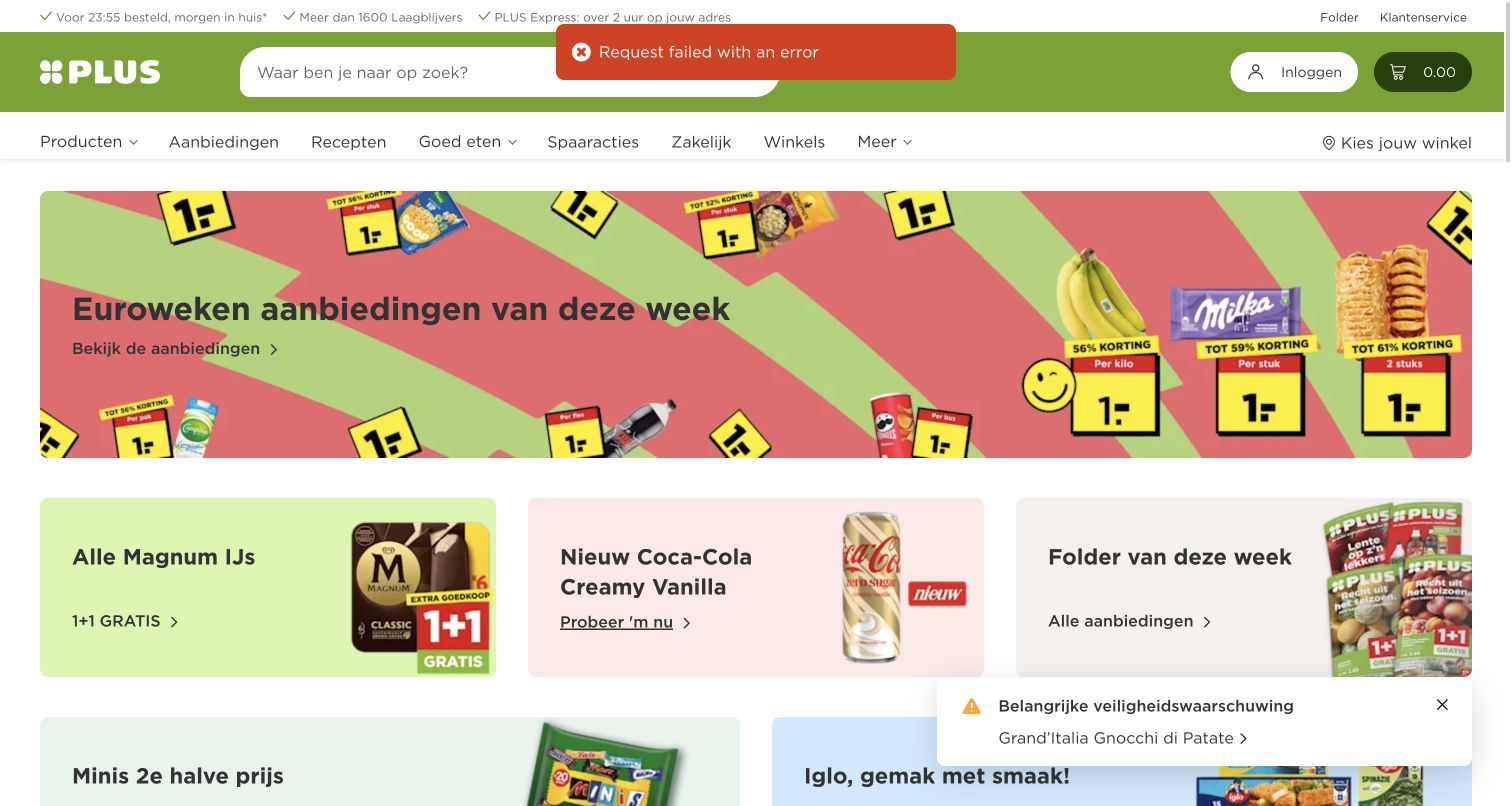
PLUS uses a vivid green header, a wide search field and familiar product, offer and recipe destinations to frame its Dutch grocery store. Large price-led campaign tiles are followed by smaller offer cards, making the weekly retail rhythm obvious. The official case describes the public webshop’s discovery, discounts and checkout, with commercetools as its commerce engine. The direct capture also records a temporary request-error toast and a product-safety notice; these genuine page conditions are retained rather than hidden. They limit what can be concluded about uninterrupted browsing at the observation time.
What you can learn
Routine shopping tasks need to remain stable while offers change frequently. Give search, store context and basket access a predictable place, and make operational errors and safety information understandable without letting temporary promotional content drown out messages that require attention.
Pros
A consistent green frame makes search and core grocery tasks easy to identify.
The offer grid supports quick scanning of several current retail promotions.
Cons & considerations
The observed request-error toast indicates a real limitation in the captured browsing state.
Dense price graphics and notices compete for attention within the initial viewport.
Platform source: Official commercetools case study for this public commerce property. Official case describes the Dutch supermarket webshop, product discovery, discounts and checkout with commercetools as the commerce engine. Documentary association for the described commerce project; not a fresh backend observation or proof of every current company system. Platform evidence is separate from the direct website screenshot and is not a complete current infrastructure audit.
Treedom’s public opening places a large environmental scene behind a short mission statement and two clear audience routes for companies and individuals. The gift-receipt action remains available in the header, acknowledging visitors who are returning with a different task. The official case documents the public tree-planting commerce platform’s cart, stock and multi-market migration, alongside a separate React frontend. That is a specific project association rather than proof of current infrastructure. The site’s environmental and community claims are presented as its own statements, not as outcomes independently established by this visual review.
What you can learn
When a product is closely tied to a mission, explain the next action as clearly as the purpose. Distinguish audience journeys early, preserve practical return-visitor tasks, and provide substantive supporting information after the emotional introduction rather than relying on the hero alone.
Pros
Separate company and individual routes make the first decision explicit and understandable.
The gift-receipt action serves a useful task distinct from purchasing or browsing.
Cons & considerations
Large background imagery can require careful treatment for legibility and alternative access.
The opening’s broad mission language needs detailed evidence beyond the photographed scene.
Platform source: Official commercetools case study for this public commerce property. Official case documents the public tree-planting commerce platform's carts, stock and multi-market migration with a separate React frontend. Documentary association for the described commerce project; not a fresh backend observation or proof of every current company system. Platform evidence is separate from the direct website screenshot and is not a complete current infrastructure audit.
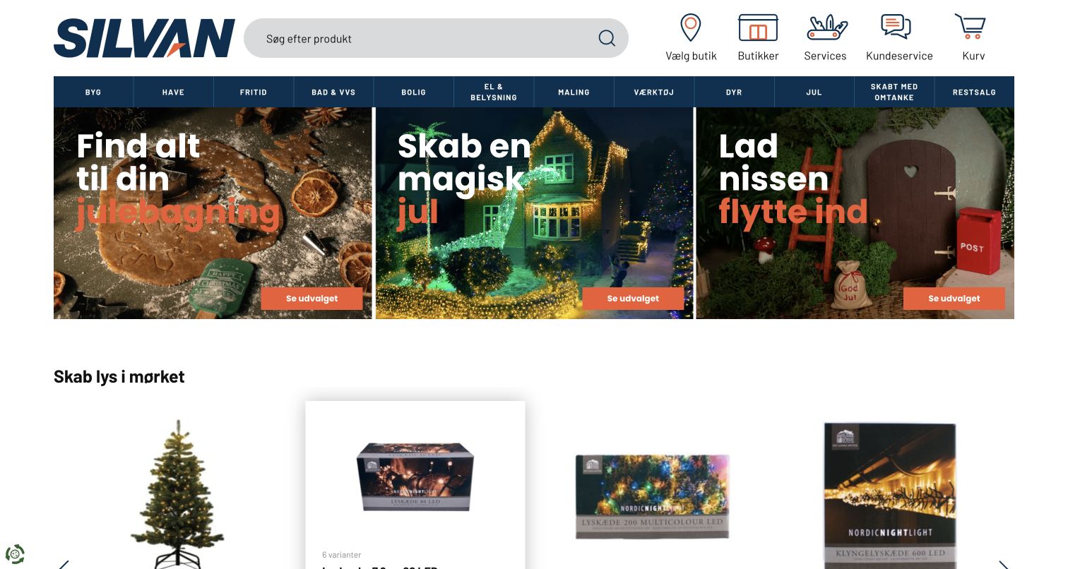
Silvan’s Danish homepage combines a broad search field with store, service, customer-help and basket controls. Below the department bar, three adjacent seasonal cards translate the catalog into concrete activities such as baking, lighting and decorating. Their consistent image-and-action structure makes the group easy to scan despite the different scenes. Product cards begin below the campaign row, creating a visible path from project inspiration toward merchandise. The official case specifically names Silvan.dk and its rebuilt public commerce experience; the association is scoped to this storefront rather than inferred for every company system.
What you can learn
Project-based retail can make a large catalog feel more accessible by showing recognizable activities first. Keep those editorial cards consistent, retain direct category and search routes for purposeful shoppers, and connect each activity to the practical products and service details needed to complete it.
Pros
Three coordinated campaign cards offer several useful entrances without one dominating the screen.
Store and service controls remain visible alongside search and the product departments.
Cons & considerations
A wide department bar requires careful adaptation when screen space becomes limited.
Seasonal projects still need clear product specifications and availability beyond the initial cards.
Platform source: Official commercetools case study for this public commerce property. Official case explicitly identifies Silvan.dk and its public DIY storefront, catalog and delivery options after its commerce-backend rebuild. Documentary association for the described commerce project; not a fresh backend observation or proof of every current company system. Platform evidence is separate from the direct website screenshot and is not a complete current infrastructure audit.
Kegan has 15+ years of experience working with small businesses, Fortune 500 companies, and everything in between. No development job is too big or too small: he brings the same hands-on attention to a focused improvement, a complete website, or a custom application.
For commercetools projects, he can help with responsive interfaces, reusable components, custom functionality, API connections, and performance-minded implementation. He works directly with clients on scope, design, implementation, testing, and handover, with an emphasis on clear communication and a system that remains practical to maintain after launch.
Show 3 other commercetools developersHide other commercetools developers
Choose a storefront structure around the shopping task
Make a specialist catalog understandable
For parts, musical equipment, craft materials or technical supplies, begin with the distinctions a buyer must understand. Compatibility, format and intended use may be more important than the current promotion. Preserve exact search and filtering routes while using editorial content to help less experienced visitors find the right starting point.
Give gifts several clear entrances
Occasion, recipient, budget, packaging and delivery timing are different decisions. Let a gift buyer begin with the information they already know, then reveal the choices needed to complete an appropriate selection. Personalized products need understandable previews and constraints, while ordinary gifts should not inherit unnecessary complexity from the customization workflow.
Separate a marketplace from its individual sellers
A shared catalog can create a consistent browsing experience even when collection, shipping or support depends on a participating retailer. Explain those responsibilities before they become a checkout surprise. A dealer directory, seller identity or fulfillment explanation should be part of the shopping structure, not a small qualification added after the main promotional promise.
From references to requirements
Plan the operating details alongside the public design
Define what happens when a cart changes
The Carts API represents the items a shopper intends to purchase and provides a recalculation action for current prices and discounts. Plan how the storefront explains a changed amount, unavailable item or updated offer. The interface should preserve context and give a useful next step rather than silently turning a familiar basket into a different purchase.
commercetools documents OAuth authorization and scoped API access, with separate clients and minimum necessary permissions. Assign clear ownership to the storefront, catalog integrations and operational tools. The public design should never depend on exposing a privileged integration credential, and release planning should include how dependent systems are checked without placing real orders or altering customer accounts.
Design for ordinary changes and conflicting updates
The platform’s general API concepts describe versioned resources and distinguish consistent from eventually consistent operations. Plan for the possibility that a previously read item has changed before an update is submitted. Helpful feedback and deliberate recovery behavior belong in the product design, especially where multiple tools or teams maintain the same commerce information.
Ask the actual team to carry out its routine job: publish a realistic update, correct a mistake, preview a narrow screen, and identify who owns an integration failure. For a library or frontend framework, also ask who maintains the content source and deployment. A polished screenshot does not answer those operational questions.
Beyond the screenshot
A practical commercetools storefront checklist
Identify the exact public store, regional scope, audiences and priority shopping tasks.
Keep persistent search and category routes independent of temporary campaigns.
Agree which differences are product variants and which need separate product records.
Define the context that determines displayed prices, offers and availability.
Make compatibility, licensing, packaging and delivery constraints understandable where relevant.
Separate ordinary shopping from optional personalization and other complex workflows.
Explain marketplace seller and fulfillment responsibilities before the purchase decision.
Plan useful feedback when prices, promotions, inventory or cart contents change.
Give content, catalog and integration changes clear operational owners.
Keep privileged credentials out of public assets and scope integration access deliberately.
Retain keyboard access, meaningful control names, readable text and image alternatives.
Run automated checks, build and deploy through the approved route, then verify the live result.
Test with real content, a keyboard, a small screen, slow or failed requests, and the people who will maintain the system. These are planning checks, not an accessibility, security, performance, or search-ranking certification.
Sources & editorial method
How this commercetools collection was reviewed
Twenty distinct public properties were selected using official commercetools customer stories tied to their public storefront or documented commerce project. Five opening organizations have separate identity sources. Eighteen genuine direct browser screenshots were captured on November 10, 2026 UTC and Pacific; two exact earlier captures were reused without changing their dates. The original batch remains the November 9 evening batch. Each image was inspected for an original collection-specific review. The PLUS image intentionally retains a visible request-error toast and safety notice; this is a limitation of the observed page, not a concealed successful interaction. Broad public audits are independently recorded, including bounded failures, and older global records are preserved. No purchase, account, recipient, medical, payment, location or form data was submitted. The reviews assess public design and information structure, not product quality, therapeutic claims, environmental outcomes or conversion performance.
Every image is an unmodified capture from the actual website, with its source and capture date. Some captures are reused from our shared catalog; their dates remain the original capture dates. None comes from a vendor gallery or a generated reconstruction. Moving imagery and live content can change.
Technology attribution uses public page assets or metadata, official platform documentation, or a cited first-party project case study. Documentary and framework-relationship evidence is identified where used; it is not a complete current backend inventory. A CMS image CDN alone does not establish a full CMS deployment. A library’s presence does not prove which individual controls use it, and a platform label does not establish AI authorship.
The composition notes, lessons, pros and tradeoffs are original editorial observations. We have not measured conversion, traffic, security, performance or accessibility conformance. Website owners retain their brands and imagery; these examples are not our client portfolio. Written, Edited and Curated are independent records, not dates advanced by a build. See our editorial standards or suggest a correction.
Questions worth asking
commercetools website development FAQs
Does a commercetools case study prove the current website uses it?
It proves the documented relationship and project scope, not uninterrupted current use. This guide distinguishes the named public property, historical migration and current public-source observations. LoveCrafts is explicitly a historical association, with current Shopify references separately recorded.
Is commercetools the same thing as a website theme?
No. The documented commerce APIs and the public storefront are different parts of the experience. A project can use a distinct frontend and content system. A screenshot shows the interface, while platform evidence must identify the specific commerce relationship independently.
Why do product modeling and variants matter to the design?
Products and variants determine which differences belong together and which choices shoppers need to make. The commercetools Products API supports variants, attributes, images and assets, but the storefront still needs useful labels and a clear selection process tailored to its actual catalog.
What should happen when a basket price changes?
The storefront should explain the changed amount and give the shopper a useful next step. The Carts API provides recalculation for current prices and discounts; the surrounding interaction must make any resulting change understandable rather than silently implying the previous offer still applies.
Why are some broad technology audits unavailable?
The scanner respects public access controls and bounded response limits. An unavailable audit does not establish an empty stack or justify guessing a private backend. Those examples retain genuine browser captures and explicit official project evidence, with the unsuccessful scan recorded separately.
Why do some screenshots have older dates?
Bang & Olufsen and Purple reuse genuine earlier direct captures and their unchanged audit records. The new reviews have their own editorial date. Capture dates, successful technology observations and publication dates describe separate events.
Are these stores ranked by revenue or service quality?
No. The sequence is editorial, opening with five recognizable organizations whose identities are sourced separately. The reviews discuss visible design choices and practical lessons, without measuring conversion rates, endorsing service quality or creating an award.
Borrow the structure that helps shoppers understand the catalog and complete their real task. Keep campaign freedom, reliable product information and clear operational responsibilities working together, then assess the actual published store rather than the technology name alone.