Best Culinary School Websites of 2026 (29 Real-World Examples)
Compare how culinary schools explain the craft, the commitment and the route into a real course.
A culinary school website has to do more than make food look delicious. It should help a future student distinguish a recreational class from professional training, understand what happens in the kitchen, and investigate the time and financial commitment without first becoming a sales lead.
The useful design question is not which school has the most cinematic food film. It is whether the site connects appetite and ambition to a specific educational choice. A prospective chef, an experienced pastry professional and someone buying a birthday workshop can admire the same photograph while needing entirely different information. An effective structure acknowledges those differences early.
This collection considers institutions that actually provide culinary education, including specialist cookery schools, chef academies, college culinary divisions and online teaching providers. Those are different operating models, not interchangeable credentials. A course page or school division is included when it presents the educational offer more precisely than a broad parent-college homepage.
Use the examples as prompts for your own brief: how does the school name the program, show learning rather than only finished dishes, separate short experiences from sustained study, and explain the next step? Visual reviews are not inspections of teaching, accreditation, student welfare, employment outcomes or the enrollment systems behind the public website.
Before the examples
What makes good culinary school website design in 2026?
State what kind of culinary education this is
Put professional training, recreational workshops, continuing education and online study into recognizable groups. A visitor should not have to decode internal qualification names before learning whether a program is a weekend experience or a substantial course. Name the learning format alongside the subject, and preserve the distinction when several offers share one school brand.
Show the process, not just a beautiful result
Finished pastries and plated dishes establish the subject, but they cannot explain how a student learns. Pair them with appropriately permissioned teaching photographs, sample practical work, curriculum descriptions and explanations of facilities. Avoid making one dramatic restaurant-service image stand in for every program, location and teaching format.
Make the commitment comparable
Bring start dates, duration, weekly schedule, location, fees, entry requirements and the exact award together on program pages. Explain what is included and what needs another enquiry. A visitor comparing two courses should not need to assemble those basics from a brochure, a booking widget and an admissions email thread.
Give different visitors different next steps
Browsing a hobby class, investigating a diploma and asking about an international application are different tasks. Use meaningful actions such as explore dates, view the syllabus or ask admissions, with a clear description of the handoff. Do not make a purchase-like button imply immediate enrollment when an application and review still follow.
The collection · 29 examples
29 culinary school websites worth studying
These29 public culinary-education examples span specialist schools, chef academies, college divisions and online teaching. Each review studies the actual captured page and identifies a practical design lesson, along with tradeoffs to consider rather than an endorsement of the school or its courses.
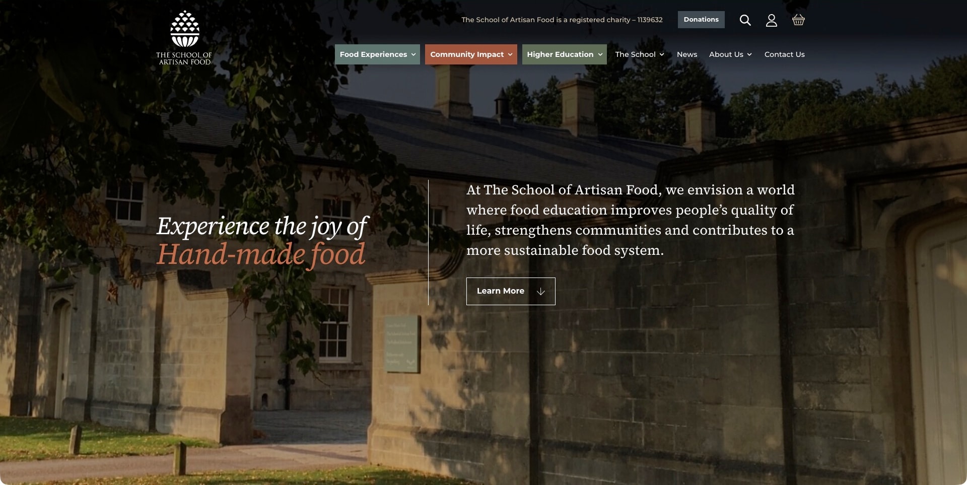
The School of Artisan Food places its identity over a darkened photograph of the teaching-site exterior rather than a restaurant dish. An italic headline occupies the left half, while a mission statement and outlined action sit across a fine vertical divider. Muted green, rust and olive navigation blocks distinguish food experiences, community impact and higher education. Those categories matter: the official course structure includes short artisan classes and longer baking education, so a single enrollment message would obscure different intentions.
What you can learn
Give each learning commitment an unmistakable route before requesting an enquiry. The setting supplies atmosphere, but the useful decision is the separation between experiences, education and community work; course duration and prerequisites should explain each choice.
Pros
The divided composition accommodates both an emotional introduction and a substantive institutional purpose.
Colored navigation groups make different kinds of food education visible without an opening catalog.
Cons & considerations
The exterior frame needs supporting classroom photography to demonstrate the teaching environment.
A general Learn More action requires clear downstream routing for diploma and short-course visitors.
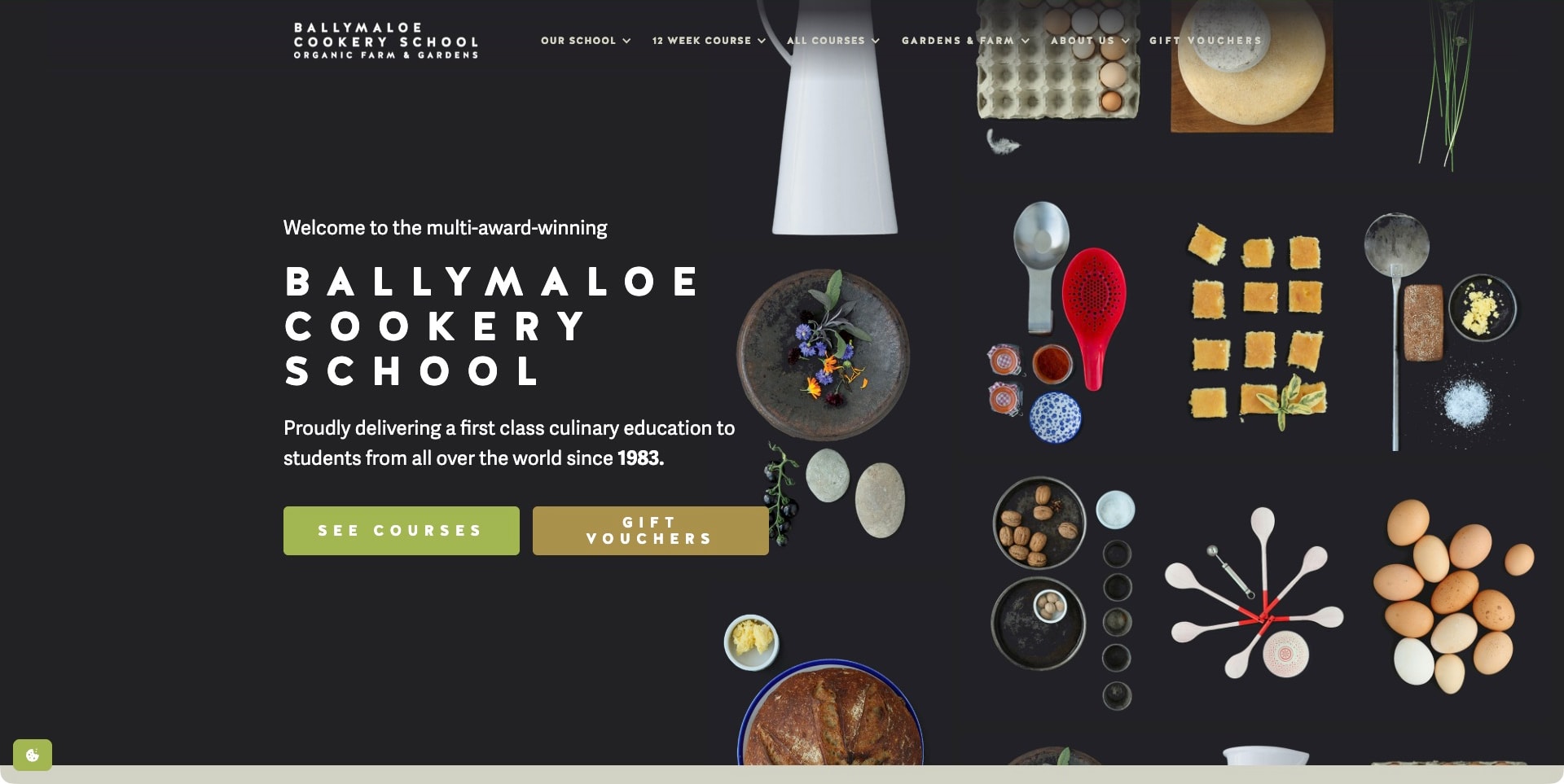
Ballymaloe builds its first screen around a charcoal background and an overhead arrangement of ingredients, utensils and small preparations. The still-life occupies the right side, leaving a deliberate dark reading area for the widely tracked school name and introductory statement. Two substantial buttons distinguish courses from gift vouchers, using green and ochre without adding photographic noise. The official school source also separates its twelve-week certificate from shorter cookery courses, making this food-led welcome a front door to different levels of commitment.
What you can learn
Compose culinary imagery around the reading area rather than placing text across its busiest details. The next course listing should make professional training and hobby sessions distinguishable, not leave visitors to infer the difference from polished food photographs.
Pros
Ingredients and tools establish culinary identity without pretending to document a particular class.
Contrasting course and voucher buttons distinguish choosing study from buying a present.
Cons & considerations
The tracked title needs careful mobile wrapping to retain usable space for actions.
School-supplied award and quality language should not substitute for specific curriculum and entry information.
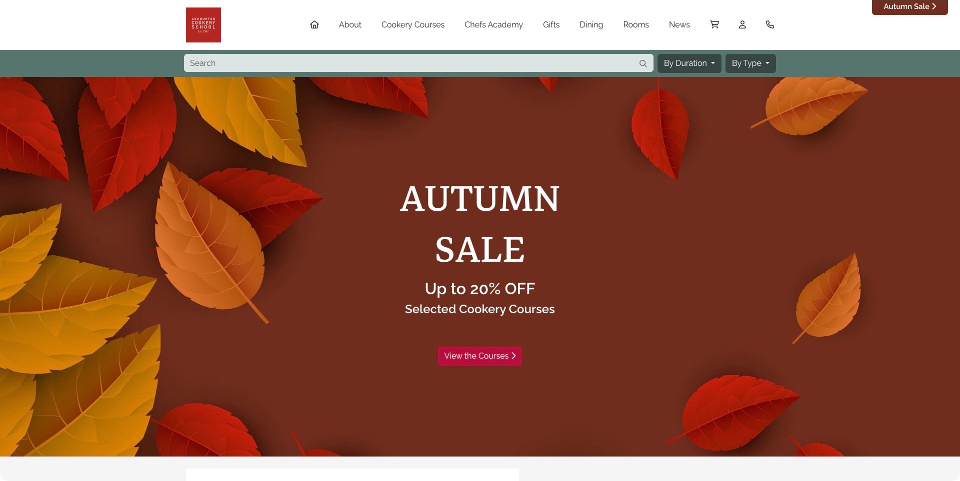
Ashburton places a practical search strip directly below its white navigation. A wide query field sits beside duration and type selectors, letting visitors narrow the offer before reading the seasonal promotion. The actual decoded capture shows an autumn sale message over red and ochre leaves, with a small red school mark anchoring the quieter header. Cookery Courses and Chefs Academy remain separate navigation items alongside gifts, dining and rooms, reflecting the institution’s recreational and professional culinary or patisserie education.
What you can learn
Let course discovery carry the practical work even during a seasonal campaign. Duration and course type are useful early distinctions for someone comparing a weekend experience with sustained training, provided the results retain qualification, date and prerequisite information.
Pros
Search and selectors expose meaningful catalog dimensions before any enquiry form is required.
Separate cookery and academy links acknowledge genuinely different study intentions within one institution.
Cons & considerations
The seasonal leaves need teaching or food imagery elsewhere to substantiate the school experience.
Commercial header destinations should not make rooms or gifts compete with essential admissions information.
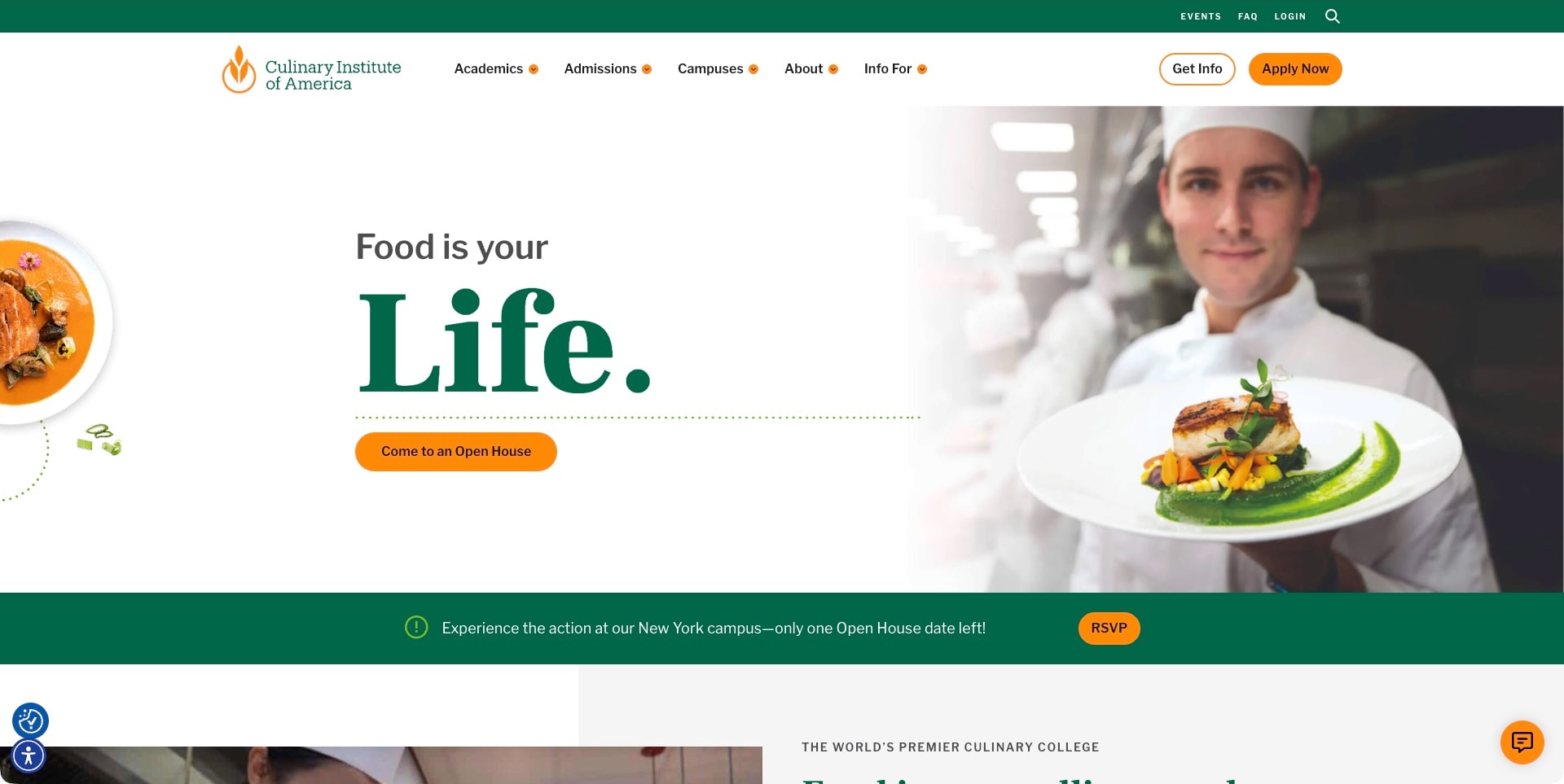
The Culinary Institute of America pairs an oversized green serif word with a chef holding a finished plate. A generous white fade protects the left-hand copy from the kitchen photograph, while orange buttons establish a consistent action color. The main invitation is an open house rather than immediate enrollment, supported by a green event strip below the hero. The header retains separate academics, admissions and campus routes, giving the aspirational image a practical institutional structure instead of relying on the portrait alone.
What you can learn
Use a first visit or information event as a meaningful intermediate step when choosing education requires investigation. Keep formal application separate, and make the event’s actual campus, date and requirements clear after the visitor selects it.
Pros
The white reading area preserves headline clarity without covering the entire photograph.
Academic and campus labels provide concrete routes beyond an emotional career message.
Cons & considerations
A finished plate and portrait do not explain practical teaching or program prerequisites.
A time-sensitive open-house campaign needs an expiry process and an alternative next step.
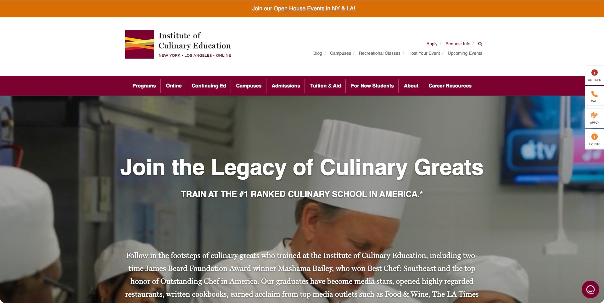
The Institute of Culinary Education uses a large white masthead with its multicolored mark and a burgundy navigation band. The captured hero shows a chef in a teaching-kitchen setting beneath a prominent legacy message. Online, Continuing Ed, Campuses, Admissions and Tuition & Aid remain explicit categories rather than being hidden behind a single programs label. An orange open-house strip and a narrow right-hand action rail add recruitment routes, while the institutional copy below the heading supplies more context than a one-line food slogan.
What you can learn
Separate delivery format, financial investigation and admission tasks in the information architecture. A person evaluating online study or continuing education should not have to infer those offers from the same cinematic image used to promote campus programs.
Pros
The burgundy band gives a long list of student tasks a consistent visual boundary.
Tuition and new-student information are visible alongside the program and campus routes.
Cons & considerations
A tall masthead reduces room for the actual educational offer on smaller screens.
Legacy and ranking language needs precise supporting context, not repetition as independent quality evidence.
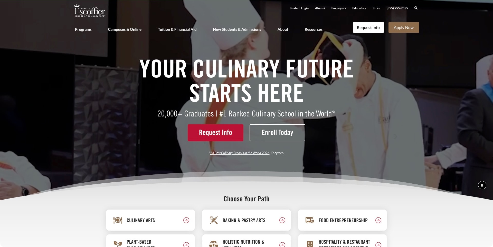
Escoffier’s captured frame uses a graduation scene behind a large condensed white headline, with red and outlined actions grouped below the introductory message. A curved boundary leads into a set of subject cards, making the move from aspiration to program choice visible at the bottom of the screen. The header separates programs, campuses and online learning, tuition and financial aid, and admissions. The current official source establishes culinary, baking/pastry and other study routes. Graduation imagery and ranking statements remain promotional context, not independent evidence of a student’s likely outcome.
What you can learn
An aspirational opening becomes more useful when the next layer immediately exposes real study choices. Give applicants a way to compare subject and delivery format, and keep career-oriented messaging distinct from the practical details of entry, commitment and qualification.
Pros
The subject cards begin the program-discovery task before the visitor leaves the first screen.
Campus/online and tuition routes remain visibly separate from a general admissions message.
Cons & considerations
Ranking and graduate-count statements need clear source and scope rather than functioning as guarantees.
Several repeated recruitment actions should have an understandable difference in what happens next.
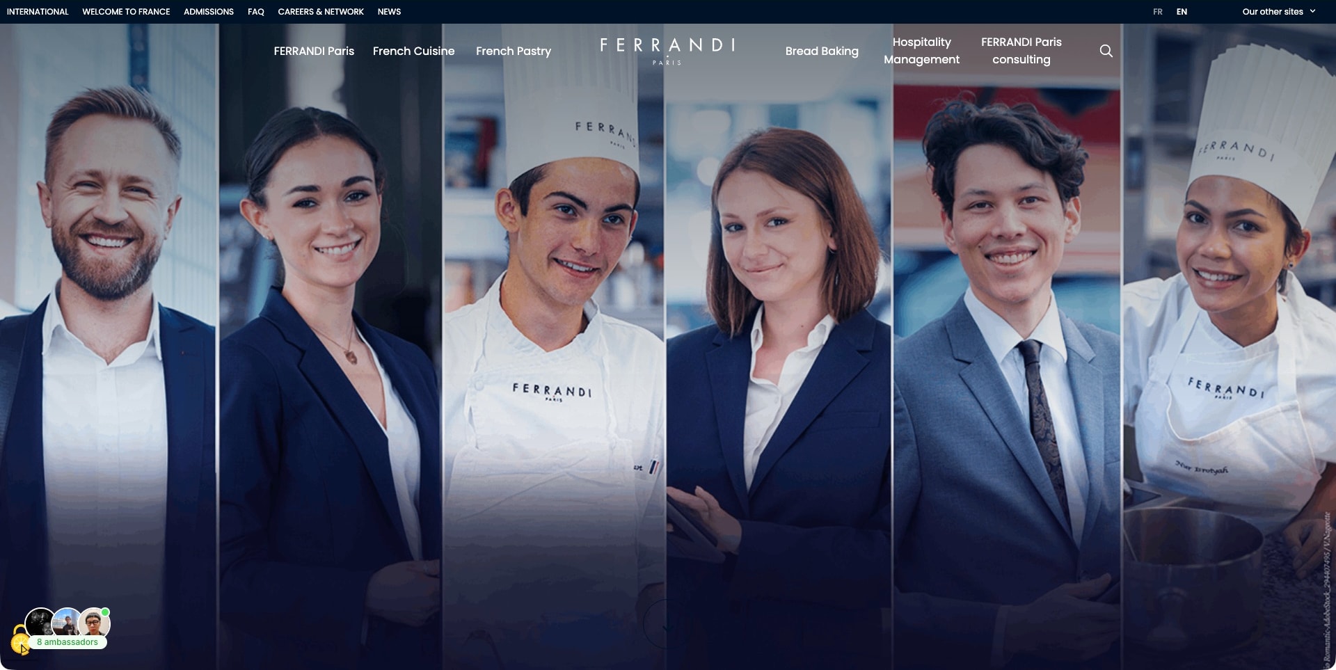
FERRANDI Paris’s captured English page opens with six vertical portraits arranged across a wide frame, mixing culinary whites with hospitality-style professional clothing. The centered school identity sits in a transparent navigation bar that names French cuisine, pastry, bread baking and hospitality management. A thin dark utility strip separates international and admissions information from those subject routes. The current official source confirms the school’s own culinary training. The portraits present a broad institutional identity; they are not independently verified testimonials, individual career outcomes or evidence that every pictured person teaches a particular course.
What you can learn
A consistent portrait treatment can connect different disciplines without forcing them into one generic food photograph. Let the navigation name the real subjects, then use program-level material to explain their distinct practical work, requirements and educational level.
Pros
The repeated portrait format gives diverse professional subjects a coherent visual treatment.
Named culinary and hospitality disciplines provide more specificity than a single undifferentiated programs label.
Cons & considerations
A nearly image-only opening needs a clear textual continuation for unfamiliar prospective students.
Wide portrait strips require thoughtful mobile ordering and appropriate image permissions.
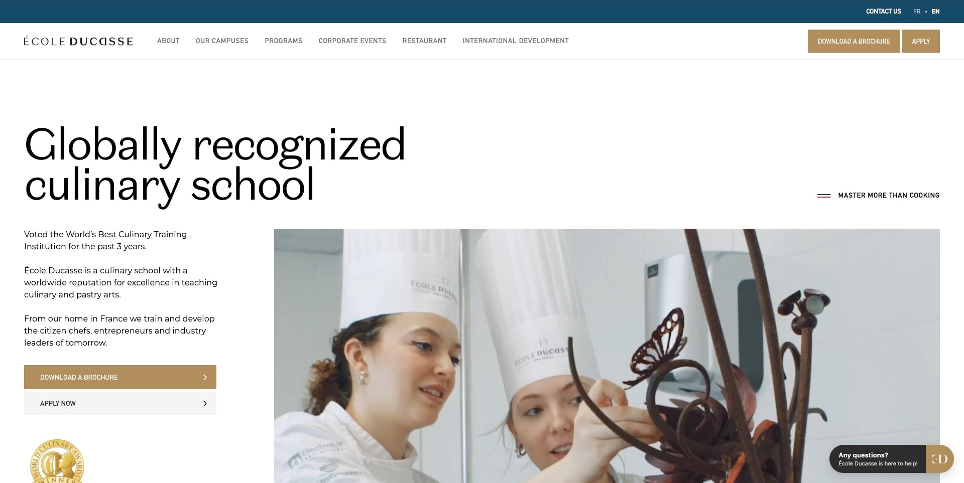
École Ducasse gives an unusually large black heading its own white space before a split introduction. A narrow text column and stacked brochure/application actions sit beside a broad photograph of students working on a chocolate sculpture. Gold accents connect those actions to the restrained header, while campus and program links remain conventional enough to scan. The composition suggests a specific practical discipline rather than generic restaurant ambience. Its award statements are part of the school’s own positioning, not verification of teaching quality by this review.
What you can learn
Use a recognizable learning activity to make a broad culinary brand more concrete. Then connect the image to an actual program, level and campus; sophisticated typography cannot explain those distinctions on its own.
Pros
The chocolate-work photograph introduces people, tools and a tangible culinary activity together.
Separate brochure and application actions accommodate different levels of applicant readiness.
Cons & considerations
The very large heading pushes detailed program information further down the page.
A premium visual language still needs clear fees, entry requirements and qualification descriptions.
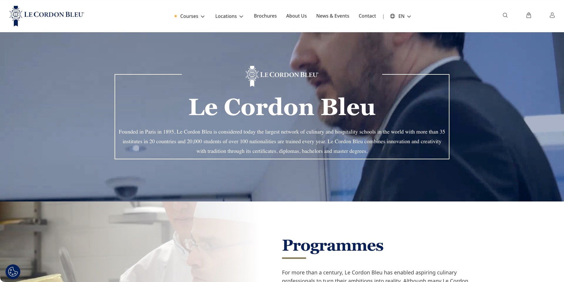
Le Cordon Bleu’s actual English network page places a serif introduction inside a fine white rectangular frame over a chef-film still. A small crest interrupts the frame at the top, while the main white header separates courses, locations and brochures from the institutional story. The next program section is already visible beneath the hero. The orange dot before Courses is an explicit navigation decoration in the cached source markup, not an assumed cursor artifact. This is the network’s public introduction, not a single campus or a particular class.
What you can learn
For a distributed school brand, give location and program discovery equal clarity. An institutional story can establish context, but the next layer must connect a prospective student to the actual course, campus and intake that applies to them.
Pros
The framed panel gives a long institutional introduction a deliberate visual boundary.
Visible course and location routes acknowledge the two main decisions within a school network.
Cons & considerations
The dense hero paragraph becomes harder to scan as the background film changes.
Network-wide scale statements should not substitute for local facilities, fees and program details.
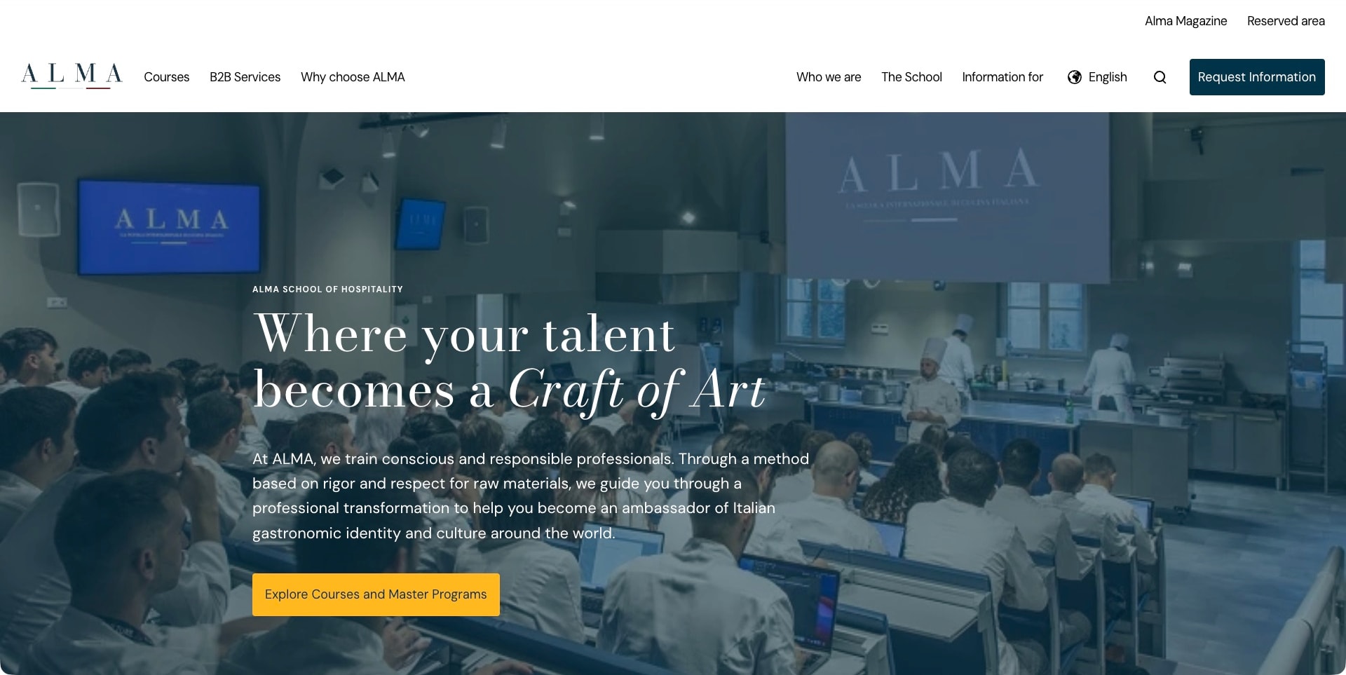
ALMA opens with a wide view of a demonstration room: seated learners face an instructor area, work surfaces and large screens. A dark blue treatment gives the left-aligned serif headline and explanatory paragraph a readable surface without removing that context. A yellow course action stands apart from the blue information button in the white header. Navigation distinguishes courses, the school, institutional background and information for different audiences. The visible frame conveys a particular learning setting, not a promise that every program uses the same room or method.
What you can learn
Choose an environment photograph that answers a real applicant question, then explain its relationship to the curriculum. A teaching-room overview can establish context more effectively than a polished dish when the offer is sustained professional education.
Pros
The image makes the relationship between learners, demonstration surfaces and instructor space legible.
The course route is visually distinct from a general request for information.
Cons & considerations
The dense introductory paragraph needs a compact mobile treatment without becoming an image caption.
A single room view cannot establish facilities or practical time for every course.
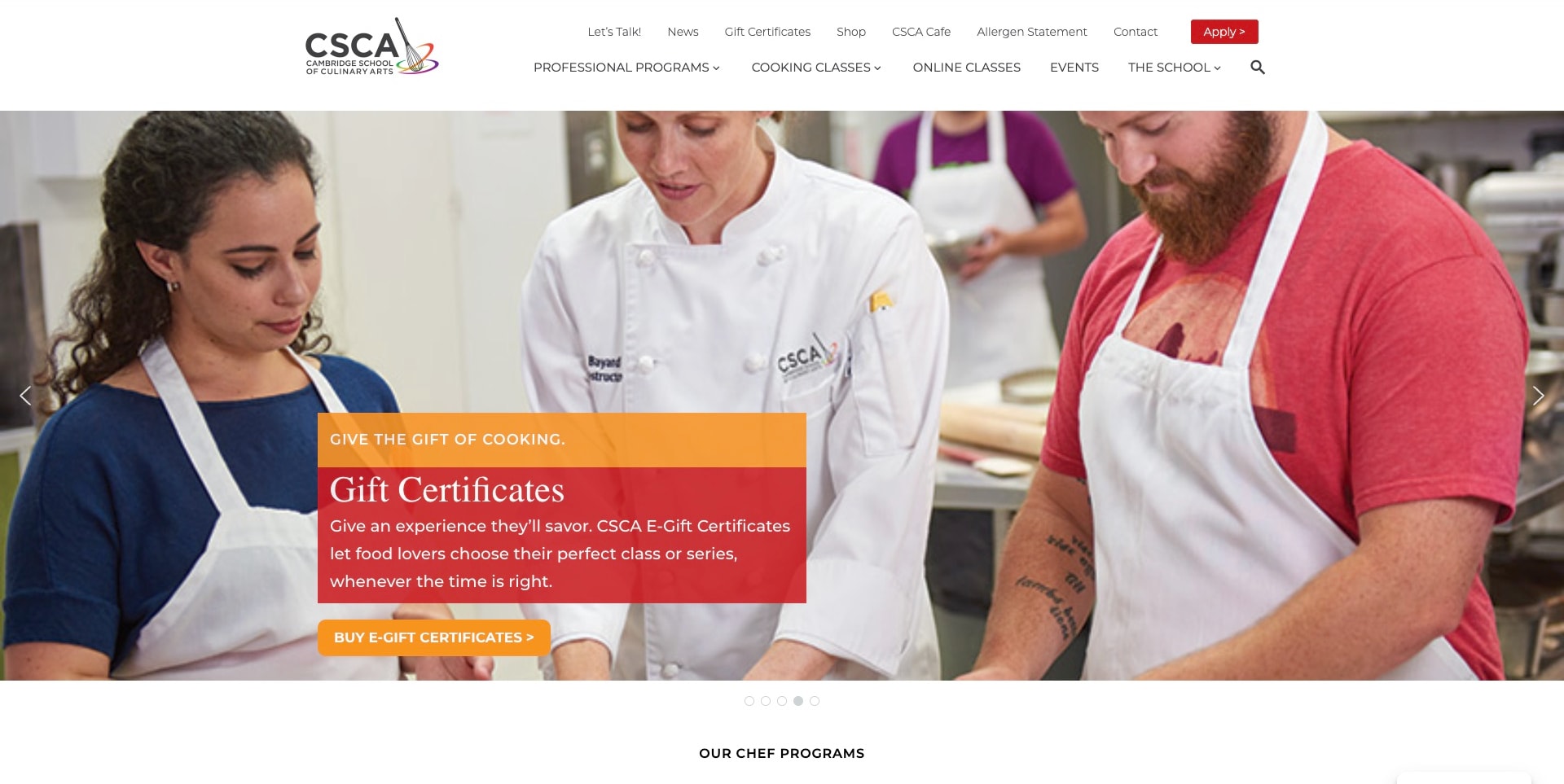
Cambridge School of Culinary Arts uses a bright teaching-kitchen photograph behind a seasonal gift-certificate message. Two learners and a chef occupy the wide frame, while an orange-and-red text panel identifies the campaign and its purchase action. The white header separates professional programs, cooking classes and online classes, with smaller practical links above them. This captured slide advertises a gift rather than a diploma, but the current official source establishes both recreational and professional education. The photo supports the activity being offered without proving a particular lesson or result.
What you can learn
A seasonal sales message can remain connected to the school’s actual activity. Keep its purpose explicit and preserve permanent program routes around it so someone researching a professional course is not forced into the gift-purchase journey.
Pros
The photograph depicts a teaching interaction rather than only a finished dish.
Professional, recreational and online study remain separate destinations in the header.
Cons & considerations
The large campaign panel can obscure useful classroom details on a smaller display.
Gift terms and redemption should remain distinct from admission requirements and tuition information.
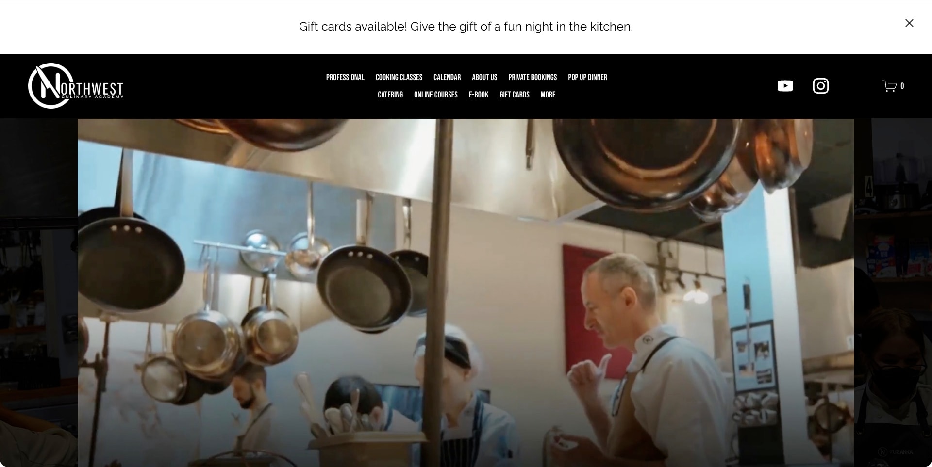
Northwest Culinary Academy’s captured frame shows a chef working in a kitchen beneath hanging pans, using a cinematic central image with darker edges. A black navigation bar holds the white academy mark and two rows of destinations, including professional study, cooking classes, a calendar, private bookings and online courses. A broad gift-card strip sits above that header. The current official source establishes professional culinary and pastry education as well as enthusiast options. The frame shows a kitchen environment, not the entirety of a program or an independently verified class structure.
What you can learn
When an institution has several public-facing activities, use concrete navigation labels to keep them intelligible. The film can establish a working-food atmosphere, but professional study and a casual kitchen experience should not rely on the same unexplained promotional route.
Pros
The working-kitchen view communicates equipment and activity rather than a generic campus facade.
The visible calendar and named course routes give visitors practical alternatives to a general enquiry.
Cons & considerations
Two rows of compact navigation need deliberate mobile and keyboard treatment.
The gift strip and film should not delay access to program duration and entry information.
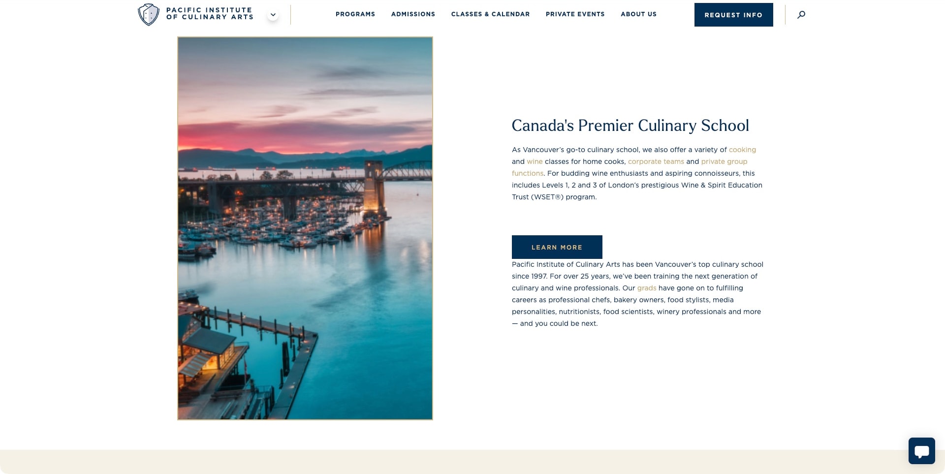
This PICA capture is a scrolled school-introduction section, not the top of the homepage. A tall waterfront photograph sits on the left inside a fine gold border, balanced by a navy serif heading, explanatory paragraphs and a compact action on the right. The sticky header keeps programs, admissions and classes visible. The official source describes professional culinary education alongside cooking and wine classes. The pictured marina establishes a Vancouver setting, not a teaching facility or a claim that every program includes the activities mentioned in the broader introduction.
What you can learn
Use a location image to explain the setting while keeping the educational offer in readable text. A scrolled editorial section can provide a calmer comparison point than an autoplay hero, particularly when the institution serves both professional applicants and local class visitors.
Pros
The split layout gives the location image and explanatory copy their own space.
Persistent program and admission links keep the longer homepage connected to practical tasks.
Cons & considerations
The waterfront photograph needs complementary teaching imagery elsewhere to explain the learning environment.
School-supplied career and prestige statements require context rather than functioning as verified outcomes.
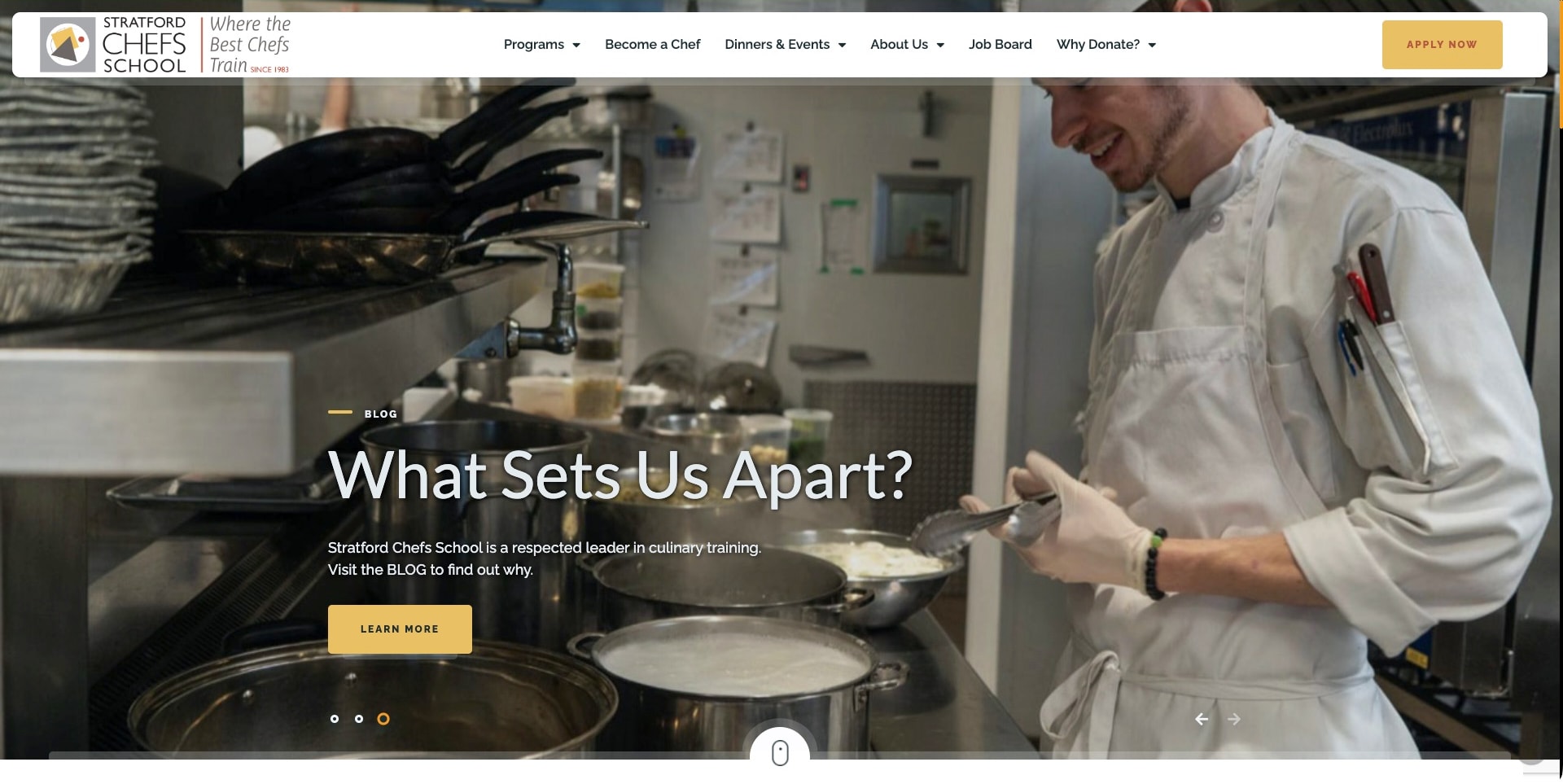
Stratford’s captured homepage slide places a chef at a working range behind a large question about what distinguishes the school. A small Blog label makes the destination explicit, and a gold action carries the same accent as the application button in the floating white header. Programs, becoming a chef, dinners and events, and giving are separate navigation routes. The current official source identifies cook-apprenticeship training. The image’s working pots and preparation setting support that educational context, without independently proving teaching quality or the experience of every student.
What you can learn
Editorial storytelling can explain a school’s approach when it is clearly labeled and connected to substantive program information. Distinguish an invitation to read a story from an application step, rather than using the same vague action for both.
Pros
The kitchen-work photograph ties the campaign to culinary practice instead of an abstract value statement.
The blog destination and application action have different labels and clear roles.
Cons & considerations
A promotional story should not become the only route to curriculum and admissions facts.
Several school, event and fundraising audiences require a clear hierarchy when the header becomes compact.
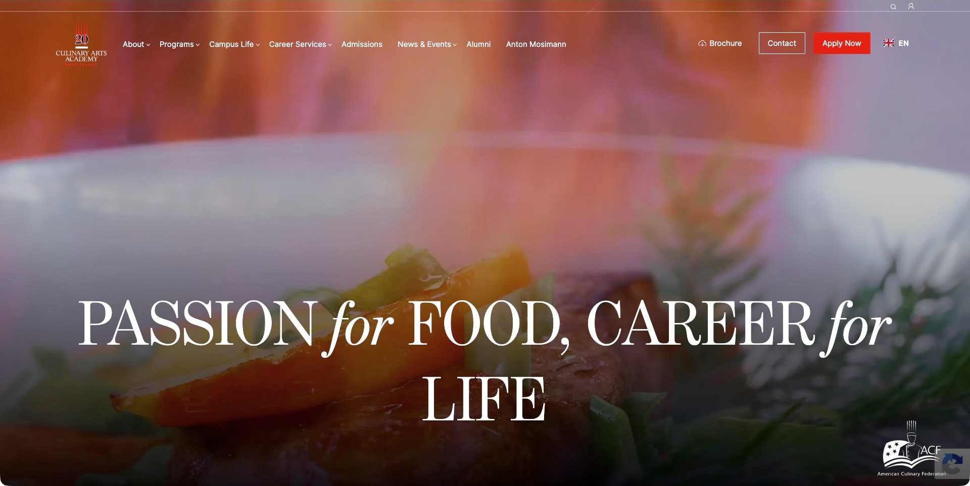
Culinary Arts Academy Switzerland’s captured frame shows a close food-preparation detail behind a large white serif statement, with italic words adding contrast inside the headline. Transparent navigation stretches across the top, grouping programs, campus life, careers and admissions, while brochure, contact and apply actions sit separately to the right. The current official source offers culinary and pastry study across several program levels. This is a food-led brand frame rather than a campus or classroom overview; the displayed federation mark is not independent verification of every program’s status.
What you can learn
A broad craft image can establish the subject quickly, but use the next layer to explain actual programs and levels. Give applicants a way to compare the commitment and location instead of letting an aspirational career message do all the explanatory work.
Pros
The large typographic treatment creates a recognizable focal point over detailed food imagery.
Program and campus-life routes are visible beside distinct brochure and application actions.
Cons & considerations
Large multi-line type needs careful mobile sizing so navigation and next steps remain usable.
Food imagery and institutional marks need specific curriculum and qualification context elsewhere.
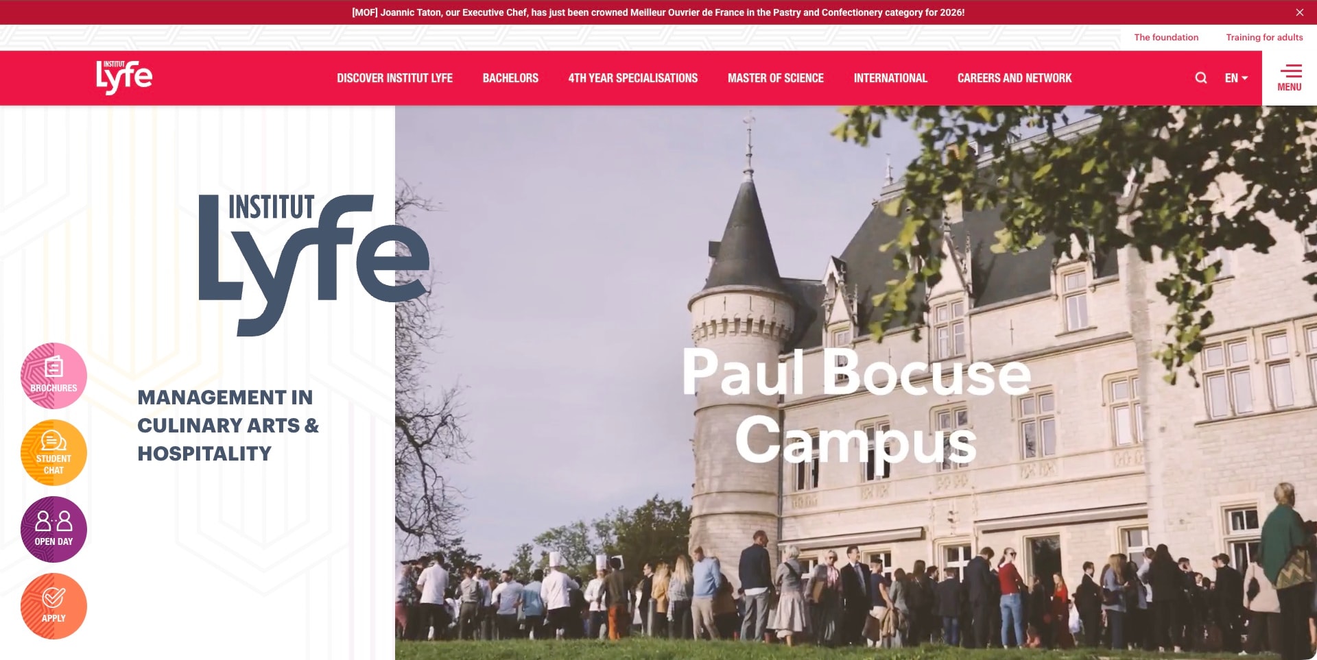
Institut Lyfe’s English homepage pairs a large slate-colored brand block with a moving campus scene, captured at the named Paul Bocuse Campus. A bright red header groups bachelor study, fourth-year specializations, masters, international information and careers. Circular brochure, student-chat, open-day and application controls form a separate vertical rail. The official source establishes culinary arts and hospitality education; the visible campus name gives the photograph useful context. The award announcement above the header remains school-supplied news, not an independent assessment of every program.
What you can learn
Label the place being shown and keep academic pathways distinguishable from recruitment actions. A memorable campus film works better when the site explains which programs and students use that setting rather than relying on the building’s prestige alone.
Pros
The campus label turns a decorative building scene into a more specific institutional view.
Program-level navigation makes the different stages of study visible from the first screen.
Cons & considerations
A dense header plus floating action rail needs careful small-screen prioritization.
Campaign and award notices require current context without displacing essential course information.
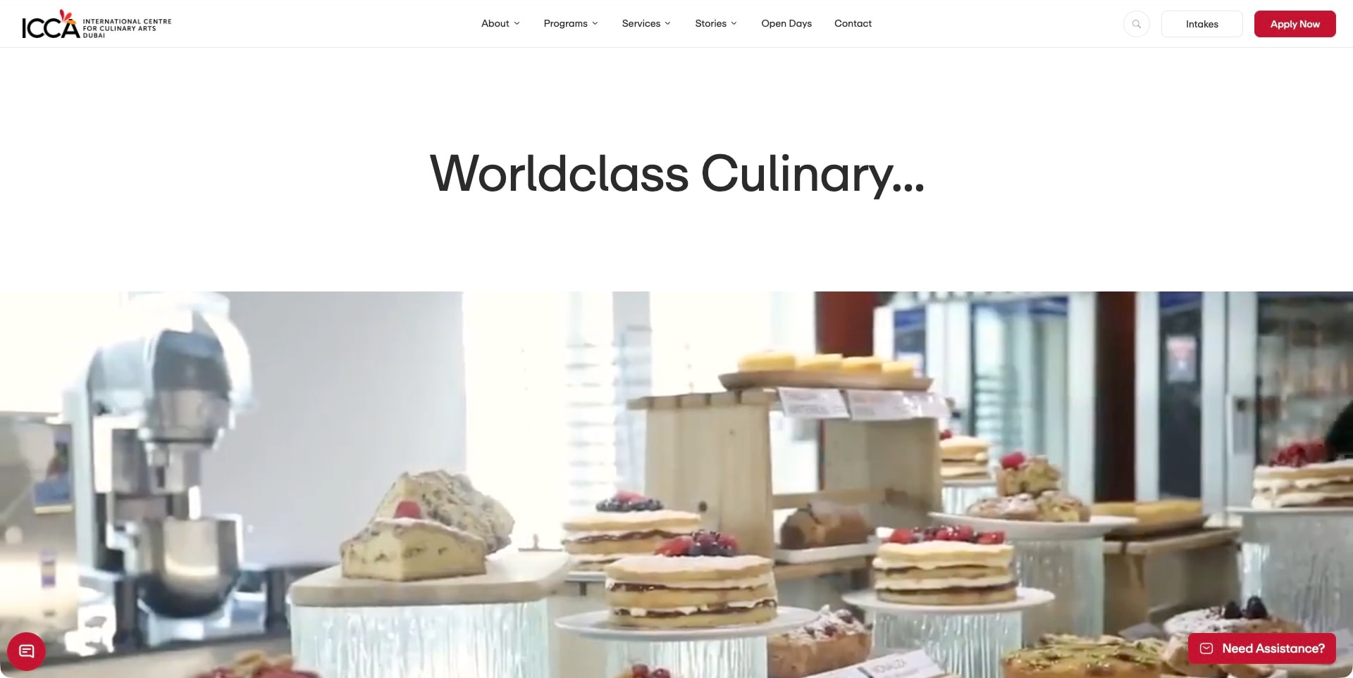
ICCA Dubai’s captured page keeps its logo and navigation in a narrow white bar, with a red application action and a separate intakes control on the right. A large centered culinary headline sits in generous white space above a bright pastry-kitchen film frame. Cakes, equipment and preparation surfaces establish the subject without a crowded text overlay. The current official source distinguishes professional cookery and patisserie diplomas from amateur and artisanal courses. The screenshot illustrates culinary activity, not independent evidence of employment placement or teaching quality.
What you can learn
Use the space around a concise heading to separate a brand introduction from the details of a practical scene. Then let intakes and program pages explain the commitment, rather than asking the film to communicate dates, prerequisites and qualification differences.
Pros
The white headline area avoids placing essential text over busy pastry imagery.
Intake and application controls make two different recruitment tasks recognizable.
Cons & considerations
A broad quality-oriented headline still needs specific program facts immediately afterward.
Collapsed assistance launchers should be tested so they do not cover mobile course controls.
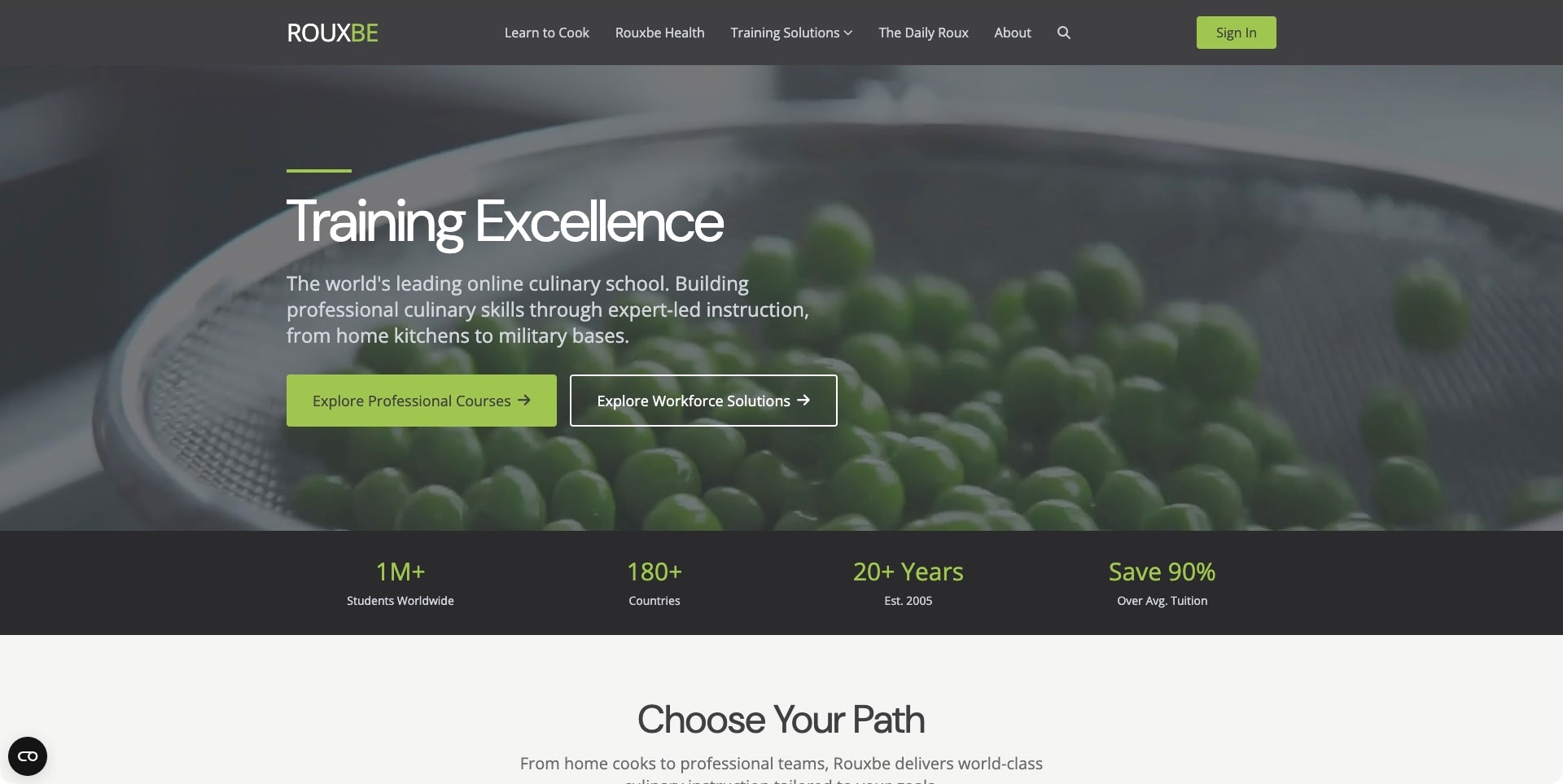
Rouxbe’s captured homepage uses a close-up of green peas as a subdued full-width background for a short white training message. Lime and outlined actions distinguish professional courses from workforce solutions, while a dark navigation bar separates learning to cook, health and broader training. A black row of school-supplied figures follows the hero before the next pathway section. The current official source explicitly identifies online culinary instruction and course-feedback processes. This is a public online-learning offer, not a physical-campus view or an independently tested learning platform.
What you can learn
Separate the person learning a skill from the organization purchasing a training program. Both audiences may care about culinary practice, but their questions, administrative needs and next steps differ. Use a shared identity without making the two buying journeys interchangeable.
Pros
Two explicitly named actions distinguish individual professional study from workforce training.
The restrained food photograph leaves the introductory text and course choices readable.
Cons & considerations
Savings and scale figures need stated methodology and terms before supporting a financial comparison.
A public marketing page cannot establish feedback quality, credential equivalence or private-platform behavior.
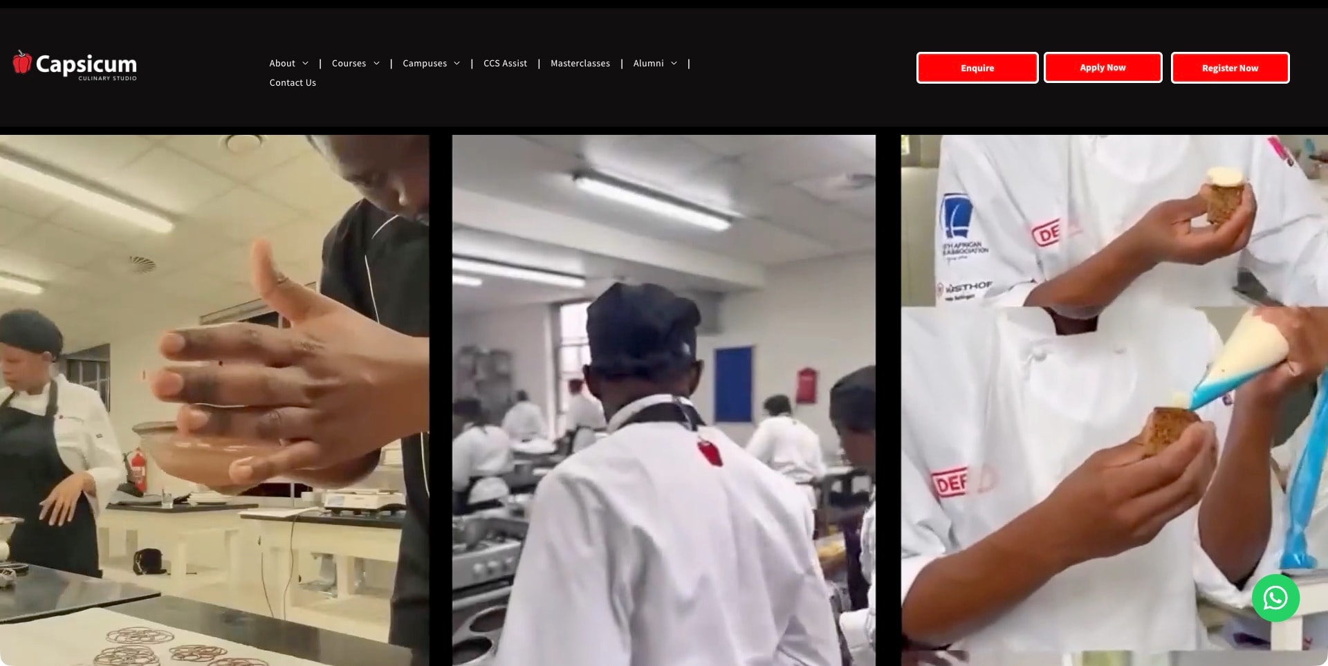
Capsicum’s captured homepage uses a black header with white navigation and three bright red recruitment actions. Beneath it, three tall video panels show hands-on culinary activity: working dough, a teaching-kitchen scene and piping into a pastry. The layout feels closer to a sequence of short practice clips than a conventional single landscape hero. Courses and campuses are separate menu groups, which matters for a provider with more than one program setting. The footage establishes the subject of the education, not the standards or outcomes of every course.
What you can learn
Multiple short visual perspectives can communicate the range of culinary practice without relying on a single polished dish. Give each recruitment action an explicit role so the energy of the imagery does not leave applicants guessing how enquiry, application and registration differ.
Pros
The three-panel composition shows different kinds of practical work within one clear visual system.
Separate courses and campuses routes expose two important dimensions of the offer.
Cons & considerations
Three equally strong red actions need explanations of what each process starts.
Moving vertical panels require useful still and mobile alternatives rather than essential information inside film.
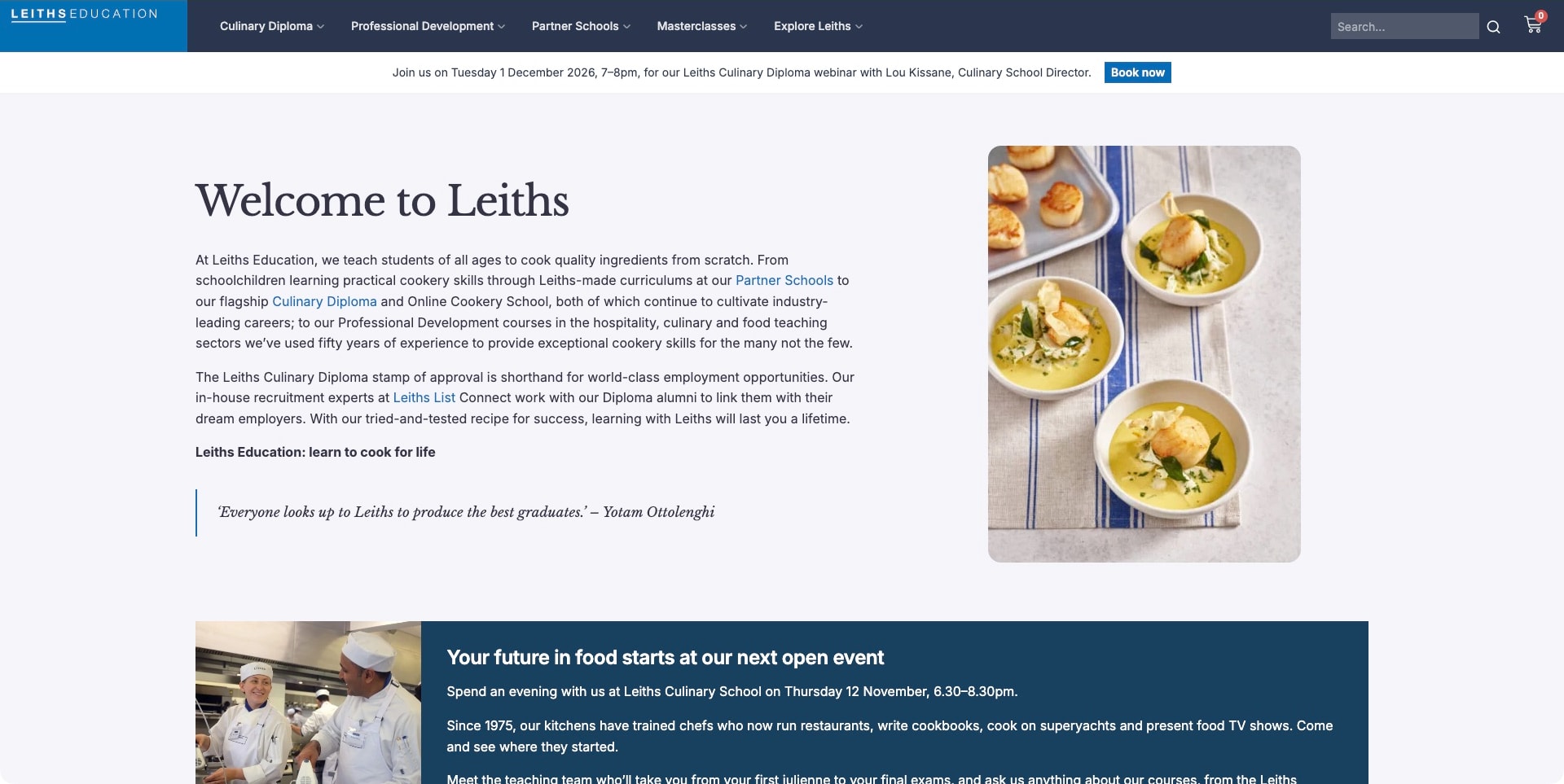
The captured Leiths view is the school’s welcome section rather than a full-screen film. A pale background holds a large serif heading, several explanatory paragraphs and contextual program links, balanced by a rounded photograph of plated food on the right. A slate-blue navigation bar remains above, and a dated diploma-webinar strip gives recruitment activity its own space. The current official source identifies culinary diploma, online school and professional-development routes. The lower open-event panel also demonstrates why dated recruitment material needs editorial maintenance alongside lasting school information.
What you can learn
A useful institutional introduction can be mostly readable text, provided it contains specific paths into the offer. Link unfamiliar program names in context and keep dated events separate so a prospective student can distinguish a permanent curriculum from a temporary recruitment invitation.
Pros
Contextual links connect the broad welcome directly to distinct forms of culinary education.
The restrained food image supports the page without interrupting the reading sequence.
Cons & considerations
Several long paragraphs need clear subheadings or summaries for quick comparison.
Past open-event dates should be retired or labeled rather than competing with future invitations.
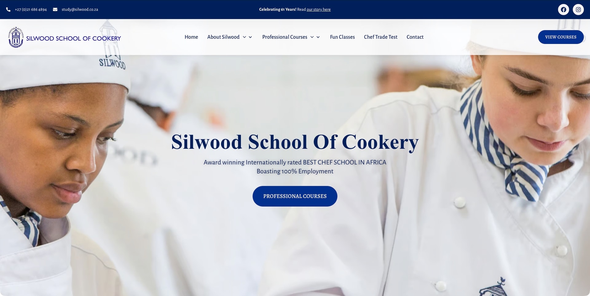
Silwood’s captured page places two people in chef whites at the edges of a bright kitchen photograph, leaving a light central area for its blue serif school title and professional-course action. A navy contact strip and pale navigation header make phone, email and course discovery visible. Professional courses, fun classes and a chef trade test are distinct destinations. The official source establishes the school’s own culinary teaching offer. Prominent ranking and employment language in the hero remains the school’s promotional claim; the design review does not verify those results.
What you can learn
Arrange human-focused imagery so it supports a clear educational action instead of competing with it. Keep the difference between professional training, recreational learning and assessment explicit, and attach proper context to strong outcome language rather than treating it as a visual badge.
Pros
The light center of the photograph gives the title and primary action a readable surface.
Professional and recreational pathways are separately named rather than combined as generic courses.
Cons & considerations
Absolute employment language needs precise source and cohort context before it can guide a decision.
The opening photograph still needs specific curriculum and practical-learning information on subsequent pages.
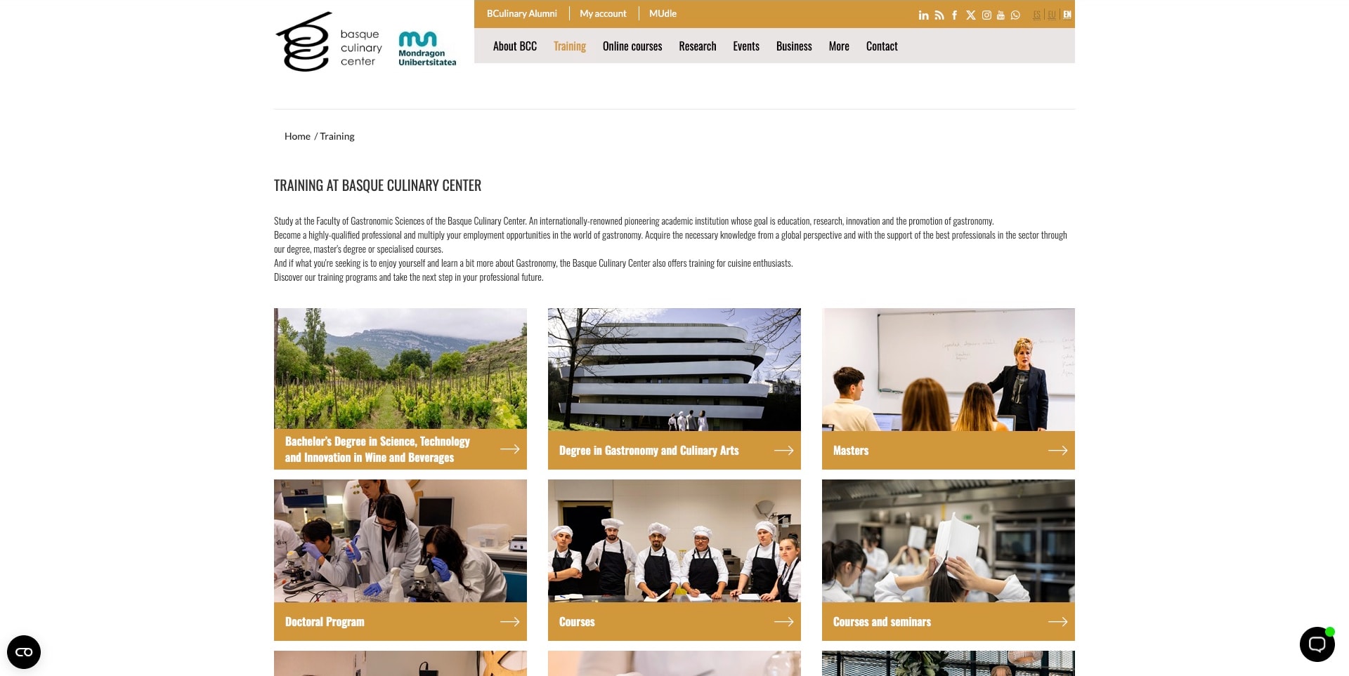
Basque Culinary Center’s actual training page uses a compact institutional header, a breadcrumb and a concise introduction before a three-column grid of education categories. Photographs differentiate wine study, gastronomy and culinary arts, masters, doctoral work, courses and seminars. Ochre caption bars make the destinations consistent despite the different subjects. This is a substantive training index, not the institution’s homepage. The current official page explicitly distinguishes academic study from enthusiast education, giving the visual grid a meaningful information-architecture role rather than using it as a gallery.
What you can learn
When the offer spans several educational levels, a clear taxonomy can be more useful than another full-screen film. Start with the differences a prospective student must understand, then give each category a consistent route into eligibility, duration and program detail.
Pros
The image grid makes a varied training portfolio visible in one coherent structure.
Breadcrumb and section heading make the actual page’s institutional context explicit.
Cons & considerations
Small condensed introductory text needs careful readability testing on different displays.
Category labels still require detailed program pages to distinguish qualifications from shorter experiences.
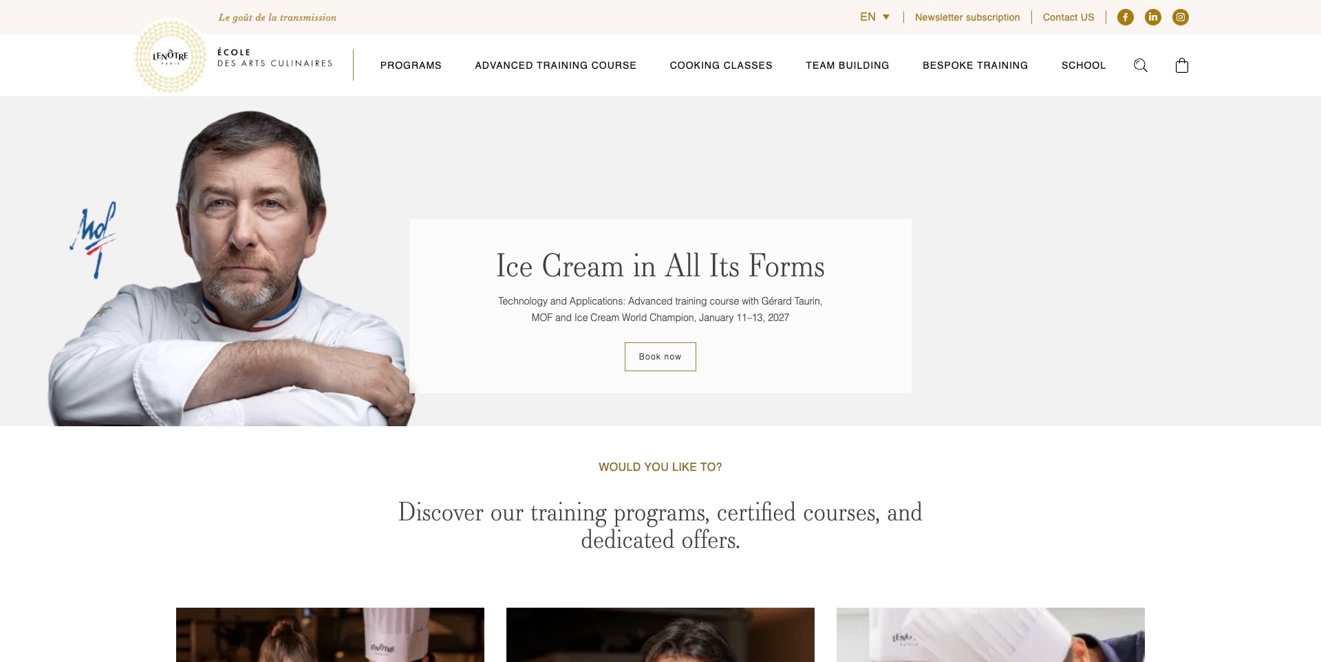
École Lenôtre’s captured English page presents a chef portrait beside a pale card advertising a specific ice-cream training course. The card names the topic, instructor and scheduled dates, with a restrained outlined booking action. Gold details and a broad white navigation bar connect the campaign to programs, advanced training, cooking classes and bespoke education. A general program-discovery introduction follows immediately below. The current official source establishes the school’s culinary teaching offer, but the instructor’s displayed titles and distinctions remain source-supplied rather than independently verified credentials.
What you can learn
A course campaign becomes more useful when it includes the subject and schedule rather than only a celebrated name. Preserve the surrounding program structure so visitors can distinguish an advanced professional session from introductory cooking and longer retraining options.
Pros
The campaign communicates a specific training topic and dates before the booking handoff.
A separate program-discovery section keeps the broader school offer visible below the promotion.
Cons & considerations
The booking route should explain prerequisites and availability before payment or commitment.
Portrait-led authority needs clear course substance rather than relying entirely on instructor distinctions.
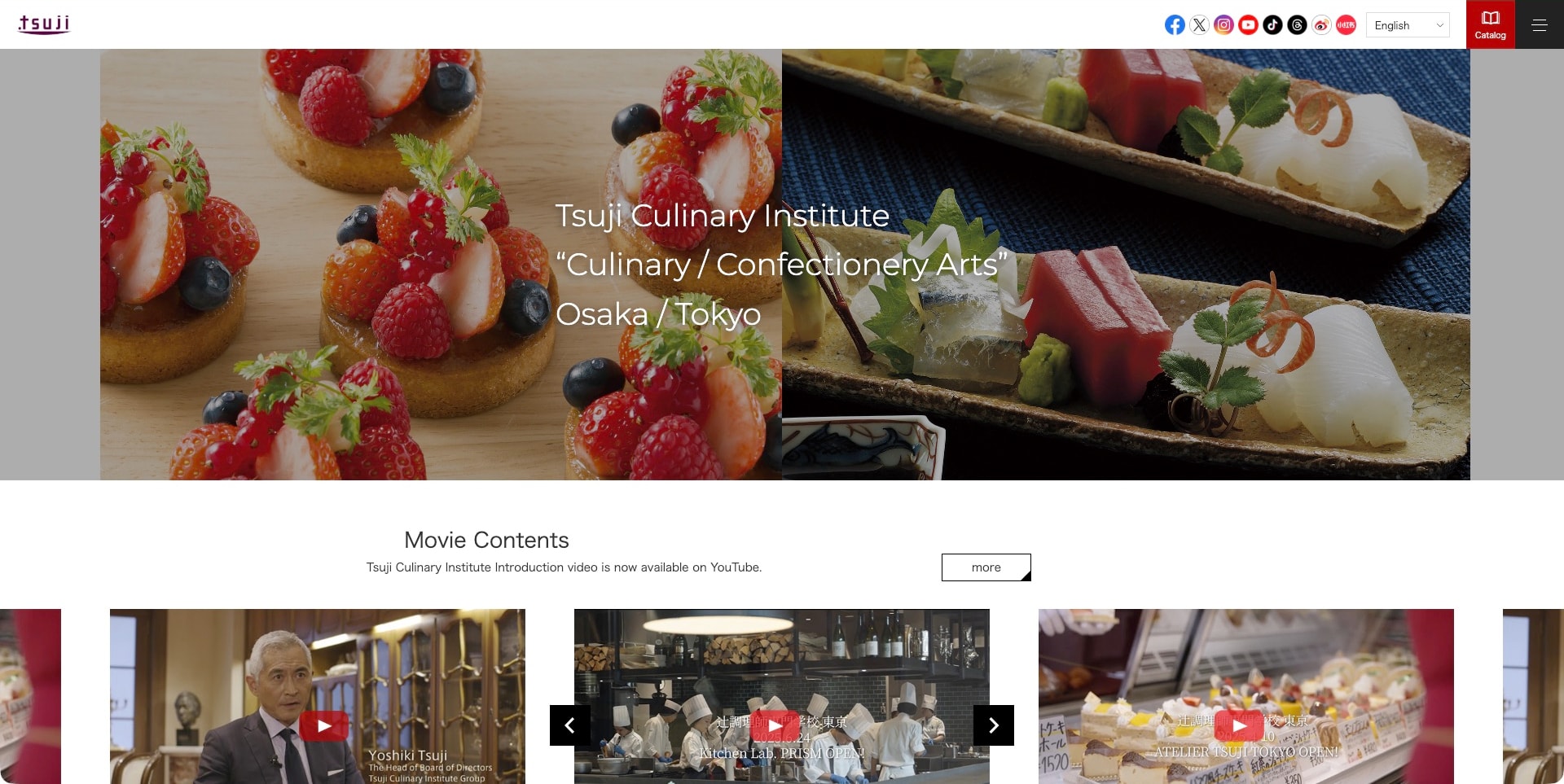
Tsuji’s captured English page pairs berry pastries and a Japanese plated preparation in one broad photographic opening. A compact white message identifies culinary and confectionery arts and the Osaka/Tokyo context, while the white header keeps the small brand mark, language selector, catalog and menu separate. A row of introduction-film thumbnails follows below. The current official source identifies the group’s own culinary and confectionery schools, but this shared overview does not establish identical teaching, courses or facilities at every location.
What you can learn
A paired subject image can explain the range of a specialist institution without a large opening course grid. Keep location and program distinctions explicit afterward, and give the school introduction useful text rather than making every prospective student watch several films.
Pros
The paired food subjects communicate both culinary and confectionery interests within one frame.
The catalog and language controls have recognizable positions outside the photographic reading area.
Cons & considerations
A busy food background needs consistent contrast behind the central white text.
Film thumbnails should have informative labels and alternatives instead of replacing essential admissions explanations.
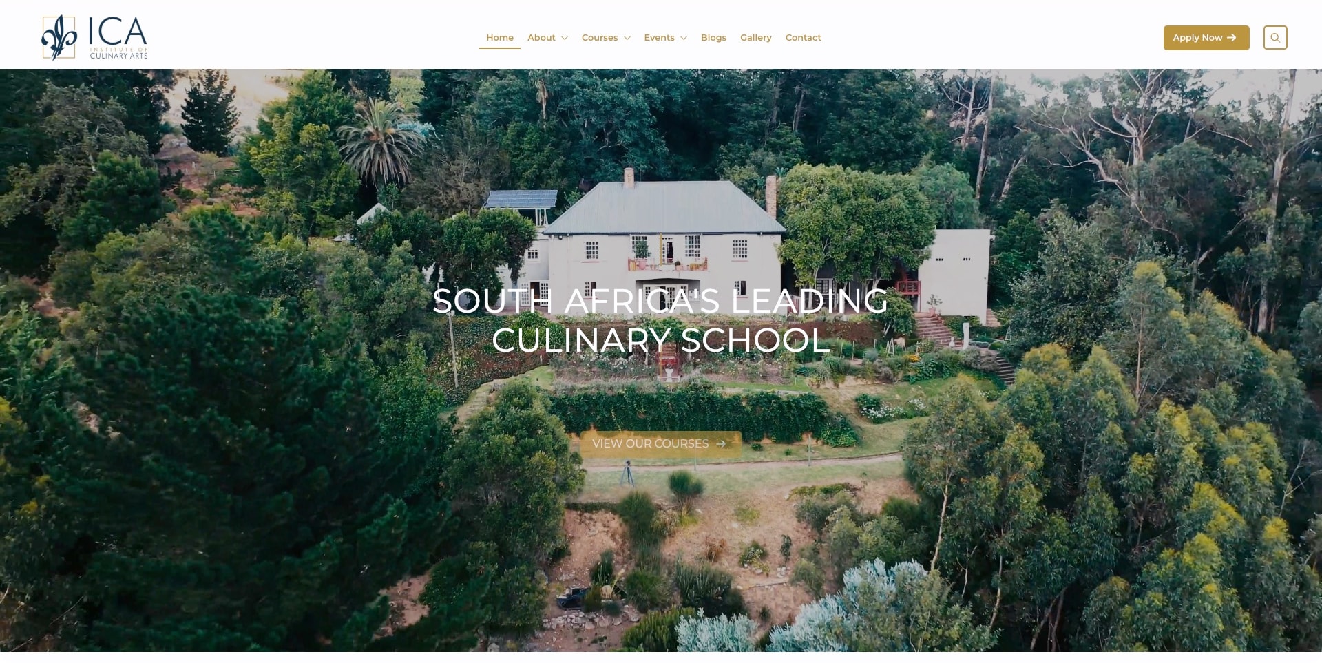
The Institute of Culinary Arts’ captured homepage uses an aerial view of a white building surrounded by trees as its main visual. White uppercase introduction text sits over the landscape, with a gold course action below. A separate white header holds the navy-and-gold identity, compact navigation and an application button. The current official source describes the institution’s culinary and patisserie study programs. The campus image gives a sense of place, but it is not a view of the teaching kitchen and cannot establish the facilities or practical arrangements for each course.
What you can learn
A distinctive setting can make a school recognizable without a complicated visual system. Connect that first impression to specific programs and teaching environments so the grounds do not become a substitute for explaining what a student will actually study.
Pros
The landscape establishes a physical school identity beyond a generic plated-food image.
Course and application actions remain distinct from the quieter institutional navigation.
Cons & considerations
White text over varied foliage requires careful contrast across different image crops.
Broad leadership language needs specific curriculum and qualification details rather than visual prestige alone.
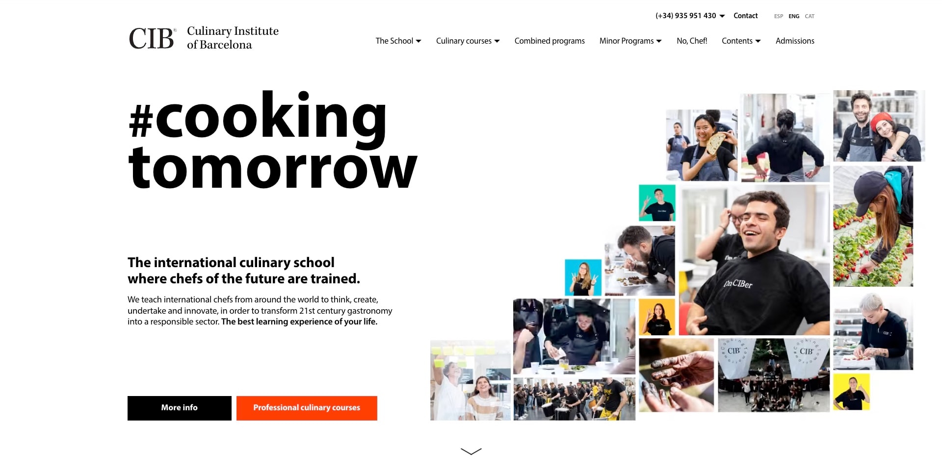
Culinary Institute of Barcelona’s captured page pairs a huge black two-line statement with an irregular collage of people, food work and social moments. The white background gives the collage breathing room rather than placing a paragraph over it. A short school explanation and two actions sit below the main type, with the professional-course route in orange. The header separates culinary courses, combined programs and admissions. The official source establishes its own chef and pastry education; the collage is an introduction to that community, not independently verified graduate or employment evidence.
What you can learn
A collage can communicate the human side of professional education when its pictures have a clear visual hierarchy. Keep the actual program route explicit so the energy supports a decision rather than becoming a substitute for practical study information.
Pros
The white reading surface keeps the strong headline and explanation legible beside varied imagery.
A contrasting professional-course action offers a more specific route than general information alone.
Cons & considerations
An irregular collage needs a deliberate mobile sequence rather than an unreadably small mosaic.
Future-focused promotional copy still needs program duration, entry and qualification context on subsequent pages.
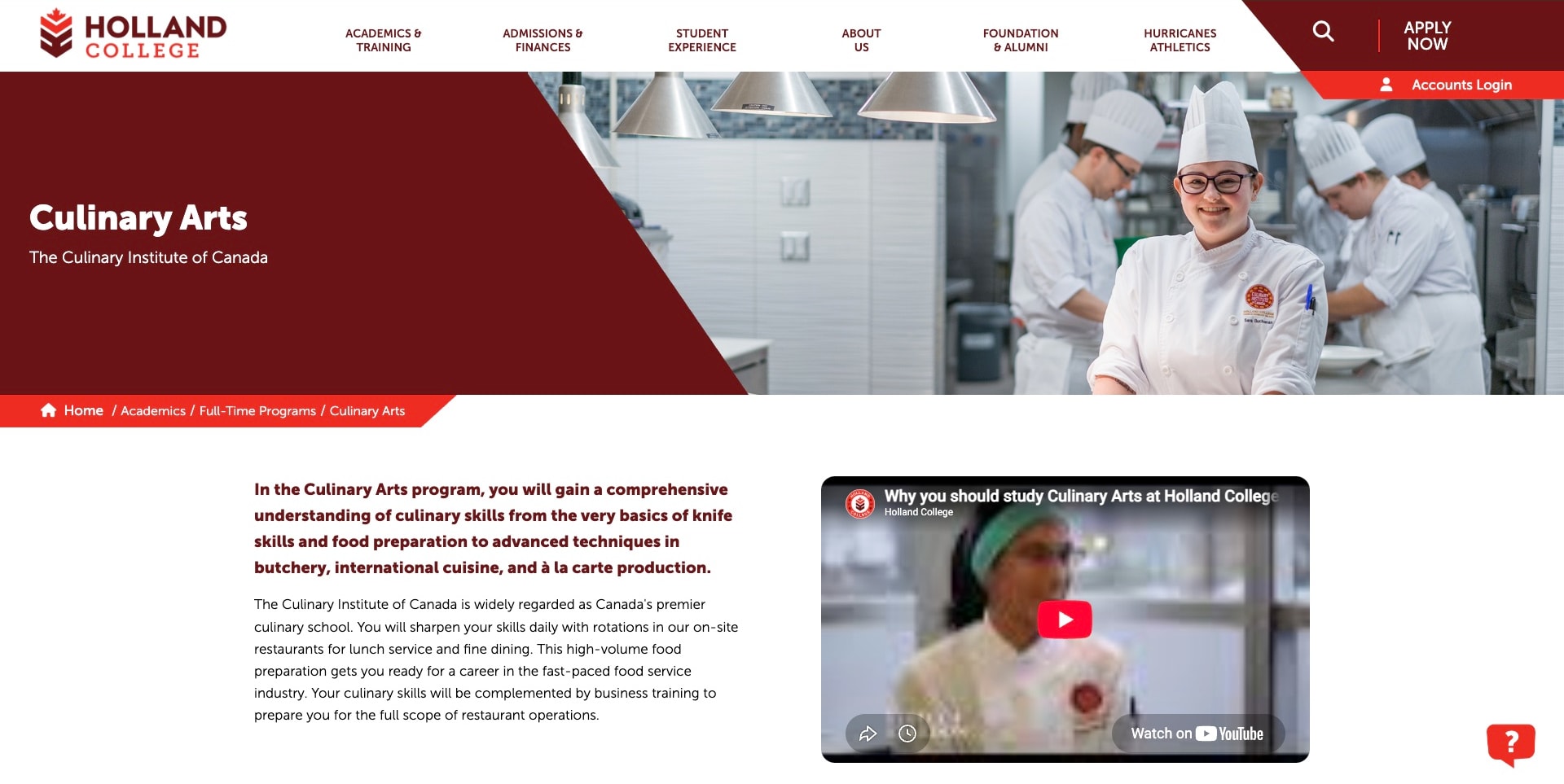
Holland College’s actual Culinary Arts program page gives the subject a large maroon panel beside a teaching-kitchen photograph. The Culinary Institute of Canada name appears immediately beneath the program title, making the institutional relationship explicit. An angular red breadcrumb leads into an explanatory text block and an unplayed introduction-video thumbnail. This is a specific full-time culinary program page, not the college homepage. The public source provides the relevant educational context, while the image and promotional copy are not independent proof of career outcomes or the quality of instruction.
What you can learn
When a specialist school sits within a broader college, show both names and the navigation hierarchy clearly. A useful subject page should provide enough readable information to stand alone, rather than relying on a video or sending every visitor back to the general institution.
Pros
The program title and institute subtitle clarify the relationship between course and institution.
Text beside the video gives visitors a reading path without requiring playback.
Cons & considerations
The broad college header needs a clear return path to local culinary-program details.
Career-oriented claims should be supported with precise context rather than inferred from the kitchen photograph.
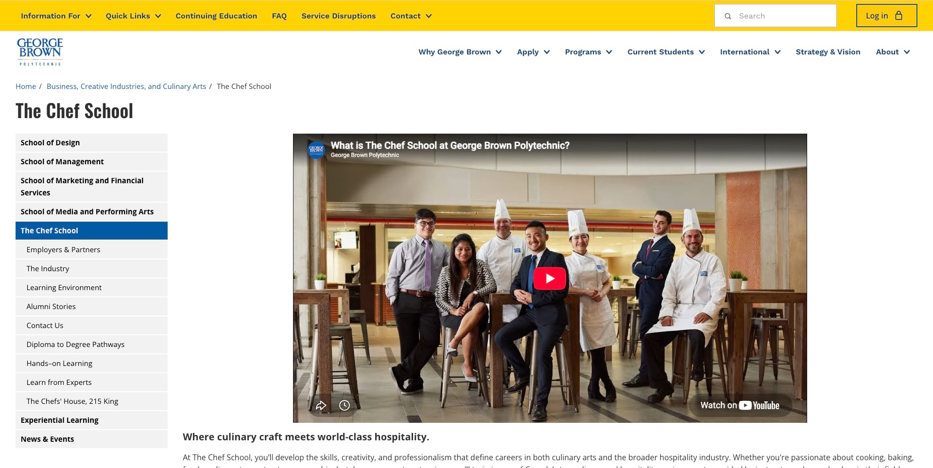
George Brown Polytechnic’s actual Chef School page uses a yellow utility band above a white institutional header, then a breadcrumb and an explicit school title. A left sidebar highlights the Chef School among related divisions and exposes local topics such as learning environment and diploma-to-degree pathways. The main column begins with a school-introduction video thumbnail and supporting copy. The current official page separately lists culinary and pastry certificates, diplomas, degrees and postgraduate study. This is a division hub, not a standalone culinary-school brand homepage.
What you can learn
A specialist education hub needs local wayfinding as well as the parent institution’s navigation. Make it possible to investigate the school’s programs and environment without repeatedly returning to a broad college menu that serves unrelated subjects and existing-student tasks.
Pros
The selected sidebar item keeps the visitor’s position within the wider institution visible.
The breadcrumb names the faculty and school relationship before the main content begins.
Cons & considerations
The broad header and long sidebar can consume considerable space on a phone.
A large video thumbnail needs a useful text alternative and a direct route to program comparison.
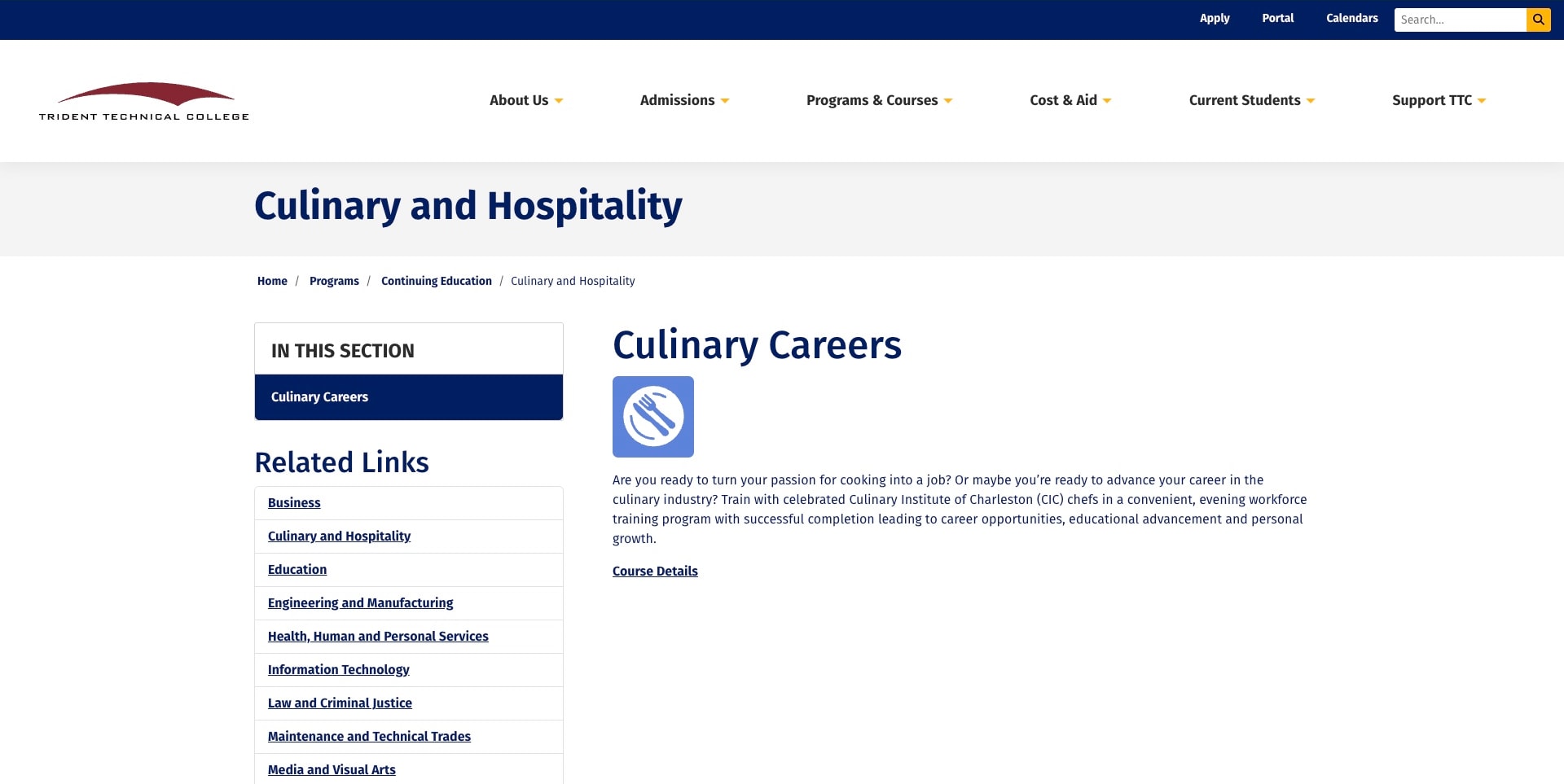
Trident Technical College’s actual Culinary and Hospitality page uses a straightforward heading, breadcrumb and two-column information layout rather than a food-film hero. The left column highlights Culinary Careers and shows related subject links; the right presents a culinary icon, a short explanation and a course-details link. The text explicitly connects evening workforce training with Culinary Institute of Charleston chefs. This is the continuing-education offering within the college, not a portrait of all institute programs. Its useful lesson is a clear, compact route into a specific educational task.
What you can learn
Not every culinary page needs a campaign treatment. A restrained course gateway can work when it identifies the offer and the next information step clearly. Ensure the detailed destination carries dates, commitment and prerequisites so the short introduction does not leave applicants with only an aspiration.
Pros
Breadcrumb and section title make the continuing-education context visible before the course description.
A simple course-details link avoids confusing enquiry, application and purchase actions.
Cons & considerations
The broad related-links column may distract from the culinary task on small screens.
The brief opening needs a substantive destination with current course terms and schedule information.
Kegan is a freelance web designer and developer with 15+ years of experience helping businesses turn complicated website requirements into clear, maintainable digital experiences. He works directly with clients from planning and design through development, launch, and ongoing support.
For culinary school website design, his development approach focuses on clear course and qualification distinctions, entry requirements, campus and delivery formats, current fees and schedules, and useful admissions enquiries without career-outcome promises. The scope can be a targeted improvement or a complete custom build, with responsive layouts, thoughtful content structure, and integrations chosen around the people using and maintaining the site.
Show 3 other culinary school website designersHide other culinary school website designers
Plan a culinary school website around the student’s decision
Start with a program map rather than a generic education sitemap
Inventory what the institution actually teaches and how the offerings relate. Separate cooking, baking and patisserie from hospitality management where the content and intended applicants differ. Then mark which are professional programs, short experiences, continuing education or introductory sessions. Write down the real distinction in plain language before selecting navigation labels or a homepage image.
For a school with several locations, keep the institution, campus and course hierarchy explicit. A shared program name does not establish that the same dates, facilities or delivery format apply everywhere. Let a visitor move from a subject into a specific location and intake without losing context. If the reviewed site represents a network or a college division, borrow its organization rather than pretending every example is a standalone local academy.
Build one complete program-page model
Design a representative program page before polishing every homepage section. It should identify the intended student, prerequisites, subjects, delivery mode, expected practical activity, duration, normal schedule, location and intake dates. Give the exact qualification or completion document a dedicated explanation. Spell out the issuing organization and link to relevant primary information rather than letting a row of logos imply an unspecified endorsement.
Keep changing information manageable. Dates, fees and application windows need named editorial owners and a visible review process. Distinguish confirmed intakes from proposed future availability. If a syllabus is available as a download, provide a useful HTML summary so someone can understand the offer before downloading a large document. A consistent comparison structure is usually more helpful than giving each department an entirely different page layout.
Organize course discovery around meaningful constraints
Choose filters that correspond to real decisions: subject, experience level, date, duration, location and format. Only expose options supported by the actual catalog. A weekend enthusiast may prioritize a date; a professional applicant may care about prerequisites and months of study. Keep the starting view understandable before asking people to combine several filters, and provide a clear way to remove a selection.
Explain empty results rather than replacing them with a generic lead form. Suggest adjusting the date or looking at a related subject, without implying that an unavailable course can be booked. Test search with everyday terms as well as formal course titles. Keep each result self-contained enough to show its duration, date and setting, especially if a school sells both a leisure experience and professional study under similar names.
Commission imagery that answers educational questions
Create a shot list around what a future student needs to understand: a teaching kitchen, a working bench, an instructor demonstrating a technique, a supervised practical session and the surrounding campus or neighborhood. Include quiet explanatory details such as tools and workstations, not only dramatic close-ups. Label facilities and program contexts accurately; a photograph from one campus should not imply that every student uses that space.
Plan how the material works without autoplay or a very wide screen. Give important text its own readable surface, choose still alternatives for films and keep captions useful outside a carousel. Obtain appropriate rights and permissions for every photograph and any identifiable student. A polished dish is valid visual storytelling, but the surrounding content should make clear whether it illustrates a topic, an actual class or an aspirational campaign.
Explain fees and practical costs without inventing certainty
Bring tuition and clearly identified additional costs into the same planning conversation. Depending on the actual program, students may need to investigate equipment, uniforms, ingredients, examinations, accommodation or transport. State what the published fee includes, the currency and the relevant intake. Do not infer a refund policy, funding eligibility or guaranteed financing from a general admissions badge.
If a fee is only available on enquiry, explain why and tell the visitor what information the school needs to provide an accurate answer. Keep financial-assistance descriptions linked to current official terms. International applicants may have separate administrative requirements; describe the institution’s own process and direct legal or immigration questions to appropriate official sources. The website should help people investigate costs, not provide blanket promises about affordability, visas or future earnings.
Make an admissions handoff proportionate to the visitor’s intent
Sketch the journey for a casual course browser, a serious diploma applicant and someone seeking an accessibility or dietary discussion. Do not require the same extensive application from all three. An early enquiry can ask for a course of interest and a preferred contact route; formal application documents belong in a clearly explained, appropriate later process. State what happens after each action without making up response-time commitments.
Keep existing-student access, public admissions, course purchases and gift-voucher redemption distinct. A booking handoff should retain the selected course and date, and a return path should bring visitors back to useful information. Verify the real behavior rather than treating an attractive form screenshot as an implemented enrollment system. Avoid collecting sensitive medical, identity or financial documents through a general public contact field.
Describe online teaching as a different experience, not a missing campus
If a program is remote, explain the actual teaching format: scheduled sessions, self-paced material, tutor feedback, practical submissions and any equipment the student needs. Distinguish synchronous teaching from a recorded lesson library. Keep the intended experience understandable to someone who cannot visit a campus or assume access to professional kitchen equipment.
The same program-page discipline still applies: prerequisites, time commitment, platform requirements and the nature of assessment should be clear. Do not claim that a public marketing page proves the quality of tutoring, the completeness of assessment or the operation of a private learning portal. Use honest illustrations of the learning flow, and make support destinations accessible without advertising unverified completion or career outcomes.
Maintain a useful site between recruitment campaigns
Give dated announcements, open days and seasonal promotions an owner and an expiry rule. An autumn offer can be appropriate in November, but it should not become the only way to understand a year-round school. Preserve stable program and admissions destinations beneath campaigns so an old search result does not force every visitor through the latest promotion.
Before launch, test realistic journeys on a small phone, a desktop and with keyboard navigation: find a course, compare two formats, check a date, read the costs, locate the campus and identify the next step. Check ordinary form errors and external booking boundaries without submitting real applications. After launch, schedule editorial review around actual intakes and catalog changes, not merely the date of a website redesign.
The editing job behind the design
Choose technology around the catalog and admissions workflow
A content platform should make programs, locations, dates and staff-owned updates manageable without copying the same facts across unrelated pages. Define those content relationships before selecting a theme. A small school with a stable offer may need a simpler setup than a network with several campuses and separate admissions processes.
Treat booking, payments, applications and a learning portal as distinct systems with explicit handoffs. The visible website does not establish which private system handles student records or whether those systems exchange data. Map the actual process with the people responsible for it, then document what information moves at each step.
The visible technology notes identify publicly observable website signals only. An attractive course grid does not prove a particular CMS, a video frame does not demonstrate teaching quality, and a detected script does not validate the whole enrollment workflow. Leave unknown items unknown rather than adding a plausible stack to make the list longer.
Our WordPress website examples offer a separate look at publishing approaches. A visible platform label is evidence for that named page, not a guarantee that the same system will suit your requirements.
Before the public launch
Culinary school website planning checklist
Identify professional, recreational, continuing and online study routes in plain language.
State the intended student and prerequisites for every program.
Publish duration, weekly schedule, location and relevant intake together.
Explain the exact qualification or completion document without implying unverified recognition.
Separate confirmed dates from proposed future availability.
Show a useful syllabus summary in HTML, even when a brochure is downloadable.
Connect tuition, currency and clearly identified additional costs.
Use real, permissioned teaching and facility images with accurate context.
Provide still alternatives and readable text outside moving media.
Make course filters useful and explain empty-result states.
Keep enquiries, formal applications, purchases and student login distinct.
Explain external booking or application handoffs and preserve the selected program.
Avoid collecting sensitive applicant documents through a general contact form.
Assign owners to program facts, fees, deadlines and expiring campaigns.
Test course comparison, admission information and contact routes on phone and keyboard.
These checks are a project checklist, not a performance, legal, security, or accessibility certification. Test real journeys with the people responsible for the website before making claims about the result.
Sources & editorial method
How this collection was selected and reviewed
The original29-example target was drawn before research. Selection is based on genuine first-party culinary teaching institutions or their substantive school/program pages. Reviews compare the actual public view, its organization and design tradeoffs; they do not assess education, accreditation, employment results or private enrollment systems. Direct screenshots retain their actual source and capture dates, separate from this guide’s writing and curation dates. Editors Choice is an editorial design selection, not a claim that the school offers the best education.
Each example links to its actual source page. Screenshots are direct browser captures with their own capture dates; moving imagery, announcements and live designs can change. The notes describe observable design choices and conditional tradeoffs, not measured traffic, conversion results, service quality, or accessibility conformance.
Technology labels use public page metadata, asset evidence, or explicitly cited platform documentation. Platform documentation is not a complete current deployment audit. A component reference may be legacy or unused; it is not a complete backend inventory. Unknown stacks are omitted. These sites are editorial examples, not our client portfolio.
Written, Edited and Curated are separate editorial records, not timestamps advanced by a rebuild. Website designs and imagery belong to their owners. See our editorial standards or suggest a correction.
Questions worth asking
Culinary School website design questions
What belongs near the top of a culinary school homepage?
Identify the school and its educational focus, show a meaningful culinary or learning context, and offer a clear route into programs. If professional training and leisure classes coexist, distinguish them early. A strong visual introduction should lead toward specific dates, curriculum, requirements and costs rather than replace those details.
Should short cookery classes and professional diplomas share a catalog?
They can share a platform, but the distinction needs to remain visible in navigation, results and program summaries. Duration alone may not explain the difference. Name the intended learner and the nature of the course so someone buying a workshop does not mistake it for a professional qualification, or vice versa.
Does every culinary school need a custom booking system?
No. Start by documenting the real enrollment process. A short class, a gift voucher and a reviewed diploma application may require different handoffs. Choose systems that support those processes and explain external transitions. A custom interface is not valuable if it obscures essential program facts or creates duplicate administrative work.
How should a school show accreditation and graduate outcomes?
Use precise current statements, identify the issuing organization or source, and explain which program and period a claim covers. Keep supporting primary references available. A testimonial, logo or attractive graduation photograph is not independent evidence of a universal result, and website design reviews do not verify educational quality.
Are online culinary schools relevant to this collection?
Yes, when the provider genuinely teaches culinary skills and the reviewed page explains its own offer. The design questions differ from a campus-based school: practical requirements, feedback, scheduling and access to equipment need clear explanations. Inclusion does not imply that remote and in-person qualifications are equivalent.
Borrow a clear learning pathway, an honest teaching context and a useful next step. Then build around the programs, dates and student questions your own school can keep accurate.