Best Private School Websites of 2026 (21 Real-World Examples)
Compare 21 private-school websites for clear admissions journeys, useful school information and distinctive visual storytelling.
Good private-school website design helps a family understand the school, investigate fit and take an appropriate next step without confusing a welcoming campaign with an application commitment.
A school website serves several audiences at once. A prospective parent may be comparing grades and tuition, a teenager may want to see ordinary school life, and a current family may only need the calendar. A dramatic campus film can support the introduction, but these tasks need a stable information structure beneath it. The strongest pattern in this collection is the separation of practical admissions routes from the broader institutional story.
The examples include smaller specialist day schools, urban high schools and larger institutions with very different settings. They are design references, not a ranking of educational quality or an assessment of suitability for an individual learner. Look at how a site communicates its own context, then build a brief around your actual divisions, admissions process, content team and family questions rather than copying another school’s claims.
Before the examples
What makes good private school website design in 2026?
Explain the school before celebrating it
Name the grades, location and basic school model in readable text. A parent unfamiliar with the institution should not have to infer these from a crest, a campus image or a historic name. If the school has a specialist learning approach, explain it plainly and link to a detailed account. Keep descriptions factual; an attractive interface cannot establish an applicant’s educational suitability.
Distinguish inquiry, visiting and applying
These are different decisions. A family asking an initial question should not land in an application account unexpectedly, while someone ready to visit needs event dates and registration instructions. Sterne’s public admissions content demonstrates why the process deserves its own clear explanation. The website should identify any handoff to a separate admissions platform before the visitor starts entering information.
Keep current-family utilities from obscuring admissions
Portals, calendars and community notices are important, but they do not belong in the same undifferentiated list as curriculum and admissions. Use a utility area or clearly grouped menu. Test the structure with a parent who has never visited the school, a current family and someone using only a keyboard. A familiar internal department name is not automatically a useful public navigation label.
The collection · 21 examples
21 private school websites worth studying
The 21 examples below show different ways to introduce people, place, values and practical admissions routes. Study the relationship between those elements rather than assuming the largest school has the most appropriate model for your own team.
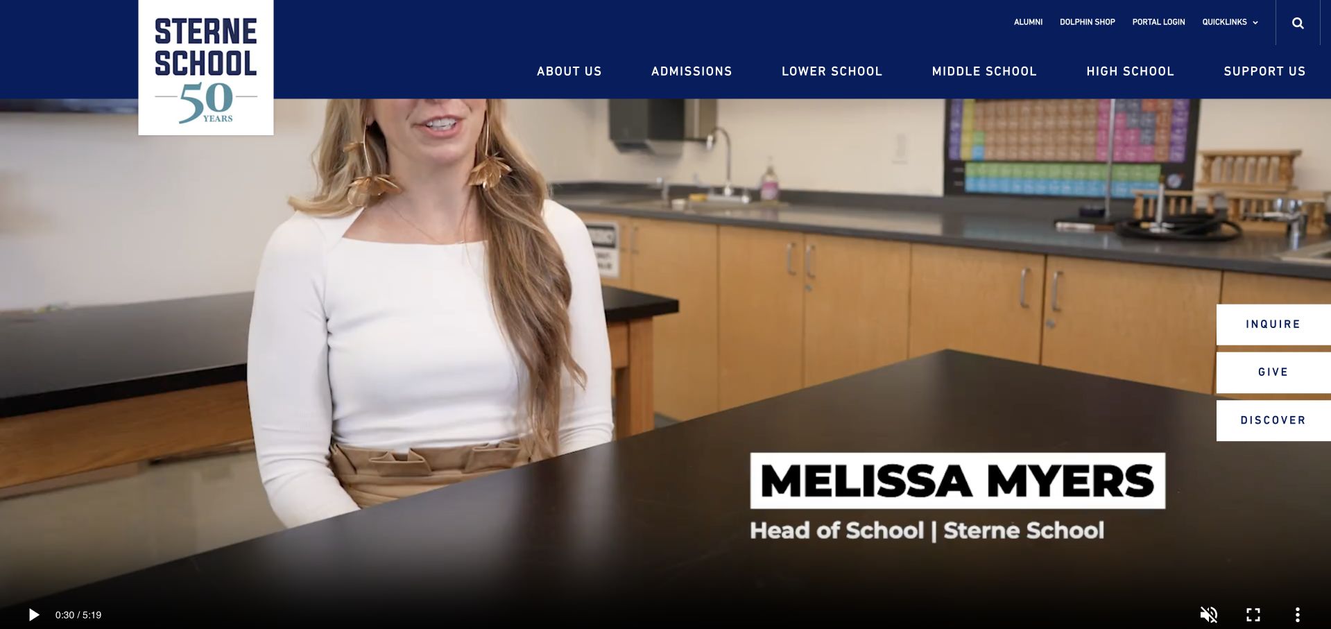
Sterne gives its San Francisco school a recognisable identity before asking families to read a long institutional introduction. A tall anniversary wordmark anchors the navy header, while a classroom scene occupies almost the entire opening view. Three small white actions—Inquire, Visit and Discover—sit together at the right, separating different levels of commitment without competing through different colours. The navigation names the school divisions explicitly. This is our smaller specialist selection for the coherence between a focused identity, an observable learning environment and an approachable admissions route, not an assessment of educational outcomes.
What you can learn
Borrow the three-step invitation rather than the size of the video. A family researching fit, a family ready to visit and a family with an immediate admissions question should each recognise a next step without having to infer the difference from a single Apply button.
Pros
A navy header gives the classroom film a stable frame.
Distinct inquiry and visit labels clarify the next admissions steps.
Cons & considerations
The opening film cannot explain the specialist learning approach alone.
Compact header labels need generous mobile spacing and text sizing.
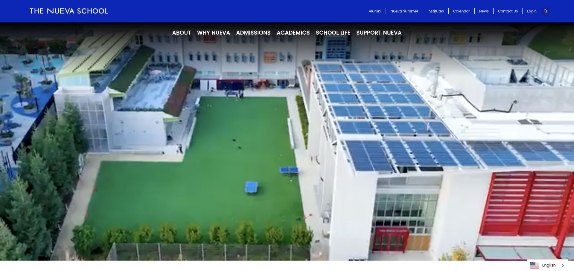
Nueva opens with an aerial view of its buildings, terraces and playing area rather than a wall of promotional statements. A blue utility strip and a second navigation row preserve the school’s identity while the footage supplies context. The visible solar-panelled roof and outdoor circulation create a concrete sense of place, although they do not independently prove environmental performance. About, academics, admissions and school life remain separate routes. The result is an institutional homepage that lets architecture establish scale while keeping the family’s practical navigation available above it.
What you can learn
Use a campus overview when geography is part of the decision, but pair it with written campus names and division details. A striking overhead sequence helps orientation only if the subsequent pages tell a parent where their own child would actually spend the school day.
Pros
Aerial imagery explains the relationship between buildings and outdoor spaces.
Consistent blue branding contains a substantial institutional navigation without clutter.
Cons & considerations
The broad campus view reveals little about an individual lesson.
Two compact header rows need testing with larger browser text.
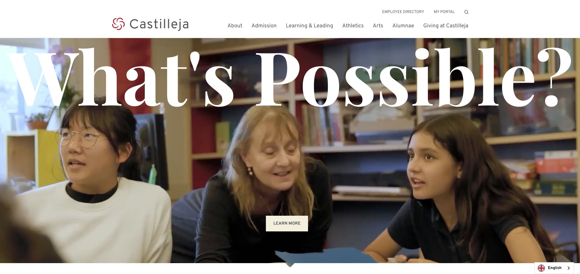
Castilleja puts a single oversized question across a classroom scene: What’s Possible? The white serif lettering is much more expressive than the compact, matter-of-fact navigation above it. A small Learn More action gives the composition a clear exit without turning the entire screen into an application form. The design’s interest comes from the contrast between a spacious editorial headline and ordinary teaching activity. It introduces an atmosphere rather than a list of credentials, so admissions requirements still need their own clear destination beyond this opening impression.
What you can learn
Let a short question organise a photographic hero, then answer it through concrete content below. The visual invitation can be expansive, but families should quickly reach subjects, age ranges, tuition information and visiting arrangements rather than encountering another sequence of similarly abstract slogans.
Pros
One large question creates a clear hierarchy over the photograph.
The white header separates navigation from the expressive campaign treatment.
Cons & considerations
Oversized text can obscure faces in tighter responsive photographic crops.
An open-ended question cannot replace a concrete explanation of fit.
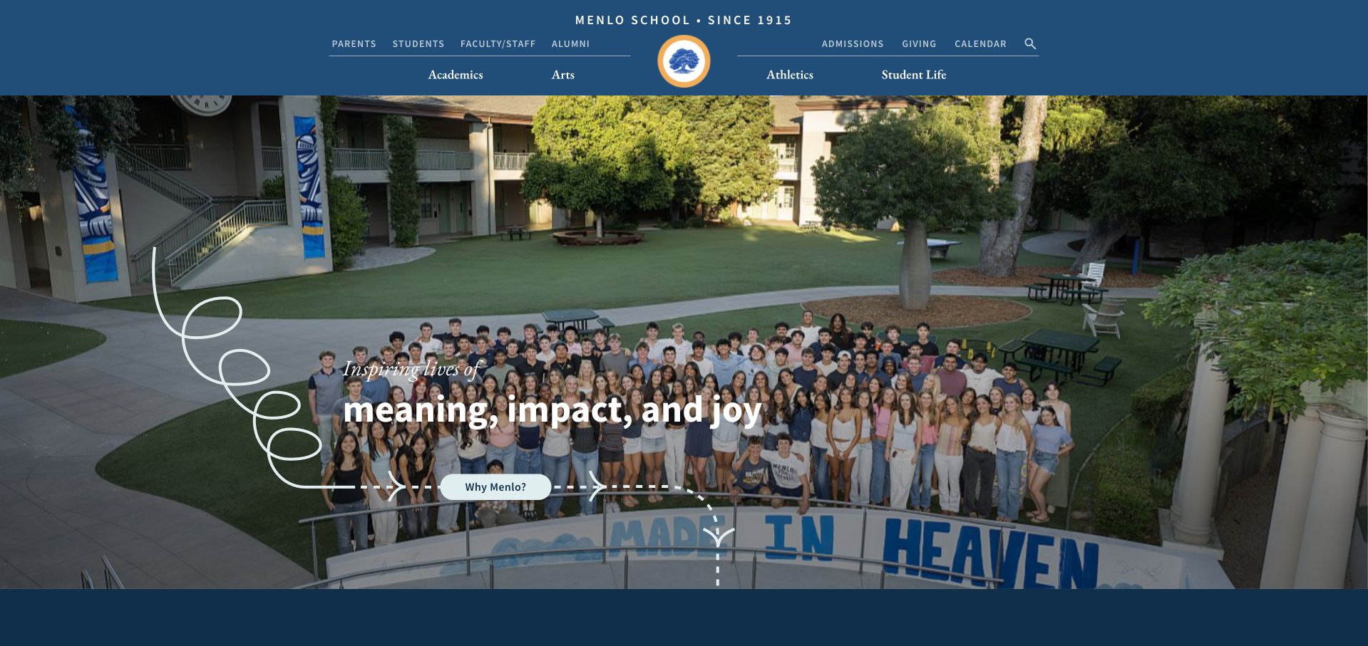
Menlo combines a wide group photograph with a loose white line that loops down from the header. The blue navigation carries both everyday utilities and the main school sections, while the opening statement is centred within the scene. The small Why Menlo action reads as an introduction rather than an immediate transaction. Showing many people at once gives this homepage a communal scale, distinct from the isolated learner portraits common elsewhere in this collection. The decorative line adds movement without needing several competing shapes or badges.
What you can learn
A group image works best when the written introduction identifies what the group represents. Use the photograph to create recognition, then let a concise school overview explain divisions and admissions. Avoid relying on a distant crowd to communicate the full range of individual student experiences.
Pros
One blue palette connects utility links and the main navigation.
The illustrated line adds character without replacing real school photography.
Cons & considerations
A distant group photograph makes individual activities hard to identify.
Several header rows need disciplined grouping for smaller mobile screens.
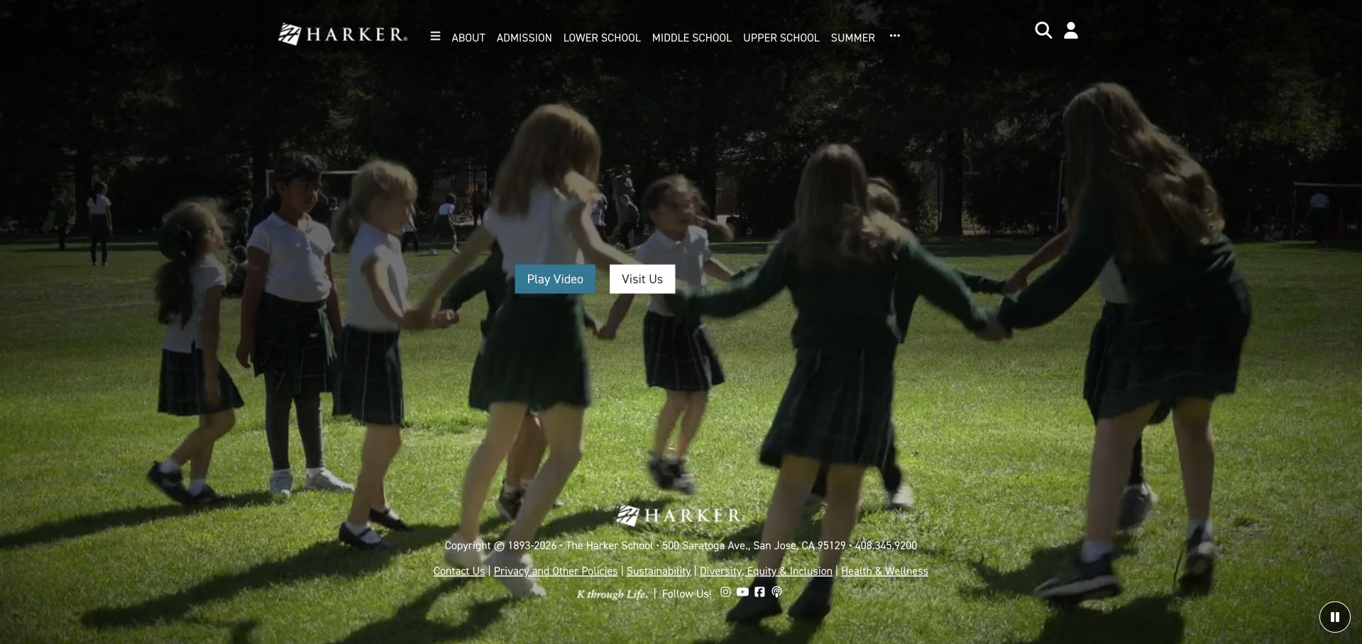
Harker’s opening view uses a green campus scene beneath a compact transparent header. Two small adjacent controls, Play Video and Visit Us, make an important distinction: watching a presentation is not the same action as arranging a school visit. The white wordmark and navigation stay visually quiet, allowing the photograph to establish the tone. Small introductory text sits lower in the scene rather than competing with an enormous slogan. This makes the page feel spacious, although a family seeking specific division information must still follow the navigation.
What you can learn
Separate media controls from admissions actions. A video should be an optional way to explore, with an equally visible route to practical visiting information. Keep school names, age ranges and the next admissions step available as text so a family does not need playback to understand the offer.
Pros
Paired controls distinguish watching a video from arranging a visit.
Restrained white branding leaves the campus scene relatively uncluttered overall.
Cons & considerations
White labels need reliable contrast against changing video backgrounds throughout.
The first view supplies atmosphere before the practical comparison details.
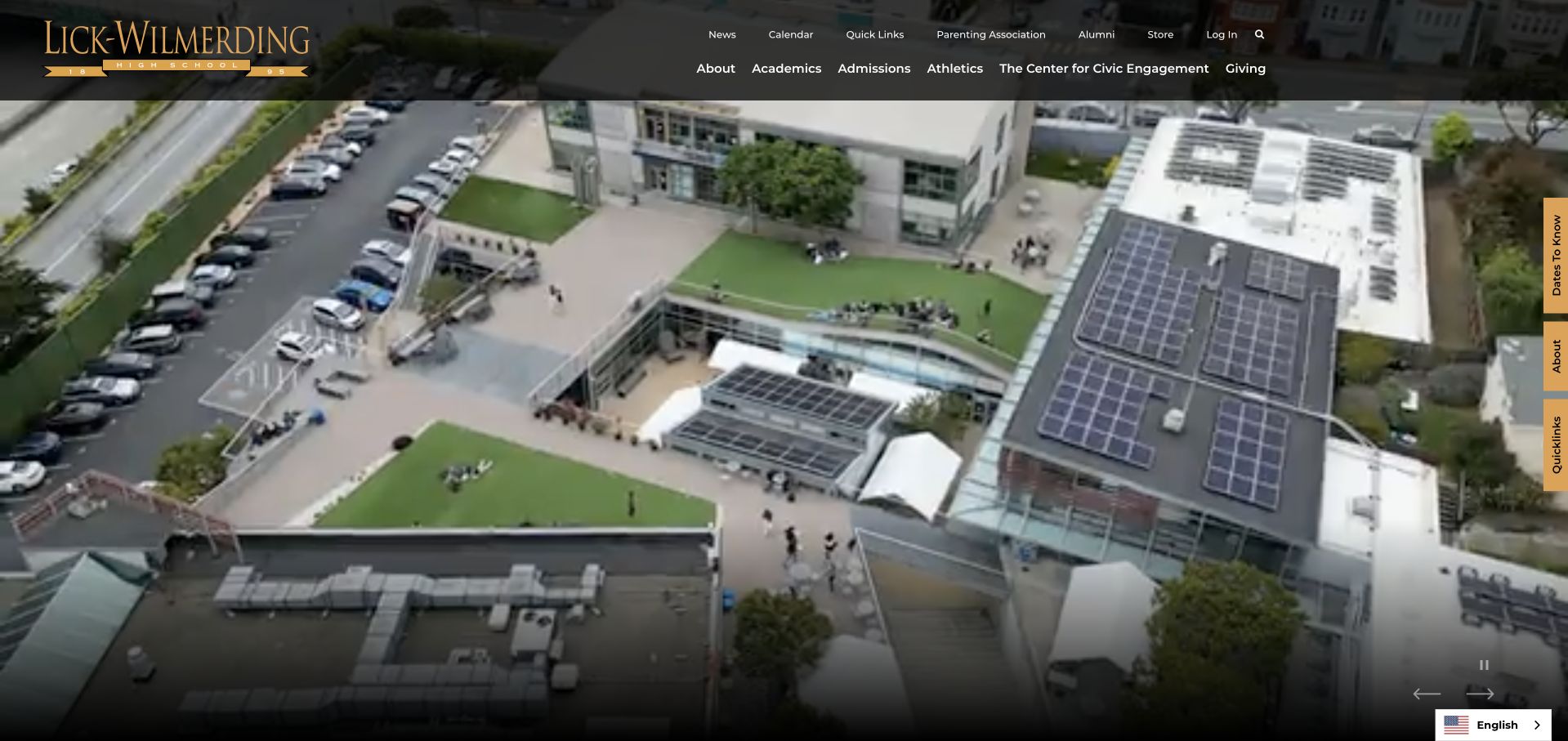
Lick-Wilmerding presents an elevated view of an urban campus, including roof areas, sports space and the surrounding street pattern. A dark transparent navigation band contains the gold wordmark and school sections, while a slim inquiry tab remains at the edge. The image establishes a city setting without a lengthy geographical explanation. The page also exposes video controls, making the moving background an interface element rather than invisible decoration. Its strongest lesson is the way a large physical setting can be shown while retaining an immediate, low-friction inquiry route.
What you can learn
Use wide environmental imagery to answer where a school is, then use division and admissions pages to answer whom it serves. A persistent inquiry tab can be useful, but it must not cover text or become the only keyboard-accessible way to contact admissions.
Pros
The elevated view explains the school’s urban campus setting clearly.
An edge inquiry route stays separate from the institutional navigation.
Cons & considerations
Aerial scale reveals little about classroom interaction or student support.
Thin edge tabs need generous keyboard and mobile interaction targets.
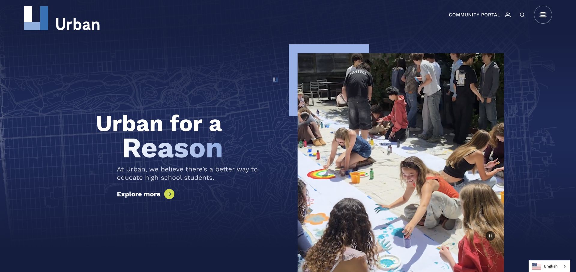
Urban uses a deep blue field, a subtle street-map pattern and a framed collage rather than placing every element over a moving campus shot. The large Urban for a Reason headline sits on the left with a short explanation and a bright circular Explore More cue. On the right, stacked photographs show several kinds of activity within a sharply defined rectangular frame. The utility navigation remains small and separate at the top. This is a useful contrast to the cinematic institutional openings elsewhere here: the layout controls both the message and the image boundary.
What you can learn
A collage can communicate variety without requiring a carousel. Give each image a reason to be present and preserve one obvious reading direction. The map texture can support local identity, but important admissions facts should remain ordinary selectable text rather than disappearing into a visual composition.
Pros
A blue text panel protects the headline from photographic contrast.
The framed collage introduces several activities within an orderly composition.
Cons & considerations
The broad headline needs details explaining the school’s specific proposition.
Collage images need simplification rather than shrinking on mobile screens.
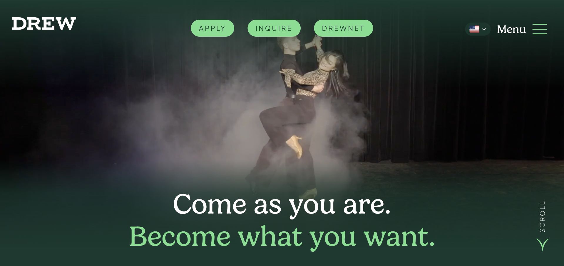
Drew uses a dark, atmospheric opening scene with a large two-line statement about arriving as yourself and becoming what you want. Green accents connect the statement to the Apply and Inquire actions beside the Drewnet community route. The wordmark sits separately at the left, while the menu label remains explicit at the right. The settled page gives the introduction more personality than a conventional institutional masthead. Its visual language is invitational, but the actual school divisions and admissions process still need to be learned through the linked public content.
What you can learn
A welcoming tone becomes useful when it is attached to different practical actions. Keep an inquiry route available for families who are not ready to apply, and explain visiting arrangements on a dedicated page. Do not let a compelling identity statement replace basic information about grades and application timing.
Pros
Green accents connect the welcoming message and the admissions actions.
Apply and Inquire remain distinct from the current-community portal route.
Cons & considerations
Dark footage needs reliable contrast throughout the changing opening sequence.
An identity statement cannot establish suitability for an individual applicant.
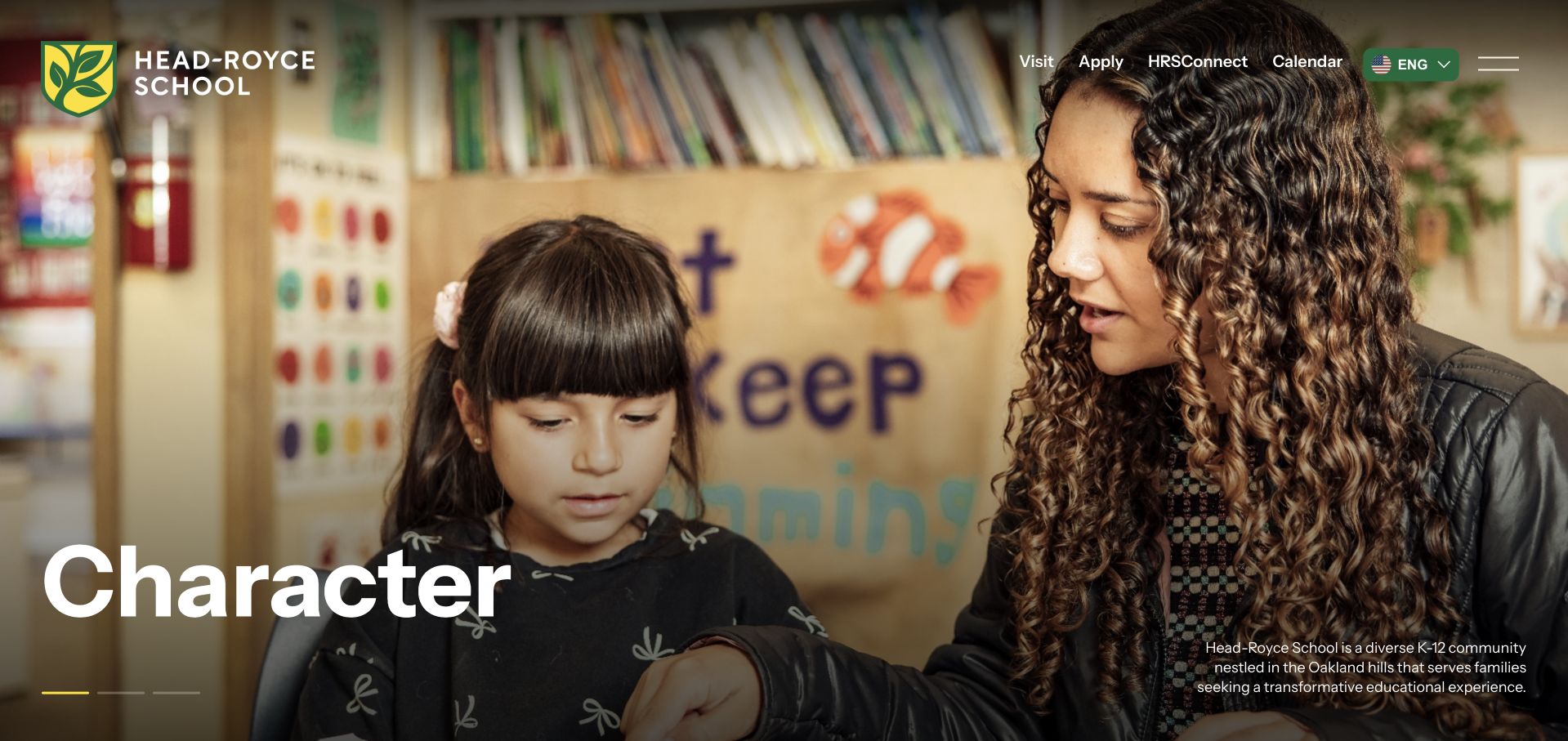
Head-Royce links the words character, intellect and creativity to photographic scenes rather than presenting them as a dense mission paragraph. The header includes Visit and Apply before the menu, giving new families direct routes alongside community utilities. In the observed view, a library scene and a large single-word label create a strong focal point. The page then introduces the school’s K–12 community and its Oakland setting in text. It is a concise way to combine a broad identity with recognisable school stages, without claiming that the imagery demonstrates individual educational outcomes.
What you can learn
Use a few consistent themes as an editorial structure, not as interchangeable slide slogans. Pair each theme with a concrete page or example, and keep all essential introductory information available outside the rotating image. Visitors should understand the school even if they never interact with the slide controls.
Pros
Visit and Apply stay visible without opening the full menu.
A small thematic vocabulary structures the photographic school introduction clearly.
Cons & considerations
Single-word values need concrete, verifiable examples in the following content.
Rotating photographs should never carry essential admissions information by themselves.
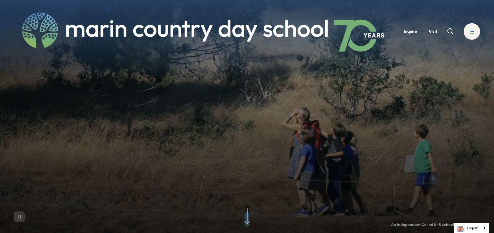
Marin Country Day School places its large white wordmark across a landscape scene, accompanied by an anniversary treatment. The main visual is an outdoor path with people moving through the setting, while the upper-right navigation stays deliberately sparse. Small Inquire and Visit links sit beside search and a circular menu control. The large branding makes the page immediately recognisable without filling the centre with several competing messages. The scene communicates an outdoor setting; it does not establish how much time any particular pupil spends outside or prove a curriculum claim.
What you can learn
Allow a distinctive environment to introduce the school, but keep the next useful action readable. Sparse navigation is effective only when the expanded menu groups practical information clearly. Families comparing day schools still need transport, divisions, calendars and visiting details without having to interpret a landscape film.
Pros
The generous wordmark remains recognisable over the changing landscape scene.
Inquiry and visit links stay separate from the circular menu.
Cons & considerations
Minimal navigation hides substantial school information behind an additional interaction.
A landscape introduction delays practical details for families comparing schools.
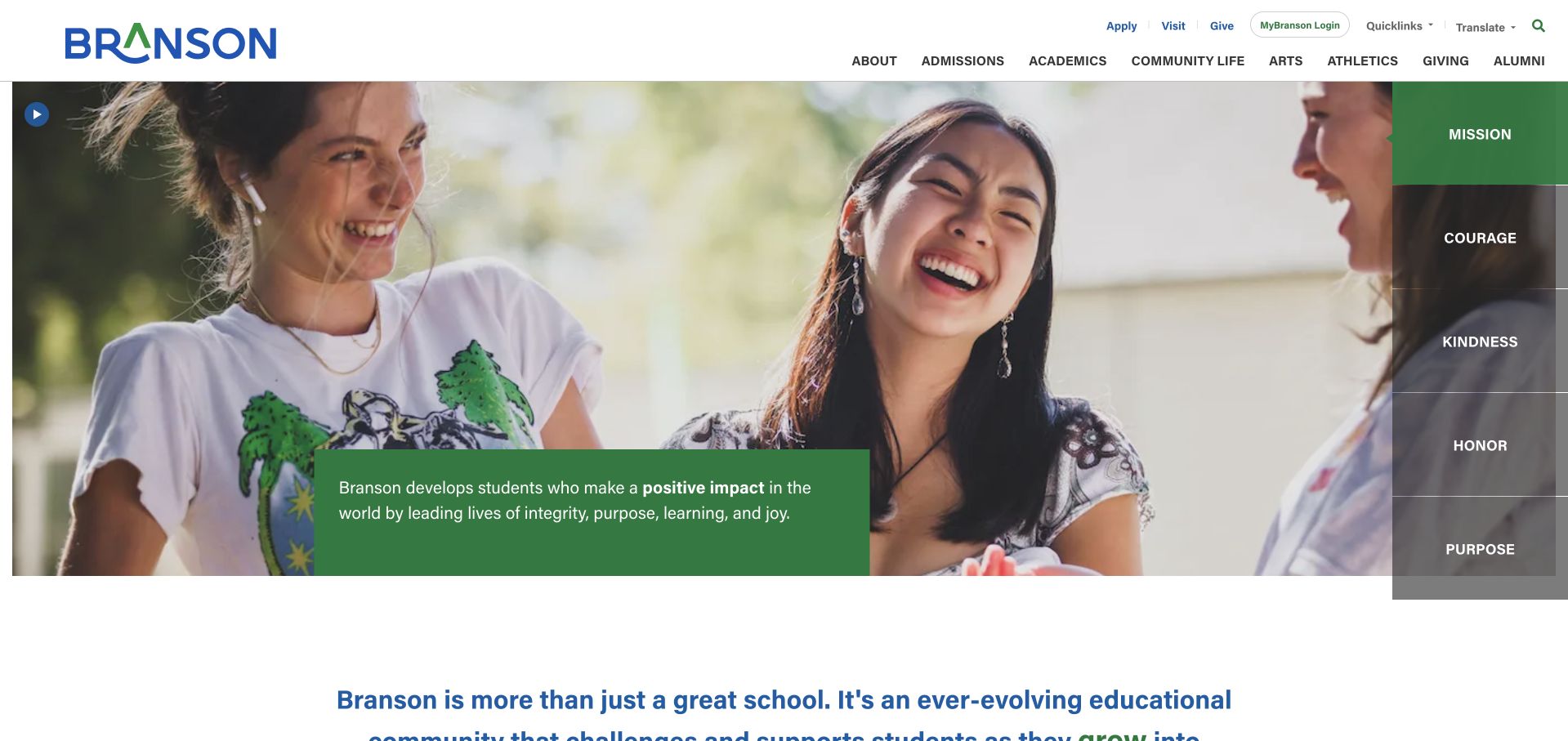
Branson frames a conversational photograph with a vertical strip of values on the right. Mission, courage, kindness, honor and purpose appear as separate labels, while one green text panel explains the currently selected idea. A white header keeps the blue-and-green wordmark, school navigation and utility links distinct from the photo. Beneath the hero, a direct school introduction begins on white. This gives the mission a visible structure instead of burying it in an About page, while preserving a transition into more practical written content below.
What you can learn
If values are interactive, make the selected state and accompanying text unmistakable. Keep the introduction understandable without clicking every label, and ensure keyboard users can reach the same content. The purpose of the interface should be to clarify the school’s message, not to make visitors complete a miniature presentation.
Pros
The values strip gives the mission a clear visual structure.
A plain introduction follows the image before more promotional sections.
Cons & considerations
Several theme controls demand more attention than a straightforward overview.
Broad values need specific examples before they support meaningful comparison.
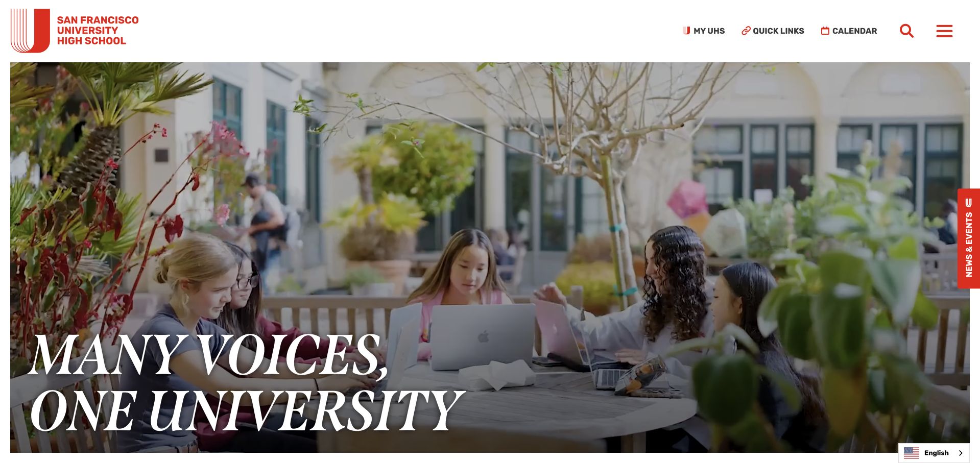
University High uses a white header and a large red letterform mark above a street-side learning scene. The italic headline, Many Voices, One University, stretches across the lower part of the photograph, giving it a magazine-like character. Everyday utilities and the menu remain compact at the top, while an inquiry tab is available at the right edge. The composition introduces the institution through people and place rather than a list of achievements. Its visual confidence is useful inspiration, but the word University in the name still needs context for visitors unfamiliar with this high school.
What you can learn
Distinctive typography can make a school memorable without requiring a complicated layout. Protect the photographic crop and the headline’s reading order across screen sizes, then explain the institution plainly nearby. A first-time family should not have to know the school’s history to understand what age group it serves.
Pros
The red identity mark stays distinct from the photographic headline.
An ordinary learning scene gives the introduction a concrete subject.
Cons & considerations
Large italic text needs careful contrast across responsive photographic crops.
The first view assumes some familiarity with the high school.
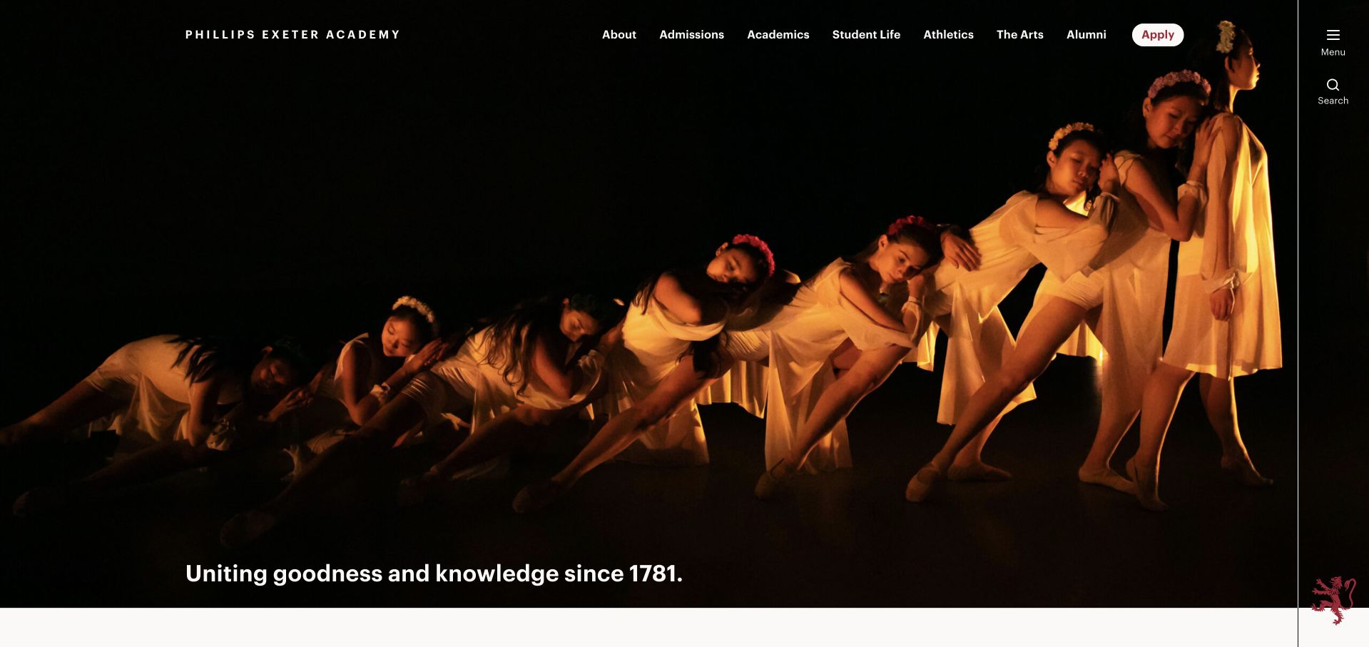
Exeter chooses a dark evening photograph in which candlelight draws attention to a group of people. The sparse white navigation and small Apply control leave most of the screen to the scene. A short line about goodness and knowledge sits near the lower edge, giving the image an institutional frame without a long block of copy. The visual is distinctive because it communicates a communal ritual rather than another bright aerial campus panorama. It offers a reference for heritage-led storytelling, not evidence that a particular tradition defines every student’s experience.
What you can learn
A heritage image needs enough written context to remain meaningful for newcomers. Preserve the unusual atmosphere, but connect it to a plain account of the school, who attends and how to visit. Avoid assuming that the significance of a ceremony or tradition is obvious from the photograph alone.
Pros
Restrained white navigation gives the candlelit scene room to work.
One short statement avoids competing institutional slogans and heritage badges.
Cons & considerations
The ceremony’s meaning is not self-evident to an unfamiliar family.
Small white links need visible focus and consistent photographic contrast.
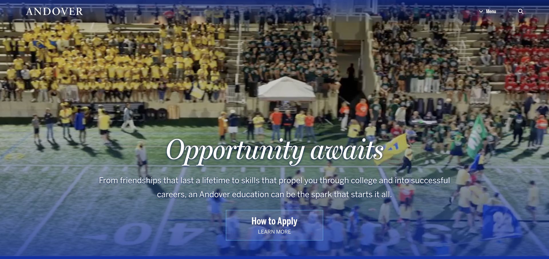
Phillips Academy’s observed opening frame shows a crowded outdoor gathering beneath the large italic phrase Opportunity Awaits. A restrained wordmark and compact navigation sit at the top, while a small How to Apply control appears below the statement. The scale of the photograph makes the school feel active and communal without introducing several separate content cards. The hero’s strength is its hierarchy: one message, one scene and one prominent route onward. It remains an introductory impression rather than a summary of admission requirements or an assurance of access to particular opportunities.
What you can learn
Use an expansive scene to introduce community, then let the action label explain where the visitor is going. How to Apply is more informative than a generic Discover button when the next page contains process details. Keep those details available in text rather than asking the hero to carry everything.
Pros
One headline and action create hierarchy within a busy scene.
Restrained branding prevents the crowd photograph from becoming visually overloaded.
Cons & considerations
A distant gathering cannot explain an individual student’s everyday experience.
Broad opportunity language needs concrete supporting information beyond the hero.
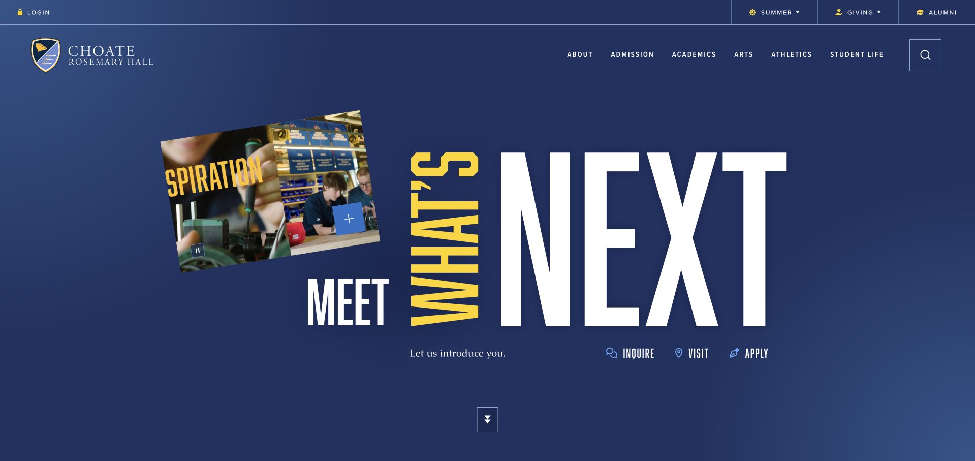
Choate opens on a deep blue graphic composition built around the phrase Meet What’s Next. Oversized white lettering, a vertical yellow word and a tilted publication image give the school a more editorial presentation than the surrounding campus-video examples. The crest and navigation remain small enough to frame rather than compete with the composition. Below the central statement, inquiry, visiting and application routes form a compact group. The visual establishes a forward-looking brand position through typography and imagery, although families still need a direct introduction to the school’s programmes and practical arrangements.
What you can learn
A graphic hero can be effective when its pieces share a single message and a clear next step. Resist adding more visual fragments simply because the layout has space. Test the arrangement with longer translated labels and smaller screens so the distinctive typography does not become an obstacle to admissions information.
Pros
A limited blue-and-yellow palette holds the editorial composition together clearly.
Grouped admissions routes balance the expressive typography with practical navigation.
Cons & considerations
An abstract campaign gives little context about daily school life.
Oversized lettering needs a deliberate mobile arrangement, not simple shrinking.
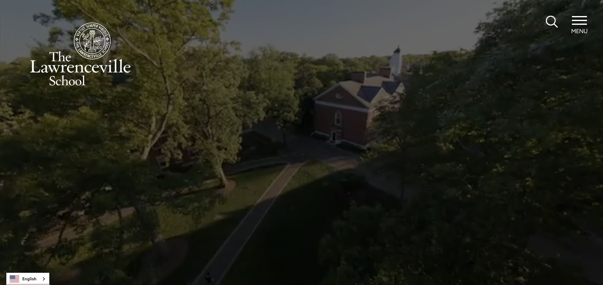
Lawrenceville gives the opening screen almost entirely to an elevated campus view, with a large school crest and wordmark at the upper left. Search and Menu are the primary visible controls on the opposite side. The image communicates buildings, tree cover and the wider setting with very little competing interface. This is a deliberately quiet first impression compared with pages that display several admissions buttons immediately. It can be effective for recognition and atmosphere, but it asks first-time families to open the navigation before they can compare detailed school information.
What you can learn
A minimal campus-first opening should be supported by a particularly clear expanded menu. Make admissions, school divisions and visiting information easy to identify, and offer a written introduction below the image. Visual calm is valuable only when it does not make ordinary family questions harder to answer.
Pros
A spacious image keeps the campus and identity immediately recognisable.
Explicit Search and Menu labels are clearer than unexplained icons.
Cons & considerations
The first view does not expose a direct visiting route.
Aerial imagery cannot explain teaching methods or individual student experience.
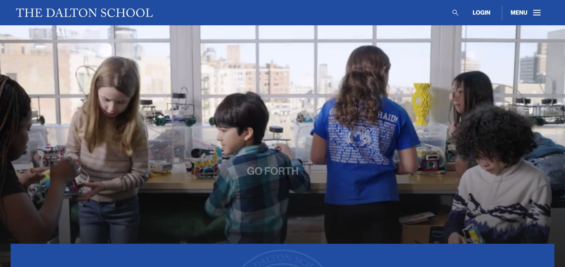
Dalton uses a blue header above a classroom scene in which tables, equipment and several people provide tangible context. The compact Go Forth statement sits within a translucent central panel rather than dominating the entire photograph. The school name remains prominent at the left, with login, menu and search grouped on the right. A blue band at the lower edge connects the hero to the next section. The page’s restraint is worth studying: the scene has enough detail to feel active, while the short statement leaves room for the school’s identity.
What you can learn
Choose a classroom image that remains understandable without a caption, then add a concise message rather than covering it. Separate current-community utilities from prospective-family navigation in the menu. A visible login route should not cause a newcomer to wonder whether the public admissions information is also behind an account.
Pros
A blue header consistently frames the detailed classroom scene below.
A short central statement leaves room for the photographic subject.
Cons & considerations
Prospective families need the menu to discover detailed admissions information.
One classroom moment cannot represent every subject or learner experience.
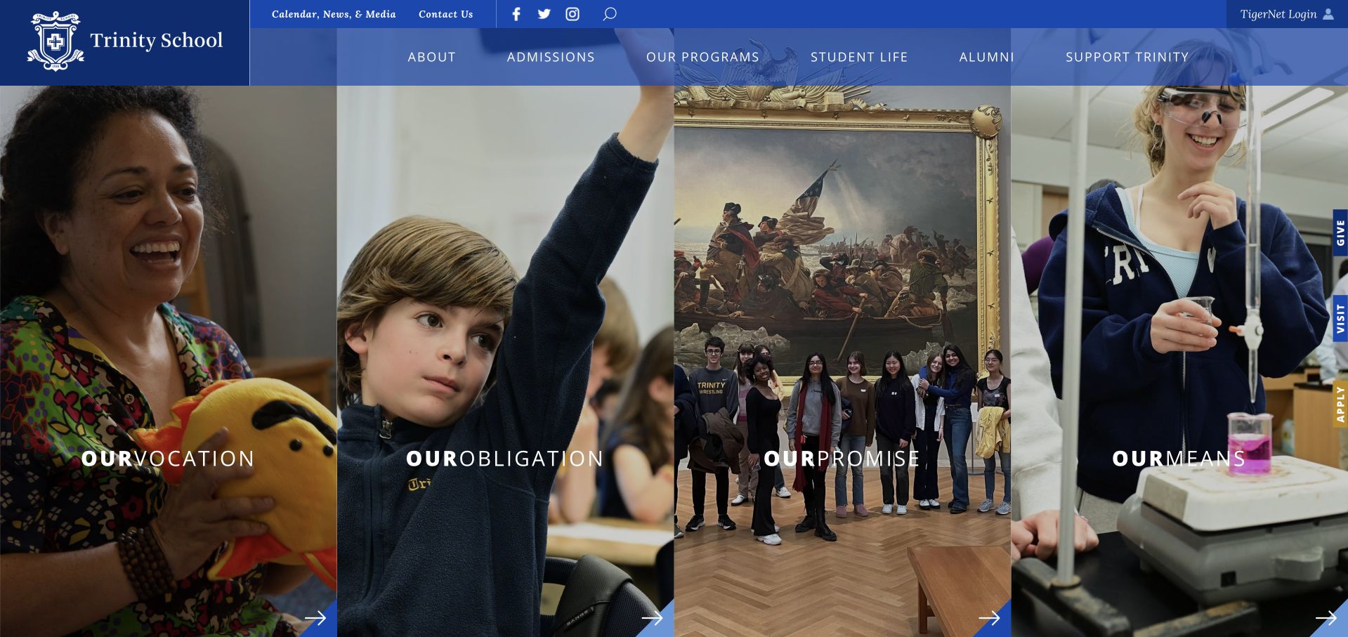
Trinity divides its opening image into four vertical panels, each paired with a short mission-related label. The scenes range from a classroom interaction to cultural and student activities, giving the hero variety without requiring the visitor to advance slides. A blue header contains the school name and the conventional institutional navigation above the panels. The repeated panel widths make the composition feel deliberate rather than like a loose photo collage. It is a useful reference for turning several institutional themes into a single readable visual system, provided those themes are explained in ordinary content as well.
What you can learn
A four-part hero works when each panel has a distinct role and remains useful at smaller sizes. Consider stacking or reducing panels on mobile rather than narrowing them until faces and labels become unreadable. The thematic structure should lead to concrete information rather than simply repeat the mission statement.
Pros
Equal panels give several photographs one coherent editorial visual rhythm.
Conventional navigation stays separate from the more experimental photographic hero.
Cons & considerations
Narrow photographic crops can remove useful context on smaller screens.
Mission labels need explanation before they support practical school comparison.
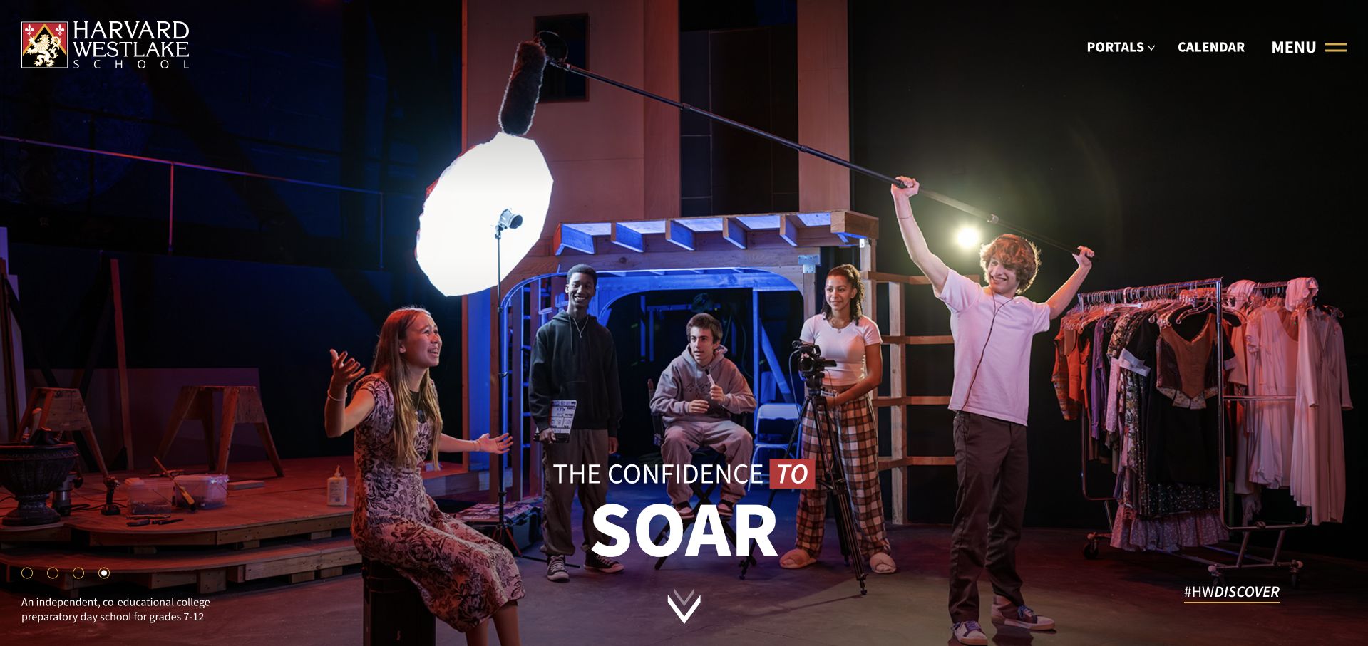
Harvard-Westlake’s settled opening view shows a stage performance beneath a compact dark header. The statement about confidence to soar sits low within the scene, while the school mark, portals, calendar and menu remain at the top. A downward cue and Discover label encourage continuation rather than an immediate form submission. The theatrical lighting and visible set make this a more specific activity-led introduction than a generic campus panorama. The image is useful as design evidence of the site’s storytelling choice, not as a measure of the breadth or quality of its arts provision.
What you can learn
Specific activities can give a broad institution a more memorable introduction. Rotate stories editorially if needed, but keep the school’s basic identity and admissions routes stable. Provide a caption or follow-up context so visitors understand what they are seeing without assuming the photograph describes the entire programme.
Pros
A stage performance gives the confidence headline a specific subject.
The compact header preserves identity without obscuring the theatrical scene.
Cons & considerations
One activity may not answer an academically focused family’s questions.
Dark performance footage needs contrast checks across all changing frames.
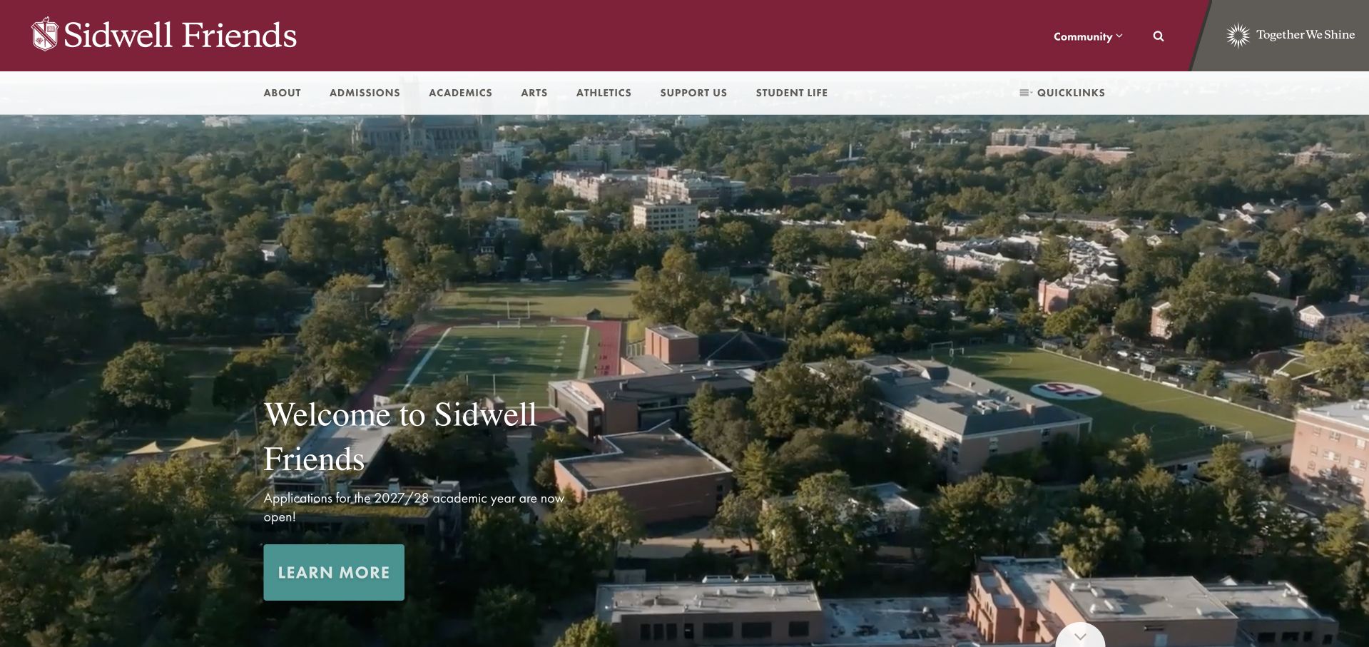
Sidwell Friends combines a maroon utility strip with a white main navigation row and a wide elevated campus scene. A small welcome block and green Learn More button sit toward the lower left rather than stretching across the photograph. The image shows the relationship between buildings, trees and the surrounding neighbourhood, while the header keeps academics, admissions and community routes available as text. Its quieter hierarchy makes the page feel institutional without filling the opening with crests, counters or award claims. The photograph establishes setting, but the school’s values still require the written explanation beyond it.
What you can learn
Keep a place-led hero legible by limiting the amount of overlaid copy. Use the following section to explain the institution in plain language and name the relevant divisions. Families should be able to move from atmosphere to practical details without another full-screen layer of promotional messaging.
Pros
Separate navigation rows distinguish community utilities from broader school information.
A compact welcome preserves the photograph’s sense of physical place.
Cons & considerations
The panorama does not explain divisions or campus arrangements clearly.
Learn More gives less destination context than a named introduction.
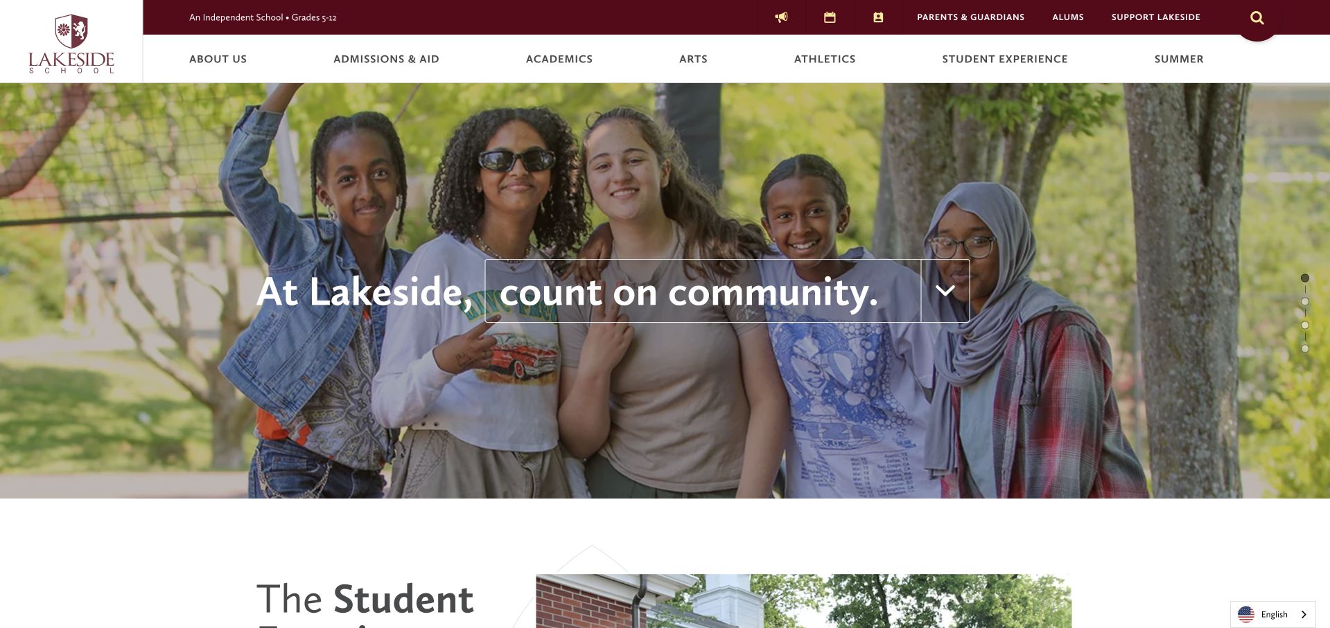
Lakeside places a group photograph beneath a maroon utility bar and a spacious white navigation row. The central statement asks visitors to count on community, while the next section begins quickly with a student-experience heading and another image. This creates a useful balance: the first view establishes tone without consuming the entire page, and the school starts explaining itself before the visitor has scrolled far. Admissions, academics and student experience are distinct navigation categories. The photograph supports a community-focused presentation, but it cannot establish whether any individual family will experience that community in the same way.
What you can learn
Give the emotional introduction a clear stopping point. A shorter hero can create room for concrete school information on the same screen, especially on larger displays. Use the next section to explain the student experience with specific examples rather than repeating the hero’s broad community message.
Pros
The next section shares the screen with the introductory photograph.
Academic and student-experience labels separate two different research intentions clearly.
Cons & considerations
Wide group photographs need considered mobile crops to preserve context.
Community language needs specific detail rather than implying universal suitability.
Kegan is a freelance web designer and developer with 15+ years of experience helping businesses turn complicated website requirements into clear, maintainable digital experiences. He works directly with clients from planning and design through development, launch, and ongoing support.
For private school website design, his development approach focuses on school philosophy, admissions information, family resources, accessibility, and straightforward visit inquiries. The scope can be a targeted improvement or a complete custom build, with responsive layouts, thoughtful content structure, and integrations chosen around the people using and maintaining the site.
Show 3 other private school website designersHide other private school website designers
Plan the school information before the photographic campaign
Map the family’s comparison questions
Start with a content inventory covering divisions, curriculum, tuition, assistance, transport, support, visits and application stages. Assign each topic an owner and a review date. Write a short public introduction that answers what the school is before adding a campaign headline. Ask admissions staff which questions recur by phone, then make those answers easy to locate without publishing private applicant information or individual learning histories.
Design one reliable admissions pathway
Document the steps from first enquiry to visit registration and application. Show which steps occur on the public site and which use a separate provider. Keep current deadlines in one maintained source rather than repeating editable dates across banners, PDFs and forms. Use descriptive actions such as View Tour Dates where they are accurate, and explain any account requirement before the handoff. Do not collect application documents in an ordinary general-contact form.
Build a sustainable school-life publishing process
Decide who approves photography, how permissions are managed and when images should be retired. Use public material that represents the intended context without exposing private pupil information. Plan useful written captions and text alternatives. If the homepage film changes each term, test every new sequence for text contrast and loading behaviour rather than treating the original design approval as permanent permission to publish any future crop or video.
The editing job behind the design
Choose technology around publishing and admissions responsibilities
[object Object]
[object Object]
[object Object]
Our WordPress website examples offer a separate look at publishing approaches. A visible platform label is evidence for that named page, not a guarantee that the same system will suit your requirements.
Before the public launch
Private-school website launch checklist
State grades, location and school model in selectable text near the introduction.
Separate prospective-family navigation from current-community portals and everyday utility links.
Give inquiry, visiting and applying different labels and accurate destination pages.
Confirm admissions dates from one maintained source before publishing or updating banners.
Explain account requirements and external admissions-provider handoffs before collecting visitor details.
Publish current tuition and assistance routes without exposing individual financial information.
Check photographic permissions and remove obsolete or incorrectly contextualised school-life imagery.
Keep essential information available without autoplay film, carousel interaction or downloadable PDFs.
Test image crops, text contrast, keyboard focus and controls across mobile layouts.
Label enquiry fields and show understandable success, validation and error messages.
Assign owners for divisions, staff biographies, calendar items and admissions content.
Review redirects, internal links and search results after replacing an older school site.
These checks are a project checklist, not a performance, legal, security, or accessibility certification. Test real journeys with the people responsible for the website before making claims about the result.
Sources & editorial method
How this collection was selected and reviewed
We inspected the linked public pages and actual browser captures, then wrote original observations about hierarchy, imagery and navigation. Selection is editorial rather than a measured educational ranking. Images are dated observations, not live representations of every subsequent update. Technology notes are source-qualified and intentionally incomplete.
Each example links to its actual source page. Screenshots are direct browser captures with their own capture dates; moving imagery, announcements and live designs can change. The notes describe observable design choices and conditional tradeoffs, not measured traffic, conversion results, service quality, or accessibility conformance.
Technology labels use public page metadata, asset evidence, or explicitly cited platform documentation. Platform documentation is not a complete current deployment audit. A component reference may be legacy or unused; it is not a complete backend inventory. Unknown stacks are omitted. These sites are editorial examples, not our client portfolio.
Written, Edited and Curated are separate editorial records, not timestamps advanced by a rebuild. Website designs and imagery belong to their owners. See our editorial standards or suggest a correction.
Questions worth asking
Private School website design questions
Should a private-school homepage use video?
Only when the school can maintain it and provide usable controls, a dependable poster image and readable text. A still photograph can work just as well. The purpose is to introduce a setting, not to make visitors watch a film before learning essential admissions facts.
How should admissions and current-family information be separated?
Use clear audience grouping and a stable utility area for portals and calendars. Keep admissions, school divisions and visiting routes easy to identify without login. Test the menu with someone who does not know the school’s internal department names.
Can we describe our learning approach through photographs?
Photographs can illustrate a setting or activity, but they cannot establish educational effectiveness or suitability. Explain the approach in plain public text, provide relevant factual context and let qualified school staff address individual questions through the appropriate admissions process.
Do we need a custom admissions form?
Not necessarily. The public site may be better used for clear information and initial routing while a dedicated admissions system handles applications. Whatever the arrangement, label the handoff, minimise general-enquiry fields and keep confidential applicant records out of public content workflows.
What should be reviewed after launch?
Start with deadlines, event registration, staff details, programme descriptions and image context. Test the main family tasks again after major updates. A school website is an ongoing publishing responsibility, particularly when several teams edit pages for different divisions and audiences.
Use the examples to clarify the school’s public story and make practical family questions easier to answer. The right design is the one the school can keep accurate, accessible and recognisably its own throughout the admissions year.