Best Duda Websites of 2026 (20 Real-World Examples)
Twenty distinct public websites with direct Duda runtime evidence, real screenshots and original design reviews.
Duda can support very different public experiences: a local service homepage, a corporate gateway, an investor publication or a hotel search entrance. These examples show how useful information structure and deliberate visual choices make a shared website platform feel specific to its audience.
Duda is a hosted website-building platform with reusable sections, sitewide design controls, content tools and developer integrations. Those capabilities provide a starting structure; they do not decide what a visitor needs to understand. A strong website still needs an explicit audience, clear navigation, dependable contact information and a sensible sequence from introduction to action.
This collection opens with AAMCO, Tuffy, BlackBerry investor relations, McKee Foods and Swiss-Belhotel International. Each selected public property contains direct Duda runtime declarations and associated page structure. The BlackBerry claim is deliberately limited to its investor-relations subdomain. Hotel reservations, patient portals, franchise systems and other linked applications are not automatically included in any homepage attribution.
Before the examples
What makes good Duda website development in 2026?
Give repeated sections a useful purpose
A shared hero, card row or header is most effective when it supports a recognizable decision. AAMCO connects a service introduction to finding a center; SwimJim separates class discovery from its atmospheric opening. Before selecting a section, write down the question it answers and the next step it should make easier. Reuse the structure where that purpose repeats, rather than repeating sections simply because they are available.
Set a small visual vocabulary
Duda documents global fonts and colors alongside reusable sections and templates. Use those controls to make ordinary decisions consistent: heading scale, button emphasis, spacing and link treatment. Tuffy shows how one bright color can identify a primary task; Nest DC carries a quieter identity through several sections. The goal is a maintainable relationship among elements, not a requirement that every business adopt the same layout.
A marketing page often leads somewhere else to finish a task. A patient portal, stock feed, class schedule or reservation engine can have different ownership, technology and support requirements. Label those transitions clearly and verify the experience on both sides. A public runtime signature is useful evidence for the page being reviewed; it is not a complete inventory of the organization's systems.
Make local and practical context visible
The smaller examples are strongest when they identify a service, place or visitor task before asking for an inquiry. Prime Boxing publishes local essentials in a dedicated strip; Pediatric Associates separates office information from new-patient content. Keep those facts current and readable. A striking photograph can establish atmosphere, but it cannot replace the details needed to choose a location, compare a service or understand a booking.
The collection · 20 examples
20 Duda website examples worth studying
Study the relationship between each page's visual hierarchy and the task it presents. The collection includes corporate homepages, local businesses and specific interior pages, with one distinct public property per example. Captures retain their actual dates, and technology evidence is recorded separately from visual observations.
We start with five recognizable brands or organizations: AAMCO, Tuffy Tire & Auto Service, BlackBerry investor relations, McKee Foods, Swiss-Belhotel International. Each attribution applies to the named website property, not every product or website belonging to its organization. This is a curated reading sequence, not a measured ranking.
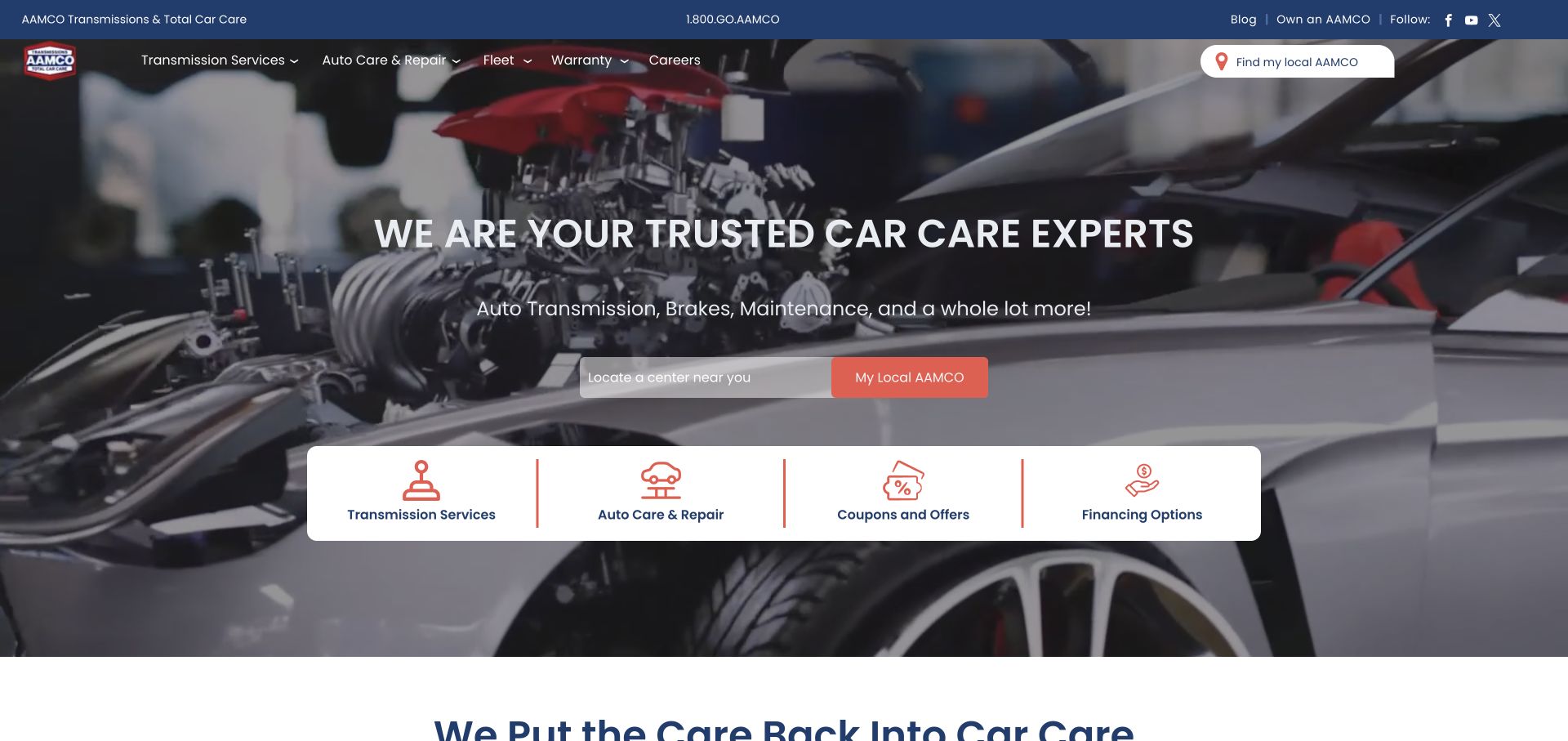
AAMCO illustrates how a Duda page can accommodate a broad service business without making the opening purely promotional. The photographed engine provides an immediate subject, while a location field turns the large hero into a useful starting point. Four white task tiles separate transmission work, general repairs, offers and financing. Navigation and utility links sit above that grouping rather than becoming another row of competing cards. The design is strongest where the reusable page structure reflects a real customer decision: identify the service, then find a center. The runtime evidence is limited to this homepage.
What you can learn
Design reusable sections around a visitor's sequence of decisions. A location search is more useful when nearby service categories explain why someone should use it, and destination pages clarify local availability.
Pros
The local-center field gives the hero a concrete task beyond reading a brand promise.
A separate tile row lets four service-related choices share a consistent visual treatment.
Cons & considerations
Repeated location actions need consistent behavior and clear labels across different screen sizes.
The large image requires a dependable text overlay when the background frame or crop changes.
Platform source: WordPress.org Showcase. Primary HTML declares SiteType atob('RFVEQU9ORQ==') (DUDAONE), window.Parameters with this exact HomeUrl/SiteAlias, dmAPI bootstrap and Duda runtime/page markup. Observed 2026-11-12T16:09:17.493Z. Applies only to this public property; linked applications and unrelated company websites are not included. Platform evidence is separate from the direct website screenshot and is not a complete current infrastructure audit.
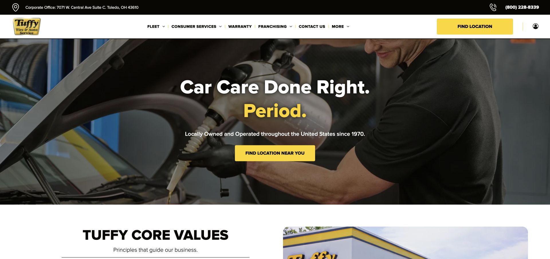
Tuffy's page uses a yellow accent sparingly enough that both location buttons stand apart from the black-and-white navigation. The workshop photograph supplies the visual setting, while the headline and supporting sentence stay centered in a relatively narrow text area. Below the hero, a white section introduces company values and an image of a branded building. This is a useful Duda reference for controlling emphasis across reusable sections: a saturated button can remain obvious without making every surface bright. Fleet, consumer, warranty and franchising routes acknowledge different audiences, although their shared position requires visitors to choose their context. Runtime evidence covers this corporate homepage.
What you can learn
Choose one action color and reserve it for meaningful decisions. Shared headers should help different audiences find their route while keeping the most common local task prominent throughout the page.
Pros
Yellow location controls are distinct from the neutral navigation and dark workshop image.
The change to a white content section provides a clear reading break after the hero.
Cons & considerations
Corporate and consumer destinations share a row, so descriptive navigation labels remain important.
Broad brand language needs practical destination content before visitors can judge a particular service.
Platform source: WordPress.org Showcase. Primary HTML declares SiteType atob('RFVEQU9ORQ==') (DUDAONE), window.Parameters with this exact HomeUrl/SiteAlias, dmAPI bootstrap and Duda runtime/page markup. Observed 2026-11-12T16:09:17.496Z. Applies only to this public property; linked applications and unrelated company websites are not included. Platform evidence is separate from the direct website screenshot and is not a complete current infrastructure audit.
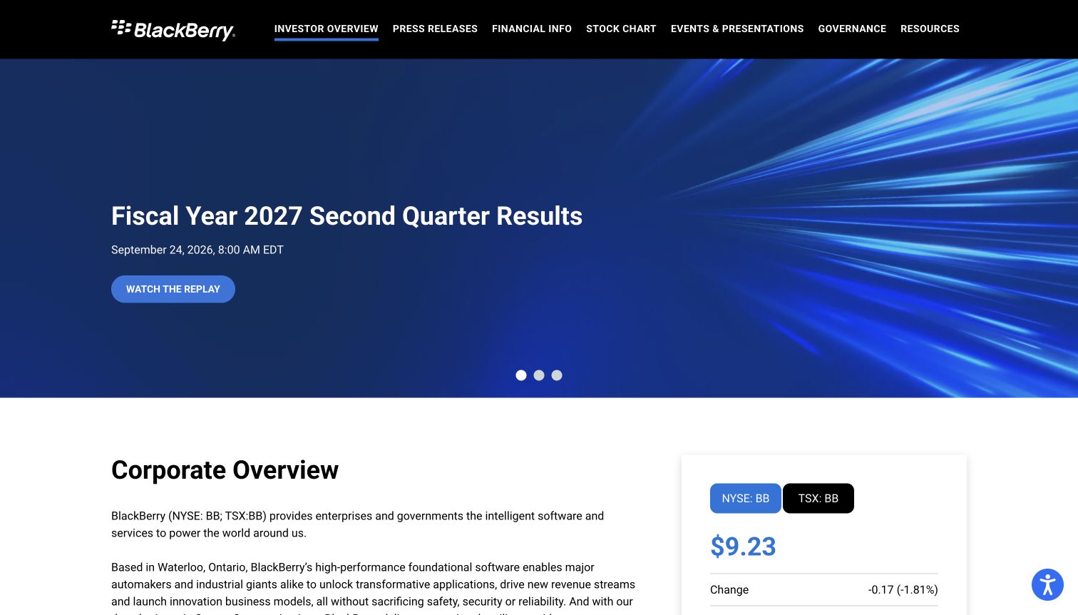
BlackBerry's investor-relations property demonstrates a focused use of Duda for a particular public audience. Its black header lists press releases, financial information, stock charts, events, governance and resources. A blue results carousel leads with a reporting period and replay action; the corporate overview and a stock module begin immediately below. The page uses familiar corporate branding without requiring investors to navigate the main product website. This distinction matters when studying the technology: the primary HTML identifies the Duda runtime on investors.blackberry.com, not on every BlackBerry website or product. The screenshot records an announcement and changing widget, not an independently verified financial assessment.
What you can learn
Give a specialized corporate property its own task vocabulary while retaining recognizable branding. Separate evergreen company context from dated reports, and make document periods explicit so older material is not mistaken for current guidance.
Pros
Investor tasks appear directly in the header rather than behind a general corporate menu.
The announcement includes a clear period, event date and specific replay action.
Cons & considerations
A carousel needs usable controls and an accessible alternative to automatically changing content.
Live financial modules need source, timing and unavailable-state information beyond a static screenshot.
Platform source: WordPress.org Showcase. Primary HTML declares SiteType atob('RFVEQU9ORQ==') (DUDAONE), window.Parameters with this exact HomeUrl/SiteAlias, dmAPI bootstrap and Duda runtime/page markup. Observed 2026-11-12T16:07:34.994Z. Applies only to this public property; linked applications and unrelated company websites are not included. Platform evidence is separate from the direct website screenshot and is not a complete current infrastructure audit.
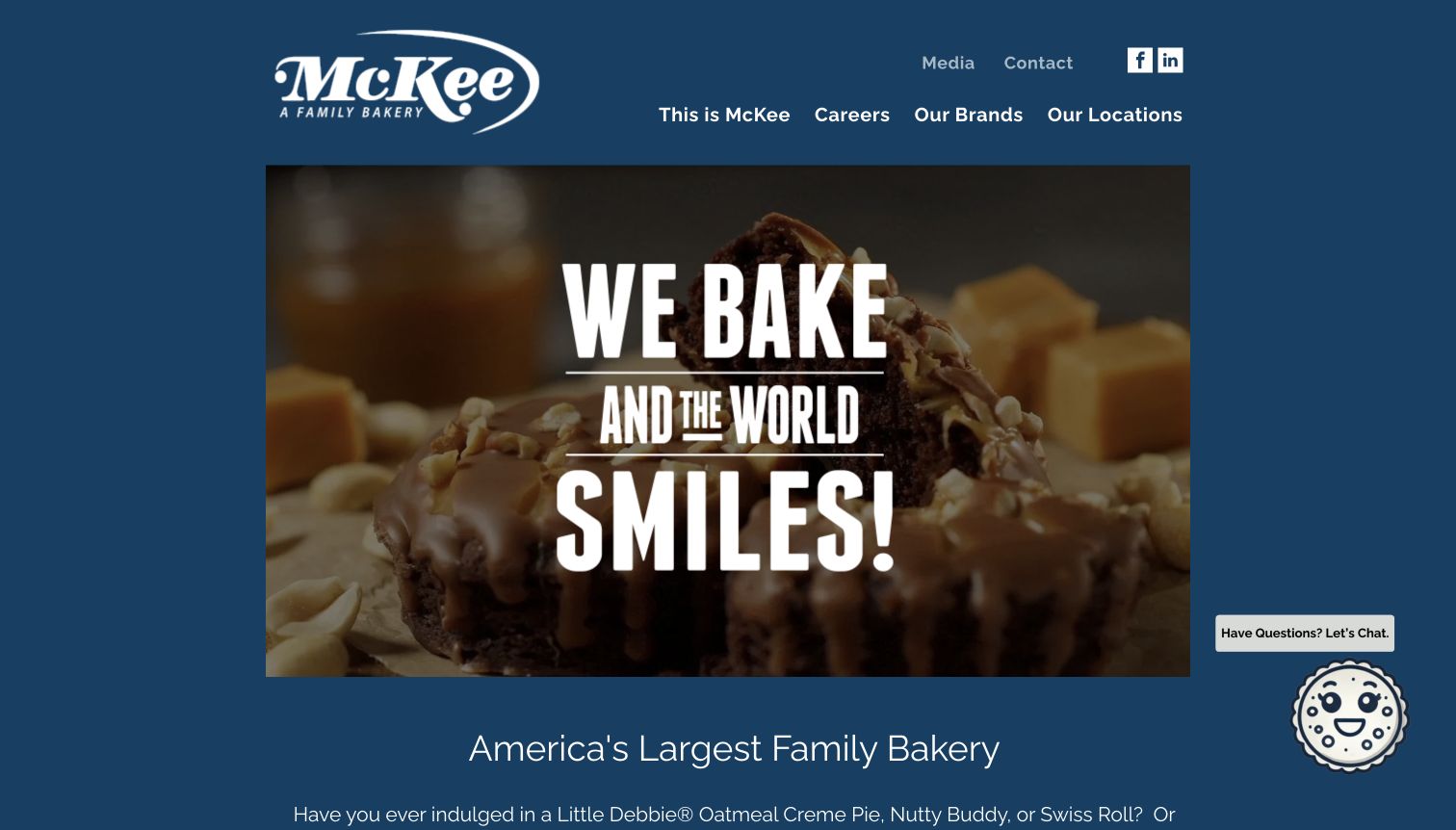
McKee Foods presents its corporate identity inside a deep blue frame, with a large bakery image occupying most of the opening. The navigation is unusually selective: company information, careers, brands and locations form the main row, while media and contact sit above. That arrangement gives different audiences a direct starting point without turning the homepage into a product catalog. The following introduction connects the parent company to recognizable snack brands, providing context for people who know the products better than the corporate name. This Duda example has a disciplined gateway structure. Runtime evidence covers this corporate homepage.
What you can learn
Use a corporate homepage to explain the relationship between the parent organization and its audiences. Keep employment, brand discovery and company information distinct, and let supporting pages carry the detail that would overload the introduction.
Pros
Four primary routes make the corporate site's purpose easy to scan before scrolling.
A consistent blue surround allows food imagery and the white wordmark to remain visually dominant.
Cons & considerations
An image-led opening needs useful alternative text and a dependable fallback if media fails.
Visitors unfamiliar with the parent name rely on the following explanatory text for product context.
Platform source: WordPress.org Showcase. Primary HTML declares SiteType atob('RFVEQU9ORQ==') (DUDAONE), window.Parameters with this exact HomeUrl/SiteAlias, dmAPI bootstrap and Duda runtime/page markup. Observed 2026-11-12T16:07:34.990Z. Applies only to this public property; linked applications and unrelated company websites are not included. Platform evidence is separate from the direct website screenshot and is not a complete current infrastructure audit.
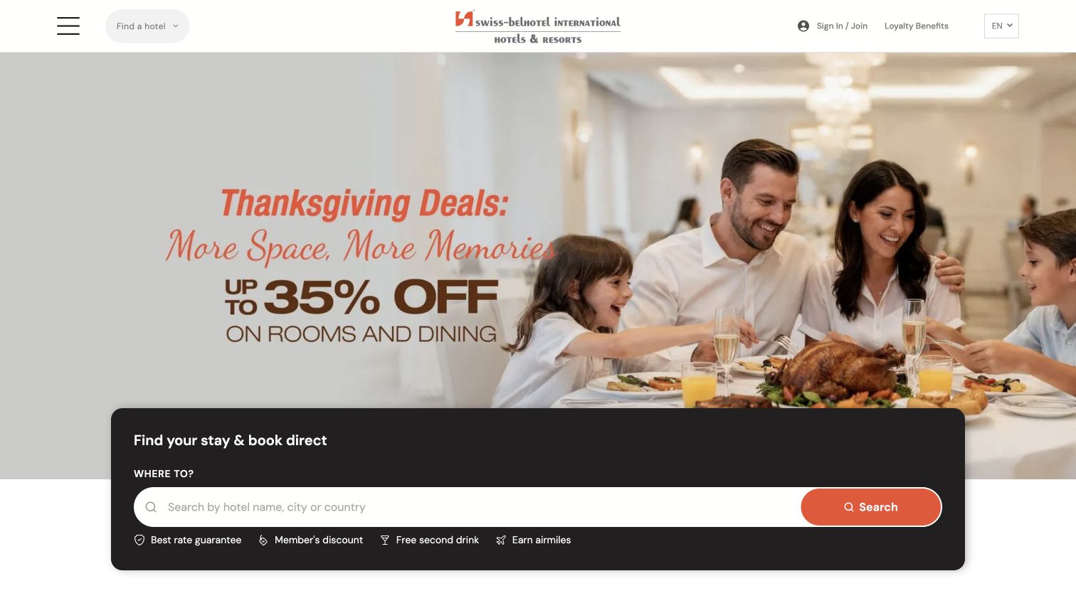
Swiss-Belhotel International places a dark search card across the lower edge of a large seasonal offer image. A hotel, city or country prompt is paired with an orange search button, while compact benefit labels sit beneath the field. The quieter white header retains hotel discovery, account access, loyalty information and language selection without competing with the booking task. This composition shows how a Duda marketing page can guide people toward a more specific service flow. It does not prove that the reservation engine or every hotel property uses the same platform. The capture retains the site's own property-selection query.
What you can learn
Keep the discovery control stable while campaign imagery changes around it. Explain the scope of a search field in its label, and distinguish finding a property from committing to dates, rates or a reservation.
Pros
The dark card provides a consistent visual home for search over a busy promotional photograph.
Hotel, city and country are named in the prompt, making the expected input concrete.
Cons & considerations
Image-based offer text needs equivalent readable content and carefully maintained terms elsewhere.
Benefits beside search should not imply that every property or rate carries identical conditions.
Platform source: WordPress.org Showcase. Primary HTML declares SiteType atob('RFVEQU9ORQ==') (DUDAONE), window.Parameters with this exact HomeUrl/SiteAlias, dmAPI bootstrap and Duda runtime/page markup. Observed 2026-11-12T16:07:34.994Z. Applies only to this public property; linked applications and unrelated company websites are not included. Platform evidence is separate from the direct website screenshot and is not a complete current infrastructure audit.
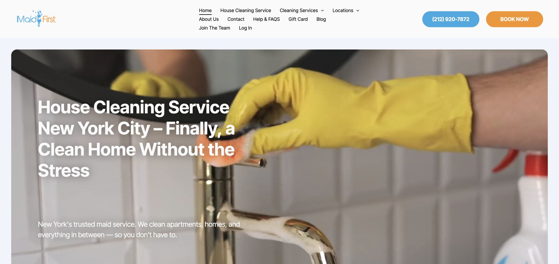
Maid First makes the service recognizable through a close photograph of gloved hands cleaning a tap. The large white headline adds both the service category and New York City, while blue telephone and orange booking controls occupy the header. This is a useful Duda example because its visual ingredients are simple: a reusable header, one dominant image and a clear text block. Their effectiveness depends on editing and proportion rather than decorative effects. The compact navigation wraps into several rows, revealing the pressure created when service, company, account and recruitment destinations all receive similar space. Direct runtime evidence establishes the platform association.
What you can learn
Give service imagery and geographic context specific jobs, then edit the header around the visitor's most likely next step. Secondary account and company links should not obscure the main service or booking choices.
Pros
The image communicates actual cleaning activity rather than relying on an unrelated lifestyle scene.
Different button colors help telephone and booking actions remain identifiable above the main content.
Cons & considerations
Several navigation rows can become difficult to scan as labels or text sizes increase.
The long overlaid heading needs deliberate wrapping and cropping at narrower viewport widths.
Platform source: WordPress.org Showcase. Primary HTML declares SiteType atob('RFVEQU9ORQ==') (DUDAONE), window.Parameters with this exact HomeUrl/SiteAlias, dmAPI bootstrap and Duda runtime/page markup. Observed 2026-11-12T16:09:17.496Z. Applies only to this public property; linked applications and unrelated company websites are not included. Platform evidence is separate from the direct website screenshot and is not a complete current infrastructure audit.
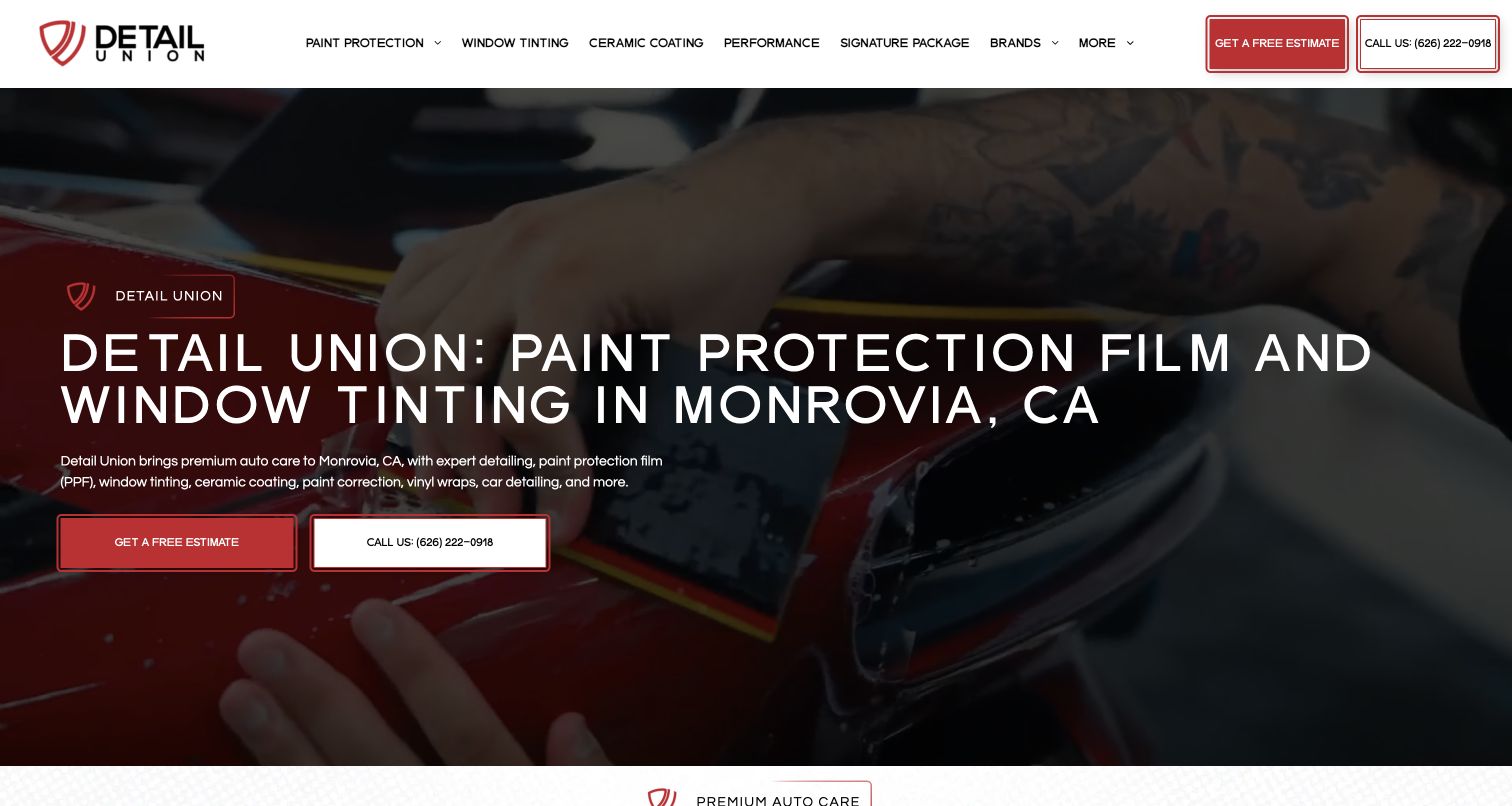
Detail Union uses a darkened work photograph to support a broad white heading and two practical contact choices. Paint protection, tinting, coatings and related services appear in the navigation, while the introductory text supplies the Monrovia location and names additional treatments. Red outlines, small rules and button fills repeat a compact visual language across the header and hero. Shared Duda styling can keep a dense service offering coherent. The screenshot also exposes the tradeoff: a long uppercase headline and a detailed menu use considerable space before visitors reach the next section. Estimate and appointment systems remain separately scoped.
What you can learn
Model service categories before building their navigation. Use the same button vocabulary for the same task, explain unfamiliar treatment terms on destination pages, and give basic services enough prominence alongside premium packages.
Pros
The estimate and telephone actions repeat consistently between the header and main introduction.
A real work image gives context to technical service labels that could otherwise feel abstract.
Cons & considerations
Many specialized labels can make the navigation demanding for a first-time vehicle owner.
A wide uppercase heading needs careful line breaks to avoid overwhelming the service explanation.
Platform source: WordPress.org Showcase. Primary HTML declares SiteType atob('RFVEQU9ORQ==') (DUDAONE), window.Parameters with this exact HomeUrl/SiteAlias, dmAPI bootstrap and Duda runtime/page markup. Observed 2026-11-12T16:09:17.497Z. Applies only to this public property; linked applications and unrelated company websites are not included. Platform evidence is separate from the direct website screenshot and is not a complete current infrastructure audit.
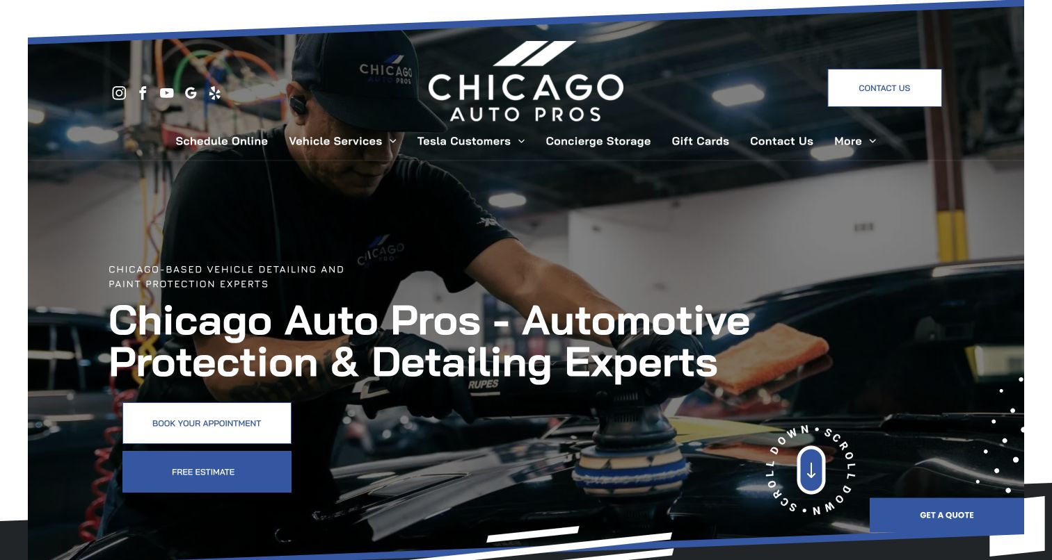
Chicago Auto Pros combines a full-width workshop photograph with an oversized centered wordmark and blue-and-white geometric borders. The main headline introduces protection and detailing, with separate appointment and estimate buttons beneath. Navigation includes vehicle services, Tesla customers, storage and gift cards, showing how a specialist business can maintain distinct commercial routes within one Duda site. The photograph records the art direction, not workmanship or product quality. Several actions repeat across the first screen, including contact and quote controls, making this an instructive example of the difference between consistent styling and a truly prioritized visitor journey.
What you can learn
Build a recognizable visual system, then decide which task deserves first emphasis. Appointment, estimate, contact and quote labels should describe distinct outcomes; otherwise, consolidate them so repeated controls reduce effort rather than add uncertainty.
Pros
Workshop imagery gives the service a tangible setting behind the introductory message.
Blue accents and angular framing connect the logo area, buttons and lower page edge.
Cons & considerations
Several equally visible inquiry routes can leave newcomers unsure which one fits their needs.
A navigation laid over photography requires contrast checks across changing media frames and crops.
Platform source: WordPress.org Showcase. Primary HTML declares SiteType atob('RFVEQU9ORQ==') (DUDAONE), window.Parameters with this exact HomeUrl/SiteAlias, dmAPI bootstrap and Duda runtime/page markup. Observed 2026-11-12T16:10:34.745Z. Applies only to this public property; linked applications and unrelated company websites are not included. Platform evidence is separate from the direct website screenshot and is not a complete current infrastructure audit.
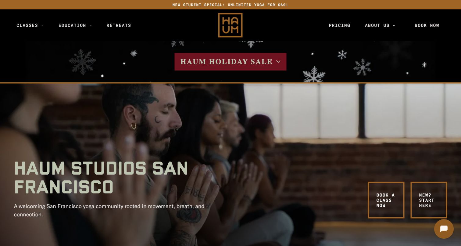
HAUM Studios uses black, gold and a warm practice photograph to establish a recognizable San Francisco identity. Two outlined hero actions distinguish immediate class booking from an introduction for newcomers. Pricing and education remain visible in the header, while a narrow new-student offer and a larger holiday promotion occupy space above the photograph. This is a useful Duda reference for the relationship between persistent structure and temporary content: a coherent color system can connect both, but promotions still consume attention and vertical space. Runtime evidence covers this homepage; the booking system is separately scoped.
What you can learn
Design a permanent route for returning customers and an explanatory route for first visits. Give temporary offers an owner and expiration plan so they support the core journey instead of gradually displacing it.
Pros
The two hero actions recognize that newcomers need different information from existing students.
Typography and gold borders connect the header, promotion bands and main action area.
Cons & considerations
Stacked promotional bands push the practical studio introduction farther down a short screen.
Compact outlined buttons require careful text wrapping and visible focus states on smaller devices.
Platform source: WordPress.org Showcase. Primary HTML declares SiteType atob('RFVEQU9ORQ==') (DUDAONE), window.Parameters with this exact HomeUrl/SiteAlias, dmAPI bootstrap and Duda runtime/page markup. Observed 2026-11-12T16:09:17.497Z. Applies only to this public property; linked applications and unrelated company websites are not included. Platform evidence is separate from the direct website screenshot and is not a complete current infrastructure audit.
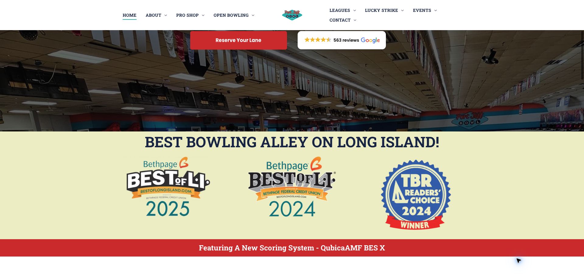
Port Jeff Bowl shows how a Duda page can support a venue with more than one visiting pattern. The split header distinguishes open bowling, leagues, the pro shop and events around a centered logo. In the retained homepage view, a reservation button sits above lane photography, followed by a large band of dated local-award graphics and a scoring-system announcement. Teal and red provide continuity across those sections. The most useful design observation is the separation of activity routes; regular league participants and casual groups need different information. Award graphics record the venue's presentation, not an independently established ranking.
What you can learn
Organize a venue site around the activities people actually plan. Keep recurring programs, casual visits and event inquiries distinct, and ensure promotional evidence does not crowd out dates, prices or practical arrival information.
Pros
League and open-bowling routes give recurring and occasional visitors separate starting points.
The reservation action has strong color contrast against the surrounding lane photograph.
Cons & considerations
Large award graphics occupy space that could explain current visitor arrangements or facilities.
A split navigation needs clear reading and keyboard order when reorganized for smaller screens.
Platform source: WordPress.org Showcase. Primary HTML declares SiteType atob('RFVEQU9ORQ==') (DUDAONE), window.Parameters with this exact HomeUrl/SiteAlias, dmAPI bootstrap and Duda runtime/page markup. Observed 2026-11-12T16:09:18.445Z. Applies only to this public property; linked applications and unrelated company websites are not included. Platform evidence is separate from the direct website screenshot and is not a complete current infrastructure audit.
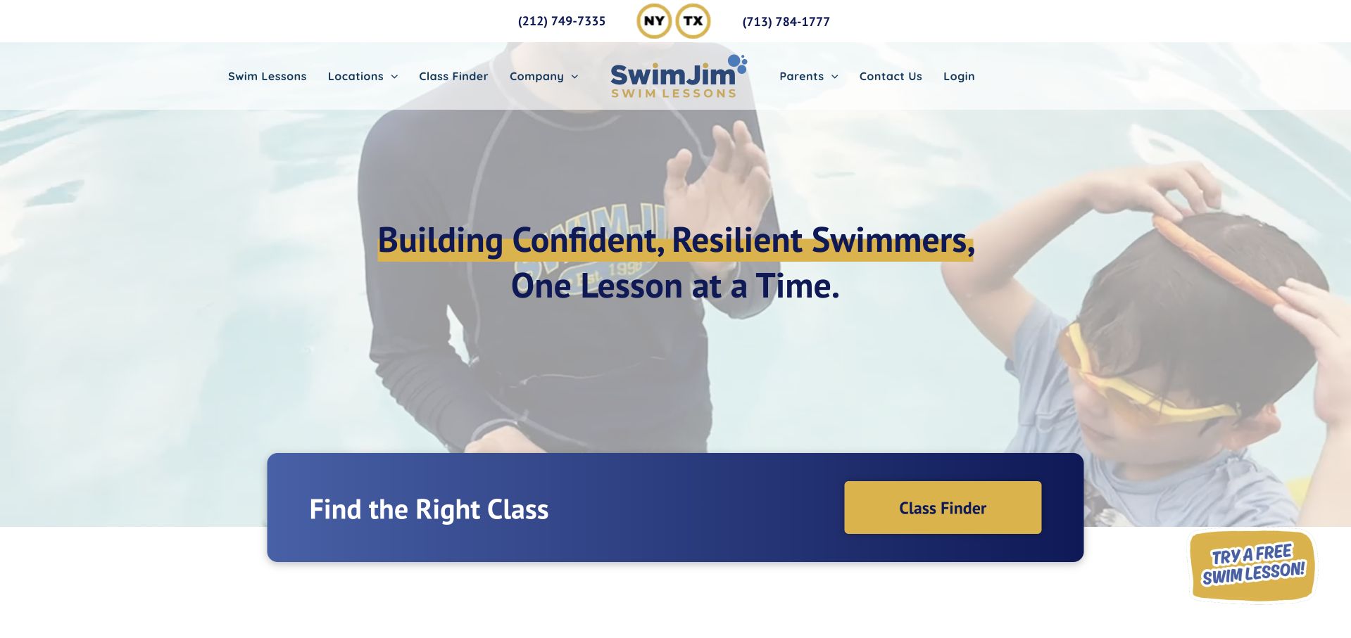
SwimJim places its class finder in a dark blue panel that overlaps the bottom of a pale pool photograph. The yellow action button and large finder label make that panel more explicit than the broad introductory headline above. Two regional telephone numbers, location navigation and lesson routes support a business serving several kinds of learner. This Duda example separates its decorative hero from a practical discovery section. The retained capture shows why the separation helps: the light image and headline compete for contrast, while the finder remains easy to locate. The enrollment workflow is separately scoped.
What you can learn
Use a stable, contrasting section for the main discovery task even when the opening media changes. Let location, age and ability choices form an understandable sequence, with promotional trials supporting rather than interrupting that process.
Pros
The finder panel remains visually distinct from the softer photograph and transparent navigation.
Regional contact numbers and location routes acknowledge that enrollment begins with geographic fit.
Cons & considerations
Headline contrast can vary where the background photograph contains both light and dark areas.
A trial promotion near the finder adds another choice that needs a clear relationship to enrollment.
Platform source: WordPress.org Showcase. Primary HTML declares SiteType atob('RFVEQU9ORQ==') (DUDAONE), window.Parameters with this exact HomeUrl/SiteAlias, dmAPI bootstrap and Duda runtime/page markup. Observed 2026-11-12T16:09:18.601Z. Applies only to this public property; linked applications and unrelated company websites are not included. Platform evidence is separate from the direct website screenshot and is not a complete current infrastructure audit.
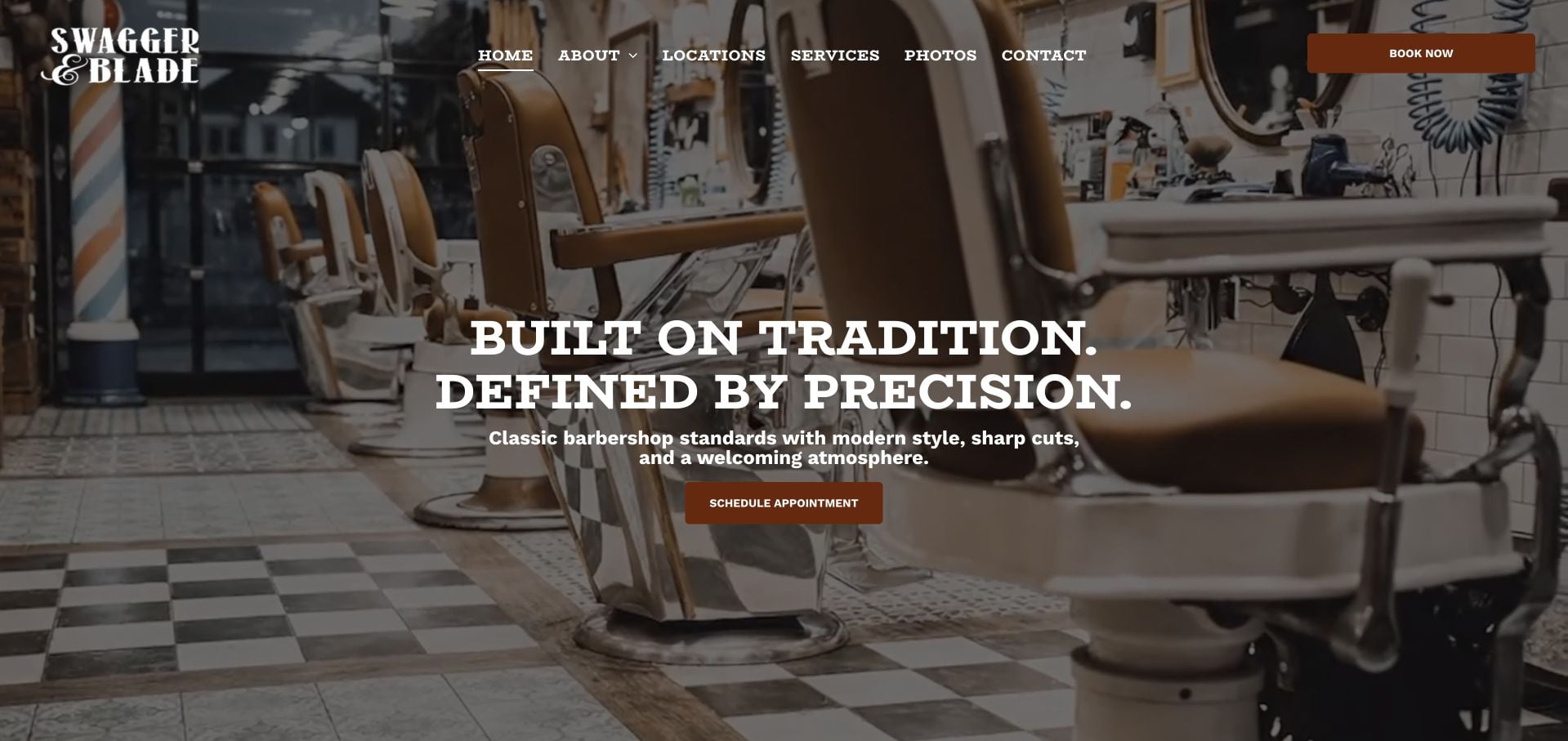
Swagger & Blade lets the barbershop interior do much of the introductory work. Traditional chairs, mirrors and floor tiles fill the screen behind a centered heading, while the white wordmark and brown booking controls maintain a restrained palette. The navigation names locations, services and photos directly, avoiding a long list of promotional categories. For a Duda site, this is a useful example of a reusable structure with a particular identity: ordinary header and hero sections feel specific because the photograph and typography fit the business. The two booking labels still need clear, consistent purposes.
What you can learn
Start with images that help visitors anticipate the real setting, then keep the surrounding structure simple. Connect service and location information to booking so a strong atmosphere is accompanied by the details needed to choose confidently.
Pros
The interior photograph gives a concrete sense of the shop before visitors open a gallery.
A short navigation exposes service and location information without a dense set of dropdown groups.
Cons & considerations
Large centered copy can conceal useful details when the hero is cropped for small screens.
Different booking labels need consistent destination behavior or a clear explanation of their distinct purposes.
Platform source: WordPress.org Showcase. Primary HTML declares SiteType atob('RFVEQU9ORQ==') (DUDAONE), window.Parameters with this exact HomeUrl/SiteAlias, dmAPI bootstrap and Duda runtime/page markup. Observed 2026-11-12T16:10:34.748Z. Applies only to this public property; linked applications and unrelated company websites are not included. Platform evidence is separate from the direct website screenshot and is not a complete current infrastructure audit.
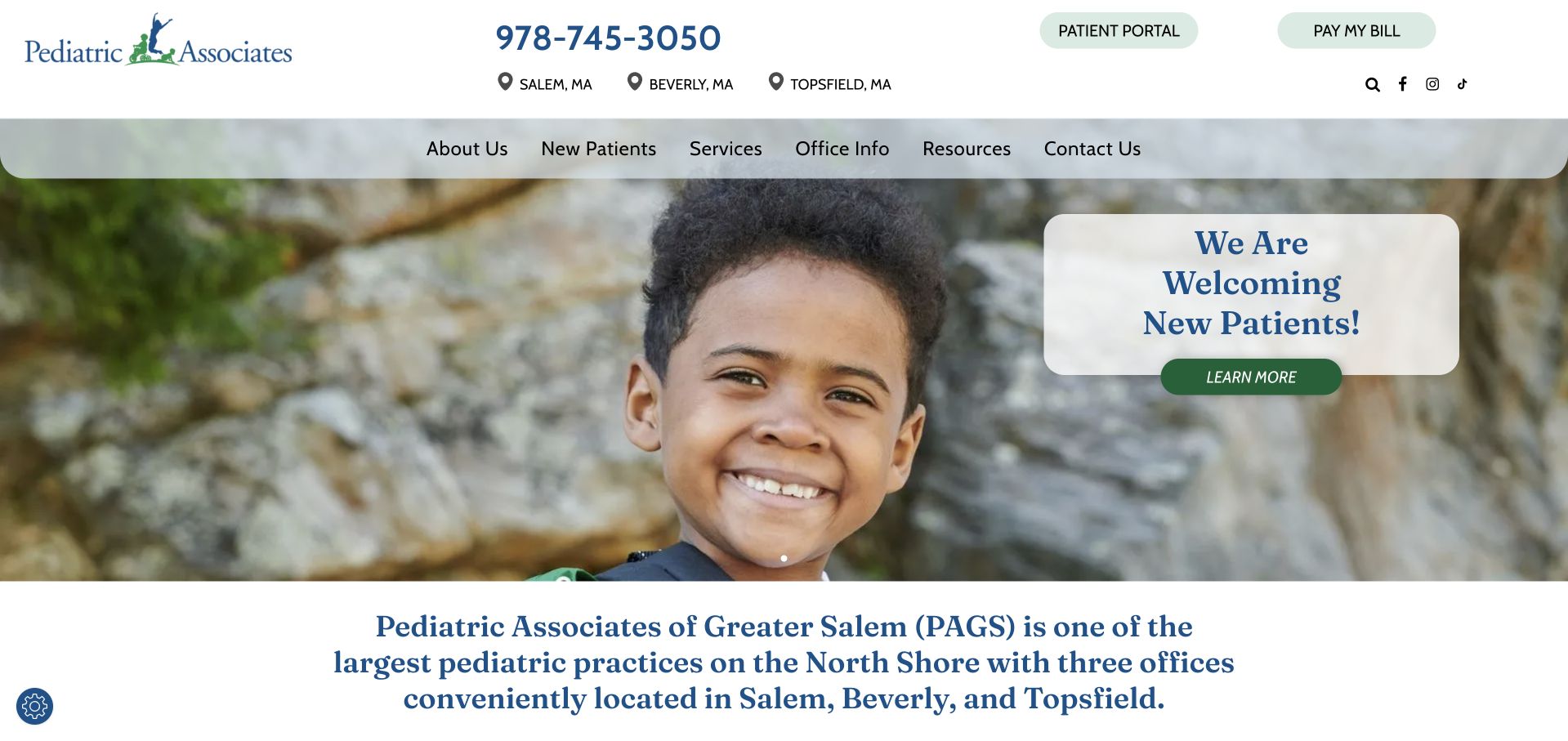
Pediatric Associates of Greater Salem gives its telephone number, three office locations, patient portal and bill-payment route a dedicated top area. A second navigation row introduces services and new-patient information, while the photograph and welcome panel focus on prospective families. This Duda example demonstrates a practical distinction between utility actions and introductory content. The pale green controls and blue serif headings create a calm visual identity, but the hierarchy comes from grouping tasks according to purpose. The public homepage runtime establishes the builder association only for that property. The patient portal and clinical services are outside this design review.
What you can learn
Separate everyday account tasks from information for new visitors. Explain office choices and joining procedures in ordinary language, and clearly identify when a link moves into a different system with its own account or privacy expectations.
Pros
Portal and payment controls remain apart from the introductory new-patient message.
Three named locations make regional relevance visible before visitors explore individual office pages.
Cons & considerations
Pale controls and fine serif text need deliberate readability checks rather than assumptions about a calm palette.
A broad welcome message needs office-level instructions and current availability on its destination page.
Platform source: WordPress.org Showcase. Primary HTML declares SiteType atob('RFVEQU9ORQ==') (DUDAONE), window.Parameters with this exact HomeUrl/SiteAlias, dmAPI bootstrap and Duda runtime/page markup. Observed 2026-11-12T16:09:18.807Z. Applies only to this public property; linked applications and unrelated company websites are not included. Platform evidence is separate from the direct website screenshot and is not a complete current infrastructure audit.
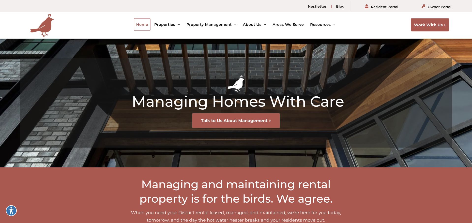
Nest DC combines a muted brick-red palette, a bird motif and a photograph of a residential interior. The main hero asks owners about management, while resident and owner portals live in a separate utility row above the main navigation. Available properties, management services and areas served receive their own routes. This is a useful Duda reference for an audience split that is expressed through page structure, not merely through different button labels. The broad translucent hero panel keeps the text readable but covers much of the architectural photograph. Linked portals remain separate implementation questions from the observed homepage runtime.
What you can learn
Give ongoing users a dependable utility area and prospective customers a distinct explanation of the service. Carry local identity through copy and imagery, while making every portal's audience and destination unambiguous.
Pros
Owner and resident portal links are separated from the management-inquiry action.
A restrained palette and repeated bird motif connect the visual identity across adjacent sections.
Cons & considerations
The large text panel obscures much of the photograph that establishes the residential setting.
Several navigation groups still need focused destination pages to explain management scope without repetition.
Platform source: WordPress.org Showcase. Primary HTML declares SiteType atob('RFVEQU9ORQ==') (DUDAONE), window.Parameters with this exact HomeUrl/SiteAlias, dmAPI bootstrap and Duda runtime/page markup. Observed 2026-11-12T16:09:18.807Z. Applies only to this public property; linked applications and unrelated company websites are not included. Platform evidence is separate from the direct website screenshot and is not a complete current infrastructure audit.
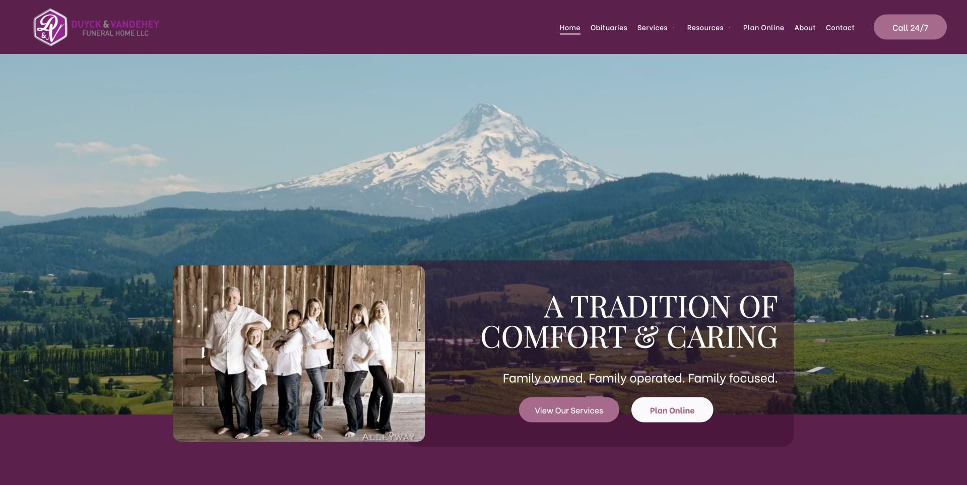
Duyck & VanDeHey Funeral Home pairs a landscape background with a smaller family portrait and a plum-colored text panel. Service information and online planning appear as separate hero actions, while a telephone control remains prominent in the header. Obituaries, resources and contact information are plainly labeled. As a Duda example, the page shows how a repeated header-and-hero structure can support a sensitive subject through imagery, spacing and a limited set of choices. The family positioning is the site's own presentation, rather than an independently verified claim about service quality. The separate planning tools remain outside the homepage runtime claim.
What you can learn
Use personal imagery to introduce the organization, then make practical routes clear for visitors with different levels of urgency. Keep immediate contact visible and explain what an online planning action asks the visitor to do.
Pros
A prominent telephone route remains available beside the broader informational navigation.
Service exploration and online planning are presented as distinct choices in the main panel.
Cons & considerations
Layered photographs and translucent panels need careful contrast and cropping at smaller sizes.
A reassuring headline still requires clear practical information on destination pages for urgent visitors.
Platform source: WordPress.org Showcase. Primary HTML declares SiteType atob('RFVEQU9ORQ==') (DUDAONE), window.Parameters with this exact HomeUrl/SiteAlias, dmAPI bootstrap and Duda runtime/page markup. Observed 2026-11-12T16:10:34.748Z. Applies only to this public property; linked applications and unrelated company websites are not included. Platform evidence is separate from the direct website screenshot and is not a complete current infrastructure audit.
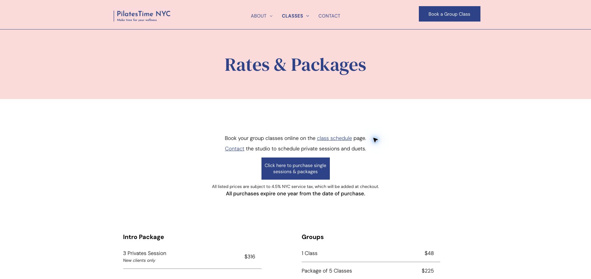
PilatesTime NYC provides a useful interior-page example within this Duda collection. A pale pink title band introduces rates and packages, followed by simple instructions for group classes, private sessions and package purchases. The visible page distinguishes a class-schedule link from contacting the studio, while a blue purchase button sits above introductory and group-rate columns. Purchase conditions appear before the prices rather than being hidden in the final checkout step. The design relies on alignment, whitespace and short labels rather than a large photograph. The observed Duda runtime covers this page; external booking and payment flows remain separately scoped.
What you can learn
Explain the difference between choosing a session and buying credit before presenting prices. Keep eligibility, expiration and extra-charge information near the relevant offer, and make every action label describe the next step accurately.
Pros
The page separates group scheduling from arranging private sessions instead of using one generic booking instruction.
Visible purchase conditions give context before readers compare the rate columns below.
Cons & considerations
Generous vertical spacing delays the actual comparison on shorter screens.
A small purchase button needs an accessible label that remains clear outside the surrounding paragraph.
Platform source: WordPress.org Showcase. Primary HTML declares SiteType atob('RFVEQU9ORQ==') (DUDAONE), window.Parameters with this exact HomeUrl/SiteAlias, dmAPI bootstrap and Duda runtime/page markup. Observed 2026-11-12T16:10:34.748Z. Applies only to this public property; linked applications and unrelated company websites are not included. Platform evidence is separate from the direct website screenshot and is not a complete current infrastructure audit.
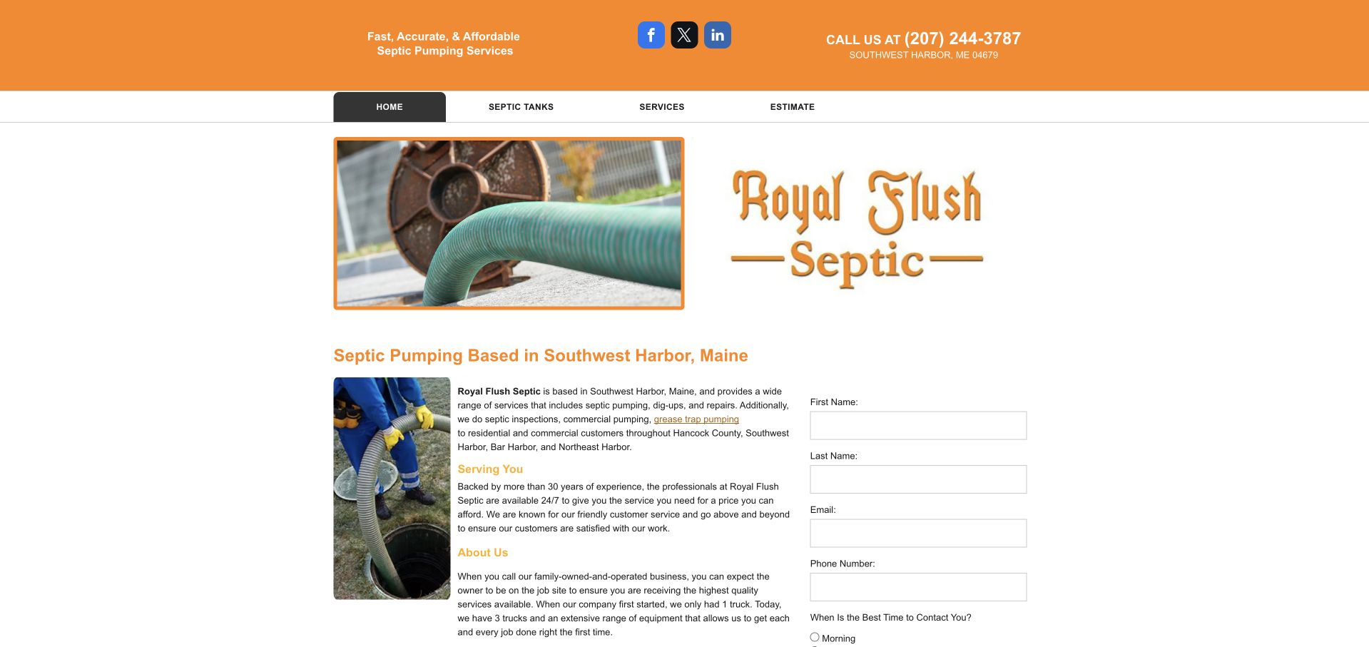
The rfsme.com homepage presents Royal Flush Septic through an orange header, wordmark and photographs of pumping equipment. Four main navigation choices keep the service structure compact, while the body places explanatory copy alongside contact fields. Southwest Harbor is named prominently, giving a geographic reference before the visitor reads the longer description. This Duda example uses a narrow content area and conventional columns instead of an oversized hero. The visible business identity is recorded as Royal Flush Septic, rather than inferred from the domain's initials. Runtime evidence identifies this public page's builder.
What you can learn
A focused local service can benefit from a compact page when its identity, territory and contact purpose are explicit. Preserve readable text and form spacing, and explain what happens after an inquiry instead of relying on the form alone.
Pros
The service territory appears in the main content heading beside a literal equipment image.
A short navigation limits the number of choices before visitors reach the explanation and inquiry fields.
Cons & considerations
Narrow columns can make dense descriptive text tiring to read on an ordinary desktop screen.
The difference between the domain initials and displayed brand warrants consistent naming across contact destinations.
Platform source: WordPress.org Showcase. Primary HTML declares SiteType atob('RFVEQU9ORQ==') (DUDAONE), window.Parameters with this exact HomeUrl/SiteAlias, dmAPI bootstrap and Duda runtime/page markup. Observed 2026-11-12T16:09:20.268Z. Applies only to this public property; linked applications and unrelated company websites are not included. Platform evidence is separate from the direct website screenshot and is not a complete current infrastructure audit.
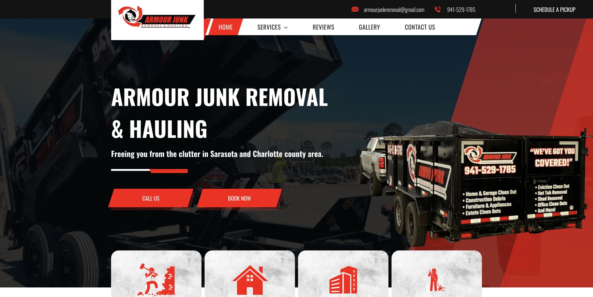
Armour Junk Removal uses its branded truck as the dominant visual evidence in a dark red-and-black hero. The large service heading sits to the left, with a regional line and two red actions beneath. Angular accents connect the navigation, buttons and vehicle treatment, while pale service cards begin at the bottom edge. This Duda example uses shared graphic elements to organize varied sections. Its strongest factual orientation comes from the named service and territory, rather than from the decorative shapes. Scheduling and service claims remain outside the homepage runtime observation.
What you can learn
Use the business's real visual identity to support a clear service explanation. Keep the territory readable, then use the next section to distinguish the jobs visitors can request and the information needed for an accurate response.
Pros
The branded vehicle gives the opening a more specific identity than a generic contractor photograph.
Repeated red shapes link the header and main actions without introducing several unrelated accent colors.
Cons & considerations
Overlapping service cards require careful spacing when the hero becomes narrower or taller.
Call and booking actions need distinct expectations so a visitor understands whether a date is actually reserved.
Platform source: WordPress.org Showcase. Primary HTML declares SiteType atob('RFVEQU9ORQ==') (DUDAONE), window.Parameters with this exact HomeUrl/SiteAlias, dmAPI bootstrap and Duda runtime/page markup. Observed 2026-11-12T16:09:20.293Z. Applies only to this public property; linked applications and unrelated company websites are not included. Platform evidence is separate from the direct website screenshot and is not a complete current infrastructure audit.
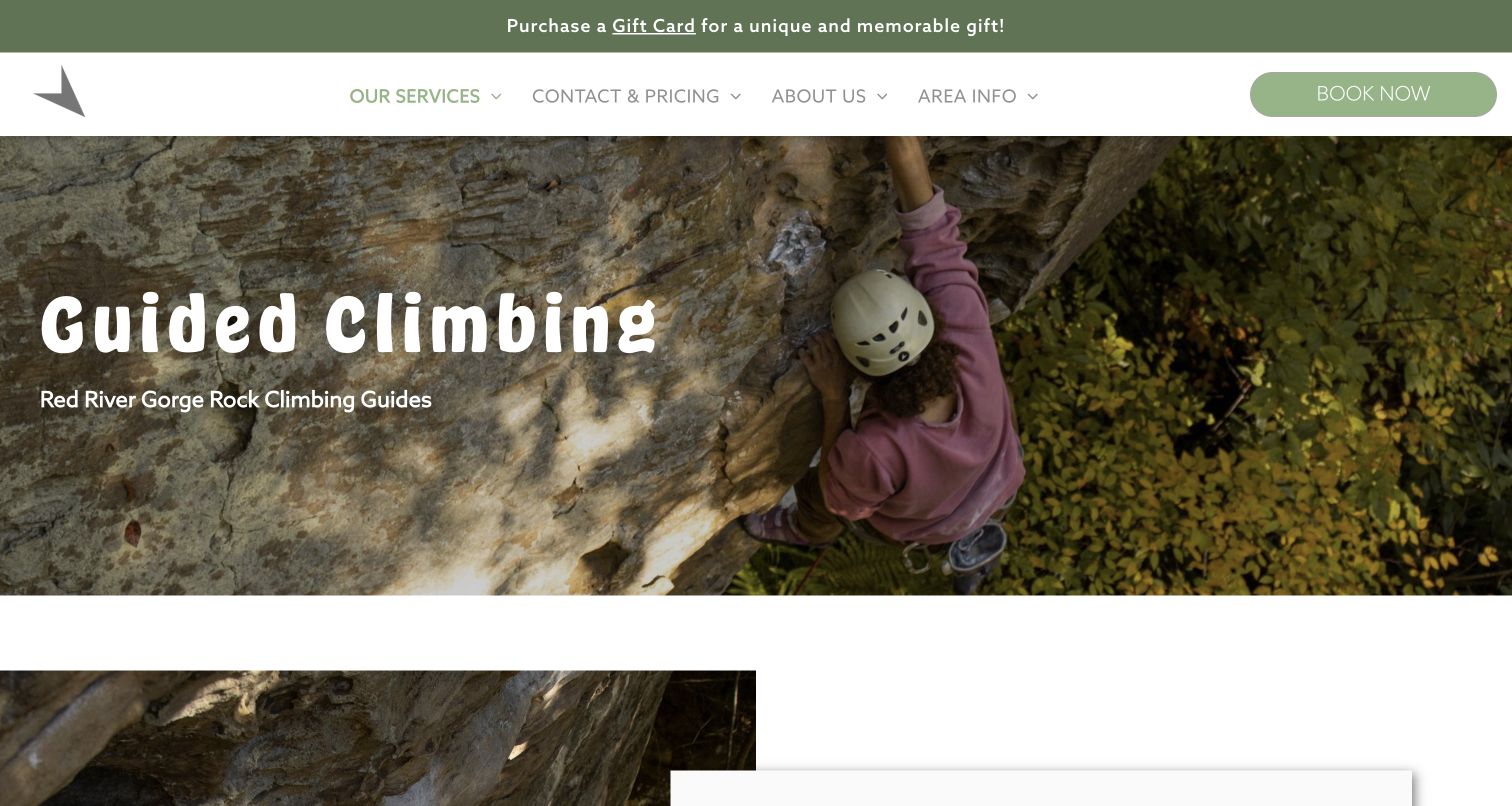
Southeast Mountain Guides' Red River Gorge page adds a focused interior property to this technology collection. The captured view names guided climbing over a close photograph of a climber, with a restrained green-and-white header and a clearly visible booking control. The image communicates the activity directly, while the page title supplies the location and service context that a broad adventure slogan would omit. Subsequent information can then answer practical questions about the experience. The Duda association is based on runtime evidence from this exact public path. Booking and safety arrangements remain outside this design review.
What you can learn
Give a service landing page a specific title, visual subject and next step. Keep related activities clearly distinguished, and connect the introduction to practical details that help visitors understand what they are considering before they book.
Pros
The title identifies guided climbing and the geographic context without relying on a generic adventure message.
A clear booking control remains visible alongside navigation for pricing and area information.
Cons & considerations
A tall introductory photograph can delay practical details for visitors arriving with a precise planning question.
Pale header text and controls require contrast checks across display sizes and focus states.
Platform source: WordPress.org Showcase. Primary HTML declares SiteType atob('RFVEQU9ORQ==') (DUDAONE), window.Parameters with this exact HomeUrl/SiteAlias, dmAPI bootstrap and Duda runtime/page markup. Observed 2026-11-12T16:09:20.583Z. Applies only to this public property; linked applications and unrelated company websites are not included. Platform evidence is separate from the direct website screenshot and is not a complete current infrastructure audit.
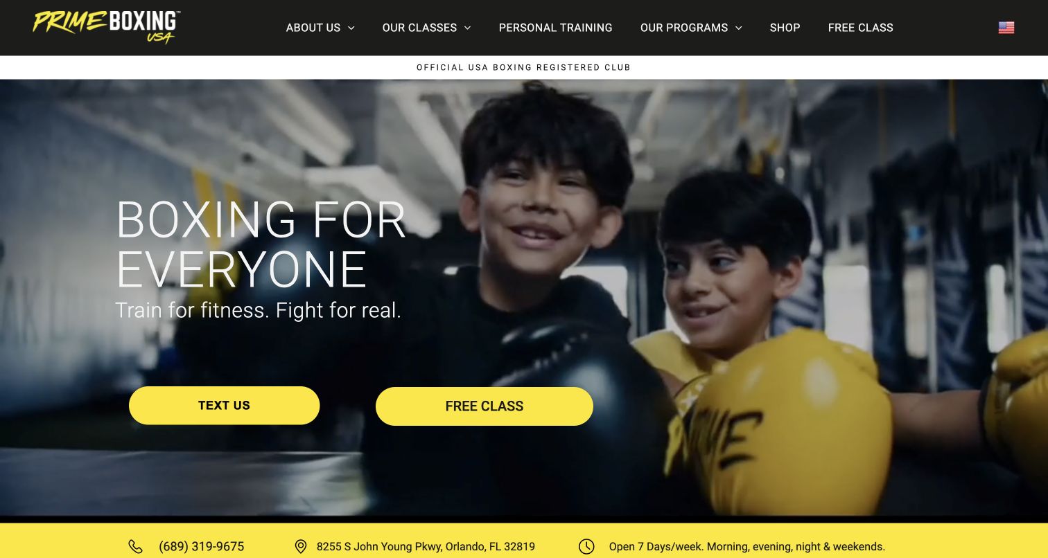
Prime Boxing USA combines a black header and bright yellow accents with a photograph of younger participants. The large introductory message distinguishes fitness from fighting, while the navigation exposes classes, personal training, programs and a free-class route. A yellow strip below the hero publishes contact, address and opening information, bringing practical details into the same first view. This Duda page separates its emotional introduction from practical visiting information. Prominent texting and free-class actions offer a choice between conversation and experience. Membership and communications systems are separately scoped.
What you can learn
Make a broad invitation concrete with program distinctions and local details. Choose a primary newcomer action, explain what a trial involves on its destination page, and keep conversational contact available without making it compete equally with every task.
Pros
The lower information strip provides a clear place for address, contact and opening details.
Yellow actions and accents form a consistent contrast against the black header and darker photograph.
Cons & considerations
Two equal hero actions can weaken the starting-point hierarchy for an undecided visitor.
Broad training language needs program-level explanations so different audiences understand the relevant route.
Platform source: WordPress.org Showcase. Primary HTML declares SiteType atob('RFVEQU9ORQ==') (DUDAONE), window.Parameters with this exact HomeUrl/SiteAlias, dmAPI bootstrap and Duda runtime/page markup. Observed 2026-11-12T16:09:20.979Z. Applies only to this public property; linked applications and unrelated company websites are not included. Platform evidence is separate from the direct website screenshot and is not a complete current infrastructure audit.
Kegan has 15+ years of experience working with small businesses, Fortune 500 companies, and everything in between. No development job is too big or too small: he brings the same hands-on attention to a focused improvement, a complete website, or a custom application.
For Duda projects, he can help with responsive interfaces, reusable components, custom functionality, API connections, and performance-minded implementation. He works directly with clients on scope, design, implementation, testing, and handover, with an emphasis on clear communication and a system that remains practical to maintain after launch.
Show 3 other Duda developersHide other Duda developers
Maid First, Swagger & Blade and Armour Junk Removal use different visual identities around recognizable local tasks. Start with the service and territory, then explain whether the main action requests a response, reserves a time or opens a separate scheduler. Avoid making every inquiry route equally prominent. A useful destination should answer practical questions before asking for unnecessary personal information.
Corporate and specialist information properties
McKee Foods separates company, careers, brands and locations; BlackBerry investor relations uses a vocabulary of reports, events and governance. These are different audiences and content lifecycles. Treat the navigation as an information model, keep dated material distinct from evergreen context, and assign responsibility for changing documents. A focused property can retain the parent brand without copying the full corporate menu.
Multi-location discovery and comparison
AAMCO, Tuffy and Swiss-Belhotel foreground finding the relevant location or property. Begin with the information needed to narrow the choice, then make the selected destination clear. If locations have different services, prices or availability, show those differences where the decision is made. Repeated page structures should make comparison easier without suggesting that all branches or properties are interchangeable.
Interior pages with a precise purpose
PilatesTime's rates page and Southeast Mountain Guides' climbing page demonstrate the value of a focused destination. Give the page a descriptive title and a small number of appropriate actions. Explain the terms of the offer near the information they qualify, and preserve the context when visitors arrive directly from search. Not every useful page needs a large promotional homepage treatment.
From references to requirements
Plan the content and handoff before building
Map the audiences and destinations
List the people who arrive and the actions they need: existing customers, new prospects, employees, investors or local visitors. Mark which pages belong to the public site and which lead to external applications. Then choose the navigation labels and primary actions. This prevents the header from becoming an unedited inventory of every department, offer and account link.
Define repeatable content carefully
Where locations, services or staff share a structure, identify the fields that repeat and the details that genuinely differ. Duda's content and developer tools can support repeatable workflows, but repetition should preserve useful distinctions. Keep unique descriptions, accurate destinations and explicit ownership for updates. Do not publish near-identical pages merely to increase the apparent size of the website.
Design with realistic content and screen constraints
Try the longest service name, the most detailed address and the smallest practical viewport before settling the layout. The examples reveal common pressure points: multi-row navigation, tall promotions, text over moving images and narrow form columns. Plan meaningful layout changes rather than shrinking the desktop composition. Check keyboard order, visible focus and text contrast in the actual finished pages.
Choose who can change what
Duda offers client-management tools and granular permissions. Use them to match real editorial responsibilities: who updates hours, who approves campaign copy and who maintains external links. Give clients enough control for routine changes without making every shared component an accidental editing target. Document the handoff and the process for reviewing significant changes.
A polished homepage does not establish a successful booking, accessible form, accurate price or reliable integration. Verify the relevant journeys with an agreed test plan, including empty, error and unavailable states. Duda publishes accessibility resources, but the implementation, content and connected services still require direct evaluation. Record observations honestly and avoid claiming measured performance or business results from appearance alone.
Ask the actual team to carry out its routine job: publish a realistic update, correct a mistake, preview a narrow screen, and identify who owns an integration failure. For a library or frontend framework, also ask who maintains the content source and deployment. A polished screenshot does not answer those operational questions.
Beyond the screenshot
A practical Duda website checklist
Name the main audience and task for every public page.
Keep service, location and company information easy to distinguish.
Define shared fonts, colors, spacing and action emphasis.
Use photographs that explain the business or activity.
Keep essential text readable over every image crop or media frame.
Give booking, inquiry, purchase and account links accurate labels.
Identify external portals and connected services explicitly.
Check navigation with long labels and smaller viewports.
Keep promotions current and prevent them from obscuring essential tasks.
Explain applicable conditions close to the offer or price.
Assign responsibility and permissions for routine content updates.
Test keyboard use, forms, error states and external handoffs.
Preserve page-specific technology evidence and actual observation dates.
Test with real content, a keyboard, a small screen, slow or failed requests, and the people who will maintain the system. These are planning checks, not an accessibility, security, performance, or search-ranking certification.
Sources & editorial method
How this Duda collection was reviewed
Twenty distinct public properties were selected and reviewed on November 12, 2026. All twenty have successful bounded public-stack audits and exact-page Duda runtime corroboration: a DUDAONE site-type declaration, page configuration and associated runtime or builder markup. Image-CDN references alone were not used as the platform proof. Seventeen genuine screenshots were reused from stable authoring sources with their original URLs, dimensions and capture dates unchanged; three new browser captures show BlackBerry investor relations, McKee Foods and Swiss-Belhotel. Normal site controls dismissed obstructing notices in the new captures. Four historical candidates with visible notices or open panels were excluded from this new collection without altering their existing records. Swiss-Belhotel's capture retains the query added by its own property-selection interface, while its canonical source identity remains the homepage. Existing broad audit history is retained separately from the additional runtime observations. The research covers public pages and their visible design, not private accounts, transactions, service quality, accessibility certification or measured commercial results. No forms, bookings, payments or messages were submitted.
Every image is an unmodified capture from the actual website, with its source and capture date. Some captures are reused from our shared catalog; their dates remain the original capture dates. None comes from a vendor gallery or a generated reconstruction. Moving imagery and live content can change.
Technology attribution uses public page assets or metadata, official platform documentation, or a cited first-party project case study. Documentary and framework-relationship evidence is identified where used; it is not a complete current backend inventory. A CMS image CDN alone does not establish a full CMS deployment. A library’s presence does not prove which individual controls use it, and a platform label does not establish AI authorship.
The composition notes, lessons, pros and tradeoffs are original editorial observations. We have not measured conversion, traffic, security, performance or accessibility conformance. Website owners retain their brands and imagery; these examples are not our client portfolio. Written, Edited and Curated are independent records, not dates advanced by a build. See our editorial standards or suggest a correction.
Questions worth asking
Duda website development FAQs
How were these websites identified as using Duda?
Each selected exact public page contains direct Duda runtime configuration, including a DUDAONE site-type declaration and associated builder code or markup. Broad public-stack audits were also attempted successfully. Duda-hosted images alone were not treated as sufficient proof of the page builder.
Does this mean every part of each company uses Duda?
No. The evidence applies to the named public property. BlackBerry is specifically its investor-relations subdomain. Linked portals, reservation systems, payment services, private applications and other company websites are not automatically included.
Why are some screenshot dates earlier than the guide date?
Seventeen authentic captures were reused with their original dates and provenance preserved. Three captures were taken for this collection. The current design review and additional runtime checks have their own dates and do not rewrite earlier capture or audit records.
Can a Duda website have a distinctive design?
The examples show a range of corporate, local-service and specialist layouts. Their differences come from typography, imagery, content hierarchy and task design. A platform supplies tools; the finished visual identity depends on the choices made with them.
Does a website builder guarantee accessibility or good performance?
No. Content, layout, interaction behavior, integrations and implementation details still need direct evaluation. These reviews describe visible patterns and scoped technology evidence, not a certification or a measured performance comparison.
What should I borrow from these examples?
Borrow a useful relationship between content and action: a clear location finder, distinct audience routes, readable prices or a focused service page. Adapt the pattern to your own information and users rather than copying brand assets or assuming that a photographed feature has been fully tested.
Start with the visitor's purpose and the information required to act. A maintainable Duda site makes those decisions consistent while leaving room for the business, place and people it represents.