An insurance website should help a visitor identify the right route without confusing a marketing introduction with a policy explanation or an actual quote.
Someone shopping for cover has a different task from a policyholder paying a bill or reporting a claim. A broker or employer may need another route entirely. The homepage should make those relationships visible and explain the next step before asking for personal information.
This collection compares product selectors, audience navigation, quote entry and service shortcuts. It is a set of design references, not an insurance recommendation or an assessment of coverage, prices or claims outcomes. Promotional offers and product availability in the captures are time-specific and require their own context.
Before the examples
What makes good insurance website design in 2026?
Use recognizable product and audience labels
Separate major coverage categories in the visitor’s vocabulary, and explain specialist terms where they are needed. Distinguish personal, business and intermediary routes when the information differs. A broad brand promise should lead into a concrete choice rather than carrying the entire introduction.
Keep servicing visible beside acquisition
Give claims, payments, ID cards, documents and account support predictable destinations. Explain which tasks require login and which can be started without it. Returning customers should not have to work through a quote campaign to find routine assistance.
Make the quote boundary clear
State whether an action starts a quote, requests contact, resumes an application or connects someone with an agent. Explain why location or personal details are needed. Keep product descriptions, offer conditions and disclosures readable around the form rather than treating them as visual debris.
The collection · 13 examples
13 insurance websites worth studying
Compare the first decision each site asks a visitor to make, how it separates customer service from shopping and where it offers assisted support. A friendly tone and strong photography can help, but clear labels do most of the routing.
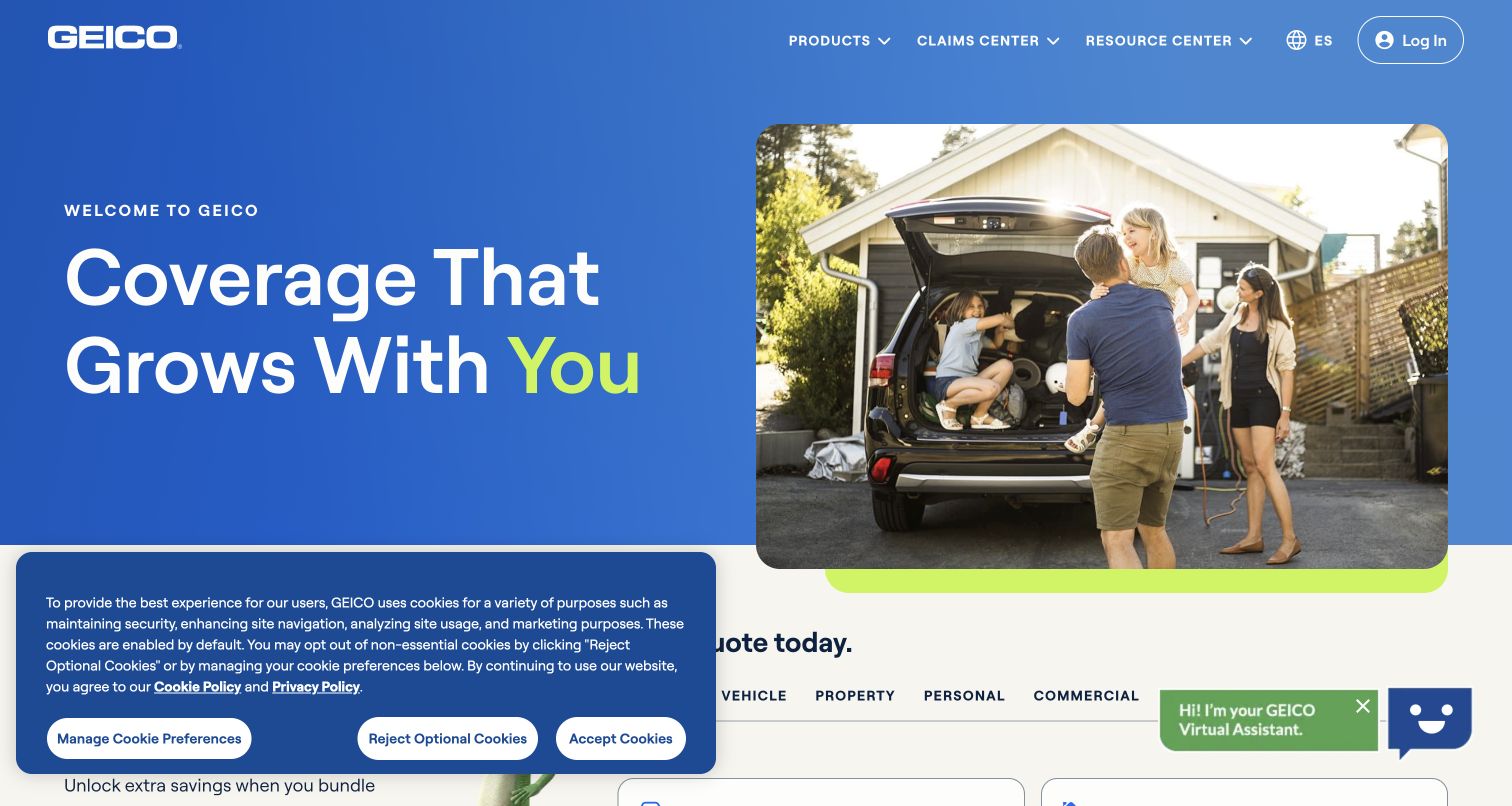
GEICO pairs a large blue introduction with a photograph of people loading a vehicle, then moves quickly into recognizable insurance categories. Vehicle, property, personal and commercial groupings make the catalog easier to scan than a single undifferentiated list. The separate continuation link acknowledges someone returning to an unfinished quote. Farther down, state-based information and educational resources give visitors a research route before committing to a form.
What you can learn
Use a friendly campaign image to establish tone, then let concrete product labels do the routing. Keep a saved-quote action beside new-business entry points, and give existing customers access to claims and account tasks without asking them to restart their shopping journey.
Pros
The category structure creates a clear entry point for several different coverage needs.
Claims, resources and account access remain identifiable in the opening navigation.
Cons & considerations
The cookie notice occupies part of the first view and competes with the product selector.
Savings and satisfaction statements need their own context; the visual treatment cannot establish their applicability.
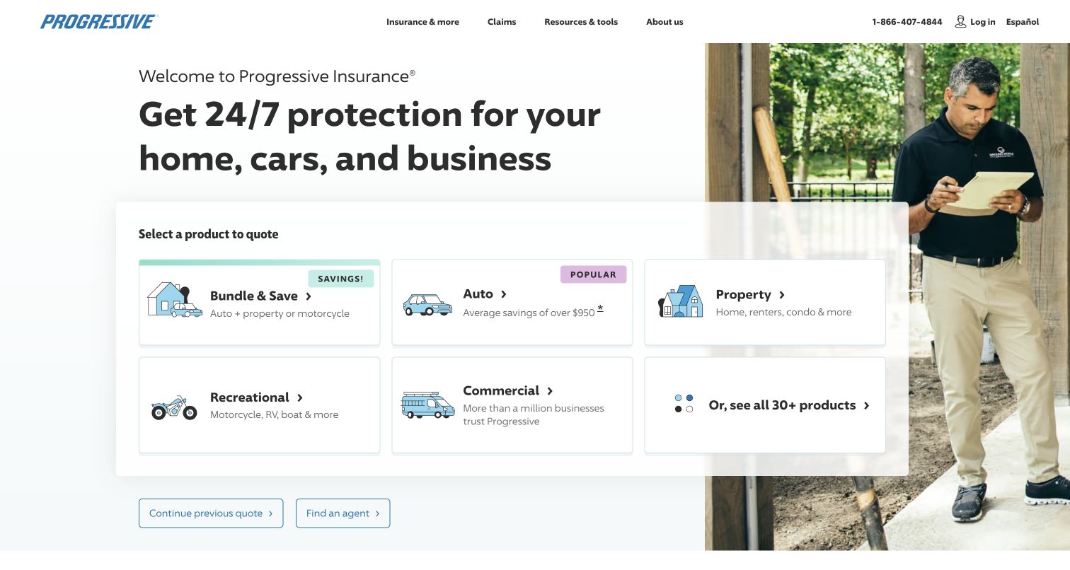
Progressive makes the first decision explicit: select a product to quote. A large white panel separates bundles, auto, property, recreational and commercial choices, with small illustrations helping differentiate them. The photograph provides personality without carrying the navigation. Continue-quote and agent links sit beneath the selector, offering two useful alternatives. The rest of the page broadens into coverage explanations, resources and service information rather than ending at the initial acquisition prompt.
What you can learn
Ask one recognizable question before collecting information. Design the product picker around the visitor’s vocabulary, and keep continuation and assisted routes close enough that someone who is uncertain does not need to search the entire footer for help.
Pros
Plain product names and short descriptions reduce the ambiguity of the initial choice.
The page distinguishes starting a quote, resuming one and finding an agent.
Cons & considerations
Several commercial and recreational products are grouped together, so later screens must explain the differences.
Large savings claims draw attention and require readable disclosures wherever that design pattern is copied.
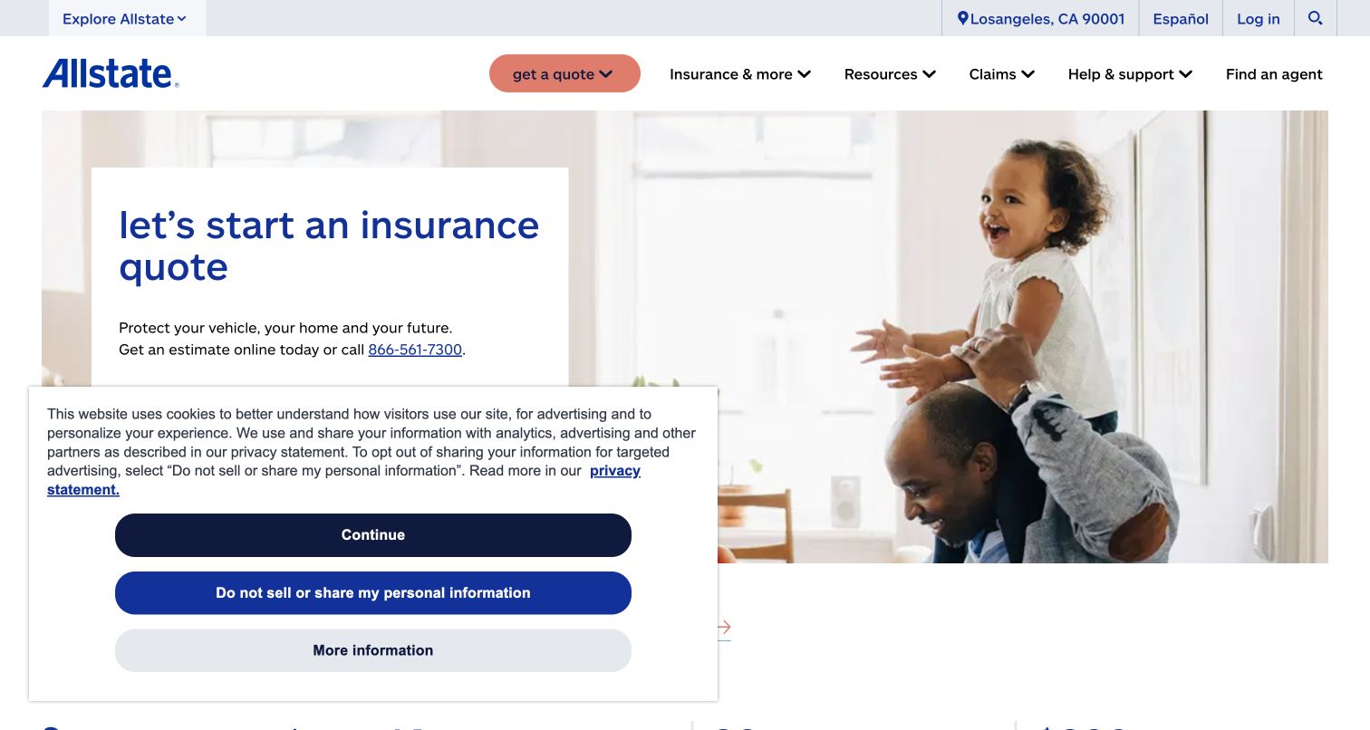
Allstate leads with a quote invitation beside an approachable household photograph. The main navigation then provides separate routes for insurance, resources, claims and support. A quick-access group identifies ID cards, bills, claims and policy information, which recognizes that many visitors are already customers. Product and life-event sections expand the page beyond a single coverage type. The design uses a restrained blue palette and compact actions to make a broad service offering feel familiar.
What you can learn
Plan the homepage for both first-time shoppers and returning policyholders. Give routine servicing its own short, stable labels, and avoid making an existing customer move through promotional content to locate a task they already understand.
Pros
The quick-access tasks are concrete and directly connected to common policyholder needs.
Product browsing and life-event content offer different ways to understand the available information.
Cons & considerations
The initial privacy panel covers a meaningful portion of the quote area in this capture.
Numerous offers and savings statements can compete with straightforward explanations of coverage and service.
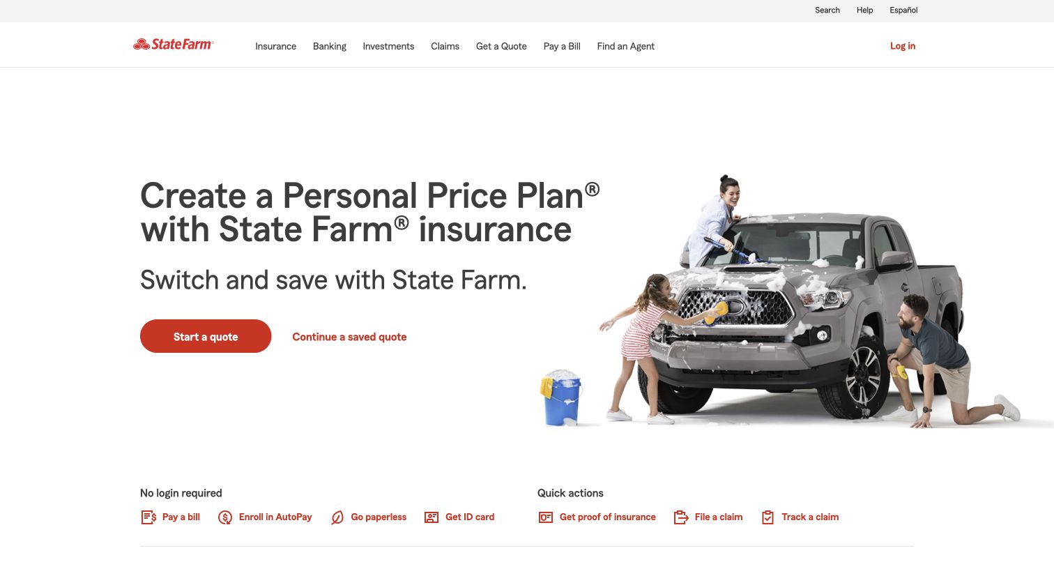
State Farm uses a short quote introduction, a red action and a small family-and-vehicle composition rather than a dense promotional banner. Immediately below, the page exposes no-login servicing actions such as paying a bill and obtaining an ID card. Product categories and an agent finder extend the journey. The visual separation between quote, quick actions and coverage categories is useful because those visits represent different intentions and should not be forced into the same funnel.
What you can learn
Name the visitor’s task before deciding its visual prominence. A lightweight row of routine actions can support existing customers while preserving a clear new-business entry. Explain which actions require an account before someone begins, and keep local assistance visible.
Pros
No-login labeling sets an expectation before a visitor enters a servicing workflow.
The red primary action remains distinct from quieter continuation and customer-service links.
Cons & considerations
The compact hero gives little coverage detail, so linked product pages must carry that explanation.
A large product range can make subsequent category navigation more complex than the opening suggests.
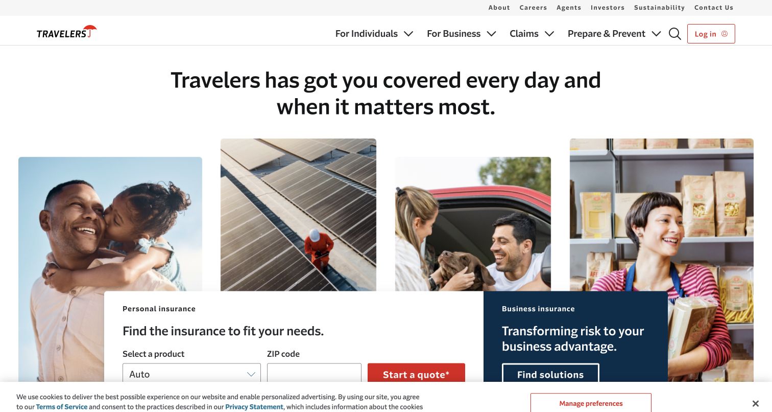
Travelers separates personal and business insurance in two adjacent panels beneath a shared brand message. The personal side includes product selection and a ZIP-code field, while the business side offers a broader solutions route. A secondary row provides bill payment, claims, agent search and contact tasks. The following sections maintain the same audience distinction, which helps the page support both a household shopping for coverage and a business evaluating more specialized risk information.
What you can learn
When two audiences need different information, give each an honest first step. A consumer quote form and a business discovery route do not have to share identical controls. Preserve the same distinction in navigation, page titles and handoffs to service teams.
Pros
Personal and business routes are differentiated in both wording and visual treatment.
Claim and payment actions remain available independently of the prospect-oriented quote panels.
Cons & considerations
A product and location form adds decisions before some visitors understand the coverage choices.
The homepage is extensive; essential service tasks should remain easy to find on a narrow screen.
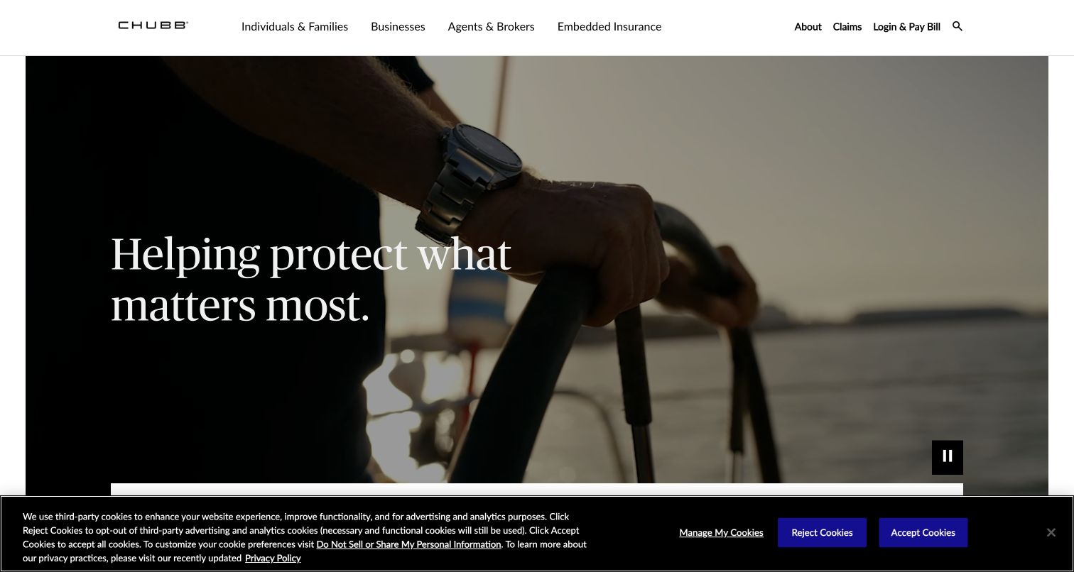
Chubb places individuals and families, businesses, and agents and brokers in the primary navigation. Its large photographic opening makes a service-oriented impression, while the following audience cards translate that impression into routes. Embedded insurance is treated as another distinct business proposition. Claims, login and payment remain visible utility destinations. This structure is a useful reference when a company’s website must serve intermediaries as well as the people or organizations eventually covered by a policy.
What you can learn
Organize around relationships when those relationships change the information needed. A broker portal, a personal-insurance explanation and a business inquiry should be clearly labeled destinations, with enough context to prevent a visitor entering the wrong workflow.
Pros
Audience labels identify the main relationships without requiring knowledge of specific product names.
Claims and payment links are separated from the larger marketing narrative and remain easy to recognize.
Cons & considerations
The emotional opening communicates little about an individual product until the visitor moves farther down.
Financial-strength statistics need dated sourcing and should not be treated as evidence of a particular customer outcome.
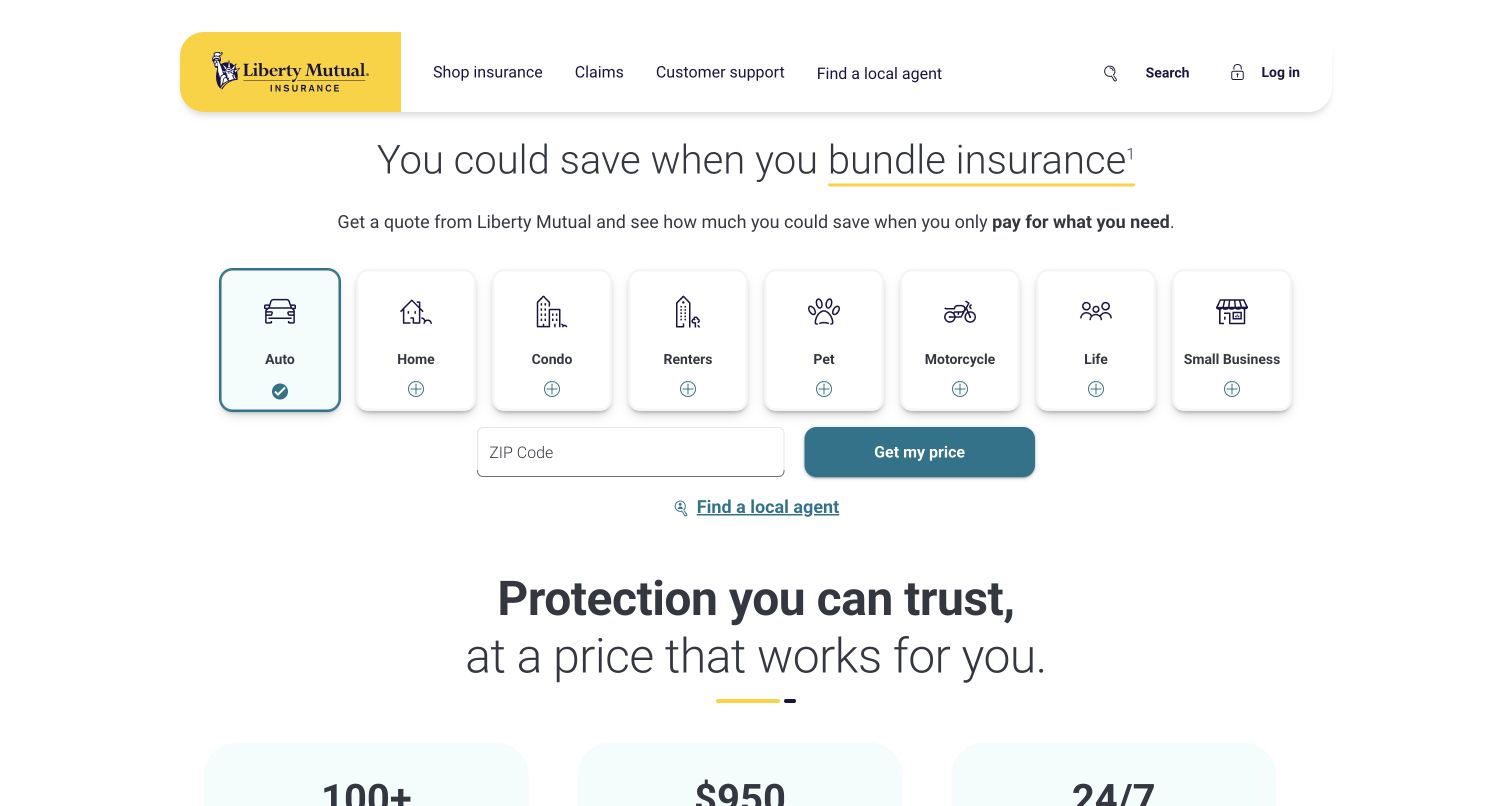
Liberty Mutual combines a concise bundle message with a row of illustrated product choices and a ZIP-code entry. The pale background and yellow brand marker leave the controls easy to distinguish. A local-agent link appears alongside the self-service direction, and later sections explain the two routes more explicitly. Claims and support are visible in the header. The homepage is useful for studying how an insurer can keep a transactional opening concise while still accommodating someone who wants human assistance.
What you can learn
Treat assisted service as a deliberate route rather than a last-resort footer link. Let people choose whether to quote independently or speak with an agent, and make the destination of each action clear before requesting personal information.
Pros
The product icons and labels create a bounded, scannable set of starting points.
Claims and customer support sit beside shopping navigation instead of being buried in company information.
Cons & considerations
The first form asks for location before presenting detailed product information or eligibility context.
A bundle-led message may be less immediately relevant to visitors who need only one specialist policy.
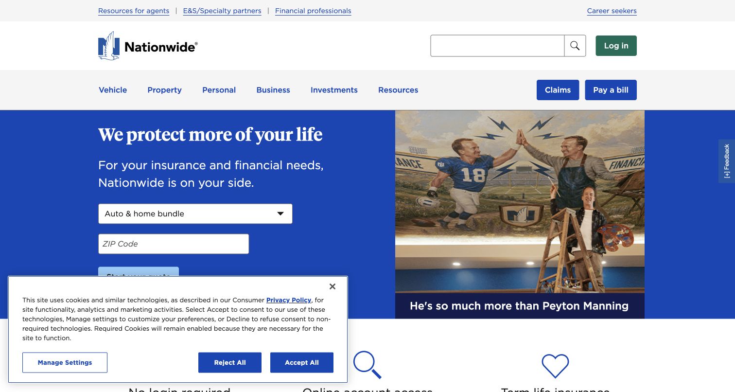
Nationwide places a product selector and quote entry below its principal brand message, with the familiar blue identity carrying the page. A separate no-login utility asks what the visitor wants to do, including bill payment, ID cards and claim tasks. Agent and investment routes sit nearby. The useful distinction is between acquiring a product and servicing an existing relationship; the site makes those jobs visible without presenting every account function as an equally large promotional card.
What you can learn
Give recurring tasks a small, predictable home and use plain descriptions of the outcome. A task menu can save space, but its chosen action should remain obvious and should not mix account service with unrelated marketing destinations.
Pros
The no-login label helps users understand the boundary of the quick-task menu.
Insurance, financial products and professional audiences are identified through separate navigation routes.
Cons & considerations
A dropdown hides alternatives until it is opened, making visible labeling particularly important.
The broad insurance-and-investments offering requires careful explanation so visitors do not confuse different product categories.
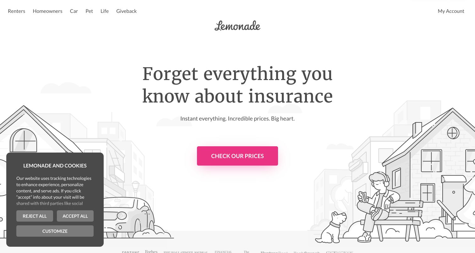
Lemonade centers a short headline and bright pink price-check action within a spacious illustrated scene. The navigation uses familiar product names rather than corporate departments. Monthly starting-price cards and testimonials follow, then an explanation of the organization’s giving model. The opening feels lighter than many traditional insurance sites, making it a useful study in tone and hierarchy. That tone should be evaluated separately from the actual policy, claim experience or price a visitor may receive.
What you can learn
Use personality to reduce visual friction while preserving the practical information people need. A distinctive illustration style can support the brand, but exclusions, availability, service routes and the meaning of a quoted price still need clear, accessible explanations.
Pros
The primary action is visually unmistakable within a restrained, mostly monochrome composition.
Product names remain direct, allowing visitors to choose a category without interpreting a slogan.
Cons & considerations
Strong speed and price messaging can overshadow the qualifications that determine an actual offer.
A long testimonial section supplies promotional reassurance but does not replace precise coverage and claims information.
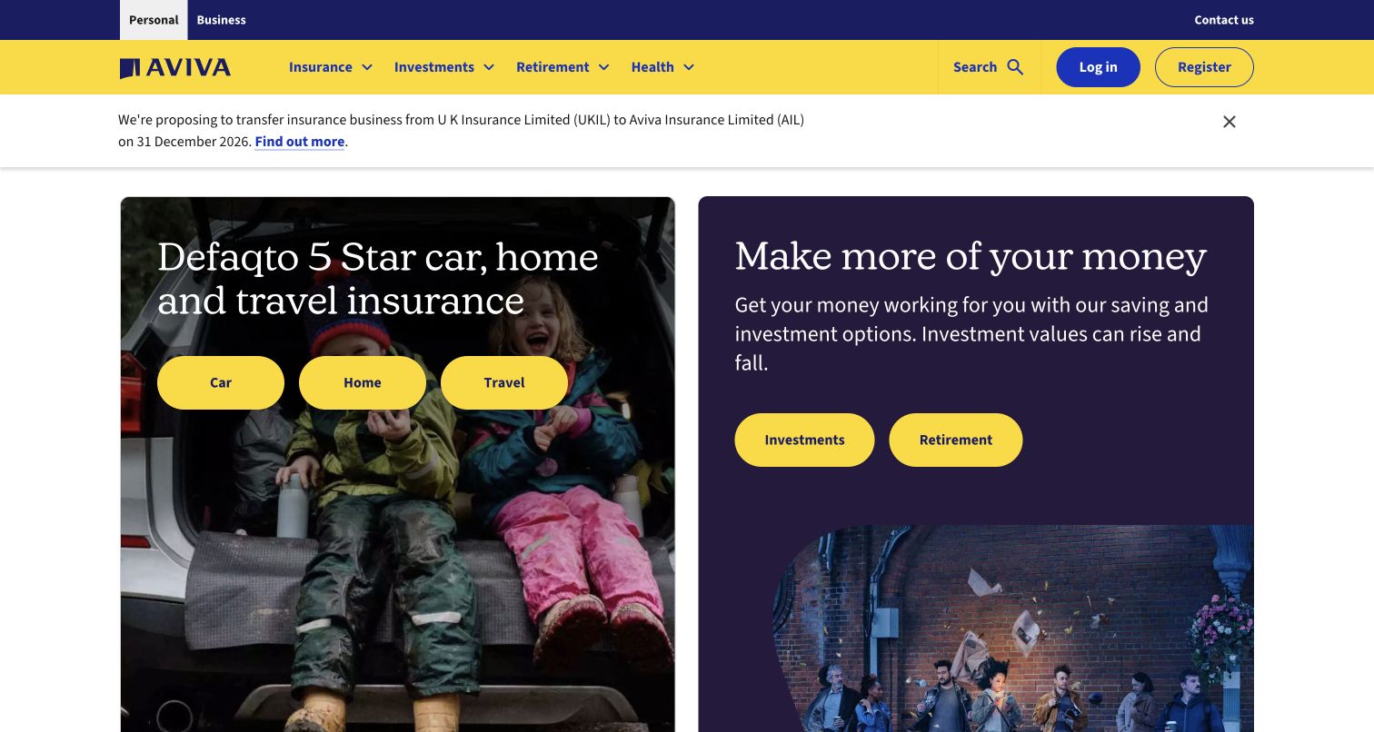
Aviva’s opening is divided into two substantial cards: one for familiar insurance products and another for savings and investment information. Yellow pill-shaped actions sit on darker photography, making the alternatives visible. A separate service notice appears above the cards, while support and account information follow below. The page is a useful reference for a company with several distinct financial journeys, because it groups them before presenting individual products rather than treating the entire catalog as one quote form.
What you can learn
Build a clear information boundary between protection products and longer-term financial planning. Explain each route in ordinary language, and retain prominent service notices without allowing a temporary announcement to obscure navigation or urgent customer help.
Pros
The two-card arrangement makes broad product families easy to distinguish in the opening view.
Support, account access and contact information remain explicit alongside product discovery.
Cons & considerations
Several rounded actions compete within the cards, so their grouping must remain clear on smaller screens.
Ratings and product claims need contextual sources; strong visual emphasis alone cannot explain their scope.
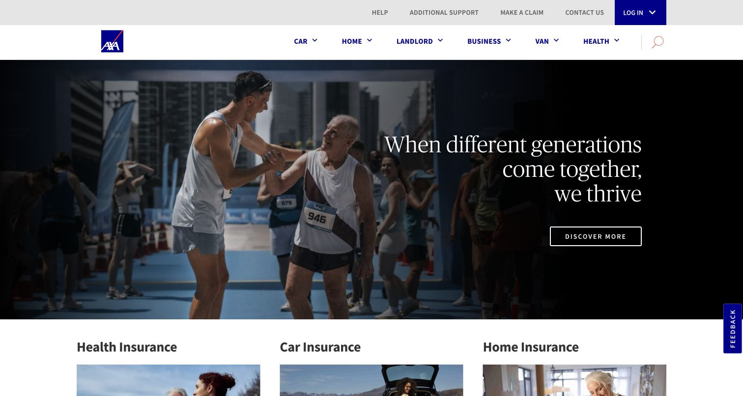
AXA UK uses a photographic campaign opening above a series of product sections. Each section distinguishes learning about a product, requesting a quote and making a claim, so similar intentions repeat in a recognizable pattern. The main navigation keeps car, home, landlord, business, van and health categories visible. Help and additional-support links sit in a separate utility row. The design offers a practical reference for building a consistent product-page system beneath a changing brand campaign.
What you can learn
Reuse the action structure, not merely the card appearance. For every product, distinguish research, new business and existing-customer service. Keep support available at the same navigation level so a visitor does not have to infer which product page contains the right help.
Pros
Quote and claim actions are associated with the specific product they concern.
The utility navigation names additional support directly rather than hiding it within generic contact copy.
Cons & considerations
The campaign headline is broader than the product tasks and adds an extra interpretive step.
Repeated long sections can become tiring; a clear category index and concise summaries matter on mobile.
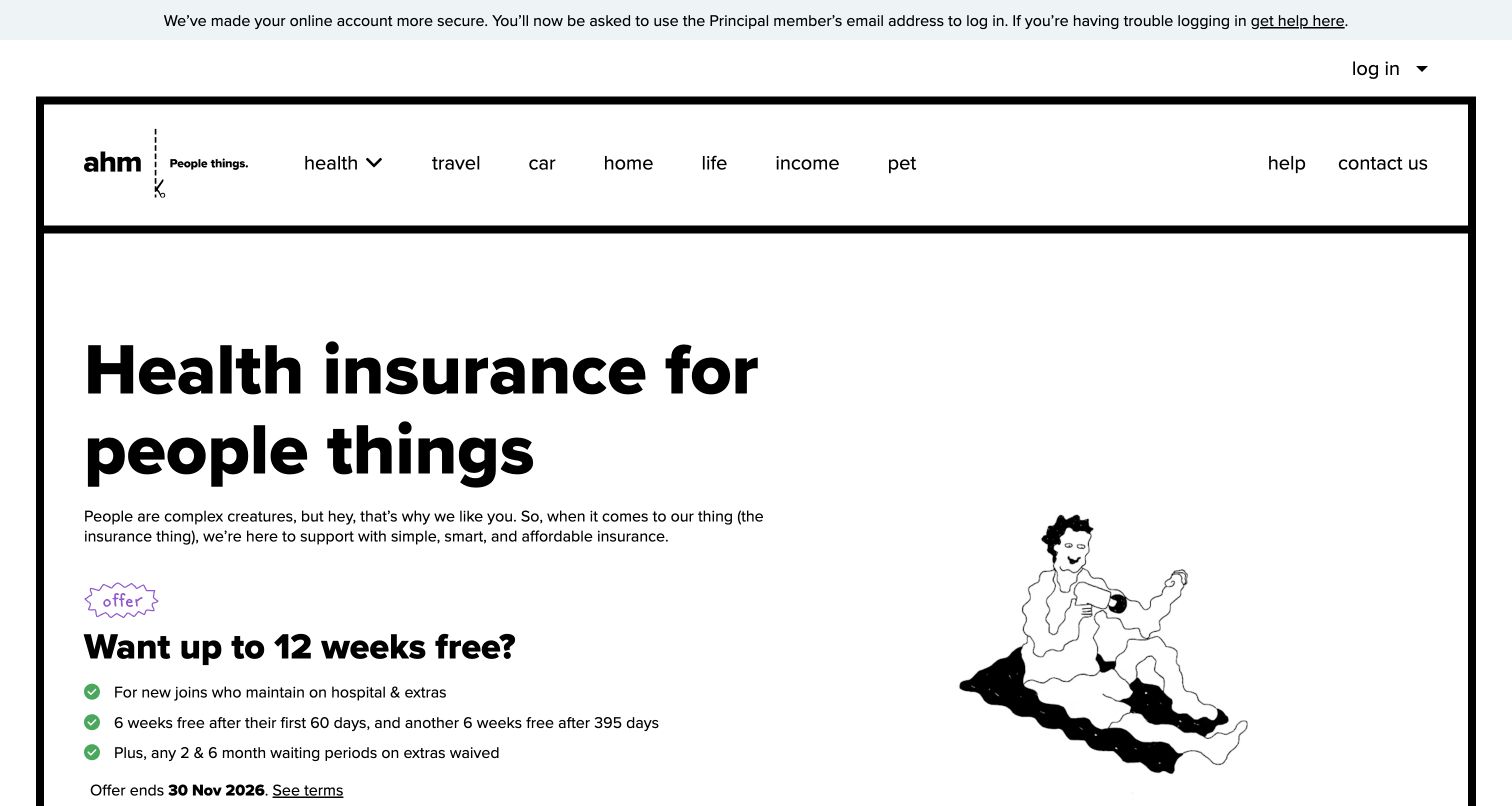
ahm uses a bold black-and-white frame, informal illustrations and a direct health-insurance introduction. The cover finder labels the information it needs, including cover type, household, location and age. The page also separates hospital and extras explanations and offers clear account and help routes. This combination is useful for studying a conversational tone without abandoning functional labels. The promotional offer is time-sensitive, so it should be understood as part of the captured page rather than evergreen buying advice.
What you can learn
Pair a friendly voice with precise field labels and plain explanations of product categories. Write the educational content before simplifying the visual design, and make offer dates and conditions easy to find wherever a promotion sits close to the main form.
Pros
The strong frame and limited palette keep the brand recognizable without relying on a large video.
Basic cover questions are labeled explicitly instead of being buried inside conversational form prompts.
Cons & considerations
A promotional free-weeks offer occupies substantial space before the coverage differences are explained.
Informal language still needs careful review where a product term has a precise contractual meaning.
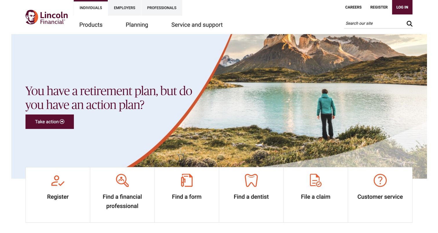
Lincoln Financial’s individual-facing page pairs a retirement-planning question with a landscape photograph and a restrained burgundy action. Directly below, a row of tasks includes registration, professional search, forms, dental-provider search, claims and customer service. Audience navigation separates individuals, employers and professionals. The page is useful for examining how a broad financial-services organization can provide a coherent public entry without pretending that every visitor needs the same product or shares the same relationship to the company.
What you can learn
Keep an aspirational planning message separate from the practical tasks people came to complete. Use audience routes and a short service index together, and ensure product explanations preserve the differences between insurance, investments and administrative account support.
Pros
The individual, employer and professional routes clarify major audience boundaries in the header.
The service-task row exposes useful destinations beneath the campaign rather than requiring a deep menu search.
Cons & considerations
The opening retirement theme may be less relevant to visitors arriving for a specific insurance claim.
Several financial product categories require careful contextual explanation beyond what the homepage can reasonably provide.
Plan the insurance site around products and service tasks
Map the real paths before drawing the homepage
Document which products can be quoted online, which require assistance and which vary by location. Identify existing-customer and professional tasks separately. The navigation should reflect real capabilities rather than send every visitor into a single form with unclear outcomes.
Assign ownership for product and offer copy
Create a review process for coverage descriptions, savings claims, eligibility statements and promotional dates. Keep the source and approved wording close to the content. Explain important terms in the main reading flow and ensure linked details remain current.
Test every transition between systems
Quote engines, customer accounts, agent directories and claims systems may be separate services. Label those destinations clearly and plan for unavailable sessions or interrupted progress. Provide a supported contact alternative without asking visitors to repeat sensitive details in an unprotected channel.
The editing job behind the design
Choose a publishing layer that works with existing insurance services
The public site needs reliable product content, audience navigation and accessible templates, while quoting and servicing may live in established systems. Decide which system owns each product fact and how updates are reviewed. Avoid copying important terms across many campaign pages where they can drift apart.
Evaluate form accessibility, secure handoffs, performance and error recovery alongside branding. A product picker should still be understandable without its illustrations, and essential support information should remain available if an interactive component fails. Use explicit evidence before attributing a platform to any reference site.
Our WordPress website examples offer a separate look at publishing approaches. A visible platform label is evidence for that named page, not a guarantee that the same system will suit your requirements.
Before the public launch
Insurance website launch checklist
Verify product names, service areas, audience routes and quote availability with their owners.
Review offer dates, savings statements, eligibility wording and linked conditions.
Check claims, payment, document and account-support paths independently of quote entry.
Test field labels, error messages, keyboard navigation and mobile readability in approved test modes.
Confirm the handoff and return path between public pages, quote engines and customer systems.
Assign owners for product changes, expired promotions, broken service links and accessibility issues.
These checks are a project checklist, not a performance, legal, security, or accessibility certification. Test real journeys with the people responsible for the website before making claims about the result.
Sources & editorial method
How this collection was selected and reviewed
We reviewed thirteen distinct official insurance and insurance-services websites through direct browser visits and saved homepage captures. Reviews compare visible product routing, customer-service access and quote introductions. We did not submit quote forms, evaluate policy suitability or independently verify promotional savings and service claims.
Each example links to its actual source page. Screenshots are direct browser captures with their own capture dates; moving imagery, announcements and live designs can change. The notes describe observable design choices and conditional tradeoffs, not measured traffic, conversion results, service quality, or accessibility conformance.
Technology labels use public page metadata, asset evidence, or explicitly cited platform documentation. Platform documentation is not a complete current deployment audit. A component reference may be legacy or unused; it is not a complete backend inventory. Unknown stacks are omitted. These sites are editorial examples, not our client portfolio.
Written, Edited and Curated are separate editorial records, not timestamps advanced by a rebuild. Website designs and imagery belong to their owners. See our editorial standards or suggest a correction.
Questions worth asking
Insurance website design questions
Should the homepage start with a quote form?
A clear product selector can work when visitors understand the choices and online quoting is supported. Explain what the first step does and provide product information or assisted support for people who are not ready to enter details.
Where should claims and existing-customer tasks appear?
Give them stable, recognizable navigation and a concise task area where useful. Their location should not depend on the current marketing campaign or require the visitor to begin a new quote.
How should an agent-assisted route be presented?
Treat it as a deliberate choice with a clear label. Explain whether the destination finds a local agent, requests a callback or provides general support, and avoid implying immediate availability without operational support.
Can a simpler visual style replace detailed product information?
No. Simpler presentation can help people find and read information, but product terms, availability and relevant conditions still need clear explanations and maintained destinations.
Borrow the routing and service patterns that fit the actual insurance operation. Clear choices, readable explanations and dependable support paths matter more than copying a promotional style.