Best Foundation Websites of 2026 (20 Real-World Examples)
Twenty public properties from Foundation’s historical maintainer showcase, with genuine dated screenshots and original design reviews; current Foundation runtimes are not established.
Foundation provides frontend layout and interface tools, but the websites associated with it have never shared one mandatory visual style. These twenty public properties appear in the maintainers’ undated Brands showcase. Their separately dated screenshots are useful design references, not proof that the current pages still run Foundation. Compare the navigation, content hierarchy and practical actions while keeping that historical evidence boundary clear.
A frontend framework can help a team organize repeated patterns, but it cannot decide which information matters to a visitor. The examples here range from retail catalogs and travel searches to museums, news and developer documentation. Their useful lessons concern choices: which task is visible first, what information repeats, how imagery supports the message and where the next step becomes clear.
Subaru, Barclays, New Balance, Sonos and Trek open the collection as recognizable public brands. Each has an exact property link in the official Foundation showcase. The same documentary standard applies to the other examples. Existing captures and broad audits retain their original dates; three fresh captures were made for this collection. No private system, transaction or framework version is inferred from a brand name, photograph or historical showcase entry.
Before the examples
What makes good Foundation website development in 2026?
Make the content hierarchy explicit
Decide which visitor task deserves the strongest position before choosing column widths or decorative treatments. A search, a ticket action, a product category and a corporate story serve different intentions. Give each a clear label and a deliberate place in the reading order. Consistency helps returning visitors, but equal styling for every element can make a complex page harder to understand. Use the framework to support an editorial hierarchy that someone can explain in ordinary language.
Design the grid around real content
Foundation’s XY Grid provides layout tools for arranging and aligning cells. Start with actual headlines, product labels and images rather than idealized placeholders. A design that works with one short label may fail when an editor adds a longer name or a campaign needs more context. Decide how the content should reorder and stack, then check that the narrow layout still expresses the same priorities as the wider one.
A component library is a starting point, not a certification of the completed website. Foundation’s guidance emphasizes appropriate document structure, labels, keyboard access and information that does not depend only on visual cues. Apply those ideas to the actual navigation, forms, carousels and overlays you ship. A visible control must also have an understandable purpose and predictable behavior. Review the combined page rather than assuming that separately documented components guarantee the result.
These twenty reviews examine genuine public-page captures and separately documented historical Foundation associations. The newer design shown in a screenshot may have a different implementation. Each property's evidence preserves that qualification, and the broad audits remain independent of the showcase claim.
We start with five recognizable brands or organizations: Subaru, Barclays, New Balance, Sonos US storefront, Trek. Each attribution applies to the named website property, not every product or website belonging to its organization. This is a curated reading sequence, not a measured ranking.
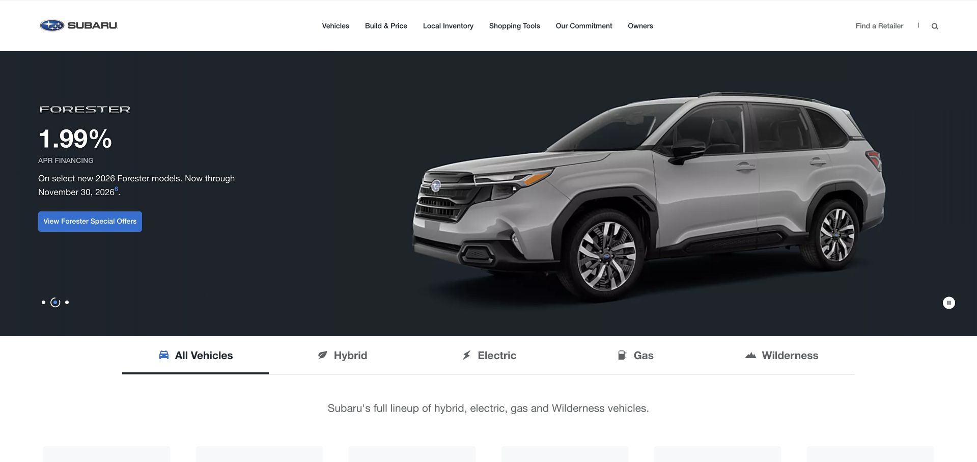
Subaru places a dark, expansive vehicle photograph beneath a compact white navigation bar. The bright offer button stays easy to locate, while the horizontal model categories give visitors a more practical alternative to the campaign. That contrast is useful: the photograph establishes a setting, but the interface still acknowledges shoppers who arrive knowing which kind of vehicle they want. The captured view offers a clear example of separating brand storytelling from product selection without dividing them into unrelated screens.
What you can learn
Start with a dependable navigation structure, then let the campaign occupy the space below it. A responsive grid should preserve the relationship between model choices, explanatory text and the primary action when the photograph is cropped.
Pros
The white navigation creates a stable edge above the darker campaign image, keeping the site controls visually distinct.
Model categories provide a direct browsing route for people who do not need the featured promotion.
Cons & considerations
Large photographic campaigns need deliberate text placement and alternative crops across screen sizes.
An offer-led opening requires frequent content review so its details and destination remain useful.
Platform source: Primary documented Kubernetes association. The Foundation maintainers' undated Brands showcase explicitly links Subaru's public property. This supports a historical, vendor-documented Foundation association only. The pictured page is a separately dated design reference, not evidence that its present runtime uses Foundation or a particular version. Platform evidence is separate from the direct website screenshot and is not a complete current infrastructure audit.
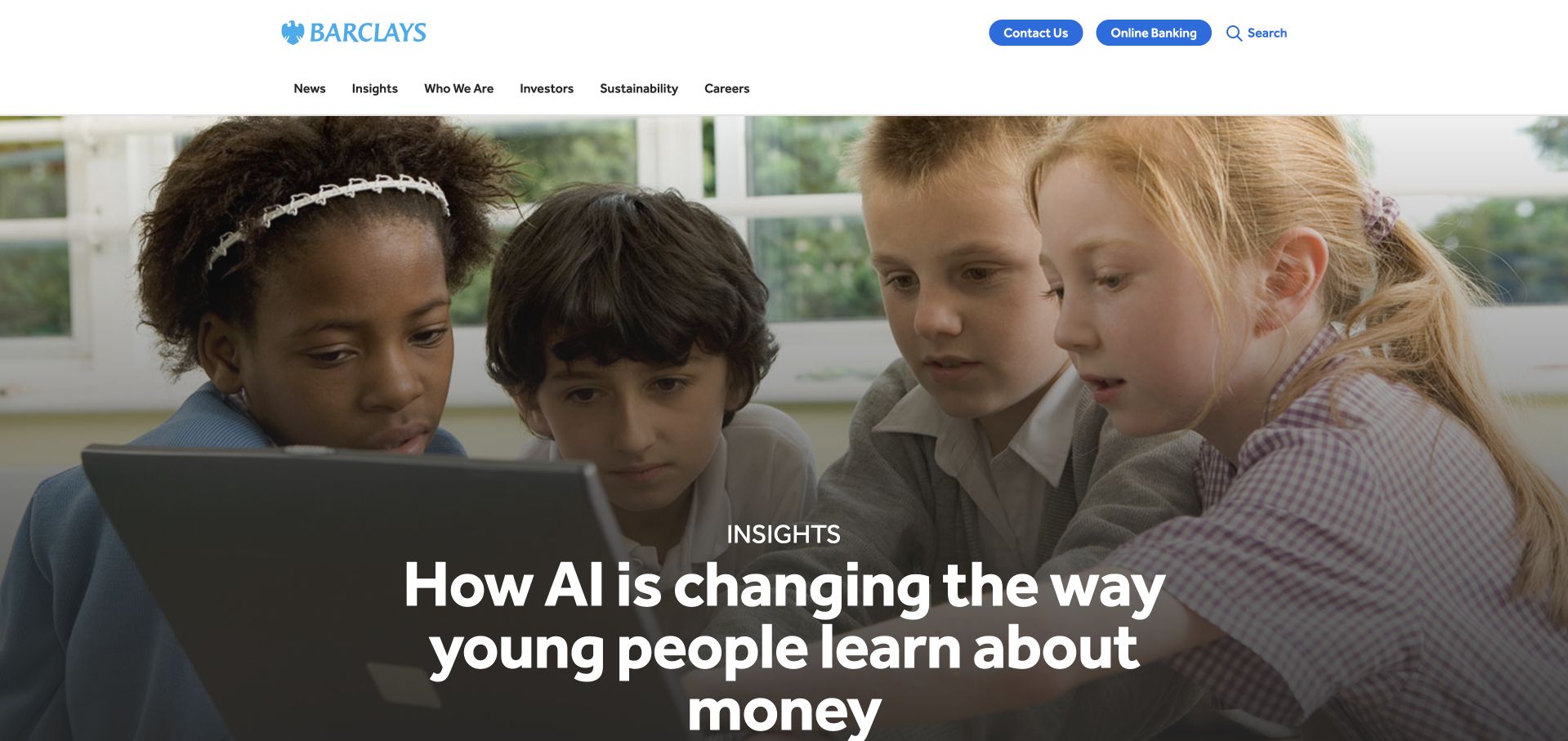
Barclays combines a generous photographic story with a restrained corporate header. Banking and contact routes appear as recognizable controls rather than being buried inside the central message. The children in the main image give the institutional story a human subject, while the large headline organizes the space around a single idea. This is a useful reference for a corporate site that must communicate purpose while still helping visitors distinguish company information from practical banking destinations.
What you can learn
Give different audiences a visible route before asking them to interpret a broad brand statement. The layout can remain calm when the content hierarchy separates global navigation, service access and the current editorial story.
Pros
Distinct banking and contact controls help practical tasks remain visible alongside the institutional narrative.
A single large image and headline create a coherent focal point instead of competing promotional cards.
Cons & considerations
Broad corporate language still needs clear destination labels for visitors with a specific banking question.
The prominent photograph demands careful mobile cropping so its human subject and headline remain legible.
Platform source: Official GitLab customer documentation. The Foundation maintainers' undated Brands showcase explicitly links Barclays's public property. This supports a historical, vendor-documented Foundation association only. The pictured page is a separately dated design reference, not evidence that its present runtime uses Foundation or a particular version. Platform evidence is separate from the direct website screenshot and is not a complete current infrastructure audit.
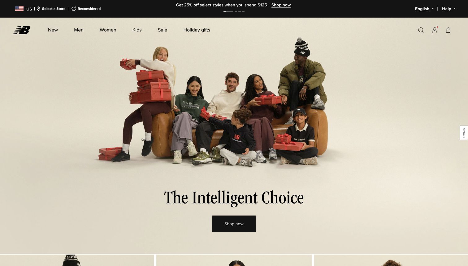
New Balance gives its seasonal campaign a pale background, a group photograph and a prominent serif statement. A dark shopping button provides the main action without adding a large cluster of competing controls over the image. Above it, the compact utility bar and straightforward product navigation preserve the more familiar retail structure. The contrast between the quiet campaign canvas and the dense header is worth studying when a store wants a distinctive art direction without obscuring ordinary shopping paths.
What you can learn
Treat campaign typography as a limited accent inside a consistent interface. Use the grid to maintain a readable relationship between image, headline and action, while keeping category navigation independent of the seasonal creative.
Pros
One dark call to action is easy to distinguish within the light photographic composition.
The product navigation gives returning shoppers a route that does not depend on understanding the campaign.
Cons & considerations
A seasonal message can become stale quickly unless its imagery and linked collection change together.
Large image-led openings leave less immediate room for product details, prices and availability information.
Platform source: Merchant-owned payment documentation. The Foundation maintainers' undated Brands showcase explicitly links New Balance's public property. This supports a historical, vendor-documented Foundation association only. The pictured page is a separately dated design reference, not evidence that its present runtime uses Foundation or a particular version. Platform evidence is separate from the direct website screenshot and is not a complete current infrastructure audit.
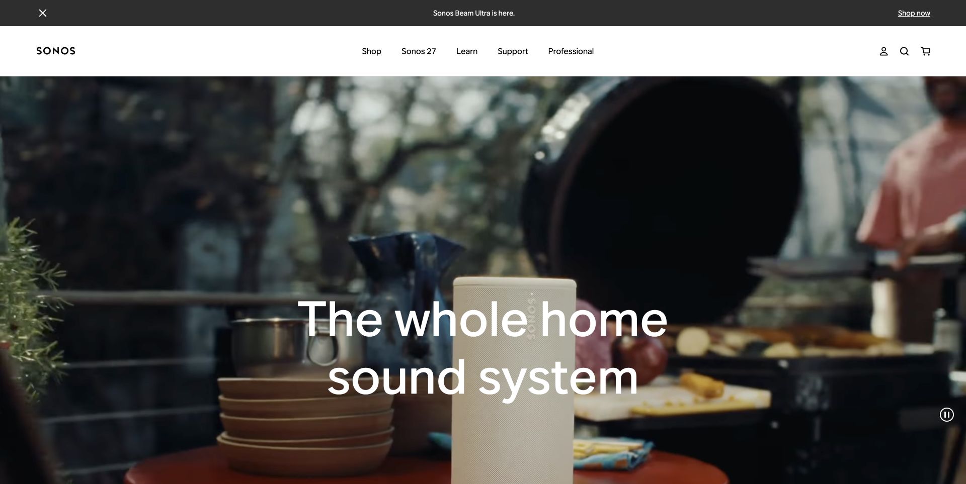
The Sonos storefront uses a cinematic room scene to explain a whole-home listening proposition. Its large headline sits within the visual story, while a clean white header and a separate product strip organize the shopping interface above it. A visible pause control acknowledges that motion is part of the page rather than an invisible background assumption. The composition shows how a product site can communicate an experience before presenting detailed specifications, provided that visitors retain an obvious route into the range.
What you can learn
Separate the emotional demonstration from the controls needed to browse products. If motion carries the story, provide a clear way to pause it and ensure the static state still communicates the main proposition.
Pros
The room scene supplies context that isolated product cutouts would struggle to convey on their own.
White navigation and the product strip remain visually distinct from the cinematic area below.
Cons & considerations
A large moving hero increases the importance of fallback imagery and deliberate loading behavior.
Visitors comparing technical specifications need a direct next step beyond the introductory room scene.
Platform source: Public page or referenced asset source. The Foundation maintainers' undated Brands showcase explicitly links Sonos US storefront's public property. This supports a historical, vendor-documented Foundation association only. The pictured page is a separately dated design reference, not evidence that its present runtime uses Foundation or a particular version. Platform evidence is separate from the direct website screenshot and is not a complete current infrastructure audit.
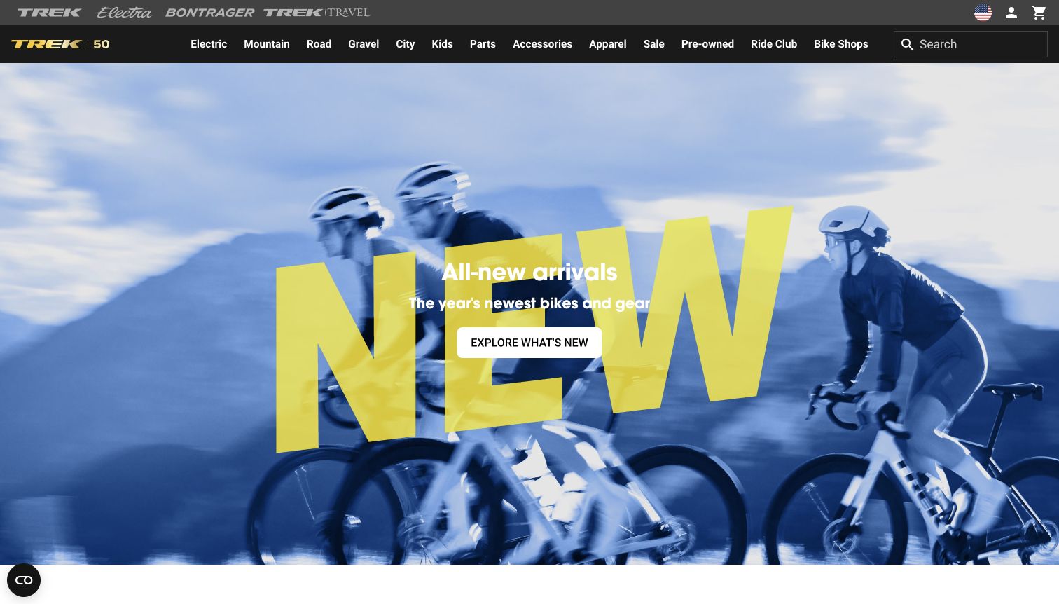
Trek pairs a vivid cycling photograph with oversized yellow campaign typography. The header uses several layers to separate brand utilities from product categories, making the energetic hero feel like one part of a larger retail system. A contrasting call to action gives the campaign a practical destination. The captured layout is useful for studying how a dense catalog can coexist with expressive sports photography, especially when enthusiasts expect detailed navigation and newcomers need a simple place to begin.
What you can learn
Let the campaign have a strong voice while keeping the catalog structure predictable. Plan the header and hero as separate responsive regions so a narrow screen does not turn every navigation layer into equal visual weight.
Pros
Bright campaign lettering creates a strong focal point against the blue photographic background.
The category system offers an alternative route for visitors who already know the equipment they want.
Cons & considerations
Several header layers compete for vertical space before the visitor reaches substantive product information.
Oversized typography needs careful line breaks and image positioning to remain useful on smaller screens.
Platform source: WordPress.org Showcase. The Foundation maintainers' undated Brands showcase explicitly links Trek's public property. This supports a historical, vendor-documented Foundation association only. The pictured page is a separately dated design reference, not evidence that its present runtime uses Foundation or a particular version. Platform evidence is separate from the direct website screenshot and is not a complete current infrastructure audit.
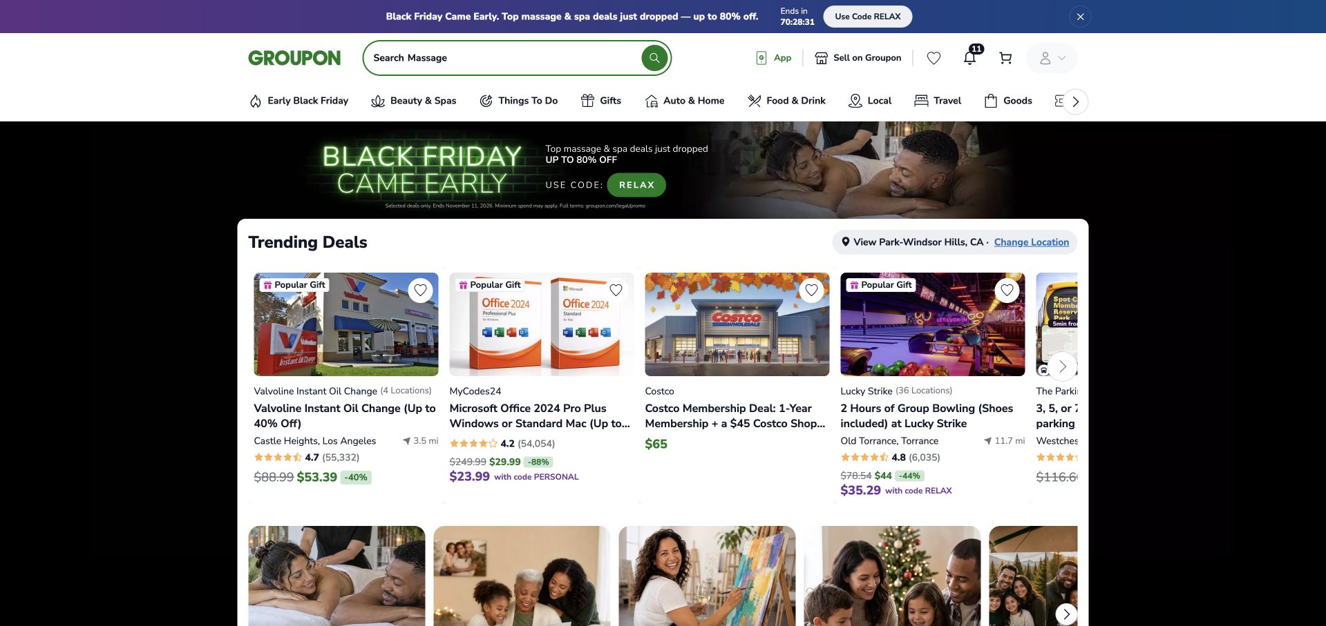
Groupon places search near the center of its opening interface and follows it with a dense grid of offers. Individual cards combine imagery with pricing, ratings and location context, giving visitors several concrete comparison signals before they open a detail page. Category navigation supplies another route when the visitor knows the type of experience but not a particular merchant. The black promotional banner adds campaign emphasis without replacing the underlying card-based browsing system shown in the capture.
What you can learn
Define the information a visitor needs to compare items, then make that information repeat consistently. A flexible grid is useful only when card titles, contextual labels and actions remain understandable as columns change.
Pros
Search and categories support both precise queries and broader browsing within the same opening view.
Repeated price and location details help visitors compare offers without opening every result first.
Cons & considerations
Dense cards can become difficult to scan when promotional labels and ratings receive similar emphasis.
Marketplace content requires ongoing attention to expired offers, missing imagery and uneven merchant descriptions.
Platform source: Primary documented Apache Spark association. The Foundation maintainers' undated Brands showcase explicitly links Groupon's public property. This supports a historical, vendor-documented Foundation association only. The pictured page is a separately dated design reference, not evidence that its present runtime uses Foundation or a particular version. Platform evidence is separate from the direct website screenshot and is not a complete current infrastructure audit.
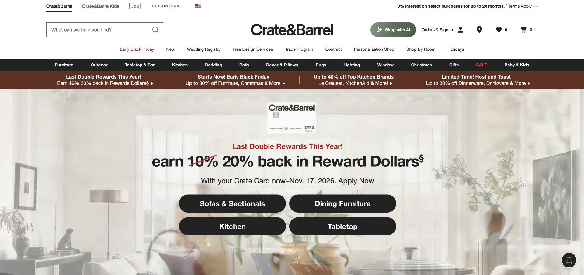
Crate & Barrel places a large centered wordmark between search and utility controls, then separates service links from the darker product-category bar. The new capture shows a rewards campaign with four substantial category buttons arranged in a compact two-column block. Those shortcuts give the promotional area a useful browsing function beyond its headline. The room photograph provides atmosphere, while the navigation above maintains routes to furniture, kitchen products and other established departments.
What you can learn
When a campaign occupies most of the opening screen, include useful category destinations within it. Keep those controls consistent with the wider navigation rather than inventing a second, ambiguous naming system for the promotion.
Pros
Search, service links and product departments are separated into recognizable horizontal regions.
Large category buttons provide practical destinations even for visitors uninterested in the featured rewards message.
Cons & considerations
The many navigation and promotion rows consume a substantial part of the initial viewport.
A rewards-led headline needs nearby conditions and accurate destinations as the campaign changes over time.
Visible tech stack
Earlier / documented evidence
Foundation
Platform source: WordPress.org Showcase. The Foundation maintainers' undated Brands showcase explicitly links Crate & Barrel's public property. This supports a historical, vendor-documented Foundation association only. The pictured page is a separately dated design reference, not evidence that its present runtime uses Foundation or a particular version. Platform evidence is separate from the direct website screenshot and is not a complete current infrastructure audit.
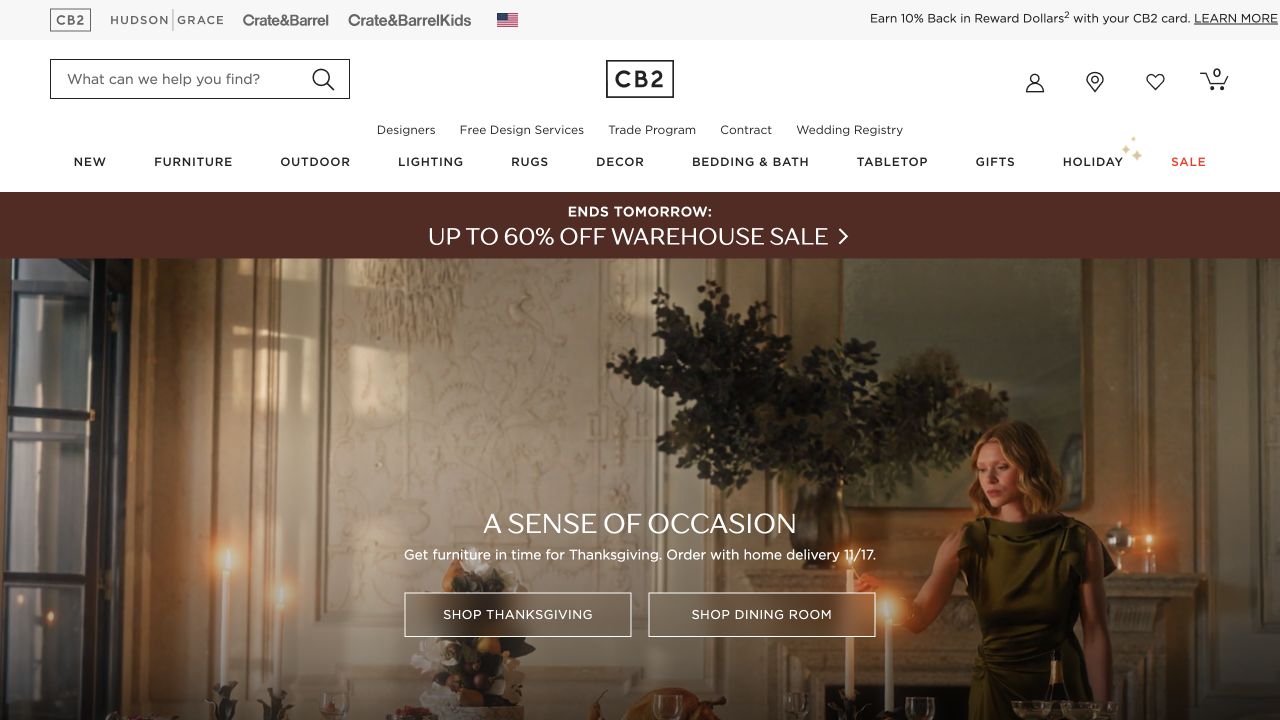
CB2 organizes the top of its storefront around a centered wordmark, search and a compact category row. A narrow promotional band introduces the campaign before the page opens into a dark dining-room image. Two outlined buttons sit within that setting, allowing the photograph to carry much of the visual identity. The composition offers a useful contrast with denser promotional retail pages: its main canvas feels editorial, while the persistent shopping controls remain clearly outside the room scene.
What you can learn
Use a consistent frame around expressive imagery so visitors do not have to relearn the shopping interface for each campaign. Test outlined actions against every image variant rather than assuming one contrast treatment will always work.
Pros
The room photograph communicates materials, lighting and product relationships in a single cohesive composition.
A separate category row preserves direct shopping routes beyond the featured interior campaign.
Cons & considerations
Dark photographic backgrounds require careful treatment of text and button borders to retain clarity.
Two similarly styled hero actions need precise labels so their destinations are distinguishable before clicking.
Visible tech stack
Earlier / documented evidence
Foundation
Platform source: WordPress.org Showcase. The Foundation maintainers' undated Brands showcase explicitly links CB2's public property. This supports a historical, vendor-documented Foundation association only. The pictured page is a separately dated design reference, not evidence that its present runtime uses Foundation or a particular version. Platform evidence is separate from the direct website screenshot and is not a complete current infrastructure audit.
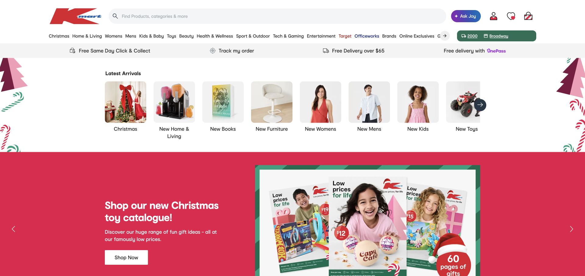
Kmart Australia gives its broad search field considerable room in the header, then follows the navigation with a row of pictured category shortcuts. The current capture shows a Christmas toy campaign below these practical entry points. Product groups such as furniture, clothing and books remain visible above the promotion, making the page useful to shoppers who arrived for something else. Delivery and collection information forms another distinct strip rather than being scattered across the campaign artwork.
What you can learn
Use visual shortcuts to reduce the effort of entering a large catalog, but keep their text labels explicit. Organize operational information separately so delivery choices remain understandable when promotional artwork changes.
Pros
The wide search field makes a direct product query an obvious alternative to browsing.
Pictured category shortcuts connect familiar product types with clearly written destinations above the main campaign.
Cons & considerations
Many horizontal regions create a crowded opening when the same information must fit a narrow screen.
Seasonal illustrations and carousel content need careful prioritization so they do not overshadow routine shopping tasks.
Platform source: Official commercetools case study for this public commerce property. The Foundation maintainers' undated Brands showcase explicitly links Kmart Australia's public property. This supports a historical, vendor-documented Foundation association only. The pictured page is a separately dated design reference, not evidence that its present runtime uses Foundation or a particular version. Platform evidence is separate from the direct website screenshot and is not a complete current infrastructure audit.
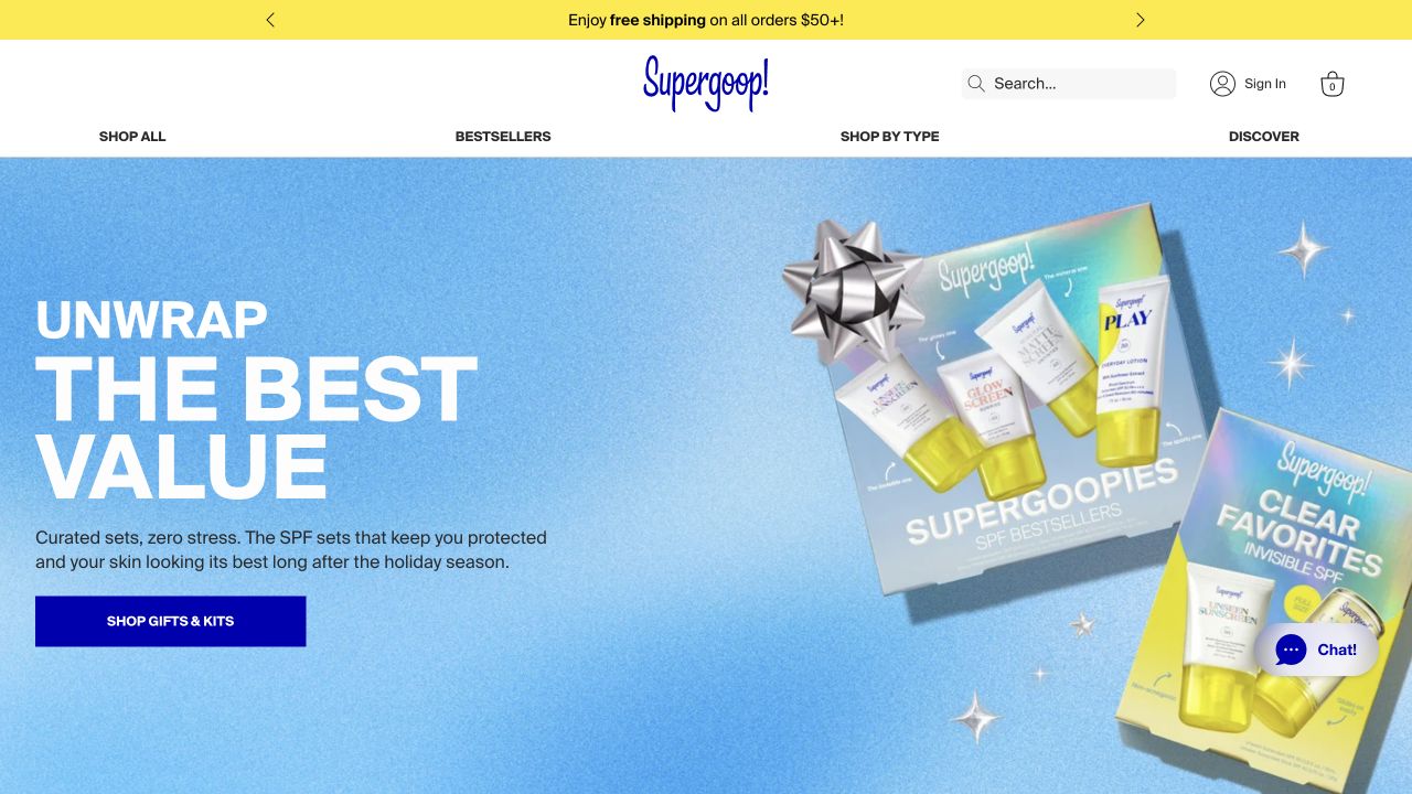
Supergoop! builds the captured opening around vivid blue packaging and a contrasting yellow utility strip. The product artwork occupies a large part of the hero, while the headline and shopping action sit in a more controlled text region. Category navigation remains available above the campaign. The result is a useful reference for turning packaging into a website identity without requiring decorative interface elements to carry every part of the brand expression.
What you can learn
Let product photography establish the color story, then use a simpler layout for navigation and action labels. A responsive composition should preserve the distinction between product imagery and explanatory text rather than shrinking the whole desktop arrangement.
Pros
The strong blue and yellow palette creates a recognizable visual relationship between packaging and interface.
A separate text region helps the main message and action remain distinct from the product arrangement.
Cons & considerations
Very saturated artwork can overwhelm secondary information if the surrounding interface uses equally strong accents.
A campaign centered on packaging still needs clear product-selection guidance for visitors unfamiliar with the range.
Platform source: Public page or referenced asset source. The Foundation maintainers' undated Brands showcase explicitly links Supergoop!'s public property. This supports a historical, vendor-documented Foundation association only. The pictured page is a separately dated design reference, not evidence that its present runtime uses Foundation or a particular version. Platform evidence is separate from the direct website screenshot and is not a complete current infrastructure audit.
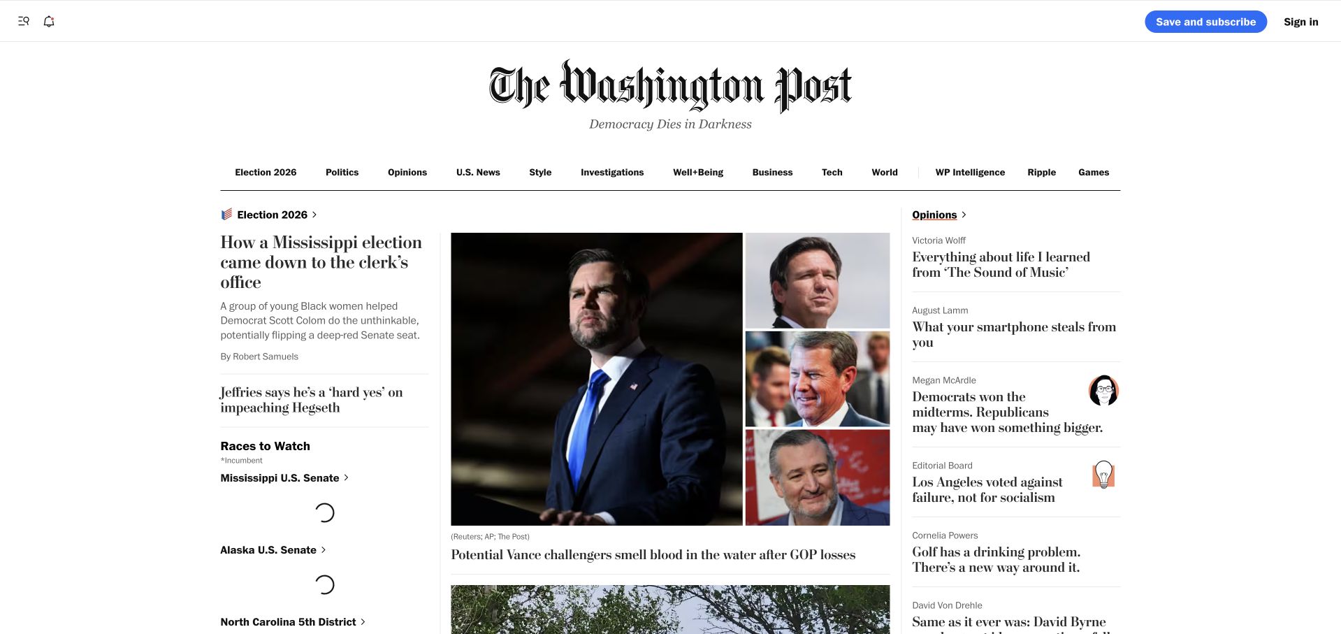
The Washington Post uses a large serif masthead and a compact section bar to establish its publication frame. Below that, the captured news layout divides attention between a lead photograph, headline groups and an opinion rail. Different column widths and text scales make the page feel edited rather than like a uniform feed. This is a useful reference for organizing many stories without pretending that every item has the same importance or serves the same reading intent.
What you can learn
Use grid proportions to express editorial priority, then reinforce that priority with headlines and labels. A narrow layout should preserve the intended reading order even when the desktop columns become a single sequence.
Pros
The recognizable masthead and section navigation provide a stable frame around frequently changing news content.
Different story treatments distinguish the lead report from supporting coverage and opinion material.
Cons & considerations
Dense editorial screens require disciplined headline lengths to avoid accidental competition between adjacent stories.
Live modules and changing news content need robust fallback states when individual elements load later.
Platform source: The Washington Post — official Datadog association. The Foundation maintainers' undated Brands showcase explicitly links The Washington Post's public property. This supports a historical, vendor-documented Foundation association only. The pictured page is a separately dated design reference, not evidence that its present runtime uses Foundation or a particular version. Platform evidence is separate from the direct website screenshot and is not a complete current infrastructure audit.
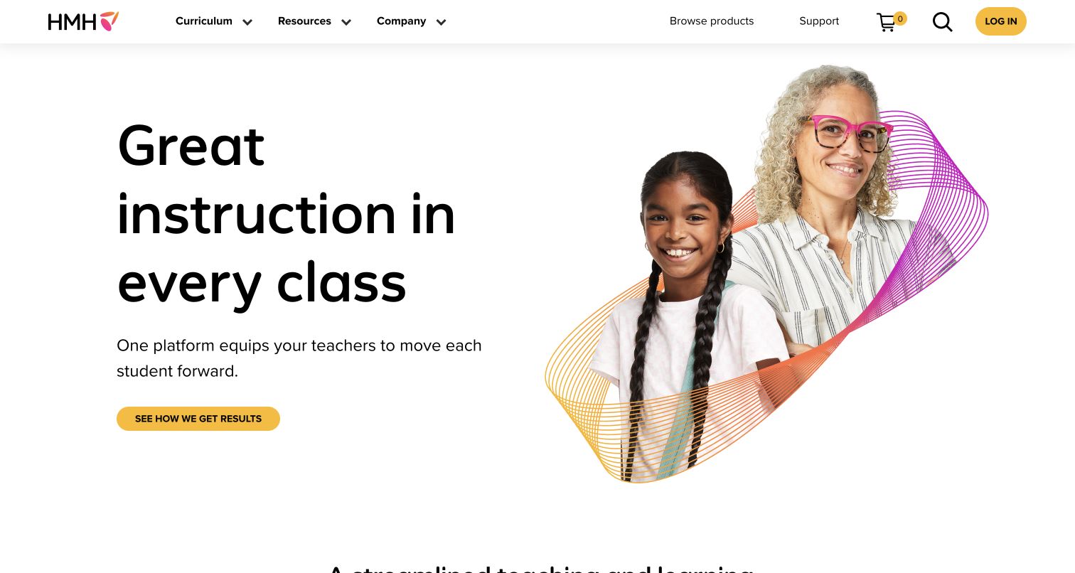
HMH pairs a large rounded headline with a photograph of a teacher and pupil. The text sits in a generous left-hand region, while colored ribbons add visual identity around the image rather than filling the page with separate decorative panels. A yellow action button stands out within the otherwise restrained composition. The captured opening is useful for examining how an education organization can introduce a complex offering without beginning with a dense inventory of products or institutional language.
What you can learn
Start with one understandable proposition and a human context, then provide clear routes into the larger offering. Keep decorative shapes subordinate to the reading order so the layout remains coherent when image and text stack vertically.
Pros
The teacher-and-pupil photograph gives the message an immediate educational context without a long introduction.
The yellow action button creates a distinct next step within a spacious and readable text region.
Cons & considerations
A broad opening promise needs specific supporting destinations to help different education audiences choose a path.
Decorative ribbons require careful responsive positioning so they do not compete with faces, text or controls.
Platform source: Craft’s official Created with Craft references. The Foundation maintainers' undated Brands showcase explicitly links HMH's public property. This supports a historical, vendor-documented Foundation association only. The pictured page is a separately dated design reference, not evidence that its present runtime uses Foundation or a particular version. Platform evidence is separate from the direct website screenshot and is not a complete current infrastructure audit.
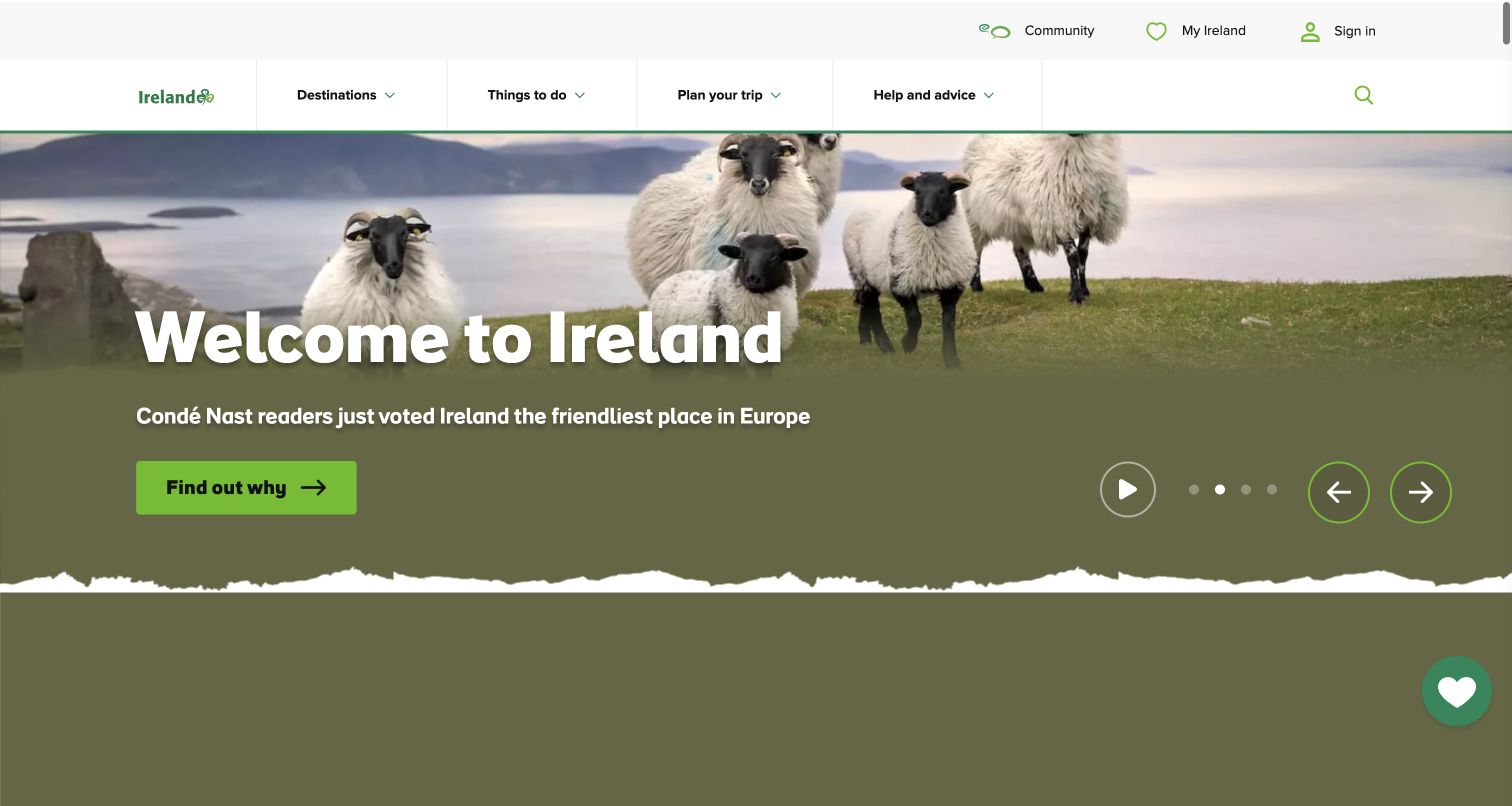
Tourism Ireland opens with a sweeping coastal scene and a prominent welcome message. The white and green header keeps the destination identity and navigation separate from the photograph, while a green action provides a clear invitation into the site. Sheep and cliffs give the image a specific sense of place rather than a generic travel backdrop. The captured composition is useful for studying how a destination page can communicate atmosphere while preserving a practical route toward further exploration.
What you can learn
Choose imagery that communicates a distinctive place, then give visitors a clear next step into useful planning content. Treat the image crop, headline position and action as a responsive composition rather than independent decorative pieces.
Pros
The coastal photograph gives the page a recognizable destination character before visitors read detailed copy.
The header and green action maintain an understandable navigation layer around the immersive hero.
Cons & considerations
An atmospheric welcome alone cannot answer practical questions about travel timing, routes or accessibility.
Carousel controls and changing imagery need consistent text placement so each slide remains equally understandable.
Platform source: Sitecore’s named customer case study. The Foundation maintainers' undated Brands showcase explicitly links Tourism Ireland's public property. This supports a historical, vendor-documented Foundation association only. The pictured page is a separately dated design reference, not evidence that its present runtime uses Foundation or a particular version. Platform evidence is separate from the direct website screenshot and is not a complete current infrastructure audit.
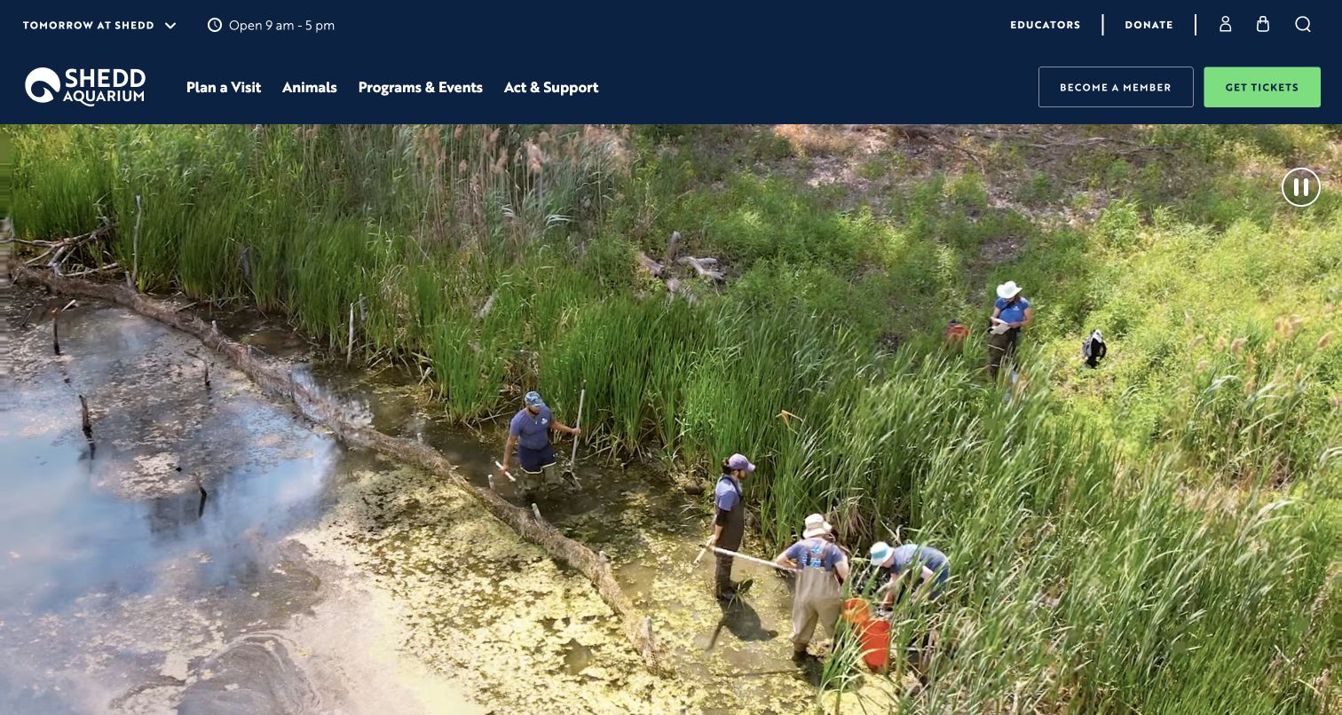
Shedd Aquarium places its logo and visitor navigation in a dark header with opening hours and a conspicuous ticket action. Below, the conservation-led moving image gives the institution a broader story than ticket sales alone. The visible pause control helps make that motion an explicit part of the experience. The captured view is useful for balancing an attraction's public mission with the immediate practical needs of a visitor deciding when to come and how to enter.
What you can learn
Make operational details easy to find before asking visitors to engage with a longer institutional story. A responsive header should preserve hours and tickets as meaningful tasks, while the hero remains understandable in a paused state.
Pros
Hours and the contrasting ticket control keep essential visit planning visible above the main story.
Conservation imagery connects the attraction experience with the aquarium's wider public purpose.
Cons & considerations
A moving background needs an effective static alternative and careful handling of text contrast.
Dense visitor navigation can become cumbersome unless the smaller-screen arrangement keeps the key tasks prominent.
Visible tech stack
Earlier / documented evidence
Foundation
Platform source: WordPress.org Showcase. The Foundation maintainers' undated Brands showcase explicitly links Shedd Aquarium's public property. This supports a historical, vendor-documented Foundation association only. The pictured page is a separately dated design reference, not evidence that its present runtime uses Foundation or a particular version. Platform evidence is separate from the direct website screenshot and is not a complete current infrastructure audit.
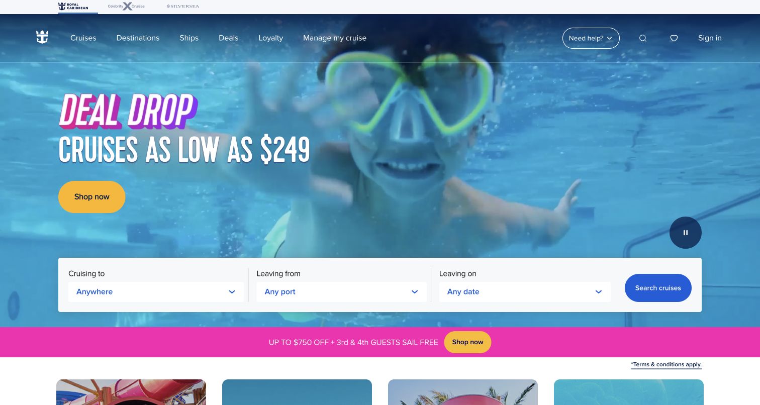
Royal Caribbean combines a colorful poolside campaign with a compact trip-search module. Three fields and a blue search button give visitors a concrete task within the photographic opening, while a separate yellow promotional action serves the featured offer. The page therefore supports both inspiration and a more deliberate search for a trip. The captured layout is useful for studying how transactional controls can sit inside a strong travel image without becoming indistinguishable from the campaign artwork.
What you can learn
Give the search module a stable visual container and clear labels, then let the surrounding campaign change independently. On smaller screens, preserve the order of the search decisions rather than squeezing the desktop row into narrow columns.
Pros
The search fields turn a visually rich opening into an actionable starting point for planning.
Distinct colors separate the search action from the campaign's secondary promotional destination.
Cons & considerations
Multiple bright accents can compete when campaign messaging and search controls receive equal prominence.
Travel searches need clear handling of unavailable choices and incomplete inputs beyond the initial screenshot.
Platform source: WordPress.org Showcase. The Foundation maintainers' undated Brands showcase explicitly links Royal Caribbean's public property. This supports a historical, vendor-documented Foundation association only. The pictured page is a separately dated design reference, not evidence that its present runtime uses Foundation or a particular version. Platform evidence is separate from the direct website screenshot and is not a complete current infrastructure audit.
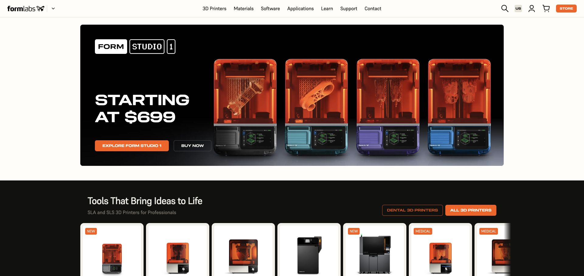
Formlabs presents a dark product hero with four printer views, a starting-price message and separate exploration and purchase actions. Below it, a row of product cards introduces the broader range with concise labels and consistent imagery. The navigation separates printers, materials, software and applications, giving technical visitors several ways to approach the same catalog. The clean capture shows how detailed equipment can be introduced through a straightforward visual hierarchy before the visitor reaches specifications or specialist resources.
What you can learn
Separate product exploration from immediate purchase, particularly when buyers need to understand applications and materials first. Use a consistent card structure so differences between equipment models remain easy to compare as the grid adapts.
Pros
The hero connects the product's physical appearance with a clearly differentiated pair of next steps.
Navigation by equipment, materials and applications supports several realistic ways of researching a technical purchase.
Cons & considerations
A starting-price headline needs accessible detail about configurations and what the advertised price includes.
Dense technical catalogs require sustained editorial work to keep product distinctions and supporting resources consistent.
Platform source: WordPress.org Showcase. The Foundation maintainers' undated Brands showcase explicitly links Formlabs's public property. This supports a historical, vendor-documented Foundation association only. The pictured page is a separately dated design reference, not evidence that its present runtime uses Foundation or a particular version. Platform evidence is separate from the direct website screenshot and is not a complete current infrastructure audit.
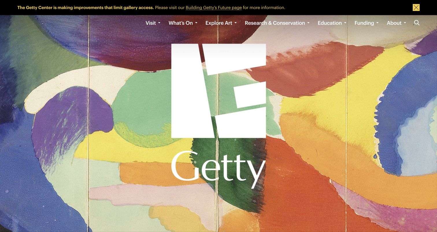
Getty lets a large artwork fill the opening canvas, with a prominent white identity and restrained navigation layered above it. A narrow visitor advisory occupies a separate top strip, keeping practical information distinct from the visual experience. The image carries much of the page's character without requiring a cluster of competing promotional cards. The captured view is useful for studying how a cultural institution can foreground its collection while retaining a recognizable and practical website frame.
What you can learn
Give collection imagery room to communicate, but reserve a dependable layer for navigation and visitor notices. Evaluate each artwork crop with the overlaid text so the interface does not depend on one unusually forgiving image.
Pros
The artwork establishes a specific cultural identity rather than relying on a generic institutional photograph.
A separate advisory strip keeps immediate visitor information outside the primary visual composition.
Cons & considerations
White text over changing artwork requires careful contrast review for every featured image.
A highly visual opening needs clear follow-on routes for visit planning, research and collection exploration.
Visible tech stack
Earlier / documented evidence
Foundation
Platform source: WordPress.org Showcase. The Foundation maintainers' undated Brands showcase explicitly links Getty's public property. This supports a historical, vendor-documented Foundation association only. The pictured page is a separately dated design reference, not evidence that its present runtime uses Foundation or a particular version. Platform evidence is separate from the direct website screenshot and is not a complete current infrastructure audit.
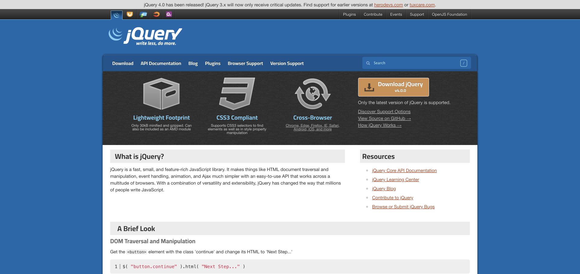
jQuery uses a blue identity bar, a compact documentation menu and a three-part feature area to introduce the library. A contrasting download block sits alongside the introductory content, while the white lower section provides room for more detailed explanations and resource links. The captured page is a useful reference for a developer project that needs to serve first-time visitors and returning users at once. Its visual hierarchy is based on practical destinations rather than a large marketing photograph.
What you can learn
Put the most common developer tasks near the introduction, then give explanatory content a predictable structure below. A responsive grid should preserve the priority of installation, documentation and learning routes as sidebars move into the main flow.
Pros
The contrasting download area gives a clear destination to visitors who already know what they need.
Compact documentation navigation and resource links support returning users without requiring a long introductory journey.
Cons & considerations
Several adjacent resource routes can be difficult for beginners to distinguish without precise labels.
A documentation-heavy opening needs consistent maintenance so examples, installation guidance and supporting links stay aligned.
Platform source: Official technology-specific customer or workload source. The Foundation maintainers' undated Brands showcase explicitly links jQuery's public property. This supports a historical, vendor-documented Foundation association only. The pictured page is a separately dated design reference, not evidence that its present runtime uses Foundation or a particular version. Platform evidence is separate from the direct website screenshot and is not a complete current infrastructure audit.
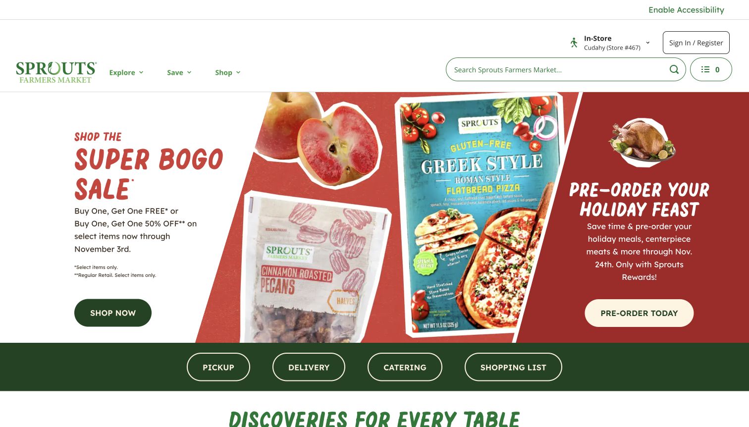
Sprouts combines local-store context and search with a modular arrangement of food promotions. The captured opening uses several campaign panels rather than one uninterrupted hero, while pickup, delivery and catering routes remain visible as practical choices. The layout acknowledges that grocery visitors may arrive with very different intentions: browsing an offer, finding a product or choosing how to shop. Its structure is useful for studying how a retail homepage can connect campaign content with repeat operational tasks.
What you can learn
Establish the shopping context before presenting promotional choices. Use a modular grid to organize campaigns, but keep service routes stable so returning visitors can reach pickup, delivery or catering without rediscovering the interface.
Pros
Local-store context makes the retail experience feel connected to a specific shopping destination.
Distinct service routes offer practical alternatives to browsing the promotional panels.
Cons & considerations
Several simultaneous promotions need clear priority so no panel becomes an indistinct block of advertising.
Local availability and service information require dependable updates beyond the national campaign artwork.
Platform source: WordPress.org Showcase. The Foundation maintainers' undated Brands showcase explicitly links Sprouts Farmers Market's public property. This supports a historical, vendor-documented Foundation association only. The pictured page is a separately dated design reference, not evidence that its present runtime uses Foundation or a particular version. Platform evidence is separate from the direct website screenshot and is not a complete current infrastructure audit.
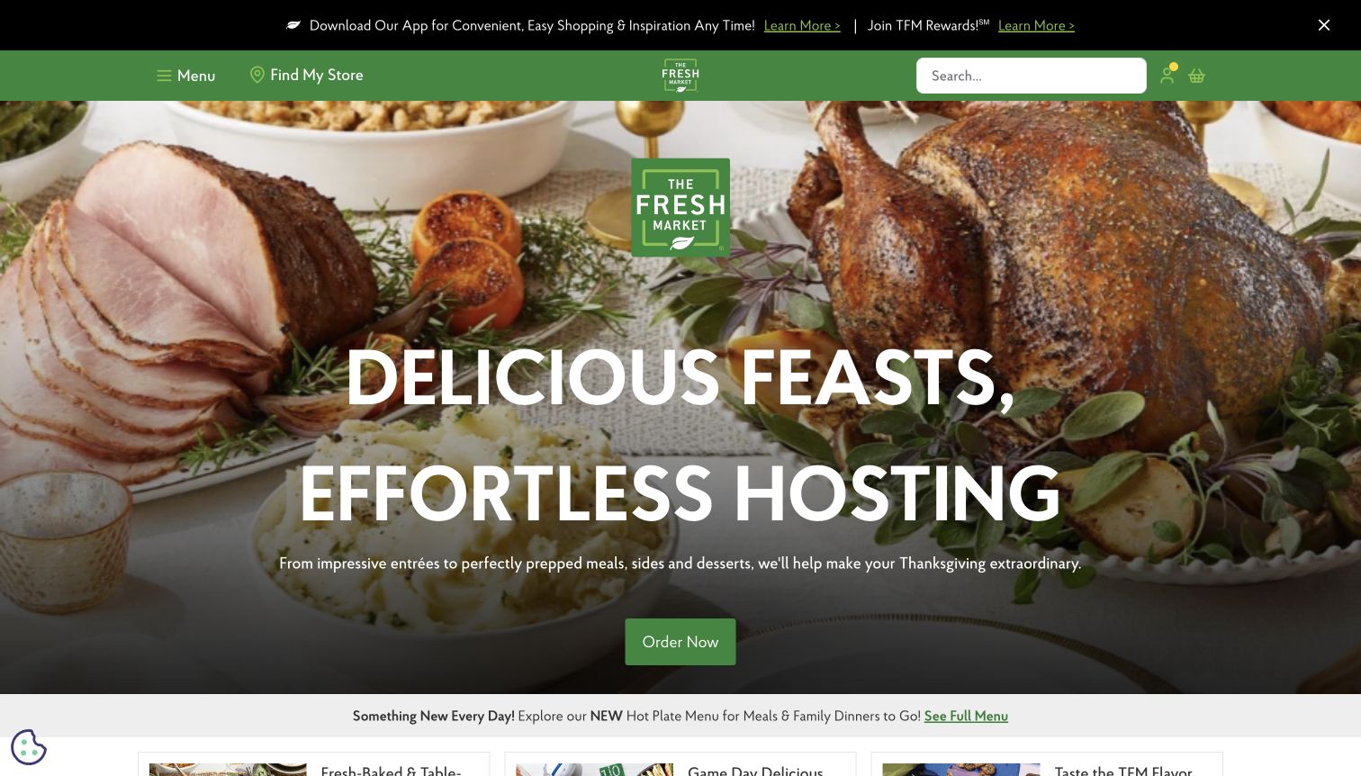
The Fresh Market frames a large seasonal food photograph with a dark green header and a prominent search field. A white headline and green ordering action sit over the feast, giving the image a practical destination rather than leaving it as decoration. A small application strip adds another service layer without replacing the main shopping message. The captured composition is useful for examining how food photography can support a specific occasion while the broader store navigation remains available.
What you can learn
Connect a seasonal food story to a clearly named action and keep essential shopping controls outside the photograph. Plan readable text positions around real image crops, especially when the same campaign must work on smaller screens.
Pros
The food arrangement communicates the occasion quickly and gives the ordering invitation a concrete context.
Search and the green navigation frame remain distinct from the detailed photographic background.
Cons & considerations
Seasonal ordering content needs accurate dates, availability and destination updates throughout the campaign.
White text over a complex food image requires careful positioning and a reliable contrast treatment.
Platform source: WordPress.org Showcase. The Foundation maintainers' undated Brands showcase explicitly links The Fresh Market's public property. This supports a historical, vendor-documented Foundation association only. The pictured page is a separately dated design reference, not evidence that its present runtime uses Foundation or a particular version. Platform evidence is separate from the direct website screenshot and is not a complete current infrastructure audit.
Kegan has 15+ years of experience working with small businesses, Fortune 500 companies, and everything in between. No development job is too big or too small: he brings the same hands-on attention to a focused improvement, a complete website, or a custom application.
For Foundation projects, he can help with responsive interfaces, reusable components, custom functionality, API connections, and performance-minded implementation. He works directly with clients on scope, design, implementation, testing, and handover, with an emphasis on clear communication and a system that remains practical to maintain after launch.
Show 3 other Foundation developersHide other Foundation developers
For a new public site, begin with the recurring page types and the handful of interactions they genuinely need. Establish typography, spacing, actions and content groupings before assembling a large component inventory. A compact system is easier for editors and developers to understand. Make the important states explicit: long text, absent imagery, empty results and a failed request should feel like supported cases, not exceptions discovered after launch.
Improve an existing Foundation site carefully
An existing site may use an older grid, custom Sass or plugins that have been adapted over time. Inspect the actual code and dependency versions before proposing a migration. Identify the templates and interactions that matter most, preserve useful public routes and document the behavior that must survive. A current showcase photograph cannot tell you which Foundation version is installed or how much of a legacy project depends on it.
Foundation is a frontend framework, so choosing it does not establish a content management system, commerce engine or application backend. Define those responsibilities separately. A catalog needs reliable product data; a publication needs an editorial workflow; a travel search needs dependable availability and clear error states. The visible interface should make those systems understandable without pretending that one CSS framework supplies their business rules or operating safeguards.
From references to requirements
Plan the content, behavior and maintenance together
Inventory real tasks and content
List the audiences, their main questions and the pages that answer them. Collect representative content before finalizing the layout: an unusually long title, a complicated product name, a time-sensitive notice and an image with limited crop options often reveal useful constraints. Assign an owner to each recurring content type. Agree on what must be present, what can be omitted and what should happen when information expires.
Specify responsive and interaction states
Describe how navigation, cards and sidebars change as available space narrows. Keep the intended reading order clear and avoid relying on a desktop arrangement to explain relationships. For interactive elements, document focus behavior, labels, loading states and recovery paths. Include ordinary overlays and privacy controls in this planning so they do not obscure the main experience or become an afterthought handled differently on each page.
Keep implementation evidence and design references separate
Use screenshots to discuss visible decisions and project files to establish implementation facts. A historical vendor showcase can support a documented association, but it cannot identify the current runtime of a redesigned property. Record which source supports each claim and preserve its date. For your own project, maintain a dependency inventory and a repeatable release check so future contributors can distinguish current behavior from an old example or an outdated assumption.
A useful handover demonstration
Ask the actual team to carry out its routine job: publish a realistic update, correct a mistake, preview a narrow screen, and identify who owns an integration failure. For a library or frontend framework, also ask who maintains the content source and deployment. A polished screenshot does not answer those operational questions.
Beyond the screenshot
A practical Foundation website planning checklist
Write down the primary visitor tasks before selecting components or column layouts.
Use real headings, images and product labels when designing responsive templates.
Keep the reading order meaningful when desktop columns stack into one sequence.
Give links, buttons and form controls clear names and predictable behavior.
Provide usable empty, loading, unavailable and error states for important interactions.
Check keyboard access, focus visibility and text contrast in the completed interface.
Keep promotional overlays and privacy controls dismissible through ordinary accessible controls.
Confirm actual dependency versions from the project rather than an external showcase.
Separate frontend choices from content, commerce and account-system responsibilities.
Preserve useful URLs and assign ongoing owners for content and dependency maintenance.
Test with real content, a keyboard, a small screen, slow or failed requests, and the people who will maintain the system. These are planning checks, not an accessibility, security, performance, or search-ranking certification.
Sources & editorial method
How this Foundation collection was reviewed
This collection contains twenty distinct public website properties linked by the official Foundation Brands showcase, reviewed for the November 11, 2026 Pacific evening batch. The showcase is undated and supports historical vendor-documented associations only. Seventeen genuine earlier screenshots were inspected and retained with their original capture dates. Crate & Barrel, Kmart Australia and Formlabs received new direct captures on November 12 UTC, still November 11 in America/Los_Angeles. Normal site controls dismissed promotional or consent overlays where needed; no page content was altered. Pluralsight was omitted because an unobstructed capture could not be obtained through the available supported controls. Nineteen existing broad audits retain their dates; Formlabs received a separate bounded audit. Original reviews analyze visible design choices without attributing those choices to a current Foundation runtime. No accounts, purchases, forms or private applications were tested. This is not a complete current backend inventory.
Every image is an unmodified capture from the actual website, with its source and capture date. Some captures are reused from our shared catalog; their dates remain the original capture dates. None comes from a vendor gallery or a generated reconstruction. Moving imagery and live content can change.
Technology attribution uses public page assets or metadata, official platform documentation, or a cited first-party project case study. Documentary and framework-relationship evidence is identified where used; it is not a complete current backend inventory. A CMS image CDN alone does not establish a full CMS deployment. A library’s presence does not prove which individual controls use it, and a platform label does not establish AI authorship.
The composition notes, lessons, pros and tradeoffs are original editorial observations. We have not measured conversion, traffic, security, performance or accessibility conformance. Website owners retain their brands and imagery; these examples are not our client portfolio. Written, Edited and Curated are independent records, not dates advanced by a build. See our editorial standards or suggest a correction.
Questions worth asking
Foundation website development FAQs
Do these websites currently run Foundation?
That is not established for every pictured page. The official maintainers’ showcase documents a historical association with each exact public property. The screenshots are separately dated design references, and the guide does not treat them as proof of a current runtime or framework version.
Does Foundation determine the visual style of a website?
No single visual style follows from the association. The examples include retail, travel, publishing and cultural institutions with very different imagery and content structures. A project still needs its own typography, hierarchy, navigation decisions and content strategy.
Is Foundation a content management system?
Foundation for Sites is a frontend framework. It does not by itself establish the system used to publish content, manage products or process accounts. Those responsibilities require separate project decisions and appropriately scoped implementation evidence.
Does using Foundation guarantee accessibility?
No. The completed website still needs appropriate structure, labels, contrast, keyboard behavior and usable content. Framework guidance and component features can help, but they do not certify a site or replace checking its actual integrated experience.
Why keep older screenshot and audit dates?
They record when the page was genuinely captured or its public technology signals were observed. A new editorial comparison does not make that evidence new. Preserving dates helps readers distinguish a design reference, a current observation and an older documentary association.
Can the broad audit confirm every technology on a website?
No. It samples one public source page and a bounded set of linked assets while respecting access and robots restrictions. It does not inspect private systems or establish a complete backend inventory. Unobserved technologies remain unknown rather than being guessed.
Borrow the clear navigation, useful content groupings and practical actions in these examples. Choose and maintain Foundation from your own project evidence, and keep historical showcase associations distinct from claims about today’s implementation.