Best Bedding Brand Websites of 2026 (29 Real-World Examples)
Turn a beautifully dressed bed into a clearly understood product choice.
Bedding brand website design should make colour, material, size and included pieces understandable without losing the tactile appeal of the product. The useful examples connect a distinctive bedroom image to a dependable catalogue, practical care information and a purchase that does not depend on guessing what comes in the box.
A customer can admire a layered bed and still be unsure whether the price covers a duvet insert, a cover or both. They may not know the depth of a fitted sheet or whether pillowcases match the dimensions they already own. Bedding websites work best when they treat these questions as part of the design problem rather than leaving them to a size-guide link after the customer has selected a colour.
Our scope is genuine own-brand bedding: sheets, pillowcases, duvet products, quilts, blankets and related bed textiles. Some businesses also sell mattresses, clothing, bath products or a broader home range. We qualify their actual bedding offer rather than presenting unrelated decor retailers as specialist brands. A mattress-led or gift-focused homepage can be included when the review clearly explains what is visible and where the bedding journey begins.
This is a collection of website-design observations, not an independent textile, environmental or sleep-quality test. We have not washed the products, verified fibre origin, assessed certifications or evaluated health claims. A photograph cannot establish how a fabric feels. Genuine direct captures retain their own dates, including suitable originals from earlier research, and the reviews describe their actual frames rather than claiming every current campaign is unchanged.
Before the examples
What makes good bedding brand website design in 2026?
Explain the product before asking someone to compare the price
Name the item precisely and list the pieces included. A sheet set, duvet-cover set and complete bed bundle are not interchangeable offers. Show which sizes and quantities the selected price represents, and distinguish inserts from covers. A beautifully layered room image is helpful only when it does not leave a customer assuming that everything pictured will arrive together. Keep those practical distinctions visible through colour changes and bundle-building steps.
Make materials and sizes comparable without oversimplifying them
Use consistent fields for approved fibre composition, construction, dimensions and care. Explain the brand’s vocabulary in ordinary language rather than assuming customers understand every weave or finish. Thread count, fibre labels and marketing terms should not become universal quality scores. For international shopping, identify the market and show actual measurements because familiar size names can refer to different products in different regions.
Use photography to reveal the textile, not conceal the offer
Combine a complete bed view with useful surface details, labelled colours and images that show the individual product. A texture crop can introduce the fabric, while a bedroom scene shows how it layers. Neither replaces dimensions or an included-piece list. If the brand offers swatches, make that route clear. Avoid implying that a screen image can guarantee colour matching or reproduce the tactile qualities of the actual material.
The collection · 29 examples
29 bedding brand websites worth studying
The29 examples below compare focused linen brands, broader bedding collections and sleep-product businesses with real bed-textile offers. Look at how they connect a particular campaign image to shopping categories and practical product information. The list is editorial inspiration, not a measured ranking of fabric quality, comfort or value.
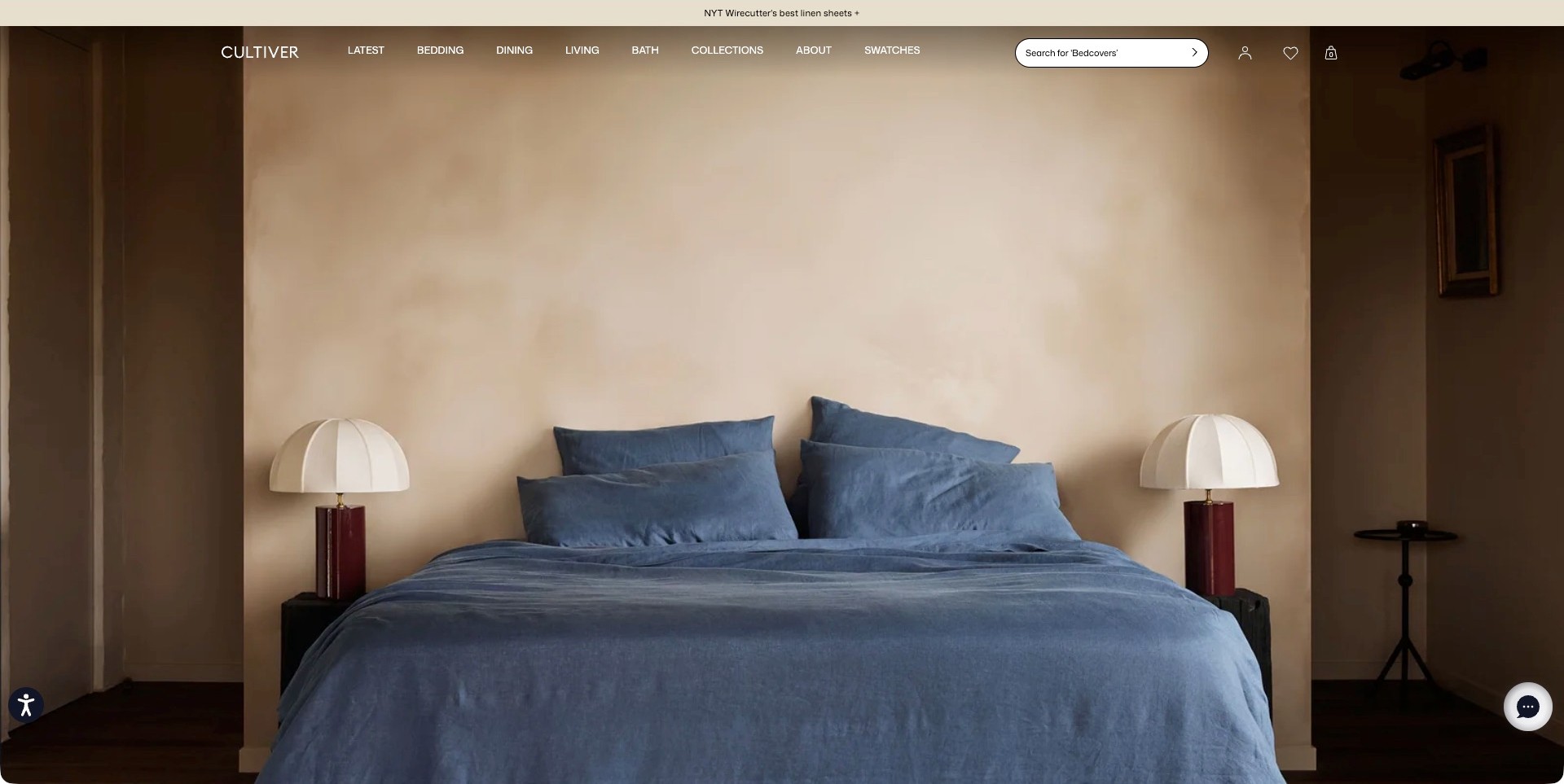
CULTIVER’s observed frame gives blue bedlinen and pillows a prominent place between two white lamps, leaving a neutral wall above. Transparent navigation names bedding alongside other home categories, and a swatch route and search field remain visible. There is no central product caption or shopping button in this particular frame. The composition is useful for studying a calmer bedding introduction, while also showing why product identification cannot depend on atmosphere alone.
What you can learn
Let a styled bed establish colour and texture, then make the actual collection, included pieces and sizes easy to identify. A visible swatch route can support a considered material decision when genuinely offered, but the website still needs precise product information beyond the photograph.
Pros
A coherent blue-bedlinen composition gives the main product category a clear visual identity without several competing promotional panels.
Bedding, search and swatches are distinct visible routes rather than being hidden behind a general shop action.
Cons & considerations
Without a product caption in the observed frame, visitors need an obvious way to identify the exact colour and collection shown.
A photograph cannot establish tactile quality, fibre origin, certification or how a material will feel to a particular customer.
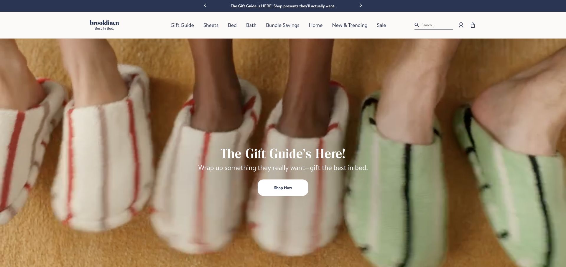
Brooklinen’s retained opening shows feet and slippers in a gift-focused campaign, rather than a neatly dressed bed. The central shopping action is supported by a header separating sheets, bed and bath. For a bedding brand, this demonstrates how a seasonal story can expand beyond its core product without making the catalogue depend on the hero photograph. The image does not establish sheet texture, composition or a complete bedding bundle.
What you can learn
Keep core bedding destinations clear when a campaign features gifts or adjacent categories. Once a visitor enters sheets or duvet covers, use labelled products, sizes and included pieces to move from brand mood to a genuinely comparable choice rather than relying on a general comfort message.
Pros
Distinct bedding categories give a direct route past a gift campaign for visitors who already know what they need.
The single campaign image and central action create a coherent seasonal introduction instead of a collage of disconnected offers.
Cons & considerations
A slippers photograph cannot answer questions about bedlinen material, mattress depth or which pieces a sheet set contains.
If campaigns promote bundles or gifts, clarify the included items and size choices before a customer compares the price.
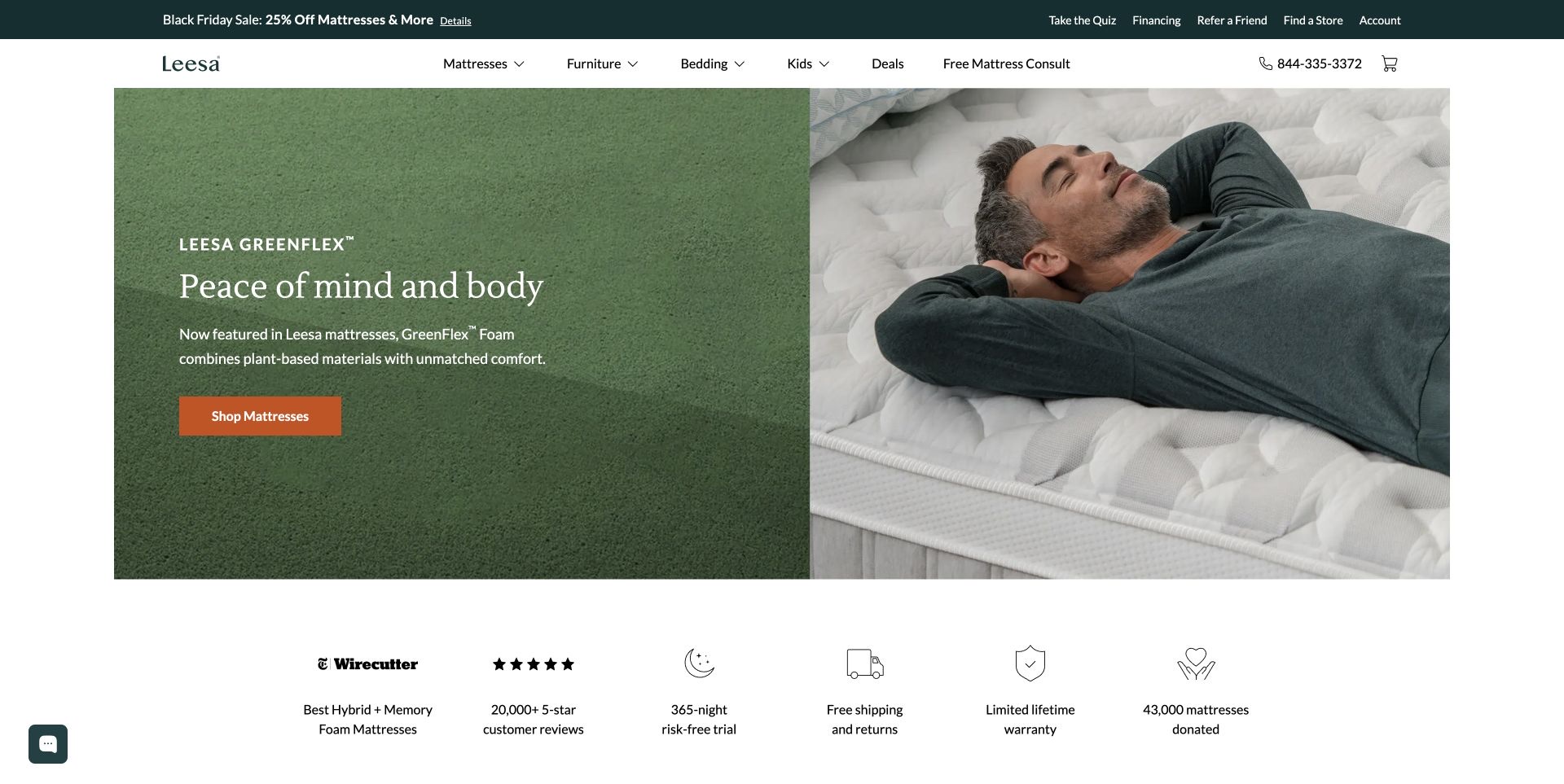
Leesa’s retained frame pairs a green material-explanation panel with a person lying on a bed and an orange mattress-shopping action. Bedding is named separately in the navigation, and the current official catalogue lists sheet and duvet-cover sets as well as pillows. That establishes a real bedding offer without pretending that the observed hero is focused on bedlinen. The displayed comfort and material language remains the company’s marketing, not an independently tested sleep outcome.
What you can learn
When mattresses lead the brand, give bedlinen its own usable catalogue route and product details. Explain sheet dimensions, included pieces and compatibility without assuming that a customer buying bedding also needs a mattress or that a general sleep message can replace practical textile information.
Pros
A distinct bedding destination prevents the broader product range from disappearing beneath the main mattress campaign.
The split layout separates explanatory copy from the photographed bed context instead of stacking every message over one image.
Cons & considerations
A mattress-led hero may under-explain sheets and duvet covers unless their destination has a clear, product-specific introduction.
Keep material and comfort claims appropriately scoped, and do not imply that a styled bed demonstrates health or sleep benefits.
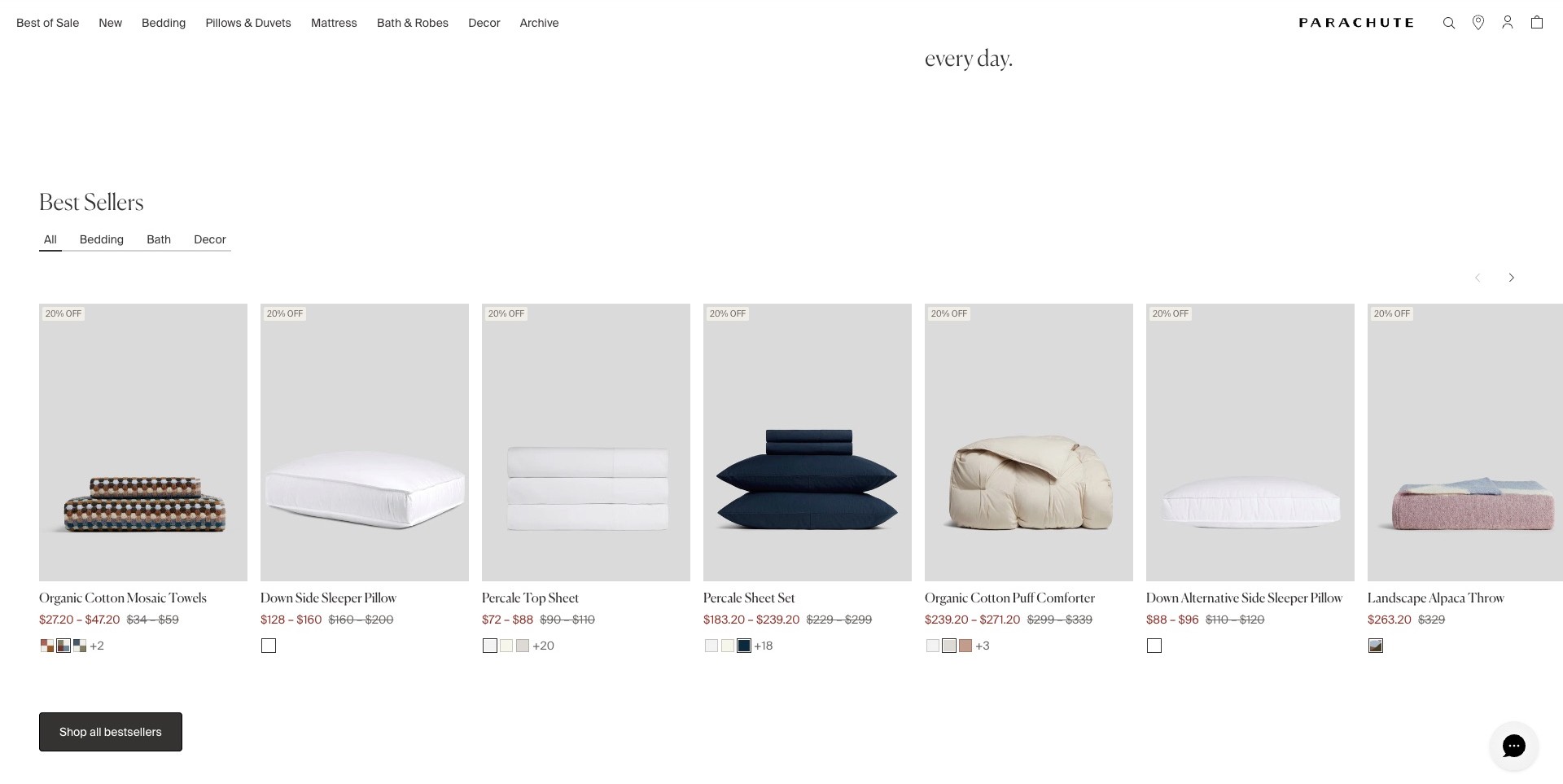
The accepted Parachute view shows a scrolled best-sellers section, not its opening campaign. Cut-out product photographs sit on consistent grey backgrounds, covering pillows, sheets, a comforter, towels and a throw. Names, price ranges and colour swatches appear directly beneath each item, with simple tabs for bedding, bath and decor. A restrained header keeps bedding and pillow categories visible. The useful pattern is the close relationship between the product image and its identifying information: visitors do not have to interpret a styled bedroom to discover the products.
What you can learn
Use comparable cards when people need to distinguish sheets, inserts and finished sets. Keep the item name, available choices and price context close to its image. Product rows should lead to clear size, set-content and care information rather than asking a small swatch to carry the whole decision.
Pros
Consistent image backgrounds make different product forms easier to scan together.
Names and swatches remain attached to the correct item rather than a separate room caption.
Cons & considerations
A broad best-sellers row can mix items that answer very different bedding needs.
Price ranges and small swatches need an explicit explanation of size and variant differences after selection.
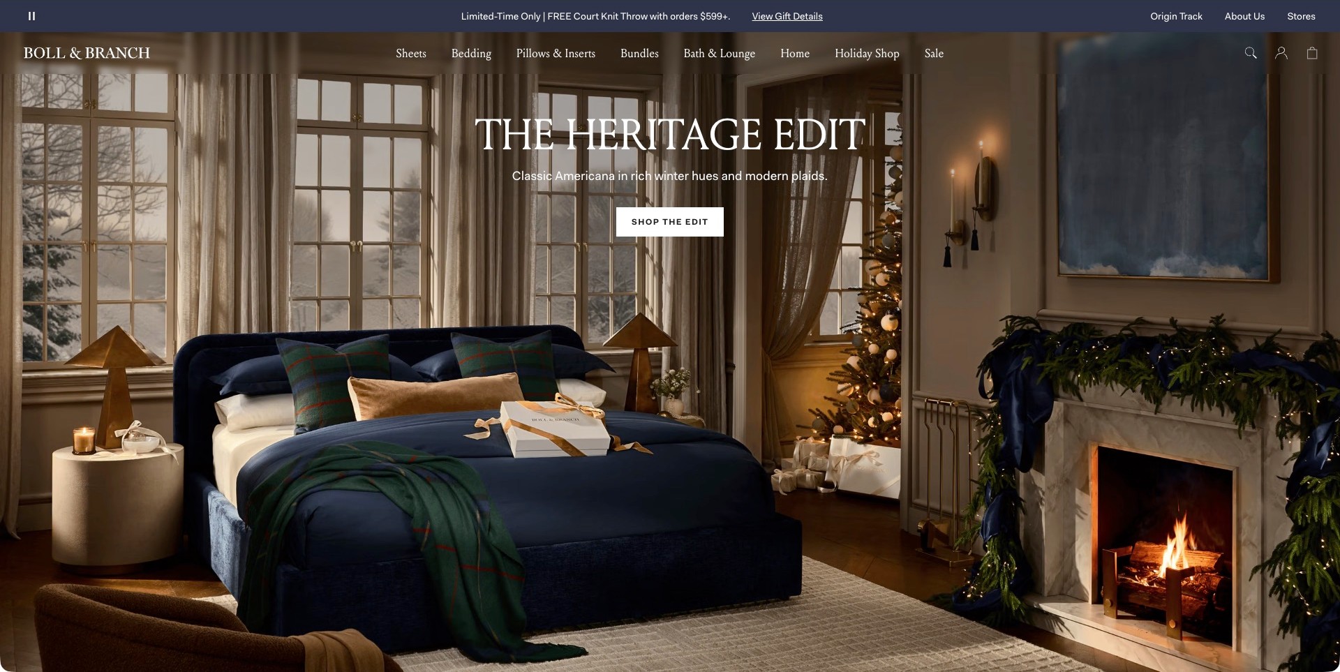
Boll & Branch’s observed opening centres a navy bed with checked pillows and a coordinated throw in a festive room. The named edit and its shopping action sit over the upper part of the photograph, leaving much of the bed visible. Sheets, bedding, pillows, inserts and bundles remain distinct navigation choices. The useful brand-store pattern is an editorial room that introduces a recognisable palette while the header still acknowledges the different components a customer may need to replace or combine.
What you can learn
Make a styled edit easy to unpack. The room can introduce combinations, but the next screen should identify which items belong to the bed, which are decorative props and what a bundle includes. Keep separate component routes available for visitors who already know the sheet or insert they need.
Pros
A coordinated room shows how several colours and patterns can work together.
Sheets, inserts and bundles have separate labels instead of one vague collection destination.
Cons & considerations
Seasonal accessories can compete with the bedding as the main subject.
A styled photograph cannot establish fabric composition, certification or how a product will feel after washing.
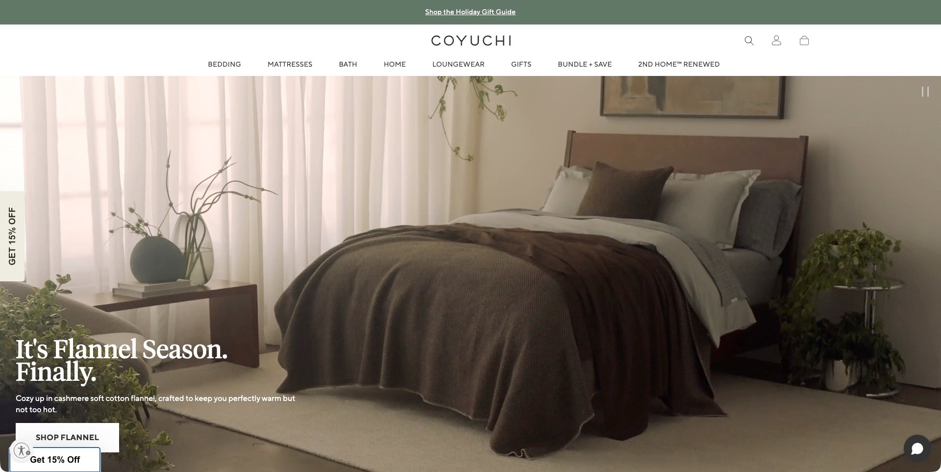
Coyuchi’s captured homepage shows a neutral bedroom with a brown cover layered over pale bedding. The lower-left caption identifies the featured flannel collection and provides a direct shopping action. The white header separates bedding, mattresses, bath, home and other categories, while the room image supplies a relatively quiet backdrop. The useful pattern is the move from a broad lifestyle mood to a named fabric category, so visitors have a more specific starting point than simply shopping everything in an attractive room.
What you can learn
Use the campaign to explain which collection someone is entering, then make the practical differences explicit. Material descriptions, sizes, care instructions and set contents should support the visual promise. Treat warmth, softness and environmental statements as claims requiring appropriate detail rather than conclusions that follow from a cosy photograph.
Pros
The campaign names a specific bedding category rather than relying entirely on mood.
A stable white header keeps ordinary catalogue navigation separate from the image.
Cons & considerations
Lower-positioned copy and an image-led opening need careful small-screen cropping.
Several categories and promotional controls can distract from the single featured fabric story if expanded.
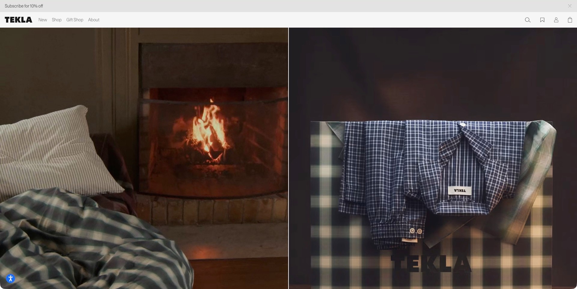
Tekla’s actual opening pairs rumpled checked bedding beside a fireplace with folded checked clothing on a graphic box. The two large photographs occupy almost the entire page beneath a sparse header. New, shop, gifts and company information provide the main textual routes. The useful pattern is a coherent textile identity expressed through two different settings, rather than a dense arrangement of discount badges and product cards. This particular frame mixes bedlinen and clothing; it should not be described as a complete bedroom or as a detailed bedding specification.
What you can learn
A spare editorial entrance needs a deliberate next step. Let the photographs establish pattern and colour, but make bedding categories, size choices and individual product names easy to reach. Keep important descriptions available as real text rather than expecting a viewer to identify a fabric or garment from the image alone.
Pros
The split layout gives two textile stories similar visual importance.
A minimal header lets the checked patterns and restrained palette carry the identity.
Cons & considerations
Sparse labels make the intended destination of each image less explicit in this frame.
Editorial fabric photographs cannot replace clear fibre, care and set-content information.
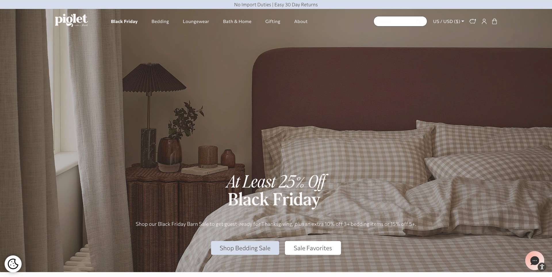
Piglet in Bed’s observed US storefront shows pale checked bedding against a burgundy upholstered headboard. A wicker bedside cabinet and muted room palette support the central bed, while seasonal copy and two shopping actions sit near the bottom. The header includes bedding, loungewear, bath, gifting and a visible regional currency choice. The useful pattern is a relatively simple bedroom composition that makes the bedlinen’s pattern legible while preserving more than one way into the current range.
What you can learn
Use the room to introduce a combination, then label the next choices precisely. A bedding-wide offer and a narrower favourite selection should lead to distinguishable destinations. Regional currency and shipping information need to remain understandable beyond the campaign, especially when the same brand serves several markets with different practical conditions.
Pros
The checked fabric remains visible rather than being hidden behind a large promotional panel.
Two labelled actions provide alternatives to following one undifferentiated sale link.
Cons & considerations
Promotion-heavy copy can overshadow what distinguishes the bedding itself.
A photograph and regional banner do not verify duties, delivery, discounts or return conditions for an individual order.
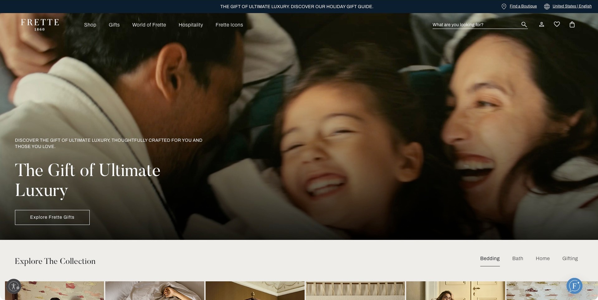
Frette’s accepted US homepage frame shows a close family scene from a gift campaign rather than a bedlinen photograph. A short message and gift action occupy the left, while shopping, brand information, hospitality and a boutique finder remain visible above. The beginning of a collection area below introduces bedding, bath, home and gifting tabs. The useful pattern is the transition from a broad emotional campaign to a more practical product structure, acknowledging that visitors may arrive for a gift, a home purchase or a hospitality project.
What you can learn
An emotional opening should hand visitors to concrete product information quickly. Keep bedding types, size systems and boutique details available outside the film, and provide a meaningful still alternative. A hospitality route should explain its different process instead of assuming it shares the same purchase journey as an individual gift.
Pros
The permanent boutique and hospitality routes recognise distinct visitor tasks.
Category tabs begin immediately below the campaign rather than leaving the film as the only route.
Cons & considerations
The pictured people do not show bedding texture or individual product features.
Large moving imagery requires readable text and a useful fallback when motion is paused or unavailable.
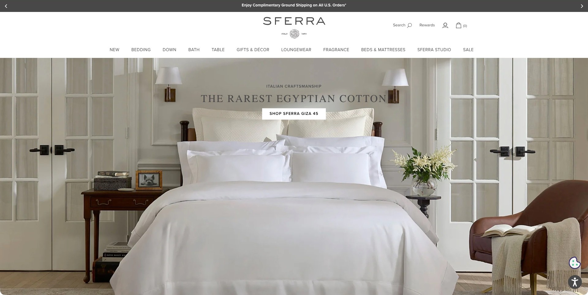
SFERRA’s observed opening places a white bed in a symmetrical room framed by doors and paired wall lights. A short collection message and a specific shopping action sit above the pillows. The broad white header separates bedding from down, bath, table and other home categories. The useful pattern is the restraint of the composition: the layered pillows and covers remain legible even though most of the palette is pale. The material-origin and rarity language belongs to the brand’s campaign and is not independently established by the photograph.
What you can learn
When a bedding collection relies on subtle differences, name the range clearly and give visitors a precise destination. Follow a restrained room image with fabric, construction and set-content information they can compare. Avoid expecting a white bedroom photograph to communicate weave, weight or feel without further explanation.
Pros
Symmetry gives the featured bed a clear focal position within the room.
A collection-specific button is more informative than a generic continuation label.
Cons & considerations
Subtle pale layers can become difficult to distinguish in smaller responsive crops.
Material and rarity claims require evidence beyond the campaign headline and styling.
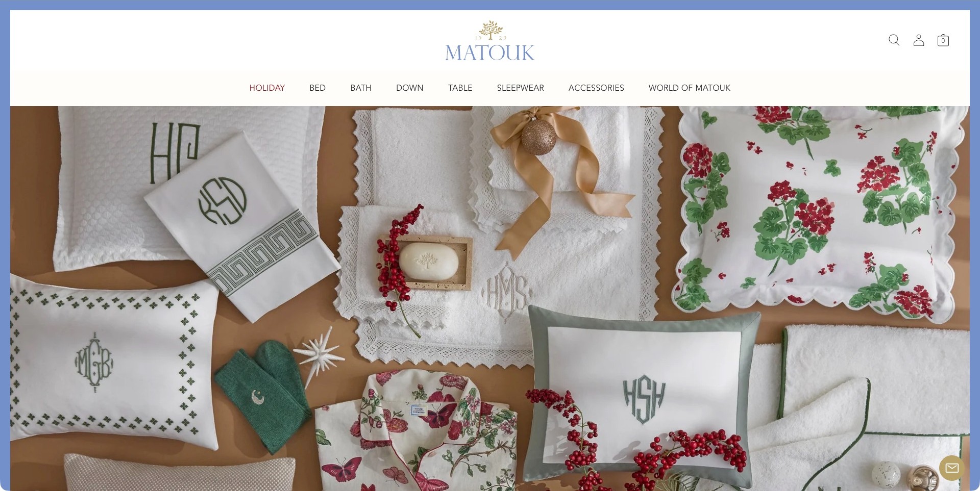
Matouk’s actual opening photograph arranges folded household textiles, embroidered cushions and gift details across a warm surface. Several monogram treatments and borders are visible, while a blue frame and a centred identity give the page a distinctive perimeter. Bed, bath, down, table and other categories sit in a plain header. There is no separate campaign headline or button visible within this particular frame. The useful design pattern is a close editorial composition that introduces decorative variety while leaving the visitor an ordinary category-based route into the range.
What you can learn
A detail-led campaign can make stitching and pattern visible, but it should not make the next step mysterious. Connect pictured items to identifiable categories and explain personalisation choices, set contents and care at product level. Keep decorative monograms separate from promises about the construction or origin of every item.
Pros
The overhead arrangement shows several border and monogram approaches in one coherent image.
A clear household-category menu supports visitors who are not browsing the campaign.
Cons & considerations
Mixed textiles can leave the relationship between pictured items and bedding unclear.
An image without an immediate caption needs an obvious continuation to the relevant products.
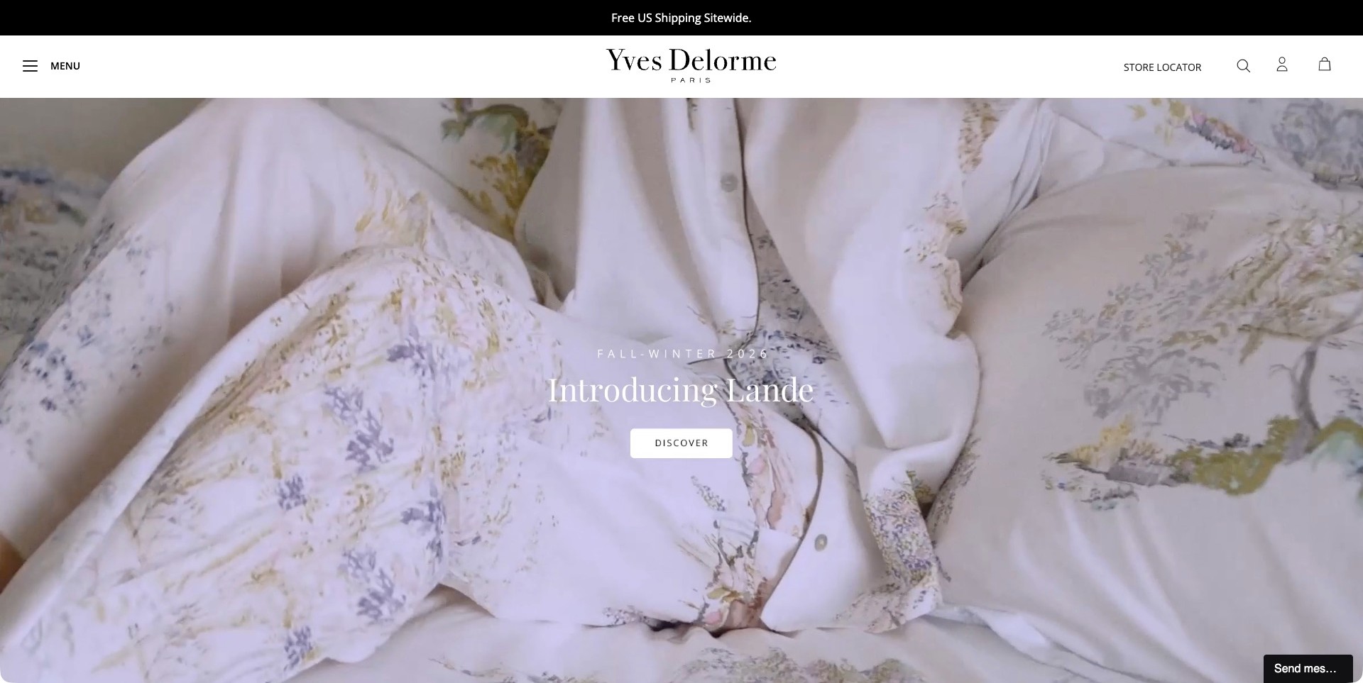
Yves Delorme’s captured US homepage fills the campaign with pale floral bedding rather than a complete room. The collection name and season sit in the centre above one discovery action. A sparse white header holds the identity, menu, store locator and utility controls. The useful pattern is the close relationship between the printed fabric and its named destination: the visitor can see the decorative character immediately without a long introductory paragraph competing with the pattern. The image describes the surface visually, not how the fabric will feel or perform.
What you can learn
Use a close print view to introduce visual character, then provide a full bed view and individual component information next. A collection destination should make matching pillowcases, covers and other pieces easy to identify. Preserve clear contrast for captions instead of assuming pale fabric always creates a readable background.
Pros
The close view makes the print more legible than a distant room photograph would.
The specific collection label gives the discovery action useful context.
Cons & considerations
A tight fabric crop leaves overall scale and the complete bed arrangement uncertain.
A minimal menu may require an extra step for visitors seeking a particular bedding component.
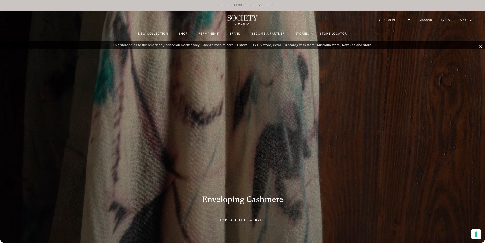
Society Limonta’s actual US-store frame promotes scarves, showing patterned fabric close to a wood surface. It is not a bedlinen photograph. The header separates new and permanent collections, shopping, brand information, stories and store discovery, while a regional strip identifies the market. The official catalogue separately establishes the brand’s bedding range. The useful lesson for a bedding-led business with other textile products is how an apparel campaign can occupy the main image without removing the more durable collection and location routes.
What you can learn
Let a seasonal story change without allowing it to define the whole product architecture. Keep permanent bedlinen and other textile categories accessible, then label campaign imagery honestly. If the opening features scarves, direct bedding shoppers to their own range instead of relying on them to infer it from the brand name.
Pros
Permanent-collection navigation provides a stable alternative to the current scarf campaign.
The close image makes pattern and colour prominent without adding several competing text blocks.
Cons & considerations
An apparel-led opening can obscure the bedding offer for a first-time visitor.
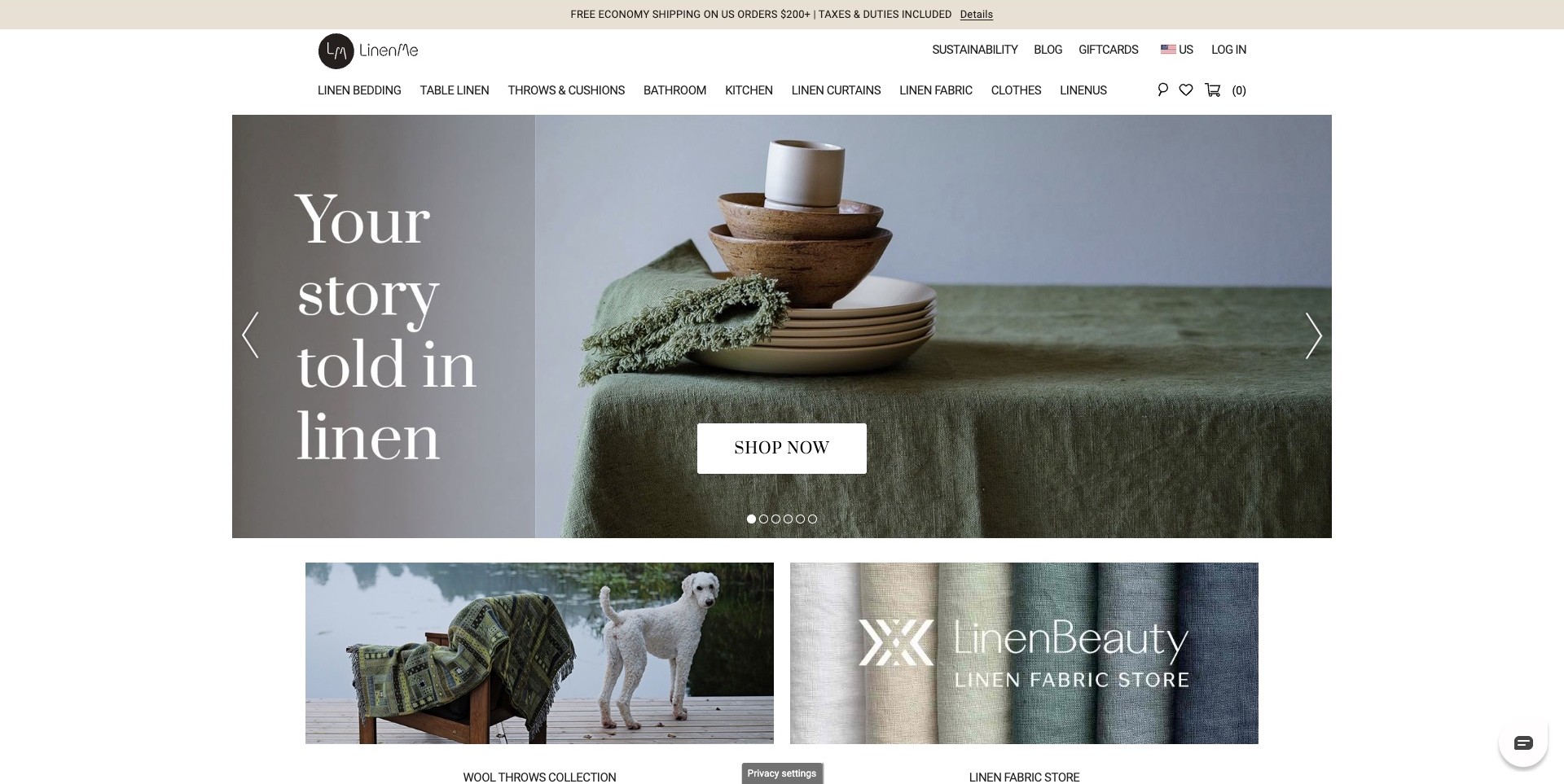
LinenMe’s observed US page shows green table linen and stacked crockery inside a contained campaign panel. Large text occupies a dedicated strip, with a shopping action over the image. The header explicitly distinguishes linen bedding, table linen, throws, bathroom, curtains, fabric and clothing. Two editorial cards begin beneath the panel. The pictured scene is table-led rather than a bedroom; the useful bedding-store lesson lies in the clear separation of uses, so a wider textile brand does not make visitors interpret every campaign before finding bedlinen.
What you can learn
Organise a material-led range by practical use as well as by collection. Bedding, curtains and fabric by the metre involve different questions. Give bedding its own destination with sizes, component labels and care details, while retaining editorial links for visitors exploring colours or coordinated products across the home.
Pros
Explicit use-based labels make the bedding route visible within a wider textile range.
A contained image panel leaves room for a clear header and additional editorial content.
Cons & considerations
A generic shopping action can leave the destination of a table-led campaign unclear.
Many adjacent category labels need careful prioritisation and readable treatment on smaller screens.
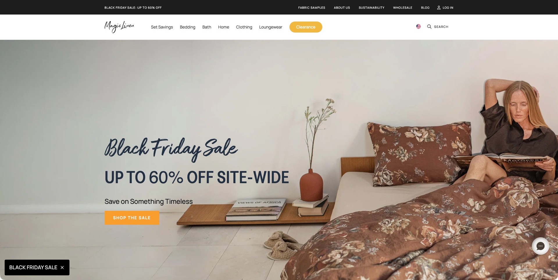
MagicLinen’s captured opening shows a person reading beside a floral pillow and duvet in a pared-back room. The promotion and its action sit to the left, while the bed occupies the other side of the frame. Bedding, set savings and other home categories remain in the header, with fabric samples placed in a separate utility row. The useful brand-store pattern is that practical sample route: the image introduces colour and styling, but the interface also acknowledges that a screen photograph is not the whole fabric-selection process.
What you can learn
Pair lifestyle photography with practical ways to investigate the actual product. Samples, clear set contents and individual component routes help visitors move beyond a room impression. Keep those destinations available outside a seasonal offer, and explain material and care information directly rather than treating a relaxed scene as proof of comfort.
Pros
The composition gives the bedding a visible role without covering it with promotional text.
A permanent fabric-sample route supports colour and material research beyond the photograph.
Cons & considerations
A large discount message may overshadow the product range and sample information.
Lighting, display settings and styling can change how a fabric colour appears online.
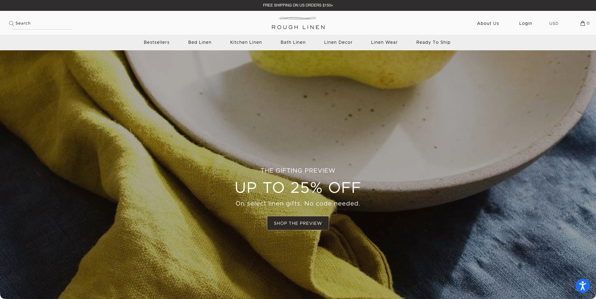
Rough Linen’s actual campaign shows yellow and blue textiles close to a ceramic plate. The gift-preview message and its action sit over the image, while a white header separates bed linen from kitchen, bath, decor and clothing. This is not a complete bed photograph, and the bedding offer is established through the brand’s own catalogue. The useful pattern is a material-led identity that can move between different household uses without changing the underlying product navigation or relying on a single room to explain the range.
What you can learn
Keep practical use categories explicit when one textile story covers several rooms. A close fabric image can introduce colour and texture visually, but bedding shoppers still need component names, size choices and clear care information. Connect a changing gift campaign to appropriate products without burying the permanent bedlinen destination.
Pros
The close composition makes colour relationships prominent without a crowded scene.
A clearly labelled bedlinen route separates sleeping products from other textile uses.
Cons & considerations
A table-oriented campaign may not communicate the bedding range to a new visitor.
Photographed texture cannot establish composition, softness or long-term laundering behaviour.
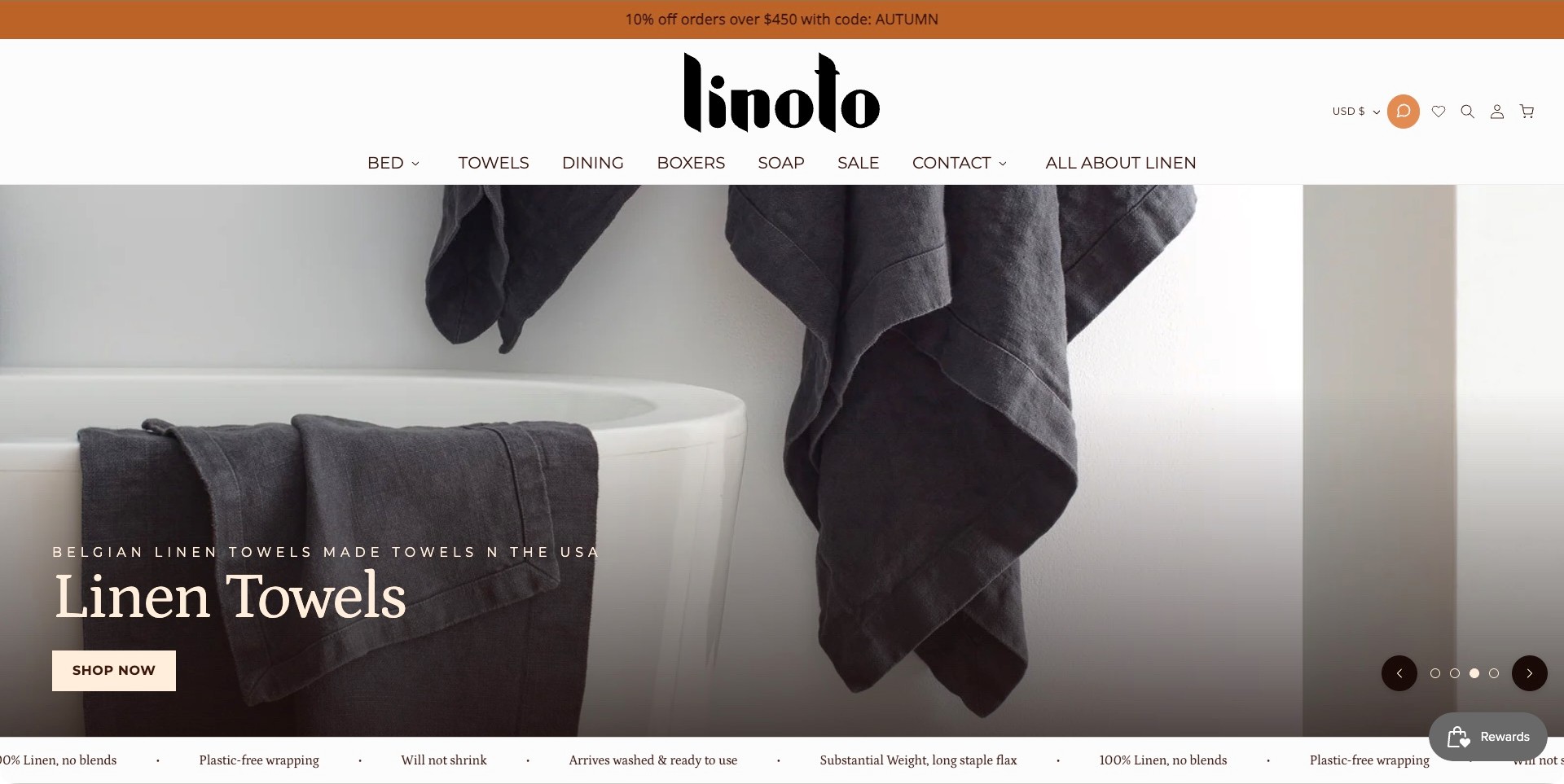
Linoto’s observed homepage features dark towels beside a white bath, with a large product-type caption and a direct shopping action. The bold identity sits above plain categories including bed, towels and dining, while an educational destination is labelled separately. The current image is towel-led rather than bedding-led; the site’s own bed category establishes the relevant range. The useful brand pattern is the separation between buying by use and learning about the material, allowing visitors with different levels of knowledge to choose a sensible starting point.
What you can learn
Use educational content to answer questions that a campaign photograph cannot resolve. Explain fabric characteristics, care and product choices without making visitors read a brand essay before shopping. Keep the bedlinen category direct, and attribute origin or production descriptions precisely rather than treating them as obvious from the image.
Pros
Short use-based labels make the bed category easy to distinguish from bath products.
The educational route gives material research its own understandable destination.
Cons & considerations
A towel campaign can leave a bedding shopper needing another step to see the range.
A strong material-origin caption needs supporting product-level information rather than visual assumptions.
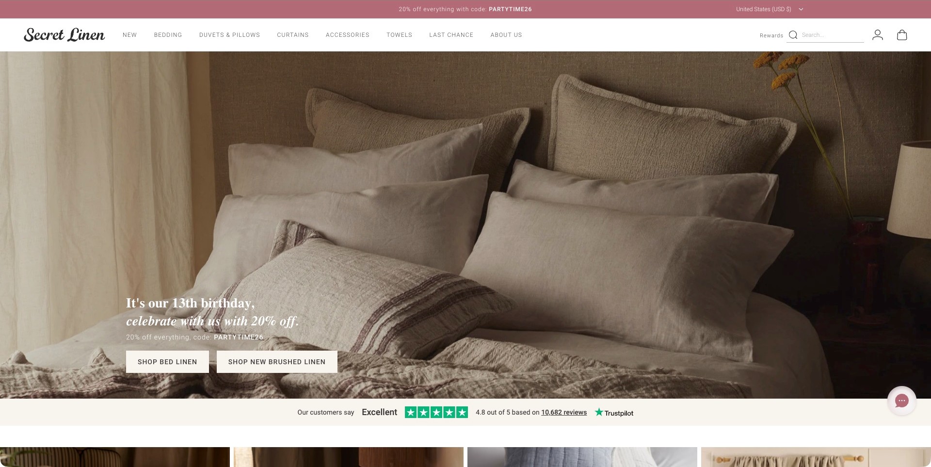
Secret Linen Store’s captured opening focuses closely on a neutral arrangement of pillows, duvet and throw. The promotional caption sits low on the image, accompanied by two buttons that distinguish the broader bedlinen range from a specific fabric introduction. Bedding, duvets and pillows remain separate header choices. A review strip follows beneath the campaign; its displayed rating is the site’s own presentation, not an independently verified measure in this review. The useful pattern is a small number of clear next steps attached to a bed rather than several unrelated promotional tiles.
What you can learn
Make adjacent actions genuinely different. One route can serve visitors browsing the whole range, while another introduces a specific material or collection. Product pages should then explain what is included, how sizes correspond and how matching pieces differ, rather than asking the styled bed to supply those details.
Pros
The close composition makes the relationship between pillows, cover and throw visible.
Two specific action labels give different browsing intentions an understandable route.
Cons & considerations
A promotion can distract from the distinctions between fabrics and bedding components.
Displayed review scores need their own transparent source and should not replace product information.
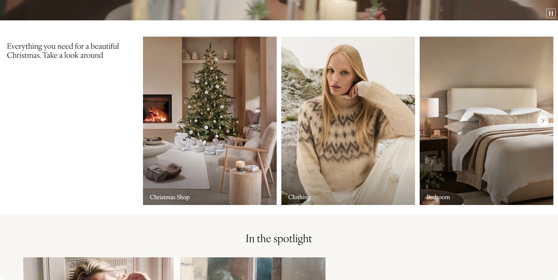
The accepted White Company image is a scrolled section of its UK homepage, not the opening hero. Three tall cards introduce Christmas shopping, clothing and the bedroom, with a pale bed visible in the final card. A short editorial introduction occupies its own white column. The useful pattern is the consistent treatment of very different categories: each receives a recognisable image and a concise label. The UK property is the reviewed source; this frame does not establish shipping or service availability for another regional storefront.
What you can learn
Give bedding a distinct, named destination even when the brand spans clothing and seasonal home products. Consistent cards can keep the catalogue understandable, but a bedroom destination should quickly separate sheets, covers, inserts and decorative accessories. Regional product information and availability need to be explained on the actual store being used.
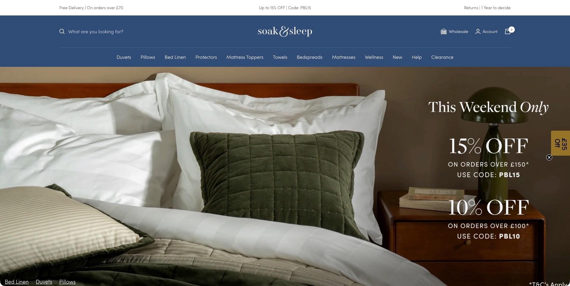
Soak&Sleep’s observed opening shows a white bed layered with green decorative pillows and covers. Promotional copy occupies the right side, while the deep blue header names duvets, pillows, bed linen, protectors, toppers and other categories. Search is placed prominently within the same header. The useful specialist-store pattern is the product architecture rather than the sale itself: inserts, protective layers and decorative bedlinen are treated as different buying tasks instead of being hidden inside one generic bedroom destination.
What you can learn
Organise a bedding range around the decisions people actually make. A pillow, protector and duvet involve different dimensions and selection questions. Give each its own clear route, then explain materials, care, compatibility and set contents without making unsupported promises about health or sleep quality.
Pros
Specific component labels support visitors replacing one part of an existing bed.
Prominent search offers an alternative to browsing the promotional campaign.
Cons & considerations
A long category row needs careful mobile prioritisation to remain understandable.
Multiple discount messages can overshadow the practical distinctions between bedding products.
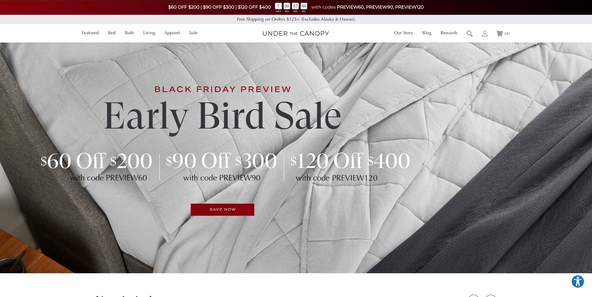
Under The Canopy’s actual homepage uses an overhead view of pale quilted bedding framed by darker fabric. Large promotional text and one red action dominate the centre, while the header keeps bed, bath, living and apparel routes separate. Story and blog destinations sit on the other side of the identity. The useful lesson is the contrast between an uncomplicated product-category structure and a highly offer-led campaign: the visitor can follow the promotion or bypass it for a particular part of the range.
What you can learn
A sale can occupy the opening without replacing the product architecture. Preserve clear routes to bedding components and product details, then explain sizes, set contents and care at the destination. Environmental or material descriptions need specific supporting information; a nature-oriented name and pale fabric photograph do not establish those claims.
Pros
The overhead image keeps the layered bedding recognisable beneath the campaign.
Short category labels offer a simple alternative to the main promotional button.
Cons & considerations
Oversized offer text can obscure the product detail that differentiates the range.
Repeated promotions may make material, care and component information feel secondary.
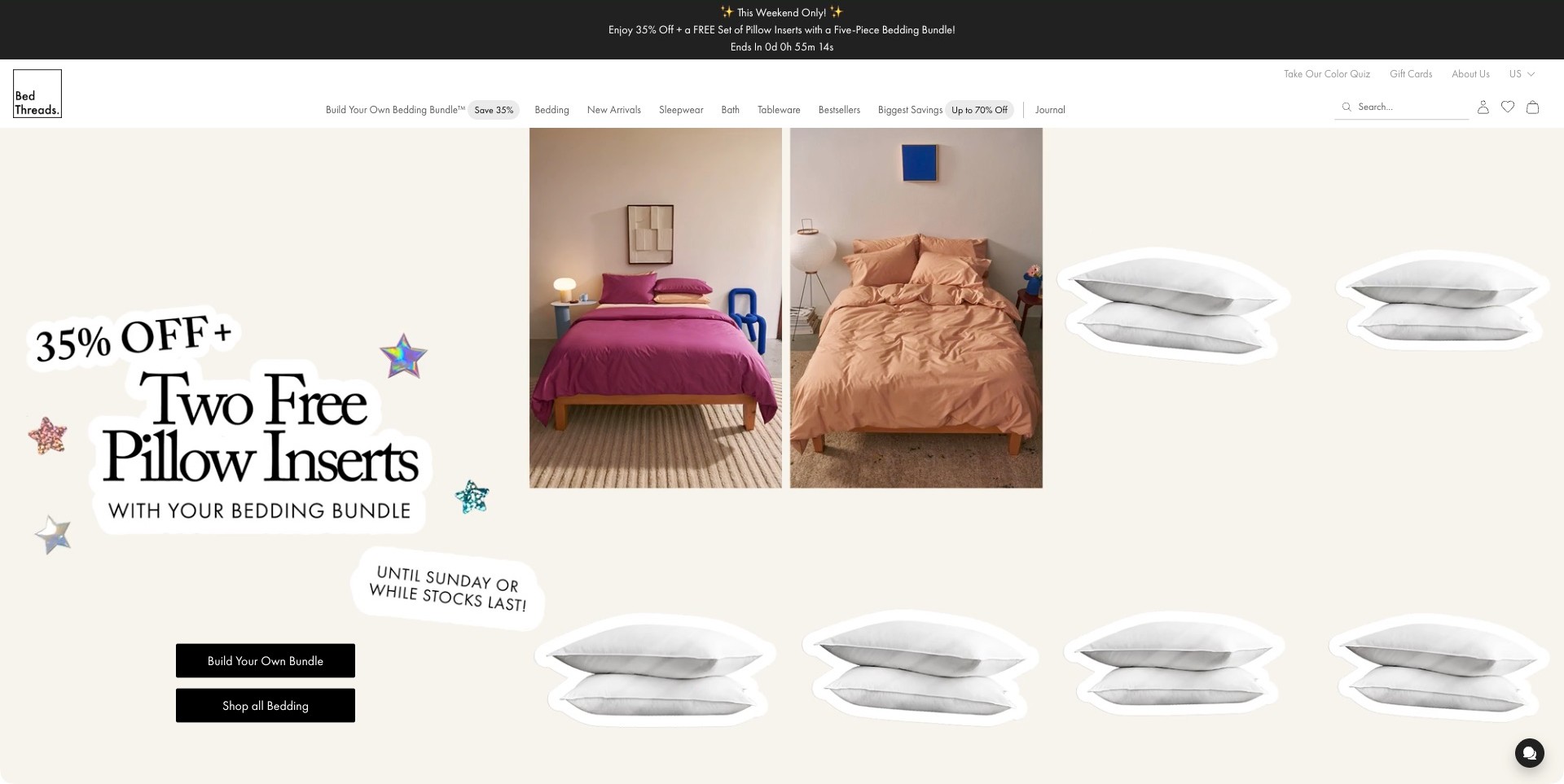
Bed Threads’ observed homepage uses a playful cream collage with two differently coloured beds and repeated pillow cut-outs. A large bundle promotion occupies the left, followed by separate actions for building a bundle and shopping the bedding range. The header also names a colour quiz alongside ordinary categories. The useful pattern is the distinction between a guided set-building task and open-ended browsing: the visitor is not forced to use the campaign’s preferred shopping route to investigate the products.
What you can learn
Treat a bundle as a clearly described choice, not a substitute for product information. Explain what is included, which components can change and how sizes fit together. Give visitors who already know their requirements a direct catalogue route, while colour guidance can remain an optional aid.
Pros
Separate actions distinguish assembling a coordinated set from browsing individual bedding.
Two visible bed palettes make colour variation part of the campaign rather than a tiny swatch alone.
Cons & considerations
Repeated promotional artwork can compete with the actual product details.
Bundle offers require transparent contents and conditions beyond the headline to avoid ambiguity.
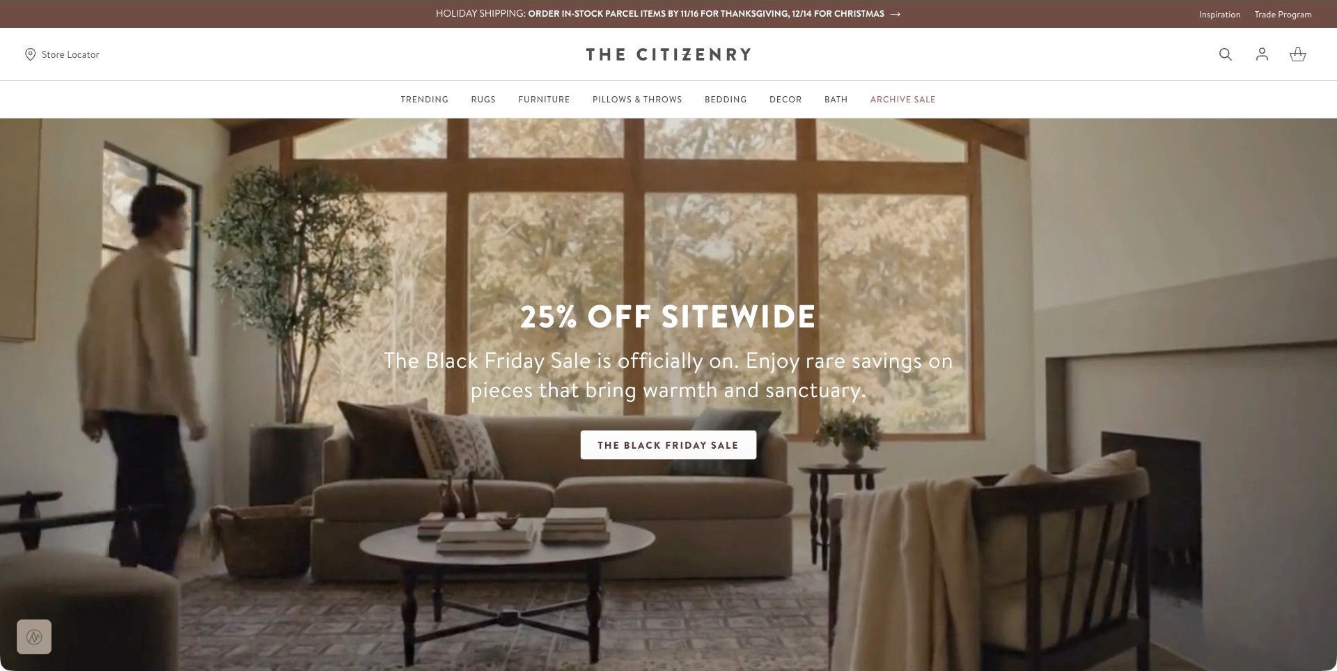
The Citizenry’s captured opening shows a person moving through a warm living room with large windows, a sofa and layered home accessories. It is not a bedding photograph. A central promotion and action occupy the image, while bedding remains plainly labelled beside rugs, furniture, pillows and bath in the white header. Store and trade routes sit above. The useful pattern for a wider own-brand home range is a permanent product architecture that remains understandable when the campaign changes its room or seasonal emphasis.
What you can learn
Give bedding a stable destination independent of the current lifestyle story. A living-room campaign can communicate a broad visual palette, but bedding shoppers need a clear next step to sheets, covers and inserts. Keep product composition, size, care and sourcing information attached to the relevant item rather than implied by the overall brand atmosphere.
Pros
The bedding label stays visible beside other home categories despite the living-room campaign.
Store and trade information occupy distinct positions outside the main promotional message.
Cons & considerations
A broad lifestyle opening may delay recognition of the bedlinen range.
Room styling and brand storytelling cannot independently verify sourcing, materials or product quality.
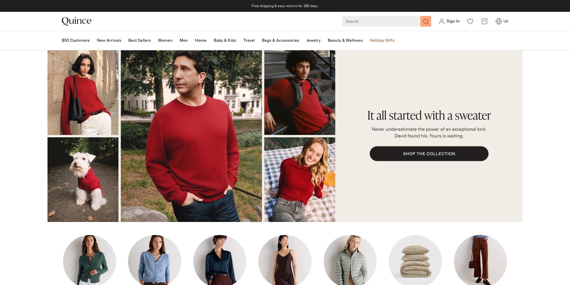
Quince’s actual homepage frame centres a red-sweater collage with several people and a dog. A dedicated text panel carries the apparel message and shopping action, while a row of category images begins below, including stacked pillows. The main header includes home within a much wider range. Bedding is established separately through the brand’s own product catalogue, not by treating the sweater campaign as a bedroom image. The useful lesson is the need for consistent catalogue routes when a changing homepage serves several very different product categories.
What you can learn
Do not make the campaign the only entrance to a broad brand. Give home and bedding visitors a predictable route with specific component categories, size information and product details. Keep the visual story distinct from the catalogue so an apparel promotion does not make bedding feel like an undiscoverable side offer.
Pros
A separate copy panel protects readability without covering the campaign photographs.
The category-image row introduces other parts of the range beyond the current sweater story.
Cons & considerations
Bedding can be difficult to recognise when the dominant campaign is entirely apparel-led.
A broad home label needs clear subsequent subdivision for different bedding components.
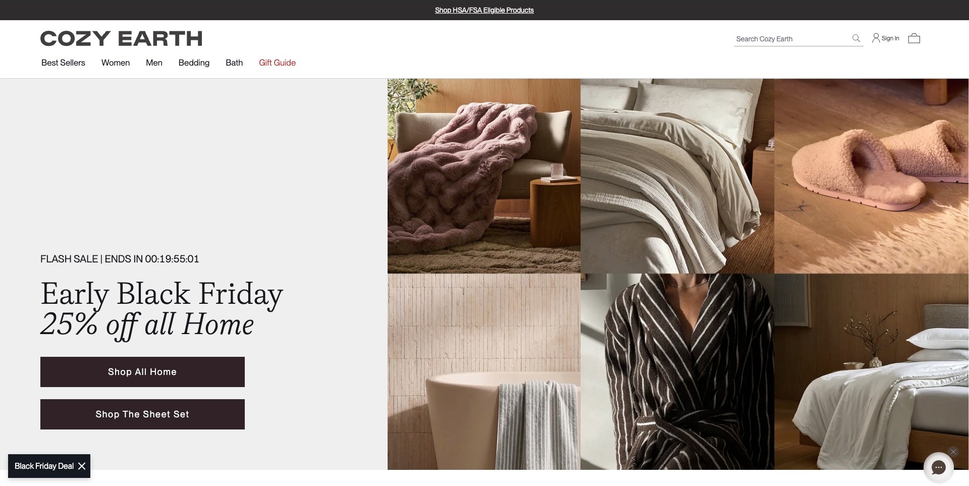
Cozy Earth’s captured opening divides a pale text panel from a six-part home-product collage. Beds, a throw, towels, slippers and a robe appear together, while two dark actions offer broad home shopping and a specific sheet-set destination. The header keeps bedding among the main categories. The useful pattern is a campaign that can introduce a wider home range without making every shopper take the same general route: someone looking for bedlinen is given a more precise option alongside the broader promotion.
What you can learn
Use a mixed-product collage to suggest a coordinated range, then label the next steps accurately. A sheet-set destination should explain components, size and material information immediately. Keep broader home browsing separate, and avoid letting a comfort-oriented visual language substitute for evidence about fibre composition, care or temperature performance.
Pros
Two distinct actions acknowledge different levels of shopping intent.
The collage shows bedding within a related home-textile palette rather than an unrelated campaign.
Cons & considerations
Several small images may lose product detail when compressed for mobile screens.
A promotional sheet-set action still needs transparent contents and variant information at its destination.
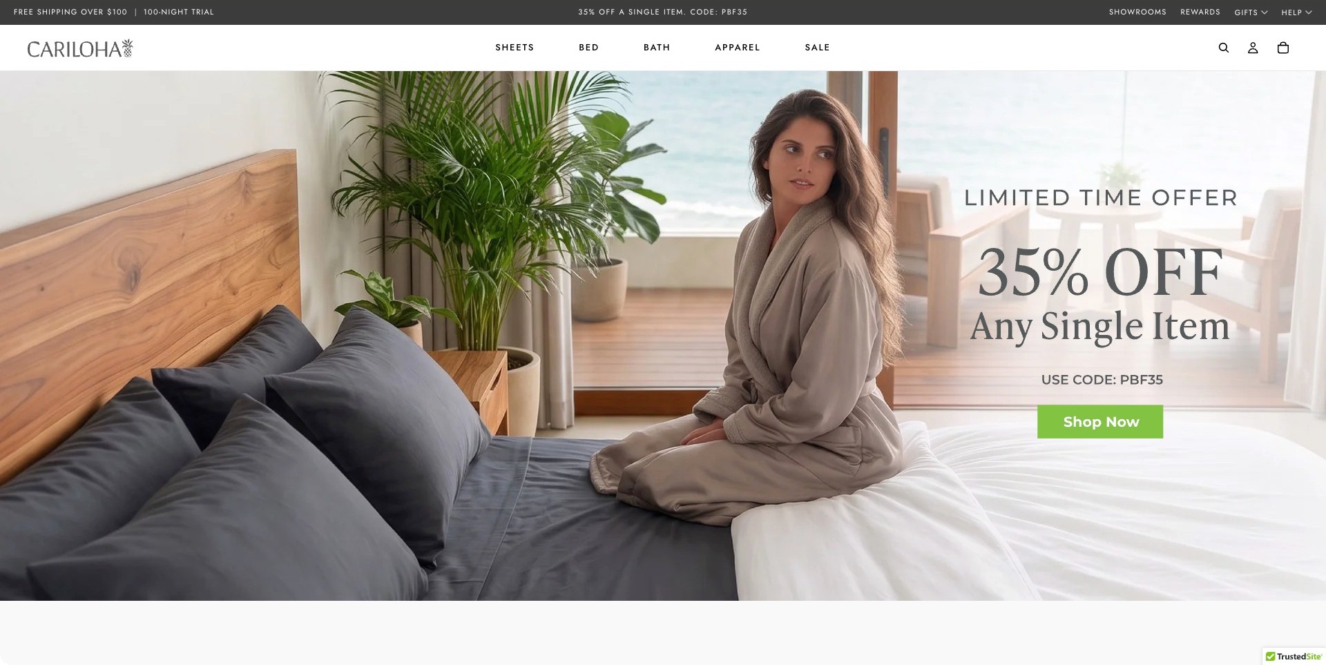
Cariloha’s actual homepage shows a person seated on blue and white bedding beside a wood headboard and tropical plants. A promotional message sits over the brighter right side, with one green shopping action. Sheets, bed, bath and apparel remain separate navigation choices, and showroom information appears in the utility strip. The useful design pattern is the division between a lifestyle introduction and enduring product routes: visitors can follow the offer or begin with a specific bedding category instead of interpreting the entire room.
What you can learn
Use a bedroom scene to introduce colour and context, then make the product investigation concrete. Sheets, covers and inserts need identifiable names, sizes and care information. Keep showroom or help routes findable, and explain any trial or material claim explicitly rather than treating an inviting room as evidence of comfort.
Pros
The bed remains a substantial, recognisable part of the campaign composition.
Separate sheet and bed categories provide alternatives to the general promotional action.
Cons & considerations
A person and scenic setting can distract from the bedding’s specific components.
Comfort, fibre and trial descriptions need clear conditions and evidence beyond the image.
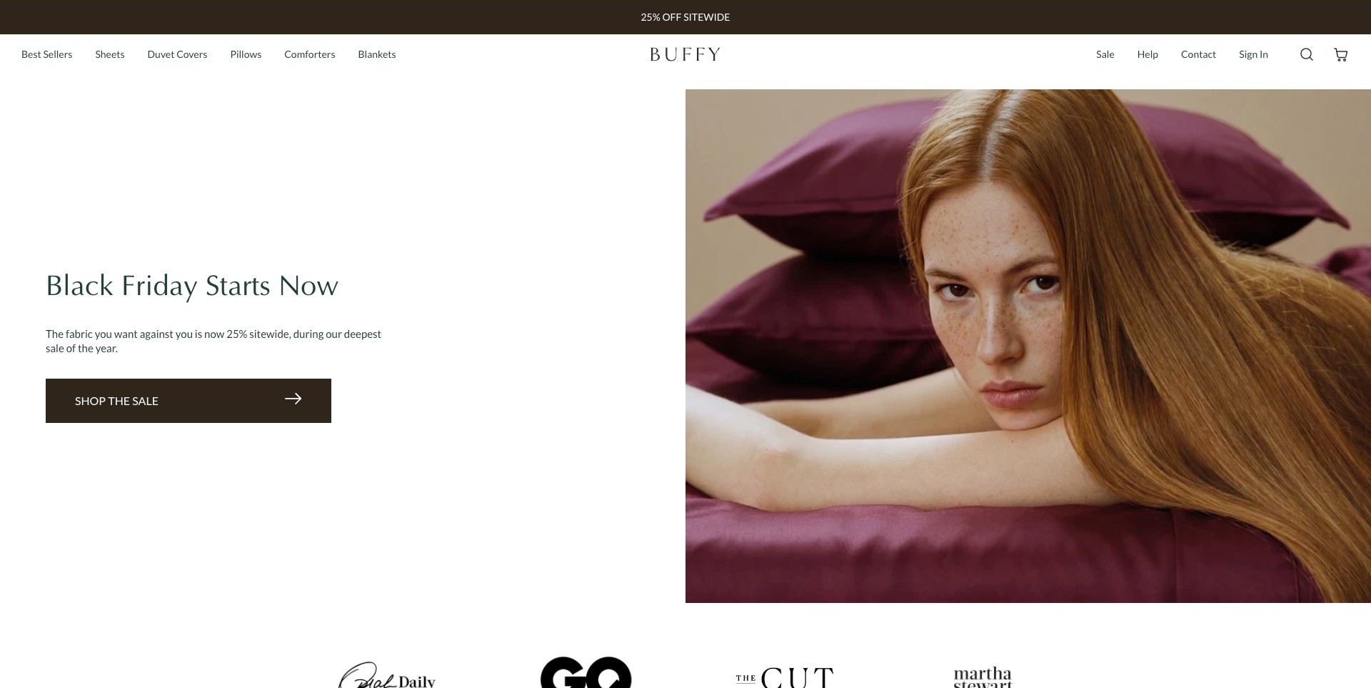
Buffy’s observed opening separates a white copy panel from a close portrait of a person resting on purple bedding, with stacked pillows behind. One dark shopping action sits below the message. The header names sheets, duvet covers, pillows, comforters and blankets individually rather than using a single general shop label. The useful pattern is the combination of a restrained campaign layout and very specific component navigation: the photograph introduces colour and atmosphere while the interface still supports visitors replacing one particular part of a bed.
What you can learn
Keep the campaign’s emotional tone separate from the product facts people need next. A readable text surface can work beside expressive imagery, but component labels should lead to sizes, filling or fabric descriptions, set contents and care. Do not make a resting pose carry an unsubstantiated promise about sleep quality.
Pros
A dedicated white panel keeps the text readable without covering the photograph.
Specific bedding-component labels make the catalogue understandable before any scrolling.
Cons & considerations
A close portrait can reveal less about the overall bed arrangement and product scale.
A general sale action may be less useful than a precise destination for the pictured bedding.
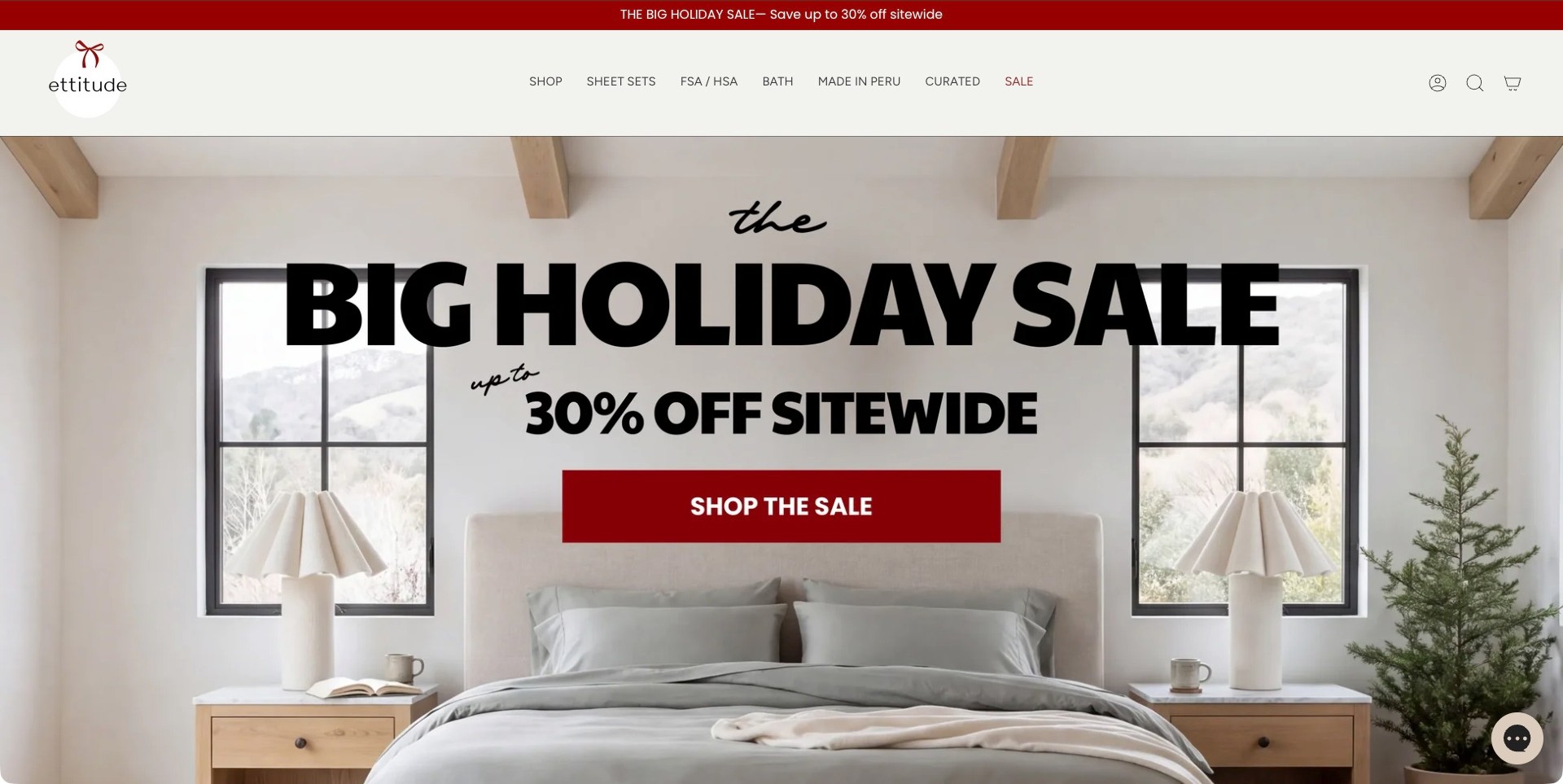
ettitude’s captured opening shows a pale bed between matching lamps and windows, with a small tree at the side. Oversized holiday typography and a red shopping action occupy the centre. The header includes a dedicated sheet-set route alongside broader shopping, bath and other branded navigation labels. The useful pattern is the relationship between a simple, symmetrical room and a highly emphatic promotion. The image identifies the product category, while the persistent sheet-set label offers an alternative to following the offer.
What you can learn
Give permanent product tasks a place outside promotional content. A sheet-set page should explain the included pieces, sizes and care rather than rely on the hero’s room styling. If a brand presents origin, health-related or reimbursement information, provide clear supporting details and conditions instead of treating a navigation label as proof.
Pros
A centred bed and paired lamps make the bedroom setting immediately recognisable.
The sheet-set label gives bedding shoppers a specific route beside the sale destination.
Cons & considerations
Very large promotional text can obscure the textile detail that differentiates the product.
Special eligibility or material claims require separate verification beyond the observed interface.
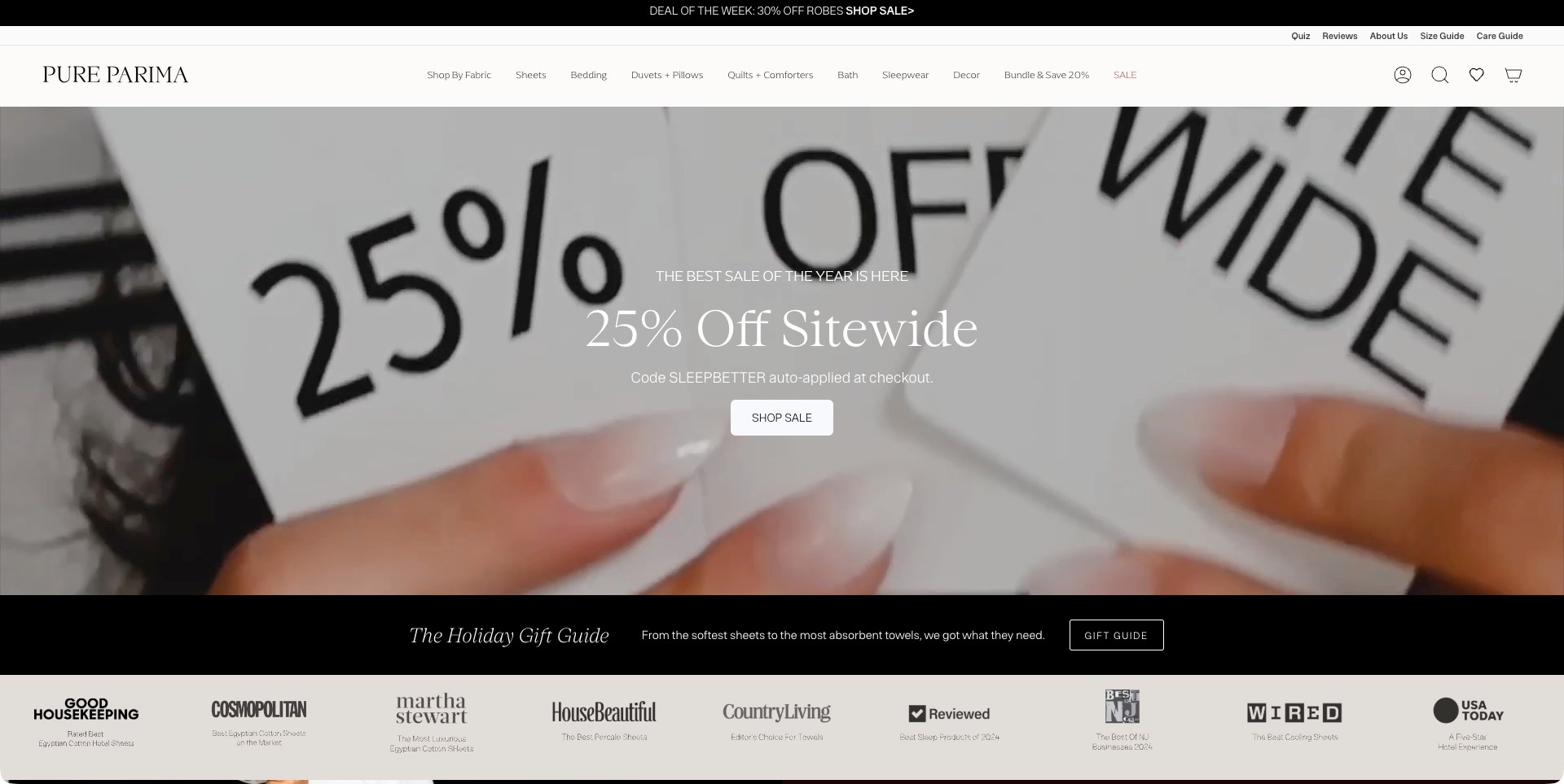
Pure Parima’s actual campaign frame shows hands holding printed discount cards rather than a bed. The central promotion and action sit above a separate gift-guide strip and a row of publication logos. The header distinguishes sheets, bedding, duvets, pillows and quilts, with size and care guides placed in a utility row. The useful pattern is that practical navigation: the campaign may focus on an offer, but visitors still have visible routes to the categories and explanations needed for a bedding purchase.
What you can learn
Preserve product and guidance destinations even when the opening is entirely promotional. Size and care guides should answer concrete questions and connect to the relevant products. Give material and set-content information at item level, while publication logos should link to accurately attributed coverage rather than serve as unexplained quality guarantees.
Pros
Size and care guidance are visible before the visitor enters the product catalogue.
Distinct component categories provide useful alternatives to the broad sale action.
Cons & considerations
A discount-card image communicates little about the bedding’s appearance or construction.
A dense header needs careful grouping to remain readable and navigable on smaller screens.
Kegan is a freelance web designer and developer with 15+ years of experience helping businesses turn complicated website requirements into clear, maintainable digital experiences. He works directly with clients from planning and design through development, launch, and ongoing support.
For bedding brand website design, his development approach focuses on fabric and bedding-format discovery, useful sizes and care information, considered colour and texture presentation, and clear delivery, returns and shopping journeys. The scope can be a targeted improvement or a complete custom build, with responsive layouts, thoughtful content structure, and integrations chosen around the people using and maintaining the site.
Show 3 other bedding brand website designersHide other bedding brand website designers
How to plan a bedding website that makes each choice easier to understand
Model the catalogue around items, sets and layers
Begin with a product inventory that distinguishes individual pieces, fixed sets and configurable bundles. Record the included quantities and the relationship between a cover and its insert. A photographed bed may contain a fitted sheet, flat sheet, several pillowcase types, a duvet cover and a decorative throw, each sold differently. Give those objects a consistent naming system before designing campaign pages or choosing an ecommerce theme.
For a bundle builder, decide what can be omitted, substituted or mixed before drawing the interface. Keep the current contents understandable throughout the process and make the selected configuration easy to review. If a customer changes the bed size, clarify which other pieces also change. The purpose is not a more elaborate shopping interaction; it is a purchase whose contents remain clear from the first image to the final review.
Build a size system that works across products and markets
Provide actual product dimensions and consistent units rather than relying only on labels such as king or standard. Explain fitted-sheet depth, pillowcase dimensions and relevant differences between a cover and an insert using approved product information. Keep the size guide close to the point of choice and available without losing the selected item. A customer should not have to start again after checking a measurement.
If the store serves several countries, identify the selected market and avoid silently mixing size conventions. Show which catalogue and delivery territory the person is browsing. Explain differences in available products where necessary instead of assuming a regional switch changes only currency. A familiar size name is a helpful starting label, not a substitute for the dimensions that let someone compare it with bedding they already own.
Create an image set that answers more than one question
Plan a complete bedroom view, a clearly visible individual item, useful textile details and labelled colour variants. Keep styling choices from obscuring the actual product. A folded duvet cover may show texture well but reveal little about its overall appearance; a distant bed may make a subtle weave impossible to see. The sequence should let the customer move between atmosphere and product identity without mistaking one for the other.
Name the colour and collection shown in each important image. If photography varies by light or styling, avoid suggesting that every frame is a precise colour reference. A swatch route, where genuinely offered, can help bridge that limitation. Do not use unrelated stock fabric images to stand in for a specific product. A brand’s visual language can remain consistent while its product records make differences between materials and ranges explicit.
Explain fabric information without promising a universal sleep result
Use approved material descriptions and provide enough context to understand the terms. Fibre composition, weave and care are different kinds of information and should have their own fields. If the brand uses a phrase such as washed or brushed, explain what it means for that particular product rather than turning it into a vague premium label. Keep comparisons specific and avoid treating one number as an objective quality ranking across unlike textiles.
Claims about cooling, sensitive skin, allergies, environmental impact or certification need careful substantiation and scope. Do not add them simply because they are common in the category. Where a product carries a certification, identify the relevant product and supporting record rather than implying that every item from the brand has the same status. A well-written website can explain material choices without making medical or universally applicable comfort promises.
Place care, returns and availability alongside the choice
Customers need to know how the specific product is cared for and which instructions belong to it. Keep care information associated with the correct fabric and version. Do not give one generic washing recommendation for every textile in the store. Explain where the customer can find the complete instructions and keep those records useful for owners after a product is discontinued.
Show stock and dispatch information for the selected size and colour rather than a reassuring message that applies only to the collection generally. Link maintained returns information in context, particularly where different conditions apply to used, washed, personalised or final-sale products. Do not invent a policy or turn a brief marketing label into the whole explanation. If a bundle includes items with different availability, make that clear before the customer assumes everything will arrive together.
Make merchandising useful between seasonal campaigns
A gift campaign, clothing launch or broader home story can be appropriate for a bedding brand, but the core bedding categories should remain easy to reach. Keep product information stable when the homepage changes. An editorial bedroom feature should link to the actual named products and clearly distinguish current items from archive or decorative props. Do not leave a beautiful older room story implying that all its pieces are still available.
Assign responsibility for campaign expiry, size-guide accuracy, product photography and material claims. Review support questions after launch to discover where visitors misunderstand sets, sizes or care. Useful success measures might include fewer wrong-size enquiries, clearer bundle selection or better-qualified product questions. A larger number of messages is not automatically a better result if the website could have answered the same uncertainty before the customer reached the inbox.
The editing job behind the design
Choose technology that can maintain sizes, colours and bundle contents
Start with the catalogue relationships: product, size, colour, included pieces, market and availability. A dependable ecommerce platform can support these without a bespoke interface if the information is structured carefully. Do not choose a theme because its bedroom photographs are attractive while ignoring how the team will maintain variant-specific records.
Bundle tools should expose the current contents and price clearly and retain enough context when a customer changes a selection. Test the ordinary paths first, including an unavailable colour, a changed bed size and a customer who wants fewer pieces. Provide a straightforward alternative when a more visual builder cannot explain the actual offer.
Visible public technology references do not reveal the entire supplier, fulfilment or product-information system. They also do not establish that another brand’s checkout or bundle workflow would suit this catalogue. Choose around accurate data, maintainable content and an understandable customer journey rather than copying a stack because it belongs to a familiar company.
Our WordPress website examples offer a separate look at publishing approaches. A visible platform label is evidence for that named page, not a guarantee that the same system will suit your requirements.
Before the public launch
A bedding brand website brief should resolve these questions
Which products are sold individually, as fixed sets or as configurable bundles?
Does every selected price correspond to a clearly described size and included-piece list?
Are duvet inserts distinguished from covers in names, images and navigation?
Are actual dimensions and units available beside familiar size labels?
Does fitted-sheet information include the relevant mattress-depth measurement?
Can shoppers identify the exact colour and collection pictured in a campaign?
Are fabric composition, construction and care described as separate information?
Which material or environmental claims have product-specific supporting records?
Can swatches be requested where the business actually offers them?
Are stock and dispatch messages specific to the selected size and colour?
Does a regional switch clearly identify the market and relevant size conventions?
Can a customer review the complete contents of a mixed bundle before ordering?
Who checks older editorial product links and expired seasonal offers?
Which common customer questions will guide improvements after launch?
These checks are a project checklist, not a performance, legal, security, or accessibility certification. Test real journeys with the people responsible for the website before making claims about the result.
Sources & editorial method
How this collection was selected and reviewed
We qualified current first-party own-brand bedding offers and inspected genuine direct browser images. Earlier clean original captures retain their own capture dates, and reviews identify mattress-led or gift-led frames honestly. CULTIVER is the explicit editorial selection for the observed blue-bedlinen composition, clearly separated bedding navigation, visible search and direct swatch route. The choice is a website-design judgement, not a tactile product test, fibre-origin verification, certification assessment, paid ranking or sleep-health endorsement.
Each example links to its actual source page. Screenshots are direct browser captures with their own capture dates; moving imagery, announcements and live designs can change. The notes describe observable design choices and conditional tradeoffs, not measured traffic, conversion results, service quality, or accessibility conformance.
Technology labels use public page metadata, asset evidence, or explicitly cited platform documentation. Platform documentation is not a complete current deployment audit. A component reference may be legacy or unused; it is not a complete backend inventory. Unknown stacks are omitted. These sites are editorial examples, not our client portfolio.
Written, Edited and Curated are separate editorial records, not timestamps advanced by a rebuild. Website designs and imagery belong to their owners. See our editorial standards or suggest a correction.
Questions worth asking
Bedding Brand website design questions
Should a bedding homepage always show a bed?
No, but a customer should still be able to reach the core bedding offer immediately. A gift or material campaign can work when it is clearly named and supported by stable categories. Product pages still need complete views, sizes and included-piece information that the campaign itself may not provide.
What information matters most for a sheet set?
Explain the included pieces, actual dimensions, relevant fitted-sheet depth, approved material description and care instructions. Keep that information tied to the selected size and colour. A photograph or a familiar size label should not be the only way a customer decides whether the product matches what they need.
Does a brand need a build-your-own bedding bundle tool?
Only when the catalogue and operating process support it. Start with clear fixed sets and individual products. If flexible bundles solve a real customer need, make each selection and the complete contents easy to review. Complexity is not useful if it makes the final offer harder to understand.
How should a website handle claims about comfort or materials?
Use approved, specific descriptions and keep supporting evidence appropriately scoped. Do not turn a material name into a universal quality or health promise. A design guide can show how information is presented, but a beautiful interface does not independently validate fibre origin, certification or an individual sleep outcome.
Borrow the clear product identities, tactile image sequences and understandable set structures. Build a bedding website that makes an attractive bed easier to interpret, not one that leaves the customer guessing which pieces, sizes and materials they are about to choose.