Best Event Planner Websites of 2026 (29 Real-World Examples)
Event-planner websites that connect celebration imagery, a clear service scope and the people responsible for making the plan work.
Explore 29 real event-planning websites, from regional wedding specialists to corporate experience agencies. Compare their portfolios, service explanations, regional positioning and inquiry journeys.
A photograph can show the atmosphere of an event, but it rarely explains who planned the schedule, coordinated suppliers or managed the setting. An event-planner website has to connect that visible result with an understandable service. Visitors may be choosing a creative partner, assessing the level of support they need or checking whether a company works in their destination.
This collection includes wedding planners, private-event studios and agencies producing corporate experiences. Their audiences and responsibilities differ, so the reviews preserve those distinctions. The focus is on public website design, useful information and portfolio presentation rather than guarantees about the quality of a future event.
Before the examples
What makes good event planner website design in 2026?
Explain the level of planning support
Separate full planning, partial support, coordination, design and production where the business actually offers different engagements. Describe responsibilities beside package names. An attractive name or beautiful gallery does not tell a visitor which decisions and tasks the planner will handle.
Give photographs useful context
Identify the kind of celebration, its setting and the planner’s contribution. Keep photographer credits and permissions attached to the source material. A portfolio should help someone recognize relevant experience without implying that every visible element was created or supplied by the planning business.
Make fit easier to evaluate
State the service territory, relevant event types and how an inquiry works. Where appropriate, provide approved investment guidance and explain what affects scope. Keep current-client access separate from new inquiries, and avoid treating a submitted form as a confirmed booking.
The collection · 29 examples
29 event planner websites worth studying
Study 29 distinct public planning properties, including image-led studios, regional specialists, portfolio grids and corporate experience agencies. The Editors Choice recognizes website communication and design, not event-service quality or a promised result.
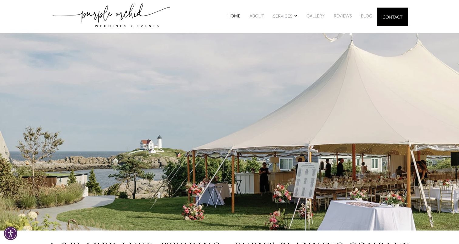
Purple Orchid opens with a coastal tented celebration rather than an abstract luxury graphic. The white navigation bar keeps services, galleries, reviews and contact easy to identify above that scene. Below it, separate wedding and social-event routes connect the imagery to a clear Maine and Tampa Bay service area. The introduction goes further than atmosphere: it names tented, outdoor, estate, private-home and glamping settings, then explains an approach built around planning, styling, organization and execution. The owner’s introduction makes the logistical concern feel personal. Together, these elements help visitors understand why this particular specialist might fit their celebration before they begin an inquiry.
What you can learn
Describe the situations a planner is equipped to organize, then connect each audience to a useful service destination. Regional context and practical scope can make a stronger introduction than repeated promises of perfection.
Pros
Wedding and social-event routes separate distinct planning needs without a large navigation system.
The territory and outdoor-event focus provide concrete context for the photographed work.
Cons & considerations
The opening photograph occupies substantial space before the service explanation becomes visible.
Several introductory routes use broad action labels that could describe their destinations more precisely.
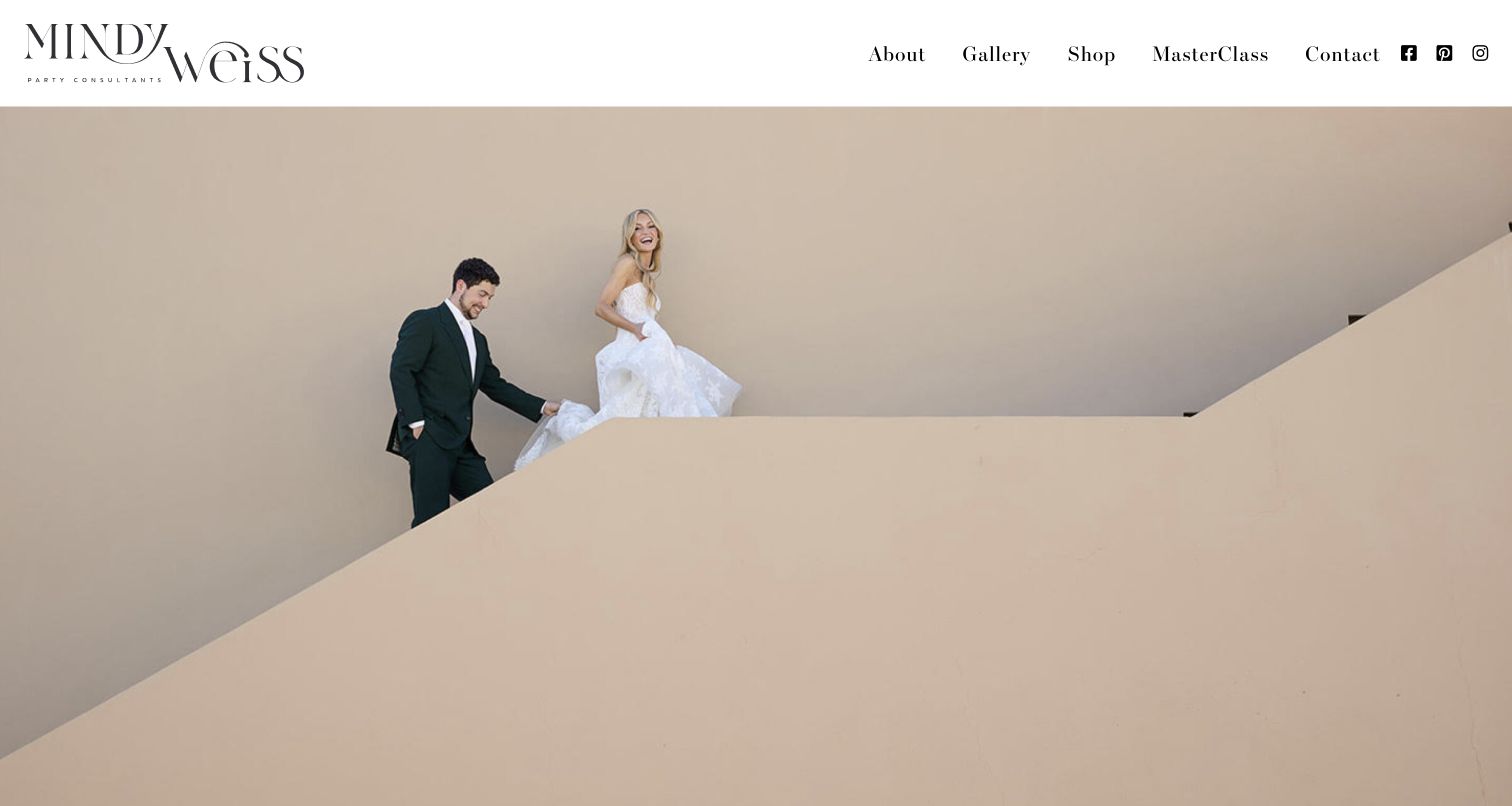
Mindy Weiss pairs a spacious white header with an unusually quiet opening photograph: the couple and architectural setting carry the composition without a promotional headline covering them. The typography and generous space give the gallery room to establish the planner’s taste. Clear top-level routes distinguish the service story and event gallery from the shop and educational offering. Further down, an introduction describes weddings, corporate events and social celebrations before the page returns to imagery and related products. The design shows how a personality-led business can keep several public activities together while allowing a prospective planning client to find the relevant path.
What you can learn
Give different business activities distinct labels, even when they share one personal brand. A gallery, educational product and planning inquiry should have understandable destinations rather than competing inside one undifferentiated promotional feed.
Pros
The calm opening leaves room for event photography to communicate scale and atmosphere.
Gallery, shop and education links clearly distinguish different reasons for visiting the site.
Cons & considerations
The first screen relies on prior brand recognition before explaining the planning service.
Product and media material can distract visitors whose immediate task is evaluating event support.
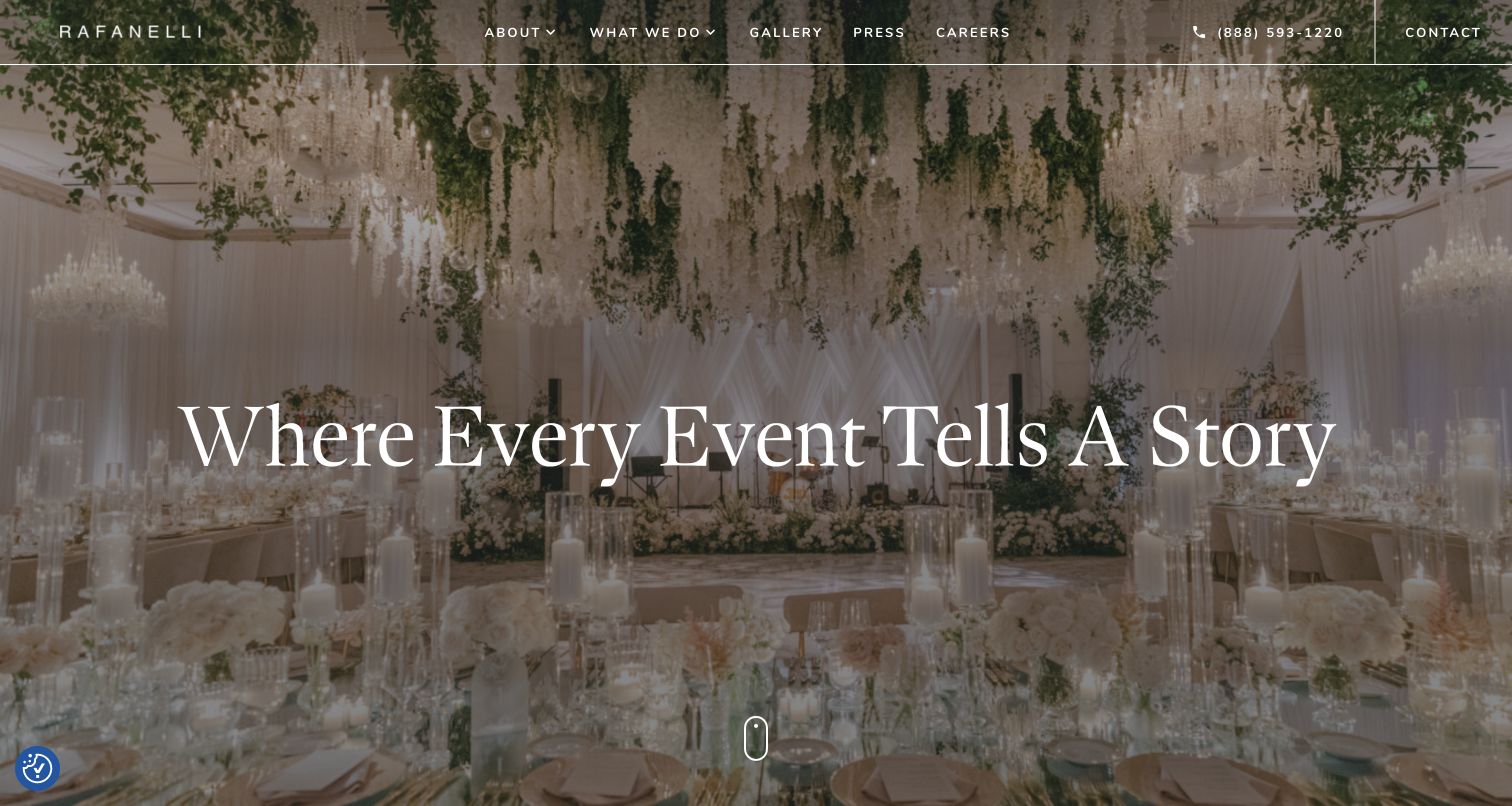
Rafanelli Events uses a large reception photograph, a darkened overlay and a centered serif headline to establish an expansive visual mood. A slim navigation bar keeps the company, gallery and contact routes present without surrounding the image with numerous promotional boxes. The page then moves from a broad story-led introduction into specific event categories, including weddings, social events, nonprofit occasions, corporate work and destination celebrations. Those categories matter because the opening image alone could suggest a wedding-only service. The combination provides a useful example of pairing emotional presentation with a more practical explanation of the different commissions the business considers.
What you can learn
Follow an atmospheric hero with explicit service categories. When one image cannot represent the whole business, the next section should make the range clear and route visitors toward evidence relevant to their event.
Pros
The opening photograph gives the page a coherent visual center and readable headline area.
Named event categories help corporate and nonprofit visitors move beyond wedding imagery.
Cons & considerations
The opening promise is broad and needs the following sections to establish practical scope.
Large imagery and interactive category sections require careful loading and keyboard behavior.
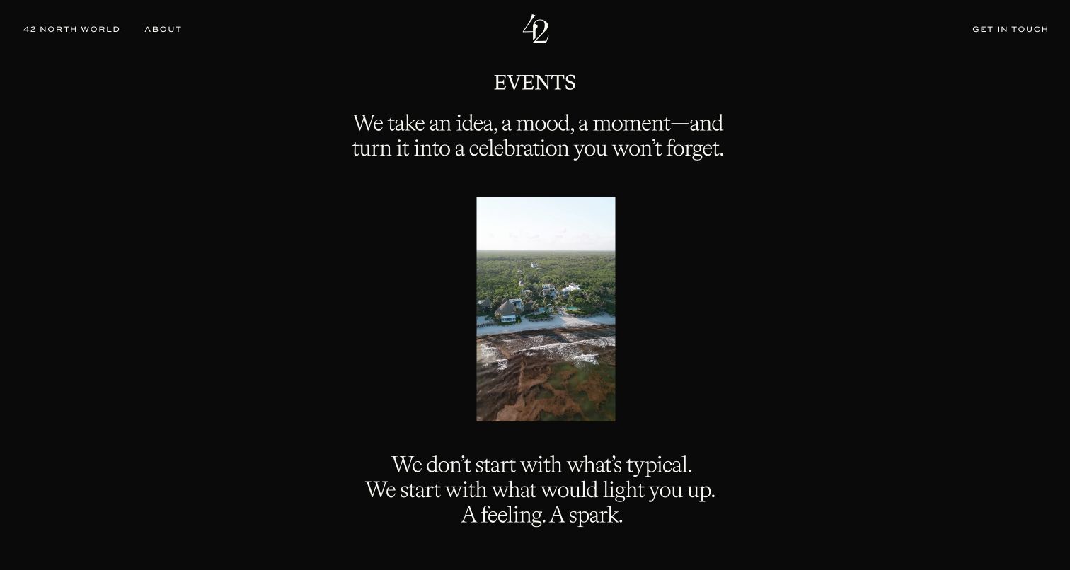
The reviewed 42 North events page uses a black canvas, small centered imagery and short lines of serif text instead of a conventional edge-to-edge portfolio grid. The resulting presentation feels like a paced editorial introduction to a creative practice. Sparse links lead to the wider 42 North world, the company story and direct contact, while the copy describes turning an idea or mood into a celebration. This is a service-page view rather than a general homepage capture. Its narrow focus is useful for studying how one offering can keep a distinct mood within a business that also presents other experiences.
What you can learn
Let a dedicated service page establish its own visual rhythm, but give visitors enough concrete information to recognize its purpose. An expressive introduction should still lead clearly toward work examples and an appropriate inquiry.
Pros
The restrained black composition distinguishes the events offering from a conventional wedding gallery.
A visible contact route keeps the next conversation accessible within the sparse layout.
Cons & considerations
Small imagery reveals less event detail than a larger portfolio or captioned case study.
The poetic introduction needs additional service context for visitors comparing planning responsibilities.
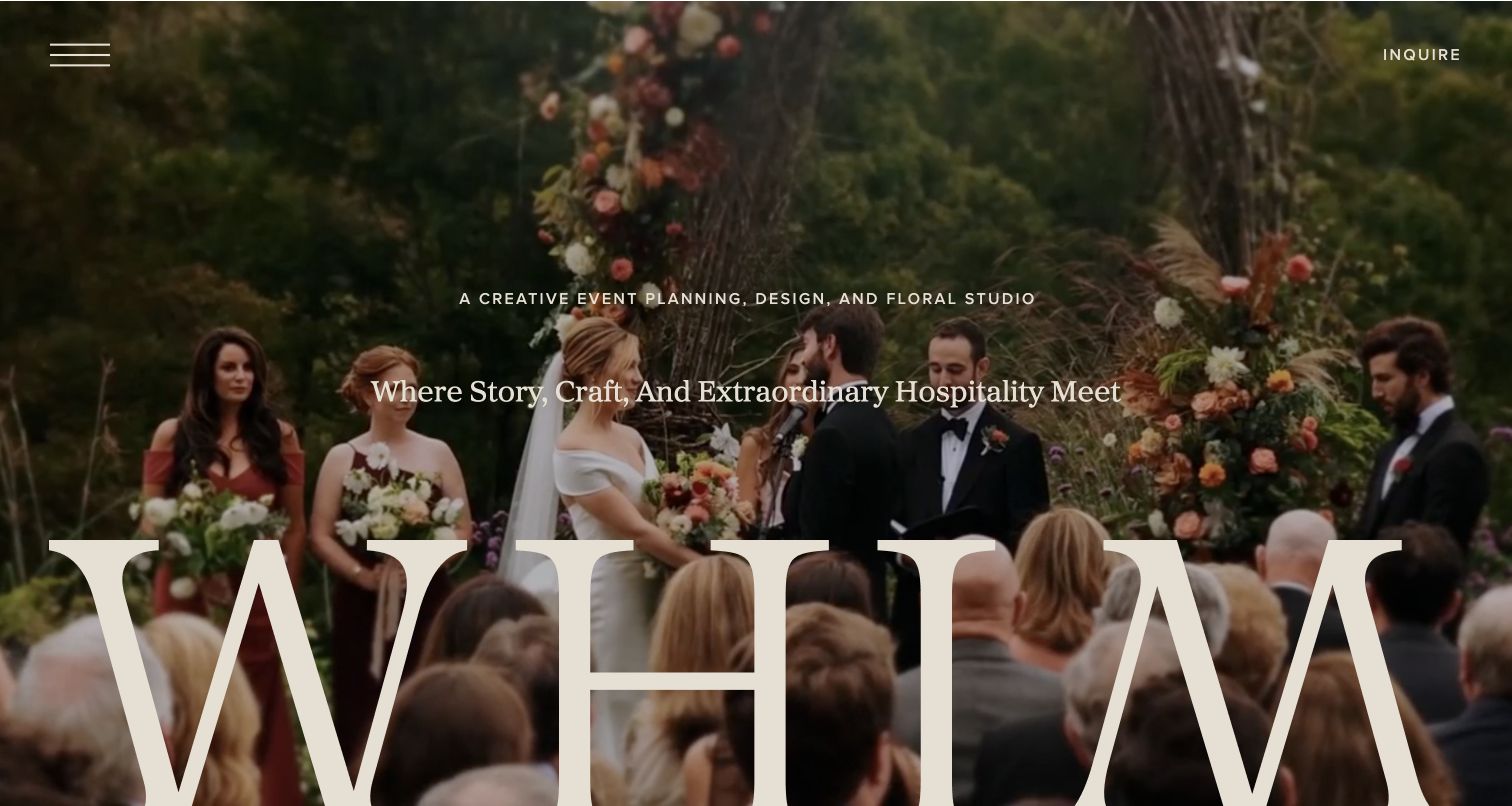
Whim Events makes the opening photograph do much of the explanatory work. A celebration scene fills the screen, with a concise description of the planning, design and floral studio placed above a larger statement about story, craft and hospitality. The oversized wordmark becomes part of the image composition rather than a separate corporate banner. An inquiry route stays visible, and the page offers distinct paths to learn about the company and explore its work. The approach is notably focused: it introduces the studio’s sensibility before presenting a dense set of packages or an extended sales argument.
What you can learn
A short creative introduction can work when the next choices are obvious. Separate learning about the team from browsing its work, and keep an inquiry route available without forcing it ahead of basic evaluation.
Pros
The service description names planning, design and floral work together in the opening.
Two discovery routes give the expressive first impression an understandable next step.
Cons & considerations
The large wordmark and photograph leave limited room for practical details above the fold.
Visitors comparing scope or location must continue beyond the initial atmospheric introduction.
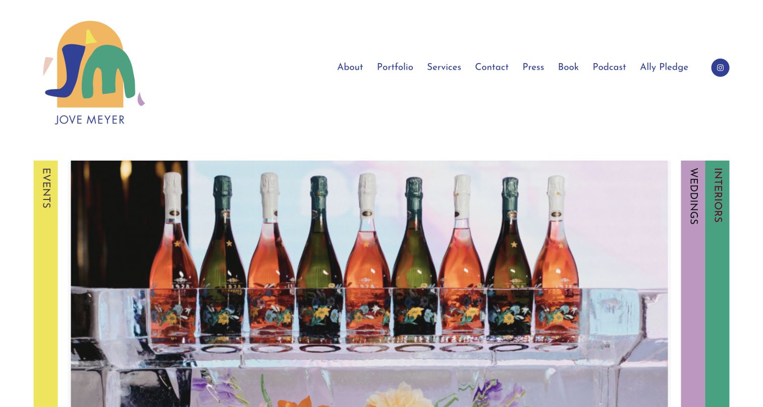
Jove Meyer’s homepage organizes a colorful creative practice through distinct events, weddings and interiors sections. The opening combines a playful multicolor identity with clearly differentiated category tabs and a large project image. The page provides more than a visual portfolio: each discipline has descriptive copy and a gallery route, while the wedding section supplies an explicit starting-budget qualification at the time of review. Book, podcast and other public activities remain in the navigation. This makes the website useful for studying a business whose personality extends across several formats without requiring every visitor to interpret one generic collection of photographs.
What you can learn
Use a repeatable section structure to distinguish services that share a designer’s style but involve different engagements. A clear explanation and relevant gallery can help visitors evaluate fit before approaching the business.
Pros
Color and category labels give the different disciplines a recognizable visual structure.
Service explanations and gallery routes connect expressive imagery to practical visitor decisions.
Cons & considerations
The many public activities make the top navigation more demanding than a single-service site.
Long descriptive sections need careful pacing so readers can compare the offerings quickly.
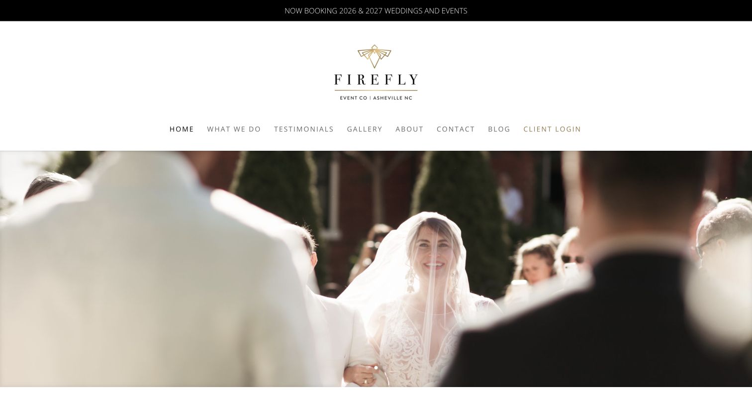
Firefly Event Company places a compact booking announcement above a centered identity and a straightforward navigation row. The opening celebration photograph introduces the emotional side of the work, while the following headings explicitly name weddings and custom events in Asheville and Cincinnati. Three simple routes explain the work, introduce the people and lead to contact. A separate client-login destination distinguishes existing customers from people still researching the company. The overall structure is approachable rather than elaborate, making it a useful example for a regional planner that needs to communicate both personality and basic service information without an extensive editorial site.
What you can learn
State the actual service locations and separate new-client research from existing-client access. A small number of clearly named destinations can support the planning journey more effectively than a large menu of overlapping packages.
Pros
The location statement helps visitors quickly establish whether the company serves their market.
Service, team and contact routes provide a practical sequence after the opening imagery.
Cons & considerations
The booking-year announcement creates a visible maintenance responsibility as seasons change.
The tall identity and navigation area delays the first detailed service explanation.
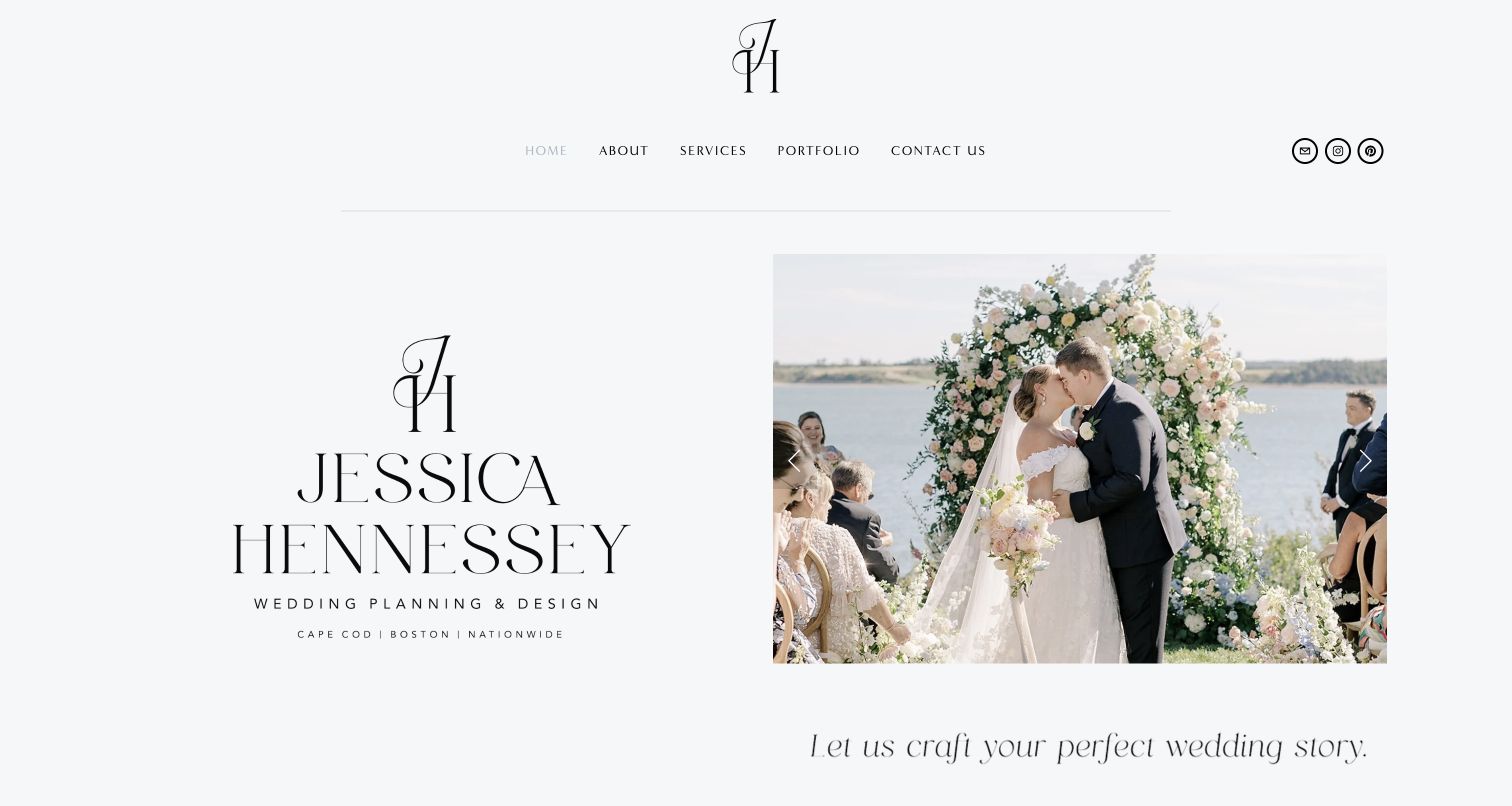
Jessica Hennessey Weddings uses a pale background, a restrained monogram and a split introduction that places the identity beside a wedding photograph. This measured layout gives the page a personal, editorial character without requiring a full-screen animated opening. The accompanying copy describes the couple’s history and personality as the starting point for the celebration, then grounds that approach in a South Shore Massachusetts location and a wider New England service area. Navigation remains short, with services, portfolio and contact close to the top. The result connects a personal planning philosophy to enough regional information for visitors to understand the business’s context.
What you can learn
Pair an individual planning philosophy with a specific geographic statement. Visitors should be able to appreciate the planner’s voice while also finding the service explanation and deciding whether the location is relevant.
Pros
The split opening balances an identifiable personal brand with an actual celebration image.
The regional description gives the story-led introduction a concrete service context.
Cons & considerations
Delicate typography and pale presentation require careful contrast and size choices.
The longer narrative takes more reading than a concise comparison of planning responsibilities.
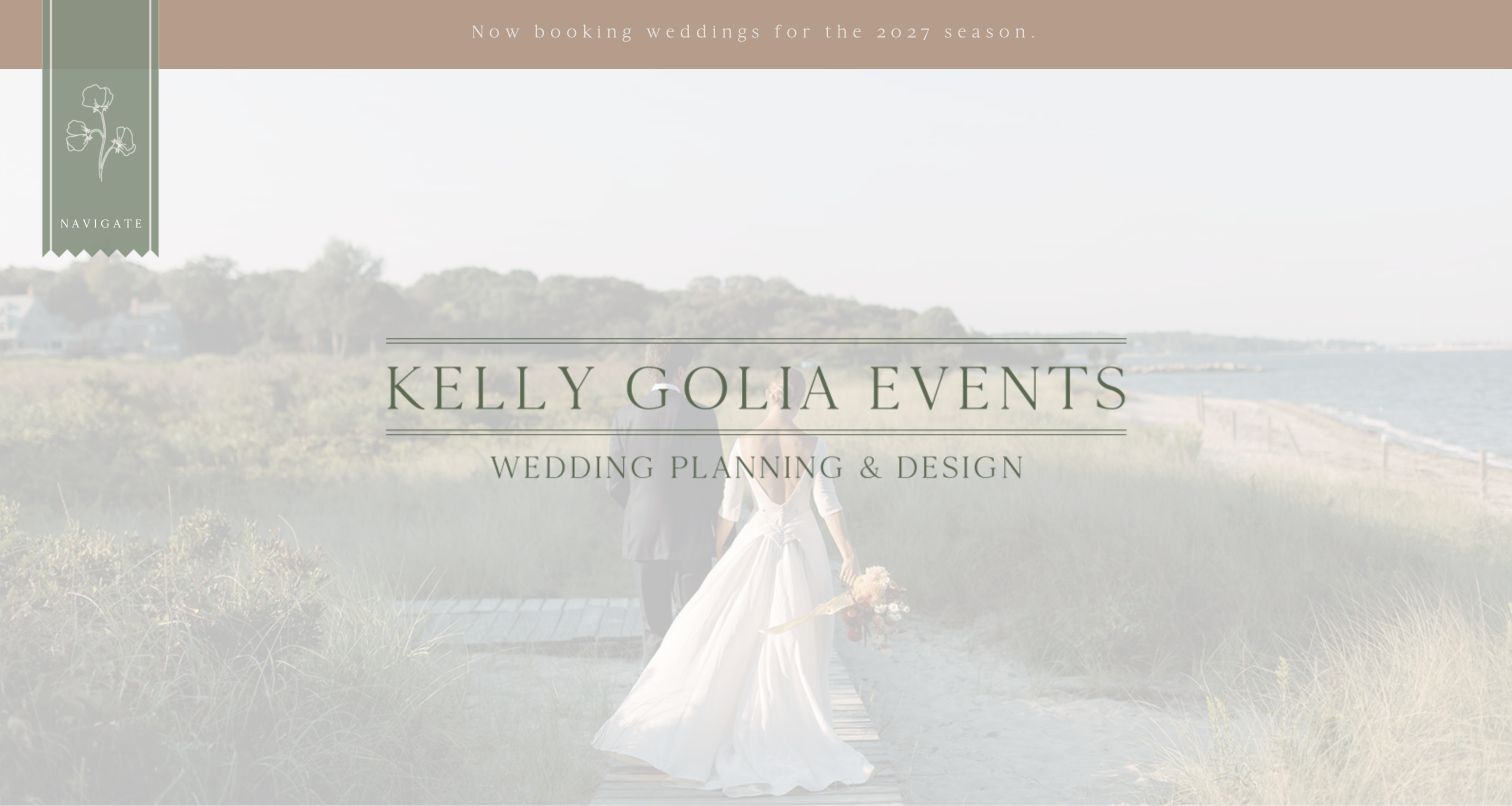
Kelly Golia Events starts with a soft photographic treatment and a clear wedding-planning identity, then gives individual projects unusually descriptive entry points. Instead of relying only on couples’ names, the page describes different celebrations through their atmosphere and location, such as a coastal setting or a mountainside event. These labels help a visitor choose a relevant gallery before opening it. Offerings, reviews and contact provide the practical routes around the portfolio. The site is especially useful as a study in editorial naming: its project introductions communicate the character of the work rather than treating every photograph as an interchangeable luxury image.
What you can learn
Name portfolio entries with useful setting or design context alongside the people involved. A visitor should be able to identify a relevant example without opening every gallery or recognizing private client names.
Pros
Descriptive project labels make the portfolio easier to browse by atmosphere and location.
Separate offerings and reviews routes support evaluation beyond the visual impression.
Cons & considerations
The light photographic overlay reduces contrast compared with a plain text panel.
Seasonal booking copy must be reviewed so an old banner does not misrepresent availability.
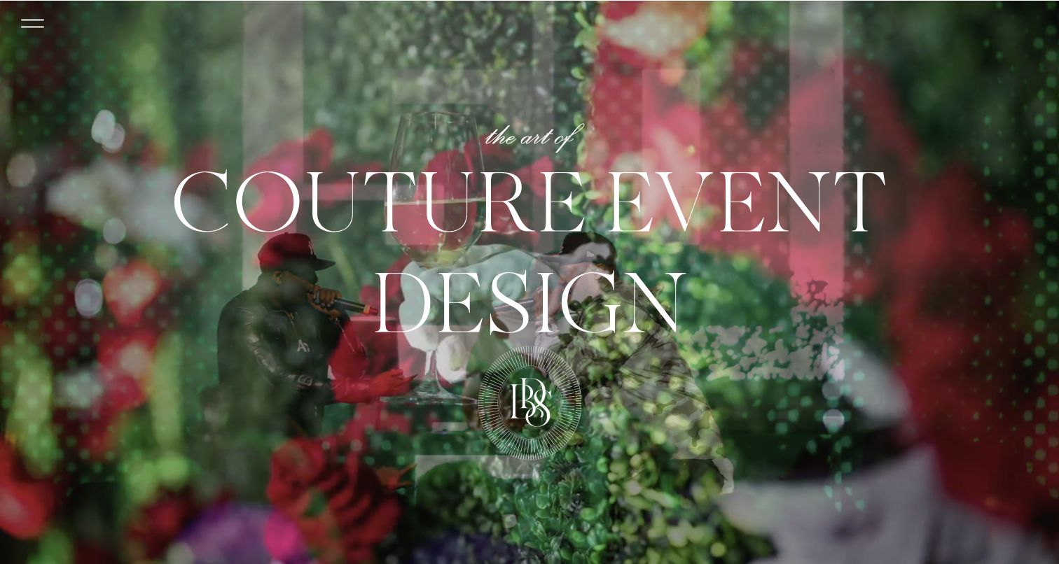
Birch Design Studio presents a densely layered event photograph beneath a short couture-event-design statement. The opening is unusually economical in text: a small menu control and the studio’s visual identity leave most of the screen to flowers, color and atmosphere. This gives the site a clear aesthetic position, but it also makes the image responsible for much of the first impression. The reviewed page is most useful as a study of that opening treatment, rather than as evidence of detailed planning packages. Its restraint shows the appeal and the limitations of asking visitors to explore before explaining the full service.
What you can learn
A minimal landing view can establish taste quickly, but its next destination needs to supply the practical information the opening omits. Preserve a clear route to services, representative work and contact beyond the visual statement.
Pros
The limited text keeps the event photograph at the center of the introduction.
A short design statement provides more context than an unexplained image alone.
Cons & considerations
The opening offers little immediate information about planning scope or geographic coverage.
A small menu control adds a discovery step before visitors can inspect further destinations.
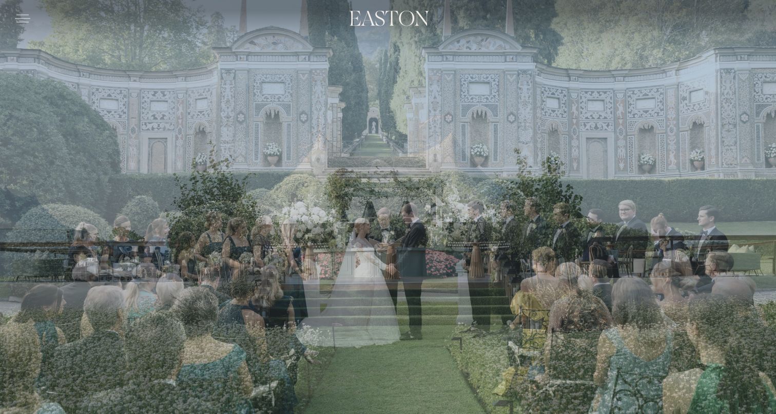
Easton Events gives the first view almost entirely to event imagery, with a compact identity and menu control kept at the edges. The captured scene places people and a designed setting ahead of a promotional headline. This is a markedly different choice from the service-heavy introductions elsewhere in the collection: the site asks visitors to absorb the visual character first and discover the supporting information through navigation. The image-led treatment can suit a portfolio gateway, although it offers little immediate explanation for someone arriving without prior knowledge of the studio. The example is valuable for that specific presentation decision rather than for an assumed planning process.
What you can learn
Decide consciously whether the first screen should explain or immerse. If a portfolio image leads, keep navigation identifiable and ensure the next view answers scope and contact questions without another layer of ambiguity.
Pros
The uncluttered first screen makes the photographed event setting easy to study.
The small identity and menu preserve a consistent, restrained visual tone.
Cons & considerations
The initial view depends heavily on prior recognition or willingness to explore.
A static capture cannot communicate the full behavior of an image-led changing presentation.
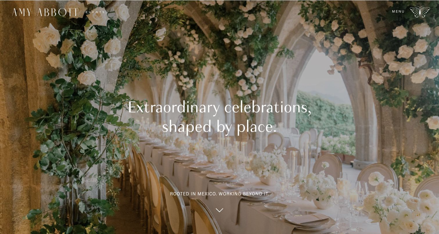
Amy Abbott Events uses a full-screen celebration setting and a brief centered headline to connect the work with its destination. The opening explicitly places the practice in Mexico while indicating a wider reach, giving the image a geographic context without filling the screen with a long biography. A small menu control, discreet identity and scroll cue preserve the visual emphasis. The composition is useful for destination planners because it shows how a place can shape the introduction without requiring an immediate list of venues. The tradeoff is that practical responsibilities and inquiry qualifications remain beyond the first impression.
What you can learn
Use a short geographic statement to make destination imagery meaningful. Then follow the visual introduction with clear planning scope, travel expectations and a relevant contact path rather than assuming the setting explains the service.
Pros
The location statement gives the atmospheric photograph a concrete relationship to the business.
The restrained overlay keeps the event setting visible while introducing the creative approach.
Cons & considerations
The opening provides little detail about the level of planning support available.
Small navigation and scroll cues can be overlooked when the photograph commands attention.
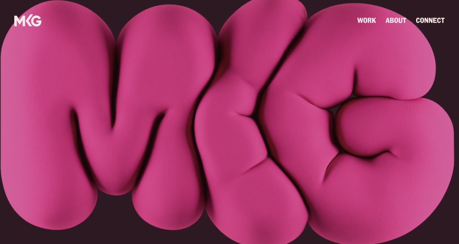
MKG opens with a bold sculptural wordmark in saturated pink, using the brand itself as the first experiential statement. The navigation is compact: work, about and connect. The page then introduces the agency’s focus on brand experiences and presents named projects with recognizable client and activation titles. That structure gives the expressive opening a practical continuation, allowing visitors to move from the agency’s personality into specific work. It is a useful counterpoint to wedding-led portfolios because the project naming explains the event concept and commissioning brand, rather than relying on a sequence of decorated spaces without context.
What you can learn
An energetic brand opening needs a direct route into named work. Describe each activation clearly enough that a prospective client can recognize the type of experience before deciding whether to open the case study.
Pros
The distinctive wordmark makes the agency’s creative personality immediately recognizable.
Client and project titles provide useful context around the experience portfolio.
Cons & considerations
The opening graphic alone does not explain services until the visitor continues down the page.
A work-led presentation needs supporting case studies to clarify responsibilities and project scope.
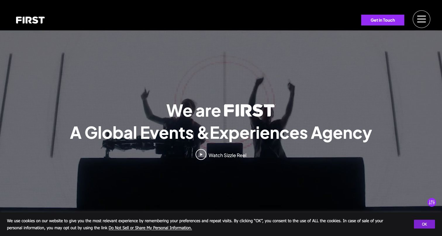
FIRST combines a direct events-and-experiences description with a large moving-image style introduction and a visible showreel control. The black header keeps the identity, contact action and menu distinct from the imagery. Below, featured work uses specific event names and dates where relevant, helping visitors distinguish different programs instead of viewing only generic production photographs. The page also explains the agency-partner and embedded-specialist approaches in its own service copy. The captured first visit includes the source site’s cookie notice, which is retained as part of the actual experience. The design is useful for studying how corporate event work is organized around named engagements.
What you can learn
State the agency category plainly before relying on a showreel. Give project cards recognizable event names and connect them to case studies that explain the engagement rather than using brand logos as the only evidence.
Pros
The headline communicates the agency’s events focus without requiring a portfolio search.
Named featured projects help visitors identify relevant corporate event formats.
Cons & considerations
The source privacy notice occupies space along the captured first-visit view.
Moving imagery and a collapsed menu make loading and navigation behavior especially important.
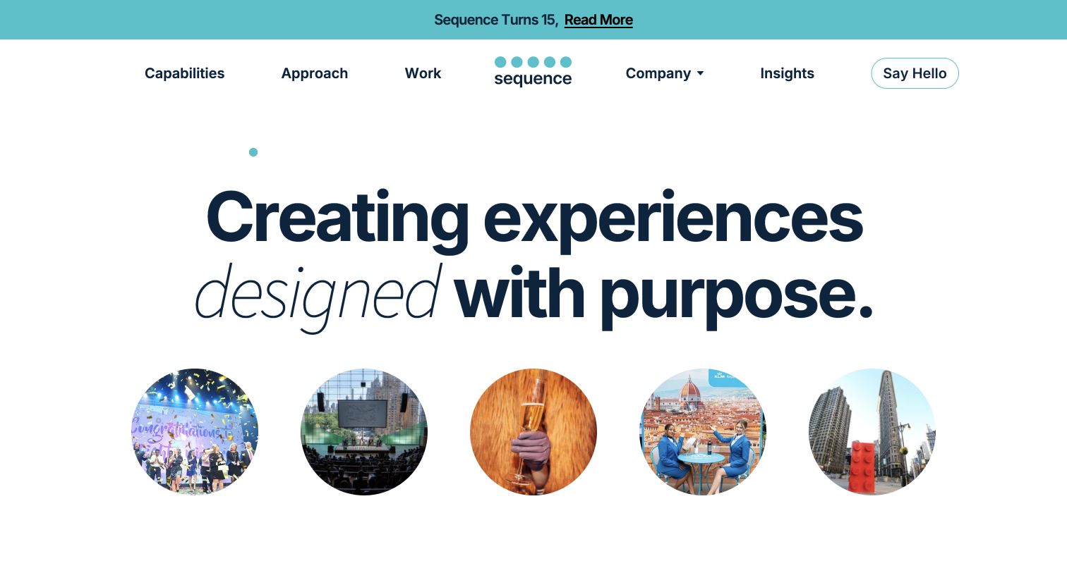
Sequence Events opens with a large typographic statement and a row of circular event images rather than allowing a single photograph to dominate. Its navigation names capabilities, approach and work, setting up three different kinds of evaluation. The following process section explains discovery, alignment, creative development, production and measurement through distinct stages. This turns a broad claim about purposeful experiences into something a visitor can inspect. The corporate emphasis differs from a personal wedding portfolio: the page gives stakeholder coordination and the planning method substantial space alongside the visual evidence. That balance is useful for organizations comparing how an event partner approaches a brief.
What you can learn
Make the working process a browsable part of the site when clients need to understand collaboration and approvals. Distinguish capability, method and previous work so each destination answers a different procurement question.
Pros
The navigation separates what the agency does from how it works and what it has made.
Named process stages provide more substance than a standalone creativity slogan.
Cons & considerations
The extensive process content can become repetitive if several interactive versions are exposed.
An anniversary announcement adds content that needs maintenance beyond the permanent service story.
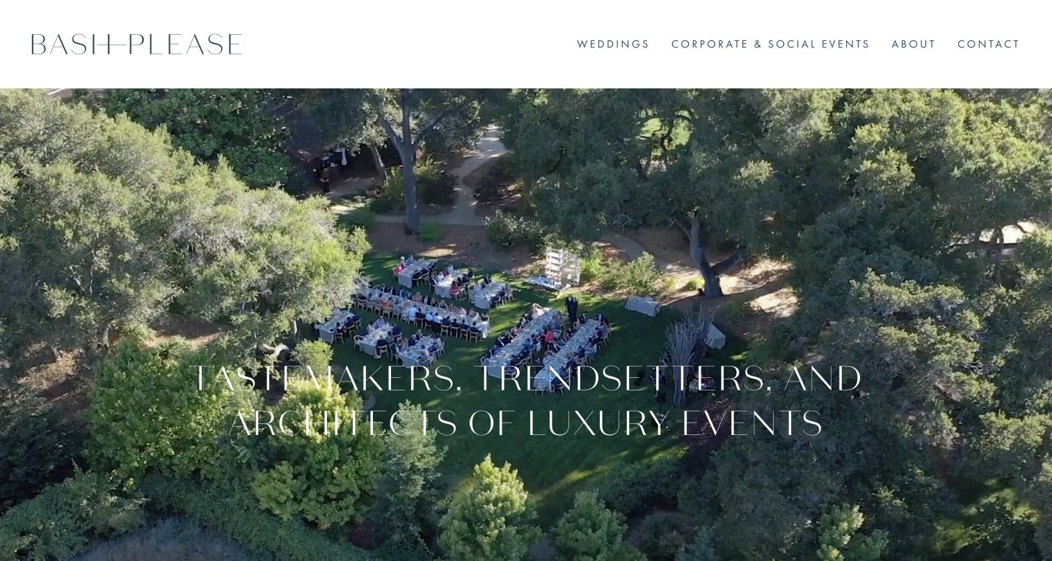
Bash Please pairs a wide event photograph with a restrained header that immediately distinguishes weddings from corporate and social events. That small navigation decision does important work: the same visual style can serve different commissions without making every visitor browse the wedding portfolio first. Large editorial statements and generous imagery carry the rest of the introduction, with company and contact routes kept close to the work. The page describes collaboration and logistics alongside its aesthetic position, although the strongest first impression remains photographic. It is a useful model for a studio that wants a compact site while still acknowledging different audiences.
What you can learn
Separate audiences where their examples and questions differ, even if the business uses one design language. A short navigation can communicate breadth when its labels name actual event types rather than vague creative categories.
Pros
Wedding and corporate-social routes make the range understandable from the header.
The restrained page structure gives portfolio imagery room without a crowded set of promotions.
Cons & considerations
Large editorial statements provide less immediate detail than clearly scoped service descriptions.
The image-led introduction depends on later pages to explain planning responsibilities and fit.
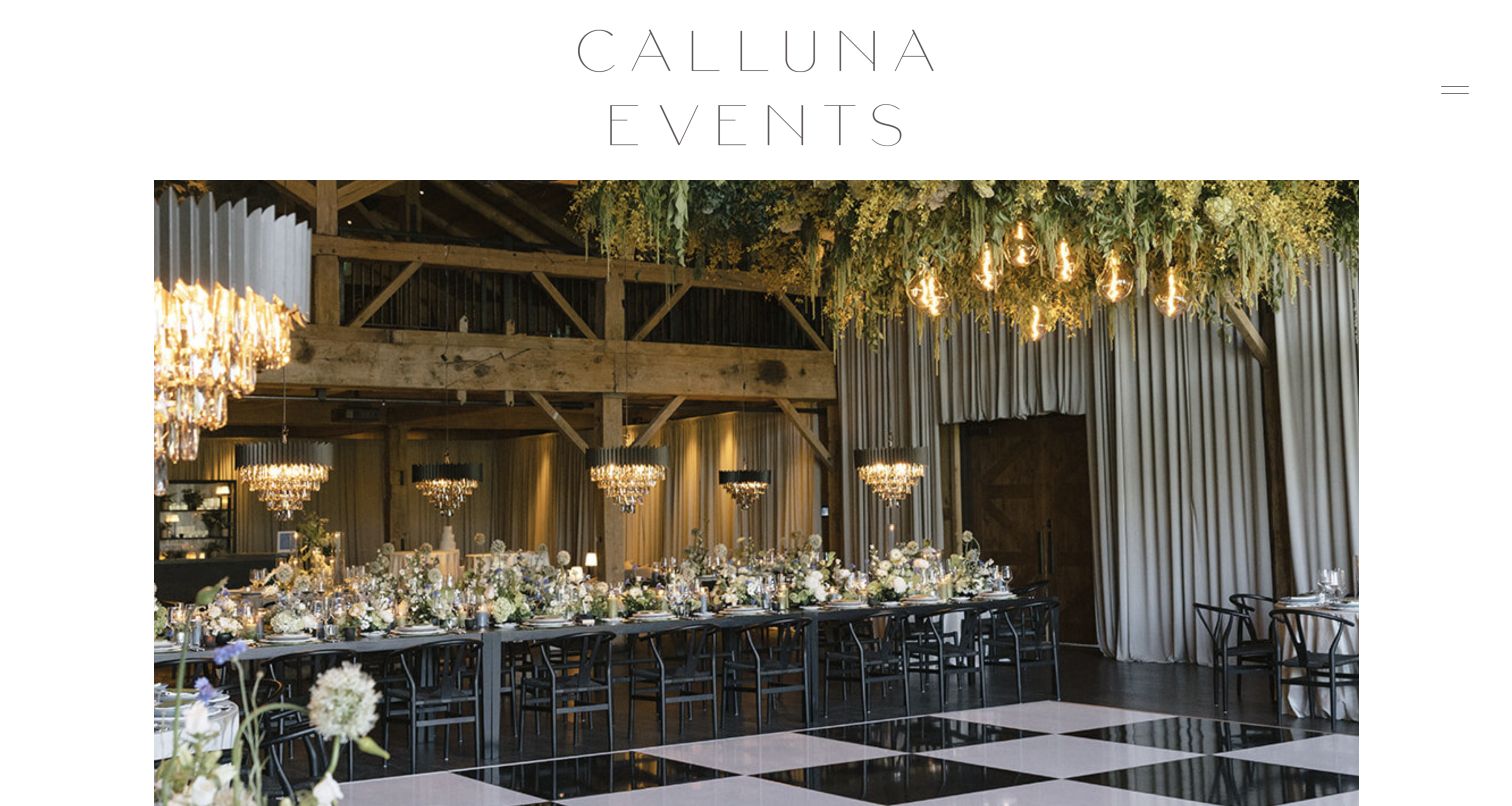
Calluna Events places a large, airy wordmark above a contained reception photograph, giving the opening the proportions of a printed portfolio rather than a full-screen advertisement. The subsequent copy connects the studio’s style with personal celebrations and natural settings, while service, portfolio and contact destinations provide the practical framework. The photographed arrangement and measured typography support that tone without a crowded assortment of buttons. This example is useful for studying consistency between visual presentation and written positioning: the website does not need a different graphic language for every project to communicate variety within an identifiable planning approach.
What you can learn
Build a stable frame around varied event photography. A consistent page rhythm can express the studio’s point of view while service and portfolio destinations carry the information needed to evaluate individual projects.
Pros
The contained image and generous white space create a clear, calm visual hierarchy.
The nature-oriented copy gives the gallery a recognizable editorial direction.
Cons & considerations
The opening does not immediately communicate geography or detailed planning scope.
Broad style statements need specific project context to help visitors distinguish similar celebrations.
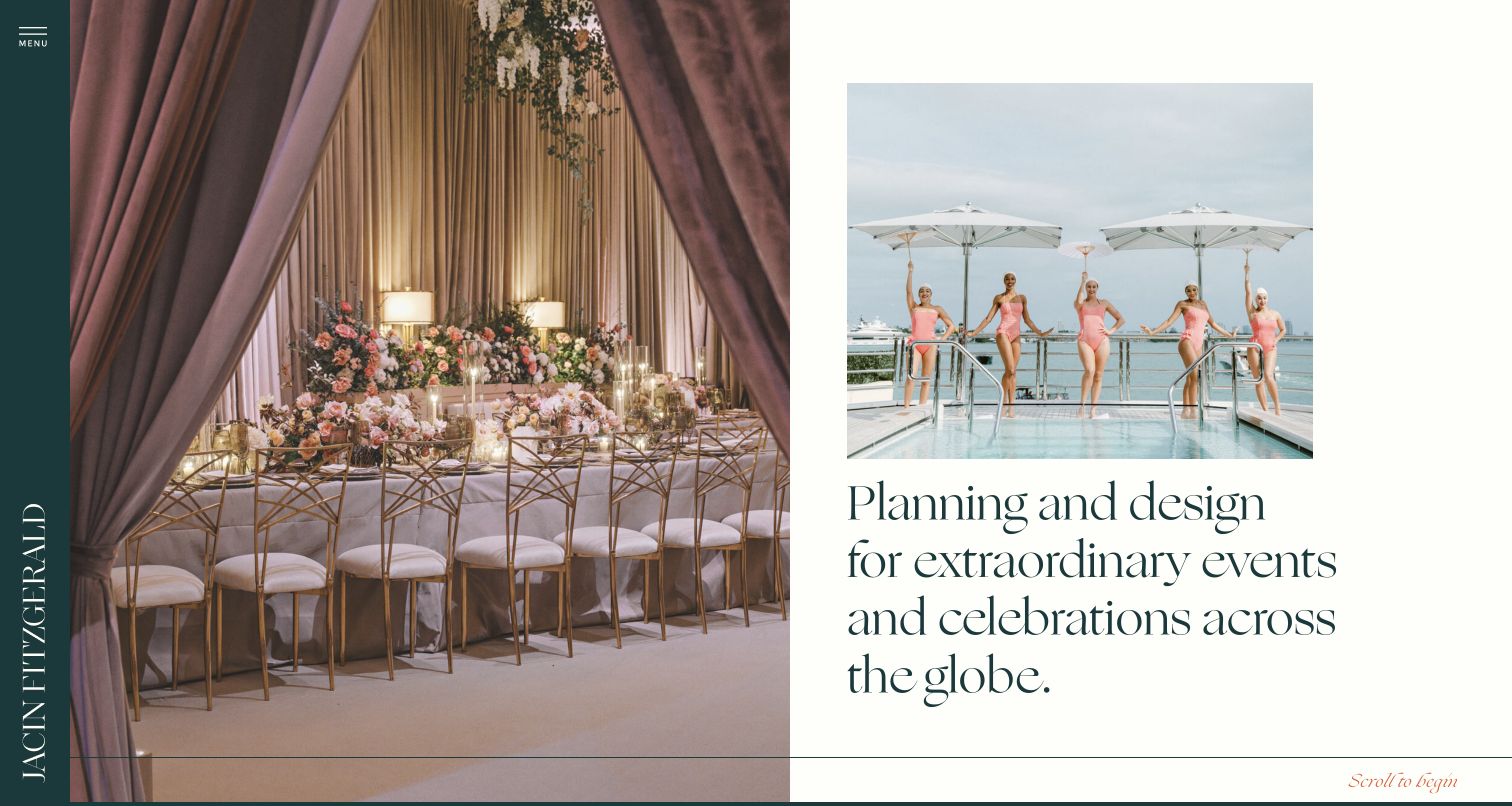
Jacin Fitzgerald Events arranges the opening like an editorial spread: a large interior celebration image sits beside a smaller outdoor scene and a concise planning-and-design statement. A dark vertical identity strip creates a recognizable edge, while the asymmetrical composition gives two different settings room to coexist. The page points visitors toward portfolio, about and contact destinations rather than overwhelming the opening with a long menu. The visual contrast communicates range without abandoning a controlled design system. It is particularly useful for studying how a planner can show more than one atmosphere in the first screen while preserving a clear hierarchy.
What you can learn
Use a small number of contrasting images to demonstrate range, then anchor them with a plain service statement. An editorial composition should help visitors compare the work rather than become a puzzle about where to click.
Pros
Two contrasting scenes communicate more visual range than a single hero photograph.
The planning-and-design statement explains the offering within the opening composition.
Cons & considerations
The unconventional vertical identity and small menu demand careful navigation affordances.
Detailed process and regional context require exploration beyond the initial visual introduction.
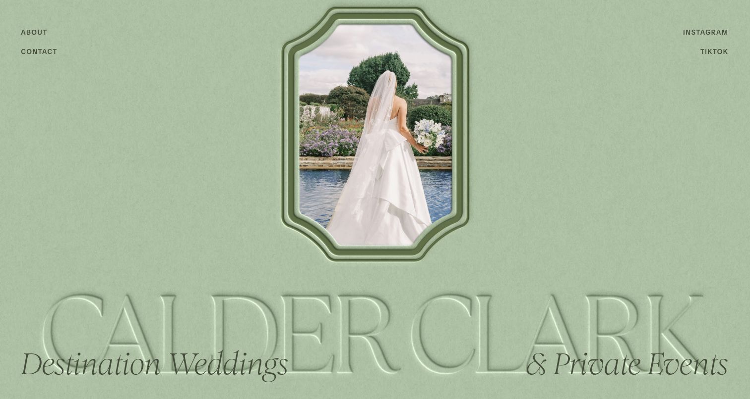
Calder Clark uses a soft green canvas, an ornamental portrait frame and oversized lettering to create a strongly authored first impression. Rather than covering a large image with generic promotional text, the page treats the name and the photograph as complementary design elements. Destination weddings and private events are identified within that composition, while about, contact and social routes remain small and direct. The result is memorable because its visual identity does more than repeat the colors of the current event photograph. It offers a useful study in giving a planning practice its own recognizable frame around changing portfolio material.
What you can learn
Develop a visual identity that remains recognizable when portfolio photographs change. Keep the event category legible within the expressive treatment so visitors can appreciate the design and understand the business at the same time.
Pros
The green palette and decorative frame make the introduction visually distinctive.
The event categories provide context without adding a long block of opening copy.
Cons & considerations
The sparse navigation offers little immediate detail for comparing planning services.
Large decorative typography and small utility links require careful readability checks on narrow screens.
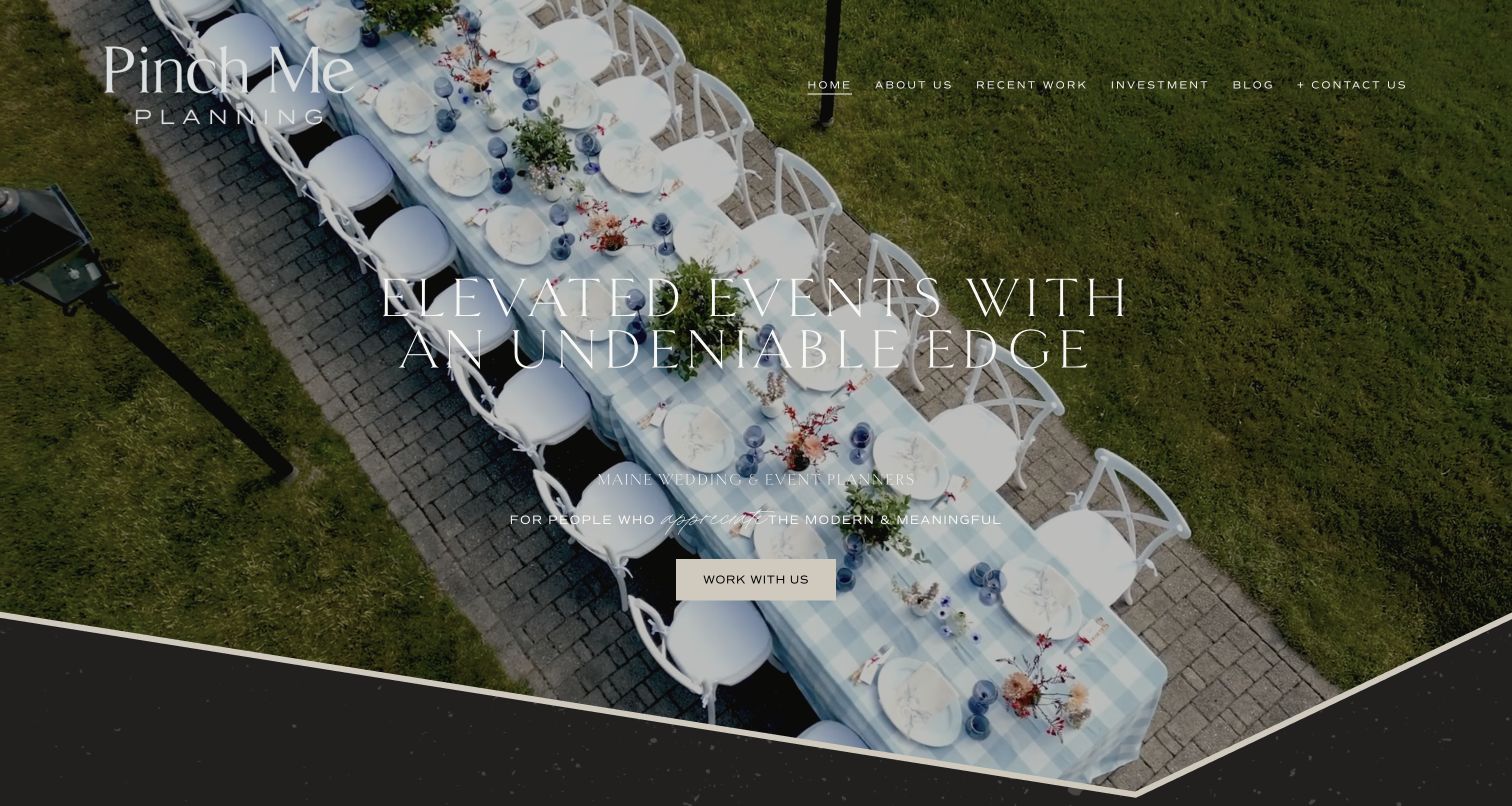
Pinch Me Planning combines an overhead celebration photograph with a concise statement about modern, meaningful events. The page explicitly identifies Maine wedding and event planning, so the aspirational tone is grounded in a real service territory. The top navigation includes team, portfolio and investment alongside contact, allowing visitors to investigate fit before making an inquiry. Further copy returns to the relationship between place, people and the planning partnership. This is a useful example of a regional business presenting a strong creative identity without hiding practical evaluation behind an undifferentiated luxury message or a gallery alone.
What you can learn
Make investment and team information easy to find alongside the portfolio. A regional planner can use a specific sense of place to support the proposition while giving visitors independent routes to evaluate the engagement.
Pros
The Maine planning statement establishes geographic relevance within the opening section.
An explicit investment route supports practical evaluation before the contact stage.
Cons & considerations
Text over a detailed overhead photograph needs disciplined contrast and spacing.
Several emotional statements repeat the positioning before the page reaches more concrete detail.
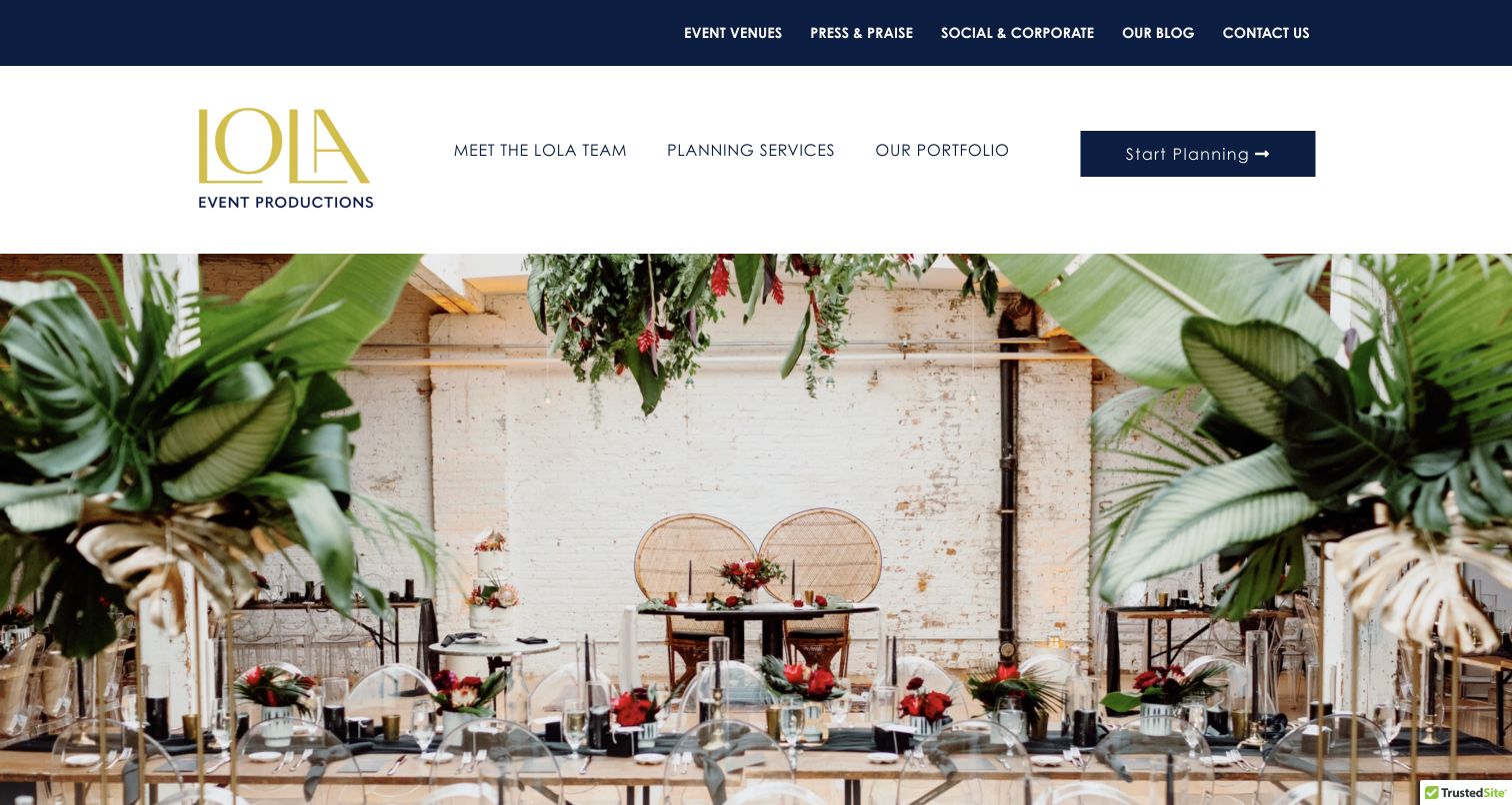
LOLA Event Productions uses two navigation tiers to distinguish general resources from the main team, planning-service and portfolio routes. A prominent start-planning action provides a direct next step, while the reception image establishes the visual character of the work. Further down, named planning offerings are accompanied by descriptions that distinguish different levels of involvement. The tone is conversational and team-centered, but the underlying structure addresses a practical problem: visitors may need different amounts of help. Venue, corporate-social and editorial routes expand the site beyond a single wedding gallery without removing the main planning destinations.
What you can learn
If the business offers different planning levels, explain the differences in ordinary language beside the package names. Personality can make the presentation approachable, but visitors still need to understand which responsibilities each offering covers.
Pros
The main service routes and start-planning action remain clear within a broader content library.
Package descriptions begin to distinguish different degrees of planning involvement.
Cons & considerations
Two navigation tiers increase the number of choices a first-time visitor must scan.
Branded package names require supporting explanations before readers can compare them confidently.
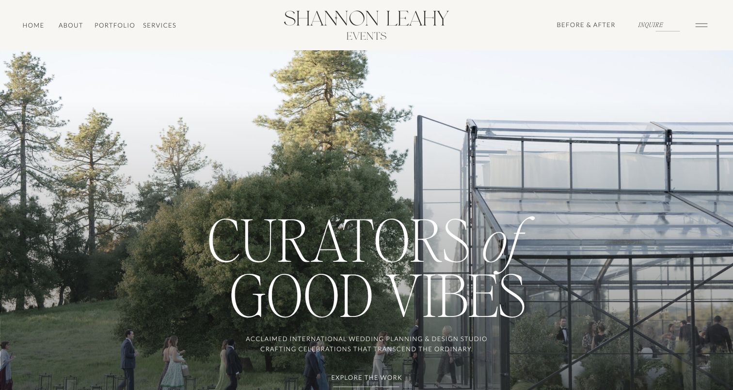
Shannon Leahy Events combines a large event photograph with playful editorial typography and an informal creative voice. The header includes a before-and-after destination alongside the portfolio, services and contact, making the transformation of a space part of the browsing proposition. The page also identifies planning, coordination, event design and floral work in its service language. Those practical routes give the exuberant introduction more substance than a mood statement alone. The example is useful for studying how a studio can communicate warmth and personality while offering visitors several distinct ways to inspect the work and understand the kind of partnership being presented.
What you can learn
Give process evidence its own route when it helps explain the value of the work. A before-and-after section can complement a finished portfolio, provided the images clearly identify the same setting and the studio’s actual contribution.
Pros
The transformation route offers an alternative to browsing finished celebration photographs only.
Named planning and design services support the informal, personality-led introduction.
Cons & considerations
The playful language may require more concrete explanation for visitors comparing responsibilities.
Text placed over busy event imagery needs careful contrast across every image variation.
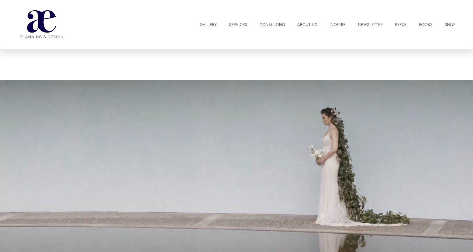
Alison Events uses a sparse white header and a large, quiet photograph to establish its visual tone before a short statement about the kind of celebrations it designs. The page avoids a dense opening sales pitch, but the navigation reveals a wider practice: gallery, services, consulting, inquiry and editorial destinations are all distinct. Books and shopping are also separated from the core planning routes. This makes the site useful for studying how a restrained aesthetic can contain several commercial and editorial activities without turning them into one continuous homepage feed. The tradeoff is that the first image carries more mood than practical service information.
What you can learn
A quiet visual introduction works best when navigation does the practical organizing. Separate consulting, planning and published material clearly so the visitor’s task determines the route rather than the order of promotional content.
Pros
The restrained photograph and short introduction create a coherent, unhurried visual tone.
Distinct navigation labels separate services, consulting, inquiry and related editorial activities.
Cons & considerations
The number of header destinations is substantial despite the minimal overall appearance.
The opening requires further exploration to establish detailed scope and geographic suitability.
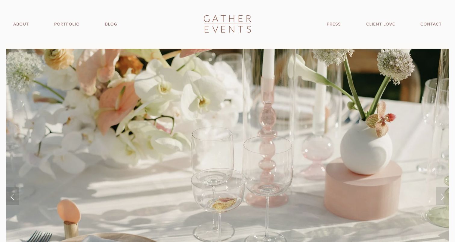
GATHER Events places a bright tablescape beneath a balanced white navigation bar, with the centered identity framed by company, portfolio, editorial and contact routes. The following introduction emphasizes the people, cultural backgrounds and communities involved in celebrations, giving the visual presentation a human context. A portfolio route remains available before the social feed, which supplies additional activity without becoming the only evidence source. The example is useful for studying how a studio can use a warm collective voice while keeping the work easy to browse. Its relatively simple structure leaves the imagery prominent without replacing the service introduction entirely.
What you can learn
Connect event imagery to the people and relationships it serves, then maintain a dedicated portfolio outside social platforms. A welcoming voice is more useful when visitors can still find representative work and a clear contact destination.
Pros
The balanced navigation keeps portfolio and contact routes visible around the centered brand.
The introduction explains the collaborative perspective behind the photographed celebrations.
Cons & considerations
The homepage gives limited detail about the exact boundaries of planning services.
A substantial social feed introduces external content and maintenance dependencies after the portfolio.
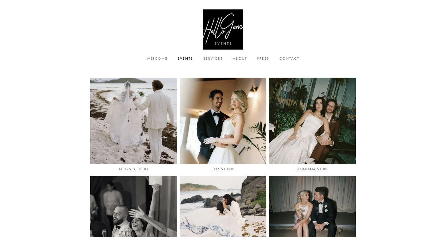
The reviewed Hello Gem Events page is the portfolio itself, not the homepage. A compact identity and simple navigation sit above a three-column grid of celebration photographs, each linked to a named project. The visual treatment is deliberately restrained: the grid provides the variety, while the surrounding page stays quiet. Visitors can move to services, about and contact without leaving the same basic navigation structure. This is a useful example for studying the evaluation stage of an event-planning website, when someone wants to compare several real celebrations rather than read another broad statement about creativity or personalized service.
What you can learn
Give the portfolio a dependable grid and individual project destinations. Pair client names with useful context where possible, so visitors can identify a relevant setting or event type without needing to open every gallery.
Pros
The repeated grid structure makes a substantial body of work straightforward to scan.
Services and contact remain accessible while the visitor browses individual celebrations.
Cons & considerations
Names alone provide little information about setting, event type or planning responsibilities.
Several images use file-style alternative text that offers limited descriptive context.
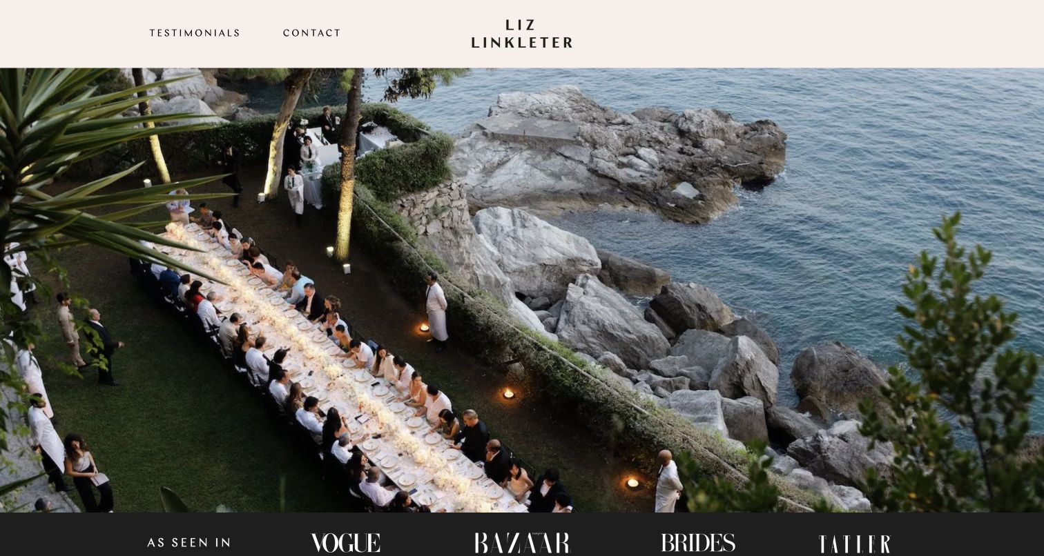
Liz Linkleter Events opens with a large celebration photograph and a restrained header, then states the agency’s full-service planning and design focus across Europe. The most practical organizational choice comes next: private parties, brand events and weddings each receive their own portfolio route. This lets the same creative identity serve different audiences without asking a corporate visitor to infer relevance from a wedding gallery. The visual design remains spare, using strong imagery and short headings instead of numerous introductory paragraphs. The page demonstrates how a relatively compact homepage can still explain the major branches of an event business.
What you can learn
Organize work by the commissioning audience when that distinction changes the visitor’s questions. Separate portfolios can make a concise site easier to evaluate without requiring a different brand treatment for every service category.
Pros
Three named portfolio routes clearly distinguish private, brand and wedding commissions.
The introduction supplies both service scope and geographic context in a short passage.
Cons & considerations
The initial navigation gives fewer direct destinations than the fuller footer menu.
Portfolio categories still need project-level explanations to establish the agency’s specific contribution.
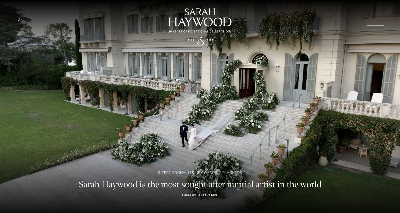
Sarah Haywood uses a large destination scene, centered identity and carefully positioned editorial quotations to establish the tone of the opening. The following sections distinguish weddings, parties and destinations, giving the image-led introduction a clearer service structure. A London-base statement and destination discussion add geographic context, while the menu keeps the first screen visually restrained. The site’s own press quotations are part of its presentation rather than independent findings of this review. The example is useful for studying how a luxury planning brand uses atmosphere and public reputation together, then moves into categories that help visitors locate the relevant kind of celebration.
What you can learn
Keep reputation statements attributed and separate from the service explanation. An impressive image and press quotation can introduce a brand, but visitors still need to understand event types, location and the next evaluation step.
Pros
The service sections distinguish weddings, parties and destination planning after the visual opening.
The photographic treatment gives the site a consistent sense of setting and scale.
Cons & considerations
Press quotations and atmosphere dominate before practical planning responsibilities are explained.
A collapsed menu requires an additional action to discover the wider site structure.
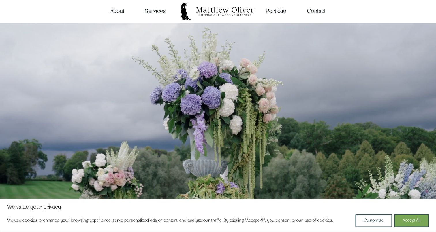
Matthew Oliver Weddings places a compact identity between about, services, portfolio and contact links, giving the destination imagery a straightforward practical frame. The large floral and landscape scene establishes the visual mood, while subsequent headings identify the wedding-planning focus. The page then introduces the team, names destination regions and offers individual wedding stories. The captured first visit retains a privacy notice at the bottom, showing the actual source-page experience rather than a cleaned promotional image. The useful design lesson is the balance between an expansive destination proposition and a small navigation that remains understandable to someone researching the business for the first time.
What you can learn
Use a simple navigation to support complex destination work. Explain the planning base and actual geographic scope in text, then connect portfolio entries to specific celebrations rather than assuming scenic photography communicates operational reach.
Pros
The four main navigation labels support a clear introduction, evaluation and inquiry sequence.
Destination context and individual wedding stories add substance beyond the opening landscape.
Cons & considerations
The first-visit privacy notice reduces the unobstructed area available for the hero image.
Press material and repeated service introductions make the page longer before detailed project exploration.
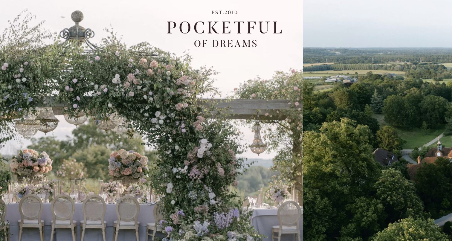
Pocketful of Dreams uses a multi-image opening that combines celebration details and landscape, with the identity placed as part of the composition. The navigation beneath that visual approach is comparatively detailed: weddings, parties, brand events, virtual support and venue search appear as distinct service destinations. Approach, signature locations, portfolio and reviews provide further ways to evaluate the practice. This makes the example useful for studying a business that wants a polished editorial front page without collapsing different kinds of support into one vague planning offer. The main challenge is balancing that breadth with an easy first decision for the visitor.
What you can learn
Give genuinely different services their own destinations, then make the highest-priority route easy to identify. Editorial imagery can establish taste, while clear service names should explain what a visitor can actually engage the business to do.
Pros
The detailed service navigation recognizes different event types and venue-search needs.
The opening collage communicates both setting and designed details within one composition.
Cons & considerations
The number of nested destinations increases the effort required to scan the navigation.
An image-heavy first screen postpones the practical service explanation for new visitors.
Kegan is a freelance web designer and developer with 15+ years of experience helping businesses turn complicated website requirements into clear, maintainable digital experiences. He works directly with clients from planning and design through development, launch, and ongoing support.
For event planner website design, his development approach focuses on genuine event portfolios, planning-service and package distinctions, practical process information, regional coverage and useful event-brief inquiries. The scope can be a targeted improvement or a complete custom build, with responsive layouts, thoughtful content structure, and integrations chosen around the people using and maintaining the site.
Show 3 other event planner website designersHide other event planner website designers
Plan the site around event type, service responsibility and the next conversation
Define the engagement before naming the packages
Begin with the work the company actually performs. Planning, coordination, creative direction, floral design and event production can overlap, but they are not interchangeable descriptions. Write a plain-language account of the responsibilities included in each engagement, who makes decisions and which suppliers the client contracts separately. A small planner may need only one clear service page, while an agency serving corporate events and private celebrations may need distinct audience routes.
Choose package labels after those differences are clear. A branded name can give the offer personality, but it should sit beside an explanation of involvement, timing and limits. Avoid making visitors infer the difference between full and partial planning from a photograph. If investment guidance is published, explain its scope and identify factors that require a tailored proposal. Keep availability statements current and avoid presenting an inquiry as a reservation.
Map the geography in a similarly practical way. Name the base and the locations the business genuinely serves, then explain destination work only as far as approved information supports it. A scenic portfolio should not imply permanent local operations everywhere an event has taken place. The goal is to help a prospective client recognize a plausible fit before investing time in a detailed conversation.
Turn the portfolio into evidence of a particular contribution
Select projects that show the range relevant to the service, not merely the most dramatic photographs. A private-estate wedding, a community celebration and a brand activation can demonstrate different planning challenges. Give each project a recognizable title and enough context to explain the setting, type of event and the business’s actual role. Where collaborators are named, preserve the agreed credits instead of implying that the planner produced every photographed element.
Use a consistent project structure so visitors can compare examples. A short brief, a few carefully chosen images and an explanation of the planning contribution can be more useful than a long uncategorized gallery. If a before-and-after presentation is appropriate, make clear that the views show the same setting and describe the transformation accurately. Do not turn a supplier’s photograph or a styled editorial shoot into evidence of an unrelated client engagement.
Plan the asset workflow before building elaborate galleries. Record publication permission, photographer attribution, meaningful alternative text and image crops that work at different sizes. Keep genuine event dates separate from website update dates. Decide who will maintain the project library after launch, and preserve useful project URLs when older work moves out of the homepage selection. A portfolio becomes more credible when its context is as dependable as its imagery.
Make the inquiry useful without creating unnecessary friction
Decide what the team needs to begin an appropriate conversation. Event type, approximate date, location and the kind of support requested may be useful, while a long mandatory questionnaire can discourage visitors who are still exploring. Explain why sensitive or detailed information is needed, and keep private planning records outside the public marketing content. Provide an understandable response expectation only when the team can maintain it.
Design the inquiry route around the actual operating process. A wedding specialist and a corporate agency may need different initial questions, but both should make it clear what happens after submission. Do not confuse a contact form with a contract, payment or confirmed booking. Existing clients should reach their planning portal through a separate, clearly labeled route so they do not need to use a new-business form for routine coordination.
Check the complete first-visit experience, including privacy notices, loading media, keyboard navigation and fallback contact information. Keep the main service and contact routes usable when a video, social feed or gallery integration does not load. A persuasive site should make an informed conversation easier to start, while detailed proposals, supplier commitments and event operations remain with the people responsible for delivering the work.
The editing job behind the design
Choose tools that keep portfolios and planning inquiries maintainable
Use a content-management system that makes service descriptions, project galleries, credits and team information straightforward to maintain. The most useful platform is one the team can keep accurate as its work changes.
Treat video, social feeds and large galleries as enhancements with useful fallbacks. Optimize genuine photography, provide appropriate text descriptions and preserve a direct route to services and contact when third-party media is unavailable.
Keep public marketing content separate from private client planning systems and inquiry records. The stacks shown with these examples come from bounded public-page evidence and do not establish which internal tools a planner uses to manage events.
Our WordPress website examples offer a separate look at publishing approaches. A visible platform label is evidence for that named page, not a guarantee that the same system will suit your requirements.
Before the public launch
Event-planner website brief checklist
Identify the event types the business actually serves.
Explain planning, coordination, design and production responsibilities clearly.
Describe the difference between service levels beside any branded package names.
State the real service base and geographic coverage.
Give portfolio projects event-type, setting and contribution context.
Retain photographer credits, publication permission and meaningful image descriptions.
Keep investment and availability statements accurate and appropriately qualified.
Separate new inquiries from existing-client access.
Ask only for information needed to begin the planning conversation.
Explain that an inquiry does not confirm a booking.
Provide usable routes when galleries, video or social integrations fail to load.
Assign responsibility for service copy, project updates and inquiry follow-through.
These checks are a project checklist, not a performance, legal, security, or accessibility certification. Test real journeys with the people responsible for the website before making claims about the result.
Sources & editorial method
How this collection was selected and reviewed
The collection contains 29 distinct public website properties, matching the original saved industry draw. All 29 examples received direct browser captures for this collection, with actual source URLs, dimensions and capture times retained. The 42 North example is an events service page and Hello Gem is a portfolio page; the remaining captures are public homepages. Reviews assess visible design and information structure. Broad public stack-audit attempts were completed for every source: unavailable or partial observations are preserved honestly and are not treated as complete backend knowledge. Two captures retain visible source privacy notices. No inquiry, booking, account action or form submission was made during the research.
Each example links to its actual source page. Screenshots are direct browser captures with their own capture dates; moving imagery, announcements and live designs can change. The notes describe observable design choices and conditional tradeoffs, not measured traffic, conversion results, service quality, or accessibility conformance.
Technology labels use public page metadata, asset evidence, or explicitly cited platform documentation. Platform documentation is not a complete current deployment audit. A component reference may be legacy or unused; it is not a complete backend inventory. Unknown stacks are omitted. These sites are editorial examples, not our client portfolio.
Written, Edited and Curated are separate editorial records, not timestamps advanced by a rebuild. Website designs and imagery belong to their owners. See our editorial standards or suggest a correction.
Questions worth asking
Event Planner website design questions
Should an event-planner homepage begin with photographs or services?
Use both in a clear sequence. Photography can establish the character of the work, while a concise service statement explains the business. Keep the main service and contact routes identifiable even when the opening is primarily visual.
How should full planning and coordination be distinguished?
Describe the responsibilities, timing and limits of each offering in ordinary language. Package names alone are not enough. Use the business’s actual scope rather than assuming every planner uses those terms in the same way.
Should portfolio projects use couples’ or client names?
Names can identify a project when publication is approved, but useful setting and event-type context helps visitors browse. State the planner’s contribution and retain appropriate collaborator and photographer credits.
Does a planning inquiry confirm availability or a booking?
No. A website should explain the next step and keep inquiry acknowledgment separate from an agreed proposal or booking. Availability and contractual commitments need confirmation through the business’s actual process.
Does this collection recommend the event services of the featured companies?
The reviews and Editors Choice assess public website presentation and communication. They do not establish service quality, suitability for a particular event, current availability or a guaranteed planning outcome.