Best Dog Training Websites of 2026 (29 Real-World Examples)
Dog training websites that distinguish programs and the first step
These 29 examples examine group classes, private sessions, puppy programs, trainer introductions, and the clarity of enrollment or consultation routes.
Training businesses often serve owners with very different questions. A puppy class, everyday skills course, and individual consultation should not share an undifferentiated booking button. Explain who each program is intended for and how staff help with uncertain fit.
Sirius is the editorial choice for its program presentation. This collection evaluates public information and design; it does not verify training outcomes or recommend an approach for an individual dog.
Before the examples
What makes good dog training website design in 2026?
Separate program types
Use recognizable audience and format labels, then describe age guidance, prerequisites, class size where published, and the kind of participation expected.
Introduce trainers with context
Show named instructors and accurately described roles. Explain the organization’s approach in ordinary language and link detailed policies without turning credentials into a guarantee of results.
Make the first contact proportionate
A basic inquiry should help staff identify the appropriate next conversation. Clarify whether an assessment precedes enrollment and avoid implying that a form submission confirms a place.
The collection · 29 examples
29 dog training websites worth studying
Compare the examples by the visitor decisions they support. Each review identifies a specific pattern, practical lesson, strengths, and limitations in the directly inspected page.
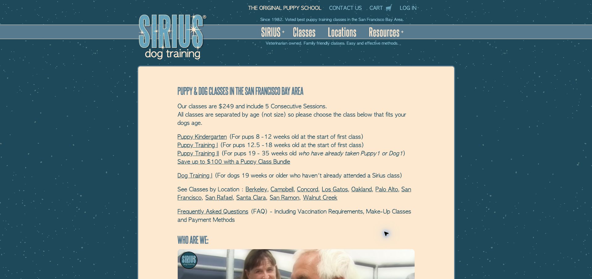
Sirius makes the first screen unusually useful. A cream panel on a blue, starry background presents the displayed course price and five-session commitment before linking to classes by puppy age and prior experience. Visitors can also browse by Bay Area location without deciphering branded program names. The FAQ link explicitly mentions vaccination requirements, missed classes, and payment, anticipating practical questions before enrollment. This is our editorial choice for making class selection concrete. The narrow layout and decorative condensed headings feel dated, while the closely spaced text links deserve more breathing room. Enrollment availability still requires opening a class or location.
What you can learn
Put the decision criteria above the brand story. Show age at the first session, prerequisite experience, total commitment, and location routes together so an owner can identify the right course before registering.
Pros
Age ranges and prerequisites accompany the class links.
Price and session count are visible immediately.
Cons & considerations
The tightly packed links are harder to scan quickly.
Individual schedules sit beyond the opening selection panel.
Hammersmith pairs a large dog portrait with blue lettering and a pale green patterned background. The first action invites visitors to join, while the short navigation separates puppy training, adult training, and class times. Below the hero, a checklist translates the service into familiar owner concerns such as pulling, barking, and recall. Puppy and adult sections then give age and scheduling context before their detail links. That progression connects an emotional promise with practical choices. The portrait occupies much of the opening, however, and the broad joining label does not explain whether the next step is enrollment, an inquiry, or a visit.
What you can learn
Use everyday behavior concerns to introduce services, then connect each group to an age range and timetable. A specific action label should explain what joining actually involves before visitors leave the page.
Pros
Puppy and adult training have separate navigation routes.
The problem checklist uses recognizable owner language.
Cons & considerations
The large hero postpones detailed course information.
The joining action could describe its destination more precisely.
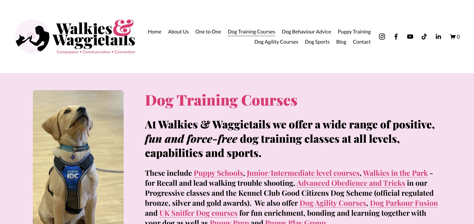
Walkies & Waggietails gives its course page a distinctive pink palette, oversized serif typography, and a portrait of an attentive dog. Linked program names in the introduction act as a contents list for an extensive offering. Further down, the page explains indoor and outdoor venues, parking context, and the relationship between introductory and advanced classes. This is valuable detail for owners comparing more than a basic puppy course. Its weakness is density: the large header, lengthy introduction, and many bold linked phrases make the opening feel demanding. Visitors must move through substantial explanation before reaching individual course logistics.
What you can learn
A long curriculum needs a compact overview that separates program, suitability, venue, and next available date. Keep the detailed teaching philosophy available, but let an owner reach the relevant course without reading every introductory paragraph.
Pros
Linked course names provide routes into the long page.
Venue descriptions explain meaningful differences in training settings.
Cons & considerations
The oversized header consumes valuable introductory space.
Dense bold paragraphs make quick comparison difficult.
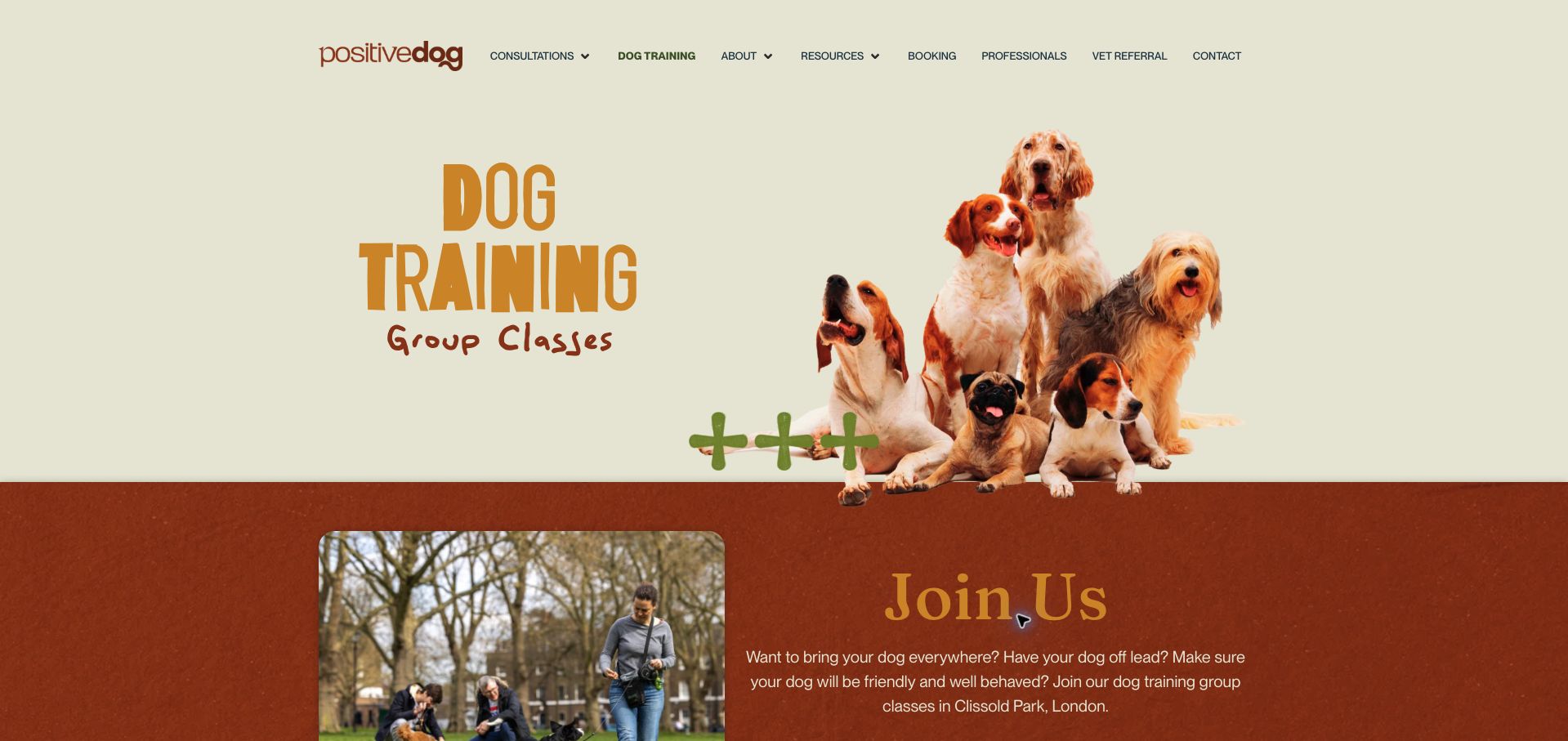
Positive Dog London uses a cutout group of dogs, irregular display lettering, and earthy orange and cream tones to make a class page feel approachable. The opening names group training, then identifies Clissold Park and offers a booking route. The more useful material follows: level descriptions divide exercises by session and spell out class size, duration, preparation work, and age suitability. That structure helps owners understand what participation involves rather than merely promising better behavior. Some playful typography is less easy to read, and visible copy errors weaken the polish. The decorative first panel also delays the concrete course comparison.
What you can learn
Explain the learning sequence in manageable stages and place eligibility beside each level. A friendly visual identity works best when the practical course description stays consistently written and easy to scan.
Pros
Session-by-session descriptions make the curriculum tangible.
Age guidance and class size support course selection.
Cons & considerations
Decorative lettering reduces readability in prominent headings.
Copy errors distract from the otherwise detailed program information.
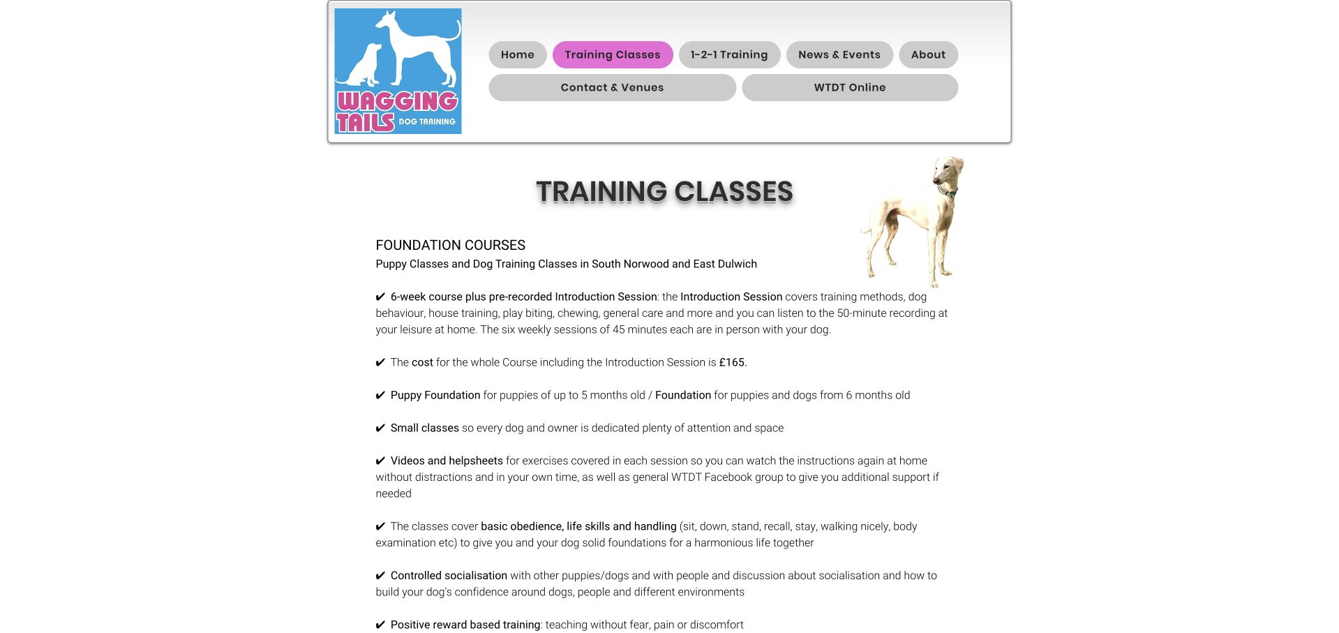
Wagging Tails opens its training page with the information many owners want first: a six-week course, a separate recorded introduction, session length, total price, and the distinction between puppy and older-dog foundations. A checkmarked list also describes take-home materials and continued support. Lower sections organize registration by location and course date, with a private-training alternative for unsuitable group situations. The presentation is functional rather than contemporary, using a narrow centered column, shaded navigation pills, and generous gaps between bullets. The displayed next-course list includes a November 7 start already past at review, so dates need careful maintenance.
What you can learn
State everything included in the course price, including introductory material and between-session support. Keep registration links grouped by age and venue, and retire start dates promptly when they no longer represent a new enrollment option.
Pros
Total price and the recorded introduction are explained together.
Separate age groups help visitors choose the correct foundation.
Cons & considerations
Some advertised upcoming dates had already begun at review.
Long vertical gaps slow comparison between the course facts.
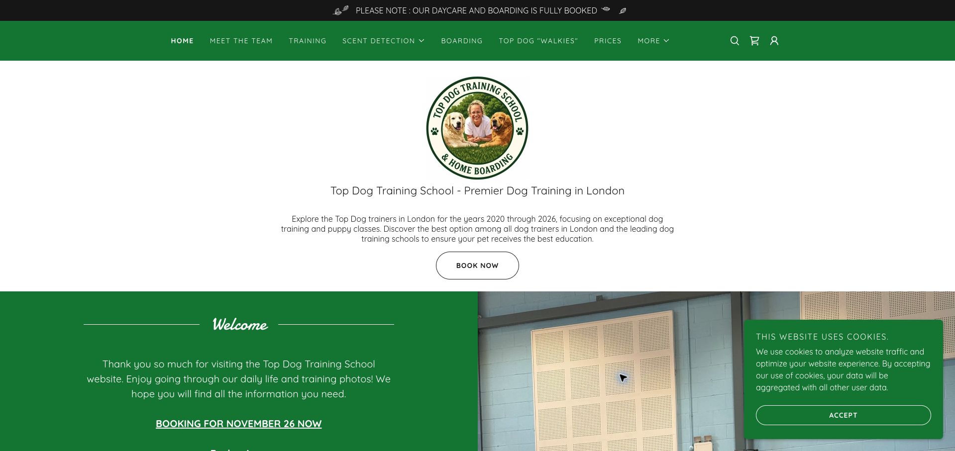
Top Dog Training School uses green navigation, a circular trainer-and-dog logo, and a centered booking action to introduce its London offering. A prominent notice states that daycare and boarding are fully booked, an important distinction from training availability. Below the introduction, venue sections list course starts, weekly meeting times, levels, and a course price. Those concrete schedules are more persuasive than the broad promotional paragraph above them. The page would benefit from making that useful information the opening focus. A cookie panel covers the lower corner, while repeated superlatives and references to multiple years make the introduction less concise.
What you can learn
Keep availability notices specific to the affected service. Bring class dates, venue, level, and fee into a compact schedule near the top, with booking actions attached to the relevant course rather than a generic claim.
Pros
The full-booking notice names the affected services.
Venue sections show levels, meeting times, and course fees.
Cons & considerations
The introductory promotional copy is unnecessarily repetitive.
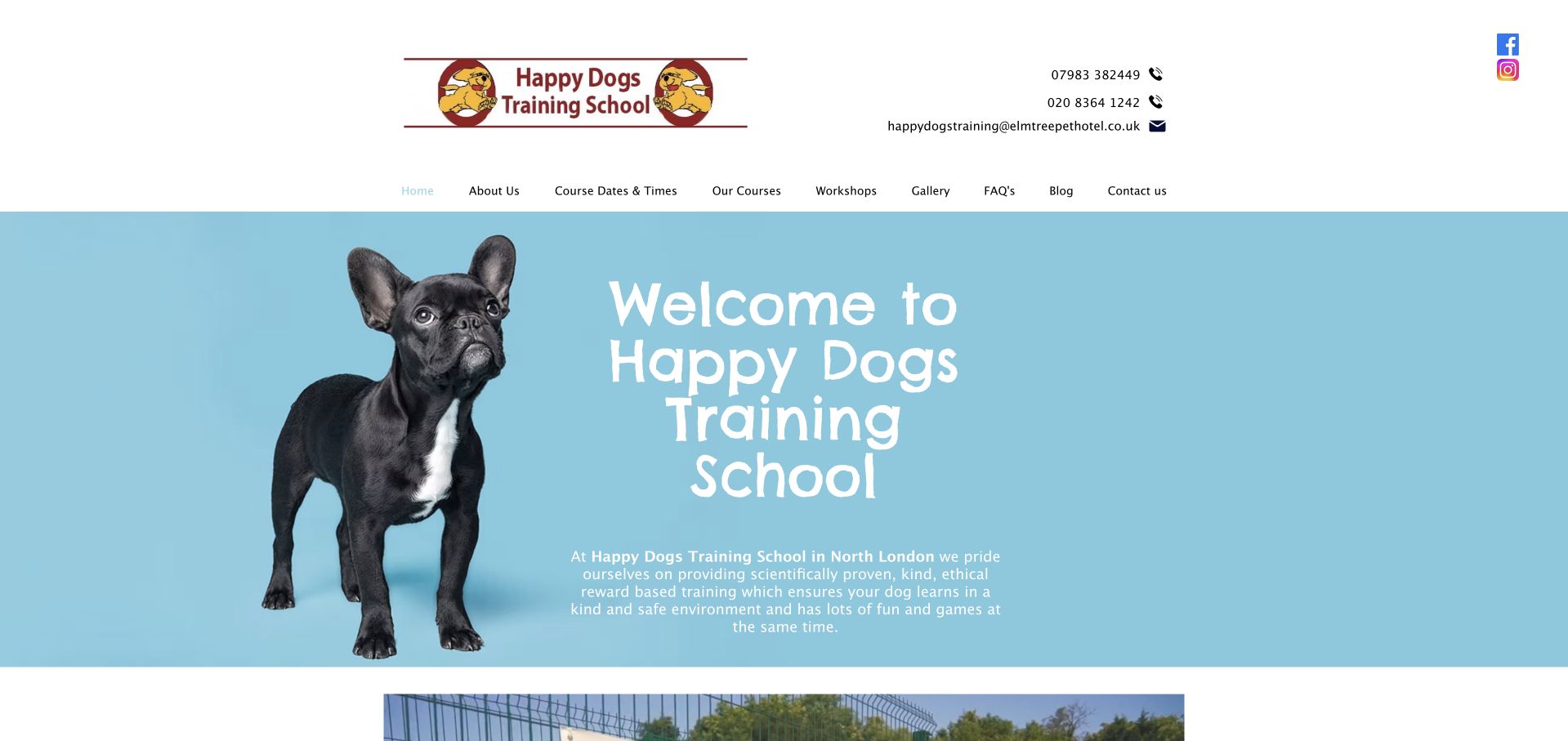
Happy Dogs places telephone numbers and an email address above a straightforward row of navigation links. A blue hero combines a dog cutout with a large handwritten welcome, while the introductory copy identifies North London. The next section gives the more precise country-club setting and explains that the school serves new puppies, rescue dogs, and owners seeking further training. Courses, workshops, and a dedicated dates-and-times link provide useful ways onward. The opening is warm but spends considerable space saying welcome. White supporting text against pale blue is also less legible than the darker text used elsewhere.
What you can learn
Let a welcoming photograph establish tone while the headline communicates the service and location. Keep direct contact methods accessible, and give course dates a clear route without making visitors search through testimonials.
Pros
Phone and email are easy to find in the header.
Course dates and workshops have distinct navigation links.
Cons & considerations
The welcome message takes more space than the practical offer.
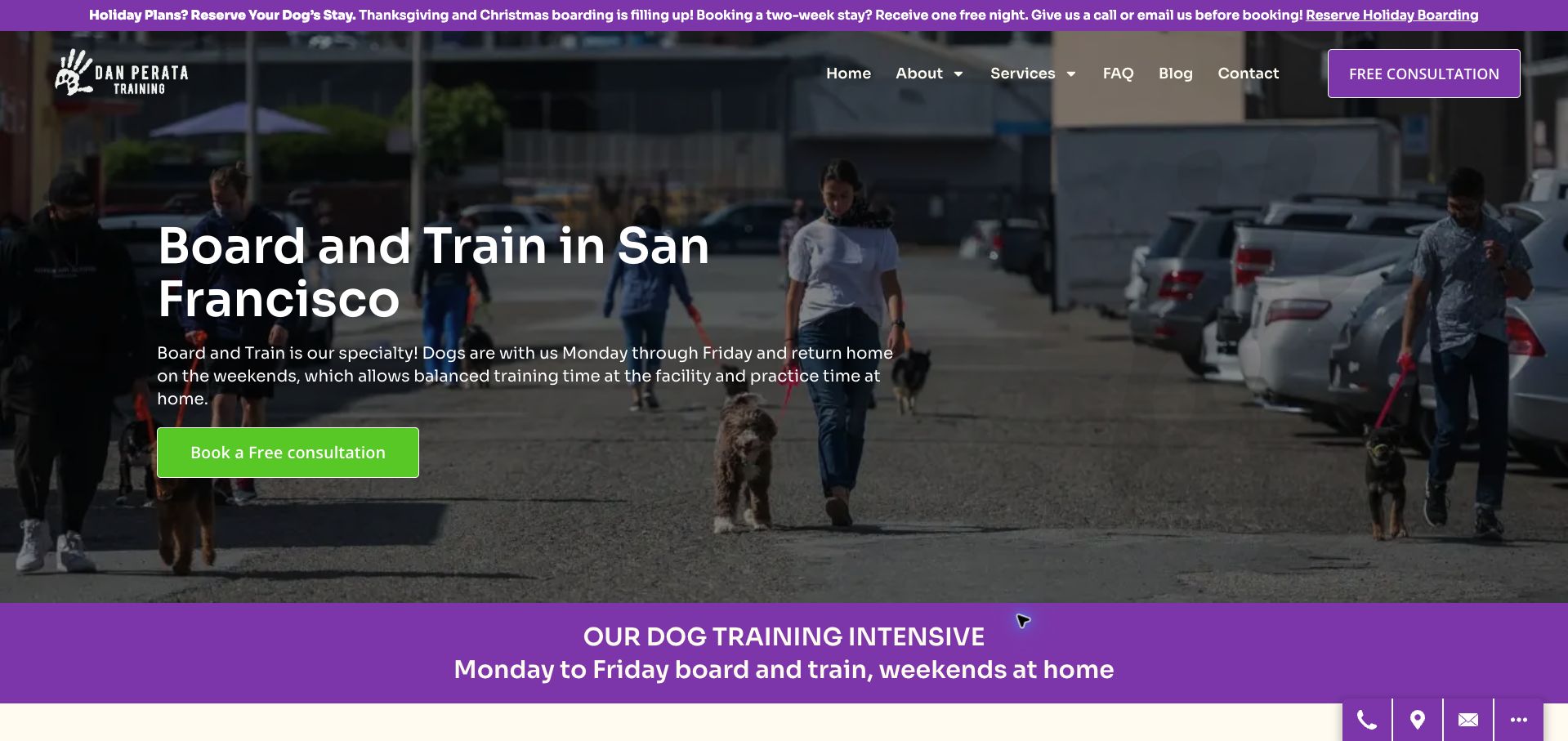
Dan Perata’s service page immediately explains the unusual rhythm of its board-and-train program: weekdays at the facility and weekends at home. A street-training photograph supports the San Francisco location, and a bright consultation button gives the introduction a definite next step. Later copy describes owner practice, follow-up lessons, program duration, and a starting price subject to evaluation. This level of operational explanation helps visitors understand the commitment. The page also makes broad outcome claims that the design review cannot verify. A holiday boarding promotion above the navigation competes with the specific training service being considered.
What you can learn
When a program differs from a familiar category, explain its weekly rhythm and the owner’s responsibilities immediately. Present evaluation requirements and starting prices together, and keep unrelated seasonal promotions subordinate to the service decision.
Pros
The weekday and weekend arrangement is explicit in the hero.
Evaluation, follow-up support, and starting price receive explanation.
Cons & considerations
Strong outcome promises are not substantiated by the page design.
The seasonal boarding banner distracts from training enrollment.
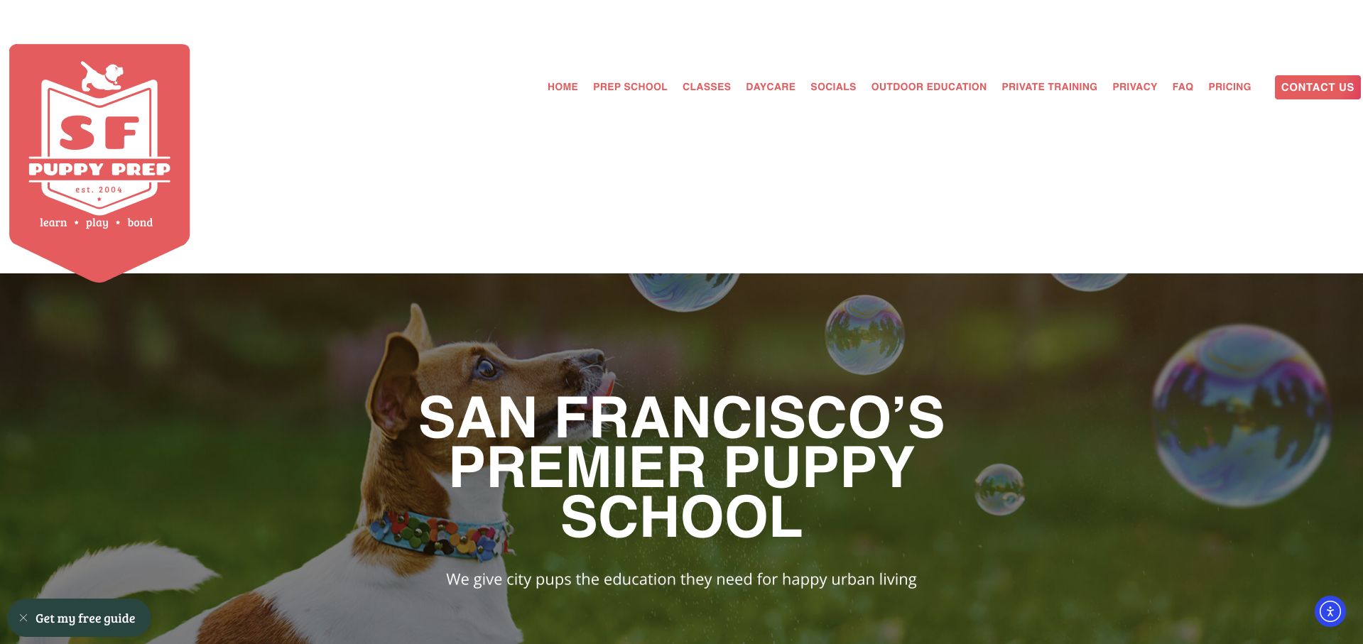
SF Puppy Prep combines a prominent school badge with changing dog photography and a clear San Francisco positioning statement. Its service grid distinguishes all-day puppy school, outdoor education, socials, group classes, daycare, and private lessons. Short descriptions include useful eligibility cues, such as the puppy-school age range and the small-dog daycare weight limit. The page later explains who might need individual support and offers a consultation route. The desktop header is exceptionally tall, pushing the actual choices below the opening screen. An initial promotional panel and cookie notice also interrupted the visit; the final capture follows dismissal, with a small guide tab remaining.
What you can learn
Organize related pet services by the owner’s actual decision: drop-off education, supervised social time, or coaching together. Keep eligibility attached to each option and reduce header height so those distinctions appear sooner.
Pros
The service grid separates six meaningfully different offerings.
Age and size limits appear in relevant service descriptions.
Cons & considerations
The oversized badge header delays the program choices.
Initial promotional and privacy overlays interrupt orientation.
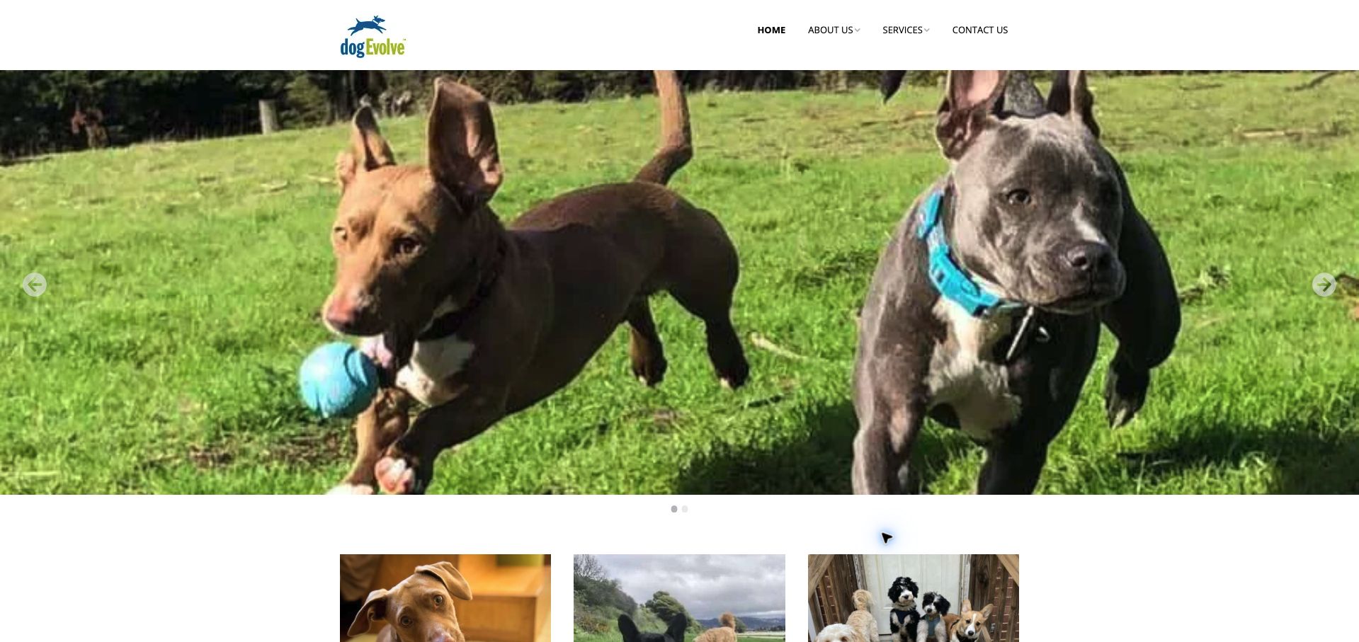
DogEvolve begins with a large photograph of dogs running outdoors and a short navigation menu. The service content below is more informative than that image alone: it separates separation-anxiety work, private lessons, puppy training, and day training. It also explains the distinction between coaching an owner and having a trainer practice with the dog before transferring skills. Current body copy identifies Durham and online services, while the footer still includes Oakland, making geographic scope less immediately clear. The photo carousel has no equivalent service statement in the captured opening. Readers must scroll to understand both location and the available training formats.
What you can learn
A large lifestyle photograph needs an accompanying service and location statement. Where a business has changed geography or added a partner venture, reconcile those references so prospective clients can identify the current provider and coverage area.
Pros
Coaching and trainer-led practice are explained in plain terms.
Online and in-person options are discussed separately.
Cons & considerations
The image-only opening leaves the offer below the fold.
Different geographic references create avoidable uncertainty.
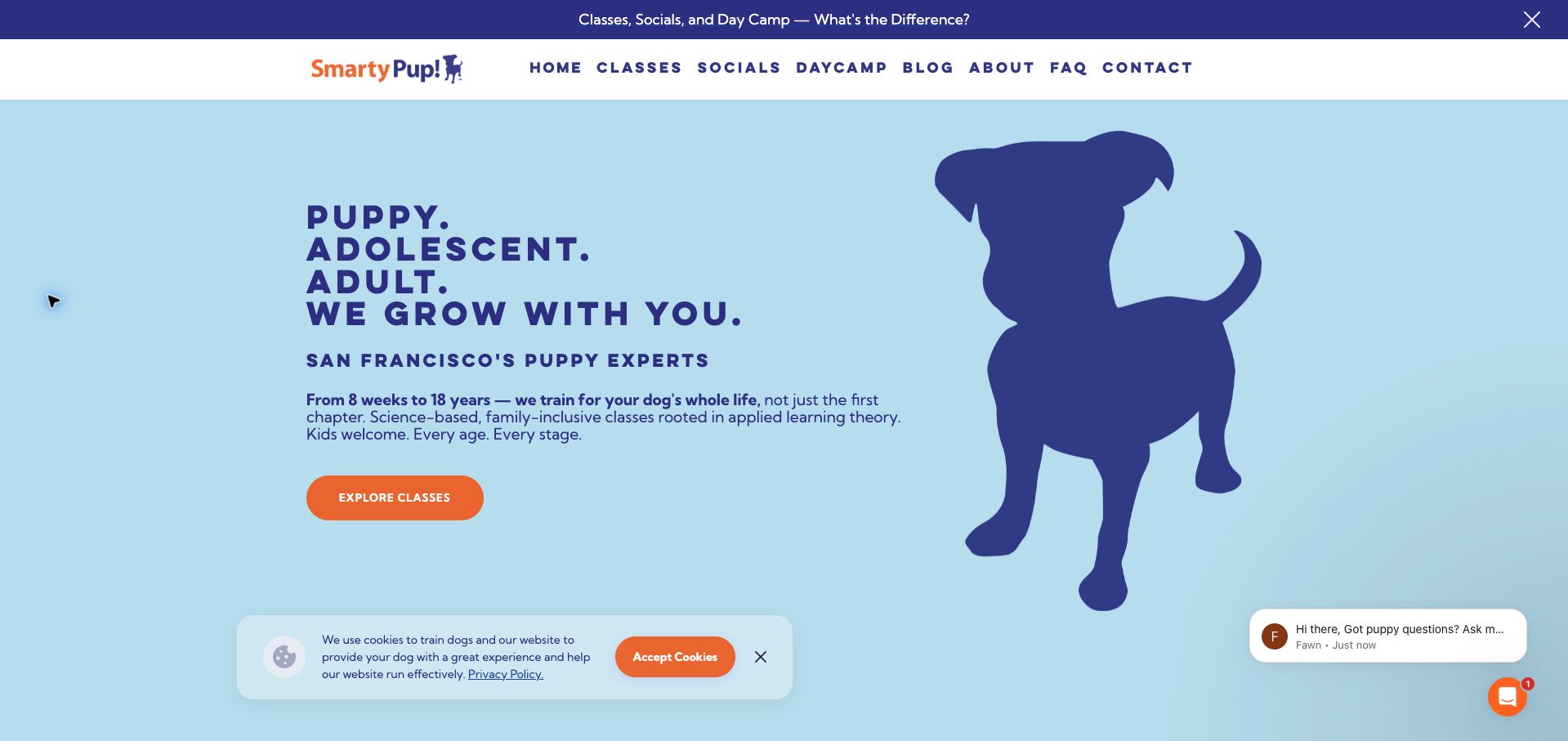
SmartyPup uses a navy dog silhouette on light blue, orange actions, and a compact navigation row to create an upbeat identity. Its opening explicitly includes puppyhood, adolescence, and adulthood, helping a puppy-focused brand avoid appearing limited to new arrivals. A prominent class link leads into separate descriptions of classes, socials, and day camp. A top announcement explains those formats for people unfamiliar with the differences. The page also carries substantial interruption risk: a lead form appeared during the visit, and the final capture retains a cookie notice and chat prompt. These additions compete with a well-composed main action.
What you can learn
Clarify the ages served before introducing branded programs. Use a simple comparison of class, social, and drop-off formats, then protect the primary action from multiple promotional elements arriving at the same time.
Pros
The hero makes support across life stages explicit.
Class, social, and day-camp routes have distinct descriptions.
Cons & considerations
Lead capture initially interrupts the introductory experience.
Cookie and chat panels compete with the main class action.
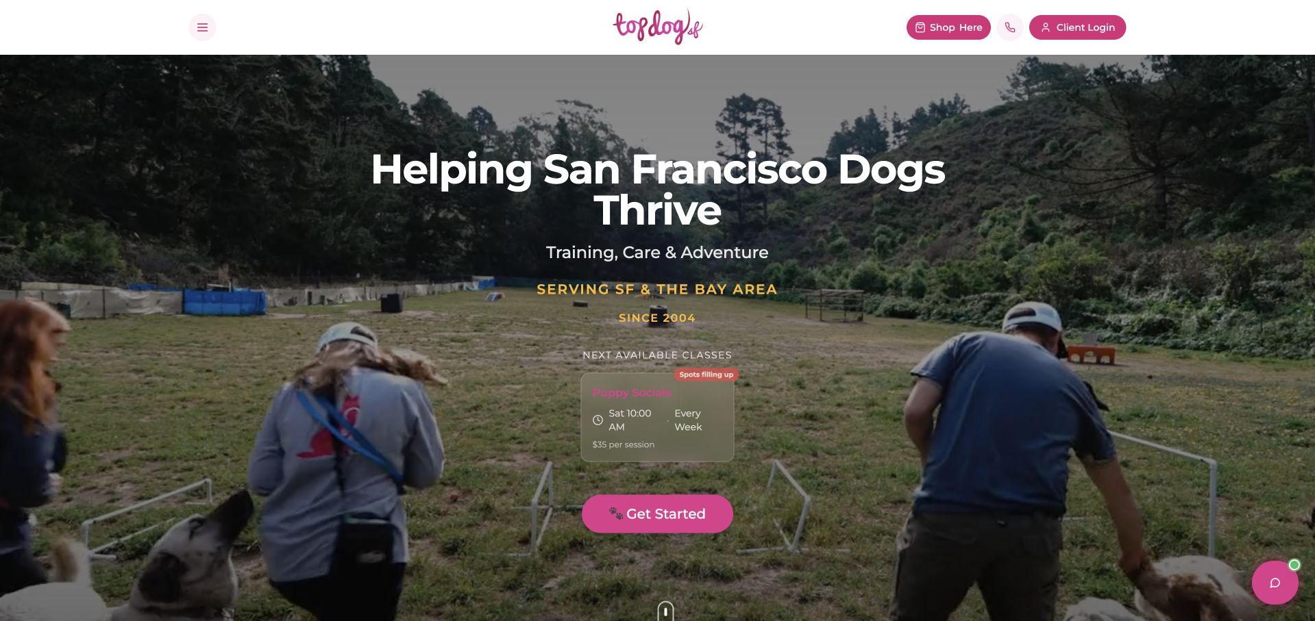
Top Dog SF places a next-available-class card inside its opening photograph, alongside a San Francisco service statement and a strong pink action. The card gives a recurring day, time, and per-session price, making the introduction more practical than a generic training promise. Below, the page explains puppy education, small-dog daycare, private training, and ranch outings, then provides neighborhood coverage. The opening is useful, but its small translucent schedule panel is less readable against the photograph. Several lower sections remained marked as loading in the observed page, so their program-finder and schedule functionality could not be assessed from this visit.
What you can learn
Feature a concrete upcoming session when it helps visitors take action, but place dates and prices on a sufficiently opaque surface. Ensure the rest of the service information remains useful while dynamic sections load.
Pros
A recurring class time and session price appear in the hero.
Service descriptions distinguish training from daycare and outings.
Cons & considerations
The translucent schedule card has limited visual contrast.
Several lower interactive sections were still loading when inspected.
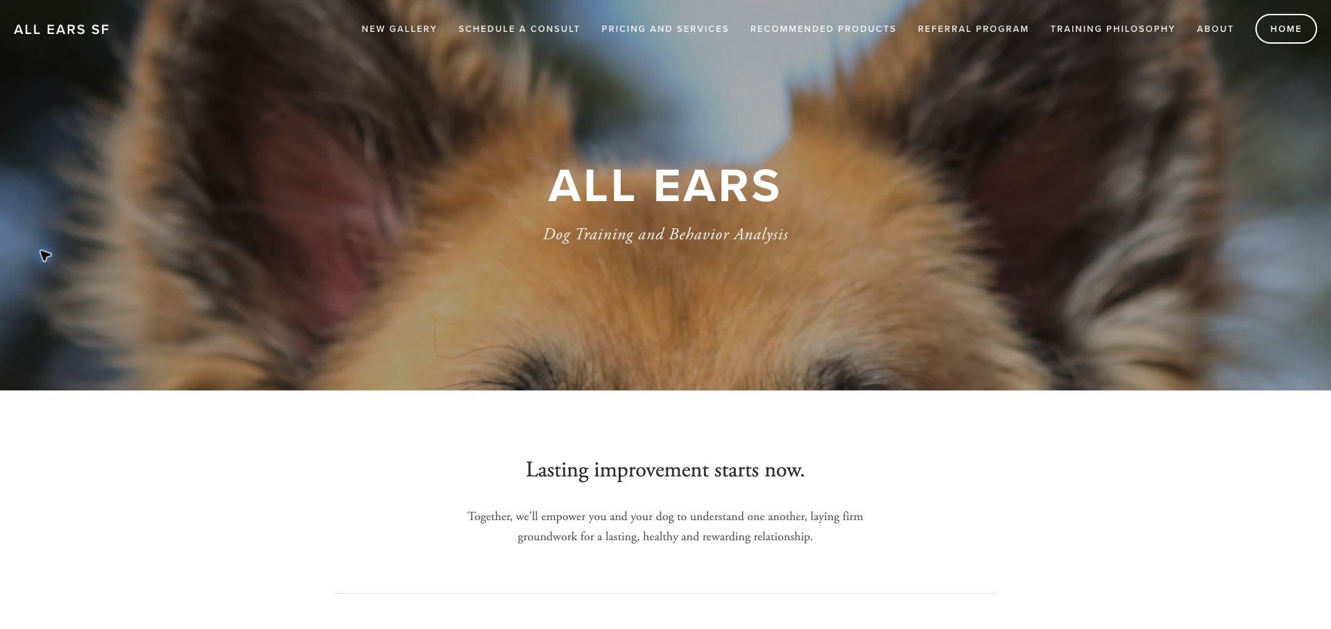
All Ears uses an extreme crop of a dog’s ears to create a memorable visual link with its name. A restrained white-and-black layout then introduces training and behavior analysis before listing concrete concerns, from leash manners and house training to preparation for a new dog. Navigation exposes pricing, services, philosophy, and a consultation route. The bottom of the page states that one-hour sessions can be virtual or in person. The practical scope is clear once reached, but the opening photograph and general relationship message do not explain location coverage. The outlined Home link is also more visually prominent than the consultation link.
What you can learn
A distinctive brand image can make a solo practice memorable, but the primary emphasis should still lead toward service fit. Pair a clear list of concerns with session format, geographic coverage, and a prominent consultation action.
Pros
The concern list makes individual coaching easier to understand.
Pricing and consultation routes are visible in navigation.
Cons & considerations
The opening does not clearly define in-person coverage.
Home receives more button emphasis than the consultation route.
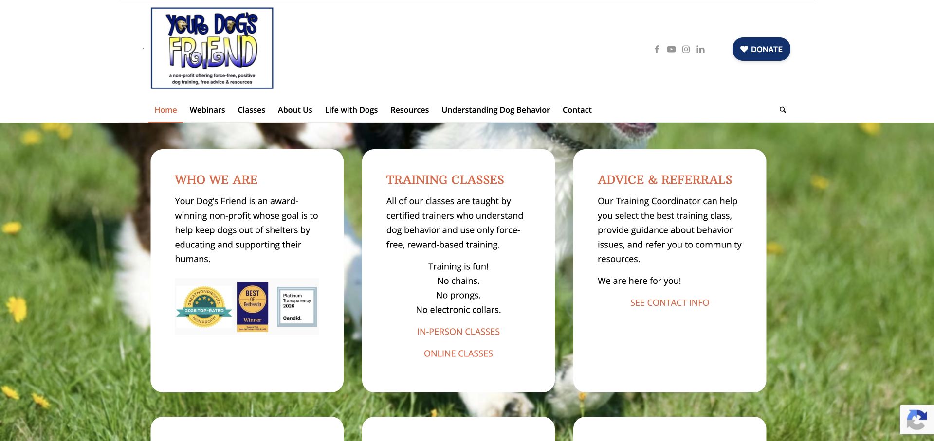
Your Dog’s Friend presents its nonprofit mission, training classes, and advice service in three large white cards over a dog photograph. This immediately accommodates different needs: understanding the organization, choosing in-person or online classes, or asking for help selecting a program. Further cards offer free webinars and educational resources, while the donate button remains separate in the header. The design communicates that support extends beyond a paid course. Its main limitation is that the large cards use substantial text and relatively modest action styling. The opening also lacks a clear geographic cue for visitors considering the in-person route.
What you can learn
Give undecided owners a legitimate guidance path alongside enrollment. Separate free educational resources, paid classes, and donations so each audience can identify its next step without assuming every visitor already knows the right program.
Pros
In-person and online classes have separate opening links.
Advice and free education receive visible, dedicated routes.
Cons & considerations
The opening does not establish the in-person location.
Long card descriptions outweigh their understated action links.
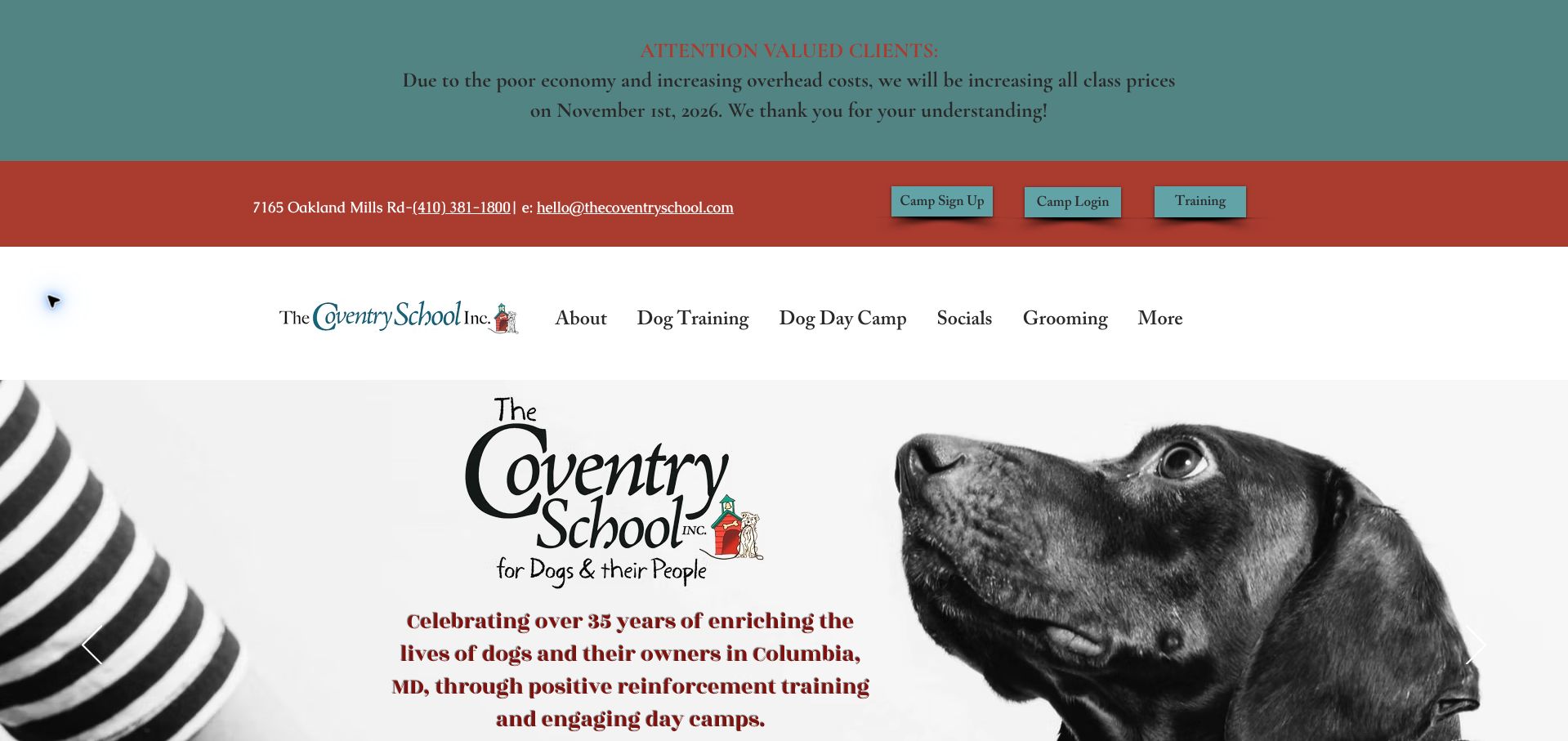
The Coventry School leads with a price-change announcement, then a contact strip and separate actions for camp signup, camp login, and training. This is useful operational information, although the stacked header occupies roughly half the first screen. A large monochrome dog photograph introduces the Columbia, Maryland school, and subsequent sections distinguish day camp, private training, prep school, and group classes. Those distinctions help a multipurpose facility explain its services without treating every owner as a boarding customer. The announcement would be stronger with a direct link to updated fees. Its forward-looking wording also remains after the stated change date.
What you can learn
Use a short operational notice with an effective date and a link to the affected prices. Separate returning-client access from first-time training selection, while keeping the header compact enough to reveal the actual service offering.
Pros
Camp access and training have separate header actions.
The service sections distinguish four different participation formats.
Cons & considerations
Stacked announcement and navigation bands dominate the first screen.
The price notice lacks a visible direct route to revised fees.
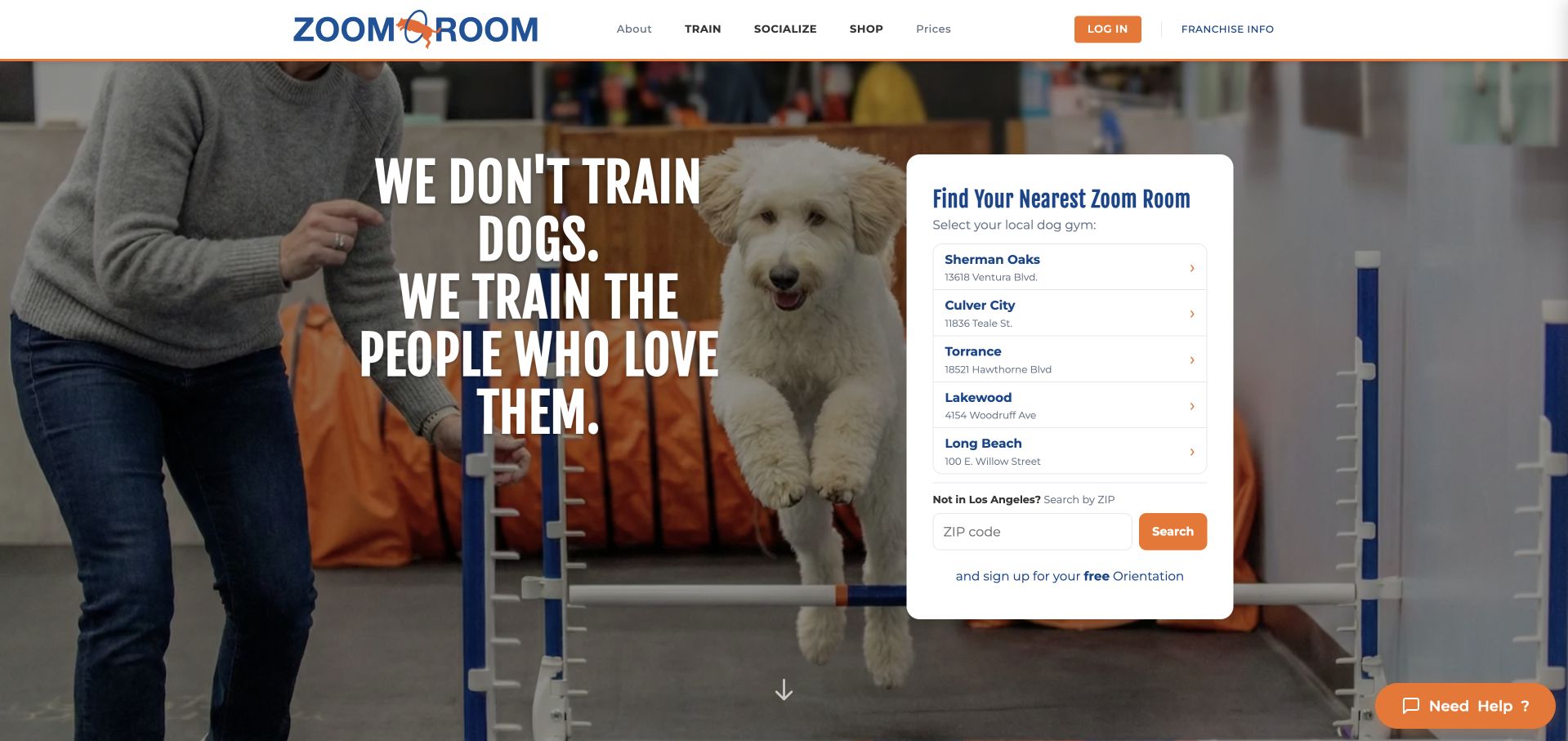
Zoom Room makes local selection the main task. Beside an owner-focused headline, a white panel lists several Los Angeles gyms with street addresses and provides a ZIP search for other areas. The panel also names the intended next step: a free orientation. Below, training, social activities, and shopping become separate paths, explaining that the business offers more than conventional classes. The location panel is crisp and readable against the dog-training photograph. Its default regional list is less helpful to visitors elsewhere, and a prominent login button can compete with new-customer orientation. The search was inspected without submitting a location.
What you can learn
For a multi-location service, put address-level choices before a generic booking button. Explain what happens after choosing a branch, and make changing the assumed region obvious so visitors can reach the correct local information.
Pros
The location panel pairs branch names with street addresses.
The introductory action clearly leads toward an orientation.
Cons & considerations
The initial list assumes a particular metropolitan area.
Login receives stronger header emphasis than first-time guidance.
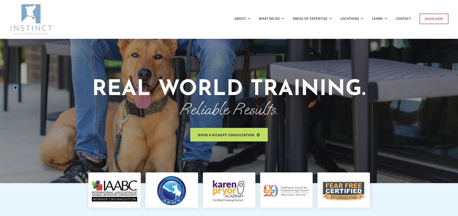
Instinct combines a full-width photograph, a concise training headline, and a lime consultation button. A row of professional-organization marks sits at the transition into the content, followed by descriptions of private coaching, board-and-train with coaching, and an AI support service. Parenthetical labels translate branded program names into more familiar categories, which makes the offering easier to interpret. A location directory identifies locally operated branches. The first screen, however, promises results without identifying the visitor’s branch or likely investment. The displayed affiliations are useful trust cues, but their presence alone does not verify individual trainer credentials or outcomes.
What you can learn
Translate branded services into familiar terms and make the initial consultation purpose explicit. Connect credentials to the relevant people or locations, and place geographic selection close enough to the opening action to avoid an ambiguous booking path.
Pros
Familiar parenthetical labels explain the main service formats.
The consultation action is visually distinct from the photograph.
Cons & considerations
Local availability requires moving beyond the opening message.
Affiliation logos need contextual detail to establish their exact scope.
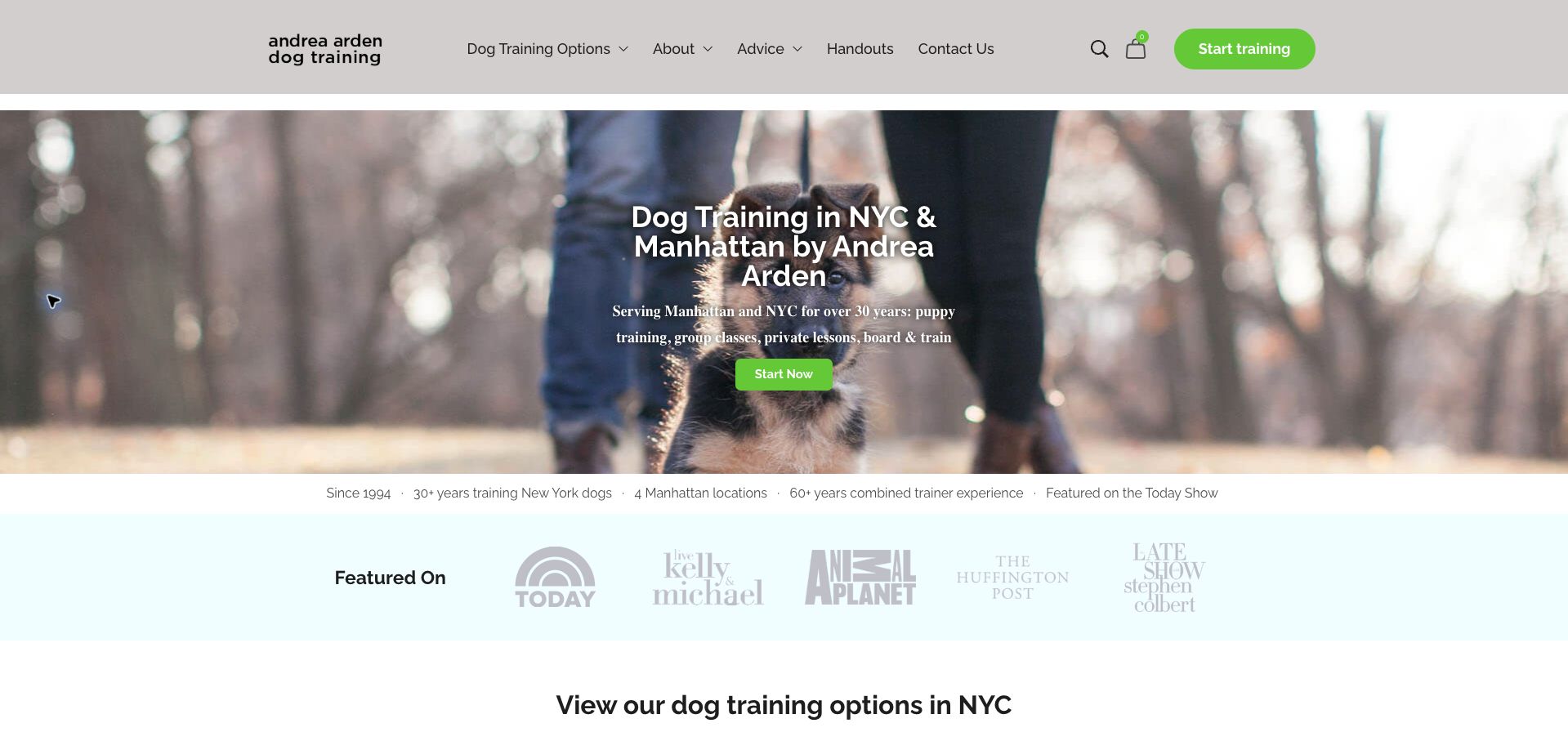
Andrea Arden’s homepage names NYC and Manhattan directly in the hero and lists puppy training, group classes, private lessons, and board-and-train in the supporting line. Bright green actions stand out against neutral navigation and a dog photograph. Below, a row of media marks and a six-option service section introduce the range, followed by a substantive comparison of private lessons and group classes. That comparison acknowledges differences in attention, scheduling, and suitability rather than treating every format as interchangeable. The centered hero copy is narrow relative to its large background, and the long page requires more effort to reach detailed comparisons.
What you can learn
Give owners a practical comparison of training formats, including who may need individual attention. Keep the local service statement concise, then let a structured comparison carry more decision-making weight than a long series of reputation markers.
Pros
The hero identifies both geography and available training formats.
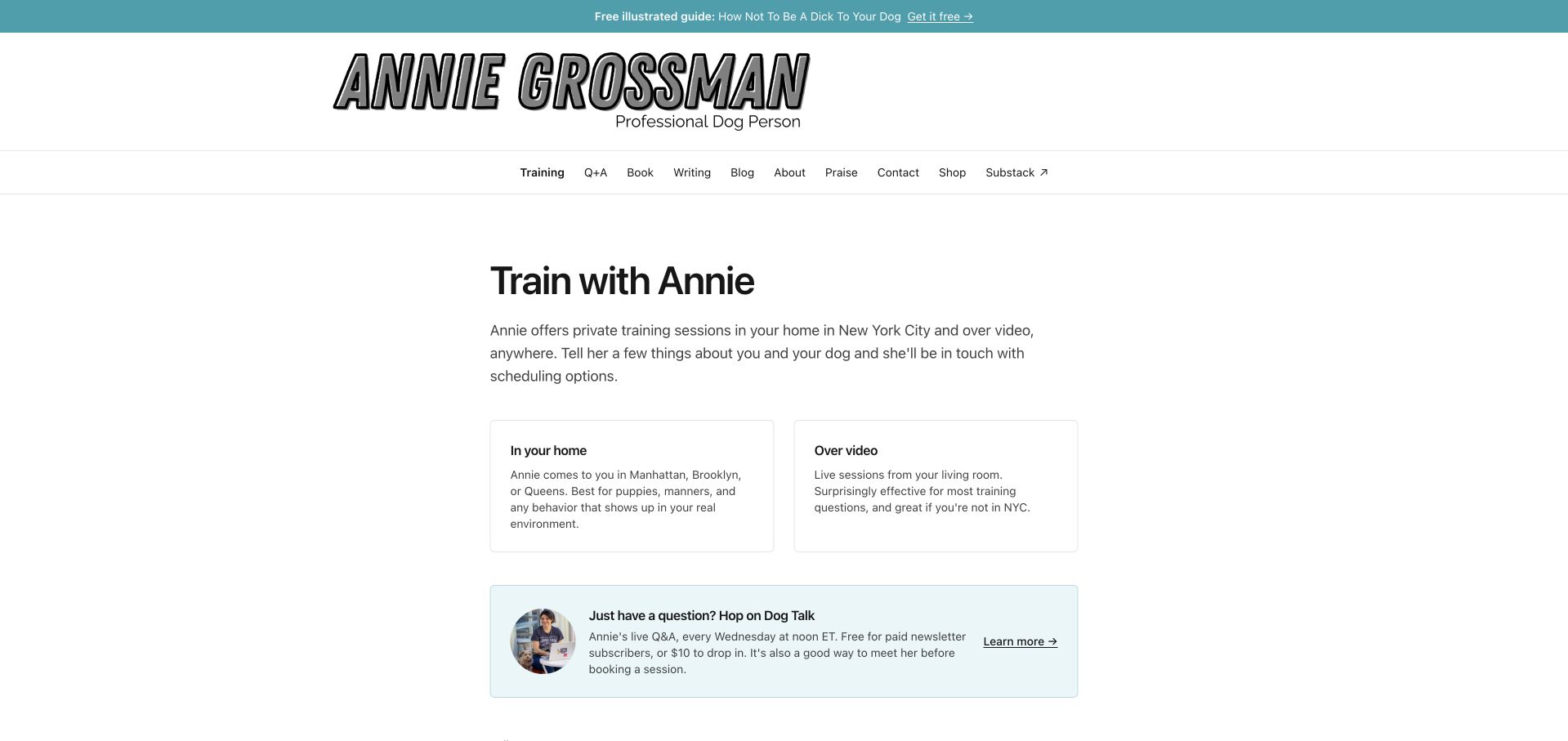
Annie Grossman’s training page uses a restrained white layout and two simple cards to distinguish in-home NYC sessions from video sessions available elsewhere. The introduction explains that an inquiry leads to scheduling options, setting a realistic expectation rather than implying instant confirmation. A separate Q&A panel offers a lower-commitment way to meet the trainer before requesting a session. The form is short enough to understand at a glance, with visible labels and an explanation of the follow-up. Pricing for private training is not shown here, and the large personal masthead and broad writing-and-shop navigation take attention away from the service task.
What you can learn
A solo professional can make an inquiry feel manageable by explaining format, coverage, and what happens after submission. Keep optional introductory events distinct from the main service and disclose enough pricing context to support informed inquiries.
Pros
In-home and video sessions are explained side by side.
The page clearly describes inquiry followed by scheduling contact.
Cons & considerations
Private-session pricing is absent from the reviewed page.
The large masthead and editorial navigation dilute task focus.
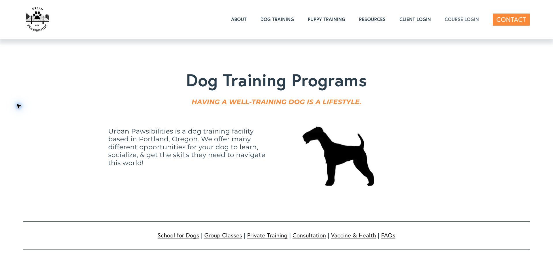
Urban Pawsibilities gives its Portland training page a clear title, simple dog silhouette, and an underlined section index. The content distinguishes daytraining, an extended-training option, group classes, private sessions, and a discovery call. Repeated length and suitability details help visitors compare formats, including an explicit confinement requirement for the drop-off program. Health requirements and FAQs receive their own routes rather than being left entirely to registration. The opening leaves considerable white space before that practical material, and a visible wording error in the tagline weakens polish. Pricing is also inconsistent across program descriptions, limiting a complete comparison.
What you can learn
Use the same factual fields for every program: audience, duration, setting, prerequisites, and price. A contents bar helps a long service page, but the summary should be complete enough to compare options without repeated inquiries.
Pros
The section index makes several training formats easy to locate.
Suitability and duration are attached to specific offerings.
Cons & considerations
Pricing detail varies between the program descriptions.
Large introductory spacing delays the practical comparison.
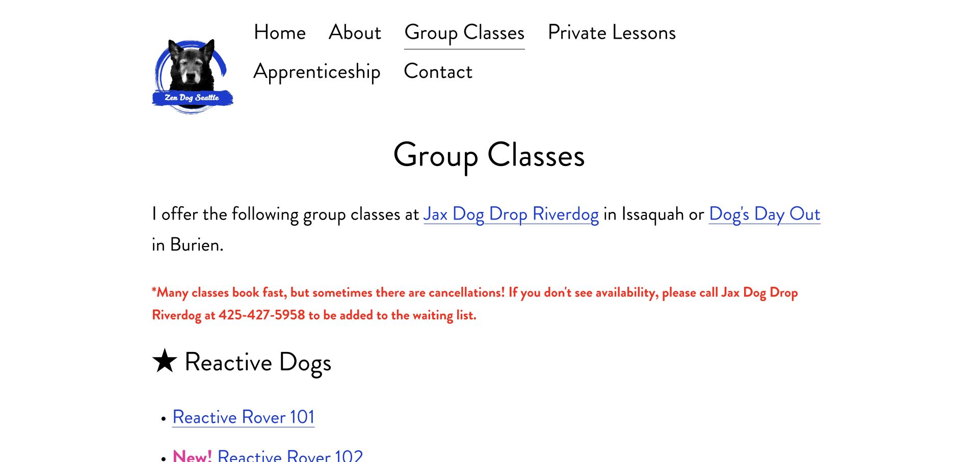
Zen Dog Seattle introduces the two host venues before grouping its class links into reactive-dog courses, manners, and sports. A prominent notice tells visitors how to request a waiting-list place if they cannot find availability. The detailed entries then provide prerequisites, course length, price, venue, and scheduled starts. Advanced reactive-dog classes explicitly build on previous levels, making progression understandable. The information is thorough, but large type and generous spacing turn the catalog into a very long page. Some schedule entries also have separate orientation times that deserve stronger formatting so an owner does not mistake them for the recurring class time.
What you can learn
Keep prerequisites and special first-session instructions next to the relevant start date. Offer a useful fallback when classes fill, and give a long catalog a compact comparison view before expanding the individual curriculum descriptions.
Pros
Class levels include specific prerequisites and course commitments.
The waitlist instruction provides an alternative to a dead end.
Cons & considerations
Large typography makes the catalog unusually long to scan.
Orientation-time exceptions need clearer separation from normal schedules.
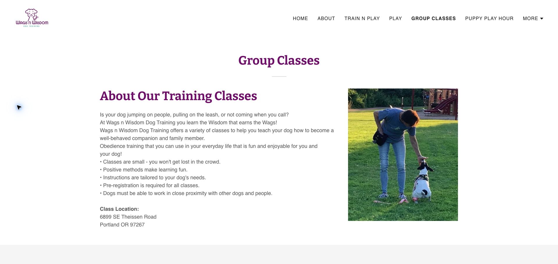
Wags n Wisdom places a trainer-and-dog photograph beside a plain-language introduction to group classes. The first section identifies the Portland venue and explains that advance registration and comfort around nearby dogs and people are expected. Later content lists class types, offers selected scheduling routes, and publishes equipment, attendance, and cancellation information. Those details help owners understand the commitment before proceeding. The opening navigation has cramped labels, and the long policy section makes the page less easy to skim. The displayed class list is broader than the immediately visible scheduling buttons, leaving some offerings dependent on further inquiry.
What you can learn
Put important suitability conditions before registration, then connect every advertised class to a clear availability or inquiry route. Separate the short decision summary from detailed policies so essential restrictions stay visible without overwhelming course selection.
Pros
The venue and basic group-participation requirements appear early.
Enrollment and cancellation expectations are publicly explained.
Cons & considerations
Crowded navigation labels reduce the clarity of the header.
Not every listed class has an equally obvious scheduling route.
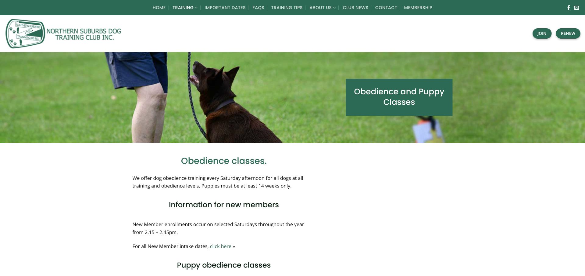
Northern Suburbs Dog Training Club uses a green identity, an outdoor handling photograph, and separate Join and Renew actions. The obedience page explains the puppy age threshold, selected intake Saturdays, and the progression from introductory training. A timetable then separates new-member sessions from more advanced levels, with the St Ives location and contact details below. This is practical information for people entering an ongoing club rather than buying a single appointment. The opening could make the venue visible sooner, and specialist abbreviations in the advanced timetable assume familiarity. The site’s vaccination policy is presented as an enrollment condition, not independently assessed advice.
What you can learn
Distinguish joining a club from renewing membership, and explain the first attendance step before the full progression ladder. Define advanced-level abbreviations and place the venue beside intake times so new owners can plan confidently.
Pros
Join and Renew address different member tasks clearly.
Intake timing and puppy eligibility are explicitly described.
Cons & considerations
The venue is not prominent in the opening panel.
Advanced timetable abbreviations require existing club knowledge.
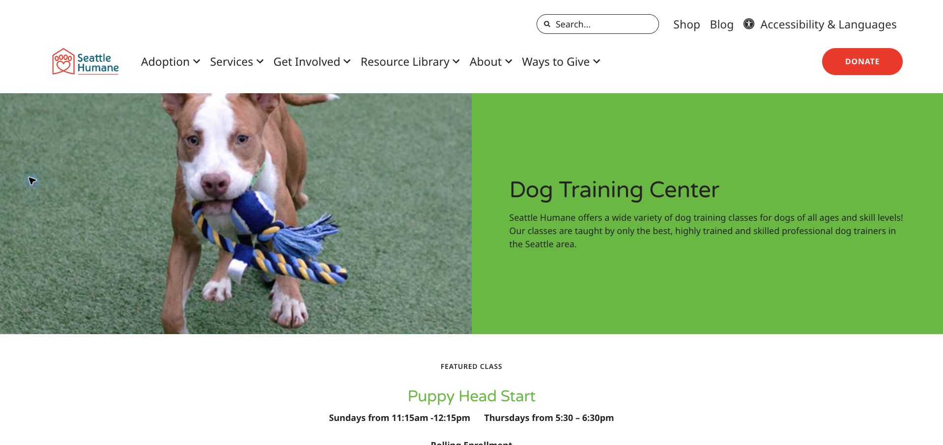
Seattle Humane introduces its training center with a split dog photograph and green text panel, then promotes a puppy course with recurring meeting times. The page provides age ranges, fees, prerequisites, and a broad list of training options, including the required introductory seminar for foundation classes. A direct training contact gives owners a route for unresolved questions. The catalog is useful, but the organization-wide donation and adoption navigation competes with class enrollment. The featured offer still advertises a discount through October 16 in a November review, a concrete example of why promotional details need an expiry process.
What you can learn
Give a dedicated service page its own enrollment hierarchy even within a large nonprofit site. State mandatory prerequisites consistently across courses, and remove expired discounts automatically so the most visible offer remains dependable.
Pros
Course descriptions include age ranges, fees, and prerequisites.
The training team has a dedicated contact route.
Cons & considerations
The featured discount had expired before this review.
Organization-wide navigation distracts from the class-selection task.
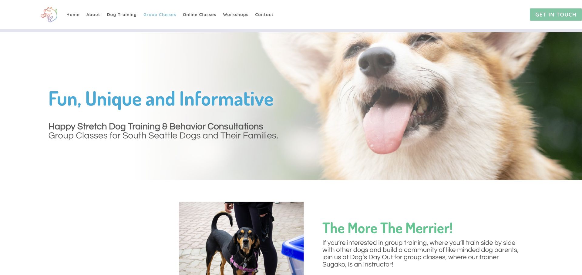
Happy Stretch uses a large smiling-dog photograph and soft blue and green accents to introduce group classes for South Seattle families. The page quickly explains that the instructor teaches at Dog’s Day Out, clarifying the relationship between the trainer’s brand and the class venue. A focus-and-fun description lists the course length, minimum age, and session duration, along with an explicit note that it is unsuitable for reactive dogs. A private-training alternative follows. The presentation is approachable, but light-colored headings have limited contrast, and visitors must follow a further link to establish current dates, prices, and enrollment availability.
What you can learn
When classes run through another venue, explain that arrangement before the registration link. State suitability limits alongside the curriculum and give owners an individual-coaching alternative rather than leaving them to interpret a rejection on their own.
Pros
The relationship with the host venue is clearly explained.
A suitability warning is paired with a private-training route.
Cons & considerations
Pale headings are less readable against white backgrounds.
Dates and pricing require leaving the reviewed overview.
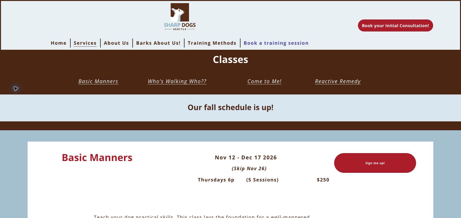
Sharp Dogs places an anchor menu above a course catalog with distinct blocks for manners, leash walking, recall, and reactive-dog training. The first course shows dates, skipped holiday sessions, meeting time, session count, price, and a signup action together. Later content distinguishes a full class from bookable options and supplies a waitlist route. This is useful scheduling design because exceptions are visible before enrollment. Brown and pale blue section bands create strong divisions, though the stacked header and schedule announcement consume considerable space. Some course details change position between blocks, making quick comparison less consistent than it could be.
What you can learn
Attach dates, skipped weeks, total sessions, price, and availability to each course using a repeated layout. A full class should offer a clearly labeled waitlist, while special orientation arrangements should stand apart from recurring meeting times.
Pros
Course blocks expose price, session count, and calendar exceptions.
A full program has an explicit waitlist alternative.
Cons & considerations
The stacked opening bands delay the first complete course block.
Information positions vary between the different course sections.
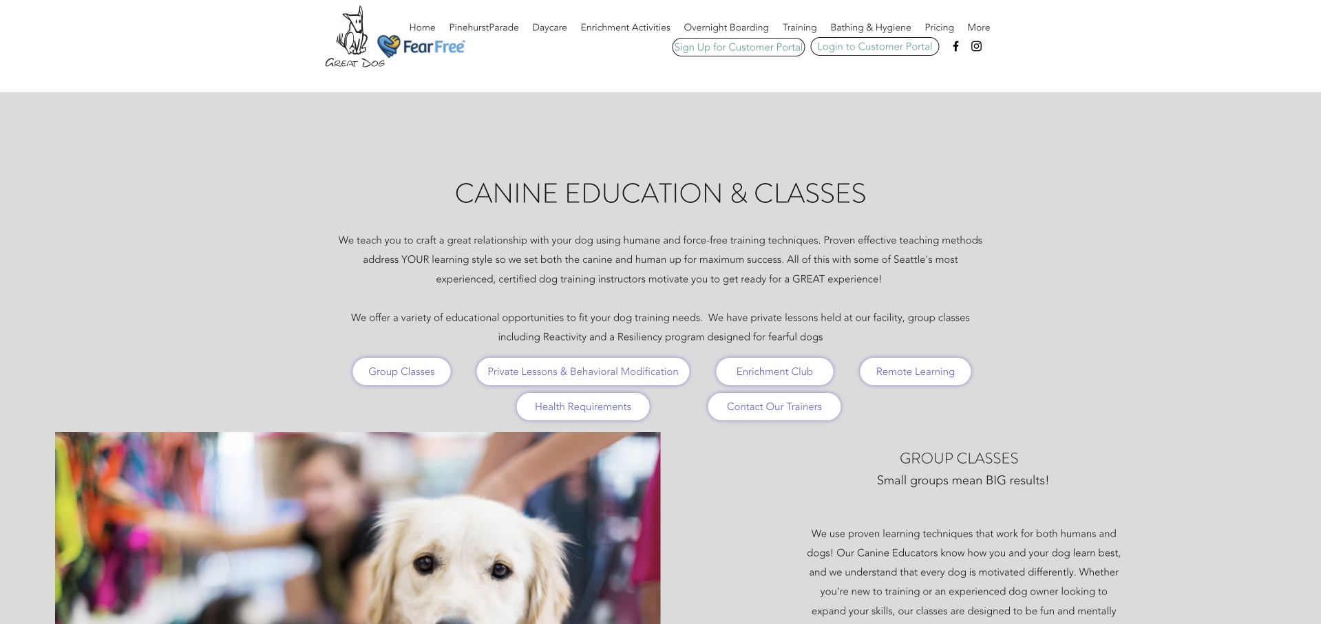
Great Dog’s training page begins with a plain-language explanation of its approach and a cluster of pill-shaped links to group classes, private lessons, enrichment, remote learning, requirements, and trainer contact. That local index helps visitors bypass unrelated daycare and boarding navigation. Subsequent sections explain session formats, interview requirements, and pricing, with useful distinctions between ordinary lessons and more complex behavior work. The design is restrained, but thin text on a gray background is less comfortable to read than a darker treatment would be. Some private-session pricing combines ranges and package totals, requiring careful reading to understand the minimum commitment.
What you can learn
Give a multipurpose pet business a service-specific contents menu. Present session price, package minimum, and initial assessment fee as separate labeled facts so owners can understand their actual starting commitment without calculating it from prose.
Pros
The local index separates six training-related destinations.
Private-session and introductory-interview requirements are explained.
Cons & considerations
Thin typography and gray backgrounds reduce reading comfort.
Ranges and package totals need a clearer pricing hierarchy.
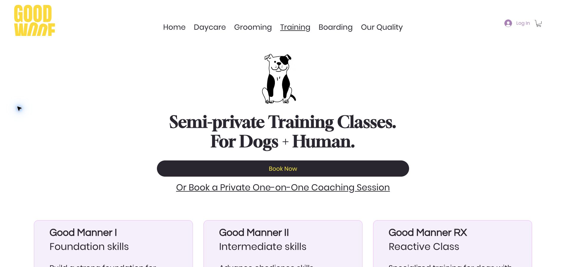
Goodwoof introduces semi-private training with a simple dog illustration, a bold serif heading, and a wide booking action. Three pale cards then distinguish foundation, intermediate, and reactive-dog classes. The entries provide suitability, meeting days, times, series and drop-in prices, and maximum class sizes, making the small-group promise tangible. Attendance and makeup rules are explained further down, followed by a private-coaching route for other needs. The page is strong on comparison but lacks immediate location context. The introductory booking button also appears before eligibility details, and coming-soon activities share space with available training in the lower navigation.
What you can learn
Use comparable course cards to explain what small-group training actually means. Place prerequisites, class-size limits, and attendance rules near enrollment, and clearly separate planned programs from those that visitors can currently book.
Pros
Course cards show prices, meeting patterns, and class-size limits.
Attendance and makeup expectations are described explicitly.
Cons & considerations
The opening does not identify the training venue.
Planned activities add noise to the available-program navigation.
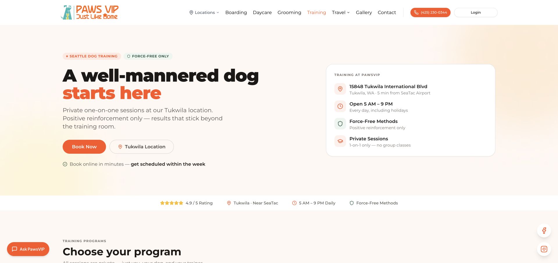
PawsVIP puts its Tukwila training location, operating hours, and private-session format in a compact card beside the main offer. Orange actions and a pale background create a clear hierarchy without depending on a large dog photograph. The program section distinguishes puppy, basic obedience, and specialist behavior packages, showing both total prices and session counts. That structure helps owners compare the scale of each commitment. The page’s promise of scheduling within the week was not independently verified, and facility opening hours should not be assumed to equal trainer availability. Calling a private package a puppy class also creates a minor terminology mismatch.
What you can learn
Pair the service description with a location card and an explicit participation format. Show total package cost alongside session count, and distinguish general business hours from appointment availability so visitors do not infer an unsupported booking promise.
Pros
Location and one-to-one format are clear in the opening.
Program prices include totals and the number of sessions.
Cons & considerations
Business hours do not establish actual trainer availability.
The puppy-class label can imply a group format despite private delivery.
Kegan is a freelance web designer and developer with 15+ years of experience helping businesses turn complicated website requirements into clear, maintainable digital experiences. He works directly with clients from planning and design through development, launch, and ongoing support.
For dog training website design, his development approach focuses on training-format comparisons, trainer introductions, class schedules, eligibility information, and enrollment journeys. The scope can be a targeted improvement or a complete custom build, with responsive layouts, thoughtful content structure, and integrations chosen around the people using and maintaining the site.
Show 3 other dog training website designersHide other dog training website designers
Store location, dates, duration, price, prerequisites, and enrollment status together. Keep recurring classes separate from one-off workshops and archived events.
Prepare the newcomer journey
Explain arrival arrangements, equipment, and participation requirements using trainer-approved guidance. Provide a direct contact route for questions that cannot be answered by the class description.
Maintain availability and changes
Assign ownership for full classes, waiting lists, cancellations, and term changes. Make schedule updates visible on the public page as well as in the booking provider.
The editing job behind the design
Choose systems the team can keep accurate
Use structured program records connected to a maintained enrollment service. Visitors should understand the course before creating an account.
Preserve a plain-text explanation when embedded calendars fail. Keep individual case details out of analytics events and public URL parameters.
Our WordPress website examples offer a separate look at publishing approaches. A visible platform label is evidence for that named page, not a guarantee that the same system will suit your requirements.
Before the public launch
Website planning checklist
Distinguish group and private formats.
Name intended audiences.
Explain prerequisites.
State dates and duration.
Show the price basis.
Introduce actual trainers.
Label waiting lists.
Explain assessment steps.
Maintain venue details.
Test the enrollment handoff.
These checks are a project checklist, not a performance, legal, security, or accessibility certification. Test real journeys with the people responsible for the website before making claims about the result.
Sources & editorial method
How this collection was selected and reviewed
These 29 examples match the collection target saved before research. Public pages were directly opened and visually inspected; the pictured source and capture date identify the reviewed state. Reused captures retain their earlier dates. Each source also has a bounded public stack-audit attempt, with inaccessible and unknown results kept explicit. Editors Choice recognizes website design and information, not service quality or promised outcomes. No purchases, bookings, applications, or private forms were submitted. Images and trademarks belong to their owners.
Each example links to its actual source page. Screenshots are direct browser captures with their own capture dates; moving imagery, announcements and live designs can change. The notes describe observable design choices and conditional tradeoffs, not measured traffic, conversion results, service quality, or accessibility conformance.
Technology labels use public page metadata, asset evidence, or explicitly cited platform documentation. Platform documentation is not a complete current deployment audit. A component reference may be legacy or unused; it is not a complete backend inventory. Unknown stacks are omitted. These sites are editorial examples, not our client portfolio.
Written, Edited and Curated are separate editorial records, not timestamps advanced by a rebuild. Website designs and imagery belong to their owners. See our editorial standards or suggest a correction.
Questions worth asking
Dog Training website design questions
How should programs be organized?
Start with the owner’s goal, the dog’s relevant eligibility, and the teaching format. Use the business’s approved terminology rather than creating an automated diagnosis.
Should every visitor book immediately?
No. Some programs need staff guidance or an assessment first. Explain that sequence clearly.
What belongs in a trainer biography?
The person’s role, relevant background, and accurately labeled qualifications. Avoid unsupported promises about what every participant will achieve.
How can a full class remain useful online?
Show that it is full and provide an accurately labeled waiting list or next confirmed session. Do not leave a generic booking action that suggests places remain.