Best Cybersecurity Websites of 2026 (15 Real-World Examples)
How to explain a security offer clearly, connect claims to useful evidence and give different evaluators a sensible next step.
A cybersecurity website has to make a complicated offer understandable without turning confidence into an unsupported promise. The strongest design work connects a specific problem, the people evaluating it and the information they need before a trial, technical discussion or procurement decision.
Cybersecurity is not one interchangeable service. An identity platform, a network-access product, a dependency scanner, a governance workflow and a training provider address different tasks. A visitor should be able to identify the actual category before interpreting an animation or a broad protection headline. The site needs to explain what is offered, who uses it and where its role ends, while making deeper product material easy to investigate.
The evaluation is usually shared by several people. A developer might want integration instructions, an administrator may need to understand deployment and ongoing work, and a business buyer may be comparing the scope of an offer. Existing customers need account and support routes that do not send them through the sales funnel again. Good information architecture recognises those differences without making the homepage reproduce every technical document.
Use the examples as references for communication and website structure, not independent assessments of security products. A screenshot does not establish detection quality, threat resistance, incident handling, legal compliance or suitability for a particular organisation. The reviews describe the actual public page and conditional design tradeoffs. Older accepted screenshots retain their dates even when current official source material is checked again for topic fit.
Before the examples
What makes good cybersecurity website design in 2026?
Name the actual problem and product category
Explain whether the offer concerns identity, network access, software development, assurance workflows, training or another specific task. A broad security headline can introduce the brand, but the next sentence should give the visitor a concrete reason to continue. Do not make an abstract shield illustration carry the entire explanation.
Separate evaluation from existing-customer tasks
Give documentation, pricing, assisted evaluation, account access and support meaningful labels. These destinations serve different needs. A person trying to resolve an existing account issue should not have to decide whether a sales demo is the closest available option. Explain external handoffs rather than relying on an unfamiliar subdomain to establish their purpose.
Connect claims to evidence with an explicit scope
A customer story, product demonstration, independent report and technical reference are different kinds of material. Identify what each supports and when it was written. A logo row or an attractive dashboard is not a substitute for explaining the product’s role, limitations and relevant implementation responsibilities.
Explain the user and administrative work
Show the tasks involved in getting started and operating the product. Distinguish a conceptual diagram from a documented deployment model. Describe the actual roles, inputs and review steps at an appropriate level; do not suggest that a short marketing animation proves a system is automatic or removes every organisational responsibility.
Keep the first contact proportionate
An initial sales enquiry usually needs enough context to route a conversation, not an upload of sensitive logs or a detailed account of an incident. Work with the responsible team to define the real process. Make commercial contact, technical support and vulnerability reporting distinct, with their actual instructions and boundaries.
Make important information usable without spectacle
Dark themes, motion and intricate diagrams can establish a strong identity, but the explanation still needs readable text and understandable controls. Test the actual navigation, forms, media and document journeys. A cybersecurity subject does not establish that the website itself meets accessibility, privacy or security requirements.
The collection · 15 examples
15 cybersecurity websites worth studying
The completed collection compares public websites for identity, access, software-security, assurance and training offers. The reviews distinguish those categories rather than treating every supplier as an equivalent protection service. Each pictured source is identified precisely, including any product or resource page that is not the homepage.
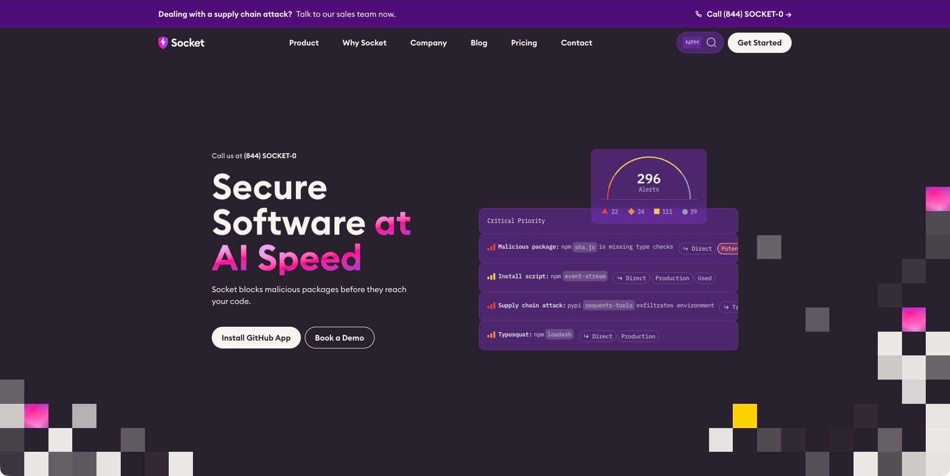
Socket’s dark-purple opening places a short software-security statement beside an illustrated stack of package alerts. Package-related rows and a summary gauge organise the illustration. An install action identifies a GitHub application route, with a demo separately labelled. The top contact strip and permanent navigation remain distinct. The useful design pattern is a specific security task shown through recognisable development objects rather than an abstract shield. The alert counts and blocking language are demonstration and supplier positioning, not independently verified findings or protection outcomes.
What you can learn
Connect a narrow product category to the object a developer already works with, then explain what installing the integration begins. Keep configuration, investigation and remediation responsibilities understandable. An attractive alert stack should lead to scoped product documentation, not suggest that the pictured package examples prove comprehensive coverage of another project.
Pros
The package rows give the technical category a concrete visual subject.
The install action names its destination type rather than a generic start.
Cons & considerations
If illustrated findings appear authoritative, explain that the sample is not a customer assessment.
If urgency and a sales contact share the opening, distinguish them from product support and reporting processes.
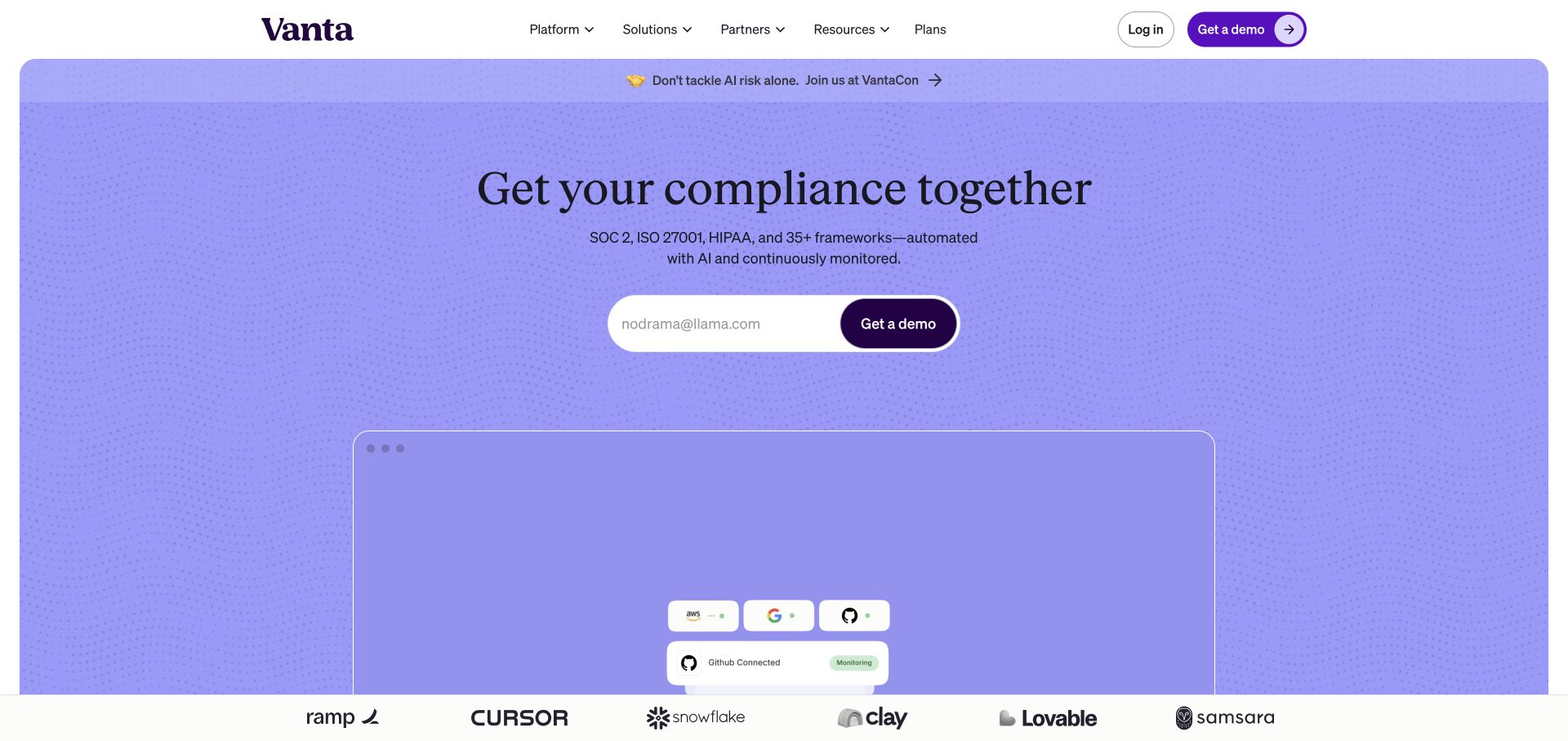
Vanta’s lavender opening centres a short compliance-management headline above an email field and demo action. A diagram-like product area begins below, while the white navigation retains platform, solution, resource and plan routes. The visual restraint contrasts with the administrative complexity of the subject. The useful design pattern is a recognisable entry point for an operational workflow, rather than presenting every framework and configuration at once. The pictured interface and marketing language do not establish that a customer meets a regulatory or audit obligation.
What you can learn
Connect a broad assurance proposition to concrete evidence items, responsible people and review states. A security buyer needs to understand what the software coordinates and what remains organisational work. Explain the limits of automation and let the relevant product and subject-matter reviewers approve claims before they become reassuring headlines.
Pros
The centred demo action has a clear place in the hierarchy.
The controlled colour field gives the introduction an identifiable visual character.
Cons & considerations
If several frameworks appear together, distinguish product support from a completed customer assessment.
If a diagram carries the explanation, provide readable descriptions of roles and manual steps.
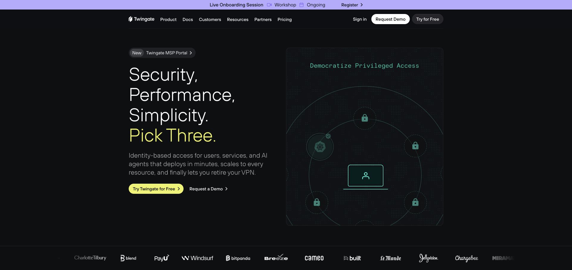
Twingate uses a near-black background, stacked short phrases and a green access illustration to introduce its product. A yellow trial action contrasts with a quieter demo route. Product documentation, customers and pricing remain in the header, with account sign-in separately labelled. The picture makes relationships between a user and protected resources more concrete without filling the opening with a detailed architecture chart. This is a marketing explanation of identity-based access, not a demonstration of how a particular customer network has been configured.
What you can learn
Explain the access problem first, then separate evaluation, implementation and account tasks. An administrator needs different information from a purchasing stakeholder or an end user. Treat the conceptual drawing as an introduction and link to actual deployment requirements, supported environments and responsibility boundaries before someone makes an implementation decision.
Pros
Short introductory blocks avoid a dense technical opening.
Trial and assisted-evaluation actions have distinct labels.
Cons & considerations
If security adjectives lead the copy, provide specific supporting product documentation.
If a network drawing simplifies the model, explain the implementation details it deliberately leaves out.
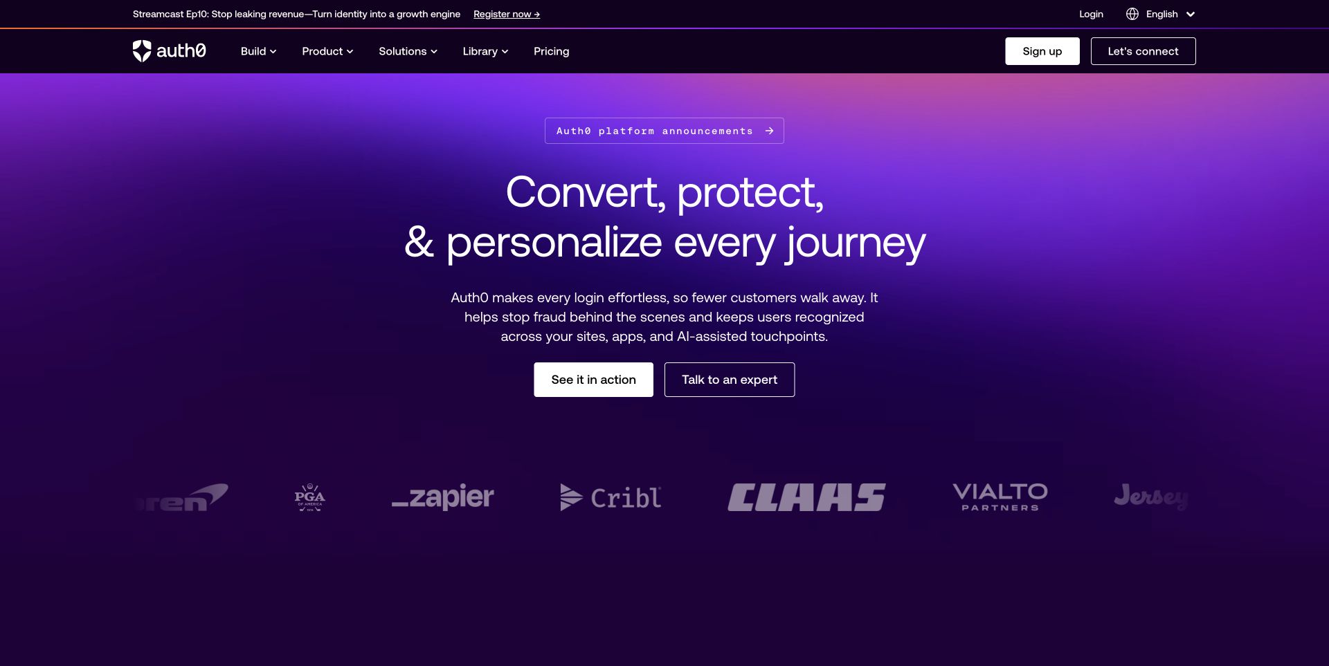
Auth0 combines a saturated purple introduction with conventional navigation for building, products, solutions, learning and pricing. Two central actions distinguish seeing the product from talking to an expert, while sign-up has its own header location. The broad identity message is not reduced to a single login widget. The useful pattern is a platform accommodating both technical investigation and commercial evaluation. This is the Auth0 public property within the wider Okta product family, not evidence that the two brands are unrelated companies.
What you can learn
Let developers reach implementation resources without forcing them through a sales journey. At the same time, explain use cases, plans and responsibilities for administrators and business buyers. Keep a general identity proposition distinct from claims about protecting the customer’s entire application, which depends on more than the marketing page.
Pros
Build and learning routes remain visible alongside commercial categories.
The central actions distinguish product exploration from an expert conversation.
Cons & considerations
If a platform serves many use cases, provide a clear starting point for a narrow task.
If protection language is prominent, explain the specific product scope and customer responsibilities.
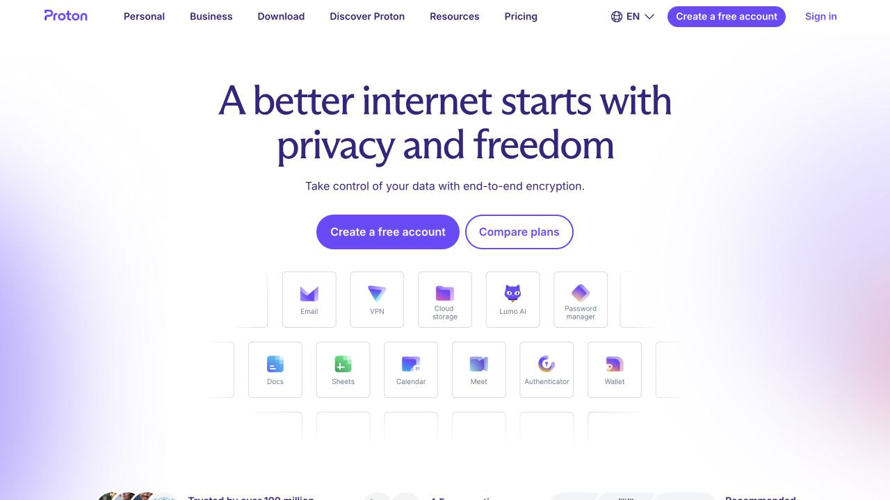
Proton’s white homepage centres a dark-purple statement above account creation and plan-comparison actions. A grid of small product cards then identifies mail, VPN, storage, password management and other applications. The navigation separates personal and business audiences from downloads, resources and pricing. The useful pattern is the connection between one umbrella proposition and several recognisable products. The pictured marketing site was reviewed, not private inboxes or account systems, and its privacy language is not an independent assessment of every application’s technical or legal properties.
What you can learn
Translate a broad promise into concrete choices before a visitor has to navigate elsewhere. Someone comparing a password manager has a different task from someone replacing business email. Give each product its own explanation and distinguish an account, an individual application and a suite plan without suggesting that one description settles all security requirements.
Pros
Product cards give an abstract umbrella message concrete destinations.
Account creation and plan comparison are visibly separate actions.
Cons & considerations
If the product family is large, test the small labels and grouping on mobile.
If privacy claims span a suite, explain their actual scope on each relevant product page.
Cloudflare places a large orange rounded panel beneath a compact white navigation. A central scale-led headline, short platform explanation and single starting action dominate the captured view. Products, solutions, resources and pricing remain available above it, while sales, login and an under-attack route have distinct labels. The useful pattern is a clear visual entrance to a wide infrastructure portfolio. The marketing’s scale and performance language is recorded as presentation, not independently verified network statistics or proof that an individual deployment is protected.
What you can learn
Keep the first introduction understandable while making the next task specific. A visitor researching protection, an existing customer seeking account access and someone investigating an urgent issue should not have to interpret the same generic button. Connect the broad proposition to product-level information and explain the relevant service boundaries.
Pros
The orange panel gives the brand an immediately recognisable hierarchy.
Pricing, account and security-related entry routes are individually labelled.
Cons & considerations
If the proposition covers several product families, make their differences easy to investigate.
If a large text panel leads the page, keep practical product evidence close enough to reach.
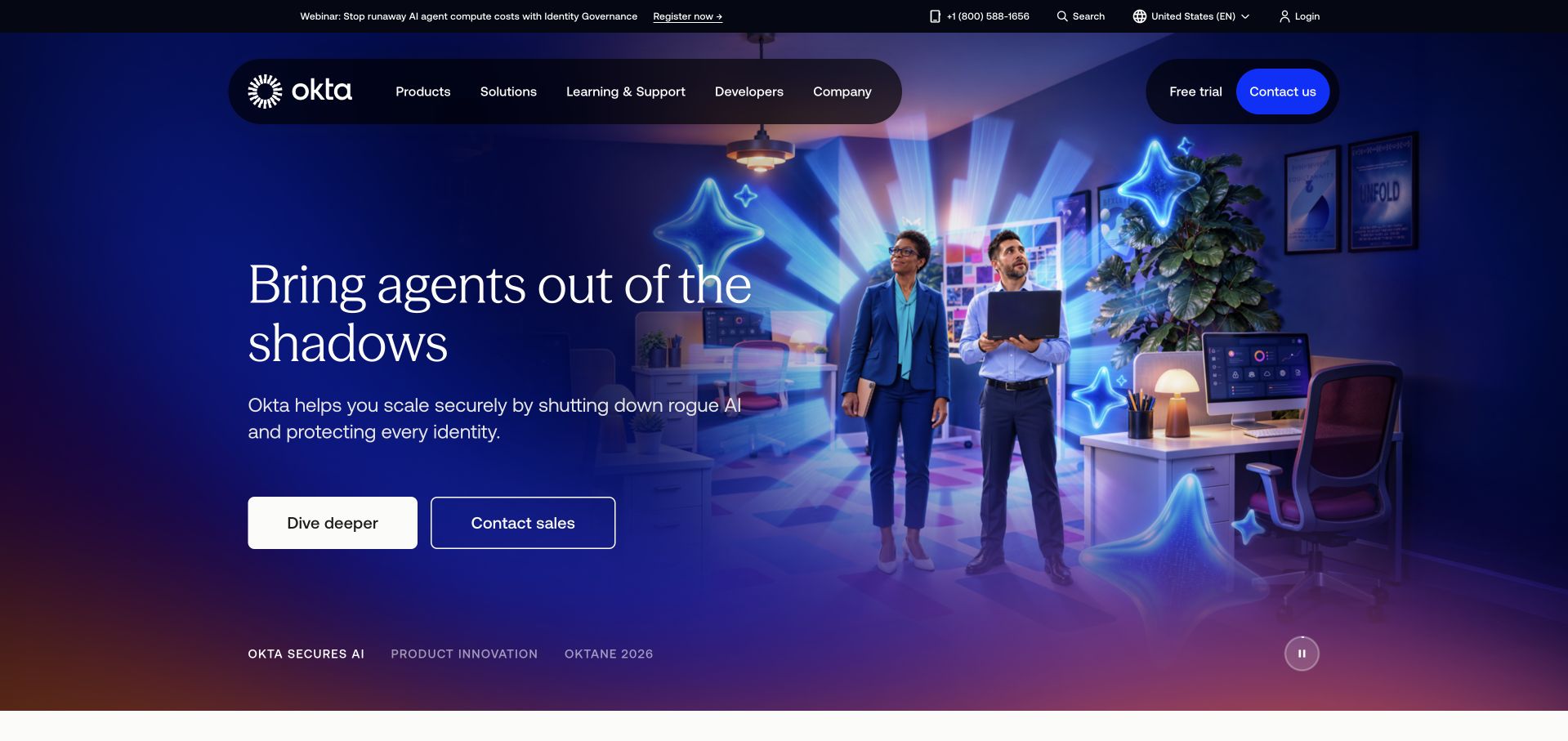
Okta’s captured homepage pairs a blue campaign scene with a large agent-related identity headline. The floating navigation retains products, solutions, learning and support, developers and company information. Trial and contact actions remain separate from the campaign’s deeper-reading route. The useful structure is a topical entrance into a broader identity portfolio, rather than making every visitor follow the campaign. The image and copy do not establish the permissions, approval rules or actual threat resistance of any customer system.
What you can learn
Use a campaign to introduce a subject, then help visitors translate it into a concrete identity-management task. Workforce access, customer authentication and agent-related administration are not identical requirements. Keep conventional product and developer routes available, with technical evidence explaining what each offering actually controls.
Pros
Permanent product and learning routes remain visible above the campaign.
The page distinguishes a trial, a conversation and further campaign reading.
Cons & considerations
If newer terminology leads the message, provide routes for familiar administrative tasks.
If a scene suggests a security outcome, substantiate the specific claim through appropriately scoped product material.
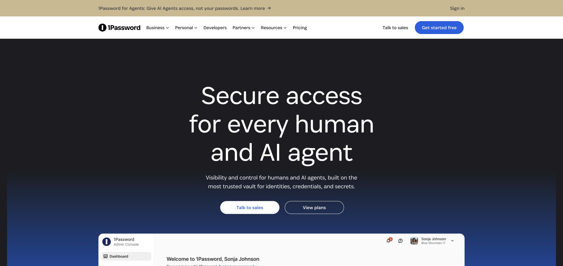
1Password’s dark introduction places a large access-management statement above separate sales and plan actions. A product-console image begins beneath them, while business, personal and developer audiences are named across the white header. The useful pattern is a recognisable interface supporting a broader category explanation without making every audience use the same evaluation route. The screenshot is a public marketing illustration; it does not expose private account behaviour or independently establish how credentials, secrets or access policies are handled.
What you can learn
Explain an expanding security offer through the people and tasks it serves. Individuals, developers and organisational administrators need different details even when they recognise the same brand. Connect the interface illustration to product boundaries, implementation information and evaluation material instead of relying on an impression of safety.
Pros
Audience labels distinguish business, personal and developer investigation.
Sales and plan comparison have separate central actions.
Cons & considerations
If an umbrella access proposition spans several products, explain their individual roles.
If interface imagery suggests operational control, distinguish illustration from documented behaviour and deployment requirements.
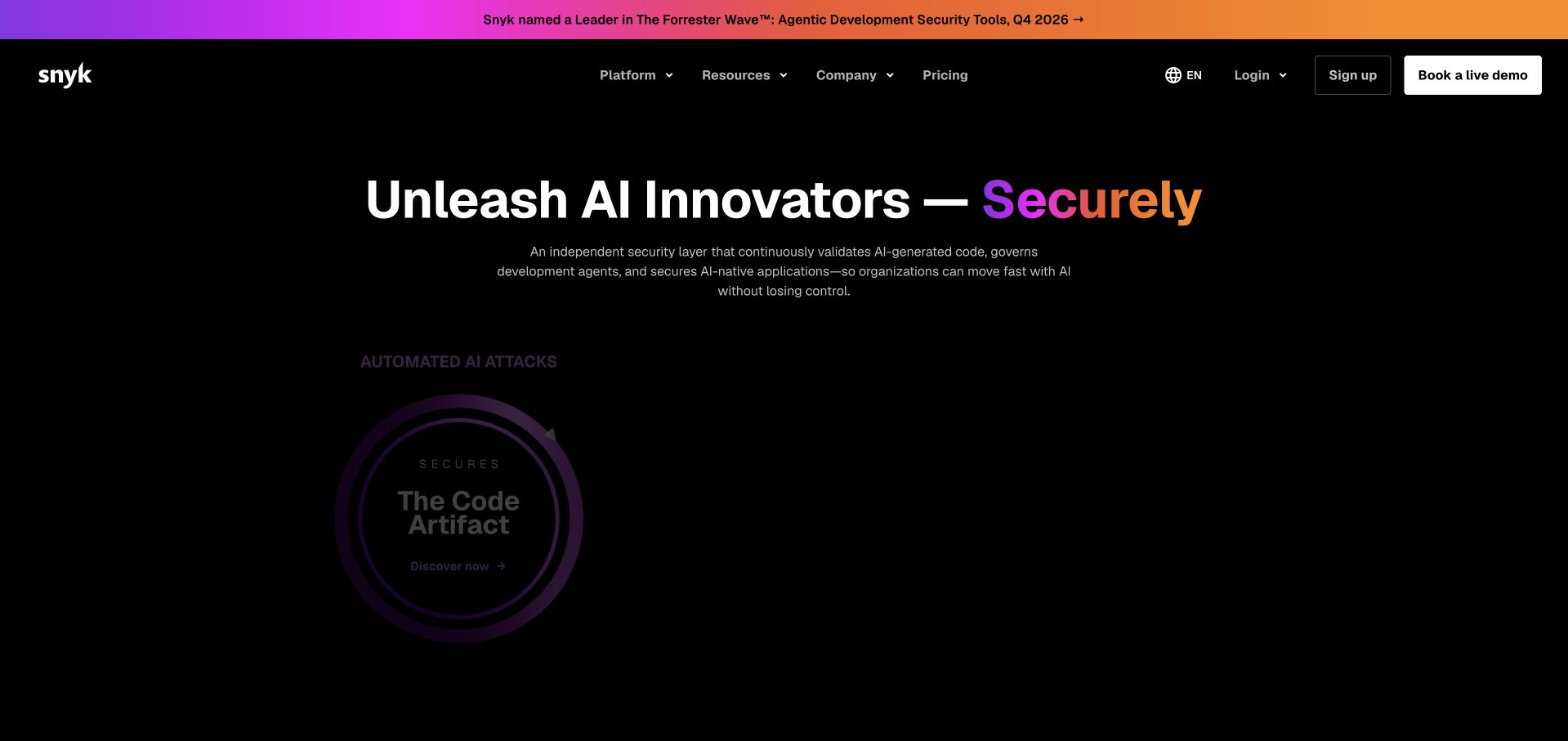
Snyk’s captured page uses a nearly black field, a purple-to-orange announcement strip and a large developer-security message. A circular product graphic sits below the compact introduction. Pricing, sign-up and a live-demo action remain easy to identify in the header. The useful design pattern is strong campaign identity without removing practical evaluation choices. The pictured artwork and AI-related wording describe public presentation, not a test of scanning coverage, vulnerability detection or security controls inside a customer’s development environment.
What you can learn
Let a campaign attract attention, then provide specific routes into the product’s actual work. A developer needs to understand what is examined, where the tool fits and what happens to a finding. Keep account access and commercial evaluation predictable, while supporting broad security language with scoped technical explanations.
Pros
The dark field creates a clear focal point around the main proposition.
Pricing, sign-up and assisted evaluation remain separately labelled.
Cons & considerations
If product artwork is dark or animated, retain readable alternatives and sufficient contrast.
If AI terminology broadens the promise, define the concrete product tasks and limitations.
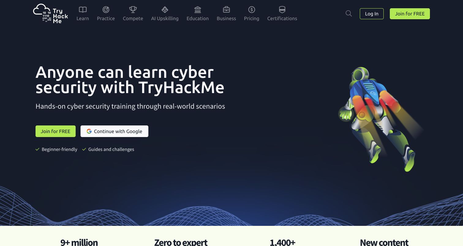
TryHackMe pairs a dark background and green actions with a colourful illustrated character. The opening explicitly identifies cybersecurity learning, names guides and challenges, and separates joining from continuing through an external identity provider. Learning, practice, business and certification routes remain in the navigation. The useful pattern is a clear invitation to begin an unfamiliar subject without implying that education is the same service as operational protection. The image was reviewed as a public learning-site introduction, not a test of private lessons or account onboarding.
What you can learn
Identify the learner and the next manageable task before presenting a large course catalogue. A beginner, an experienced practitioner and a business training buyer need different expectations. Keep the welcoming tone connected to actual learning-path information, while making account creation and any external sign-in handoff understandable.
Pros
The introduction directly names cybersecurity training and beginner-oriented support.
Joining and the external sign-in option have distinct labels.
Cons & considerations
If a playful character leads the page, provide concrete course expectations nearby.
If several experience levels share the site, help each visitor find a relevant starting route.
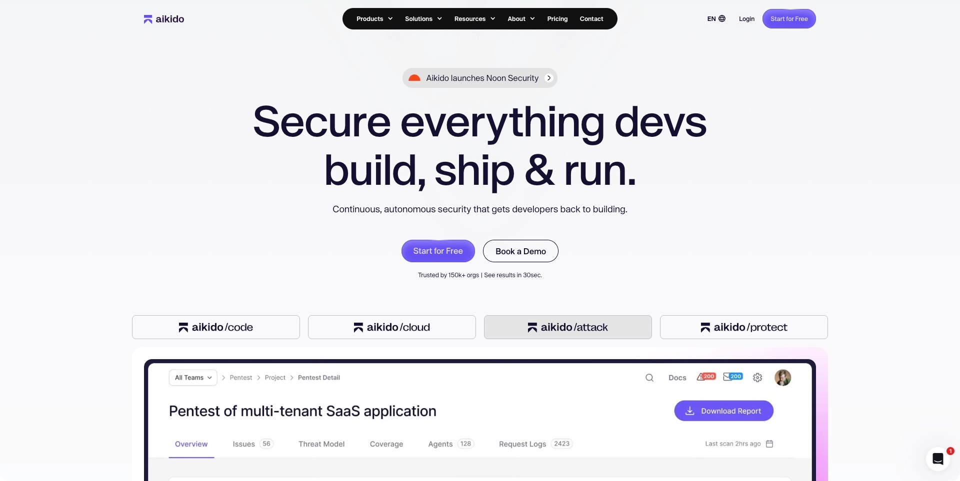
Aikido’s light introduction centres a large developer-oriented statement above separate start and demo actions. A row of code, cloud, attack and protection tabs then connects the broad message to a pictured pentest workspace. The rounded dark navigation keeps pricing and contact visible without filling the opening with every available capability. The useful pattern is a clear transition from an umbrella security message to specific product categories. The public interface illustration and autonomous-sounding copy do not establish detection quality, the completeness of a test or what would happen in a particular customer environment.
What you can learn
Name the distinct work behind each category and give a technical evaluator a route into the relevant detail. An illustrated report can make the offer tangible, but it should not imply that every finding is complete or every action is automatic. Explain product scope, review steps and customer responsibilities through appropriately qualified supporting material.
Pros
The category tabs give the broad proposition concrete destinations.
Self-service and assisted evaluation have separate labels.
Cons & considerations
If the promise spans several security activities, explain the differences before account setup.
If reports or automated actions are illustrated, identify their example context and review boundaries.
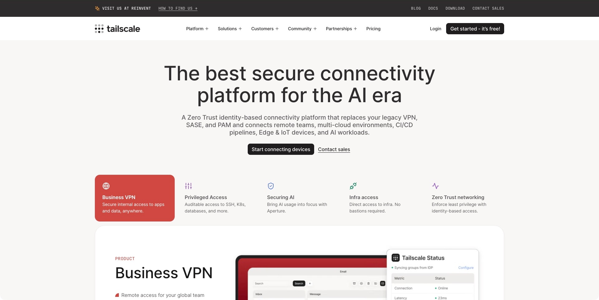
Tailscale’s captured homepage uses a restrained white introduction beneath two clearly separated navigation layers. The main statement is followed by a more concrete connectivity explanation, then device-starting and sales actions. A horizontal row names business VPN, privileged access, AI-related security, infrastructure access and zero-trust networking, with the first category highlighted in red. A corresponding product preview begins below. The useful pattern is a broad platform connected to explicit use-case choices. The public description and example status panel do not independently establish a customer’s permissions, network configuration or threat resistance.
What you can learn
Help a reader translate a wide connectivity proposition into a particular access task. Keep account, download, documentation and commercial routes clear, and explain what a device-starting action initiates. Conceptual use cases should lead to actual deployment and responsibility information rather than imply that a short introduction completes a network design.
Pros
The use-case row makes several platform entry points identifiable.
Device setup and a commercial conversation are separately labelled.
Cons & considerations
If many access acronyms appear together, provide plain explanations for mixed audiences.
If a status interface suggests readiness, distinguish illustration from a verified customer deployment.
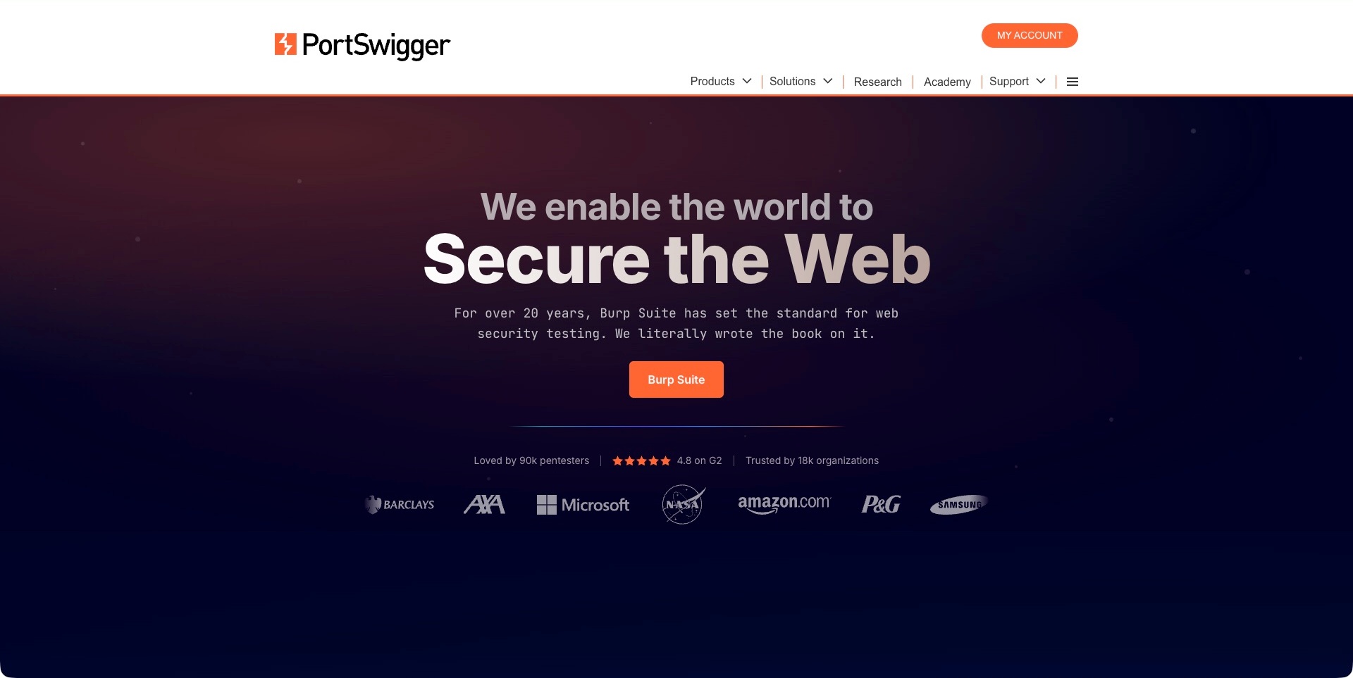
PortSwigger’s homepage separates a conventional white navigation from a dark, atmospheric introduction. An orange Burp Suite action gives the broad web-security statement a named product destination, while research, academy and support remain in the header. Customer marks and review-oriented material follow the central message. The useful design pattern is a specialist identity connecting a commercial tool with learning and reference activities. The longevity, review figures and customer marks are supplier presentation, not independent evidence of the tool’s effectiveness or suitability for a particular engagement.
What you can learn
Give a technical audience a named product route without hiding the material needed to learn and investigate. Software evaluation, training, research reading and customer support are related but different tasks. Keep their destinations explicit, and connect broad security language to appropriately scoped product descriptions rather than treating reputation signals as a substitute for technical evaluation.
Pros
The central action names a specific product rather than a generic sales destination.
Research, academy and support remain separately reachable.
Cons & considerations
If reputation signals support the opening, explain what their sources and scope actually establish.
If the portfolio serves learners and practitioners, help each audience find an appropriate starting point.
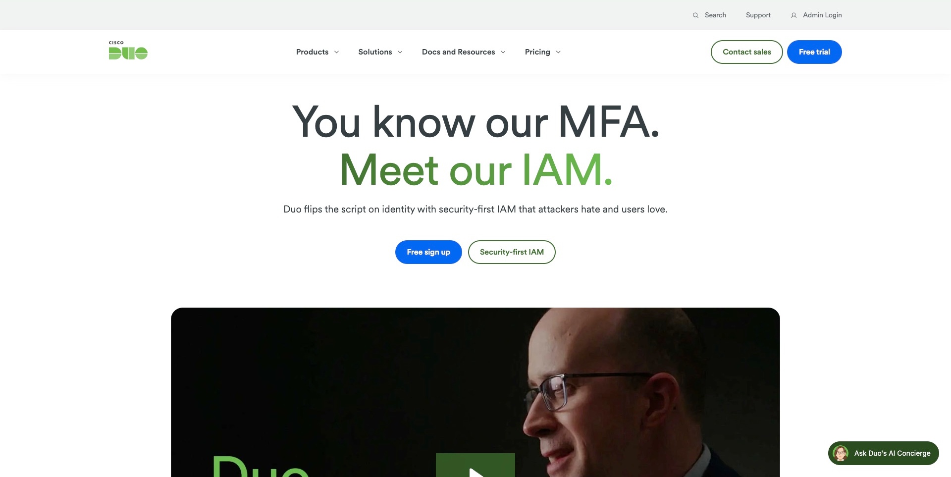
Cisco Duo’s captured opening foregrounds its category transition. A two-part headline contrasts familiar multifactor authentication with an identity-management introduction, using green emphasis within a white layout. The explanatory line sits above separate free-signup and product-information actions. Search, support and administrator login have a separate utility row. A large video thumbnail begins below the proposition. The useful pattern is an established product introducing a wider offer through a clear comparison rather than hiding the change in a crowded feature grid. This is supplier positioning, not independent verification of protection or user satisfaction.
What you can learn
When an offer expands, explain what is retained, what is added and who needs the new capability. Keep learning about a product distinct from creating an account. A video can support that explanation, but the surrounding text should still communicate the category and an appropriate next step without playback.
Pros
The two-part headline gives the category change a visible organising idea.
Support and administrator login are separated from evaluation actions.
Cons & considerations
If acronyms lead the introduction, provide plain-language explanations for less technical buyers.
If free signup is prominent, clarify prerequisites and product scope before an account commitment.
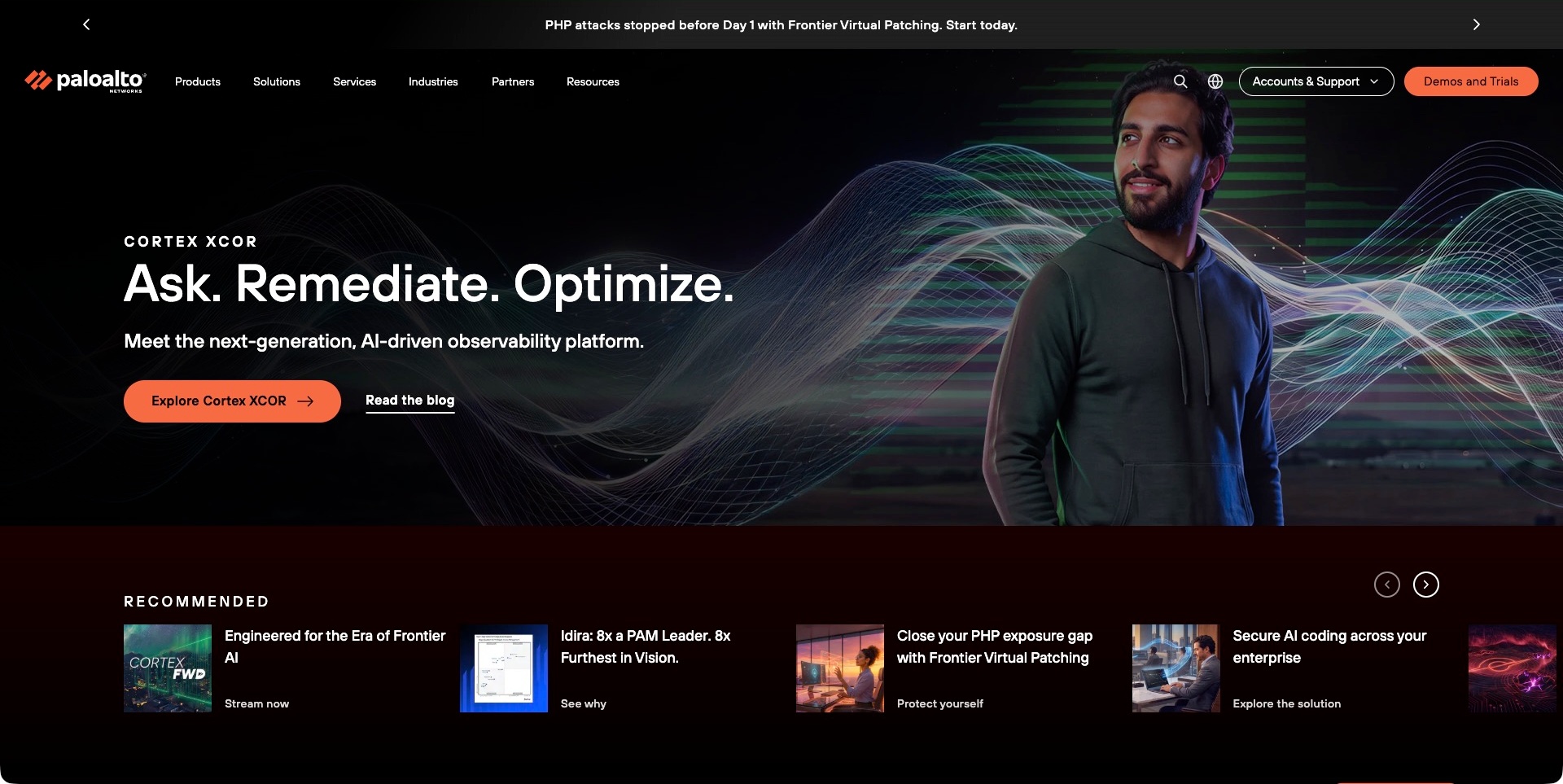
The accepted Palo Alto Networks frame features Cortex XCOR rather than a generic company introduction. A dark background combines fine waves with a person photograph, leaving space for the product name, short action-led heading and observability description. An orange product button and adjacent article link offer different depths of investigation. The broad header and recommended-resource strip retain other entry points. The useful pattern is a large portfolio temporarily focusing attention on one concrete offer without removing its wider navigation. This is one actual carousel frame, not independent evidence of system capabilities.
What you can learn
Give a campaign a destination and category information to remain understandable outside its animation. Keep the research route visible alongside the product action. For rotating introductions, ensure each complete frame carries its own meaning and does not rely on a visitor watching every slide.
Pros
The product name and category explanation anchor an otherwise expressive visual frame.
An article route offers a lower-commitment alternative to the main product action.
Cons & considerations
If the first screen rotates, preserve readable timing and a clear control system.
If a broad portfolio surrounds one campaign, provide paths for visitors with unrelated product tasks.
Kegan is a freelance web designer and developer with 15+ years of experience helping businesses turn complicated website requirements into clear, maintainable digital experiences. He works directly with clients from planning and design through development, launch, and ongoing support.
For cybersecurity website design, his development approach focuses on understandable product and service boundaries, appropriately qualified security claims, useful technical documentation, distinct demo and support routes, and accessible evaluation journeys. The scope can be a targeted improvement or a complete custom build, with responsive layouts, thoughtful content structure, and integrations chosen around the people using and maintaining the site.
Show 3 other cybersecurity website designersHide other cybersecurity website designers
Plan a cybersecurity website around a real evaluation journey
Write the offer and its boundaries before the headline
Start with a short internal description of the actual product or service. Identify the primary task, intended user, relevant environment and delivery format. An organisation evaluating a managed service needs different information from a developer installing a tool or a learner choosing a training path. Agree on those distinctions before selecting a visual direction or borrowing another company’s language.
List the statements that the website needs to substantiate and the people responsible for reviewing them. Separate current product capabilities from planned features, supplier descriptions and examples from one customer environment. A concise homepage can be confident without implying universal coverage. Its purpose is to help the right visitor recognise the offer and find the appropriate detail, not settle every technical question in a slogan.
Map the people involved and the task of each destination
Document the main reasons someone visits: understanding the category, checking an integration, comparing plans, preparing an internal recommendation, getting help or entering an account. Assign each reason a useful public destination. Some visitors need several routes over time; the navigation should not assume that everyone follows a single sequence from headline to sales form.
Use labels that explain the destination rather than the internal team that owns it. Product documentation, an interactive demo, an account console and a support centre should not all be called a platform. Review the journey when a link moves to another domain or service. Keep its purpose clear and provide a usable way back to public information, without entering private accounts merely to verify a marketing route.
Build an evidence library rather than a pile of trust symbols
Decide what information helps someone evaluate the actual offer. Depending on the product, that might include implementation documentation, a clear service description, a demonstration, a dated report, a customer account or a discussion of limitations. Give each item a title, source, scope and owner. Help visitors understand whether they are reading a product explanation, a marketing claim or a separate assessment.
Keep evidence close to the statement it supports. A customer logo does not tell a visitor which product was used, when the relationship existed or which result was being described. A report about one aspect of an organisation should not be presented as proof of every application or deployment. The responsible subject-matter team must review those relationships; attractive badges and a redesigned page do not expand an assessment’s scope.
Explain implementation without turning the homepage into documentation
Identify the first questions a technical evaluator needs answered before investing in a deeper review. These may concern supported environments, the role of an integration, who administers it and what the product asks the customer to do. A compact overview can point to the relevant documentation without reproducing every setting or implying that a diagram is a deployment guide.
Give illustrations a defined job. One might explain the relationship between a user and a resource; another might show the sequence from a finding to a review. Keep labels readable and describe the meaning in nearby text. Distinguish an example interface from a live customer system, and avoid putting sensitive or fabricated operational data into a marketing demonstration merely to make it look authentic.
Define what a trial, demo or enquiry actually starts
Clarify the commitment behind each primary action. A recorded demonstration, a product sandbox, an account request and a scheduled sales call are different experiences. Explain the purpose and prerequisites before a visitor reaches the form or external service. Do not use one ambiguous start button for several materially different journeys simply because it creates a cleaner visual composition.
Keep initial fields tied to the real routing task and explain what happens after submission. The responsible team should decide what information is appropriate and how it is handled. Public sales forms should not quietly become incident-intake or vulnerability-reporting channels. Give those processes their own accurate instructions and contact routes, without promising a response time, confidentiality arrangement or support coverage that has not been agreed.
Give content and campaign changes a maintenance model
Security marketing often changes quickly as product names, integrations and emerging categories evolve. Keep the permanent product explanation separate from a temporary event, research release or campaign. Assign owners for plan information, documentation links, service descriptions and dated material. A new homepage theme should not automatically advance the review date on unrelated evidence.
Decide how retired capabilities and old material are labelled. Visitors may arrive directly from search at a report or a documentation page rather than the current homepage. Provide enough context to understand its age and relationship to the current product. Keep redirects and replacement links intentional, while preserving the source and date of historical material instead of silently rewriting it to look current.
Test the information journey, not just the visual impression
Create realistic public tasks for the intended audiences: identify the offer, find a relevant product detail, understand a plan, locate implementation material and choose the correct contact route. Review keyboard navigation, responsive layouts, readable diagrams, form messages and external handoffs. Include appropriate users and the people who maintain the information, not only the team that approved the visual concept.
Keep website usability checks separate from product testing and security assessment. A polished interface, a successful form submission or an automated page test cannot establish that a product protects a particular environment. Record what was actually reviewed and what still needs specialist evaluation. That distinction makes the website’s communication more useful without claiming that a design project has completed work outside its scope.
The editing job behind the design
Choose a publishing system that can preserve scope, ownership and evidence
Start with the content model rather than the technology used by an attractive example. Product descriptions, integration records, plans, documentation, reports and customer stories have different editing and review needs. Decide which material belongs on the marketing site and which belongs in a dedicated product or documentation system, with clear links between them.
Model dates and qualifications as part of the content where they matter. An editor should be able to update a product boundary or replace a report without rebuilding an entire decorative section. Keep responsibility for technical claims with the appropriate reviewers. A visual page builder, static framework or content platform does not independently establish the accuracy of the statements published through it.
Document external form, scheduling, search and account handoffs before choosing integrations. Decide what each service controls and what a visitor should be told at that step. Public technology evidence describes only the relevant observed page or cited property; it is not a complete backend inventory, an operational audit or proof that another organisation should use the same stack.
Our WordPress website examples offer a separate look at publishing approaches. A visible platform label is evidence for that named page, not a guarantee that the same system will suit your requirements.
Before the public launch
Cybersecurity website planning checklist
Name the actual product category and the problem it addresses.
Identify developers, administrators, buyers, learners and existing-customer tasks separately.
Explain the boundary between the product’s role and the customer’s work.
Give documentation, pricing, support and account access distinct destinations.
Identify the source, date and scope behind important claims.
Keep assessment, customer-story and marketing materials clearly distinguished.
Make diagrams understandable through readable labels and supporting text.
Distinguish illustrative product interfaces from live or independently tested systems.
Explain what a trial, demo and sales enquiry each starts.
Keep initial contact fields proportionate to the actual routing task.
Provide separate accurate support and vulnerability-reporting instructions where relevant.
Assign owners to changing plans, integration information and campaign notices.
Test public navigation, forms, media and external handoffs at realistic screen sizes.
Keep website-design checks separate from product-security or legal assessments.
These checks are a project checklist, not a performance, legal, security, or accessibility certification. Test real journeys with the people responsible for the website before making claims about the result.
Sources & editorial method
How this collection was selected and reviewed
This collection contains exactly15 distinct public website examples, matching the original random target saved before research. Every accepted image was independently inspected. Reused original direct screenshots retain their exact bytes, source identity and original capture dates; new direct screenshots retain actual UTC timestamps and browser-only crop records. Current official source observations establish topic fit without turning older images into fresh captures. Reviews are original industry-specific editorial analysis of the visible communication, including conditional tradeoffs; illustrations and vendor claims are not independently tested product outcomes. Socket is the explicitly researched Editors Choice for the stated website-design reasons, not a vote-derived or measured ranking. Unknown technologies remain unlisted until supported by a scoped dated observation. External imagery and trademarks belong to their respective owners.
Each example links to its actual source page. Screenshots are direct browser captures with their own capture dates; moving imagery, announcements and live designs can change. The notes describe observable design choices and conditional tradeoffs, not measured traffic, conversion results, service quality, or accessibility conformance.
Technology labels use public page metadata, asset evidence, or explicitly cited platform documentation. Platform documentation is not a complete current deployment audit. A component reference may be legacy or unused; it is not a complete backend inventory. Unknown stacks are omitted. These sites are editorial examples, not our client portfolio.
Written, Edited and Curated are separate editorial records, not timestamps advanced by a rebuild. Website designs and imagery belong to their owners. See our editorial standards or suggest a correction.
Questions worth asking
Cybersecurity website design questions
Should a cybersecurity homepage list every feature?
Not necessarily. It should identify the actual category, intended user and next useful step, then connect those statements to relevant detail. A broad portfolio needs understandable routes into individual products. The goal is not to hide complexity, but to let visitors investigate it without making every audience read the same exhaustive opening paragraph.
Are dark colours and lock illustrations necessary?
No. They are visual choices, not evidence of security. The examples use different palettes and ways of explaining a product. Choose the treatment that supports readable content and the actual task. Test text, controls, diagrams and media rather than assuming a familiar security aesthetic makes the website more trustworthy or usable.
What should a trust or evidence section explain?
Identify what the material is, who produced it, when it applies and what scope it supports. A report, a product demonstration and a customer story answer different questions. Have the responsible reviewers confirm the claims and qualifications. A collection of badges cannot independently establish every technical, operational or legal property of a service.
How should sales and technical support be separated?
Use distinct destinations and labels based on the actual processes. Explain what each route is for and what information is appropriate. Account help, incident-related contact, a commercial discussion and vulnerability reporting should not be silently combined into one generic lead form. Do not promise response times or handling arrangements that the responsible organisation has not agreed.
Does inclusion here mean a product is secure or recommended?
No. This is a website-design collection. A public screenshot and source review can show how an offer is presented, but they do not test a private application, customer deployment, detection capability or operational process. Selecting a service for a particular environment requires its own appropriately scoped evaluation.
Borrow the clearest information patterns, not an impression of certainty. Explain the actual offer, keep evidence in scope and help each visitor reach the information or conversation relevant to their task.