Best Digital Marketing Websites of 2026 (26 Real-World Examples)
Digital marketing website design that connects services, evidence and the next decision
A useful marketing agency website helps a buyer understand the work before asking for a call. It distinguishes channels, explains the agency’s role and gives reported results enough context to be meaningful.
Digital marketing covers very different responsibilities: search, paid media, social campaigns, content, email, analytics and conversion work can sit inside one practice or be provided by separate specialists. A strong website makes the actual remit clear instead of treating every channel as a synonym for growth. It helps a visitor compare relevant evidence and identify a sensible starting conversation.
The examples below are selected for observable website communication, not independently measured agency performance. Some are specialist marketing practices and others are communications agencies with documented digital services. Reported client results remain attributable claims; a screenshot cannot verify return on investment, attribution, campaign quality or suitability for a particular business.
Before the examples
What makes good digital marketing website design in 2026?
Describe what the agency actually manages
Distinguish strategy, implementation, ongoing channel management, creative production and measurement. Explain whether media spend, software, development or specialist partners sit outside the engagement. A prospective client should understand the service boundary before interpreting a broad promise about growth.
Make performance claims interpretable
Give a result its metric, period, baseline, source and scope. Revenue, qualified inquiries, traffic, impressions and rankings are not interchangeable. Explain attribution limits and avoid implying that a single campaign caused every later business change. A smaller well-explained result is more useful than a large number without context.
Help buyers move from problem to relevant evidence
Organize services and cases around real questions: an underperforming channel, an unclear measurement setup or a need for ongoing capacity. Keep ordinary navigation and contact routes available without forcing a visitor through a diagnostic quiz. The first inquiry should begin a useful discussion rather than pretend to produce a complete marketing strategy.
The collection · 26 examples
26 digital marketing websites worth studying
Compare the agency proposition, service distinctions, case context, navigation and inquiry design. Look for a way to make the buying decision clearer, not a claim that one visual style automatically increases conversions.
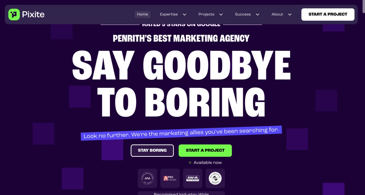
Pixite’s retained screen uses a deep purple field, a bright green studio mark and very large white display type. A Penrith marketing-agency claim provides a local cue above the headline, while a green Start a Project action contrasts with a secondary outlined button. The persistent header separates expertise, projects, success and information about the practice. Current first-party services identify search, advertising, email and social work alongside web and branding capabilities. The expressive introduction does not independently verify its self-reported superlatives or recognition marks.
What you can learn
Make the agency’s identity and relevant location visible, but pair an energetic headline with precise service and case information. Give a visitor an obvious next step without making a sales action the only way to understand the practice. Reported results need their own context beyond the visual confidence of the page.
Pros
A consistent purple-and-green palette makes the primary action easy to locate.
Ordinary expertise and project navigation sits above the expressive headline.
Cons & considerations
Large display type can delay a practical explanation of the actual services.
Superlatives and recognition marks need context rather than being treated as a substitute for evidence.
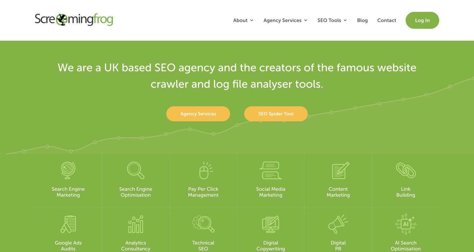
Screaming Frog’s retained homepage uses a green field, a direct description of the business and two yellow actions separating Agency Services from the SEO Spider tool. A service-icon grid below names search, paid media, social, content, analytics and related disciplines. The white header keeps agency services and SEO tools distinct in the navigation, with a separate login action. Current first-party information confirms the agency remit. The useful pattern is the explicit split between buying professional services and exploring software, rather than allowing a famous product to obscure what the agency actually does.
What you can learn
When one business serves both product users and service buyers, name those journeys early and give each a clear destination. Keep channel descriptions precise and link to relevant cases. A software product’s reputation should not be used as automatic evidence of agency results.
Pros
Two clearly labeled actions separate the main service and product journeys.
The visible channel inventory makes the agency’s broad remit understandable.
Cons & considerations
A dense service grid can become harder to scan on smaller screens.
A broad capability list needs deeper scope and case context before a buyer can evaluate a particular engagement.
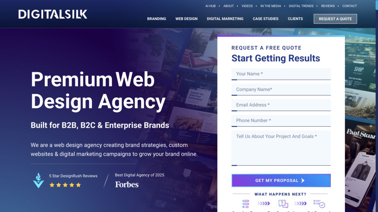
Digital Silk’s retained homepage pairs a dark blue-and-purple service introduction with a large white quote form. Branding, web design and digital marketing are separate header links, and the introduction describes their relationship in one broad offer. The form requests contact and project information directly in the first view. Recognition and review claims sit below the headline. Current first-party services establish digital-marketing work, but this particular frame foregrounds web design, so it should not be described as a pure performance-marketing landing page. The useful design question is how much first-screen space to assign to explanation versus immediate inquiry.
What you can learn
If a form is integrated into the hero, make its purpose clear and keep service and case navigation available for visitors who are not ready to submit. Explain the actual marketing scope and support claims through relevant assignments rather than relying only on badges.
Pros
The inquiry route is visible without opening a separate dialog.
Header labels distinguish the agency’s major disciplines.
Cons & considerations
A large form can compete with the information a visitor needs before deciding to inquire.
A web-design-led introduction needs relevant marketing cases elsewhere to establish the narrower service evidence.
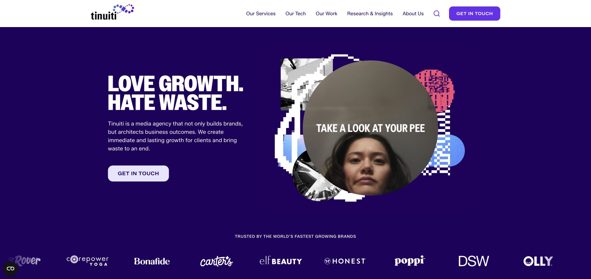
Tinuiti’s retained homepage uses a deep purple background, a bold two-line proposition and a short media-agency description beside an irregular collage of campaign imagery. A prominent contact action sits below the copy, while the white header separates services, technology, work, research and company information. A row of client marks begins beneath the hero. The closed lower-corner launcher is normal site UI, not an expanded consent panel. Current first-party information establishes media and digital-marketing services. The frame is useful for hierarchy and agency identity, but its growth language and client logos do not independently verify a campaign result.
What you can learn
Give the proposition, scope, evidence routes and contact action different jobs. A distinctive collage can make a media practice memorable, while the work archive explains channels, periods and responsibility. Keep reported business outcomes separate from the visual impression of the hero.
Pros
Services and work remain easy to find without starting an inquiry.
The own-brand palette unifies a varied set of featured campaign images.
Cons & considerations
A broad growth proposition needs bounded case evidence before it becomes meaningful.
A collage-based opening requires readable alternatives and careful small-screen ordering.
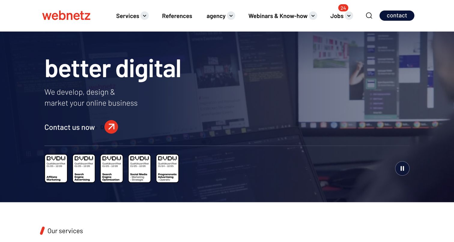
webnetz’s retained homepage uses a darkened office-screen image behind a short digital-business proposition and a direct contact action. The white header keeps services, references, knowledge, jobs and contact visible. A row of channel-related credential graphics sits beneath the introduction, and a pause control is visible at the right of the media area. The original capture includes English browser translation; that state should not be presented as the agency’s original language experience. Current first-party information establishes digital-marketing services alongside development and design. The useful pattern is a concise umbrella description followed by more specific service and evidence routes.
What you can learn
Explain how adjacent disciplines connect without pretending they are identical. A broad digital offer needs relevant service pages and cases, while credential marks should be described accurately and kept distinct from client outcomes. Preserve ordinary navigation and a useful non-motion experience.
Pros
The header provides practical service and reference routes above the media.
A visible pause control gives the moving presentation an explicit interface element.
Cons & considerations
Credential graphics need sufficient size and explanatory context to be useful.
A translated still cannot establish the clarity or behavior of the original language and motion states.
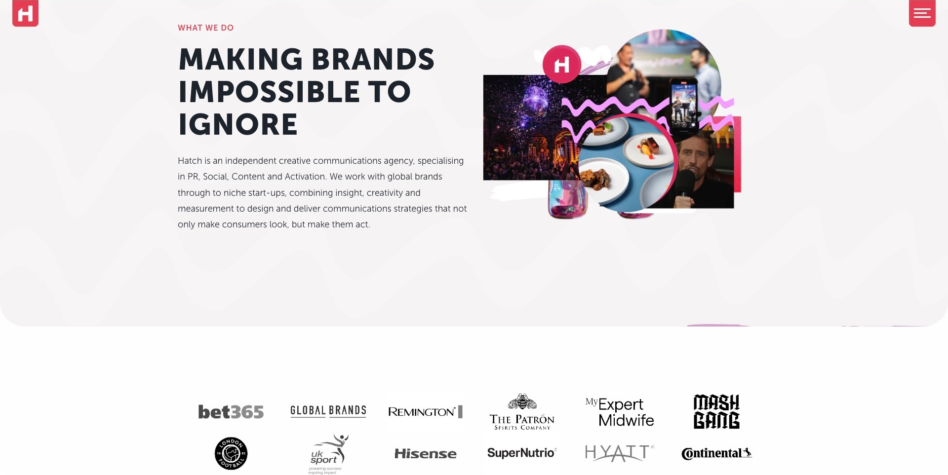
Hatch’s saved service introduction uses a large black headline, a plain paragraph naming PR, social, content and activation, and an energetic collage at the right. The images suggest different campaign contexts without replacing the written explanation. Client marks begin below the main block, and fixed corner navigation remains available after the initial reel. Current first-party information includes digital PR alongside the other disciplines. This is a communications-led digital-marketing example, not evidence that the agency provides every performance channel. The useful design pattern is a clear statement of adjacent services before the visitor reaches detailed cases.
What you can learn
Explain how channels connect and identify the actual responsibilities rather than presenting a generic full-service promise. A collage can express creative range, while cases should establish the brief, delivery role and bounded evidence. Keep the initial scope readable without requiring the visitor to play media.
Pros
The paragraph makes the multi-channel remit understandable in one place.
A separate image area supports the message without covering its text.
Cons & considerations
A broad channel description needs relevant cases to distinguish the actual engagement types.
The dense introductory paragraph could require shorter grouping in a narrow layout.
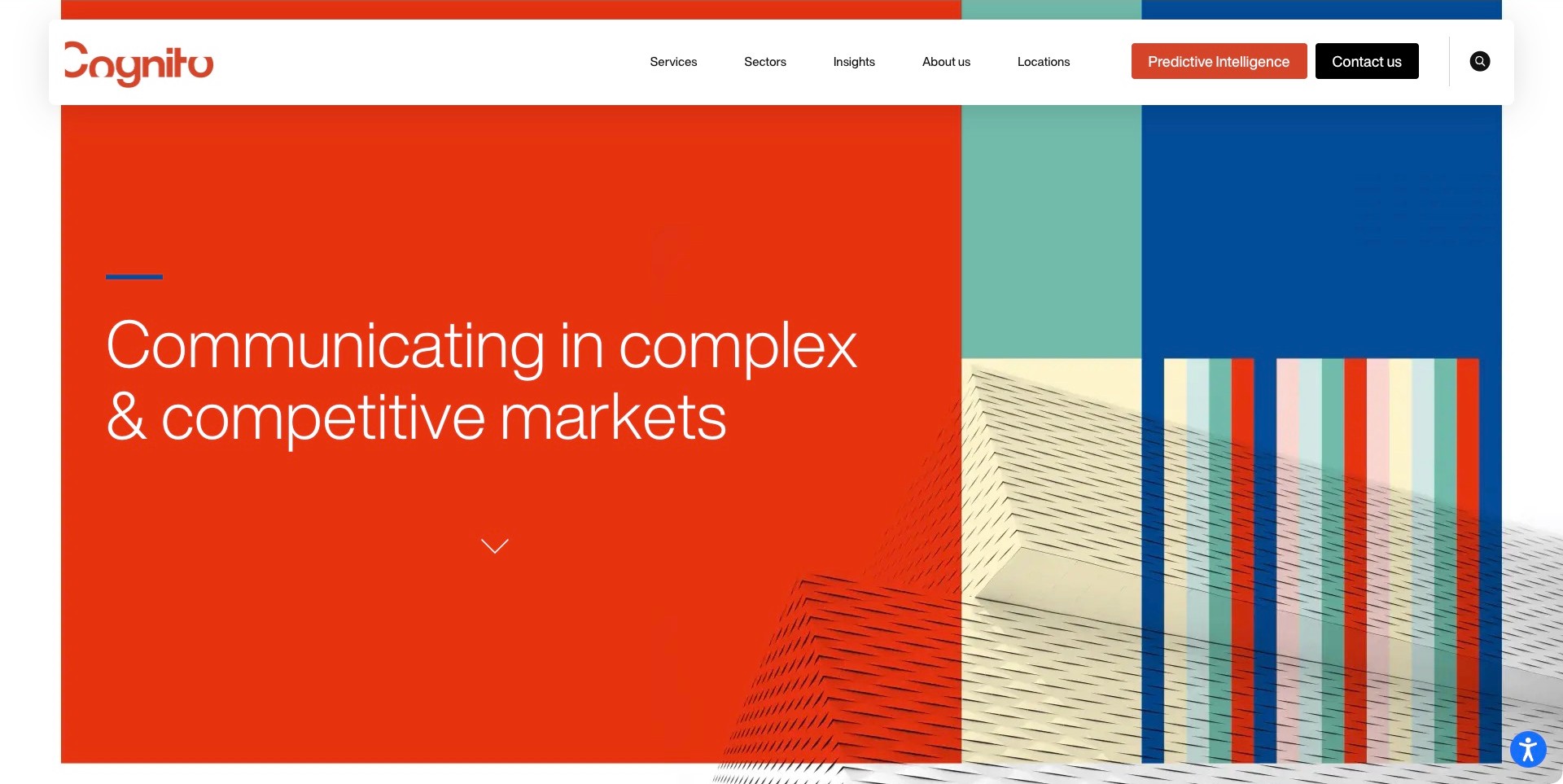
Cognito’s opening uses a strong orange proposition field beside a geometric architectural image. A wide white header keeps Services and Sectors separate, with additional routes to insight, locations and contact. Current first-party services establish digital-marketing and social work within a broader communications practice. The screenshot does not show a campaign dashboard or prove that a named intelligence offer powers every engagement. The useful pattern is how a specialized market position can be supported by distinct paths for the buyer’s industry and the work they need.
What you can learn
Let a visitor approach the agency through either a problem or a sector, then connect those paths to relevant evidence. Explain the scope of any named product or method separately. Strong positioning should make the service easier to understand, not replace the account of what the team actually manages.
Pros
Separate service and sector routes support two practical ways of evaluating fit.
The bold proposition has a clear visual area outside the detailed image.
Cons & considerations
A crowded desktop header needs thoughtful reduction on smaller screens.
A specialist market claim still needs cases to establish the specific digital responsibilities and results.
Prosek’s retained homepage separates a large business-impact statement from a smaller description of its marketing-and-communications remit. The pale gradient and black typography create a quiet setting, while Expertise, Perspectives and About Us remain in the header. Partner With Us is a distinct action, and a featured-story strip supplies company news below. Current first-party information establishes digital, paid and analytics-related capabilities within the wider practice. Its useful lesson is the way a short positioning statement can be followed by a more precise professional context without filling the hero with service icons.
What you can learn
Use layered text to explain the relationship between marketing and adjacent advisory work. Then give buyers relevant cases that state channels, periods and responsibility. Keep company news separate from performance evidence, and avoid letting a headline ranking stand in for an explanation of the agency’s actual contribution.
Pros
Different text scales distinguish the broad proposition from the specific remit.
Expertise and insight remain available before a visitor begins an inquiry.
Cons & considerations
A broad corporate statement needs deeper pages to clarify digital-service boundaries.
A moving news strip may compete with reading unless its actual behavior is carefully designed.
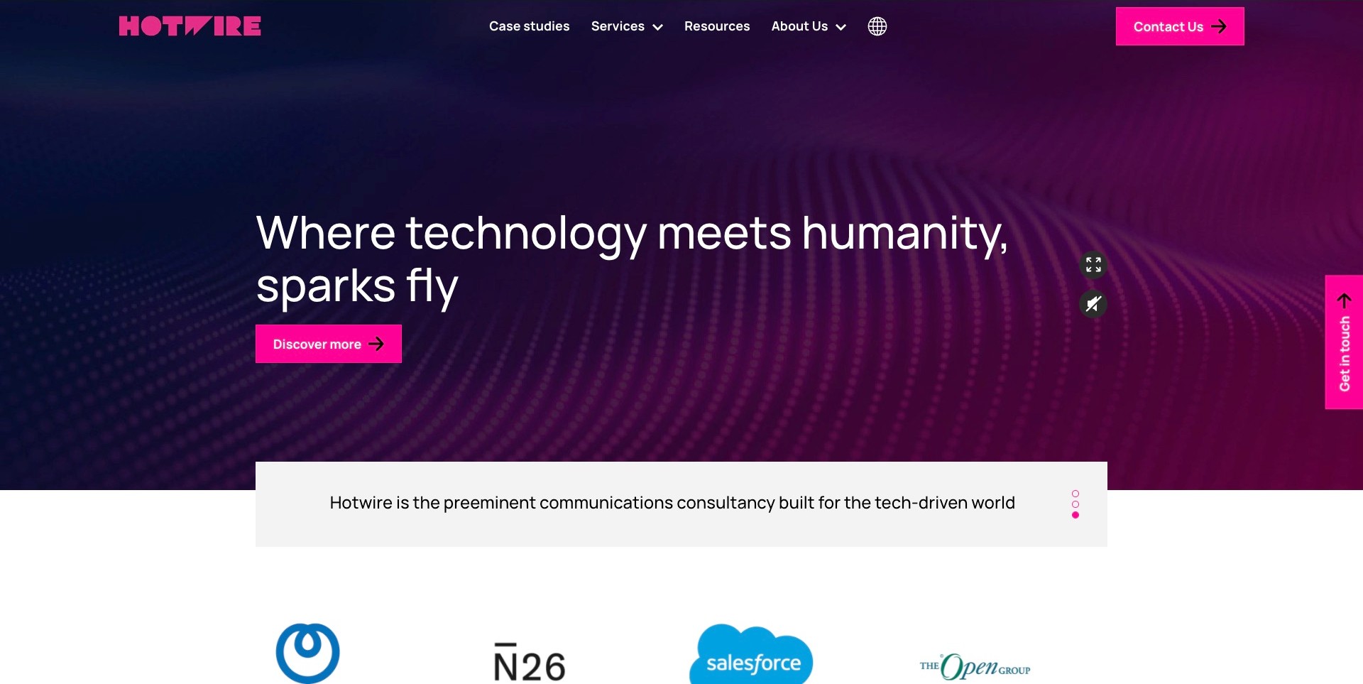
Hotwire’s saved homepage combines a magenta identity, abstract navy-and-purple media and a large technology-and-humanity proposition. Discover More sits below, while a pale panel supplies a more literal communications description and a client-mark row begins underneath. Services, case studies and resources remain separate header choices. Current first-party information identifies technology PR and digital marketing as related capabilities; that does not mean every pictured client uses every service. The useful digital-marketing lesson is the transition from an expressive market position to an explanation visitors can investigate through ordinary service and case destinations.
What you can learn
Describe the audience and the actual digital responsibilities near the introduction, then connect them to cases that state channels, deliverables and measurement scope. Distinguish communications from paid-media or conversion work instead of presenting one as proof of the others. A visible client logo does not establish outcomes or implementation details.
Pros
Capabilities and case evidence have distinct navigation routes.
The description panel creates a stable reading surface below the media-led opening.
Cons & considerations
Broad innovation language needs specific service definitions to become useful.
Multiple contact actions and media controls need clear priorities and accessible focus behavior.
Manifest’s saved opening pairs a literal unified-brand-communications description with an oversized white wordmark over a dark campaign-film frame. The captured moment shows an adult holding a baby, while a simple Menu control remains at the upper right. Current first-party cases label content strategy, social media and campaign work alongside other communications disciplines. This qualifies a communications-led digital example, not a universal performance-marketing or media-buying claim. The useful design question is how to let varied creative material demonstrate range while still giving visitors a way to understand the actual services behind it.
What you can learn
Attach readable roles and deliverables to each campaign rather than making a reel stand in for a content strategy. Separate creation, distribution and measurement where the assignment includes them, and say when it does not. Keep case destinations and meaningful stills available independently of the opening film.
Pros
A plain category label anchors the highly expressive visual treatment.
The consistent wordmark connects different campaign scenes to one agency identity.
Cons & considerations
The large introductory media delays service-specific information.
A menu-led structure needs clear labels and predictable keyboard behavior beyond the initial screen.
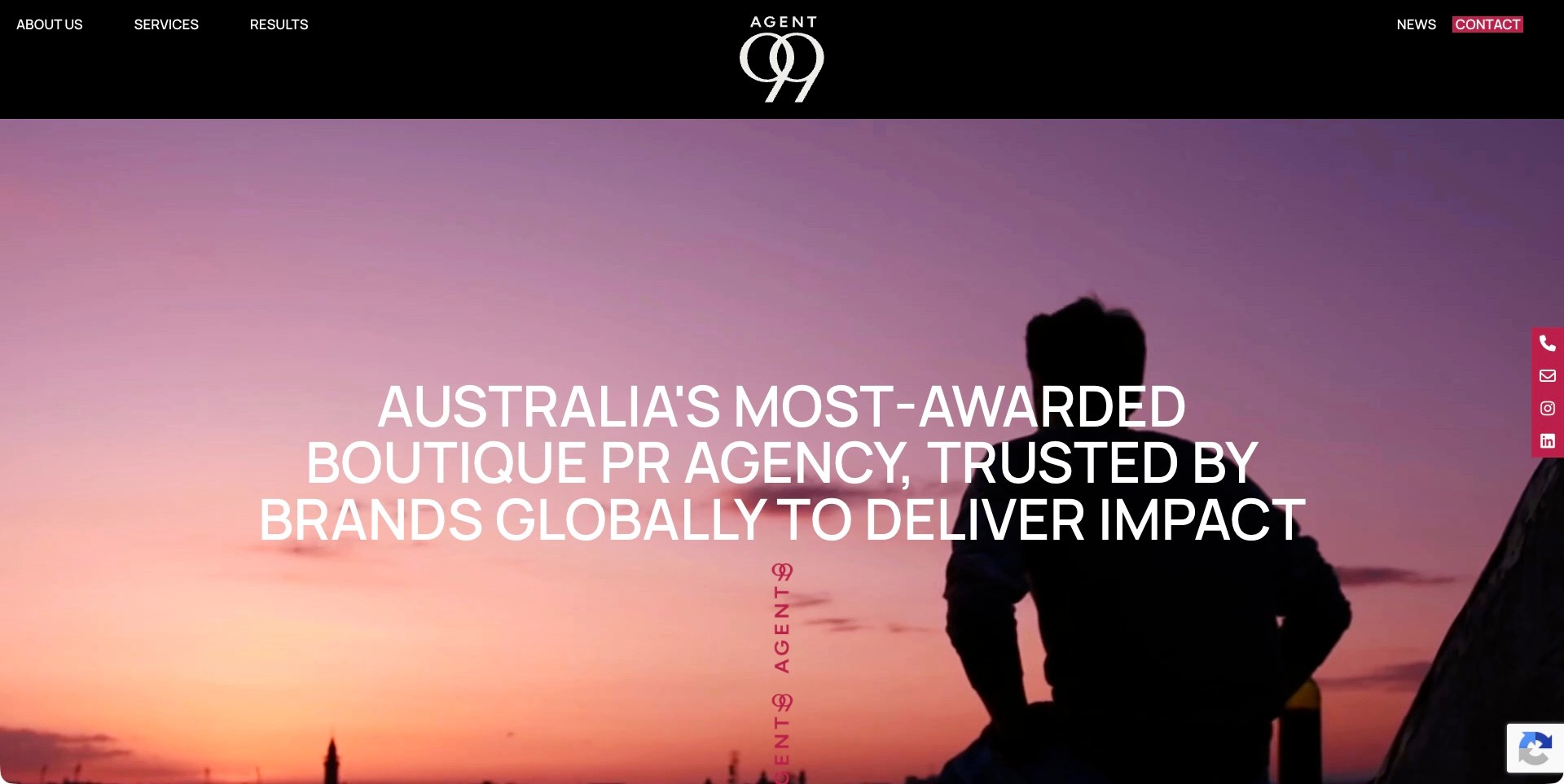
Agent99’s saved homepage uses a black header, centered monogram and sunset film frame, with a large white positioning statement and a burgundy side contact rail. Services and results are distinct navigation choices rather than one general work link. The current first-party explanation names social media and content marketing alongside consumer and corporate PR, events and media relations. This is a communications-led digital scope, not evidence that the practice runs every advertising or analytics discipline. The useful pattern is a recognizable identity with separate destinations for understanding the offer and examining campaign evidence.
What you can learn
Explain whether a digital assignment concerns content creation, community channels, earned attention or paid distribution, and connect each responsibility to an appropriate case. Keep the measurement definition visible instead of treating an impact claim as a complete result. A social icon or film frame does not establish which channels were used for a client.
Pros
The services/results distinction supports different stages of buyer research.
A compact, consistent identity leaves the main campaign image visually coherent.
Cons & considerations
The opening’s broad superlatives postpone channel and deliverable detail.
A persistent contact rail needs checks for obstruction, focus and smaller-screen behavior.
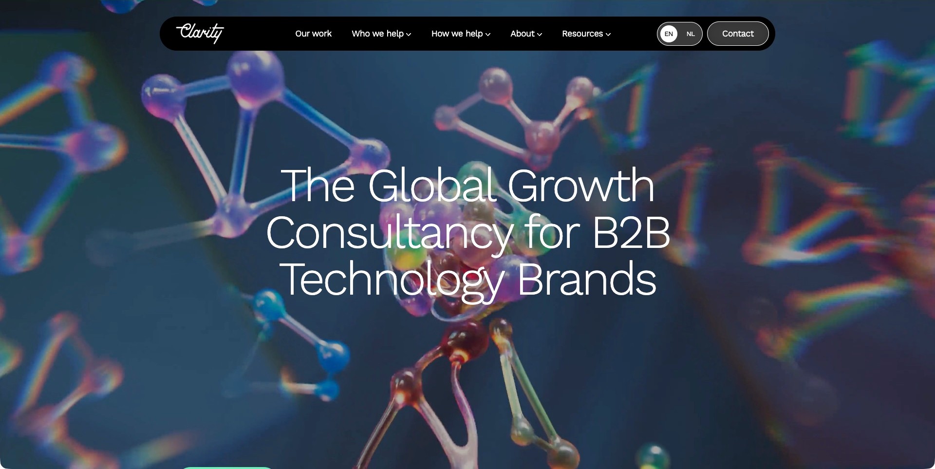
Clarity’s saved homepage uses colorful molecular-model imagery behind a large B2B-technology growth proposition. Its rounded black header distinguishes Our Work, Who We Help and How We Help, with language and contact controls nearby. Current first-party information identifies a marketing-and-communications practice, including digital services alongside PR. The abstract film is an atmospheric introduction, not a pictured campaign or evidence of a conversion outcome. The useful digital pattern is a deliberate separation between market fit and capabilities, giving visitors more than one way to decide whether the offer is relevant.
What you can learn
Connect audience-specific language to concrete service and case records that explain channels, deliverables and measurement boundaries. Keep a business goal distinct from the mechanism proposed to address it. A broad growth label does not establish which digital work was performed, how a result was attributed or whether a visitor completed an inquiry.
Pros
Audience and capability routes address different research questions.
The dark header gives ordinary navigation a stable reading surface.
Cons & considerations
A large abstract opening delays channel-specific detail.
Thin text over changing imagery needs legibility and reduced-motion alternatives.
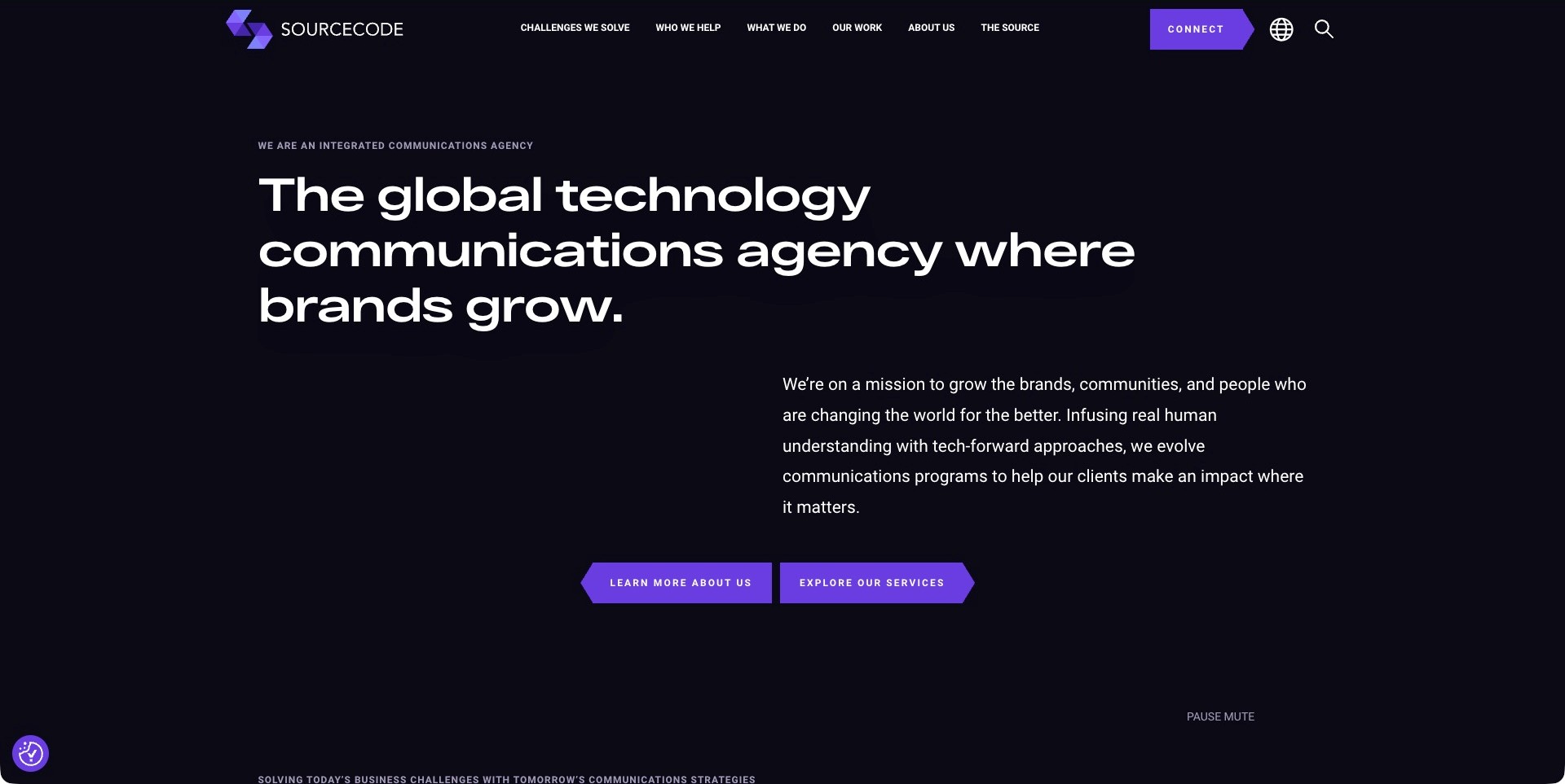
SourceCode’s saved opening is a nearly black text-led composition with a large technology-communications heading, an offset paragraph and purple angular actions. Challenges We Solve, Who We Help, What We Do and Our Work are separately labeled across the header. Current first-party source content names community amplification, search discovery and lead-generation challenges within a communications practice. That does not establish the implementation of the client programmes or every possible digital discipline. The useful pattern is a problem-led entry that remains paired with a literal service route and a work archive, rather than turning the whole site into a series of outcome promises.
What you can learn
Map each business challenge to actual responsibilities, then explain channels, dependencies and measurement limits in the related case. Keep an exploratory service route for visitors who already know the task. A named growth challenge is not evidence of causation, a client result or a successful inquiry.
Pros
Problem-led and capability-led research both have visible routes.
The supporting paragraph gives the specialist heading additional context.
Cons & considerations
Ambitious language needs precise case evidence to become evaluable.
Small uppercase navigation and button labels need readable phone and keyboard states.
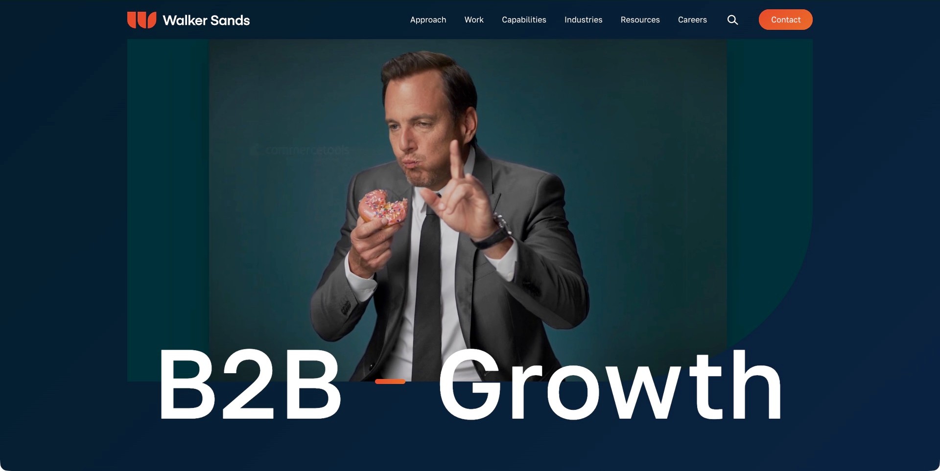
Walker Sands’ saved homepage places oversized B2B-growth lettering over a navy composition and a film frame showing a suited person with a doughnut. Orange identity and contact details provide selective emphasis. Approach, Work, Capabilities and Industries are separate header routes. Current first-party information explicitly lists brand, demand, PR, social, digital marketing, data and analytics. The image does not identify a specific assignment or prove any claimed result. The useful pattern is a clear intended audience coupled with multiple research routes, allowing a broader offer to remain navigable without presenting every channel in the headline.
What you can learn
Explain how the proposed responsibilities work together while preserving each channel’s role and measurement limitations. Use cases to show the brief, time period and agency contribution rather than letting an integrated-growth label imply universal attribution. Keep a useful still and ordinary navigation available outside the creative film.
Pros
The intended B2B audience is explicit in the opening.
Industry and capability routes let visitors research different kinds of fit.
Cons & considerations
The large creative introduction postpones practical delivery details.
A broad growth statement needs evidence beyond an expressive image and a service list.
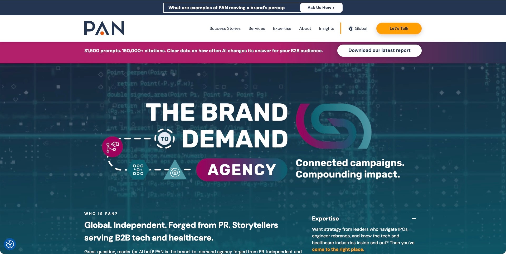
PAN’s saved homepage combines a top question strip, a report-download banner and a teal-and-magenta brand-to-demand diagram. The main navigation separately labels success stories, services and expertise. An introduction below names B2B technology and healthcare audiences alongside a PR origin. Current first-party information includes earned, owned and paid media, but the diagram does not demonstrate a particular client implementation. The report’s prompt and citation counts are agency-published claims, not independently validated findings here. The useful design distinction is between an editorial research invitation and the ordinary routes used to investigate a service engagement.
What you can learn
State what a research download contains and keep its acquisition separate from a sales inquiry. Explain channel responsibilities and attribution limits in cases instead of letting a connected diagram imply causal proof. Treat download interest, campaign reach and qualified business outcomes as different measures with different evidence requirements.
Pros
The report invitation and contact action are visually distinct.
The introduction identifies the audiences the broader proposition concerns.
Cons & considerations
Stacked strips and promotions make the opening dense.
Research and performance claims require a readable method and supporting context beyond the graphic.
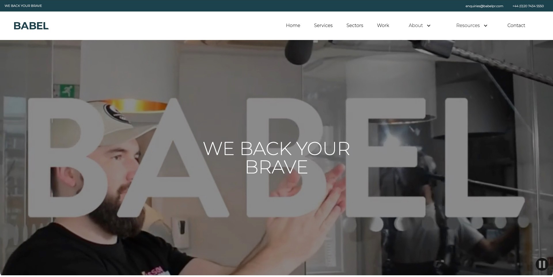
Babel’s saved opening overlays translucent studio lettering and a thin white statement on an office-film frame. A white header separates services, sectors, work and resources, while a teal contact strip remains above. Current first-party content explicitly identifies B2B technology PR and marketing, including content and integrated campaigns. The scene does not prove which digital channels a client used or the results of a programme. The useful pattern is a creative introduction anchored by ordinary routes that distinguish a buyer’s sector from the agency’s delivery capabilities.
What you can learn
Keep integrated digital work concrete by identifying the content, distribution and measurement responsibilities in each case. Preserve sector routes for visitors researching context without assuming they know the agency’s terminology. A brand statement or moving office scene should support, not replace, an explanation of the brief and limits of the engagement.
Pros
Services and sectors give buyers different valid research paths.
Contact information remains visible outside the film treatment.
Cons & considerations
Several text layers compete over changing imagery.
A broad bravery-oriented proposition needs specific delivery evidence in supporting pages.
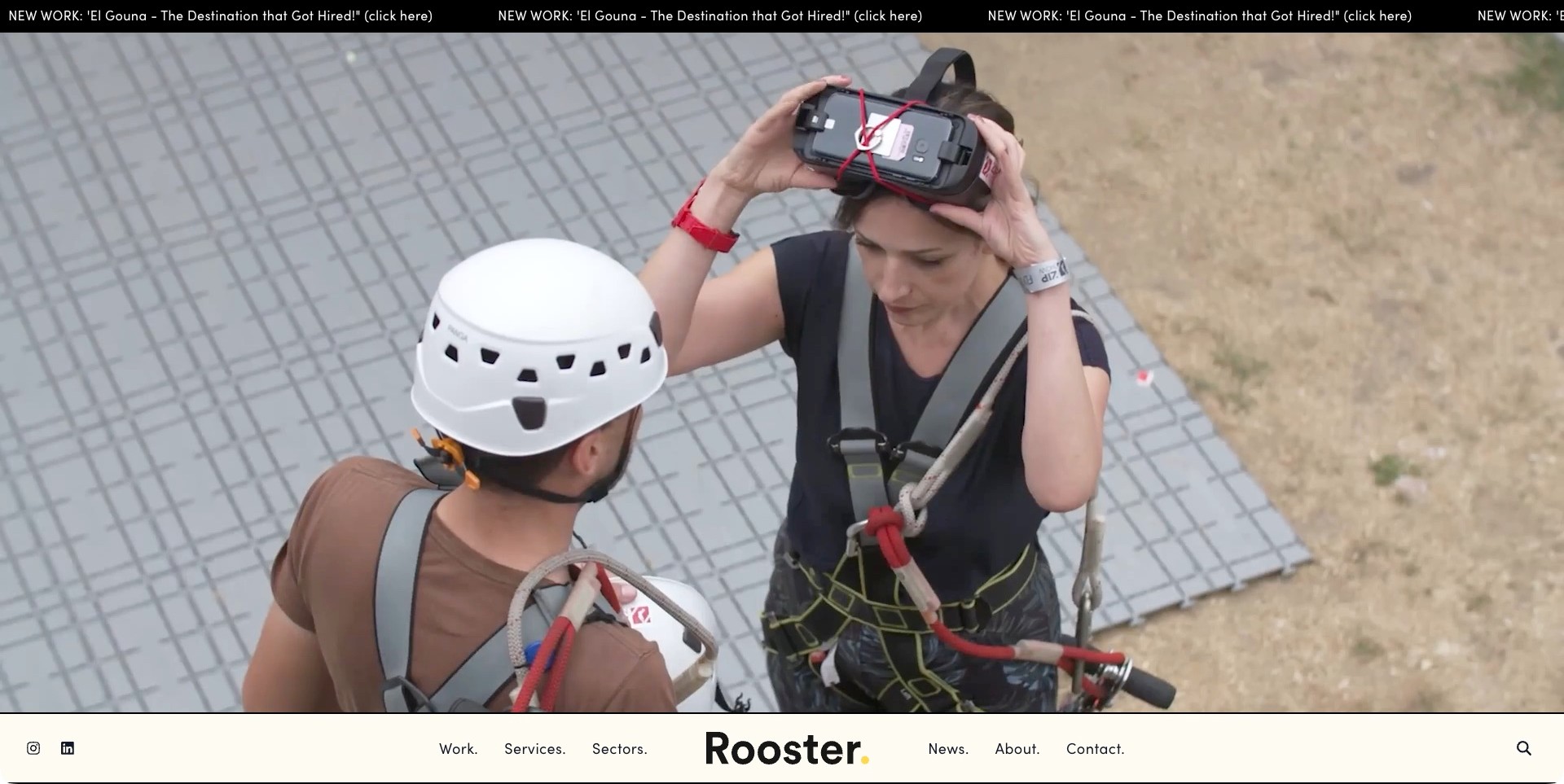
Rooster’s saved homepage frames a campaign-film moment with a narrow new-work ticker above and cream navigation below. The pictured participants have harnesses and a headset; the frame alone does not identify a project or establish an outcome. Work, Services and Sectors remain ordinary labeled routes. A separately checked official social-services page explicitly lists strategy, content production, channel management, creative campaigns, paid social and analytics. That qualifies the communications-led digital scope without implying that every reel scene used all of those services. The useful pattern is a dramatic introduction whose practical service definition can be investigated separately.
What you can learn
Connect creative scenes to cases that identify the deliverables, distribution channels and measurement period. Distinguish a campaign’s content from the paid and organic ways it may be distributed. Keep useful stills and ordinary project links available outside motion, and do not treat a reel as proof of attribution or conversion.
Pros
Work, services and sector research are separately labeled.
A stable cream navigation bar remains readable around the large image.
Cons & considerations
The opening delays literal service detail in favor of media.
Tickers and film need usable motion alternatives and a predictable keyboard journey.
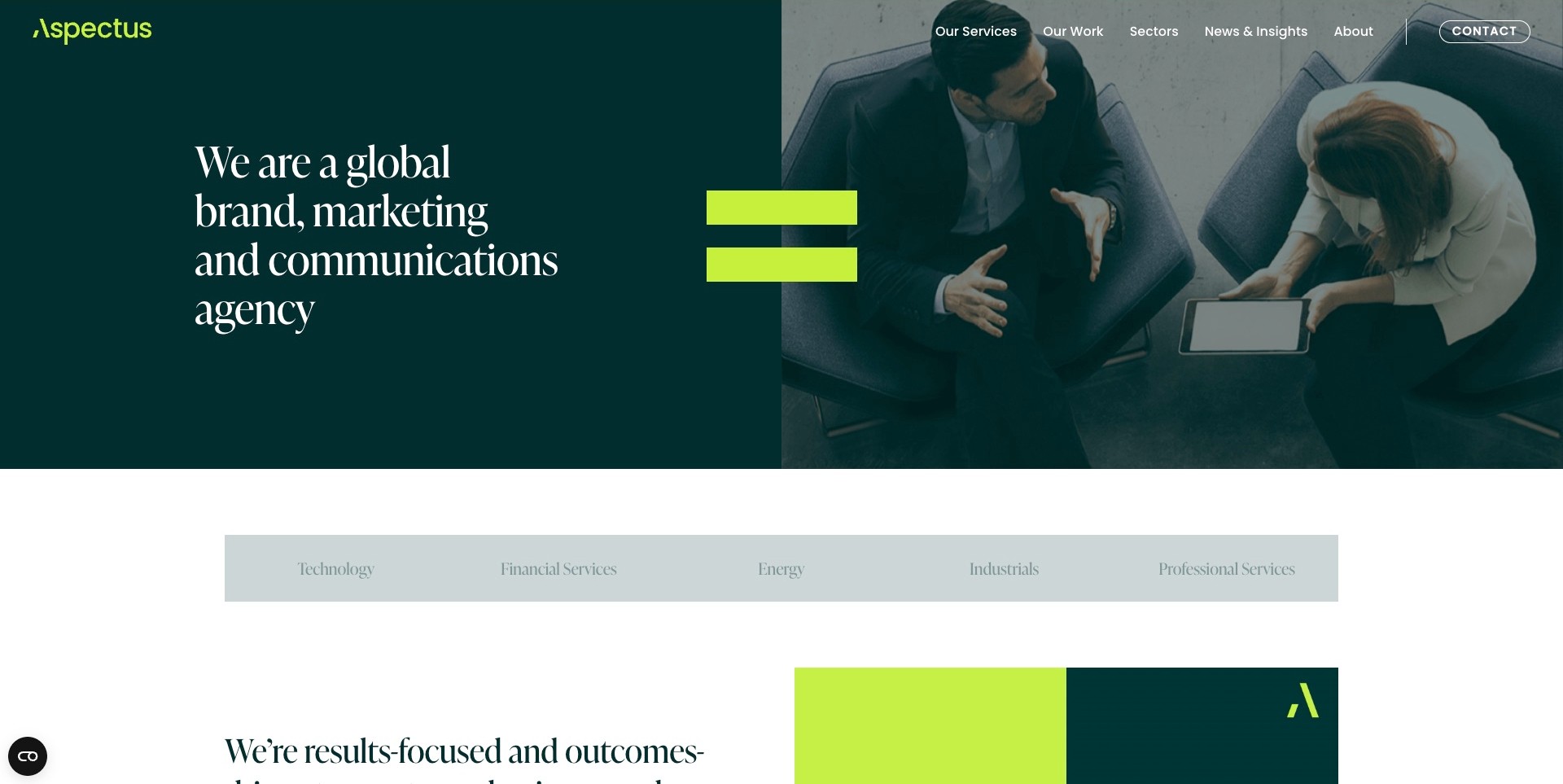
Aspectus’ saved opening combines a green text panel, serif agency description and overhead meeting-film frame, joined by a lime equals sign. A sector strip below exposes technology, financial services, energy, industrials and professional services. Our Services and Our Work are separate header routes. Current first-party material distinguishes digital marketing from PR, communications and brand strategy. The useful digital pattern is a broad offer made more researchable through concrete sector destinations, without implying that a meeting image or an equals sign proves a coordinated campaign produced a specific result.
What you can learn
Connect sector pages to actual digital responsibilities, deliverables and cases, rather than repeating the same broad growth message everywhere. Explain what was created, where it was distributed and how outcomes were measured. Keep channels conceptually distinct even when the engagement is integrated, and do not let the visual identity imply causal attribution.
Pros
Sector choices are visible immediately beneath the introduction.
Service and work routes support different stages of buyer research.
Cons & considerations
A broad agency category still needs precise channel definitions.
The split media treatment requires readable navigation across changing frames.
Zeno Group’s saved opening uses a green identity and white-and-green text over a backlit-keyboard film frame. A short data-driven-storytelling statement accompanies the headline, with language and menu controls at the upper right. Current first-party information qualifies an integrated communications practice and related marketing work, while research and creator-marketing content appear elsewhere on the page. The image does not identify a client programme, analytics product or technical implementation. The useful digital lesson is a recognizable narrative entrance that still requires supporting content to define the channels and responsibilities behind it.
What you can learn
Make creator, content and other digital responsibilities concrete in service pages and cases, including how work is reviewed and what the measures mean. Keep an impact claim separate from attribution evidence. A technology-themed reel should not become the explanation of either the production process or a client’s results.
Pros
The supporting statement adds context to the expressive headline.
A restrained green signature connects brand and editorial presentation.
Cons & considerations
The menu-first opening postpones visible channel distinctions.
Data and impact language needs a method and specific case evidence beyond the film.
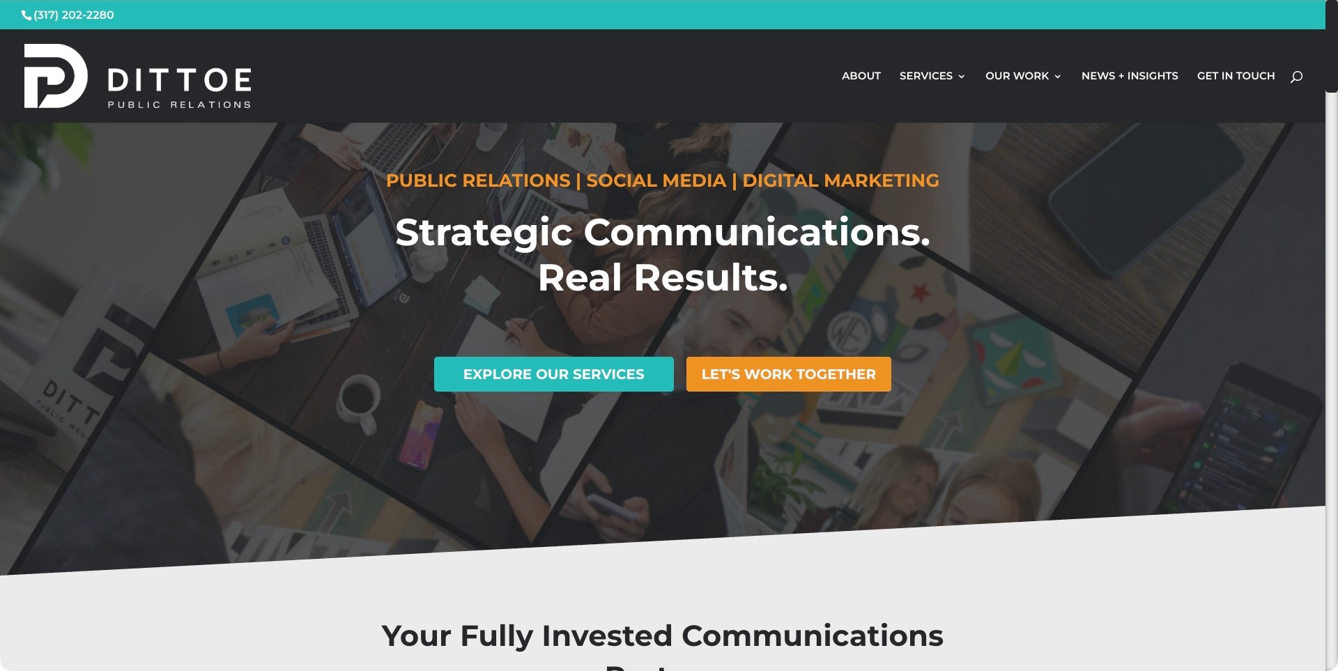
Dittoe’s saved homepage names public relations, social media and digital marketing in an orange line above its main statement. A charcoal header and diagonal working-scene collage provide the background, while teal service exploration and orange inquiry actions remain separate. Current first-party information describes a communications practice combining PR, social and digital strategy. The useful digital pattern is a literal service-category introduction that lets visitors investigate the scope before treating them as ready to inquire. The photograph collage is atmosphere, not evidence of particular channel delivery, client relationships or measured results.
What you can learn
Explain the boundaries between PR, social content and other digital services, then connect each to cases with identifiable deliverables and measurement periods. Give exploration a meaningful destination instead of making every route a contact form. Keep visibility, engagement and business outcomes distinct rather than allowing a broad results statement to stand in for the evidence.
Pros
The service line makes the adjacent disciplines explicit.
Different actions distinguish learning about capabilities from starting a conversation.
Cons & considerations
Several image panels and accent colors compete in the opening.
Digital-result claims need definitions and relevant case context beyond the introductory headline.
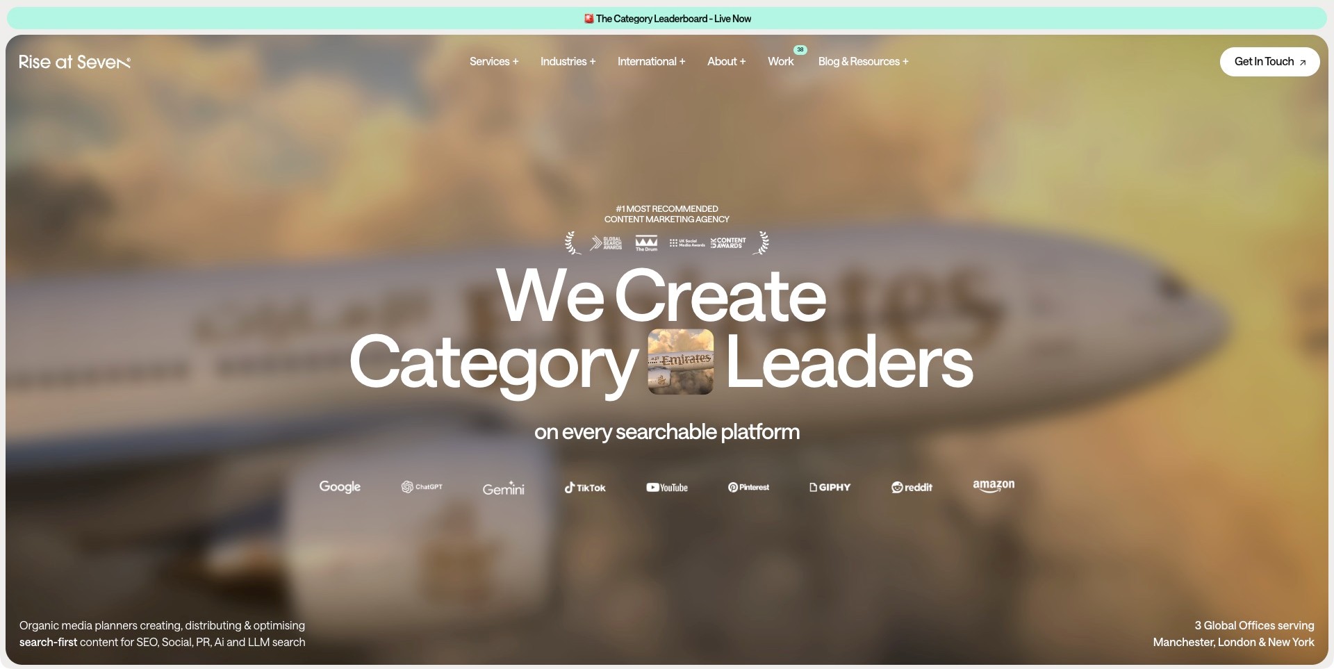
Rise at Seven’s saved opening places a large white category-positioning statement over a blurred aircraft background with a smaller sharp inset. A mint news strip remains above, while service, industry and work routes occupy the header. Search and social platform marks appear below the headline, and a lower-corner description names content across SEO, social and PR. Current official services substantiate those disciplines. The marks do not identify the page’s backend or prove platform partnerships. The useful digital pattern is an explicit content-and-discovery scope paired with several ways to investigate the agency beyond its broad positioning claim.
What you can learn
Connect each platform or channel to actual responsibilities and relevant cases, rather than letting logos stand in for a distribution strategy. Explain the content, optimization and measurement work separately. Preserve readable service information outside the image, and distinguish discovery metrics from commercial outcomes and recommendation claims.
Pros
The supporting description plainly names the related digital disciplines.
Work and industry routes give buyers different ways to research relevance.
Cons & considerations
Large positioning and platform imagery delay detailed delivery information.
Claims of category leadership or recommendation require evidence beyond the opening composition.
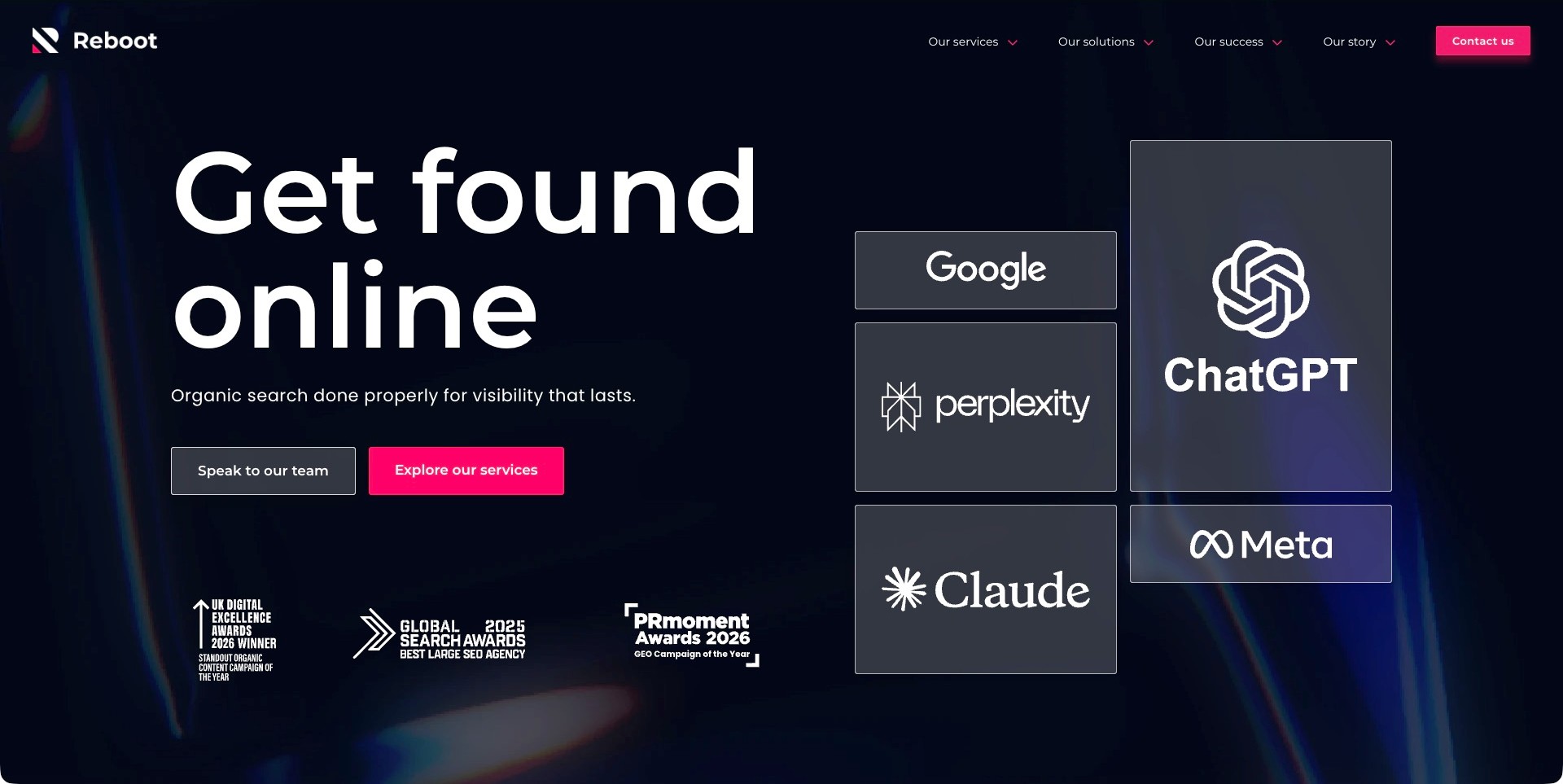
Reboot Online’s saved homepage pairs a large white visibility heading with dark outlined platform cards and bright pink actions. Google and several AI-search or social product marks frame the context, while service exploration and contacting the team have distinct buttons. Current first-party information names SEO, search strategy, digital PR and research-led content services. The marks are not a detected technology stack or an independently verified partnership list. The useful pattern is a relatively simple proposition and action hierarchy around an otherwise complex set of discovery channels, with room for supporting services to define the actual work.
What you can learn
Describe what changes across content, technical work and earned distribution, then use cases to explain the method and measurement period. Do not treat every channel as producing the same kind of result. Keep guarantees and platform visibility claims separate from what a website screenshot can establish.
Pros
Researching services and starting a conversation are clearly different tasks.
The supporting line identifies organic search as the main discipline.
Cons & considerations
Platform cards need practical explanation to avoid becoming decorative credibility signals.
Award and sustained-visibility claims require specific supporting evidence.
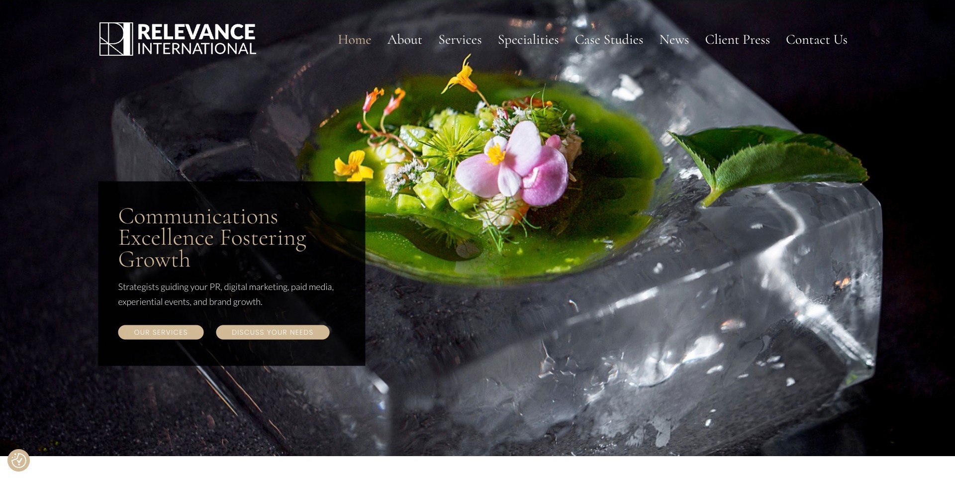
Relevance International’s saved homepage uses a vivid plated floral dish on ice as its full-width opening image. A translucent black panel holds gold serif positioning text, a plain service description and separate services and inquiry actions. The header distinguishes specialties, case studies and client press. Current first-party information explicitly names digital marketing and paid media alongside PR, events and brand work. The image is not treated as an identified client campaign. The useful digital pattern is a stable text surface that explains a broad communications offer without making visitors infer capabilities from the art direction alone.
What you can learn
Separate case studies from a press archive and explain the channels, deliverables and agency role in each engagement. Keep an exploratory route for visitors not yet ready to inquire. A distinctive image can establish tone, but it does not verify marketing effectiveness or show which service produced a result.
Pros
The dark panel gives the written service explanation a defined reading area.
Case studies and client press are separate navigation destinations.
Cons & considerations
Fine gold typography and small button text need contrast checks.
A broad growth proposition requires specific, qualified case evidence beyond the image.
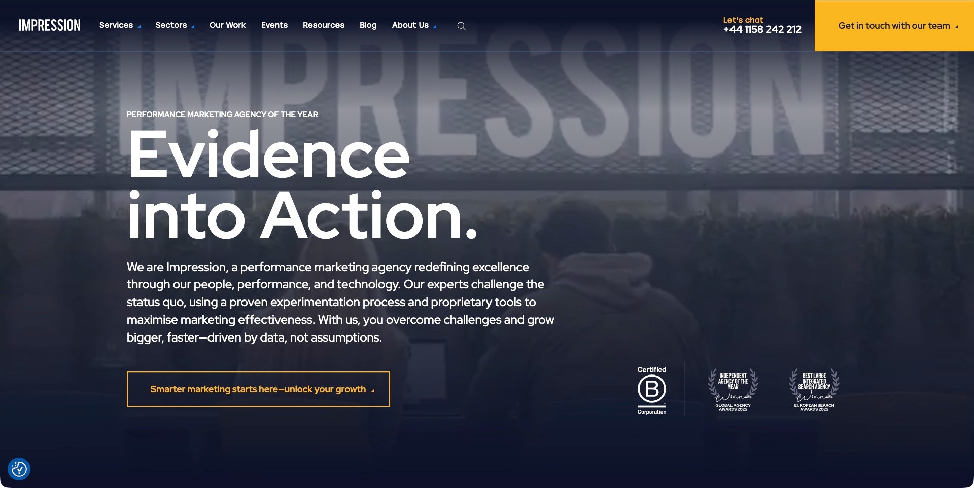
Impression’s saved homepage places a large white evidence-oriented headline over an office-sign film frame with a dark treatment. Supporting copy describes a performance-marketing practice, while a yellow action and visible phone route provide contact options. The header separates services, sectors and work, with resources and events alongside. Agency-displayed awards and certification marks appear near the bottom of the opening. Current first-party service information qualifies SEO, paid media, digital experience and measurement. The useful pattern is a proposition about method paired with ordinary routes where a visitor can investigate capabilities and cases; the method is not independently validated by the screenshot.
What you can learn
Support evidence-oriented language with cases explaining baselines, periods, channel responsibilities and attribution limits. Distinguish a repeatable process from guaranteed future performance. Keep service exploration separate from a conversation, and maintain readable still content rather than depending on the opening film to communicate the offer.
Pros
Services and sectors support different buyer-research approaches.
The supporting paragraph gives the headline a more concrete performance-marketing context.
Cons & considerations
Awards and proprietary-tool claims need supporting detail rather than visual prominence.
Large media and long introductory copy require careful mobile hierarchy and contrast.
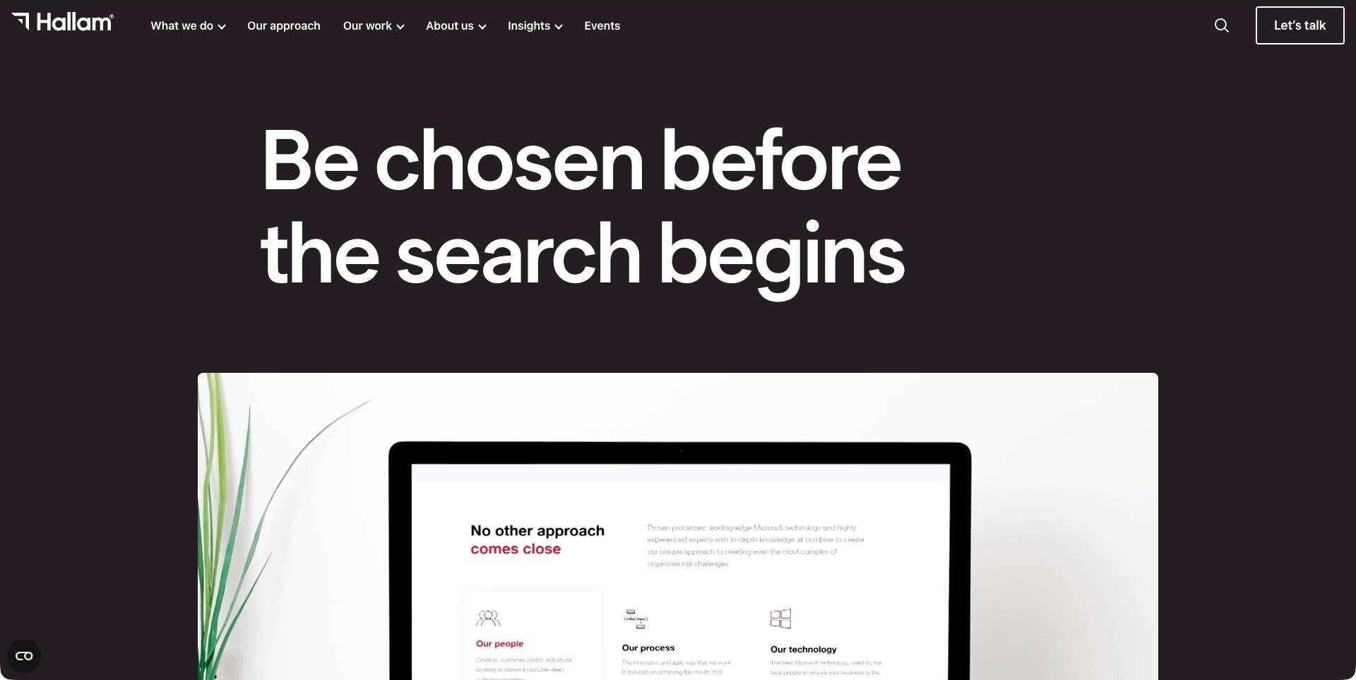
Hallam’s saved homepage uses large white type on a dark brown-black field, with a simple header separating capabilities, approach and work. The opening proposition concerns being considered before a search begins. A rounded media panel below shows a monitor and a client-site interface, beginning the transition toward project material. Current first-party information identifies B2B marketing across paid media, search, content, conversion and reporting. The pictured interface is not evidence of an improvement or a tested client workflow. The useful pattern is a quiet text-led introduction followed quickly by something more concrete to investigate.
What you can learn
Explain how brand, discovery and conversion responsibilities connect while preserving their different measures and time horizons. Give project previews readable case destinations with an actual brief and role, not only a polished screen. Keep a meaningful still and avoid letting a memorable headline imply guaranteed consideration or revenue.
Pros
Approach and work are distinct visible research routes.
The project preview provides a more concrete follow-on to the abstract proposition.
Cons & considerations
The opening statement needs service detail to explain delivery.
A polished interface preview does not establish performance, attribution or successful user interaction.
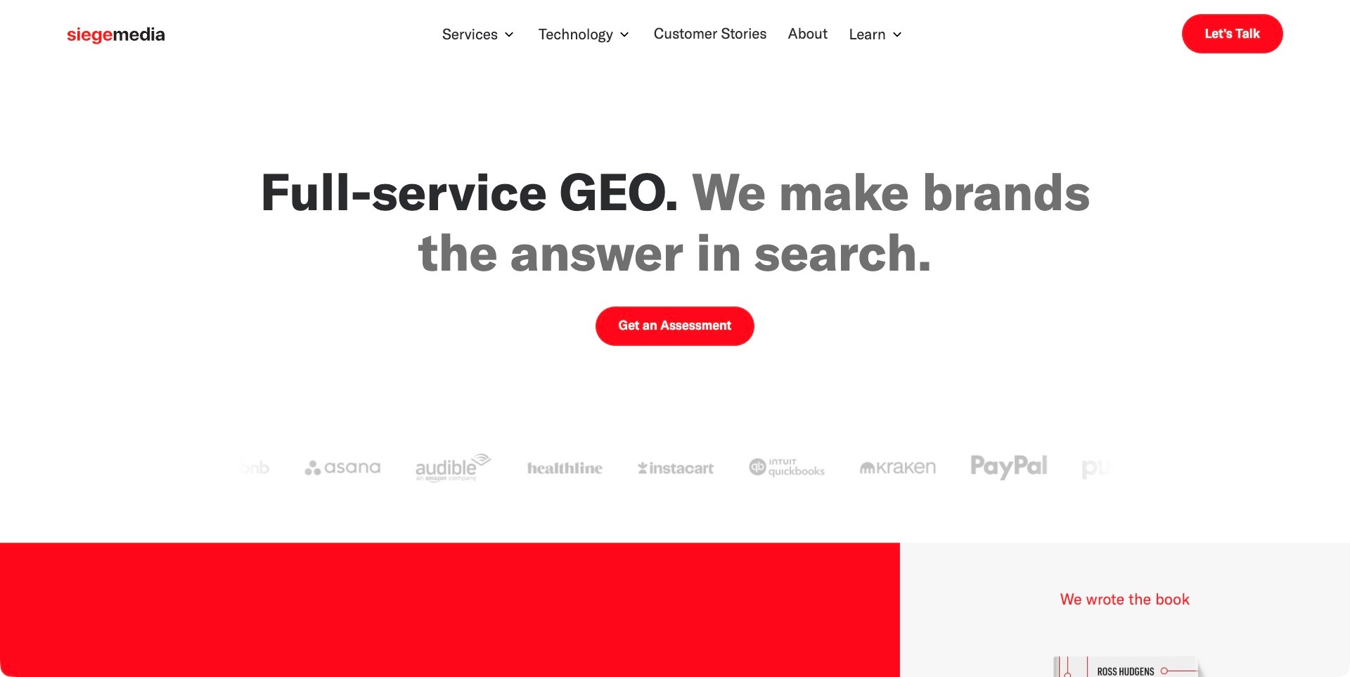
Siege Media’s saved homepage uses generous white space, a large search-and-GEO proposition and a single red assessment action. A muted client-mark row appears below, while the header separates services, technology, customer stories and learning material. Current first-party service information qualifies search-oriented content, consulting and related digital work. The visible marks are agency-listed references, not proof that every organization used every service. The useful pattern is a clear action hierarchy and separate case-research destination around a category that still needs a plain explanation of deliverables and limits.
What you can learn
Define specialist search terminology in ordinary language and explain what an assessment includes before requesting information. Use cases to separate content work, distribution, citations, traffic and commercial outcomes. A restrained interface helps reading, but it cannot substantiate guaranteed-sounding growth language or prove visibility on any particular search platform.
Pros
The assessment action has clear visual priority without many competing buttons.
Customer stories are separated from services and educational content.
Cons & considerations
Specialist terminology needs definition before a buyer can evaluate the offer.
Client marks and ROI language require detailed supporting cases and measurement context.
Kegan is a freelance web designer and developer with 15+ years of experience helping businesses turn complicated website requirements into clear, maintainable digital experiences. He works directly with clients from planning and design through development, launch, and ongoing support.
For digital marketing website design, his development approach focuses on specific channel and engagement scope, carefully contextualized case studies, useful reporting and process explanations, and well-routed enquiries without unsupported growth promises. The scope can be a targeted improvement or a complete custom build, with responsive layouts, thoughtful content structure, and integrations chosen around the people using and maintaining the site.
Show 3 other digital marketing website designersHide other digital marketing website designers
Plan a digital marketing agency website around scope and accountable evidence
Define the buyer and the work the agency wants to discuss
Start with the actual audience and engagement model. A small business seeking local search support needs a different introduction from an in-house team looking for a paid-media partner or an agency buying white-label capacity. Describe the problem you work on, the responsibilities you can take and the circumstances in which a conversation is useful. Do not borrow enterprise language merely because a large reference site looks impressive.
Write a short plain-language description beside the expressive headline. Clarify whether the practice provides advice, setup, ongoing management, creative execution or a combination. Identify meaningful sector or geographic limits without implying that one case makes the team a specialist in every adjacent market. A precise position helps the right visitor continue and the wrong visitor make an informed decision without a sales call.
Separate channel pages from a list of fashionable services
Build service explanations from genuine responsibilities and recurring buyer questions. Search optimization, paid search, paid social, content, email and analytics may need separate pages when the agency has enough original material to explain them. A long icon grid is not a substitute for describing who does the work, what is included and how the engagement is reviewed. Keep the ordinary service overview available for visitors who do not know the channel terminology.
Explain important boundaries, including media spend, creative production, landing-page development, software subscriptions and third-party responsibilities where relevant. New labels such as AI search optimization should have a concrete explanation rather than being added as a guarantee of visibility in a changing system. Avoid promises of fixed rankings, guaranteed leads or predetermined revenue outcomes that the agency cannot substantiate.
Use cases to explain the intervention, not only the result
Record the starting problem, agency role, channels, campaign period and relevant collaborators. Explain what changed and why that change was chosen. A reader should understand whether the case concerns a one-time audit, ongoing management, creative production or a wider redesign. Obtain permission for client names, images and results, and distinguish current work from a past relationship.
Give every published figure enough context to be interpretable. Name the metric, baseline, period and source, and state important limitations. A traffic increase is not automatically an increase in qualified inquiries; a platform-reported return is not necessarily independently verified profit. Avoid using a large percentage when the underlying denominator is too small or unclear to support the impression it creates. A transparent explanation is stronger than an unexplained trophy number.
Connect proof to the service being evaluated
Link a channel explanation to cases that actually demonstrate that responsibility. A website-development project may support a broader agency story, but it should not be presented as evidence of paid-media management unless that work was part of the assignment. Use labels for the relevant channels and client context, and keep an all-cases view so the filtering system does not become a puzzle.
Separate partner certifications, awards, reviews and client outcomes. Each can have a role when current and accurately described, but none proves every other claim. Identify what a badge refers to and link to an appropriate verification route where available. Do not imply that the agency is endorsed by a platform simply because its website uses that platform’s technology or displays a familiar logo.
Make the first inquiry proportionate to its purpose
Ask for enough information to route a conversation: name, reply address, business, website where relevant and a short description of the need. A broad timeframe or current channel can help if the team will use it. Let a visitor say that the problem is not yet clear. A long form requiring a precise monthly budget, target cost per lead and a complete channel plan can discourage a useful initial discussion.
Do not ask for advertising passwords, customer lists, private analytics exports or other sensitive account information in a general public form. Define an appropriate later access process. Provide accessible labels and errors, server-verified spam protection and a truthful confirmation of delivery. State only response expectations the team can maintain; clicking a button should not imply a reserved project slot or an automatically completed audit.
Use content to clarify decisions rather than inflate the archive
Publish useful explanations of the decisions buyers actually face: what an audit covers, how an engagement is scoped or why a metric needs context. Give articles an author, a real publication date and a clear distinction between opinion, research, company news and a service page. Cite primary sources for changing platform features and avoid presenting an outdated tactic as a universal rule.
Connect related material through meaningful internal links, not repetitive sales prompts. Review articles when a platform, service or measurement method changes and record substantial edits honestly. A new-looking date should reflect actual editorial work rather than an automatic refresh. Fewer substantive pieces can explain the agency’s thinking more effectively than a large set of thin keyword variations.
Specify the operating model behind the website
Model services, cases, people and articles with structured fields. Cases should preserve the channel, role, period, sources, permissions and relevant caveats alongside the visual material. Give editors a preview and an approval route for client claims. Define who can publish and who must review sensitive statistics or sector-specific statements before they appear publicly.
Assign responsibility for contact delivery, access control, backups, software updates and corrections. Preserve useful URLs when services are renamed and redirect retired content deliberately. Decide what measurement is genuinely needed and have the appropriate privacy and legal review for the actual implementation. A marketing website should demonstrate accountable information design without assuming that more tracking or more integrations are automatically better.
The editing job behind the design
Choose technology around publishing, inquiry handling and maintenance
Select a CMS or hosted platform from the content model, editor permissions, integration needs and maintenance plan. A specialist practice may need a straightforward service-and-case site rather than a custom application. A larger organization may justify structured workflows and a separate frontend, but the reason should be an actual requirement rather than imitation of a reference.
Keep meaningful service content, case context and ordinary links available independently of animation or third-party widgets. Plan responsive images, lightweight previews and sensible loading. A visible technology signal identifies an observable component, not the agency’s internal campaign stack or the quality of its client work.
Test the real inquiry path, accessible errors, keyboard navigation, small-screen layouts and media behavior. Treat performance, privacy, accessibility and security as implementation and operational questions, not qualities guaranteed by a CMS, analytics product or JavaScript framework.
Our WordPress website examples offer a separate look at publishing approaches. A visible platform label is evidence for that named page, not a guarantee that the same system will suit your requirements.
Before the public launch
Digital marketing agency website checklist
Identify the actual buyer and the engagement model.
Describe strategy, setup, management, production and measurement separately.
Clarify relevant exclusions such as media spend, software and development.
Remove unsupported ranking, lead-volume and revenue guarantees.
Record the problem, role, channels, period and collaborators for each case.
Label result metrics with sources, baselines and attribution limits.
Obtain permission for client names, images and published statistics.
Connect service pages only to genuinely relevant cases.
Distinguish certifications, reviews, awards and client outcomes.
Keep the first form short and never request account passwords.
Provide truthful confirmations, accessible errors and appropriate spam protection.
Assign owners for approvals, content updates, redirects, access and maintenance.
These checks are a project checklist, not a performance, legal, security, or accessibility certification. Test real journeys with the people responsible for the website before making claims about the result.
Sources & editorial method
How this collection was selected and reviewed
The collection considers public website positioning, service boundaries, hierarchy, evidence presentation and contact journeys. Genuine original direct captures retain their actual provenance and dates, including earlier captures requalified against current first-party information. Editors Choice is a design judgment, not an independent agency-performance ranking, certification or validation of reported client results.
Each example links to its actual source page. Screenshots are direct browser captures with their own capture dates; moving imagery, announcements and live designs can change. The notes describe observable design choices and conditional tradeoffs, not measured traffic, conversion results, service quality, or accessibility conformance.
Technology labels use public page metadata, asset evidence, or explicitly cited platform documentation. Platform documentation is not a complete current deployment audit. A component reference may be legacy or unused; it is not a complete backend inventory. Unknown stacks are omitted. These sites are editorial examples, not our client portfolio.
Written, Edited and Curated are separate editorial records, not timestamps advanced by a rebuild. Website designs and imagery belong to their owners. See our editorial standards or suggest a correction.
Questions worth asking
Digital Marketing website design questions
Should every channel have its own page?
Only when the agency genuinely provides it and has enough original substance to explain the scope, process and relevant evidence. A clear overview can be better than many thin channel pages that repeat the same growth promise.
What should go beside a performance statistic?
The metric, period, source, baseline and important limitations. Explain the agency’s role and avoid treating platform-reported activity, qualified inquiries and profit as interchangeable. A result needs context to support the impression it creates.
Should the form ask for analytics or ad-account access?
Not through a general public inquiry. Begin with a short description of the need, then use an appropriate authorized process for sensitive account access after the relevant responsibilities and permissions are agreed.
Can a communications agency belong in this collection?
Yes, when current first-party information documents relevant digital services such as social campaigns, content marketing or paid amplification. The review should preserve that scope rather than relabeling every PR practice as a full-service performance-marketing agency.
Does a conversion-focused design guarantee more leads?
No. Clearer information and a usable inquiry path are worthwhile design goals, but lead quality and volume depend on many factors. Evaluate the actual implementation and business context instead of treating a visual pattern as a guaranteed outcome.
Borrow a more precise service explanation, a better-supported case or a simpler first inquiry. A credible marketing website makes the decision easier without pretending that uncertainty can be designed away.