Best Supabase Websites of 2026 (20 Real-World Examples)
Twenty public properties with real screenshots and carefully scoped Supabase client, product and historical feature evidence.
A useful Supabase project connects understandable visitor tasks to a deliberately designed data model. These examples show public interfaces worth studying, while their evidence distinguishes an observed client reference from a documented application backend or an earlier feature implementation.
Supabase combines a Postgres database with services such as authentication and storage. It does not prescribe the visual design of a website, and a polished homepage cannot reveal its private data model. This collection keeps those distinctions visible: sixteen examples have dated public Supabase client signatures, three have supplier-documented public product associations, and MDN has a dated first-party account of its AI Help feature.
The opening properties are Mozilla MDN, Dilmah, Resend, Chatbase and Udio. They are followed by smaller service, retail, education and destination websites with observed client references. Each example has its own direct capture and original design review. No screenshot demonstrates private account behavior, database permissions, conversion performance or the full architecture of the business behind it.
Before the examples
What makes good Supabase website development in 2026?
Start with a useful task and a small data model
Identify what a visitor needs to read, create or change before selecting a screen pattern. A location finder, inquiry form and private workspace have different records and responsibilities. Write a few realistic examples, including missing information and an interrupted action. Keep the initial model small enough that the person maintaining the service can explain who owns each record and why it exists.
Separate identity from permission
Signing in identifies a user; it does not by itself decide which records that user may read or change. Supabase Auth can work with database Row Level Security. Define permissions around the actual application roles and test them through the same public access path the application uses. Do not rely on hiding a button to protect a record.
A client signature establishes the presence of recognizable code, while a customer story may describe a specific backend workload. Neither automatically explains every visible control. Study the interface independently, retain observation dates, and use the exact source wording to define the technology scope. This prevents an attractive reference from becoming an unsupported architecture prescription.
The collection · 20 examples
20 Supabase website examples worth studying
The first five examples provide recognizable brand and product context. The remaining public pages are qualified Supabase client-reference examples. Existing screenshots and broad-audit dates are preserved, and the new Udio capture has a successful bounded audit. Reviews describe visible composition and planning lessons; they do not assign particular controls to Supabase without evidence.
We start with five recognizable brands or organizations: Mozilla MDN Web Docs, Dilmah, Resend marketing website, Chatbase, Udio. Each attribution applies to the named website property, not every product or website belonging to its organization. This is a curated reading sequence, not a measured ranking.
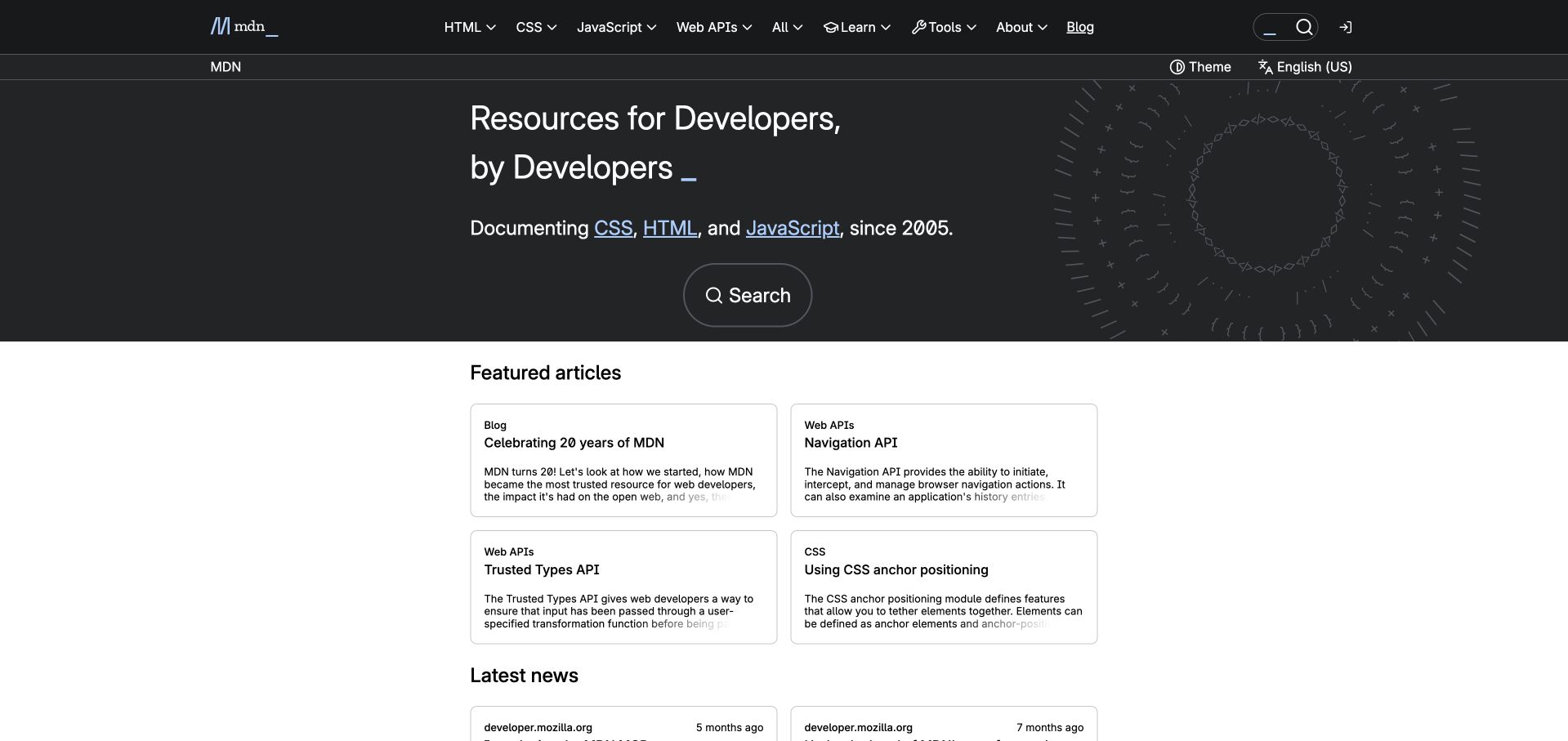
MDN gives developers several sensible ways into a large reference library. Its dark introduction keeps a prominent search action below the central statement, while the header separates HTML, CSS, JavaScript and Web APIs. The white article grid then presents shorter editorial entry points with recognizable topic labels. This is useful context for Supabase because MDN’s June 2023 AI Help announcement describes storing documentation embeddings in Supabase-hosted Postgres with pgvector. That dated account concerns the named AI Help feature, not the implementation of every MDN page or a claim that the feature remains unchanged today.
What you can learn
Borrow the separation between purposeful retrieval and exploratory reading. In a knowledge application, maintain canonical source pages, readable category routes and clear search results even when adding generated answers. Show where an answer came from and give users a direct route back to the underlying documentation.
Pros
Search is prominent without removing the ordinary topic navigation.
Article cards offer readable alternatives for visitors without a precise query.
Cons & considerations
Several navigation layers can feel dense before a newcomer chooses a subject.
A screenshot cannot demonstrate the quality or current availability of AI Help.
Platform source: Primary source: scoped Supabase association. MDN’s June 27, 2023 first-party article describes AI Help storing documentation embeddings in Supabase-hosted Postgres with pgvector. This is historical evidence for that named public account feature, not every MDN page or proof of its present availability. Platform evidence is separate from the direct website screenshot and is not a complete current infrastructure audit.
Dilmah’s opening places a tea-making scene behind a large serif statement, with a dark overlay keeping the white lettering readable. Gold buttons connect the brand story and the shopping route without giving them identical emphasis. The header makes space for tea, family, corporate information and the brand’s broader purpose. The saved public audit found a recognizable Supabase client signature on this exact homepage. That is evidence of a client reference only; it does not reveal what data is stored, which feature calls it, or whether a separate shop shares the same backend.
What you can learn
Use this reference to plan editorial boundaries before connecting a database. A brand story, product catalog and store can share vocabulary while retaining distinct owners and destinations. Keep essential copy readable independently of background media, and provide an obvious next step for visitors arriving with a purchase already in mind.
Pros
The scene gives the brand an identifiable human and product context.
The shopping control remains available alongside the slower editorial journey.
Cons & considerations
The large background scene can delay more specific product comparison.
Gold and white overlays need care when imagery changes or becomes brighter.
Platform source: Dated public-source client reference. Recognizable Supabase client signature in inline code/styles. A bounded public-source audit observed a recognizable Supabase client signature on this exact page. This establishes a client-code reference only, not database contents, backend configuration, current production use or which visible feature uses the client. Platform evidence is separate from the direct website screenshot and is not a complete current infrastructure audit.
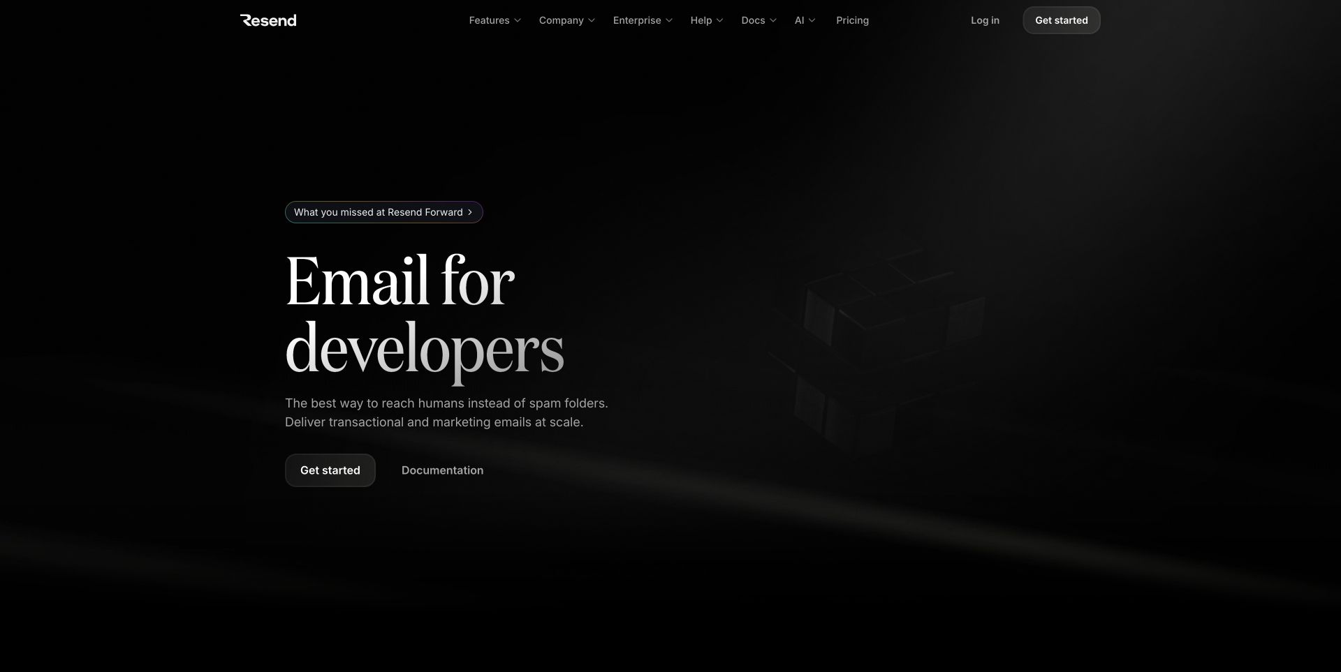
Resend uses a spacious black composition and a serif headline to name its audience before presenting technical detail. The primary starting action and documentation link sit together below a short explanation, while pricing, help and product navigation remain in the header. The saved frame contains a subdued graphic rather than a dense dashboard, so the written proposition carries most of the work. Supabase’s customer story specifically associates Resend’s public email platform with its database and authentication services. It does not establish that the pictured marketing homepage renders through Supabase or expose the platform’s full operational architecture.
What you can learn
For a developer service, make the first integration decision easy to understand. Pair an onboarding route with useful documentation, then carry consistent terminology into account setup and application screens. Plan the relationship between account identity and application records without making visitors learn the storage model before they can evaluate the product.
Pros
Documentation is a first-class alternative to immediately creating an account.
Strong hierarchy makes the audience and core product easy to identify.
Cons & considerations
The subdued artwork contributes little concrete product detail in this frame.
Technical evaluators need another step to see implementation examples or limits.
Platform source: Primary source: scoped Supabase association. Supabase’s customer story describes Database and Auth for Resend’s public email platform. It does not establish the captured marketing homepage’s rendering stack or the entire email-delivery architecture. Platform evidence is separate from the direct website screenshot and is not a complete current infrastructure audit.
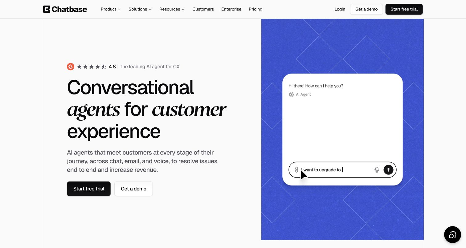
Chatbase divides its opening between a large written proposition and a blue panel containing a conversation preview. The mixed serif and sans-serif heading creates emphasis without moving the primary actions away from the explanation. Trial and demonstration routes sit side by side, serving visitors with different levels of commitment. The visible chat composition communicates the product category more quickly than a generic illustration would. Supabase’s customer account names Database, Auth, Storage, Realtime and pgvector for Chatbase’s customer-facing agent platform. That documented product association is separate from the captured homepage’s frontend and from any particular customer’s configuration.
What you can learn
Make a product preview explain the task, then plan the real states behind it. A conversational service needs clear boundaries between public demonstration, authenticated workspace and customer information. Give empty conversations, unavailable answers and handoff states as much attention as the polished introductory exchange shown in marketing.
Pros
The preview makes the conversational product understandable beside its explanation.
Trial and demonstration actions accommodate independent and assisted evaluation.
Cons & considerations
A single idealized exchange cannot demonstrate difficult or failed interactions.
Large headline styling leaves limited room for detailed qualification above the fold.
Platform source: Primary source: scoped Supabase association. Supabase’s customer story identifies Database, Auth, Storage, Realtime and pgvector for Chatbase’s public AI customer-support product. This is a product-backend association, not proof of every marketing-page component or customer configuration. Platform evidence is separate from the direct website screenshot and is not a complete current infrastructure audit.
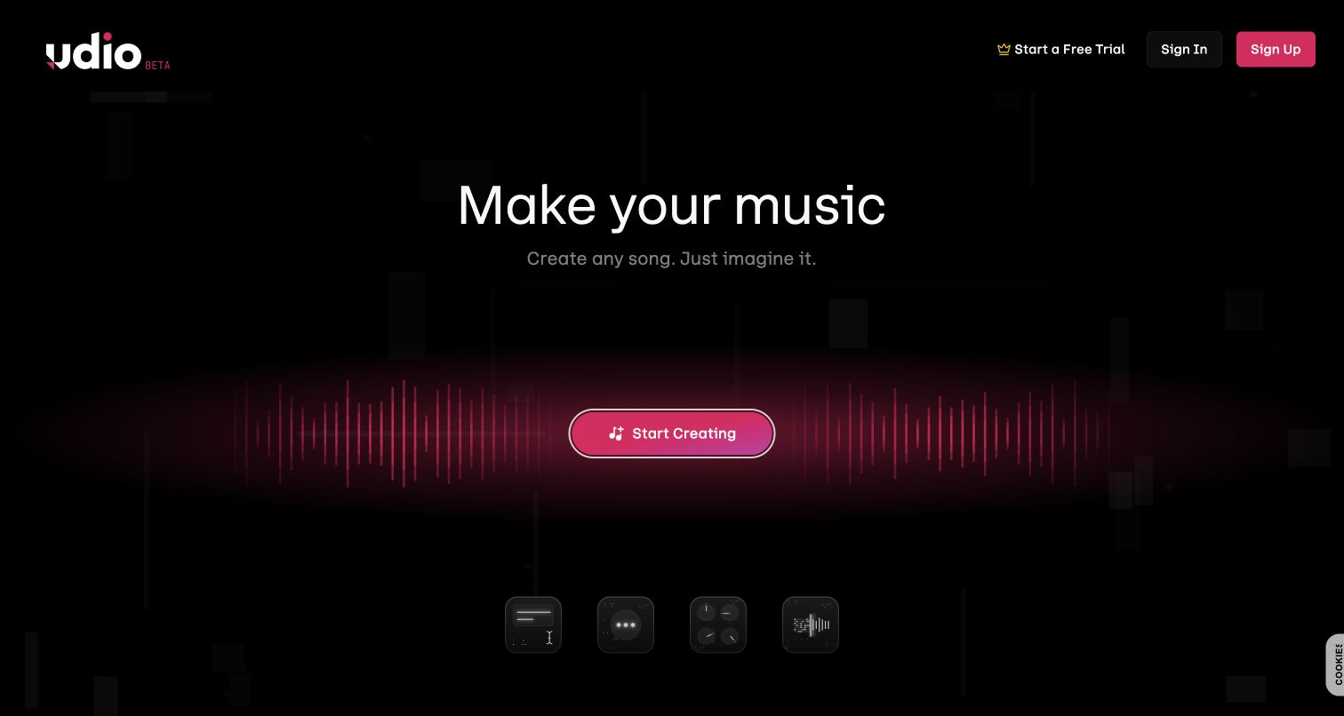
Udio’s public opening combines a black canvas, a concise music-making invitation and one glowing pink creation button. Process icons sit below, while sign-in, sign-up and trial routes occupy the top. Further public content introduces sample songs, creation tools and community discovery, giving the simple first screen a broader context. Supabase’s customer story explicitly connects Udio’s website and mobile app through shared authentication and describes Database and Auth for user and application records. This is documentary evidence of that public product backend, not a claim that Supabase generates music or determines the visible design.
What you can learn
Separate the invitation to experiment from the account and processing states that make creation reliable. Explain what a visitor can explore before registration, then design understandable progress, failure and return states for longer tasks. Preserve access to a person’s work without making a decorative animation the only indication of activity.
Pros
One dominant creation action gives the opening a clear direction.
Public discovery content offers context beyond the initial sign-up invitation.
Cons & considerations
The first frame says little about the practical limits of a creation session.
Dark motion and subtle process icons need text alternatives and readable fallback states.
Platform source: Primary source: scoped Supabase association. Supabase’s customer story identifies Database and Auth for Udio user/application records and explicitly states that its website and mobile application share authentication. This concerns the public music product backend, not music-generation models or homepage rendering. Platform evidence is separate from the direct website screenshot and is not a complete current infrastructure audit.
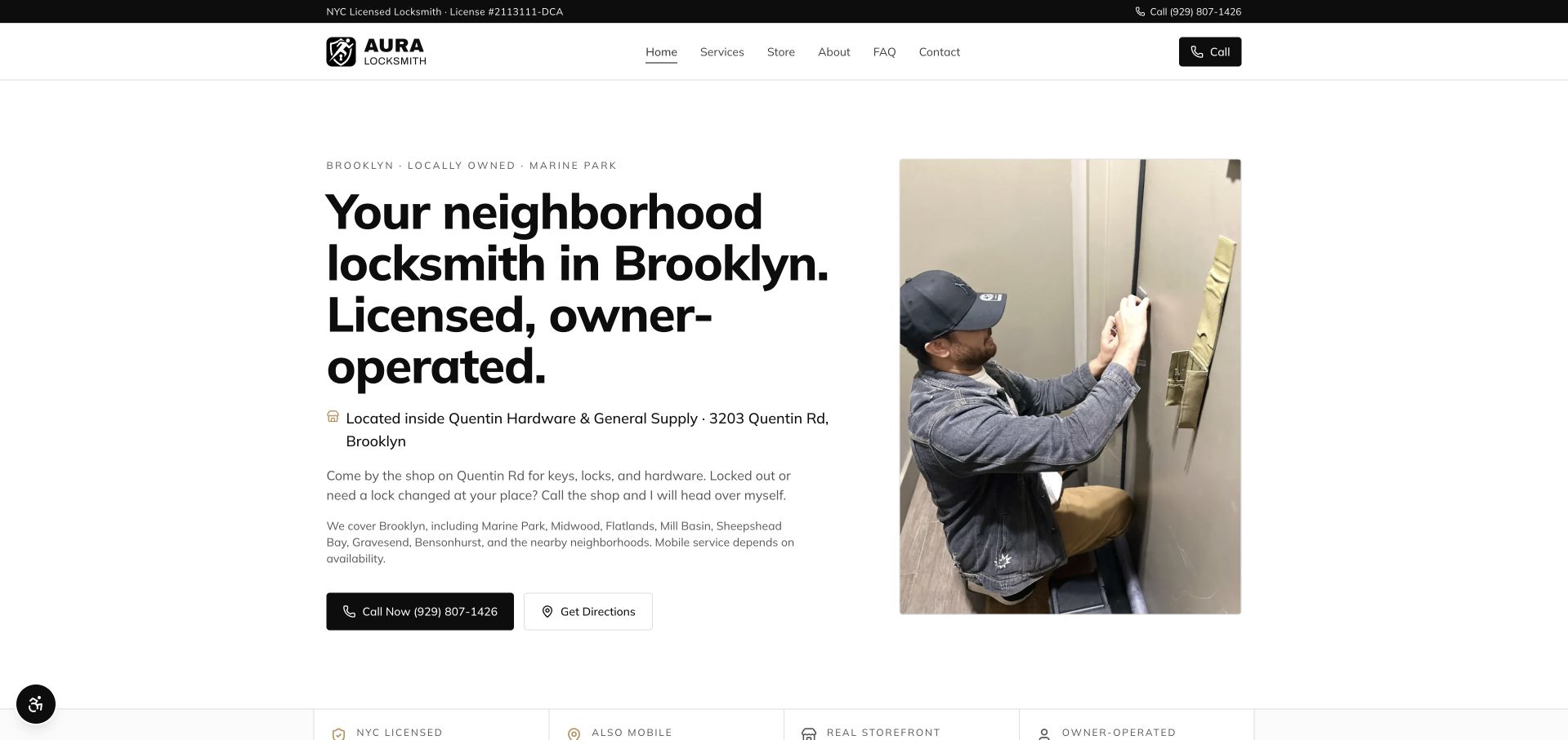
Aura Locksmith pairs a direct Brooklyn introduction with a photograph of a person working on a door. The clean white layout gives the location, shop relationship and service explanation enough room to read as useful information. Calling and directions receive separate controls, while the header keeps services and frequently asked questions accessible. The saved homepage audit includes a Supabase client reference, but it does not identify the reference’s purpose or confirm the systems behind customer inquiries. The useful design evidence is the relationship between service, location and next action.
What you can learn
A small application should keep public service facts separate from private inquiry records. Plan who can update opening information and which contact methods remain available if an enhancement fails. If a database supports an additional feature, introduce it around a genuine visitor task rather than replacing a clear phone or directions link.
Pros
The working photograph gives the introductory copy a concrete subject.
Call and directions controls distinguish urgent help from visiting the shop.
Cons & considerations
The long headline occupies substantial space before the supporting service details.
A dense coverage paragraph could be easier to scan as structured local information.
Platform source: Dated public-source client reference. Recognizable Supabase client signature in JavaScript. A bounded public-source audit observed a recognizable Supabase client signature on this exact page. This establishes a client-code reference only, not database contents, backend configuration, current production use or which visible feature uses the client. Platform evidence is separate from the direct website screenshot and is not a complete current infrastructure audit.
Belvedere Design Build uses a house photograph as a background, darkening it enough to support centered serif typography. A pale header and gold consultation controls create a restrained palette across the composition. The navigation exposes services, portfolio and contact destinations, giving visitors alternatives to requesting a conversation. The headline emphasizes values while the supporting sentence names kitchens and baths. Supabase appears in the saved audit as an observed client signature on the public page; no private project management or consultation workflow was inspected, and those capabilities should not be inferred from the image.
What you can learn
Use a project-led opening to establish the work, then make the inquiry process concrete. A future database-backed form should collect only information needed for the next conversation and clearly distinguish a received request from an accepted project. Keep the portfolio useful even when visitors are not ready to contact the company.
Pros
The compact navigation keeps portfolio exploration close to the consultation action.
A consistent muted accent links the header and main call to action.
Cons & considerations
Values-led headline copy is less specific than the supporting service sentence.
A single exterior photograph offers limited evidence about the named interior specialties.
Platform source: Dated public-source client reference. Recognizable Supabase client signature in JavaScript. A bounded public-source audit observed a recognizable Supabase client signature on this exact page. This establishes a client-code reference only, not database contents, backend configuration, current production use or which visible feature uses the client. Platform evidence is separate from the direct website screenshot and is not a complete current infrastructure audit.
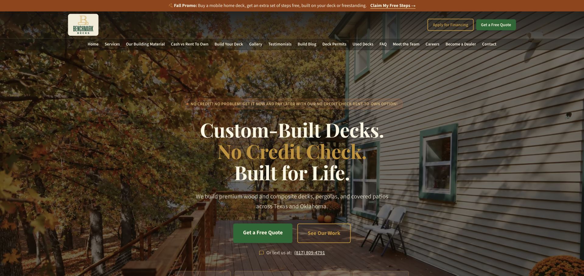
BenchMark Decks layers its introduction over a porch scene, combining large serif text with separate quotation and work-gallery actions. A seasonal strip sits above a broad navigation row covering materials, permits, used decks and other practical subjects. The page makes both the product and its regional focus visible, although financing language adds another prominent message to the opening. The saved source audit found a Supabase client signature. That observation supports including the public page as a client-reference example, not a conclusion that financing, quotations or deck configuration use a particular database or approval process.
What you can learn
For a trade catalog, model the visitor’s questions before adding interactive tools. Keep product type, service region and example projects easy to compare. If a quotation feature stores inquiries, show its submission state clearly and avoid making a website request look like financing approval or a confirmed construction booking.
Pros
Visitors can choose between asking for a quote and inspecting completed work.
Navigation exposes several practical questions beyond the main sales pitch.
Cons & considerations
The long navigation row and multiple offers compete for initial attention.
Payment-related wording requires careful maintenance alongside the actual offer conditions.
Platform source: Dated public-source client reference. Recognizable Supabase client signature in JavaScript. A bounded public-source audit observed a recognizable Supabase client signature on this exact page. This establishes a client-code reference only, not database contents, backend configuration, current production use or which visible feature uses the client. Platform evidence is separate from the direct website screenshot and is not a complete current infrastructure audit.
Bill Plant Driving School puts a wide postcode lookup across a vivid red and orange opening. The learner and branded car give the service a recognizable physical context, while the navigation distinguishes lessons, instructor training and franchise information. The search bar is more operationally specific than the surrounding promotional headline: it asks the visitor for one piece of information needed to find an instructor. A saved broad audit identifies a Supabase client reference on this source page. It does not establish that the postcode search, instructor availability or any booking records are handled by Supabase.
What you can learn
A location search should explain what happens after a visitor supplies an area. Plan valid matches, no nearby availability and ambiguous input as distinct states. Keep the search result focused on the next useful decision, and make it clear when an inquiry still requires confirmation from a local provider.
Pros
The postcode task has a clear label and a prominent place in the layout.
Separate audience routes prevent instructor recruitment from replacing learner information.
Cons & considerations
Large promotional artwork competes with the central service explanation.
The opening does not show how unavailable or ambiguous locations are handled.
Platform source: Dated public-source client reference. Recognizable Supabase client signature in inline code/styles. A bounded public-source audit observed a recognizable Supabase client signature on this exact page. This establishes a client-code reference only, not database contents, backend configuration, current production use or which visible feature uses the client. Platform evidence is separate from the direct website screenshot and is not a complete current infrastructure audit.
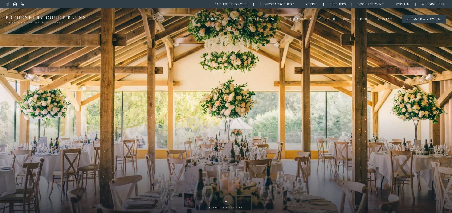
Bredenbury Court Barns gives almost the entire opening to a photograph of a dressed reception space. Warm timber, suspended flowers and long views through the room communicate the setting before a visitor reads detailed copy. Two navigation bands preserve routes to pricing, accommodation, real weddings, brochures and viewings. The composition is therefore useful for studying how a visual introduction can coexist with planning tasks. Its saved public audit includes a Supabase client signature, but that evidence does not identify the booking system, guest data or any private event-planning workflow behind the website.
What you can learn
Connect inspirational content to structured practical information. In a venue application, a gallery, event inquiry and confirmed reservation represent different records and different promises. Keep published details easy to maintain, state when an availability request needs a human response, and avoid using a decorative hero as the sole route into planning information.
Pros
The full-width scene communicates the character of the venue immediately.
Pricing and viewing routes remain visible within the photographic introduction.
Cons & considerations
Two dense navigation rows create many choices before the visitor has context.
Small overlay text depends on the image remaining legible behind it.
Platform source: Dated public-source client reference. Recognizable Supabase client signature in inline code/styles. A bounded public-source audit observed a recognizable Supabase client signature on this exact page. This establishes a client-code reference only, not database contents, backend configuration, current production use or which visible feature uses the client. Platform evidence is separate from the direct website screenshot and is not a complete current infrastructure audit.
Choice Escapes uses an ornate doorway as the setting for its introductory message. The dark and gold palette carries through the logo, navigation and booking controls, so the page feels related to the experience it describes. Two central actions separate reserving an escape from exploring the rooms, while group information and FAQs remain available above. The visible review strip acts as supporting proof rather than the main headline. A public source audit observed a Supabase client signature here; it does not confirm the reservation provider, inventory handling or payment architecture, and no booking was performed during research.
What you can learn
Keep storytelling and reservation state connected without confusing them. A room description can be public editorial content, while dates, group capacity and payment status need explicit ownership and confirmation. If building a similar application, design unavailable sessions and interrupted checkout paths as carefully as the invitation to begin an adventure.
Pros
The themed background gives the business a coherent visual identity.
Room exploration is available before committing to a booking route.
Cons & considerations
Decorative lettering and generous tracking can make small labels harder to scan.
The atmospheric opening postpones details such as duration and group suitability.
Platform source: Dated public-source client reference. Recognizable Supabase client signature in JavaScript. A bounded public-source audit observed a recognizable Supabase client signature on this exact page. This establishes a client-code reference only, not database contents, backend configuration, current production use or which visible feature uses the client. Platform evidence is separate from the direct website screenshot and is not a complete current infrastructure audit.
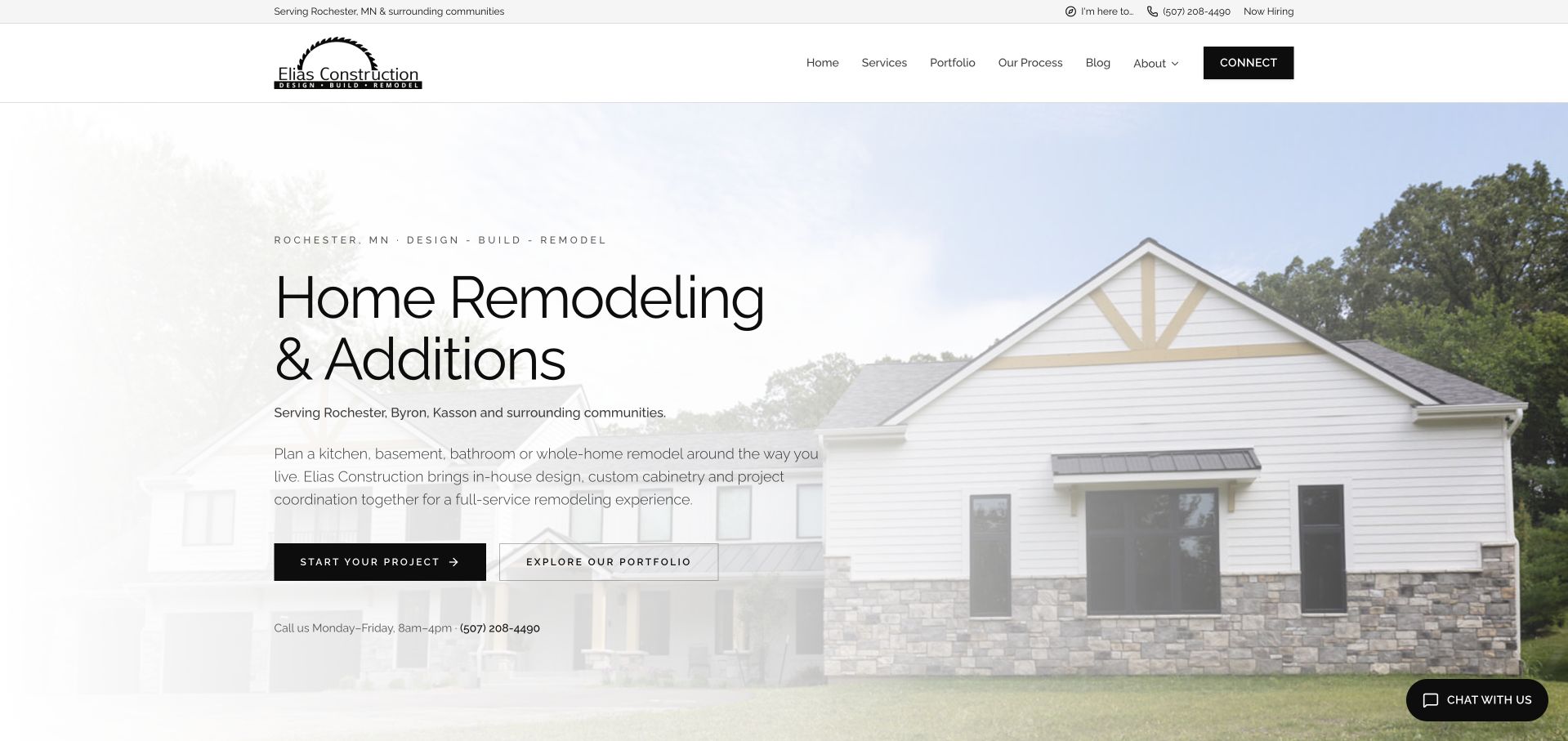
Elias Construction places a light fade over a house photograph, creating a readable area for its remodeling introduction. The copy names the work and nearby communities, then offers distinct project-start and portfolio actions. Business hours appear below the buttons, adding practical context to the telephone route. The header makes process information available alongside services and examples, helping a visitor understand that a project involves more than a single transaction. An audit found a Supabase client signature in public source. This does not establish where estimates, client records or construction schedules are stored.
What you can learn
A useful project inquiry starts with shared expectations. Keep the public portfolio and service descriptions structured, then ask only for information that helps the team qualify a request. If an application supports follow-up, distinguish the visitor’s submitted details from staff decisions and keep the confirmation message consistent with actual response capacity.
Pros
Service type and location are stated before the visitor reaches the inquiry controls.
Published contact hours make the telephone option more actionable.
Cons & considerations
The pale overlay reduces the contrast of some details in the project photograph.
Long introductory copy needs disciplined line lengths when adapted to smaller screens.
Platform source: Dated public-source client reference. Recognizable Supabase client signature in JavaScript. A bounded public-source audit observed a recognizable Supabase client signature on this exact page. This establishes a client-code reference only, not database contents, backend configuration, current production use or which visible feature uses the client. Platform evidence is separate from the direct website screenshot and is not a complete current infrastructure audit.
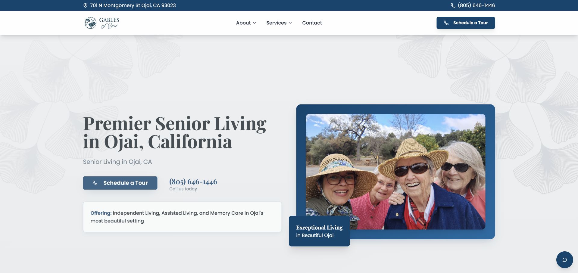
Gables of Ojai balances a serif introduction with a framed photograph of people outdoors. The blue accent connects the top contact strip, tour button and image frame, while a small service panel names the offered living categories. Location and telephone information remain visible without opening the menu. The public audit observed a Supabase client reference on this page, but it supplies no evidence about resident information, care records or a private scheduling system. This review concerns the public presentation and contact hierarchy, not the quality or suitability of the organization’s services.
What you can learn
For a sensitive service, let the public page answer basic orientation questions before requesting personal information. Design a simple inquiry or visit request around the minimum necessary details, explain the response process, and keep private operational records outside public content. The interface should remain understandable to someone comparing options for another person.
Pros
Location and contact details are easy to find in the opening frame.
The service panel names categories without overwhelming the main invitation.
Cons & considerations
The broad introductory claim provides less detail than a visitor evaluating specific needs may require.
Decorative framing consumes space that could introduce practical visit information.
Platform source: Dated public-source client reference. Recognizable Supabase client signature in JavaScript. A bounded public-source audit observed a recognizable Supabase client signature on this exact page. This establishes a client-code reference only, not database contents, backend configuration, current production use or which visible feature uses the client. Platform evidence is separate from the direct website screenshot and is not a complete current infrastructure audit.
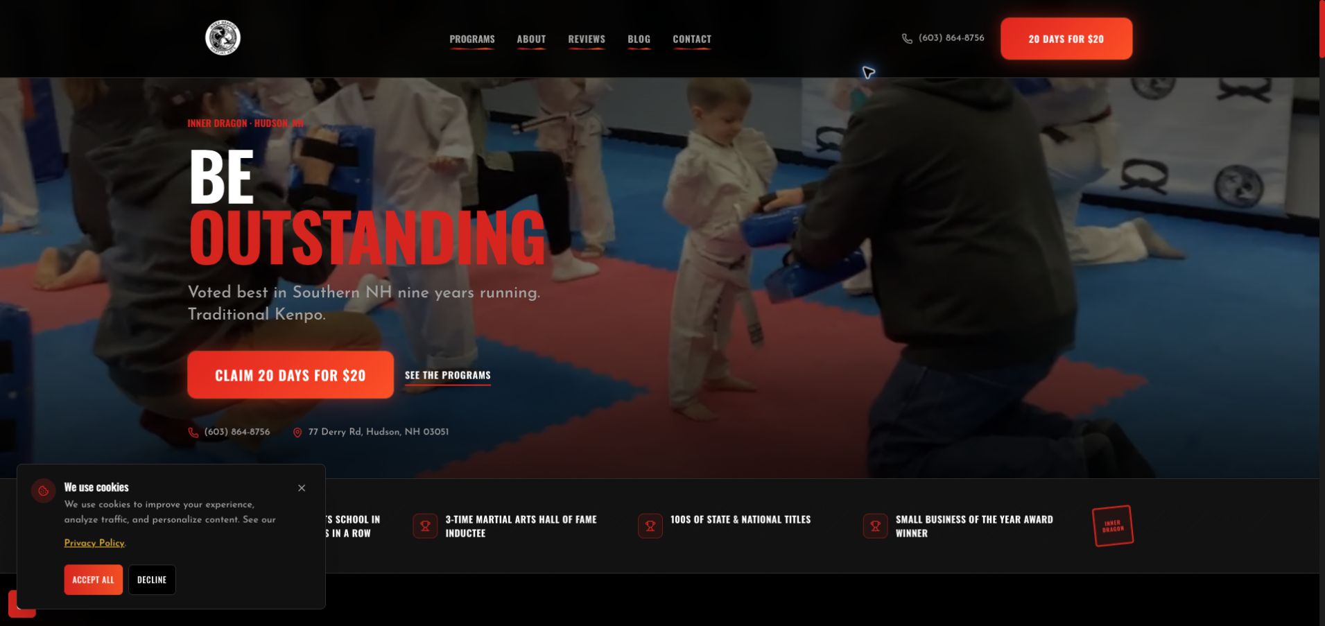
Inner Dragon Martial Arts uses a class scene and red lettering to convey movement and participation. The promotional trial control is repeated in the header and composition, while a secondary program route lets visitors investigate before responding. Location and telephone information sit near the actions. The saved frame also contains a cookie panel that partly covers the lower proof strip. Its audit includes a Supabase client signature, but that does not identify how trial requests, student records or membership payments are managed. The visible claims are the website’s presentation, not independently verified awards.
What you can learn
Treat a trial invitation as the start of an understandable enrollment journey. Explain program suitability, what the first visit involves and when a request becomes confirmed. Any supporting data model should separate public class descriptions from participant information and should preserve a clear route to contact the school when self-service steps are unavailable.
Pros
The class photograph supplies context for the otherwise abstract motivational headline.
A program link offers a lower-commitment alternative to the trial promotion.
Cons & considerations
The cookie panel overlaps supporting content in the saved capture.
Several strong red accents compete with the smaller location and explanatory text.
Platform source: Dated public-source client reference. Recognizable Supabase client signature in JavaScript. A bounded public-source audit observed a recognizable Supabase client signature on this exact page. This establishes a client-code reference only, not database contents, backend configuration, current production use or which visible feature uses the client. Platform evidence is separate from the direct website screenshot and is not a complete current infrastructure audit.
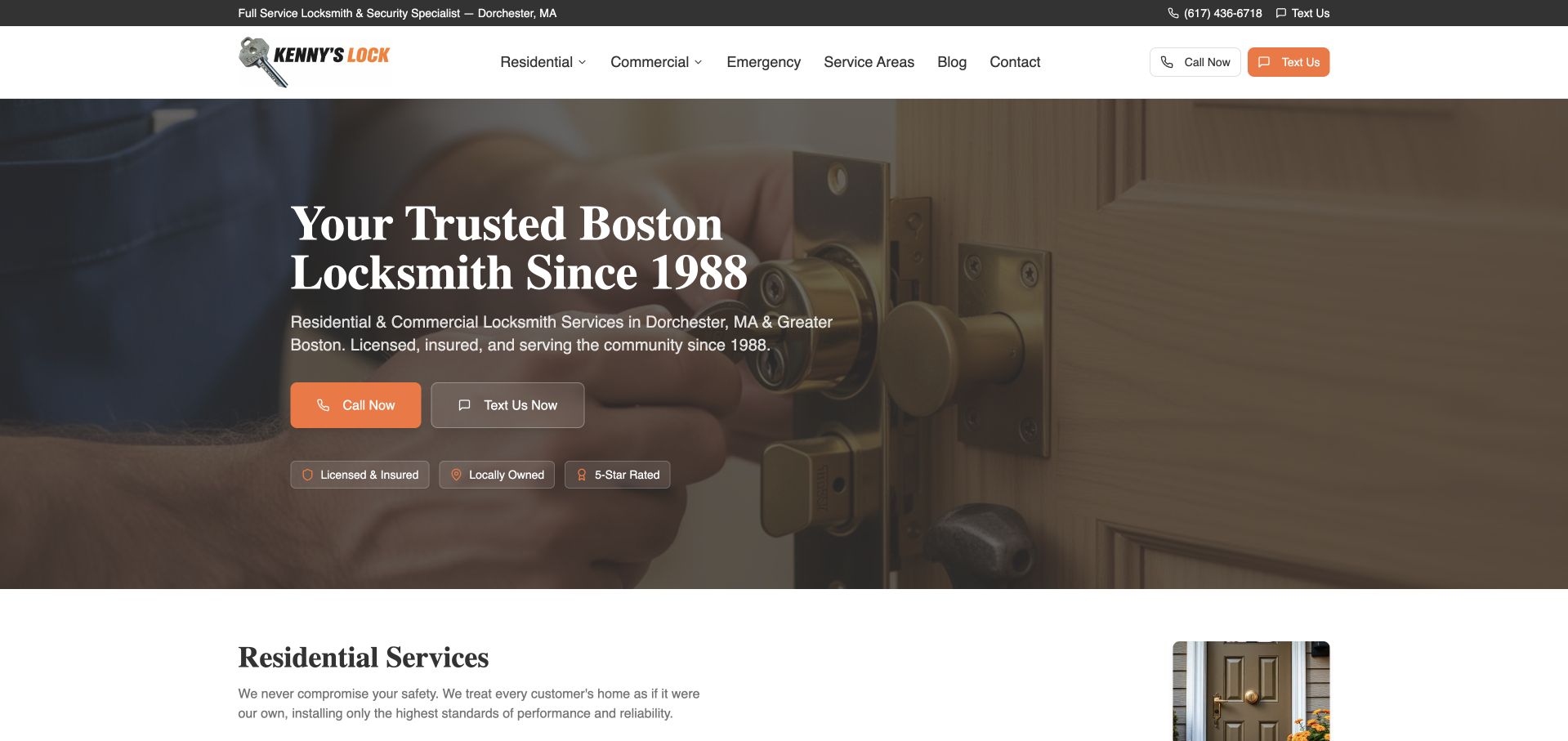
Kenny’s Lock uses a close view of a door lock to establish the service before the navigation. A large regional introduction, explanatory paragraph and paired call and text buttons occupy the left side of the hero. Orange accents connect the prominent text action with the brand, while residential content begins directly below the image. The saved audit recorded a Supabase client reference on the public homepage. It does not demonstrate that either contact method, emergency dispatch or customer records use Supabase; those systems remain outside the evidence collected.
What you can learn
Preserve direct contact choices when adding application features to a service website. A visitor should understand whether they are calling, sending a message or submitting a request into a queue. If the site stores inquiries, describe successful receipt separately from a promised arrival time and keep service-area information consistent across the interface.
Pros
Call and text choices are clearly labeled in header and hero.
The next section begins with a specific service category rather than another generic slogan.
Cons & considerations
Trust badges summarize claims without supplying their supporting detail in this frame.
A background photograph can lose useful contrast when the overlay or crop changes.
Platform source: Dated public-source client reference. Recognizable Supabase client signature in JavaScript. A bounded public-source audit observed a recognizable Supabase client signature on this exact page. This establishes a client-code reference only, not database contents, backend configuration, current production use or which visible feature uses the client. Platform evidence is separate from the direct website screenshot and is not a complete current infrastructure audit.
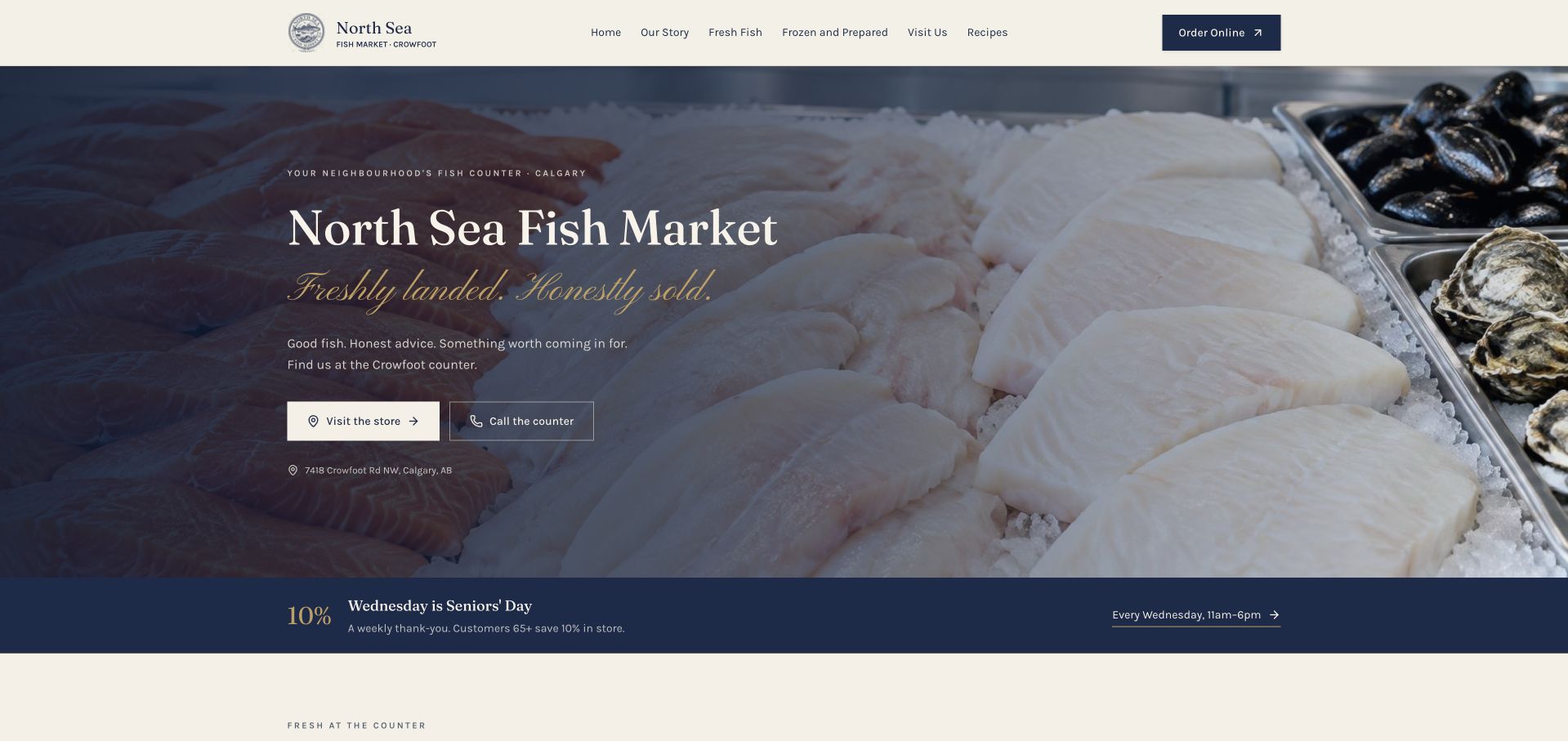
North Sea Fish Market fills the opening with a close view of seafood while keeping its name and local context on the darker left side. Cream and navy surfaces give the header and promotional strip a consistent frame. The central controls prioritize visiting or calling the counter, while online ordering remains a separate header action. Navigation distinguishes fresh fish, frozen and prepared products, recipes and the shop story. The saved audit observed a Supabase client signature on the homepage. It does not verify inventory synchronization, online order storage or the technology of any separate checkout destination.
What you can learn
A specialty retailer should make the relationship between public product information and current availability explicit. If building a database-backed catalog, decide who updates stock descriptions and what can actually be ordered. Keep practical visit details available without requiring an account, and avoid treating a displayed item as a guaranteed reservation.
Pros
The product photograph makes the shop’s category immediately apparent.
Visit, telephone and online ordering routes are separated by their purpose.
Cons & considerations
Script lettering over photography needs careful contrast and size choices.
A recurring promotion introduces maintenance obligations beyond the main product story.
Platform source: Dated public-source client reference. Recognizable Supabase client signature in JavaScript. A bounded public-source audit observed a recognizable Supabase client signature on this exact page. This establishes a client-code reference only, not database contents, backend configuration, current production use or which visible feature uses the client. Platform evidence is separate from the direct website screenshot and is not a complete current infrastructure audit.
Swimtime uses a large pool photograph with generous white space rather than a dense promotional banner. A short statement below it explains the broad purpose, while the top-right controls distinguish shopping, finding lessons, an account and the menu. Each control receives a different brand color, which makes the operational choices visible before the visitor reads deeper content. The saved public audit contains a Supabase client signature. That reference alone does not establish how lesson availability, customer accounts or learner information are implemented, and no private booking or account flow was opened for this review.
What you can learn
Separate the tasks of a new visitor and a returning customer. A lesson finder should offer useful public context, while account access should have a clear purpose and predictable return path. When planning an application, model location, class and enrollment as distinct concepts and explain when an inquiry still awaits confirmation.
Pros
The major task controls are visible without opening a navigation menu.
The photograph gives the lesson proposition a clear human context.
Cons & considerations
The large image delays more detailed information about lesson types.
Equal visual weight among several colored controls can weaken the preferred starting point.
Platform source: Dated public-source client reference. Recognizable Supabase client signature in JavaScript. A bounded public-source audit observed a recognizable Supabase client signature on this exact page. This establishes a client-code reference only, not database contents, backend configuration, current production use or which visible feature uses the client. Platform evidence is separate from the direct website screenshot and is not a complete current infrastructure audit.
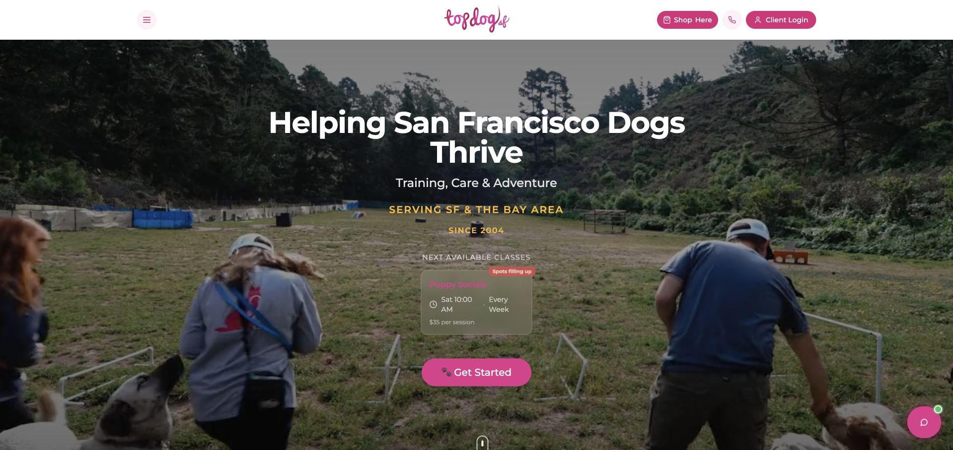
Top Dog SF places its introductory copy over an outdoor training scene, linking the service to its location and activity. A small class card appears near the starting action, introducing a specific offering beyond a general promise. The header keeps shopping and client access separate from the main menu. Pink accents create continuity across the logo, action and floating help control. Its saved audit observed a Supabase client signature on this public page; no evidence assigns the visible class card, enrollment data or client portal to that service.
What you can learn
Use the class card as a planning prompt for structured content. Give each offering a clear name, schedule, eligibility description and next step. If availability is maintained in an application, define who updates it and how stale or sold-out information is shown. Keep account access distinct from the public explanation of the program.
Pros
A concrete class preview makes the next step more specific than a generic contact button.
Existing-client access is available without dominating the main introduction.
Cons & considerations
Small text on the translucent class card has a busy background behind it.
Several floating or highlighted controls compete with the central enrollment invitation.
Platform source: Dated public-source client reference. Recognizable Supabase client signature in JavaScript. A bounded public-source audit observed a recognizable Supabase client signature on this exact page. This establishes a client-code reference only, not database contents, backend configuration, current production use or which visible feature uses the client. Platform evidence is separate from the direct website screenshot and is not a complete current infrastructure audit.
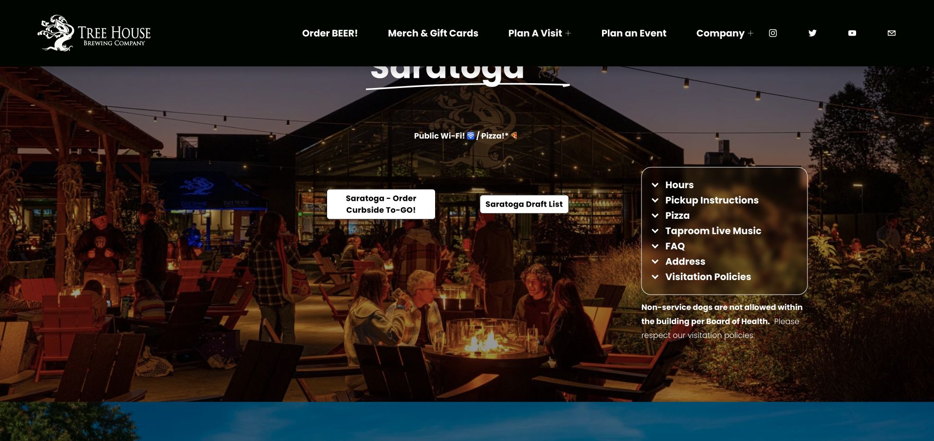
The saved Tree House Brewing frame shows the Saratoga section rather than a generic opening hero. A photograph of the venue surrounds ordering and draft-list actions, while a bordered panel groups hours, pickup instructions, food, music, address and visiting policies. The persistent header retains broader company and visit routes. This makes the capture useful for studying how one location can carry operational detail within a larger brand. A public audit observed a Supabase client signature on the source page, but it does not establish that ordering, tap lists or venue operations use Supabase.
What you can learn
Model each location’s practical information as an owned set of records rather than copying the same paragraph across several pages. Keep hours, ordering destinations and policies independently maintainable. If an application manages changes, show the location clearly at every step so a visitor cannot mistake one venue’s information for another’s.
Pros
Related visit details are grouped beside location-specific actions.
The wider navigation stays available while the visitor studies one venue.
Cons & considerations
The large persistent header overlaps the section heading in this saved view.
Text and controls over the venue photograph require a stable contrast treatment.
Platform source: Dated public-source client reference. Recognizable Supabase client signature in inline code/styles. A bounded public-source audit observed a recognizable Supabase client signature on this exact page. This establishes a client-code reference only, not database contents, backend configuration, current production use or which visible feature uses the client. Platform evidence is separate from the direct website screenshot and is not a complete current infrastructure audit.
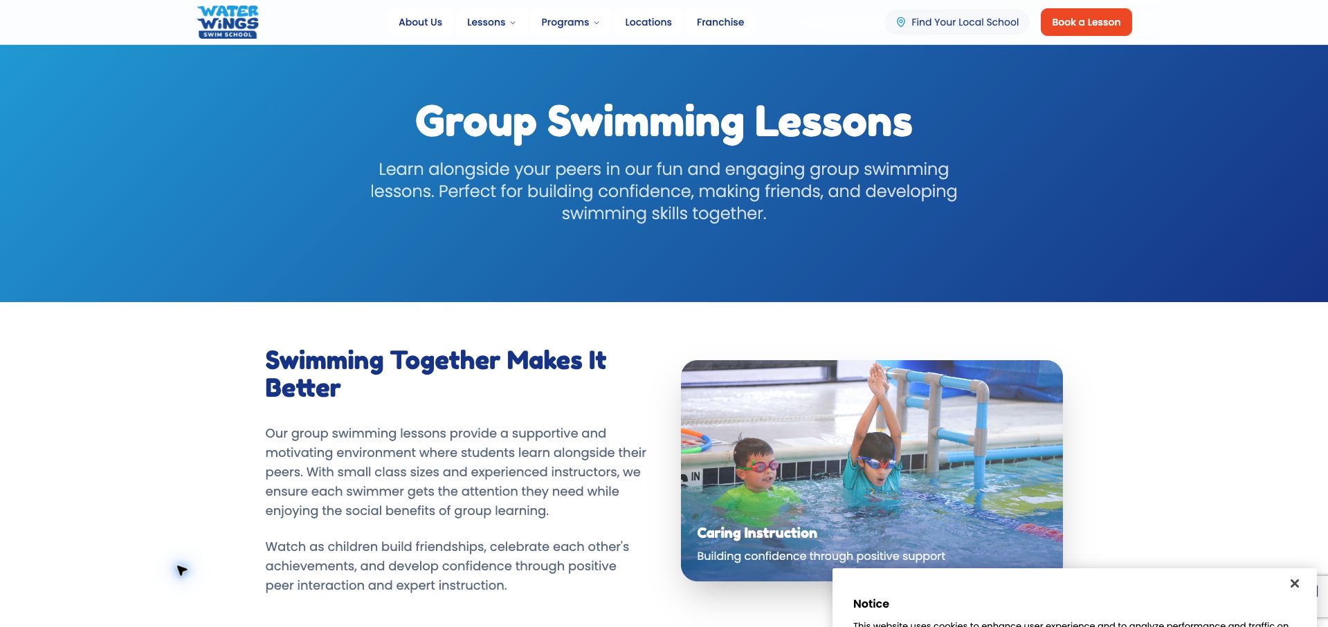
Water Wings’ group-lessons page begins with a blue gradient introduction that names the program directly. Below it, a white section pairs explanatory copy with a lesson photograph and a short supporting caption. The header keeps local-school discovery and booking visible, giving a program-specific landing page access to the broader enrollment journey. A notice panel partly overlaps the lower-right corner in the saved capture. The public audit identifies a Supabase client reference on this exact program URL. It does not establish the implementation of school selection, booking, participant records or any separate parent account.
What you can learn
A focused program page should help visitors decide whether an offering fits before asking for location or enrollment details. Structure program descriptions consistently, then connect them to the appropriate local options. If a database supports that relationship, distinguish shared program information from location-specific schedules and availability, and make missing options understandable.
Pros
The page names the specific program before introducing broader marketing material.
Local-school and booking routes remain accessible from the program context.
Cons & considerations
The notice panel obscures part of the saved content area.
The first explanatory section does not yet show a concise age or level comparison.
Platform source: Dated public-source client reference. Recognizable Supabase client signature in JavaScript. A bounded public-source audit observed a recognizable Supabase client signature on this exact page. This establishes a client-code reference only, not database contents, backend configuration, current production use or which visible feature uses the client. Platform evidence is separate from the direct website screenshot and is not a complete current infrastructure audit.
Kegan has 15+ years of experience working with small businesses, Fortune 500 companies, and everything in between. No development job is too big or too small: he brings the same hands-on attention to a focused improvement, a complete website, or a custom application.
For Supabase projects, he can help with responsive interfaces, reusable components, custom functionality, API connections, and performance-minded implementation. He works directly with clients on scope, design, implementation, testing, and handover, with an emphasis on clear communication and a system that remains practical to maintain after launch.
Show 3 other Supabase developersHide other Supabase developers
Choose the smallest application boundary that solves the problem
Add a focused feature to an existing public website
A useful first step might be a public directory or a clearly bounded account feature. Keep existing content routes stable and define exactly which information the new feature owns. Decide how visitors continue when the feature is unavailable. Avoid migrating an entire content workflow just because one new interaction would benefit from structured records.
Build a dedicated customer application
For a workspace or recurring service, map identity, application records and staff responsibilities together. Show what a new account can do before it contains data, and distinguish pending actions from completed ones. Reuse clear public marketing language in the application so that a visitor does not have to learn a second vocabulary after signing in.
Keep editorial publishing separate when it has different owners
A marketing team may need a familiar publishing interface while a product team maintains application data. Define the relationship between these systems instead of assuming one database must become every editor’s tool. Shared identifiers and explicit update responsibility are more useful than a single oversized schema that nobody can safely change.
From references to requirements
Plan the records, permissions and recovery states before launch
Write a record and state inventory
Choose one complete visitor task and write the records it touches. For a lesson inquiry, that could include a public program, a location and a private request. Record which fields belong to each concept, who can edit them and which values must remain stable when the wording changes. Use representative content rather than short placeholder labels. Include a missing photograph, a long program name, a location without availability and an inquiry that has not yet received a response. Then sketch the interface states around those records: initial loading, a useful result, no match, invalid input, a saved request and a failure that leaves the outcome uncertain. The confirmation should describe what actually happened. Saving an inquiry is not the same as confirming a place, accepting a project or approving a payment. Give the operations team a simple way to explain and resolve that difference. Finally, decide which parts should remain publicly readable if the interactive feature is unavailable. A small written state inventory helps designers and developers agree on the service before either group commits to an attractive but incomplete successful path.
Make permissions a reviewable part of the design
List the roles in the application using ordinary language: anonymous visitor, account holder, staff editor and administrator, for example. For every record type, describe who may read, create, update and remove it. Translate those decisions into the trusted access layer and test the intended denials as well as the successful cases. Supabase documents Row Level Security for controlling access to rows, but the application team still has to define the correct policies. Do not treat a working login screen as evidence that unrelated users are separated correctly. Use test records and several representative users when checking ownership boundaries. Keep server-only credentials outside browser code, logs and copied examples. Review file access separately from record access: an application may protect a database row while accidentally publishing the associated document. Decide how a user sees an unavailable or unauthorized item without exposing its private details. The result should be understandable to a maintainer who did not build the first version. Keep the role table, policy tests and explanation of unusual exceptions together so a later feature does not silently broaden access.
Before launch, name the person responsible for public content, account support, data changes and deployment. Walk through an ordinary change such as updating a location, retiring a program or correcting a customer-facing label. Check that the change reaches the intended interface without altering unrelated records. Plan how the team recognizes a failed operation and how it distinguishes failure from an uncertain result. A timeout should not automatically encourage another payment, booking or destructive action. Give users a stable way to return and see the authoritative state. For uploaded material, decide who can read the file, how long it is retained and what happens when its related record is removed. Supabase Storage has its own access-policy considerations; a successful upload alone does not establish the right visibility. Rehearse support using safe test information rather than real customer data. Document how a maintainer can investigate an issue, restore service and communicate what remains incomplete. This operational handover keeps a compact application understandable as people, content and requirements change after the initial release.
Ask the actual team to carry out its routine job: publish a realistic update, correct a mistake, preview a narrow screen, and identify who owns an integration failure. For a library or frontend framework, also ask who maintains the content source and deployment. A polished screenshot does not answer those operational questions.
Beyond the screenshot
A Supabase application planning checklist
Name the exact public property or product covered by each technology source.
Define one visitor task and the records needed to complete it.
Separate public content from account and staff-only information.
Document who may read, create, update and remove each record type.
Test denied access with representative users and safe test data.
Keep private credentials out of browser assets, logs and shared examples.
Explain loading, empty, invalid, failed and uncertain outcomes clearly.
Review file visibility independently from database record permissions.
Assign ownership for content updates, support and application maintenance.
Preserve useful public routes when an optional interactive feature is unavailable.
Check the completed workflow before launch and verify the actual live result.
Retain source dates and qualifications when reusing research or screenshots.
Test with real content, a keyboard, a small screen, slow or failed requests, and the people who will maintain the system. These are planning checks, not an accessibility, security, performance, or search-ranking certification.
Sources & editorial method
How this Supabase collection was reviewed
This collection contains twenty distinct public properties with direct browser screenshots, source URLs, dimensions, attribution and retained capture dates. Nineteen images were reused from stable authoring inputs and inspected for new Supabase-specific reviews on November 9, 2026, America/Los_Angeles. Udio received a new direct public-page capture and one successful bounded broad technology audit. Sixteen source pages retain dated Supabase client-signature observations; those do not identify private data or the features using the client. Resend, Chatbase and Udio have explicitly scoped Supabase customer stories about their public products. MDN’s own June 2023 article documents the earlier AI Help feature and is qualified as historical. All prior broad-audit records remain intact. The five opening selections use separate primary identity sources and editorial judgment, not a fabricated popularity score. No accounts were created, private application screens opened, forms submitted, purchases made or service performance measured. These reviews assess interface decisions, not service quality, security certification or business outcomes.
Every image is an unmodified capture from the actual website, with its source and capture date. Some captures are reused from our shared catalog; their dates remain the original capture dates. None comes from a vendor gallery or a generated reconstruction. Moving imagery and live content can change.
Technology attribution uses public page assets or metadata, official platform documentation, or a cited first-party project case study. Documentary and framework-relationship evidence is identified where used; it is not a complete current backend inventory. A CMS image CDN alone does not establish a full CMS deployment. A library’s presence does not prove which individual controls use it, and a platform label does not establish AI authorship.
The composition notes, lessons, pros and tradeoffs are original editorial observations. We have not measured conversion, traffic, security, performance or accessibility conformance. Website owners retain their brands and imagery; these examples are not our client portfolio. Written, Edited and Curated are independent records, not dates advanced by a build. See our editorial standards or suggest a correction.
Questions worth asking
Supabase website development FAQs
Does every pictured homepage run on Supabase?
No. Sixteen examples have an observed public Supabase client reference, which does not prove the whole page or business runs on it. Three customer stories describe named public products, and MDN has an explicitly historical account of its AI Help feature. Each review keeps that scope separate from the screenshot.
Does Supabase determine the design of a website?
No. It supplies database and application services, while the project still needs decisions about frontend presentation, content, navigation and user tasks. The examples show different visual approaches. Choose the design around the visitor’s needs rather than treating a technology logo as a template.
Is authentication enough to protect application data?
A successful sign-in does not establish permission to every record. Define the intended access for each role, implement it in the trusted data-access path and test both allowed and denied cases. Supabase Auth and Row Level Security address related parts of that work, but the project must still define appropriate policies.
Can a public client reference reveal the private database?
The reference used in this guide does not reveal database contents or establish the purpose of individual features. It is a bounded public-source observation. We did not query private data, use account credentials or infer hidden systems from the presence of the client.
Why do the screenshots and evidence have different dates?
A screenshot records one visible page at its capture time, while a broad audit or documentary source records a different observation. Reusing a genuine image does not make its capture new. Historical product evidence also remains historical even when it is read again for a new review.
What should a small team plan first?
Choose one useful task, define its records and owners, and write the success, empty and failure states. Decide which information is public and who may change private records. A small, understandable workflow is a stronger starting point than copying a large reference product’s entire feature list.