Best Recording Studio Websites of 2026 (25 Real-World Examples)
Recording studio websites that make the rooms, people and session enquiry understandable
A studio website should help a musician, producer or production team recognize the right working environment without mistaking an impressive room photograph for a complete session plan.
People do not choose a recording studio from exactly the same starting point. A producer may arrive with a detailed input list; an artist may need an engineer, instruments and help understanding the booking process; a visiting team may be comparing accommodation, travel and several rooms. The website should make those paths intelligible. A beautiful console photograph can establish an atmosphere, but it cannot answer whether a room is available, what is included or which people will be working on a session.
This collection compares how genuine studios present rooms, equipment, personnel, history and practical enquiry information. It is about website communication, not a ranking of acoustics, engineering ability or records made there. Public photographs and credits are useful evidence of a place and its presentation, while the details of a particular session still need confirmation with the studio. Original screenshots retain their real capture dates, and visible technology notes do not identify the recording systems or private booking tools behind the business.
Before the examples
What makes good recording studio website design in 2026?
Describe a usable session environment, not just a famous room
Give each room a clear purpose, useful photographs and proportionate supporting details. Explain which spaces can be used together, where a visitor can find equipment information and what should be discussed with the studio before booking. Do not infer acoustic suitability, capacity or included services from a dramatic photograph.
Connect equipment and people to the enquiry
A gear inventory is useful when it is current and scoped to the right room. A person planning a session also needs to understand engineering, assistance, production and other support. Distinguish staff, independent collaborators and optional services rather than implying that every pictured person or listed item is automatically part of every booking.
Make practical information compatible with the studio’s character
History, records and distinctive imagery can communicate a studio’s identity. Keep contact, location, room information and booking expectations readable alongside that story. A first-time client should not need insider knowledge of the studio’s reputation to find out how to begin.
The collection · 25 examples
25 recording studio websites worth studying
Compare what each site makes clear before an enquiry: the rooms, the working context, the people, the equipment and the information needed to start a realistic session conversation.
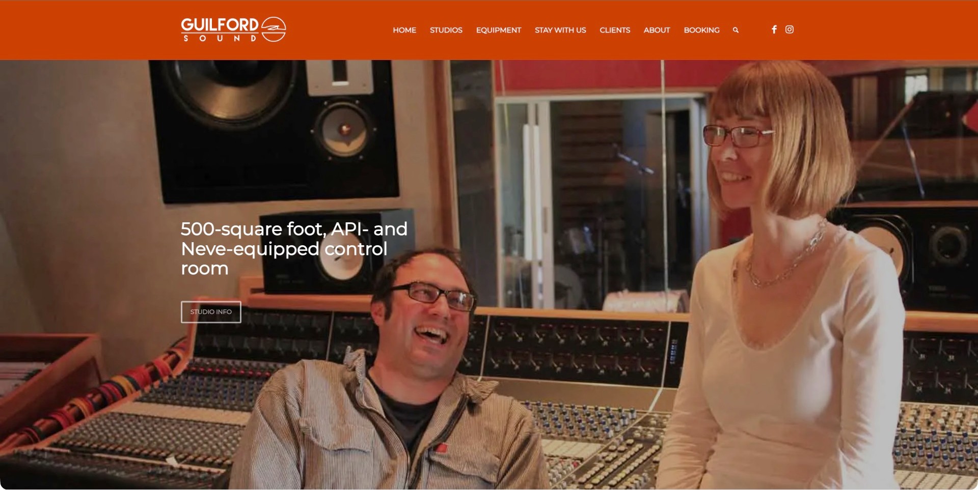
Guilford Sound’s pictured slide shows two people beside the console rather than presenting equipment as an isolated trophy. A short description identifies the control room’s size and API/Neve equipment, followed by a Studio Info action. The orange header supplies a strong visual boundary and puts Studios, Equipment, Stay With Us and Booking into distinct routes. That combination is especially useful for a destination studio: visitors can investigate both the session space and the practical question of staying there. The photograph conveys an informal working atmosphere, but it cannot establish the quality of a recording or the experience of every client.
What you can learn
Give each room photograph a small, useful specification and a relevant next step. Keep accommodation separate from technical equipment so visiting musicians and production coordinators can pursue different questions without decoding one long sales page.
Pros
People and equipment appear together, making the facility easier to imagine in use.
Stay With Us has a clear place in the header.
Cons & considerations
White slide copy needs checking against every photograph.
A rotating introduction may hide a useful room specification from a hurried visitor.
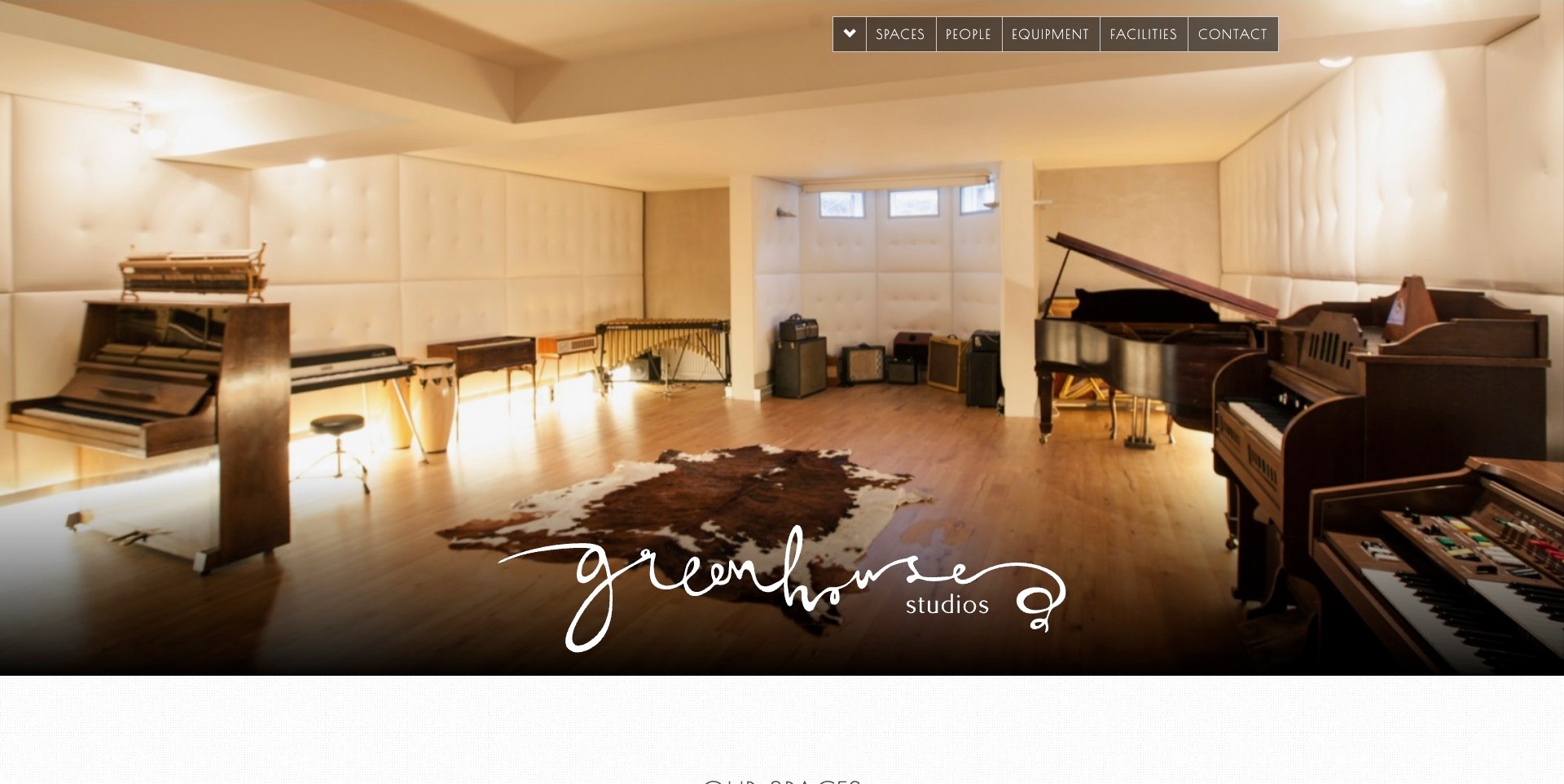
Greenhouse Studios gives almost the entire opening view to a bright live room containing several keyboard instruments, percussion and a large central floor area. Its handwritten logo sits near the bottom of the photograph, while a narrow outlined navigation strip offers Spaces, People, Equipment, Facilities and Contact. The picture communicates scale and atmosphere before any equipment list appears. Separating people from rooms also acknowledges that a session involves expertise as well as a building. This is a visually calm opening, not evidence that a particular instrument is currently available for every booking. Availability and staffing still belong in a direct project conversation.
What you can learn
Photograph rooms with enough context to show how musicians might arrange themselves, rather than cropping every image into a console detail. Then provide straightforward routes to the people, equipment and logistical information that a producer will need to confirm.
Pros
The wide room view gives a useful sense of physical space.
The short navigation labels cover complementary booking questions.
Cons & considerations
The expressive handwritten identity may be less legible at small sizes.
A photograph-led opening can delay location and service details for an unfamiliar visitor.
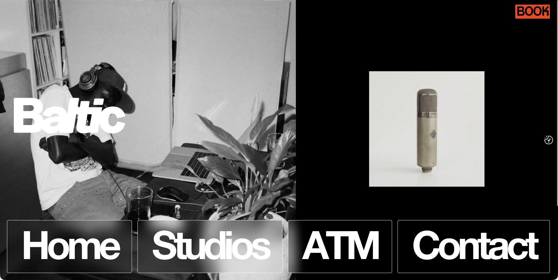
Baltic’s homepage contrasts a black-and-white working scene with an isolated microphone photograph on a black field. The white Baltic wordmark crosses the people-focused image, while a small orange Book control sits high on the opposite side. Oversized Home, Studios, ATM and Contact tiles occupy the bottom of the view. The result is unusually graphic for a studio site: it gives equipment, people and navigation separate visual roles instead of layering all three into one cinematic background. The image demonstrates the website’s presentation, not the microphone’s availability or the outcome of a session. The unexplained ATM label also asks more of a first-time visitor than Studios or Contact.
What you can learn
A restrained palette can create a strong identity when image treatment and navigation scale are deliberately coordinated. Keep the booking action easy to recognize, and explain branded or abbreviated destinations before expecting an unfamiliar artist to understand them.
Pros
The orange booking control stands apart from the monochrome design.
Separate images give people and equipment their own space.
Cons & considerations
Very large navigation tiles consume substantial opening-screen space.
An abbreviated label such as ATM may need supporting context.
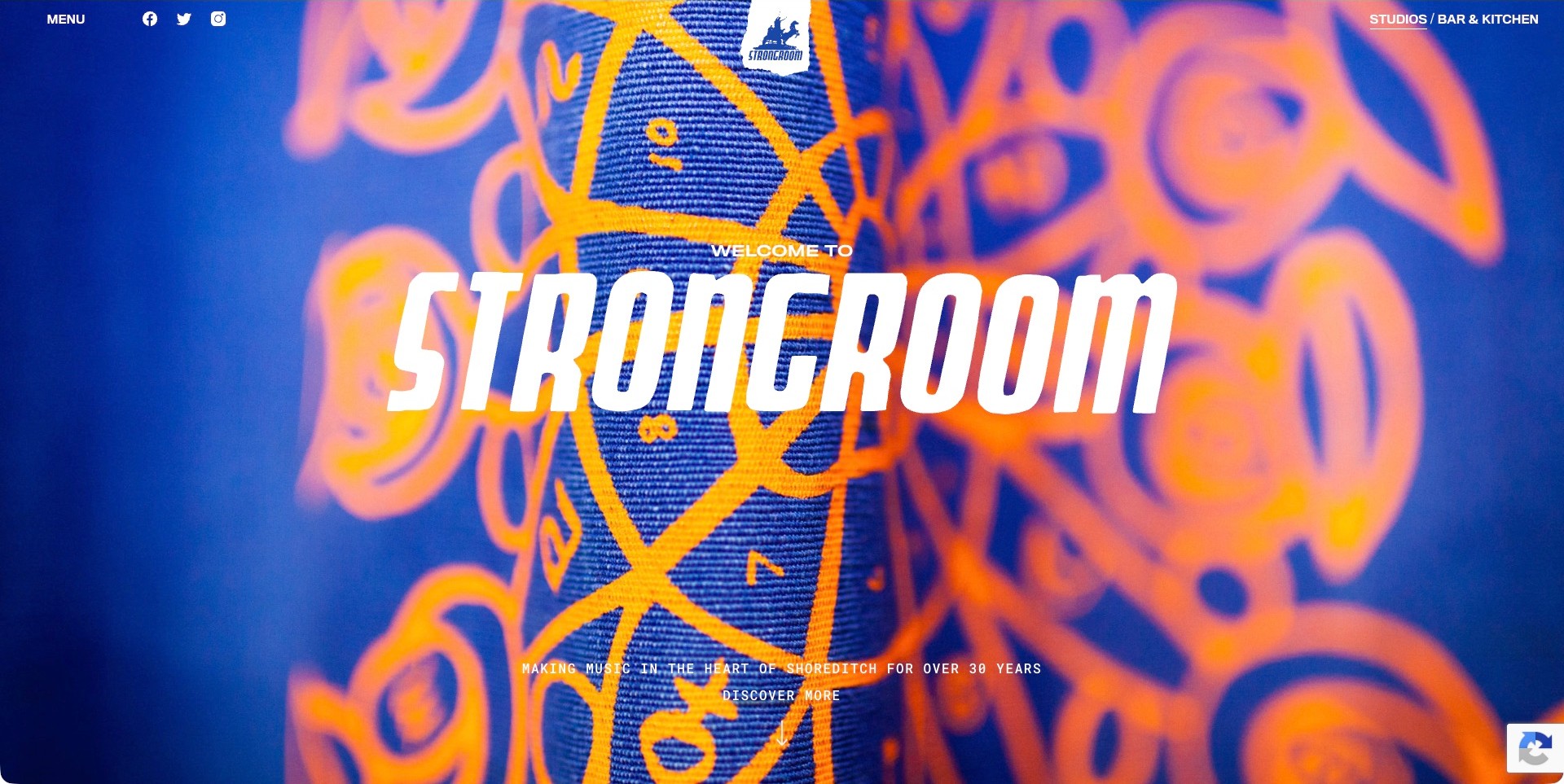
Strongroom opens with an intensely blue and orange patterned image behind a large white wordmark. The central Welcome To treatment is brief; a smaller line identifies music-making in Shoreditch, and a Discover More prompt sits below it. Menu and social links occupy the upper left, while Studios and Bar & Kitchen are distinguished at the upper right. That split acknowledges two genuine visitor intentions without letting the hospitality offer replace the studio identity. The first screen is memorable because of color and texture, not a list of famous recordings. It also deliberately postpones practical room details, so the following content needs to make those details easy to find.
What you can learn
Use a business’s own distinctive visual culture rather than assuming every recording website needs the same dark console photograph. When the venue has more than one purpose, separate those routes in plain language and preserve an obvious recording-specific destination.
Pros
The vivid patterned treatment gives the studio a recognizable opening.
Studio and hospitality routes are visibly separated.
Cons & considerations
A broad Discover More prompt is less specific than a room or booking label.
A minimal menu may slow visitors who arrive seeking one technical fact.
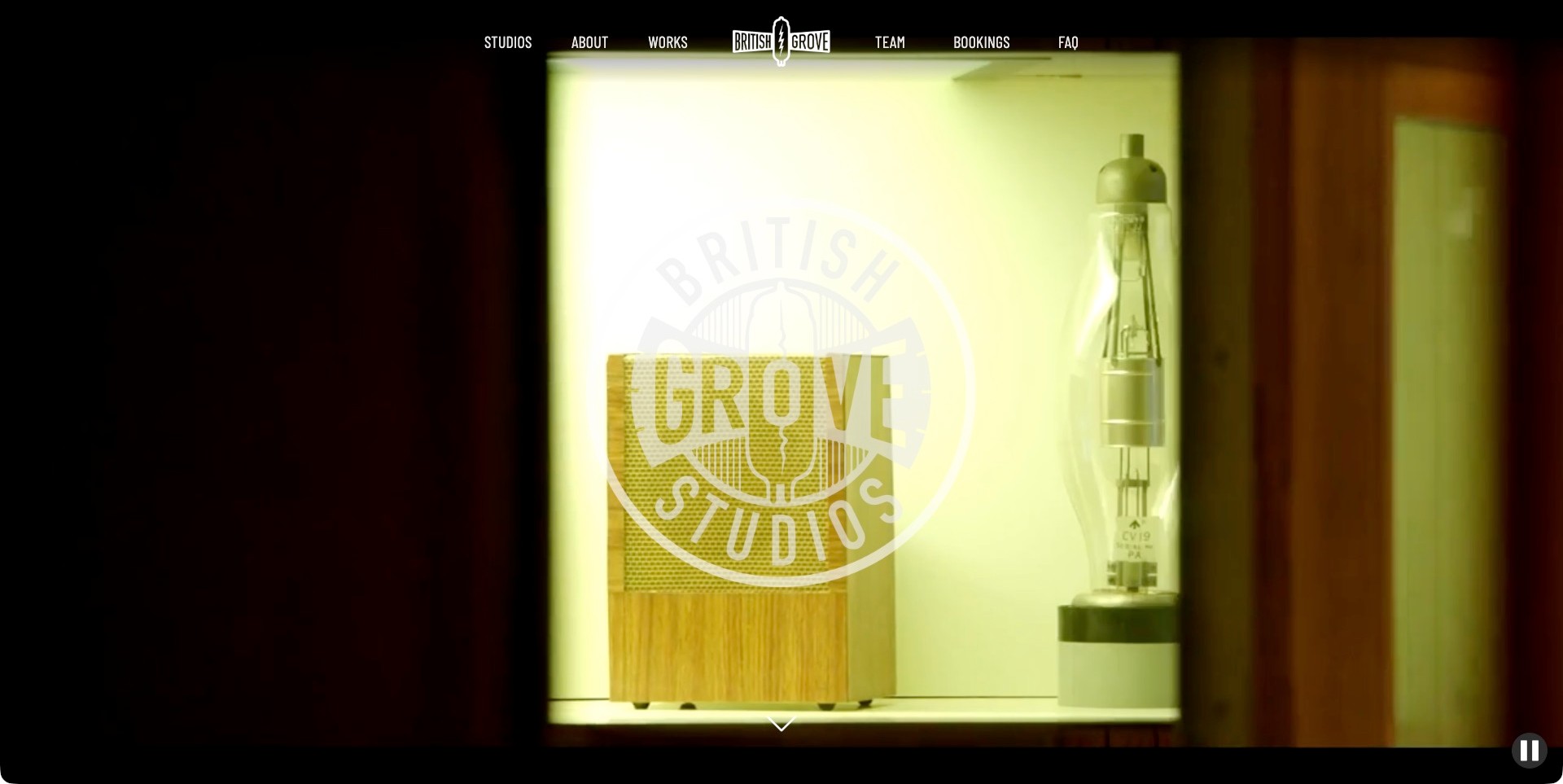
British Grove’s captured homepage film shows microphones in a warmly lit display, with a circular studio identity overlaid near the center. A slim row above it places Studios, About, Works, Team, Bookings and FAQ around a smaller logo. The opening therefore balances an atmospheric image with routes that cover both creative proof and practical questions. A pause control remains visible at the lower right, acknowledging that moving media is part of the presentation. The film does not itself tell a producer which room or engineer suits a brief. Those decisions require the more detailed pages, and the homepage’s navigation makes their roles reasonably clear.
What you can learn
Let atmosphere introduce the facility while stable navigation carries the useful information architecture. Distinguish completed work, personnel and booking information rather than expecting an impressive room film to answer every production question on its own.
Pros
Team, work and booking routes are independently labelled.
The warm material detail creates a coherent visual mood.
Cons & considerations
A large translucent logo can reduce the visibility of the photograph beneath it.
An image-led first screen may require extra navigation to establish location or session scope.
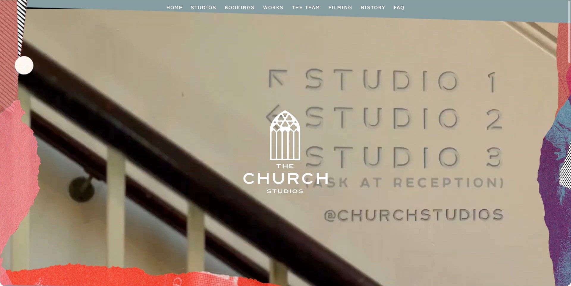
The Church Studios places a church-window logo over a homepage film, framed by torn-paper-style color and texture. The saved frame shows directional signage for three studios, an unusually practical detail within an atmospheric introduction. A restrained navigation row lists Home, Studios, Bookings, Works, The Team, Filming, History and FAQ. That structure separates recording, filming and background information without making the opening copy dense. The building-derived identity connects the name to a physical place, while the collage avoids an overly formal institutional feeling. The screenshot is a moment from the film, not a still representation of every room or proof of session availability.
What you can learn
A recognizable building can supply a visual identity without becoming the entire message. Pair that identity with separate room, people and booking routes, and use supporting imagery to make the facility understandable to someone who has never visited.
Pros
The architectural logo makes the studio name visually concrete.
Bookings and FAQ are available alongside creative work.
Cons & considerations
Moving footage can change the contrast behind the central logo.
A long top navigation needs careful adaptation for smaller screens.
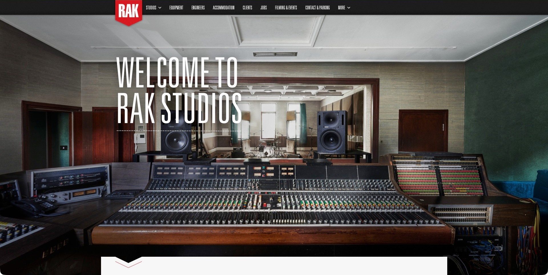
RAK’s opening photograph looks across a large console and through a window into the live room. The tall, condensed Welcome To RAK Studios heading leaves much of that relationship visible, while a red shield-shaped logo anchors the dark navigation band. Studios, Equipment, Engineers, Accommodation, Clients and Contact & Parking all have distinct labels. This is a practical arrangement for an industry audience: the photograph introduces the facility, and the header supports the detailed planning that follows. Accommodation and parking are treated as legitimate production concerns rather than hidden administrative material. The image cannot establish sound isolation, current equipment condition or the suitability of a room for a particular ensemble.
What you can learn
Choose photographs that explain how control and performance spaces relate. Then organize the supporting information around the questions a production team actually asks, including staff and arrival logistics as well as equipment.
Pros
The photograph shows more than a close-up of the console.
Accommodation and parking are easy to identify in navigation.
Cons & considerations
Condensed small navigation text may be difficult for some readers.
A very large hero still postpones detailed room comparisons until later.
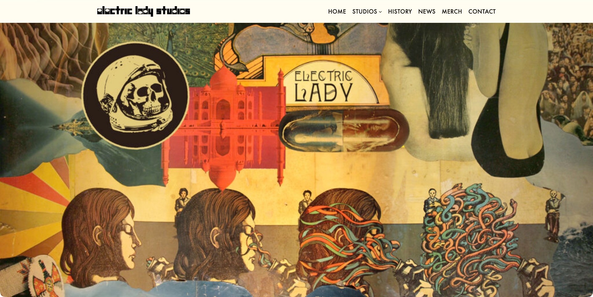
Electric Lady’s captured homepage fills the main view with a psychedelic collage: architectural forms, an astronaut-like skull motif and musical imagery sit beneath a cream header. The studio’s distinctive black wordmark remains separate from the artwork. Home, Studios, History, News, Merch and Contact provide a conventional navigation structure around a much less conventional visual introduction. This contrast is the useful idea: personality comes from the imagery and identity, while basic wayfinding stays recognizable. The screenshot does not show a room specification or a booking calendar, so it should be studied as brand presentation rather than a complete example of technical sales information.
What you can learn
A creative business can be visually expressive without making every interaction unfamiliar. Preserve ordinary, descriptive navigation around the distinctive artwork, and make sure a producer can move from brand atmosphere to concrete room information without having to interpret the imagery.
Pros
The artwork establishes a strong, unmistakable visual character.
A simple cream header keeps the main destinations readable.
Cons & considerations
Artwork alone does not explain the current recording offer.
A visitor seeking a specific room may need to bypass the large visual introduction.
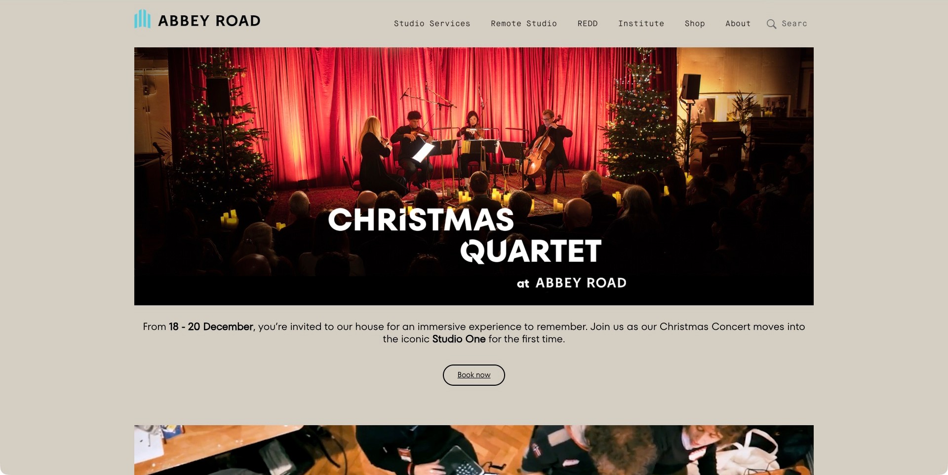
Abbey Road’s saved homepage view promotes a Christmas Quartet event with a performance photograph, clear event identity, a short invitation and a Book Now button. Above it, Studio Services, Remote Studio, REDD, Institute, Shop and About remain visible. The distinction matters: a public-facing seasonal campaign can be prominent without removing the paths for people commissioning recording work. The warm neutral background and generous margins give the event room to breathe instead of making the page feel like a crowded ticket listing. This capture documents the campaign that was actually present, not an assumed permanent homepage or a completed booking transaction.
What you can learn
Treat temporary campaigns as replaceable content within a stable service architecture. Give the campaign its own meaningful action, but retain obvious routes for customers whose needs have nothing to do with the featured event.
Pros
The event is supported by a photograph, description and labelled action.
Studio-service routes stay distinct from shopping and education.
Cons & considerations
A seasonal hero can initially distract a visitor seeking a recording room.
Campaign dates need maintenance so the introduction does not become stale.
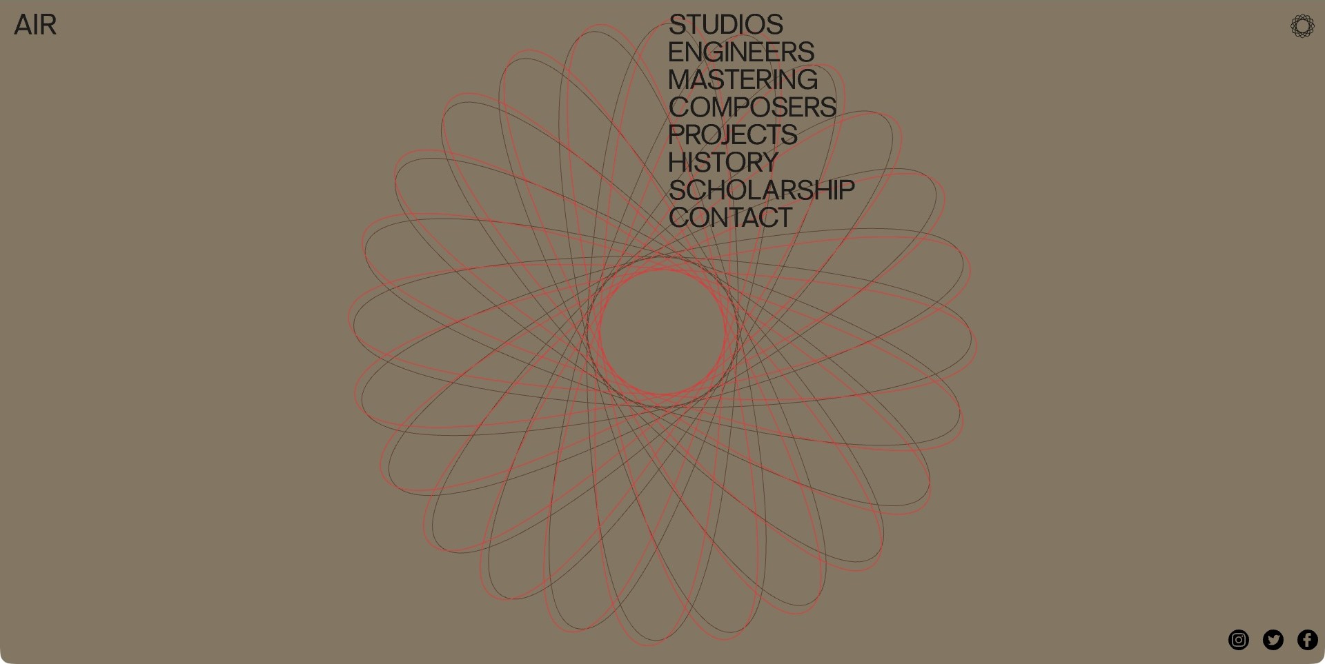
AIR’s homepage uses a large red-and-black looping line form on a muted background. Its name sits at the upper left, while Studios, Engineers, Mastering, Composers, Projects, History, Scholarship and Contact form a prominent vertical list. The graphic echoes a compact rosette mark at the opposite corner, tying the animated center to the surrounding identity. Unlike many studio openings, this view makes the navigation itself a major compositional element. The tradeoff is that a first-time visitor gets little immediate photographic explanation of the rooms. The graphic communicates a visual personality, not acoustic performance, engineering quality or the complete scope of the recording facilities.
What you can learn
If a homepage uses abstract motion, let the service labels carry unusually clear meaning. A recognizable directory can keep an expressive introduction useful, provided visitors can quickly reach concrete rooms, people and project information.
Pros
The large service list is more explicit than a generic menu icon.
The central graphic and small mark form a consistent identity.
Cons & considerations
The abstract opening does not show what a studio space looks like.
Overlapping animated lines and navigation need careful readability testing.
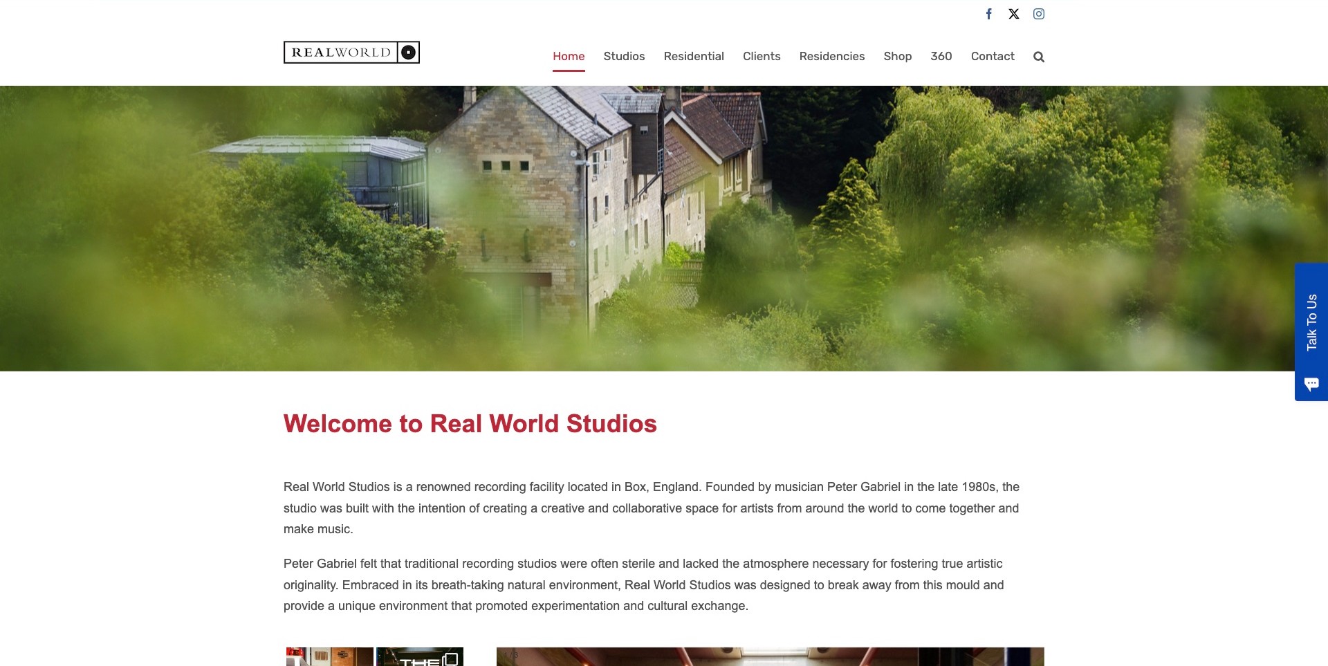
Real World’s homepage shows the studio buildings among trees before introducing the business in a conventional, readable text section. The white header distinguishes Studios, Residential, Clients, Residencies, Shop, 360 and Contact. That combination makes the destination aspect understandable without replacing practical room information with travel-style imagery. In the saved view, the short introductory paragraphs explain the recording facility and its intended creative environment. A compact closed Talk To Us launcher remains at the edge, rather than an expanded conversation covering the page. The landscape photograph can communicate setting, but it is not evidence of accommodation availability, accessibility or the result a visiting artist will achieve.
What you can learn
For a residential studio, show the surroundings and explain their relationship to the working offer. Keep accommodation, rooms and contact in separate routes, then use ordinary paragraphs to supply context that an attractive landscape cannot convey by itself.
Pros
The setting and facility are connected through a clear introduction.
Residential information is easy to distinguish from studio details.
Cons & considerations
The introductory text may feel broad to a producer seeking exact specifications.
A large landscape image cannot replace room plans or arrival information.
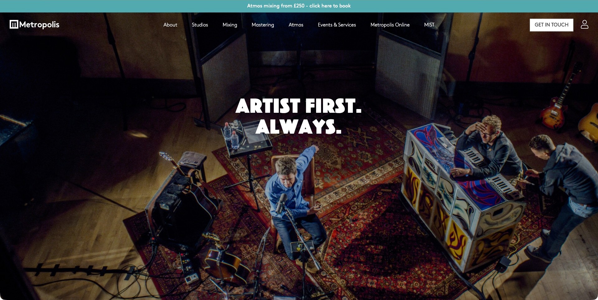
Metropolis uses an overhead session photograph beneath the short Artist First. Always. headline. The people, instruments and room remain the visual focus, while the header separates Studios, Mixing, Mastering, Atmos and Events & Services. A contrasting Get In Touch action is visible at the right, and a narrow offer strip sits above the main navigation. This is a useful example of organizing several related services without turning the hero into a technical inventory. The picture gives the positioning an actual working context, although neither the headline nor the image demonstrates the quality of a particular session. The advertised price also belongs to its specific offer, not a general studio rate.
What you can learn
Give each service a clear label when customers may arrive with only one stage of production in mind. A broad artistic message works better when visitors can immediately branch into the precise room, mix or mastering information they need.
Pros
Recording and finishing services have separate navigation routes.
The hero connects the artist-focused message to people making music.
Cons & considerations
Offer strips need accurate scope and continuing maintenance.
A dark photo treatment can conceal room details beneath large white type.
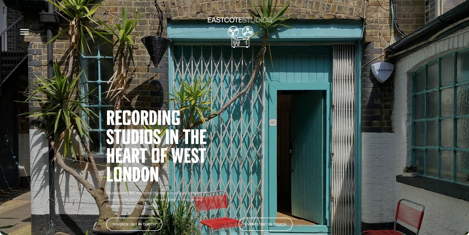
Eastcote’s saved homepage centers on a turquoise courtyard entrance, framed by brickwork, plants and red chairs. A small reel-to-reel identity sits above a large West London recording-studio headline. The accompanying paragraph names the facility and its blend of vintage and modern equipment, while separate Studios: Get In Touch and Events: Get In Touch buttons acknowledge different enquiries. The entrance photograph gives the business a specific sense of place rather than an interchangeable stock-room impression. It does not show the internal layout or establish access arrangements, so those details still need their own supporting content. A small menu icon keeps the opening visually restrained.
What you can learn
An exterior or entrance photograph can make a studio feel real and approachable, particularly when it includes distinctive details. Pair it with an explicit location and separate contact routes when the building supports more than one type of booking.
Pros
The photographed entrance gives the facility a memorable physical identity.
Studio and event enquiries are differentiated.
Cons & considerations
The small introductory text has limited contrast in parts of the photograph.
A collapsed menu requires another action to explore detailed facilities.
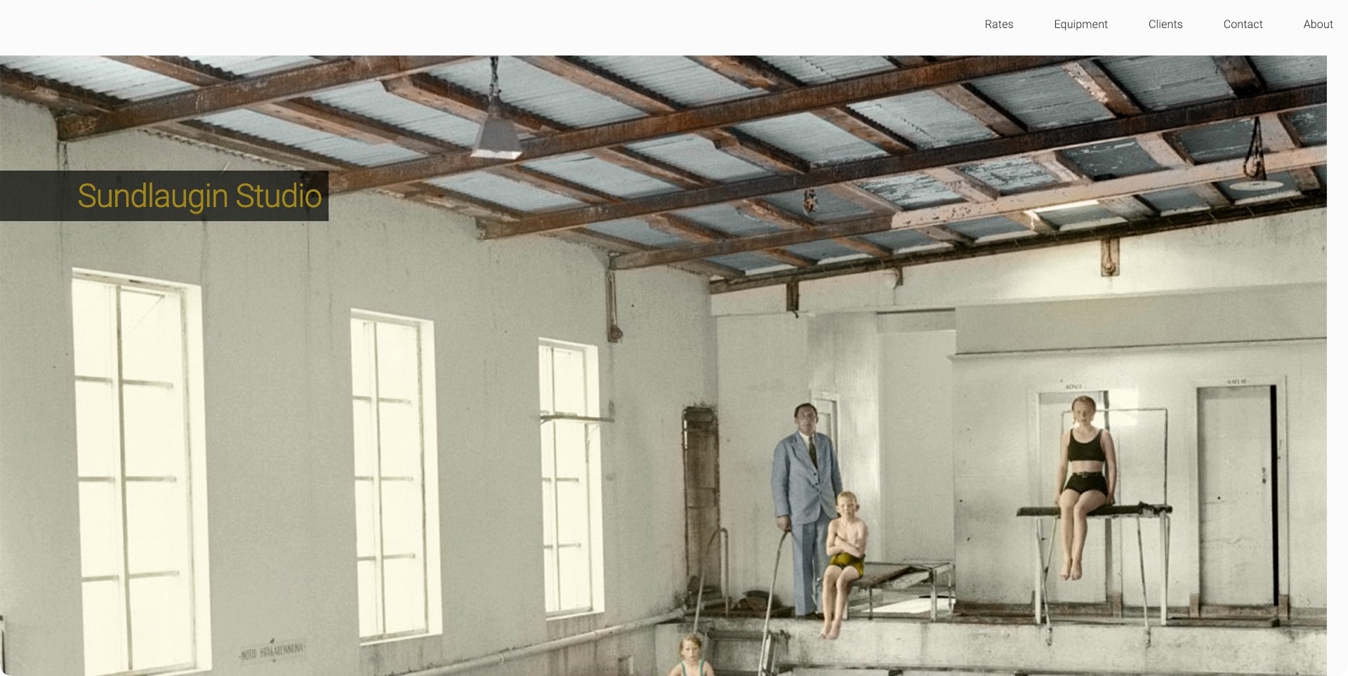
Sundlaugin’s homepage uses a large photograph of an indoor swimming pool, with a simple studio nameplate set over the image. The room’s roof structure, windows and diving-board scene dominate the view rather than a contemporary console photograph. A sparse white header provides Rates, Equipment, Clients, Contact and About. The juxtaposition creates curiosity about the building while giving practical visitors familiar destinations. It is important not to read the historical-looking image as a current floor plan or an illustration of the studio’s present equipment. The useful design observation is how an unusual place-based story can coexist with very direct commercial labels.
What you can learn
When a building’s earlier life is relevant to the studio identity, show that history deliberately and label current facilities separately. Keep rate and equipment routes obvious so a distinctive story does not force a production coordinator to search for practical information.
Pros
The pool image is visually different from a conventional studio hero.
Rates and Equipment are clearly named in the header.
Cons & considerations
A historic image needs context to avoid confusion about current facilities.
The opening view offers little immediate explanation of the recording services.
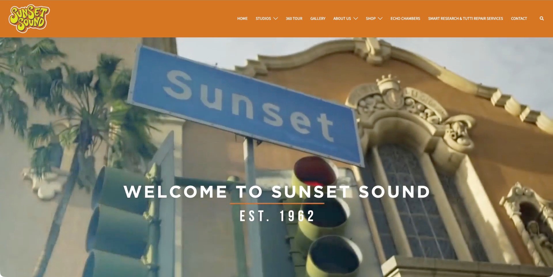
Sunset Sound’s captured homepage film shows a Sunset street sign and architectural surroundings beneath an orange header. A large Welcome To Sunset Sound title and establishment date sit over the footage. The retro-styled logo is distinct from the navigation, which includes Studios, 360 Tour, Gallery, About Us, Echo Chambers and Contact. Those labels provide specific ways to investigate the place after the location-led introduction. The film supplies atmosphere and context rather than a room comparison, and the establishment date should not be mistaken for evidence about present-day facilities or service quality. The site’s own mix of visual heritage and practical routes is the useful pattern.
What you can learn
A studio can communicate history through its identity and surroundings while keeping current facilities accessible through straightforward links. Give specialized spaces their own descriptive route rather than leaving visitors to discover them inside a general gallery.
Pros
The header makes tours, studio details and echo chambers independently discoverable.
The logo and warm palette reinforce a coherent identity.
Cons & considerations
Small navigation text may be difficult to read across many destinations.
A location film does not by itself establish what a particular session can use.
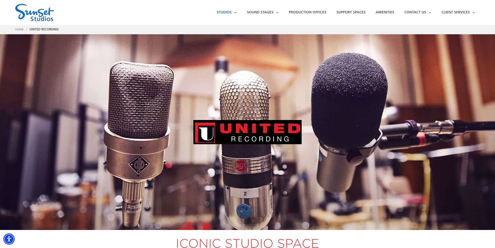
United Recording’s current source is a dedicated landing page within Sunset Studios. The saved view uses three close-up microphones behind a centered United Recording logo, while a breadcrumb identifies the specific destination below the parent site’s navigation. An Iconic Studio Space heading begins the next section. The page therefore preserves a recognizable studio identity without pretending it is an independent standalone navigation system. The distinction matters for readers: the surrounding sound-stage and production-office links describe the wider website, not necessarily everything available inside United Recording. The microphone photograph is an evocative introduction, not an inventory or a guarantee that those exact items are included in a booking.
What you can learn
When a specialist facility lives inside a broader company site, make the location name and breadcrumb unmistakable. Follow the image with precise facility information so visitors can distinguish the actual studio offer from the parent website’s wider services.
Pros
The studio logo is prominent despite the parent-company header.
The breadcrumb makes the landing page’s position clear.
Cons & considerations
Parent-site navigation can distract visitors seeking recording information only.
Equipment close-ups need supporting room descriptions and practical booking detail.
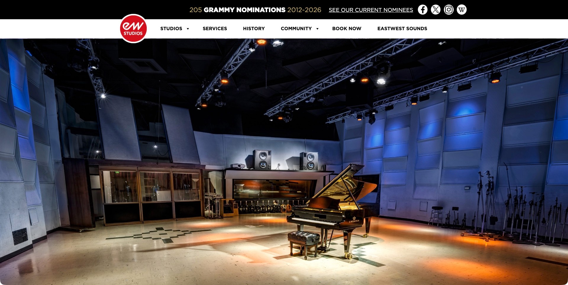
EastWest’s saved opening view shows a blue-lit recording room with a grand piano, visible ceiling rigging and substantial open floor space. The red circular studio logo overlaps a white navigation band containing Studios, Services, History, Community and Book Now. A separate black strip carries the site’s nominations message and a link to its current nominees. The photograph does much more spatial work than a cropped console detail: it shows how a musician or ensemble might relate to the room. It cannot prove acoustic behavior or confirm a particular setup, and the promotional nominations claim remains the business’s own statement rather than an independent service ranking.
What you can learn
Use a genuinely wide room photograph when capacity and atmosphere are central to the offer. Keep the booking route stable and separate from promotional proof, then supply room-specific dimensions, layouts and session requirements in the detailed information.
Pros
The room image communicates visible scale and floor space.
Book Now is a clearly labelled top-level destination.
Cons & considerations
A large room photograph needs supporting specifications to answer production questions.
Promotional award messaging should not replace relevant room and staffing information.
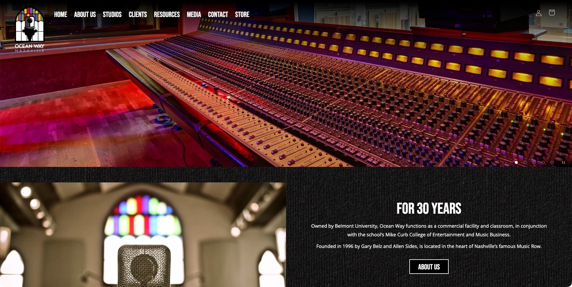
Ocean Way Nashville’s captured homepage uses a large illuminated-console photograph above a split introductory section. One side shows a microphone against a stained-glass setting; the other explains the studio’s history and its relationship with Belmont University. A compact navigation row distinguishes Studios, Clients, Resources, Media and Contact. The layout lets the console communicate craft while the adjacent text provides context that the image cannot. It is a useful balance between visual atmosphere and institutional explanation. The equipment image is not an exhaustive inventory, and the university relationship does not on its own establish what is included in a commercial booking or a particular teaching session.
What you can learn
Place a concise explanation close to the strongest photograph when the business has an unusual operating context. Separate facilities, client work and resources so the same site can support professional enquiries without turning the opening into a complete organizational history.
Pros
Photography and explanatory copy share the first visible page area.
The header distinguishes resources from studio and contact information.
Cons & considerations
Text over a textured dark panel needs careful contrast testing.
A rotating hero may show visitors different aspects of the facility first.
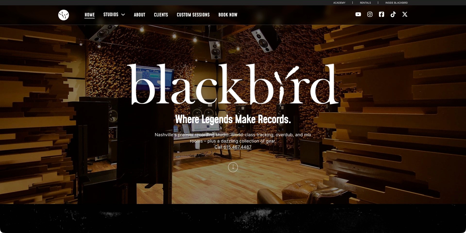
Blackbird’s homepage places a large white wordmark over a warmly lit room with striking timber wall treatment. The supporting text names tracking, overdub and mix rooms, identifies Nashville and gives a phone number. Studios, Clients, Custom Sessions and Book Now remain visible in the header, while related Academy and Rentals links sit in a smaller strip above. This is a useful distinction between the core recording offer and adjacent activities. The room’s visual character supplies atmosphere, but the site does not need visitors to infer its services from the photograph alone. The picture should not be interpreted as an acoustic assessment or a guarantee of access to every item shown.
What you can learn
Combine a memorable room image with a short statement of services and location. Keep related businesses visible but secondary, and make contacting the studio possible without requiring visitors to finish a long brand story first.
Pros
The first screen names recording tasks as well as the location.
A phone number and Book Now route are both visible.
Cons & considerations
Large branding can compete with the practical copy beneath it.
Dense timber imagery benefits from a careful darkening treatment for legibility.
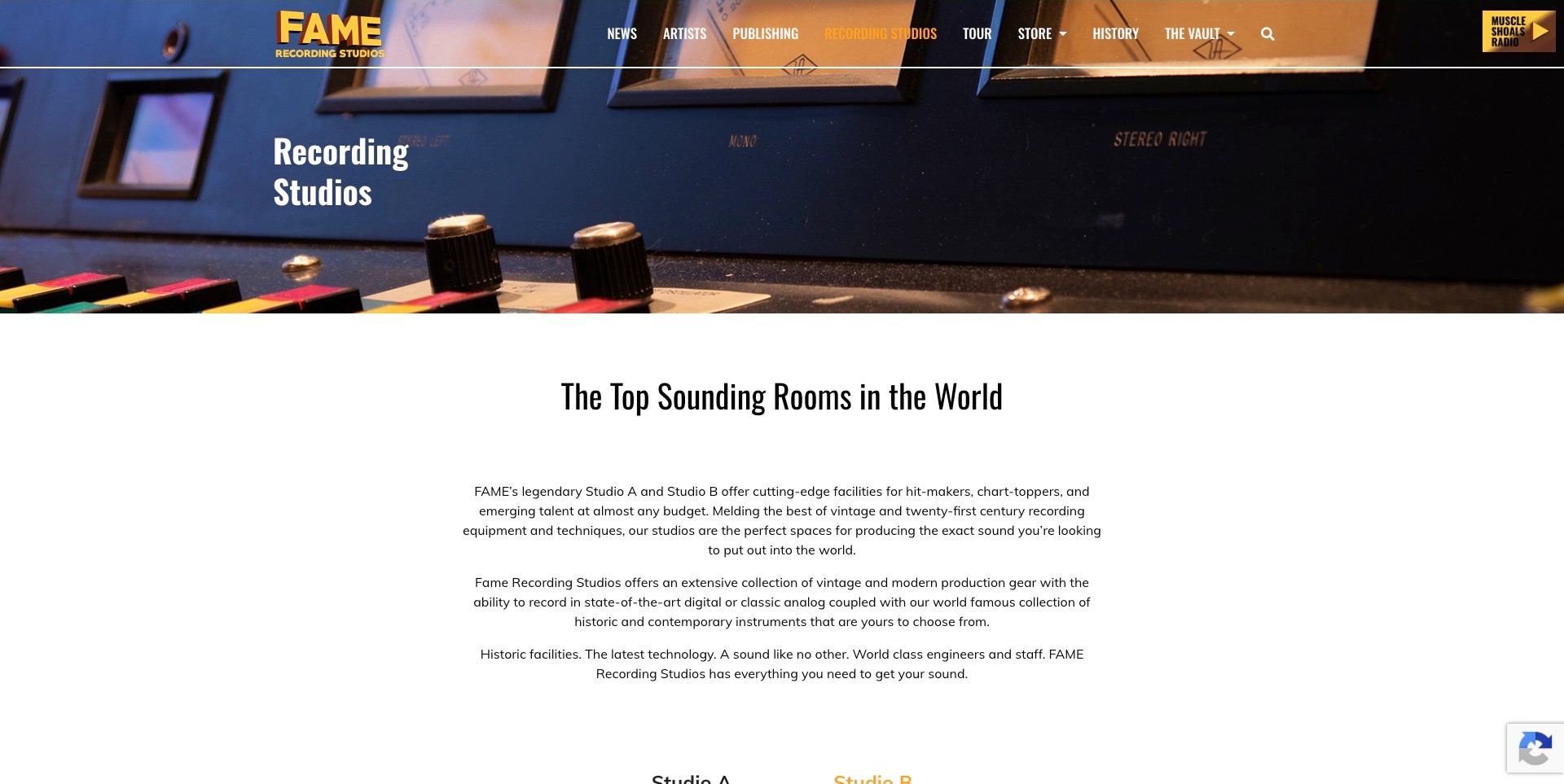
FAME’s reviewed source is its Recording Studios page rather than the homepage. A close-up console banner carries the page title, followed by a spacious white introduction describing Studio A, Studio B and the recording offer. The site-wide navigation still distinguishes recording, publishing, tours, artists and history. That separation is important for a studio with several public audiences: an artist can enter a clearly named service page instead of treating tourism or historical material as the booking information. The site’s promotional superlatives are its own copy; this review considers the page structure, not whether its rooms outperform other facilities or suit every project.
What you can learn
Give recording services a dedicated, descriptive landing page when the wider business also attracts fans and visitors. Use a clear title, a short explanation and room-specific next steps rather than expecting a broad heritage homepage to carry the whole production enquiry.
Pros
The service title makes the page’s purpose immediately clear.
Studio A and Studio B are introduced within the recording context.
Cons & considerations
Broad promotional claims need concrete room facts alongside them.
The large introductory spacing may slow a visitor seeking specifications quickly.
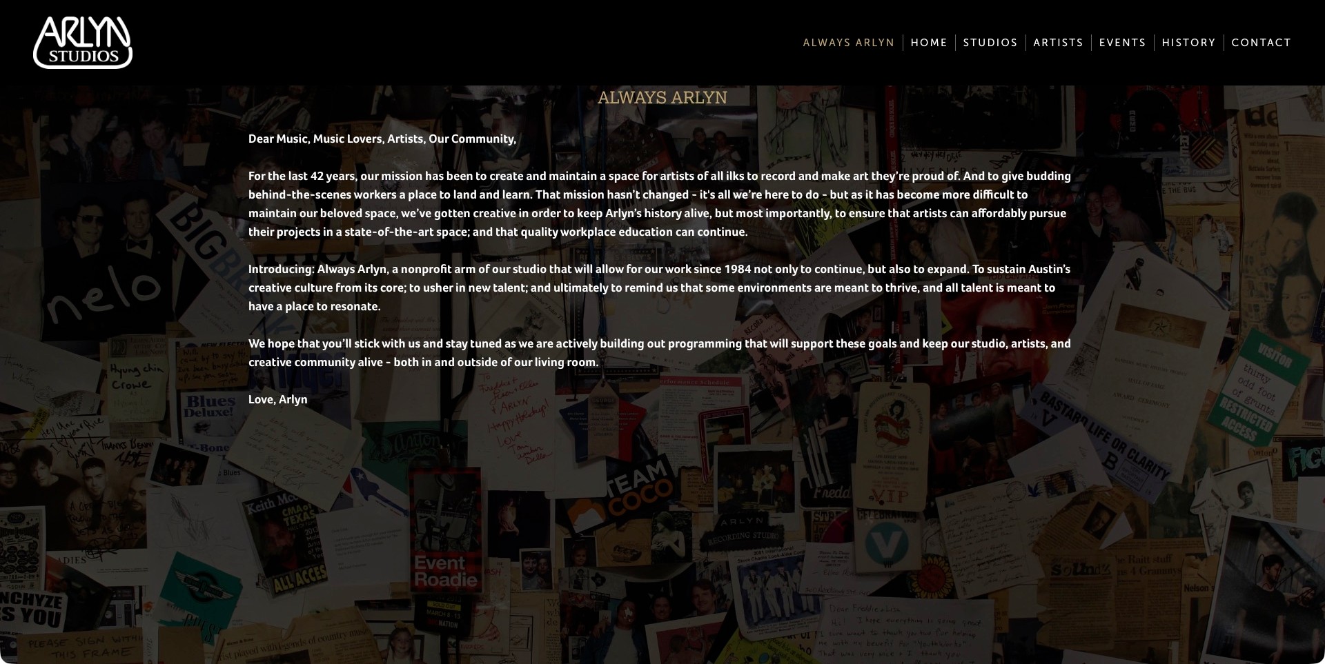
Arlyn’s current homepage foregrounds an Always Arlyn letter addressed to music lovers, artists and the local community. White text sits over a darkened collage of photographs and memorabilia, with the studio identity in a black header. Studios, Artists, Events, History and Contact remain accessible beside the campaign label. The first screen therefore explains a current organizational direction rather than presenting a generic booking slogan. That can help a longstanding studio communicate change in its own voice, although a long letter asks more reading effort than a conventional service summary. Its mission statements should not be confused with a guarantee of access, price or educational opportunity for every visitor.
What you can learn
When a studio’s mission changes, explain the change plainly while preserving the routes for people who still need room and contact information. Support the message with genuine visual history, but keep the distinction between an organizational story and a specific bookable service clear.
Pros
The campaign explains its purpose in a recognizable personal voice.
Core studio navigation remains available above the letter.
Cons & considerations
A long opening letter may delay practical session information.
Text over a busy collage needs generous contrast and comfortable line lengths.
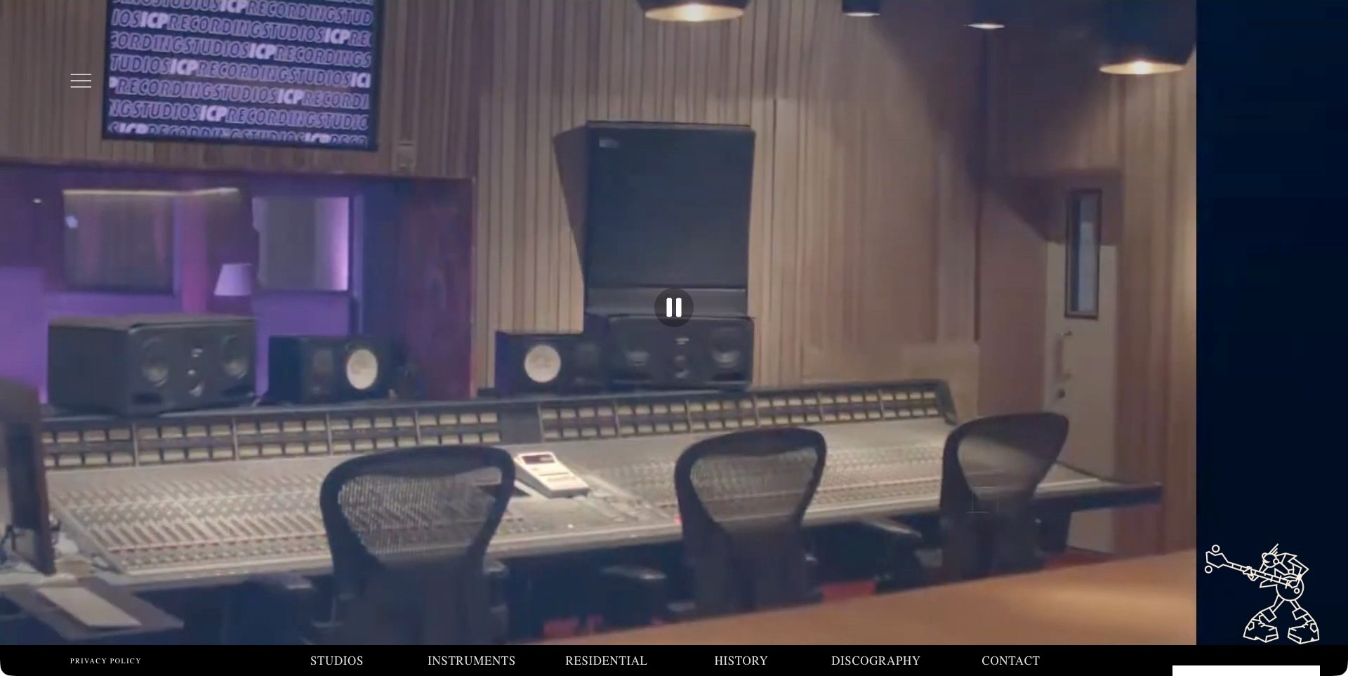
ICP’s saved homepage frame shows a recording-console film with a visible pause control and a small illustrated musician at the right. A persistent bottom navigation names Studios, Instruments, Residential, History, Discography and Contact, while a menu icon remains at the upper left. The film is atmospheric, but the fixed text routes make the useful information architecture visible even before a visitor opens the menu. Residential and Instruments are especially specific labels for people arranging a session away from home. The film frame is not an inventory or evidence that any particular setup can be booked. Its ordinary player control is part of the actual page, not an editorial addition.
What you can learn
Moving media works better when it does not hide the essential destinations. Keep room, instrument and accommodation information available as text links, and provide an understandable way to stop motion rather than treating a background film as the only introduction.
Pros
Specific bottom navigation remains visible over the opening film.
The site distinguishes accommodation from studio and instrument information.
Cons & considerations
A video-led opening can take longer to become useful on a slow connection.
Small low-positioned navigation needs careful testing on shorter viewports.
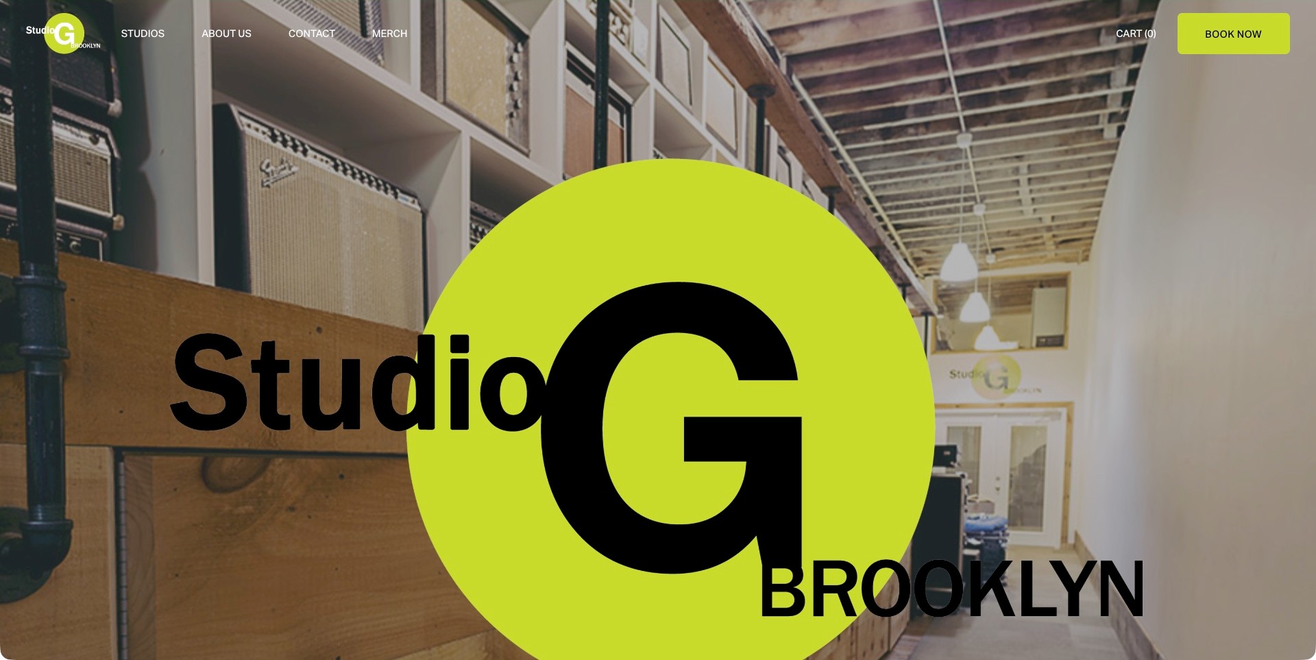
Studio G Brooklyn puts a very large lime-green and black identity over a photograph of an amplifier-lined interior. The same bright color marks the Book Now button at the upper right, creating a straightforward connection between brand and action. Studios, About Us and Contact sit in a relatively short navigation row, with merchandise and the cart treated separately. The opening is visually assertive without adding a long block of promotional claims. It does, however, depend heavily on the visitor recognizing the studio category or continuing to the room pages. The amplifier photograph and oversized logo do not explain the complete session offer or establish the availability of particular equipment.
What you can learn
One strong accent color can make both the identity and the primary action recognizable. Keep the surrounding navigation economical, then make the next page carry the concrete room descriptions and project details that a dramatic first screen deliberately omits.
Pros
Book Now is easy to spot because it shares the brand accent.
The short navigation reduces competition among destinations.
Cons & considerations
The oversized identity covers much of the room photograph.
A new visitor may need more immediate location and service context.
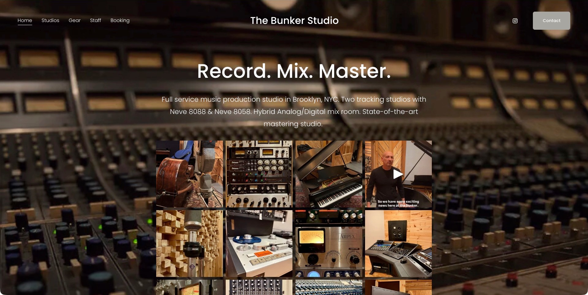
The Bunker Studio’s homepage begins with Record. Mix. Master. above a concise description of its Brooklyn production facilities. A grid of photographs shows instruments, microphones, tape equipment and room details against a softened console background. Studios, Gear, Staff and Booking are visible in the header, with a separate Contact button at the right. The text does useful explanatory work before the visitor reaches the imagery: it identifies the broad services and gives a more concrete sense of the facilities. The grid is a visual sample, not a complete or independently verified inventory, and a video thumbnail does not demonstrate the outcome of a session.
What you can learn
Start with the tasks customers recognize, then use a small range of relevant photographs to make the offer tangible. Separate staff, gear and room information so a producer can investigate the specific constraint that matters to their project.
Pros
The three-part headline communicates the service categories quickly.
The photo grid shows several aspects of the facility rather than one angle.
Cons & considerations
A busy photographic background can compete with introductory text.
Small image tiles need descriptive destinations to remain useful beyond their appearance.
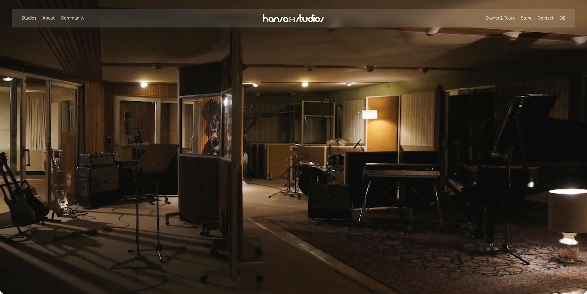
Hansa’s saved homepage film shows a warmly lit room containing guitars, drums, keyboards and a grand piano. A translucent horizontal header places the studio wordmark at the center, with Studios, About and Community on one side and Events & Tours, Store and Contact on the other. The balanced arrangement keeps the identity visible without a large sales headline covering the room. It also separates recording-related exploration from public visits and shopping. The film communicates material character and atmosphere, but a visitor still needs detailed pages to confirm room dimensions, equipment and booking conditions. No visual treatment can establish how a room will sound for a particular project.
What you can learn
Use stable, descriptive navigation to support a cinematic introduction, especially when the business serves artists and visitors for different reasons. Let room photography remain visible, then supply practical details in clearly named destinations rather than overloading the film with copy.
Pros
The centered identity and balanced menu leave the room imagery largely visible.
Contact and Studios remain easy to identify.
Cons & considerations
A film without explanatory headline may leave unfamiliar visitors needing more context.
The translucent header’s contrast should be checked against changing footage.
Kegan is a freelance web designer and developer with 15+ years of experience helping businesses turn complicated website requirements into clear, maintainable digital experiences. He works directly with clients from planning and design through development, launch, and ongoing support.
For recording studio website design, his development approach focuses on studio and room comparisons, current equipment and service information, clearly credited session work, practical access details, and proportionate booking enquiries. The scope can be a targeted improvement or a complete custom build, with responsive layouts, thoughtful content structure, and integrations chosen around the people using and maintaining the site.
Show 3 other recording studio website designersHide other recording studio website designers
Plan a recording studio website around actual sessions
Map the kinds of sessions the studio supports
Begin with the studio’s current activities and the questions each creates. Tracking a band, recording a small ensemble, mixing, mastering, voice work, filming a performance and hiring a rehearsal space are different services. Publish only those genuinely offered. If another business handles a service, identify that relationship rather than presenting every possible audio task as an in-house capability. The website can be welcoming without promising an environment that has not been confirmed for a particular production.
Write down the likely enquiry routes. An experienced producer might need an equipment list and a direct contact; an independent artist might need an explanation of how a session is planned. Give both a sensible entrance. Avoid dividing visitors into rigid labels when a small set of clear room and service pages can answer their questions more naturally. The aim is to make the studio’s real working model understandable, not to turn a creative space into an elaborate booking questionnaire.
Create a meaningful page for each room
Use room pages to explain differences a prospective client can actually assess. Include the room name, relevant live and control spaces, a coherent image sequence and the studio’s own description of intended use. Show enough context to understand how the spaces relate. A wide photograph can be followed by a detail or alternate view, but a sequence of attractive close-ups should not be the only representation of the working environment. Avoid adding capacities or dimensions unless the studio has supplied and checked them.
Separate observable facts from claims that require professional judgment. A photograph of a piano does not establish that it is included, tuned for a particular session or available on the requested date. Likewise, a room description should not guarantee a particular acoustic result. Link to the current equipment and booking information, and invite questions about the proposed session. The website’s job is to support a useful conversation, not replace the studio’s assessment of a brief.
Make equipment information current and properly scoped
A gear list should tell readers which room it concerns and whether items are fixed, shared, optional or subject to arrangement. Long inventories become less useful when everything is listed without context. Organize equipment in a way that matches how people plan work, and use readable text rather than only a photographed or oversized PDF. If a downloadable document is useful, provide its revision date and keep its relationship with the public page clear.
Assign responsibility for changes. Equipment is repaired, replaced, hired or moved, and a stale list can create avoidable assumptions. Do not imply that listing a manufacturer establishes a current partnership, endorsement or guaranteed availability. A concise statement asking clients to confirm specific requirements is more useful than an impressive but unmaintained inventory. Keep recording software and session compatibility questions explicit where the studio supplies that information; do not infer them from the technology used to deliver the website.
Explain the people and the scope of support
Introduce the people a client may actually work with and describe their roles in plain language. Engineer, producer, assistant, studio manager and independent collaborator are not interchangeable labels. Explain whether a client can bring an outside engineer and which services need separate arrangement. A room hire page and a staff profile can connect without implying that every staff member is included in every booking. Keep biographies focused on relevant work and an accurate relationship with the studio.
Credits can help explain experience, but represent them precisely. A record made in the building, an engineer’s previous work elsewhere and a client testimonial support different claims. Avoid placing all of them in one undifferentiated logo strip. Where permission permits, state the studio or individual’s contribution and provide enough context to understand the credit. Do not turn the presence of a well-known artist’s name into a promise that a new session will produce a similar result.
Show the studio’s character without making history the whole journey
A studio’s history and location can be compelling parts of its identity. Use them to explain the place rather than forcing every visitor through a long chronology before current room information becomes available. An archive and a practical session enquiry serve different purposes. Give both stable routes. A studio with no famous legacy can communicate its character through honest photographs, clear descriptions of the working environment and the people who maintain it.
Choose images that make the place recognizable. A control-room overview, a live room, an instrument detail and an arrival or accommodation view can tell a more useful story than many nearly identical console photographs. Label archival imagery where it could otherwise be mistaken for the present arrangement. When using video, keep a static alternative and readable supporting information. The website should remain intelligible if someone does not play a showreel or cannot load a large background film.
Make booking expectations clear before the form
Explain what happens when someone enquires. State whether the studio confirms availability manually, prepares a proposal or directs particular requests to another team. If rates are published, describe their scope and relevant conditions accurately. If they are not, ask for enough information to begin a useful discussion: preferred dates, approximate duration, room interests, session type and any important requirements. Do not request an exhaustive production specification before a visitor has established basic fit.
Keep date enquiries separate from confirmed bookings. A calendar can display useful information without guaranteeing that a session is reserved. Confirmation, deposits, cancellation terms and final service arrangements belong in the studio’s actual booking process and should be reviewed by the business. The public website should not casually invent commitments. Make an accessible alternative contact route available when the studio supports it, and give the team a manageable way to receive and respond to requests.
Give visiting clients the practical context they need
Travel, parking, loading access, accommodation and nearby facilities can affect a session, especially for residential studios or teams bringing equipment. Publish the details the studio is willing to make public and keep them current. A location photograph does not establish step-free access, delivery arrangements or permission to arrive without an appointment. Explain how to obtain specific arrival and accessibility information rather than using broad unsupported claims about what every visitor will find.
Keep residential accommodation distinct from the recording-room offer. Describe what is actually included or separately arranged, and use accurate photographs and occupancy information provided by the studio. An attractive retreat setting should not obscure practical contact and booking details. The website can help a visiting team assess whether to enquire without pretending to settle every travel or accommodation question. Confirm those details through the studio’s normal process before anyone makes plans around them.
Build a sensible publishing and media workflow
Give the studio a content structure it can maintain between sessions. Rooms, equipment, people, selected credits and practical information should not require a full redesign to update. Separate draft and public content so changes can be checked before publication. Record who owns each page and which information needs regular review. A small team may benefit more from a concise, dependable website than from an ambitious news archive that stops being maintained after launch.
Treat client media and session photographs carefully. Publish only material the studio is permitted to use, credit contributors accurately and avoid exposing private session details. Use appropriately sized images and sensible video loading rather than assuming every visitor has a fast connection. Keep important room names and contact information as readable text. Public source signals can describe parts of the website delivery stack, but they do not prove security, accessibility, booking reliability or the operation of any studio software.
Evaluate the site with realistic questions
Before launch, ask someone unfamiliar with the studio to find a suitable room, locate its equipment information and begin an enquiry. Another person can try to understand the difference between room hire and a supported session. These simple tasks reveal information gaps more effectively than a review focused only on visual impact. Check the real implementation with keyboard navigation and on small screens; a still image of a polished homepage cannot establish that the working interface is usable.
Define useful maintenance checks after launch. Confirm that contact routes reach the right people, that room photographs reflect current arrangements and that shared equipment is not described as permanently included. Review broken downloads and outdated external links. Do not treat an enquiry count as proof of booked sessions or revenue without the appropriate operational records. The website should support the studio’s relationships and working process, not create a set of claims the team must continually explain away.
The editing job behind the design
Choose website technology separately from the recording workflow
Use a content platform that can maintain rooms, equipment, people, credits and practical information as structured content. The right level of complexity depends on the studio’s actual publishing needs, not the prestige of the artists in its archive.
Keep room enquiries, confirmed reservations and payments distinct. If the studio needs integrations, define who confirms availability, how changes are handled and what data is appropriate to collect before selecting a form or booking component.
Public website technology evidence does not reveal a studio’s digital audio workstations, file-transfer practices, internal schedules or session delivery process. Describe those only when the studio itself supplies relevant information.
Our WordPress website examples offer a separate look at publishing approaches. A visible platform label is evidence for that named page, not a guarantee that the same system will suit your requirements.
Before the public launch
A practical recording studio website checklist
Define the actual session types and services offered.
Give each current room an understandable name and page.
Show coherent room views rather than only equipment details.
Scope equipment lists to rooms, shared items and arrangements.
Explain staff roles and independent collaborator relationships.
Keep engineering and production support separate from room hire.
Represent credits and historical work accurately.
Describe the enquiry process without promising a reservation.
Ask for proportionate initial session information.
Provide current location and arrival context where appropriate.
Confirm accommodation details rather than implying inclusion.
Keep essential information available without video playback.
Review keyboard access, readable labels and small-screen layouts.
Assign responsibility for equipment, people and contact updates.
These checks are a project checklist, not a performance, legal, security, or accessibility certification. Test real journeys with the people responsible for the website before making claims about the result.
Sources & editorial method
How this collection was selected and reviewed
This is an editorial review of genuine public recording studio websites. We compare how the visible pages communicate rooms, working context, equipment, people and practical enquiry routes. Current official material qualifies the studio’s activity, while original screenshots preserve their actual dates and pictured scope. We do not record audio, test acoustics, book sessions, verify equipment condition or rank engineering ability. Editors Choice highlights a specific website communication approach rather than endorsing a studio for a particular production.
Each example links to its actual source page. Screenshots are direct browser captures with their own capture dates; moving imagery, announcements and live designs can change. The notes describe observable design choices and conditional tradeoffs, not measured traffic, conversion results, service quality, or accessibility conformance.
Technology labels use public page metadata, asset evidence, or explicitly cited platform documentation. Platform documentation is not a complete current deployment audit. A component reference may be legacy or unused; it is not a complete backend inventory. Unknown stacks are omitted. These sites are editorial examples, not our client portfolio.
Written, Edited and Curated are separate editorial records, not timestamps advanced by a rebuild. Website designs and imagery belong to their owners. See our editorial standards or suggest a correction.
Questions worth asking
Recording Studio website design questions
What information should a recording studio website make easy to find?
Current rooms, relevant equipment information, actual services, the people involved and a clear enquiry route are useful starting points. Add travel, accommodation and other practical context when it genuinely applies. The amount of detail should help someone assess fit without implying that a website replaces session planning with the studio.
Should a studio publish its rates?
Published rates can be useful when their scope and conditions are clear. Some sessions require a tailored discussion because rooms, personnel, duration and other arrangements vary. Whichever approach the business uses, explain the next step and do not suggest that a public enquiry automatically confirms a price or reservation.
Is a long equipment list enough to demonstrate a studio’s value?
It can answer technical questions, but it does not explain the whole working environment. Room context, people, support and a usable booking conversation matter too. Keep the list current and correctly scoped; the presence of a particular item does not guarantee availability for every session.
Can studio history and famous credits lead the design?
They can be meaningful parts of the story when accurately attributed. Keep current room and contact information accessible as well. A historical photograph, a staff member’s earlier credit and work recorded in the building are different claims and should not be silently combined.
Do recording studios need online instant booking?
Not necessarily. Many sessions require manual confirmation and a discussion of requirements. A clear, manageable enquiry can be more appropriate than an apparent instant reservation that the studio cannot operationally support. Build around the actual booking process rather than a generic hospitality template.
Borrow how these sites make a studio recognizable and a session conversation easier to begin. Then build the room, people and practical information your own team can keep accurate.