Best Lighting Showroom Websites of 2026 (23 Real-World Examples)
Let the website begin the lighting conversation—and make the visit worth planning.
Lighting showroom website design connects visual inspiration, product information and a real place to experience fixtures. It should help visitors understand what the business offers, prepare useful questions and choose between browsing online, requesting advice and visiting a specific location.
Lighting has a particular website challenge: a photograph can show the form of a fixture and suggest the atmosphere of a room, but cannot reproduce the experience of seeing light in person. A showroom site is most useful when it acknowledges that difference. It can introduce products, explain relevant specifications and make the next step concrete without pretending that an image predicts exactly how a room will look.
Our scope is businesses with a genuine current physical lighting showroom, gallery or store presence. That includes specialist multi-brand retailers, lighting manufacturers with their own showrooms and some broader interiors stores that sell lighting. A stockist directory alone is not treated as an owned showroom, and an attractive online-only catalogue does not automatically qualify. We identify these different business models rather than presenting them as identical shopping experiences.
The examples are reviewed for observable communication and design. We have not visited the spaces, tested fixture output, assessed electrical installations or confirmed the display inventory of each location. Captures document specific public pages and retain their original dates where an existing original image is suitable. The collection is not an engineering, safety, accessibility or product-quality certification.
Before the examples
What makes good lighting showroom website design in 2026?
Make the physical destination unmistakable
Show which locations the business actually operates, what kind of visit each supports and whether an appointment is expected. A manufacturer’s showroom, a multi-brand store and an independent stockist are different destinations. Connect the location to contact details and relevant collections, while making clear that a website catalogue is not a promise of display availability. Lightology’s direct showroom route is a useful example of treating a visit as a primary task rather than a footer afterthought.
Connect atmosphere to identifiable fixtures
Room photography is valuable when visitors can discover which product, finish and size created the setting. Keep product names and dimensions close to the relevant image or linked record. Distinguish the fixture from its light source, optional accessories and photographic props. A glowing room may inspire a project, but it should not leave someone comparing several nearly identical pendants without enough information to identify the one they saw.
Explain advice and ordering without overpromising
Tell a visitor whether the next step is a product question, a showroom appointment, a design consultation or an order. Describe the actual scope of any advice service and the information needed to prepare. Keep installation-specific questions directed to appropriately qualified people. A website can make documentation easier to understand without implying that a shopping form or a staff conversation confirms the technical suitability of every fixture for a particular property.
The collection · 23 examples
23 lighting showroom websites worth studying
The23 examples below compare specialist lighting destinations, brand showrooms and broader interiors retailers with real physical locations. Look at the relationship between the actual first screen, the lighting catalogue and the visit route. We discuss tradeoffs in the website experience rather than ranking light quality or promising that every displayed product is available to see in every store.
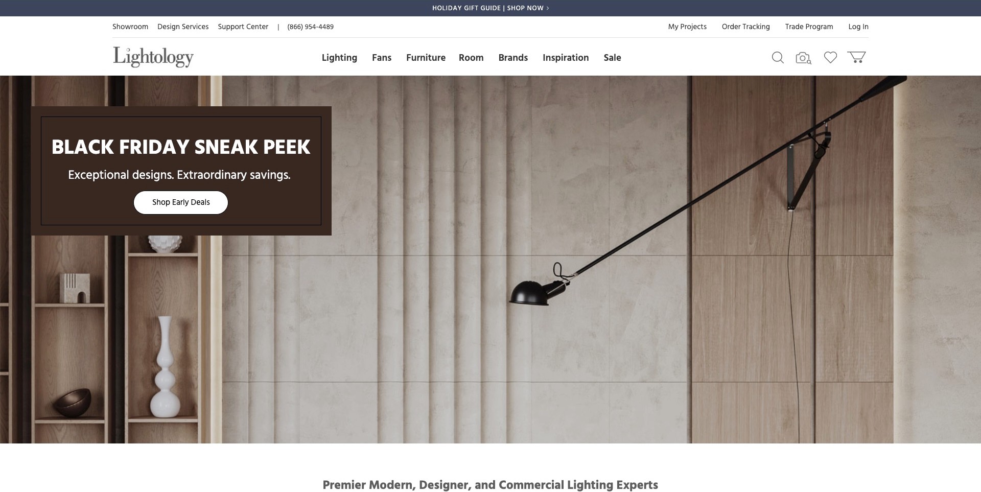
Lightology’s actual opening pairs an extended black wall lamp with wood and concrete surfaces, adding an integrated brown seasonal offer at the left. Above it, showroom, design-service, support and trade routes sit apart from lighting, room and brand categories. This makes the specialist offer understandable even when a promotion occupies the hero. The official page also identifies its Chicago showroom; the screenshot does not establish which fixtures are currently displayed there.
What you can learn
Separate a visit, a service conversation and product discovery before adding campaign content. A lighting customer may want to see a finish, ask about a project or compare fixture types. Keep each route named and explain display availability separately from the size of the online catalogue.
Pros
The header gives the showroom and design-service journey a visible place rather than burying both beneath product categories.
A recognisable wall fixture supplies category context while room and brand navigation offer different ways to continue browsing.
Cons & considerations
A promoted fixture image does not explain its exact version, output or suitability for another installation.
Display range and appointment expectations need current location information; a showroom link alone cannot answer those practical questions.
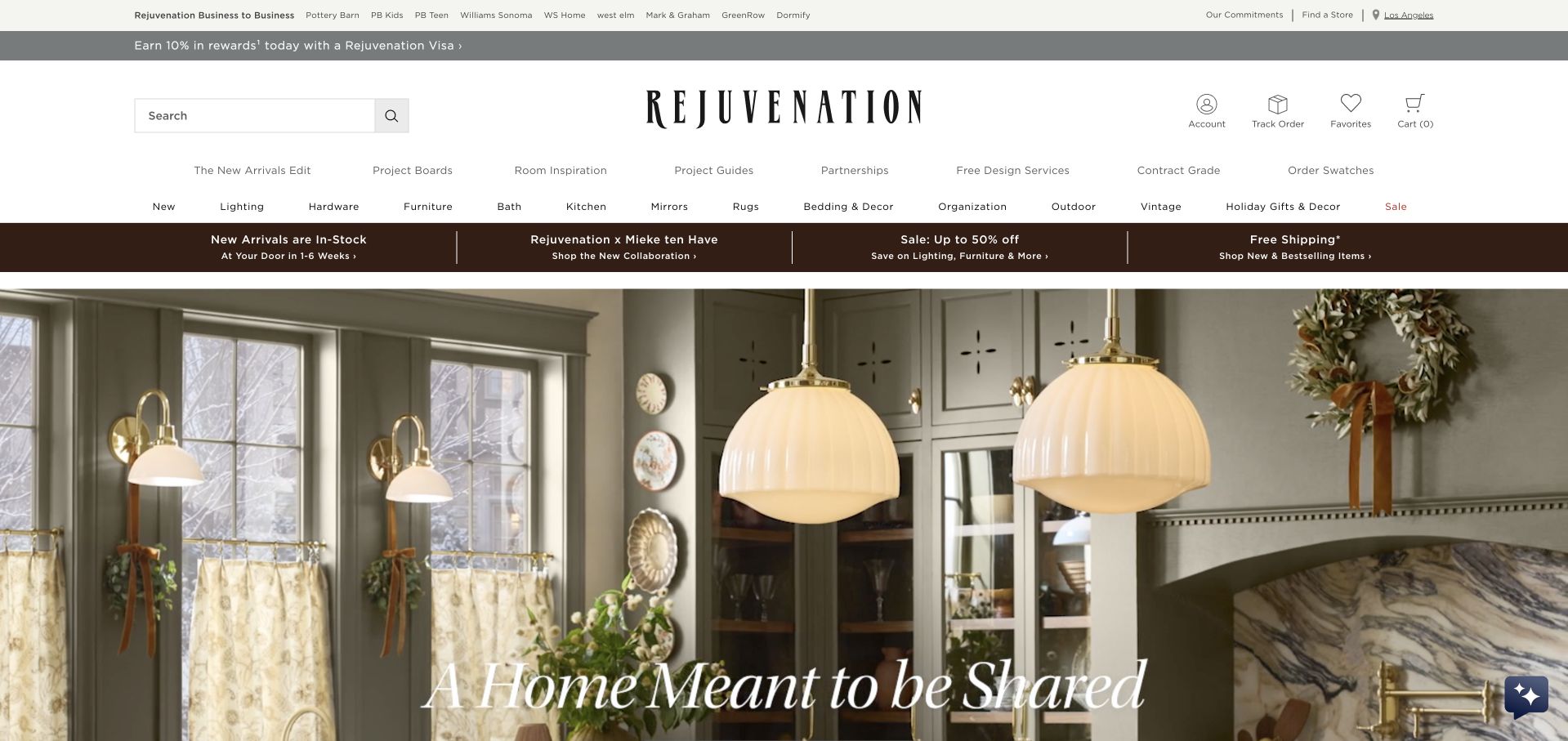
Rejuvenation’s original screenshot puts large cream globe pendants into a pale green kitchen. Their relationship to the island and cabinetry helps make scale and repetition visible, while a white campaign caption sits near the lower edge. The broader header includes store access alongside product categories. Current official store information establishes the physical retail fit; the image itself shows a styled room rather than a lighting showroom visit or a tested illumination result.
What you can learn
Use a room to explain how multiple fixtures relate spatially, then identify the actual products and provide separate visit information. A showroom website should make it possible to move from a desirable setting to questions about size, finish and seeing the fixture in person.
Pros
The pendants are clear focal objects within a complete interior rather than isolated shapes without scale.
Store and product navigation allow a visitor to separate inspiration, catalogue browsing and an in-person next step.
Cons & considerations
A styled photograph cannot show actual light output, colour appearance or suitability for a different electrical installation.
If several fixtures or sizes look similar, captions and product links should identify the pictured arrangement rather than leaving customers to guess.
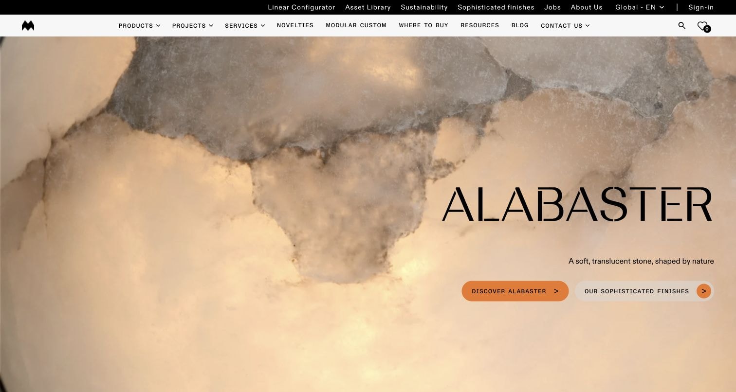
Modular Lighting Instruments’ original frame uses a large alabaster closeup with a material heading and two clearly labelled exploration actions. The header distinguishes products, projects, services, resources and where-to-buy information. No complete light fixture is depicted in this particular image. Current official content separately describes showroom visits and names physical locations, making the example relevant to a brand-showroom guide without pretending that the material photograph is a showroom or technical demonstration.
What you can learn
Use a material story to introduce a finish, then connect it to actual fixtures and a useful viewing route. A visitor still needs product identity, dimensions and specification information; a beautifully enlarged surface should start that investigation rather than stand in for the answers.
Pros
Two distinct material-exploration actions give the campaign an understandable purpose beyond simply enlarging an attractive texture.
Product, service and resource destinations remain separate in the header, supporting different kinds of lighting enquiry.
Cons & considerations
A close material image cannot show the scale or complete form of the fixture using that finish.
Showroom, partner and purchasing routes should explain their different roles so a visitor does not assume identical displays or services everywhere.
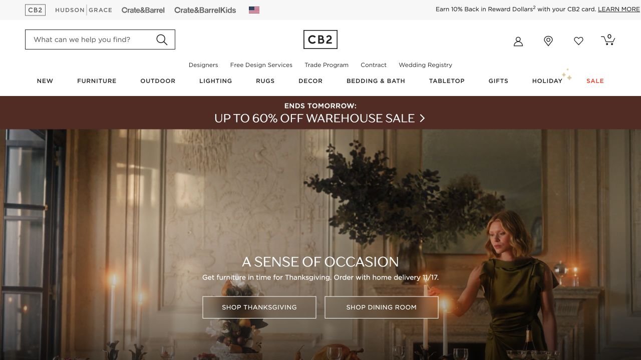
CB2’s retained opening centres a warmly lit dining portrait, with two shopping actions and a broad navigation row that includes lighting. The photographed scene supplies interior context, but the lighting products are not individually specified in the first screen. Current official store information supports the physical-retailer scope separately. It is useful for studying how a broader showroom business can use a coherent room campaign while keeping lighting available as its own shopping destination.
What you can learn
Give lighting a direct category route even when furniture leads the current campaign. Connect room photographs to identifiable fixtures, dimensions and maintained product information, then explain where an interested customer can see relevant products rather than implying every store displays the entire online range.
Pros
A complete dining setting demonstrates how lighting contributes to an interior rather than presenting the category in isolation.
The lighting label remains easy to recognise within the wider home-product navigation.
Cons & considerations
A room campaign does not identify which pictured fixture or size a shopper can actually view in a particular store.
When a retailer sells many product types, maintain a specific lighting journey instead of relying on generic furniture-store visit information.
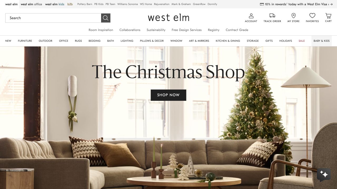
West Elm’s original holiday scene brings together a sofa, a tree and a visible lamp under a direct seasonal-shopping action. Lighting is also named in the product navigation. That balance gives the room a recognisable mood while leaving visitors a route beyond the seasonal collection. The observed frame is not a showroom photograph or a technical lighting demonstration; physical-store information and product availability need their own explicit explanation.
What you can learn
Use a furnished setting to start a lighting conversation, then provide a product-specific path with dimensions, finish choices and relevant installation information. Separate inspiration from the practical question of where a customer can see an item, especially when a broad home retailer has many locations.
Pros
The room composition makes lighting feel connected to furniture and everyday use rather than an isolated accessory.
Persistent category navigation lets a visitor bypass the holiday campaign and start a focused lighting search.
Cons & considerations
A lamp in a styled room does not establish its exact model, size or display availability in a nearby store.
Avoid letting seasonal imagery substitute for year-round lighting guidance, particularly when customers need to compare different fixture types.
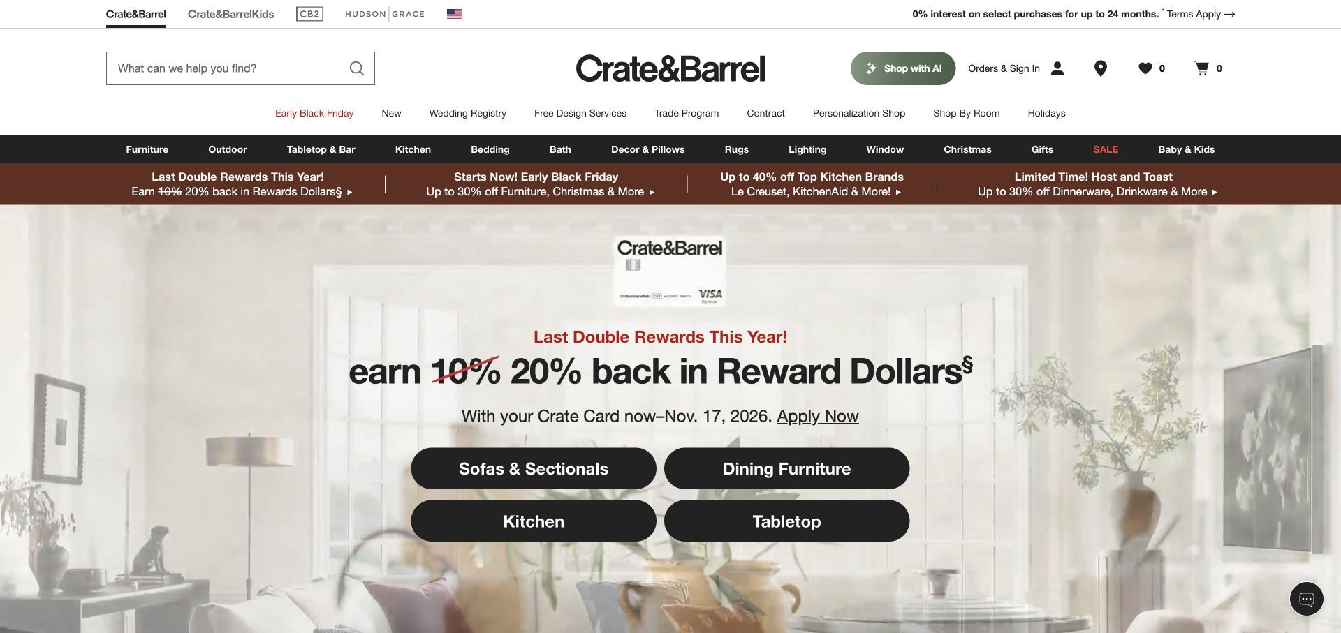
The clean retained Crate & Barrel capture is a rewards-focused homepage frame, not the older dining campaign. A large credit-card promotion sits within a furnished living-room background, with four product-category actions and extensive header navigation above. Lighting belongs to the catalogue and stores, rather than being the main subject of this particular screen. That makes the example useful for examining the limits of a broad retailer’s campaign-led introduction.
What you can learn
Keep essential product and store routes stable when another commercial message occupies the hero. For lighting shoppers, the next page should restore category-specific context, identify fixtures clearly and explain in-person viewing options rather than assuming a rewards offer has answered their product questions.
Pros
The broad catalogue structure remains available even when a non-product campaign takes the strongest visual position.
A furnished room preserves interior context instead of turning the entire first screen into an abstract financial promotion.
Cons & considerations
A rewards-led opening may delay the lighting task, so clear category access is particularly important for visitors with a specific need.
Do not treat a background fixture as a product recommendation or assume it is displayed in every store without checking current location information.
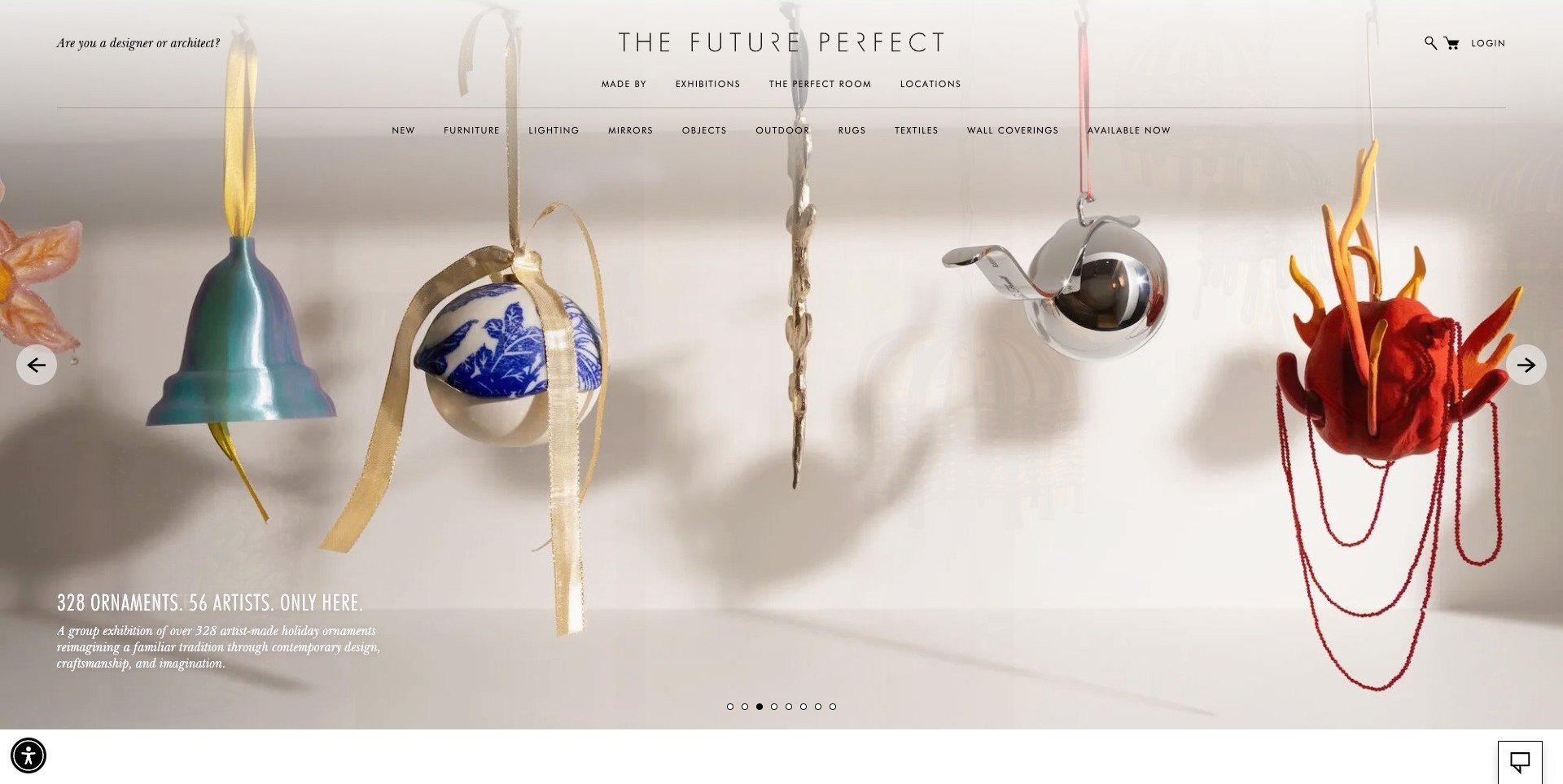
The Future Perfect’s observed homepage opens on hanging decorative ornaments rather than lamps. A short exhibition caption sits at the lower left, while a fine, two-level header separates lighting from furniture, objects and other categories. Exhibition and location routes have their own positions above the product row. This is useful for a lighting showroom or design gallery whose editorial programme changes regularly: the current campaign can have a distinct visual character without making the permanent catalogue and physical destinations disappear.
What you can learn
Keep the difference between an exhibition and a product category understandable. A visitor arriving for a light fixture should be able to find lighting and gallery information directly, even when the opening promotes another object type. Connect editorial stories to identifiable products and current viewing locations.
Pros
The consistent pale photographic background gives several decorative objects one clear campaign setting.
Lighting, exhibitions and locations remain individually named rather than sharing a vague discovery menu.
Cons & considerations
An ornament-led opening provides little immediate information about the lighting range.
Fine navigation over photography needs careful contrast and touch-target testing on smaller screens.
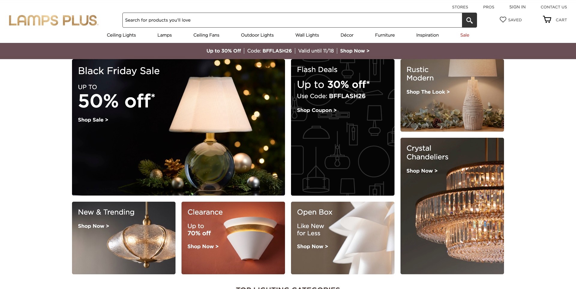
Lamps Plus’ observed homepage keeps a large search field beside its identity, with store, professional and contact routes above a row of lighting categories. Below, differently sized tiles introduce a table-lamp campaign, a chandelier category, trends, clearance and open-box shopping. The promotions are part of the page rather than a window covering the catalogue. The useful showroom-retailer pattern is the combination of prominent search, recognisable fixture-type labels and several visible destinations, allowing visitors to choose a task without following the largest offer.
What you can learn
Use the header for enduring tasks and the campaign grid for changing priorities. Lighting categories, stores and professional help should remain findable when an offer ends. Give each tile a clear destination, then explain current specifications and store availability beyond the promotional surface rather than treating an image as a complete buying answer.
Pros
The search field has a prominent, predictable position above the campaign content.
Fixture categories and physical stores remain separate from discount-led routes.
Cons & considerations
Several simultaneous offers can compete with product discovery and showroom planning.
A tile labelled by style still needs dimensions, technical information and relevant viewing details after the click.
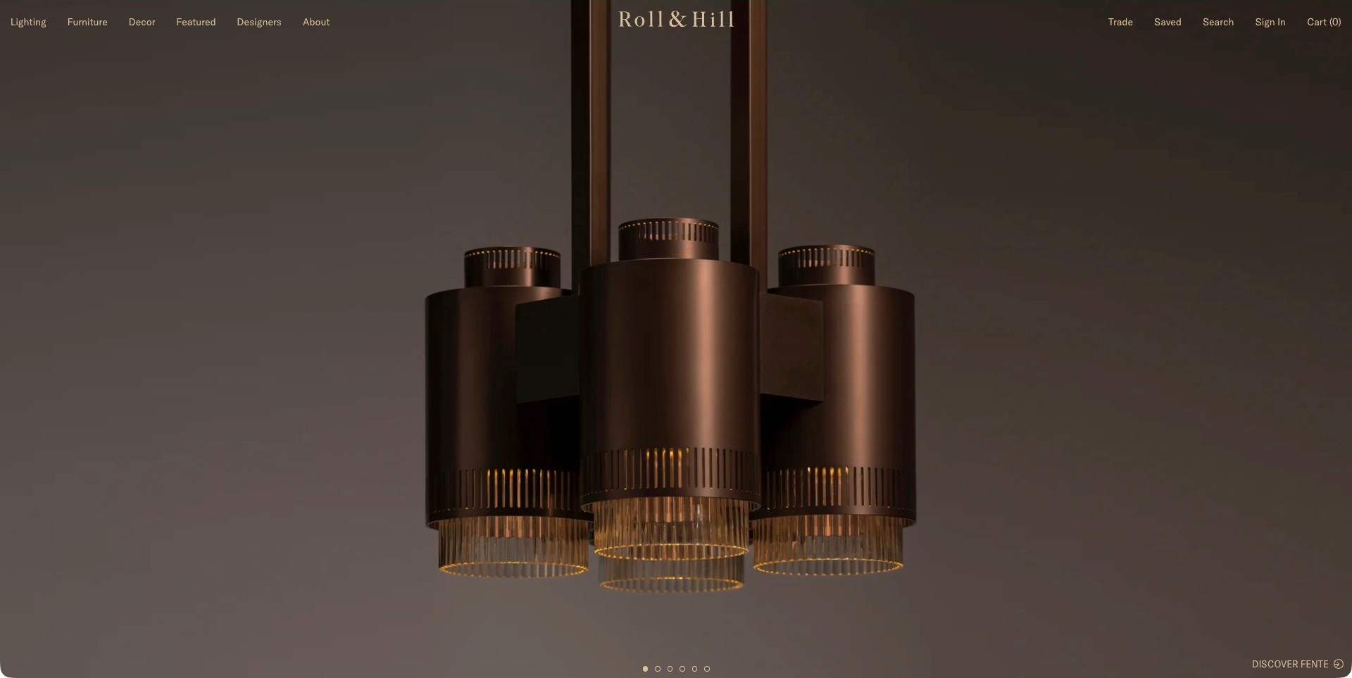
Roll & Hill’s captured opening centres a group of bronze-toned cylindrical pendants against a restrained brown background. The fixture’s overall silhouette and illuminated lower sections are visible without a large block of promotional text. A compact header retains lighting, furniture, designers and trade information, while a small collection destination sits near the lower edge. The useful pattern is the discipline of showing one distinctive object clearly, then leaving separate navigation for visitors who need to research the broader range or professional information.
What you can learn
Give the object enough space to be understood, but do not make atmosphere the only route to information. A product-led campaign should connect to a name, dimensions, finish choices and relevant specification material. Keep showroom or contact information easy to reach for someone who wants to see the fixture before proceeding.
Pros
A single dominant fixture avoids competition between several unrelated campaign images.
Lighting, designer and trade routes remain visible outside the central product composition.
Cons & considerations
A subtle lower-edge action may be easy to miss on a shorter screen.
A close fixture image does not establish scale, output or suitability for a particular room.
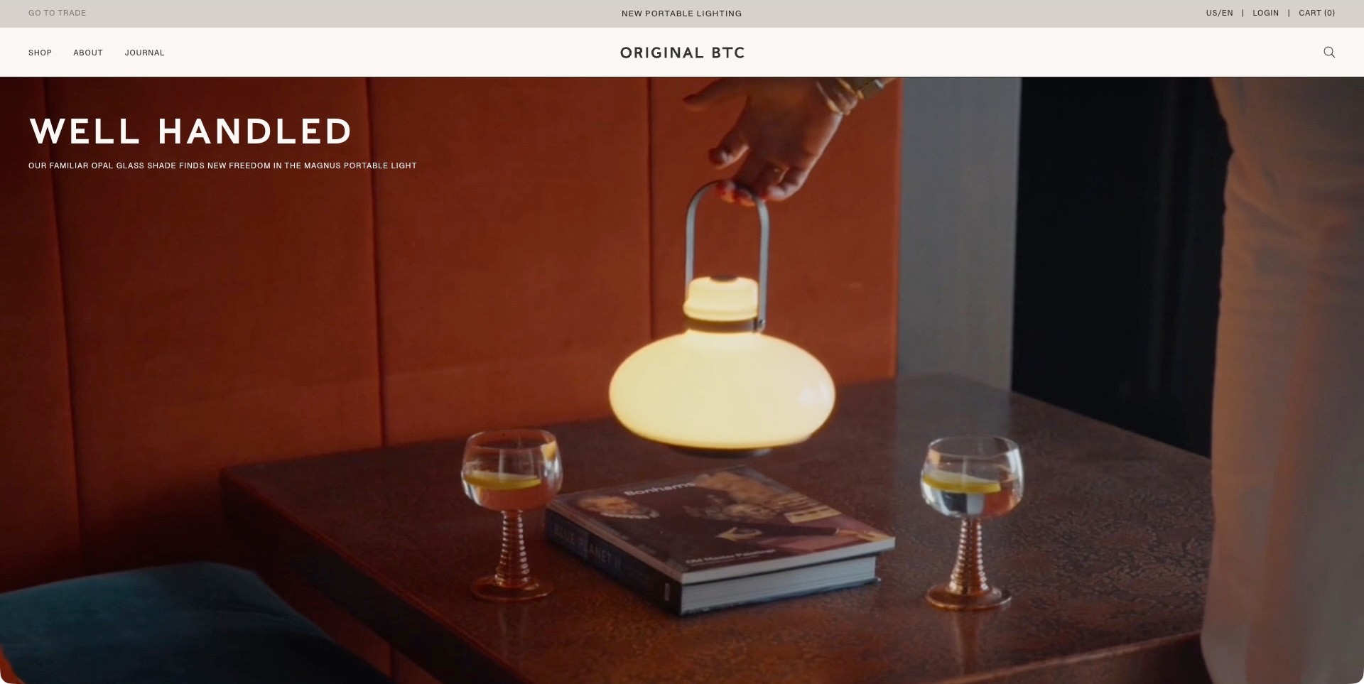
Original BTC’s observed frame shows a hand lifting a lit portable lamp by its handle above a table. The orange seating, glasses and book create a domestic context, while the short campaign copy identifies portable lighting as the subject. A pale header keeps shopping, company information, journal and trade routes distinct. The useful design lesson is the relationship between the object and an ordinary action: the viewer can understand its form and intended handling without needing a diagram or a long feature list.
What you can learn
Show the action that makes a product understandable, then provide the details the scene cannot establish. For a portable light, that means clear dimensions, operating information and relevant product conditions after the campaign. Keep editorial stories separate from shopping so visitors can choose between inspiration and specification.
Pros
The handle and hand make the portable form more tangible than an isolated glowing object.
The restrained header lets the product remain prominent without removing shopping and trade routes.
Cons & considerations
Film-based copy needs checks across changing backgrounds and paused frames.
A scene of a lamp in use does not verify battery life, brightness or charging requirements.
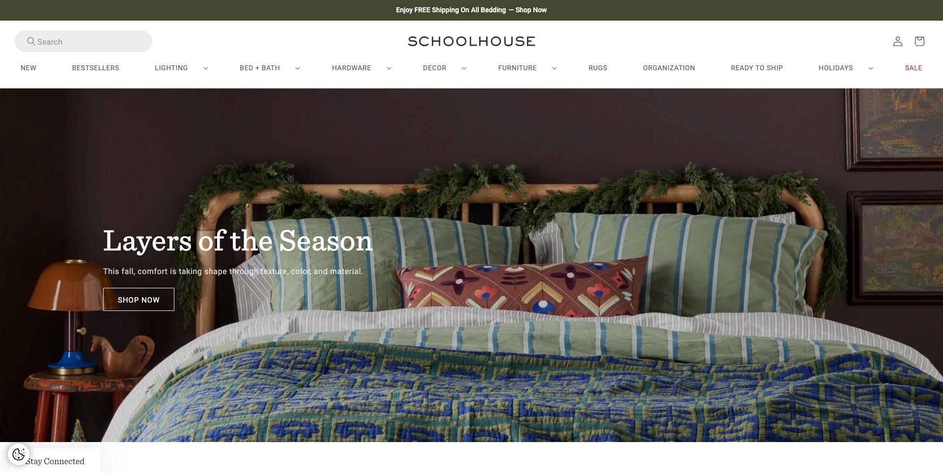
Schoolhouse’s captured campaign is led by a styled bed with striped pillows and a patterned quilt. An orange table lamp sits at the side, but bedding is the main subject of this particular frame. The white header keeps lighting visibly separate from bed and bath, hardware, furniture and other categories. A short seasonal headline and one shopping action sit over the image. This is useful for a lighting showroom with a broader home collection because it shows the value, and the limits, of a room-led introduction.
What you can learn
Make the campaign’s subject clear while keeping lighting discovery independent of it. Room photography can suggest coordination, but a visitor still needs a direct route to fixture types, dimensions and viewing information. Do not assume that a lamp appearing beside a bed explains which model is shown or what it requires.
Pros
The room places a lamp in a recognisable relationship to the surrounding furniture and textiles.
A clearly named lighting category remains available despite the bedding-led campaign.
Cons & considerations
The opening does not identify the pictured lamp or explain its specifications.
Seasonal text over patterned bedding needs responsive contrast and cropping checks.
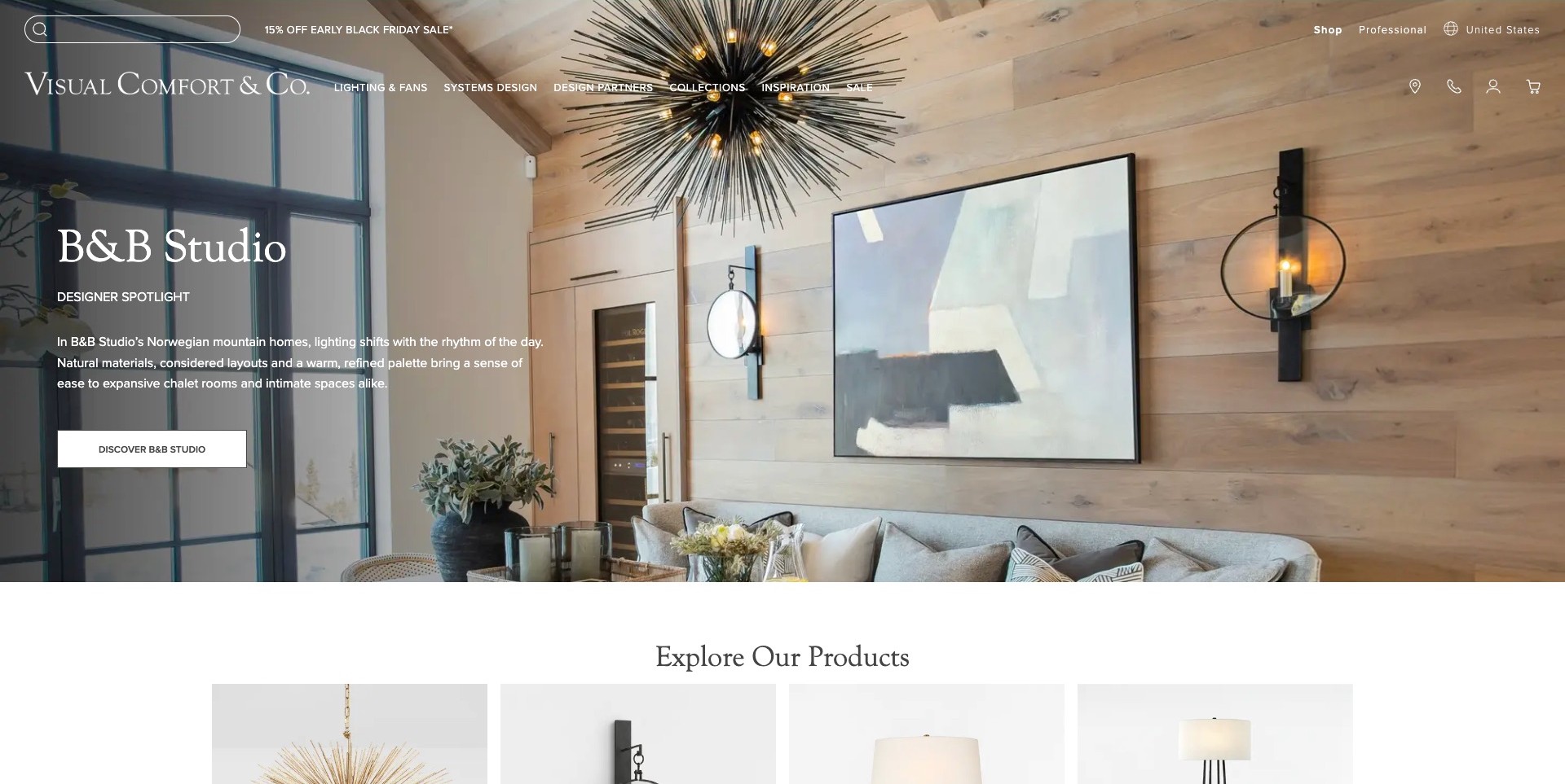
Visual Comfort & Co.’s observed opening features a timber-lined room with a large radial chandelier and paired wall lights. The designer-spotlight caption and short description occupy one side rather than covering every fixture. Product cards begin directly below the campaign, and the transparent header separates lighting, systems design, design partners and collections. The useful pattern is a bridge between a complete interior story and a more structured catalogue: the visitor can study how the lights relate to a room before moving into identifiable product groups.
What you can learn
Connect the designer story to the fixtures rather than letting it become a disconnected editorial feature. Keep category browsing and showroom information available, and provide dimensions, finishes and relevant specification details after the inspiration. A photographed interior is context, not proof of a lighting plan’s suitability elsewhere.
Pros
The campaign shows both ceiling and wall fixtures in a coherent architectural setting.
The beginning of the product section makes the next stage of catalogue exploration apparent.
Cons & considerations
Transparent navigation needs contrast checks when the campaign photograph changes.
The room image does not establish output, installation requirements or the full range of available finishes.
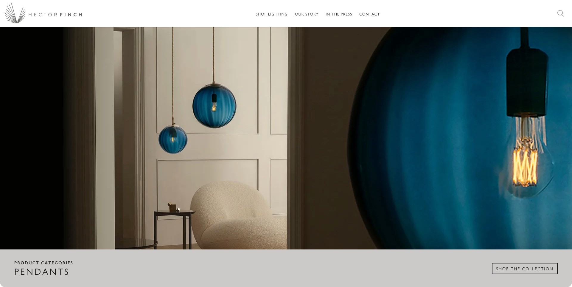
Hector Finch’s captured opening pairs two blue pendants in a room with a much closer view of a blue shade and lit bulb. A pale category band beneath identifies pendants and offers a collection action. The white header is concise, separating lighting, the company story, press and contact. The useful pattern is the combination of context and detail: one image suggests how the fixture sits above furniture, while the other makes the shade and illuminated element more prominent.
What you can learn
Use complementary image scales to answer different visual questions. A room scene can establish context, and a close view can reveal form, but the product page still needs dimensions, finish choices and appropriate technical information. Name the category near the image so someone knows where the next action leads.
Pros
The paired views make the fixture easier to understand than either a distant room or close-up alone.
The category label and collection action connect the visual treatment to a clear catalogue destination.
Cons & considerations
A close image cannot reliably communicate the fixture’s overall size.
Simple navigation still needs clear access to showroom details and product-specific support as the range grows.
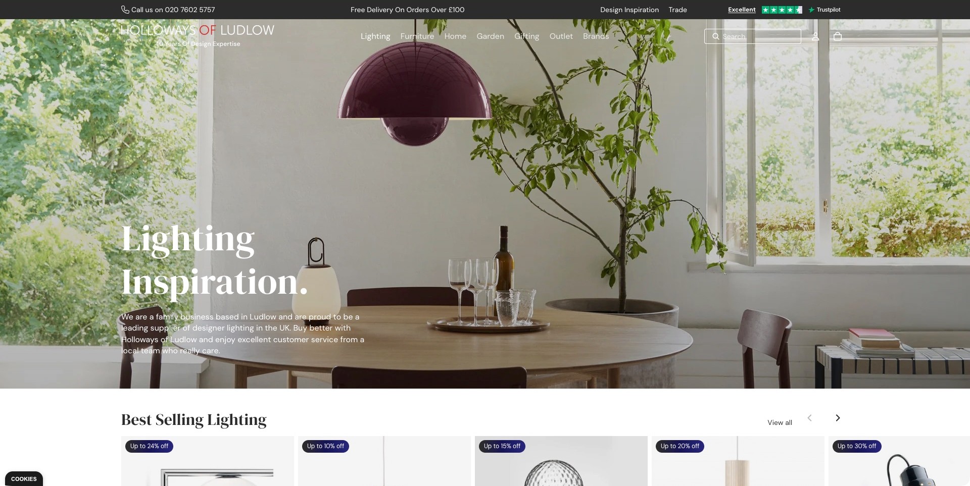
Holloways of Ludlow’s selected designer-lighting page shows a purple pendant above a dining table, with a portable lamp also visible in the room. A lighting-specific heading and short introduction sit over the image, while the main header retains brands, trade information, search and contact. Best-selling product cards begin below the hero. This is a category-page example rather than the general homepage, making it useful for a showroom that sells several kinds of home products but needs a distinct lighting entrance.
What you can learn
Build a focused category journey inside the wider store. Let room imagery establish context, then move promptly to identifiable products, filters and viewing information. Keep showroom details and brand routes accessible so visitors can investigate a fixture without following an unrelated furniture or gifting campaign.
Pros
The category-specific image and heading explain the page’s lighting focus immediately.
The product-card section provides a visible transition from inspiration to catalogue research.
Cons & considerations
Text placed over a bright room image needs careful contrast testing.
Popularity labels and promotions should not replace the specifications and availability details needed to compare fixtures.
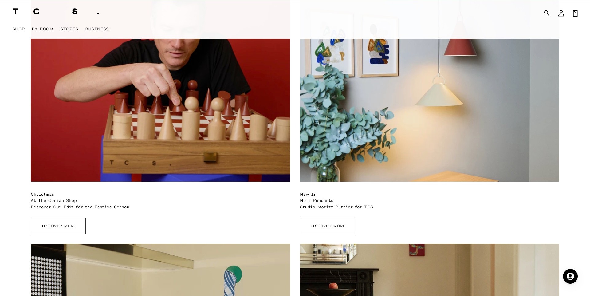
The Conran Shop’s actual homepage uses a two-column editorial grid beneath a spare white header. One card introduces a festive selection through a chess scene; the adjacent card names a pendant-light collection and its designer. Each receives its own caption and discovery action, with further cards beginning below. Stores and business information remain separate from shopping and room browsing. The useful pattern is a broad design retailer giving lighting a specific, labelled editorial slot rather than leaving it as an anonymous object inside a general room photograph.
What you can learn
Give each card enough context to explain what someone will find next. Product type, collection and creator labels make a grid more useful than a sequence of attractive images. Keep the physical-store route permanent so editorial browsing can lead to an informed visit.
Pros
Individual captions distinguish the lighting collection from an unrelated seasonal campaign.
A repeatable grid provides a clear structure for several kinds of editorial content.
Cons & considerations
Repeated generic action labels can become ambiguous without their nearby captions.
A lighting card still needs a direct route to specifications and current viewing or buying information.
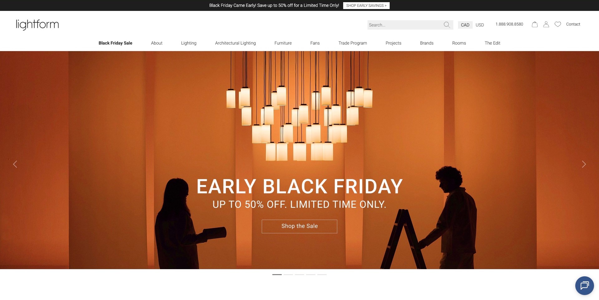
LightForm’s observed opening sets a cluster of rectangular pendants against an orange campaign scene with two silhouetted people. A large promotional message occupies the centre, while the white header separates ordinary lighting from architectural lighting, brands, rooms, projects and trade information. Search, contact and currency choices are also visible. The useful showroom-store pattern lies in that permanent structure: the campaign can change while visitors retain several understandable routes into a broad lighting catalogue.
What you can learn
Organise a multi-brand lighting range around the ways people actually investigate it. A room, a known brand and a professional specification are different starting points. Keep those routes stable, then make showroom information, dimensions and relevant technical documents accessible beyond the promotional entrance.
Pros
Architectural and decorative lighting have distinct navigation labels rather than one undifferentiated shop link.
Brand and room routes give useful alternatives to the current sale destination.
Cons & considerations
A large promotion can overshadow what differentiates the showroom’s range or service.
A dramatic pendant scene cannot establish dimensions, light output or installation requirements.
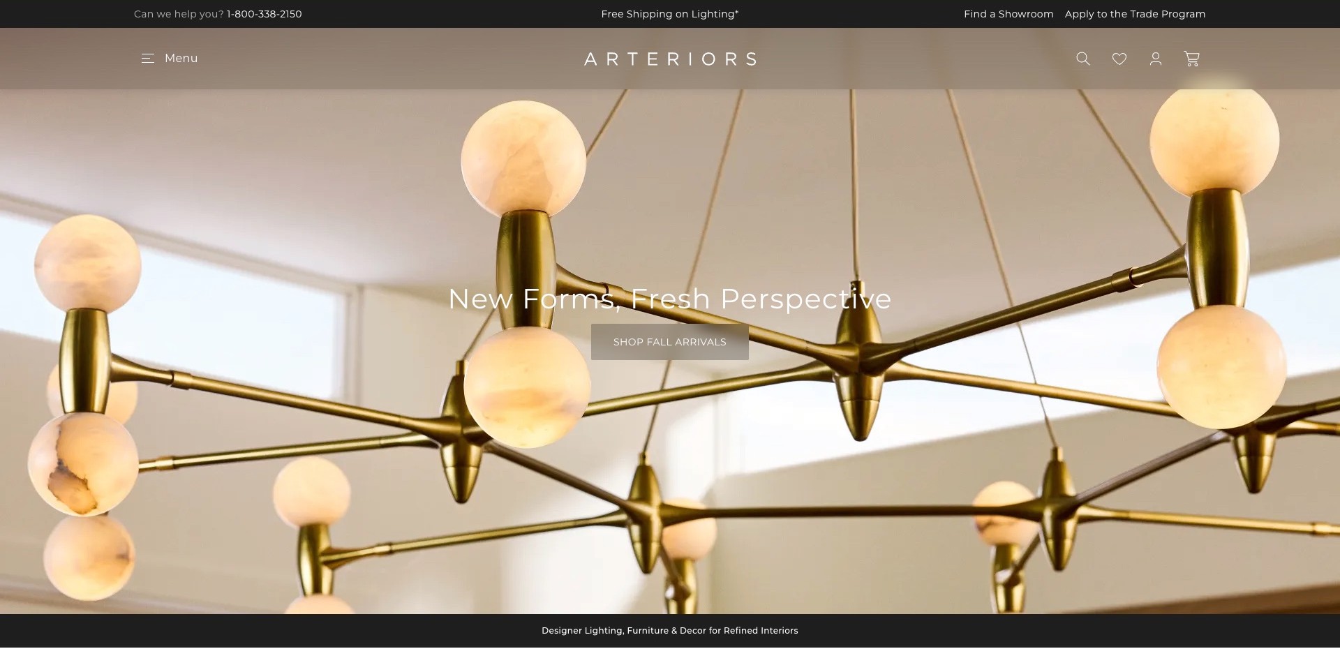
Arteriors’ captured opening is a close view of a branched, gold-toned chandelier with pale glowing globes. A short arrival message and shopping action sit in the centre, while the muted header keeps the identity and menu comparatively restrained. Above it, a separate strip names the showroom finder, trade programme and contact number. The useful pattern is the separation of a highly visual collection campaign from practical business information, so a visitor can seek a location or professional route without first opening the full product menu.
What you can learn
Use a close fixture view to introduce shape and visual character, then provide complete views and scale information next. Keep showroom and professional information visible outside the campaign. Someone planning an in-person visit needs a reliable location route even when the featured collection changes.
Pros
The close photograph makes the fixture’s branching form and illuminated elements prominent.
The showroom and trade strip gives practical tasks a stable position above the campaign.
Cons & considerations
A tight crop can leave the overall fixture size and configuration unclear.
Text over pale illuminated elements needs contrast checks across responsive crops.
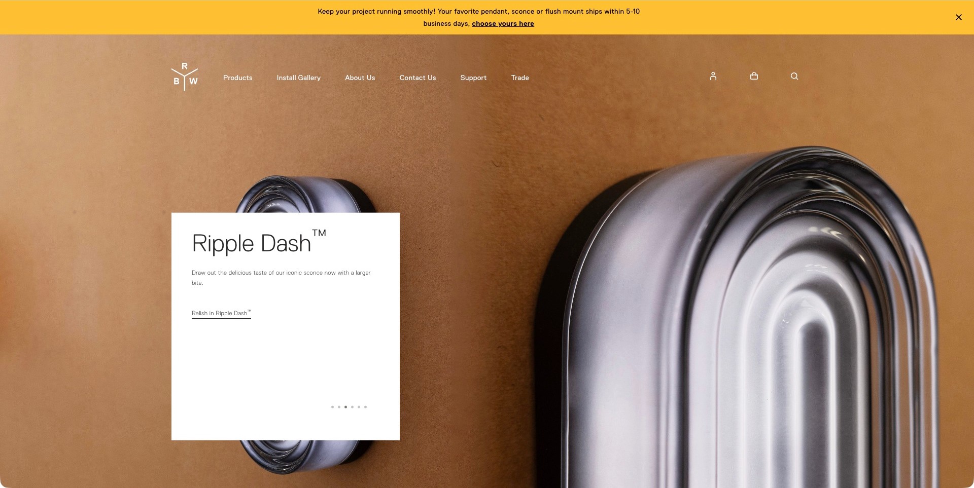
RBW’s observed homepage places two ribbed oval wall fixtures against a warm background. A white card names the featured product and provides a short description and an underlined continuation link. Products, installation gallery, contact, support and trade routes sit above it. The useful design pattern is the combination of a large, distinctive object image and a clearly separated text surface: the product remains the visual focus, but its identity does not depend on interpreting the photograph alone.
What you can learn
Give a product-led campaign a precise label and an obvious next destination. A separate text card can protect readability when the background is visually complex. Keep installation examples and support close enough to help visitors move from admiring the form to checking dimensions, mounting conditions and relevant specifications.
Pros
The white card creates a stable reading surface independent of the surrounding image.
Installation-gallery and support routes acknowledge the research that follows an initial product impression.
Cons & considerations
A close fixture photograph does not show room-scale proportions by itself.
Short promotional descriptions should lead to practical documents rather than imply performance through visual styling.
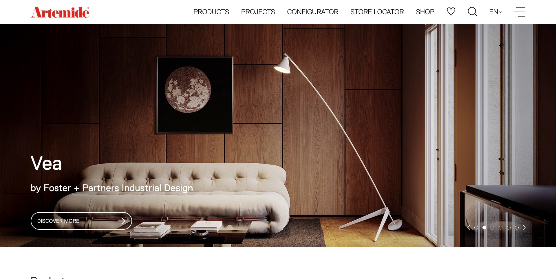
Artemide’s actual homepage frame shows a long, angled white floor lamp beside a sofa in a wood-panelled room. The caption names the light and its design attribution, while a large discovery action sits below. A white header separates products, projects, configurator, store locator and shopping. This is useful for a lighting showroom brand because the room introduces the object’s relationship to furniture while the navigation signals several different next steps, from inspiration to configuration and an in-person destination.
What you can learn
Identify the featured light and provide a route to investigate it beyond the room image. Configuration, project examples and store information should remain distinct tasks. The photograph can suggest proportion and placement, but technical suitability and the exact product options need explicit information after the campaign.
Pros
A room-scale view gives more context than an isolated close-up of the lamp head.
Configurator and store-locator labels make practical research routes visible immediately.
Cons & considerations
The angled fixture needs careful responsive cropping to remain understandable on smaller screens.
A styled room and designer attribution do not establish lighting output or installation suitability.
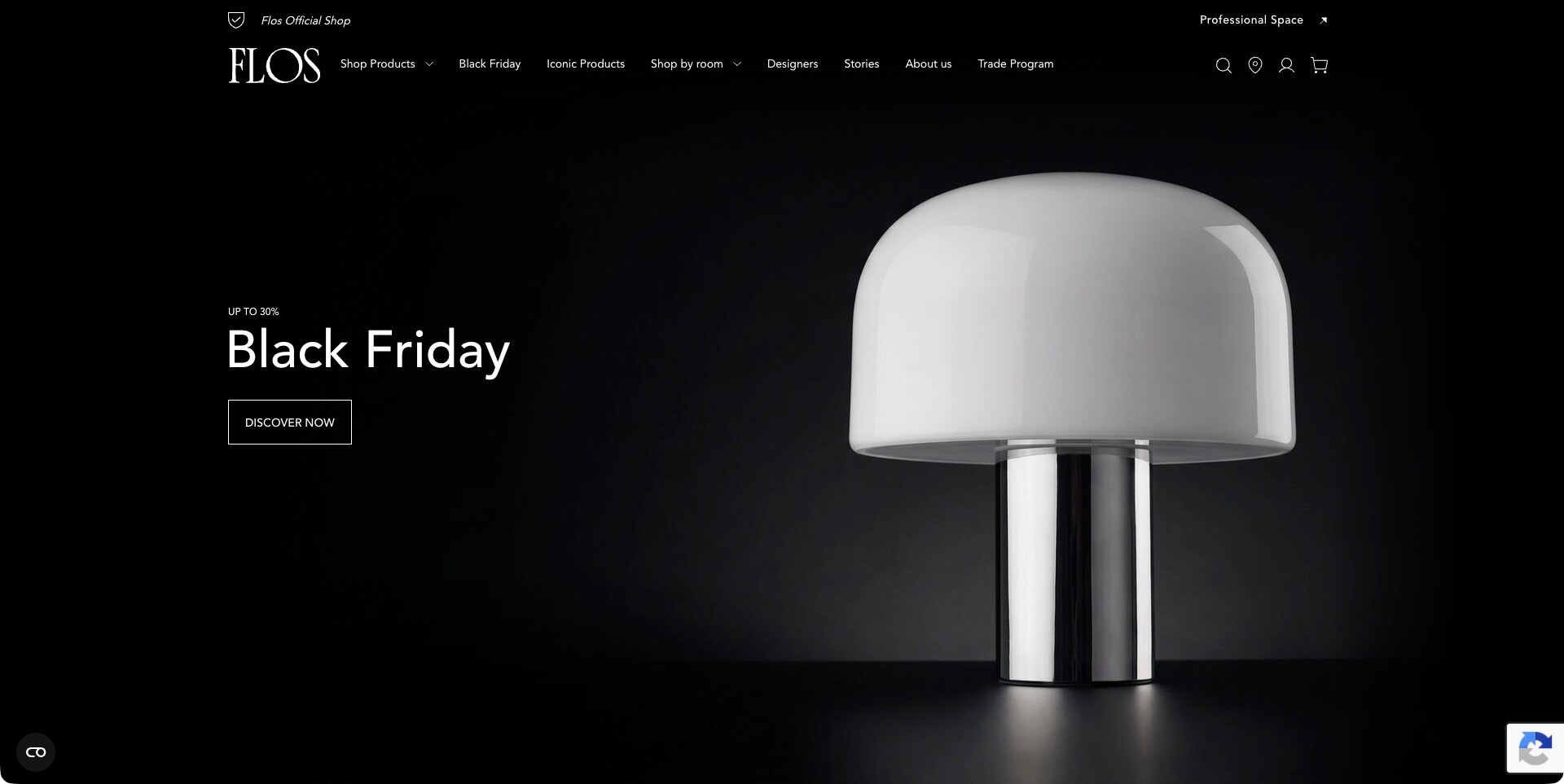
Flos’ captured US store opening uses a black background and a large white-domed table lamp with a reflective base. The seasonal message and one discovery action occupy the opposite side, leaving the object’s outline clear. The header distinguishes products, rooms, designers, stories, trade information and a professional destination. The useful design pattern is the contrast between a highly focused product image and a stable catalogue structure: the visitor can follow the campaign or bypass it for another research task.
What you can learn
Use contrast to make the product legible, then keep navigation and text equally clear. A seasonal campaign should preserve ordinary category, designer and professional routes. Provide product names, dimensions and appropriate specifications after the first click rather than relying on recognition of a familiar silhouette.
Pros
The dark background separates the lamp’s main shape from surrounding visual clutter.
Room, designer and professional routes offer clear alternatives to the campaign action.
Cons & considerations
A single product image may not communicate the breadth of the showroom’s range.
Glossy surfaces and a strong silhouette do not establish material composition, output or suitability for a particular space.
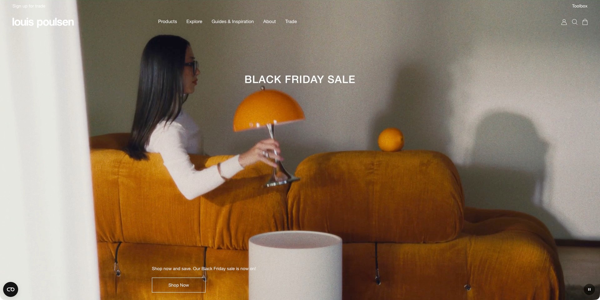
Louis Poulsen’s observed US homepage shows a person holding an orange-domed table lamp beside a yellow sofa. The seasonal headline sits above the object, while a shopping action appears lower in the frame. Products, inspiration, company information and trade resources remain visible in a restrained header. The useful pattern is an ordinary domestic interaction making the light understandable as an object within a room, without turning the navigation itself into a large promotional banner. Official showroom information separately distinguishes dedicated viewing spaces from stores and other retailers.
What you can learn
Use a human-scale scene to introduce how a light relates to its surroundings, then make the next research task explicit. A showroom visit, a retail purchase and professional specification are not interchangeable destinations. Give each a clear route rather than assuming one campaign button serves everyone.
Pros
The person and sofa give the featured lamp an immediate visual context.
Stable product and trade labels remain available beside the seasonal campaign.
Cons & considerations
Film imagery needs a readable static alternative when motion is unavailable.
A room photograph cannot establish light output, glare control or the stock displayed at a particular showroom.
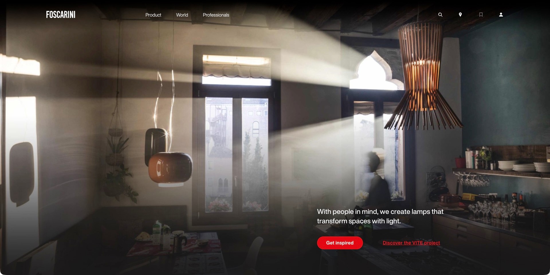
Foscarini’s captured homepage uses a room filled with sunlight and suspended lights of several shapes. A concise statement sits in the lower right, while the header limits its main text routes to products, the brand’s wider world and professionals. Search and a location symbol provide additional ways forward. The effect is a deliberately atmospheric introduction rather than a list of model names or technical values. Its owned New York showroom is documented separately on the official site; the campaign photograph itself is not presented here as proof of a particular showroom installation.
What you can learn
An atmospheric opening still needs a practical continuation. Pair a room image with product identification, location details and professional resources that answer different questions. Show how to move from a visual impression to a specific fixture or visit, without asking the photograph to communicate technical suitability.
Pros
Several visible lighting forms establish variety within a coherent interior scene.
A concise professional route avoids crowding the image with specification material.
Cons & considerations
The sparse opening leaves individual fixture names to a later step.
Sunlight and styling can influence perceived brightness, so the image should not replace product data.
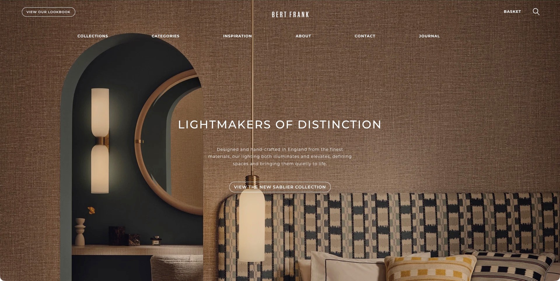
Bert Frank’s observed opening layers a vertical wall fixture, mirror and suspended pale light within a richly textured brown room. The centred headline and outlined collection action share the image, while collections, categories, inspiration and contact routes sit above. A lookbook provides another distinct destination. The site’s official showroom page identifies its appointment-based London space, so the business has a genuine physical viewing route beyond the imagery. The useful design lesson is the relationship between a tightly controlled room palette and a relatively direct set of catalogue and enquiry labels.
What you can learn
Use a consistent photographic palette to establish identity, but keep the path to individual lights and a showroom visit straightforward. A collection name helps visitors continue from inspiration. Provide dimensions, viewing arrangements and relevant product documents after that introduction rather than treating evocative copy as a specification.
Pros
The repeated warm tones connect several fixtures without making each compete for attention.
Category, collection and contact labels offer understandable alternatives to the lookbook.
Cons & considerations
Centred text over a textured room needs careful contrast and mobile-crop testing.
Material and craftsmanship descriptions require supporting details rather than visual assumptions.
Kegan is a freelance web designer and developer with 15+ years of experience helping businesses turn complicated website requirements into clear, maintainable digital experiences. He works directly with clients from planning and design through development, launch, and ongoing support.
For lighting showroom website design, his development approach focuses on fixture and room discovery, practical dimensions and installation context, showroom and appointment information, and well-routed residential and trade enquiries. The scope can be a targeted improvement or a complete custom build, with responsive layouts, thoughtful content structure, and integrations chosen around the people using and maintaining the site.
Show 3 other lighting showroom website designersHide other lighting showroom website designers
How to plan a lighting showroom website around discovery and a useful visit
Define the relationship between the catalogue and the showroom
Begin by listing owned stores, appointment-only galleries, professional showrooms and independent stockists separately. Decide what information the business can maintain for each. A showroom may present a selected installation rather than a full retail assortment. Another location may focus on trade projects or operate different hours. Those differences should be visible in location records instead of hidden behind identical map pins.
Explain how a visitor can confirm a particular display before travelling. If an appointment is needed, state the reason and what to bring. If walk-ins are welcome, do not make a booking form the only contact route. A clear location page can include current opening information, transport context and a direct business contact without promising that a fixture is currently in stock or installed in the space.
Use a product structure that matches how people search
Give visitors understandable fixture categories such as pendant, wall, table and floor lighting, then add useful room, finish and brand routes where the catalogue supports them. A customer may know the kind of fixture needed but not a designer’s name. Keep the labels consistent across navigation, search results and product records. Avoid a room taxonomy that implies the website has confirmed installation suitability simply because a product appears in a bathroom or outdoor inspiration image.
Build repeatable specification fields from approved product information. Identify overall dimensions, available versions, finish names, included components and links to the relevant manufacturer documents. Where several variants share a photograph, explain which one is shown. Technical information should be scoped to the exact version rather than copied across an entire collection because the product shapes look alike.
Plan images that reveal form as well as mood
Use a sequence of unlit or neutral product views, relevant details and contextual room photography when those assets are available. An illuminated photograph can obscure the shape of a shade or make a finish difficult to compare. A room image can help someone understand scale, but it should not be the only source of dimensions. Keep important information available as text rather than embedding it solely inside a brochure image.
Caption styled installations with the information needed to identify the fixture. Avoid implying that a photograph reproduces its actual colour appearance or brightness on a visitor’s screen. If a project image includes another brand’s furniture, decorative objects or a custom installation, distinguish those elements from what the store sells. Good art direction can be atmospheric and precise at the same time.
Make consultations and project enquiries specific
Separate a quick product question from a larger project brief. For a showroom appointment, ask only for information that helps staff prepare: the area of interest, approximate project stage, relevant location and whether the visitor has a particular fixture in mind. For a professional project, provide a route to discuss quantities, schedules and required documentation. Do not require a complete architectural package before someone can ask an initial question.
Explain the scope of the advice offered. Product selection, decorative coordination, lighting design and installation are not interchangeable services. Name what the business actually provides and where another professional must be involved. An acknowledgement should explain the next step without implying that a booking request is already confirmed or that an enquiry establishes product compatibility, final price or an installation date.
Keep ordering details connected to the exact product
Lighting orders can depend on finish, size, regional version and separately supplied components. Show those choices clearly and explain which information a person needs to confirm before purchase. If a product is made to order or requires a quotation, label that early. A generic sale price or delivery banner should not appear to override a product-specific lead time or the terms for a custom configuration.
Provide contextual routes to maintained delivery, returns and aftercare information. Explain whether a displayed piece is a showroom sample, a standard orderable product or a special project item. For ex-display offers, condition and included parts should be described explicitly. A visitor should not have to infer these distinctions from a small price reduction or a photograph taken in an exhibition.
Maintain the site as a bridge to an evolving physical space
Assign a person to updating location details, temporary closures, installation changes and appointment contacts. A showroom is not static: displays, exhibitions and ranges change. Date time-sensitive notices and remove them when they no longer apply. Preserve useful manufacturer documentation for existing customers while making current ordering status clear. A campaign homepage can change without breaking the underlying visit and product journeys.
After launch, review the questions staff receive before appointments. If visitors repeatedly arrive expecting an entire online range, improve the display explanation. If they cannot identify a fixture from a room photograph, improve captions and product links. Measure whether enquiries are better prepared and visits are more relevant, not only whether the page creates more form submissions. The website should reduce avoidable uncertainty for visitors and staff alike.
The editing job behind the design
Choose technology for accurate catalogue and location information
A useful content model should distinguish product families, variants, manufacturer documents, owned locations and stockists. The platform needs to make those relationships maintainable by the actual team. Start with a manageable catalogue and reliable location pages before commissioning a visually elaborate product finder.
Appointment tools should explain what is being requested, which location or service it concerns and when confirmation will arrive. Keep a usable contact alternative and avoid collecting unnecessary project or personal details. A booking interface should not imply that inventory, staff availability or technical advice has been confirmed unless the underlying process genuinely supports that claim.
Public technology references can identify visible components but not every quotation, supplier or showroom-management system. A familiar brand’s stack is not a complete implementation brief. Choose around the retailer’s data quality, update responsibilities and actual ordering model, while preserving accessible text and a useful experience when decorative motion is unavailable.
Our WordPress website examples offer a separate look at publishing approaches. A visible platform label is evidence for that named page, not a guarantee that the same system will suit your requirements.
Before the public launch
Resolve these questions in a lighting showroom website brief
Which locations are owned showrooms, stores, galleries or independent stockists?
Can visitors understand appointment expectations before planning a journey?
Is there a way to confirm which fixtures are displayed at a specific location?
Are product type, room, finish and brand routes understandable without expert vocabulary?
Can the visitor identify the exact fixture and variant pictured in a room?
Are dimensions, included components and manufacturer documents tied to the correct version?
Do images distinguish product form from atmospheric lighting effects?
Are product advice, design services and installation responsibilities described separately?
Does a consultation request explain what happens next and what is not yet confirmed?
Are made-to-order, ex-display and standard products clearly distinguished?
Do campaign prices avoid overriding product-specific availability or terms?
Who maintains opening information, temporary closures and changing displays?
Can important documents and product facts be reached without a video or visual planner?
Which recurring staff questions will be used to improve the site after launch?
These checks are a project checklist, not a performance, legal, security, or accessibility certification. Test real journeys with the people responsible for the website before making claims about the result.
Sources & editorial method
How this collection was selected and reviewed
We required current first-party evidence of a physical lighting showroom, gallery or store presence and kept that evidence separate from screenshot provenance. Genuine direct browser captures were reviewed at full size, with old clean captures retained under their original dates. Lightology is the explicit editorial selection for the observed separation of showroom, design-service, trade and product-navigation tasks within a specialist lighting offer. This is a website-design judgement, not a statement of company size, electrical expertise, display completeness or service quality.
Each example links to its actual source page. Screenshots are direct browser captures with their own capture dates; moving imagery, announcements and live designs can change. The notes describe observable design choices and conditional tradeoffs, not measured traffic, conversion results, service quality, or accessibility conformance.
Technology labels use public page metadata, asset evidence, or explicitly cited platform documentation. Platform documentation is not a complete current deployment audit. A component reference may be legacy or unused; it is not a complete backend inventory. Unknown stacks are omitted. These sites are editorial examples, not our client portfolio.
Written, Edited and Curated are separate editorial records, not timestamps advanced by a rebuild. Website designs and imagery belong to their owners. See our editorial standards or suggest a correction.
Questions worth asking
Lighting Showroom website design questions
Can a lighting manufacturer qualify as a showroom example?
Yes, when current first-party information identifies an actual physical showroom or gallery associated with the business. A general list of independent stockists is not the same thing. The review should explain whether the page belongs to a brand showroom, a specialist retailer or a wider interiors store.
Should the homepage show fixtures or the showroom itself?
Either can work if the visitor can quickly understand the offer and the next step. A product campaign needs a visible visit route; a showroom photograph needs clear product discovery. The stronger choice depends on the business’s main visitor tasks, not a rule that every site must begin with the same type of image.
Can website photographs demonstrate how a light will look in my room?
They can provide useful context, but screens and styled photographs do not reproduce a particular installation. Product documentation, dimensions and an appropriate professional discussion remain important. A showroom site should explain that distinction rather than presenting an image as a precise prediction of light quality.
Does every showroom need ecommerce?
Not necessarily. Some operate primarily through project enquiries or appointments; others sell standard products online. Make the actual ordering model clear. A well-maintained catalogue and an understandable consultation route can be more appropriate than a checkout that cannot handle the business’s real product and delivery conditions.
Borrow the clear product paths, precise captions and useful visit information. Build a website that turns an attractive fixture into an informed question, a well-prepared appointment or a clearly understood order.