Best Outdoor Furniture Store Websites of 2026 (15 Real-World Examples)
Help people picture the patio—and understand what they are actually choosing.
Outdoor furniture store website design has to connect a desirable setting with a practical purchase. A visitor may be planning a compact balcony, replacing a dining set or furnishing several hospitality terraces. Useful websites explain product relationships, materials, dimensions and the next step without relying on sunshine-filled photography to answer every question.
A patio image can make a furniture collection feel inviting, but outdoor shopping involves more than matching a photograph. Customers need to understand what fits, which pieces belong together, what a set contains and how products are cared for. They may want to see a finish in person or ask whether a delivery team can reach a particular garden. A strong store website connects those practical questions to the attractive room-like setting.
The collection includes specialist outdoor retailers and broader furniture stores with a current, genuine outdoor offer. Some sell their own collections; others represent several manufacturers. Those are different models, and the website should not obscure the difference. A material-led indoor campaign may still offer a useful outdoor navigation pattern, but we identify that limitation rather than claiming every screenshot depicts a patio.
These reviews evaluate public website presentation, not furniture durability, safety, environmental performance or suitability for a particular climate. Terms such as weather-resistant, recycled or maintenance-free require product-specific substantiation and context beyond a homepage. Screenshots are genuine observed captures with their own dates. We have not left furniture outside, tested fabrics, visited showrooms or completed orders to produce this collection.
Before the examples
What makes good outdoor furniture store website design in 2026?
Let visitors begin with the space and the job
Provide understandable paths into dining, lounging, small spaces, shade and other actual product categories. A customer may know that they need four dining places but not recognise a collection name. Keep dimensions and configurations accessible from those categories. A useful inspiration image shows a possible setting; the shopping structure should help someone decide whether that arrangement suits the space they actually have.
Explain materials without making universal promises
Different materials, finishes and cushions need different explanations. Identify what a frame, tabletop and fabric are made from using approved product information, then connect care guidance to that exact product. Avoid implying that all metal, wood or synthetic furniture behaves the same way outside. Where claims rely on a specification or certification, identify the relevant source and scope rather than using a general green or all-weather badge as the entire explanation.
Connect browsing, configuration and an in-person visit
Some buyers can confidently order a known item; others need to compare scale and materials in a showroom. Give each a clear path. If the business has locations, provide current visit information and a way to ask about the actual display range. A store listing should not suggest every online product is physically present. For modular sets, explain configuration and included pieces before asking the customer to evaluate a headline price.
The collection · 15 examples
15 outdoor furniture store websites worth studying
These15 examples compare specialist patio businesses, own-brand outdoor collections and broader home retailers. Notice which pages show the outdoor product directly and which rely on an explicit outdoor shopping destination within a wider store. The useful lessons concern clarity, hierarchy and decision support rather than a measured ranking of the furniture.
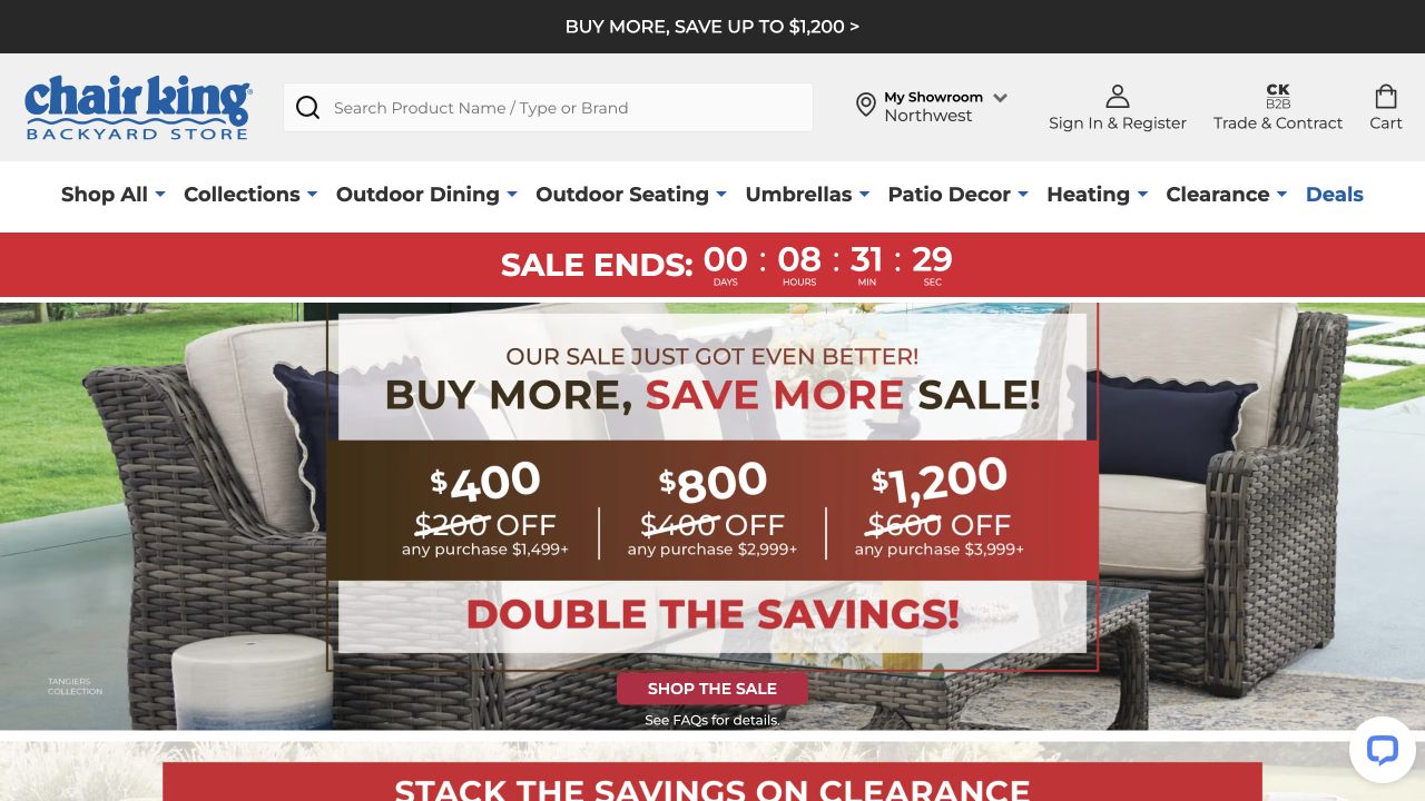
Chair King’s original opening combines a blue identity, prominent search and showroom access with explicit outdoor seating and dining categories. A large seasonal campaign is integrated over wicker furniture imagery, with a red countdown above it. The page is commercially busy, but the visitor does not have to infer whether this is a general home store or a specialist outdoor retailer. The observed photograph supports the category rather than introducing an unrelated room.
What you can learn
Keep the category and local shopping route obvious even during a sales event. An outdoor retailer can combine broad product discovery with showroom information, then help a visitor narrow by layout, material and use without treating every patio as the same kind of space.
Pros
The outdoor-specific navigation establishes a useful shopping vocabulary before someone needs to recognise a collection name.
Search and showroom access accommodate both a known-item purchase and a customer who wants to visit in person.
Cons & considerations
Several promotional layers can compete with material and configuration information if campaign hierarchy is not carefully maintained.
A large outdoor range needs clear product-level dimensions and care context beyond the attractive furniture shown in a campaign.
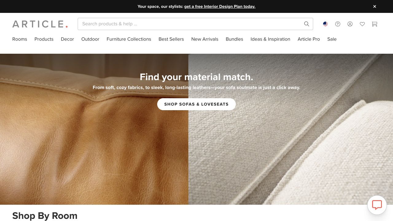
Article’s retained homepage contrasts leather and fabric closeups around a material-choice headline and sofa-shopping action. It is not an outdoor furniture photograph. The outdoor label in the product navigation is therefore the important connection for this collection, supported by the current official outdoor catalogue. This gives a useful counterpoint to specialist patio retailers: a broad furniture store can maintain a coherent visual identity while leaving a direct route for a different seasonal need.
What you can learn
When the main campaign concerns indoor furniture, make the outdoor destination unambiguous. Once visitors enter it, replace general lifestyle assumptions with the dimensions, materials, configurations and care explanations relevant to outdoor products rather than expecting the homepage texture story to answer those questions.
Pros
The clear outdoor category gives patio shoppers a route that does not depend on the featured indoor sofa campaign.
A restrained composition establishes material interest without filling the first screen with unrelated product thumbnails.
Cons & considerations
Indoor upholstery imagery does not demonstrate the outdoor range, so category pages need appropriate complete-object and setting photography.
Do not transfer an indoor material message to an outdoor product without its own specific description and maintained care information.
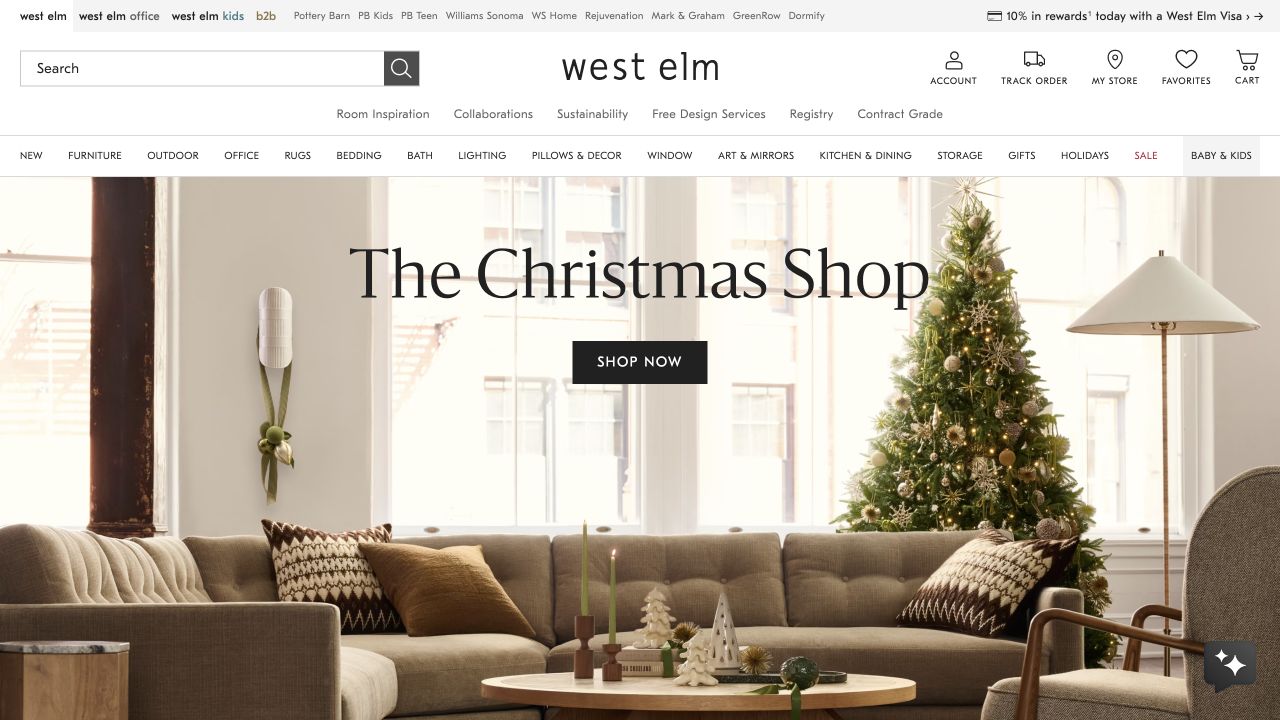
West Elm’s original frame shows a furnished holiday living room with a sofa, tree and lamp, plus a direct seasonal-shopping action. Outdoor appears in the broader product navigation rather than in the pictured campaign. For an outdoor-furniture guide, that distinction is useful: the store’s homepage can change with its commercial calendar while the patio catalogue keeps a stable point of entry. Nothing in the interior photograph establishes outdoor suitability for the pictured objects.
What you can learn
Let campaigns change without moving or renaming the customer’s main product routes. An outdoor destination should then show appropriate settings and explain product-specific materials, available sizes and care expectations instead of relying on the broad home-store image to establish practical suitability.
Pros
A recognisable seasonal room creates a coherent introduction without removing the broader catalogue structure.
The explicit outdoor label helps a customer bypass a campaign that is unrelated to their current furniture project.
Cons & considerations
A patio shopper may need a more direct category introduction than a holiday living-room scene provides.
If indoor and outdoor products share visual styles, make their different specifications and intended uses unmistakable in product records.
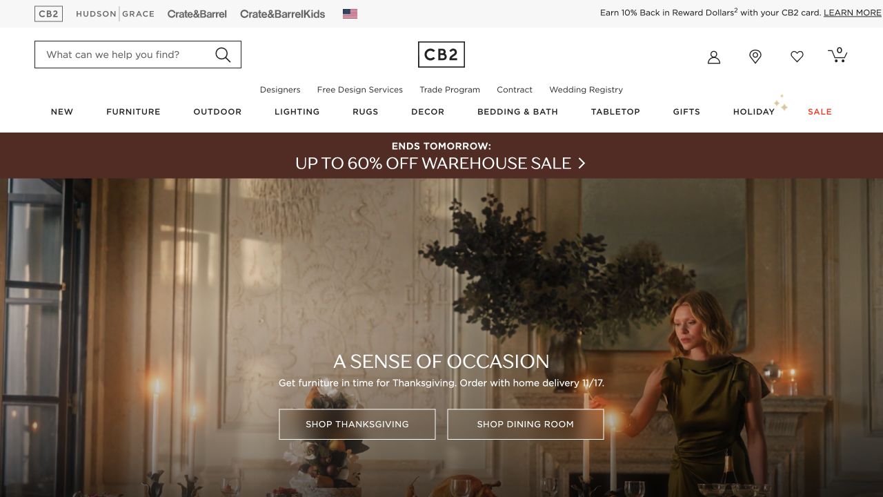
CB2’s retained screenshot uses a warm dining-room portrait and two clear shopping actions rather than a wall of small product images. The outdoor category remains named in the upper navigation, supported by the current official patio offer. This is not a photograph of an outdoor dining set; its value here is how the website separates a temporary interior campaign from a stable catalogue. A customer can follow the brand’s visual story or move directly to a different room.
What you can learn
Preserve simple category access beneath expressive art direction. For an outdoor collection, use the category destination to connect a complete setting to named pieces, dimensions and material information rather than treating every attractive dining photograph as interchangeable indoor and outdoor inspiration.
Pros
The edited campaign and limited actions create a readable hierarchy instead of competing product promotions.
The persistent outdoor destination gives a practical alternative to following the featured interior dining story.
Cons & considerations
An indoor dining scene cannot establish what an outdoor set includes or how its material should be maintained.
If categories lead into large ranges, provide useful filters and configuration labels so the initial visual clarity continues beyond the homepage.
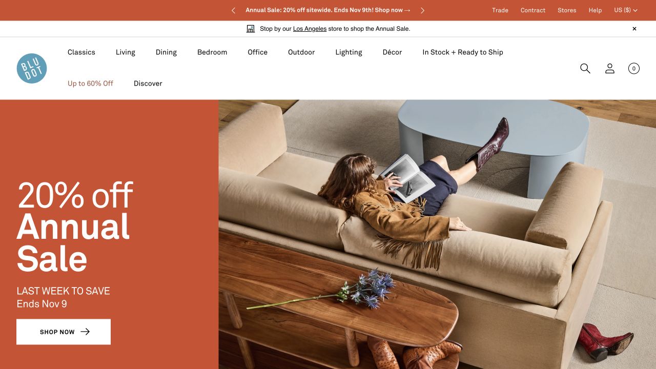
Blu Dot’s original frame features an orange annual-sale panel beside an overhead sofa-and-table composition. Outdoor is clearly included among its room categories, although the observed scene itself does not demonstrate an outdoor arrangement. For a retailer with a consistent collection identity, this is a useful pattern: a strong campaign can remain focused while product navigation carries the broader scope. Current official outdoor seating and table categories establish the topical fit separately from the photograph.
What you can learn
Keep seasonal outdoor products within a familiar catalogue structure, then explain their particular combinations and intended use on the relevant pages. A consistent brand language can help people browse, but should not blur the distinction between an indoor photographed scene and the specifications of an outdoor item.
Pros
The outdoor category stays visible even when the homepage campaign is not dedicated to a patio setting.
One strong colour block and a single composed photograph make the commercial message easier to identify.
Cons & considerations
A sale-led opening can under-explain the outdoor range unless the destination provides its own useful introduction and photography.
Materials, cushions and protective accessories need product-specific explanation rather than assumptions borrowed from a visually similar indoor collection.
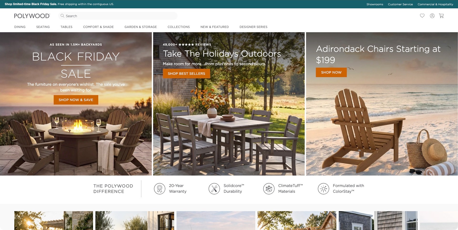
POLYWOOD’s observed opening uses three adjacent outdoor scenes: seating around a fire pit, a garden dining arrangement and an Adirondack chair by the sea. Each has its own short message and orange shopping action. The white header supplies dining, seating, table, shade and garden categories alongside search and showroom information. A separate strip introduces the brand’s own warranty and material claims. The useful pattern is the relationship between activity-led photography and a catalogue organised around the same practical outdoor tasks.
What you can learn
Start with how people intend to use the space, then connect each scene to an identifiable category. Keep material, care, warranty and size information accessible after the campaign. Brand claims can introduce those topics, but a badge should link to the conditions and details a buyer needs.
Pros
Distinct dining and lounging scenes show more of the outdoor range than one generic patio photograph.
Category navigation provides an alternative for visitors who do not want to follow a sale campaign.
Cons & considerations
Three simultaneous promotional messages can become difficult to prioritise on a narrow screen.
Styled outdoor scenes do not independently establish weather resistance, maintenance needs or current product availability.
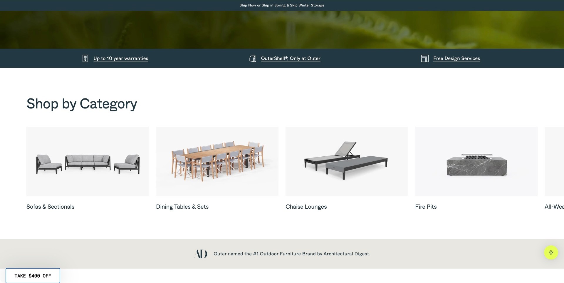
Outer’s captured scrolled homepage section presents product cut-outs on pale backgrounds beneath a clear category heading. Sofas and sectionals, dining sets, chaise lounges and fire pits each receive a labelled tile. A navy strip above separates warranty, cover-system and design-service information from the shopping categories. This is an interior page viewport, not the opening hero. Its useful lesson is how a simple object-led section can make the range legible after a more atmospheric introduction, giving visitors several direct ways into the catalogue.
What you can learn
Use category images to reduce ambiguity about what a store sells. The labels should describe recognisable buying tasks, and each destination should provide sizes, configurations, care information and relevant conditions. Keep service explanations connected but distinct so someone can browse products without committing to a design consultation.
Pros
Consistent cut-out backgrounds make the different furniture groups straightforward to compare.
Service information has its own visual strip rather than being embedded in every product tile.
Cons & considerations
An object cut-out needs contextual photographs later to explain scale and layout.
A horizontal category row needs clear navigation and usable touch targets when only part of the range is visible.
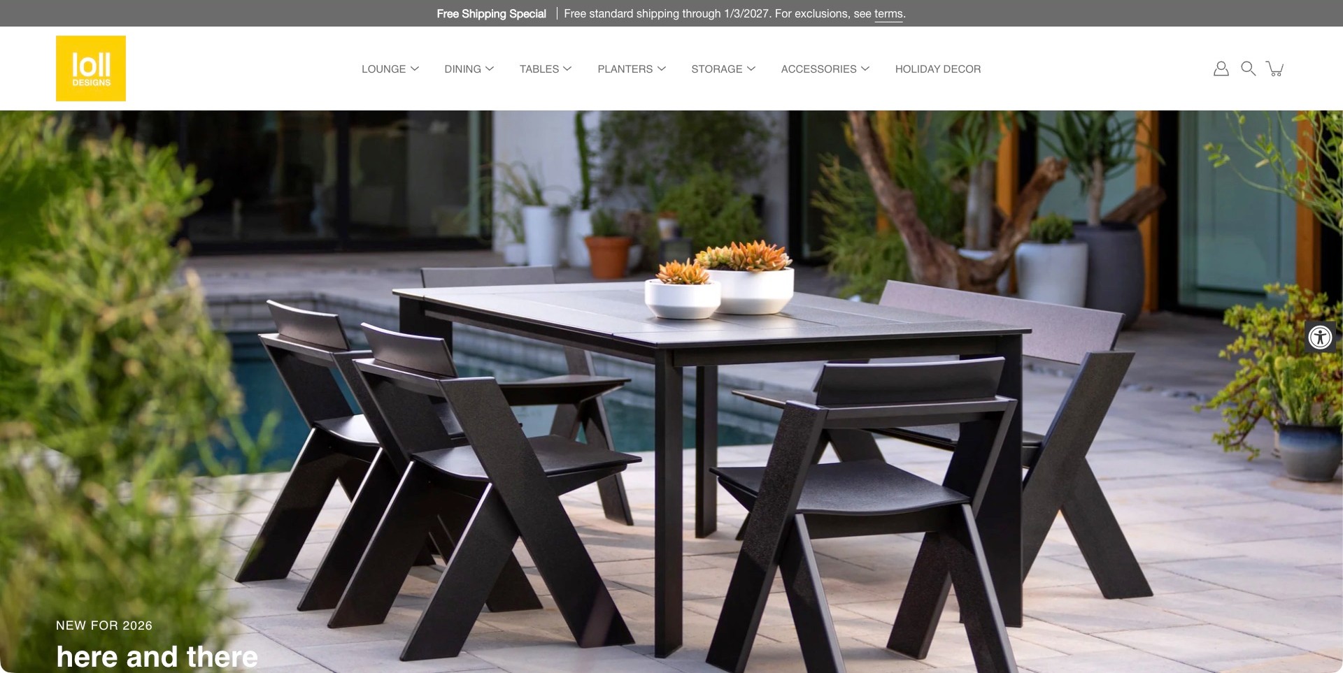
Loll Designs’ observed campaign centres a dark dining table and angular chairs on a patio, with plants and the surrounding home giving the arrangement context. The yellow brand mark stands apart from a white header that names lounge, dining, tables, planters, storage and accessories. The photograph occupies most of the first screen; a campaign caption only begins near the viewport’s lower edge. This makes the furniture itself the main introduction rather than a large discount or a stack of promotional messages.
What you can learn
Let the product arrangement establish the category, then provide a clear route to the items shown. A full-width image works best when stable navigation remains readable and the following content identifies dimensions, finishes and care. Do not expect a patio photograph to explain a material’s performance on its own.
Pros
The dining arrangement shows several coordinated pieces while keeping their shapes visible.
The yellow identity and restrained white navigation remain distinct from the outdoor image.
Cons & considerations
A low-positioned caption may be easy to miss on shorter screens.
The setting does not explain exact seating capacity, material care or which accessories are sold separately.
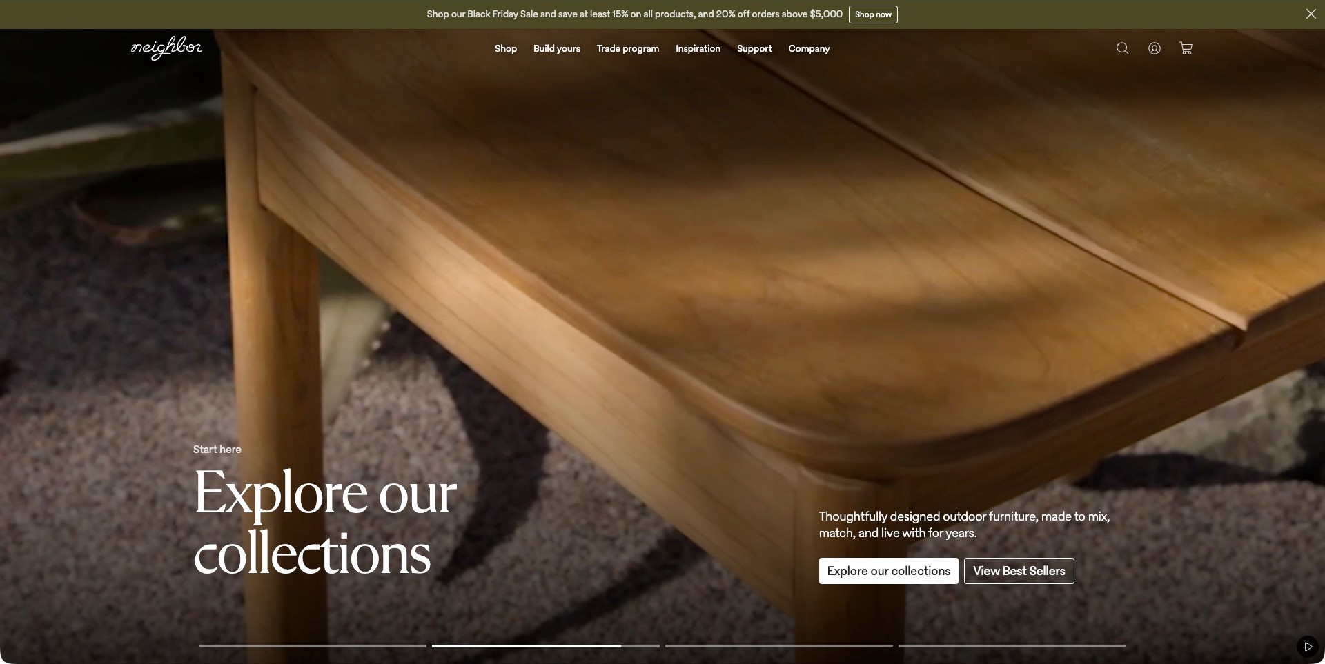
Neighbor’s actual homepage frame is a close view of a wooden furniture surface and edge, not a complete garden room. The collection headline sits at the lower left, with a short description and two shopping actions on the right. A transparent header separates shopping, building a configuration, trade information, inspiration and support; a slim olive announcement sits above it. The contrast between a tactile detail and plainly named routes is the useful pattern, particularly for a range whose configurations need more explanation than one photograph can provide.
What you can learn
A material close-up can create interest, but connect it quickly to complete objects and configuration choices. Keep collection browsing, best sellers and build-your-own tasks distinct. Visitors should be able to move from the atmosphere to dimensions, components and care information without decoding a brand film.
Pros
The restrained header leaves space for the material image while retaining important buying and support routes.
Separate collection and best-seller actions offer understandable alternatives to the configuration route.
Cons & considerations
A close detail may not reveal which furniture category a new visitor is seeing.
Film captions and transparent navigation need contrast testing across all frames and responsive crops.
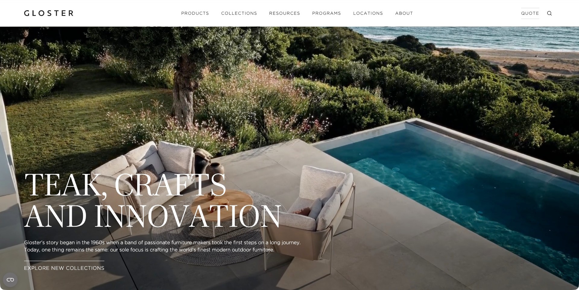
Gloster’s captured US homepage shows outdoor seating and a round table beside a pool, with coastal planting and the sea beyond. Large serif copy introduces the brand’s material-and-craft story, while one collection action sits below. A white header separates products, collections, resources, locations and quotation information. The furniture remains visible within the setting rather than disappearing into a landscape photograph. This is useful for an outdoor specialist whose customers may need both inspiration and a more involved dealer or project conversation.
What you can learn
Give the setting enough context to suggest an arrangement, then preserve direct routes to the collection and buying information. Material storytelling should lead to care instructions, finish details and current specifications rather than asking the photograph to establish durability or provenance.
Pros
The scene shows seating, a table and surrounding circulation space together.
Location, resource and quotation labels acknowledge research and purchase tasks beyond viewing the campaign.
Cons & considerations
Large type over a film or changing image needs contrast testing across its actual frames.
A coastal setting does not prove suitability for every climate, exposed site or maintenance routine.
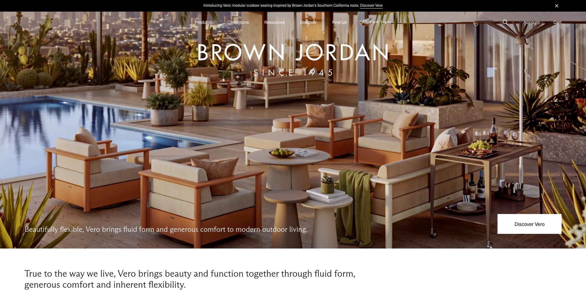
Brown Jordan’s observed Vero campaign fills the opening with an outdoor terrace around a pool. Light upholstery, wood-toned frames, small tables and a bar cart create several related seating areas. The brand occupies the upper part of the image, while the collection caption and discovery action sit near the base. Products, collections, resources, location and trade routes remain above. The useful design lesson is the way a coordinated scene introduces a specific collection without turning the whole first screen into a dense product grid.
What you can learn
Name the range when a room-scale image shows many pieces at once. Follow that setting with identifiable objects, dimensions and configuration information. Keep location and trade routes separate from the campaign so a visitor can investigate buying or specification without first reading a brand story.
Pros
The terrace composition demonstrates relationships between seating and supporting tables rather than one isolated object.
The collection-specific action gives the image a clearer destination than a generic exploration link.
Cons & considerations
A rich scene may make exact item identification difficult without labels on the next page.
Styled outdoor imagery does not verify product comfort, material performance or local availability.
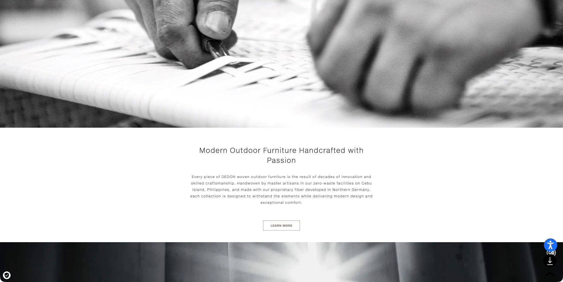
DEDON’s selected capture is a scrolled homepage section, not the opening campaign. A monochrome film frame shows hands weaving above a centred heading, explanatory paragraph and one learning action. The pale text area gives the process image room to breathe and makes the following explanation easy to identify. This is useful to study as a supporting section within an outdoor-furniture website: it connects the finished-product catalogue to a making story without placing several sale or enquiry buttons over the moving image.
What you can learn
A process image can make a material story more concrete, but distinguish the demonstration from substantiated product claims. Link it to specific materials, care information and collection records. Explain what a buyer can learn next instead of expecting a craft film to establish weather resistance, environmental performance or quality by itself.
Pros
The separation between film and text avoids placing the main paragraph over a busy moving surface.
One continuation action keeps the purpose of this supporting section understandable.
Cons & considerations
A close process frame does not identify the complete furniture or its dimensions.
Manufacturing and environmental statements need accessible supporting details rather than relying on the film’s atmosphere.
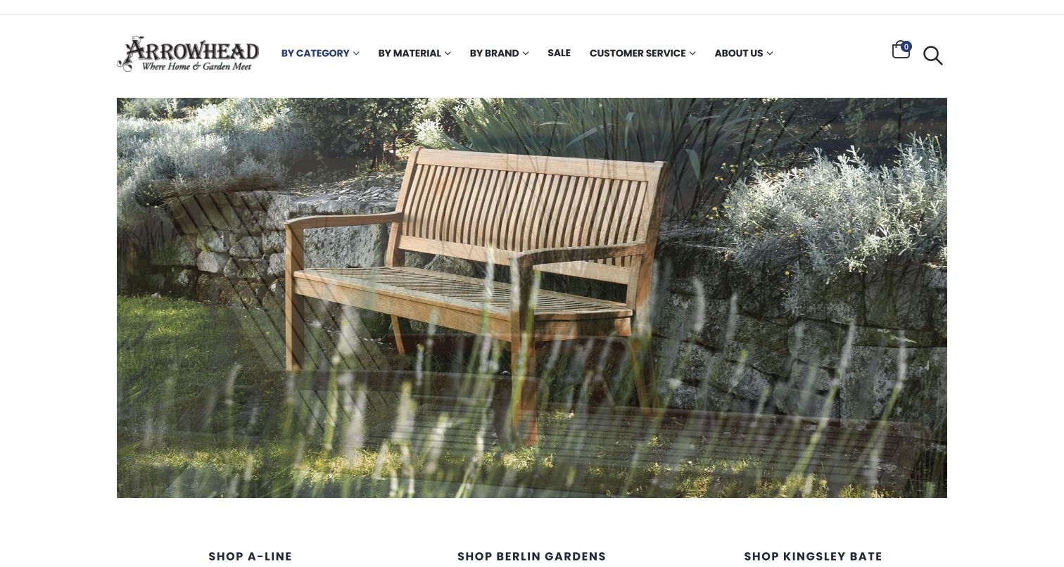
Arrowhead’s retained frame shows a wooden bench in a garden under a white identity and navigation area. Products can be approached by category, material or brand, with collection names beginning below the photograph. Official information identifies an outdoor-furniture showroom on Nantucket. This is a retailer presentation rather than evidence that Arrowhead manufactures the pictured furniture, and the observed image does not independently establish its material specification or weather performance.
What you can learn
Give outdoor shoppers several understandable ways to begin without confusing them about the business’s role. A category suits someone planning a dining area, a material route supports comparison and a brand route helps an existing owner. Connect those paths to current showroom information and identifiable product records.
Pros
Category, material and brand routes acknowledge genuinely different ways a visitor may explore a multi-brand outdoor catalogue.
A recognisable garden bench gives the outdoor offer a clear visual setting without a large promotional modal.
Cons & considerations
A scenic bench photograph needs an identifiable product record before someone can evaluate its dimensions or available finishes.
A local showroom should explain its actual display range and visit details rather than implying every represented brand is fully on view.
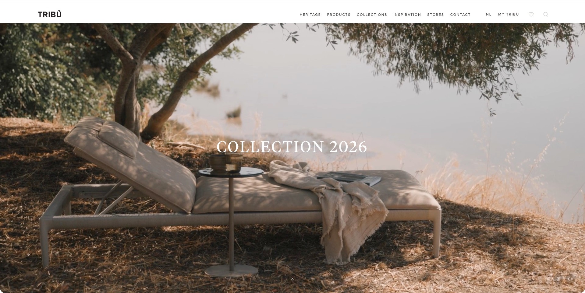
Tribù’s observed collection frame shows a chaise and small table under a tree beside the water. The restrained collection title leaves much of the photograph visible, while a white header separates products, collections, inspiration, stores and contact. Small film controls remain near the bottom rather than competing with the central image. The useful pattern is a deliberately quiet opening supported by practical navigation: the visitor can appreciate the setting or move directly into the furniture range and buying locations.
What you can learn
A calm hero works best when the next step is unambiguous. Keep product families, store information and contact accessible, then supply the dimensions and material choices the setting cannot communicate. Make sure the composition still identifies the furniture when it is cropped for a smaller screen or paused at another film frame.
Pros
Sparse text lets the chaise, table and surrounding space remain the main visual subjects.
Product and store routes are named separately rather than hidden behind the collection campaign.
Cons & considerations
A collection year alone gives little information about the pictured model or configuration.
The atmospheric setting does not replace product-care guidance or evidence about outdoor exposure.
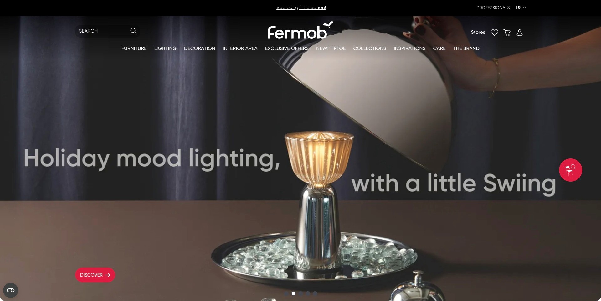
Fermob’s captured US opening features a portable table lamp, with a hand lifting its shade against a dark background. The holiday-lighting message and red discovery action make the campaign’s immediate subject clear. Furniture remains a distinct navigation category alongside lighting, decoration, collections, care and stores. This is not an outdoor-seating photograph, which makes the example useful for a different reason: it shows how a specialist outdoor brand can promote an adjacent product group without removing the route to its core furniture range.
What you can learn
Keep the current campaign’s category explicit, and let permanent navigation explain the broader offer. Someone arriving for outdoor chairs should not need to interpret a lighting film before finding them. Give each category appropriate specifications, care information and purchasing guidance rather than treating all outdoor products as interchangeable.
Pros
A close, identifiable lamp gives the seasonal campaign a more concrete subject than an abstract festive scene.
Furniture, care and store information remain visible outside the promotional image.
Cons & considerations
A lighting-led opening may not immediately communicate the breadth of the outdoor furniture collection.
Product-finder and campaign controls need checking so they remain usable without covering important image details.
Kegan is a freelance web designer and developer with 15+ years of experience helping businesses turn complicated website requirements into clear, maintainable digital experiences. He works directly with clients from planning and design through development, launch, and ongoing support.
For outdoor furniture store website design, his development approach focuses on outdoor collection and material comparisons, useful dimensions and care information, considered setting photography, and clear delivery, retailer and purchasing journeys. The scope can be a targeted improvement or a complete custom build, with responsive layouts, thoughtful content structure, and integrations chosen around the people using and maintaining the site.
Show 3 other outdoor furniture store website designersHide other outdoor furniture store website designers
How to plan an outdoor furniture website around real customer decisions
Define the catalogue around understandable arrangements
Start by mapping individual pieces, sets, modular components and accessories. A photograph of a sectional may show several separately sold modules, while a dining package may contain a fixed number of chairs. Model those relationships clearly before commissioning page designs. Name the displayed arrangement, list its included pieces and distinguish a complete-set price from a starting component price. Customers should not need to reconstruct the offer by comparing tiny product thumbnails.
Use a consistent vocabulary for dimensions and orientation. A left-facing module can be misunderstood when the point of view is unstated. Pair text with a simple dimensioned plan when the business has accurate drawings. Keep a route to individual pieces for customers adding to an existing arrangement, and identify collection compatibility carefully rather than implying that similarly coloured products will necessarily fit together.
Build a useful image sequence for an outdoor purchase
Plan complete-product images, an assembled setting, material closeups and views that explain important details. A broad garden scene provides atmosphere but can hide the actual size of a coffee table or the depth of a chair. Identify the pictured configuration and cushions in captions. Where accessories, plants or structures are props, keep the included-product information explicit so the photograph is not mistaken for a bundle.
Include a view that helps customers understand scale without manipulating proportions. A person or surrounding architecture can provide context, but measurements still need to be available as text. Do not let a full-screen video become the only introduction to the collection. A useful still frame, understandable heading and direct category route should remain available when a visitor does not play motion content or wants to reach a specific product quickly.
Treat care and storage as product information
Ask the product team which care instructions are approved for each material and finish. Link those instructions at the point of choice, not only in a general footer. Explain removable cushions, covers and storage options using the seller’s actual guidance. A generic statement that furniture is suitable outdoors does not answer whether a cushion should be stored, how a finish changes or which cleaning products are appropriate.
Where the business publishes performance claims, preserve their conditions and scope. A fabric claim, frame claim and warranty may address different things. Do not collapse them into one reassuring label or add claims that were not supplied and approved. A website can make reliable information easier to find without pretending that an attractive product presentation is an independent durability or climate-suitability test.
Make a showroom visit a practical continuation of browsing
For each physical location, provide the actual address, current opening information, appointment expectations and contact route. Explain whether visitors can ask about displayed collections before travelling. If different stores carry different ranges, state that clearly. A map and a generic showroom photograph are useful only when the visitor can connect them to the product or kind of help they are considering.
Give a customer a way to carry a shortlist into a conversation. A shareable product list or a simple enquiry naming the collection can be more useful than a complex account system. Explain what an appointment or design consultation involves without promising a service the store cannot consistently provide. Online-only offers, stockists and owned showrooms should be labelled as different channels rather than shown as interchangeable pins.
Explain delivery and access before the final transaction
Outdoor furniture can involve bulky cartons, assembled frames and awkward access to gardens or rooftops. Describe the service the customer is selecting: dispatch, doorstep delivery, room or garden placement, assembly and packaging removal are not identical. Ask for relevant access information at a suitable point and provide reliable packaged dimensions when available. Do not assume that a product fitting the patio also fits the route to it.
Keep availability language tied to the actual configuration. An in-stock table and made-to-order cushion can have different timings. Explain whether pieces may arrive separately and who confirms the schedule. If an order requires a quotation because of destination, quantity or installation, make that clear early. A general free-shipping promotion should not appear to answer questions about a particular delivery territory or service level.
Support repeat ownership and seasonal maintenance
Outdoor products are often bought in stages. Provide a route for replacement cushions, covers, care products or compatible additions when the business actually offers them. Preserve useful product identity and historical documents after a collection is discontinued. A returning customer should not have to guess which current cover might suit an older arrangement because the original record has vanished.
Assign responsibility for seasonal campaigns, stock messages, showroom details and care documents. Review common enquiries after launch to see whether visitors are missing included-piece lists or delivery information. Measure meaningful outcomes such as a useful shortlist, informed store enquiry or appropriately specified order rather than treating every contact as equally successful. A clearer catalogue should reduce avoidable uncertainty as well as help the business sell.
The editing job behind the design
Choose technology that can keep outdoor configurations understandable
Structured products and variant relationships matter more than a fashionable visual effect. Make sure the platform can represent a set, a separately sold module, the selected finish and the matching cushion without losing the relationship between them. Start with the actual catalogue rules and the people who will maintain them.
A planner or augmented-reality feature can be useful only when its models, dimensions and combinations are reliable. Provide a simpler route using labelled photographs and dimensioned information. A preview does not establish access, structural suitability, installation requirements or product availability, so it should not be presented as confirmation of an order.
Public frontend technology observations cannot reveal every warehouse, supplier or fulfilment system. Select integrations based on the store’s real operating process and the information it can keep accurate. A modest catalogue with maintained stock and clear delivery explanations can be more useful than an elaborate interface built around uncertain data.
Our WordPress website examples offer a separate look at publishing approaches. A visible platform label is evidence for that named page, not a guarantee that the same system will suit your requirements.
Before the public launch
Questions to resolve before an outdoor furniture redesign
Which pieces are sold individually, as sets or as configurable modules?
Can a visitor see exactly what the pictured arrangement includes?
Are dimensions, orientation and required clearances consistently explained?
Are frame, surface, cushion and cover materials described separately?
Does each product link to the correct maintained care information?
Which performance and environmental claims have specific supporting evidence?
Can shoppers distinguish an owned showroom from an independent stockist?
Can a customer confirm what is displayed before planning a visit?
Do delivery descriptions distinguish doorstep service, placement and assembly?
Are packaged dimensions and access questions available where relevant?
What happens when different parts of a set have different availability?
Are replacement covers, cushions and discontinued-product enquiries handled clearly?
Can core product information be reached without a planner or video?
Who checks seasonal promotions and location details after publication?
These checks are a project checklist, not a performance, legal, security, or accessibility certification. Test real journeys with the people responsible for the website before making claims about the result.
Sources & editorial method
How this collection was selected and reviewed
We qualified current first-party outdoor furniture offers and reviewed genuine direct screenshots. Clean original captures are retained with their original dates, and each review explains the actual visible frame rather than pretending an indoor campaign depicts outdoor products. Chair King is the explicit editorial selection for its specialist outdoor category structure, showroom access and recognisable outdoor furniture context. Selection concerns website communication only, not price leadership, company size, customer-service quality or product performance.
Each example links to its actual source page. Screenshots are direct browser captures with their own capture dates; moving imagery, announcements and live designs can change. The notes describe observable design choices and conditional tradeoffs, not measured traffic, conversion results, service quality, or accessibility conformance.
Technology labels use public page metadata, asset evidence, or explicitly cited platform documentation. Platform documentation is not a complete current deployment audit. A component reference may be legacy or unused; it is not a complete backend inventory. Unknown stacks are omitted. These sites are editorial examples, not our client portfolio.
Written, Edited and Curated are separate editorial records, not timestamps advanced by a rebuild. Website designs and imagery belong to their owners. See our editorial standards or suggest a correction.
Questions worth asking
Outdoor Furniture Store website design questions
Should an outdoor store organise products by material or by room?
Give people a straightforward way to begin with their task, such as dining or lounging, then offer useful material and configuration distinctions within that structure. Material can be an important comparison route, but should not assume that every visitor already understands the implications of a frame or finish choice.
Does every product need an outdoor lifestyle photograph?
A contextual image helps, but complete views, dimensions and configuration information are equally important. If a setting includes several separately sold pieces, identify them clearly. Do not use atmosphere to obscure what is included or to suggest a product has been tested in the pictured conditions.
How should a website explain showroom availability?
Separate the online catalogue from the range physically displayed at each location. Provide current visit information and a way to ask about a particular collection. A showroom listing should help a visitor plan a useful trip rather than imply that every option can be seen immediately.
Is an interactive patio planner necessary?
Not for every store. Begin with reliable dimensions, included-piece lists and a clear product structure. Add a planner only if the business can maintain the models and rules and if it helps a real customer decision. Keep a non-interactive alternative and explain what the preview cannot confirm.
Borrow the clear categories, useful spatial context and transparent next steps. Build a store that helps someone move from an attractive outdoor scene to a product, arrangement or visit they can actually understand.