A useful skincare website helps someone understand the products, compare relevant differences, and find practical purchasing information. Photography and scientific-looking graphics cannot substitute for clear, supported descriptions.
The examples span large product families and focused independent brands. Their visual decisions can suggest ways to present a routine, explain a format, or make a category easier to browse. They are not independent evidence that a product is effective, appropriate for a particular person, or superior to another product.
Plan the experience around questions the business can answer responsibly: what is being sold, how the brand describes its intended use, the available size, the full product information, and the practical order terms. Have the appropriate qualified reviewers approve claims and instructions; the website should not improvise individualized health advice.
Before the examples
What makes good skincare website design in 2026?
Give similar products meaningful differences
Use consistent names for product type, size, texture, and the brand’s approved descriptive categories. Explain what distinguishes two neighboring items without relying on bottle color or a vague promise. Make the complete product description accessible from a card, and keep promotional bundles distinct from individual products.
Keep claims and their qualifications together
Give the team a review process for product statements, imagery, quoted endorsements, and evidence references. A percentage, chart, or before-and-after image needs its relevant context where the reader encounters it. Do not present a visual review of a website as an assessment of those claims or the product itself.
Make ordinary shopping information easy to find
Show the selected size, what is included in a set, stock state, price qualifications, delivery, and returns clearly. Explain recurring-order choices before a purchase decision. A guided product finder should have understandable questions and a useful ordinary catalog alternative, not an implied diagnosis.
The collection · 22 examples
22 skincare websites worth studying
Compare focused product storytelling, broad-category navigation, routine-led merchandising, and the balance between visual atmosphere and practical information. The reviews evaluate the website presentation—not product effectiveness or clinical evidence.
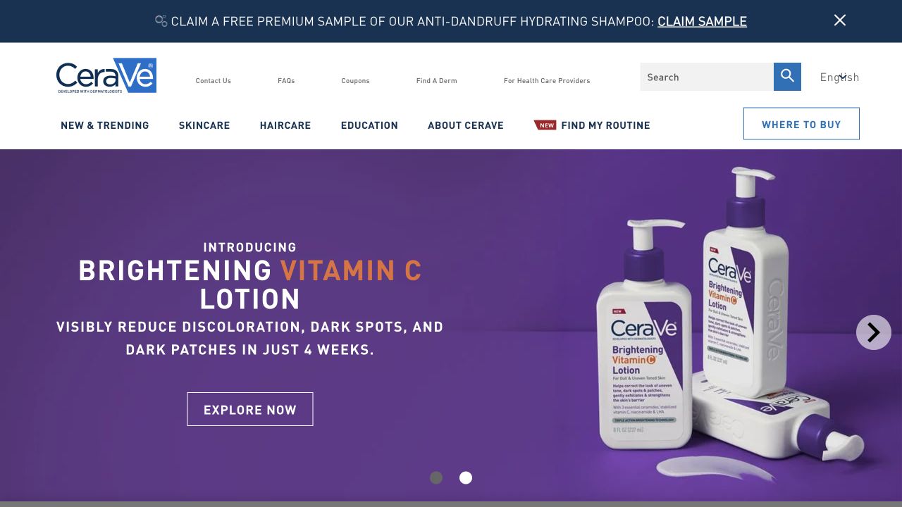
CeraVe separates Skincare, Haircare, Education and company information in a light header above a colorful product introduction. The observed page follows its campaign with product-category entrances, new launches and a routine-finding route. Professional information and a dermatologist-finding destination sit in a quieter utility area. The useful design distinction is between understanding the range, learning unfamiliar terminology and deciding where to buy; those tasks are not compressed into one promotional button.
What you can learn
Map educational content to the questions behind the catalog. A customer who recognizes a cleanser should be able to shop directly, while someone unfamiliar with a category needs an explanation that does not pretend to diagnose them. Have the responsible product reviewers approve scientific claims and any recommendation workflow before publishing.
Pros
Shopping and education have separate, recognizable places in the header.
Product types provide practical entry points beyond the changing campaign.
Cons & considerations
Several stacked promotional messages can compete with essential navigation.
A routine finder needs clear limitations and cannot replace individualized professional advice.
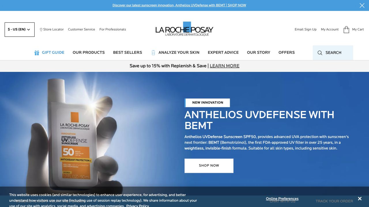
La Roche-Posay uses a large blue product feature under a pale navigation area. The observed header keeps Products, Best Sellers, Expert Advice and the brand story distinct, while an analysis route and professional utilities offer different forms of help. A service and loyalty layer appears around the shopping content rather than replacing it. This structure is worth studying for its separation of audiences, not as verification of the efficacy or regulatory status of the featured formula.
What you can learn
A specialized launch should link to an explanation with the appropriate evidence, limitations and market information. Keep professional resources separate from consumer shopping, and explain what an analysis tool actually returns before collecting personal details. Test the ordinary browse route as carefully as the more elaborate guided experience.
Pros
Professional utilities are separated from the primary consumer catalog.
Advice and product navigation remain available alongside the seasonal feature.
Cons & considerations
Dense service and promotion strips increase the visual load above the main content.
Technical product claims need a maintained supporting explanation, not only a hero graphic.
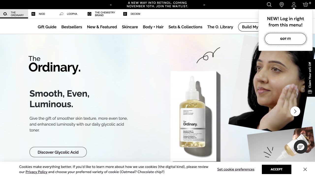
The Ordinary combines a restrained monochrome navigation system with a brighter campaign area and product packshots. The catalog uses ingredient names and concentrations, while a library and regimen-building destination sit alongside more familiar shopping categories. A multi-brand strip adds another layer above the main menu. The reference highlights the tension between precise product naming and visitor confidence: detailed labels are informative only when the reader can understand how to compare them.
What you can learn
Give specialist product names a consistent supporting vocabulary. Explain product purpose, format and relevant cautions without forcing every visitor into a quiz or account. Prototype a first-time shopping session using an unfamiliar ingredient and check whether the educational route reconnects clearly with the correct product page.
Pros
The learning library is presented as an enduring destination rather than a temporary article campaign.
Product naming is visibly systematic across the assortment.
Cons & considerations
Several brand and promotional layers can complicate initial orientation.
A technical label is not sufficient guidance about suitability or combining products.
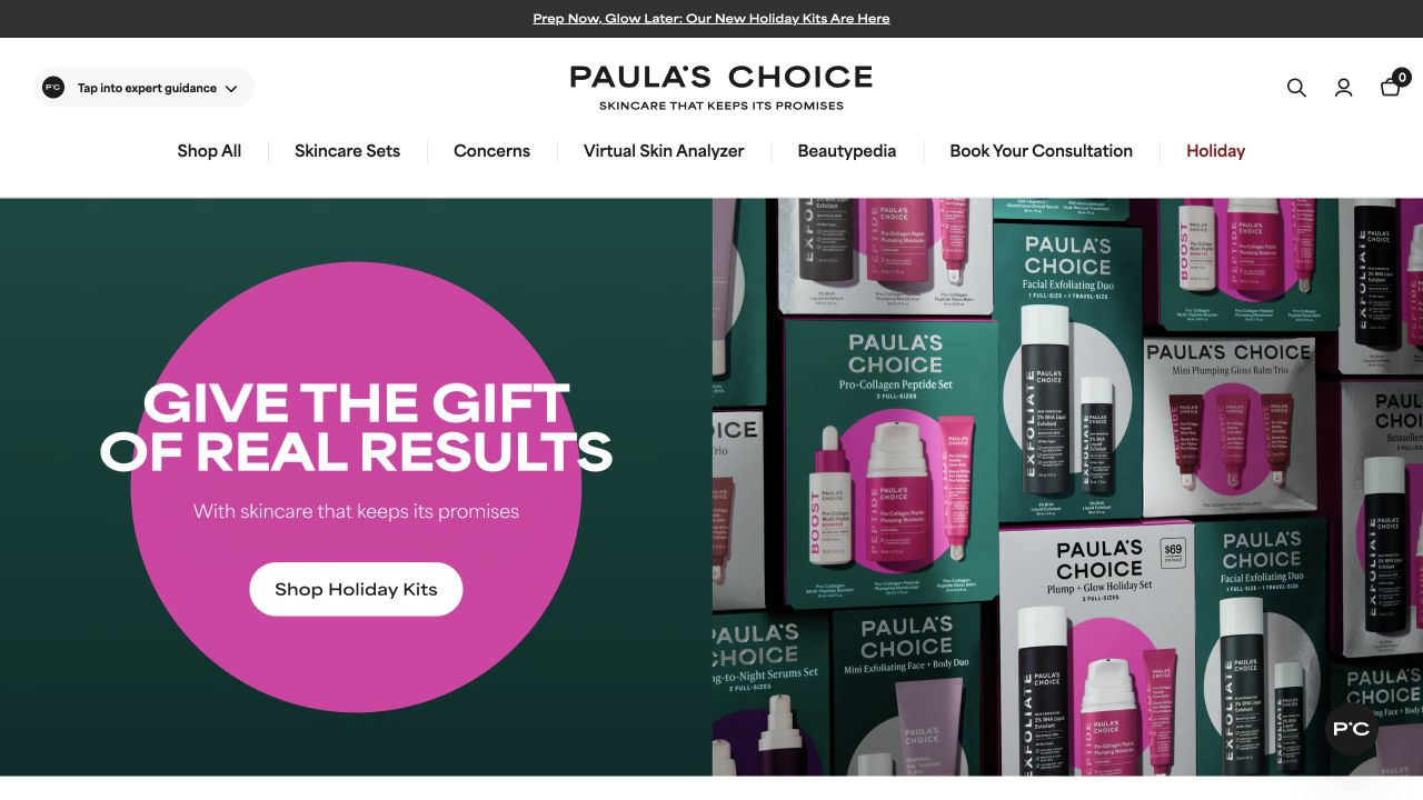
Paula’s Choice places a centered identity over a clear menu that includes concerns, skincare sets, a skin-analysis route, ingredient education and consultation access. The captured seasonal feature uses a strong pink-and-green composition with product packaging visible beside the action. Below it, product collections and guidance content give the visitor additional starting points. This is useful for studying how educational services can remain discoverable without making the shop disappear inside a recommendation experience.
What you can learn
Let visitors choose their level of assistance. A consultation or analysis tool should have a stated purpose, appropriate data handling and a direct alternative for someone who simply wants to browse. Keep collection labels understandable and connect guidance results to reviewed product information rather than a vague sales destination.
Pros
Consultation and learning routes are explicit in the primary navigation.
The campaign shows actual product packaging rather than only an abstract lifestyle scene.
Cons & considerations
Several assistance tools may be difficult to distinguish without short explanations.
Large seasonal claims should not obscure the practical product information needed after the click.
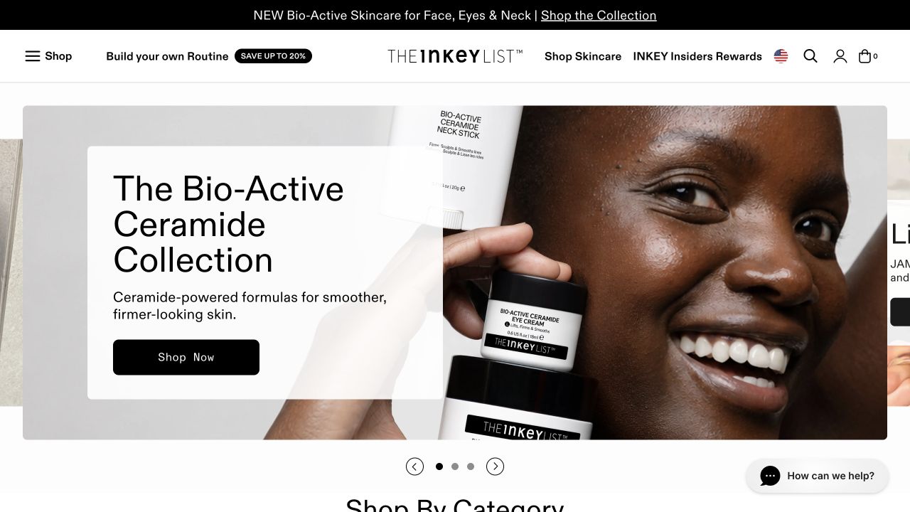
The Inkey List’s observed page pairs a product-and-person campaign with direct catalog links and an ingredient-education section. Bestsellers, sets and body care have their own places, while lab and advice destinations expand the site beyond a grid of bottles. Product cards expose prices and shopping actions near descriptive names. The important lesson is the connection between educational terminology and the retail structure, not the accuracy of the brand’s stated clinical outcomes.
What you can learn
Create a glossary that supports real comparison questions and link it to the products it explains. Give the material an editorial owner and a review process. A familiar ingredient can appear in several formats, so the page still needs clear usage context, package details and approved cautions rather than assuming the name settles the decision.
Pros
Ingredient explanation is part of the visible site structure.
Shopping categories remain distinct from editorial and lab content.
Cons & considerations
A dense product vocabulary can overwhelm a visitor new to the range.
Clinical-result language requires evidence and qualifications beyond a short card description.
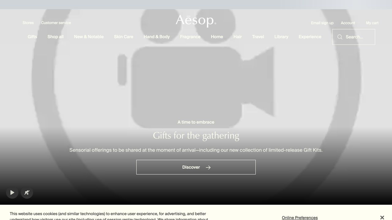
Aesop’s homepage uses a muted palette, restrained typography and a wide campaign composition. Skin Care remains a named category beside body, fragrance and other ranges, while Library and Experience introduce a more editorial layer. The observed content moves from gifting into product groups and store-related information rather than presenting every item at once. It is a reference for maintaining one visual language across commerce and storytelling, not proof that restrained design automatically produces a better shopping experience.
What you can learn
Write the practical retail content before adopting a sparse visual style. Prices, sizes, directions and delivery information must remain easy to locate even when the brand voice is more literary. Test a visitor who knows a product category but not the brand’s collection names, and preserve a plain route to the relevant assortment.
Pros
The main category vocabulary remains readable inside a distinctive brand presentation.
Commerce and editorial destinations share a consistent typographic treatment.
Cons & considerations
Atmospheric campaigns can postpone concrete product comparison.
Minimal labels need sufficient surrounding context to avoid making the visitor guess.
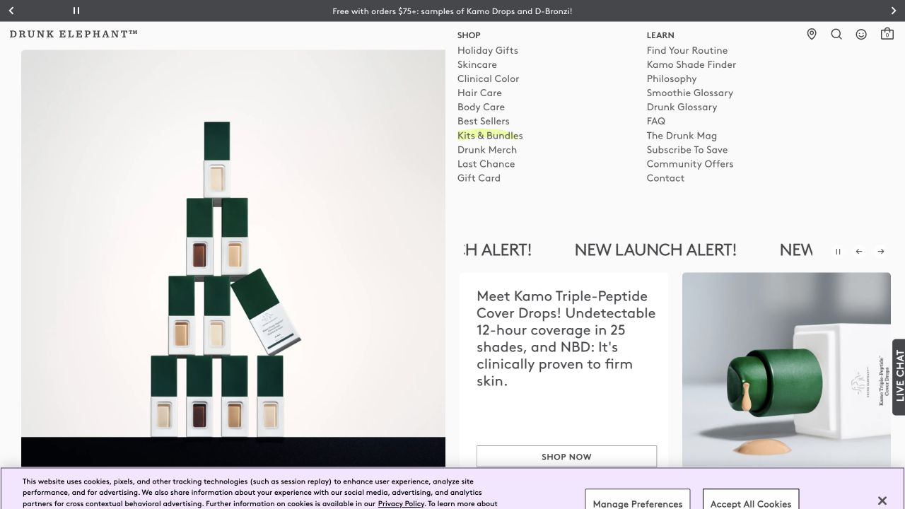
Drunk Elephant uses vivid product colors and a broad split between Shop and Learn. The observed learning branch includes routine guidance, a philosophy area and glossary-style content, while product families and kits stay in the shopping structure. The opening feature combines a product announcement with a model and a short action. The reference shows how an energetic voice can be organized; it does not establish that a playful name or a visible claim explains suitability on its own.
What you can learn
Keep branded terminology anchored to plain-language descriptions. A glossary should explain unfamiliar names in context, and a routine-building route should clarify what information it uses and what it cannot determine. Ask a new visitor to find both a known item and an explanation without relying on familiarity with the campaign.
Pros
The split between shopping and learning gives different visitor tasks clear homes.
Strong product colors create a recognizable visual system across the range.
Cons & considerations
Playful names can make product differences harder to understand.
A launch-heavy first screen still needs dependable routes to quieter service and usage information.
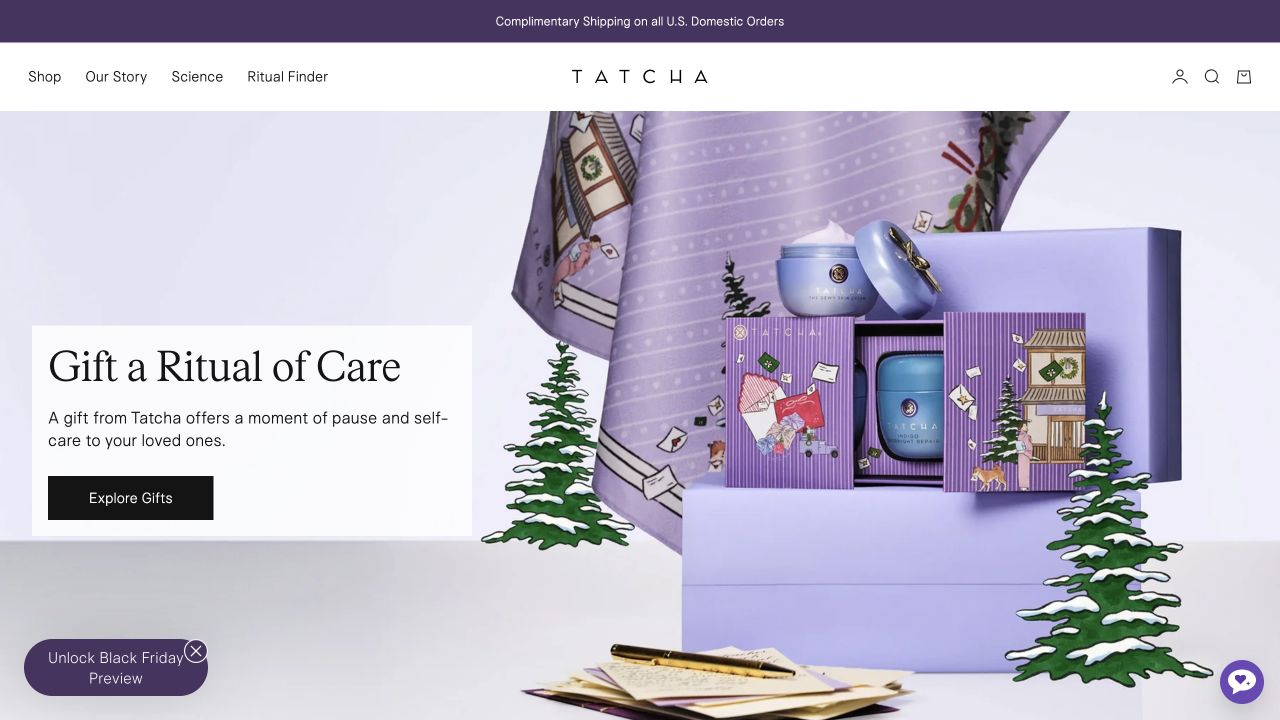
Tatcha’s captured page places Shop, Our Story, Science and a ritual-finding route in a compact header. The seasonal composition uses softly colored packaging and gift imagery, followed by best-selling formulas and skin-type entry points. Product cards provide format descriptions as well as names and prices. This makes the reference useful for considering how a concise navigation can still acknowledge that an unfamiliar shopper may need more explanation before choosing a product.
What you can learn
A short menu works when its destination pages carry the necessary detail. Decide what belongs in the product catalog, what explains the brand and what describes supporting evidence. Keep guided shopping optional, and test whether the result of that journey can be understood without treating it as a professional assessment.
Pros
A small number of navigation labels establishes distinct reading and shopping tasks.
Product cards combine branded names with more descriptive format labels.
Cons & considerations
A ritual-led vocabulary may be unclear to someone seeking one straightforward replacement item.
Premium presentation does not establish efficacy, value or suitability for a particular person.
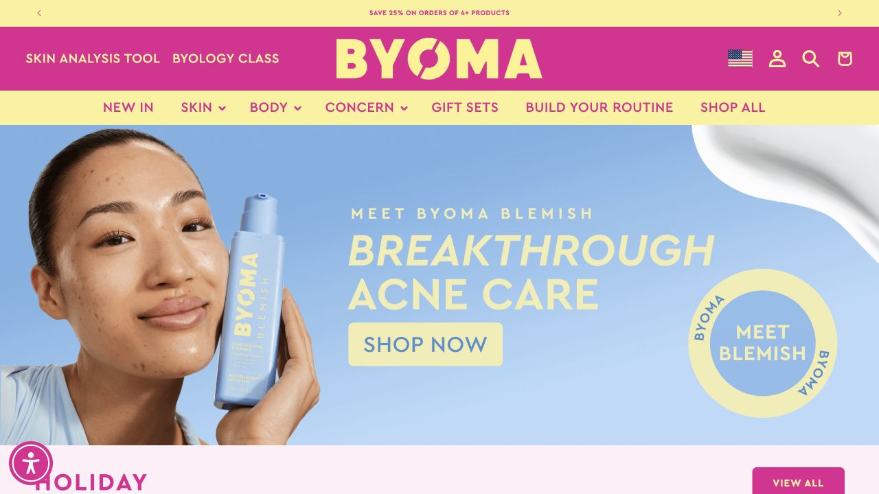
BYOMA’s bright header and colorful packaging create an immediately recognizable frame. The observed menu separates Skin, Body and Concern, with a routine-building route and a link to the whole range. Product sets and bestsellers follow the main feature. The brand’s educational destination has its own label rather than being hidden solely inside product descriptions. The interesting design question is how those routes connect, so the same product does not appear to belong to unrelated catalogs.
What you can learn
Use a shared content model behind category, concern and routine pages. Give each product one authoritative record for sizes, instructions and claims, then surface it through the relevant browsing route. Write concern labels carefully: they should help navigation without implying that a public storefront has diagnosed the visitor’s skin.
Pros
The catalog exposes product-type and concern-based browsing as separate options.
Packaging colors and site colors form a clear, repeated identity.
Cons & considerations
Several guided routes need explanation so visitors understand how they differ.
Bright combinations should be checked for text readability rather than assumed to be accessible.
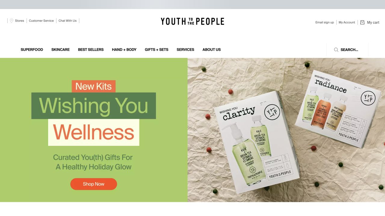
Youth To The People presents a split campaign with green typography and a product-set photograph, followed by bestsellers, new arrivals and bundles. The observed navigation distinguishes skincare from body care and gives services and brand information their own positions. A separate editorial platform appears later on the page. This arrangement makes it possible to study where product buying ends and broader brand storytelling begins, without assuming that a mission statement independently verifies the company’s claims.
What you can learn
Keep values content connected to specific, supportable information. Explain refill, packaging or sourcing statements where they matter to the product decision, and give dated editorial pieces a maintained home. A shopper looking for a cleanser should be able to reach the range without first completing the brand’s entire narrative.
Pros
Routine retail categories are not replaced by the mission-led story.
An editorial destination gives longer material a durable place outside promotional banners.
Cons & considerations
Environmental language needs clear evidence and scope behind the headline.
New arrivals, bundles and services can become overlapping routes without careful labeling.
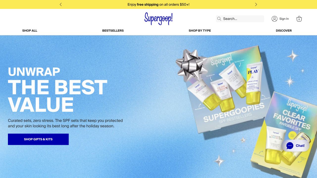
Supergoop! builds the observed opening around a bright blue gifting composition and a small set of high-level shopping labels. Shop by Type provides a more practical route alongside bestsellers and editorial discovery. Product cards then expose sizes, prices and short format descriptions. The visual identity is energetic, but the site’s specialist focus means the next page still has to explain meaningful differences between formulas, finishes and packaging rather than relying only on a shared brand promise.
What you can learn
For a specialist catalog, identify which distinctions customers actually compare and make those consistently visible. Keep required product statements and directions accurate for the market served. A cheerful campaign and familiar category label cannot establish how a particular person should use a formula or whether one format meets their needs.
Pros
Product-type navigation offers a direct alternative to seasonal merchandising.
Cards expose practical package information alongside branded names.
Cons & considerations
A strongly promotional first screen can delay the distinctions between similar products.
Important sunscreen instructions and qualifications must not be reduced to decorative badges.
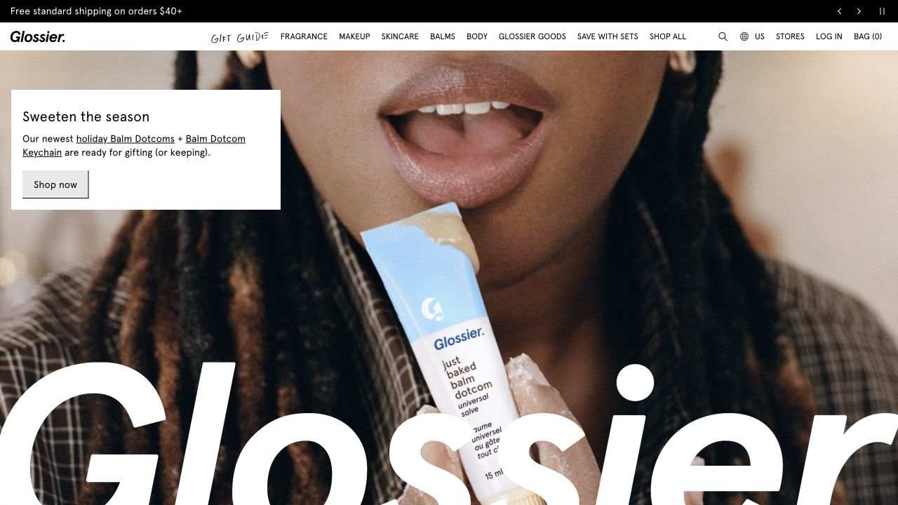
Glossier places a close-up product-use photograph beneath a very compact navigation row. A small white copy panel carries the seasonal message and action, while an oversized version of the identity extends into the image. Skincare remains a direct category beside fragrance, makeup, balms and body products. That separation matters for a multi-category beauty business: a customer looking for cleansing or moisturizing products need not infer the right route from the main campaign.
What you can learn
Use the same navigation discipline when one brand serves several related shopping needs. Let campaigns cross categories without erasing the category boundaries. Before using a very large image or wordmark, test how the content behaves when the photograph fails to load and whether the practical product label remains understandable.
Pros
A solid copy panel protects the campaign text from the photographic background.
Skincare has a named route within the broader beauty assortment.
Cons & considerations
A large image-led opening can reveal little about product differences.
Oversized branding and photography need thoughtful crops on smaller screens.
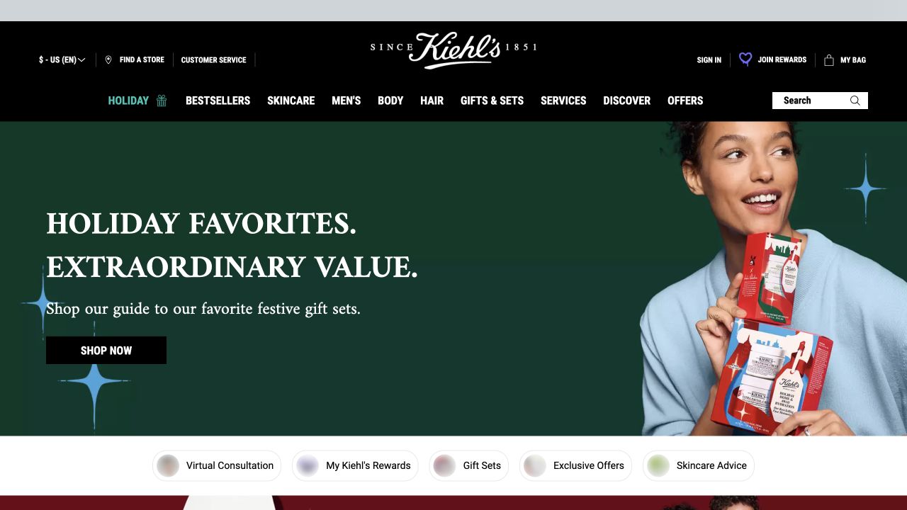
Kiehl’s observed page uses a dark green seasonal composition under a black-and-white retail header. The navigation separates product categories, services and offers, with store finding and customer support in the utility area. A concern-based section appears below the featured gift campaign, alongside direct access to popular formulas. The design is useful for understanding how an established store network can support online discovery without turning the entire website into a branch directory.
What you can learn
Specify the relationship between online product information and in-person assistance. A consultation, store visit and ordinary online purchase are different next steps and should be labeled accordingly. Keep product concerns as browsing aids, and have the appropriate reviewer approve any assessment language before it becomes part of an interactive tool.
Pros
Store and customer-service utilities have a consistent place above the catalog.
Concern-based discovery offers an alternative to browsing by product type.
Cons & considerations
Service, gift and promotion layers can crowd the first view.
Concern labels need careful context so they do not imply an individual diagnosis.
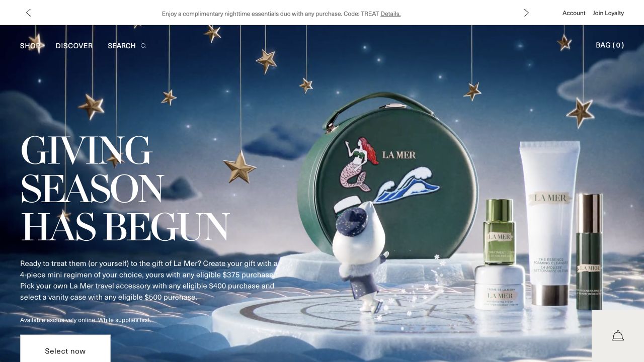
La Mer’s captured homepage uses a dark blue seasonal setting, star-like details and product packaging as the principal visual elements. A compact header splits Shop from Discover, with account and bag utilities nearby. The subsequent content moves into named product collections instead of presenting one undifferentiated grid. The reference demonstrates a controlled brand atmosphere; it does not establish whether a premium product is effective, suitable for a particular person or worth its price.
What you can learn
Keep the visual hierarchy restrained, but make the next page more informative than the advertisement. Customers comparing products need formats, sizes, directions and supporting explanations in a repeatable structure. Ensure gift conditions and promotional eligibility remain readable without requiring someone to decode decorative campaign artwork.
Pros
A small number of primary destinations gives the opening a clear structure.
Product-family sections provide a more organized continuation after the seasonal feature.
Cons & considerations
An atmosphere-led introduction can be vague for first-time visitors.
Promotional conditions and scientific claims need plain, accessible supporting text.
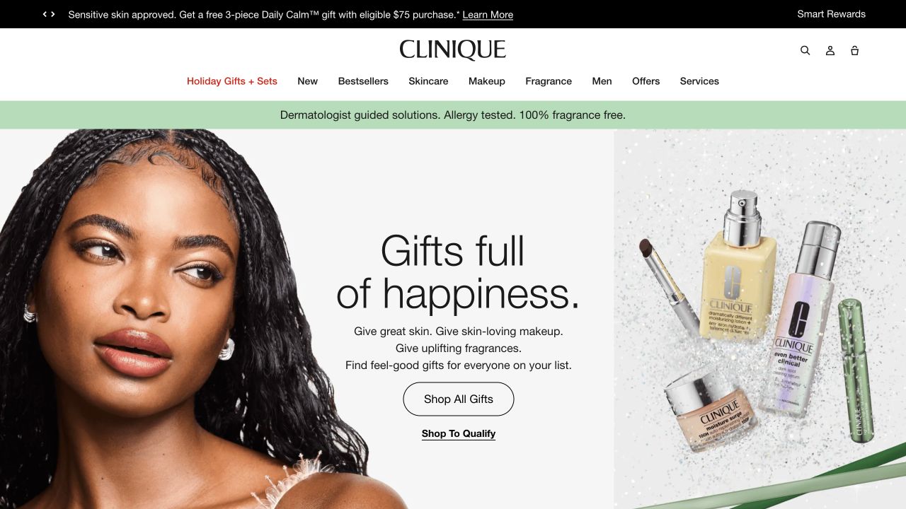
Clinique places a large photographic gifting composition beneath a white navigation area. Skincare, makeup, fragrance and other ranges are separated from services and offers, while bestsellers provide a route for returning shoppers. The campaign uses large green type, a person and product packaging together rather than an isolated decorative background. This is a useful example of using seasonal styling without abandoning the practical structure of an extensive beauty catalog.
What you can learn
Define which navigation choices must remain stable across every campaign. Make product-family pages do the explanatory work that a large hero cannot: show how formats differ and where approved instructions and cautions are found. A prominent promotional story should remain optional for someone who already knows the product they need.
Pros
Stable product-category labels remain visible above the seasonal composition.
The campaign combines recognizable packaging with a human-scale photograph.
Cons & considerations
Multiple offers in the announcement area can dilute the main message.
A broad beauty assortment needs clear distinctions between skincare guidance and cosmetic merchandising.
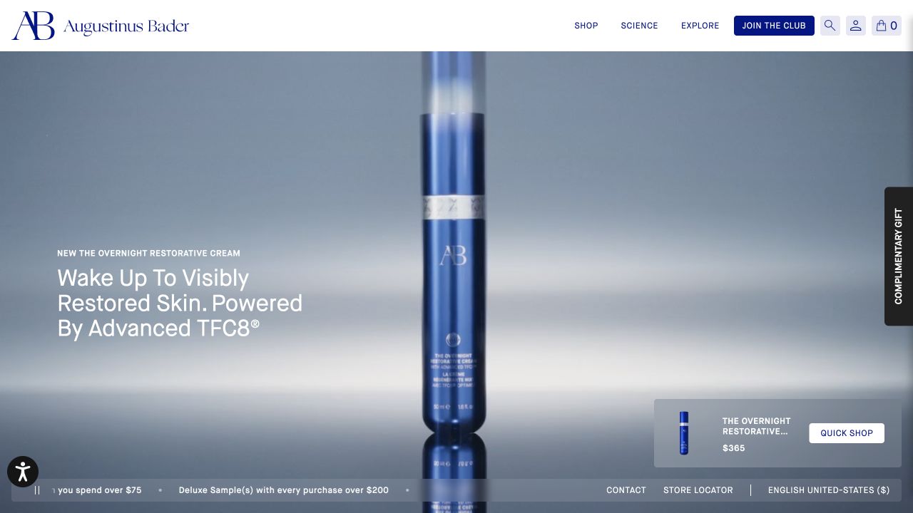
Augustinus Bader’s observed header separates Shop, Science and Explore, with a loyalty destination and compact utilities. The main feature introduces a single cream against a restrained dark background, followed by face, hair and body groups. A scientific proposition therefore has a dedicated information route rather than existing only in the hero. The design reference is the separation of explanation from transaction; the brand’s claims and results were not independently evaluated in this review.
What you can learn
If a technical story is central to the positioning, make its supporting material easy to find and readable without a specialist background. Define who reviews the evidence, qualifications and update dates. A concise header can help, but a large promotion or newsletter overlay should not become the first obstacle to that explanation.
Pros
Scientific explanation has a distinct destination beside the shop.
The flagship feature is followed by recognizable product groups.
Cons & considerations
Premium terminology can require more context than a short headline offers.
Promotional overlays may obscure an otherwise carefully controlled first impression.
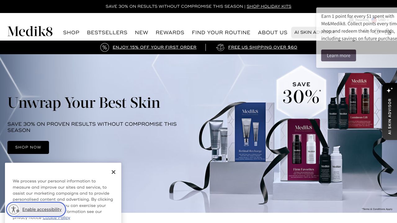
Medik8’s observed homepage follows a seasonal campaign with product categories and a separate concern-based section. The header also exposes routine guidance, rewards and company information. Gift kits, bestsellers and specialist product families receive distinct modules rather than being mixed into one long list. The resulting structure is useful for comparing two shopping vocabularies: a visitor may know they want a serum, or may only know the subject they want to research.
What you can learn
Use shared product records behind both routes so claims, instructions and package details do not diverge between landing pages. Explain the boundaries of any advisor or routine tool before asking for personal input. Test whether someone can return from a guided recommendation to ordinary browsing without losing the product context.
Pros
Product-type and concern-based entrances acknowledge different starting knowledge.
Gift kits and ordinary product browsing are visibly separated.
Cons & considerations
Several competing guidance and loyalty routes need prioritization.
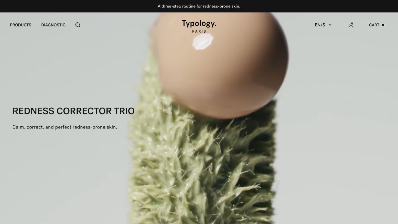
Typology uses a very small header and a large product composition with a brief description on a muted background. The observed assortment names formats, ingredients and concentrations in the same line, while a diagnostic route is separate from the direct product catalog. Seasonal routines and sets then provide another way to browse. The design shows how a consistent naming system can become part of the interface, while also making its reading burden more apparent.
What you can learn
Create a naming pattern that can survive both a short card and a long detail page. Explain ingredient terminology where it appears, and keep the underlying product instructions authoritative. A concise-looking storefront still needs a usable route for customers who do not know the technical vocabulary or do not want a guided assessment.
Pros
The restrained navigation clearly distinguishes products from guided discovery.
Product names follow a visibly consistent information pattern.
Cons & considerations
Long ingredient-led titles can be difficult to compare on narrow cards.
Minimal presentation must not hide qualifications, directions or practical purchase details.
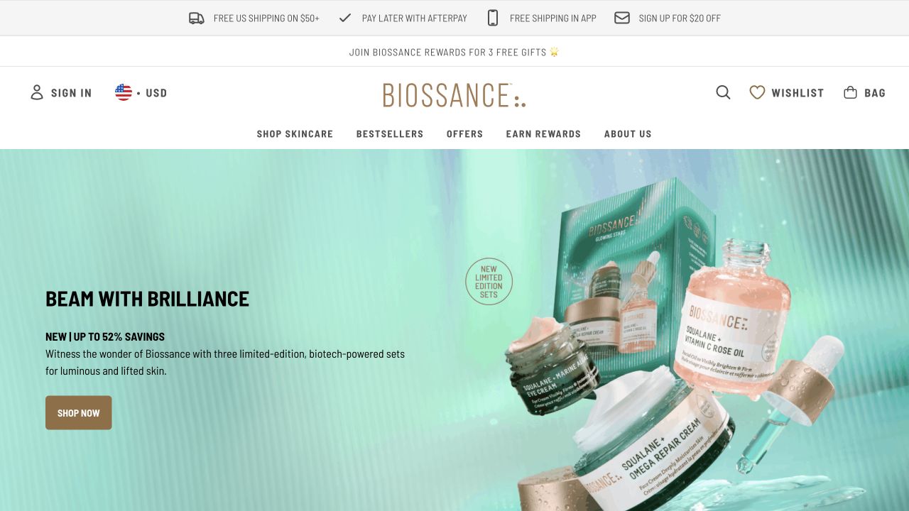
Biossance’s captured opening uses a turquoise product photograph and a seasonal set promotion, followed by distinct loyalty and new-member sections. The header separates skincare, bestsellers, offers, rewards and brand information. Product lists then return to formulas and routine-oriented content. It is useful to compare the shopping route with the membership route here: both are visible, but they answer different questions and should not be mistaken for the same visitor objective.
What you can learn
Decide which information someone needs before joining a program and which belongs to ordinary product evaluation. Present the terms of incentives close to the offer and provide a direct route to the catalog. Keep explanatory product material independent of temporary reward campaigns so it remains useful when promotions change.
Pros
Rewards and product browsing have recognizable, separate labels.
The product-set photograph makes the featured assortment concrete.
Cons & considerations
Several consecutive membership incentives can delay practical product information.
Promotional value statements need clear eligibility and package context.
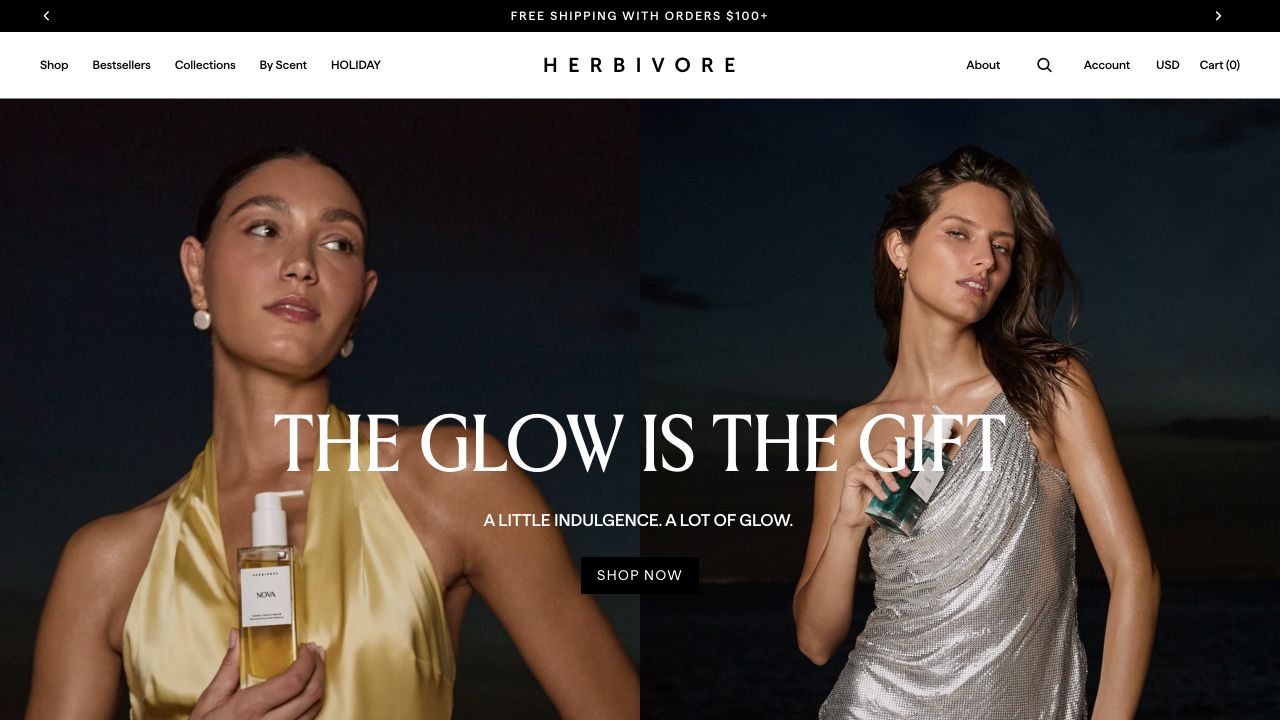
Herbivore’s opening uses warm, close-up photography, restrained white type and a clearly labeled shopping action. The observed header keeps Shop, Bestsellers and Collections distinct, with a seasonal gift route and brand information alongside them. Further down, the page introduces product and ingredient stories. The design reference is the coherence of the photography and retail structure; botanical imagery is not independent evidence of a formula’s safety, effectiveness or environmental impact.
What you can learn
Choose imagery that introduces the identity without making unsupported promises. Pair ingredient stories with accurate product-specific explanation and an appropriate review process. Visitors who arrive with a practical replacement purchase in mind should still find the product format and details without reading the full brand narrative.
Pros
A consistent photographic treatment makes the brand presentation easy to recognize.
Bestseller and collection routes give returning customers alternatives to the campaign.
Cons & considerations
White copy over photographic subjects requires testing across crops.
Plant-based language needs precise scope rather than implied universal suitability.
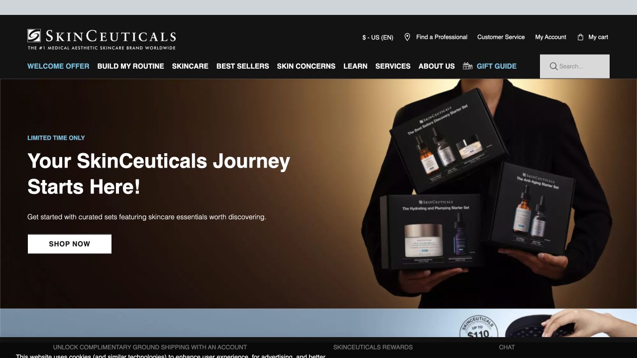
SkinCeuticals places a dark, product-led feature beneath a conventional shopping header. The observed navigation separates product categories, concerns, learning, services and company information. Finding a professional and building a routine are distinct routes rather than an interchangeable pair of shopping buttons. This is useful for considering how a specialist range can acknowledge the limits of self-service product discovery without hiding the ordinary catalog.
What you can learn
Write the boundaries of each assistance route clearly. A professional locator, product explanation and public recommendation tool serve different purposes and involve different information. Have the responsible business reviewers approve claims, terminology and form fields, and give visitors a plain path to support when the online material does not answer their question.
Pros
Professional assistance has a recognizable destination outside the basic catalog.
Learning content and product concerns are separated from the brand story.
Cons & considerations
Scientific positioning requires accessible supporting material and careful claim review.
A multi-route assistance system can feel repetitive unless each option explains its purpose.
Cipher Skincare’s captured homepage places a large reflective wordmark on an otherwise spare off-white field. Shopping, product-finding and company information appear as small, spatially separated text routes, with account and cart utilities at the edges. There is little conventional product explanation in the initial view. The example is useful precisely because it exposes a tradeoff: a memorable identity can occupy the first screen, but an unfamiliar visitor still needs enough context to understand what is being sold.
What you can learn
Before choosing an identity-led opening, test it with people who do not already know the brand. Ask them to describe the product category and locate the next practical step. Preserve the visual idea only if the subsequent product pages supply the format, directions and support information that the introduction leaves unanswered.
Pros
The very small set of routes avoids competing promotional modules.
One expressive visual element gives the opening a distinct character.
Cons & considerations
The initial frame provides little immediate skincare or product context.
Controls positioned at distant corners need a deliberate mobile and keyboard order.
Plan the catalog, review process, and customer questions
Build representative product records first
Prepare a single item in several sizes, a bundle, a temporarily unavailable item, and a product with a long description. Include approved ingredients, directions, qualifications, and the source owner for each field. A content model is useful when a routine correction can be made without updating several inconsistent copies.
Make marketing review part of publishing
Identify who approves product descriptions, campaign statements, customer stories, and translations. Record what happens when packaging or instructions change. Keep a dated source for approved statements rather than allowing a promotional page to become a second, unreviewed version of the product record.
Test comparison and ordering without real customer data
Walk through category selection, product comparison, size changes, a bundle, and any recurring-order option. Use the provider’s appropriate test workflow for transactions. Check that a reader can leave a recommendation flow, find the ordinary catalog, and understand where a public inquiry stops short of individualized advice.
The editing job behind the design
Choose tools around accurate product information
Select the commerce and content setup around catalog ownership, variants, approved descriptions, language needs, and daily merchandising. A separate editorial system can be useful only when its relationship to the product record stays clear. Avoid maintaining different ingredient or instruction copies in unconnected campaign sections.
Review quiz, chat, analytics, reviews, and subscription integrations individually. Define their purpose and the information they handle, and provide an alternative if they are unavailable. A visible Shopify reference or an image service does not reveal a brand’s full ordering, fulfillment, or customer-data architecture.
Our WordPress website examples offer a separate look at publishing approaches. A visible platform label is evidence for that named page, not a guarantee that the same system will suit your requirements.
Before the public launch
Skincare website launch checklist
Have responsible reviewers approve product statements, instructions, and supporting context.
Check sizes, variants, bundle contents, availability, and selected prices.
Keep complete product information consistent across cards, detail pages, and campaigns.
Make recurring-order choices and practical order terms understandable before purchase.
Test category browsing and product-finder alternatives on a phone and with a keyboard.
Record permissions and context for customer stories and before-and-after imagery.
Keep personal health details out of ordinary marketing forms and measurement events.
Assign owners for product changes, translations, integration failures, and expired offers.
These checks are a project checklist, not a performance, legal, security, or accessibility certification. Test real journeys with the people responsible for the website before making claims about the result.
Sources & editorial method
How this collection was selected and reviewed
We selected official skincare-brand properties to compare product explanation, catalog structure, and merchandising. Direct browser screenshots are dated and attributed; original dates are retained where an existing capture is reused. We did not buy products, evaluate formulations, verify clinical claims, or submit personal information to recommendation tools.
Each example links to its actual source page. Screenshots are direct browser captures with their own capture dates; moving imagery, announcements and live designs can change. The notes describe observable design choices and conditional tradeoffs, not measured traffic, conversion results, service quality, or accessibility conformance.
Technology labels use public page metadata, asset evidence, or explicitly cited platform documentation. Platform documentation is not a complete current deployment audit. A component reference may be legacy or unused; it is not a complete backend inventory. Unknown stacks are omitted. These sites are editorial examples, not our client portfolio.
Written, Edited and Curated are separate editorial records, not timestamps advanced by a rebuild. Website designs and imagery belong to their owners. See our editorial standards or suggest a correction.
Questions worth asking
Skincare website design questions
Should a skincare homepage lead with a routine or a product?
Choose the primary audience’s actual task. A focused catalog may benefit from one clear product explanation, while a larger range may need recognizable category entrances. Test whether an unfamiliar visitor can still find complete information without following a guided routine.
Do we need a product quiz?
Only if it has a defined purpose, appropriate review, understandable questions, and a clear information-handling process. Keep an ordinary catalog route available. A marketing quiz should not imply that the website has provided a personal diagnosis.
Can we copy the claims or customer photos in these examples?
No. The collection is an editorial design reference, not permission to reuse a brand’s assets or statements. Prepare your own approved material and record permissions for customer contributions.
Does an impressive design prove a product works?
No. Visual presentation and public technology signals do not establish effectiveness, safety, suitability, or clinical results. Those questions require their own appropriate evidence and review.
Borrow a clearer way to explain or compare products. Build the actual descriptions, claims, and buying process around information your business can support.