Best Kitchenware Store Websites of 2026 (27 Real-World Examples)
Kitchenware store websites that make a broad assortment easier to choose
A kitchenware website should connect appealing food and product imagery with clear information about the item, its size, its intended use and the practical details of buying it.
A customer looking for a first saucepan, a replacement coffee filter and a professional knife may arrive with very different knowledge. A useful kitchenware store does not require all three to learn the retailer’s internal product vocabulary. It provides recognizable entrances, dependable item records and a sensible way to compare variants without turning every product page into an overwhelming technical manual.
This collection studies genuine kitchenware retailers and direct-to-consumer product brands. Their catalogues range from broad cookware and utensil selections to more focused coffee, tabletop or specialist-tool offers. We compare visible retail presentation and information design, not cooking performance, product safety or value for a particular household. Original screenshots retain their capture dates, and current official material qualifies the retail offer independently from the pictured frame.
Before the examples
What makes good kitchenware store website design in 2026?
Organize around recognizable shopping tasks
Product type, size, material and cooking interest can each provide useful entrances. Choose categories the actual catalogue supports and explain specialist terms. A shopper should not have to know a model name before finding an appropriate product family.
Give variants dependable information
A set, a single pan, a replacement part and a gift bundle are different purchases. Keep names, included items, sizes and supplied compatibility information connected to the exact variant. Attractive collection imagery should not leave the customer guessing what is in the order.
Separate inspiration from unverified product promises
Recipes, kitchens and demonstration photographs can explain context. They do not independently establish durability, safety, performance or health benefits. Use the responsible brand’s accurate specifications and instructions, with clear attribution where needed, rather than amplifying claims merely because the product looks impressive.
The collection · 27 examples
27 kitchenware store websites worth studying
Compare how each store turns a visual first impression into a specific shopping choice. Notice category labels, product context, variant information and the balance between practical retail navigation and a distinctive brand.
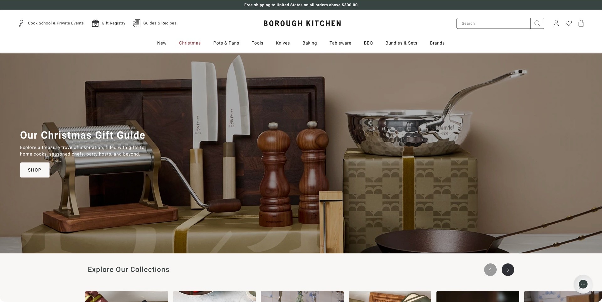
Borough Kitchen presents its Christmas gift guide as a carefully arranged still life: knives, wooden mills, a pasta machine and reflective cookware share a muted background. The photograph communicates assortment without becoming a product grid. Above it, clear departments name Pots & Pans, Tools, Knives, Baking and Tableware. A separate utility row introduces the cook school, gift registry and guides, giving the specialist shop an identity beyond seasonal discounts.
What you can learn
Give customers two complementary entry points: an occasion-led collection and a stable vocabulary for the tools themselves. Education links help when unfamiliar cookware needs explanation before purchase. Keep those routes visible when the holiday campaign changes, and connect product pages to material, size and care information. The photograph supports discovery; it does not establish product performance.
Pros
The restrained still life makes several distinct kitchen categories feel like one coherent selection.
Cook school, registry and guides are separated from the main merchandise navigation.
Cons & considerations
If a visitor needs a particular pan size, the broad gift campaign is an extra browsing step.
The layered header needs careful prioritization when the same navigation is reduced to a narrow screen.
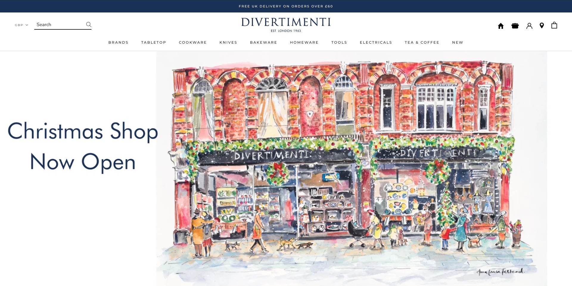
Divertimenti uses a detailed illustration of its decorated brick storefront rather than a conventional cookware photograph. The large Christmas-shop message sits beside the drawing, while the centered serif wordmark and small establishment date create an orderly introduction. Brands, Tabletop, Cookware, Knives, Bakeware, Homeware, Tools, Electricals and Tea & Coffee remain readable across the white header. Search and shopping utilities occupy opposite sides, leaving the central identity visually undisturbed.
What you can learn
A physical store can contribute distinctive visual material without turning the homepage into a location page. Let the illustration establish character, then use the category system for practical shopping. This separation is more transferable than copying the drawing. Maintain year-round routes for shoppers arriving with a particular tool or brand in mind.
Pros
The illustrated premises make the shop memorable without repeating another generic pan photograph.
The broad assortment is divided into familiar, concrete department names.
Cons & considerations
If the seasonal artwork is the main entry, a clear linked destination becomes especially important.
Small, widely spaced navigation text should be checked for readability rather than treated as inherently accessible.
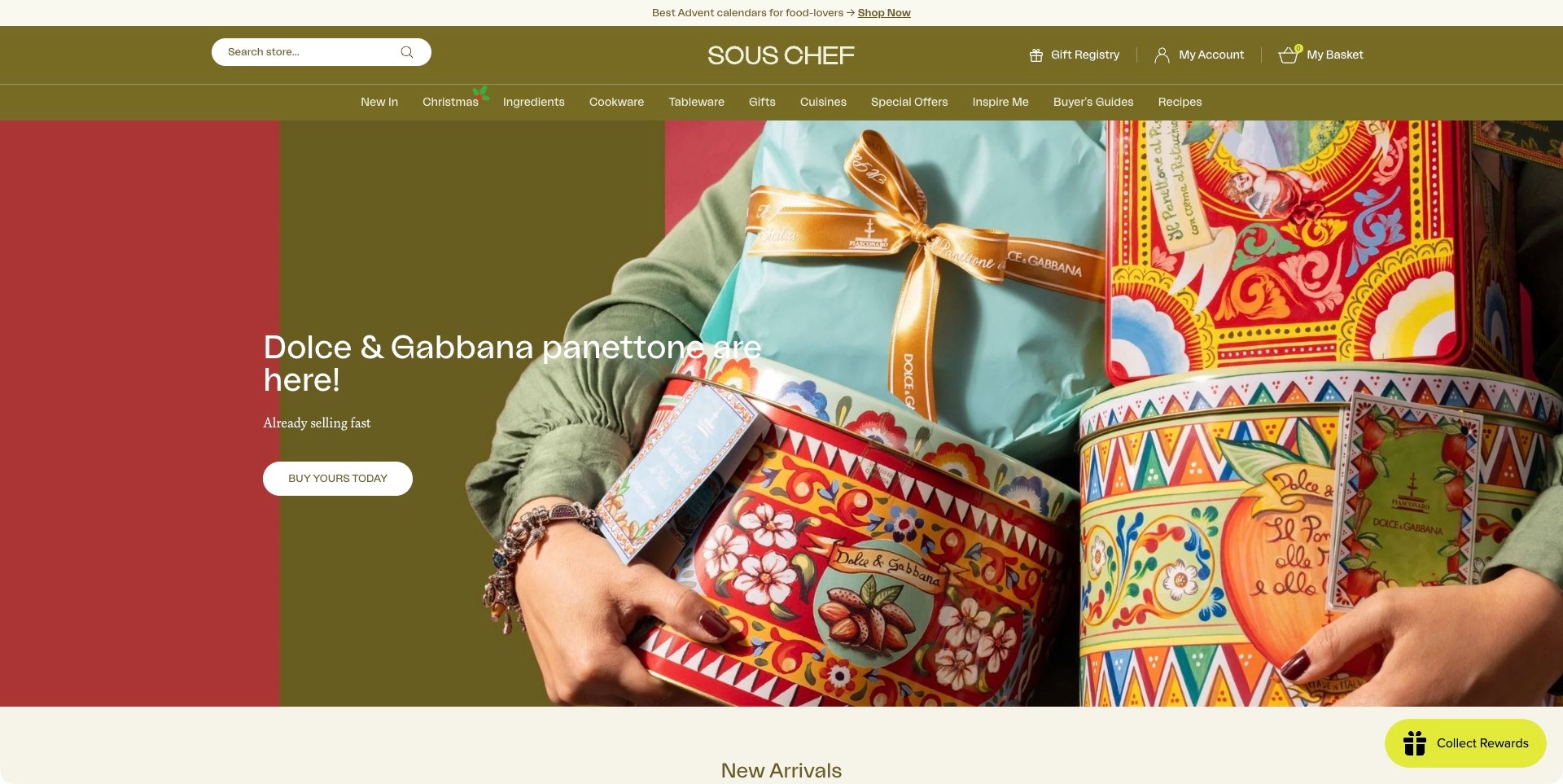
Sous Chef opens with colorful panettone packaging held in a person's arms, paired with an olive-colored header and a short buying action. This is a food campaign inside a wider cooking shop rather than a cookware-only presentation. Ingredients, Cookware, Tableware, Gifts and Cuisines are named beside Buyer's Guides and Recipes. Search, the gift registry and account controls remain prominent above the department row, making the larger offer visible around the highly seasonal hero.
What you can learn
When food and equipment coexist, organize around how customers cook and choose, not only the inventory structure. Guides and recipes give unfamiliar ingredients or tools context, while product departments serve precise requests. Distinguish edible gifts from durable equipment. Packaging-led photography suits this campaign but cannot replace dimensions, compatibility and care guidance for cookware.
Pros
The vivid gift packaging provides a distinctive seasonal focal point within a consistent olive interface.
Guides and recipes are visible alternatives to entering a merchandise category immediately.
Cons & considerations
If a visitor expects cookware first, the food-led hero relies on navigation to communicate the broader assortment.
The many department and editorial links need a disciplined smaller-screen hierarchy.
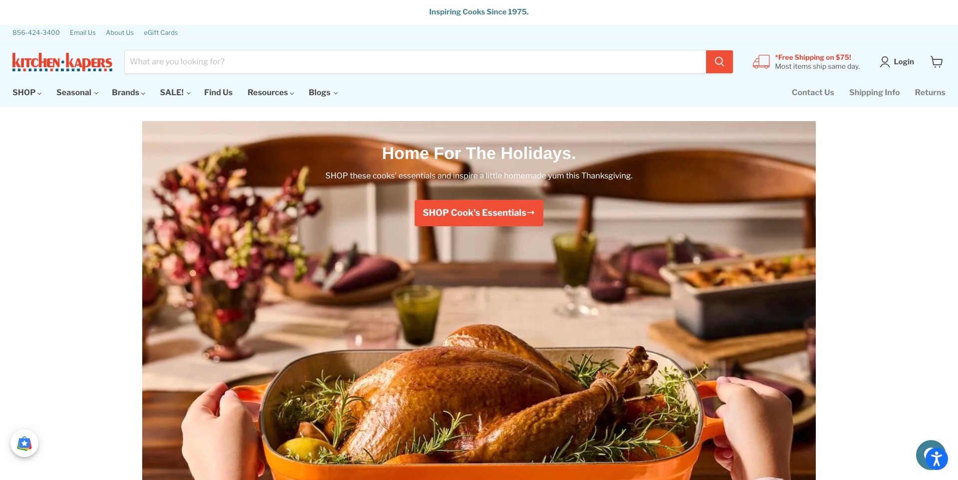
Kitchen Kapers gives its header an unusually wide search box, positioned beside the colorful wordmark and a shipping message. Contact details, store finding, resources, blogs, shipping information and returns are visible around the merchandise links. The campaign below shows a roast turkey being carried in a copper-colored roasting pan, connecting the holiday meal to the tools used to prepare it. A contrasting orange button leads into the cook's essentials selection.
What you can learn
Do not hide practical assistance behind an atmospheric opening. Let search handle visitors who know a product, while an occasion-led image supports discovery. Keep support and shipping routes near shopping controls. Maintain promotional thresholds separately from permanent navigation, and connect the cooking scene to relevant tools rather than an unrelated catch-all sale.
Pros
The prominent search input makes a specific-item shopping task easy to recognize.
Shipping, returns and contact routes remain visible alongside the holiday campaign.
Cons & considerations
If every utility retains equal prominence, the substantial header can compete with product discovery.
The seasonal photograph needs a useful destination for shoppers who want the displayed equipment.
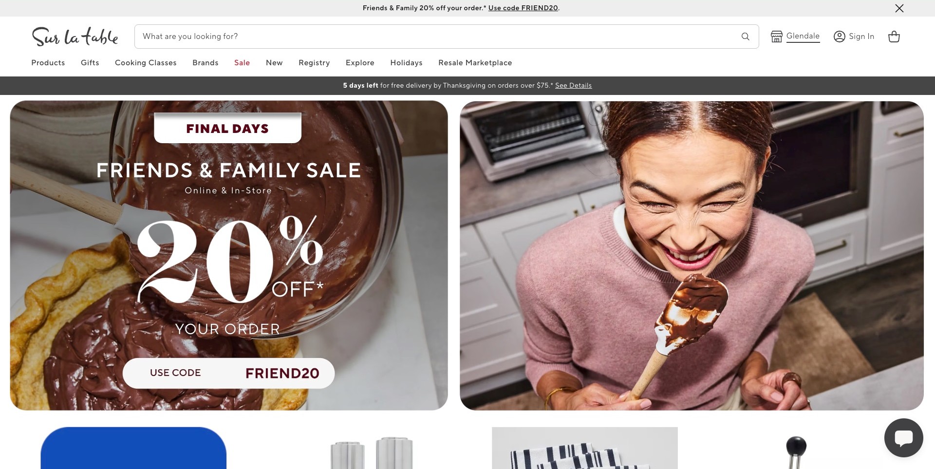
Sur La Table splits its opening into two rounded image panels: chocolate being spread on food and a smiling cook holding the spoon. A large sale treatment overlays the left image, while the right supplies the human moment. Above, a long search field, visible store location and straightforward Products, Gifts, Cooking Classes, Brands and Registry links communicate several ways to engage. The delivery deadline is presented in its own dark horizontal strip.
What you can learn
Cooking photographs connect a transaction with an activity customers enjoy. Preserve distinct routes for classes, merchandise and store visits. When a sale occupies this much space, maintain its code, deadline, exclusions and delivery information together. The layout demonstrates campaign hierarchy; this screenshot does not verify redemption, booking or a particular visitor's delivery eligibility.
Pros
The paired food and person images give the promotion a recognizably cooking-focused context.
Products, classes, registry and store finding remain distinct choices in the header.
Cons & considerations
If promotions stack above and within the hero, their combined visual weight can dominate the first screen.
The large discount treatment needs nearby qualifications that remain readable at smaller sizes.
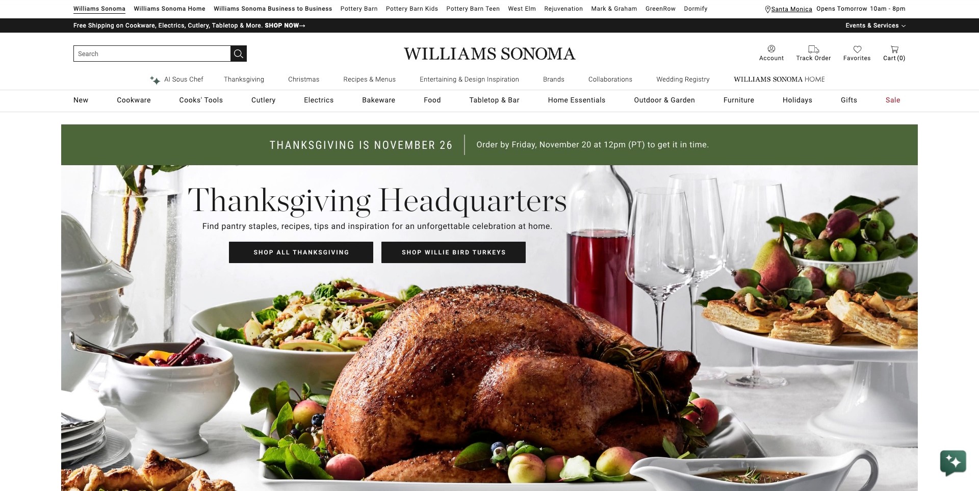
Williams Sonoma places a Thanksgiving table across the hero, with turkey, wine glasses and serving dishes surrounding a centered seasonal heading. Two black buttons distinguish the broader occasion collection from a specific turkey destination. The green order-deadline band is separate from the photograph. Multiple navigation tiers identify product departments, recipes, entertaining inspiration, registry and other company properties, while search and order utilities stay near the large serif wordmark.
What you can learn
An occasion page connects tools, food and tableware through a common customer project. Offer a broad collection alongside narrower destinations for very different purchases. Separate corporate brands, editorial content and merchandise departments. Smaller stores should borrow that separation selectively rather than reproduce every row, and keep fulfillment language accurate to the visitor's location.
Pros
The complete table setting explains why several otherwise separate product departments belong together.
The two campaign buttons distinguish broad exploration from a particular food-shopping destination.
Cons & considerations
If the full multi-tier header is copied into a smaller store, the added complexity may outweigh its usefulness.
Time-sensitive order messaging requires active maintenance rather than permanent reuse as decoration.
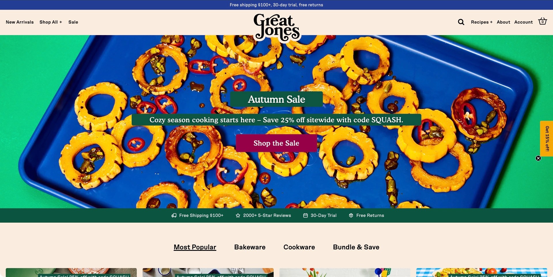
Great Jones fills the hero with orange squash rings on a saturated blue baking sheet, framed by green at the edges. Small dark-green text bands and a burgundy shopping button sit over the photograph instead of introducing a separate neutral panel. The cream header centers the expressive stacked wordmark between compact shop and editorial links. Below the campaign, a service strip and category tabs provide a more conventional transition into the assortment.
What you can learn
Use the product's visual character to create a recognizable campaign palette. The baking sheet doubles as merchandise and photographic background, keeping the food scene relevant. Follow the expressive introduction with recognizable browsing controls. Prepare contrast-safe text areas and alternate crops rather than assuming every food image supports an equally readable overlay.
Pros
The cookware color is integral to the composition rather than an incidental background detail.
A conventional category row gives the highly expressive campaign a practical next step.
Cons & considerations
If imagery or text bands change independently, the carefully balanced color contrast could be lost.
The compact discount tab adds another promotional element beside the main seasonal offer.
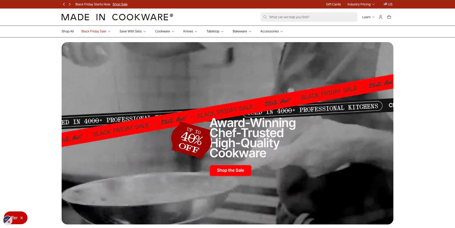
Made In pairs a monochrome cooking-film frame with diagonal red sale strips, a hanging discount graphic and a red shopping button. The energetic campaign sits inside a rounded rectangular panel rather than consuming the entire page edge. Above it, the wordmark, long search field and familiar cookware, knives, tabletop, bakeware and accessories labels establish a calmer framework. The site also exposes a Learn route and an industry-pricing destination in the header.
What you can learn
Separate temporary campaign energy from the permanent shopping interface. Red graphics can change without renaming the equipment families. Moving imagery needs a readable still and appropriate controls; a capture cannot establish those behaviors. Treat professional endorsements and sale percentages as claims requiring supporting details, not conclusions independently verified by a design review.
Pros
The permanent category row remains straightforward despite the unusually forceful campaign graphics.
The contained hero panel gives the promotion clear boundaries within a white storefront.
Cons & considerations
If diagonal strips overlap key text at another viewport, the campaign can become harder to parse.
Motion, offer terms and professional-use claims require checks beyond this single photographed browser frame.
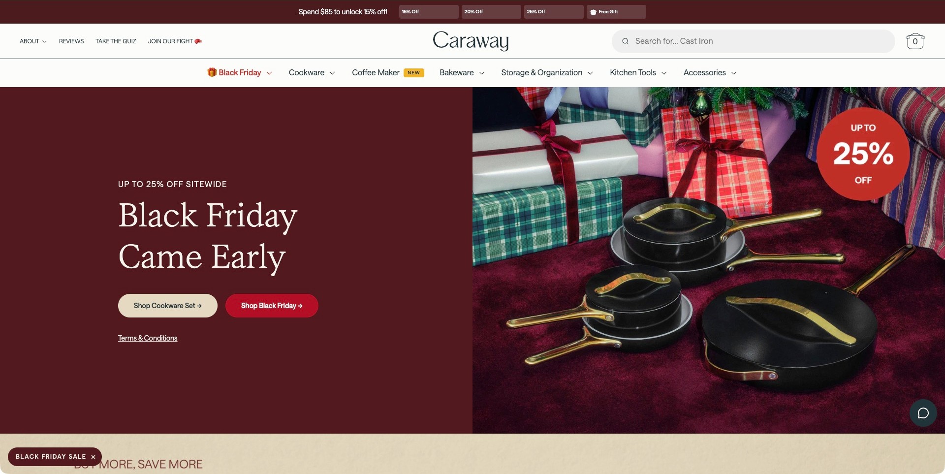
Caraway divides the hero evenly between burgundy campaign copy and a photograph of dark cookware with gold-colored handles beside wrapped presents. Two rounded buttons distinguish a cookware-set destination from the broader sale. Terms remain linked beneath them. The white header names Cookware, Coffee Maker, Bakeware, Storage & Organization and Kitchen Tools, while a separate strip above presents spending thresholds. The image promotes a coordinated collection without turning the main copy into another product photograph.
What you can learn
For a campaign covering a broad assortment, give the main shopping routes different purposes. A set destination serves a different question from browsing a sale. Keep terms nearby and permanent categories visible. Coordinated styling should lead to concrete size, material and care information rather than stand in for comparison of individual pieces.
Pros
The plain text panel preserves a clear reading area alongside the detailed holiday composition.
The two buttons distinguish set shopping from a broader promotional collection.
Cons & considerations
If the spending-threshold strip becomes too prominent, it can compete with understanding the products themselves.
Coordinated styling still needs deeper specifications before a shopper can compare individual pieces.
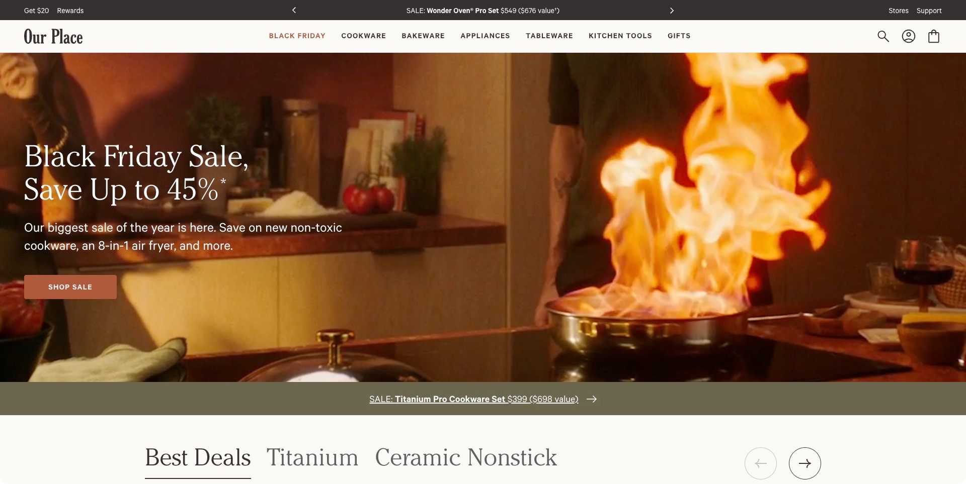
Our Place uses a warm kitchen-film frame with a prominent flame and pan to introduce its seasonal sale. Large white copy and an earthy shopping button occupy the quieter left side, while the cooking action remains on the right. The pale header separates Cookware, Bakeware, Appliances, Tableware, Kitchen Tools and Gifts. Another strip beneath the hero promotes a particular cookware set, with visible product-family tabs starting the next section.
What you can learn
A lifestyle scene can unify a growing assortment if navigation still explains what the business sells. Follow the broad campaign with narrower product families. Judge whether photograph and text remain understandable together, not whether the cooking demonstrates product performance. Health-related language needs substantiated merchandise information; do not borrow it as an unsupported layout claim.
Pros
The warm cooking scene relates the seasonal offer to an identifiable kitchen activity.
Product families remain explicitly named despite the lifestyle emphasis of the hero.
Cons & considerations
If the background moves substantially, text readability and reduced-motion behavior need separate testing.
Several simultaneous offers can make the next shopping choice less obvious without clear hierarchy.
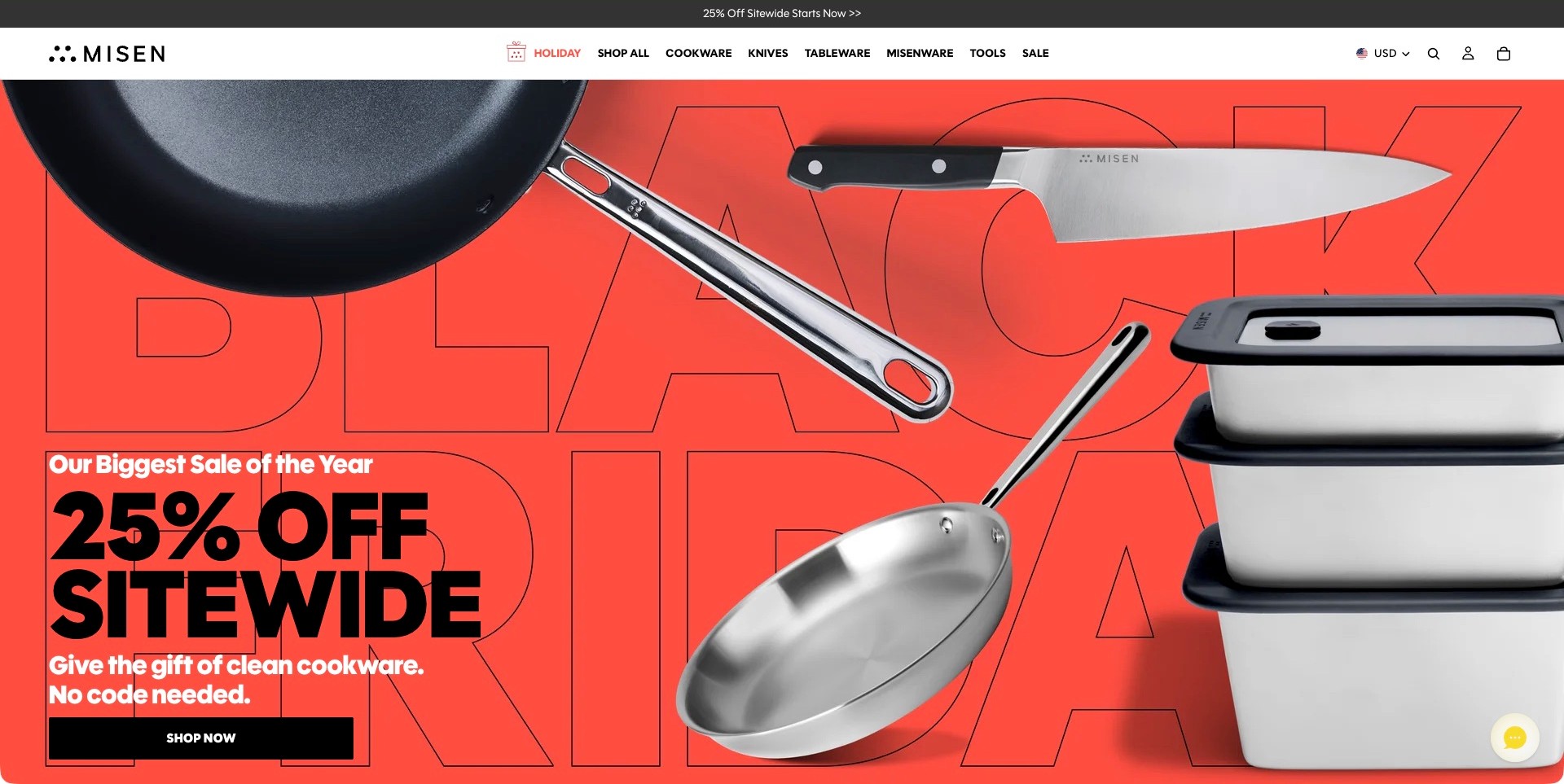
Misen places oversized pans, a chef's knife and stacked storage containers over a bright red background with enormous outlined sale lettering. The offer is concentrated in the lower-left corner, above a wide black shopping button. The white header uses a compact wordmark, bold department names and minimal shopping utilities. Cookware, Knives, Tableware, Misenware and Tools make the range visible before a visitor enters the promotional collection.
What you can learn
Show representative objects when a campaign covers several categories. These silhouettes communicate more about the assortment than a generic festive room. Connect the sale destination to the visible families and preserve routes for other shoppers. Dramatic homepage cutouts are graphic choices, not reliable dimensions; provide scale, materials and care details at product level.
Pros
Distinct product silhouettes communicate cookware, knives and storage in one coherent campaign.
A restrained white navigation bar remains visually separate from the high-energy red promotion.
Cons & considerations
If oversized merchandise is cropped differently on mobile, important category cues could disappear.
Strong sale typography should not displace the qualifications needed to understand the actual offer.
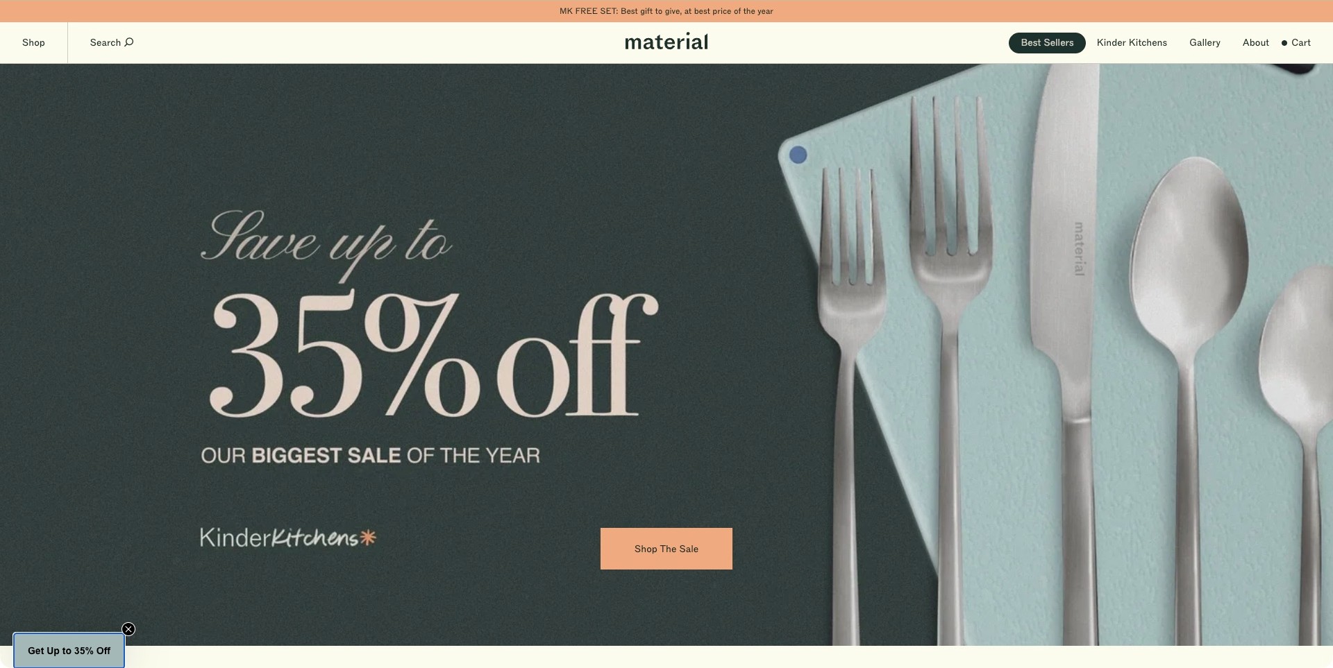
Material presents pale cutlery against a mint-colored board, leaving the dark-green left half for a large sale message and a peach shopping button. The photography emphasizes edges, finishes and gentle color relationships rather than an elaborate cooking scene. A thin promotional strip sits above the cream header, where Shop and Search are balanced against Best Sellers, Kinder Kitchens, Gallery and About. The centered lowercase wordmark reinforces the quieter composition.
What you can learn
Product styling can create a distinctive retail voice without an elaborate interface. Make the Shop destination reveal the full assortment instead of asking visitors to infer it from a photograph. Connect the polished campaign to concrete specifications: color harmony alone cannot answer questions about construction, fit, care or suitability for a particular kitchen.
Pros
The restrained green, cream and peach palette makes the product finishes visually coherent.
The short header avoids competing with the campaign's large, carefully spaced typography.
Cons & considerations
If a visitor needs a specific utensil category, the minimal Shop label may require another navigation step.
The floating discount teaser adds a competing promotion to an otherwise disciplined composition.
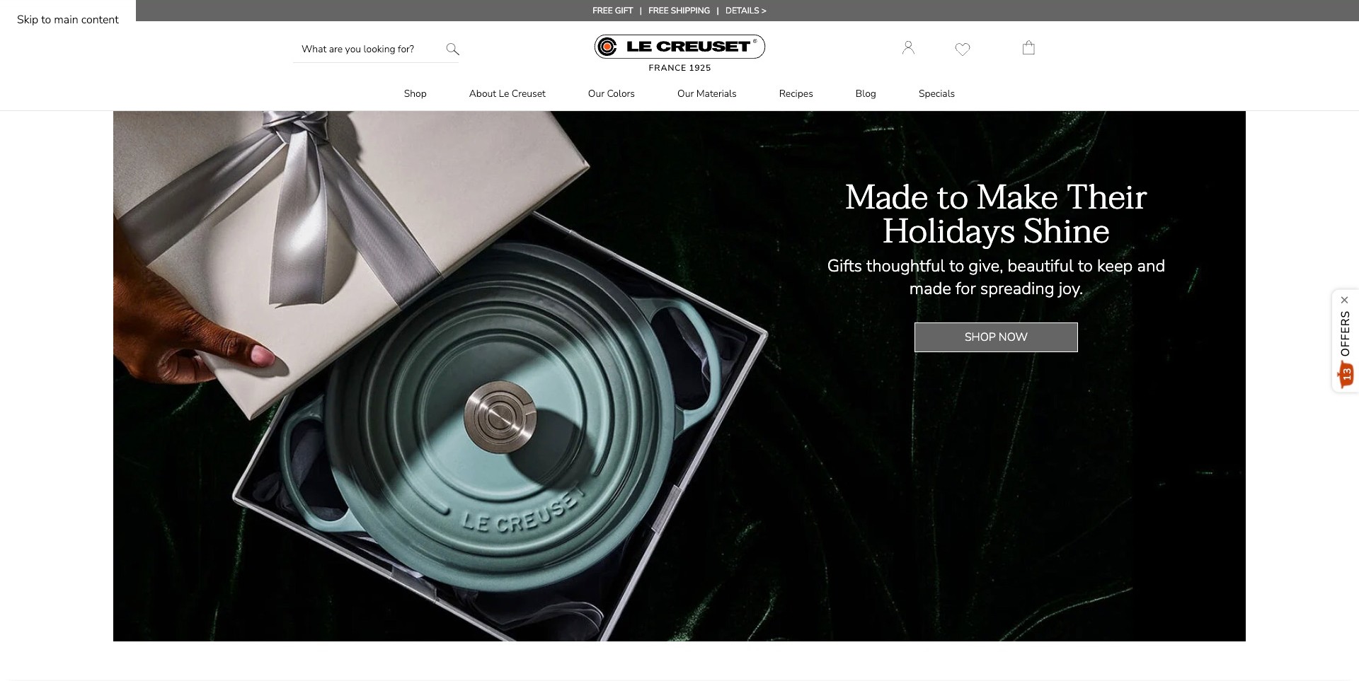
Le Creuset shows a lidded pot inside an open gift box, with silver ribbon and dark velvet giving the scene a festive context. White campaign text occupies the dark right side, separate from the detailed product photograph. The centered wordmark and France date sit above a compact navigation row that distinguishes Shop, Our Colors, Our Materials, Recipes and Blog. A narrow service strip is kept apart from the main holiday composition.
What you can learn
Gift styling is strongest when merchandise remains identifiable beneath the occasion. This composition keeps the pot central. Color and material routes acknowledge attributes buyers may compare before choosing a family. Carry that specificity into accurate variant information and care guidance rather than assuming an attractive gift scene answers practical selection questions.
Pros
The gift-box framing communicates an occasion while preserving a clear view of the cookware.
Color and material navigation offers useful alternatives to browsing only by product type.
Cons & considerations
If the dark photo changes, the white heading needs a newly checked contrast-safe background.
A broad Shop Now action requires further choices before a customer reaches a particular size or color.
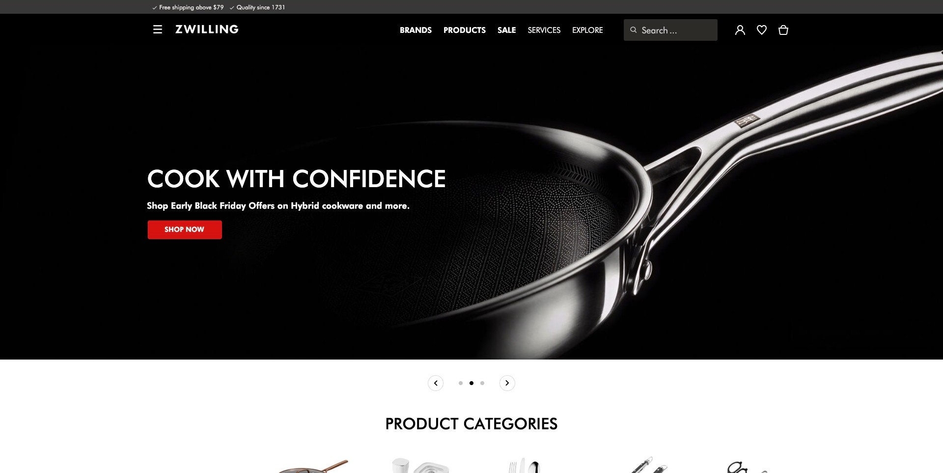
ZWILLING's US storefront uses a near-black hero with a close view of a pan's textured surface and reflective handle. A short white heading, supporting offer line and red button occupy the left, leaving most of the product visible. The dark header distinguishes Brands, Products, Sale, Services and Explore alongside search. Carousel controls sit below the image, and the following section begins with a plainly labeled product-category heading.
What you can learn
A close photograph can replace decorative scenery when construction supplies visual interest. Keep the explanation concise enough to leave the detail useful. Separate brand browsing from product browsing for different customer intentions. Explain the promoted surface and compatibility on deeper pages; a confidence-oriented heading is not technical evidence.
Pros
The restrained dark composition gives the pan's shape and surface a clear visual role.
Brands and Products offer distinct browsing models above the featured cookware campaign.
Cons & considerations
If the carousel changes automatically, its timing and accessible controls need separate interaction checks.
The general campaign heading does not itself explain the differences between cookware materials or ranges.
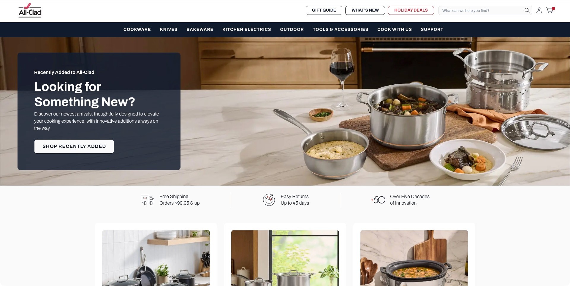
All-Clad places several stainless-colored pots and prepared dishes across a kitchen counter. A translucent navy card on the left contains the new-arrivals heading, a short explanation and a white shopping button. The wordmark, gift-guide shortcuts and search occupy a white top row, while cookware, knives, bakeware, electrics and other departments sit in a separate navy bar. A service strip beneath the hero introduces shipping, returns and the brand's history messaging.
What you can learn
A dedicated text panel makes a detailed photograph usable without stripping its context. This card points to recently added products rather than vague prestige. Separate campaign shortcuts from permanent departments so holidays do not require rebuilding navigation. Explain what is genuinely new and how pieces differ at the destination; the countertop scene supports, rather than replaces, that information.
Pros
The navy card supplies a consistent reading area independent of the photograph's many details.
New arrivals, gift content and permanent merchandise departments have distinct navigation treatments.
Cons & considerations
If the translucent panel becomes lighter over another image, its text contrast could weaken.
The new-arrivals promise depends on the linked collection being maintained as the assortment changes.
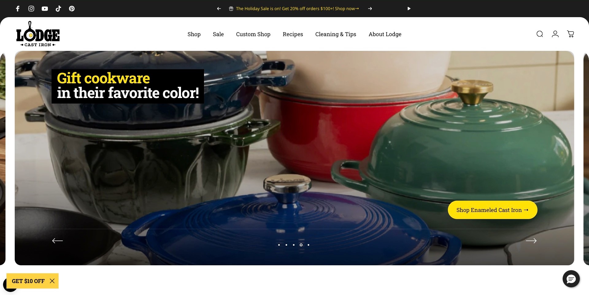
Lodge's captured carousel frame fills a rounded image panel with enamel-colored lidded pots. Yellow-highlighted copy introduces a color-based gifting idea, and a yellow pill-shaped button names enameled cast iron directly. The white header separates Shop, Sale, Custom Shop, Recipes, Cleaning & Tips and About Lodge. Carousel arrows and position dots are visible across the image, with a play control in the upper promotional strip.
What you can learn
A seasonal angle can focus on a product attribute rather than a generic discount. Here color gives gift shoppers a concrete direction while the destination names the cookware family. Add capacity, weight and care details downstream. Visible carousel controls aid presentation, but their keyboard operation and motion preferences need tests beyond the still.
Pros
The button names the relevant cookware family rather than using only an ambiguous shopping prompt.
Recipes and cleaning guidance remain visible around a distinctly seasonal product campaign.
Cons & considerations
If different slides use different text positions, reading and control placement should remain predictable.
Color-led gifting still requires deeper information about the recipient's cooking and storage needs.
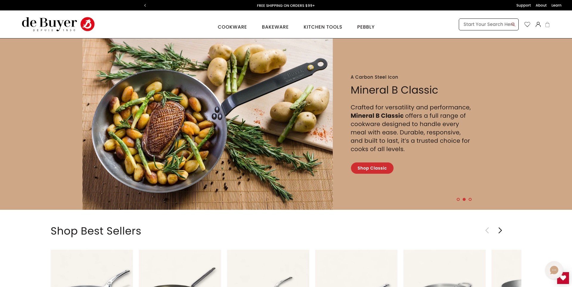
The de Buyer visit redirects to its US storefront, where the captured hero pairs a pan of food with a tan copy panel. The panel identifies Mineral B Classic, introduces the carbon-steel range and provides a red Shop Classic button. A restrained white header separates Cookware, Bakeware, Kitchen Tools and Pebbly, with Support, About and Learn above. A Best Sellers row begins immediately after the campaign, giving the page a clear merchandising continuation.
What you can learn
Name a range before asking customers to browse it, especially when material distinguishes it more than silhouette. Separate text and image leave room for explanation without covering the food. Carry that specificity into care and compatibility details. This pictured US property does not establish other regional catalogs, policies or implementations.
Pros
The named range and dedicated button create a more specific next step than a generic sale action.
The split layout provides stable text space alongside an in-use cookware photograph.
Cons & considerations
If regional routing changes, shoppers need clear currency, shipping and destination information.
The opening product claims still need substantive material and care details on the relevant destination pages.
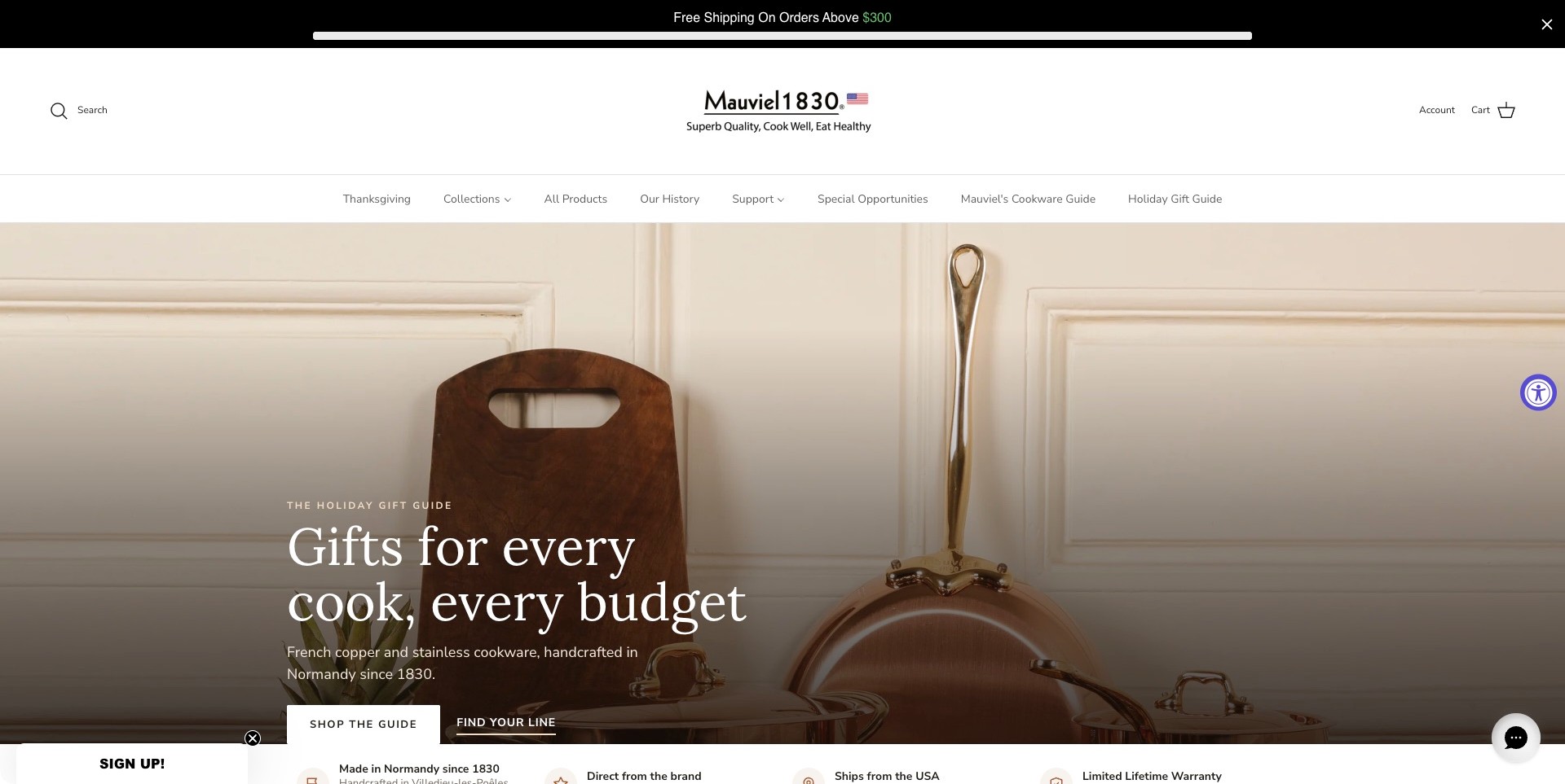
Mauviel USA introduces its holiday gift guide with copper-colored cookware against a pale paneled wall. A large serif heading sits over a darkened lower portion of the photograph, followed by separate Shop the Guide and Find Your Line actions. The spacious white header places search away from account and cart controls. Collections, All Products, Our History, Support and a cookware guide remain visible above the campaign, establishing both shopping and explanatory routes.
What you can learn
Place an explanatory route beside the inspirational one. A gift guide invites browsing; Find Your Line acknowledges comparison needs. Material-led photography creates identity, but buyers still need construction, capacity and maintenance details. A long history and polished scene are presentation choices, not independent proof of suitability for someone's stove or routine.
Pros
The two campaign actions distinguish gift discovery from understanding the cookware ranges.
History, support and educational navigation accompany the product-focused shopping links.
Cons & considerations
If the large header remains equally spacious on smaller displays, it may delay the main shopping content.
The small signup teaser and chat launcher add peripheral elements to an otherwise calm photograph.
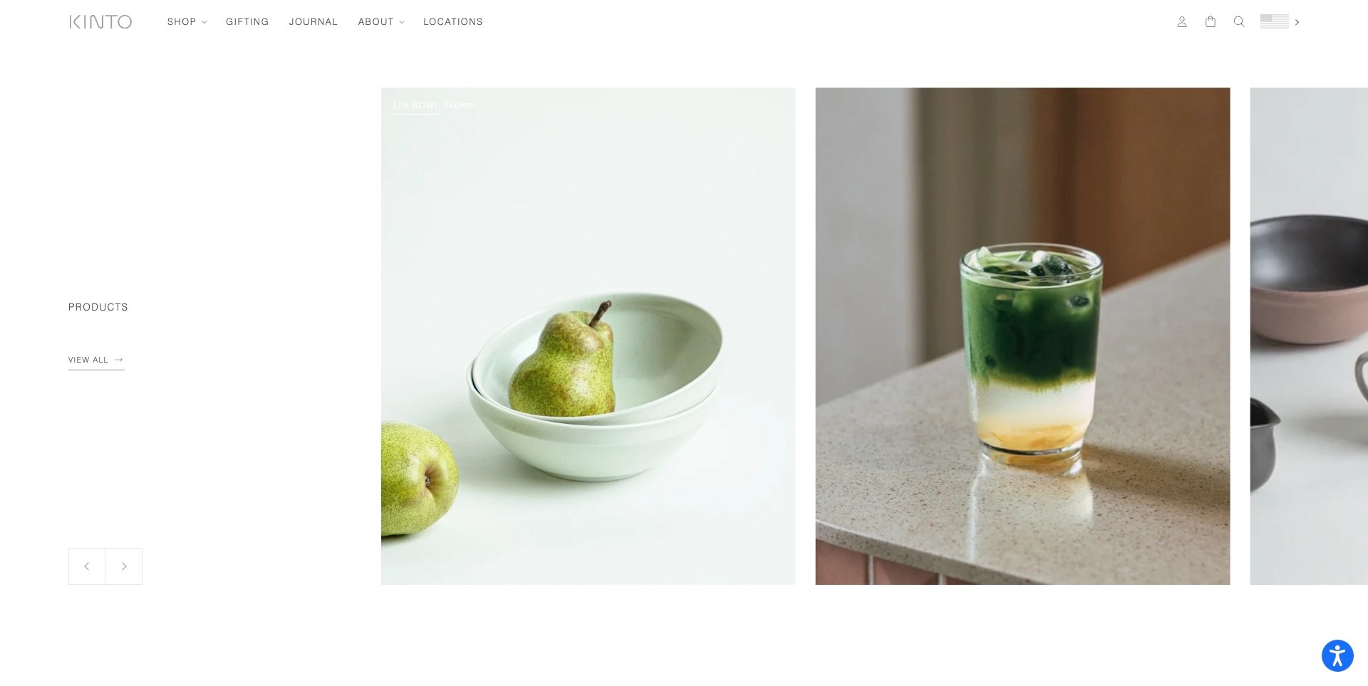
The captured KINTO USA homepage section shows a pear in pale bowls beside a glass of layered green drink, with another tableware photograph partly visible at the edge. Products and View All occupy a generous white column on the left. The small wordmark and restrained Shop, Gifting, Journal, About and Locations links remain above. This is a normally scrolled product section, not the changing opening hero, and its calm photography gives everyday objects substantial space.
What you can learn
A product carousel can invite discovery through consistent lighting and recognizable use rather than through discount language. Preserve a direct route to the full assortment, since a sparse selection cannot communicate every available category. If following this approach, make item labels readable against pale photographs and include specifications at the destination. The composition suggests a lifestyle; it does not establish dimensions or material properties.
Pros
The repeated photographic proportions give unrelated bowls and drinkware a coherent presentation.
A separate View All route acknowledges shoppers who want a broader catalog.
Cons & considerations
If low-contrast item labels remain over pale images, they may be difficult to read.
The generous whitespace reduces the number of products visible in one screen.
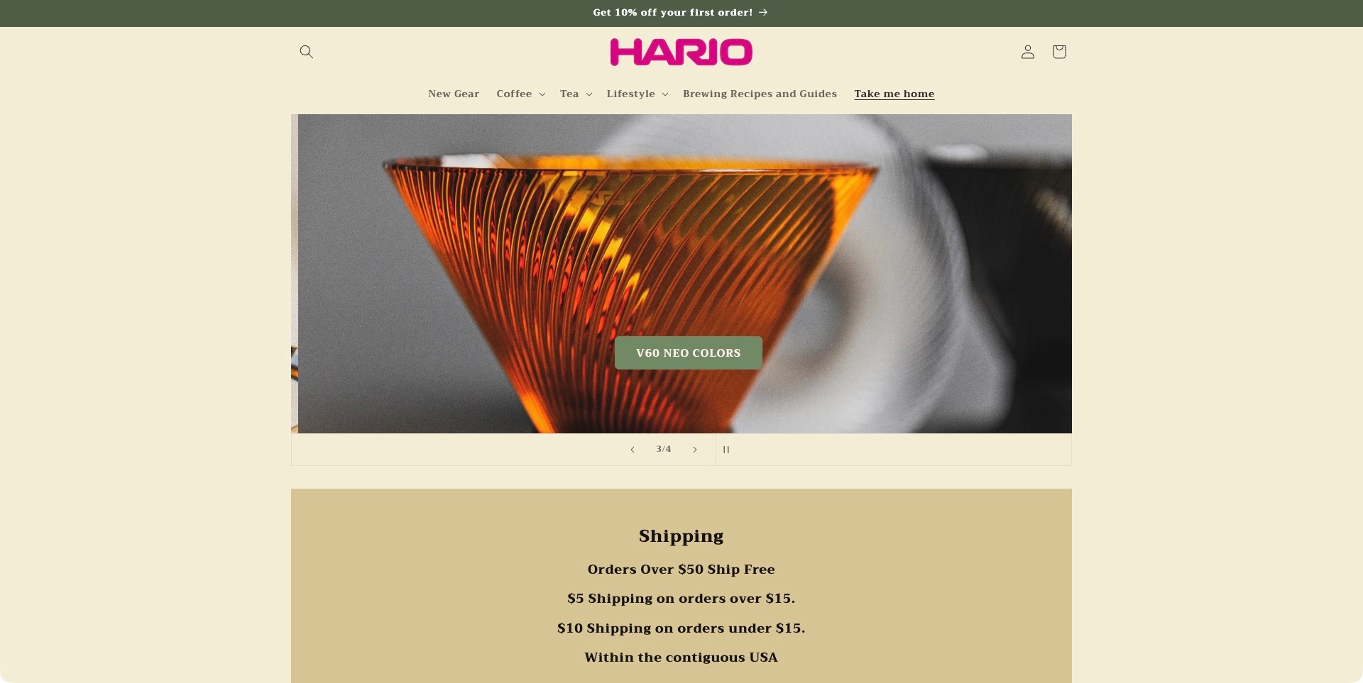
HARIO USA frames an orange translucent dripper against a softly blurred background. A compact V60 Neo Colors button sits within the photograph, while slide numbers, arrows and a pause control appear beneath. The cream page and magenta wordmark establish a distinct palette without competing with the object. Coffee, Tea, Lifestyle and Brewing Recipes and Guides are visible across the header. A separate shipping-information block begins directly below the campaign.
What you can learn
Specialist equipment often benefits from a named product-family destination plus an educational route. The close-up creates interest in this particular range, while brewing guides offer context for visitors who do not yet know what to choose. Keep those purposes connected but distinct. A rich product photograph should lead to capacity, compatibility and care details rather than serve as a substitute for them.
Pros
The restrained cream frame lets the dripper's color and ribbed surface carry the visual interest.
The visible pause control and slide position make the carousel's presentation explicit.
Cons & considerations
If customers do not recognize V60, the short campaign label needs explanatory support downstream.
The specialist close-up does not provide an immediate overview of the wider equipment range.
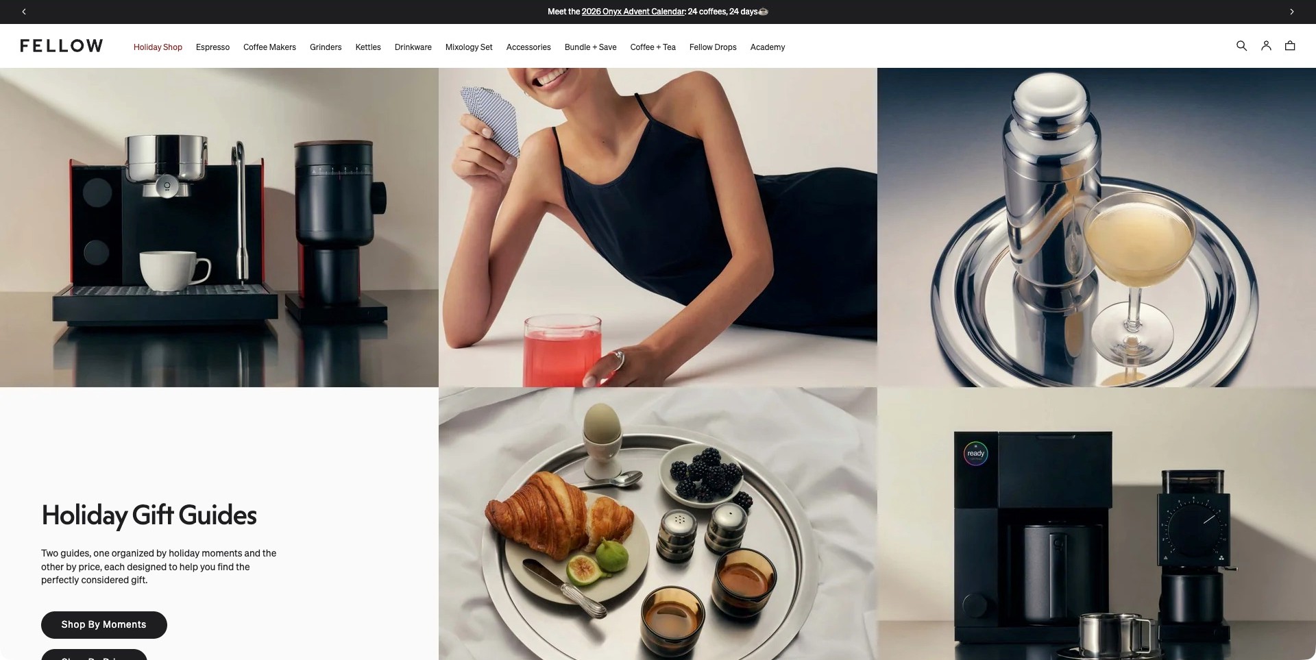
Fellow presents a collage of espresso equipment, a person with a drink, a cocktail shaker and a breakfast setting. A white block within the composition introduces holiday gift guides organized by moments and price, with a visible Shop By Moments button. The compact header names Espresso, Coffee Makers, Grinders, Kettles, Drinkware and other product families, while Academy supplies a separate learning route. The photography connects equipment to several beverage occasions rather than one isolated appliance.
What you can learn
Gift browsing and equipment shopping use different vocabularies. Offer an occasion-led route for uncertain shoppers while retaining explicit product categories for informed buyers. A second budget-based route can further reduce ambiguity, provided the collection labels stay accurate. Product imagery should remain connected to the items actually available at each destination; this saved frame is not a test of stock, compatibility or checkout.
Pros
The page explains its gift-guide organization instead of presenting an unexplained generic gift button.
Equipment families remain accessible around the lifestyle-led collection imagery.
Cons & considerations
If multiple gifting routes overlap, their differences need to remain clear on the destination pages.
The collage's cropped objects require more detailed product views before comparison.
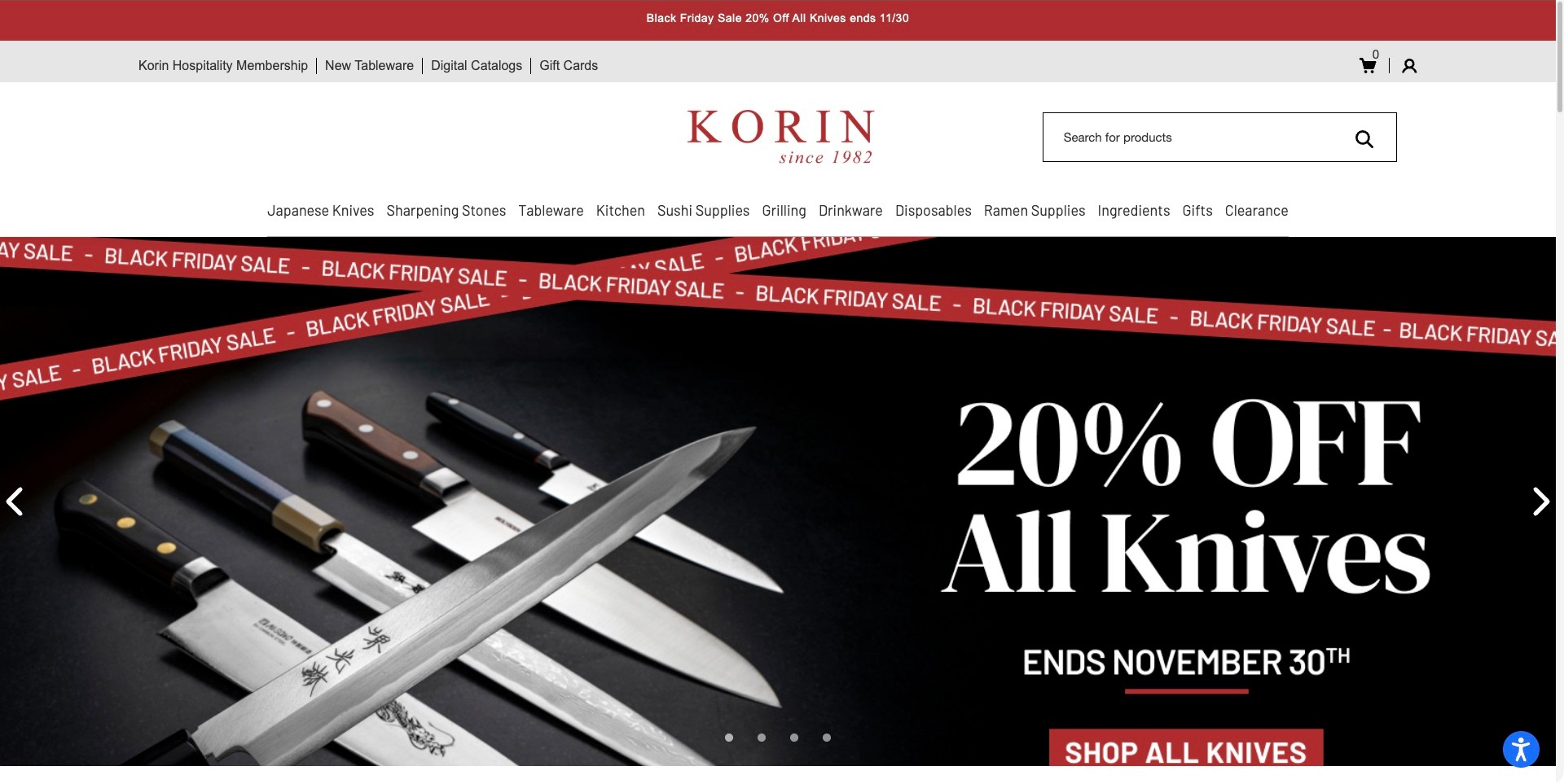
Korin's captured homepage shows an arrangement of knives against black, paired with a large seasonal offer and a specific Shop All Knives action. The centered red wordmark is balanced by a prominent product search. Japanese Knives, Sharpening Stones, Tableware, Sushi Supplies, Grilling and Ramen Supplies are explicitly named in the category row. A separate utility area introduces hospitality membership, digital catalogs and gift cards, communicating a specialist assortment rather than a general homewares store.
What you can learn
Use customers' actual vocabulary, even when more specific than generic kitchen categories. Sharpening stones and sushi supplies describe different tasks and deserve distinct destinations. Keep promotions around that stable structure instead of merging everything into a sale collection. Knife comparison needs substantive product information; a dramatic arrangement is not evidence of edge performance or suitability.
Pros
Specific product families communicate the store's culinary specialization immediately.
Search and digital catalogs offer alternatives to browsing the featured sale.
Cons & considerations
If the long department row is reduced without prioritization, specialist categories may become harder to find.
The sale-led opening gives little guidance to a first-time knife buyer without deeper explanatory pages.
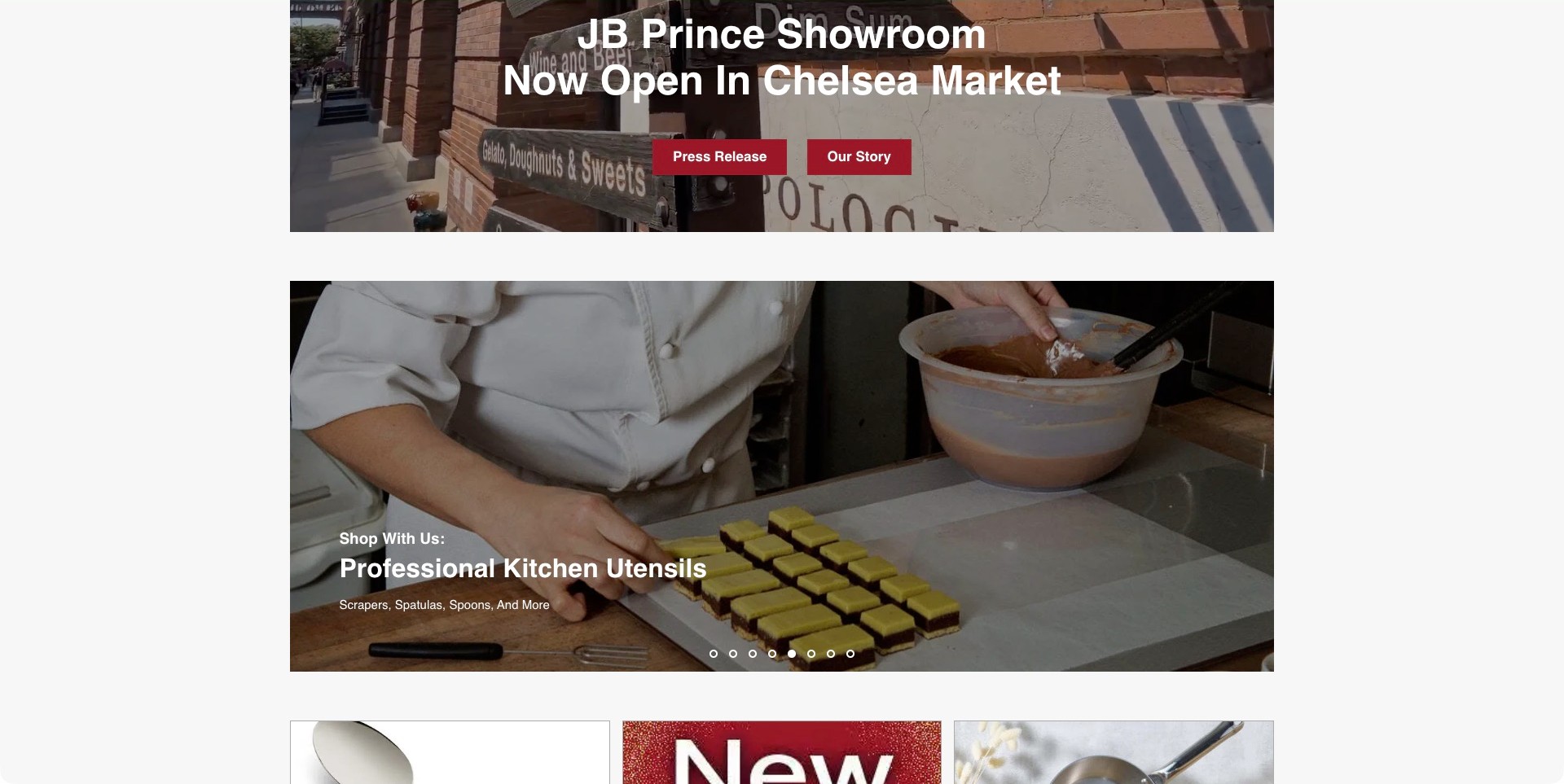
The normally scrolled JB Prince homepage frame pairs a Chelsea Market showroom announcement with a large photograph of a cook cutting small pastries. The lower panel names Professional Kitchen Utensils and clarifies the assortment with scrapers, spatulas and spoons. White text overlays a darkened photograph, and carousel position dots appear along its bottom edge. The showroom panel above offers distinct Press Release and Our Story buttons, linking a physical retail change with the company's wider identity.
What you can learn
Show the task that specialist tools support rather than treating every utensil as an isolated catalog object. A scene of precise pastry work provides useful context for otherwise unfamiliar equipment. Keep that inspiration connected to a well-labeled collection with dimensions and materials. The showroom announcement serves a different purpose, so its informational destinations should remain distinguishable from the product-shopping panel below.
Pros
The working-kitchen photograph gives a concrete context to a broad utensil category.
Showroom news and merchandise discovery have separate headings and actions.
Cons & considerations
If the carousel changes, the text must remain readable across each different work scene.
This scrolled section does not by itself establish the clarity of the full catalog navigation.
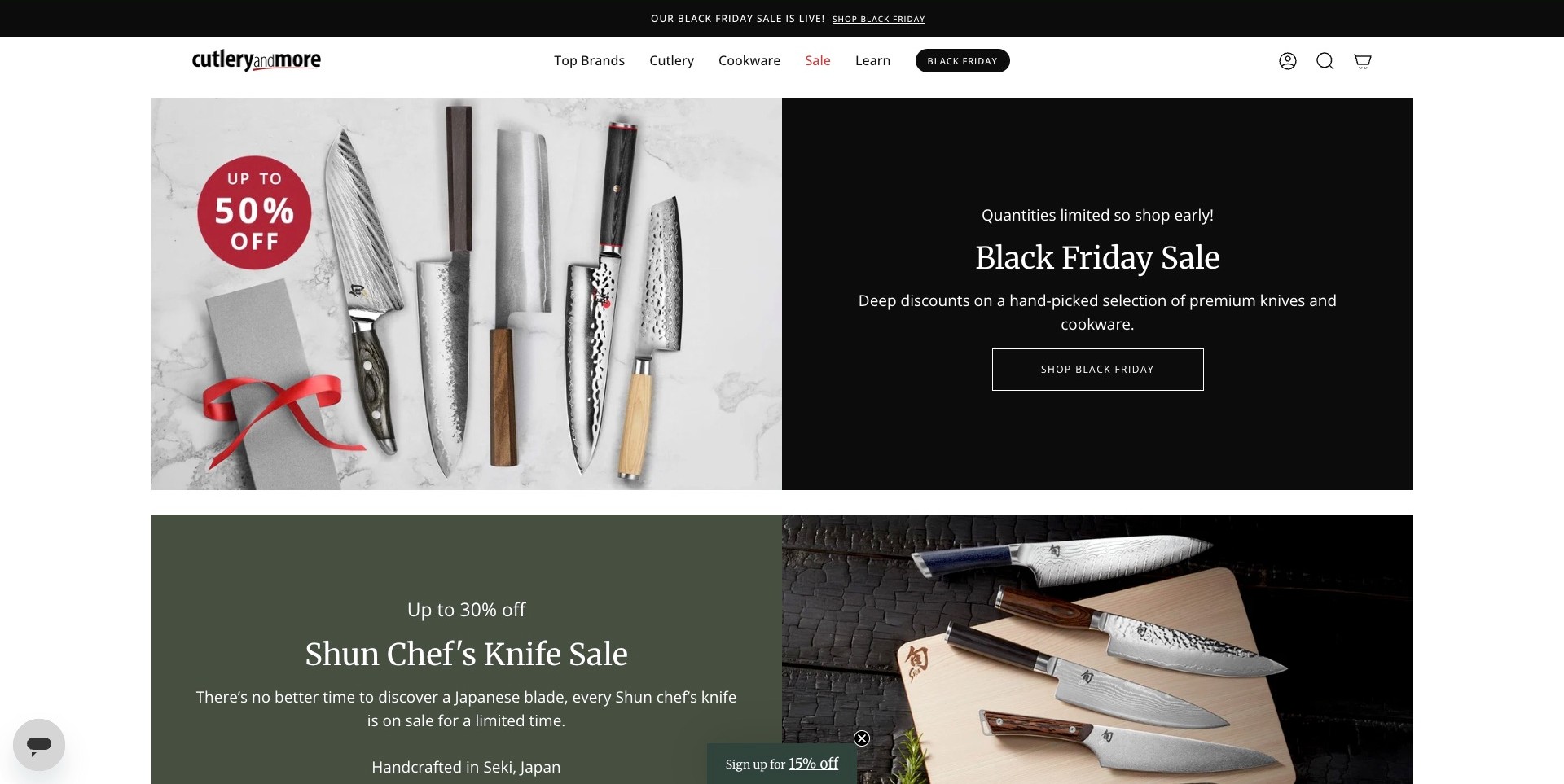
Cutlery and More places several knives and sharpening accessories on a light stone surface beside a black campaign panel. The photograph and text share equal space, with one outlined shopping button on the right. The compact header distinguishes Top Brands, Cutlery, Cookware, Sale and Learn. A second, differently colored promotion begins beneath the main image, showing how a broad sale can lead into a more specific chef's-knife collection without abandoning the same product focus.
What you can learn
Keep specialist commerce understandable before adding seasonal urgency. A simple split panel preserves detail in the knives and separates it from offer copy. Retain brand, category and learning routes for people comparing rather than buying immediately. Link promotions to accurate collections and substantive product details; photographs cannot establish sharpness, construction or long-term performance.
Pros
The light product photograph and dark copy panel create an easily understood visual division.
A small set of category, brand and learning routes accommodates different shopping approaches.
Cons & considerations
If several sale panels continue down the page, they can crowd out nonpromotional comparison guidance.
The compact signup teaser remains an additional competing element near the lower campaign.
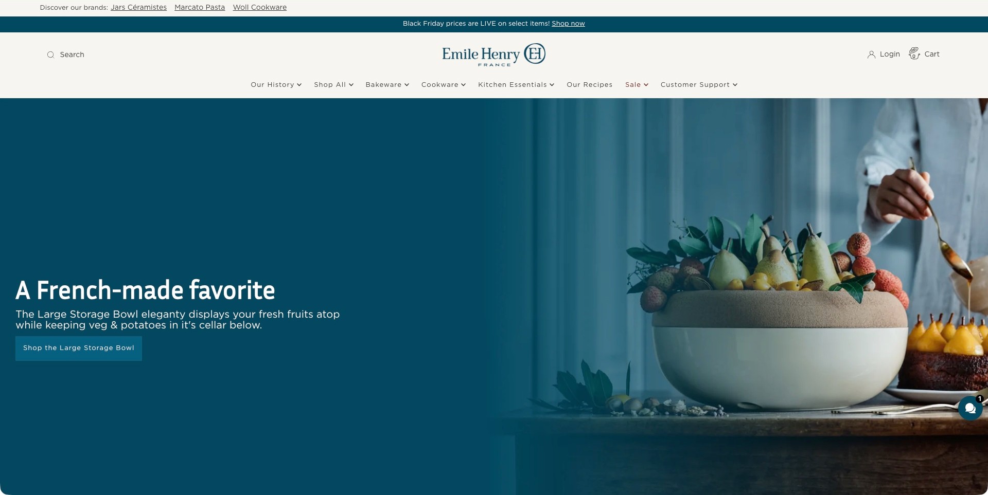
Emile Henry USA introduces a large storage bowl with fruit above it and a kitchen scene behind. A teal gradient provides a consistent background for the left-aligned heading and short explanation of the bowl's two storage areas. The button names the Large Storage Bowl directly. Above, Bakeware, Cookware, Kitchen Essentials, Our Recipes and Customer Support sit beneath the centered wordmark. A separate sale strip is kept visually apart from this single-product story.
What you can learn
Connect a product to a task, then name what makes it relevant. Here the copy explains the storage arrangement beside the bowl in use. Keep dimensions, maintenance and appropriate-use details at the destination. Lifestyle photography should support that information rather than prove freshness, storage performance or a health-related benefit.
Pros
The copy explains why the bowl has more than one storage area rather than relying on styling alone.
The product-specific button aligns directly with the object pictured.
Cons & considerations
If the teal gradient changes with another photograph, text contrast needs to be checked again.
A single-product campaign leaves the wider ceramic assortment dependent on clear navigation and subsequent sections.
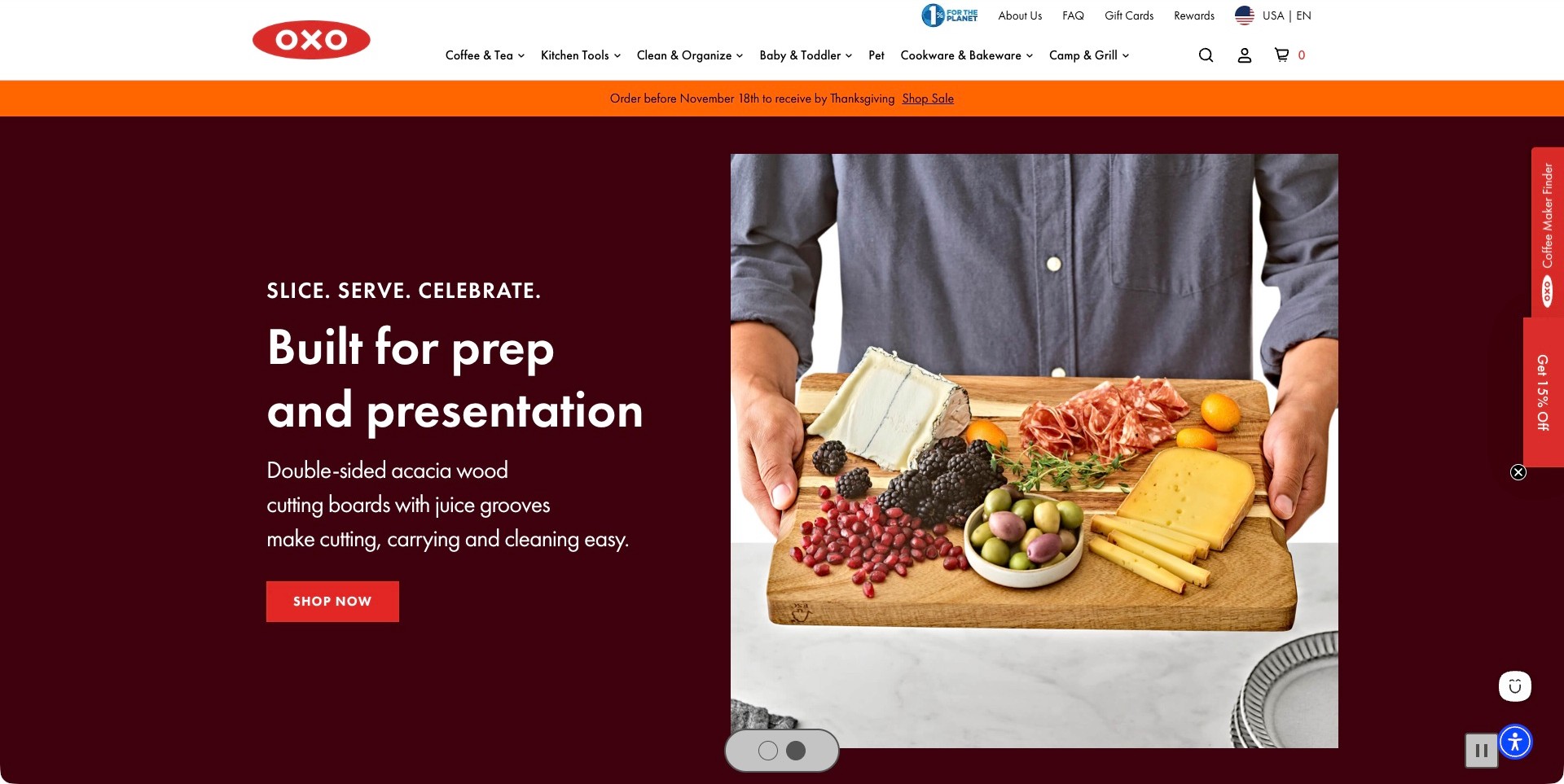
OXO pairs a burgundy text area with a person holding a wooden board covered in cheese, fruit and charcuterie. The heading connects preparation with presentation, while the supporting copy identifies a double-sided acacia board and juice grooves. A red shopping button matches the logo and contrasts with the dark background. Coffee & Tea, Kitchen Tools, Clean & Organize and Cookware & Bakeware remain visible in the white header. Carousel controls sit beneath the photograph.
What you can learn
Connect a practical object to the whole customer task, naming the product and useful features clearly. The serving scene expands the board's context without hiding what it is. Preserve dimensions, maintenance and appropriate-use information at the destination. This review concerns the board campaign actually pictured, not an older food-container promotion.
Pros
The object is shown at a useful human scale within a recognizable entertaining task.
The main benefit, named material and shopping action occupy a stable text panel.
Cons & considerations
If floating finder and discount tabs expand, they can compete with the product photograph.
The attractive serving scene still needs detailed product information for a practical buying decision.
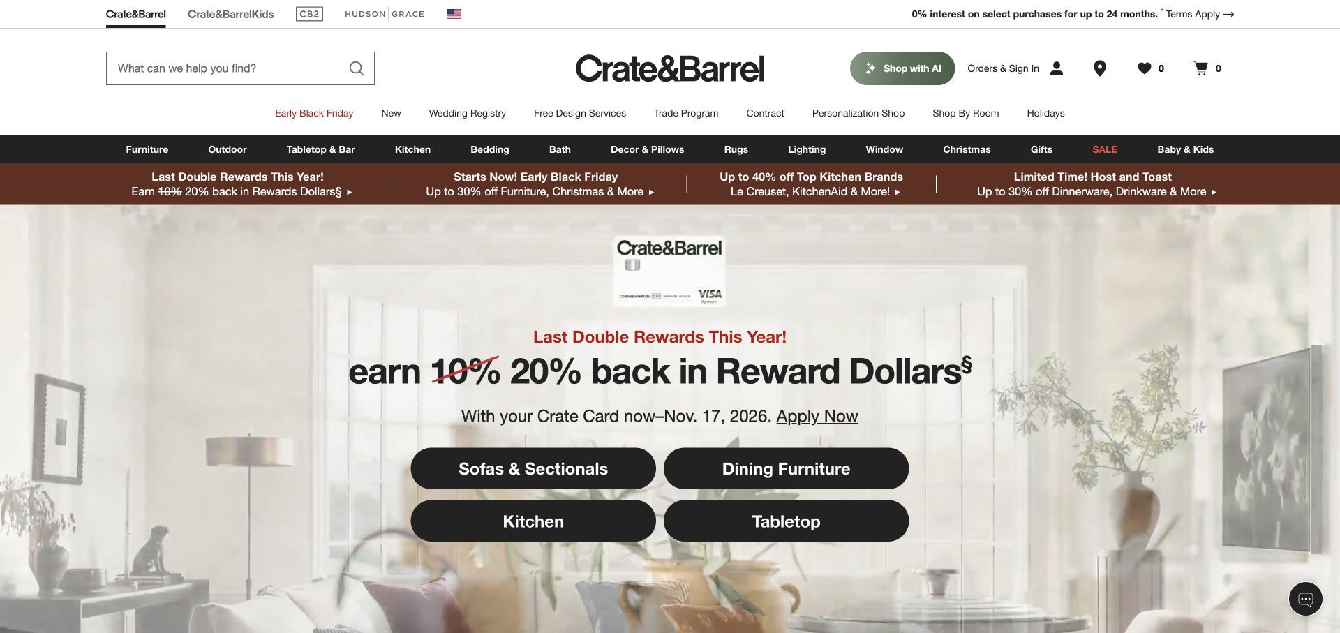
The retained Crate & Barrel capture shows a rewards campaign over a bright living-room photograph. Four large black buttons distinguish Sofas & Sectionals, Dining Furniture, Kitchen and Tabletop, giving the promotion practical destinations beyond its financial message. Search, order utilities, service links and a dark department bar form distinct header layers. Kitchen remains named both in the permanent navigation and inside the campaign, which is important for a home store selling much more than cookware.
What you can learn
A broad campaign should still help visitors reach the department they want. The kitchen shortcut is useful even to someone uninterested in rewards. Preserve accurate conditions and ordinary merchandise browsing. This original November 12 capture is newly reviewed for kitchenware relevance, not a claim that the homepage was photographed again today.
Pros
The substantial category buttons give kitchen shoppers a direct route within a broad home campaign.
Search, customer utilities and merchandise departments are visually separated.
Cons & considerations
If every promotional row remains visible, the layered header occupies substantial initial screen space.
Rewards-led messaging requires clear conditions and should not be mistaken for a product comparison.
Kegan is a freelance web designer and developer with 15+ years of experience helping businesses turn complicated website requirements into clear, maintainable digital experiences. He works directly with clients from planning and design through development, launch, and ongoing support.
For kitchenware store website design, his development approach focuses on cooking-task and product categories, practical material and care information, useful dimensions and compatibility details, and understandable shopping and support journeys. The scope can be a targeted improvement or a complete custom build, with responsive layouts, thoughtful content structure, and integrations chosen around the people using and maintaining the site.
Show 3 other kitchenware store website designersHide other kitchenware store website designers
Plan a kitchenware store around real catalogue decisions
Map the assortment and the questions behind it
List the product families the business actually offers before designing a large mega menu. Cookware, bakeware, tools, knives, coffee equipment, tabletop and replacement parts need different supporting information. A specialist shop may be better served by a small number of well-explained categories than by a broad department-store structure. Record which distinctions matter to a customer choosing an item, and which are only useful to the warehouse or supplier. Public navigation should describe the shopping task rather than expose an internal stock classification.
Use real examples to test the proposed structure. Can someone find a single item without knowing the manufacturer’s collection name? Can they distinguish a set from its individual pieces? Can an existing customer locate a replacement accessory without starting the whole discovery journey again? The goal is not to create every possible filter. It is to make the catalogue’s genuine breadth understandable and give the team a structure it can keep consistent.
Create complete records for the exact item being sold
Define a consistent product record with the supplied name, item or model reference, included pieces, relevant size information and the brand’s intended-use guidance. Keep functional facts separate from descriptive writing. A product can have a lively story and an attractive name while still making the contents of the order obvious. If the retailer sells several manufacturers, preserve meaningful specification differences rather than forcing every item into a template with misleading empty fields.
Treat variants as real choices. Colour, capacity, diameter, finish and pack size may affect the item the customer receives. Keep images and specifications associated with the selected variant and explain when a change affects price or availability. Do not invent compatibility or assume that similarly named accessories fit across a product range. Give the customer a clear route to the retailer’s support when the supplied information does not answer a specific question.
Show the product clearly as well as attractively
Plan an image sequence with different jobs. A clean view helps someone recognize the item; an in-use photograph can provide context; a scale or detail image may explain a particular feature. A styled kitchen or finished meal can support the brand without replacing the product view. Use accurate imagery for the variant and label illustrative or rendered material appropriately. Record rights and attribution so a supplier image is not casually detached from the product it describes.
Review category-card and small-screen crops as well as the full product image. A tightly cropped pan handle or a beautifully arranged bundle can make the contents hard to identify at thumbnail size. Keep names and essential facts as real text. Use sensible image sizes and loading behaviour so shopping does not depend on a large video finishing first. The visual standard should help a customer understand the catalogue, not only produce a striking homepage.
Make comparison useful without manufacturing a ranking
Choose comparison fields that are accurate and relevant to the product family. Size, capacity, included pieces, the manufacturer’s stated intended use and care information can be more helpful than a vague best-for-everyone badge. Explain differences in ordinary language and link to the responsible source for detailed instructions where appropriate. Do not imply that a marketing category settles suitability for every appliance, kitchen or cooking preference.
Keep the distinction between editorial advice and measurable claims visible. A retailer may explain why it carries a collection or how a tool is commonly used, but independent durability, safety or performance conclusions require evidence beyond the page design. Avoid health or environmental assurances that have not been qualified. A concise comparison should reduce uncertainty without inventing certainty. Where information is missing, support a question rather than filling the gap with an assumption.
Connect specialist content to the right products
Recipes, preparation guides, demonstrations and buying advice can give a kitchenware store useful depth. Connect content to relevant products only when the relationship is genuine. A recipe should remain usable without being an excuse to repeat the same product pitch, and a specialist equipment guide should identify the assumptions it makes. Keep the instructional content within the business’s actual expertise and preserve the manufacturer’s current operating and care directions for specific products.
Structure this material so the team can maintain it. Name an author or responsible editor, keep product links current and decide what happens when an item is discontinued. A category collection and an instructional article serve different search intentions; give each a clear purpose. Avoid producing many nearly identical pages around minor wording changes. A small set of dependable resources can be more useful than a large archive that sends people to unavailable or mismatched products.
Explain price, stock and fulfilment in the actual store’s terms
Put the relevant current price and purchase choice where someone expects to find them. Explain whether the listing concerns a single item, a set, a deposit or another supported offer. Stock, dispatch and delivery information should come from the business’s real systems and policies, not invented copy added to complete a design mockup. If a product is a preorder or handled differently from normal stock, make that distinction understandable before checkout.
Keep the transition to fulfilment and support coherent. A visitor should be able to find the store’s current shipping, return and contact information without guessing which brand or regional site handles the order. Do not imply that a photographed storefront offers pickup or that a product ships everywhere unless the retailer has confirmed it. A polished shopping interface does not itself establish inventory accuracy, delivery performance or a successful return process.
Separate new purchases from support and replacement tasks
Existing customers may need care guidance, a spare part, an instruction document or help identifying an item. Give these routes a place in the information architecture rather than forcing every visitor toward a new set. Use exact product references where the business supplies them. A replacement-part page should be particularly careful about compatibility, with an appropriate support route when the customer is unsure. A similar photograph is not enough to establish that two parts are interchangeable.
Make support enquiries proportionate. Ask for the details the team needs to understand the question and avoid a form that demands unnecessary personal information. Explain what happens after submission without inventing a response time or guarantee. If warranty or other policy information is involved, publish the business’s current terms and let the responsible organization maintain them. This design collection does not verify those policies or provide consumer-law advice.
Plan an operational handover, not only a visual launch
Assign responsibility for adding products, correcting variants, maintaining supplied instructions and handling unavailable stock. A content system should make a normal update understandable to the people who will actually perform it. Demonstrate a real product entry with its images, options and related content rather than handing over only an empty template. Record where authoritative information comes from so a future editor can resolve a discrepancy instead of copying an old description into several places.
Use an authorized acceptance plan for the store you control. Check a representative product family, variant selection, basket, checkout and relevant notification or integration. Test small-screen and keyboard use in the actual implementation, and preserve any incomplete checks. A screenshot of an appealing storefront cannot establish purchase success, accessibility or security. Schedule sensible maintenance after launch so changed products, broken advice links and obsolete options do not gradually undermine the useful structure.
The editing job behind the design
Choose technology around catalogue ownership and the buying process
A broad multi-brand retailer and a focused direct-to-consumer brand may need different catalogue structures. Choose a system that handles the actual variants, specifications and editorial responsibilities rather than copying the platform visible on an attractive competitor.
Keep stock, product information, checkout, support and fulfilment integrations distinct in the brief. Public storefront signals do not reveal a complete warehouse, manufacturing or customer-service system.
Plan how the business will correct a product, retire a variant and maintain related advice. The sustainable editorial workflow matters as much as the initial visual theme.
Our WordPress website examples offer a separate look at publishing approaches. A visible platform label is evidence for that named page, not a guarantee that the same system will suit your requirements.
Before the public launch
A kitchenware store website checklist
Define product families using recognizable customer language.
Distinguish individual items, sets, bundles and replacement parts.
Keep included pieces and variant details accurate.
Connect each product image to the correct item and option.
Show clear product views alongside styled imagery.
Publish supplied dimensions and capacity consistently.
Use qualified compatibility and care information.
Keep comparisons useful without unsupported guarantees.
Connect genuine advice and recipes to maintained products.
Explain the current purchase and fulfilment terms accurately.
Separate existing-customer support from new-purchase routes.
Assign ownership for changed and discontinued items.
Test authorized variants, basket, checkout and notifications.
Review keyboard, small-screen and error-recovery behaviour.
These checks are a project checklist, not a performance, legal, security, or accessibility certification. Test real journeys with the people responsible for the website before making claims about the result.
Sources & editorial method
How this collection was selected and reviewed
The collection reviews genuine kitchenware retail and direct-to-consumer brand websites for visible catalogue organization, product presentation, shopping context and support routes. Current official pages qualify the retail offer, and original captures preserve their actual dates and pictured scope. We do not buy or test equipment, assess food-contact safety, verify product claims or measure checkout conversion. Editors Choice recognizes a specific public website design approach, not the quality or suitability of cookware.
Each example links to its actual source page. Screenshots are direct browser captures with their own capture dates; moving imagery, announcements and live designs can change. The notes describe observable design choices and conditional tradeoffs, not measured traffic, conversion results, service quality, or accessibility conformance.
Technology labels use public page metadata, asset evidence, or explicitly cited platform documentation. Platform documentation is not a complete current deployment audit. A component reference may be legacy or unused; it is not a complete backend inventory. Unknown stacks are omitted. These sites are editorial examples, not our client portfolio.
Written, Edited and Curated are separate editorial records, not timestamps advanced by a rebuild. Website designs and imagery belong to their owners. See our editorial standards or suggest a correction.
Questions worth asking
Kitchenware Store website design questions
Should kitchenware stores lead with products or cooking inspiration?
Both can be useful when their roles are clear. Inspiration creates context, while recognizable product categories and dependable item pages support a purchase decision. A styled meal or kitchen should not be the only way to identify the exact item, size or included pieces.
What belongs on a cookware product page?
The exact item, its supplied dimensions or capacity, included pieces, relevant variants, current price and the manufacturer’s intended-use and care information are useful foundations. The required fields vary by product family. Do not invent compatibility or performance claims to fill a standard template.
Does every kitchenware store need comparison tables?
No. A focused assortment may be clearer with good product records and concise differences. Where comparison helps, use accurate fields relevant to that family rather than generic scores or unsubstantiated best-product labels. Provide a sensible support route for questions the supplied information cannot answer.
How should replacement parts be presented?
Give them a clear route and use exact references and qualified compatibility information from the responsible source. Do not rely on visual similarity alone. Existing customers should be able to ask a focused support question without being pushed through an unrelated new-purchase journey.
What should be tested before a kitchenware store launches?
Use authorized tests of representative products, options, basket, checkout, notifications and relevant integrations, plus real small-screen and keyboard interaction. Record what was actually checked and what remains incomplete. Attractive screenshots and a successful build do not prove the buying process works.
Borrow how these stores make a large or specialist assortment feel approachable. Then give your own products the exact information, imagery and support process customers need to choose responsibly.