Best Property Management Websites of 2026 (29 Real-World Examples)
Property management websites that separate the sales pitch from the everyday tasks people need to complete.
Study local practices, apartment portfolios, association managers and commercial firms for useful routing, location search and service explanations—not as a ranking of property-management quality.
A property management homepage rarely has one audience. An owner may be comparing a new manager, a resident may need account access, an association board may want a proposal, and a renter may be looking for a specific home. The strongest structures make those differences visible before a large photograph or broad brand statement takes over.
This collection intentionally includes different operating models. Nest DC illustrates a local service practice; residential portfolios demonstrate home-search tasks; association brands introduce board and resident routes; commercial firms show broader expertise and publishing structures. Borrow the thinking that matches your business, not the scale claims or service terms of a different organization.
Before the examples
What makes good property management website design in 2026?
Give each audience its own practical door
Owners, residents, renters and association boards should not have to interpret the same generic contact button. Use recognizable task labels, separate existing-client tools from new-business inquiries, and make maintenance assistance visibly different from a quote request. A polished hero is only useful if the person who arrives with an immediate task can move past it.
Make geography part of the service explanation
Coverage affects which office, property list or service conversation is relevant. A city selector, address field or local-office finder should lead somewhere specific and preserve the selected context. State actual coverage in text; a skyline or a national footprint claim cannot tell an owner whether an individual property is accepted.
Show the operating relationship, not just the lifestyle
Interiors and neighborhood photographs establish a setting, but owners also need to understand responsibilities, communication and the first inquiry. Residents need accurate support routes. Use concise process explanations and real community information rather than implying that an attractive home image demonstrates management performance, occupancy or investment results.
The collection · 29 examples
29 property management websites worth studying
Compare the audience and property type before comparing the visual style. A resident-search homepage solves a different problem from a local owner-services page.
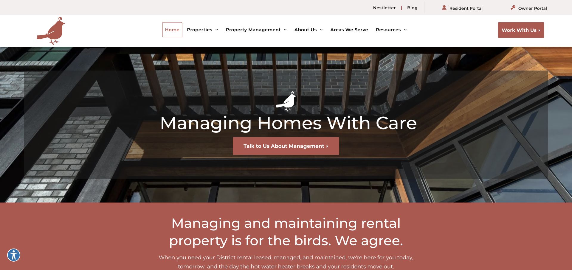
Nest DC uses a bird motif, muted brick-red accents and an actual domestic interior rather than a generic skyline. The main message describes caring for homes; the next section extends that voice with a playful maintenance reference. Owner and resident portals sit in the utility bar, away from the management inquiry button. Navigation includes available properties, property management and areas served, so a prospective tenant is not forced through an owner’s sales journey. The page feels like a local service business before it feels like a software product.
What you can learn
Borrow the division between ongoing service tasks and new-business inquiries. A small manager can make a distinctive visual identity work harder by giving residents and owners obvious destinations, then using neighborhood-specific information to establish relevance instead of relying on national scale claims.
Pros
The warm palette and bird device connect the logo, messaging and subsequent sections without crowding the navigation.
Portal links remain distinct from the management call to action, which reduces ambiguity for returning visitors.
Cons & considerations
The large transparent headline panel covers much of the interior photograph, reducing the image’s storytelling value.
Several navigation groups require exploration before a first-time owner can understand the full management scope.
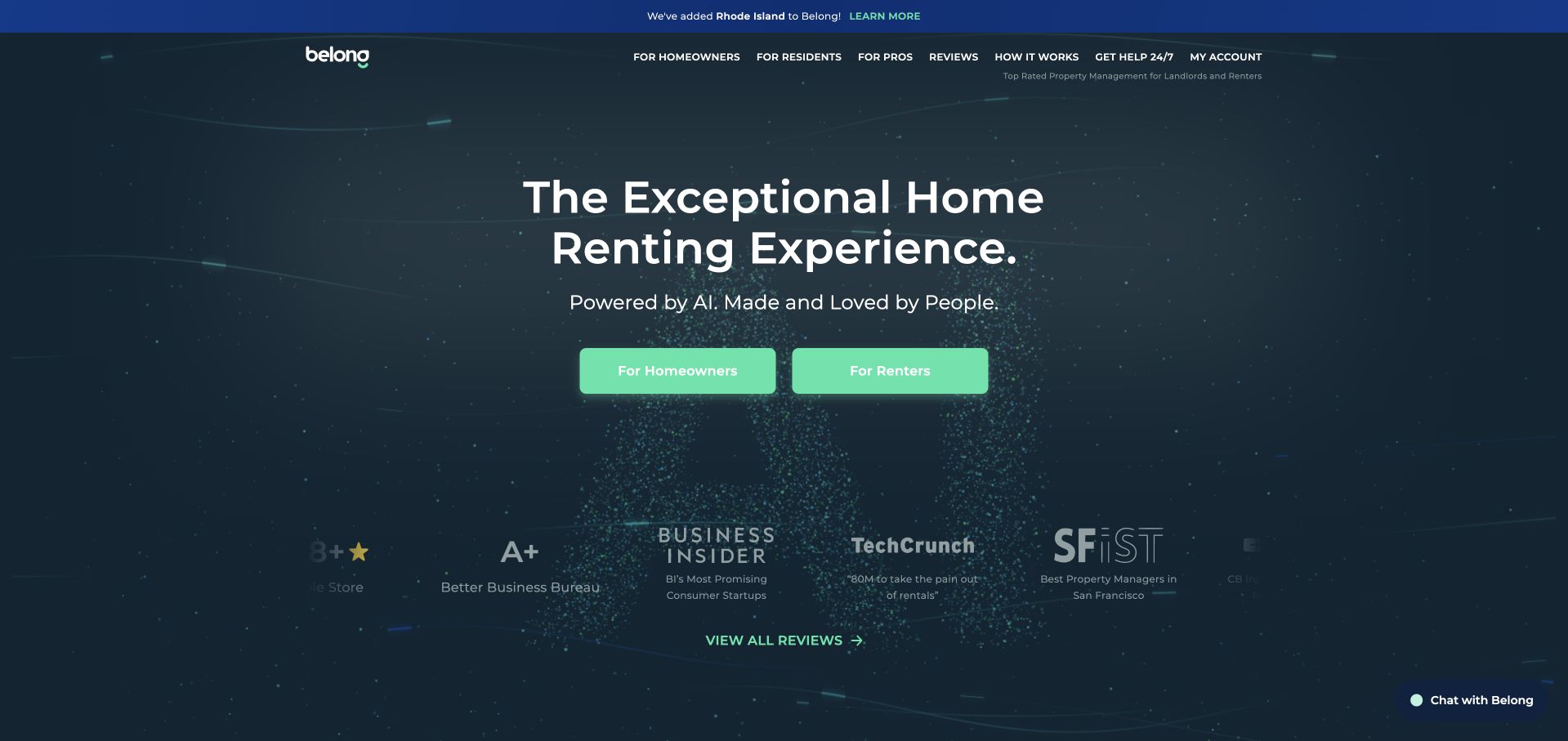
Belong opens with a dark navy field, a centered rental-experience proposition and two matching mint buttons for homeowners and renters. That symmetrical choice is the useful part: the page acknowledges different customer intentions before presenting a long service argument. Review and publication marks appear underneath rather than fighting the main action. The current copy mentions AI, but the design still leads with the rental relationship rather than a feature inventory. A thin top strip and compact header preserve room for the opening message, while the darker visual treatment distinguishes it from a conventional property-listing portal.
What you can learn
Use audience labels that people recognize immediately, then keep the two paths consistent in visual weight. Technology can explain how a service operates further down the page; it should not replace the basic answer to who the visitor is and what they can do next.
Pros
The equal homeowner and renter buttons make the first decision unusually easy to scan.
The compact proof row provides additional context without becoming a second hero headline.
Cons & considerations
Abstract dark graphics communicate atmosphere better than they communicate a particular property or neighborhood.
The prominent review and press marks need their own accessible context rather than being treated as proof by themselves.
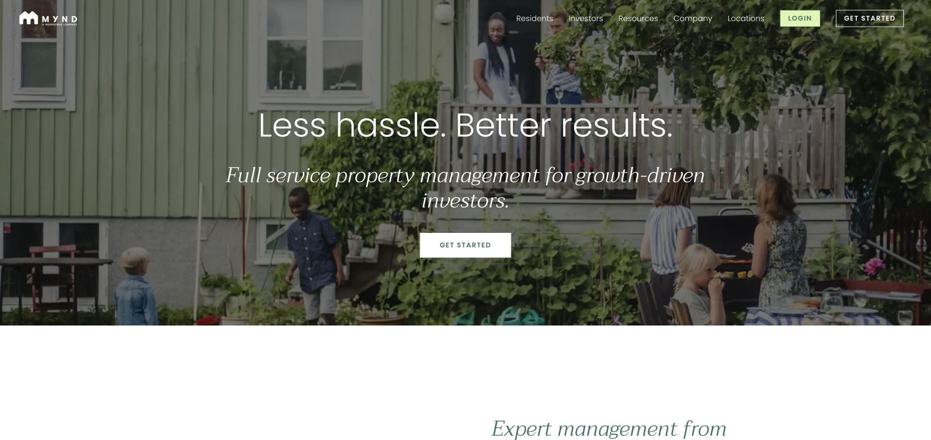
Mynd pairs a broad garden-and-patio photograph with a short headline and an explicit property-investor description. The image contains people using a home, not simply a building elevation, which makes the service’s setting understandable. The header provides separate investor, resident, company, location and learning routes, while login and a highlighted start button are reserved at the right edge. Lower headings move from full-service management into move-in and maintenance. This creates a progression from the outcome-oriented introduction to the practical work behind the offer, although the opening language itself remains quite broad.
What you can learn
An operational service can feel human without losing its business audience. Pair residential imagery with a precise description of the property type and customer, then follow it with concrete responsibilities. Keep account access easy to find, but visually separate it from inquiries from a new owner.
Pros
The photograph demonstrates a residential use case without needing an illustrated workflow to explain the category.
Returning residents and prospective investors receive recognizable header routes rather than one undifferentiated contact link.
Cons & considerations
Text laid over a busy garden requires a reliable contrast treatment across different image frames.
A broad results-oriented headline needs the following service explanations to avoid sounding interchangeable with competitors.
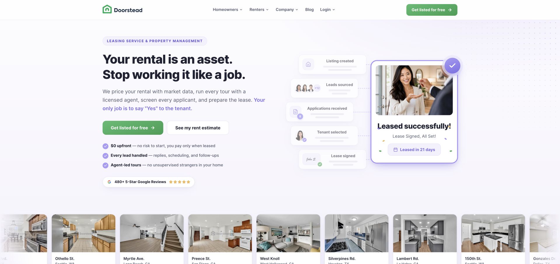
Doorstead places a plain-language owner message beside a collection of leasing, maintenance and rent-related interface cards. A property-photo strip sits immediately below the opening, bringing actual homes back into a layout that could otherwise resemble a software landing page. The green primary action is paired with a secondary estimate path, acknowledging that some owners want information before a sales conversation. Compact benefit statements explain what the service handles. The composition is especially useful for studying how a property manager can visualize otherwise invisible operational work without replacing the entire page with a dense application screenshot.
What you can learn
Use a few representative service artifacts to explain the management relationship, but label them as illustrations when appropriate. Give an exploratory visitor a meaningful information route alongside the main contact action, and keep actual properties visible so the brand remains anchored in housing.
Pros
The illustrated task cards translate an abstract management service into recognizable pieces of work.
The property strip prevents a technology-led composition from losing its connection to real homes.
Cons & considerations
Small interface labels are difficult to read at reduced widths and cannot carry essential service terms.
Several benefits and proof elements compete near the opening, so a simpler mobile sequence is important.
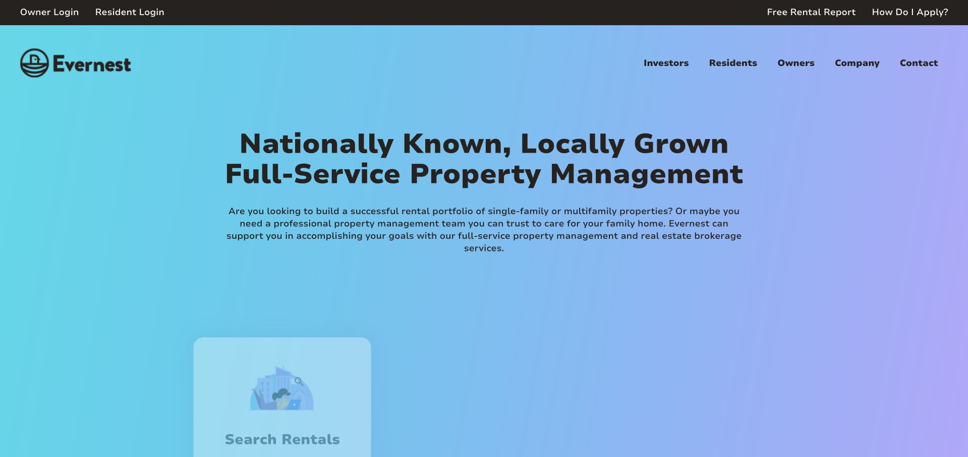
Evernest uses a bright cyan-to-lilac background and a substantial headline rather than a conventional full-screen property photograph. Owners, residents and investors appear in the main navigation, while login and application-help links occupy a narrow utility strip. The contrast between a national proposition and local language is a recurring theme in the opening. Service-route cards begin below the introduction, encouraging a visitor to move toward a task rather than read an uninterrupted company biography. It is a useful example of a network brand using color and hierarchy to make a large service footprint feel approachable.
What you can learn
A multi-location manager should make the local next step explicit, even when the brand introduction is national. Organize the homepage around searching rentals, owner services and resident support, then carry the selected location into the appropriate office information instead of making users repeat it.
Pros
The gradient creates a distinctive brand field while leaving the headline easy to identify.
The utility strip removes recurring account and application tasks from the new-business message.
Cons & considerations
A colorful corporate introduction does not establish which local office will handle an individual property.
Lower route cards must remain complete and readable when animations or decorative illustrations are unavailable.
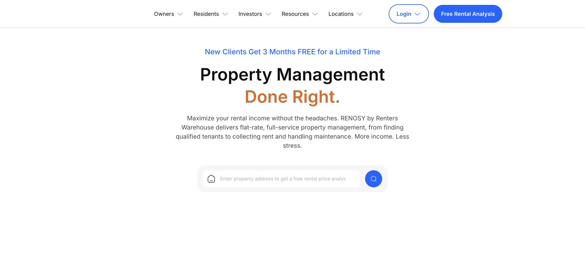
The current Renters Warehouse page presents RENOSY by Renters Warehouse in its description, so this is a current-brand example rather than a frozen historical logo reference. The central composition is deliberately sparse: a short management headline, an explanatory paragraph and a property-address input with a blue search control. A temporary offer sits above the headline, while owners, residents, investors and locations remain in the header. Instead of asking visitors to understand a large service diagram, the page starts with the address that makes the inquiry local. The tradeoff is that practical service detail appears later.
What you can learn
An address-led opening is useful when location determines service availability. Explain what the input will return before asking for it, preserve an alternative contact route, and avoid implying that an automatically generated estimate is a guaranteed rental or investment result.
Pros
The address field gives the opening one obvious interaction instead of several competing forms.
Audience labels and location navigation remain available for visitors who do not want an assessment.
Cons & considerations
A prominent limited-time offer can distract from the more durable explanation of the management service.
An address alone cannot communicate fees, coverage or the responsibilities included in a management agreement.
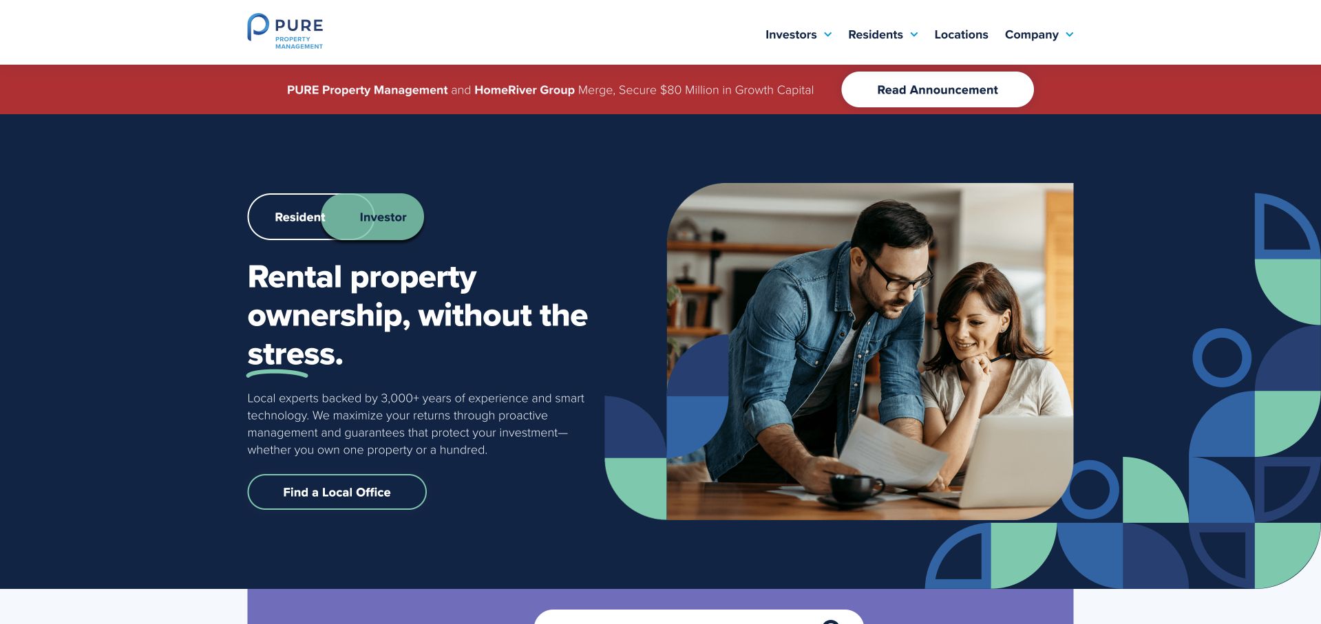
PURE combines a navy background, mint accents and simple geometric shapes around a domestic photograph. A resident/investor switch changes the context of the message, while the current investor view leads toward finding a local office. An announcement strip sits between the header and hero, clearly separating corporate news from the management proposition. The people in the photograph and the compact service description soften what could otherwise be a highly abstract financial-services presentation. Navigation favors a few broad groups over a very large link inventory, leaving local-office discovery to do much of the routing work.
What you can learn
If two audiences genuinely need different homepage content, make the selected state obvious and ensure each version has a complete next step. A local-office action can be more useful than a generic contact button when service terms and staff depend on the property’s location.
Pros
The navy and mint system gives the brand continuity across the switch, buttons and decorative shapes.
The local-office route introduces geography before asking the visitor to discuss a property in detail.
Cons & considerations
A switch adds an interaction that must be understandable to keyboard and screen-reader users.
The announcement bar takes valuable first-screen space and should not obscure the selected audience context.
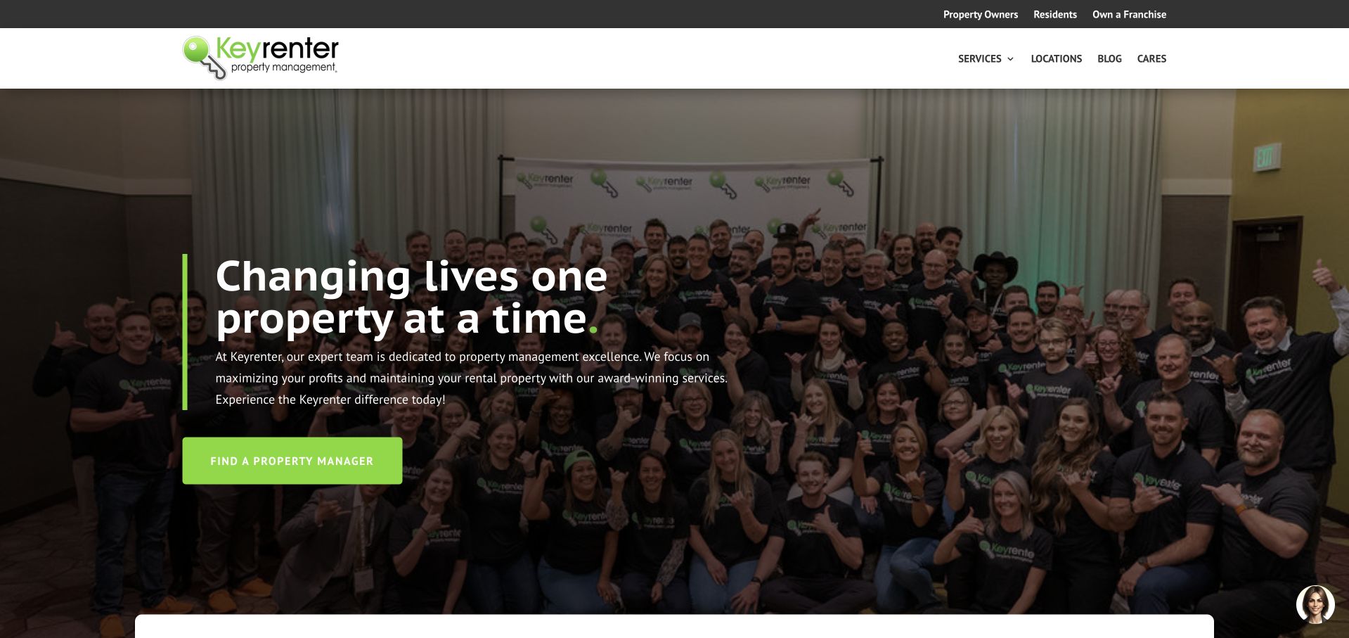
Keyrenter’s opening uses a group photograph rather than a staged empty interior. A green vertical accent and matching action connect the headline to the logo, while the upper utility strip names property owners, residents and franchise opportunities. The main action directs people to find a property manager, making the homepage a network gateway rather than pretending that one central team serves every property. Services and locations remain separate navigation groups. This is a useful contrast with investor-dashboard imagery: the visual argument is primarily about the people delivering the service, even though the visitor still needs to select the relevant office.
What you can learn
A team image can establish a human presence, but a network must follow it with accurate location routing. Help visitors distinguish the national brand from the office they will contact, and keep franchise recruitment separate from the path for owners and residents.
Pros
The group photograph makes the service feel staffed rather than presenting an anonymous software platform.
A clear manager-finder action matches the distributed nature of the brand.
Cons & considerations
A large group image becomes visually busy behind text and needs a strong contrast layer.
The national team photograph does not tell a visitor who will manage a specific local property.
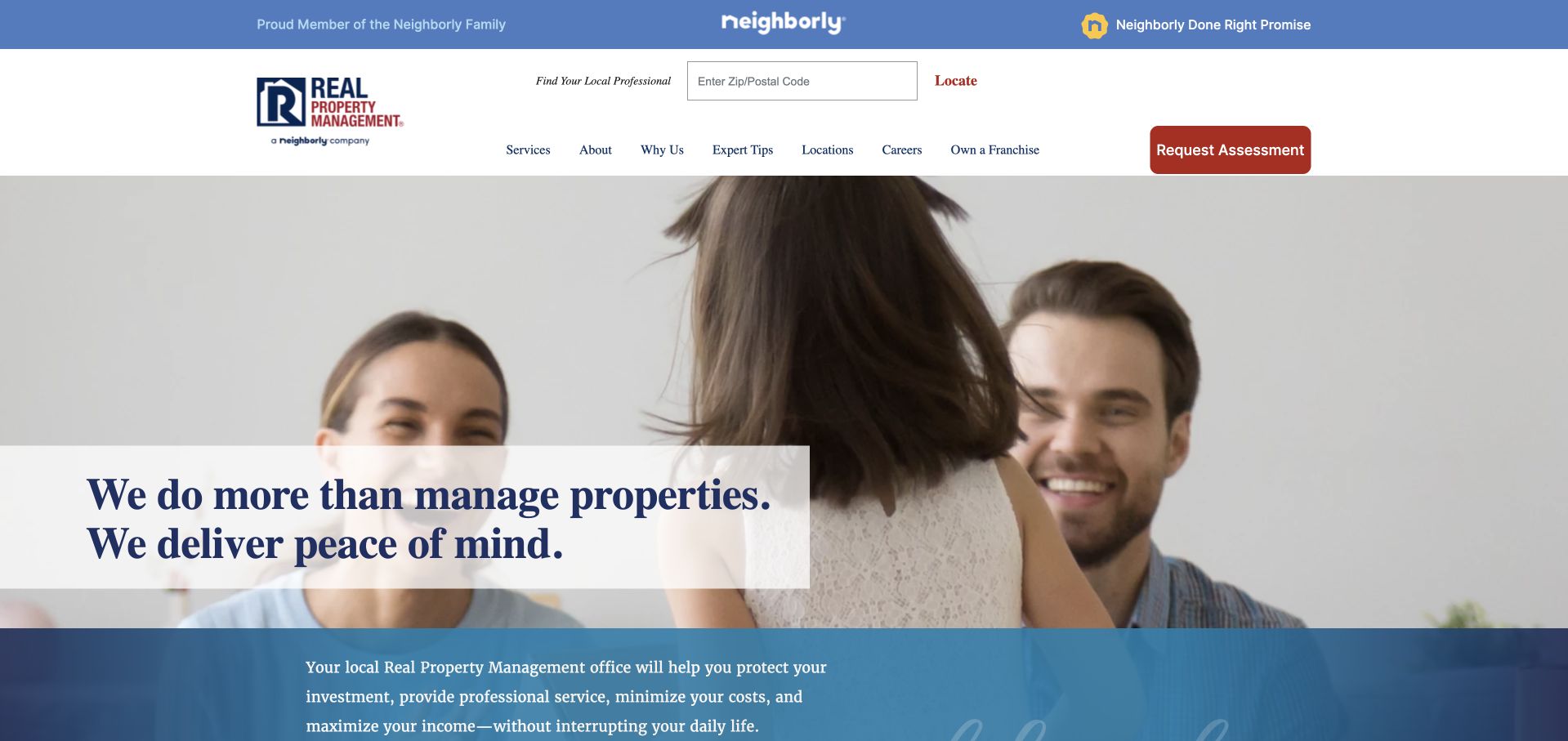
Real Property Management places its office-finding fields in the header and uses a family photograph beneath a service-led introduction. The Neighborly affiliation occupies a distinct top strip, preventing it from replacing the management brand itself. A red assessment action is kept separate from the office locator. The page is worth studying for its division between a national brand promise and the practical need to identify a nearby office. The content includes services, process and local-office routes, which lets an owner investigate the relationship before starting an inquiry. It is not simply a searchable inventory of available rentals.
What you can learn
Treat affiliation, office selection and a new-owner inquiry as related but different pieces of information. A franchise homepage should help people find the local operator first, then give that office room to explain its coverage and terms rather than relying entirely on the parent brand.
Pros
The locator is visible in the header instead of being buried inside a contact page.
National affiliation and local-office discovery receive separate visual treatments with different purposes.
Cons & considerations
The family photo and broad reassurance message require practical service detail to establish differentiation.
Multiple header strips and a locator create a dense opening that needs careful small-screen prioritization.
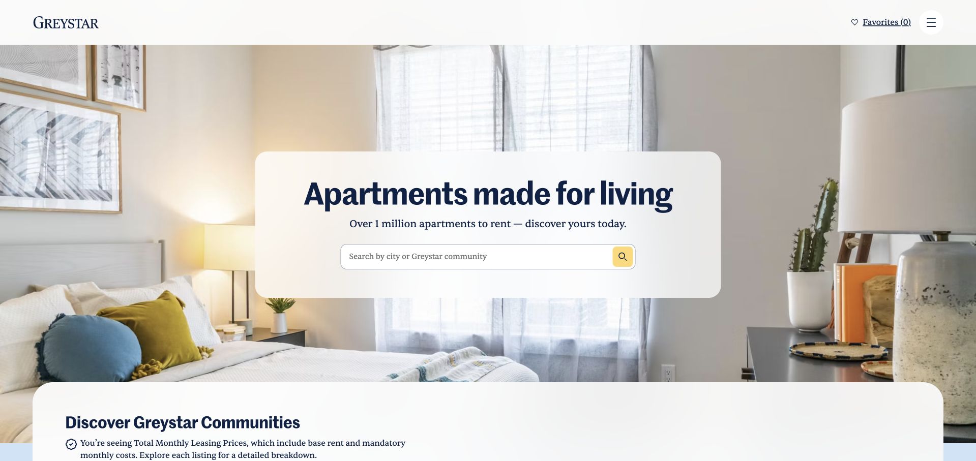
Greystar places an apartment search inside a compact white panel over a bright furnished-room photograph. The headline describes apartments rather than opening with a corporate investment statement. A minimal top bar offers favorites and a menu, leaving the search field as the main interaction. A lower discovery panel begins the broader community story without displacing the first task. For a property-management guide, this is a resident-facing portfolio example, not a template for every local owner’s management inquiry. Its strength is the unusually direct relationship between the page’s imagery, the destination inventory and the visitor’s immediate intention.
What you can learn
When home search is the main job, make the input the centerpiece and supply a useful search vocabulary. A small manager can borrow the task-first hierarchy while using its own coverage and inventory, rather than copying scale statements that only make sense for a national portfolio.
Pros
The central search panel has a clear background that protects field and label readability.
The furnished interior illustrates the type of destination the user is looking for.
Cons & considerations
A very restrained header can hide owner, investor or support routes behind an additional interaction.
A large room image should not delay the search controls or become essential to understanding the page.
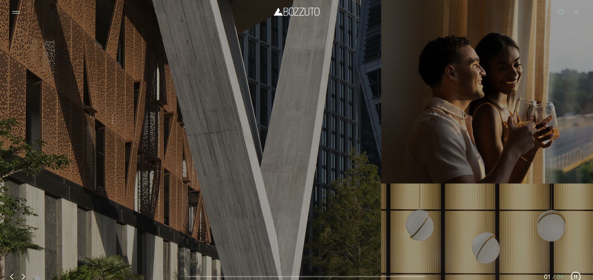
Bozzuto’s opening is an image-led composition with several architectural and lifestyle frames instead of a single block of marketing copy. A small white wordmark and menu sit over the photographs. The arrangement contrasts building exteriors, intimate interior details and people using the space, giving the visitor a sense of a residential experience before the wider navigation is explored. It is useful as a study in visual brand editing rather than as a model for an information-heavy property-service page. The same decision that creates atmosphere also makes it less immediately obvious where an owner or prospective resident should begin.
What you can learn
A portfolio with strong original photography can use a few deliberately different scales of image to tell a story. Keep a visible, descriptive search or location route alongside that storytelling; an immersive opening should not require a visitor to discover the menu before they know what the company does.
Pros
The mosaic gives architecture, interiors and people distinct roles within one coherent opening.
Minimal interface elements keep attention on the company’s selected residential imagery.
Cons & considerations
Visitors who need an immediate rental or management task receive little guidance in the initial image field.
Image-heavy compositions need meaningful text alternatives and an efficient loading strategy to remain usable.
Lincoln’s current homepage redirects to lpc.com and presents a commercial real-estate brand, not the residential leasing company some visitors may associate with the older name. A large moving image anchors the opening, with a serif headline and a small service annotation at one edge. Below it, the page names its broad commercial service role and introduces management alongside other activities. The useful design detail is the supporting annotation: it gives the cinematic introduction a more concrete service context. The restrained white wordmark and compact menu leave much of the first screen to the brand presentation.
What you can learn
When using a corporate film, add a stable text explanation that does not depend on the current frame. Also make the operating sector explicit. A commercial property-management page should not leave residents looking for apartment assistance on a corporate investment and services site.
Pros
A small service caption adds practical context to the larger brand-led visual.
The typographic contrast gives the opening an editorial quality without adding many interface elements.
Cons & considerations
A menu-only navigation adds a step for users seeking a particular service or office.
A cinematic first screen can postpone essential property-management details and requires a non-moving alternative.
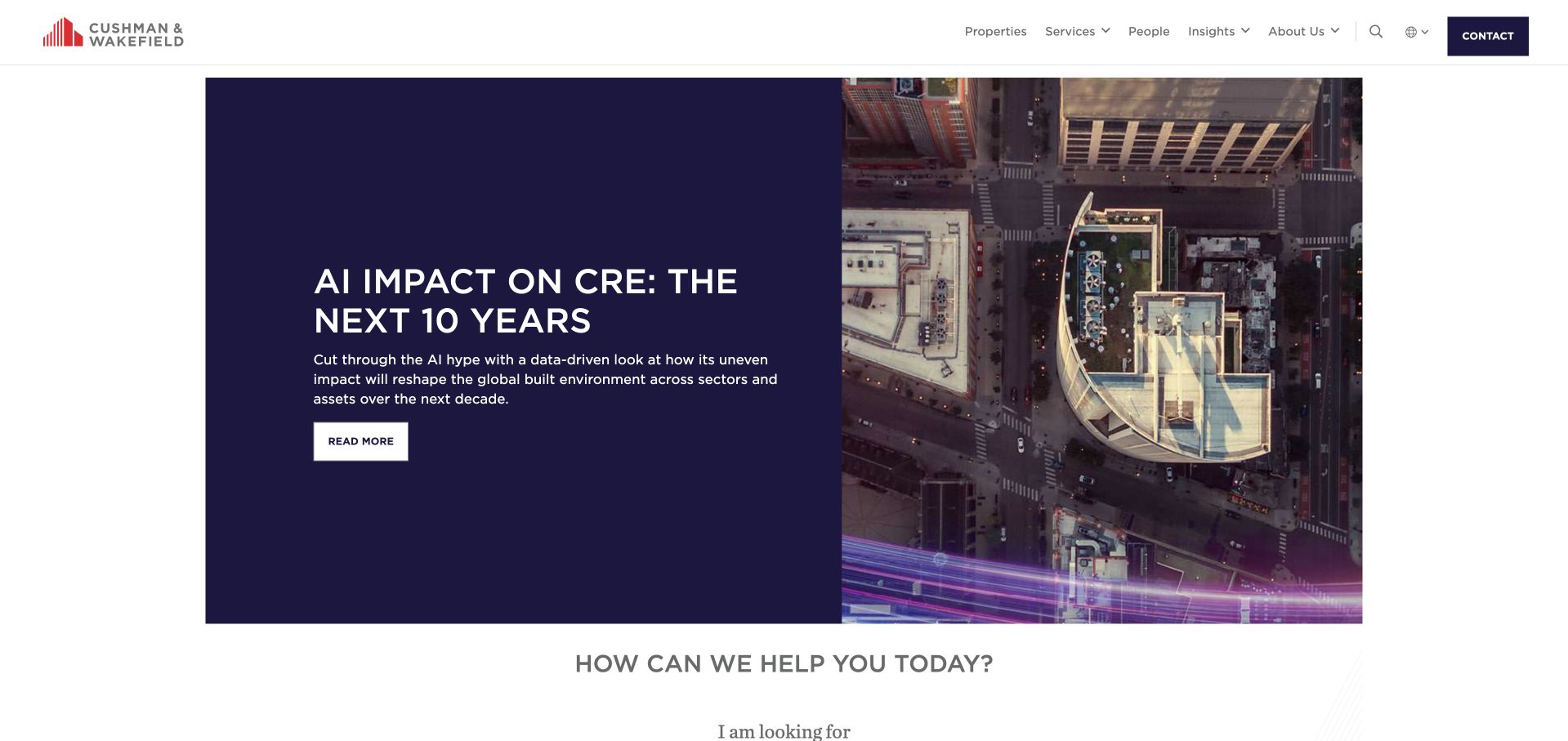
Cushman & Wakefield uses a contained editorial feature rather than a full-bleed brand film. In the captured version, a dark text panel and a technical interior photograph introduce an AI-and-commercial-real-estate report. Immediately below, a routing question asks what the visitor is looking for. The header separates properties, services, people and insights, allowing editorial content and practical service discovery to coexist. This is a broad commercial-real-estate example; the homepage does not pretend to be a direct residential-management landing page. Its strongest transferable pattern is giving a featured report a bounded area while retaining obvious access to the organization’s main tasks.
What you can learn
A property firm with regular research can feature it without turning the homepage into a news archive. Pair the article with stable service and people routes, and make the difference between general market commentary and advice for an individual property clear.
Pros
The contained two-column feature gives imagery and text defined, readable areas.
The service-routing prompt beneath the feature brings attention back to the visitor’s task.
Cons & considerations
A topical report may be less relevant than local service information for a first-time property owner.
The breadth of global navigation requires clear regional context so visitors reach the correct team.
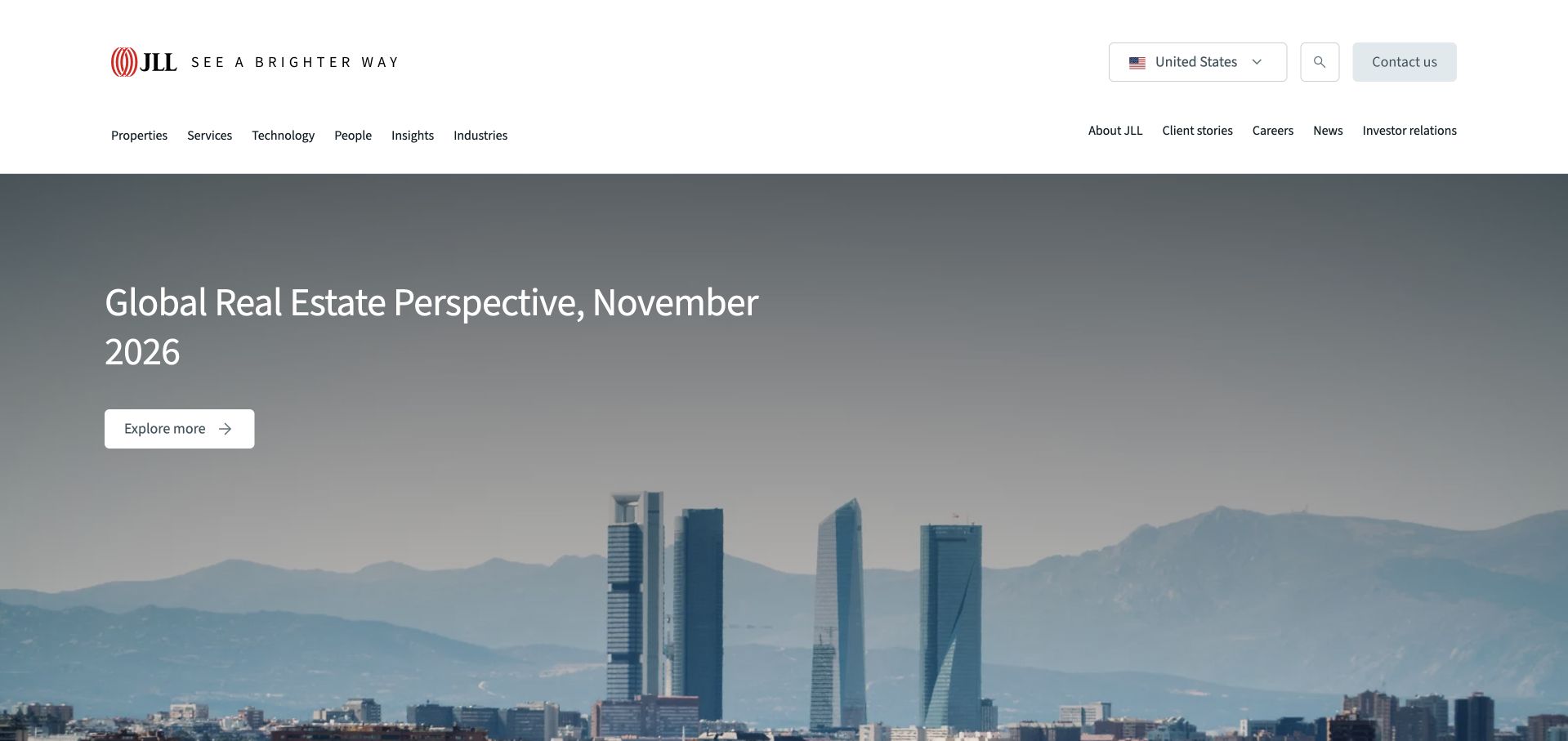
JLL’s captured homepage leads with a dated global real-estate perspective over a wide city photograph. The header groups services, technology, people, insights and industries beneath a larger corporate utility row. The report is presented as a current editorial entry point, not a property-search form. That distinction matters: this is a commercial-services organization using its homepage to frame a conversation about the sector. For smaller managers, the instructive part is the relationship between a timely publication and stable navigation. The page can change its featured story without changing the underlying route to the people and services a visitor needs.
What you can learn
Use dated editorial material as an additional trust-building resource, not as a replacement for a clear service description. A local property manager could feature one genuinely useful neighborhood or owner resource while keeping management coverage and contact routes immediately available.
Pros
The report date makes the featured editorial context easier to interpret than an undated market claim.
Services and people receive persistent navigation positions outside the changing homepage story.
Cons & considerations
A wide scenic image and broad report title do not explain a specific management engagement.
Several navigation layers may be excessive for a small regional business with a narrower audience.
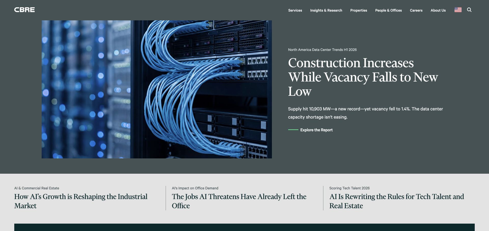
CBRE’s opening pairs a server-room photograph with a report headline on a muted green field. Several smaller story links immediately below offer alternative reading paths. The main navigation names services, insights, properties, offices and people, so a reader can move from a general report toward a business task. This is an editorially rich commercial-property homepage rather than a local landlord-acquisition page. The composition is worth studying for its controlled hierarchy: one substantial feature is given a clear lead, while the secondary stories use less space and do not imitate primary call-to-action buttons.
What you can learn
If research publishing is part of the brand, distinguish the lead story from supporting links and preserve stable service discovery. A local firm should publish a smaller amount of maintained, location-specific material instead of copying a news-heavy structure it cannot keep current.
Pros
The split feature keeps the headline off the detailed server photograph, improving readability.
Secondary stories are visibly subordinate, which makes the opening easier to scan despite its breadth.
Cons & considerations
Research-heavy content may delay an owner who simply wants to understand local management availability.
Broad sector headlines need dates and source context before readers treat them as current market information.
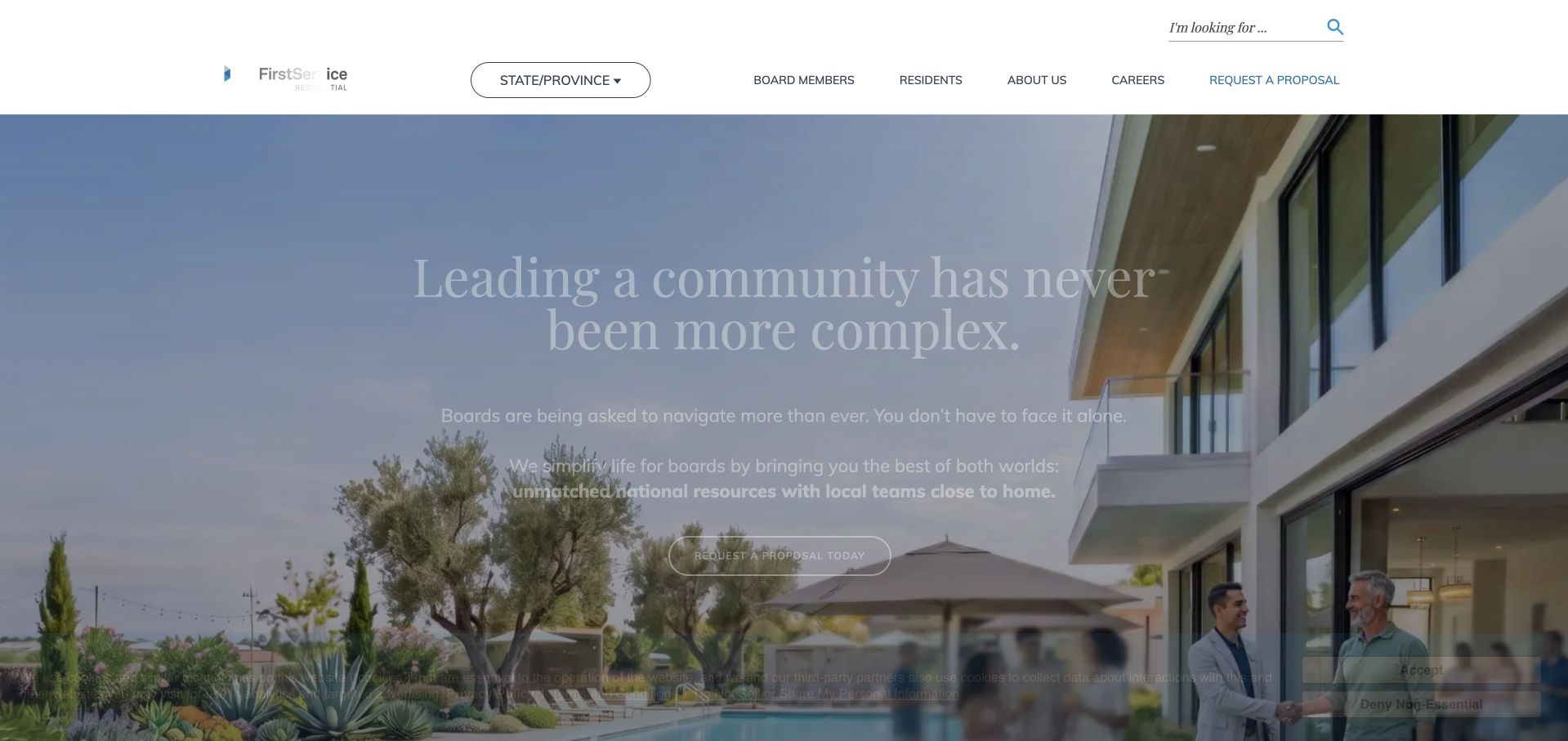
FirstService Residential opens with a message about the complexity of leading a community, positioned over a contemporary residential building. The header puts state or province selection near board-member services, residents, company information and a proposal request. This audience structure is the main lesson: the page does not treat an association board, a resident and a new business inquiry as the same visitor. A pale typographic treatment and wide photograph make the introduction feel restrained, although text over the changing image is not always as strong as the navigation. The regional selector acknowledges that the correct operating context matters.
What you can learn
For association management, start with the visitor’s role and service area rather than a vague property-management headline. Board information, resident support and proposal requests should remain distinct, with contact details that match the selected region and the actual local service arrangement.
Pros
The state or province selector introduces location as part of service discovery rather than an afterthought.
Board members, residents and prospective clients receive explicitly different header routes.
Cons & considerations
Light text over a bright building photograph creates a contrast challenge in the opening.
A general leadership message needs specific scope information before a board can judge whether to inquire.
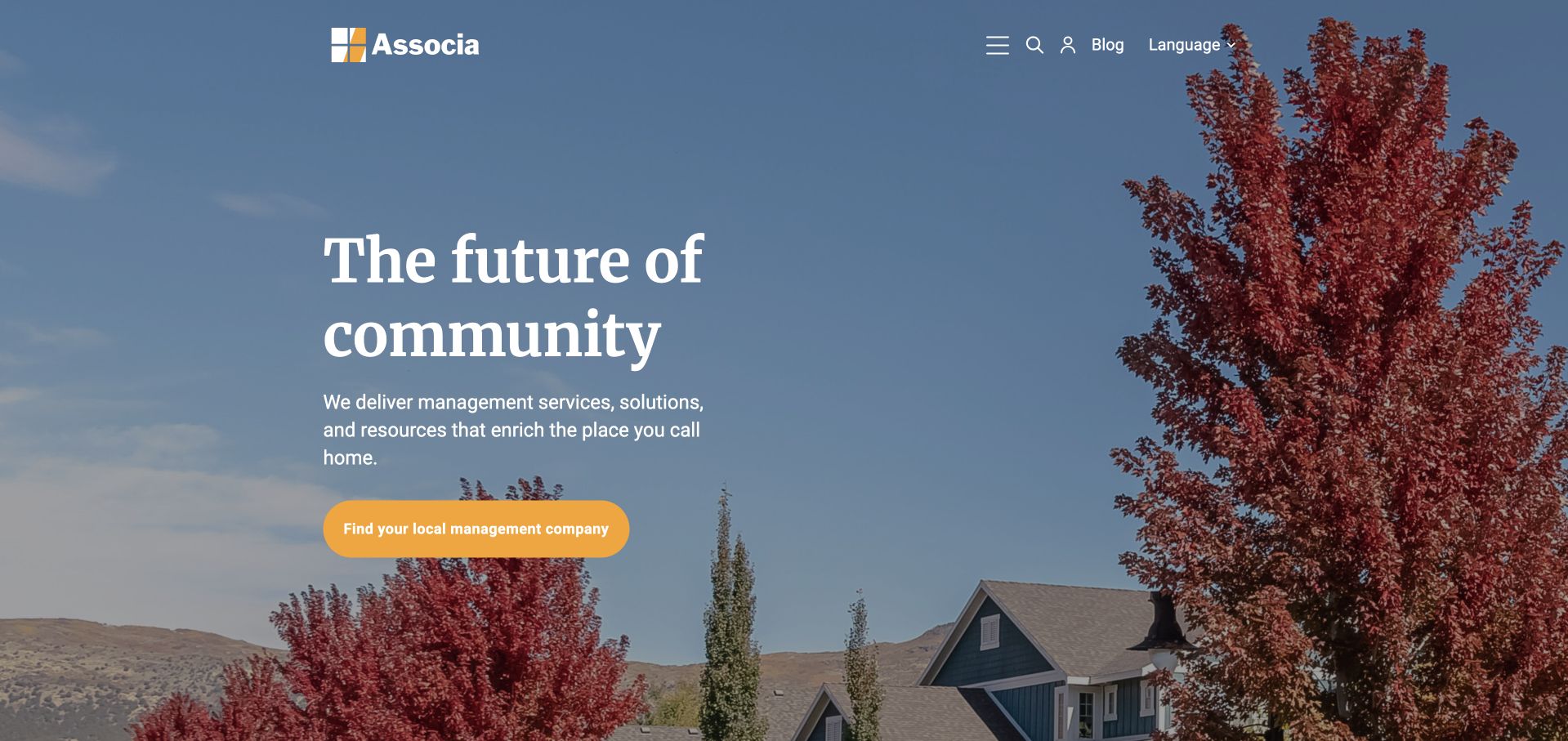
Associa combines a serif community headline, a residential streetscape and a yellow local-company action. The opening describes management services and resources, while a compact header keeps the brand, menu, search and language access visible. Rather than using the homepage as a resident portal alone, it introduces the network and then directs people toward the local business. The streetscape’s seasonal color supplies visual warmth without becoming a busy collection of property cards. For a property-management collection, this is an association-focused example whose useful pattern is the transition from national brand reassurance to finding a relevant regional operator.
What you can learn
A network’s next step should explain what will happen after the user selects a location. Preserve the local office’s identity and contact details, and separate resident assistance from a board’s search for a new management relationship instead of routing everyone into one sales conversation.
Pros
A single contrasting company-finder button gives the image-led opening a practical purpose.
The community photograph supports the association audience more directly than an abstract corporate graphic would.
Cons & considerations
The national introduction does not establish the actual service scope or fees of a local company.
A highly compact header puts additional discovery work on visitors who want a specific resource immediately.
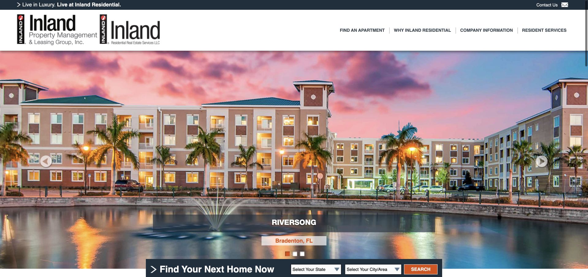
Inland Residential leads with a large photograph of a named community, including its location. A compact search strip asks for state and city directly beneath the image, making the relationship between the showcased property and the wider inventory understandable. The top navigation separates apartment finding, reasons to choose the company, company information and resident services. This is primarily a resident-facing portfolio, and the design works best when judged on how it helps someone move from a residential image to a relevant community list. Its more conventional header and search controls contrast with the large lifestyle-first approaches elsewhere in this collection.
What you can learn
Use a named, real community image to establish context, then give visitors geographic controls that match your actual portfolio. Keep resident-service access separate from the search path, and avoid making every property inquiry depend on a general corporate contact form.
Pros
The photograph’s community and location labels turn a decorative image into a specific example.
State and city controls make the inventory route visible without requiring a menu search.
Cons & considerations
A carousel-style property presentation can hide other communities unless the search remains obvious.
Several thin utility and navigation rows make the top of the page visually dense at smaller sizes.
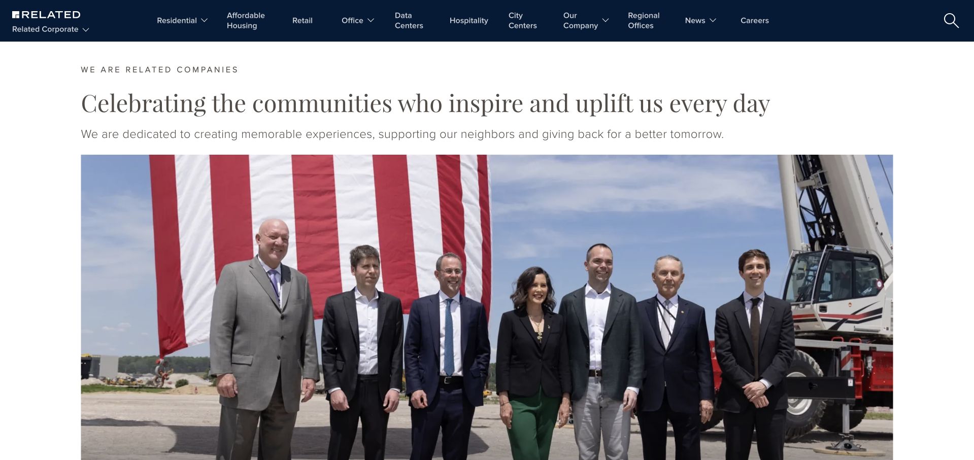
Related’s captured homepage introduces the company through a community-focused story and a large event photograph. The navigation names residential, affordable housing, retail, office, data centers and other operating areas, acknowledging that the organization spans more than a single management service. A short introductory paragraph precedes the image, so the page is not purely a visual splash screen. This is useful for studying the separation between a corporate brand narrative and sector-specific destinations. It is less useful as a direct model for a small property manager whose visitors primarily need vacancies, maintenance assistance or a management quote.
What you can learn
A diversified company should label its sectors in ordinary language and give each one a meaningful destination. A corporate story can introduce the organization, but the service pages still need to answer the practical questions that a broad homepage cannot cover for every property type.
Pros
Sector names provide a visible map of the company’s different property activities.
A short text introduction frames the event photograph instead of leaving visitors to interpret it alone.
Cons & considerations
Corporate news imagery may have limited relevance to a resident or owner seeking immediate assistance.
A very broad navigation system would overwhelm a local business with only a few actual services.
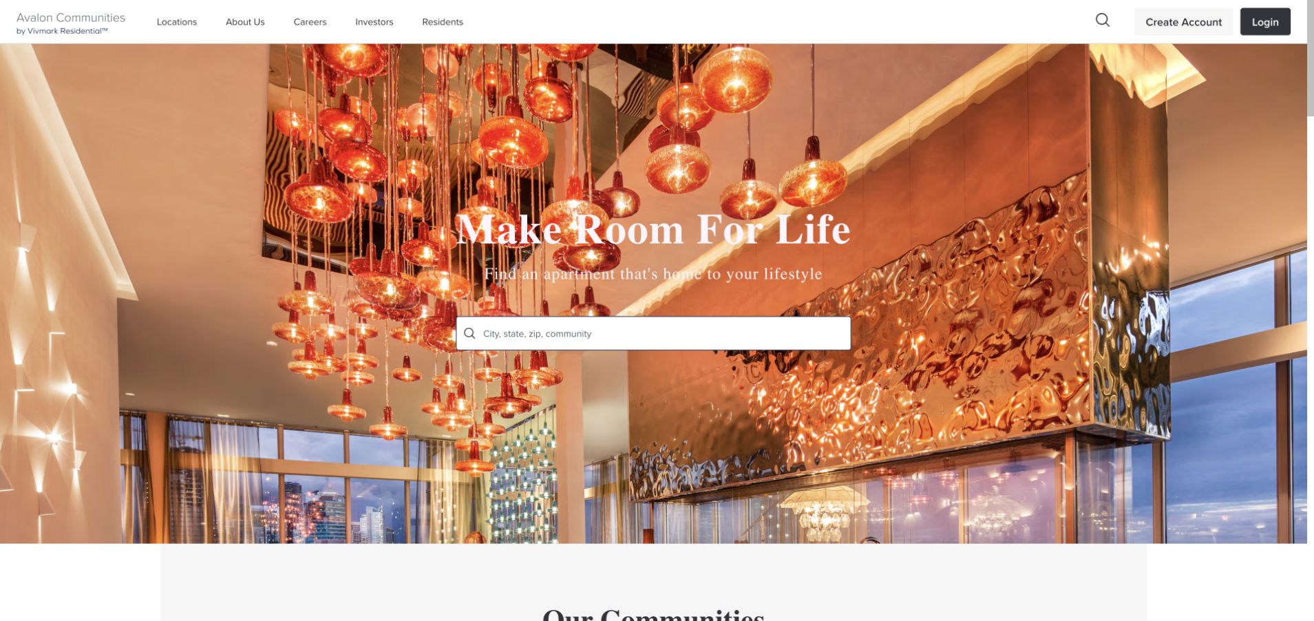
AvalonBay places a long location-search field over a warmly lit interior photograph and a short lifestyle headline. The header stays relatively spare, with company information, careers and account access outside the central search task. The rich interior helps convey the atmosphere of the residential offer, but the search field is what turns the opening into a useful tool. Community content begins below rather than competing in the hero. This is a resident acquisition example, not a demonstration of the firm’s full property-management operation or the condition of every community in its portfolio.
What you can learn
A lifestyle photograph can support apartment search if the field remains readable and immediately usable. Treat the image as one selected setting, retain property-specific information later in the journey, and give returning residents an account route that does not depend on repeating a home search.
Pros
The wide search field remains the dominant interaction within a visually rich first screen.
The restrained header avoids duplicating every possible resident and corporate task in the hero.
Cons & considerations
A single polished interior cannot communicate the variation between individual communities and units.
White overlay text requires dependable contrast as featured images change over time.
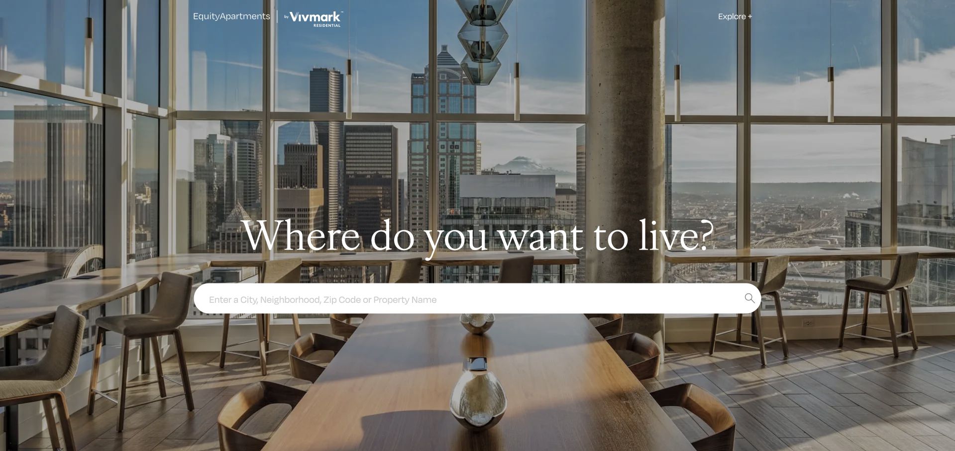
The EquityApartments address currently presents Equity Residential with Vivmark branding in the opening. The site asks where the visitor wants to live and places a wide search field over a residential interior. Resident login and corporate routes remain distinct from the search. This makes the page useful for studying a brand transition without discarding the central user task: finding a home is still the most prominent interaction. The screenshot is a current observation of that public page, not evidence that every property or legal entity has changed its name. The interior image is secondary to the search prompt.
What you can learn
When a portfolio changes its public identity, maintain recognizable navigation and explain the relationship between names. Preserve search and resident support, update labels consistently, and avoid assuming that visitors understand a new brand merely because it appears next to the previous one.
Pros
The opening keeps home search stable while displaying the current brand relationship.
Returning-resident and corporate links are separated from the main property-discovery interaction.
Cons & considerations
Two brand names can confuse visitors unless subsequent pages explain their relationship clearly.
An aspirational interior needs specific community and availability information in the search results to remain useful.
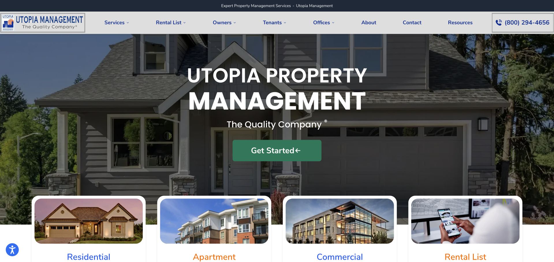
Utopia uses a recognizable house photograph, a substantial company headline and a green start button. Large category cards begin immediately below, identifying residential, apartment, commercial and rental-list destinations. The header also keeps services, owners, tenants, contact and resources separate. This is a more explicit service-routing layout than the purely cinematic brands in the collection. It shows how a management firm with several property types can help visitors self-select without presenting every service detail in the first paragraph. The prominent telephone number supplies an alternative to the primary button for visitors who prefer a direct conversation.
What you can learn
Use property-type shortcuts when they correspond to real differences in the service, not merely as extra navigation decoration. Each category page should name its coverage, responsibilities and inquiry route. Keep owner and tenant tasks apart so a maintenance request is not mistaken for a management lead.
Pros
Visual category cards make the breadth of property types easy to understand near the opening.
A visible phone number provides a practical alternative to the main inquiry action.
Cons & considerations
The large headline largely repeats the brand name before explaining what distinguishes the service.
Several category images and a full navigation row require a carefully simplified sequence on mobile.
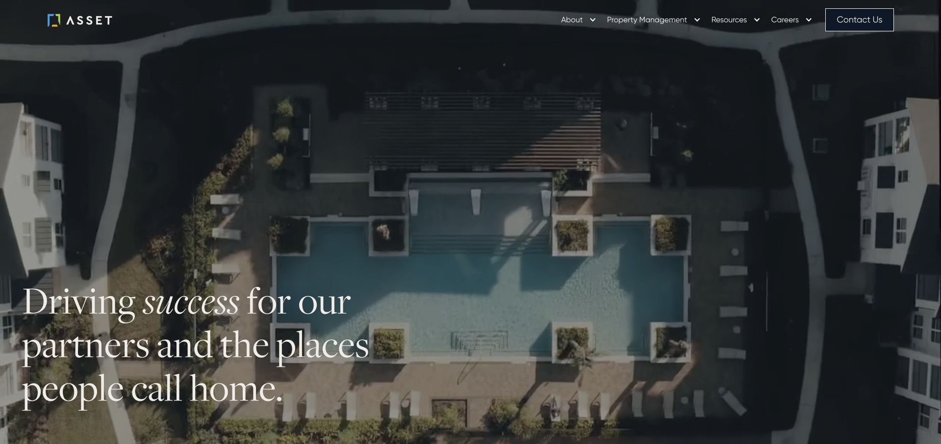
Asset Living’s settled opening uses an overhead residential image with a large serif message about partners and the places people call home. The navigation groups company information, property management, resources and careers, with contact set apart. This is clearly a corporate management introduction rather than an apartment-search landing page. The aerial viewpoint links the partner audience to the physical communities the business manages, while the typography gives a broad service proposition more visual character. The page initially uses an animated entrance, so the final settled view is important when assessing whether the main message is actually readable.
What you can learn
A partner-facing management site can use residential imagery without pretending its primary action is apartment search. State the relationship being offered, then give owners concrete property-management information and resident visitors a separate support destination. Animation should enhance the introduction, not delay its meaning.
Pros
The aerial residential scene connects the corporate proposition to recognizable places rather than abstract finance graphics.
The restrained navigation reserves clear visual emphasis for a direct contact action.
Cons & considerations
Animated entrances can create an empty-looking first frame if essential content appears late.
A broad partner statement requires specific management capabilities and operating markets further down the page.
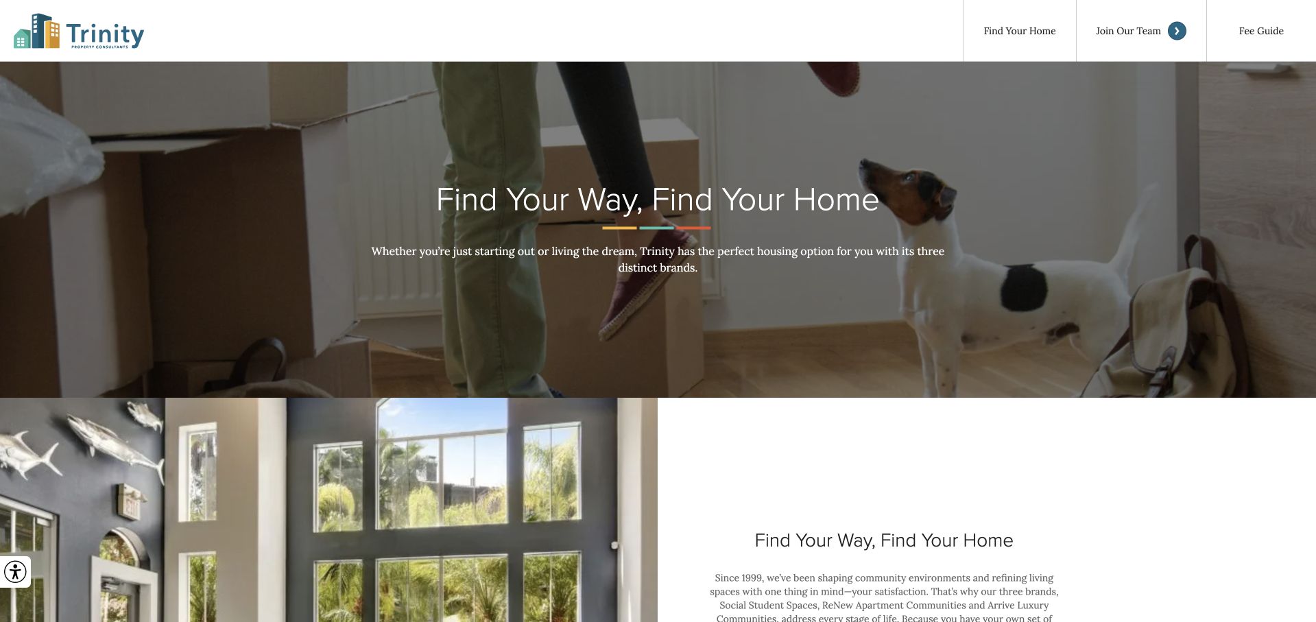
Trinity presents a resident-focused headline over a domestic scene, then brings individual community imagery into view directly beneath the hero. The header exposes finding a home, about, careers and resident access, making the intended resident journey clearer than a corporate-only menu would. The immediate shift from a broad welcome to named places is the useful design move. A visitor can begin with a lifestyle impression and then investigate an actual community. For this collection, the example illustrates resident-facing presentation, not a claim about operating performance or the availability of a particular apartment.
What you can learn
Follow a broad residential message with specific communities before asking users to absorb a company biography. A property operator can preserve its brand personality while making location, availability and resident assistance easy to identify as separate tasks with their own destinations.
Pros
Community imagery appears near the opening rather than being buried behind a general contact route.
Resident access and home finding are visibly different navigation choices.
Cons & considerations
A generic welcome headline does little on its own to explain the portfolio’s geography.
Moving domestic imagery and layered text require a static, readable fallback and careful contrast.
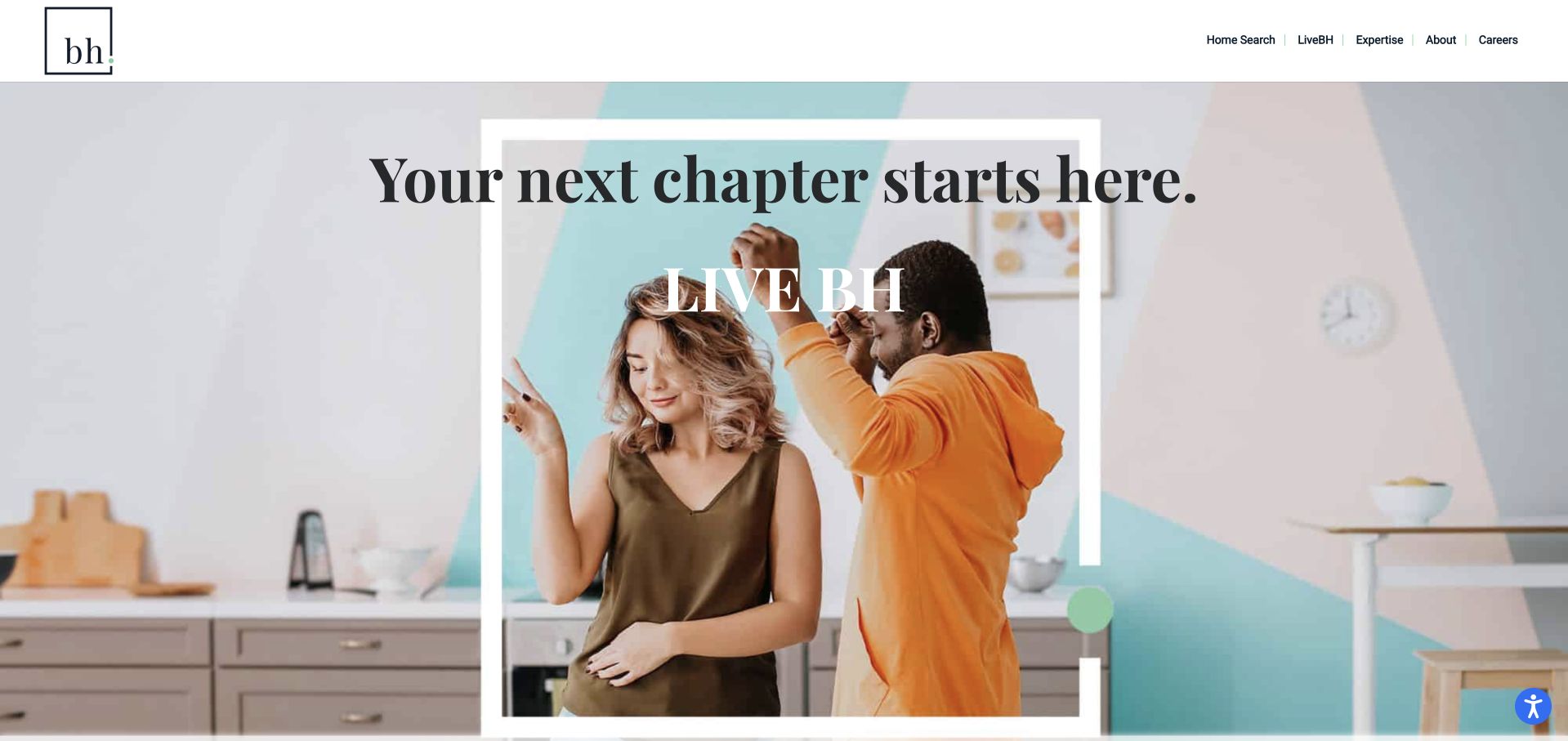
BH uses a short serif headline, a compact square wordmark and a domestic photograph with a pale geometric overlay. The navigation separates home search, resident life, expertise, company information and careers. This lets the brand speak to both people looking for an apartment and visitors interested in the management business without forcing them through the same route. The opening has a lighter, more editorial character than a typical apartment listing portal. Its main transferable quality is not a particular slogan, but the controlled relationship between a simple brand system and the different audiences represented in the header.
What you can learn
A multifamily brand can offer a strong lifestyle impression while keeping practical destinations plainly named. Connect home search to actual location information and keep corporate expertise separate from resident assistance, so the first screen does not ask one message to do every job.
Pros
A small wordmark and restrained header leave a clear hierarchy for the opening text.
Home search and corporate expertise appear as different choices rather than competing calls to action.
Cons & considerations
Large decorative overlays consume image space without adding much service-specific information.
A lifestyle-led opening still needs a prominent geographic route before it can help an apartment seeker.
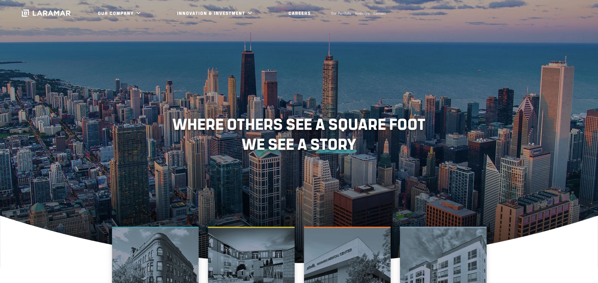
Laramar places a concise square-footage-to-story message over a panoramic city photograph. The header names company information, investment management and commercial activity, showing that the site serves more than apartment seekers. A lower band of property images starts to bring the broad skyline introduction back to individual assets. The composition is useful for studying the change in scale between a corporate view of a market and the buildings within it. It is not an immediate listing-search interface, and that difference should be intentional when borrowing the layout for another property business.
What you can learn
If the homepage introduces an investment or operating company, use the opening to establish that role clearly. Then move from market-scale photography to specific properties, services and team information. A local manager should not sacrifice resident or owner task access merely to imitate a panoramic brand treatment.
Pros
The skyline establishes a market-scale visual context before individual property imagery appears below.
The navigation labels distinguish investment and commercial activity from a simple residential directory.
Cons & considerations
A broad story statement does not explain a particular management process or local service area.
White text and navigation over a detailed skyline need strong contrast and an accessible non-image equivalent.
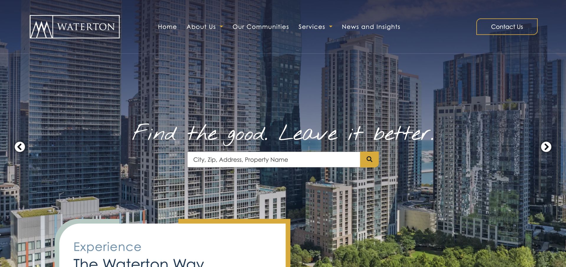
Waterton places a city photograph behind a handwritten-style brand line and a conventional property-search field. The search accepts a city, postal code, address or property name, describing the inputs directly instead of making users guess the search vocabulary. Navigation includes communities, services, company information and insights, while contact is highlighted at the edge. A white panel introducing the company’s approach begins below the hero, balancing the property-finding task with the corporate story. The page is valuable because its expressive typography does not replace the more ordinary controls needed to find a community.
What you can learn
Use personality in the brand statement while keeping search labels and controls conventional. Accept the location terms residents actually know, explain the search scope, and give owners or partners a separate services path rather than trying to convert every visitor through the property finder.
Pros
The search prompt names several accepted input types, reducing uncertainty before interaction.
A distinct services route lets business visitors avoid the resident-oriented property-search task.
Cons & considerations
Handwritten-style display text can become harder to read over a detailed city photograph.
The search needs helpful empty and no-match states; an attractive input alone does not establish usability.
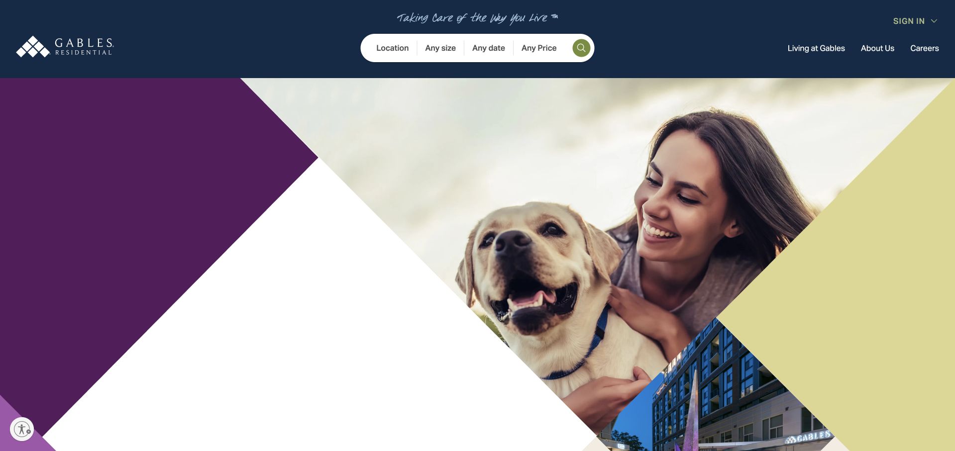
Gables combines a navy header, purple and yellow geometric fields and a lifestyle photograph that includes a resident with a dog. A white search strip in the header asks for location, size and price, placing practical apartment-selection criteria above the larger visual. The design makes a clear distinction between the expressive brand area and the utilitarian controls. Resident sign-in and company routes remain on the right, outside the central search group. This is a useful resident-facing example because the hero’s personality does not require the search interface to adopt unusual controls or decorative labels.
What you can learn
Give a residential brand its own color and image language, but keep apartment criteria recognizable and consistently labeled. Ensure the same search remains usable on a small screen, and avoid letting lifestyle imagery stand in for property-specific amenities, policies or availability information.
Pros
The header search makes location, size and price visible before a visitor scrolls.
Geometric brand shapes create distinction without forcing essential labels onto the photograph.
Cons & considerations
Several search criteria in a thin header need careful reflow on narrow devices.
A lifestyle image can imply an atmosphere, but individual community policies must be communicated separately.
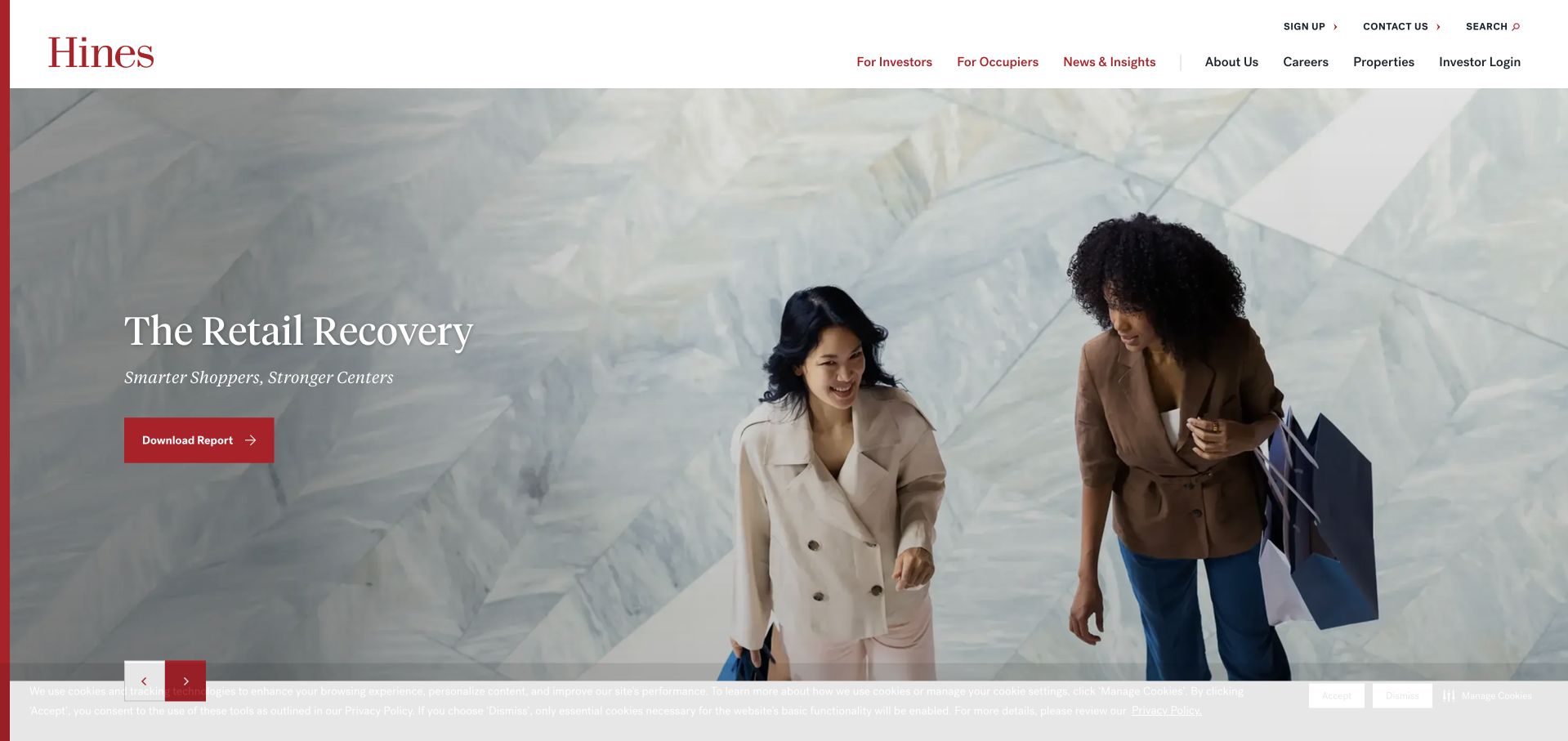
Hines uses a white header, a red wordmark and a wide editorial image with a contained report title. The captured feature concerns retail, while the navigation provides different destinations for investors, occupiers, news, properties and the company itself. That breadth makes this a corporate real-estate example rather than a dedicated residential management lead page. The red report action is small enough not to overwhelm the image but distinctive enough to be found. The page demonstrates how a stable brand system can host changing sector stories while maintaining a consistent route to the organization’s broader property and service information.
What you can learn
Separate a changing editorial feature from permanent audience navigation. A property firm can feature one current report or project while keeping owner, occupier and property routes stable. Avoid copying a global content structure if the business cannot support it with maintained, relevant material.
Pros
The restrained red accent gives a featured story a clear action without adding a second visual system.
Audience-oriented navigation persists independently of the currently featured property-sector story.
Cons & considerations
The report-led opening may not answer a visitor’s immediate question about a local management service.
A wide image and small overlay copy require careful responsive treatment to remain readable and useful.
Kegan is a freelance web designer and developer with 15+ years of experience helping businesses turn complicated website requirements into clear, maintainable digital experiences. He works directly with clients from planning and design through development, launch, and ongoing support.
For property management website design, his development approach focuses on distinct owner and resident journeys, property information, service areas, and inquiry integrations. The scope can be a targeted improvement or a complete custom build, with responsive layouts, thoughtful content structure, and integrations chosen around the people using and maintaining the site.
Show 3 other property management website designersHide other property management website designers
Plan a property management website around real tasks
Map the recurring tasks before choosing the hero
Start with the last several weeks of questions received by the business. Separate new-owner inquiries from current-owner administration, resident account access, maintenance, rental availability, application questions and association-board information. This is a content exercise, not a reason to expose private support records. Summarize the patterns without names, account numbers or property-specific disputes. Decide which tasks belong on the public site and which belong in an authenticated property-management platform. The marketing site should route people accurately; it does not need to reproduce every function of the operational system.
Draw the top-level structure from those tasks. A small residential manager might need Owners, Available Homes, Residents, Areas Served and About. An association practice may instead need Board Services, Community Resources, Residents and Request a Proposal. A commercial firm may organize by property type and expertise. Do not copy the largest company’s menu simply because it appears comprehensive. A menu is successful when its labels match the actual service relationship and every important destination has an owner who can maintain it.
Write the expected next step for each route before designing its button. A rental search should return relevant properties, a resident link should identify the correct portal, and an owner inquiry should explain what information will be reviewed. Test the labels with someone unfamiliar with the company. Ask where they would go, not whether they like the page. Include a clear route for urgent property issues that reflects the company’s real procedures; do not invent response commitments as a design flourish.
Build a maintainable location and property content model
Define the relationship between markets, offices, communities and individual listings. They are not the same thing. A market page can explain coverage and local service context; an office page can identify the team and contact route; a community page can describe a specific place; an available-home record can contain current inventory data. Mixing all four into repeated city landing pages produces confusing navigation and a large maintenance burden. Start with the structure the team can keep accurate, then expand it when there is genuinely different information to publish.
For each public property record, decide where the data originates and which system is authoritative. Establish how availability, photographs, price, accessibility information, contact details and application destinations will be updated. If a listing feed supplies the information, handle empty states, removed listings and delayed updates intentionally. Do not leave an old inquiry button active simply because a property image still looks attractive. A removed listing should help the visitor find current options rather than becoming a misleading sales page.
Treat photography as a labeled content asset. Use actual properties and neighborhoods with appropriate permission, record what the image represents and avoid suggesting that every community has the same features. Provide text details outside the image. When a carousel changes, the service description and task controls should remain stable. Test a property page with its images unavailable: the visitor should still understand location, relevant contact and the next useful action. A small, accurate portfolio is more useful than a large set of thin or stale pages.
Design the inquiry and support handoff together
Before building a form, define who will receive it and what they need to respond. A new-owner inquiry may require a location, property type, unit count and a short description of the request. It does not automatically require tenant records, financial statements or a complete property history. Put a short explanation beside the fields, identify required items clearly and tell the visitor what happens after submission. Use descriptive labels rather than relying on placeholders that disappear as someone types. Confirm the request on screen and provide a useful path if delivery fails.
Keep operational support separate. Residents should not be encouraged to place account, payment or maintenance details into a public sales form. Where the company uses an external portal, identify that destination and its purpose plainly. If several local offices have different portals, show the selection step before sending the visitor away. Review the handoff with the staff who actually answer the phone and handle requests. A visually elegant page that sends the right person to the wrong queue creates avoidable work for everyone.
Plan ownership after launch. Assign responsibility for coverage pages, office contacts, portal destinations, listing feeds and form delivery. Keep a small set of useful checks: whether visitors can complete the main task, whether inquiries reach the correct team and whether old pages redirect appropriately. Review the site after a brand change or office acquisition rather than assuming the menu can stay untouched. Evaluate the website as a communication and routing tool, not as proof of occupancy, rent collection, investment performance or the quality of property-management services.
The editing job behind the design
Choose the simplest stack that keeps property information accurate
For a brochure-style local practice, a maintainable CMS and a reliable connection to the existing listing or portal system may be enough. Separate public content from authenticated operations. Choose integrations for documented needs such as inventory, office routing or forms—not because a larger brand’s homepage appears to use a fashionable framework.
A property-search interface needs thoughtful empty states and resilient data updates more than decorative complexity. Keep image delivery efficient, preserve readable search labels and test with a keyboard and a narrow screen. Public technology observations in this collection identify visible signals only; they are not a complete inventory of a company’s operational systems.
Our WordPress website examples offer a separate look at publishing approaches. A visible platform label is evidence for that named page, not a guarantee that the same system will suit your requirements.
Before the public launch
Property management website brief checklist
Identify owners, renters, residents and board members as separate audiences where those roles actually exist.
List the five recurring tasks that should remain easy to find without reading the full homepage.
Document real service areas and the office responsible for each location before creating city pages.
Separate markets, offices, communities and individual listings in the content model.
Name the authoritative source and update process for availability, prices, images and property details.
Keep resident support, payment and maintenance destinations out of the public new-business inquiry workflow.
Explain what an address or location search returns before asking users to enter it.
Use actual property imagery with accurate context and permission rather than implying universal amenities.
Give forms persistent labels, clear required fields, useful errors and a visible confirmation.
Test the main search and contact tasks without a mouse and at narrow screen widths.
Assign an owner to portal links, listing-feed failures, office contacts and removed-property pages.
Review every service and response statement with the business rather than inventing operational commitments.
These checks are a project checklist, not a performance, legal, security, or accessibility certification. Test real journeys with the people responsible for the website before making claims about the result.
Sources & editorial method
How this collection was selected and reviewed
These public pages and direct browser captures were reviewed on November 9, 2026. Observations concern navigation, content structure and visual presentation, not property quality, service performance or investment results. Corporate, association and resident-search examples are identified according to their actual role. The structured source records preserve the actual pages and capture dates.
Each example links to its actual source page. Screenshots are direct browser captures with their own capture dates; moving imagery, announcements and live designs can change. The notes describe observable design choices and conditional tradeoffs, not measured traffic, conversion results, service quality, or accessibility conformance.
Technology labels use public page metadata, asset evidence, or explicitly cited platform documentation. Platform documentation is not a complete current deployment audit. A component reference may be legacy or unused; it is not a complete backend inventory. Unknown stacks are omitted. These sites are editorial examples, not our client portfolio.
Written, Edited and Curated are separate editorial records, not timestamps advanced by a rebuild. Website designs and imagery belong to their owners. See our editorial standards or suggest a correction.
Questions worth asking
Property Management website design questions
Should a property manager lead with available rentals or owner services?
Choose according to the main audience and actual business model, but keep the other recurring tasks visible. A resident-facing portfolio may prioritize search; a local practice seeking management inquiries may prioritize owner services. Neither should make residents hunt through a sales form for support.
Does every city need its own property management page?
Only when the page can provide accurate, meaningfully different coverage, office, property or service information. Repeating the same paragraph under many city names makes maintenance harder and gives visitors little help. Start with the locations the business actually serves and can describe specifically.
Should the public website include a resident portal?
It should clearly identify and link to the correct existing portal when one is used. Rebuilding account, payment or maintenance tools inside a marketing site is a separate project with different security and operating requirements. Explain the handoff so residents understand where they are going.
Are the largest property websites the best templates for a small practice?
Not necessarily. A national portfolio, association network and local manager have different audiences and information needs. Borrow a useful pattern such as audience routing or location search, then reduce it to the real services, markets and maintenance capacity of the smaller business.
Can an attractive website demonstrate management performance?
No. This collection examines public design and communication. Images, review marks, claims and interface illustrations do not independently establish service quality, occupancy, financial results or a property’s condition. Evaluate those questions through appropriate evidence outside a design-inspiration list.
Start with a task map and one accurate local-service page. A clear handoff to the right person or system is a stronger foundation than a larger hero or a longer menu.