Best Funeral Home Websites of 2026 (14 Real-World Examples)
Funeral home website examples that make the next step easier to find
A funeral home website must serve people seeking immediate help, looking for a service notice and planning for the future. These fourteen examples show how local identity, clear contact routes and carefully organized information can support those different needs.
People rarely approach a funeral home website in the same frame of mind. One visitor needs a telephone number now. Another wants the date and place of a service. Someone else is comparing cremation, burial or preplanning options at a slower pace. The design should make these routes understandable without asking anyone to learn the business's internal language. A calm presentation is useful, but calm does not mean hiding the action beneath a large scenic image.
This collection compares public pages from fourteen funeral-service businesses. We look at visible navigation, writing, contact hierarchy, location information and memorial discovery. These are design observations, not recommendations of a provider's care, prices or suitability. Business claims remain the providers' own statements. No forms, payments, planning requests or condolence submissions were made during the review.
Before the examples
What makes good funeral home website design in 2026?
Make immediate help unambiguous
Use a visible telephone route with plain wording such as Immediate Need. Distinguish it from preplanning, payment and general inquiry actions. Explain availability only when the business can support that statement, and keep location-specific numbers clearly labeled.
Treat obituary discovery as a primary task
Provide a recognizable obituary route and search near the top of the page. Show names, dates and useful service context in readable formats. Preserve stable memorial URLs when changing platforms and avoid placing commercial actions ahead of the information families seek.
Replace generic reassurance with concrete detail
Real staff, facility photographs, parking information and clear service descriptions explain what a visitor can expect. A local story is stronger when it answers a practical question, rather than only stating that a business cares.
Separate planning from urgent arrangements
A preplanning visitor can spend time comparing options. Someone responding to a recent death may need a short instruction and a phone number. Give these tasks different entry points without requiring a long form before anyone can obtain basic information.
The collection · 14 examples
14 funeral home websites worth studying
These fourteen funeral-home websites show different ways to organize immediate assistance, obituary discovery, planning information and local identity. Duyck & VanDeHey is the Editors Choice for its combination of family imagery, distinct service and planning routes, and location-specific contact information. This is a website-design selection, not a recommendation of funeral services or a result of visitor votes.
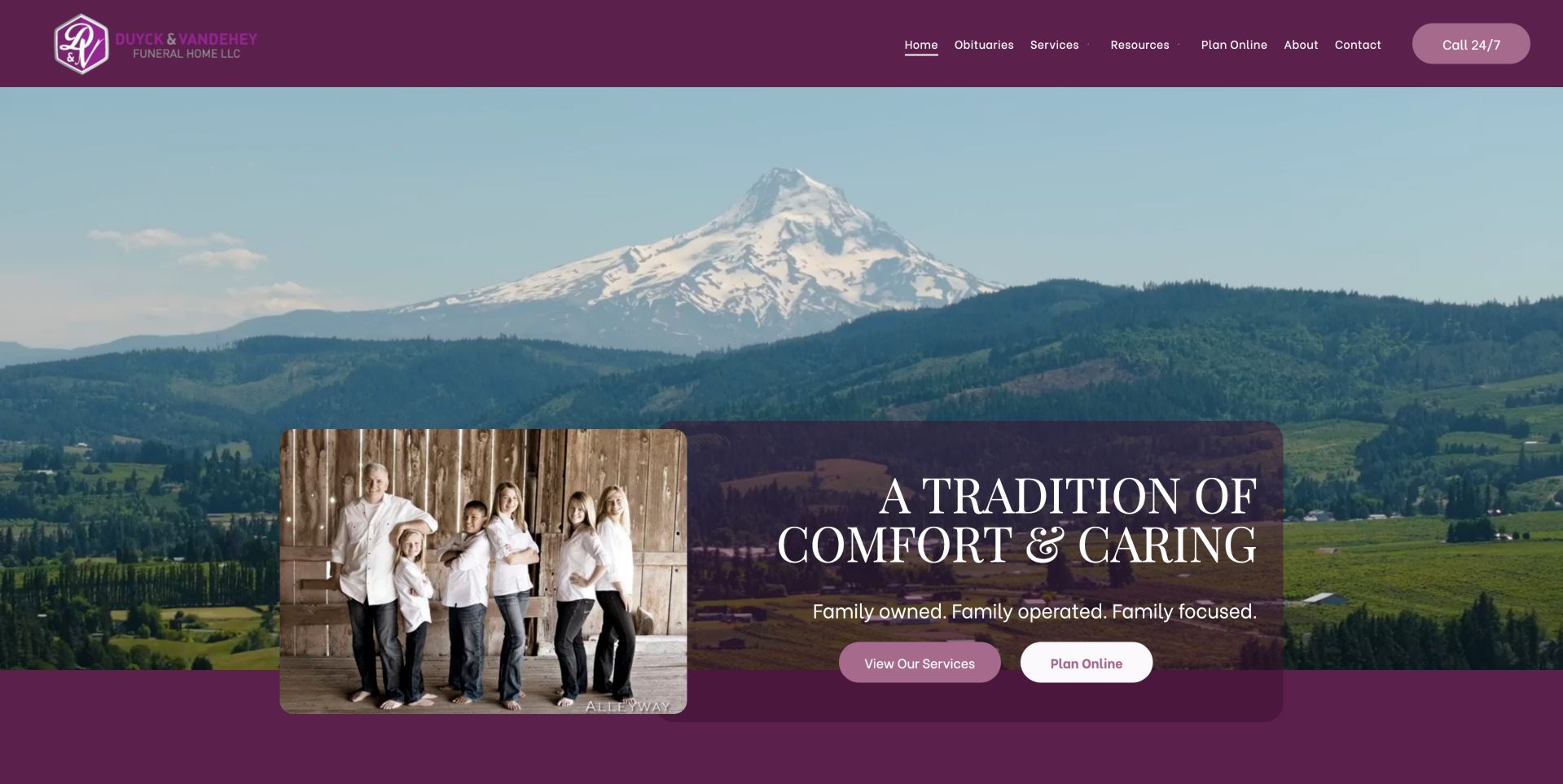
Duyck & VanDeHey connects a regional mountain landscape with a separate family portrait, creating a more particular introduction than scenery alone. Plum colors carry from the header into the translucent content panel, where a short family-focused message leads to two distinct controls: service information and online planning. Their separate labels let readers choose between understanding the offering and beginning a planning task. A round-the-clock call action remains visible in the header, so those choices do not replace direct assistance. The saved page content then assigns individual headings, phone numbers and addresses to the locations, reducing ambiguity for a regional practice. This combination of people, place and concrete next steps supports its Editors Choice placement. The tall hero still pushes branch information below the first view, and the translucent panel should be checked against its background at different sizes. The award concerns the observed website design, not the quality of funeral care.
What you can learn
Connect a human introduction to concrete service choices and location-specific details. This works best when the photograph supports a real business story and the urgent call route stays available above it.
Pros
Family and regional imagery create a distinctive identity.
Separate location contacts reduce ambiguity.
Cons & considerations
The tall hero pushes location information below the first screen.
Translucent panels need contrast testing against varied imagery.
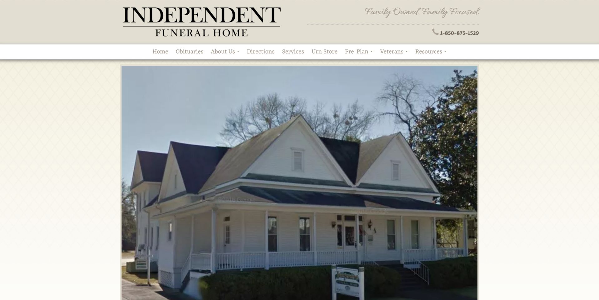
Independent Funeral Home gives its actual building the central role in the opening screen. The photograph is framed within a narrower page canvas, with a cream patterned background and a large traditional wordmark above it. This helps establish the place a visitor may later need to recognize, rather than introducing the business solely through abstract imagery. A telephone number appears beside the family-ownership message, and the horizontal menu names obituaries, directions and services explicitly. Those labels support several reasons for visiting, although the building image occupies most of the initial viewport. The saved page notes also show obituary search and grief resources further down the page. For an urgent caller, a more prominent immediate-help control would be useful alongside the photograph. The design's strongest element is its recognizable location; its main limitation is the distance between that visual introduction and the practical information beneath it.
What you can learn
Use an actual location photograph to establish familiarity, but keep immediate help and directions equally easy to find for someone visiting in distress.
Pros
Real building photography reinforces place.
Obituaries and directions have explicit navigation labels.
Cons & considerations
The large photograph pushes practical information down.
Some service and contact shortcuts rely on small icons.
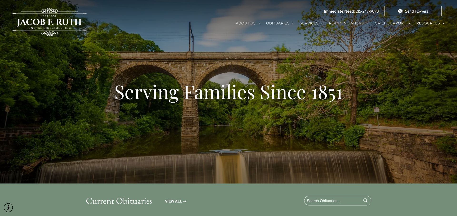
Jacob F. Ruth uses a stone bridge and wooded waterway to introduce its local identity, with a large founding-date statement centered over the scene. The ornate white logo and restrained serif heading suit the historical message, while a labeled immediate-need phone number remains visible above the navigation. A green band directly after the hero brings the page back to a current task: viewing or searching obituaries. This transition is important because the scenic image alone does not explain what to do next. The welcome section adds useful visit information, including parking and an entrance from the parking lot, alongside the Philadelphia address and service categories. These details make the business introduction more informative than a longevity claim alone. The large hero still delays some of that information, and several service routes sit within dropdowns. The corrective capture verifies the fully rendered page without changing or completing any service flow.
What you can learn
Combine a restrained historical introduction with current obituary search and specific arrival information. Visitors should not have to interpret a heritage story to find practical help.
Pros
Immediate-need number is clearly labeled.
Welcome copy includes parking and entrance details.
Cons & considerations
The scenic hero occupies substantial vertical space.
Several service choices remain nested in dropdown navigation.
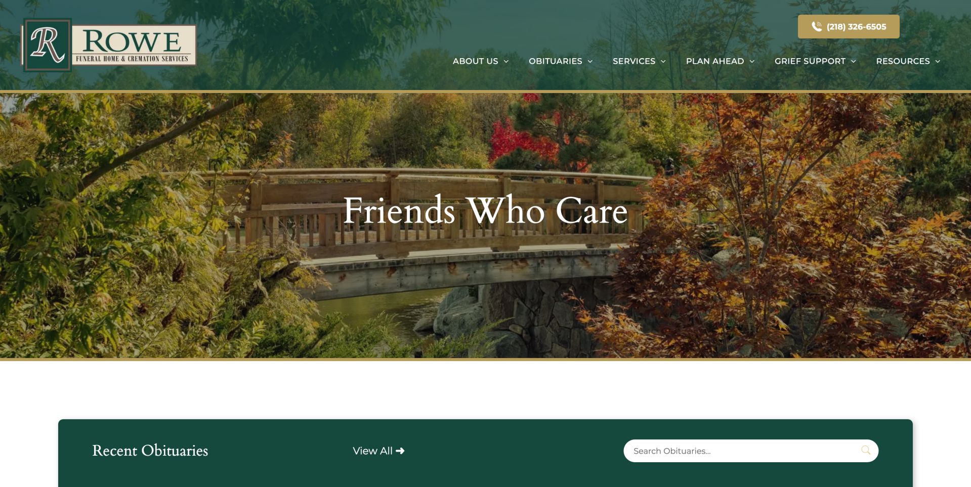
Rowe builds a consistent visual system from dark green, muted gold and a garden-bridge photograph. The gold telephone control sits at the upper right against the darker header, giving contact a clearer distinction than the ordinary navigation links. A thin gold rule connects the header to the hero, while the obituary section below returns to the same green in a rounded panel. Within that panel, a heading, all-notices link and search field establish three recognizable parts of the memorial-discovery task. The large central hero phrase communicates reassurance but says little about the available services. More useful distinctions appear in the saved lower-page content, including cremation facilities, memorial products and veterans' services, with an explicitly labeled general price-list route in the service menu. The lesson is to carry a coherent palette through information hierarchy while ensuring that practical service and pricing routes remain easier to find than decorative messaging.
What you can learn
Give complicated funeral-service information clear headings and a permanent price-list route. A unified visual style should organize choices rather than make every panel look equally urgent.
Pros
Prominent telephone action contrasts with the header.
General Price List has an explicit service-menu entry.
Cons & considerations
The hero phrase does not describe the available services.
Detailed service explanation is concentrated below the large image.
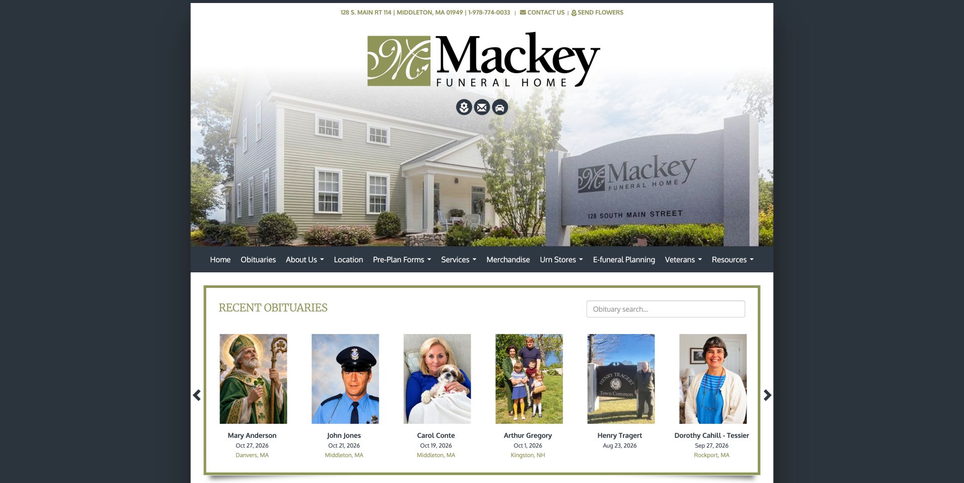
Mackey combines its actual building, roadside sign and large wordmark into a compact identity area. A narrow line above provides the street address, telephone and contact links, while the building photograph helps visitors recognize the destination. Beneath the image, a dark navigation row introduces a broad range of services and planning options. Recent obituaries then receive a distinctly framed panel with portraits, dates, town labels and a search box. The panel's separate border and background make the notices feel like a primary destination instead of incidental company news. The saved introduction also names a comfort-dog option and distinguishes traditional services, cremation and preplanning, adding details specific to the business. The main tradeoff is density: many navigation categories share one line, and several utility shortcuts are small. Reducing competing planning and merchandise entries would make immediate help and current notices more readily distinguishable.
What you can learn
Show the actual facility and distinguish useful local details from general service claims. Keep a long catalogue of planning and merchandise choices secondary to urgent help and current notices.
Pros
Facility and sign photography support location recognition.
Obituary cards display useful date and town context.
Cons & considerations
The desktop menu packs many categories into one line.
Several repeated shortcuts make the lower page longer to scan.
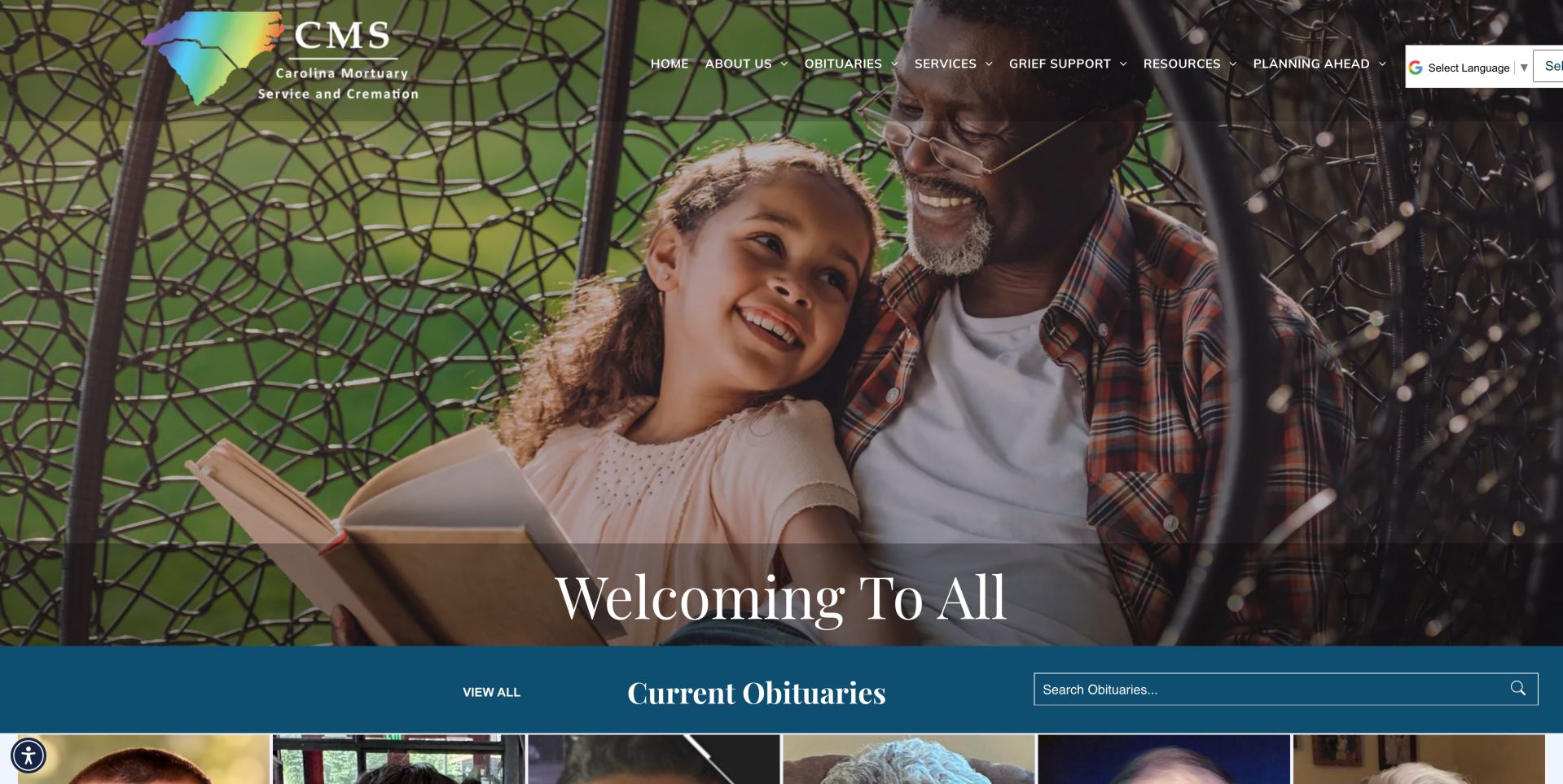
Carolina Mortuary opens with a warm family photograph and a brief welcome statement, using a dark overlay to carry the navigation across the image. The multicolored regional logo introduces the organization, while a deep blue obituary band creates a strong break from the photographic section. That band combines a view-all route, section heading and search field, so a visitor looking for a notice can move beyond the emotional introduction without interpreting a general services message. The saved navigation and body distinguish mortuary and transportation work as well as funeral and cremation services, indicating that the site addresses professional partners alongside families. That breadth needs clearer audience routing than a single long introductory paragraph can provide. The captured header also shows translation controls crowding the right edge. A better hierarchy would retain the welcoming image while giving each audience a plain, well-spaced route to relevant assistance.
What you can learn
When a funeral business also handles specialist transport, provide distinct explanations for families and professional partners. Avoid expecting one broad welcome paragraph to serve both audiences.
Pros
The obituary band is visually distinct from the hero.
Specialist transportation services are named in navigation.
Cons & considerations
Long introductory copy mixes several audiences.
Large image and translation controls compete with header navigation.
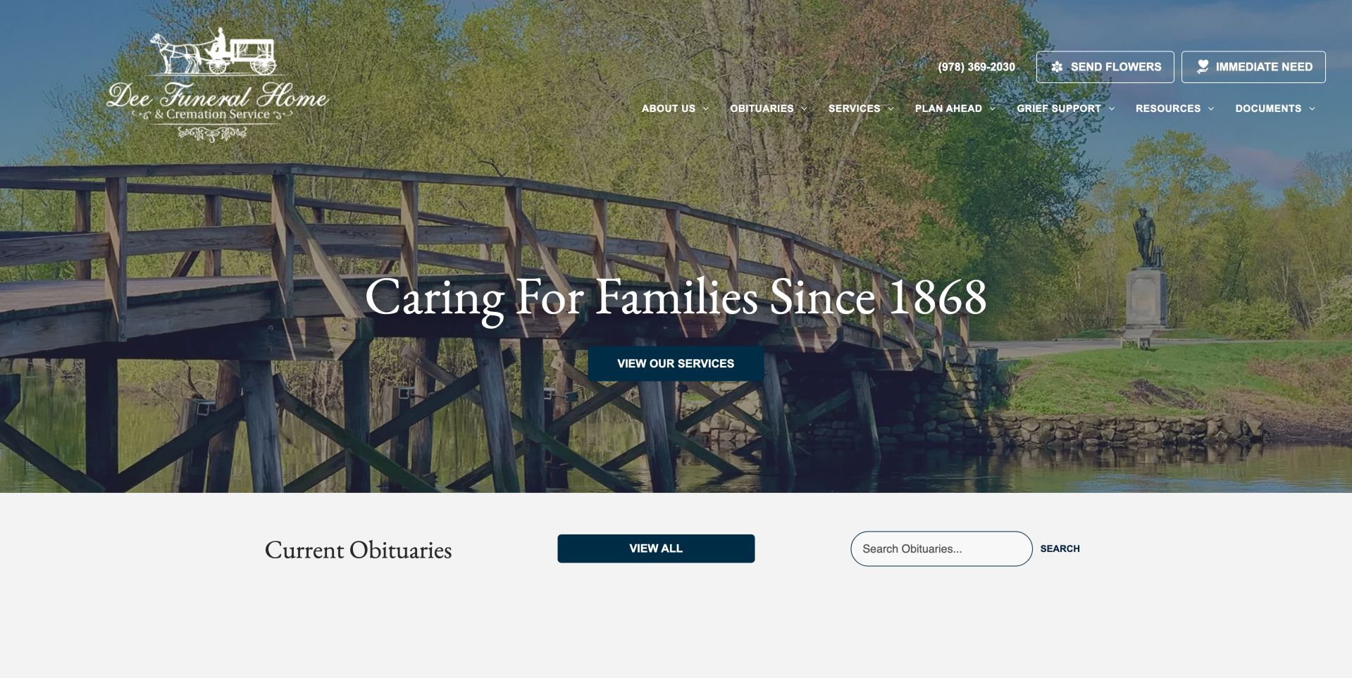
Dee pairs a local bridge scene with a historical statement and a solid services button. The button is a useful addition to a heritage-focused hero because it translates the introductory message into an explicit information route. Above it, a phone number, flower link and immediate-need action sit apart from the broader navigation. This separation acknowledges that arranging assistance and browsing service options are different tasks. The next pale section places current obituaries, a view-all button and search controls in one horizontal group, continuing the practical path below the image. The saved welcome copy supplies more location-specific detail, including the Concord setting, nearby places of worship, parking and a children's room. Those particulars help the history answer present-day visitor questions. The long introduction could still be easier to scan, and the image-backed header requires enough contrast wherever the photograph changes beneath its white text.
What you can learn
A heritage-led website should answer present-day questions too. Pair local history with concrete visit information and keep service browsing and immediate assistance separate.
Pros
Hero includes an explicit services action.
Practical location and family-facility details enrich the history.
Cons & considerations
The introduction is long before the service-card section.
The image-backed header needs careful contrast across changing photography.
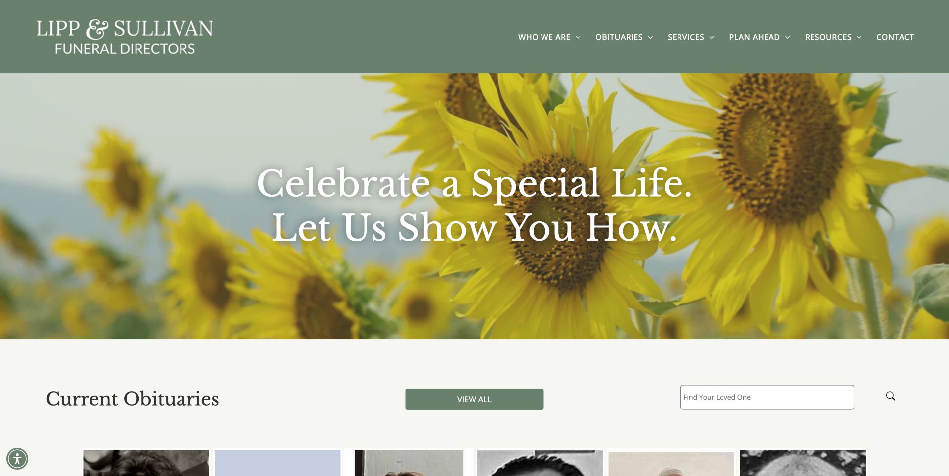
Lipp and Sullivan keeps a clear rhythm between a muted green header, sunflower photograph and pale obituary area. The restrained wordmark and short navigation avoid a crowded top bar, while the flowers introduce a warmer visual tone. Two large emotional statements dominate the hero, however, without offering a direct action within that image. The practical task becomes clearer in the next section, where an obituary heading sits beside a view-all control and a search field labeled around finding a loved one. That phrasing speaks to the visitor's purpose rather than an internal archive name. The saved lower-page material adds an ownership introduction, telephone and address, followed by separate planning, services and flower cards. Keeping those supporting routes distinct is helpful. Moving a direct phone action into the top header would reduce the effort required for immediate assistance without disturbing the calm visual composition.
What you can learn
Write search prompts around the visitor's task and keep the supporting routes few enough to recognize quickly. Attractive emotional copy still needs a visible path to immediate assistance.
Pros
Obituary search uses an understandable task label.
Planning, services and flowers are separated into cards.
Cons & considerations
No telephone action appears in the captured top header.
The hero repeats two emotional headlines without a direct action.
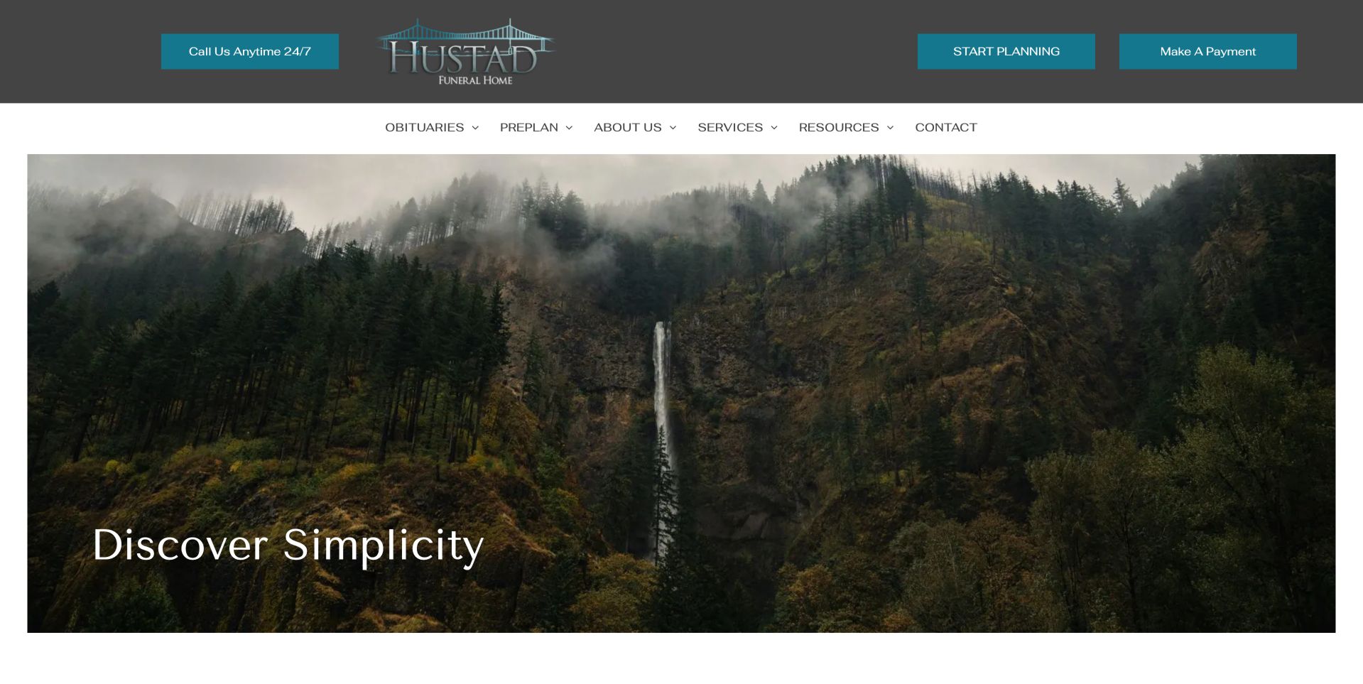
Hustad separates utility actions from descriptive navigation through two stacked header bands. A dark upper band contains the logo and three teal controls for a round-the-clock call, planning and payment. A white row beneath holds the obituary, preplanning, business, service and resource categories. This makes recurring tasks available without opening a services menu, although the equal button treatment gives urgent help and an administrative payment task similar visual weight. The main image is a wide forest waterfall scene with a brief simplicity message near its lower edge. It supplies atmosphere but does not explain the service choices or display recent notices within the captured first screen. The logo's bridge motif adds a more specific identity cue above the landscape. A stronger arrangement would preserve this orderly split while emphasizing the call route and moving a concise obituary or service shortcut closer to the opening.
What you can learn
Separate utility actions from descriptive navigation, but test their relative emphasis. An urgent caller should be able to identify help without treating a payment button as an equally appropriate next step.
Pros
Phone availability is stated directly.
Planning and payment have distinct labeled destinations.
Cons & considerations
Three prominent utility buttons compete for attention.
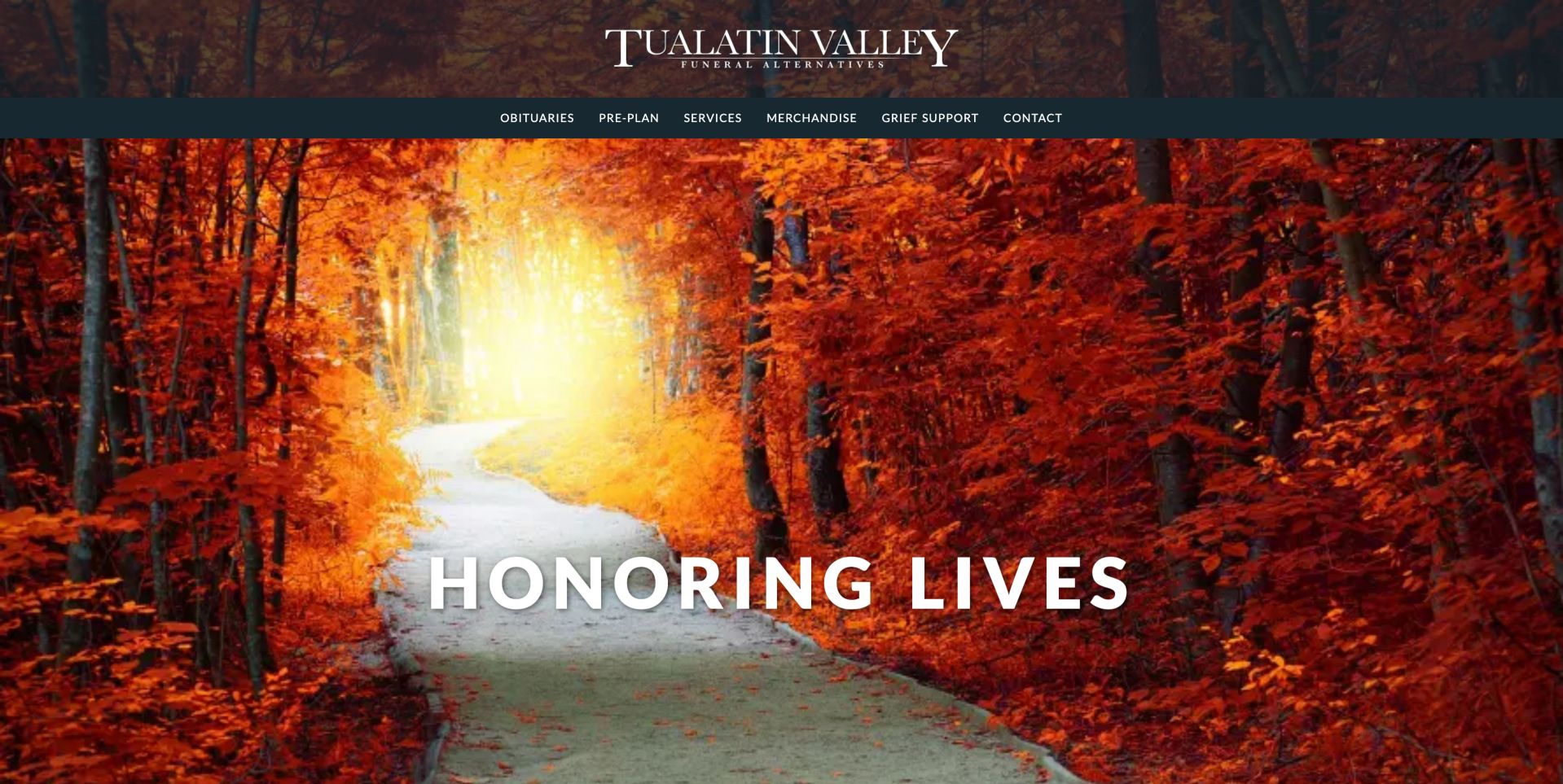
Tualatin Valley uses a full autumn woodland path to frame its opening, with the brand centered above a restrained dark navigation strip. The image supplies a strong seasonal identity, but the large introductory phrase does not explain what makes the funeral-alternatives model different. That explanation arrives in the saved body copy, which describes the smaller-facility approach before presenting separate Beaverton and Hillsboro contact blocks. Naming the offices individually is useful because a shared regional identity should not leave visitors guessing which location they need. Obituaries and task cards provide further routes after the introductory material. The page's practical strength is its willingness to describe an operating model in ordinary language, rather than relying entirely on a value adjective. Bringing a short version of that explanation and a direct contact option into the opening would make the distinctive service proposition easier to understand before scrolling through the large photograph.
What you can learn
Explain what makes an alternative service model different in ordinary language. Bring the most useful distinction and a direct contact route closer to the opening, rather than relying on a scenic headline.
Pros
The operating model is explained in specific terms.
Location blocks distinguish two offices.
Cons & considerations
The full-height image postpones the useful value explanation.
Long obituary listings and bold introductory prose can make scanning harder.
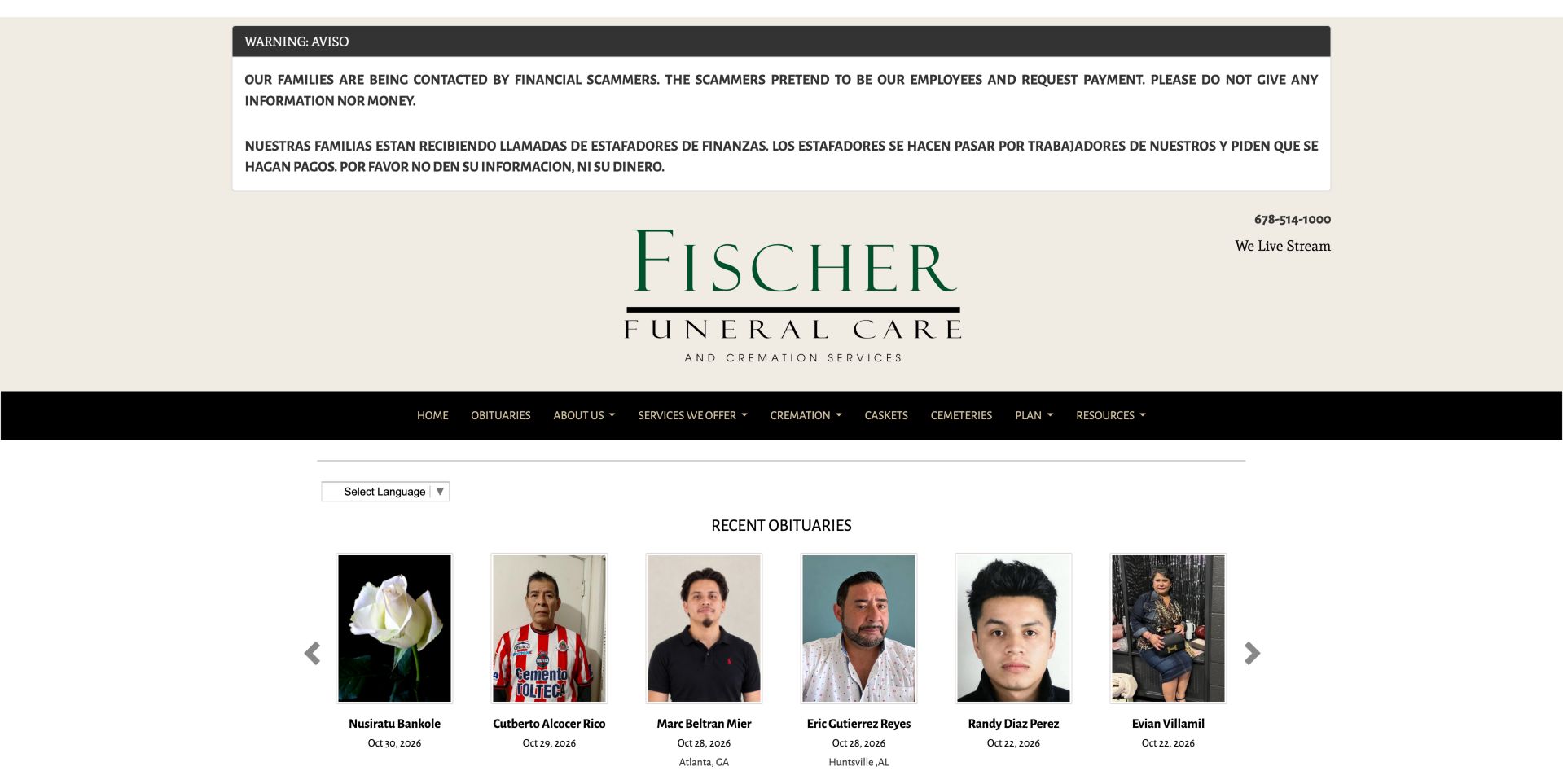
Fischer gives an operational warning priority over its identity and service navigation. A large bilingual notice explains that callers have been impersonating staff and requesting payment; its placement makes the message difficult to miss before continuing into the site. The review treats that as the business's published notice, not an independent investigation of the reported incidents. Below it, a broad cream identity area provides the telephone number and a livestream reference, followed by a black navigation bar. Recent obituary cards appear next with portraits and dates, keeping the notices reasonably close to the beginning despite the warning's size. The saved page also includes a clearly named route for what to do when a death occurs. This is a useful example of letting timely information outrank decoration. The notice would be more accountable with visible review dates and a direct verification contact, particularly if it remains prominent for an extended period.
What you can learn
Provide a clearly governed notice area for time-sensitive information, with understandable language and a direct verified contact route. Keep the notice reviewable so an old warning does not remain indefinitely without context.
Pros
The bilingual warning is difficult to miss.
An explicit When Death Occurs route names the first action.
Cons & considerations
The notice and large identity area push services down.
Navigation contains many closely spaced categories.
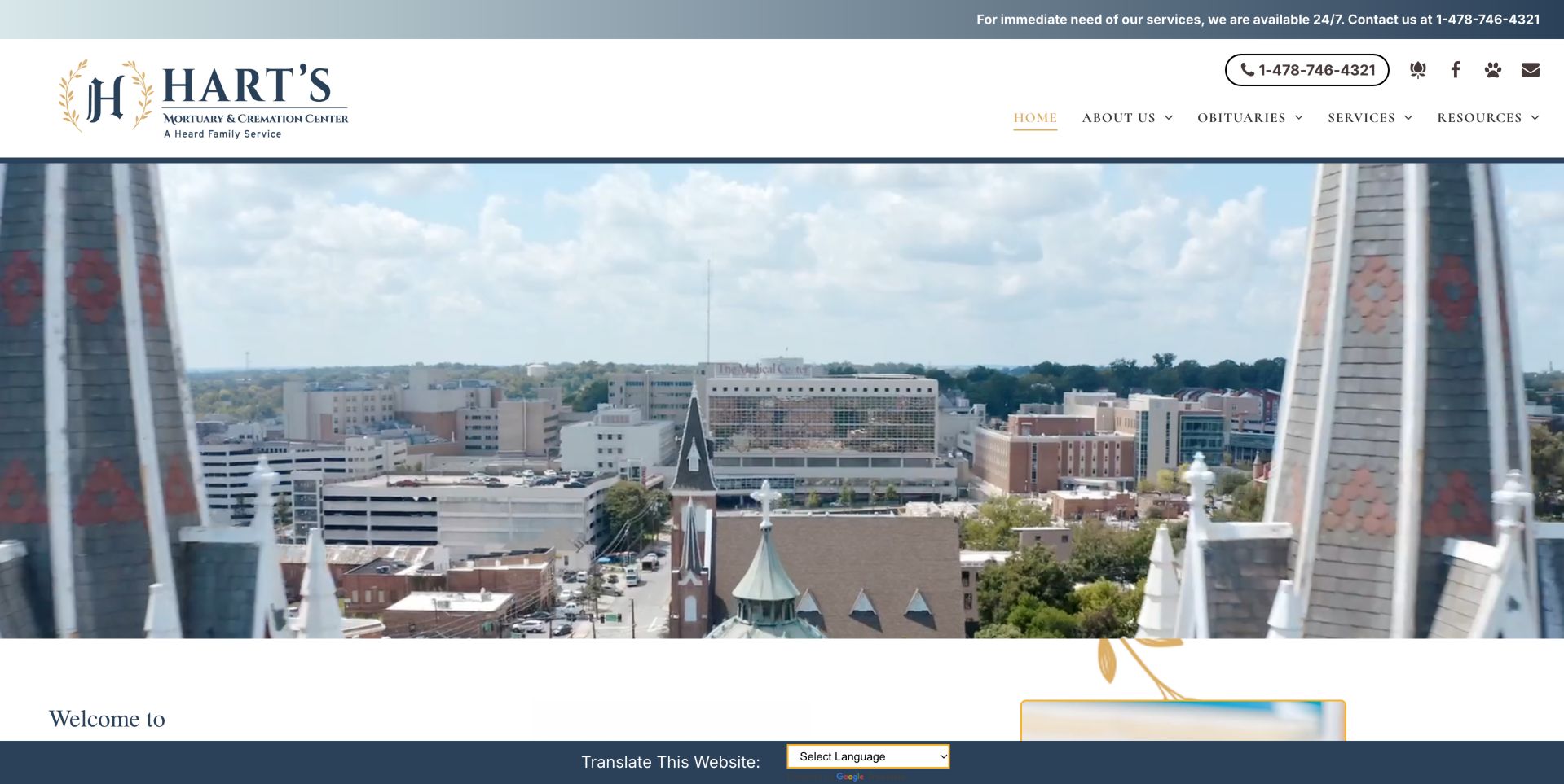
Hart's places an immediate-need telephone message in a permanent top strip and repeats the number as a distinct control in the main header. That consistency helps urgent visitors recognize the same contact route before exploring the site. The opening imagery shows a local city scene beneath a traditional blue-and-gold identity, linking the organization to its region without making the photograph carry essential instructions. The saved body introduces the cremation center and provides separate cards for finding a loved one, immediate need and facility-related information. Named locations later in the page help distinguish the individual facilities within the broader business. One observed destination needs attention: the link labeled as a facility tour points to a grief-support path in the saved page evidence. This illustrates why clear labels must be paired with correct destinations. The substantial visual opening also delays task selection, so motion and image height deserve careful consideration.
What you can learn
Keep urgent assistance consistent across a multi-location site and pair regional imagery with actual branch information. Check every task-card destination, especially when labels promise a specific facility tour.
Pros
Immediate-need contact is repeated consistently.
Location names and task cards structure a broader business.
Cons & considerations
The moving-image opening can distract from task selection.
The observed Tour Our Facilities link points to a grief-support route and needs review.
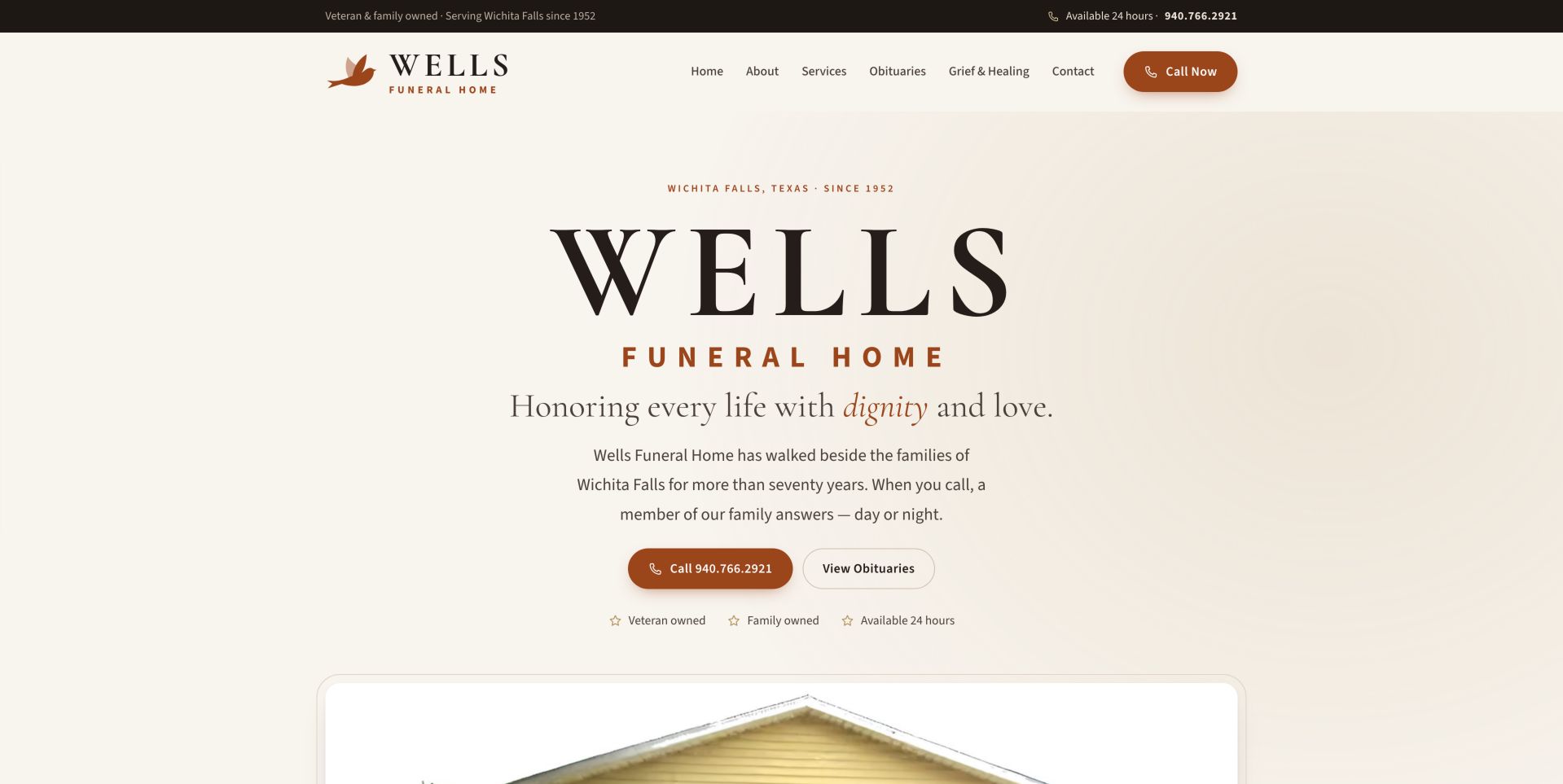
Wells takes a typographic approach to its first screen, using an off-white background, dark lettering and warm rust-colored controls. A small location and founding-year line establishes Wichita Falls before the large business name and short introduction. The main action pair is especially clear: a filled telephone button sits beside an outlined obituary button, distinguishing immediate conversation from notice browsing. The header repeats the phone option, while a narrow upper strip states availability and ownership information. These are the website's representations rather than independently verified service findings. A real building image begins below the text, and the saved page continues with family and service information. The design shows that a calm opening does not require a full-screen landscape. Its oversized brand name still takes considerable space, but the practical controls remain visible within the same composition, making the first decision easier to recognize.
What you can learn
A text-first opening can feel calm without being vague. Use a short local introduction, clearly different call and obituary actions, then support the promise with real staff and facility information.
Pros
Call and obituary actions are clearly separated.
Real family and location content support the introduction.
Cons & considerations
Large brand typography still consumes much of the first screen.
Warm muted text requires careful contrast checking at smaller sizes.
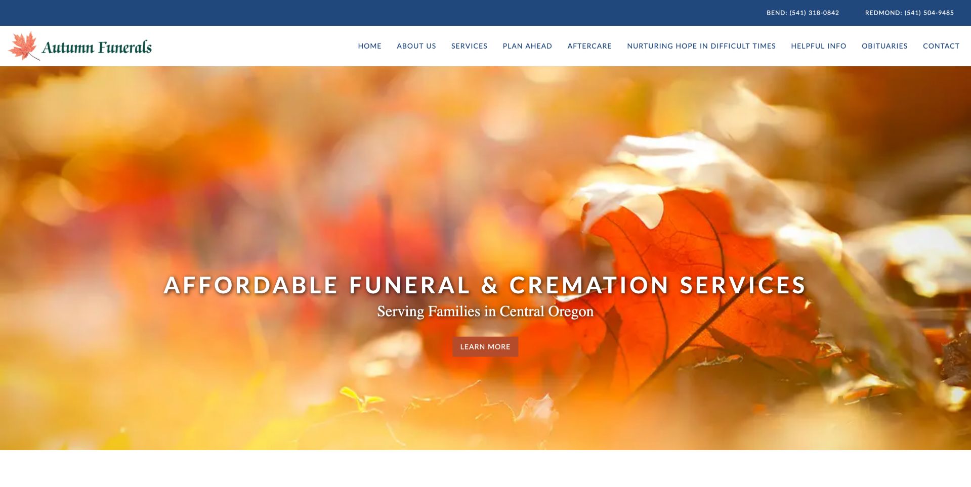
Autumn uses a close photograph of orange leaves to connect its name with a memorable visual theme. A blue strip above the white navigation labels the Bend and Redmond telephone numbers separately, preserving branch context even before a visitor reaches location information. The hero states the funeral and cremation offering and identifies Central Oregon as the service region, giving the photograph a concrete purpose beyond seasonal decoration. Its action is labeled Learn More, while the saved link evidence shows that the destination is a general price list. That is a useful connection for the affordability message, though a more descriptive price-list label would make the next step less ambiguous. Obituary search and service-community information appear further down the page. The long main menu includes a lengthy campaign-style phrase, which reduces room for other choices and makes concise grouping especially valuable at narrower widths.
What you can learn
Connect affordability language to a specific information route rather than leaving it as an unsupported impression. Label branch numbers and use a descriptive action such as View Prices when that is the destination.
Pros
Branch numbers are labeled with their cities.
The hero action leads to the general price list.
Cons & considerations
Learn More does not disclose the price-list destination.
The long main menu includes a lengthy campaign-style label.
Kegan is a freelance web designer and developer with 15+ years of experience helping businesses turn complicated website requirements into clear, maintainable digital experiences. He works directly with clients from planning and design through development, launch, and ongoing support.
For funeral home website design, his development approach focuses on clear arrangement information, service options, obituary navigation, practical contact details, and considerate inquiry journeys. The scope can be a targeted improvement or a complete custom build, with responsive layouts, thoughtful content structure, and integrations chosen around the people using and maintaining the site.
Show 3 other funeral home website designersHide other funeral home website designers
Plan the website around the family's next question
Map the three main arrival paths
Start with immediate need, obituary or service information, and planning ahead. Write the first question and next action for each path. Use those tasks to decide the homepage hierarchy before choosing hero photography or animation.
Create a consistent location record
Give each facility a maintained address, phone number, directions link, parking notes and relevant visit information. Label branch numbers consistently in the header, footer and contact pages. Verify maps against the written address rather than assuming an embedded map is current.
Write service explanations without pressure
Explain the differences between available options in familiar language. Where prices or price lists are published, make the destination recognizable and maintain its date. Have the responsible team review the actual statements and any applicable requirements; a design example is not legal guidance.
Protect memorial continuity
Inventory existing obituary URLs and media before a redesign. Define redirects, search behavior and ownership for corrections. Test names with punctuation and spelling variations, and plan a helpful no-result state without exposing private family information.
Govern notices and sensitive forms
Assign an owner and review date to operational notices, including fraud warnings. Explain which inquiries belong on a public form and which should be handled privately. Request only information needed for the specific step and document who receives it.
Test ordinary and difficult conditions
Review the site on small screens, with a keyboard, enlarged text and reduced motion. Test phone links, menus, branch navigation and memorial search without making real submissions. A visual review does not establish accessibility conformance or the reliability of a provider's service.
The editing job behind the design
Choose a platform that maintains essential information
A funeral-home platform needs more than a flexible homepage template. Evaluate obituary publishing, stable URLs, search, location records, notices, document maintenance and staff permissions. Decide what happens when a third-party memorial or flower service is unavailable. Visitors should still be able to find the business and its urgent contact route.
Public technology observations can reveal an exposed platform reference or delivery service, but they do not establish the complete stack, privacy safeguards or internal handling of family records. Keep technology evidence tied to its actual source and observation date. Choose integrations based on ownership and dependable workflows rather than the number of features visible on another site.
Our WordPress website examples offer a separate look at publishing approaches. A visible platform label is evidence for that named page, not a guarantee that the same system will suit your requirements.
Before the public launch
Funeral home website planning checklist
Immediate-need contact is visible without opening a menu.
Every branch telephone number is labeled with its location.
Obituaries have a clear route, usable search and stable URLs.
Service information distinguishes urgent arrangements from preplanning.
Actual staff and facility photographs have appropriate rights and context.
Directions, parking and visit information are maintained by a named owner.
Price-list links have descriptive labels and lead to the intended document.
Operational notices have an owner and a review process.
Sensitive information is requested only through an appropriate controlled workflow.
Commercial links are distinguishable from service and memorial information.
Menus, search, text contrast and motion have been tested across devices.
Redesign testing preserves existing memorials and does not create real submissions.
These checks are a project checklist, not a performance, legal, security, or accessibility certification. Test real journeys with the people responsible for the website before making claims about the result.
Sources & editorial method
How this collection was selected and reviewed
Fourteen distinct public funeral-service homepages were inspected against the saved pre-research target of fourteen. The reviews describe observable design, writing and information architecture. Saved direct captures and source notes were checked again on November 6, 2026 UTC, with one replacement capture of the fully rendered Jacob F. Ruth homepage. Each image retains its actual source URL, capture date, dimensions and attribution. Commercial and service statements are attributed to the businesses rather than independently verified. No private records, forms, payments or condolence systems were used.
Each example links to its actual source page. Screenshots are direct browser captures with their own capture dates; moving imagery, announcements and live designs can change. The notes describe observable design choices and conditional tradeoffs, not measured traffic, conversion results, service quality, or accessibility conformance.
Technology labels use public page metadata, asset evidence, or explicitly cited platform documentation. Platform documentation is not a complete current deployment audit. A component reference may be legacy or unused; it is not a complete backend inventory. Unknown stacks are omitted. These sites are editorial examples, not our client portfolio.
Written, Edited and Curated are separate editorial records, not timestamps advanced by a rebuild. Website designs and imagery belong to their owners. See our editorial standards or suggest a correction.
Questions worth asking
Funeral Home website design questions
Should the homepage lead with obituaries or the funeral home's story?
Both matter, but a visitor looking for a service notice should not have to read the business's history first. Keep obituary discovery and immediate contact prominent, then use the story to explain the people, place and approach behind the service.
Are scenic images appropriate for a funeral home website?
They can provide a calm visual setting, especially when they relate to the local area. Avoid allowing a large photograph or video to hide essential contact and service information. Real facility and staff imagery often communicates useful detail that a landscape cannot.
How should multiple locations be presented?
Give each location its own consistent record and clearly labeled contact details. A shared phone number may be appropriate if that reflects the actual operation, but the site should explain how a caller reaches the relevant team. Verify directions independently of decorative map imagery.
What should be tested before moving an obituary archive?
Check existing URLs, redirects, names, dates, photographs, search and authorized correction workflows. Make a representative test set before migration and verify it afterward. Do not assume that a new template preserves all memorial information automatically.
Does an Editors Choice badge recommend the funeral service?
No. It identifies an editorial website-design selection within this collection. It does not verify a provider's care, licensing, pricing, security or accessibility, and it is not based on visitor votes.
Use these examples to make important choices easier to understand. A recognizable local identity, direct help and dependable memorial information are more valuable than copying a reassuring headline without the practical structure behind it.