Best Pilates Studio Websites of 2026 (25 Real-World Examples)
Pilates studio websites that explain class fit and the first session
These 25 Pilates studio examples examine the practical choices behind a first booking: equipment, class level, private or group format, introductory packages and studio access. The goal is a clear route into the actual teaching offer.
A newcomer may not know whether a reformer class, mat session or private introduction is the appropriate starting point. Explain the studio’s own process in plain language, including any required consultation or introductory session, without implying individualized health advice.
Returning clients need a fast timetable, while new visitors need context before entering it. A good studio site supports both tasks and keeps introductory pricing, equipment descriptions and cancellation rules connected to the booking system.
Before the examples
What makes good pilates studio website design in 2026?
Build a complete first-visit route
MoveWell explains a sequence through consultation, introductory sessions, forms, pricing and preparation, then adds practical location information. This makes a small studio understandable beyond an attractive room photograph or a single book button.
Name formats precisely
Mat, reformer, apparatus, private and small-group sessions are not interchangeable. Explain the actual format, expected experience and any studio-specific prerequisite close to each class description.
Qualify introductory prices
State how many sessions an offer includes, which clients qualify, its validity period and what happens after it ends. A low headline price is only useful when the visitor can understand the ongoing commitment.
Show the real space and access
Photographs can communicate equipment and atmosphere, but the location page should explain entrances, stairs, parking and arrival arrangements. Let visitors ask about access before buying a package.
The collection · 25 examples
25 pilates studio websites worth studying
The collection compares local studios and broader brands through specific pages, including first-visit guides, pricing and booking explanations. A polished visual identity is useful when it reinforces accurate class and participation information.
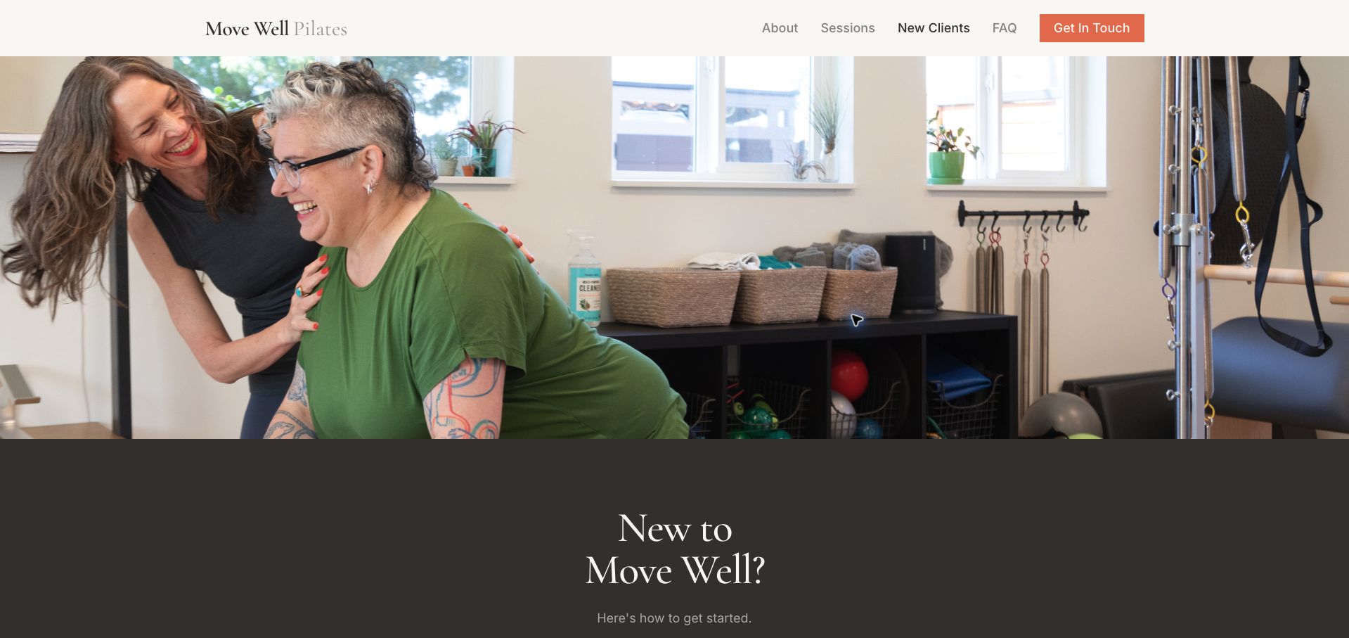
Move Well Pilates earns our Editors Choice for a first-visit page that treats practical reassurance as part of the design. A warm photograph of instructor and client leads into a restrained cream, brown and coral layout. The sequence is unusually complete: a short consultation comes before the introductory appointment, required forms are identified, and ongoing prices are separated from preparation advice. Clothing, equipment, parking and the studio's wheelchair-access limitation are stated plainly. This helps visitors assess the visit before contacting Shane. The large opening photograph delays the steps, and an appointment request still requires a conversation rather than showing availability. Those are modest tradeoffs for a page that explains both the personal setting and the process. Our selection concerns website communication, not instruction or health outcomes.
What you can learn
Write the first visit as a sequence, including preparation and physical access information alongside the booking route.
Pros
Consultation, appointment and preparation are distinct steps.
Parking, session length and access limitations are explained directly.
Cons & considerations
The large opening image pushes the sequence below the fold.
Available appointment times are not shown on this page.
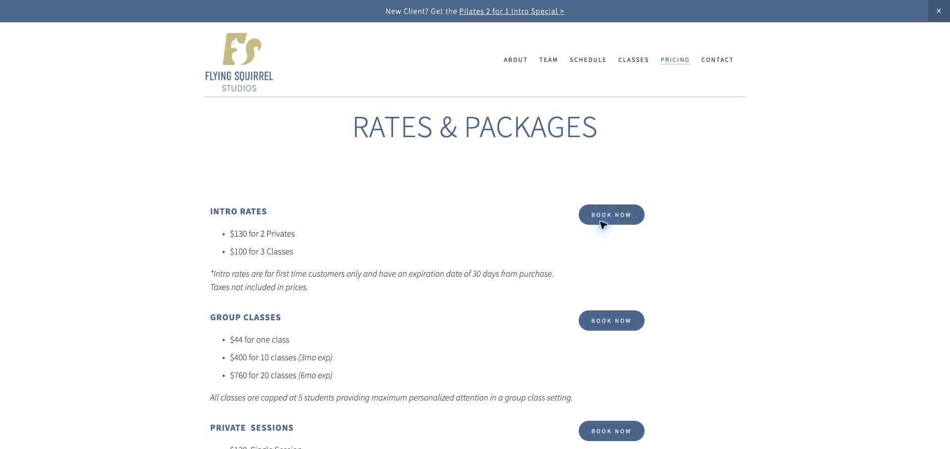
Flying Squirrel keeps its rates page spare: a distinctive squirrel mark, blue-gray headings and repeated booking buttons carry most of the visual identity. The introductory offer appears first, with new-client eligibility and its short expiry immediately beneath it. Group classes, private sessions and duets then follow in a predictable order, while the stated five-person group limit adds meaning to the class price. This makes the page easy to read without a large promotional photograph. The unlimited membership wording is less precise about the relationship between the displayed amount and the six-month commitment, however. Duet prices would also benefit from an explicit per-person or per-pair label. The page demonstrates the value of proximity between price and conditions, with two important opportunities to make the billing unit clearer.
What you can learn
Keep expiration beside the relevant price and label exactly what each amount buys, especially for memberships and partner sessions.
Pros
Introductory eligibility and expiry appear together.
Group size is stated beside the group-class offer.
Cons & considerations
The unlimited membership billing wording needs greater precision.
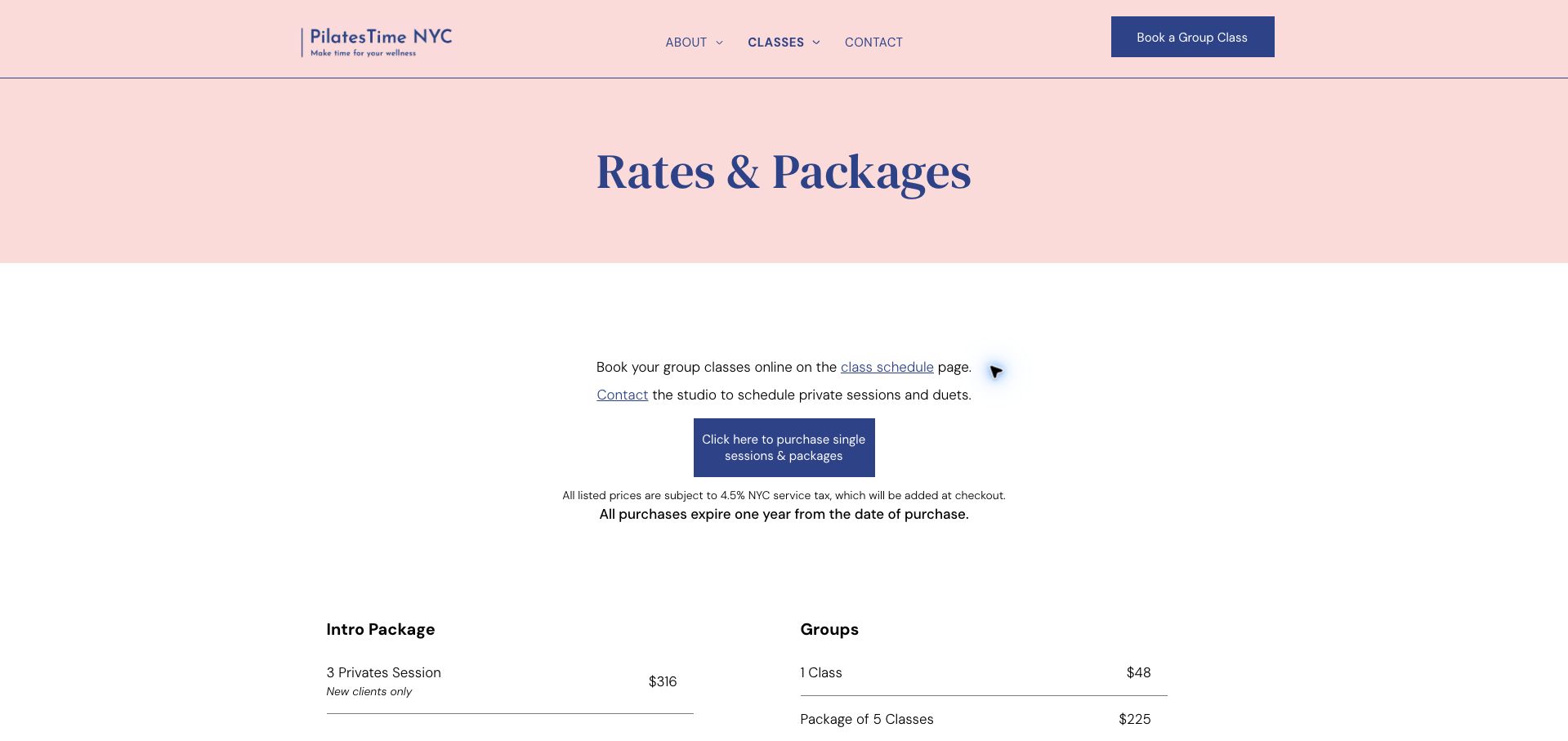
PilatesTime NYC opens its price page with a soft pink banner and dark blue serif title. Before listing packages, it explains that group classes are booked online while private lessons and duets require contact with the studio. That distinction prevents the purchase button from implying that every session can be scheduled in the same way. Tax and the common one-year expiry appear above the prices, and duet rows consistently identify the per-person basis. The two-column arrangement allows visitors to compare several formats without excessive decoration. Its main weakness is a generic purchase action that serves many packages, leaving the visitor to carry their choice into another interface. The long list also lacks a brief recommendation for newcomers choosing between a group and private introduction.
What you can learn
Explain scheduling separately from payment so that purchasing a credit is not mistaken for securing an appointment.
Pros
Group and private scheduling instructions are stated before purchase.
Tax, expiry and duet price units are conspicuous.
Cons & considerations
The general purchase button does not visibly preserve a selected package.
Newcomers receive little help choosing an initial format.
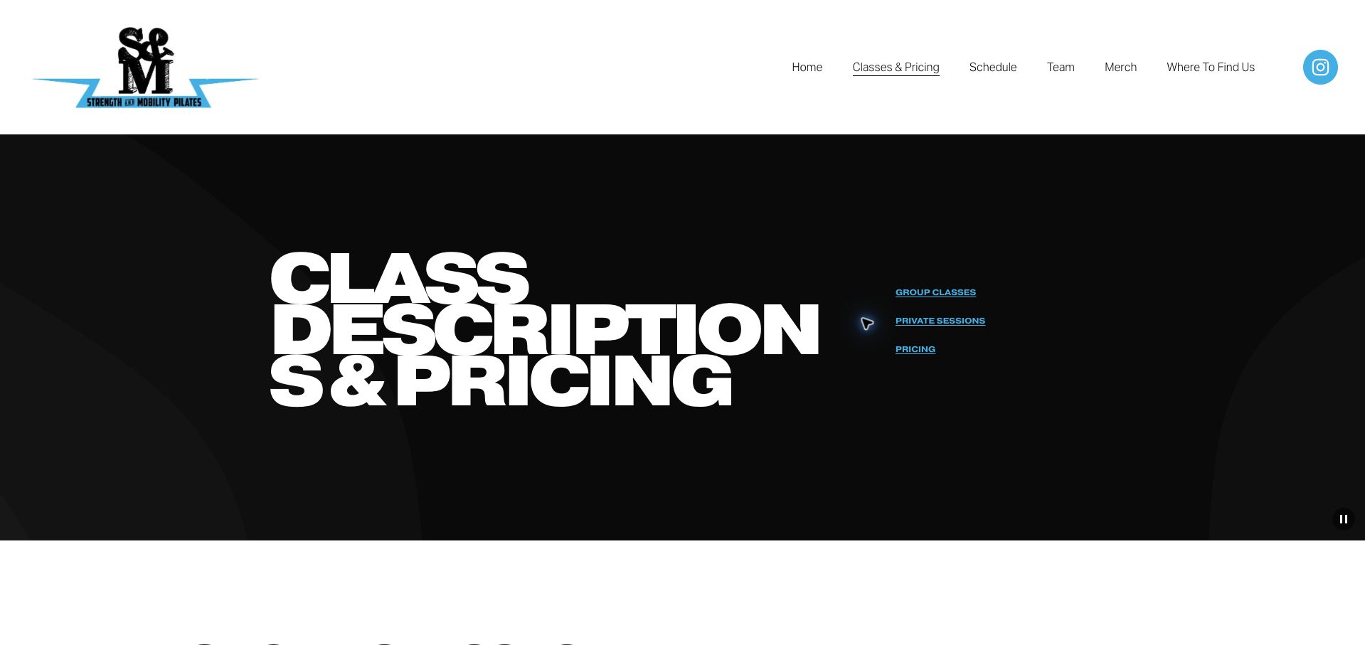
Strength & Mobility Pilates uses oversized white typography on a black geometric opening panel, with bright blue links to group classes, private work and pricing. The class descriptions explain pace and equipment rather than relying only on evocative names. Level labels and an instructor-approval requirement for advanced sessions help readers understand that the timetable contains different starting points. Group duration and capacity are also explicit. Private sessions receive an honest availability caveat and a contact form. The opening title wraps awkwardly at the reviewed desktop width, and visitors must travel through a long page to connect a particular description with its price. The strongest idea is the clear distinction between class formats; a compact comparison or repeated schedule link could make that information easier to act on.
What you can learn
Explain class pace, equipment and instructor-approval prerequisites before inviting a visitor to choose a timetable slot.
Pros
Level labels and advanced-class approval requirements are explicit.
Group duration, capacity and private availability are described.
Cons & considerations
The oversized opening title breaks into awkward lines.
Descriptions and pricing are separated by considerable scrolling.
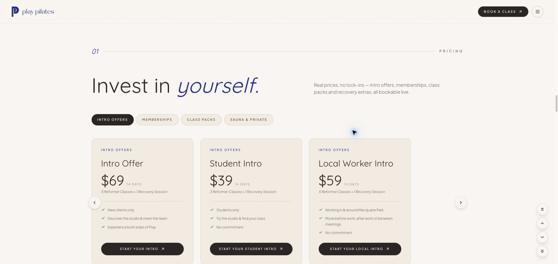
Play Pilates gives its pricing area a polished cream-and-blue identity with rounded cards, fine rules and restrained italic emphasis. Tabs distinguish introductory offers, memberships, packs and other services. Within the opening set, each card pairs an amount with a validity period, included sessions and an audience such as students or local workers. This makes the differences more legible than separate promotional banners would. The page identifies Mindbody as the live booking destination and explains nearby transport and parking. Its opening loader adds friction, and the broader page mixes pricing with classes, facilities and recovery promotions. Some supporting type is also small against the light background. The card structure is the useful reference here: a consistent set of fields lets readers compare eligibility and inclusions before leaving for booking.
What you can learn
Give every introductory offer the same fields: audience, duration, included sessions, price and a clearly named next step.
Pros
Offer cards make eligibility and included sessions comparable.
The external booking platform and local access information are identified.
Cons & considerations
An opening loader delays access to the pricing.
Small supporting text and a long mixed-purpose page reduce scanning speed.
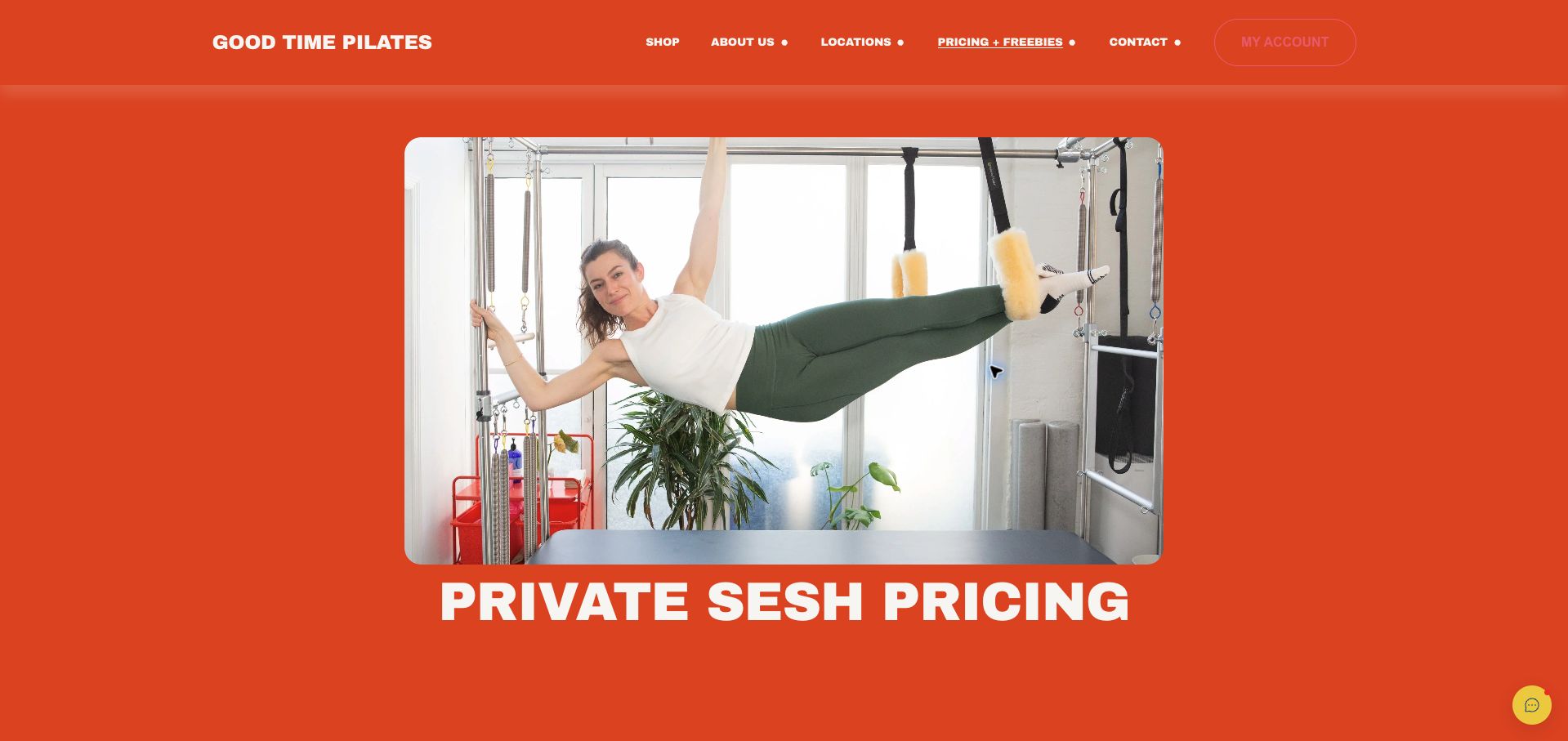
Good Time Pilates makes a memorable first impression with saturated orange, heavy white headings and an equipment photograph. Its informal language continues through the private-session packages, but the offer details are concrete: duration, package total, per-session cost, expiry and cancellation timing appear repeatedly. Duet descriptions explicitly say that the amount covers two clients. The later extension policy anticipates a realistic problem for someone buying a larger pack. The extensive repetition makes the page long, and playful purchase labels are less descriptive than naming the session or package. The forty-session block also lacks the same conspicuous total shown for several smaller packs. This is a useful example of personality supporting a commercial page, provided that the transactional labels and comparison fields remain consistent.
What you can learn
Keep a distinctive voice in the surrounding copy while making purchase labels and price units immediately understandable.
Pros
Duration, expiry and cancellation terms accompany the packages.
Duet prices explicitly cover two clients.
Cons & considerations
Playful purchase labels provide limited information about the action.
The package list is long and not every total is equally prominent.
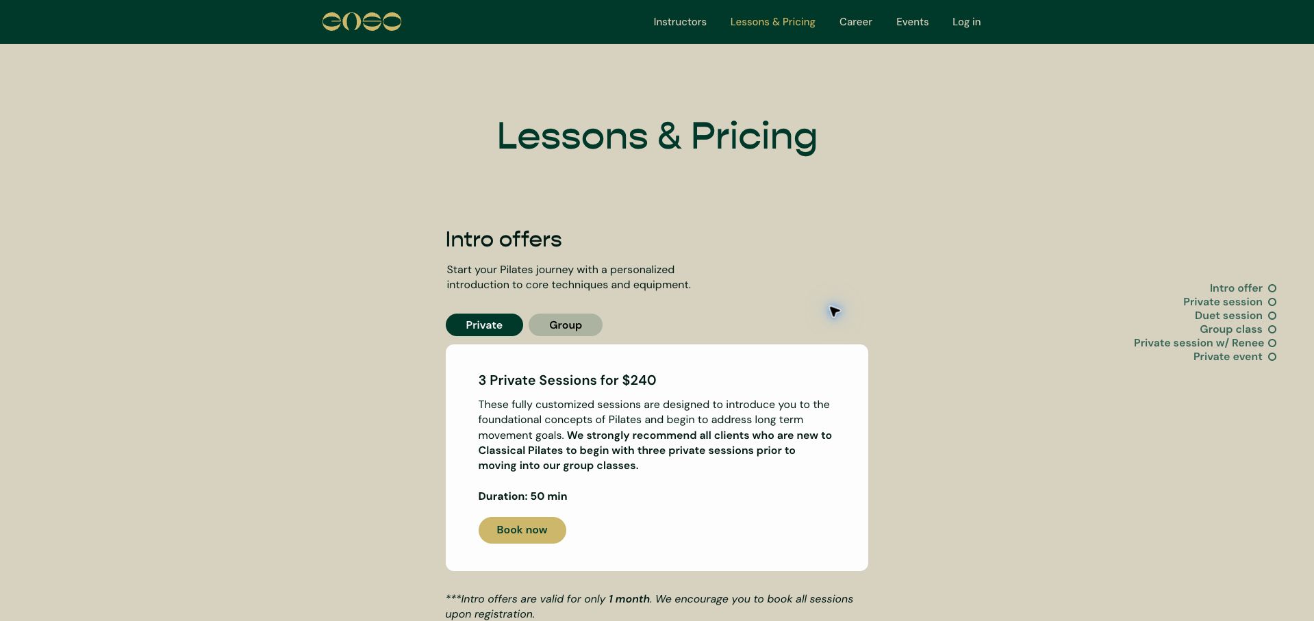
Enso combines deep green, muted gold and a quiet neutral background with a narrow central pricing column. The introductory panel lets visitors choose private or group options, while a side index identifies the longer page's major sections. The private introduction explains why beginners are encouraged to start individually before joining a group, and its validity period is placed directly beneath the card. Later sections distinguish instructor tiers, lesson duration and group size. This gives the page more decision support than a bare price list. Several comparisons nevertheless require changing tabs, making simultaneous review harder. Tax and the broader sales conditions appear much farther down. The useful pattern is a clear introductory recommendation supported by navigable sections, rather than a single undifferentiated catalog of session prices.
What you can learn
Combine a recommended starting route with a persistent section index, while keeping important conditions near each offer.
Pros
The introductory recommendation explains its purpose.
Section navigation, duration and group size help orient readers.
Cons & considerations
Tabbed rates cannot all be compared at once.
Tax and general sales conditions sit far below the first offer.
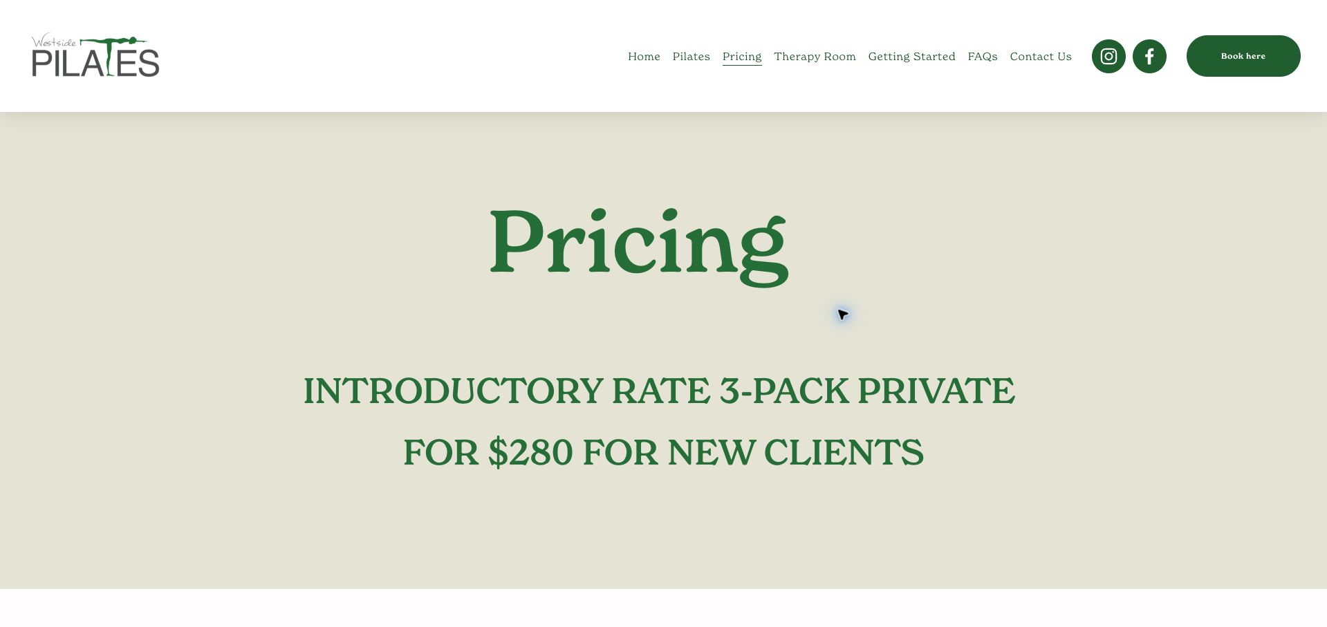
Westside Pilates uses green serif headings and a pale neutral background to establish a quiet pricing page. The introductory private package is impossible to miss, occupying the opening panel before the recurring rates. Each service category then repeats tax and expiry information, so a visitor entering midway through the page still encounters the relevant conditions. The duet section also states that clients must already have a partner. A plain cancellation explanation gives a reason for the policy rather than presenting it only as a penalty. The large opening panel consumes substantial space, and the distinction between owner sessions and the following ten-pack could be labeled more clearly. Repeated generic booking links also provide little guidance about what will happen after leaving the price list.
What you can learn
Repeat essential conditions where users make a choice, and label teacher-specific prices so neighboring rows cannot be confused.
Pros
Tax and package expiry recur within the relevant categories.
The duet partner requirement is explicit.
Cons & considerations
The introductory panel delays the full rate comparison.
Owner-specific rates and generic booking links could be clearer.
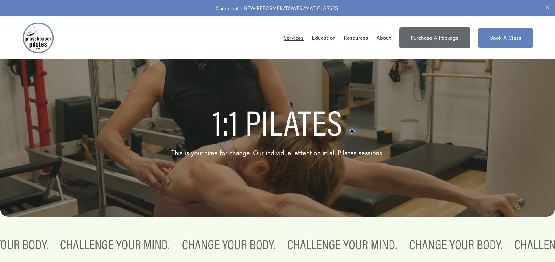
Grasshopper Pilates leads with a photograph of hands-on instruction, a clear private-session heading and prominent package and class actions. A moving text band adds energy, while the pricing distinguishes sessions with founder Gina Papalia from sessions with the wider teaching team. The team section offers help finding a Pilates partner, a useful difference from studios that require clients to bring one. A substantial FAQ follows the rates and addresses practical starting questions. The founder and team price formats are inconsistent about fees and inclusions, however, and a range tied to teacher choice requires more investigation before a total is clear. The animated slogan also competes with the functional content. This example is strongest when it explains who is teaching and how a paired session can be arranged.
What you can learn
Make instructor-specific rates comparable, and explain whether the studio helps arrange a partner for shared sessions.
Pros
Founder and team instruction have distinct pricing sections.
The studio explains that it can help match a partner.
Cons & considerations
Fee inclusion and rate formatting vary between sections.
Animated promotional text competes with the booking information.
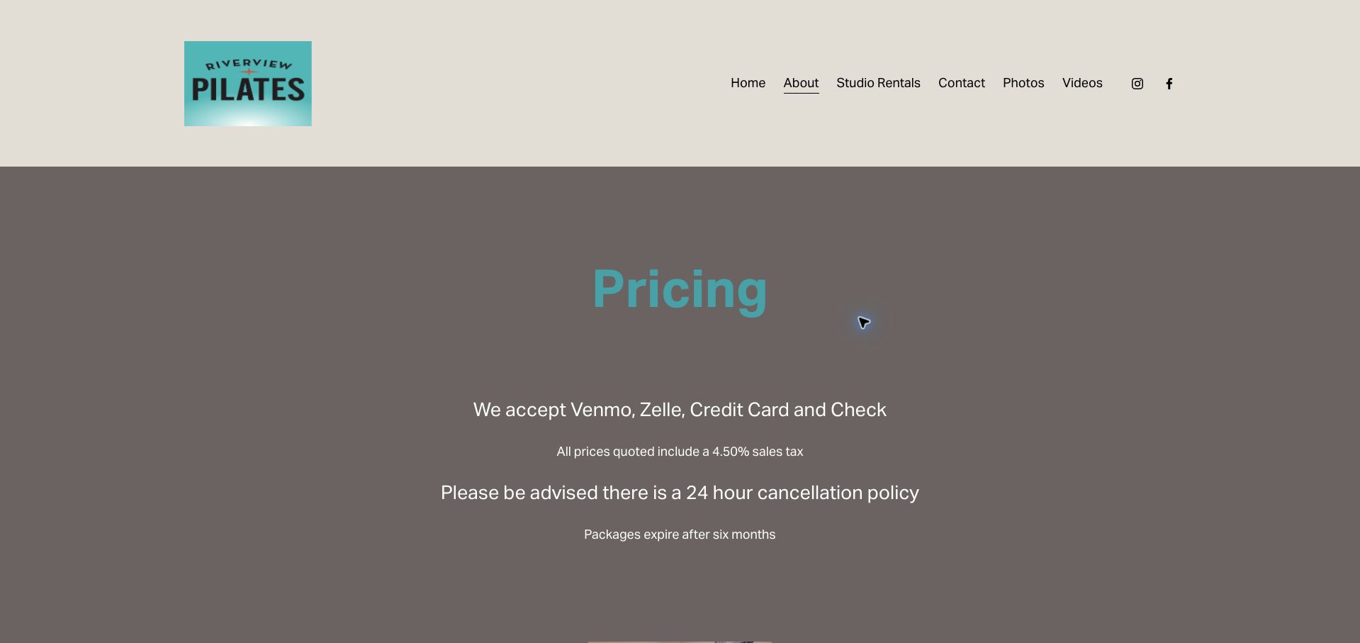
Riverview Pilates places payment methods, tax inclusion, cancellation timing and package expiry before its private and duet rates. That order makes the conditions hard to miss and gives the displayed amounts a useful common foundation. The visual treatment is simple, using a turquoise identity against warm gray surfaces and centered white text. Private studio and virtual sessions are distinguished by format and duration, while the duet section states that clients must find their own partner. The opening policy block occupies most of a desktop screen before a price appears, and the navigation does not make booking as prominent as contact or media. A clearer appointment action and more compact opening would improve momentum. The page is still a helpful reference for reducing ambiguity without building a complicated pricing interface.
What you can learn
Explain universal terms once in a compact introduction, then give every rate a clear scheduling action.
Pros
Tax inclusion and common package conditions are stated upfront.
Duet participants are told to arrange their own partner.
Cons & considerations
The large policy block pushes prices below the opening view.
There is no equally prominent appointment action beside every rate.
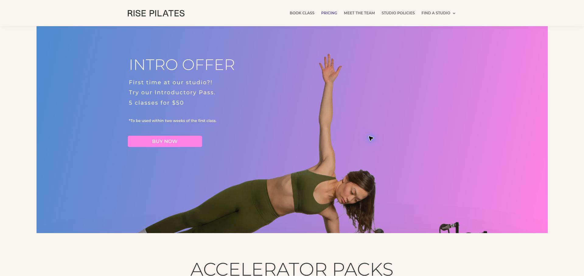
Rise Pilates introduces its pricing with an energetic blue-to-pink gradient, an exercise photograph and a simple introductory offer. The expiry starts from the first class, a useful detail placed immediately below the amount. Accelerator packs then connect total price with a per-class figure and a shorter usage window, while flexible packs receive their own expiry periods. This helps readers understand that a lower unit cost may require more frequent attendance. The weekly membership section explains a minimum commitment but directs visitors to email instead of displaying a complete comparable rate. Private sessions also require a conversation. The visual hierarchy is clear for class packs, although several similarly sized blocks make the page longer than necessary. It is a useful example of explaining the relationship between flexibility and price.
What you can learn
Compare package cost together with the time allowed to use it, so visitors can judge value against their actual schedule.
Pros
Accelerator packs include total and per-class prices.
Expiry triggers distinguish the introductory and flexible offers.
Cons & considerations
Weekly membership pricing requires an email inquiry.
Repeated package blocks create a lengthy comparison.
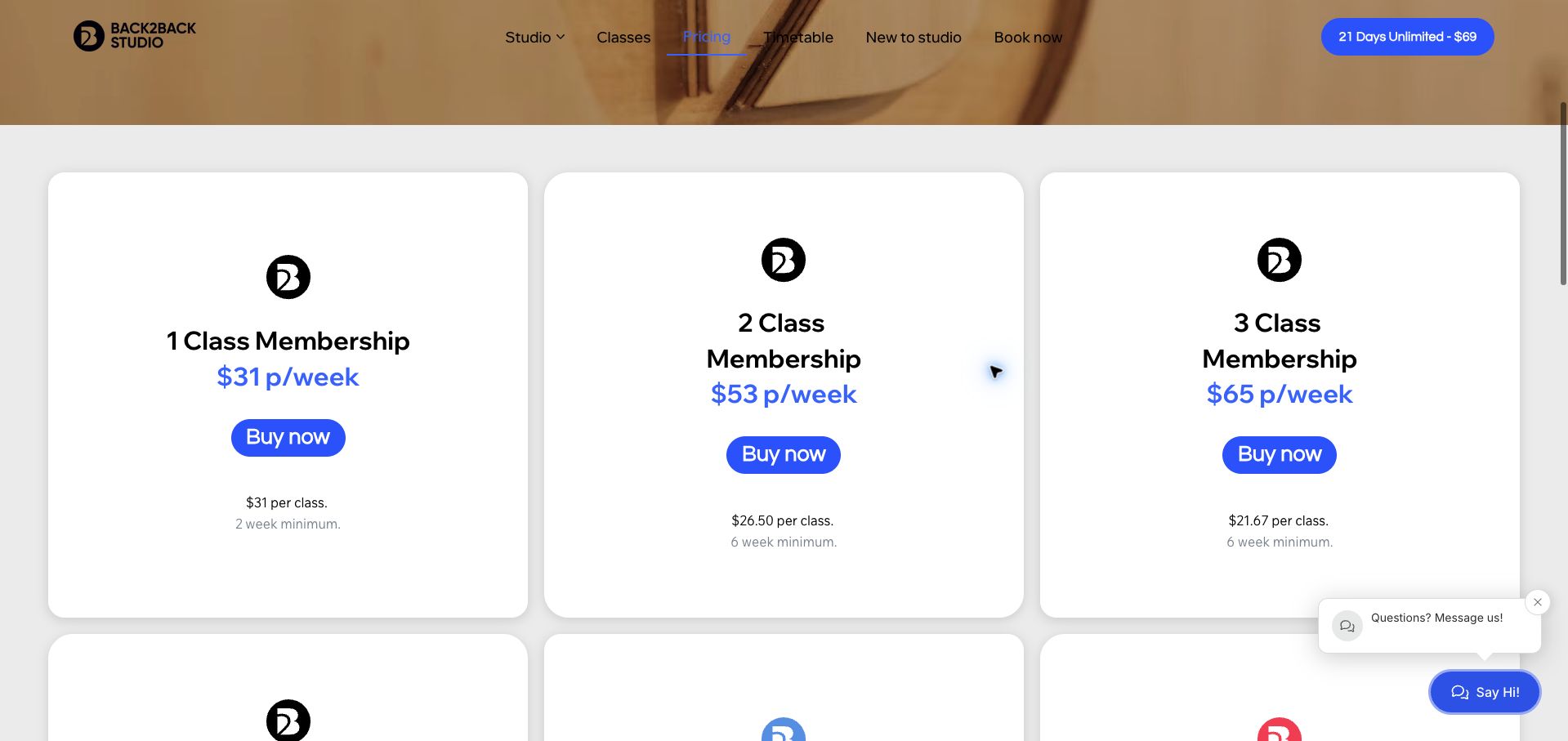
Back2Back Studio uses large white cards, blue prices and repeated purchase buttons to compare weekly memberships and class packs. Each membership identifies the attendance allowance, weekly total, per-class equivalent and minimum duration. The unlimited option explains the attendance assumption behind its unit-price calculation, which makes the comparison more honest. Benefits such as unused-credit rollover and membership freezes are summarized separately. A persistent introductory offer provides a clear alternative for visitors who are not ready to choose. The decorative opening image delays the price cards, and the oversized cards require scrolling to compare all six options. The chat prompt can also overlap the lower corner. The useful lesson is the inclusion of commitment length within each offer rather than requiring a visitor to discover it after selecting a plan.
What you can learn
Put minimum terms beside the weekly price and disclose the attendance assumption behind any calculated per-class equivalent.
Pros
Each membership card states its minimum duration.
The unlimited plan explains its per-class calculation.
Cons & considerations
The large image and cards slow a complete comparison.
The chat prompt can cover part of the lower content.
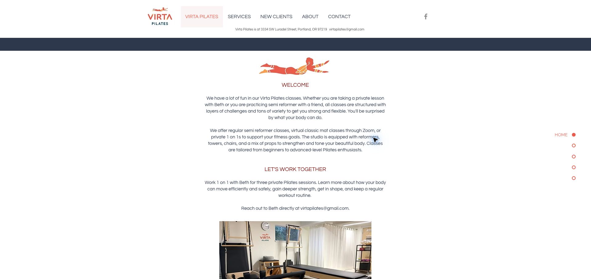
Virta Pilates keeps the instructor at the center of its offer. The compact navigation leads to services, new clients, background and contact, while the page names Beth and explains private, partner and virtual mat formats in ordinary language. Equipment photographs and a narrow reading column give the site a personal scale. The new-client section describes three individual sessions and provides direct text and email routes for arranging them. This is a useful fit for a studio whose scheduling begins with a conversation. The centered paragraphs are less easy to scan than short aligned lists, and price blocks do not consistently place expiry and cancellation conditions beside the amounts. The site also mixes broad benefits with logistical details. Its strongest contribution is a clear human point of contact and an understandable introductory package.
What you can learn
Give a small studio a clear human contact while preserving concise, consistently formatted service and policy information.
Pros
The instructor and direct scheduling routes are easy to identify.
Private, partner and virtual formats are explained plainly.
Cons & considerations
Centered paragraphs make longer sections harder to scan.
Expiry and cancellation details are not consistently attached to prices.
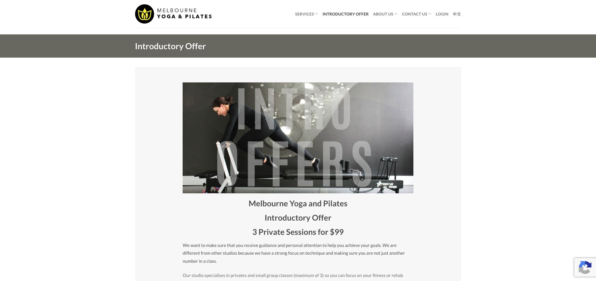
Melbourne Yoga and Pilates builds its introductory page around one offer, supported by a studio image and a sequence of explanations. The copy distinguishes private instruction from a group class and says the package does not enroll the visitor into a further commitment. Local-resident eligibility, a three-week usage window and a peak-hour exclusion appear before the purchase action. Opening hours and transport details then help assess whether the offer is practical to use. The language describing the three thirty-minute sessions is awkward enough to invite rereading, and the image's large overlaid lettering adds visual noise without explaining the offer. Extensive parking copy also stretches a page meant to support one decision. The worthwhile pattern is making introductory restrictions visible before asking for details or payment.
What you can learn
Explain introductory duration, eligibility and scheduling exclusions in a short checklist before the purchase action.
Pros
The page distinguishes private sessions from group classes.
Local eligibility and the usage window appear before purchase.
Cons & considerations
The session-duration wording could be more precise.
Large image lettering and lengthy transport copy distract from the offer.
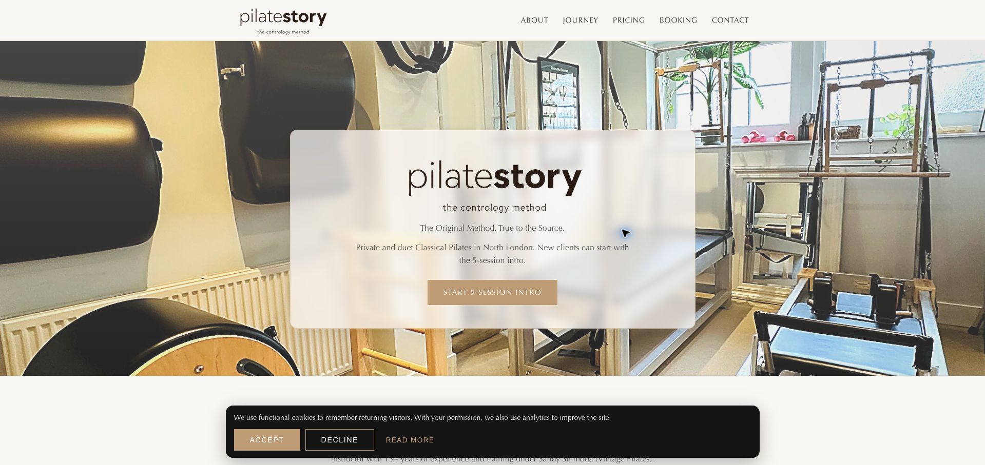
PilateStory places a translucent information panel over a photograph of its equipment, introducing a private North London studio with one clear starting action. The next sections describe a progression from a five-session introduction to ongoing private or duet practice and then packages or memberships. This sequence gives the price menu a purpose rather than presenting discounts first. The instructor's background and dated review summary add context, though their claims remain the studio's own presentation. The opening wording suggests new clients can begin with the introduction, while the journey section says all new clients do, creating a small but consequential ambiguity. Membership names also need practical conditions to make their differences fully understandable. The design is most effective when it uses the staged journey to explain what a newcomer should do next.
What you can learn
Keep introductory requirements consistent between the hero and the detailed journey so visitors know whether a step is optional.
Pros
A single introductory action gives the opening a clear purpose.
The staged journey explains how introductory and ongoing sessions relate.
Cons & considerations
The introductory requirement is phrased inconsistently.
Membership names need stronger context about their conditions.
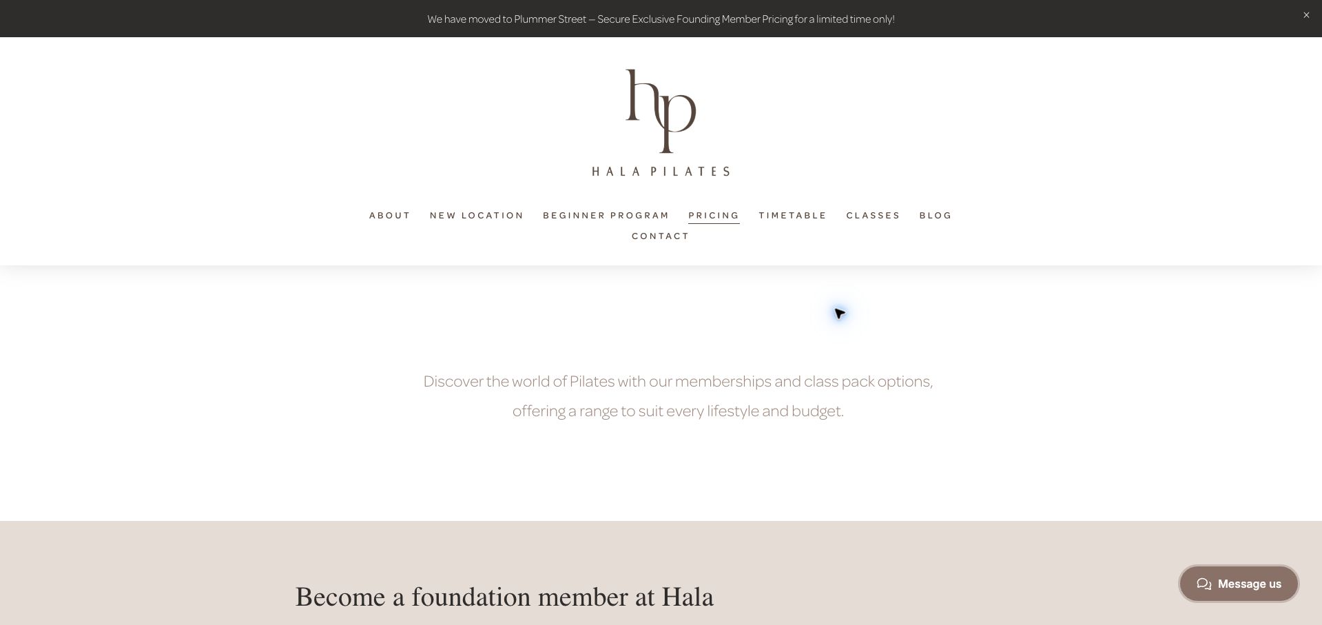
Hala's pricing page uses generous white space, an elegant monogram and understated neutral sections to introduce memberships and packs. A relocation notice identifies the new Plummer Street address, while the founding offer explains weekly pricing and fortnightly payment. The regular memberships and class packs remain available farther down, with cancellation notice and expiry details providing useful context. That transparency helps separate a promotional launch rate from ordinary attendance options. The opening branding occupies a large amount of screen space, however, and the limited-time offer has no conspicuous end date. Founding and standard unlimited memberships also require careful comparison across different sections. The page is a useful reference for communicating a move without hiding the ongoing pricing, but the distinction between temporary and standard offers deserves a tighter summary.
What you can learn
When promoting a new location, identify the address and compare launch terms directly with the standard ongoing offer.
Pros
The relocation address is visible alongside the launch promotion.
Billing frequency, notice and pack expiry receive explicit explanations.
Cons & considerations
The temporary founding offer lacks a clear displayed end date.
Standard and promotional memberships are separated by a long page.
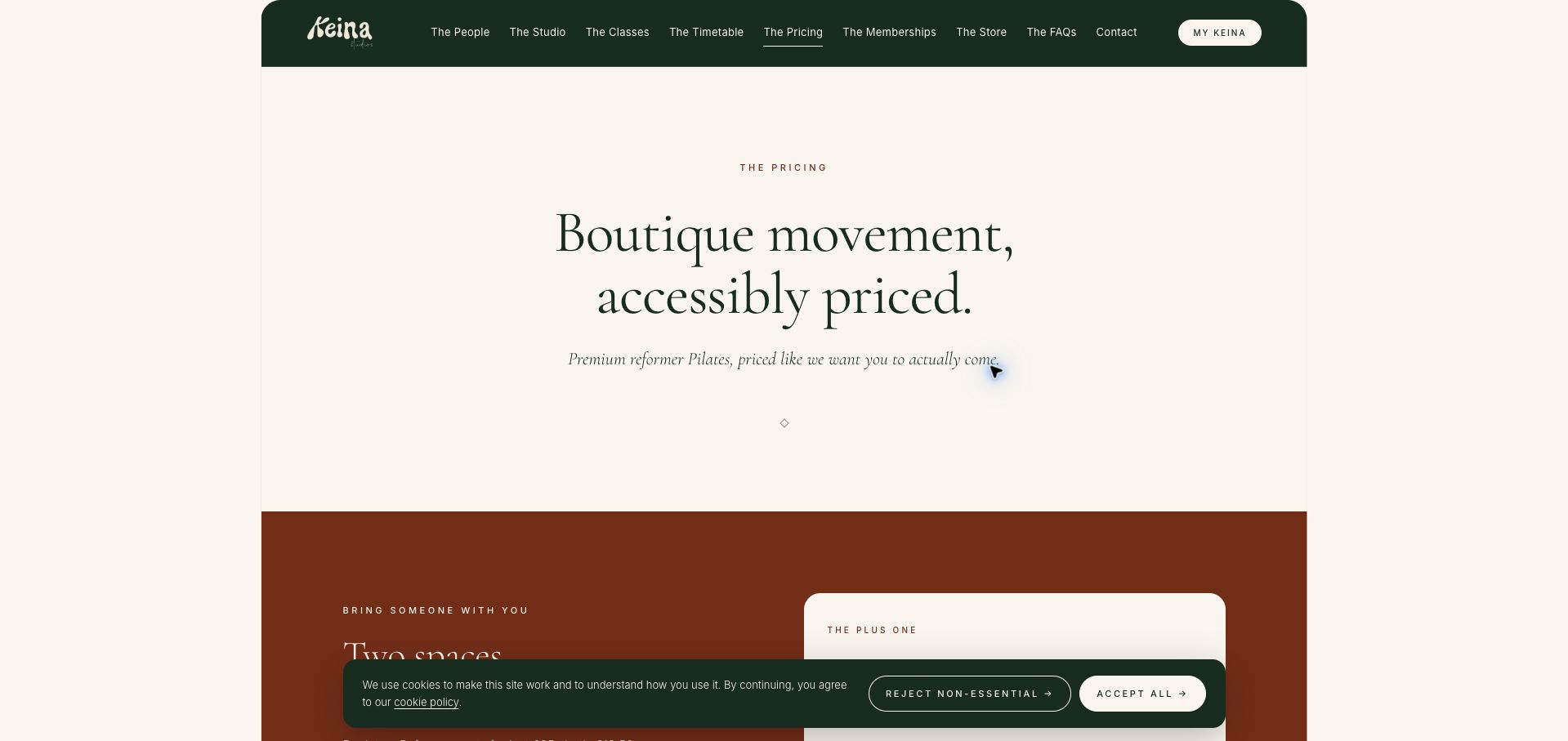
KEINA pairs dark green navigation with a cream page, serif headlines and a rust-colored promotional section. The Plus One offer is unusually explicit: one booking covers two spaces, both guests attend the same class, and each needs an individual account and participation form. That detail addresses the common gap between paying for a companion and preparing them to attend. Introductory, drop-in, pack and membership options follow, with unit prices and validity periods making many comparisons straightforward. The conversational plan names add personality but require a reader to inspect the supporting numbers to understand each offer. The long opening statement and numerous options also delay a final choice. This is a strong reference for writing the operational details of a social offer, especially where multiple attendees share one purchase.
What you can learn
For companion offers, distinguish the shared purchase from each participant’s individual account and preparation requirements.
Pros
The two-person offer explains both payment and attendance requirements.
Pack prices include unit costs and validity periods.
Cons & considerations
Playful plan names need supporting detail to communicate their contents.
Many offers and a large introduction create a long decision path.
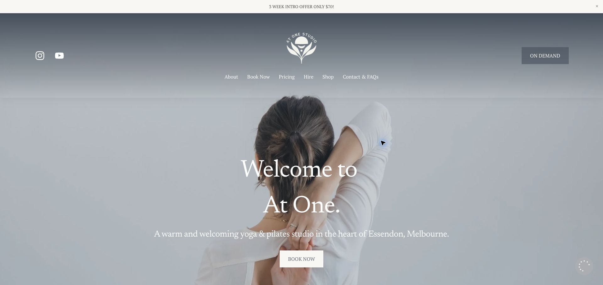
At One Studio uses soft photography, serif typography and a restrained navigation to present a calm first impression. The introductory offer is repeated in a narrow announcement bar and a dedicated section, with its duration and inclusion of studio and online attendance clearly stated. A general welcome addresses both beginners and experienced visitors, while pricing and contact routes remain easy to find. The homepage stays short enough that events and the local address are not buried beneath a large catalog. Its simplicity also leaves practical questions unanswered: a newcomer cannot tell from the opening view which Pilates format or class level to choose. White text over photography can vary in legibility as the image changes. The useful pattern is a focused entry offer that invites further exploration without overwhelming a first-time visitor.
What you can learn
Keep a mixed-discipline homepage focused, but add a plain route that helps a newcomer identify the appropriate first class.
Pros
The introduction states its duration and studio-plus-online inclusion.
The short page keeps local contact and pricing routes accessible.
Cons & considerations
The opening does not distinguish Pilates formats or levels.
Light text over photography has uneven visual contrast.
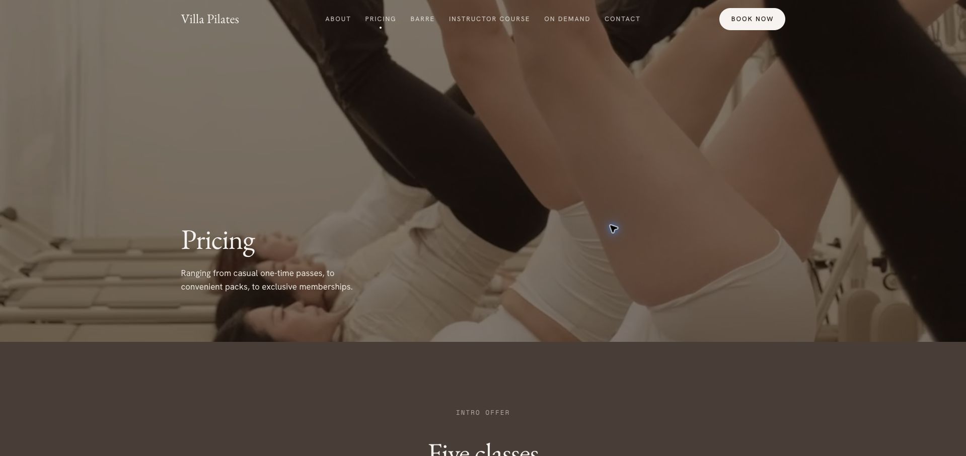
Villa Pilates presents its pricing through warm photographic imagery, large serif headings and an orderly sequence of introductory offers, overview cards and comparison tables. The crucial distinction is geographical: all-studio access and Glen Waverley-only access are shown as separate columns. Unavailable combinations are labeled instead of silently omitted, and class packs include unit costs and validity periods. Membership commitment and early-termination information are published alongside the relevant rates. The number of repeated labels and footnotes makes the table dense, and a visitor must scroll beyond a substantial hero before reaching the useful comparison. The cancellation process is also tied to the studio app, which deserves prominence before purchase. The strongest lesson is that location restrictions belong in the pricing structure itself when they materially change what a pass can be used for.
What you can learn
Treat all-studio versus single-location access as a core pricing field, and show unavailable plan combinations explicitly.
Pros
Tables distinguish all-studio access from a single-location option.
Expiry and membership commitment details accompany the rates.
Cons & considerations
Repeated labels and footnotes make the comparison dense.
The app-specific cancellation requirement deserves earlier emphasis.
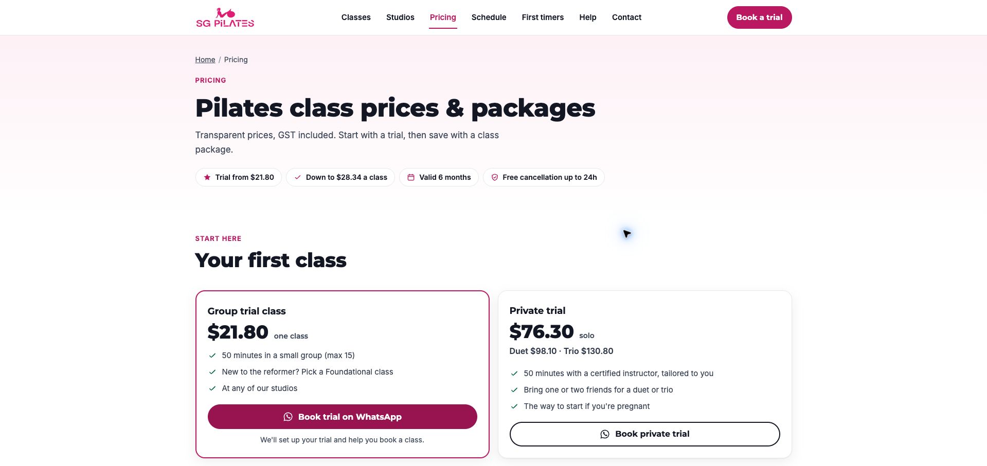
SG Pilates starts its pricing page with a compact row of facts about the trial, package validity and cancellation timing. Pink accents, strong headings and simple white cards create a practical hierarchy. The group and private trial cards explain duration and format, while the group option directs new reformer users toward a foundational class. The action explicitly names WhatsApp, setting an expectation of assisted scheduling rather than an instant calendar reservation. Later package rows show totals and unit costs, with currency and tax inclusion stated. Private package rates still require an inquiry, and the promotional opening offer adds a short-lived exception to the otherwise clean comparison. The page is a useful example of giving new visitors enough information to choose a first step before presenting the larger pack menu.
What you can learn
Name the actual booking channel and summarize the conditions of a first purchase before asking visitors to compare larger packages.
Pros
Trial cards explain format, duration and the assisted booking channel.
Currency, tax inclusion and pack validity are explicit.
Cons & considerations
Private package rates require a separate conversation.
Short-term promotions complicate the otherwise consistent price comparison.
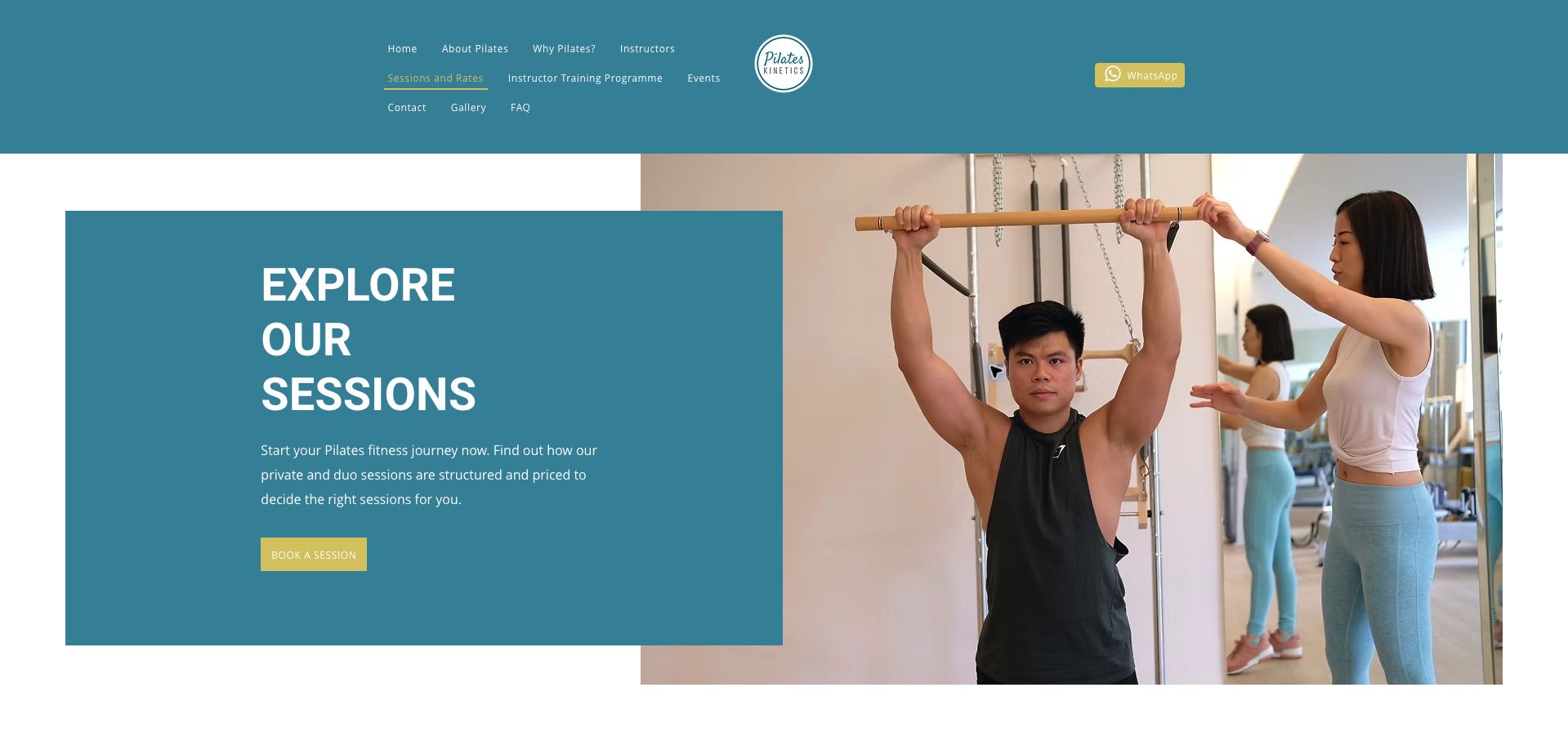
Pilates Kinetics introduces its sessions with a teal panel beside a photograph of equipment instruction. The page then separates one-to-one and two-to-one formats, with trial, single-session and package choices within each. Instructor tiers have distinct prices, and the trial information identifies duration, validity and local-resident eligibility. The duo section repeatedly labels prices per person and states that clients should bring a partner. These details make a complex offer more intelligible. Several dimensions of choice are nevertheless spread across tabs and sections, so comparing an instructor and package combination takes effort. The large introductory image also postpones the actual rates. This is a useful reference for studios where teacher tier is a real pricing variable, provided that the interface keeps the chosen format and package visible throughout the comparison.
What you can learn
When price depends on several choices, keep format, package and teacher tier visibly connected rather than scattering them across controls.
Pros
Trial eligibility, duration and validity are stated together.
Duo rates identify the per-person basis and partner requirement.
Cons & considerations
Multiple tabs and sections make cross-comparison demanding.
The large opening panel delays the rate information.
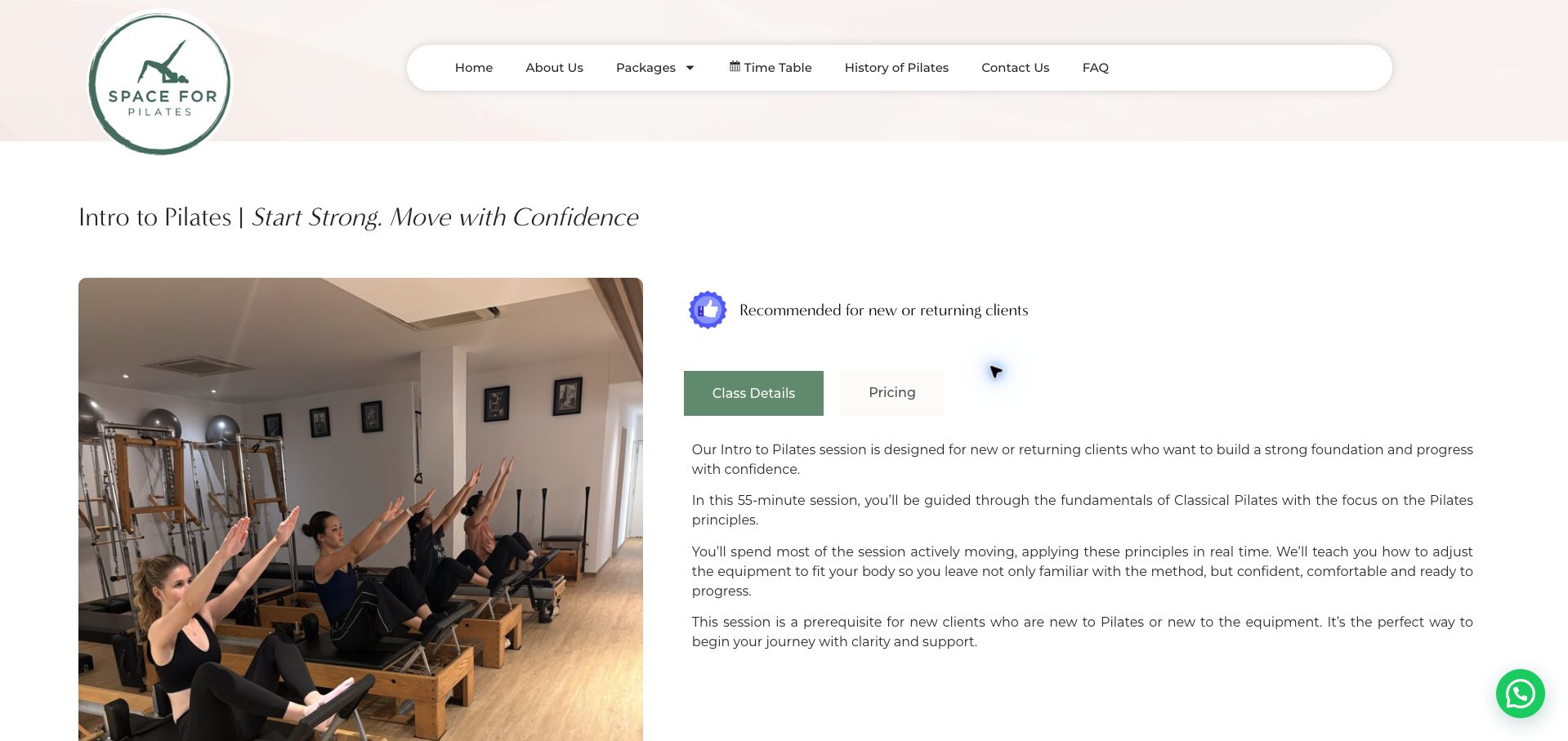
Space For Pilates pairs a classroom photograph with a concise explanation of its introductory session. The soft green identity and rounded navigation give the page an approachable frame, while separate class-detail and pricing tabs distinguish two kinds of information. The text explains that new or returning clients will actively use the equipment and learn how to adjust it, making the introduction more tangible than a generic consultation. It also states that the session is required for newcomers to Pilates or the equipment. The opening recommendation language is softer than that requirement, and the price remains behind a tab. Lengthy testimonials then dominate much of the page; their health-related claims are not independently established by this review. The strongest feature is the explanation of what the introductory session actually contains.
What you can learn
Explain a prerequisite through the practical skills it introduces, and state consistently which visitors must complete it.
Pros
The session description explains equipment familiarization in concrete terms.
Class details and pricing have distinct controls.
Cons & considerations
Recommended and required wording could be more consistent.
Long testimonials and hidden pricing slow a practical booking decision.
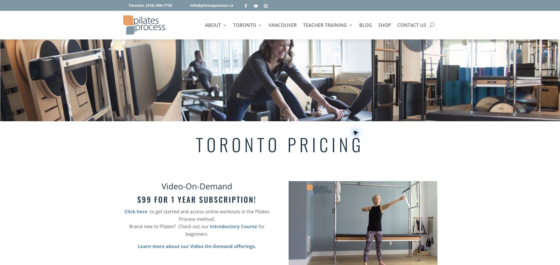
Pilates Process places its Toronto pricing beneath a strip of studio photography and a clear location heading. The page distinguishes on-demand access, apprentice or student-teacher opportunities, introductory private sessions and regular private, partner and group rates. The apprentice description explains limited availability and gives a range rather than implying universal access to the lowest price. The introductory package leads to an intake process with a promised human follow-up. Standard packs show both totals and unit prices, while an effective date, tax exclusion and expiry appear at the end. The ordering makes visitors pass the digital offer before reaching studio pricing, and the long paragraphs are less scannable than the later rate lists. Its useful contribution is explaining why rates differ and what happens after an initial inquiry.
What you can learn
Explain the availability and conditions of discounted instructor options, then keep them clearly separate from standard studio rates.
Pros
Apprentice pricing is qualified by availability and intended use.
The introductory intake process explains the next human step.
Cons & considerations
The digital subscription precedes the main studio price comparison.
Some shared conditions are separated from the individual offers.
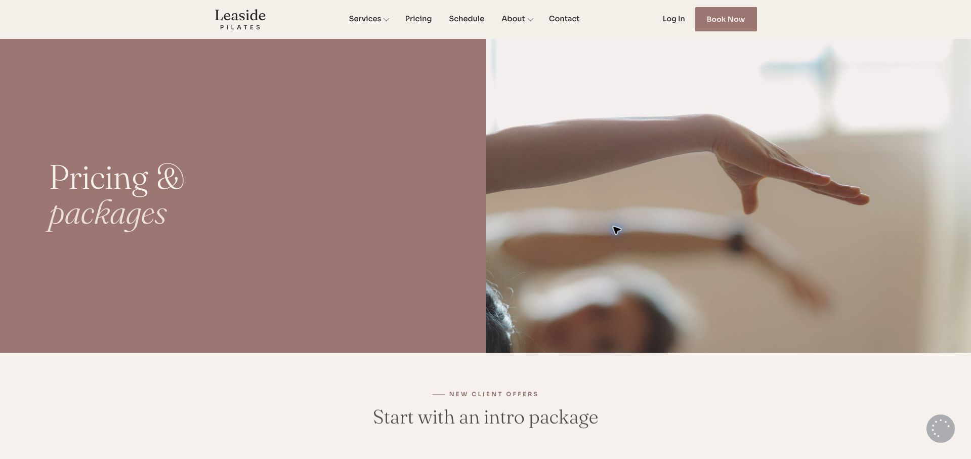
Leaside Pilates combines a muted rose panel with a close-up movement photograph, followed by three introductory options. The full rates distinguish packages from subscriptions instead of presenting every discount as the same kind of purchase. Pack sections explain their different expiry periods, while subscriptions identify monthly use, automatic renewal and notice requirements for cancellation or holds. Per-session figures sit beside the totals, and duo pricing explicitly uses a per-person basis. These details make the commercial differences understandable. The resulting page is very long, with repeated private, duo, trio and group structures. A visitor comparing only two formats must retain details across substantial scrolling. The large hero also delays the initial offers. This is a strong reference for clear commitment language, with room for a more compact comparison interface.
What you can learn
Present automatic renewal as a defining feature of a subscription, alongside use periods and cancellation notice.
Pros
Packages and subscriptions have distinct explanations and conditions.
Totals and per-session rates support meaningful comparisons.
Cons & considerations
Repeated format sections make the page lengthy.
The large opening image postpones the introductory choices.
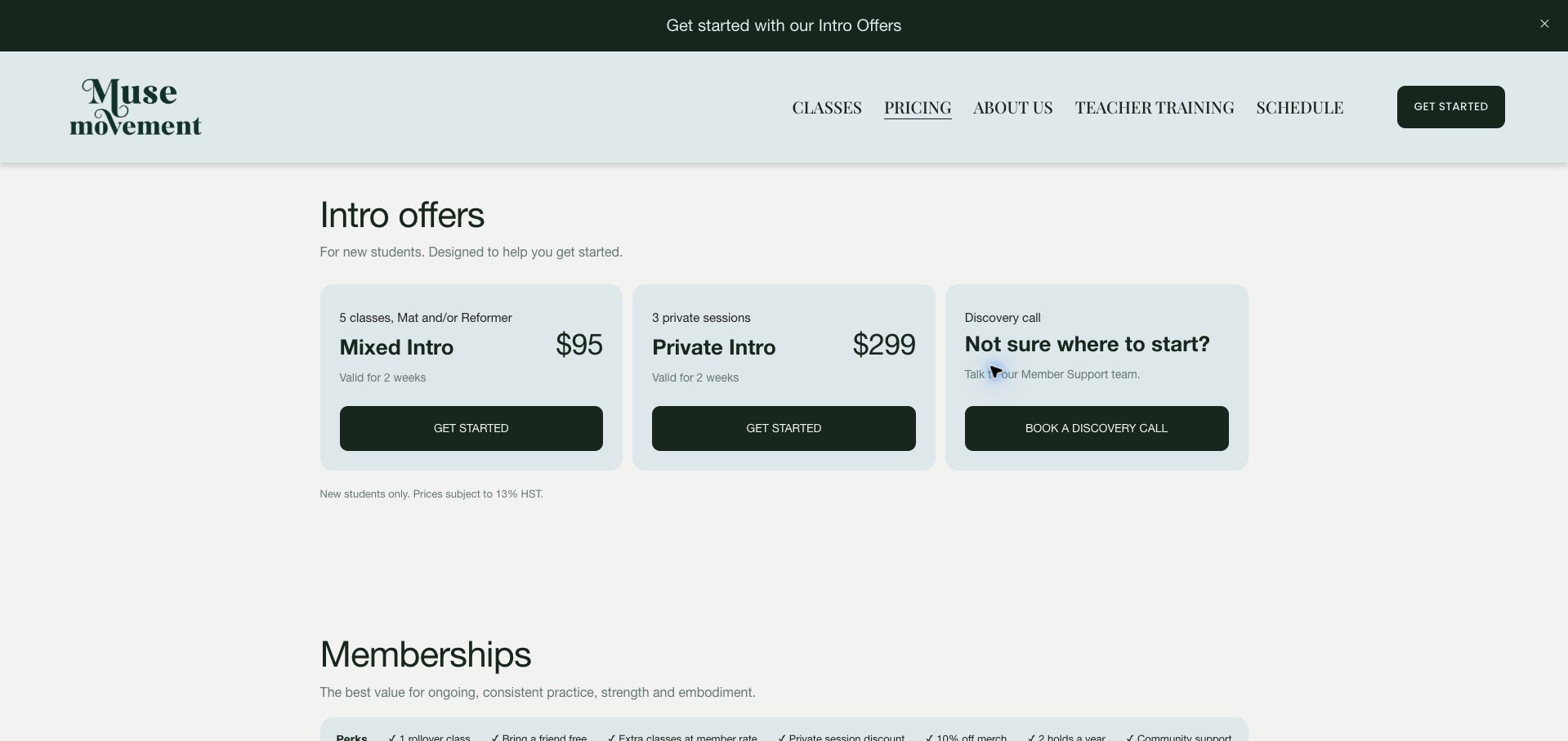
Muse Movement opens its pricing page with three equal cards: a mixed-class introduction, a private introduction and a discovery call. The third card is a useful piece of decision support because it acknowledges that a newcomer may not yet know which format fits. Pale blue cards, dark green buttons and concise labels make the initial choice easy to scan. Memberships then use attendance frequency and class format to organize rates, with benefits grouped separately. Pack expiry and the monthly-renewing membership's minimum term are stated, though the page grows dense as group, private and pack combinations accumulate. Some conditions apply to a whole section rather than appearing within every card. The strongest pattern is treating an assisted decision as a legitimate starting route, with equal visual prominence to immediate purchase.
What you can learn
Place a short consultation route beside the main introductory offers for visitors who cannot yet choose a format confidently.
Pros
The discovery-call option receives equal prominence to purchases.
Frequency and class type structure the membership comparison.
Cons & considerations
The full set of formats creates a dense and lengthy page.
Some commitment terms sit below the cards they qualify.
Kegan is a freelance web designer and developer with 15+ years of experience helping businesses turn complicated website requirements into clear, maintainable digital experiences. He works directly with clients from planning and design through development, launch, and ongoing support.
For pilates studio website design, his development approach focuses on class-format explanations, introductory-session guidance, package comparisons, studio access information, and dependable booking connections. The scope can be a targeted improvement or a complete custom build, with responsive layouts, thoughtful content structure, and integrations chosen around the people using and maintaining the site.
Show 3 other pilates studio website designersHide other pilates studio website designers
Plan the content around the decisions visitors need to make
Map the class system
List formats, levels, teachers and locations using the studio’s actual terminology. Explain unfamiliar labels and distinguish an open beginner class from a programme that requires prior introduction or approval.
Document onboarding
Describe consultation, first-session selection, paperwork and arrival using the process staff actually follow. Make clear which steps are required and which are optional, and avoid turning general guidance into personal medical advice.
Make packages comparable
Show session counts, expiry, location or format restrictions and renewal behavior. Keep one-off, introductory and recurring prices visibly distinct. Assign an owner to remove expired offers and update external checkout descriptions.
Prepare the timetable handoff
Give members a quick route to the schedule, but preserve explanatory class pages for newcomers. Identify the selected studio and any external booking service before asking someone to log in or purchase.
Write useful access guidance
Document entrances, transport, parking and known physical constraints. Use actual studio photographs and offer a contact route for participation questions that cannot be answered by a generic equipment description.
Test realistic booking states
Check full classes, waitlists, expired packages and unavailable embeds in a test environment where available. On the public site, verify labels and navigation without making purchases or creating real client records.
The editing job behind the design
Choose a maintainable publishing and booking system
The public site should maintain classes, instructors, locations and pricing explanations while the booking platform manages attendance and purchases. Keep the same class names and package conditions across both surfaces.
Choose integrations that remain usable on narrow screens and with keyboard navigation. A visually impressive timetable is not sufficient if visitors cannot identify prerequisites, understand an error or find a contact fallback.
Our WordPress website examples offer a separate look at publishing approaches. A visible platform label is evidence for that named page, not a guarantee that the same system will suit your requirements.
Before the public launch
Practical website planning checklist
Distinguish mat and apparatus formats.
Explain class levels.
State introductory prerequisites.
Describe required first-visit steps.
Show session counts and expiry.
Identify recurring charges.
Publish cancellation guidance.
Keep timetable and class names aligned.
Identify external booking services.
Show actual studio photographs.
Describe entrance and access details.
Test waitlist and loading states.
These checks are a project checklist, not a performance, legal, security, or accessibility certification. Test real journeys with the people responsible for the website before making claims about the result.
Sources & editorial method
How this collection was selected and reviewed
The 25 examples match the original saved collection target. Each official public page was opened, inspected and directly captured in an ordinary browser; source URLs and capture dates identify the reviewed state. Reviews describe observed design, information and navigation, with distinct practical lessons and limitations. A bounded public technology-audit attempt accompanies every source, preserving unknown and inaccessible results without inventing a hidden stack. Editors Choice is an explicit editorial selection favoring a smaller specialist or local organization, not a service-quality, safety or outcome endorsement. No booking, application, payment or private form was submitted. Website imagery and trademarks belong to their owners.
Each example links to its actual source page. Screenshots are direct browser captures with their own capture dates; moving imagery, announcements and live designs can change. The notes describe observable design choices and conditional tradeoffs, not measured traffic, conversion results, service quality, or accessibility conformance.
Technology labels use public page metadata, asset evidence, or explicitly cited platform documentation. Platform documentation is not a complete current deployment audit. A component reference may be legacy or unused; it is not a complete backend inventory. Unknown stacks are omitted. These sites are editorial examples, not our client portfolio.
Written, Edited and Curated are separate editorial records, not timestamps advanced by a rebuild. Website designs and imagery belong to their owners. See our editorial standards or suggest a correction.
Questions worth asking
Pilates Studio website design questions
What should a Pilates studio homepage prioritize?
The actual teaching formats, location and a clear route for new and returning clients. Newcomers need an explanation of the studio’s first-session process before a dense timetable or purchase screen.
Should beginners start with a private lesson?
The website should accurately state the studio’s own requirements and offer a contact route for individual questions. This design guide does not make a personal training or health recommendation.
How should introductory packages be presented?
Specify the number and format of sessions, eligible clients, expiry and the next pricing stage. Keep the public description consistent with the checkout system.
Does the studio need a custom booking system?
Only if the operational requirements justify it. A dependable existing service may be suitable when the public site explains the offer and the handoff remains clear and accessible.
Why include physical access details?
Visitors need to know how to reach and enter the studio before committing. Specific information about stairs, entrances and parking is more useful than a general welcoming statement.
A strong Pilates website makes the studio’s first-session process and ongoing offer understandable. Pair the calm visual identity with clear formats, package conditions and practical access information.