Best Bowling Alley Websites of 2026 (12 Real-World Examples)
Bowling websites that explain lanes, prices and group visits
These 12 bowling website examples compare the details that turn a venue search into a planned visit: open play, reservations, lane limits, pricing units, food, leagues and parties. The most useful pages explain how the venue actually operates.
A visitor may want to walk in tonight, reserve a birthday party or join a recurring league. Those are different journeys. Label them clearly and distinguish a request for an event from a confirmed lane reservation.
Lane photography and a recognizable local identity can create interest, but practical information closes the gap. A price is difficult to use without knowing whether it applies per game, per person or per lane-hour, and whether shoes are included.
Before the examples
What makes good bowling alley website design in 2026?
Separate open play from booked events
UnderPin gives a small local venue a distinct personality while explaining its walk-in model and group arrangements. Visitors should not mistake an event inquiry for an ordinary lane booking or assume every venue takes reservations.
Explain the charging unit
Compare per-game and time-based pricing in plain language, with shoe rental and peak-period conditions visible. Show the basis for a group total rather than relying on a single large starting price.
Make visit planning concrete
Publish the correct hours, location, parking and age or venue conditions. League sessions and private events can affect open play, so explain how visitors check availability before traveling.
Give parties their own useful route
A party page should explain lane allocation, duration, included food or equipment, minimums and how confirmation works. A generic contact form leaves organizers uncertain about what they are requesting.
The collection · 12 examples
12 bowling alley websites worth studying
The collection includes neighborhood lanes and larger entertainment operators. Compare their open-play explanations, event packages and local information before borrowing a larger brand’s more elaborate navigation.
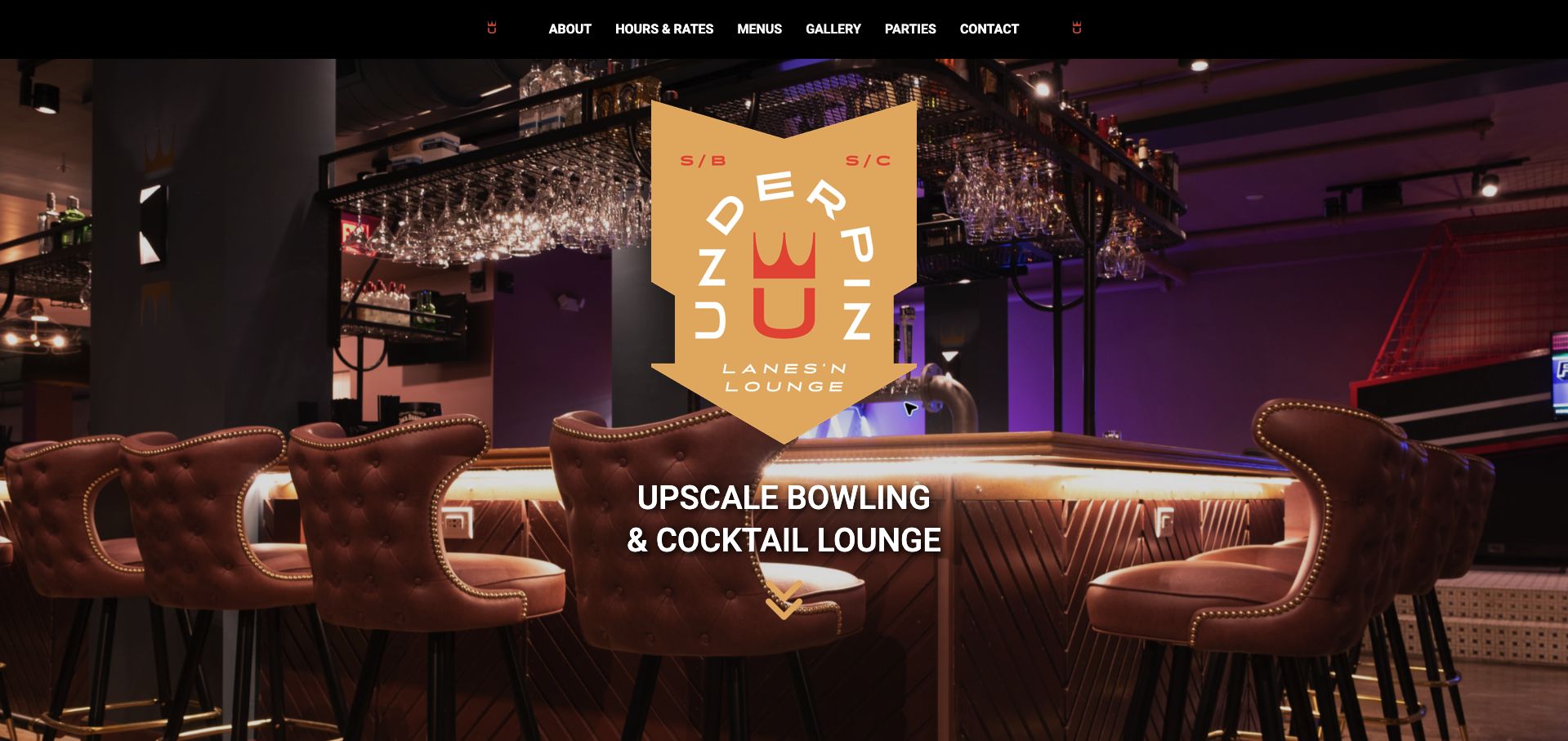
UnderPin gives its eight-lane Spartanburg venue a strong identity through a gold and red shield mark, warm lounge photography and compact black navigation. The page then does the less glamorous work: it explains ordinary first-come play, peak and off-peak lane rates, shoes, group limits and the difference between casual visits and event packages. The party options scale by lane count, which helps a group understand what it is actually reserving. That combination makes this our Editors Choice for the collection's website-design purpose. The lounge-led opening could show more of the bowling experience, and long photographic sections separate some practical tasks. Even so, the venue's personality and booking boundaries remain unusually clear together.
What you can learn
Give a small venue a recognizable identity, then explain exactly how casual play differs from reserving several lanes for an occasion.
Pros
Lane-based event packages make the group offer concrete.
Ordinary play rules and rate differences are explicitly explained.
Cons & considerations
The opening lounge image says less about the lane experience.
Long photo sections can separate related planning details.
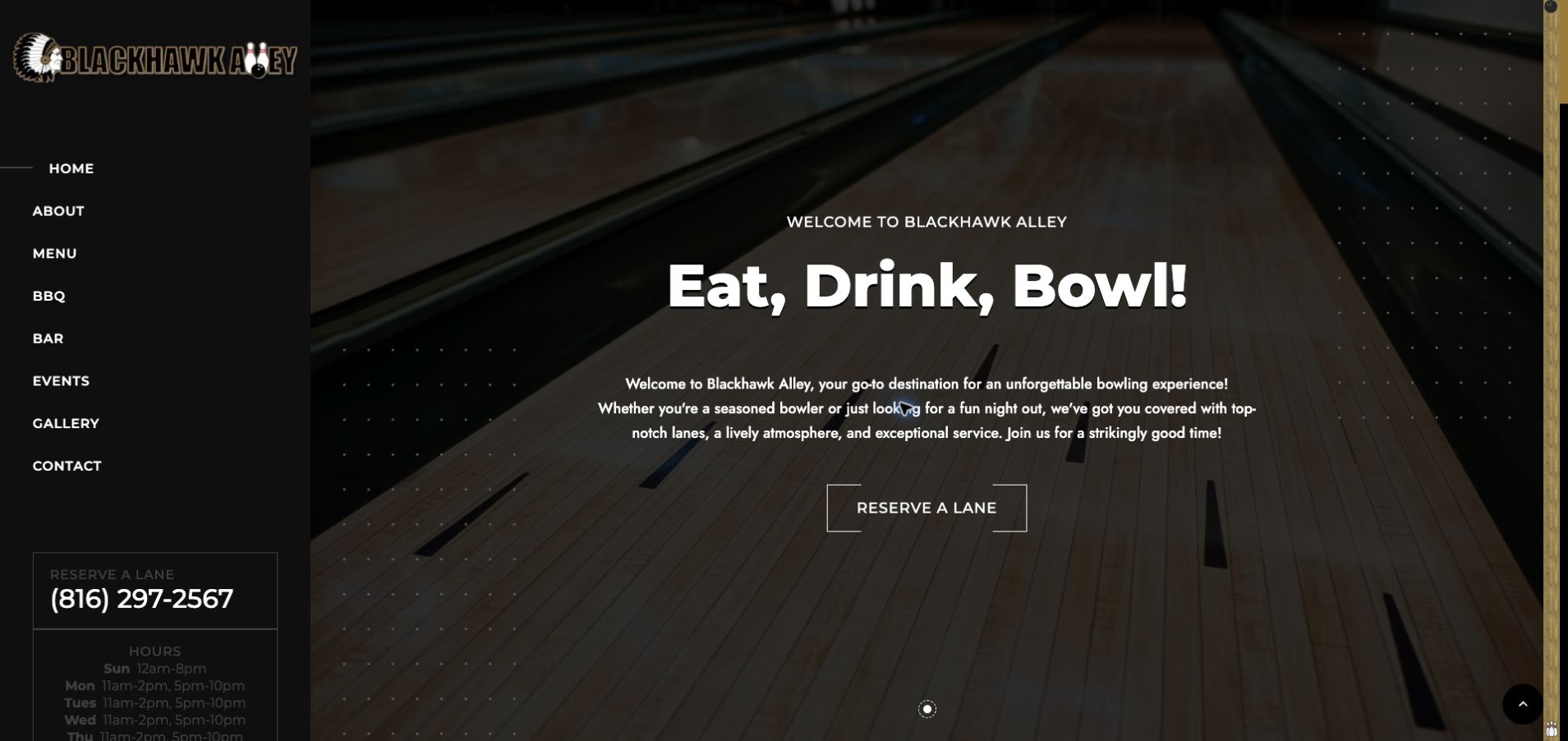
Blackhawk Alley anchors its dark homepage with a fixed left-hand navigation, keeping the venue name, telephone contact and opening information beside the large lane photograph. The oversized invitation to eat, drink and bowl communicates the basic offer quickly, while separate menu, bar, event and gallery routes support the different reasons to visit. That arrangement suits a local venue where customers may call to resolve group details. The sidebar's smaller hours text has less contrast than the main headline, however, and the page's historical statements do not use one consistent time reference. The design is worth studying for its stable contact area, but important operating facts need stronger emphasis and careful maintenance.
What you can learn
Keep local contact and arrival information available while visitors explore food and event options, and give those facts enough contrast to remain readable.
Pros
The contact route stays alongside the main content.
Food, events and gallery information have separate destinations.
Cons & considerations
Small low-contrast schedule text is easy to overlook.
Inconsistent historical time references weaken the practice of maintaining facts.
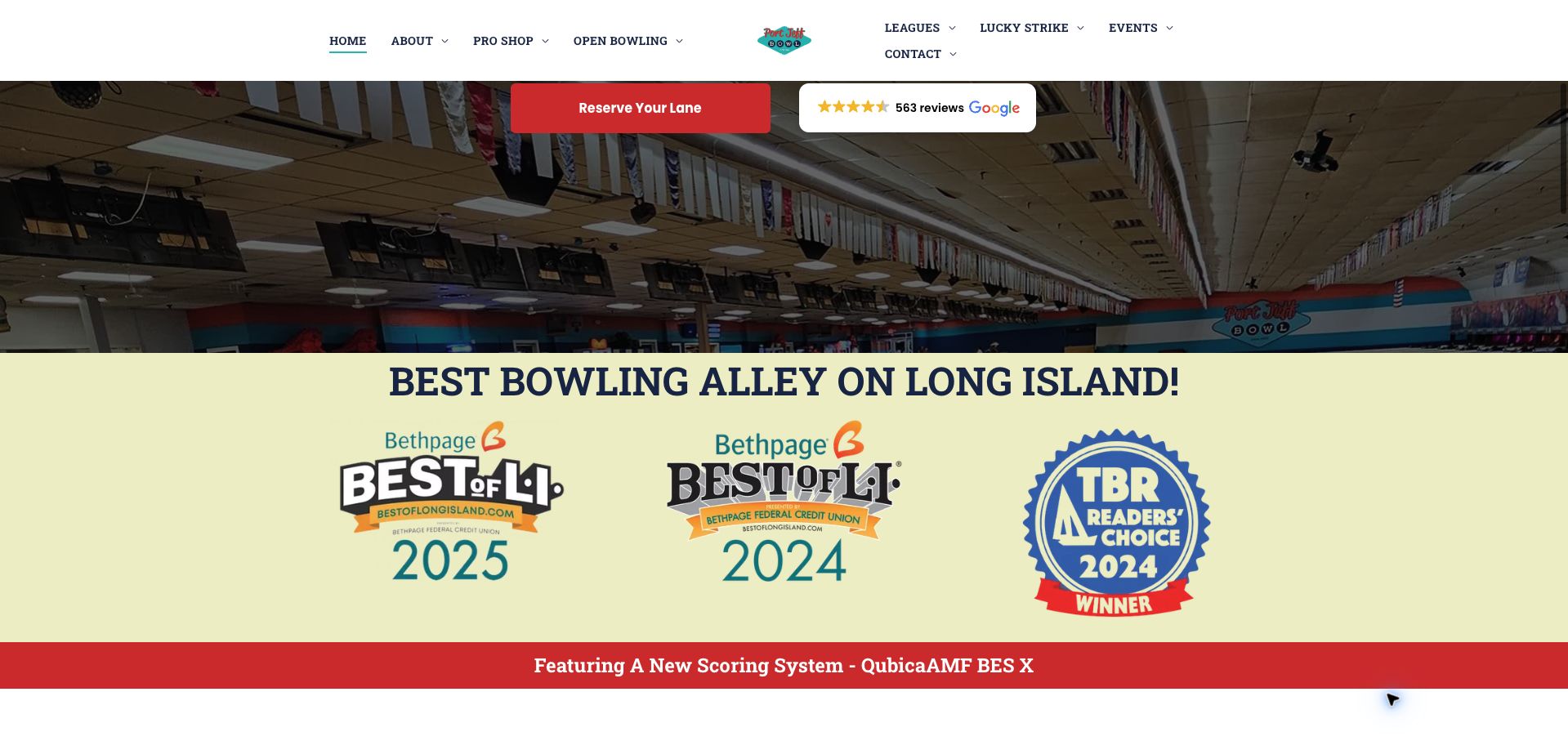
Port Jeff Bowl combines teal and red accents with a centered retro logo and extensive navigation. Adult leagues, youth programs and standings receive separate routes, signaling that regular bowlers are a major audience alongside casual visitors. The reviewed homepage section pairs real lane imagery with dated local-award graphics and a prominent reservation action. Practical notices also explain holiday hours and the booking fee, which are useful details to show before a customer enters a reservation flow. The tradeoff is density: the split navigation presents many choices, and promotional badges occupy space that could communicate the current visit experience. The awards are part of the site's presentation, not an independently established ranking in this review.
What you can learn
Serve league regulars and casual visitors with distinct routes, and place booking fees and holiday exceptions before the reservation handoff.
Pros
Youth and adult league information are separately labeled.
The booking-fee notice makes an important condition visible.
Cons & considerations
Extensive navigation can overwhelm a first-time visitor.
Award graphics compete with current planning information.
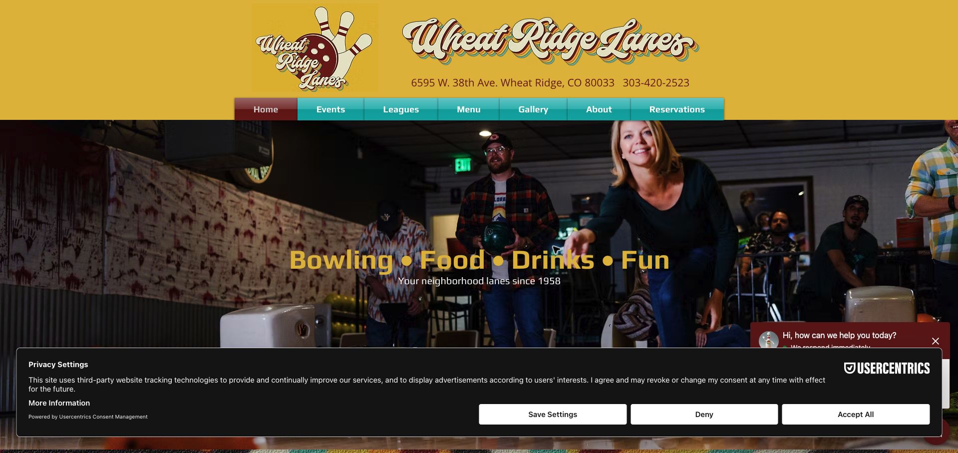
Wheat Ridge Lanes uses a yellow retro header, teal navigation and a photograph of actual bowlers to establish a lively neighborhood identity. The body supplies detailed hours, pricing, age restrictions and parking directions, giving visitors more than a promotional invitation. It also explains first-come rules and weekend reservation limits. That detail is valuable, but the presence of a reservations navigation label makes the scope of those limits something the visitor must resolve. Several price durations and repeated schedule blocks increase the reading load. In the captured view, a consent panel and chat control also compete near the bottom of the screen. The site's practical depth would work better with one concise policy summary next to the main action.
What you can learn
When reservation rules vary by day, summarize the exceptions directly beside the reservation link and keep one clear schedule source.
Pros
Parking and age restrictions are included in visit planning.
Real bowlers give the opening a local, active character.
Cons & considerations
Reservation labels and weekend exceptions need tighter coordination.
Consent and chat layers compete with content in the captured view.
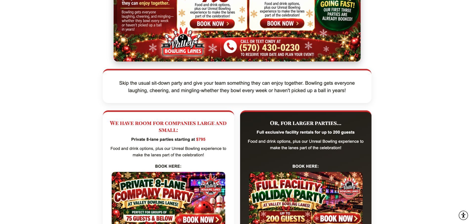
Valley Bowling Lanes' holiday-event section separates an eight-lane private experience from an exclusive facility rental. Red and white promotional cards communicate two different group scales, with price and capacity context helping organizers decide where to start. This is a useful distinction because a party inquiry can otherwise mean anything from a few adjacent lanes to taking over the building. The wider site provides many navigation routes, but the event comparison is the most concrete part of the reviewed experience. Some promotion text is embedded in artwork, making it harder to maintain or read independently of the image. A concise live-text comparison beside the cards would preserve the visual energy while making the package differences easier to evaluate.
What you can learn
Define group packages by space, privacy and capacity, then repeat the essential comparison in accessible live text rather than promotional artwork alone.
Pros
Private-lane and whole-facility occasions are clearly separated.
Capacity context helps organizers choose an appropriate inquiry route.
Cons & considerations
Text inside promotional artwork is harder to maintain and access.
The multirow navigation adds complexity before the event choice.
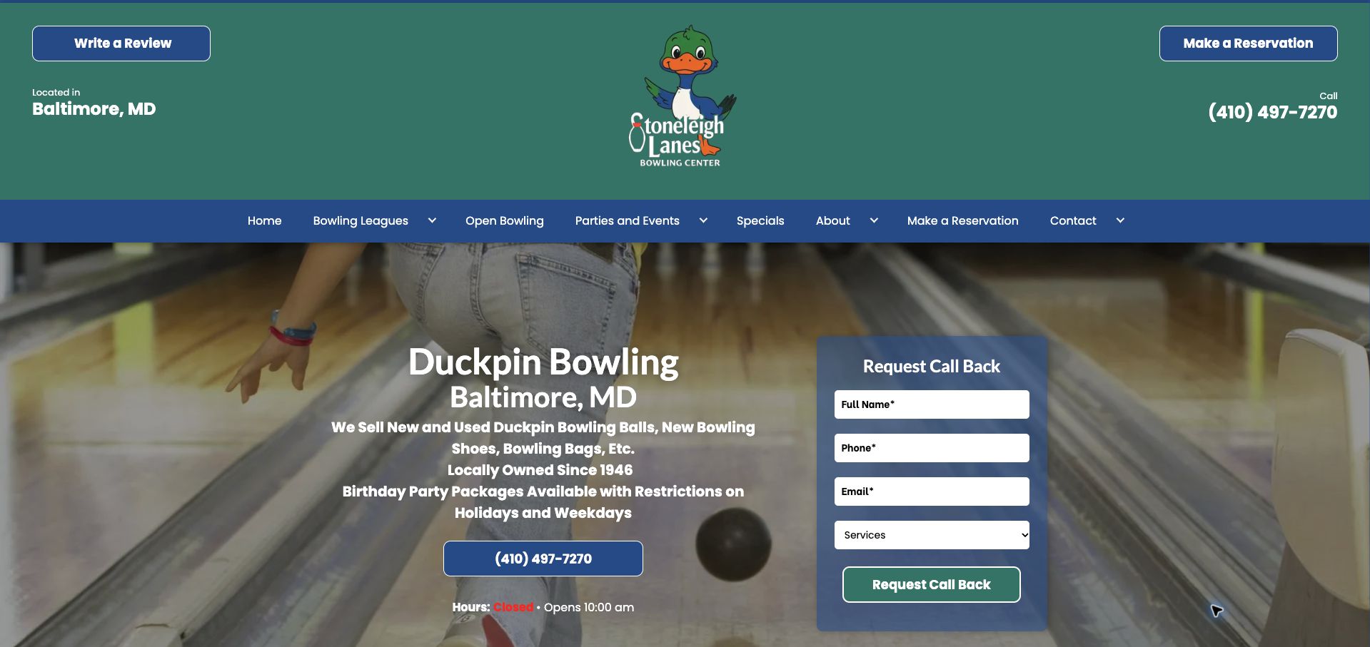
Stoneleigh Lanes makes duckpin bowling part of its identity rather than assuming every visitor knows the format. A duck mascot, green and blue header and prominent Baltimore positioning distinguish the venue from a conventional ten-pin center. The page pairs lane imagery with an inline callback form and repeats telephone and reservation routes, while leagues, open play and events receive recognizable destinations. These choices support both curious first-timers and regular players. The tall masthead uses a large portion of the opening view, and the repeated contact actions do not always establish which one should come first. Its useful lesson is specialty clarity: explain the particular activity before presenting generic entertainment language or broad claims about the venue's history.
What you can learn
Name the bowling format clearly and show the environment, then give new visitors one primary route for arranging an appropriate visit.
Pros
The duckpin identity is visible in both wording and imagery.
Open play, leagues and events have distinct routes.
Cons & considerations
The tall masthead delays the main content.
Repeated contact actions need a clearer order of priority.
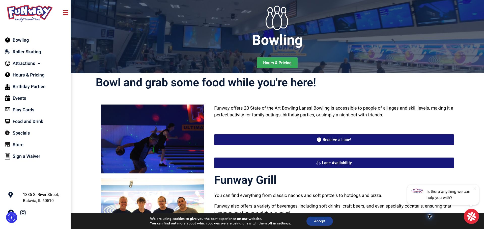
Funway's dedicated bowling page sits inside a larger entertainment-center site, with a persistent activity rail showing the other available attractions. The page itself provides a lane photograph, a concise overview and separate links for reserving a lane and checking availability. Supporting sections connect bowling to food, leagues, specialist sessions and equipment, helping visitors plan a longer outing. The distinction between availability and reservation is useful if the destinations remain clearly explained. Visually, several blue, green and red controls compete for attention, while chat, accessibility and cookie layers crowd the lower viewport in the captured state. The example shows how a broad venue can give one activity enough detail without removing the wider context, but the action hierarchy needs discipline.
What you can learn
Within a multi-activity venue, give bowling its own practical page and make the relationship between availability information and actual reservations explicit.
Pros
Bowling has a focused page with supporting visit information.
Other attractions remain available through the activity rail.
Cons & considerations
Several competing control colors weaken the main action.
Multiple floating interface layers crowd the captured viewport.
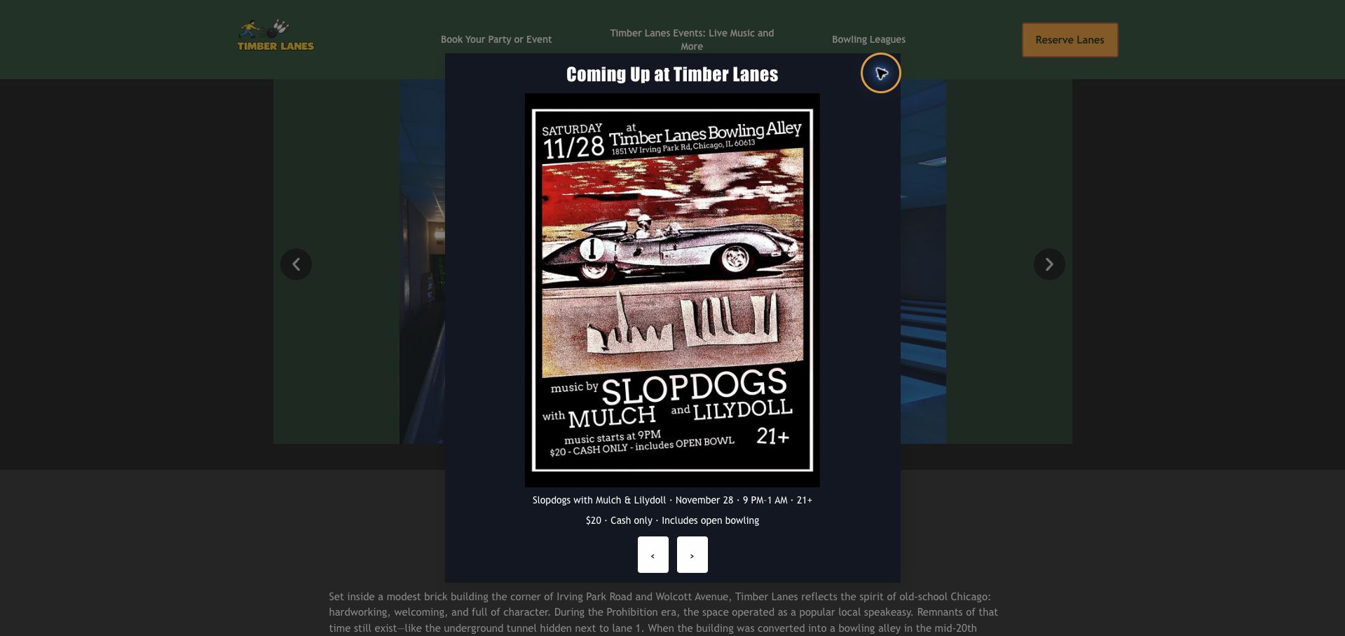
Timber Lanes combines forest green and yellow accents with a compact navigation and a distinct lane-reservation button. Real interior images and a substantial Chicago history give the venue a specific character, while party, event and league routes cover the main visitor tasks. The captured page includes an upcoming-event poster overlay, which makes the promotion impossible to miss but obscures the normal homepage experience. That tradeoff is central to the review: a dated event can be useful, yet it should not prevent someone from finding basic hours or booking. The site also links to named publications rather than presenting anonymous praise alone. Its strongest material is the recognizable venue and local story, supported by a simpler route through current promotions.
What you can learn
Use authentic venue images and history to establish character, but keep dated event promotions easy to dismiss and separate from routine booking tasks.
Pros
Real interior photography supports a distinctive local identity.
Parties and leagues have clear navigation routes.
Cons & considerations
The captured event overlay obscures the underlying homepage.
Long historical material can delay immediate planning information.
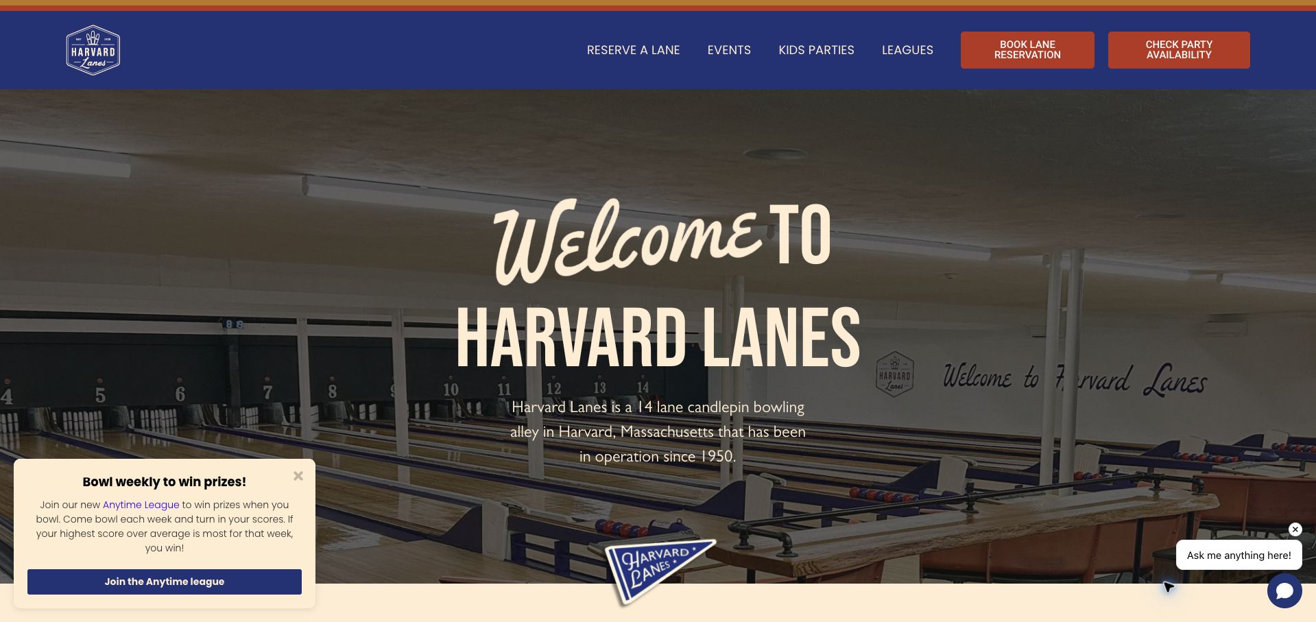
Harvard Lanes uses navy, rust and cream around a broad photograph of the actual lanes. The opening identifies candlepin bowling and the local setting, giving first-time visitors a clearer idea of the experience than a generic entertainment headline would. Separate lane-reservation and party-availability actions acknowledge that an ordinary visit and a celebration require different planning. Room galleries and practical questions about equipment, sessions and party scope add useful detail below. The site has a strong visual identity, but promotional and chat elements in the corners compete with that calm structure. Its many offerings also need consistent labels so visitors can distinguish a session, league and party package. The most transferable idea is to explain the special format before presenting the booking choices.
What you can learn
Show the distinctive bowling format and divide ordinary lane visits from party planning before asking visitors to select a booking route.
Pros
The candlepin format is named prominently.
Lane reservations and party availability are separate actions.
Cons & considerations
Promotional and chat elements compete with the main content.
Numerous session types require especially consistent labels.
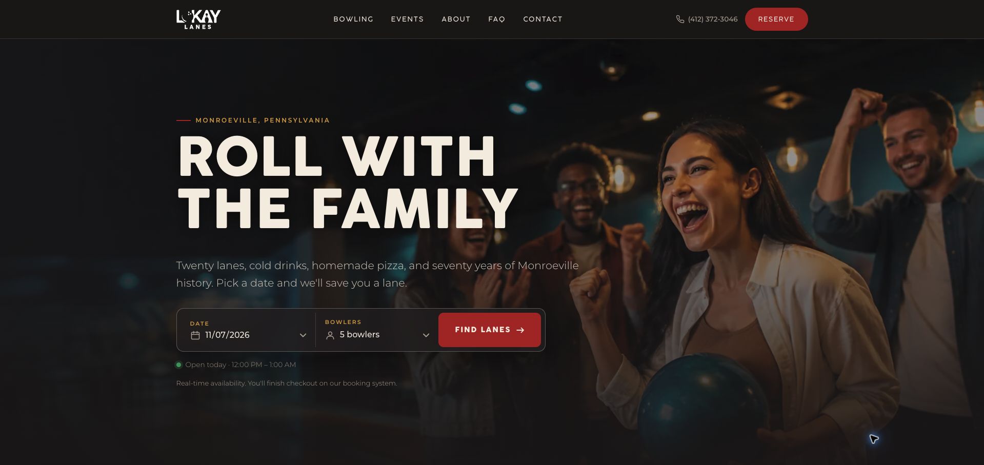
Lokay Lanes pairs large modern type and a charcoal, cream and red palette with an inline date-and-bowler search. The Monroeville location is explicit, and the page explains that checkout continues on an external service. That disclosure helps preserve context when the booking interface changes. Open play, cosmic bowling and events are separated, while lane-based pricing and group limits give customers a framework for the availability search. The long page also makes room for food and the venue's family story. A very long bowler-count selector is less efficient than a smaller set of meaningful group choices, and some practical details sit among extended promotional prose. The strongest pattern is a concrete planning input supported by a clearly explained handoff.
What you can learn
Ask for the date and realistic group size early, and tell visitors when availability or checkout will move to another booking service.
Pros
The availability search begins with concrete planning inputs.
The external checkout handoff is disclosed.
Cons & considerations
The long bowler-count selector can be cumbersome.
Extended promotional sections separate some practical booking details.
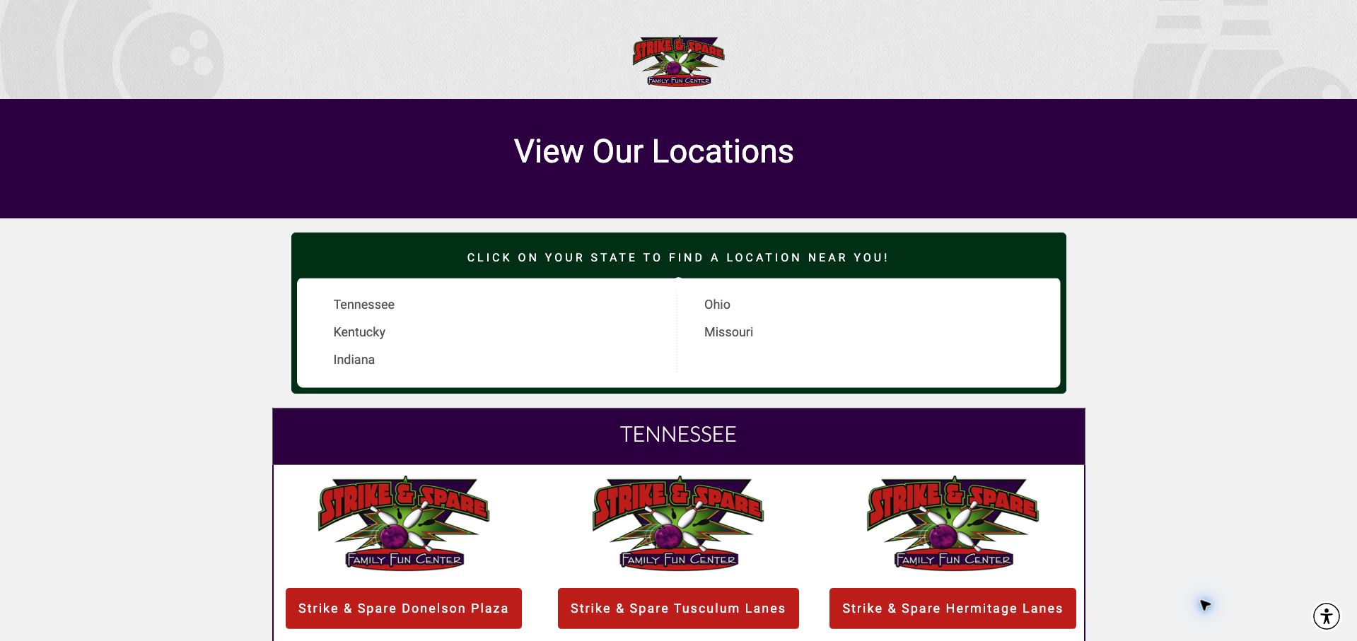
Strike & Spare treats its homepage primarily as a venue directory. State groupings and repeated location cards give each center a name, street address and telephone number, making the first decision geographical rather than promotional. Purple title bands, green outlines and red links provide a recognizable system for that large amount of information. This is a sensible structure for a multi-location operator: a visitor needs the right center before evaluating its hours, leagues or party options. The repetition becomes visually monotonous, however, because similar logos occupy card space that could help distinguish the actual locations. The long vertical list also puts a burden on scanning. The useful lesson is task priority, with room for more compact comparison and stronger location-specific imagery.
What you can learn
For a regional operator, resolve the visitor's location first and make each branch's address and contact route immediately available.
Pros
Addresses and telephone numbers accompany the venue names.
State groupings give the directory a clear geographic structure.
Cons & considerations
Repeated logos do little to distinguish individual centers.
The long vertical list requires substantial scanning.
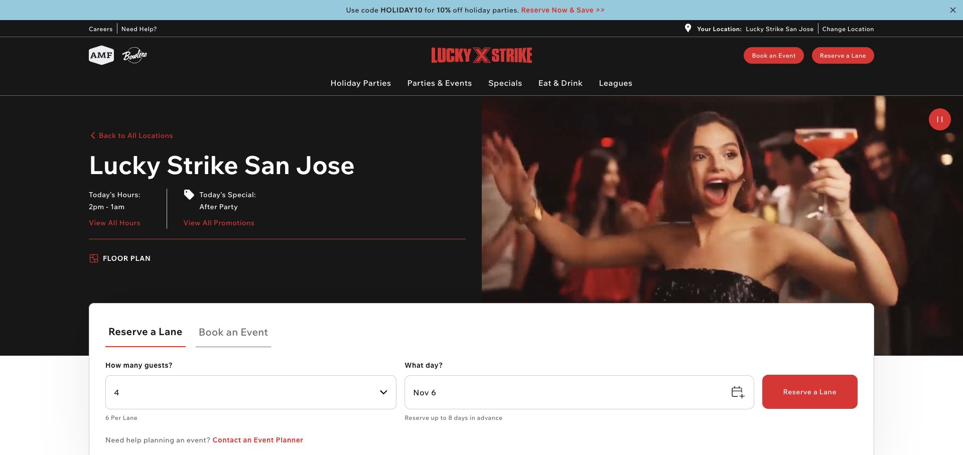
Lucky Strike's San Jose page keeps the selected location in its utility area and combines local hours and promotional information with a white reservation panel. Tabs distinguish reserving a lane from arranging an event, while guest and date inputs make the next step concrete. The page also explains the group size per lane and the reservation window, helping visitors interpret the form before proceeding. The black and red brand system is strong, and the media has a pause control, but corporate navigation and cross-brand elements introduce choices beyond the selected venue. This review concerns the San Jose page specifically; the visible interface does not establish actual inventory or the quality of a visit. The useful pattern is retaining branch context throughout the booking decision.
What you can learn
Keep the chosen venue unmistakable while visitors enter dates and guest counts, and explain lane capacity and reservation limits beside the form.
Pros
Lane reservations and events are separated within the booking panel.
The selected branch remains visible in the page interface.
Cons & considerations
Corporate and cross-brand navigation add unrelated choices.
Promotional media competes with practical location information.
Kegan is a freelance web designer and developer with 15+ years of experience helping businesses turn complicated website requirements into clear, maintainable digital experiences. He works directly with clients from planning and design through development, launch, and ongoing support.
For bowling alley website design, his development approach focuses on open-play and reservation information, readable lane pricing, party packages, league resources, and practical visit-planning journeys. The scope can be a targeted improvement or a complete custom build, with responsive layouts, thoughtful content structure, and integrations chosen around the people using and maintaining the site.
Show 3 other bowling alley website designersHide other bowling alley website designers
Plan the content around the decisions visitors need to make
Map the real booking model
Document whether the venue uses walk-ins, reservations, event requests or a mixture. Give each action a label that matches the operational process and explain when a lane is actually confirmed.
Create a clear rates table
Separate weekdays, peak periods and special offers only where the prices genuinely differ. State the per-person, per-game or per-lane unit and shoe charge. Date temporary promotions and remove expired ones.
Define group and lane limits
Explain how many people can use a lane and how larger parties are allocated. Keep maximums and recommendations distinct. Connect children’s arrangements, bumpers or other equipment to the actual venue offer.
Maintain availability expectations
State how league nights, private events and seasonal hours affect casual play. A published opening time is not a guarantee of an available lane, so give visitors a practical way to check.
Write complete event packages
List duration, included services, minimum group size and additional charges. Explain deposits, changes and confirmation using the venue’s approved policy. Keep food and drink arrangements attached to the package they qualify.
Test the visit and inquiry routes
Ask someone to plan a casual visit and a group event from a phone. Check menu readability, contact links and reservation handoffs without creating bookings or sending event inquiries.
The editing job behind the design
Choose a maintainable publishing and booking system
Most venues need maintainable hours, prices, menus and event packages more than a complicated custom interface. Store recurring facts centrally so a change does not leave the homepage, footer and booking page in conflict.
If lane availability comes from a separate system, identify the transition and preserve venue and party context. Keep a useful public explanation and contact fallback when the booking service is unavailable.
Our WordPress website examples offer a separate look at publishing approaches. A visible platform label is evidence for that named page, not a guarantee that the same system will suit your requirements.
Before the public launch
Practical website planning checklist
Explain walk-in versus reservation rules.
Show current opening hours.
State the pricing unit.
Identify shoe-rental charges.
Qualify peak-period rates.
Publish lane capacity.
Explain larger-group allocation.
Describe party inclusions.
State how events are confirmed.
Keep food menus readable.
Explain league effects on open play.
Test the mobile booking route.
These checks are a project checklist, not a performance, legal, security, or accessibility certification. Test real journeys with the people responsible for the website before making claims about the result.
Sources & editorial method
How this collection was selected and reviewed
The 12 examples match the original saved collection target. Each official public page was opened, inspected and directly captured in an ordinary browser; source URLs and capture dates identify the reviewed state. Reviews describe observed design, information and navigation, with distinct practical lessons and limitations. A bounded public technology-audit attempt accompanies every source, preserving unknown and inaccessible results without inventing a hidden stack. Editors Choice is an explicit editorial selection favoring a smaller specialist or local organization, not a service-quality, safety or outcome endorsement. No booking, application, payment or private form was submitted. Website imagery and trademarks belong to their owners.
Each example links to its actual source page. Screenshots are direct browser captures with their own capture dates; moving imagery, announcements and live designs can change. The notes describe observable design choices and conditional tradeoffs, not measured traffic, conversion results, service quality, or accessibility conformance.
Technology labels use public page metadata, asset evidence, or explicitly cited platform documentation. Platform documentation is not a complete current deployment audit. A component reference may be legacy or unused; it is not a complete backend inventory. Unknown stacks are omitted. These sites are editorial examples, not our client portfolio.
Written, Edited and Curated are separate editorial records, not timestamps advanced by a rebuild. Website designs and imagery belong to their owners. See our editorial standards or suggest a correction.
Questions worth asking
Bowling Alley website design questions
What should a bowling homepage prioritize?
Location, hours, the open-play or reservation model and an understandable rates route. Give parties and leagues their own clear paths so they do not obscure a casual visitor’s task.
How should lane pricing be displayed?
State whether the charge is per person, game or lane-hour, then identify shoes and important time-period conditions. A starting price alone is rarely enough to estimate a visit.
Does every bowling venue need online reservations?
No. The website should accurately explain the venue’s actual process. A clear walk-in policy with a way to check availability can be more useful than a misleading booking label.
What belongs in a party package?
Duration, lane or group limits, included equipment and food, minimums, extras and confirmation steps. Keep deposits and change terms easy to find before commitment.
How should league information relate to open play?
Separate the participation route while explaining any effects on public lane availability. Opening hours should not be presented as a promise that lanes are always free.