Best Septic Service Websites of 2026 (28 Real-World Examples)
Septic service websites that make territory, work categories, and the inquiry process understandable.
Compare 28 public company pages for local-service content, pumping and rental navigation, and practical contact design. The guide does not provide system, environmental, health, permitting, or property-inspection advice.
A septic-service visitor may be arranging routine pumping, asking about an inspection, researching installation work, or requesting a portable-facility rental. A useful website explains which conversations the company accepts instead of treating those tasks as one generic quote request.
The collection includes small owner-led sites and broader regional contractors. Some use detailed forms, some lead with a telephone, and others rely on a distinctive company truck. Compare the information those choices expose, while keeping website presentation separate from judgments about technical work or system condition.
Before the examples
What makes good septic service website design in 2026?
State the actual territory and service families
List the counties or communities the company serves in readable text. Separate pumping, inspection, repair, installation, commercial grease, excavation, and rentals where those are real offerings. A truck photograph or broad septic label cannot explain every service relationship by itself.
Describe the request without asking for a diagnosis
The public page can explain how to start a conversation and what broad context is useful. It should not ask visitors to open, inspect, or work on equipment, determine environmental conditions, or decide compliance questions before they can contact the company.
Distinguish routine scheduling and other contact situations
A callback, estimate request, planned pumping appointment, and urgent telephone inquiry can have different next steps. Label them accurately and keep availability wording current. A successful online submission does not itself establish a system assessment, confirmed dispatch, price, or accepted job.
The collection · 28 examples
28 septic service websites worth studying
Look at how the examples identify territory, distinguish service families, use real company imagery, and explain the first contact. The list does not rank technical capability or service outcomes.
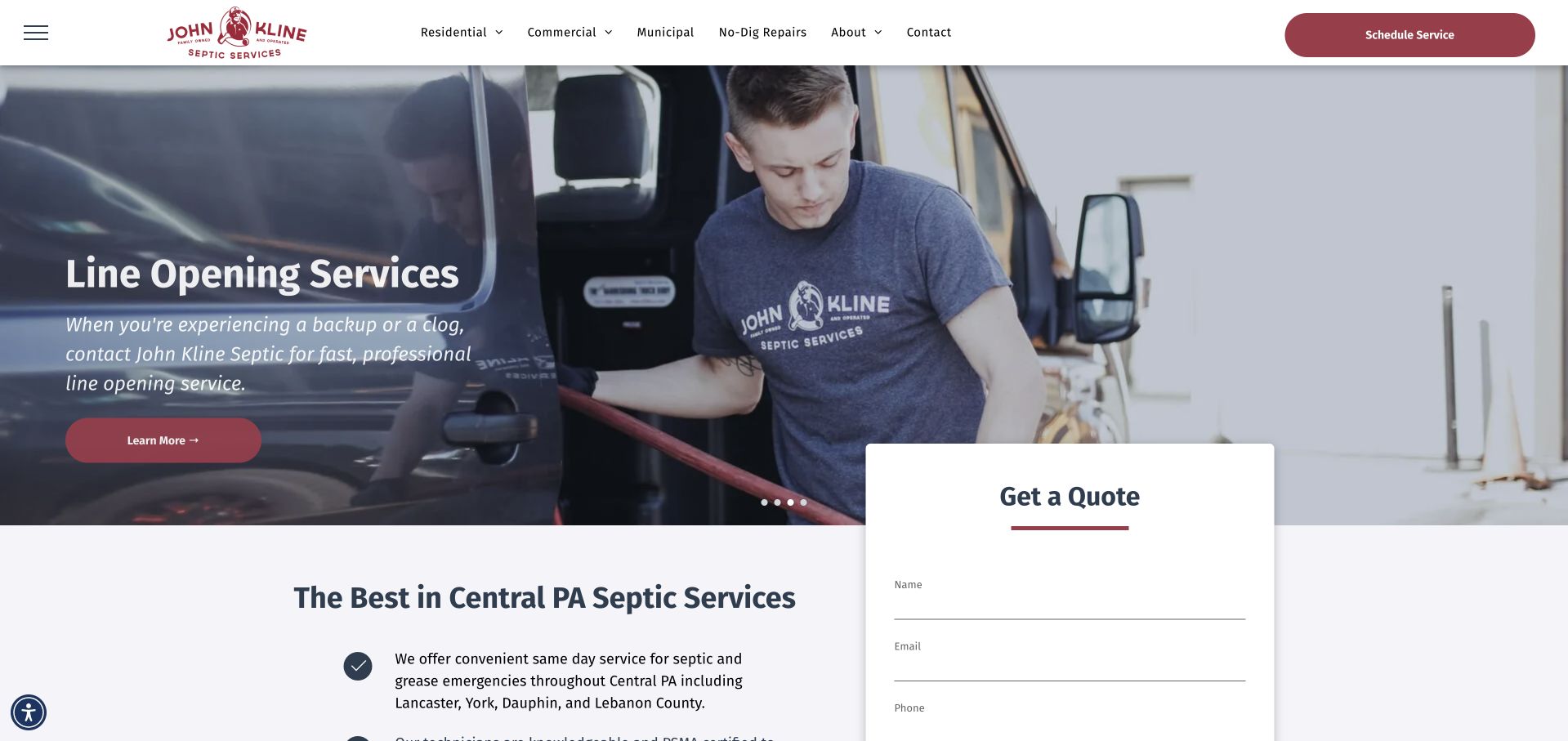
John Kline uses a photograph of a technician beside company equipment beneath a clean white header. The captured slide introduced line-opening work, while the main heading below established the Central Pennsylvania septic-service context. A pale quote panel overlaps the lower part of the hero, and the navigation distinguishes residential, commercial, municipal, and no-dig repair routes. This is useful because the company does not treat every inquiry as the same household pumping task. The working photograph gives the opening a real operational subject, while the customer-type navigation provides a structure for the broader catalog.
What you can learn
Use genuine field photography and separate audiences when the intake differs. Keep essential service and territory information outside changing slides, and state that a quote request starts a conversation rather than confirming a visit or property assessment.
Pros
Customer-type navigation reflects meaningful differences in the service catalog.
A clearly separate quote surface keeps form fields readable over the work photograph.
Cons & considerations
A rotating slide can introduce a different service from the visitor’s immediate need.
The overlapping form needs a careful mobile order and limited required information.
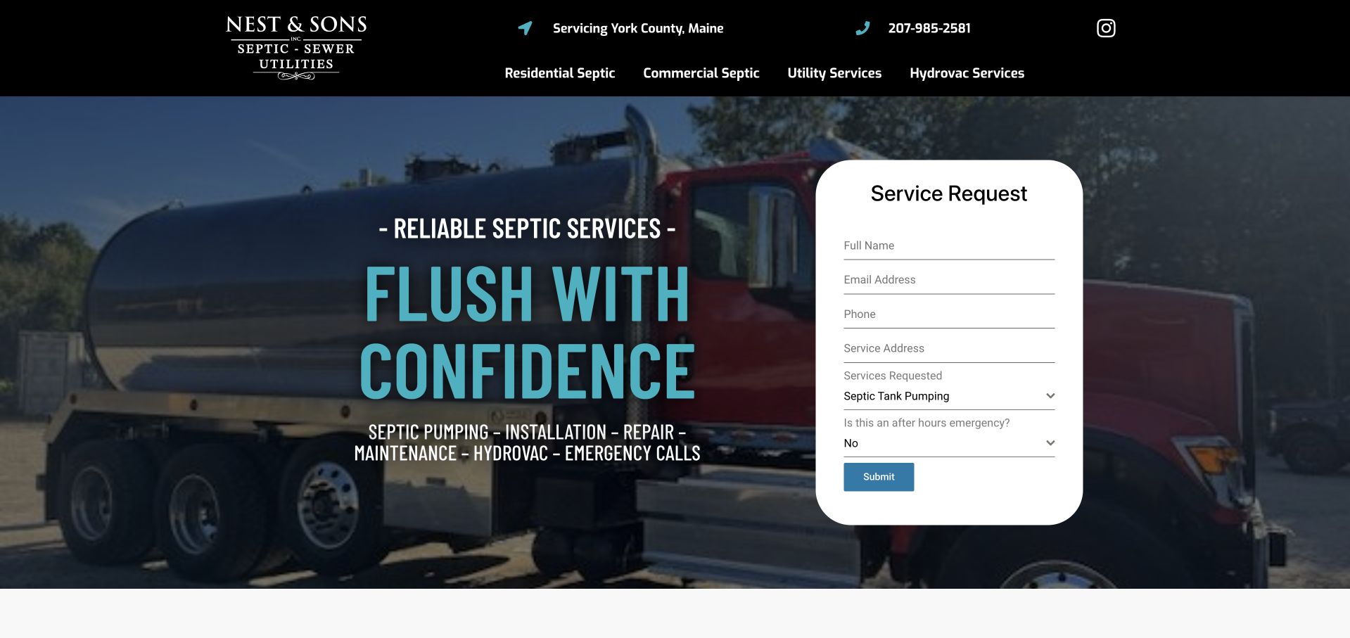
Nest and Sons places a large pumping-truck photograph behind a turquoise headline and a white service-request card. The form asks for contact and address details, a service type, and whether the situation is an emergency. The black header remains relatively short, naming the business, county, telephone number, and principal service categories. This is useful as a form-led local-service reference because the image and interface have different jobs: the truck establishes the operational setting, while the card organizes the first inquiry. The large rounded form surface also keeps the fields separate from the dark photograph without requiring an additional modal.
What you can learn
If urgency is part of intake, explain how that answer is handled and provide the appropriate direct contact route. Keep the request distinct from a confirmed dispatch, and avoid collecting property details that are unnecessary for the next conversation.
Pros
The white request card is visually separate from the branded truck image.
A service-type field supports a business with more than one pumping-related offering.
Cons & considerations
Several address and contact fields can make the first screen demanding on mobile.
An emergency selector needs clear expectations beyond a simple yes-or-no answer.
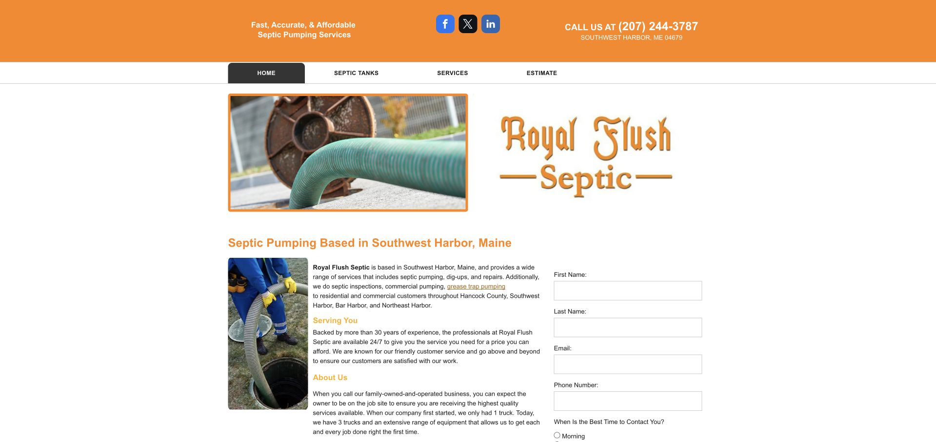
The rfsme.com page presents Royal Flush Septic branding in an orange-and-white layout. A hose photograph and large wordmark introduce the service, followed by a Southwest Harbor heading, explanatory text, a work photograph, and a contact form. This is a compact local-business presentation rather than an elaborate booking application. It is useful for studying how much information can fit in a small page when the service and territory are defined. The visible Royal Flush brand matters more to a visitor than inferring a company identity from the domain alone, so the guide records that page presentation explicitly rather than assuming the domain name tells the whole story.
What you can learn
Keep the public brand, contact details, and company identity consistent across the website. A compact form can work well when its purpose and receiving business are clear and its labels remain readable without zooming.
Pros
The orange palette and large wordmark make the displayed service brand recognizable.
Service text and inquiry fields appear close together in the compact layout.
Cons & considerations
The relationship between the domain name and visible brand needs clarity.
Small text and narrow form columns need more generous responsive spacing.
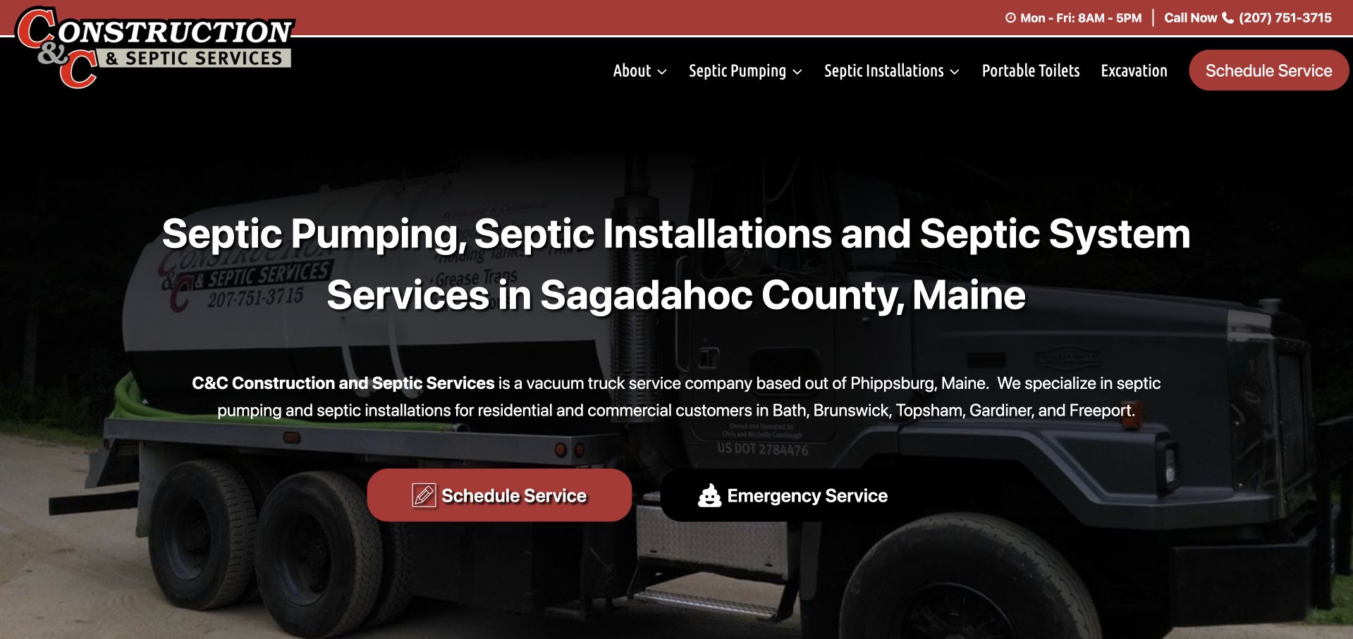
C&C Construction and Septic Services uses a dark truck photograph beneath a black-and-red header. The large white heading names pumping, installation, system services, and Sagadahoc County, followed by a short paragraph listing nearby towns. Red scheduling and separate emergency-service controls sit below. The navigation also exposes portable toilets and excavation, acknowledging a broader contractor catalog without putting every category into the headline. This is useful for studying a local-service opening that is unusually explicit about both work and territory. The photograph gives the page operational context, while the copy answers geographic relevance in ordinary language before an inquiry starts.
What you can learn
Name the services and actual coverage in readable text, not only inside a map or logo. Keep planned scheduling separate from the contact route used for urgent questions, with accurate expectations for what happens after either action.
Pros
The county-specific heading establishes relevance before a visitor contacts the business.
Separate actions distinguish routine scheduling from a different contact situation.
Cons & considerations
A long service-and-location heading requires deliberate wrapping on small screens.
The dark photograph needs enough contrast behind the supporting town list.
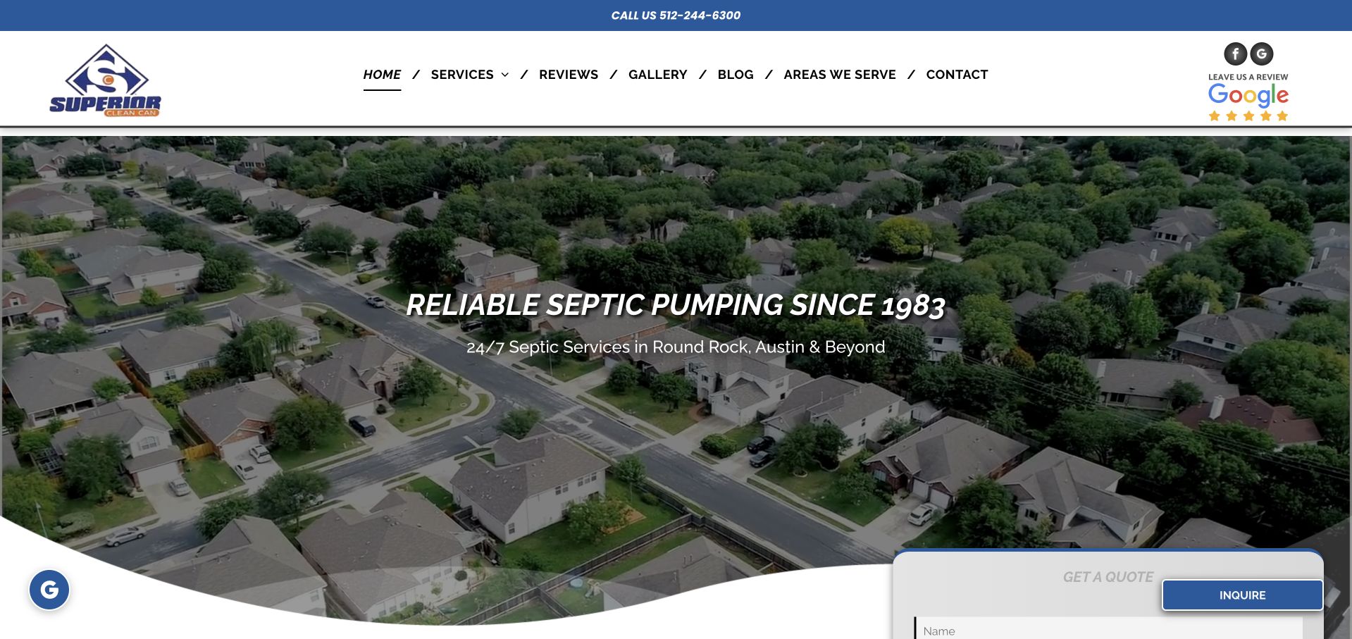
Superior Septic and Clean Can uses an aerial neighborhood photograph behind a short company-history headline and regional service line. The pale blue-and-white header provides telephone access and separate service, review, gallery, blog, territory, and contact routes. A quote panel overlaps the lower hero edge, while an optional promotion can be closed to reveal the page. This is useful for studying a broader septic and portable-facility business that introduces coverage through a residential setting rather than a truck close-up. The photograph supplies place context, but literal information still needs to explain the actual catalog.
What you can learn
Keep the catalog and territory explicit beneath place-based photography. Make optional promotions easy to close, and distinguish a quote inquiry from any confirmed appointment, property assessment, or accepted project.
Pros
A visible regional line gives the broad company introduction geographic context.
The header separates service, territory, and contact research routes.
Cons & considerations
A promotional overlay can interrupt access to the underlying quote information.
Aerial neighborhood imagery explains place more clearly than the actual service work.
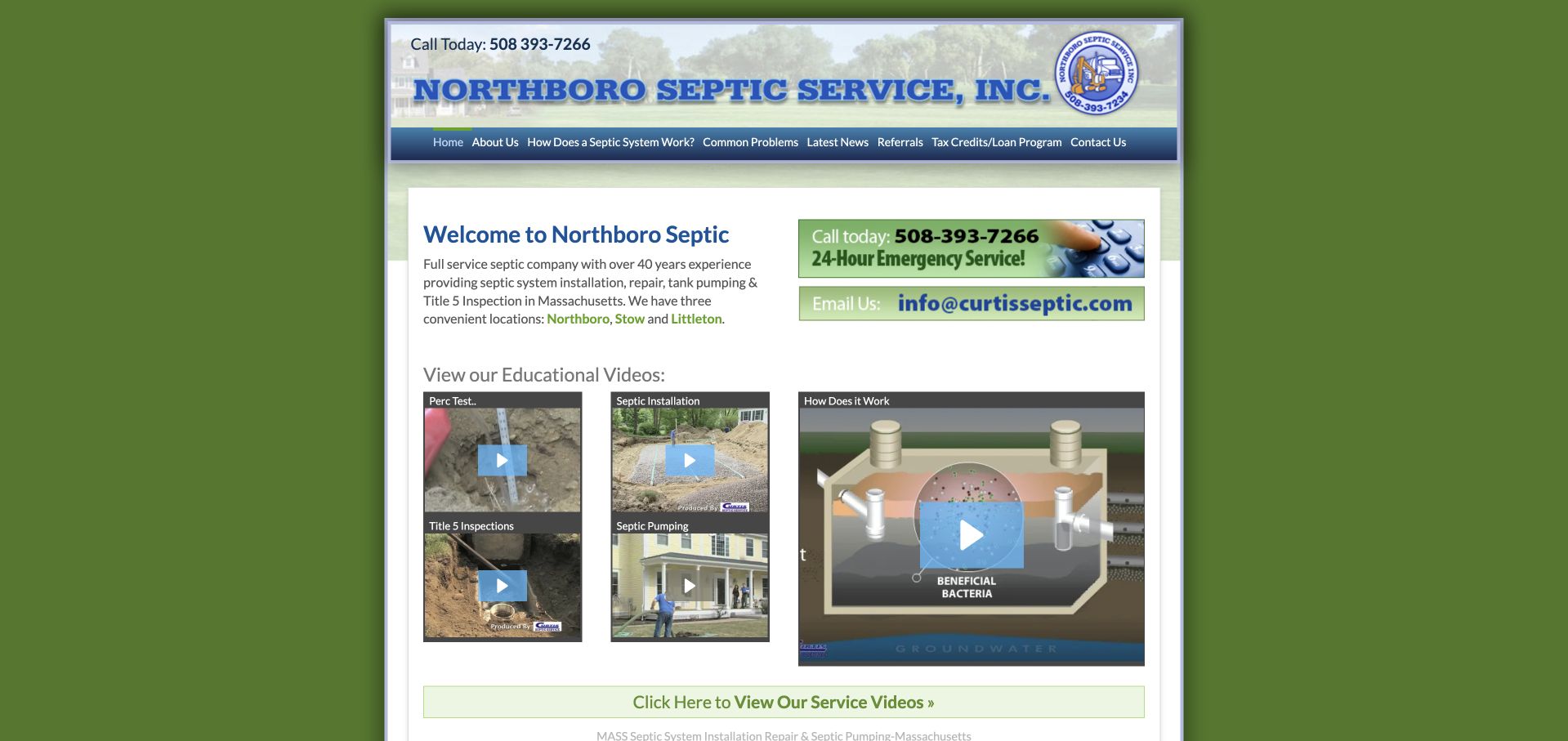
Northboro Septic uses a compact centered layout surrounded by a green background. The header combines the company name, telephone number, and short navigation labels, while the main content places an introductory paragraph beside a visible contact banner. Several educational video thumbnails appear immediately below. This is useful as a content-organization reference rather than a contemporary visual template: the business gives service explanations a place early in the journey instead of relying solely on a quote form. The narrow composition also exposes the tradeoff of preserving an older layout on a wide screen. A redesign can retain the useful learning routes while substantially improving type size, spacing, and mobile presentation.
What you can learn
Keep educational resources accessible in ordinary text as well as video, and have qualified staff review technical content. The website can explain the service process without encouraging visitors to assess or work on a septic system themselves.
Pros
Educational resources have a visible location near the introductory service information.
The company name and telephone remain prominent in the compact header.
Cons & considerations
The narrow layout leaves substantial unused space on large displays.
Small navigation and video captions need stronger reading and mobile accessibility treatment.
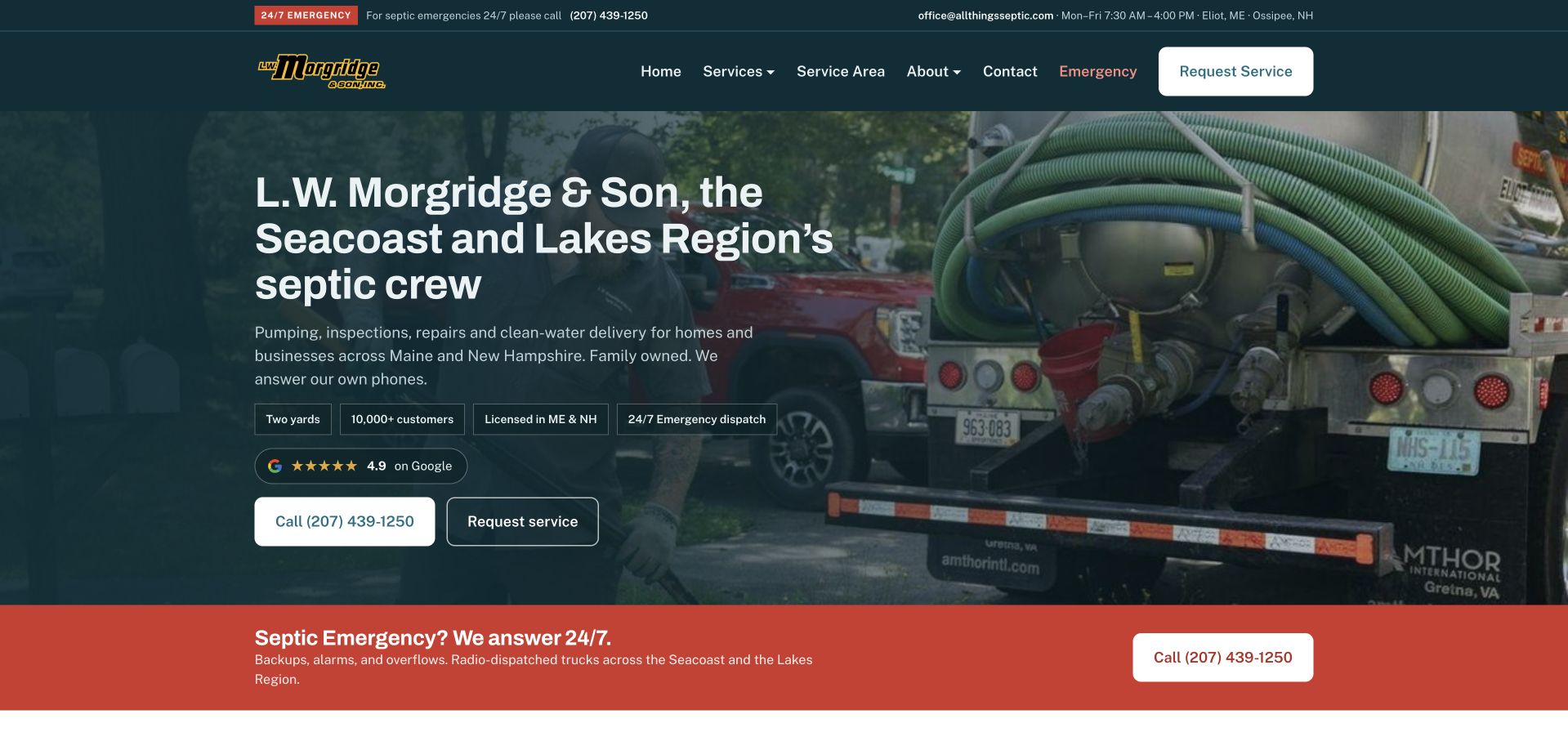
L.W. Morgridge & Son uses a dark teal hero over a photograph of hoses and pumping equipment. The headline names the Seacoast and Lakes Region and describes the business as a crew, giving the introduction a local human tone. A short service paragraph and two contact controls sit beneath it, while a broad red emergency-contact band starts the next section. The white request-service button in the header stays visually distinct from the red urgent-contact treatment. The equipment photograph supplies specific operational context rather than generic landscape imagery.
What you can learn
Use different visual treatments only when the contact routes genuinely differ. Explain who answers and what information is useful, while keeping availability statements accurate and separate from any guarantee of arrival time or system outcome.
Pros
The regional crew heading gives the service a concrete geographic and human context.
The red contact band clearly separates a second inquiry situation from routine requests.
Cons & considerations
Several small reassurance labels can compete with the main service paragraph.
A broad catalog needs detailed scope pages beyond the compact hero list.
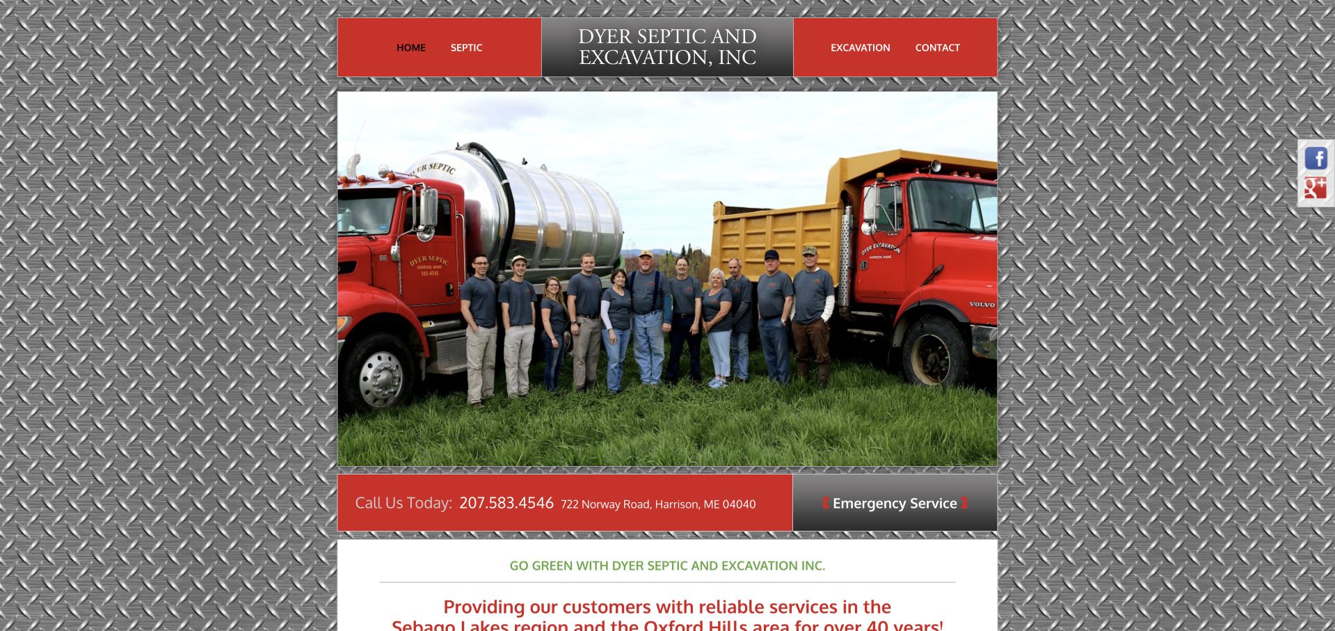
Dyer uses a large photograph of its team standing between company trucks, framed by a metallic-pattern background and red navigation panels. The first text section names the Sebago Lakes and Oxford Hills context, while a red contact strip separates the photograph from the introduction. This is useful for studying the value of a company-specific team image: the people and vehicles establish a local operation more distinctly than a stock illustration. The industrial frame gives the page a strong personality, although it also competes with the content. A modern redesign could preserve the photograph and local identity while simplifying the surrounding treatment and giving the text more space.
What you can learn
Keep genuine company assets when updating a legacy contractor site. Simplify decorative frames before replacing useful team and equipment photographs, and ensure the service, coverage, and contact process remain readable on a phone.
Pros
The team-and-truck photograph provides a specific identity for the business.
A contact strip separates the image from the explanatory local-service section.
Cons & considerations
The metallic background competes with the content and narrows the reading area.
Compact navigation panels need larger tap targets and clearer mobile stacking.
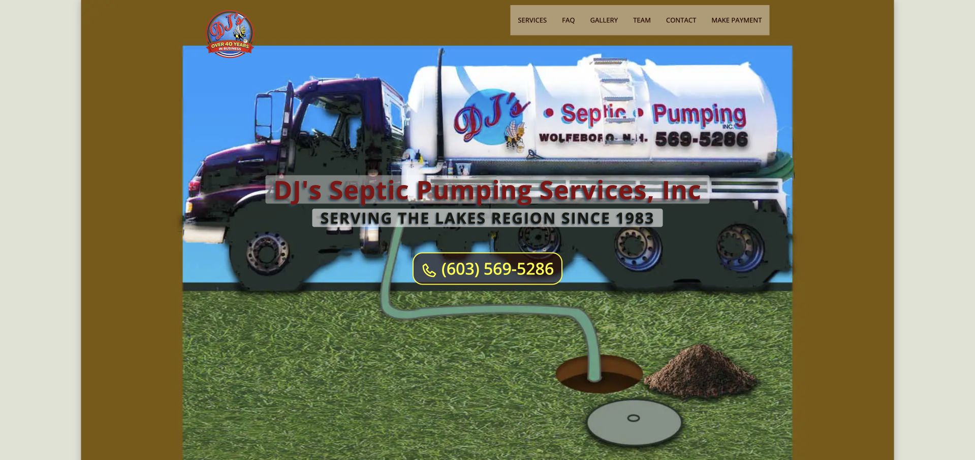
DJ's uses a large branded pumping-truck image and a playful hose-and-ground illustration inside a compact gold-and-green page. The company name, Lakes Region service-history statement, and yellow telephone action are layered over the central composition. A short navigation bar offers service, questions, gallery, contact, and payment routes. This is useful as a reference for preserving personality rather than defaulting every trade site to the same dark photographic hero. The vehicle itself communicates the type of work, while the telephone action remains close to the business identity. The layout is visually distinctive, but its compact size means a contemporary update should improve reading comfort without losing the company-specific asset.
What you can learn
Retain a recognizable local visual identity when it is meaningful to customers. Pair it with literal service and coverage text, and make payment, existing-customer, and new-inquiry routes clearly different tasks.
Pros
The branded truck gives the small page a memorable company-specific subject.
The telephone action is placed beside the main business introduction.
Cons & considerations
The compact composition leaves room for larger text and more generous spacing.
Illustrative humor should not replace clear service scope or contact expectations.
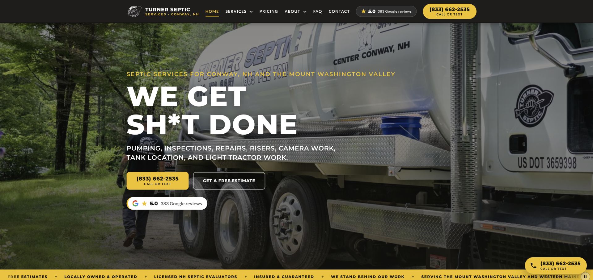
Turner Septic uses a large pumping-truck photograph behind a deliberately blunt slogan. White service text, a yellow telephone control, an outlined estimate action, and a review summary create a practical hierarchy beneath that brand statement. The dark header keeps the main navigation and telephone available, while a narrow yellow strip lists additional company claims below the hero. The design is useful for studying a service business with a strong tone of voice rather than a neutral template. The vehicle photograph and local service line keep that personality tied to a real company context. It also shows why the supporting information must remain literal when the headline is primarily memorable branding.
What you can learn
Choose a tone that suits the actual business and audience, then make the services and next contact step unambiguous. Strong personality works best when it does not replace readable coverage, scheduling, and inquiry information.
Pros
A distinctive voice and branded truck make the company presentation memorable.
Telephone and estimate actions are differentiated with consistent yellow styling.
Cons & considerations
The slogan may not suit every customer or professional procurement context.
A scrolling claim strip requires a readable static alternative and current supporting detail.
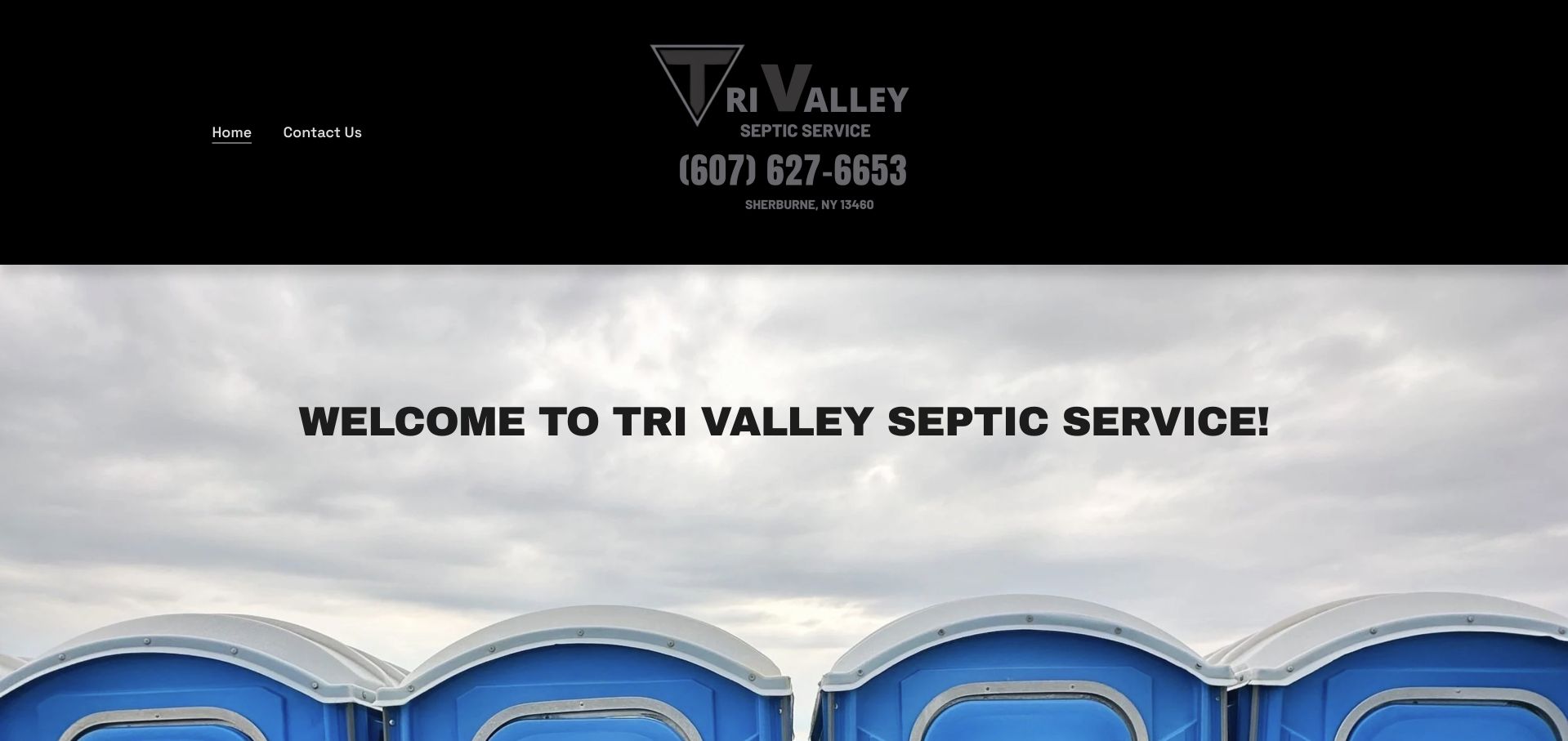
Tri Valley uses a black header with a simple company mark, telephone number, town, and two navigation links. A large photograph of portable facilities fills the opening beneath a welcome heading. The page demonstrates why the homepage image should be understood in the context of the whole offer: the first photograph communicates rentals more strongly than pumping. A small-business brief can learn from the clear telephone placement while improving the distinction between the two service families. The minimal navigation is easy to scan, but it places more responsibility on the content below to explain scope.
What you can learn
Give pumping and rental inquiries separate labels and destinations when they need different details. Choose the opening image deliberately, and make sure visitors can identify the full service offer without assuming the photograph represents every category.
Pros
The company telephone and town are prominent in the simple header.
A real catalog photograph makes the rental part of the business visible.
Cons & considerations
The opening image emphasizes rentals more than the septic service implied by the name.
Two navigation links offer limited guidance for different inquiry types.
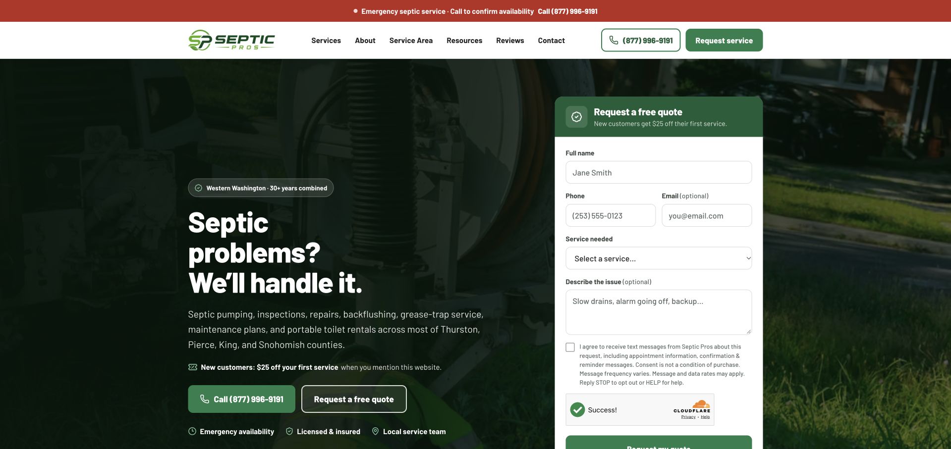
Septic Pros uses a dark green work photograph with a short service-problem headline on the left and a white quote form on the right. The form groups name, telephone, optional email, service type, and a short description, followed by a consent explanation and submission control. The header makes the telephone and service-request route visible above the photograph. The green palette ties the introduction, action controls, and form heading together, while the service selector acknowledges that different visitors may need different conversations. The page should still distinguish a request from any confirmed assessment or work.
What you can learn
Keep the form focused on the next conversation and explain optional fields and communication choices clearly. Do not require unnecessary technical details or encourage customers to diagnose their own system before they can contact the company.
Pros
The white form surface separates readable fields from the dark work photograph.
A service selector gives the inquiry useful structure without a long checklist.
Cons & considerations
Consent text and supporting labels need sufficient size and spacing on mobile.
A prominent form can crowd the introductory explanation if too many fields are added.
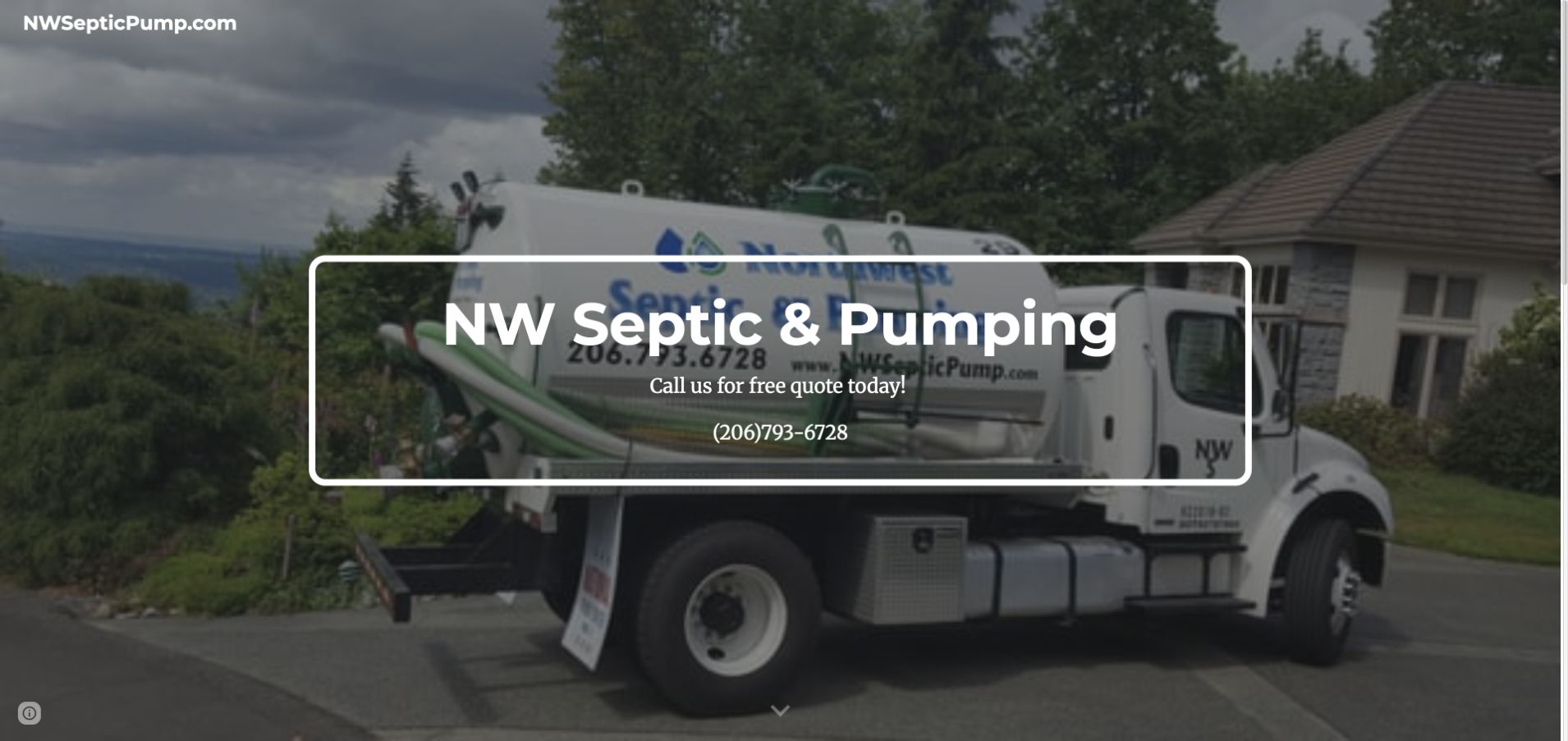
NW Septic & Pumping uses a large photograph of its truck outside a residential property, with the company name and telephone inside a simple white outlined panel. The page title sits in a small upper bar, and the subsequent content provides company and maintenance-related information. This is a very restrained presentation compared with the larger form and directory examples in the collection. A small site can be useful when it answers the basic questions reliably. The design also demonstrates the limits of relying on a photograph and telephone alone: service boundaries and the inquiry process still need readable supporting text.
What you can learn
Prioritize an accurate company identity, service territory, and contact route before adding complex widgets. A simple site should still provide accessible text and clear next-step expectations rather than embedding all useful information inside an image.
Pros
A genuine company truck provides a recognizable local-service visual anchor.
The short opening keeps the telephone close to the business name.
Cons & considerations
The minimal header provides little guidance about service categories.
Text over the truck image needs careful contrast and responsive positioning.
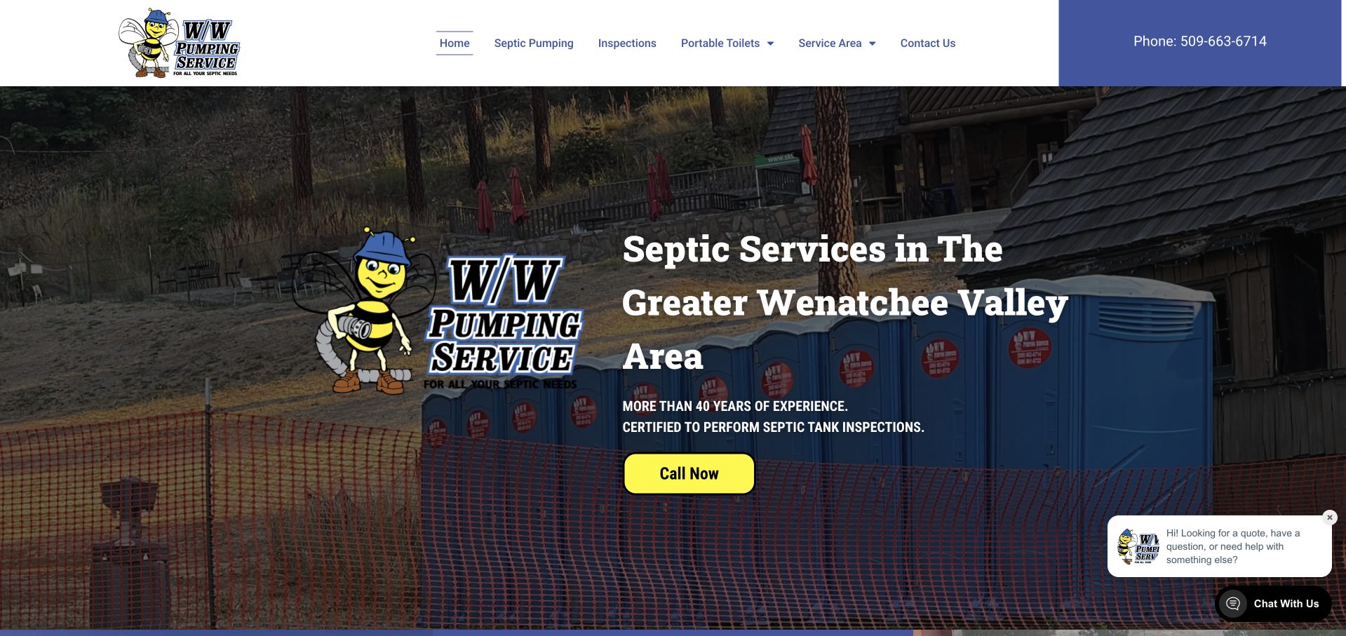
W/W Pumping uses a distinctive illustrated company mark beside a large Wenatchee Valley service headline. The background photograph includes portable facilities and a property setting, while a yellow call action anchors the text block. The white header separates pumping, inspections, portable toilets, service area, and contact routes. This is useful for studying a mixed catalog whose categories are related operationally but not interchangeable for a visitor. The brand illustration adds personality without requiring the headline to be playful or vague. The page's experience and inspection statements remain company claims; the design lesson is the clear relationship between service categories, local area, and contact access.
What you can learn
Use separate navigation routes for different service families and make the local territory explicit. Keep any professional qualification statement accurate and explained, rather than relying on a small line of uppercase text as evidence of suitability.
Pros
The navigation clearly distinguishes pumping, inspections, and portable facilities.
The yellow call action remains visible against the darkened photograph.
Cons & considerations
The illustrated mark and long headline compete for limited hero space.
A floating chat preview can crowd the lower contact area on small screens.
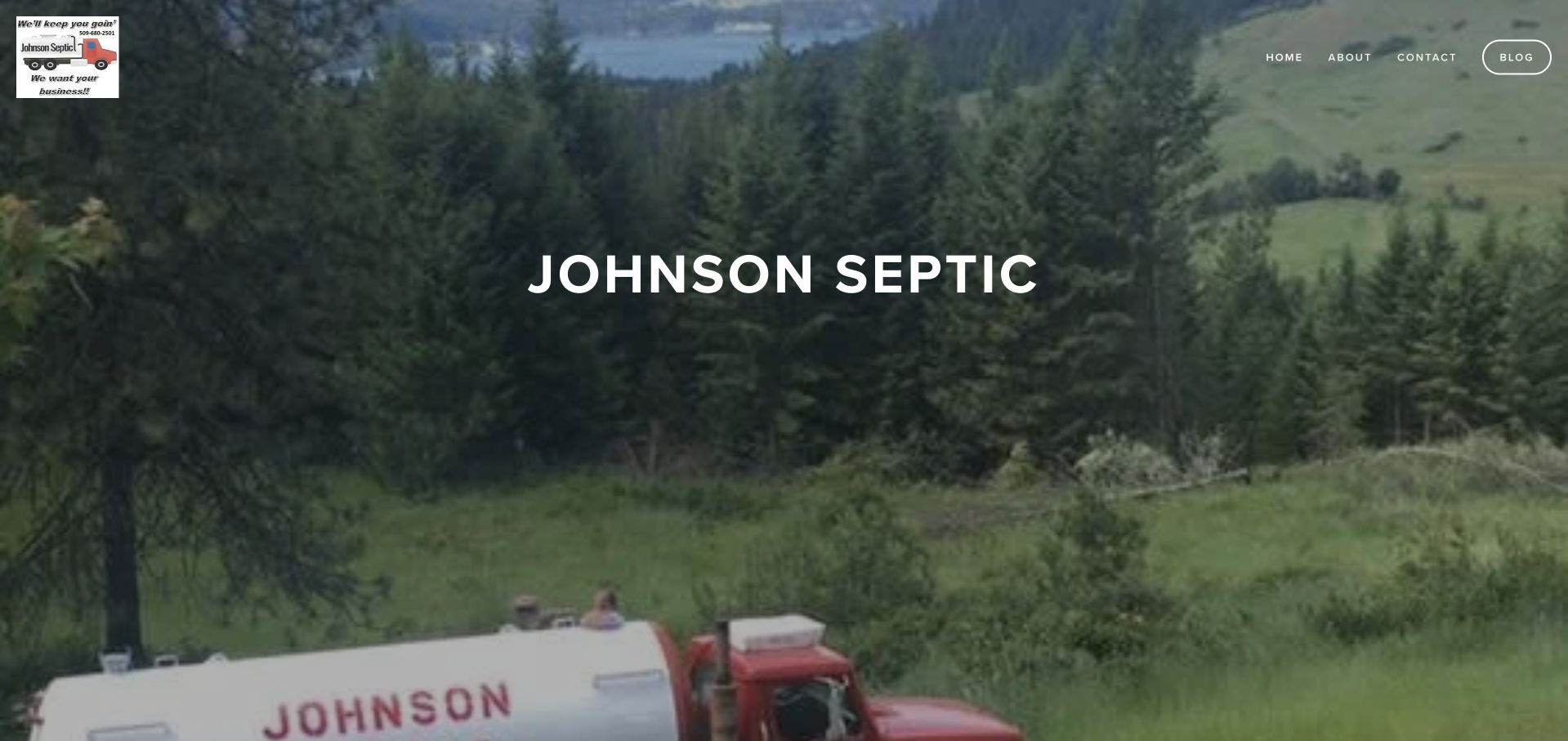
Johnson Septic places its name over a broad green landscape photograph that includes company equipment near the lower edge. A small logo and compact navigation sit above the image, while the public content names several eastern Washington counties and towns. The opening is intentionally sparse, giving the landscape the main visual role. That creates a calm first impression, but it also means the supporting service and contact information must do more work below the hero. The page is a design reference, not an independent assessment of inspection qualifications or system-service outcomes.
What you can learn
Use regional imagery when it supports the actual service territory, but keep the coverage list and contact route in readable text. Avoid making visitors infer eligibility from a scenic photograph or a very small company logo.
Pros
The landscape provides a regional context distinct from urban contractor imagery.
The public service-area text gives the broad regional offer concrete boundaries.
Cons & considerations
The sparse hero delays practical service and contact detail.
A small logo and minimal navigation can make business identity less prominent than the scenery.
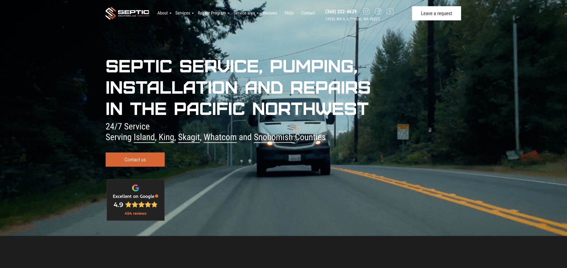
Septic Solutions uses a road-and-truck scene behind a large white heading naming service, pumping, installation, repair, and the Pacific Northwest. An orange contact control provides the main action, while a small review panel sits lower in the hero. The header includes service, project, review, question, contact, and request routes, offering several ways to investigate before making an inquiry. This is useful for studying a broad service statement that still names recognizable work categories. The operational image provides context, but its detail makes overlay contrast important. The design review does not validate the site's licensing or cost statements; those require their own appropriate sources and review.
What you can learn
Keep the service categories literal and link to scope details before collecting a request. Important headings and contact information should remain usable when background video is paused, unavailable, or replaced by a still image.
Pros
The headline identifies the main work categories without abstract brand language.
A separate request route stays visible in the header.
Cons & considerations
Detailed moving imagery can compete with the large overlay text.
A long category-and-region heading requires careful mobile wrapping and contrast.
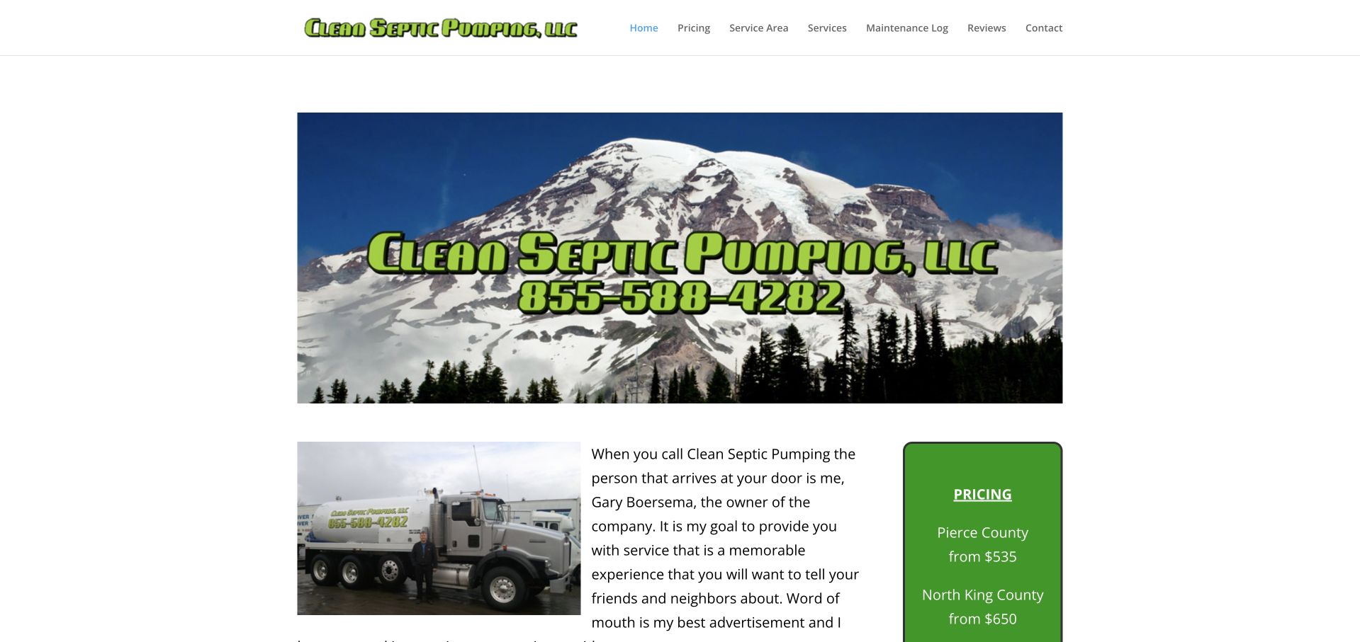
Clean Septic Pumping uses a large mountain image with the company name and telephone overlaid, followed by an owner introduction beside a truck photograph. A green pricing panel sits to the right, while the compact navigation includes pricing, service areas, services, a maintenance log, reviews, and contact. The page gives practical information a place beside the introduction rather than relying only on broad quality claims. Its compact scale is also a reminder that strong content choices and a recognizable company identity can matter more than an elaborate hero animation or large directory interface.
What you can learn
Introduce the real operator and explain the service relationship, while keeping pricing scope and geographic conditions explicit. Any maintenance resource should be professionally reviewed and should not ask customers to inspect or work on a system themselves.
Pros
The owner introduction gives the service a specific human relationship.
Pricing and service-area routes address practical questions before a contact request.
Cons & considerations
The branded mountain image carries information that also needs accessible text.
A small pricing panel needs enough context to avoid implying a universal quote.
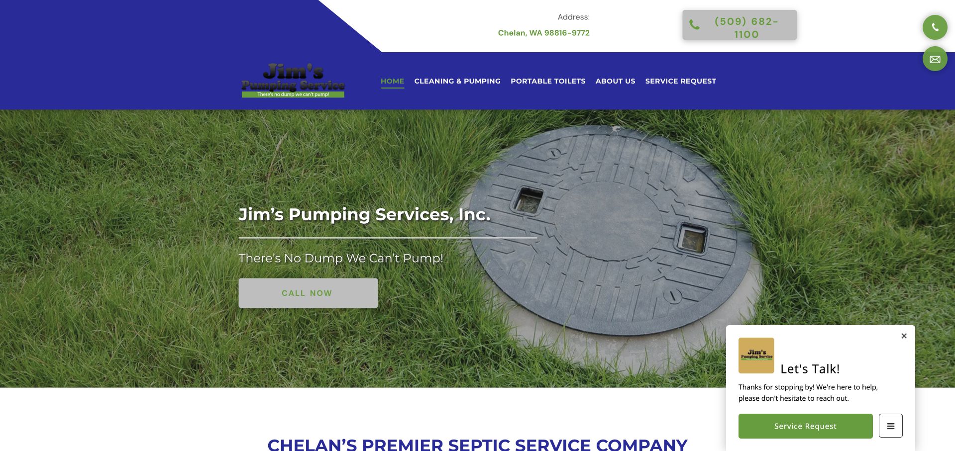
Jim's uses a photograph of a septic access lid in grass behind a short company heading and a pale call action. The blue-and-white header includes telephone information and separate cleaning, pumping, portable-toilet, company, and service-request routes. The next section introduces the Chelan service context in literal text. The page remains recognizably local, although the photograph alone does not explain the full catalog. A floating contact prompt is present in the public experience, illustrating the need to keep supplementary help from obscuring the primary contact path or the beginning of the service explanation.
What you can learn
Use service imagery as context, not as an invitation to operate or inspect equipment. Keep the literal service and geographic explanation close beneath the hero, and make optional contact prompts easy to dismiss without losing the main telephone route.
Pros
The subject matter gives the opening a direct relationship to the service.
The header distinguishes pumping from portable-facility inquiries.
Cons & considerations
A pale action over grass needs stronger contrast than the photograph alone provides.
The introductory image does not communicate all of the company’s service categories.
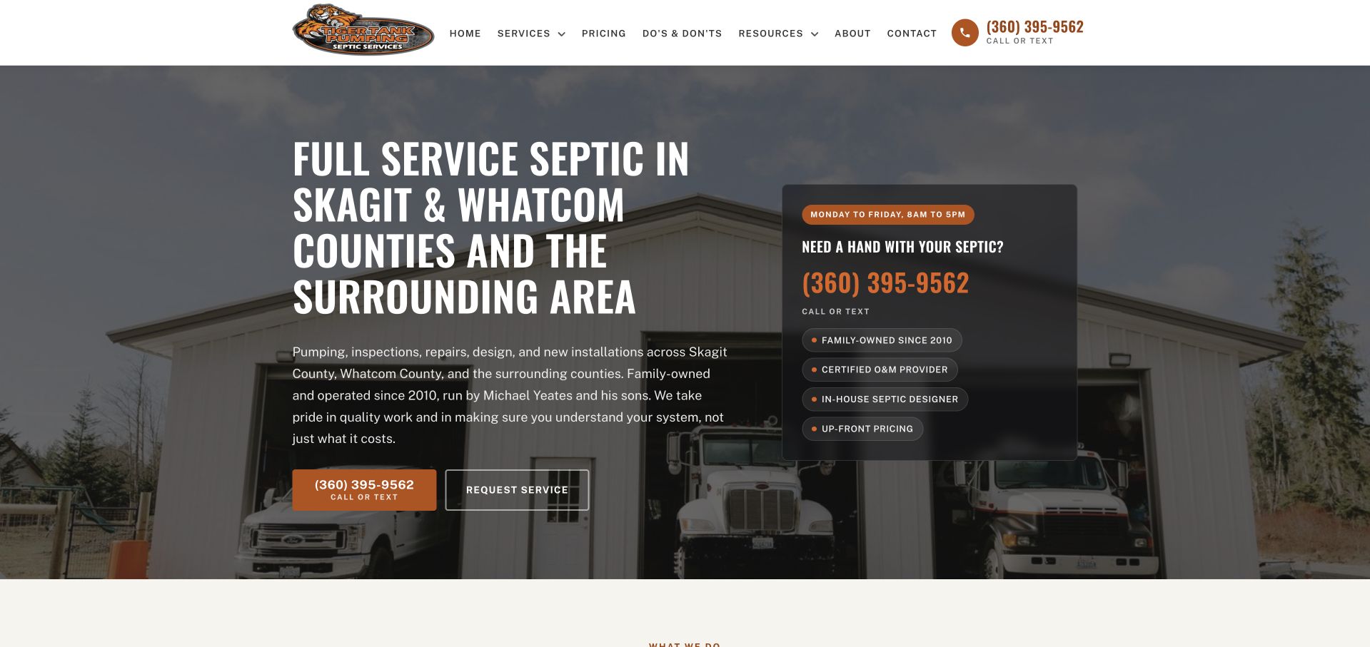
Tiger Tank uses a large Skagit and Whatcom County heading over a photograph of company equipment outside a building. An orange call-and-text action and a separate service-request control sit beneath the copy, while a dark card on the right summarizes contact and company context. The white header includes services, pricing, resources, company information, and contact routes. This is useful for studying a service business that makes local coverage and contact choices visible without immediately asking for a long form. The side card adds structure, although it partly repeats information already available in the hero. The design review concerns that hierarchy, not the site's service-performance or qualification claims.
What you can learn
Keep the local territory and contact modes explicit, then use supporting cards only for genuinely additional information. Distinguish a telephone conversation, text message, and service request so visitors understand the next step of each route.
Pros
The county-specific heading gives the service offer concrete geographic relevance.
Call, text, and request choices are easy to locate near the introduction.
Cons & considerations
The side contact card repeats some information already present in the main text.
A detailed work photograph needs a strong enough overlay behind the long heading.
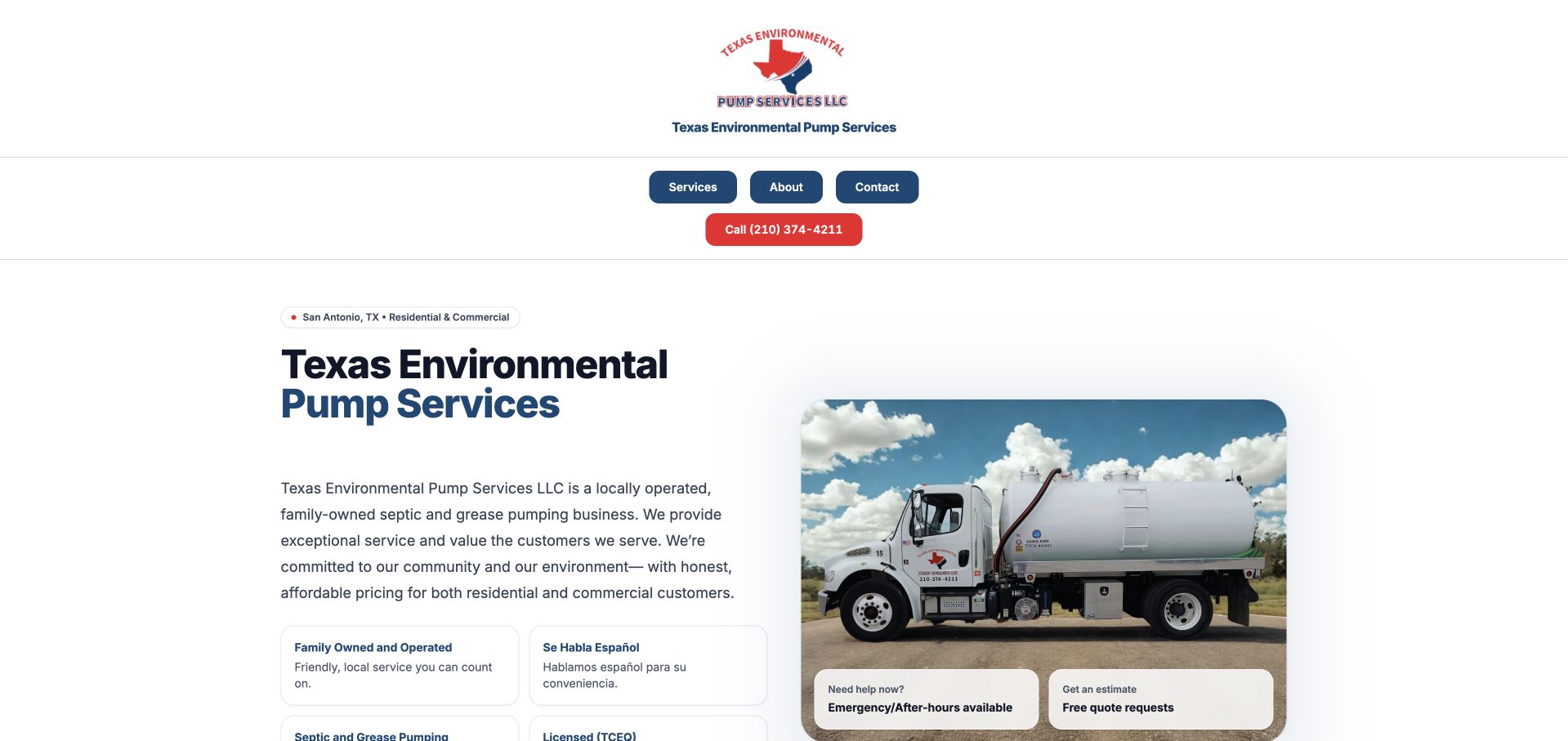
Texas Environmental Pump Services uses a white background and a compact centered header above a split introduction. The left side carries the company name and a short local-business explanation; the right shows a pumping truck and two small contact-context cards. A red telephone action provides the strongest accent. The next service headings distinguish grease-trap and septic work, making this a useful mixed-audience reference. The design feels closer to a straightforward company brochure than an emergency-dispatch page. That restraint gives the business room to explain its service relationships without a large stack of badges, although the header and introduction could be more tightly connected for visitors arriving on a phone.
What you can learn
Separate residential septic and commercial grease inquiries when their intake differs. Keep the telephone route obvious, and describe coverage and scheduling expectations in ordinary language instead of implying that one broad pumping label covers every situation.
Pros
The split layout keeps explanatory text off the detailed truck photograph.
Distinct service headings acknowledge residential and commercial pumping contexts.
Cons & considerations
The compact centered header leaves significant space before the main content.
Small contact cards need clear labels to avoid repeating the same inquiry action.
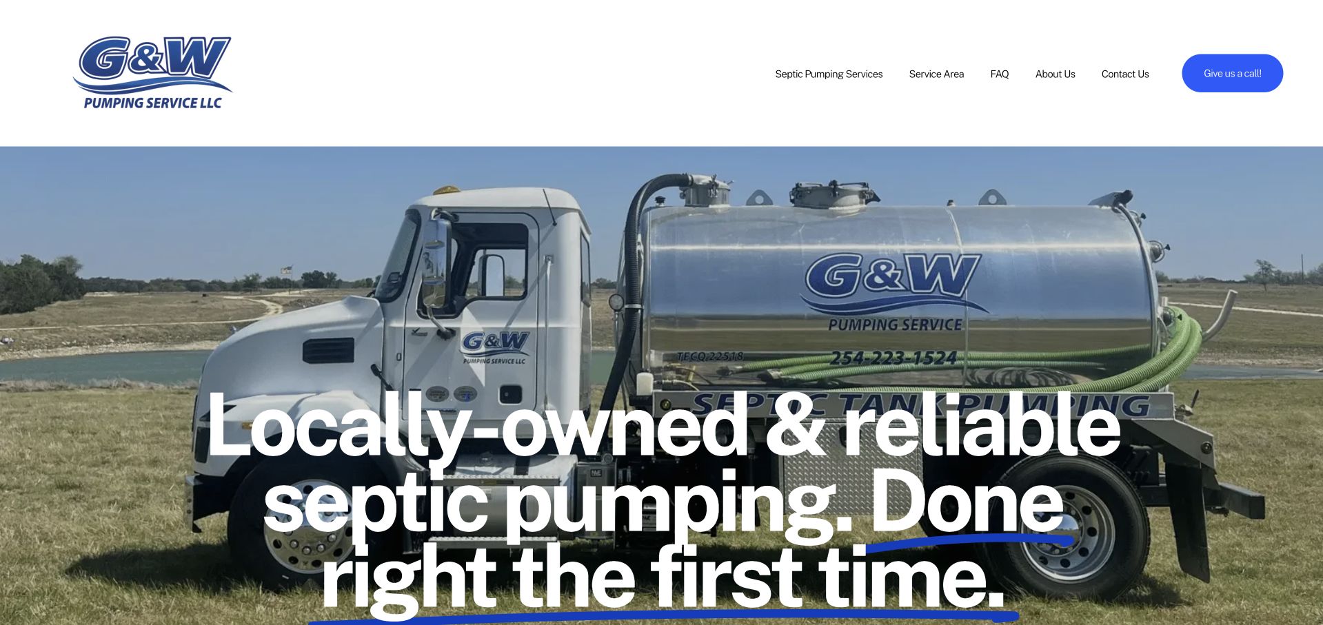
G&W places a large photograph of its silver pumping truck behind an oversized white local-service headline. The white header is minimal, with a blue call action and a small set of service, area, question, company, and contact routes. The truck's own branding gives the hero a specific company identity without a separate decorative illustration. This is useful for studying how a single strong operational photograph can carry a small-business homepage. The large type is immediately noticeable, but it also competes with the truck details and requires a deliberate crop. The company's reliability wording remains its own promotional statement, not an independently established service result in this collection.
What you can learn
Choose a company photograph with enough quiet space for the intended headline. Keep the local area and inquiry process clear in accompanying text, and do not rely on a broad reliability statement to explain service scope or scheduling.
Pros
The actual branded truck makes the opening specific to the business.
A short header keeps the telephone action and service-area route easy to find.
Cons & considerations
Oversized type can obscure the equipment branding in the photograph.
The broad headline needs concrete territory and service detail immediately below.
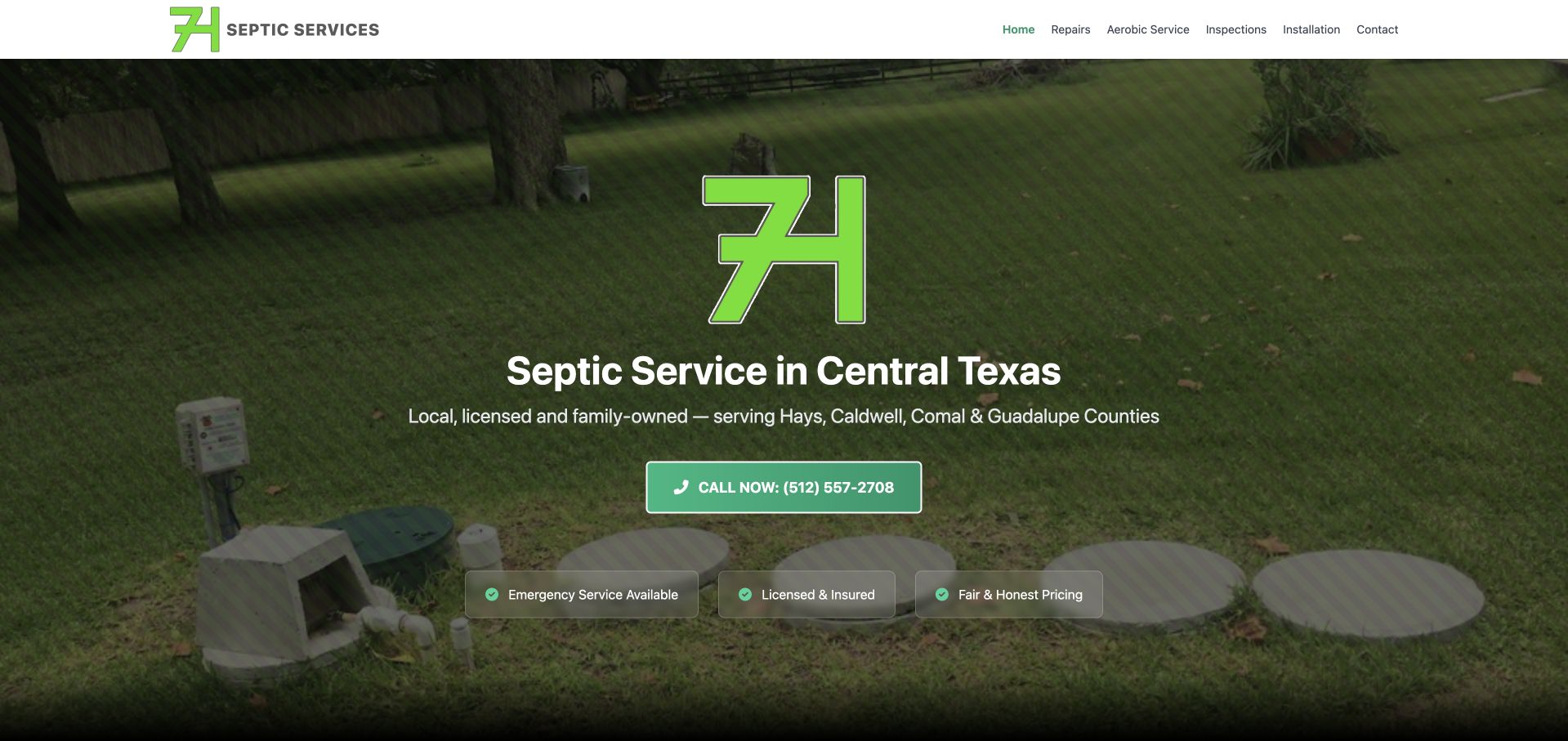
7H uses a large green mark above a concise Central Texas septic-service heading. The background photograph shows a service setting, darkened enough for the white supporting line and green call action to remain readable. The header separates repairs, aerobic service, inspection, installation, and contact, giving the catalog more structure than a single all-purpose service link. Small supporting labels sit below the action rather than filling the introductory paragraph. This is useful for studying a restrained local contractor page that lets the brand and literal service description share the first screen. The photograph supplies context, but it should not be interpreted as operational guidance or evidence about a particular property's system.
What you can learn
Use specific service labels and real coverage text before adding more promotional claims. Keep the call action consistent with the actual inquiry process, and have qualified staff review technical wording without turning the public site into do-it-yourself instructions.
Pros
The literal region-and-service heading is easy to understand quickly.
Separate service routes recognize that repair, inspection, and installation inquiries differ.
Cons & considerations
The large brand mark uses space that could explain the service relationship.
Small qualification labels need current, accessible supporting information.
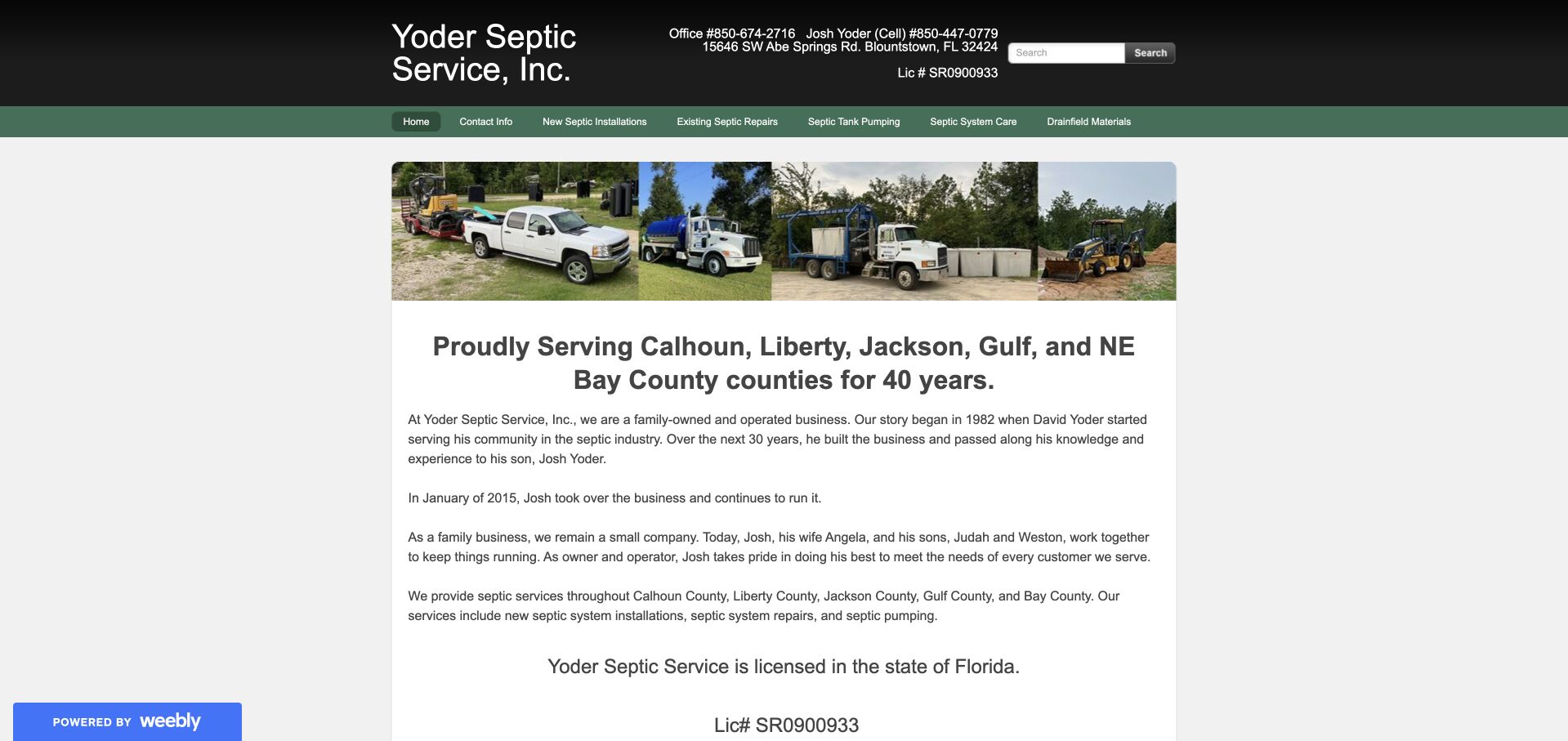
Yoder uses a narrow white content column beneath a black-and-green header. A strip of company trucks and equipment introduces the page, followed by a prominent list of Florida counties and a family-business history. Telephone numbers, an address, and a license statement appear as ordinary text rather than only in decorative badges. This is useful as a content-priority reference: the site gives a visitor concrete identity, territory, and contact details before asking for a form submission. Its legacy layout is not a contemporary visual benchmark, but the useful company facts should survive a redesign. The small navigation and dense paragraphs could be improved without replacing the recognizable business story.
What you can learn
Preserve accurate company history and practical contact details while improving reading size and responsive layout. Keep current licensing and service-area information maintained separately from the historical narrative, and explain which contact route is intended for new inquiries.
Pros
The territory and company contact details are presented in accessible ordinary text.
A real equipment strip supports the family-business introduction.
Cons & considerations
The narrow centered layout and dense paragraphs reduce comfort on large screens.
Small navigation labels need more generous tap targets and mobile spacing.
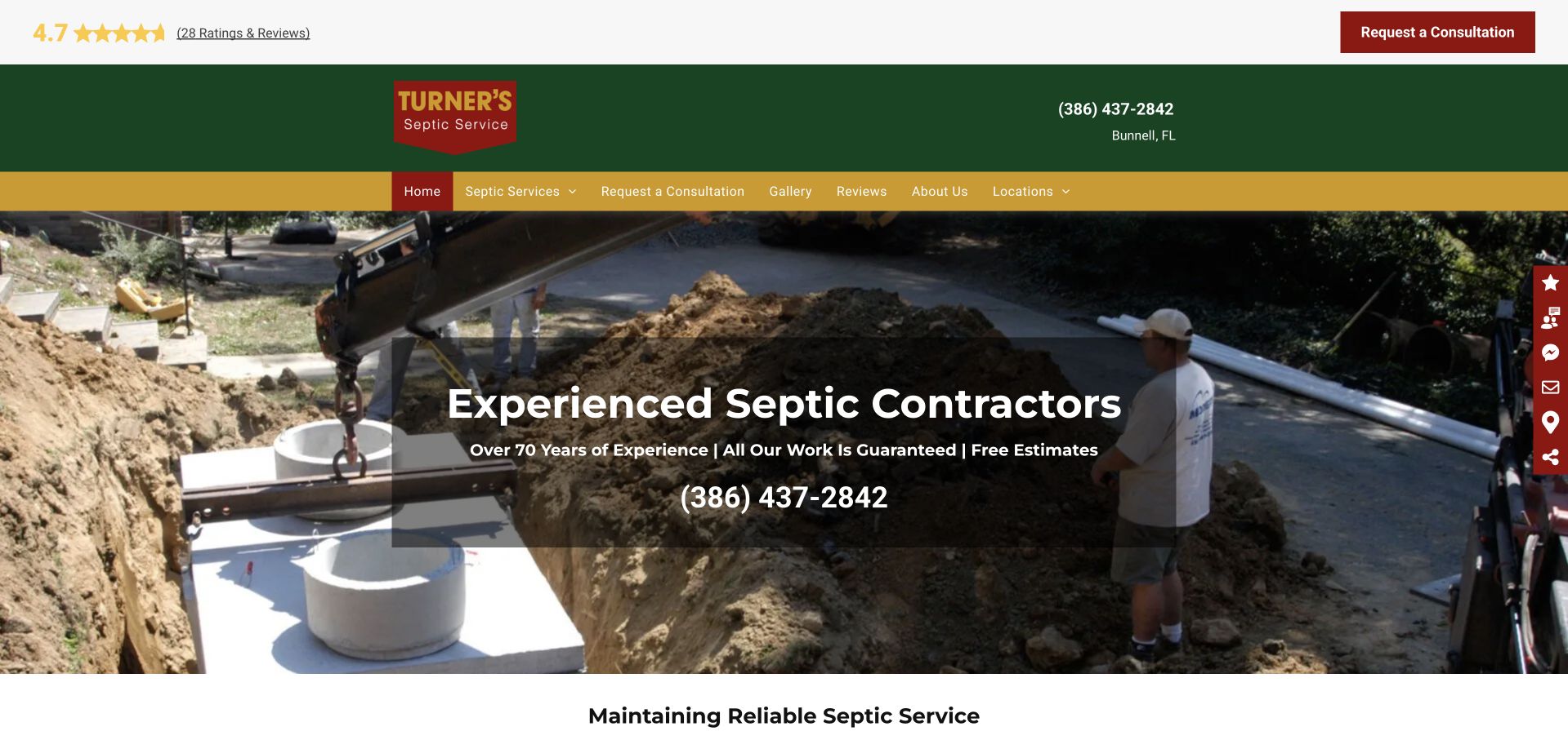
Turner's presents a green-and-gold header above a photograph of excavation and septic-related work. The local telephone and consultation action remain visible near the top, with service, company, gallery, review, and location routes arranged beneath. The public experience also includes promotional media and privacy controls, so the unobstructed page is the relevant state for evaluating the design. This is useful for studying the relationship between an actual work photograph and a more traditional contractor navigation. The image communicates field work, while the following content must explain which services the company accepts and where. A redesign can preserve those company-specific assets while reducing interruptions that delay the visitor's first useful decision.
What you can learn
Keep optional promotional media from obscuring service and contact information. Provide a clear close control, respect privacy choices, and make the consultation request's purpose explicit rather than implying that a website interaction confirms an assessment or job.
Pros
The work photograph is directly related to the company’s service context.
Telephone and consultation routes are visible in the upper page structure.
Cons & considerations
Promotional media can interrupt the first-screen service explanation.
Several header layers require a simpler responsive hierarchy for phone visitors.
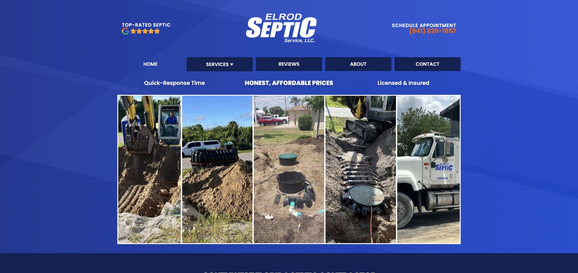
Elrod uses a blue background and centered company mark above a five-panel collage of equipment, excavation, service work, and a branded truck. The navigation separates services, reviews, company information, and contact, with an appointment telephone route visible in the header. This is useful for studying a business whose own work imagery is more informative than a single stock hero. The collage shows variety without asking visitors to wait for a slideshow, although the narrow image panels limit how much detail remains visible. The introductory service heading follows below the collage, so the photographs carry much of the first-screen explanation and need accessible supporting text.
What you can learn
Use a small, deliberate image set to show different service contexts, and provide captions or nearby descriptions. Do not treat project photographs as proof that every property needs the same work or will receive the same result.
Pros
Several actual work contexts are visible without a rotating carousel.
The blue brand treatment connects the header and photographic collage.
Cons & considerations
Narrow image panels can obscure useful detail on small displays.
The literal service introduction appears after the imagery rather than leading it.
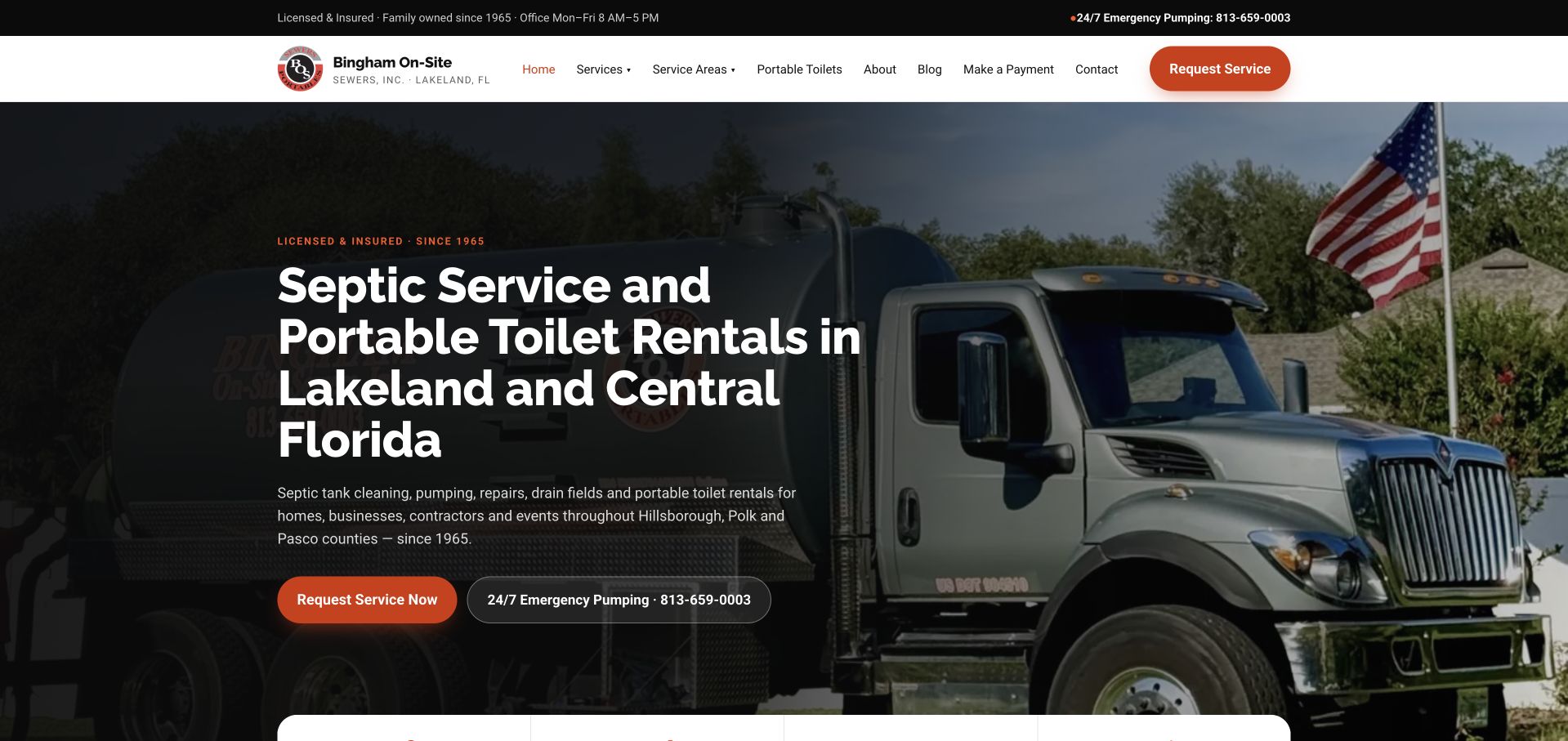
Bingham uses a darkened pumping-truck photograph behind a large heading naming septic service, portable-toilet rentals, Lakeland, and Central Florida. Orange request styling supplies the primary action, with a separate telephone route beside it. The white navigation bar distinguishes septic service, portable toilets, blog, payment, contact, and request tasks. This is useful for studying a mixed catalog presented without ambiguity: the headline makes both service families visible before the visitor explores the menu. The branded truck reinforces the operational identity, while the direct geographic statement avoids relying only on a service-area map. The page's company-history and availability wording remain its own claims rather than independently verified service outcomes.
What you can learn
Make different service families explicit in both the headline and request flow. Keep payment and current-customer tasks distinct from new inquiries, and state what happens after a request rather than implying immediate scheduling or dispatch.
Pros
The headline explains the two principal service families and their region together.
Request and telephone routes are visible beside the introduction.
Cons & considerations
A long headline requires careful wrapping across tablet and mobile widths.
The broad catalog needs distinct intake questions rather than one undifferentiated form.
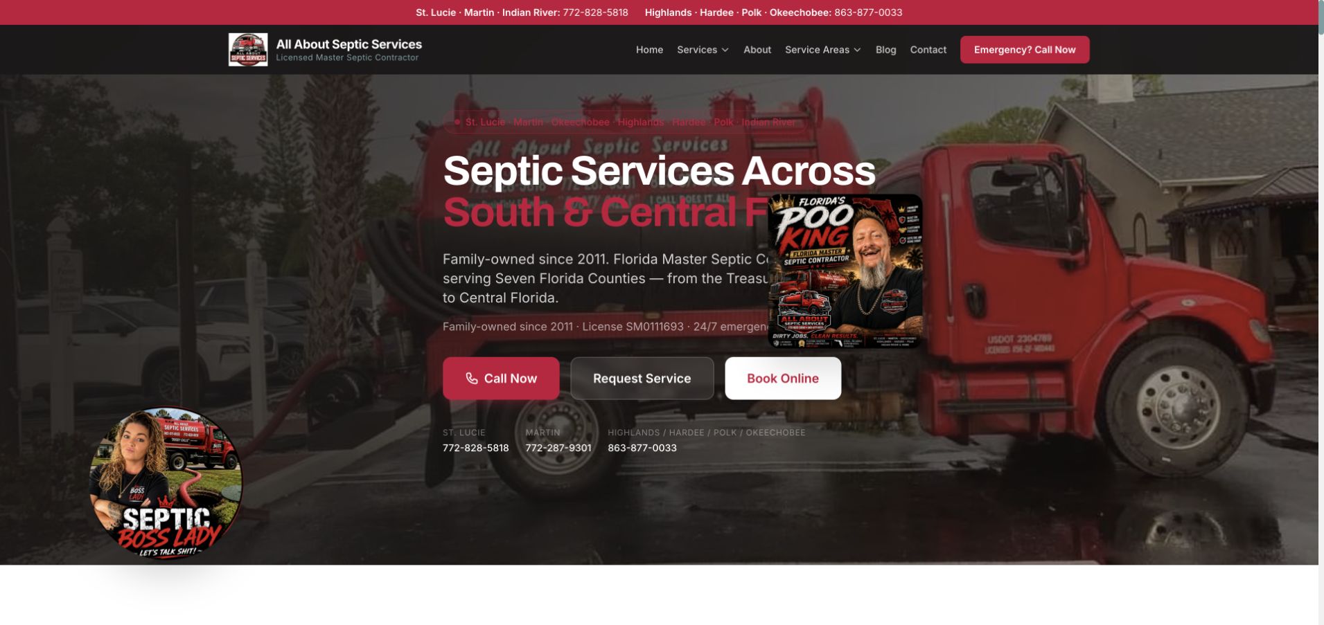
All About Septic places a red branded truck behind a large South and Central Florida service heading. The hero also uses a circular portrait-style brand element, giving the page a more individual personality than a neutral contractor template. Call, service-request, and online-booking actions appear together below the introduction. The dark header separates service categories, territory, reviews, company information, and contact, while a narrow top strip lists regional telephone contexts. This is useful for studying the combination of strong personal branding and practical contact choices. The several action modes should still lead to clearly different, explained processes rather than giving visitors three labels for the same uncertain next step.
What you can learn
Use genuine company personality as a supporting asset, but keep the service and coverage literal. Distinguish calling, requesting, and booking so customers understand whether they are beginning a conversation or selecting an actual appointment.
Pros
The truck and portrait-style brand element make the company visually distinctive.
Three contact modes are visible without requiring the visitor to open a menu.
Cons & considerations
Several regional numbers and action labels can make the first decision crowded.
The busy branded photograph needs strong text contrast and deliberate cropping.
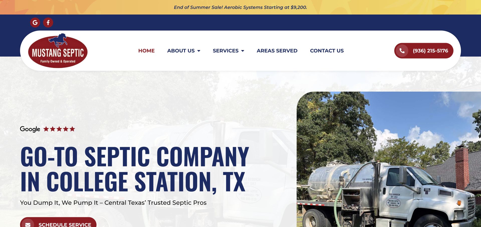
Mustang uses a white and pale-gray hero with a large blue College Station heading on the left and a rounded truck photograph on the right. Burgundy action styling connects the header telephone route with the scheduling control below the introduction. The white navigation sits within a curved frame, giving the page a softer visual treatment than a full-width dark contractor banner. A review summary sits close to the headline, while the main menu provides company, service, territory, and contact routes. The visual presentation does not independently verify review claims or the suitability of a service for a particular property.
What you can learn
Separate readable copy from detailed photography when the local service message is long. Keep promotions current and clearly qualified, and make the scheduling action explain its next step rather than treating a request as a confirmed visit.
Pros
The pale text surface avoids the contrast problems of a full photo overlay.
A rounded company-truck image provides a recognizable operational subject.
Cons & considerations
A promotional strip above the header adds another competing first-screen message.
Large local headings need controlled wrapping so the action remains visible on mobile.
Kegan is a freelance web designer and developer with 15+ years of experience helping businesses turn complicated website requirements into clear, maintainable digital experiences. He works directly with clients from planning and design through development, launch, and ongoing support.
For septic service website design, his development approach focuses on system-service information, coverage areas, maintenance resources, and distinct routine and urgent inquiry journeys. The scope can be a targeted improvement or a complete custom build, with responsive layouts, thoughtful content structure, and integrations chosen around the people using and maintaining the site.
Show 3 other septic service website designersHide other septic service website designers
Plan the service conversation before building the form
Write a catalog the local office can actually maintain
Begin with the work the business accepts today. Separate residential pumping, commercial grease work, inspection inquiries, installation or repair projects, excavation, and portable-facility rentals when they require different information. Do not add adjacent services merely because a competitor lists them. A useful catalog gives each visitor a recognizable starting point and tells staff what kind of inquiry is arriving.
Describe coverage in ordinary text, with accurate counties, towns, or other meaningful boundaries. A rural operation may span a different geography from a city-based company, and a map alone may not make that clear. Give customers a maintained contact route for uncertain locations. Avoid implying that the entire region is served identically for every work type; installation projects, routine pumping, and rentals may have different practical coverage.
Keep company identity consistent across the public brand, domain, telephone context, and form confirmation. Several small firms use legacy domains or older company names, so explain the relationship where needed rather than letting customers infer it. Publish current opening and contact information separately from company history. The goal is a clear description of the operating relationship, not a broad claim that the company handles every system or every property situation in the region.
Explain the process without giving operational or regulatory advice
Write about the customer-facing steps: an initial inquiry, the information the office discusses, later scheduling, and any separate project assessment. Do not ask visitors to open tanks, locate equipment by entering unsafe areas, inspect system condition, or perform work to complete a form. Technical explanations should be reviewed by appropriately qualified staff and remain within the website's intended informational scope.
Keep inspection and property-transaction wording carefully bounded. The site can describe services the business offers, but it should not determine whether a property complies with a requirement or advise a visitor about a transaction from a general page. Permitting, environmental, health, and legal questions need the appropriate professional or authority. Avoid turning an educational resource into a promise that a checklist establishes a system's condition or satisfies a local requirement.
Use real company photographs where permission exists, with a useful mix of vehicles, people, and general work context. A project collage can explain the range of services without a dramatic slideshow, but the images do not establish that another property needs the same work. Attribute reviews, explain qualifications accurately, and keep pricing or offer conditions accessible. Do not use company marks, professional logos, or a long experience figure as an implied independent guarantee of system performance or service suitability.
Make inquiry, scheduling, and record handling deliberate
Choose the first contact route with the staff who answer it. A small owner-led business may use telephone and a short callback form, while a larger operation may need service-type routing. Keep the initial request limited to useful contact details, broad location, and the requested conversation. If an address is needed, explain why. Avoid requiring technical system details that a customer may not know and should not attempt to investigate themselves.
Separate new inquiries from existing-customer records, payments, and rental arrangements. A payment link should not be confused with accepting a quote, and a message should not be described as a booked visit unless the process genuinely confirms one. State the next step in the acknowledgment and provide an alternative route if a form or external tool fails. Explain optional photos or attachments and handle property information through the appropriate business process rather than a public shared page.
Test the experience on phones, with a keyboard, and with realistic incomplete information. Check field labels, errors, telephone links, service-area routes, and mobile menu behavior. Ensure promotional overlays, chat prompts, privacy notices, and autoplay media do not block the contact controls. Assign maintenance ownership for coverage, services, qualifications, prices, offers, and inquiry delivery. A useful septic website helps the customer reach the right conversation; it does not diagnose a system, establish compliance, guarantee work, or replace a qualified property-specific assessment.
Rehearse the content with the staff who answer inquiries. Try a visitor requesting routine pumping, a restaurant asking about grease work, and someone researching a rental. Each should understand the appropriate route without selecting unrelated technical answers. Review the geographic wording for the specific work category rather than assuming one coverage statement fits the entire catalog. Keep a written list of the people responsible for approving service descriptions and changing contact information, so an office update does not silently create a new public promise.
The editing job behind the design
Use a maintainable public service catalog and a controlled request handoff
A small regional firm can use a straightforward CMS with service and territory pages, real company imagery, and a reliable contact route. Preserve useful local facts when modernizing an older site rather than replacing them with generic contractor language.
A broader contractor may need separate forms for pumping, installation projects, commercial work, and rentals. Use shared content and clear routing rather than a long universal form. Provide a fallback when scheduling or payment tools are unavailable.
Keep customer property records, inspection reports, routing, invoices, and private project documents in the appropriate operational systems. A public homepage and its visible technology signals do not establish how those private systems work or whether a property meets a requirement.
Our WordPress website examples offer a separate look at publishing approaches. A visible platform label is evidence for that named page, not a guarantee that the same system will suit your requirements.
Before the public launch
Septic service website brief checklist
Name the actual counties or communities served.
Separate genuine service families instead of one generic quote label.
Explain the relationship between the visible brand and company identity.
Keep routine scheduling distinct from other contact situations.
State what a request acknowledgment actually confirms.
Collect only useful first-conversation contact and location details.
Do not ask customers to inspect or work on equipment to complete a form.
Have qualified staff review technical, inspection, and regulatory wording.
Scope prices, promotions, and qualification statements accurately.
Use permitted company and project photographs with accessible text.
Test mobile, keyboard, errors, overlays, and failed integrations.
Assign ownership for territory, service catalog, contact information, and form delivery.
These checks are a project checklist, not a performance, legal, security, or accessibility certification. Test real journeys with the people responsible for the website before making claims about the result.
Sources & editorial method
How this collection was selected and reviewed
These 28 public company pages were directly inspected and captured. Reviews address visible design and communication only. No equipment was inspected, work observed, qualifications verified, regulatory status determined, or health and environmental outcomes assessed.
Each example links to its actual source page. Screenshots are direct browser captures with their own capture dates; moving imagery, announcements and live designs can change. The notes describe observable design choices and conditional tradeoffs, not measured traffic, conversion results, service quality, or accessibility conformance.
Technology labels use public page metadata, asset evidence, or explicitly cited platform documentation. Platform documentation is not a complete current deployment audit. A component reference may be legacy or unused; it is not a complete backend inventory. Unknown stacks are omitted. These sites are editorial examples, not our client portfolio.
Written, Edited and Curated are separate editorial records, not timestamps advanced by a rebuild. Website designs and imagery belong to their owners. See our editorial standards or suggest a correction.
Make the business, territory, and first conversation clear. Use the website to support an appropriate service relationship, not to diagnose systems or promise outcomes from a form submission.