Best Adhesive Manufacturer Websites of 2026 (20 Real-World Examples)
Industrial adhesive manufacturers with useful approaches to product discovery, application context and technical support.
An adhesive manufacturer website should help a visitor find the right conversation and documentation—not turn an impressive product claim into an unsupported material recommendation.
A design engineer, production manager, distributor and purchasing team may arrive at the same adhesive website with very different questions. One knows the product code, another knows the substrates, and another needs to understand an application process. Effective sites provide several connected routes through that information rather than expecting every visitor to know a chemistry name before starting.
This collection concerns the communication and design of manufacturers’ public websites. The examples are not a comparison of bond strength, safety, regulatory suitability or manufacturing quality. Product selection still depends on the intended application and the manufacturer’s current technical advice. Study how the sites explain their scope, organize documents and connect an unfamiliar task with a qualified discussion.
Before the examples
What makes good adhesive manufacturer website design in 2026?
Offer more than one way to find a product
Connect product families with materials, applications and industries. Someone who knows a stock code should not need the same navigation as someone asking about bonding two unfamiliar substrates. Keep those routes related without pretending they are interchangeable selection tests.
Keep technical and safety documents identifiable
Give data sheets meaningful titles, product references, relevant regional context and revision information. Explain the difference between product-performance information and safety documentation. An attractive download button is not enough when the reader cannot tell whether the document matches the product being discussed.
Explain the production context
Application equipment, surface preparation, cure conditions and handling can be part of the enquiry. Describe the support the manufacturer actually offers without presenting a short marketing paragraph as a complete work instruction or safety procedure.
Make the next step appropriate to the question
Separate technical enquiries, distributor discovery, documentation requests and commercial purchasing. A visitor who is still establishing application fit should not be pushed into an order flow that assumes the decision has already been made.
The collection · 20 examples
20 adhesive manufacturer websites worth studying
Compare how specialist suppliers and broader manufacturers connect products, material questions, technical resources and people. These editorial selections concern the websites’ communication patterns, not independent approval of their formulations or performance claims.
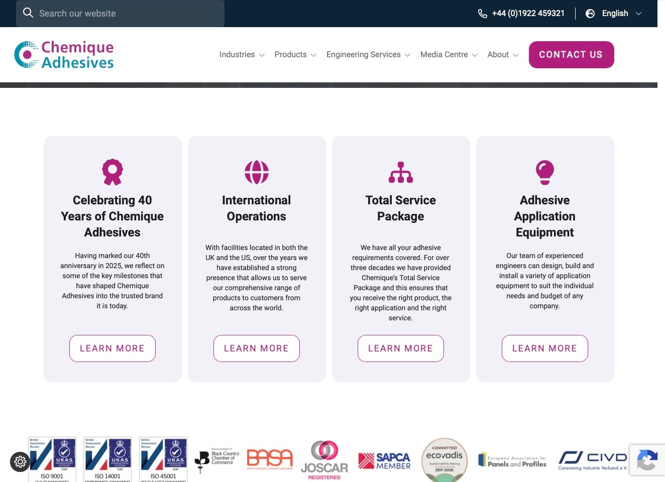
Chemique Adhesives combines a cyan-and-magenta identity with separate destinations for industries, products and engineering services. In the pictured view, four pale cards explain its anniversary, international operations, service package and application equipment, each with a concise heading and an outlined next step. A dark utility strip keeps search, telephone and language controls apart from the white primary navigation. This is useful for studying a manufacturer whose customer may need both a bonding material and application support. The visible company and association marks provide research starting points, not independent evidence of suitability for a particular production line.
What you can learn
Explain material selection and surrounding support through specific destinations. Use cards for different tasks, then connect them to product documentation or an engineering conversation; do not make the same contact action stand in for every stage of technical research.
Pros
Industries, products and engineering have distinct discovery paths within a compact header.
Consistent magenta icons and outlined actions make the service cards easy to compare.
Cons & considerations
Company-history cards need a direct onward route for buyers researching an immediate application.
Association marks require clear scope and current supporting information rather than implying universal product approval.
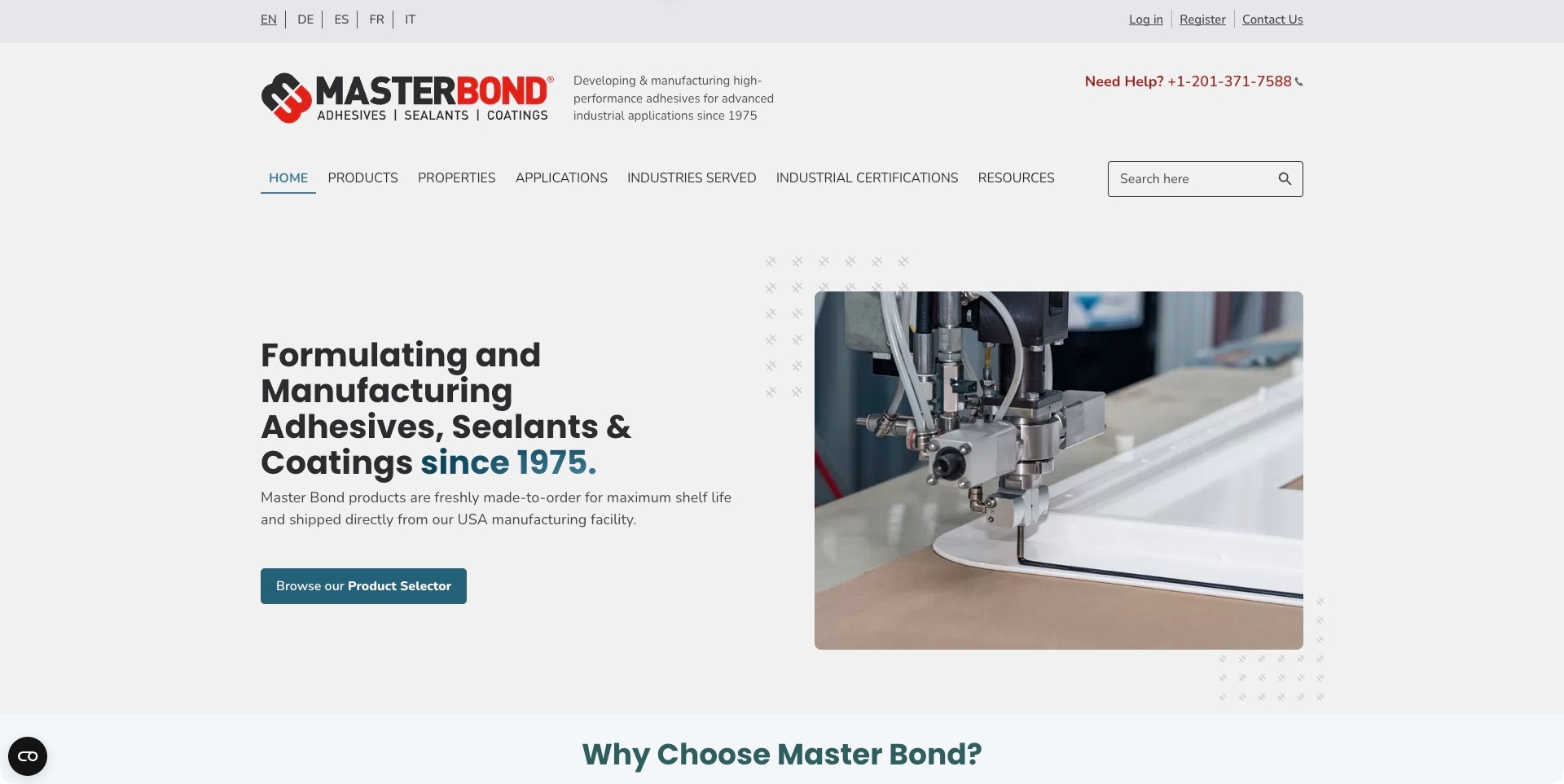
Master Bond opens with a restrained split layout: a manufacturing introduction on the left and a close view of an application process on the right. The red-and-black identity is balanced by teal accents, and the main action points to a product selector rather than asking every visitor to submit a general enquiry. The navigation provides several distinct research routes, including products, properties, applications, industries and industrial certifications. Language choices and a help telephone number sit above those technical routes. This is useful information architecture for an engineer who may know a required characteristic or substrate before knowing the manufacturer’s product name.
What you can learn
Let visitors start with the information they actually have: application, material, required property or known product. Connect those routes to specific technical documents and a qualified support conversation, rather than implying a selector alone can validate a real production process.
Pros
Property, application and product routes accommodate different technical starting points.
The selector action is prominent without obscuring the supporting manufacturing image.
Cons & considerations
A broad set of parallel categories needs clear definitions to avoid overlapping results.
Certifications and performance claims must remain tied to the exact product and test scope.
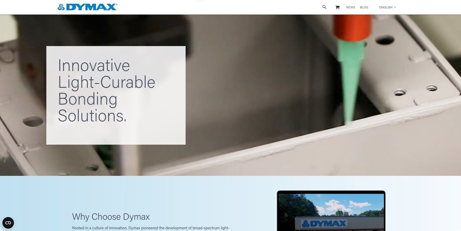
Dymax uses a large close-up of an adhesive application process as the dominant opening image, with a pale text panel providing a clean area for its light-curable bonding introduction. The spare white header keeps the blue identity prominent and gives search, shopping, news and language controls their own positions. The next section begins immediately below with a company explanation and facility image, creating a transition from process imagery to organizational context. The screenshot makes the type of work recognizable, but it is not a demonstrated test result or evidence of suitability for any particular medical, electronic or industrial assembly.
What you can learn
Use process photography to explain what an unfamiliar material system does, then connect that visual to the appropriate product family, equipment and documentation. Keep application conditions explicit so an attractive production image does not become an implied promise about curing, compatibility or finished-part performance.
Pros
A close process view communicates more context than an isolated bottle photograph.
The pale reading panel keeps introductory copy separate from the detailed image.
Cons & considerations
A compact first-screen header needs discoverable routes to technical product information.
Moving process footage requires useful controls and a stable reduced-motion alternative.
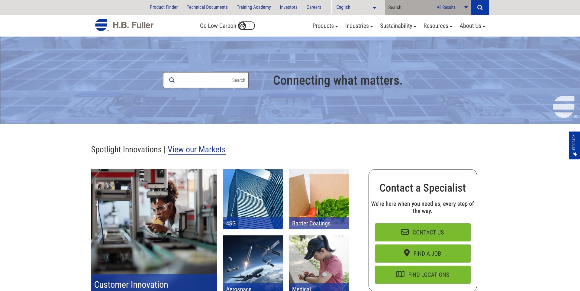
H.B. Fuller gives search an unusually prominent place inside the opening banner, while the utility row offers a product finder, technical documents and a training academy. Below, an irregular image grid highlights different applications beside a bordered specialist-contact panel. Green actions distinguish contact, careers and locations rather than funneling all visitors through the same form. The result is a practical example of handling a wide industrial portfolio: a returning technical buyer can seek a document while a new visitor explores markets. The pictured applications are editorial routes, not proof that a specific adhesive is suitable for every example shown.
What you can learn
Separate technical retrieval from broad market browsing. Someone with a product code should reach the relevant current document quickly, while an application-led visitor should find the material context and specialist route needed to ask a more precise question.
Pros
Product finder and technical-document links are visible in the utility navigation.
Distinct actions acknowledge technical, employment and location-related visitor needs.
Cons & considerations
Multiple search and finder entry points need clear scope and consistent results.
Sustainability or application imagery requires product-specific evidence and qualified destination copy.
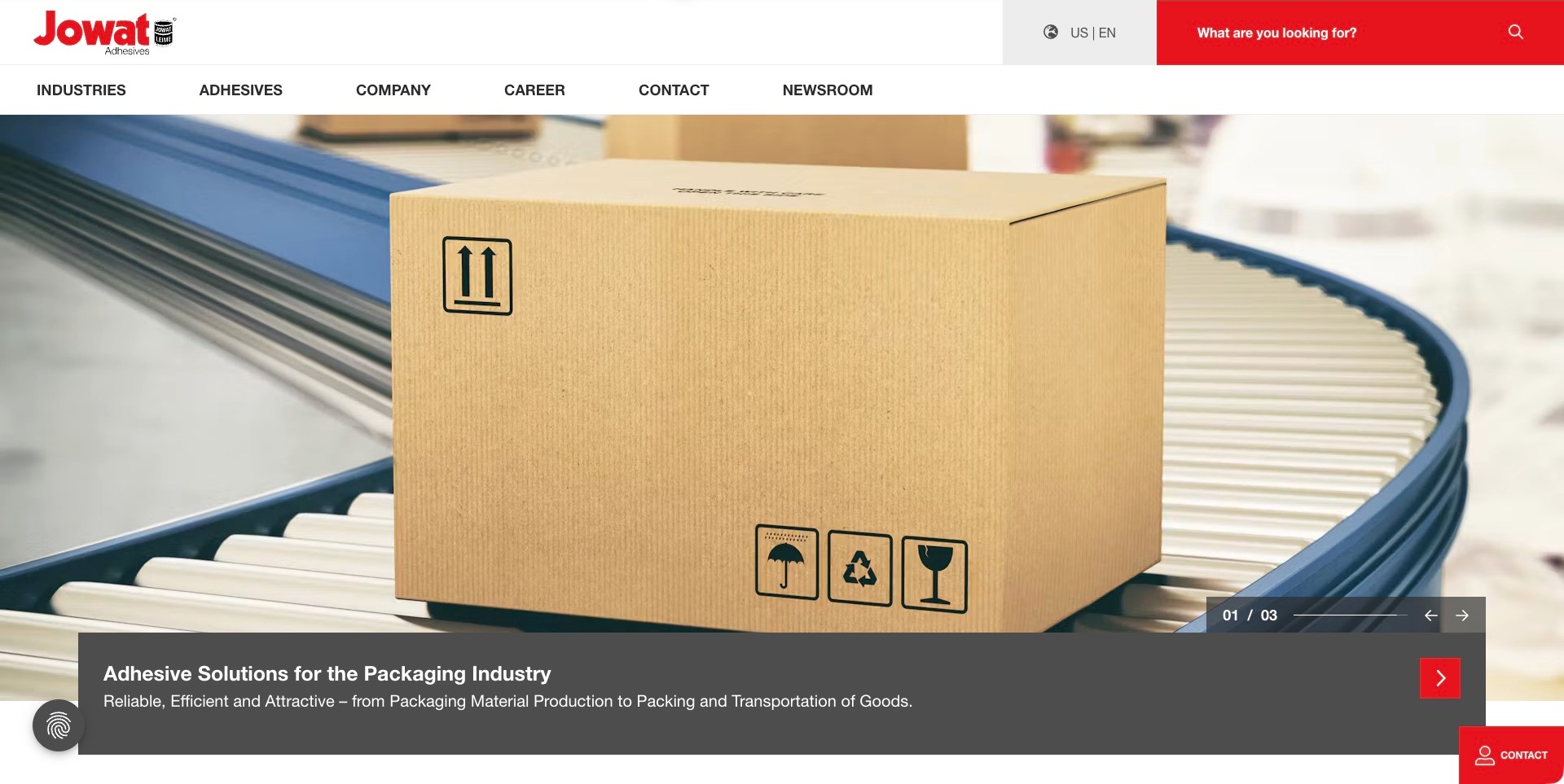
Jowat’s US-English homepage places a large packaging photograph below a straightforward white header. A dark caption band anchors the image with an industry-specific topic, while red controls and the red wordmark keep the brand visible without coloring every surface. Industries and adhesives remain distinct navigation choices, and a prominent search area asks what the visitor needs. The regional language indicator is useful for a manufacturer whose documentation and availability may vary by market. The captured packaging slide is an introduction to an application area, not a technical recommendation or independent confirmation of the product-performance language in its caption.
What you can learn
Introduce adhesive families through recognizable production contexts, but preserve a direct route for visitors who already know the material they need. Keep regional scope, technical documents and support clear when an application story leads into a particular product or manufacturing question.
Pros
Industry and adhesive routes accommodate both application-led and product-led research.
The dark caption band gives detailed imagery a stable reading area.
Cons & considerations
A rotating application story needs durable links that remain findable after the slide changes.
Regional product and document differences need explicit handling beyond a language label.
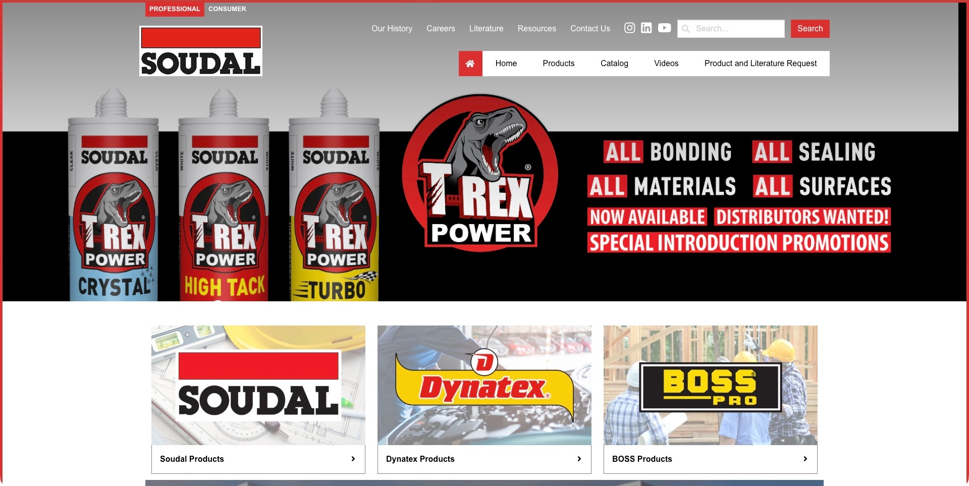
Soudal USA opens with an unmistakable red, black and white identity and a product-led campaign featuring labeled cartridges. Beneath it, three large cards distinguish Soudal, Dynatex and BOSS product families through their own logos and application imagery. The header also separates professional and consumer contexts, with literature, resources, a catalogue and product requests available as distinct routes. This regional site is useful for studying portfolio organization rather than treating a global manufacturer as a single product catalogue. Its broad campaign wording is marketing copy, not a technical finding that one adhesive works on every material or surface.
What you can learn
Make brand, audience and regional scope clear before presenting individual products. Someone researching a professional assembly material should not have to infer whether a consumer product, distributor request or technical document belongs to the same range and market.
Pros
Large brand-family cards help visitors distinguish several ranges under one regional site.
Literature and catalogue routes remain separate from general company information.
Cons & considerations
A visually dense campaign can overpower the underlying product-discovery tasks.
Universal-sounding promotional claims need precise product and application qualifications on destination pages.
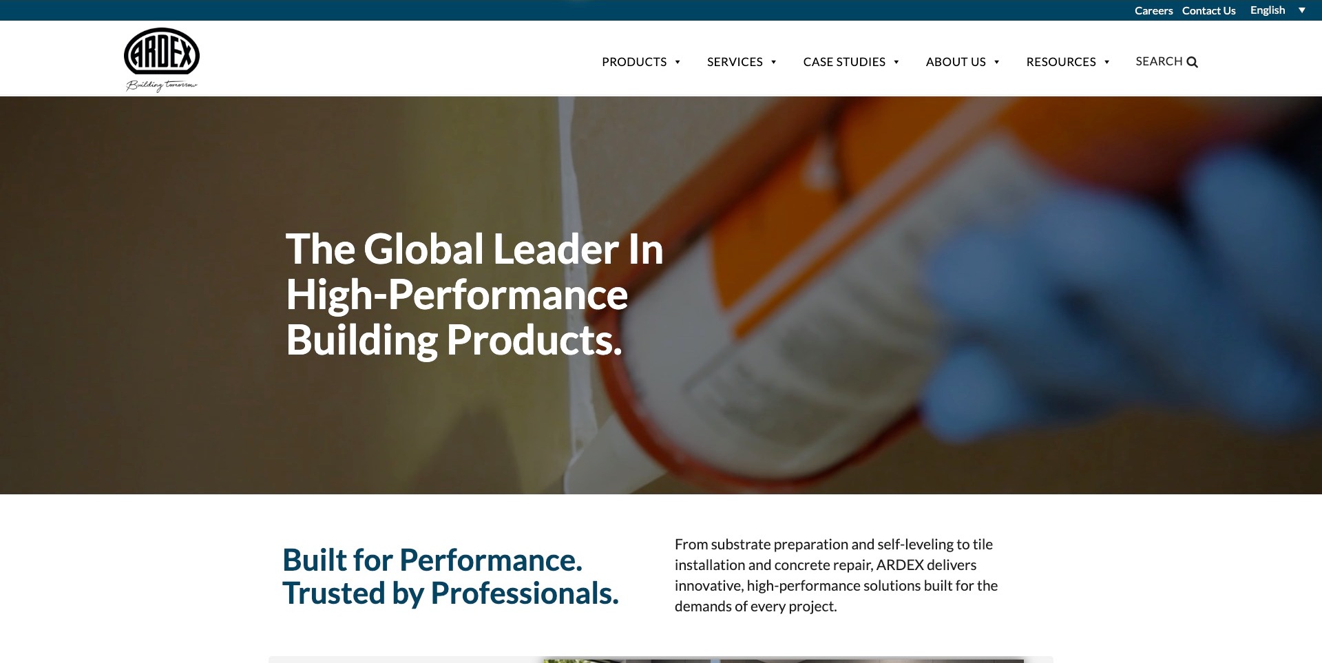
ARDEX Americas uses a white navigation band above a darkened close-up of material application, giving the large white introduction a stable reading area. Teal accents link the utility bar, next-section heading and brand system without distracting from the photograph. Products, services, case studies and resources remain separate destinations. The introduction describes a wider construction-materials business, so the screenshot should not be read as an adhesive-only catalogue. Its official product information, including flooring-adhesive material, establishes the relevant collection fit. The useful design lesson is how to connect a broad manufacturer’s positioning to more specific product, training and project research.
What you can learn
Explain where an adhesive sits in the wider preparation and installation process, then direct the reader to the exact product documentation. A strong corporate introduction should support, not replace, substrate requirements, application conditions and the appropriate technical-support route.
Pros
Product, service and project-evidence routes are clearly distinguished in the header.
A dark photographic reading area creates a simple visual hierarchy.
Cons & considerations
A broad building-products headline requires a direct route to the relevant adhesive family.
Project imagery and brand performance language do not establish suitability for a different installation.
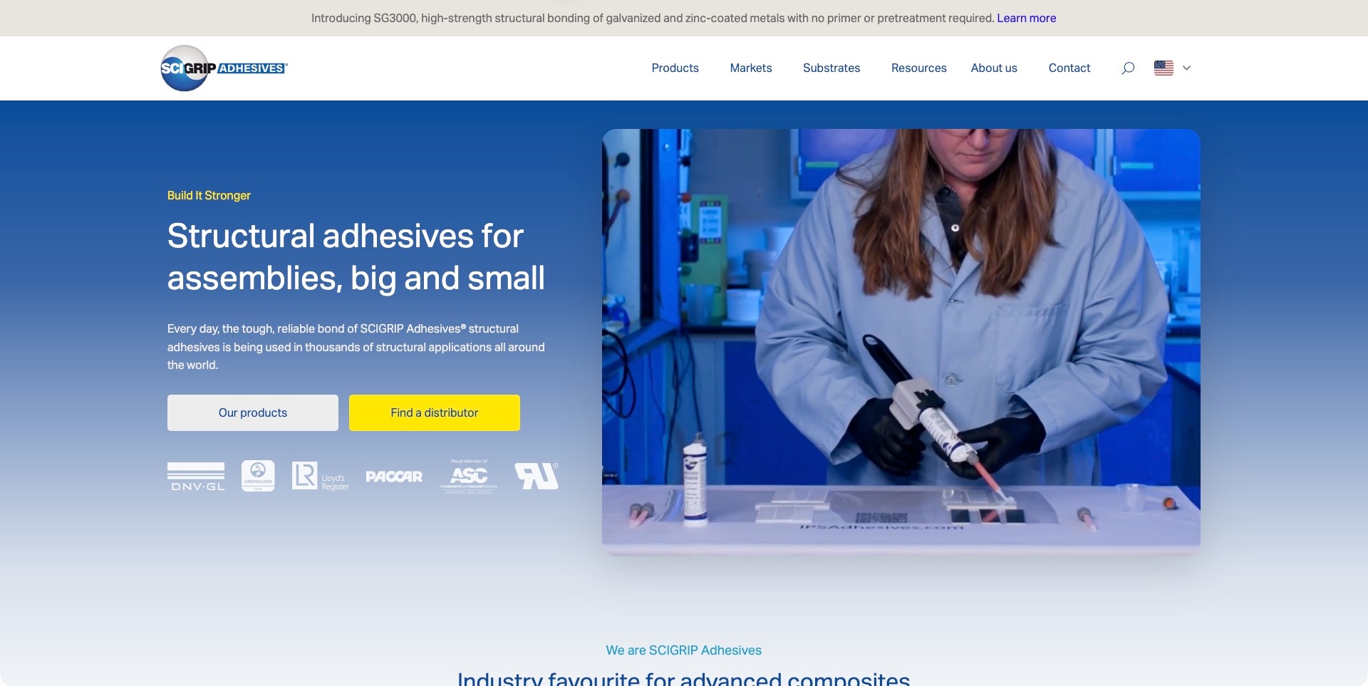
SCIGRIP combines a blue gradient with a large laboratory application image, placing the introductory copy and two contrasting actions beside the process rather than over it. The white product button and yellow distributor button make research and purchasing-channel discovery visibly different tasks. In the header, products, markets and substrates provide three specific starting points, with resources and contact nearby. A narrow product announcement sits above the navigation without becoming the whole page. The logos beneath the actions are presented by the manufacturer; their presence should not be interpreted as blanket certification of every product or of the website itself.
What you can learn
Offer both application-led research and a clear sourcing route. Engineers may begin with a substrate while purchasing teams need a distributor; connect those journeys through exact product records and current documentation rather than assuming every visitor starts with a known adhesive name.
Pros
Substrate, market and product navigation reflect different technical starting points.
Distributor discovery is explicitly separated from the product research action.
Cons & considerations
A row of approval or association marks needs clearly stated product-specific scope.
A detailed process image should be accompanied by relevant text for readers who cannot inspect it visually.
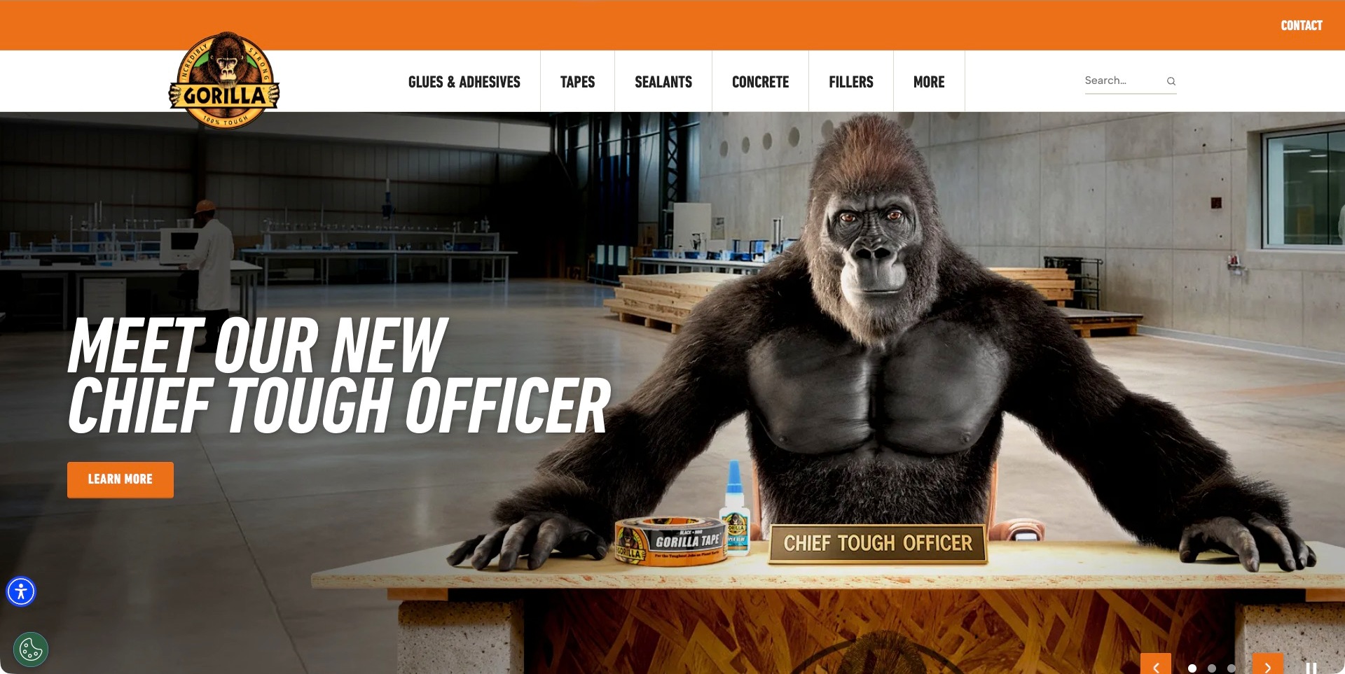
Gorilla’s homepage gives its familiar mascot the central role in a workshop campaign, with an orange utility band and bold condensed type carrying the same visual identity into the navigation. Glues and adhesives, tapes, sealants, concrete and fillers are listed as plain product categories, so the expressive hero does not replace basic catalogue access. The campaign also includes visible slide and pause controls. This is a consumer-facing brand example within the collection, deliberately different from the engineering-led manufacturers. The mascot and toughness theme are communication choices, not independent evidence about a product’s strength or appropriateness for a particular repair.
What you can learn
Keep product discovery simple even when the brand campaign is highly theatrical. A recognizable character can attract attention, but users still need clear category names, actual product instructions and suitable support; the visual metaphor should not carry technical or safety meaning on its own.
Pros
Plain product-category labels remain available above the expressive campaign.
The mascot, orange accent and condensed lettering form a consistent identity.
Cons & considerations
A large promotional hero can delay specific product comparison information.
Toughness language needs exact product instructions and application limits on the next page.
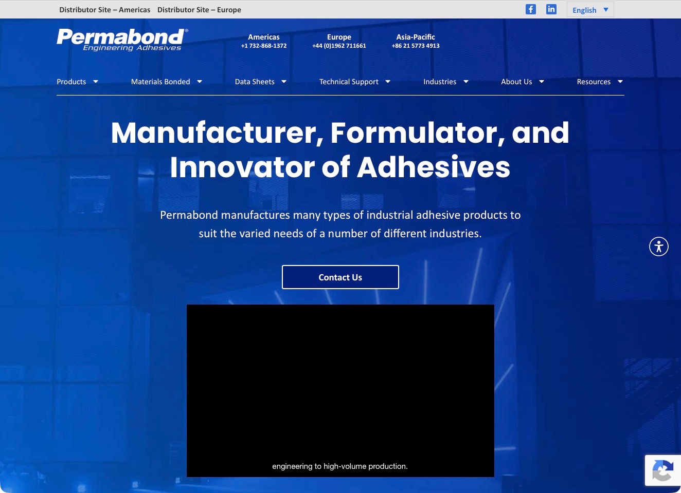
Permabond presents its blue identity and a manufacturing backdrop around a large white introduction. The pictured media panel is dark with subtitles, so the useful design lesson is the surrounding information structure rather than a particular process still. Products, materials bonded, data sheets, technical support and industries are separate navigation choices. Americas, Europe and Asia-Pacific telephone details sit near the identity, with distributor routes providing another regional task. This approach accommodates engineers who know a substrate or document requirement before they know a product name. The public presentation does not establish bonding performance for an untested assembly.
What you can learn
Offer several entry points into the technical catalogue. Cross-link substrate, industry and product pages to current documents, and provide a written introduction when an embedded video is unavailable; essential selection information should remain understandable without playback.
Pros
Materials and data sheets receive explicit navigation labels rather than disappearing within resources.
Regional contact information supports a practical next step alongside the technical browsing routes.
Cons & considerations
Parallel routes need consistent terminology and cross-links to avoid duplicated research dead ends.
A dark media frame should retain useful captions and should not carry essential product-selection instructions alone.
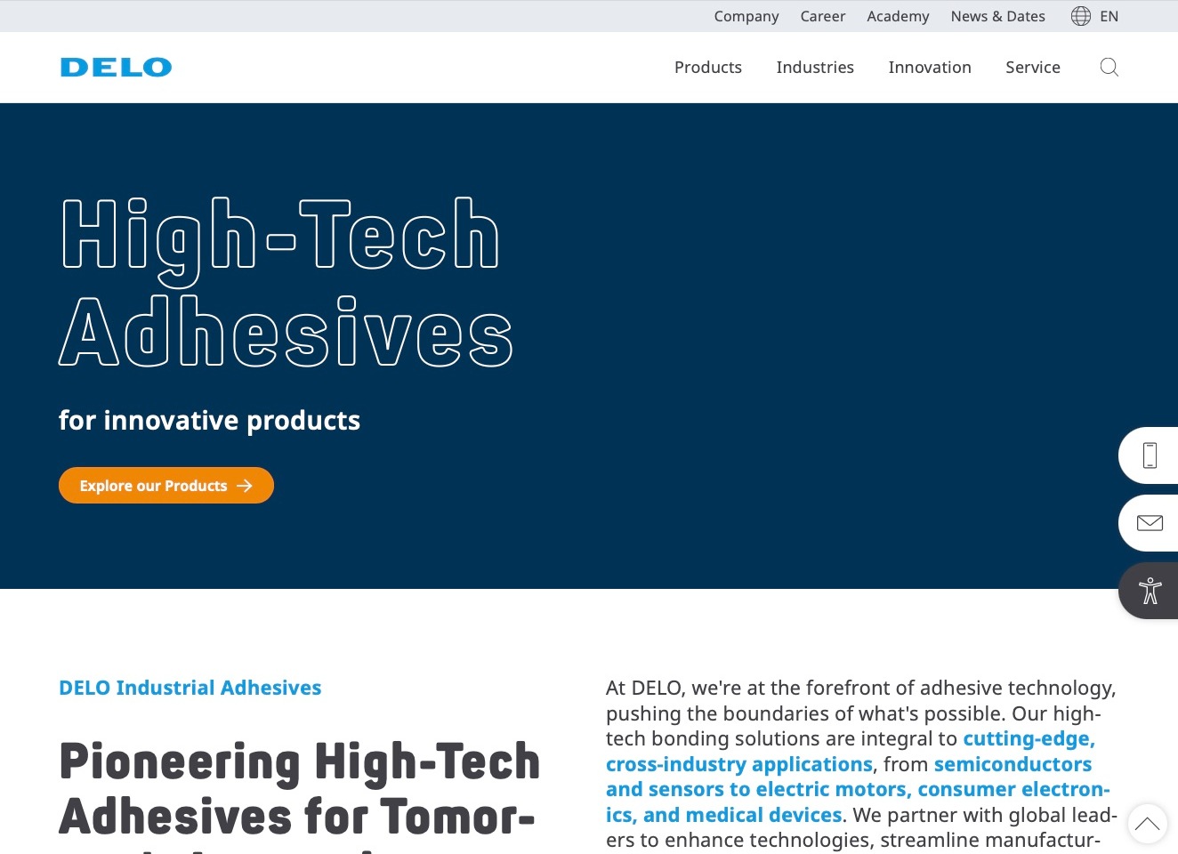
DELO uses a clean white header above a solid navy introduction, with oversized outlined white lettering and an orange product action. The accepted view is text-led rather than an application photograph. Products, industries, innovation and service form the main navigation, while the academy and corporate information sit in the smaller utility row. A substantive adhesive introduction starts immediately below the opening. This combination is worth studying when a manufacturer needs a strong identity without asking a single process image to explain a complex portfolio. The page’s positioning remains a manufacturer description, not a test report for another assembly.
What you can learn
Give an industrial introduction an immediate technical next step. Connect the headline to product families, application context and training or support, so that visual scale establishes hierarchy without forcing visitors to interpret an image or slogan as an engineering recommendation.
Pros
The orange product action has a clear role against the restrained navy introduction.
Academy, product and service routes distinguish learning from technical and commercial research.
Cons & considerations
Outlined typography needs careful contrast and legibility checks at smaller screen sizes.
A broad adhesive introduction requires exact material, dispensing and curing limitations in its supporting documentation.
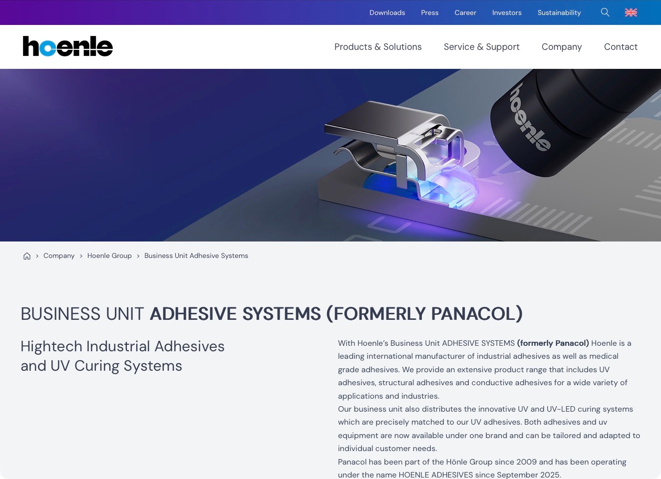
Hoenle’s current Adhesive Systems page explicitly identifies the business as formerly Panacol. A blue-to-purple identity band and a large curing illustration establish the group context, followed by substantive text about industrial and medical adhesives and associated UV-curing systems. Products and solutions, service and support, company information and contact remain recognizable navigation categories. This is useful for a manufacturer whose customers may arrive using an older specialist name: the relationship is explained in the page itself rather than left to a redirect. The illustration communicates a materials-and-equipment relationship, not an independently verified manufacturing result.
What you can learn
State the current relationship between a recognized legacy brand and its business unit in ordinary page copy. Keep product families, technical documents and support easy to find across that transition, and distinguish corporate identity changes from product-specific availability, qualifications or application advice.
Pros
The visible formerly-Panacol label makes the brand transition explicit at the relevant destination.
Product and support navigation remain distinct within the wider group presentation.
Cons & considerations
Group-level illustrations need direct links to the specific adhesive families under discussion.
Legacy product searches require precise naming and redirects to avoid confusion about current documentation or support.
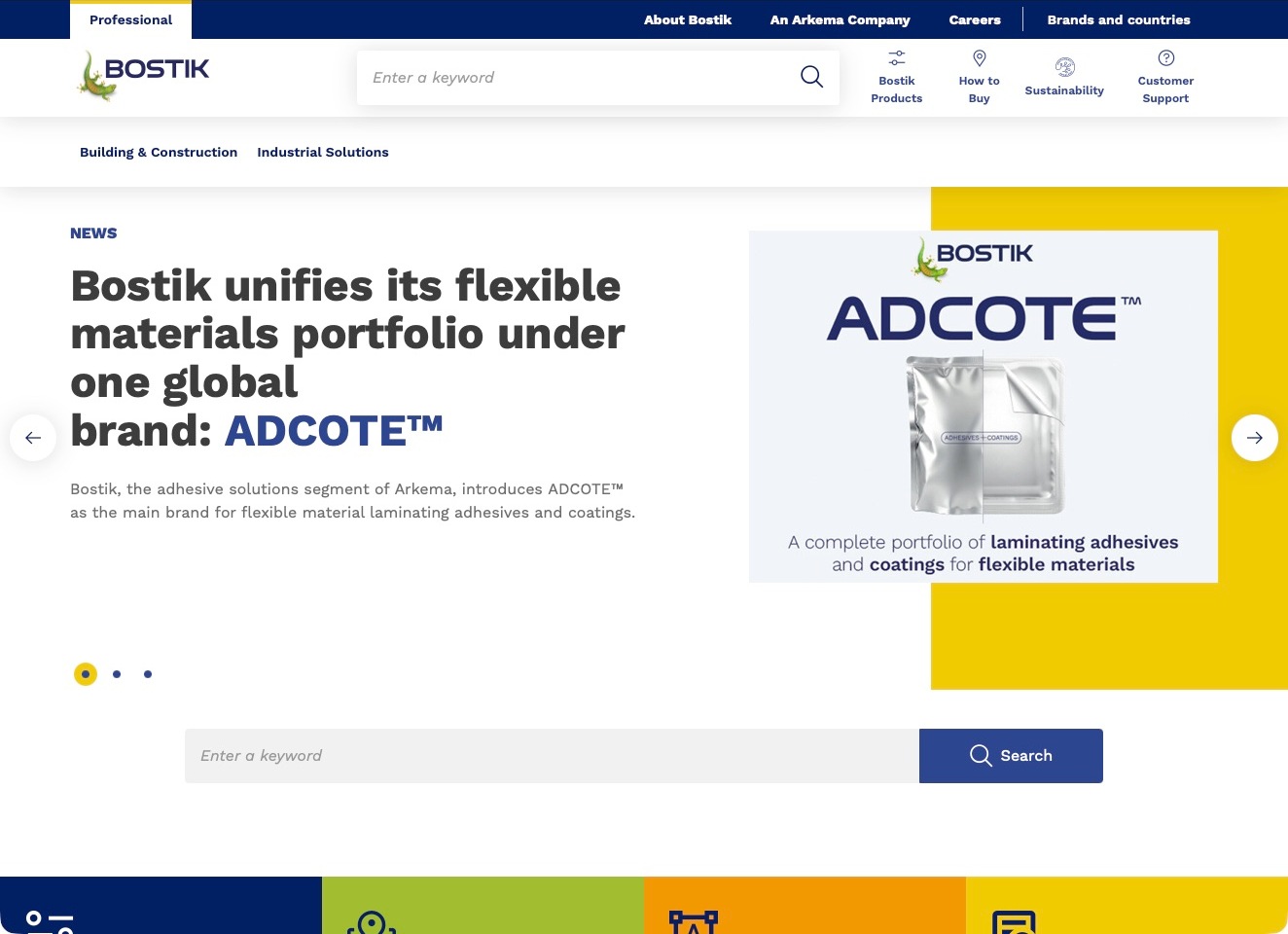
Bostik’s US-English site places a wide search area near the identity and separates product discovery, buying information, sustainability and customer support in its header. The Arkema relationship is stated in the utility navigation, while professional and regional context help locate the visitor within a larger international brand system. The visible campaign introduces an industrial materials topic rather than turning the whole homepage into a single product record. This is useful for studying how a broad adhesive business can retain common brand recognition while providing market-specific routes. The affiliation and campaign do not establish current availability or certification of every product across every country.
What you can learn
Make region, brand relationship and buyer task visible together. A construction professional looking for a technical sheet and an industrial buyer exploring a new application need different next steps; search should lead to exact regional product records rather than undifferentiated global marketing pages.
Pros
Product, purchase and customer-support tasks have distinct header destinations.
Corporate affiliation and regional context are visible without opening a history page.
Cons & considerations
A broad search needs clear regional scope and document-version handling.
Campaign-led terminology requires a stable route to the underlying material and application categories.
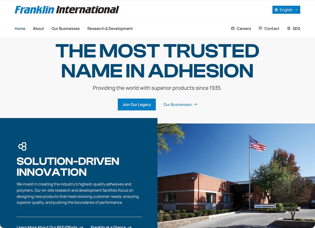
Franklin International uses a bold blue typographic introduction followed by a split section combining a research-and-development explanation with a facility photograph. The white header gives the business portfolio and R&D their own destinations, while careers, contact and safety data sheets remain distinct utility tasks. That is a useful parent-company pattern: it introduces the organization without making a visitor guess that every familiar product brand belongs to the same catalogue. Primary company material distinguishes its business areas, including Titebond and adhesives and polymers. The homepage’s trust and quality language remains the manufacturer’s positioning, not an independently measured ranking.
What you can learn
Use the corporate site to explain the relationship between business units, then direct product research to the appropriate brand and documents. Keep safety-data retrieval and technical questions straightforward even when the opening story emphasizes company history or research capability.
Pros
Business portfolio and R&D are clearly labeled navigation destinations.
Safety data sheets remain visible alongside the ordinary utility controls.
Cons & considerations
A large reputation-led headline needs concrete product and business detail below it.
Corporate research claims should not substitute for exact product documentation and application limits.
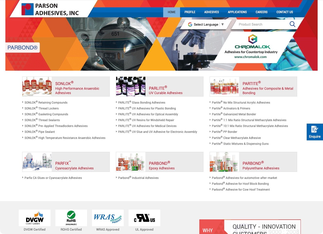
Parson Adhesives uses a dense, directory-like homepage with a geometric red-and-blue banner and several product-family panels below it. Names such as SONLOK, PARFIX and PARTITE are accompanied by smaller category links, making the relationship between sub-brand and chemistry visible rather than relying on logos alone. A product search and application route provide alternatives to browsing those lists. This is a useful contrast with the large scenic or process heroes elsewhere in the collection: it prioritizes the breadth of the catalogue. The visible family descriptions are navigation aids, not a conclusion that a particular adhesive is appropriate for an unreviewed application.
What you can learn
When a portfolio contains multiple sub-brands, give each name a plain-language category and relevant cross-links. Let a returning visitor search a known product while a new buyer can begin with chemistry or application, then converge on current documentation and a qualified technical enquiry.
Pros
Product-family panels connect distinctive brand names with descriptive material categories.
Search and application navigation provide alternatives to scanning a long catalogue list.
Cons & considerations
Dense lists can become difficult to scan without clear grouping and mobile spacing.
Brand-level approval marks require exact product and certification scope on their destinations.
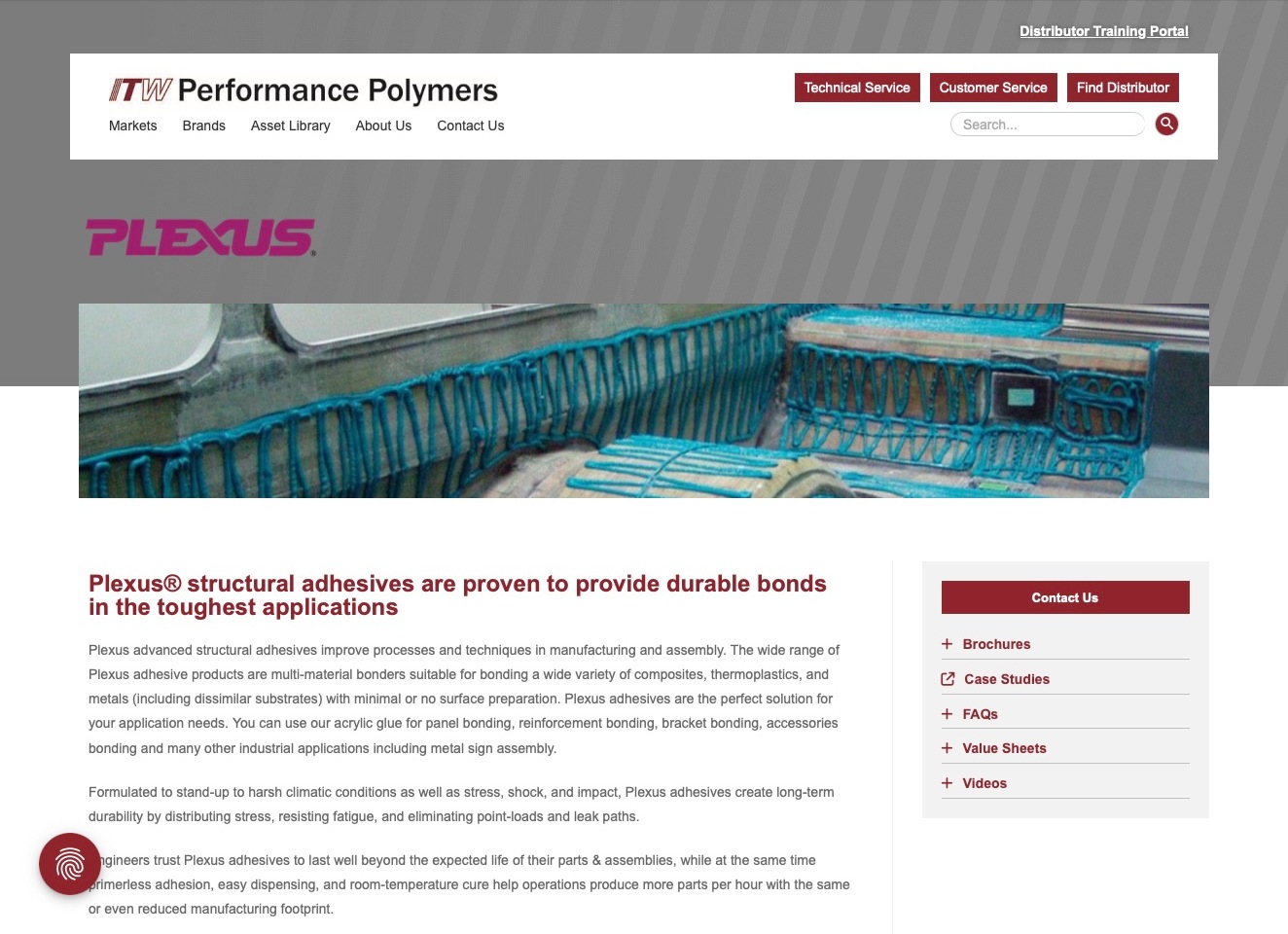
ITW Performance Polymers gives Plexus a dedicated product destination beneath the corporate navigation. A large magenta brand mark and a wide adhesive-application photograph introduce a substantive explanation, while a right-hand resource panel collects brochures, case studies, FAQs, value sheets and videos. Technical service, customer service and distributor discovery remain separate red actions in the header. This is a product-page example, not the previously blank homepage or an invented electric-vehicle feature. Its value is the relationship between corporate portfolio, product identity and supporting material; the manufacturer’s durability and suitability language remains a claim requiring application-specific investigation.
What you can learn
Connect a recognizable adhesive brand to the documents and support tasks buyers actually need. Put product explanation beside useful resources, distinguish technical questions from ordering, and avoid treating a photograph or broad performance statement as sufficient evidence for selecting a material.
Pros
The product-resource panel groups several research formats beside the explanatory body.
Technical service, customer service and distributor discovery have separate labels and actions.
Cons & considerations
A long performance-led introduction needs precise product records and limitations within easy reach.
Resource labels should explain scope and version so visitors do not confuse case studies with technical specifications.
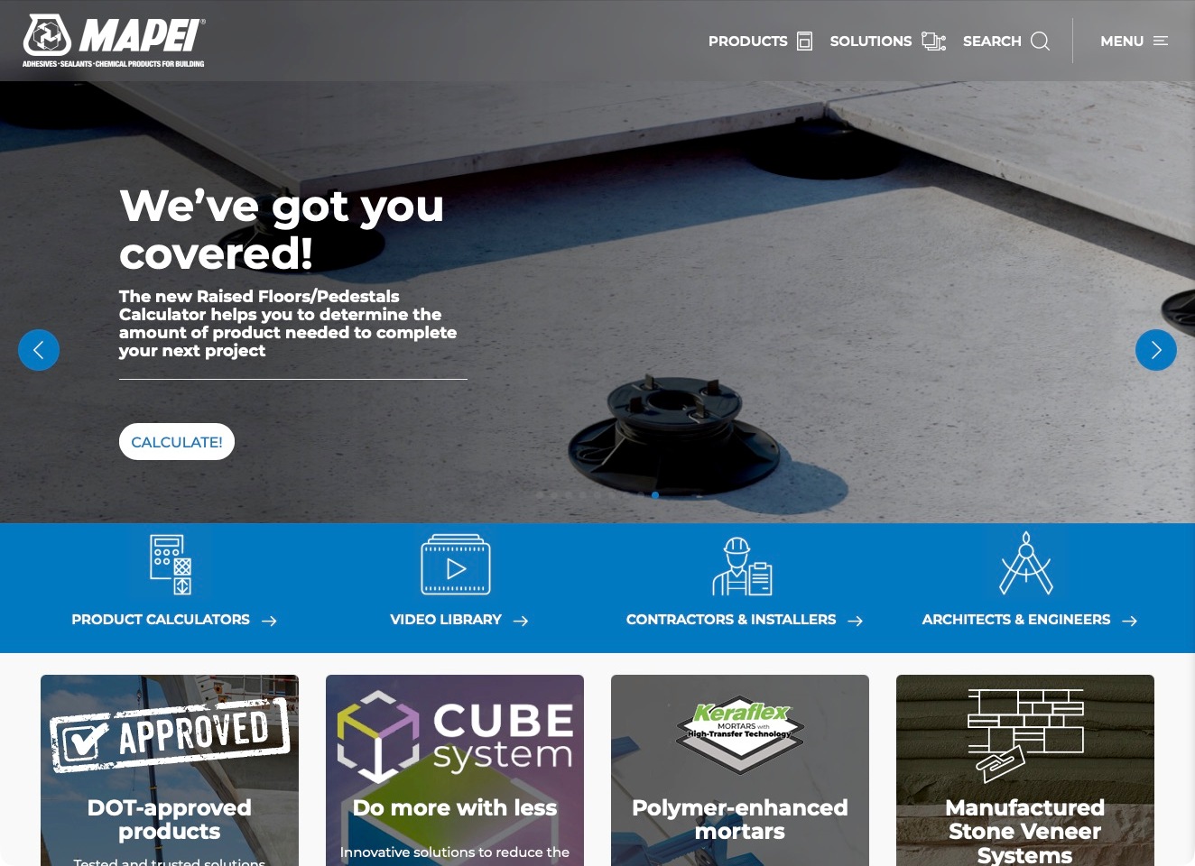
MAPEI’s current US homepage uses a broad construction-product introduction rather than an adhesive-only catalogue. The captured feature promotes a raised-floor and pedestal calculator over a physical installation image. Beneath it, a blue utility band separates product calculators, a video library, contractors and installers, and architects and engineers. Products, solutions and search remain the main header tasks, while application cards begin below. For an adhesive manufacturer, this is useful because it shows how a wider building-materials range can support different professional questions without treating every visitor as a retail shopper. The calculator feature does not establish adhesive suitability or replace product-specific instructions.
What you can learn
Connect products, professional audiences and practical tools without conflating them. State a calculator’s assumptions before use, and lead application routes toward current regional documents rather than allowing a broad campaign to replace material-selection guidance.
Pros
The blue utility strip groups practical research tools and clearly named professional audiences.
Products, solutions and search provide alternatives to the currently featured homepage campaign.
Cons & considerations
A wide construction portfolio needs a clear onward route to the exact adhesive family.
Calculator and approval-led features require explicit scope rather than implying universal project suitability.
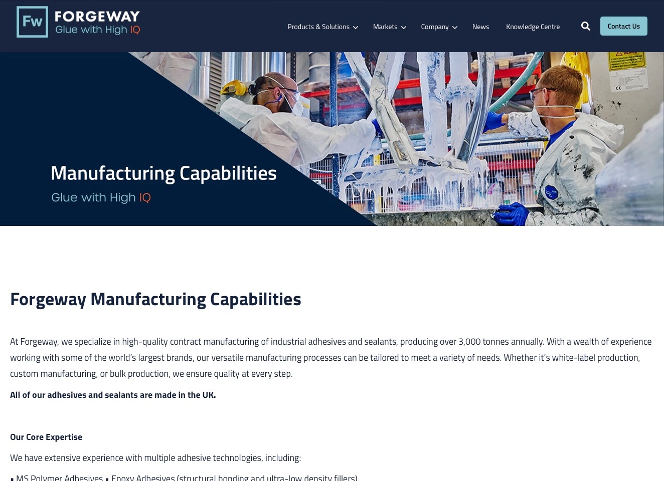
Forgeway’s manufacturing page places a clear capability title on a navy diagonal panel beside a factory photograph. The navy header keeps products, markets, the knowledge centre and contact visible. The body starts with an explicit industrial adhesive-and-sealant manufacturing explanation before introducing chemistry expertise. This is a substantive capability page rather than the homepage’s previously blank carousel. It is worth studying for the connection between a physical production context and a specific commercial service. Statements about output, location or quality are the manufacturer’s descriptions, not independent verification of its production process.
What you can learn
Give contract manufacturing its own destination and explain what the service includes before asking for an enquiry. Connect chemistry, packaging and application questions to the appropriate next discussion, while keeping factory imagery separate from evidence of a particular formulation’s suitability or certified scope.
Pros
The manufacturing title and opening explanation make the page’s commercial purpose explicit.
Product, market and knowledge routes remain available around the focused capability content.
Cons & considerations
Long body lines need careful width and spacing for comfortable technical reading.
Capacity and quality statements need dated supporting detail rather than relying on a factory photograph alone.
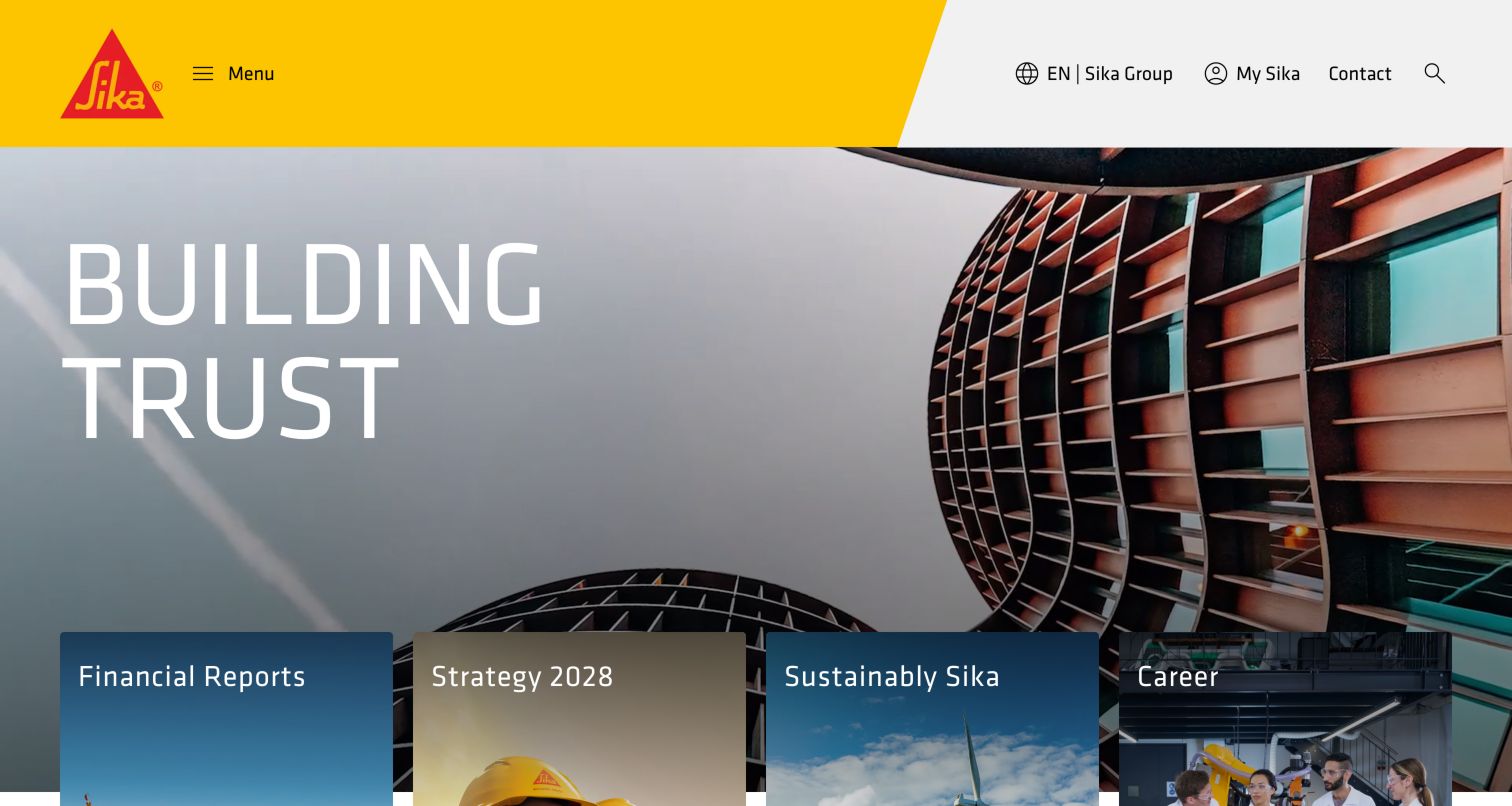
Sika’s retained group-homepage image makes the yellow and red identity unmistakable, with a large architectural photograph and cards for reports, strategy, sustainability and careers. Those are corporate tasks rather than adhesive-selection tasks. The current construction-adhesives destination provides the useful technical contrast: elastic and rigid bonding, adhesive sealants and pre-treatment are separate explanations, while local products and international-project support have different routes. A manufacturer with several material categories can use this division without pretending the group homepage is a complete product catalog.
What you can learn
Separate the corporate introduction from the conditions of product selection. A technical visitor needs an applicable bonding category, documentation and regional support, not only a recognizable brand and a finished-building photograph.
Pros
The strong visual identity remains consistent across a broad corporate information structure.
Adhesive categories and local-support routes turn a general product subject into more specific research.
Cons & considerations
A menu-led group opening makes a technical visitor take another step to identify relevant products.
Comparative bonding and durability claims require system, substrate and application conditions rather than universal interpretation.
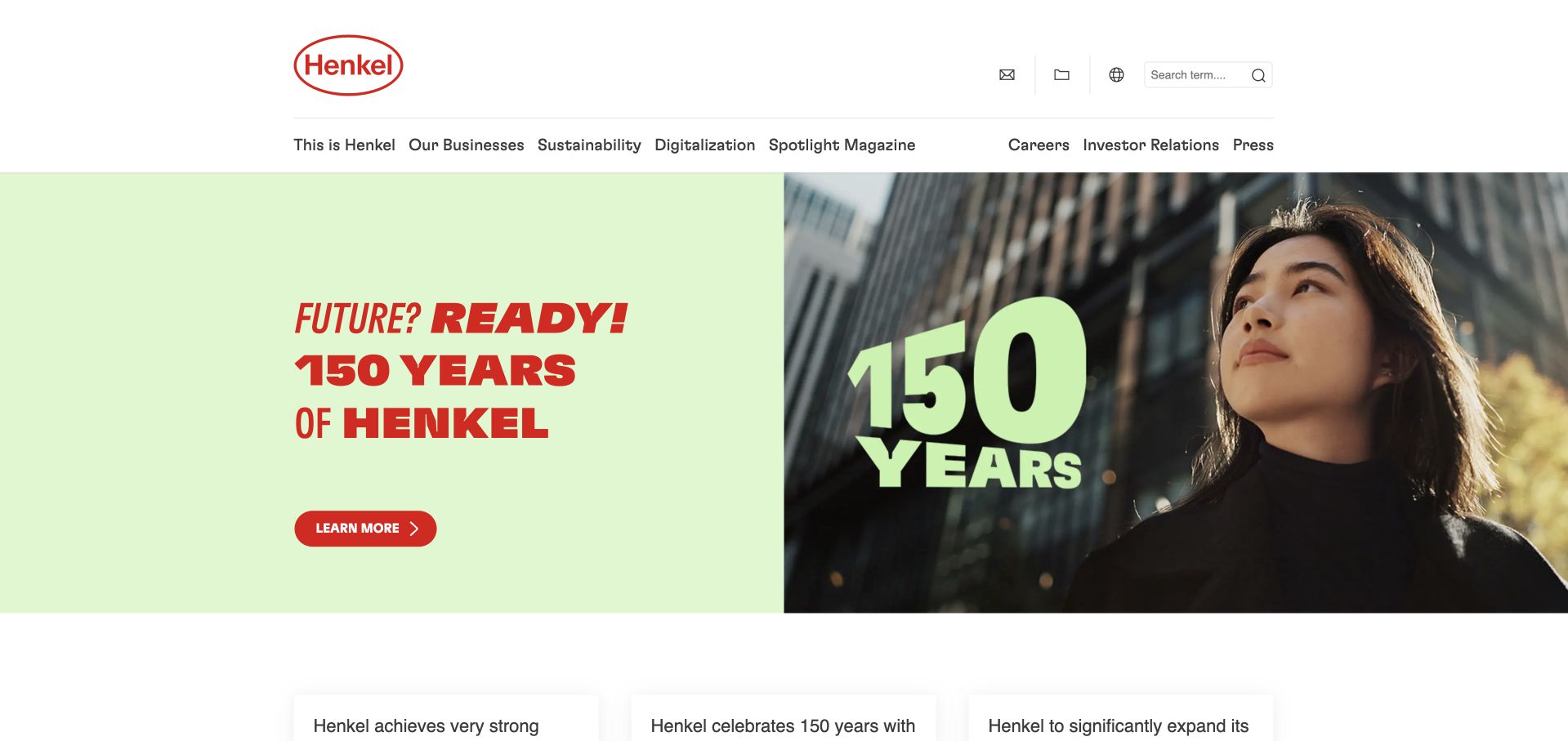
Henkel’s retained homepage capture leads with a pale-green anniversary campaign, red typography and a split image. The navigation keeps Our Businesses distinct from corporate culture, sustainability, careers and investor relations. On the current site, Adhesive Technologies and Consumer Brands are separate business entrances, and a data-sheet route provides a technical research destination. For an adhesives reader, the useful lesson is the relationship between that corporate layer and the relevant business, rather than copying a commemorative campaign as if it explained a particular bonding product.
What you can learn
Give each business unit a clear entrance and keep technical documentation findable around corporate campaigns. A reader should not have to know every industrial brand name before locating the manufacturer’s adhesive information.
Pros
Corporate, business-unit and investor purposes have recognizably different navigation roles.
A direct data-sheet destination supports a practical task beyond campaign browsing.
Cons & considerations
An anniversary hero needs a timely maintenance plan so it does not outlive its intended context.
A group-level sustainability or innovation statement needs product-specific evidence before informing a bonding decision.
Platform source: Primary documented Tableau association. Documented association: Historical Laundry & Home Care supply-chain reporting, with 2016 adoption and a May 2020 update; not current group-wide infrastructure or every product website. Platform evidence is separate from the direct website screenshot and is not a complete current infrastructure audit.
Kegan is a freelance web designer and developer with 15+ years of experience helping businesses turn complicated website requirements into clear, maintainable digital experiences. He works directly with clients from planning and design through development, launch, and ongoing support.
For adhesive manufacturer website design, his development approach focuses on adhesive-family and substrate navigation, technical and safety-document discovery, manufacturing and distributor distinctions, application context, and well-routed technical enquiries without unsupported product-performance claims. The scope can be a targeted improvement or a complete custom build, with responsive layouts, thoughtful content structure, and integrations chosen around the people using and maintaining the site.
Show 3 other adhesive manufacturer website designersHide other adhesive manufacturer website designers
Plan an adhesive manufacturer website around application discovery and evidence
Start with the ways customers describe a bonding task
Interview the people who answer technical and commercial enquiries. Record the useful information that visitors already know: a product identifier, substrate pair, production process, application setting or reason an existing approach is being reviewed. Use those observations to design navigation. Do not begin with a product taxonomy simply because it mirrors an internal spreadsheet; the customer may not know which family contains a potentially relevant product.
Permabond’s public navigation offers chemistry families, materials bonded, industry contexts and technical resources as distinct entry points. Master Bond also gives properties and applications their own routes. These are useful information-architecture references, not evidence that selecting one label establishes suitability. A material or property page should explain what the category means, connect to relevant documentation and invite the information needed for a more specific assessment.
Provide a reliable exact-code search alongside exploratory browsing. Handle spacing, punctuation and known former references deliberately, without silently substituting a different formulation. If a product has been discontinued or renamed, explain the status and link to a documented next step. A reassuring search result should not conceal that a visitor’s existing specification may need review before another product is considered.
Make the product record useful beyond its headline claim
Agree a consistent product-page structure with the technical team. Possible fields include product family, intended application context, packaging information, regional availability and links to current documents. Only publish properties and approvals with their proper conditions and scope. The website should make limitations legible rather than using an isolated high number or attractive icon to imply universal performance.
Distinguish a technical data sheet from a safety data sheet and from an application note. Let readers identify the document before downloading it, including its product reference and relevant version or date. Decide who owns revisions and how superseded files are withdrawn from navigation. Preserve legitimate historical references where necessary without leaving several unlabelled documents competing as though each were current.
Use a controlled publishing process for claims involving food contact, medical uses, fire behaviour or other regulated contexts. The responsible company needs to verify the precise wording, geography and application limits. A website designer should not convert a broad product-family statement into a certification badge for every item. Explain how to request clarification when a project requires documentation beyond the public page.
Connect adhesive products with the actual production workflow
A product can be only one part of a manufacturing conversation. Chemique’s public site separates adhesive products from application equipment, engineering support and maintenance services. That distinction helps a visitor understand what can be discussed without assuming every manufacturer supplies the same package. Describe the support that is genuinely available and identify when a separate equipment supplier or specialist is involved.
Write application pages around a defined task rather than repeating the same generic strength claim under different industry headings. Useful questions include what is being assembled, which conditions the team needs to understand and where the process fits into production. Keep explanations understandable to a commercial reader while giving a technical visitor a clear route to more detailed information. Do not publish an incomplete procedure as if it were sufficient for safe use.
Use case studies to explain the manufacturer’s contribution and the limits of what can be shared. Identify whether the work involved formulation development, a product discussion, application equipment or support for a production trial. Obtain permission for client names, photographs and measured outcomes. A photograph of a finished vehicle or panel does not independently demonstrate which adhesive was used or what conditions were tested.
Design technical support as a guided handoff, not an empty form
Ask the technical team which initial questions route an enquiry effectively. A concise description of the application, relevant materials, general production context and contact information may be more useful than a long mandatory questionnaire. Explain which details can be supplied later. Do not ask visitors to upload confidential drawings, safety information or proprietary process data before the company has established an appropriate handling process.
Keep regional support and purchasing routes explicit. A global manufacturer may have different product availability, safety documents and distributors in different markets. Sika’s construction-adhesive information directs readers toward local organizations for applicable products and advice. The design lesson is to make a regional boundary understandable before a reader assumes that a global overview is a locally available specification or purchasing commitment.
Confirm what happens after an enquiry without inventing a response promise. Show useful alternative contact methods if a form fails, and separate technical-support requests from recruitment, general messages and distributor questions. Sample requests should be clearly labelled requests rather than guaranteed shipments. Do not let a confirmation message suggest that the manufacturer has approved an application merely because a form was submitted.
Build a maintainable resource system for changing products and documents
Treat products, document versions, application categories, industries and regional contacts as related content. Define the source of truth for each field before choosing a content-management system. A public website may draw from a product-information process, but editors still need to understand which claims require technical approval and which presentation changes can be made without altering the underlying meaning.
Design resource listings for readers who are working, not just browsing. Meaningful titles, file types, clear categories and usable search can matter more than a decorative document grid. Keep key explanations available as ordinary readable text. Check that a keyboard user can open filters, identify results and reach a download, and that a person on a phone can distinguish similarly named products without horizontal tables swallowing the page.
Assign owners for discontinued items, broken document links, regional contact changes and expired campaign material. Product data may remain valuable for years while a news story becomes stale quickly. Keep those editorial lifecycles separate. Record substantive content reviews honestly rather than making every data sheet appear newly validated whenever the website is rebuilt or an unrelated design change is deployed.
The editing job behind the design
Choose publishing tools for products, documents and qualified enquiries
Model the relationships among product records, material categories, applications, documents and markets before choosing the interface. A single document should be referenced consistently rather than uploaded under several unrelated pages with no obvious revision owner. Decide how regional variants are distinguished and who can approve their publication.
Separate the public marketing system from formulation records, laboratory data, confidential customer files and commercial account systems. A visible website platform does not establish how the manufacturer manages production or technical testing. Report observed public technologies only at their actual scope; unknown systems should remain unknown.
Prioritize dependable search, accessible navigation, clear file handling and a manageable approval workflow. Add a product selector only when its inputs, limits and maintenance process can be explained. A sophisticated-looking recommendation interface is not a substitute for a validated selection process or a conversation with the appropriate technical team.
Our WordPress website examples offer a separate look at publishing approaches. A visible platform label is evidence for that named page, not a guarantee that the same system will suit your requirements.
Before the public launch
Adhesive manufacturer website planning checklist
Identify technical, purchasing and distributor audiences separately.
Support exact product-code search as well as exploratory browsing.
Connect chemistry families, materials, applications and industries.
State the scope and limits of product-performance claims.
Label technical, safety and application documents distinctly.
Record document versions, product references and regional context.
Define responsibility for discontinued and renamed products.
Explain actual equipment, engineering and support services.
Obtain permission for project imagery and outcome statements.
Route regional enquiries to the appropriate organization.
Protect confidential application details and uploaded files.
Test search, filters, downloads and contact paths on mobile and keyboard.
Assign technical approval and recurring content-maintenance owners.
These checks are a project checklist, not a performance, legal, security, or accessibility certification. Test real journeys with the people responsible for the website before making claims about the result.
Sources & editorial method
How this collection was selected and reviewed
The collection compares public website presentation by businesses with an explicit adhesive-manufacturing scope. Current first-party product and company descriptions establish topic fit. Screenshots retain their genuine source and capture dates, including any accepted earlier originals reviewed again for this collection. Observations are about website communication and do not verify formulations, product claims, safety procedures, certifications or suitability for a particular application.
Each example links to its actual source page. Screenshots are direct browser captures with their own capture dates; moving imagery, announcements and live designs can change. The notes describe observable design choices and conditional tradeoffs, not measured traffic, conversion results, service quality, or accessibility conformance.
Technology labels use public page metadata, asset evidence, or explicitly cited platform documentation. Platform documentation is not a complete current deployment audit. A component reference may be legacy or unused; it is not a complete backend inventory. Unknown stacks are omitted. These sites are editorial examples, not our client portfolio.
Written, Edited and Curated are separate editorial records, not timestamps advanced by a rebuild. Website designs and imagery belong to their owners. See our editorial standards or suggest a correction.
Questions worth asking
Adhesive Manufacturer website design questions
Should the main navigation use chemistry names or applications?
Both may be useful because visitors arrive with different knowledge. A technical buyer may know a chemistry family or code, while another visitor knows only the materials and application. Connect those routes and explain their limits instead of assuming that one category establishes product suitability.
Should safety and technical data sheets be grouped together?
They can share a resource system, but their purpose and identity should remain clear. Label each document with its product reference and relevant version or regional context so a reader can distinguish safety information from performance data and application guidance.
Can a website product selector replace technical support?
Not simply because it is interactive. Its inputs, outputs, limits and maintenance process need to be defined. The site should make an appropriate technical discussion available and avoid presenting an exploratory result as approval for a specific application.
What information belongs in the first enquiry?
Collect enough context to route the question, such as the application, materials and a short description of the process. Decide how confidential files and detailed technical data will be handled before requesting them through a public form.
Do these examples endorse the manufacturers’ products?
No. The collection studies website design, information structure and communication. It does not independently test adhesive performance, validate regulatory statements or recommend a formulation for a production process.
Borrow the clear product routes, identifiable documents and thoughtful support handoffs. Let the website help people ask a better application question without treating marketing presentation as proof that a bond will perform.