Home/Industries/Building Material Manufacturer website design
Definitive guide · Design inspiration
Best Building Material Manufacturer Websites of 2026 (20 Real-World Examples)
Building material manufacturer websites that connect inspiration with specification
A building material website has to help people imagine a finished project, identify a suitable product and find the information needed to specify, buy or maintain it. These examples show how manufacturers organize those different tasks across broad catalogs and local sales networks.
The same product may attract a homeowner comparing colors, an architect preparing a specification, a contractor checking installation details and an owner looking for replacement parts. Those visitors need different entry points, but the underlying product identity should stay consistent. A persuasive image becomes more useful when it leads to the correct collection, finish, document set and local contact.
This collection compares public manufacturer sites for roofing, siding, insulation, windows, doors, bulk materials and construction systems. It includes both product-facing sites and corporate gateways, because their differences help explain what a homepage should prioritize. The reviews examine visible design and navigation. They do not verify engineering performance, endorse product suitability, test a purchase or certify accessibility.
Before the examples
What makes good building material manufacturer website design in 2026?
Make product and application routes work together
People may know a product name, a material form or only the part of a building they are working on. Offer useful routes from each starting point. Connect application guidance to identifiable products, and explain when a complete assembly or system matters more than one component.
Give documents their own clear structure
Separate technical data, installation instructions, specifications, safety information, warranties and environmental declarations. Show the product, market, language and revision that each file covers. A document library should support repeat visits without forcing a professional through a promotional sequence.
Keep geography and audience visible
A global brand can have different products, services and contacts in each market. Explain the selected region and make changes easy. Homeowner and professional shortcuts can help, but they should complement public product navigation rather than create a mandatory gate.
Connect interest to a realistic next step
A sample, configurator, dealer, contractor or quote route serves a different stage of the decision. Explain what each action provides and what information is needed. Preserve the selected product and location when handing a visitor to another team or website.
The collection · 20 examples
20 building material manufacturer websites worth studying
These nineteen examples compare audience-led navigation, product and application catalogs, specification libraries, renovation support and corporate portfolio gateways. Each review identifies a visible design pattern, its practical benefit and a tradeoff to consider before applying it to another manufacturer’s site.
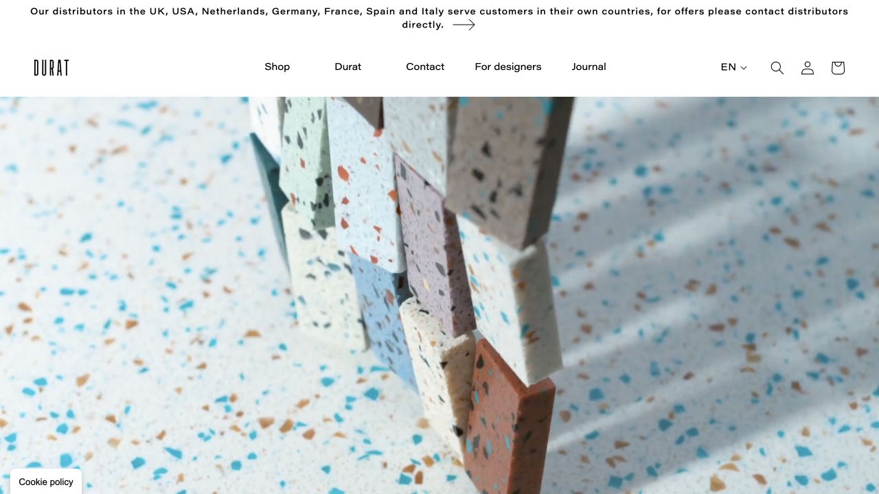
Durat makes its distinctive surface material the visual subject, combining close-up texture with a restrained identity and clear routes for designers. Colors, applications, sample shopping and technical context give the material a practical structure instead of leaving it as a purely decorative architecture image.
What you can learn
Use the material’s real visual qualities to establish identity, then make specification tasks explicit. Color, samples, fabrication and project context need to connect rather than live in separate visual worlds. Let a material close-up establish its texture, then give architects a direct route to colors, technical information and samples rather than making every image a dead end.
Pros
Material texture gives the website an identity grounded in the actual product.
Designer and sample-related routes support a practical specification process.
Cons & considerations
Location and consent overlays can interrupt the material presentation.
Recycled-content and environmental claims need current supporting documentation.
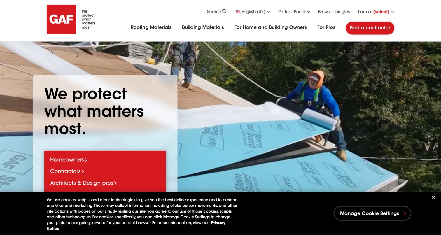
GAF uses an installation scene to establish the product context, then places homeowners, contractors, architects and building owners inside the opening message. The distinction matters because these visitors arrive with different levels of knowledge and different next steps. A homeowner can look for an installer while a professional can head toward documents, training or commercial systems. Roofing materials and building materials remain separate navigation categories, and the prominent contractor action connects product interest with delivery. The large menu holds a substantial amount of detail, however, so its hierarchy deserves careful testing on smaller screens. The captured cookie strip also competes with the lowest audience option.
What you can learn
Put audience shortcuts near the first useful product explanation, while retaining direct routes to the catalog and documentation. Test whether a returning specifier can reach a data sheet without choosing an audience again. An installer locator should explain the relationship between the manufacturer and listed businesses.
Pros
Installation imagery explains the product’s setting.
Audience routes coexist with direct document access.
Cons & considerations
A dense menu requires careful mobile organization.
The privacy strip occupies valuable opening space.
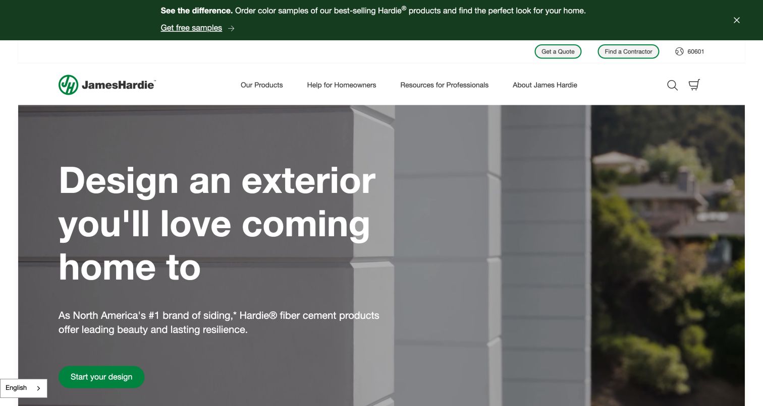
James Hardie starts with a finished exterior and an invitation to design a home. This speaks to a buyer evaluating appearance before understanding siding profiles or installation details. The header then distinguishes products, homeowner help and professional resources, giving technical visitors a recognizable route away from the promotional story. Product discovery is paired with color samples, while quote and contractor links remain visible above the main navigation. That combination connects inspiration with a physical selection process. The large video area is attractive but pushes the product range below the opening screen, and the sample announcement adds another layer before the main message.
What you can learn
Connect a visualization journey to actual product identifiers, color names and samples so the imagined result can become a useful conversation with an installer. Keep technical documents independently reachable. Motion should have a clear control and a static alternative that still explains the exterior application.
Pros
Homeowner and professional labels are easy to distinguish.
Samples provide a concrete next step after inspiration.
Cons & considerations
The hero delays comparison of product families.
Promotional and utility bars increase header height.
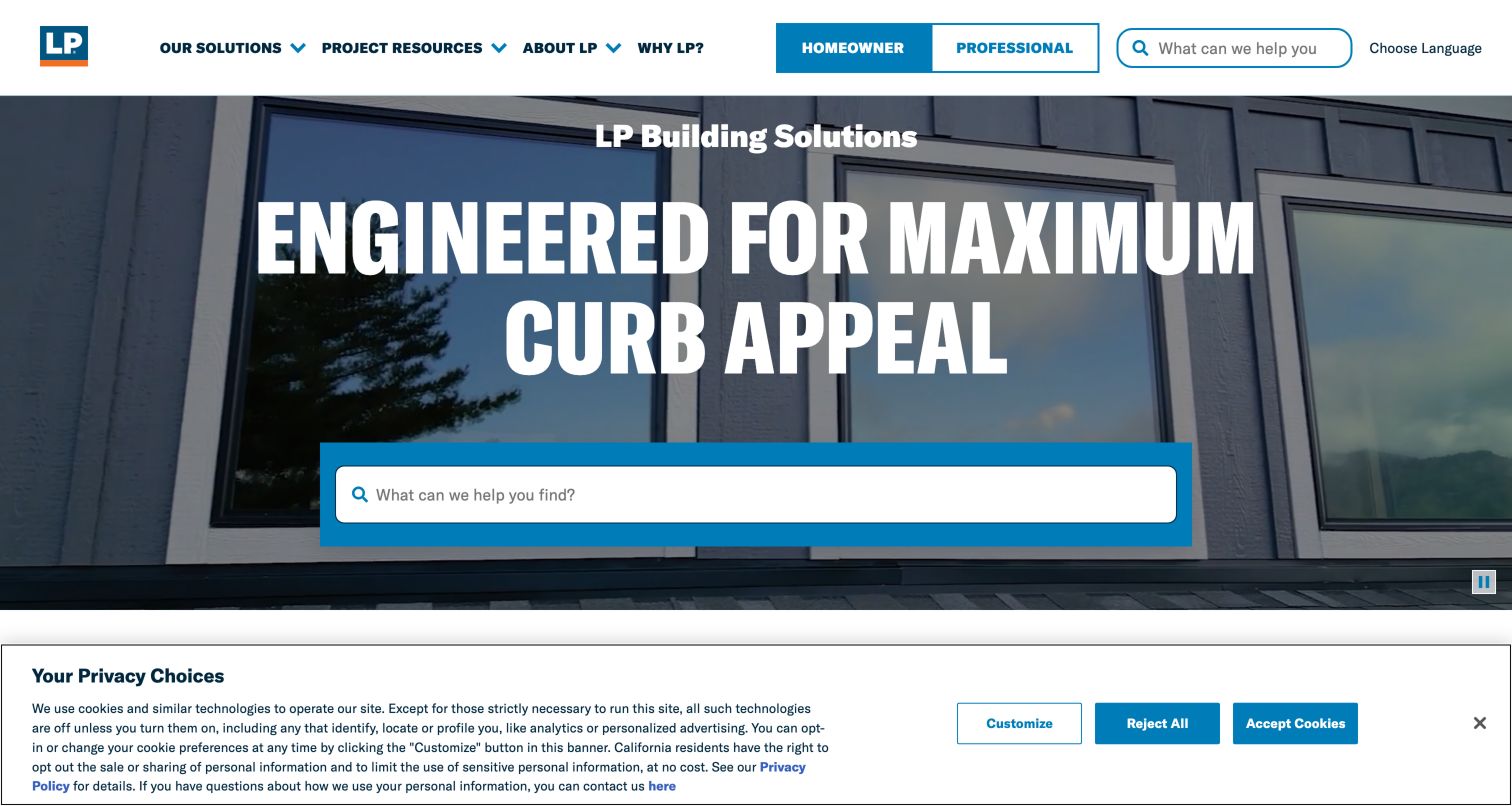
LP Building Solutions gives search unusually prominent placement within its opening image. The field invites a visitor to describe what they need without first learning the manufacturer’s internal product organization. A homeowner and professional selector sits in the header, and the page follows with visual entry points for colors, siding, energy-related solutions, sheds and contractor discovery. This is a useful combination of free-form intent and structured browsing. The same search wording appears in the compact header and the hero, which helps recognition but also duplicates a major interface element. A large cookie panel in the capture reduces the room available for the inspiration cards.
What you can learn
Use prominent search when the catalog contains different product types and visitors know different names for them. Back it with synonyms, document filtering and useful empty states. Keep category browsing alongside search so people who cannot name a material can still make progress from a familiar project type.
Pros
Search is central to the initial task.
Visual categories offer an alternative browsing path.
Cons & considerations
Repeated search fields can compete visually.
The consent panel crowds the next content section.
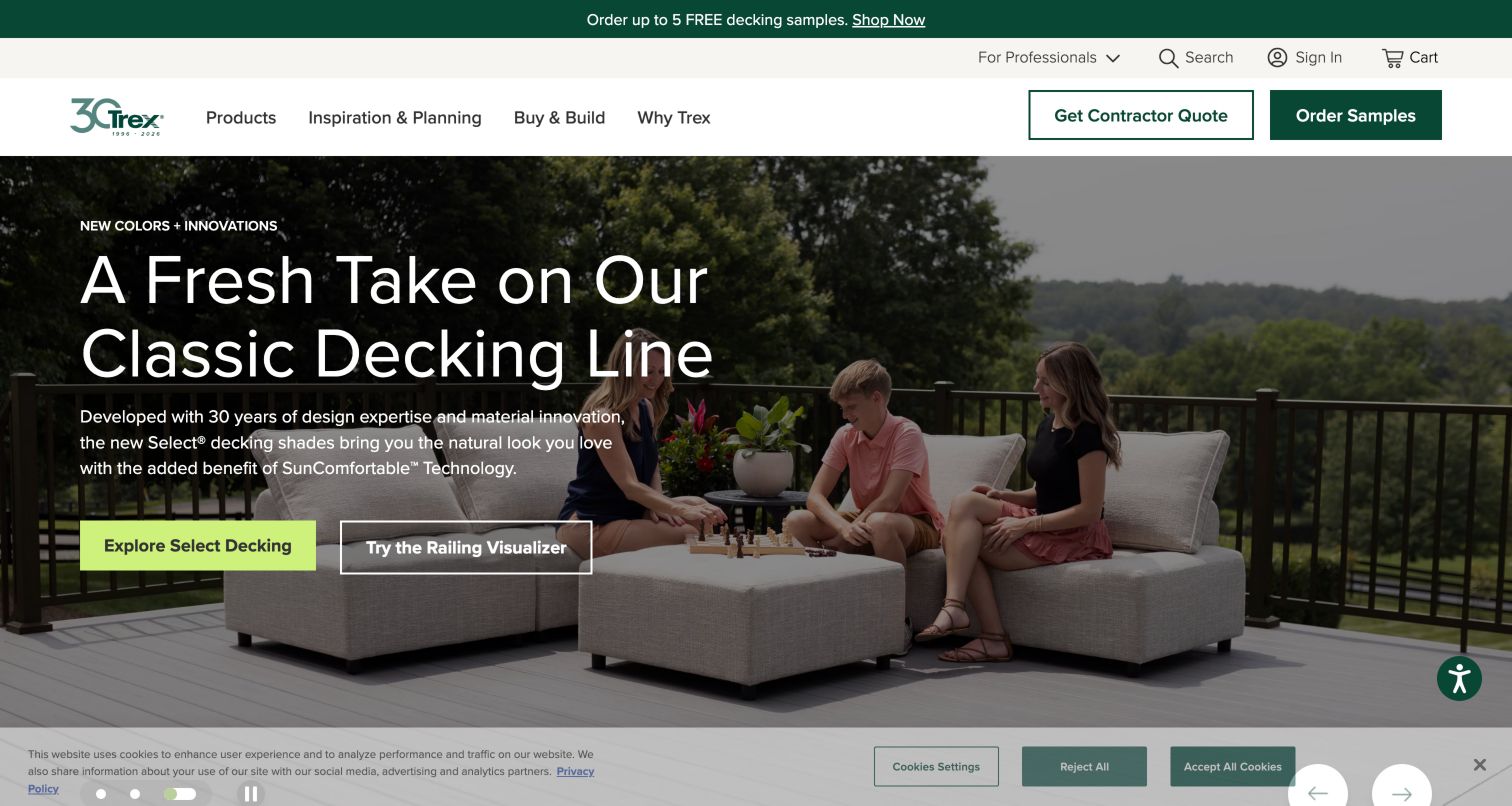
Trex organizes its product story around the process of building a deck. The opening campaign offers a named decking range and a railing visualizer, while persistent actions lead toward samples and contractor quotes. Farther down, the page describes planning, handling samples and choosing how to build. That sequence gives a homeowner a more concrete orientation than a collection of unrelated promotional tiles. Product comparisons, a cost calculator and installation documents appear as separate destinations. The visual language is strongly residential, so professional resources need to remain conspicuous. Promotional offers, changing slides and comparison claims also require careful ownership as product ranges evolve.
What you can learn
Map the stages of a material purchase and give each stage a distinct action: compare, sample, estimate and locate help. Preserve the chosen product and finish between those stages when possible. Explain the assumptions of calculators and visualizers before visitors treat their output as a final specification or quote.
Pros
The page explains a recognizable project sequence.
Samples and installer discovery have persistent routes.
Cons & considerations
Residential campaigns can overshadow professional tasks.
Rotating promotions need active content maintenance.
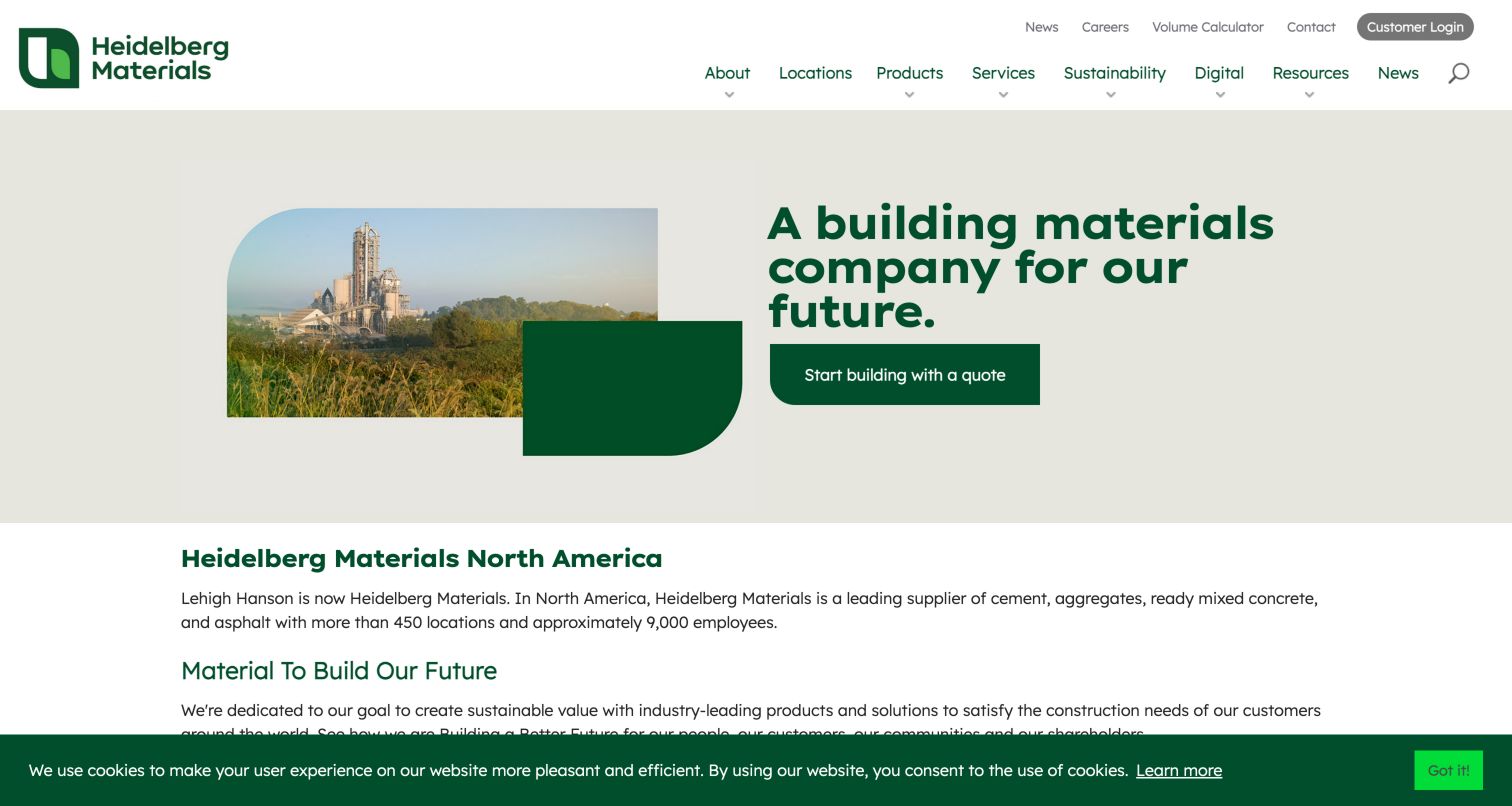
Heidelberg Materials North America presents a restrained opening with a plant photograph, a short promise and a quote action. That action links to locations, reflecting the practical importance of local supply for heavy building materials. Products, services, resources and a volume calculator are visible in the surrounding navigation. The introduction also explains the former Lehigh Hanson identity, helping people who know the older name recognize the company. Unlike the consumer-facing examples, the page uses industrial context instead of home inspiration. The broad sustainability and digital-services sections add context, but they should not delay a visitor who needs the relevant location or product contact.
What you can learn
For regionally supplied materials, design the journey around product and service area together. Make it clear whether a quote begins with a plant, branch or central team, and carry that context forward. Retain helpful former-brand explanations during transitions without allowing outdated names to conflict across contact and product pages.
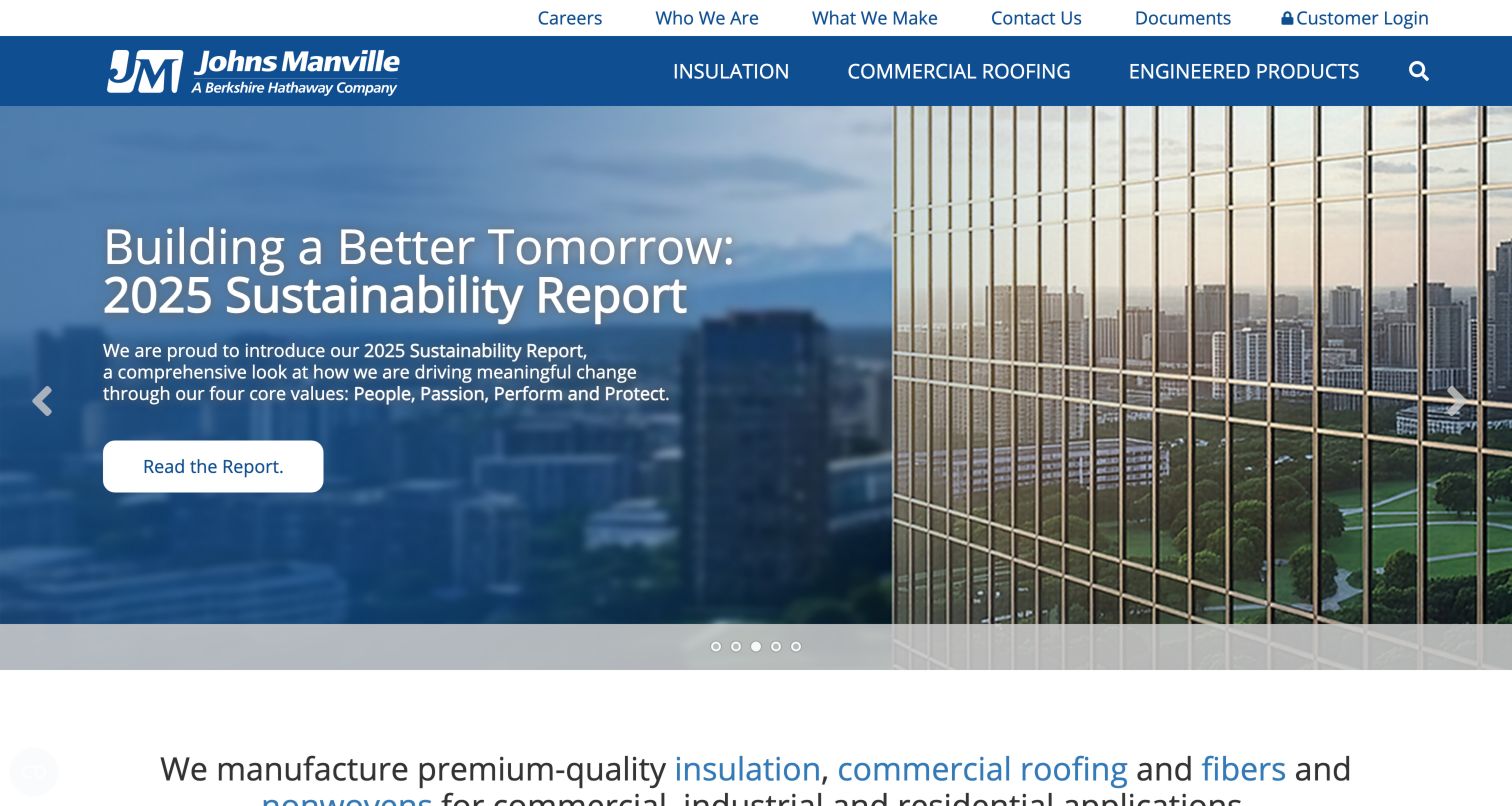
Johns Manville reduces its main product navigation to insulation, commercial roofing and engineered products. A separate utility row exposes documents, contact and customer login, which gives returning visitors a direct task route above the corporate storytelling. The captured slide promotes a sustainability report; the text below then names the product divisions and their commercial, industrial and residential applications. This keeps a broad organization understandable, although the rotating story occupies most of the first screen. The visible resource structure includes specifications, details and a submittal wizard for roofing, showing how deeper tasks can sit within a division instead of overwhelming the global header.
What you can learn
Give recurring professional tasks a stable utility position even when the homepage campaign changes. Organize technical resources by the product business that owns them, then offer a cross-site document search for visitors who only know a product name. Ensure changing slides never become the sole route to essential information.
Pros
Three product divisions create a manageable starting point.
Documents remain independent of the campaign slide.
Cons & considerations
Corporate stories dominate the opening area.
Deep division resources need consistent cross-site naming.
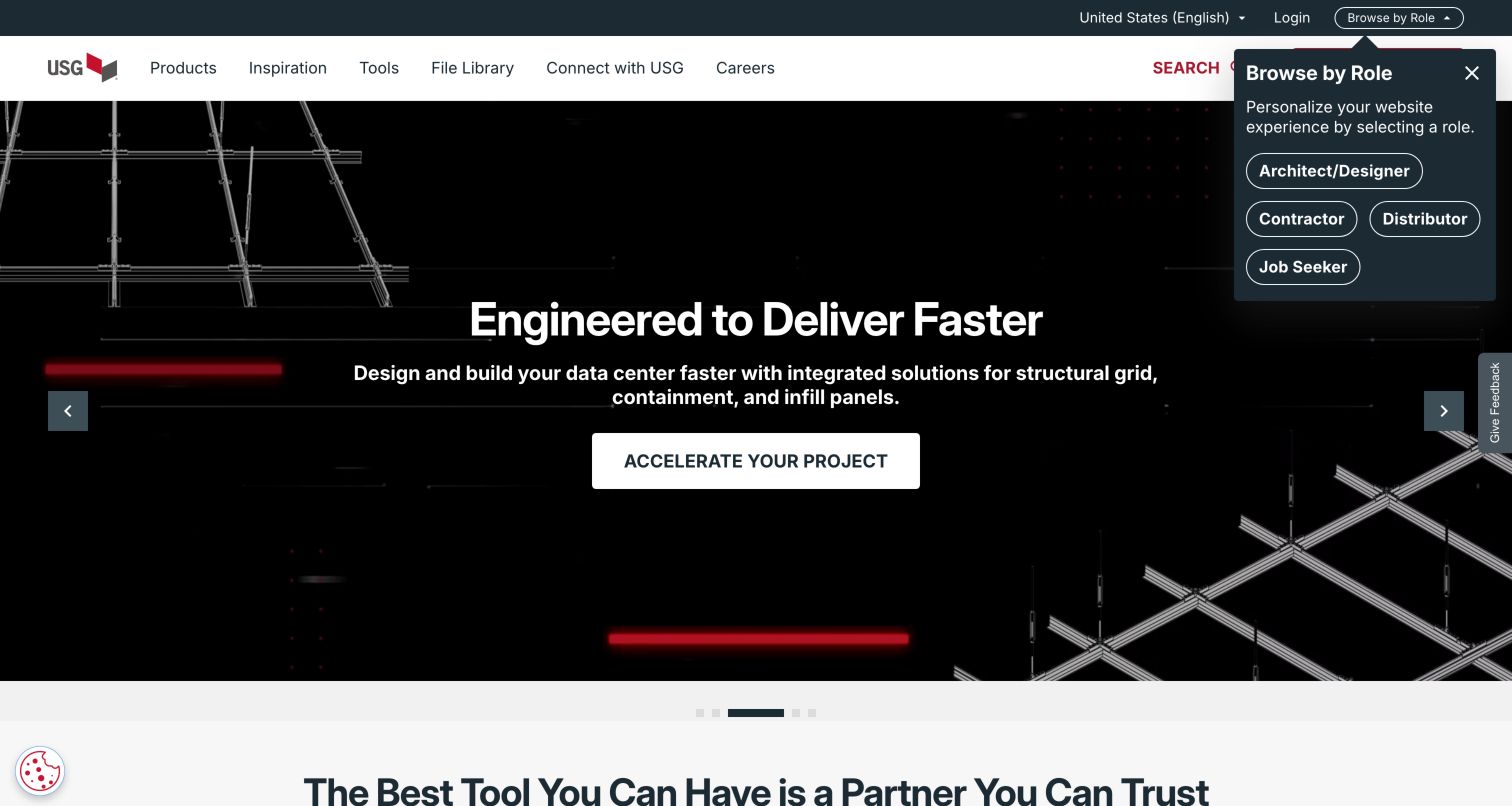
USG places File Library beside Products, Inspiration and Tools in its main navigation. That choice recognizes that a technical document can be the destination rather than supporting material hidden inside a product page. The inspected navigation distinguishes specifications, CAD and Revit files, submittal sheets, warranties and installation guides. Assembly routes and digital tools sit nearby, while audience options include architects, contractors and distributors. The captured homepage promotes data-center systems, illustrating how an application campaign can coexist with the underlying catalog. The initial role prompt and carousel add choices, however, and the volume of terminology may be demanding for a first-time buyer.
What you can learn
Treat documentation as a first-class product when designers and contractors return frequently for files. Use document type, product family, assembly and revision metadata to narrow results. Keep audience personalization optional, and make public technical information accessible without forcing someone to create an account or identify their role first.
Pros
File types are explicitly distinguished in navigation.
Products, assemblies and tools have separate routes.
Cons & considerations
Professional terminology can overwhelm unfamiliar visitors.
Audience prompts add another decision before browsing.
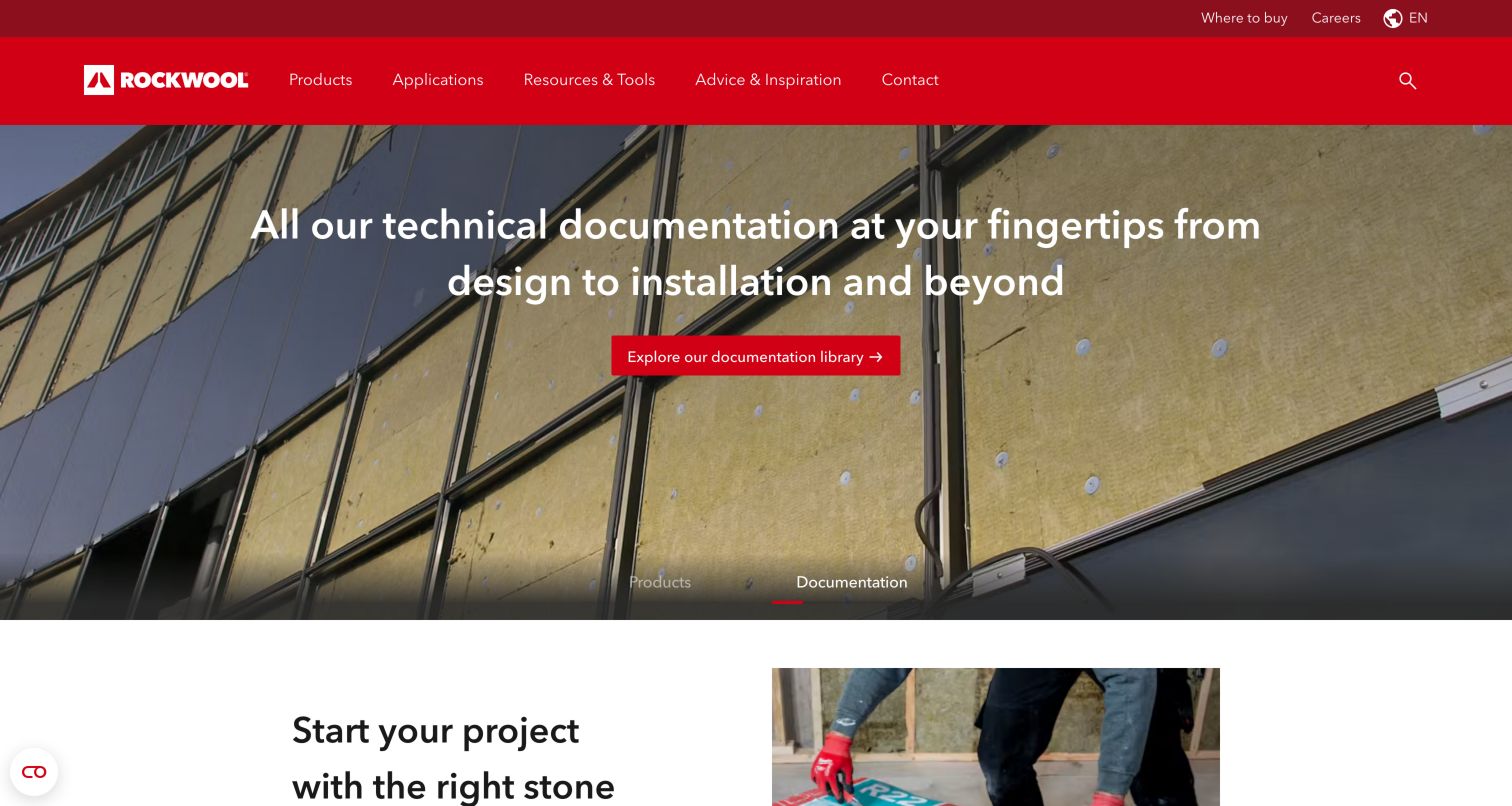
ROCKWOOL North America gives technical documentation equal prominence with its insulation products. The captured opening directs visitors to a documentation library, followed by a guided product-finder invitation. Application guides then distinguish interior walls, exterior walls and roofing, making the building context an organizing principle. Product cards add short descriptions rather than relying only on branded names, and separate support routes connect visitors with technical staff, sales representatives or stores. This is a useful model for products whose suitability depends on an assembly. Its long page and repeated library links could become difficult to scan if new resources are added without a clear hierarchy.
What you can learn
Let visitors start from the application as well as the product name. Explain why a guided selector asks each question and show the assumptions behind any recommendation. Keep technical assistance visible for exceptions, and distinguish a general application guide from the current product data required for an actual project.
Pros
Application guides make technical choices more approachable.
Technical support is separated from sales and store discovery.
Cons & considerations
Repeated resource links increase page length.
A selector cannot resolve every assembly-specific requirement.
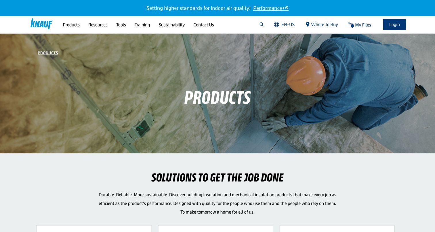
Knauf Insulation’s North American product page starts with installation imagery and a plainly labeled product destination. Its catalog distinguishes recognizable forms such as batts, rolls, boards and pipe insulation, then explains their applications in short descriptions. Separate navigation areas collect documentation, tools, training and sustainability material. The page also introduces concepts such as R-value, thermal properties and sound control, giving less experienced visitors a way to learn the vocabulary behind a selection. A professional who already knows a product can use the technical-resource routes instead. The extensive menu and generic hero heading make category cards important for communicating what is actually available.
What you can learn
Use product form and application as complementary ways into a technical catalog. Place definitions near unfamiliar terms and preserve a fast route for experienced users who need a submittal sheet. Avoid treating a general educational explanation as a substitute for the specific test conditions and limitations in current product documentation.
Pros
Product forms provide concrete category labels.
Training and documentation are visibly distinct.
Cons & considerations
The generic opening reveals little of the range.
The large navigation system needs careful mobile grouping.
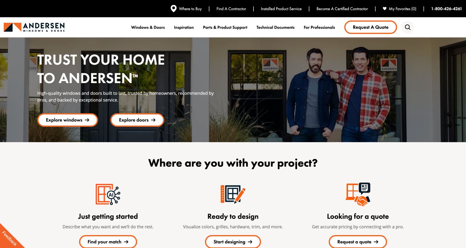
Andersen separates the window and door catalog from inspiration, product support and technical documents. Below the opening image, three project stages distinguish initial discovery, design exploration and a quote request. This lets visitors approach the same product range with different amounts of certainty. The surrounding navigation includes replacement parts, installation guidance and performance information, acknowledging that an installed window continues to generate service tasks long after purchase. A first-visit audience prompt appeared during inspection and was dismissed for the capture. The breadth of choices is valuable, but repeated routes and separate Andersen-related services need clear labels to prevent visitors entering the wrong purchase or support journey.
What you can learn
Organize long-lived building products around both purchase stage and ownership stage. Keep parts, installation and warranty help independent of promotional campaigns. If several brands or service models share a name, explain their differences at the handoff, and allow visitors to dismiss personalization prompts without losing access to the catalog.
Pros
Project stages explain different next steps.
Support and technical documents have primary navigation positions.
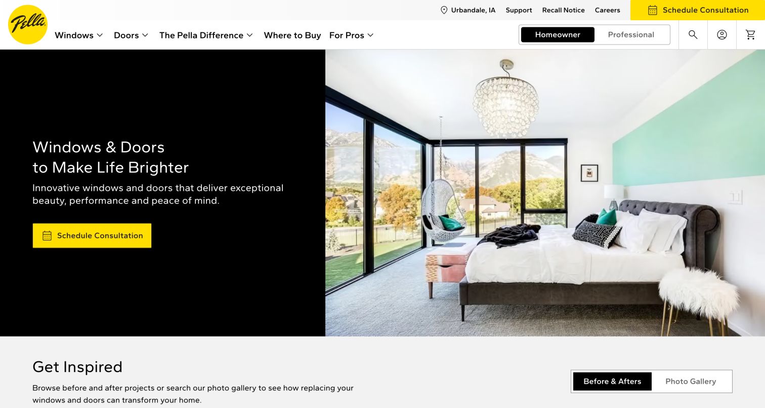
Pella combines a clear consultation action with large residential photography and a persistent homeowner/professional switch. The opening speaks in terms of the completed home, then offers before-and-after projects and a photo gallery to make the transformation easier to imagine. The captured navigation also exposes support and a recall notice, preserving important ownership tasks beside sales content. A location label appears prominently, making the regional nature of the journey visible. The benefit is a straightforward starting point for someone who wants advice; the tradeoff is that a consultation can feel premature to a visitor who first wants an independent comparison of product types and specifications.
What you can learn
Show the local context of a consultation and let visitors confirm or change it. Pair the appointment route with ungated product details and comparison material. Before-and-after examples should identify the relevant products and project conditions so the images can support a useful decision rather than serve only as decoration.
Pros
Consultation and regional context are easy to find.
Project transformations provide concrete inspiration.
Cons & considerations
Advice-first messaging may precede a buyer’s readiness.
Product comparison sits below the main sales message.
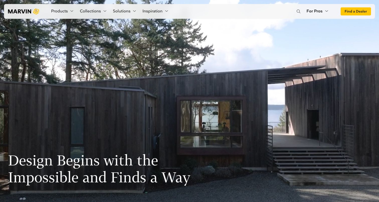
Marvin leads with expansive architectural imagery and a compact navigation bar. Its page then explains five window and door collections with distinct descriptions of materials and design intent. This is valuable because branded collection names alone rarely tell a visitor what changes between ranges. Case studies and project photography continue the architectural emphasis, while professional resources and dealer discovery provide practical routes into the specification and purchasing process. The opening is visually confident, but the product distinctions arrive after a large image area. Visitors arriving with a particular technical requirement may prefer a direct comparison rather than reading each collection’s narrative in sequence.
What you can learn
When several product collections overlap, identify their material, configuration and application differences in consistent fields. Let the imagery establish the design ambition, then give visitors a concise comparison they can use with a dealer or architect. Keep technical specifications linked from each collection instead of relying on a separate resource hunt.
Pros
Collection descriptions explain meaningful material differences.
Dealer and professional routes remain visible.
Cons & considerations
The large opening postpones practical comparisons.
Sequential storytelling can slow specification-driven visitors.
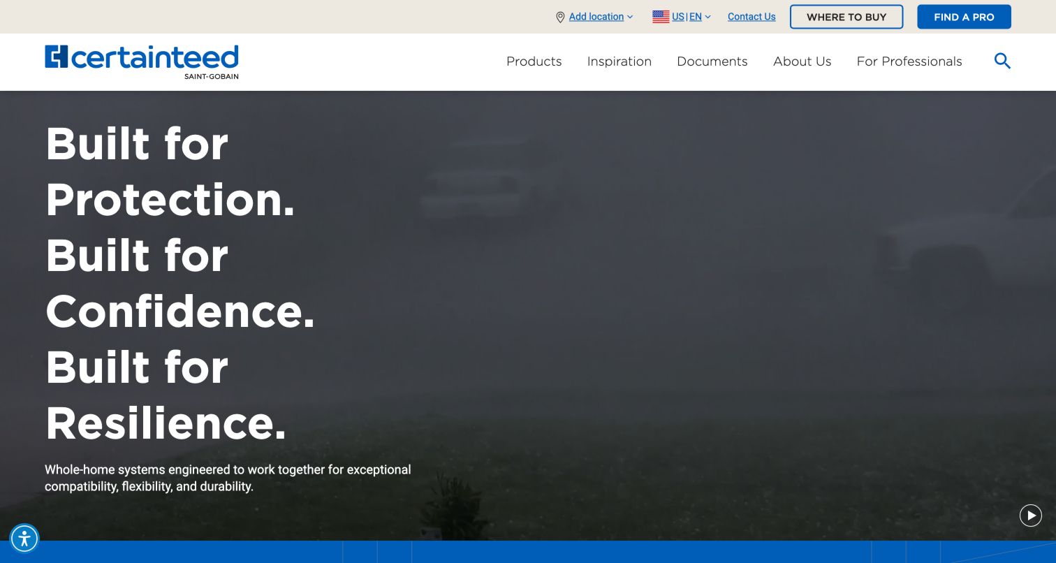
CertainTeed frames its range as coordinated systems for a whole building. The homepage divides residential and commercial solutions, then uses a cutaway house with hotspots to connect materials to their physical locations. Product categories include roofing, siding, drywall, ceilings, insulation and sheathing, giving the larger story concrete destinations. Documents have a place in the main navigation, while Where to Buy and Find a Pro sit in the utility row. The approach helps explain a broad portfolio, but the opening promise remains abstract until the visitor reaches those categories. The cutaway also needs a usable text structure for people who cannot operate or interpret the image.
What you can learn
Use an assembly illustration to explain how product families relate, then provide equivalent category links and written descriptions. Keep compatibility claims tied to the exact system and current documentation. Distinguish inspiration, product selection and technical validation so a homeowner’s visual exploration does not imply an approved construction specification.
Pros
Residential and commercial paths narrow a broad portfolio.
Documents and purchase assistance remain explicit.
Cons & considerations
The opening headline does not name individual materials.
Interactive hotspots require an accessible alternative.
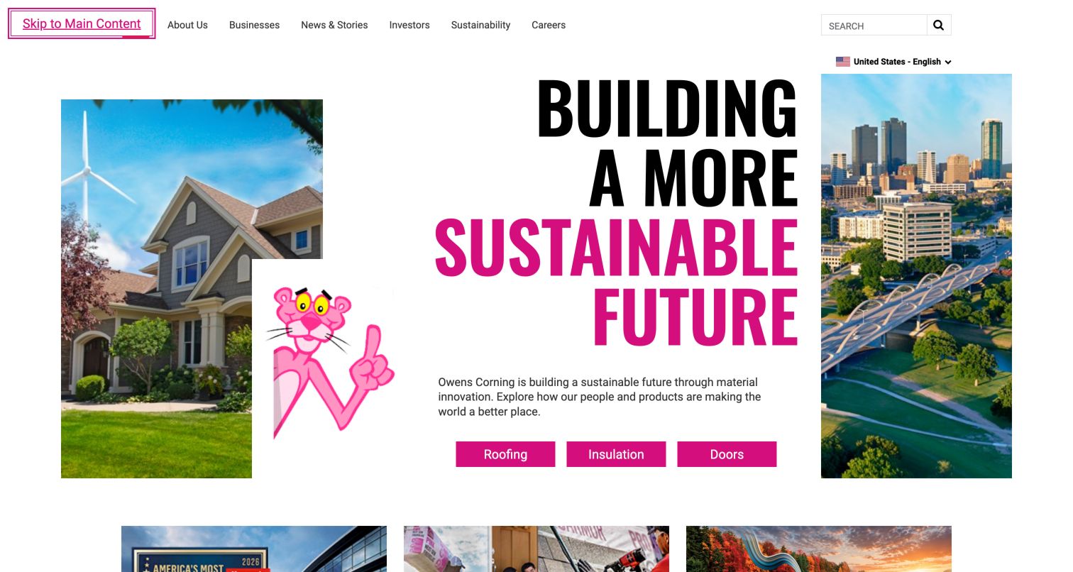
Owens Corning uses recognizable brand imagery and oversized typography, then offers three direct business choices: roofing, insulation and doors. These buttons are important because the surrounding navigation serves corporate audiences through company information, investors, sustainability and careers. Below the opening, quick links identify practical tasks such as shingles, warranties, documents and suppliers. The result is a corporate front door with useful product exits rather than a single undifferentiated company story. News and reports still occupy substantial space, and a visitor looking for a specific data sheet must move beyond the brand-level message before the task-oriented links become apparent.
What you can learn
If the corporate homepage is also the main product entry point, make the business divisions immediately recognizable. Give frequent technical and ownership tasks their own clear labels, and maintain a visible distinction between company sustainability reporting and the evidence that applies to a particular product or assembly.
Pros
Three business buttons simplify initial orientation.
Quick links name recurring product and support tasks.
Cons & considerations
Corporate news competes with sourcing journeys.
The hero communicates identity more than product detail.
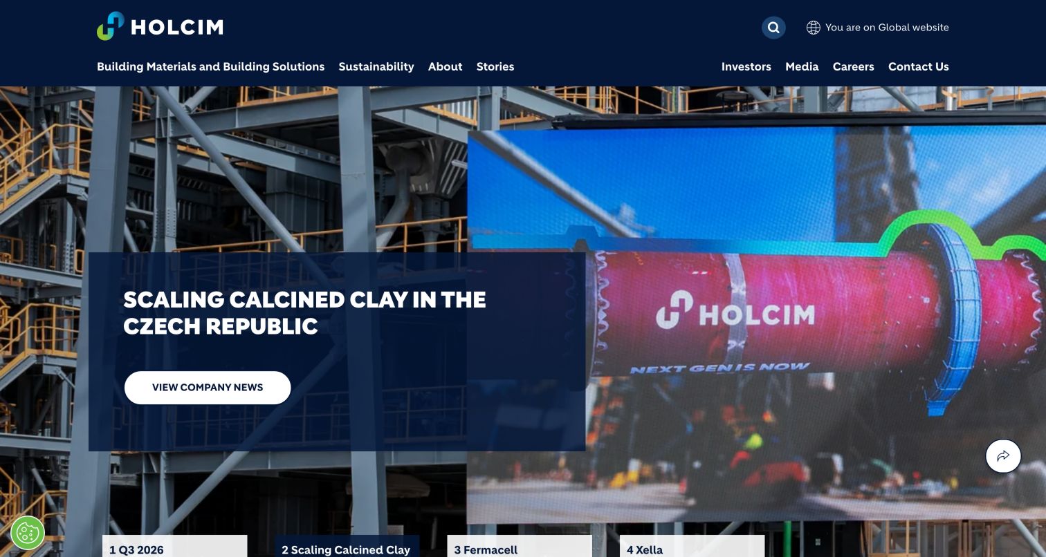
Holcim explicitly labels the page as its global website and gives building materials and solutions a prominent header position. The opening carousel carries corporate developments, while subsequent sections connect strategy, building solutions, careers and investor information. That structure suits a manufacturer whose corporate audience differs from a local buyer seeking availability or a technical sheet. The captured slide illustrates production activity rather than a finished home. During inspection, a newsletter dialog appeared after the cookie choice and was dismissed. This is a useful reminder that the global story and its promotional prompts can create extra steps for people who arrive with a narrow product task.
What you can learn
State the geographic scope of a global manufacturer site and offer a reliable route into the relevant local business. Preserve product and country context across that transition. Corporate stories can explain capability, but regional availability, technical documents and contact ownership must remain explicit before a visitor acts on a product claim.
Pros
Global scope is clearly identified in the header.
Materials and solutions have a prominent route.
Cons & considerations
Corporate slides delay direct product detail.
The newsletter prompt interrupts the research journey.
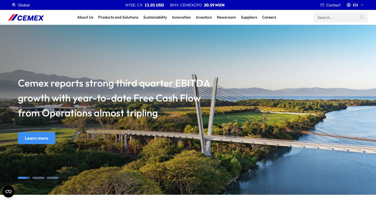
Cemex pairs a compact corporate navigation with a large project image and a financial-news opening. Its page later presents cement, ready-mix concrete, aggregates and urbanization solutions as separate material families, each with an explanatory description. Project examples connect those materials to construction settings, while a global link signals that local market information is a separate task. This arrangement provides context for investors and partners without abandoning product discovery. The tradeoff is the ordering: financial performance appears before the catalog, so a construction buyer must pass through substantial corporate content. Repeated generic learning links also depend heavily on surrounding headings for meaning.
What you can learn
Give corporate and product audiences direct entry points instead of expecting every visitor to read the same long homepage. Connect project stories to the material family and local team involved. Use descriptive links that remain understandable outside their immediate visual context, particularly when the page contains several similar cards or carousels.
Pros
Material families include short explanatory descriptions.
Projects demonstrate the intended construction context.
Cons & considerations
Financial content precedes the product catalog.
Repeated generic links need strong surrounding labels.
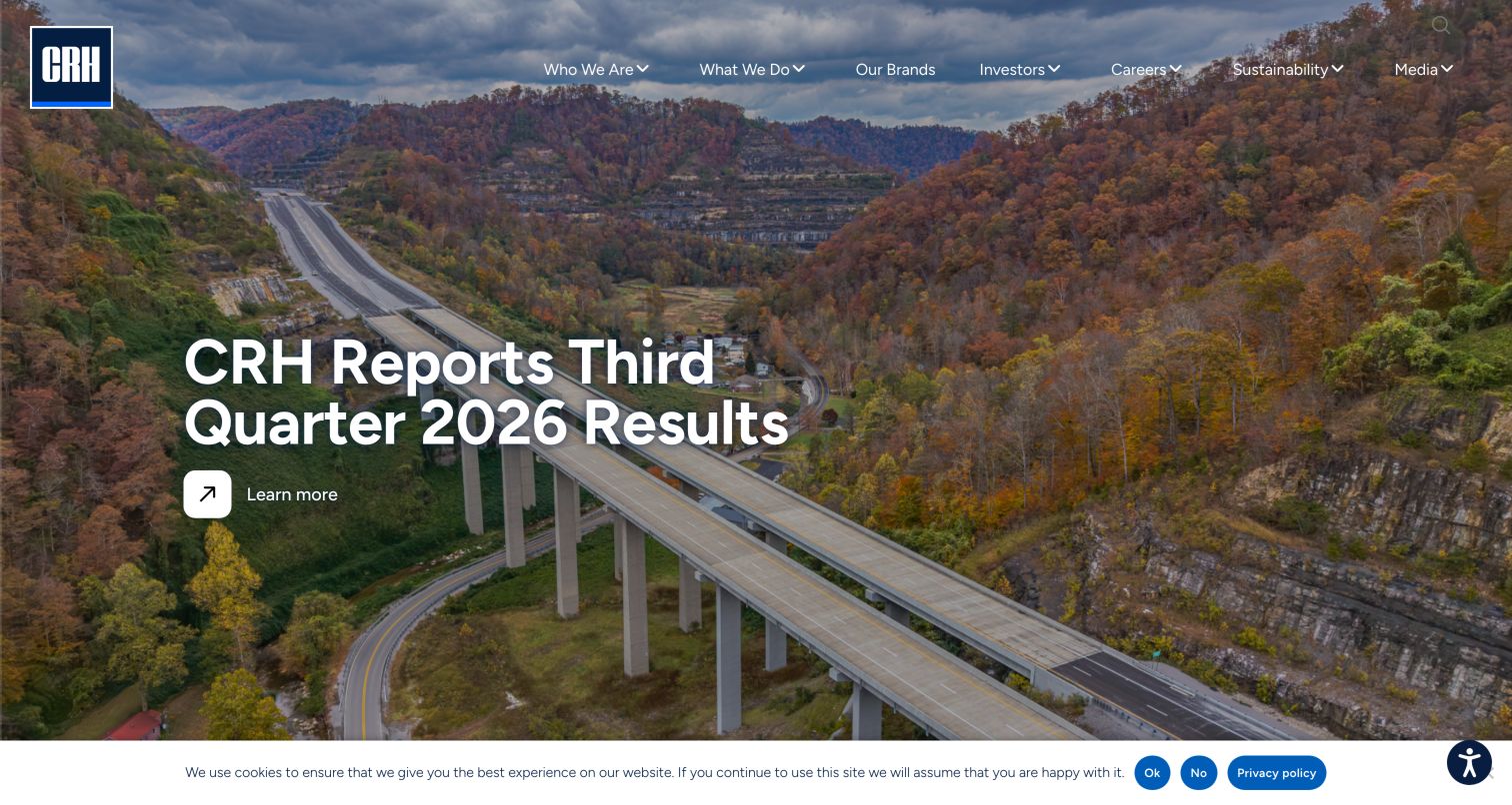
CRH’s homepage opens with infrastructure photography and a corporate-results announcement. Its main navigation includes Our Brands alongside company information, activities, investors and sustainability, making the portfolio itself a visible destination. The supporting introduction names material and infrastructure areas, while the news section combines financial updates with stories about roads, water and industrial development. This approach communicates the scope of a large group rather than presenting a unified retail catalog. It is useful for understanding the organization, but a buyer must still identify the relevant brand or regional business before reaching detailed products, availability and contacts.
What you can learn
For a group built around local brands, treat brand discovery as a practical sourcing tool. Let visitors narrow by material, application and geography, then explain the destination before handing them off. Keep corporate announcements separate enough that an urgent product inquiry does not depend on scanning an investor-oriented homepage.
Pros
The brand portfolio has a primary navigation link.
Infrastructure imagery matches the organization’s material context.
Cons & considerations
The opening is oriented toward corporate updates.
Local sourcing requires an additional brand decision.
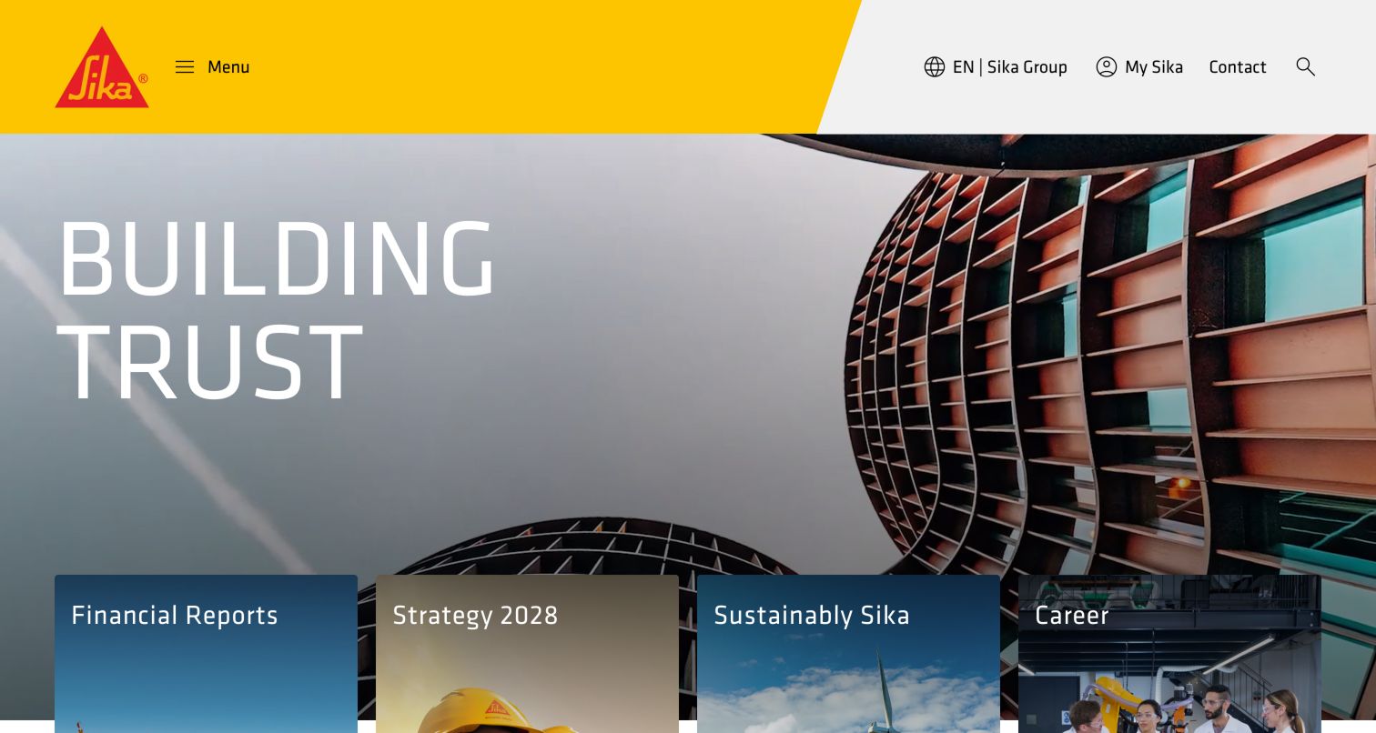
Sika uses a bold brand header and architectural imagery, with prominent cards for reports, strategy, sustainability and careers. Further down, a help-oriented search field sits beside country selection, and the page distinguishes construction solutions from industrial solutions. That separation matters for a manufacturer whose materials can serve very different applications. Knowledge resources, project references and project support provide routes beyond the corporate introduction. The broad homepage works as an organizational gateway, but the first screen does not yet explain the available product families. A visitor seeking a sealant, repair system or technical document needs the next layer of navigation to establish local and application context.
What you can learn
Separate markets when they require different product language, specifications and support teams. Make country selection part of the product journey, and explain when a visitor is leaving the global site. Connect reference projects with identifiable systems and documentation rather than expecting architectural images to establish suitability on their own.
Pros
Construction and industrial solution routes are distinct.
Country selection and project support are available.
Cons & considerations
Corporate cards dominate the first screen.
Specific material selection begins deeper in the site.
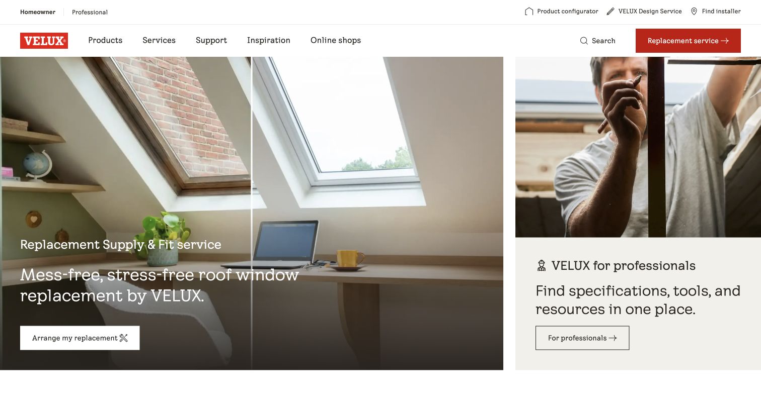
The saved VELUX UK capture places a replacement-service story beside a dedicated professional resource panel. The two areas make different intentions visible immediately: an owner can explore replacing a roof window, while a professional can look for specifications and tools. A utility row adds a configurator, design service and installer search without burying the main product, support and inspiration categories. The side-by-side composition is especially useful for a product that participates in both renovation and new construction. It also creates competing actions, so the same distinction must survive on a narrow screen where the panels can no longer receive equal horizontal space.
What you can learn
Give replacement owners and design professionals equally clear starting points, using labels that explain the task rather than an internal department. Carry the relevant product identity into support and configuration. This review uses the original November 3 capture, so its campaign is a documented example rather than a claim about today’s offer.
Pros
Replacement and specification needs are visible together.
Useful service links remain close to product navigation.
Cons & considerations
Several actions compete within the opening view.
The split composition needs deliberate mobile ordering.
Kegan is a freelance web designer and developer with 15+ years of experience helping businesses turn complicated website requirements into clear, maintainable digital experiences. He works directly with clients from planning and design through development, launch, and ongoing support.
For building material manufacturer website design, his development approach focuses on product specifications, technical documents, project examples, and distributor discovery. The scope can be a targeted improvement or a complete custom build, with responsive layouts, thoughtful content structure, and integrations chosen around the people using and maintaining the site.
Show 3 other building material manufacturer website designersHide other building material manufacturer website designers
Define stable product identifiers, collection names, variants, finishes, sizes, markets and related components before designing page templates. Identify the authoritative owner for each field. A product rename or withdrawal should update navigation, documents, comparisons and local contact routes together.
Separate selection from specification
Inspiration pages can help visitors explore appearance and broad applications. Technical pages need the exact product, intended use, limitations and relevant documentation. Create clear transitions between these modes, and involve product specialists in reviewing claims that could affect a construction decision.
Design the document journey
Test tasks such as finding an installation guide for an older product, comparing current data sheets and collecting a submittal set. Include version handling and discontinued products in the plan. Show file format and size before downloads, and make document titles useful outside the website.
Define local handoffs
Decide when the visitor needs a country, region, dealer or supply location. Explain whether a contact is the manufacturer, a distributor or an independent installer. Carry product and market context into the handoff where supported, with a readable fallback if a locator or partner tool is unavailable.
Connect visual tools to real products
A color selector or visualizer should return recognizable product names and configuration details. Explain display and rendering limitations, then offer samples or professional advice where appropriate. Avoid suggesting that an attractive visualization confirms availability, compatibility, installed cost or engineering suitability.
Plan for ownership after purchase
Support does not end when someone requests a quote. Make parts, care instructions, warranty information, recalls and replacement guidance easy to reach. Test those tasks with people who do not know the current product name or still hold documentation from an earlier brand or collection.
The editing job behind the design
Choose technology for a maintained product catalog
Start with the information responsibilities: product data, market availability, technical documents, media and customer support. The site may need a content management system, product information system, document repository and dealer integrations, but each should have a clear source of truth. Define how an approved change reaches product pages, search results, downloads and regional sites before choosing a visually impressive component.
Public stack observations identify exposed website components, not hidden manufacturing, ordering or engineering systems. A script or asset reference can help explain delivery choices without proving how the entire business operates. Evaluate catalog search, document versioning, accessibility, performance and failure handling in your own workflows. Provide readable alternatives when a visualizer, locator or embedded tool cannot load.
Our WordPress website examples offer a separate look at publishing approaches. A visible platform label is evidence for that named page, not a guarantee that the same system will suit your requirements.
Before the public launch
Building material manufacturer website launch checklist
Products can be found by common name, collection, form and application.
Homeowner and professional paths remain optional shortcuts to public information.
Country and market context is visible and persists through product navigation.
Product pages identify variants, related components and intended applications clearly.
Technical claims link to the relevant current documentation and limitations.
Documents show useful titles, file formats, language, scope and revision information.
Discontinued products and older installation guidance have an intentional support path.
Visualizers and calculators explain their assumptions and preserve product identifiers.
Sample, quote, dealer and installer actions explain what happens next.
Locators distinguish manufacturer contacts from independent businesses.
Keyboard navigation, text enlargement and narrow-screen layouts support catalog and document tasks.
Moving media, consent banners and promotional dialogs do not hide essential navigation.
These checks are a project checklist, not a performance, legal, security, or accessibility certification. Test real journeys with the people responsible for the website before making claims about the result.
Sources & editorial method
How this collection was selected and reviewed
Original selection: The collection uses its saved target of nineteen distinct manufacturer properties. Eighteen examples were inspected and captured directly in the browser on November 5, 2026. The VELUX UK example reuses a verified November 3 capture and its original provenance, with a new review focused on manufacturer navigation. Capture URLs, dimensions and attribution are retained. Candidates that did not render reliably or presented an access check were excluded. Reviews describe visible design and information organization; forms were not submitted, products were not purchased, and engineering, performance and accessibility claims were not independently certified. On November 5, 2026, Durat was reviewed and added as Editors Choice in the first slot, bringing this collection to 20 examples. All earlier reviews and their original capture dates are retained. The badge is an editorial design selection, not a user-vote award or an endorsement of the organization’s services.
Each example links to its actual source page. Screenshots are direct browser captures with their own capture dates; moving imagery, announcements and live designs can change. The notes describe observable design choices and conditional tradeoffs, not measured traffic, conversion results, service quality, or accessibility conformance.
Technology labels use public page metadata, asset evidence, or explicitly cited platform documentation. Platform documentation is not a complete current deployment audit. A component reference may be legacy or unused; it is not a complete backend inventory. Unknown stacks are omitted. These sites are editorial examples, not our client portfolio.
Written, Edited and Curated are separate editorial records, not timestamps advanced by a rebuild. Website designs and imagery belong to their owners. See our editorial standards or suggest a correction.
Questions worth asking
Building Material Manufacturer website design questions
What should a building material manufacturer homepage prioritize?
Prioritize the tasks your visitors arrive to complete: finding a product, identifying an application, retrieving a document or locating help. A consumer product brand may lead with inspiration, while a technical supplier may need documents and regional contacts first. Confirm the order with representative users rather than copying a corporate homepage.
Should homeowners and professionals have separate websites?
They may need different content emphasis, but separate sites are not always necessary. Clear audience shortcuts can sit above a shared product catalog. Keep product identities, technical facts and documents consistent, and allow visitors to switch paths without losing their market or selected product.
How should technical downloads be organized?
Use product, document type, market, language and revision information. Distinguish installation instructions from promotional brochures and general application guides. Give older products a support route and identify the current approved file. Test whether a visitor can find the right document without knowing your internal naming conventions.
Are visualizers and product finders enough to recommend a material?
They can support exploration, but their output needs clear assumptions and limits. Product suitability may depend on an assembly, local requirements, installation conditions and professional judgment. Connect suggested products to current documentation and technical assistance instead of presenting a visual match as a complete specification.
Do these examples prove better conversion or accessible design?
No. Public inspection and screenshots reveal useful interface patterns and potential friction, but they do not establish completion rates, legal compliance or accessibility conformance. Use task testing, analytics and appropriate specialist review to evaluate your own implementation and the claims you plan to make.
Build the manufacturer website around the connection between a project need, an identifiable material and the information required for the next decision. Strong imagery can start the conversation; clear product data, documents and local support make that conversation useful.