Best Adventure Travel Websites of 2026 (20 Real-World Examples)
Real adventure-travel websites that connect inspiring places with practical decisions about activity, timing, support and trip format.
An adventure travel website has to make an unfamiliar journey understandable. The scenery may create interest, but a visitor still needs to know what they will do, how demanding it is, who supports the trip and whether the dates fit. These twenty examples show different ways to connect that emotional opening with useful planning information.
Adventure travel spans much more than one visual style. A backpacking specialist, a cycling operator and a small-ship expedition company all need to explain different forms of participation. The strongest structure begins with that actual product. Destination is one useful entry point, but activity, effort, support and travel format often determine whether a trip is suitable.
This collection includes broad operators and focused specialists, with public homepages and one exact destination landing page. The reviews examine navigation, photography, search prompts, trip-card information and the relationship between inspiration and practical detail. They are website-design observations, not travel recommendations or evaluations of safety, guide quality or fulfillment.
Before the examples
What makes good adventure travel website design in 2026?
Make the travel format explicit
Explain whether the trip is guided, self-guided, custom, expedition-based or part of a small group. Use plain descriptions of the experience and the support provided. A visitor should not have to infer the format from a landscape photograph or an unfamiliar product label.
Expose the decisions that change suitability
Activity level, terrain, duration, season and support arrangements can matter as much as country. Surface the important criteria in the finder and trip cards, then provide detailed definitions on itinerary pages. Avoid presenting a numbered grade as a complete explanation of physical demands.
Connect imagery to a real journey
Name the trip, place or activity behind a hero image whenever possible. Distinguish representative imagery from an actual itinerary promise, particularly for wildlife and weather-dependent experiences. The next action should lead to information that supports the interest created by the image.
The collection · 20 examples
20 adventure travel websites worth studying
Compare how these operators move visitors from a place or activity that catches their attention into a more specific planning task. The examples deliberately include both detailed finders and quieter editorial entrances, with their different strengths and tradeoffs.
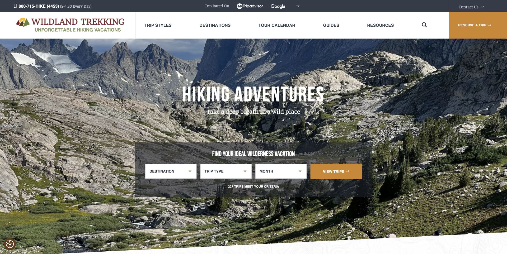
Wildland Trekking places its trip finder directly over a dramatic rocky valley, with destination, trip type and month as the three starting decisions. The navigation names trip styles, a tour calendar and guides instead of relying only on country lists. Its public page distinguishes backpacking, inn-based walking, day hikes and supported trips, making the type of experience easier to understand. The strong feature is the bridge between an inspiring scene and a manageable search. The photograph sets the atmosphere, but the surrounding structure helps visitors decide what kind of hiking holiday they actually want.
What you can learn
Translate a landscape promise into a small set of meaningful choices. Trip style and timing can be as important as destination, so put those distinctions near the opening rather than leaving them buried in an itinerary.
Pros
The visible trip finder names three concrete planning decisions.
Guides and a tour calendar have their own main-navigation routes.
Cons & considerations
The first screen does not yet explain fitness requirements or inclusions.
The many trip styles need plain definitions for visitors unfamiliar with guided hiking.
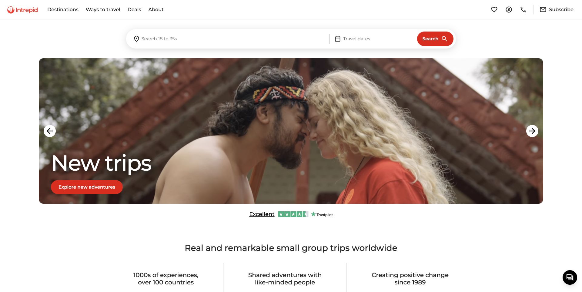
Intrepid keeps a large destination-and-date search above its rotating campaign image. The captured scene emphasizes a human encounter, while the supporting page identifies small-group travel and offers cards with trip names, duration, category and dated starting prices. The page therefore gives browsing and direct search different places in the hierarchy. This is useful when visitors range from those with a country in mind to those still deciding on an experience. Ratings and promotional prices are the site's own displayed information, not independently tested service results or permanent offers.
What you can learn
Separate an enduring search interface from changing campaigns. Pair emotional imagery with cards that expose enough comparable information for someone to move from general interest to a plausible shortlist.
Pros
The destination-and-date search remains distinct from the carousel.
Trip cards expose duration and trip categories alongside their names.
Cons & considerations
Large campaign images can postpone the most useful comparison details.
Starting prices need their date and departure context to avoid misleading comparisons.
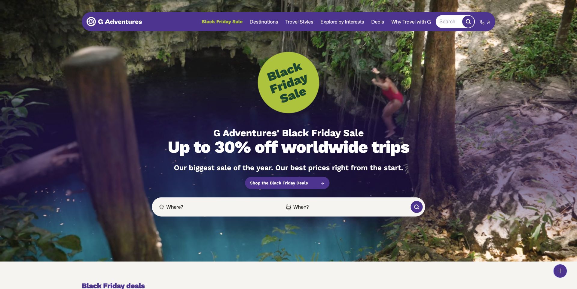
G Adventures uses a purple navigation pill and bright lime campaign badge over adventure footage. The observed homepage leads with a seasonal sale, then provides a simple where-and-when search and region-based browsing. Destinations, travel styles and interests remain distinct header choices, so the campaign does not erase the underlying catalog structure. Study the connection between the temporary offer and the ordinary ways of finding a trip. The discount in the screenshot is a time-specific promotion; this review does not verify its eligibility, availability or value.
What you can learn
Keep lasting discovery routes available during a major campaign. A visitor who is not motivated by a discount should still be able to choose a region, activity or travel style without decoding the offer.
Pros
Distinctive colors connect the campaign and navigation visually.
Travel styles and interests offer alternatives to destination browsing.
Cons & considerations
The promotion dominates the first impression more than trip suitability does.
Moving footage and a busy offer require stable contrast and clear conditions.
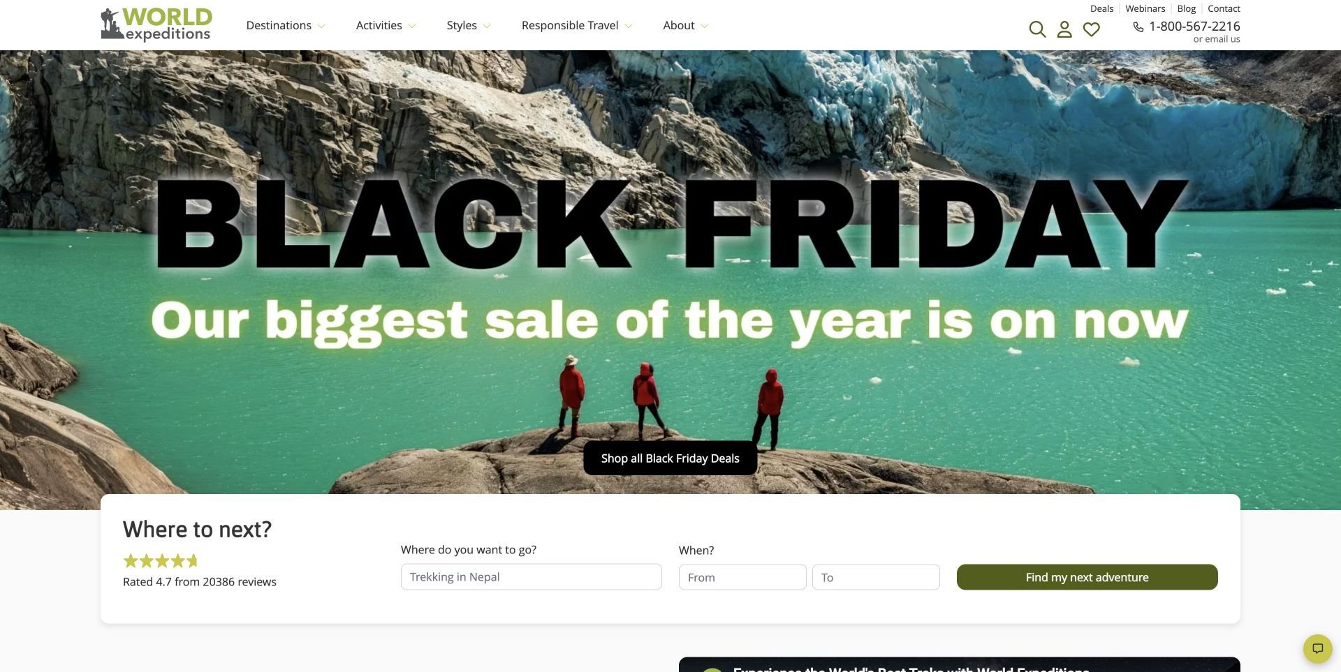
World Expeditions combines a large seasonal campaign image with a white search panel that asks where and when visitors want to travel. The main navigation separates destinations, activities and styles, with a dedicated responsible-travel route. Further down, the page introduces its active-adventure focus and shows destination and activity collections. The useful design idea is the distinction between what someone wants to do and where they want to do it. The oversized promotion creates a strong initial signal, although the actual planning controls are more valuable once a visitor begins comparing options.
What you can learn
Give activity and destination separate routes through a large catalog. Place date filtering where it is easy to recognize, and keep the explanation of trip styles close enough that new visitors can interpret the results.
Pros
The search panel supports a start and end date rather than one vague season.
Activities and travel styles are separate, plainly labeled navigation choices.
Cons & considerations
The seasonal offer occupies much of the opening before specialist detail appears.
Review totals and sustainability statements require their own supporting context.
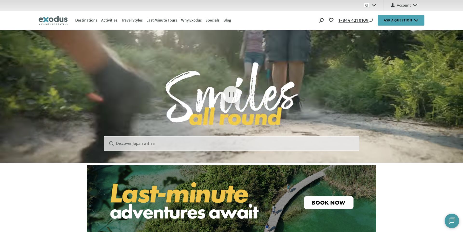
Exodus places an understated search field over a changing travel film, beneath a conventional header for destinations, activities and travel styles. The supporting content combines destination stories, guide perspectives and links into guided-group travel. Its composition emphasizes the feeling of participation, then lets visitors move toward a specific itinerary. The useful lesson is to connect the people in the imagery with understandable browsing choices. The campaign does not by itself establish how demanding an activity is, what is included, or whether a departure will suit a particular traveler.
What you can learn
Use travelers and guides to make an experience tangible, then supply practical routes into the catalog. Keep activity level, itinerary structure and inclusions available once visitors move beyond the opening film.
Pros
Destinations, activities and travel styles are separately labeled.
Guide and traveler perspectives connect the page to specific places and experiences.
Cons & considerations
The film and animated search prompt need stable, readable controls.
Cookie and chat overlays interrupted the initial view until dismissed normally.
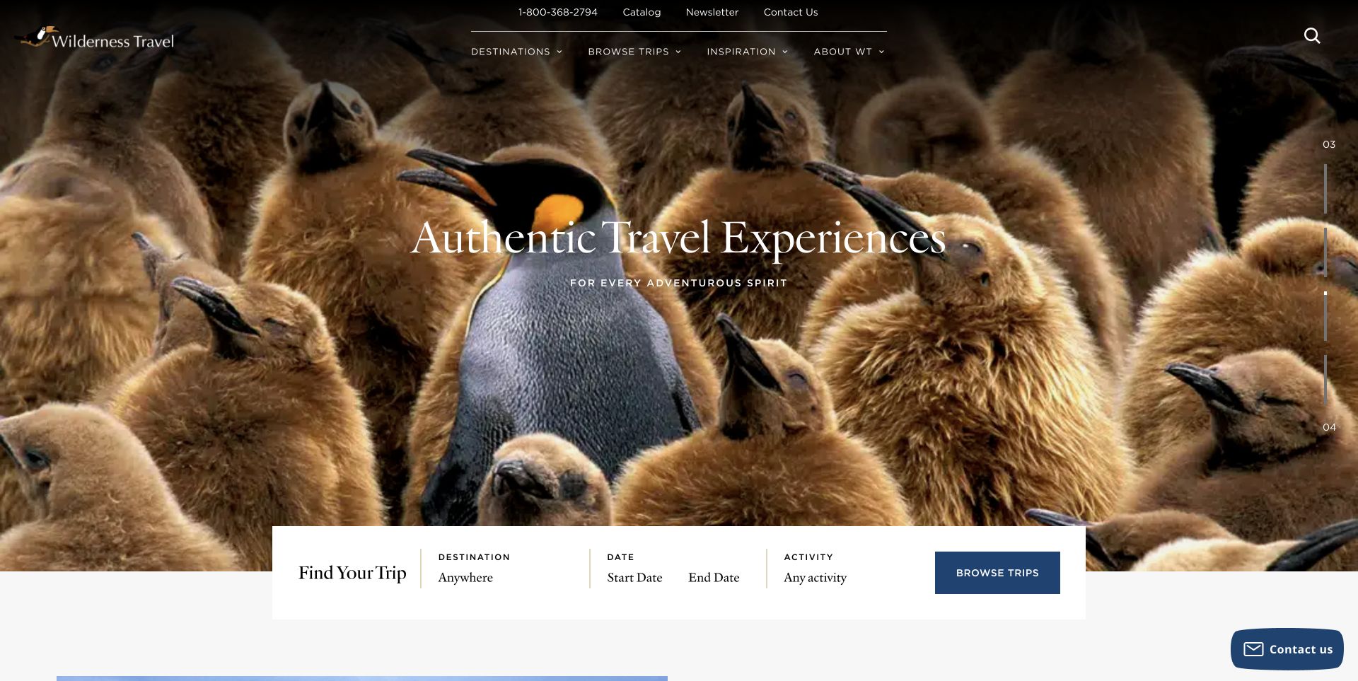
Wilderness Travel gives a large photographic scene most of the opening, with a restrained serif heading and a compact trip finder overlapping its lower edge. The reviewed carousel frame shows penguins, while destination, date and activity controls supply the practical next step. Catalog, contact and inspiration routes are also visible in the header. This is a useful reference for making a varied travel program feel coherent without putting every destination into the first screen. The imagery communicates subject matter; it is not evidence of a guaranteed wildlife encounter on an individual trip.
What you can learn
Let strong photography introduce the character of a journey, but anchor it with a short, consistent finder. Keep the boundary clear between an illustrative scene and an itinerary's actual promised activities.
Pros
The trip finder combines destination, date range and activity in one compact area.
The restrained typography gives the image room without removing the next action.
Cons & considerations
Fine navigation text must remain readable over every carousel frame.
A visual-first entrance postpones price and activity-level comparisons.
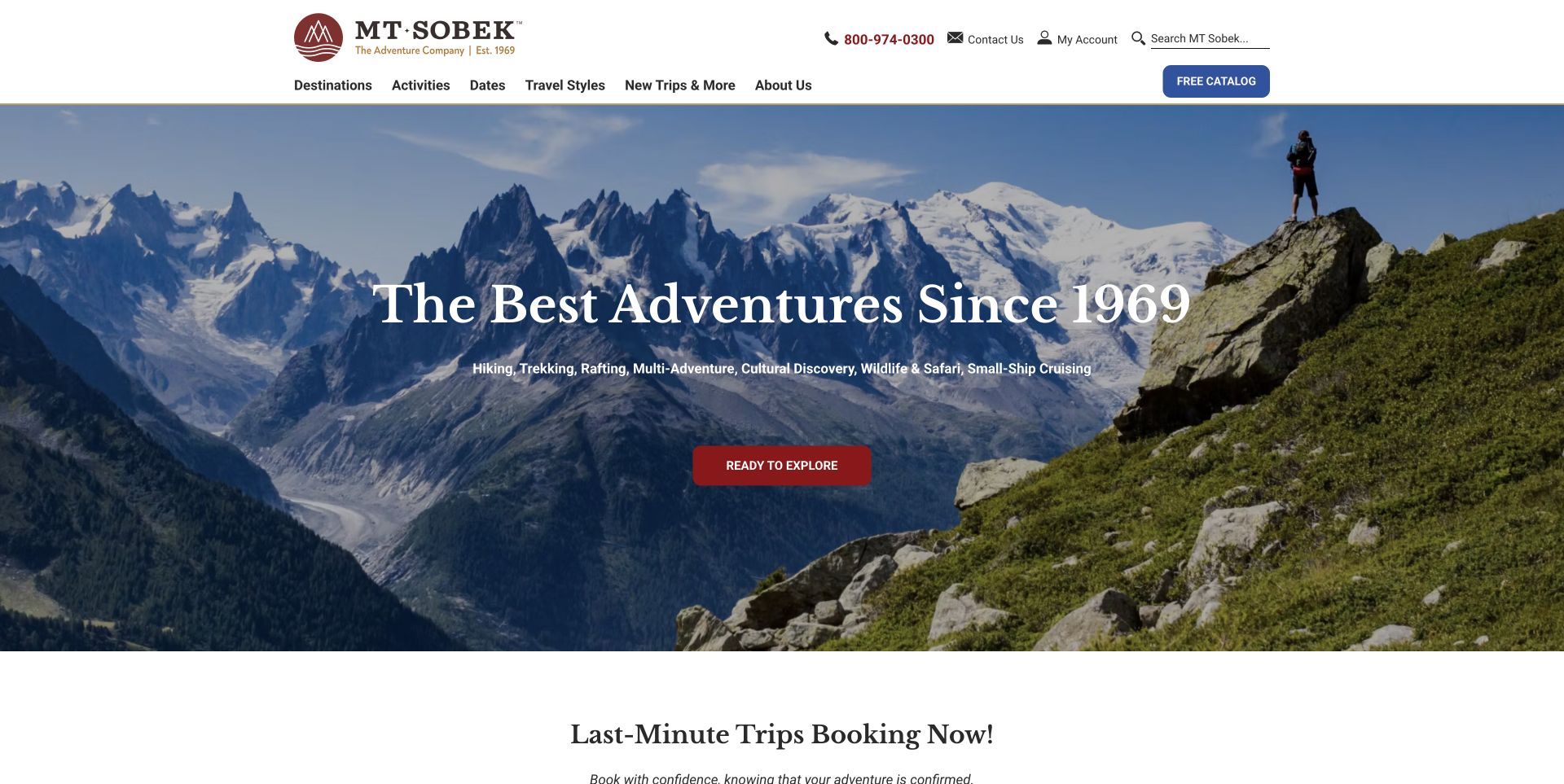
MT Sobek pairs a mountain panorama with an explicit list of adventure types rather than expecting the image to explain the whole business. Its header gives dates their own navigation position, and the next section points toward confirmed departures. Featured trip cards display an activity level, duration and starting price. The useful pattern is the movement from broad inspiration to concrete comparison information. The historical and quality claims in the headline belong to the company; the design review focuses on how the page organizes choices and makes the next step visible.
What you can learn
Name the activities a visitor can actually book and give departure timing a direct route. Consistent trip-card fields help readers compare unlike experiences without opening every itinerary first.
Pros
Dates has a clear place in the main navigation.
Featured cards show level, duration and a price basis together.
Cons & considerations
The broad activity list can be dense on the hero.
Level numbers need accessible definitions before they can guide a suitability decision.
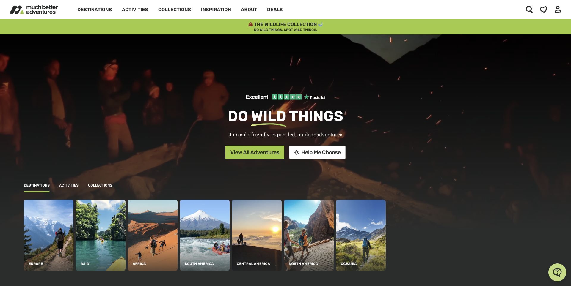
Much Better Adventures pairs a short outdoor-travel proposition with two distinct actions: view all adventures or get help choosing. A row of illustrated destination cards sits inside the opening composition, with tabs for destinations, activities and collections. The site explicitly describes its trips as solo-friendly and expert-led, giving context to the group scenes. The useful design distinction is between visitors ready to browse and those who need help narrowing their options. The page's responsibility and review claims remain source statements rather than independently assessed travel outcomes.
What you can learn
Offer a clear browsing route and a separate decision-support route. Organize the same catalog by destination, activity and collection when those reflect real visitor questions, and explain what help choosing will involve.
Pros
The two main actions acknowledge different levels of planning readiness.
Destination cards make the broad geographic range visible without a long list.
Cons & considerations
Several regional, cookie and newsletter overlays appeared before the clean view.
Motion and layered promotional strips can compete with the core planning task.
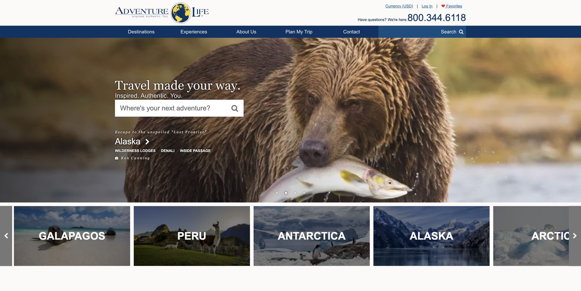
Adventure Life combines a prominent phone contact with a simple destination search and a Plan My Trip navigation link. Each opening slide names a place and several experiences, so the large image connects to a concrete region rather than remaining an anonymous landscape. The captured Alaska frame includes a visible photographer credit, followed by a strip of destination cards. This is a useful pattern for custom travel: inspiration, independent browsing and a human planning route coexist. No inquiry was submitted, and the review does not evaluate the planning service itself.
What you can learn
Give a custom-travel visitor both a self-service starting point and an obvious route to a conversation. Name the destination and relevant experiences alongside imagery so the inspiration can become a specific request.
Pros
The phone and Plan My Trip route are easy to find.
Destination names and experience labels connect the hero image to usable browsing choices.
Cons & considerations
The carousel can change context while a visitor is reading.
The first screen does not explain the custom-planning process or its cost.
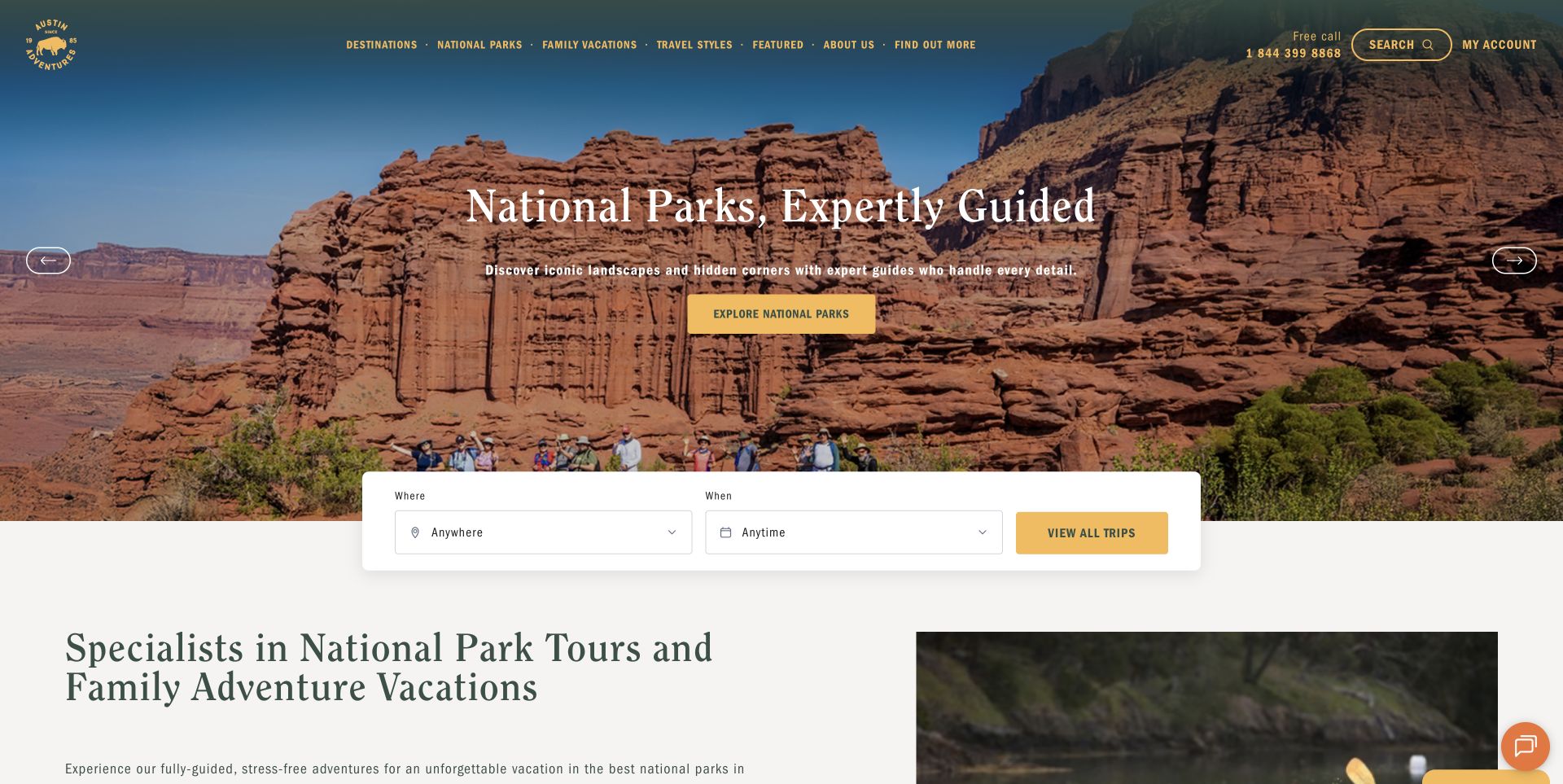
Austin Adventures uses warm yellow accents over a national-park landscape, with a compact where-and-when finder crossing the lower edge of the hero. National Parks and Family Vacations are separate navigation items, while the introduction reinforces those specialties. The structure helps visitors recognize the operator's focus before exploring the whole catalog. Study how a specific audience and setting shape the information architecture. The headline's service-quality language is the operator's claim; the observed design value is the clarity of the categories and the immediate access to trip discovery.
What you can learn
Let a genuine specialty determine the main navigation. Family travel and national-park itineraries involve distinct planning questions, so expose those paths early instead of putting every trip behind a generic destinations menu.
Pros
Family Vacations and National Parks are directly visible in the header.
The short finder leaves the specialty message understandable.
Cons & considerations
Small header labels rely on contrast over the landscape image.
Family age guidance and activity requirements need detail beyond the homepage.
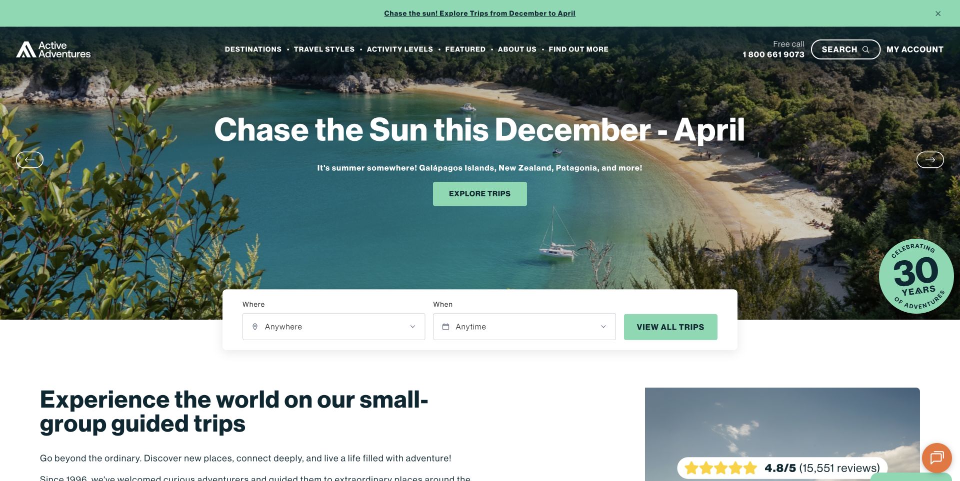
Active Adventures gives Activity Levels its own place in the main navigation, with visible routes from easygoing to more demanding trips and a fitness guide. The captured seasonal campaign leads into a straightforward destination-and-date finder, followed by an explanation of small-group guided travel. This is useful because physical suitability is a central decision in adventure travel, not merely a detail after booking. The page is related to Austin Adventures through its footer, but it presents a distinct property and travel range; this review does not treat shared branding infrastructure as separate ownership proof.
What you can learn
Bring activity-level guidance into primary navigation when suitability strongly affects the purchase. Pair descriptive levels with concrete walking, terrain and daily-effort information on the itinerary pages.
Pros
Activity Levels and its definitions are directly discoverable.
Travel styles distinguish multi-activity, hiking, biking and comfort-focused trips.
Cons & considerations
A level label alone cannot describe altitude, terrain or accessibility.
Seasonal promotions and signup overlays can delay the practical planning information.
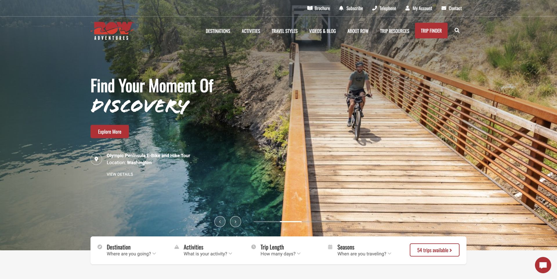
ROW Adventures gives each hero scene both an emotional heading and a specific trip name with its location. The reviewed frame identifies an Olympic Peninsula e-bike and hike tour rather than leaving the cycling image uncaptioned. Below, the finder includes destination, activity, trip length and season. This is a useful way to connect visual storytelling with the constraints people use when planning time away. Trip resources remain in the main navigation. The review assesses the interface and does not verify the site's permitting, membership or service-quality statements.
What you can learn
Caption an inspiring image with the actual trip and place it represents. Add length and season to the discovery tools when a visitor's available time is as important as the activity itself.
Pros
The featured image is tied to a named itinerary and geographic location.
Trip length and season appear alongside destination and activity in the finder.
Cons & considerations
The tall hero pushes much of the finder toward the fold.
Multiple carousel frames require consistent contrast and descriptive links.
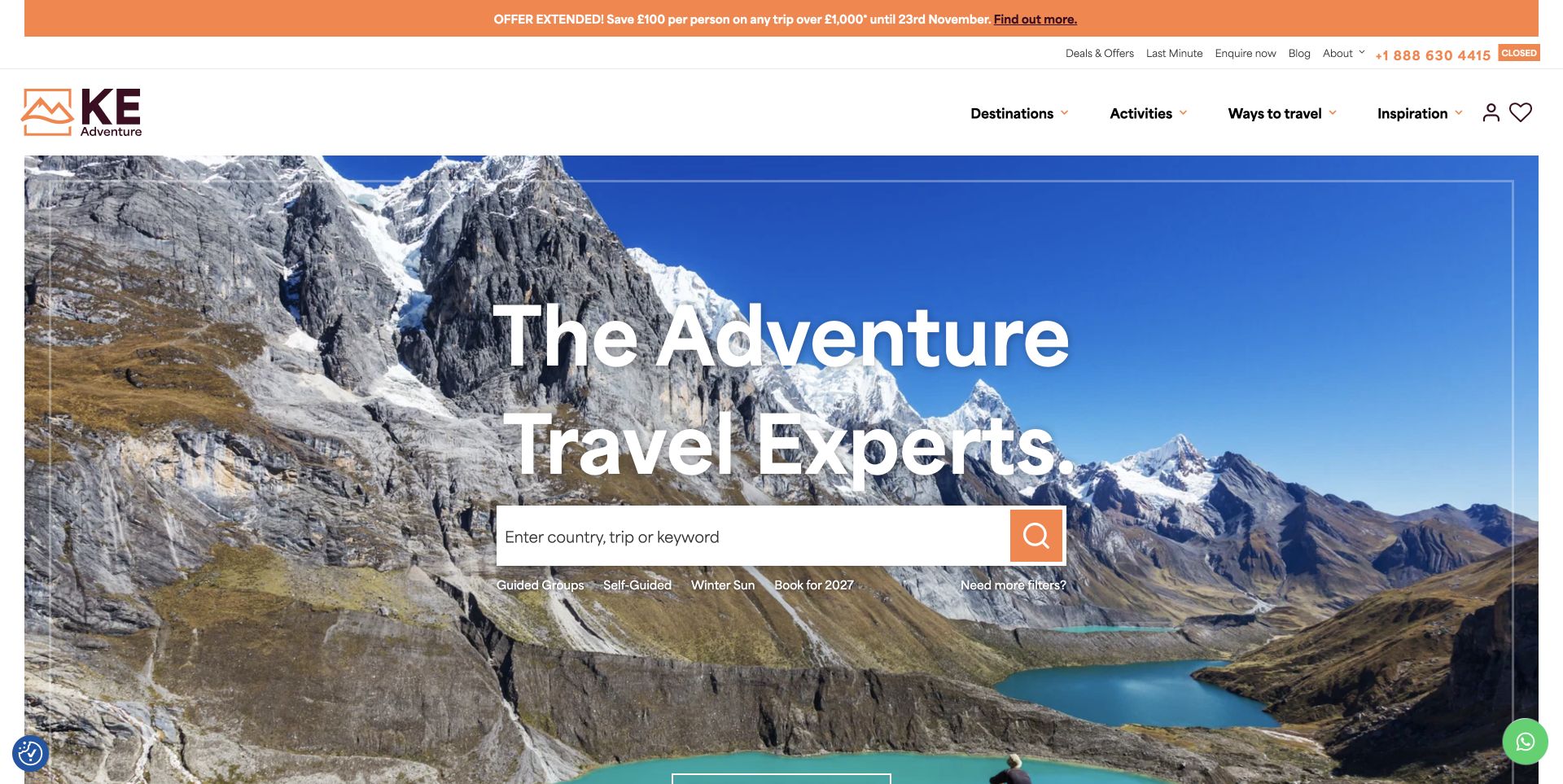
KE Adventure Travel places a broad keyword search over a mountain landscape and immediately supplements it with guided-group, self-guided and seasonal shortcuts. A Need more filters link acknowledges that some visitors need more precise criteria than the homepage provides. Destinations, activities and ways to travel remain separate header routes. The useful pattern is progressive detail: the page offers a simple start without pretending it can capture every planning need. The source's protection, longevity and environmental statements were not independently evaluated as part of this design review.
What you can learn
Give visitors a low-effort search entrance, then clearly expose the more detailed finder. Shortcuts should describe real travel formats so they help people narrow the catalog before committing to a long search.
Pros
Guided and self-guided formats are named beside the search.
Need more filters provides a clear route for more precise planning.
Cons & considerations
Several promotions and utility links compete in the upper portion of the page.
Broad keyword search needs useful handling of vague or unmatched queries.
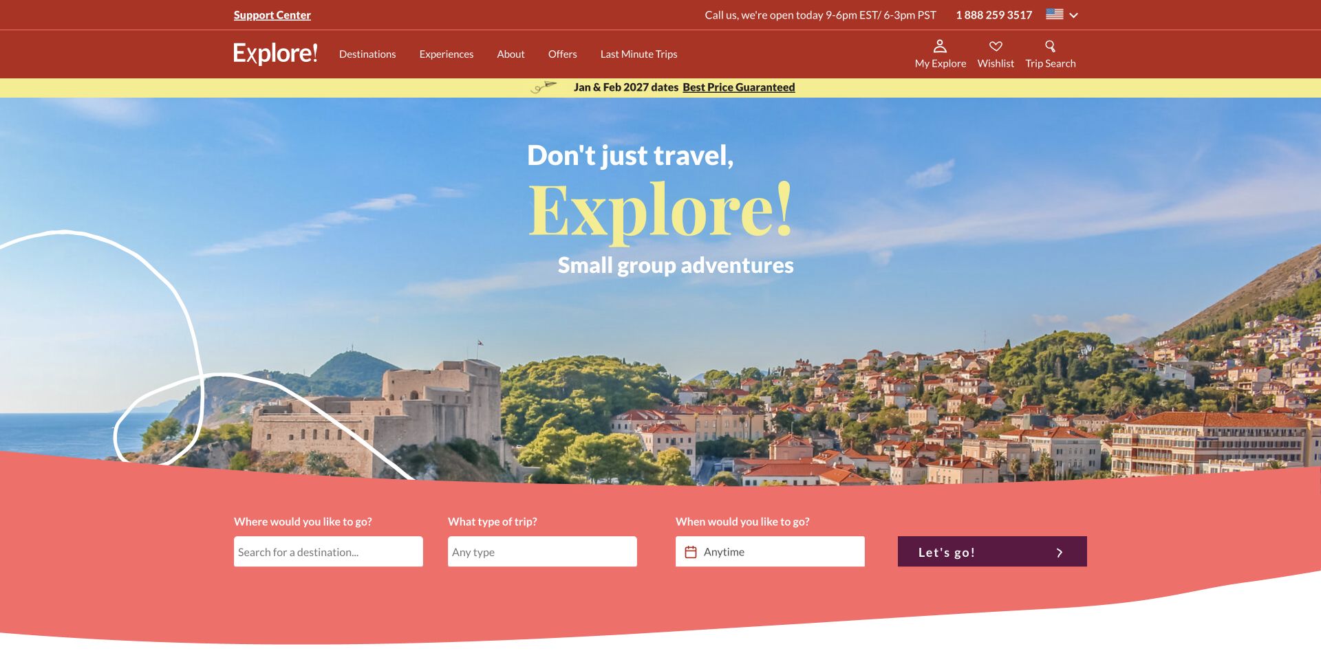
Explore Worldwide uses a bright red and coral identity, a clear small-group proposition and three plain-language planning prompts: where, what type of trip and when. The finder is visually separated from the destination photograph, improving the boundary between inspiration and input. Supporting sections explain tour leaders, group travel and travel experiences. The useful lesson is the simplicity of the first decision sequence. Claims about repeat-booking intentions and customer satisfaction remain the company's displayed statements; no survey methodology or booking outcome was independently checked.
What you can learn
Phrase a finder around the questions a traveler can answer first. Keep destination, experience and timing distinct, then use supporting content to explain how the group format affects the journey.
Pros
The three search prompts are written as understandable traveler questions.
A colored panel gives the controls a stable background separate from the photograph.
Cons & considerations
The first screen provides little activity-level or price context.
Cookie and signup dialogs initially obscured the page until normal dismissal.
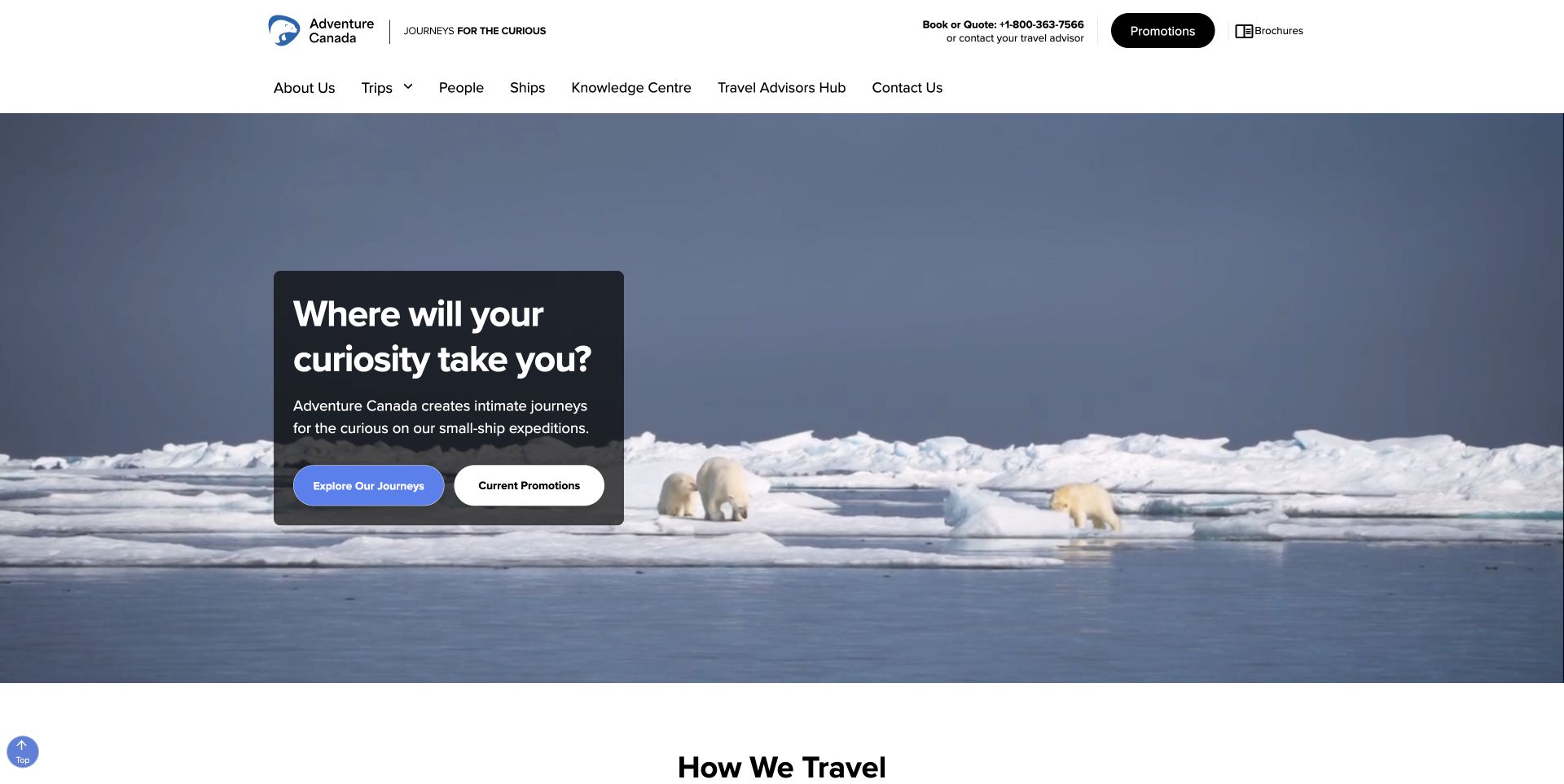
Adventure Canada explains its small-ship expedition format directly in a dark text panel over polar footage. The header includes People, Ships and Knowledge Centre alongside Trips, giving visitors routes to understand more than the destination. Further down, the page describes how it travels and presents journeys with dates and per-person price ranges. This is useful for a specialist product that may be unfamiliar to a first-time visitor. Wildlife imagery is illustrative, and the design review does not imply a guaranteed sighting or assess expedition safety or service quality.
What you can learn
Explain an unfamiliar travel format before asking visitors to compare departures. People, vessels and practical knowledge can deserve their own routes when they materially shape the experience.
Pros
The opening identifies the small-ship format explicitly.
People, Ships and Knowledge Centre provide supporting context beside trip browsing.
Cons & considerations
The initial choice between journeys and promotions offers limited filtering.
Expedition suitability and accessibility require details beyond the wildlife-led opening.
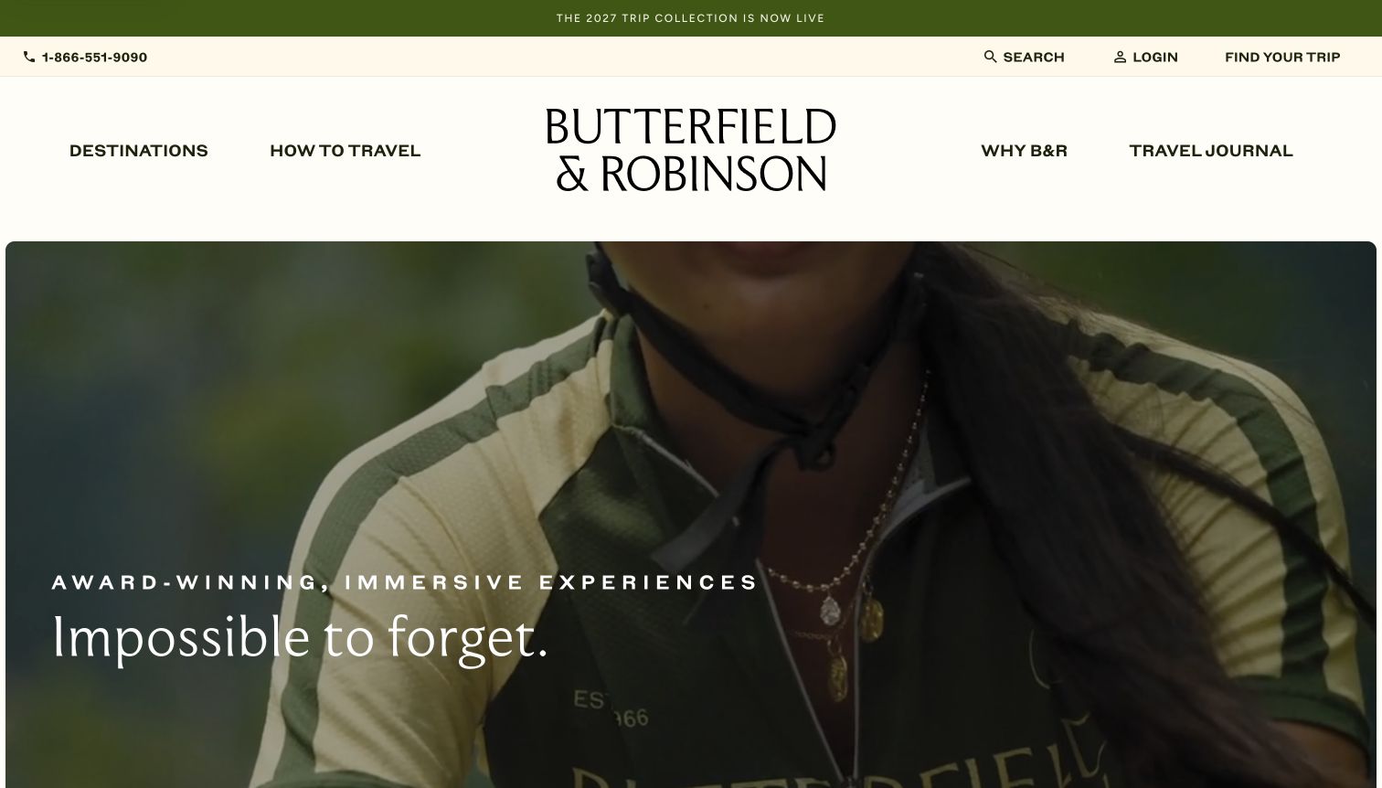
The retained Butterfield & Robinson homepage pairs a very large wordmark with a cinematic cycling scene and restrained editorial typography. Destinations, ways to travel and the travel journal form the principal routes, while a seasonal collection banner sits above them. The presentation creates a strong sense of a curated travel program rather than a dense booking marketplace. For adventure travel, the useful lesson is how editorial storytelling can organize an experience-led brand. This is the genuine November 10 capture, and the campaign is not represented as a newly checked offer.
What you can learn
Use editorial storytelling to establish the character of a travel program, then make the activity and destination routes easy to find. Preserve the original date when a retained campaign illustrates the design.
Pros
The large brand treatment and restrained navigation create a coherent editorial identity.
Ways to travel gives activity context a place alongside destinations.
Cons & considerations
The opening postpones practical details such as effort, duration and price.
Campaign footage needs supporting itinerary information before it can guide a decision.
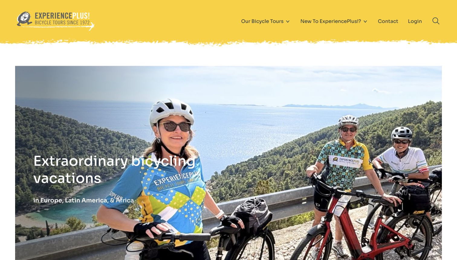
The retained ExperiencePlus! page uses a bright yellow header and a coastal cycling photograph to make its activity focus immediate. Its main routes include bicycle tours and a dedicated introduction for visitors new to the company. The headline names several travel regions, while the image shows people participating rather than only an empty landscape. The useful adventure-travel pattern is the combination of an obvious activity and an explicit newcomer route. The review retains the November 10 source capture and does not claim current availability or independently assess the operator's tours.
What you can learn
Make the core activity unmistakable and provide a named route for first-time visitors. A newcomer guide can explain the support, group format and expectations that experienced customers may already understand.
Pros
The cycling subject and tour navigation establish the specialty clearly.
A New to ExperiencePlus route acknowledges first-time planning needs.
Cons & considerations
The broad regional claim needs more detailed destination browsing below.
The opening image cannot explain daily distance, elevation or support arrangements.
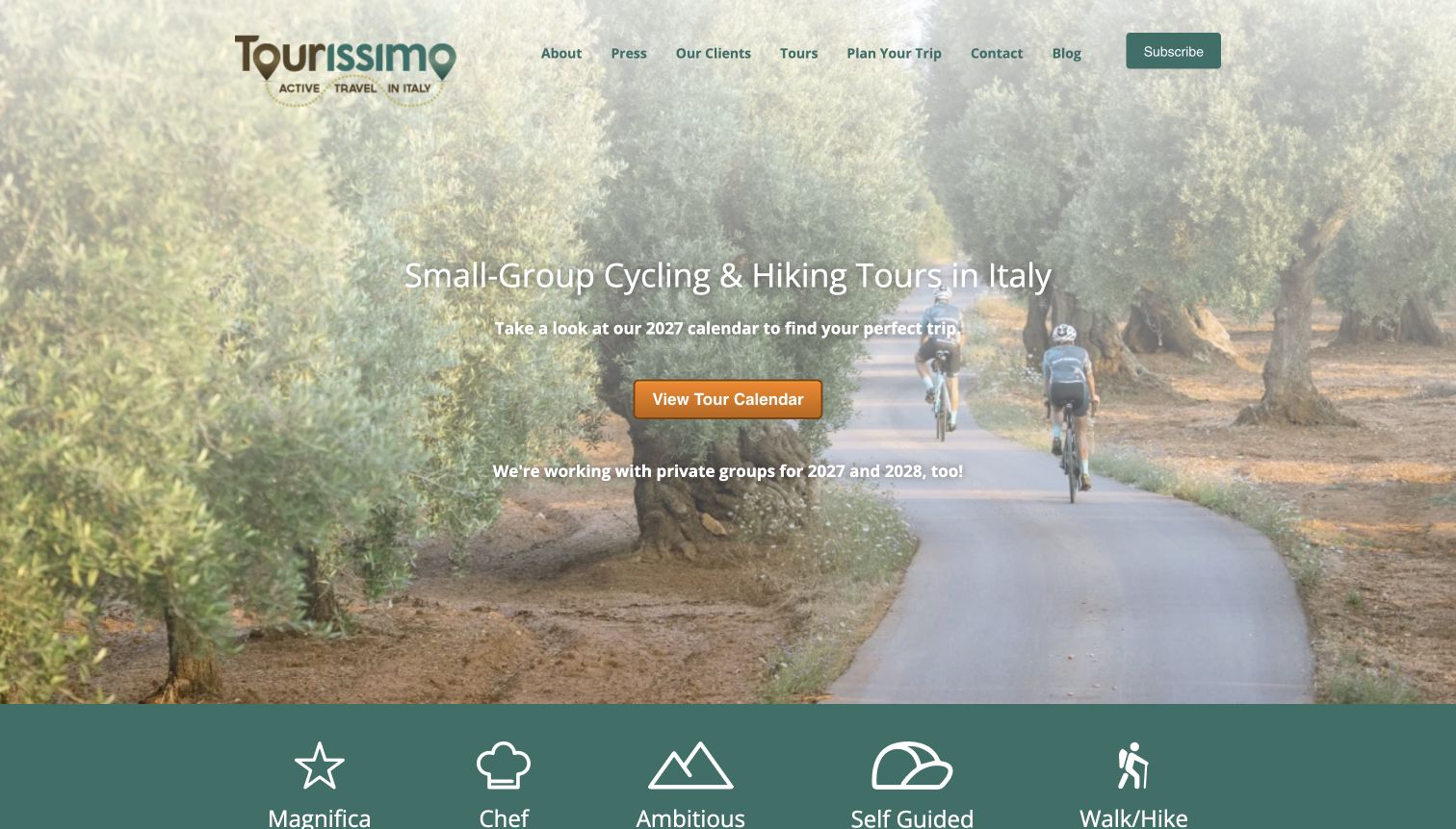
Tourissimo's retained homepage makes its Italy focus explicit over a forest cycling photograph, then offers a prominent tour-calendar route. A row of named travel formats includes chef-led, self-guided and walking or hiking options, showing that the destination is a starting point rather than the whole product definition. This is a useful example of organizing a specialist catalog without becoming a generic world map. The original November 10 capture remains dated accurately, and the review does not turn the page's experience claims into independent service endorsements.
What you can learn
If a company specializes in one region, use the next level of navigation to explain the different experiences available there. A direct calendar route helps visitors connect those formats to their available travel dates.
Pros
The Italy focus is stated plainly in the opening.
Named formats distinguish guided, self-guided and walking options.
Cons & considerations
Some proprietary format names need short explanations for new visitors.
The image-led introduction defers price and activity-level details.
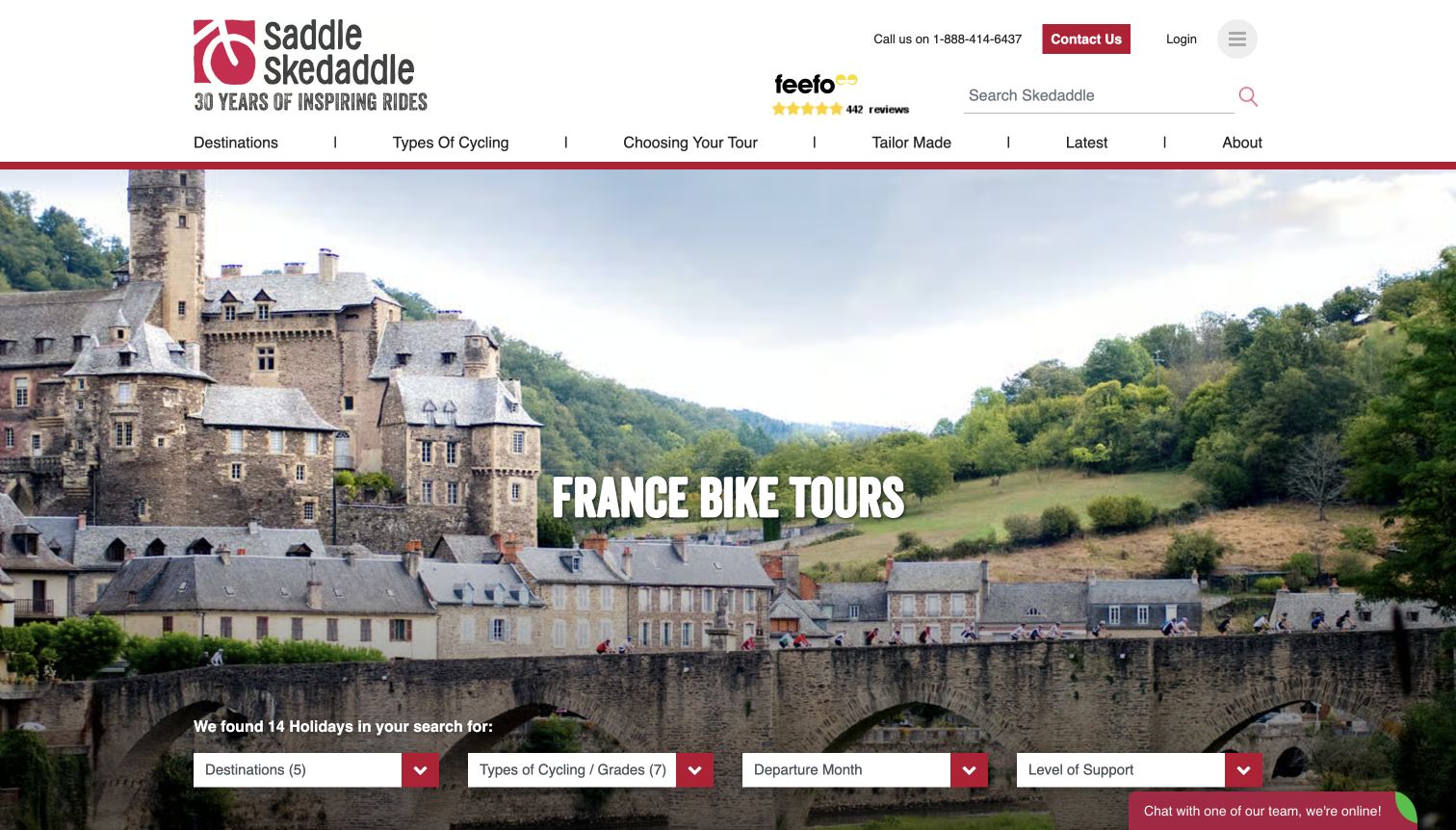
The retained Saddle Skedaddle example is its France cycling page, not the general homepage. A country-specific image and heading lead directly into filters for cycling type, grade, departure month and support level. The visible result count makes the page feel like a usable catalog rather than only a destination article. For an adventure-travel site, the valuable pattern is this second-stage decision: once someone chooses a country, the interface helps distinguish how demanding and supported the trip will be. The capture retains its November 10 date and exact source path.
What you can learn
Design destination pages as useful comparison entrances. Activity grade and support arrangements help turn a broad country preference into a more realistic shortlist, provided the filter terms are clearly defined.
Pros
The exact-country page exposes grade and support filters immediately.
A visible result count communicates the scope of the current catalog view.
Cons & considerations
Grade numbers require definitions tied to effort and terrain.
A destination hero still takes space above the detailed trip results.
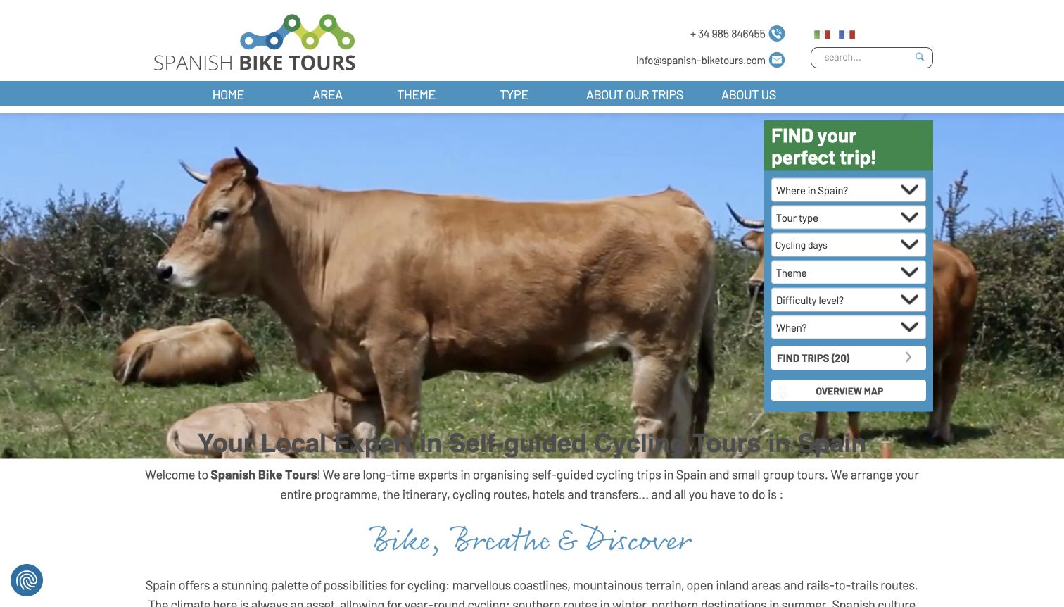
Spanish Bike Tours combines a countryside image with a vertical finder covering region, trip type, days, theme, difficulty and timing. The retained page also explains the self-guided model, including routes, accommodation and transfers, so the word independent is not left to carry the whole proposition. This is a useful adventure-travel reference because it separates freedom on the trip from the arrangements supplied by the operator. The November 10 screenshot is retained as evidence of that layout; no trip, transfer or booking service was tested.
What you can learn
Explain what self-guided means in practical terms. Pair the freedom of an independent itinerary with a clear account of the planning and support included, then let visitors filter by time and difficulty.
Pros
The finder includes days and difficulty as well as geography.
Supporting copy explains the arrangements behind the self-guided format.
Cons & considerations
Many filter fields can be demanding before visitors understand the catalog.
Support availability and exact inclusions still need trip-specific detail.
Kegan is a freelance web designer and developer with 15+ years of experience helping businesses turn complicated website requirements into clear, maintainable digital experiences. He works directly with clients from planning and design through development, launch, and ongoing support.
For adventure travel website design, his development approach focuses on trip styles, destination routes, difficulty and itinerary guidance, responsible travel details and clear booking information. The scope can be a targeted improvement or a complete custom build, with responsive layouts, thoughtful content structure, and integrations chosen around the people using and maintaining the site.
Show 3 other adventure travel website designersHide other adventure travel website designers
Plan an adventure travel website around the decisions before departure
Define the trip information before designing the catalog
Start with a consistent record for each itinerary: destination, activities, duration, departure dates, price basis, inclusions, support, accommodation and activity requirements. Decide which details belong in a comparison card and which require a fuller explanation. Keep dates and availability connected to a maintained source rather than scattering manually repeated claims across campaign pages.
Use descriptive activity guidance. Daily distance, elevation, terrain, altitude and opportunities to rest communicate different things; one general difficulty score cannot replace them. Explain limitations and the route to ask a suitability question without promising that every trip works for every traveler.
Give different planning states a clear route
Some visitors arrive with a country and month already chosen. Others know only that they want a walking holiday, a family adventure or a supported cycling trip. Provide a small number of understandable entrances for those different starting points. A concise homepage finder can lead to a more detailed catalog without trying to ask every question at once.
For custom travel, distinguish browsing from requesting help. Explain the next step and any expected response process before presenting a long inquiry form. For scheduled departures, make date and availability information easy to compare. Do not make a promotional signup the only obvious action.
Use stories to answer practical questions
Photography and guide stories can explain what participation feels like, but they should connect to the actual travel format. Caption featured journeys, identify the destination and show the people, equipment or accommodation when those details help set expectations. Avoid letting an attractive scene stand in for clear inclusions or support information.
Treat campaigns as temporary layers over a stable catalog. Keep ordinary destination and activity routes available, state the conditions of any offer, and remove expired messages. A trip should remain understandable after the seasonal promotion is gone.
The editing job behind the design
Choose systems that keep trip details consistent
The content model and the booking or inquiry workflow should agree about the trip's name, dates, price basis and availability. A visually polished homepage is of limited use if those details conflict on the next page. Test the handoff between editorial content and the booking system without making real reservations during QA.
Use a CMS or structured catalog that can reuse destination, activity and trip-style information consistently. Keep public editorial content separate from private traveler details. A public technology scan can identify visible references and delivery services, but it cannot prove the full booking backend or how personal information is handled.
Large photographs, films and embedded review widgets deserve careful loading and accessibility checks. Provide meaningful image text, readable controls and a stable alternative when motion is paused or unavailable. Keep consent choices and visitor preferences separate from functional trip browsing.
Our WordPress website examples offer a separate look at publishing approaches. A visible platform label is evidence for that named page, not a guarantee that the same system will suit your requirements.
Before the public launch
Adventure travel website planning checklist
State the trip format and the level of support in plain language.
Expose destination, activity and timing routes that reflect the actual catalog.
Explain effort with concrete distance, terrain and daily-activity information.
Show duration, departure date and price basis consistently on comparison cards.
Separate representative photography from guaranteed itinerary inclusions or wildlife sightings.
Keep guide, operator and practical trip information easy to reach before an inquiry.
Explain what a custom-planning request involves before collecting details.
Keep seasonal offers accurate, qualified and removable without breaking navigation.
Check filters, empty results, keyboard use, image loading and the booking-system handoff.
Preserve consent choices and protect private traveler information.
These checks are a project checklist, not a performance, legal, security, or accessibility certification. Test real journeys with the people responsible for the website before making claims about the result.
Sources & editorial method
How this collection was selected and reviewed
We reviewed twenty distinct public adventure-travel properties and wrote collection-specific observations about their visible design and information structure. Fifteen direct browser captures were made on November 12, 2026 UTC, during the November 11 Pacific editorial work date. Five clean captures from November 10 are explicitly retained with their original source paths, dimensions and dates. Cookie, newsletter and chat overlays were dismissed through normal site controls where needed; screenshots were not fabricated or altered to hide page elements. Each new source received a separate bounded public technology-audit attempt, and retained sources keep their earlier audit provenance. An unavailable or access-restricted scan does not support new technology claims. The Editors Choice is a researched website-design selection based on the observed hiking-focused structure and trip discovery at Wildland Trekking; it is not a vote-derived award, travel-safety assessment or service-quality endorsement. No booking, inquiry, signup or real form submission was made.
Each example links to its actual source page. Screenshots are direct browser captures with their own capture dates; moving imagery, announcements and live designs can change. The notes describe observable design choices and conditional tradeoffs, not measured traffic, conversion results, service quality, or accessibility conformance.
Technology labels use public page metadata, asset evidence, or explicitly cited platform documentation. Platform documentation is not a complete current deployment audit. A component reference may be legacy or unused; it is not a complete backend inventory. Unknown stacks are omitted. These sites are editorial examples, not our client portfolio.
Written, Edited and Curated are separate editorial records, not timestamps advanced by a rebuild. Website designs and imagery belong to their owners. See our editorial standards or suggest a correction.
Questions worth asking
Adventure Travel website design questions
What should an adventure travel homepage explain first?
It should identify the kind of journey and give visitors a clear route toward a suitable trip. A destination image can attract attention, but the travel format, main activities and planning choices need to be understandable without opening a long series of pages.
Should the trip finder start with destination or activity?
Use the starting points that reflect the catalog and its visitors. A regional specialist may need activity and support filters more than a world map. A broad operator can offer both destination and activity entrances, followed by timing and suitability details.
How should a site describe activity level?
Explain what the level means with concrete information such as walking time, distance, elevation, terrain, altitude and support. A number or label can help organize a catalog, but it should link to definitions and trip-specific details rather than replace them.
Can a self-guided trip use the same page structure as a guided tour?
Some catalog fields can be shared, but the support explanation needs to differ. State what the operator arranges, what travelers do independently, how routes are supplied and how help is available. Avoid making visitors infer those differences from the word self-guided alone.
Does inclusion here recommend an operator or guarantee a trip?
No. The collection studies public website design, navigation and presentation. It does not independently assess tour safety, guide quality, availability, pricing value or fulfillment. Travelers need to review current itinerary details and the operator's terms for their own plans.
Start with the decisions a traveler must make before committing: the activity, the effort, the support and the dates. Then use the photography and stories to make those choices tangible, keeping every route connected to accurate trip information.