Best Public Relations Websites of 2026 (30 Real-World Examples)
Public relations website design that makes expertise and evidence easier to evaluate
A PR agency website needs to do more than announce that it creates impact. It should explain the communications problems it works on, distinguish its services and help different visitors reach the right person without confusing a marketing inquiry with a press request.
Public relations practices vary considerably. Consumer campaigns, corporate reputation, financial communications, public affairs, media relations, influencer work and digital amplification are not interchangeable services. A useful website makes the agency’s actual focus clear, then supports that introduction with relevant, permissioned examples and a practical description of how a conversation begins.
These websites are references for public communication and interface design, not a ranking of agency performance. Client names, awards and reported campaign figures are the agencies’ own public material unless explicitly sourced otherwise. A dramatic homepage can establish personality, but it does not independently prove coverage quality, reputation outcomes or commercial results.
Before the examples
What makes good public relations website design in 2026?
Define the communications remit
Name the actual services and sectors rather than relying on a broad promise to change the conversation. Explain the difference between earned media, owned content, paid amplification, social work and advisory responsibilities where relevant. A buyer should understand which problems the agency can discuss without being promised a guaranteed placement or reputation outcome.
Put case claims in a useful context
A case should identify the assignment, intended audience, agency role, channels and time period. If figures are published, explain what they measure and where they come from. Do not present reach, impressions, coverage counts and revenue as interchangeable evidence. Permissioned work and a clear account of responsibility are more informative than a logo wall alone.
Route different visitors deliberately
Prospective clients, journalists, job applicants and partners have different needs. Give them appropriate routes without making every person complete the same sales form. Keep urgent or sensitive matters out of a general marketing promise, and identify the actual contact process rather than implying that a public form is continuously monitored.
The collection · 30 examples
30 public relations websites worth studying
Study positioning, service boundaries, case presentation, current insight and contact routing. The observations concern what the websites communicate, not whether any agency can deliver a particular coverage, reputation or business result.
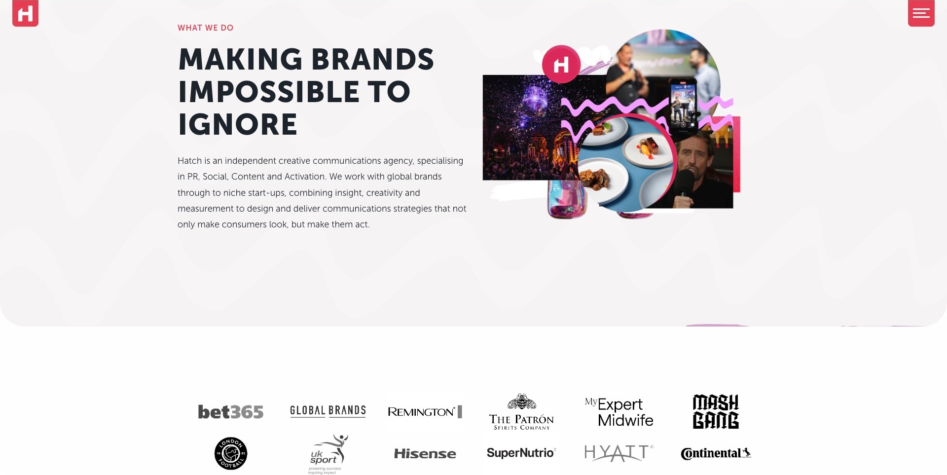
Hatch’s scrolled homepage introduction places a large black statement above a plain description of PR, social, content and activation. A collage of food, events, people and media imagery occupies the right side, with pink squiggles and a circular studio mark tying the pieces together. A row of client marks begins below. The fixed corner identity and menu remain visible, and the saved view is the service introduction after the opening reel, not the hero itself. Current first-party services distinguish public relations and digital PR.
What you can learn
Name the actual disciplines beside the expressive proposition and use the collage as supporting atmosphere, not the entire explanation. Link the introduction to cases that clarify the brief, channels and agency role. A readable service paragraph can make an energetic communications identity easier to evaluate.
Pros
The service description explains the remit without requiring a video or a sales call.
The text and collage have distinct areas, allowing different reading speeds.
Cons & considerations
A long introductory paragraph can need shorter grouping on smaller screens.
A row of client marks still needs case context before it establishes the scope or results of the work.
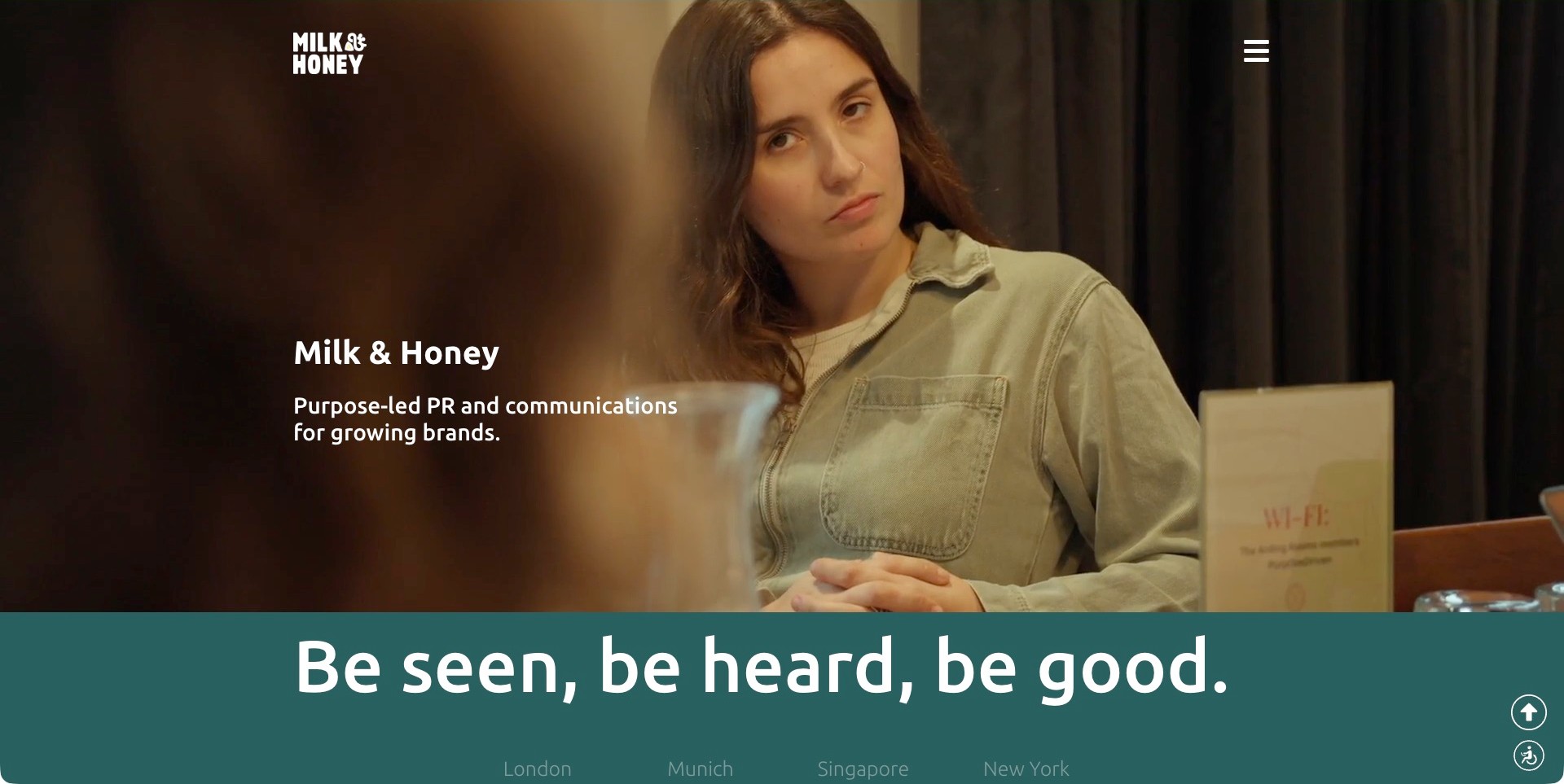
Milk & Honey PR’s saved homepage uses a full-width office film frame with a woman in conversation, a white studio mark and a simple menu control. The agency name and a short purpose-led PR-and-communications description sit on the darker left side. A teal section below introduces a second statement and office locations. The image supplies a human context rather than a wall of client logos, but it does not identify a specific client or campaign outcome. Current first-party information confirms PR and communications work.
What you can learn
A clear specialist description can carry more practical information than a long sequence of ambitious slogans. Keep text readable over the actual film frames and provide a useful still experience. Use the next sections to explain services and permissioned cases rather than treating purpose language as proof of impact.
Pros
The opening identifies the discipline in a short, readable description.
A distinct teal section creates a clear transition beyond the film image.
Cons & considerations
White text over changing footage requires checks beyond this saved frame.
A purpose-led position needs specific assignments and evidence to become more than a broad agency promise.
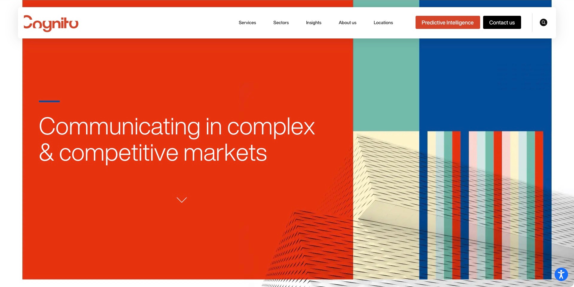
Cognito’s retained homepage sets a concise complex-market communications proposition on a vivid orange field. A geometric architectural composition and striped color panels occupy the right side, while a broad floating white header separates services, sectors, insights, company information and locations. Predictive Intelligence and Contact Us have their own prominent actions. Current first-party information establishes communications and marketing services. The useful PR pattern is a specialist audience position supported by separate sector and service routes, rather than a homepage trying to show every campaign at once.
What you can learn
State the context in which the agency works and make the distinction between a sector and a capability visible. A specialized proposition needs relevant cases and an explanation of responsibilities, while a named intelligence product should have its own description rather than being treated as proof of every service.
Pros
Services and sectors are separate destinations for different buyer questions.
A strong color field gives the proposition a clear area away from the detailed imagery.
Cons & considerations
A very broad header can require careful prioritization on smaller screens.
A complex-market statement still needs specific examples to explain the actual communications work.
Prosek’s saved homepage places a large black business-impact proposition on a pale peach-and-blue gradient. A second text group at the lower right describes the practice as a marketing and communications company working where brand and capital meet. The compact header separates expertise, perspectives and company information, with a distinct Partner With Us action. A company-news strip begins below. The screenshot is useful for the separation between a broad positioning statement, a more specific remit and an ordinary route into the firm’s expertise. It does not independently verify the ranking claim visible in the news strip.
What you can learn
Use a supporting explanation to make a broad corporate proposition more precise. Keep agency news and recognition secondary to service and case evidence, and label reported claims accurately. A partnership action should lead to an understandable inquiry rather than imply a particular engagement or outcome.
Pros
The supporting description gives the large proposition a more specific professional context.
Expertise and perspectives remain separate exploratory routes.
Cons & considerations
A broad impact statement needs cases before a buyer can understand the exact contribution.
A moving story strip can compete with reading and needs accessible behavior in the actual site.
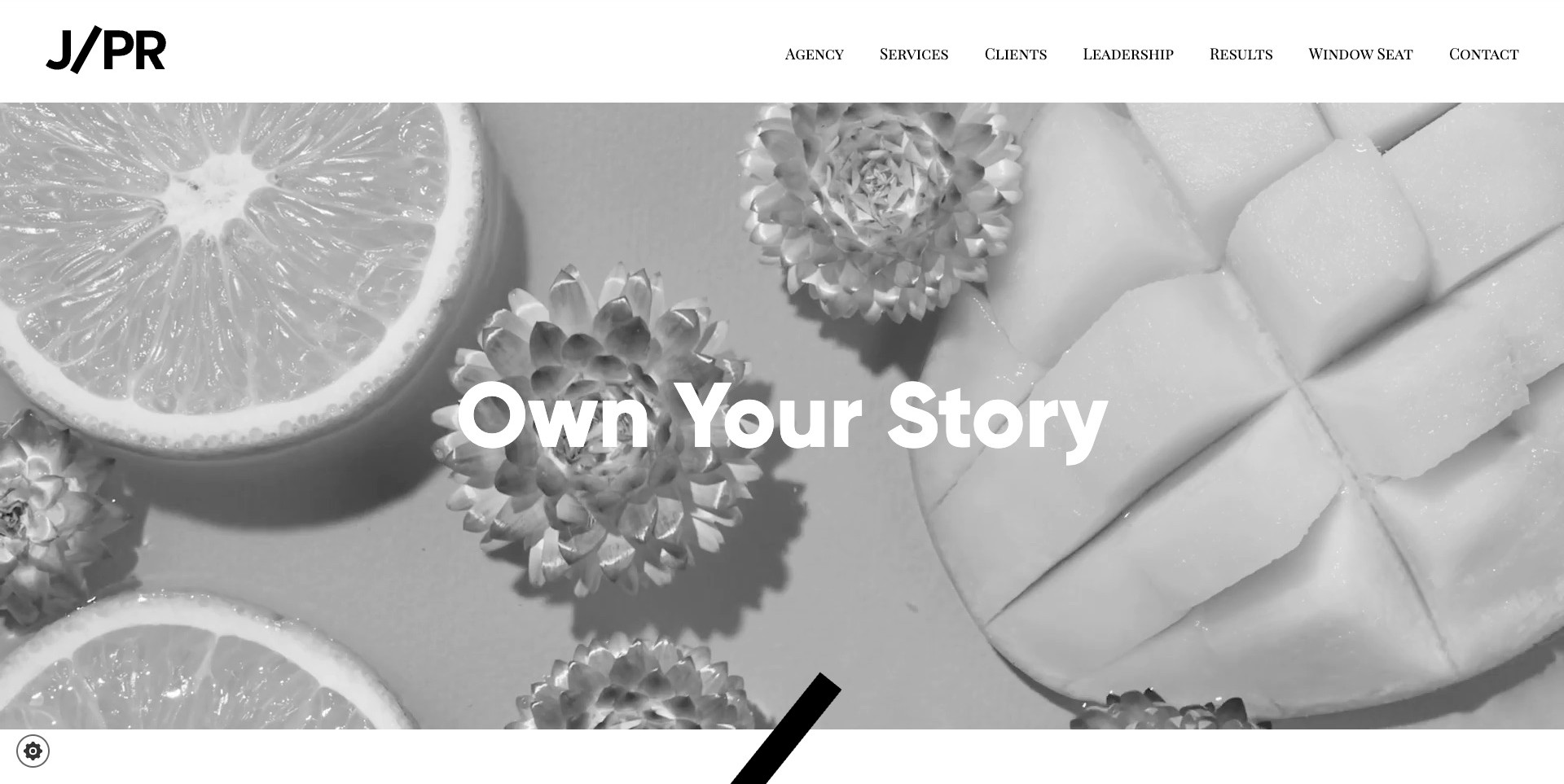
J/PR’s saved homepage sets a large white statement over monochrome fruit, flowers and sliced-melon imagery. A broad white header carries the black agency mark and ordinary routes to services, clients, leadership, results and contact. The image is a hospitality-oriented film frame, not an identified client campaign or a demonstrated result. Below the opening, the current first-party explanation names luxury travel, hospitality and real estate alongside strategic PR, influencer relations, social content and partnerships. The useful pattern is a visually quiet introduction whose surrounding navigation makes it possible to investigate both the practice and the work.
What you can learn
Let specialist imagery establish a tone, then explain the actual sectors and responsibilities in readable text. Separate the client list from results so visitors can look beyond recognition. Keep a meaningful still experience and check text contrast across the real film, rather than treating a beautiful frame as evidence of communications effectiveness.
Pros
The header provides recognizable service, people and work-related routes.
A restrained monochrome composition gives the short introduction visual coherence.
Cons & considerations
The opening statement alone provides little practical service detail.
White text over changing film needs contrast and motion checks beyond this frame.
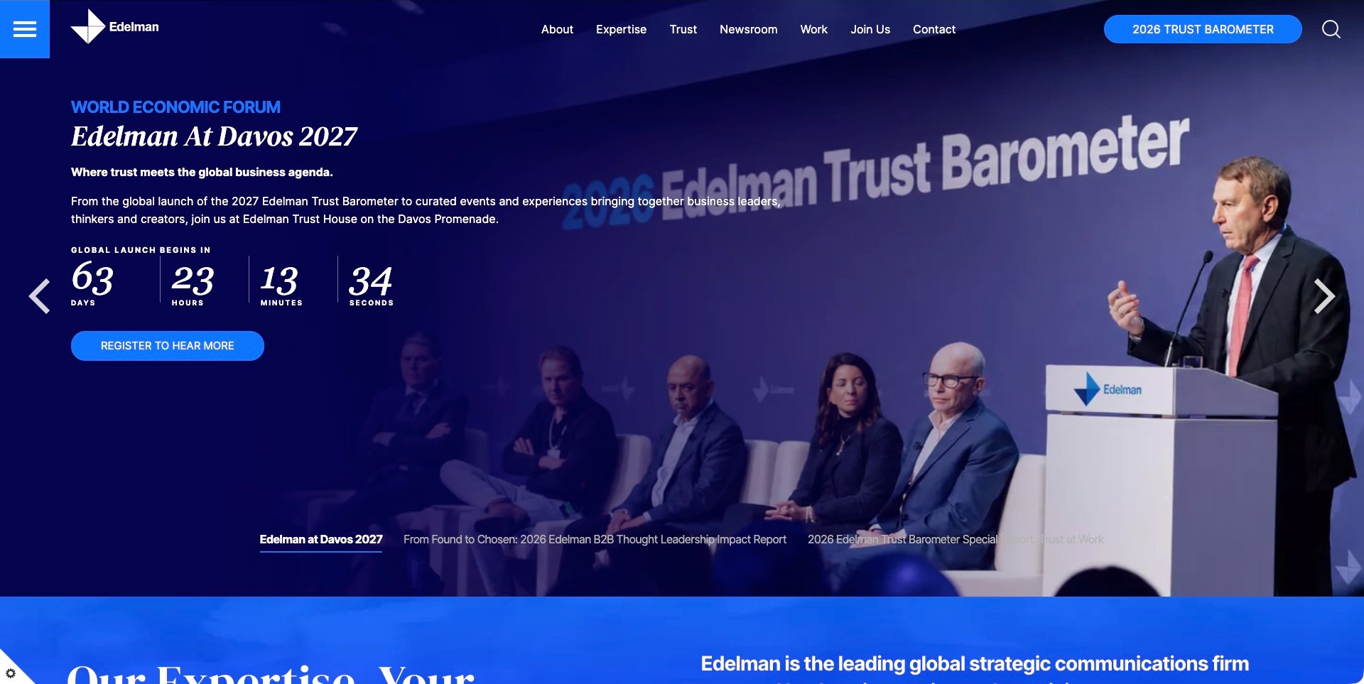
Edelman’s saved homepage promotes its Davos 2027 activity through a conference photograph, deep blue overlay, descriptive text and a registration action. A visible countdown and labeled campaign tabs identify the opening as a time-sensitive feature, while expertise, trust, work and newsroom routes remain above it. A separate blue section begins the agency explanation below. Current first-party material identifies strategic communications and reputation work. The useful website pattern is how an owned research programme can become a substantive editorial entry point without removing ordinary routes for visitors researching the practice. The captured countdown is historical, not a current event-timing claim.
What you can learn
Give a research-led campaign a clear date, purpose and maintained destination, then distinguish participation from service inquiries. Preserve ordinary expertise and case routes outside the carousel. Treat report findings and client-result claims as information requiring their own methodology, not as conclusions proved by a prominent event photograph.
Pros
The campaign explains why someone might register rather than offering an unexplained signup.
Stable navigation separates research, work and company information.
Cons & considerations
A dated countdown requires an explicit retirement or replacement process.
Overlaid text and labeled tabs need readability and keyboard checks across all frames.
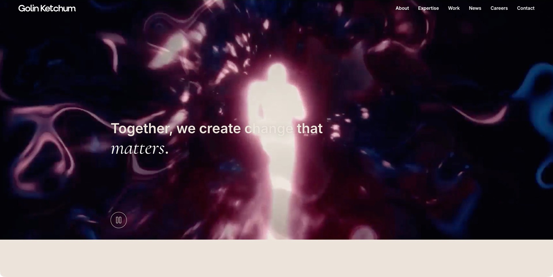
The combined Golin Ketchum homepage places its white wordmark and compact navigation over an abstract purple-and-blue film frame. A glowing figure sits behind a short change-oriented statement, with a visible pause control near the lower left. About, expertise, work, news, careers and contact remain separate routes. The current first-party explanation explicitly identifies public relations and links named campaign cases below the opening. This is one combined public property, not two separate examples. The useful pattern is a consistent navigation shell around an expressive introduction, although the opening statement alone does not explain the actual communications assignment.
What you can learn
When identities combine, give visitors one coherent starting point and make capabilities, cases and organizational context easy to distinguish. Keep a useful still experience and describe the agency’s role in each case. A dramatic film and an awards claim do not independently establish impact, expertise or client outcomes.
Pros
The header offers recognizable routes beyond the moving introduction.
A visible pause control acknowledges that visitors may not want continuous motion.
Cons & considerations
The broad statement needs a concrete service explanation nearby.
Text contrast and actual control behavior require checks beyond a single saved frame.
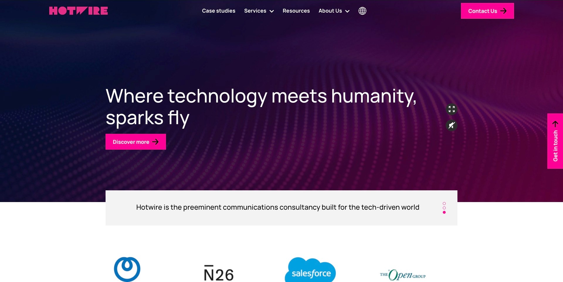
Hotwire’s saved homepage uses magenta branding against a navy-and-purple wave background. A large technology-and-humanity statement sits above a Discover More action, with visible media controls to its right. A pale panel below supplies a more literal communications-consultancy description, and a client-mark row begins beneath it. The header separates case studies, services, resources and company information. Current first-party sources explicitly identify technology PR alongside measurement and digital-marketing services. The useful relationship is between an atmospheric opening and a subsequent plain description, rather than relying on the abstract background to explain the practice.
What you can learn
Place a concrete discipline and market description close to a broad positioning statement. Give visitors separate routes to services and cases so they can understand responsibilities rather than infer them from client logos. Check motion, contrast and media controls directly, without treating a polished introduction as proof of campaign effectiveness.
Pros
Services and case studies are recognizable separate destinations.
The pale description panel provides a stable reading area below the media.
Cons & considerations
Several contact actions compete for attention around the opening.
Client marks and prestige language require case context before they establish a relevant assignment.
Manifest’s saved homepage places a plain unified-brand-communications label at the upper left and a simple Menu control at the right. The enormous white wordmark spans a dark film frame showing an adult holding a baby in blue and red light. The campaign-film frame does not establish the agency’s responsibilities or outcomes. Current first-party work records distinguish public relations, brand strategy, content and social campaign categories. The useful pattern is the contrast between a very expressive visual introduction and a short literal explanation of what kind of practice visitors have reached.
What you can learn
Keep the discipline identifiable even when campaign imagery changes radically. Give the work archive readable titles, service roles and project context, rather than expecting a reel to communicate the brief. A large wordmark can unify different material, but a meaningful still and ordinary navigation remain important when motion is unavailable.
Pros
The communications label explains the category without waiting for the reel.
A consistent wordmark ties the changing material to one recognizable identity.
Cons & considerations
The oversized identity leaves little room for practical detail in the first screen.
A menu-only opening requires clear routes and predictable keyboard behavior after it is opened.
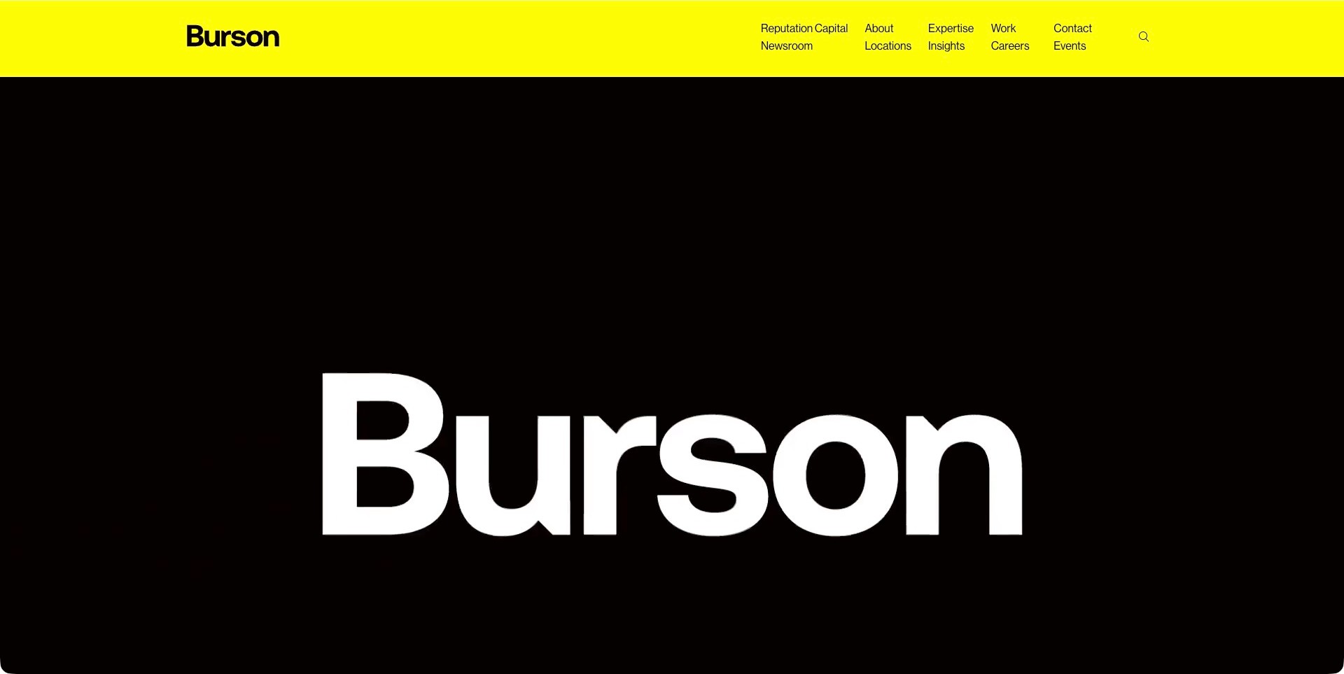
Burson’s saved opening uses an unusually bright yellow header above a black film frame carrying a large white wordmark. The header exposes reputation, expertise, work, locations, insights and contact in compact columns rather than concealing all destinations behind one menu. Current first-party content below identifies a communications practice centered on reputation, with consumer-brand and corporate service routes. The captured frame is a brand-identification moment, not a campaign case or a demonstration of the work. It is useful for studying how stable information architecture can remain available while the opening media focuses almost entirely on recognition.
What you can learn
Give broad service practices multiple understandable research routes without making the opening film the only explanation. Distinguish a proposition about reputation from evidence describing an actual assignment. Follow the brand introduction with precise capability and case information, and check the compact header’s reading order and focus behavior directly.
Pros
Expertise, work and locations remain visible outside the film.
The yellow-and-black system gives the identity a clear visual signature.
Cons & considerations
The saved wordmark frame provides little immediate service detail.
Compact navigation columns need careful prioritization and accessible reading order on smaller screens.
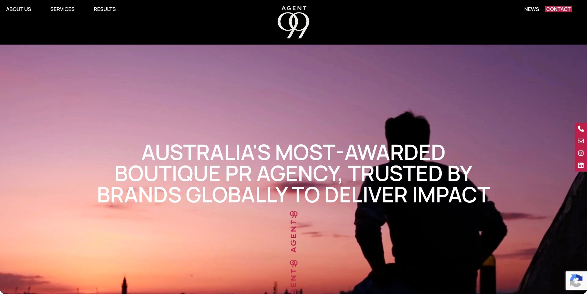
Agent99’s saved homepage centers its white monogram in a black header, with about, services and results at the left and news and contact at the right. A sunset silhouette fills the opening film frame beneath a large uppercase positioning statement. A burgundy contact-and-social rail remains at the side. The visible awards and impact language is the agency’s own claim, not an independently verified ranking. Current first-party information describes consumer and corporate PR, media relations, training, social content and events. The useful pattern is a distinctive restrained identity with ordinary routes to investigate services and results beyond the headline.
What you can learn
Let a clear results destination support ambitious positioning rather than treating awards language as proof. Explain each case’s brief, channels, agency role and measurement limits. Preserve contact routes without crowding the reading area, and provide a useful still experience for people who do not use the opening film.
Pros
Services and results are separate visible research destinations.
The monogram, black header and burgundy accents create a coherent identity.
Cons & considerations
A large all-caps claim postpones practical service distinctions.
White text needs contrast checks across changing film frames rather than only this sunset image.
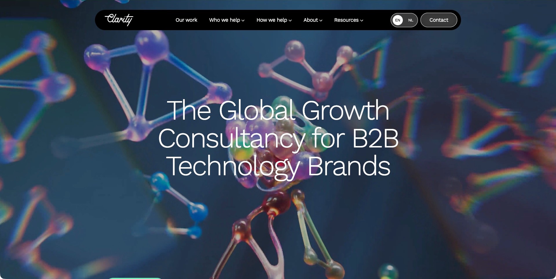
Clarity’s saved opening places a large B2B-technology growth proposition over colorful molecular-model imagery. A rounded black navigation bar floats above it, separating Our Work, Who We Help and How We Help, with language and contact controls at the right. The image is an abstract film frame rather than an identified client case. Current first-party information describes marketing and communications services, including PR and influencer relations. The useful pattern is the distinction between audience fit and delivery capabilities: a visitor can investigate either the market context or the work without needing to understand the agency’s internal structure.
What you can learn
Make both the buyer context and the service responsibilities explicit. Connect a broad growth proposition to cases with a defined brief, role and evidence, rather than assuming a specialist audience label substantiates results. Keep readable text and ordinary routes available when the opening media does not run.
Pros
Who We Help and How We Help support different research questions.
The dark navigation gives its labels a consistent backdrop over the imagery.
Cons & considerations
The large opening postpones detailed service information.
Fine white type needs contrast checks across the full film, not only this frame.
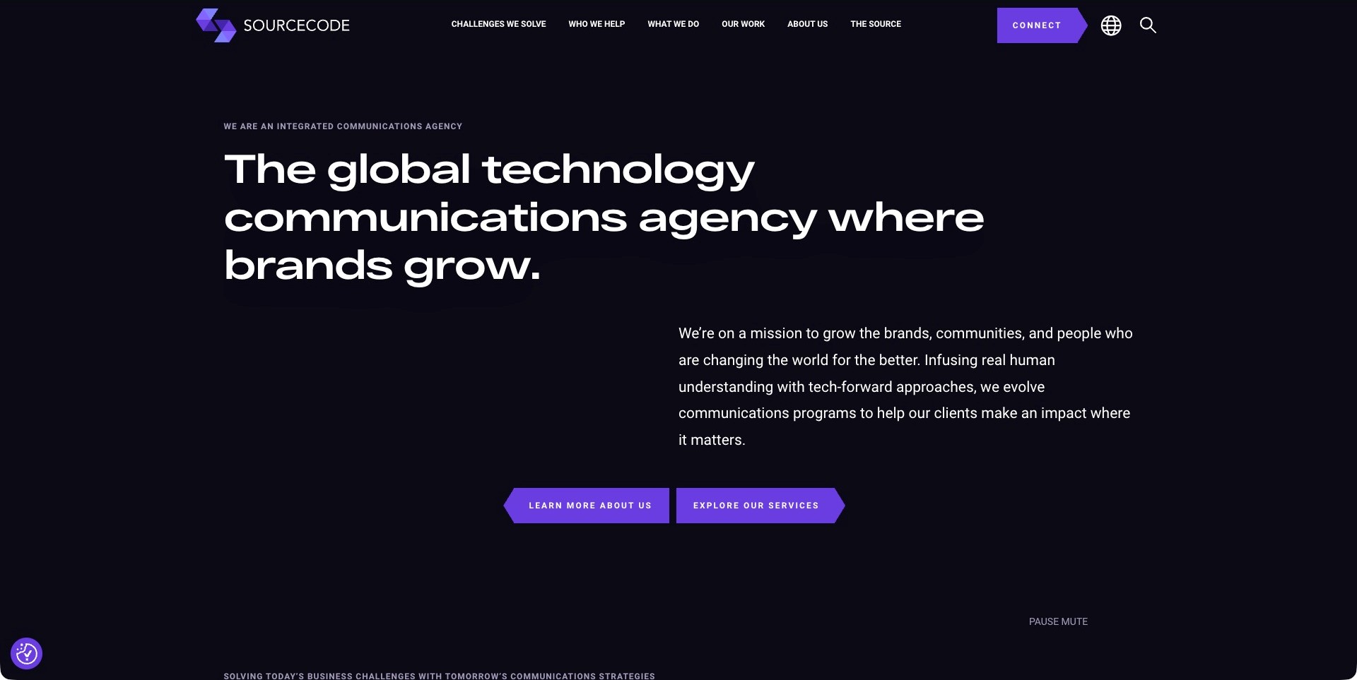
SourceCode’s saved homepage is nearly black and text-led, with a large white technology-communications heading and an offset supporting paragraph. Purple angular actions separate learning about the practice from exploring its services. The header distinguishes Challenges We Solve, Who We Help, What We Do and Our Work. No campaign imagery is visible in this saved frame, and none is inferred from the media controls near the bottom. Current first-party information establishes technology PR and communications work. The useful design pattern is a choice between investigating a business challenge and browsing named capabilities, supported by a clear specialist category.
What you can learn
Offer problem-led routes alongside a literal service list, then explain how the two connect. Do not let ambitious growth language replace a case’s actual brief and responsibilities. Make the text-led experience complete on its own so visitors are not required to interpret a film or a complex animated sequence.
Pros
Challenges and capabilities are different, recognizable navigation choices.
The supporting paragraph supplies more context than the large headline alone.
Cons & considerations
Broad impact language still needs concrete case evidence.
Small uppercase navigation and angular buttons require legibility and keyboard-focus checks.
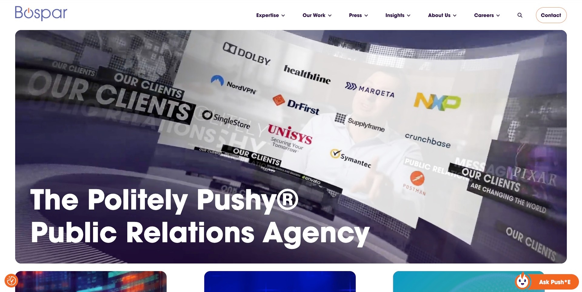
Bospar’s saved homepage uses a broad white header above a rounded media panel. The captured film frame contains a collage of agency-listed client marks and editorial-style fragments, with a large white PR-agency headline across the bottom. Expertise, Our Work, Press and Insights are separate navigation routes. A chat launcher remains closed at the lower right. Current first-party information describes PR strategy, storytelling and sector-specific work. The useful pattern is the combination of a memorable positioning phrase with a literal discipline label; the collage itself does not establish the agency’s role, current relationships or campaign outcomes.
What you can learn
Keep distinctive voice attached to a clear category and give each named client a route to relevant case context where permission allows. Separate an agency press archive from client-work evidence. Provide a readable still experience and test the headline across actual film frames rather than assuming every collage supports equal contrast.
Pros
The main headline explicitly identifies the PR discipline.
Work and agency press are separate research destinations.
Cons & considerations
A dense client collage supplies recognition before it supplies project context.
Large media and closed utility launchers need unobstructed, accessible behavior across smaller screens.
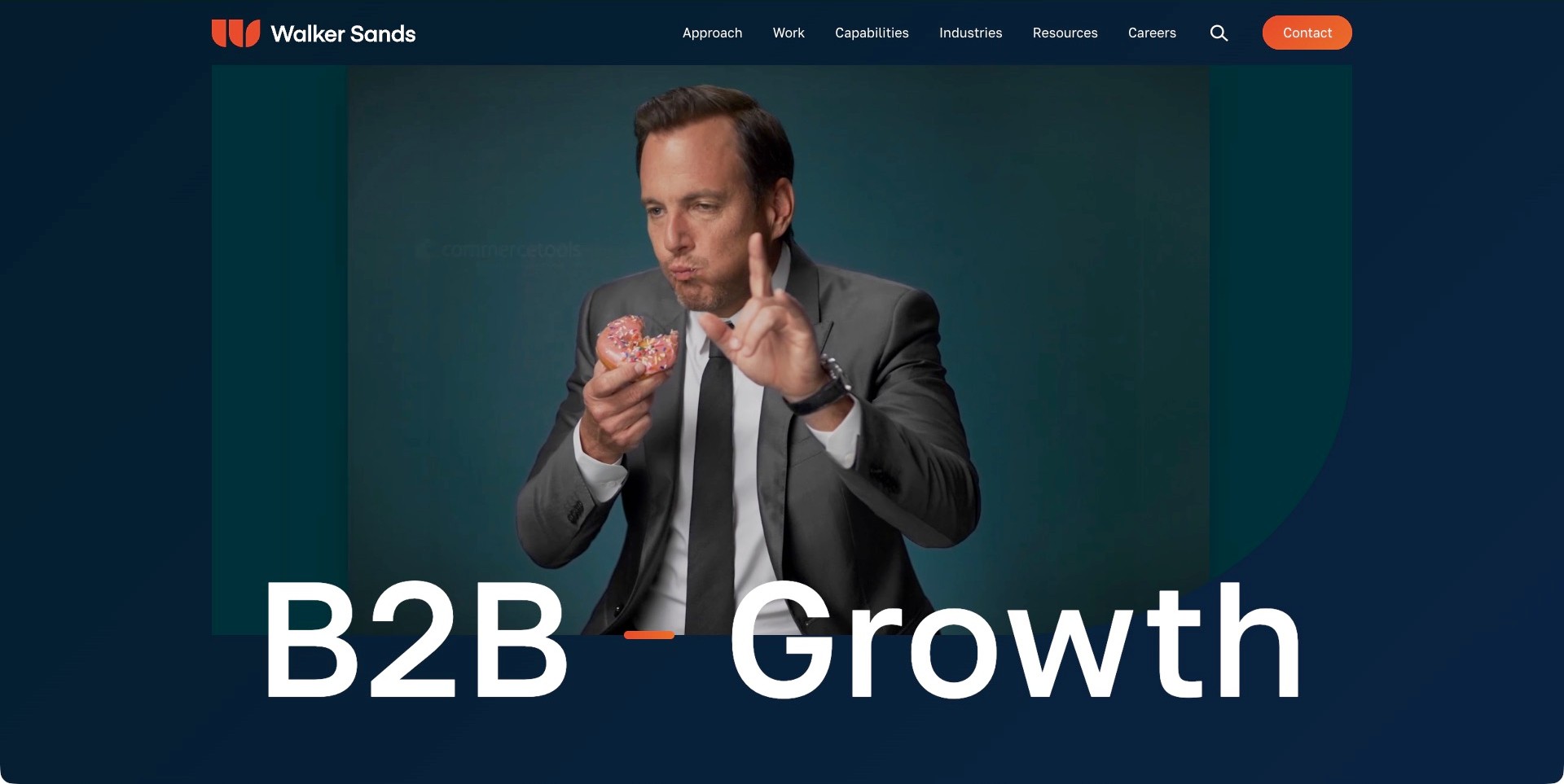
Walker Sands’ saved opening uses a navy background and a large white B2B-growth title overlapping a film frame. The pictured scene shows a suited person holding a pink doughnut; it is not treated as an identified campaign or a result. Orange identity details and the contact action punctuate the restrained header, which separates Approach, Work, Capabilities and Industries. Current first-party content explicitly includes PR alongside brand, demand, social and digital marketing. The useful pattern is the relationship between an audience-specific opening and several ordinary ways to investigate the delivery model beneath it.
What you can learn
Explain how PR contributes to an integrated assignment without implying that every channel produces the same measure. Give cases a defined brief, agency role and time period. Keep industry and capability routes distinct so a visitor can research a relevant context before deciding which service they need.
Pros
The B2B audience is explicit rather than left to client-logo inference.
Approach, capabilities and industries provide different research routes.
Cons & considerations
A broad growth statement needs specific evidence to explain the contribution.
The oversized title and changing film need readable small-screen and reduced-motion alternatives.
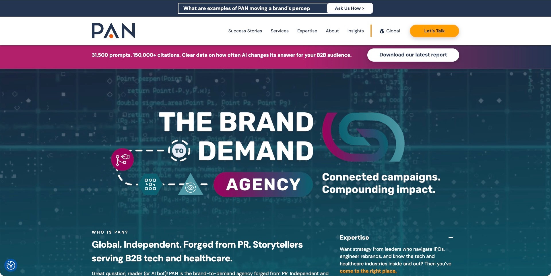
PAN’s saved homepage stacks a question strip, white navigation and a magenta report invitation above a teal-and-magenta brand-to-demand diagram. The visible introduction below explicitly names a PR origin and B2B technology and healthcare audiences. Success Stories, Services and Expertise remain separate header routes. The report counts and connected-impact language are agency-published claims, not findings independently established by the screenshot. Current first-party content qualifies communications work across earned, owned and paid media. The useful pattern is a graphic explanation of a broad proposition paired with a more literal audience and practice description.
What you can learn
Define the different responsibilities behind an integrated diagram and connect each to readable cases. Keep a research download separate from a service inquiry, with a clear explanation of what the visitor will receive. A visual chain should not imply causal proof between awareness, demand and business results.
Pros
The introduction names both the practice’s PR background and its intended audiences.
Research and service inquiries have different visible actions.
Cons & considerations
Several stacked promotional layers consume substantial opening space.
Diagram text and research claims need readable explanations and source methodology beyond the graphic.
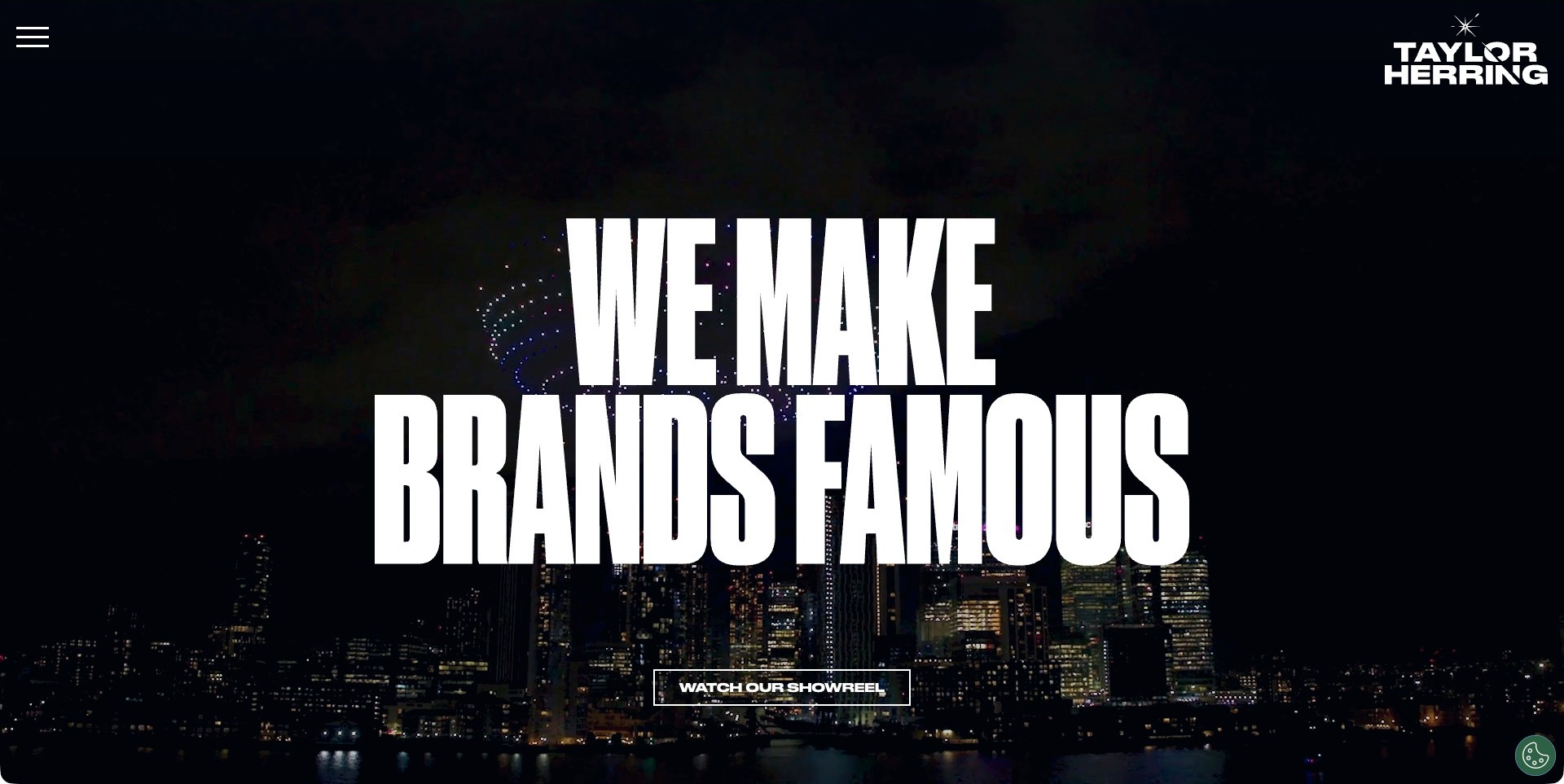
Taylor Herring’s saved homepage places tall condensed white lettering over a dark night-skyline film frame. The white studio mark occupies the upper right, a menu control sits opposite, and an outlined showreel action appears below the central statement. Current first-party copy identifies PR, social and influencer creative work, including ongoing programmes and launch moments. The captured skyline is an introduction to that proposition, not an identified client assignment. The useful pattern is how a small set of strong typographic and visual decisions can create a recognizable entrance while leaving the actual service explanation and cases to supporting sections.
What you can learn
Make the reel optional and follow a broad fame-oriented proposition with precise project roles, campaign context and appropriately qualified results. A striking scene is not evidence of business impact. Keep ordinary work and contact destinations easy to find for visitors who cannot or do not want to watch the film.
Pros
The strong typographic treatment creates a recognizable visual signature.
The outlined showreel invitation clearly identifies a media action.
Cons & considerations
The opening delays practical service detail behind a broad statement.
Menu labels, film contrast and reduced-motion behavior need direct checks beyond this saved frame.
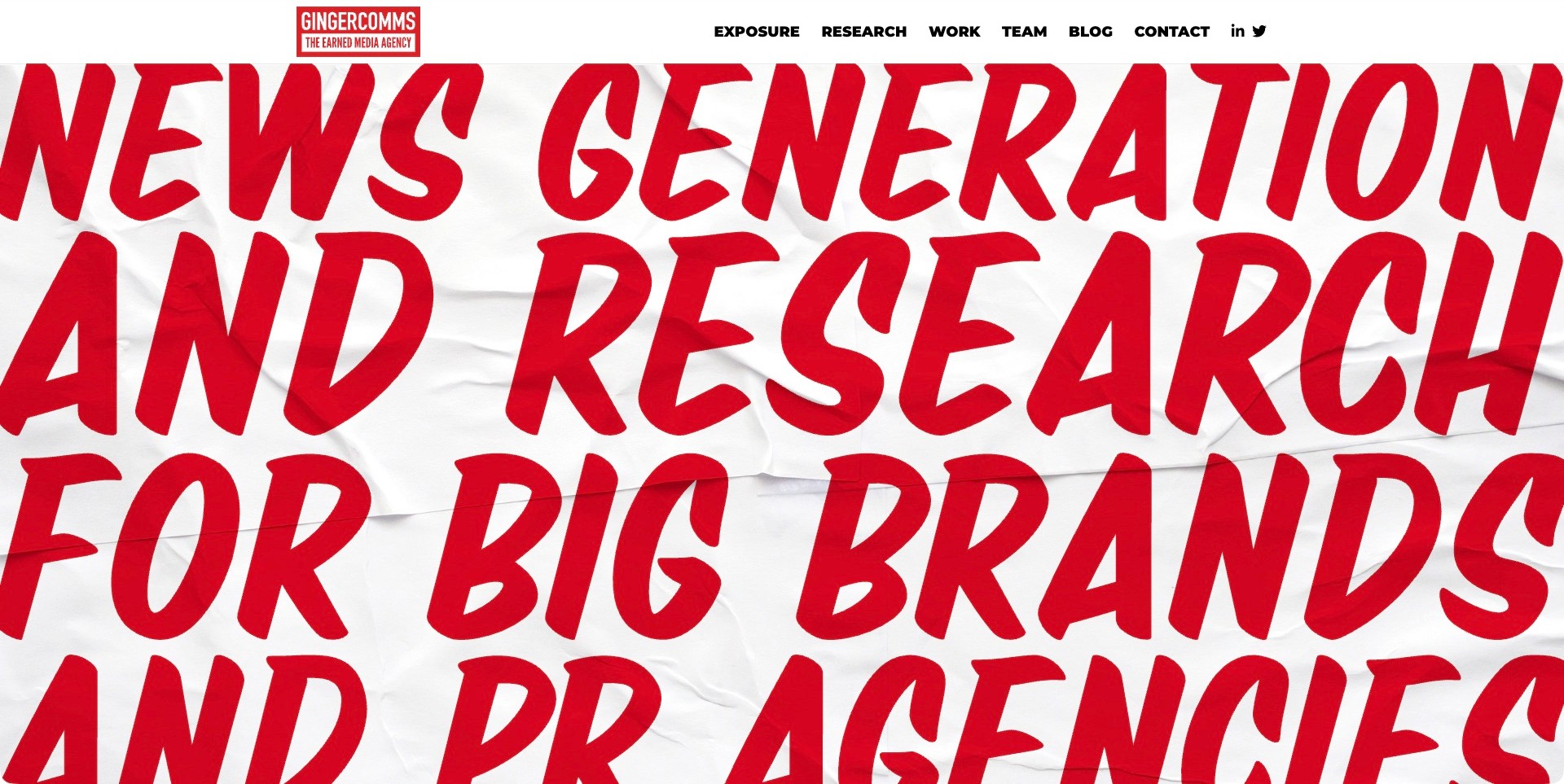
GingerComms’ saved opening fills the screen with oversized red editorial lettering over a crumpled-paper texture. The cropped lines name news generation, research and PR, while a compact white header separates Exposure, Research, Work, Team and Contact. The small identity also explicitly describes an earned-media practice. Current first-party copy names consumer research, data visualisations, case studies and release writing. The useful pattern is a specialist offer communicated through both ordinary labels and a distinctive print-inspired treatment, rather than relying on a vague all-purpose creativity claim. The visual does not independently validate the quality or reach of the underlying research.
What you can learn
Name the actual production stages and connect them to cases that explain sources, methods and distribution responsibilities. A research-led PR website should make evidence quality easier to investigate, not merely suggest that a headline became coverage. Keep the main proposition available in readable text alongside decorative oversized lettering.
Pros
Research and work are distinct visible navigation routes.
The print-inspired identity reinforces the explicitly stated earned-media category.
Cons & considerations
Cropping large lettering can reduce comprehension on narrower screens.
Coverage and guaranteed-sounding language need qualified supporting evidence rather than visual repetition.
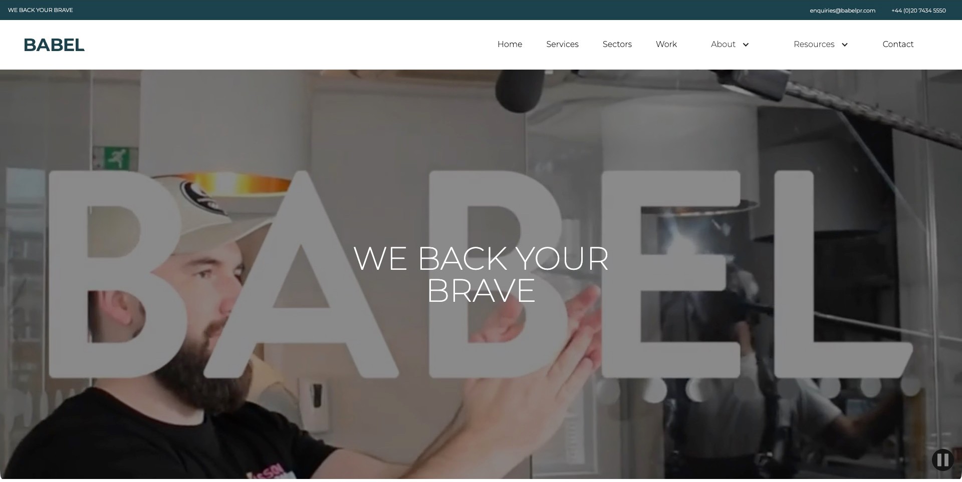
Babel’s saved homepage places a large translucent wordmark over an office-film frame, with a thin white bravery-oriented statement in the center. A white header separately labels services, sectors, work and resources, while a teal utility strip exposes ordinary contact information. A visible pause control sits at the lower right. Current first-party information identifies B2B technology PR and marketing, including PR, analyst relations, content and integrated campaigns. The useful pattern is how a broad brand statement can sit inside a more literal information structure that lets visitors investigate the practice without first decoding the film.
What you can learn
Keep services, sector context and case evidence as distinct routes around an expressive opening. Explain the responsibilities within an integrated campaign instead of letting a bravery claim stand in for method or results. Preserve a meaningful still and test the visible pause control, text contrast and keyboard journey directly.
Pros
Services and sectors address different buyer-research questions.
Ordinary contact information is visible outside the media panel.
Cons & considerations
Layered wordmark and statement create competing reading levels.
Thin white text requires contrast checks across changing office-film scenes.
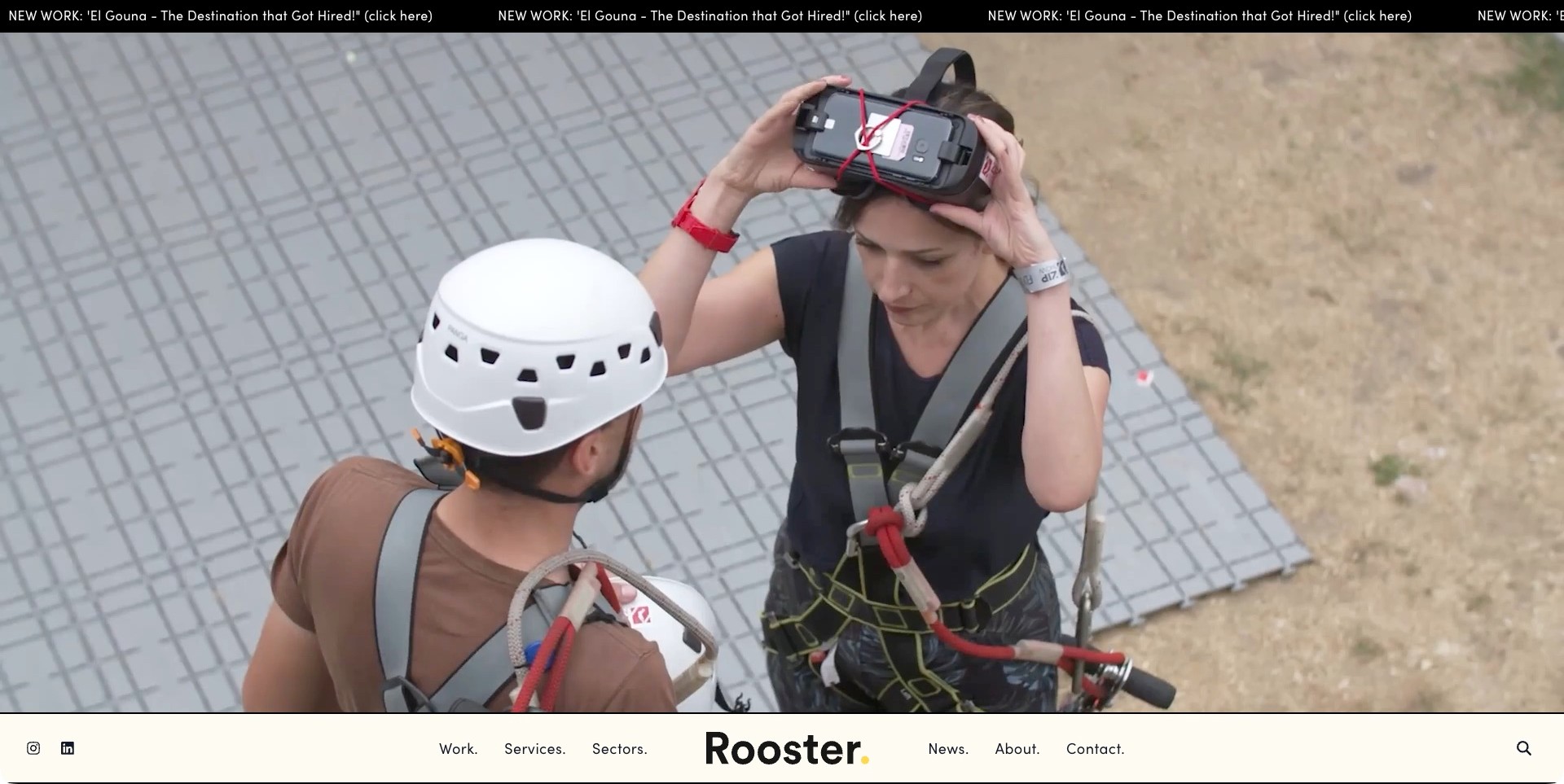
Rooster’s saved homepage shows a large campaign-film frame with harnessed participants and a headset, beneath a narrow new-work ticker. A cream navigation bar anchors the bottom of the opening, with the wordmark centered between work, services, sectors, news and contact. The pictured activity is not treated as an identified project or evidence of event outcomes. Current first-party information describes PR and communications across several sectors, and a separate social-services page gives the digital scope. The useful website pattern is an immersive visual opening with ordinary routes remaining visible beside the reel.
What you can learn
Connect reel scenes to readable cases that explain the brief and agency role, while keeping service and sector research distinct. Maintain a useful still and a clear path beyond the film. News tickers and large media should supplement practical information, not become the only way to discover what the agency does.
Pros
Work, services and sectors remain separately labeled in the opening.
The cream navigation creates a stable surface independent of the film imagery.
Cons & considerations
The image-first entrance delays the literal service explanation.
A moving news strip and bottom navigation need careful keyboard and smaller-screen behavior.
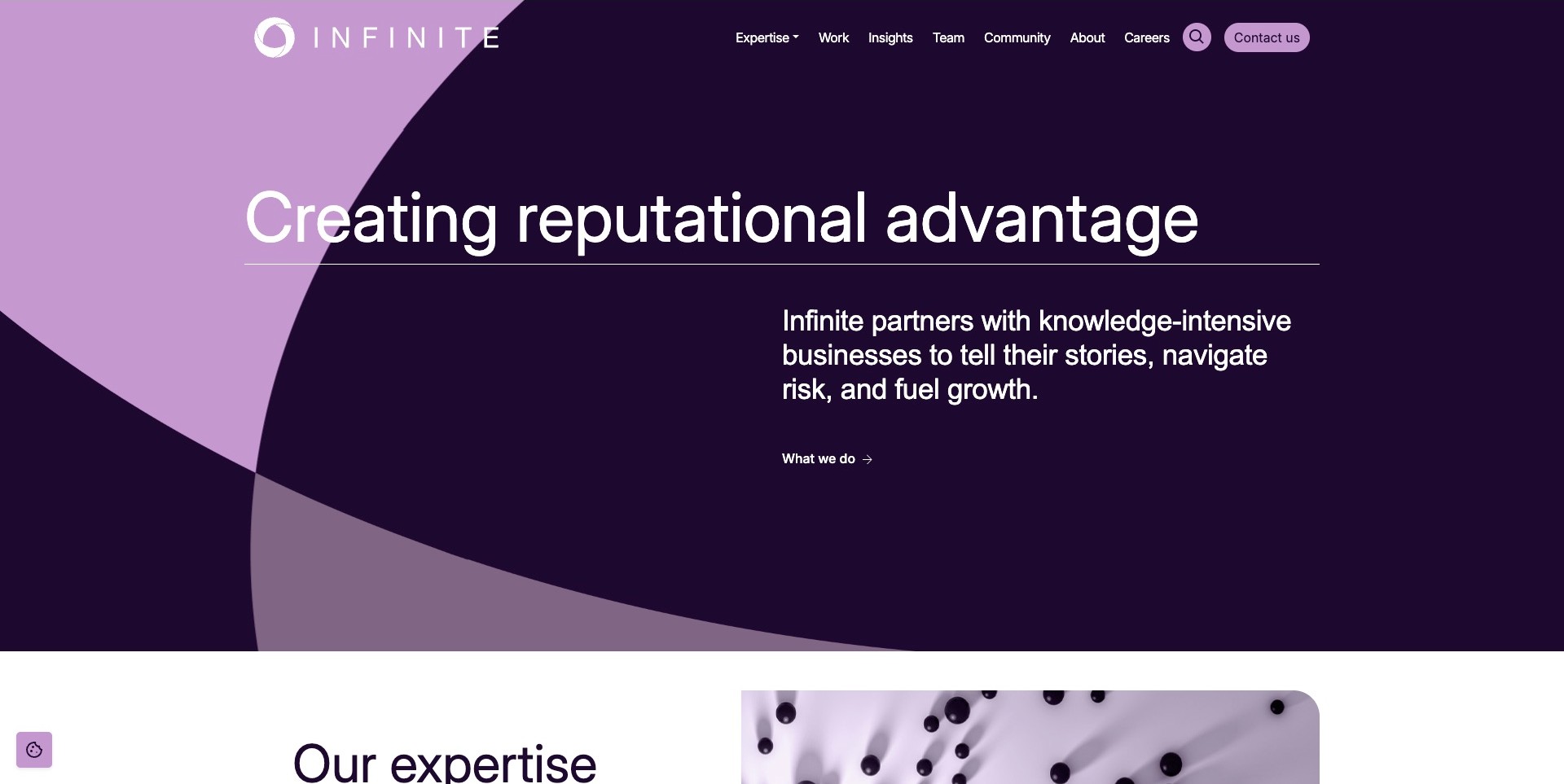
INFINITE’s saved homepage uses overlapping purple curves behind a large reputation-oriented heading. An offset paragraph identifies knowledge-intensive businesses and links to the work the practice does. Expertise, Work, Insights and Team remain separate header routes, while the next section begins on white below. Current first-party content identifies strategic communications across professional, financial and technology contexts. The useful pattern is a specialist audience made explicit within a restrained text-led introduction: the graphic identity supplies recognition without pretending to illustrate a particular client issue or result. The page is still a service proposition, not independent evidence of reputational advantage.
What you can learn
Name the situations and sectors the practice understands, then connect that claim to cases with appropriately permissioned detail. Keep reputation, risk and growth language distinct from measured outcomes. Useful content can explain responsibilities and constraints without publishing confidential client material or making an abstract shape carry the entire service explanation.
Pros
A supporting paragraph identifies the intended business context.
Expertise and work remain different research destinations.
Cons & considerations
A broad reputation claim needs supporting cases to become evaluable.
Large curves and text still need clear reading order and contrast on smaller screens.
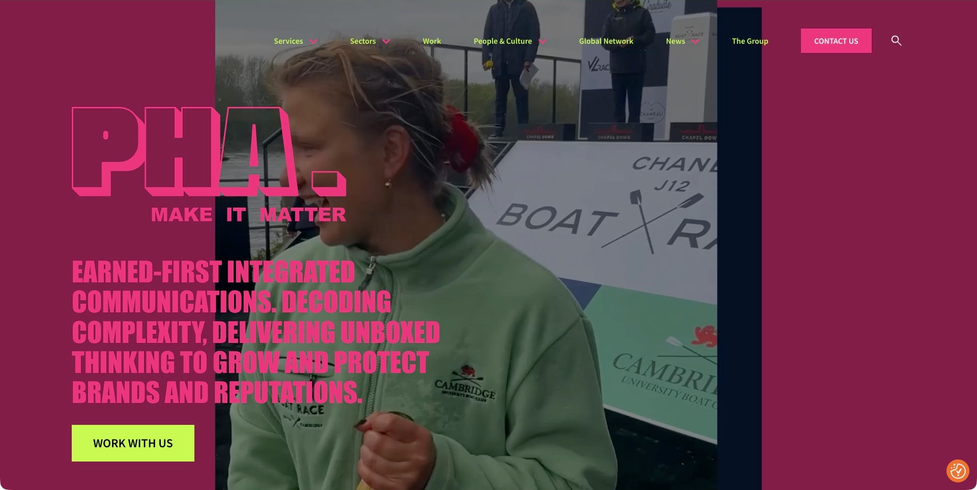
PHA’s saved homepage uses magenta fields, pink typography and lime navigation over a filmed boat-race interview moment. A large studio mark precedes an explicit earned-first communications description and a bright Work With Us action. Services, sectors, work and people remain separately labeled in the header. Current first-party information names PR, social, digital and crisis communications. The pictured interview is an introduction to that wider proposition, not an identified assignment or evidence that the agency produced the event. The useful pattern is a strong organizing discipline stated plainly within an otherwise expressive media treatment.
What you can learn
Explain which responsibilities connect an integrated campaign, and distinguish earned attention from paid distribution and crisis support. Cases should identify the brief and agency contribution without relying on a reel or guaranteed-sounding language. Keep readable still content and check the layered typography across every actual film frame.
Pros
The earned-first category is explicit rather than implied by imagery.
Services, sectors and work have distinct navigation labels.
Cons & considerations
Pink text over magenta and film requires careful contrast review.
A dense opening proposition needs shorter practical explanations and qualified case evidence below.
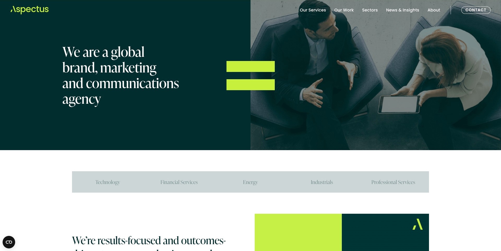
Aspectus’ saved opening splits a deep green text area from an overhead business-meeting film frame. A large lime equals sign bridges the two, while a serif heading explicitly names brand, marketing and communications. The header separates services, work and sectors, and a sector strip begins below with technology, financial services, energy, industrials and professional services. Current first-party information distinguishes PR and communications from digital marketing and brand strategy. The useful pattern is a broad category immediately followed by concrete routes into specialist contexts, rather than expecting the meeting photograph to demonstrate expertise.
What you can learn
Give buyers both a service route and a sector route, then explain the agency’s role within each relevant case. A visual equals sign can connect the identity, but it should not imply that one channel or activity directly caused a business result. Keep evidence and measurement definitions in readable supporting content.
Pros
The heading plainly identifies the agency’s broad discipline.
Sector choices are exposed below the introduction rather than only inside a menu.
Cons & considerations
The headline remains broad until visitors reach specific cases.
White navigation over changing imagery needs contrast and keyboard checks.
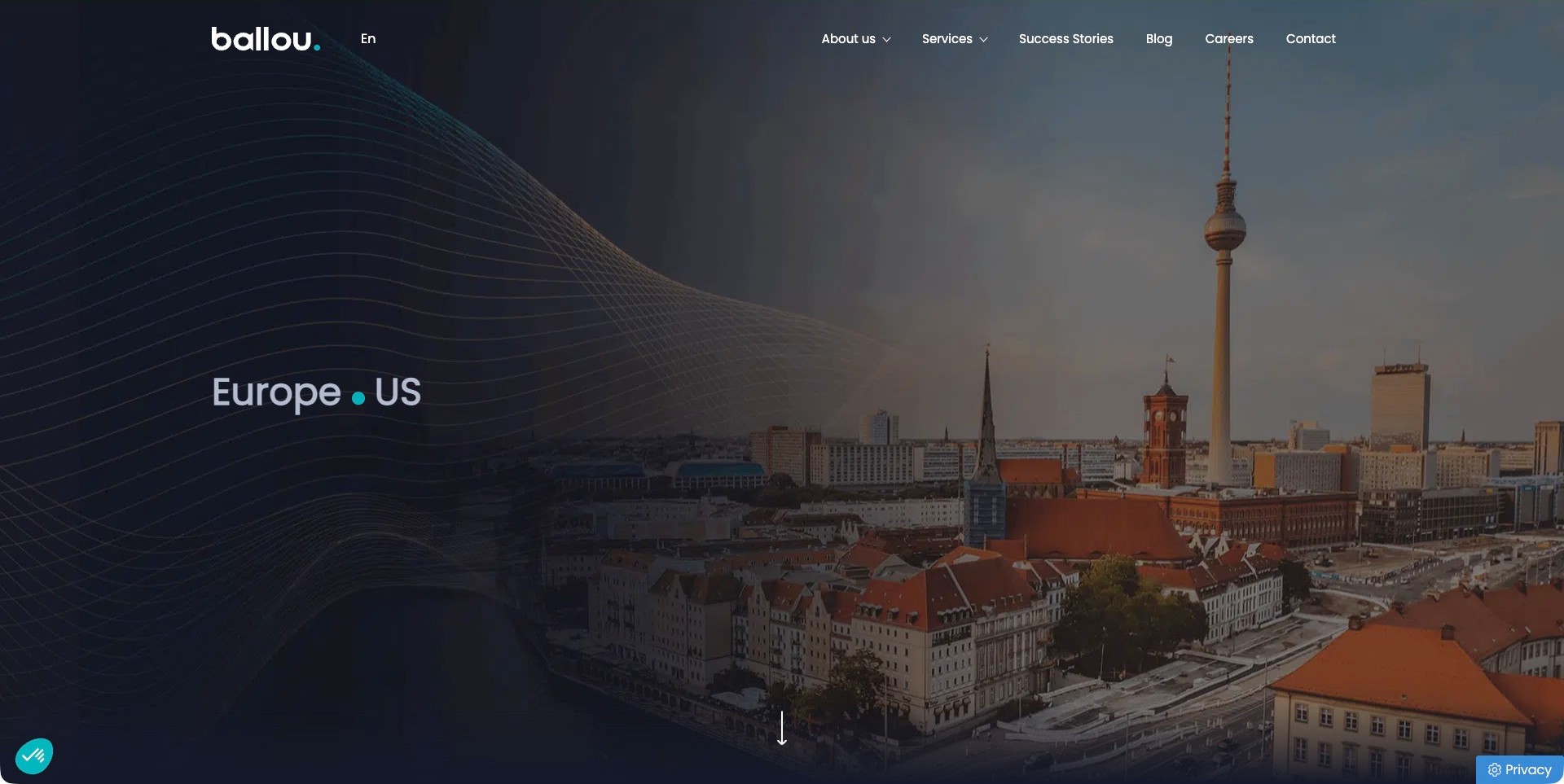
Ballou’s saved homepage shows a Berlin skyline with fine curved lines and a short Europe-and-US label. White header links separate services, success stories, company information and contact, with a language control near the mark. The current first-party introduction further down explicitly identifies technology and venture-capital communications for B2B and B2C audiences. The saved frame therefore establishes a geographic tone rather than presenting a particular client campaign. The useful pattern is a restrained international identity combined with ordinary routes to understand services and cases, without making visitors infer the agency’s remit solely from a city photograph.
What you can learn
Connect geographic positioning to clearly described capabilities and relevant assignments, not an unqualified implication that every market receives identical delivery. Explain the role of each office or team where it affects an engagement. Keep meaningful stills and a plain service description available alongside changing location imagery.
Pros
Services and success stories are separate visible research routes.
The restrained mark and line treatment leave the city image visually coherent.
Cons & considerations
The captured geographic label alone gives little service detail.
Light navigation over skyline imagery needs checks across every frame and smaller-screen state.
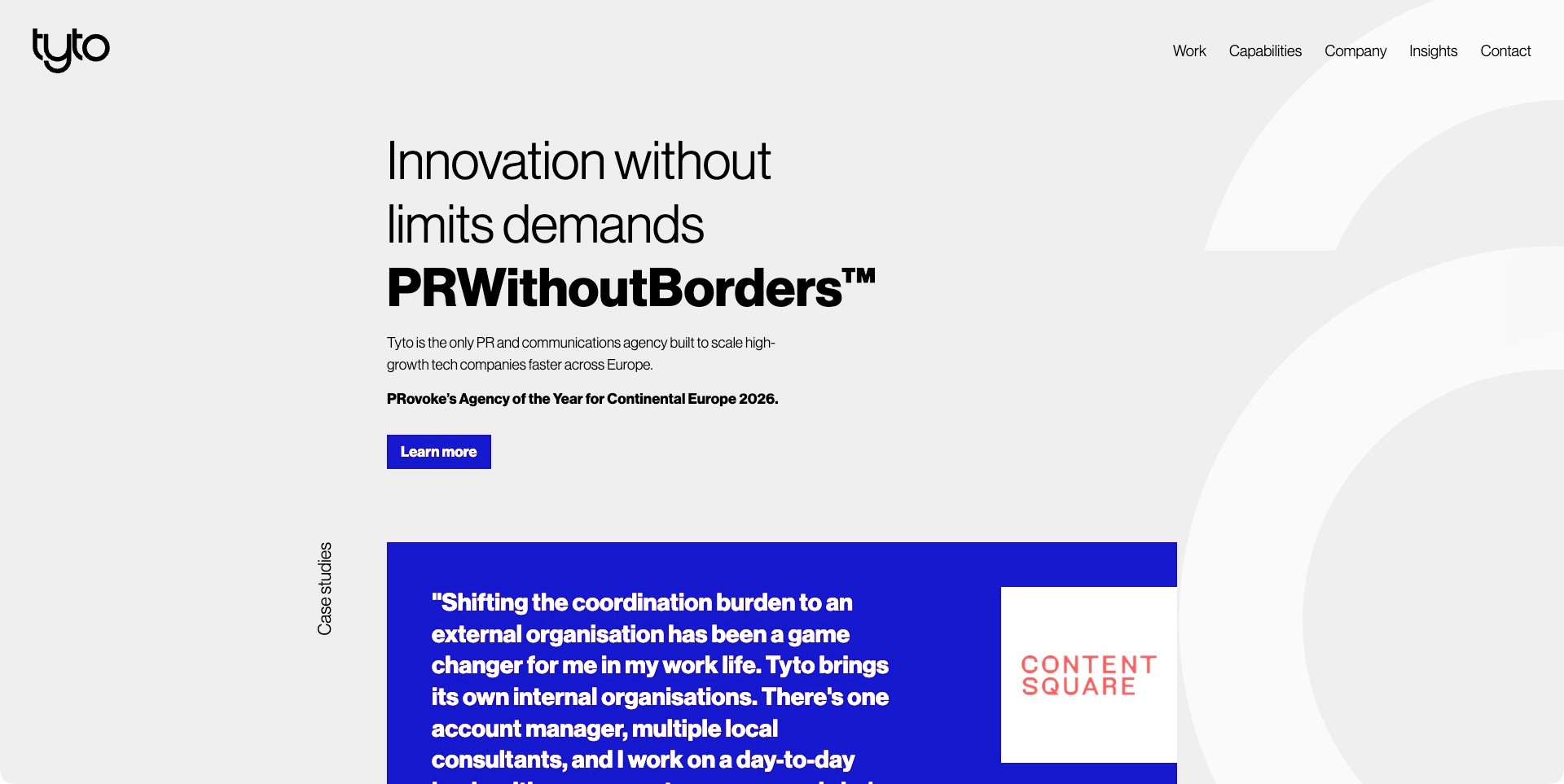
Tyto’s saved homepage uses a light grey field, large black text and selective bright blue actions. A borderless-PR proposition is followed by a short explanation of high-growth technology clients and European context. The next section begins with a blue ContentSquare testimonial panel, while Work and Capabilities remain separate header links. Current first-party information confirms PR and communications work. The awards and exclusivity language are the agency’s own claims, not independently verified rankings here. The useful pattern is a text-first specialist introduction with supporting client context nearby rather than a film that must be watched before the service becomes understandable.
What you can learn
State the intended market plainly and use client testimony as one perspective, not a substitute for a case’s scope and method. Give project evidence a readable destination and explain the coordination responsibilities within a cross-market programme. A concise proposition should remain useful without adopting its exclusivity claims as editorial fact.
Pros
The specialist category and regional context appear in readable text.
Capabilities and work are different exploratory destinations.
Cons & considerations
Awards and only-provider language require separate substantiation.
A testimonial sequence needs attribution, context and usable controls beyond the saved frame.
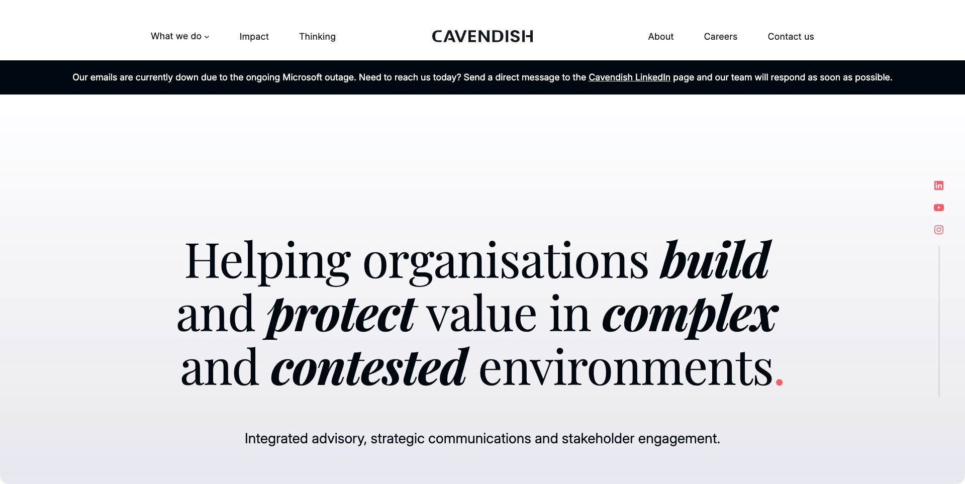
Cavendish’s saved homepage centers a large serif statement on a pale background, using italic emphasis for the complex-environment proposition. A supporting line plainly names advisory, strategic communications and stakeholder engagement. The white header separates What We Do, Impact and Thinking, with the mark centered. A dark notice above the introduction reports an email problem and offers an alternative contact route. That is a captured site-published operational claim, not an independently verified outage or current status. The useful pattern is a quiet professional introduction with a visibly separate place for urgent practical information.
What you can learn
Keep temporary contact notices distinct from evergreen positioning, with an owner and removal rule. Explain capabilities and permissioned cases in ordinary language rather than relying on broad complexity claims. Provide usable alternative contact routes while avoiding unnecessary disclosure of confidential stakeholder or issue information.
Pros
The supporting line names the actual advisory disciplines.
A temporary notice is visually separated from the main proposition.
Cons & considerations
The large statement delays detailed service distinctions.
Operational notices need maintained timing and expiry so historical problems are not mistaken for current conditions.
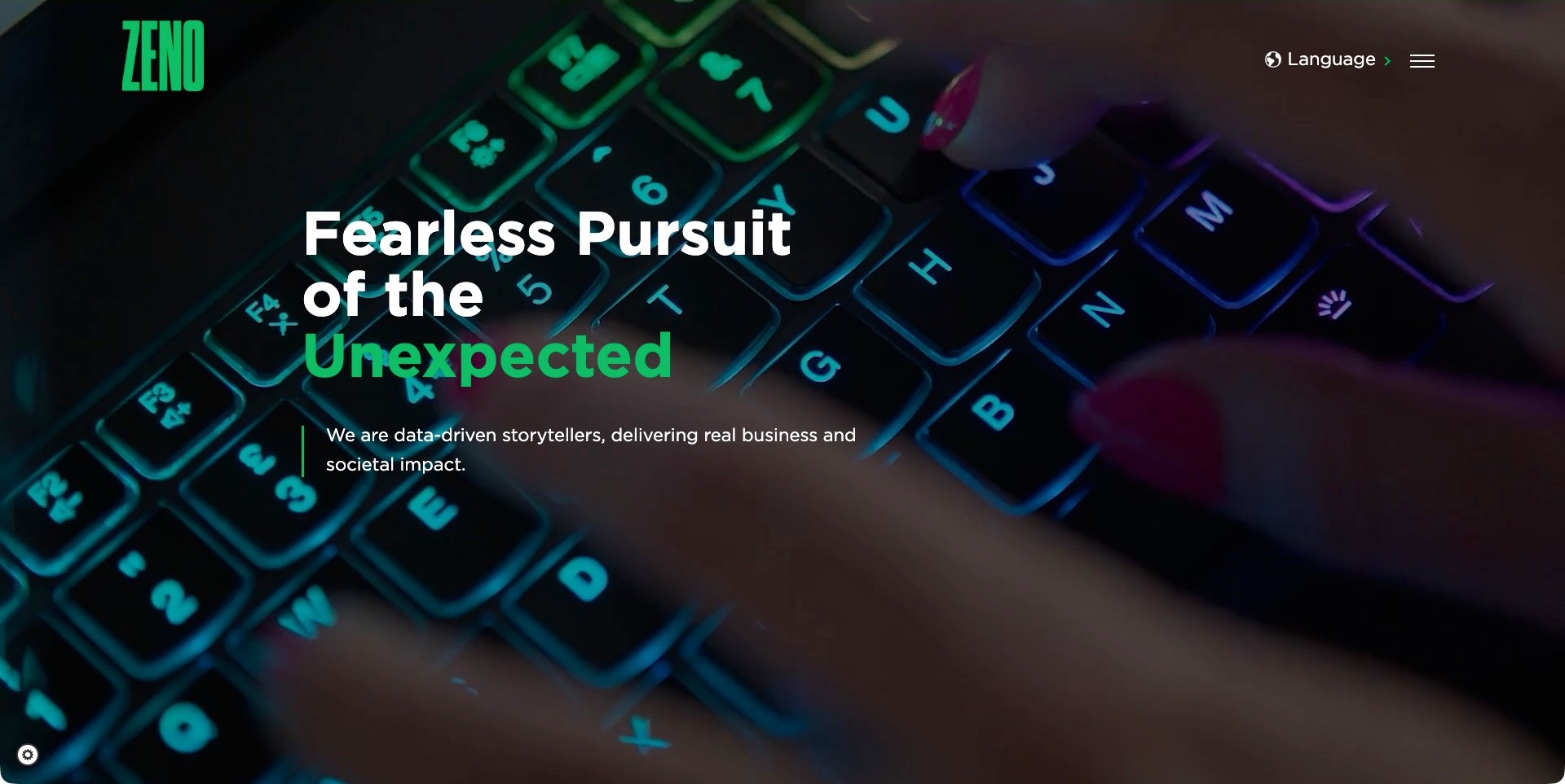
Zeno Group’s saved homepage places a green wordmark and selective green headline emphasis over a backlit-keyboard film frame. A short white supporting statement describes data-driven storytelling, while language and menu controls sit at the upper right. The image is not evidence of a particular technology stack, client project or measured impact. Current first-party information identifies integrated communications with a PR origin and corporate and consumer campaign work. The useful pattern is a strong visual signature around a concise proposition, followed by a need for more literal service and case information beyond the opening screen.
What you can learn
Follow an expressive storytelling statement with concrete responsibilities and relevant cases. Explain the source and limits of any data used to support impact language rather than letting a technology-themed image suggest analytical proof. Keep a useful still and ordinary routes for visitors who do not engage with the film.
Pros
Selective green emphasis links the identity and headline without many competing colors.
The short supporting sentence adds context beneath the main proposition.
Cons & considerations
A menu-led introduction delays visible service categories.
Text over changing imagery requires contrast, motion and keyboard review beyond this frame.
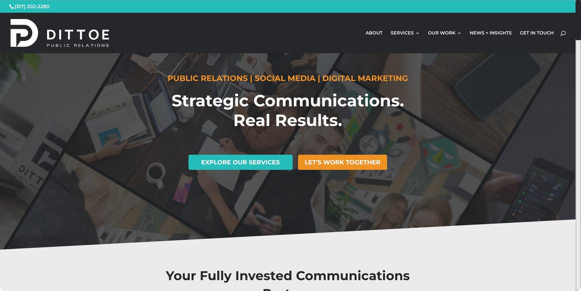
Dittoe Public Relations’ saved homepage combines a charcoal header, turquoise phone strip and diagonal collage of working scenes. An orange service line explicitly names public relations, social media and digital marketing above a white communications proposition. Teal Explore Our Services and orange Let’s Work Together actions provide different next steps. The header also separates Services, Our Work and News & Insights. Current first-party copy confirms a communications practice combining PR, social and digital strategy. The useful pattern is a plain category statement and an exploratory route placed alongside, rather than beneath, an immediate invitation to inquire.
What you can learn
Name adjacent disciplines clearly and give visitors a way to investigate the scope before contacting the practice. Connect broad results language to cases that explain the brief, channels and agency contribution. A collage can communicate a working atmosphere, but it cannot establish outcomes or show that every service was delivered for every client.
Pros
The opening explicitly identifies the disciplines instead of relying on the headline alone.
Exploration and inquiry have distinct actions and colors.
Cons & considerations
The collage and multiple accent colors create several competing elements.
Results language requires specific supporting evidence beyond the introductory composition.
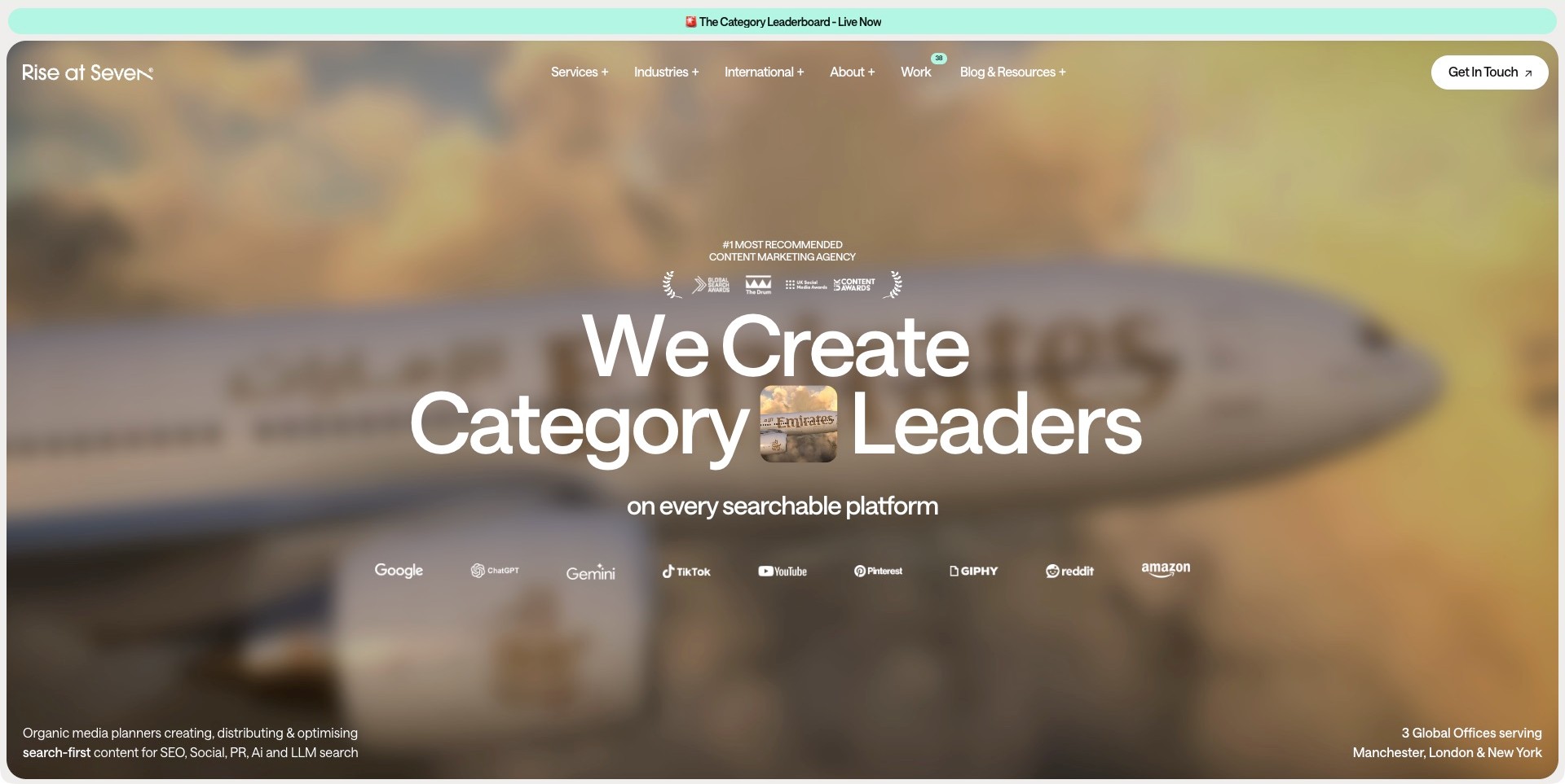
Rise at Seven’s saved homepage combines a mint news strip with a rounded hero containing a blurred aircraft image and a small sharp inset. Large white positioning text sits above a row of search and social platform marks, while services, industries and work remain separate header routes. A lower-corner description explicitly identifies search-first content across SEO, social and PR. Current official services include Digital PR alongside search strategy and content. The useful PR example is this specific search-led scope, not an inferred general crisis or corporate-reputation practice. Platform marks and agency-published recommendation claims are not endorsements verified here.
What you can learn
Explain the editorial, research and distribution responsibilities within digital PR, then connect cases to their actual briefs and measurement limits. Distinguish coverage, citations, visibility and business outcomes instead of treating them as interchangeable. Keep the agency’s service description readable outside campaign imagery and prestige language.
Pros
The short supporting description makes the search-led PR scope explicit.
Services and work are separate, visible research routes.
Cons & considerations
A broad category-leadership claim needs precise supporting cases.
Small text over imagery and a long platform-mark row require readable phone alternatives.
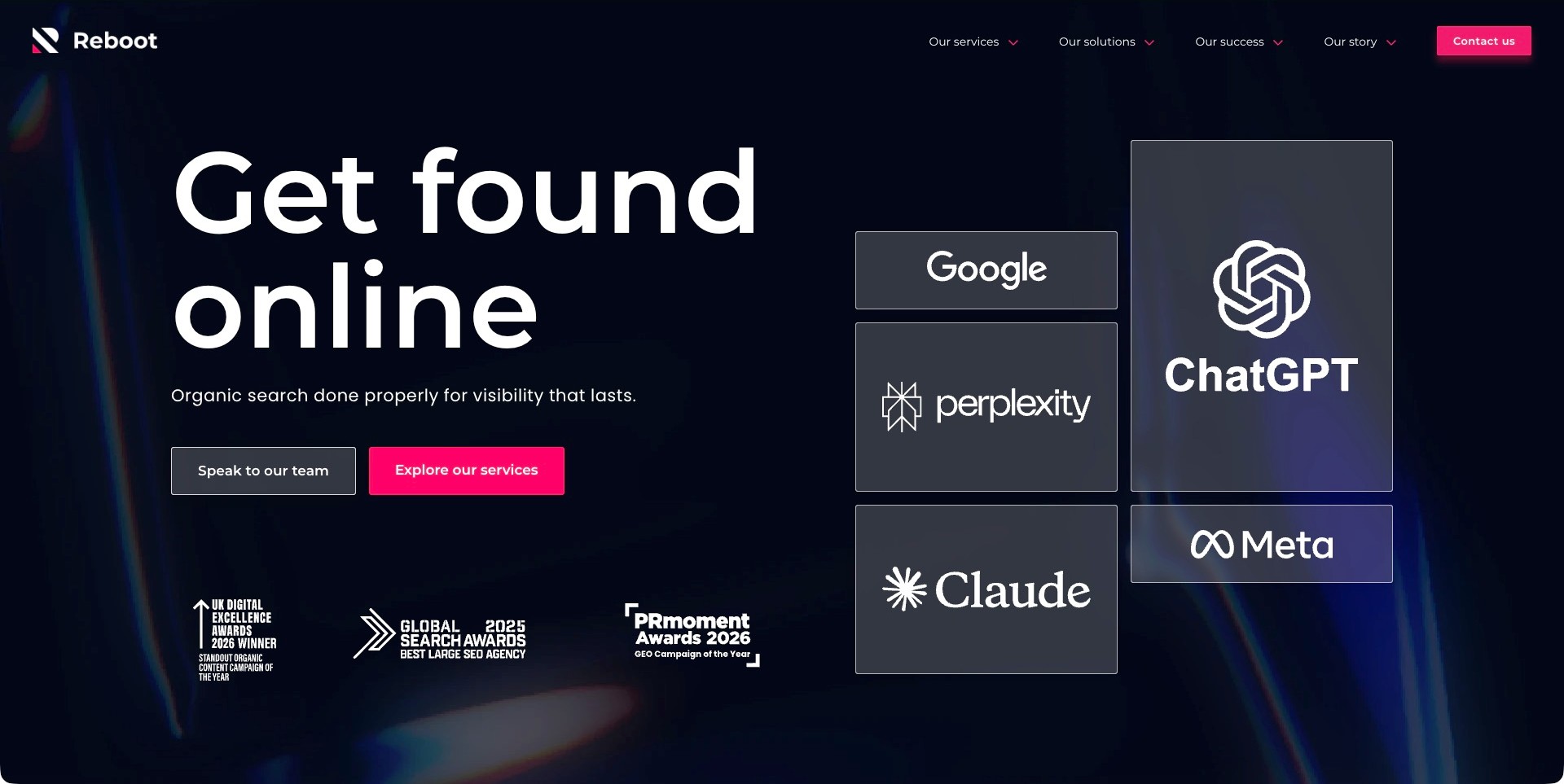
Reboot Online’s saved opening uses a dark background, large white visibility proposition and two different actions for contacting the team and exploring services. A grid of Google, ChatGPT, Perplexity, Claude and Meta marks occupies the right side, with agency-displayed award marks below. Current first-party services explicitly name Digital PR and earned media alongside SEO and search strategy. The platform cards describe the marketing context, not the website’s backend or a verified endorsement. The useful PR pattern is a clear search-led category with a separate service-research route rather than an immediate requirement to request a proposal.
What you can learn
Explain the boundaries of digital PR, source research and distribution in readable service and case pages. Do not let a visibility proposition imply guaranteed placement, citation or commercial results. Keep client measures tied to their period and method, with context beyond platform recognition and award imagery.
Pros
Service exploration and a direct conversation have distinct actions.
The short supporting line identifies organic search as the organizing discipline.
Cons & considerations
Platform marks can overwhelm practical delivery detail without explanation.
Awards and durable-visibility language need qualified supporting evidence rather than visual prominence.
Kegan is a freelance web designer and developer with 15+ years of experience helping businesses turn complicated website requirements into clear, maintainable digital experiences. He works directly with clients from planning and design through development, launch, and ongoing support.
For public relations website design, his development approach focuses on clear communications specialisms, properly contextualized campaign examples, useful media and team information, distinct press and new-business routes, and maintainable news publishing. The scope can be a targeted improvement or a complete custom build, with responsive layouts, thoughtful content structure, and integrations chosen around the people using and maintaining the site.
Show 3 other public relations website designersHide other public relations website designers
Plan a PR agency website around scope, evidence and the right conversation
Map the real audiences before writing the hero
Identify the visitors the agency genuinely needs to serve. A communications director comparing corporate-reputation advisers, a consumer brand planning a launch and a journalist looking for a press contact do not arrive with the same task. Decide which audience leads the homepage and which needs a direct secondary route. Avoid a universal campaign slogan that forces every visitor to work out whether the practice is relevant.
Write a short service-and-sector description beside the more expressive proposition. Describe the work the agency actually undertakes and the regions or markets it can discuss. Distinguish an office location from delivery coverage and a past client sector from a current specialist offer. If a capability depends on another agency or external adviser, explain the relationship rather than making a network diagram imply that every service is in-house.
Organize services by meaningful responsibilities
Separate the capabilities in terms a buyer can understand. Media relations, corporate communications, public affairs, crisis-related advisory work, influencer campaigns, social content and digital amplification may overlap, but they involve different responsibilities. Use a concise overview and deeper pages where there is enough original substance. Do not create many thin pages that merely exchange a sector name inside the same pitch.
Make the relationship between earned, owned and paid work explicit when it matters to an engagement. A reader should not assume that a case featuring a publication logo was an earned placement if the project involved paid distribution. Avoid promises of guaranteed editorial coverage or a predetermined reputation outcome. The website should help a prospective client ask a better question, not remove the uncertainty inherent in communications work.
Build cases around the assignment and the evidence
Record the brief, target audience, agency role, collaborators, channels and public campaign period for every case. Obtain client permission for images, names and reported results. Explain the problem and the chosen approach before displaying a long sequence of coverage screenshots. A reader should be able to distinguish the agency’s contribution from the client’s wider marketing activity and from work carried out by other partners.
Where figures are used, label the metric and its source. Coverage counts, potential reach, measured engagement, qualified inquiries and business outcomes answer different questions. Avoid presenting a percentage without a baseline or a time period. If attribution is limited, say so rather than implying that a campaign caused every later change. A clearly bounded result is more credible than a large unexplained number.
Use visual energy without making the message disappear
Campaign films, photography and oversized typography can reflect a PR practice’s personality. Plan a readable still-image state, a useful headline and normal navigation before adding them. The visitor should understand the basic remit without waiting for a showreel or interpreting a sequence of changing slogans. Keep controls and text legible over the actual frames rather than approving contrast from a single favorable screenshot.
Test reduced-motion preferences, keyboard navigation and media controls in the finished implementation. A reel is not a reason to autoplay sound or download every campaign film on the homepage. Provide a concise route into relevant work and let visitors choose deeper media. The most useful creative treatment supports the agency’s explanation instead of becoming a barrier to finding a service or contact.
Distinguish contact, press and careers journeys
Give business inquiries, press requests and applications their own appropriate labels and routes. A public press contact may need a named person, topic or client-specific destination, while a new-business form can begin with a short description of the need. Keep confidential or urgent matters out of a general form unless the agency has defined an appropriate process and staffing arrangement.
Do not promise round-the-clock response or immediate crisis assistance simply because a contact button is prominent. Publish only support or response expectations the organization has agreed to maintain. Use accessible form labels, useful errors, server-verified spam controls and truthful submission confirmations. A visitor should know what has actually happened after clicking Send and how to use an ordinary alternative if delivery fails.
Make insight content demonstrate a genuine point of view
An insight section can help a buyer understand how the agency thinks, but it needs authorship, a clear publication date and an identifiable purpose. Separate research, opinion, company news and recruitment posts so the reader can judge each piece appropriately. Cite the underlying source for factual claims and explain limitations rather than presenting a small internal survey as a universal statement about public behavior.
Connect useful insight to relevant services or cases where the relationship is genuine. Do not add a sales link to every sentence or publish near-identical trend articles for every sector. Review old material that discusses changing platforms, regulation or measurement methods, and label substantial updates honestly. A current-looking date should reflect actual editorial work rather than an automatic refresh.
Prepare the publishing and approval workflow
Model cases with fields for brief, scope, channels, period, metrics, sources, permissions and credits. Give the agency a way to update a client name or withdraw an unapproved claim without rebuilding a page. Define who approves sensitive material, legal references and client results before publication. A flexible CMS should support the review process, not bypass it because a project card looks complete.
Assign owners for biographies, office details, service changes, contact routing and archived work. Keep important case URLs stable and redirect retired pages deliberately. Plan backups, access control, software updates and an appropriate retention policy for inquiries. The public website may be playful, but the operational responsibilities behind it should be ordinary and accountable.
The editing job behind the design
Choose a CMS around cases, insight and editorial approval
A conventional CMS or well-scoped hosted platform may support an agency’s cases, services, people and insight. A custom frontend can be appropriate when there is a clear interaction requirement and a maintenance plan. Decide from the publishing model, preview needs, approval workflow and media inventory rather than assuming that a dramatic agency reference requires the same stack.
Define reusable content fields and permission boundaries before selecting plugins or integrations. Keep case metrics, sources and approval notes manageable. A public technology marker identifies an observed website component, not the tools the agency uses for media monitoring, campaign delivery, internal analytics or client work.
Check inquiry delivery, accessible errors, keyboard operation, motion preferences and image loading in the actual implementation. Do not infer performance, accessibility, privacy compliance or operational readiness from the choice of a CMS or a library.
Our WordPress website examples offer a separate look at publishing approaches. A visible platform label is evidence for that named page, not a guarantee that the same system will suit your requirements.
Before the public launch
Public relations agency website checklist
Identify the primary buyer and provide secondary routes for press and careers.
State the agency’s real service remit, sectors and markets.
Distinguish earned, owned and paid responsibilities where relevant.
Remove guaranteed coverage, reputation or commercial-outcome promises.
Document the brief, role, channels, collaborators and period for every case.
Label metrics with sources, baselines and appropriate limitations.
Obtain permission for client names, imagery, coverage and results.
Keep navigation and positioning useful without playing a reel.
Test contrast, keyboard access and reduced-motion behavior.
Separate general inquiries from sensitive or urgent communications.
Provide truthful confirmations, accessible errors and appropriate spam controls.
Assign owners for approvals, corrections, office details, redirects and maintenance.
These checks are a project checklist, not a performance, legal, security, or accessibility certification. Test real journeys with the people responsible for the website before making claims about the result.
Sources & editorial method
How this collection was selected and reviewed
The selection concerns observable public website communication: positioning, service clarity, hierarchy, case context and contact routing. Each image is a genuine direct browser capture or an explicitly retained original with its real provenance. Current first-party pages qualify the agency’s relevance. Editors Choice is not an endorsement of services, a ranking of campaign performance or verification of agency-reported claims.
Each example links to its actual source page. Screenshots are direct browser captures with their own capture dates; moving imagery, announcements and live designs can change. The notes describe observable design choices and conditional tradeoffs, not measured traffic, conversion results, service quality, or accessibility conformance.
Technology labels use public page metadata, asset evidence, or explicitly cited platform documentation. Platform documentation is not a complete current deployment audit. A component reference may be legacy or unused; it is not a complete backend inventory. Unknown stacks are omitted. These sites are editorial examples, not our client portfolio.
Written, Edited and Curated are separate editorial records, not timestamps advanced by a rebuild. Website designs and imagery belong to their owners. See our editorial standards or suggest a correction.
Questions worth asking
Public Relations website design questions
Should a PR agency lead with results or creativity?
It needs an understandable relationship between them. A creative opening can establish personality, while cases explain the assignment and bounded evidence. Neither a dramatic image nor an unexplained percentage should replace a clear description of the agency’s responsibilities.
Can client logos serve as the main proof?
They can establish a public relationship when permission and context are clear, but they do not explain the scope, period or outcome of the work. Add relevant cases and distinguish the agency’s role from a client’s wider communications activity.
Should a crisis contact be on the general form?
Only if that reflects the agency’s actual process and staffing. Do not imply immediate or continuous monitoring through a normal marketing form. Provide the appropriate clearly described route and have sensitive wording reviewed by the responsible team.
How should campaign statistics be presented?
Name the metric, source, period and relevant baseline. Distinguish potential reach from measured engagement and from business outcomes. Explain attribution limits rather than presenting every change after a campaign as caused by the agency.
Does this collection recommend an agency?
No. It examines public website design and communication. Suitability for a real assignment requires a separate discussion of scope, experience, terms and evidence that a screenshot cannot establish.
Borrow a clearer service distinction, a better case explanation or a more deliberate contact route. The objective is a website that makes the agency easier to understand, not a louder version of the same unsupported claims.