Best Flooring Websites of 2026 (21 Real-World Examples)
Flooring websites connecting material inspiration with practical selection
Flooring websites have to bridge two kinds of research: how a surface looks and what buying or installing it actually involves. These examples include fitters, specialist suppliers, retailers and manufacturers, with the service model kept explicit.
A homeowner comparing engineered timber is not doing the same task as an architect researching a sports floor or a customer booking an in-home measuring visit. The best structure makes those differences understandable. Name the materials, show them at room and detail scale, and explain whether the business manufactures, supplies, retails, fits or coordinates a combination of those roles.
This collection deliberately includes several business models. A manufacturer’s product catalogue is not evidence of a local installation service, and a fitter may not sell the materials shown in its projects. Study the navigation, sample journeys, project records and service explanations rather than treating the examples as comparable providers or independent endorsements of material performance.
Before the examples
What makes good flooring website design in 2026?
Explain the role of the business
State whether customers are buying materials, arranging fitting, visiting a showroom or beginning a specification conversation. Keep those routes distinct when more than one is available. A room visualiser should not imply that a retailer performs every installation, and a global product page should not suggest that its range is stocked in every country.
Help people compare at more than one scale
Room images show pattern and atmosphere; detail images reveal grain, finish and variation. Connect both to named products or ranges. Give technical information a readable home without making newcomers learn a complete specification vocabulary before browsing. Physical samples and project-specific advice remain separate from what a screen can communicate.
Make the next research step useful
Samples, showroom visits, catalogues, retailer finding and installation assessments serve different purposes. Label them precisely and preserve the selected product or project context when someone moves between steps. Do not ask for an extensive lead form just to reveal basic catalogue information or the location of a showroom.
The collection · 21 examples
21 flooring websites worth studying
Compare how each site moves from a room image to a material, sample or service decision. Borrow the structure that matches your business model, not another company’s product claims or promotional offer.
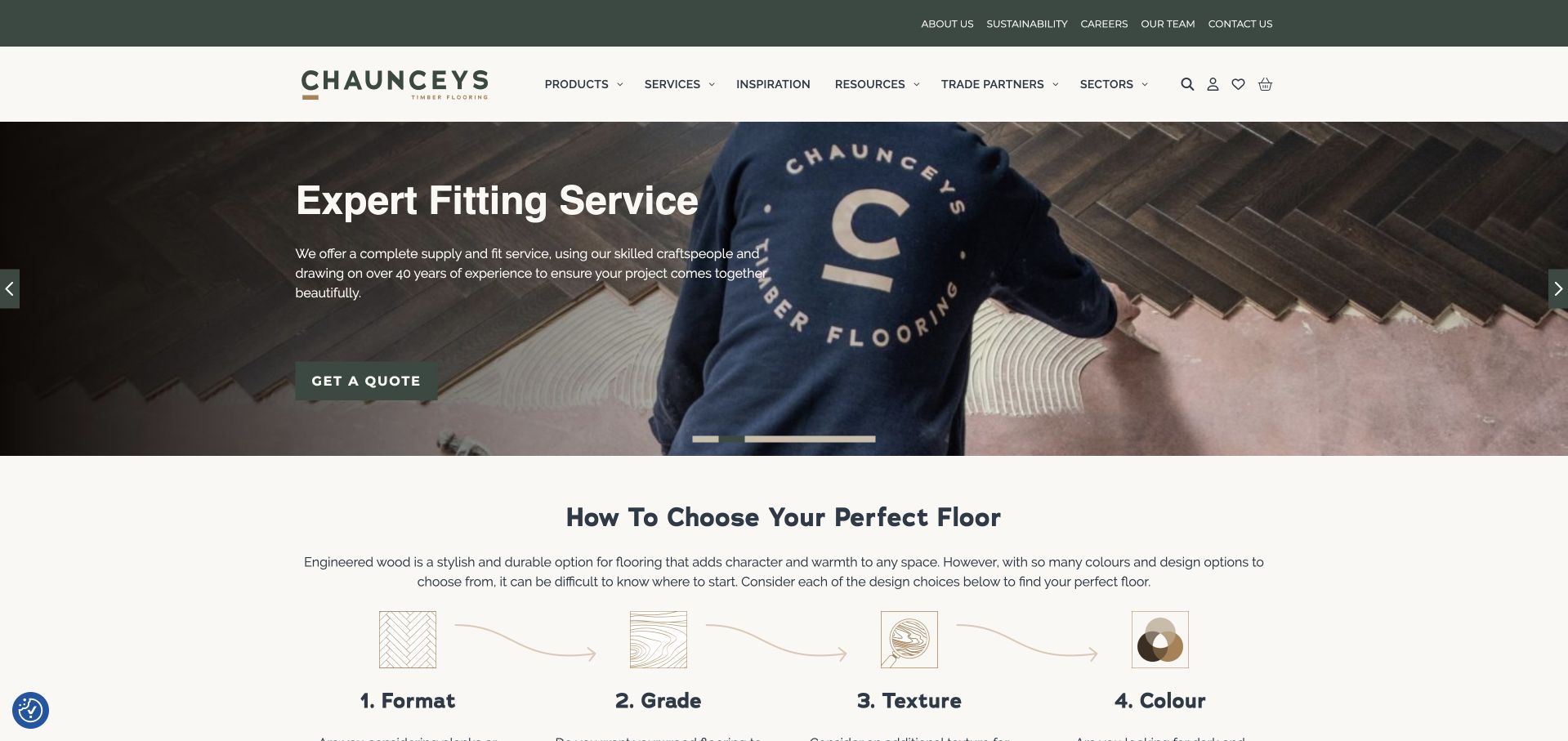
Chaunceys pairs a sage-and-cream identity with a photograph of a fitter laying a patterned timber floor. The image supports an explicit supply-and-fit proposition rather than a vague interiors promise. Directly below, four illustrated decisions introduce format, grade, texture and colour. That sequence gives a newcomer a vocabulary for browsing, which is particularly useful when a timber catalogue contains many similar-looking options. Product, service, inspiration, resource and trade routes are separated across the navigation. The typography and restrained palette feel warm, but the most transferable feature is this clear bridge from seeing an attractive floor to understanding how to choose one.
What you can learn
Show the customer which decisions come first. Format and appearance choices are easier to research when a page explains the terms before opening a large catalogue. Keep product supply, fitting and professional specification distinct, because the existence of a product does not mean installation is available in every location.
Pros
Four illustrated selection criteria turn a broad catalogue into an understandable research process.
The opening photograph shows fitting work as well as the finished material.
Cons & considerations
The full navigation includes many audiences and can feel dense at first glance.
Regional fitting coverage needs a clear route alongside the broader product catalogue.
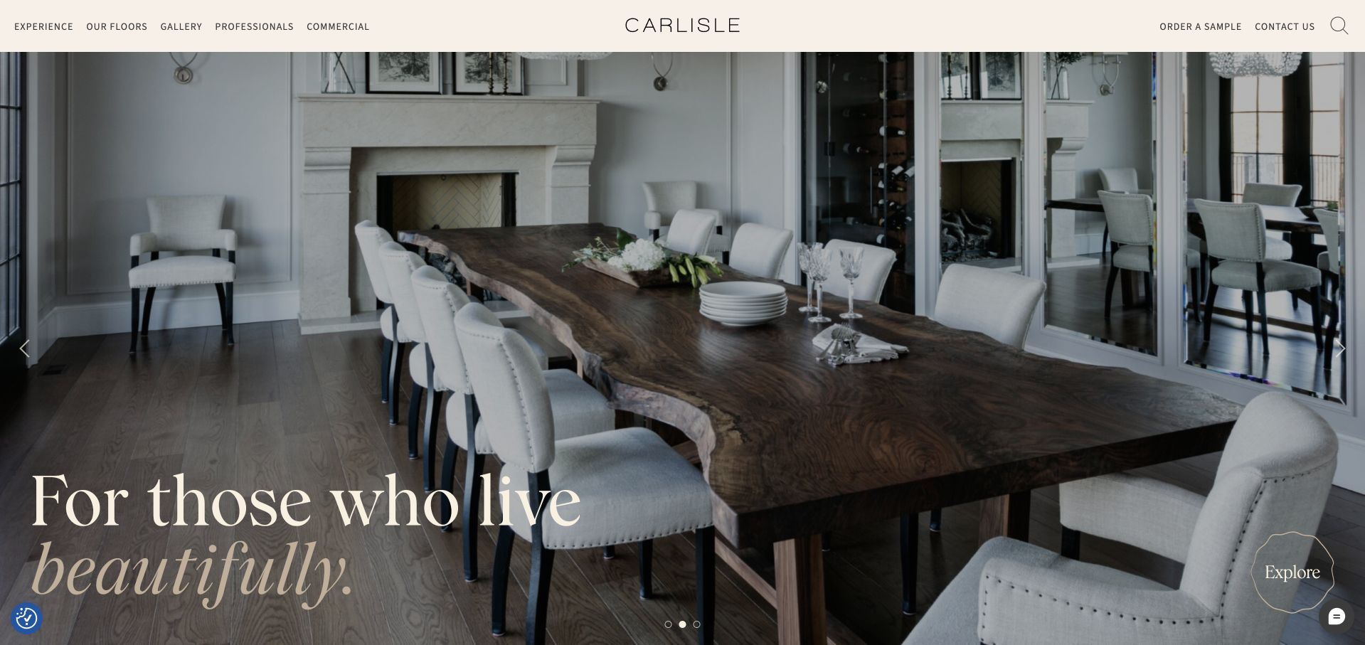
Carlisle uses a thin, widely spaced wordmark and a quiet header above a large room photograph. The floor remains visible as part of an architectural setting rather than a cropped swatch. Oversized serif language sits low in the image, leaving the upper part visually open. The navigation separates floors, galleries, professional resources and commercial work, while sample ordering stays accessible on the right. Below the opening, project names, locations and floor details connect aspirational images with specific products. The presentation is deliberately editorial, making it useful for studying how to sell a material without turning every first screen into a dense product grid.
What you can learn
Connect project inspiration to named flooring details so a beautiful room becomes a useful research starting point. Keep sample requests distinct from full orders, and provide practical specifications behind the editorial surface. A room photograph is persuasive context, but colour, texture and scale still need physical samples and project-specific assessment.
Pros
The gallery links room imagery with identifiable floor details instead of anonymous inspiration.
Samples and professional resources have clear, separate destinations in the navigation.
Cons & considerations
The large image and low-set headline postpone practical selection information until scrolling.
A promotional lookbook popup can interrupt the otherwise calm first impression.
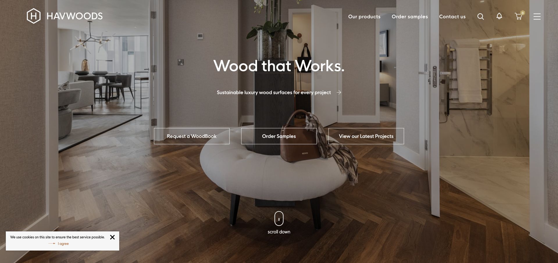
Havwoods’ North American page places its geometric logo and white navigation over a warm residential photograph. Three outlined actions identify a WoodBook, samples and completed projects, offering different research depths without forcing a consultation. The central headline is brief enough not to cover much of the interior. A compact product menu and sample ordering route remain prominent above. This is the regional North American site reached through the official location selector, not a claim that every country has the same catalogue or services. Its useful lesson is the deliberate balance between seeing flooring in context and obtaining tangible product information.
What you can learn
Offer a manageable set of research tools with distinct purposes: the project gallery explains context, the catalogue explains range and samples support a material decision. A global supplier should route readers to the relevant market before presenting availability, pricing or service promises. Do not let a polished international homepage imply a local installation offer.
Pros
Samples, catalogue and project routes address three different stages of flooring research.
The short central headline preserves the room photograph as the dominant visual.
Cons & considerations
White navigation over detailed imagery needs careful contrast across every rotating image.
Market selection introduces an extra step before visitors reach region-specific product information.
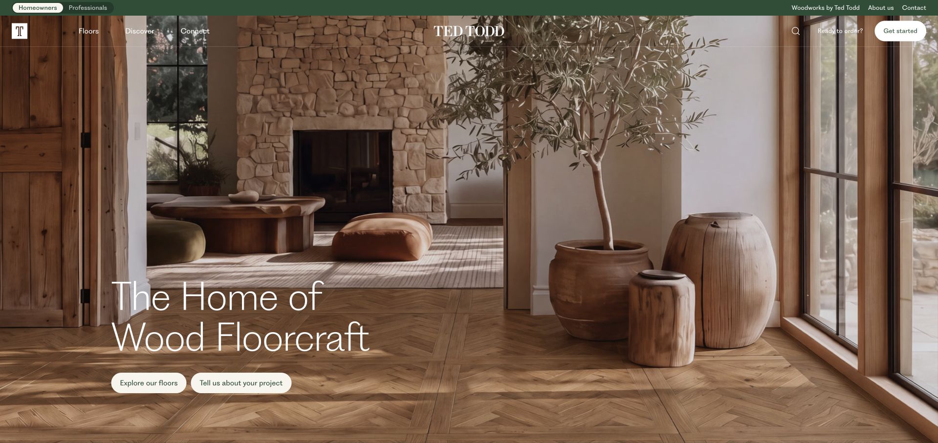
Ted Todd uses a dark green utility strip, translucent navigation and a warm room image to establish an understated materials identity. The large thin white headline sits above two cream pill buttons for browsing floors and discussing a project. Homeowner and professional routes are visibly distinct at the top, while later content introduces consultation, measuring, pricing, installation, delivery and aftercare as separate stages. This is more useful than treating a floor purchase as one undifferentiated quote request. The page also connects to the company’s separate Woodworks brand, so product families and broader brand relationships are discoverable without dominating the opening photograph.
What you can learn
Use process navigation to explain what support accompanies a product. Customers should know whether the company is supplying materials, arranging fitting or providing a more comprehensive service, and where each stage applies. A calm visual tone works best when practical details remain easy to reach rather than disappearing behind lifestyle language.
Pros
Homeowner and professional routes recognise different research and specification needs.
Named service stages make consultation and aftercare discoverable beyond product browsing.
Cons & considerations
Thin white lettering can lose clarity over the more detailed parts of the image.
The opening headline gives less immediate detail about material options or regional availability.
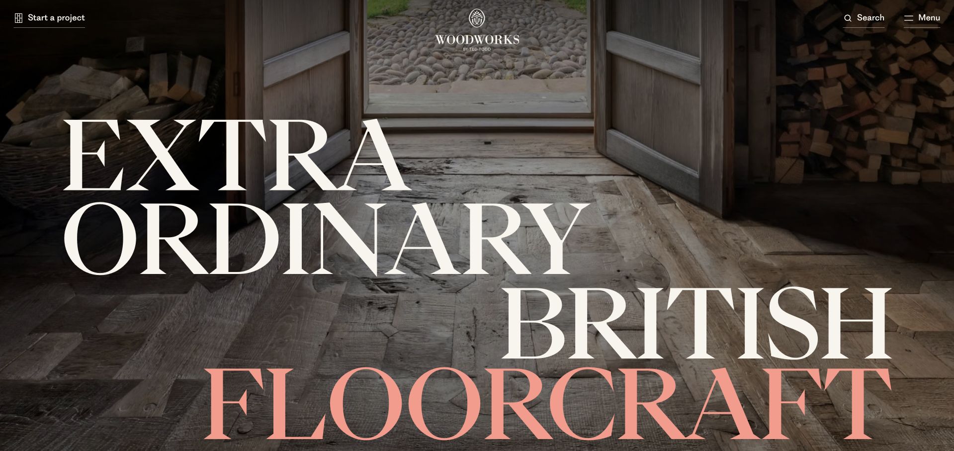
Woodworks by Ted Todd makes a dramatic opening from a timber interior and extremely large serif lettering. The cream and coral words cross the image rather than sitting in a conventional boxed hero. Navigation is deliberately reduced to a project action, search and menu, with the brand centred near the top. The visual message is about rarity and craft, not quick retail shopping. Lower content separates antique and reclaimed material stories from project inspiration. It is a useful counterpoint to conventional flooring catalogues, although the typographic scale asks readers to invest more scrolling before they can compare products or find practical specifications.
What you can learn
A specialised range can justify an editorial opening, but distinctiveness should lead somewhere useful. Connect the story of a reclaimed material to provenance, available formats, project use and an enquiry route. Avoid making a visitor decipher an elaborate word composition merely to discover what is being sold or how the company supports a specification.
Pros
The limited navigation lets the timber texture and distinctive typography establish the identity.
A visible project action offers a practical route alongside the more expressive brand presentation.
Cons & considerations
The enormous headline occupies most of the first screen and limits immediate product detail.
Product categories are less visible initially than on a conventional flooring supplier site.
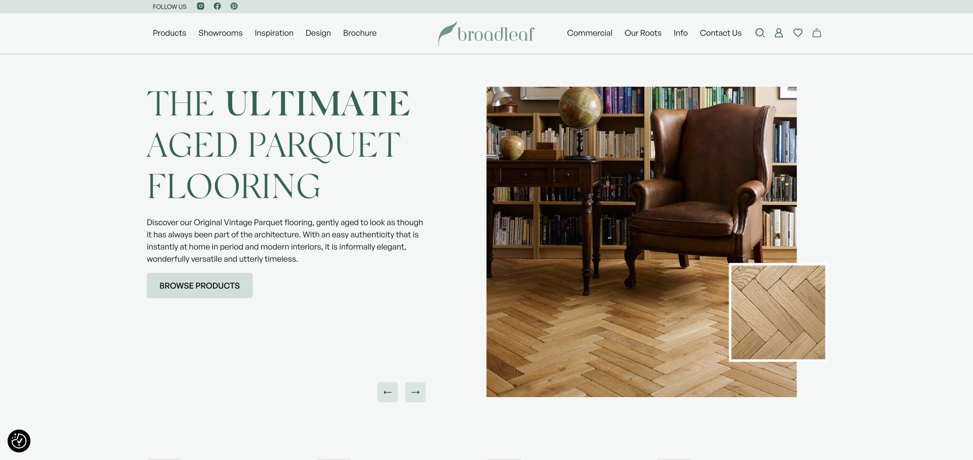
Broadleaf uses a pale sage background, dark green serif headline and a two-part image composition. A room photograph shows the floor in context, while a smaller overlapping square isolates the parquet texture. That inset is a genuinely useful design choice: it bridges the gap between liking a room and understanding the surface beneath the furniture. The main action leads to product browsing rather than an immediate lead form. Showrooms, inspiration, commercial information and company history remain available in a balanced header. The overall presentation feels considered without the image swallowing the entire screen or leaving the written proposition unreadable.
What you can learn
Show flooring at two scales. Whole-room photography explains pattern and atmosphere; a close detail explains grain, finish and variation. Link both to a named range or product so readers can continue researching. Descriptions such as aged or vintage should clarify the product’s actual character rather than implying an unverified history for a newly made surface.
Pros
The overlapping texture image helps readers connect the room setting with the actual floor.
Product browsing remains a clear first action beside the editorial description.
Cons & considerations
Several catalogue, showroom and brand-history routes compete within the broad header.
The opening range-specific headline does not immediately summarise the full flooring offer.
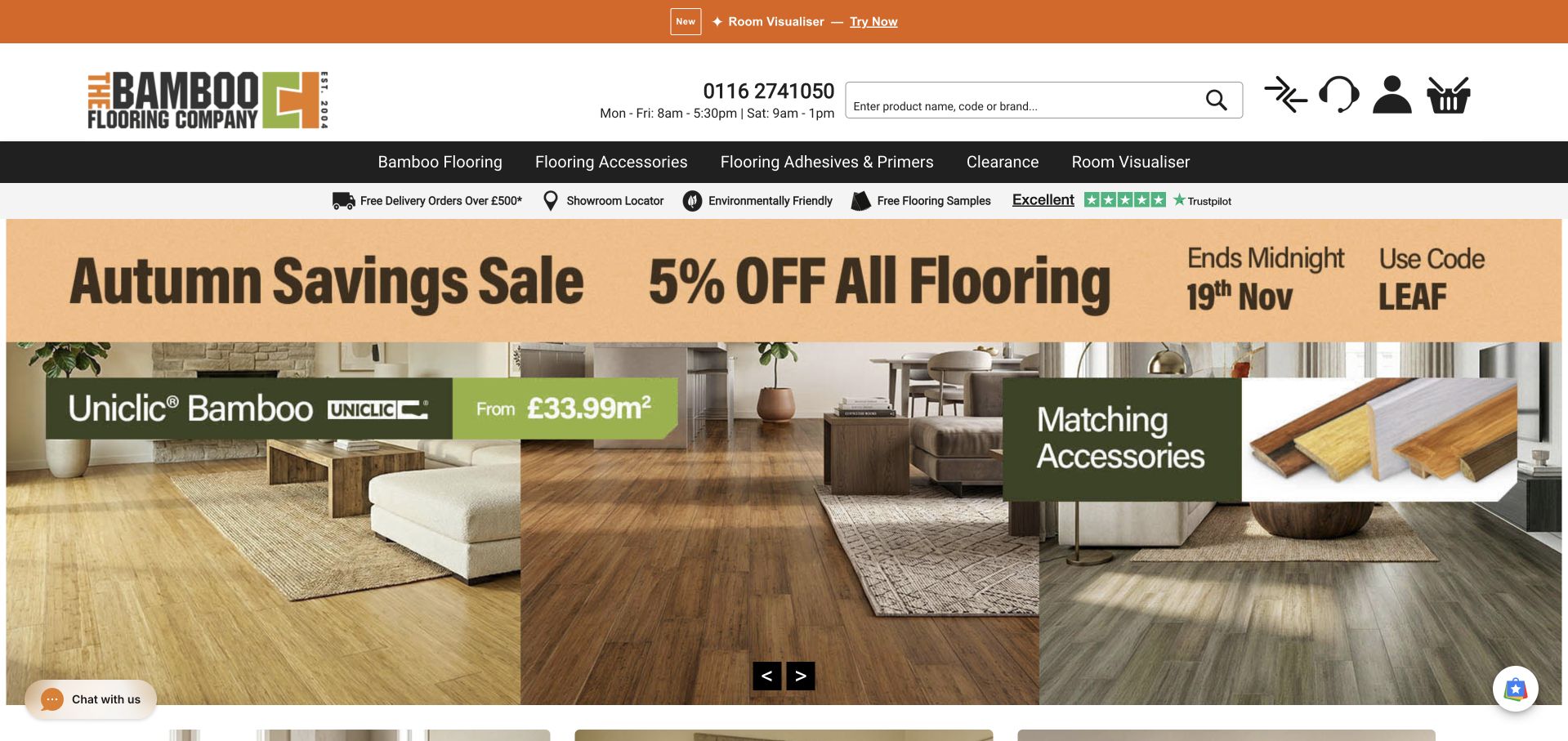
The Bamboo Flooring Company gives search, telephone support and account utilities substantial space in its header. The product navigation distinguishes flooring, accessories, adhesives and primers, acknowledging that a floor purchase involves more than boards. A visible sample offer and showroom locator provide research routes below the menu. The hero uses a multi-panel room-and-detail collage with an overt seasonal promotion, so the commercial message is difficult to miss. Compared with the quieter timber brands here, this is a more transactional presentation. Its value lies in how clearly it surfaces complementary products and customer-support information before browsing begins.
What you can learn
Make the supporting parts of a flooring purchase discoverable without assuming visitors already know what they need. Accessories, samples and technical advice should connect to the relevant product rather than being hidden after checkout. Keep promotional prices and time limits clearly qualified, and ensure a sale banner does not replace practical information about material, dimensions or installation requirements.
Pros
Search and telephone hours make practical shopping support easy to locate.
Accessories and preparation products are separated into understandable catalogue categories.
Cons & considerations
The large seasonal promotion competes with the more enduring product proposition.
Multiple utility strips and icons make the first screen visually busy.
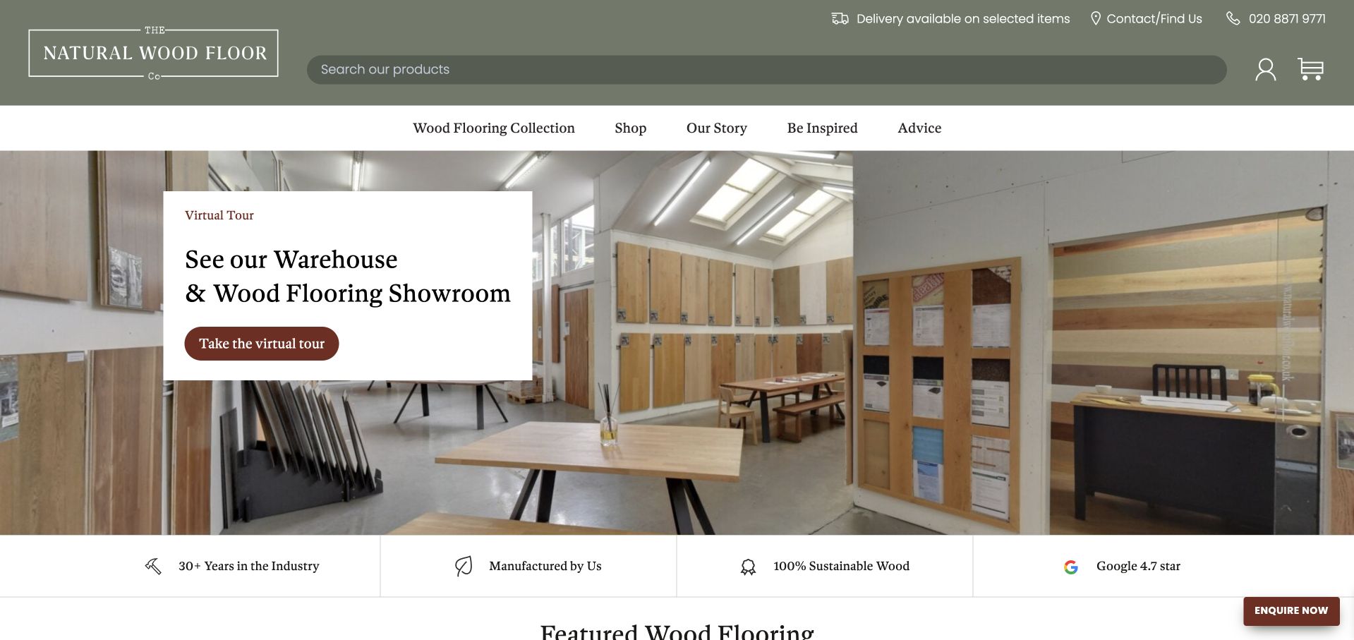
The Natural Wood Floor Company combines olive branding, restrained serif headings and a highly visible catalogue search field. The captured homepage slide promotes a warehouse and showroom tour with a photograph of full-sized boards arranged in an airy space. This is more concrete than an anonymous luxury interior: it shows where a customer can examine the material. Product, company story, inspiration and advice routes sit in a white navigation band. A four-part reassurance strip follows the hero, while contact and delivery information remain in the utility row above. The composition supports both exploratory browsing and a practical visit.
What you can learn
Make the showroom useful before asking someone to travel. Explain what they can see, where it is, how visits work and whether appointments are required. Search is valuable for returning shoppers who know a range name, while imagery and advice should help first-time buyers who do not yet have that vocabulary.
Pros
The actual showroom image gives a clear sense of the available in-person research experience.
Large search and contact controls support visitors who arrive with a specific flooring question.
Cons & considerations
The header is tall enough to reduce the room available for the main content.
Broad sustainability and review statements need accessible supporting detail and source context.
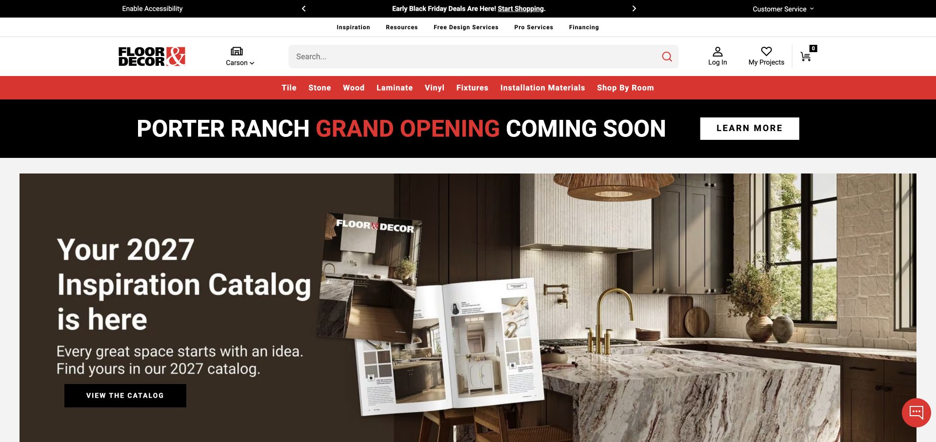
Floor & Decor uses an overtly retail layout: a prominent search field, location control, account, project and cart utilities, then a red material-category strip. Tile, stone, wood, laminate, vinyl and installation materials are readable at a glance. The captured opening promotes an inspiration catalogue with a large kitchen scene, while a separate band announces a store opening. Unlike a local installer’s website, this page has to support product discovery and store-specific shopping as well as inspiration. The hierarchy demonstrates how a broad catalogue can keep material categories permanently visible without asking visitors to navigate a single generic shop link.
What you can learn
Separate inspiration from transactions but connect them intentionally. An editorial catalogue should lead back to identifiable products, and store selection should make availability and local services clear. A smaller flooring business can borrow the plain category names without importing the full account-and-cart complexity of a national retailer whose operating model is different.
Pros
Material categories are exposed in a consistent, highly visible navigation strip.
Store selection, project organisation and catalogue search address distinct retail tasks.
Cons & considerations
Promotions and store announcements create several competing messages before product research starts.
Dense utility controls may be unnecessary complexity for a small installation-only business.
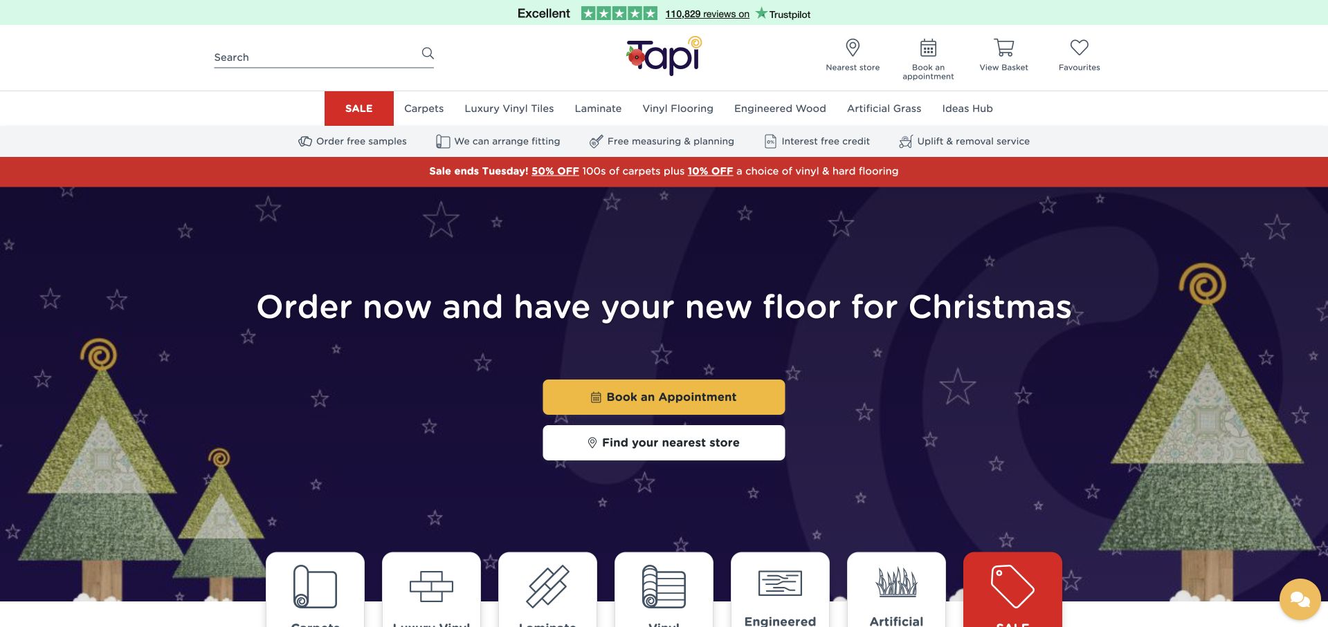
Tapi’s purple-and-yellow branding gives its seasonal homepage campaign an immediately recognisable style. Above the hero, a white header groups search, store finding, appointments, basket and favourites. A separate material navigation row names carpet, luxury vinyl tile, laminate, vinyl and engineered wood, with another strip describing samples, fitting, measuring and uplift services. Those practical services are useful because they acknowledge the work around buying a new floor. The captured promotional slide favours appointment booking and store finding rather than a specific product. The result is accessible as retail navigation, though the stacked strips make the opening visually dense.
What you can learn
Support the whole customer task, not just the choice of a floor covering. Measuring, removal and fitting may be important decisions, but their availability and conditions need clear explanations. Keep the distinction between a retailer arranging a service and the person performing installation explicit, especially when customers move between national product information and a local branch.
Pros
Fitting, measuring and removal information is visible alongside the material catalogue.
Store finding and appointments provide clear alternatives to immediate online shopping.
Cons & considerations
Several utility and promotional rows compete for attention above the first product view.
A strongly seasonal hero needs regular maintenance to avoid dated campaign messaging.
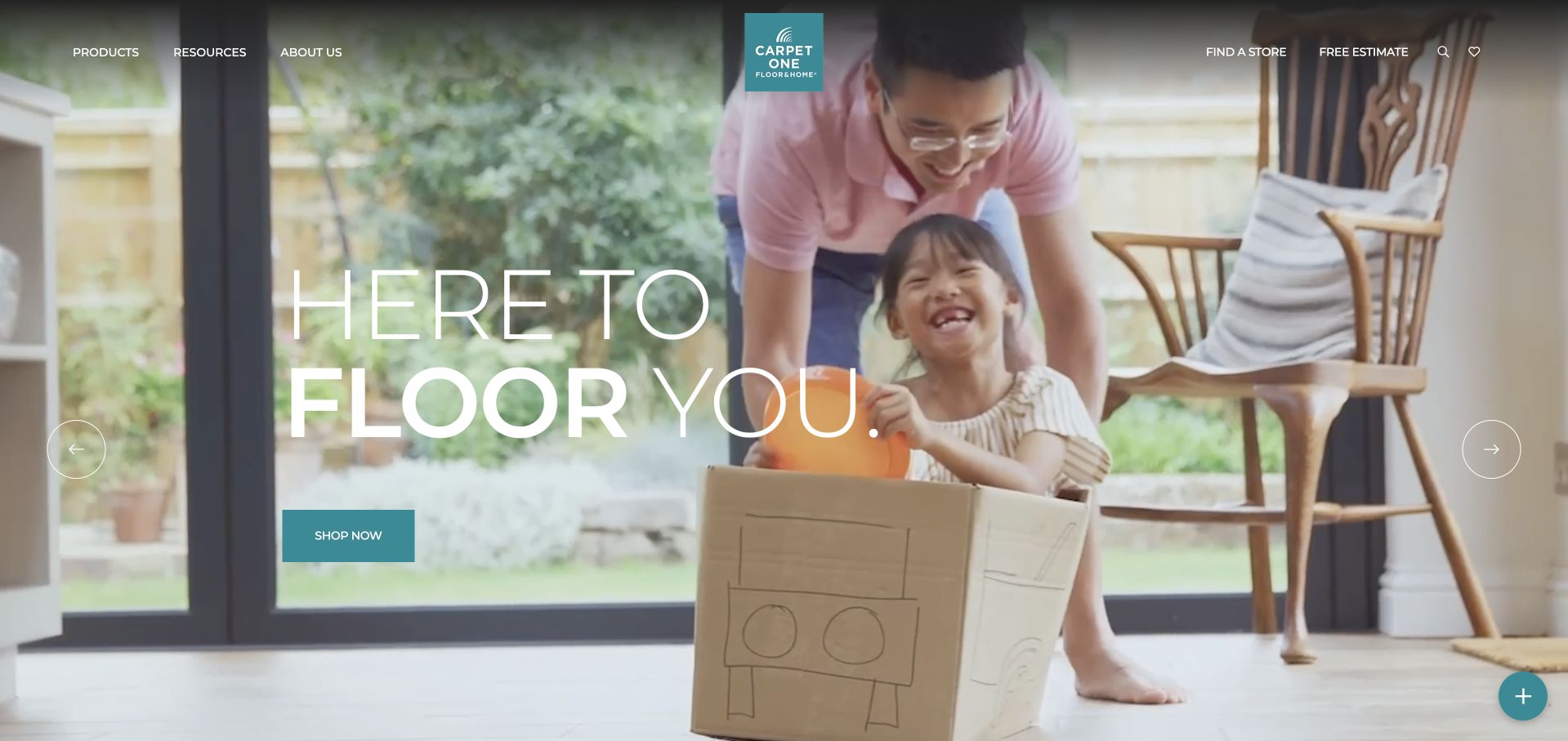
Carpet One uses a large lifestyle video with an oversized white wordplay headline and a teal shopping button. The header is comparatively restrained: product, resource and company menus occupy the left, the centred logo anchors the composition, and store finding plus estimates sit on the right. The emotional opening is followed by product and educational routes rather than a long sales form. It illustrates a network-level homepage that can inspire visitors while directing them toward local retail help. The moving background adds atmosphere, but it also makes consistent headline contrast and the ability to pause motion important parts of the interface.
What you can learn
Treat a national brand introduction and a local buying decision as related but different tasks. The store route should preserve the product a visitor was researching and explain what the local store offers. Lifestyle footage can suggest how a floor is lived on, but static product details, readable controls and source-attributed reviews are still needed for comparison.
Pros
A restrained header makes both product research and local store discovery easy to recognise.
The teal action and logo provide a consistent accent against the neutral room footage.
Cons & considerations
The lifestyle opening gives less immediate detail about specific flooring materials.
Motion and large overlaid text require careful contrast and pause controls.
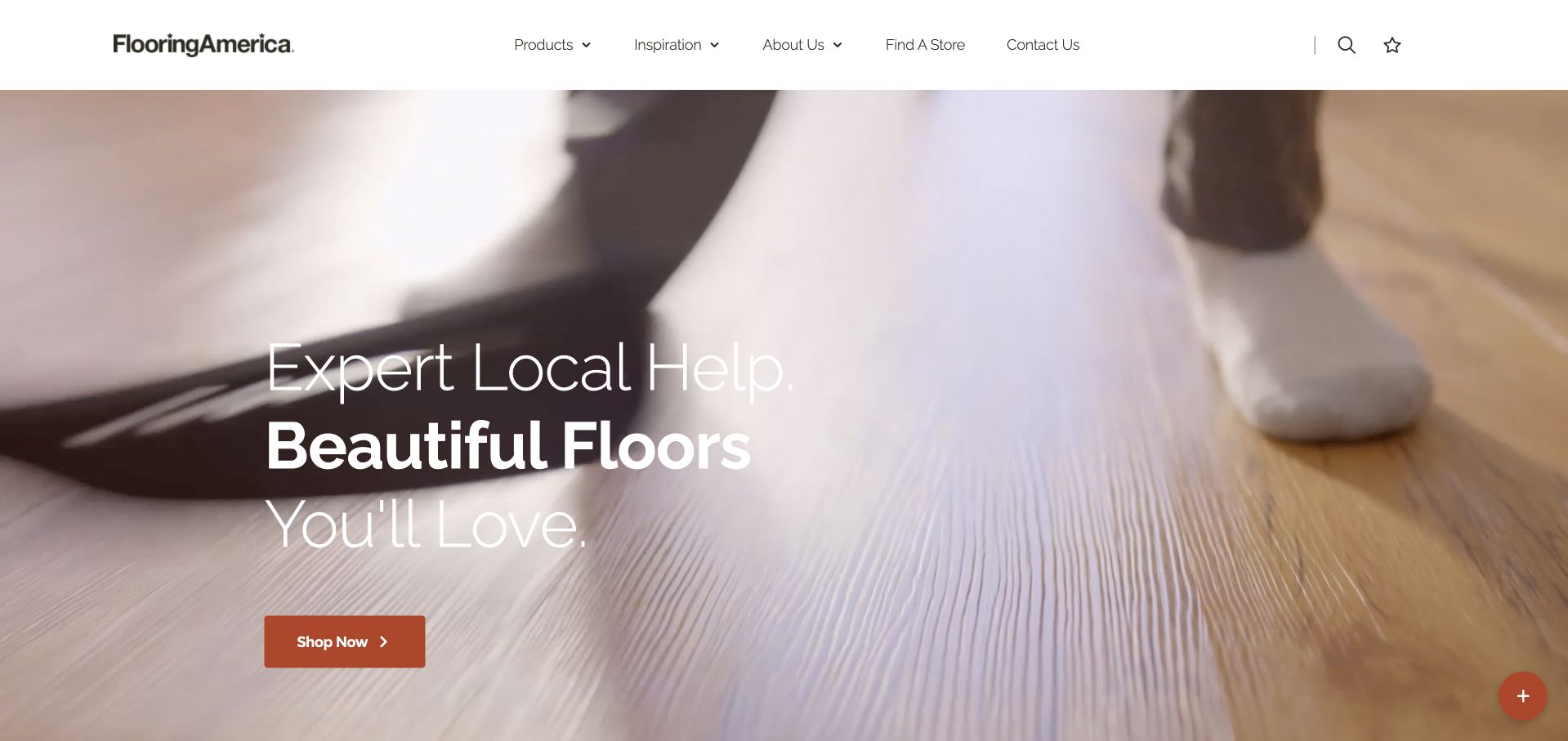
Flooring America’s homepage puts a compact white navigation bar above a full-width close-up of a lived-in wood floor. A three-line white headline introduces local help and an orange shopping button supplies the first action. Product, inspiration, company and store routes are plainly named rather than hidden behind abstract labels. The site then separates carpet, luxury vinyl, hardwood, tile and laminate into product choices. Compared with more promotional retailers in this collection, the opening is visually quiet. Its tradeoff is that the photograph and broad promise do not immediately tell a visitor which local shop, material or installation service is relevant.
What you can learn
A short opening can be effective when the next layer supplies concrete choices. Ensure the store finder, material catalogue and service information work together rather than sending readers back to the beginning after they select a location. Local-help language should identify the relevant provider before customers assume a national website is offering a single uniform installation service.
Pros
Plain navigation labels make products, inspiration and store discovery straightforward.
One orange shopping action gives the large image a clear interaction hierarchy.
Cons & considerations
The broad opening promise delays material-specific information until visitors scroll.
The local provider and exact service scope are not established in the initial hero.
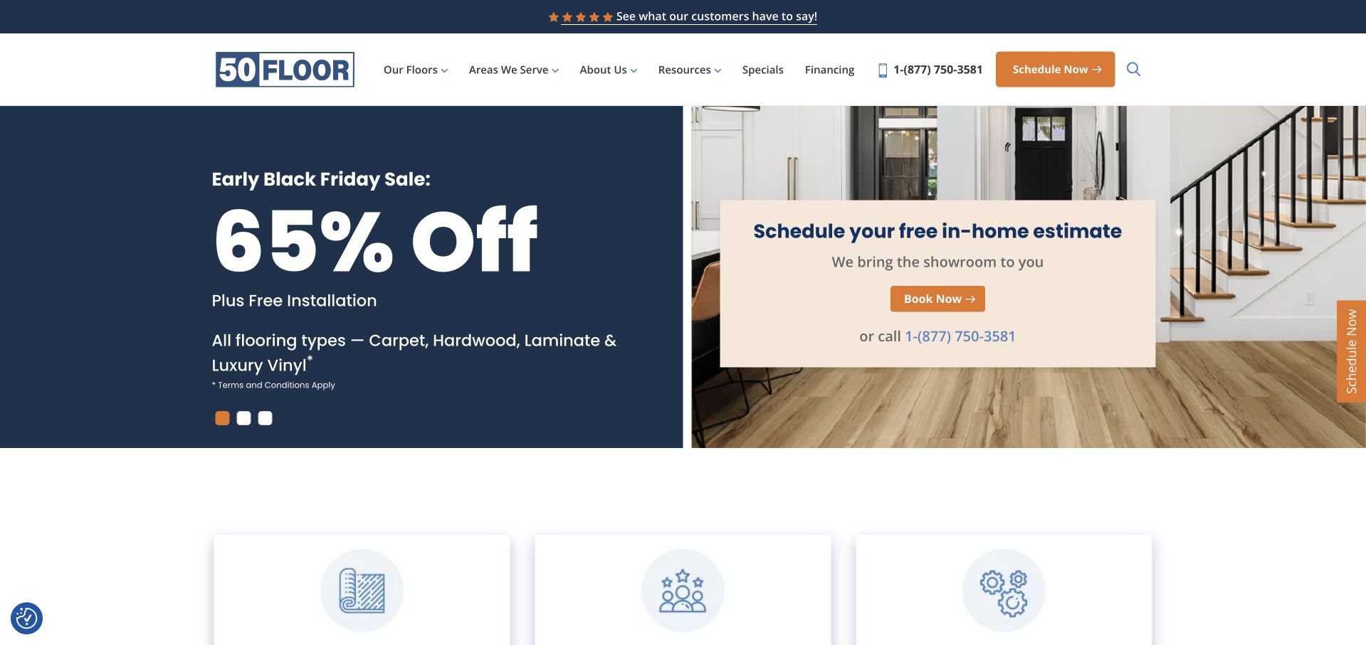
50Floor divides its hero between a navy promotional panel and a photograph with a cream consultation card. The appointment message explains that the showroom comes to the customer, distinguishing its model from visiting a conventional flooring shop. A phone number provides an alternative to booking online, and the navigation exposes flooring types, coverage, financing and company information. The captured campaign includes a substantial discount statement with a terms note, while a vertical scheduling tab remains at the edge. This is a useful example of making an operating model explicit, even though the promotional percentage receives more visual weight than the service explanation.
What you can learn
If the business sells through home visits, explain that model before asking for an appointment. Describe what the visitor will see, who attends and what information is needed to assess fit. Promotional savings require clear reference terms; the design lesson is the service-model clarity, not a recommendation to copy a discount or imply the same offer applies elsewhere.
Pros
The cream appointment card explains the in-home showroom concept in plain language.
Both booking and telephone routes are easy to find within the main hero.
Cons & considerations
The oversized discount figure dominates the first impression over material information.
Repeated scheduling controls can feel insistent before customers have explored service details.
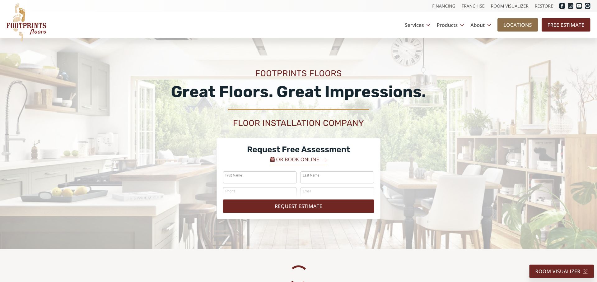
Footprints Floors explicitly labels itself a floor installation company in the hero, underneath its cream-and-burgundy brand identity. A pale room photograph provides context while a compact white assessment card asks for contact information. Product, service and company menus are separate, and a locations button sits beside the estimate action. The visible distinction between installation and product browsing is useful in a category where manufacturers, retailers and fitters often use similar room photography. Financing, restoration and a room visualiser occupy a smaller utility row. The page is organised around beginning a service conversation rather than adding flooring to a cart.
What you can learn
State the role of the business before showing products. Customers need to know who supplies materials, who installs them and whether existing floors can be repaired or restored. Keep the initial assessment form short, but explain coverage and the next step so a visitor understands why they are sharing contact information rather than receiving an instant product price.
Pros
The installation-company description makes the service model clearer than imagery alone could.
Locations and assessment actions are kept visibly separate from product information.
Cons & considerations
The central form covers much of the photograph that establishes the project context.
The faded background treatment reduces the visibility of some room and flooring detail.
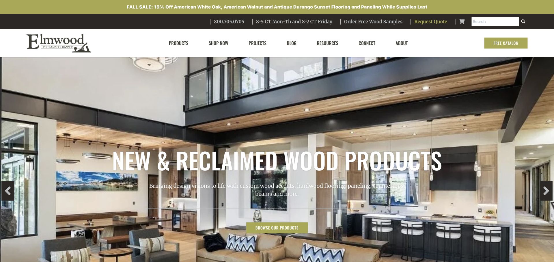
Elmwood Reclaimed Timber uses olive and dark brown utility bands above a large timber-rich interior photograph. The condensed headline names new and reclaimed wood products, while a shorter explanation expands the range beyond flooring to paneling, beams, countertops and accents. Free samples, quotes and a catalogue are visible as different research tools. Product and project menus remain central in the white navigation. The composition is useful for a supplier whose materials appear across an entire room rather than only on the floor. Its visual challenge is maintaining readable text over a detailed interior with many horizontal and vertical wood surfaces.
What you can learn
Show related material applications without blurring the catalogue. A project can demonstrate how flooring, beams and paneling work together, but each visible product should have an identifiable route to specifications or samples. Explain reclaimed provenance at the product level, and distinguish a supplier’s material contribution from authorship of the whole architectural project.
Pros
Samples, quotes and catalogues are distinct actions suited to different research stages.
The opening copy acknowledges the wider timber range rather than implying flooring only.
Cons & considerations
Multiple promotional and utility rows make the header visually heavy.
White text over a busy interior image needs careful positioning and contrast.
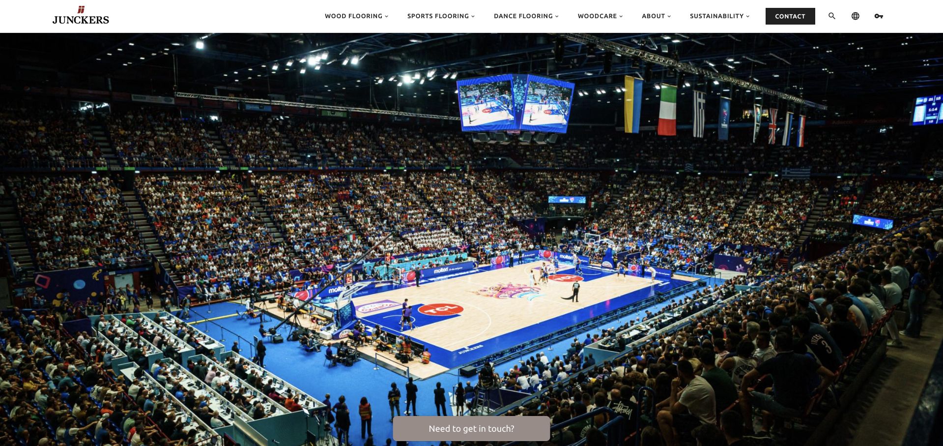
Junckers opens with a dramatic indoor basketball scene and a compact white header. Instead of organising every visitor around domestic rooms, its main navigation separates wood flooring, sports flooring, dance flooring and woodcare. That is a meaningful difference in audience and use, not simply a stylistic product filter. The body connects sporting projects and partnerships with product news, technical guidance and inspiration. This is a manufacturer’s presentation rather than a local installation service. The captured hero is primarily photographic, which makes the industry categories in the header particularly important for explaining what visitors can investigate next.
What you can learn
For specialist flooring, organise around the setting and requirements of use before asking customers to compare appearances. Sports and dance projects need documentation and professional coordination, while homeowners may begin with room inspiration. Keep performance or certification claims linked to current, applicable documents rather than allowing a logo or association to imply that every product is suitable for every project.
Pros
Sports, dance and domestic wood-flooring audiences receive clearly separate navigation routes.
Technical advice and downloads support research beyond the initial project photography.
Cons & considerations
The photograph-led opening provides little written orientation within the captured first screen.
Specialist terms need explanatory destinations for visitors unfamiliar with flooring specification.
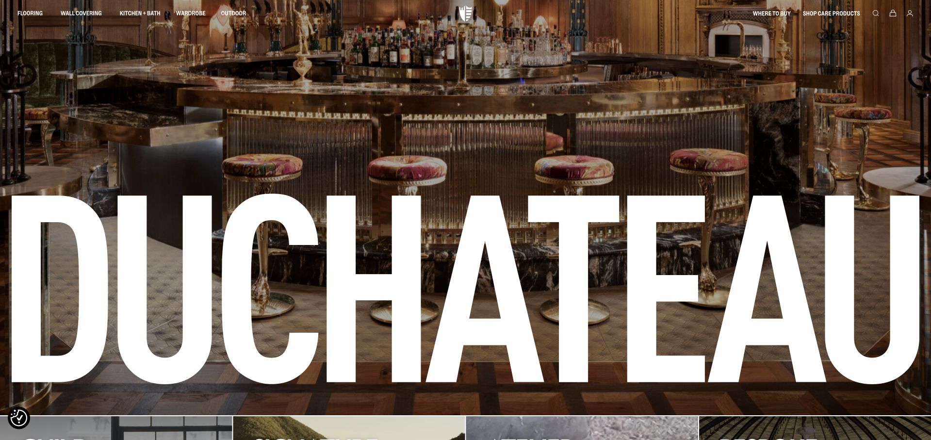
DUCHATEAU gives its wordmark almost the full width of the first screen, placing it over a richly detailed bar interior. The narrow upper navigation lists flooring alongside wall covering, kitchen and bath, wardrobe and outdoor surfaces. Where-to-buy and care-product routes occupy the opposite side, distinguishing specification from maintenance shopping. The presentation is intentionally image-led, with the project setting carrying much of the initial atmosphere. It is effective as a memorable design-brand introduction, but a visitor looking for flooring dimensions, species or availability needs to move into the catalogue before making a meaningful comparison.
What you can learn
A materials brand can use an architectural setting to express range and taste, but the website still needs to make the individual surfaces identifiable. Connect the room image to named collections and provide a clear dealer or purchasing route. A large wordmark should not conceal the actual product or become the only readable content when the screen narrows.
Pros
The surface categories establish the brand’s broader product scope immediately.
Separate buying and care-product routes acknowledge both new and existing customers.
Cons & considerations
The oversized wordmark covers much of the material detail in the opening photograph.
The first screen provides limited written guidance for a visitor comparing flooring options.
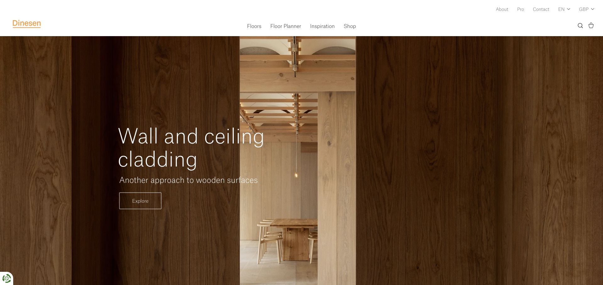
Dinesen uses a clean white header, small warm-toned wordmark and a large wood-clad architectural image. The captured slide introduces wall and ceiling cladding, demonstrating that the brand’s surface story extends beyond floors. Floors, Floor Planner, Inspiration and Shop form a short primary navigation, while professional and language options remain in a smaller upper row. The typography is light and spacious rather than overtly promotional. The useful design idea is the clear distinction between exploring a finished space, planning a floor and shopping, although visitors arriving specifically for flooring may need another step when the homepage is promoting cladding.
What you can learn
Show how a material can move across an architectural project without hiding the core product route. Planning tools should help visitors understand scale and combinations, while specifications and professional advice establish suitability. Keep a stable navigation label for floors even when a rotating campaign highlights another surface, so search visitors can orient themselves regardless of the current slide.
Pros
A short primary navigation separates product exploration, planning, inspiration and shopping.
The quiet type and white header allow the wood texture to remain the main visual.
Cons & considerations
The opening cladding slide is less immediately relevant to a visitor seeking flooring.
Light overlaid text needs consistent contrast across the full image rotation.
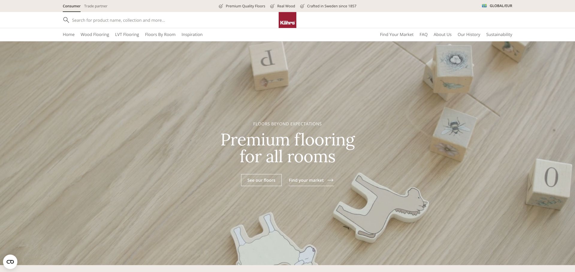
Kährs’ global consumer page uses warm neutral branding, a central red logo and a broad catalogue search. The captured room detail shows a pale timber floor with children’s objects, placing the material in a familiar domestic setting. Navigation separates wood, luxury vinyl, rooms and inspiration, while consumer and trade routes appear at the top. The body includes a market directory and a floor-finding process, acknowledging that the relevant catalogue and support vary by country. This is the global consumer view, not a claim about local inventory or installation. Its main lesson is the explicit separation of market, audience and material choices.
What you can learn
International product sites should establish country and customer type without trapping people in repeated choice dialogs. Preserve their intended destination after selection, and make it easy to change the choice later. A global floor image can inspire, but pricing, stock, technical documents and retailer support should resolve to the market where the project will actually take place.
Pros
Consumer and trade navigation recognises that specification needs differ by audience.
Market finding and material categories offer concrete research routes beyond lifestyle imagery.
Cons & considerations
Initial region and audience prompts can interrupt the first visit before product browsing.
The pale image and white overlaid headline require careful contrast to stay readable.
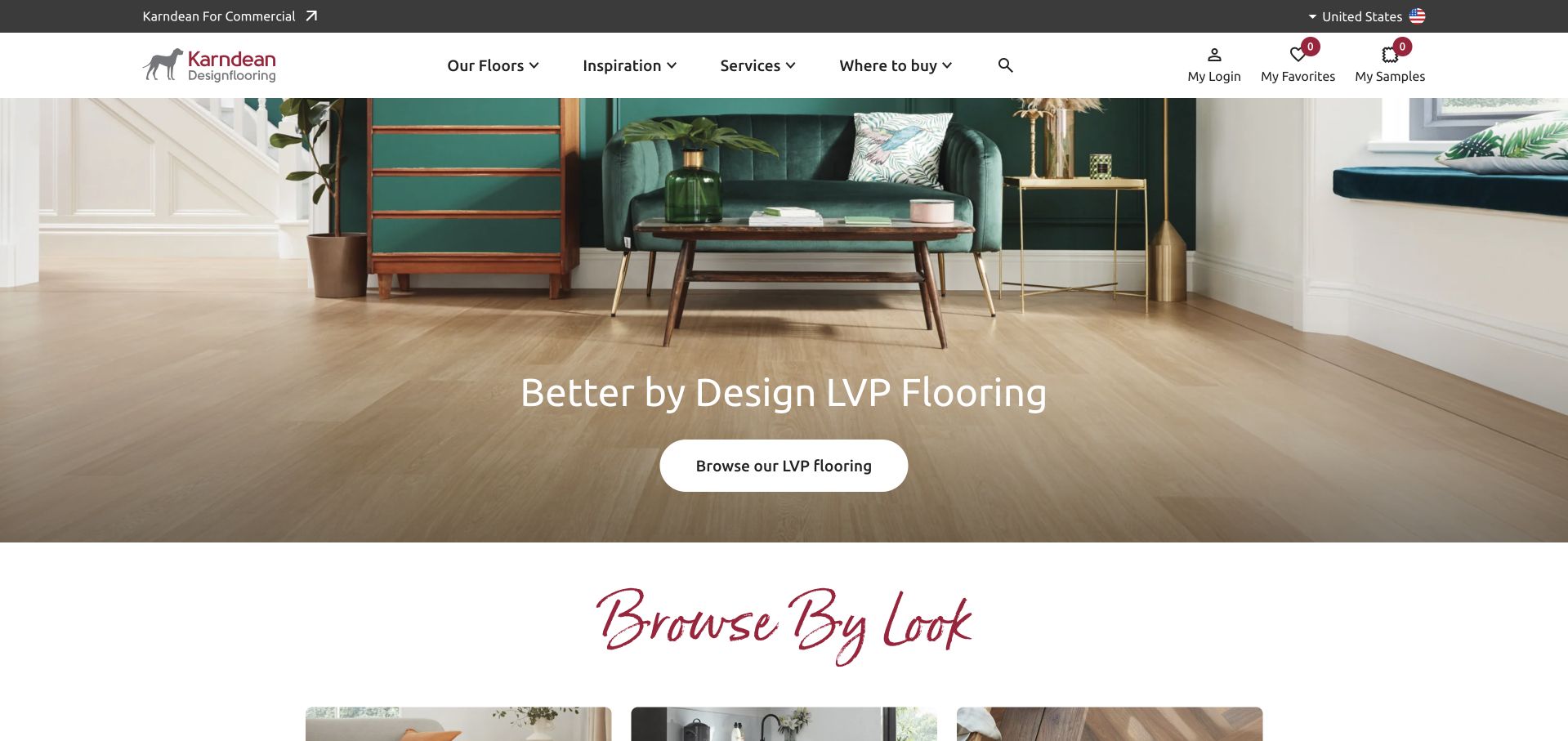
Karndean’s US residential page combines a dark utility strip with a white header and a room photograph that leaves plenty of floor visible. The central action invites readers into the luxury-vinyl range, while the next section begins a browse-by-look journey. Samples, favourites, login and a where-to-buy route remain available in the header. The page also makes commercial and regional choices explicit rather than mixing all audiences into the same catalogue. Its strong design feature is that it supplies several useful research actions without immediately asking the visitor to speak to sales or provide a complete project brief.
What you can learn
A floor can be researched by material, appearance and room, but those are not interchangeable categories. Explain how each route helps, connect inspiration to product information and keep samples within reach. A where-to-buy journey should retain the selected product so readers are not required to repeat their research after finding a retailer.
Pros
Samples, favourites and local purchasing routes support a longer flooring decision process.
The room image gives the actual floor substantial visual space beneath the furniture.
Cons & considerations
Several account and sample utilities make the desktop header comparatively dense.
Regional and residential-versus-commercial selection adds an initial step before catalogue browsing.
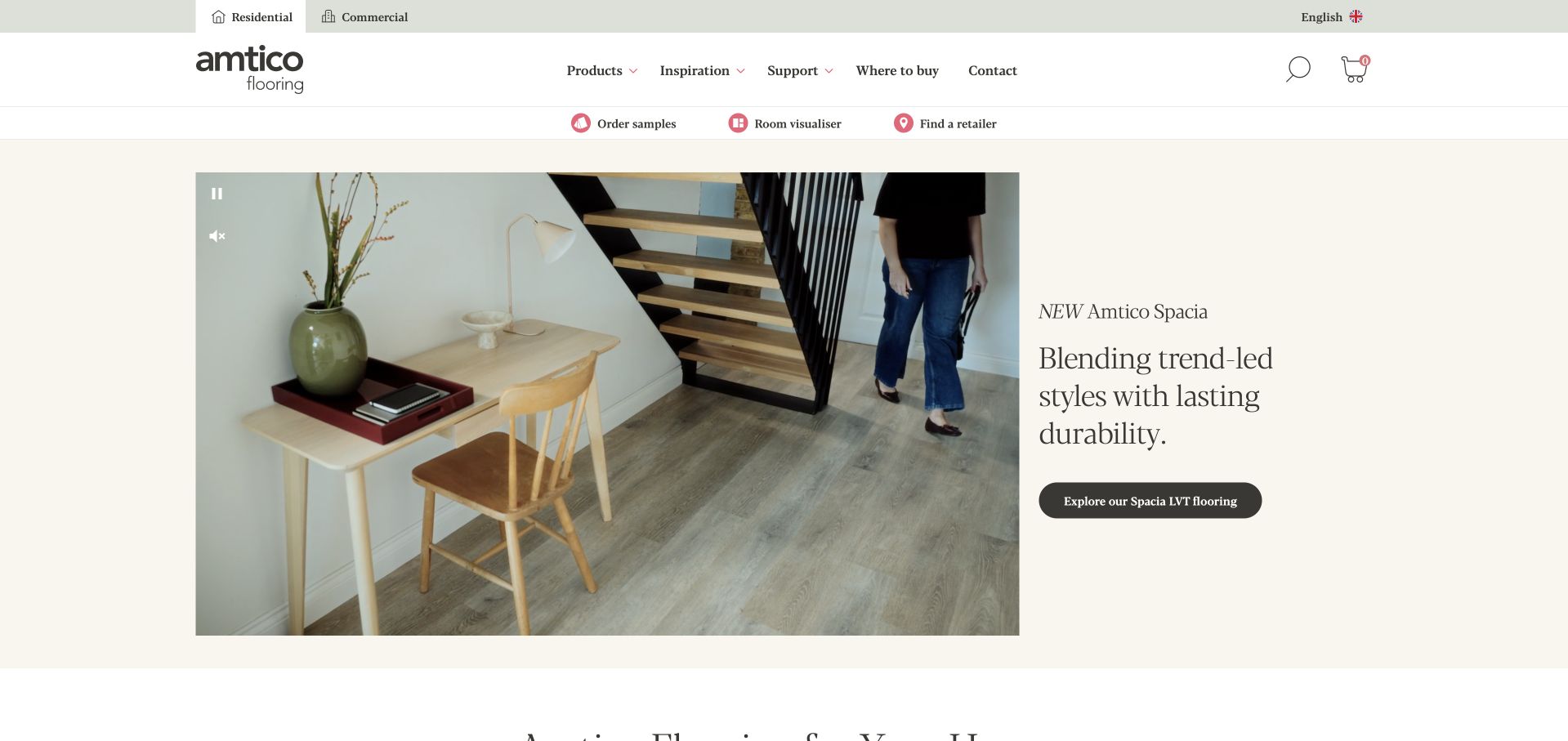
Amtico places a contained room film beside a short serif collection introduction on a warm cream background. Unlike full-screen video heroes, the split arrangement gives the text its own stable, readable space. A black pill button connects the story to the promoted flooring range. Samples, a room visualiser and retailer finding form a practical utility row beneath the main navigation. Residential and commercial destinations are visibly separate at the top. The composition demonstrates a useful balance between atmosphere and a recognisable product-research path, while still requiring deeper pages to explain formats, specifications and suitability for a real project.
What you can learn
Use motion to demonstrate a surface without making every message move with it. Keep explanatory text, product links and playback controls stable outside the image where possible. The visualiser and sample routes should supplement accurate product information, not imply that an on-screen rendering can predict the exact appearance or technical suitability of a floor in someone else’s room.
Pros
The split layout gives the collection explanation a quiet, consistently readable panel.
Samples, visualisation and retailer finding are grouped as practical research tools.
Cons & considerations
The promoted collection receives more emphasis than the full product range initially.
A large media panel still needs efficient loading and useful pause controls.
Kegan is a freelance web designer and developer with 15+ years of experience helping businesses turn complicated website requirements into clear, maintainable digital experiences. He works directly with clients from planning and design through development, launch, and ongoing support.
For flooring website design, his development approach focuses on material comparisons, installation services, showroom information, project imagery, and quote inquiries. The scope can be a targeted improvement or a complete custom build, with responsive layouts, thoughtful content structure, and integrations chosen around the people using and maintaining the site.
Show 3 other flooring website designersHide other flooring website designers
Build a flooring brief around materials, markets and service responsibilities
Map the catalogue before choosing filters
Create a consistent product vocabulary for material, format, colour family, pattern and relevant specifications. Decide which fields are genuinely useful and maintainable. A filter should return meaningful choices rather than a handful of inconsistent labels. Include units and market context where prices are shown, and explain availability without turning every range page into an enquiry dead end.
Connect projects to identifiable materials
Record project context, broad location, the product used and the company’s contribution. A supplier may have supplied one surface within a much larger interior; credit that accurately. Keep image permissions and photographer information with the record. If a project illustrates a discontinued product, say so and provide an appropriate research alternative rather than silently presenting it as current stock.
Describe the purchase and fitting boundary
Explain measuring, delivery, removal, preparation, fitting and aftercare only to the extent the business actually offers or coordinates them. Identify who will assess suitability and what an appointment covers. Make showroom visiting details current, and distinguish a sample request from a full order. Customers should not discover the service boundary only after they have submitted a lengthy project brief.
The editing job behind the design
Select technology for a catalogue that staff can maintain
A flooring content model may need products, ranges, material attributes, project references, downloads, locations and sample rules. Those records should relate without duplicating descriptions across every image. Test whether editors can correct a specification, retire a finish and update a showroom independently. Commerce is useful only when the real pricing, fulfilment and support model can be represented accurately.
Room visualisers, video heroes and large image galleries are optional tools, not substitutes for readable product information. Provide clear controls, useful text alternatives and a straightforward route when a visual tool is unavailable. Public technology notes cannot reveal the full stock, fulfilment or quotation systems behind an example site, so choose against your own requirements rather than assuming its stack is complete.
Our WordPress website examples offer a separate look at publishing approaches. A visible platform label is evidence for that named page, not a guarantee that the same system will suit your requirements.
Before the public launch
Flooring website brief checklist
State whether the business manufactures, supplies, retails, fits or coordinates services.
Separate regional installation coverage from product delivery and global market availability.
Give every product a consistent name, material description and relevant dimensional information.
Show room context and close material detail without implying screen colour is exact.
Connect project images to the products used and the company’s actual contribution.
Explain sample requests, charges or limitations clearly before asking for personal information.
Keep showroom addresses, hours, access and appointment requirements current.
Make measuring, delivery, removal and fitting responsibilities understandable.
Use product filters that reflect real maintained attributes rather than marketing synonyms.
Provide readable technical documents and explain what needs project-specific assessment.
Test visualisers, favourites, location choices and catalogue search on mobile and keyboard.
Assign ownership of product retirement, prices, promotions, review sources and image credits.
These checks are a project checklist, not a performance, legal, security, or accessibility certification. Test real journeys with the people responsible for the website before making claims about the result.
Sources & editorial method
How this collection was selected and reviewed
The examples were inspected on their official public pages and captured directly. The opening selection’s official team information and homepage establish a specialist timber business rather than an inferred company size. Supplier, retailer and installation roles are identified in the individual reviews. The W3C images tutorial supports purposeful text alternatives. Selection does not verify flooring performance, installation quality or private infrastructure.
Each example links to its actual source page. Screenshots are direct browser captures with their own capture dates; moving imagery, announcements and live designs can change. The notes describe observable design choices and conditional tradeoffs, not measured traffic, conversion results, service quality, or accessibility conformance.
Technology labels use public page metadata, asset evidence, or explicitly cited platform documentation. Platform documentation is not a complete current deployment audit. A component reference may be legacy or unused; it is not a complete backend inventory. Unknown stacks are omitted. These sites are editorial examples, not our client portfolio.
Written, Edited and Curated are separate editorial records, not timestamps advanced by a rebuild. Website designs and imagery belong to their owners. See our editorial standards or suggest a correction.
Questions worth asking
Flooring website design questions
Should flooring inspiration and product shopping share one page?
They can work together when the connection is explicit. Name the product shown, explain the project context and offer a clear route to specifications or samples. Keep editorial imagery distinct from a claim about current availability, local fitting or the exact appearance of a floor in another room.
Does an installation company need online checkout?
Not necessarily. A service-led business may need a clear assessment and quotation journey more than a cart. Product retailers have different fulfilment and pricing requirements. Choose commerce only when the actual ordering model, material quantities, delivery rules and support responsibilities can be represented accurately.
What should a sample journey explain?
Identify the selected product, what the sample represents, any relevant charges or limits and what happens after requesting it. Keep the form proportionate. A sample can help with appearance, but the website should not imply that it replaces assessment of the proposed floor, room or installation conditions.
How should an international flooring site handle markets?
Choose the relevant market before showing local prices, stock or service promises. Preserve the visitor’s selected range when changing region where possible. Let them change the choice later, and distinguish global inspiration content from a country-specific catalogue or retailer network.
What makes a flooring gallery more useful?
A short caption describing the setting, material, range and company contribution makes the image actionable. Link to relevant product information without claiming the supplier designed the entire room. Include permission and credit records, and identify archived products honestly when older projects remain useful inspiration.
Start with the customer’s material and service decisions. A clear catalogue, honest project links and well-explained samples or fitting routes are more useful than a beautiful floor image without a next step.