Best Mental Health Websites of 2026 (22 Real-World Examples)
Explain the service model, preserve choice and make a thoughtful first step possible without an intrusive public intake.
A mental-health website should explain what the organisation actually does before asking someone to begin. A private practice, provider directory, workplace benefit and advocacy nonprofit are different services. Warm design can make information approachable, but the most important work is clarity: who the service is for, where it operates, what happens next and which questions can be answered publicly.
The collection intentionally includes several organisational models. Compare the relationship between a headline, a provider search, an insurance explanation and a contact route. Do not assume that a matching interface is preferable to a directory, or that an attractive consultation room says anything about clinical results. The right structure depends on the real service and the visitor’s task.
These are observations about public websites, not treatment recommendations, diagnoses or an assessment of clinicians. Provider, coverage and availability statements remain the publisher’s claims. A public form or self-guided tool should have clearly approved boundaries, with the organisation’s clinical, privacy and operational reviewers responsible for the actual process. Avoid collecting sensitive personal details merely to measure marketing interest.
Before the examples
What makes good mental health website design in 2026?
Name the organisational model
Say whether the site represents a local practice, a directory, an employer programme or a resource organisation. Give organisational buyers, existing members, clinicians and individual visitors different routes when their tasks differ. A request-demo action should not look like personal appointment booking. A resource charity should not imply it provides the same direct services as a clinical practice.
Make fit information public and specific
Explain service geography, formats, practical contact expectations and the provider’s published roles. Keep cost questions and plan participation discoverable before a long intake. Distinguish browsing a provider, requesting a consultation and confirming an appointment. A matching result should explain what it represents rather than imply clinical suitability or guaranteed availability merely because a profile appears.
Preserve visitor control
Do not make a visitor complete a personal questionnaire just to learn the basic offer. Provide a directory or public explanatory route where appropriate, and describe what information a consultation request needs. Keep clinical intake separate from an ordinary marketing form. Have qualified reviewers approve any urgent-support notices and the limits of self-guided material; do not improvise clinical instructions as part of a visual redesign.
The collection · 22 examples
22 mental health websites worth studying
Study the service explanation, not just the calming palette. The first example highlights a regional specialist practice. The wider collection includes directories, programmes and nonprofits to illustrate different design problems, not to rank care quality or suggest that their services are interchangeable.
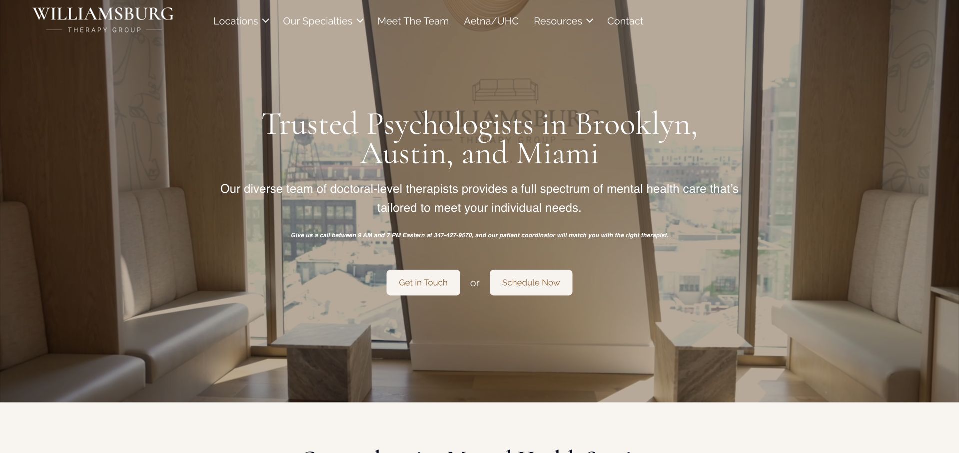
Williamsburg Therapy Group leads with its office environment rather than a generic wellness illustration. Warm wood, seating and a muted photographic treatment provide a setting for a location-specific headline naming Brooklyn, Austin and Miami. Two separate actions offer contact and scheduling, while the navigation distinguishes specialties, people, locations and insurance information. Its official About page supports the regional practice context and identifies its leadership. The design is worth studying for connecting atmosphere with practical qualification, not for treating a comfortable-looking room as evidence of care quality. Small text over changing photographic backgrounds remains the main readability tradeoff.
What you can learn
Show the environment a visitor can actually learn about, then pair it with literal location and process information. Keep contact, scheduling and insurance routes distinct rather than relying on the photograph to establish fit.
Pros
Named cities immediately establish the practice’s regional scope without requiring a separate location search.
Office imagery gives the brand a specific physical character rather than a purely abstract promise.
Cons & considerations
Fine white copy over photographic material needs careful contrast and stable fallback imagery.
Contact and scheduling actions need clear explanations so visitors understand the difference before beginning either process.
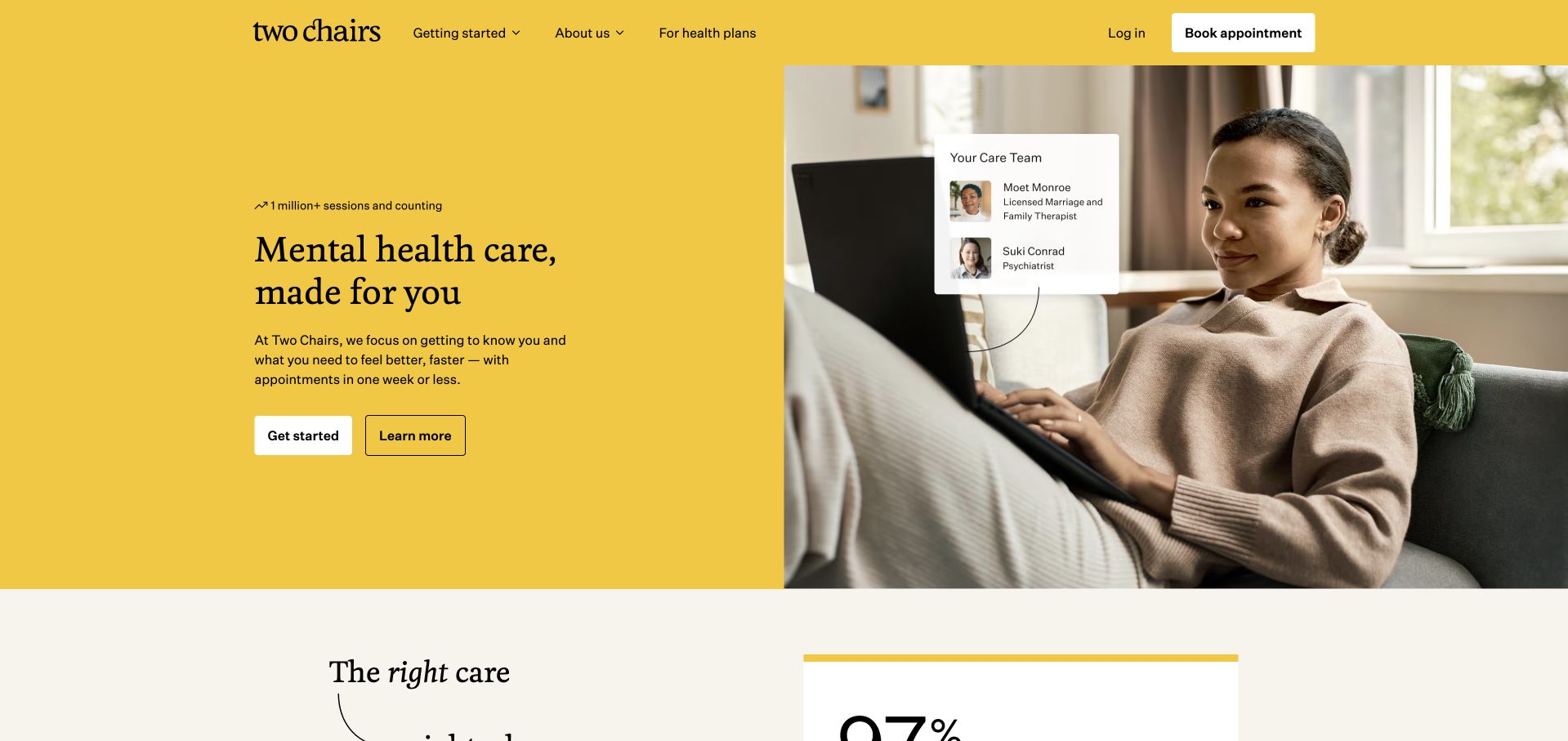
Two Chairs uses a saturated yellow field, restrained black typography and a large seated-person photograph. The main heading and two compact actions have room to breathe instead of competing with a long symptom list. A provider-card motif adds context to the image without turning the public homepage into a clinical dashboard. The navigation distinguishes how to begin, information about the organisation and health-plan material. The visual confidence makes the brand memorable, but the page still needs practical detail about geography, available clinicians and payment. The photograph and interface motif should be understood as brand presentation, not proof of any individual treatment experience.
What you can learn
Give the first decision enough space to be understood. Use supporting provider and access information to explain the service, while keeping illustrative interface elements distinct from real availability or personalised results.
Pros
The strong yellow identity creates recognition without requiring a crowded collection of trust badges.
Two concise opening actions provide a useful hierarchy for visitors at different stages of exploration.
Cons & considerations
A brief emotional headline leaves geography, payment and service limitations to supporting content.
Provider-card imagery can look functional and needs a clear distinction from live matching or appointment information.
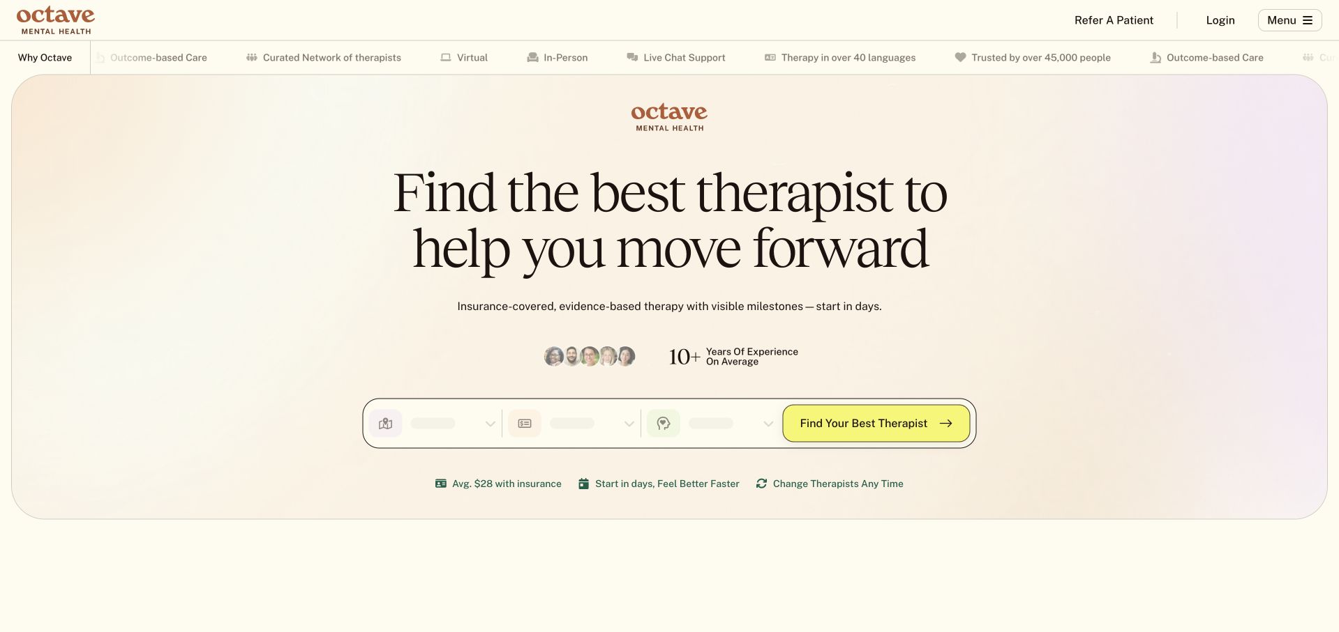
Octave places its introduction inside a large rounded pale panel, with a centred headline and a compact therapist-search row. The menu exposes locations, specialties and the question of what therapy costs. That explicit cost route is useful because financial uncertainty can remain even when a page repeatedly says insurance is accepted. The soft gradient and restrained yellow action give the interface a calm visual rhythm. Some very small supporting claims and figures sit close to the search, however, making the opening denser than it first appears. Those claims need clear definitions and should not be mistaken for a prediction about an individual visitor’s costs or care.
What you can learn
Put fit and cost information within the same public browsing structure. A search-led opening should explain its inputs and limits without surrounding the visitor with small, difficult-to-interpret outcome or pricing claims.
Pros
The cost-information route addresses a concrete comparison question alongside therapist discovery.
The contained hero panel gives the search a stable visual home without a full-screen photographic background.
Cons & considerations
Small figures and supporting claims can make an apparently simple opening harder to interpret.
A general insurance statement does not establish a particular person’s coverage or eventual out-of-pocket amount.
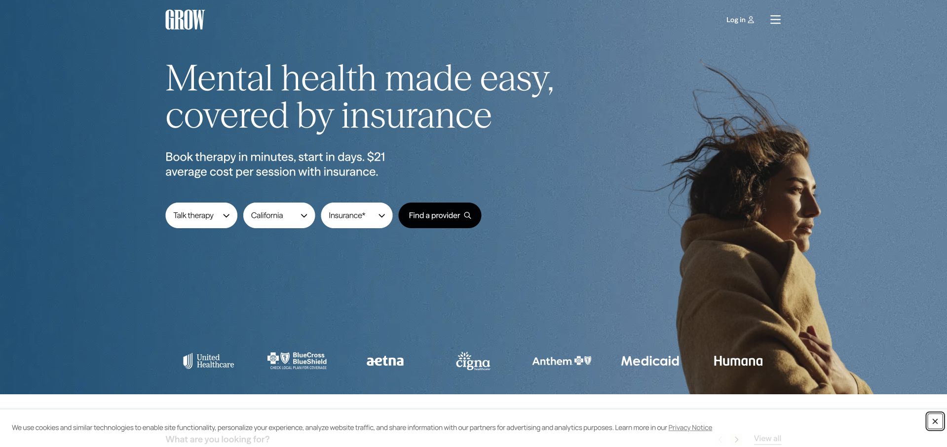
Grow Therapy combines a blue photographic field with a short care statement and a compact search. Therapy type, location and insurance are separate inputs, showing the visitor the main dimensions of the browsing task. Insurer logos provide context beneath the search rather than occupying the entire hero. The typography and open composition make the page feel less like a directory database, while the fields keep the function visible. The design needs equally careful results and no-results states: a clear opening does not by itself show whether suitable providers are available in a selected place or under a particular plan.
What you can learn
Expose the main search dimensions before requesting personal details. Preserve the distinction between browsing a directory, checking a specific plan and confirming an appointment with a provider.
Pros
Location, service type and insurance are visibly separate rather than collapsed into an ambiguous get-started button.
The large image and restrained field group provide a clear focal point without a dense introductory essay.
Cons & considerations
Insurer logos need contextual limits rather than implying that every provider accepts every displayed plan.
The concise opening leaves important availability and eligibility questions to the subsequent results experience.
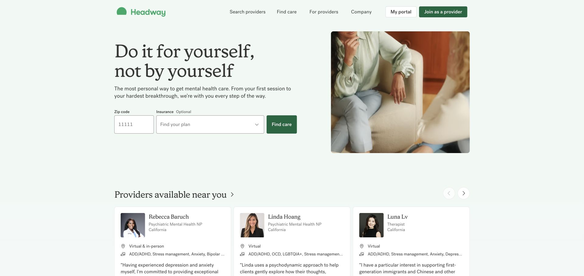
Headway uses a pale green background and a split photograph to frame a short, personal introduction. A ZIP and insurance search appears beneath the explanation, and provider cards begin lower in the first view. That sequence connects an emotional message to concrete browsing without asking the visitor to complete a long intake immediately. The public navigation also separates provider-facing information from the consumer task. The provider cards make the service tangible, but they need to communicate whether they are examples, nearby results or currently available options. A visitor should not have to infer those distinctions from the card styling.
What you can learn
Follow reassuring copy with a small, clearly scoped search. Label provider-card context explicitly and keep a provider’s participation, local availability and appointment confirmation as separate facts.
Pros
The opening pairs a humane tone with a practical geographic and insurance search.
Provider-facing navigation is separated from the visitor’s care-discovery path.
Cons & considerations
Provider cards can imply current local availability unless their context is made explicit.
A short search still needs transparent explanations of plan matching and any later handoff to a provider.
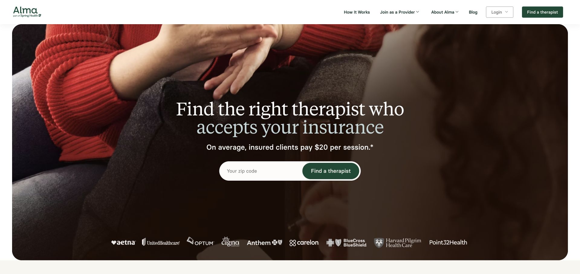
Alma places a centred therapist-discovery message over a close, warm-toned photograph. A ZIP search and contrasting action sit directly beneath it, followed by a row of insurer identities. The white header keeps browsing and provider-facing links readable outside the photograph. This makes the page visually cohesive while preserving an obvious task. The tradeoff is that insurance and average-cost messaging carry substantial weight in the introduction. Those statements require precise scope and current ownership; they should not be interpreted as an individual quote. The image provides atmosphere, but the useful service information comes from the search and the public explanation that supports it.
What you can learn
Let a strong photograph frame, rather than replace, the discovery task. Treat cost and insurance claims as maintained information with clear limits, and preserve an ordinary browsing route for visitors not ready to start matching.
Pros
The search action has a strong position and contrast within the photographic composition.
The separate white header keeps navigation readable even as hero imagery changes.
Cons & considerations
An average-cost statement can be misunderstood without clear explanation of who and what it describes.
A ZIP-only opening needs later clarity about provider fit, service area and actual appointment availability.
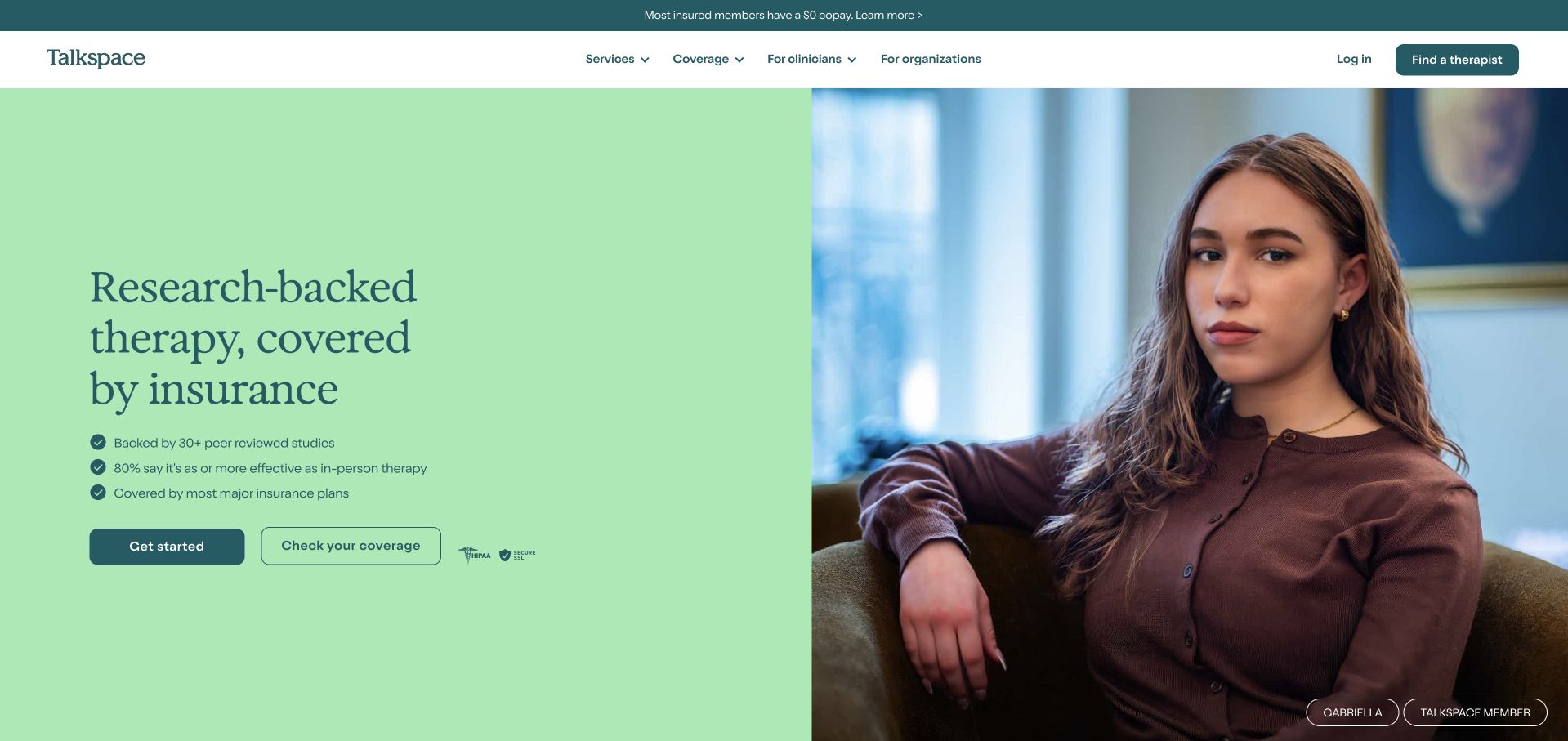
Talkspace uses a mint text panel beside a large portrait, giving the main proposition a stable background. The opening separates getting started from checking insurance coverage, which recognises two different visitor questions. A narrow utility strip and straightforward header preserve navigation without overwhelming the central message. The composition is simple enough to study without copying the provider’s clinical or research claims. Its main limitation is the gap between a brief public promise and the actual service model: visitors need to understand communication format, provider availability and plan-specific terms before they treat the page as a complete explanation.
What you can learn
Separate an informational coverage check from an enrolment action. Use a split layout to keep important text off variable photographs, then describe the service format and limitations in ordinary public content.
Pros
Two distinct actions acknowledge that some visitors need financial information before beginning a care process.
A solid-colour text panel provides a predictable reading surface beside the portrait.
Cons & considerations
Research-oriented marketing language needs clear original sources and should not stand in for service explanation.
The concise first view cannot answer individual coverage, provider availability or communication-format questions by itself.
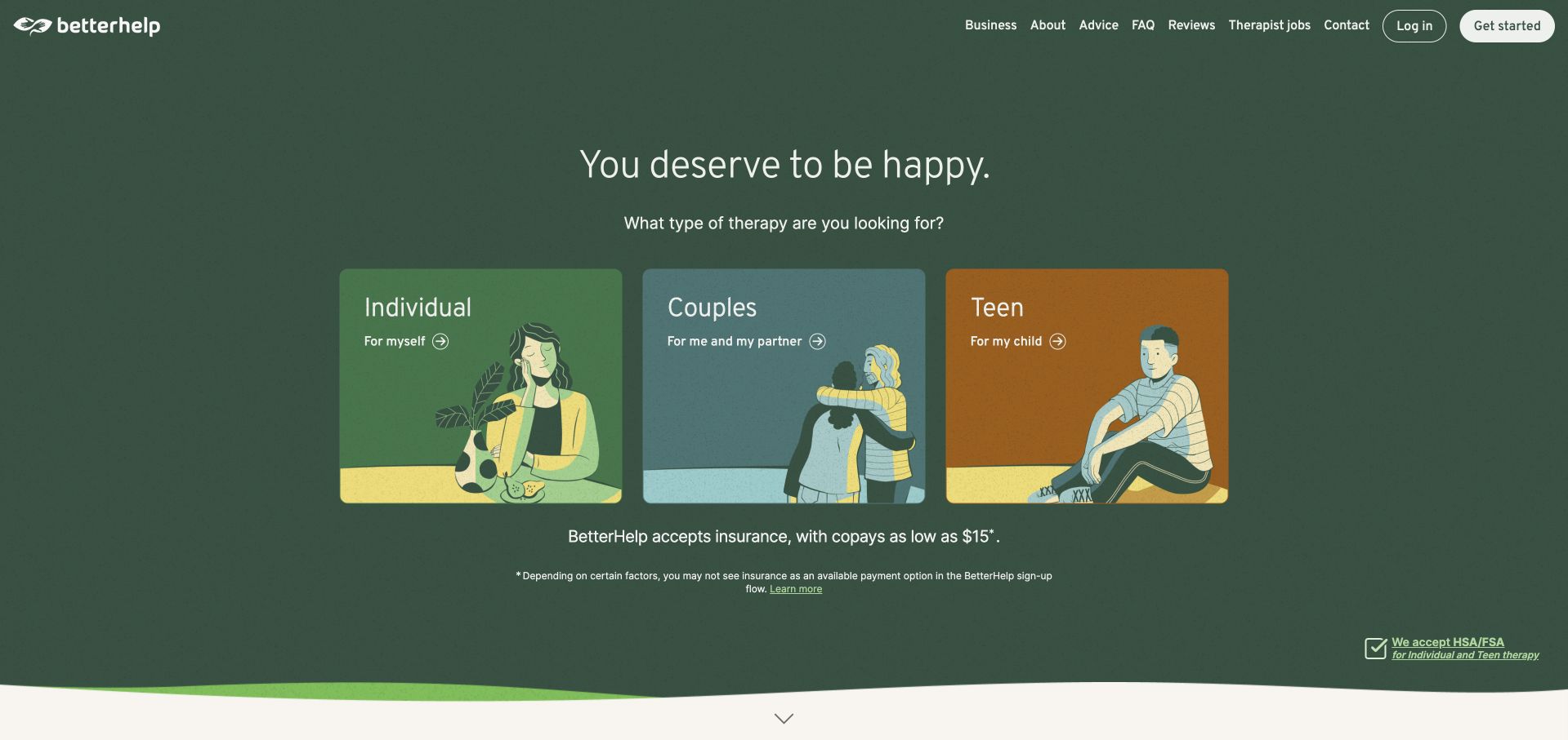
BetterHelp uses a deep green opening and three large illustrated cards to distinguish individual, couples and teen pathways. The visitor chooses a category before encountering a lengthy explanatory page. The illustrations and restrained text make this first decision easy to recognise, while the navigation preserves informational routes such as about and FAQs. The approach is worth studying as audience segmentation, not as evidence that one service arrangement fits every person within a category. Teen and couples routes in particular may involve different organisations, eligibility rules or consent processes. Those distinctions need to be explained rather than hidden behind a consistent visual template.
What you can learn
Use audience cards only when the paths genuinely differ and the next step explains how. Keep optional discovery separate from account creation, and make service-format and organisational changes visible during a handoff.
Pros
Three large cards make the initial audience decision visually simple and easy to scan.
Illustration creates a recognisable identity without relying on a wall of testimonial portraits.
Cons & considerations
Broad audience labels cannot explain individual suitability or the practical limits of a service.
A consistent card style can conceal differences in provider, eligibility or consent arrangements across destinations.
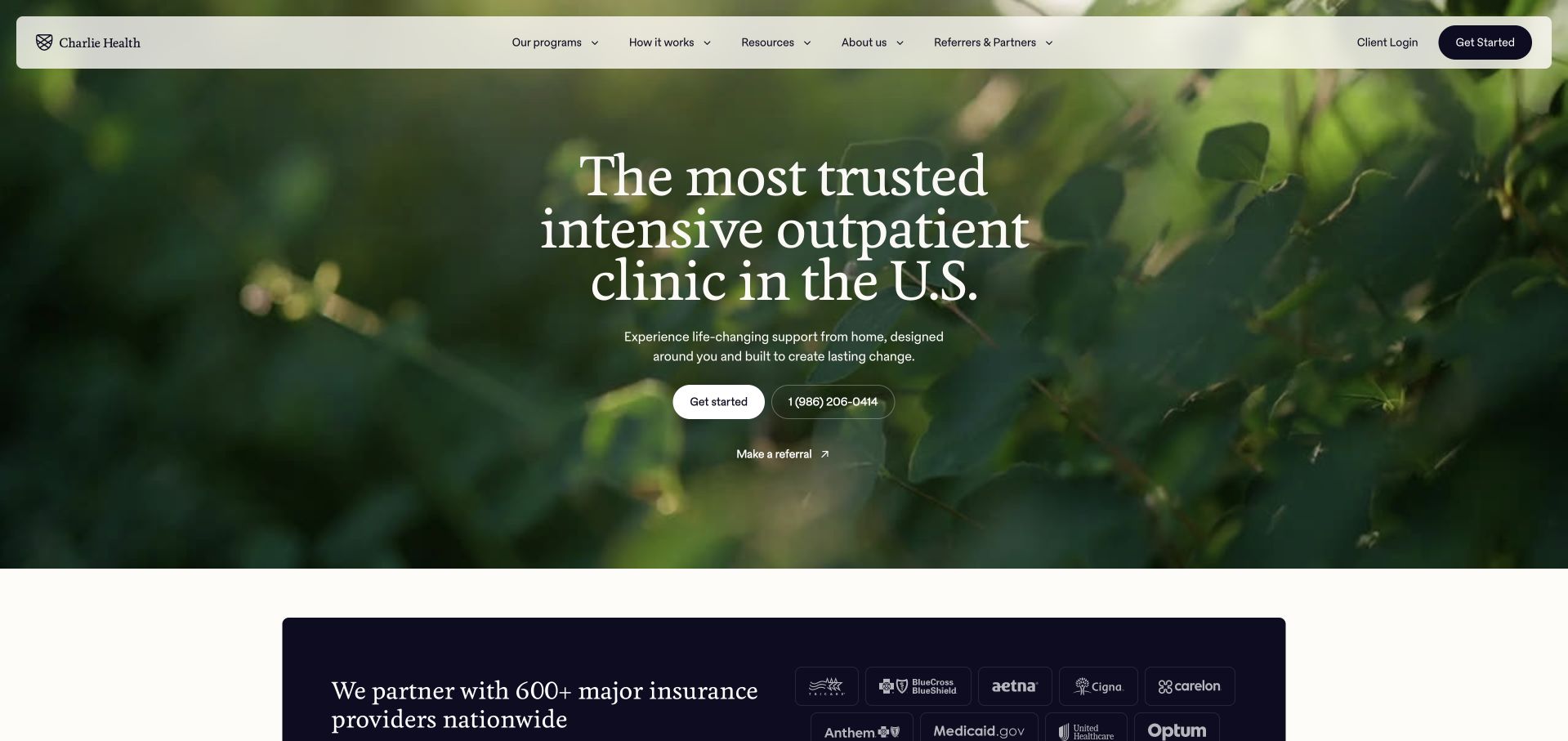
Charlie Health uses a dark green photographic field and a centred specialist-service introduction. The opening offers a small set of actions, followed by a dark insurer panel below the hero. The natural imagery creates visual calm, while the headline identifies a more specific service category than general therapy. That specificity is useful, although a specialised programme requires more explanation than an ordinary appointment button. Visitors need a public account of format, participation requirements, access process and limits. The homepage’s strong trust-oriented marketing language should remain clearly attributed to the provider rather than adopted as an independent ranking or clinical judgement.
What you can learn
Name a specialised programme clearly, then explain the participation model before requesting sensitive information. Keep source-qualified service facts separate from superlative marketing language and insurance-brand reassurance.
Pros
The opening identifies a specific programme category rather than implying an undifferentiated therapy service.
A restrained action group avoids turning the first view into a long intake questionnaire.
Cons & considerations
A specialist model needs substantial public explanation beyond a brief headline and enrolment action.
Trust and coverage claims require clear scope rather than being treated as universal guarantees.
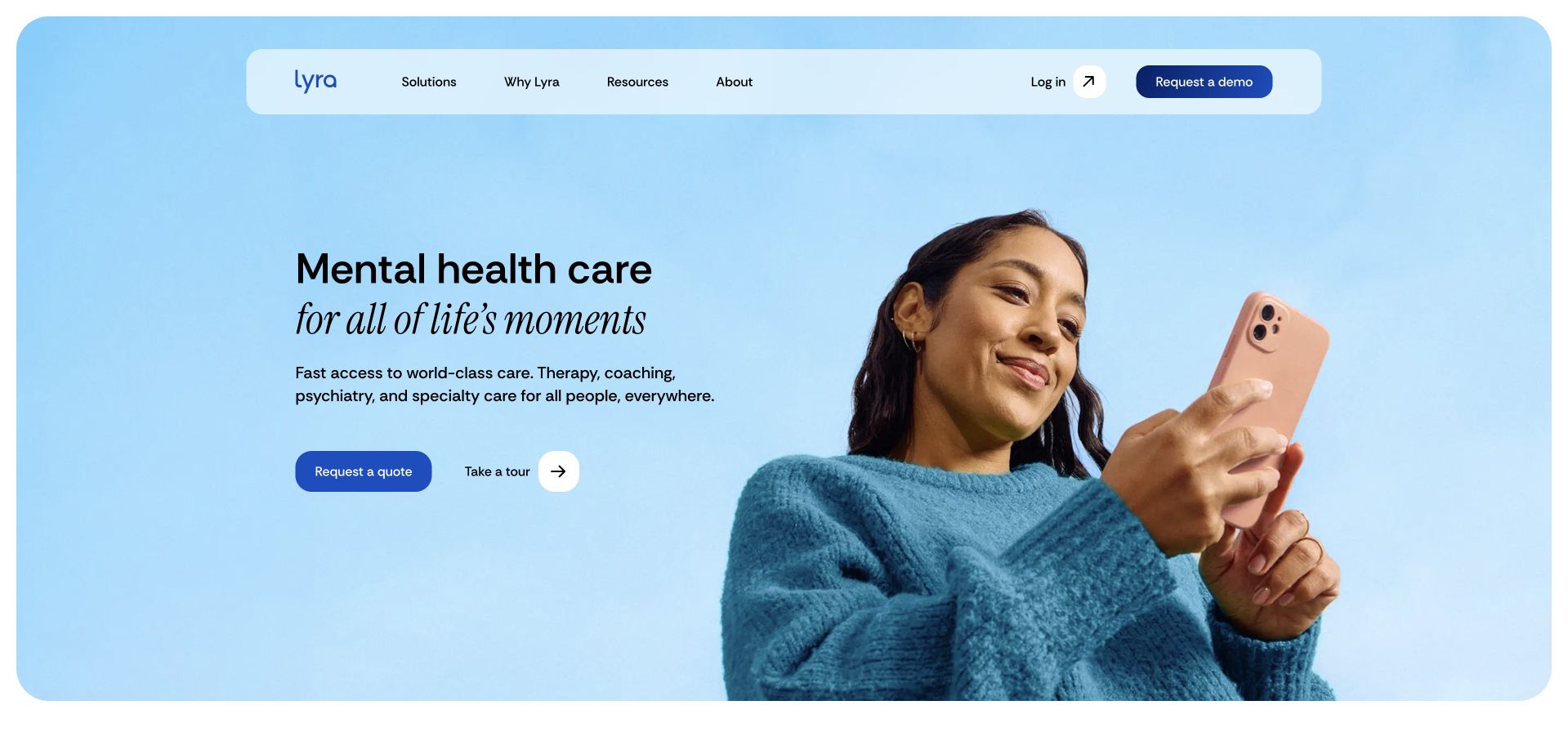
Lyra places a rounded blue hero inside generous white margins, using a large phone-focused portrait and a short care message. A floating white navigation bar keeps the page feeling light, while a demo action signals an employer or organisational buying journey. That is a useful reminder that a mental-health homepage may not primarily be a direct-to-consumer clinic. A member looking for existing benefits and an employer assessing a programme need different routes. The page’s polished simplicity works best when the audience distinction is explicit, since a visitor could otherwise assume that the prominent action begins a personal appointment rather than a sales conversation.
What you can learn
Make the intended audience clear before presenting a dominant call to action. Workplace buyers, existing members and clinicians need separate destinations even when the brand uses the same warm, consumer-oriented visual language.
Pros
The rounded hero and white navigation provide a clear, uncluttered opening composition.
A demo action makes the organisational buying path identifiable without a long sales form in the hero.
Cons & considerations
Consumer-style imagery can obscure the difference between a benefit programme and direct clinic access.
A broad care statement needs audience-specific explanations of eligibility and what happens after each action.
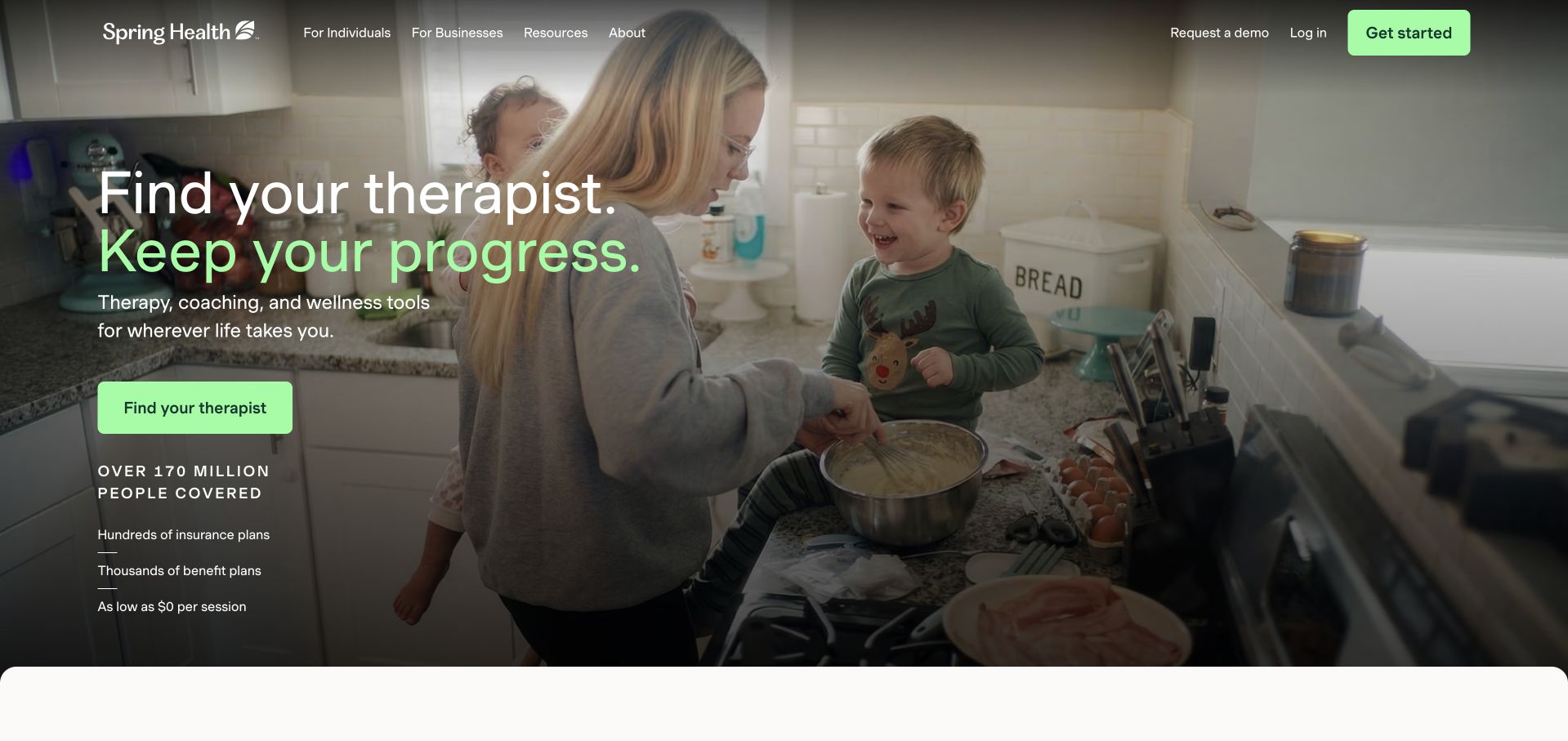
Spring Health overlays a darkened everyday-life photograph with a large therapist-focused headline and a bright green action. The navigation explicitly separates individuals and businesses, helping clarify a service that addresses both members and organisational buyers. The opening also contains substantial scale and coverage messaging, which adds context but increases the amount of small supporting text. The practical lesson is the visible audience split, not the assumption that a large published number proves fit for an individual. The photograph supports the tone, while the public explanation must establish eligibility, service format and the next step for each audience.
What you can learn
Keep individual and organisational paths visible from the first interaction. Give important practical qualifications their own readable space instead of placing every coverage or scale claim over a moving photographic background.
Pros
Individuals and businesses have explicit navigation routes rather than sharing an ambiguous start button.
The contrasting green action is easy to locate within a large photographic opening.
Cons & considerations
Small scale and coverage claims can compete with the main task and require precise current definitions.
A dark overlay must preserve readable text across every image or video frame and responsive crop.
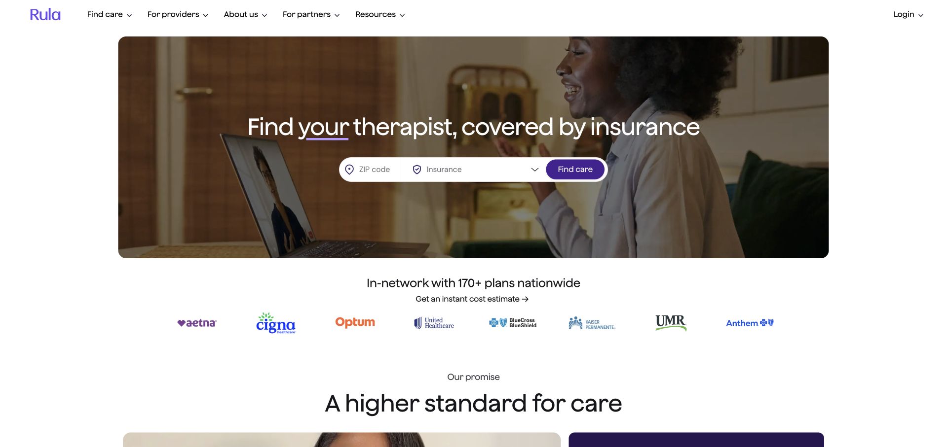
Rula uses a wide rounded photograph with a centred therapist-search message and a compact search row. A separate insurer strip follows on white, keeping the supporting brands out of the busiest part of the image. The header distinguishes care discovery, providers, partners and resources, showing that the service serves several audiences. The opening is deliberately economical: the visitor can recognise the search task without reading a large manifesto. That economy means the search results and supporting explanations carry much of the burden. They need to clarify whether a provider is merely listed, participates in a particular plan and has a suitable appointment available.
What you can learn
Keep discovery simple without making the service model opaque. A compact search should lead to clearly contextualised results, with payment, availability and provider details treated as separate maintained information.
Pros
The search is visually central while supporting insurer identities have a calmer, separate space.
Audience-specific header links preserve provider and partner tasks without taking over the consumer opening.
Cons & considerations
A short hero leaves service-format and availability questions to later parts of the journey.
Insurer-brand presentation needs limits so users do not read it as universal provider participation or coverage.
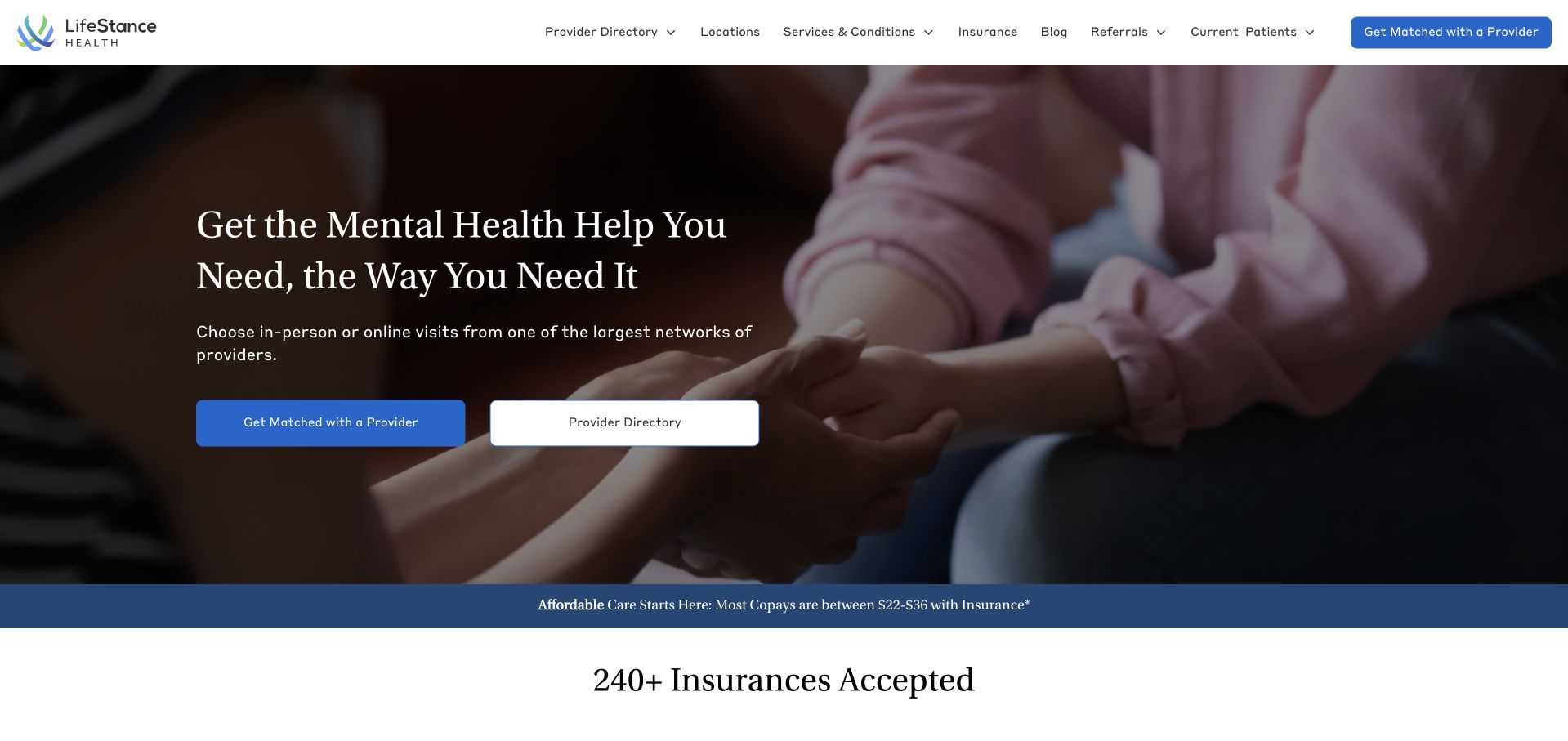
LifeStance places a darkened close-up photograph behind a restrained headline and two distinct actions: matching and directory browsing. That is a useful functional distinction. Some visitors want assistance narrowing options; others already know a clinician or prefer to examine the list themselves. The header exposes locations, services, insurance and current-patient information, while the lower page develops the network context. The design makes choice visible without forcing all visitors into one assessment. Its broad network framing still needs local detail, and the photograph should not be read as a documented account of a particular person’s care or a promise about treatment results.
What you can learn
Offer assisted discovery and independent browsing as genuinely separate paths. Keep the existing-patient route prominent, and explain the information required for matching before asking someone to disclose personal details.
Pros
Directory browsing remains available alongside the more guided matching action.
Insurance, location and current-patient navigation acknowledge practical questions beyond the introductory care message.
Cons & considerations
Network-level language needs provider- and location-specific detail before it supports an individual access decision.
A photographic overlay requires stable contrast and should not carry the only explanation of an important task.
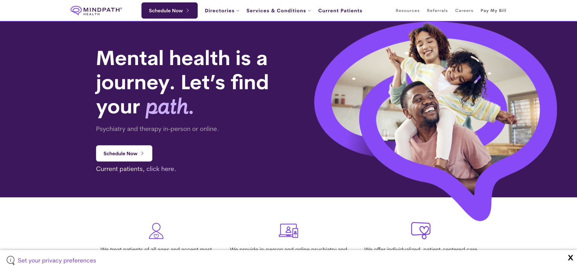
Mindpath uses a saturated purple field and a large speech-bubble-shaped image to make its identity recognisable. The opening explicitly mentions psychiatry and therapy, with a scheduling action and a separate current-patient route nearby. The header divides directories from service information and resources, giving visitors more than one way to understand the organisation. The strong visual motif is useful because it can recur across cards without requiring a new illustration language for every page. The task is to keep that motif secondary to readable service distinctions. Psychiatry, therapy and current-patient administration should not become interchangeable simply because the brand presents them in one cohesive composition.
What you can learn
Build a recognisable visual system around a literal service structure. Keep current-patient administration separate from new enquiries, and explain the different service processes rather than expecting the shared brand treatment to communicate them.
Pros
The speech-bubble shape gives the brand a consistent, distinctive visual element.
Current-patient and directory routes remain visible alongside the new scheduling action.
Cons & considerations
A broad psychiatry-and-therapy statement needs service-specific practical explanations underneath it.
Large decorative shapes can reduce usable text space when the hero collapses onto a small screen.
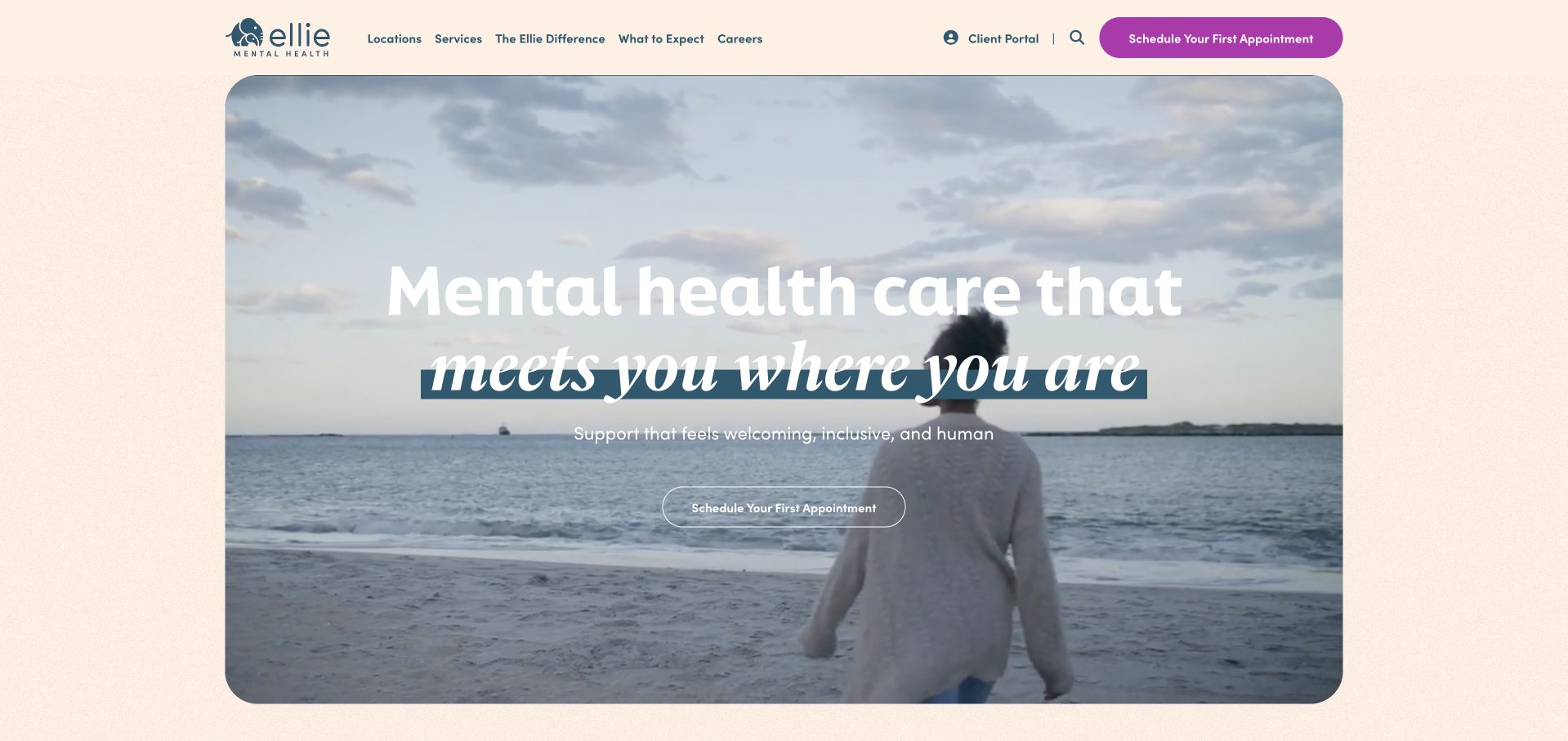
Ellie Mental Health combines a pale warm background, a large photographic hero and a contrasting purple appointment action. The header keeps locations, services, the organisation and existing-client access separate. The approachable campaign tone is supported by a public location structure, which matters for a brand whose own footer explains that local practices are independently operated. That organisational detail should not disappear behind the shared identity. A visitor needs to know which practice provides the service and which policies apply there. The design is useful for studying a consistent national-style brand, while the practical content must remain specific to the selected local provider.
What you can learn
A shared therapy brand needs transparent local practice ownership and access information. Preserve the friendly presentation, but identify the actual service destination and distinguish existing-client access from a new appointment enquiry.
Pros
A contrasting appointment action is easy to recognise within the warm photographic treatment.
Locations and client access remain explicit routes instead of being hidden inside a general contact menu.
Cons & considerations
A unified brand can obscure differences among independently operated practices unless local details are prominent.
A large campaign image must not delay basic service-area, payment and appointment-process information.
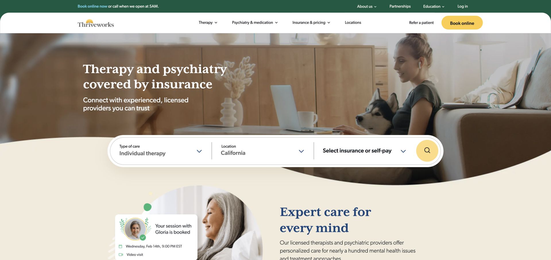
Thriveworks places a white search component over the lower edge of a broad photographic hero. Service type, state and insurance are separate choices, while the curved transition gives the opening a distinct visual shape. A strong booking action appears in the navigation, and the page follows with another provider-focused section. The layout is worth studying for how it turns a broad care proposition into concrete search dimensions. The interface still needs careful labels: choosing a category or insurer is a browsing step, not confirmation of suitability, coverage or availability. The decorative curve should not cause controls or explanatory text to overlap when the layout stacks.
What you can learn
Translate the main service questions into a short search, then clearly describe what the result represents. Keep decorative hero geometry independent from the functional layout so keyboard focus, labels and error messages have predictable space.
Pros
The search exposes several practical filters before a visitor enters a longer appointment process.
A distinct white search surface keeps controls readable against the photographic background.
Cons & considerations
Filter choices can be mistaken for verified coverage or confirmed availability without clear result context.
Curved overlays and floating controls require careful small-screen and enlarged-text testing.
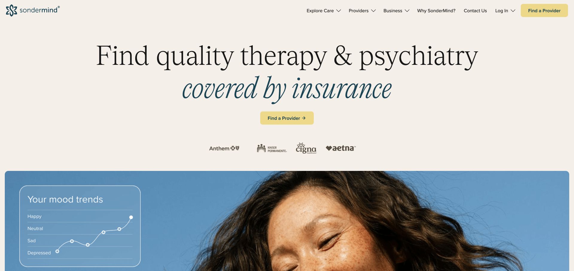
SonderMind gives a large serif headline generous space on a pale background, with a small contrasting provider-finding action underneath. Insurer identities sit between the message and a broad photograph, creating a calm progression rather than a full-screen booking interface. The header separates care exploration, provider information and resources. The design is a useful contrast to search-heavy competitors: it makes the service legible before asking the visitor to filter results. The small action is correspondingly easy to overlook, and the restrained opening still requires specific information about service areas, provider options and payment. Visual calm should not mean practical information is difficult to find.
What you can learn
A typography-led opening can reduce visual pressure, but keep the next step large and literal enough to recognise. Follow the message with concrete discovery and access information rather than relying on reassurance or insurer logos alone.
Pros
Generous spacing and a stable pale background give the main message a clear reading hierarchy.
Provider and consumer navigation are separated without filling the opening with many competing controls.
Cons & considerations
The small provider-finding action can feel secondary despite being the page’s main practical task.
Insurer identities and broad coverage wording need provider-specific qualifications in the next stage.
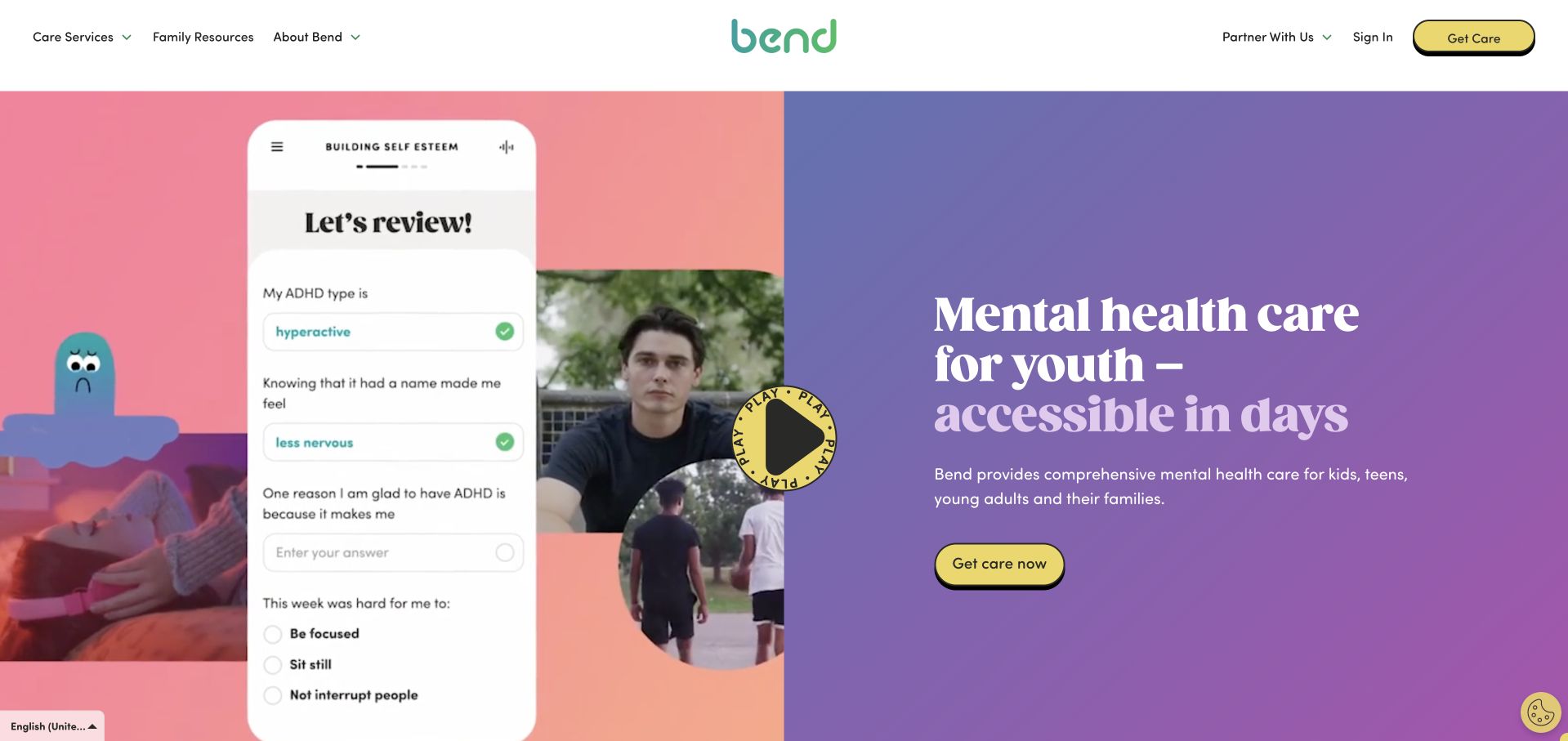
Bend Health uses a white header above a split opening: a colourful promotional media panel on the left and a purple text field on the right. Yellow actions and a circular play control create a clear visual identity. The headline explicitly names youth mental-health care, while navigation separates services, family resources, organisational information and partners. The public film includes an illustrative app presentation; it is marketing material, not a private signed-in record. The design makes the service category clear, but its timing-oriented headline remains the provider’s claim. Visitors still need practical explanations of formats, geography and the process behind the main care action.
What you can learn
Use a media demonstration to explain a service only when the text stands independently. Keep family and partner routes separate, and label illustrative interfaces so they are not mistaken for live or personalised information.
Pros
The solid purple text area remains readable beside the changing promotional material.
Family resources and partner information have different navigation routes rather than sharing the same care action.
Cons & considerations
A timing-oriented headline needs clear current scope rather than appearing to guarantee access for every visitor.
The film and illustrative app material need a meaningful still state and usable motion controls.
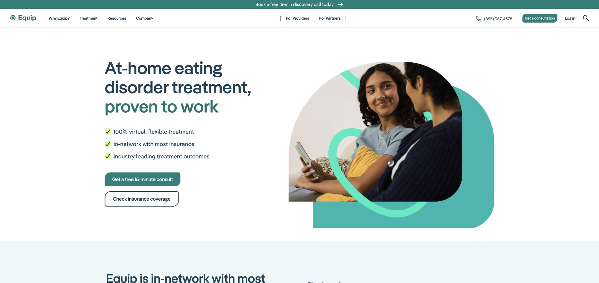
Equip uses a white split layout, a strong dark headline and a rounded image framed by a looping green motif. The opening names a specific at-home service model, followed by concise supporting statements and two different learning or care actions. A telephone number and navigation remain visible above it. The design is useful for how quickly it establishes the category without burying the visitor in a long diagnostic list. Its clinical and coverage assertions remain the provider’s claims, not facts established by this design review. A focused service needs substantial information about programme format, participation and limitations before a visitor enters an assessment or intake process.
What you can learn
State a specialist service model directly and separate learning from starting care. Give the programme’s practical requirements enough public explanation, with clinical claims reviewed by the organisation’s qualified team rather than amplified through decorative badges.
Pros
The split layout gives the service description a stable, high-contrast reading surface.
Separate care and learning actions support visitors who are not ready to begin intake.
Cons & considerations
Concise clinical and coverage statements require clear scope and original supporting information.
A specialist programme cannot be adequately explained by a short checklist of promotional benefits.
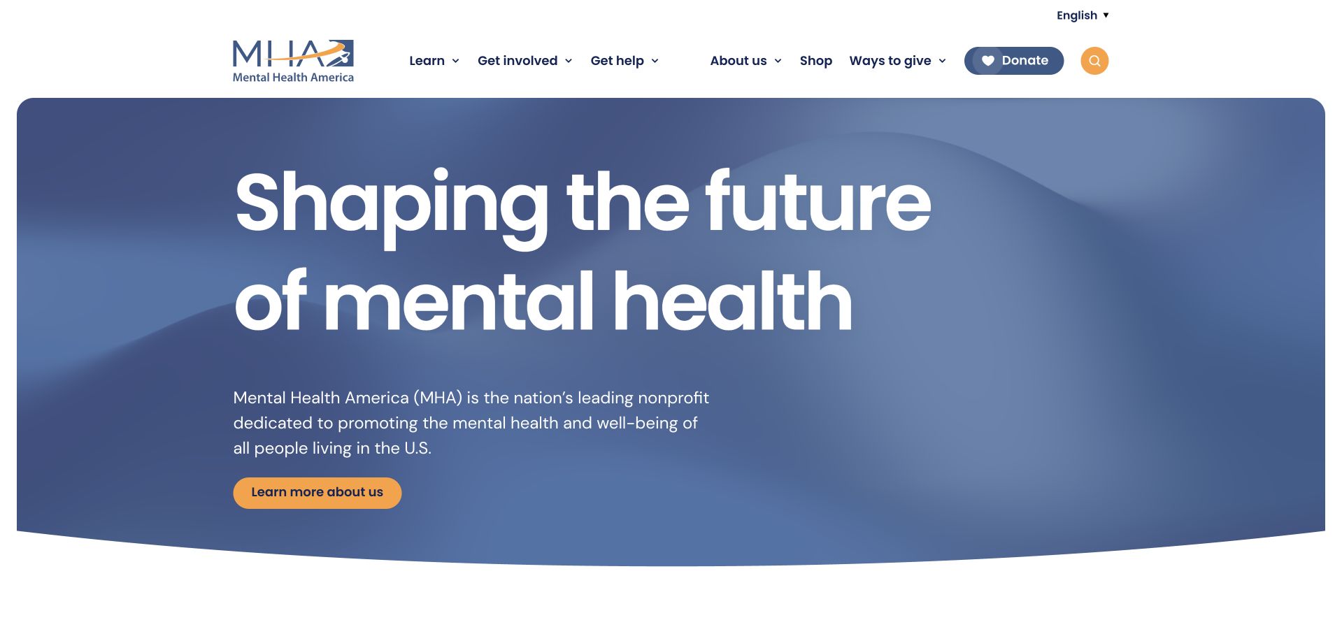
Mental Health America uses a large blue rounded hero with a mission-led headline and a restrained yellow action. The header separates mental-health information, screening, advocacy, involvement and the shop, with donation presented as another distinct task. This is a resource and advocacy organisation, not an interchangeable example of therapist booking. Its value in the collection is the clear distinction between learning, participation and support-oriented content. The broad mission message creates a strong first impression, but users looking for a particular resource still need direct, well-labelled navigation. Any screening destination also needs its own clear purpose and limitations rather than being understood as a diagnosis.
What you can learn
Match the homepage structure to the organisation’s actual role. Education, advocacy and resource discovery need different paths from clinical appointment booking, with clear boundaries around any self-guided tools.
Pros
The navigation makes several nonprofit audience tasks visible instead of presenting one generic donation funnel.
A stable blue text field keeps the mission statement readable and visually focused.
Cons & considerations
A broad mission headline can delay a specific resource search if the navigation is overlooked.
Screening and educational tools require explicit scope rather than an implied clinical assessment or treatment recommendation.
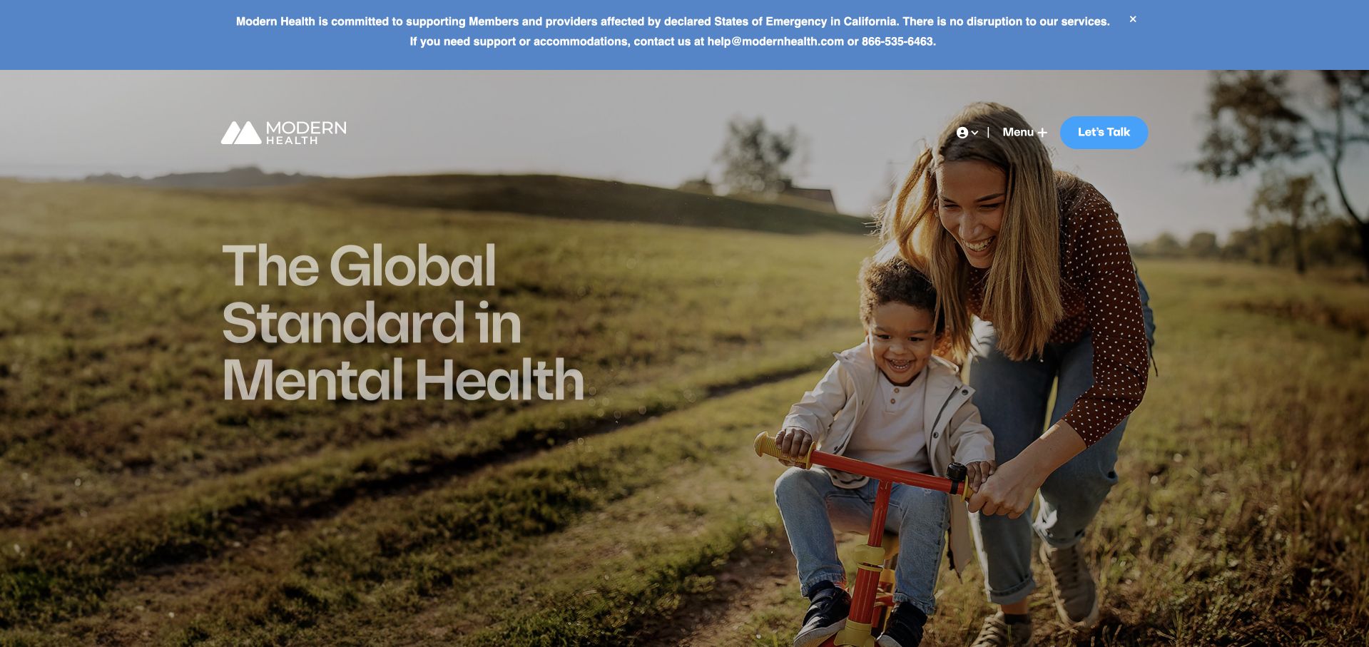
Modern Health introduces its workforce service over a large everyday-life photograph, with a compact action and a substantial organisational notice above the header. Navigation separates employers, members, providers and other partners, which is essential when the same brand has several different relationships. The opening’s global-standard language is promotional and should not be treated as an independent comparison. The most useful design feature is the audience segmentation: an existing member seeking access should not have to begin an employer demo request. The notice and the hero also demonstrate how operational, regulatory or corporate updates can occupy considerable first-view space and need careful hierarchy.
What you can learn
Keep member access separate from organisational buying and partner information. Give significant notices a deliberate place and review process, while preserving a literal description of the service and the audience behind each action.
Pros
Audience-specific navigation reflects the different tasks of employers, members and providers.
A prominent notice has a separate presentation rather than being buried inside the general marketing copy.
Cons & considerations
A large notice and photographic campaign can crowd the first view before practical access information appears.
Global or standard-setting language needs qualification and should not be repeated as a measured service ranking.
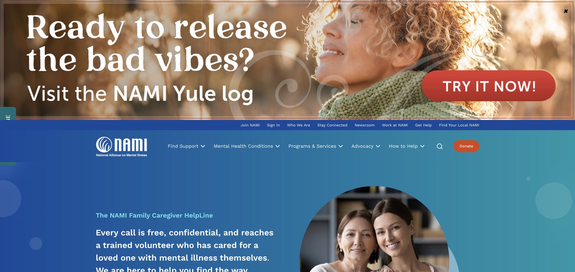
NAMI combines a broad blue brand area with navigation for learning, involvement, support and giving. In the captured state, a large seasonal promotional banner sits above the main header, illustrating how campaigns can compete with a resource organisation’s permanent tasks. The underlying page includes family-support messaging and a prominent human image. This is not a therapy-provider directory or a clinical booking example; it is useful for studying nonprofit information architecture and community-oriented communication. The strongest improvement opportunity is hierarchy. A visitor arriving for a specific resource should not need to interpret a seasonal campaign before discovering the stable support and education paths.
What you can learn
Give campaigns a bounded place within a resource-led homepage. Keep core education and support destinations consistently visible, with clear descriptions of the organisation’s role rather than language that implies direct clinical treatment.
Pros
The main navigation separates learning, involvement, support and giving into recognisable nonprofit tasks.
The strong blue identity creates continuity across campaign and permanent resource content.
Cons & considerations
A large promotional banner can push essential navigation and resource information too far down the page.
Support-oriented messaging needs clear service boundaries so visitors understand what the organisation does and does not provide.
Kegan is a freelance web designer and developer with 15+ years of experience helping businesses turn complicated website requirements into clear, maintainable digital experiences. He works directly with clients from planning and design through development, launch, and ongoing support.
For mental health website design, his development approach focuses on specialty and provider information, privacy-conscious inquiry journeys, and clear service boundaries. The scope can be a targeted improvement or a complete custom build, with responsive layouts, thoughtful content structure, and integrations chosen around the people using and maintaining the site.
Show 3 other mental health website designersHide other mental health website designers
Build the information journey before the intake flow
Write the first-contact explanation
Describe whether contact requests a reply, a consultation, a matching conversation or a booking. State the organisation’s actual response process without inventing promises. Let visitors understand the people and places involved before they disclose information. Avoid an ambiguous start action that moves directly from a public marketing page into a sensitive assessment without explaining the destination.
Give provider profiles a maintained structure
Use approved public names, roles, service areas, languages and formats, with clear responsibility for updates. Keep availability separate from a general profile unless it is connected to a reliable current source. Show where published registration or professional information can be checked when appropriate. Never fabricate headshots, testimonials or patient identities to make a directory feel fuller.
Design low-pressure alternatives
Allow learning before conversion. A cost page, service explanation, directory or contact-process description can answer a meaningful question without forcing an account. Test empty results and unavailable-provider states. Avoid language that blames the visitor or turns a marketing limitation into a statement about their needs. A clear next step can remain optional and understandable rather than repeatedly demanding an immediate commitment.
The editing job behind the design
Keep public discovery and sensitive workflows separate
Use structured public records for providers, offices, services and resources. Connect only the data necessary for the stated function. A search interface should clearly distinguish illustrative profiles, public directory records and live appointment information. Have the organisation’s responsible technical and privacy reviewers assess forms, third-party tools and reporting before collecting information; do not treat a standard website template as approval for a sensitive workflow.
Design for readable text, keyboard focus, reduced motion and understandable form feedback. Calm colours alone do not establish accessibility. Give photographs appropriate descriptions without inventing personal stories. Evidence-limited technology observations in this guide cannot reveal the private clinical platform, assess care quality or establish that a provider’s entire infrastructure uses a particular tool.
Our WordPress website examples offer a separate look at publishing approaches. A visible platform label is evidence for that named page, not a guarantee that the same system will suit your requirements.
Before the public launch
Mental-health website planning checklist
State whether the organisation is a practice, directory, programme or resource body.
Separate individuals, existing members, organisational buyers and provider audiences.
Explain the actual geographic and service-format scope.
Keep public cost and plan-information routes discoverable.
Distinguish directory browsing, matching, consultation requests and confirmed appointments.
Maintain provider roles and public profile information with an accountable owner.
Label whether availability is live, illustrative or requires confirmation.
Keep clinical intake out of an ordinary marketing enquiry form.
Have qualified reviewers approve service boundaries and urgent-support notices.
Provide useful empty-result and unavailable-provider explanations.
Use real, permitted imagery without invented patient stories or testimonials.
Test readable contrast, keyboard access, reduced motion and form feedback.
These checks are a project checklist, not a performance, legal, security, or accessibility certification. Test real journeys with the people responsible for the website before making claims about the result.
Sources & editorial method
How this collection was selected and reviewed
The reviews are original observations of public pages and direct browser captures. They do not evaluate treatment, clinical suitability, screening tools or outcomes. The first selection is based on website design and documented regional scope, with organisational claims attributed to their publishers.
Each example links to its actual source page. Screenshots are direct browser captures with their own capture dates; moving imagery, announcements and live designs can change. The notes describe observable design choices and conditional tradeoffs, not measured traffic, conversion results, service quality, or accessibility conformance.
Technology labels use public page metadata, asset evidence, or explicitly cited platform documentation. Platform documentation is not a complete current deployment audit. A component reference may be legacy or unused; it is not a complete backend inventory. Unknown stacks are omitted. These sites are editorial examples, not our client portfolio.
Written, Edited and Curated are separate editorial records, not timestamps advanced by a rebuild. Website designs and imagery belong to their owners. See our editorial standards or suggest a correction.
Questions worth asking
Mental Health website design questions
Should the homepage start with a matching questionnaire?
Only when the purpose and handling process are clearly explained and appropriate for the organisation. Visitors should be able to learn basic service, geography and cost information first. A public directory or ordinary explanation may be a better starting point for some practices.
Do calming colours make a mental-health website better?
They can support the tone, but clarity and readability matter more. Pale text on a pale background can be difficult to read. Compare actual tasks and contrast rather than selecting a palette solely because it feels gentle.
How should insurer logos be used?
As contextual information with clear limits. They should not imply that every provider participates in every plan or that an individual’s costs are known. Link the visual reassurance to maintained public explanations and appropriate confirmation steps.
Can a profile show a provider’s availability?
Yes, if the source and meaning are reliable and clear. Otherwise use a contact or enquiry description rather than an apparently live promise. A listed profile, a matching suggestion and a confirmed appointment are different things.
Should testimonials lead the page?
They should never replace service explanation, and their publication needs the organisation’s appropriate review and permission process. Do not invent reviews, personal identities or clinical outcomes. A clear practice description and transparent first-contact process can be more useful than a wall of endorsements.
Borrow the examples’ clarity and distinct service paths, not implied promises about care. A thoughtful public website gives people enough information and control to understand their next step without turning every visit into an intake.