A water utility website has to work for a routine payment and an unexpected loss of supply. Begin with those practical situations, show which places and customers an update concerns, and keep a clear route to human help.
Water organizations serve different roles. Some manage household accounts and local pipes; others focus on bulk supply, drainage, catchments, infrastructure, or national public services. A useful website makes its own responsibilities clear. Visitors should not need to understand the organization's structure before finding an outage, reporting a leak, asking about a bill, arranging a move, or locating the right provider.
These twenty-five examples show several approaches to that problem: incident strips above the hero, task panels beside conservation campaigns, prominent local searches, audience-specific navigation, and detailed support categories. The collection examines their visible public interfaces. It does not establish water quality, supply reliability, customer-service outcomes, regulatory compliance, or the performance of private account systems. Seasonal messages, service notices, and consent interfaces are part of the recorded page state.
Before the examples
What makes good water utility website design in 2026?
Separate current incidents from general water advice
Give each incident an affected area, a clear description, a status, and an update time with a timezone. Link to the current detail page and show when the next update is expected if that information is available. Keep drought campaigns, planned works, and immediate interruptions distinct. A large conservation message should not force a customer with no water to guess whether it explains their problem.
Make everyday tasks and support equally reachable
Provide direct routes for paying, moving, reading a meter, managing an account, and reporting a problem. Place bill support and accessible contact options near the actions where people may need them. Describe the information a task requires before requesting it, and explain when a visitor will move to another service or portal. Keep the public information useful even when someone cannot sign in.
Explain the service area without forcing location permission
Offer a manual area or postcode lookup and explain what the selected location changes. Preserve that context across the pages where it matters, while making it easy to correct. Distinguish the customer's account address from a place they are checking for an incident. Visitors should be able to understand regional restrictions and identify the appropriate provider without sharing their precise device location.
The collection · 25 examples
25 water utility websites worth studying
Compare how each organization prioritizes local information and customer tasks around its larger public story. Look at the wording of reporting routes, the treatment of payment assistance, the visibility of service-area choices, and what happens to the first screen when notices accumulate. Adapt the relevant pattern to the utility's responsibilities rather than copying a homepage wholesale.
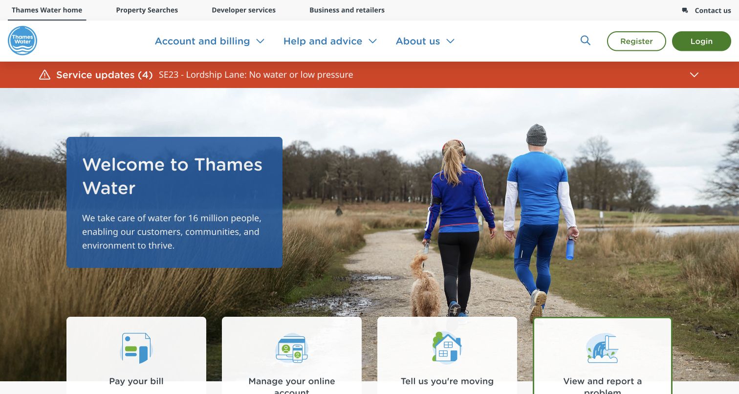
Thames Water places a red service-update strip between the navigation and its large outdoor welcome photograph. The incident count and named affected location give an urgent visit a clear starting point before the customer reaches the softer community message. Four illustrated cards at the bottom of the hero then lead to paying, managing an account, moving, and reporting a problem. The hierarchy separates current operational information from the slower introduction without giving up either. Account and help categories remain prominent in the compact main navigation.
What you can learn
Reserve a stable, highly visible place for incidents, and describe their geographic scope in the link itself. Keep common transactions immediately adjacent to the welcome area so an attractive regional photograph does not become an obstacle to practical service.
Pros
The colored incident band can be recognized before reading the main promotional content.
Distinct task illustrations support the plain payment, account, moving, and problem labels.
Cons & considerations
The large welcome photograph pushes portions of the task cards below the initial viewport.
A broad welcome statement provides less immediate help than the specific service links around it.
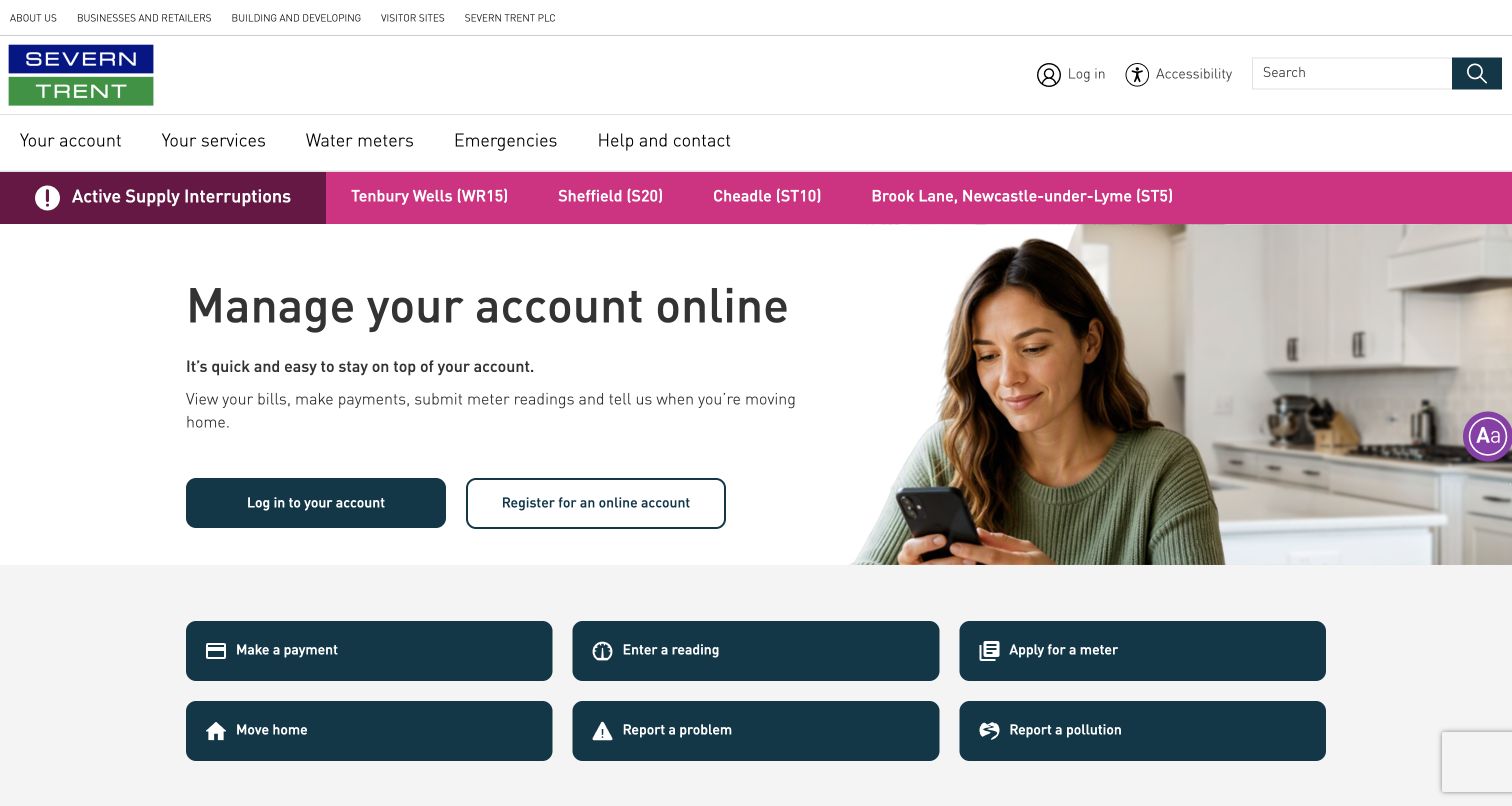
Severn Trent gives its online account a substantial introduction with separate login and registration buttons, a short explanation of available tasks, and a photograph of someone using a phone. Above that panel, a magenta interruption strip lists affected places. Below it, six dark buttons cover payments, readings, meter applications, moving, problems, and pollution. This is a useful division between account adoption and individual actions: an existing customer can take a shortcut without interpreting the broader campaign, while someone new can understand why registration might help.
What you can learn
Explain the account's practical benefits while preserving direct routes for people who arrive with one job. Treat pollution and supply problems as named actions with their own entry points instead of expecting every visitor to recognize the appropriate department.
Pros
Login and registration are visually distinct and both describe their destination clearly.
The six transaction buttons use a consistent size and straightforward action language.
Cons & considerations
Several tiers of navigation and interruption notices create a busy opening viewport.
The account hero occupies more space than the independent tasks that some returning visitors need.
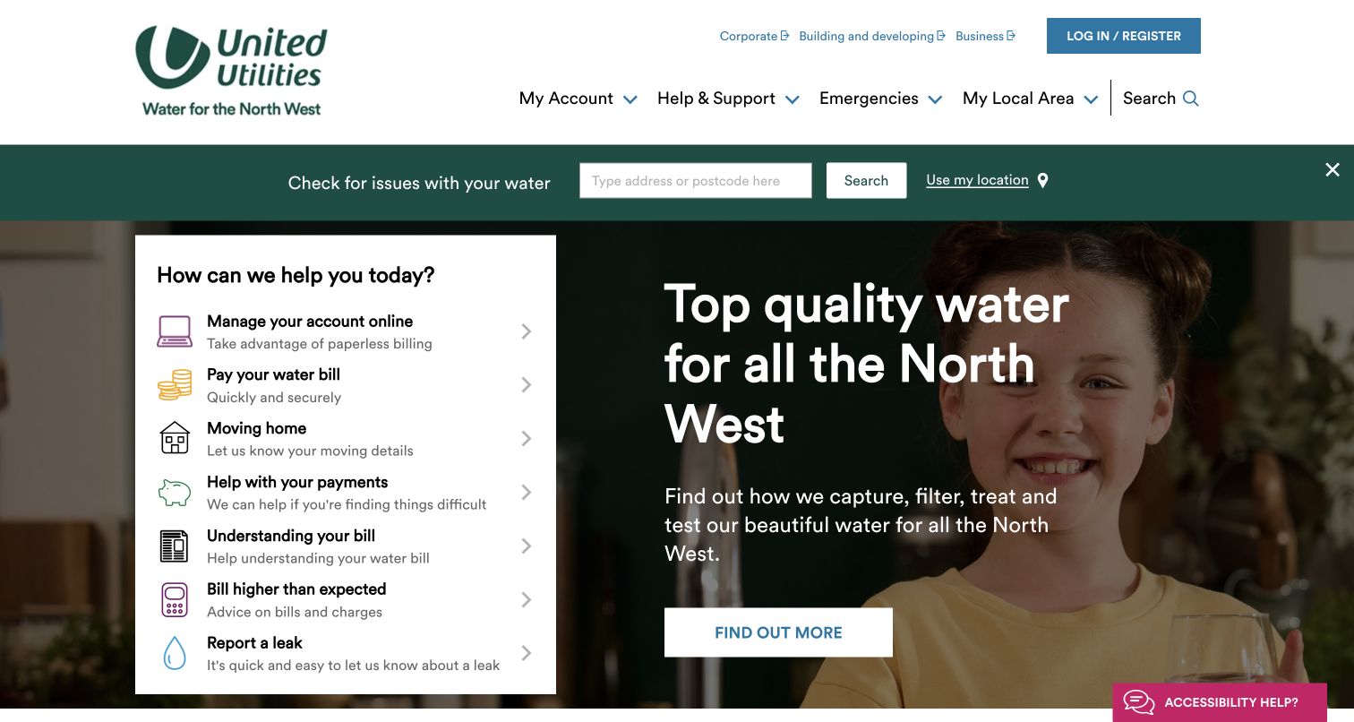
United Utilities starts its practical experience with an address or postcode search for local issues, positioned in a green strip above the main image. The hero itself pairs a water-quality message and photograph with a white panel of common requests. Paying, moving, understanding a bill, and reporting a leak can therefore sit alongside a broader explanation of the company's work. The panel reads more like a compact service directory than an advertising call to action, which suits an audience whose next steps vary widely.
What you can learn
Put location-dependent information where visitors can find it without committing to account login. A short menu of tasks can share a hero with a public-information story, provided that each task remains readable and the two purposes have clear visual boundaries.
Pros
The local-search strip establishes a direct route to geographically relevant information.
Bill explanation and high-bill support appear alongside payment rather than being hidden as secondary topics.
Cons & considerations
The number of links in the service panel requires careful spacing on smaller screens.
A photograph and a dense task list compete for attention within the same prominent area.
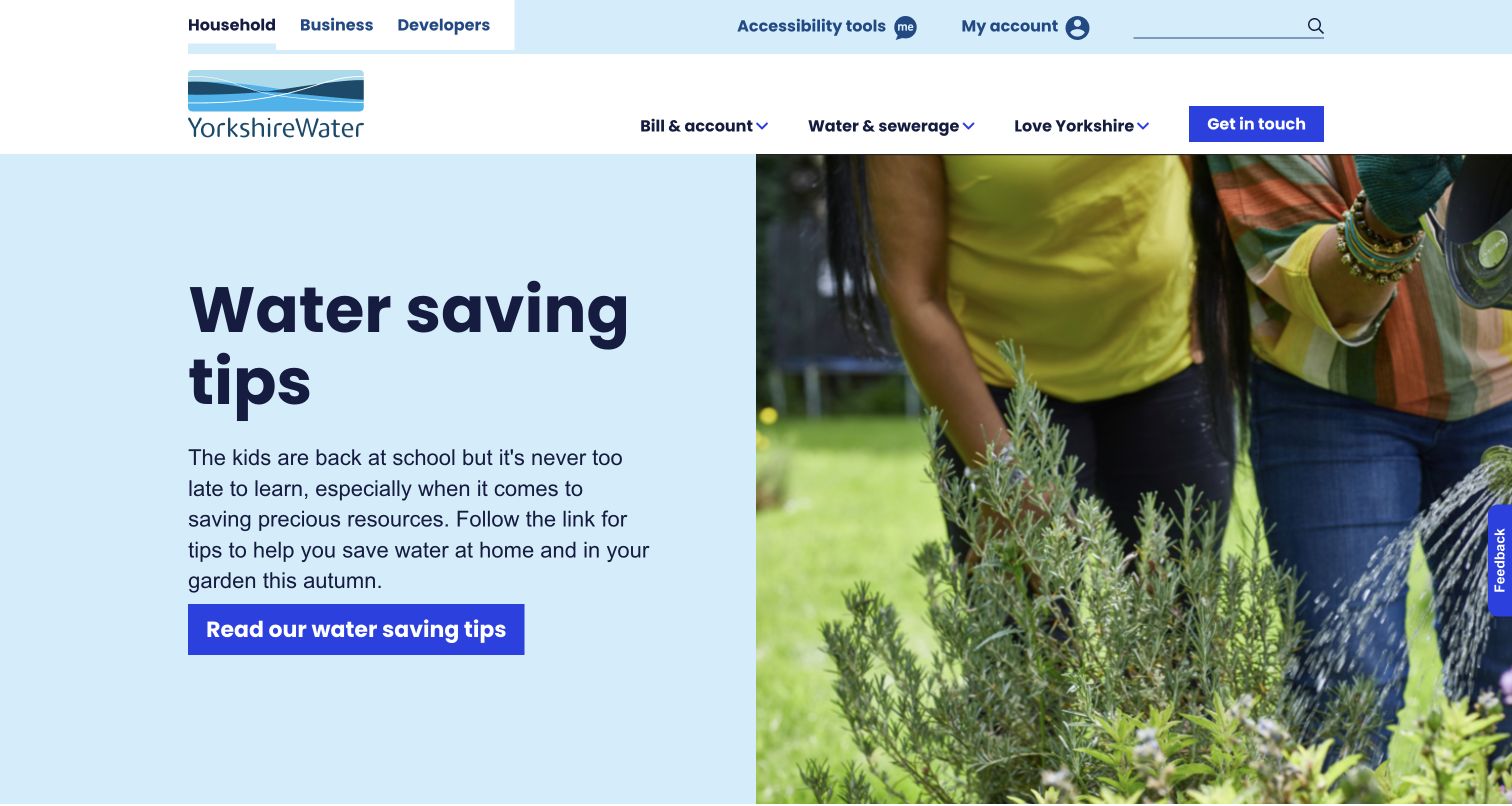
Yorkshire Water uses a clean split hero: oversized dark text on pale blue sits beside a gardening photograph. The water-saving message has one specific action, while account access and contact remain in the header. Household, business, and developer audiences are separated in a narrow upper row, with a shorter main navigation for bills, water services, and regional information. The design gives the conservation story considerable breathing room. The tradeoff is that practical tasks farther down the page are less immediately visible than the seasonal campaign.
What you can learn
A focused educational hero works best when routine account and support routes remain obvious outside it. Give each conservation campaign one understandable destination, and ensure the underlying task navigation still works when that seasonal story is replaced.
Pros
The split layout makes the headline and action easy to distinguish from the photograph.
Audience links separate household needs from business and development work without expanding the main menu.
Cons & considerations
The tall hero delays the broader list of everyday service shortcuts.
Visitors with an urgent supply problem must rely on the navigation rather than a prominent incident panel in this captured view.
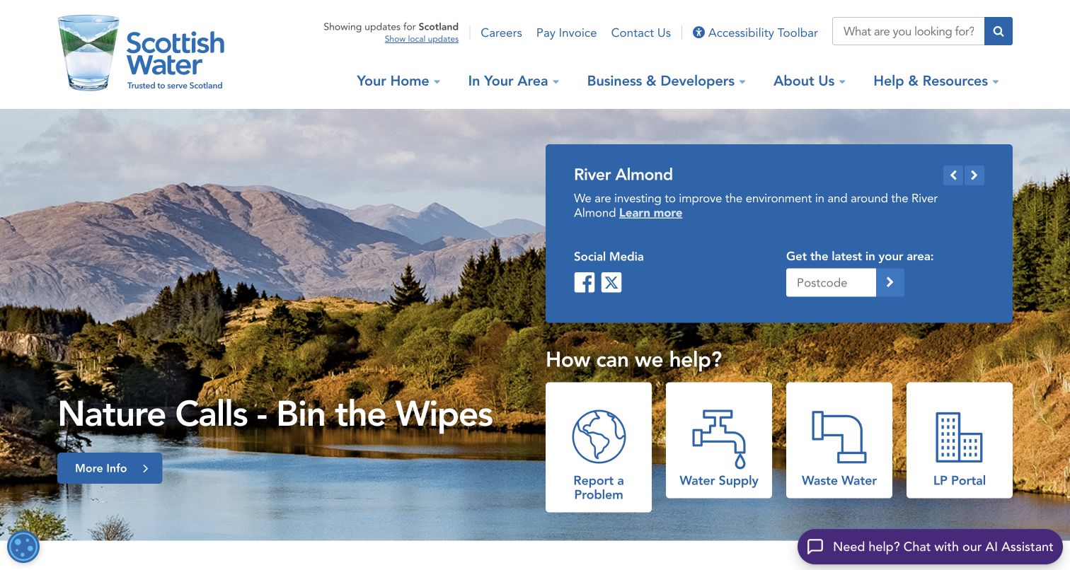
Scottish Water layers several useful functions over a landscape photograph. A large blue panel offers a regional news item and postcode lookup, while four white tiles underneath lead to problem reporting, water supply, wastewater, and the LP Portal. The environmental campaign sits separately on the left. This arrangement connects the organization's landscape identity to actual service routes, although the combination of campaign, news, social links, location field, and task tiles asks the visitor to scan several competing clusters. The visible portal abbreviation also assumes more prior knowledge than the other labels.
What you can learn
Use regional imagery to establish context, then give operational tools their own solid surfaces and legible labels. Where a specialist portal shares space with household services, explain its audience instead of relying entirely on an abbreviation.
Pros
The postcode field makes local information accessible from the main hero.
White service tiles remain visually distinct against the detailed landscape background.
Cons & considerations
Social links and rotating news add secondary choices beside the urgent service routes.
The LP Portal label communicates less to a first-time visitor than the neighboring plain-language tasks.
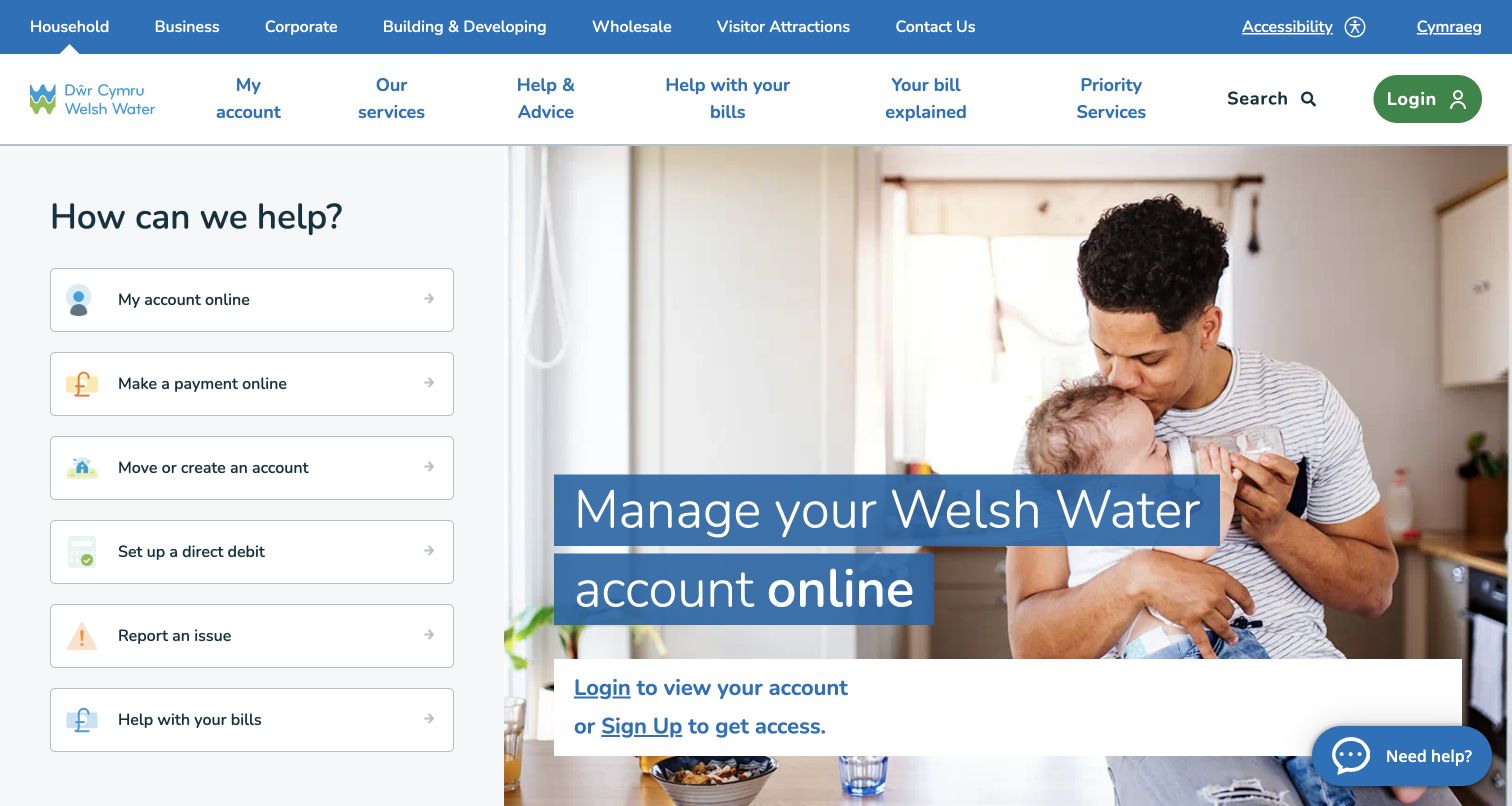
Dŵr Cymru Welsh Water places a vertical stack of common service actions beside a family photograph and an online-account invitation. The left-hand menu covers account access, payment, moving, direct debit, problem reporting, and bill support, giving the page a practical entry point before a visitor reads the promotional message. The header accommodates several audiences and a Welsh-language route. The account panel provides login and signup choices directly within the hero, while subsequent material broadens into investment and customer support. This makes the opening feel oriented around repeat use.
What you can learn
Keep the everyday transaction menu stable while allowing the adjacent campaign to change. Billing assistance should appear close to payment actions so a customer who cannot complete the ordinary route has an equally visible way to seek help.
Pros
The vertical service list exposes several common jobs without requiring a menu expansion.
Language and audience choices remain identifiable above the main household experience.
Cons & considerations
Account entry appears in more than one place, adding repetition within a compact opening.
The number of audience and service links requires disciplined ordering to avoid overwhelming a new visitor.
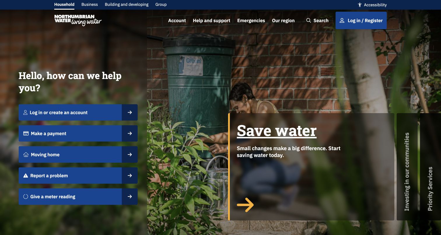
Northumbrian Water puts a friendly question and five blue action buttons on the left of its photographic hero. Logging in, paying, moving, reporting, and submitting a reading have explicit labels and matching arrows. A larger conservation panel occupies the right, with additional vertical campaign headings beside it. The page therefore keeps its transaction routes in one steady column while the editorial surface can carry different topics. Its dark photographic treatment adds atmosphere, but the layered panels and sideways headings are more visually complex than a simple grid.
What you can learn
Separate recurring customer jobs from changing editorial panels at the component level. Keep the task column readable across every background image, and give secondary campaigns ordinary text links as well as decorative or rotated presentation.
Pros
The five action buttons use verbs that correspond to recognizable customer intentions.
The task column remains independent of the large conservation story beside it.
Cons & considerations
Multiple translucent areas over a detailed photograph increase visual density.
Vertical campaign headings are less immediately scannable than the horizontal task labels.
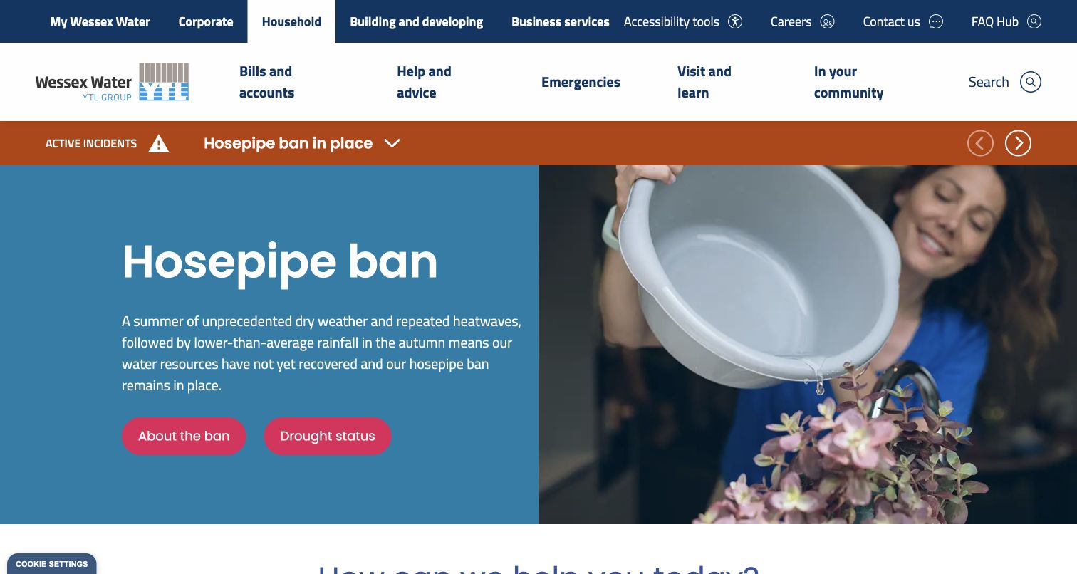
Wessex Water gives its drought and hosepipe information a large blue-and-pink hero beside a water-reuse photograph. Separate buttons lead to the restriction explanation and drought status, while an orange notice band sits above the main panel. The broader page also exposes moving, reporting, payment, online billing, and local works. The important design choice is that a temporary operational story receives more emphasis than an evergreen brand welcome. That can make the current issue easier to find, but it also raises the need for careful expiry and scope management.
What you can learn
Build temporary operational campaigns from reusable components with a clear owner, geographic scope, and review date. Keep the ordinary customer task routes available below or beside the campaign so a widespread notice does not absorb the entire service experience.
Pros
Separate restriction and drought-status links distinguish two related but different information needs.
Strong colored surfaces make the main message readable without relying on the photograph.
Cons & considerations
The campaign occupies most of the first viewport, delaying routine service actions.
A large operational message can mislead later visitors if its wording and status are not maintained promptly.
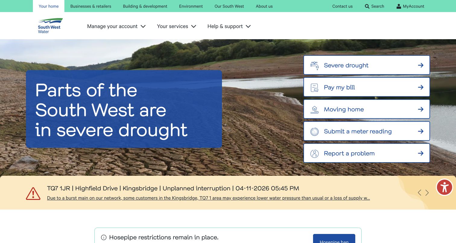
South West Water combines a prominent drought message with a fixed-looking white panel of shortcuts on the right. The panel includes drought information, payment, moving, meter readings, and problem reporting. A yellow local incident strip underneath gives the wider campaign an operational counterpart with named places and update information. The photograph establishes the topic, while solid blue and white panels hold the text. This makes a useful distinction between a broad regional condition and the specific service interruptions that may affect a customer's immediate plans.
What you can learn
Design broad resource notices and local incident updates as related but separate information types. Keep key transactions in a stable shortcut module during both normal and exceptional periods, and use clear geographic labels to help visitors judge relevance.
Pros
The white shortcut panel preserves common actions next to the main drought message.
The local incident strip creates a separate route for more specific service information.
Cons & considerations
Several notice colors and panels make the first screen information-heavy.
A large seasonal photograph and headline can still dominate a visitor who only needs a routine account task.
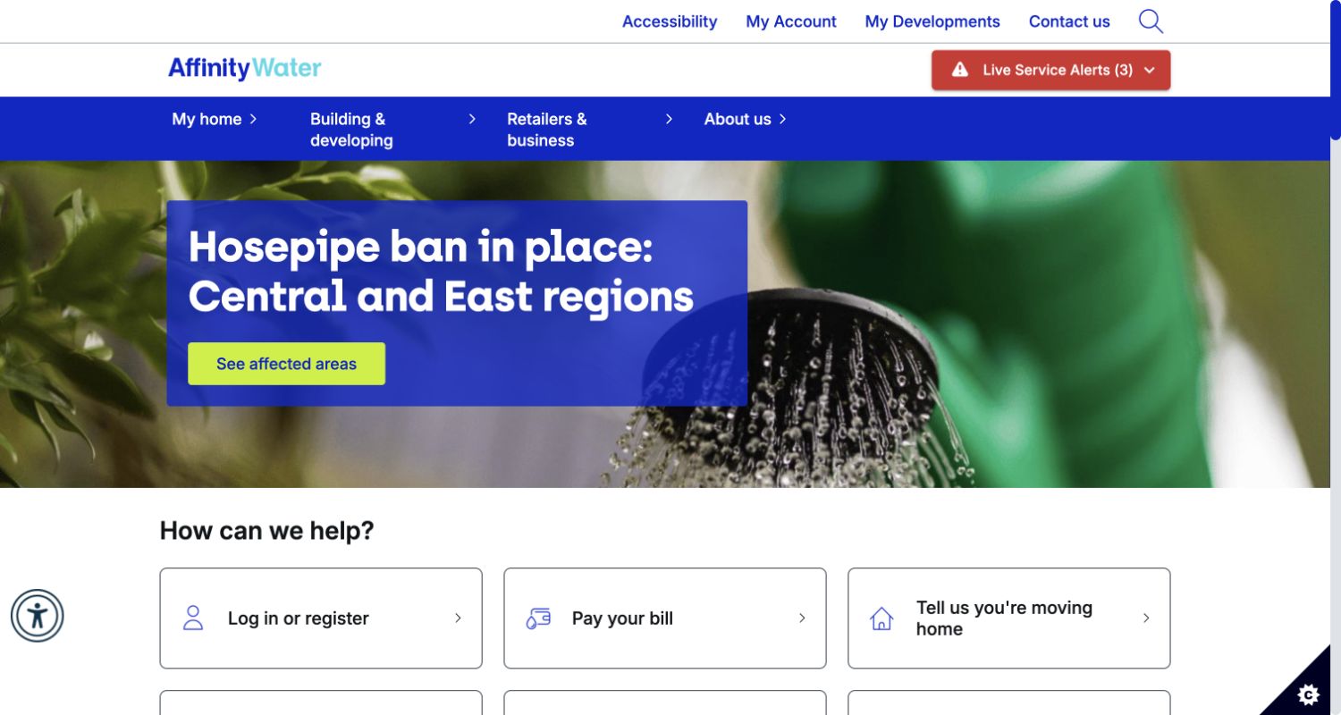
Affinity Water's homepage uses a gardening photograph, a strong blue information block, and a bright yellow button directing visitors to affected areas. The message focuses on restrictions rather than a general corporate introduction. A red alert indicator remains visible in the header, and the beginning of the service-card row appears below the hero. Account access, developments, contact, and accessibility routes are also visible. The distinction between the main restriction story and the separate alerts gives the visitor multiple ways to recognize that location matters before acting.
What you can learn
When an announcement does not apply uniformly, make the affected-area check an obvious next step rather than burying it in explanatory copy. Keep alerts and standard account tasks available around the campaign, with enough context to distinguish their purposes.
Pros
The contrasting affected-area button turns a broad announcement into a specific next action.
An alert count offers an additional visible entry point for operational notices.
Cons & considerations
The restriction story takes precedence over routine task cards in the first view.
Alerts and the hero may cover related subjects, so their labels need coordination to avoid duplicate journeys.
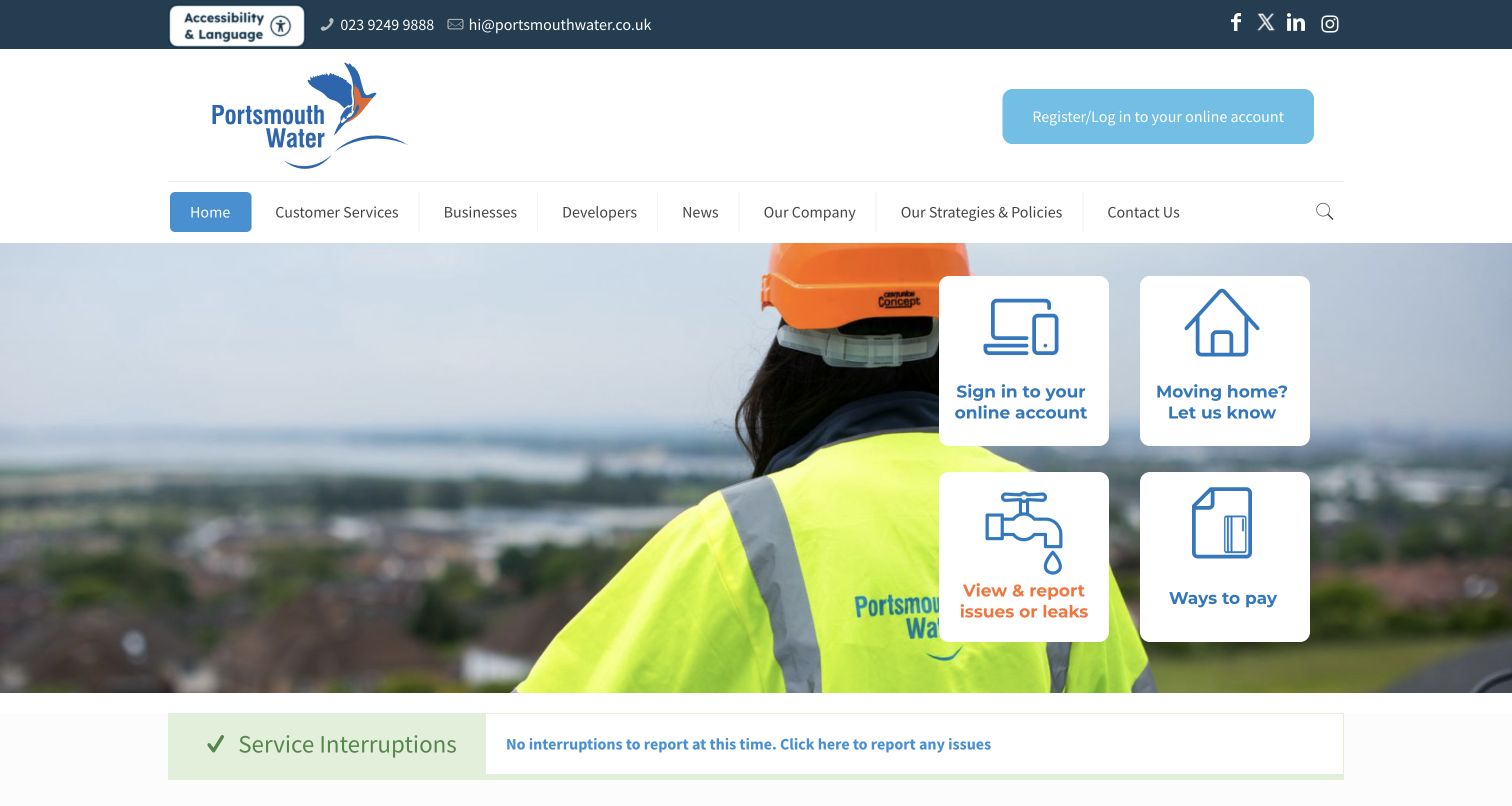
Portsmouth Water uses a photograph of an employee in safety clothing as the background for four large white task cards. Signing in, moving, reporting a leak, and paying are therefore the first substantial actions in the hero. Contact details are visible in the upper strip, and a service-interruption section follows immediately below. The page does not require a long brand explanation before presenting assistance. Its layout also shows the value of saying what the current interruption state is, rather than offering only an unexplained link to a map.
What you can learn
Give common transactions priority and place a clearly maintained interruption summary close to them. Visible contact information offers a useful fallback, especially when an online journey cannot address the customer's particular situation or the visitor cannot use the account portal.
Pros
Large cards make the four principal customer actions easy to scan independently of the photograph.
The nearby interruption summary helps bridge ordinary transactions and urgent support.
Cons & considerations
The image-led hero leaves limited room to explain less familiar service tasks.
A status summary requires an explicit maintenance process so the displayed condition remains dependable.
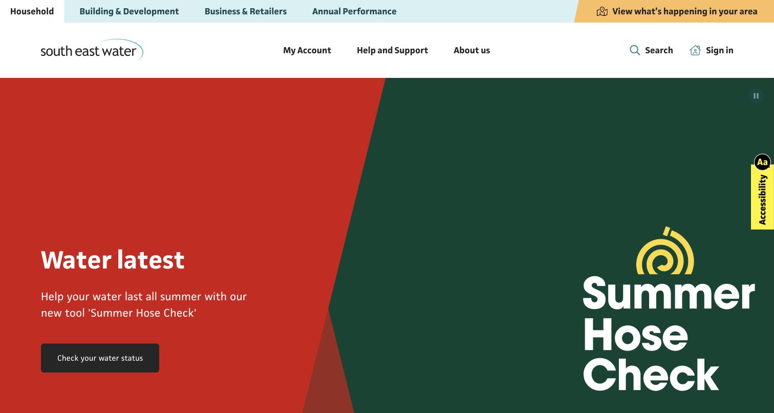
South East Water pairs oversized campaign graphics with a clearly labeled water-status action. In the captured carousel slide, red and green fields carry the Summer Hose Check message with little photographic detail. Above it, a yellow link to local activity remains separate from the hero, while account, help, and sign-in options sit in the white header. The composition makes the promoted tool hard to miss. At the same time, a large carousel can delay other customer tasks and requires its seasonal language to be reviewed as circumstances change.
What you can learn
Keep area-specific operational access outside a rotating campaign so its position stays predictable. Use campaign artwork to attract attention, but write the action label around what the tool actually tells a customer and maintain its seasonal context carefully.
Pros
The persistent yellow area link supplies a visible route beyond the current carousel slide.
Large typography and flat color fields make the promoted action visually unmistakable.
Cons & considerations
The tall carousel pushes general service shortcuts farther down the page.
Seasonal campaign wording can outlive its usefulness unless the content has a scheduled review and replacement.
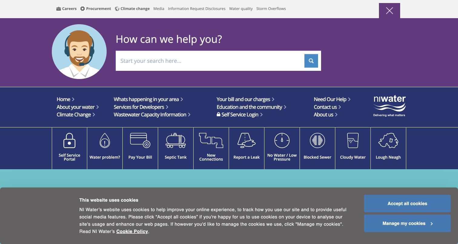
Northern Ireland Water opens with a large support-search area and a dense but explicitly labeled row of service icons. The visible choices include the self-service portal, water problems, bills, septic tanks, new connections, leaks, low pressure, blocked sewers, and cloudy water. This breadth acknowledges that water-service visits are not all billing visits. A cookie notice occupies the bottom of the captured viewport, reducing the space available for the following content; the navigation and task row remain visible. The design is strongest as a catalogue of recognizable problems.
What you can learn
Use customers' descriptions of a problem to name support routes, then connect those routes to the correct reporting or guidance journey. A broad taxonomy needs clear grouping and a compact consent experience so many useful choices do not become a wall of options.
Pros
Specific problem labels help visitors avoid translating their issue into internal organizational terminology.
Search is prominent enough to offer an alternative to scanning the long service row.
Cons & considerations
Ten neighboring service icons create a demanding horizontal scan in the desktop view.
The nonblocking cookie notice consumes a substantial part of the initial viewport in this recorded state.
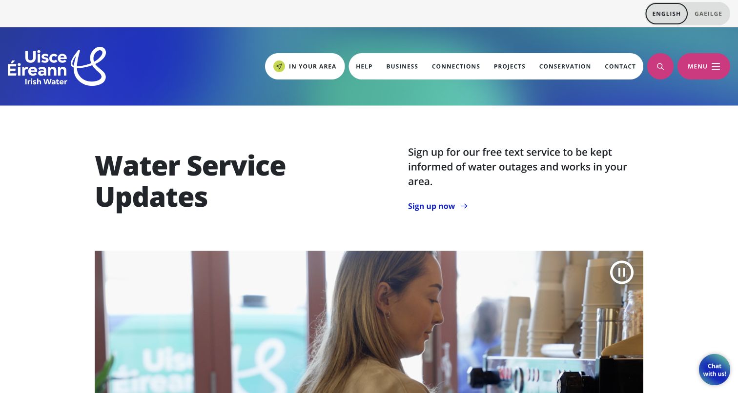
Uisce Éireann gives water-service updates a spacious two-column introduction, with the heading on one side and a concise explanation plus signup link on the other. A video follows below with a visible pause control. The colorful header keeps an In your area route separate from the main help, business, connections, projects, conservation, and contact links. Elsewhere on the public homepage, supply updates and water-quality tools appear as distinct services. The opening concentrates on learning about interruptions proactively, although someone arriving with an existing problem may prefer a faster route to the local lookup.
What you can learn
Explain the purpose and local relevance of an alert subscription before asking people to join. Keep current outage information equally discoverable, and make video supplementary to the text so the service proposition remains understandable without watching it.
Pros
The heading, explanatory copy, and signup action form a simple and readable sequence.
The prominent In your area link provides a direct alternative to the subscription story.
Cons & considerations
The video occupies substantial vertical space before other service tools come into view.
Subscription promotion and immediate interruption lookup need distinct labels to prevent a mistaken detour.
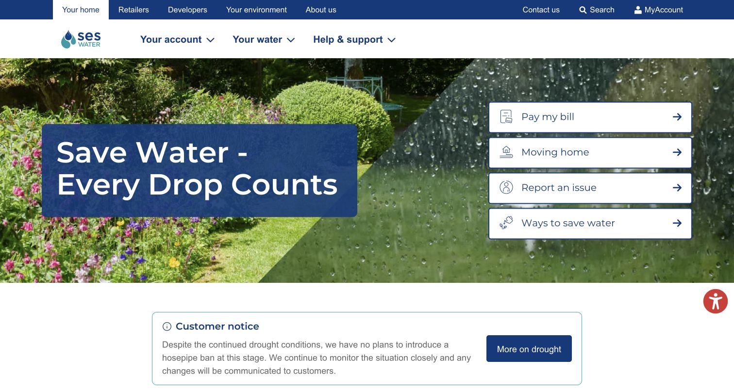
SES Water combines a garden photograph and a large conservation headline with four white quick links: paying, moving, reporting, and saving water. Immediately below, a bordered customer notice clarifies the supplier's stated position on restrictions at the time of capture. This is a useful relationship between a broad behavioral campaign and a more precise operational statement. The main navigation is short, grouping account, water, and support topics, while audience links sit above. The homepage presents several ways to help without placing a large account-registration message ahead of everything else.
What you can learn
Place a concise status clarification near a conservation campaign when visitors may otherwise infer that a restriction applies. Separate that statement from general advice, keep its publication context current, and retain direct payment and reporting routes throughout the campaign.
Pros
Four large shortcuts cover different intentions without creating an oversized service menu.
The bordered customer notice adds context to the general water-saving headline.
Cons & considerations
The large photograph leaves the status clarification near the bottom of the first screen.
An undated-looking status statement needs disciplined editorial review when regional conditions change.
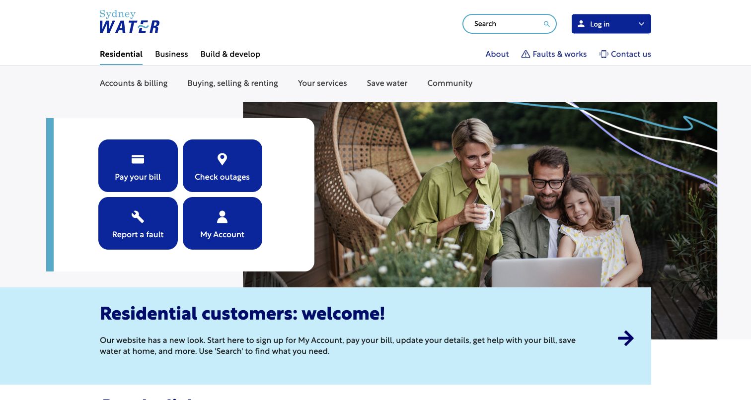
Sydney Water places four bold blue service tiles in a white panel overlapping a family photograph. Paying a bill, checking outages, reporting a fault, and entering My Account receive equal treatment. A pale-blue introduction underneath identifies the residential audience and explains the site's service scope. The upper navigation separates Residential, Business, and Build & develop, with a second row for residential topics. The arrangement is effective because the campaign image does not determine the task hierarchy: the four customer actions remain the most concrete objects in the opening view.
What you can learn
Use a small, consistent group of high-frequency tasks as the front door, then confirm the audience and offer deeper categories. Keep checking an existing outage separate from reporting a new fault so visitors can choose the appropriate route immediately.
Pros
Outage checking and fault reporting are adjacent but separately named actions.
The audience navigation establishes which content set the visitor is currently viewing.
Cons & considerations
Two navigation rows add height before the principal service panel.
The general welcome announcement below the hero competes with further useful links for returning visitors.
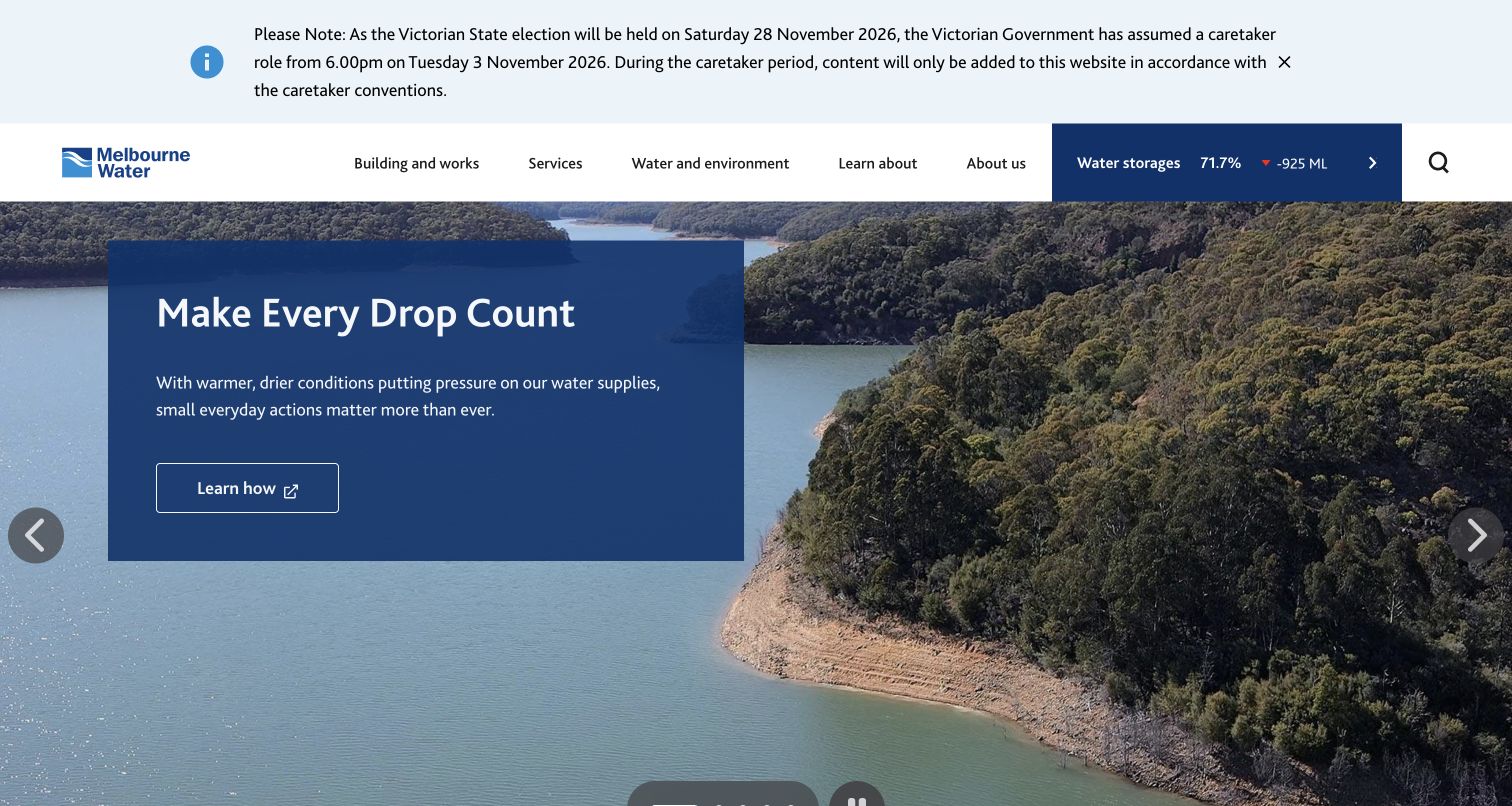
Melbourne Water gives water-storage information a dedicated block in its main header, combining a percentage, change figure, and link to more detail. A reservoir photograph and conservation campaign fill the hero beneath an institutional notice. The navigation emphasizes building, services, water and environment, learning, and organizational information rather than a household billing portal. That distinction matters: this is a useful reference for a water organization whose public website must explain infrastructure and stewardship. The large rotating hero carries the campaign, while the storage indicator offers a more specific data-oriented entry point.
What you can learn
Match the homepage to the organization's actual service role rather than borrowing a billing-first template indiscriminately. When presenting live-looking metrics, link to context and update information, and provide an understandable fallback if the data has not loaded.
Pros
The storage indicator creates a compact route from a headline metric to deeper information.
Navigation categories reflect infrastructure, environment, and education responsibilities.
Cons & considerations
The institutional notice and tall hero leave little immediate room for detailed service links.
A numerical status widget requires careful loading and freshness behavior to avoid misleading temporary values.
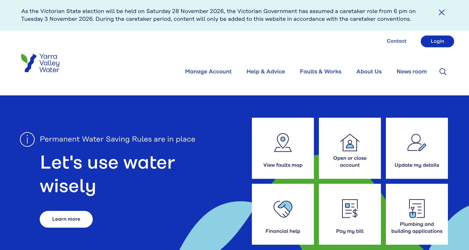
Yarra Valley Water uses a saturated blue hero with a simple water-saving message on the left and six white service tiles on the right. The tiles include faults, account changes, personal details, financial help, payment, and plumbing or building applications. The equal treatment makes financial help part of the ordinary service experience. Above, the navigation remains short and contact and login have their own positions. A substantial public notice is visible at the top, illustrating how temporary institutional messaging can alter an otherwise efficient opening layout.
What you can learn
Treat support and hardship routes as first-class services alongside payments and account maintenance. A balanced tile grid can accommodate both household and property tasks, but the order and grouping should remain understandable when temporary notices reduce the available screen space.
Pros
Financial help receives the same visual weight as payment and account actions.
Solid backgrounds and spacious tiles create strong separation between the campaign and service choices.
Cons & considerations
Six equally prominent tasks give little indication of which route is most commonly needed.
The large notice and generous header spacing push the lower tiles toward the viewport edge.
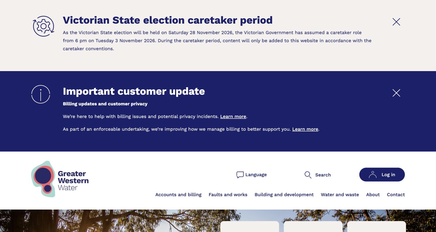
Greater Western Water's captured homepage begins with two large public notices before the logo and main navigation. One concerns the institutional publishing period; the other directs customers to billing updates and related information. This is a striking example of notices controlling the first impression: the reservoir image and service tiles begin only near the bottom of the screen. The underlying page still includes paying, moving, fault reporting, billing updates, and payment support, with separate residential and business content farther down. The notices are visible, but their combined height carries a substantial usability cost.
What you can learn
Give significant customer notices clear prominence, then manage their cumulative height. A concise summary with descriptive links and a deliberate dismissal pattern can retain transparency while keeping urgent reporting and payment-support routes reachable in the first screen.
Pros
Important customer updates are directly visible before any promotional content.
Billing updates and payment support also appear as practical destinations in the underlying task set.
Cons & considerations
Two expansive notices consume most of the opening viewport before the main website header.
The cumulative banner height makes ordinary customer services less immediately discoverable in this recorded state.
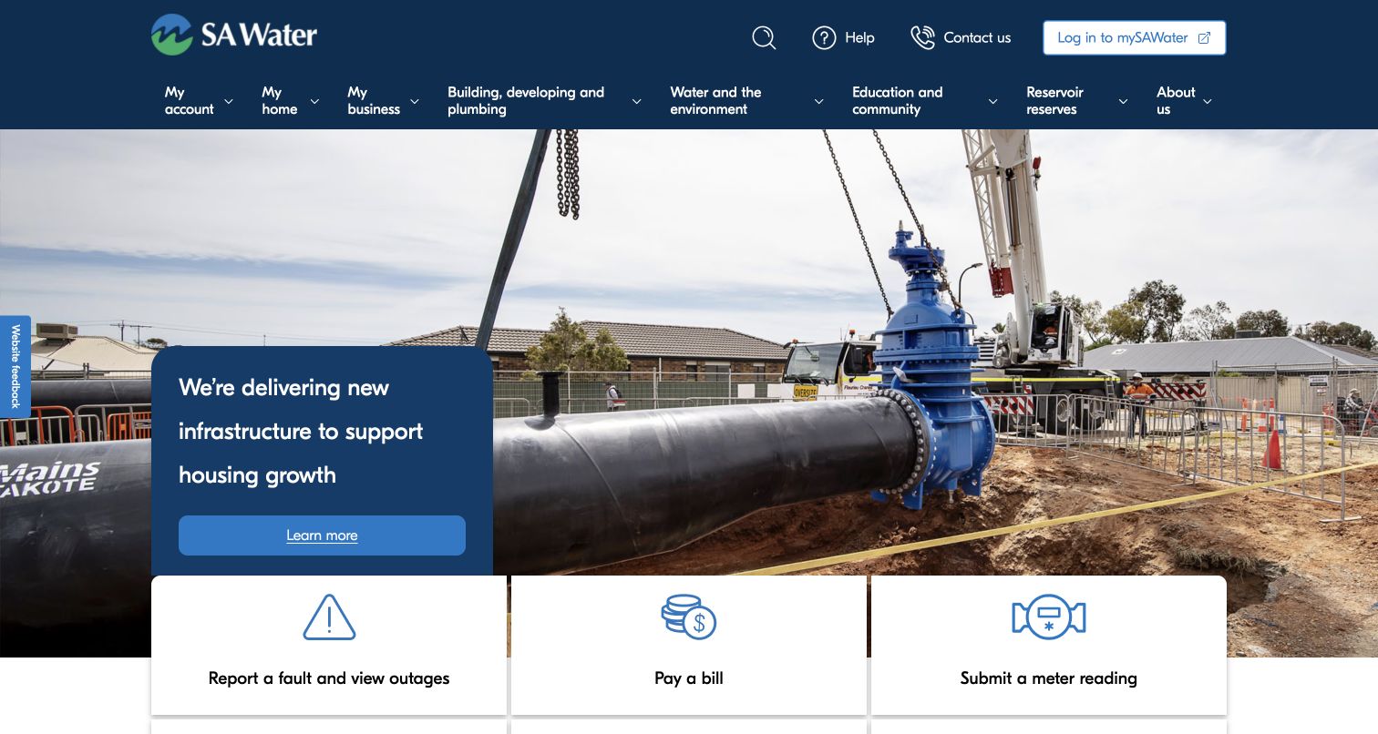
SA Water uses a large construction photograph to show a water-main project, with a compact blue message about infrastructure and housing growth. White action cards overlap the bottom of that image, beginning with faults and outages, bill payment, and meter readings. The navigation spans account, home, business, development, environment, education, and reservoir topics. The project image makes the organization's physical work tangible, while the cards prevent that story from becoming the only entry point. The breadth of the header also reflects the challenge of serving several specialized audiences from one homepage.
What you can learn
Pair an infrastructure story with immediate routes to the services people use today. Keep the project explanation short at the homepage level, then use a dedicated page for scope, location, progress, and customer impact rather than adding more detail to the hero.
Pros
The construction photograph provides concrete context for the investment message.
The overlapping cards introduce faults, payments, and readings before the project story ends.
Cons & considerations
The broad navigation requires visitors to distinguish among several overlapping audience and topic categories.
A tall image means only the first row of service actions is fully apparent in the initial view.
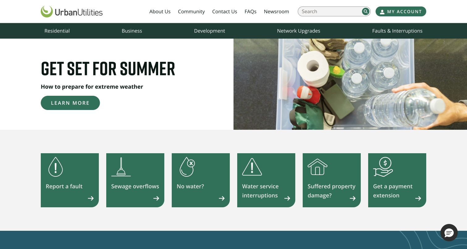
Urban Utilities places a summer-preparedness story above a row of six green service cards. The choices use the language of customer situations: report a fault, sewage overflows, no water, service interruptions, property damage, and payment extensions. This creates a more specific front door than a generic contact link. A local interruption lookup and pricing explanations follow on the page. The restrained green-and-white treatment makes the cards easy to distinguish from the photograph, while the large number of related problem routes requires careful explanations after the click.
What you can learn
Describe service journeys using recognizable situations, especially when a weather event can produce several different kinds of problem. Keep reporting, checking known interruptions, and seeking payment help distinct, then explain the next step and expected response within each journey.
Pros
The service cards name concrete problems and support needs in ordinary language.
A clear visual break separates the preparedness campaign from the practical action row.
Cons & considerations
Related fault and interruption routes could confuse visitors unless their destination pages clarify the difference.
Six equal cards provide breadth but little prioritization for the most urgent situations.
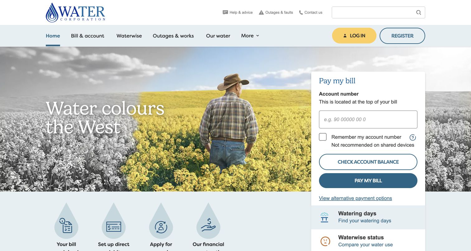
Water Corporation places a payment panel directly in the hero beside a regional landscape image. It asks for an account number, explains where to find it, offers balance and payment actions, and links to alternative payment methods. The remember-account option includes a warning about shared devices. None of those fields or actions were submitted for this review. Outside the panel, outages, help, contact, login, and registration remain available. The design makes payment exceptionally concrete, though other service priorities must compete with a relatively large form.
What you can learn
When a transaction begins on the homepage, explain the requested identifier, offer alternative routes, and state the implications of remembering details. Keep error handling and completion screens within the full design brief; a clear entry panel alone does not establish that the transaction is easy or reliable.
Pros
The account-number help text reduces ambiguity about what the payment panel requires.
Alternative payment options are linked beside the primary route rather than hidden in the footer.
Cons & considerations
The form claims a large share of the hero even for visitors who are not paying.
The public screenshot cannot establish the usability or reliability of the subsequent account and payment flow.
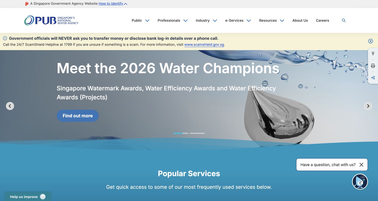
PUB's homepage establishes its government-agency identity in a small upper strip and separates Public, Professionals, Industry, e-Services, and Resources in the main navigation. A scam-awareness notice appears before a large water-awards campaign. The popular-services section begins below, with destinations covering licensed plumbers, tours, payments, and venue use. This is a broader civic-services model than a household account homepage. Its advantage is clear institutional scope; its challenge is that campaigns, notices, utility services, and visitor activities all compete for the first few screens.
What you can learn
Organize a national agency website by the audiences and services it actually supports, and provide clear definitions for broad e-service categories. Keep public-interest campaigns connected to practical service discovery so users can move directly to their task without interpreting the entire institutional agenda.
Pros
The government identity and audience categories establish the site's scope quickly.
The popular-services area uses specific destinations rather than an undifferentiated contact action.
Cons & considerations
The award campaign occupies most of the initial view before the service list.
Several floating utility and chat controls add visual competition around an already busy hero.
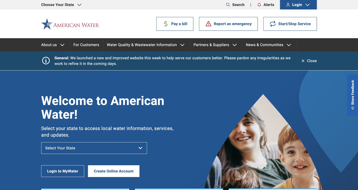
American Water makes selecting a state the main action in its blue welcome panel. The explanation tells visitors that local water information, services, and updates depend on that choice. Above it, three outlined shortcuts for payment, emergencies, and starting or stopping service remain available, with alerts and login in the upper strip. The captured page also contains a notice about the website's recent launch. This structure separates geographic routing from common tasks, allowing a national brand to acknowledge that service details differ by operating area.
What you can learn
Explain why a location selection is necessary and keep genuinely shared tasks available while the visitor chooses. Preserve the selected jurisdiction through later pages, and label local content clearly so the national shell does not create the impression that every rule or service is uniform.
Pros
The state selector is accompanied by a plain explanation of the information it controls.
Emergency reporting has a prominent shortcut independent of the main geographic selection.
Cons & considerations
The large welcome panel adds an extra decision before local information becomes visible.
Launch notices and several header tiers consume space that could otherwise introduce local service status.
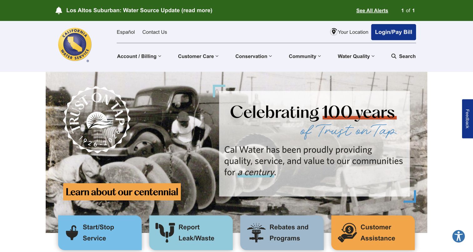
California Water Service uses a centennial photograph and large anniversary message to tell a heritage story, but keeps a green alert band above the header and four service cards along the bottom of the hero. Starting or stopping service, reporting leaks or waste, rebates, and customer assistance each have a distinct tile. Location selection, Spanish-language access, and login or payment are visible in the header. The opening therefore combines brand history with practical routes, though the anniversary artwork takes considerably more space than the actions themselves.
What you can learn
A heritage campaign can support familiarity without replacing service navigation. Keep alerts, location context, language access, and assistance visible around the story, and ensure the campaign has a replacement plan so the homepage remains useful after the anniversary ends.
Pros
Customer assistance receives a contrasting tile alongside routine service and conservation actions.
The alert band stays separate from the anniversary campaign and names the affected locality.
Cons & considerations
The large heritage treatment delays deeper explanations of service tasks.
Location-dependent alerts require careful context so visitors do not assume every displayed notice applies to them.
Plan the water utility website around real customer situations
Map the urgent and routine journeys separately
Write scenarios for someone with no water, someone checking known works, a customer who needs payment help, a person moving, and a contractor requesting a connection. Identify what each person knows when they arrive, which department or system owns the next step, and how they can recover from a wrong choice. Define success as reaching useful information or a clear service handoff; do not measure only clicks on the hero.
Create one structured source for service notices
Model notices with a type, scope, affected locations, operational status, publication time, last review, owner, and expiry behavior. Make the same record available to the homepage, local search, map, and detail page so wording does not drift between them. Plan for an incident that has no estimated resolution, a withdrawn notice, overlapping works, and a map that cannot load. Keep a readable list alternative.
Design the portal handoffs as part of the website
Inventory account, payment, moving, reporting, and development portals. Document what information each asks for and which tasks can start without login. Make external destinations clear and preserve a recognizable route back to public help. Use approved test accounts and nonproduction services for transaction testing; do not use real customer details or submit real reports as design QA. Include validation, timeout, error, and confirmation states in the design brief.
Assign owners to seasonal and sensitive content
Give conservation campaigns, restriction information, assistance programmes, and contact details named editorial owners and review schedules. Separate the design team's observations from the utility's authoritative operational guidance. Test the homepage with several simultaneous notices and a small screen before launch. Retire expired campaigns without breaking bookmarked advice pages, and keep the date and geographic context close to statements that can change.
The editing job behind the design
Choose tools that keep public information dependable
Start with a content model that supports location, notice status, review dates, and reusable task links. The CMS should let authorized editors publish and correct a service notice quickly, preview its mobile presentation, and retain an editorial history. Keep content publishing permissions separate from access to customer accounts. A map or search service should support a usable text alternative and an intelligible empty or unavailable state.
Treat the public website, customer portal, payment provider, and operational reporting systems as distinct parts of the experience. Define ownership for each handoff and avoid duplicating sensitive information in general analytics. Test the public shell when an embedded tool fails or loads slowly. Public stack observations can reveal some delivery, script, analytics, font, or content tooling, but they do not prove hidden billing or operational systems. Choose integrations for a defined customer task and a supportable maintenance process.
Our WordPress website examples offer a separate look at publishing approaches. A visible platform label is evidence for that named page, not a guarantee that the same system will suit your requirements.
Before the public launch
Water utility website launch checklist
Confirm that the organization's service responsibilities and geographic coverage are understandable from public pages.
Make incident lookup and new-problem reporting separate, clearly named routes.
Give operational notices a scope, status, owner, and visible update context.
Provide a manual location lookup and an accessible text alternative to map-only information.
Keep payment assistance and contact options near payment and account tasks.
Explain portal handoffs and required identifiers before a visitor starts a transaction.
Review keyboard operation, focus order, labels, contrast, and reduced-motion behavior across the main journeys.
Check the first mobile screen with multiple notices, long place names, and a visible consent interface.
Verify empty, stale, slow, and unavailable states for maps, search, account entry, and embedded services.
Assign review dates to campaigns and service guidance, and test permanent links when a notice or campaign expires.
These checks are a project checklist, not a performance, legal, security, or accessibility certification. Test real journeys with the people responsible for the website before making claims about the result.
Sources & editorial method
How this collection was selected and reviewed
The collection contains twenty-five distinct official water-organization websites captured directly in the browser during the November 4, 2026 evening research session in America/Los_Angeles (November 5 UTC). Each record retains its actual UTC capture date, source URL, image dimensions, and attribution. Reviews are based on the visible desktop interface and recorded public page text; no real payments, reports, account changes, location requests, or other forms were submitted. Blocked pages were excluded. Northern Ireland Water retains its visible nonblocking consent notice. Technology observations are handled separately through documented public-source audit attempts.
Each example links to its actual source page. Screenshots are direct browser captures with their own capture dates; moving imagery, announcements and live designs can change. The notes describe observable design choices and conditional tradeoffs, not measured traffic, conversion results, service quality, or accessibility conformance.
Technology labels use public page metadata, asset evidence, or explicitly cited platform documentation. Platform documentation is not a complete current deployment audit. A component reference may be legacy or unused; it is not a complete backend inventory. Unknown stacks are omitted. These sites are editorial examples, not our client portfolio.
Written, Edited and Curated are separate editorial records, not timestamps advanced by a rebuild. Website designs and imagery belong to their owners. See our editorial standards or suggest a correction.
Questions worth asking
Water Utility website design questions
What should a water utility homepage show first?
Prioritize the tasks and information that match the organization's role. A household supplier usually needs clear routes to incidents, reporting, bills, accounts, moving, and support. An infrastructure or national agency may need different primary services. Preserve urgent access even when the main hero promotes conservation, investment, or a seasonal campaign.
Should customers have to log in to see an outage?
Public service information should generally be discoverable through a clearly scoped area lookup without account access. Explain which locations a notice covers and what is known about its status. Keep customer-specific details within the appropriate authenticated service, and provide contact guidance when the public information does not answer the person's situation.
How can a utility keep a map useful for everyone?
Offer a searchable or filterable text list that uses the same incident records as the map. Make locations and statuses understandable without relying only on pins or color. Include loading, unavailable, and no-results states, and let users enter a location manually. Test the experience with keyboard and assistive technology as part of a broader accessibility review.
How much space should a service notice occupy?
Enough to identify the subject, affected area, and next action without hiding all other essential routes. A severe or widespread issue may deserve substantial emphasis, but the combined height of several notices should be tested. Use concise summaries linked to maintained detail pages and define which notices can be dismissed.
What can these screenshots tell us about technology?
They show the public interface at a recorded moment. Some public resources may separately support observations about scripts, fonts, analytics, delivery, or content tooling. A screenshot does not identify every backend, establish a complete architecture, or demonstrate the reliability of billing and reporting systems. Use documented evidence with its date and scope.
Borrow the pattern that makes a real customer situation easier to handle, then support it with accurate local information, predictable service routes, and content your team can keep current.