Best Book Illustrator Websites of 2026 (12 Real-World Examples)
Real book-illustrator portfolios showing how to present a visual voice, explain published work and make the right inquiry easy.
A book illustrator’s website should let someone recognize the work, understand the storytelling and find the person behind it.
A striking image can begin the conversation, but an art director needs more than a collection of attractive thumbnails. Useful portfolios explain which books are published, who collaborated on them and how an illustration works across a sequence. Readers, teachers and event organizers arrive with different questions, so those routes need a little structure too.
These examples range from compact personal portfolios to extensive publication archives and multidisciplinary artist websites. Some lead with covers, others with interior artwork or a studio introduction. Compare their decisions about image scale, project context and navigation rather than treating one visual style as the right answer for every illustrator.
Before the examples
What makes good book illustrator website design in 2026?
Show the kind of book work you want to make
Choose projects that demonstrate your actual strengths: character continuity, atmosphere, informative diagrams, cover composition or sequential storytelling. A portfolio should make those qualities visible through relevant examples. Separate a published project from an unpublished study, and explain your role when several people contributed to the finished book.
Make individual projects understandable
Give each project a name and a durable page. Include a cover, selected interior spreads and concise credits where permission allows. Explain enough about the audience and brief to make the images useful without replacing the portfolio with a long production diary. Keep the author, illustrator and publisher roles accurate.
Give different visitors a clear next step
A publishing inquiry, school visit, rights request and print purchase are different conversations. Use plain navigation and contact instructions that direct each one appropriately. If an agent represents publishing work, explain that relationship. Do not make a commissioner search through a social feed to find the right professional route.
The collection · 12 examples
12 book illustrator websites worth studying
Study how the cover-led indexes support known-title searches, while broader artwork grids communicate style and range. Notice which examples supply project labels immediately and which depend on a deeper visit for context.
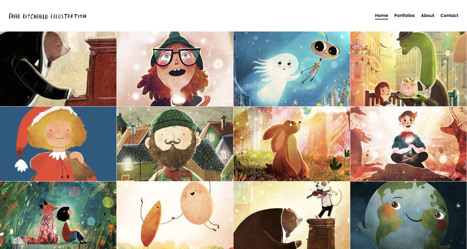
David Litchfield makes the artwork the first substantial content on the page. A four-column wall of illustration runs directly beneath a narrow white header, with almost no decorative interface competing for attention. The crops show characters, atmosphere and changes in scale across different projects, making the portfolio feel varied without losing its visual identity. The navigation supplies the structure that the image wall deliberately leaves quiet: picture books, illustrated novels and book covers are distinct destinations. Project names are also present in the page structure, so this is more useful than a single flattened collage.
What you can learn
Let a portfolio establish the visual voice immediately, then organize deeper work by the kinds of commissions a visitor actually needs. Keep project titles and meaningful destinations attached to each image, even when a sparse presentation gives the art most of the space.
Pros
The uniform grid makes many separate projects easy to compare in one view.
Clear portfolio categories distinguish picture books, novels and cover work.
Cons & considerations
The tight crops cannot explain narrative sequence or the complete printed spread alone.
A new visitor needs the About or project pages for publishing context and credits.
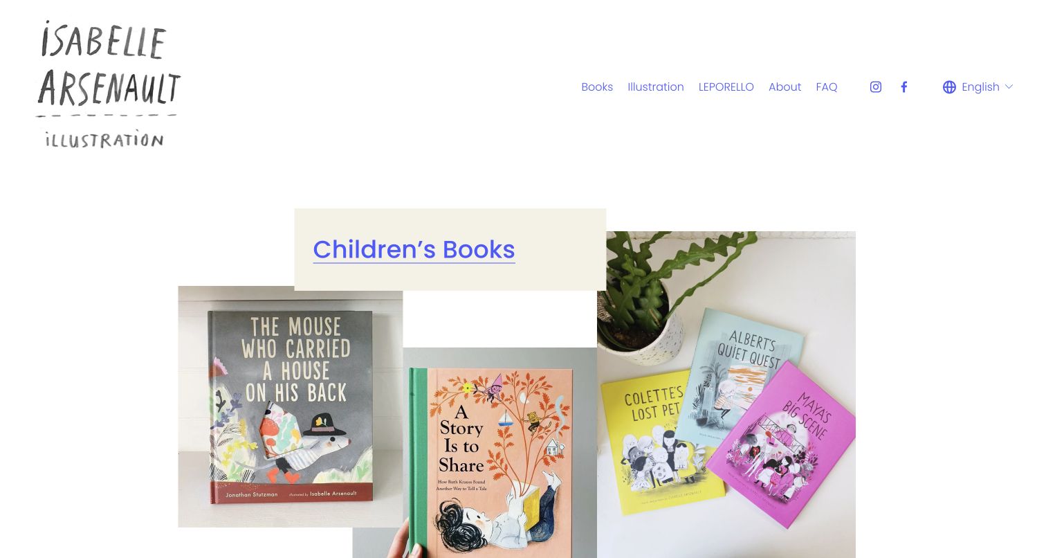
Isabelle Arsenault introduces the book collection through photographs of finished objects rather than a uniform wall of digital artwork. Covers overlap at different scales beneath a prominent Children’s Books link, creating the feeling of a small, thoughtfully arranged display. A hand-lettered identity sits apart from the quieter navigation, which separates Books, Illustration and LEPORELLO. The layout gives those different practices space without requiring a long explanation at the top. The reviewed opening view is particularly useful for studying how photographs can make publication work feel tangible while preserving a simple route into the archive.
What you can learn
Use the physical book as part of the portfolio story when cover design, scale and production contribute to the work. Pair an expressive arrangement with an unmistakable text link so visitors do not have to guess which part of a collage opens the collection.
Pros
Finished-book photographs communicate material and publishing context immediately.
Named sections distinguish books from other illustration practices.
Cons & considerations
The overlapping arrangement shows fewer individual titles at once than a regular grid.
Large introductory spacing delays the detailed project records below the opening view.
Julie Morstad’s homepage pairs a textured black wordmark with a small row of practical links, then gives almost the entire remaining view to illustration. A postage-stamp image, a large bespectacled face and a pencil-like figure sit against white rather than inside matching cards. Their different proportions preserve something of the work’s original character. The menu remains easy to summarize: books, sketchbook, about, contact and shop. This is an intimate portfolio entrance rather than a sales landing page with repeated calls to action. It asks a visitor to look carefully at the drawing before moving into the more specific book or background sections.
What you can learn
An illustrator’s own lettering and image selection can provide enough identity without additional graphic decoration. Maintain a short, conventional navigation alongside the expressive work so a publisher can move from appreciating the style to finding books and contact information.
Pros
The artwork keeps its varied proportions instead of being forced into identical crops.
Books and sketchbook are clearly separated as different kinds of evidence.
Cons & considerations
The opening images lack visible project captions that would explain their publication context.
Small navigation type carries much of the practical wayfinding responsibility.
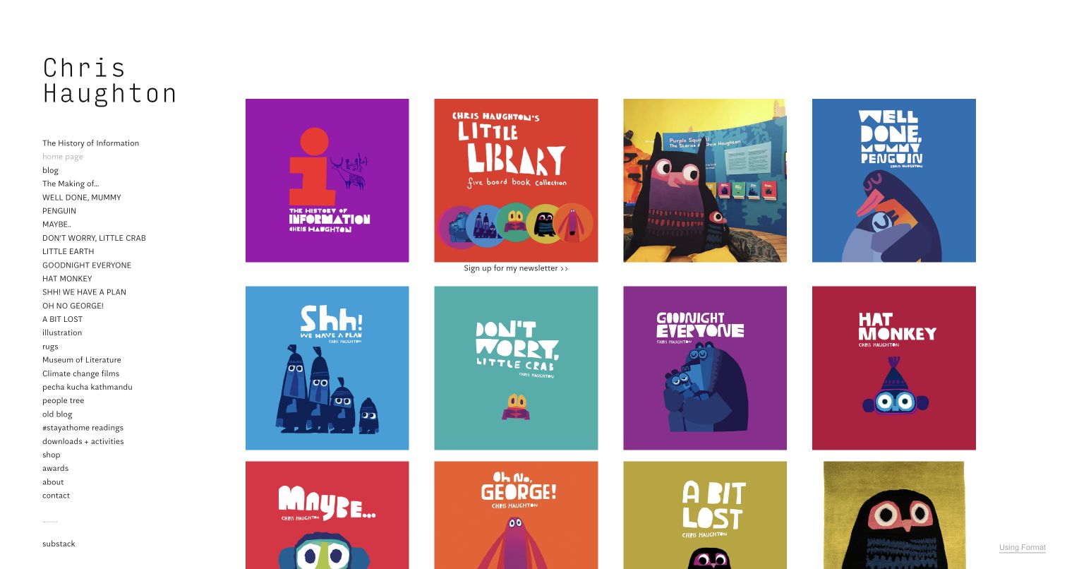
Chris Haughton places a long, plain-text navigation column beside a colorful grid of books and projects. The covers themselves supply strong visual hierarchy through bold lettering and a consistent graphic sensibility. A visitor who knows a title can use the left-hand list; someone browsing visually can recognize the same work from its cover. The navigation also exposes making-of material, readings and downloadable activities, showing how an illustrator’s site can serve readers and educators as well as commissioners. The design accommodates work beyond books without hiding the publishing archive. Its strength comes from the contrast between a restrained interface and exceptionally distinctive source material.
What you can learn
Offer both title-based and visual access when visitors may remember either a book name or its appearance. Put genuinely useful supporting resources in the same navigational system, while making their purpose clear enough that they do not become miscellaneous links.
Pros
Book titles are directly available without searching through image-only menus.
Making-of and activity destinations extend the usefulness of the published work.
Cons & considerations
The long sidebar requires careful prioritization as the archive continues to grow.
Several unrelated practices share the same navigation level, increasing scanning effort.
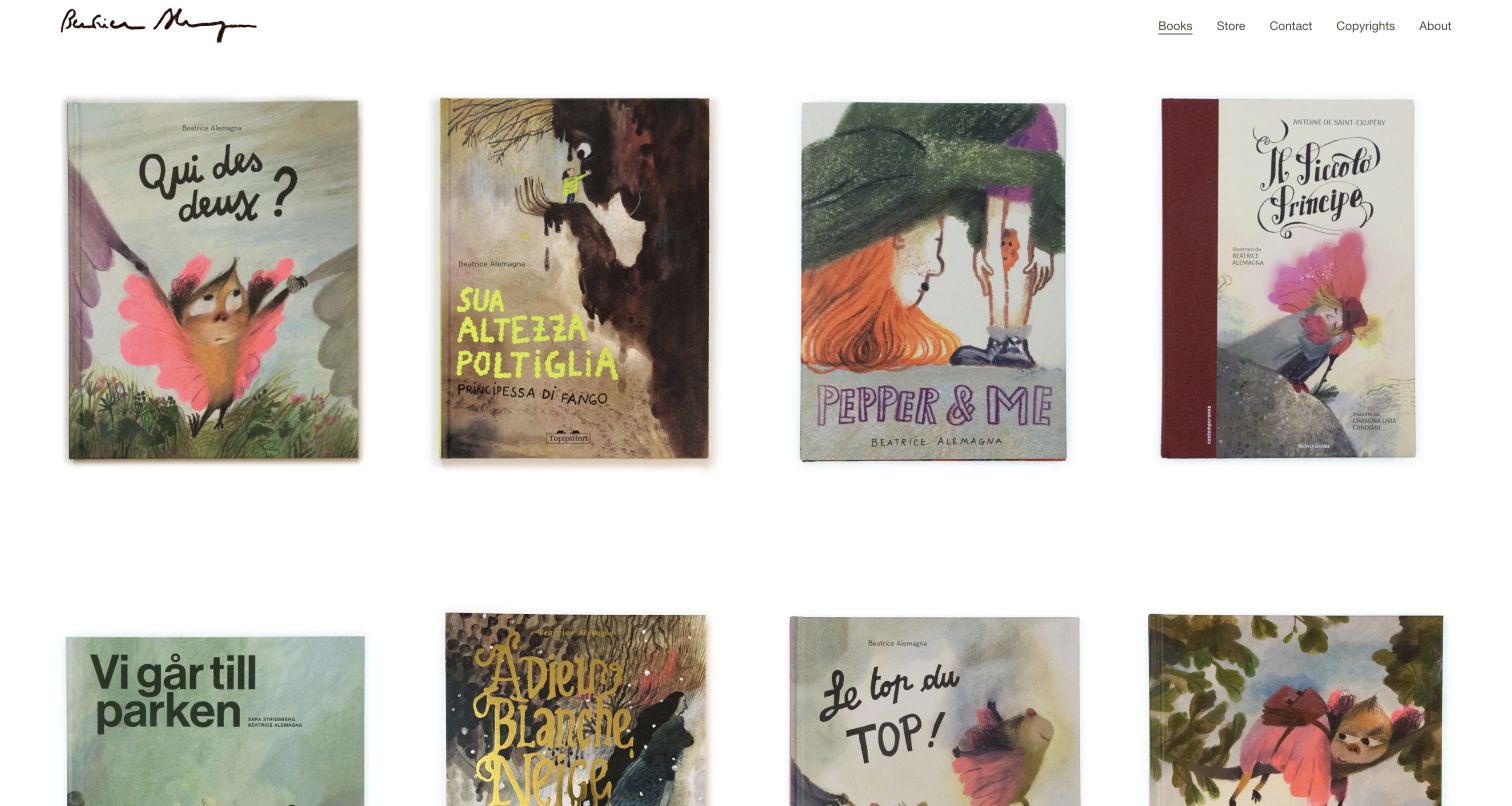
Beatrice Alemagna’s reviewed Books page is a spacious gallery of covers beneath a compact signature and a short navigation bar. Four large covers occupy the first row, retaining their individual dimensions and printed lettering. That choice lets differences in language, texture and composition remain visible instead of replacing them with a standardized promotional treatment. Books is visibly marked as the active section, while Store, Contact, Copyrights and About remain nearby. It also demonstrates the limits of a cover-only introduction: recognition is immediate, but a commissioner still needs to enter a project to understand the interior work.
What you can learn
Treat each published title as a coherent project with its own cover and supporting record. A consistent gallery rhythm can unite diverse editions without erasing their differences; readable captions and meaningful image descriptions should carry the information that artwork alone cannot communicate.
Pros
Generous spacing allows textured covers to remain the main focus.
The active section and short navigation make the archive’s location clear.
Cons & considerations
Most titles are carried by cover artwork rather than adjacent visible text.
Interior spreads and collaborator credits require a deeper project visit.
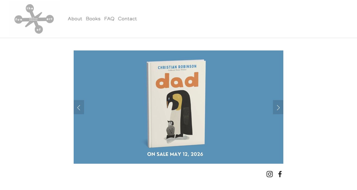
Christian Robinson’s The Art of Fun uses a restrained white frame around one large promotional image at a time. In the inspected view, the Dad cover sits on a flat blue field with its release information beneath it. Previous and next arrows make the image’s carousel role visible, while the header offers About, Books, FAQ and Contact without an elaborate hierarchy. This is a useful contrast to the many dense portfolio grids in the collection: it gives a single release room to register, then leaves the broader backlist to an explicit Books destination.
What you can learn
A current publication can deserve a dedicated opening moment, provided the rest of the portfolio remains easy to reach. Keep release details attached to the featured work and provide clear controls instead of assuming every visitor will wait for a rotating sequence.
Pros
A single large cover gives the featured book an unmistakable focal point.
The short header preserves direct access to books and practical background information.
Cons & considerations
Only one project can be compared at a time in the opening carousel.
Campaign-style release copy needs maintenance after its announcement period passes.
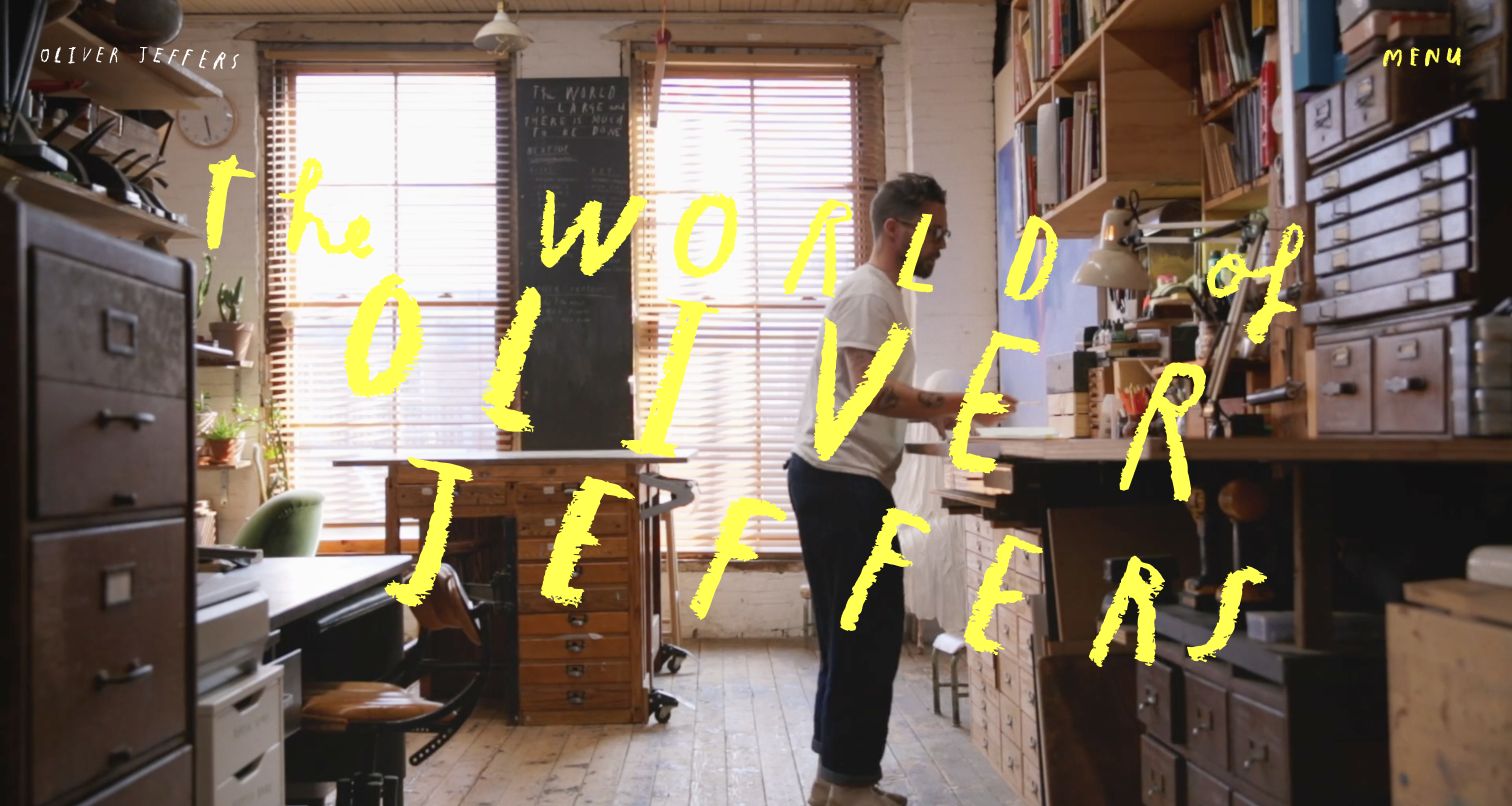
Oliver Jeffers opens with a full-window studio scene and large yellow handwritten lettering. The artist’s name and a compact Menu control sit above the image, leaving the first screen closer to a film introduction than a conventional book catalog. The page structure then distinguishes art, books, biography and speaking, with individual works appearing as named entries. This is a deliberate choice to introduce the person’s creative world before narrowing to a specific publishing format. It is useful inspiration for an established practice, but a smaller portfolio should weigh the delayed access to individual books.
What you can learn
Use an atmospheric introduction when it communicates something concrete about the artist and the relationship between different practices. Preserve direct paths to the book archive and project records so the opening experience does not become a prerequisite for finding useful information.
Pros
The studio imagery presents a memorable context for the creative work.
The broader page distinguishes books from fine art and other activities.
Cons & considerations
A menu control hides the main destinations until the visitor opens it.
Large moving imagery can demand more loading and accessibility care than a simple cover grid.
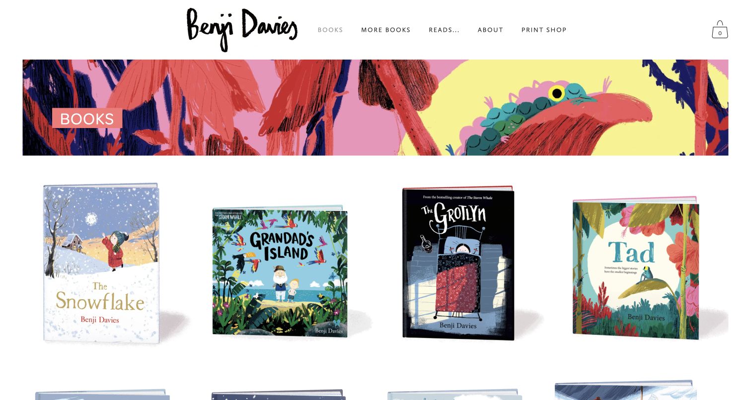
Benji Davies places an illustrated banner below a handwritten identity and a concise horizontal menu. The opening collection shows freestanding book covers with visible depth and generous white space around them. That presentation makes the titles feel like objects on a shelf, while the banner supplies a separate glimpse of the illustration style. The page’s book entries have individual names and destinations rather than functioning as a decorative collage. More Books, Reads and Print Shop suggest distinct follow-on journeys for people who want another title, a reading or artwork. The result balances a memorable visual voice with a clear publication-led structure.
What you can learn
Separate the emotional introduction from the functional book index. A modest illustrated banner can carry personality while a consistent row of covers helps readers identify titles, compare them and enter the right project without navigating a complicated interface.
Pros
Large individual covers make the publishing output easy to recognize.
Book, reading and print-shop destinations serve different visitor intentions.
Cons & considerations
Books and More Books need supporting context to explain the difference between them.
The large cover treatment limits how much of the backlist appears in one screen.
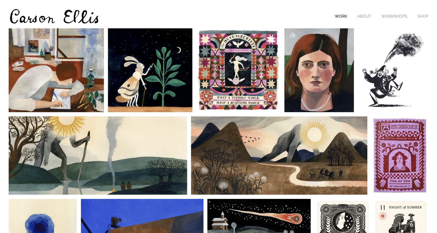
Carson Ellis presents a dense, varied mosaic beneath a handwritten name and four quiet navigation links. Book images sit alongside album artwork, paintings and other pieces, making the breadth of the practice immediately apparent. Unlike a grid built around identical promotional tiles, the differing image proportions create a changing visual rhythm. The page also includes specific titles, media, collaborators, publishers and years in its project descriptions. Those details are valuable because the same visual language can appear in several kinds of commission. The opening view emphasizes looking, while the accompanying records give an interested visitor a way to understand what each image actually represents.
What you can learn
A mixed portfolio needs concrete project context. Keep the visual presentation coherent, but label the work’s format, collaborators and publication details so a book commissioner can distinguish a finished spread from a painting, study or unrelated commercial image.
Pros
The mosaic communicates range without requiring a separate promotional statement.
Specific project captions distinguish book work from other creative formats.
Cons & considerations
The mixed opening sequence does not provide an immediate book-only filter.
A dense image field can make individual projects compete for attention.
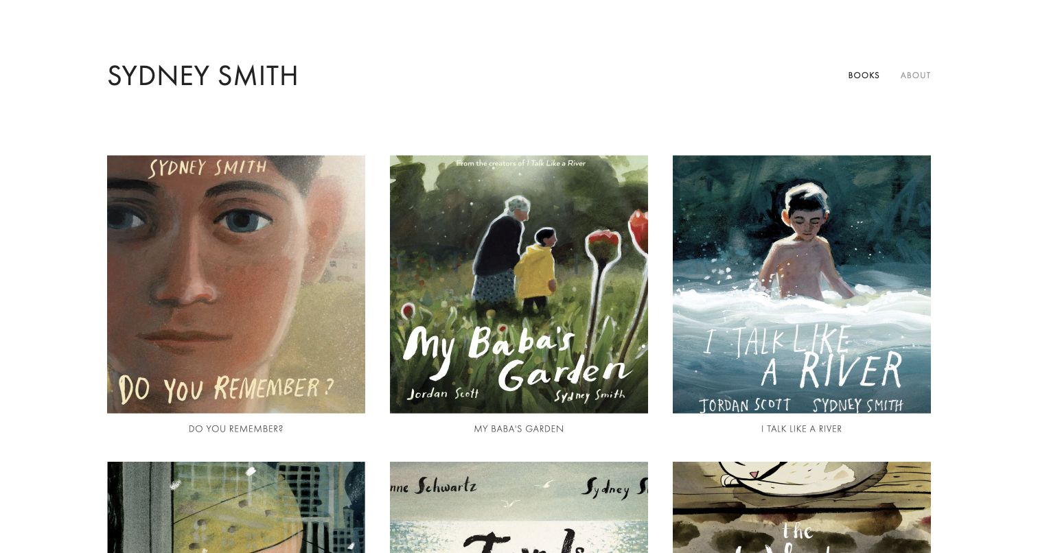
Sydney Smith’s homepage uses a simple name, two navigation destinations and a three-column book grid. Each large cover is followed by its title in a small but distinct caption. The restrained framework suits the nuanced paintings: there is little interface color or ornament to compete with the work. A visitor can move from a known title directly into its record, while About provides the practical alternative to browsing. The page demonstrates how a portfolio can feel individual through the artwork itself without relying on a complicated navigation concept.
What you can learn
A strong book portfolio does not require many interface elements. Give each title a readable label and a stable project destination, then use spacing and image scale to let the illustration establish the tone while practical information stays one clear step away.
Pros
The title beneath each cover supports recognition independently of the artwork lettering.
The two-item navigation keeps the main visitor choices easy to understand.
Cons & considerations
The opening grid gives little explanation of the illustrator’s role on collaborative books.
The minimal menu leaves contact details inside the background page rather than immediately visible.
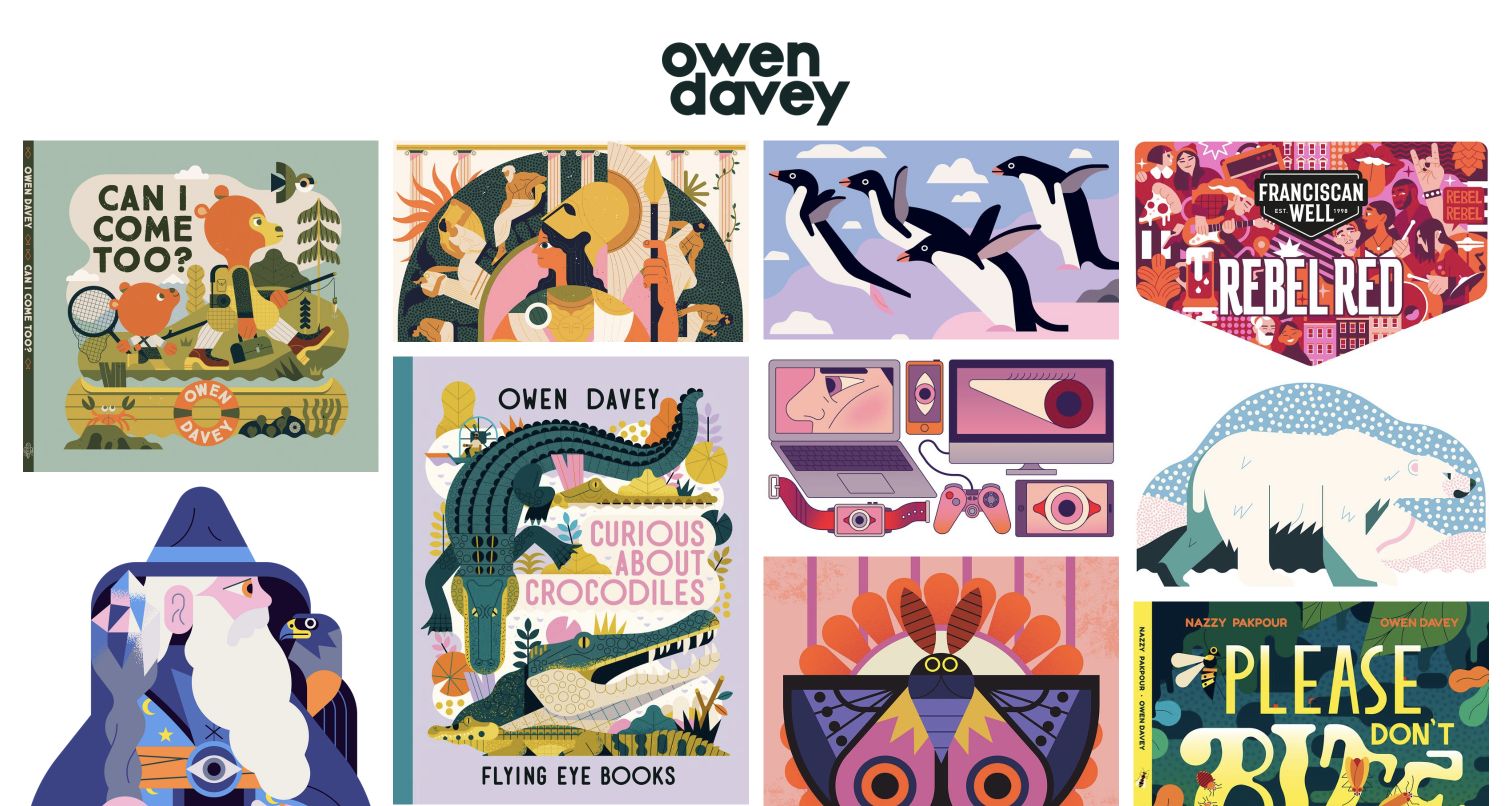
Owen Davey’s homepage opens with a bold, rounded wordmark above a tightly packed collection of illustrations. Recognizable book covers, animal images and commercial compositions appear together in different proportions. The page’s practical information is sparse: a business name, direct contact detail, Instagram and Bio appear in the document structure. This is a portfolio that relies on visual recognition and immediate stylistic comparison rather than an explanatory headline. Its book work is visible within the mix, making it useful for studying how a consistent illustration practice can span publishing and other commissions without separate visual identities.
What you can learn
Show the range of applications without obscuring the discipline a visitor came to assess. Keep the strongest book examples recognizable and add project context where needed, while letting a consistent visual language connect the broader body of work.
Pros
The mixed proportions retain the distinct character of covers and other compositions.
A strong shared illustration style makes the varied portfolio feel coherent.
Cons & considerations
The opening view does not visibly separate book projects from commercial illustrations.
Sparse captions make the scope of individual commissions harder to establish immediately.
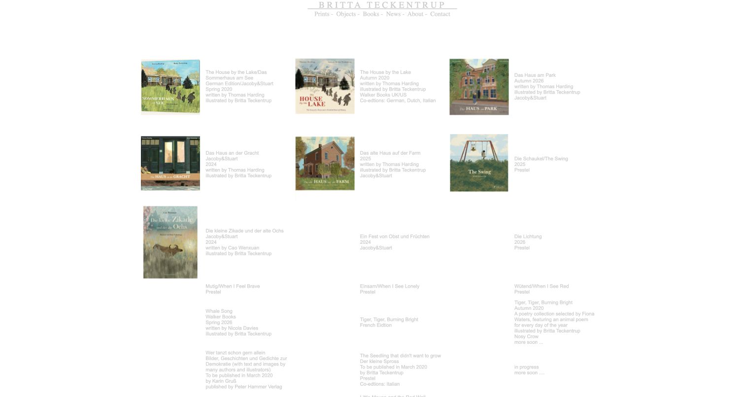
Britta Teckentrup’s reviewed book catalog takes a documentary approach. Rows pair covers with publication information, including named collaborators, publishers and editions. The page shows newer entries alongside a much longer backlist, making the breadth of the publishing work explicit. The useful lesson is the amount of context preserved around each title, rather than the visual treatment of the table itself. In the captured view, some image positions are empty while text records remain readable; that makes image maintenance and clear text structure especially important for a large archive.
What you can learn
Build publication records as durable information, not just cover images. Keep author and illustrator roles, edition details and dates clear, then present those records with sufficient contrast, readable spacing and a maintained image library so a long backlist remains practical to use.
Pros
Detailed entries distinguish collaborators, publishers and different editions.
Text records preserve useful context even where a cover is not displayed.
Cons & considerations
Small, pale text makes the dense catalog harder to scan in the inspected view.
Older future-tense release wording and empty image positions need ongoing editorial attention.
Kegan is a freelance web designer and developer with 15+ years of experience helping businesses turn complicated website requirements into clear, maintainable digital experiences. He works directly with clients from planning and design through development, launch, and ongoing support.
For book illustrator website design, his development approach focuses on portfolio structure, book and collaborator records, image presentation, publishing inquiry routes and maintainable project archives. The scope can be a targeted improvement or a complete custom build, with responsive layouts, thoughtful content structure, and integrations chosen around the people using and maintaining the site.
Show 3 other book illustrator website designersHide other book illustrator website designers
Plan a book-illustrator website around the evidence a commissioner needs
Choose the portfolio’s scope before choosing the layout
List the real projects you can show and what each one proves. A cover can demonstrate composition, but several linked spreads may be needed to demonstrate pacing and character continuity. Build the selection around those distinctions instead of uploading every image from the studio archive.
Decide whether the primary visitor is a publisher, an existing reader, an event organizer or an art buyer. Other audiences can still be served, but the opening page should make the main purpose apparent. A book-centered practice may need a title index; a broader practice may need clearly named portfolio categories.
Check permissions and credits for every proposed image. Record the collaborator, publisher, publication year and any relevant edition. Keep unpublished work labeled honestly, and avoid presenting a personal exercise as a commissioned or released project.
Create a project record that supports both images and context
Use a consistent set of fields for titles, collaborators, role, publisher and selected images. Leave room for a short explanation when the format requires it. A simple record makes it easier to maintain a coherent archive as new books appear.
Prepare images at useful sizes and preserve their intended proportions. Avoid a crop that hides the central action or misrepresents a spread. Add readable text labels and meaningful image descriptions so recognition does not depend entirely on lettering embedded in a cover.
Connect the record to the appropriate next step: a publisher page, a retailer, related work or an inquiry route. Identify external destinations clearly. Buying a book, licensing artwork and commissioning new work should not appear to be the same process.
Keep the site usable as the backlist grows
Give published titles stable URLs and retain useful older project records. Group work by format or audience only when that distinction helps a visitor. A dozen competing categories can make a small portfolio harder to understand than a carefully ordered grid.
Assign responsibility for release dates, event information, representation details and shop links. Announcement copy that remains in the future tense years later weakens an otherwise useful archive. Keep the original publication dates while correcting outdated availability or contact information.
Test a few real journeys with the actual content: finding a named book, seeing interior work, locating publishing representation and reading a project on a narrow screen. Check keyboard access, contrast and image loading in the implementation. Improve the structure before adding more decorative interactions.
The editing job behind the design
Choose tools that make portfolio updates straightforward
Most illustrator portfolios benefit from a manageable content system with reusable project records and predictable image handling. A simple gallery may be enough for a small body of work. A larger archive needs consistent titles, credits and categories more urgently than it needs elaborate transitions.
Add commerce only when the artist will maintain inventory, delivery and customer support. Link to an established shop or publisher when that better fits the practice. Keep publishing inquiries separate from retail transactions and avoid collecting unnecessary personal information in forms.
Public technology observations describe a bounded sample of the reviewed source page and accessible supporting resources. They do not reveal the artist’s private workflow, contracts or complete technical architecture. Choose tools for the actual editing and accessibility requirements rather than assuming a visible platform will produce another illustrator’s result.
Our WordPress website examples offer a separate look at publishing approaches. A visible platform label is evidence for that named page, not a guarantee that the same system will suit your requirements.
Before the public launch
A book-illustrator portfolio launch checklist
The first page clearly identifies the illustrator and the relevant body of work.
Each published book has an accurate title, role, collaborator and publisher record.
Unpublished studies and personal projects are labeled distinctly from commissioned work.
Selected spreads demonstrate storytelling rather than repeating the same cover crop.
Artwork permissions and required credits are checked before publication.
Image proportions, descriptions and text labels remain useful at smaller sizes.
A known title can be found without navigating an unlabeled image maze.
Publishing, events, rights and retail inquiries have appropriate destinations.
Agent and contact information reflects the current verified arrangement.
Release announcements and shop availability are maintained without rewriting publication history.
Keyboard navigation, contrast and reduced-motion behavior are checked where relevant.
The illustrator can add a project and correct a record through the intended editing workflow.
These checks are a project checklist, not a performance, legal, security, or accessibility certification. Test real journeys with the people responsible for the website before making claims about the result.
Sources & editorial method
How this collection was selected and reviewed
We reviewed these 12 public illustrator websites on November 11, 2026, using their actual homepage or explicitly labeled book index. The collection compares artwork presentation, publication context, navigation and inquiry routes. David Litchfield is the Editors Choice for its immediate project grid and useful separation of picture books, illustrated novels and covers. This is an editorial website-design selection, not an assessment of commissioning suitability, availability or commercial outcomes. Public technology checks are limited to accessible source-page evidence; unavailable or unknown details are not inferred.
Each example links to its actual source page. Screenshots are direct browser captures with their own capture dates; moving imagery, announcements and live designs can change. The notes describe observable design choices and conditional tradeoffs, not measured traffic, conversion results, service quality, or accessibility conformance.
Technology labels use public page metadata, asset evidence, or explicitly cited platform documentation. Platform documentation is not a complete current deployment audit. A component reference may be legacy or unused; it is not a complete backend inventory. Unknown stacks are omitted. These sites are editorial examples, not our client portfolio.
Written, Edited and Curated are separate editorial records, not timestamps advanced by a rebuild. Website designs and imagery belong to their owners. See our editorial standards or suggest a correction.
Questions worth asking
Book Illustrator website design questions
Should an illustrator lead with book covers or interior artwork?
Use the material that best demonstrates the intended work. Covers help readers recognize a title and show a finished publication. Interior spreads can explain storytelling, character continuity and pacing. A useful project page often includes both, with accurate credits and permission to display the images.
How much explanation should a portfolio project include?
Start with the title, your role, collaborators, publisher and a short statement of the project’s context. Add detail when it helps someone understand a specific design decision. Avoid lengthy introductions that delay the actual work, and do not imply outcomes or responsibilities you cannot support.
Can personal projects sit beside published books?
Yes, when they are labeled clearly. A personal sequence or study can demonstrate a skill that a current backlist does not show. Distinguish it from a commissioned publication and explain what the visitor is looking at without inventing a client or release.
Does a book illustrator need an online shop?
Only if selling and fulfilling products is part of the practice. A link to an existing print shop, publisher or retailer may be more manageable. Keep retail questions separate from commissioning and rights inquiries so the contact routes remain useful.
Should the portfolio include school visits and teaching resources?
Include them when they are genuinely offered and maintained. Give educators a clear section with relevant age groups, formats and contact instructions. Keep those details separate from the professional portfolio so each audience can find its next step quickly.